The Daily Edit – Genome: Samuel Solomon

genome_01

genome_02

genome_03

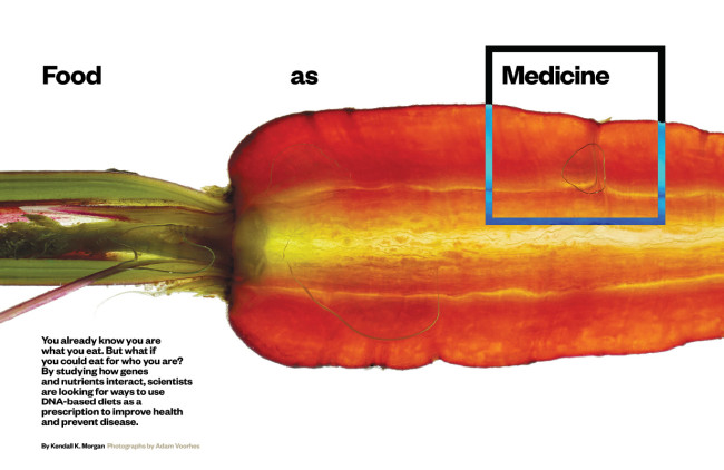
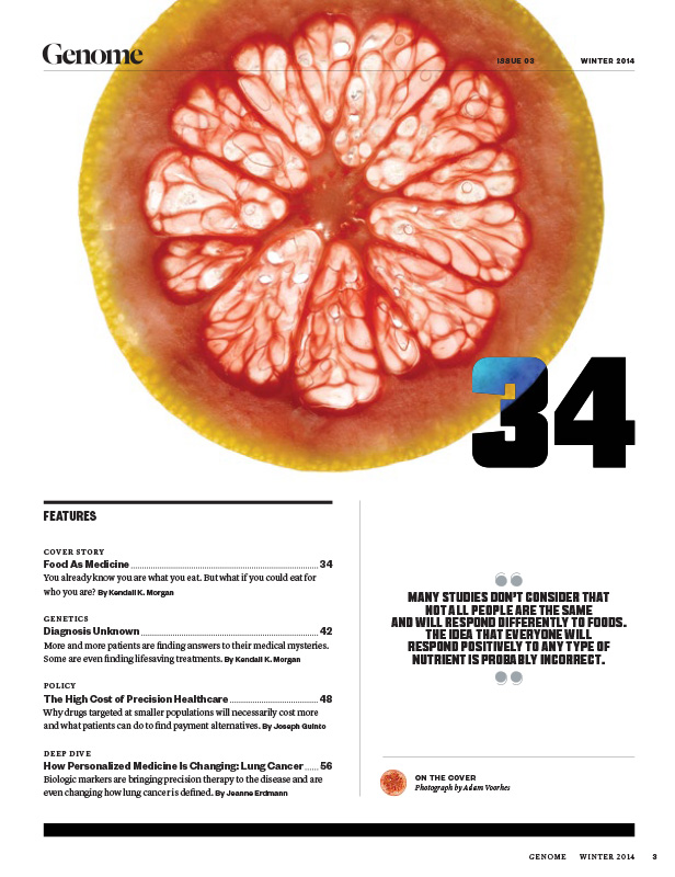
Food as Medicine:
Photographer:Adam Voorhes
Editor: Rhonda Reinhart

genome_04

genome_05

genome_06

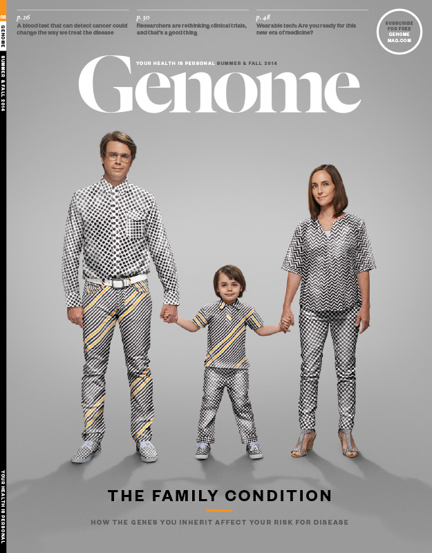
The Family Condition
Photographer: Randal Ford
Casting and wardrobe: Lauren Smith Ford
Retouch: Gigantic Squid
Editor: Rhonda Reinhart

genome_07

genome_08 genome_09

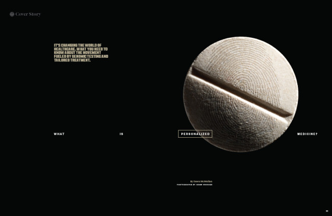
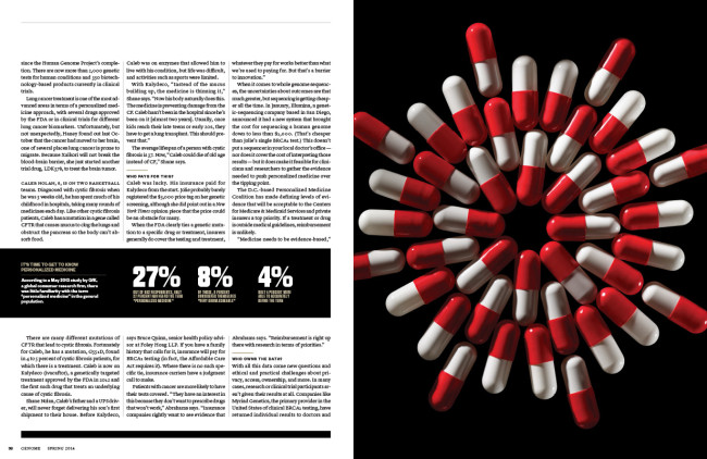
What is Personalized Medicine
Photographer: Adam Voorhes
Editor-in-Chief: Eric Celeste
Designer: Caleb Bennett

Genome


Creative Director: Samuel Solomon
Editor-in-Chief: Eric Celeste

Heidi: How did this job come about for you?
Samuel: Years ago, I worked with Genome’s founding Editorial Director, Eric Celeste, while at American Airlines’ inflight, American Way. We always had a great working relationship during our time there, so he reached out about the Creative Director position when things were first getting off the ground.I jumped at the opportunity because I felt like it would be a chance to build something meaningful from the ground up, and had a lot of potential to become a great product.

Did you choose healthcare consciously as an editorial pursuit? It seems as though that would be a very solid career path. Smart.
Not healthcare specifically, but I’ve always had a personal interest in science, and looking back I’ve often gravitated towards projects which had a philanthropic element or could contribute something of real value for the audience. Not to draw a comparison to Tibor Kalman, but I always admired the editorial work he was able to do at Colors, and that sort of social consciousness has always been very appealing. There is a lot of promise in the field of genomics and personalized medicine for helping people with chronic diseases, so to be able to work on a magazine that can have real impact is great. The bonus is that from a design perspective, science and medicine have such a huge visual vocabulary to draw from.

Who publishes it and how many times a year does it come out?
Genome is a quarterly published by Big Science Media, and is the core product around which the media company is built. All of our content lives in both the print edition and online at genomemag.com. We’re in the process of closing our fifth issue (Summer 2015) right now.

How big is your staff?
Well, I am the entire art department if that says anything. It helps that we publish quarterly, and I occasionally bring on some outside help when needed. So yeah, we are a pretty lean operation — 5 in our Dallas office, our Editor-in-Chief in the Bay area, and we are growing our sales staff outside the Dallas area.

Are you also the Photo Director?
More or less. I do all of the research, assigning, editing and color work.I’d say the vast majority of our imagery is conceptual in nature, so there’s also a good deal of illustration in the book.

Medicine can a dry subject, what is your creative mantra to combat that?
Well, our writers and editors are great at making these topics accessible for a broad audience, which in turn makes my job a lot easier.If you look at the existing visual vernacular of genomics, you see a ton of glowing 3-d helixes, walls of ACGT text, scientists hard at work in the lab. My challenge is to try to avoid the clichés, and find a fresh way to speak to these topics.For the first issue, I wanted to see if we could do an entire issue without a single helix. We came close — I think there was exactly one. But it was a super smart solution by the Milan-based illustrator, Alessandro Gottardo.

How did the idea of the suit come about for the disease story?
We work out which story will be featured on the cover for each issue during editorial meetings. Usually it’s something with broad appeal — topics that affect everyone like family, technology, food, etc.

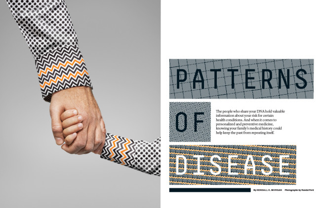
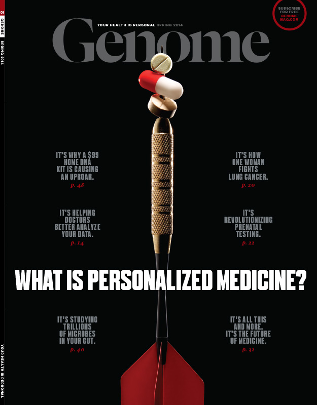
For this particular cover, I had to find a way to communicate disease inheritance that would be really immediate for the reader. The idea came up to bring something that’s usually hidden inside the body to the outside, so we ended up using clothing as the metaphor for inherited genetic traits, with the genetic mutation represented in orange. There’s this sort of anxiety around the idea of an inherited disease, because it’s lurking away inside your genetics, and the jarring patterns help to reinforce that anxiety.

I reached out to Randal Ford, because I knew he could execute the concept and bring something extra of his own to the project. A concept like this could go south pretty fast if it wasn’t executed really well. Randal brought on Gigantic Squid to help with the retouch and creating the patterns, and in the end, everyone did an awesome job of making a pretty weird idea come to life.

What’s the creative direction for the brand?
Our overarching goal is making complex science understandable and compelling for the lay audience. I’d say the creative direction is idea-driven and bold, sometimes a little experimental or whimsical but always approachable. Someone with an existing health condition doesn’t need to fight against the design in order to get to information that could potentially change their life.

Are you hamstrung at all by newsstand sales?
Genome is actually not on newsstands, and goes primarily to subscribers and point-of-care settings: doctor’s offices, hospitals, personalized medicine facilities. Anyone that’s interested can subscribe for free at genomemag.com/subscribe.

Who is your competition?
We were the first producer of content centered around genomics and personalized medicine, so we have a leg up in that sense, but a few more have come along recently. Front Line publishes a genomics magazine, and Cure is a cancer publication which occasionally touches on personalized medicine. Ultimately, our competition is any publication in the point-of-care setting, so everything from medical journals to newsweeklies.

If a photographer wants to get in touch with you, what’s the best way?
A simple email or printed promo piece works just fine and we look at everything that comes through our door, digital or print. Submissions, messages, criticisms, whatever can be sent to art(at)genomemag.com.

The Daily Edit – Jeffery Cross: AFAR

 Screen Shot 2015-05-08 at 3.47.51 PM


Screen Shot 2015-05-08 at 4.59.15 PM


AFAR

Creative Director: Elizabeth Spiridakis Olson
Director of Photography: Tara Guertin
Photographer: Jeffery Cross

Heidi: Where did you get all that candy?
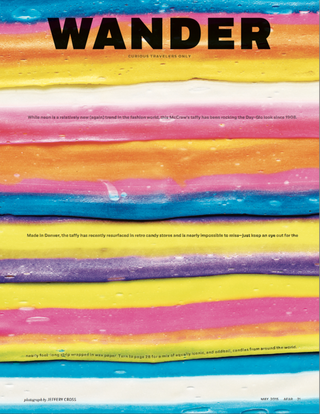
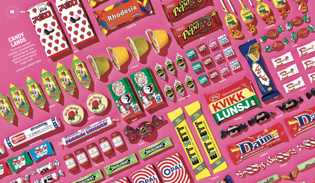
Jeffery: AFAR’s art department collected iconic and oddball candy (from staff members who had traveled recently, from online sources, and from local shops), based on visually interesting packaging, as well as geographic range. The Mix department runs in the magazine in every issue, and always tackles one object, from all around the world. The candy came from Sweden, Germany, Mexico, Russia, Japan, Colombia, Iceland, and beyond.

What is your process for setting up those graphic shots?
AFAR’s art director Jason Seldon mocked up the candy in the San Francisco office before we shot it in my Oakland studio. The products were all bright, colorful, and pop-y, and Jason wanted to play up that aspect. He’d also wanted to use that crazy pink background for some time, and this seemed like a good opportunity to do so. First step was to level the set and camera, waned the shot to be as rectilinear as possible. To help with the arduous task of getting the candy lined up in some sort of grid two we employed two special pieces of equipment: the first being a laser square…always fun to play with lasers, and the second being a 24” x 36” vacuum easel, this gave us a totally flat surface and held each piece of candy in place…magic!..The only downside was the noise. A vacuum easel should come with a great stereo… or noise canceling headphones.

How many options did you have and how long did it take to set up that spread?
For this spread we took the slow and steady approach to end up with one version built piece by piece, evaluate then modified until it looks finished. According to the metadata the shoot took aprox 4hrs from start to finish.

Did you try any of the candy?
We did! Unfortunately… I tried almost all the candy. It was all good in its own way. It was cool to see how each country approaches its sweets, all super different than our candy here in the states. Lucky for me that there were two families with children on my loading dock after the shoot… Being the stranger with the candy I doled out as much of the candy as they would take. The kids went crazy over the McCraw’s Taffy… its crazy big.

How big was that piece of candy for the opener?
McCraw’s taffy, which is made in Denver, comes in nearly foot-long strips, and has been in production since 1908! I am sure it would have other practical uses much like duct tape. It’s a fun product

The Daily Promo – Cody James

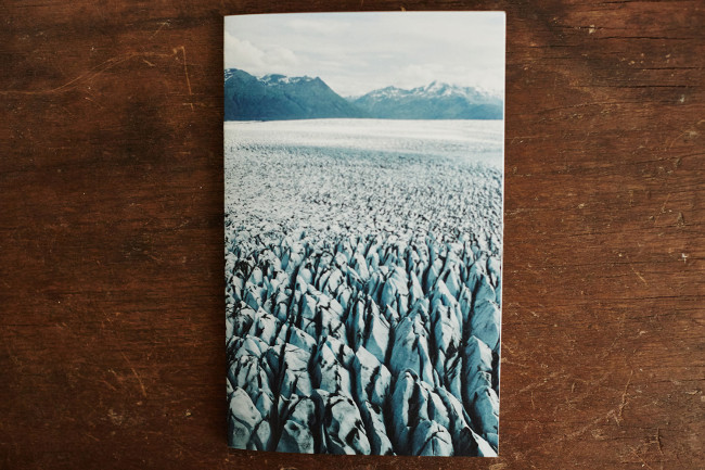
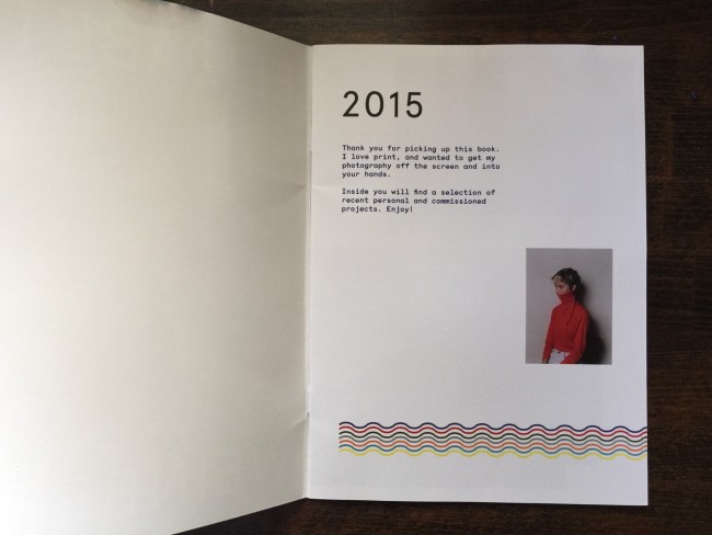
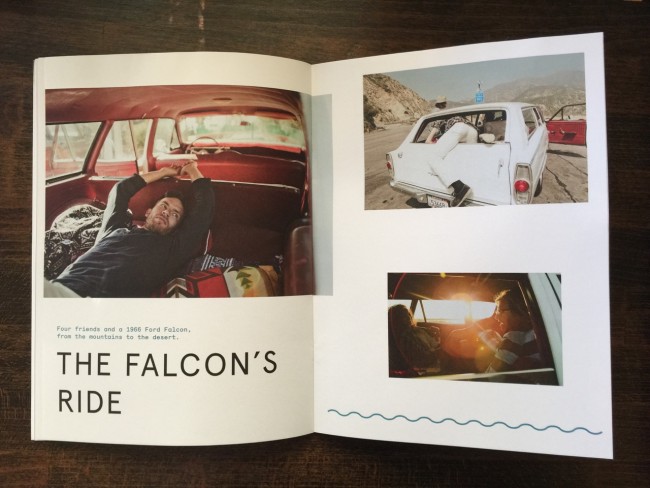
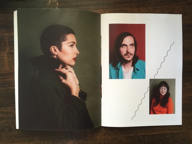
2015 Up In The Air Zine

Cody James


Who printed it?
QIS in Lower Manhattan.

Who designed it?
I designed the zine.

Who edited the images?
I designed the zine and edited the photos with the help of the creative eyes of a few friends.

How many did you make?
30

How many times a year do you send out promos?
This was my time making a zine like this. I am going to start making zines every few months. It’s great to see this process through and hold the finished product in your hands.

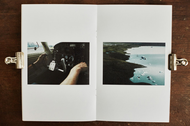
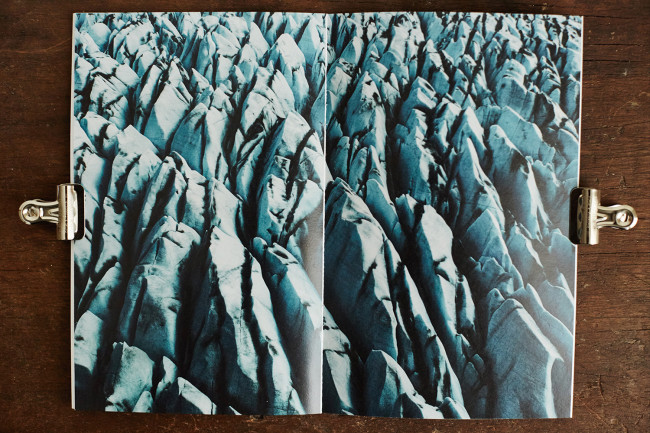
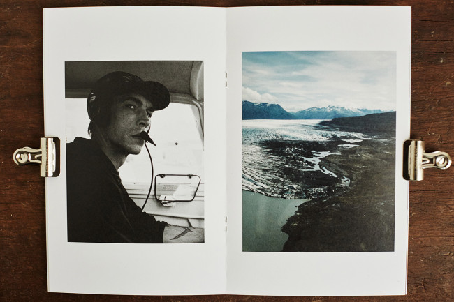
I was in Alaska last July and had the opportunity to trade photos for a flight with some local pilots. I’ve always had a huge interest in flight, nature, and storytelling. I feel like this was a great chance to combine all of these elements and put the content into a cohesive story. I’ve been wanting to make more physical objects of my work, and I chose to start with of some of my favorite photographs to date.

Did you add any text to the images/captions?
I didn’t add any text or captions to the images. I opened the zine with a quote by Socrates and let the images do the rest of the story telling. The quote was : Man must rise above the Earth—to the top of the atmosphere and beyond—for only thus will he fully understand the world in which he lives.”


The Daily Edit – Emiliano Granado: T Magazine and Manual for Speed

Screen Shot 2015-05-11 at 10.18.37 PM

Screen Shot 2015-05-11 at 10.18.44 PM

T Magazine

Photo Director: Nadia Vellam
Photo Editor: Caroline Hirsch
Photographer: Emiliano Granado

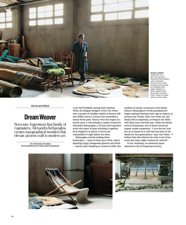
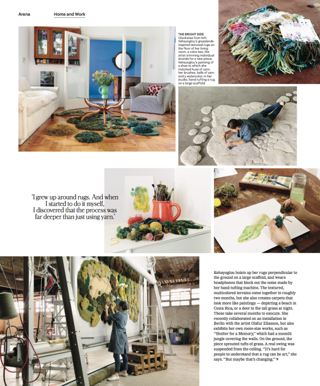
You can read the T Magazine article here

Heidi: I know this was your first time shooting with T Mag, how was it they had you on their radar? Had you been sending promos?
Emiliano: To be honest, I don’t know! I do send them promos, but I don’t think I was sending Caroline promos.

What were you doing in Argentina already? Do you often send notes to clients if you are traveling internationally
I was shooting a commercial job for 72andSunny. If I foresee having an extra day or two, I will definitely send a travel notice. Luckily, I’ve been busy enough lately that I don’t really have too many extra days.

What sort of direction did you get from the magazine?
They wanted photos of the artist at her studio and at her home. Details of both place and portraits of her in both places.

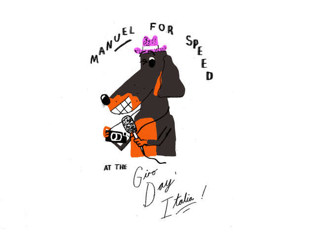
 Manual for Speed

ARG/USA- Founder, Director of Photography, Social Media: Emiliano Granado

mfs_emiliano

USA – Founder, Photographer, Writer: Daniel Wakefield Pasley

mfs_daniel


Tell us about Manual for Speed’s Photo Annual, I know Manual for Speed started out as a personal project and PND covered your story last year.
The photo annual is a big deal for us! We’re finally putting digital pixels into the analog world, and it makes it feel real, all of a sudden. For the last four years, it’s felt like a digital side project. But it’s starting to feel more and more like a media property. We’re collaborating with artists, with designers, etc. We’re taking retail sales seriously. We’ve got plans for more printed material. It’s just getting bigger and bigger.

With that said, personal projects are great forms of marketing. And self-publishing is a great way to get those projects out. The most memorable images of my career are from projects that were self-initiated or where I invested more than the necessary to complete the job. If you can create emotional connections with your images, people will notice you. When things are slow, you have to create work for yourself. If you’re not constantly creating work, then you’re failing.

image1
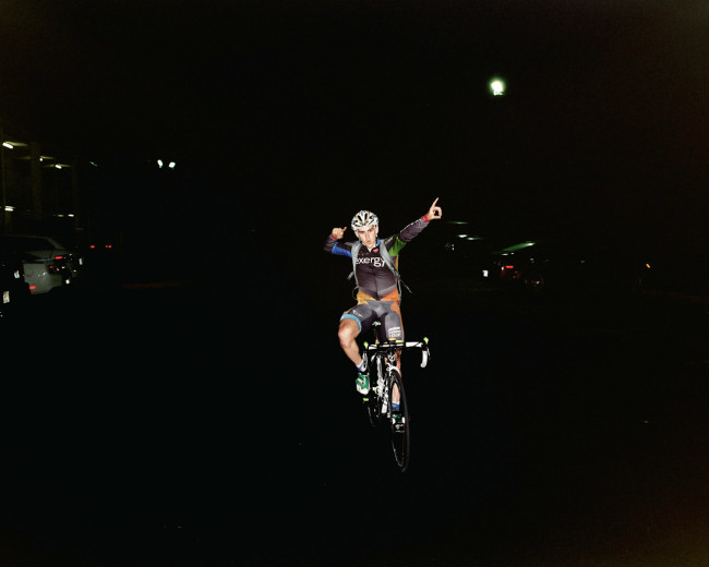
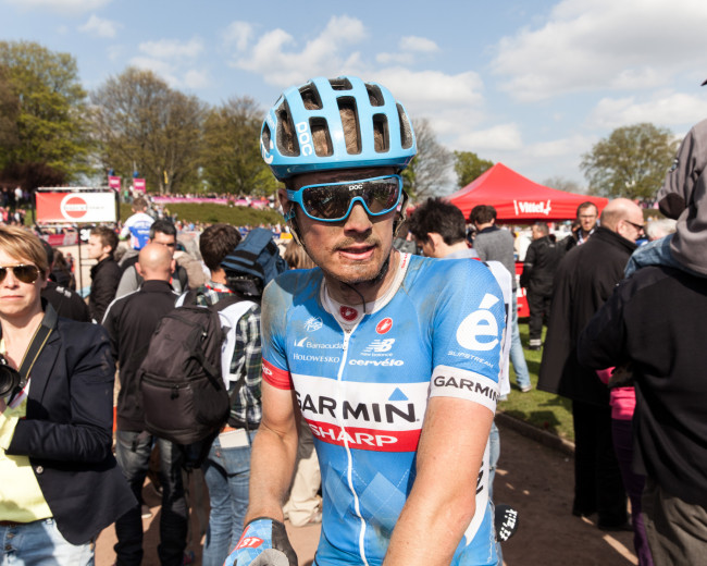
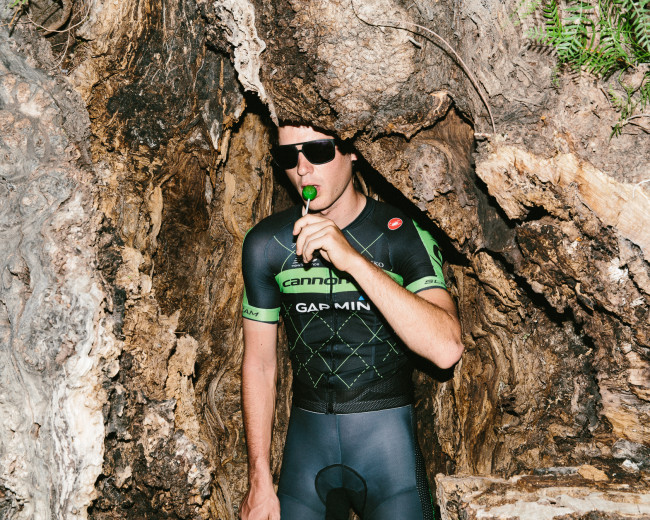
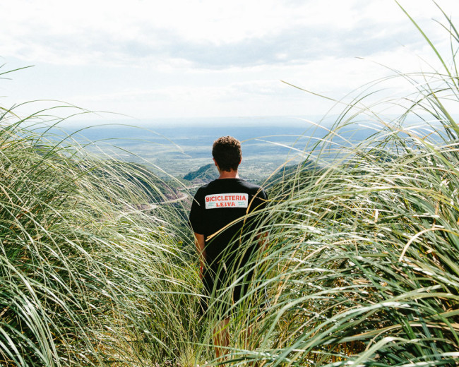
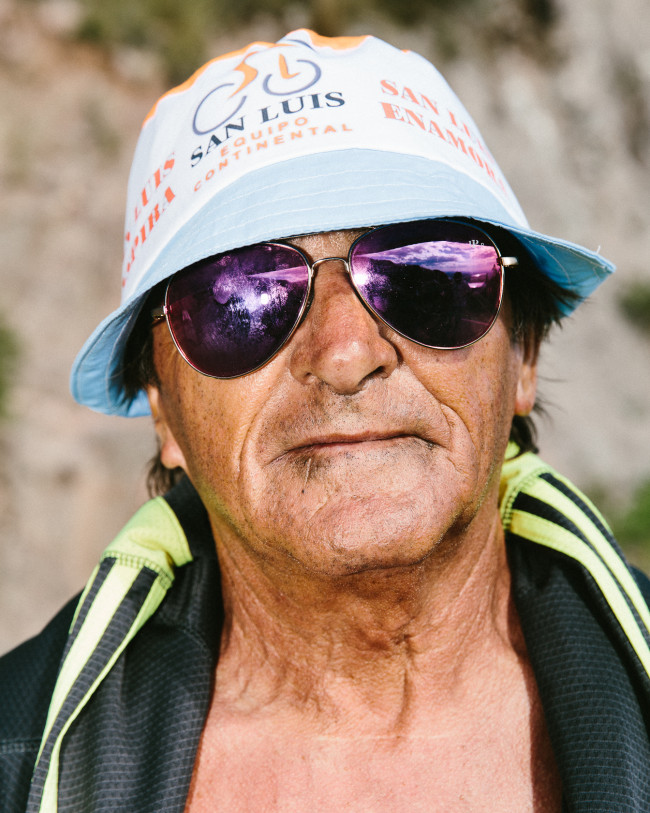
20120428_MFS_SpeedWeek2012_329212_22-03 20140412_MFS_Roubaix_0013 20140413_MFS_Roubaix_0689 20150118_MFS_SanLuis_0064 20150120_MFS_SanLuis_1180 20150120_MFS_SanLuis_1194 20150122_MFS_SanLuis_1958 20150123_MFS_SanLuis_2362 20150425_MFS_RHC_0552

manualforspeed_ape-1

manualforspeed_ape-2

manualforspeed_ape-3

When you first started doing MFS as a daily. What was the hardest aspect of publishing MFS?
Just the logistics of posting every day is gnarly. Photo edit, words, structure, quality, spelling errors. All that becomes gargantuan tasks when you’ve been running around all day and you have to wake up early the next morning.

Did you simply figure it out how to produce MFS as you went along ( publishing daily ) or did you have any prior experience?
Definitely no experience! We got a ‘publisher’ that receives all the images and words and puts it together neatly and creatively. That was by far the best thing we did.

Describe that moment when you realized this was about to get real.
There was never ONE absolute breakthrough moment. Instead, many small ones. A certain pro rider would tweet at us. They’d give us their personal phone number to get a hold of them. We’d get offers from strangers to sleep at their homes. We’d get recognized by strangers at races. People would send us loving emails out of the blue. Traffic would spike. Sales would spike. Major media people would say what a great job we’re doing, etc etc. Lots of little victories here and there.

What do you think was the single most important aspect to MFS’s success and what type of advice can you share for others wanting to pursue a personal project?
MFS has a unique voice. No one else is doing anything similar. A personal project should be exactly that – personal. Make it yours. Own it. Don’t do what you think the world wants to see. Just do you.

MFS’s coverage of the 2013 Giro d’italia drew your biggest traffic numbers to date and was the first time you guys started getting more mainstream attention. Were you surprised how much traction you got?
Yes. We had been doing MFS for a few years already and it wasn’t getting the attention we thought it should. The Giro was definitely the first big POP.

Had you ever published content on a daily basis? I gained a new found respect for daily online content. ( I had recently worked for Red Bull’s Sound Select division on  30 days in LA  and got up at 5:00 am for a month to edit and post, it was tremendously rewarding and relentless )
As I write this, I’m in a hotel room with two other MFS guys. We’re editing photos and concepting ideas and figuring out how best to execute tomorrows post. We won’t be done for a few hours. And then we’ll tweak the post in the morning while we’re in the car chasing the race around. It’s grueling and gnarly to publish daily. It is extremely rewarding though.

Where does your love of riding come from and how often do you ride?
It started as a means of transportation, but turned into an athletic endeavor. Riding is incredibly rewarding – you put in a physical effort and all of a sudden you’re going 25-30mph on two wheels. Its a great feeling. You can go as fast or as slow as you want, but it’s always fun to watch the landscape roll by. Unfortunately, I don’t have that much time to ride anymore. I commute everywhere on bike, but I’ve only been going on longer rides once a week if I’m lucky.


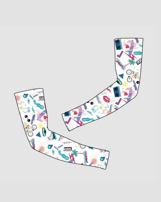
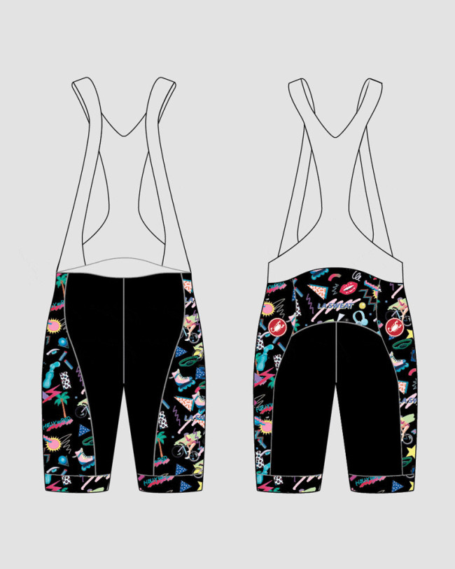
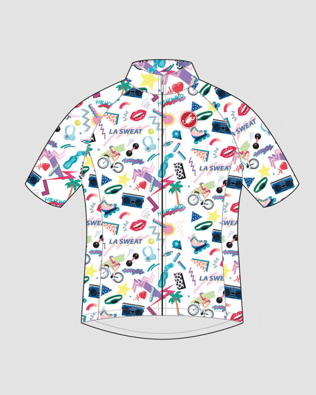
manualforspeed_lasweatintro-arms manualforspeed_lasweatintro-bibs manualforspeed_lasweatintro-jersey

How did the merchandising come about? Are you enjoying any success with it?
Merchandise was always a way to help pay the bills. Recently, we’re approaching merchandise as “retail as content.” That means everything we make has to be original artwork, thought out ideas, and it has to deliver on MFS’ worldview somehow. Slapping a logo on a tshirt is bullshit. We don’t want to make bullshit.

Aside from the photo annual, what’s next for MFS?
We’d like to continue publishing books. Smaller typology studies. Maybe some newsprint editions. Definitely a Photo Annual for 2015. More merchandise – lots of original jerseys and apparel coming this summer. Print sales. Interesting media partnerships with non-cycling media, etc.

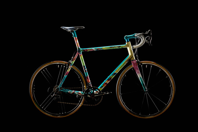
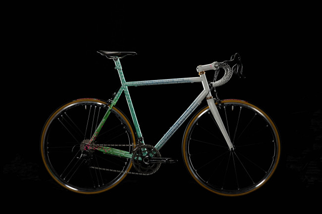
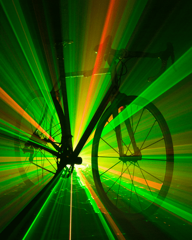
For those of us with some serious bike lust, check this out, custom bikes
manualforspeed_reachforthedream_pressrelease_argonaut-1
manualforspeed_reachforthedream_pressrelease_speedvagen-1 manualforspeed_reachforthedream_pressrelease_speedvagen-laser

The Daily Promo – Stephen Rose

Screen Shot 2015-05-08 at 7.16.23 AM Screen Shot 2015-05-08 at 7.17.04 AM Screen Shot 2015-05-08 at 7.17.25 AM
Stephen Rose 

Who printed it?
The zine was printed by Shapco in Minnesota.

Who designed it?
I designed it and had some (mostly production) help from my friend Seth Zucker who is a really talented designer. He works on a lot of interesting art books and publishes some of his own under the name The Kingsboro Press.

Who edited it?
I edited the images.

How many did you make?
I made 500

How often to you send out promos?
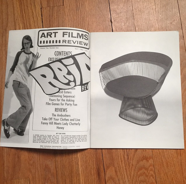
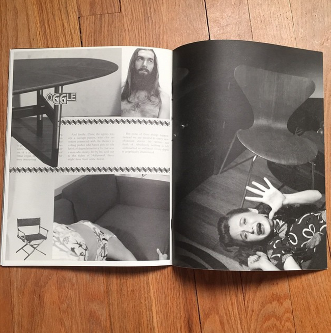
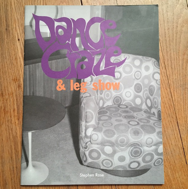
This was never intended to be a promo piece. I made it in conjunction with an exhibition I had last year of the same name. It was a site specific show at a midcentury modern furniture gallery called Regeneration. The idea is that the obsessive nature of collecting devolves into a kind of sexual obsession.

I sent some out to art galleries and art magazines but never really thought about using it as a promo until recently. I thought at the very least it’s going to stand out!! Not your typical beautifully lit promo I guess.


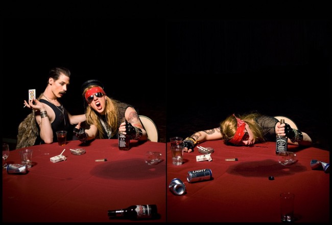
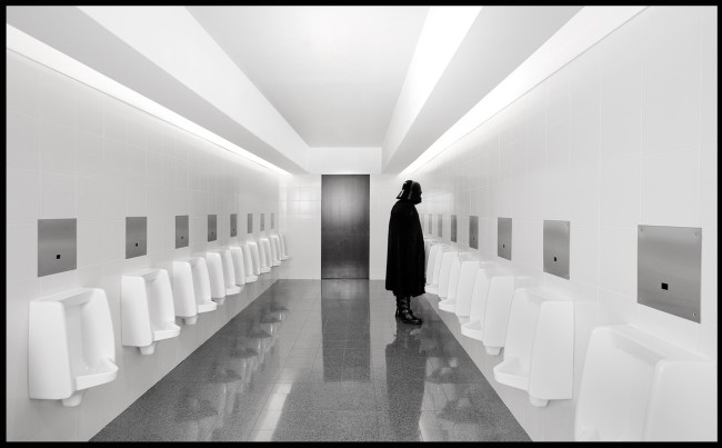
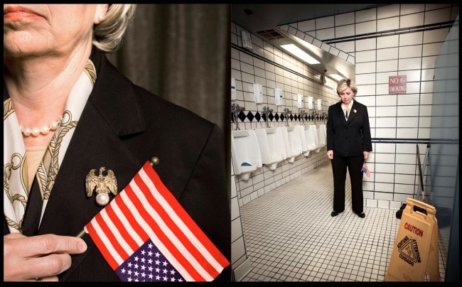
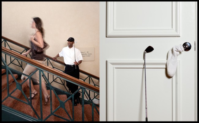
The Daily Edit – Celebrity Impersonators: John Hryniuk

axl_rose_freddie_mercury

darth_vader

hillary_clinton

tiger_woods

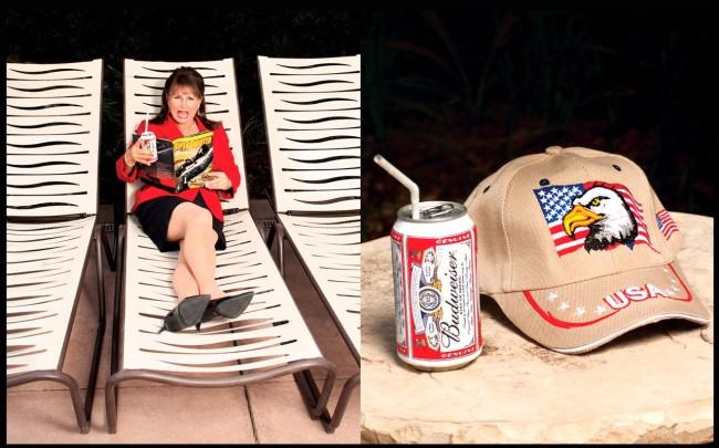
sarah_palin

John Hryniuk: Celebrity Impersonators

Heidi: Where did this idea come from considering you don’t live near Hollywood?
John: The idea of photographing impersonators came from doing one on one portraits with real celebrities at the Toronto International Film Festival. Unfortunately you get about 3 minutes in a boring hotel room. You can’t really be very creative in that amount of time.
How much time do you typically get with them?
About five years ago I though it would be really interesting to photograph impersonators because they give you all the time you need. I thought if I had the real person in front of me how would I photograph them? The other great thing with impersonators is there usually are no cranky egos to deal with. They are pretty much willing to do anything you’d like except something that would portray the celebrity they’re impersonating in a bad light.

Are you shooting these while on other jobs?
No, every year I take time off to travel and shoot the projects I want to work on. There isn’t any pressure or expectations from art directors or clients. Its about having fun. I call it a working vacation. I discovered its really important as a professional photographer to work on your own personal projects. You have to make the time to shoot things for yourself otherwise you will burn out.

How do you choose the characters and where do you find them?
In terms of casting its easiest to attend their yearly conventions in Las Vegas and Florida etc. I usually choose the most realistic looking ones, here some of the places I’ve found people.

The Annual Celebrity Impersonators Convention Las Vegas , on linkedin,  you tube, another convention in Las Vegas

How long has this series been in play?
The series is still an ongoing project. I think I will probably search out individuals and attend a few more meetings before it will be complete. The impersonators all do this part time or full time for a living. Which makes it even more interesting for me. I don’t only love photographing people but also finding out all about them when I do. There is also something about photographing in the United States that find unique than any other place in the world. The culture lends itself well to this kind of project. It is very different from Toronto, Canada where I live as its much more conservative.

A few times while working on this project I felt like I was on a TV reality show. I asked the boy who was impersonating Elvis why he was doing it he hesitated for a moment and responded: “ Because my mom made me. “

The Daily Promo: Elizabeth Weinberg

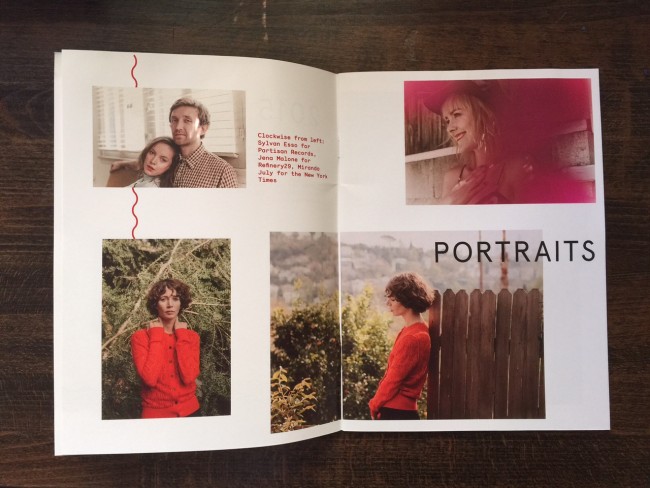
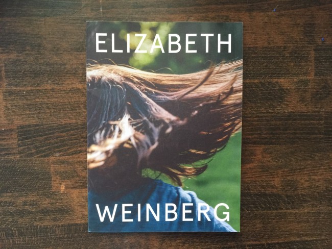
unnamed-1 unnamed-2 unnamed-3 unnamed-4 unnamed-5 unnamed

Elizabeth Weinberg

Who printed it?
Smartpress in Chanhassen, MN. I have used them for several years.

Who designed it?
Me!

Who edited the images?
Me!

How many did you make?
650.

How many times a year do you send out promos?
I do at least one large mailer per year and fill in the gaps with some postcards.

 Tell me about your design process
At first the cover was just going to be just white with the title and no photo, as I always have a hard time editing for that one cover shot. I got the plain-covered hard proof back and then decided to instead use a photograph that would look good very cropped in. In the photo, the boy’s hair is flying, giving the viewer a sense of movement, but leaves the rest open to interpretation. It’s all about making the person holding the book want to open it up.

Once the images were laid out, I felt it looked a bit too plain, so I added a geometric element to guide the eye through each page. Each section of the booklet has its own line, and each line was a color that I decided would best represent the series of images. The different colored lines were all aligned chronologically on the first page of the book, sort of like a symbolic table of contents.


The Daily Edit – Kyle Johnson: AFAR

AFAR_Spread1

AFAR_Spread2

AFAR_Spread3

AFAR_Spread4

AFAR_Spread5
AFAR

Creative Director: Elizabeth Spiridakis Olson
Director of Photography: Tara Guertin
Photographer: Kyle Johnson


How did you get those amazing aerial shots?
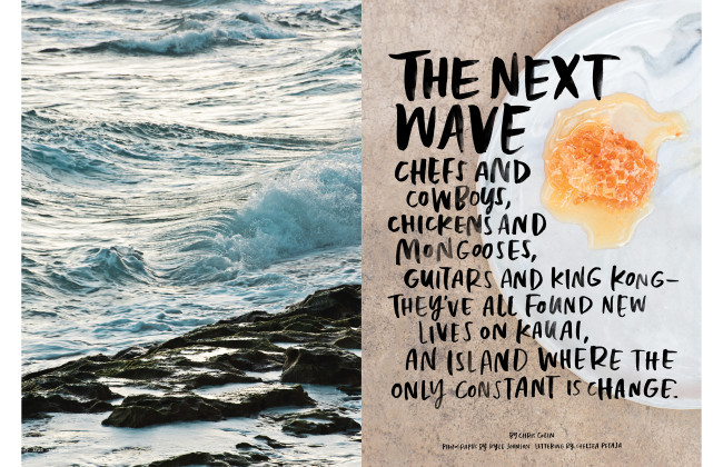
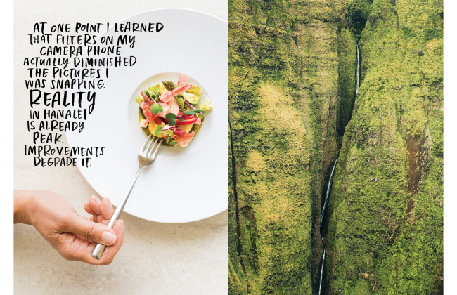
I ended up taking a helicopter tour of Kauai, knowing it would be the most amazing way to see and photograph the island from a unique perspective. I specifically found a company that offered a doorless chopper to get the best photos I could. The experience was incredible and terrifying at the same time. I honestly found that looking through my lens made it feel less “real” but every time I would set my camera down I started freaking out. The pilot gets down within the canyons and directly over the rocky cliffs or huge ocean swells. Its really a surreal way see the crazy diverse mix of landscapes on such a small island.

What was your approach to this shoot, did you have a shot list?
I approached this shoot similar to any editorial project I shoot. I definitely come in excited with some initial ideas and knowing the magazines specific needs. I always leave room however for exploration and spontaneous shots as well…Always turn down every road that looks interesting, dont hesitate to talk with locals, etc…

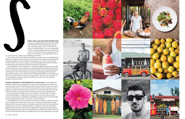
With this being a big feature, we definitely talked about the shoot a lot before hand and went into it with a Shot List. I had never been to Kauai previously. Being brand new to an area is always a great advantage for me photography wise. Everything is new and exciting and none of the little details get missed or overlooked. With a place this incredible I know there is bound to be almost too many good small details. I did try to stay within the vein of the story though. With it being a story for their Food Issue, the specific dishes had to be chosen and bringing any necessary lighting/plates/etc.. was also planned ahead of time. Shooting food at night almost always needs to be lit. I wanted to light it yet have it still feeling fitting to the story that was mostly shot outdoors & natural.

Did you know the writer on this project?
I have yet to meet Chris personally however he also wrote the one other travel story I have shot for AFAR earlier last year. After that story (about Oregon Coastal foragers) he reached out to me via email expressing he loved how the story turned out. We have corresponded a few times and I hope to collaborate with him again. I think my aesthetic is a good fit for his stories and we definitely have a mutual respect. I was stoked to find out he was writing the Kauai piece.

What sort of direction did you get from the magazine?
The creative director Elizabeth Spiridakis Olson & Photo Director Tara Guertin are both amazing people. AFAR does a great job of planning, producing and scheduling yet also letting the photographer find your own vision and tell the story as you see it and experience it. They both had great ideas going into the shoot on locations, aesthetic, and other details. Elizabeth actually joined me during the food shoots and helped with specific plate styling. Its great to collaborate with people who are just as passionate and whose aesthetics and curation I respect.

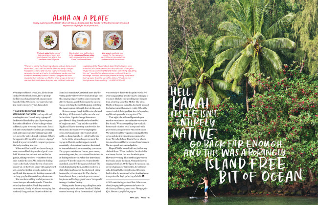
Whose idea was it to ride a bike off the pier?
Technically Jim was only diving off the pier…not riding a bike off of it but he did have damn good form. I might of mis-worded that about the bike. He rode his cruiser bike onto the pier and then dove off a few times for us. I was taking some more classic environmental portraits at his restaurant Bar Acuda. We were pretty much finished up and he asked if we needed anything else. I mentioned “not unless you wanna go dive off the Hanalei Pier”. He answered right away “sure!” This made for more for some way more natural and cool shots of him. He truly is in his element on the island.  (2 outtakes attached)
How was the food at Bar Acuda?
The food we had was awesome! You can really tell Jim uses the best local ingredients possible. Weekly trips to the farmers market/fish markets and sourcing as many things as he can that way. The islands climate can grow almost anything. As simple as it was the Local North Shore honeycomb with Humboldt Fog goat cheese and apple was one of my favorite things we tried. That honey smells and tastes like the islands flowers. I also have only good things to say about any of the sea food they serve. Seared Ono was especially memorable.

What made this story different from your other travel assignments?
This was a dream job! 100 percent. I have shot a lot of travel related stories around the Northwest where I live but I had never yet traveled somewhere so exotic and breathtaking for travel work. I think knowing it was a big feature and a huge opportunity pushed me to work harder than ever before. I was up before sunrise every day and really made the most of every minute on the island. Without sounding super cheesy, it really affirmed how much I love my job. Its a ton of work on a travel story. Running around hitting so many places but its always the most fun and exciting. Especially being somewhere you have never been and knowing the photos are going to accompany a great travel writers story. I don’t think I have ever been more excited to get home and scan through film/files than on this story.

How many shots did you get of the ocean before you got that beautiful opener?
Surprisingly not many. It was only our first morning of shooting..(we arrived the previous afternoon). My assistant Ron Harroll & I got up before dawn and just started driving around looking for interesting views and landscapes in the morning light. It wasn’t even a particularly scenic beach  but we noticed the waves/water looked good in that light and we pulled over for a few quick shots. It ended up making a great opener.

The Daily Promo – Rebecca Cabage


Screen Shot 2015-04-27 at 10.11.08 AM Screen Shot 2015-04-27 at 10.12.15 AM

Rebecca Cabage

Who printed it?
I had them printed at The Paper Chase Press,  they came highly recommended from a long time agent friend.

Who designed it?
I designed the promos myself.

I see you added a touch of gold to the promo.
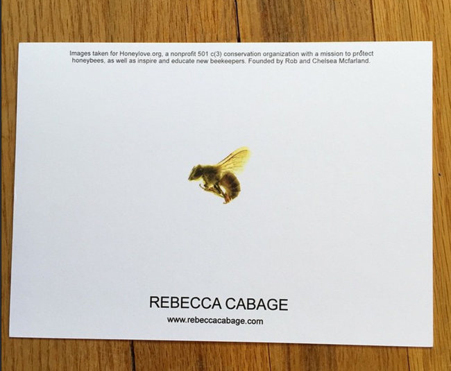
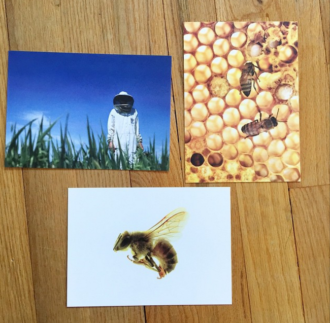
Yes, the gold is to represent honey and it’s thick card stock, so the sides of the cards have gold on them.

Who edited the images?
I edited the images with the intent of it telling a good story, like an editorial piece would. I wanted a close up of the honeybee so that you could identify with, and personalize the bee. Each image after pulled back a little more until it ultimately reveals the full story of the beekeeper. Here’s the complete gallery and written story.

How many did you make?
I did a total of 180 cards, and sent them out in pairs of 3, so 60 total.

How many times a year do you send out promos?
This was my first batch of promos to go out. Prior to this year, I was working full time at a studio, as the Director of Bookings, and was shooting on weekends and in my off hours, and didn’t have time to pursue additional work. I’m now 100% percent focused and plan to send out promos 3 times a year.

I recall seeing a remarkable video at one of SPD’s Unsung Heroes;  Mathieu Young presented you.
It was a pleasant surprise to see that along with being a successful Director of Bookings, you were also a talented photographer with a deep interest in environmental awareness.

The Daily Edit – Douglas Busch

I had the good fortune of sitting down with legendary creative Douglas Busch who has an inspirational punch list of achievements. Doug is well known for his large BW photographic work shot with a cameras he designed and built under de Golden Busch banner : the finale being the world’s largest portable camera, “The SuperLarge™.” His photographic Silver Chloride and Amidol contact print work ranges from 8×10 to 40×60 presenting an imperfect world with the most graceful and honest eye. He still mixes his own chemistry from the 1900’s.


buschdesign.com His architecture firm
phLiving.us  The healthiest housing system in the world, created for the Multiple Chemically Sensitivity
deGoldenBusch.com My cameras and lenses
Superlarge.com photography


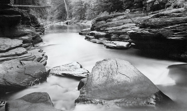
little rocky glenn

Little Rocky Glenn, PA 1982

You were an assistant to Al Weber, Morley Baer, and Ansel Adams, looking back what their biggest impact on you as a creative?
Al Weber taught me the basics from the Zone System, exposing film to the finished mounted photograph. Ansel taught me to see the beauty in all things, and Morley taught me about architectural photography and equipment. Al also taught me how to be a descent human being; to give all you have to help and teach people.

While working with those three you had developed a patent for a print washer only using a cup of water an hour, tell us about that.
This was the beginning of my concern for preserving and not wasting water. The planet will run out of water if we continue down the path we are on.

How much of a catalyst was The Mono Lake project for your sustainability work? I know the book was celebrated with a grand exhibition in 1979 that shared awareness about the water diversions to LA.
I saw that Mono Lake was being drained by LA, and I saw an opportunity to have an impact as a water advocate, a photographer and then later in my life as an architect Designer. Mono Lake lead me down the path to sustainability, healthy housing and draught tolerant landscaping. I am now working on a self watering vertical hydroponic herb and vegetable growing system for the home; www.theFarminaBox.com

Screen Shot 2015-04-19 at 6.05.26 PM
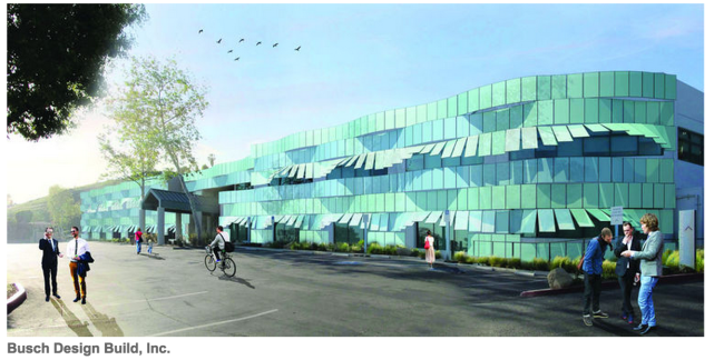
Your architecture firm recently presented a solar panel project to Malibu City Council which would be the first artful construction of a functional and sustainable building, is that right?
 Yes, the project has a promising outlook to convert ugly solar into ART. The design and structural skeleton for these very cool new panels from Switzerland seem to oscillate as you move past the building and then curve up like a wave and turn into awnings for the windows giving the feeling of the rolling movement of the waves because the panels are tilted up at various angles to create a wave-like effect. The panels seem to move like the rhythm of the ocean.  This is as much an ART piece as it is a functional net zero building. This approach to Solar has never been done before…ART and solar functionality…net zero.

How did this idea develop?
 I’ve been in several meeting in that building and noticed the windows were hot to the touch, about 120 degrees and most offices had their blinds drawn to avoid the heat. This seemed like a great opportunity for Malibu to be a maverick in sustainability and forward thinking architectural design. “Malibu” as a brand has always tried to stay in the forefront of a wonderful living environment for their population while protecting the ocean and land. The hope being, Schools and other communities would come to see it as a work of art producing power, and protecting the environment choosing to go down an aesthetic path rather than most solar panel projects which are incredibly ugly and a blight on the environment. The solar system will reduce air conditioning costs and energy usage by protecting the façade from the heat of the sun. It will also be an educational tool for students to participate and see how the futurecan and should be for them through monitors showing the production and use of the sun’s power by us (including waste and vampire energy consumption).

One of the many things that stood out for me was the clarity and remarkable detail of just your proofs for the Zuma and Dark Zuma personal photographic project.  Are you using one of your own SuperLarge™ lenses?
I shoot everything from 35mm to 12×20. This project has been going on for years. I started with the “Silent Waves” in the early 2000’s.  Then in the last several years photographing Zuma as I walk my dogs on Zuma/Broad Beach.

 Silent Waves Project

wave 3112

wave 3113

wave0761

wave3749v2 black

At some point you mentioned losing your visual eye and gravitated towards architecture, sustainability, healthy detoxing housing, and organic vertical gardening. What’s your best advice for anyone who feels they are in that same position?

I was making the same photographs. Different subjects but the same metaphor. I moved to Malibu to push my vision going from black and white contact prints to Color. The Silent Waves series has been shown and sold all over the world. They are the complete opposite of my prior 35 years of work. Color and a purposeful lack of detail, a 180 degree turn, just color as emotion. It did free up the vision but on my terms not what is popular and/or hip. I still tend to photograph very subtle images, not beat the viewer over the head; bringing them into a more intimate serene place.

You have an interesting idea for the printing of this book, tell us about it.
The idea for Zuma and Dark Zuma is to have some of the images in color, and then some of them in black and white using a blue filter. They take on an abstract nature when shot in black and white and become wonderful organic solitary personal images.

Screen Shot 2015-04-19 at 5.57.47 PM

Screen Shot 2015-04-19 at 5.56.29 PM

What’s the difference between your eye for photography and your eye for 3D architectural or sculptural work?
With photography you making decisions about what to include in the frame and what not to include in the frame, it’s all right there for you, with architecture and 3D design, it’s all begins visually in your head, goes to paper, then is built. It is a very rewarding process. Add in the sustainable net zero and detoxing healthy elements it is the way the future housing should be for all.

Is it hard to edit you own work?
Well there’s the editing part and then the sequencing. I like to put my work up on a wall and begin to make my selects, walking by daily and removing images as they no longer affect me emotionally. My friend Sally Mann says it best,  “location, location, location” in Real Estate holds the same meaning in photography– edit edit, edit. I also have some curators who often assist me in my editing and see other paths the imagery can go. Once I finish that process I may revisit some of the images I’ve pulled out simply to bridging images in a sequence for a show or book.

How hard is it for you to divide your eye between observational architectural work and fine art?
It’s fairly easy because I’m looking at things differently. My own design work calls on my architectural skills looking at details, traffic patterns, space volumns, and structure. Did I mention DETAILS. It’s invisioned as a holistic space and then I deconstruct it to every detail and then reassemble it, while the fine art is more of an expression of daily life and the found environment and the feelings that are aroused when I feel the place .

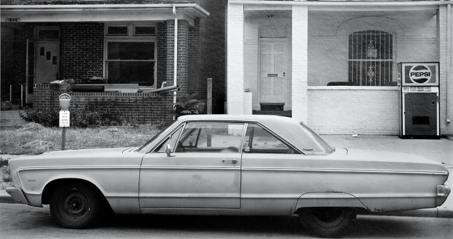
car & pepsi machine


Car & Pepsi Machine 1986

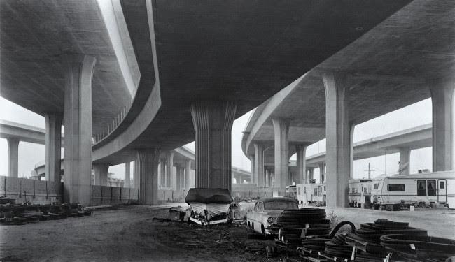
imperial highway


Imperial Highway 1993

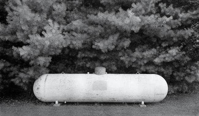
unnamed-1

Propane Tank 1987

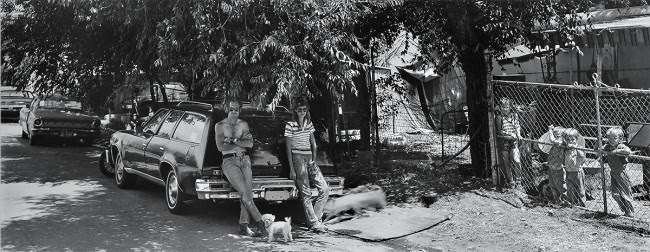
unnamed-2

Rick Knight & Fenced in Kids, 1985

unnamed-3

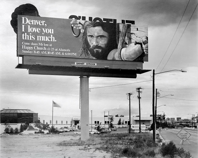
Denver I love  you this much 1986

unnamed

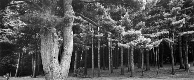
Black Forest 1981

Your book “In Plain Sight” is a wonderful early career retrospective of your work and exquisitely printed with a Japanese linen embossed cover, tri-tone printing and a dull and gloss varnish.
Yes. The book was designed by the talented book designer, Bill Sosin in Chicago and won the “Best book of the year from a small publisher” and each image had a gloss varnish in the blacks, along with a dull varnish surrounding the image which gives the white separation from the page. The images hold their integrity down to the finest detail.

One of the many wonderful things about my chats with Douglas is his true sincerity and his quite creative force that shines but never boasts; he simply shares what’s right in front of all us through his talented eye. His new book could include a collaboration with an lovely 87 years young female poet whose never expressed herself via images before. His architecture project is moving forward to next level meetings and hopefully will be approved by next month.

The Daily Promo: Stephen Kent Johnson

unnamed-1

unnamed-2

unnamed

unnamed-3

201501_StephenJohnsonMushroomPromoCard_final2
Stephen Kent Johnson


Who printed it?

It was printed by Mirror NYC

Who designed it?
I designed it.

Who edited the images?
I edited the images, I tried to find an image that was interesting enough to make the inspiration boards of the people I want to shoot with.

How many did you make?
500.

How many times a year do you send out promos?
This is actually the first printed promo I’ve ever sent out. I was an art director in a former life and used to get a lot of promos in the mail, I found you can’t avoid looking at a postcard, there’s nothing to open.

Where did you source the mushrooms?
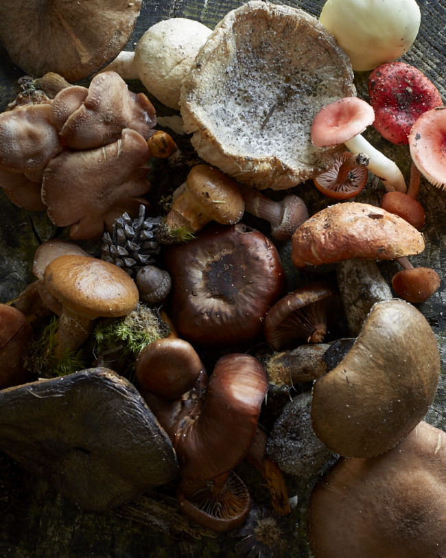
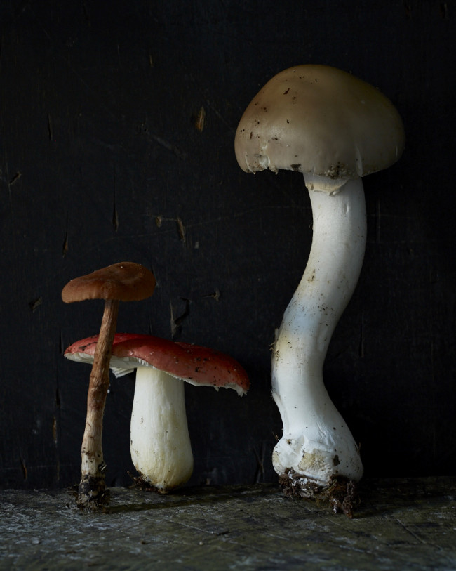
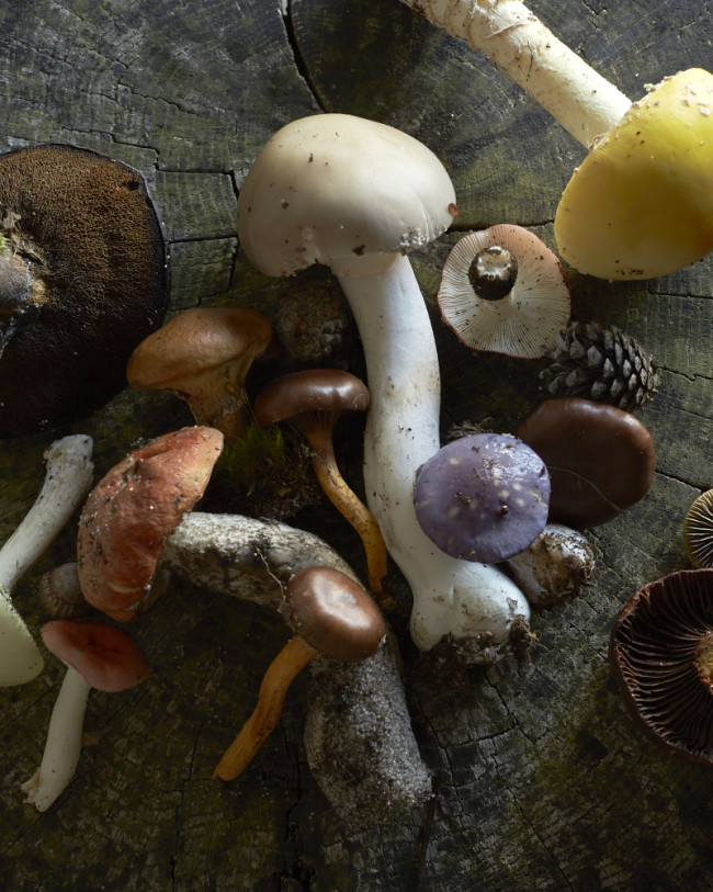
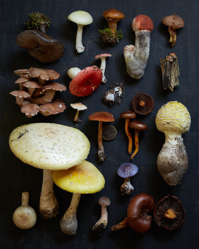
The mushrooms are all from Provincetown, MA. My boyfriend and I were up there one weekend this fall and they were everywhere! We’d been up there the year before around the same time and were dazzled by the mushrooms then. I brought my camera this year and my crossed fingers that they would be out again because I knew I wanted to get some shots of them. We went out one afternoon in forest and the sand dunes and brought a basket and loaded it up with the mushrooms, then brought it back to the house and I just played for a few hours with different compositions. I like the more organic shots too, but there was something nice about the old school instructional chart feeling of the dark background and all the little guys lined up in rows. After I was done we put them out on the front stoop in a row, and the people walking by liked looking at them.

Did you prepare any of the mushrooms?
No, we did not eat any of them.

The Daily Edit – Ramona Rosales


Ramona Rosales

What it is about your style of working that has you with a steady client base?
My overall approach and why my regular clients hire me for specific subjects is that I shoot very fast (good for people who have zero time), I try to maximize that time with multiple / simultaneous set ups and I’m extremely resourceful. Besides creating a fun and collaborative set, I believe I’ve gained a good reputation with both client and talent representatives. Sometimes I’ve had to put my creative motives aside to get job done, but always put my best efforts to fulfill both the job and my own desires on making a great image.

You’re all over the newsstand right now, tell us about some of your projects and how they evolved.

ANDY SAMBERG

ANDY SAMBERG

Billboard

Director of Photography:  Jennifer Laski
Deputy Director of Photography: Jenny Sargent
Creative Director: Shanti Marlar
Photo Editor: Amelia Halverson
Photo Editor:  Samantha Xu

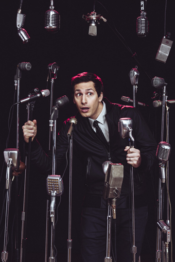
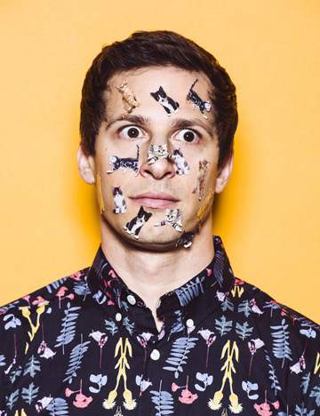
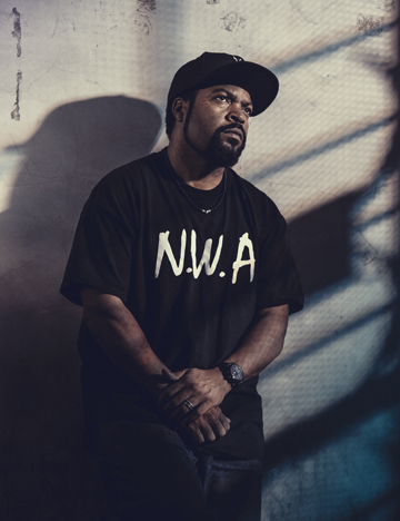
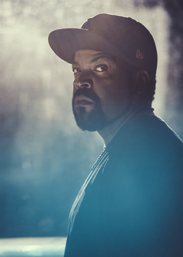
For this issue, I had two assignments in the feature portfolio which included Ice Cube & Andy Samberg. The premise of the portfolio are subjects who are both actors and musicians. With Andy, it was collaborative, we chatted with him about my concepts (we had four set ups ready to go, but we had to narrow it down to two for time).  He was honest on what he didn’t feel would have the best comic effect but was enthusiastic for having fun with my other ideas. He actually mentioned to the editor he wanted to pose with a bunch of mics, but I designed one of the sets to be more random with mics and he had ran with it thankfully. He loved the variety of mics that I had our prop stylist pull. For our second set up, I gave him a choice of different stickers and he went for the kittens, which I secretly hoped he would.

RAMONA_ROSALES_ICECUBE-1

RAMONA_ROSALES_ICECUBE-2
With Ice Cube, I felt there was so much gravity in keeping the balance between his distinct music and acting persona. I’ve have always been a huge fan and so excited about his directorial project about his days in NWA. I had to shoot at a location near his studio and I found a bar near by that had limited options, but could allow me to experiment to make the location take on completely different look. I wound up shooting four set ups in 20 minutes with him, quickly jumping between each set up. In these situations, my in camera or lightening risks usually pay off, which I feel was a great fit for his character.

RAMONA_ROSALES_1cover_kendrick_LORESFINAL

RAMONA_ROSALES_KENDRICK_LAMAR_2015_CHAINLINK

RAMONA_ROSALES_KENDRICK_LAMAR_2015_SPARKLE

RAMONA_ROSALES_KENDRICK_LAMAR_2015-0142

RAMONA_ROSALES_KENDRICK_LAMAR_2015-0281

RROSALES_KENDRICK_LAMAR-0617
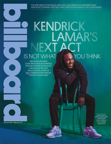
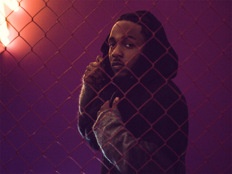
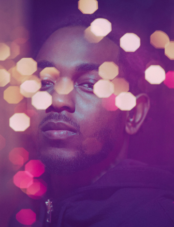
This assignment was a cover and feature with Kendrick Lamar. I had the opportunity to work with him last year and had grown to understand him more as an artist rather then a musician. I’m a fan of all his projects and was able to learn what path he was setting up for his upcoming (now out) album. I also really wanted to experiment with color and light on this one since most images I had seen of him where very dark or moody (which is a great fit for him but I wanted to see him in color)  We had a small budget to work with to build a partial set that I could get a few different looks with; I also brought some elements to play with in-camera effects. He was super excited to see the images as worked through the day which is always is so flattering when the subject appreciates your interpretation of themselves.

RAMONA_ROSALES_NICK_KROLL-0077

RAMONA_ROSALES_NICK-KROLL-HORIZ2

BuzzFeed

Photo Editor: John Gara

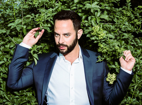
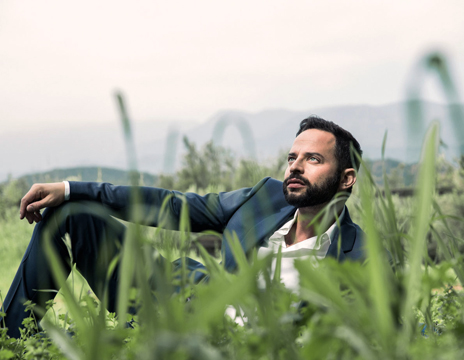
I’ve had some fun assignments with BuzzFeed, but this one was a little unusual with Nick Kroll. The story was about his current projects but apparently the entire interview was done over a long day of hiking. Due to his love of the outdoors we thought it would be fun to get him dressed up and shoot him on location as if we were on a hike. He was filming in Ojai so we found a location via AirBnB that was on a beautiful plot of land and had an RV for us to base camp. We had about 40 minutes to squeeze in about five different set ups I planned for us to tackle which I think we wound up doing six to seven different set ups with one look. I got him up in a tree, rolling around in the grass and getting close with nature without him breaking out of character.


RAMONA_ROSALES_RUDOLPH_MORRIS-2

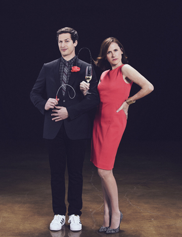
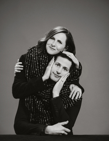
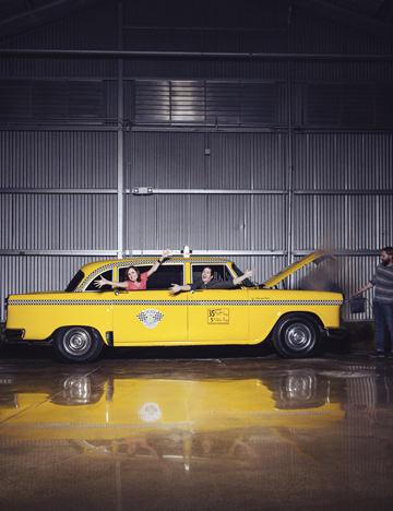
ANDY SAMBERG & MOLLY SHANNON

ANDY SAMBERG & MOLLY SHANNON

ANDY SAMBERG & MOLLY SHANNON

RAMONA_ROSALES_WIIG_NEWMAN-1

RAMONA_ROSALES_WIIG_NEWMAN-2

RAMONA_ROSALES_WIIG_NEWMAN-3

The Hollywood Reporter/40 Anniversary SNL Issue

Director of Photography: Jennifer Laski
Creative Director: Shanti Marlar
Deputy Director of Photography: Carrie Smith
Photo Editor: Michelle Stark

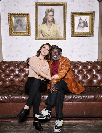
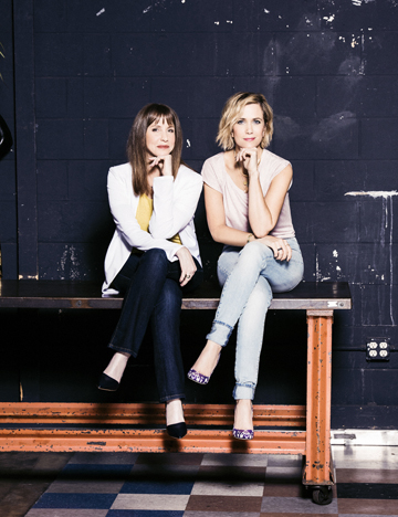
It was such an honor to be working with such amazing talent on this one; we got to shoot pairs of SNL alumnus from different eras including Maya Rudolf with Garrett Morris, Molly Shannon with Andy Samberg and Kristen Wiig with Larane Newman. Each shoot was done at different locations or in studio. Andy and Molly had worked with each other in the past, so they immediately had a good time on set. We did three set ups with two changes within 30 minutes. One set up required some special effects including squirting flower and a vintage taxi cab smoking up. Luckily they had amazing team work and we got all the shots we hoped to get. Kristen Wiig and Larane Newman met on set for the first time and it was magic to see these amazing performers bounce off each other. I had five set ups ready to go but was limited on time so we had to sacrifice the last one. Maya Rudolf and Garrett Morris had the most amazing chemistry, it was actually kind of a challenge to interrupt their amazing conversations since everyone on set was so engulfed in their stories and rapport. With them, I loved these in-between shots that captured the essences of how much fun they where having on set.

RAMONA_ROSALES_KUMAIL_NANJIANI_2014-0715

Playboy*

Creative Director: Mac Lewis
Director of Photography: Rebecca Black

* the pick up was done via August Syndication

I actually shot him for his PR and it wound up getting picked up by Playboy the same week. I just got to shoot him again a few weeks ago for Bust Magazine. He has an amazingly animated face and we had such a great conversation throughout out the whole shoot we had to keep taking breaks to Stop laughing the entire time.


RAMONA_ROSALES_AARON_BRUNO-0261

RAMONA_ROSALES_AARON_BRUNO-0288

RAMONA_ROSALES_AARON_BRUNO-0332

RAMONA_ROSALES_AARON_BRUNO-0802


The Red Bulletin

Creative Director: Erik Turek
Art Director:  Kasimir Renmann
Head of Photography: Fritz Schuster
Associate Photo Editor: Rudolf Uebelhoer
Photo Editor: Marion Batty
Contributing Photo Editor US: Heidi Volpe

We had worked together on The Red Bulletin shoot with Aaron Bruno, so I know you have this wonderful way of engaging talent with your special effects and the ability to move from set up to set up quickly.  Have there been situations where you’ve prepared set ups and not gotten to them?
Time always a major factor in most of the celebrity shoots and I always feel I need to have as many set ups as possible (within budget or logistical reason) so I’m prepared for surprises, good or bad. There might be factors like delays, weather / (natural) light /location, wardrobe issues, talent issues that might change my plans but I know that by giving myself as many options possible, it allows me more flexibility for the whole shoot. Because there are so many X factors to contend with, specially on a less controlled set, I try not to fall in love (so to speak) with any of the set ups Just from the experience that things can change in an instant. There have been numerous times I haven’t been able to get every set up I hoped to get, but I’ve learned (and still learning) how to best manage my time and prepare my set to allow me to seamless transitions between sets.

Is it typical to have so many set ups for you? Do you have a hit list for your style of shooting and then bend that towards the unique assignment?
Depending on the budget and logistics I’ll layout as many options I can squeeze out within the given time frame, while keeping things fun on set. I think I have a specific style but strive to evolve within what is currently inspiring to me. An assignment may allow me to experiment based on the subject, the logistics and what the client would like to achieve. I’ll customize an assignment with the client as the priority and if there is options to do secondary set ups, I’ll take the opportunity to try things outside of the main scope, usually resulting In images both the client and myself are happy with. It’s moments like this on set that keep me inspired and remind myself to constantly aim to elevate my work.


The Daily Promo: Justin Poulsen

Screen Shot 2015-04-08 at 4.27.25 PM

Screen Shot 2015-04-08 at 4.28.32 PM

Justin Poulsen 

Who printed it?
MSG Printing in Toronto

Who designed it?
Hans Thiessen at Rethink

Who edited the images?
The printed image was shot specifically for this project. The documentation images were edited by Hans and myself.
The post production was handled by myself.

How many did you make?
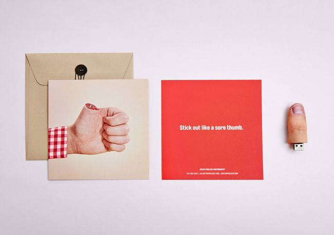
Originally there were 50. Due to the overwhelming response, I will be creating an additional 50 throughout the year for a grand total of 100.

How many times a year do you send out promos?
This was my first promo. I hope to do it once or twice a year (not necessarily containing body parts).

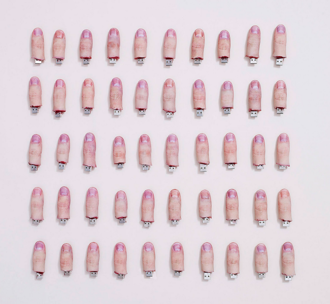
How did the thumb idea emerge?
I was exchanging emails and brainstorming with Hans. We pulled together a rough list of ideas/talents I have that are uncommon. One of the ideas was to create physical thumb drives. We bounced back and forth between some other ideas, but the thumbs seemed to stick. I knew that I could pull it off because we had previously cast an entire fake hand and forearm in faux ice. Including the physical thumb drives in the promo allowed the recipient to have a small piece of the shoot, while also opening their eyes to some creative possibilities of our in-house prop building.

How did the thumbs get made?
First I cast my own thumb in a low durometer platinum cure silicone rubber. This specific rubber is commonly used in the special effect industry to have an almost-flesh-like feel. This “realistic feel” was further enhanced when paired with an internal skeleton (the rigid flash drive). The same silicone used in the thumbs also worked out to be a suitable mold rubber. Casting silicone in silicone, I used a urethane spray to ensure that the mold and thumb did not become one. I then painted/airbrushed using hand mixed solutions of FW ink + alcohol. To seal in the pigmentation the thumbs are sprayed with a solution of naphtha and silicone. With the future thumbs I’m moving to a completely silicone based pigmentation system, which is a slower process, but the end product is more durable.

Here’s a video demonstrating the process of creation

The Daily Edit – Mark Hanauer: We Transfer

Screen Shot 2015-04-05 at 3.15.40 PM

Screen Shot 2015-04-05 at 3.15.50 PM

Screen Shot 2015-04-05 at 3.16.01 PM

Screen Shot 2015-04-05 at 3.16.11 PM

We Transfer

Photographer: Mark Hanauer

We Transfer Facebook

We Transfer Twitter

Heidi: What sparked your interest in submitting to We Transfer?
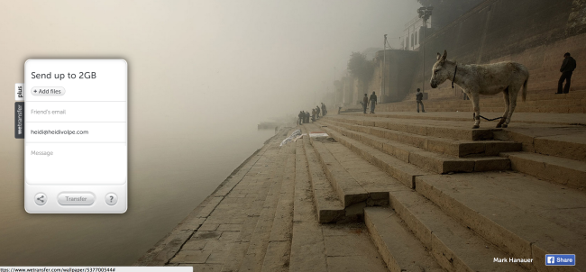
Mark: I had been using We Transfer for some time. It’s a great service for sending large files to clients and colleagues over the web. I enjoyed a lot of the graphics that they used on their site and one day I decided to send them a series of images that I thought were appropriate for their format.

Which images did you send and how many where sent/accepted?
Basically the images are horizontal with a lot of free space. To my delight they have used a handful of them. All of the images that I sent to We Transfer have been personal images from my travels, three from India and one from Central California. I don’t recall how many images that I sent to them, but I am very happy with what they have used. And they are appreciative as well, nice credit on the page and they share the contribution on Twitter and Facebook.

You’ve been drawn to photographing artists, why is this?
My first job assisting a commercial photographer was for Malcolm Lubliner. He had a studio on Melrose Avenue in West Hollywood that adjoined Gemini GEL. 95% of what Malcolm did was for Gemini. I recall my first day at work Malcolm giving me a tour of Gemini and I was mesmerized. The produce fine art lithography and silkscreen printing, very old-world style. Gemini would invite artists to print at their press, the likes of Frank Stella, Jasper Johns, Claes Oldenburg, David Hockney, Roy Lichtenstein, Ellsworth Kelly, the list is amazing and I was instantly drawn to the work that was created there. We photographed every print that Gemini produced. I learned more about photographic technique there than anywhere I have studied or worked. It was also a great intro for me into the fine art world, something that was very new to me.

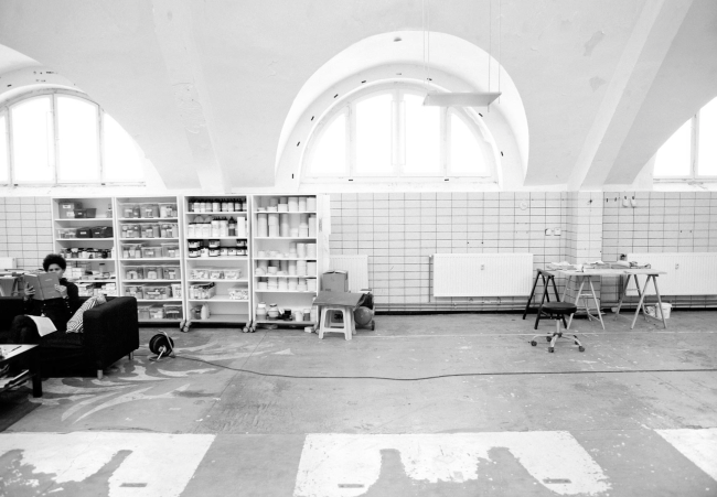
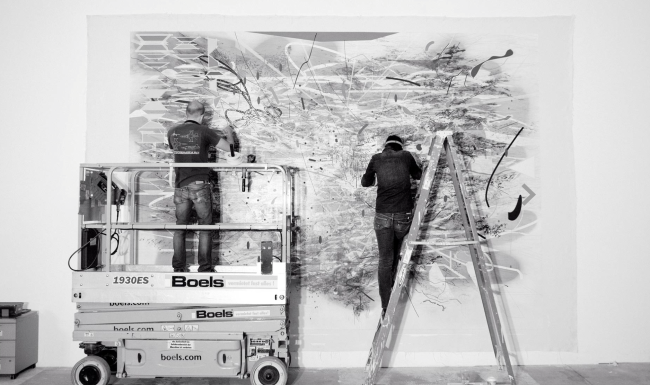
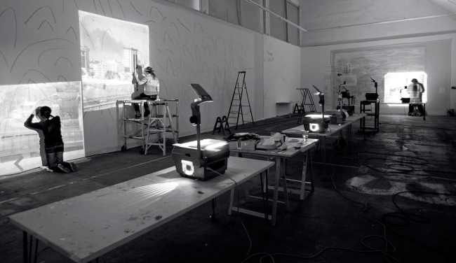
I enjoy a vicarious thrill looking through my camera at people that do extraordinary visual work, painting, sculpture, architecture, photography, dance, sports. I love seeing what artists do and I marvel at the process. Working with Julie Mehretu at her studio in Berlin was a remarkable experience. I spent a week photographing Julie, her staff and the studio for a museum catalogue. To have that kind of  time to record her working was amazing. I love to do more in-depth projects like that. Whenever I have time, I try to get together with local artists whose work that I enjoy to create a portrait or something in the moment that gives me joy.

Screen Shot 2015-04-05 at 3.19.35 PM Screen Shot 2015-04-05 at 3.19.42 PM Screen Shot 2015-04-05 at 3.19.53 PM Screen Shot 2015-04-05 at 3.20.21 PM

Tell us about your personal project.
My personal project is currently titled, Negative Space. It’s an idea that has been floating in my head for the last two weeks. The idea is based on something that I remember from a painting teacher in elementary school about the parts of a canvas where the subject isn’t. What do yo do with that space where there is nothing? Generally I think of an idea and by the time I pick up the camera, the idea has transformed into something else. We will see what happens….

The Daily Promo – John Hafner

john hafner_2
john hafner_11
john hafner_9 (1) john hafner_7 john hafner_5 john hafner_4 john hafner_3

John Hafner

Who printed it?
My promo book was printed by Blurb. It’s a Trade Book, 6X9.

Who designed it?
A graphic artist friend of mine, Paul Allen, in Missoula, Montana designed it.

Who edited the images?
Paul and I both edited the images. I did an initial edit, and then had him weigh in on which pics would make the strongest presentation. It’s really tough to edit objectively, and it’s important to
have a neutral set of eyes to narrow the selections. Just because a pic might be one of my favorites doesn’t mean it would add any value to my promo. The end result is, I think, a good mix of product/studio shots, people/portraits, wildlife and documentary that conveys the scope of what I shoot.

How many did you make?
This was actually my first hardcopy promo. My marketing and promo work has largely been digital. I’ve sent out several PDFs and e-books, which have been quick, cheap, simple and very effective. But this year, I wanted to have something more substantial; something that was portable yet impactful that my clients, and prospective clients  would hang onto and reference.

How many times a year do you send out promos?
The promo features some of my best work from 2014. I chose to include a pic of me in the field to give clients a sense of who I am and how/where I work. I primarily shoot for hunting and fishing markets, and my clients need to know that I, too, am an outdoorsman. This gives them the assurance that I know the industry, their brand and their customer. It’s vital that I can tell my clients’ stories not just creatively but also authentically.

What shoot is the opening spread from and whose paw is that?
The opening spread features some pics from a shoot I did last December with the guys from Duck Dynasty. Not only was it one of the more memorable and fun shoots from 2014, it’s great to have their super-famous facial hair in my portfolio. I also included a partial client list to give prospective clients a sense of my experience in the outdoor industry. And I included client and location info. for each pic in the book.

And yes, that’s my Golden Retriever/office manager/page turner/paw model, Shiley, in the promo pics.

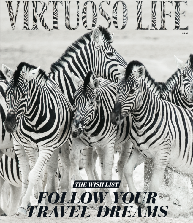
The Daily Edit – Jen Judge: Virtuoso Life

Screen Shot 2015-03-11 at 2.55.46 PM


Screen Shot 2015-03-26 at 9.13.11 AM

Screen Shot 2015-03-26 at 9.13.43 AM

Screen Shot 2015-03-26 at 9.13.36 AM

Screen Shot 2015-03-26 at 9.13.22 AM

Virtuoso Life

Art Director: Melanie Prasetyo Fowler
Photo Researcher: Mary Risher
Photographer: Jen Judge

Heidi: How often do you and your husband get hired as a team, are you promoting yourselves that way?
Jen: It’s something of a work in progress. Aaron and I have been working together on and off for about ten years. In the beginning, we found that most editors wanted the freedom and flexibility to hire writers and photographers independently. But as we’ve built relationships with editors over the years, they’ve learned that we produce really good work together (and we’re not just trying to score freebie trips). So we’ve been working together more and more, probably about 30% of the time. With the changing media world, we’re also taking steps to begin formally promoting ourselves as a team.

How did this assignment come about?
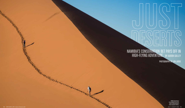
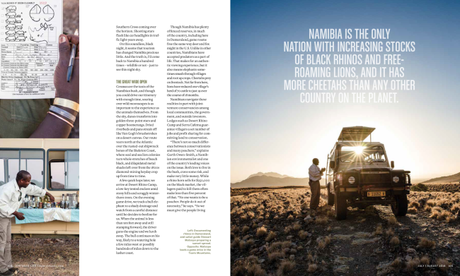
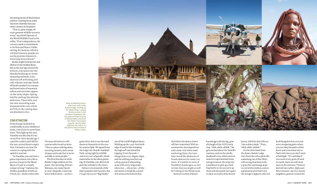
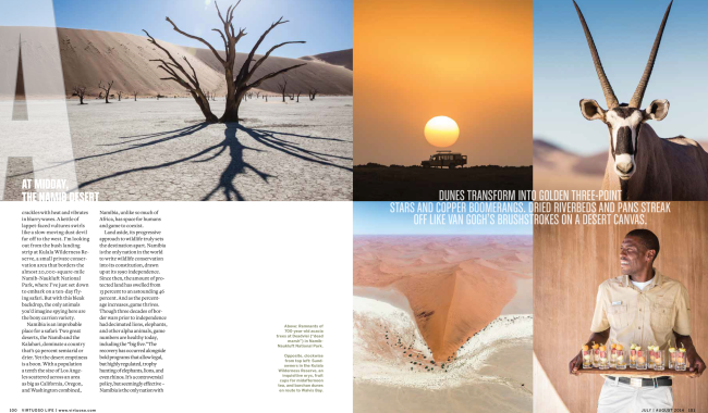
This is a story that Aaron has been wanting to write since our first trip to Namibia in 2005, and the country’s investment and dedication to wildlife conservation in the last few years had him looking for timely opportunities. Sometimes it’s just a matter of patience and persistence to get a story placed. So when the Adventure Travel Trade Association (ATTA) announced its annual conference in Namibia, we took it as the perfect opportunity, and he pitched the story to Virtuoso Life, a publication we regularly work for as a team and they loved the idea.

What was the biggest obstacle you faced with this project?
This was my first “re-assignment.” I had some anxiety about this trip for a number of reasons.

In 2005, Aaron was working as an editor and staffer at Outside magazine and had a story in Namibia for their travel title, Outside Traveler. At the time, I had a full time job in marketing in Santa Fe but was trying to return to my work in photography. So we convinced Outside to let me go with him and photograph the story. The only caveat, since I was a complete unknown, they wouldn’t assign it but would buy stock if they liked what I shot. Upon my return, they liked the images, but my employer didn’t like the time I’d taken off and fired me. Outside hired me for a Las Vegas feature a few months later, other publications saw my work, and the the rest was history. The idea of going back to a place that was the pivotal moment of my photography career was scary and exciting at the same time. I was curious to see how my vision had changed, but I was also nervous about trying to shoot the same thing over again. The fact that Aaron and I both independently won national magazine awards for this feature means a lot.

Travel assignments are the crown jewel for most photographers, what’s your best advice for someone wanting to break into this market?
Travel. You can’t get travel assignments if your work only show cases “local” travel work. Editors need to know you can handle yourself in foreign countries. Language barriers and local customs can be tough to deal with and can often make or break getting a great shot. Being able to adapt to your surroundings and set locals at ease is key.

How many days were you there traveling? and did you have a guide /driver?
Twelve days including travel to and from Namibia via South Africa. We were nine days on the ground. There was no driver, but a pilot flew us about the country.

How difficult was the edit and how many images do you typically turn in?
Edits are always hard. I love making photographs but I get a little stir crazy sitting in front of my computer for hours. I wouldn’t say this edit was any harder than others. The story and the length of time on the ground usually dictates how many images I shoot for a given story. This story was longer than most, so I shot more, about 5,000 images in total. I only like to turn in images I’m really excited about, so I typically submit about 200 and specifically call out about 50 of my favorites.

Does the job usually cover any type of shots, visas, immunizations?
It depends on the destination. As American citizens, we have a lot of flexibility and relatively easy access to other countries, which helps tremendously. For example, in Namibia visa’s were obtained on arrival and no immunizations were required. By contrast, Senegal required a long list of vaccines, and I’ve actually had to turn down two assignments to Brazil because I couldn’t get a visa in time. So every story and country is different.

With so much beauty and intrigue in front of you, is it hard to put down your camera? You must be constantly shooting since everything appears to be beautiful. How do you decide what to photograph (aside from the magazine’s shot list, if there is one)?
Since I was traveling with my husband (and writer), I didn’t get any shot list. We were creating the shot list as we went. In some ways, it’s harder to shoot in tandem with a writer. It means I have to cover everything we do because it’s all a work in progress and you don’t yet know what will or won’t be in the story. In those cases, I am always on.

Over the years, though, I’ve really had to learn to make myself step back. If I shoot constantly, I get overstimulated and don’t produce my best imagery. So I really work hard to conceptualize a few great shots a day and then go out and get them. It’s my way of being proactive and creating what I want versus running around and making mediocre pictures of a lot of things. Ultimately, I aim for variety and continue to check my image library each night to make sure I’m hitting all the bases. Great landscapes, people, architecture, lifestyle and culture, food, flora and fauna—and all at a variety of focal lengths.

Best local food and drink you enjoyed?
Any wild game is amazing, but in particular I love oryx. It’s the most tender, deep red, lean, and flavorful meat I’ve ever had, and I could eat it daily, washed down with a local brew of Windhoek beer, of course.

The Daily Promo – Josh Ritchie

Screen Shot 2015-03-12 at 6.26.38 PMScreen Shot 2015-03-12 at 6.26.56 PM

Josh Ritchie

Heidi: Who printed it?
Josh: After searching around for a reasonably priced printer, since I was getting 1200 prints done at an odd size, I decided to go with a local print house, Dale Laboratories in Hollywood, FL. They were fast (they printed it same day within 3 hours), cheap, and most importantly their quality was exceptional.

Who designed it?
It was sort of a design by committee. It start with a chat with Andrea Maurio who edits a lot of my material. After we came up with a single image idea I tossed it around with fellow freelancer and very close friend Melissa Lyttle. She suggested that I turn the single image idea into a 12 image calendar. From there we both brain stormed both ideas for the images and the presentation until we came up with something I felt fit me while being sleek and functional. I ended up designing and constructing the wooden stands myself spending more that a week covered in sawdust in my driveway cutting, sanding and recutting just to get the perfect 4 x 4 block of wood. My wife began to think I was more of a lumberjack than a photographer.

Who edited the images?
This again was done by committee. Melissa Lyttle, Ed Linsmier, David Holloway, and many other photographer friends all weighed in on what they thought worked best. There was a lot of back and forth on what holidays to use and what techniques to shoot with as well as what final images to use.

How many did you make?
In total I made 100. I gave out a copy to everyone who participated and ended up sending out like 85 to potential clients.

How many times a year do you send out promos?
I send out an email promo 6 times a year, a print promo 6 times a year, and one special promo each year.

Did the calendar idea emerge from wanting to have a functional promo?
The thought behind the calendar was that I wanted a way to keep my images in front of potential clients as long as possible. After the initial idea grew into a calendar I knew it would allow me to do two things : First it would allow me to allow me to explore the making of the images a little deeper than I did when I first shot them at the Eddie Adams Workshop, and second it would allow me to keep my work in front of clients for a full year.

Did you match certain images with the months?
Yes. Once I decided to do a calendar I wrote out all of the months and started brainstorming for images ideas. Some months like December, January, October were easy. Other months like May, June, September were a bit harder. For any month that did not have a well known holiday I started writing down ideas and then looked from props that would fit my budget. For May the ideas was May flowers. September was the start of football season. June was BBQ season. After I had the idea’s firmed up I then went out and bought backgrounds in various colors to try and match a color to the time of the year. I then recruited friends and family for the shoot.

Screen Shot 2015-03-30 at 6.40.46 AM Screen Shot 2015-03-30 at 6.40.32 AM Screen Shot 2015-03-30 at 6.40.22 AM

Where did the idea for the leaf blower come from?
The idea for the leaf blower came from some shots I had seen from an ad campaign. Off hand I forget what campaign it was but I like the idea and I stashed it away for a rainy day.

Here’s some BTS and one more.

How did you pitch this to talent?
My friends and family are pretty awesome so it didn’t take much convincing, although I did get some strange looks. I told them the plan and for the most part everyone bought into the idea right away. The ones who were on the fence jumped in with both feet once they found out they would be able to use the leaf blower on someone else. It is amazing what you can get people to do if you tell them they will be able to make someone else look foolish as well. I guess we all have a dark side

The Daily Edit – Mossless: Romke Hoogwaerts/ Grace Leigh

1 cover copy

Stephen Tamiesie

3 ~man&nature copy

( left to right ) Amy Stein, Cait Opperman, Thomas Prior, Trevor Paglan, Jessica Auer, Michael Itkoff, George Underwood

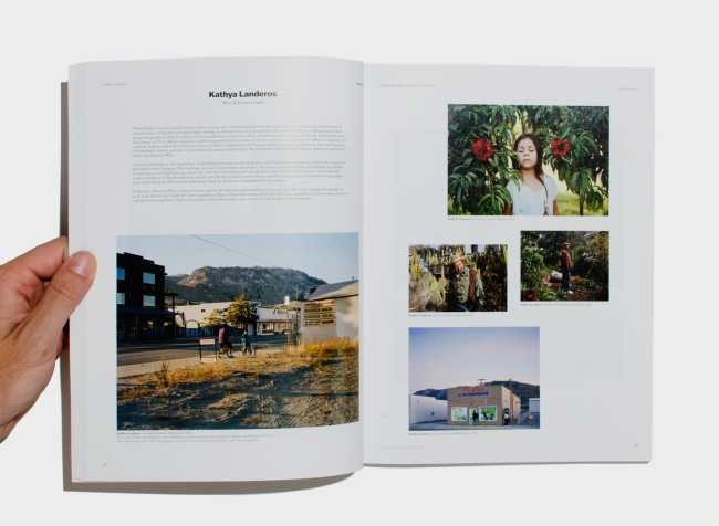
4 Landeros copy

Kathya Landeros

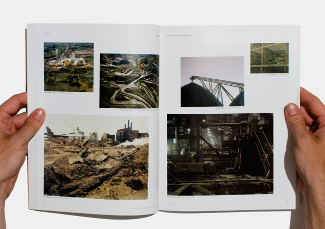
5 ~mining,Kaneps copy

( left to right )  Suzanna Zak and Justin Kaneps

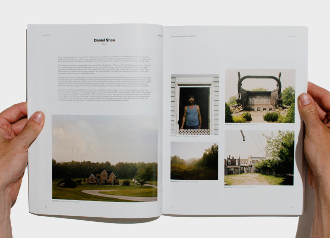
6 Shea copy

Daniel Shea

7 Evans,~industry copy

 ( left to right ) Terry Evans and Carson Gilliland

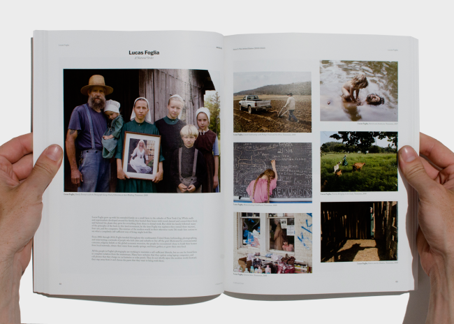
9 Foglia copy

Lucas Foglia

10 ~domesticdebris copy

( left to right ) Nich Hance Mcelroy, Eric Ruby, Mo Castello, McNair Evans

19 Yahlring,~desolation copy

( left to right )  Keith Yahrling, Andrew Bruah, Lisa Kereszi

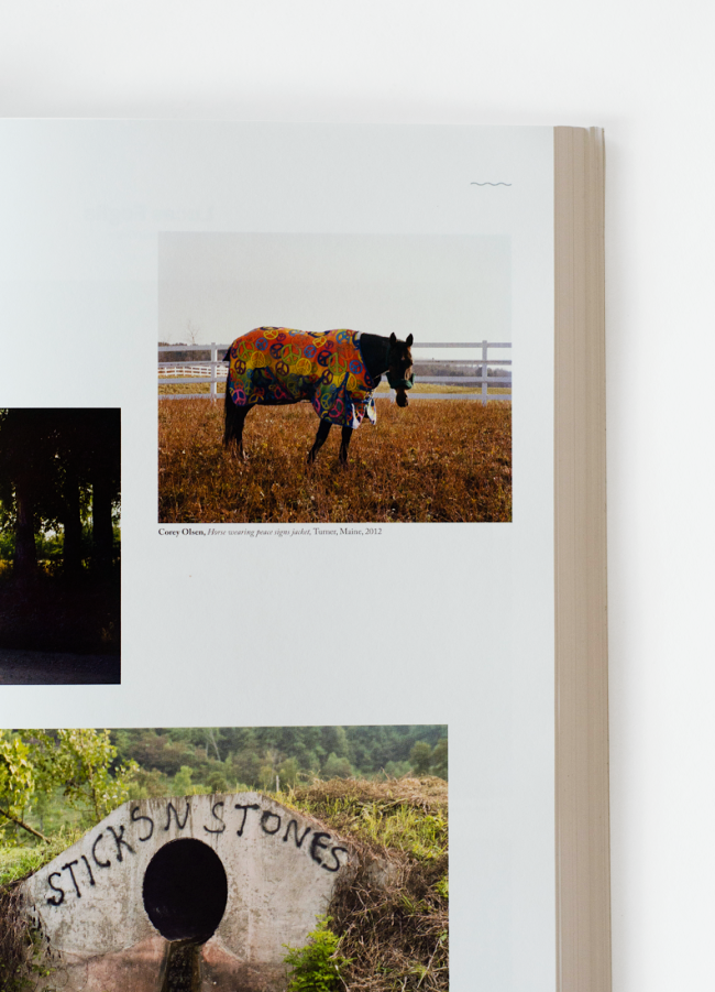
unnamed

 Corey Olsen


Mossless

Founder: Romke Hoogwaerts
Partner: Grace Leigh

Heidi: What brought about Mossless magazine?

Romke: As a kid growing up abroad I had become attached to various online communities, one of which was photography. I loved photography, had wanted to be a photographer but I saw early on how hard of a career path it would be, regardless of talent. I wanted to study cinematography, but I also wanted to work in publishing. Once I realised that it would also be very hard for me to even get my foot in any door in publishing if I were to go down this other path, it struck me that I might as well try to develop my own. So I started a blog and soon interviewed a photographer every two days, preparing for a day where I might print a book of someone else’s photos.

Grace: I joined Romke in Mossless in February of 2012 when we started seeing one another. At first just to help packing and shipping copies of the first issue, which had just been released. I quickly became very interested in the project, being somewhat new to New York and the contemporary photography scene—I was raised by two documentary photographers—and found it to be an incredible crash course in everything from daily scouring the internet for content to book design and binding to handling distribution of our print issues. It’s been an incredible learning experience.


What is the best way for online and print photography to complement each other?

Romke: That’s a great question! A lot of newspapers and magazines would sure love to know the answer. I don’t know if I have it either but I do know that since it’s still hard to monetize web content, one should refrain from putting valuable work on there… unless you have some cunning secret interface that has it figured out. I think it’ll take a bit of a change of perspective on the value of content access across the whole internet before this conundrum is really solved. And who knows, some day soon our access to the internet may no longer need backlit screens, maybe then the internet will look more like it’s on paper, which could make physical books totally redundant!

In your mind, what are the differences between imagery that exits online vs print and what are the benefits to each? 

Grace: I find that seeing images online is generally more of a passive act, the images come to you through whatever host you happen to be using (tumblr, Flickr, etc) and can easily get buried or overpowered by the multitude of images moving past your eyes. For that reason in particular I think it’s an excellent place to get acquainted with different trends and movements and for sourcing work to put together collections of images. The appeal of print for me is the tangibility of it and the sort of ritualistic act associated with looking through a book or a magazine. By choosing to leaf through a collection of images you are taking a much more active role in viewing, it’s deliberate. There are so many amazing images online, print just gives them a place to live so they can be revisited again and again.

Romke: It’s a thrill to explore images online, as long as you know where to look to find stuff that will surprise and reveal new things, which isn’t too hard considering how many people across the world take part. With print, it’s a thing of ownership, or belonging and solidarity to a mentality. People buy books so that their contents can become a part of them in some way. It’s a potent feeling that is impossible to have online. Beyond the feeling of ownership and belonging I’d say that main difference is simply in an image’s illumination and resolution. Some images look spectacular backlit, others are best found matte and on paper. Some photos lend well to a calculated sequence, controllable in print, others suit the chaos online. It makes for quite a neat contrast. What really tips the balance, though, is exposure to the public. Books are limited in number, resources and by tangibility. An image online is at once at risk of being seen by no-one and by the whole world.

How many images did each photographer submit for the magazine?

Romke:  We didn’t really take submissions, we requested specific photos that we saw on their websites or blogs. We invited them to add any others they thought would be fitting. I think that most photographers sent an average of about six or seven photographs. Some sent just two or three, some sent about twenty.

What was your editing criteria?

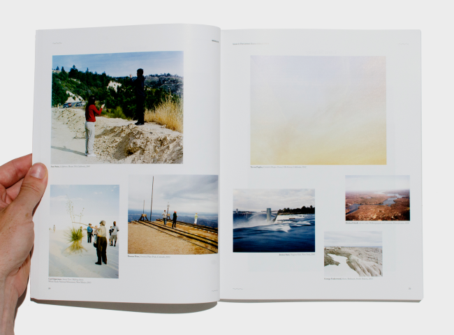
Romke:  Once we had our huge folder of photos, we printed them all out, labeled them, and tried to organize them by loose categories like commerce, industry, rural, urban, and so on. We used those loose categories as groupings that we could move through and we tried to find ways to connect the different themes in a visual way. We had requested a number of photographs that would fall under  “on the road” which we used quite a bit to connect these themes. It was really hard. We created a few rules for ourselves and we broke them frequently in this mad goal of finding some kind of pure sequence.

Overall what was your theme for this issue?

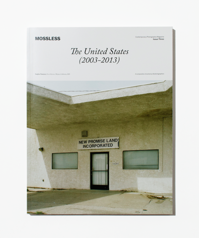
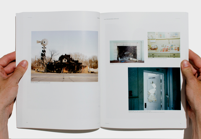
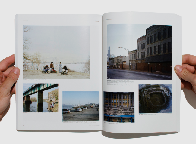
Grace: The theme was photographs taken in the United States over a ten year period, as seen by a chorus of different photographers. It was our goal to create a survey of new american photography so we published a range of works from amateur  photographers we found on flickr to professional photographers with already published works, our only strict criteria that it be taken between 2003-2013 and that the work had already been published online. 

I know you’re developing a fly-on-the-wall/interview type video, which may be turned into a series, when can we look forward to that and how would we find it?

Grace: Yes! We’re really excited about our new project. We’re currently editing that video, which should go online within the next month. I wish I could say more, but I really shouldn’t!