The Daily Promo – Lauren Pusateri

Lauren Pusateri

Who printed it?
Paper Chase Press. I fell in love with their folded tabloid posters (thanks to your feed) and knew that’s the route I wanted to go. I liked the folded poster because it allowed a lot of real estate for images but folded up to a size that wouldn’t be obnoxious for the recipient to keep on file (and wouldn’t be a headache for me to mail). I like that the posters lend themselves to be designed as cohesive spreads — this allowed for spread 1 to be a mix of work and spread 2 to focus on one project specifically.

Who designed it?
Shelby Maggart, we connected a couple of years ago on a job and since then, we’ve had many opportunities to work together for various clients. This was our first time working on something just for me. I trust her eye and I love the way her brain works. I knew her background in packaging design would be a boon with these posters. I left the image selection up to her but curated the images I wanted her to pick from.

Tell me about the images?
If you’re like me when you’re busy fulfilling client-driven creative you can forget to make work just for you. When 2018 came to a close I realized that 70% of what I’d shot the past two years was animal work…and yes dogs are the best and I enjoy photographing them, but I’d never intended to pigeon-hole myself into a singular specialty. So I made a goal for 2019 to carve out time to make some work for me, to make what I wanted to see — and in the process fill some holes I felt existed in my overall portfolio.

All the images in my promo came from personal projects I shot between March-August 2019 with all-female teams. I challenged myself to create new work in areas I hadn’t played in for a while (kids, fitness, food). I sought out local female-owned small businesses and female creative talent to collaborate with so that the work I was making would have additional use outside of just being portfolio images for myself.

How many did you make?
150

How many times a year do you send out promos?
Up until this fall, I’d never created any kind of promo for my work. I learned a lot through this first promo experience and the process overall feels less daunting now. I’m *hoping* to send out promos twice a year going forward.

Do you think printed promos are effective for marketing your work?
Totally. It’s a way to further communicate your vibe/what you’re all about and show people what you have to say. I feel that having a tangible representation of your work has more shelf-life than an email campaign or social media.

The Daily Promo – Darren Carroll

Darren Carroll

Who printed it? How many did you make?
Smartpress in Minneapolis. I like them because they can do short runs, and offer a multiple-version option whereby there’s only one setup but, as was the case here, you can swap out multiple images. So for example here I had 100 cards printed of each of the 6 versions, but instead of charging the (higher) price for 100 cards 6 times over, the charge is just for a 600-card run.

I had a small, targeted list of about 150 creatives that I wanted to send these to, and not all of them really needed to get all 6 cards. So there were some who got all 6, but others who got only 2, 3 or maybe 4, depending on who they were and what kind of work I thought I could potentially get from them.

Who designed it?
I designed these myself.

Tell me about the images?

–The female golfer is an image from a shoot for the Dick’s Sporting Goods/Golf Galaxy golf catalog, which I’ve shot for the past 8 years each December. Even though the shoot is highly produced, we try to shoot everything on-location with natural light, using real people (we cast for low-handicap golfers), as the creatives at DSG and I insist on giving the images a realistic feel–when you’re trying to sell $500 drivers to a demographic that’s extremely educated about the product and the game, you don’t want to fake it because there’s no better way to turn off an audience than by insulting its intelligence.

The image of the kid playing basketball is also for Dick’s Sporting Goods, shot for a Christmas online and print ad showcasing the company’s Techgrip line of products.

–The tennis image is of Kei Nishikori at the 2018 U.S. Open; that year was the first year of the new Louis Armstrong stadium which meant that it provided an opportunity for some new pictures and new spots to shoot from. So I went and scouted it on my first day there, before the tournament started, both for positions and to see what the light did as the day went on. (For scouts, I usually take the SunSeeker app with me and walk around to various spots on and off the court to see where the sun is going to be and what potential there is for shadows, backlighting, etc. Same thing for golf courses I’m seeing for the first time.) It turns out that the way the stadium is oriented, there’s about a 5-minute window as the sun crosses the sky that the shadow from the (open) retractable roof parallels the south baseline in the morning, right about when the first match of the day starts. And within that 5-minute window, there are about 2 minutes where the light is just right, slicing in and hitting the player’s upper body and casting a long shadow, while also rendering everything behind the baseline dark. So I would put myself in a position on the concourse to make this frame during the morning match. But then, of course, you have to have a player serving, who has to be right-handed, on that side of the court, precisely during that 2-minute window, to make the whole thing work. I can’t remember how many times I had to go back before it all came together, but I do know for sure that this was not from the first day of play…

–The Tiger Woods shot was photographed at the Dell Match Play Championship this past March, where I was playing around with some new, silent Sony mirrorless gear so as not to incur the wrath of Mr. Woods.

–The black-and-white image of the charro is from a personal project I’m working on about charreria, a Mexican form of rodeo, as it’s practiced in Austin and San Antonio. I’ve had to take a little hiatus from it just because I haven’t had the time to devote to it lately, but it’s probably the most rewarding personal project I’ve ever done and I’m looking forward to getting back into it next year.

–The gentleman with the flag is Jose Luis Sanchez, a retired Marine sergeant who lost his left leg to an I.E.D. in Iraq. He ran and finished the 2017 Boston Marathon, carrying a pole with the flag he has draped around his back, which was given to him and signed by members of his unit. This was shot for the cover of Competitor Running magazine.

–The pit room portrait is of Leamon Parks at Wilber’s BBQ in Goldsboro, North Carolina, where he had worked for over 40 years. If you follow me on instagram you know that I’m a sucker for barbecue, but I’m even more of a sucker for the atmosphere and light in old-school barbecue joints and love to photograph them, just as personal work. My wife and I were visiting her family in North Carolina, and on our way to see her grandfather’s home town she insisted on taking me to Wilber’s, where she had gone with him as a kid. Without telling me, she told the manager about my interest in places like this, and he invited us to come to the back for a little tour. It was there that I met Leamon and asked if I could make his portrait.

–Zion Williamson is the basketball player. He was the top pick in this year’s draft; every year the NBA brings a large group of rookies together for a pre-season photo and video session, where they move from station to station shooting various portraits, league marketing materials, etc. I was there for Panini America, which holds the trading card license with the NBA, shooting portraits for his rookie card.

–The yoga image and the image of the woman in the blue truck are from personal test sessions.

How many times a year do you send out promos?
Not as often as I should. This was my only effort this year. This leads me to your next question…

Do you think printed promos are effective for marketing your work?
I think they can be, but I have to be more consistent. I’m shooting for a quarterly effort starting with these, which means my next one should go out in January. I do think that it can be a successful way to get my name and work out there if done regularly.

The Daily Promo – Cate Brown

Cate Brown

Who printed it?
Modern Postcard

Who designed it?
Me! I wanted a more interactive design than a flat postcard and decided on a barrel rolling tri-fold pretty early. I keep a number of photos standing by that I wanted to feature, so when I had the sudden idea for a somewhat minimalist style collage I was able to finish the design in a couple days. I played with laying out mini-groupings based on a combination of both subject matter and color scheme.

Tell me about the images?
The images are a combination of personal work, portfolio building, and client work. They’re all personal favorites and all but one were shot within the last year. The opening silhouette shot is perhaps one of my absolute favorites from a concept shoot this summer with my friend Claire, incorporating stylized posing with her surfboard for a less traditional lifestyle shoot in dramatic sunset light. The first grouping you see upon opening the tri-fold includes client work for a regatta and a boat builder, plus one of my favorite wave shots from swimming in the surf this past spring. The second feature panel is for the boatbuilder again, from a lifestyle shoot we completed in Palm Beach that I’m very proud of. On the very inside is another feature shot from a portfolio fitness shoot with my friend Eliza this past summer. She’s a bodybuilder with personality to boot, and this shot captured her persona perfectly. Lastly is another small grouping of shots, all personal work, including hiking in Acadia National Park, lifestyle on the beach before surfing with my friend Abby, and a delicate flower detail I just photographed in the parking lot of a motel while visiting my brother in California but I absolutely love the soft aesthetic of it. Together they make a much more feminine little snapshot of my portfolio, and in combination with the other ocean or lifestyle shots, both client and personal work, this whole mailer captures my most work from this year very well.

How many did you make?
I send out about 100-120, so I’ll print 150 and use whatever leftovers as takeaways at in-person events like art festivals, lectures, and client meetings. I’ve been using vellum envelopes to give a sneak preview of the photos but still protecting the work during mailing. I do all the assembly and mailing out myself — including accidentally putting the return label and stamps on backward for half the batch one very groggy morning, but hopefully it shows I’m only human hahah!

How many times a year do you send out promos?
The goal is quarterly, but I’m still developing my marketing budget and schedule. The past two years I’ve done biannual — one in the first quarter of the year, and one in the third quarter.

Do you think printed promos are effective for marketing your work?
Yes. They are more personal and targeted than my email list, and even though my design covers a broad range of portfolio work as opposed to a singular project, it can still highlight my creative aesthetic and composition across photographic genres. I actually got a call from a new client within a month of a promo mailer that ended up with a commissioned assignment and will hopefully result in a successful long term partnership. When I asked how the client found me, she said my mailer (even though she had been on my email list for a year). She found it very thoughtful and recognized that I was specifically targeting brands I wanted to work with.

The Daily Promo – Zack DeZon

Zack DeZon

Who printed it?
Rolling Press in Brooklyn! In addition to being a green printer, they were great to work with, putting up with a number of annoying revisions from me.

Who designed it?
I did, though I heavily cribbed from a few of my favorite promos on this site…

Tell me about the images?
I made a lot of work this year I was super proud of, so I wanted to make a promo that celebrated that. After a long time trying to figure out what makes me tick as a photog, I’m finally crystallizing around portraits (my original love) and documentary, so I built this promo as a two-cover reversible booklet to emphasize that these are two complementary sides of my personality. The portraits are mostly of performers—I went to school for acting, so they’re my favorite—who are coming up in the scene but not quite yet household names. That’s something of an extension of a self-published book project I did back in 2013. I’m especially proud of the Ben Sinclair shots. This was the second time I photographed him—the first was back when I was making the book, and High Maintenance was just a little web series, and now it’s on HBO (and wonderful as ever). On the Documentary side, I think it reflects my loves of travel and unique, specialized situations (I especially like odd equipment, like you might find in a greenhouse or state fair). The Las Fallas story is my favorite there—I took the initiative to plan a trip to Spain to photograph it and Culture Trip picked it up and helped turn it into an award-winning story.

How many did you make?
50!

How many times a year do you send out promos?
I admittedly am not the most dedicated or successful marketer, but about once a year I make an attempt. This has probably been my most successful, though, and will definitely encourage me to make more going forward!

Do you think printed promos are effective for marketing your work?
I think so! I’ve tried the email-campaign thing and they just feel so spammy. Not helped by the fact that they’re frequently picked up by spam filters, and all the tips they give you on how to get around them just make your messages sound gimmicky. With a printed promo, I try to make something I’d be happy to have on my desk; I really want to feel like I’m giving a gift to these editors, or I’m just going to be too self-conscious to even try.

The Daily Promo – Nils Ericson

Nils Ericson

Who printed it?
We used a company out of the UK called Newspaper Club. We had looked locally at a couple of different printers here in the Portland area and they looked amazing but taking into account turnaround and price we ultimately went with Newspaper Club.

Who designed it?
After we went back and forth regarding what project/which images, she designed it and laid everything out. I was in the enviable position of simply taking the photographs and working on the color.

Tell me about the images?
I grew up in Des Moines, Iowa and would get out of school for a couple of days every Spring for the Drake Relays. I was never fast enough to run on the blue oval but did grow up running track and cross country. In any case, I’ve photographed some track and field in the past and for the last few years couldn’t shake the idea of going back home, staying with my folks, walking to and photographing the Drake Relays. It’s a special event. The weather is a mix of amazing and miserable – think snow, rain, wind, and sun – and the athletes range from high school to professional. I called my friend Amy Wolff at Runners World and she pulled a credential in the hopes it might turn into a story. The story didn’t work out but it made for a beautiful promo.

How many did you make?
100 finals plus 3 rounds of proofs to iron out the color.

How many times a year do you send out promos?
Truth be told, this was basically the first. I’d toyed with a promo forever ago but this was my first stab and making something that felt well-conceived and concise and hopefully apropos considering the Olympics coming this summer. In the future, I’d like to send out no more than 2/year. Honestly, 1 per year is probably all I have in the tank with everything else going on.

Do you think printed promos are effective for marketing your work?
I’m undecided, largely because this is my first go around. In my heart of hearts, I want to believe that making something special that conveys real emotion and sending it to a very core group of people is effective but time will tell.

The Daily Promo – Andrea Fremiotti

Andrea Fremiotti

Who printed it?
I’m really particular about color and paper quality, and since each postcard is basically a 5 x 7 art print that I hope the recipients will keep, I went the labor-intensive route and printed the promos in my home studio. I used an Epson Stylus Pro 3880 and Moab entrada rag bright 300 gsm double-sided paper. I took turns with my wife, Jeanée (who is also my studio manager and creative collaborator), printing, sealing, and slicing the 17 x 22-inch sheets.

Who designed it?
Jeanée makes my marketing materials; she taught herself basic graphic design and photo editing. The vellum envelopes are from JAM Paper. My brother-in-law Seth Kelly of Helmet Studio designed my logo and website.

Tell me about the images.
We chose 10 images — mostly portraits related by color, lighting, and mood — and custom picked 3 for each recipient. That way, we can remind people of photos they liked before or show them something new that’s relevant to what they’re looking for. Here’s what we sent you: 1) The woman in the orange coat is my former Brooklyn neighbor Amanda Smith, an artist and vintage clothing enthusiast I shot in my home studio. 2) On the sofa is the model/actress/media heiress Lydia Hearst with her collection of horror memorabilia, shot for a “Domino” magazine Halloween story. 3) Starting as a personal project, I photographed the Atlanta fiber artist Sonya Yong James over a year while she worked on a huge sculpture commissioned by the U.S. Embassy in Mauritania. I shared the images with some editors and ended up publishing some in “The Atlantan” and “Uppercase” magazines to illustrate stories about Sonya.

How many did you make?
We made about 200 packets, with half going to editorial outlets and half to advertising agencies and entertainment companies.

How many times a year do you send out promos?
This was my first physical mailing in a few years. I plan to do them twice a year and monitor the impact. I may also make a book for a small number of recipients who are most aligned with my style.

Do you think promos are effective for marketing your work?
I don’t know yet whether physical promos are more effective than e-mails. The last time I sent physical mailers, which was a few years ago, I outsourced postcards and did not write anything personal to the recipients. The response rate was close to zero. This time, I printed the cards myself, presented them as little art pieces, and hand-wrote everyone a note. I’ve had a couple of enthusiastic replies.

I think that whether I’m emailing someone images or snail-mailing them prints, what I say is just as important as what I send. For example, referencing a conversation we had during a portfolio review is more impactful than just saying “here’s some new work.”

Photo Directories & Sourcebook Review

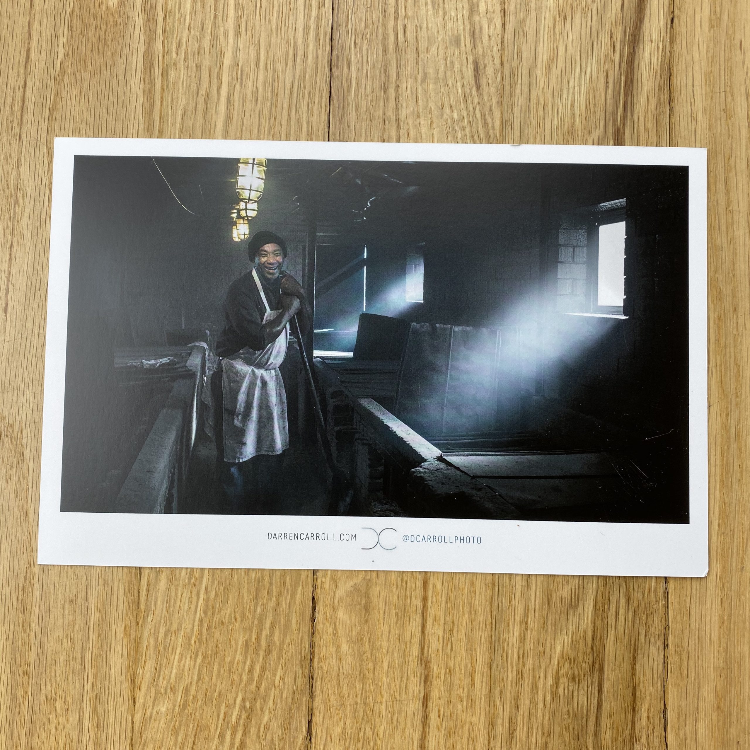
Guest Post by Amy V. Cooper

Sourcebooks, Photography Directories, Listings… What are the differences between them, and which one will give me the highest return on investment? You asked, so I did the research.

I interviewed dozens of photographers and directory agents and conclude that there are no best or worst.  Your genre of photography, location, target market, how you prefer to interact, and of course your marketing budget will collectively determine which one (or more) of these resources is right for you. This review will help you decide which resources are best for your business.

The most important thing to know is, the more you put into it, the more you get out of it. As with all of your marketing efforts, you have to be consistent, you have to be the squeaky wheel, and you have to be patient.

The majority of these source books and directories are by invitation or selective review, and I do not recommend them for photographers who do not yet have commercial or editorial experience.

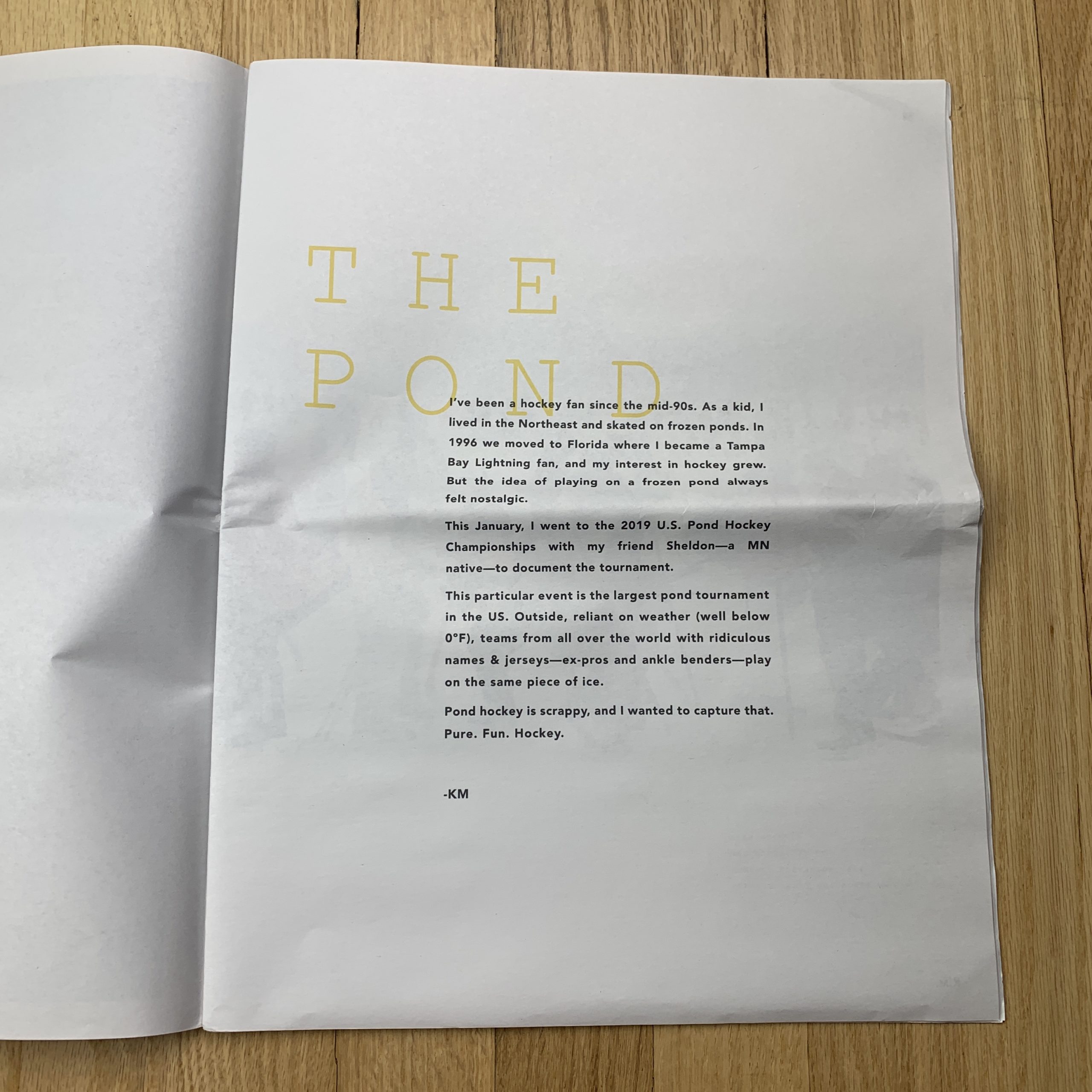
Below you will find an abbreviated version of my full report which is available to my clients or subscribe to my newsletter to receive a download. Numbers and costs are based on research completed in October 2019.

THE ESTABLISHMENT

WORKBOOK is one of the oldest and perhaps most well-known bi-annual print directories for photographers and illustrators. Their hefty books are ubiquitous at most ad agencies and Workbook is known for great customer service and ROI. ”We are still relevant to creative buyers after 41 years. The Workbook is the most recognizable direct mail pieces in the world.” BORN1978 COST: Between $2000 (website) –$7500 (Pro tier includes a 2-page spread in spring and fall books as well as online and free portfolio presentations). Current number of photographers: 321

Best for (IMO/In My Opinion): Advertising photographers interested in print and online marketing support willing to update their work regularly.

LE BOOK is another one of the print originals, born in Paris in 1982, expanding to New York (1995) and further in Europe (1999) to include film, photography and other production and event resources. I actually purchased my one and only source book listing in Le Book as a photographer in 2007. Le Book still publishes directories annually in four markets but their business model seems to be more focused on events and production. BORN1982 COST$110/mo. Current number of photographers: 126 in the U.S. (more internationally).

Best for (IMO): Fashion Photographers in larger markets.

ATEDGE is a series of print publications (5 books/year) sent to agencies and major brands in the U.S.  By invitation only, AtEdge limits their roster to 150 artists so that they can promote and provide their members with individual attention. “We focus on the most innovative photographers, directors and CGI/post-production studios and always make your image the hero. The AtEdge marketing program sets the bar for talent on our digital platforms, in our books, and at our exclusive industry events. Creatives know and love us for that reason.” BORN2003 COST$8340/year (includes a spread in all 5 sourcebooks, a web portfolio, consulting, and one face-to-face portfolio event with 4-6 senior-level creatives.) Number of photographers/directors: 150.

Best for (IMO): Advertising photographers wanting a more personalized collaboration.

THE DISRUPTORS

WONDERFUL MACHINE began as a photography collective and has expanded into a global online-only directory of photographers in more than 40 countries. In my opinion, Wonderful Machine is one of the few directories that has an intentional foot in the editorial and reportage space (not solely focused on advertising agencies and direct-to-brand.) They also do a lot of production. ”We take a personalized approach when marketing, estimating, and producing for our photographers. We have a lot of photographers that have been with us for many years, lasting relationships. We enjoy seeing their careers grow.” BORN2010 (as a directory) COST$192-$240/month (listing only.) Number of artists: 595.

Best for (IMO): Photographers wanting more global and editorial reach with the availability of a full suite of services like bidding and production.

FOUND ARTISTS is an online and print directory known as one of the best in design and user experience. It’s also one of the more affordable options. Found is unique in that it hosts portfolios showings without the artists in attendance. If you are an introvert, this might be your jam. Found Artists print curated sourcebooks twice per year (100 artists per book) and “Decks” (unbound) six times per year (50 artists per deck).  ”We’re unique in our team and passion as well as our price point. We know what it takes to market our artists and we’ve built rapport with clients over time and in doing so many portfolio reviews.” BORN2016 COST$40/month (does not include portfolio reviews nor placement in print books) up to $3995/year. Current number of photographers: ~700.

Best for (IMO): Advertising photographers needing flexibility with their marketing budgets, wanting help with bids, less interested in or unable to attend in-person reviews.

BOULEVARD Artists is (more than) an online directory of photographers created by the founders of Fotoworks. They host in-person portfolio reviews several times per year in multiple cities. Although you do not have to be a BLVD Artist to attend some of these reviews, their members receive priority and discounts. ”We see ourselves more as a roster than a directory, we host portfolio reviews and focus on personal relationships.” BORN2014 COST$1399/year or $4200/year for Select members, buy up to $6950 to include 3 portfolio review events. Number of photographers: ~40.

Best for (IMO): Advertising photographers & directors willing to hustle their physical portfolios, travel to meetings, and make face-to-face connections.

PRODUCTION PARADISE is one of the most internationally recognized online resources for finding photographers, stylists, producers and almost every category of production service you could hope to discover in 55 directories around the globe.  ”We are unique in our reach and have the highest number of email subscribers out of all of the online photo directories (over 200K).” BORN2002 COST$2-$5K/year for photographers (less for stylists and other production resources, prices are determined by profession and location.) Number of photographers: ~500 in North America & the Caribbean (more internationally, supporting over 2500 creative businesses worldwide.)

Best for (IMO): Photographers wanting broader online reach and promotion.

THE NEW PIONEERS

KOMYOON is a digital directory offering services and tools for professional artists & the people who hire them. The app and soon to be desktop version allow artists to customize a searchable digital profile. Paid membership includes profile curation, portfolio/website reviews, spotlights on social media and access to varied in-person events. ”Our commitment to better unify our industry is aimed at addressing current pay for play models and making it easier for decision makers to find and track artists. We provide an affordable, useful solution that works fairly for qualified commercial artists of all levels.” BORN2019 COSTFree up to $3450 (4 tiers). Current number of artists: 265

Best for (IMO): Advertising photographers with zero to large marketing budgets who enjoy the social media model/experience of sharing their work, and are willing to stay active and update their content.

PHOTOPOLITIC began as a production services company in 2012 and expanded into its current online directory model in 2017. More than a photographer directory, PhotoPolitic is rapidly forming as an all-in-one stop for promotion, production, consulting, marketing, design, and soon to be direct casting model. PhotoPolitic is unique in many ways but notably in its mission to connect photographers to each other with a members-only discussion group and fireside chat style events. ”Our website is state of the art in functionality and speed. We make it easy for art buyers to find new photographers. Artists who join PhotoPolitic are side by side with some of the top photographers in the world.” BORN2017 (as a directory) COST$900/year (going up to $1200 in 2020). Current number of photographers: 272 (limited to 25 photographers per category per major market)

Best for (IMO): Advertising photographers interested in community and more direct support.

The companies that I researched for this blog are the most well known in the space of promoting commercial/advertising photographers. I’ve discovered numerous other artist directories and listings in addition to the ones included here. There are many resources that blur or dilate the lines of what might be considered a directory, some that are free and many that are niche. So as not to overwhelm here, I will be posting future blogs to share what I have learned about these additional resources. Please sign up for my newsletter to be notified.

***

Pro-tips before spending your money:

1. Prepare and ask lots of questions. This is not a vending machine. Make sure to get a phone call or face to face meeting with a rep or salesperson before deciding to commit to a listing. Consider the professional background, experience, and vibe of the people you speak with. Some of these agents may be representing you and your work to potential clients in the future or advising you on your career and portfolio, make sure it’s a great fit. Take your time.

2. Look at the caliber of other artists in each directory that you are considering. They should be as good as or better than you. Call or email several artists using the same directories you are considering who are in your same genre and/or location and ask about their experience. Ask yourself if there are a lot of competing artists in the same directory, that can be a good or bad thing.

3. Define your goals and expectations. Different directories have different resources available to photographers. Some are more hands-on than others. Decide if you want to drop and run or if you are the type of artist who prefers a bit of handholding. Know if you are willing to attend reviews and if it’s realistic in your schedule and budget to travel and also update/submit/print new work regularly.

4. Know your budget. Some directories might start cheap, but ROI usually grows with “buy-ups” (buying in to email or print promotions, portfolio reviews, editing services, etc.) A sourcebook or directory should never consume your entire marketing budget.

5. Ask for a discount (politely). Most of these directories have discounts available, it can’t hurt to ask!

Still confused about which directories to choose? Shoot me an email or jump on my calendar here.

Hey, #ImRootingForYou!

                                                                             V.

Never miss a blog or event, sign up for my newsletter here.

Get inspired, keep up with my pro-tips, and meet some of my favorite clients and artists: follow me on Instagram @amyvcooper.

The Daily Promo – Jennifer Chong

Jennifer Chong

Who printed it?
I printed at Mixam. I really wanted to do a unique print piece but those get costly quickly. I used Mixam and hand-trimmed pages for something a little unexpected. They have a nice paper quality without breaking the bank.

Who designed it?
I designed the promo. I worked as a designer and art director before shifting to photography. After helping other photographer friends work on their promo, I figured it was time for me to work on my own (it’s always harder to design for yourself)! The designer in me wanted to explore fun paper, textures and printing options but ultimately those end up being costly. I focused on highlighting my photography while also mixing in some playful typography.

Tell me about the images?
This is the first promo piece I’ve done that wasn’t a simple one-sided postcard and I wanted to show the breadth of my work while also maintaining a good flow. With the help of friends and family, I selected a mix of personal projects and client work to showcase.

How many did you make?
I printed 50, but once I send these out I will print more. I wanted to see how the initial run would look and feel before printing more.

How many times a year do you send out promos?
This is my first time sending something other than a postcard, My goal for the new year is to send out a printed promo 2-3 times a year.

Do you think printed promos are effective for marketing your work?
While I haven’t gotten a specific job from the piece I can say that the printed promo has attracted potential clients which I’d say is a win! I think a nice printed piece can stand out through the noise of our busy inboxes – and I appreciate and enjoy having a printed piece to showcase my work.

The Daily Promo – David McClister

David McClister

Who printed it?
I went back to Overnight Prints for this current series of postcards, a vendor I used many times in previous years, mainly due to ease since I had their templates already set up on my computer. I like their price (they have special offers several times a year), but I wish they offered proofs. I used Smartpress earlier this year for a book of work, as well as another run of postcards. They do offer proofs (at a small price). Their overall pricing was competitive, and the quality of their work was strong, but it was not an easy process for my designer (more so on the book than on the cards).

Who designed it?
I typically do the editing, the initial layouts, and the copy to start with, then pass it on to a professional designer to fine-tune the layouts, type, and color (if necessary). I have always worked with Gina R Binkley/ Altar Ego Design for all of my design needs.

Tell me about the images?
I started this postcard series earlier this year, mixing in current/new work with archival work. Since they are postcards, I try and select images that are strong enough to stand alone; and that someone might want to send/share with a friend (or tack on their wall at work). Photos, like music, are meant to be shared, and I hope these postcards will be used/shared in some form/fashion.

How many did you make?
300 – 500; going mainly to previous clients in the music industry (label, pr, mgmt) and editorial.

How many times a year do you send out promos?
Once a quarter.

Do you think printed promos are effective for marketing your work?
I do absolutely; email blasts are a good way to keep your name in front of clients; but I love the possibilities of printed pieces – there are so many ways you can show your work with a printed piece, tailoring it to a specific personal project, crafting a series, etc. It’s another way to show how you see, how you feel and approach things, etc. I’ll use another music reference, in that promos to me are like releasing a new album of work (or with these postcards – a series of singles that will ultimately make up a collection). And like musicians, we as photographers are continually moving forward, honing our craft, exploring new themes and issues, changing/evolving – our promos and work should reflect this as well.

If you’re not pushing yourself into uncomfortable territory, then you’re stagnant. Shake it up.

Have you ever gotten a job directly from a printed promo?
I’m often wrong about expectations when I share my work (that’s why I try and have none). When I sent out the promo book earlier this year that I mentioned, I sent several to an ad agency that I had worked with on a commercial spot several years ago. I sent it simply because I liked the team at the agency a lot, and because I knew that they were fans of some of the musicians pictured in the book. Several weeks after they received it, I got a call from them to bid on another commercial spot – and won the job.

The Daily Promo – Natalja Kent

Natalja Kent

Who printed it?
I had chromogenic prints made at a local lab, my assistant Leah Rom hand sew the belly bands from an Italian imported ribbon, and write notes to each person I was sending the package to and added super fun ChromoDepth glasses for a color 3D effect. So it was really a blend of a few things I love: photos, textures, and op-art!

Who designed it?
I designed it with a love of real photographic paper and a touch of nostalgia for 3D viewing.

Tell me about the images?
These photographs are all new work inspired by the experimental photography I’ve been doing in the analog, color darkroom called Movement Artifact as well as a book I photographed last year of the Blaschka Glass Plants and Flowers. There is a fun little Wired Article about my artwork that tells a bit about the project. The Blashka Glass Plants taught me so much about light and form, I’m excited to be bringing these ideas to commercial product clients. For the package, I added one print from my art series, so people could get a sense of my color palate. With my commercial work, I’ve been teasing out how to play with light, color, and form in ways that reference this fine art project as well as a deep technical dive into glass photography and what I discovered. It’s been fun to beautifully draw out a product for a client with these tools. I adore visual problem solving for clients’ needs and by drawing on my rich knowledge of art, light, form and art history I am building a fun, pop-fantasy, still life world.

How many did you make?
I made 50 of this promo. I keep my physical outreach pretty low volume so as not to make a lot of garbage. By targeting people I really want to work with I’m doing my best to balance outreach and environmental awareness.

How many times a year do you send out promos?
About twice a year.

Do you think printed promos are effective for marketing your work?
What my promos do for me is put the work I feel is adding something strong to the visual dialog in a physical form and in front of people I think are working on great projects. It’s more of the idea “action begets action” and less “I want this outcome to happen right now”. My business practice includes a kind of self-awareness about what I’m putting into the world and what I’m asking for. Being generous is a part of that ideology. I make great work for very aligned clients. Having a fun promo that’s closer to sending them a little game then a plea for work is what I’m aiming for.

If there’s one thing I learned from surfing, which I’m obsessed with, it’s to get out into the water no matter how you feel or if the conditions are not perfect. There are almost always waves that teach you something about your form and approach — and it’s crazy fun. For example, last night after a long day in the studio I popped out to Malibu for a sunset surf. We had some fun little sets (waves) in the crimson fade, and then suddenly I realized it was totally dark and the moonlight was sparkling on the water. In the blackness, it was hard to read what the size of the waves was coming towards the three of us still surfing. I decided to paddle into one that looked small and uneventful. Then I found myself on a perfectly arching wave, tucked right into the pocket, then gaining speed along the face. Because it was so dark, all I could see was a thin line of silver moonlight on the deep black face of the wave, and we rolled together all the way to the shore. Who knew such a majestic wave was to be experienced in such darkness, more about the feeling of the movement then seeing it and controlling it. By showing up, and sticking with it I felt an incredible belonging to the ocean and the activity I adore. By bringing a sense of curiosity and play to all processes I undertake, I learn from each new experience — and I treat sending out packages to folks the same way. Let’s have a good time with these cool projects we get to make!

The Daily Promo – Amos Morgan

Amos Morgan

Who printed it?
DCG One https://www.dcgone.com/

Who designed it?
Chaun Osburn https://madebychaun.com/

Chaun and I have known each other for many years and he was on the design team that did the branding for my business. We’re both huge fans of music and appreciate vinyl records so for this project we came up with the idea to create a promo pieced based on that format. I’ve always been fascinated by the design/copy/imagery that record jackets and liner notes feature, and have spent hours pouring over those details while I’m listening to the music. Using that as inspiration, it was really important for the images and text to have a thematic arc similar to how the tracks are arranged on many albums. Chaun’s design creates such a wonderful home for the images and brings the feeling of an album’s liner notes to life.

Tell me about the images?
The images are from a mix of personal test shoots and commercial jobs.

How many did you make?
300

How many times a year do you send out promos?
Large promos (like this) every 1-2 years and small “postcard” promos 2-3 times a year.

Do you think printed promos are effective for marketing your work?
For me, printed promos are very effective. I’m pretty selective with who I send them to as I prefer a targeted marketing strategy vs. a large scale “blanket” approach. This allows me to tailor the promo to an audience I believe will appreciate the selected work. Then the printed piece at the very least allows for a conversation starter when following up and I often receive compliments that it was nice having something tangible to hold and look through.

The Daily Promo – Kennett Mohrman

Kennett Mohrman

Who printed it?
Right off the bat, I knew I wanted to print this on newsprint. We came across Newspaper Club – they specialize in newsprint in tabloid sizing. It was a great option for a small run as well. And, I was able to print one to start as proof and nit-pick color etc. I was so pleased with the results.

Who designed it?
Luckily, I’m married to a Creative Director – Lizzy Sonenfeld (@lizz_zzz_y). We’ve worked together for a long time, so the process is really collaborative and natural. I knew I wanted to marry colorful graphic images with strong player portraits and she did a great job of working it all in together.

Tell me about the images?
I went out to Minnesota with a buddy for this tournament, looking forward to capturing both action photos and portraits. It’s the largest pond hockey tournament in the US so I knew there would be a ton of character. We set up a scrappy portrait tent directly on the ice (it was below 0°F most of the weekend), and capturing the portraits as players were coming off the ice was the real highlight. The small details – frosted beards and eyelashes and subtle expressions – were so much fun to capture.

How many did you make?
We printed 200 newspapers, and made 150 hand-addressed packages with postcards.

How many times a year do you send out promos?
Honestly, this is my first one, and I’m already planning the next. It’s been an awesome challenge to myself creatively, and really rewarding to get these into people hands to open up conversations.

Do you think printed promos are effective for marketing your work?
I was skeptical going into this, but it’s been really effective. Doing a small batch and sharing with relevant people/agencies was the key for me. So much more effective than cold calls/email blasts. I’ve already landed a couple of jobs because of the work too so I’m very stoked with the results! It’s been great to see people hold tangible printed work in their hands and respond to it with honest critical feedback.

The Daily Promo – Jennifer Causey

Jennifer Causey

Who printed it?
Print West in Woodinville, Washington

Who designed it?
Kaela Rawson
We worked together to create something that showcased the photos but also had a sense of design and aesthetic. I worked with some prop stylist friends to get feedback and help me choose and pace the imagery.

Tell me about the images?
The images are a combination of test shoots and assignments. I wanted to showcase some shots that don’t really get a chance to be seen. I started looking at some of my recent work to see what I was drawn to. The images that stood out seemed to have a similar color story and feel. The cover image was actually a last-minute addition. It came from a test shoot I did with prop stylist, Audrey Davis. I was looking at a final draft of the promo while I was editing this shoot and I liked how it looked with the yellow font we had chosen to use, so I went with it.

How many did you make?
I printed 1000

How many times a year do you send out promos?
1 to 2

Do you think printed promos are effective for marketing your work?
Yes, I think it is nice to have something tangible to catch people’s eye and to hold on to, and to hopefully make them remember you for future assignments.

The Daily Promo – Chris Loupos

Chris Loupos

Who printed it?
My promo was printed at Casa Papel (casapapel.com) in Philadelphia. It was honestly not easy to realize this promo. I went through quite a few meetings with printers before I met with Casa Papel and even with them, it took quite a bit of back and forth before we got it perfected. Not really their fault, it’s just funny how hard it is to recreate something that was so common in the early 1900s. Other places had offered to print it on paper stock backing or other materials to get it “close” but I didn’t want to cut any corners. It was very important to me to have them be as authentic as we could make them to how they used to be. There were more steps in the process than you probably would imagine.

Who designed it?
I kind of had a cheat code here in my back pocket because my younger brother Michael (dribbble.com/mikeydoesit) is a talented graphic designer in Philadelphia so he and I had been talking about this for a while before we decided to try and actually do it. I bought probably 15 vintage cabinet cards at thrift stores as examples to work off of as well as some images of them from the web and he took them and made a TON of custom logos with my name and photo business on the front and back that would kind of be an homage to that style. I originally was going to do 5 or 10 different backs, but once we started really trying to print it, we realized that could never happen logistically. It was hard to choose the final design, there were a bunch of good options and I struggled a bit with the final decision but I’m really happy with how they turned out.

Tell me about the image and the card itself?
The image is of a model named Rebekah Marine (@rebekahmarine) who I’ve had an on-going working relationship with over the past few years. I just had an idea for a shoot with a sort of vintage feel to it and wanted to shoot with some peacock feathers and maybe a fascinator veil so I bought them both and we did a shoot together at a studio in Philadelphia. It wasn’t planned that this image was going to be a promo for me at all. I just liked the image. When my retoucher Nick (nicksilver.studio) sent it back to me and we talked about it I just thought this was an image that would make a perfect updated version of a cabinet card. It has that timeless feel to it. I could’ve gone black and white like they used to be, but my work is mostly based in color and I wanted to stay true to what I mostly do. And to add a little twist to make it my own as well.

How many did you make?
I printed around 75 of them with Rebekah on them and a couple individual ones for people that have been important to me in the photo business to give as personal gifts. They were NOT cheap to produce and I know people probably say this with promos, but I truly mean it when I say that I only sent these out to clients I really would want to work with and whose work I really really admire. I am not sure if most of the world, even the photo world, has any idea what a cabinet card is but my hope is that some of the real photography nerds like me will recognize it right away when they see it and those are the kind of people I want to work with the most.

How many times a year do you send out promos?
I don’t usually send promos, honestly. It’s been a while. I’ve spoken to a lot of photo editors I’ve worked with over the years and most of them say its a mixed bag on how effective they are. I didn’t want to do postcard mailers. I wanted to create something different and something unique. Something that someone might pin on their wall, put on their desk or at the very least remember when they’re trying to hire new photographers. I have to credit my brother for going the extra mile with some suggestions for complementary elements that ultimately brought the whole project together and highlighted what was most important, which was the cards.

Do you think printed promos are effective for marketing your work?
I’ve never directly gotten a job from one that I can recall, but I also have only sent out a couple. I’ve never sent out postcards. I find them to be impersonal and that’s not really me. In the past, I’ve created a zine with a mustache/beard photo series and accompanied it with custom made mustache wax in metal tins we custom branded and designed and now this cabinet card. I have an idea for the next one but we will see if I can actually follow through with it once the body of work is finished. It’s percolating though.

I’m endlessly fascinated with the world of photography. It’s one of the only jobs in the world where you want to work more than you do, if you love it like I do anyway. I think it’s becoming so hard to get anyone to stop and pay attention to you in the scrolling era, and with promos my goal is to make something unique that isn’t run of the mill and commonplace. I wanted people to be able to hold this in their hand, feel the letterpress, look at the gold etching on the edges and honestly just appreciate the work that went into making it. I think we succeeded and I’m happy people are appreciating them, I hope some prospective clients feel the same way.

The Daily Promo – Michael Kunde

Michael Kunde

Who printed it?
It was printed by Modern Postcard https://www.modernpostcard.com

Who designed it?
The Promo was designed by my dear friend who’s been designing for me for about a decade now. His name is Nicolas D’Amico he is based in SLC, UT.
https://www.designbydiamond.com He also made my logo and design identity for my website.

Tell me about the images?
The images were shot this time last year for a client of mine Nutrien Ag Solutions. The creative agency was Osborn-Barr https://osbornbarr.com
Creative Directors: Zach Arnold and Dan Brindley. Agency Producer: Tammy Cheatham. We shot these images over a series of 3 days in a very rural area of Kansas near the city of Garden City. On this shoot I had help from my go-to assistant Alex Igidbashian @alexigidbashian and my very talented drone operator Rudy Lehfeldt-Ehlinger @rudy.le

Rudy and Alex are key people in the creation of my AG work. Rudy flys an Alta 8 Free-fly drone up in the air with my Canon 5Dmk4 so I can capture the iconic agriculture aerials of combines working harvest. I love putting up full-frame or medium format cameras into the air so I can grab the best possible files for these aerials. This gives me the best latitude with the files to push these images in whatever direction needed to give them the look and feel I’m going for. Alex basically reads my mind and somehow always knows which lens I’m going to want next.

How many did you make?
I printed 500 of these promos.

How many times a year do you send out promos?
I have initiated a new business strategy this year and will now be sending out promos quarterly. Before this year I only sent them out when I felt like I had the time or bandwidth to do so. I worked with my Designer Nic and he created a years worth of Promos for me. I printed them all at the same time so they are here and ready to go each quarter.

Do you think printed promos are effective for marketing your work?
I am a firm believer that printed promos are an effective marketing tool. The way I see it is, yes many of these promos will likely end up in the recycling bin. But many don’t. I have talked with many creatives at agencies throughout the country and consistently I hear that they appreciate a well designed and thought out promo. Many file them away, many creatives have them pinned onto giant walls in their office and reference when they need to find a photographer to match the agencies creative. I like to try put myself out there as much as possible. How can you be hired for a job if you’re not constantly on the radar of agencies around the country and the world.

The Daily Promo – Greg Mionske

Greg Mionske

Who Printed It?
Print on Paper (printonpaper.com)

Who designed it?
I did.

Tell me about the images?
These photos were all made as part of a personal project this past spring at the U.S. Men’s Clay Court Championships in River Oaks, Texas. I was pretty determined to shoot here as I knew I wanted to shoot on red clay for color and textural reasons. I initially made a few editorial pitches focused on the event, all of which failed to gain enough traction. Fortunately, one of those editors was still willing to help me secure credentials to pursue the project on my own.

I spent every day at the tournament chasing light and photographing anything that caught the light nicely. Aside from the tennis, I was rather intrigued by the spectators as many of them seemed to be more worried about seeing and being seen or gossiping court-side than the event itself. Overall my goal was to come away with a set of images that made the viewer experience the beauty and uniqueness of this particular event.

How many did you make?
I had 100 printed.

How many times a year do you send out promos?
I don’t have a schedule set in stone at this time however it is certainly something I would like to do quarterly.

Do you think printed promos are effective for marketing your work?
I’m not sure. Obviously some people like to see printed photos while others don’t care, but I do think prints have the potential to be effective in a world where most email inboxes are overflowing with junk mail. Having said that, a friend from a particular Boston-based footwear company sent me an Instagram video of him opening my mailer, thumbing through a page or two and then walking it over to the recycling bin. I’d call that pretty decent engagement in the digital age ; )

The Daily Promo – Aviva Klein

Aviva Klein

Who printed it?
MOO.com

I did run into a couple of obstacles with this mailer. Moo offers a ‘finish’ option; which turns out to be really beautiful and velvety. However, my background color was black and so it took a bit of trial and error to find the right pen that would be visible and also write smoothly on the surface. I made a mistake with the last mailer and got these paint pens which didn’t work well. This time, I used metallic Sharpies.

The other obstacle I ran into is that MOO.com requires all files to be uploaded in CMYK. For some images, it’s not a huge deal to color correct on my own. However, for this one, I couldn’t get the colors to look true to the original- the blues practically disappeared in CMYK. So, I had to hire a Retoucher to do the job.

Who designed it?
I did.

Tell me about the images?
The images of Cardi B that I used for this promo were taken at this year’s Summer Jam in NJ for HOT97/Emmis Comm.

How many did you make?
250

How many times a year do you send out promos?
3-4 times a year. I try to get one out a quarter.

Do you think printed promos are effective for marketing your work?
To be honest, I’m not sure. I haven’t had anyone reach out to me directly after receiving any of my promos. I enjoy the process of designing them, finding the right stamps and envelopes, receiving them, packing them, and taking them to the post office. I put a lot of thought and care into the process. I did hear from a colleague of mine that he saw this promo at his agent’s office, so that was pretty cool. My philosophy is that you never know who’s going to see it and what that might inspire. It’s a rather minor expense that could lead to a major opportunity.

The Daily Promo – Dimitri Djuric

Dimitri Djuric

Who printed it?
Ex Why Zed in the UK. I’ve used them a few times in the past. I like them.

Who designed it?
I did.

Tell me about the images?
This is a series I’ve been working on for a while. It’s a visual study of the motifs of of construction. The title, Esthetique Chantier, is French for Building site aesthetics.

I’m interested in the temporary/permanent nature of building sites: They change all the time so it calls for documentation. Even though they are generally perceived as short term, they are also a permanent feature of large cities, always and everywhere around us. Both my father and sister are architects so there is a family interest.

I started taking pictures of buildings and construction sites from the street. I wanted to get access to some sites but this took a while. I contacted developers and building firms. The architects I knew didn’t have anything interesting in the building phase at the time. My sister put me in touch with some people and I got to photograph a couple of great projects. These discussions for access meant I was showing the work to a lot of various people, it was good networking.

How many did you make?
150. I use it as a promo piece and send it to prospects but it’s also a photo book in it’s own right and is sold in a few bookshops in London and Paris.

How many times a year do you send out promos?
Twice on average. I don’t do big campaigns. Generally personalised postcards. I have been doing a book or zine every year/18 month. Each has been used as promo as well as sold in a few bookshops.

Do you think printed promos are effective for marketing your work?
I think so. It’s definitely more memorable than emails or galleries on websites. I think people look at printed work in a different way than on screens.