Happy Tuesday after the holiday. If you want to kill a little time today and have a laugh check out the “I’m an Art Director” xtranormal video:
I know there are lots of funny ones out there, leave your favorite in the comments.
Happy Tuesday after the holiday. If you want to kill a little time today and have a laugh check out the “I’m an Art Director” xtranormal video:
I know there are lots of funny ones out there, leave your favorite in the comments.
Wow. Roger Black, the consummate magazine and newspaper redesign mogul has rocked the design world with the announcement of his new company Ready-Media, which seeks to sell high quality templates to publications seeking an overhaul/upgrade. The Society of Publication Designers blog has lit up with commentary from many of the top designers chewing over the ramifications of Roger’s new product. Luke Haymen, a partner at Pentagram and architect of high profile redesigns for New York Magazine, Time and The Atlantic comments that “…I think this may not be such a bad thing. These designs are decent. In fact I’d say they’re better than 90% of the magazines and newspapers out there. They are generic but of course they have to be to have broad appeal. A good designer will take them and customize them.” He and a few other super star designers seem to be the exception in the commentary with many bemoaning how this plays into the publishers hand of cost cutting at any opportunity and a demotion for unique one of a kind design.
With top names contributing templates to the collection have publication designers just been handed their Getty moment?
I was corresponding with Elizabeth Avedon after I posted several pages from Rolling Stone Magazine’s seminal political photo essay “The Family” shot by Richard Avedon, because as it turns out Elizabeth was working in the photographer’s studio at the time designing the cover of the book “Portraits.” She was telling me some fascinating stories about working with Richard Avedon along with revealing the fact that she designed that issue of RS and so I asked her a few question. The first obviously was if she’s related to Richard to which she replied that at one time she was married to his son.
APE: Tell me how you ended up working with Richard Avedon for 20 years?
 Marvin Isreal was Dick’s best friend and together they created Avedon’s Minneapolis exhibition, Nothing Personal book, and Marlborough exhibition. Marvin Israel was a Painter, Book Designer, Art Director of “The Bazaar” and Diane Arbus protege. He created, along with Doon Arbus, the first retrospective of Diane’s photographs at the Museum of Modern Art, as well as designed and edited her famous Aperture Monograph, now in it’s umpteenth printing.
I was his student at Parsons and he was always trying to convince me to leave school and just start working. Marvin was one of my favorite teachers and I began working as his assistant on several books. He would invariably have a falling out with who ever we were working for half way through and then I would end up completing the project. For example, while working with Peter Beard on “Kamante’s Tales,” Peter and Marvin had a falling out early into it. Marvin insisted Peter hire me to finish designing the book which is how I began my path as a book designer.
Marvin introduced me to Richard Avedon beaming I was “the best student he’d ever had.” Dick wanted me to start work for him that very day. We were on the same page right away when it came to his work. At that time Marvin and Dick (RA) were working on editing all of the fashion photographs RA had ever taken. They had special printers come over from Japan to work around the clock in the darkroom making contact sheets of the thousands and thousands of negatives for them to edit from. There were huge stacks of cartons filled with contact sheets all over Marvin’s studio. It was a several year project just to edit them so they would work on it on and off. During an off period, I was a magazine designer under the fabulous A.D. Bea Feitler (Bea was later Annie Leibovitz’s lover/partner).
During the period just after the Marlborough show, RA offered me a full time position to quit the magazine and work as designer/art director for him at the Studio. Some of my first projects were the cover for the Rolling Stone issue “The Family” and the book Portraits from the work that was in the Marlborough exhibit.
The work itself was phenomenally inspiring. The most elegant, beautiful images anyone could ever wish to work with and I thought it was my job to just make them look as great as they are, to not get in their way with a lot of strange type faces or layout ideas. It was my theory to keep everything simple so the work shined through, not my “design” showing off.
APE: Tell me about designing the Fashion book cover?
RA wanted “Dovima and The Elephants” on the cover and didn’t like my idea of using his signature. While he was away for a month shooting the Paris Collections for Vogue, I designed many covers along the lines of what he’d asked for – including the one I was sure would be distinctive and beautiful.
APE: How did you convince Richard Avedon to not go with “Dovima and The Elephants” on the cover?
He knew it was the right choice immediately. All of us have an idea in our mind how we want something to look and can’t let go of it until we see something better. When he looked at the two covers side by side, there was no discussion. Marella Agnelli embodied everything his fashion photographs were about and the simplicity of his signature curved around the crook of her neck was extraordinary.
We never lost anything by putting “Dovima and the Elephants” on the back cover. It was fabulous that book stores displayed both front and back, side by side.
I also featured Dovima in each and every museum poster in Avedon’s retrospective exhibition I designed for The Metropolitan Museum of Art in New York. I redesigned the typography for all the additional museums it traveled to, including reshaping the space in each to accommodate the images I had divided into decades.
The lighting, framing, size of the prints and finally wall colors all changed and expanded – beginning with faintly lit, dark grey walls and the Paris photographs framed in small gold leaf frames. They were spot lit and as each decade unfolded the lighting would become brighter in each room as the frames slowly became more modern, until the last room of “Icons” – June Leaf, Renata Adler, Priscilla Rattazzi etc. were displayed as huge 9 foot prints mounted on canvas lit in blazing white light. Strong women – with an inner beauty that seemed to radiate out in these particular images.
APE: Do you think he appreciated the drive and instinct you had for the book design and exhibitions the same way that he used those qualities in his photography?
Can you imagine that Richard Avedon, who was at the top of his profession, would let someone whose opinion he didn’t completely trust and respect edit his work or design his exhibitions, books, catalogs, or collaborate on advertising campaigns?
APE: Do you have any anecdotes from working in his studio that you could share with young photographers?
He was driven to be who he became – it was not an accident. He practiced and demanded excellence everyday.
APE: Tell me about working on “The American West” book?
Every last detail in the design down to the color selection of the hard cover linen cloth was meticulously considered and symbiotic to the work. I chose a color I associated with the desert landscape of the Four Corners area of the West. The typeface was influenced by an antique western frontispiece I found printed in the late 1890’s.
The images he made for this was a multiple year project and he rented a loft space just to work on it. After laying out all of the photographs on the floor, we spent months remixing them over and over until we finally edited them down to a manageable number. I then posted them up on a very long wall of cork board we had painted white. After mixing and remixing the wall images, they were reduced to almost the amount in the final book and inserted into acetate sleeves in a big black portfolio notebook. We would then go over whatever changes each would make day to day and re-sequence, just moving the acetate pages within the notebook until the images would seem to find their own home.
Collector’s want to buy the “book dummy”, but the dummy they want to buy never existed. They imagine a book of master prints perfectly bound, it wasn’t created that way.
Everyone asks that I explain my homage to Marvin Israel in the design credit as he died before I began working on the project. Marvin had traveled to Montana and then Texas with Dick while he was photographing for the book. Two diehard New Yorkers traveling around the American West together. It was a great moment for their friendship. Marvin died in Texas while on that trip. As my long time friend and mentor, I wanted to honor him in the book.
The book was a complement to the original exhibition I designed for the Amon Carter Museum in Fort Worth, specifically for this work. I had a model built to scale (one inch = one foot) and had the images made into 5 different sizes to scale and rework within the space. An additional space was created within to house the coal miners. It was a breath taking exhibition – the entrance to the Museum is entirely glass and you can see two floors at once lit up from outside the Museum. I placed 8 of the huge iconic images within their 8 large entranceways/doorways. It was a very glamorous entrance. I redesigned the spaces of the other eight Museums it traveled to over several years and recreated somewhat the original show for each of them. Only the Amon Carter had the full effect of his work being seen as it was originally intended.
APE: Where did you go from there?
I spent several years going through the archives and having prints made for many of the books that were published later. I moved on to co-publish, in conjunction with Random House, Elizabeth Avedon Editions/Vintage Contemporary Artists series, working with distinguished art critics such as Donald Kuspit and Peter Schjeldahl, and contemporary artists Francesco Clemente, Louise Bourgeois, Robert Rauschenberg, and many others. I was Art Director for Ralph Lauren’s National Advertising and a co-founder of Tibet House, NYC. Later, as Creative Director for The Gere Foundation, I initiated a wide range of photography exhibitions and projects to raise money for Richard Gere’s non-profit organization. I then worked for Ralph Lauren Media as photo editor for their online magazine (here). I recently returned to New York from New Mexico where I worked as Director of Photo-Eye Gallery in Santa Fe.
APE: What are you doing now and what kinds of projects you are looking to work on?
I’m happy to be back in NYC and designing. In early June I’ll be at Review Santa Fe and look forward to meeting all of the photographers there. I like working on projects that have multidisciplinary design possibilities in that I can play with two and three dimensional space. Books, exhibitions, ad-work – I always welcome the opportunity to work closely with photographers.
You can visit Elizabeth Avedon’s website (here) and see more photographs from Richard Avedon (here).
What you see very frequently in peoples professional lives and perhaps in their emotional life as well is they lose interest in the 3rd act, you sort of get tired, and indifferent and sometimes defensive and you kind of lose your capacity for astonishment and that’s a great loss because the world is a very astonishing place.
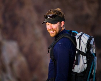 I met Marshall in 2001, when he landed his very first job with the Outside Magazine Art Department and I’ve enjoyed watching him climb the ladder moving from magazine to magazine over the last few years. I was especially pleased when I heard he was going to run the Art Department at Garden and Gun because it seems like the kind of magazine where someone can really leave their mark. Not only do they have an awesome name, they appear to have the backing and foresight to produce a magazine that’s more of a luxury item. This is something that will serve them well as the media landscape evolves in the coming years, because I believe magazines that are printed well on nice paper stock, with big glossy photos, will be rewarded with a loyal audience and advertisers.
So, tell me about Garden and Gun, what does it stand for?
Garden & Gun, our no-nonsense name, represents the soul of the Southern lifestyle ––the land and the conservation of it, the sporting life, arts, culture, travel and food. It also says dual audience, a magazine that appeals to both men and women. The name Garden & Gun captures the spirit of the discerning Southerner’s sense of heritage and pride while conjuring thoughts of high craftsmanship, elegance and subtle detail. In fact, G&G has come to be part of the Southern lexicon. In blogs, I sometimes see people refer to something as being “G&G.” It seems the name was just born out of a strong sense of tradition. I personally like the name very much because whether it is received favorably or not it forces one to contemplate.
Obviously the magazine is very well funded but I’m wondering if you think there’s a future (beyond generous investors) for regional magazines that want to have a national reputation?
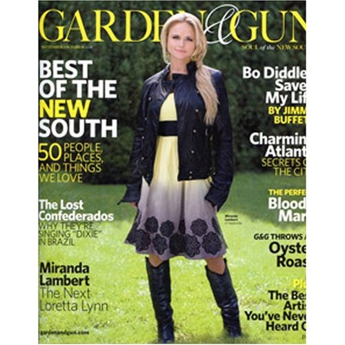 Garden & Gun does have a national reputation, no doubt about it. I attribute that as much to the novelty of our name / brand and tasty editorial content as our financial wherewithal. However, it is important to remember that G & G is a national magazine about a regional lifestyle—not a regional magazine. So, do I think there’s a future for regional magazines with a national reputation beyond generous investors? The answer is YES! I think there is a future for regional magazines and I think that future is (sorry for the forthcoming exclamation point) bright! I mean, look at Denver’s 5280, Virginia Living or the Texas Monthly franchise, which all appear to be fat and happy. Then there are new launches like Forbes Mountain Time, which hopes to bottle the lifestyle of an affluent regional audience.
I believe in the power of print. It’s here to stay. No other medium in the world translates the awesome authority, emotion and intensity of images better than paper. The reader is not staring into a light source but rather enjoying reflective light bouncing off (in our case) quality stock and tantalizing photography. Add that to editorial fare that conjures a healthy, connected—albeit “unique”–– lifestyle with a strong sense of place and voila! another successful magazine is born. (Ahem, if only it were that easy.)
Tell me about the photography. Are you hiring a lot of regional photographers? Are you paying national rates?
We hire a blend of national and regional photographers depending on the assignment and its location. However, we are very fortunate at Garden & Gun to have access to several brilliant shooters right here in our backyard of Charleston, SC. Those shooters being Squire Fox and Peter Frank Edwards. As to whether or not we pay national rates I’ll just say we are competitive and ALWAYS pay on time.
Your website (here) is amazing. 99.9% of magazine publishers are afraid of giving the content away online or they’re afraid of making the online content as enjoyable to read and look at as the printed content. Why do you think you can prove them all wrong?
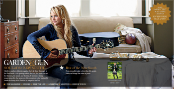 We arrived at our website philosophy like this: We asked ourselves, what is everybody else in magazine publishing doing? Once we deduced that, we then made a decision to do the exact opposite. In our case, lead with the bold use of photography and use as much as possible or as much as the content will allow. In my mind the thinking is this. We serve an affluent audience. One that expects quality content at a high presented tastefully or at a high taste-level—particularly when it comes to the packaging. Again, the stock we print on speaks to the fact that G&G recognizes the magazine as a luxury item. Therefore, we aren’t afraid of giving content away on the Internet because we feel like our audience wants G&G prominently displayed on their coffee tables.
All that said, though, look for a tweak to the website in the coming months as we are morphing the site to better take advantage of e-newsletter technologies. However, I don’t anticipate our newly developed web strategy conflicting with our philosophy to give all our images the star treatment online.
How do you like to be reached and what types of photography and photographers are you looking for?
I’m looking for down-to-earth, easy-to-work-with photographers who are committed as much to their craft as developing personal, lasting relationships with their clients. I look for shooters who own their style and know exactly how to get the goods in the can. I also look for shooters who specialize in a certain kind of photography whether it be portraiture, travel reportage, product, etc. I also liked to be reached in creative ways via the internet and snail mail. I like seeing photography printed on paper but I like the convenience of the Internet.
I like to find young hungry talent as much as the next AD but the realities of the business are such that many of the editors at this level want the peace of mind that comes with hiring a known quantity. Editors at national magazines are quite savvy and familiar with the photography talent that revolves around the publishing world. As much as I’d like to bring along eager, talented young shooters, sometimes it can be very difficult. With looming deadlines hovering over everyone’s head, it can be tough to fight battles where bringing on an unknown is concerned. There’s just not enough time in the day—not to mention the fiscal concerns and scheduling nightmares that would ensue if, they didn’t come back with the right images.
All that said, editors and art directors alike know it when they see it. They know talent and original thinking. So for any young shooters out there, my best advice to you it is to hone your craft, dedicate yourself to it and don’t fear these sorts of obstacles but rather recognize that they exist for your enlightenment. It’s cliched but true that nothing worthwhile in life ever comes easy. You have to want it, you have to earn it and you have to be resilient and open at the same time. But enough with the preaching already. BACK TO WORK!
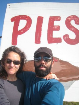 I’ve known Heidi for quite awhile now, we worked on and off together at Outside Magazine over a few years and still talk frequently about photography and the industry on the phone. She has an impressive resume of magazines where she’s worked that includes: Philadelphia Magazine, Men’s Health, GQ, TimeOut NY, Outside, Outside Traveler, Men’s Health 18, Muscle and Fitness and finally the L.A. Times Magazine.
 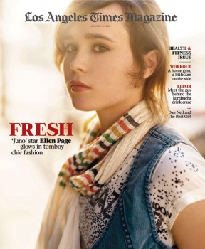 I think the makeover she’s given the LA Times Magazine is nothing short of brilliant. Sure, I’m biased towards full bleed images and minimal design fuss but her 18 Society of News Design awards last year proves the design community is behind that aesthetic as well. What’s even more remarkable is that a place as troubled as the LA Times would allow Heidi to continue to do such brilliant work. I think it’s more a testament to the power of a strong willed Art Director than it is any genius on the part of the management.
It must be impossible to work without a photo editor I mean honestly, how any magazine survives without the sage advice of a photo editor is beyond comprehension. Ok, seriously there’s a fairly large group of publications out there that don’t employ a photo editor and my theory is that it changes the photography choices because the person making them is concerned with how they will work with the design. Do you think not having a photo editor on staff effects a publications approach to photography?
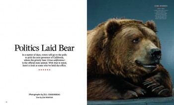 I don’t think it affects the approach at all. I think it can be a great benefit. When I worked with Dan Winters and Christian Witkin they saw it as a great opportunity to have ultimate creative control and that’s how I see it. I’m smart enough to know superior photography is everything. I heard David Carson speak a long time ago about design, he said the answer is always in the picture and that stuck with me.
 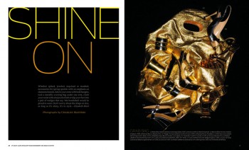 At a previous job I even got myself ejected for my taste in photography. I told the editor it wasn’t his fault he couldn’t recognize good photography because he’d only been exposed to a certain genre of imagery his entire career, which, I had no interest in working with. We had a battle over images John Huet shot for us which eventually led to an early departure.
There’s not much magazine publishing going on in LA or really, anywhere west of the George Washington bridge for that matter. Does that put more pressure on you to represent magazines that aren’t located on an island in NY? Why aren’t there more great publications in LA?
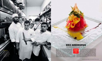 Sure, I really wanted our book to be creative outlet for LA photographers. People gripe that there are no good photographers in LA, I strongly disagree and wanted to prove it and along the way support the photo community out here.
There are a few reasons for this, Life magazine (1936), Esquire (1933), New Yorker (1925), all started in New York City and they in turn spawned many more magazines. 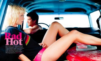 They also raised an entire generation of editors, art directors, writers and photographers who went on to create and work at other magazines. Plus, now with the high cost of publishing you need corporate support to get started and all the publishers are in New York.
When it comes to awards and use of photography, newsstand magazines have always felt that newspaper inserts have an unfair advantage. You’re not subjected to the crazy newsstand, advertising and even some of the audience demands because your publication rides along inside the newspaper and is more of an added value then something that needs to pull it’s own weight. Would you agree with that?
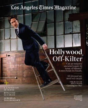 Insert? Gawd, I hate that word. No, we compete with ourselves actually. We have to be something the paper isn’t and that can be hard sometimes because the Los Angeles Times itself has award winning photography. The LA Times Photo Director, Colin Crawford is amazing (examples, here and here).
Our struggles are different, it’s a content war to see who gets there first, we can’t cannibalize the newspaper’s feature sections so we always have to make sure whatever we are reporting is fresh and that can be difficult. Most magazines traditionally use newspapers to locate stories to further report in depth. We can’t do that. We do however have fewer coverlines on the image which is nice and no upc but we have advertising in every issue so it’s no different than a newsstand magazine. We need to pull our own weight especially now with many, many cut backs in this industry.
What are your main sources for finding photographers and how do you like to be reached?
I talk to a lot of photographers, go to openings, visit Art Center, look at magazines and look a lot online. Art Streiber is also a great resource and ambassador for the photo community out here (on top of being a great photographer).
So, you don’t really use promo cards or book drops?
No, I still rely on promos and book drops but word of mouth is my favorite method for finding photographers. I love talking to photographers about other photographers they’re into.
With your focus on all things LA will you hire photographers from other cities? Do you ever shoot anything outside of LA County?
We just shot a feature story in Paris. Is that far enough out of LA for ya?
If you have any questions for Heidi leave them in the comments.