The Art of the Personal Project: John Kealey

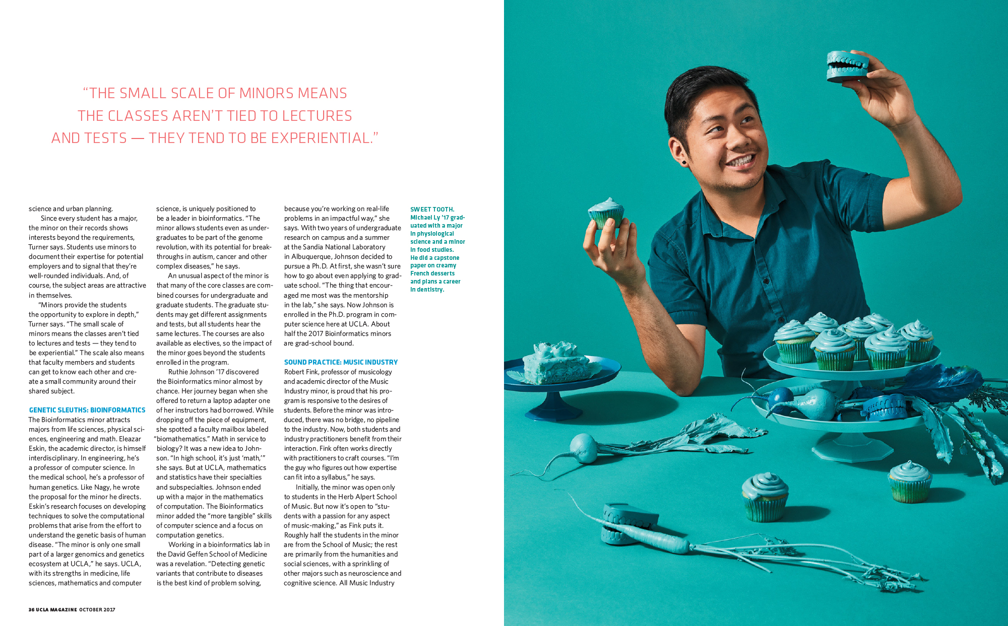
The Art of the Personal Project is a crucial element to let potential buyers see how you think creatively on your own.  I am drawn to personal projects that have an interesting vision or that show something I have never seen before.  In this new revised thread, I’ll include a link to each personal project with the artist statement so you can see more of the project. Please note: This thread is not affiliated with any company; I’m just featuring projects that I find.  Please DO NOT send me your work.  I do not take submissions.

Today’s featured artist: John Kealey

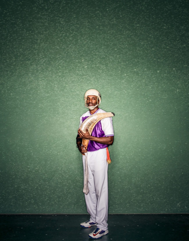
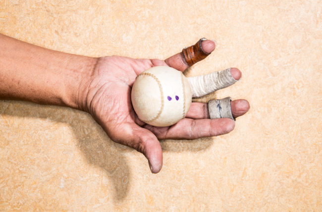
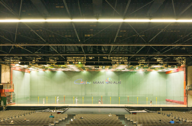
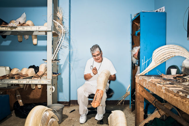
Jai Alai originated in the Basque country of Northern Spain almost four centuries ago. The sport was first played professionally in Miami around 1926. The Miami fronton is still active and often referred to as the Yankee stadium of Jai Alai.

Fronton Blvd is a personal photo study on the sport of Jai Alai in the U.S. The sport is very much overlooked and probably in it’s final years of existence with the exception of Dania Beach. Personally I wanted the project to serve as a testament to the beauty of the sport, players, courts (concha), stadiums (frontons) and makers currently surrounding Jai Alai in Florida.

A trip to the Pyrenees is in the works to photograph where it all started.

To see more of this project, click here.

APE contributor Suzanne Sease currently works as a consultant for photographers and illustrators around the world. She has been involved in the photography and illustration industry since the mid 80s. After establishing the art buying department at The Martin Agency, then working for Kaplan-Thaler, Capital One, Best Buy and numerous smaller agencies and companies, she decided to be a consultant in 1999. She has a new Twitter feed with helpful marketing information because she believes that marketing should be driven by brand and not by specialty.  Follow her at @SuzanneSease.

The Daily Promo – Carmen Chan

Carmen Chan

Who printed it?
It was printed by FLASH Reproductions in Toronto. The designer found the printer and FLASH mailed us physical proofs to check color and quality before going to print. We went with them because they were able to accommodate the special binding for a reasonable rate.

Who designed it?
Kati Forner (katiforner.com)
I became a fan of her work via the print spreads she designed for other clients, and felt as though our styles aligned. She also has experience creating photographer’s pieces – coming up with a design language and format that speaks to each photographer’s work is a passion of hers. She started by presenting me with four design concepts (some of which I didn’t choose, she’s shared on her instagram) and explored cover layouts for one of them and then she went ahead with the layout.

Tell me about the images?
The images are an edit of my commercial, editorial, and personal work from the last 1-2 years for clients including WWD, Cereal Magazine, and Marriott Hotels. I sent Kati a wide edit of my favorite work and gave her free reign to make the first edit for the layout. We swapped out a few images after receiving input from a few close friends who are familiar with my body of work. I really liked the pairings we ended up with and the variety in scale and space throughout the piece.

How many did you make?
500. Half of them have been mailed to prospective clients. The rest will go to current clients, friends, and I’ll keep the rest as leave-behinds.

How many times a year do you send out promos?
Last year, I sent out my first promos – a variety of double sided 5×7 postcards. This year, I’m only sending this one. Moving forward, I’ll be sending them once a year.

Do you think printed promos are effective for marketing your work?
It’s nice to be able to share your work in a print piece that is designed in a way that compliments your work, and this piece in particular acts as a mini-portfolio. So I think they can be effective in conjunction with your work being seen elsewhere. A good example of this is a photo rep I recently met with who first saw my work in a magazine, then received my printed promo, then received my e-newsletter and responded to the newsletter asking for a meeting. Then there’s serendipity – the postcard promos that were sent last year were graciously shared on your instagram feed (@aphotoeditor) and John Cogan from GOODNOISE (goodnoisephoto.com) saw it and reached out. We worked on a commercial job together last month that wouldn’t otherwise had come about had I not shared that promo with you. Thank you so much for sharing it!

The Daily Edit – UCLA Magazine: Charlie Hess


UCLA Magazine

Design Director: Charlie Hess
Art Director: Suzannah Mathur
Photographer: Stephanie Gonot


Heidi: Did you plan on the double entendres of music and academics (majors and minors?)

Charlie: At first blush this seemed like a pretty rote story about UCLA offering students minors as well as majors. But as our Art Director Suzannah Mathur and I dug deeper it turned out that many of the minors programs were pretty rad. And what the kids wound up pursuing after college anyway. The double entendres was a happy accident.

What about Stephaines style made you choose her for this project and what was your direction?
I had been looking for an opportunity to work with photographer Stephanie Gonot and this seemed like the perfect assignment – conceptual, fun, and eye catching, so this seemingly academic story wouldn’t get lost.
Stephanie and I brainstormed some ideas and settled on an approach. Tight portraits, each with their own color palette, and matching props.

What was the criteria for casting and did you hire models?
With public university budgets we can’t hire models. Shooting students is the right price, and generally creates a more authentic visual approach. We picked students from the fields discussed in the story, gave them their color schemes, and prepped coordinated props. Luckily the kids turned out on set enthusiastic and up for anything.

At some point in our careers we take stock and self reflect, what has this job taught you?
Working for a university is complicated, but Suzannah and I have learned how to make great work despite the limitations of cost, and an art staff of just us two. I love the challenges. And I love working with brilliant, dedicated students and faculty who are making a difference in the world. I can’t imagine going back to all the years of celebrity shoots, publicists, and entourages!

Previously this year I interviewed you about your Agency called 20 Over Twenty, what’s the update on this?
It started strong. I put together a great team of six talented photographers, each with their own aesthetic. We got some great shoots with USC, AFI, LACMA, SCI ART, LAPHIL, GET LIT, ELLE… My concept was for us to shoot cultural institutions, nonprofits and academic institutions, where I saw a gap in the market between the high end commercial clients, and the bottom feeders who wanted us to work for nearly free. I was working with marketing departments which used to have sizable staffs, and now had been whittled down to one or two people giving them no time to plan ahead. My business model was for us to book multiple shoots over a year, creating the content the clients needed. I had dreamed of a photo utopia where we would all help each other, but in reality, I think the concept of a photographic collective has its challenges and I didn’t have the bandwidth to make it viable in the long run. Consequently, I’m shutting the agency down at the end of the year. It’s hard to say that out loud but my hope is others can learn from my mistakes. I have no regrets for trying something new. We learn from our failures.