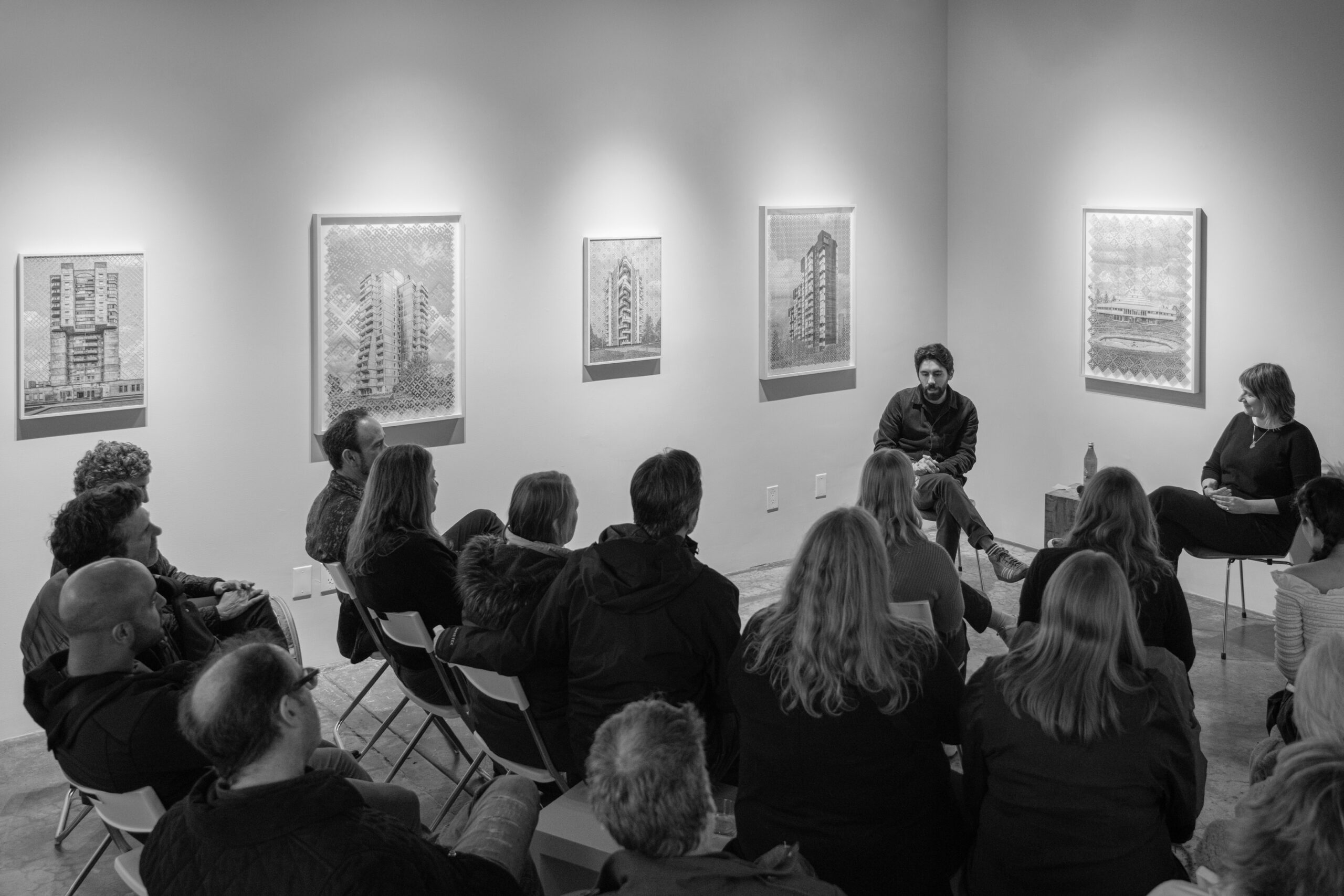
Artist Talk with Krista Svalbonas
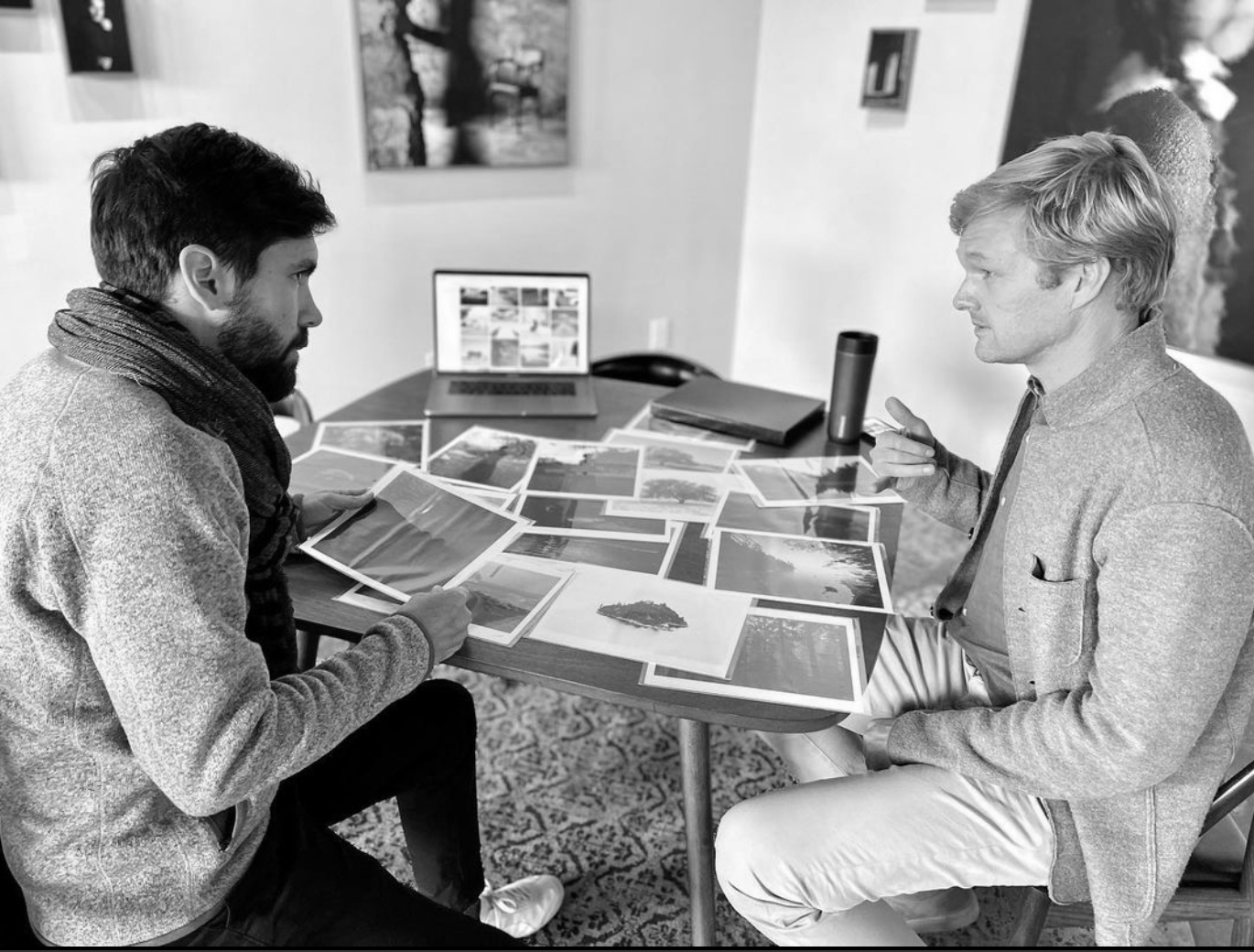 Artist Consultation with photographer Michael James Hillman
Founder and Curator: Douglas Marshall
Marshall Gallery
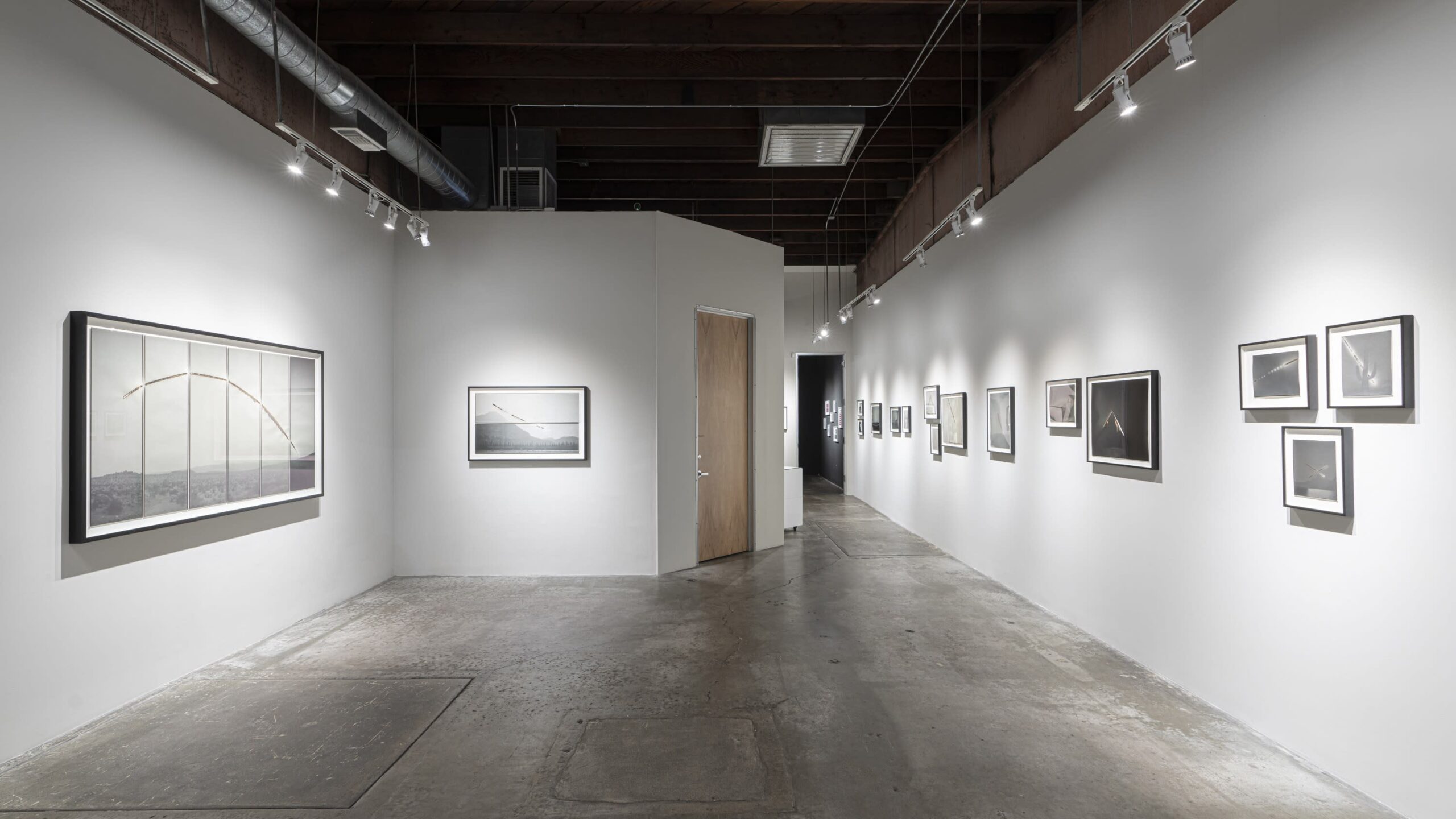
Current Exhibition
Heidi: How long have you been doing portfolio reviews?
Douglas: Well, I’ve been doing reviews overall close to a decade now I guess. I’ve done many of the review festivals around the country as well as looking at countless portfolios in the galleries over the years. But for the last 2 or 3 years I have been doing the private portfolio reviews, meeting with artists one-on-one either online or at my Santa Monica gallery. These started in response to the ubiquity of the standard 20m-minute tabletop review format. Many people on both sides of the table relate to a form of speed dating. I found many artists felt unsatisfied, understandably, never getting to any depth in such a short meeting. So these longer private meetings allow us to go there. And that many artists had nuts and bolts questions about the gallery world which can often be murky and gate kept. Like commission percentages, production costs related to exhibitions, pricing, etc.
What form do you like to review photography work? Formed or unformed – one is open to possibilities, the other you build together as the discussion unfolds.
As far as the state of work we review… The work can be at any stage really, I just put myself in a position to help in whatever way is useful. It can sometimes be like a therapy session haha! Sometimes the work is raw and unformed and it’s editing people want to go through and general framework development… what’s working, what’s not. Other times they are finished portfolios with which people want to discuss things like pricing, editions, printing, and gallery relationships. The former, for me, is more my background as a once-upon-a-time artist myself and the latter from my 15 years in the gallery field having worked for four galleries before starting my own. But I always try to be honest and direct with the artists. No one just wants a pat on the back, they are there for the fair criticism. There is so much BS in the art world, people appreciate honesty.
I do prefer to look at prints, when possible, but of course virtual meetings open the reviews to many more artists around the world. In person always allows for deeper connections and when artists ask about doing festival reviews, I always encourage to do in-person only. This business is all about relationships, and you can’t accomplish quite the same thing online.
Your gallery has a specific focus, was that in response to seeing beyond the medium – looking towards the hybrid of where photography and art intersect? Reframe photography?
Yes, the gallery focuses primarily on what I often refer to as process-based photography. That is to say, that for me and my curatorial focus the physical or conceptual act of how the photograph is made is of equal weight as what it visually records. So many of the artists whom I present use experimental analog processes, unique printing techniques, mixed media with painting, embroidery, etc.
The focus of which is probably three-fold in origin. My background in school and early in my career was all black and white humanist photography. Street, documentary, etc. But as I got exposed to the wider photo world primarily through visiting international art fairs, I began to see a growing prevalence of these experimental practices from contemporary artists and their origins in art history. I also have a love for the “traditional” fine arts, like painting and sculpture, so it sparked my interest to see the boundaries between them and photography blurred in contemporary work.
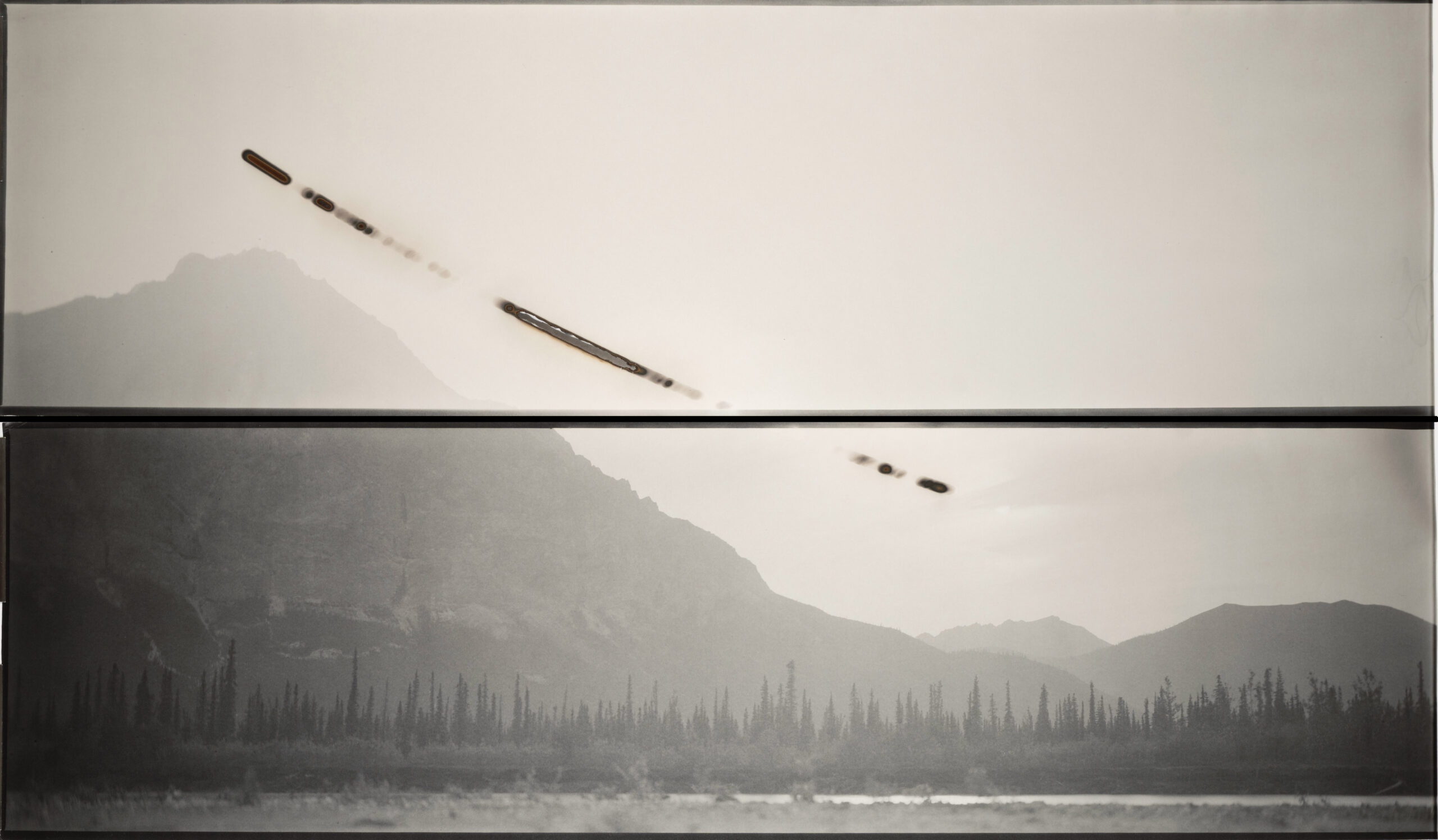
For the artists, my thinking is that it’s somewhat of a reaction, conscious or otherwise, to the mass consumption and ubiquity of digital images. Mass even seems an understatement with some billions of images produced daily. To see the work of an artist like say Chris McCaw, our current exhibition, who is creating real objects with his method of photography is so refreshing in a world drowning in pixels. We are just tired of staring at screens and want to get our hands dirty like painters, there is something quintessentially human about working with material while still loving the documentary / story-telling potential of the camera. And then for me, realizing there were few if any galleries focused on this intersection, I decided that my gallery would do so, but it’s always evolving.
We met when your studio was on Abbot Kinney, fast forward to today – what has changed, and how has your gallery evolved beyond showing work?
I’m not sure too much has changed. Even in the 500 sq ft shoebox in Venice where we met I was trying to produce exciting and ambitious shows. Now I just have 3x the space to do so. But certainly, Bergamot Station has a certain legacy of galleries and especially with focus on photography. So being here allowed me more access to collectors, curators and foot traffic by proximity with my gallery neighbors, many of whom I have worked with over the years.
But I am happy to say with certainty the gallery’s capabilities and awareness has grown exponentially since then, having recently exhibited in the most important international photography fairs and making regular acquisitions with major museums, both important signifiers that something we’re doing here is working.
Beyond the exhibitions, we of course host the private consulting appointments as well as quarterly critique nights that we call “Static Fire” where we invite four photo-artists to show work in progress with about two dozen guests and just have a fun night looking at work. We sell tickets for these events to cover costs and afford a small donation to various local art non-profits like Las Fotos Project and Venice Arts, both of whom are doing great work for LA youth. These have been fun and for me less pressure than the requisite salesmanship that is required for the exhibitions.
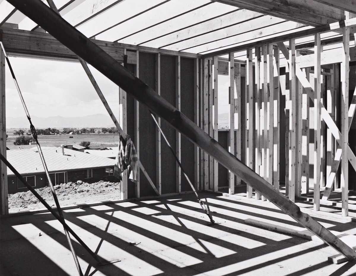 Robert Adams, House Construction, Colorado. 1975 Vintage silver gelatin print 6 x 7 1/2 in.
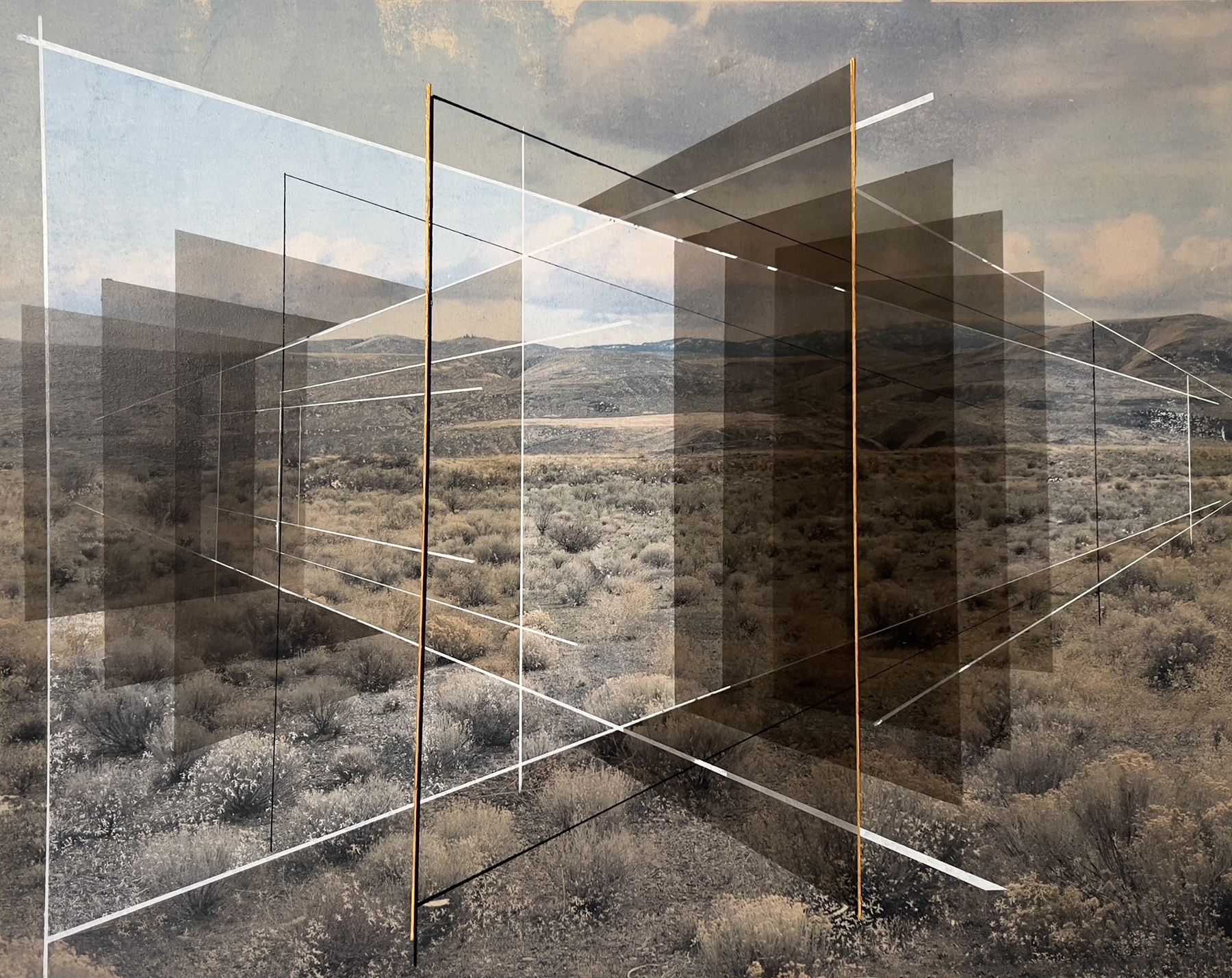 Rodrigo Valenzuela, New Land, 2024. Toner ink on canvas with acrylic. 36 x 48 in.
How you are defining the two sets of artists you are showing?
Well, most of my career pre-Marshall Gallery was in showing 19th and 20th Century work which has a strong market and thus many legacy galleries focus there. So, while the main exhibitions at Marshall focus on contemporary work, I really enjoy putting their work in conversation with vintage works which I source from a network of collaborative collectors in LA. For example, a recent show juxtaposed UCLA Photo Professor Rodrigo Valenzuela’s mixed-media works from his “New Land” series with vintage prints from the 1970s New Topographics movement such as Robert Adams and Henry Wessel. Both had conceptual angles of thinking about land use in the American West. It also helps to bridge the gap to contemporary work for collectors who may typically only be interested in vintage works. Many collectors are wary of the edition systems of contemporary photography, so I think it helps when works are one-of-a-kind due to the physical process of the artist.
Ultimately, I love the history of the medium and revere so many of our bygone photo-heroes, so I do love to show them when it makes sense with the contemporary show on view. But certainly, most of my energy goes to the artists working today. I keep close relationships with my artists, it’s like a sort of creative marriage.