The Art of the Personal Project is a crucial element to let potential buyers see how you think creatively on your own. I am drawn to personal projects that have an interesting vision or that show something I have never seen before. In this thread, I’ll include a link to each personal project with the artist statement so you can see more of the project. Please note: This thread is not affiliated with any company; I’m just featuring projects that I find. Please DO NOT send me your work. I do not take submissions.
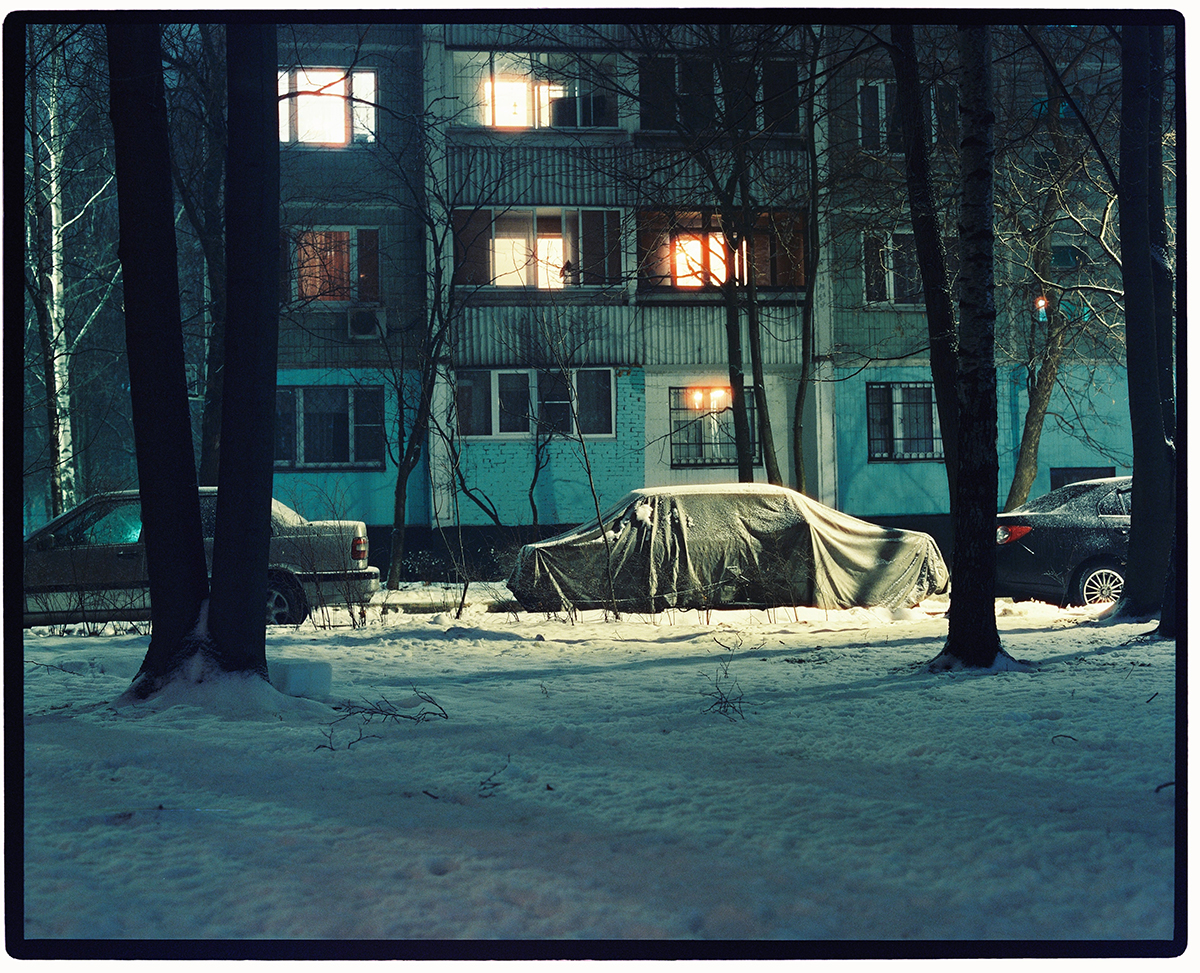
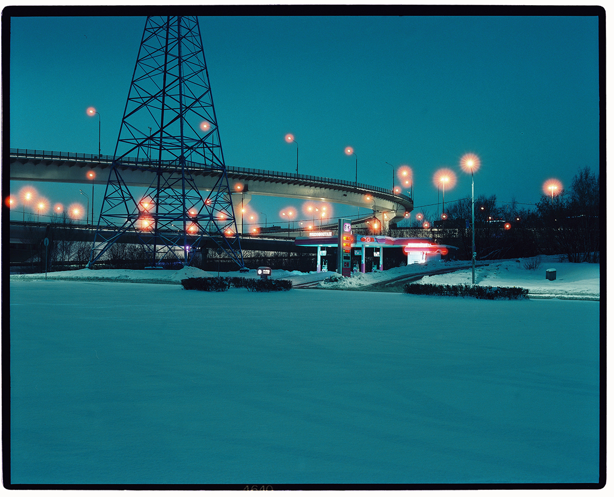
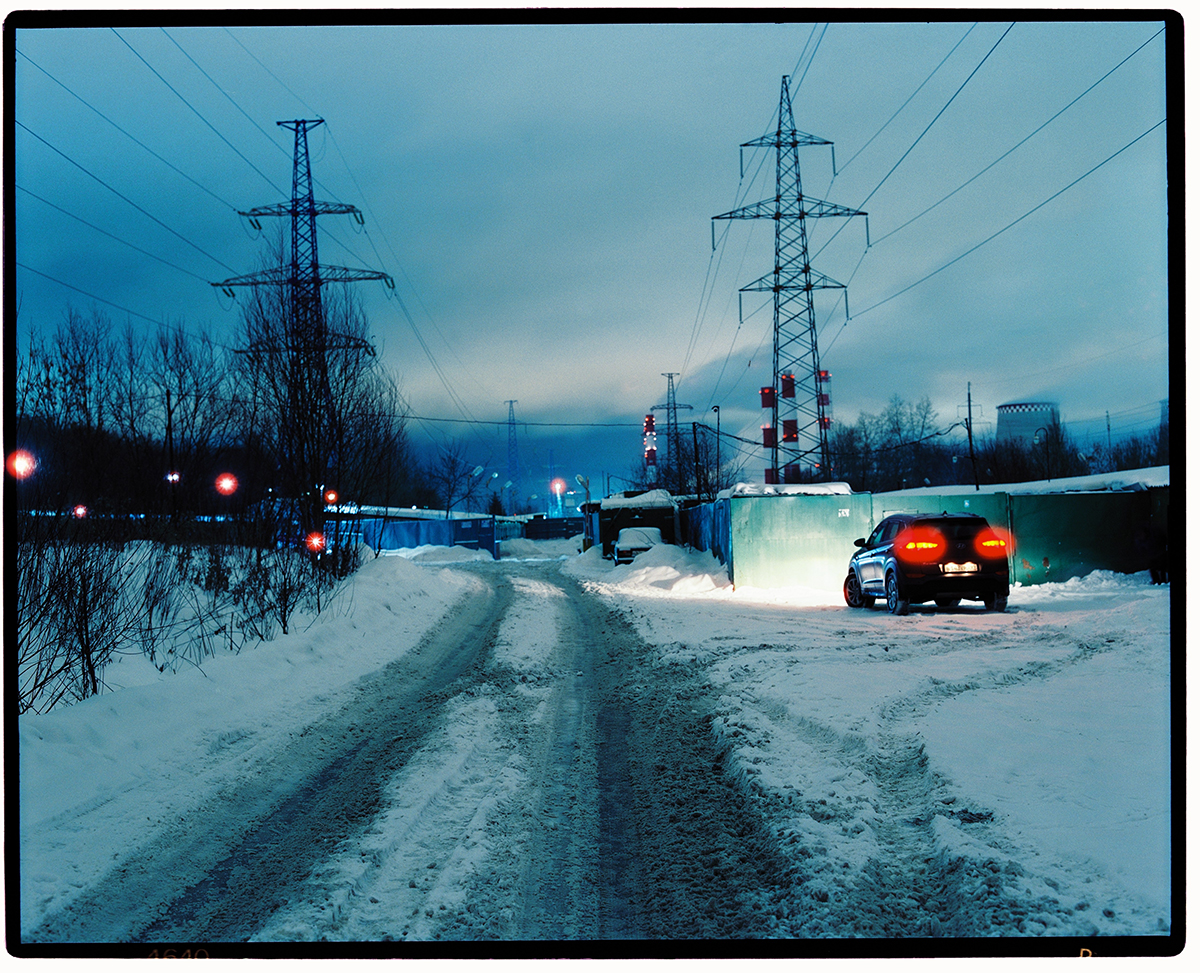
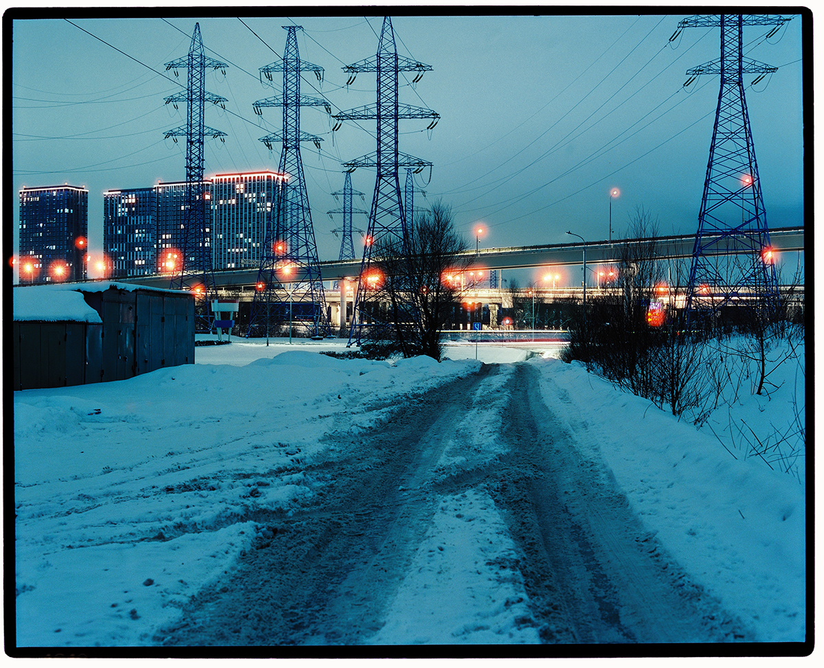
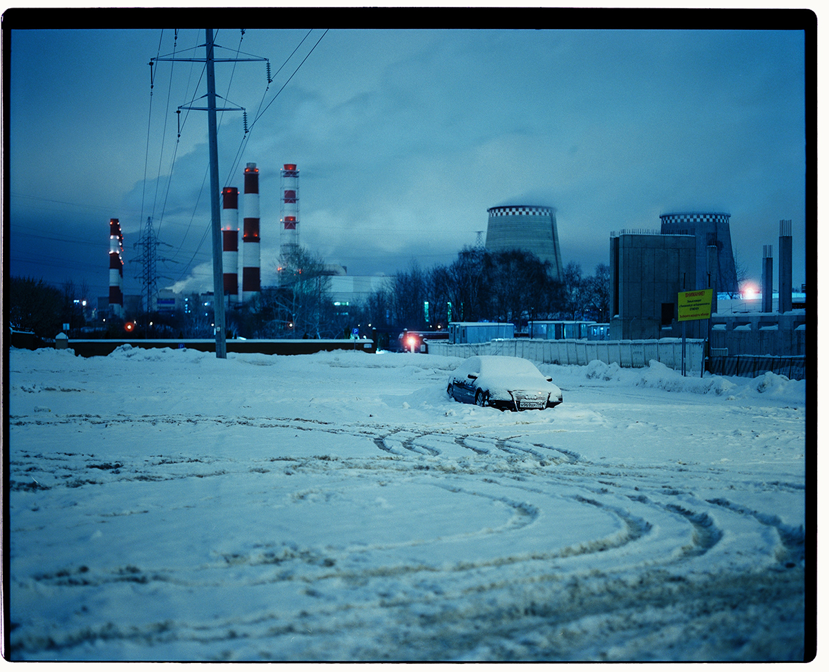
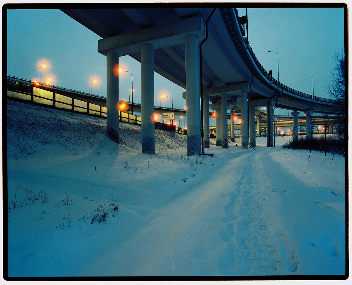
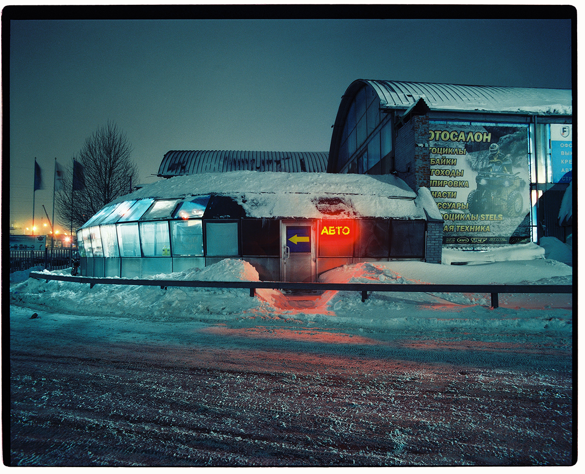
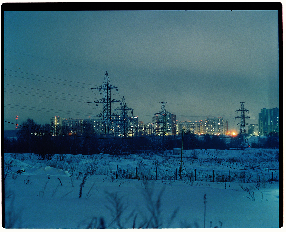
End of the Line is a personal stills project I’ve wanted to shoot in Moscow since 2013 when I lived there for two years.
I was living in the center close to the Red Square and didn’t really travel too far outside of my neighborhood. With over 17 million people living there I felt I didn’t really get a good sense of how a large percentage of the locals lived.
My plan was to travel to the end of every metro line and spend a night there to document the surrounding area in winter. Always looking over my shoulder, there was a constant sense of unease as the neighborhoods were a lot rougher than what I was used to. Battling temperatures of -20c with the sun setting at 4pm, I roamed for around 5 hours, or until I couldn’t use my fingers anymore.
What made this project more special is the fact that I have finally worked with Cinestill 800t, a film stock I’ve always wanted to use for its cinematic and moody aesthetic, combined with my Pentax 67II.
APE contributor Suzanne Sease currently works as a consultant for photographers and illustrators around the world. She has been involved in the photography and illustration industry since the mid 80s. After establishing the art-buying department at The Martin Agency, then working for Kaplan-Thaler, Capital One, Best Buy and numerous smaller agencies and companies, she decided to be a consultant in 1999. She has a Twitter feed with helpful marketing information because she believes that marketing should be driven by brand and not by specialty. Follow her at @SuzanneSease. Instagram
Success is more than a matter of your talent. It’s also a matter of doing a better job presenting it. And that is what I do with decades of agency and in-house experience.
Concept: Architectural and Lifestyle images of employees within an office.
Licensing: Collateral use of up to 12 images in perpetuity.
Photographer: Interiors, architecture, and lifestyle specialist.
Client: Interior design firm.
I recently helped a NYC-based photographer quote on and negotiate a project for an interior design firm that had just finished a 3-floor redesign of the office space of a well-known social media company. The creative deck from the design firm described images of people working, drinking, eating, and utilizing the newly designed vast spaces. The final use of the photography would be web and print materials to promote the design firm’s portfolio. It was requested that the licensing would be conveyed to the social media company as well. While reviewing the initial shot list and scope of the project with the client, the photographer estimated this would need to be accomplished over 3 shoot days. The client requested this be completed within 2 shoot days due to the location and staff needs. Once we revised the shot list with the client, we let them know this could be accomplished in 2 days, with overtime on one 12-hour day. The client let us know that no production support was needed, as they would be handling all location(s), location coordination, location styling, employee/talent coordination, wardrobe/hair/makeup styling, crew meals and craft services, and necessary medicines, and COVID safety protocols. We included a Client Provisions section within the Job Description to note who would be handling these items.
Here is the estimate:
Fees
The client would be handling all production elements and requested an estimate for up to 12 images taken over a two-day shoot. The client had previously hired the photographer and was accustomed to a $ 3,000-day rate. This was noted in some of the first notes from the client. I put the fees at $700 per image, for each of the 12 images, for perpetual collateral use. The images and the established “day rate” totaled $14,400. Our estimate included a line stating the cost of additional images to be $800 each including up to 1 hour of retouching. I added $750 for the photographer to attend a tech scout day.
Crew
We added the first assistant to help with lighting and camera equipment management and to attend the tech scout day to familiarize themselves with the shoot needs and help advise on equipment needs. We also added a digital tech to manage the files and display the content to the client as it was being captured. We added 2 hours of overtime for these two positions at 1.5x their hourly rate. These fees were consistent with previous rates the photographer had paid their team on past productions.
Equipment
We included $3,200 for cameras, grip, and lighting rentals. The photographer brought their own cameras, lenses, and lighting, and intended to rent some supplemental lighting, grip, and a few specific modifiers and other specialty items from a local rental house. The digital tech estimated $650/day for their workstation rental and we also included $350 for three hard drives.
Miscellaneous
We included $700 for insurance based on client-provided specific insurance requirements that were a little outside of the photographer’s existing policy coverages. We also added $500 to cover taxis, additional meals, and any other small expenses.
Post Production
We added $1000 for the photographer to perform the First Edit for Client Review. Even though there would be a digital tech on set, we estimated that going through two days of photography, the compositing mock-ups needed, client delivery of roughs, and client calls discussing the images, would take 8-10 hours. We also included retouching for the 12 images at $150/hr.
Results
The photographer was awarded the project, and the shoot was a phenomenal success! The client was thrilled with the final work and added two additional images to the final license order.
Heidi: How have you used your talent as a photographer to reframe climate messaging and the grassroots narrative?
Dani: My whole life has changed in the small moments where I am shown the way—often through firsthand experiences, photos, stories, and films. This is why I am a storyteller—to try and share some of the insights and experiences I have been privileged to have with others.
In 2018, for example, I went to stand with the protectors (kia’i) of Mauna Kea with Nikki Sanchez (the writer on the story included in this interview) I was first introduced to the concept of “kapu aloha” and was honored to be immersed in a space where this love-based conduct was being practiced, in combination with regular ceremony and teachings. I had a stark realization of how different things could be. This forever changed me—who I am as a storyteller, as a leader, and as a human. Similarly, with this story for Patagonia about matriarchy and intergenerational knowledge transfer featuring Kayah George of the Tsleil-Waututh nation, I learned so much; from the community’s gentle ways, to their strong and steady approach to fighting battles against monstrous entities, to their songs and connections to the orca whales. This is why I feel it’s so important to tell stories about people and communities that hold knowledge that many of us have become disconnected from through the impacts of colonialism. This knowledge—which each of us has from our own lineages—is what I know in my heart contains the keys to our future.
It’s obvious that we need to “do something” to mitigate climate change and protect natural habitats (our best bet is truly to keep intact what we have as much as possible—we are only beginning to understand the value and complexity of ecosystems and their services), but more importantly we need to address the underlying cause, which is disconnected human behaviour motivated by greed, consumption, capitalism, and other values that are not in alignment with a healthy and abundant planet for all. Further, this conditioned, colonial mindset disregards our innate oneness and interconnectedness to all things, which is a key underlying concept in many Indigenous teachings.
We humans are social learners who also mimic each other, so to address the toxicity that we have become so accustomed to, and to combat social numbing and apathy, we need to see examples of how we can be; see what becomes possible when we reconnect to our reverence for sacredness.
What was your biggest challenge and biggest celebration? My biggest challenges in this story were a) getting into freezing cold water in a dry suit to document some of the images; and b) trusting that everything would turn out how it needed to. We had challenges with weather and time, and sometimes the process of surrender also feels like a celebration. It’s been really special to me to get to know Kayah more deeply.
How much did your studies, research and various degrees inform your approach to photography? Quite a bit. I studied conservation biology, psychology, and did an MSc in Environment and Development. I learned a lot about critical thinking, and learned a lot about unlearning. There was something about the way I was being taught, what I was being taught, particularly in my undergraduate degree that I found really unsettling. I found myself questioning a lot more than we were being asked to—Why were the sources so limited? Why were we constantly referencing white conservationists and applauding trophy hunting and amplifying racist views about Indigenous peoples and their knowledge? I always loved Vandana Shiva’s groundbreaking work, for example, but her ideas on eco feminism were literally laughed at by some of my professors. In this way, we become conditioned. So while I sought out knowledge about how to protect the planet (from ourselves), I wasn’t satisfied by what I was learning in school on multiple levels.
I do find myself also applying a lot of my psychology background in my work. Systemic change is what is truly needed for us to make any significant changes, and for systemic change to occur, we need political will. Political will comes from the power of the people and our dollars.
For us to know our political power, I believe it helps to be intrinsically motivated—to cultivate an appreciation for personal and community growth, purpose, curiosity, cooperation, enjoyment, and expression. Intrinsic motivation essentially involves doing something because it’s personally rewarding, versus extrinsic motivation, which involves doing something to earn a reward or avoid punishment. Extrinsic values seem to be more closely related with a capitalist approach where we are constantly given messaging about what to buy or how to change ourselves, to be “winners,” to engage in competition, and to earn perks and benefits in exchange for a behaviour. My studies into psychology have revealed that the more we strengthen extrinsic motivation, the more we weaken intrinsic motivation and vice versa. Most communications today strengthen extrinsic motivation, yet there is a real case to be made for strengthening intrinsic motivation for us to be the change we hope to see.
Shifting the values of the dominant culture is not easy. The dominant culture values consumption, capitalism, exploitation, convenience, comfort, etc which are not aligned with the values needed to support all beings into the future in a healthy way. I see the majority of climate change messaging as being very “distant” to most humans, and very difficult to relate to. To bring it closer to the heart means moving people to recall their own connection with all that is sacred, and to foster a reverence for this beautiful creation we are a part of.
Photography has allowed me to learn so much by being a witness and understanding peoples’ lives and stories.
What behavior change or mindset do you hope to challenge with this work? I personally see it as my responsibility as a settler in so-called Canada to do whatever I can in exchange for living here as a treaty person, and I urge those situated on unceded land (95% of so-called British Columbia is unceded yet settlers keep taking up residence there, and the coastlines continue getting affected by oil spills/toxicity, noise and light pollution, development, etc.) to think about their obligations as guests.
My hope is threefold:
1) To further the collective healing process (Recently, our MPs voted unanimously to name what has happened in so-called Canada with residential schools a genocide that has affected Indigenous peoples across the nation, and acknowledging the harm is an important step);
2) To ensure the Tsleil-Waututh know they are not alone in their fight to stop the TMX pipeline expansion and other extractive entities from destroying the land and putting the inlet and their kin (human and non-human) at risk from oil spills and other disasters. They need much more support from settlers. This is not just their fight, it’s all of our fight. And what’s at stake canning be replaced.
3) That settler audiences will see these stories and do their part to advocate through their votes and voices. Indigenous people are responsible for protecting 80% of the biodiversity on the earth but make up only 5% of the population. Science is only beginning to catch up to what Indigenous people have already known. They also make up 5% of the population in so-called Canada but make up a disproportionate percentage of prison populations, suicides, children in foster care, and violence against women due to the prevalence of systemic racism and colonized mentalities.
I mention this today, because unfortunately, I was proven right about something insidious, and we’re going to talk about it.
In the past two weeks, we also saw a cultural firestorm lit by my nemesis: Kyrie Irving.
As my family, (and Twitter,) can attest, for the past couple of years, I’ve been telling anyone who would listen that the Brooklyn Nets point guard was probably Bipolar, certainly narcissistic, and happy to torch any NBA team dumb enough to pay him tens of millions of dollars.
I was shouted down by everyone, who insisted the Brooklyn Nets would win so many titles, it would be worth appeasing an asshole.
Fast-forward to 2022, and the Nets, (for whom I’ve rooted since I was a boy,) a team mired in decades of mostly-losing, temporarily became the most hated team on Earth.
After two years of drama that would make Kurt Sutter blush, only then did things amp up a notch.
Kyrie Irving, (who by now has caused numerous controversies since I first went public with my critique,) promoted a virulently antisemitic film playing on Amazon Prime, and then he doubled down on his transgression.
He refused to apologize, while he gave a massive cultural boost to dangerous, antisemitic theories, which denigrated Jews, and then smugly claimed, “I cannot be antisemitic if I know where I come from,” which was code for:
Black people are the real Jews, and therefore can’t be antisemitic, because the people claiming to be Jews are actually imposter slave-masters.
It’s not like it’s any crazier than theories about the Rapture, but that is one dangerous, hateful, insane ideology.
My man Kyrie has dogged the media for years, calling us pawns, and worse, so now that he came after me as Jew too, I went full boycott.
Fuck that guy.
(Though I did watch Wednesday night’s drubbing of the cross-town rival NY Knicks, because the Nets finally suspended Kyrie Irving.)
Antisemitism is everywhere now, unfortunately, but it felt really scary when I called out art for antisemitism, for the first time, last September.
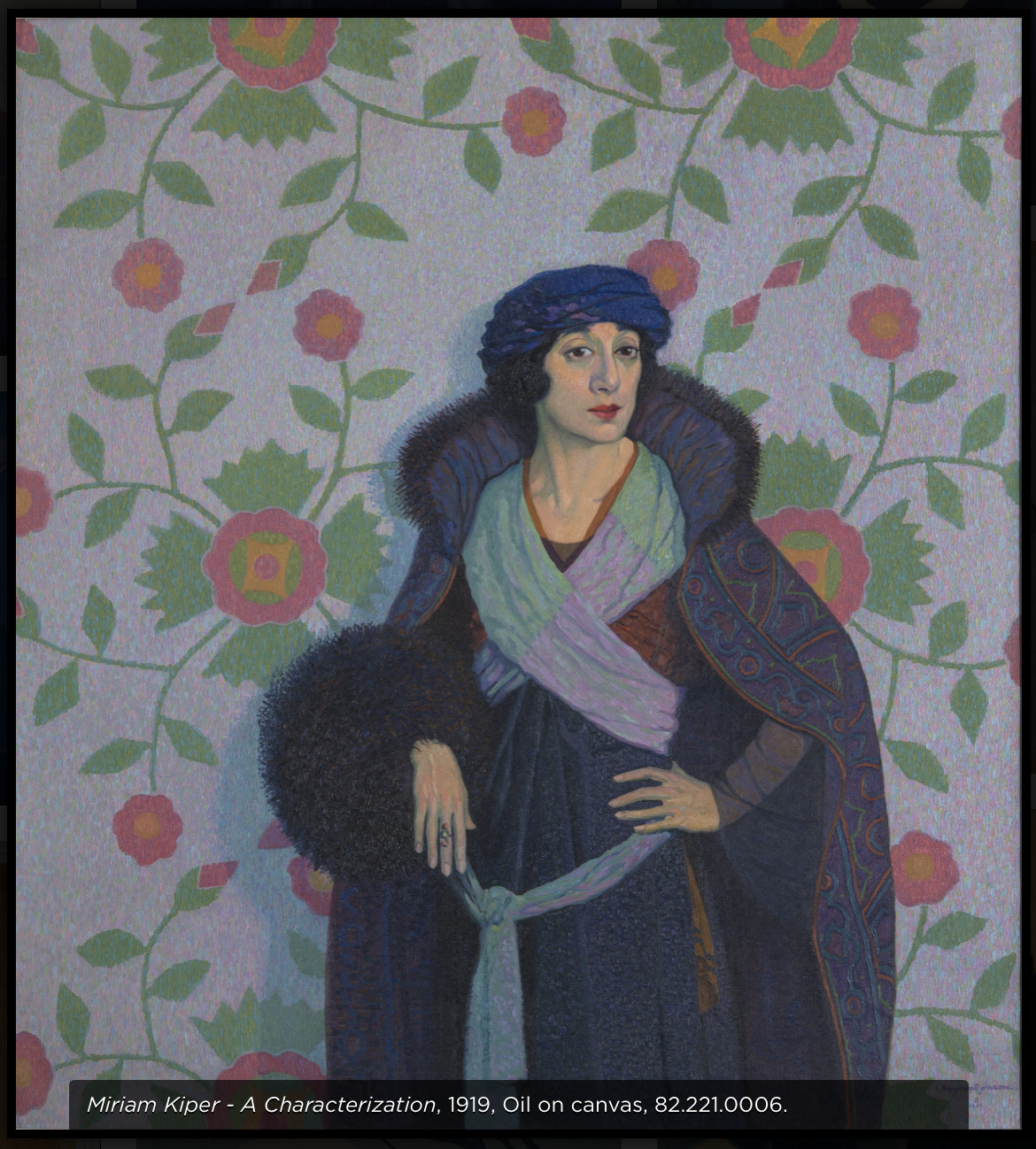
I saw a painting by Raymond Johnson, at the UNM Art Museum, a characterization of a Jewish woman from 1919, and it set off a weird Spider Sense in my head.
(Not a good one.)
Suggesting that such an ancient prejudice might accidentally show up in the uber-liberal art world, under the cover of “we didn’t realize it,” seemed a bit of a reach.
A month later, I had the same feeling at the Art Institute of Chicago, from a David Hockney painting.
If you want to make fun of rich collectors, sure go ahead. But when you title the painting in such a way that is has a Jewish name associated, it becomes a trope.
And yet again, in March 2022, at the San Francisco Art Institute, I told you all about Diego Rivera using a “trope” in one of his murals.
He put the short, hook-nosed Jew at the literal center of a Capitalist cabal.
(Doesn’t get more trope-y than than.)
So now that Kanye has gone full Ye, Deathcon 3 to the Jews, and Kyrie went full bigot, do you believe me now?
Here’s the deal.
Hating people because of the color of their skin, religion, gender, choice of romantic partners, the pronoun with which they choose to be addressed…
All these forms of judgmental hatred are lame.
They’re wrong.
Bad.
Terrible.
You dig?
Israeli Jews shouldn’t hate Palestinians any more than some faction of Black Hebrew Israelites should hate American Jews.
It’s the most uncool thing a person can do.
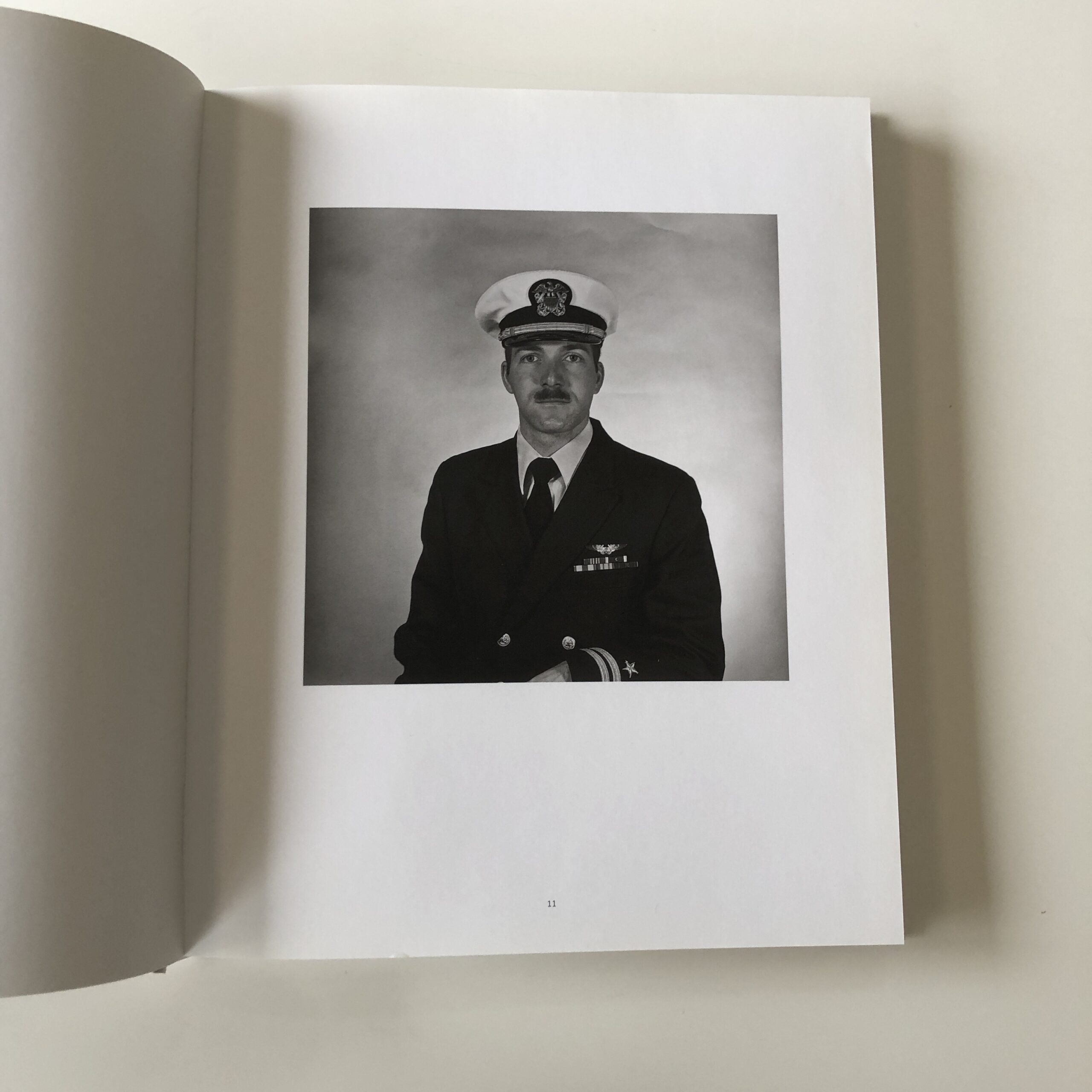
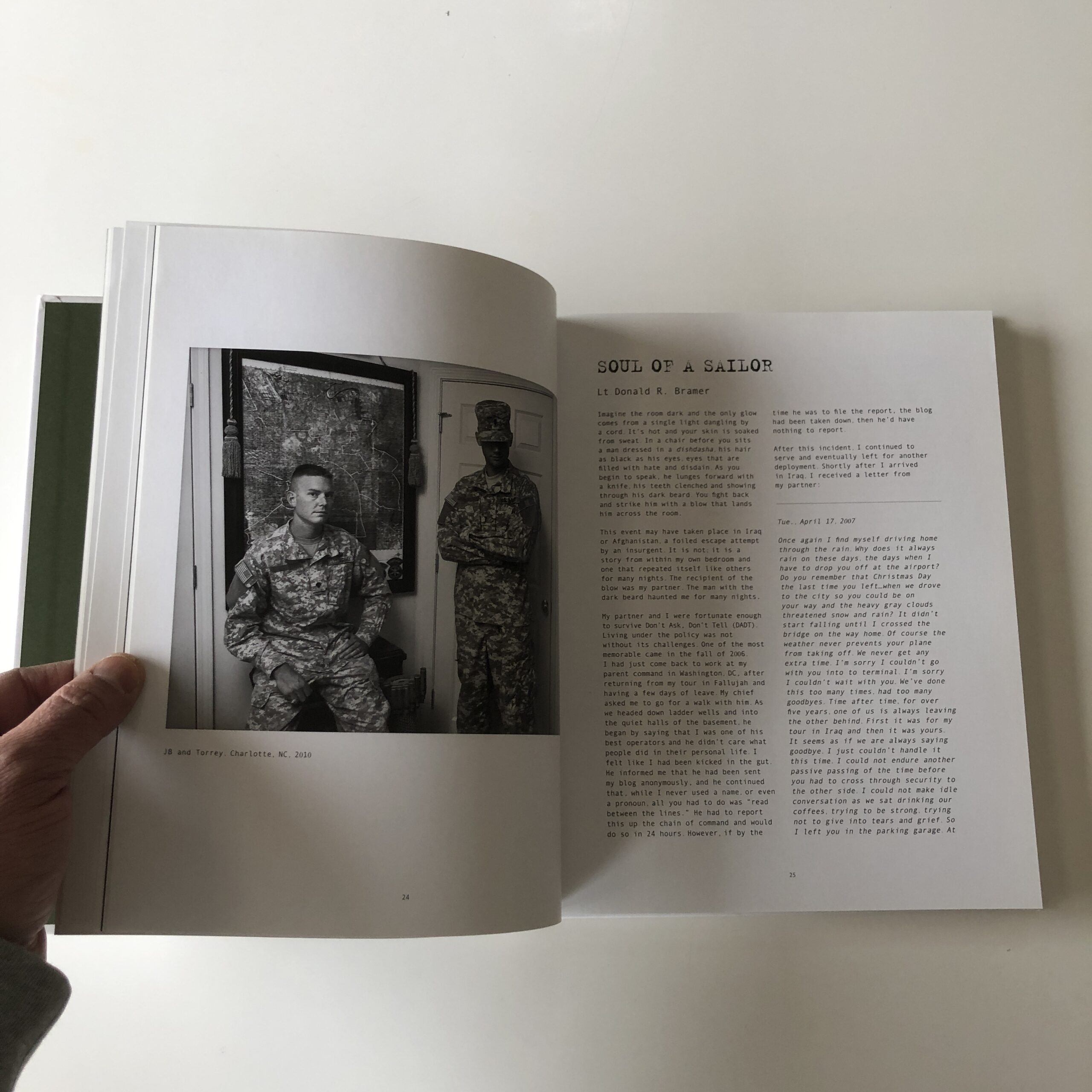
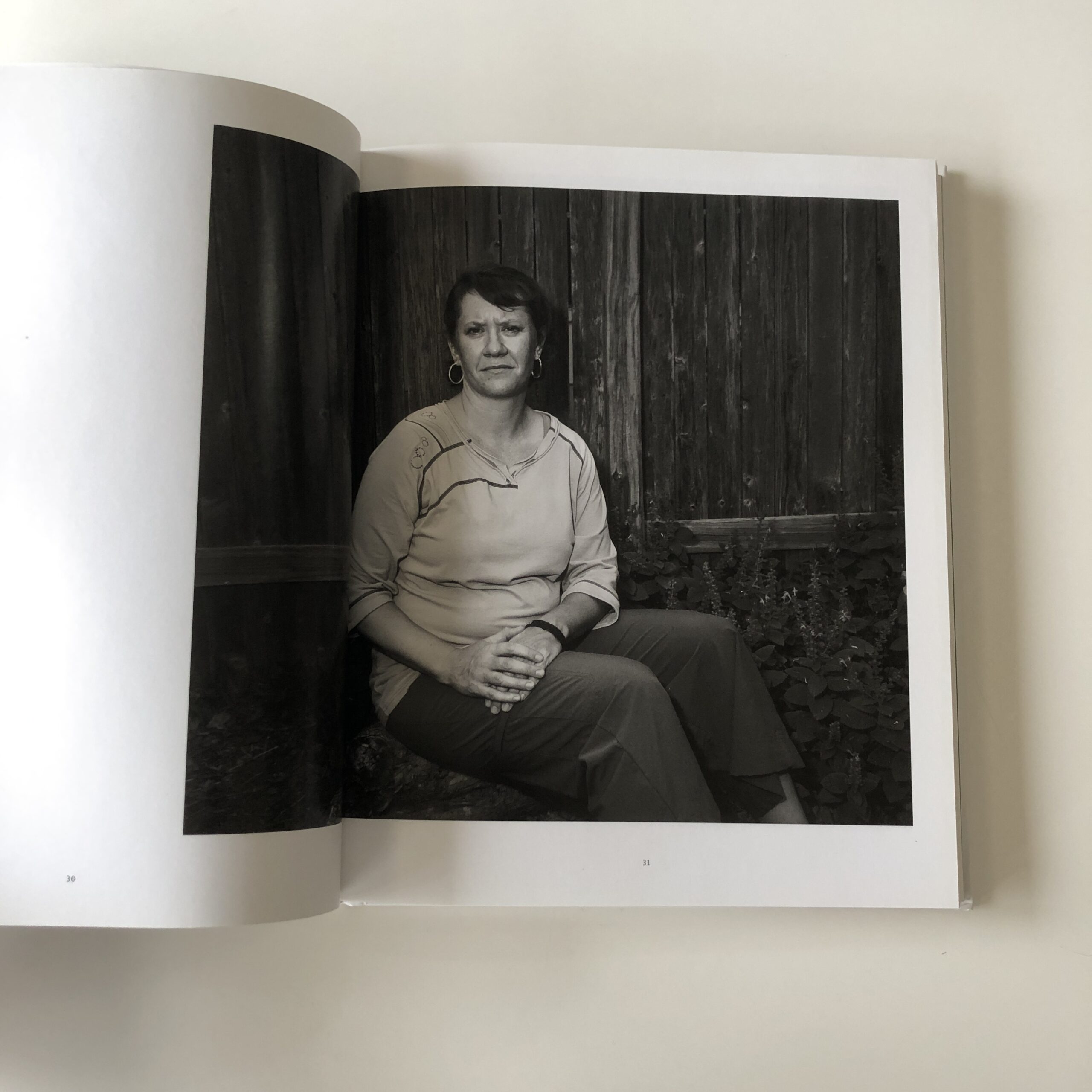
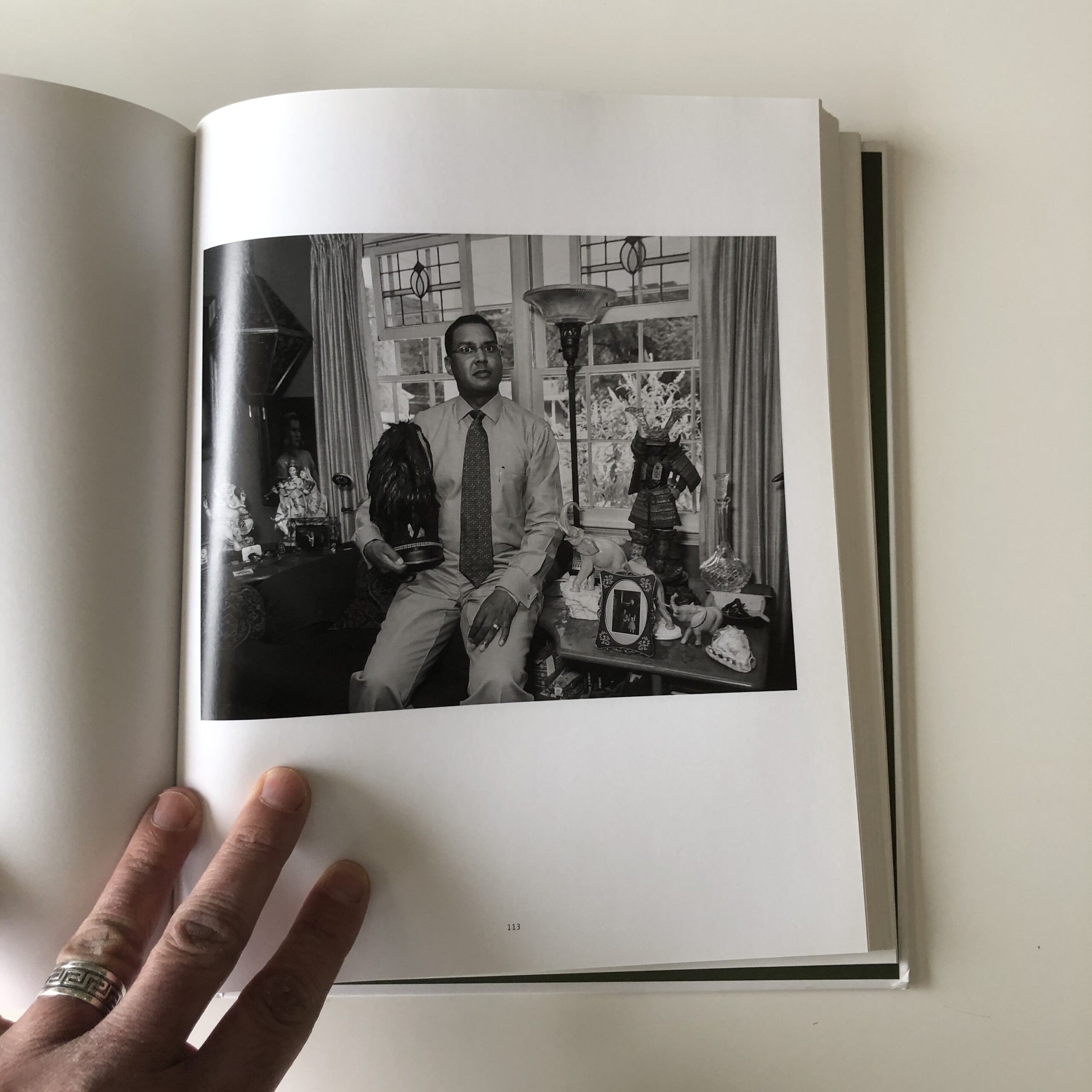
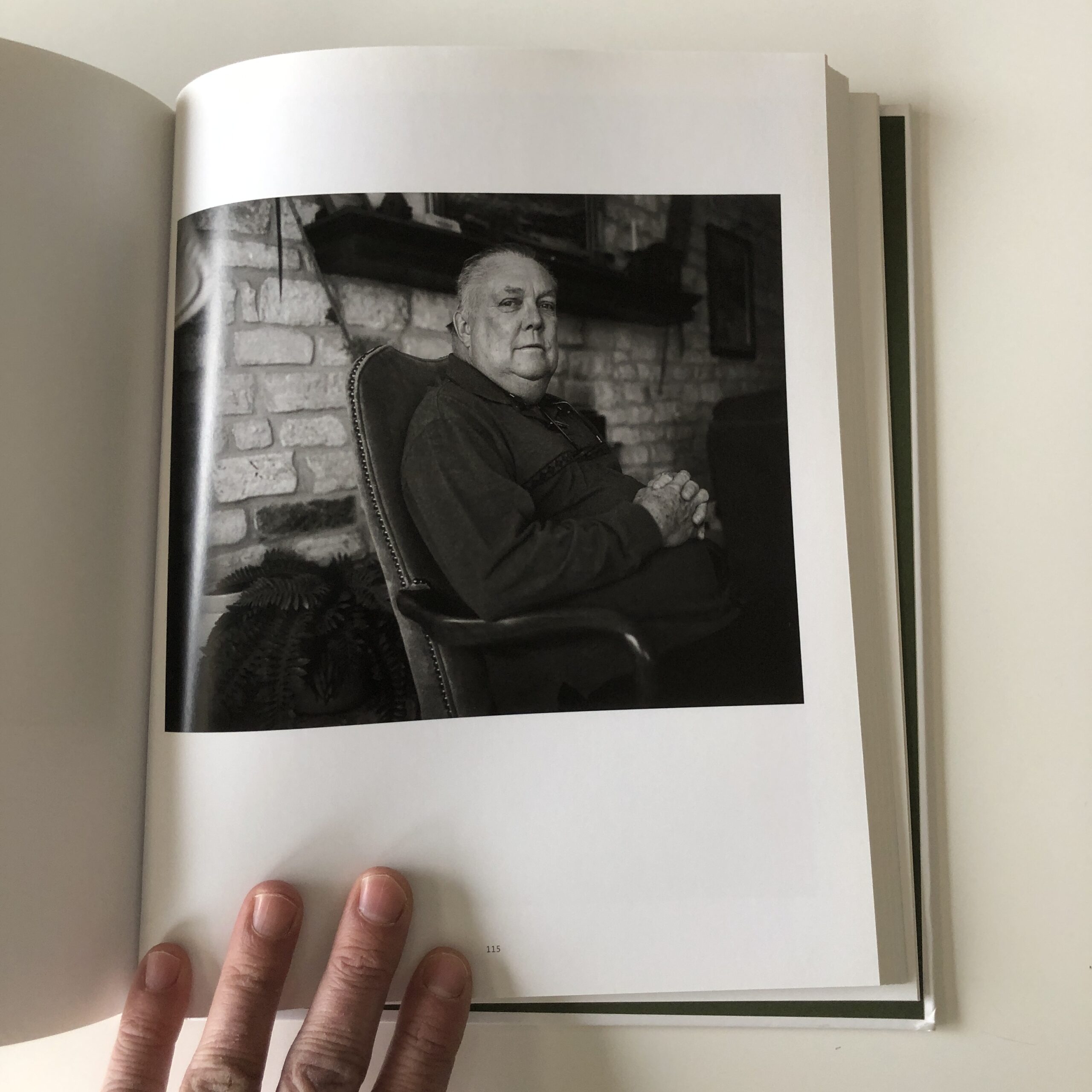
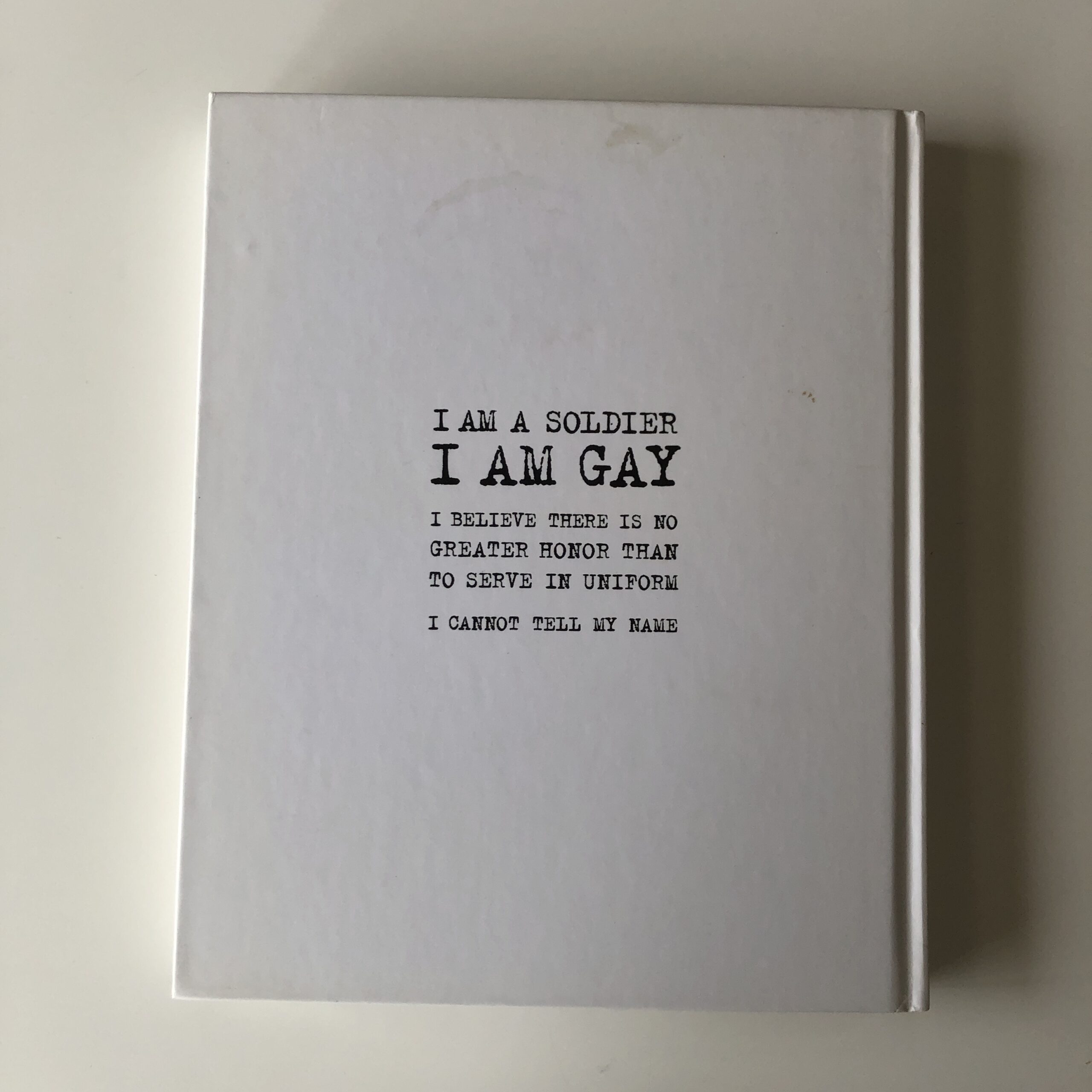
This morning, trying to find some writing inspiration, I noticed a book on my shelf that I’d never truly considered. A book given to me in a swag-bag at a portfolio review years ago, (so it wasn’t an official submission,) and who knows why I haven’t reviewed it before?
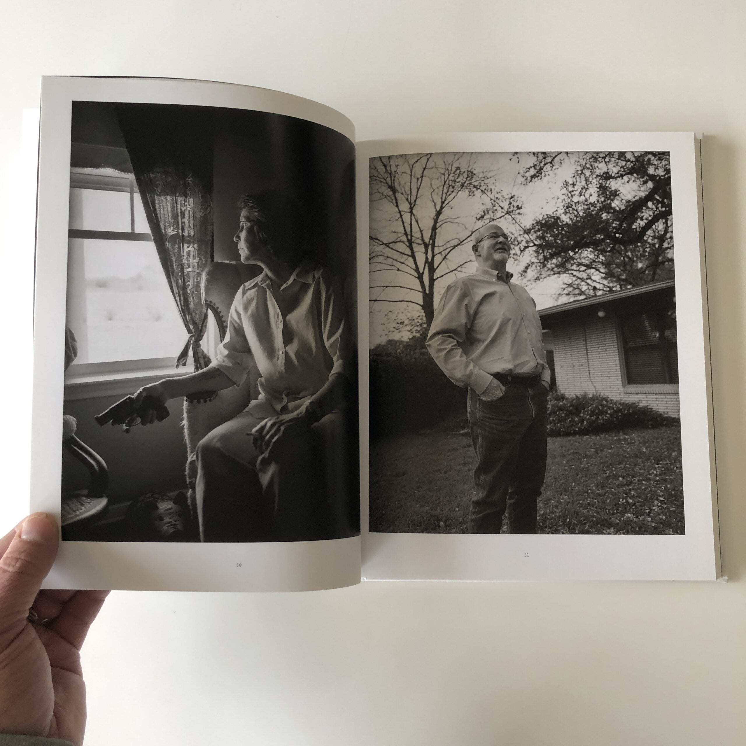
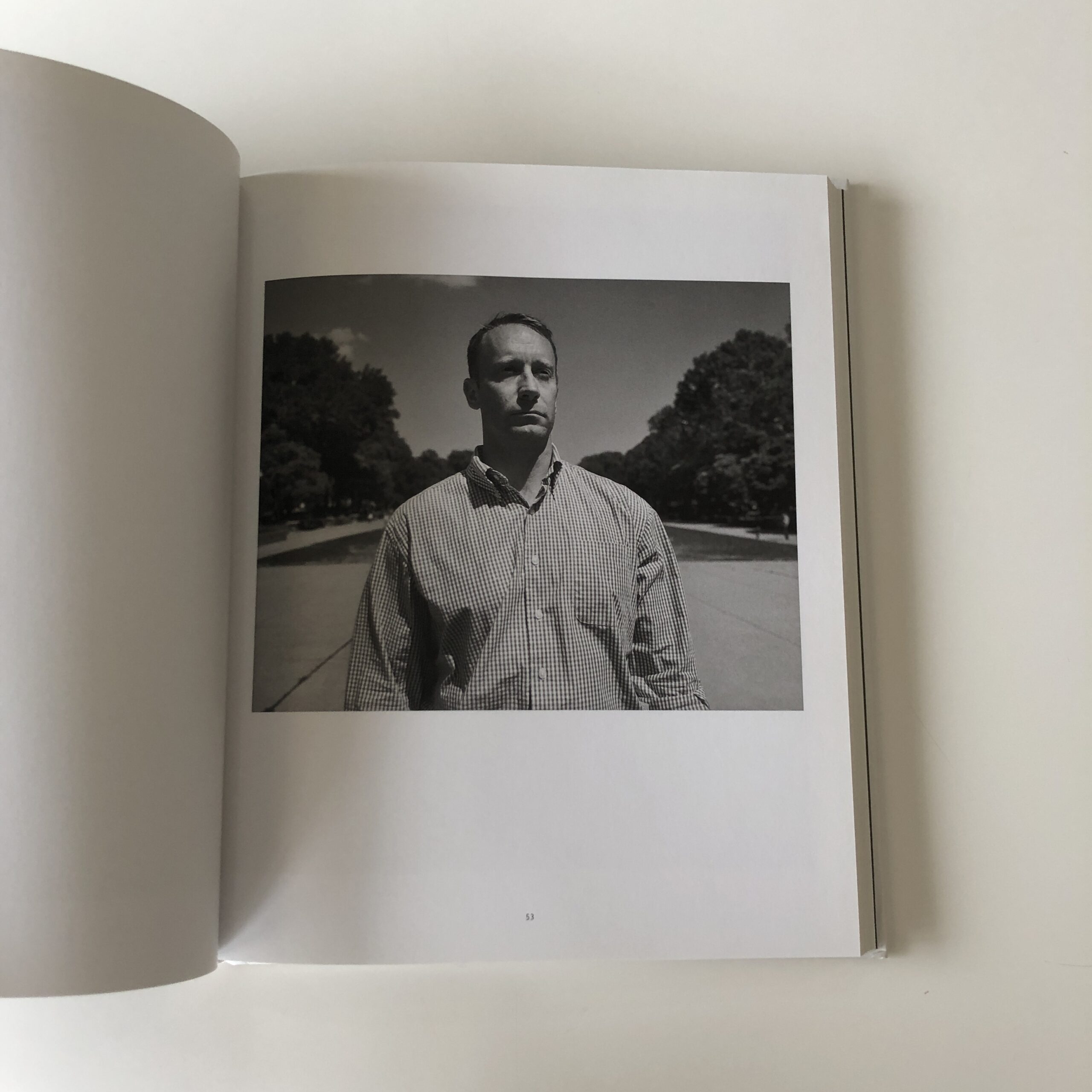
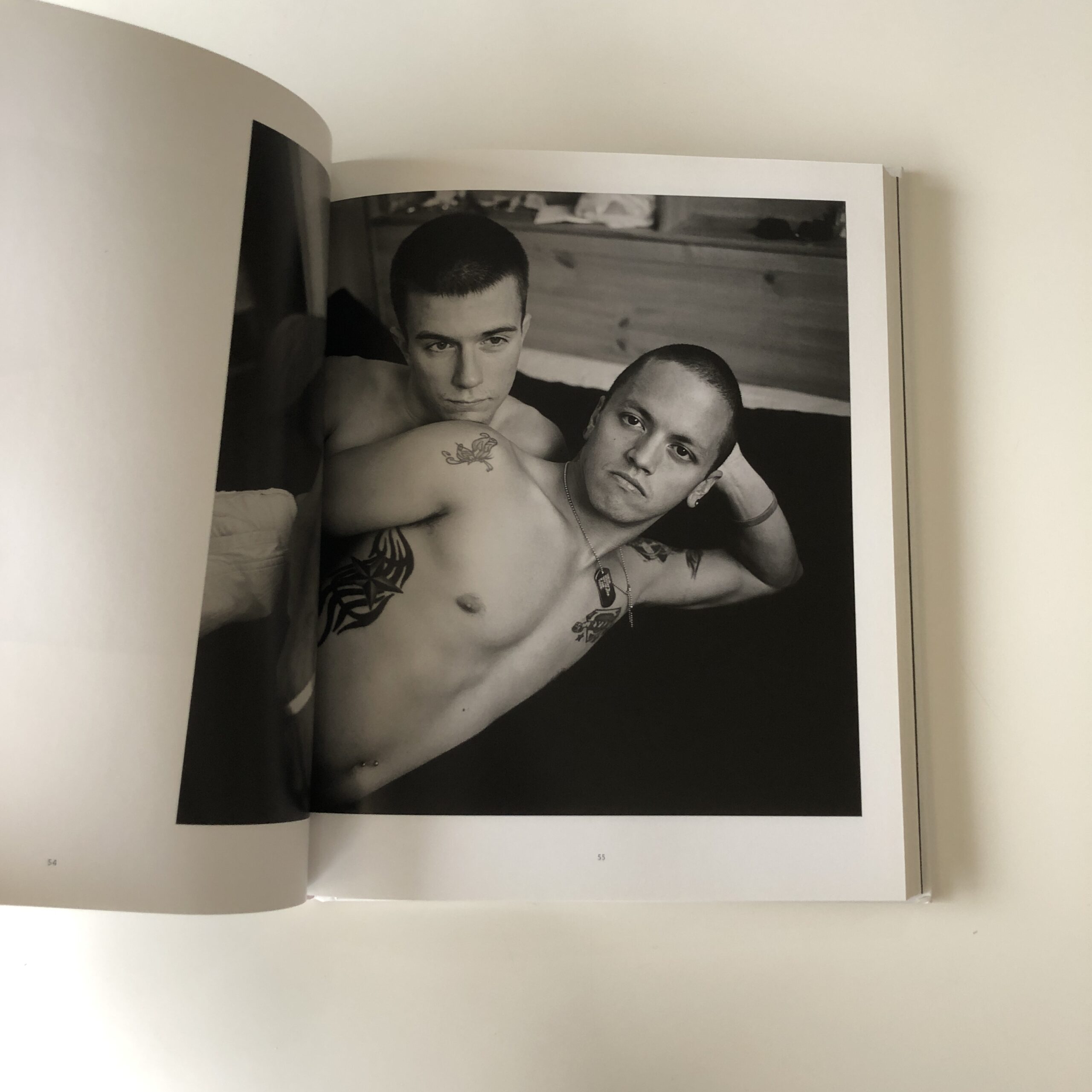
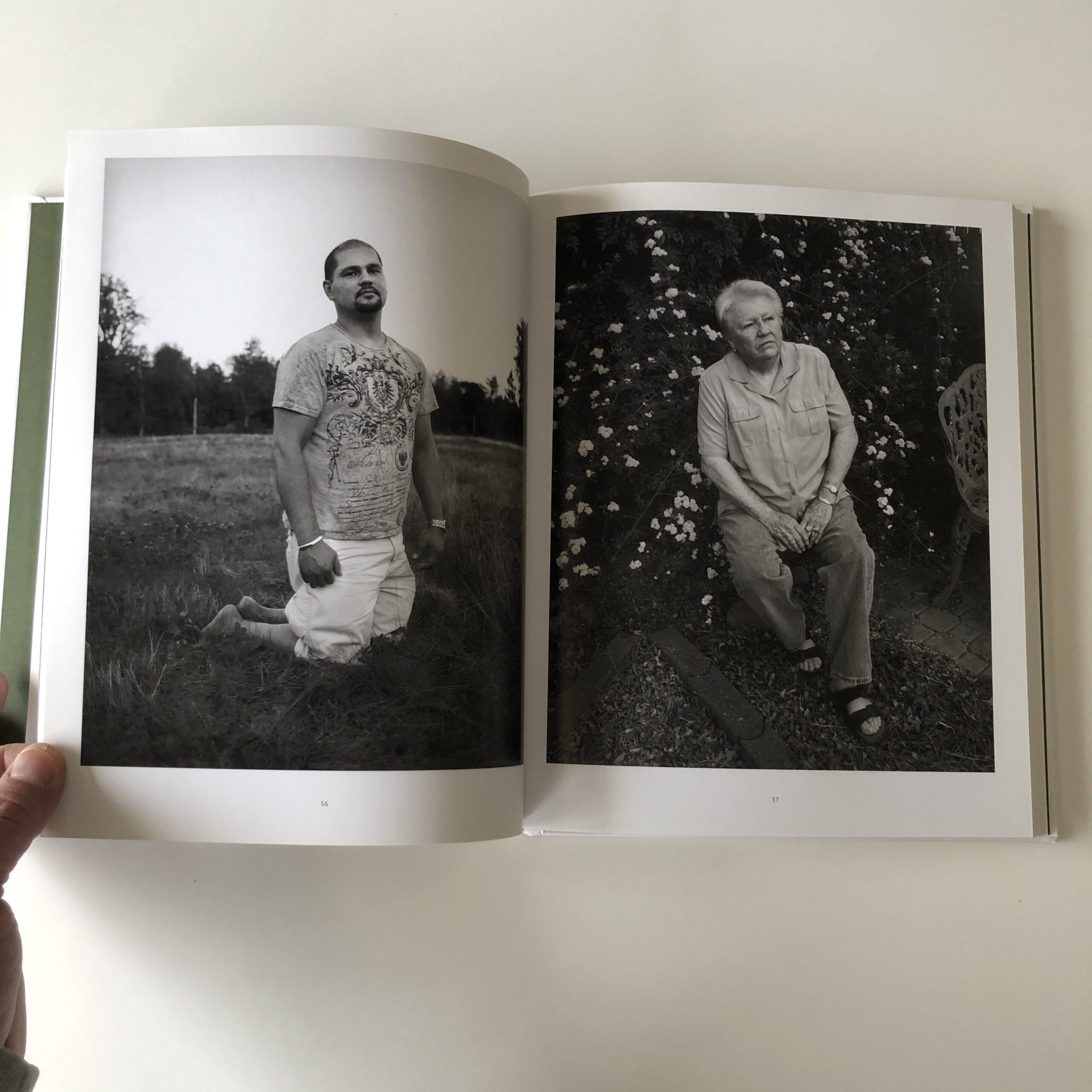
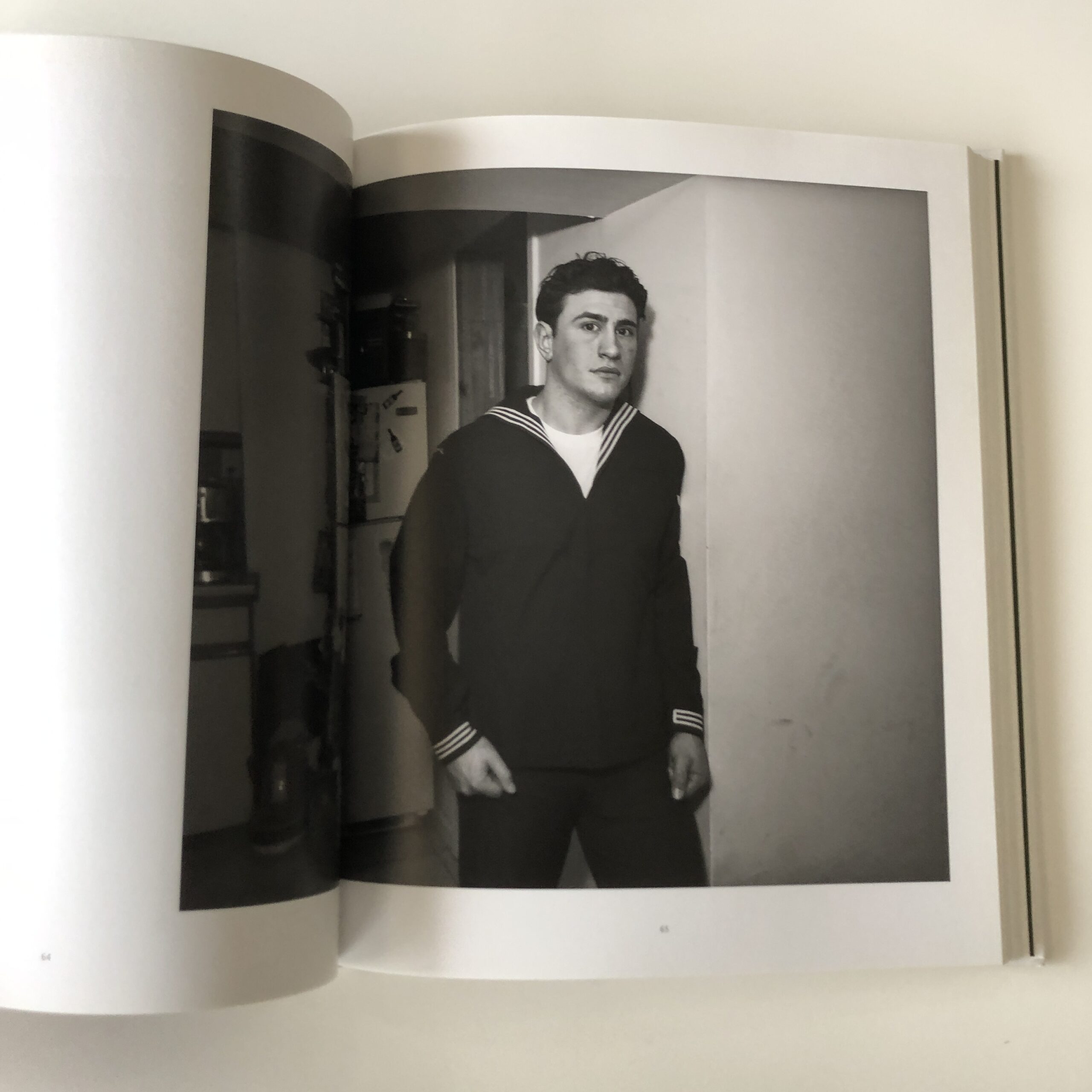
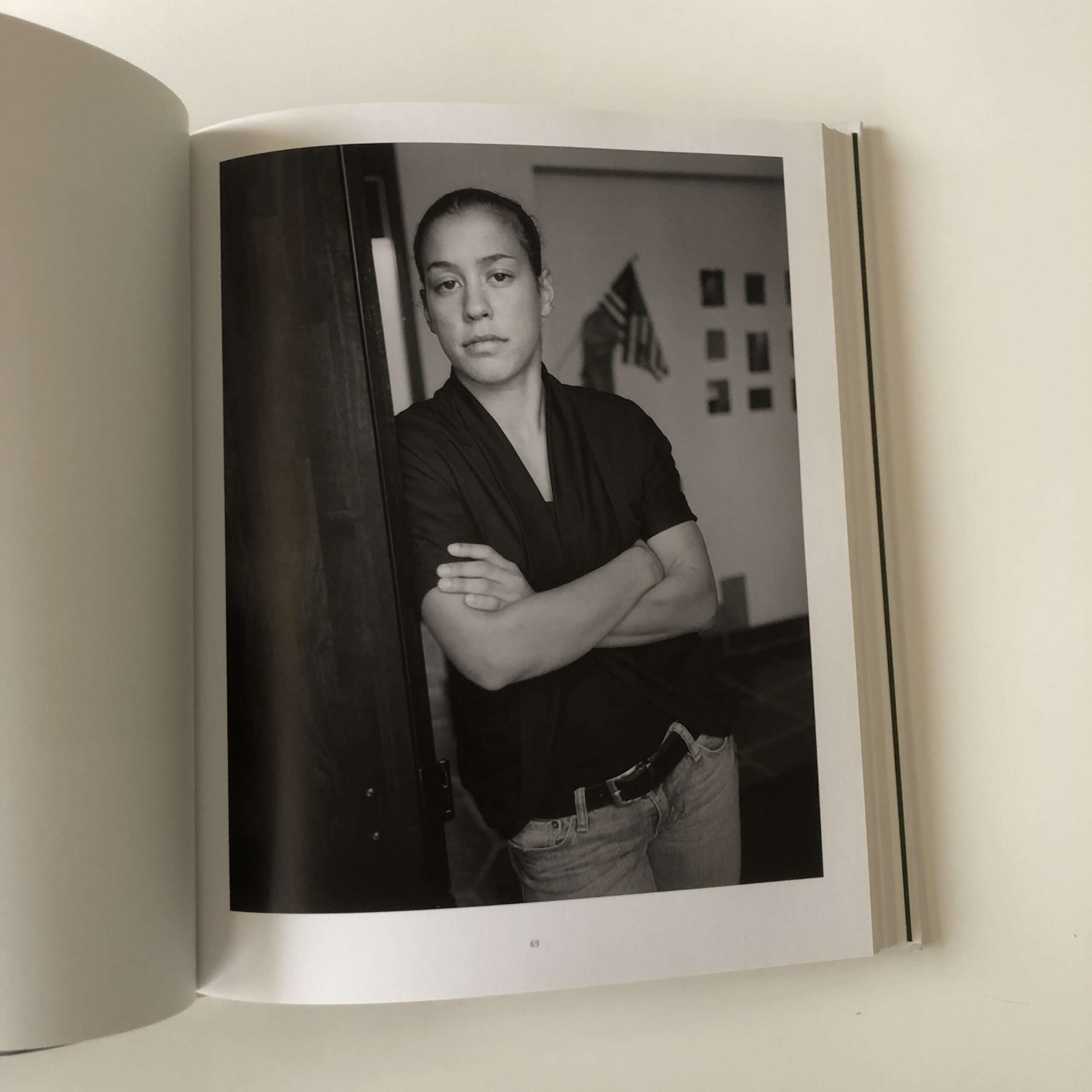
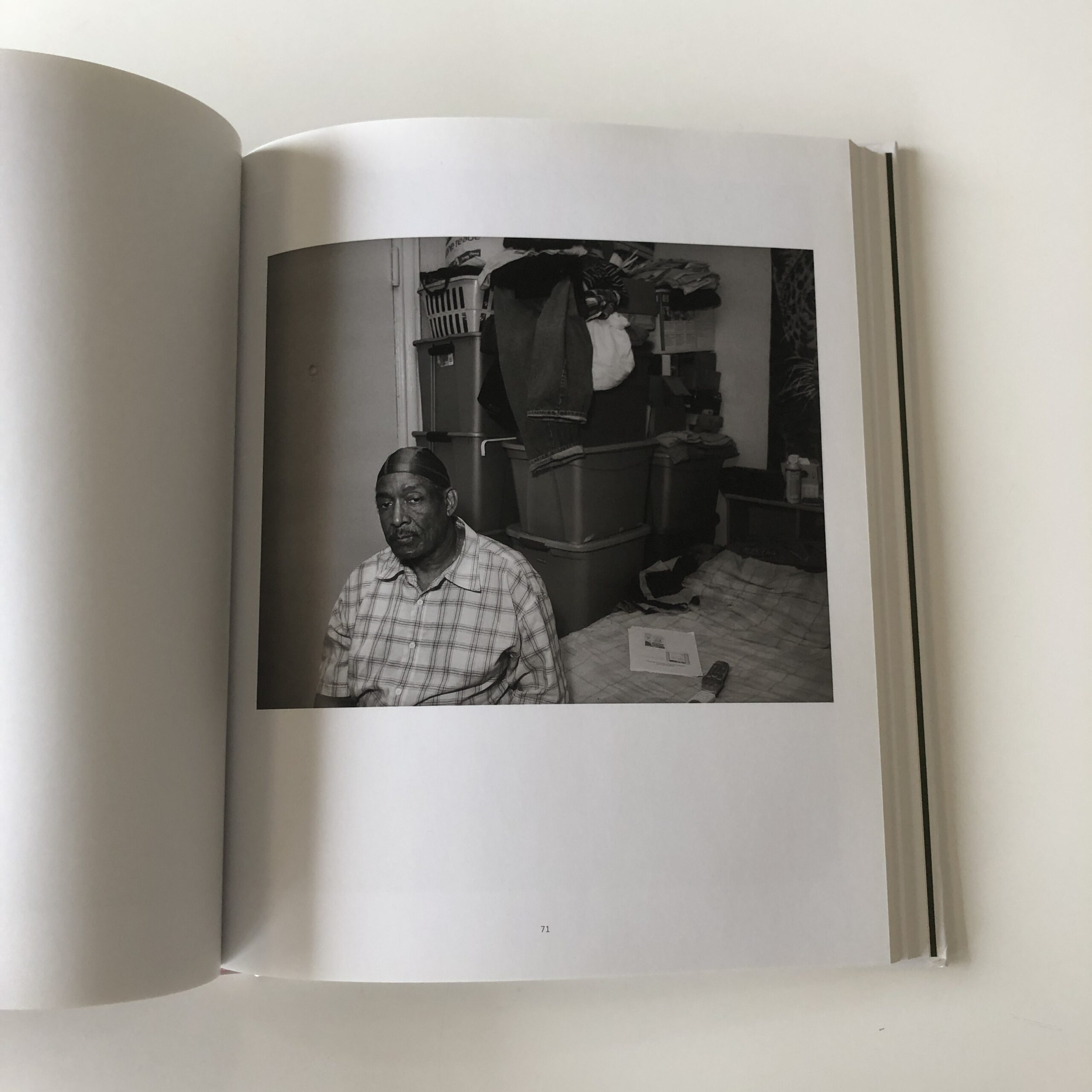
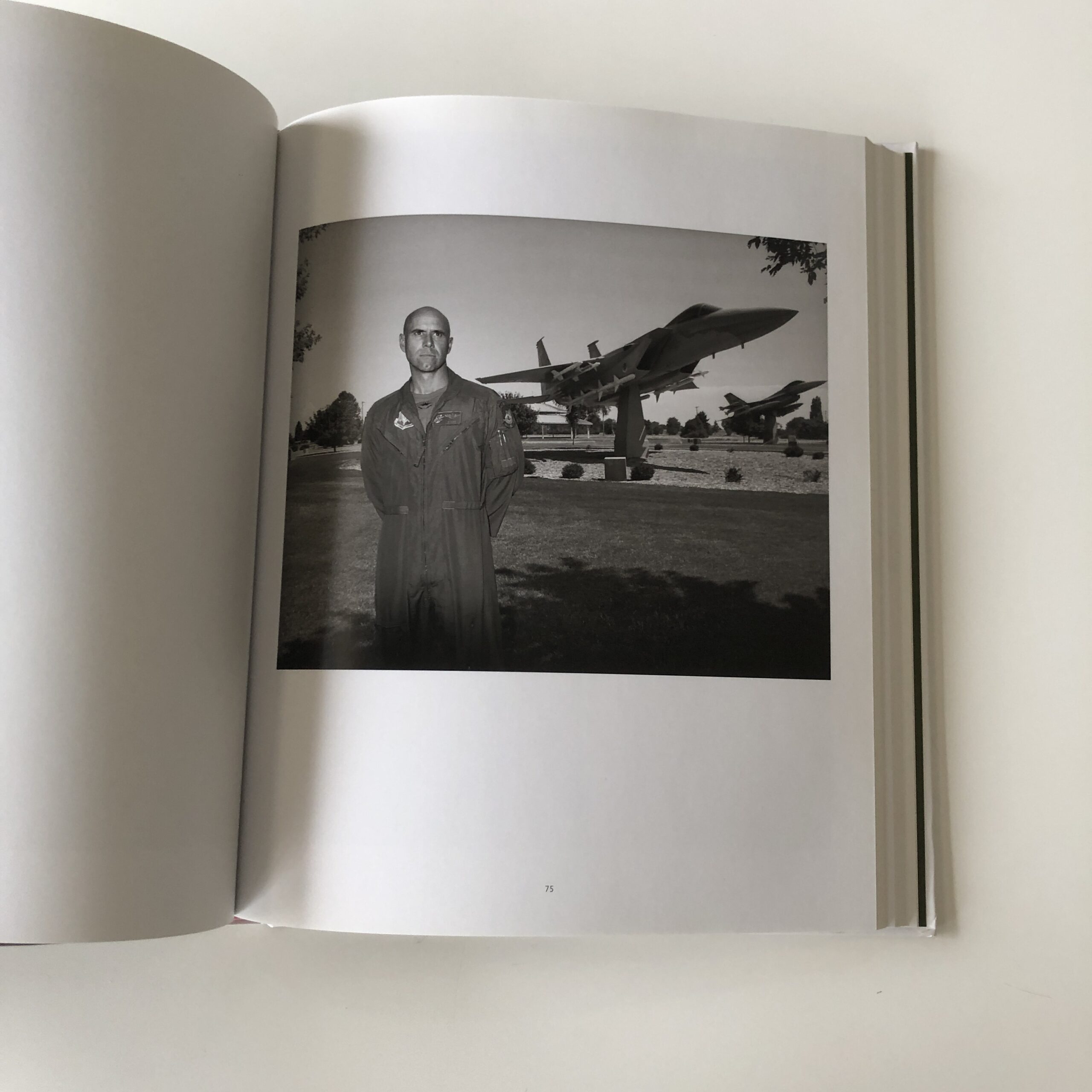
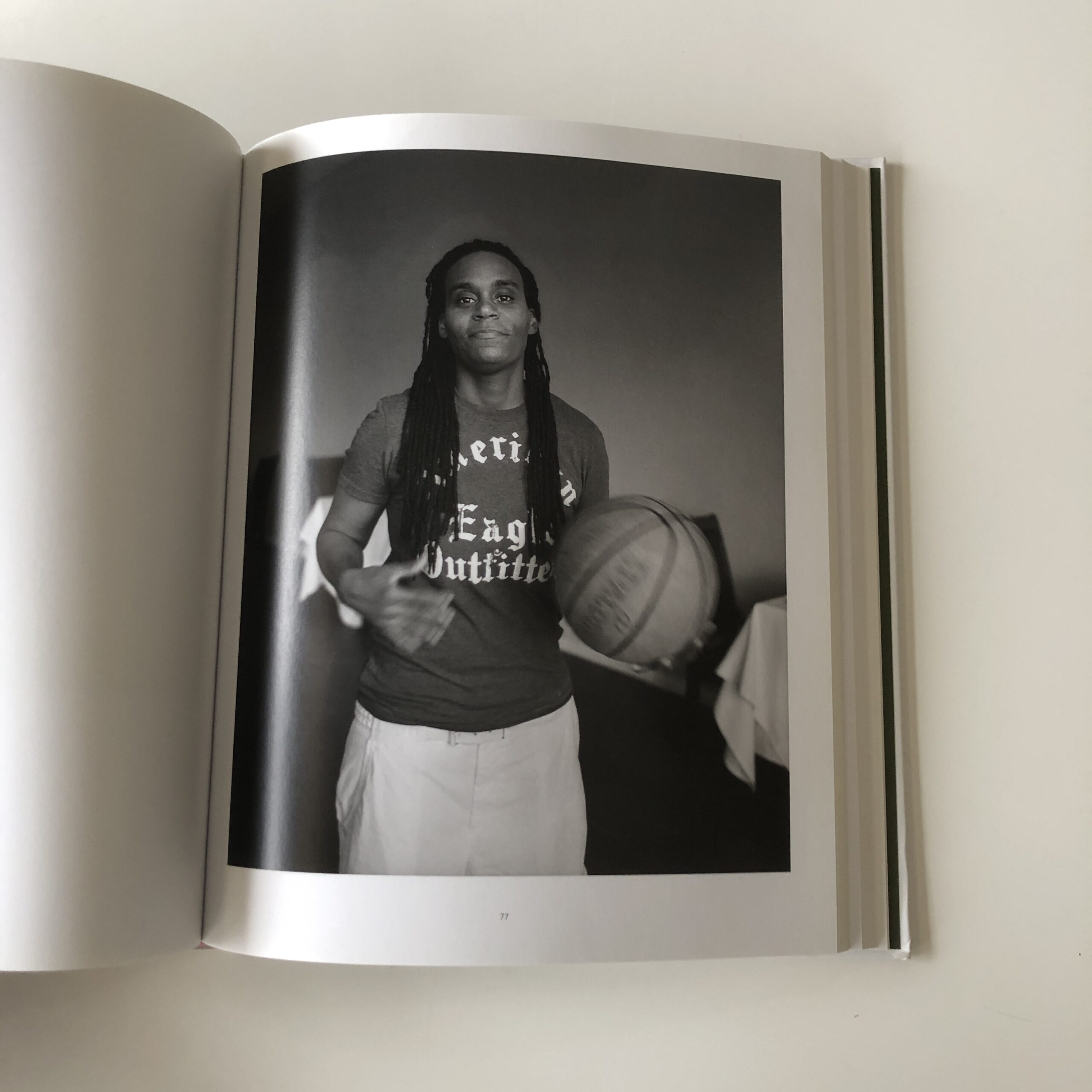
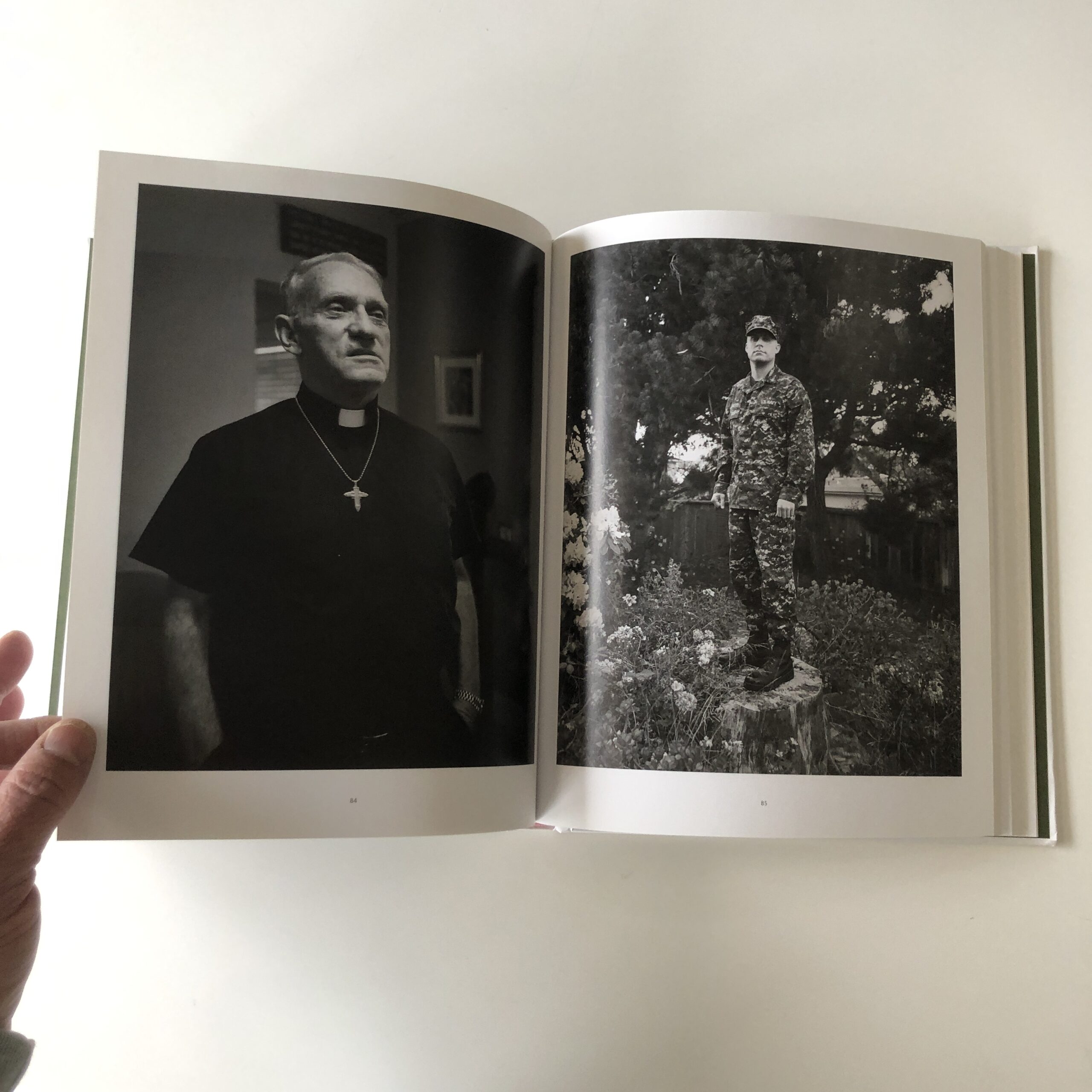
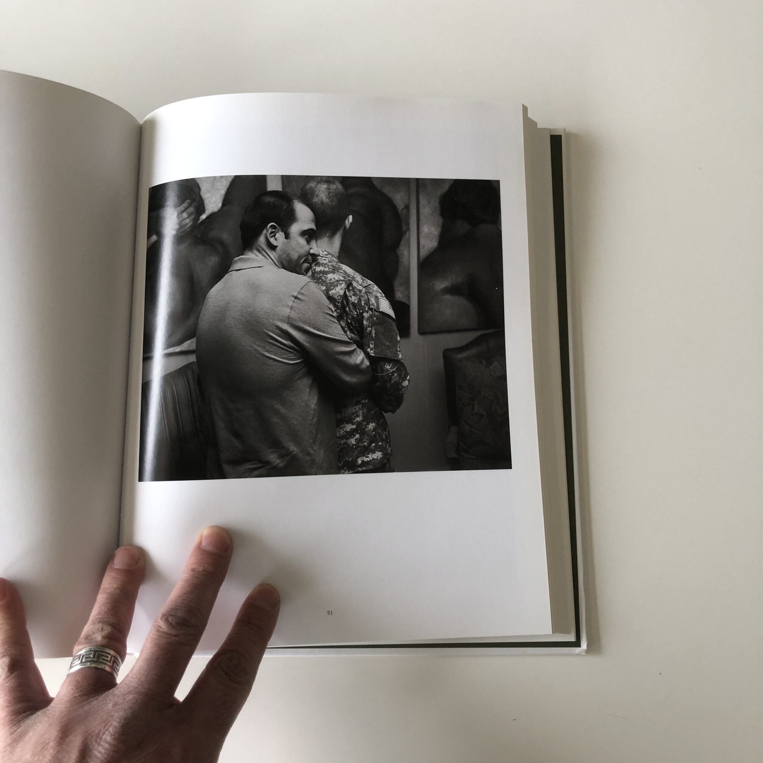
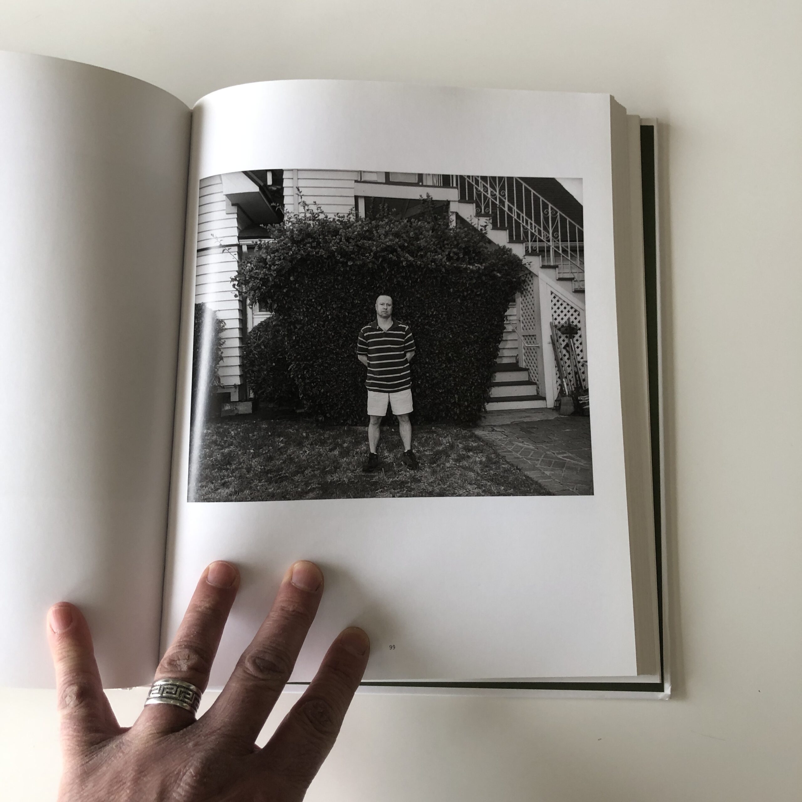
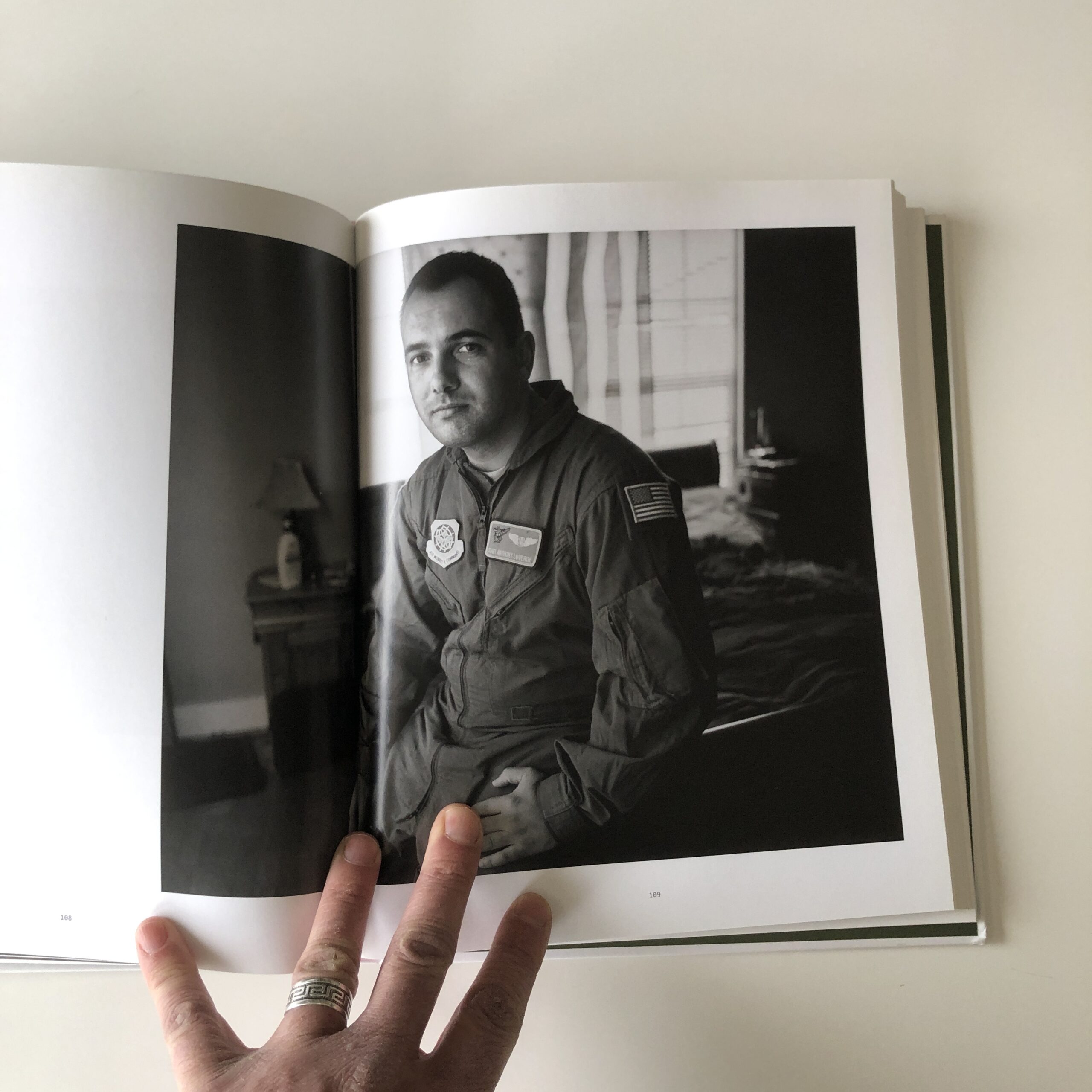
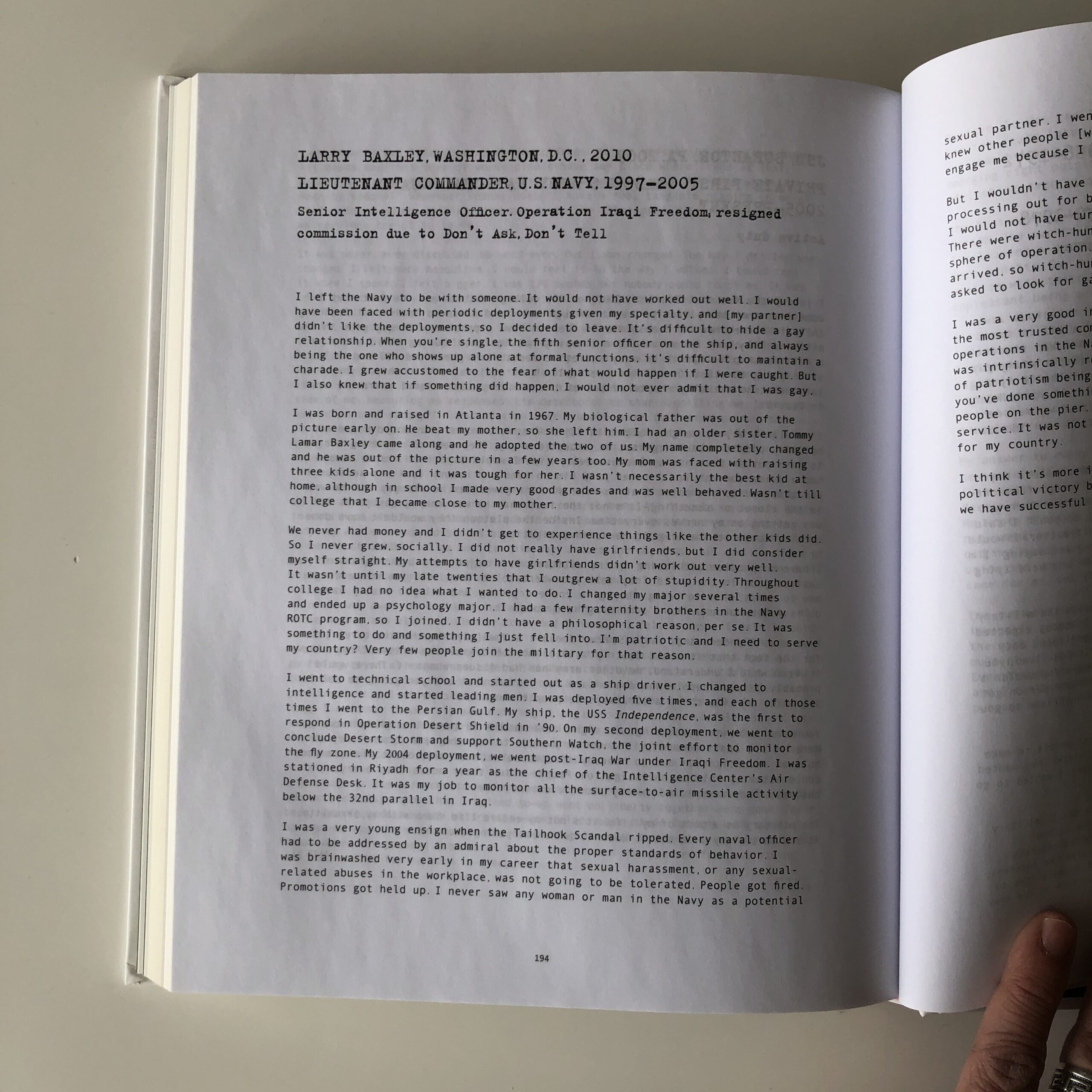
“Gays in Military: Photographs and Interviews,” by Vincent Cianni, was published by Daylight, back in 2014.
It contains the requisite, well-written essays, and a host of interview material, but I’m not going to delve into that today. With this much to read, and the density of captured experience, I’d say it’s more a book to be picked up and experienced, bit by bit.
(It’s not a book for one sitting.)
Vincent photographed a series of men and women who were emotionally tortured, during their time as American soldiers, as warriors.
For being gay.
During the 1990’s, Bill Clinton, Don’t Ask Don’t Tell fiasco, countless gay Americans served, but had to keep their private lives secret.
Or for many, have no private lives at all. In order to do their jobs, so many people had to give up the right to privacy, to a partner, or to happiness.
That is some nasty-ass discrimination right there, and thankfully the policy was done away with.
Everyone photographed in this book suffered while protecting us. Think on that.
But policies improve, and sometimes, our lives improve, when times are good.
Let’s all do our part to battle intolerance, and discrimination.
In the words of those gentle philosophers, Bill and Ted:
The Art of the Personal Project is a crucial element to let potential buyers see how you think creatively on your own. I am drawn to personal projects that have an interesting vision or that show something I have never seen before. In this thread, I’ll include a link to each personal project with the artist statement so you can see more of the project. Please note: This thread is not affiliated with any company; I’m just featuring projects that I find. Please DO NOT send me your work. I do not take submissions.
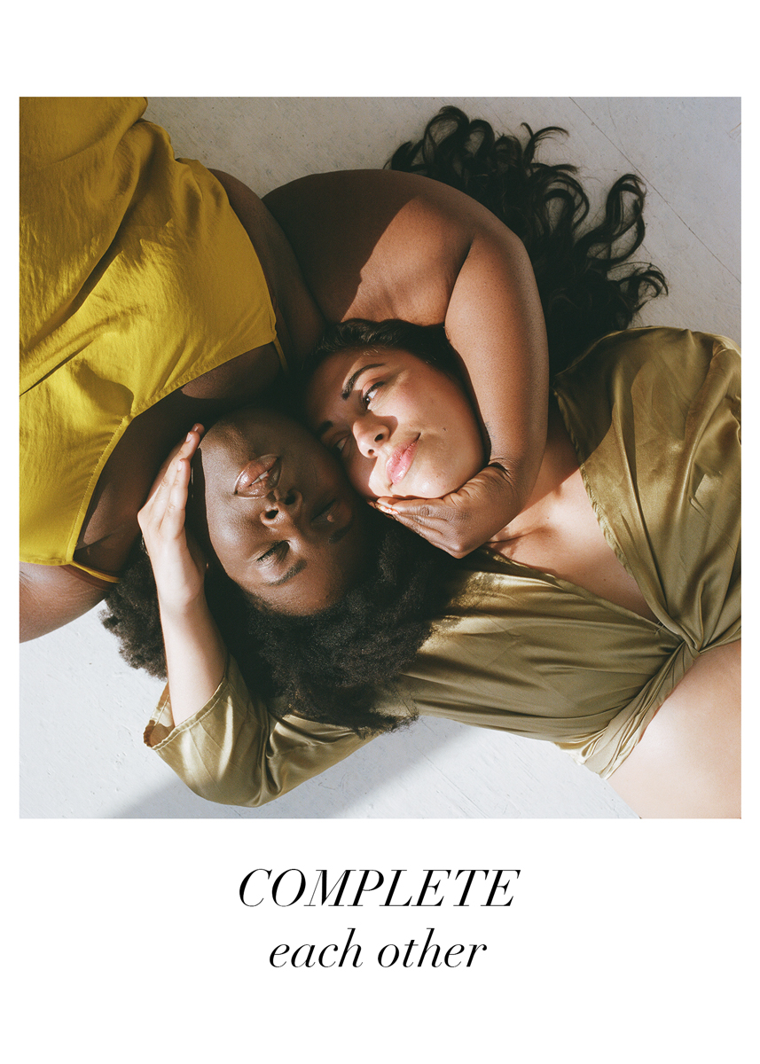
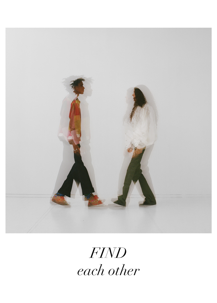
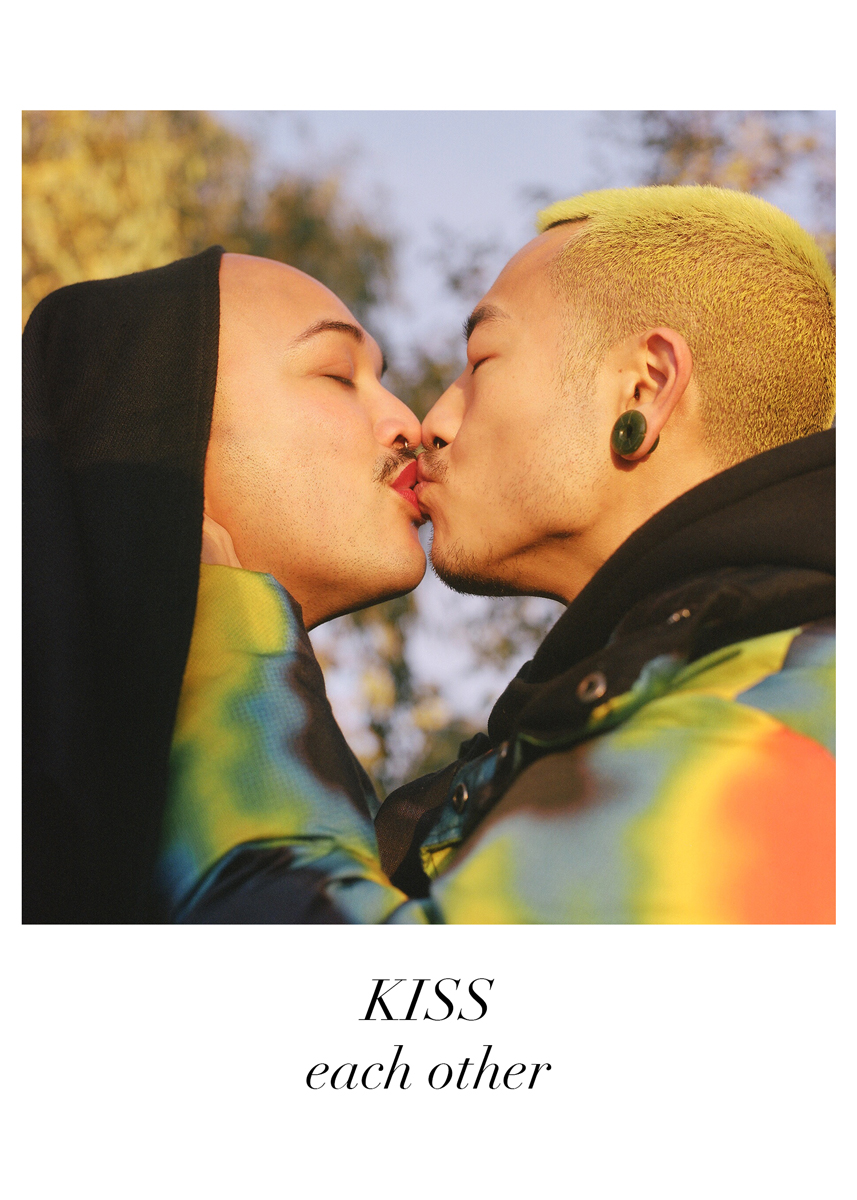
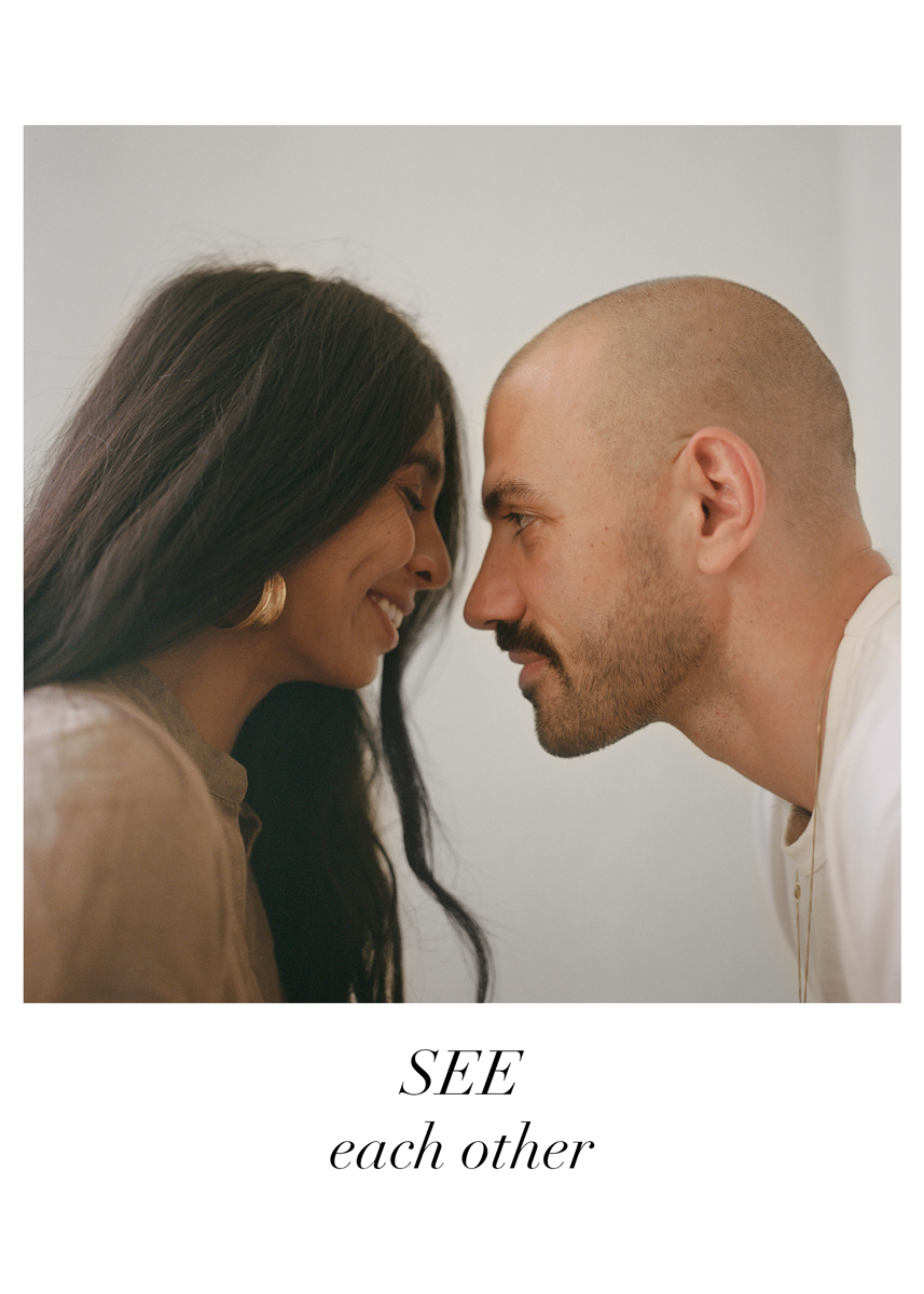
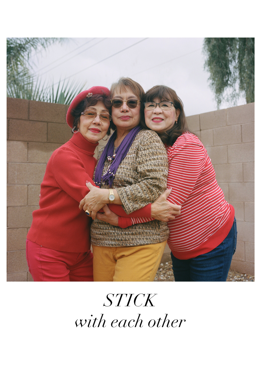
THE THINGS WE DO TO EACH OTHER is an ongoing portrait series about intimate relationships of all kinds (romantic couples, best friends, siblings, parents and their children), the effect we have on each others’ lives and love as action. New York City-based photographer Anjelica Jardiel started this project in May 2021, as a response to the pandemic, craving physical closeness, and realizing how important her close relationships are.
The process begins with a recorded interview that often inspires individuals to reveal and express things that perhaps they have never said to each other before. Some consider it to be kind of a therapy session. Then, they collaborate on poses that help describe their unique dynamic.
Anjelica Jardiel is a Filipina-American Buddhist, photographer, scuba diver, avid traveler and dog mom, striving to live a dynamic life for her Mama, Papa and Ancestors. Her interest in documenting human connection may stem from being an only child and twin-less twin.
She is working to make photography more accessible through her public art exhibition series called ANYONE / ANYWHERE (www.anyoneanywhere.org), which currently has a partnership with Brooklyn Public Library.
Anjelica is available for commissions, assignments, and studio portrait bookings to turn your beloved relationships into art.
APE contributor Suzanne Sease currently works as a consultant for photographers and illustrators around the world. She has been involved in the photography and illustration industry since the mid 80s. After establishing the art-buying department at The Martin Agency, then working for Kaplan-Thaler, Capital One, Best Buy and numerous smaller agencies and companies, she decided to be a consultant in 1999. She has a Twitter feed with helpful marketing information because she believes that marketing should be driven by brand and not by specialty. Follow her at @SuzanneSease. Instagram
Success is more than a matter of your talent. It’s also a matter of doing a better job presenting it. And that is what I do with decades of agency and in-house experience.
The Art of the Personal Project is a crucial element to let potential buyers see how you think creatively on your own. I am drawn to personal projects that have an interesting vision or that show something I have never seen before. In this thread, I’ll include a link to each personal project with the artist statement so you can see more of the project. Please note: This thread is not affiliated with any company; I’m just featuring projects that I find. Please DO NOT send me your work. I do not take submissions.
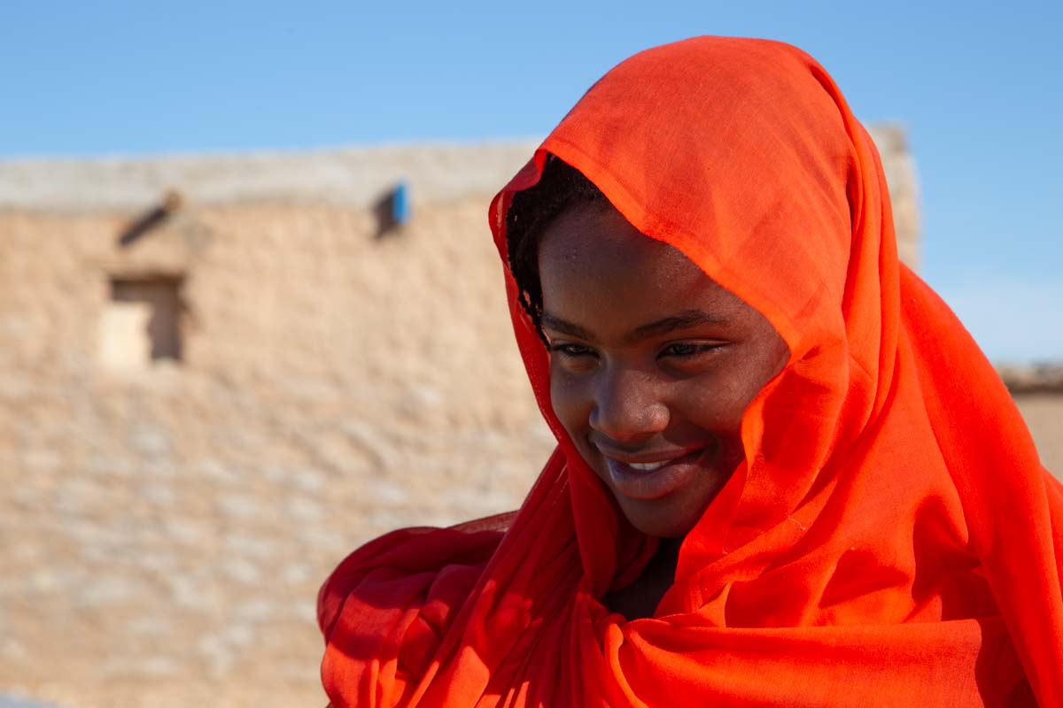
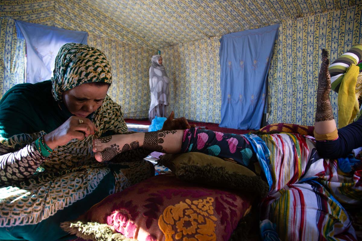
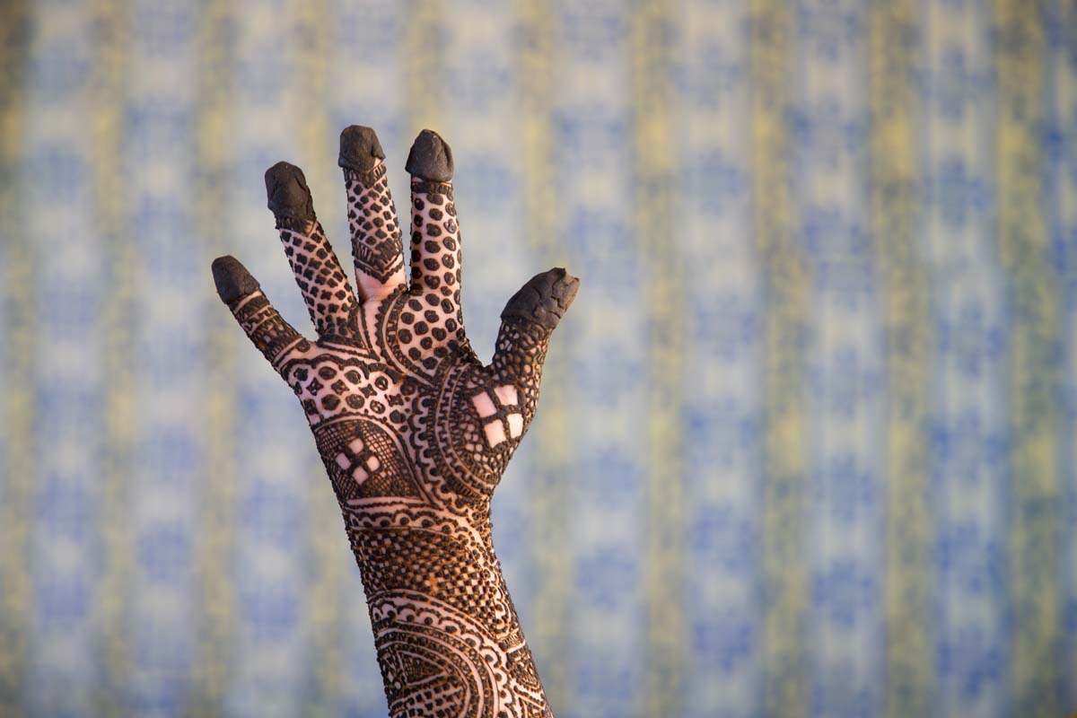
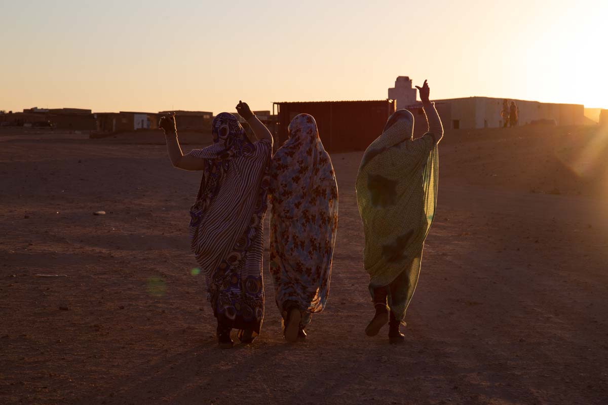
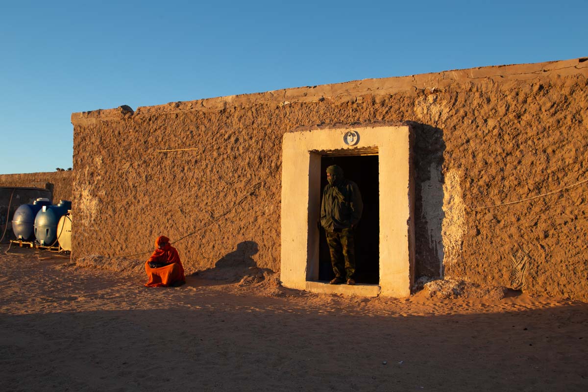
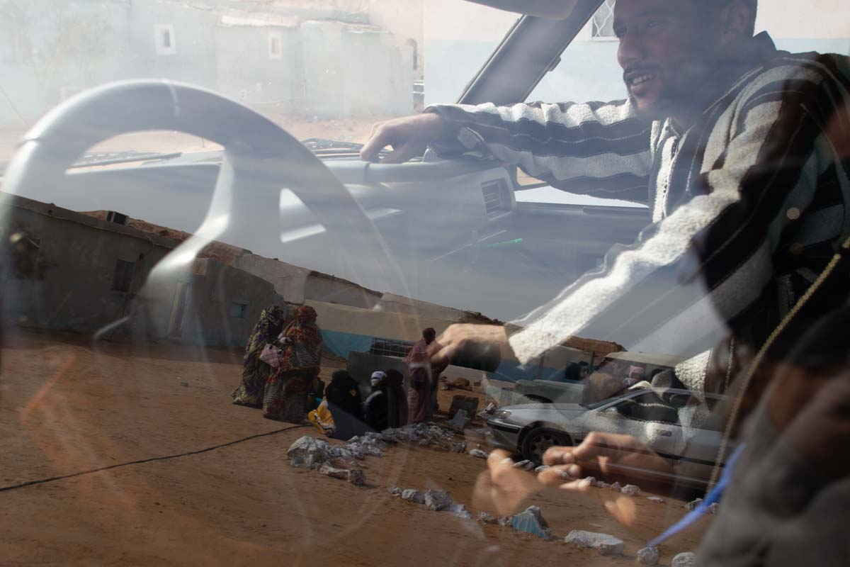
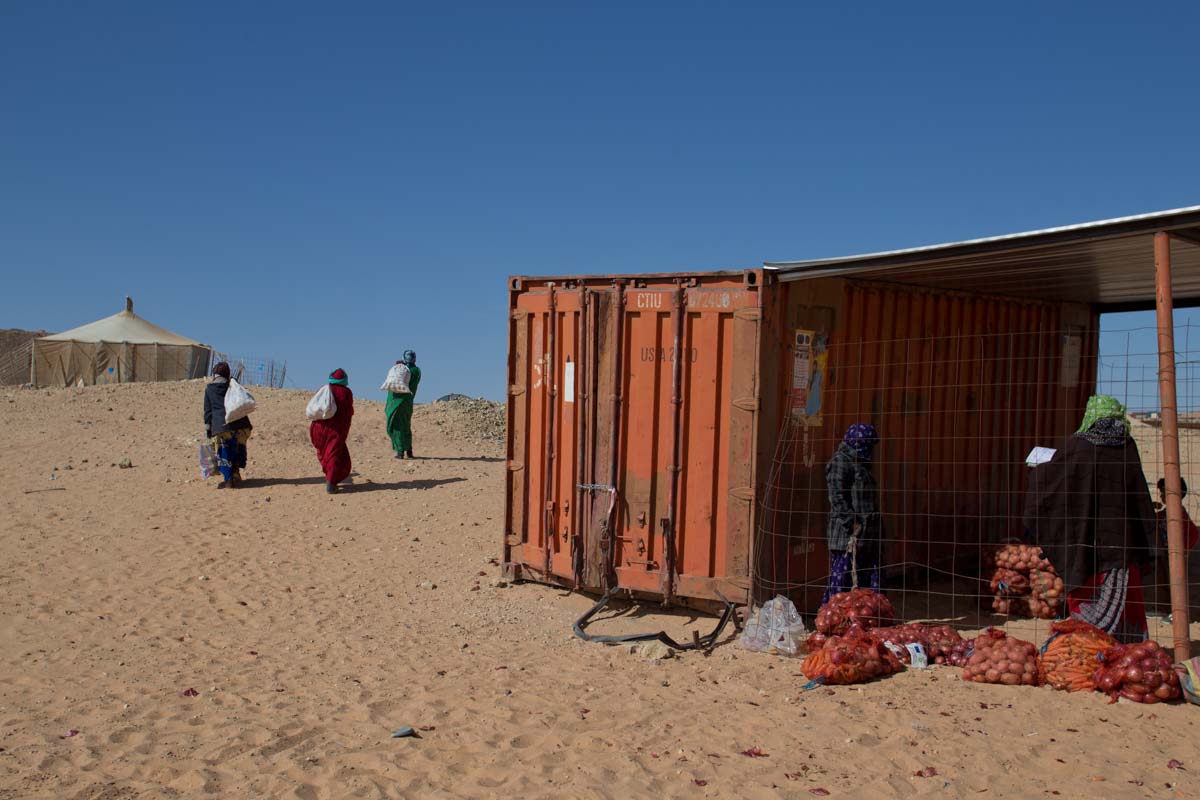
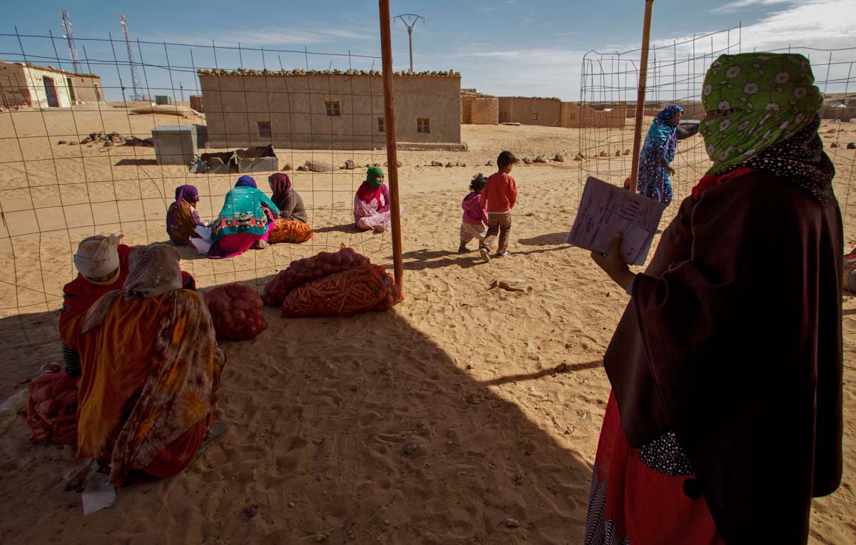
In Hassani culture, women play the most important role in the family. Hassani women hold high positions of power and authority not only within their family, but also in their community and nation. Hassani women have played an essential role in building community in the refugee camps in Southwest Algeria to which they fled during the Western Sahara War in 1976.
The Hasani women took an active part in distributing the cheap antibiotic to the refugees in the camp.
APE contributor Suzanne Sease currently works as a consultant for photographers and illustrators around the world. She has been involved in the photography and illustration industry since the mid 80s. After establishing the art-buying department at The Martin Agency, then working for Kaplan-Thaler, Capital One, Best Buy and numerous smaller agencies and companies, she decided to be a consultant in 1999. She has a Twitter feed with helpful marketing information because she believes that marketing should be driven by brand and not by specialty. Follow her at @SuzanneSease. Instagram
Success is more than a matter of your talent. It’s also a matter of doing a better job presenting it. And that is what I do with decades of agency and in-house experience.
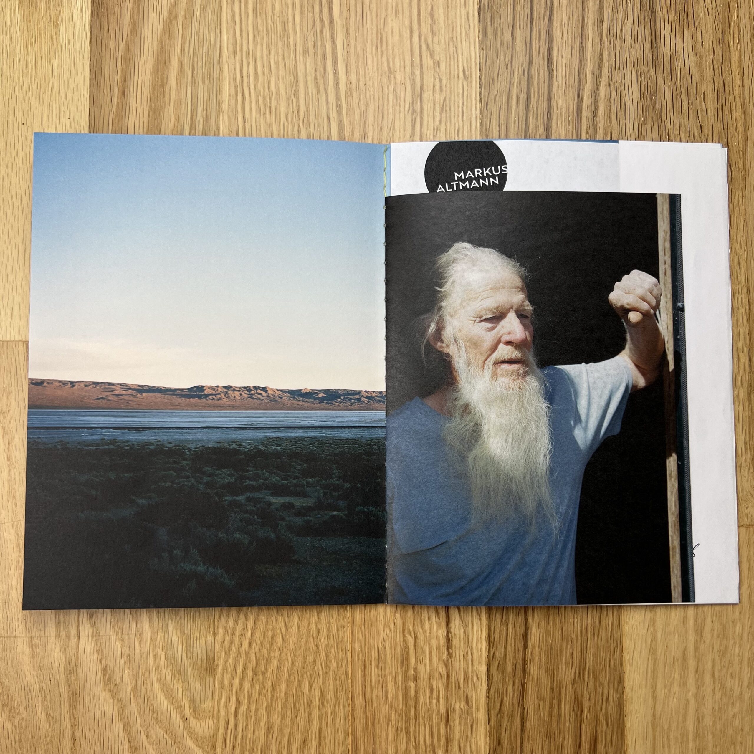
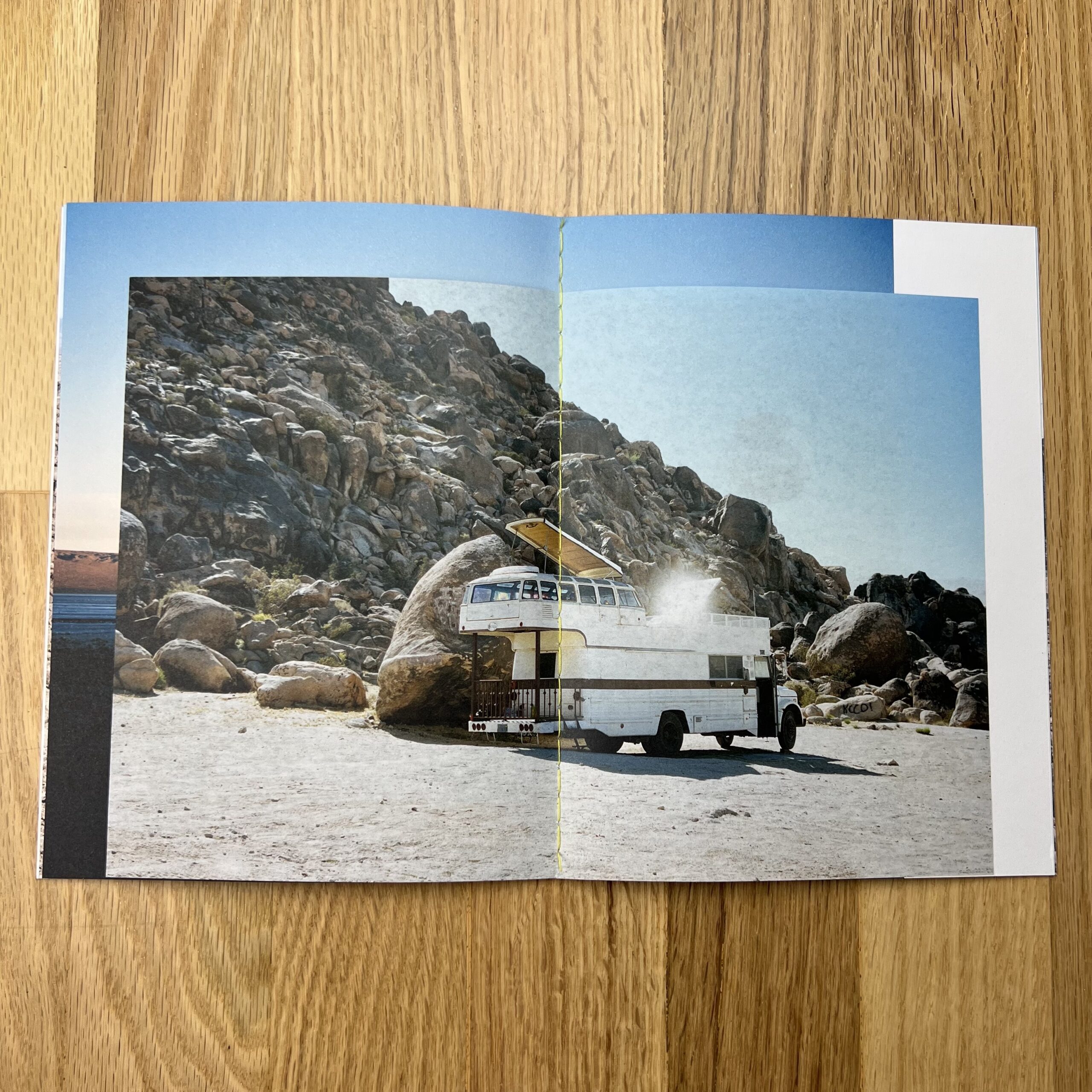
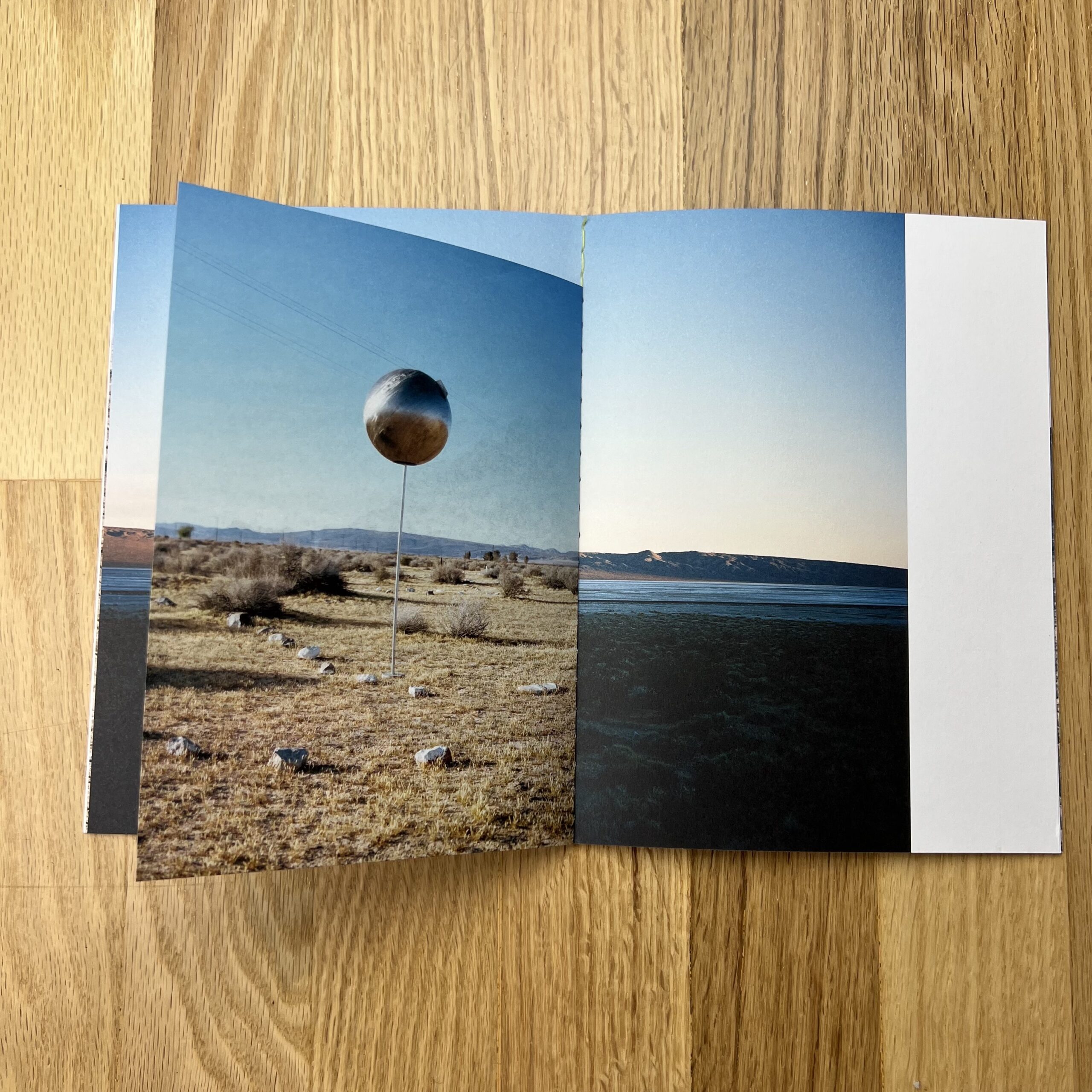
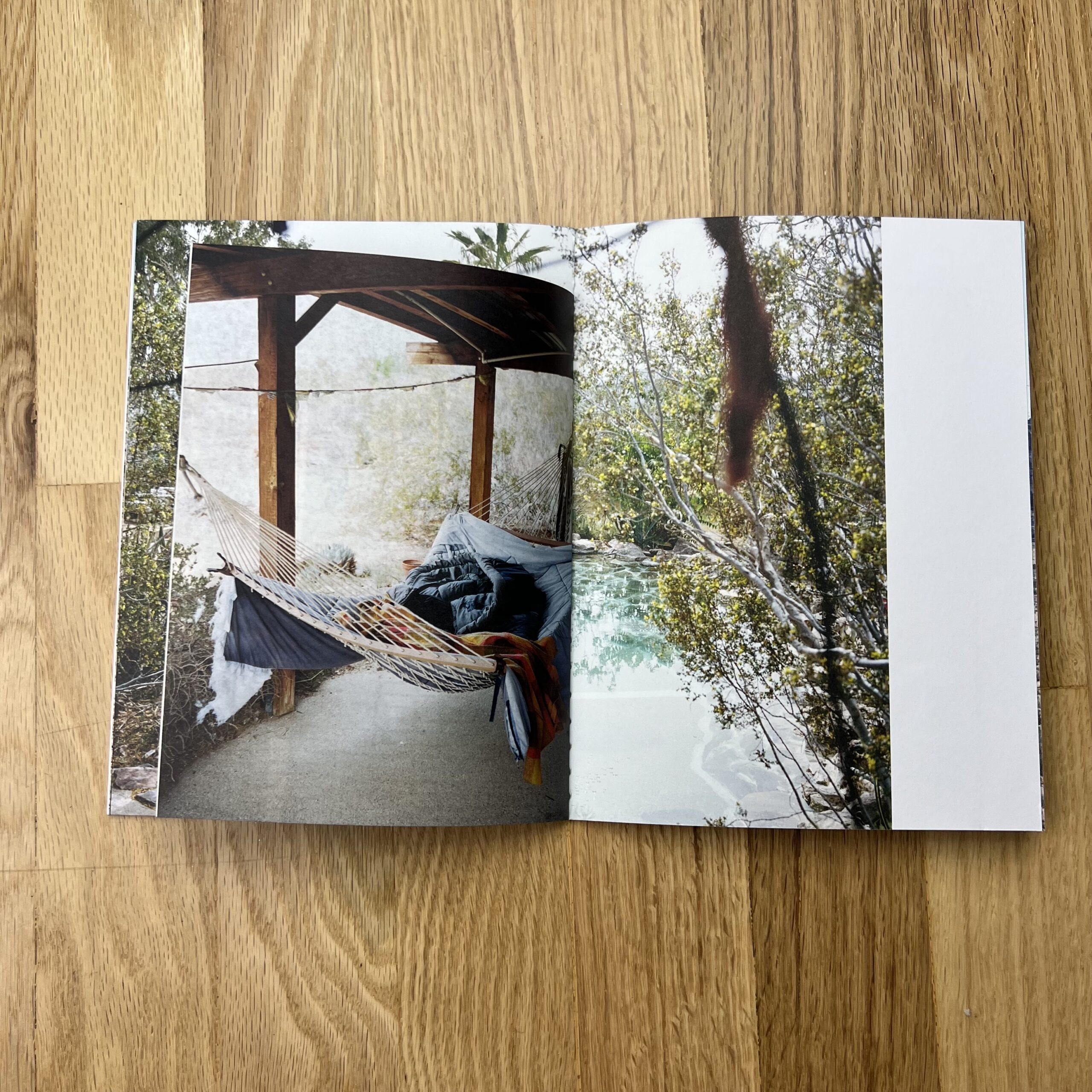
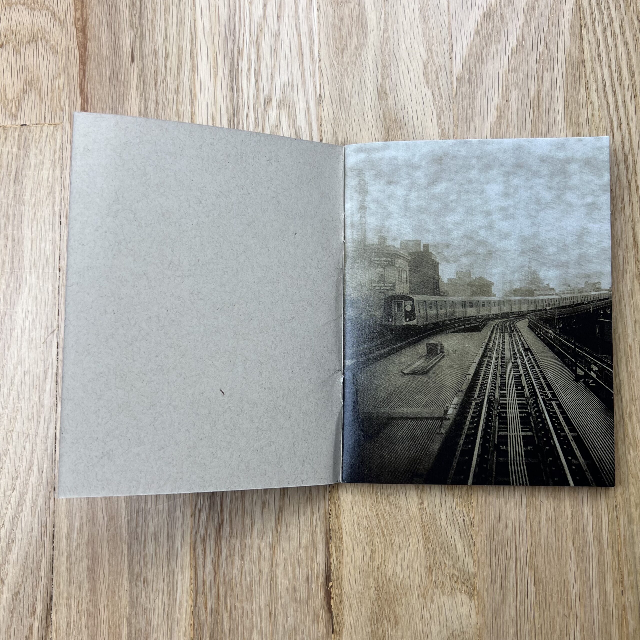
Who printed it?
Königsdruck in Berlin. My designer had worked with them before and knew they would be open to a small project with some challenges.
Who designed it?
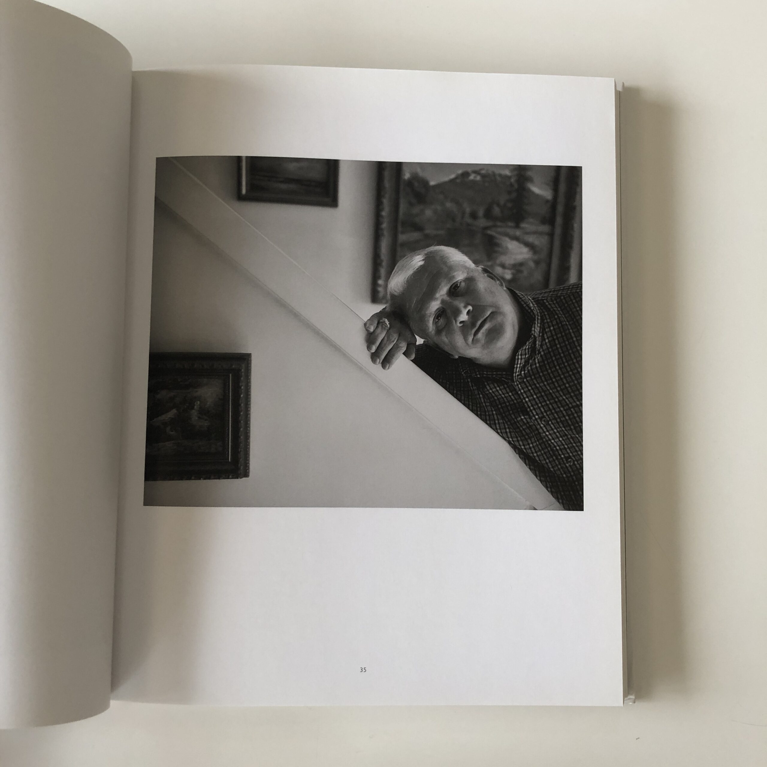
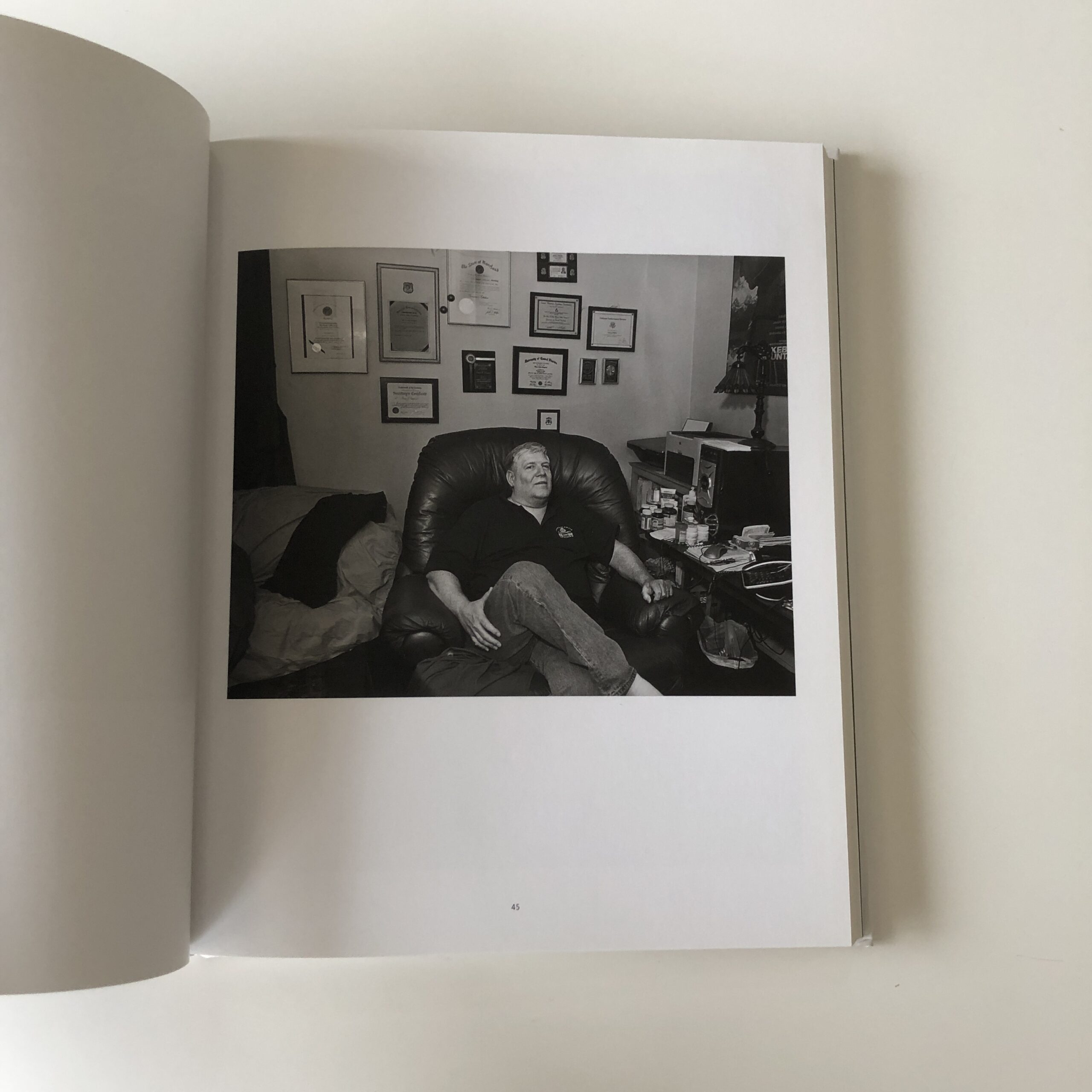
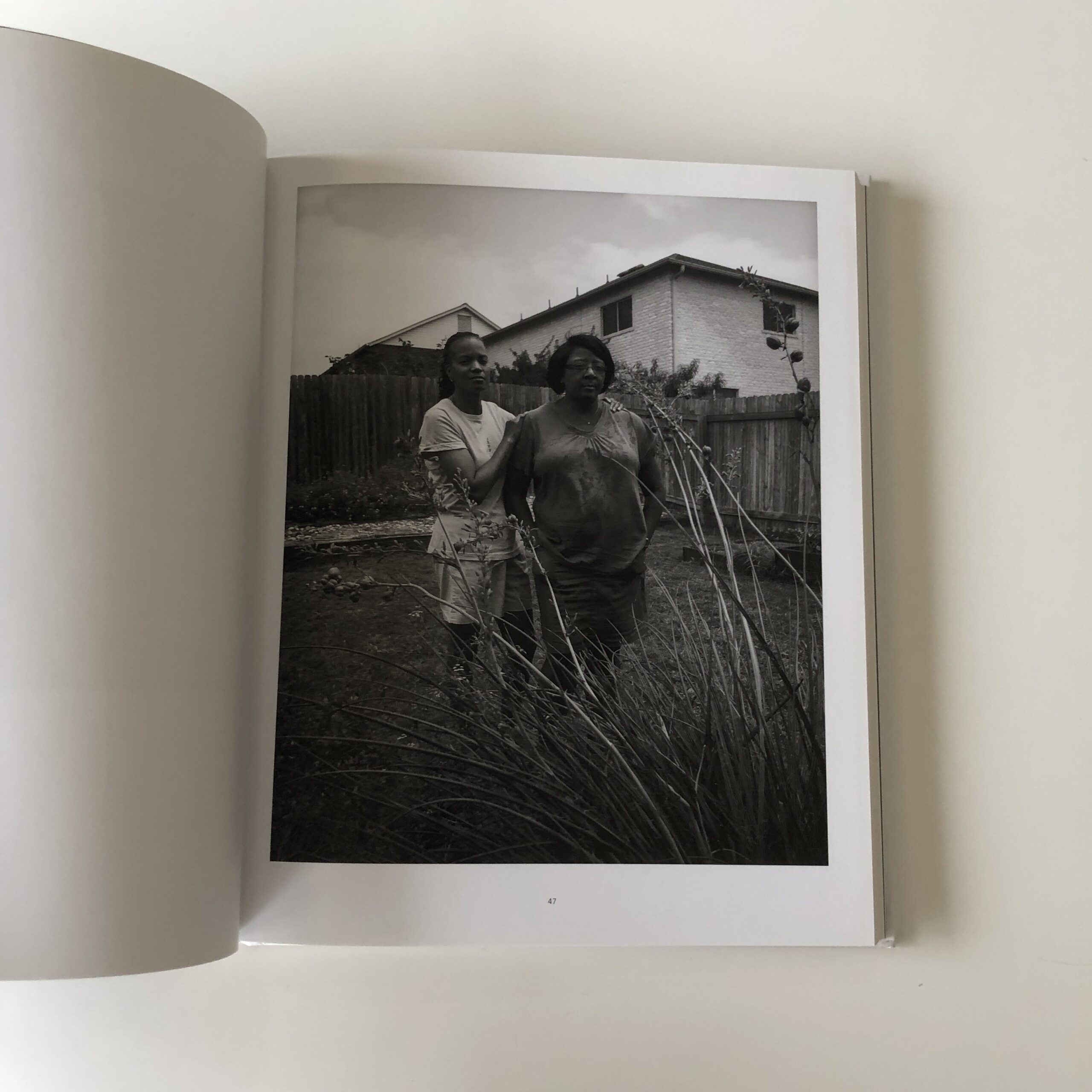
Dagmar Dunkelau (who is a graphic designer at BogunDunkelau, www.bogun-dunkelau.de) and me. I came up with the idea for the layout and the sequencing of the images. I thought two different-sized pages would work well – putting the portraits on a smaller insert in front of a larger double-page landscape image. The inserts are printed on thinner paper too, which adds to the contrast. Dagmar was a great help in the design process. She also did the cover design and handled the final artwork and production.
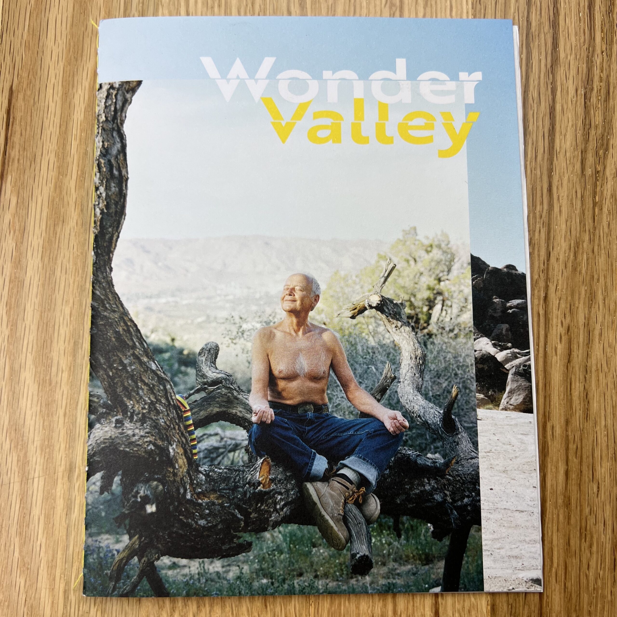
Tell me about the images.
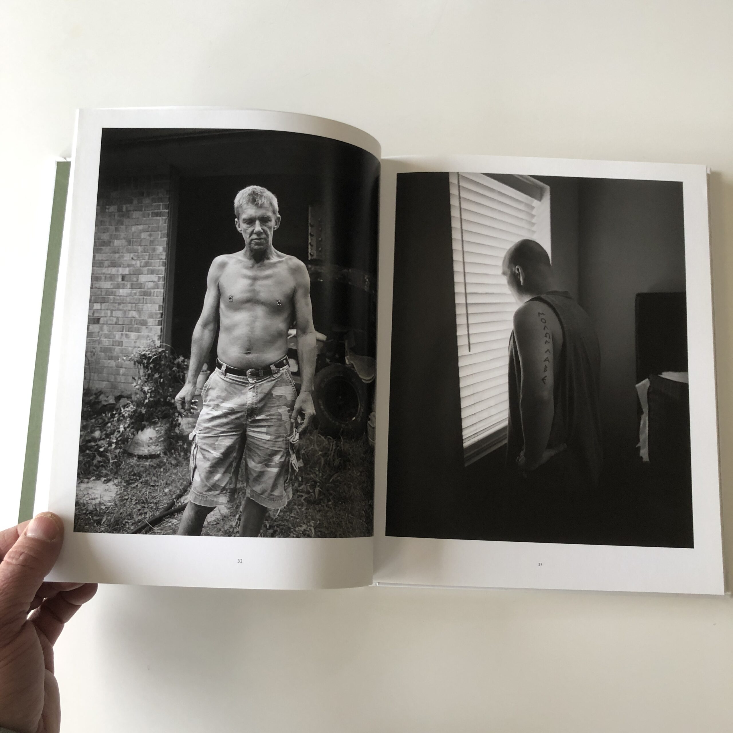
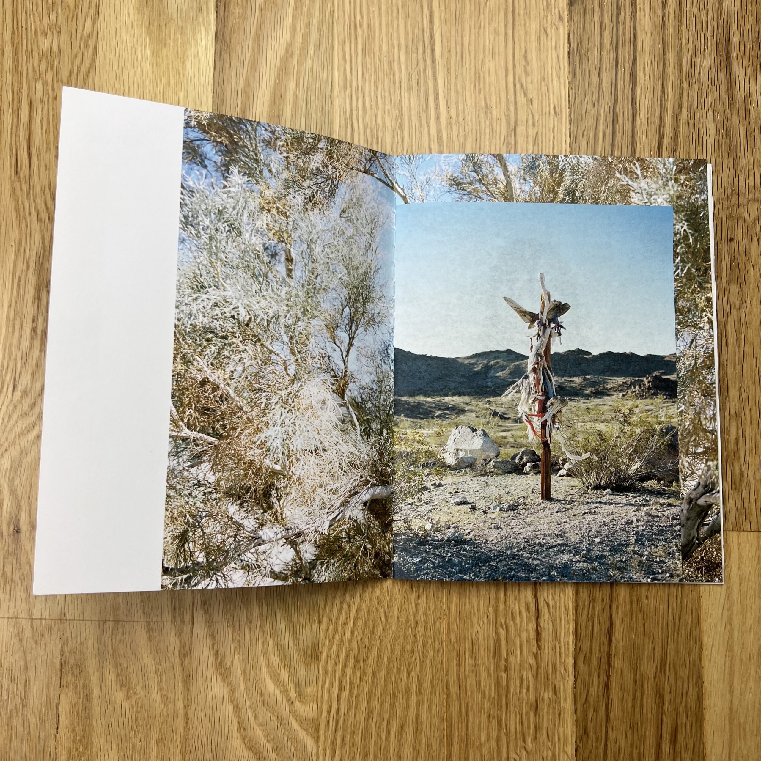
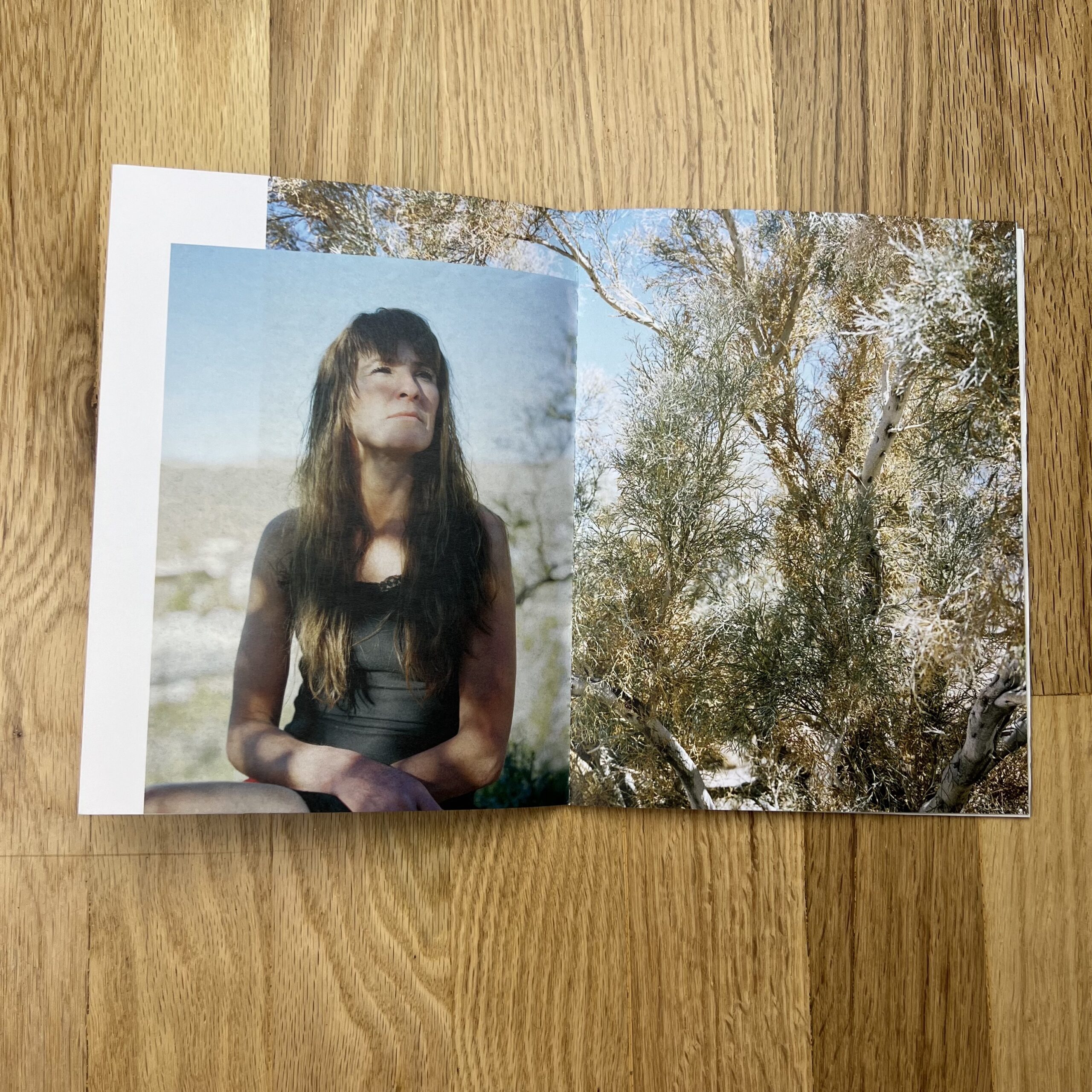
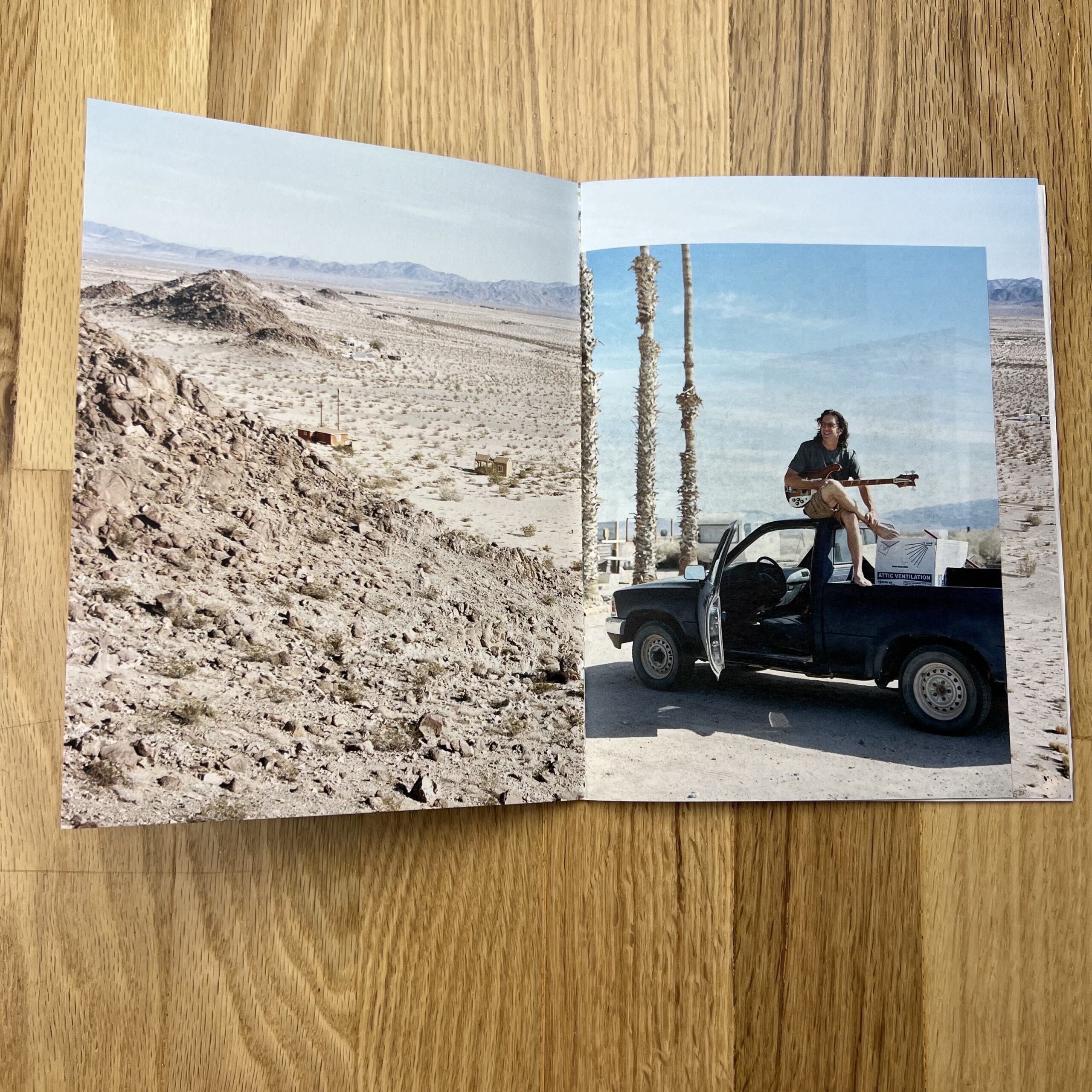
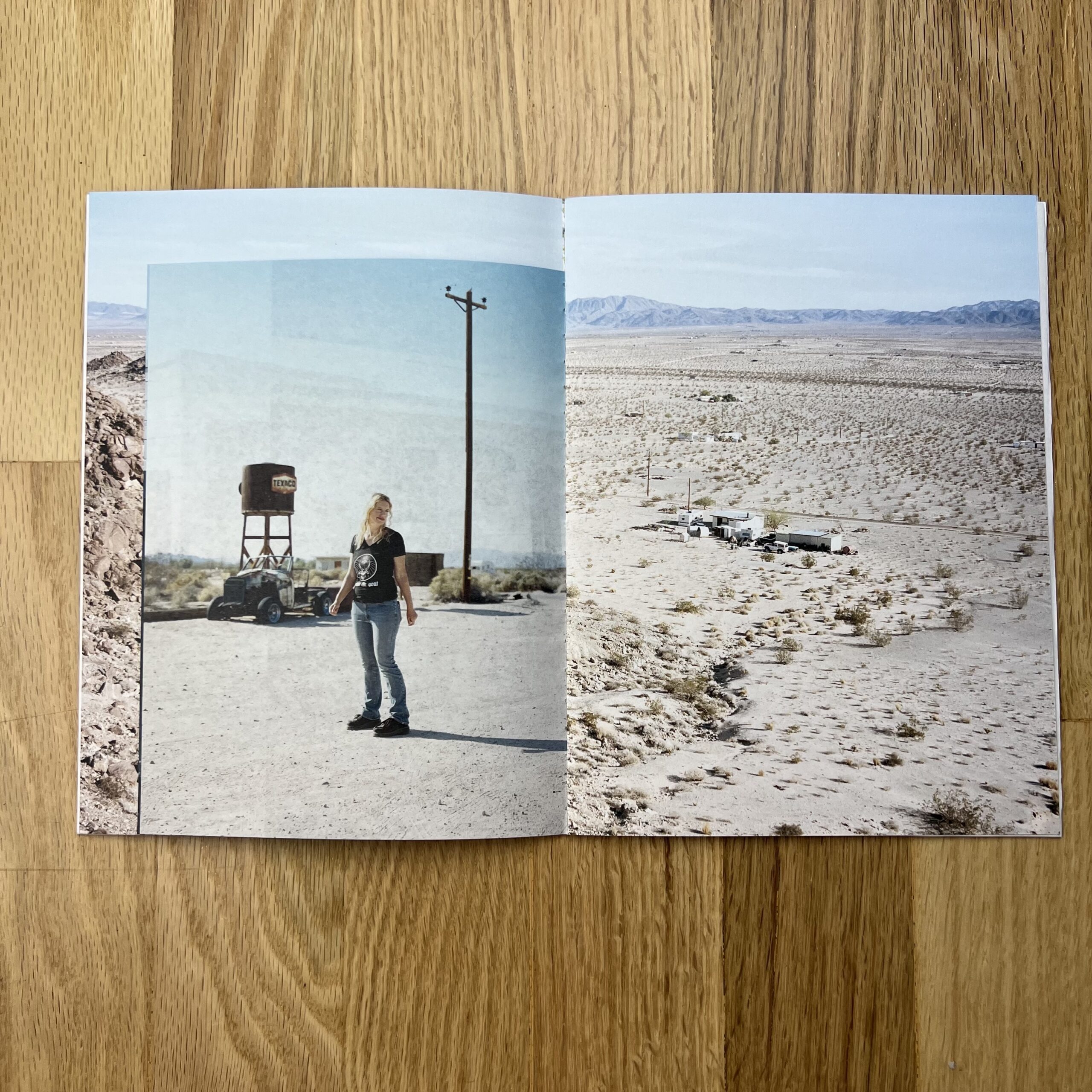
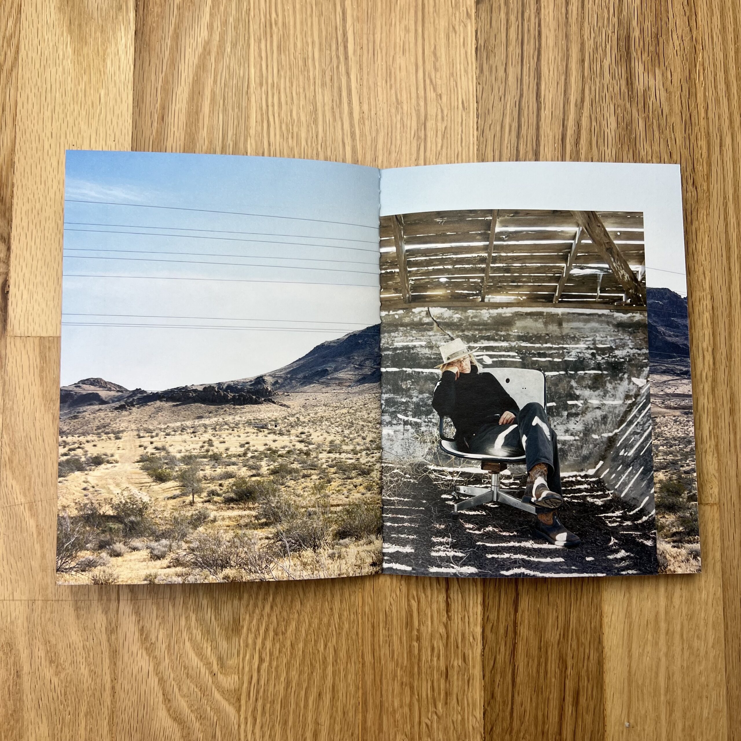
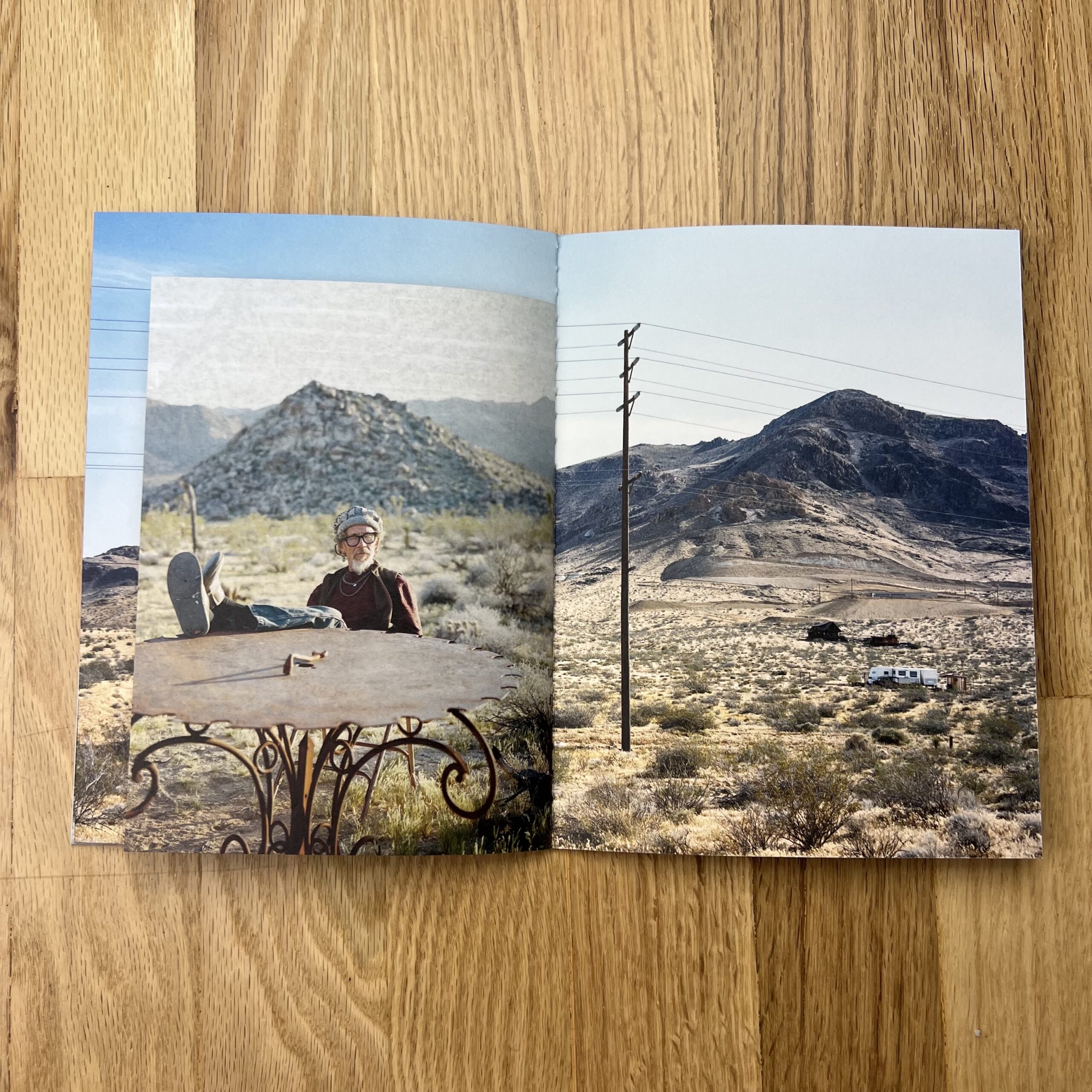
They are from a personal project I shot a few years ago. Wonder Valley is the name of a community near Twentynine Palms; some of the images were taken around there, some in other parts of the Mojave. Since this is really more a zine than a classic promo, I’ve included an insert in the booklet: “The Mojave Desert northeast of Los Angeles: for some a place of longing, for others tough everyday life. An extraordinary living space, without a doubt, challenging and inspiring at the same time. For a personal project, I visited people who have made it their home – in search of alternative concepts of living, inexpensive land, untouched nature, and freedom. My thanks to all the people who shared their time and home with me. They are just as special as the places where they live.“
How many did you make?
We did a print run of 600, and I mailed out about 400.
How many times a year do you send out promos?
I used to send out one every year on average but had stopped a while ago. This is the first one after the start of the pandemic.
Do you think printed promos are effective for marketing your work?
They used to be. I think that if you still do a printed promo, there should be some extra value to it, a reason why you didn’t just send a PDF. Hopefully, it will deliver some inspiration that will get passed on. This promo was really more about keeping in touch than showing new work. And I have received great feedback, especially from people I value much.
Going to festivals as I do, reviewing portfolios, I see a ton of work.
Each time, when you meet with someone for 20 minutes, at some point, you’re giving specific feedback about their individual project, and the component pictures.
That’s obvious.
But often, (if you’re seeing 150+ portfolios a year,) you say certain things over and over again.
It’s the meta-advice, if you will.
Some of it, you’ve heard here a million times.
(Were I substantially more popular and important, they might have a drinking game for how often I say, “Get out of your comfort zone.”)
In 2022, one thing I said, over and over again, is the goal is to be memorable.
To somehow stick in the mind of the person you’re meeting, so they hang on to tidbits about you down the line.
(When they’re far more likely to work with you than ASAP.)
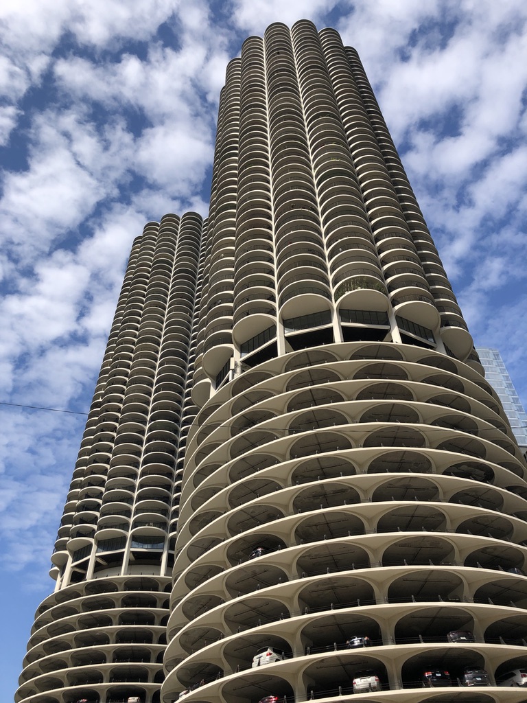
This year alone, I hit festivals in San Francisco, San Diego, Chicago, and I’m going to PhotoNOLA in New Orleans this December.
Chicago, Sept 2022
That’s a lot of portfolios!
How much work, how many people, can I really remember in detail?
Or perhaps, the better question is, which details did I remember at all?
Being memorable is meta-advice, because it’s not something you can do directly.
Sure, I guess you could go the obvious route and jump off your roof, while having your dumb buddy film it.
Post it on Youtube.
That might work.
By definition, average is not memorable.
Exceptional is memorable.
Brilliant is memorable.
Innovative is memorable.
Heart-breaking is memorable.
(As is extreme, unfortunately.)
Show me things I haven’t seen, and I’ll remember it.
If your work is FUCKING AMAZING, I’ll remember you.
Or if it’s odd, kooky, strange-enough-to-occupy-the-Upside-Down type of art.
The weird shit.
That’s memorable too.
I’m more-than-overdue to write about the festivals I’ve visited this year, and San Francisco came first.
I mention all this because I’m doing something new today.
If you remember, in the Spring, I wrote an extensive travel article about SF, as my visit was so traumatizing.
It was a story about the power of human feces, and the death of cool.
(Better we don’t revisit it.)
But I never wrote about the portfolio review I attended, the reason I went to SF in the first place, and critiqued that Diego Rivera mural at the SF Art Institute.
(Calling it out for antisemitism. BTW, I’ve been warning about that for a year, so hopefully you’re paying attention now.)
I spent two days there at the PhotoAlliance portfolio review in March, and for some reason, I barely remember any of the work, or the people I met at the review table.
So today, for the first time ever, I’m only going to share the portfolios that stuck in my brain.
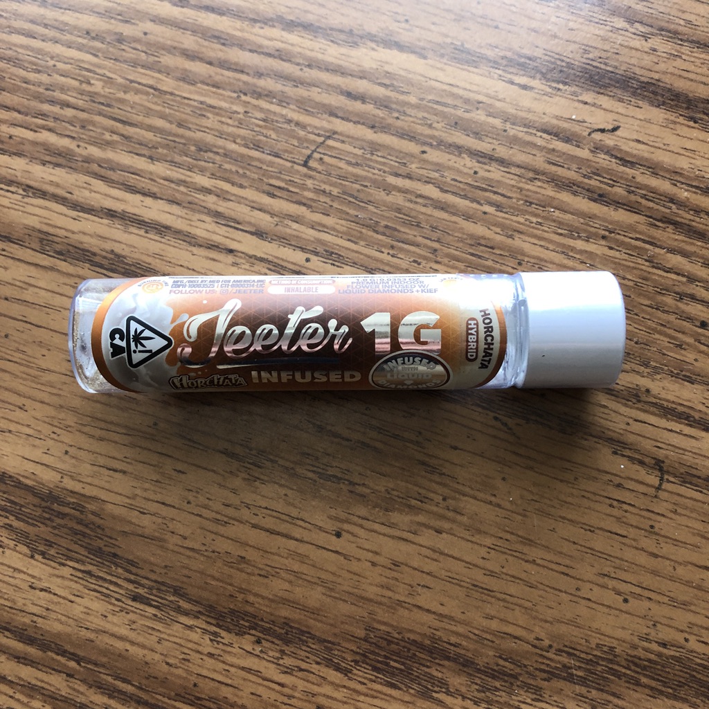
Sure, you could say it was the California weed, (and maybe it’s true,) but I’ve been stoned plenty of times and still remembered everything.
My 44 % THC Horchata joint
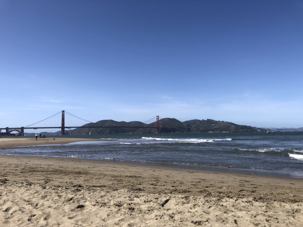
With respect to my few days in San Francisco, the location, the meals, walking through the city, sitting by the bay, I can recall all of it in my mind, easily.
View of the Golden Gate from Chrissy Field
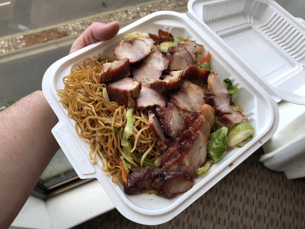
$10 BBQ Pork noodle plate from Chinatown
(Damn, I’d eat a plate of those noodles right about now.)
But it’s far more likely that particular group of artists did not stand out, for some reason.
Not enough juice to the work, or the conversations.
Thankfully, two artists made an impression.
(Three, if you count Pamela Gentile, whom I once wrote about for the NYT, but we didn’t really look at new work. I just remember chatting.)
I met Jacque Rupp at one of the online portfolio reviews, back in 2020, or ’21.
(Really, can anybody remember which year was which?)
Jacque lives in NorCal, and I remember her black and white, documentary project about immigrant, farm-worker communities along the coast, near Gilroy.
I published those images here, and wrote about our conversation, with respect to how an “outsider” can do the research, work with non-profits, and earn the right to share stories from other communities.
Which she had been doing.
So that was my context for our IRL meet in March.
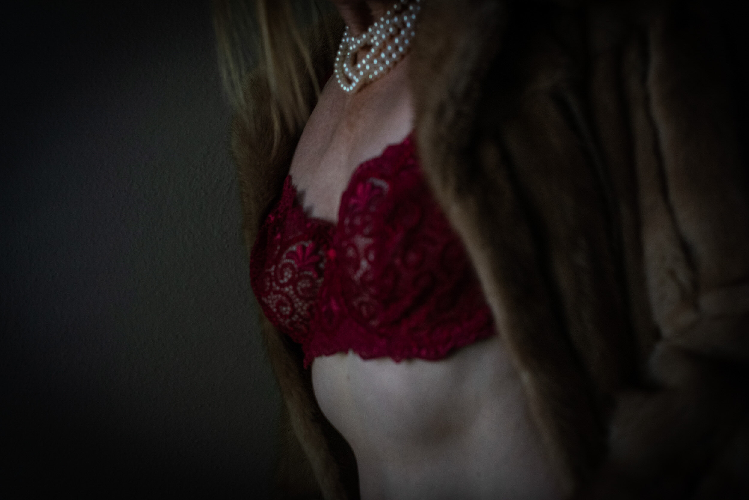
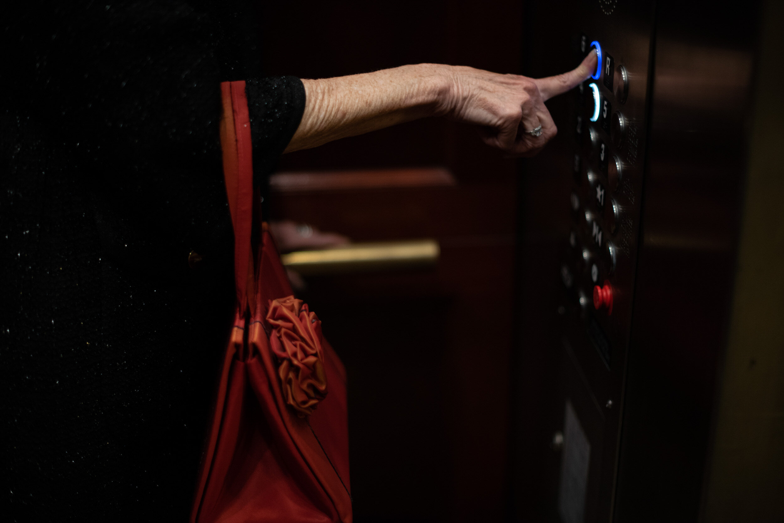
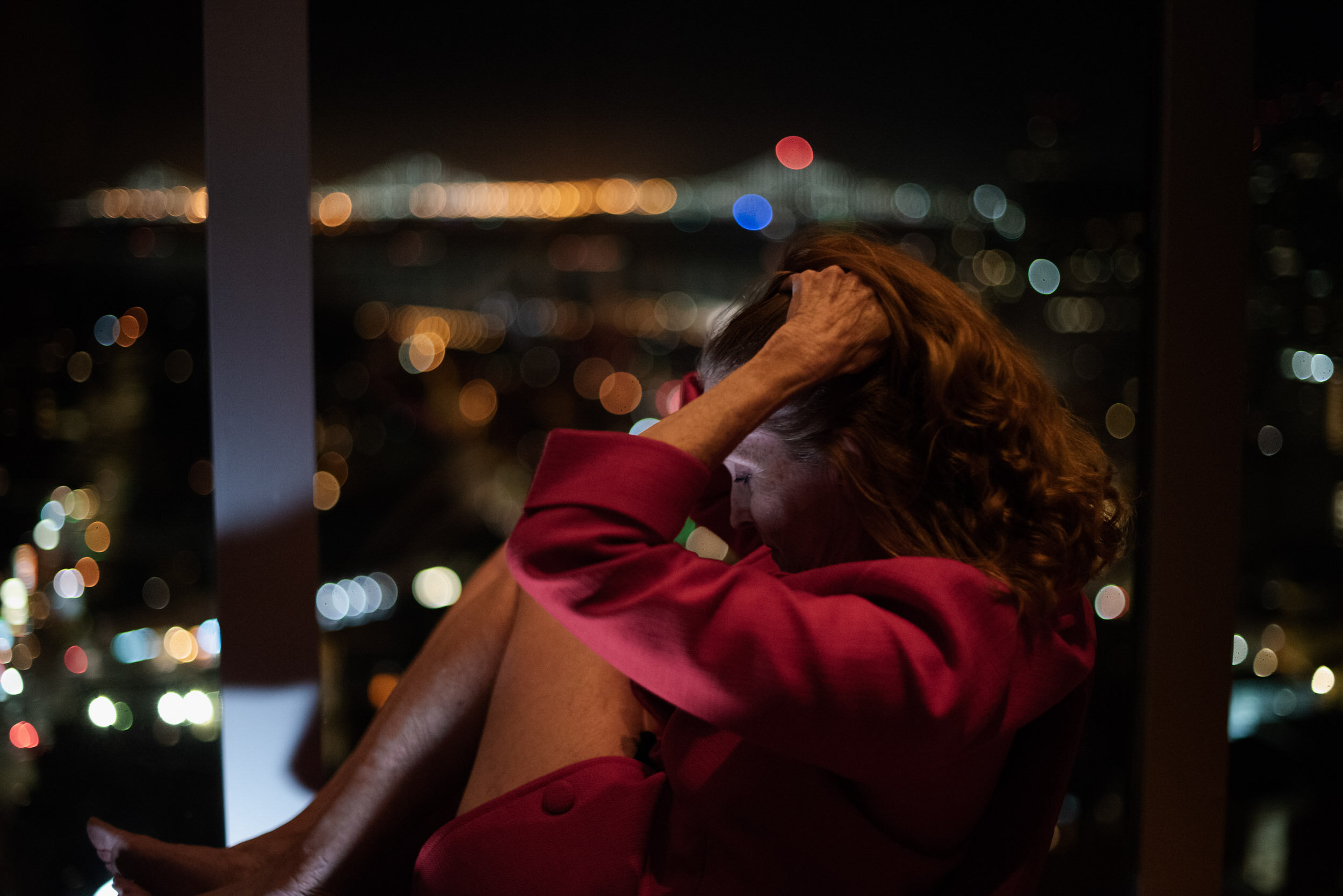
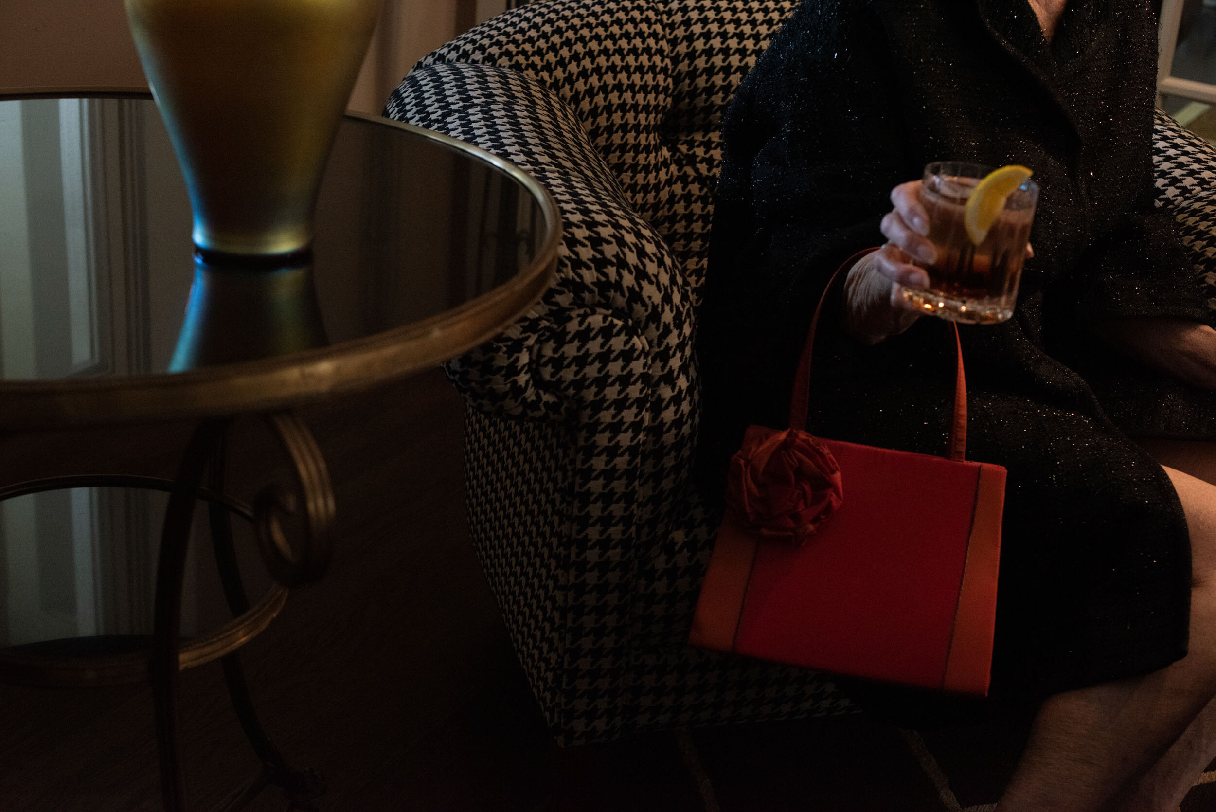
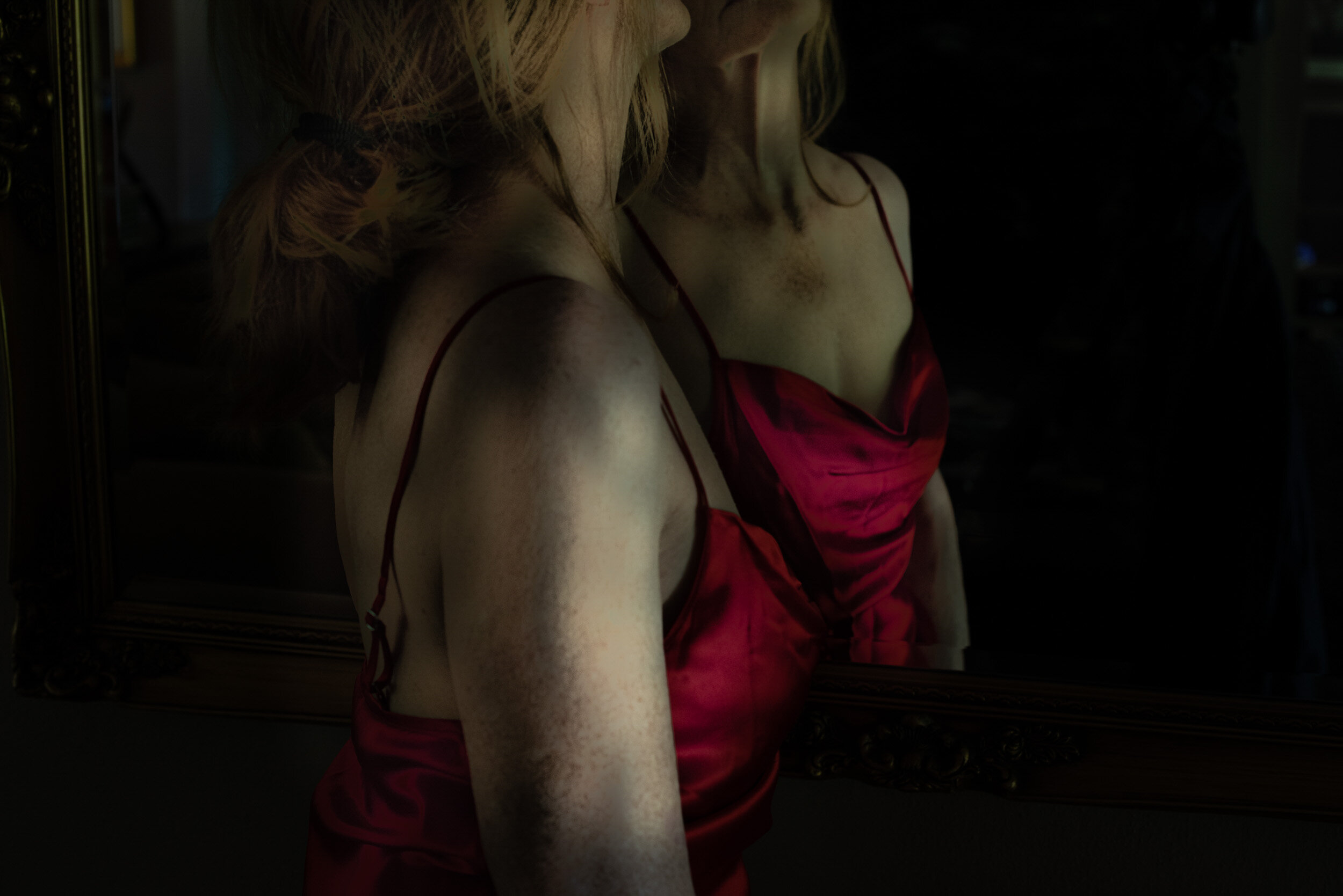
I was therefore NOT expecting “The Red Purse,” a series of intimate, color self-portraits that explored middle-aged, female sexuality.
It was weird, and personal, and not like anything I could recall.
In my mind, now, when I close my eyes, I remember slip dresses. The color red. And Jacque there before me, in the flesh.
I didn’t need to go to her website to look it up, because fragments of the images were living in my mind.
Heidi: What was your approach to the photo direction? Amy: The publishers of this project are Epic (owned by Vox Media) along with a company called Headline. Josh Davis (Epic co-founder) and Jon Steinberg (then creative director at Epic) approached me about photo directing a new business magazine with the idea that it would be large format, print-only, and photo forward. One of the publications that inspired them is Victory Journal. At first I was skeptical. I immediately said the gulf between sports and business is exactly what allows Victory to do what they do. Sports are inherently graphic and business is…not. I said I would do it only if the decisions we made about what stories to include were based on whether or not it would make a good photo story (which, of course, is totally subjective). If they really wanted it to be filled with full page photos, that had to be the first priority and they had to buy in to that. To me, it meant tech and science (not to mention anything or anyone in an office) were, for the most part, off the table. My experience at Wired taught me a lot about photographing folks in labs and photographing tech stories (or…finding conceptual solutions to illustrating tech stories usually!) and I didn’t think that would carry longer, photo-driven stories. We also had to steer away from stories that revolved around founders in the ways that many business magazines tend to do. I knew we would need a lot more than portraits to keep it compelling and, again, these guidelines felt crucial to me in terms of making it successful. They agreed and our Editor, Alana Levinson, was very committed to it as well.
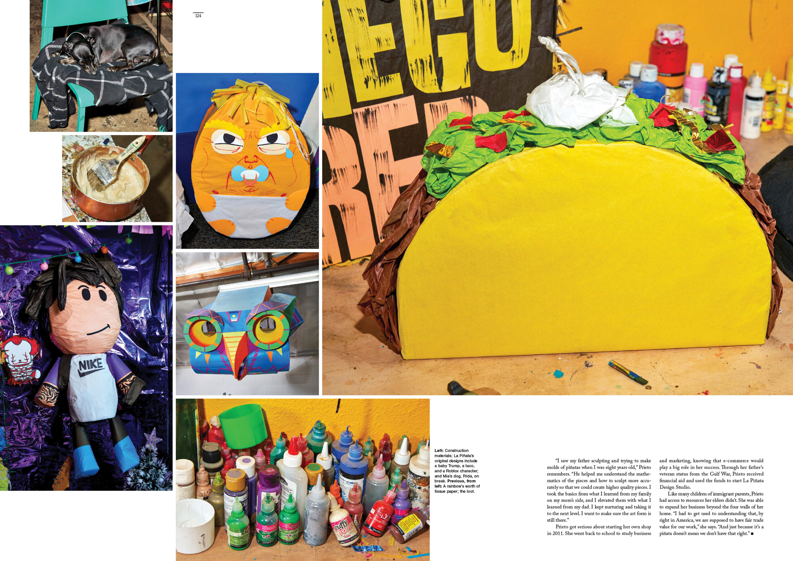
What were you looking for in the imagery? My thinking around the imagery was, How can we fill pages with really graphic, energetic shots that work well at that scale? The magazine is 11.5” x 16.5”. It’s really big! One of the first stories that was proposed was one about a young woman in Los Angeles who makes piñatas for people like Rihanna and also for a million other things like corporate events and quinceañeras. She is part of a long tradition of piñata makers. Her grandmother and father both did it in LA and she is really trying to find new ways to do it— as an art form and as a business. This felt like a perfect example of what we were looking for and I thought Michelle Groskopf could do a great job of capturing the colors and somewhat messy business of her process. It’s all very handmade. We wanted it to feel fun and irreverent.
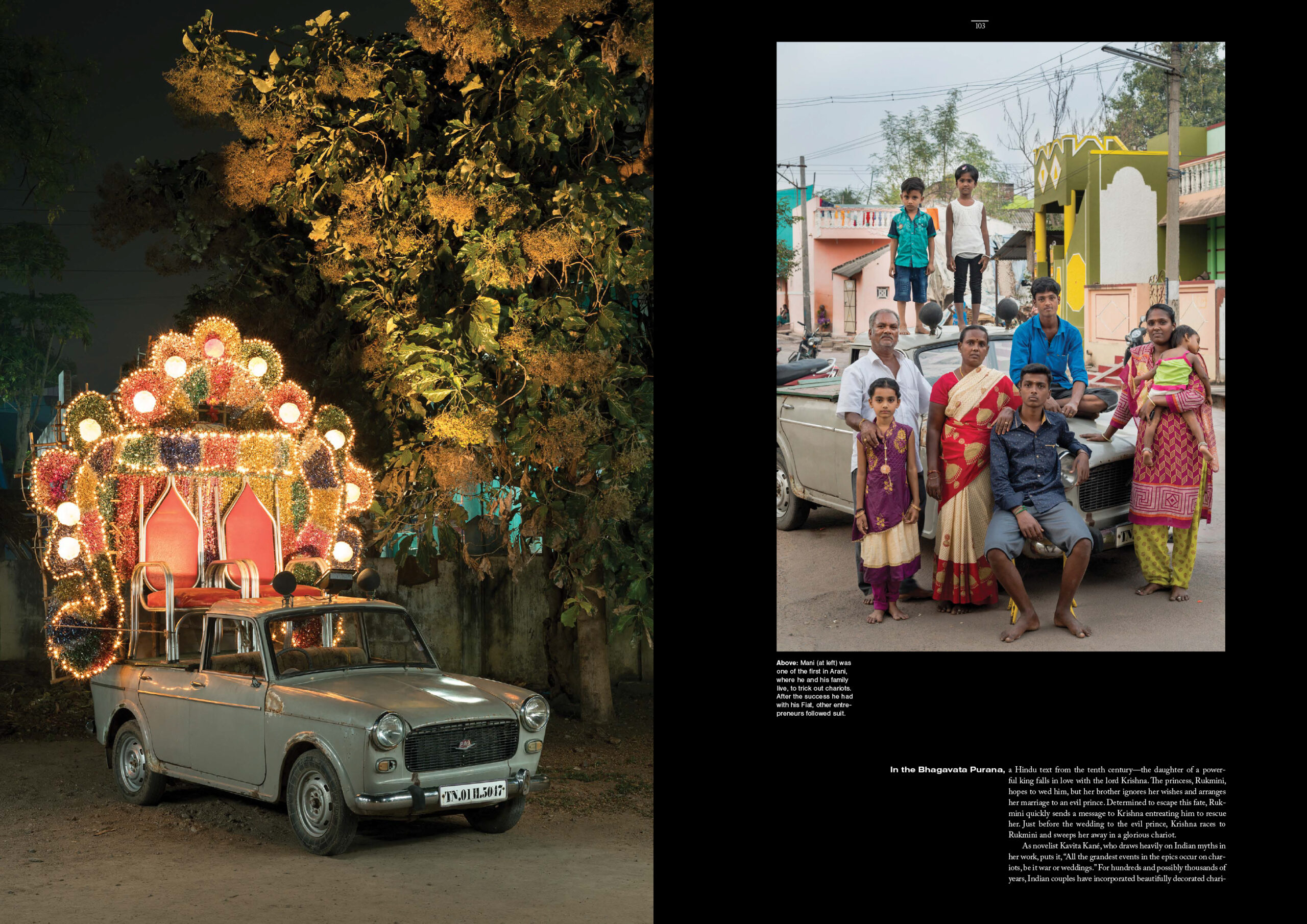
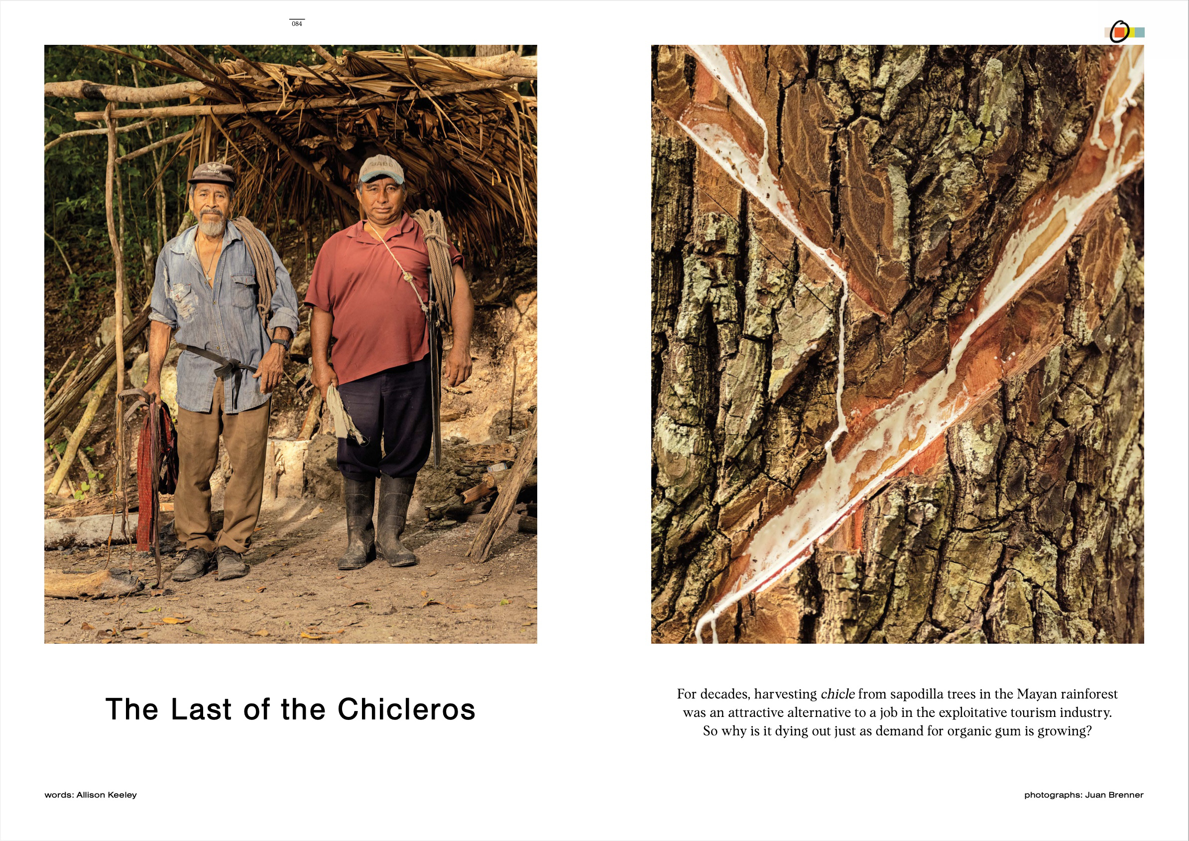
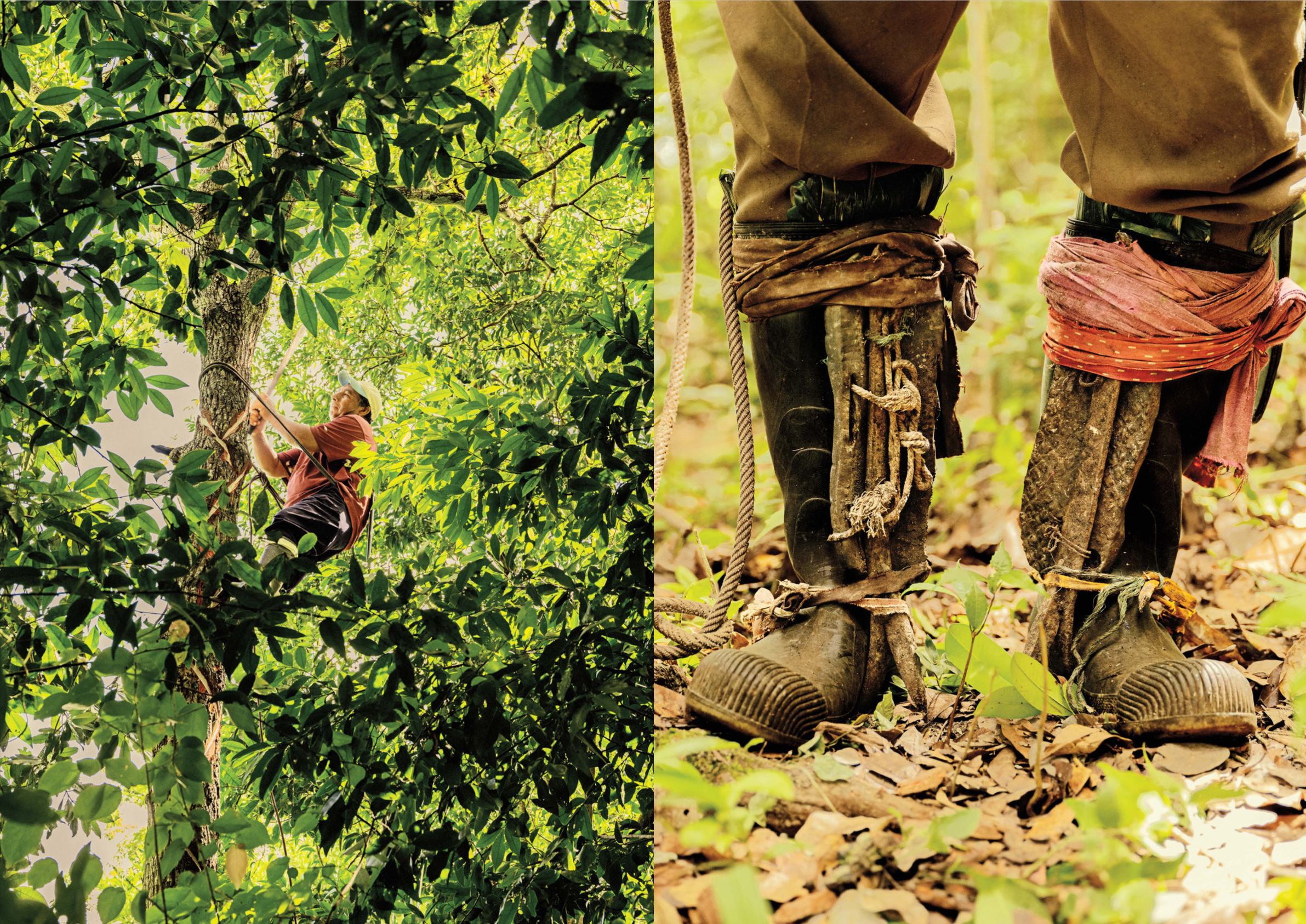
When we started out I did think we may have a mix of some more conceptual work or even some illustration but as we assigned the first couple stories, it became clear that going with more documentary or portrait photographers with a very strong style would be the way to go. We really wanted to include stories from all over the world so I started digging for photographers in China, South Africa, Central America, all over really. I looked for people who walk the line between documentary and fine art. A writer pitched a piece about gum makers (chicleros) in the Yucatan and I immediately thought of Juan Brenner who I really admired but had never worked with. His interest in photographing the culture of his native country of Guatemala made it feel like a great match to me and that story is just beautiful- and it really feels like him.
A writer in China pitched a story that takes place in mainland China and we ended up having to work around Covid restrictions. (This was all happening in mid-2021.) Travel restrictions were extremely tight and I couldn’t even send someone from Hong Kong so I did a lot of research and ended up working with photographer Yuyang Liu, based in Shanghai, who did an incredible job. We were really blown away when those images came in. I made it very clear to each photographer that we would run images as full page spreads so they absolutely had to keep it in mind while shooting.
Our budget was not that big so I also looked really intensely for any stories that we could pick up if it made sense. I found a project that Sameer Raichur had done a while back about wedding chariots in India. It is a really beautifully photographed series showing families with their cars and then the cars turned into these elaborate chariots used to carry the bride and groom in wedding processions. This felt like a great opportunity to just run a series of beautiful portraits.
I could really just talk about every story individually because, in the end, I try to always do what I think is right for the story so I knew there would be a lot of variation between them. I decided not to let the idea of an overarching style get in the way of using who I thought was the right photographer for the individual piece. And there were so many opportunities to make great images and have fun with it. I didn’t want to there to be any one-offs that felt completely different from everything else but I felt like there was room for flexibility.
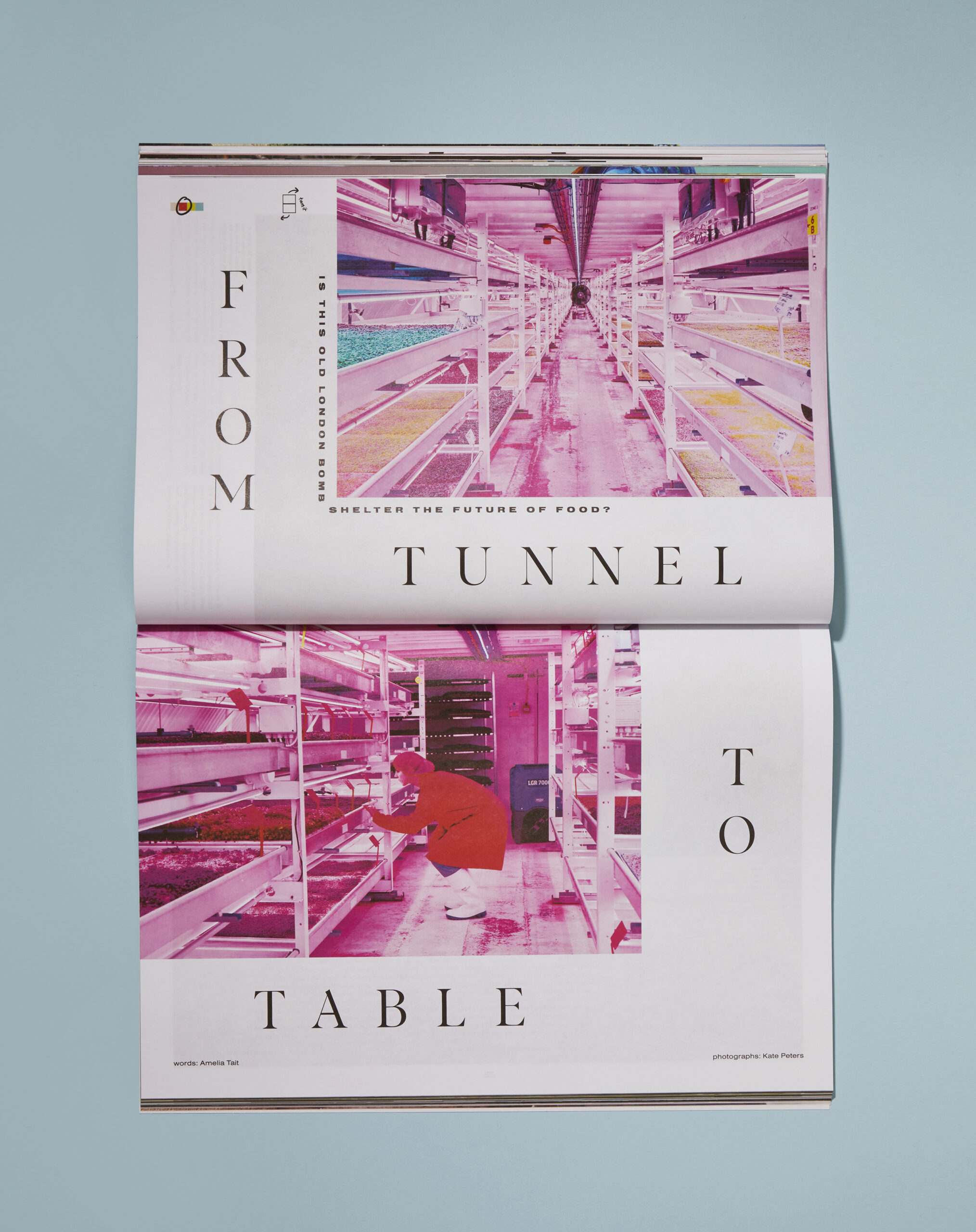
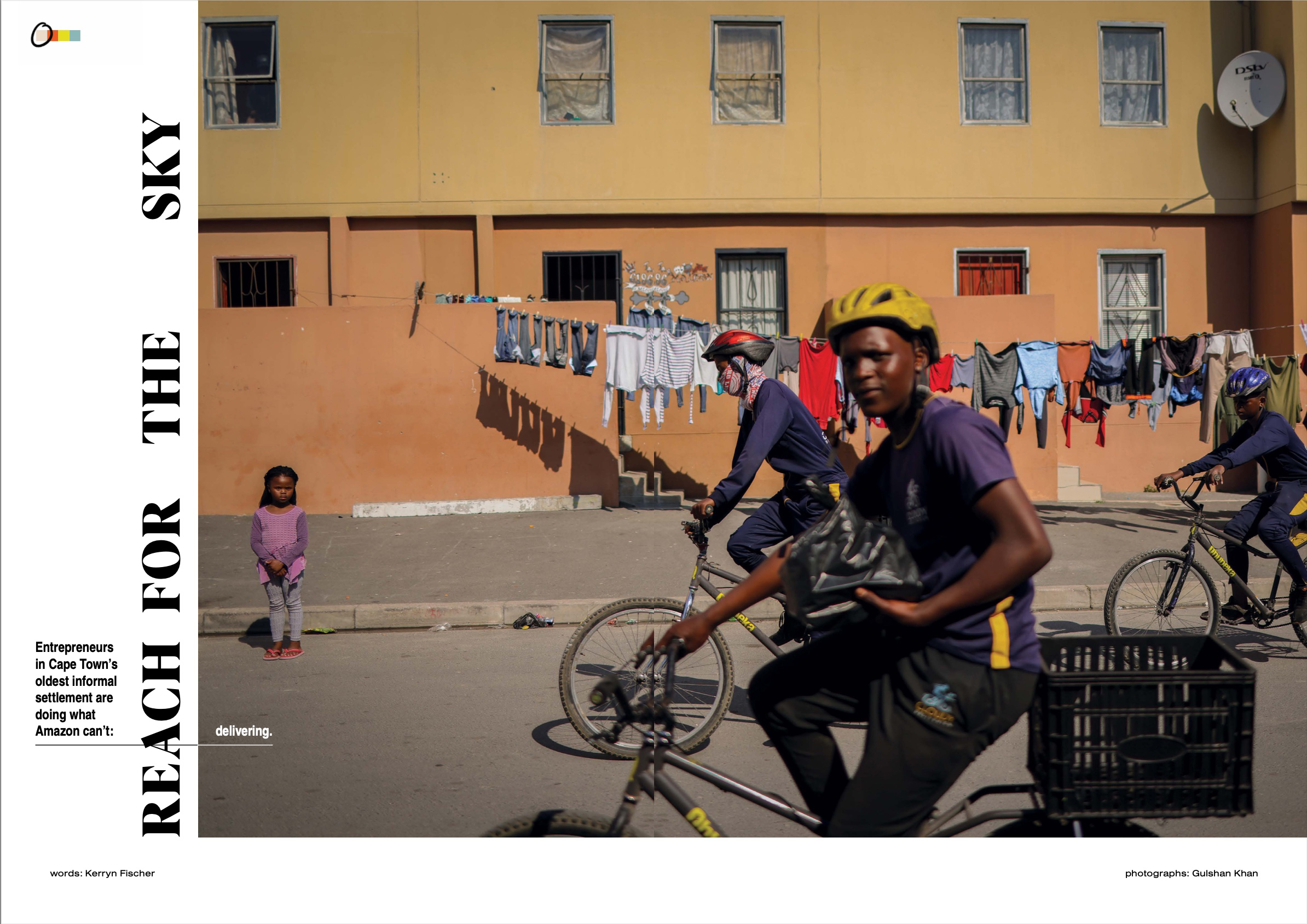
What makes this business magazine different, and how was the business landscape changed? We wanted to cover the people and the businesses that get left out of mainstream business publications. Our editor, Alana, had no allegiance to traditional business publications. She is someone who really doesn’t back down from being irreverent and questioning everything. She is fearless in that way! We felt like it was the perfect time, coming out of the pandemic, when the world is rethinking the idea of work, to look for some people who are doing it differently. To look at work in general- through pieces like Night Shift about the culture of work in Japan or to find people who are filling needs in creative ways like the company Cloudy Deliveries, in a township outside of Cape Town. That business is sending young people out on bikes to deliver anything that people need- combining social services for young kids who are looking for something to do as well as filling this real need that is not being filled by companies like Amazon who just don’t deliver to places like that. The story Superfly is about a company in Singapore that is extracting biomaterials from black soldier flies- basically using local compost to generate materials that can be used in many different products. So we let in a science story because I really wanted to run a double page spread of fly larvae!! The hope was to celebrate the idea of entrepreneurship by finding disruptors and innovators who aren’t necessarily flashy or in the spotlight.
How often does this come out? This was our pilot issue. I would so love to make more but right now I’m not sure if there will be an issue #2. Let me know if you want to fund more!
Tell us about the name?
The search for a name was tough. We all brainstormed and threw around ideas for months going through several iterations before settling on 100 Battles. That was one of the few things that needed to get approval from Headline who otherwise gave us a ton of freedom editorially. So it took us a while to land it but 100 Battles is quote from the famous Sun Tzu book, The Art of War. “Know the enemy and know yourself; in a hundred battles you will never be in peril.” We definitely aren’t pushing the idea of competitors as enemies but think of it more as an acknowledgement of the amount of work entrepreneurs must put in to be successful and the amount of understanding it takes to be able to break the rules.
If you want to hold a copy in your hands, you can find it here: 100battlesmag.com
Other contributors include in order of appearance
Cover: Mary Kang
The Art of the Personal Project is a crucial element to let potential buyers see how you think creatively on your own. I am drawn to personal projects that have an interesting vision or that show something I have never seen before. In this thread, I’ll include a link to each personal project with the artist statement so you can see more of the project. Please note: This thread is not affiliated with any company; I’m just featuring projects that I find. Please DO NOT send me your work. I do not take submissions.
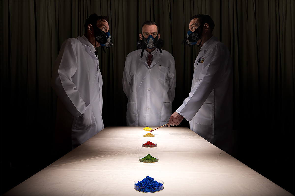
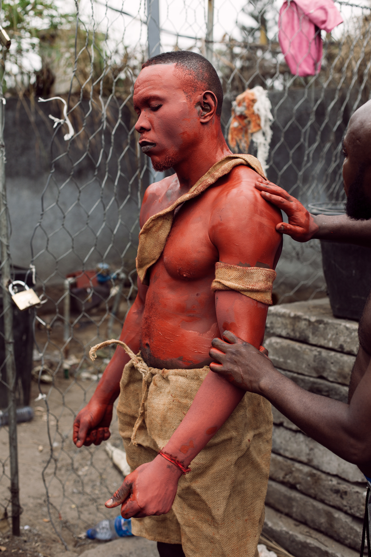
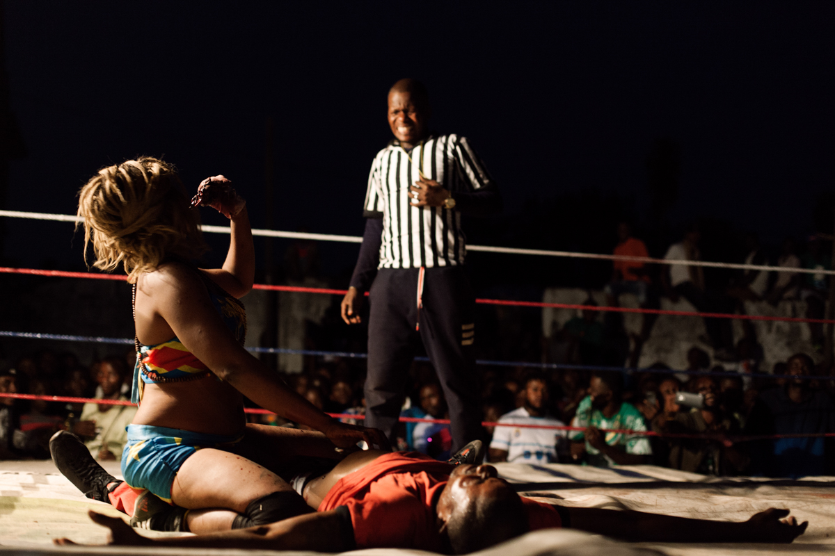
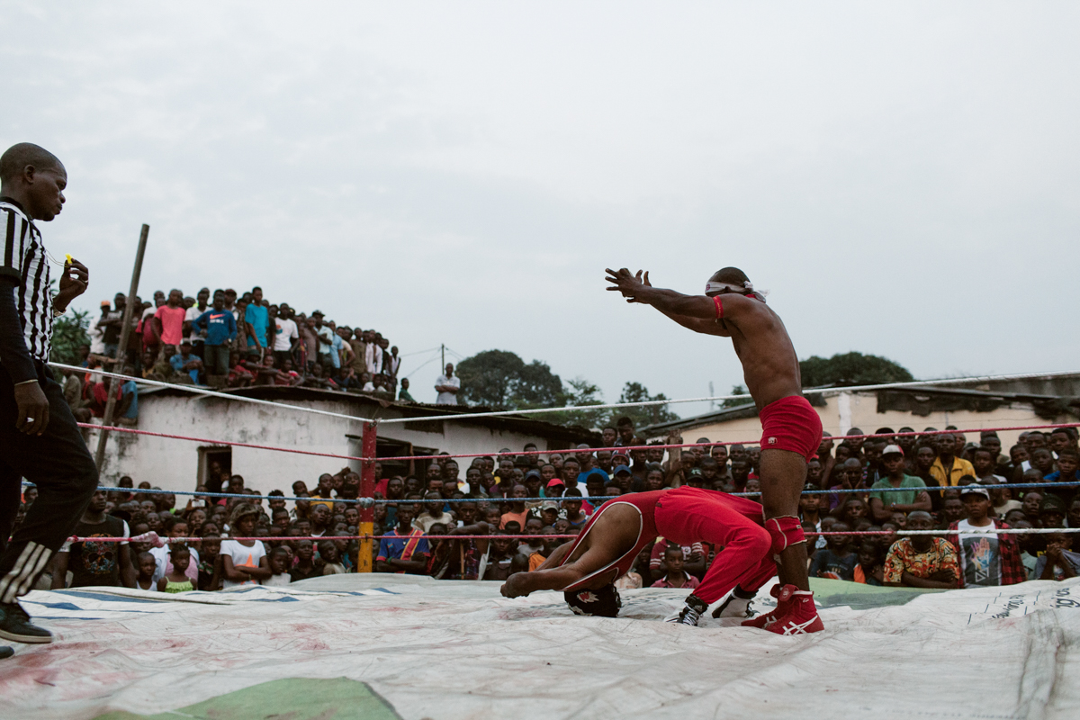
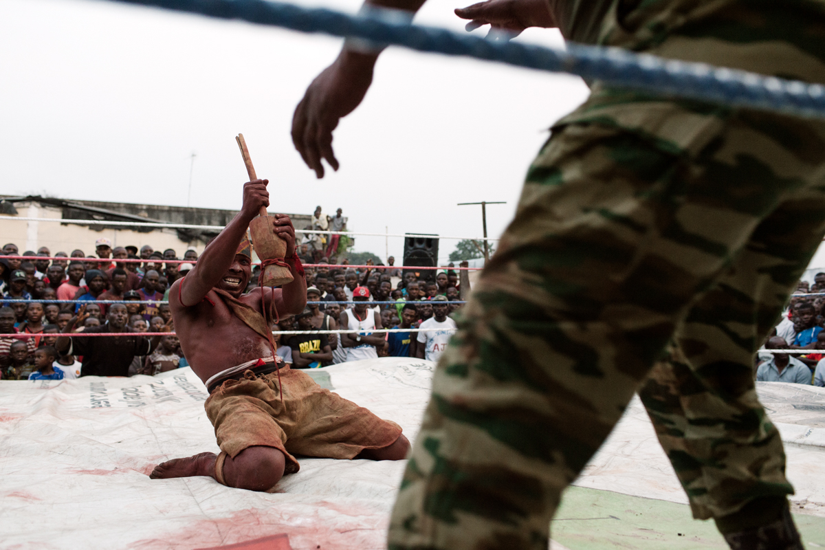
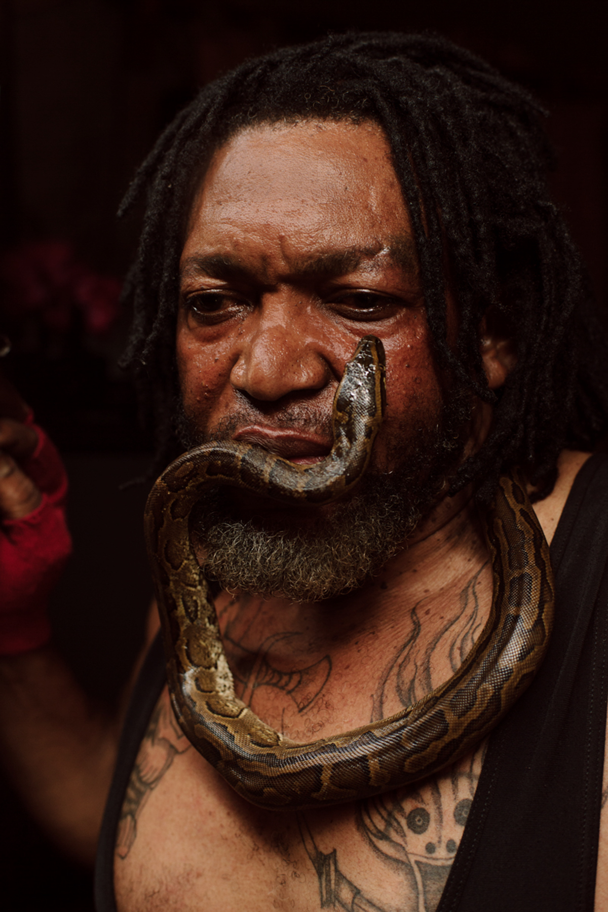
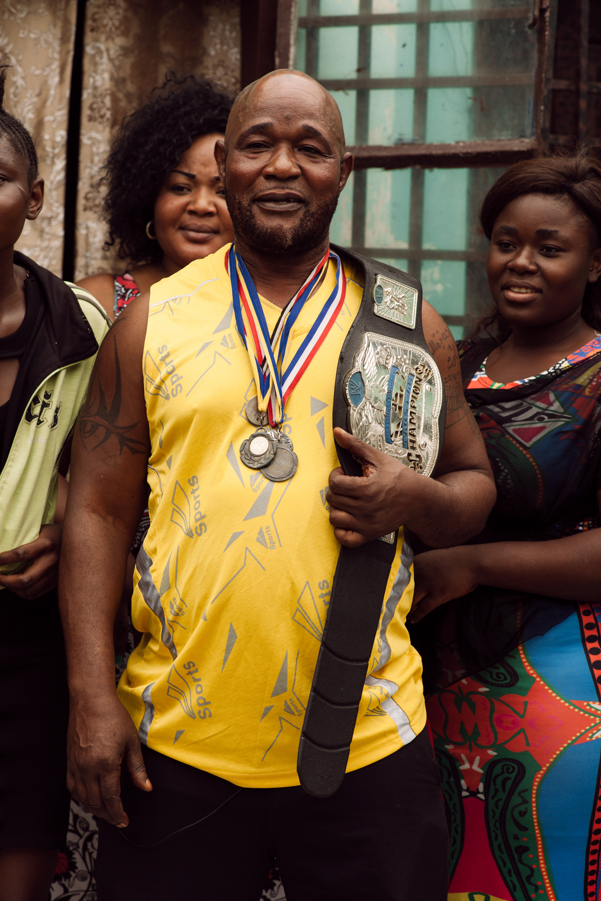
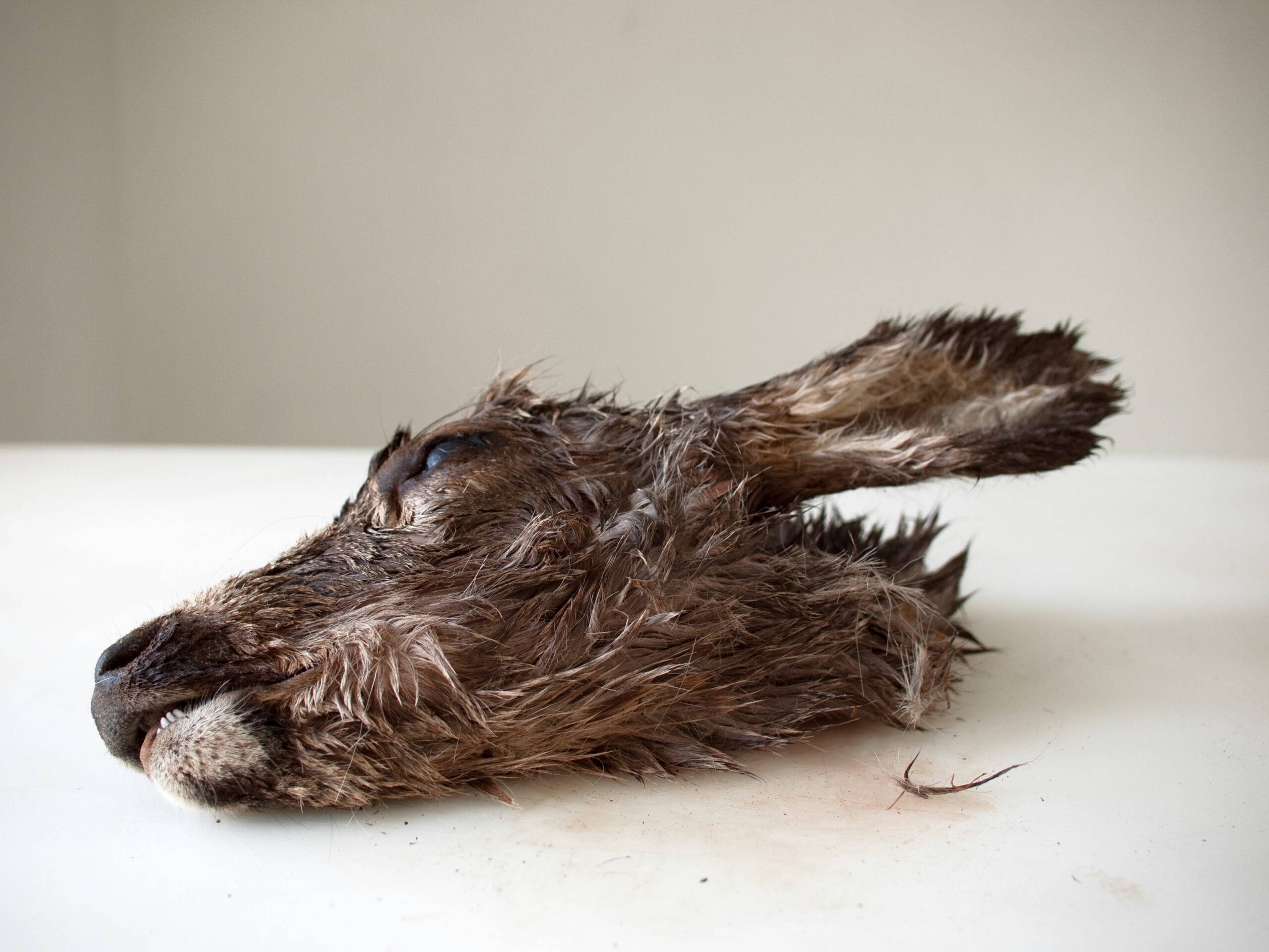
“In 2017 I worked on a documentary crew covering niche wrestling cultures around the world (we’re talking WWE-style professional wrestling, not the kinds of competitive wrestling you see in the Olympics). One of our episodes focused on Catch Fétiche, loosely translated as “Voodoo Wrestlers,” a unique subculture in the Democratic Republic of Congo.
As the name suggests, these wrestlers, or Féticheurs, employ magic in their matches in addition to the standard arsenal of wrestling moves. They use spells, sorcerous powders, and talismans to hypnotize, paralyze, and generally bamboozle opponents. With blaring brass bands, plenty of fire, and a few pints of animal blood, each match is a spectacle.
The wrestlers are usually unpaid, and the matches are free events. Besides the fear and/or adoration of the crowd, the performers use the stage time to advertise the potency of their magical offerings in the hope that, later on, some of the spectators will seek out their services. That might look like soliciting a love potion, divining the future, or removing a curse.
Each event begins with a parade through the neighborhood, centered on the fighters and a brass band, that amasses a crowd as it goes. Despite the inclusion of magic, many of the wrestlers are accomplished athletes and run training academies in various neighborhoods for other wrestlers and local youth.
It’s thought that professional wrestling first arrived in Congo with Belgian soldiers. However, it got there, in the time since it’s combined with local customs and mysticism to create something entirely unique, fascinating, and entertaining.”
APE contributor Suzanne Sease currently works as a consultant for photographers and illustrators around the world. She has been involved in the photography and illustration industry since the mid 80s. After establishing the art-buying department at The Martin Agency, then working for Kaplan-Thaler, Capital One, Best Buy and numerous smaller agencies and companies, she decided to be a consultant in 1999. She has a Twitter feed with helpful marketing information because she believes that marketing should be driven by brand and not by specialty. Follow her at @SuzanneSease. Instagram
Success is more than a matter of your talent. It’s also a matter of doing a better job presenting it. And that is what I do with decades of agency and in-house experience.
I wanted to open that way because betrayal is one of the great themes in art, culture, and human existence.
Yet it’s not a word we use in every-day conversation:
–Scene:
“How was your day today, honey?”
“Oh, you know, the usual. Petersen forgot to log off his copy code again, so he got blamed for the wastage.”
“That Petersen would forget his head if it weren’t attached to his body, wouldn’t ya say, honey?”
“Yeah, you betcha.”
“What else happened at work, honey?”
“Well, what else? Tyler brought ham again for lunch, which made the 50th day straight. We were counting. That was wild.”
“Oh, I can see that. Exciting, in an office-betting sort of way.”
“Yeah, right. Exactly. 50 days. (Chuckles.) What else happened? Oh yeah, sure. I betrayed Tommy, and he swore a blood oath to kill me, my children, and my children’s children.
So there’s that.”
–End Scene
I didn’t look up betrayal on the internet.
And I didn’t check a dictionary.
Betrayal is one of those words everyone just knows what it means, even if they’ve never tried to define it.
(Like its sister, revenge.)
I’d say, to betray: (verb:) to hurt or injure someone important or close to you, by some nefarious method, in a manner such as going behind someone’s back, cheating, lying, taking their stuff, selling them out, snitching, etc…
And not only people betray.
Societies and governments can too.
America was built by betraying treaties with the Indigenous inhabitants of this Continent, and betraying the boundaries of all human decency with the TransAtlantic Slave Trade.
We know this.
But the United States often betrayed its own principles, its belief in the power of Democracy, by undermining the freedom of so many people throughout Latin America, overturning elections, engineering coups, or outright invading nation after nation.
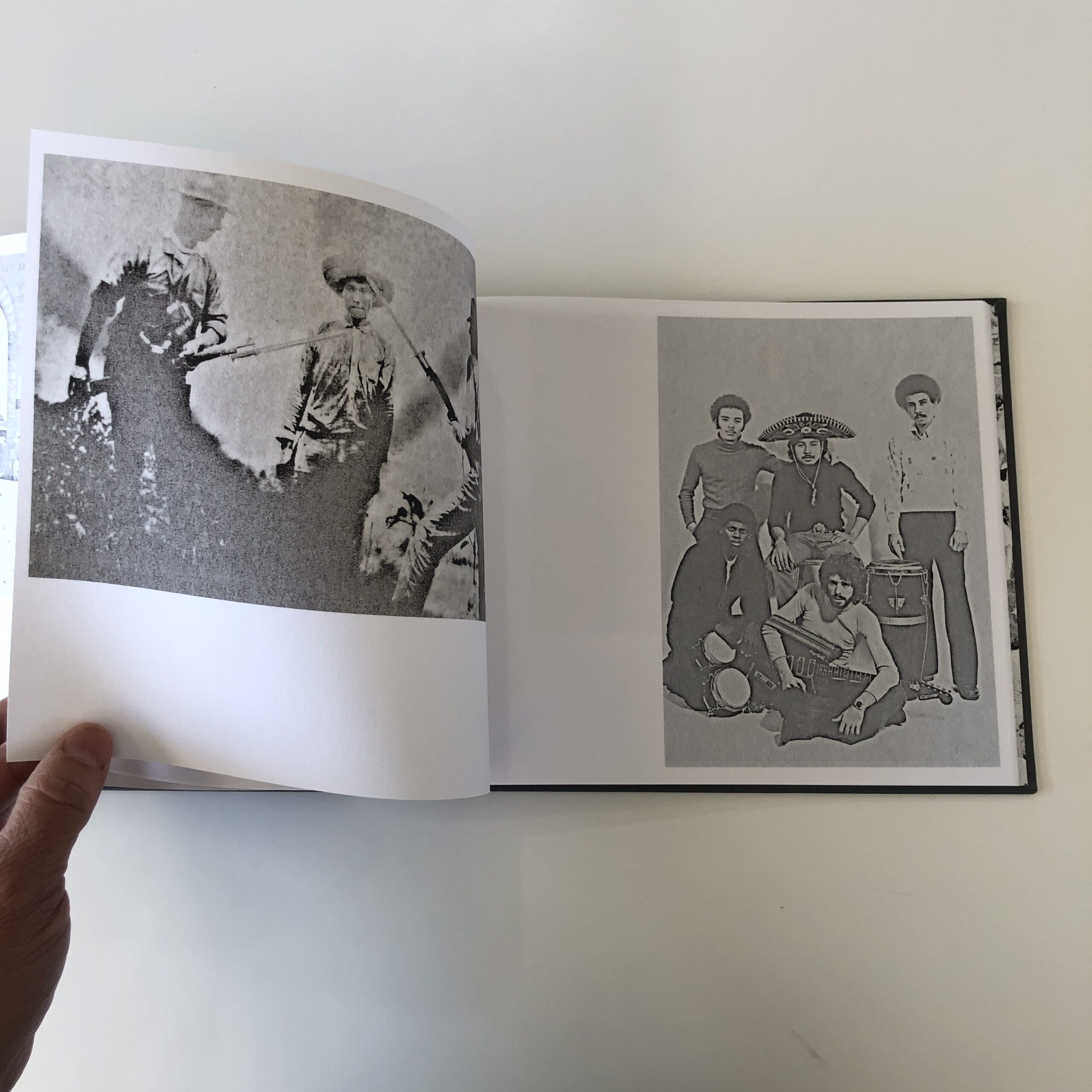
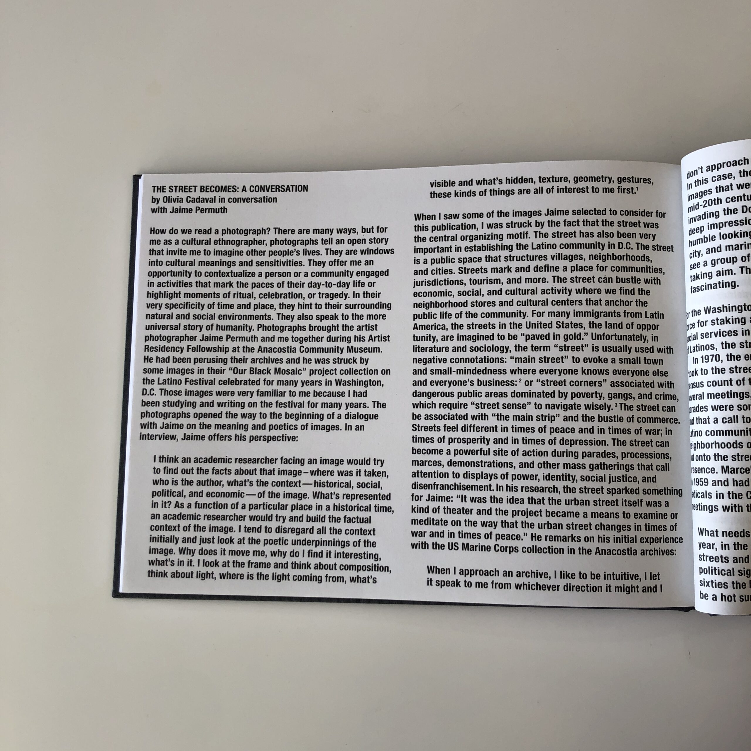
As luck would have it, we’re going to take a look at my friend Jaime Permuth’s new book, which turned up in the mail in October 2021.
“The Street Becomes,” published by Meteoro Editions in The Netherlands, has a gray cover, with cool fonts and embossed letters.
(But it doesn’t give much away.)
This is one of those books that doesn’t proffer context from the jump, but asks you to figure out things as you go.
Given that I know Jaime is from Guatemala, (though he currently lives with his wife and children in South Korea,) and I’ve looked at a lot of photo books, I put on my detective cap, and went to work.
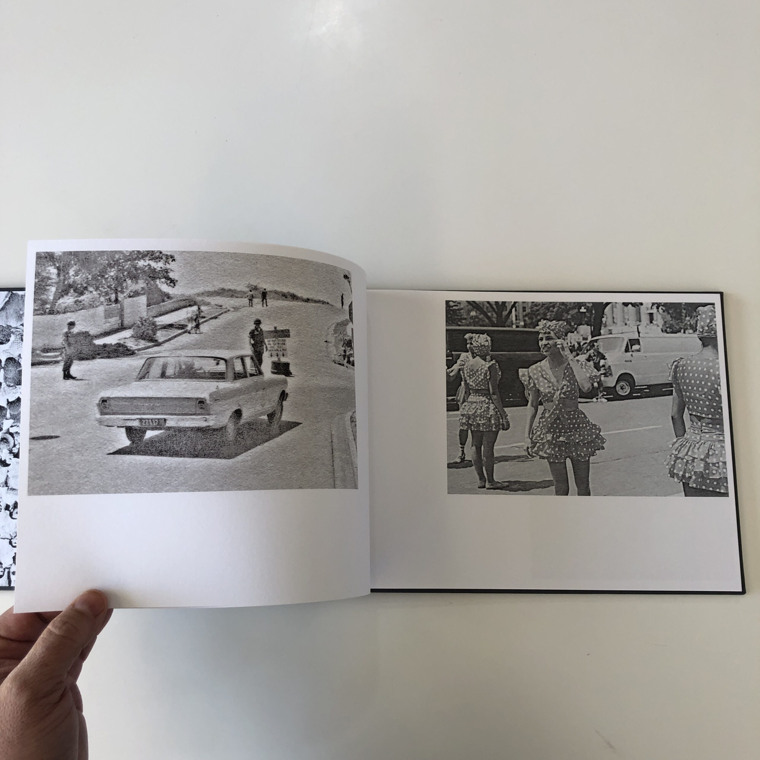
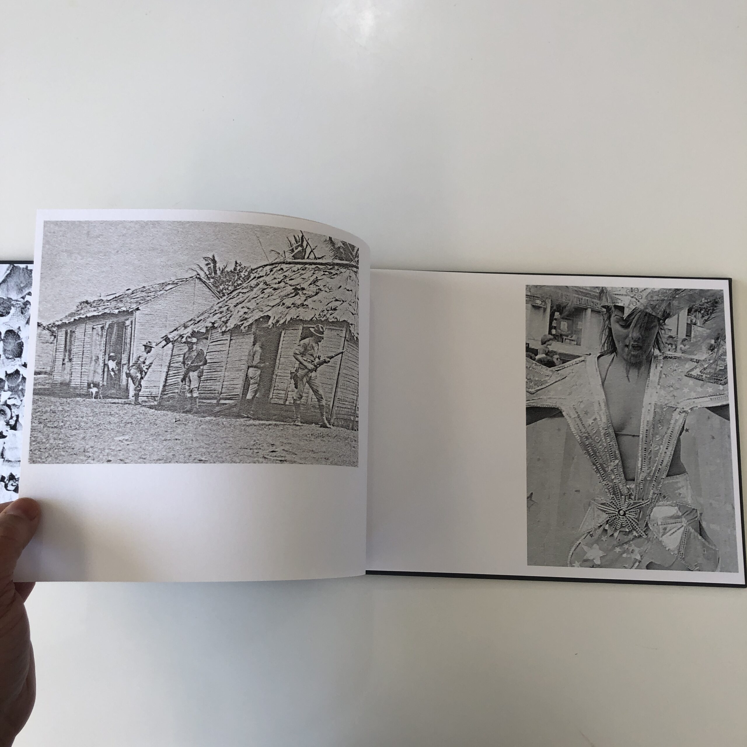
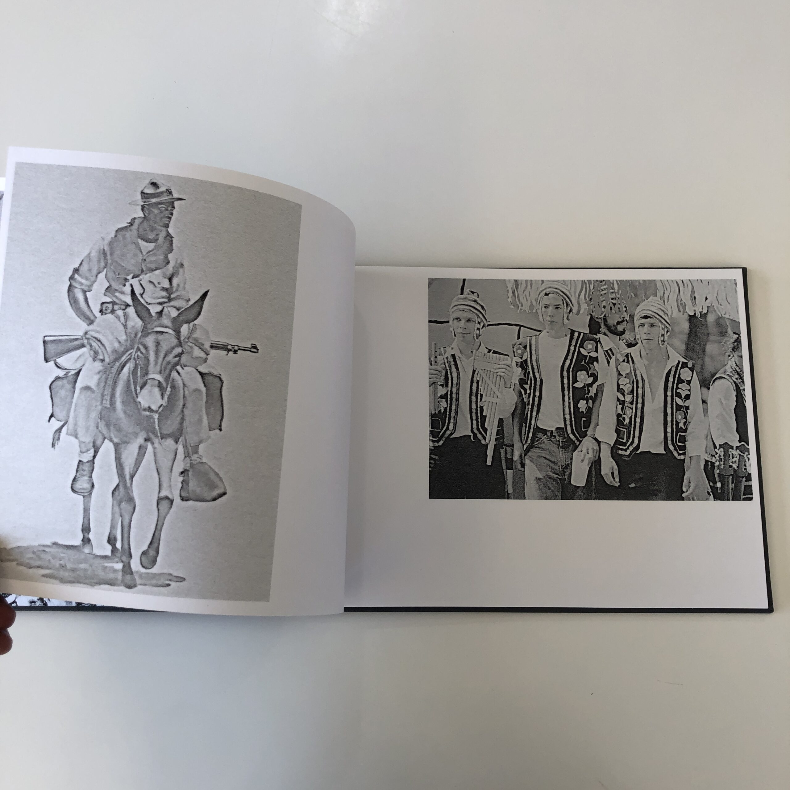
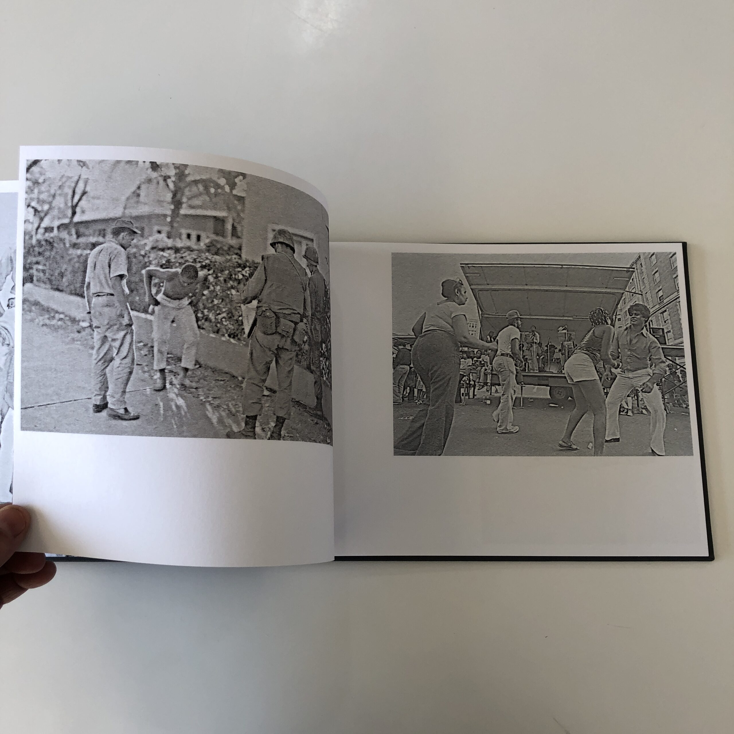
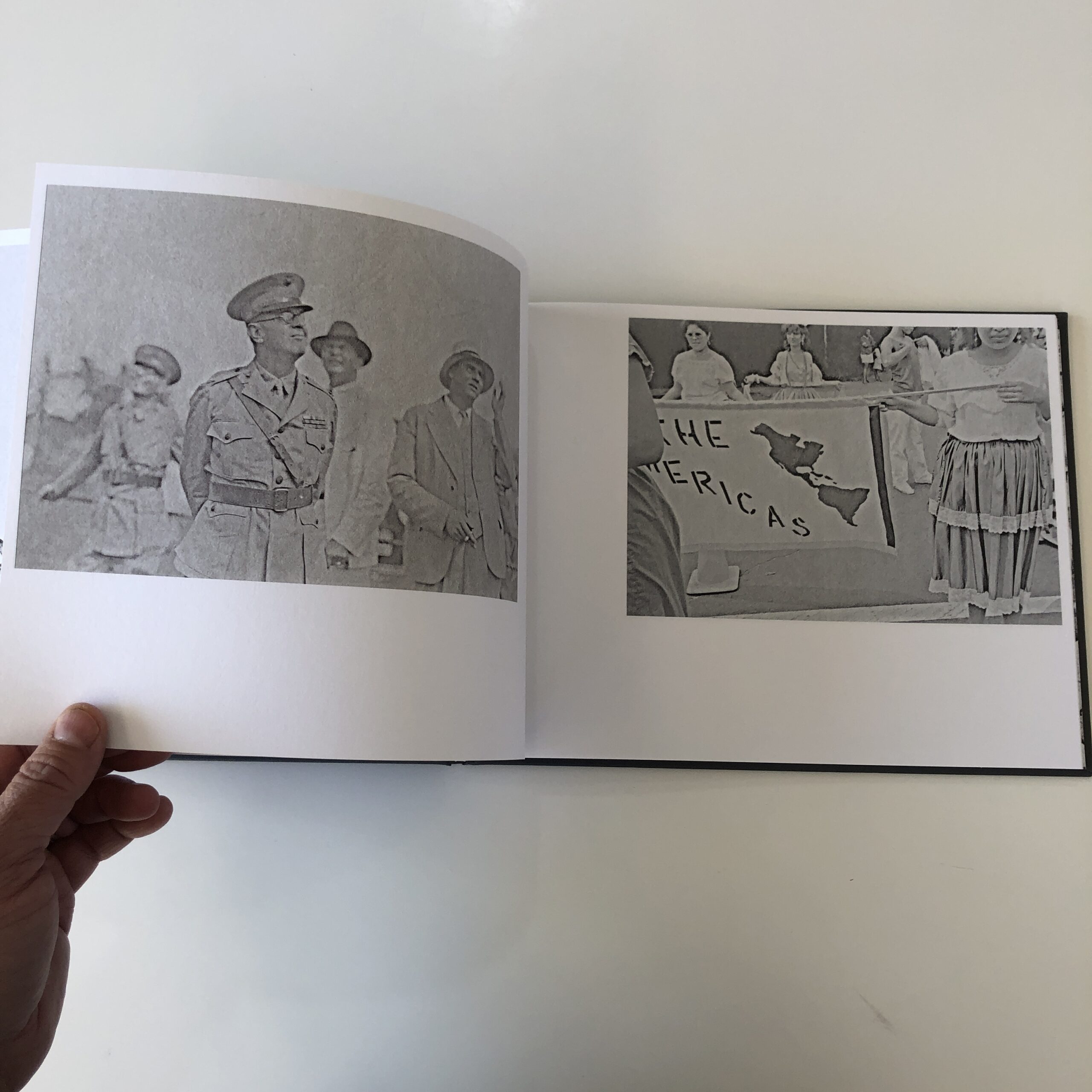
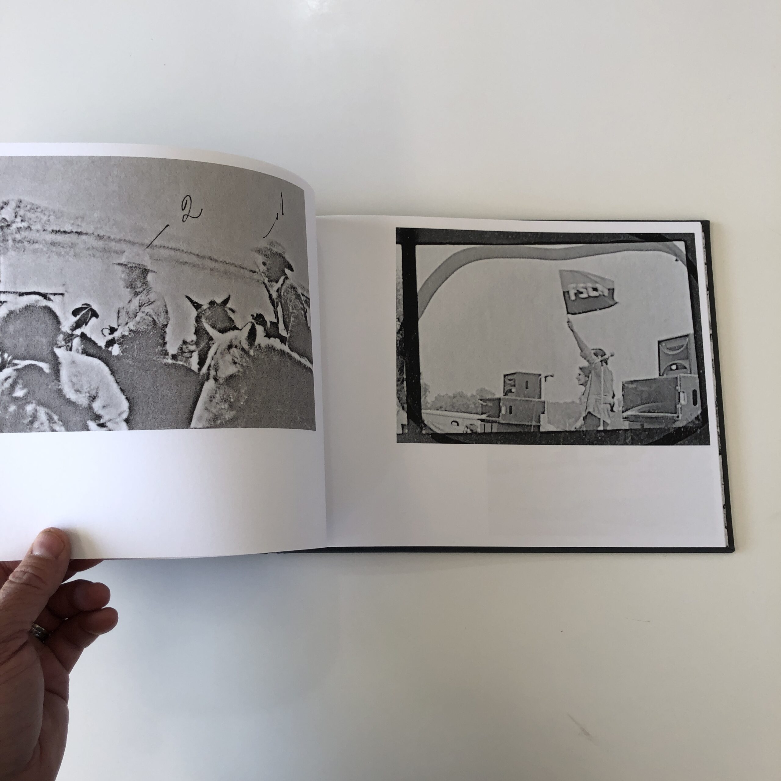
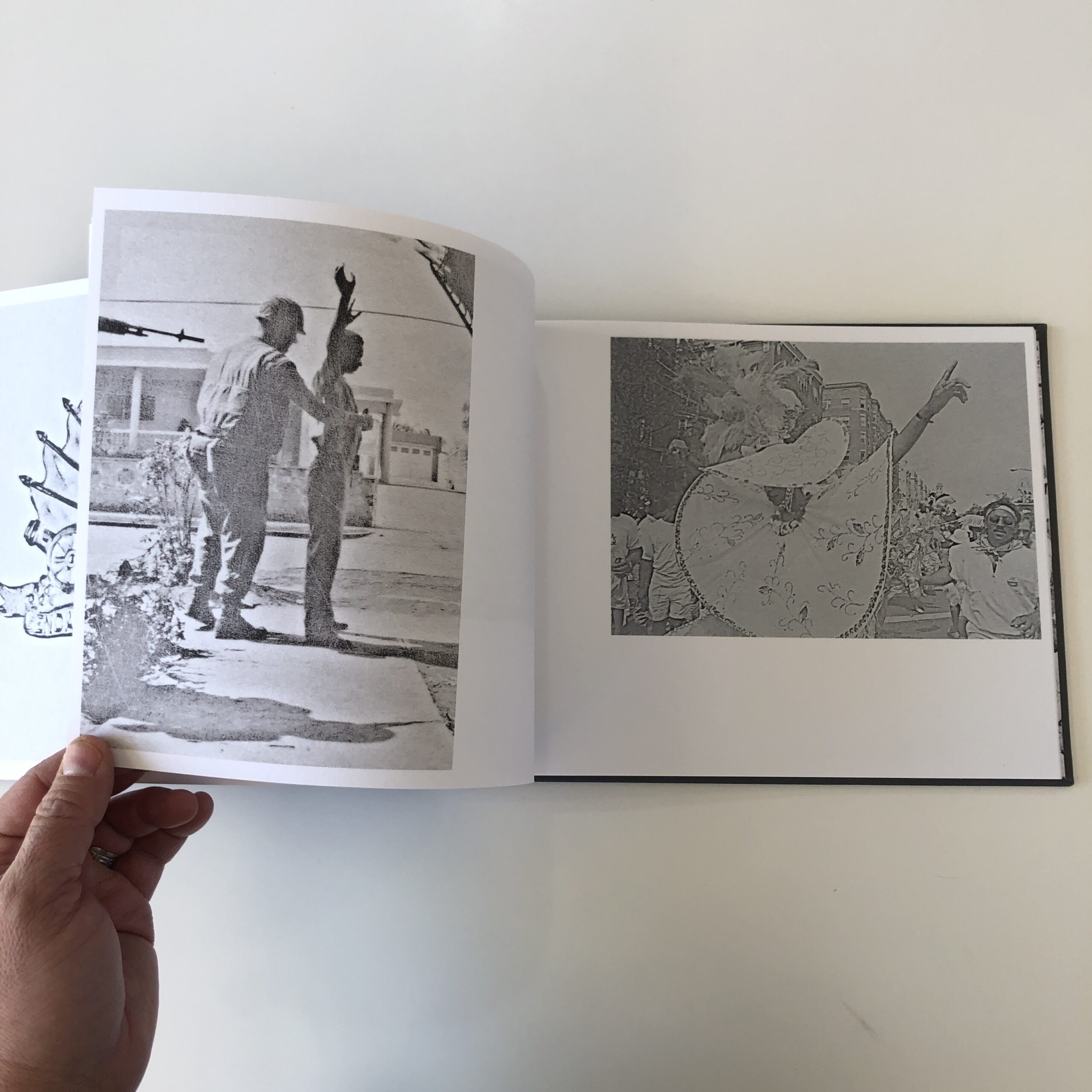
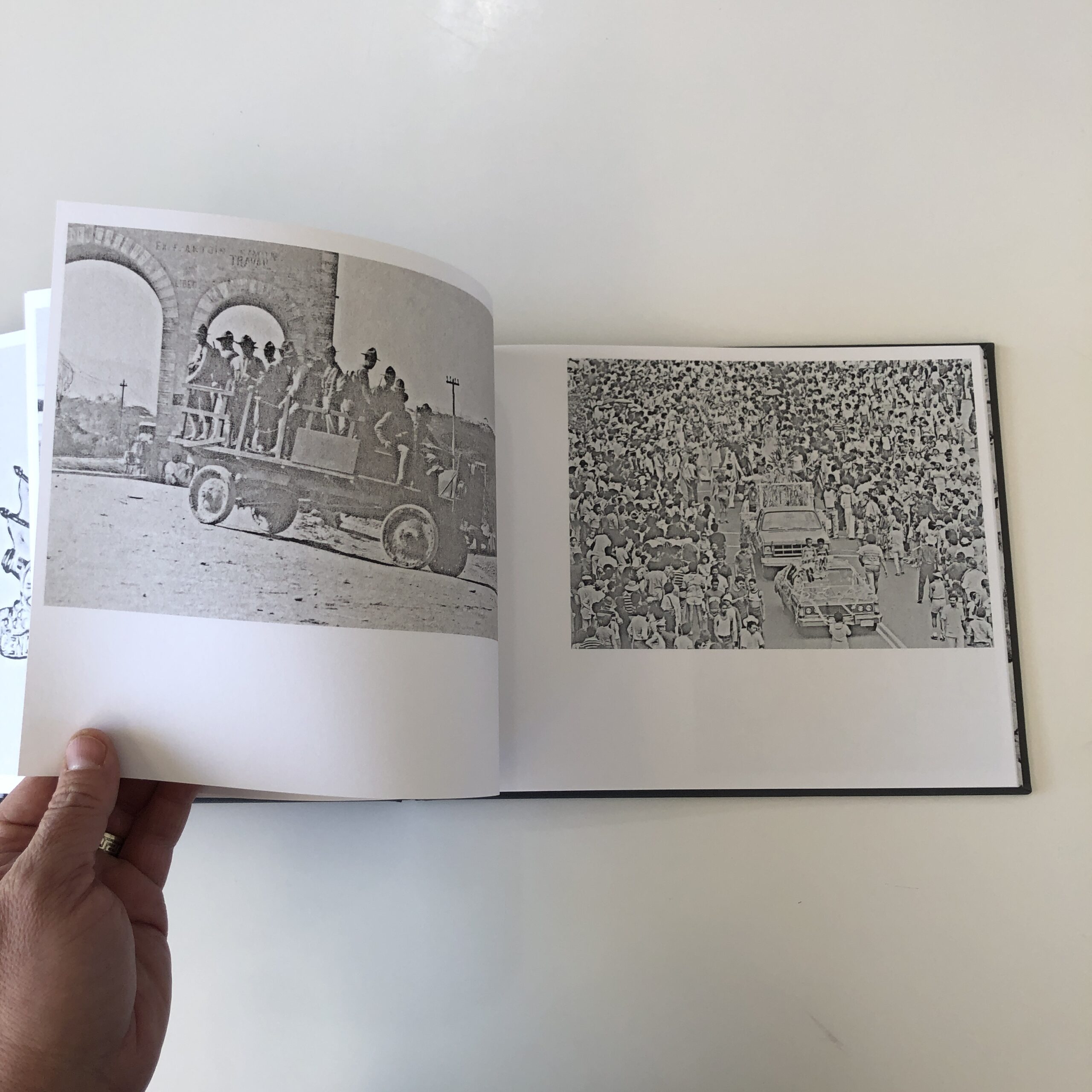
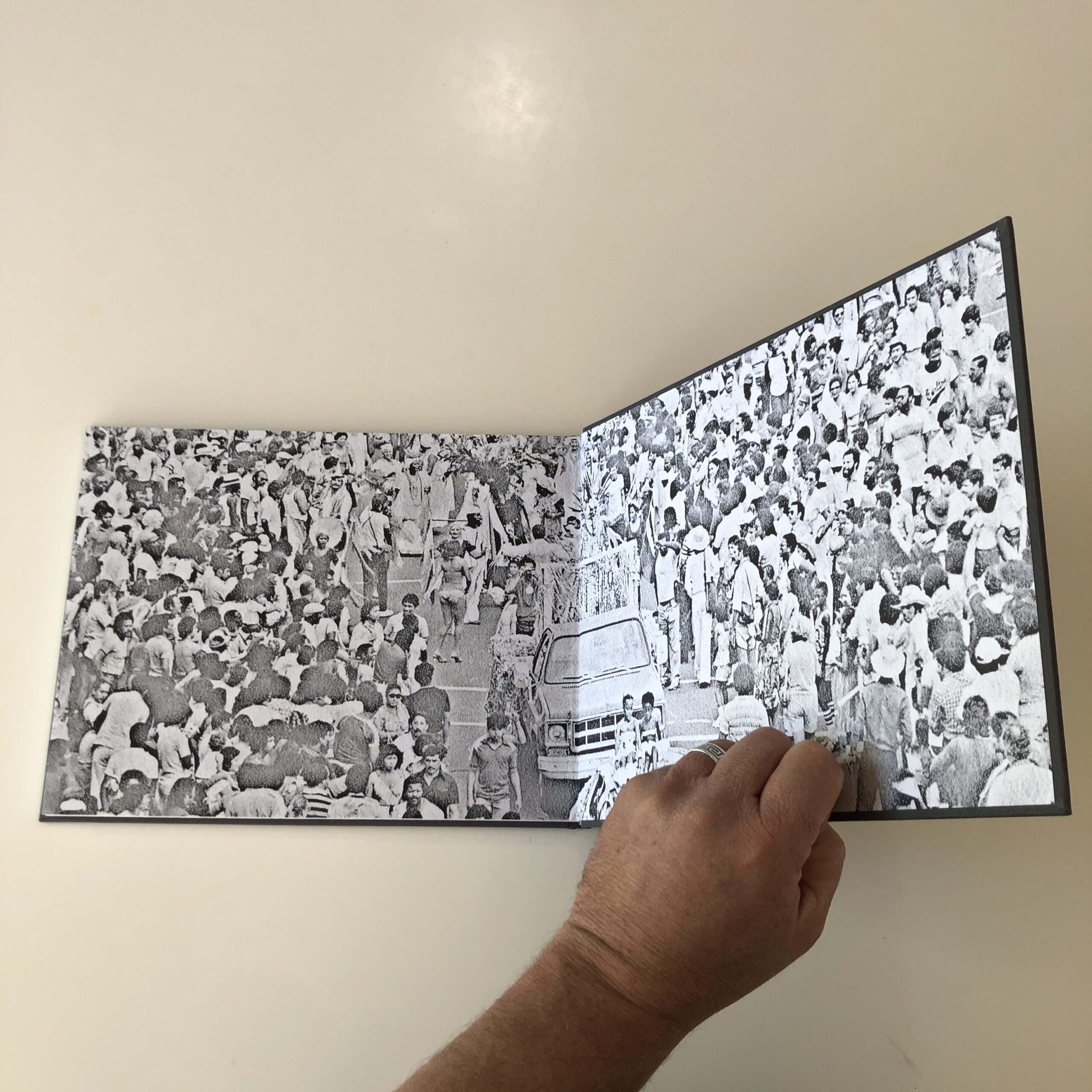
We see a series of double-spreads, featuring gray-scale images that appear to have been digitally altered, to create a consistent aesthetic.
On the left, always what appears to be archival imagery of American Imperialist, Colonialist invasions into Latin America, though it’s hard to say where.
On the right, the images also feel historical, but maybe over a slightly larger range of history. These pictures give us a feeling of Carnival, at times, or protest, at others, but maybe they’re all joined together by themes of Latino/Hispanic/Chicano/Latinx people, in their culture, out and about, in the streets?
But where?
Sometimes, the spread-pairings are direct, and obvious.
Others, less so.
I kept turning the pages, and thought, “This really seems like a concept book. Most of these pictures are not super-awesome, by themselves, so this book is telling a story in the aggregate.
With a very particular style.”
I kept turning the pages, hoping for a bit of surprise, and then, at the end, I spotted a Maryland license plate on a parade car .
Finally, I definitively placed it in the US, and if we’re being literal, in the DMV. (DC, Maryland, Virginia.)
Then the photos were done.
For text, at the end, there’s a conversation-style-interview between Jaime and curator Olivia Cadaval.
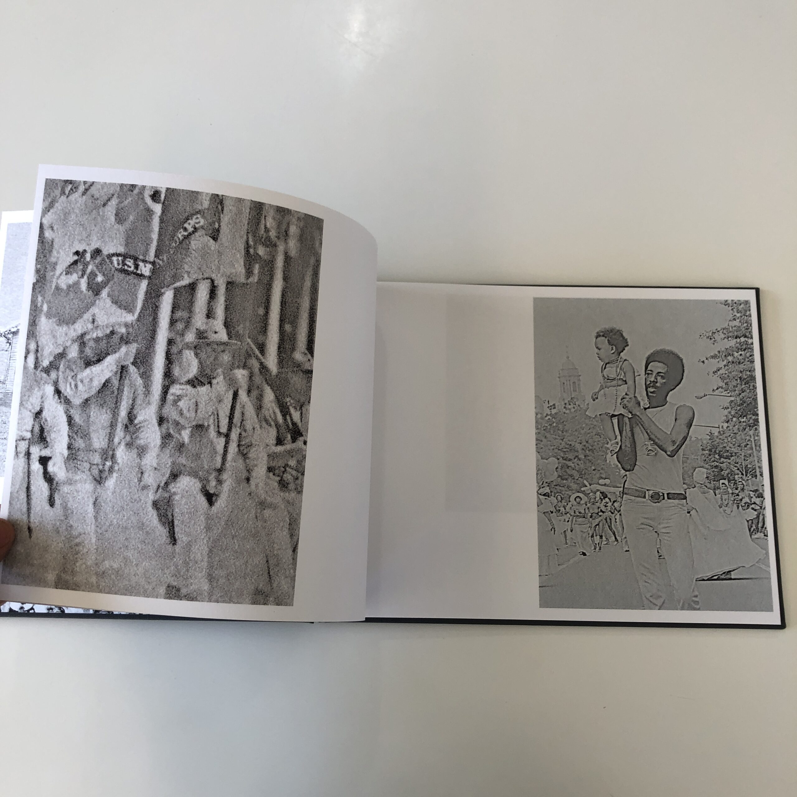
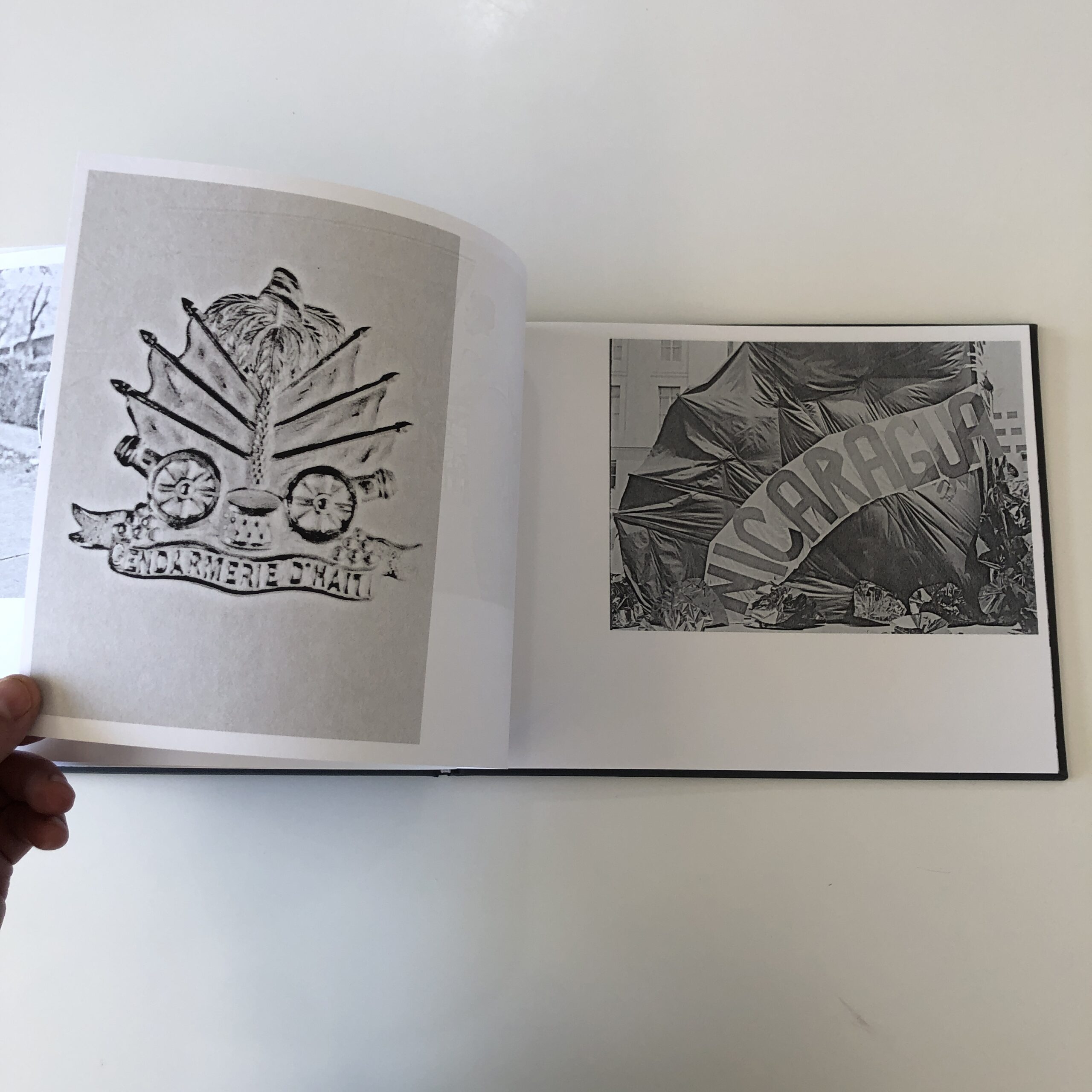
We learn Jaime was a fellow in DC, at the Smithsonian’s Anacostia Community Museum, and chose to make a book of two different groups of images from the archives, which appealed to him intuitively.
The first is of US Marine Corps invasions in Haiti and the Dominican Republic; the second came from The Latino Festival, which first began in DC in 1968, and continued for years.
Jaime also spoke of connections to his youth in Guatemala, a country still ravaged by insane violence and poverty; the long shadow of a bloody 80’s Civil War. (In large part due to US Imperialism.)
So maybe, (in the end,) it’s a concept book with a mission:
To remind us, when a society betrays its best values for its worst, bad shit can happen.
The Art of the Personal Project is a crucial element to let potential buyers see how you think creatively on your own. I am drawn to personal projects that have an interesting vision or that show something I have never seen before. In this thread, I’ll include a link to each personal project with the artist statement so you can see more of the project. Please note: This thread is not affiliated with any company; I’m just featuring projects that I find. Please DO NOT send me your work. I do not take submissions.
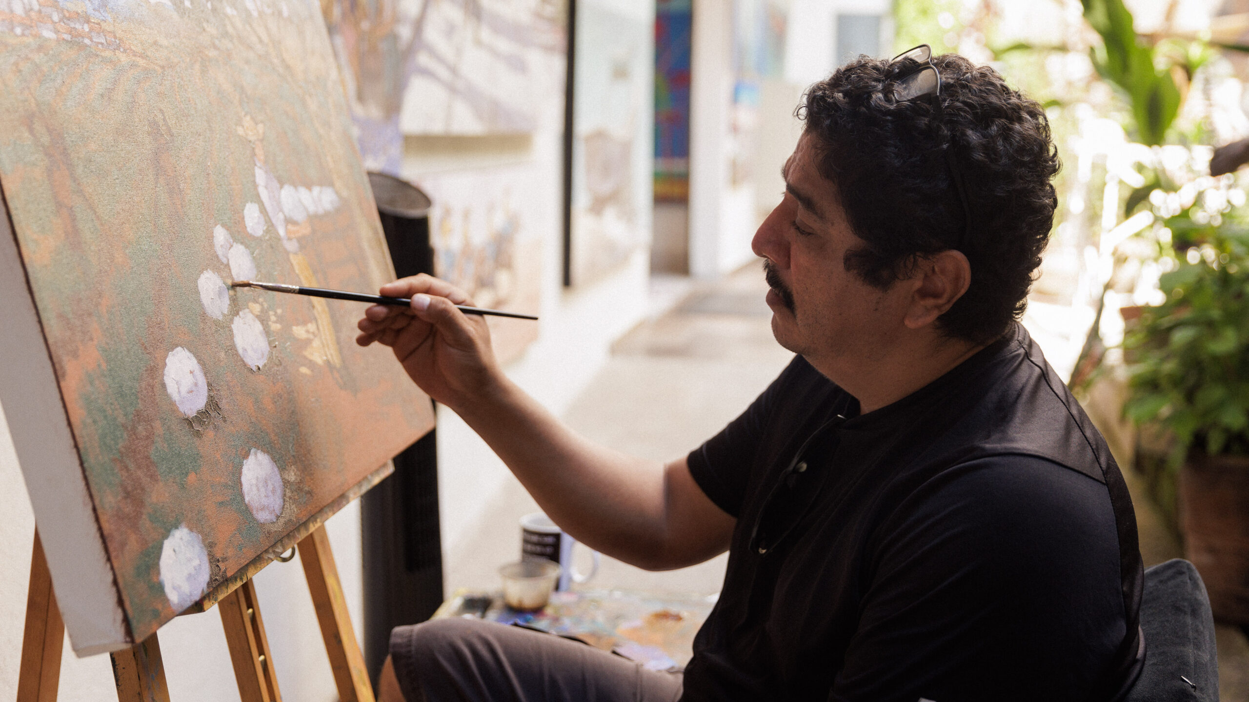
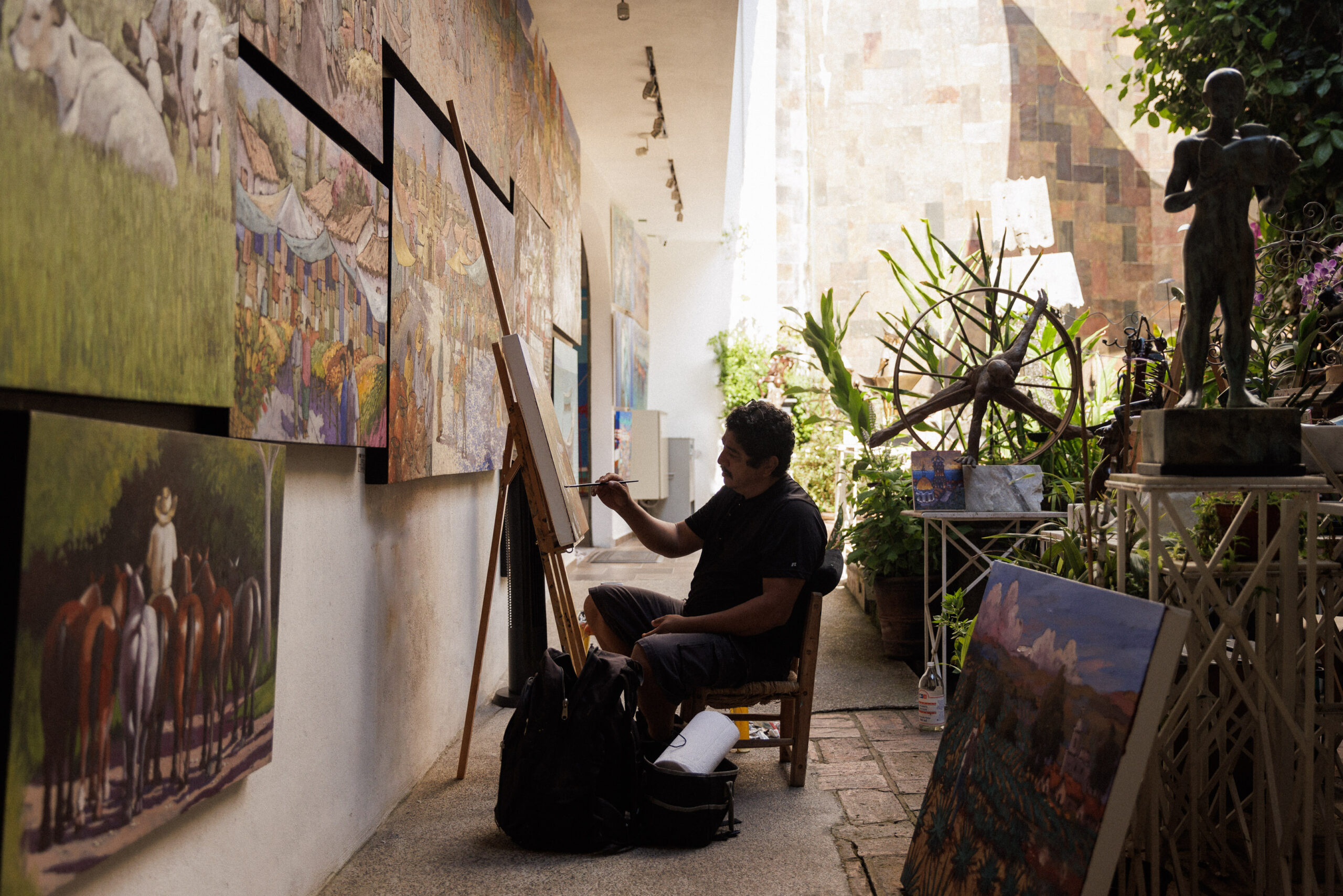
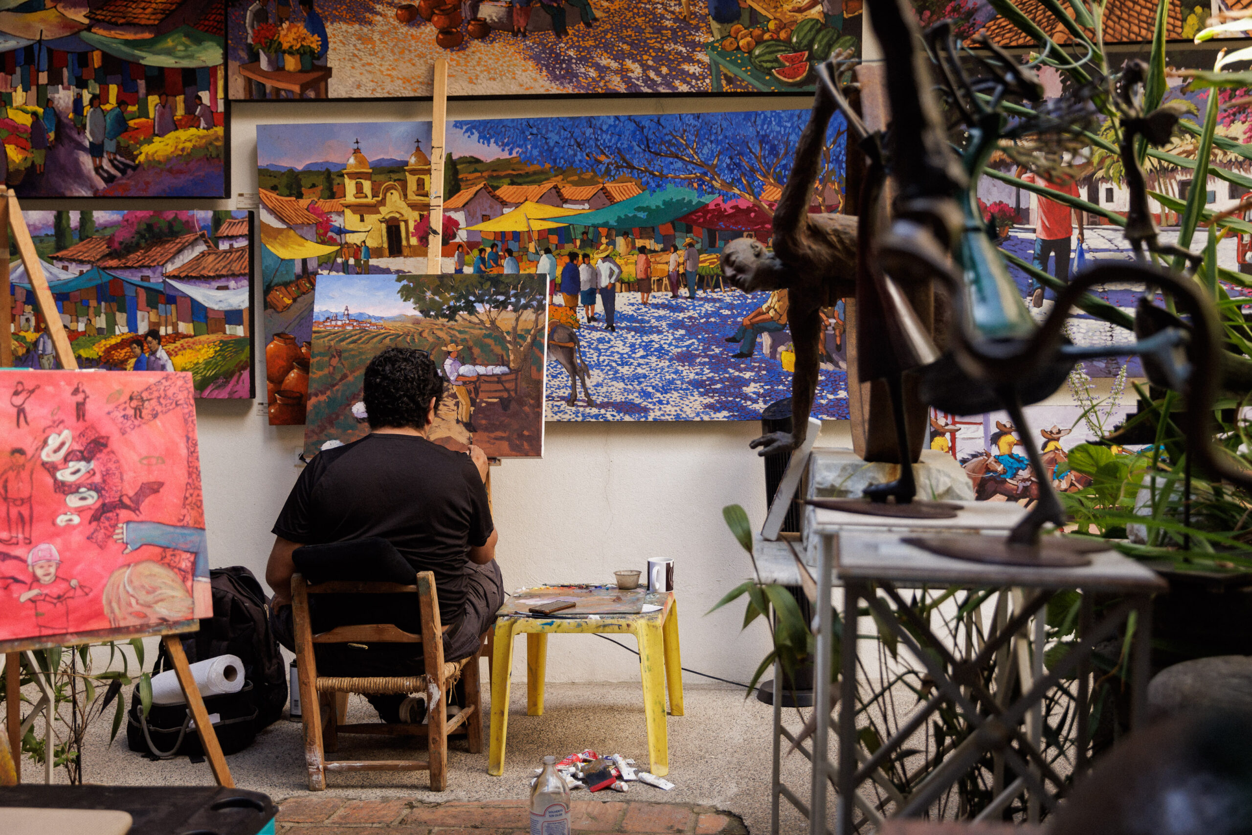
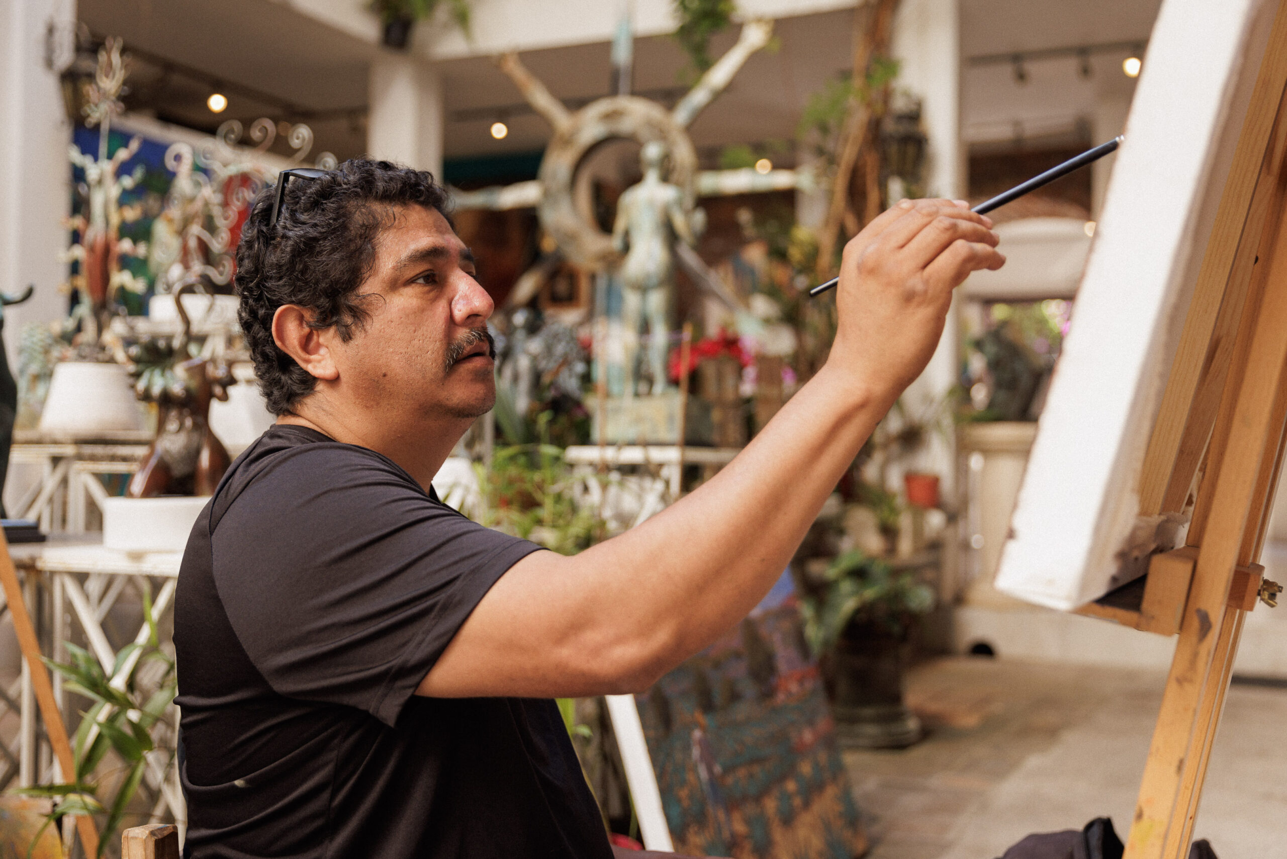
Whenever I travel, I love to just walk, especially off the normal tourist’s path. You get such an authentic and casual view into the lives of people who actually live there, rather than the curated spaces that line the beachfront. Real people and real moments and real spaces. I’ve always been magnetically drawn to those scenes.
On a recent trip I was walking down a side street in Old Puerto Vallarta, and I saw this incredible courtyard inside of an art gallery, with a lone figure working on a canvas painting inside. I didn’t have my camera with me at the time, so I asked the gallery manager if I could talk with the painter about shooting some photos later in the day. He said I could ask the painter directly and introduced me to Efren Gonzalez.
It turned out that Efren is a well-known Mexican artist, and an incredible person. He allowed me to spend a couple of hours shooting with him that afternoon and answering my endless questions about the exceptional things he’s done for the arts in his local community of Ajijic, Mexico. He told me about the museum he’s opening in his home to support Ajijic artists, and about the Day Of The Dead Wall sculpture work he had just completed that commemorates members of his community that have passed away.
I walked away from that afternoon with some great images, but more importantly, with a connection to this amazing person. Photography has given me so many opportunities to meet people like Efren over the years, and I’m forever grateful for that.
APE contributor Suzanne Sease currently works as a consultant for photographers and illustrators around the world. She has been involved in the photography and illustration industry since the mid 80s. After establishing the art-buying department at The Martin Agency, then working for Kaplan-Thaler, Capital One, Best Buy and numerous smaller agencies and companies, she decided to be a consultant in 1999. She has a Twitter feed with helpful marketing information because she believes that marketing should be driven by brand and not by specialty. Follow her at @SuzanneSease. Instagram
Success is more than a matter of your talent. It’s also a matter of doing a better job presenting it. And that is what I do with decades of agency and in-house experience.
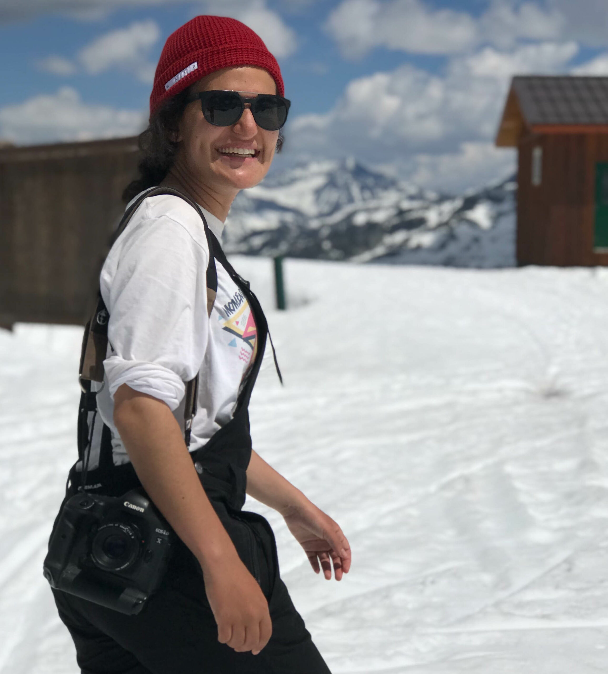
Heidi: A significant portion of your photo career was steeped in the ski industry, what are you bringing forward from that experience creatively, and what are you leaving behind? Ilanna: Skiing was my foundation for a creative career. Over those years, I learned how to conceptualize and pull together the images I wanted to create. I loved shooting for the magazines, and the democratic nature of submitting your best work at the end of the season to photo editors around the world. I always had a plan for the creative images I wanted to capture over the winter. I used to organize night shoots at the local mountains or convince a group to build and ride a Mount Seymour backcountry jump at sunset. I learned the benefits of going the extra mile to create a photo when I saw them published in some of my favorite magazines. That made hiking with photo gear in my backpack or dealing with the elements entirely worth it. When I started broadening my horizons outside of skiing, I left behind having such a specific niche driving my creativity. With that, I gave myself permission to experiment and dive into different genres.
How has this project helped you transition from Canada to California? This series got a significant amount of traction, which luckily coincided with the transition and growth of moving from Canada to California. Through that, I learned the real importance of personal work, and how it can truly be the catalyst needed to achieve your wildest goals.
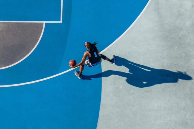
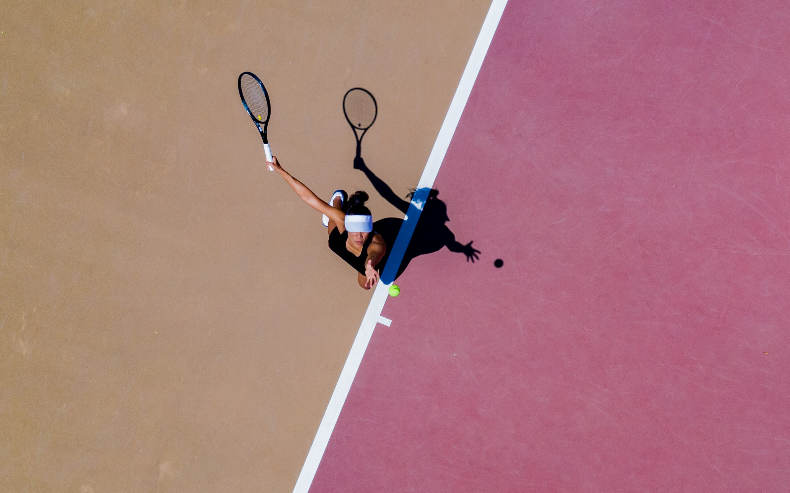
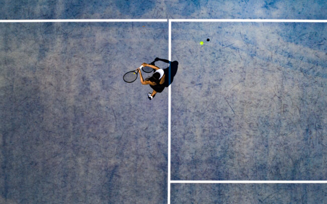
What made you choose courts and how do you find them? I was looking to intersect movement and shadows with shapes and lines. Tracks, as well as tennis and basketball courts, was a perfect fit for the concept I was looking to explore. Finding these locations was straight forward. I would sometimes browse Google Earth, but I also kept an eye out for them in my daily life once the project was underway. One of my favorite locations that I shot for basketball and skateboarding was found out of the corner of my eye while driving on a bridge in my hometown of Vancouver.
Why the drones? I originally bought a drone because I wanted to be on the cutting edge of something new and exciting within photography. I quickly realized that the overhead, top-down angle of a drone creates these simplistic compositions that I really gravitate towards. Not only is it a unique perspective that many of us do not see on a regular basis, but it also feels like a poetic way to look at the world.
Where and how are you finding the talent? For the Colour Series, I was mainly asking friends of mine to be a part of the project. Over the years, I’ve been able to work with such incredible athletes and meet wonderful people along the way. I always circle back and ask people I’ve worked with previously to keep shooting together. I really thrive on creative collaboration, and it is one of my favorite aspects of the job.
What sport has replaced the experience and flow of skiing for you, if any? I think it will be hard for any sport to replace the space that skiing held for me. That aside, in terms of a similar experience, I have always been obsessed with the ocean. I’m looking to spend more time in the water whether it is surfing, paddling, and getting my scuba certification.
What have you been working on lately? My most recent project was one of the most rewarding so far! I directed and produced a personal project called Simply Stronger with 6 different athletes and an amazing crew. We ended up with a 45s spot and some creative cutdown videos anywhere from the 6-15 second range.
Why the 6 second challenge? If the idea of something scares me, I try to give it a go at the first available opportunity to demystify it. The idea of condensing storytelling into a 6 second timeframe seemed daunting, but it is also needed in today’s advertising/commercial landscape. We incorporated some motion design into the final cuts, which I think really elevated the final product. I’m looking forward to doing more!
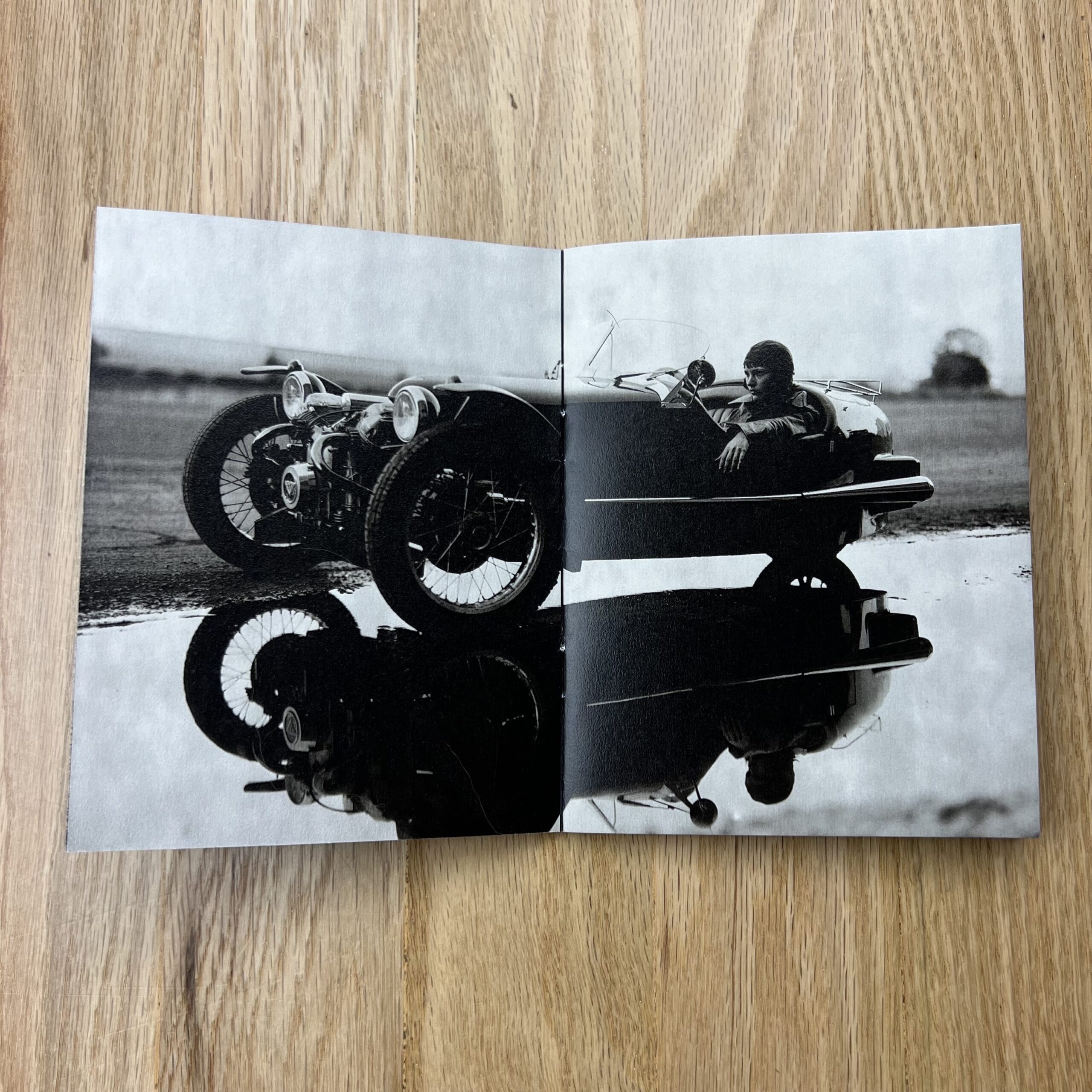
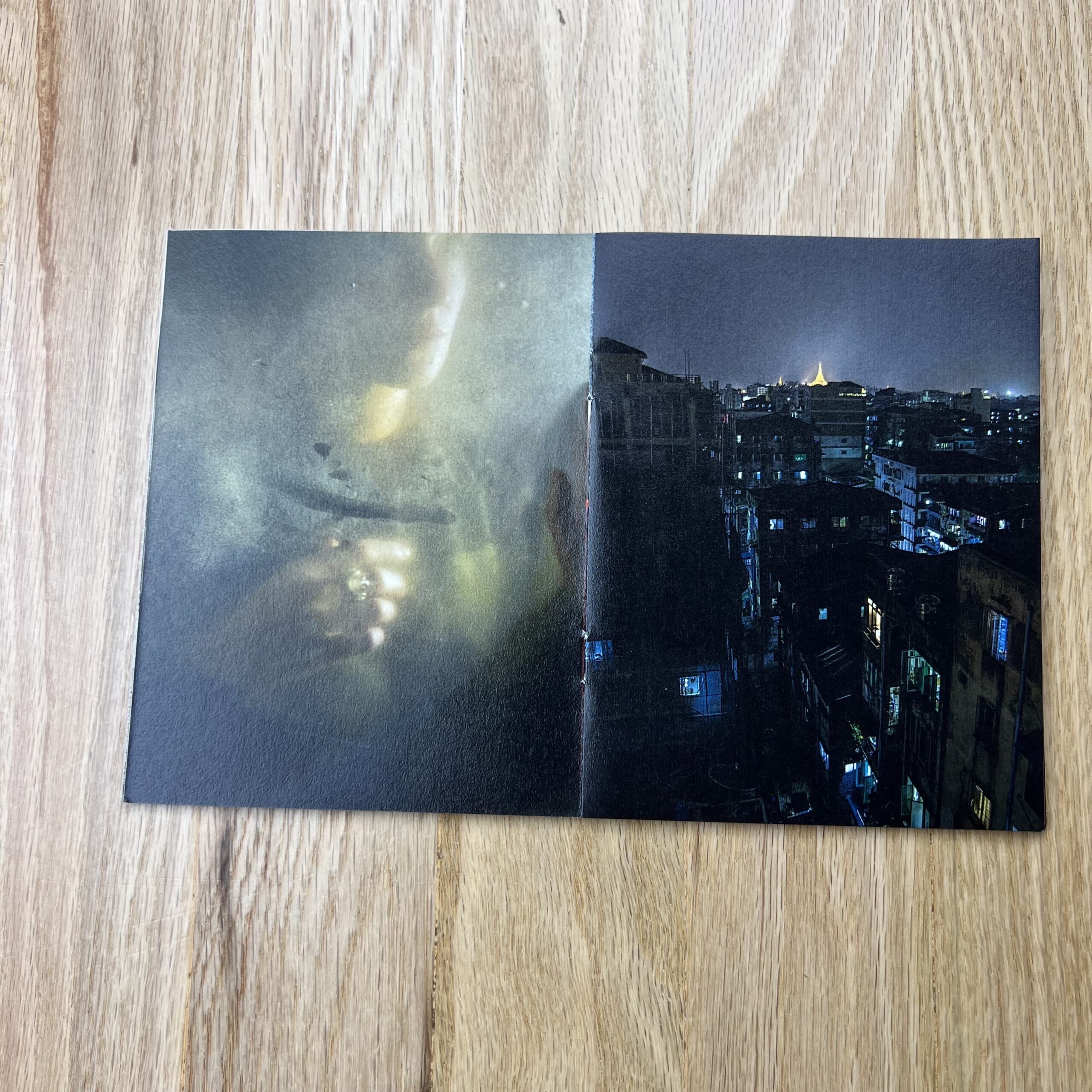
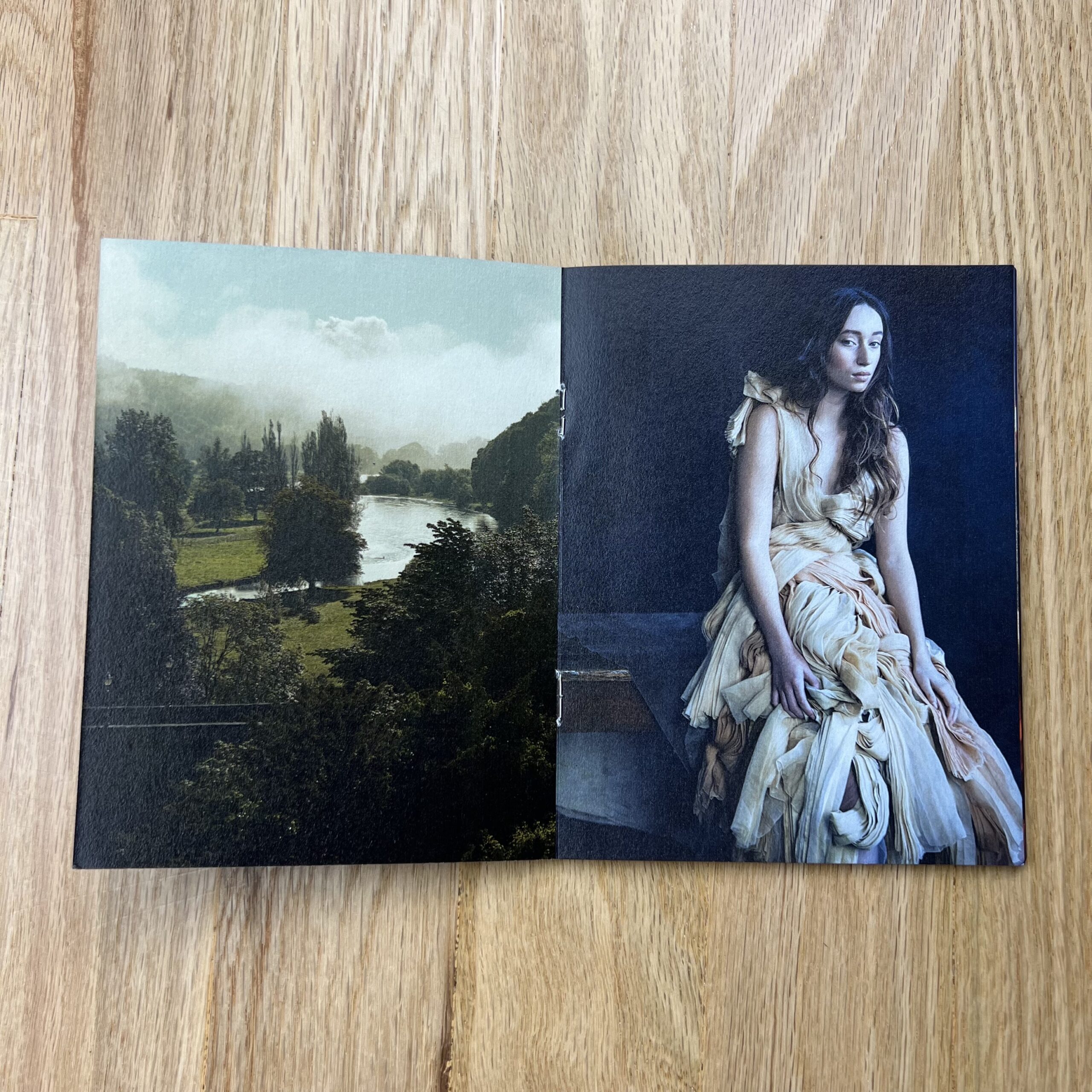
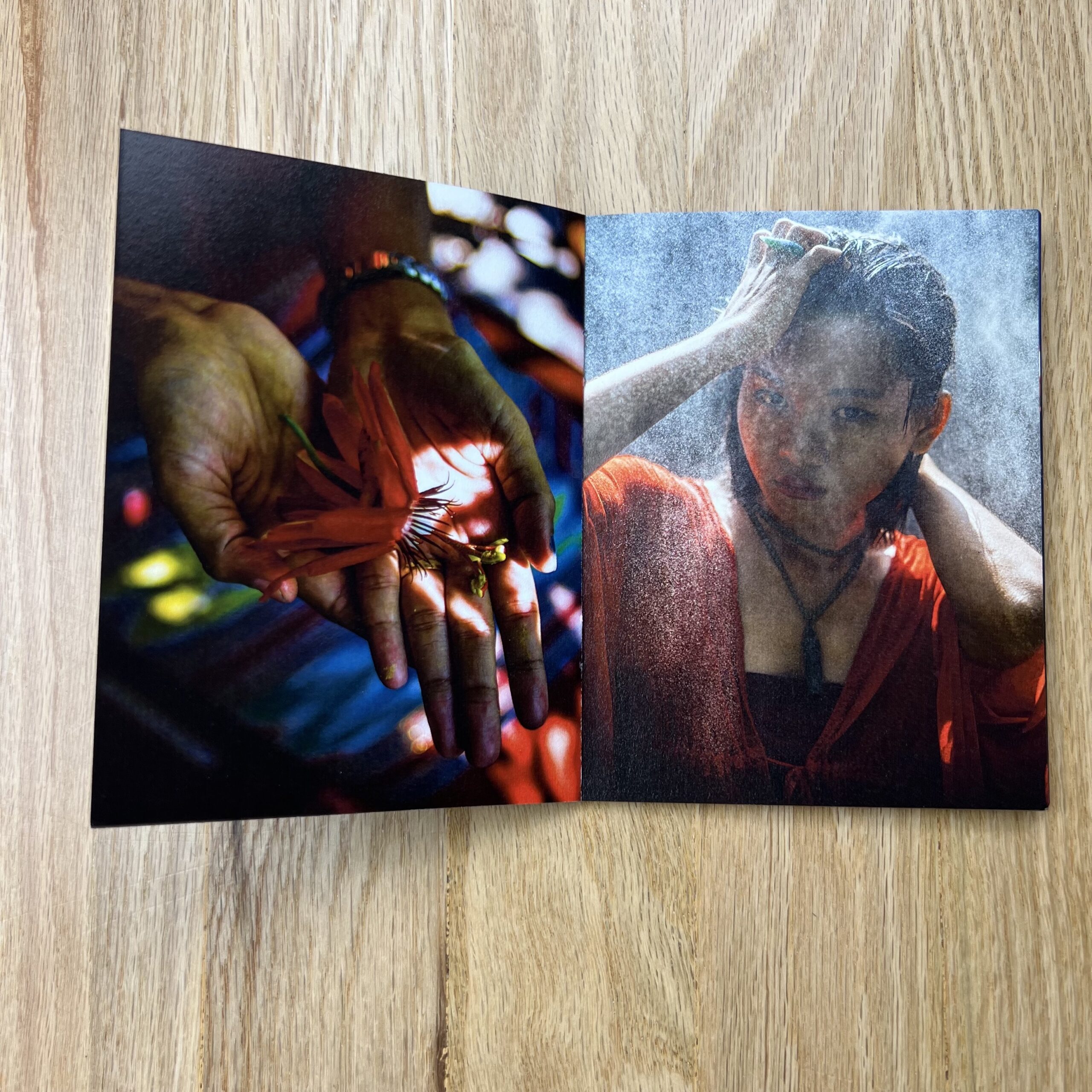
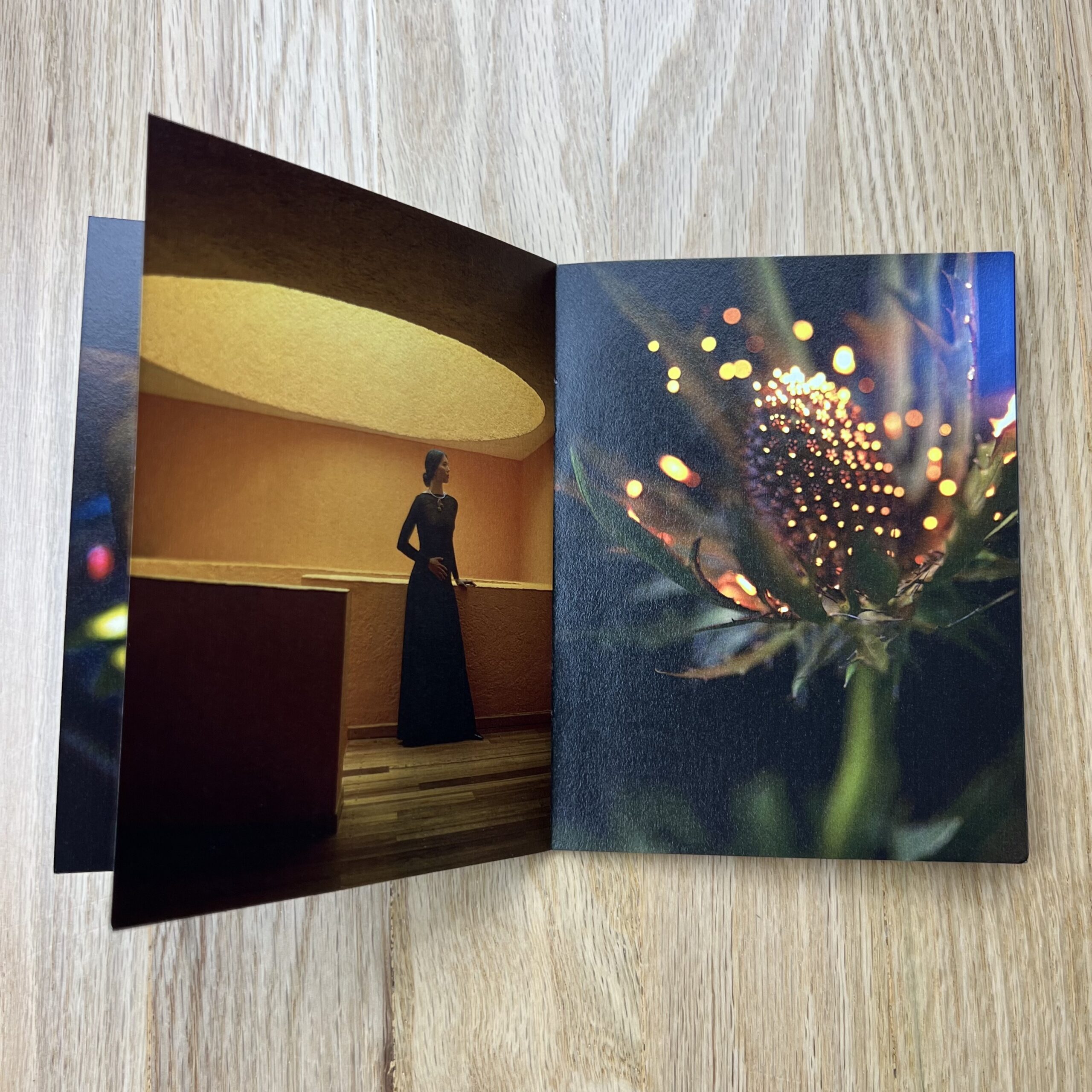
Tell me about the images.
The images are from various years. A mix of large format Polaroid studio and location shots. The Polaroid work is personal, some inspired by a passion for vintage machines, and European motorsport. The opening frame is a medium format Polaroid shot on the tracks of the JMZ subway line above my own café in Williamsburg Brooklyn.
The color images are from various assignments for Condé Nast. Ireland, Mexico City, Yangon, as well as more personal views.
How many did you make?
On this first round we printed 500 pieces, though we plan to do another printing of them soon, they were incredibly well received.
Do you think printed promos are effective for marketing your work?
I find great satisfaction in the power of implied storytelling, beauty and simplicity. The lyric, mystery, story living in the shadows of an image, the inbetween.
I find a similar power in the printed page, the subtlety of design, the tactile, a reconnection.
The Art of the Personal Project is a crucial element to let potential buyers see how you think creatively on your own. I am drawn to personal projects that have an interesting vision or that show something I have never seen before. In this thread, I’ll include a link to each personal project with the artist statement so you can see more of the project. Please note: This thread is not affiliated with any company; I’m just featuring projects that I find. Please DO NOT send me your work. I do not take submissions.
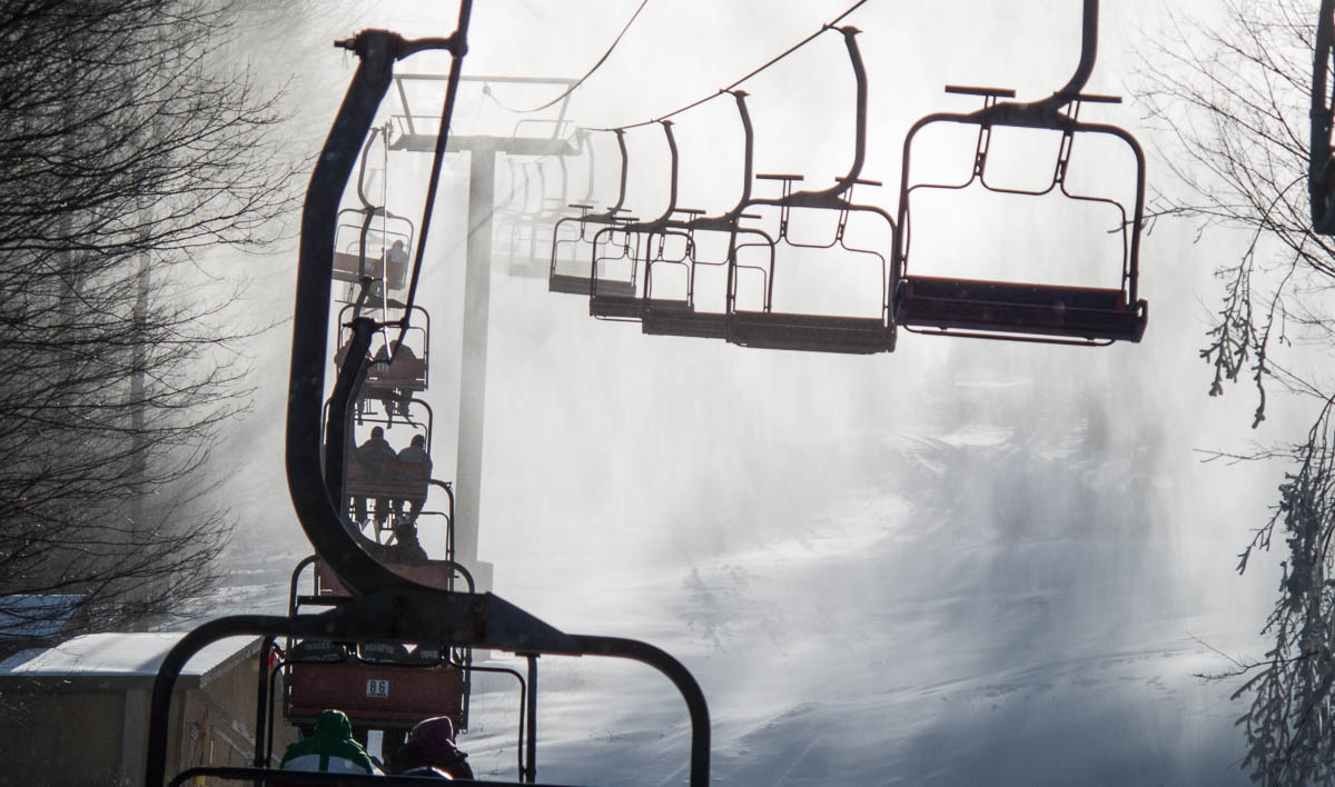
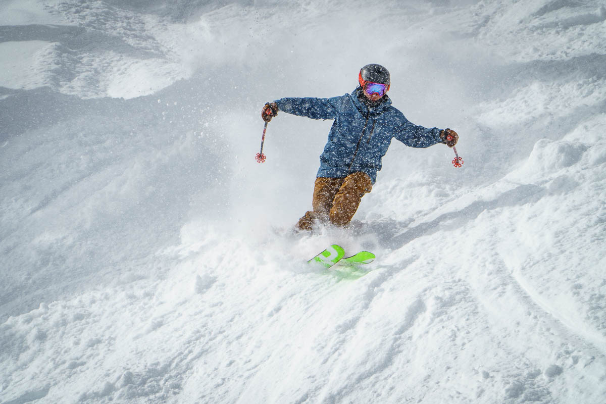
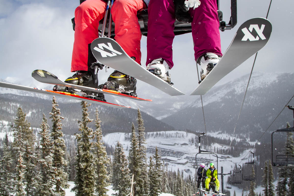
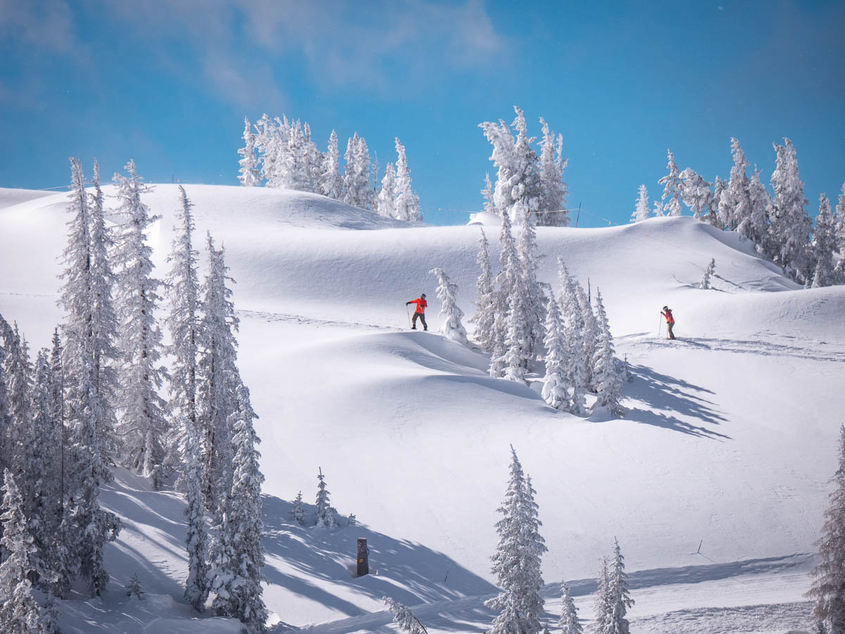
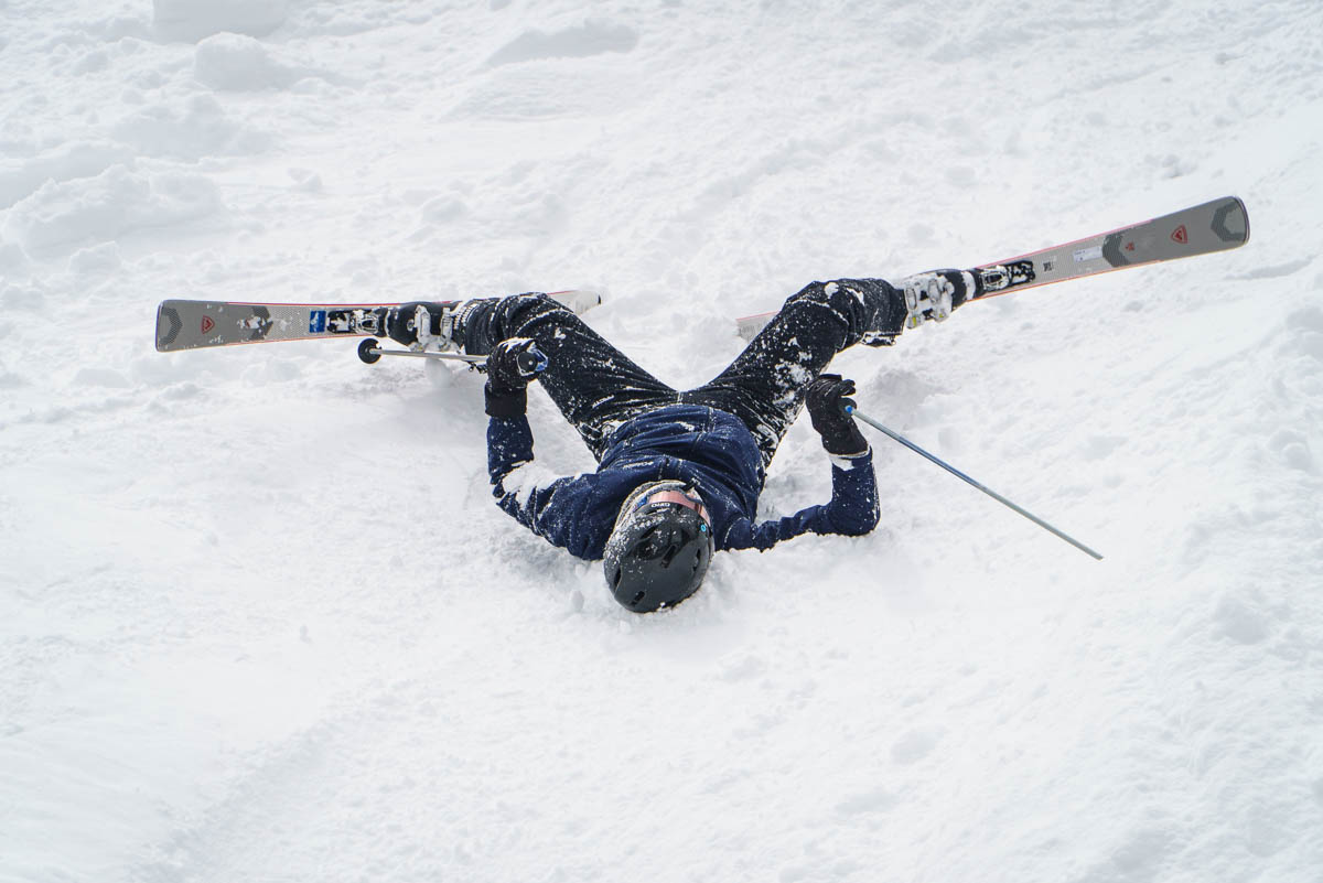
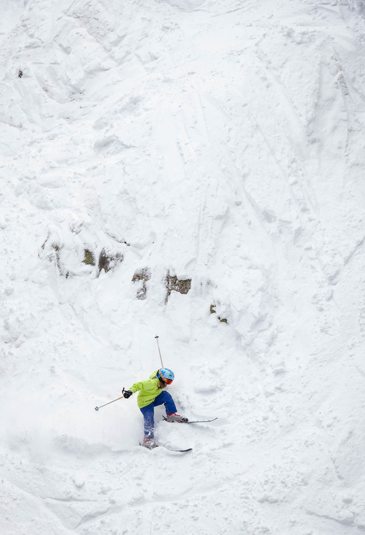
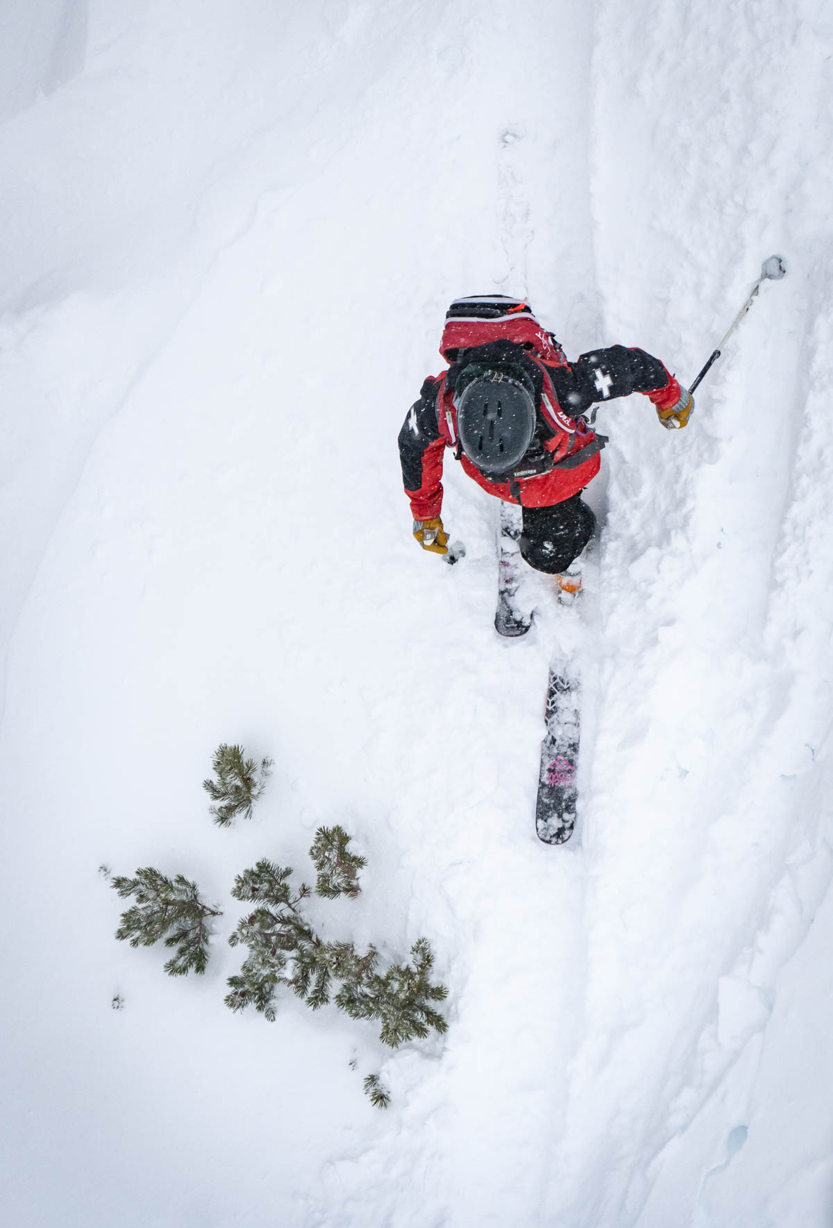
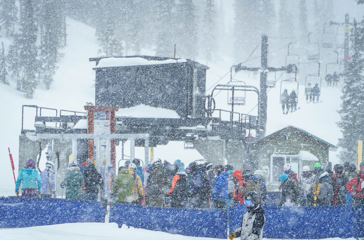
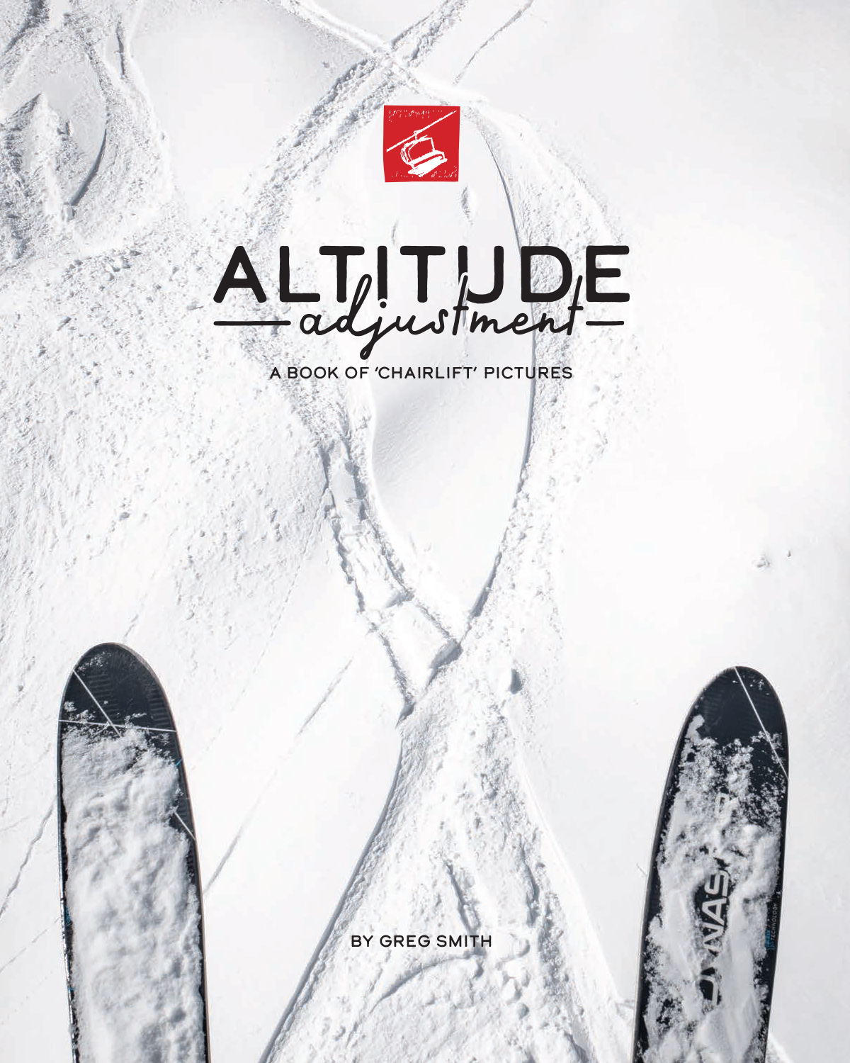
Altitude Adjustment: A Book of ‘Chairlift’ Pictures
Skiing and snowboarding are peculiar pastimes, sending otherwise sensible folks – and some not so sensible – into harsh winter weather, just to go up a hill and slide back down. Skiing didn’t come easy for me on the icy slopes of southern Pennsylvania, but for some reason I stuck with it and fell in love with the sport.
My first real date with Janet, now my wife of 40 years, would be driving overnight from western Kansas to Colorado’s Wolf Creek. Later, we lived briefly in Telluride, starting a newspaper, getting married, getting pregnant and getting out before another winter descended. Although we reared our children in snow-challenged South Carolina, we invested great efforts for at least annual ski trips as they got older.
I documented the kids. I documented our trips. And eventually, I started carrying a small film camera on the chairlift. I was fascinated by the patterns of snow, cables, chairs and people. I wanted to share this with my Southern belle mother. And I didn’t want to interrupt our family’s skiing too much by pausing during our day. Making pictures of and from the lift seemed a good solution.
When we moved back to Colorado 10 years ago and bought season passes at Monarch Mountain, I began documenting in earnest the in-bounds skiing experience. Eventually, I saw my pictures – now made with digital cameras – as a gentle counterpoint to the “powder porn” that sells winter sports. Such commercial – and many editorial – productions show the powdered glory of those who hike up hills or take helicopter rides with film crews to ski nearly impossible lines in perfect conditions. I wanted to show how wonderful and quirky the experience is for the rest of us who just want a few days to play in the snow – and to highlight the technology that makes that possible.
Altitude Adjustment grew as an idea and collection over this past decade. It documents the actual experience most of us have in-bounds at accessible, safe – but stoked – resorts. The Covid 19 epidemic cut our 2020 season short, and I used that lonely time to finally compile and contextualize my project in 10 chapters. A bit of a designer myself, I opted to hire a real one, David Downing of Ovid Nine Productions, whose work and collaboration delighted me. We printed through Print Ninja in China.
I call it a labor of joy – a book to remind skiers and riders of how fabulous winter sports are, and to show those who don’t brave the cold just what they’re missing. You can learn and see more – and order copies – by clicking AltitudeAdjustment.net.
Snow guns coat the slope, trees and chairlift at Timberline Ski Resort on a bitter-cold January day.Skiers and riders take in the snow and the chairlifts at Monarch Mountain on a February day.Skiers ride the Garfield chair over a ridge on the way to the top of Monarch Mountain.Light snow falling under a blue sky highlights a pair of skiers crossing a ridge along the Continental Divide to reach the steep Curecanti face on a powdery March morning at Monarch Mountain.A snowy March offers up good skiing and riding at Monarch Mountain.A young skier tries to embrace the challenge of a rocky face at Monarch Mountain.Skiers and riders take in fresh December powder under the chairlifts of Monarch Mountain.Skiing and riding among chairlifts on December snow at Monarch Mountain.
APE contributor Suzanne Sease currently works as a consultant for photographers and illustrators around the world. She has been involved in the photography and illustration industry since the mid 80s. After establishing the art-buying department at The Martin Agency, then working for Kaplan-Thaler, Capital One, Best Buy and numerous smaller agencies and companies, she decided to be a consultant in 1999. She has a Twitter feed with helpful marketing information because she believes that marketing should be driven by brand and not by specialty. Follow her at @SuzanneSease. Instagram
Success is more than a matter of your talent. It’s also a matter of doing a better job presenting it. And that is what I do with decades of agency and in-house experience.
9/11 was a decade ago, (at that point,) and we’d moved back to Taos 6 years prior.
Those first couple of months, the column looked nothing like today.
I reviewed three books at a time; only a couple of paragraph-blurbs per book.
There was no trademark rant, no random connections, no absurdist tricks like opening a column with a short story, or a treatise on gaslighting.
It wasn’t until Thanksgiving, 2 months later, when one of my deepest fears came true, and it unlocked an entirely new writing style.
Late that night, it was pitch black outside, just after Jessie and I went to bed.
Suddenly, we heard a bashing knock at our bedroom door, and my Mother-in-Law, Bonnie, was brandishing a gun, yelling about trespassers.
Somehow, when we moved into our house in 2009, I had a premonition I’d be woken by a knock at the door, by a gun, late at night.
And here it was.
My Father-in-Law kept a cool head, and I accompanied him into the field.
Some local kids were trying to visit a friend, back for the holidays, and had gotten lost.
(Then stuck in the irrigation ditch.)
We towed them out, sent them on their way, and that was that.
But my fear became reality, and it wasn’t so bad.
Now that I think about it, around the same time, some wild animals in the canyon brought down a deer in our stream.
I found it in the morning.
Stone dead.
Untouched.
I chopped off the deer’s paw with a hatchet, to make a photograph, and when the farm dogs chewed off its head, my Mother-in-Law, Bonnie, fought them for the trophy and won.
“My deer paw”
(Bonnie was tough as nails.)
She put the deer head in her garage freezer, in a black garbage bag, and insisted I take it to make a photograph.
“My deer head”
When I wrote those stories down in 2019, for my book, “Extinction Party,” we’d just noticed Bonnie’s decline.
By mid-2020, the dementia became progressively worse, and the pandemic turbo-charged it.
Bonnie loved my book when it came out, and knew I’d honored her in it.
But now she knows nothing at all.
My main point is: things change.
Time moves.
And I’ve spent the last 11 years sharing my life with you each week, from a working horse farm at the base of the Rocky Mountains.
In the American Wild West.
But Taos Mountain loves nothing more than symbolism, and she’s not subtle in her teaching.
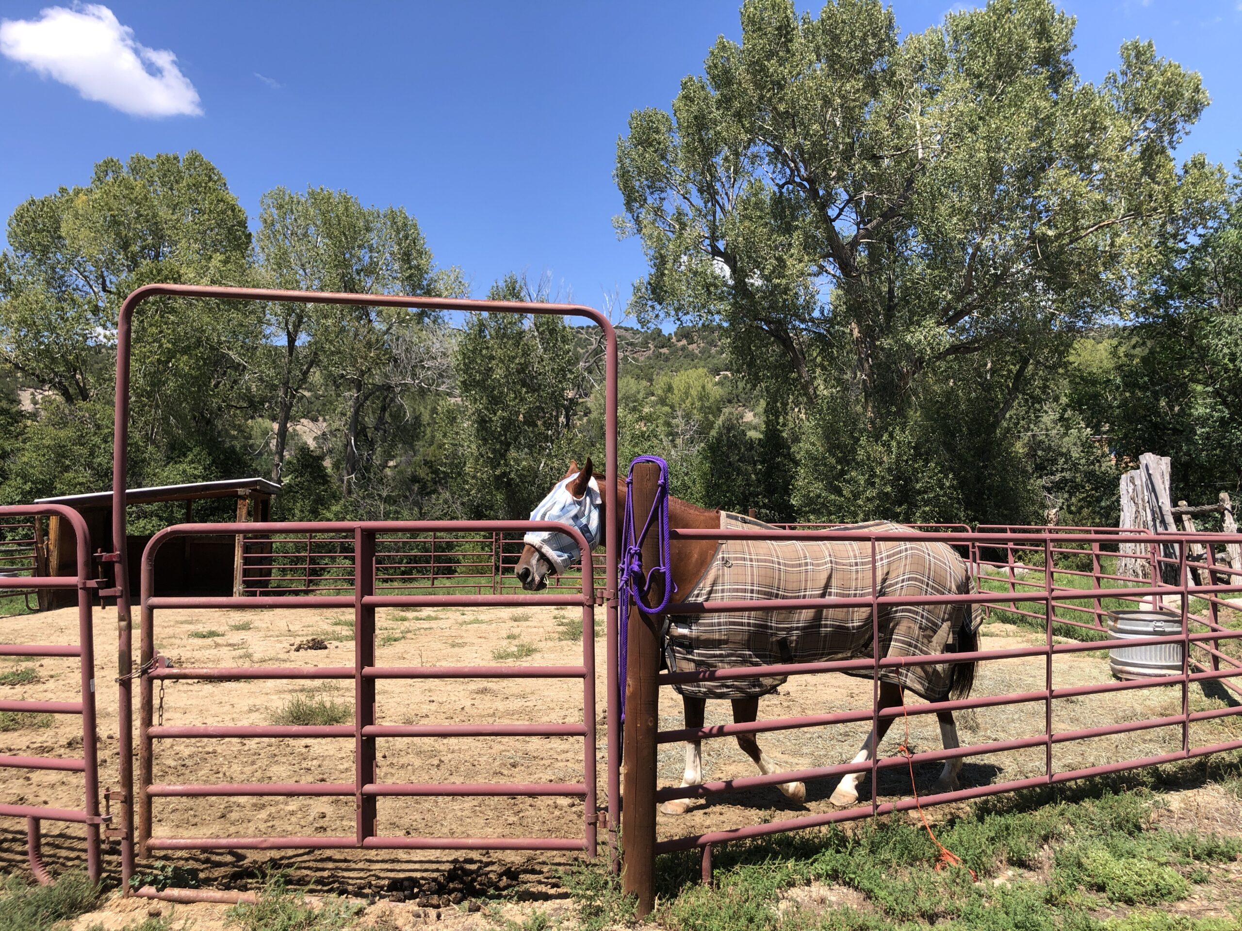
Yesterday, while getting myself prepared for Antidote, our photo retreat, (which begins Friday,) I was petting the new horse, Penny.
Penny, earlier this summer
She’s my first horse-friend, and her tawny hair catches the light just so.
But my kids are mildly allergic to horses, so I went down to my favorite spot by the stream to wash my hands.
I looked to my right, as I crouched by the water, and noticed a dead deer; a huge carcass, a few feet to my right.
It had been eaten, BIG TIME, which explained why my dogs were hanging by the stream all morning.
It was a jarring moment.
Later, I saw part of a jawbone here, a piece of stomach there.
Primal nature, right in my face.
I checked with a shaman friend, (via text message,) who suggested I honor and respect the deer’s spirit.
(To make up for exploiting the other deer 11 years ago.)
Unless the coyotes work together and drag the carcass off, I’ll be grabbing the shovel and some work gloves. Then wedging the deer out of the stream, before our students come.
I’ll be swatting flies, and covering my nose for the smell. (Unless the cold water staved off the rot.)
I’ll move the deer to a more permanent, peaceful resting place.
The Art of the Personal Project is a crucial element to let potential buyers see how you think creatively on your own. I am drawn to personal projects that have an interesting vision or that show something I have never seen before. In this thread, I’ll include a link to each personal project with the artist statement so you can see more of the project. Please note: This thread is not affiliated with any company; I’m just featuring projects that I find. Please DO NOT send me your work. I do not take submissions.
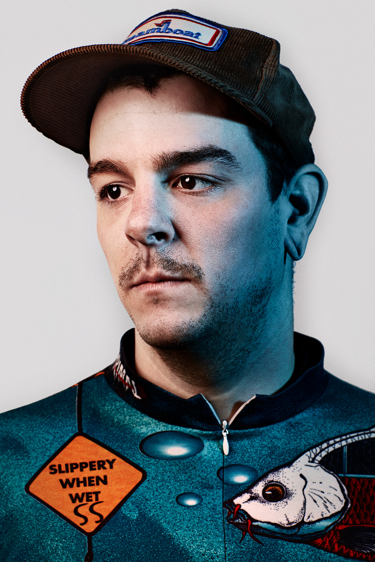
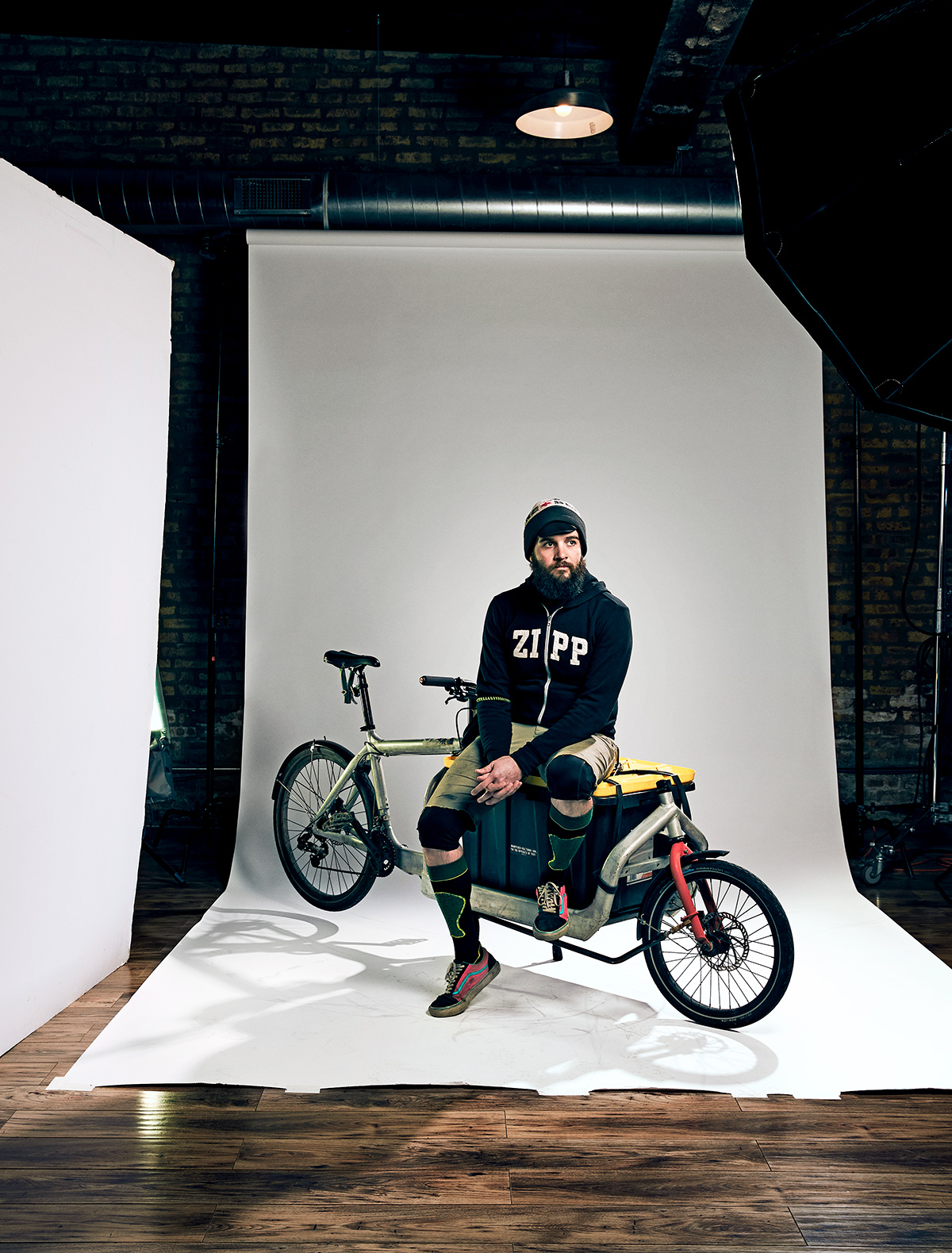
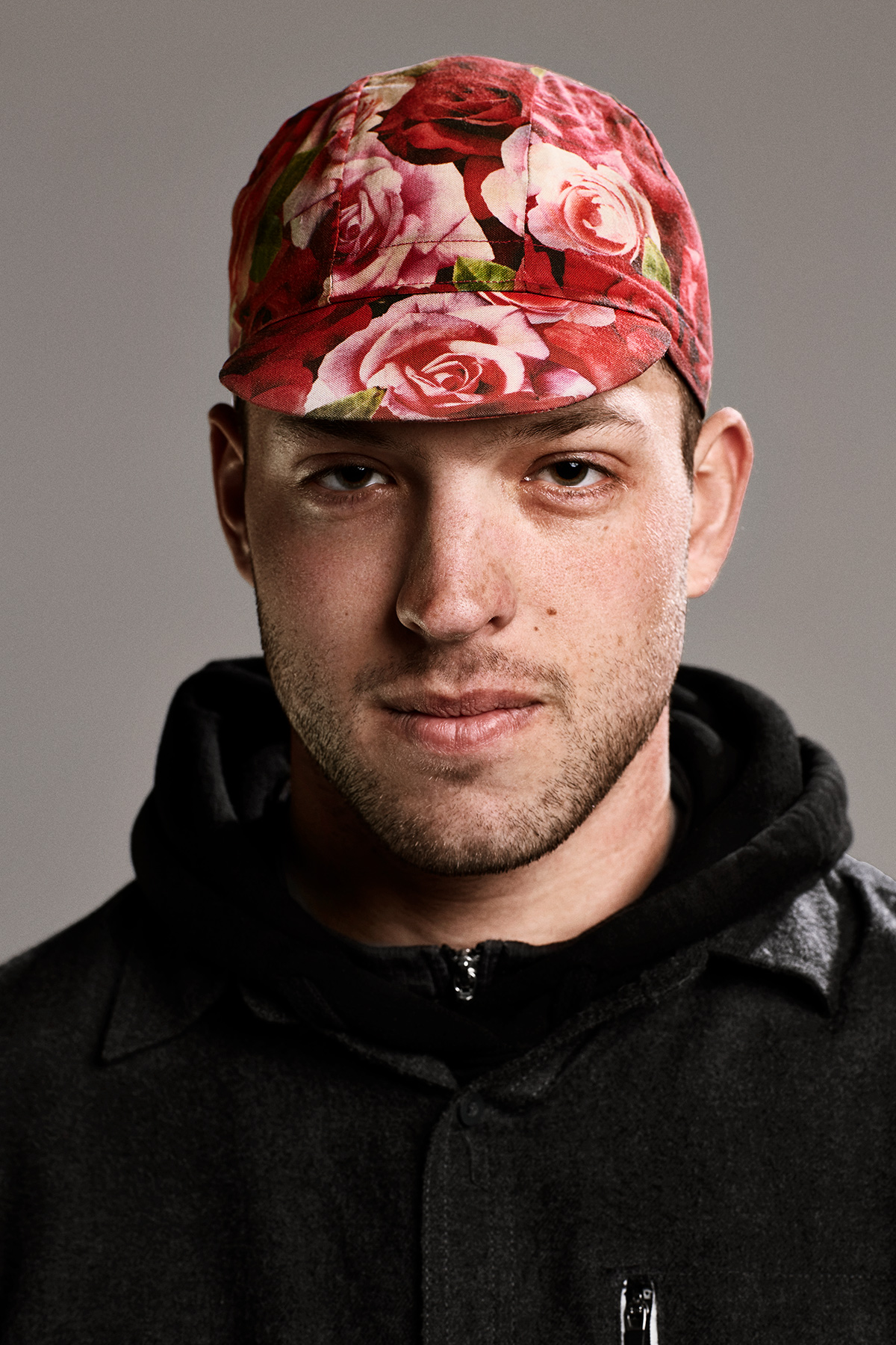
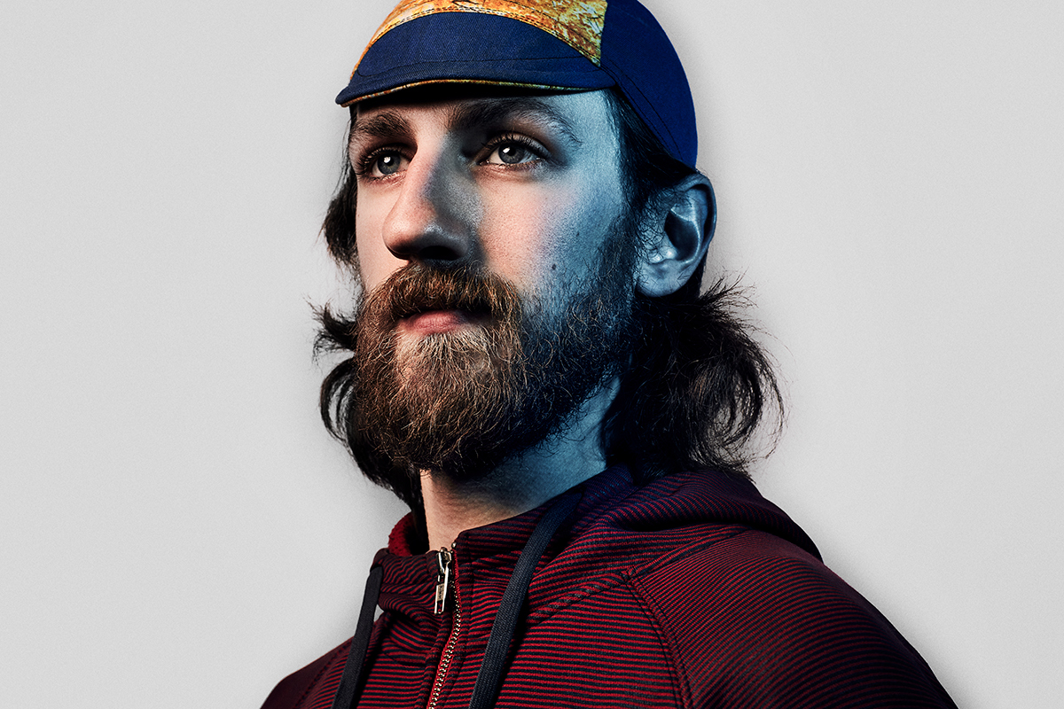
In my younger days, before I moved to the States, I used to ride. I was part of the Corinium Cycling club, rode open road time trials & trained almost year-round. During the colder months, I would venture out less often & stuck to riding rollers in my garage. I never did particularly well in the colder weather.
That’s why one day, on my way back home from work early in my time in Chicago, on a bitterly cold February evening, I came across a messenger packing his bike into the back of his car. It blew my mind that he would even consider riding in these frigid & snowy conditions. As I quizzed him about why on earth, he would choose to ride his bike in these temperatures, he told me he was a bike messenger & that he liked working in the winter months as only the most committed riders went out in these months & it meant more work & better pay. I remember him saying anyone can be a messenger in the summer, but the cold had a way of whittling out those who weren’t serious.
That encounter left an impression on me & respect for those riders who I would see braving the cold & the traffic downtown.
My further introduction to the World of Bike Messengers came when Redbull hired me to photograph Nico Deportago-Cabrera at the NACCC (the North American Cycle Courier Championships). There I got a glimpse of the world of the sense of family, camaraderie & style that links the participants together. It was the sense of community, the dress sense, and the tattoos that really drew me in. The tattoos were awesome!
That following year, through Nico, I put a call out to Chicago messengers to stop by a studio I rented for the day if they wanted to have their portrait taken. It was late winter & still bitterly cold outside & the messengers that had impressed me so when I first arrived in the country were the ones who turned up.
APE contributor Suzanne Sease currently works as a consultant for photographers and illustrators around the world. She has been involved in the photography and illustration industry since the mid 80s. After establishing the art-buying department at The Martin Agency, then working for Kaplan-Thaler, Capital One, Best Buy and numerous smaller agencies and companies, she decided to be a consultant in 1999. She has a Twitter feed with helpful marketing information because she believes that marketing should be driven by brand and not by specialty. Follow her at @SuzanneSease. Instagram
Success is more than a matter of your talent. It’s also a matter of doing a better job presenting it. And that is what I do with decades of agency and in-house experience.
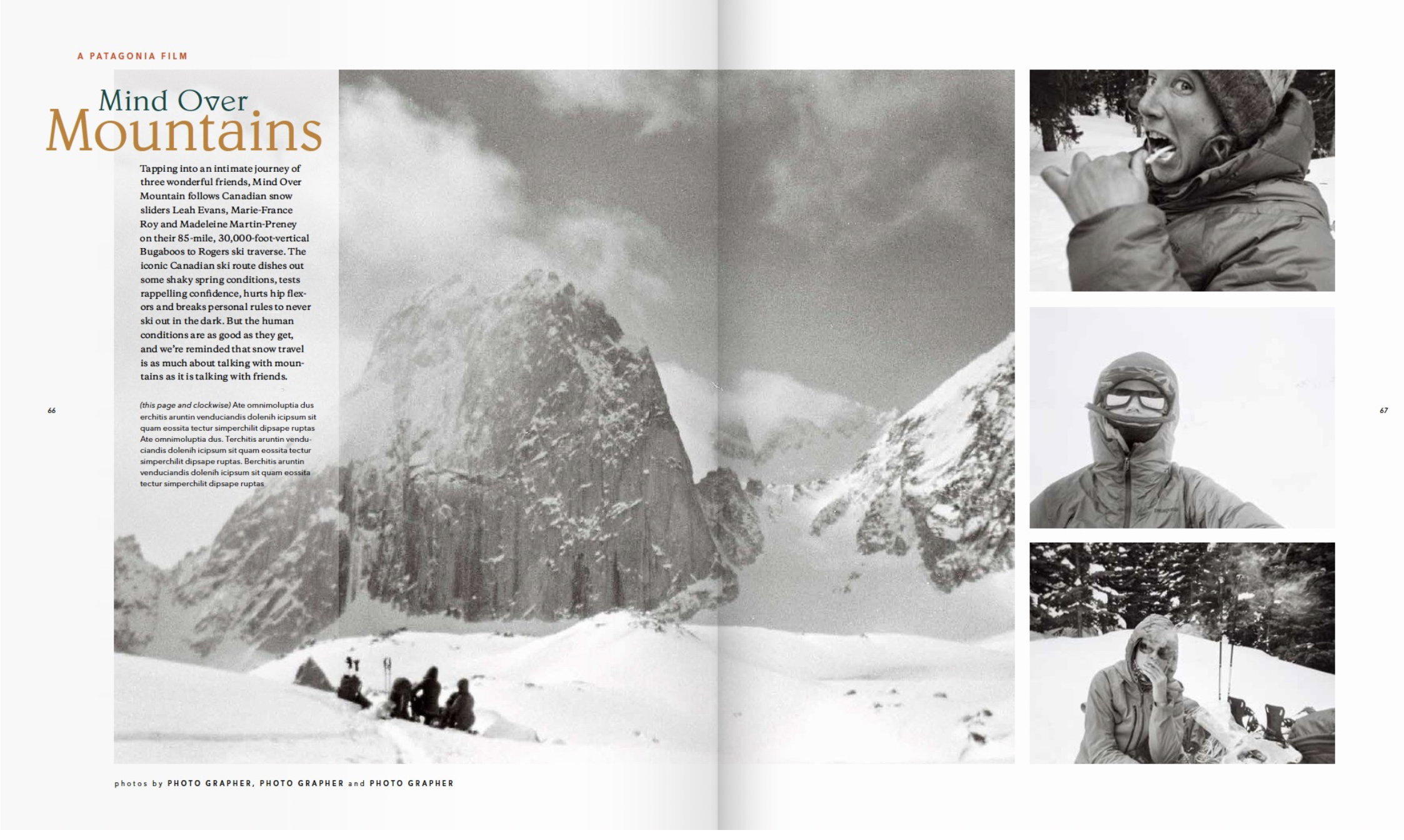
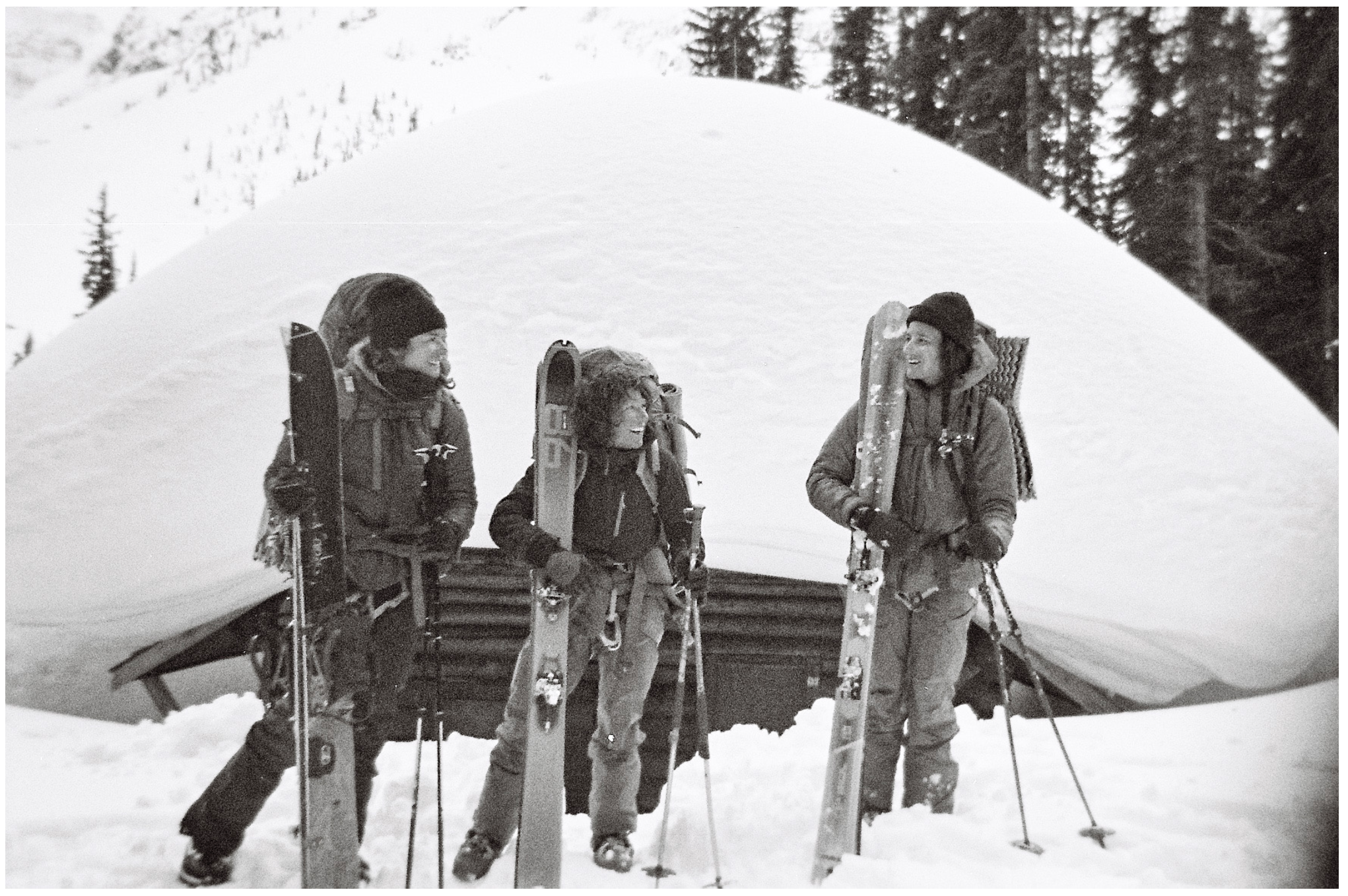
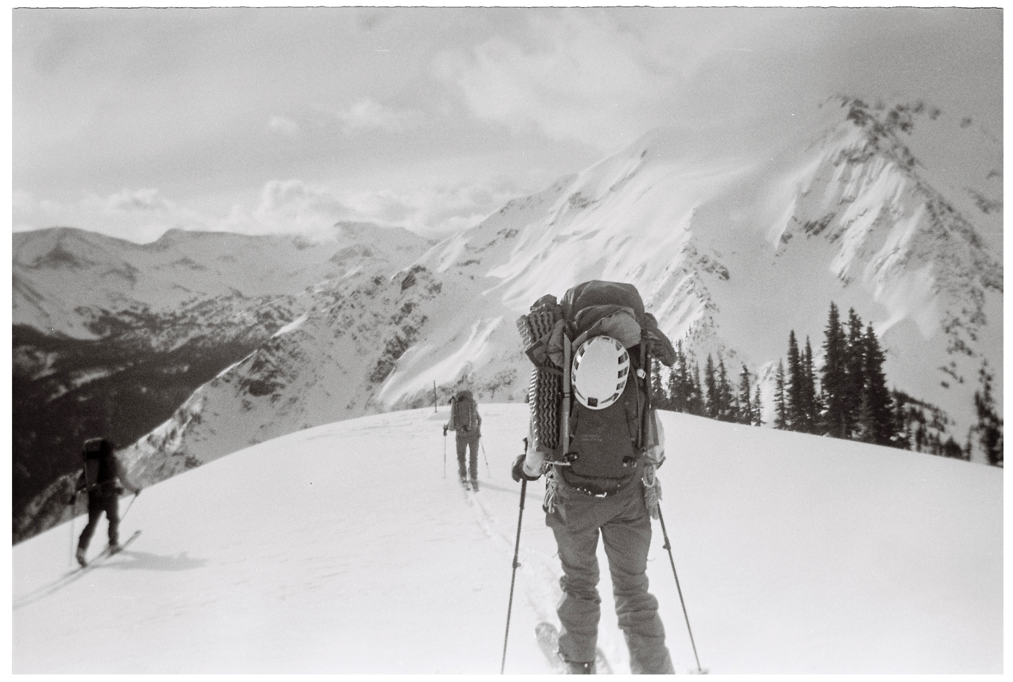
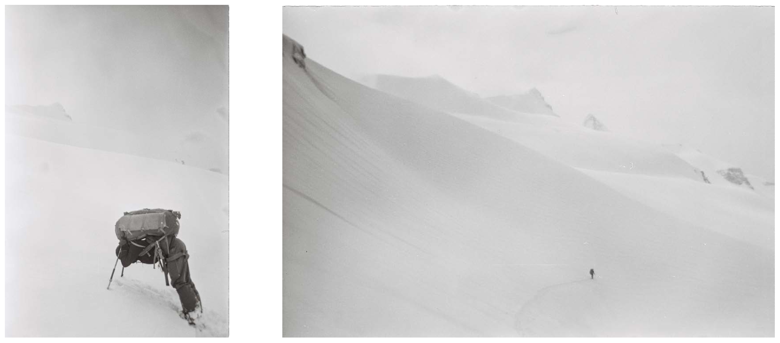
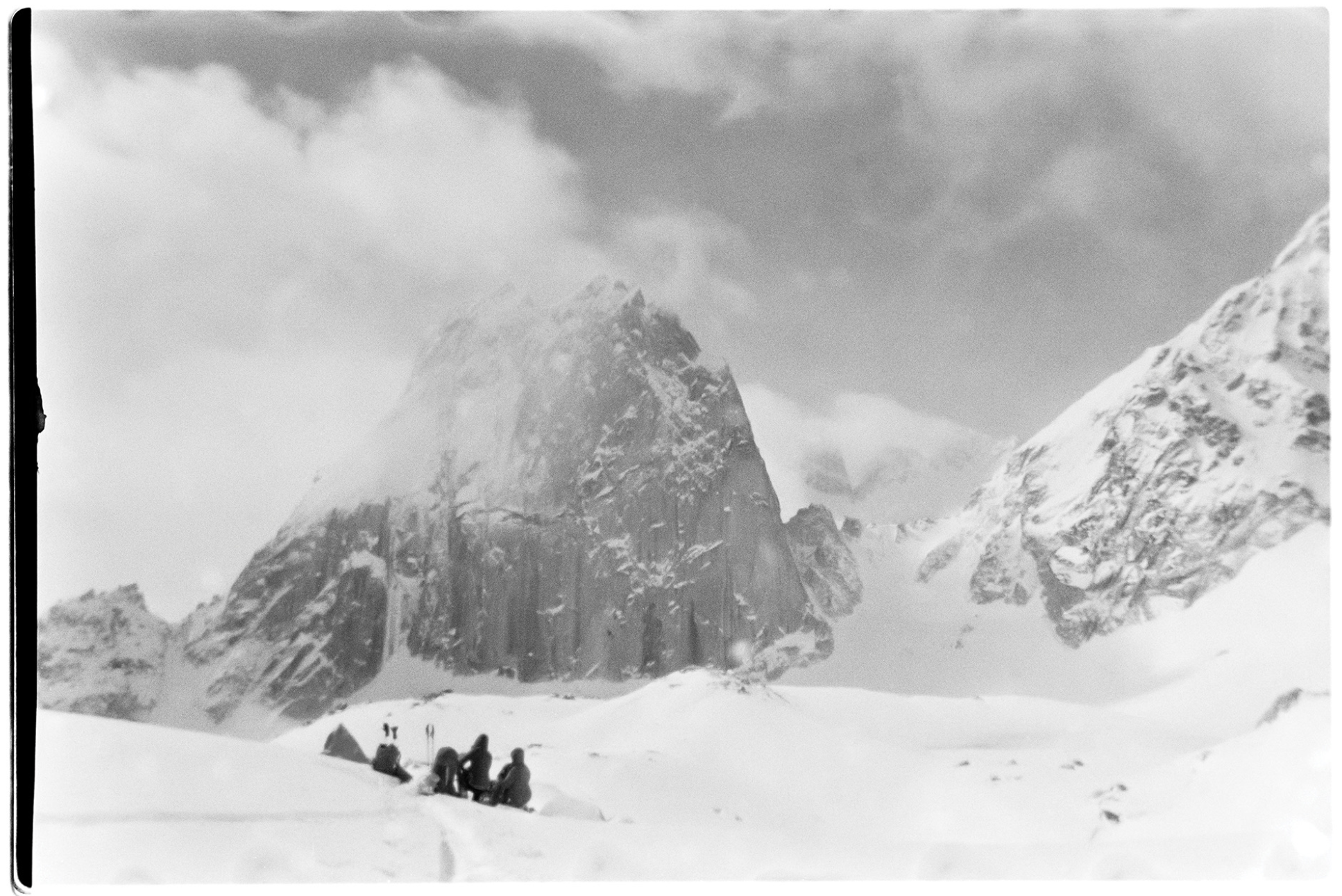
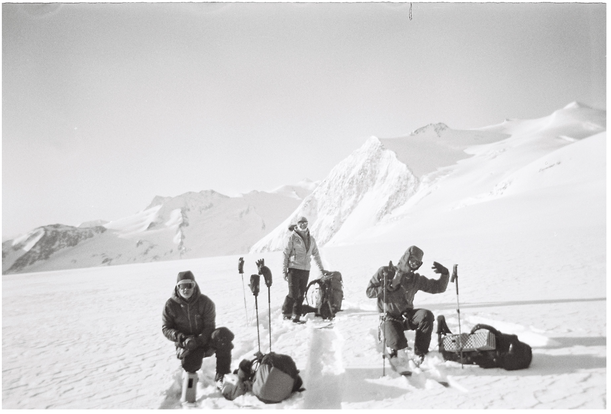
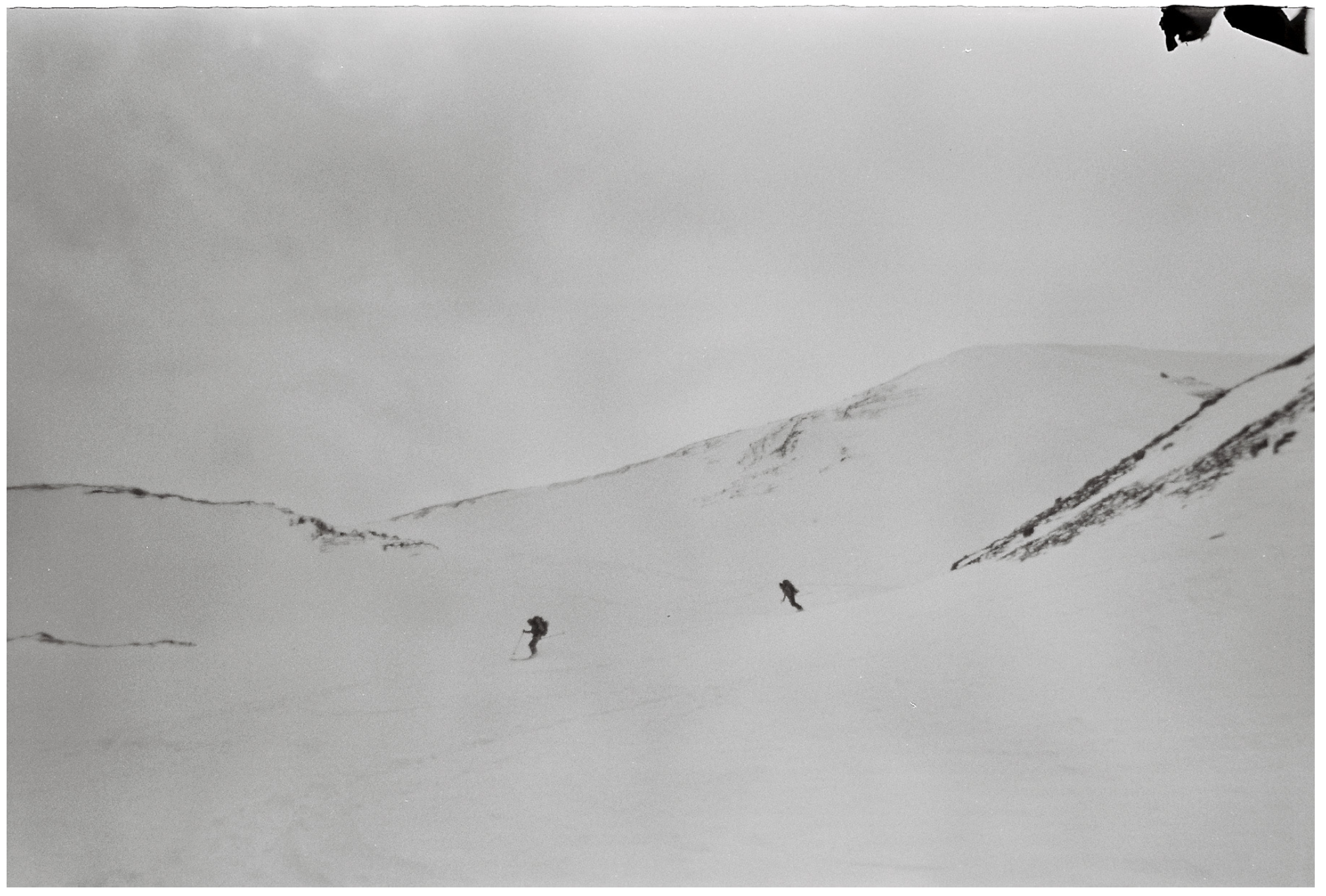
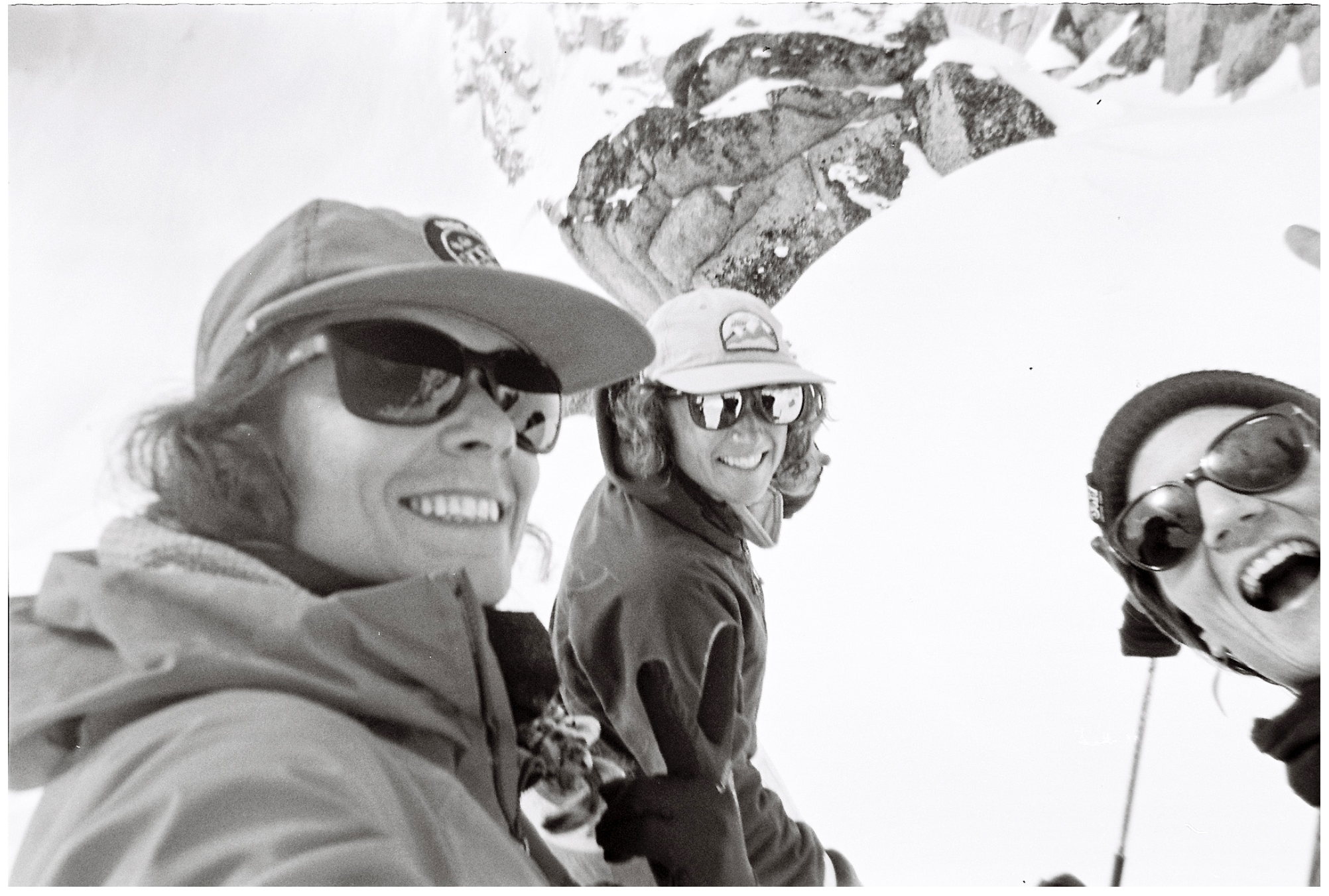
Heidi: Where did this all-female crew go and for how long?
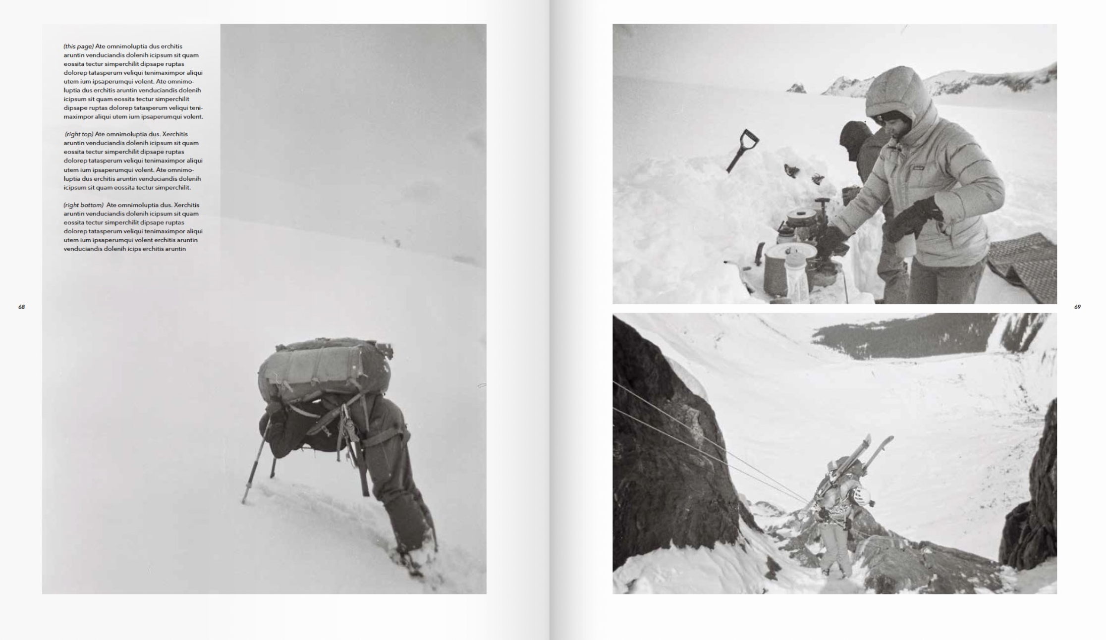
Jakob: These photos were created on the prestigious Bugaboos to Rogers Pass ski traverse in British Columbia during the Spring of 2021. Our snow ambassadors Leah Evans, Marie-France Roy, and Madeleine Martin-Preney had their eyes and hearts set on this project for many years. When the stars aligned, filmmaker Nick Waggoner, with the help of Tucker Anderson and Alex Geary, tagged along to document it.
Why did you provide the crew with disposable cameras?
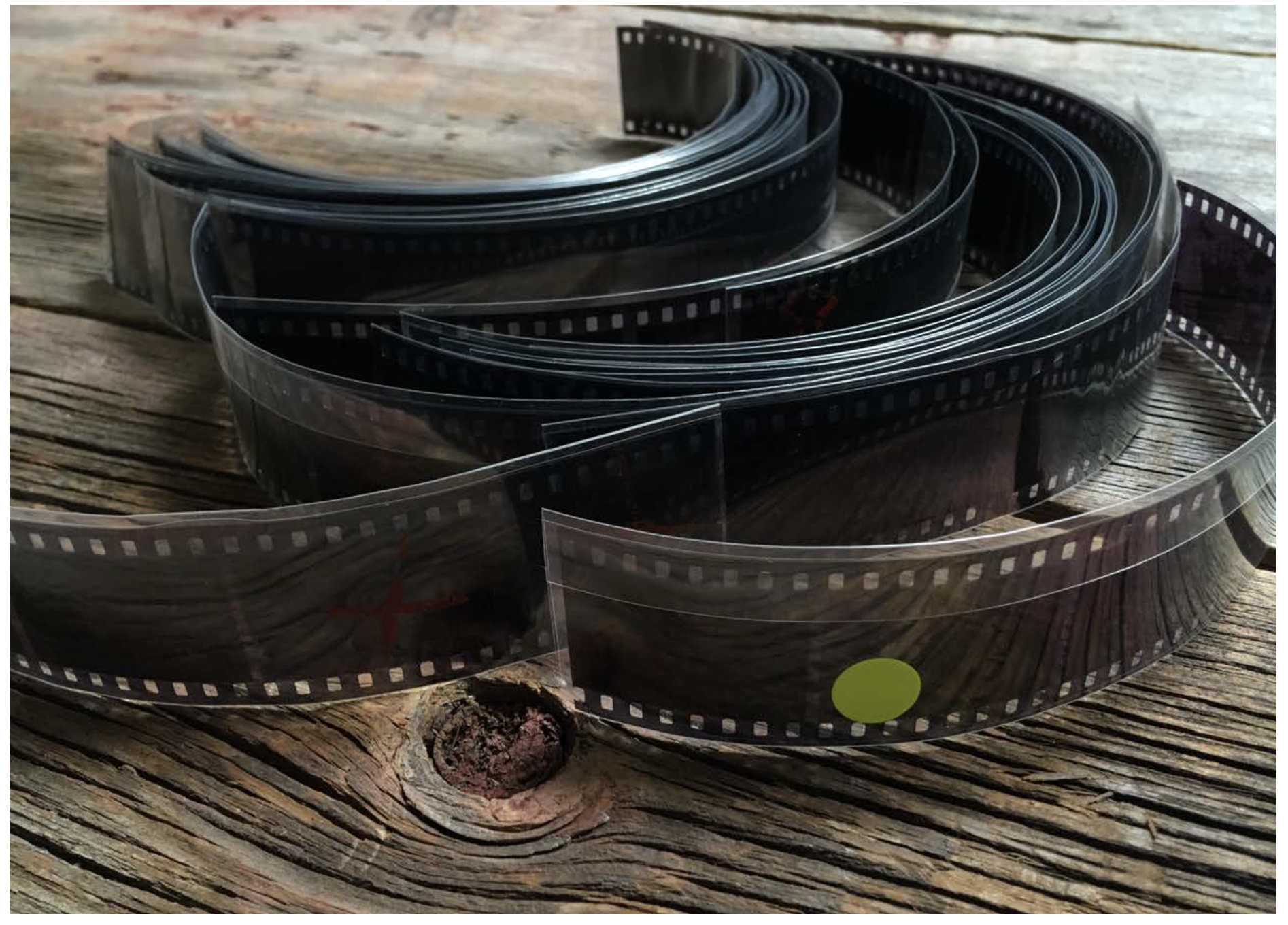
Early in the planning they had all expressed safety concerns with a large group over 6 people on such a long traverse in remote mountains with no room for error. More people equate to more possible complications. So, we were not able to send along a dedicated still photographer because moving picture was the priority. Single-use cameras seemed like the way to go because of their reliability, ease of use, no battery charging or electronic fails on a 10-day adventure with harsh weather conditions and varying temperatures.
What aesthetic were you going for with BW film?
I chose BW for an elevated but also simplistic aesthetic. I think it works very well in snow environments and big open spaces, like the glaciers on the traverse, and gives nice contrast. To me BW film does a wonderful job conveying the mood of snow—it’s purity and timelessness. We used cameras with Ilford XP2 film stock because those were the only ones available near Revelstoke, B.C. where Leah lives, and a friend of hers had to pick them up the night before the girls left on their trip. Later I learned that there’s actually a Kodak Tri-X single use camera which I would have preferred. We color corrected the images to match Tri-X a bit.
How did your love of the snow and mountains inform this project?
Skiing is my first love and moving through snowy landscapes will always feel like coming home for me. Snow is a gift from heaven and cannot be cherished enough. Using BW film was my attempt to celebrate winter a bit and replicate a sense of adventures past. This project basically brought together my two biggest passions and I’m so stoked that Patagonia is a place where these photos can shine. I had to pinch myself a few times while working with these images that I’m getting paid to do this 😊.
Some of Patagonia’s founding photo principals are images on speculation, participatory POV, real people doing real things, and what YC calls an honest shot. What other principals did you call in?
The photography ties into our desire to offer a participatory point of view where the photographer is really part of what is happening rather than being an outside observer. This way the photos feel energetic, engaging, and authentic as opposed to staged and ‘commercial’ because that’s how the moments were. The photos came back so personal, fun, and gritty and it really feels like a trip report from the athletes’ personal perspectives. By removing the pressure of a professional assignment and letting the athletes really just have fun with the cameras added an element of realness. They never had to ‘pose’ for a photo, they just did their thing and went full circle by self-documenting it.