It’s Wednesday, and I’m writing, which means I’ve got a kink in my schedule.
Please allow me to explain…
I’m leaving for Chicago tomorrow morning; my first air-travel since the bender in Jersey last May.
But it’s not even my first big trip this week, as Monday at 4:30 am, the family poured into our trusty Subaru, and did a 15 hour turn-and-burn to Denver, so the kids could visit the eye doctor.
We’d planned on spending the night, but when my brother told me our dog wasn’t welcome, (he’s a long-time Denverite,) we had to pivot, and spent a full day cruising up and down I-25.
(Thankfully, a little adventure when it was sunny and 70 degrees was invigorating, as it snowed the next day.)
Hitting the road, I was reminded that just going a couple of hundred miles can change everything.
There are no mask mandates in Colorado, (apparently,) so we had to adjust to people strutting around, faces uncovered, knowing it was within their right to do so.
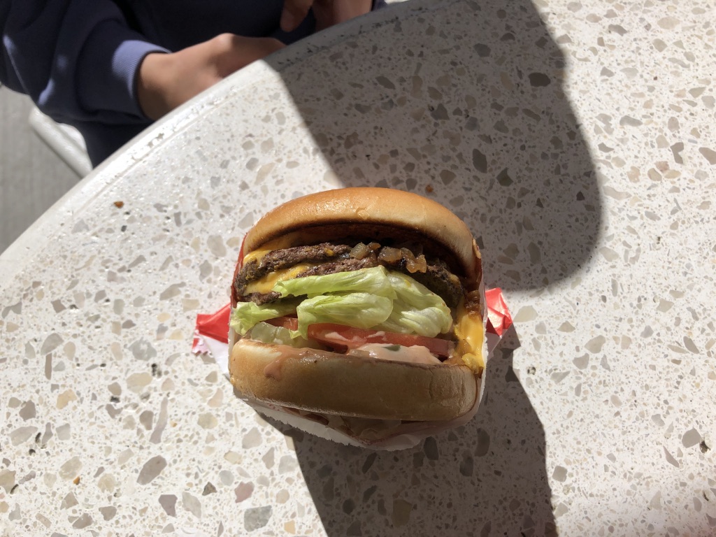
Plus, they have In-N-Out in Denver now, so we reveled in the absolute deliciousness of a perfect burger, (Double-Double, animal style,) while sitting at an outdoor table, overlooking a mall-parking-lot.
Frankly, feeling the friendly SoCal vibes in Conservative South Denver was enough to make my head spin.
(But the burgers! OMG! I rarely eat beef anymore, and can’t stress enough how phenomenal they were.)
That said, Denver on Monday, Chicago on Thursday, and you can perhaps understand why I’m brain-fried.
(Plus, yesterday was a full-work-day, while also parenting the kids, who are home on Fall Break.)
I’m cooked.
Out of gas.
Running on empty.
(Insert random tired cliché here.)
So let’s cut to the chase.
As I’ll have fresh, Chicago-based-content for you in the near future, we’re going in the opposite direction this week.
We’re keeping it local.
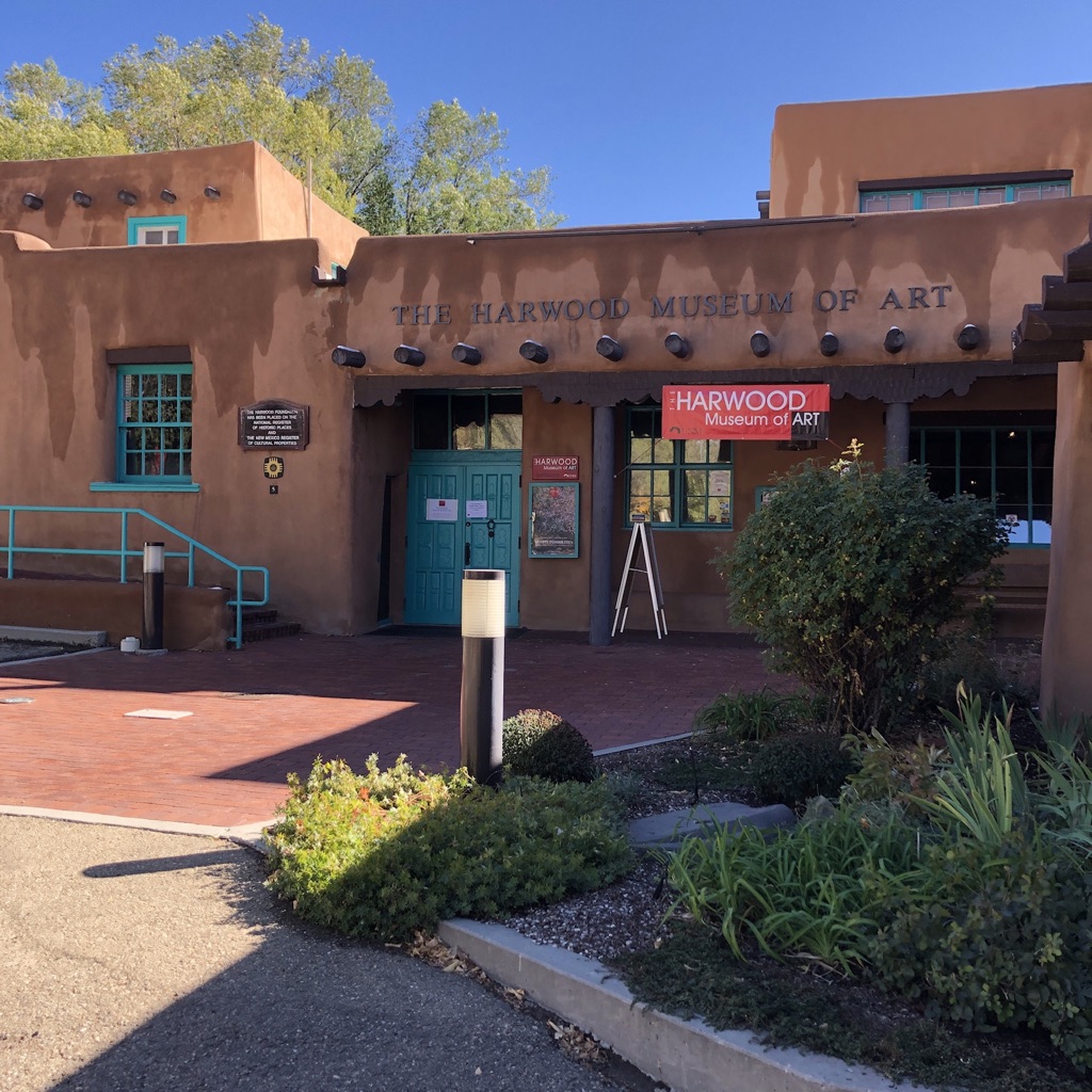
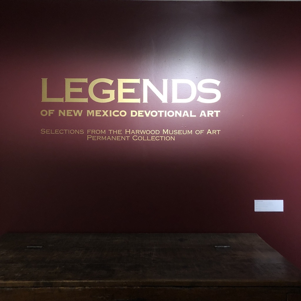
If you can believe it, I’m going to review a terrific exhibition I saw at the Harwood Museum of Art, right here in Taos, New Mexico.
The Harwood Museum of Art
Unfortunately, as with the stellar show I saw at the Albuquerque Museum recently, the exhibit I’m about to discuss has just closed.
(I apologize, but as pretty-much-none of you live in Taos, it’s not like you were going to see it anyway.)
Full disclosure, I had a solo show at the Harwood in 2019, and was part of a three-person exhibit there in 2014, so I do have ties to the institution, but both curators with whom I worked have since moved on.
I’ve never met the newish curator, Nicole Dial-Kay, who came to Taos from Colorado not-too-long-ago, so there’s no reason for me to be extra nice.
I’m telling you this, because I want to stress my objectivity, as I thought this show was dynamite.
Fantastic.
Inspiring.
Supremely well-done.
(Insert random compliment here.)
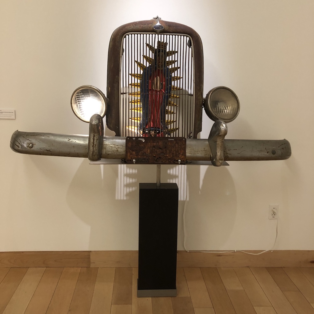
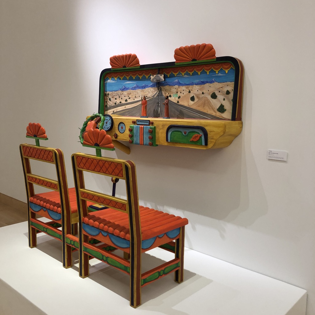
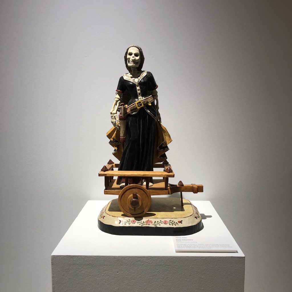
In the exhibition, “Santo Lowride: Norteño Car Culture and the Santos Tradition,” the deep roots of Spanish/Hispanic culture in Northern New Mexico, (which go back more than 400 years,) and the Native roots, which are more than 1000 years old, were honored and respected in vast and obvious ways.
Everything came together so well, as the art presented to the public was shiny, flashy, smart, though-provoking, rich and fascinating.
It’s literally a curator’s job to show off artists’ work.
To make it look as good as possible.
To create context, in which ideas, feelings and objects are synthesized, presenting a message in which the whole is greater than the sum of its parts.
And boy, did that happen.
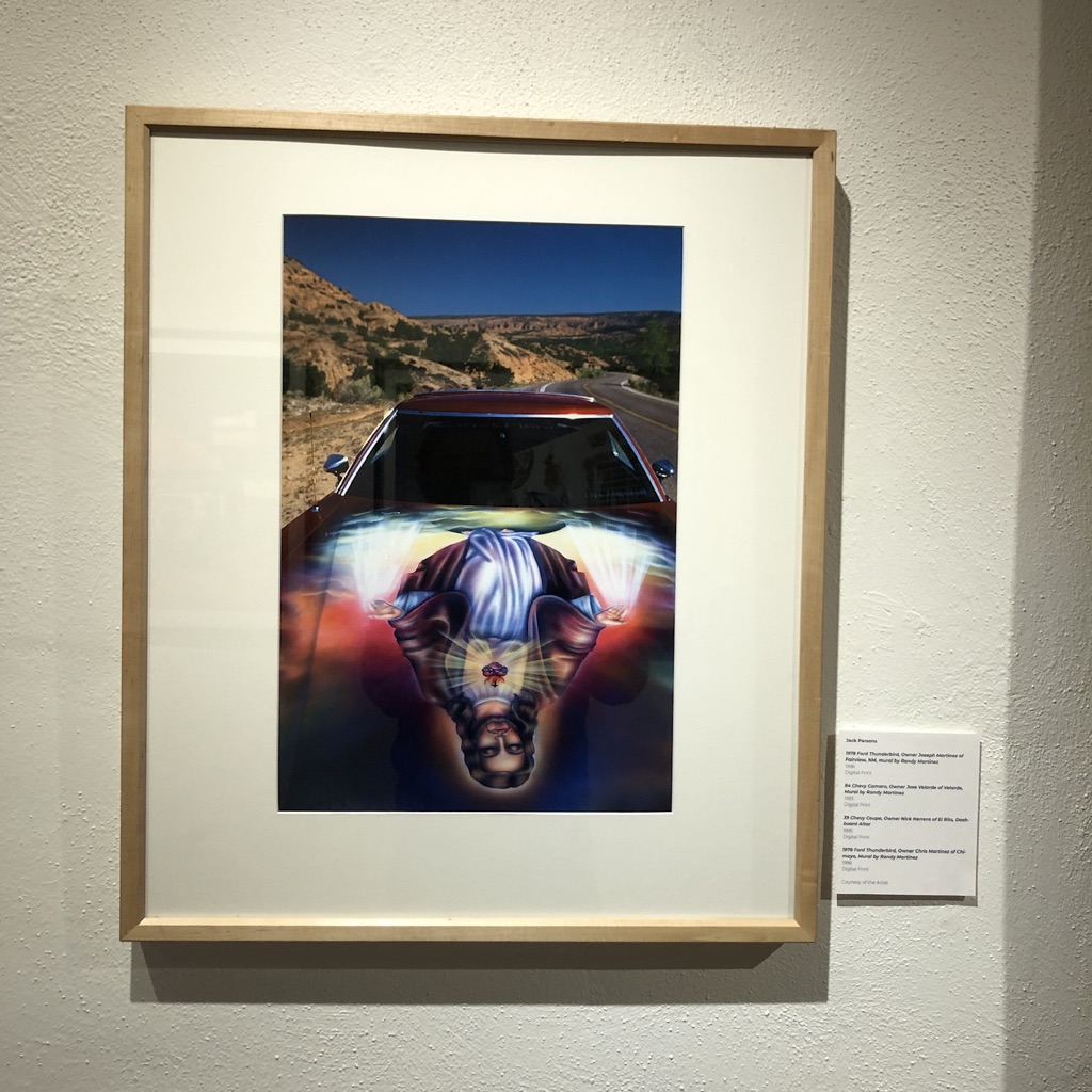
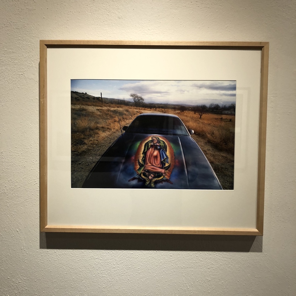
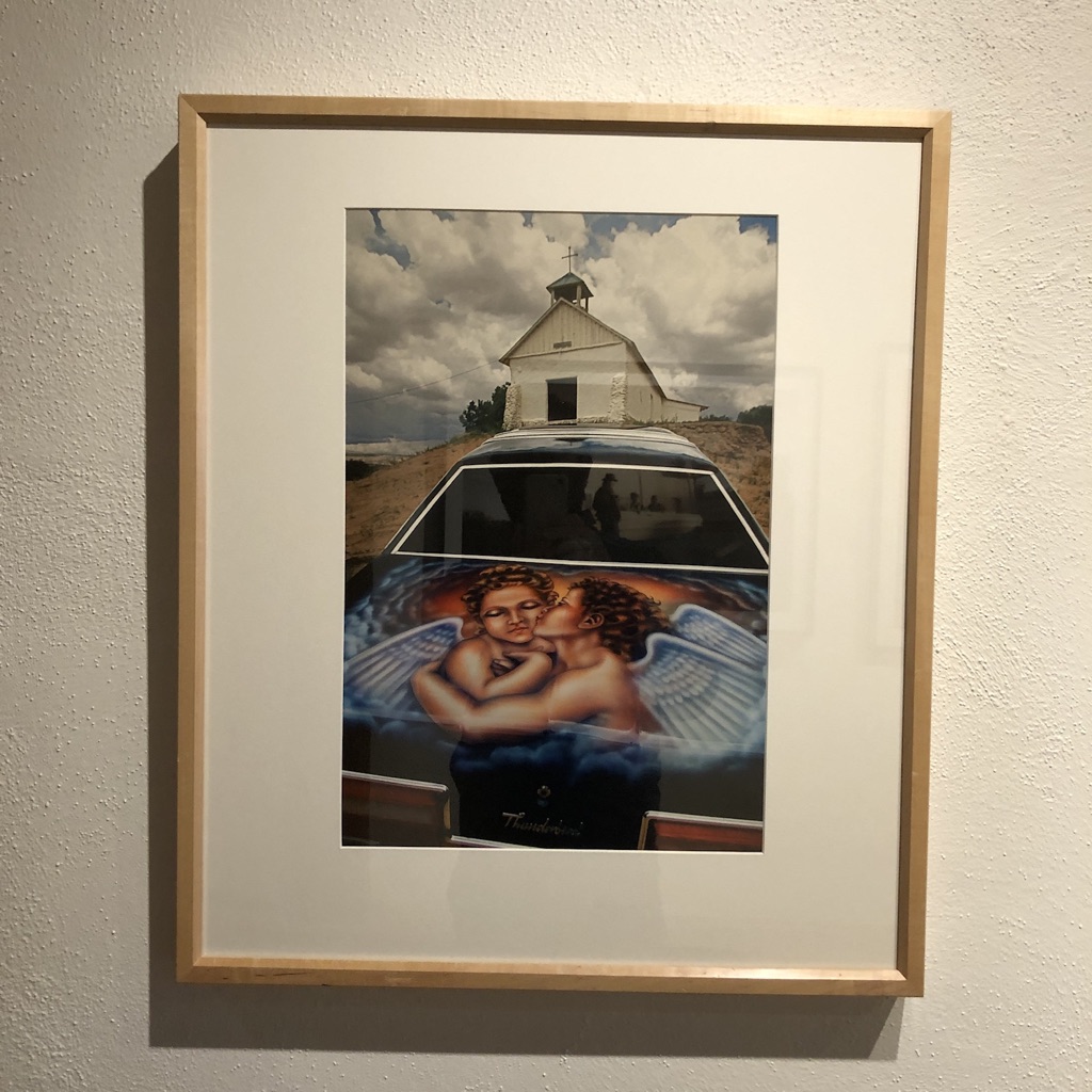
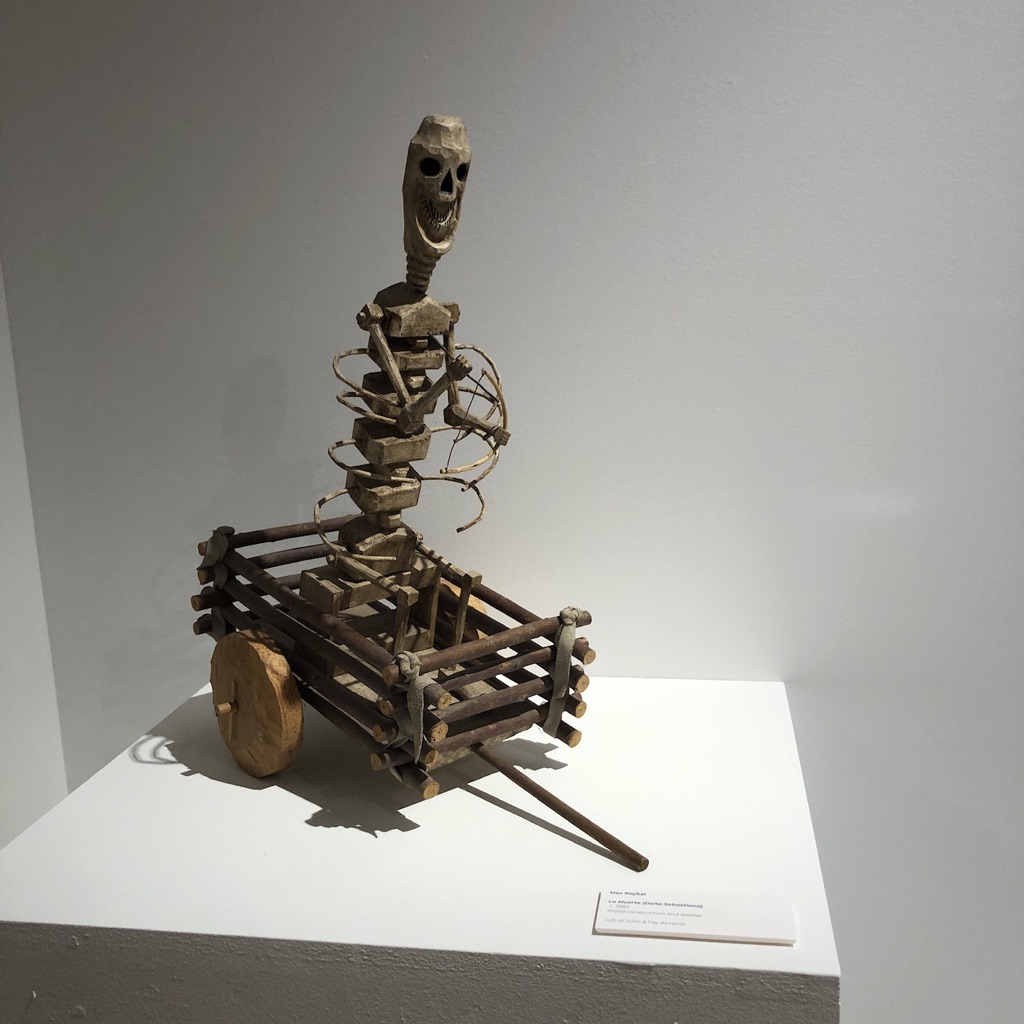
There were photographs by Cara Romero and Jack Goldsmith, in the entry hall, that announced the work was by the culture, for the culture.
Religious iconography on low-riders: that set the tone.
Three images by Jack Goldsmith
Two images by Cara Romero
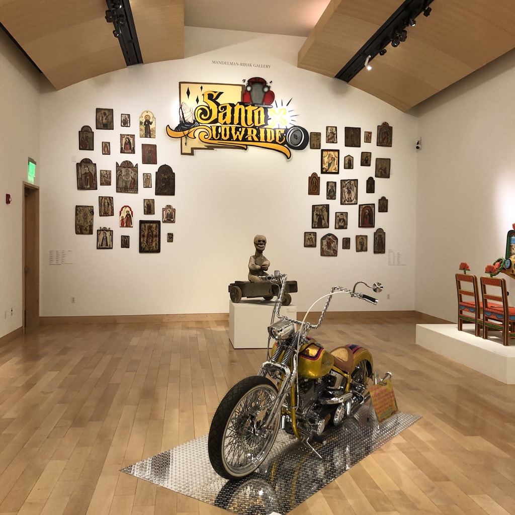
We cut right after those photos, instead of walking down the long hallway, and wandered through a permanent installation of historical Taos art, before entering the Mandelman-Ribak Gallery, where the bulk of the exhibit was waiting.
I’ve got plenty of photos, because this was art to be experienced, but that’s not possible, so images become the next best thing.
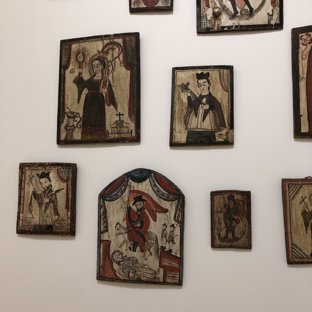
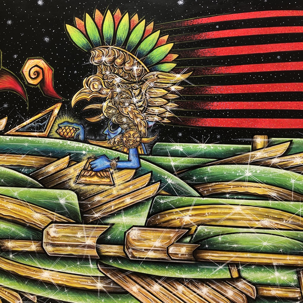
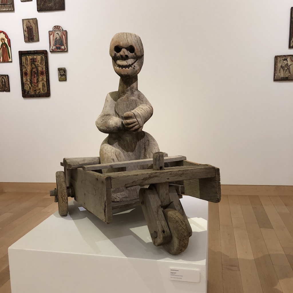
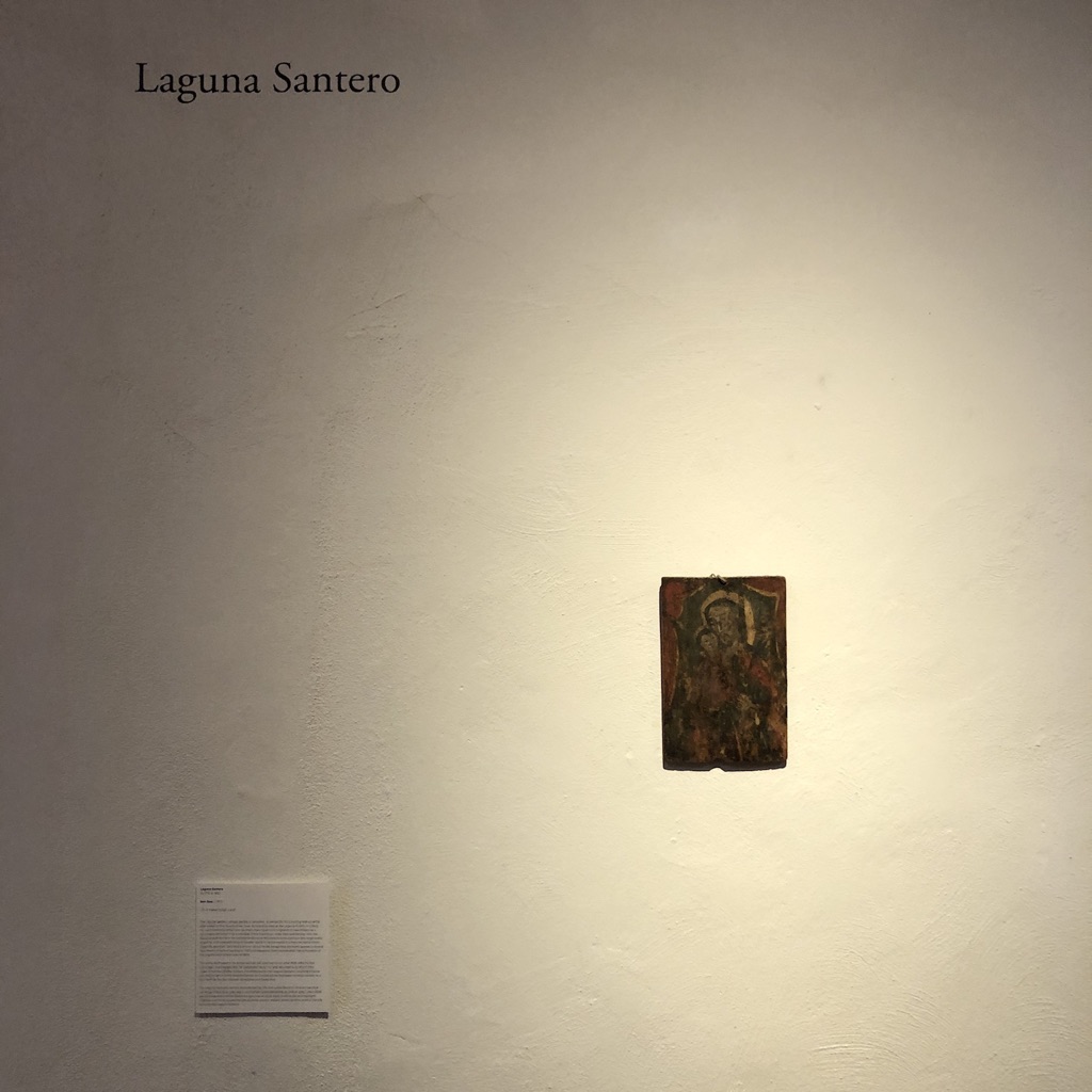
Shiny cars and motorcycles, costumed super-heroes, scary skull heads, Aztec-inspired paintings, all sharing space with a set of Retablos, which were made in the 19th Century as low-tech, hauntingly beautiful advertisements for the Catholic Church.
(I’ll drop the pictures for you now.)
I covered Cara Romero’s work in my first exhibition review of 2021, when I went to the New Mexico Museum of Art, and published Kate Russell’s work in the same article.
I’d seen her pictures, (of low-riders, ironically,) in a restaurant in Santa Fe, where I ate in April, right after my second vaccine kicked in.
I remember that feeling, where just taking a mask off in public and eating indoors seemed so uncomfortable, so absurd, I might have been in the Upside-down world.
Still, at that moment, I assumed “regular” life was right around the corner.
Instead, Delta hit, and our fellow Americans decided, by the tens of thousands, they’d rather die than give in to the the libs.
So…that’s the world we’re living in.
Straight up.
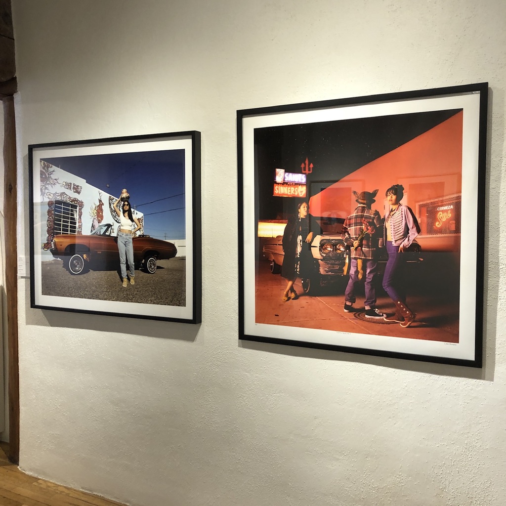
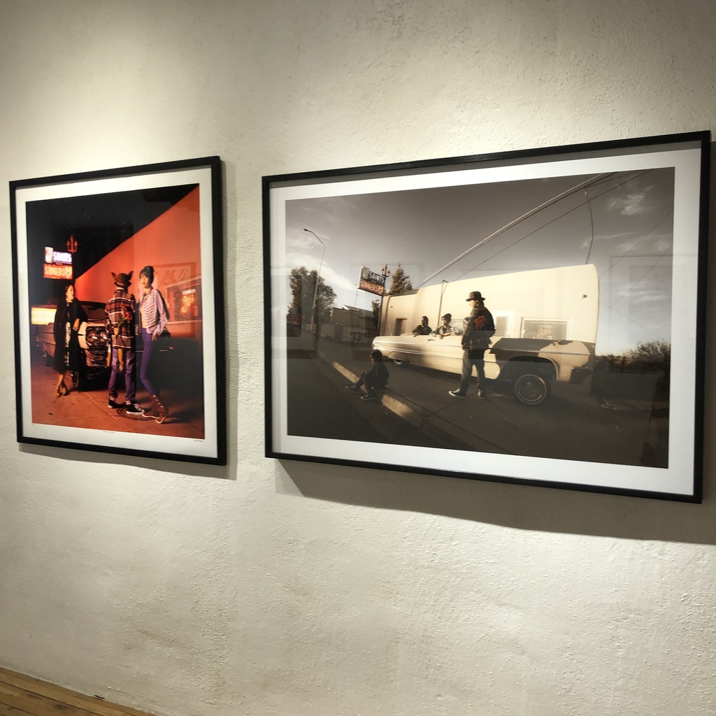
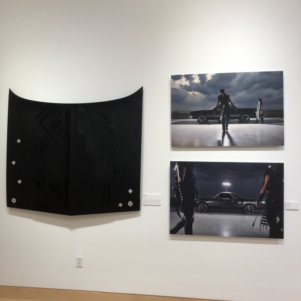
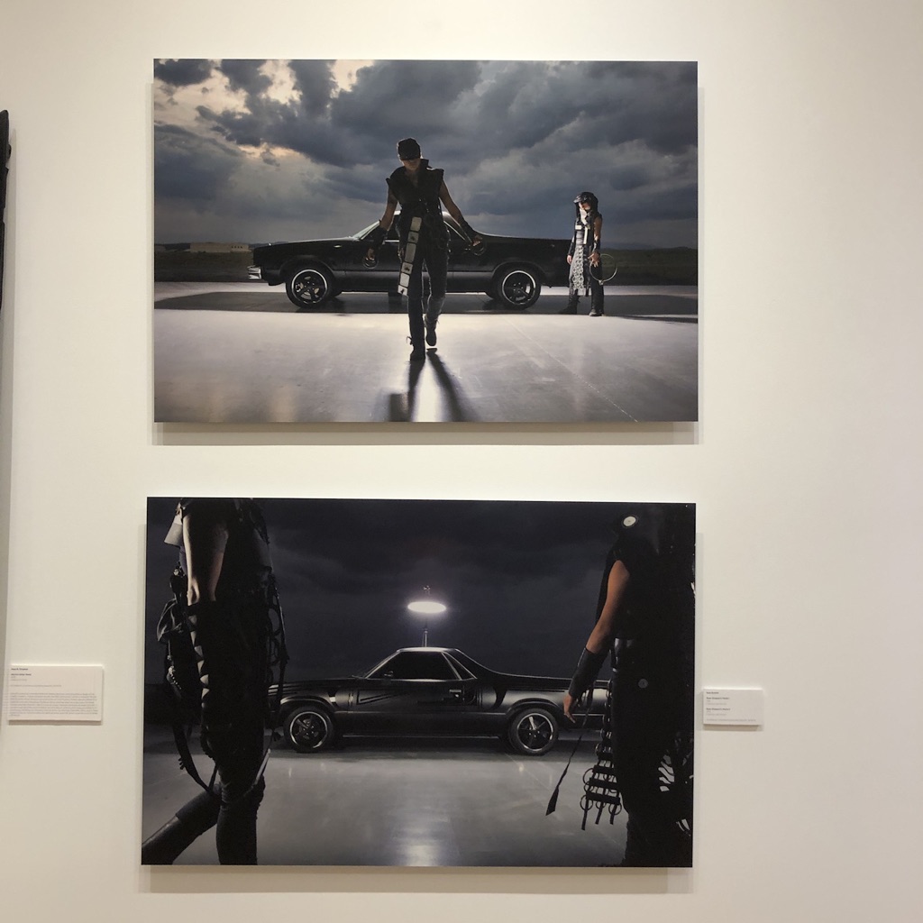
But Kate Russell’s photos here felt like they were hyper-charged by someone else’s creativity, and I mean that as a compliment. Perhaps it would be better to say she was collaborating with another artist, whose vision was so distinct, so AMAZING, that you’ll leave this article happier than you entered.
Just look at this.
The low-rider-hood is displayed on the wall, featuring designs that around here are associated with pottery, from the Santa Clara Pueblo.
(The black on black is common.)
In the photos, Rose B. Simpson presents as a Native American super-hero, like a female, indigenous Zorro, and for all the movie reboots these days, I dare you to find a protagonist you’d rather watch on screen.
This is SO FUCKING BADASS.
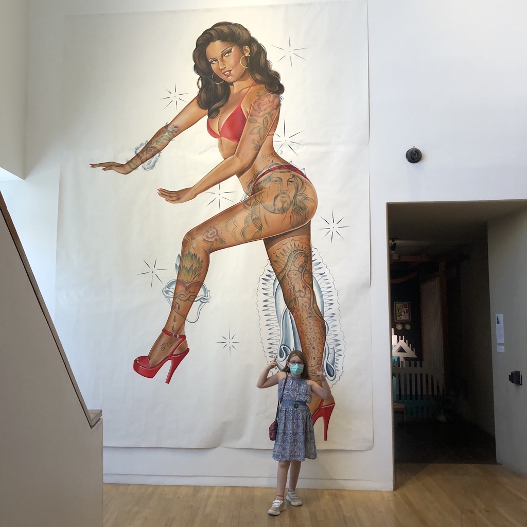
From there, we saw more blingy-bikes and creepy skulls, before going upstairs, (past the massive painting of a pin-up model,) to see a new installation of even more Retablo paintings.
My friend Ed was with me, (along with the kids,) and he agreed that in all his years visiting the museum, (he’s a long-time patron,) he’d never seen these paintings hung in such a modern, crisp way.
I luxuriated in the work.
Standing there.
Admiring the magnificence.
We all did.
It was so easy to travel back in time in your mind, to a dark, mud-walled church, two hundred years ago, with flickering candles, Latin-chanting priests, and huddled heads, where every now and again, someone would look at an image of Jesus, or Mary, and find hope.
Or solace.
So that’s where we’ll leave it today.
Art is, and has always been, a huge part of humanity’s salvation.
Art is an act of creation, and represents the best of us, as a species.
So let’s not forget that, in 2021, when so much bad-behavior gets us down.
The Art of the Personal Project is a crucial element to let potential buyers see how you think creatively on your own. I am drawn to personal projects that have an interesting vision or that show something I have never seen before. In this thread, I’ll include a link to each personal project with the artist statement so you can see more of the project. Please note: This thread is not affiliated with any company; I’m just featuring projects that I find. Please DO NOT send me your work. I do not take submissions.
I shoot personal work throughout the year around commercial assignments. Sometimes you just do self-assigned projects to feed the soul.
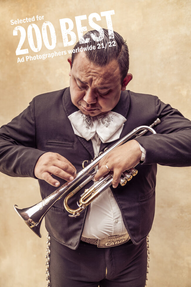
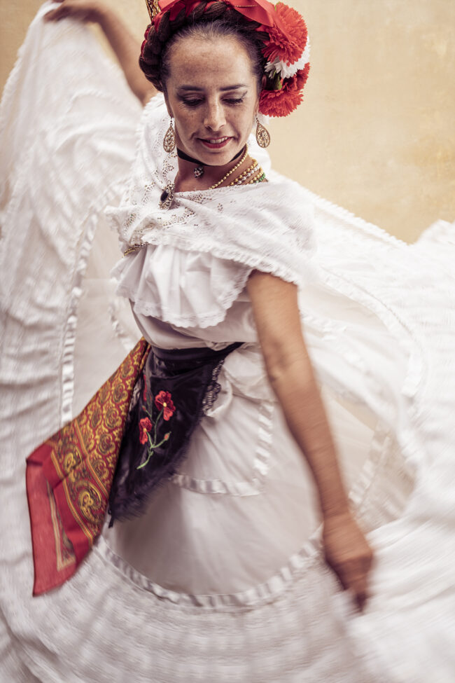
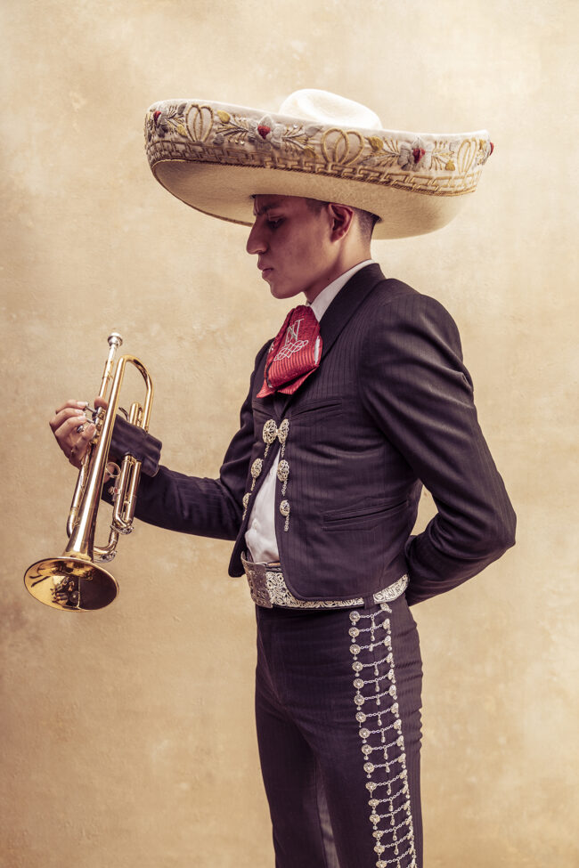
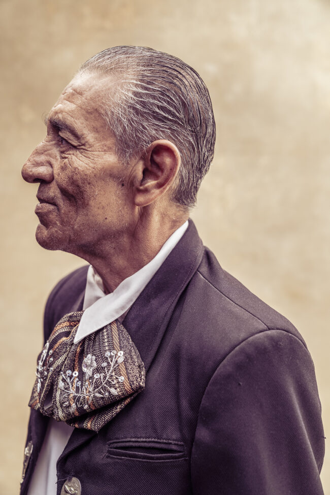
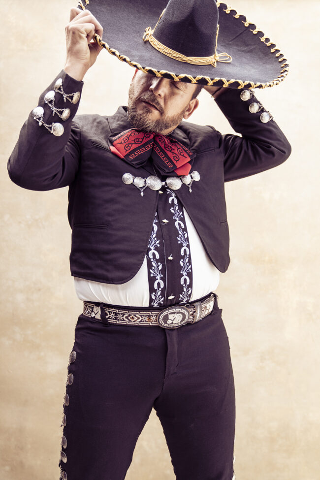
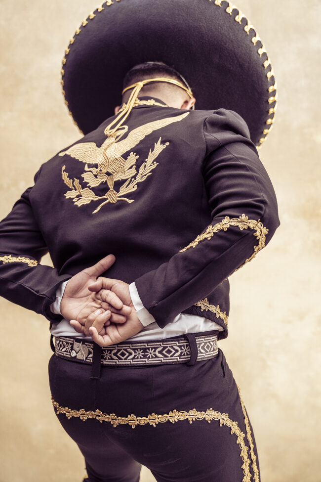
I grew up surfing around Mexico. It’s a place that is close to the heart for me. Recently traveled around the Baja Peninsula searching out and casting Mariachi band members. With an assistant and an outdoor studio, we focused on creating a series around the wonder of the Mariachi tradition.
I am a huge fan of Spanish culture, the food, the history, the people, and the traditions. This project allowed me to work on a project I have had on my list for a long time. Many years ago, while in NY for work I sought out an artist to paint a backdrop for me knowing I would eventually run out of excuses to take on the project and just go do it.
An opportunity came up when Marianne Campbell (my rep) was putting together a project including all her photographers. I needed to shoot something for it to be included, but I wanted it to be unique.
Normally I shoot in an editorial or story telling fashion where I’m immersing myself in the story I want to convey. Here I just focused purely on portraiture and the beautiful people performing their passion. I wanted to convey the commitment and joy around this tradition. The color palette chosen was based on my experience with the subject matter. To me it had to be warm, romantic and include the authentic elements. It’s hard to listen to this music and not be moved. I hope I have captured that in beautiful and respectful way.
The musicians were happy to be performing as they also have been affected by 18 months of lock down due to the pandemic. It was such a joy to be serenaded for several days. It was really a magical experience.
APE contributor Suzanne Sease currently works as a consultant for photographers and illustrators around the world. She has been involved in the photography and illustration industry since the mid 80s. After establishing the art-buying department at The Martin Agency, then working for Kaplan-Thaler, Capital One, Best Buy and numerous smaller agencies and companies, she decided to be a consultant in 1999. She has a new Twitter feed with helpful marketing information because she believes that marketing should be driven by brand and not by specialty. Follow her at @SuzanneSease. Instagram
Success is more than a matter of your talent. It’s also a matter of doing a better job presenting it. And that is what I do with decades of agency and in-house experience.
Heidi: How did this idea come about, did the pandemic have an influence?
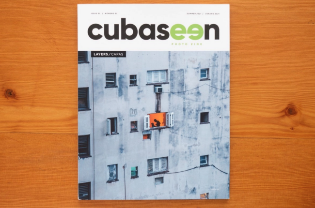
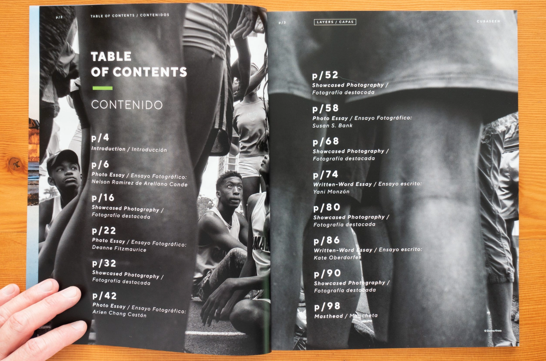
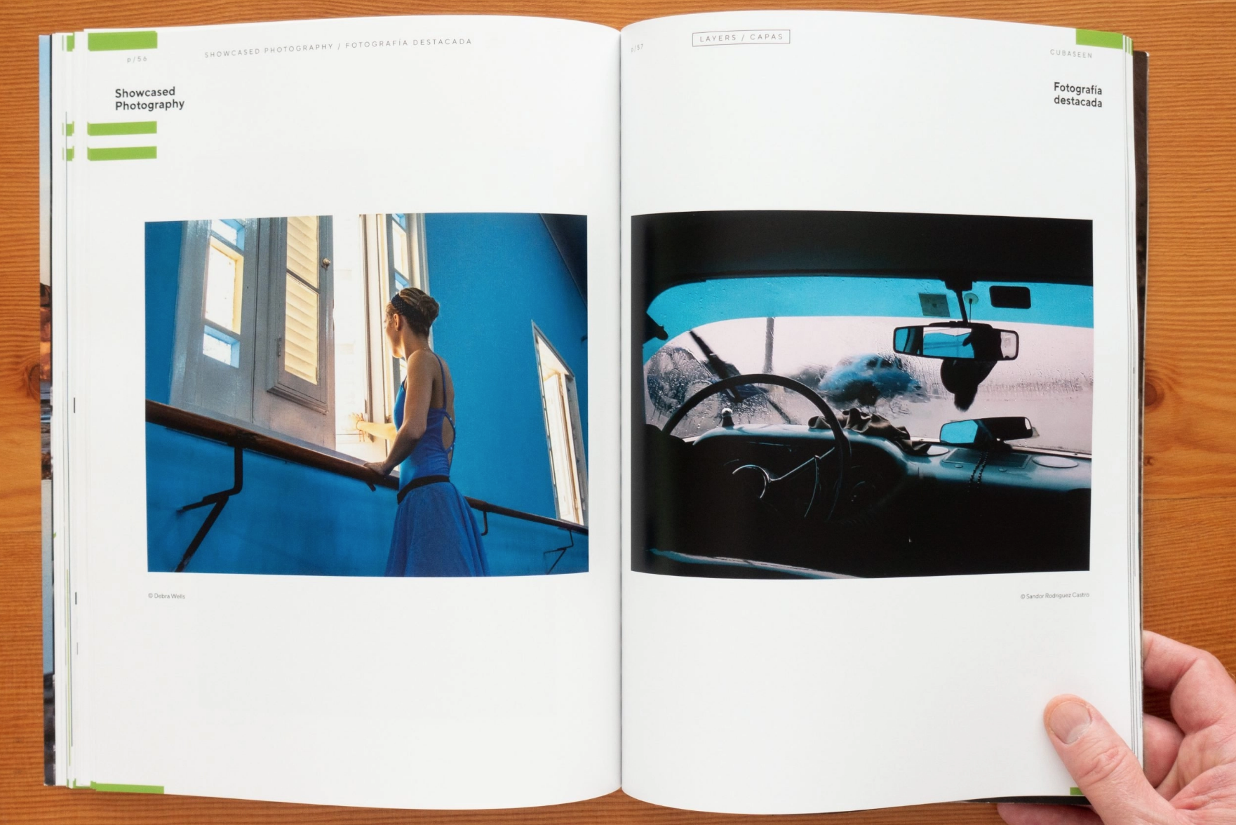
Jennifer: After travel came to a sharp halt I started teaching online courses with Santa Fe. One was on creating Zines – lots of fun to deep dive into projects, sequencing and designing after so many years just focusing on capturing images. Somewhere mid-pandemic a friend and fellow photographer, Andrew Child approached me with an idea of co-publishing a zine showcasing Cuban and US photographers together on one platform.
Why Cuba? Cuba is a place it’s hard to visit and not genuinely get attached to the people. It’s also a place it’s hard to understand through simple news headlines. It’s culture is layered in complexity, due to both politics and isolationism. We appreciate the strong commitment to the arts and music Cuba has always held. Our magazine is trying to provide a deeper lens into the happenings on the island and testing whether art and written words can actually help broaden perspectives. There are countless photos of Cuba sitting idle on the hard drives of talented photographers who have visited the country through people-to-people and support of the Cuban people programs. We provide a unique platform to share those photos and pair them with the work of Cuban photographers in a way that is thoughtful, creative, and exposes truths about both our cultures.
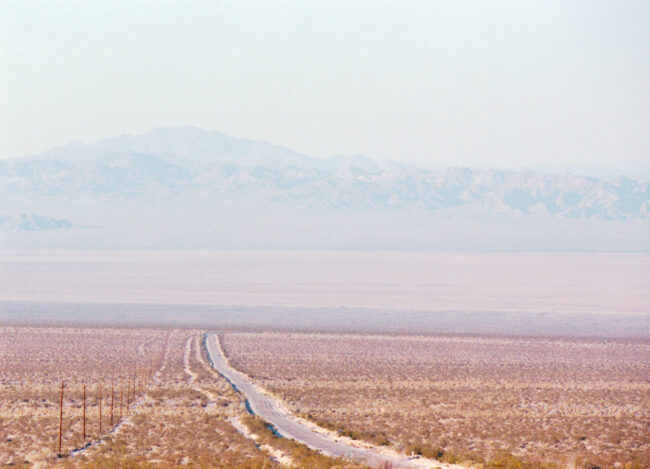
Is there any call to action for the magazine? CubaSeen exists at the intersection of both U.S. and Cuban governments recognizing the value of artists connecting across national boundaries. Distribution includes key members of the U.S. Congress and Biden Administration foreign policy officials. “We’re not political but we do want decision makers in Washington to understand the value of people-to-people interactions between artists during this time of strained relations between the U.S. and Cuba. CubaSeen is not just about beautiful photography, it’s about people forming friendships, the cross pollination of creative ideas, and debunking the myths we hold about each other in both countries.” Andrew Child
We are hopeful people will share the magazine with friends and fellow photographers and that our magazine can achieve what news headlines are often unable to do – giving a face to the people. Our distribution also includes a range of galleries and curators within the art world in hopes that the exposure will lead to other exhibits and more traction for the artists collectively.
How did you spread the word for call in to entries in both countries? So far everything has been by word of mouth and social media. We’ve reached out to photographers from Cuba and the US for entries and all have been eager to participate. We’re encouraged by the range of visual voices – from amateurs to professionals. We’ve now started getting submissions from all over the world and are excited by the depth in perspectives. It’s fun to see the difference in work that comes from outsiders looking into Cuba and insiders looking out from Cuba.
Are you creating diptychs with US based images and Cuban images?
We put a lot of focus into crafting the most dynamic page spreads we can – creating unexpected relationships and challenging juxtapositions between images. We understand that the meaning of an image can be influenced by what image it appears next to it and are enjoying editing the work to create these types of pairings. We are letting the imagery drive these relationships – sometimes they are between a Cuban and US photographer, sometimes two Cubans, sometimes work from photographers in other parts of the world. Andrew shared with me, “I see reactions from people who have not been to Cuba, I get the sense that those pairings and juxtapositions which Jennifer describes still resonate. The subject is always Cuba, but there’s plenty in the zine for anyone who just appreciates great photography.”
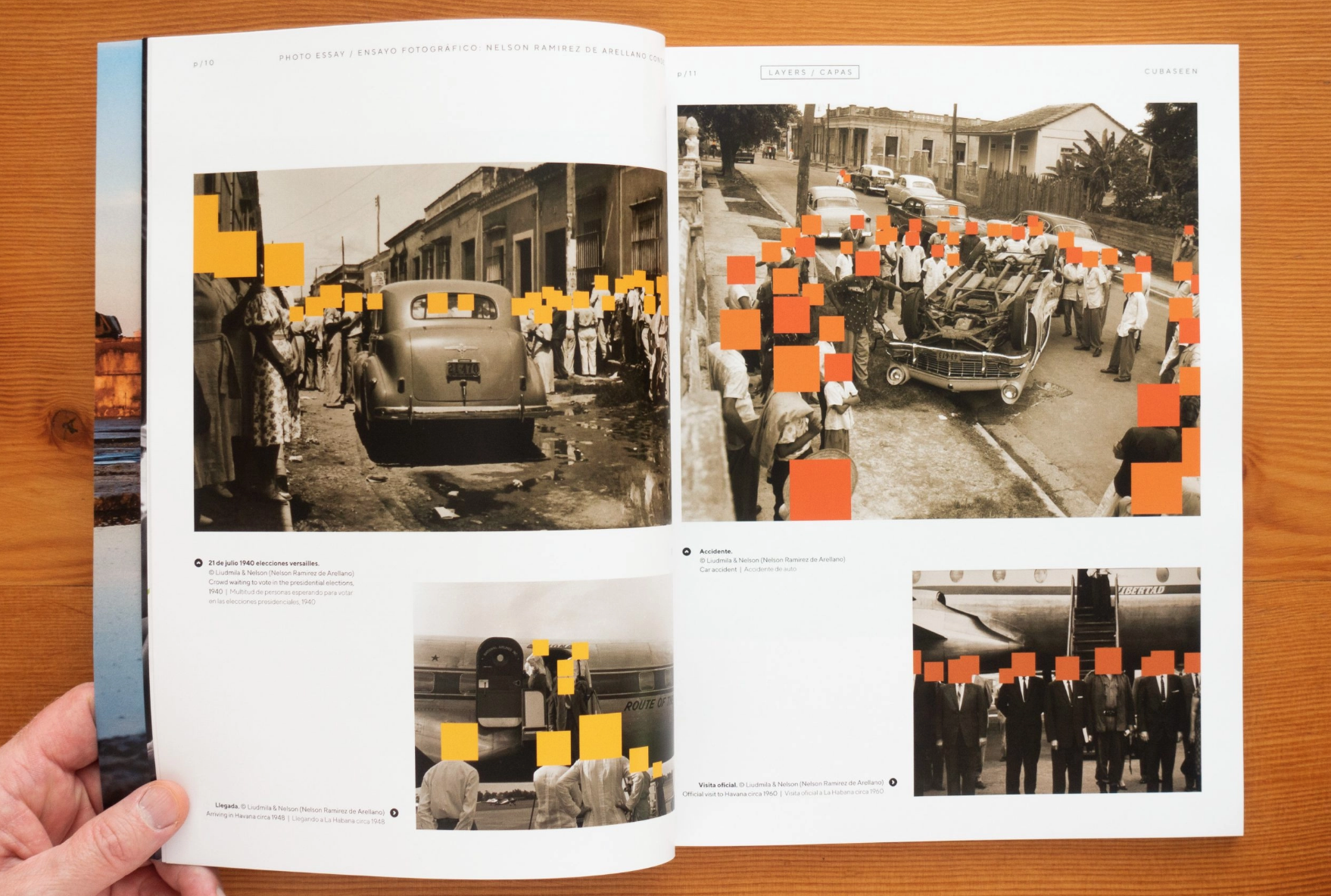
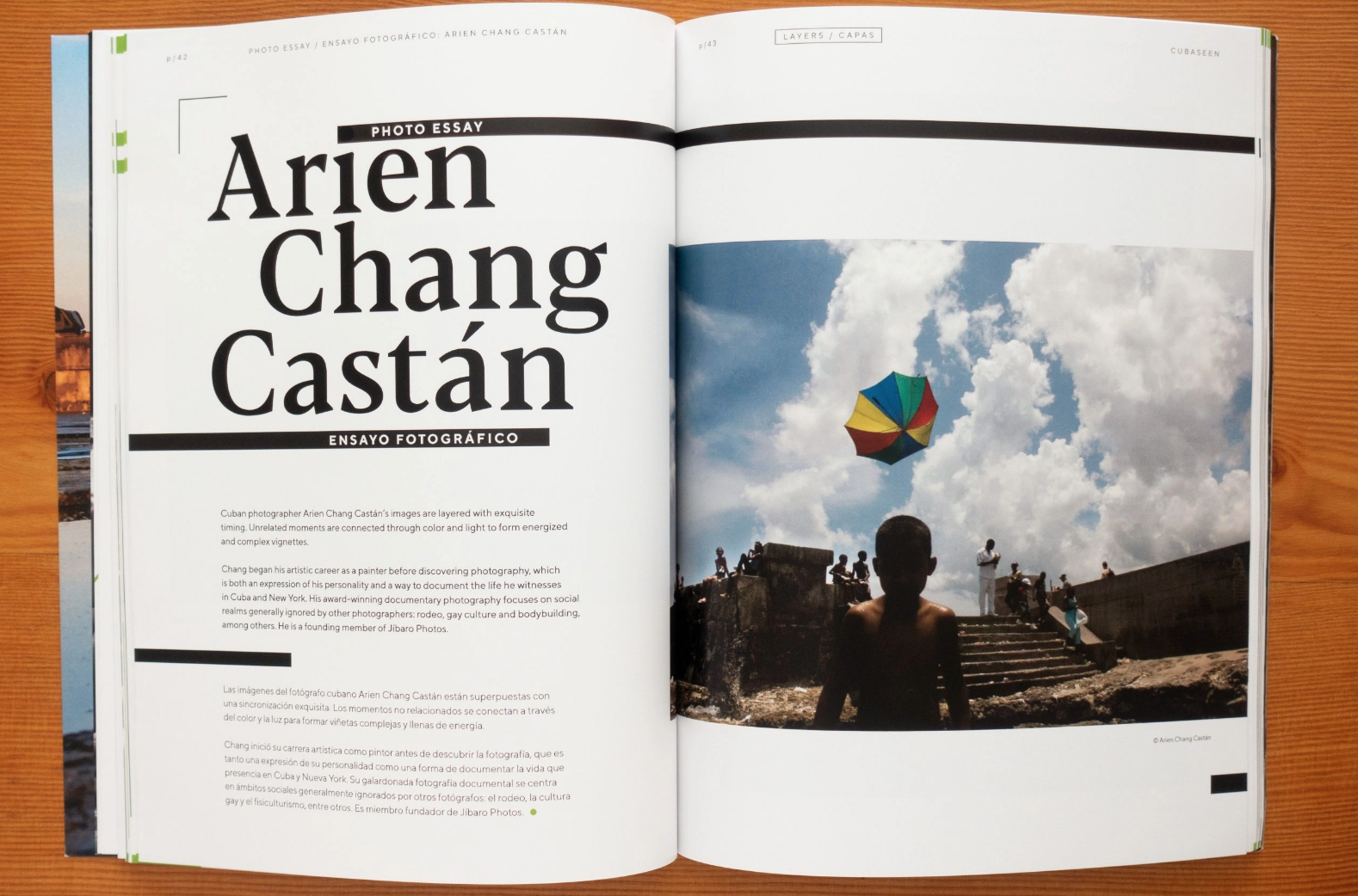
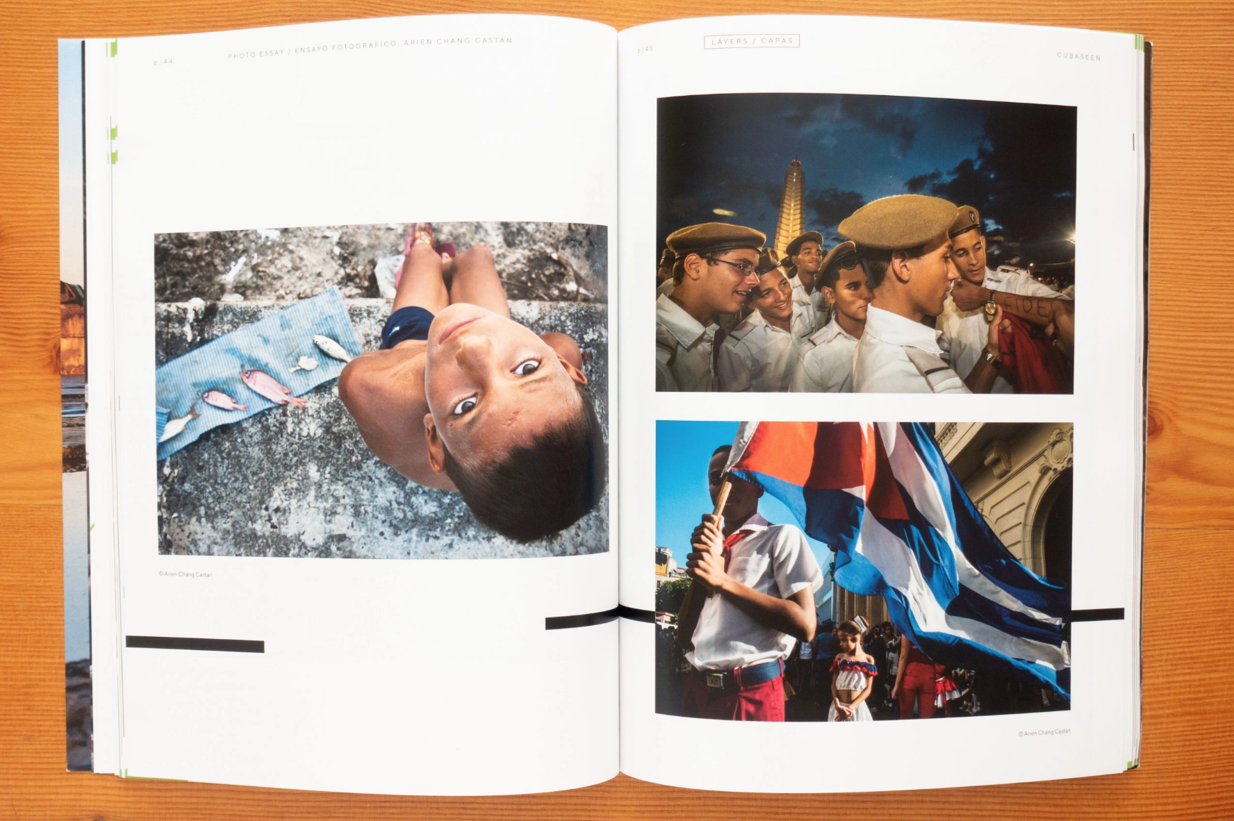
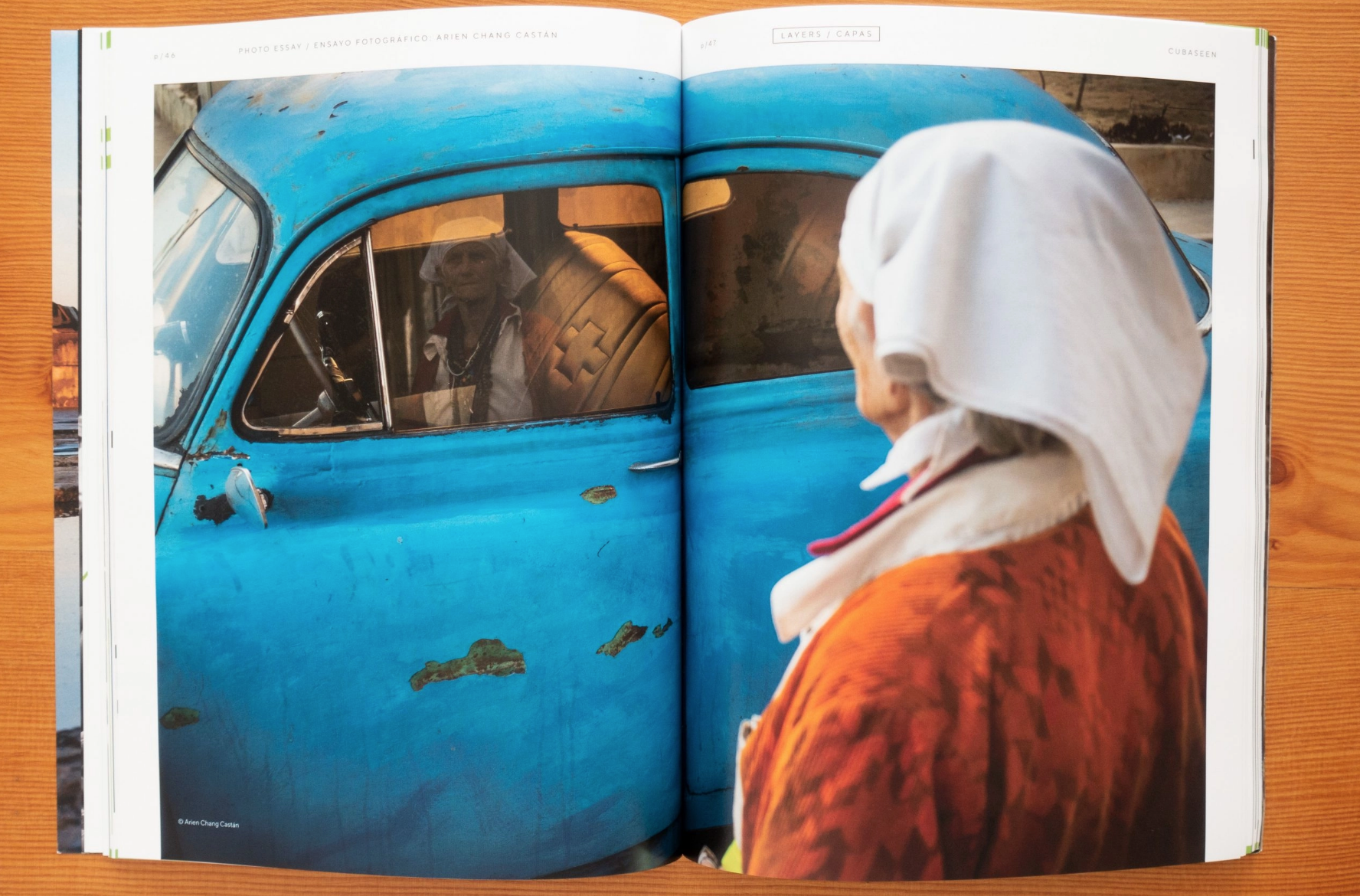
What are the themes based on? The themes are meant to encourage imagery beyond the standard cliches of Cuba. Our first theme of LAYERS was a tribute to the long history of powerful street photography in Cuba and the complex cultural layers within the island. Our next theme of PERSONAS was meant to amplify and personify the voices of the people of Cuba during a summer of incredible internal and external political unrest. Our current theme of “UNEXPECTED CUBA” is about celebrating the moments that delight, surprise and endear us to the island. We are excited to see what kind of photographs it yields.
It’s so inspiring to see all these collectives popping up.
We agree-it’s been beyond cool to see the cooperative endeavors that came out of us all having a little time to slow down and actually talk about ideas together. The very best part of CubaSeen has been working together with the most dynamic team Andrew and I could assemble. We have a copy editor/translator who brings extensive experience in publication, two Cuban designers who’ve helped craft the CubaSeen brand and weave the Cuban aesthetic into each page and a dynamic Cuban writer and US writer. Those folks combined with each of our rotating photo essayists and the over 100 photographers who’ve submitted work to each issue creates a synergy of visual thoughts far beyond what any individual perspective could do. Many times throughout the last year Andrew and I have remarked on the collaborative part of CubaSeen being the most fun and powerful part of the project.
Our next call for entries is on “Unexpected Cuba” and submissions are due by November 9th. Anything we can do to encourage submissions from folks who have visited Cuba would be great – https://cubaseen.com/submissions-03/
Who printed it? Smartpress. I’ve used them for the last couple of years, and the quality has been excellent every time. For photographers, color accuracy is obviously one of the first things we look at and I feel they do a great job in that regard. Their pricing is also very fair, helped in part by the flexibility they offer in terms of production quantity.
Who designed it?
It was a collaboration between myself and Peter Dennen of Pedro + Jackie. I usually have a fairly clear idea of the overall look and feel I’m after, but Peter was particularly instrumental in putting this one together.
I’ve worked with Peter on web edits, print book edits and a couple of promos. It’s always a conversation, which is as it should be, I think. Obviously one characteristic of a good conversationalist is the ability to listen, and Peter is not only good at that, but he’s good at parsing the necessary information from the conversation. He’ll also tell me if he thinks I’m headed in the wrong direction, which I appreciate. Of course, I’d like to think that doesn’t happen too often! But Peter has frequently made visual connections in my work that I might otherwise have missed.
Tell me about the images.
I conceived of this promo mostly as an introduction to this element of my work for potential clients who might not already know me or my work. With that in mind, I drew from a larger body of work rather than the most recent work specifically.
One of numerous privileges of my long relationship with Texas Monthly is that I’ve covered Texas far and wide… and as we know, it really is far and wide.
I think there’s only one image that’s not from Texas (it’s potentially a little awkward thematically, but I don’t think it registers in a huge way visually), so I think it really grounds me as a Texas-based photographer (for better AND most definitely for worse!).
How many did you make?
60. It’s a 28 page booklet, and it’s a fairly targeted campaign. I felt that I could order more a little later if needed.
We also designed a large-format hardcover print book that was largely based on this booklet. I intended ordering a handful of these books, thinking I’d show them at portfolio reviews and also send a couple to the likes of Wonderful Machine for them to show at their client meetings. Then the pandemic happened before I had chance to order them.
How many times a year do you send out promos?
In a normal year 3-4. I try to put together one booklet or at least a tri-fold, and beyond that, I typically send out a couple of postcards every year too.
But of course, this wasn’t a normal year…
Do you think printed promos are effective for marketing your work?
How much space do we have to devote to this subject?! Typically, I would say yes. The message when it comes to effective marketing seems to be about consistency across multiple channels. As many of us would admit, this a theory that isn’t always put into practice with as much reliability as we’d like… That said, I think a good printed piece is always going to resonate. Done well, it shows an extra level of care and attention to detail.
However. What about in the midst of a pandemic? What about now that work culture has irrevocably changed, and many art buyers, art directors, and editors won’t be returning to the office with anything approaching regularity? Truth be told, these promos were delivered to me literally DAYS before we went into our first lockdown. I sat on them for a year because who was going to be in an office receiving them? I finally reached the point that I felt they had to go out if they were to represent current work in any way. I sent them out in the knowledge that a significant number of them wouldn’t reach their intended audience, yet 50% of something beats 100% of nothing.
Meanwhile, the email boxes of industry creatives overfloweth. Honestly, I empathize with them. Who can possibly keep up? But right now, even as many emails will go ignored out of sheer necessity, it’s still the best option we have in terms of reaching creatives. This is obviously a time to nurture established relationships as well as seek to make new connections.
With all of this in mind I recently worked with a designer to create an attractive, adaptable email template, hoping to up my email game. Whatever we can do to grab a moment’s attention, right?
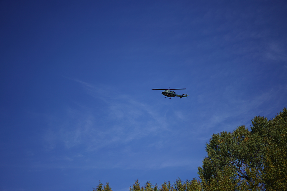
My neighbor built a heliport, about five years ago.
He didn’t have the permits to build in a remote, rural valley, but he’s a wealthy man, so he skirted the rules, and got away with it.
(Like that phrase, it’s easier to ask for forgiveness than permission.)
Sure, some people made a fuss, but as he built across the street from the volunteer firehouse, and enlisted some of the firemen to walk around with petitions, there was at least plausible deniability.
(That it was in the public interest.)
Ironically, my neighbor does not own a helicopter, (that I’m aware of,) but he does own a big chunk of land, so it was speculated he was planning to develop ranches for the “copter class.”
Given a hedge-fund billionaire, Louis Bacon, purchased Taos Ski Valley not long before, started his own airline, and expressly began cultivating a super-rich clientele, such conjecture about our misfit heliport seemed just.
But nothing like that has come to pass, and I’ve never even seen the damn place used. It just sits there, jutting out of a cow pasture, and has more No Parking signs than parked cars, much less helicopters.
Until today, that is.
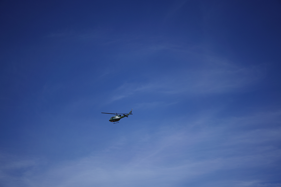
Ten minutes ago, I was perusing today’s book, preparing to write this column for you.
As I sat on the couch, (having only recently had the confidence to leave my bedroom as a workspace,) I heard a shocking roar that split the silence.
My head started throbbing, as a hellacious noise tore though the valley, and I quickly ran outside to see what the fuck was happening.
I looked to the East, and saw nothing, so I ran to the other side of the house, looked West, and there was a massive, military helicopter up in the sky.
It made no sense, as was it landing, or what was it even doing here?
So I threw on some shoes, grabbed my camera, (and a leash for the dog,) and tried to suss out what was up.
I watched the helicopter ascend, right after landing, and then circle the valley again, before coming in to land.
Again.
It lifted off one more time, did yet another circle, but this time, I had the camera ready, and a fast shutter speed chosen, so I could at least get some photos of the random, unsettling phenomenon.
I might mention our valley ends in a box canyon, which amplifies sounds like mad, so this particular military helicopter made me think of what it must have been like in distant, Afghan valleys, when those war ships showed up over the nearest peak, ready to fuck shit up.
Viscerally, I was afraid, though logically, I knew we weren’t under attack.
The copter did the same maneuver, landing and immediately rising, and then headed off to the South, (perhaps towards Kirtland Air Base in Albuquerque,) leaving the place as abruptly as it arrived.
Just now, my heart rate has dropped back to normal, and I’ve convinced myself it was just a training exercise.
That’s all.
But if my rapacious neighbor had never built that heliport, in the middle of a cow pasture, when there was no actual demand for such a thing, I would be a bit calmer than I am.
The architecture had a purpose in mind, and eventually, people always find a way to use things, once they exist.
Last week’s piece ran nearly 3000 words; likely the longest I’ve written in my 10 years as a columnist.
There was much to discuss, and I leaned in.
Today, as a counter-point, we’ll keep it brief, and relatively obvious.
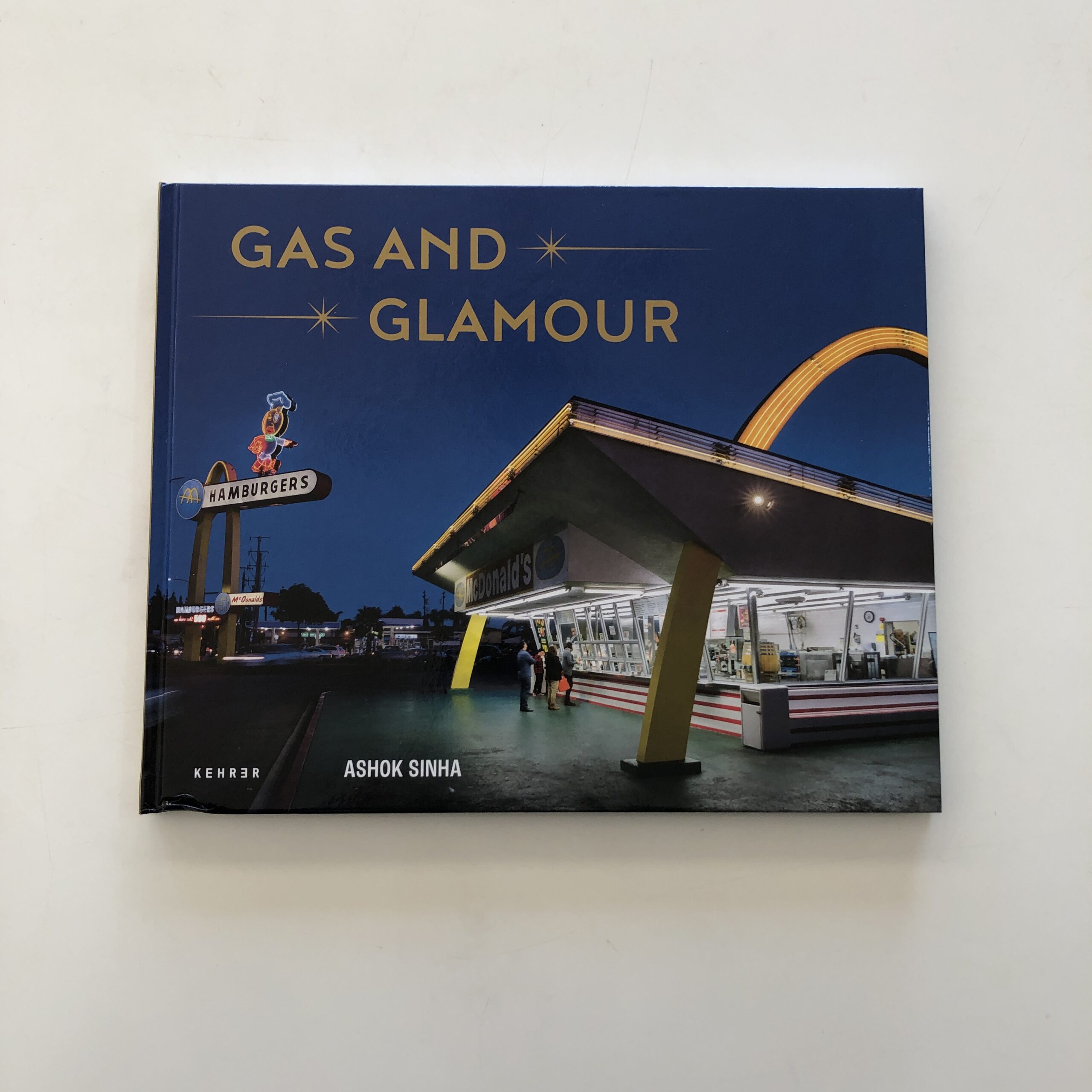
I’ll introduce today’s book, by Ashok Sinha, which showed up in the mail nearly a year ago. (I swear, we’re almost done with 2020 submissions. Maybe 1 more to go.)
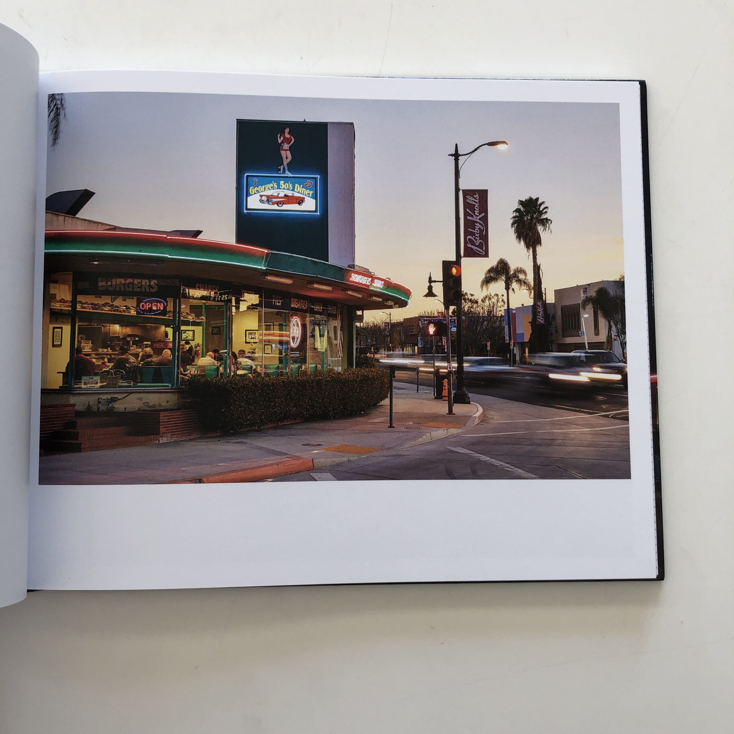
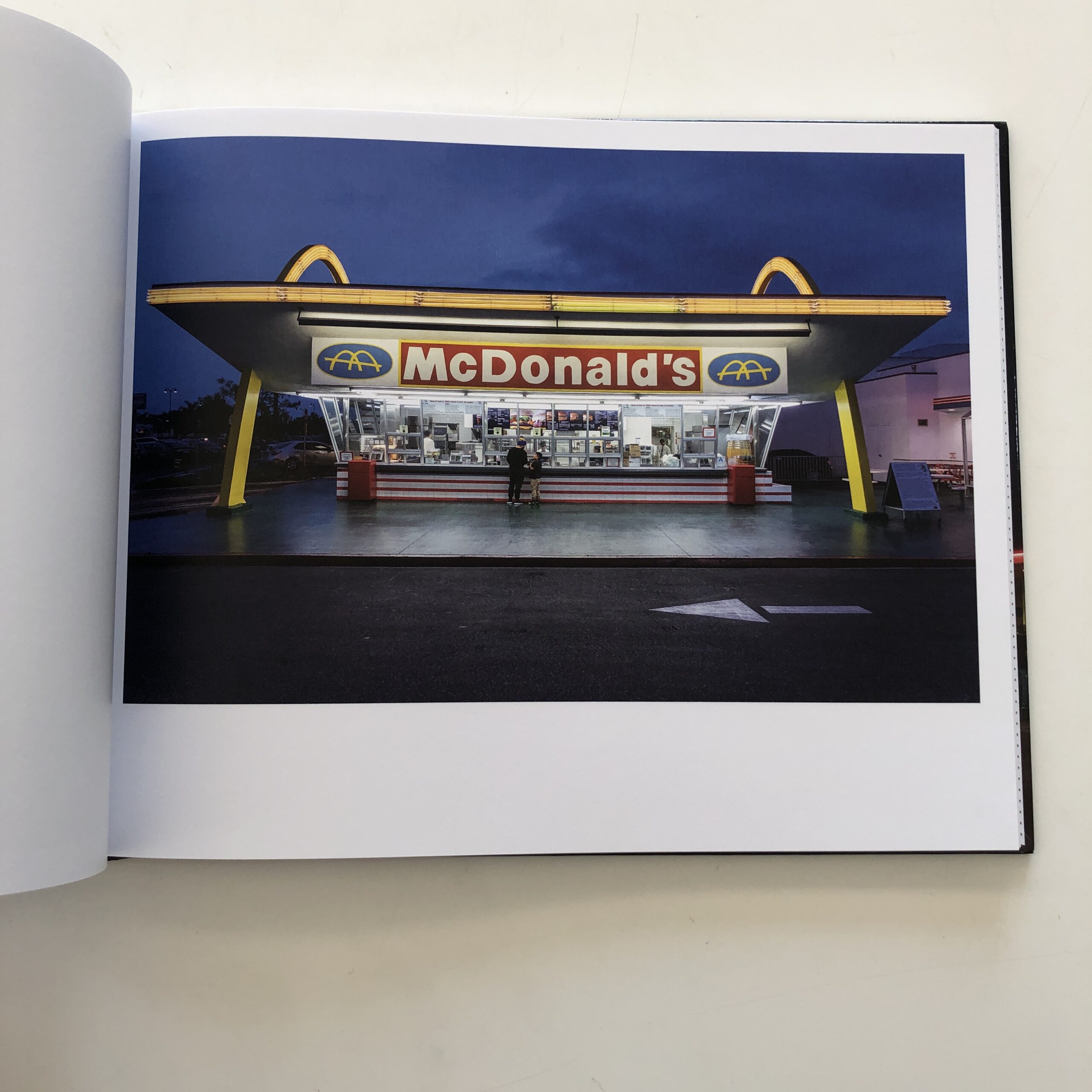
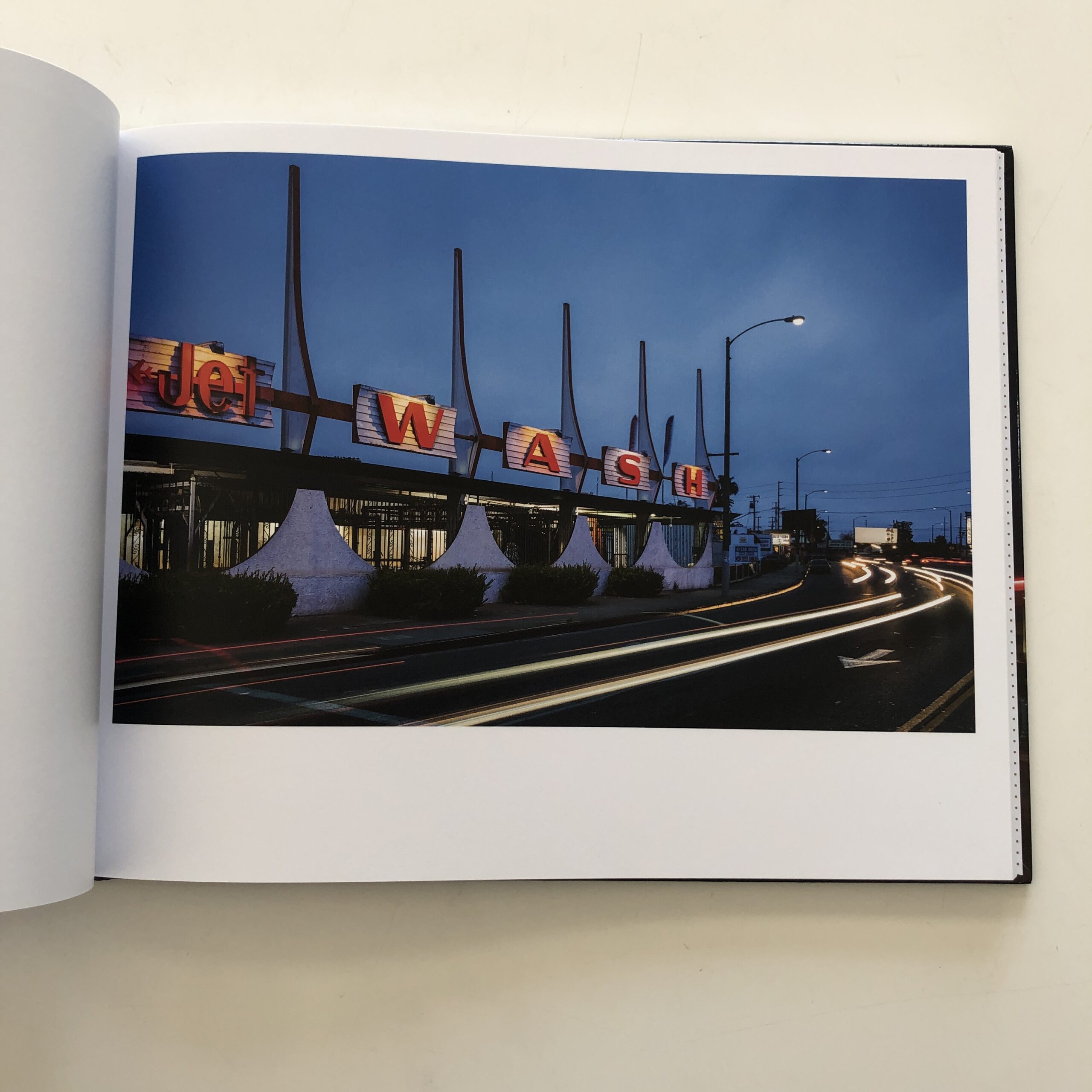
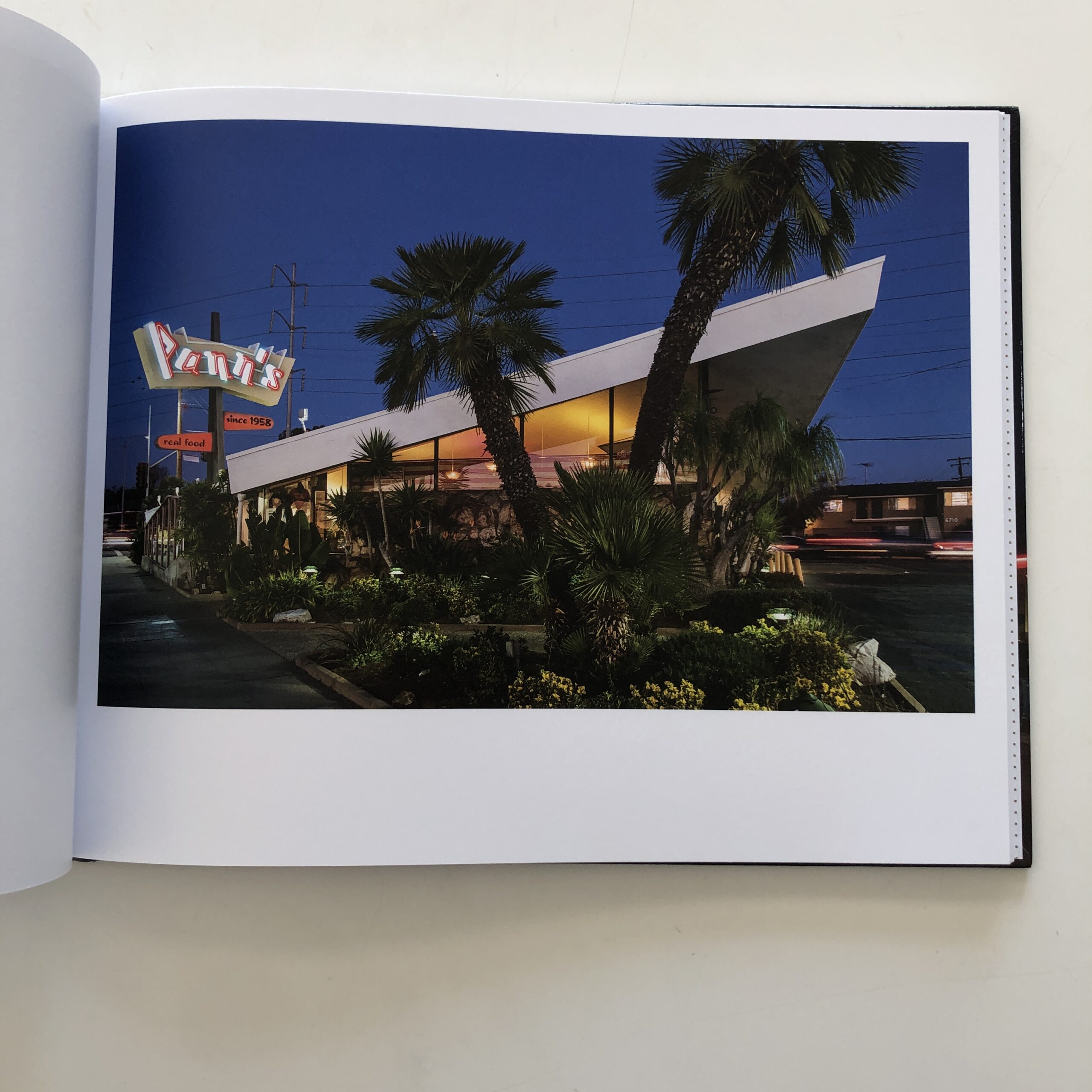
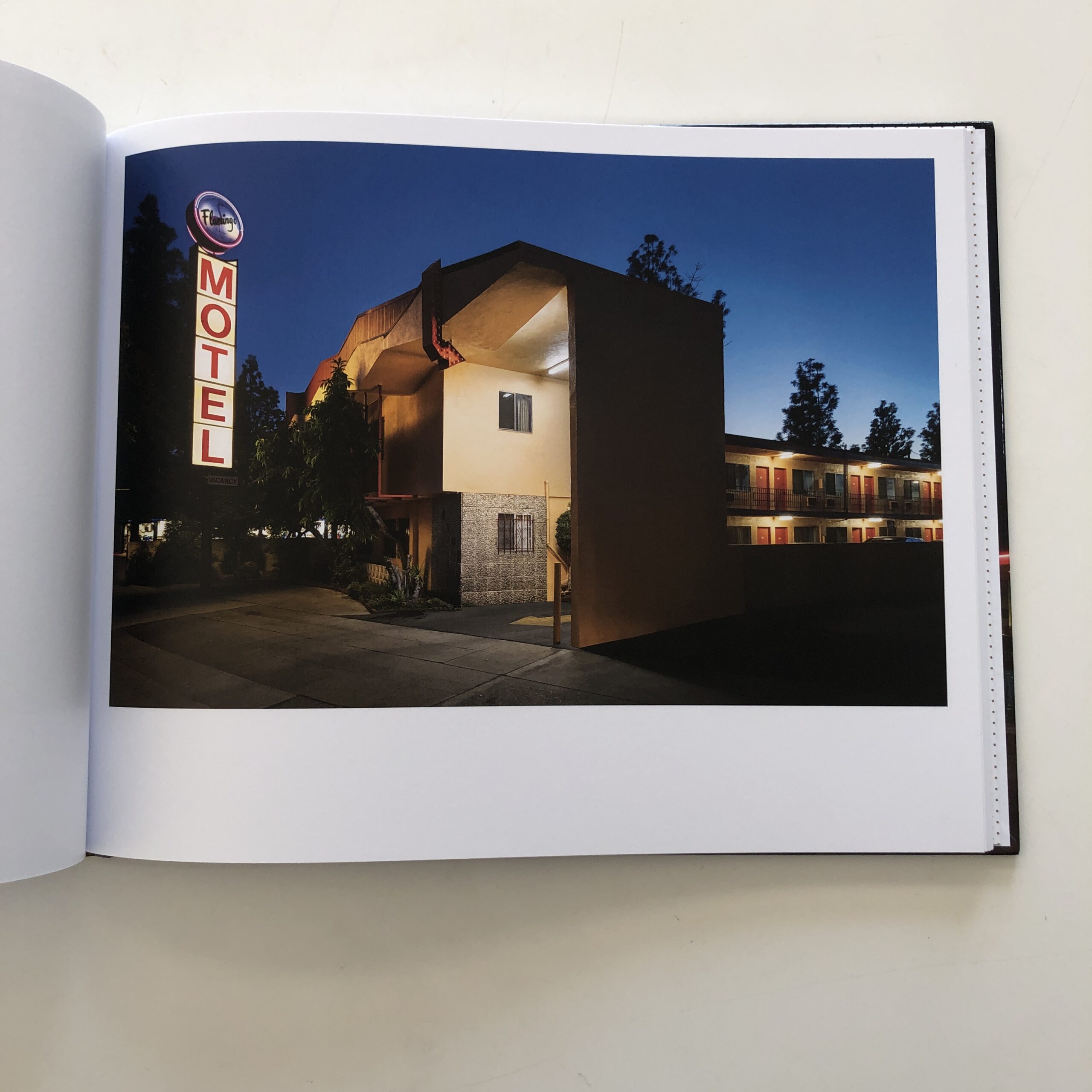
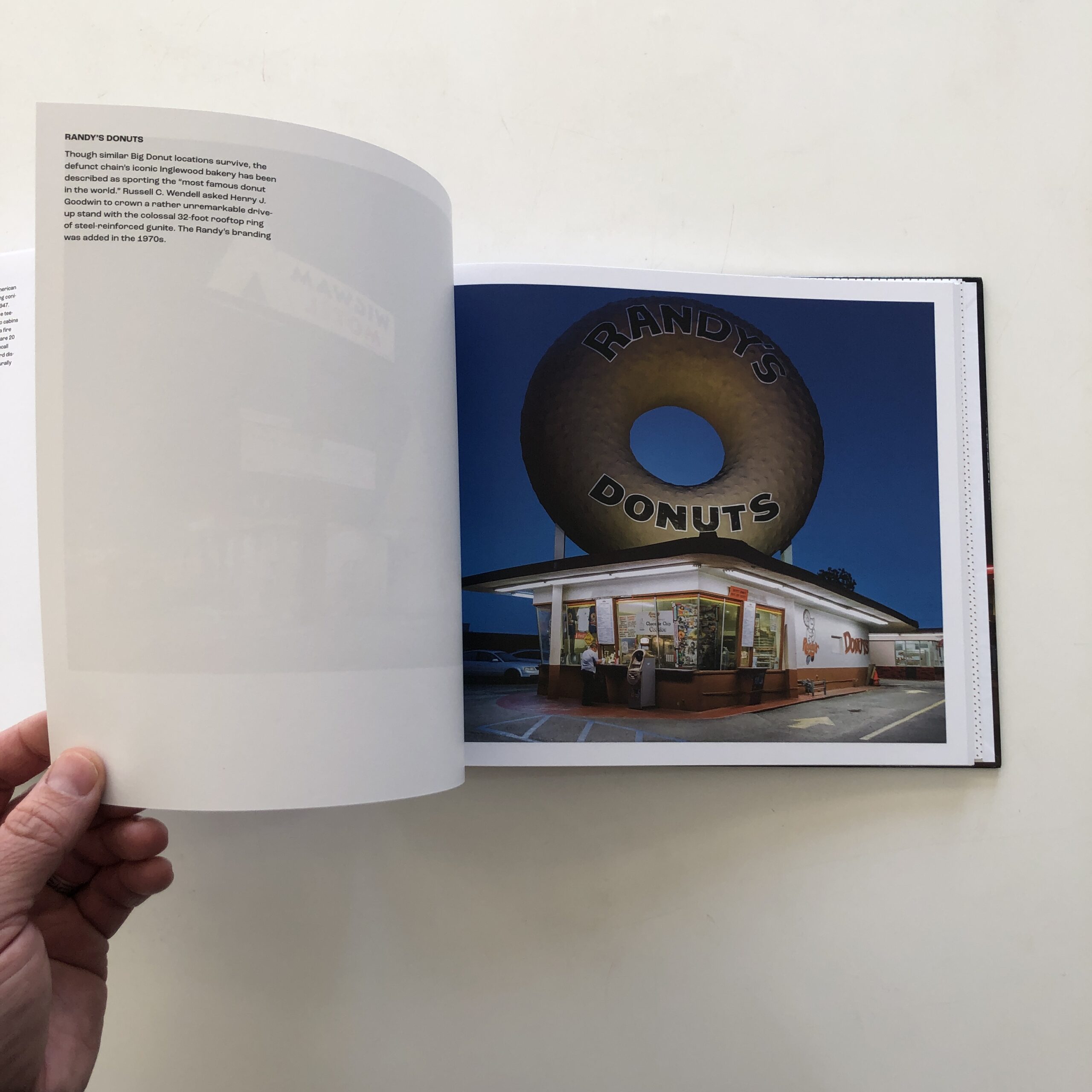
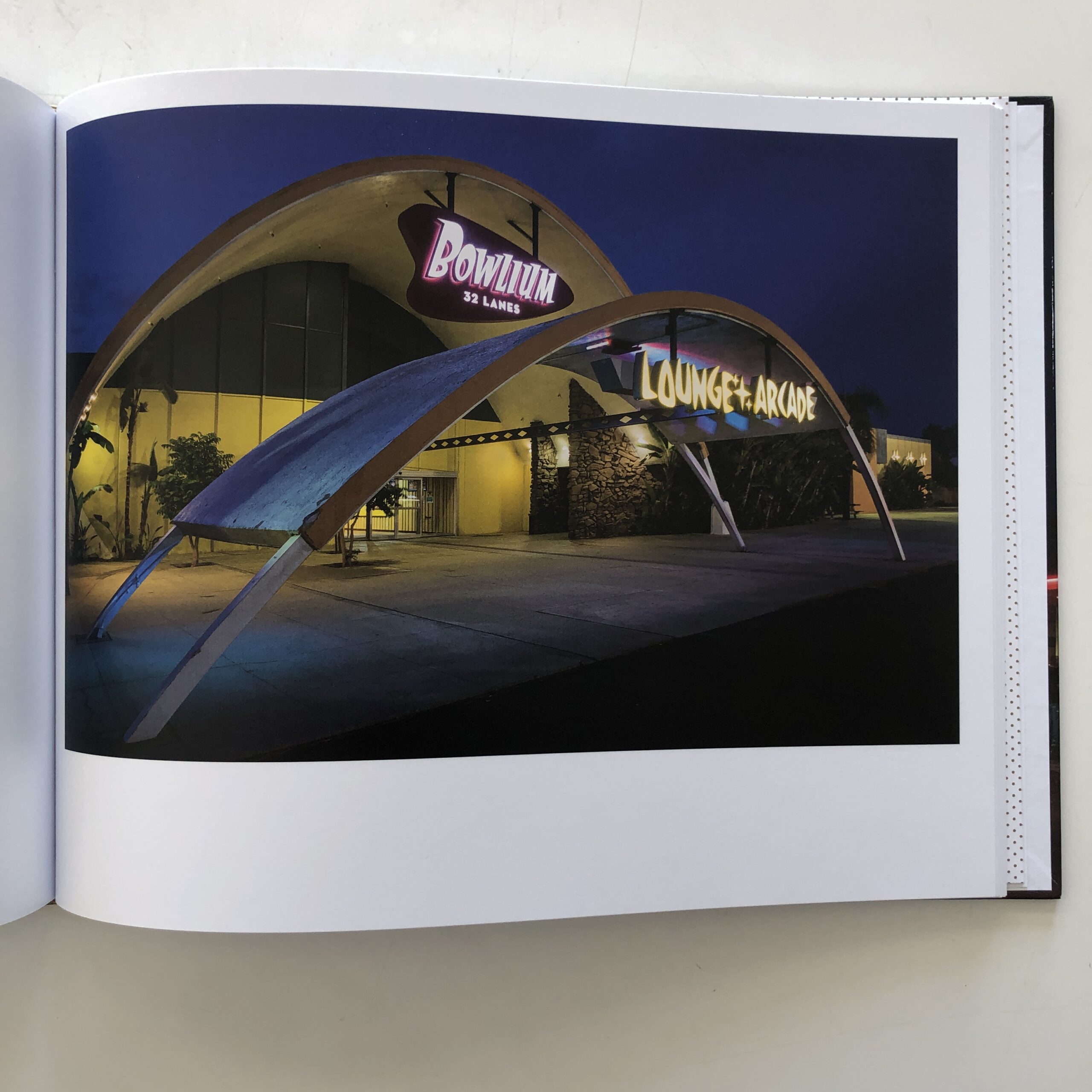
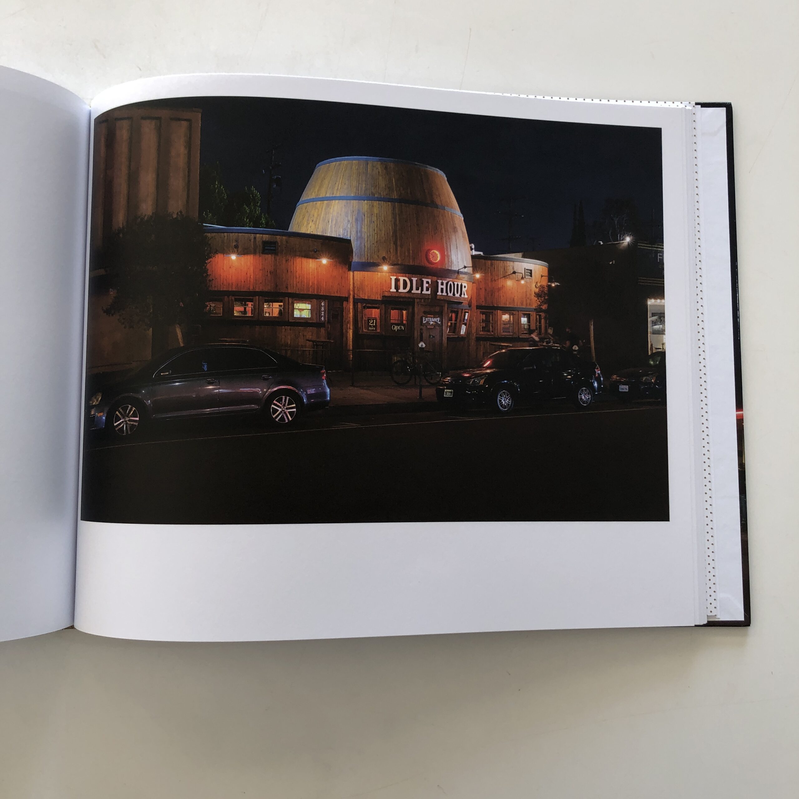
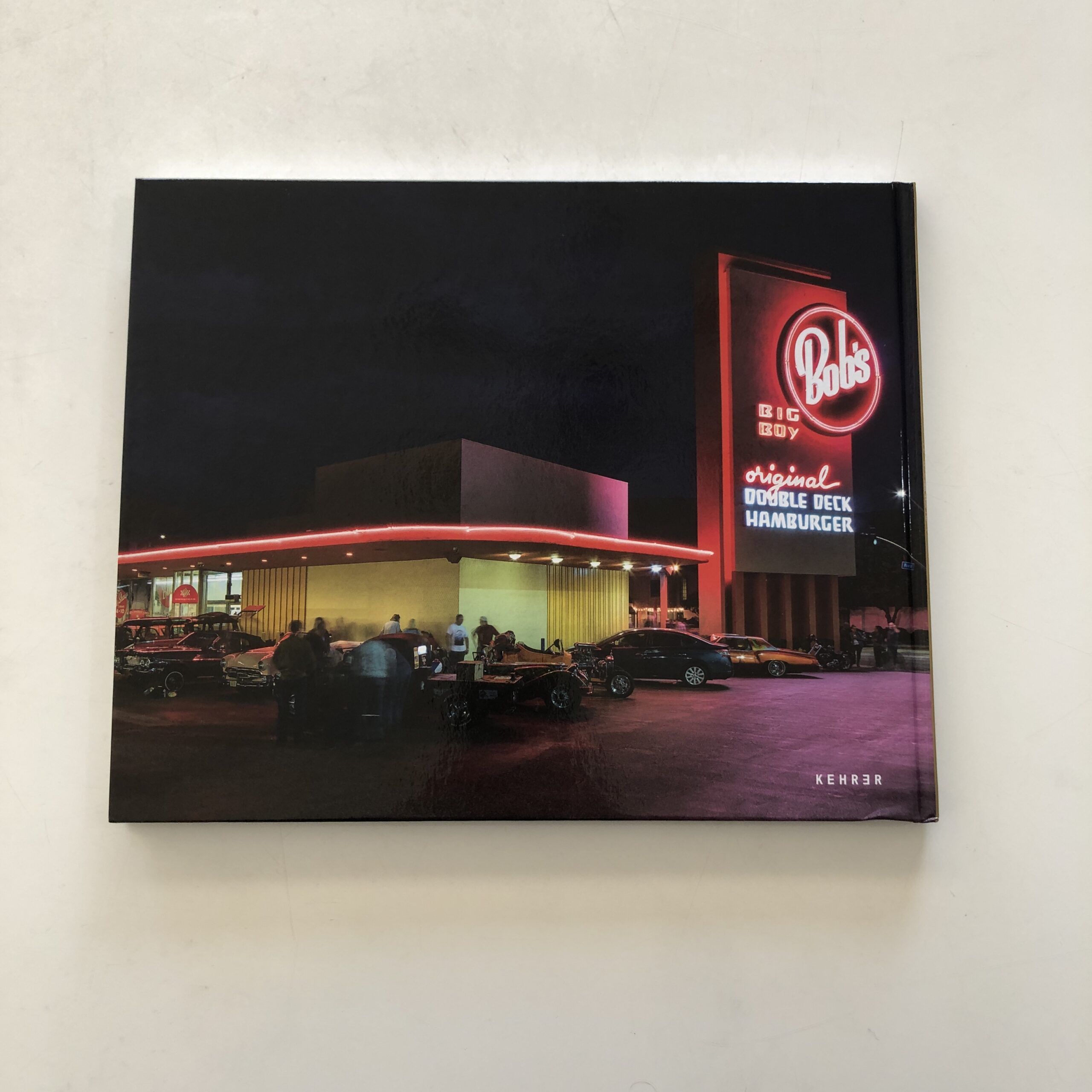
“Gas And Glamour” was published by Kehrer Verlag in Germany, and is somewhat straightforward, as is today’s review.
I met Ashok at an NYT event a while back, and we stayed in touch, so when he reached out offering a book about LA architecture, I said sure.
And given the magic of that brief sequence, in “Once Upon a Time in Hollywood,” where Tarantino wrote his love letter to LA neon, and old movie theaters, it seemed like this book would mine similar turf.
The quick gist is, I found this book flawed, and had questions about its construction throughout, but there were also strong elements to the production, so it felt like one of those “teachable moment” column opportunities.
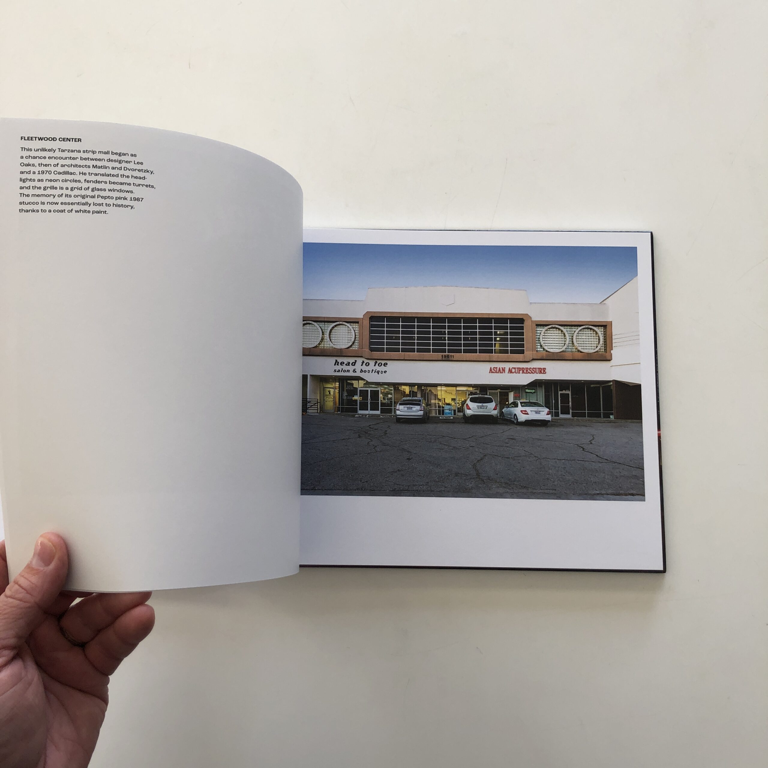
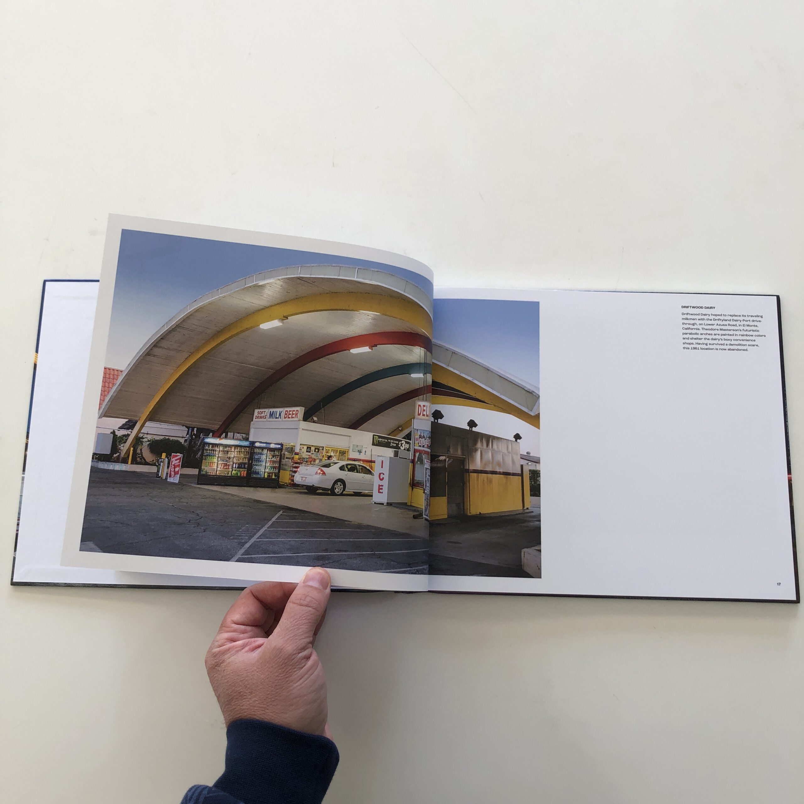
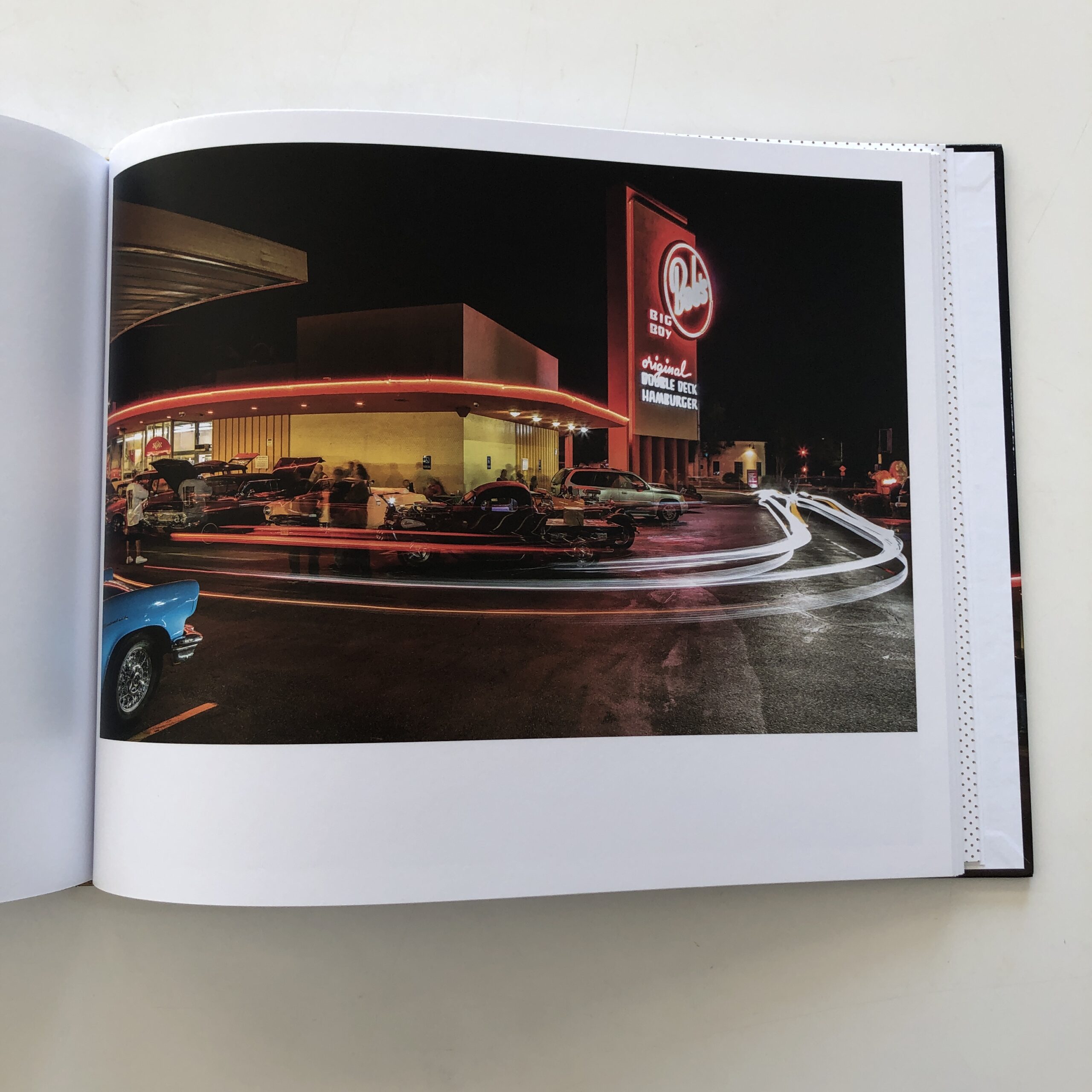
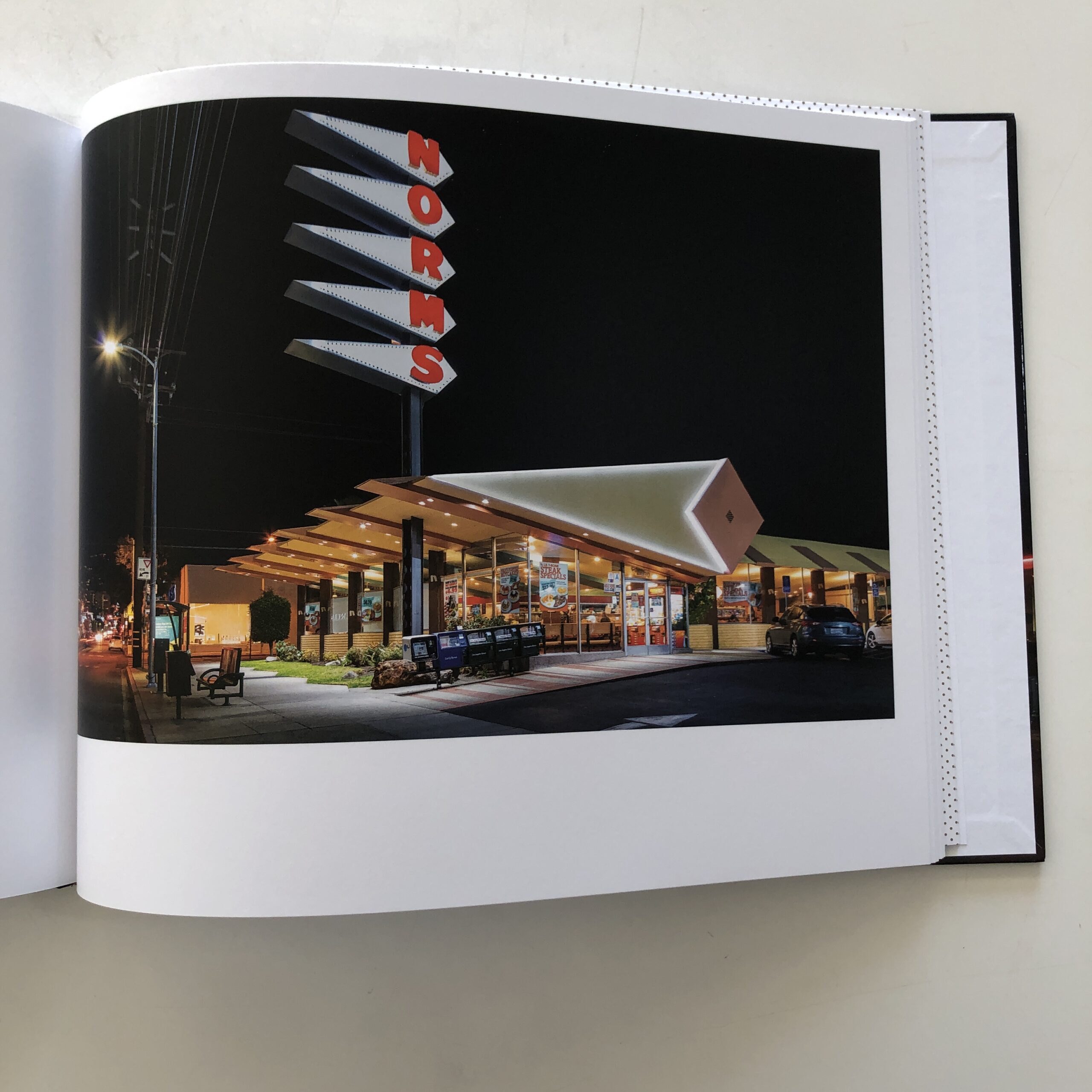
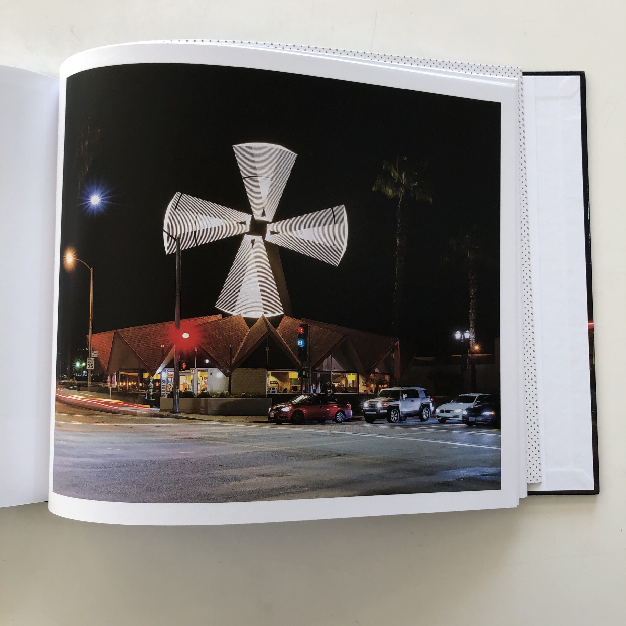
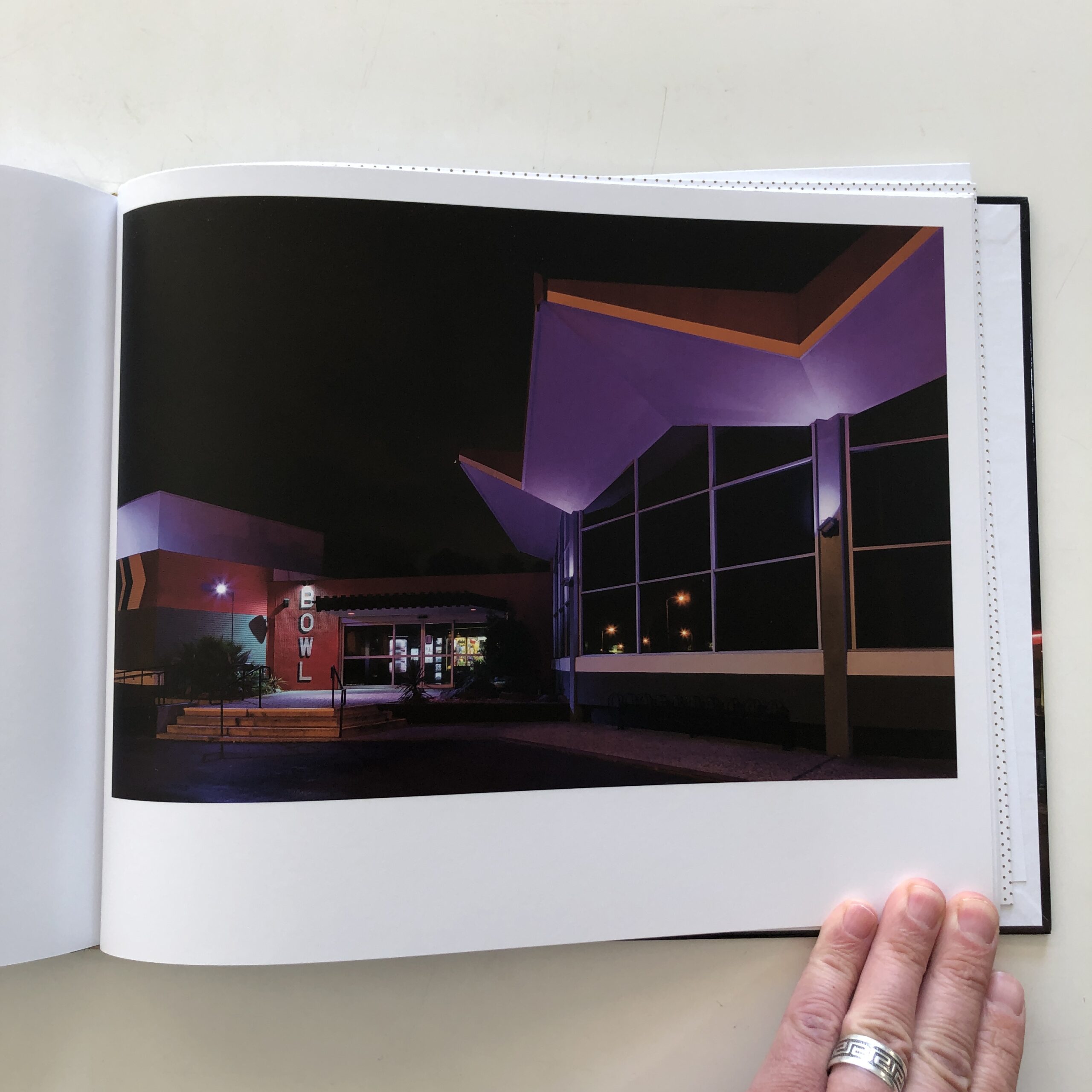
The project focuses on LA, mid-20th-century architecture, specifically buildings constructed for the burgeoning car culture that has since defined the city.
And the buildings are cool, to be sure, all shot in the gloaming, or at night.
The two intro essays, which set the scene, are printed on paper backed with small polka dots, so the eye begins to swim in space while focusing on the words, which reminded me of those 80’s prints with the hidden image embedded within.
(“Just relax your eyes, man, and you’ll get it.”)
The photos are good, and a few are excellent, but throughout, I found myself craving more formality. As in, I wanted them to look like tripod, 4×5 images, in which the photographer waited as long as possible to get the perfect, insanely-well-composed shot.
I did not get that sense, as these feel more Canon 5D Mark II, and while I’m sure a tripod was involved at times, I didn’t feel it in my gut.
Additionally, the modern cars included in the frames felt like afterthoughts, as they did not add much formally, or to the color-palette, and I kept thinking, “Why didn’t you just wait another 20 minutes until the lot was clear?”
Furthermore, the few images that lacked cars, or light trails, did communicate that more weighted, luxurious viewing experience, which confirmed what I thought and felt were in line.
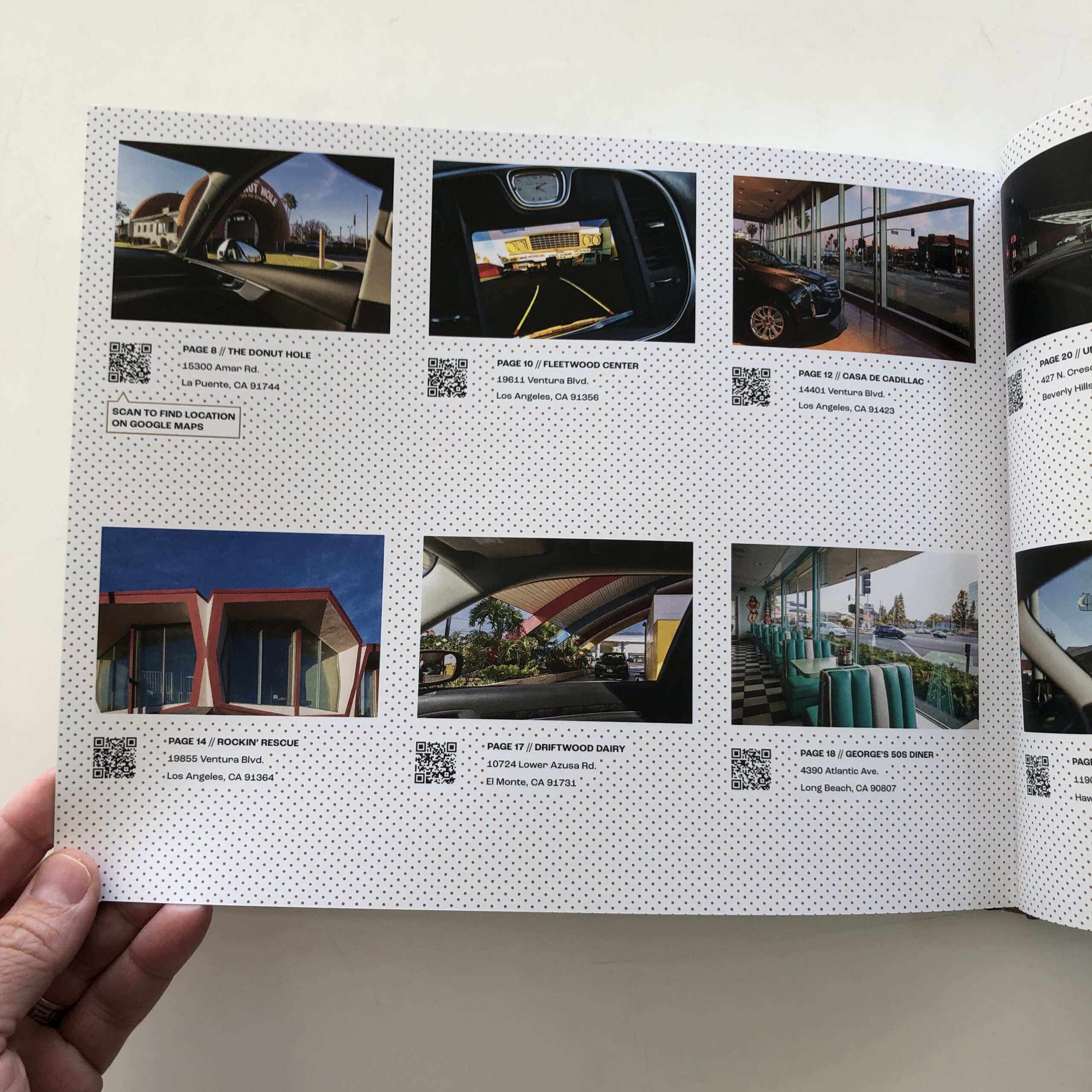
As to text, there were descriptive, historical captions included in the upper-left-hand-corner of each double-spread, but they were more informative than interesting, (to me,) so I began to skip the reading.
These, I thought, would be perfect for an index at the end, so I could choose to inform myself afterwards, rather than breaking up the flow of images.
“I wish,” I said to myself, “there were more images instead.”
So I was quite surprised, at the end, to see an extensive index, featuring additional photos, including ones that showed the car in which Ashok travelled, as well as QR codes to give me the exact location of each building. (Which I would never use, though I’m aware others like the technology.)
“If only,” I uttered in my head, “he’d given us more dynamic images in the body of the book, and saved the textual info for the index, I’d have liked this book a lot more.”
Lately, I find myself telling book clients, and students with whom I meet, that every single part of a book needs to be considered.
All of it.
My design partner Caleb feels the same way, and when I recently interviewed Katherine Longly, she shared the same sentiment.
Think hard about every segment, and stress test those choices.
I don’t doubt that in “Gas And Glamour,” Ashok and his extensive team did think about the details. I guess I just don’t agree with the decisions they made, but it is literally their prerogative to make the book they want to make.
(And it’s cool, just not what I would have done.)
As a critic, though, it is my job to tell you what I think, and how you might avoid such (subtle) pitfalls when you make your own book.
If you’d like to submit a book for potential review, please email me at jonathanblaustein@gmail.com. We are particularly interested in books by artists of color, and female photographers, so we may maintain a balanced program. And please be advised, we currently have a backlog of books for review.
The Art of the Personal Project is a crucial element to let potential buyers see how you think creatively on your own. I am drawn to personal projects that have an interesting vision or that show something I have never seen before. In this thread, I’ll include a link to each personal project with the artist statement so you can see more of the project. Please note: This thread is not affiliated with any company; I’m just featuring projects that I find. Please DO NOT send me your work. I do not take submissions.
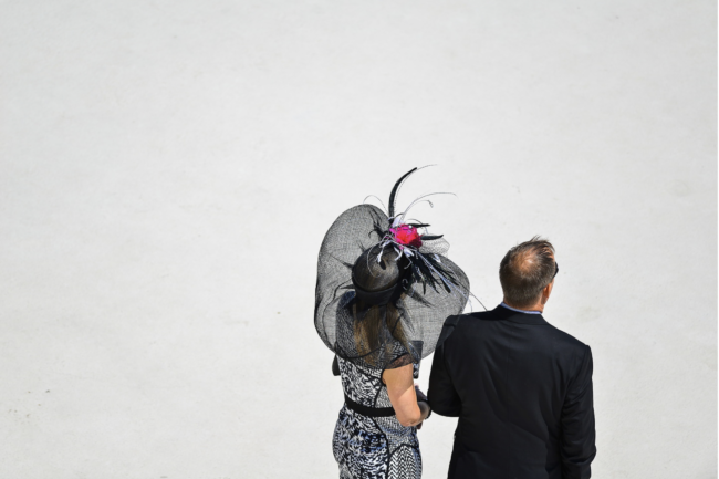
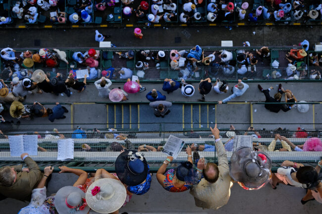
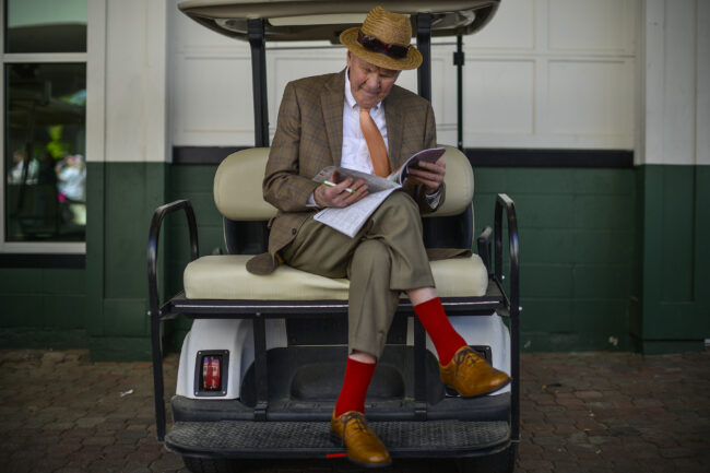
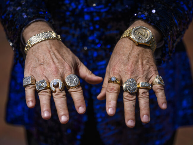
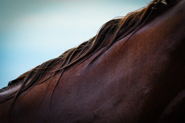
I was born and raised in Louisville, Kentucky. It’s the place I still think of as home. Even now living in Nashville, Tennessee I miss it. If you’re from Louisville there are three things you identify with regardless of your personal relationship to them… Bourbon, baseball (Louisville Slugger) and of course, The Kentucky Derby. In my youth I played baseball, so I saw Louisville Slugger bats everywhere. It was commonplace. Obviously, I was too young to enjoy bourbon and my parents weren’t big drinkers. But there was always a pageantry leading up to the first Saturday in May. It was akin to that anticipation of Christmas. A city came together through fireworks displays, parades, airshows, hot air balloons, and elaborate decor.
I never attended the race as a child, but I was always glued to the television with my family. Yes, we watch the race, but mainly we would take in the atmosphere and see the spectacle of it all. The hats and outfits. The cheering spectators and celebrities in attendance. It was always either the focus or secondary to the derby party we hosted in our home. So, when photography entered my life, I knew I had to be there to capture it. Fortunately, I’ve covered it every year since 2014.
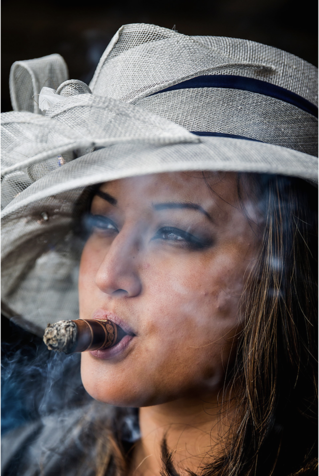
They call it “The Greatest Two Minutes in Sports.” and “The Run for the Roses.” Sure, the racing aspect of it is incredible, but what always appealed to me was what’s happening outside of the racetrack. Whether it’s the backside stables that start working horses before the sun rises, the day drinkers in the infield, the gamblers looking to hit a trifecta, or the men and women dressed to the nines. Every year I’m like a kid in a candy store. It’s a homecoming for me and a reminder of the magic I experienced in my youth growing up in “Derby City”.
APE contributor Suzanne Sease currently works as a consultant for photographers and illustrators around the world. She has been involved in the photography and illustration industry since the mid 80s. After establishing the art-buying department at The Martin Agency, then working for Kaplan-Thaler, Capital One, Best Buy and numerous smaller agencies and companies, she decided to be a consultant in 1999. She has a new Twitter feed with helpful marketing information because she believes that marketing should be driven by brand and not by specialty. Follow her at @SuzanneSease. Instagram
Success is more than a matter of your talent. It’s also a matter of doing a better job presenting it. And that is what I do with decades of agency and in-house experience.
Heidi: The forced repose of the pandemic allowed us to take a collective pause and access our present and hopes for the future. How much did the hard costs of the pandemic overhead come into play for this, or was it simply a matter of time and space to think? Kelly and Carol: The idea of the AMA was a conversation that had taken place within the industry for years. Many different groups of artists representatives, on both coasts,would come together and discuss the need for a trade organization for our industry, but it was always difficult to get off the ground considering how hectic a typical work week had become. The silver lining of the pandemic was the opportunity to have the time and space for a few of us to really focus on the administrative aspect of developing a trade org. Those of us who could commit the time began to gather over zoom and discuss what the future held for our business and dig into the ground work of creating the organization.
What inspired this group to mobilize? Did the momentum of youth activism and the future of our photo industry sustainability come into play? The economic recession of 2008 greatly affected our industry. We all saw significant economic pressure on our businesses, as longer hours, higher shot counts and broader rights became the expectation of clients. An organic group formed from the west and east coasts, sharing the fears of a repeat from that time period as well as a discussion as to how these new trends weren’t sustainable for our business.
The events of the social justice movement during the summer of 2020 definitely inspired us to look at the lack of diversity within our industry as well. One of our intentions is to create industry standards for the next generation of agents and photographers, which will help those who are most marginalized. We have a diversity committee working towards connecting underrepresented talent with artist managers to increase representation within the industry.
Our hope is to also bring the conversation of sustainability forward in our industry. Part of our goal is to create educational initiatives around sustainability so that we are providing our members and partners with resources that can help them run “greener” productions. To that end, we have a webinar on sustainability in the planning stages.
How many new, younger agents are entering the market? We see that many new agents are entering our business and the AMA can really help them build their business on a strong foundation. We have many shared legal resources; from terms & conditions to NDA’s, as well as a usage glossary and definitions for common legal language found in contracts. It’s a great resource that can help launch a business.
WIth new media developing, how has the rights and usage flexed and before AMA?
The AMA has developed a usage Glossary to help define existing and emerging media. While we can’t give direction on pricing, we can offer the industry education around developing media that will allow for informed estimating by artists agents.
Has there been any one governing body formed prior to this? SPAR (Society of Photographers and Artist Representatives) was one organization that existed. The APA and the ASMP have helped our industry greatly. Our main reference for the work the AMA is developing is the Association of Independent Commercial Producers (AICP). As we developed the National Guidelines for Photo Production, we found alignment with the AICP, which also helps our clients since these are the standards offered by our live action counterparts.
With budgets changing, more people are being asked to take on more than one role. This “omni role” forfeits expertise in one given area, have you seen a shift in the who and how images are being assigned value? Yes we are seeing budgets changing in terms of fees, rights and expenses. New common occurrence is the all in budget which compromise production values as well as artists’ worth.
One other alarming trend is around payment schedules. Artists agents and photographers are small businesses and are being asked to carry large production debt while we wait for payment for 90-120 days, as well as advances that come post shoot. We’re working to educate our clients on why that is such a hardship and provide templates for payment models that are more in line with the standard in the live action world.
The elephant in the room is the tsunami of imagery available and its consumption rate. This creates an erosion of value. While there is a plethora of imagery available, from influencers to iphone photos, there is still a need for that subset of professional photographers that can make truly iconic imagery. Valuing their talent and the work (and crews) involved in that process is our focus.
For many years the internet and social media was considered a bit of a throw away, but now paid digital campaigns are the main form of advertising and amazing imagery is needed to break through this clutter. Additionally, Social media can often become the new catalog of retail sales, with click to buy offers embedded in the posts. Through education we are trying to change the mindset of “it’s just digital” and also awareness that you can’t just repost an image – that can equate to the illegal use of imagery.
How are you trying to educate and empower art buyers to create guidelines and best practices? The AMA has created the National Guidelines for Photo Production. Since the 1970’s, the AICP has been setting standards for the live action production industry. While many of us adhere to those, there are unique differences between live action and photo production. The AMA’s guidelines address those differences as well as areas of alignment with the AICP. These guidelines were created to support, educate and advocate for the interests of our members in the photo production industry.
The AMA developed a Usage Glossary which is a collection of terms and their definitions. The glossary is provided as an educational resource for our members and their clients to better define the terms commonly used,and assist agents in negotiating on behalf of their artists. The glossary outlines the standard understanding within the industry, and as new types of media enter the market, it can help to provide clarity within the bidding process.
There are also a variety of shared legal resources available to our members, such as templates for Terms & Conditions, a Mutual NDA and other confidentiality agreements. Each of which can be customized to serve the nature of the representative and their artist’s production, but gives them a strong foundation from which to start.
We are also in the process of developing a Universal Bid Form to serve as a platform for bidding. While the AMA can’t advise on pricing, it does create standards for categories that can be utilized when bidding. It’s up to the individual member to set prices for their services.
How can we retain/create value in the practice of creating and buying photography? We’re hoping to educate our community that photography lives on many different revenue generating platforms. Agreeing to broad licenses or rights buyout for current or future media can do a disservice to how an image is valued. Through education on the various types of usage rights and partnering with our buyers on the agency and client sides, we hope to protect our artists’ work and change the conversation.
What are your hopes for the group? Unlike the commercial production industry, which set standards years ago, the lack of leadership in our sector of the visual arts industry has led to individual terms & conditions and a lack of standards that has resulted in inconsistent business practices across our industry. With the emergence of new media platforms; the integration of stills and motion; and lack of standards around payment terms, image usage and copyright; our hope is that the AMA will play an optimal role in advancing the interests of its members, building a solid framework of best business practices and promoting expansion of the industry for years to come.
Who printed it?
I worked with Mary at Printing Center USA – super fast, responsive, and I like to print in the US when possible.
Who designed it?
Along with my commercial photography business, I also have a branding and design company called Ristra Studio, and /Ristra Studio I have designed most of my promos and printed matter, which I love!
Tell me about the images.
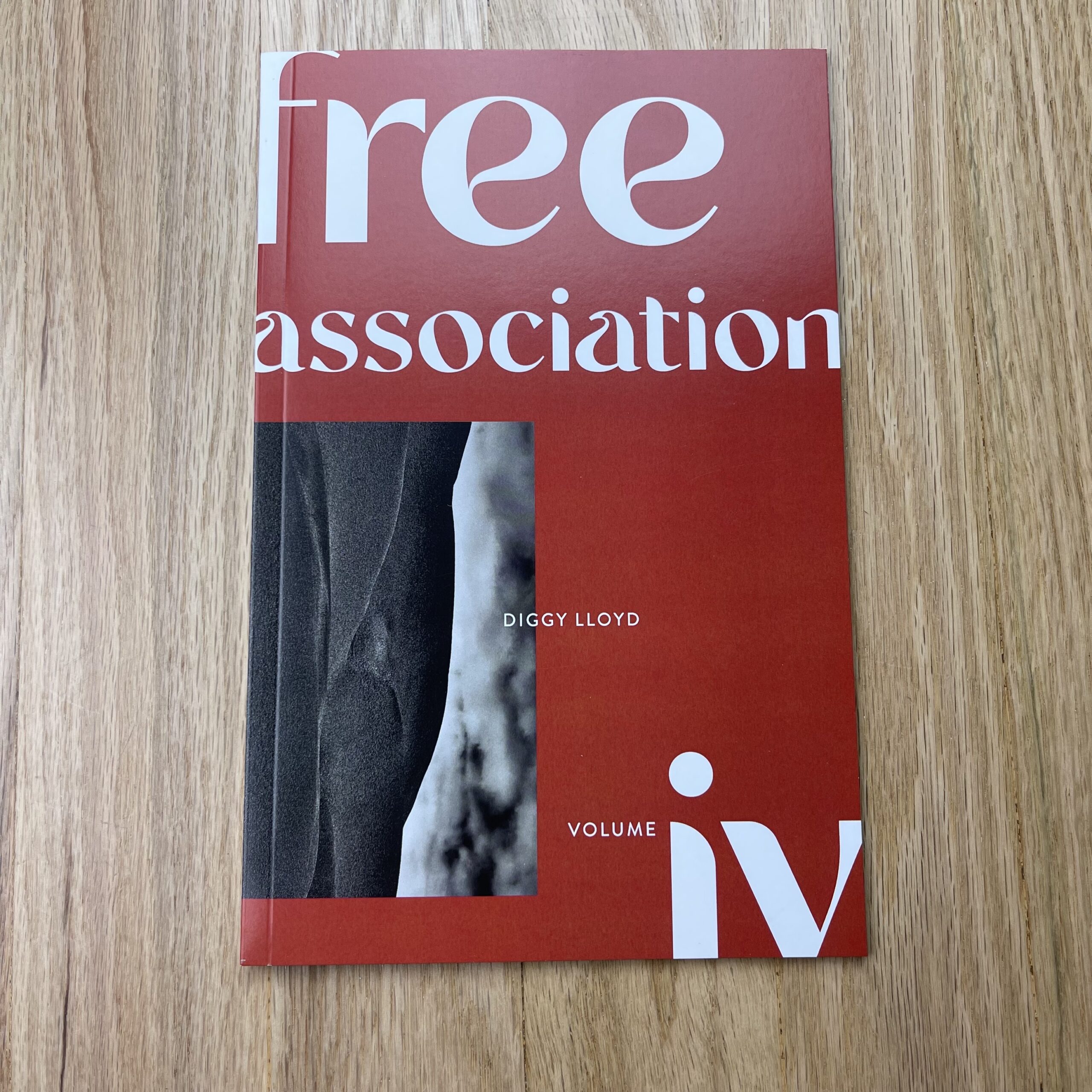
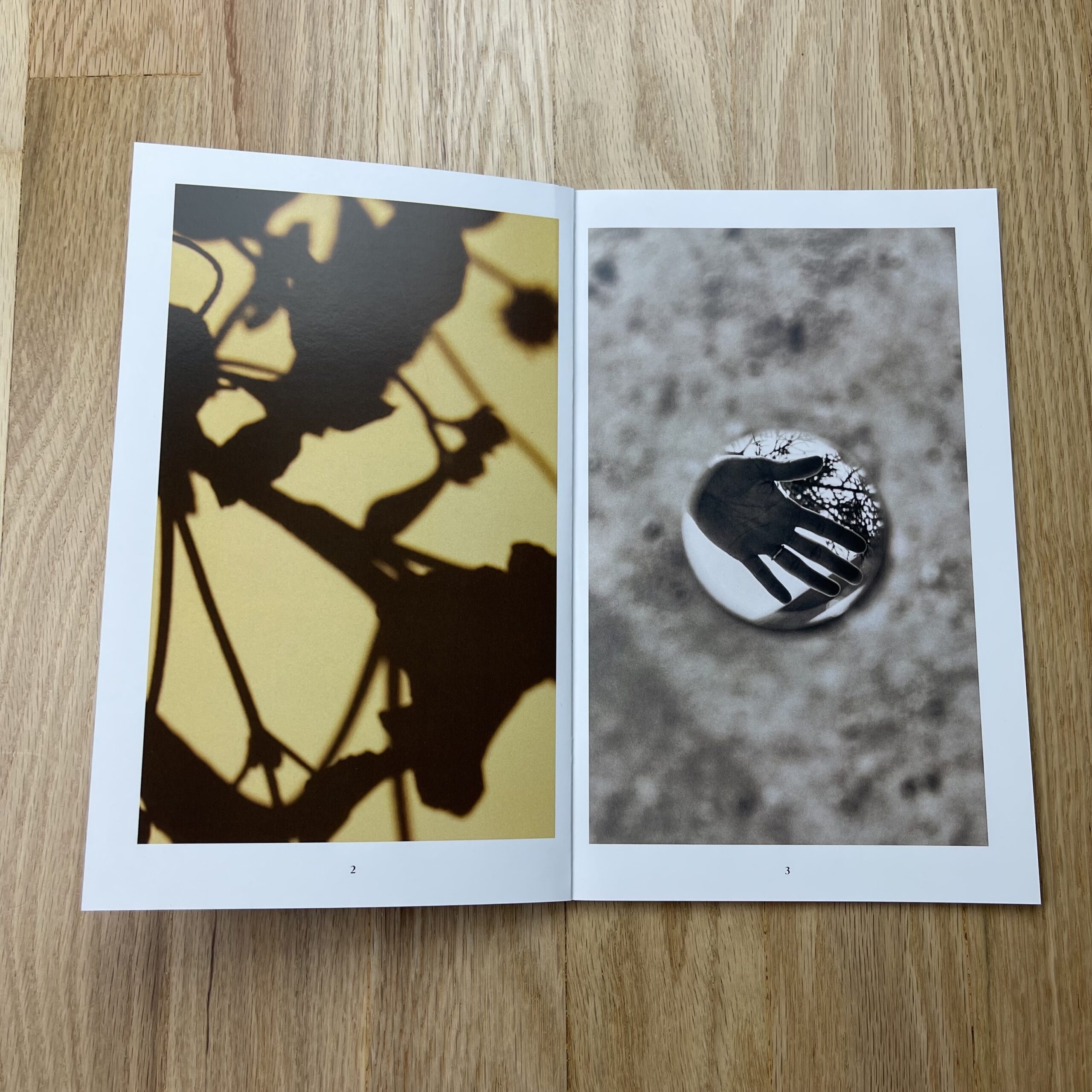
Free Association is a zine series I started producing in 2012. This series of images is influenced by a course I took from Charles Harbutt, an incredible documentary photographer. The course was called “Instinct and Metaphor”. He asked us to allow the camera to become an extension of ourselves, and to speak through its lens. Through his teachings I was able to understand my instinctive reflex, a millisecond decision to shoot an image. Then the next question came – well, why would I want to take that picture? We had to make the connection as to why instinctually we shot that image, and what metaphor we believed appeared in that image. We had to do this for every image we hung in critique. Ten years later, this is still an exercise I do regularly. Free Association, and each of its volumes are a direct result of this exercise. The story I compose through Free Association will be different from the story you compose. The metaphors I see will be different from what you see, and that is the magic of photography. The images in Volume IV were mostly shot in and around Taos, New Mexico and showcase my love for this sacred land. Juxtaposed next to these images are self-portraits, family portraits, and musings from everyday life.
How many did you make?
With Free Association each volume prints around 100 copies, which I leave as open editions. For my commercial photography promos – they run around 1500-2000 copies.
How many times a year do you send out promos?
Now, I do at least one volume of Free Association every year, and around 12-18 months I do a commercial photography promo.
Do you think printed promos are effective for marketing your work?
Absolutely! I think as a photographer, it is so important to create printed matter. Oftentimes we are working so much in the digital space, we forgot how impactful and powerful print can be. I enjoy sending this out to previous/potential clients and I also sell them in my print shop – ristrastudio.com/shop
The belief we should be reduced to our race, religion, gender identification, sexual orientation, or even nation of origin seems to come back around, every so often, and occupy the intellectual high ground of American culture.
Personally, I think the advent of identity politics, in the 70’s and 80’s, is one of the best things to ever happen to this country. (And if you’d like to extrapolate beyond our borders, feel free.)
From the 2021 vantage, that it was ever acceptable for all the jobs, all the opportunities, all the press coverage, and all the $$$$ to go to “White Christian Men Only” is laughable, tragic, and most definitely hard to comprehend.
(It’s beyond WTF.)
So the people who fought that, and made space for women, people of color, and those of other genders, religions and sexual preferences, they did us all a solid.
We should, and hopefully do, honor their efforts, which most certainly required sacrifice.
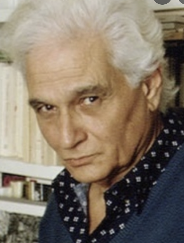
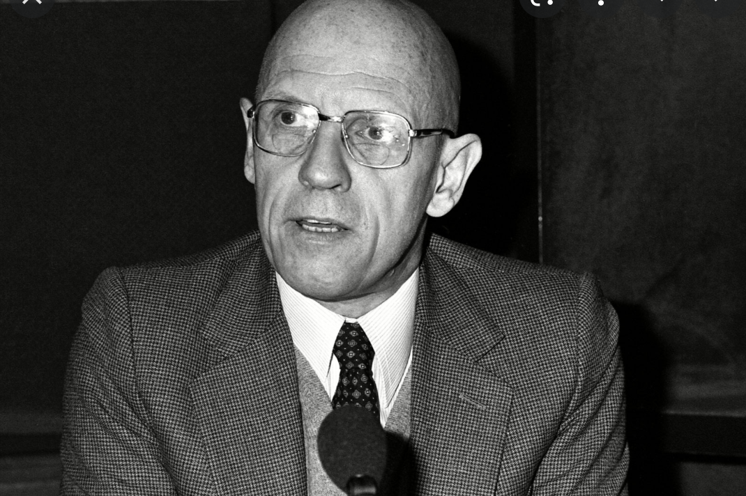
But when I matriculated to Pratt for grad school in 2002, those ideas, particularly as structured by the French Post-Modern theorists Jacques Derrida and Michel Foucault, were back en vogue, and dominated much of the campus discourse.
Jacques Derrida, courtesy of the Freedom from Religion FoundationMichel Foucault, courtesy of Brittannica
At the time, I’d arrived with a digital project I’d shot in Mexico the previous summer, only to learn there was no existing Digital Photography program at the Graduate level.
Literally nothing.
Teotihuacan, Mexico, 2002
So I was forced to pull bits of knowledge from a variety of departments, including digital art, undergrad photo, graphic design, computer science, and even printmaking.
There I was, seeing the new digital reality, and none of my fellow photographers wanted to talk about it.
I took an Art History class, with the brilliant Marsha Morton, which had the boring title of “The Beginnings of Abstraction,” and it was so dynamic, I still get chills thinking about it.
She had meticulously reconstructed the personal, cultural, and geo-political history of artists like Picasso, Braque, Malevich, Kandinsky, O’Keefe, and others, and taught us the intellectual backstory that led to such a radical change in art.
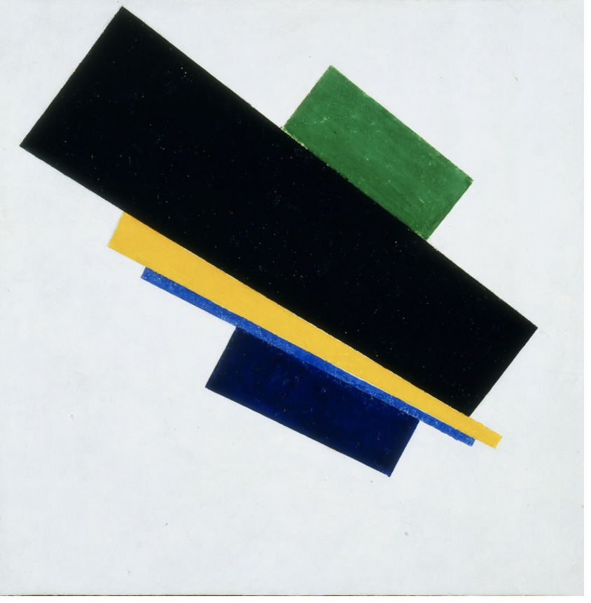
Kazmir Malevich Suprematist painting, 1915, courtesy of Clemens Toussaint/Heirs of Kazimir Malevich
The basic premise was, at the turn of the 20th Century, with the invention of the automobile, airplane, mechanized warfare, the theory of relativity, these changes were so seismic, from 19th Century life, they led to an entirely new world.
I sat in class, at the beginning of the 21st Century, and it was clear such things were happening again.
Just the internet alone, 9/11, and cell-phone-technology, made life almost unrecognizable from the 80’s and 90’s.
So I’d ask, “If life is this different, and our problems are so new, why are we turning to a 30 year old philosophy to explain what the fuck is going on in the world?”
It was less about people battling over race and class, and more the construct that every single sentence anyone says, (or writes,) is so loaded with cultural/identity baggage, that every utterance can be deconstructed, and rendered meaningless.
I wondered what would happen if and when such ideas migrated from the left wing to the right?
(Now we know.)
At one point, in a History of Digital Art class, I proposed a paper theorizing about the impending reality-shift, once images and videos could no longer be trusted, presaging the world of Deep-fakes. (I’d recently read William Gibson’s amazing “Pattern Recognition,” and like many before me, got my big idea from a sci-fi genius.)
The professor couldn’t fathom such a thing happening, nor why it might be important, so she denied my paper idea, and I wrote about Jackson Pollock, Carl Jung, and the Collective Unconscious instead. (Meaning, the part of the human psyche we all share.)
After Marsha’s class, I went around quoting Kandinsky, talking about how art was driven by “Inner Necessity,” and I still use that phrase with my students today.
In 2021, identity politics are of paramount concern again, and over the last month or so, I can not count how many people have wanted to talk to me about it, always confidentially.
(Off-the-record, just-between-us, please don’t quote me, that sort of thing.)
I believe efforts to increase diversity and inclusivity in the arts, in culture, and in our society, are insanely important, and to be commended.
If you’ve been reading this column for 10 years, (or even 5,) you’ll know I’ve always been an “ally,” standing up for disenfranchised people, owning my privilege, reporting on what’s going on out there, learning about and then practicing outreach, and generally trying to be a good dude.
At the onset of the #MeToo movement, I began alternating male and female book artists each week, for a year, and put a submission disclaimer at the end of each book review, soliciting books from artists of color, and female artists, so we could maintain a balanced program.
And still, someone came at me recently, accusing me of having never, not even once, reviewed a book by an artist of color.
It was easily disproven, but still, I responded politely, offered to have dialogue, and respected the other person’s opinion.
(Because in 2021, antagonizing anyone who’s that wound-up never seems to work out well.)
But the reason everyone wants to talk to me about this, (secretly,) is there seems to be a fervor for downgrading or degrading straight White male artists, which feels like it’s bordering on vengeance more than reason.
(Or at least, the idea that such people no longer “deserve” opportunities has become conventional wisdom.)
I’ve compared it to something my people, the Jews, have done, as the Israelis got a country due to 6 million dead in the Holocaust, but then become occupiers and racists of the highest order. (Denying basic human rights to Palestinians, and Israeli citizens of Arab descent.)
Hell, a few years ago, I even tried to re-brand myself as Jewish-American, rather than be known as a White Guy, but it doesn’t seem to have stuck.
As usual, I’m working up to a point, so please bear with me, as this has been on my mind lately, and I always try to find (and share) the nuance in difficult situations.
(While others have their heads hiding behind parapets.)
So allow me to reiterate: it is inherently good that so many people are now going out of their way to cultivate opportunities and support for, to honor and respect BIPOC artists.
All good.
But maybe, just maybe, the world will be a better place if we take some advice from Jesus, and the Golden Rule?
Is that such a radical concept?
I know this article might be controversial.
I get it.
So let’s give it some context.
Just last week, I went to Albuquerque to see two museum exhibitions, and speak to my friend Jim Stone’s Intermediate Photo Class at UNM.
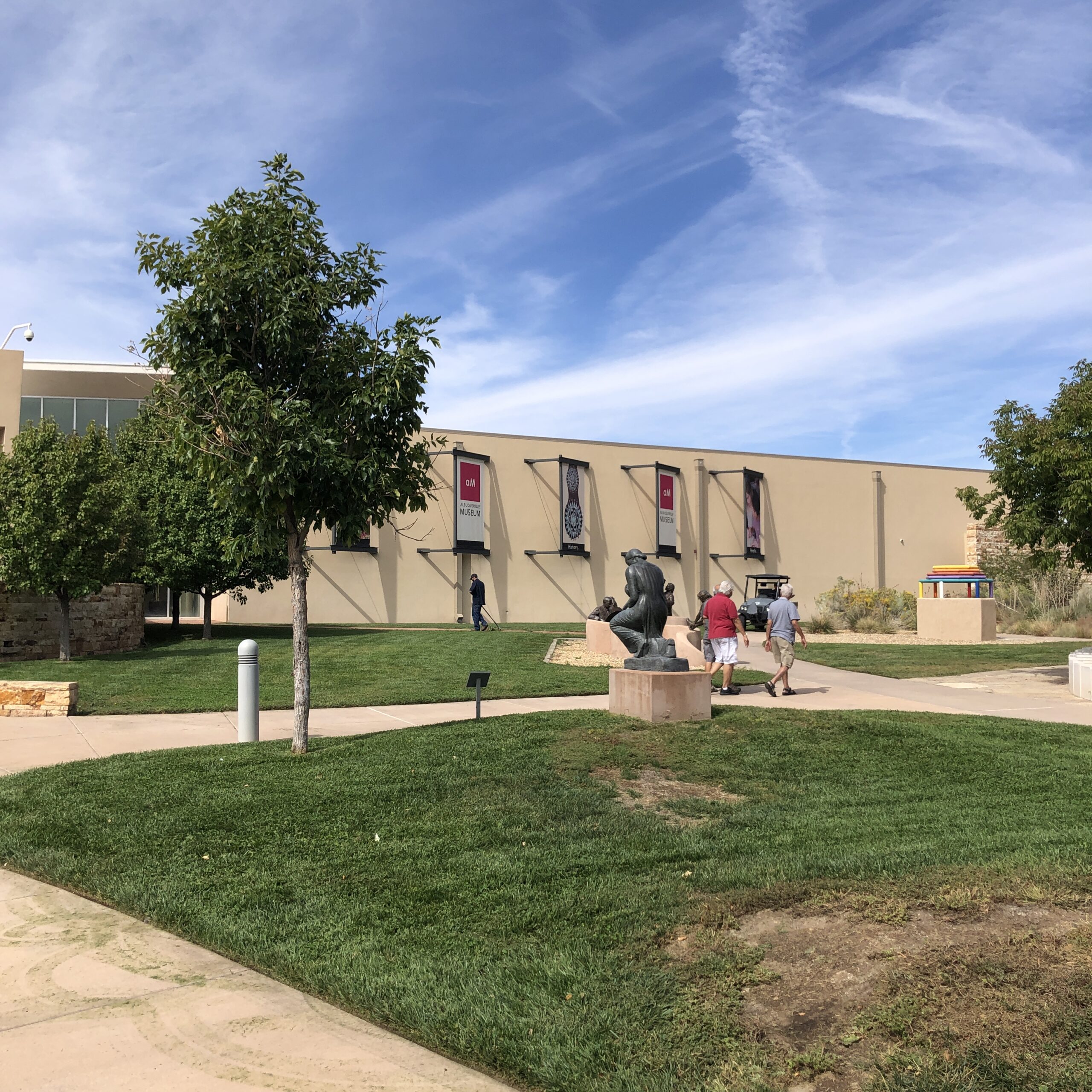
As soon as I got to the city, I headed to the excellent, criminally underrated Albuquerque Museum, (in Old Town,) the site of the exhibition that launched my art career in 2008.
The Albuquerque Museum
(Though that’s not why I love the place. It’s a genuinely great institution.)
I met up with Adrian Gomez, the arts and culture editor of the Albuquerque Journal, as we’d hit it off when he interviewed me for an article about my work last year.
Adrian Gomez at the ABQ Museum
Adrian and I come from very different backgrounds, and had never spoken before the interview, yet we vibed immediately, and stayed in touch via IG DM’s, and the occasional text.
Though we’re both of the same gender, and love art, we had little in common, beyond a shared sense of morals/ethics, a believe in respecting others, and perhaps an artsy-hipster-energy that is less common in Northern New Mexico than you might think.
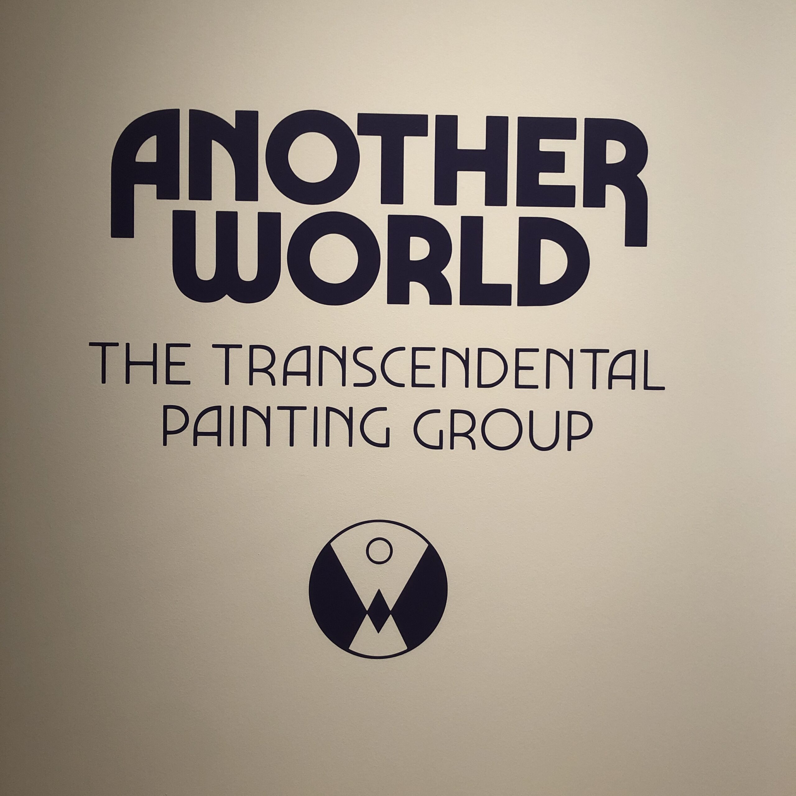
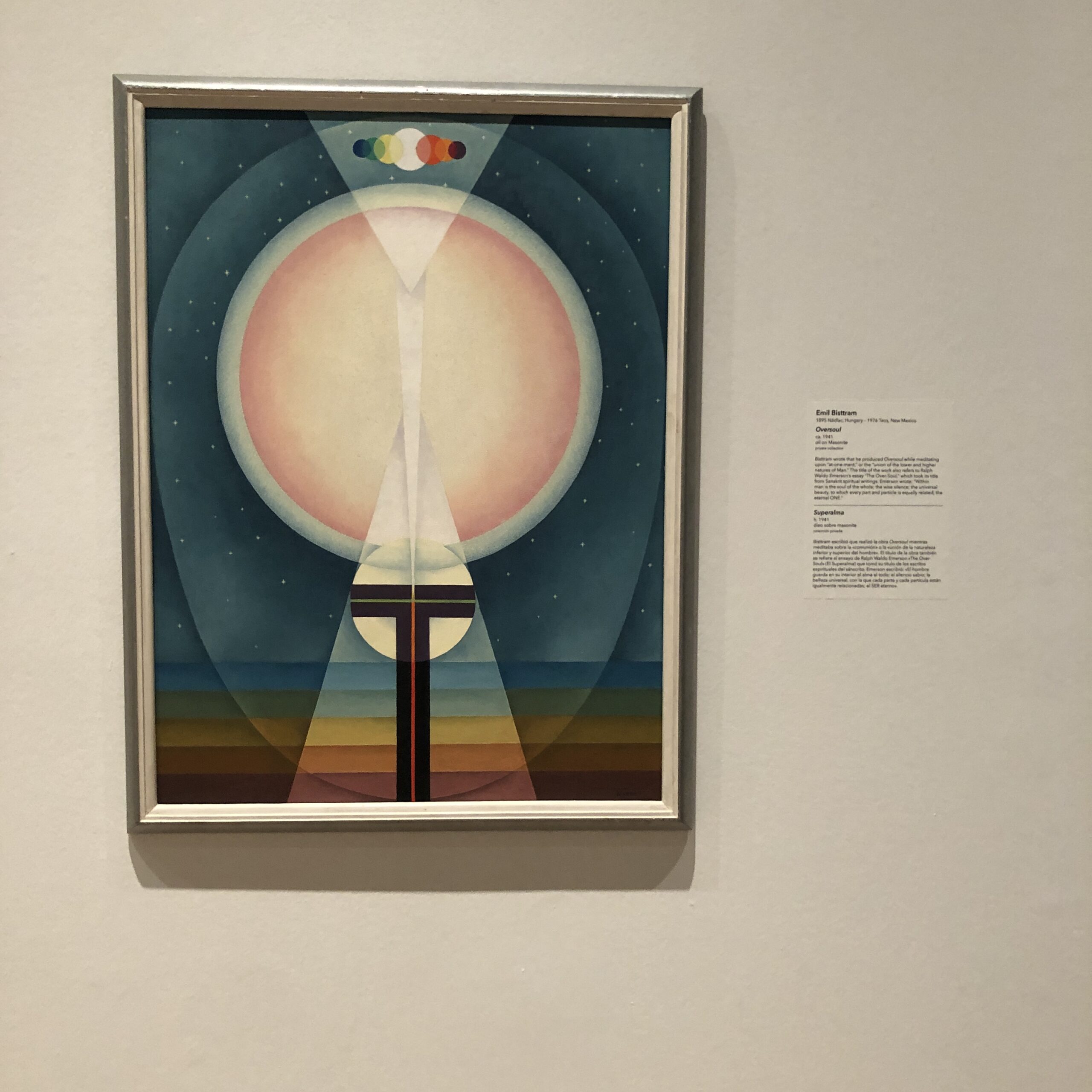
We were there to see “Another World, the Transcendental Painting Group,” a show that has unfortunately since closed, which featured Transcendental Paintings by a NM based art movement in the not-quite-mid 20th Century.
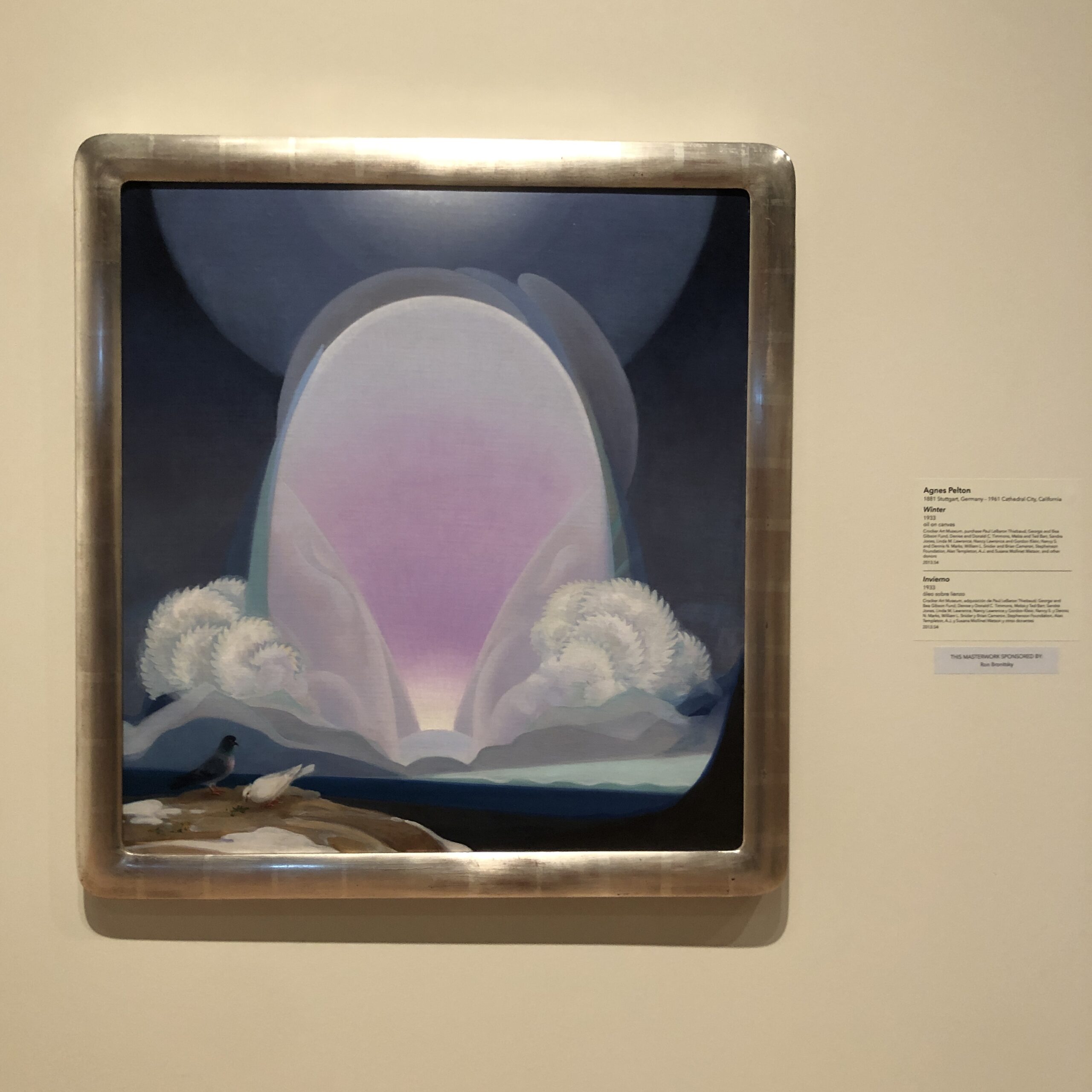
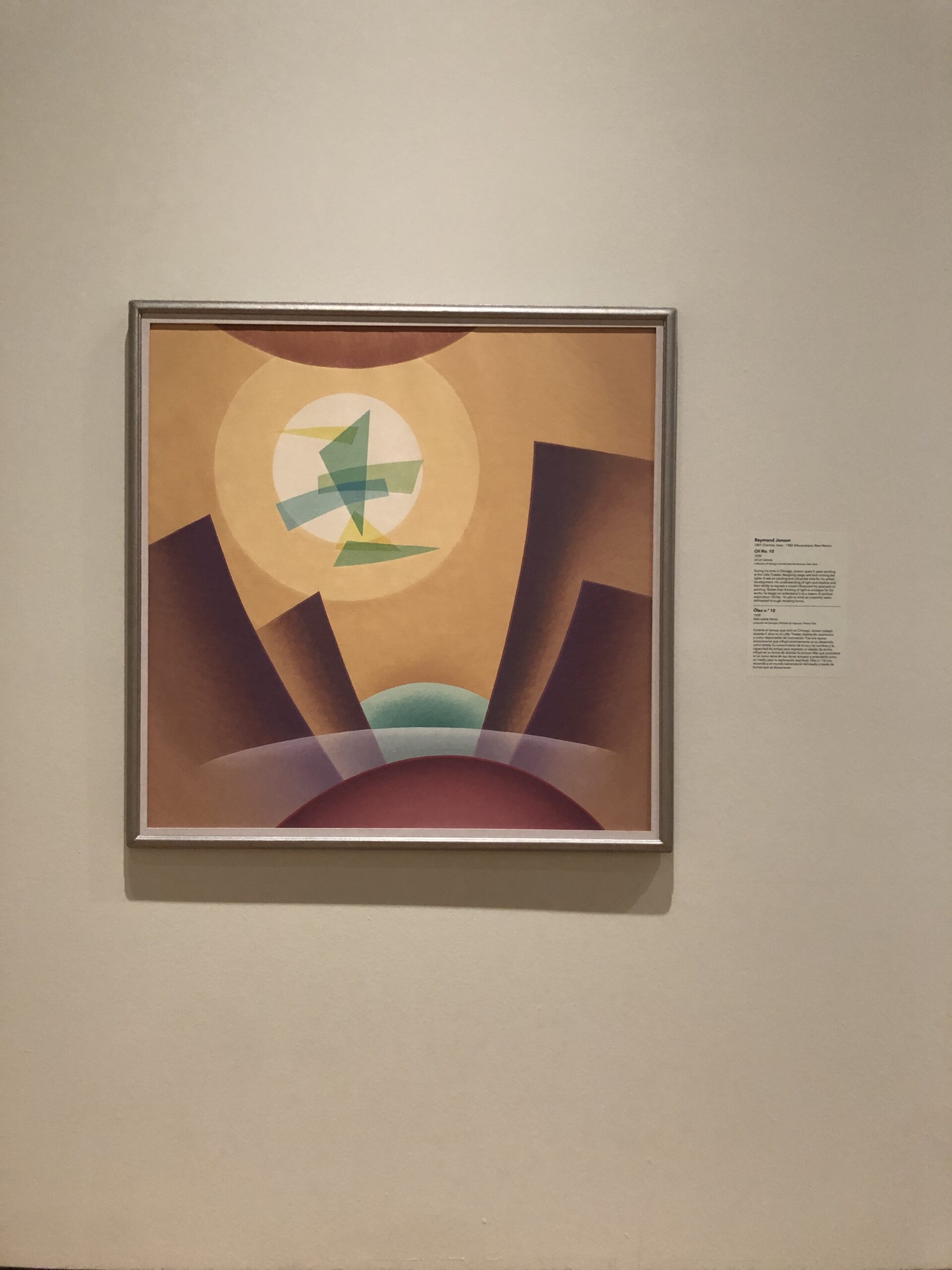
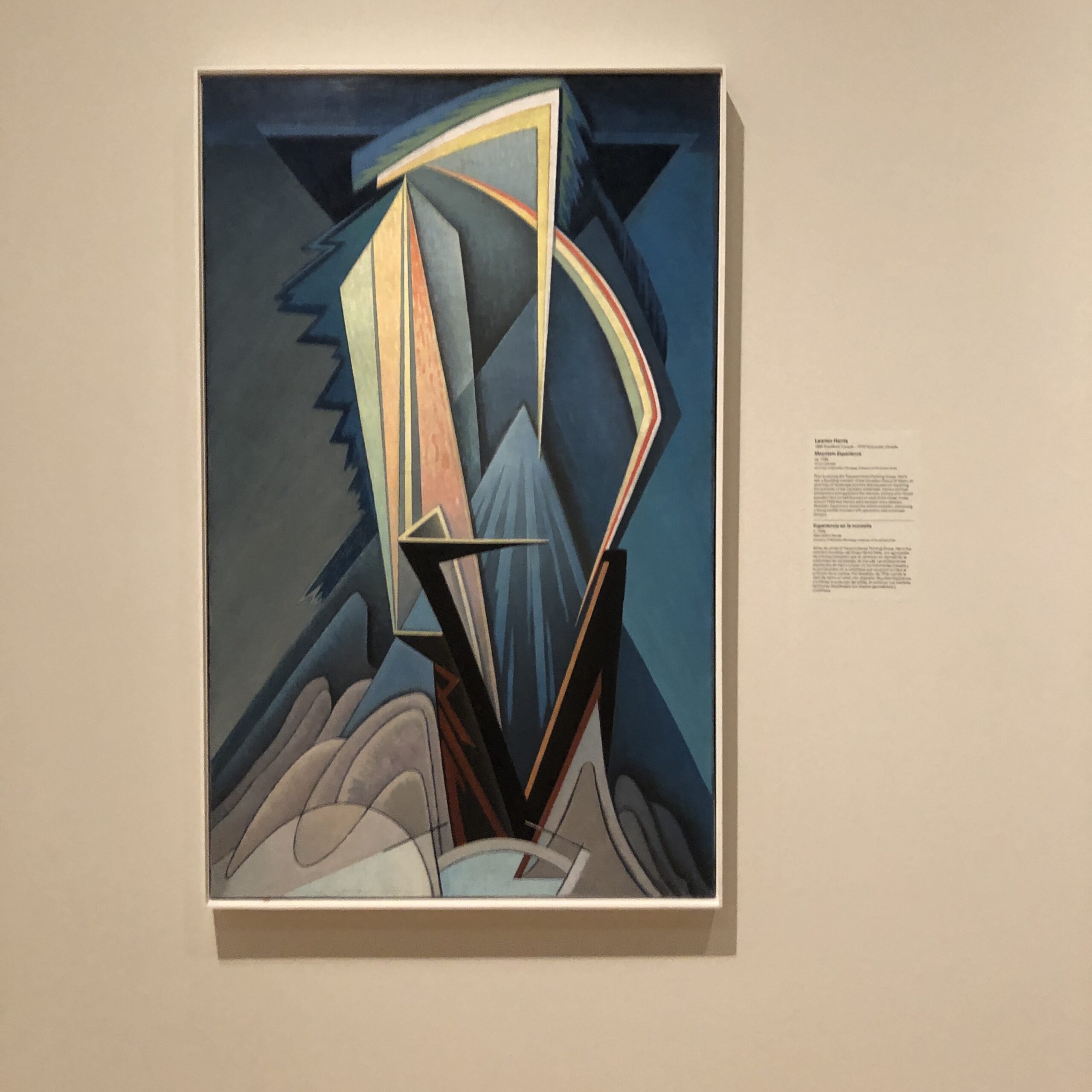
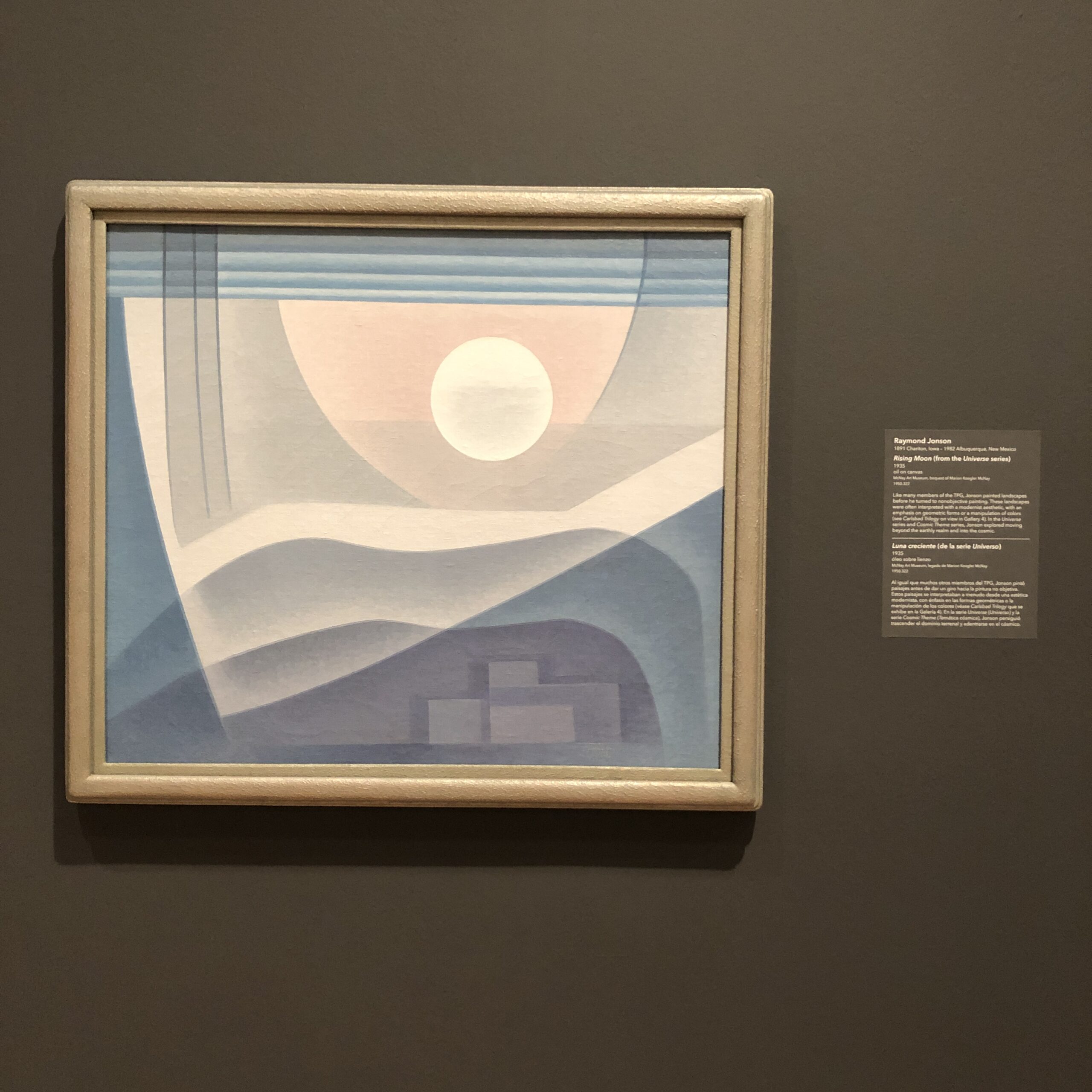
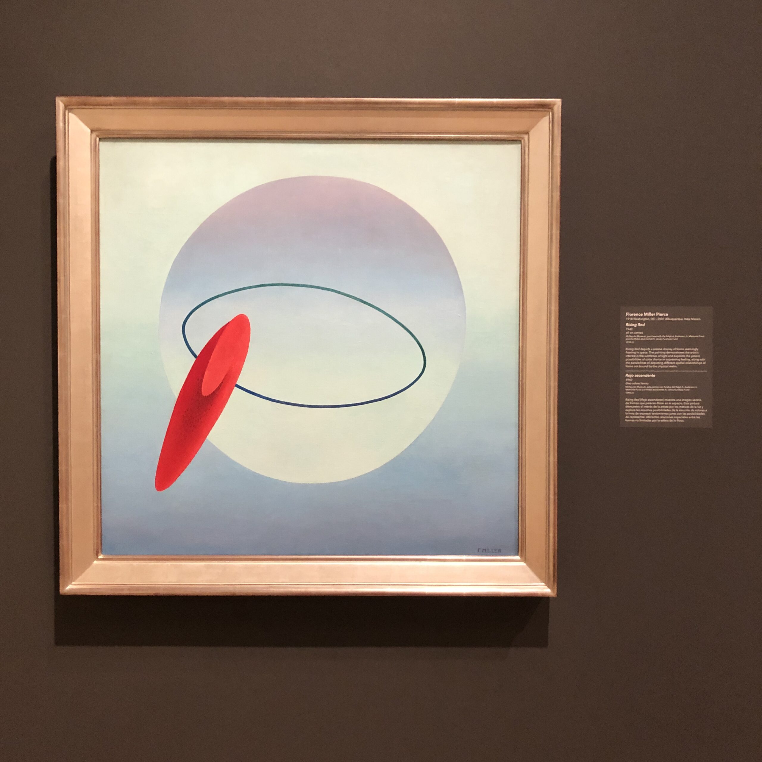
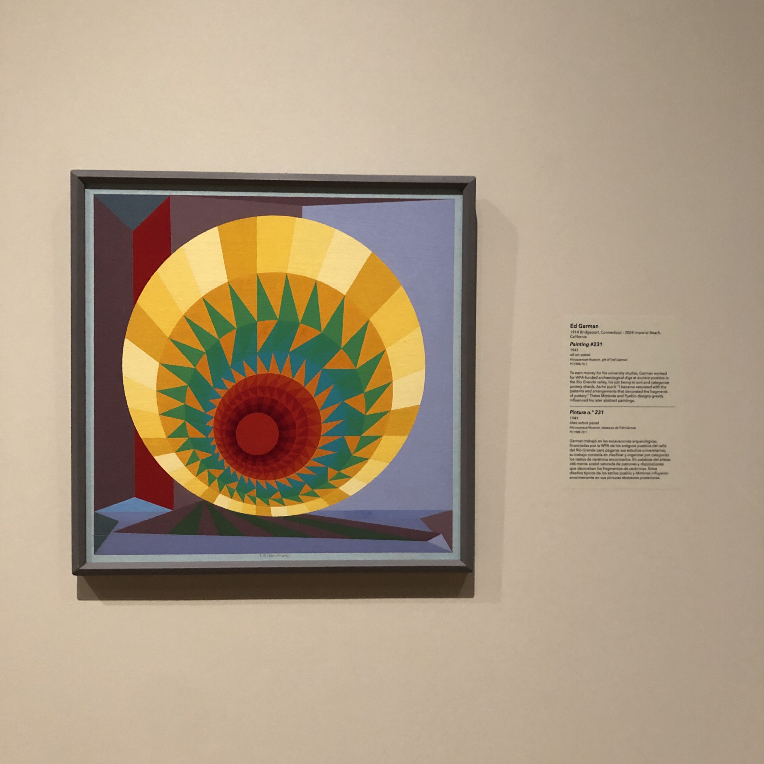
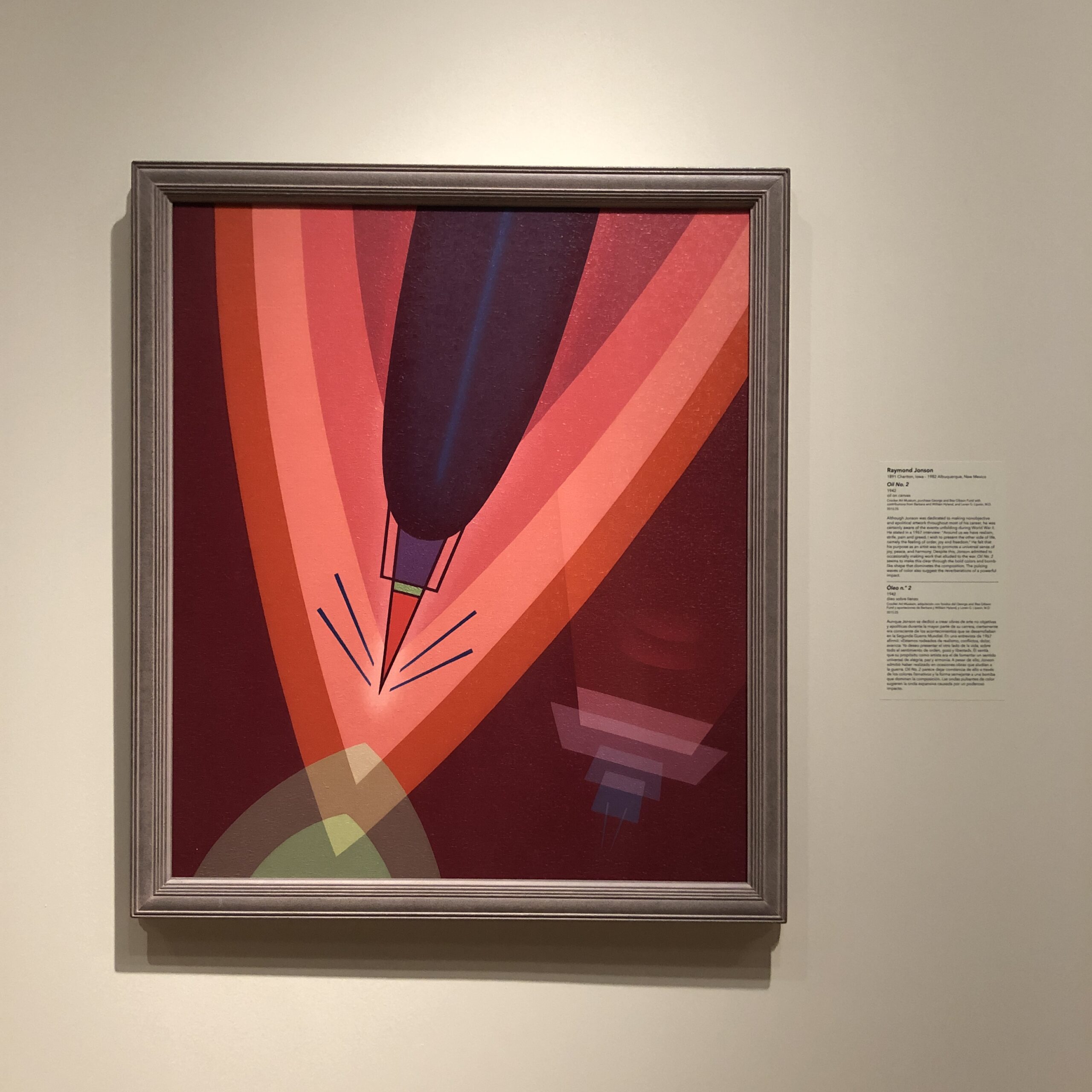
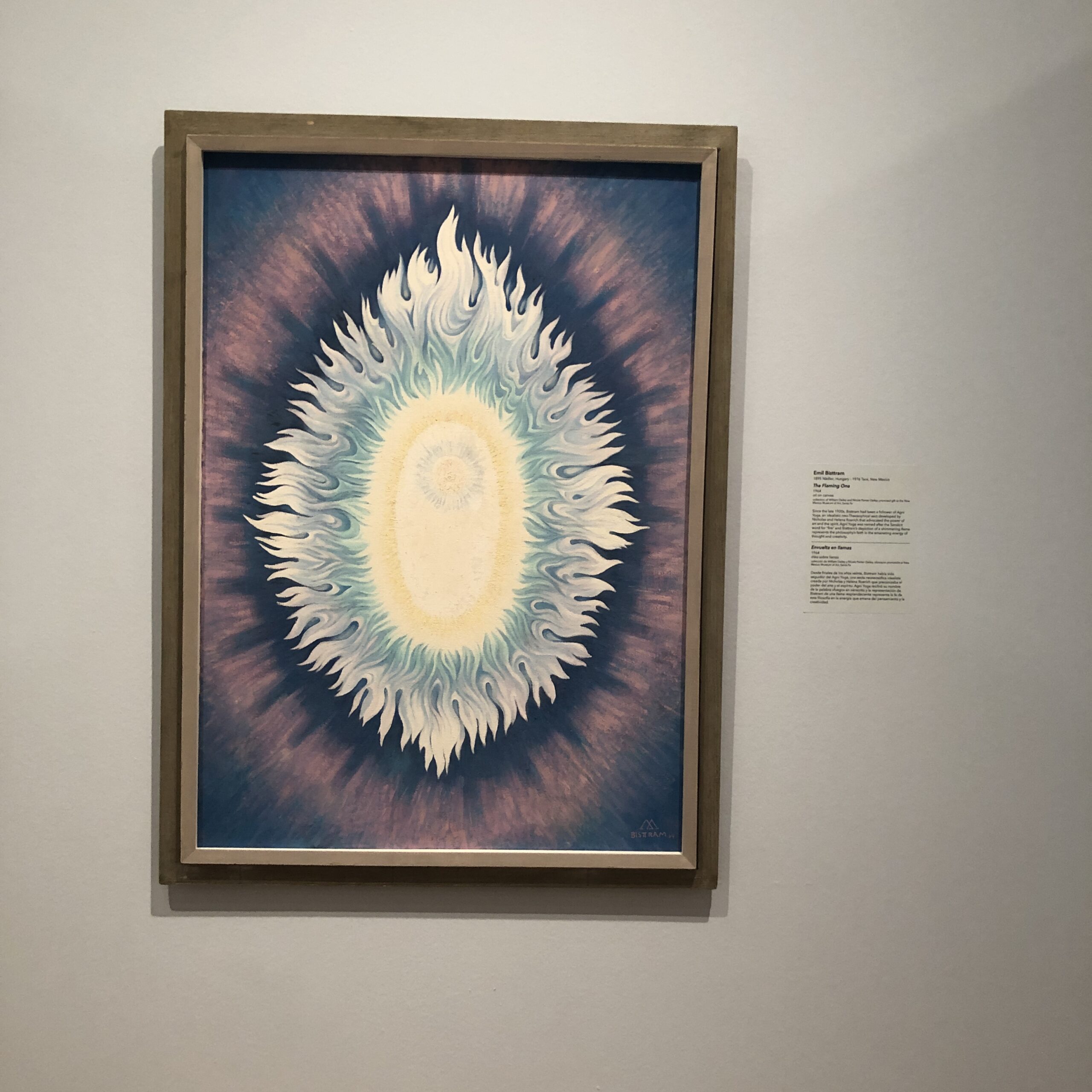
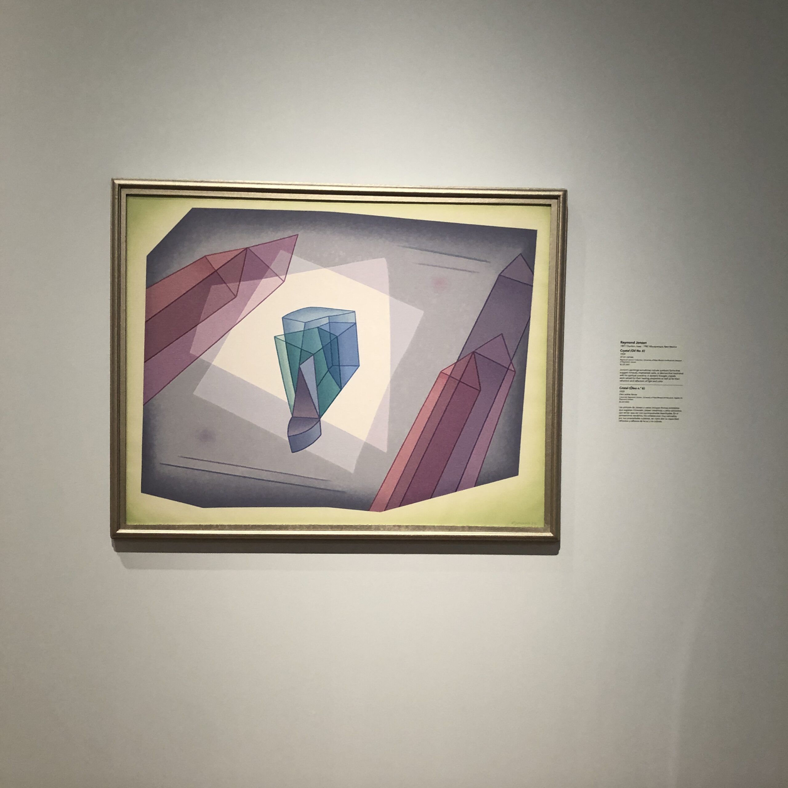
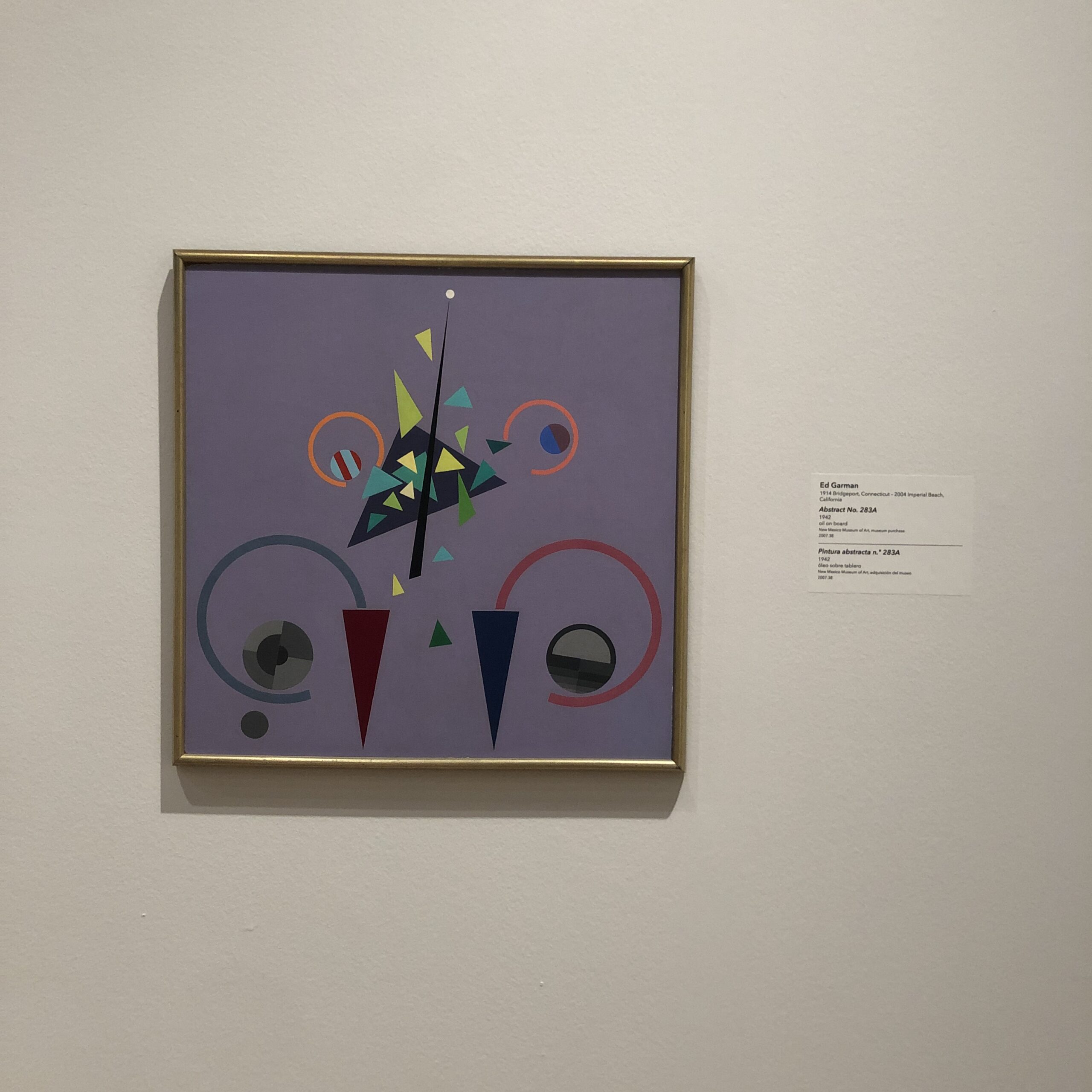
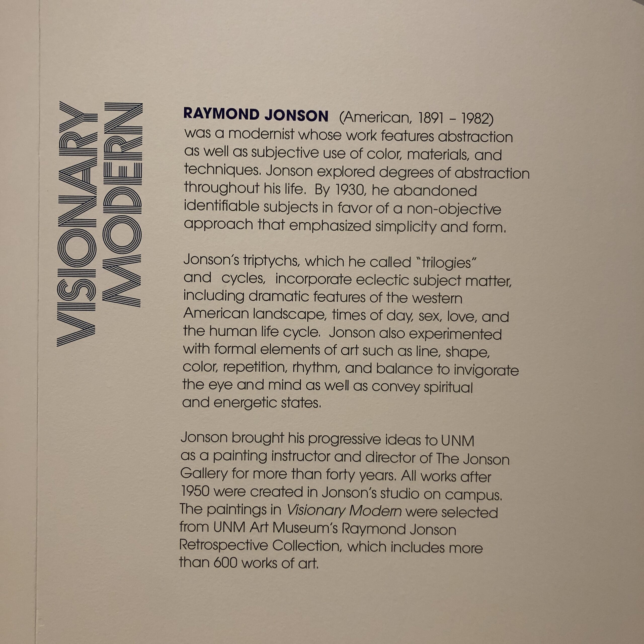
Founded by Raymond Jonson, who was also a leading arts educator at UNM, the group made mostly, (but not entirely) abstract paintings that used color theory, and shapes and forms, to communicate spiritual energy. And the exhibition featured work by Jonson, Emil Bisttram, Agnes Pelton, Lawren Harris, Florence Miller Pierce, Horace Pierce, Robert Gribbroek, William Lumpkins, Dane Rudhyar, Stuart Walker, and Ed Garman.
These paintings, which were heavily influenced by the early abstractionists like Kandinsky, Malevich, O’Keefe, and Arthur Wesley Dow, (who taught O’Keefe at Pratt,) were about mining the aforementioned Collective Unconscious, and the ineffable, mystical powers that exist all around us, but are never seen.
They tried to use art to tap into a universality of experience, and of the Universe itself, things often undervalued when we reduce people to their differences, at the expense of any sense of a larger shared understanding.
Adrian was knowledgeable about art, obviously, and we, the two critics, walked around the huge galleries slowly, feeling each painting, and discussing what we thought was going on.
(Including a running joke about how much opium some of them must have been smoking.)
It was clear some paintings, done in very consistent color palettes, filled with cool blues, lavenders, and such, were soothing, and made us feel relaxed and good.
Those tended to have everything line up together, value wise, with respect to color theory.
Then, images that had jarring colors mixed in, or which were based more on oranges, mustards, and ochres, were less pleasing to the eye, less soothing to the body, but they engaged the mind, as the artists were introducing juxtaposition, or dislocation, which makes you think.
There were female artists included, but if I had to guess, all the artists were White.
Adrian shared stories and insights with me, as we walked, and as that is often my job, it felt wonderful to listen and learn, rather than teach and pontificate.
(As I do here each week.)
As soon as we left the gallery, we walked into an education room, which was designed to engage children and citizens, and it was another example of why IRL museums are so vital to our sanity and quality of life.
We walked around the museum some more, and Adrian dropped knowledge bombs, like the fact that NM was once known as the Sunshine State, on its license plates, before rebranding as the Land of Enchantment, as the richer, more populous Florida took the Sunshine State as its own.
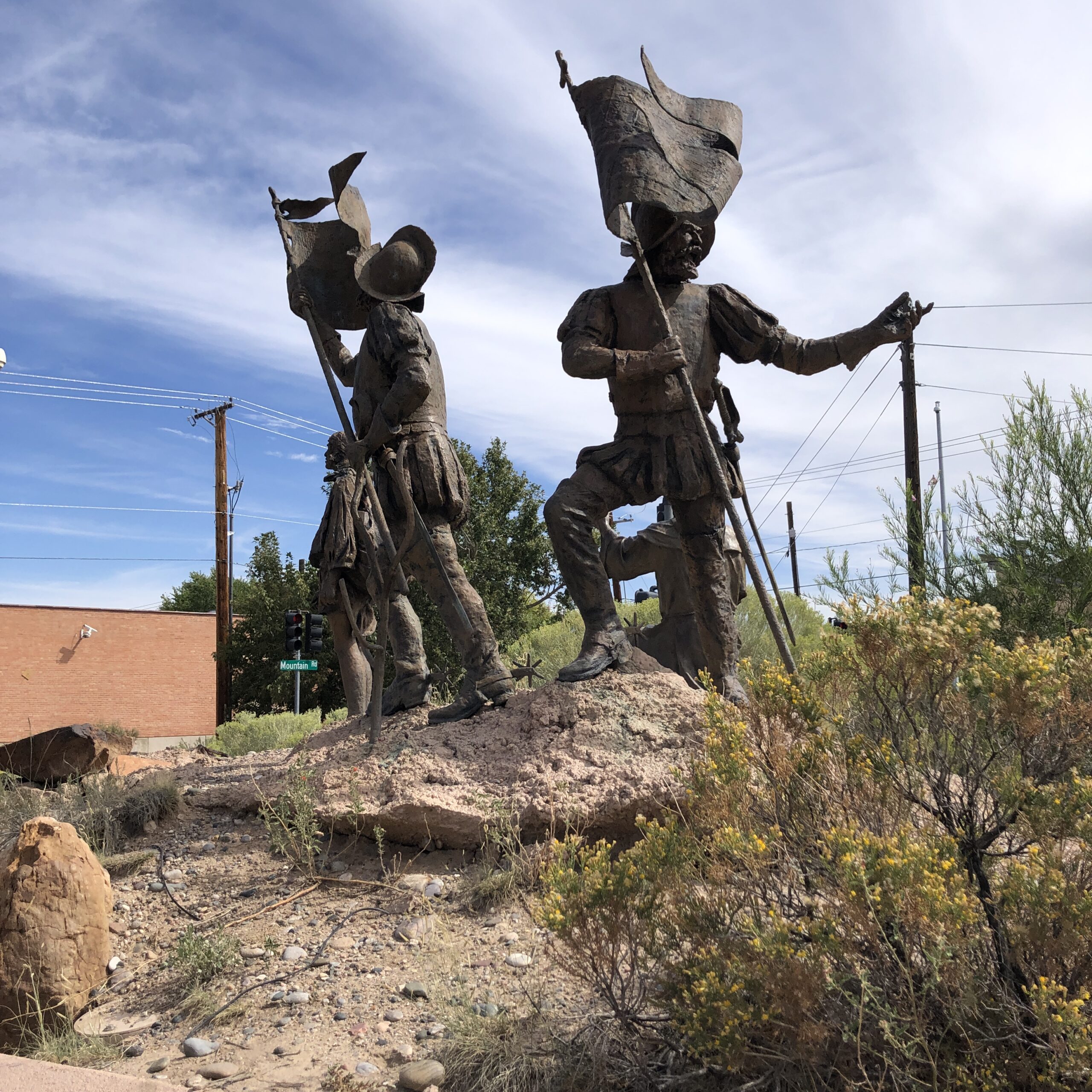
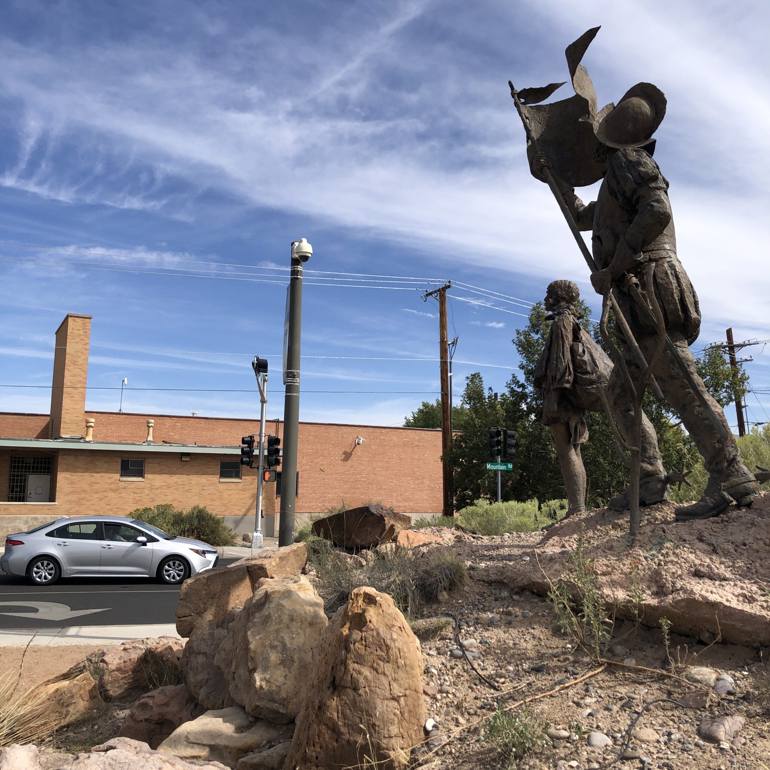
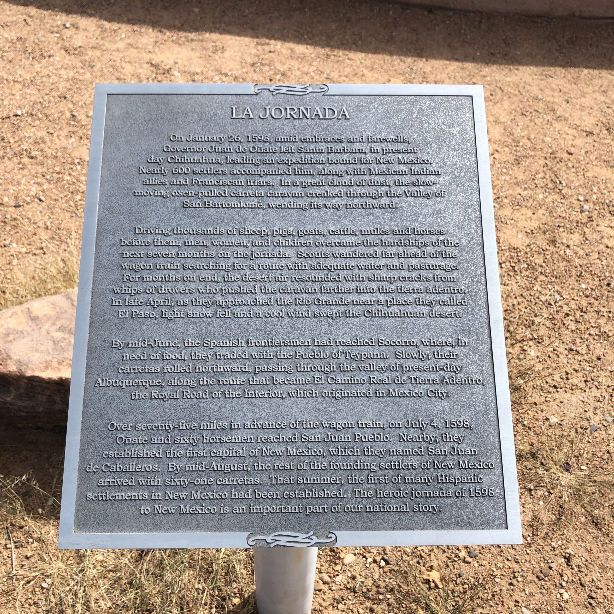
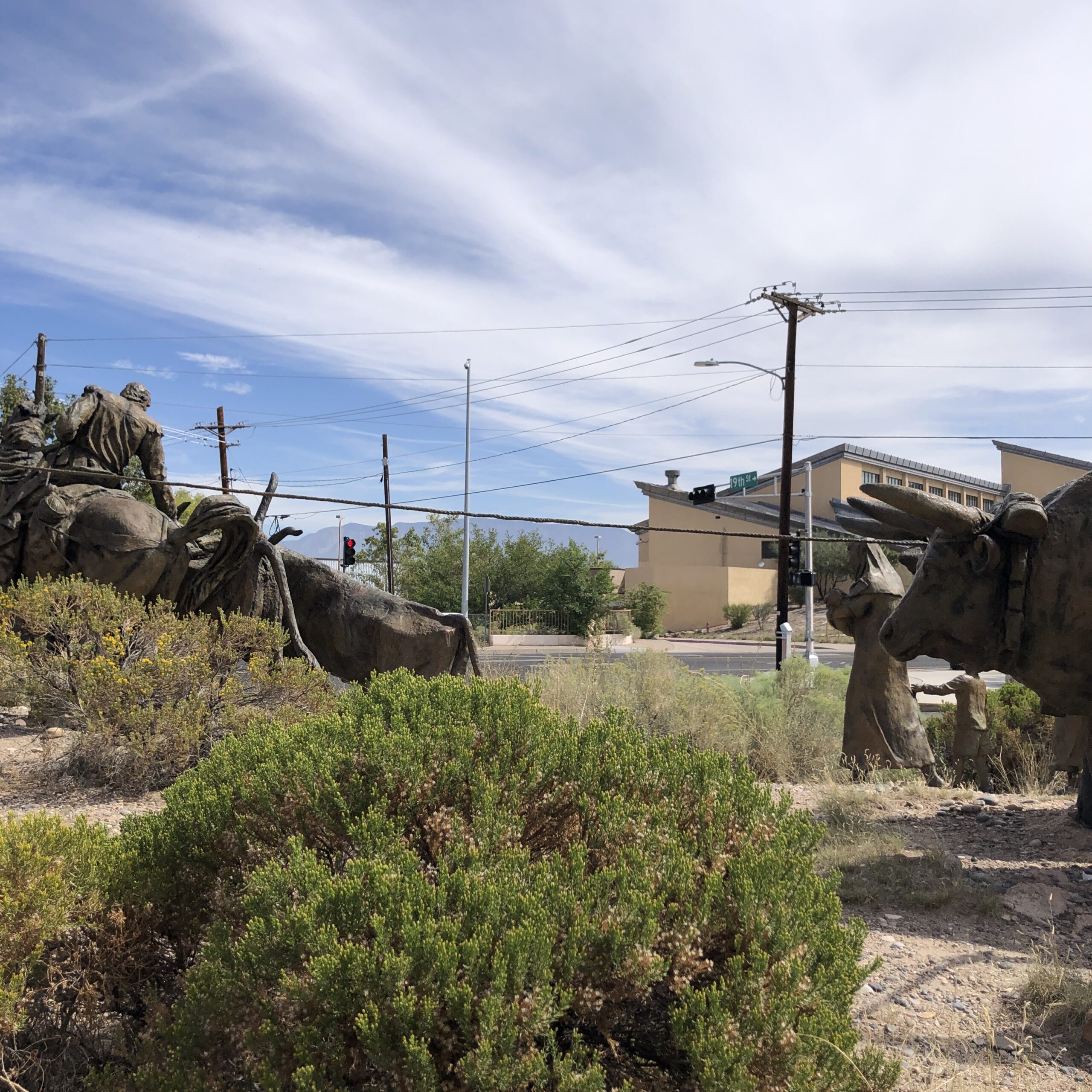
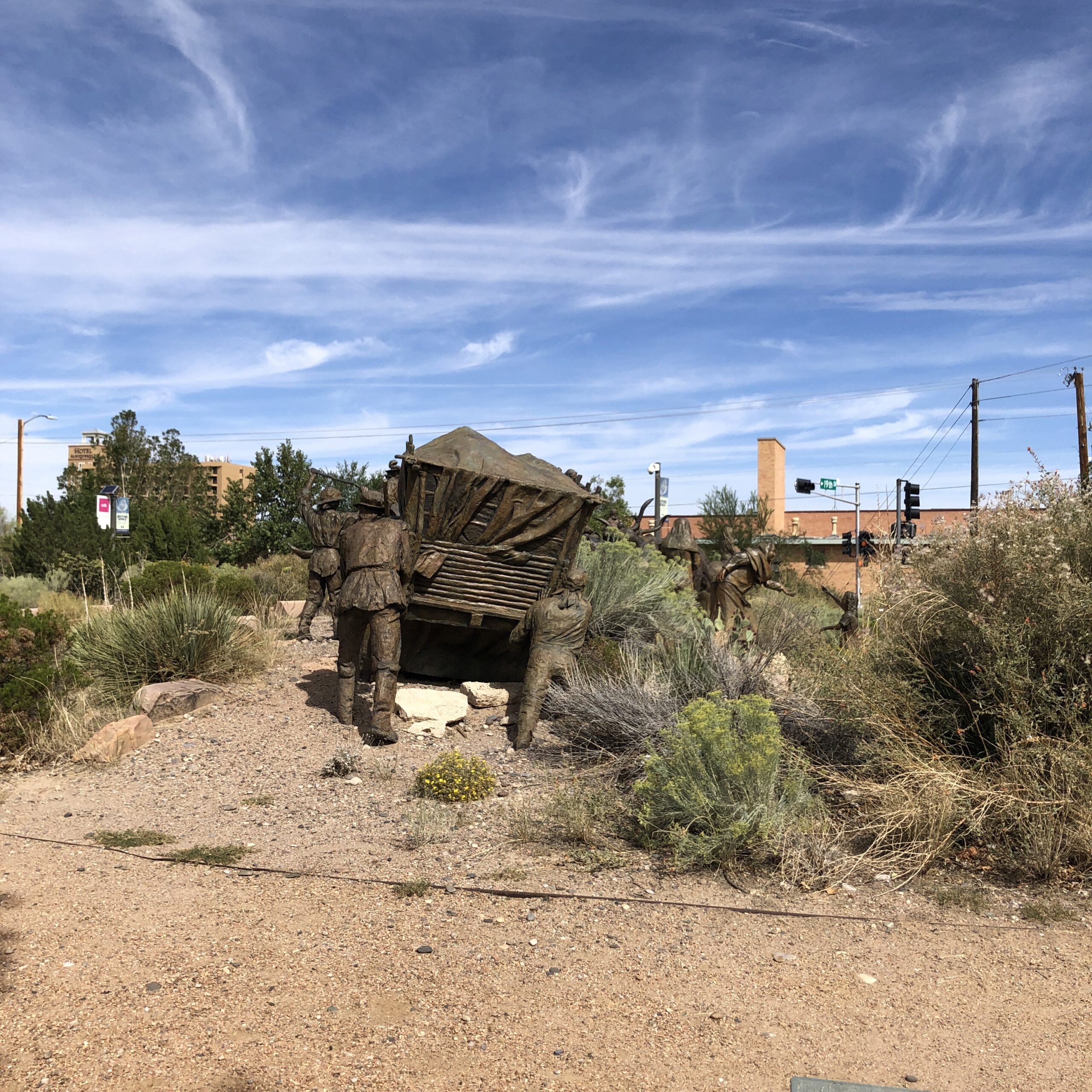
Then, as we left the building, we inevitably walked by the famous bronze sculptural installation of La Jornada, about which I wrote during the riot phase of 2020.
Someone was actually shot in the street, right near this piece of art, because some activists were trying to tear down the statue of Don Juan de Oñate, who violently colonized New Mexico, and a right-wing-psycho gunned a man down. (As a creepy, armed militia stood by.)
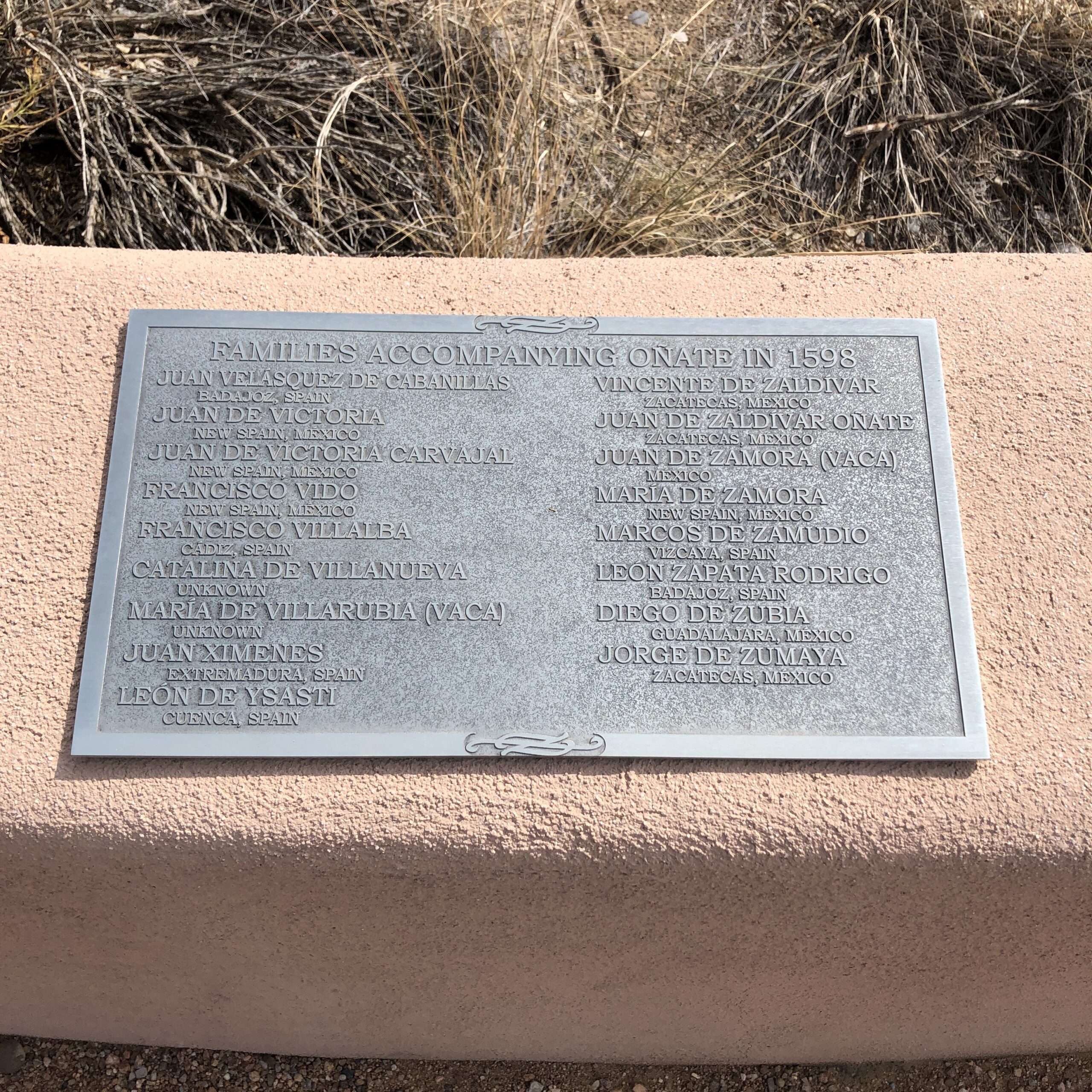
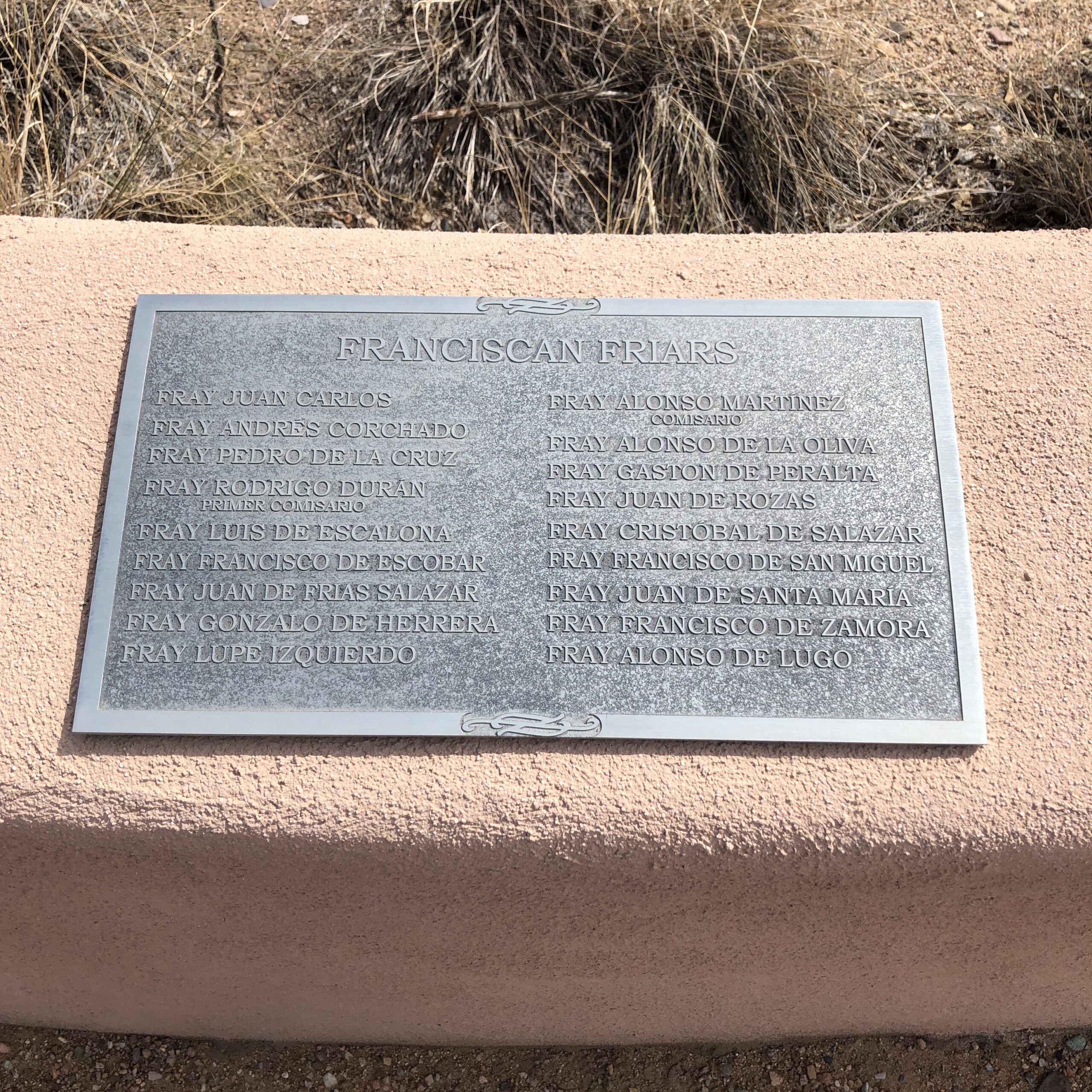
The installation is over the top, as the artists Betty Sabo and Sonny Rivera created a full wagon-train, with conquistadors, cows, and colonists, and it is life-like, and educational, as nearby plaques include the family names of those who came from Spain. (Some of whom were hidden Jews, fleeing the Spanish Inquisition.)
The spot where the Oñate once stood
Adrian and I discussed how complicated the situation was, with Spanish New Mexicans traditionally revering their history, and the Native Americans viewing the same events as tragedy and genocide.
As such, after the riot, they hacked out the statue of Oñate, but left the rest of the art piece, and the bronze-man is now locked-away inside the museum. (Though there are apparently still discussions as to whether to remove the entire installation.)
We compared that type of decision with the subsequent removal of Confederate statues that honored men who fought to preserve slavery in the South.
Men who fought to break up America.
The conquistadors, by contrast, were just like the Protestant English Pilgrims.
The English, Dutch, French, and Spanish carved up this country, wreaked havoc, and killed millions of Native Americans. (Or American Indians, to use the term again popular in the NYT.)
It is the shared history of this country, a society built upon blood, yet as Adrian said, “If they hadn’t come here, I wouldn’t exist.”
And neither would I.
If America had not been colonized, my ancestors would still have been in Europe in the mid-20th-Century, and would all have been gassed, shot or burned alive by Adolph Hitler and the Nazis.
America has created evil in this world, and I have personally written about the injustice of the American Conquest, and the history of slavery, more times in this column than I can remember.
But as an artist, and a critic, I wasn’t so sure that cleaving off Oñate from the rest of a piece of history was entirely the right move.
I understand why others feel that way.
But people getting shot over art makes me think of the Taliban.
Or the Cultural Revolution in China.
Is that really the best we can do?
It was time to move on, so I drove through some California-style-gentrification, and the first California-style-sidewalk-tent I’ve seen in Albuquerque, and got to UNM in time to meet Jim Stone for lunch.
There were big, white tents set up on campus, where musicians practiced violin, or students studied outside, as concessions to our current Covid reality.
It was great to be back at my alma mater, (Post-Bac 1997-99,) and after a nice teriyaki chicken lunch outside the Student Union, I chatted up Jim’s class for an hour.
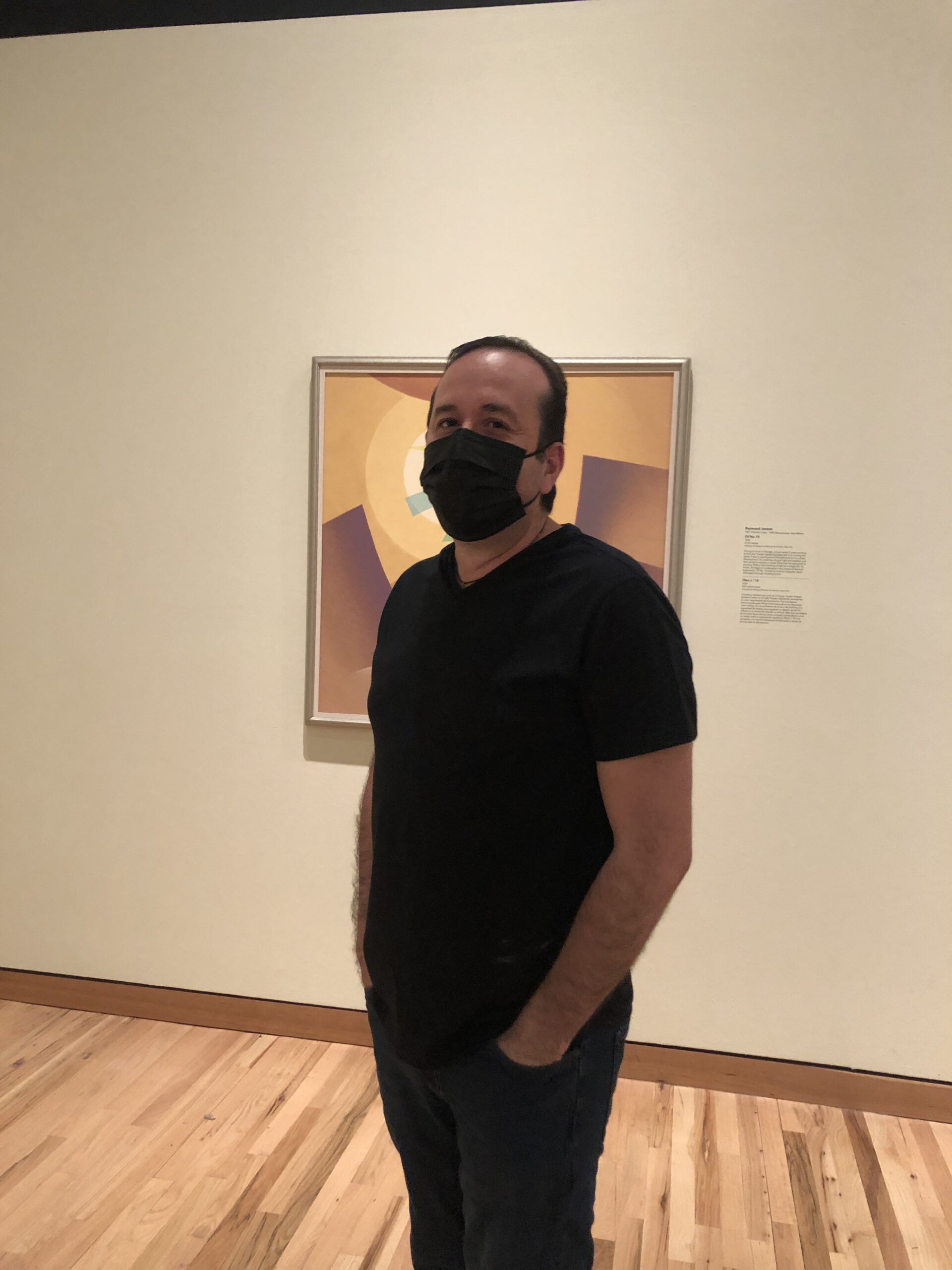
Jim Stone, outside the UNM Student Union
All five students were either Native American, Hispanic, or female, (or some combination thereof,) and their teacher was a bearded White guy. (Who was named SPE honored educator in 2016.)
We talked about how hard it was for them, having their entire first year online, and they treated me with so much respect, as I did them.
Jim asked me to talk about the festival circuit, and portfolio review industry, as the non-profit organizations that run them offer the opportunity for community, education, and camaraderie after students leave the University nest.
I empathized with the students, and shared my knowledge and passion with kindness, and it felt wonderful to be back in a classroom in 2021.
I try to find nuance in things, as Jews are reputed to “run the world,” yet we’ve been attacked, killed and discriminated against for Millennia.
Growing up, it was implied we should hide our “Jewishness,” for fear of being persecuted, so I don’t really identify as a “person in power.”
But I grew up with some privilege, as I’ve admitted here before, and have always tried to use my platform to support others.
Which I will continue to do.
And starting with my next book review, I’ll re-institute our call for submissions by artists of color, and female photographers.
Not b/c someone suggested I was racist, (when I identify as Woke,) but because outreach is vital.
And just so we’re clear, I previously removed the submission info because I have nearly a year’s waiting list for review, and it seemed unethical to call for books, knowing I’d have to make people wait so long. (Though I do tell that to any artist who looks me up on his/her/their own.)
As my time in ABQ wound down, but before I headed to the Asian market for some groceries, I went to the UNM Art Museum, which recently re-opened after being closed for more than a year during the pandemic.
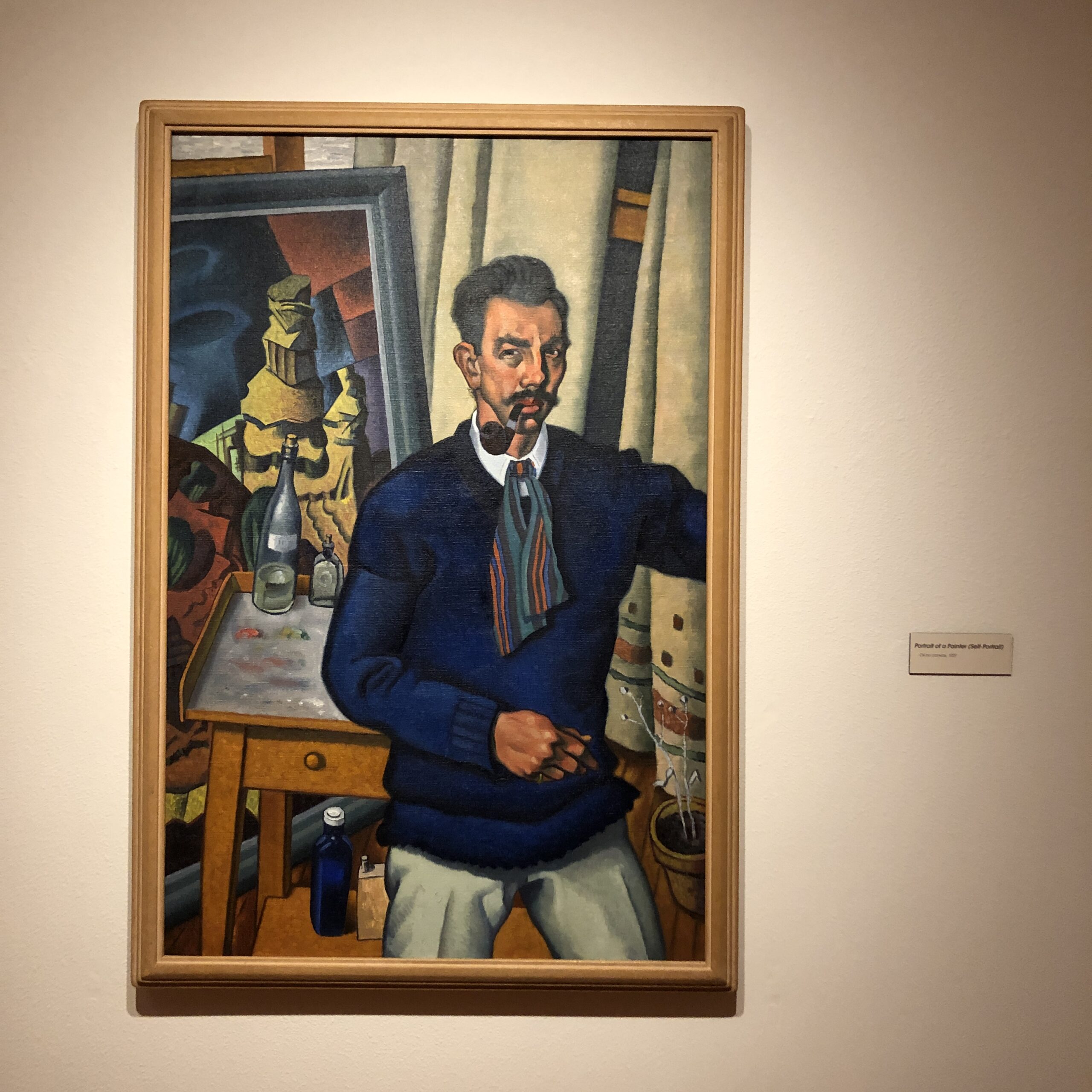
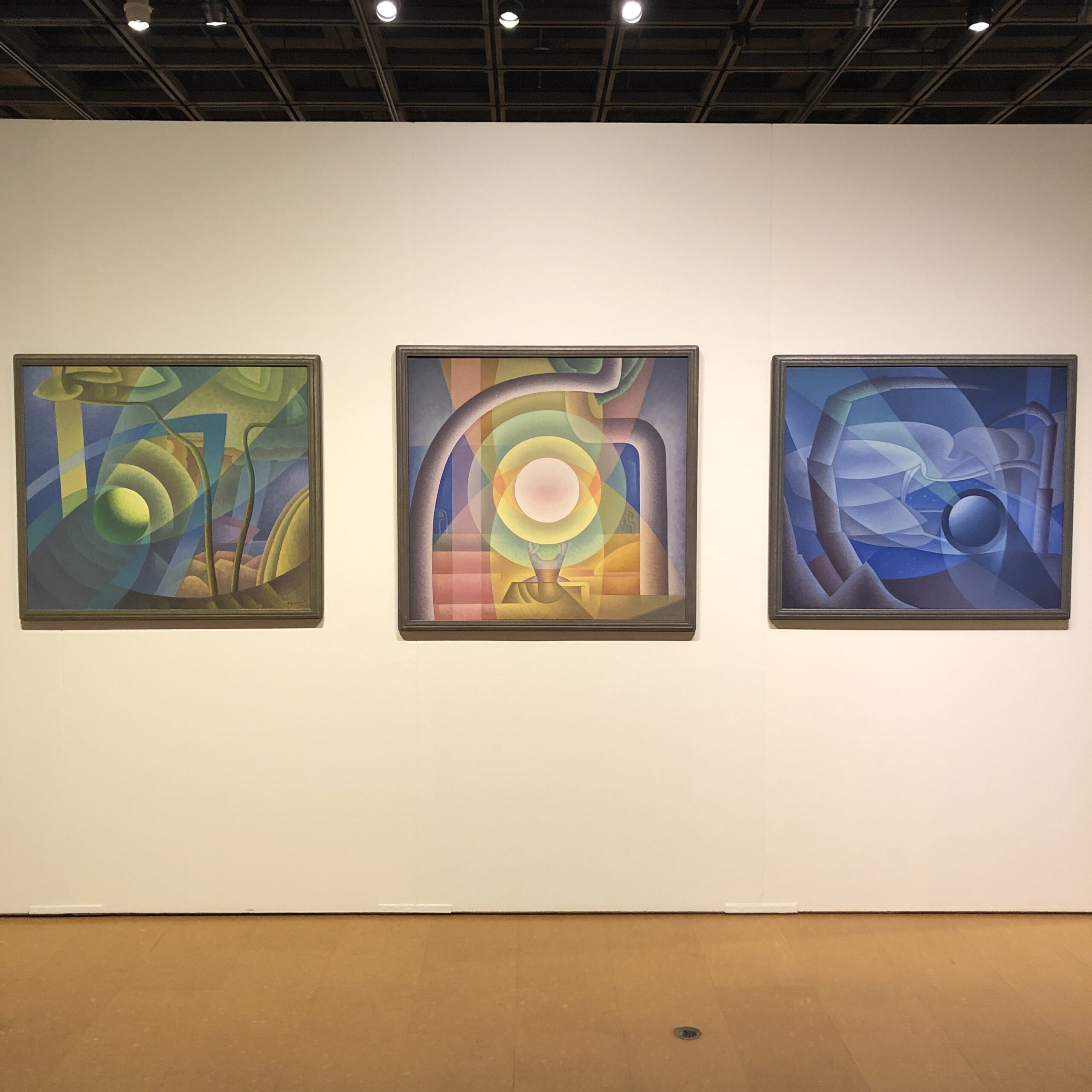
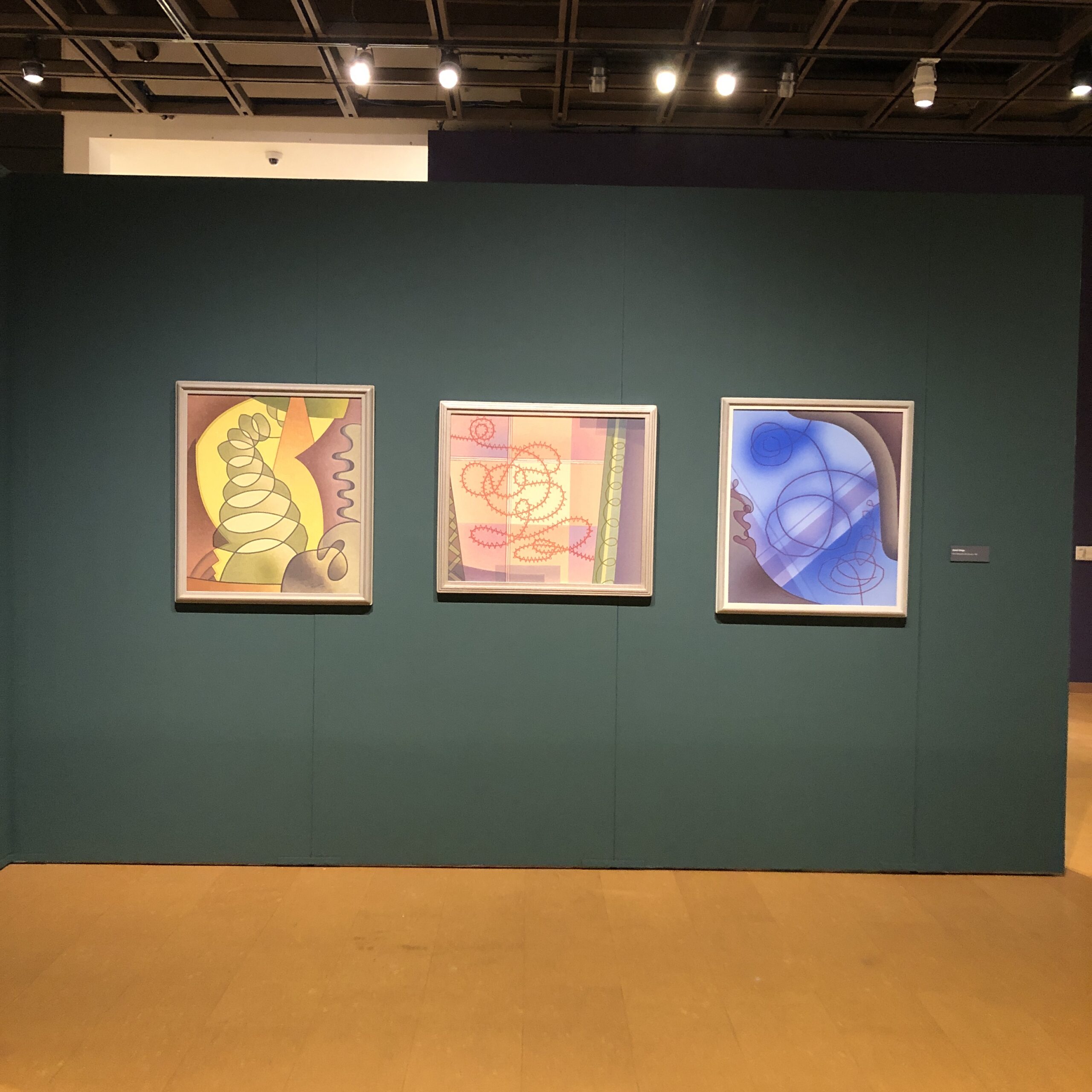
Though it’s known for its brilliant photography collection, begun by former professor Beaumont Newhall, (who founded the photo department at MoMA in New York,) there was a painting exhibition by Raymond Jonson, who as I said was a big deal on campus back in the mid-20th-Century.
Raymond Jonson Self-Portrait
I saw more of his paintings in one day than I had in my lifetime, yet this exhibition, decontextualized from the larger Transcendental movement, was less satisfying than the one at the ABQ Museum.
Fortunately, while the other exhibition has closed, this show will be up for a while, and the museum is free, so I highly recommend you check it out if you’re passing through NM. (Or if you live here.)
While the vibe at the ABQ Museum was ethereal, this was squarely in the trippy, strange territory. (I called it super-funky to Mary Statzer, who curated the exhibit, and she found that term on-point.)
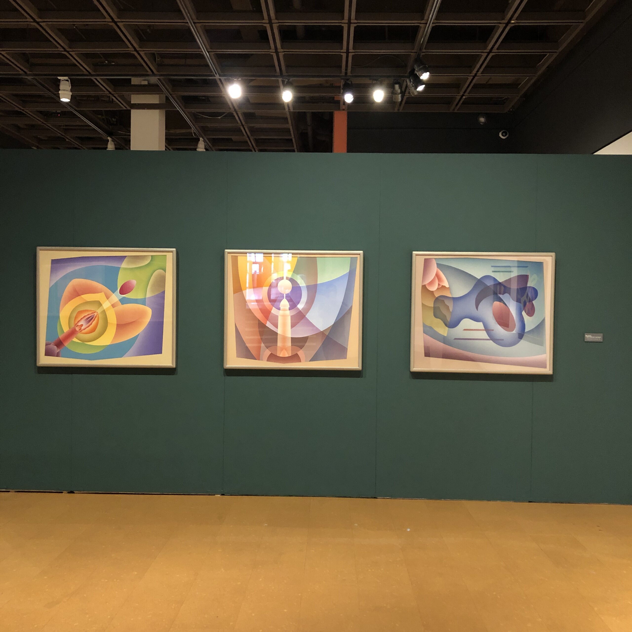
The bulk of the exhibition was built around triptychs and mini-series, and feels spectral, or like Aliens were just around the corner, and maybe that’s just right for New Mexico in 2021.
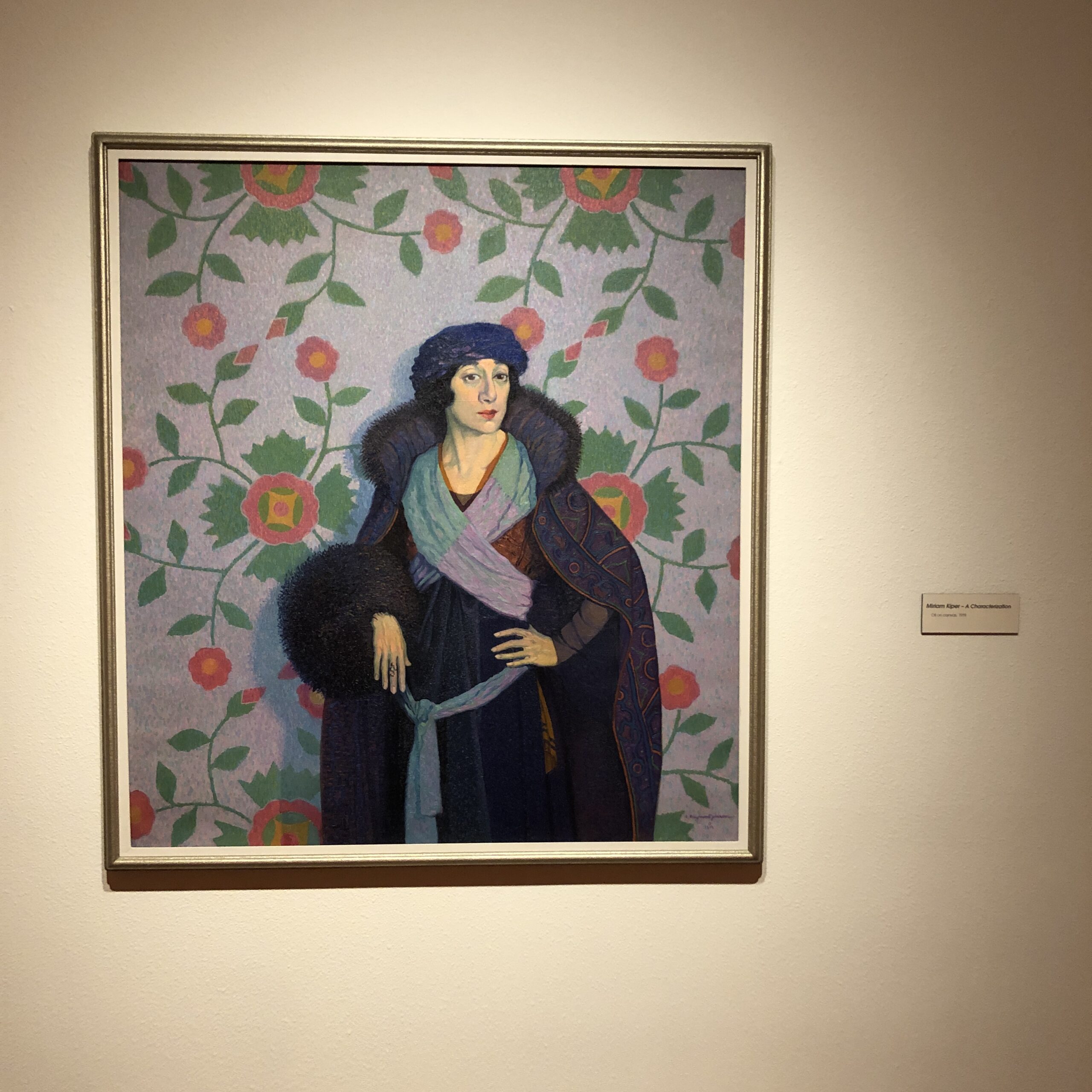
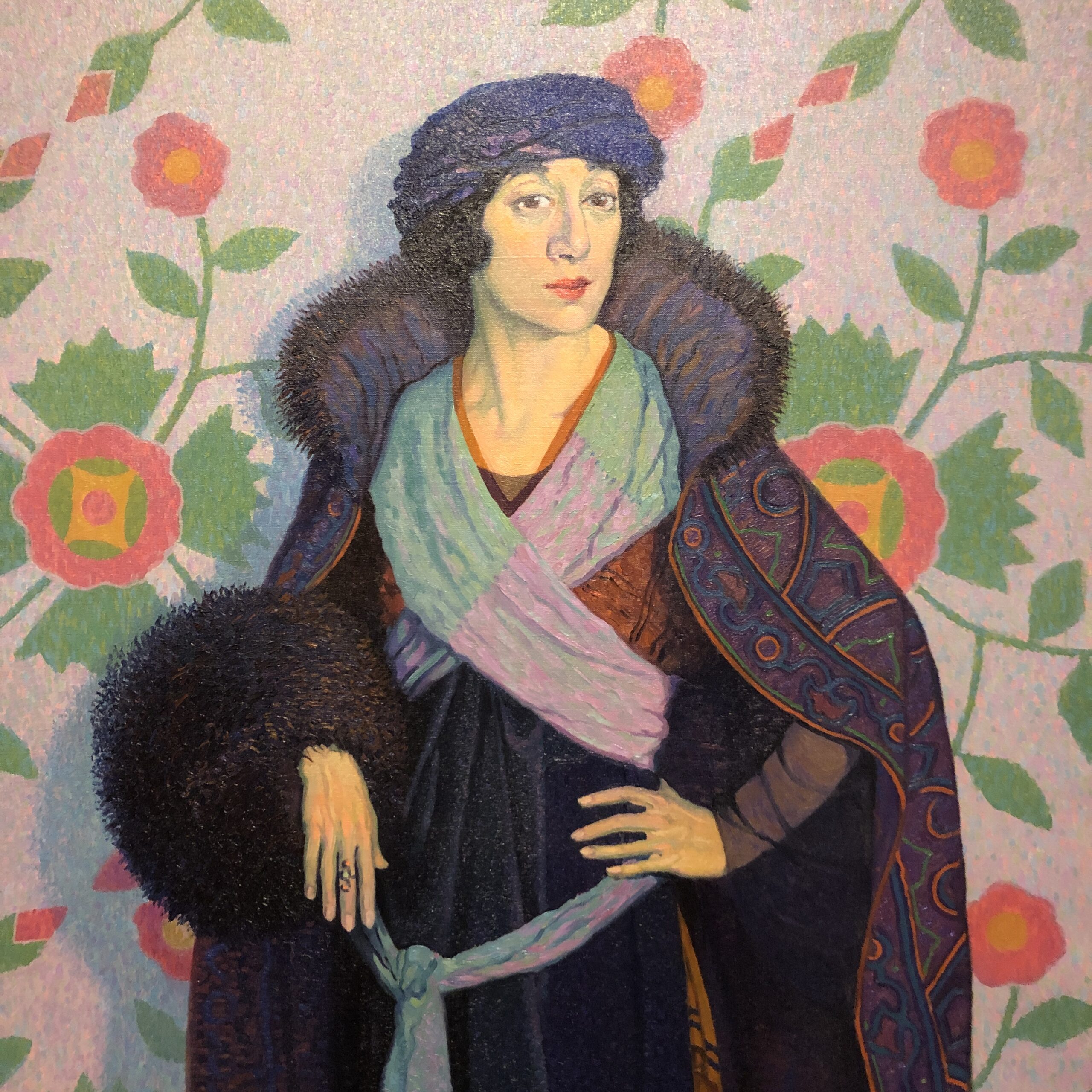
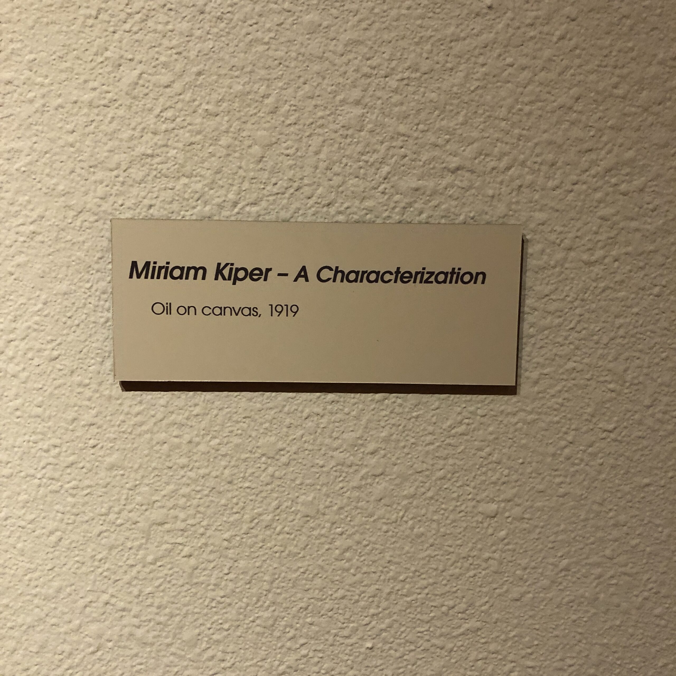
In an alcove, separate from the rest of the work, were portraits, which were pretty phenomenal, so Raymond Jonson, (of Iowa, having done a stint in Chicago,) was clearly a talented dude.
But one portrait from 1919, of a prominent actress, Miriam Kiper, rubbed me the wrong way.
Her name was Jewish, her nose was exaggerated, as were her eyes, and hands. It seemed to be touching on Anti-Semitic tropes, and I felt bad inside.
(In 10 years of writing this column, I’m pretty sure I’ve never made that accusation before.)
I know such ideas were more acceptable back then, or perhaps Raymond Jonson was not even aware of his “implicit bias.”
Still, it never occurred to me to complain, or protest.
To demand the museum remove the painting.
Or destroy it.
Others are more comfortable with censorship, or the belief that if they get offended, the perpetrator of such offense is bad, or the enemy.
Worthy of punishment.
I understand ideas go in and out of fashion, and you will NEVER find me defending Robert E. Lee, or Donald J. Trump.
But maybe, just maybe, we can all walk back from this current, contentious ledge together?
America, as we know, is broken.
And perhaps it’s time we stop waiting for someone else to fix it?
Maybe it’s time to pull on our work gloves, cut each other a bit of slack, and do the heavy lifting ourselves?
The Art of the Personal Project is a crucial element to let potential buyers see how you think creatively on your own. I am drawn to personal projects that have an interesting vision or that show something I have never seen before. In this thread, I’ll include a link to each personal project with the artist statement so you can see more of the project. Please note: This thread is not affiliated with any company; I’m just featuring projects that I find. Please DO NOT send me your work. I do not take submissions.
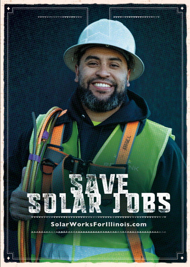
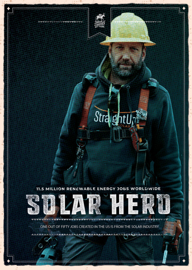
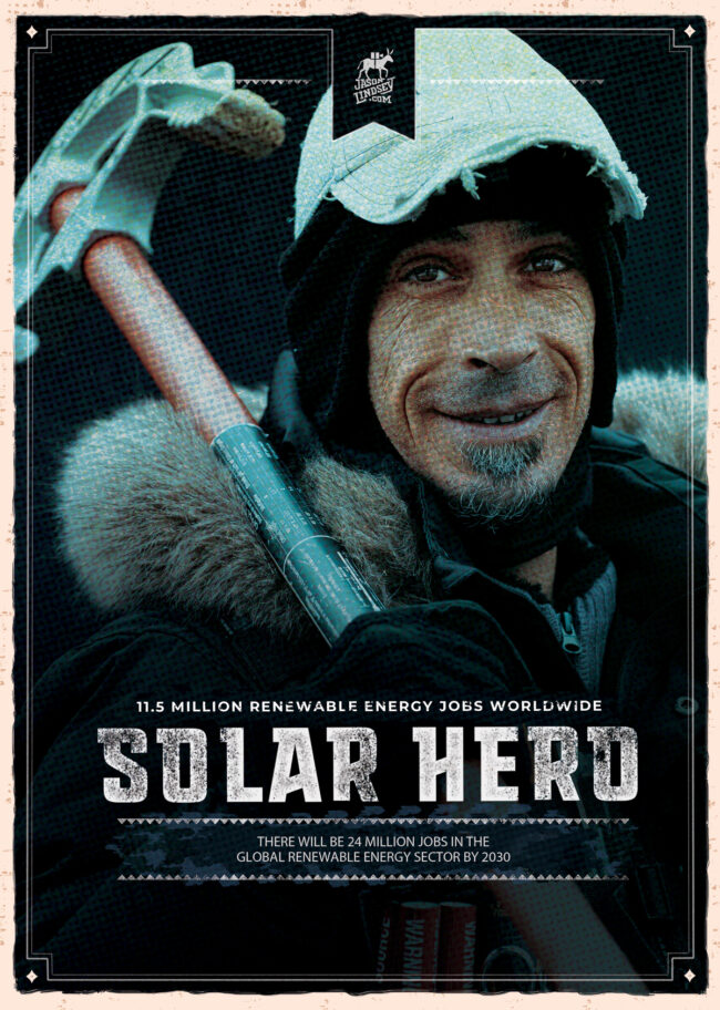
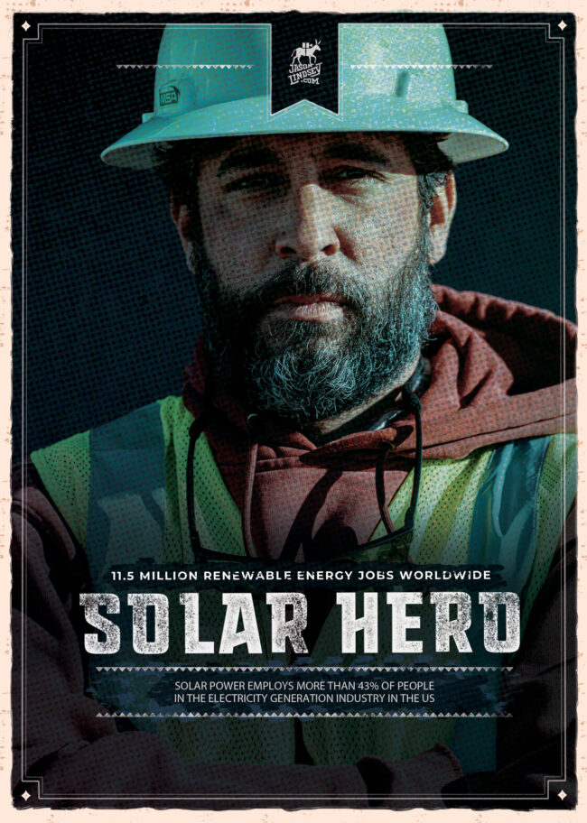
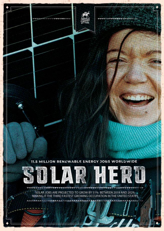
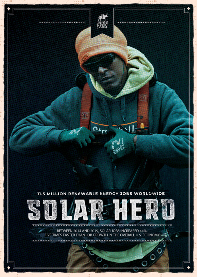
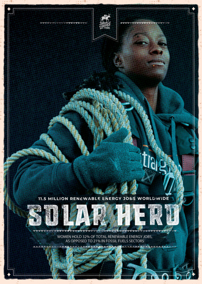
JASON LINDSEY CREATES THE CAMPAIGN HE ALWAYS HOPED TO SEE
The inspiration for a personal project called Solar Heroes was to create a campaign that is a celebration of the people who install solar. He was aware that this was a politically charged topic when it shouldn’t be. Rather than focus on one industry replacing another, he wondered why no one was talking about how the solar industry was adding jobs. Why wasn’t anyone talking about the workers? So, Jason sought to highlight these unsung heroes. He photographed the portraits and designed the campaign as well.
As the title suggests, at the beginning of 2021, Jason Lindsey created a series of images that he always hoped to see, a personal project campaign celebrating the everyday heroes of the solar industry. While he didn’t set out to make an in-your-face political campaign about climate change, it undoubtedly made an impact. The Illinois Solar Energy Association tapped him to create a campaign to help pass the climate change legislation. This past week, the State of Illinois passed major climate change legislation, and we’re celebrating Jason having been a small part of it!
APE contributor Suzanne Sease currently works as a consultant for photographers and illustrators around the world. She has been involved in the photography and illustration industry since the mid 80s. After establishing the art-buying department at The Martin Agency, then working for Kaplan-Thaler, Capital One, Best Buy and numerous smaller agencies and companies, she decided to be a consultant in 1999. She has a new Twitter feed with helpful marketing information because she believes that marketing should be driven by brand and not by specialty. Follow her at @SuzanneSease. Instagram
Success is more than a matter of your talent. It’s also a matter of doing a better job presenting it. And that is what I do with decades of agency and in-house experience.
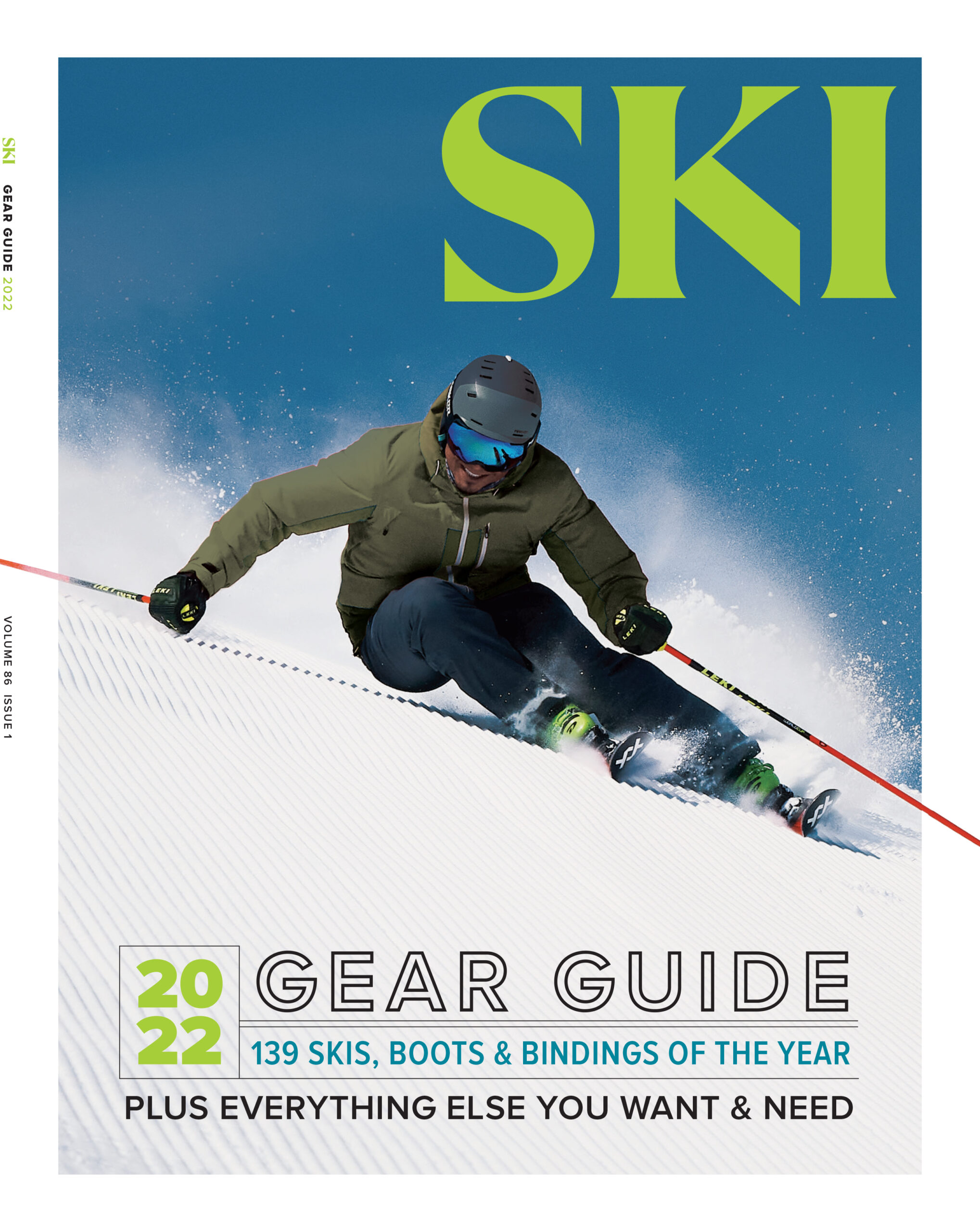
Photographer:Stan Evans Photo Director: Keri Bascetta Editor in Chief: Sierra Shafer
Heidi: SKI Magazine was framed around an invitation to a party, how did you update this and help make this, in the words of the Sierra Shafer, Editor-in-Chief make this “a fresh invitation?”
Stan: They wanted it fun and authentic but not too staged. We kept it real. We explored the backcountry, went searching for powder, carved groomers, laughed on chairlifts and Lauren asked me a million questions on the snowcat ride. I leaned into their personalities and tried to extract what a real ski vacation with a group of friends might look like. This group of friends just happened to be Black. SKI just rebranded and wants to maintain an ethos of appealing to the hardcore skier, provide quantifiable product information as well as opening it’s lens to a broader audience with a dash of healthy respect for mother nature. I think we achieved all those things.
I know this cover is honoring representation in front and behind the camera, what else can you elaborate on for you personally about this experience?
It is about teaching the importance of Black Media. Too often diverse talent is in front of the lens but when the final piece is aired it’s been edited and chopped to fit the narrative of whoever paid production costs. On one hand, naive actors, models and athletes may not know any better but on the other hand there are some that get paid to read lines in front of a camera and the motivation is not always altruistic. Unfortunately sometimes for brands it’s more about looking like they are doing the right thing rather than actually doing the right thing. We need to be controlling our own narrative if we want the real message to get out. I look at what high profile Black actors, musicians and athletes are doing by creating their own production companies, structuring their own deals with licensing and percentages and retaining their masters. I took the knowledge I have and put it into
I had a zoom meeting with the SKI staff awhile ago and we were talking about diversity and how people view it as this super serious goal and it becomes this pebble in your shoe if you are resistant to it. I think if we shifted the attitudes and talked about DEI as a block party or a potluck you would go and earnestly invite ALL your neighbors and ask them to bring something – you’re not quite sure what you will get but it is the curiosity in setting the stage and the dinner table. You might be hesitant to try a new dish but it could turn out that you love it plus there’s something about bringing a dish of your own that you love and sharing it with others. I really need to thank Sierra, Keri, Elyse and Andrea for inviting me to the potluck at Micah’s prodding. They put money, time and effort into this when they didn’t really know me. Sometimes great things come from a leap of faith.
This magazine has been publishing for 85 years, how did this unique idea come about?
It was mainly initiated by Micah Abrams, he was the publisher Snowboarder, Powder, Surfer, Bike Men’s Journal and had overseen my guest editor on “The Black Issue” of Snowboarder Magazine. When ASN folded he went to Outside and started tackling diversity head on pretty quickly. He appreciated the creativity and experience I brought to that issue as well as my understanding of winter sports culture and Black culture. So he called me and asked if I could help him steer SKI authentically in DEI and give insight to Black people in the outdoors for Outside Business Journal.
You’ve been shooting for 25+ years, what made this project and cover with Errol Kerr special for you.
Honestly I’d done this 20 years earlier with Snowboarder so I kind of knew what to expect. It’s less about what it does for SKI and more about empowering the athletes involved and letting them tell their stories in their own way. Having Lauren, Justin and David Samuels there as well made them feel seen. They weren’t props in an advertisement, these were real people who have had pivotal experiences in the outdoor industry. Some deeply personal and they’ve really had no one that looks like them to talk through and share. Those experiences can make you feel very alone. But having a group of people is a support system to learn and grow. Within that experience, joy comes as a second nature and each of those athletes will be a catalyst to spread that joy to the culture. That’s the part that brands miss in their quest for ROI because joy is an intangible metric but it brings us all to the hill and together. It’s also about advertising to a younger generation. Really kids have to see it to be it and I’m glad I am manifesting change with my camera.
What was the direction from the magazine or Outside as a brand? They wanted it fun and authentic but not too staged. We kept it real. We explored the backcountry, went searching for powder, carved groomers, laughed on chairlifts and Lauren asked me a million questions on the snowcat ride. I leaned into their personalities and tried to extract what a real ski vacation with a group of friends might look like. This group of friends just happened to be Black. SKI just rebranded and wants to maintain an ethos of appealing to the hardcore skier, provide quantifiable product information as well as opening it’s lens to a broader audience with a dash of healthy respect for mother nature. I think we achieved all those things.
How did your love outdoors and those first turns on Arctic Valley inform you as a photographer? I would say just growing up in Alaska shifted my perspective. Beauty was literally all around me. So it was natural to embrace it. I was into art, I liked to draw, write poetry and explore (enter awkward teenage phase here) but picking up a camera helped me show the world how I see it and I could share it with others but it was a teacher, Ms. Jackson saw I had talent and encouraged me to pursue it. Having someone believe in me gave me confidence. So it was more my teacher revealing a career path of creativity instead of pushing me to pursue some mainstream job as a lawyer or doctor. Arctic Valley was great though. They offered Military dependents a season pass for $200 and they had a ski bus that would pick up all the kids in the neighborhood after school for night skiing. I learned a lot through repetition because wed – sun I was at the hill everyday.
What advice would you give your younger self? I would probably say seek out older mentors sooner. Having solid advice from those who have been there and done it will save you a lot of setbacks and heartache. Inside winter sports it was pretty hard because most of the time I was the only Black person but meeting people from different walks of life and backgrounds helps shape perspective. Don’t be afraid to ask questions and never assume anything. Don’t be so set in your ways that you resist change. Life is an evolution and we are all constantly growing. It’s having a mindset of being open to change and a willingness to do better.
Congratulations on your appointment to SIA, how has that appointment on the board informed your most recent cover shoot? Thank you and I think it was the first time I’d seen an established outdoor organization recognize what I’d done in the winter sports field and respect it. For years I could tell people I grew up in Alaska, went to school in Montana and have a degree in photography but the moment I entered a room and people saw I was Black inevitably someone would ask “are you sure you know what you are talking about?” Those attitudes are what eventually drove me to leave my past behind to move to New York and reinvent myself in advertising photography. No one there or in LA where I currently live knew about my past and I was fine with it. But sometimes life comes at you from leftfield and suddenly people remember your accomplishments and you get a phone call. That’s what happened with The Black Issue and Snowboarder. In the wake of George Floyd and America’s racial reckoning, people in winter sports needed advice from a voice they’d shunned so many times before. The real reason I came back to the fold was to show new Black creatives and athletes how to hold their heads up high, to tell their stories through their mediums and to be fairly compensated for their work. So many Black creatives and athletes were being exploited for brand clout without clear objectives for diversity and equity so now being on the Board of Directors for an entity that talks directly to that industry, they value my opinion and it gives me a wider reach so my experience can help fill in the potholes and roadblocks the youth following in my footsteps might have hit.
In the past, I’ve rarely sent print promos (tho I always wanted to create a nice one), and I mostly relied on online marketing, sourcebooks (At-Edge, Archive Magazine, Workbook, etc), and face to face portfolios showings for sharing my work. However, as soon as 2020 hit and everything began to lock down I figured it was a great opportunity to channel my energy into a nicely designed promo… something I have always wanted to do, but never made it a priority.
Last spring, I connected with an Art Director & Graphic Designer friend of mine named Ryan Frease that I had previously worked with on some campaigns (some actually in the fold out case study), and learned he was in between gigs and had some extra time on his schedule. The timing lined up for both of us, and we were off and running. I threw out a bunch of ideas, and he heard them all and really helped channel them all into one cohesive and branded message.
My main goals with this promo were to:
Communicate quickly the type of work that I specialize in, and leave an impression.
Create multi-tiered items; something you can keep and perhaps pin on your office wall (fold-out case study promo or postcard), something designer related and practical that you can use on a daily basis (wine key, or pencil + notebook), and something of good print quality that shows an overview of my portfolio. I realize Agency folks get a lot of promos, so I wanted to create something that would at least get passed around, as opposed to tossed.
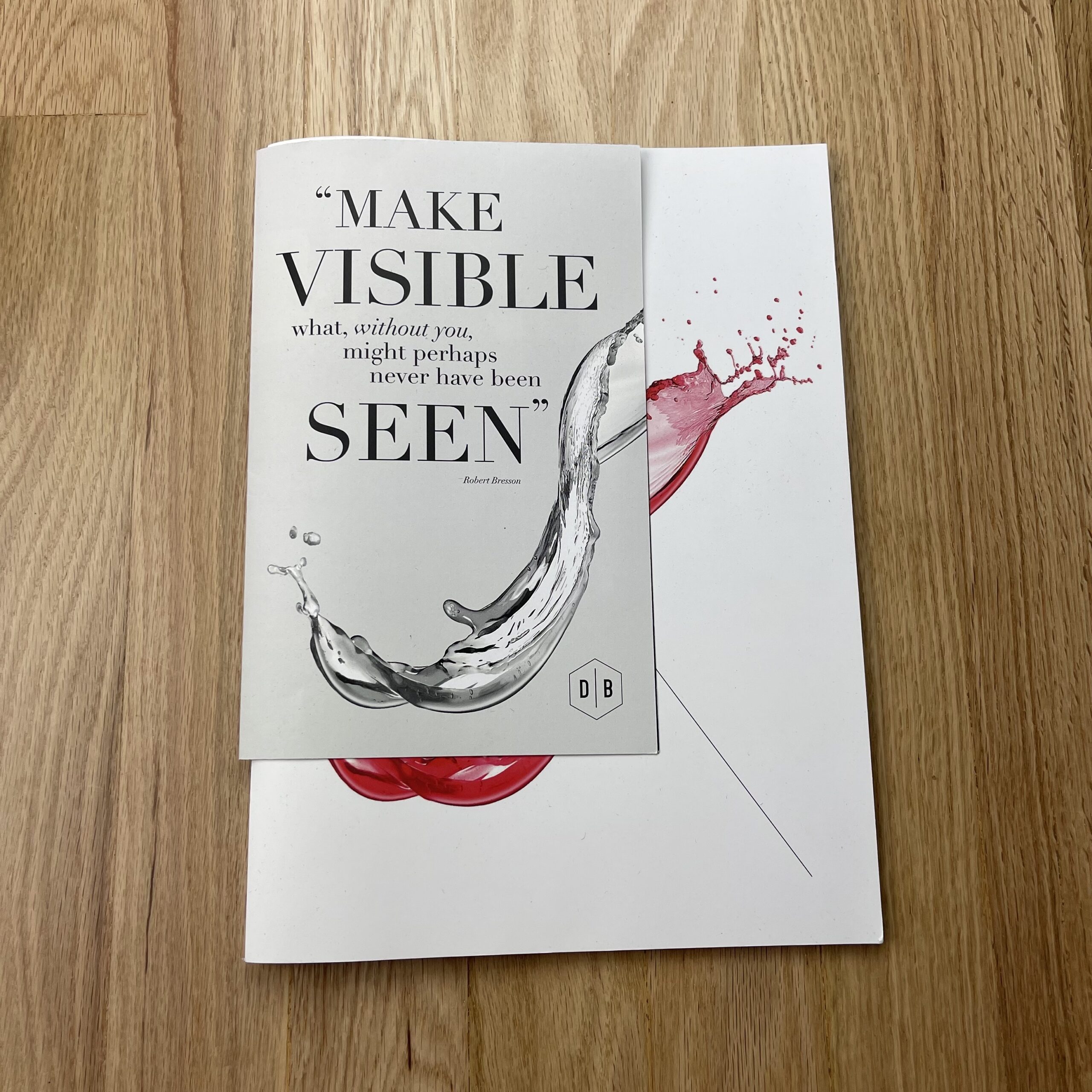
As a product photographer, I work with a lot of designers. So, I wanted the packaging to be note-worthy, and something that would demonstrate my appreciation and passion for good well thought out design. Ryan really brought a deeper layer of design to this promo in a few areas. Particularly in the way, he designed the folding case study to line up perfectly with the portfolio book cover as the copy reads “Make Visible” while revealing the splash image from monochrome to color. These details go a long way with me.
I really wanted to show the human connection element, especially in a time where we are over-saturated with content and DMs… As of now, I only printed 250 promos. I am only sending out a few at a time, so I can track who they are going to, and I can follow up. I am intentionally and personally sending each promo to creatives I would love to work with. Each box contains a personalized handwritten note, and my hope is that it shows that I am at least aware of who I am sending these to, and it contains that human element that I feel is missing in other forms of digital marketing.
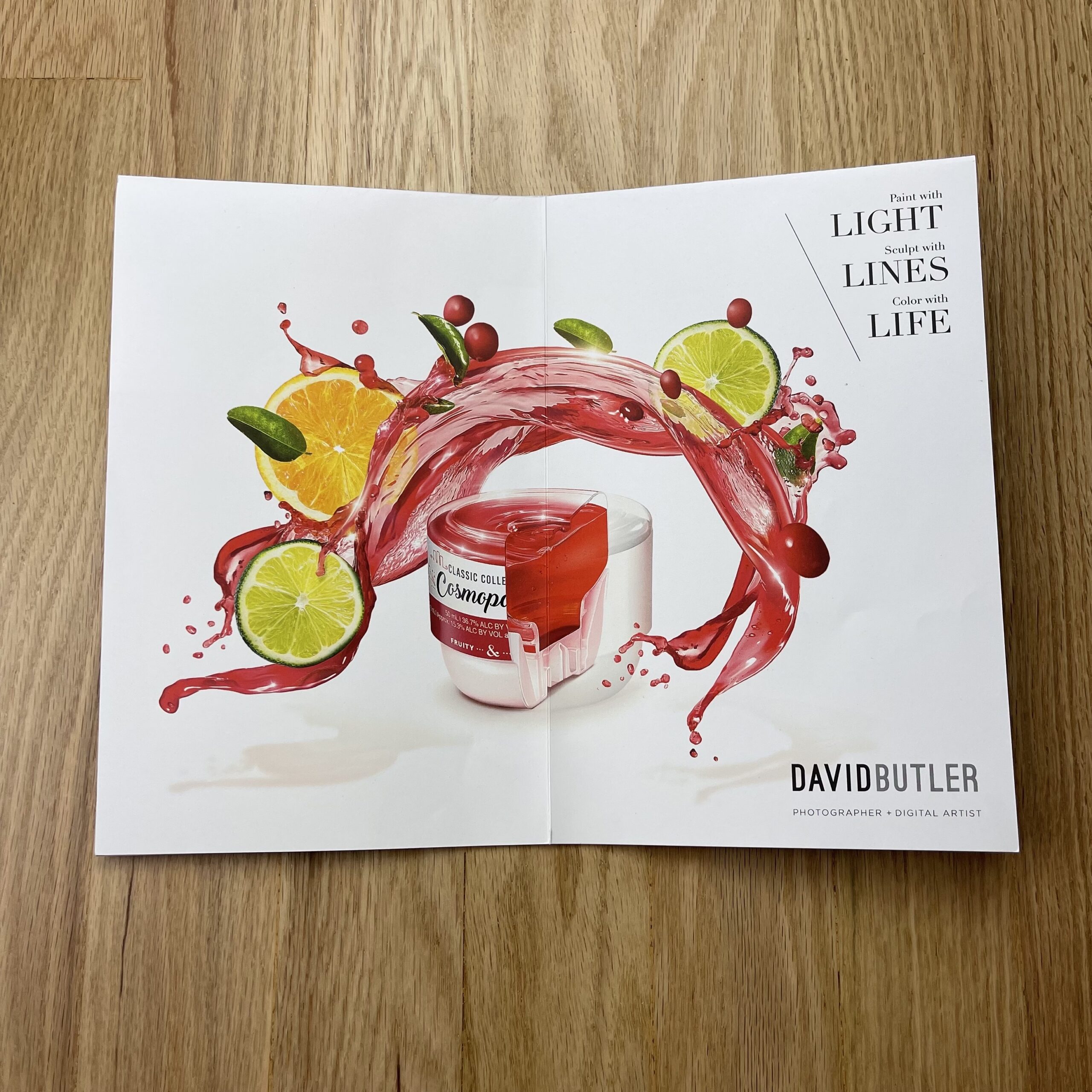
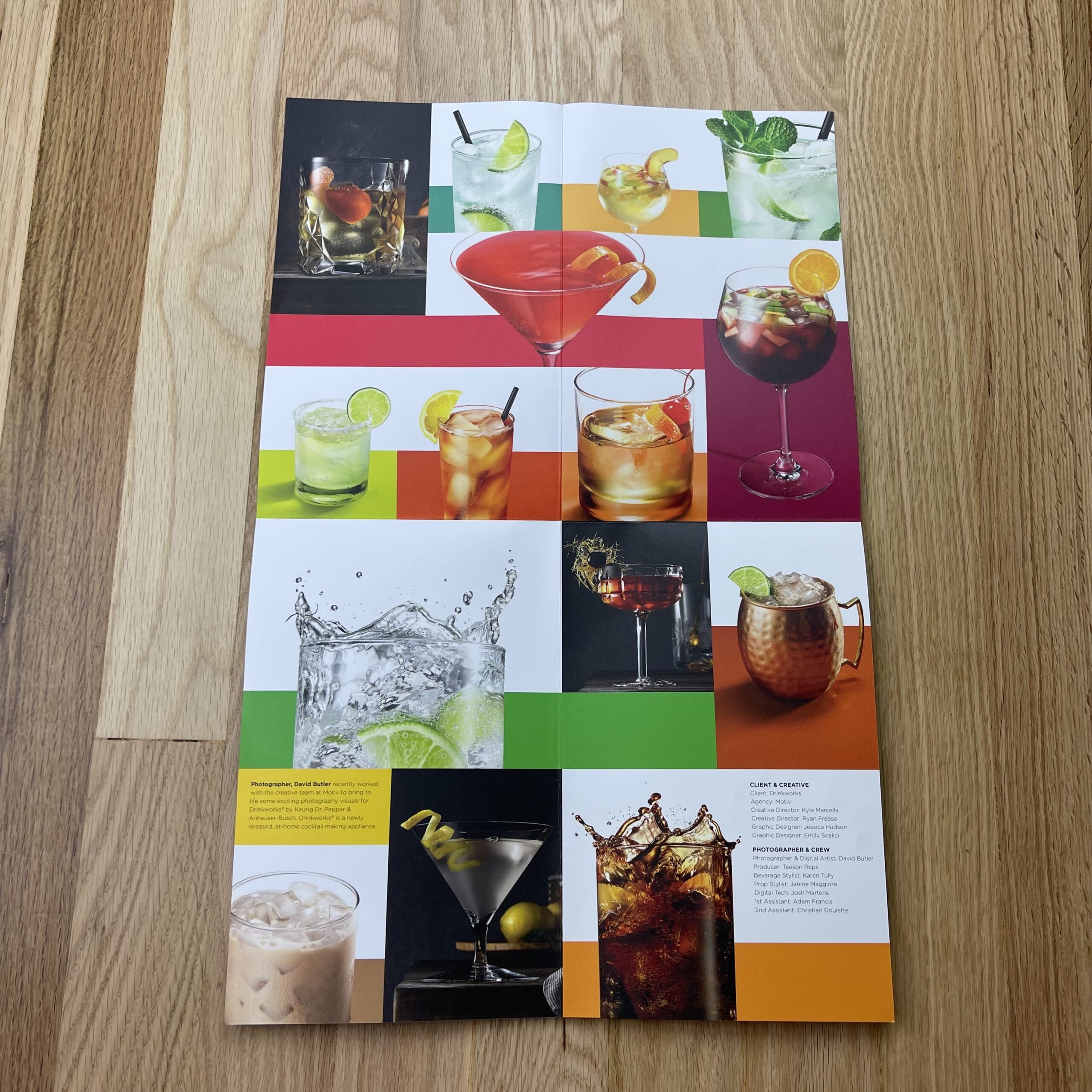
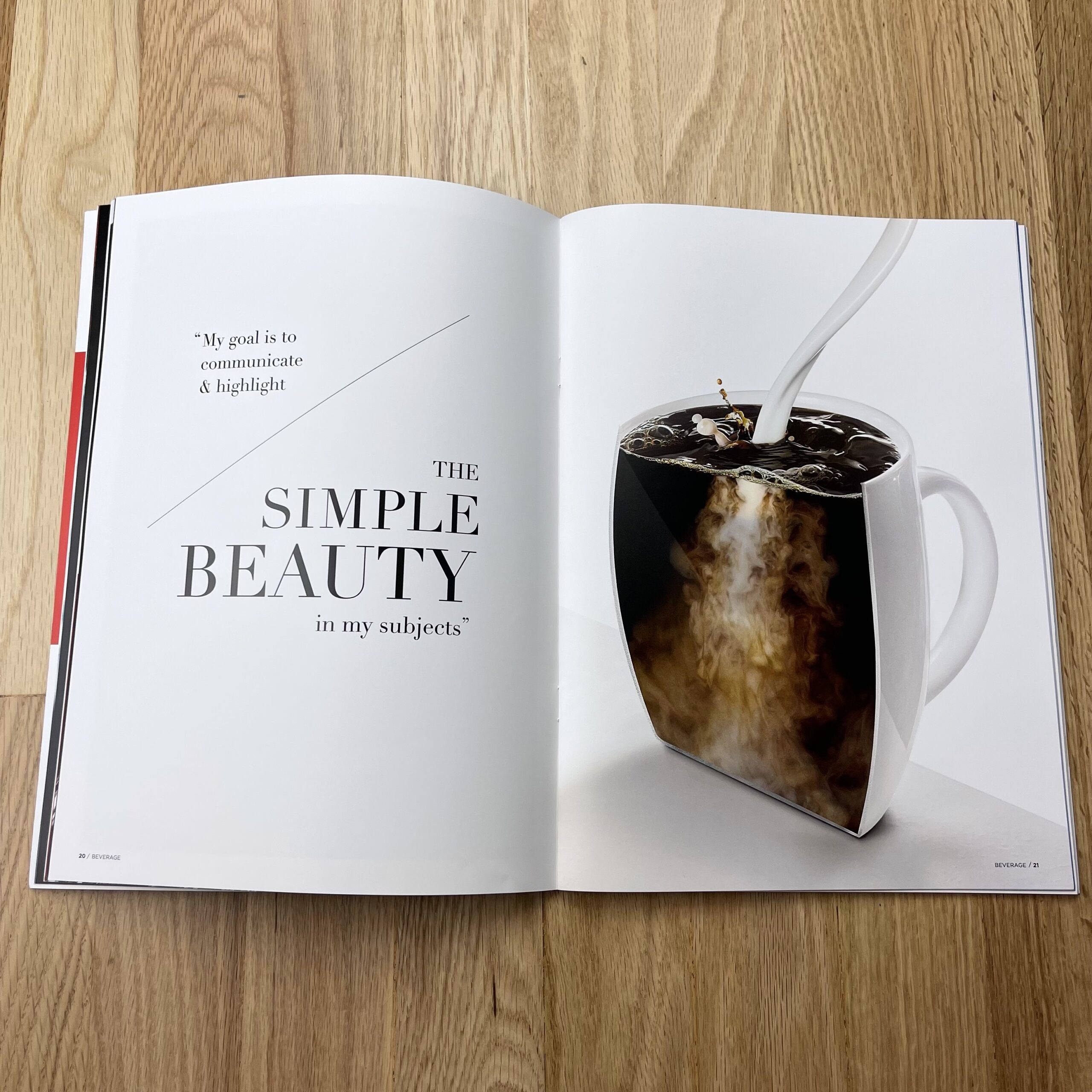
The images in the fold-out case study represent almost 3 years of work created for the brand Drinkworks They are a pod-based at-home cocktail brand, created by Keurig and Anheuser-Busch. Prior to Drinkwork’s launch up until now, I have been collaborating with a Boston-based design agency Motiv Design on bringing to life an entire portfolio of cocktail images that are designed to be used on their packaging designs as well online and print marketing. I felt this was a great case study since we captured such a brand range of beverage photography, from conceptual to just beautifully simple and graphic.
After designing and printing everything, the next hurdle was acquiring addresses for folks I was trying to reach… given that everyone was working from home, the agency address wasn’t going to work. So, for the better half of a year, I sat on these promos, and have just been sending them out over the past few months. The feedback has been mostly quiet, however, there are some cases where I have gotten some great responses as well as some creatives that have passed my work along to colleges along with some incredibly kind words, so that is very encouraging!
As far as who printed these, I actually went through a few vendors recommended to me by Ryan, and I am really pleased with each piece.
It’s officially been ten years since I began this weekly column.
(And so much of the world has changed.)
In September of 2011, my son was four years old, and my daughter was yet to be conceived.
9/11 happened only a decade prior, and the wounds were still so fresh.
Donald Trump was a loud-mouth reality television star, and Barack Hussein Obama the President. Joe Biden was VP, Obama’s wingman, and wasn’t-yet-known for his signature aviator sunglasses. (Or for calling people “Folks.”)
James Gandolfini was alive, and no one knew he had an odd-looking kid. Joe Biden’s son Beau was also living, as were Tony Bourdain, David Bowie, and Ruth Bader Ginsburg.
Courtesy of the BBC
The United States was mired in the after-effects of The Great Recession, which was the biggest thing to happened since 9/11. (The two defining events of GenXers lives, up until the pandemic. Probably Millennials too, now that I think about it.)
Most people weren’t using social media yet, in 2011, so no one had heard of fake news, and anti-vaxxers were a small subset of the population who mostly got grumpy about the measles.
Oh yeah, one more thing. The New York Football Giants, now the laughingstock of the NFL, were about to win the Super Bowl. (Go Eli!)
If you had told me in September 2011 that my column would turn into a diaristic, long-running critique of American culture and politics, I would have stared like you had a magical-third-eye in the middle of your forehead.
(Inconceivable!)
Those first few weeks, in September 2011, I reviewed several books at a time, just a couple of paragraphs each, and my signature style was still to come.
It wasn’t until Thanksgiving, when my mother-in-law banged on our door at night, brandishing a .45 handgun, afraid of intruders, that things fell into place.
I felt compelled to tell that story, and then connect it to a photo book by superstar Taryn Simon, and the rest, as they say, is history.
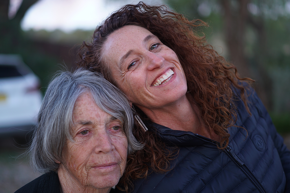
These days, my mother-in-law, (who was one of the smartest, fiercest people I’ve ever known,) is in a near-vegetative state, due to the ravages of Alzheimer’s disease.
As bad as the pandemic has been for many people, (in particular those who lost loved ones to Covid,) I’ve had my hands full, battling my wife’s clinical depression, and then watching Bonnie’s brain melt, day by day, until there was nothing left.
Jessie and Bonnie on May 14th, 2021. The last day she was cognizant.
Being Trapped in Paradise, walking in circles, with the beautiful mountains as a backdrop, would have been a nice way to spend a plague year-and-a-half, (in theory,) but I can’t say as I enjoyed it much.
Writing for you each week, having an outlet for my emotions, and a desire to share my experiences with others, (so they might have better lives,) was a big part of what kept me going.
So… thank you.
Thank you very much!
I’m not going to review a book today, as it’s the rare week when I’m writing on a Wednesday, and I thought a 10 year anniversary was enough reason to freestyle, and celebrate the achievement.
Tomorrow, I’m going to Albuquerque for the first time in 18 months.
I came home from the Burque on March 8, 2020, from my trip to Houston, and then never left. (At least until I went to Amarillo a year later, to get my first vaccine shot.)
It is highly likely I’ll be able to tell you about it next week, if the food and art are any good, but after 18 months, even shitty water tastes delicious when you’re dying of thirst.
I’d be remiss if I didn’t take a second to thank Rob Haggart, the founder and editor of this website.
These days, I get a lot of compliments for my honesty and vulnerability, as it’s literally become a part of my “personal brand.”
And that stems directly from the advice he gave me, when I first began writing here in 2010. (The weekly column came a year + into my tenure at APE.)
Rob has always given me creative freedom, and let me stretch my wings from a place of trust.
But at the very beginning, he did give me a particular piece of advice.
“Be honest,” he said, “and write what you really think.”
“But Rob,” I replied, “if I’m honest all the time, writing about the industry, won’t I burn bridges? Isn’t that a bad idea, as I’m just trying to make a name for myself?”
“You might burn a bridge or two,” he said, “it’s true. But in my experience, you’ll open many more doors by telling the truth, and those people who don’t want to work with you, those few bridges you burn, they probably weren’t the right people to work with anyway.”
“That makes sense,” I said.
We’ve been going strong each Friday, ever since, and I can say, without exaggeration, that Rob’s unwavering support, and his belief in me, changed my life forever.
Thanks, Dude!
And see you all next week!
(ED note: I had a great trip to ABQ, and will write a travel piece with exhibition reviews for next week’s column.)
The Art of the Personal Project is a crucial element to let potential buyers see how you think creatively on your own. I am drawn to personal projects that have an interesting vision or that show something I have never seen before. In this thread, I’ll include a link to each personal project with the artist statement so you can see more of the project. Please note: This thread is not affiliated with any company; I’m just featuring projects that I find. Please DO NOT send me your work. I do not take submissions.
Many families in Western society have been personally affected by divorce. In fact, 40% to 50% of marriages in the U.S. end in divorce, according to the American Psychological Association.
This is something photojournalist Gabby Jones has experienced firsthand. Growing up as the child of divorced parents, Jones felt a sense of resentment and instability. As the divorce was finalized, the custody agreement arranged for Jones to live with her mother. However, as she got older, she realized that she and her mother didn’t see eye to eye and were having a hard time understanding one another.
“She got the brunt of my wrath. I was your typical angsty, hormonal teenager; quick to judge and tough to please … Our relationship was tumultuous to say the least,” she said.
As the pandemic took hold on daily life this past year, Jones had an opportunity to mend her relationship with her mother.
The island of Saint Thomas holds a great deal of importance to Jones’ family history, but Jones had rejected that part of her family heritage. It was an important part of her mother’s life growing up, and as Jones got older, she began to realize the importance it could hold in her life as well.
So, when the opportunity to go visit with her mother presented itself this year, she couldn’t say no. In January, Jones and her mother spent a month together living in her great grandmother’s house on Saint Thomas.
This was the longest amount of time that they had spent together in years, and Jones decided to document it.
APE contributor Suzanne Sease currently works as a consultant for photographers and illustrators around the world. She has been involved in the photography and illustration industry since the mid 80s. After establishing the art-buying department at The Martin Agency, then working for Kaplan-Thaler, Capital One, Best Buy and numerous smaller agencies and companies, she decided to be a consultant in 1999. She has a new Twitter feed with helpful marketing information because she believes that marketing should be driven by brand and not by specialty. Follow her at @SuzanneSease. Instagram
Success is more than a matter of your talent. It’s also a matter of doing a better job presenting it. And that is what I do with decades of agency and in-house experience.
Fees: The photographer had previously worked with this agency. While they wanted to specifically work with this photographer on this project, we were given a strict budget of $4500 for the shoot. This was similar to previous budgets the photographer had seen from the agency. We discussed a shot list and creative with the agency and let them know that while we’d like to see a higher fee, we could work within their budget for the photographer fee for a limited qty of images, but that additional hard cost expenses would need to be covered. We understood this work would be used on the brand’s social media channels, and while we would have liked to see increased fees, we understand each project has set limits and the photographer was excited to work with this agency again for a new client.
Crew: We added a first assistant at $500/day, which was appropriate for the given market.
Equipment: We included $600 for simple cameras/lighting/grip and $200 for hard drives.
Travel: When we initially estimated this shoot we didn’t know the location, but understood it to be local to the photographer. We included $75 to cover mileage and parking to cover the scout, gear pickup, as well as shoot day travel.
Post Production: As the budget was limited, we waived the cost for a first edit and retouching, for up to 30 minutes per image for the 10 selects.
Additional Production Added:
Originally, the agency was going to handle all locations, talent, wardrobe, and hair/makeup styling. About 2 weeks out from the shoot the agency asked us to put an estimate together to handle locations and casting/talent. At this point we already had a signed estimate for the shoot, so we created a second estimate to encompass the pre-production support items requested.
Fees: We included 3 Producer Days to work on the locations and talent search coordination. This fee would be for the photographer and/or producer to scout and book the locations, coordinate casting, as well as collect invoices, and facilitate payments. We estimated this could take 3 full days.
Locations: The client was seeking a high-end urban home (ideally) with city skyline views, as well as landscape views. We estimated location fees of $3,500, plus possibly $1,000 in permits. We added a TBD to this cost in speaking with the agency about the possibility of spending more if there was a location we found that the client loved. We also added 3 days for an additional location scout to assist the producer in the search. That person would also be our on-site property liaison during our shoot.
Casting and Talent: We estimated $4,000 for two talents based on casting from smaller agencies and friends and family. The fee would include the talent’s shoot fee, usage rate, and potential agency fees. We added $1500 for casting as a fee for the producer, to handle the casting. We noted to the agency and client that while the photography license would be in perpetuity, it would be beyond our budget to obtain perpetual use rights from talent. Talent use agreements would be Unlimited use for 1 year, with a note that the work could exist in archive form on the internet. All talent agreements and payments would be made directly by the agency.
Travel: $225 was estimated for mileage and parking (as well as a cup of coffee or two) for the producer and assistants to scout any potential locations.
Results: The photographer was awarded both the shoot and the pre-production support on the project! About a week before the shoot the agency sent us an agreement that was un-signable. The agreement sent our way stated this was to be a Work Made for Hire with full copyright transfer, no advance, and payments to be net-45… among other restrictive items that needed adjustment. We pushed back on the agreement and after a few days were successful in negotiating this project back to our proposed license terms, with a 50% advance (on both shoot and pre-pro support work), and a net-30 final payment, or upon first use of work as the photography license would not be conveyed until payment was made in full.
The shoot happened and was very successful! The agency and client had attendees on set and loved all the work. Upon delivery of the content, the client ended up licensing an additional 4 images at $500 per image, as well as expanding the license of an image for one year in-store POP for $2,000. The photographer was very happy with the work we put in to increase their fees, negotiate terms, and of course protect their copyright through this process.
Need help estimating or producing a project? Please reach out. We’re available to help with any and all pricing and negotiating needs, from small stock sales to large ad campaigns.
Heidi: How are you celebrating motherhood differently?
Natalia and Melissa: We are looking at motherhood through a cultural lens, rather than a lifestyle lens. Our stories are not about children or how to parent them; the magazine is about the nuanced lives women are living as mothers—and much more.
How did this idea/collaboration come together?
We met a decade ago in London, when we were both working as editors at the video storytelling platform NOWNESS. We reconnected at the beginning of the pandemic, as we both suddenly found ourselves at home full time, each with two young children, our professional lives upended—like so many mothers across the country and the world. We were having conversations about the duality of motherhood—discussing the many roles and challenges that come with it, and the feeling of completely losing yourself in that mix— and we felt these kinds of candid, questioning dialogues were missing in the media landscape. So we decided to do something about it.
Is your content meant to reach others beyond mothers? The audience we are targeting is mothers, but our hope is that the stories stand on their own and appeal to anyone with an interest in the human experience, whether they are a mom or not.
Describe the magazine’s visual aesthetic? (is it emerging and established artists, are they exclusively women contributors? Fresh, modern and unfussy, but also punchy and fun. We both come from the world of design and interiors (from the journalistic side) and we wanted to bring a more edgy and interesting look to the motherhood space which, for so long, has been dominated by quite saccharine, stereotypically “feminine” visual language. For this first issue, we kept it to female contributors only, both emerging and established.
What can you tell us about “Where I Go?” and its photo direction?
The portfolio was curated by our fabulous photo director, Gigi Jack. A few other highlights include: Bethany Mollenkof’s In My Mother’s Garden (2021) and Anais Wade’s Desert Road (2018). The idea for the portfolio was to ask a selection of photographers (who also happen to be mothers) about the spaces they occupy when they need a moment—alone.
How many times a year are you publishing and how can I get a copy? The magazine is biannual and the easiest way to purchase it is directly through our website. We also have a selection of retailers, which you can also see listed on the site.
This was my first real promo piece having been a working photographer since 2001 – crazy I know. But as a photographer living in Vancouver we’re a small community, and work is word of mouth in this provincial town. That being said I think the practice of mailing out promos is under appreciated and is another asset that the right editor will appreciate. It’s really your opportunity to put together work in a meaningful way, on chosen print stock, with design intent, that provides an editor the sensorial cues about the person they’re about to hire … without having ever met them before. It invites a mutual relationship of trust. This is the blessing and curse of our industry these days. You just don’t get that kind of connection with the disposable Instagram-one-hit-wonder post that is so prevalent in our swipe right culture these days. So this is why I sent you my 2lb mailer. Here’s how it all began ….
I knew it was time to do something with the images I’d been commissioned to create over the last few years. Do I send out a mailer with a selection of images to tell an editor a story? Ok what images do I send? What do they mean? How do I present them? How many should I deliver? Am I over thinking this whole process. Well… yes and No.
I called Jaden Critchlow – @jac_illustration and the two of us got to work on creating a visual brand package. Jaden was a third year student at the design program at Capilano University in Vancouver (he’s now in Berlin … good move). He’s also my cousin so I was able to hold him hostage while we took 3 months to get these books completed. It was great to have a designer at the desk beside you who was skilled at the technical details of layout and design. Great for me, but I suspect an exercise in futility for Jaden because I was wielding executive control over the image selection and layout. I eventually stepped down from my lofty perch realizing he was full of great ideas and that we worked better as collaborators.
We ended up printing a few thousand 4×6 prints for the initial edit covering the main floor of my house, and we began laying out the shots according to whatever arcane and esoteric principles we could BS each other with. It’s amazing what you see when your floor is completely covered in photographs. Colours, shapes, themes, stories, light. The limitations of a computer monitor were quickly realized when we made visual / narrative connections with a room full of photographs that never would have been made on a tiny screen. This is really where the magic happened. When we had our final edit we realized that we were sitting on over 450 images. I stubbornly said let’s print them all. He agreed because again … he was family and couldn’t say no.
After the wide edit we then started the layout for two separate books. One focused on Editorial images – people and places. And the other on Interior images – something looser than pure architecture. I kept the two separate because it’s pretty rare that the interiors guys are also people shooters. One job is total silence, the other requires people skills. And people hiring for one often don’t consider you for the other. It made sense to kept the two brands separated.
After month of back and forth we had agreed on a layout for both books. I had a few ideas for a cover that Jaden worked up and we then dove into the print world. I initially went to an offset press house and was quoted about $15,000 for a print run of 100 of the books. Kinda out of budget but damn did the printing look amazing. Can’t beat it really. So I settled with digital output for about a third the cost. We ended up spending about $5000 for 50 copies of the the 178 page Editorial book and 100 copies of the 106 page Interiors book.
My Art Director in Vancouver Tanner Wilson (tannerwilson.com) always went to the same print broker – Russel White at Nine Yards Print (nineyardsprint.com). Russel deals with printers who are not public facing and handle large commercial jobs. They often sneak in the smaller guys a the end of a print run for a better price. It was great to have Russel stick handle the print brokering as his job is to connect you with the best print houses in the city, matching your budget and print requirements. It took the guesswork out of printing and one day we met in a back alley where he delivered a trunk full of printed books. Magic.
These images are a departure point in my photogrpahy, the culmination of 7 years of commissioned work in Vancouver. A personal retrospective. They’re largely street imagery and portraiture created during a great run of work for local real-estate developers who would hire me to go out on the street, create whatever images I wanted to, and come back to them with a look and feel for a specific neighbourhood that they were launching a tower in. What a gift. Because we are without an editorial scene in Vancouver, the opportunity to roam the streets to create images and get paid for it was a total blessing. The trade off was you’d get paid better than editorial rates, almost great for feeding a family of four in the overpriced city of Vancouver, but no one who mattered ever saw your work because it was locked away in a brochure for a development that sold out in a day. The challenge then was to get these images into the hands of editors and agencies around the world for their consideration. Do I ramp up the website? Blast social media? And then make cold calls?
I already spend way too much time in front of a screen and I’ve lived through watching old clients suddenly disappear to hire photogs based on their one-hit-wonder Insta image – who by the way have returned because it turns out you need to know something about something to re-create the magic of a lucky single image. So I thought that the best way for me to engage a photo editor was not with a few good images, but with a book. Two books actually that are 100 and 175 pages each. Something that when you drop them off on an editor’s desk you let loose from three feet and the reverberation is felt throughout the office. Something that that they could really engage with.
These books are a way for me to entice editors and creatives into digging deeper into my work, give them something to sit with for more than 15 seconds. Each and every page has been laid out with intent and purpose. Nothing is by accident. Images play off each other though light, texture, content, narrative. There’s easter eggs everywhere. The real joy for me is in watching someone sit with the book. Do they flip through it rapidly or do they spend time with each image. Most people these days unfortunately flip through so fast that they barely remember a single image. Oh well, I tried.
The challenge I face now is in how best to get these to the agencies/editors who really matter to me, and have them hire me for jobs that will push my creative boundaries? I recently sent the books to the UK and it cost me $80. But it felt great when that editor responded immediately to my phone call because they had received the work and loved the production of it. Will it get me work? Maybe. Maybe not. I think what will get me work is consistency. I gambled putting all my eggs in one basket. But I did it for myself because who would be crazy enough to delver 275 pages of printed content to a random editor? It’s now up to me to keep up with these new relationships by calling/sending more work.
Living out on the west coast, without an international agent to put you forward for work is a big challenge. The goal now is to identify the finest editors/agencies worldwide and target them specifically with this work. And I’ll eventually upload all of the books to Instagram and revamp the websites. And start another body of work that makes my happy.
“What is there to understand? Just read it. There it is in black and white. Who wants you to understand it? If the Lord God wanted you to understand it He’d have given you to understand or He’d have set it down different.”
John Steinbeck, “East of Eden,” 1952.
Have you ever heard of Andy Kaufman?
He was a comedian back in the 70’s, and got famous for pissing people off. (And for his weird-ass accent in the TV show “Taxi,” which would certainly be considered offensive in today’s cultural climate.)
I must have seen a few minutes of his stand-up act, back in the day, and then Jim Carrey played him in a movie, but I do have strong recollections of his place in the culture.
Andy Kaufman was such an absurdist, he’d get on stage and say strange, not-particularly-funny shit, just to get a rise out of his audience. Some of it was hilarious, but mostly because he was toying with expectations in a manner that feels very of-the-moment.
I’m pretty sure he got involved with professional wrestling, and got his ass kicked for real, because he made his living pushing the envelope.
Plus, he did a spot-on-perfect Elvis impersonation. (And got to hang out with Johnny Cash on “Hee Haw,” which melts my brain.)
These days, we know all about trolls, and gas-lighting, but it seems Andy Kaufman helped pioneer the practice, back when it would have seemed revolutionary.
To me, the point is to grind into the human consciousness that our desire for things to “make sense,” and for us to be able to “understand” the world, much less the Universe, is hubristic and fallacious.
Much like Loki needed to get the shit beat out of him by Hulk, in my kids’ favorite scene in the first “Avengers” film, Andy Kaufman was the canary in the coal-mine for our 21st Century misadventures. (He died young, and didn’t live to see our new-times.)
Poor guy.
At least he had some fun.
But today is not one of those days where I’ll weave together ten strands of American culture into a tapestry of awesomeness. (Sorry if that sounds cocky, but sometimes I get there.)
No.
Not today.
I’ve been immersed in trying to reason with a teenager, who’s been hell bent on self-sabatoge, as were millions of teenagers before him.
Trying to understand the teenaged mindset, from a 47 year old vantage, makes about as much sense as a chicken trying to force its way into a KFC. (A true story I heard on Sirius radio the other day. Dumb fucking chicken.)
Today, I’m going to cut to the chase more quickly than normal, and the connection between the introduction and the book review will be as obvious as a wet-dog-fart.
Today, I spent some time with “Providencia,” a book by Daniel Reuter, published by Skinnerboox, which arrived in the mail nearly a year ago. (Almost done with the 2020 submissions, thankfully.)
Today, as I sit here and write, I can honestly report that I was thinking of Andy Kaufman WHILE I was looking at the book, because I couldn’t make any sense of it at all.
Normally, when I spend time with a book, I look for clues, and figure things out, as slowly the narrative begins to focus. Eventually, I get there. (Almost always.)
But not today.
The title, which means Providence in Spanish, made me think maybe the series was made in Spain. (Such a Euro-centric vision of the world, it’s true.) And early on, there is a publication in Spanish, so that exacerbated my reaction. (As did the inclusion of a palm tree in one photo.)
But as to the theme, or point of the work?
I just couldn’t get there.
We see buildings, walls, hard-scrabble desert scenes, buildings, junk, trees, and occasionally, some people who don’t look at the camera.
Circles form a repeating motif, including a cool image with a hole cut in a wall, and another with a record player sitting before metal tubes that remind me of pipe bombs.
There are no words, until the end, and no context until then either.
Mostly, beyond thinking about Andy Kaufman, I realized the book was not really meant for me, as an American. (I know they sent it my way, but you likely catch my drift.)
It felt loaded with cultural references that I could not access, and the book also felt intentional about it.
As if creating a state of chaos and confusion was part of the book’s mission. Or perhaps it was commenting on a society that experienced those sensations, and the point of the art was to communicate that emotion through visceral means.
Furthermore, the production values are high, and the inclusion of images printed on vellum, as a way of breaking up the visual consistency, was great. (By not half-assing the production, it also lets a viewer know the project is serious, if inscrutable.)
In the end, we get a long essay in Spanish, (of course, as I said, this was not designed for Americans,) and then a translated version.
It’s by Alejandro Zamba, and quickly establishes the book is about Santiago, Chile, not long after the city erupted in protests, violence, and social disorder, not unlike what happened in the US in 2020.
It’s a beautiful short story, almost in the form of a parable, as a stranger lands at an airport, and takes a long taxi ride, during which the driver catches the author, (and we, the viewer,) up on what the book is actually about.
There’s a quote within, which summed up my feelings about our innate human desire for things to make sense: “The feeling of understanding all is useful, hopeful, cocky and false, while the feeling of understanding nothing returns our humility to us…”.
I must say, one of my very favorite things about this job is that I get to learn about faraway places, and share that knowledge and “intel” with you.
The end notes tell us this project was supported by a publisher in Italy, foundations in Luxembourg, in conjunction with Les Rencontres d’Arles in France, but what that has to do with a Dada book about Chile, I cannot say.
Only after I was done did I notice some press materials that likely tried to explain things, including an essay by Adam Bell, but it was pointedly not included in the book. Nor was it an insert.
So I didn’t read it.
I’m not being petty, though.
Rather, I was luxuriating in the not-knowing. In being reminded I’m just a puny human, living for a short time on a spinning rock, hurtling around a star in an ever-expanding Universe.