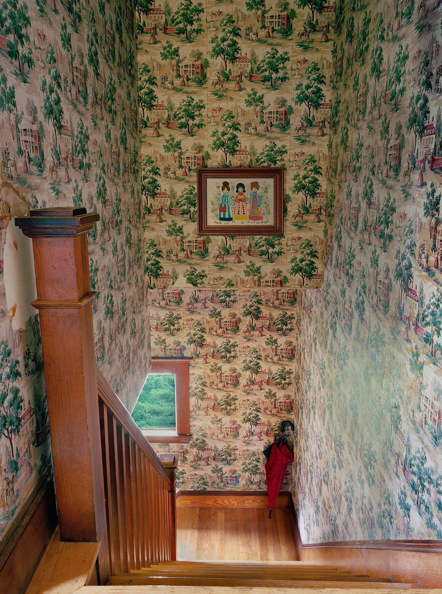
The Art of the Personal Project is a crucial element to let potential buyers see how you think creatively on your own. I am drawn to personal projects that have an interesting vision or that show something I have never seen before. In this thread, I’ll include a link to each personal project with the artist statement so you can see more of the project. Please note: This thread is not affiliated with any company; I’m just featuring projects that I find. Please DO NOT send me your work. I do not take submissions.
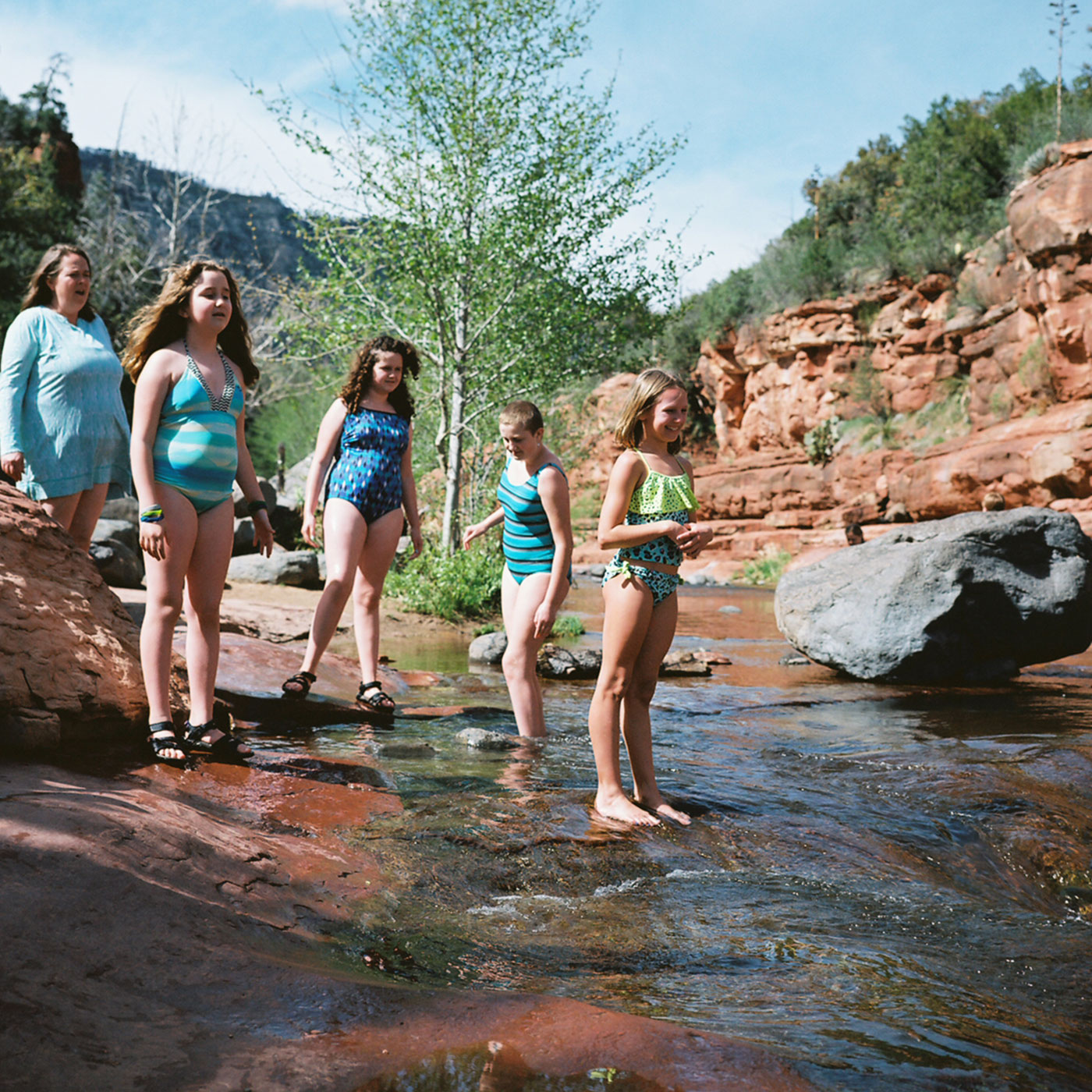
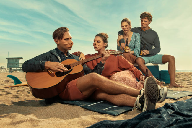
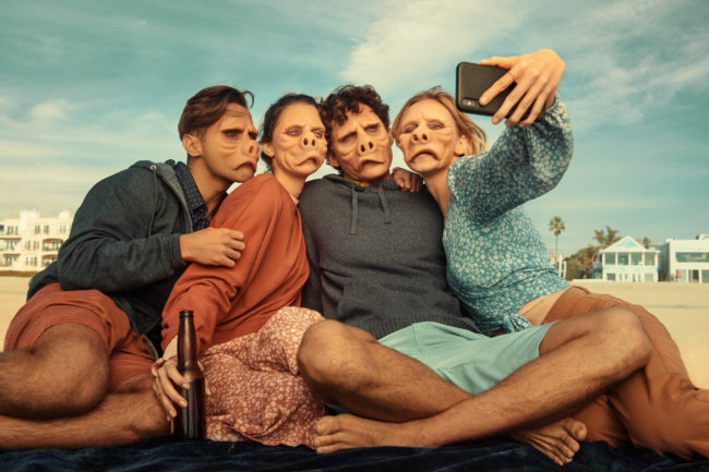
After waking up and piecing the previous evening together, this quartet of lifelong friends enjoys a fun filled winter day at the beach. Unaware the world around them has changed. Unaware their appearances will no longer be considered normal. For who’s perception of beauty is in the eye of the beholder or is it in the eye of society in a place we call, The Twilight Zone. ~ Based on the “Eye of the beholder” – season 2 episode 6. Released 11.11.1960 ~ Thank you to Oscar winner, Kevin Haney for the SFX Make up
APE contributor Suzanne Sease currently works as a consultant for photographers and illustrators around the world. She has been involved in the photography and illustration industry since the mid 80s. After establishing the art buying department at The Martin Agency, then working for Kaplan-Thaler, Capital One, Best Buy and numerous smaller agencies and companies, she decided to be a consultant in 1999. She has a new Twitter feed with helpful marketing information because she believes that marketing should be driven by brand and not by specialty. Follow her at @SuzanneSease. Instagram
Success is more than a matter of your talent. It’s also a matter of doing a better job presenting it. And that is what I do with decades of agency and in-house experience.
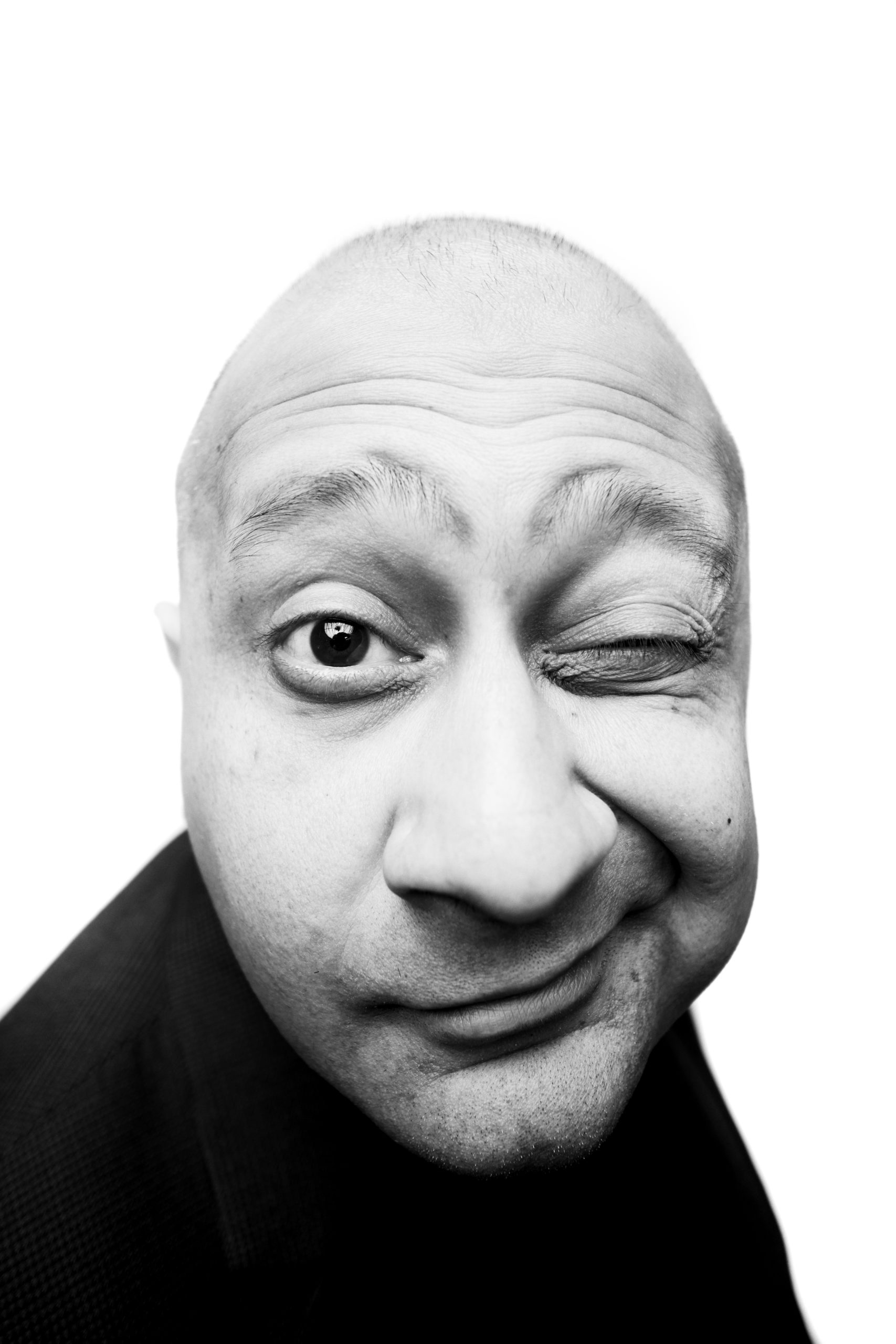
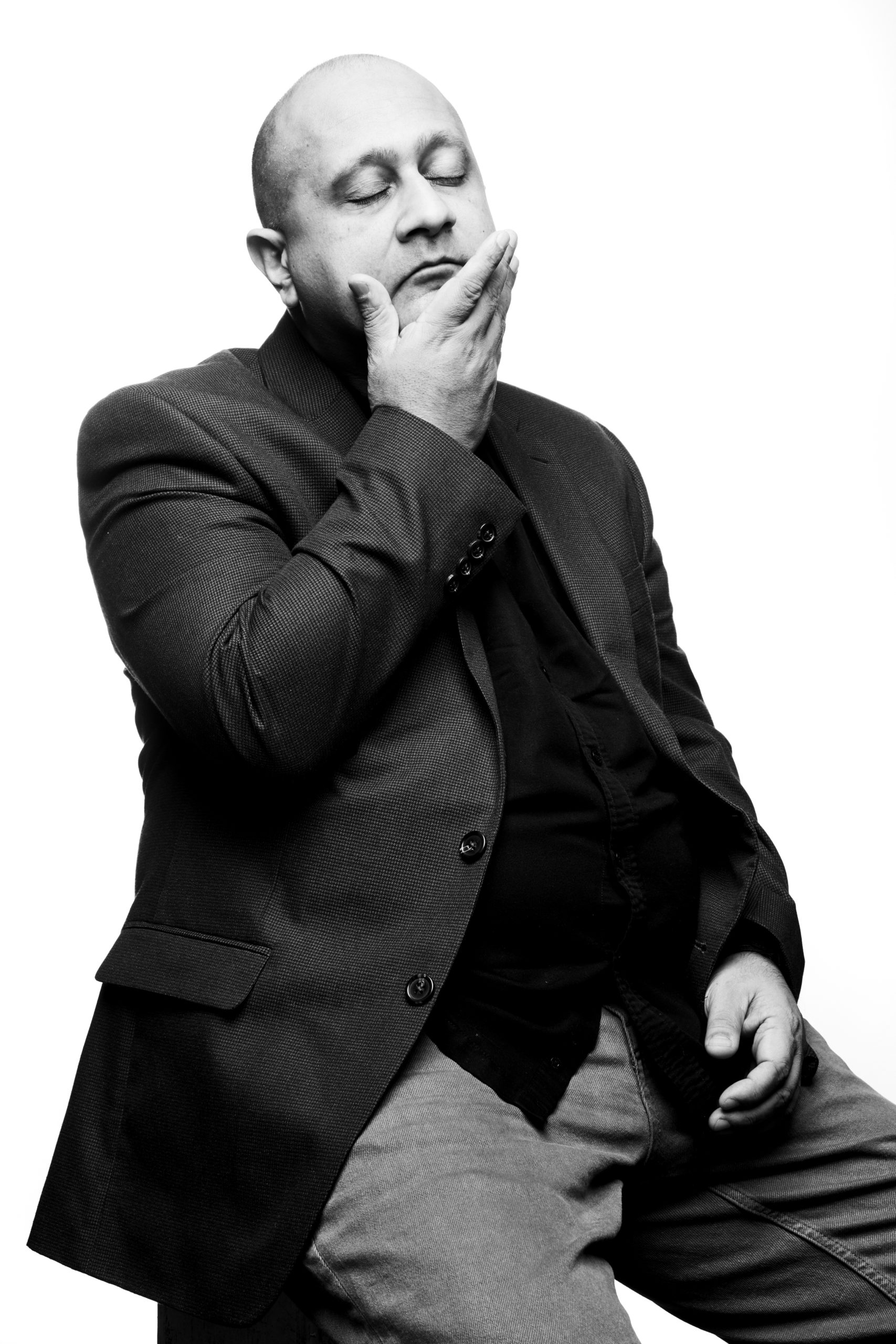
Art Director: Jennifer Moody
Photographer:Ian Curcio
Heidi: What is the Rotary?
Ian: Rotary is a global network of 1.2 million neighbors, friends, leaders, and problem-solvers who see a world where people unite and take action to create lasting change – across the globe, in our communities, and in ourselves. They have a magazine call The Rotarian
Who assigns this work to you?
I’ve been working with Rotarian Magazine art director Jennifer Moody on these assignments. I just finished another one photographing Sarah Parcak, the Space Archeologist, for the March issue.
Who was the subject and what was the event?
Kiran, a Type A British-born Sikh, is president of the International Storytelling Center in Jonesborough, TN. ISC is a nonprofit that has hosted its annual National Storytelling Festival for more than 35 years. With a population of 6000, the oldest town in Tennessee, now known as the Storytelling Capital of the World, brings in visitors from all over the world every year, doubling the population during the festival.
What direction did the magazine provide?
The creative direction was very specific; Jennifer wanted to make sure Kiran wore the same outfit and that we captured him with a variety of different expressions against white. With that direction, I started to explore Kiran’s personality.
Did you have to direct Kiran?
Kiran was a ball of energy from the very start. He was excited about the shoot and fully engaged. It didn’t take long to realize that I was interacting with was the same Kiran everyone interacts with. His personality doesn’t change based on his environment or the company he’s mixing with. He is unapologetically himself.
Where was this shot?
The shoot took place at The Storytelling Center Theatre. Afterward, we went across the street for lunch. Not much conversation there, though. Kiran knows everyone, and everyone wants a minute of his time. It seems to me that the juxtaposition between the Type A individual and the Type B town is a perfect balance for Kiran.
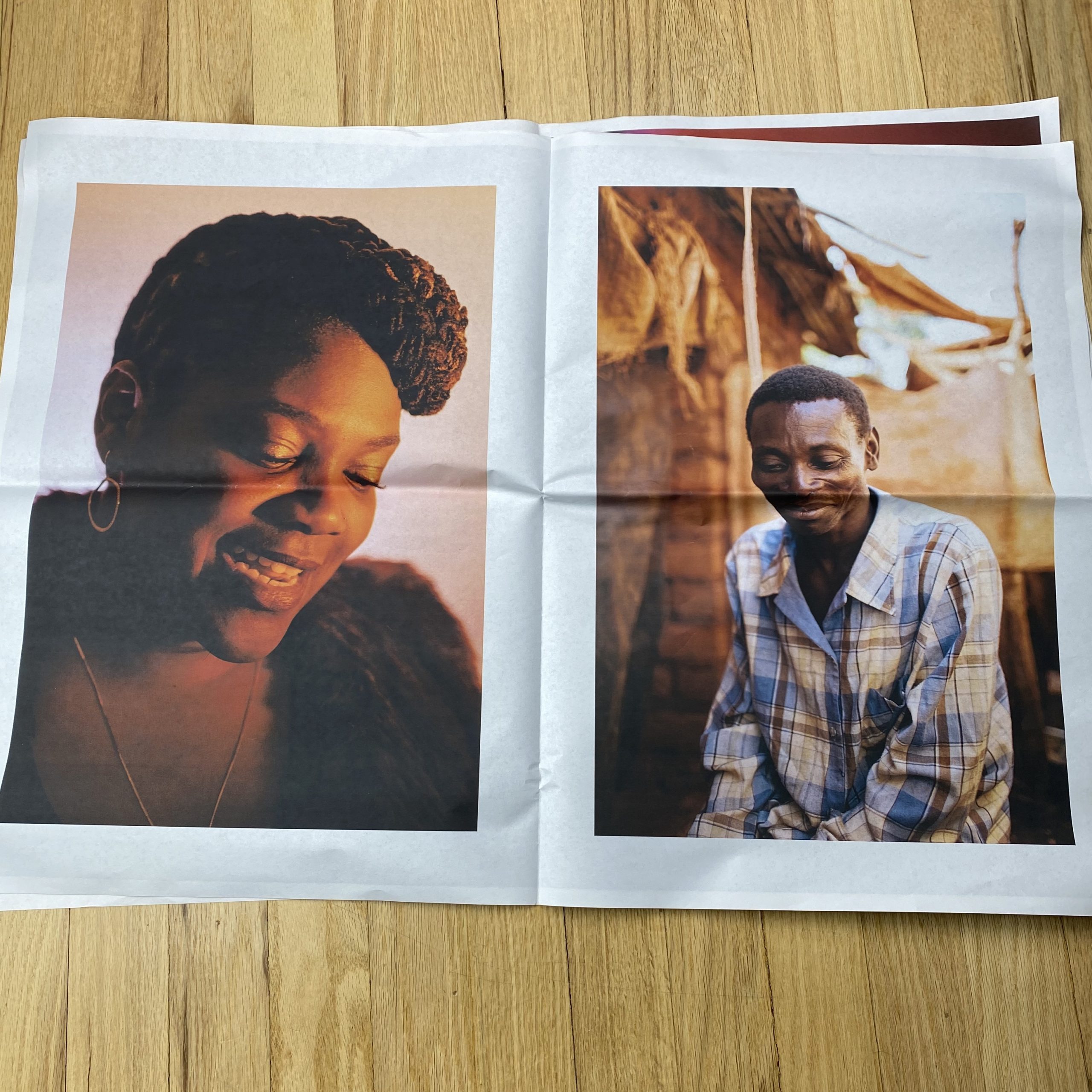
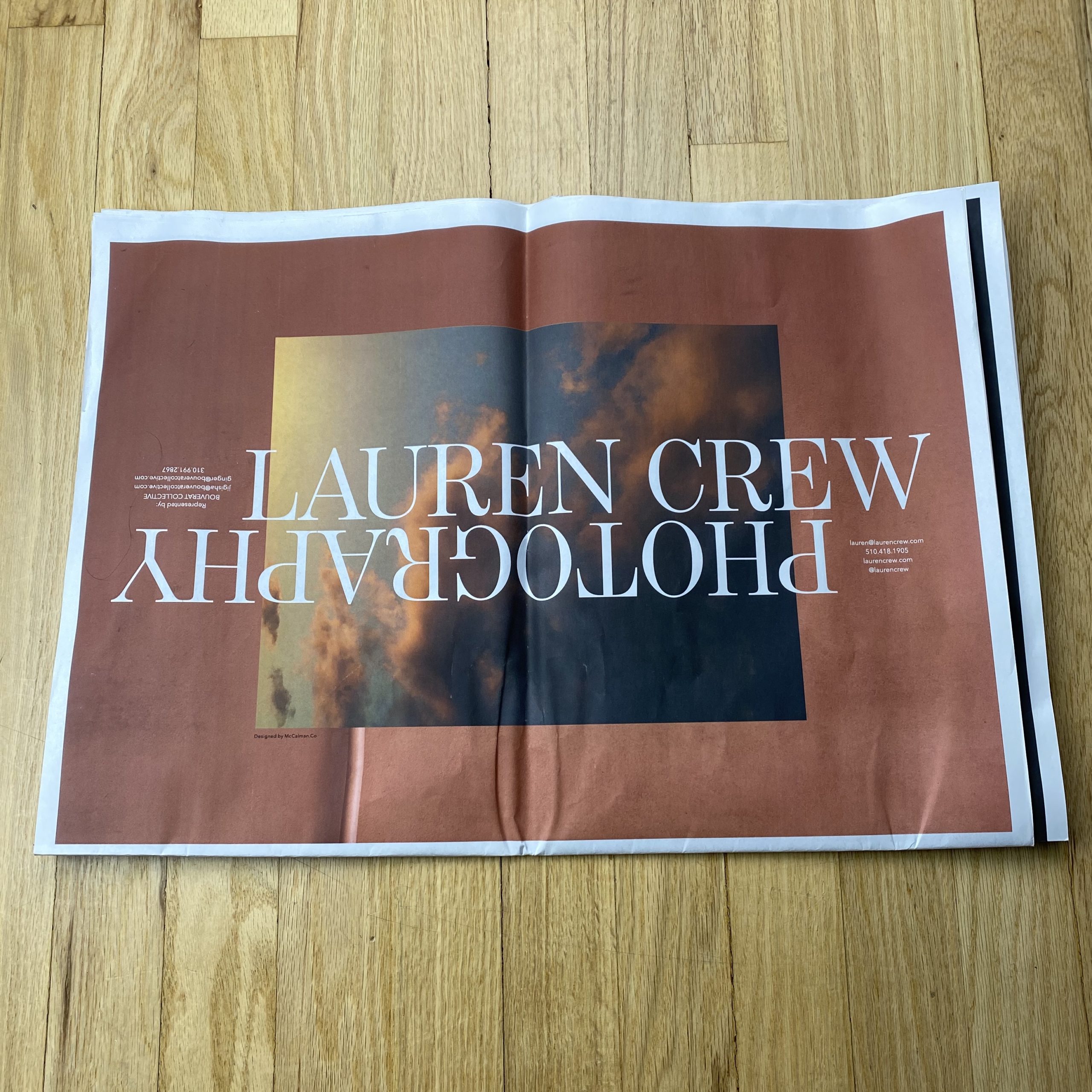
Who printed it? Newspaper Club – they are a specialty (and award winning) newspaper printer based out of the UK. They’ve been around for over 10 years and their small team of 12 are all art school graduates with expertise in print and publication design. Their goal in creating Newspaper Club was to make newspaper printing accessible for smaller businesses and artists.
Tell me about the images?
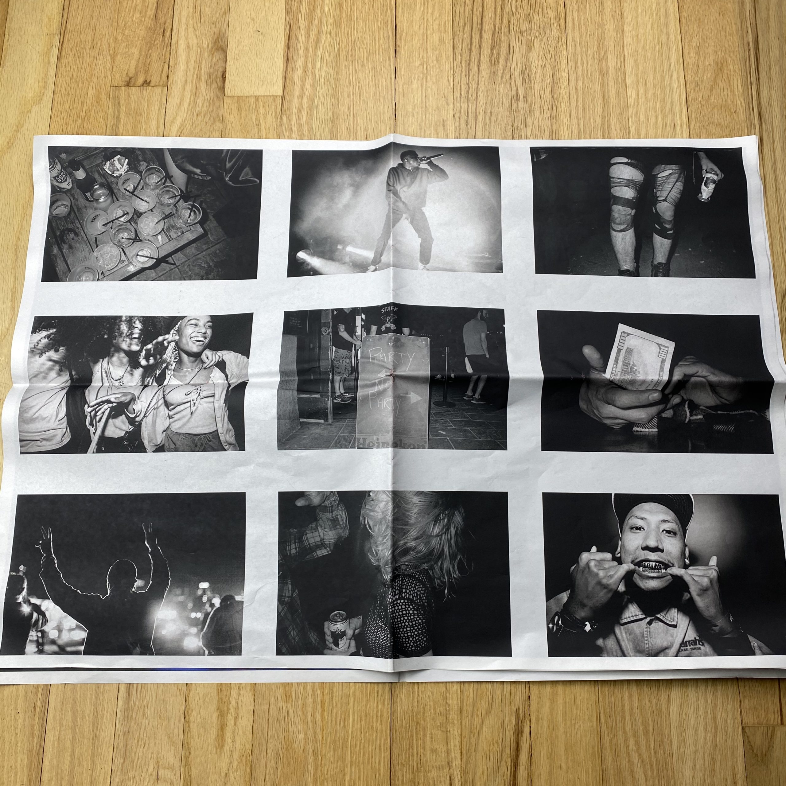
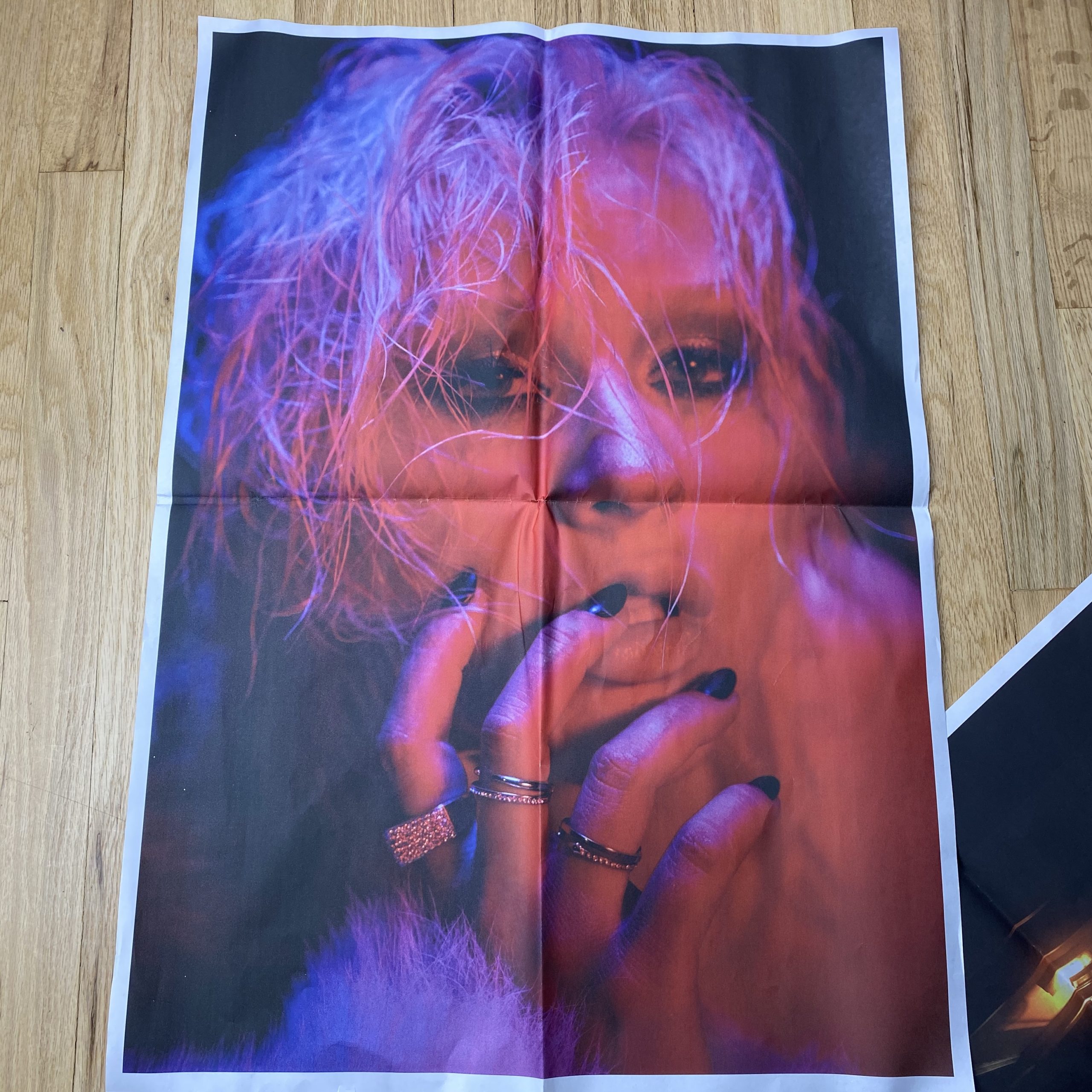
George McCalman: “The philosophy behind the image selection and design was defined before the process started. I wanted to show Lauren a different perspective on her own work. I wanted her to see that aspirational part of her work was there in plain sight. Lauren placed a whole lot of faith in our studio. She said basically: “just do it”. The image selection process was based on selecting avatars, aspects of her cinematic and street-level photography, honest moments that looked like movie stills”
Lauren Crew: This was my first time working with someone other than myself on a promo so letting go of any control of the image selection and sequencing was equal parts terrifying and invigorating. The temptation was to freak out and dispute his selects but it was important for me to be mindful of myself in the process; where do I get in my own way? I took notes where I was holding on, what work I was attached to and why and that helped me let go and trust deeper in the process. My aim was to detach from my work in a way that would allow me to see the images through the edit of someone else’s gaze; someone who has been familiar with work my over the span of 10 or so years more or less. It has been important in my process to learn and do as much as I could with what I had, but at a certain point – you have to outsource your weaknesses so I was really excited to let George do his thing.
How many did you make?
I printed 100. I wanted to be more intentional with who was going to be receiving the promo – people who I have built relationships with as well as people with who I am looking to collaborate with in the near future rather than a huge distribution to a bunch of strangers.
How many times a year do you send out promos?
I am committed to my craft and my personal growth as an artist, therefore, it is important to send promo at least once a year to display that progression. People may not have a project for you at that exact moment that you mail your promo – but when you send aligned work annually, you are educating them on the maturation and evolution of your own visual voice and those are the creative seeds I like to plant in the relationships that I build.
A lil somethin’ somethin’ to remember me by ;)
Do you think printed promos are effective for marketing your work?
Absolutely. Early on in my career, I used to be a photo editor. The promos that stood out to me were printed well and had strong curation even if it was just a simple postcard. However, if you sent me a promo on flimsy paper with shitty inks, that showed me you that you didn’t care that much, so why would I care to hire you? I took that note from that experience and applied it to anything I was making for any sort of distribution, even when the budget was slim to none. If you let it, promo can be an extension of yourself. During my first portfolio review ever, there was a man who flipped through the pages of my book with a quickness and told me I was “not ready”. After that awkward encounter, my ego threw him a handmade zine I made the night before as I walked off. (I had been saving the zine for someone worthy of receiving it so I was reluctant to give it to him but clearly, I had something to prove.) He called me back over and said, “what is this? THIS is you. THIS is interesting. You should have just shown me this”. Ever since then, I have always made sure to make promo that excites me before anyone else. Fast forward to being on a panel in 2018 about inclusivity within the industry – I did my research in advance of who would be alongside me on that panel and learned about a woman named Jigisha Bouverat of Bouverat Collective. I saw that she was an artist rep (something I had long given up on) yet still brought a leave behind promo to plant a seed. After the panel, I handed it to her and introduced myself. A year later, we signed and she is now my rep. So yeah, making printed promos has been very effective within my experience.
If all goes well, as you read this, I’ll be on my way to Amsterdam to supervise printing of my first book.
I’m a ball of nerves, if I’m being honest, but the upside is, I’ll have lots of new things to write about for you.
Between the global panic over the corona virus outbreak, and the fact that I’m flying into a bomb cyclone hurricane, (Storm Dennis,) I think you’ll allow me a rare quickie.
To balance the brevity, though, we’re going heavy.
Here’s the rub.
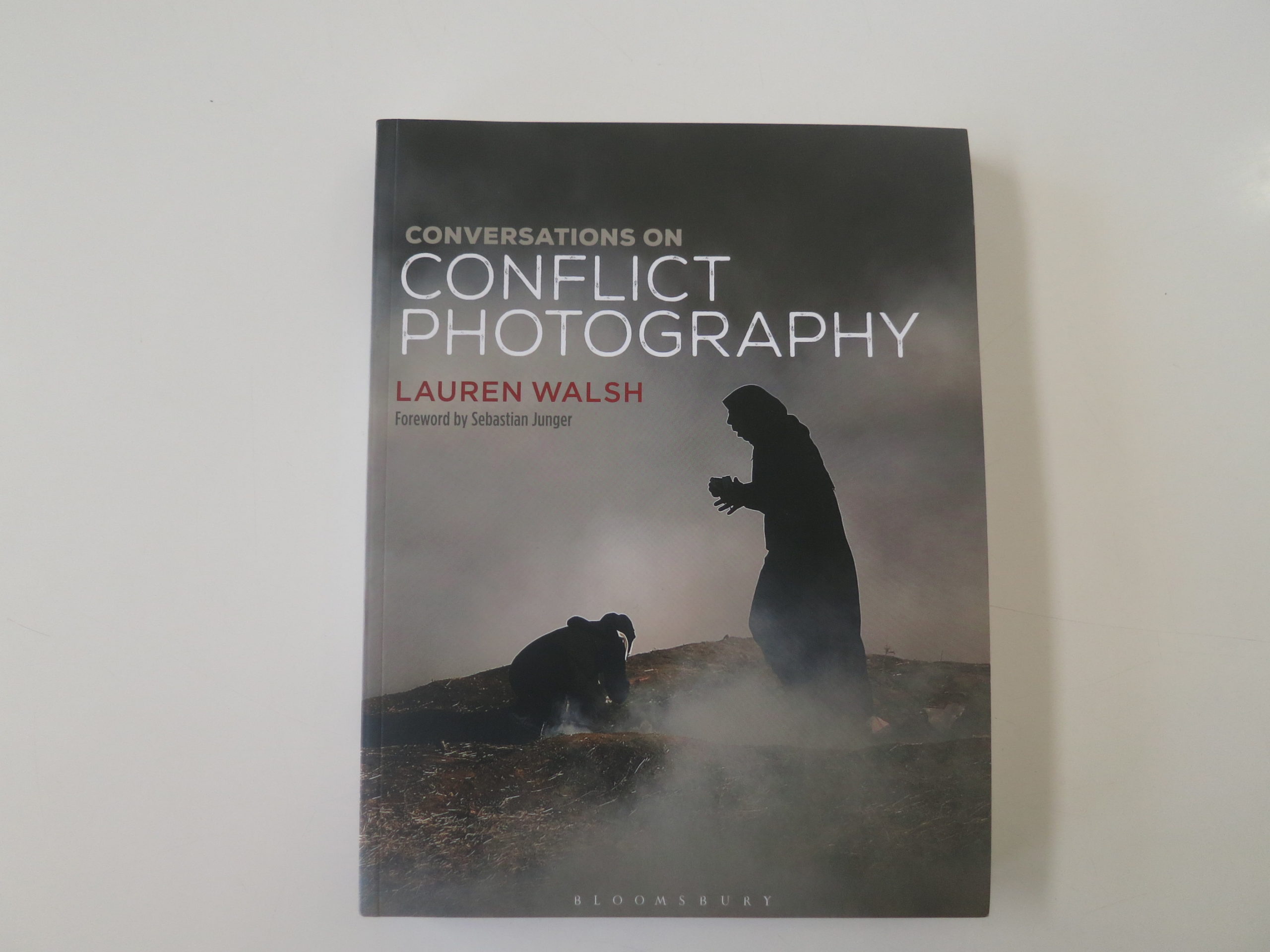
In the middle of #2019, well before I began doing book reviews again, NYU Professor Lauren Walsh, whom I’d interviewed for a story before, reached out to see if I’d be interested in seeing her upcoming book about conflict photography.
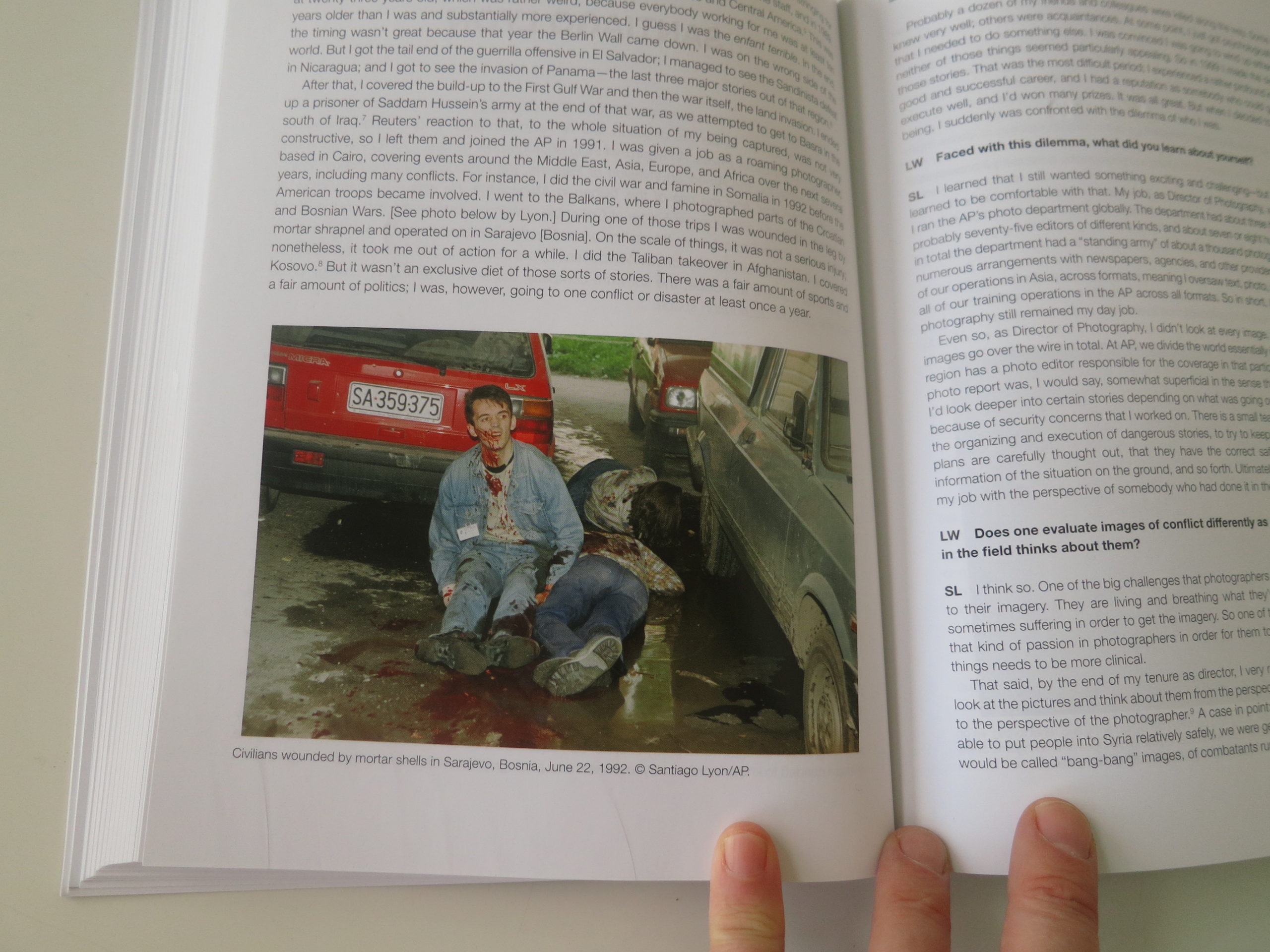
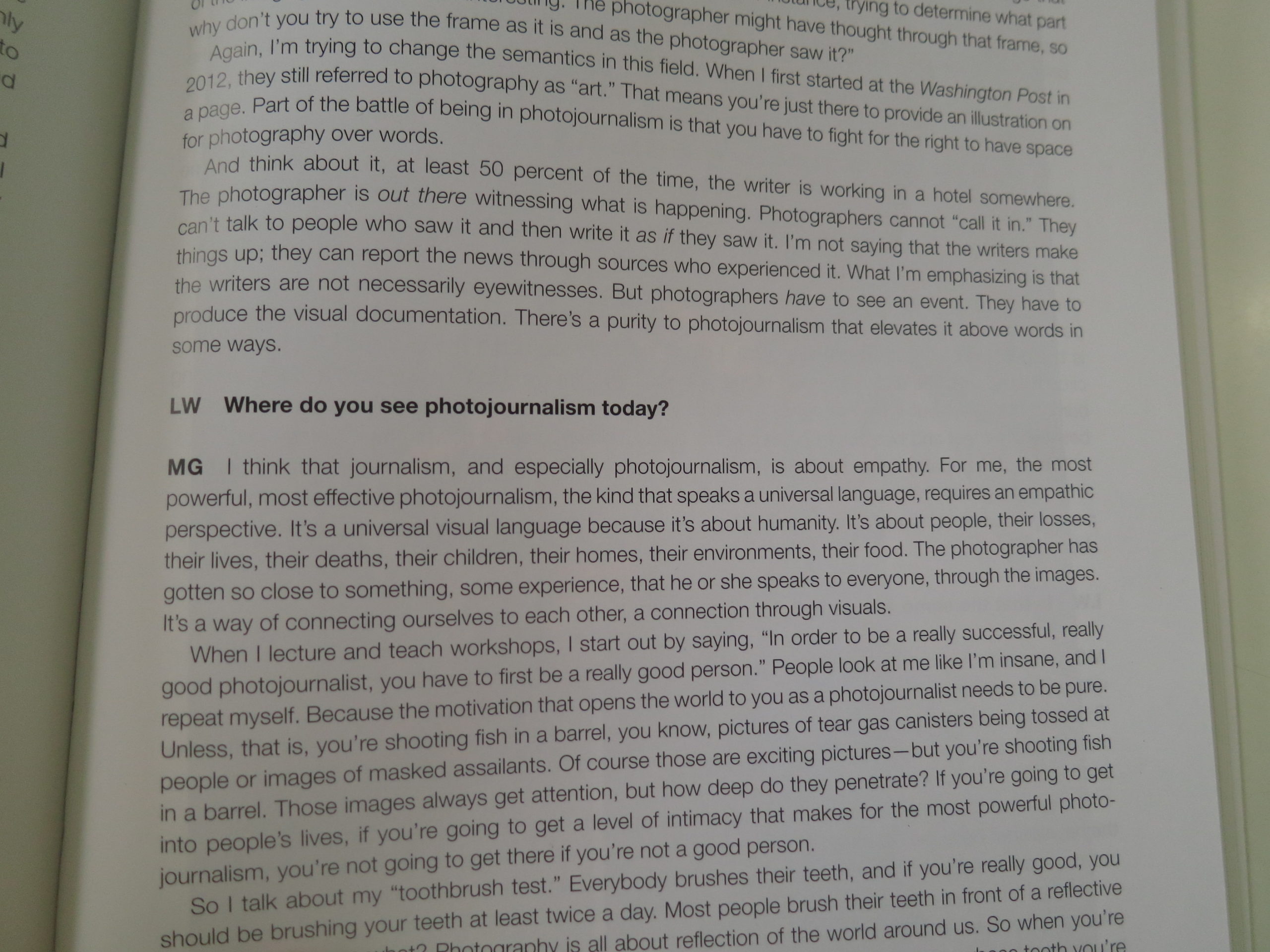
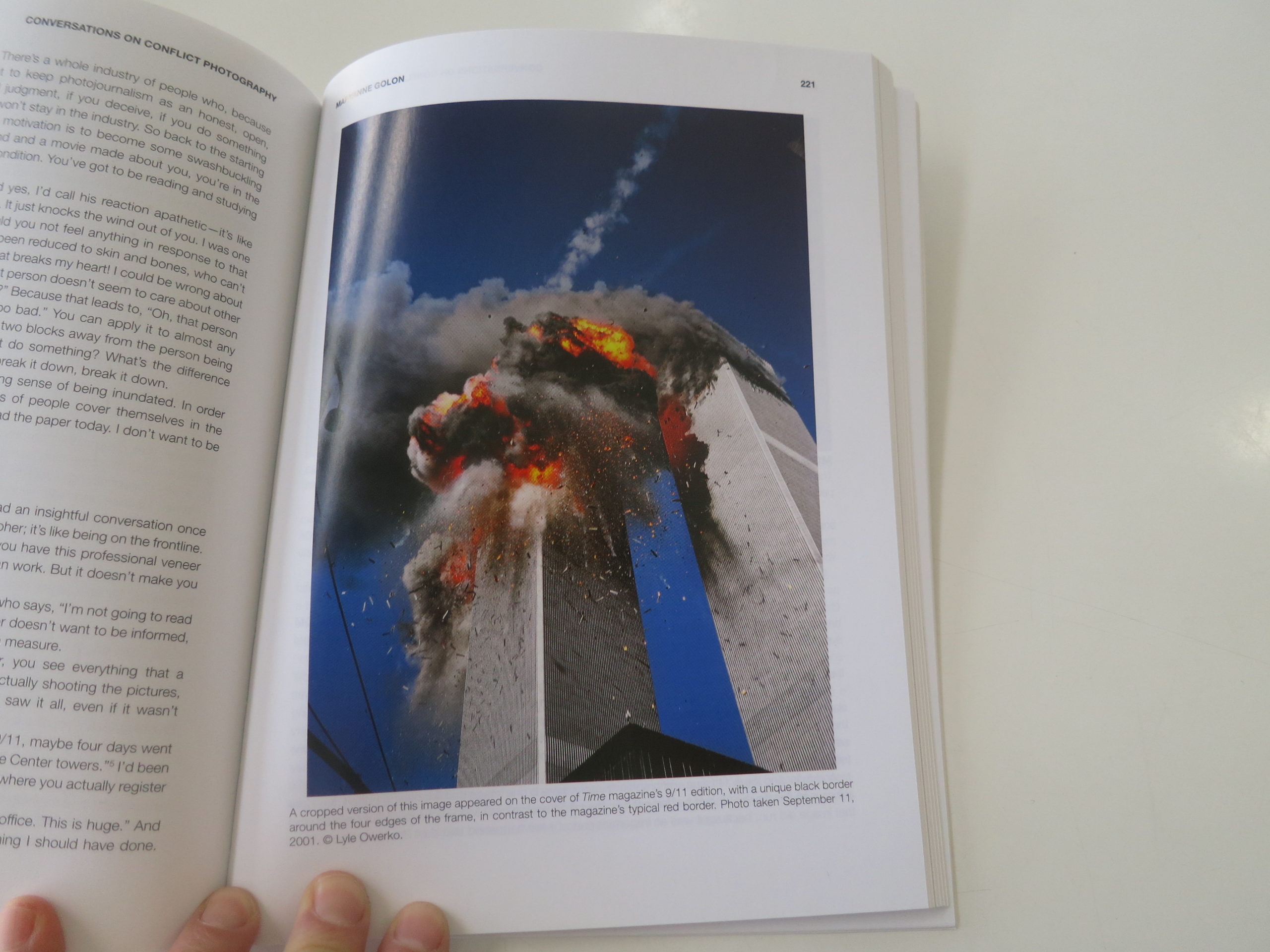
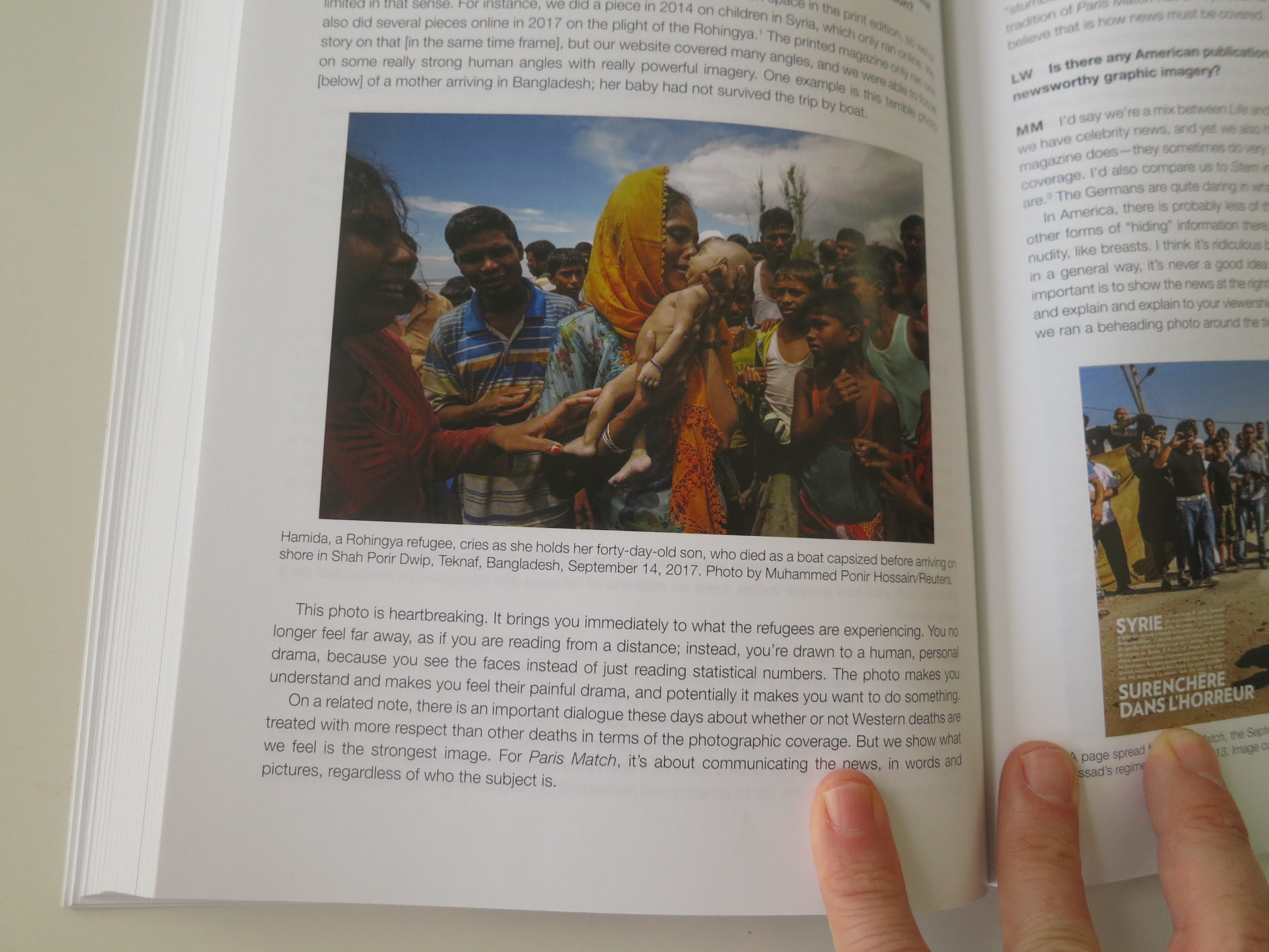
She long-form interviewed a host of the top names in photojournalism, including photographers like Nina Berman, Ben Lowy, Susan Meiselas and Shahidul Alam, and editors like Santiago Lyon and MaryAnne Golon.
(Top, top people.)
I told her I wasn’t reviewing books for a few months yet, and had almost never reviewed text-dominant books before, outside of a few rare exceptions.
Undaunted, Ms. Walsh sent the book, content to wait six months for a review, and then she followed up several times thereafter.
Finally, I took a look and tried to read it, but it didn’t grab me in the “right” way. I kept getting bogged down, perhaps because I’d interviewed several of the people before, and did these types of interviews myself, here, for years.
And the pictures are so hard to look at, this being a book about conflict journalism.
It was easier not to engage.
(And isn’t that just a metaphor for all of it.)
I wrote to Professor Walsh to apologize, and say, “Sorry, this one’s not for me.”
In reply she asked me to reconsider.
“Perhaps,” I said, “I’ve done it before,” and here we are.
“Conversations on Conflict Photography” by Lauren Walsh, was published last year by Bloomsbury. And when I took another look at it yesterday, I realized it was something worth showing you.
It’s just not what I first expected it to be.
You don’t have to read it cover to cover in one sitting.
It’s not meant for that.
Rather, I began to think of this book as a resource, to be sought out for knowledge for anyone learning the craft; a guidebook into a vital segment of the photo industry.
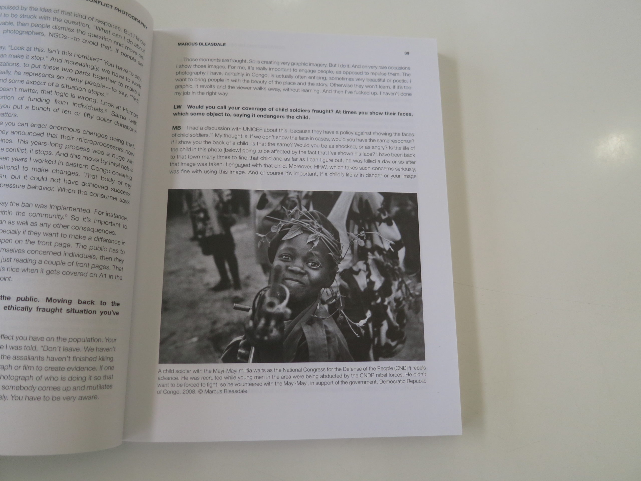
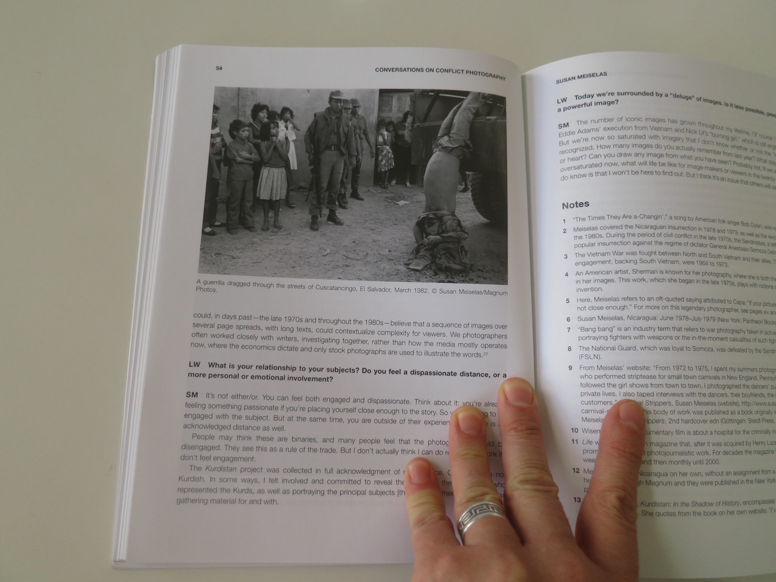
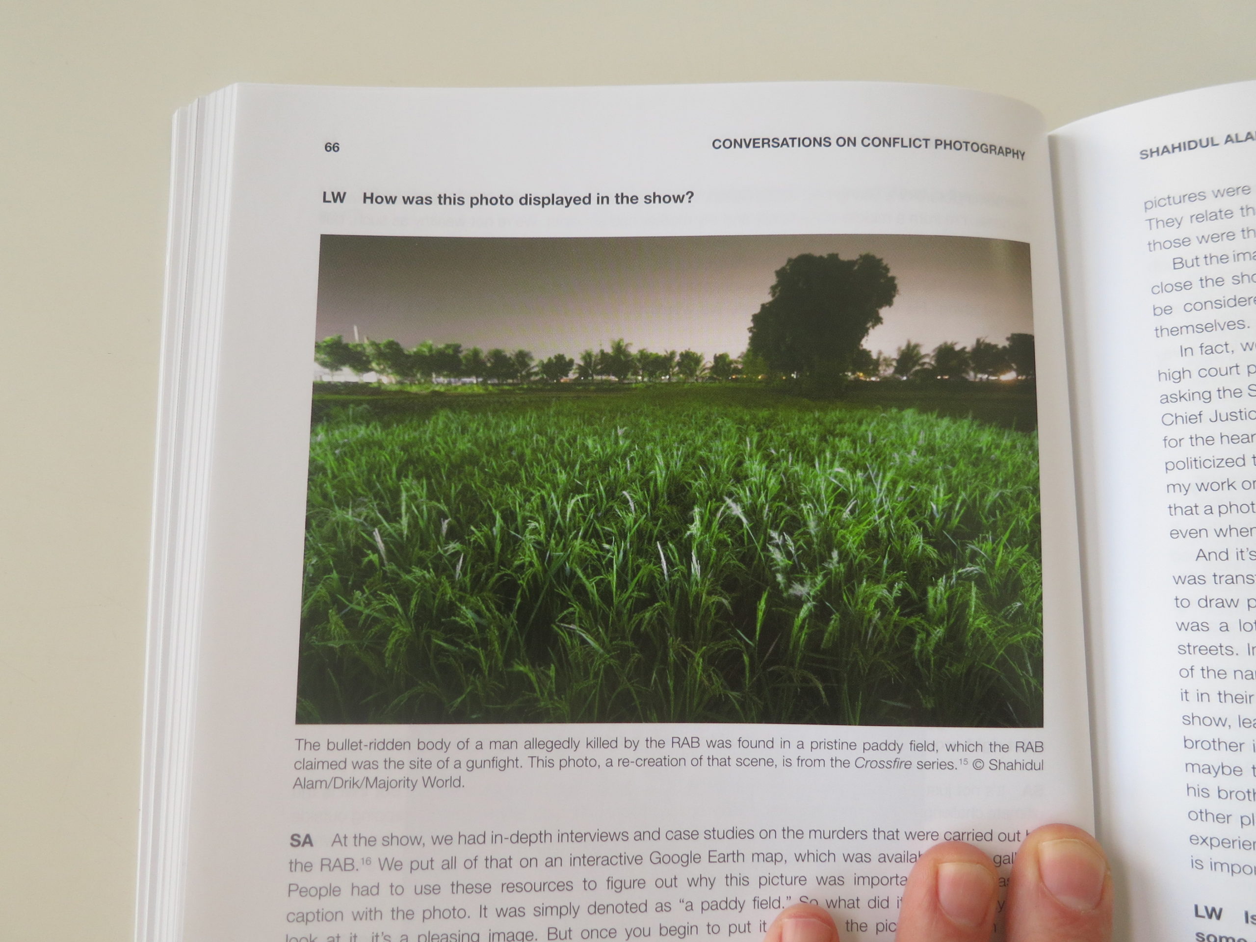
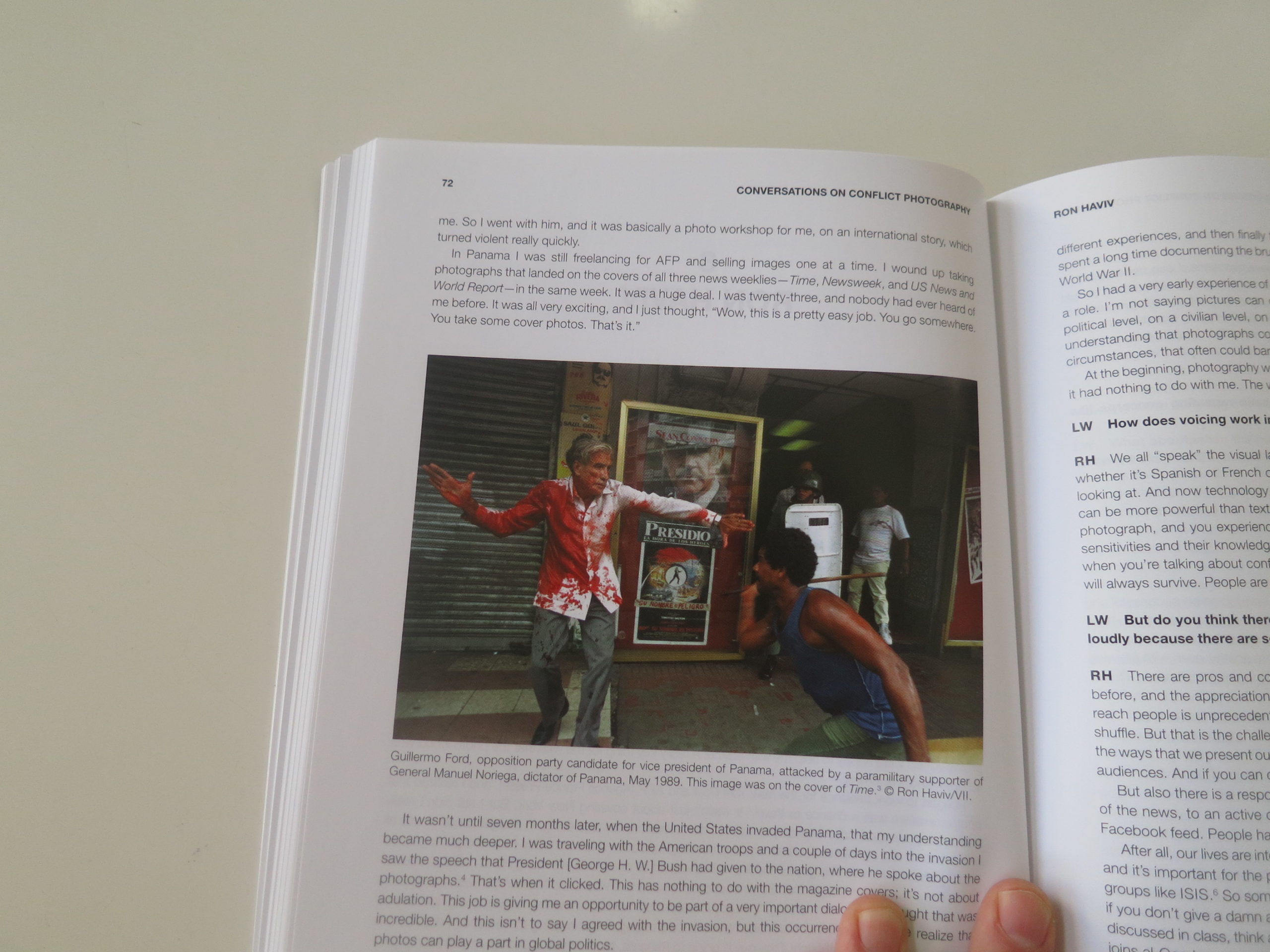
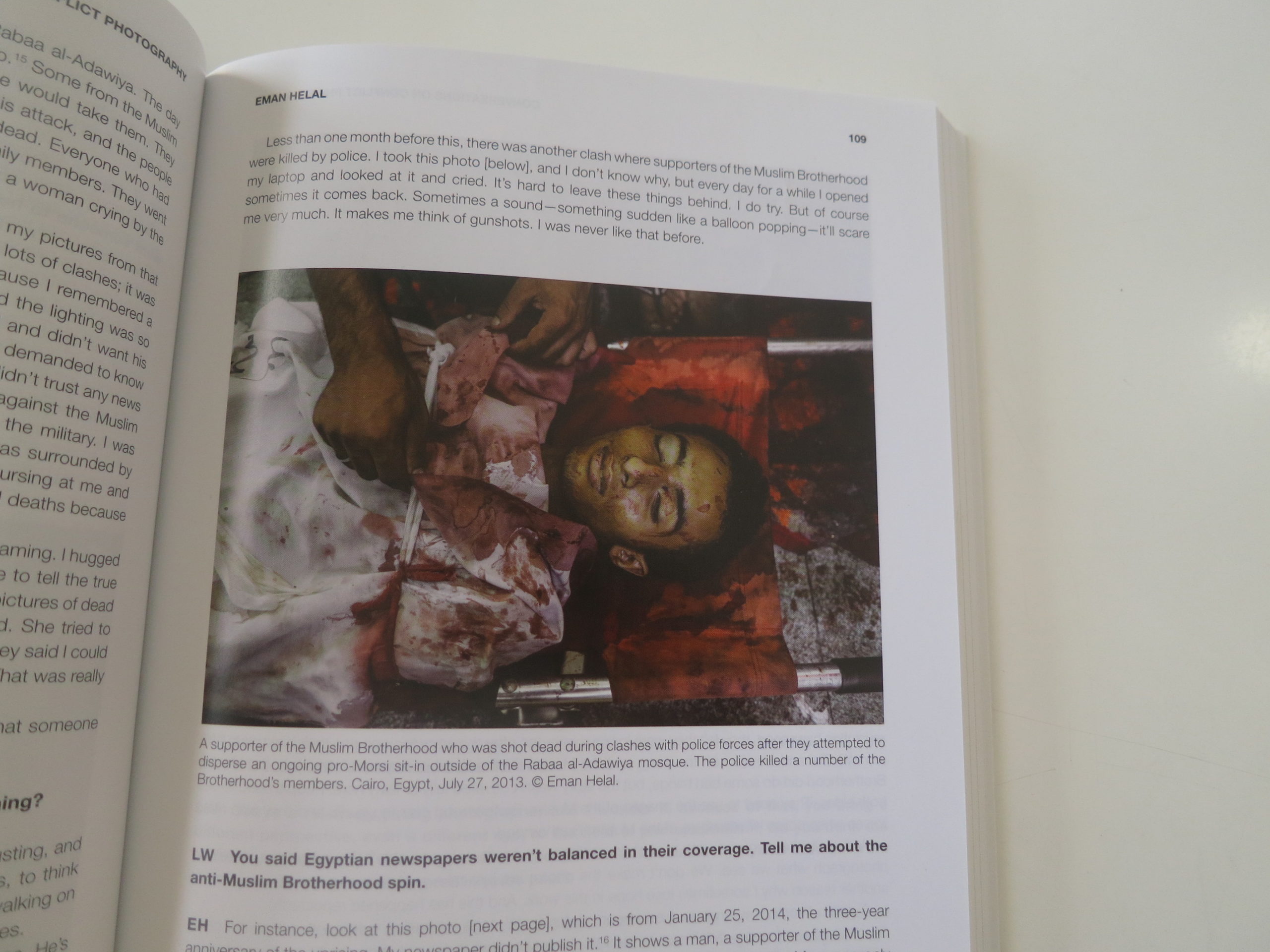
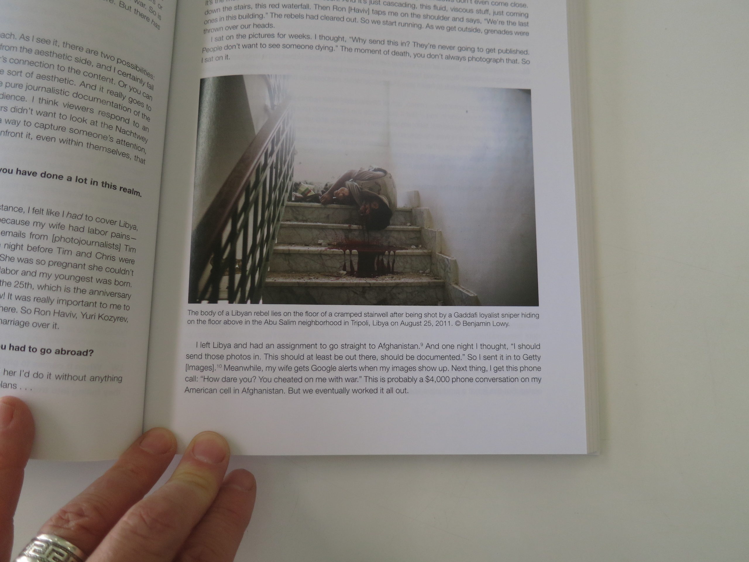
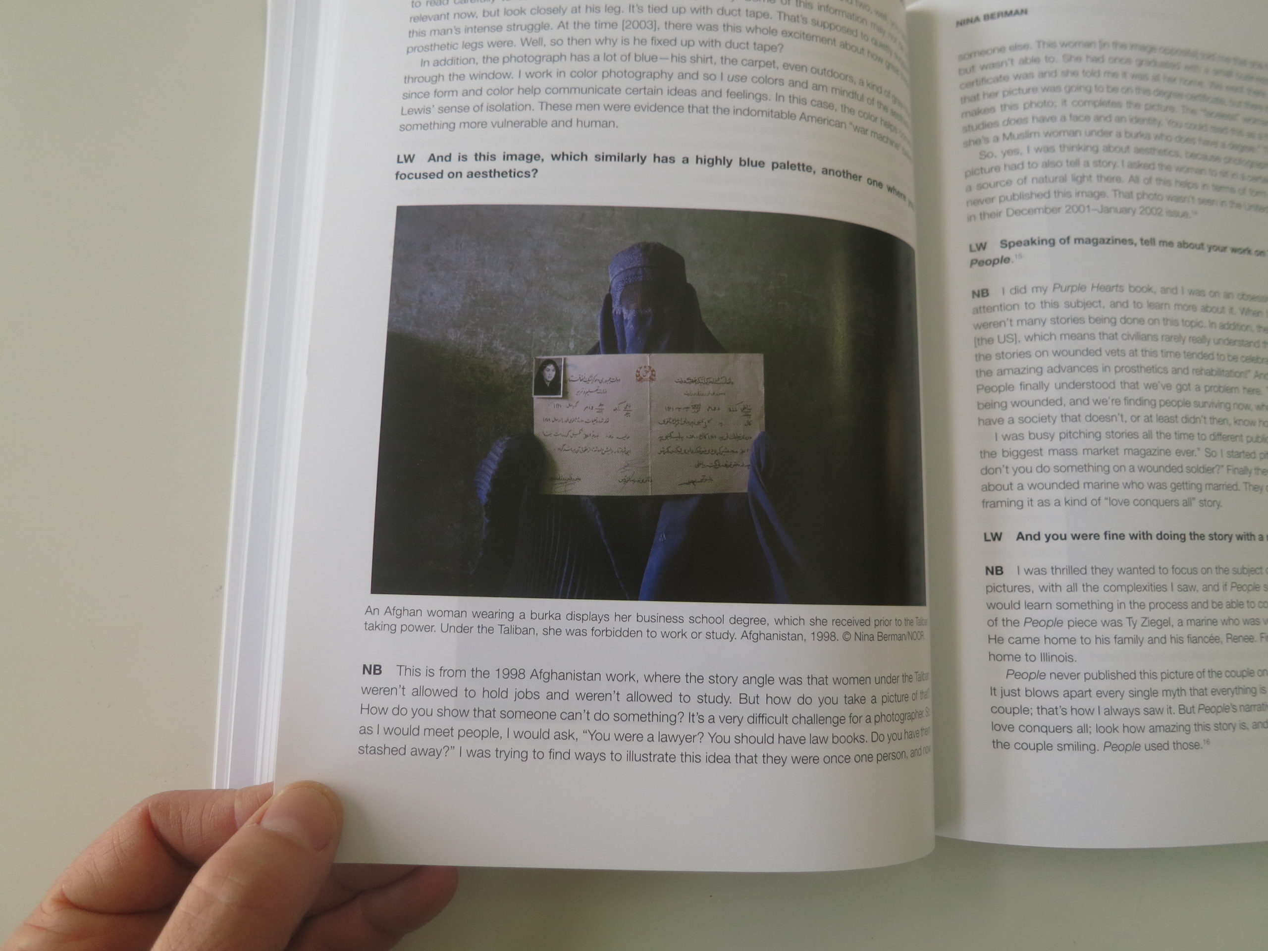
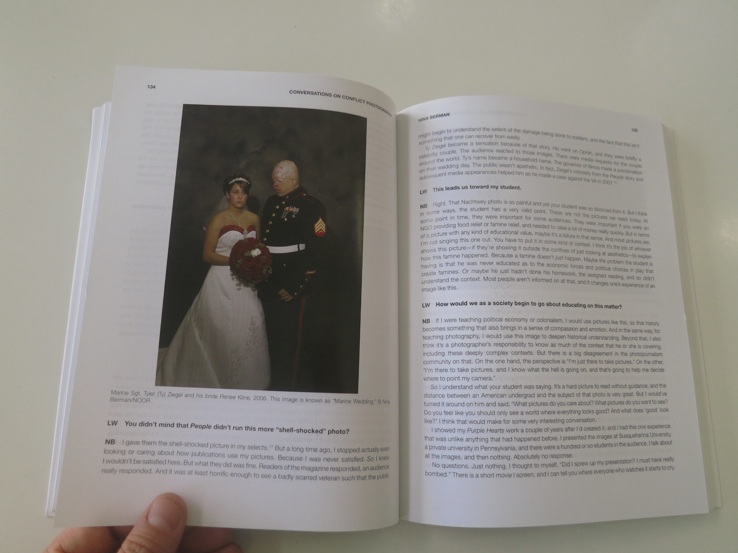
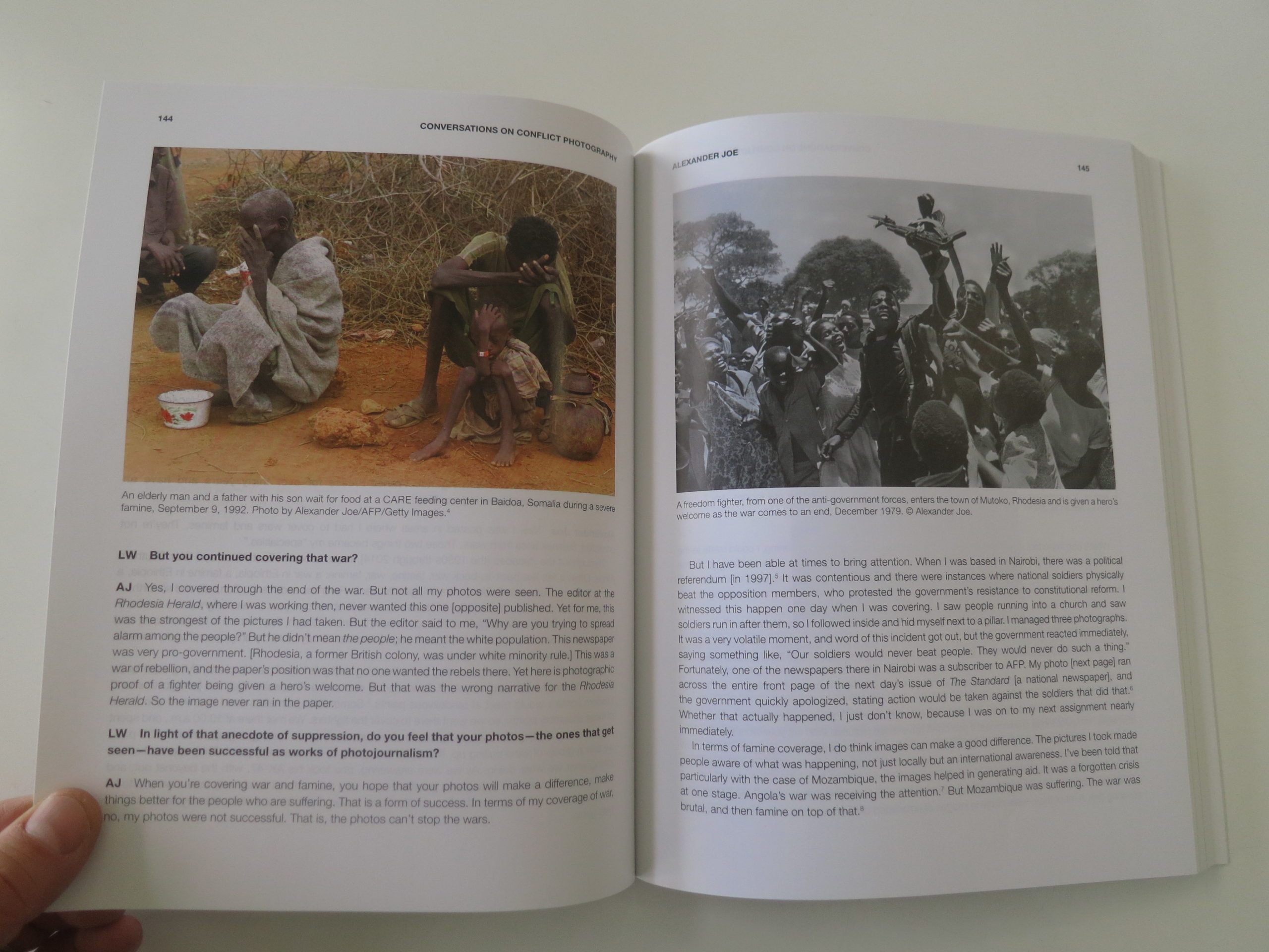
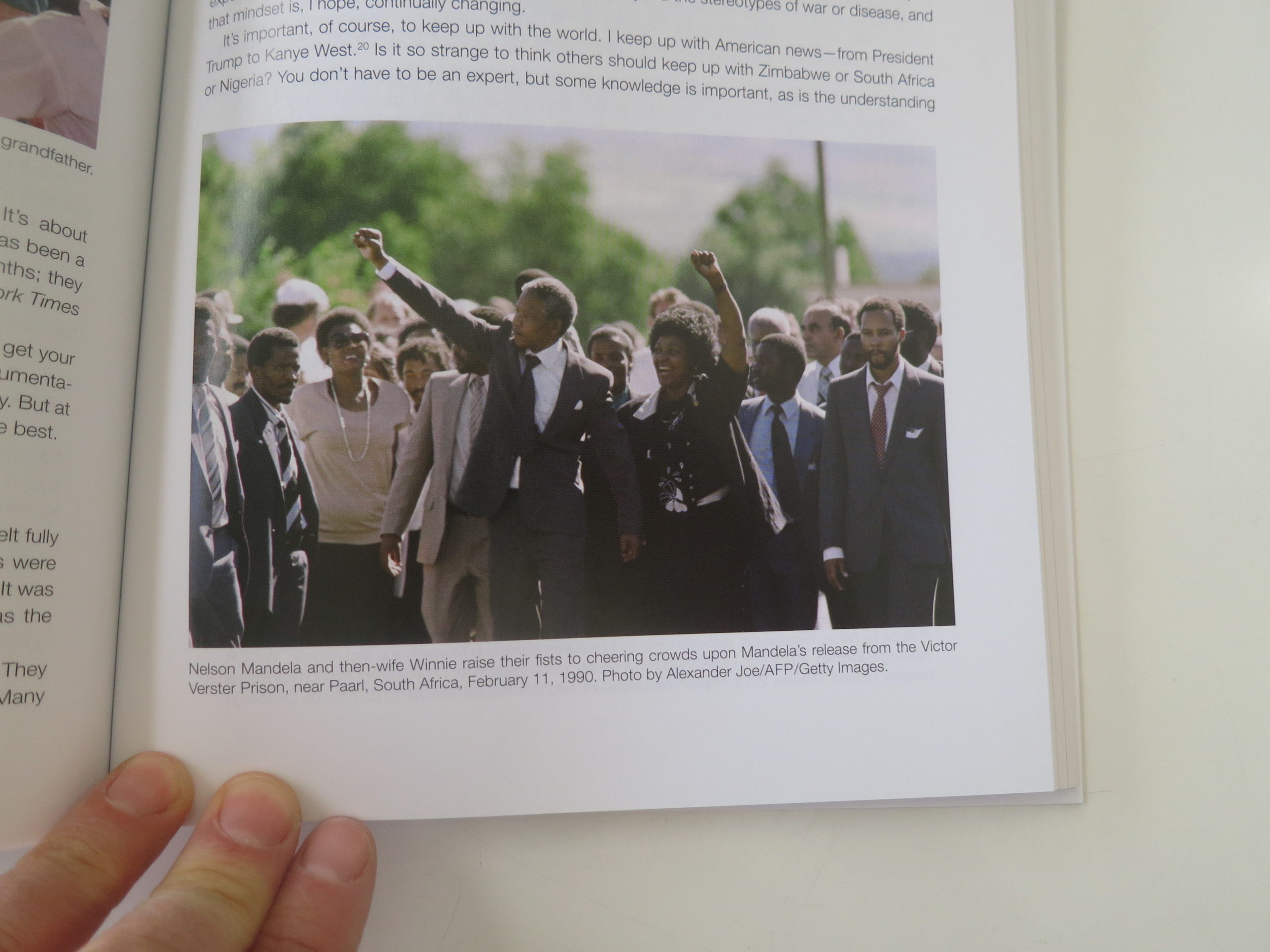
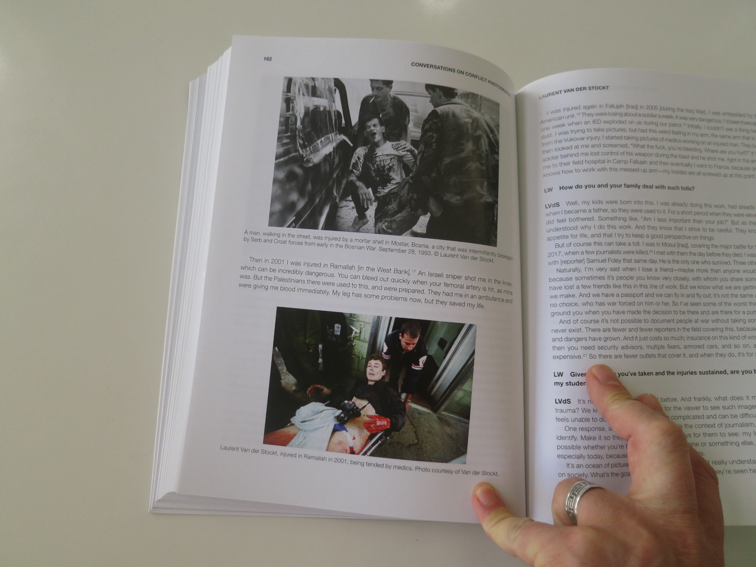
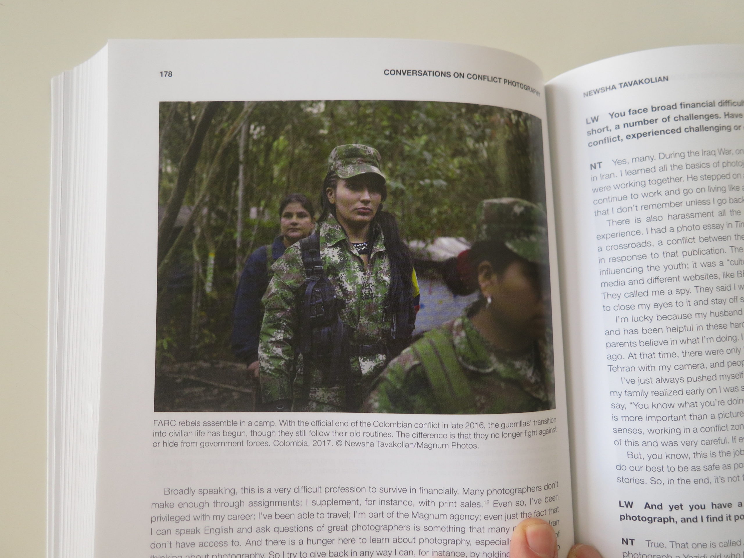
It’s crammed full of famous pictures, like Eddie Adams shot from Vietnam, the burning Twin Towers from Time Magazine, or Nina Berman’s Marine Wedding photo. (Which we showed here in 2011.)
I just needed to realize that because I’d read and written about these things before, that didn’t meant it wasn’t newsworthy or beneficial for many of you now, in 2020.
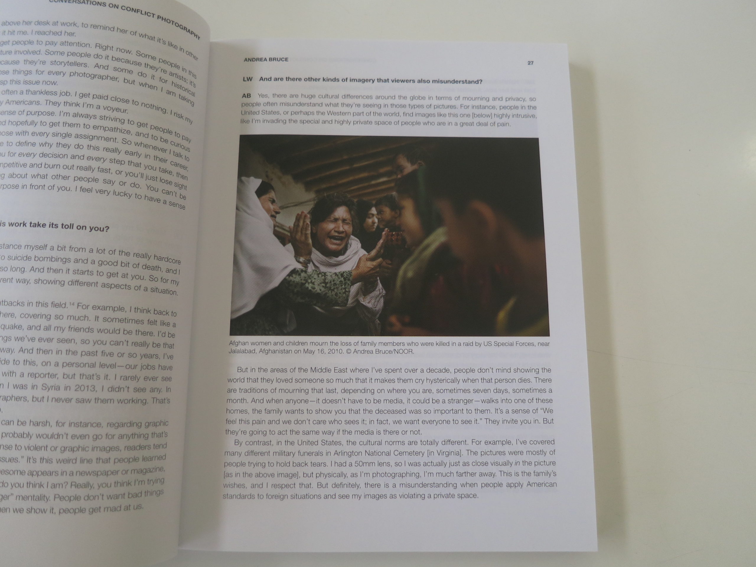
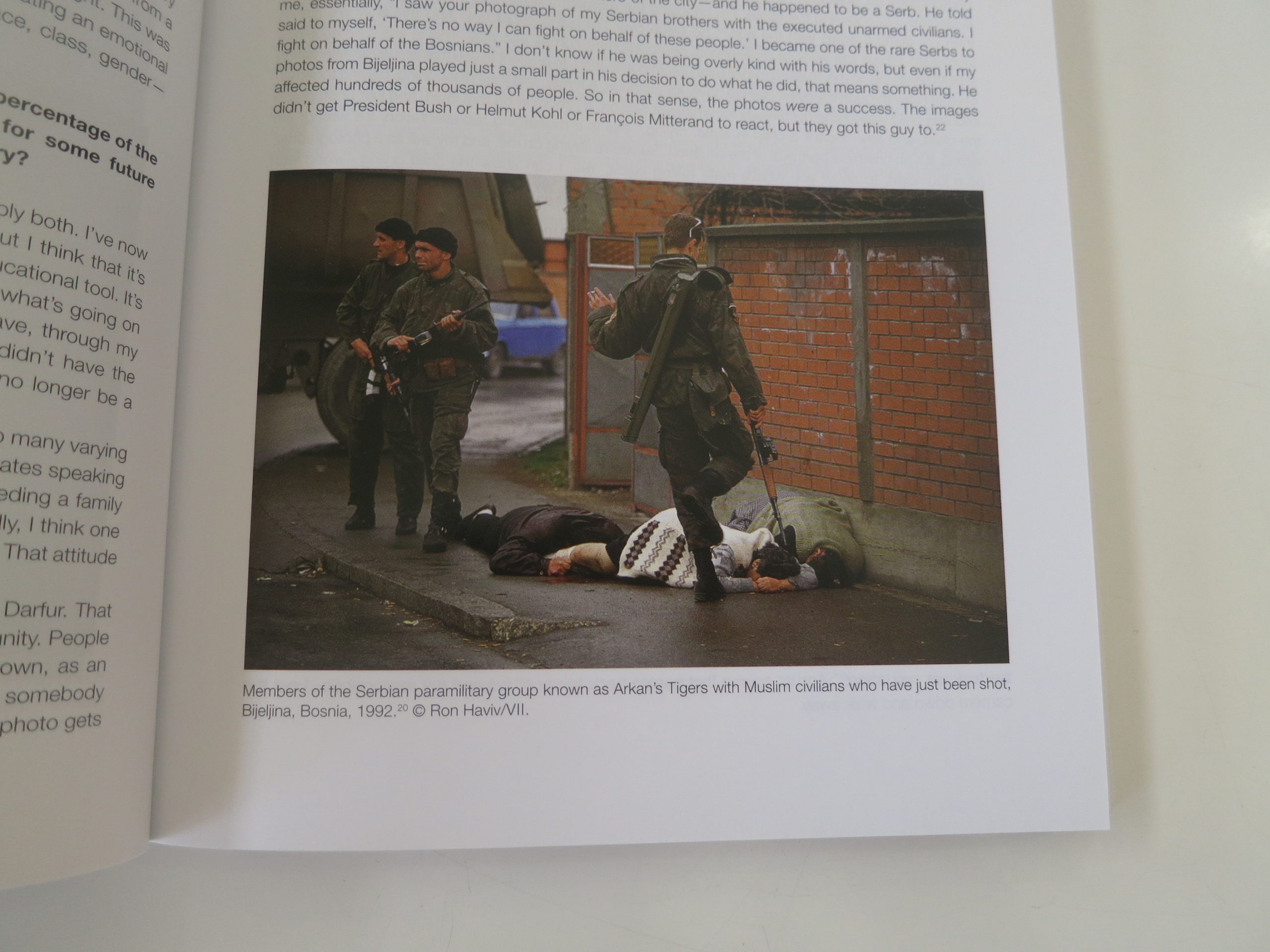
Given the subject matter, there will be a lot of photos of violence below. (Or its remnants.)
Be forewarned.
But just as I can reconsider whether a book is worthy of review, I can also wrap up quickly, and let the photos do the talking.
I think we all believe this kind of photography has a social value, bearing witness to suffering, for posterity.
But it also allows us to understand geo-politics on a local, human level.
Kudos for the job well done.
Bottom Line: Fascinating, dense resource book on conflict photography
If you’d like to submit a book for potential review, please email me directly at jonathanblaustein@gmail.com. We are interested in presenting books from as wide a range of perspectives as possible.
The Art of the Personal Project is a crucial element to let potential buyers see how you think creatively on your own. I am drawn to personal projects that have an interesting vision or that show something I have never seen before. In this thread, I’ll include a link to each personal project with the artist statement so you can see more of the project. Please note: This thread is not affiliated with any company; I’m just featuring projects that I find. Please DO NOT send me your work. I do not take submissions.
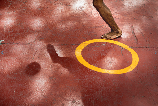
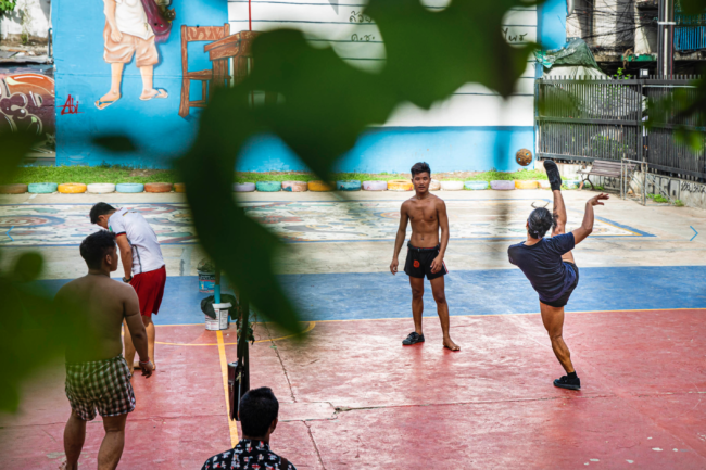
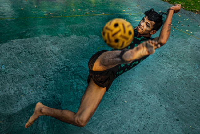
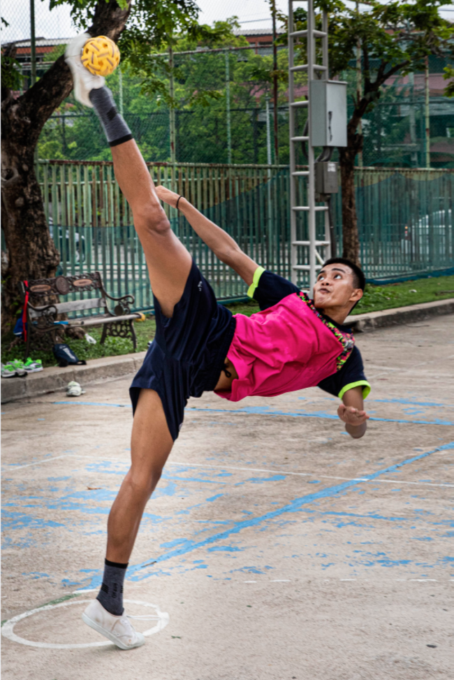
There’s a scene painted on a wall in the Temple of the Emerald Buddha where the god Manuman plays a game with 3 monkeys. The game is called Sepak Takraw, one of Asia’s most oldest and most popular sports. There are references to the game being played as far back as the 1500s. A cross between Hacky sack & volleyball, this timeless activity is the most widely played sport in Thailand. Sepak Takraw is simple; all that’s required is a ball, a net and an extraordinary amount of skill and athletic ability. It is today what is always has been, a game played by gods and by people.
As a child, I grew up playing soccer and when I didn’t have a soccer ball to play with, I spent hours playing what we called Hacky sack- where I would kick a cloth/knitted sac filled with beans around either by myself or with my friends. When I saw Sepak Takraw on a TV show where they were highlighting sports from around the world and I remember thinking that it was a wild sport.
Last year, when I had a chance to travel to Bangkok, Thailand, I decided to use the opportunity to explore the sport and the people who play it. Through the images I wanted to focus on the simplicity of the game- playing with the shapes of the court, net, ball and also the lack of equipment needed to play it- a lot of the players would play the game barefoot and at the same time highlight the athleticism of the players.
APE contributor Suzanne Sease currently works as a consultant for photographers and illustrators around the world. She has been involved in the photography and illustration industry since the mid 80s. After establishing the art buying department at The Martin Agency, then working for Kaplan-Thaler, Capital One, Best Buy and numerous smaller agencies and companies, she decided to be a consultant in 1999. She has a new Twitter feed with helpful marketing information because she believes that marketing should be driven by brand and not by specialty. Follow her at @SuzanneSease. Instagram
Success is more than a matter of your talent. It’s also a matter of doing a better job presenting it. And that is what I do with decades of agency and in-house experience.
Heidi: Why did you choose to form this? The Group: It has become harder and harder for individual photographers to secure a book showing at advertising agencies. We’ve banded together a diverse group of photographers in order to efficiently meet with agencies where solo shooters might have more difficulty securing a show. Art producers and creatives have very limited time, so this is a way to meet several artists at once.
Does one of you act as the agent or is it a shared responsibility?
There is no agent. Each of us are independent photographers and we work together to build name recognition for the group, and to prepare for and plan our group showings. We do have a coordinator that does our outreach, books our showings and acts as the point person for agency communications. We don’t book jobs through the group or have a point person working in an agent’s capacity of estimating, negotiating, or marketing any of us individually – that’s up to each of us separately.
Does everyone travel or one photographer travels and brings all the books?
We feel it is important to meet with creatives directly. These days it is about building relationships and each member is committed to doing just that, bringing a personal touch and a true sense of artistic collaboration to everything we do. Consequently we all try to attend every showing.
Do you have to apply to join?
The Group really is a democratic collaborative. We as a group definitely vet each potential member to ensure that they are like minded and of a certain caliber so as to keep the quality of work at the highest level.
What are the requirements to be involved?
Each member must contribute in an equitable fashion, both financially as well as with tasks. Each member is forthcoming in their strengths and weaknesses and everyone is quick to take on duties that speak to their strengths.
Why this over an agent?
We’ve often heard that creatives like to meet the artist they will be working with. Artists are able to create a more personal connection to their work and also verbalize their process and workflow on a deeper level than an agent might. Also with group showings, individual creatives can get more personalized attention while reviewing a portfolio, than with a single agent showing multiple books.
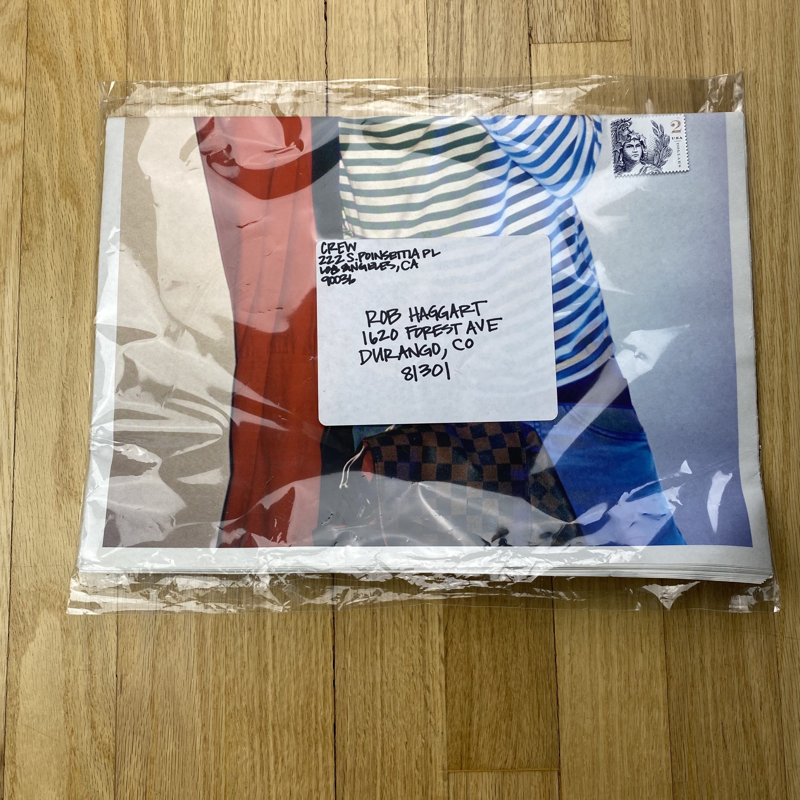
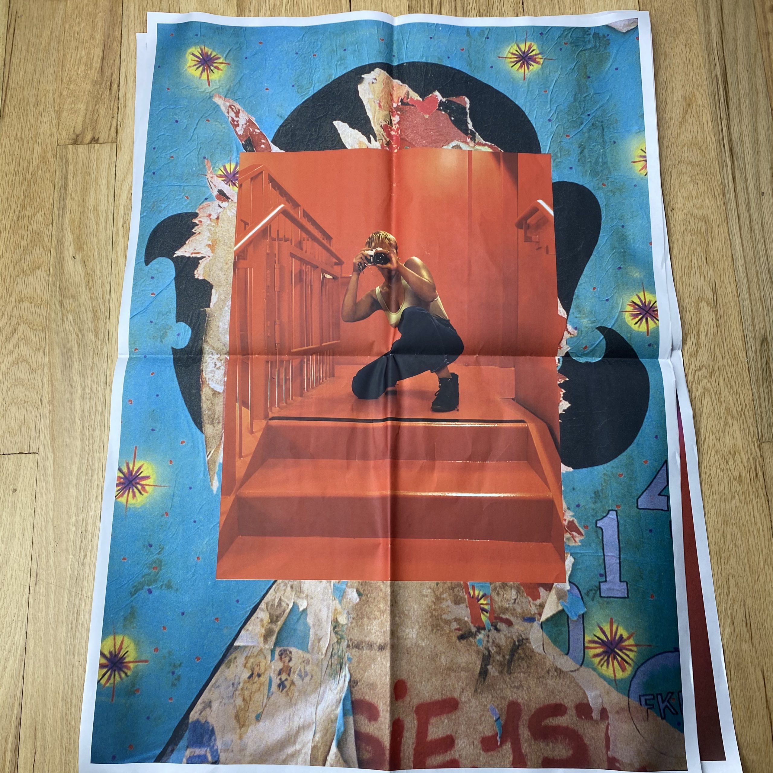
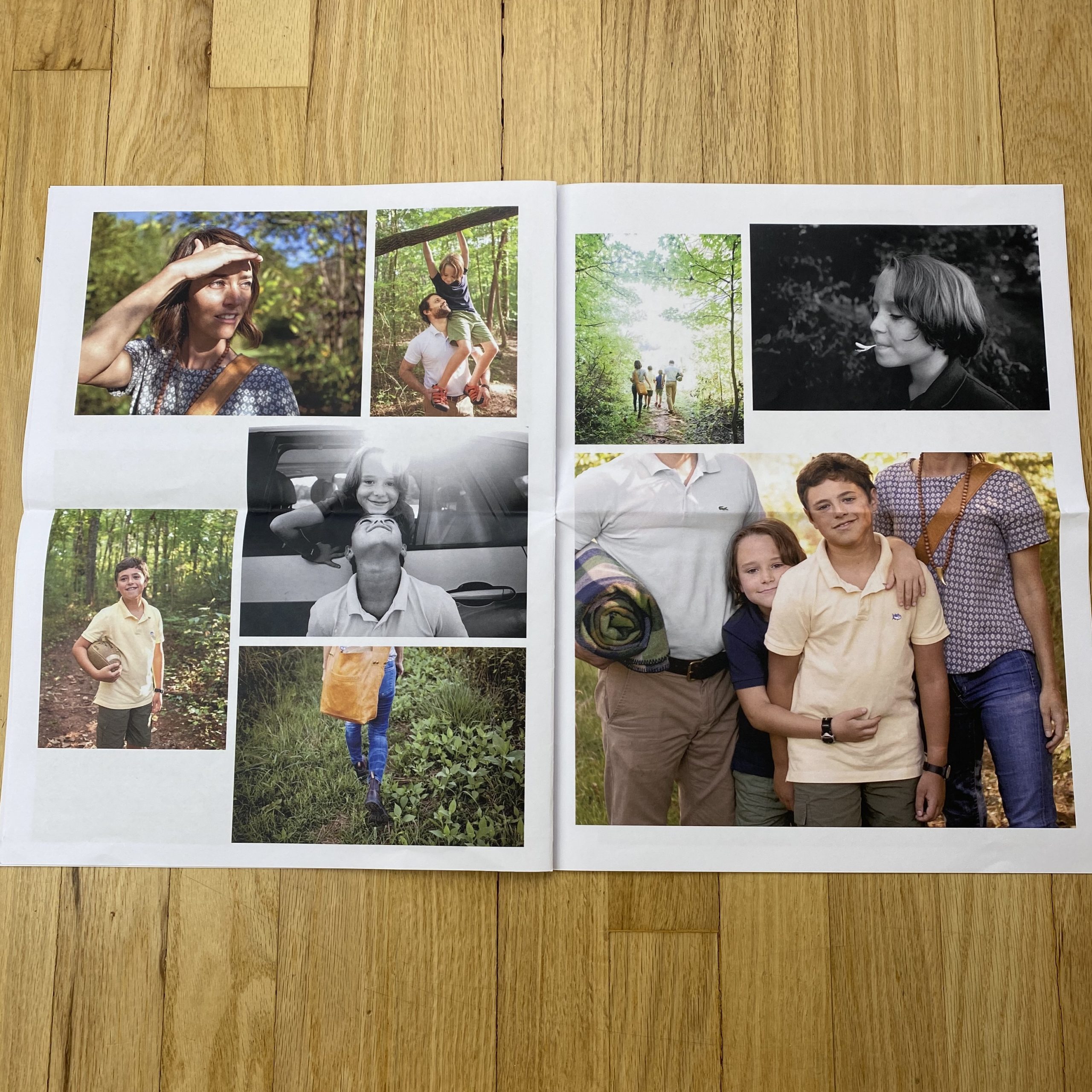
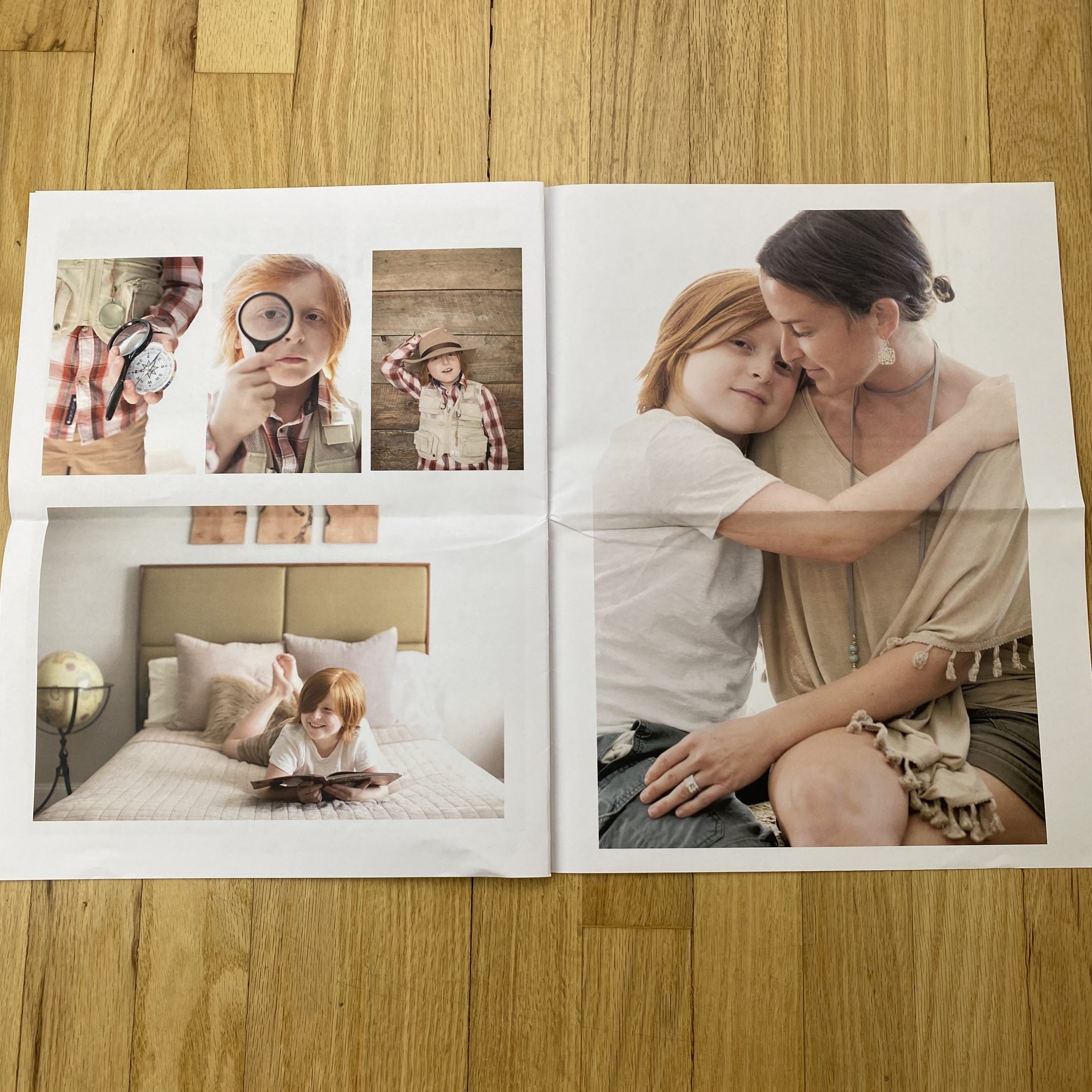
Who printed it?
The promo was printed by Newspaper Club. Their tabloid format has so many creative possibilities and I felt that the laid-back feel of a newspaper suited my work.
Who designed it?
As I am also a graphic designer, I was excited to take on the challenge of designing a piece for myself that represented both my design aesthetic and my photography. I wanted it to feel fun and approachable.
My experience of being a Photography Director in New York and Atlanta for seventeen years guided my goals for the promo: show Creatives my work and my ability to craft a visual story and also create a piece of work that might be pinned onto an inspiration board in a Creative’s office.
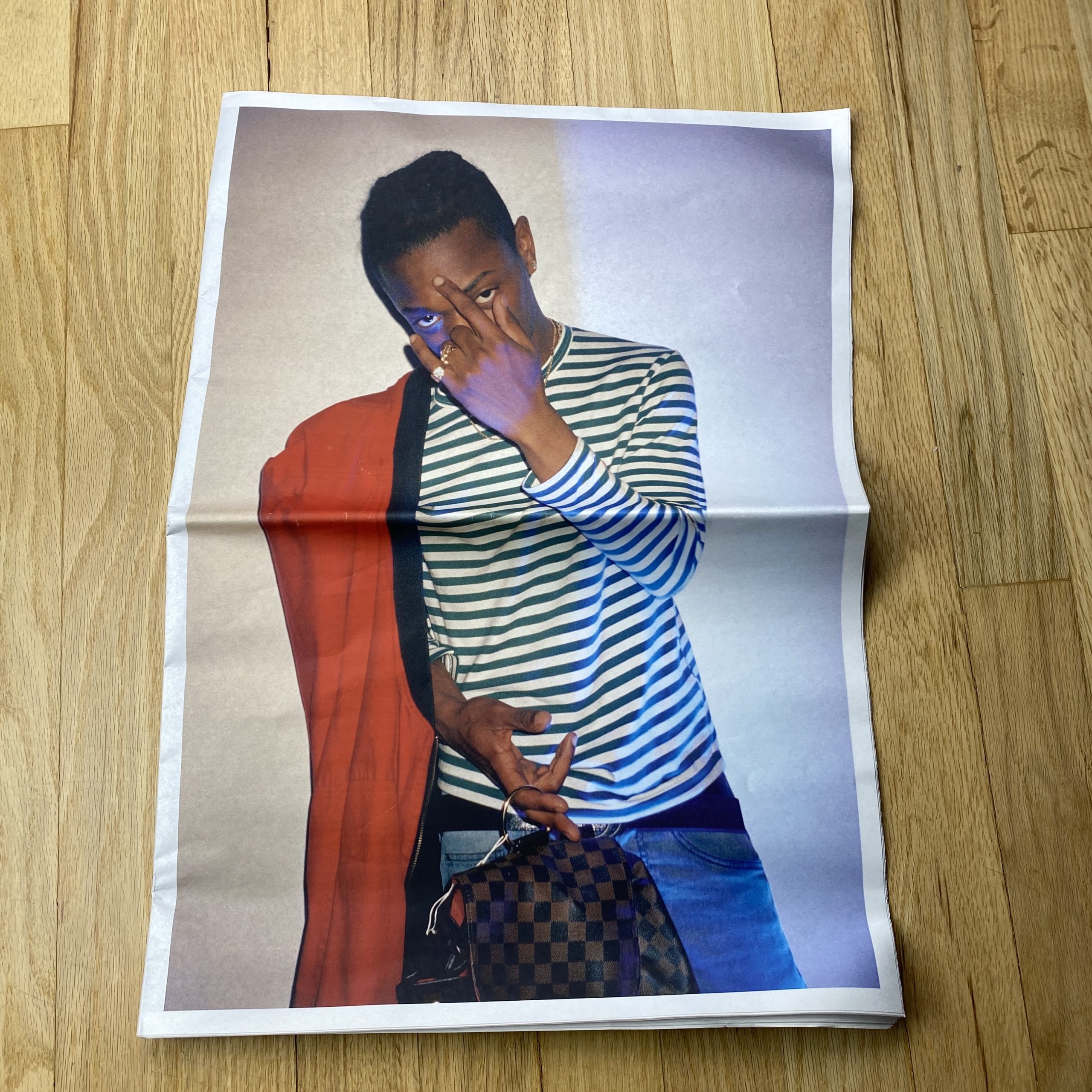
Tell me about the images?
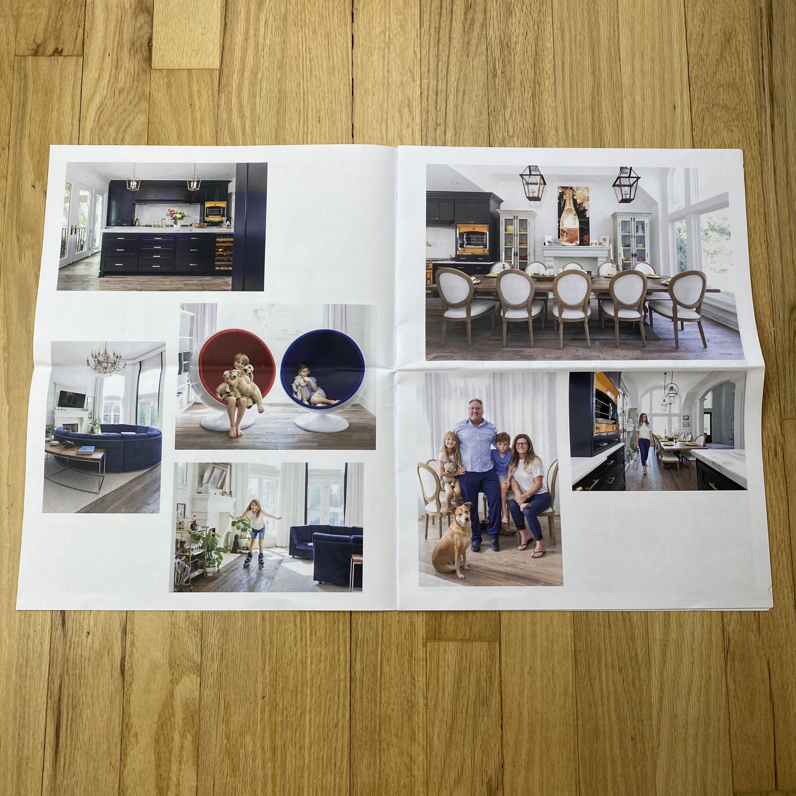
The Wall Street Journal has been a client of mine for many years and several of these stories were commissioned by them. Frequently they send me to shoot for their Mansion section which combines interiors and lifestyle photography. I love the challenge of building a story from whatever I find when I arrive at the location, as there are no stylists involved.
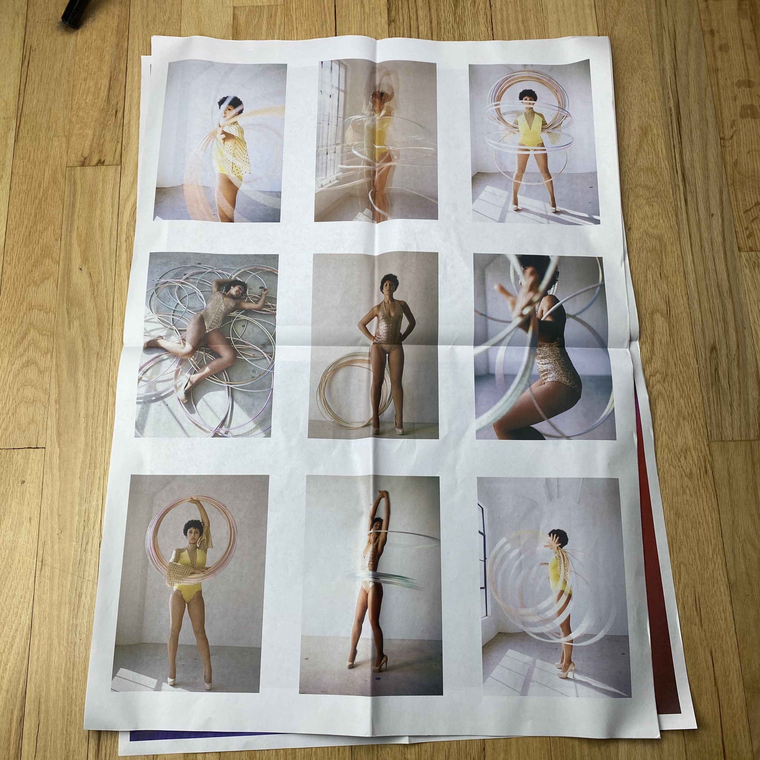
The family and child photography was done for a small magazine here in South Carolina. I adore photographing children because they are so fun and imaginative. I usually give them some basic starting direction and then follow their lead. Ultimately, I’ve realized that they are way cooler than I am and it’s better to just let them do their thing!
How many did you make?
I’m just now making a concerted effort to broaden my client base, so I started with a small print run of 50 pieces. Newspaper Club makes it easy to go back and re-print as needed.
How many times a year do you send out promos?
This is my first time making an organized effort to edit, design and send out a promo. Although I have been shooting regularly, Greenville, South Carolina is a far step from being a hub for photography. After living in New York and Atlanta for so long, I felt out of the loop in a much smaller city and unsure how to proceed with marketing. Finally, I just decided to start with this first piece and decide where to go from there.
Do you think printed promos are effective for marketing your work?
Based on my experience as a Photo Director, I definitely think that printed pieces are an effective marketing tool. It’s true that we are deep in the digital age and online marketing and portfolios are efficient and effective, but at the end of the day, I think creative people will always appreciate holding a pretty printed piece in their hands. And if you’re lucky, maybe they will pin it on their inspiration board.
Or what about that massive Google commercial during last weekend’s Super Bowl? My son and I were mostly skipping the ads on the DVR, briefly stopping at the ones that seemed intriguing, or were worth mocking.
(His criteria.)
We saw the Google ad in question featured an old man, interacting with an AI, which through smart-learning could begin to categorize his memories, via his digital footprint.
(Rough synopsis.)
He recalled his dead wife, in a tragic, breaking voice, and then they showed old photographs of their life together.
Good thing we were skipping quickly, or I would have cried for sure. Theo was of the opinion the ad was emotionally manipulative, and I had to agree with him.
Very often, memories need triggers, in order to dislodge from wherever it is in our deep-brains they reside, so they can flash back to the front of our consciousness. (Like going from the hard drive to RAM.)
We all know that smell can trigger us, or sound.
Who hasn’t gone back in time when they hear a certain song?
(Seriously, if you play “Don’t You Want Me,” by the Human League, I will regress to a 7 year old.)
And, of course, we have photographs.
If ever a process were invented to aid memory, it was the one cooked up by the collective geniuses who figured out how to chemically capture light. (Or is it genii?)
Those brilliant 19th Century bastards who gave us the medium we now treasure.
And what a time it is to be a photographer.
Sure, photography was adopted by the masses each time technology allowed it, but the IPhone/smartphone revolution has taken things to new levels.
So much so that venerable photo institution PDN closed last week, and the Washington Post folded its photography newsletter, almost simultaneously.
The nature of photography has changed, and it’s now a living thing, a visual language, and even temporary, as much as it’s supposed to be a physical, permanent record of what really was.
(Frozen light particles that bounced off of real things in the real world.)
Now, we photograph our parking space at the airport, or the information on a flyer we want to remember for a day, or a selfie because the light was good, but we’re never going to look at it again.
Digital photos, the lingua franca of our time, are not designed to be archived forever, like a contact sheet in 1983.
(Or 1883, for that matter.)
But objects, real physical things in the actual world, do retain resonance.
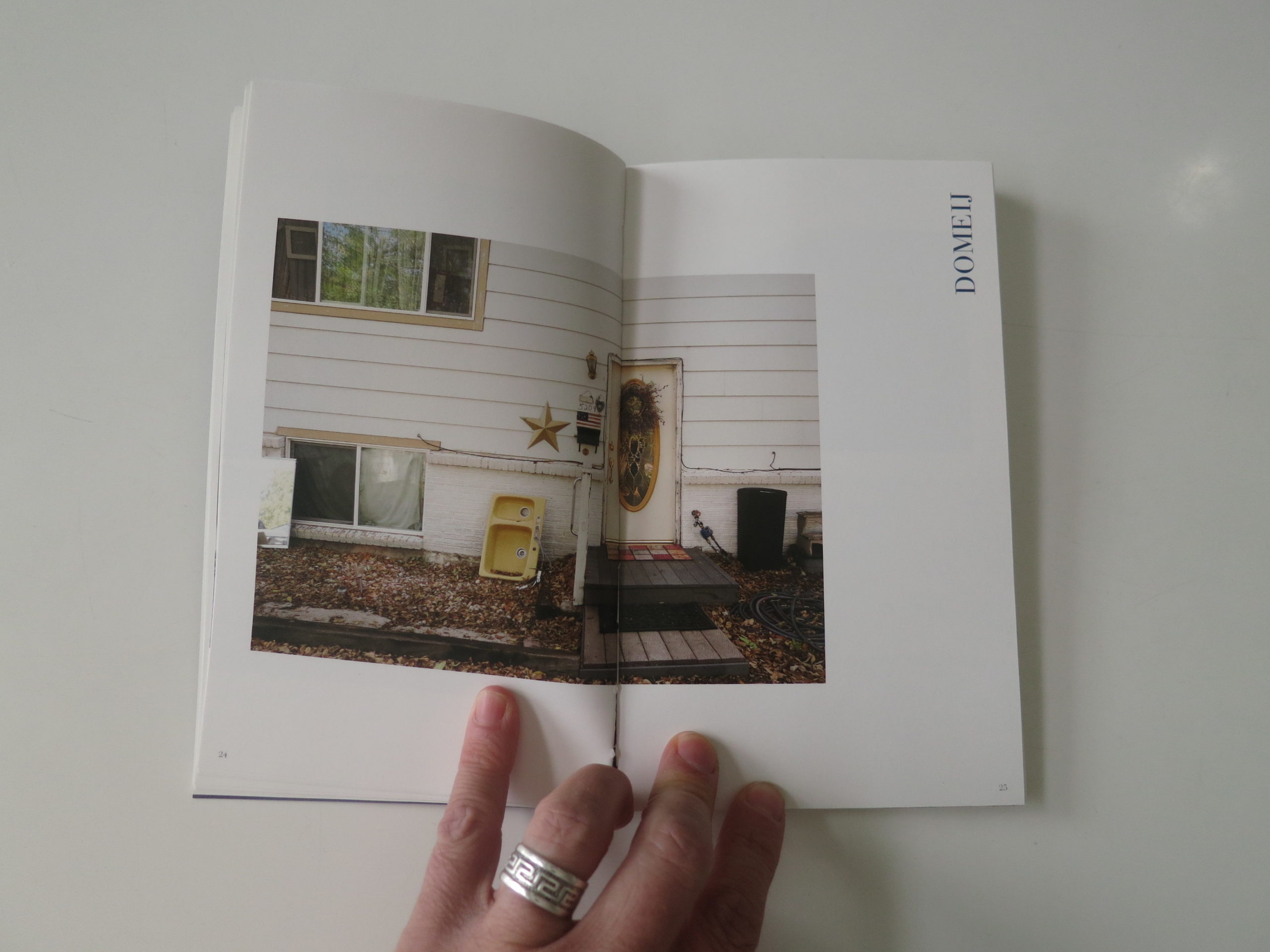
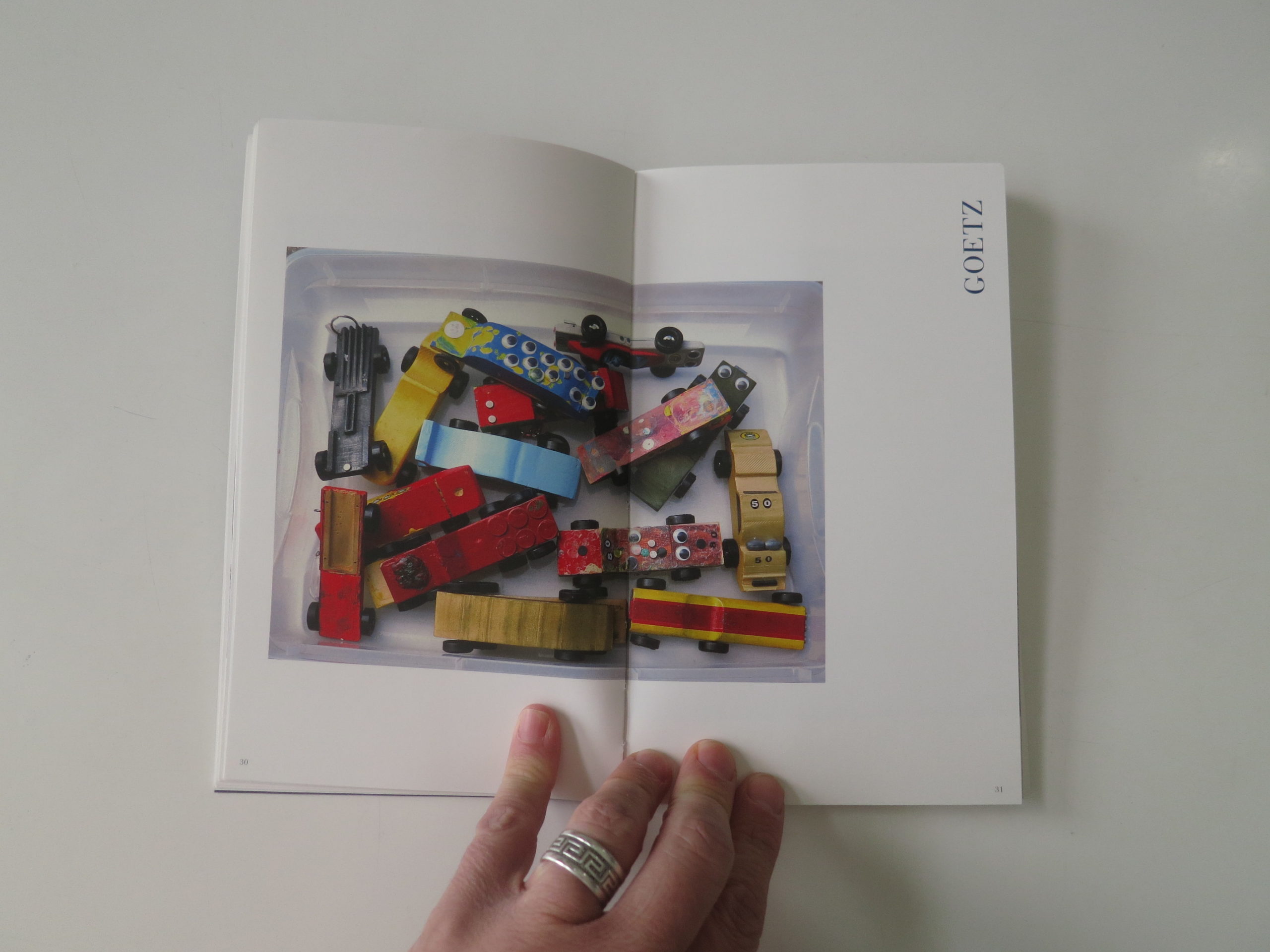
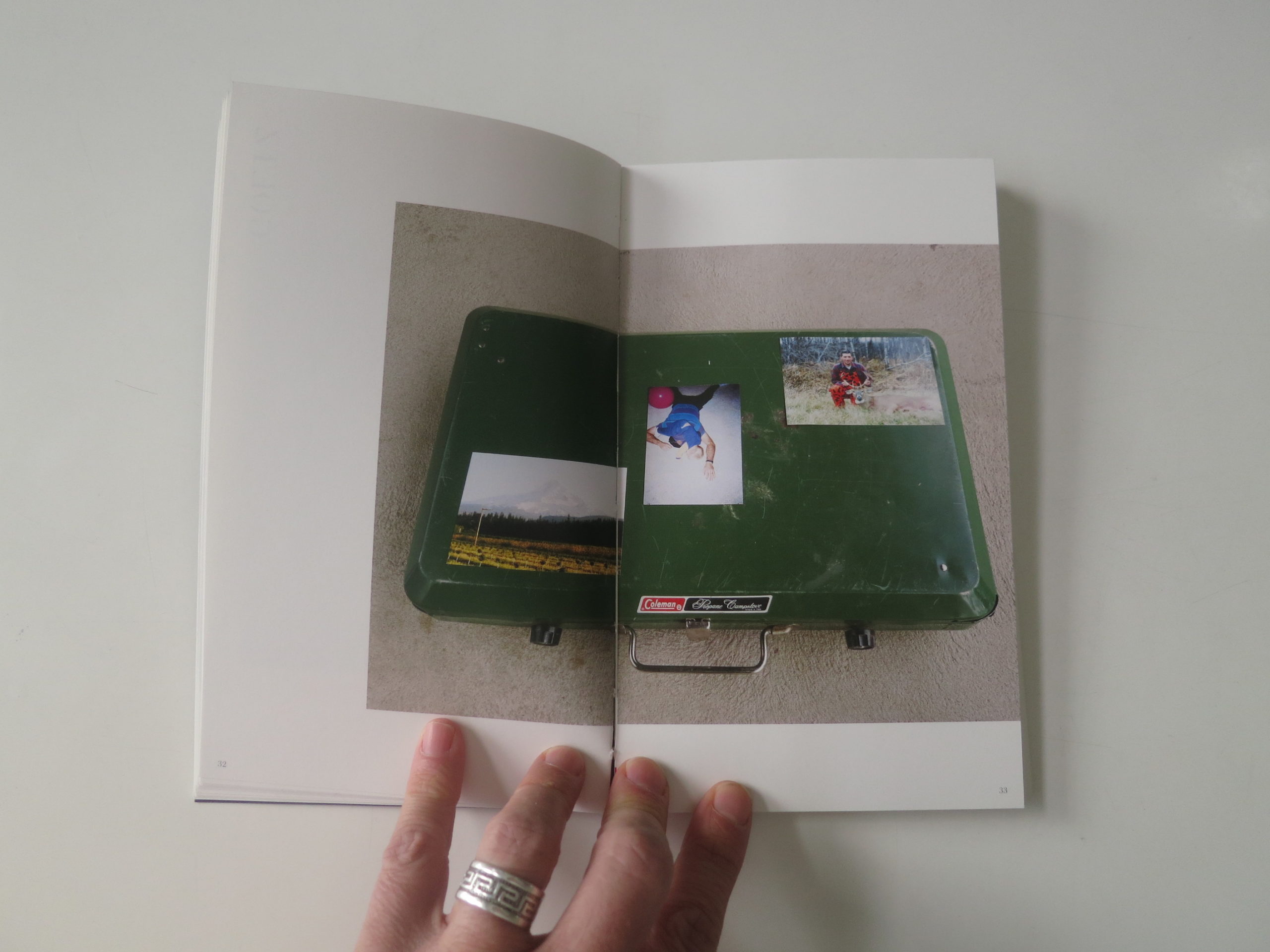
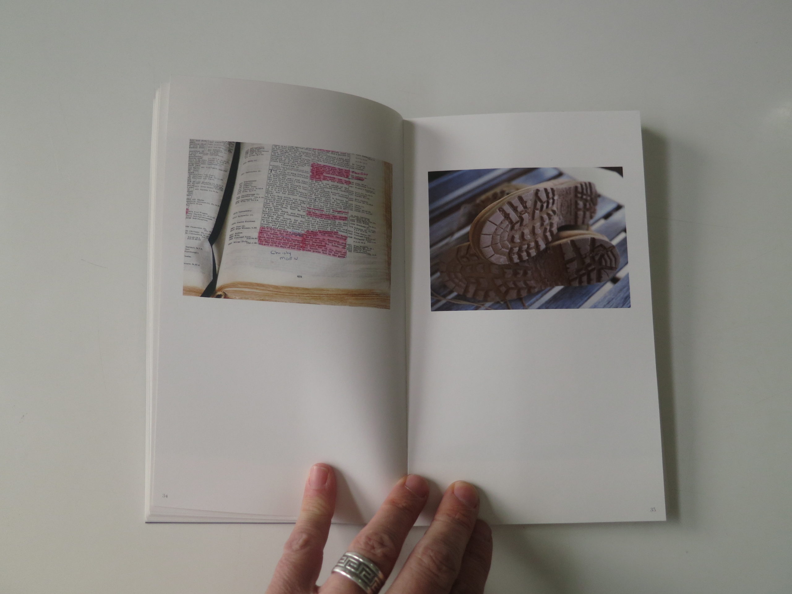
T-shirts can smell for a while, because of your cousin’s distinctive detergent. Boots and Barbies and Bibles can trigger memories too.
And of course books are also well-suited to capturing the spirt of the dead.
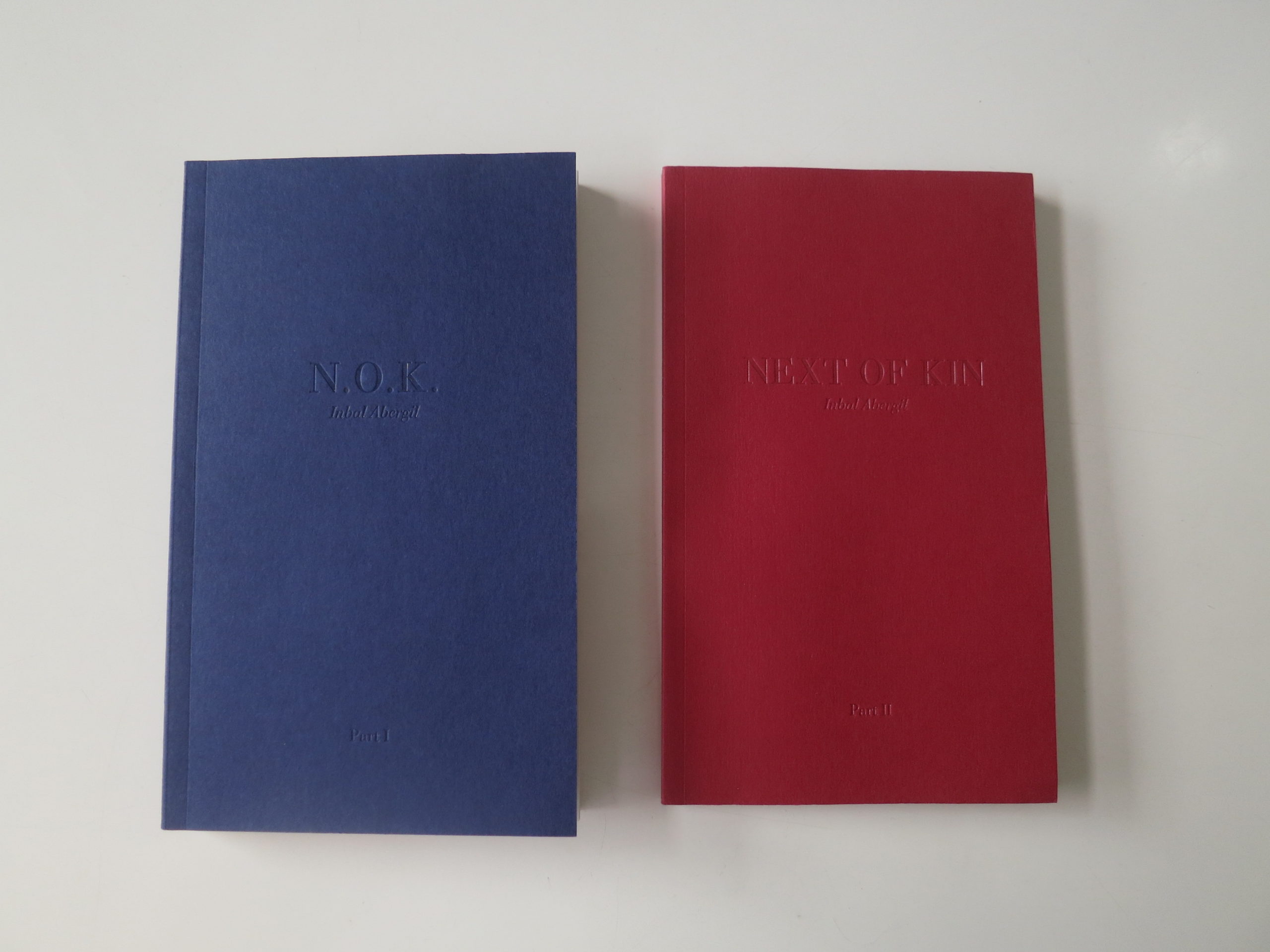
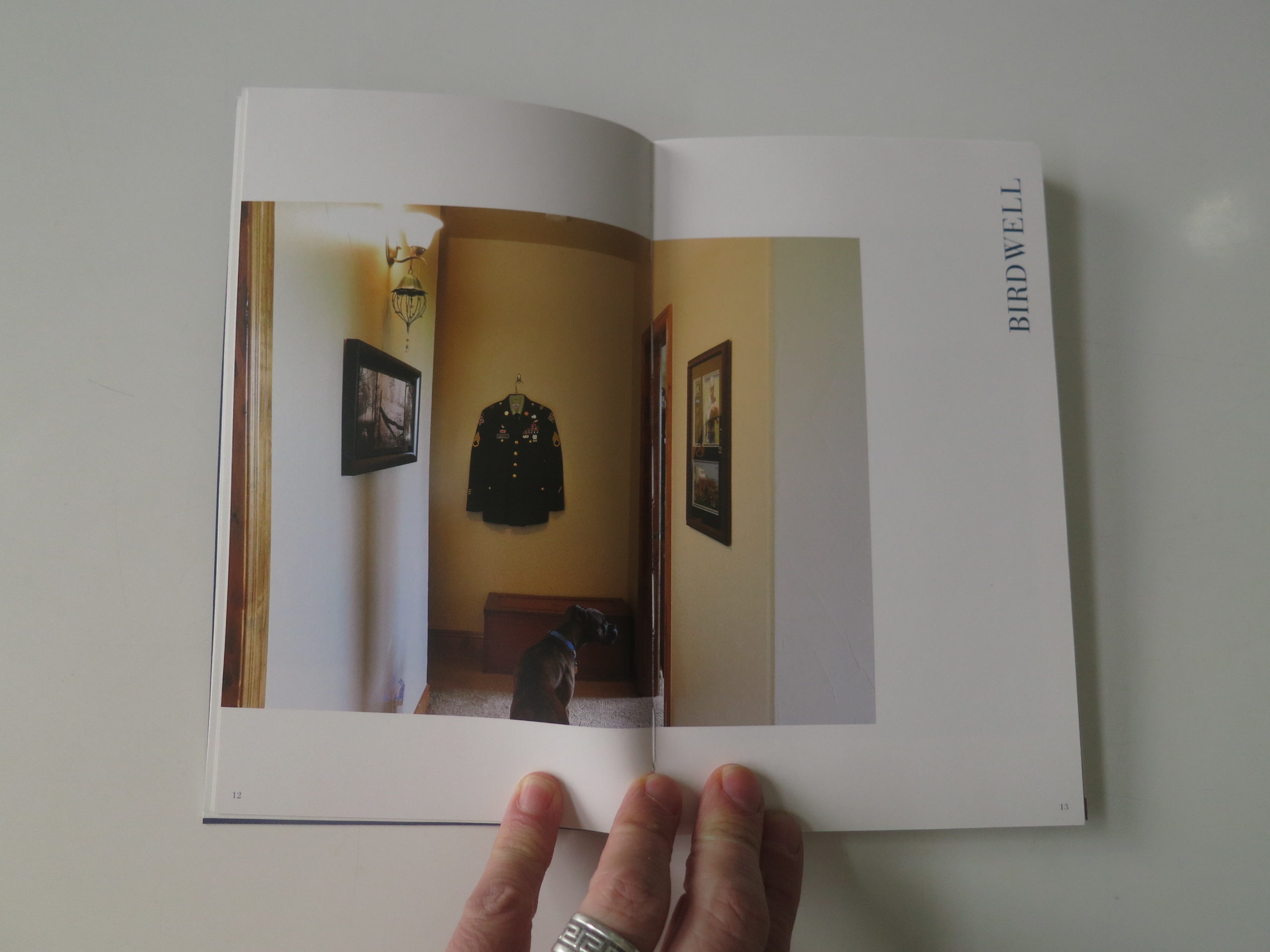
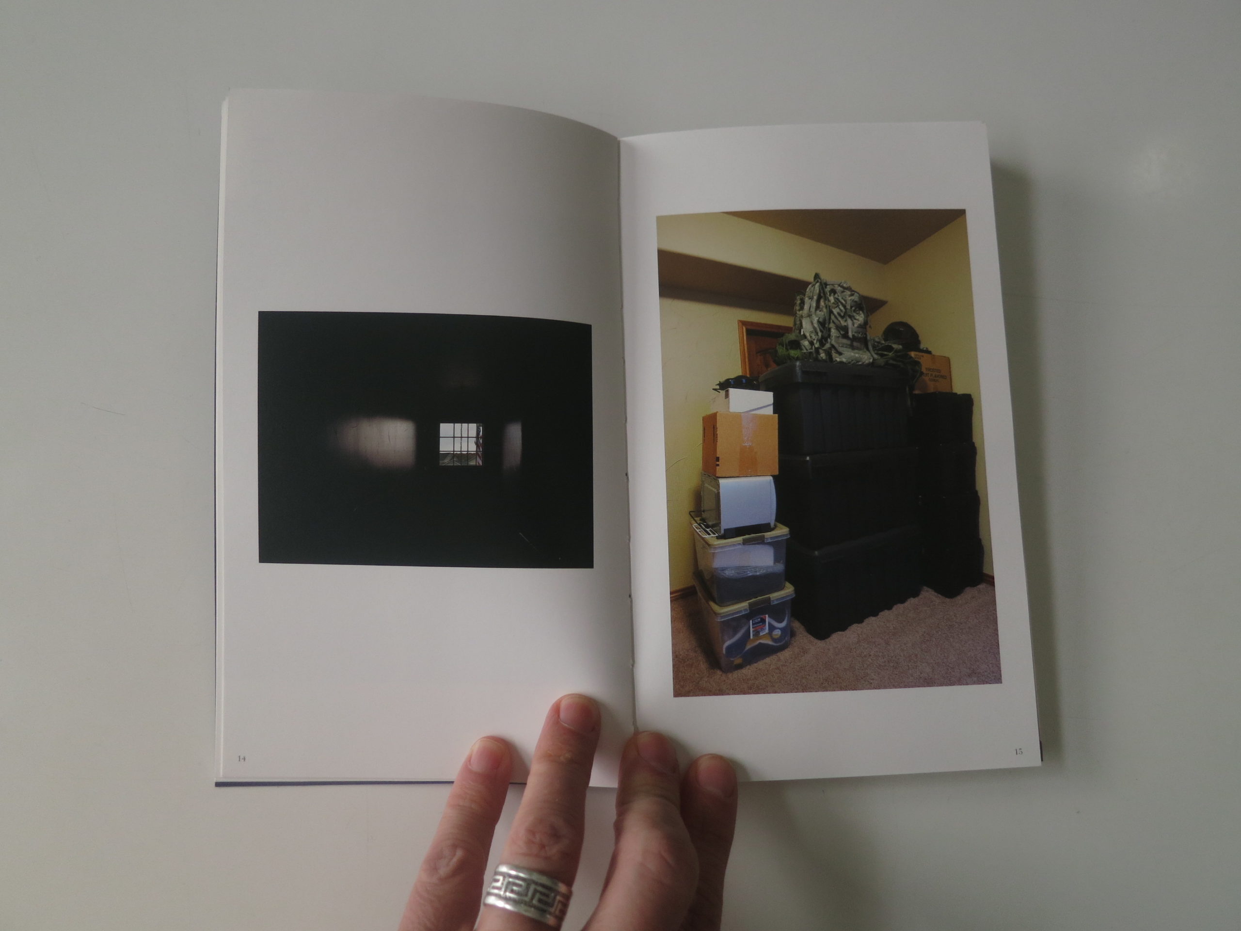
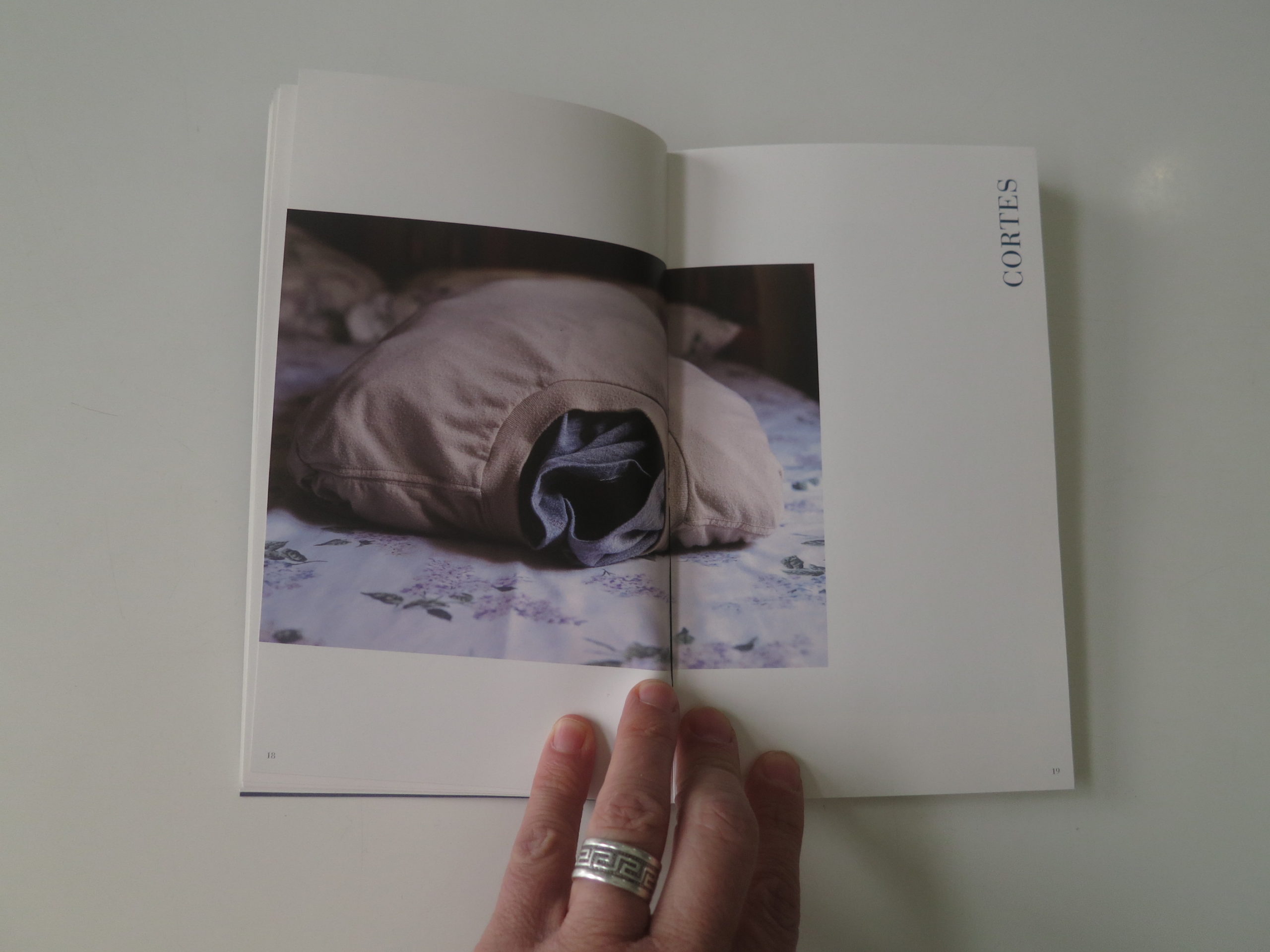
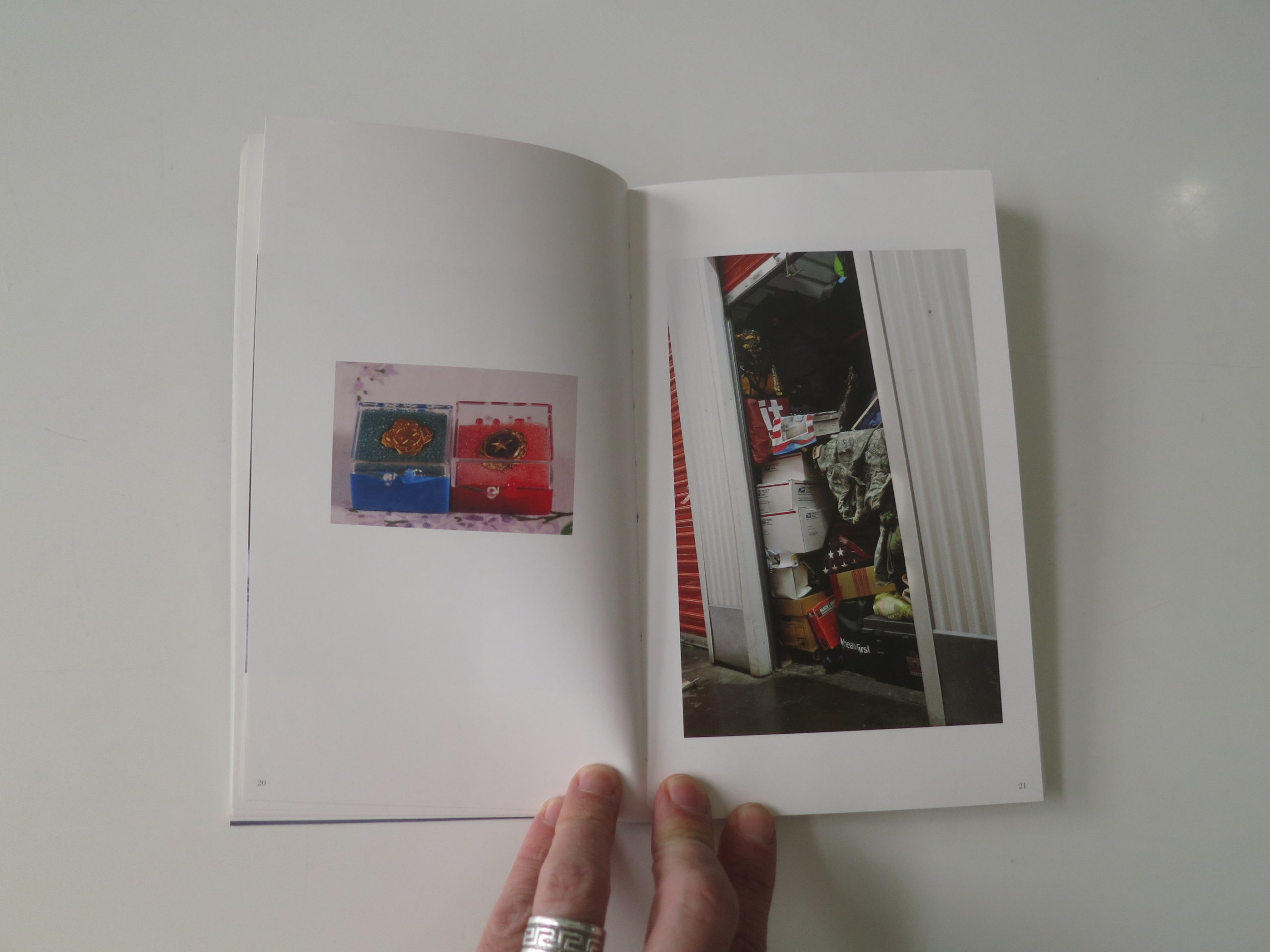
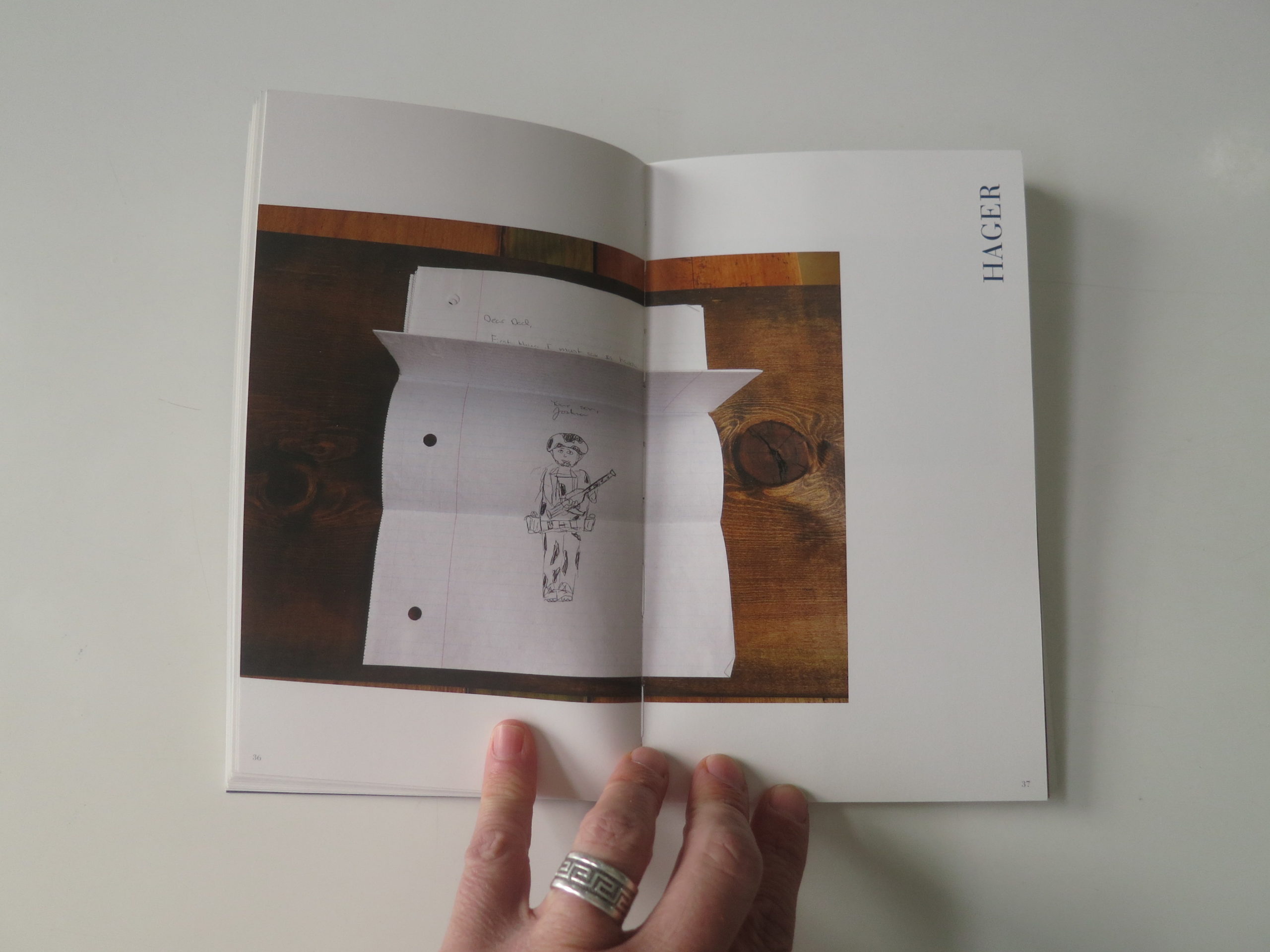
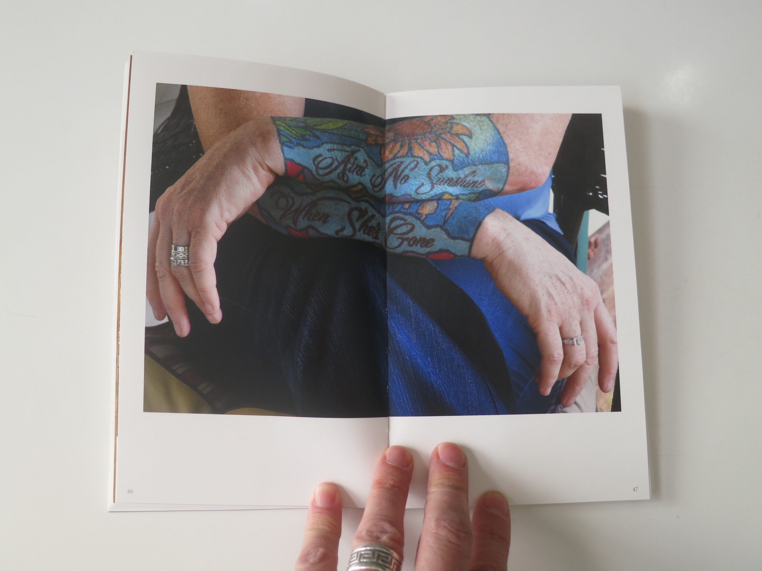
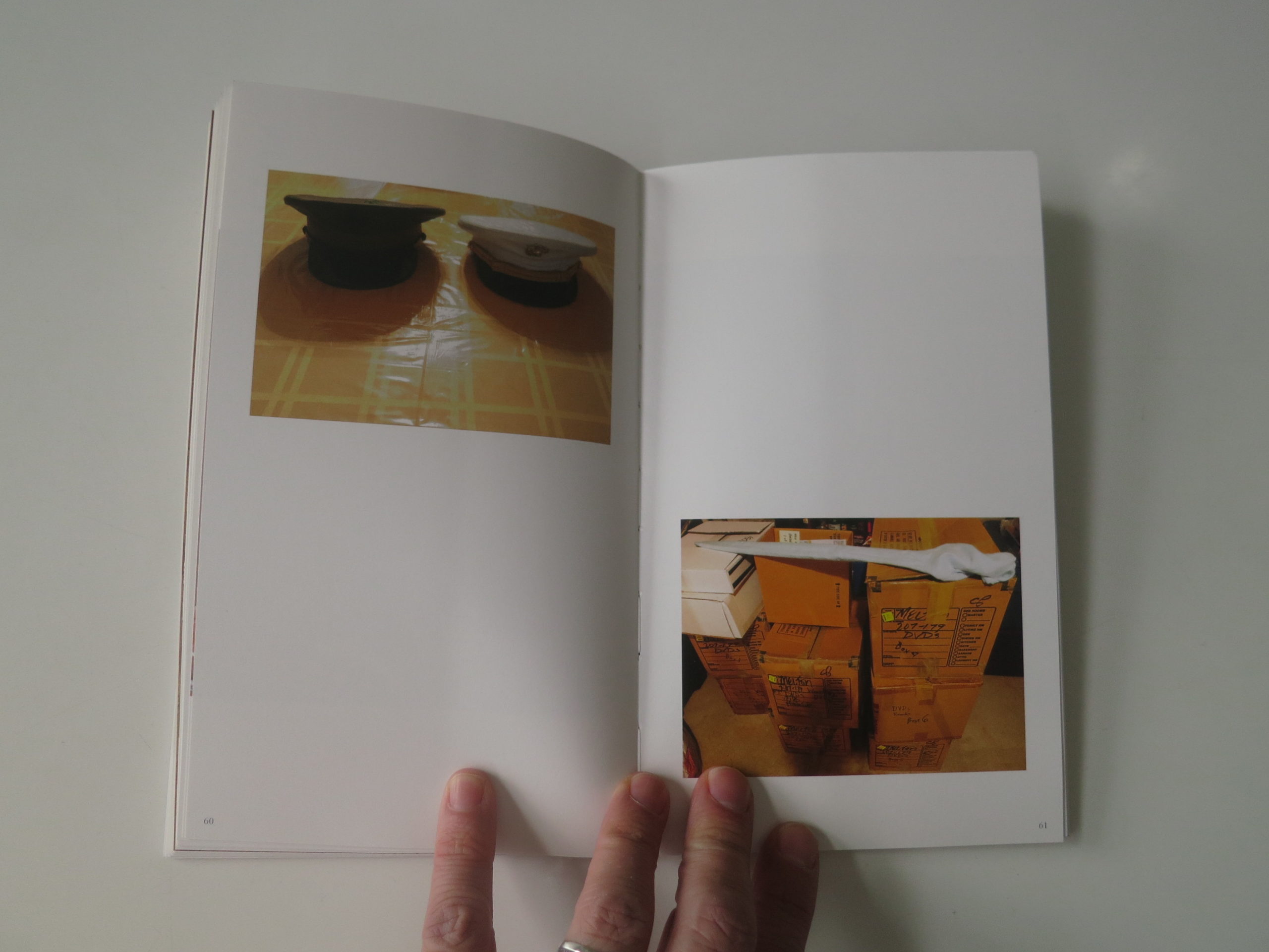
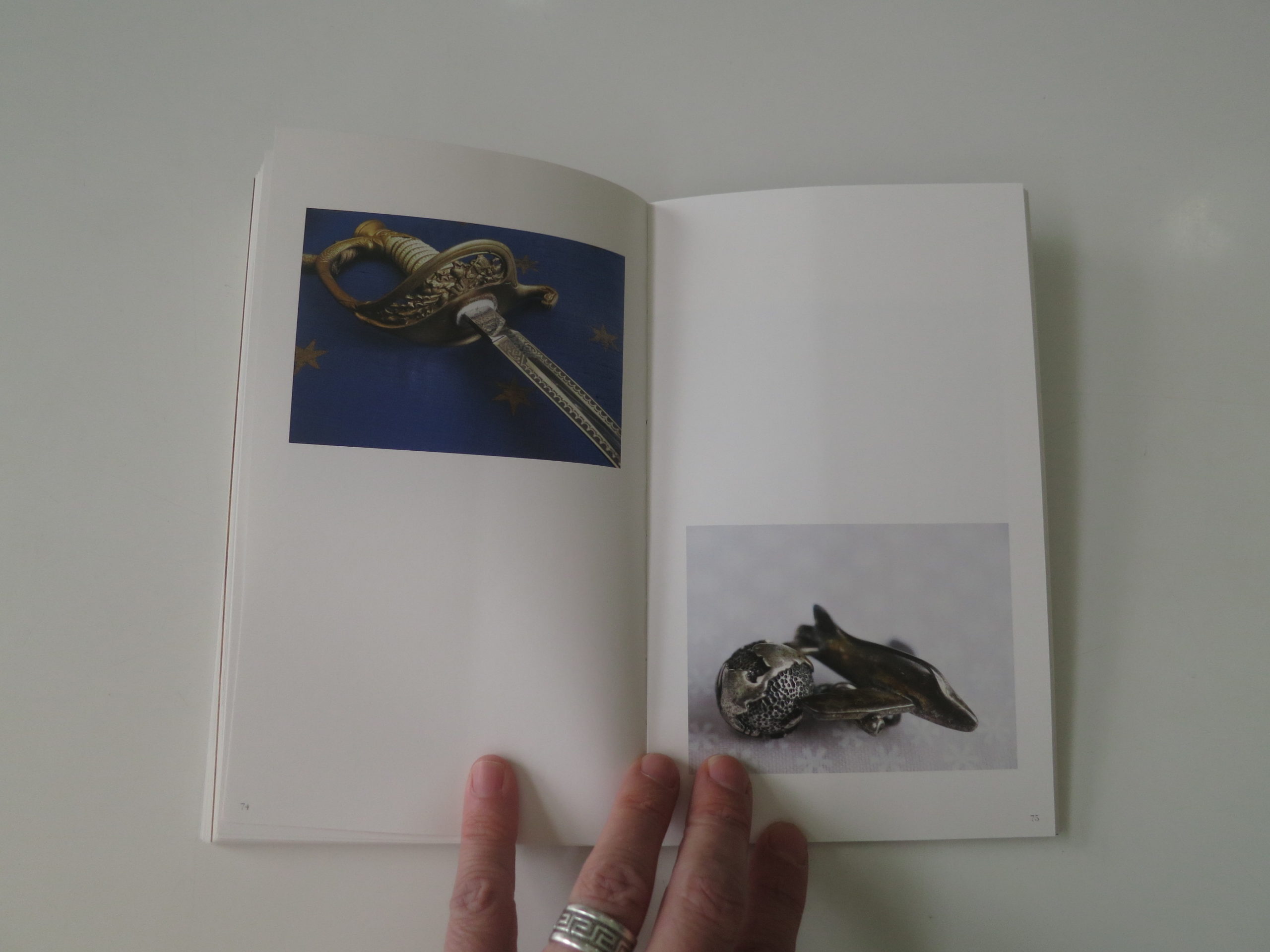
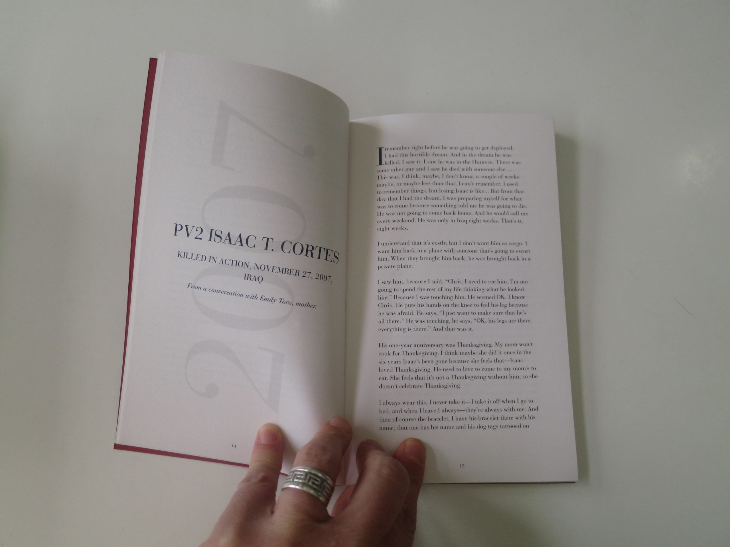
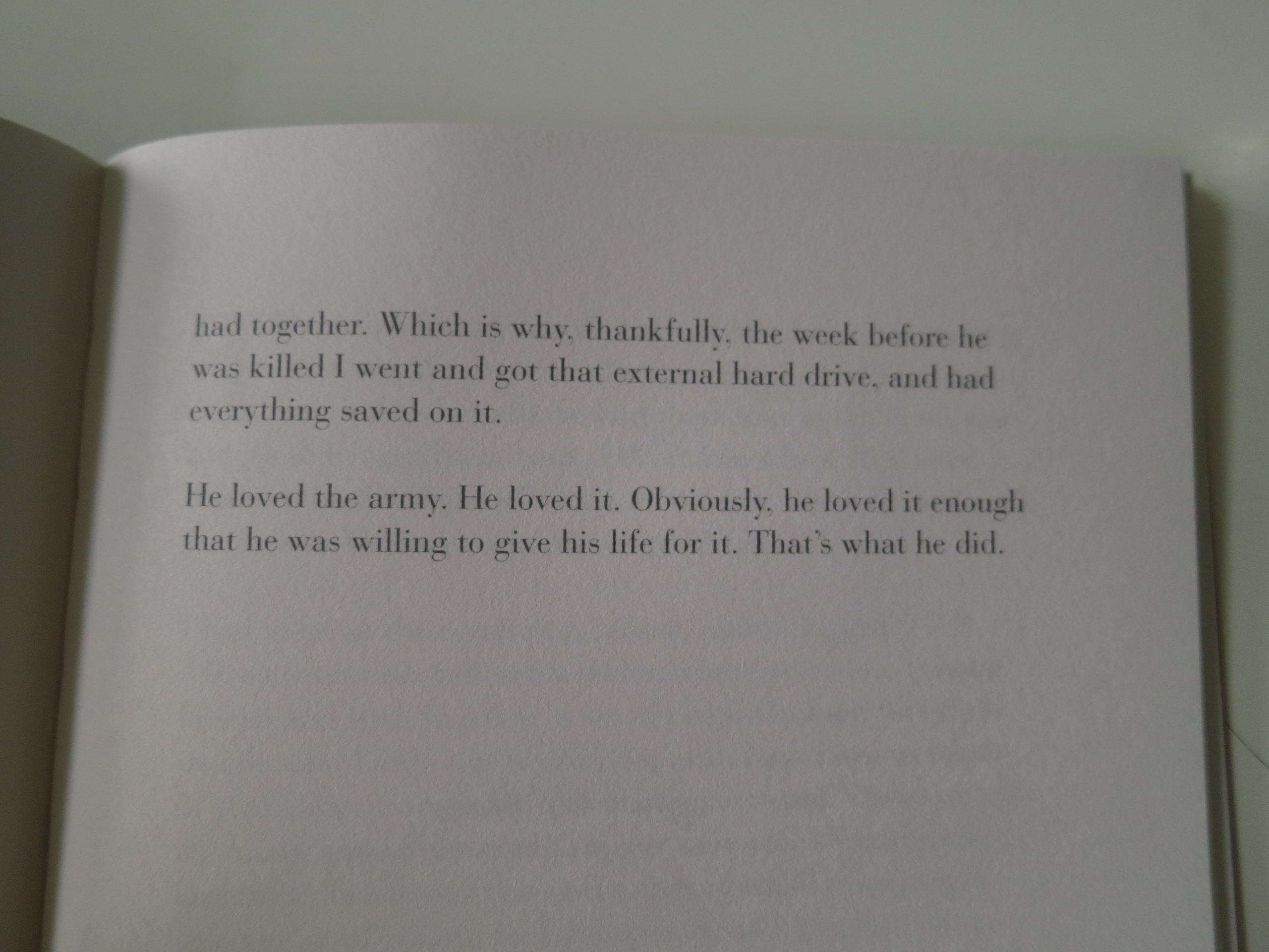
In this case, I’m thinking of “Next of Kin,” a recently published set of photobooks that turned up in the mail in late #2019, from Inbal Abergil, published by Daylight.
The covers, in blue and red, are marked Part I and Part II, and the first book has little text beyond a dedication and section breakers.
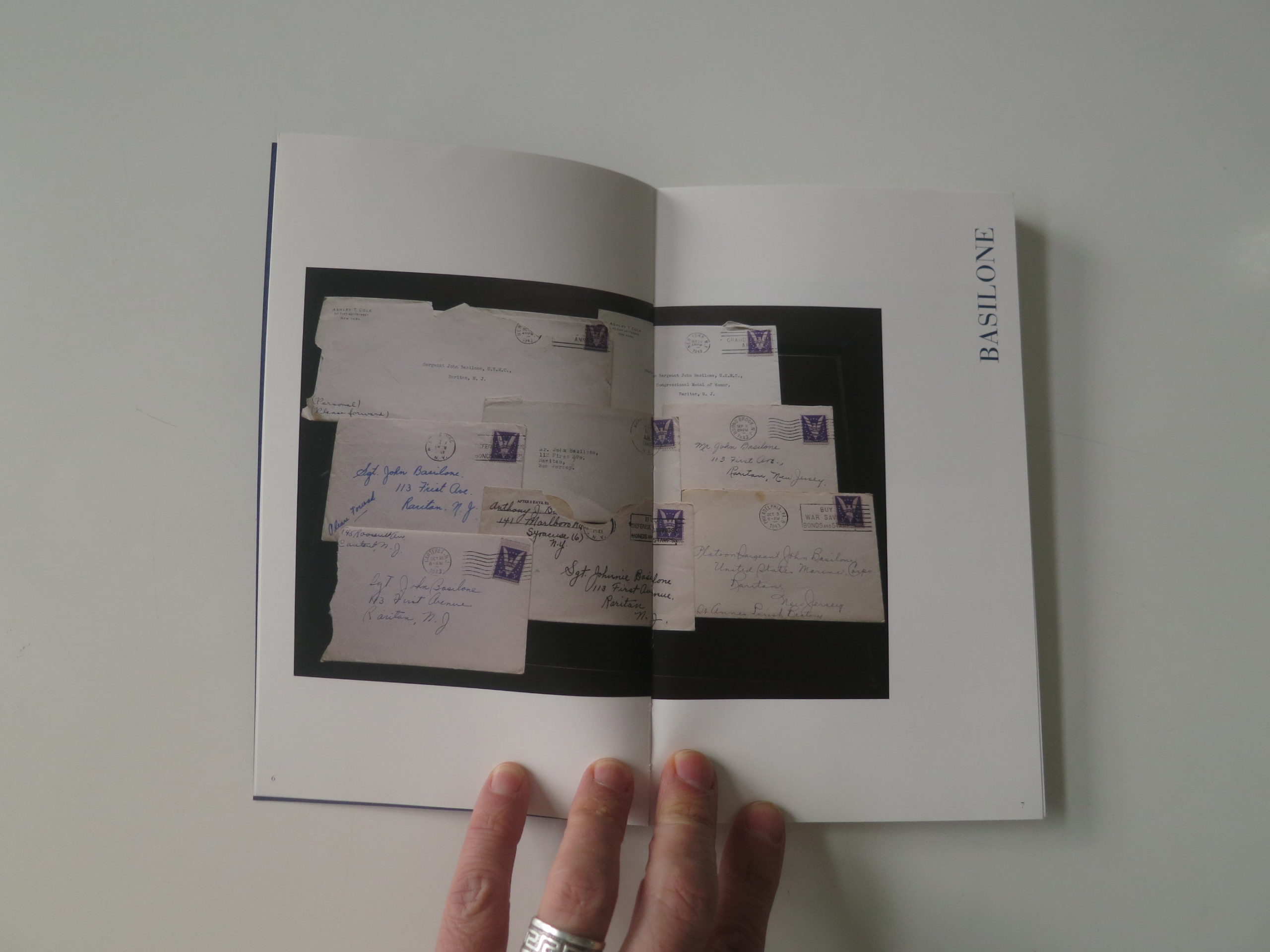
From the get-go, we see only one word, (a name,) printed sideways, but after one or two sections, you suspect you’re looking at the artifacts of dead soldiers.
I wasn’t certain until the third section, when we see a full storage unit stuffed with life-remnants, but the second section features some heavy-duty storage objects, so the hints are there quickly.
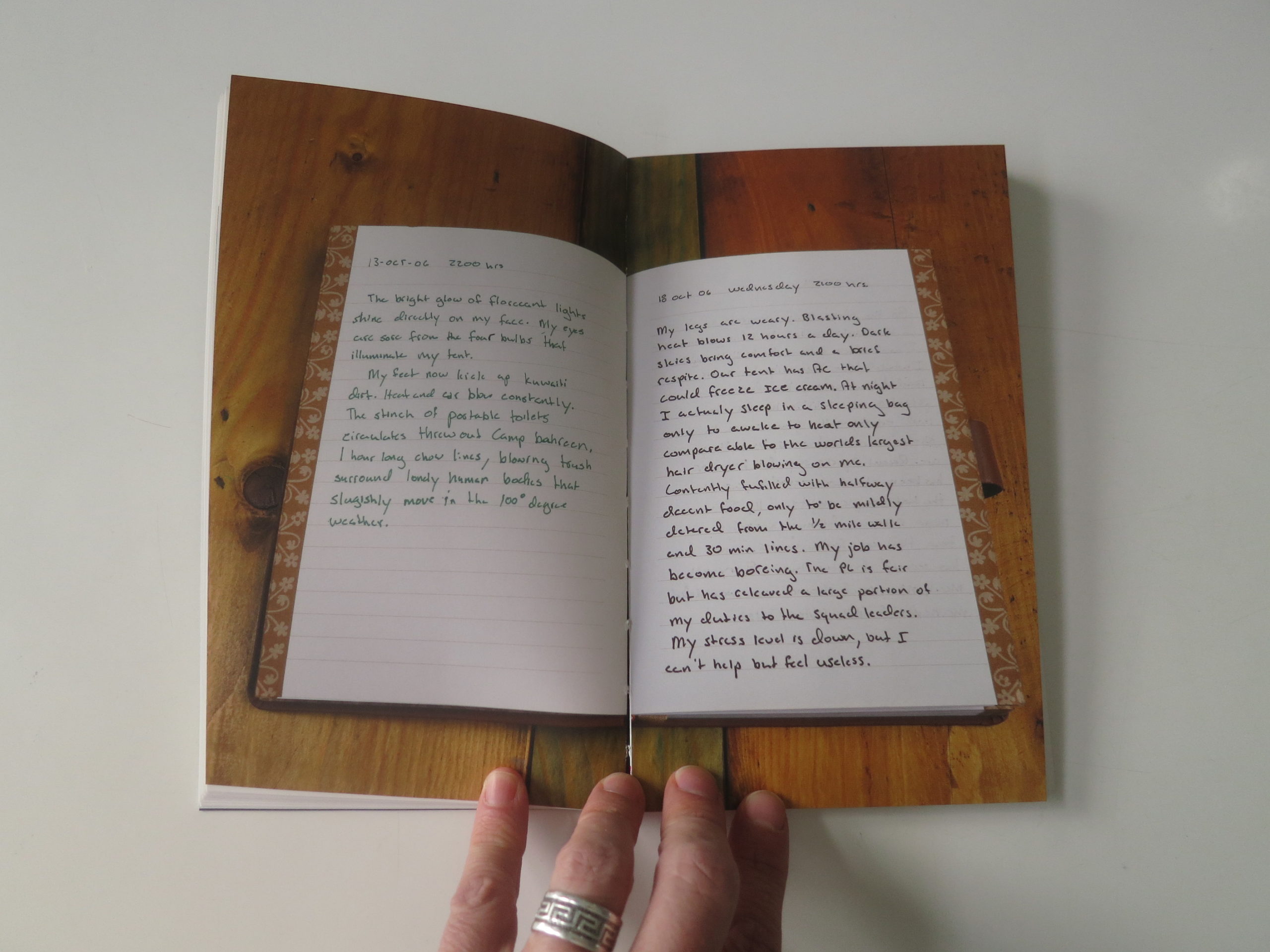
All the text beyond those soldier names is saved for Part II, which is a decision I understand. It says, this is not one object, but two, conjoined by the elastic band, and therefore, the viewing experience will be guided.
That is seemingly the main purpose of Part II, using words to house stories and memories from Gold Star families, the people who suffered the loss of a loved one.
To keep things intriguing, I think, the book opens with a historical death, from WWII, but of course most of the stories are modern, from Iraq or Afghanistan.
Most of the wounds are fresh.
The pictures are gracefully shot, and unlike that Super Bowl Commercial, are respectful with their handling of emotion. They’re sad, for sure, but not dripping.
(You can’t hear the strings in the score, if you know what I’m saying.)
Perhaps it’s a quibble, but I’d say that four commissioned essays, at the end of Part II, are a bit much. None are too long, and leading with the always-intelligent Fred Ritchin is a good idea, but given how many books I see, I think two contextual essays is plenty, maybe three if you’re being generous.
(Especially with all the other text.)
Early on, I asked myself why the artist was telling these stories, and if she mentioned her ethnicity when she originally reached out, I’d forgotten, as her name suggests she could be from many places.
Turns out, Inbal Abergil is Israeli, was a solder herself, and wanted to understand grief and loss in American culture.
This was a smart, elegiac, thoughtful way to explore the subject matter. And I hope all those families felt a measure of peace, after seeing their fallen warriors memorialized in such a classy way.
Bottom Line: Sad, graceful look at the aftermath of soldier’s deaths
If you’d like to submit a book for potential review, please email me directly at jonathanblaustein@gmail.com. We are interested in presenting books from as wide a range of perspectives as possible.
The Art of the Personal Project is a crucial element to let potential buyers see how you think creatively on your own. I am drawn to personal projects that have an interesting vision or that show something I have never seen before. In this thread, I’ll include a link to each personal project with the artist statement so you can see more of the project. Please note: This thread is not affiliated with any company; I’m just featuring projects that I find. Please DO NOT send me your work. I do not take submissions.
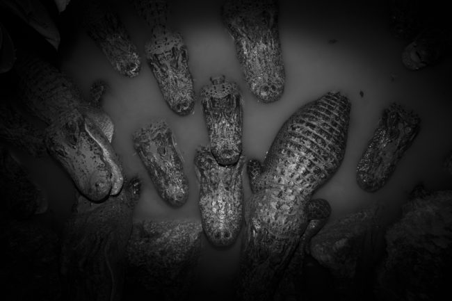
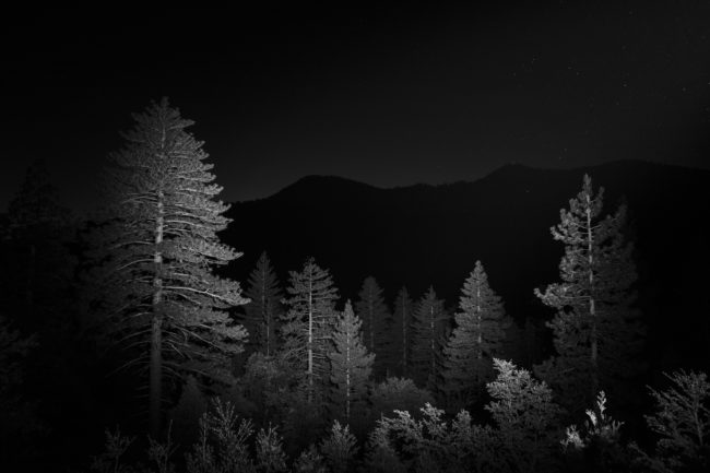
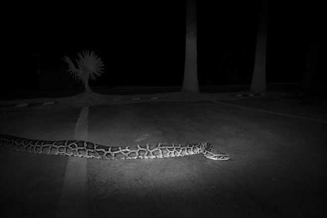
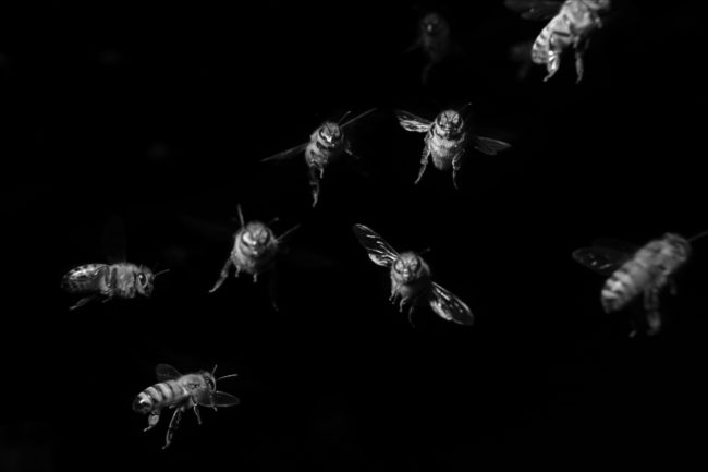
“And Here We Are- Stories From the Sixth Extinction” examines the current condition of our rapidly changing landscape, the punishing impacts of invasive species, the accelerated rate of extinctions and the fragile places where man and nature collide.
I present this work as evidence. Light and sound pollution, fences, roadways, water diversions, terraforming, agriculture, temperature rise, deforestation, globalization vectors in the movement of goods, newly introduced resource competition by invasive species, and innumerable other recent changes have made much of our planet unrecognizable to the existing instincts and genetic memory of countless species.
Shooting at nighttime visually isolates my subjects from their environment and allows me to illustrate the distress on an individual life sans all of the sunsets and mood lighting we often associate with nature photography. The darkness that surrounds my subjects is also analogous to the lack of familiarity and inability for organisms to recognize and adapt to the new world around them.
APE contributor Suzanne Sease currently works as a consultant for photographers and illustrators around the world. She has been involved in the photography and illustration industry since the mid 80s. After establishing the art buying department at The Martin Agency, then working for Kaplan-Thaler, Capital One, Best Buy and numerous smaller agencies and companies, she decided to be a consultant in 1999. She has a new Twitter feed with helpful marketing information because she believes that marketing should be driven by brand and not by specialty. Follow her at @SuzanneSease. Instagram
Success is more than a matter of your talent. It’s also a matter of doing a better job presenting it. And that is what I do with decades of agency and in-house experience.
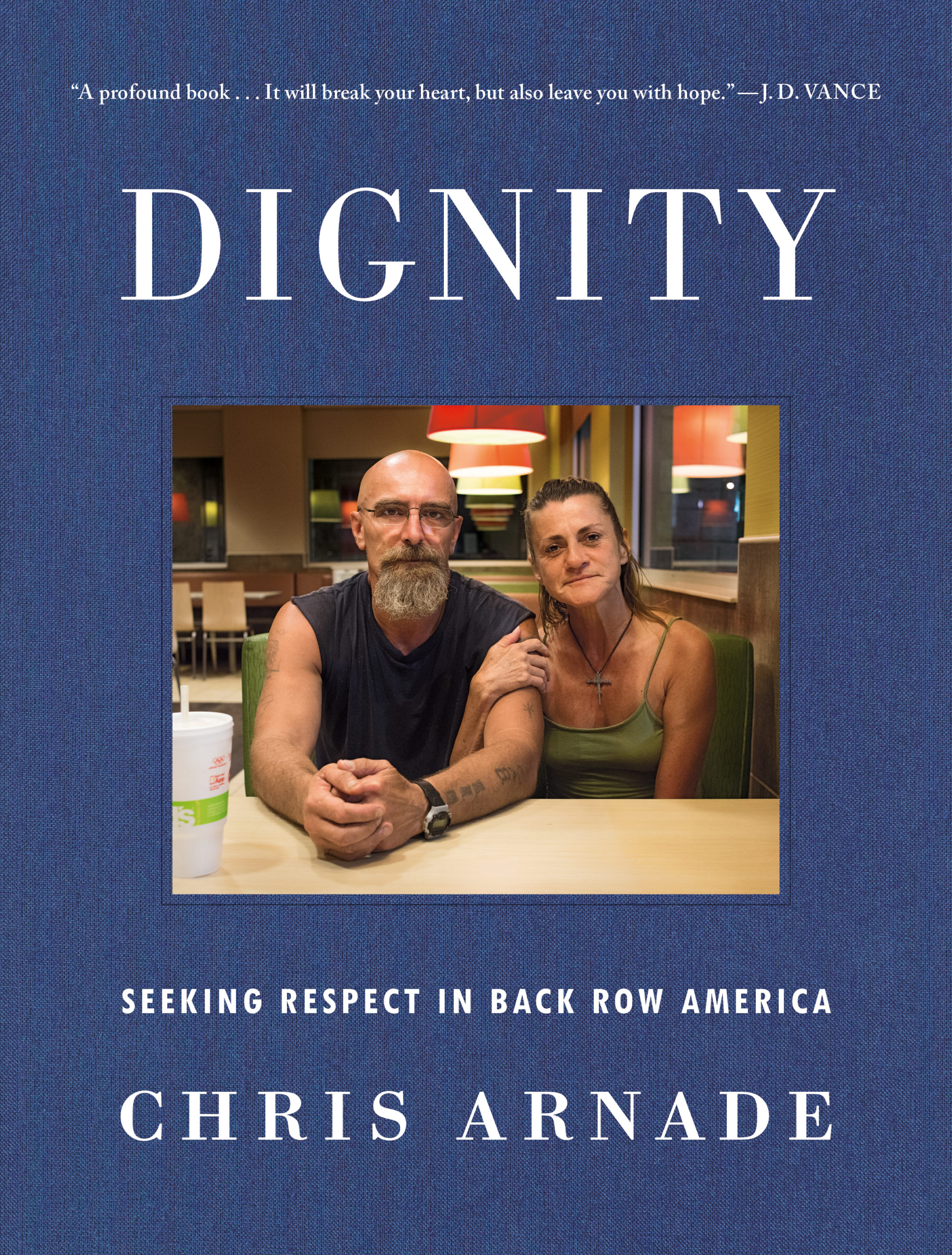
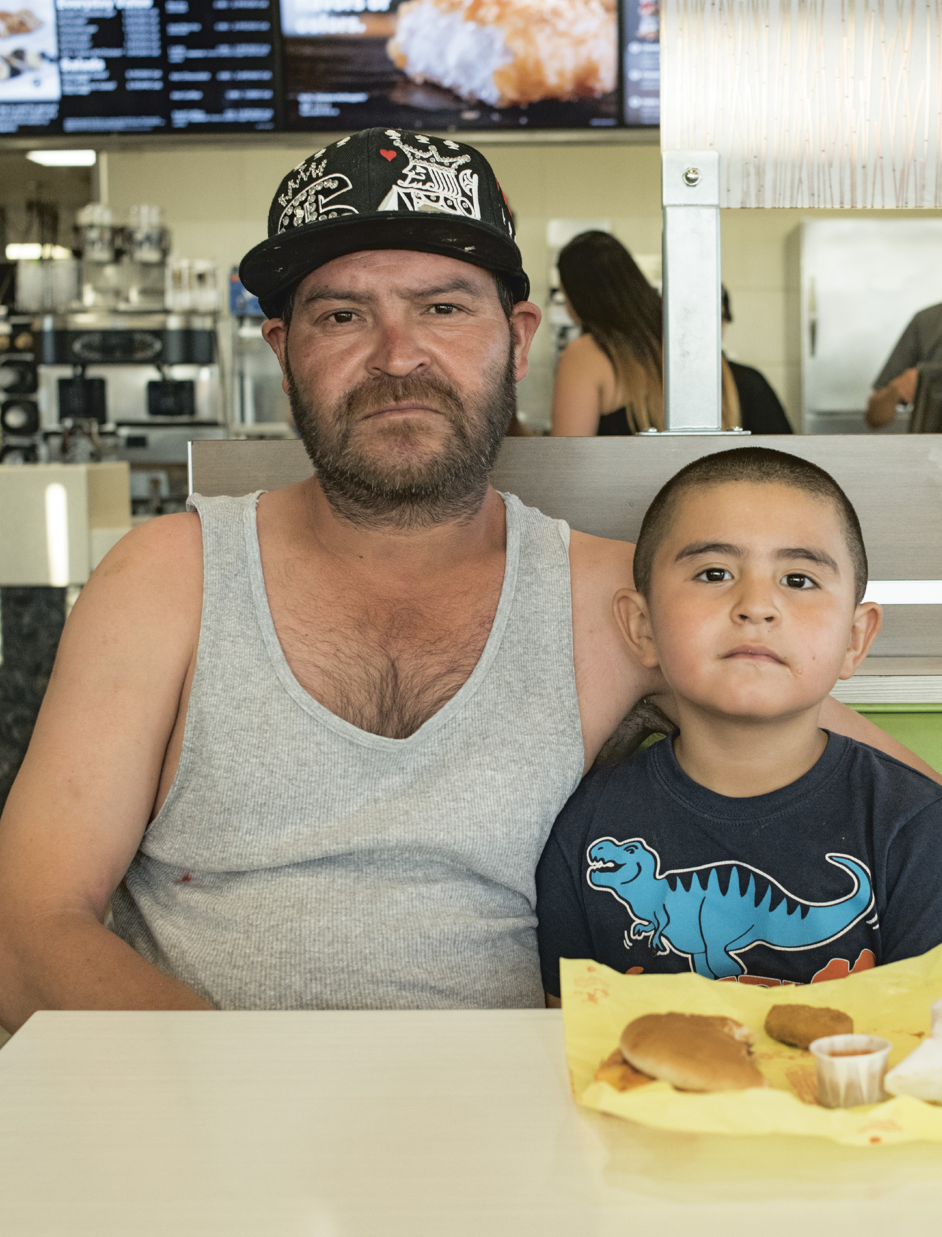
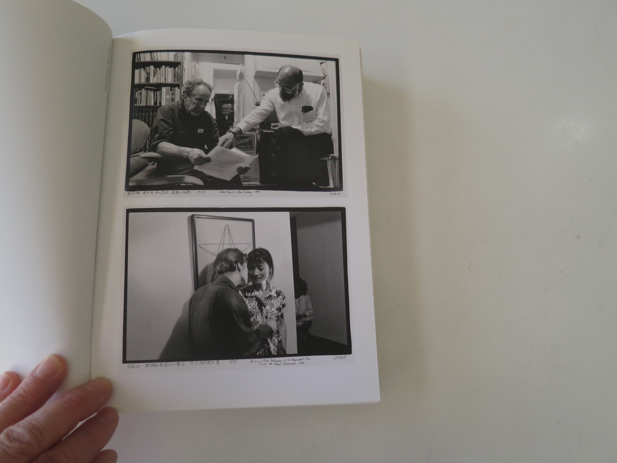
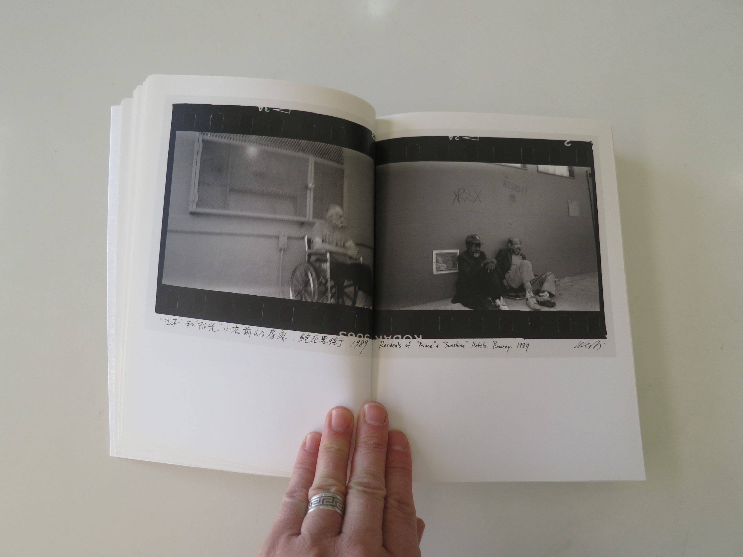
Heidi: Tell us why you choose to shoot digital despite having a penchant for film? Chris: Like many photographers I prefer the look of film. It is what I grew up with and how I learned, so I transitioned to digital late and without a lot of love. Yet for what I ended up doing, taking pictures of people struggling, it ended up being necessary. Digital allowed me to immedietly show people their pictures, and should they not like them, allowed me to delete them. Few of the people I photograph ever have any control over how they are seen or viewed. Allowing them to look at my pictures of them, and then delete the ones they don’t like, gave them a little bit more control over the process.
You had an early interest in cameras, then it halted, what reignited your interest? I stopped taking pictures when it became hard to get film developed (2000-ish?). Until then I kept a few old fully manual cameras around, each with a different type of film in them, and would shoot whatever interested me.When it became hard to get the film developed as the industry transitioned to digital, I just kinda gave up. Also it was nice (as any photographer who has quit for awhile will tell you) to not feel pressure to “capture the moment” That changed when I started going on longer walks into areas I had not been before. I had always spent my free time going on very very long walks (20 miles sometimes) through NYC, but mostly it was Manhattan. Around 2006 I started walking more in Brooklyn, Queens, and what I saw there, and the people I met and the stories they told, got me interested in taking pictures again. Initially it was just a cheap point and shoot digital, but eventually I got so into it that I bought a high end 35MM camera
How did you come up with front row/ back row? or what that already a term? I came up with that term after roughly four years of documenting frustrated communities. Initially that meant spending time in South Bronx & Queens & poor other mostly urban neighborhoods in the North East (Bridgeport CT, Providence RI, etc). Eventually I included poor rural communities in Ohio, West Virginia, and Texas. What I realized was despite the differences, despites some being rural, some urban, some mostly African-american or Hispanic, or White, all had many things in common. Not just physical things, but in the challenges the residents faced, and how they responded, and how they viewed the world. Also, almost all of these communities where filled with people who hadn’t gotten a lot of education beyond High School. That was very different from the communities I had spent the prior twenty five years of my life in, and where my family lived. Those communities, while spread all over the country, were similar in that almost everyone had an advanced education. The split I was seeing in the country was as much, if not more, about education than anything else.
How does your previous Wall Street Job of analysis work transcend into this visual analysis and does one inform the other? While I am proud my book uses no statistics, which can only dehumanize the problem, I did spend a lot of time looking at maps, statistics, and data when I chose where do go. I wanted to give a realistic and balanced look at poverty in America, so I went to places that in aggregate reflected the statistics on poverty. By race, geography, and community size. In that sense, my prior Wall Street work was useful. Mostly however, this project was about unlearning so much I had learned on Wall Street. How to look beyond those statistics to see the individuals impacted.
Describe your drift from the trading floor to taking photos only, what changed within you? I wish I had a simple answer to this, but I just don’t. As my career on Wall Street progressed I became more and more frustrated with it and how we thought, and found my interest drifting towards other things, like my hobbies (photography & walking) and my family. I stopped spending the extra weekend in the office and spent that time going on extra long walks, or small trips with the family. It is those walks, ones that had no real point beyond seeing, talking, and photographing people, that I realized I was the happiest. Work, which I once enjoyed, became more and more a chore, and I focused less and less on
What has the past few years taught you about yourself? I hope humility. Many of us in the front row feel we have all the answers, and one of the things I tried to express in my book is we probably don’t. Which is why I didn’t include any solutions in the book. I realize I have a long way though before I can really claim to have learned true humility.
What would you tell your younger self? Don’t listen so much to gatekeepers. Those people in industries (Photography, journalism, business) who try and define what and how something can be done. There is less gatekeeping in things like Physics or Math, but they are there also. Be more confident when you think the status quo is wrong.
How difficult was it to arrive in a neighborhood with no camera and just be, try to fit in? and what myth or misconception revealed itself? For me it has never really been a problem. My general rule is be confident without being arrogant. Don’t cause problems. You are a visitor and that means respecting how things are done, and to do that you have to figure out first how things are done. That means watching and listening, not questioning and rocking the boat. I realize being a kinda large white guy makes it easier for me. I think the biggest myth is it is hard to get people to talk. Often it is the opposite. It is hard to get them to stop talking!
Why is the backrow easier or different from the front row since you vacillate between both? you said at one point on our call the back row was less measured and simpler in a way I think there is more forgiveness for failure, or for sins, or for mistakes. Partly this is a necessity. Most people in the very back row have had a life filled with problems, and have to be more forgiving of the mistakes of others. There is an understanding that life is tough and most people do their best to survive it. I also find that friendships and personal dealings feel more genuine, and less about seeing what someone else can do for you.
How does this freedom of toggling affect you? or does it make being in the row tolerable because you can leave it? It is confusing and frustrating. I am firmly a member of the front row, there is no denying that. Most of my best friends are front row, and I enjoy their company. I also like much of what the front row likes. I love academics, I love reading obscure academic books. But I also don’t feel I fit in anymore, because I don’t necessarily share the values I used to have. I don’t fit in with the back row either, simply because that isn’t who I am anymore, despite having grown up surrounded by it. So it is frustrating
Why did you stop working and start taking photographs? I started taking pictures again, more seriously, around 2009 and eventually left my full time banking job mid 2012
Tell us about your next project and how you chose those locations? I have two projects in mind. One is a continuation of the Dignity project, but with more in depth interviews and less of my voice. Over the last seven years I have briefly visited places that stay in my mind, that I can’t shake. I want to go back to those places and spend two weeks in each, talking to whoever.
The other project is on global slums. I spent a month recently in Jakarta, just walking around the poorer parts of the town, without a camera. Roughly 1/5 of the world lives in these ad hock self organized poor neighborhoods (slums, or barrios, or whatever derisive term), in mega-cities we never really talk about. Like Calcutta, or La Paz, or Jakarta, or Dhakka, or so many others
Jesus, a young Jewish preacher, a rebel and an upstart, challenging the status quo in Israel, which was then a vassal of the Roman Empire.
He kicked up shit for the Jews the Romans put in charge, and also for the Romans themselves, and was killed for it in an awful way.
I did a bunch of reading on the subject this morning, readying for the piece, and was not surprised to learn the sad ending of the story, (for the man Jesus, anyway,) was all about money and power.
The Rabbis were charging people to get “clean” enough to pray, making bank, and Jesus called them out for it. (All this I learned from an archived BBC website.)
Later, a massive religion grew up in his name, with billions of people believing he rose from the dead, after being crucified to death, and that he was actually a combination of man, God, and the Son of God.
Judaism, the religion Jesus was born, lived and died believing, claims that no Messiah, no divine being, has yet come back to Earth, but billions of Christians disagree.
Honestly, as Jews, we must see some missed opportunities, with Islam and Christianity sprouting from our religion, becoming the two biggest faith systems on Earth, while we’re a few measly million people in this world.
Why am I on about this today?
Where can this possibly be going?
I know you must be asking yourself that.
Come on.
Admit it.
Part 2. Leaving comfort zones
The truth is that 2020 has felt different than #2019, and I’m shaking things up accordingly. (For example, no early-morning email check, to keep the cortisol down for a few hours.)
So last Friday, my wife and I decided to do something we never, ever do.
On Friday late-afternoon, after our son has his Hebrew practice, the four of us piled into the car to leave Taos, driving the hour and forty-five minutes to Santa Fe, just beating the dark, so we could attend a public opening at the New Mexico Museum of Art.
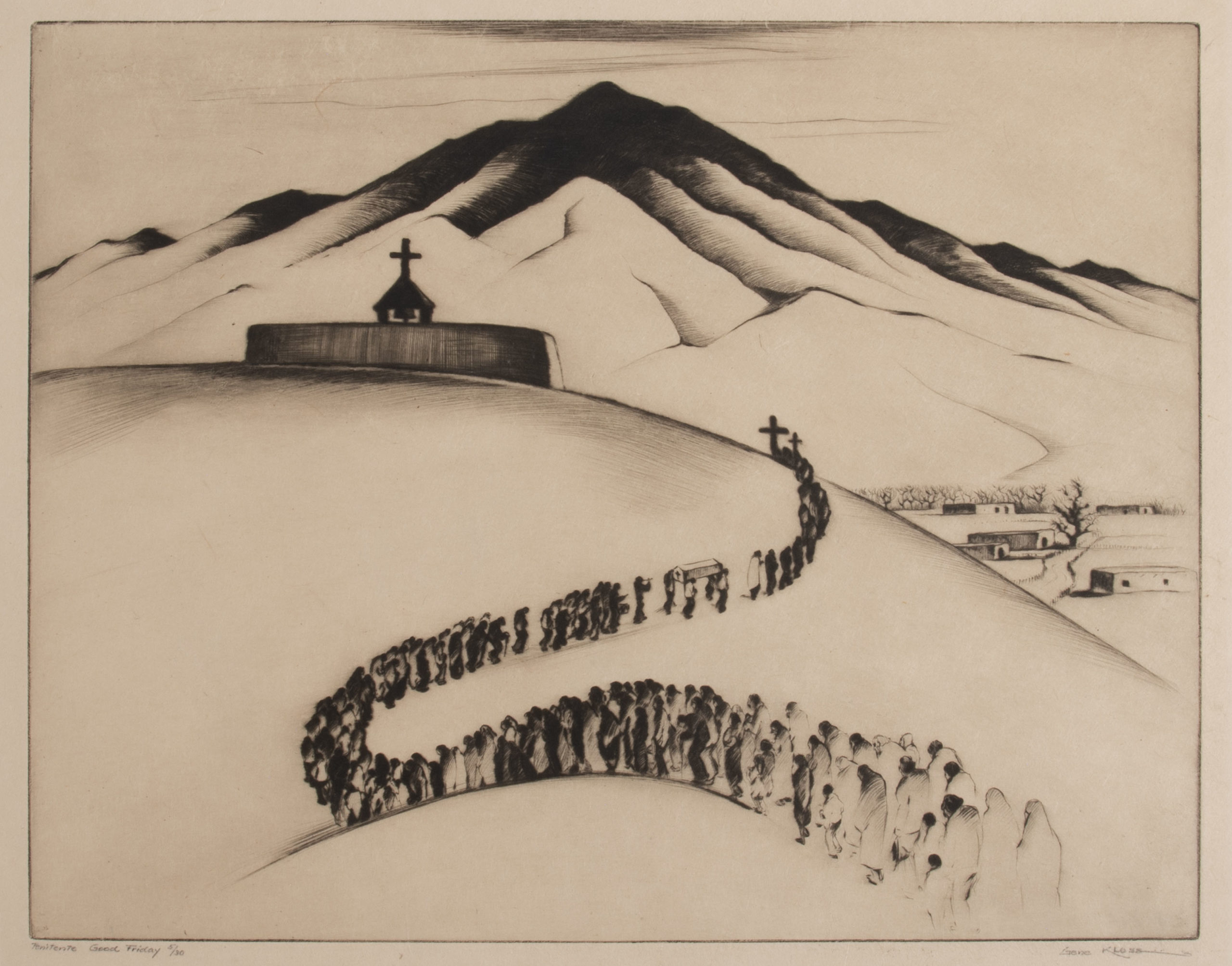
I’d been overdue to see an exhibit there, curated by Christian Waguespack, which focuses on the Penitente culture in Northern New Mexico.
It was a 17th through 20th Century local, Spanish Colonial Catholic tradition in which men would pray together, whipping and flagellating themselves, in a small building in each community called a Morada.
They also staged fake crucifixions, and other seemingly extreme Catholic traditions imported from Spain.
By the time we rolled into Santa Fe, the sky was rapidly blackening, and our collective hunger was rising.
The parent in me thought: we’ve got to avoid a collective food crash.
The art critic in me thought, let’s get to the museum first, since it’s on the way, and we’ll get more time there.
(Quick snack at Trader Joe’s it was.)
We arrived at the New Mexico Museum of Art shortly thereafter, after a short walk across the plaza, which featured large trees extravagantly lit in non-harmonious colors.
There were nice snacks in the lobby, and free admission, so my kids each ate a cheese chunk or two, though I was waiting for good restaurant food.
(The Santa Fe food scene is much better than ours in Taos, IMO.)
We headed through a lovely tent, covering the open courtyard of the early 20th Century building, and then into the special exhibition section in the Museum.
(I’d decided to come trusting it would be cool, not bothering to learn the details ahead of time, if I’m being honest.)
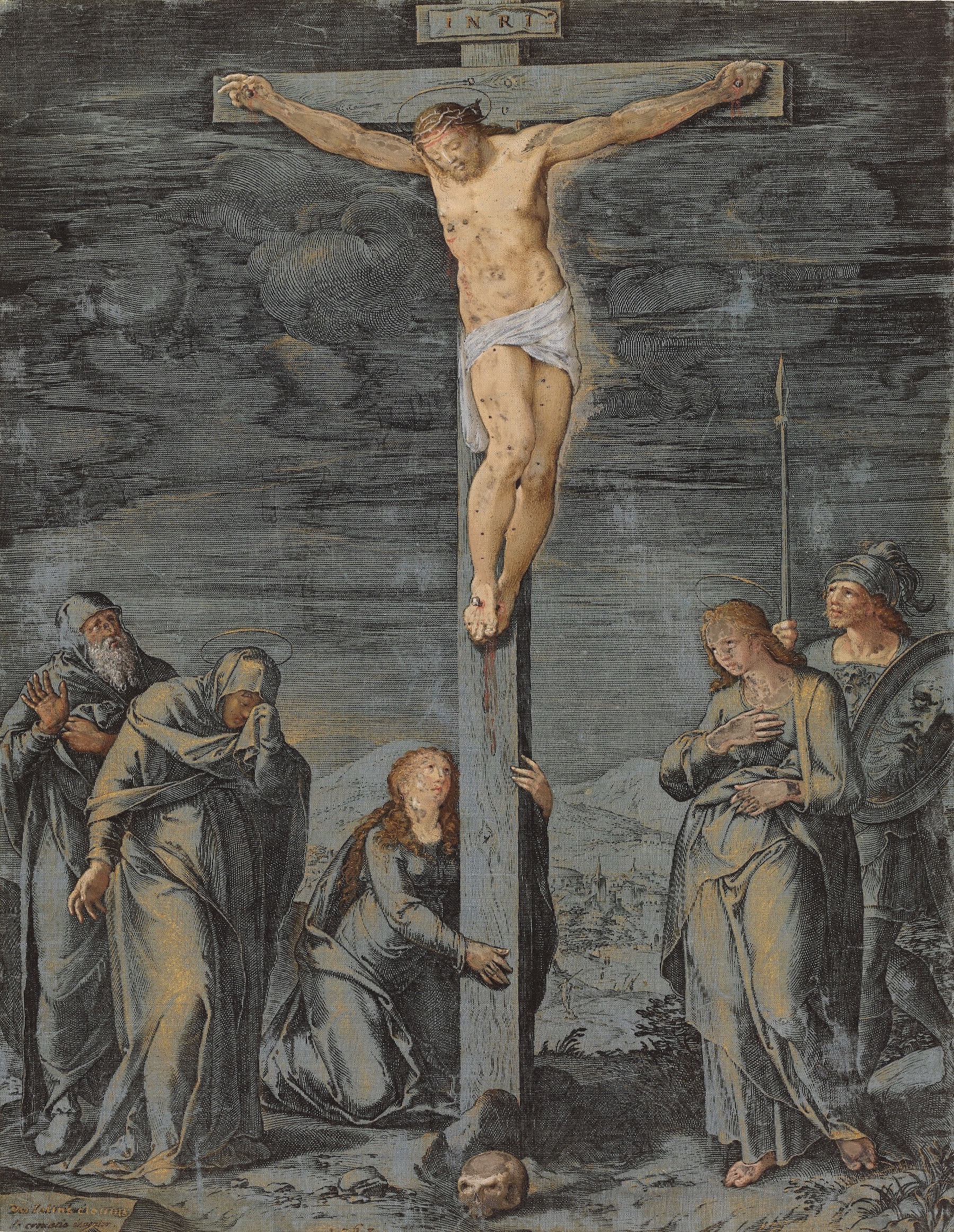
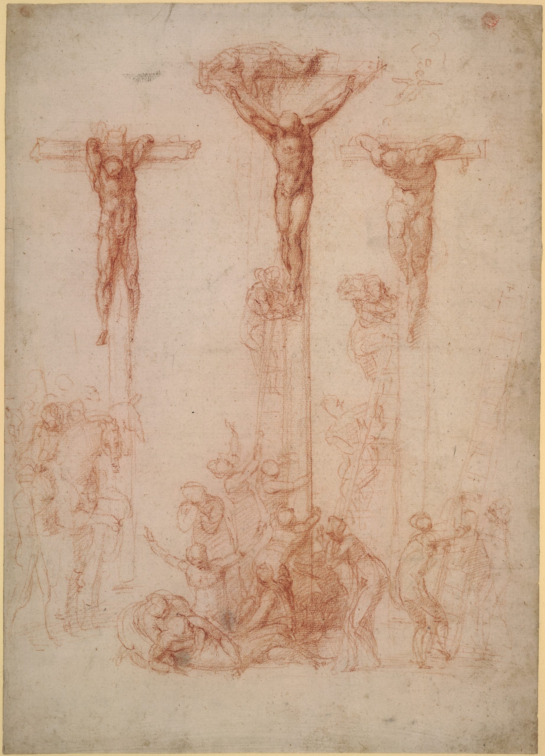
And there were indeed masterpieces on the walls, some of which were drawn, others a wash in a light ochre.
Michelangelo, stood out, as did Filippo Lippi.
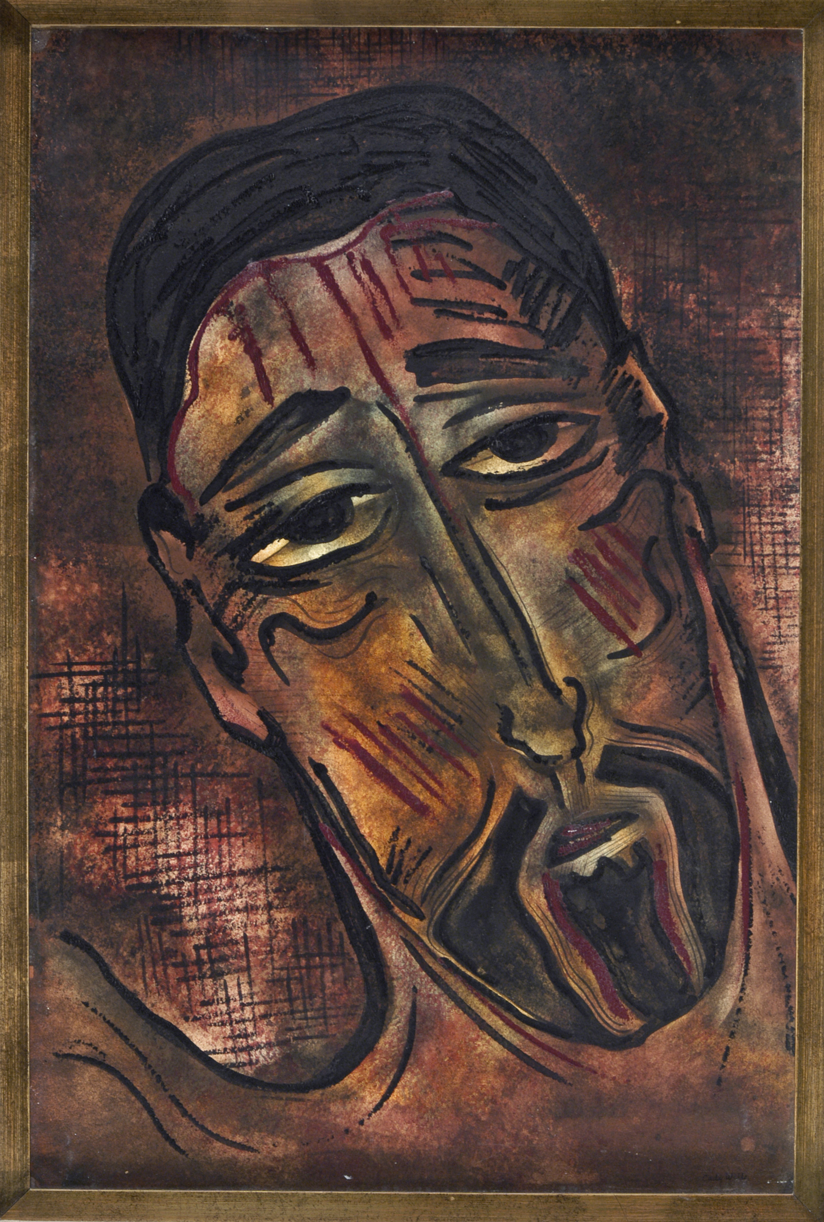
Cornelis Cort, The Crucifixion, after Giulio Clovio, 1568, Hand-colored engraving with bodycolor, heightened with gold and white, printed on blue-gray silk. Credit: The Trustees of the British MuseumSchool of Andrea Mantegna, The Descent from the Cross, 1470–1500, engraving. Credit: The Trustees of the British MuseumMichelangelo, The Three Crosses, 1521-1524, red chalk. Credit: The Trustees of the British Museum
My daughter fled quickly, with my wife in tow, and I only briefly heard, “she wants to draw at the kid’s station out there.” (I later learned the pictures freaked her out.)
My son and I flitted about, getting hungrier by the moment, with many of the pictures being properly ogled by the a nice-sized crowd.
All the masterpieces were on loan from the British Museum, so it was an opportunity for New Mexicans to see old-school, proper European art, without having to leave the continent.
Frankly, I felt like the smart move would be to come back, without the crowds, to sink into the details of admiring a 500 year old drawing, without someone waiting their turn.
Here’s where I tell the truth, because the same curator was responsible for both exhibitions.
The paintings, drawings and photos in the smaller Penitente show, while local and younger, had a creepy, scary, powerful, religious juju that blew me away.
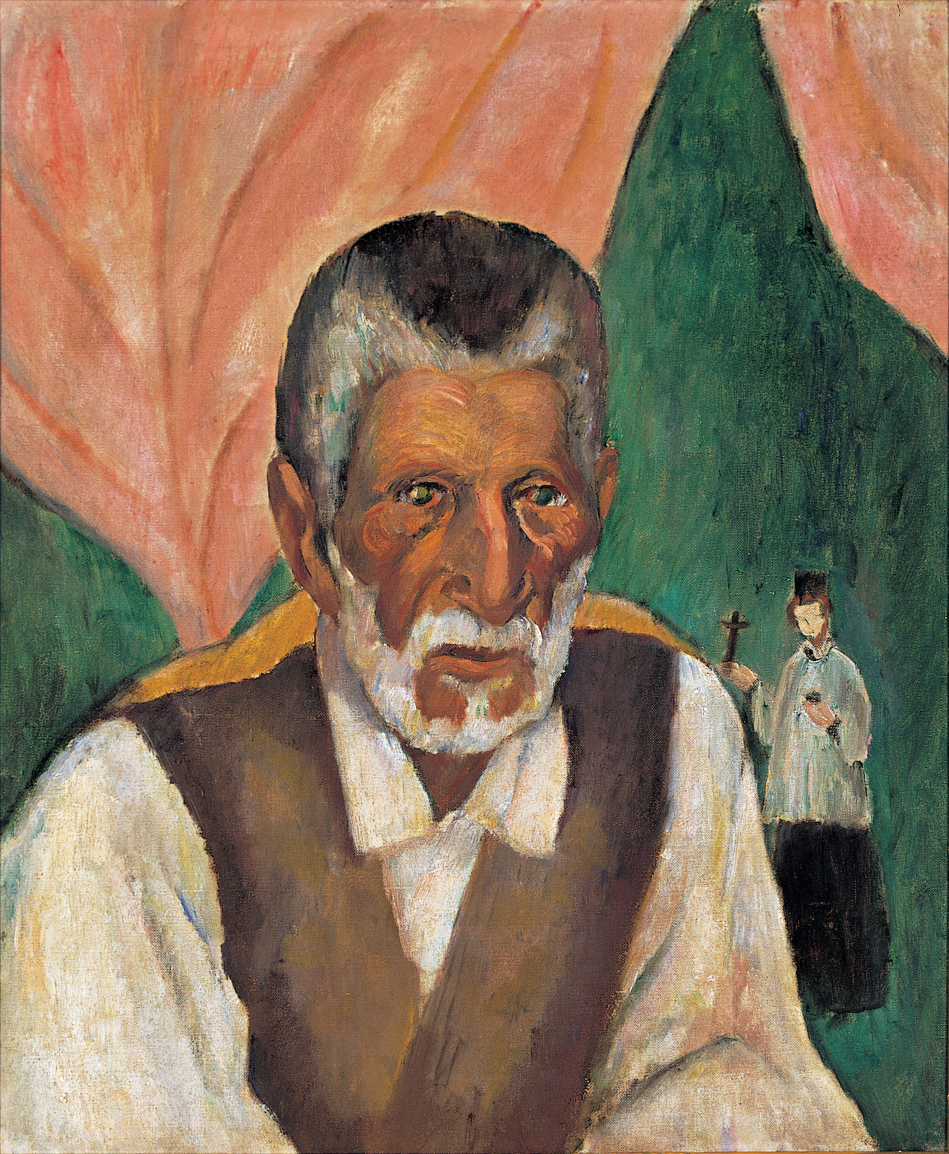
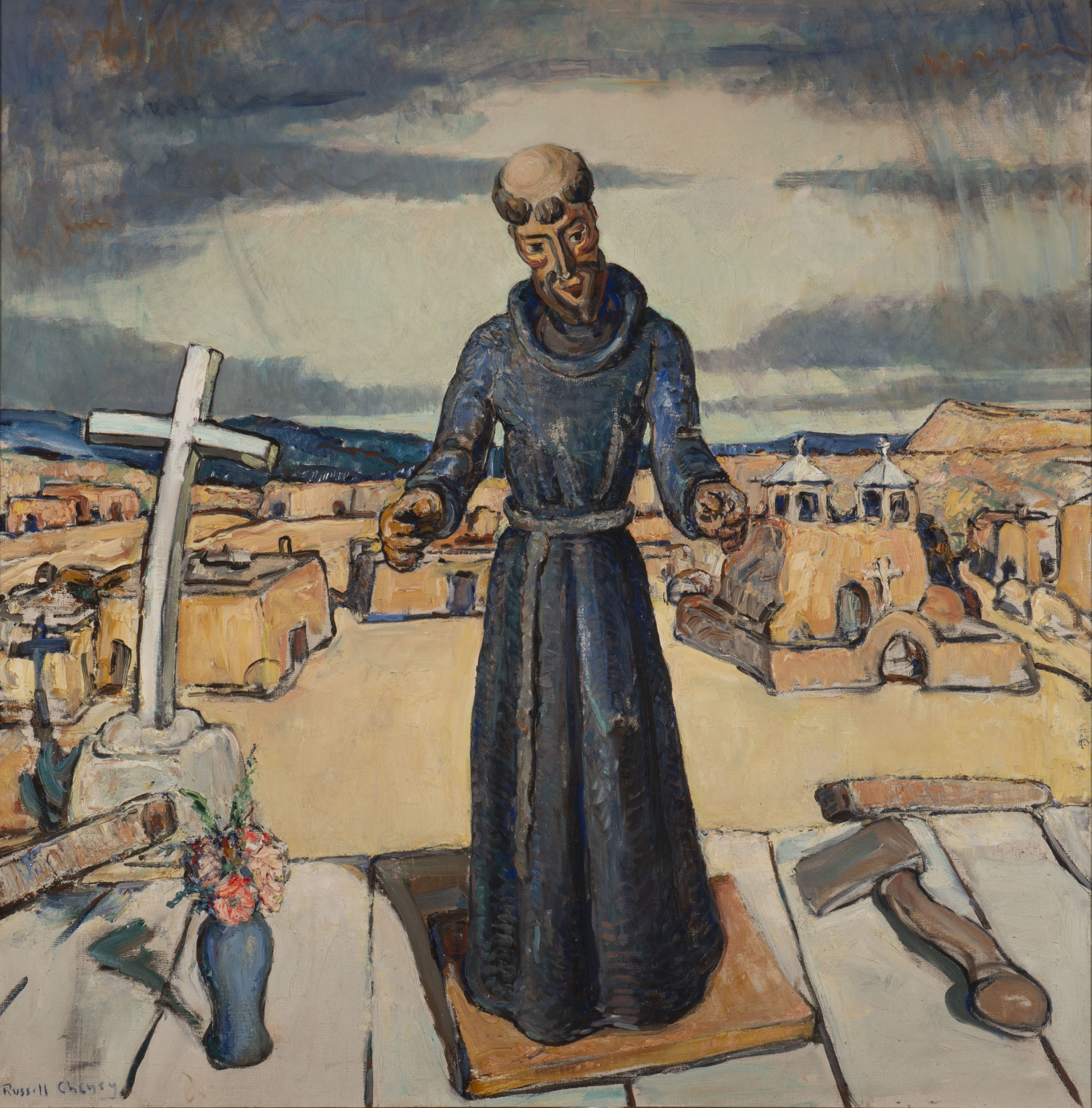
Paul Burlin, The Sacristan of Trampas, 1918, oil on canvas, 23 1/4 x 19 1/2 in. New Mexico Museum of Art. Museum purchase, before 1922 (118.23P) Photo by Blair Clark.Russell Cheney, New Mexico (Penitente), 1929, oil on canvas, 39 1/2 x 39 1/2 in. New Mexico Museum of Art. Gift of Russell Cheney, 1942 (1181.23P) Photo by Cameron Gay.
I kept saying, “I need to come back. I need to come back.”
(Rather than, “I’d like to come back.”)
Because each object was so tight, and in the smaller rooms, with the lower ceilings, in which the Northern New Mexican architecture so clearly matched the subject matter in the work, everything felt just perfect.
For all the talk of Meow Wolf, (which in fairness I have yet to visit,) and the Instagramification of the world, with backdrops mattering more than reality, I thought this show was a breath of fresh air.
(Of creepy air, I mean.)
I didn’t have enough time to process each piece, with my stomach rumbling, but the self-flagellations were there and the crucifixes.
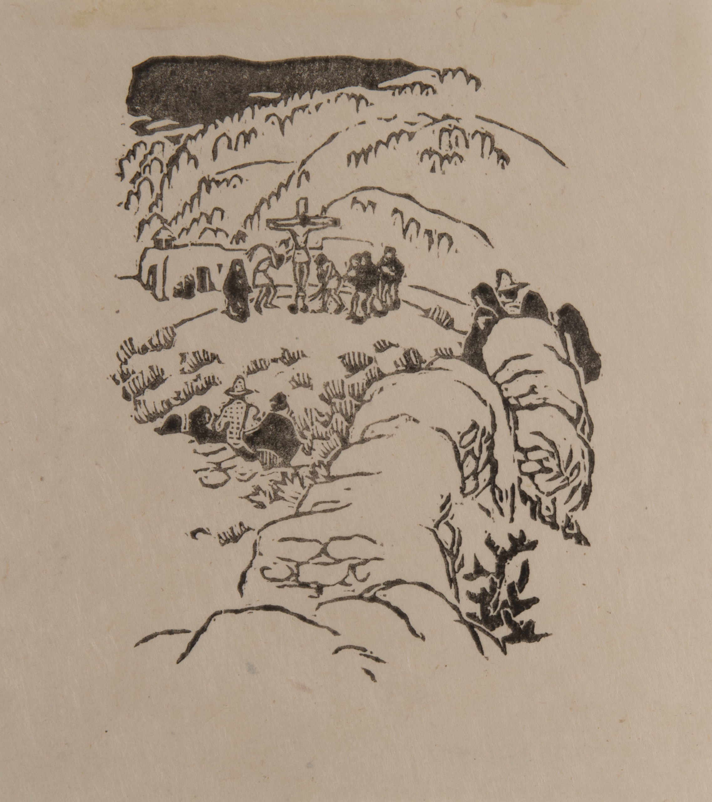
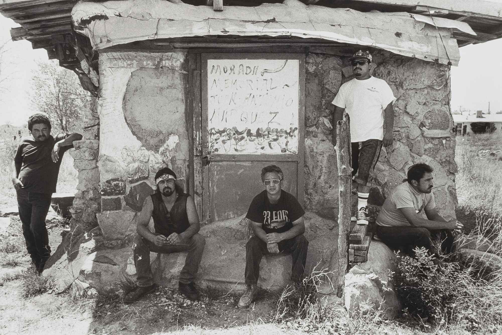
There was one standout, black and white documentary photo by Miguel Gandert, of some 20th Century Northern New Mexican Penitentes, in street clothes, outside the Morada.
You know, week ago, I hadn’t given Jesus much thought.
(Though with American politicians like Mike Pompeo actively awaiting the Rapture, maybe we should all think about Jesus more often?)
But then I saw those two art shows, and the imagery bore down into my consciousness like a dental drill.
Part 3. Kick it up a notch
After a weekend spent moving washing machines, learning stick fighting, and hanging pictures, we kicked it up a notch on Tuesday, when my wife had the day off from work.
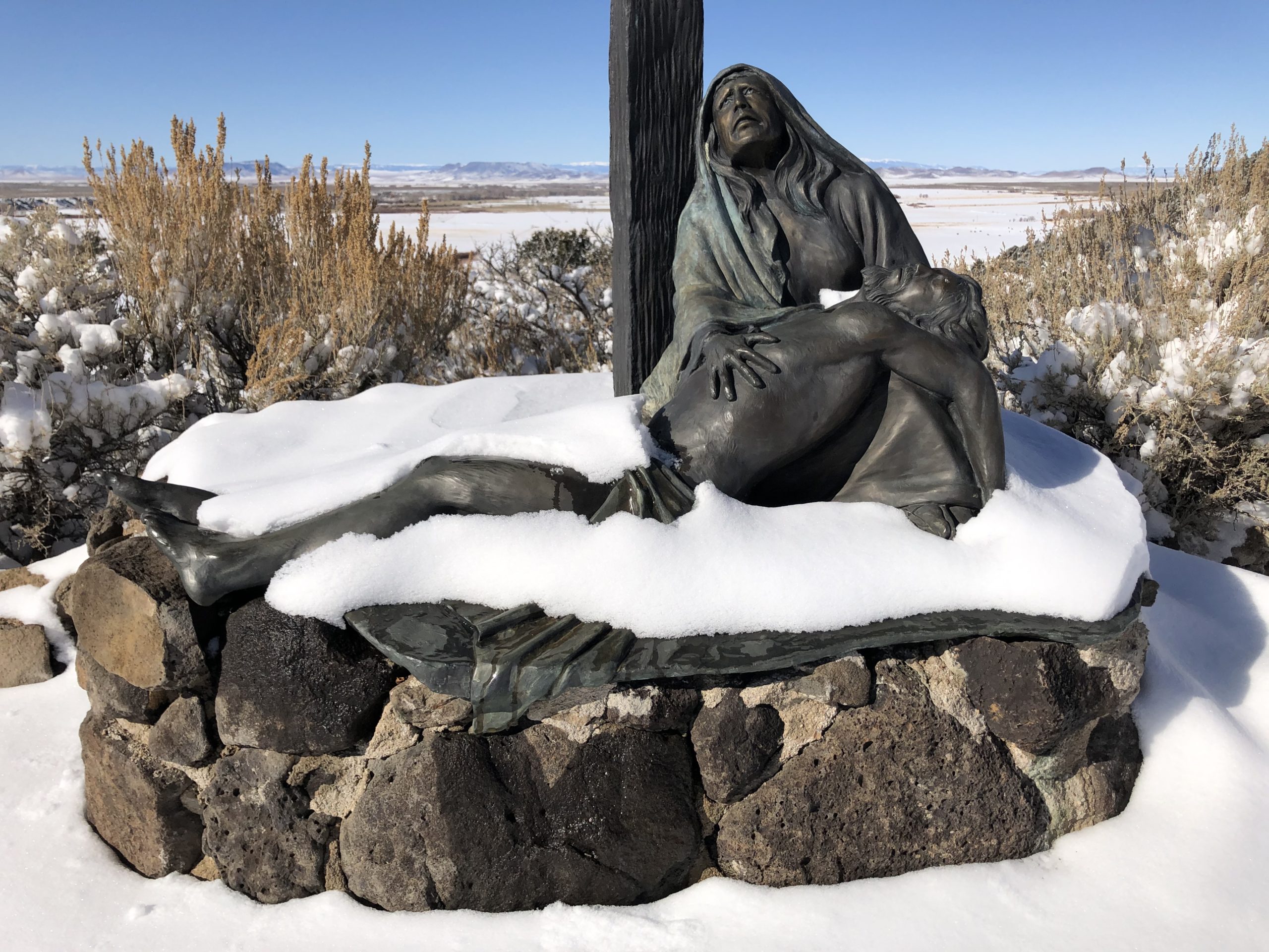
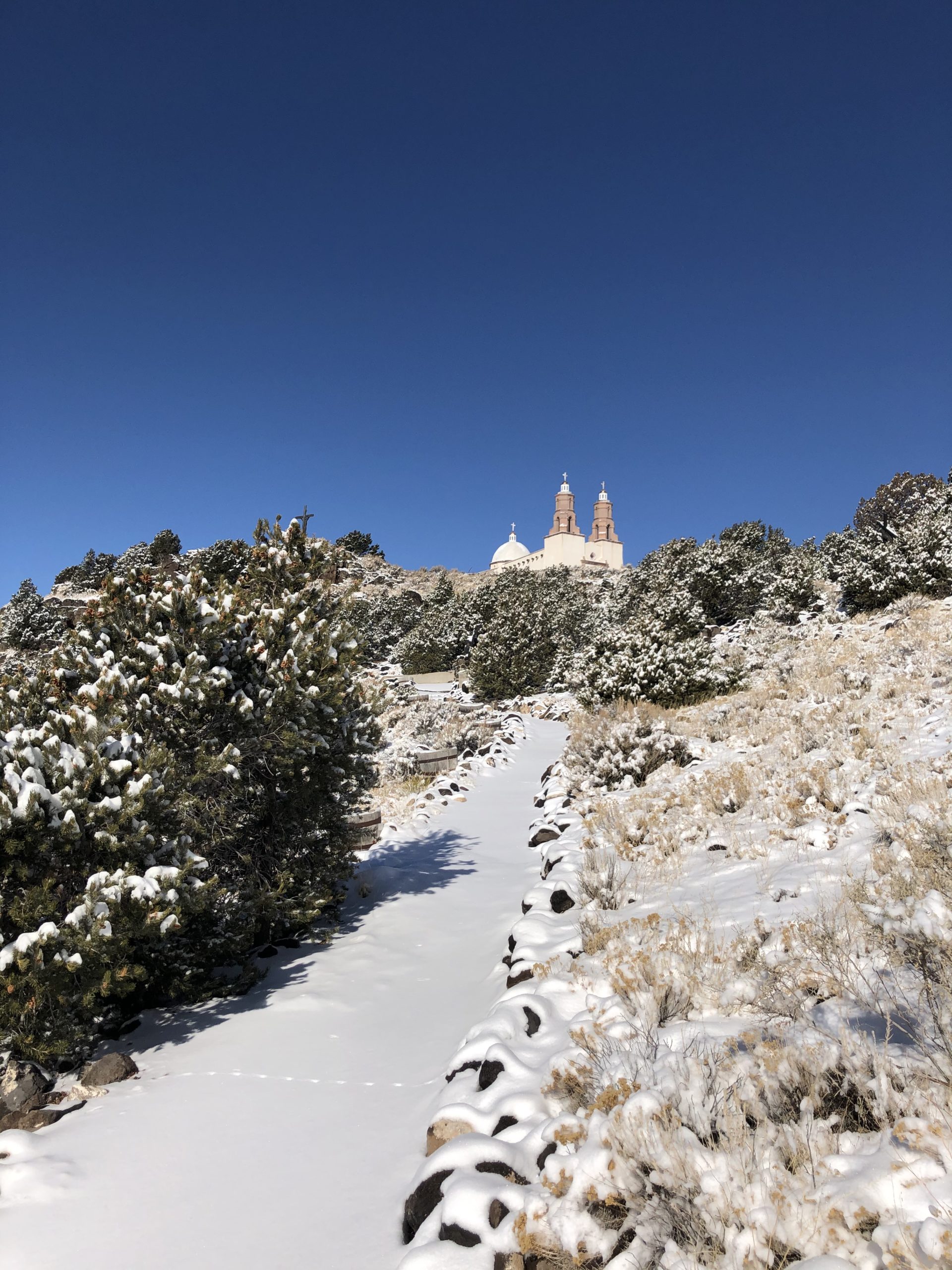
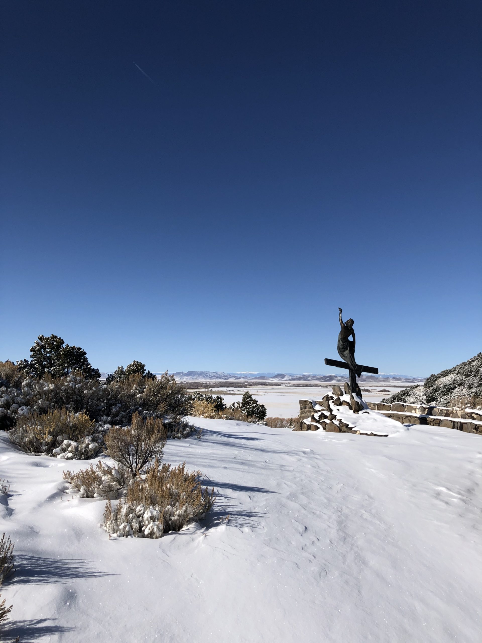
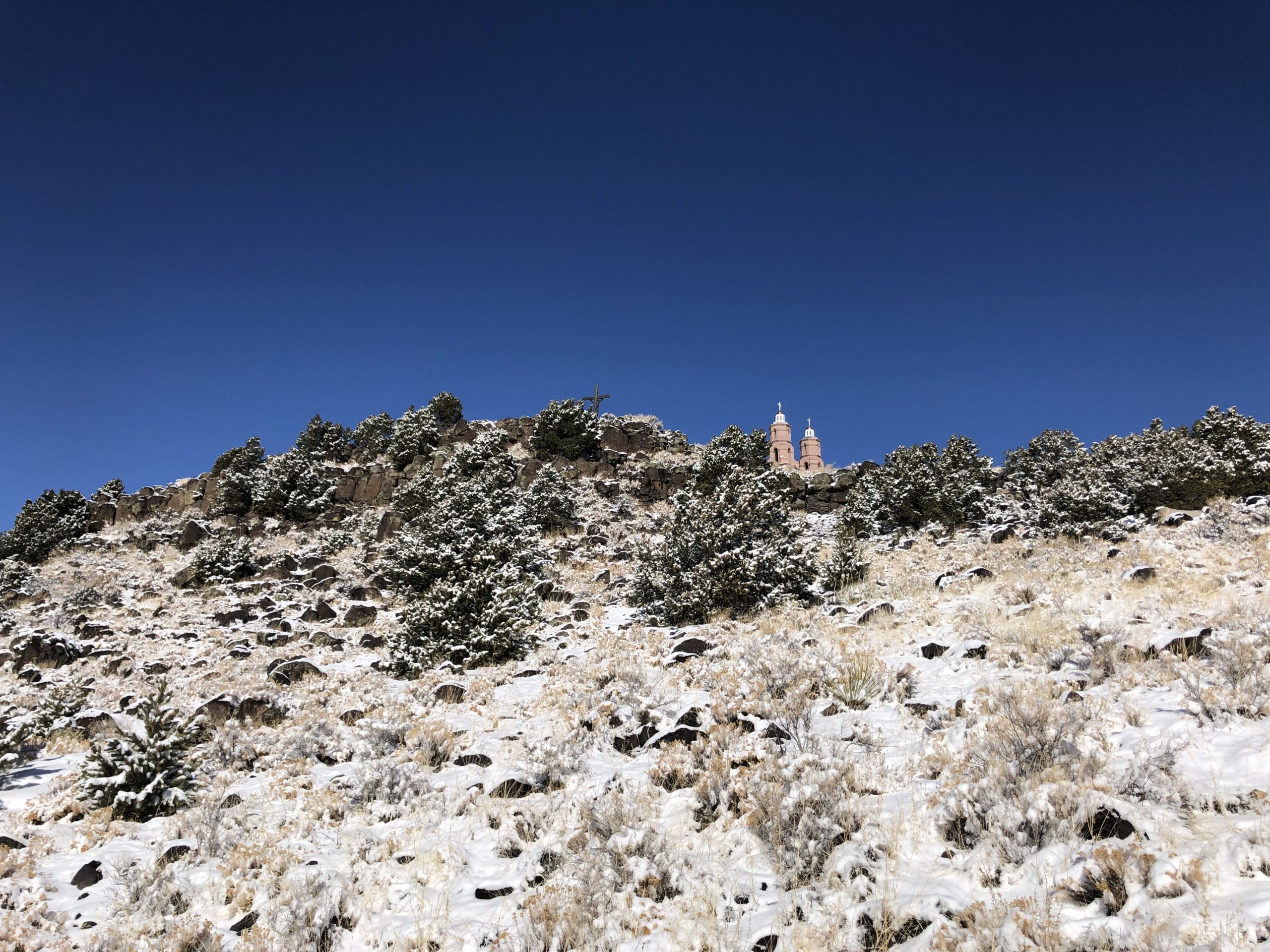
She suggested we cross the border to San Luis, Colorado to visit the Stations of the Cross Shrine that looms above town. (Among other reasons.)
Jessie had always wanted to do it, and again, in 2020 we’re gunning for new things, so I said yes.
I swear, I made no connection to the intense, Catholic work I saw in Santa Fe, nor did I plan to write this column.
We parked the car next to the humble town hall, and were instantly met by a huge old dog, who leaned into me for pets.
He was sweet, and a chunky collar said his name was Bam Bam, the Mayor.
It had snowed the night before, and Bam Bam accompanied us across the street, and a little foot-bridge, where we soon blazed our own trail in the 5 inch snow, as no one had yet gone all the way up the hill.
Bam Bam seemed an apparition, or a spirit guide, there was no way around it, and when he chose to turn back, we waved, and kept on alone.
We broke trail in fresh snow against a perfectly blue sky.
There were no people around.
It was all ours.
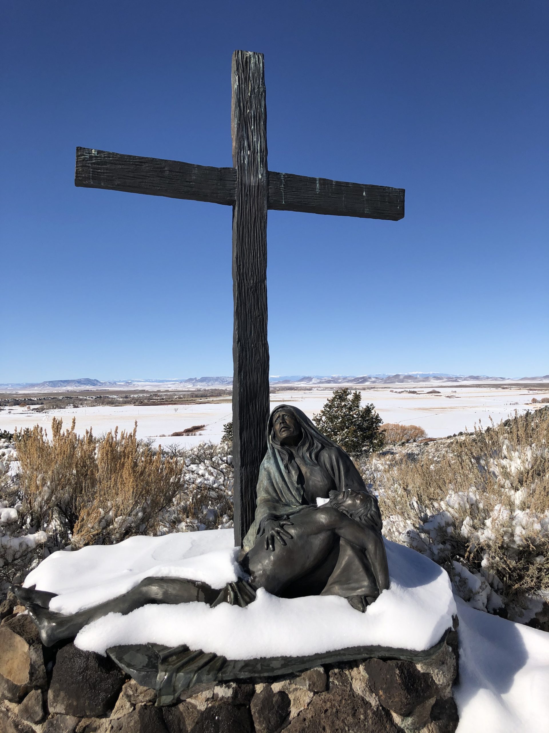
Up we went, stopping occasionally to check out the sculptures honoring Jesus’ last ascent, with his cross, to be crucified.
I believe there were 14 bronze sculptures in all, by local artist Huberto Maestas.
(You knew I’d come back around to it, right?)
Jessie and I remembered the Carmel Mission, and how it was similar in its intense combination of beauty and spirituality.
But the setting here, on a mesa-top called the Hill of Piety and Mercy, surrounded by snow-covered, jagged Rocky Mountain peaks in the Wild West, was unlike anything I’ve experienced before.
I stopped at the Pieta sculpture, Jesus draped across Mary’s lap, (which I now know is a subset of the Lamentations, thanks to the excellent NM Museum of Art Gallery Guide,) and made this video for you.
I’m not sure I’ve ever been to a more stunning location for a piece of art, nor at a more perfect moment to view it.
I’ve seen better art, in more famous places, but nothing more perfect than this spot.
Finally, we circled around to try to enter the shrine, which is in a Spanish Colonial style, (in honor of the local ancestors,) but it was obviously locked on a snowy morning.
So down we went, occasionally pausing to take in the Sangre de Cristos to the East, and the Conejos Mountains to the West, with the sun burning happiness into our cheeks.
Listen up.
If you’re coming to Taos, or Santa Fe, or Southern Colorado, I can not suggest this place more highly.
(And I didn’t even get into the Shrine.)
The strangest part, if you ask me, the one that ties this tale together, across the Millennia, is that I would have bet anything the chapel, La Capilla de Todos Los Santos, was built in the 19th Century.
Taos families pushed North into the San Luis Valley in the 1840’s, and the town was officially founded by those Spanish Colonial Catholics in 1851.
But it was a town made of dirt back then, at the edge of nowhere.
With no resources.
(I guess I didn’t think it through.)
So my research turned up that it was built, as an offering of peace and love from the San Luis parish, in 1986!
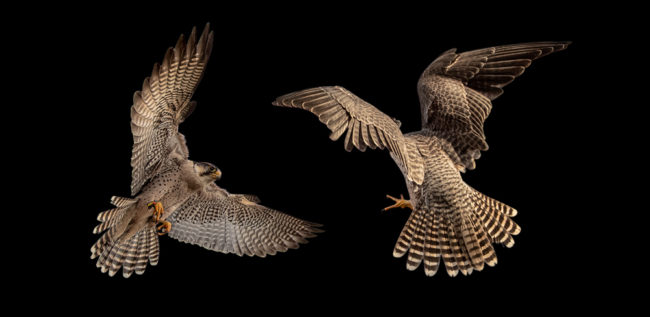
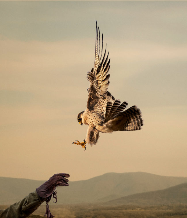
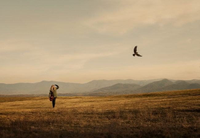
The Art of the Personal Project is a crucial element to let potential buyers see how you think creatively on your own. I am drawn to personal projects that have an interesting vision or that show something I have never seen before. In this thread, I’ll include a link to each personal project with the artist statement so you can see more of the project. Please note: This thread is not affiliated with any company; I’m just featuring projects that I find. Please DO NOT send me your work. I do not take submissions.
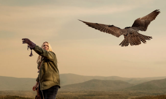
I live in a part of Virginia with my wife and kids, where on a daily basis we get to enjoy wildlife right outside our windows. Fox, deer, owls, coyote and falcon can be daily visitors to our backyard.
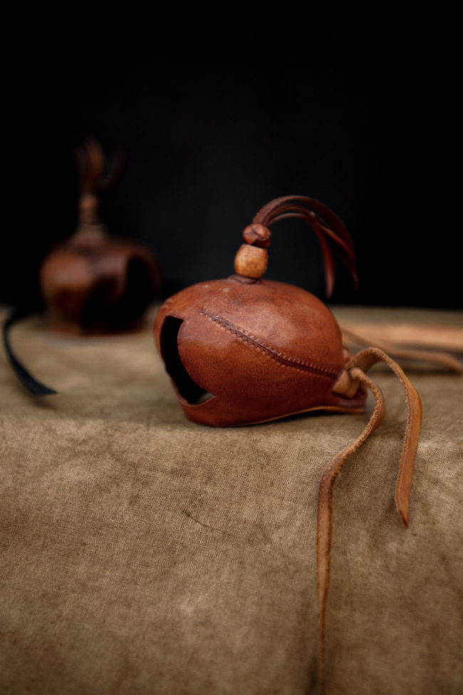
I’ve seen photo projects on Falcons before, but I felt like I had a unique way to tell the story of these incredible birds. So, I did what every good researcher does, I googled “Falconry Virginia”.
Our day trip to the mountains was a reminder of why I picked up a camera in the first place many years ago. I believe these personal projects are the lifeblood of any long and healthy photo career. They take me back to when I first started in photography and my singular pursuit was to create images that made me happy or allowed me a creative path to express myself.
Most photographers who have been in this business for a while would likely say that the “business” of photography has the potential to dull their original vision with a blur of rules, current styles and red tape. It’s the personal project that can be a reminder of why you started down this road in the first place. Just for the love of making pictures.
I’ve often heard that Art Producer’s enjoy seeing an artist’s personal work, because it’s a window into their heart. Consistent personal work helps me stay fueled and sharp so that I can be the best creative collaborator I can be, for my clients.
After I shot the Falcon series, I asked an editor friend of mine if they would be interested in running this as a story and he said yes. So, happily it took on another life in print.
The Falcons won in the Communication Arts 2019 Photo Annual editorial category and the full series won a Gold award in the Graphis Photography Annual 2020. And a huge bonus, It was also selected for the cover image of the Graphis Photography Annual 2020.
APE contributor Suzanne Sease currently works as a consultant for photographers and illustrators around the world. She has been involved in the photography and illustration industry since the mid 80s. After establishing the art buying department at The Martin Agency, then working for Kaplan-Thaler, Capital One, Best Buy and numerous smaller agencies and companies, she decided to be a consultant in 1999. She has a new Twitter feed with helpful marketing information because she believes that marketing should be driven by brand and not by specialty. Follow her at @SuzanneSease. Instagram
Success is more than a matter of your talent. It’s also a matter of doing a better job presenting it. And that is what I do with decades of agency and in-house experience.
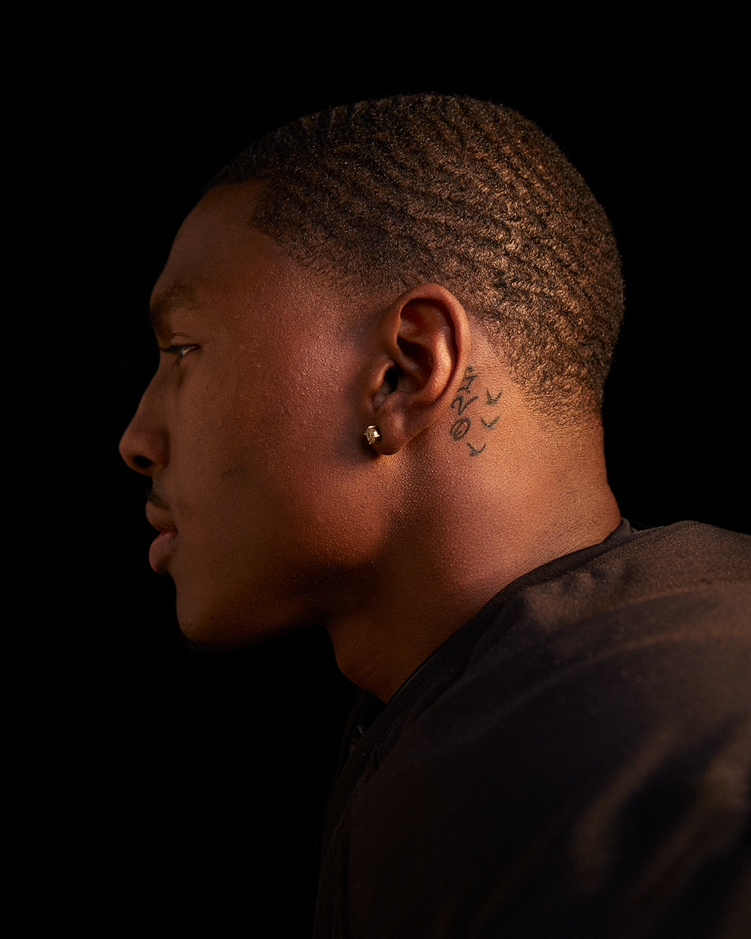
Heidi: How long have you been shooting the for the NFLPA? (National Football League Players Association) Dominic: For the last 4 years I have been shooting the incoming class of NFL rookies for the NFLPA (National Football League Players Association). This entails me photographing over 40 professional athletes over a two day period.
How long to do you have each player? I have each player for about 5-10 minutes total so there is a challenge to connect with them quickly and successfully accomplish our shot list which includes many variations in two different lighting setups.
What tools do you rely on to make a fast connection? To help achieve this I always do some research on the individual players and try to find something interesting to ask them about, play their favorite music, or any other technique that will quickly engage them. This quick connection is very important on these days as these players schedules are packed with meetings and obligations so it is easy for them to be mentally fatigued. I thrive on the challenge to connect with my subjects in a short period of time despite the fact that they all have very different personalities and their comfort in front of the camera can vary greatly.
How are these images used? The NLFPA uses the images from our shoot as a catalog of assets they can make available to corporate sponsors throughout the NFL season.
Tell us about these two portraits. Two of the players shot this season for this project will be in the Super Bowl on February 2nd and played major roles in their teams success this year. Nick Bosa of the San Francisco 49ers and Mecole Hardman of the Kansas City Chiefs.
It seems like one of those compliments that is universally understood to be a good thing.
It means relatable.
Grounded.
Empathetic to others’ experience.
Humble.
Polite.
Thoughtful.
Respectful.
For some people though, (yes, they’re often rich,) the lure of being fake, affected and pretentious is just too strong.
In this case, I’m thinking about Gwyneth Paltrow, the occasional actress, full-time GOOP lifestyle guru/ magnate, likely vegan, and occasional television guest.
Last year, on Jon Favreau’s Netflix show, she denied, or “forgot,” multiple times, that she had acted in a Spiderman movie with the aforementioned Favreau.
To his face, on camera.
“Nope, nope. Not me. I wasn’t in Spiderman.”
It became a thing on the internet, of course, because how could it not, but she steadfastly went with the whole attitude of “I’m so rich and busy, and these silly comic superhero movies are kind of beneath me, so I refuse to lay down any memories of what I’ve done.”
“I’d rather be selling high end bath salts for $250 per gram, thank you very much.
I will simply pretend Pepper Potts, with her gauche auburn wig, simply does. not. exist.
Tony Stark can fuck off, for all I care.
I’m glad he’s dead.”
There was a time, though, early in her career as an actor, when she was properly talented, even garnering an Oscar for the admittedly mediocre “Shakespeare in Love.”
And she totally carried “Sliding Doors,” a seminal film, back when cinema still had a larger place in the grand cultural pantheon, in 1998.
There were two simultaneous timelines, and both played out during the course of the movie. Young Gwyneth Paltrow discovers her partner is cheating in one timeline, or she doesn’t in another, and the final consequences are dire.
Basically, she dies in one of the plot lines, and it’s terribly sad. The other ends with a glimmer of hope, after GP kicks her cheating man to the curb.
But my point, (as I always try to have one,) is that there were two simultaneous narratives going on.
Two timelines. And I’m on about parallel realities today for a reason.
I promise.
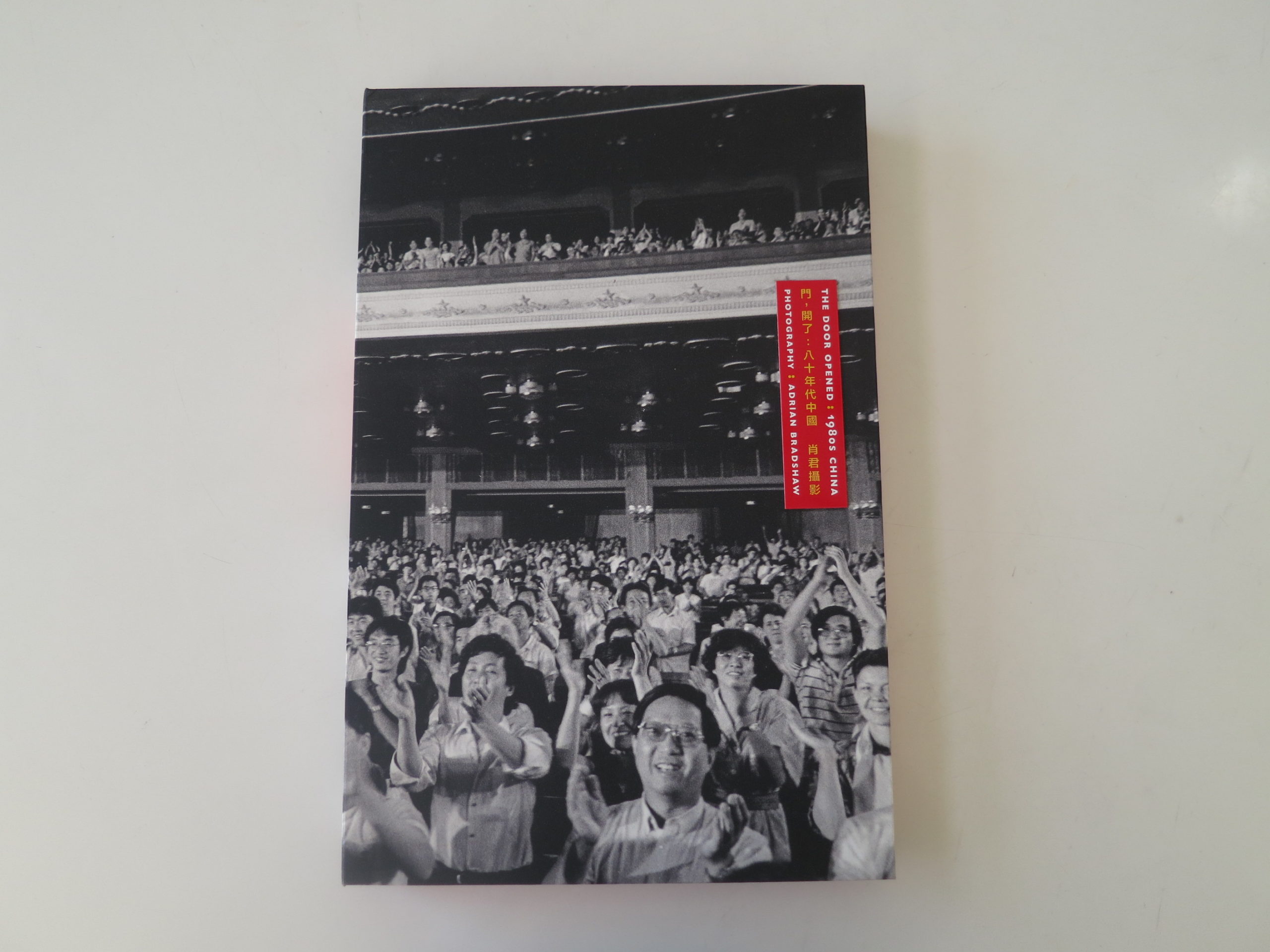
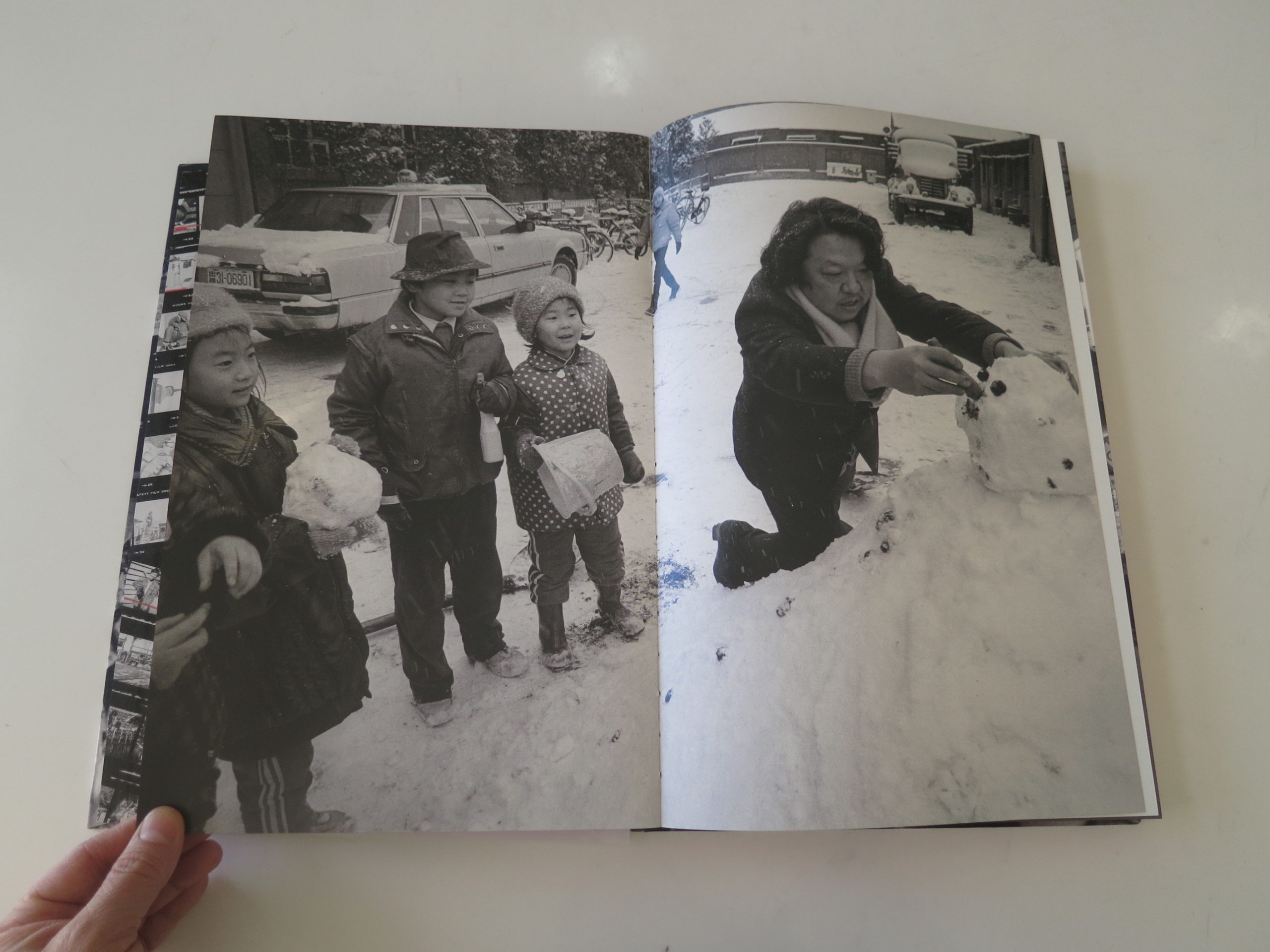
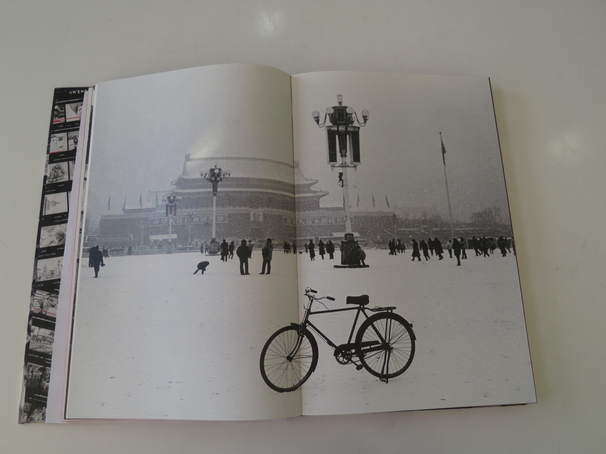
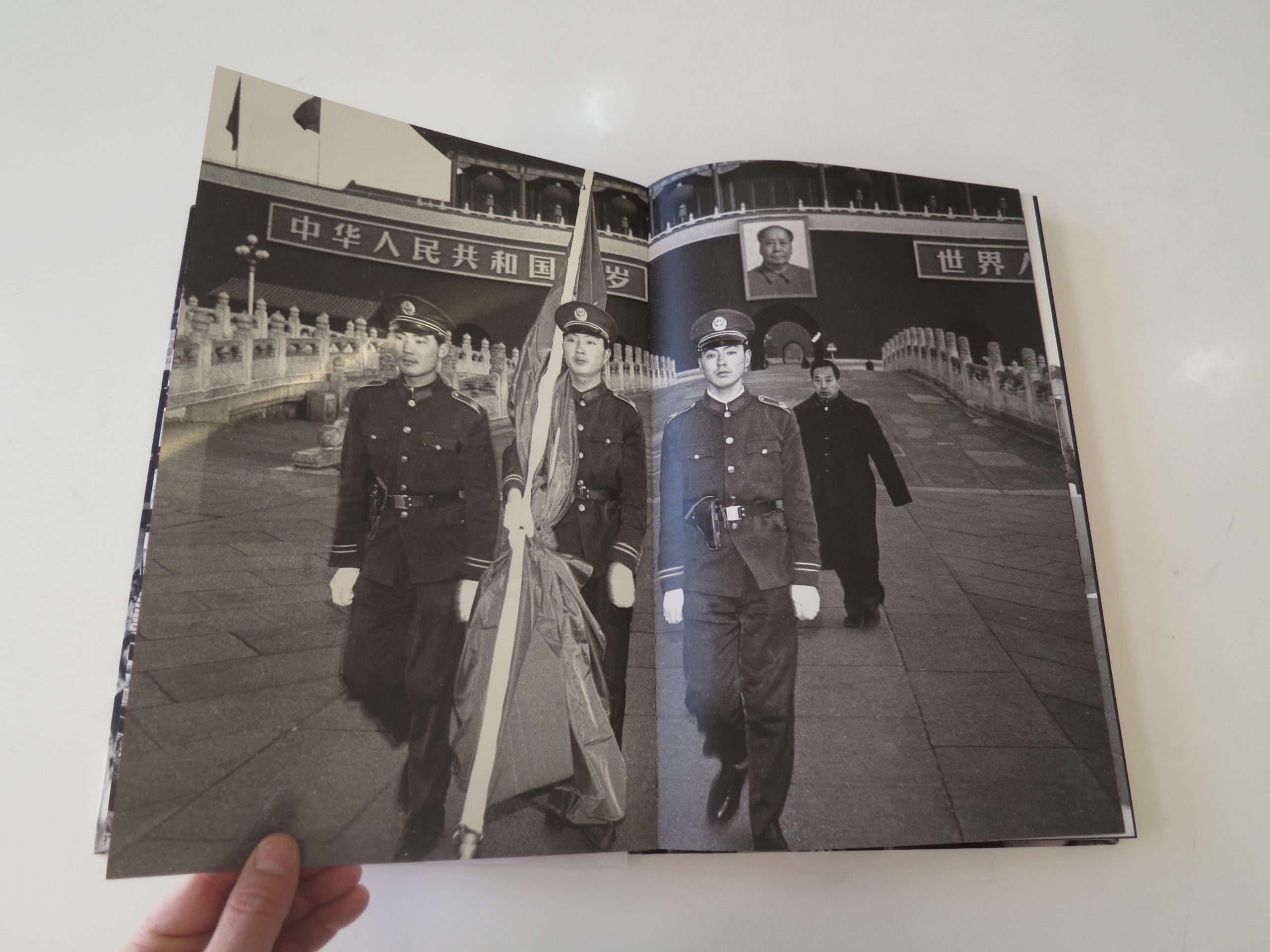
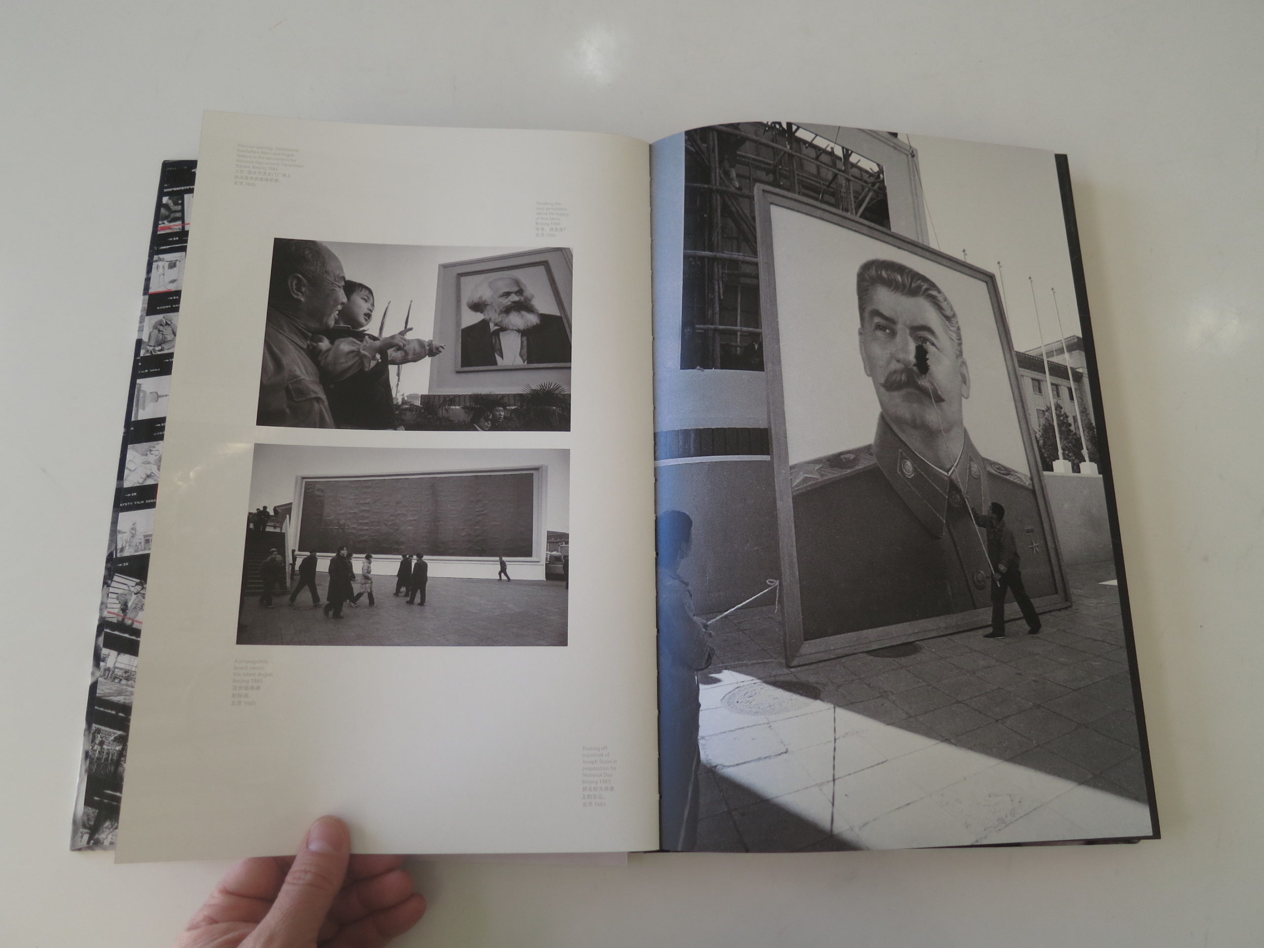
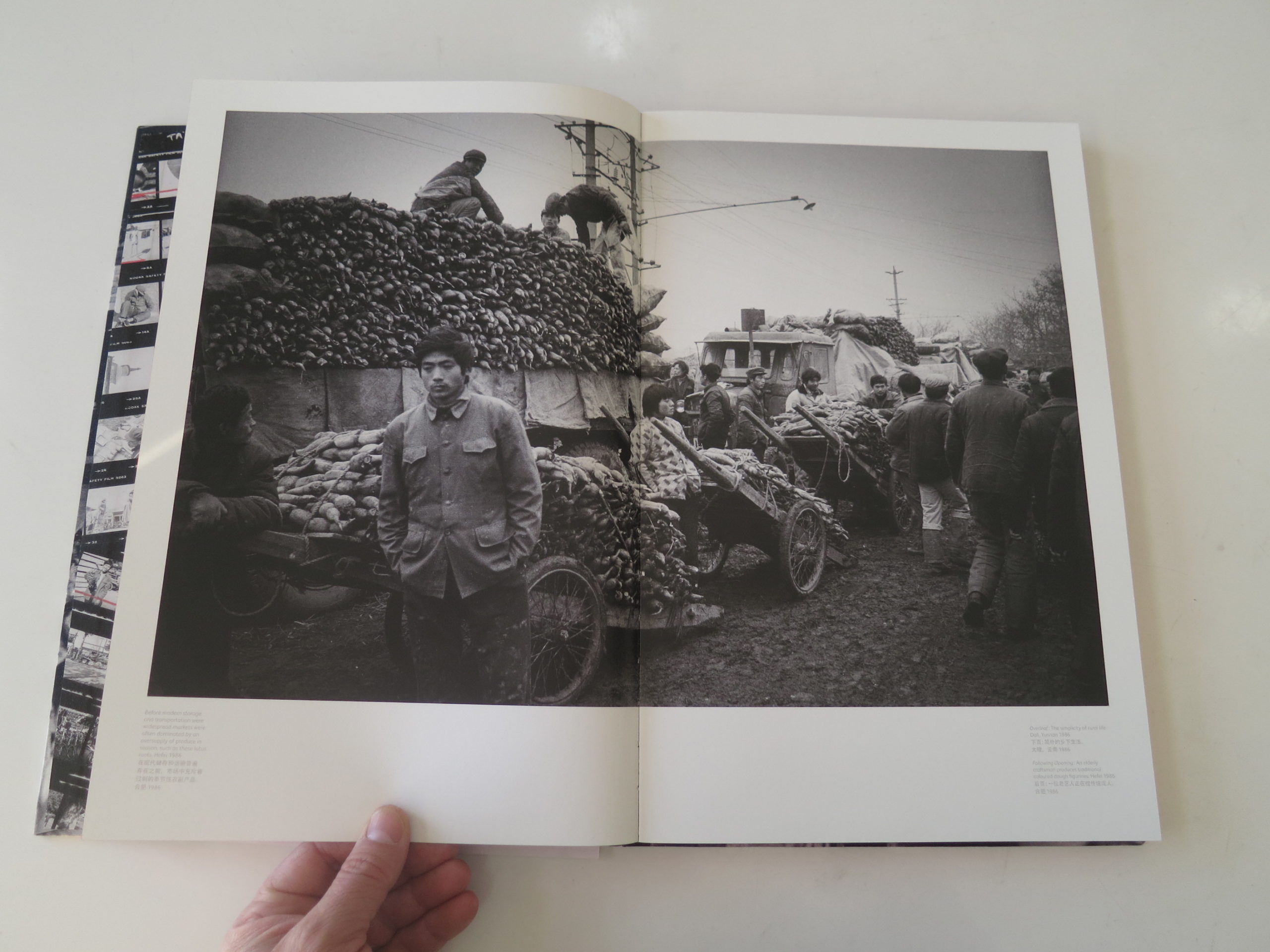
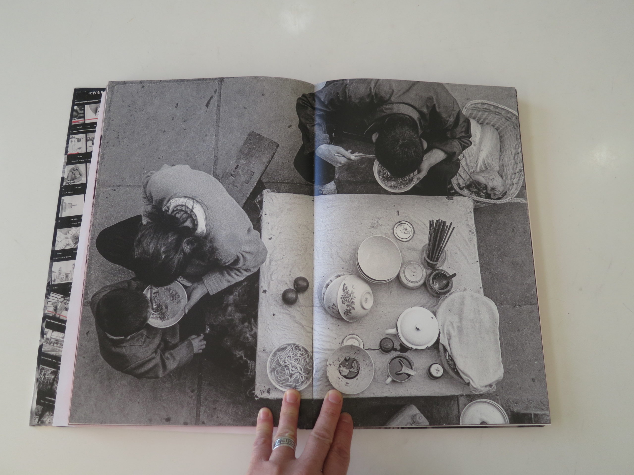
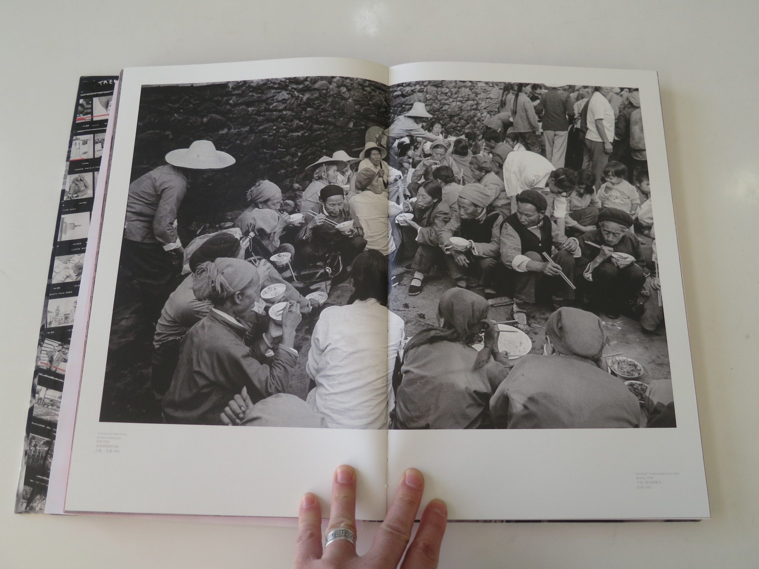
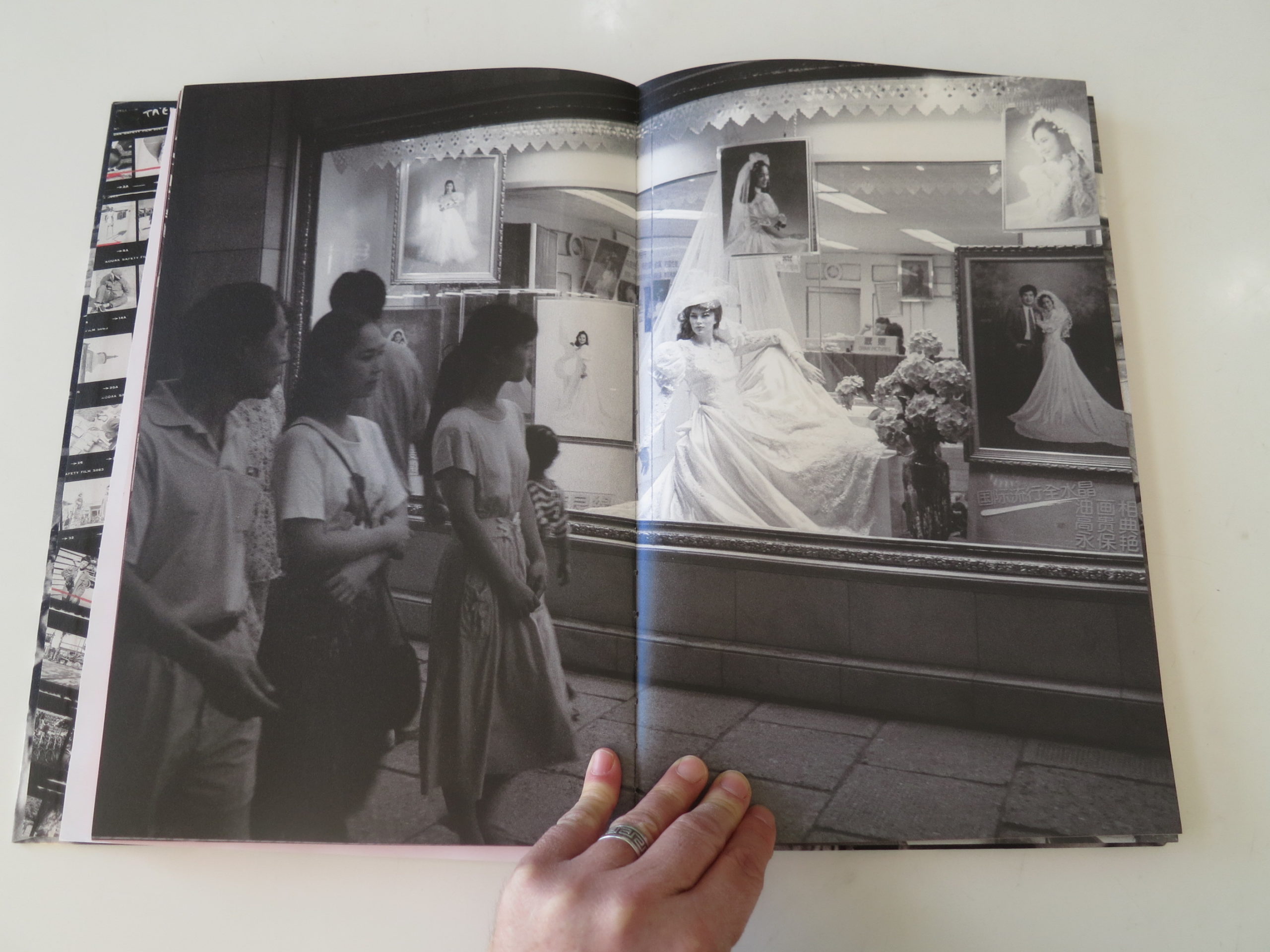
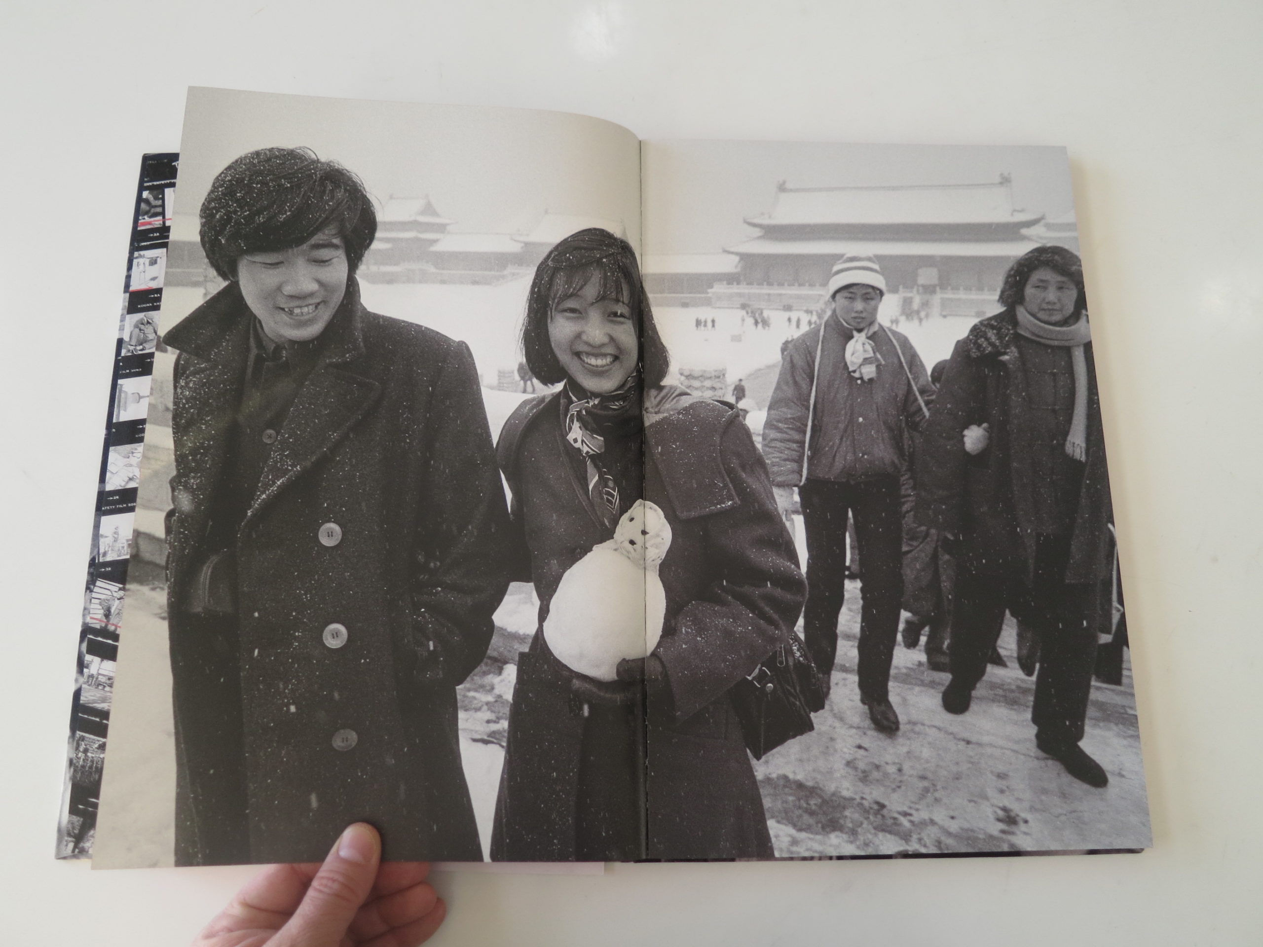
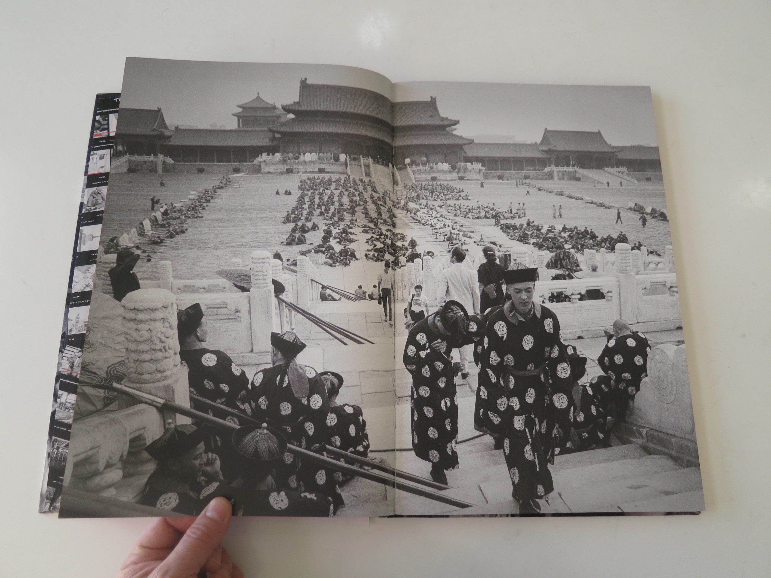
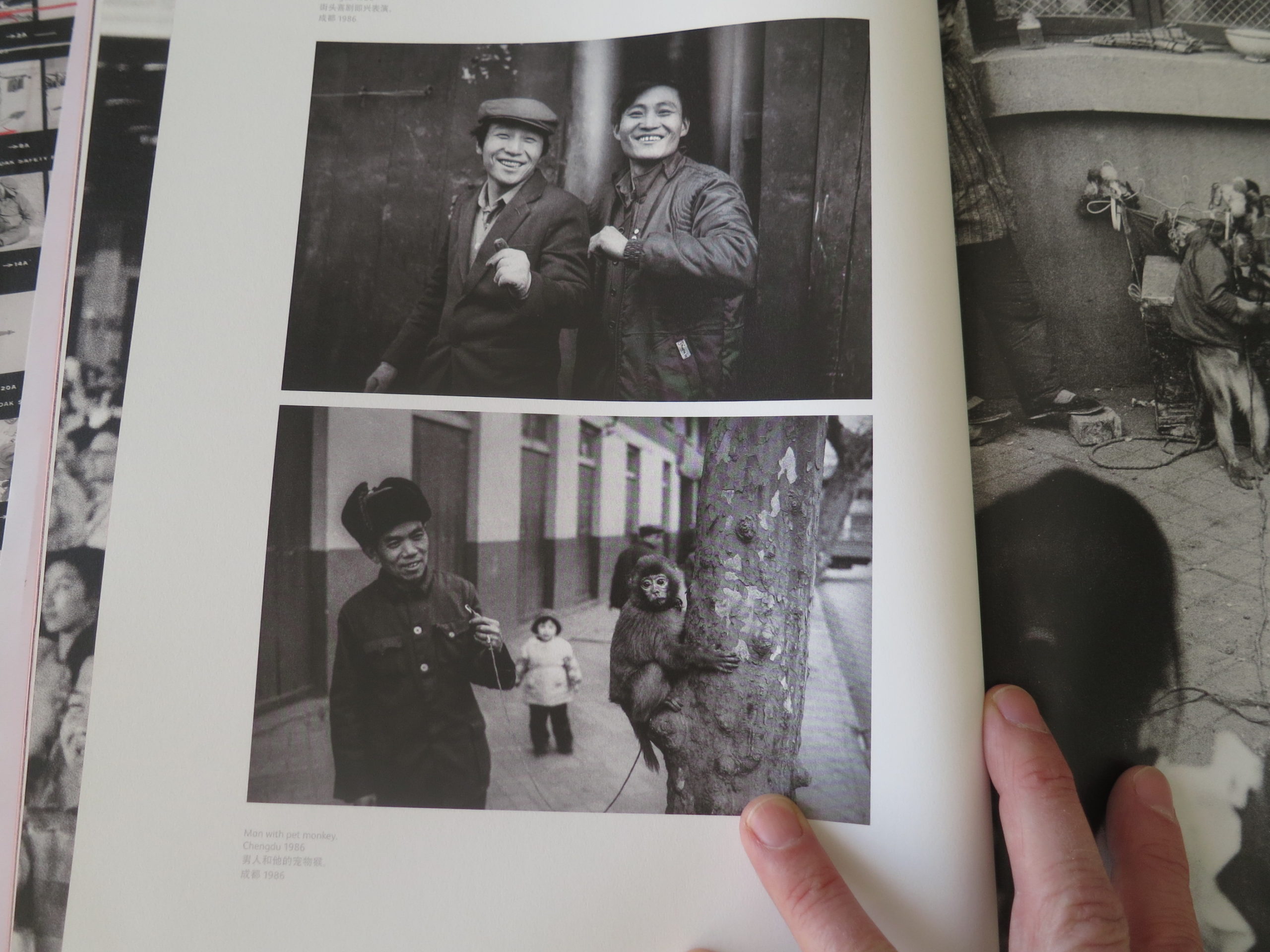
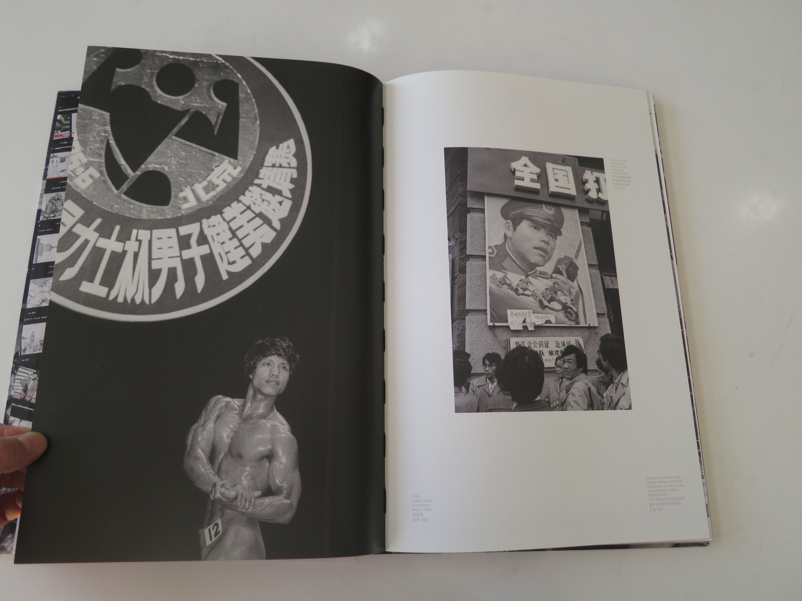
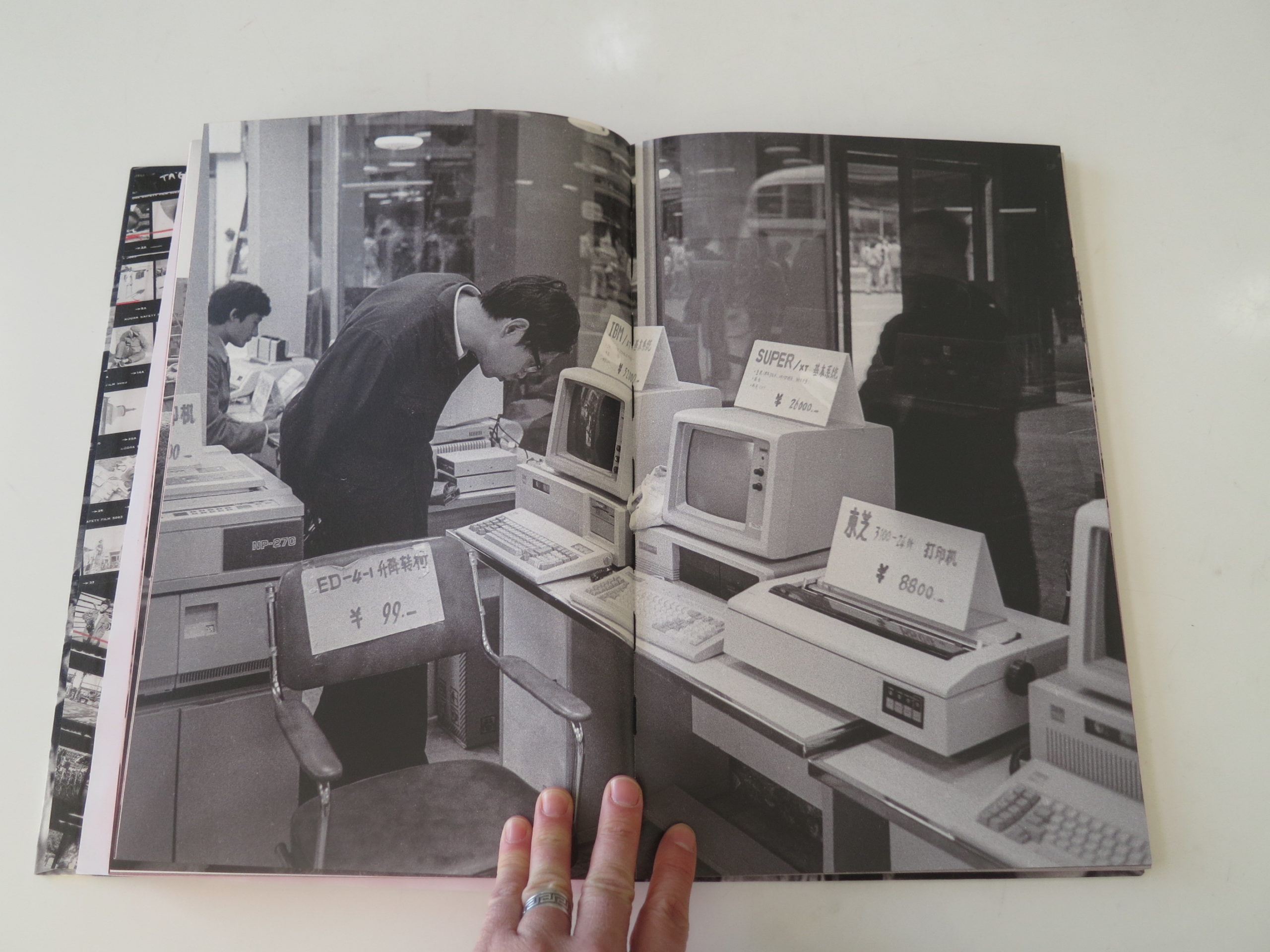
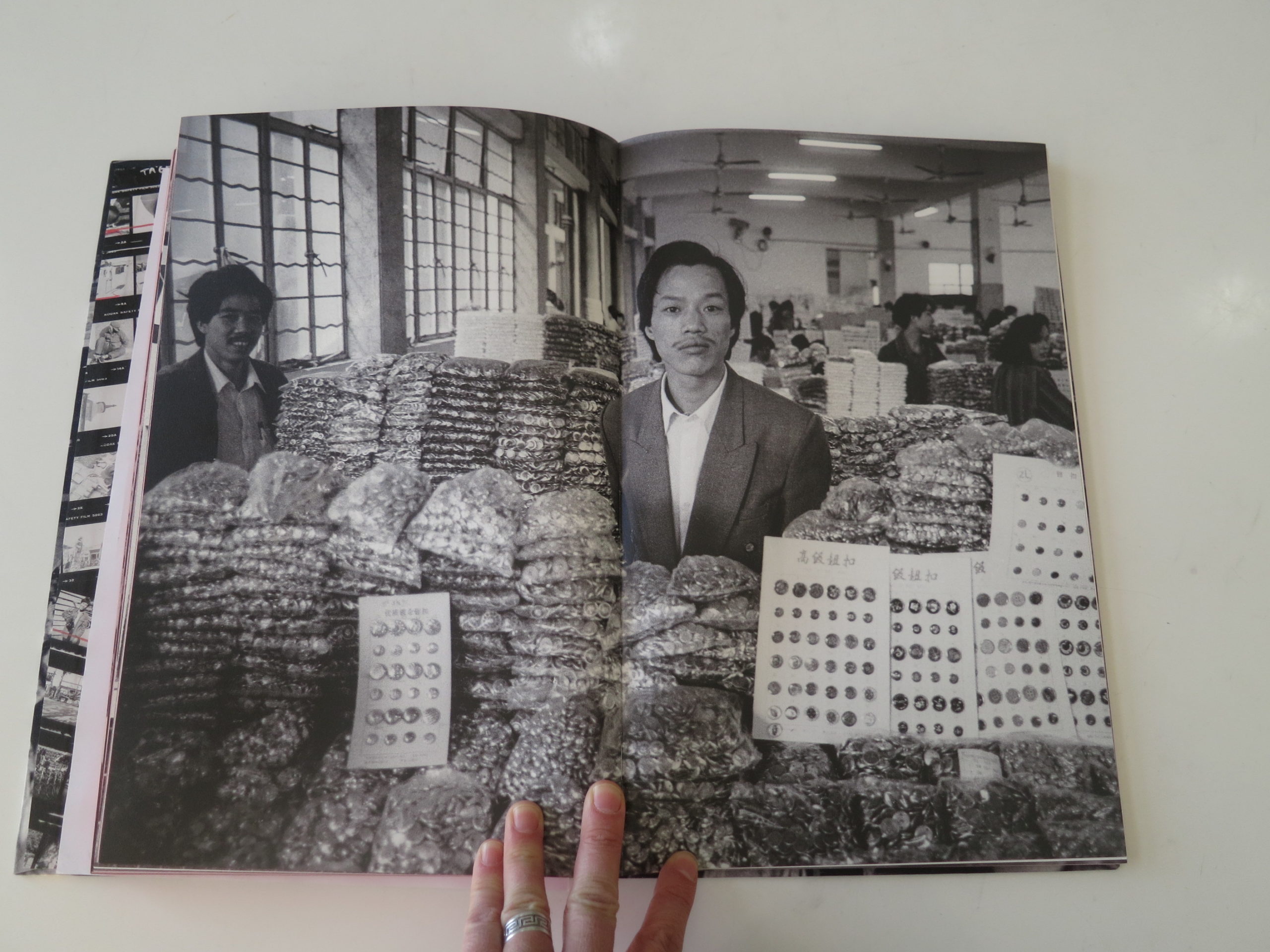
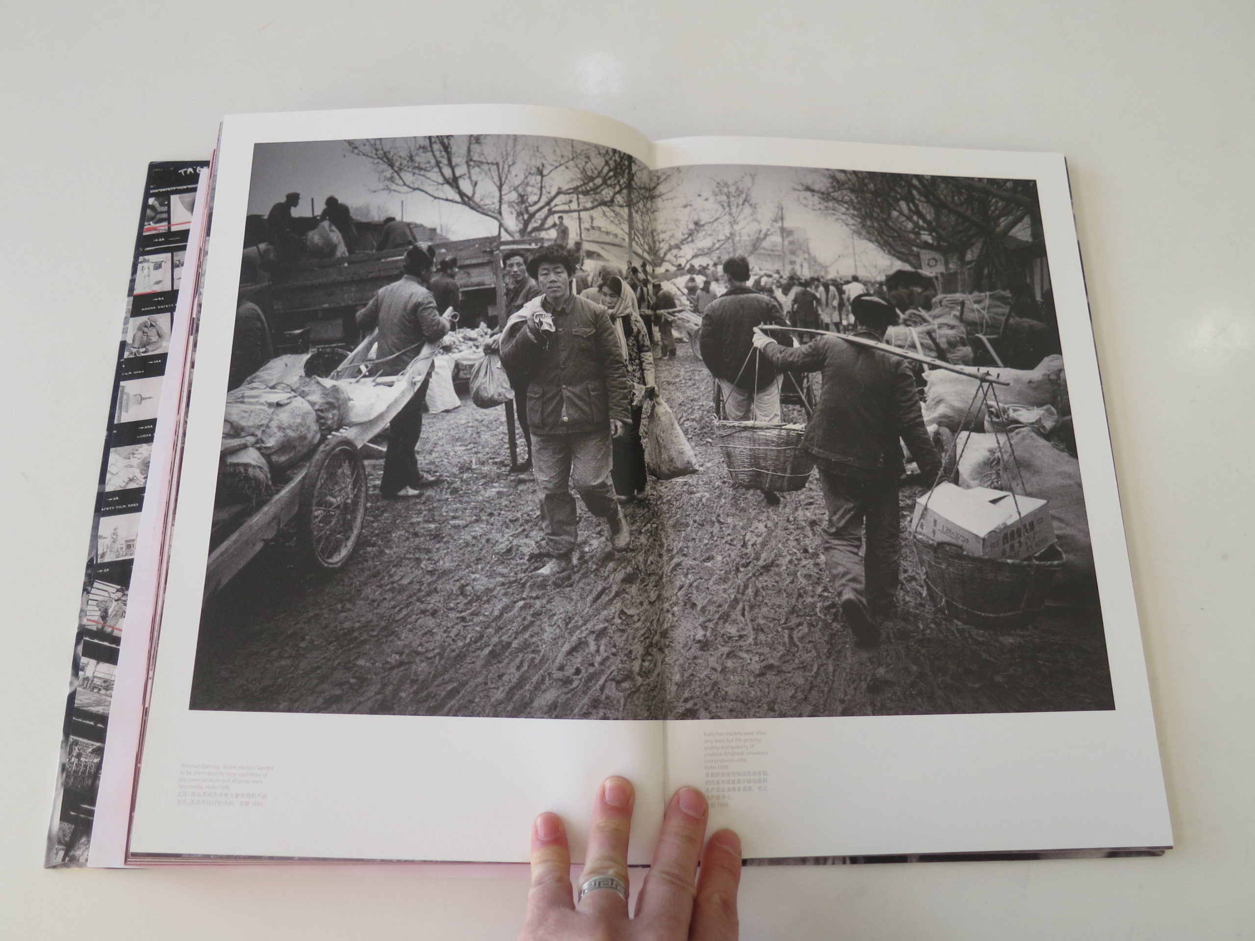
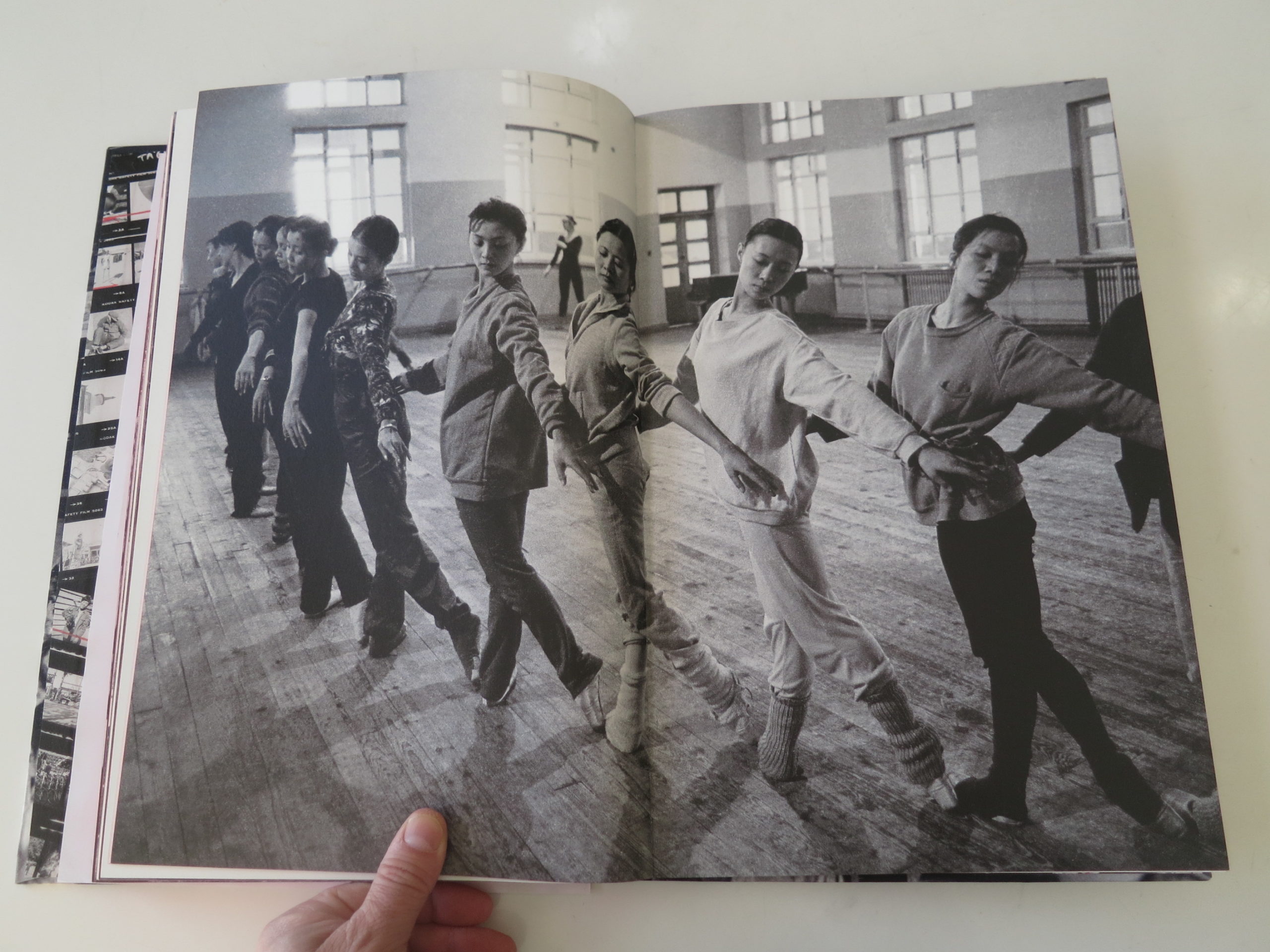
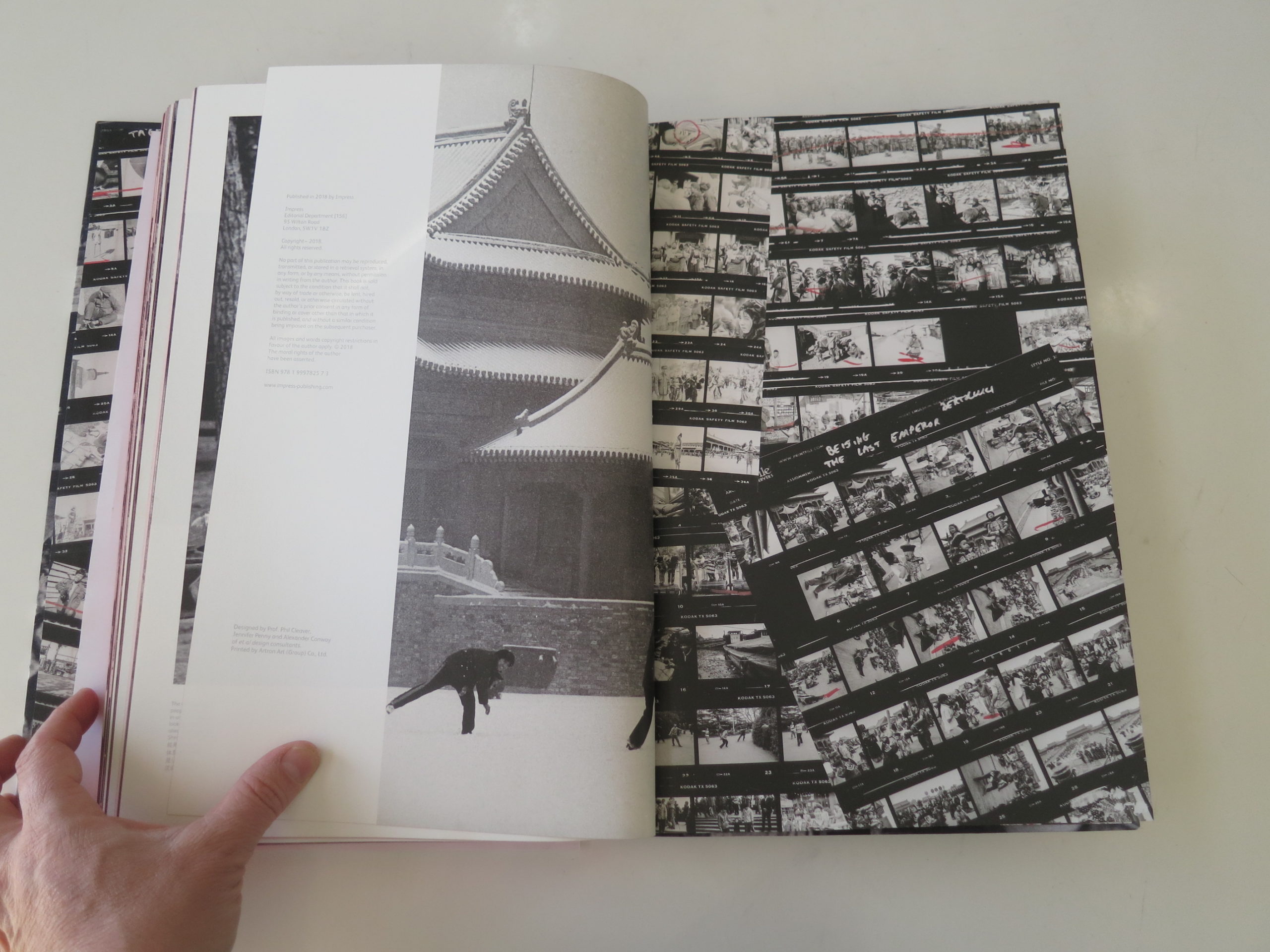
That’s because I went into my book pile today and found “The Door Opened: 1980’s China,” by Adrian Bradshaw, (published by Impress,) an exceedingly well-produced object, in a black fabric box.
I did a heavy, deep-dive, historical column about China not-too-long-ago, and my frivolous opening about Gwyneth Paltrow should have hinted that we’ll keep it (mostly) light today.
This book, and its representation of China, is mesmerizing from the jump. The opening text, alternately in English and Mandarin, has hot graphic design, red and black.
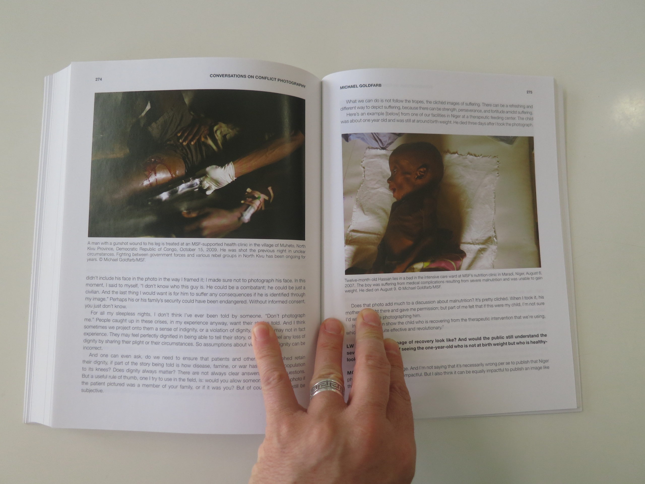
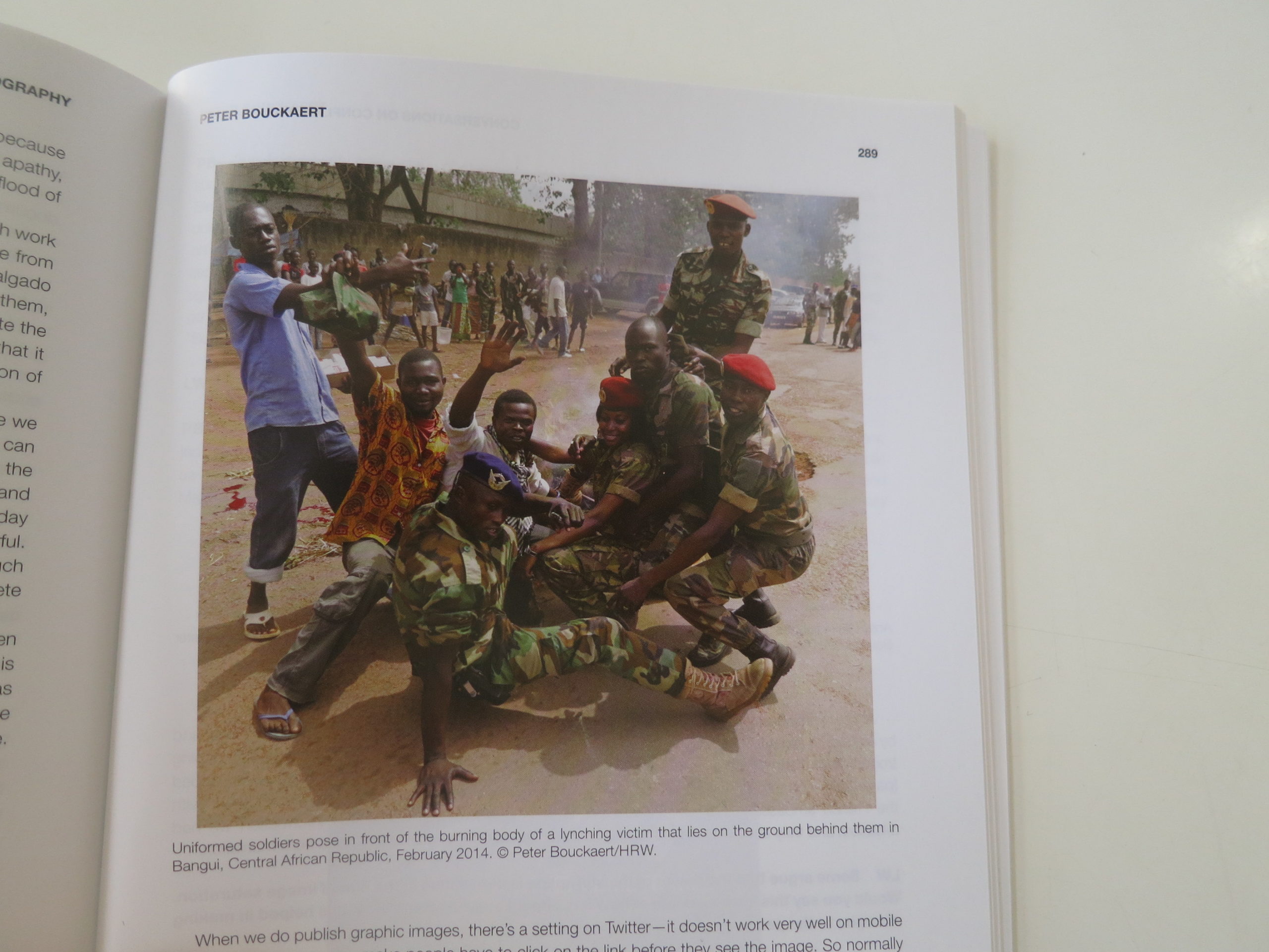
You learn what you need to, though an opening essay and Q and A with the artist, and then you’re off, with the book being broken down into sections that each have short amounts of text. (Children, Country Life, etc.)
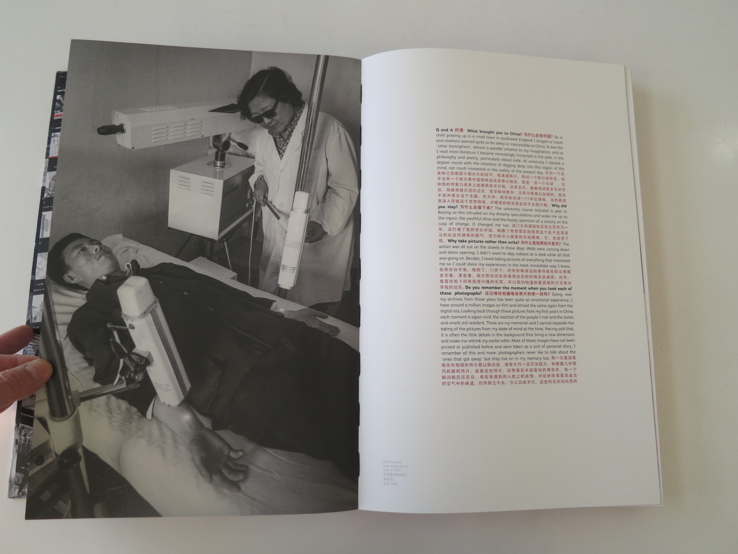
Over the course of the book, we learn Adrian Bradshaw has lived in China most of his adult life, and seems to have married a Chinese woman, raising a family there. For years, in particular in the vital decade of the 1980’s, he photographed prolifically in black and white with a series of Leica cameras. (There’s mention of a million photographs.)
We see Deng Xiaoping, working a cigarette HARD, as he’s the leader associated with China’s opening, in the 80’s, when the first taste of Western life and Capitalism were allowed in, after the deep deprivation of Mao’s Cultural Revolution.
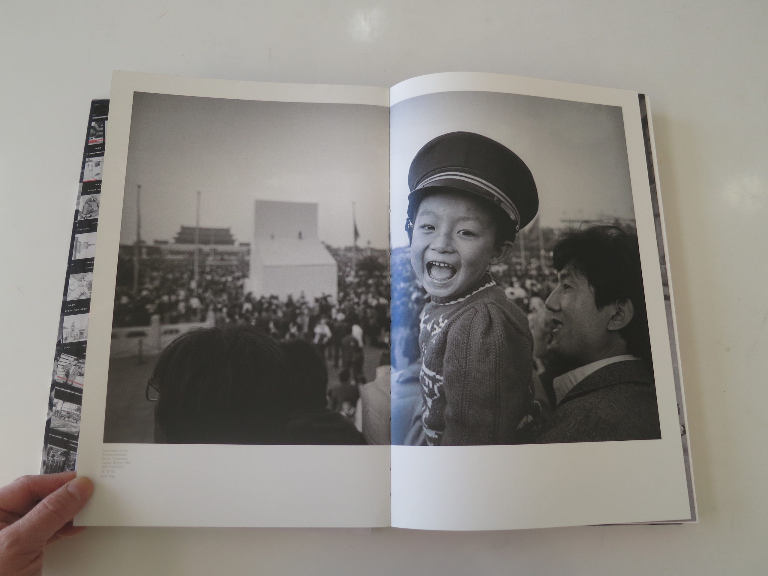
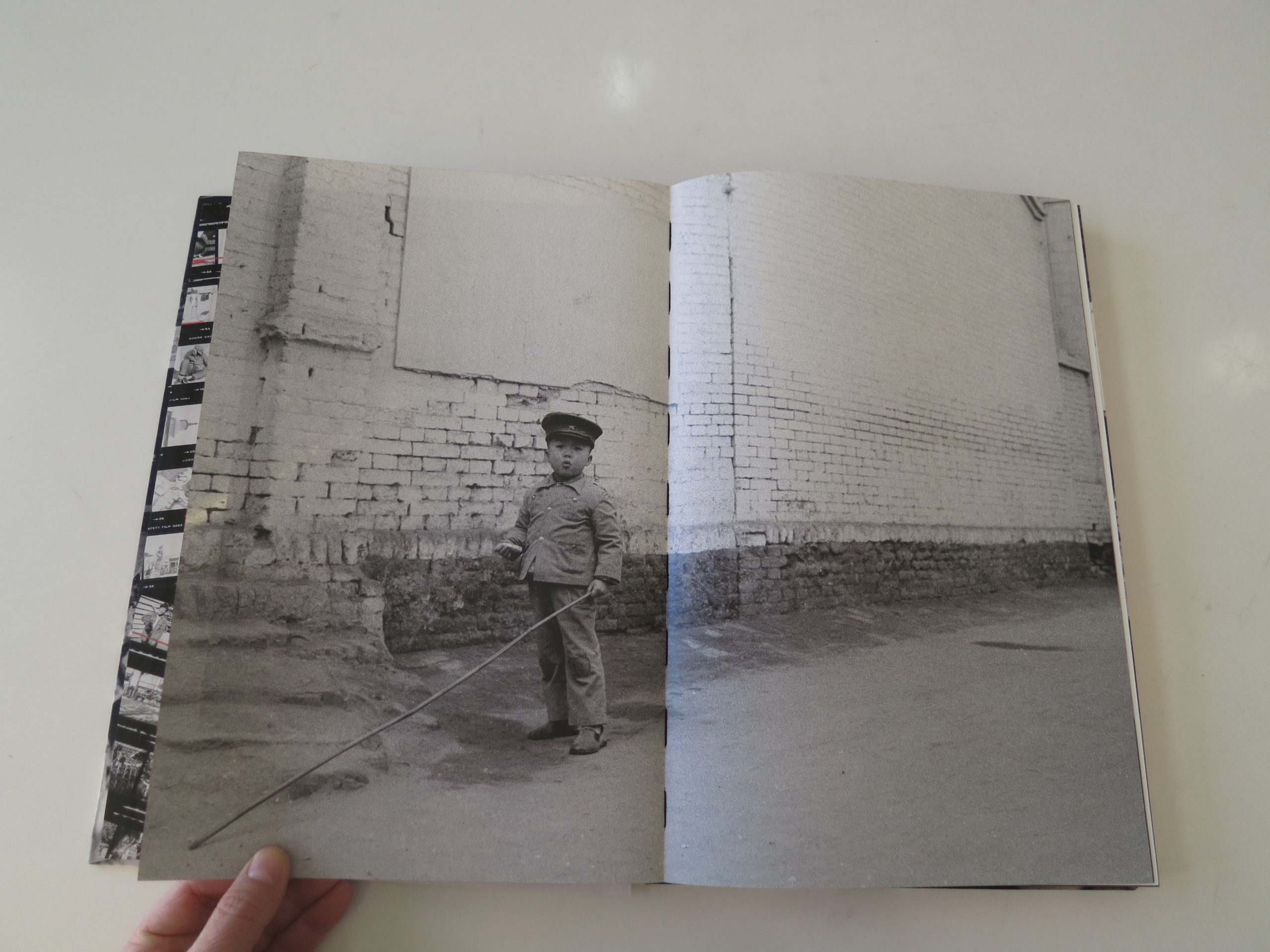
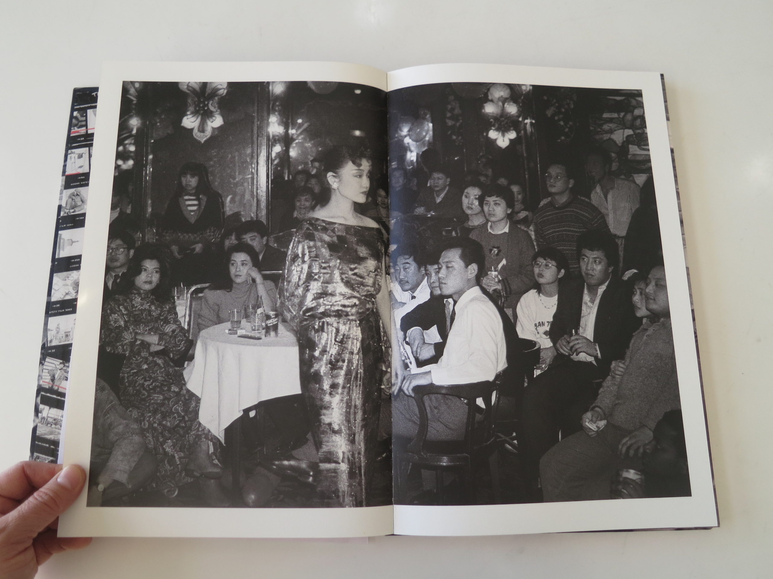
Adrian Bradshaw was on the ground, photographing amazing change, and the book contrasts the still-ancient-looking China of rural society, (and at times the urban working class,) with the rapidly modernizing sub-culture in the cities, Shanghai and Beijing, where fashion was taking root.
People were no longer forced to dress in military navy, gray or green. Prints were available in department stores, where people waited forever for disinterested state workers to help them.
And there were suddenly hipsters in China.
Hipsters!
These pictures are so good, and the ones that are blown up large or full-bleed are dynamite.
For the breadth of Chinese life we see here, and it is a significant range, there is noticeably nothing political.
No police, no protests, or military are present, unless they’re photos of painted propaganda posters, or soldiers in period garb for a Bertolucci film.
With one glaring exception.
There is a photo of soldiers carrying a flag in Tiananmen Square, with a portrait of Mao looming in the background, (from 1986,) and I thought to myself, well, how many years until the quashed uprising/protest/mini-rebellion there?
3 years later, in 1989.
Beyond that wicked bit of foreshadowing, whether intentional or not, the content mostly adheres to what would be acceptable to censors.
Markets. Street life.
Villages.
People.
I love this book, yet all morning, even though I was on deadline, I couldn’t quite get to write the review.
It’s like I was waiting for something.
So there I was, stretching out my shoulder in my living room with a weighted ball, and I craned my neck to the side in an unnatural position, to try to un-do a little knot.
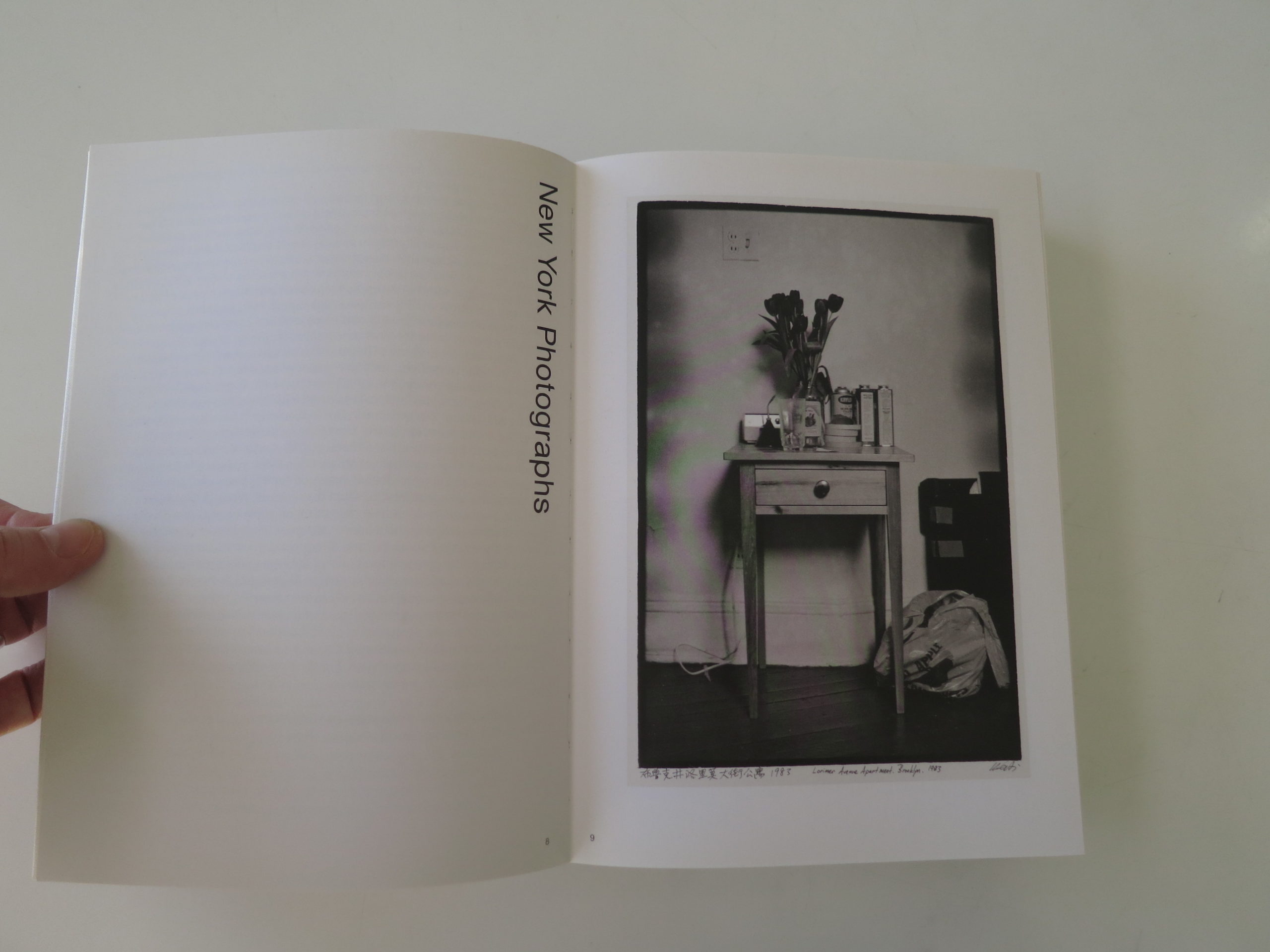
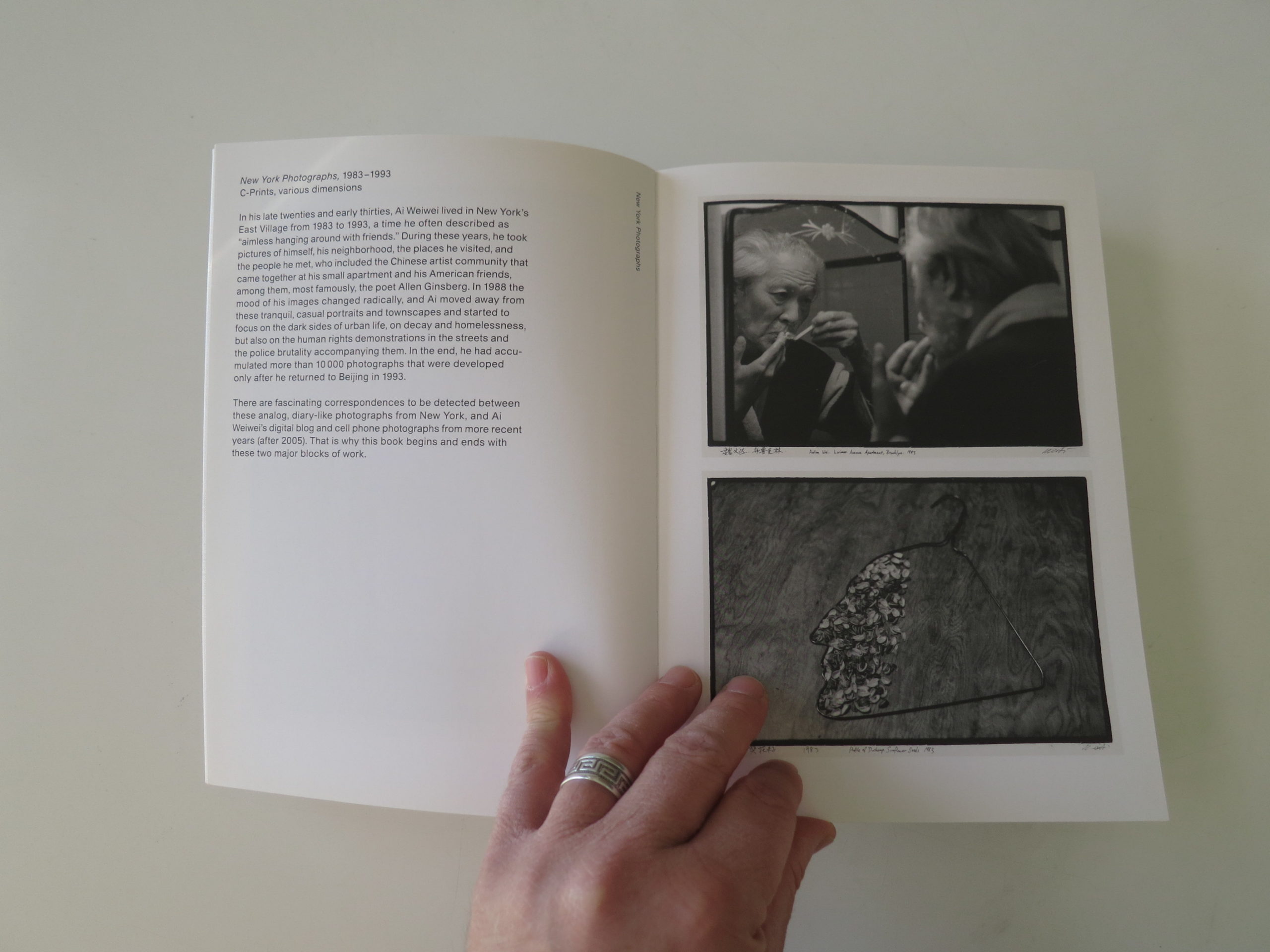
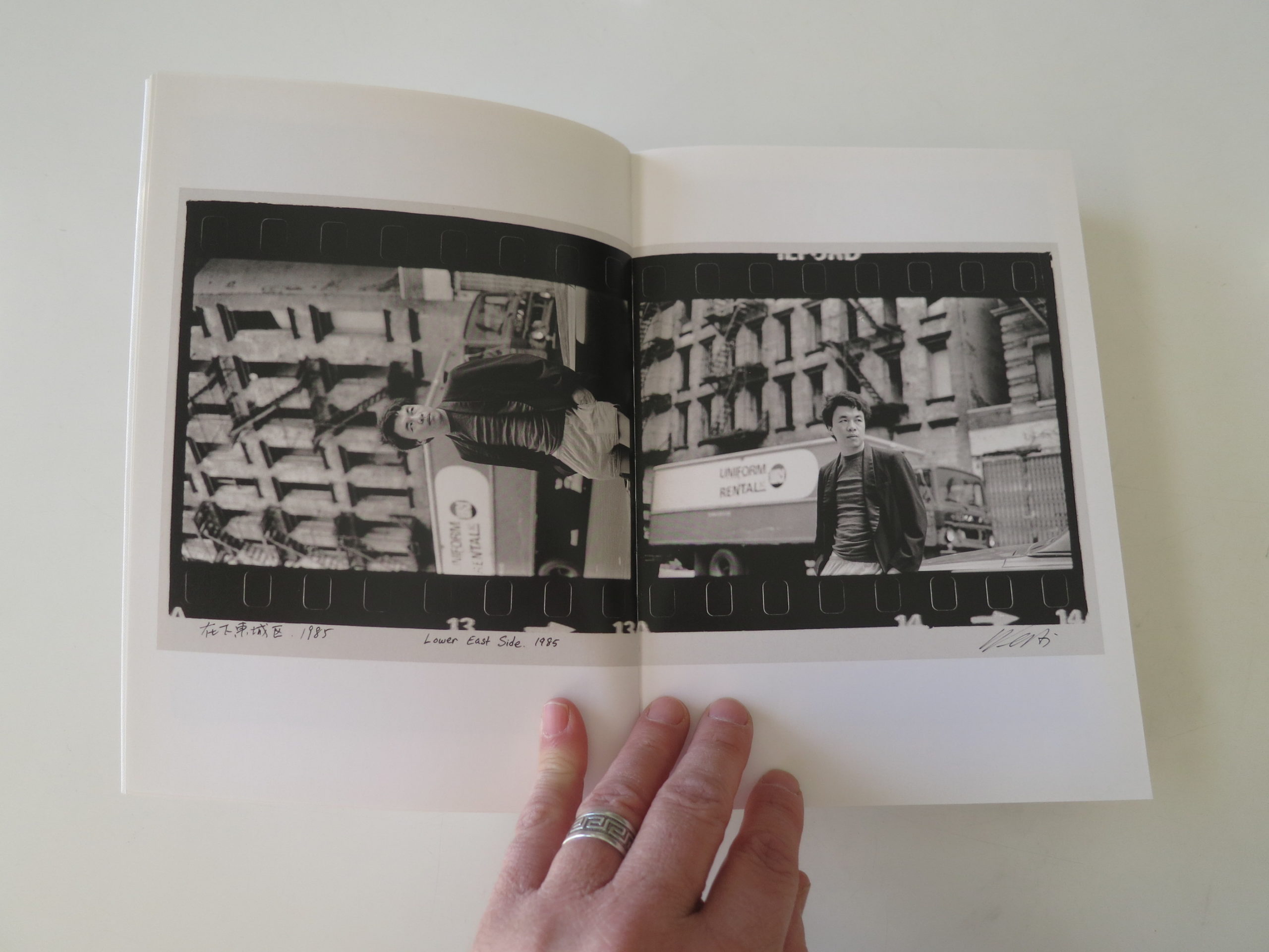
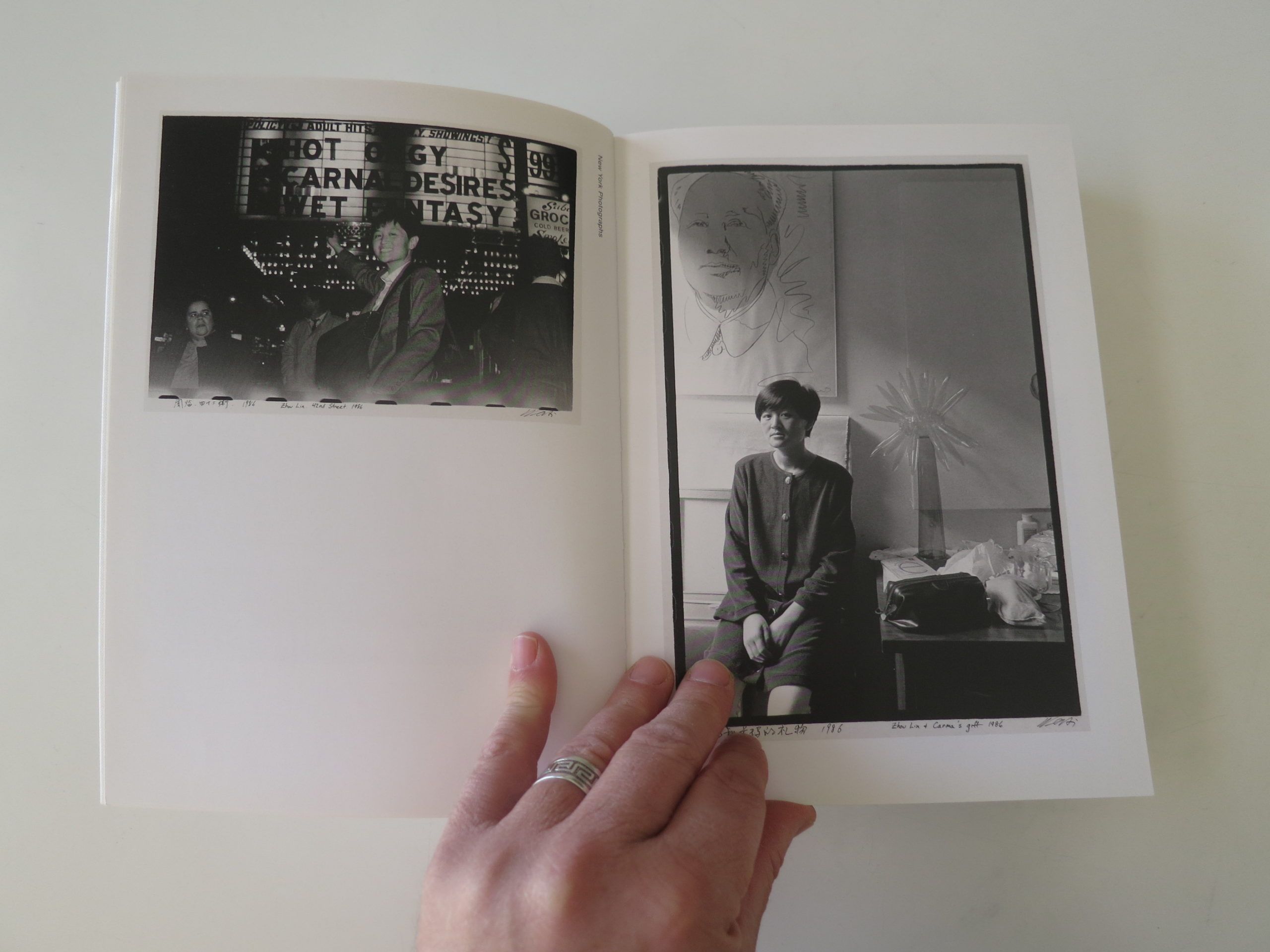
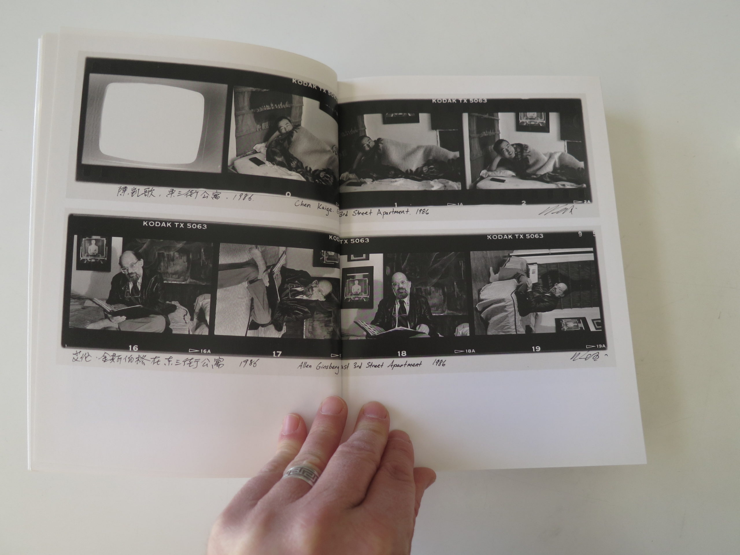
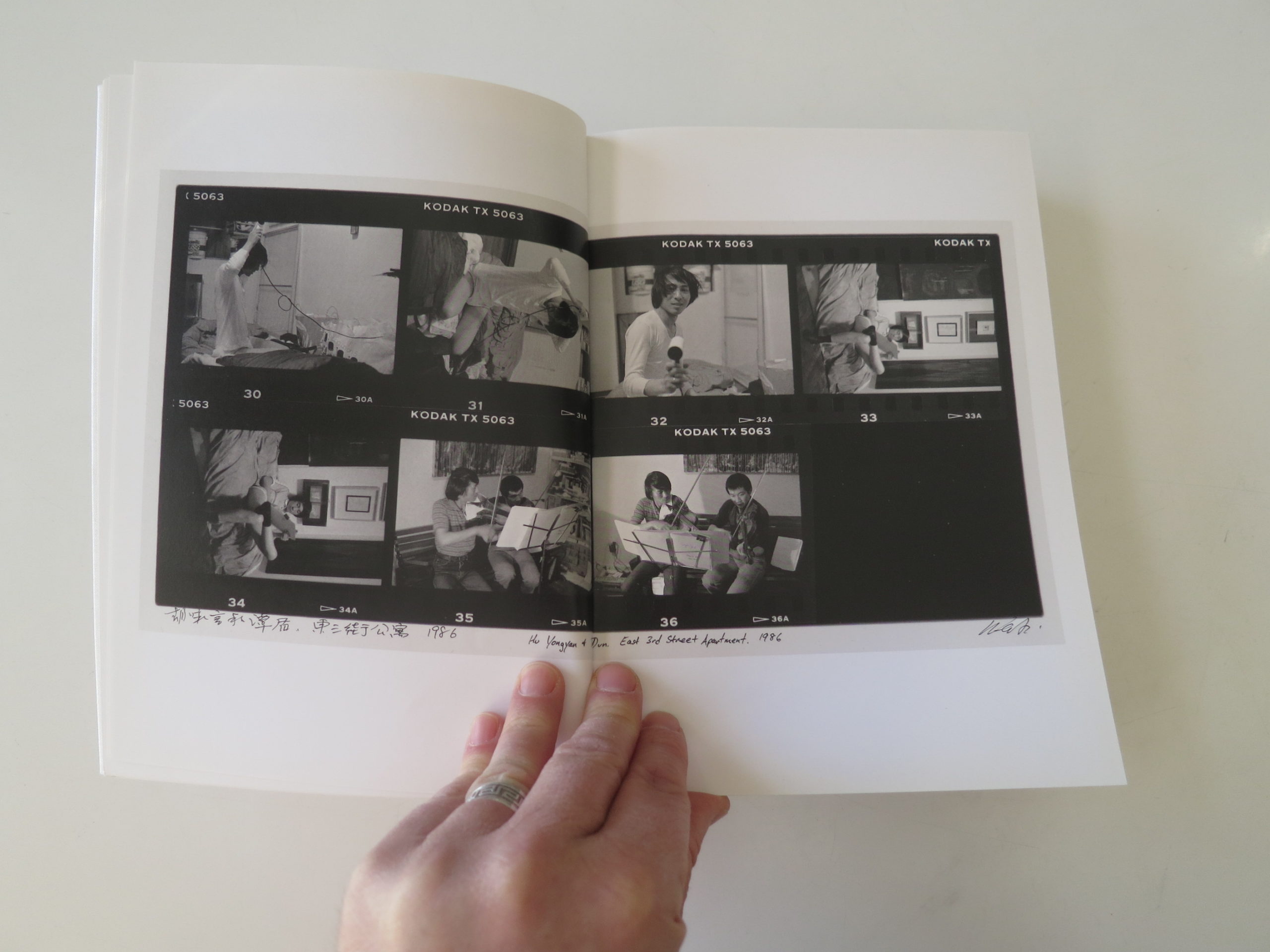
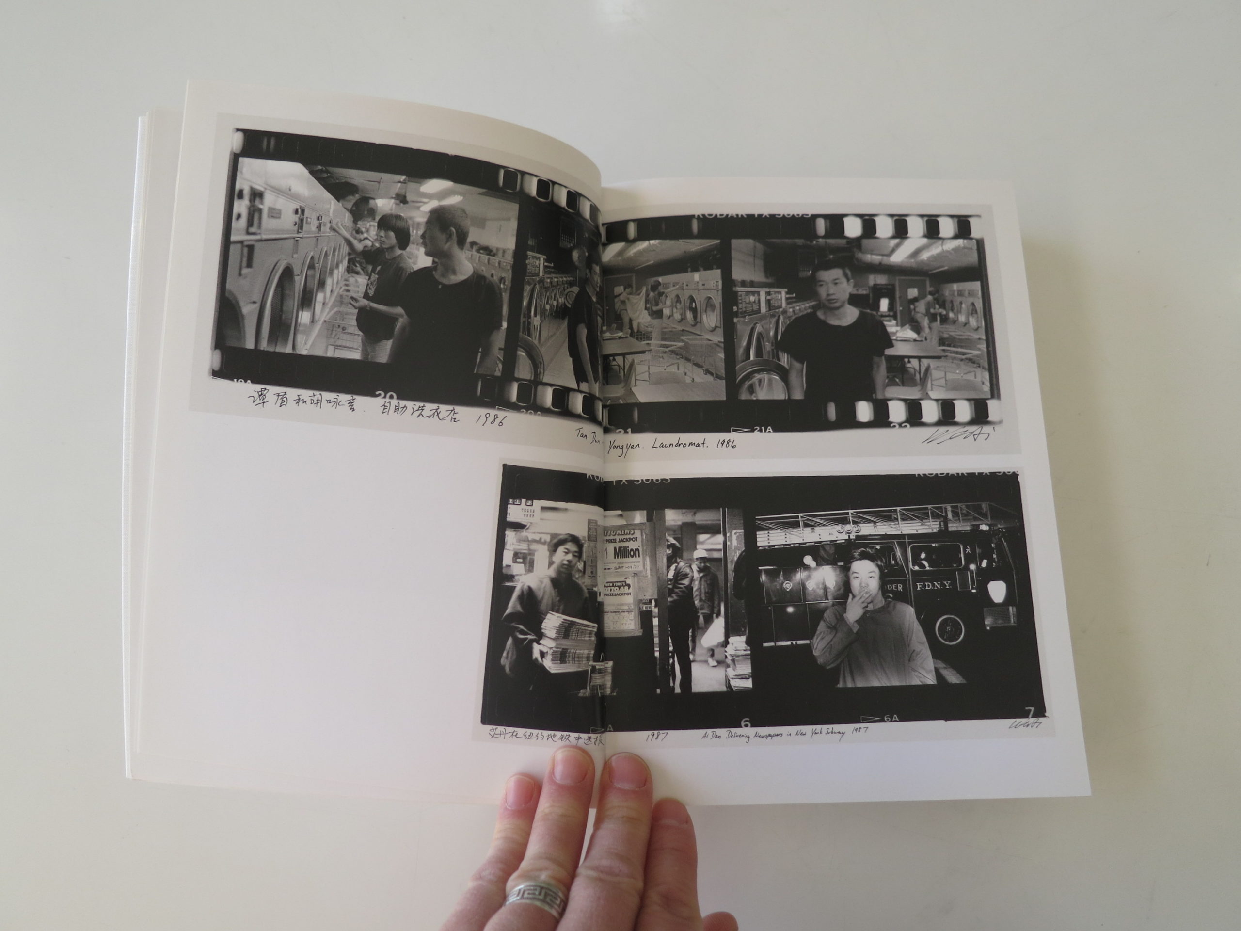
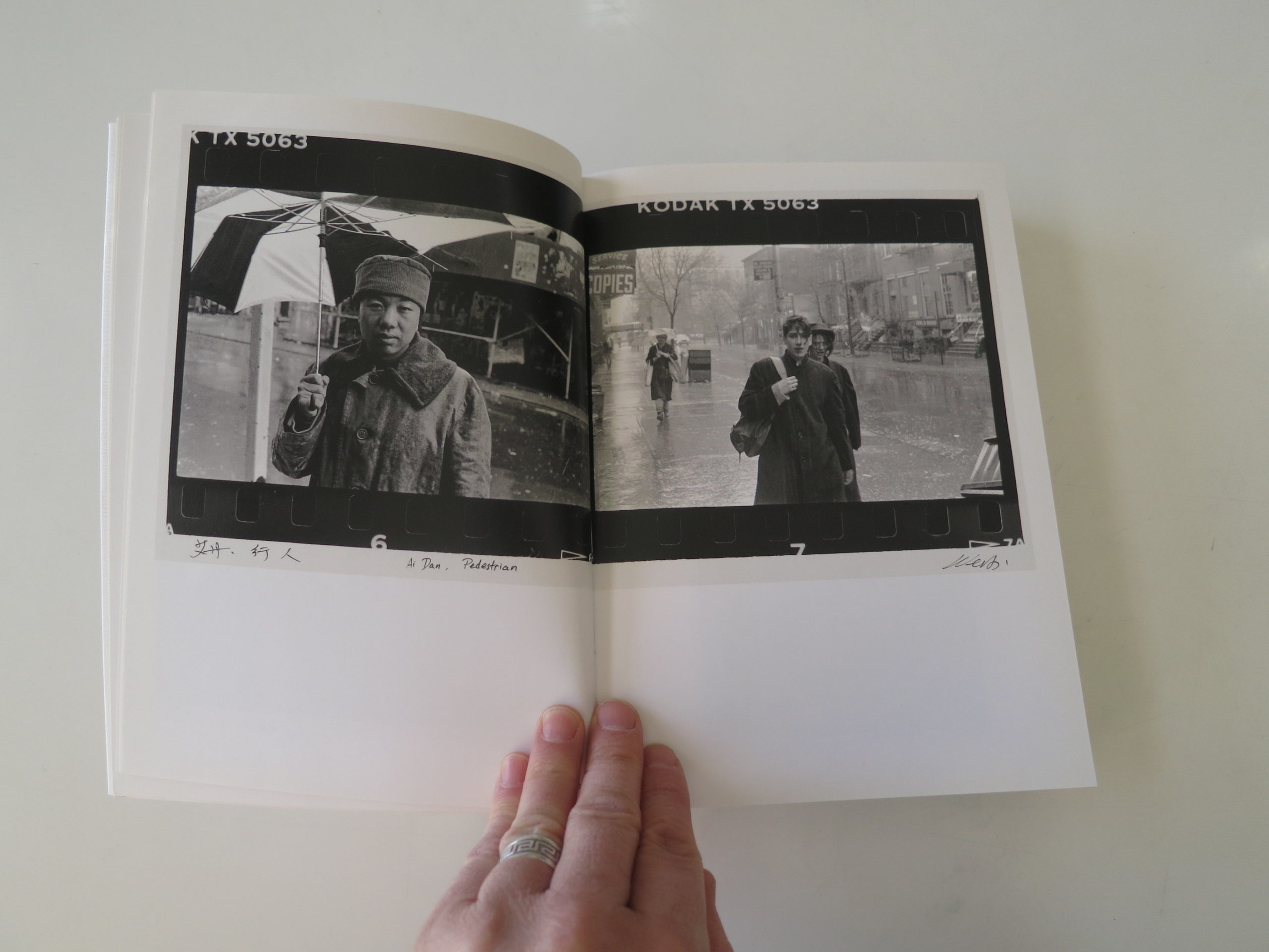
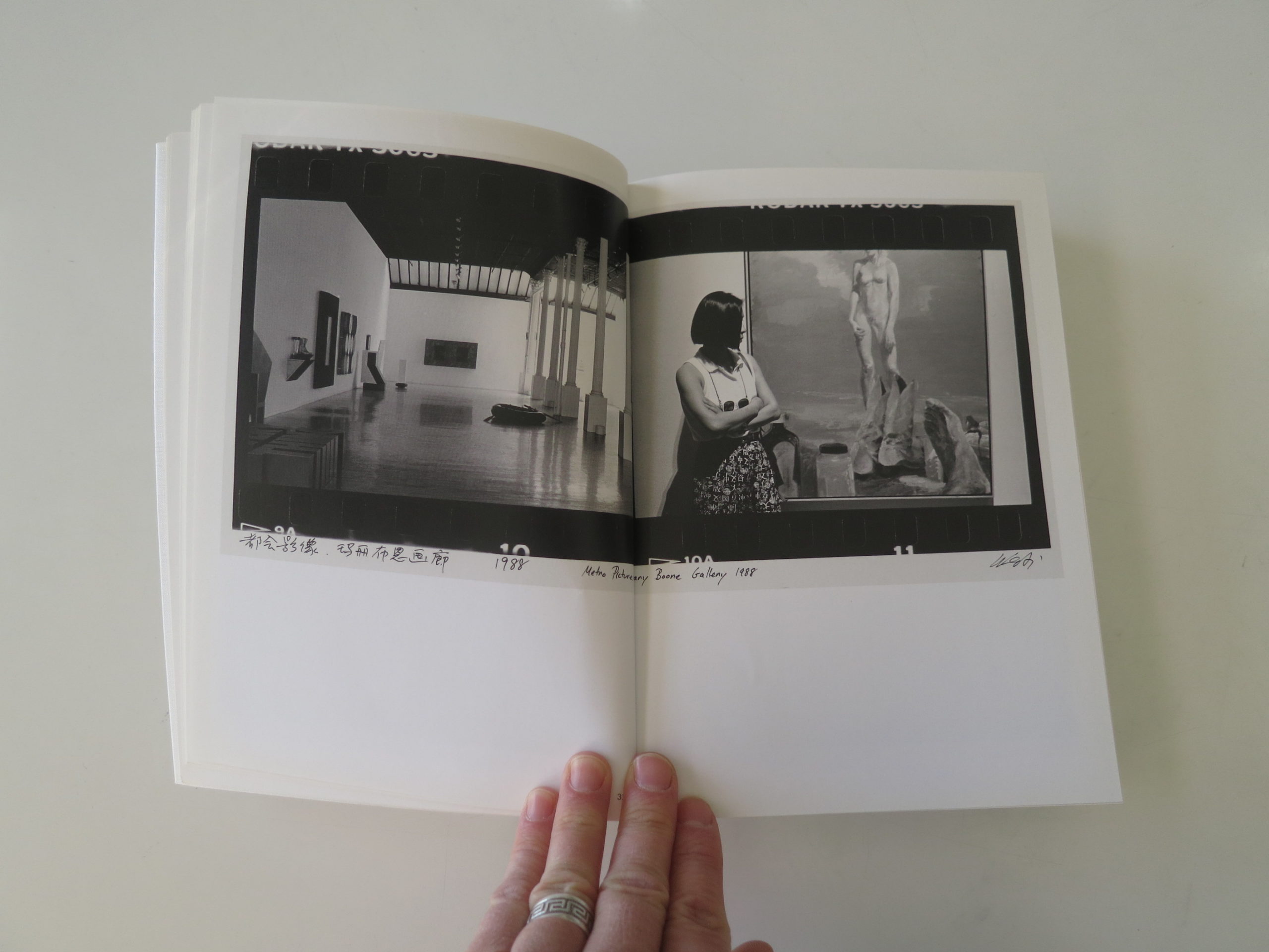
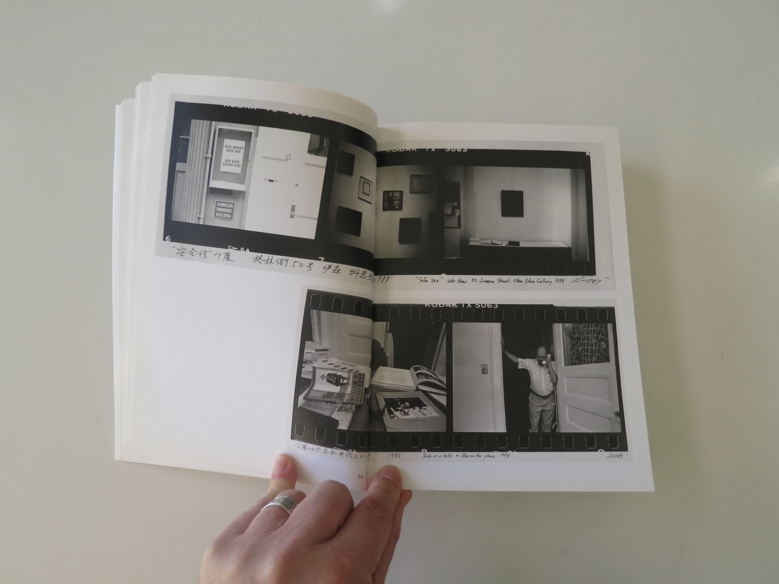
Right in my line of sight, on the book case, was the Ai Weiwei book “Interlacing,” and I remembered it had a series of images that the Chinese artist made in New York City, in the 1980’s, when he lived there as a young man.
In a flash, I knew how I could write about the first book, because how could this not work?
Parallel timelines?
Right?
I’m not going to review the entire second book, because I can’t do 2500-word-mega-columns each week, but these photographs clearly depict the vision of a creative young man who was exercising freedoms he did not have back home.
Ai Weiwei and his hipster, artist buddies.
Hanging out with American art and culture luminaries like Allen Ginsburg.
So cool.
But beyond the gallery shows and art experiments, there is hard journalism here too.
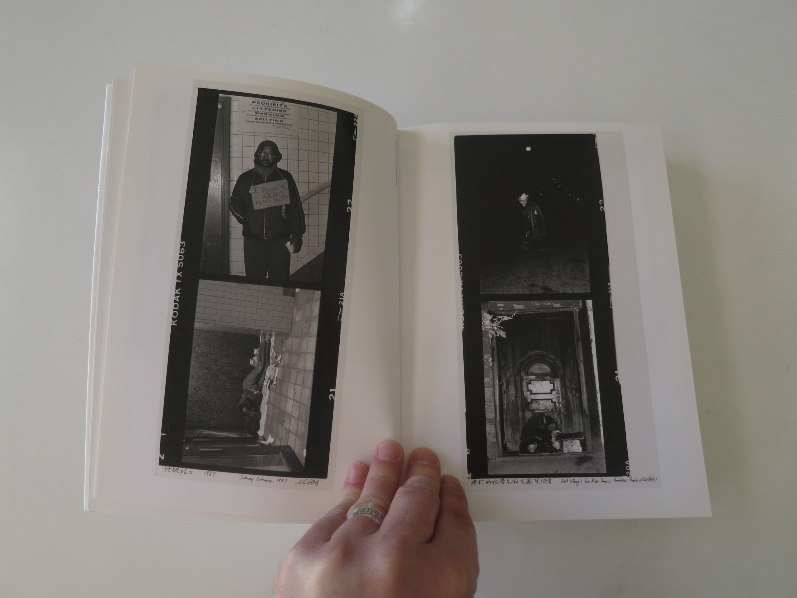
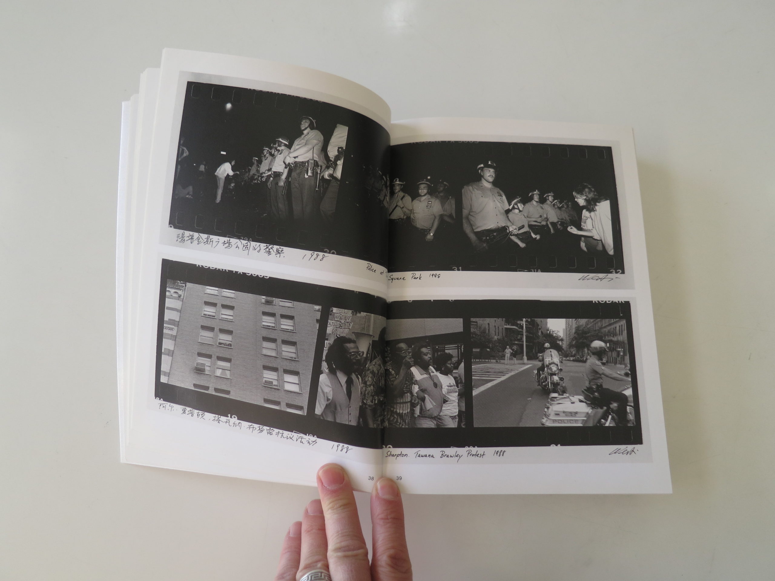
He’s made images of police arresting people, political protest, and a still-chunky-Reverend-Al-Sharpton during his regrettable Tawana Brawley phase.
Even crazier, the book features a few photographs from the Tomkins Square Riots in 1988.
If you don’t remember what they were, you’re not alone, as I was 14 years old at the time, living about fifty miles away, and I never heard of it.
The short version is, the NYC Police either instigated, or participated in a full riot in an East Village park that was being used as a homeless encampment, and loitering place for squatter types.
One of the rallying cries was “Gentrification is Class Warfare.”
Sound familiar? (Everything old is new again.)
The cops, it was later proven, went buck wild, and severely beat protestors and innocent bystanders, with clubs, hands and feet.
They covered their badge numbers, or didn’t wear badges at all, and supposedly the whole thing was like something out of a movie.
Nasty business.
And Ai Weiwei was there in the middle of it, shooting documentary photographs.
From just a few images in “Interlacing,” we see a Chinese citizen freely photographing government violence, in America, while had he done so in China a year later, he would have been locked up forever.
(And of course he was famously jailed for a few months in 2011.)
Meanwhile, with Adrian Bradshaw’s photos, the 6’2″ Englishman gives us the outsider/permanent resident’s perspective of China just as it’s starting to grow and change, irrevocably, lifting hundreds of millions of people out of poverty, all wanting their televisions, washing machines, and fancy home computers.
How bizarre.
Bottom Line: Fascinating, well-made document of China in the 80’s, just as it’s beginning to rise
If you’d like to submit a book for potential review, please email me directly at jonathanblaustein@gmail.com. We are interested in presenting books from as wide a range of perspectives as possible.
The Art of the Personal Project is a crucial element to let potential buyers see how you think creatively on your own. I am drawn to personal projects that have an interesting vision or that show something I have never seen before. In this thread, I’ll include a link to each personal project with the artist statement so you can see more of the project. Please note: This thread is not affiliated with any company; I’m just featuring projects that I find. Please DO NOT send me your work. I do not take submissions.
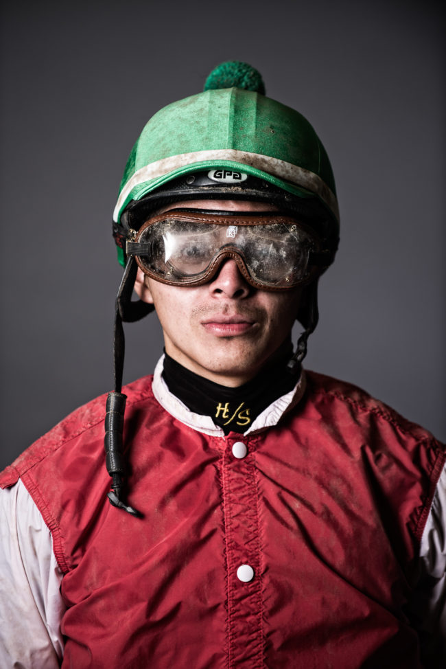
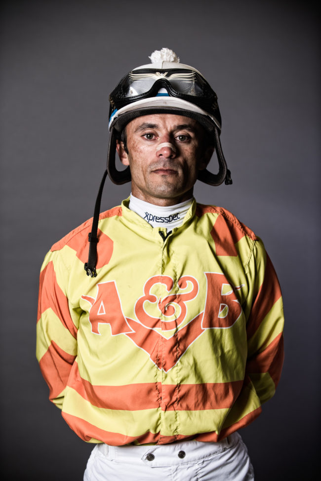
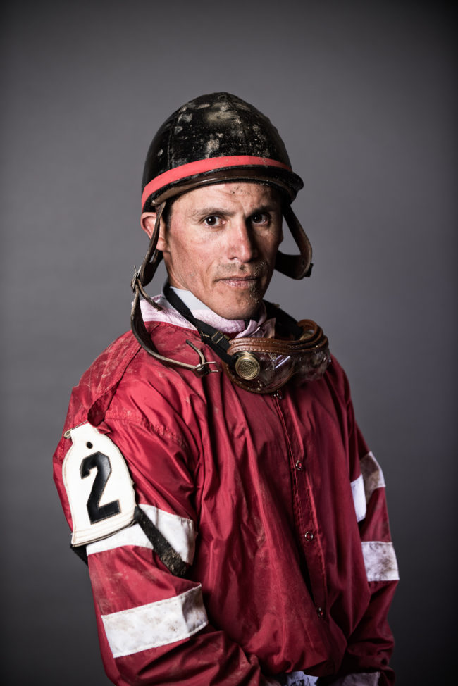
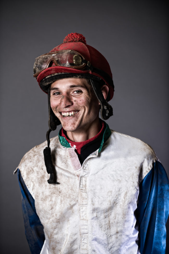
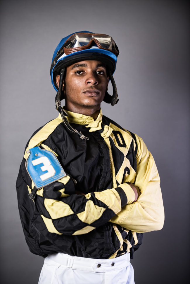
Canterbury Park is the local horse-racing track located outside of Minneapolis in Shakopee, Minnesota. It was formed in 1985 after a constitutional amendment allowing betting on horse racing was approved by Minnesota voters in 1982. When I was coming up with story ideas of my new website, a friend of mine said, “Why don’t you go out and shoot at Canterbury Park?” I got in touch with the media coordinator, and the next thing I knew, I had full access to all aspects of the facility.
They were incredibly accommodating, and I ended up going out there something like 11 times as it was one of the first photo stories I worked on for my site. It was amazing for me to have that kind of access, from race nights to training routines, I got to see all aspects of what life was like at the track. They had 40 barns where owners would stable the horses, and dormitories where the workers and jockeys would stay. It was pretty fascinating to get to witness the behind the scenes world of horse racing.
I would go early mornings and photograph the daily routines; the stable hands taking care of the horses, jockeys taking the horses out on their morning rides, the farriers who would come in and shoe the horses… they even had a pool that they would swim the horses in.
I eventually asked if I could work on a portrait project with the jockeys. I wanted to photograph them right after they came off the track. It took a little doing, but I was able to get permission to set up a small backdrop, and then I was then able to handpick jockeys immediately after they were done with a race. I had previously spent a bit of time photographing in the locker room with the jockeys, so they were somewhat familiar with me by the time I did the portrait project. The jockeys come from all over the U.S. to race, as well as Mexico, Canada, Puerto Rico, Panama, and England, and run about 600 races during the season. It’s a lot of hard work, early mornings, and a ton of racing.
I’ve gotten a lot of good response to this collection of photos, and it makes me feel like I should continue doing portrait work like this. Thank you so much for the feature, it really means a lot!
APE contributor Suzanne Sease currently works as a consultant for photographers and illustrators around the world. She has been involved in the photography and illustration industry since the mid 80s. After establishing the art buying department at The Martin Agency, then working for Kaplan-Thaler, Capital One, Best Buy and numerous smaller agencies and companies, she decided to be a consultant in 1999. She has a new Twitter feed with helpful marketing information because she believes that marketing should be driven by brand and not by specialty. Follow her at @SuzanneSease. Instagram
Success is more than a matter of your talent. It’s also a matter of doing a better job presenting it. And that is what I do with decades of agency and in-house experience.
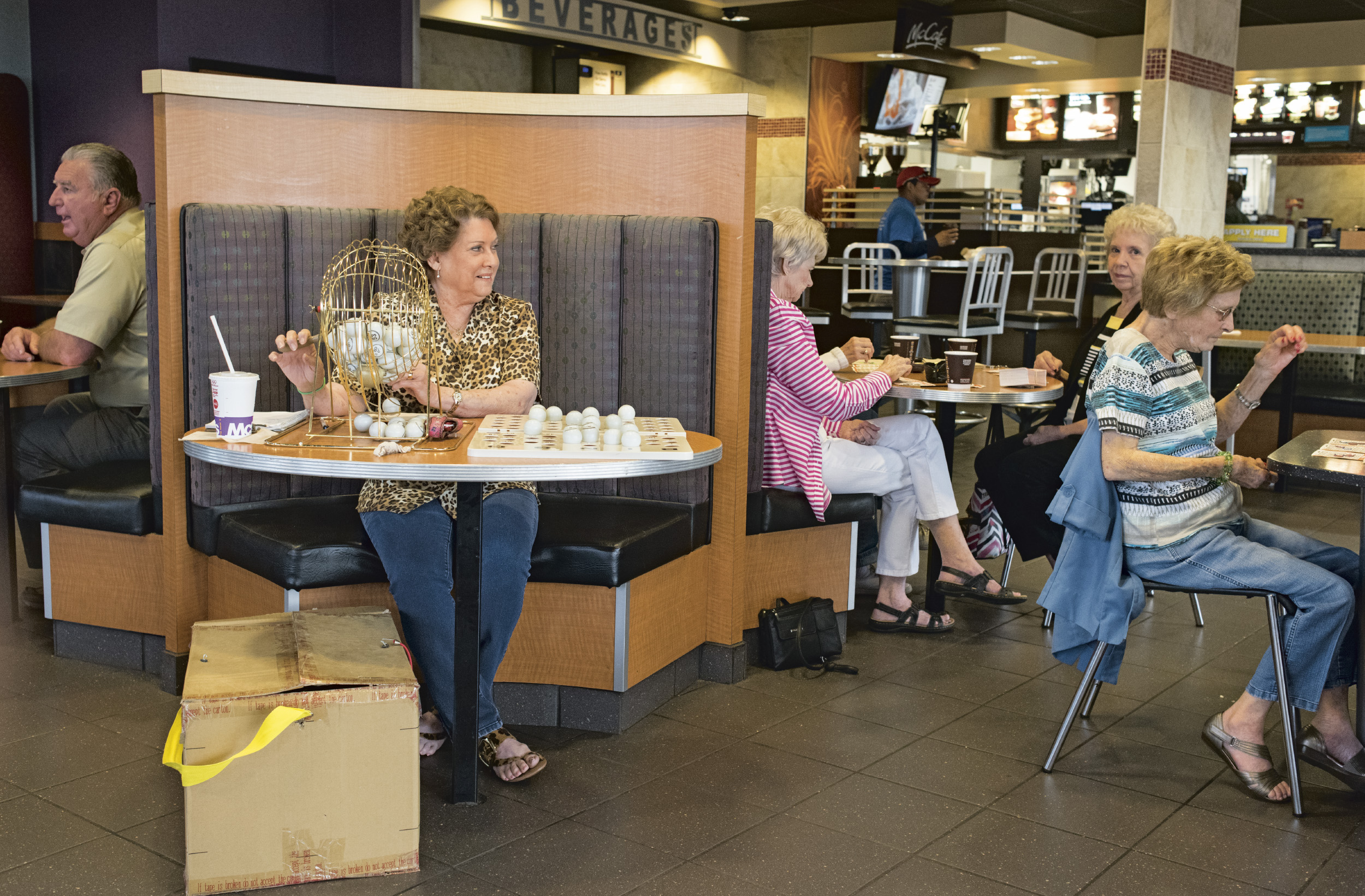
Heidi:What was the genesis of the column? Ellen: In 1911 on Christmas day Alfred S Ochs the publisher of The New York Times was out walking after Christmas dinner when he encountered a man who had just had been served a Christmas dinner at the YMCA but had no place to sleep. Ochs determined that he was a respectable man who was just down on his luck, he gave him a few dollars and told him to come see him about a job. That encounter led to the establishment of the Neediest Cases Fund. The next year he sent reporters to social service agencies to gather the stories of 100 people in need. Their stories were published and readers were asked to make donations to help them. That first year of 1912 the fund raised $3600. Since then the fund has raised over $300 million dollars. Today, The Times works with seven social service agencies in the city to identify those in need. From October through January the stories are published in a weekly column. The Times continues to manage the investment and distribution of the money to the agencies. Other cities were inspired by Ochs idea and have set up similar funds.
How did this job come about? When Kim Gougenheim, the Food Editor at The New York Times first looked at my website she responded to the reportage work and asked if I would like to shoot restaurant reviews for the food section. These assignments have become a favorite job. They require me to go to an unknown location armed with a shot list and quickly figure out what, where, and how to shoot. The challenge of the unknown, and working by myself is energizing. After working with both Kim and her assistant Lisa Dalsimer for the past year and a half I invited them both to get together for a coffee. These days, so often we are assigned projects via email and submit the work without meeting the people we are working with, a rather anonymous process. I thought that after working together for the past 18 months it would be nice to actually meet each other. Eventually the conversation moved away from food and on to other topics. Lisa mentioned that she was also an assigning editor for The Neediest Cases column. This is a column that my very civic minded mother read to us when we were children and that I have continued to read. Coincidentally, that morning I had read a profile in The Neediest Cases column that I was touched by and thought would make an interesting short doc. Lisa said she would be happy to put me in touch with the journalist who wrote that piece. She thought my work was well suited for this column and asked if I would like to shoot one of the profiles. This was all very serendipitous, as I have been moving my work in the direction of shooting people. This was the perfect assignment.
What drew you to that column as a reader? As I mentioned, my mother read this column to my sister and I when we were children. I grew up sharing her deep care and curiosity about people. As a result, I never shy away from an opportunity to engage in a conversation with a stranger. Reading this column is like having a one-way conversation. This assignment gave me the opportunity to actually be involved in the conversation through the medium of photography.
How long did you spend with the subject and tell me about the interaction? The morning of the shoot I met Julio at 7 am outside of his home in the Bronx. His openness, obvious warmth, and winning smile immediately drew me in. Julio shared bits of his story with me, pointing out the first apartment he lived in when he was put into foster care at the age of 13. He explained that he was moved from his family home on the lower east side to the Bronx. As we were walking the sun started to rise. I was drawn to the strong morning light and began to shoot. We took the subway together to his office in Times Square where he works at Ernst and Young, one of the largest professional services companies, continuing to shoot along the way. During our conversation I learned that Julio is a passionate Salsa and Bachata dancer. Although he did not end up dancing for me I continued shooting him, choosing places where the late fall setting sun created strong swaths of light, a natural dramatic backdrop. In between shooting we continued to speak about his life, passions, and goals. It was a pleasure to spend those few hours photographing Julio, a young man who has faced more adversity in his life than most of us can begin to imagine. His tremendous inner strength and focus has taught him how to turn his disadvantages into advantages. Julio is laser focused on achieving his goal of becoming a CPA, exploring the world, and living a life that he creates and shapes just as he would like it to be. Being chosen as a Times Neediest Cases recipient allowed him to move out of the 1 bedroom apartment he was sharing with his aunt and 7 other family members. He moved into an apartment around the corner with a cousin where he now has his own bedroom, allowing him to shut the door of his room and quietly study for his CPA exams. Funds from the New York Times Neediest Cases helped him pay for his first month rent, utilities, and broker fees.
What direction did you get from the NYT? The direction from the Times was to meet Julio in front of his apartment at 7am on the morning of the shoot and to photograph him during his commute to work.
Why has your work evolved into portraiture?
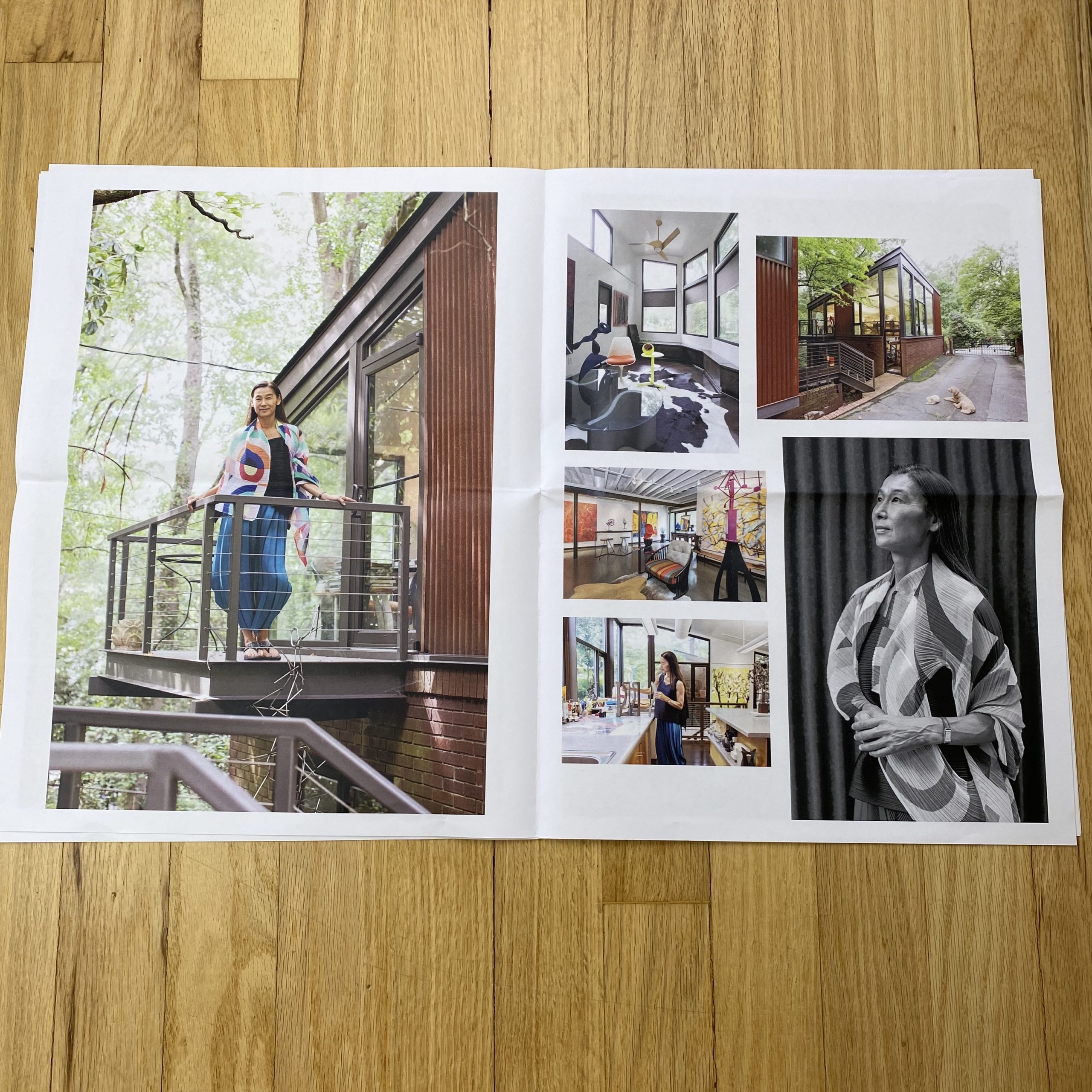
I have spent most of my career as a photographer shooting food and still life. In the last few years I have begun to shift my focus to people this started on one of my many trips to Cuba. I had made a short documentary film about four elderly Cubans who had lived in their homes all of their lives. Our homes are a reflection of who we are. The idea was to explore the relationship between a person and their home, After the film I went back and began to shoot portraits of people in their homes – shooting both a portrait and an object or interior which could alternatively be seen also as a portrait.
Tell us about these portraits. Two years ago at an event at a church to welcome immigrant children from Latin America who had been “ shipped” to NY from the border that summer, I met two pastors from The Church of Living Hope in East Harlem. They told me that they wanted to open the church on 3 Fridays after Thanksgiving to neighborhood families for family holiday portraits. I had been looking for photography opportunities to work with organizations which had need of my skills. Immediately I volunteered to photograph the holiday portraits. It was both a challenging and rewarding experience. Challenging because I had very little time with each family as we had a line out the door. Although I would have chosen a different environment in which to shoot the families, I had to understand that what they wanted was a holiday themed portrait, which meant a tree was set up on the side of the makeshift set to set the mood. What I had to do was let go of controlling the aesthetics and focus on the families. The challenge was that in the few minutes with each family I had to make a connection, put them at ease, and take the picture. I was very touched by the thankfulness and grace of each family. This year I did this again in a shelter in East Harlem. I have promised to go back before Mother’s Day to shoot portraits of the children for Mother’s Day gifts. We have a make-up stylists who is willing to come and do make-up for the moms while I shoot the children. I hope to find a cosmetic company who sells products for Black and Hispanic women who would be willing to donate cosmetics. Doing these projects satisfies my desire to use my talent to do community based work. It has also shown me that after years of working in a studio shooting food and still life that I want to now shift my focus outward to people. I hope to find more opportunities to work with non profits, NGOs or social service agencies who have a need for portrait and location photography to visually explain their mission.
Why, I daresay it’s light up there, far away, at the end of that tunnel yonder.
I’m sure I see it.
Do you?
It was 46 degrees F yesterday, with a deep blue sky and lots of sunshine.
At the hottest point of the day, in the sun, that feels like 56F, which means there was an illusion of Spring yesterday, for the first time this year.
Spring, I say.
Spring!
At one point, I was only wearing a T-shirt, it was so warm.
A T-shirt!
Now, beyond that, (not that I need more ammunition,) my father-in-law has lived here for nearly 50 years, on this piece of land, and when we moved back to town, almost 15 years ago, he gave me a good piece of advice.
He doesn’t say much, most of the time, my father-in-law.
With the grizzled look of a cowboy, country doctor, you can get him going on certain subjects, like the health care system, or local politics.
Mostly, though, he likes to grunt.
So imagine him thusly, back in 2005.
SCENE:
Grunt.
“Hey Jon. December 15th to January 15th. Coldest time a year. Every year.”
Grunt.
END SCENE:
So, as I write this, it’s January 15th, and yesterday felt like Spring, for heaven’s sake.
How can you not feel just a bit better?
How can you not revel in silliness, as I am now?
Did you not read my column last week, in which I postulated it was rational to laugh at a terrifying world? Did that not give you permission?
What’s wrong with you?
War with Iran, you say?
Pish tosh, I say.
Impeachment?
Poppycock!
And just to prove it, to sit down in the muck of my own good humor, today, we’re going to look at the final group of photographers I met at the Filter Photo Festival last September.
It so happens that I like to mix up the column these days, between travel stories, book reviews, and portfolio review articles.
It’s a feel thing, in which I assume if I’m ready to shake it up, writing wise, you’ll be ready for something different as a reader.
These following artists, therefore, represent the last batch of The Best Work I Saw at the Filter Photo Festival in Chicago.
And normally, almost always, I’d say that the artists are in no particular order. That they’re seemingly disconnected, because I don’t really plan which photographer ends up in which piece.
Sure, that’s still the case. But when I looked through the last group of portfolios, I kept thinking the same thing.
Sad pictures.
More sad pictures.
Then, even when the pictures weren’t overtly sad, because of the other pictures, contextually, they still felt sad.
It was like the sad energy from Deep Winter was trying to creep back into my psyche, here, one day into the far-less-daunting Mid-Winter.
Do you see what I did there?
I bait-and-switched you.
Silly opening, depressing photos.
Here we go.
First up, we’ve got Bernadette Fox, who was visiting from Minnesota. She told me she was a filmmaker before she was a photographer, and that her career had taken many twists and turns.
We looked at one group of photos she shot in Morocco, of an arranged wedding, and they were really cool, for sure.
But I was perhaps a bit more interested in her next group of photos, a long-term project shot on film, and we jumped right into editing mode.
Yes to this, no to that: we separated the prints into two groups.
In the best of theses photographs, (which were edited down in the ensuing months,) the energy, the sweet vibe of loss, comes through via color and light palette, as much as anything.
The ever-so-slight color shifts that come with time.
It’s the good kind of pain, like pulling out a splinter with a sharp pair of tweezers.
Next, we’ve got William Davis, an artist I met at the portfolio walk. I have to admit, I was multi-tasking, as I’d just come back from dinner with a student, was doing a tour of the room with another student, while simultaneously trying to scout projects for you guys.
But I noticed William’s night-time pictures out of the corner of my eye, and made a move straight to them, knowing almost from the glowing glance that I’d like them.
(Is it OK to have developed the 6th sense, after so many festivals?)
He said the project was all about documenting light pollution, on multiple continents. From Cusco, Peru to Kalamazoo.
They’re super-cool, even if the subject is (literally) dark.
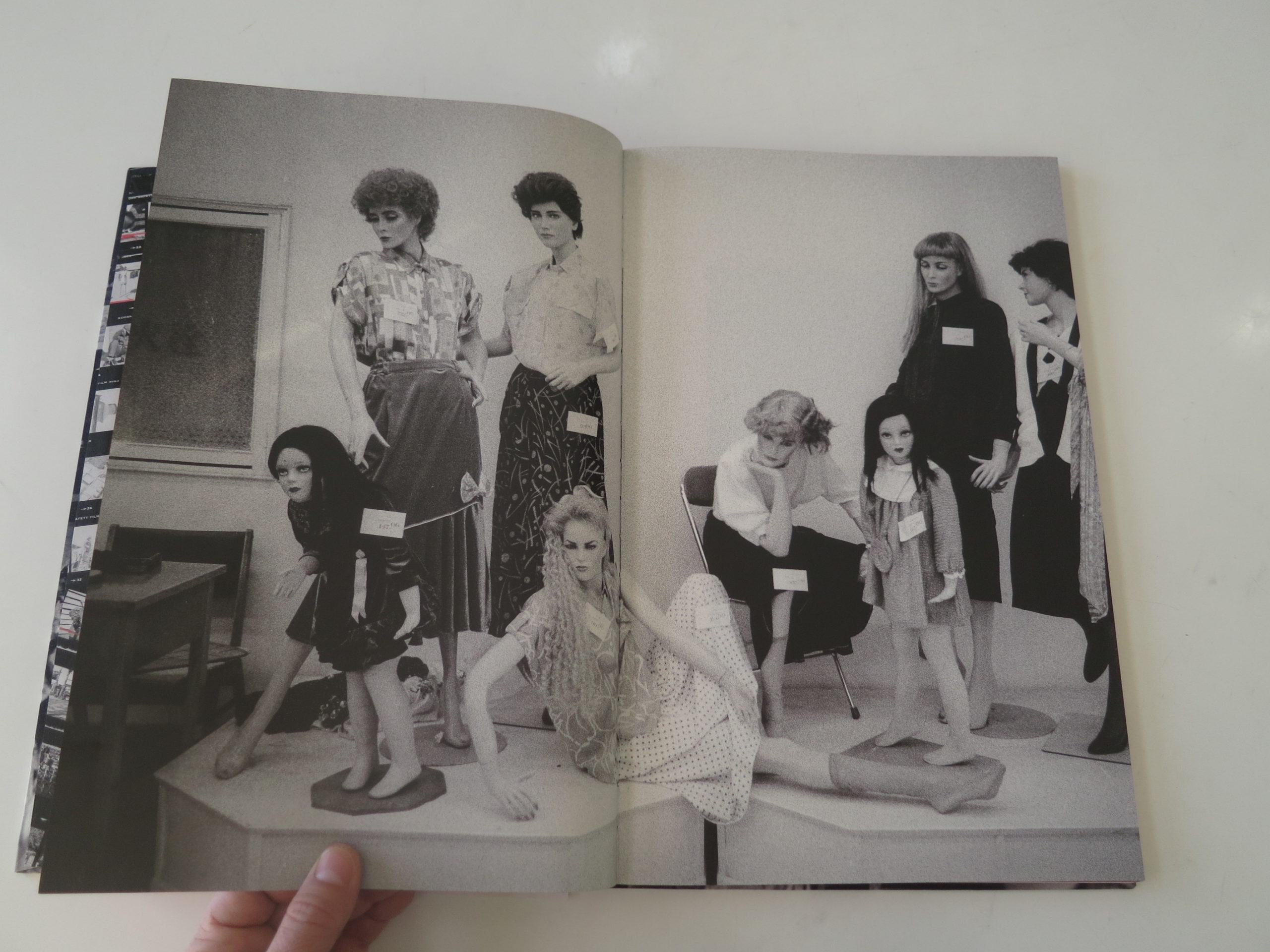
Next up is Kari Laine, and maybe this work was meant for today?
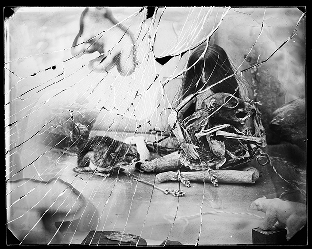
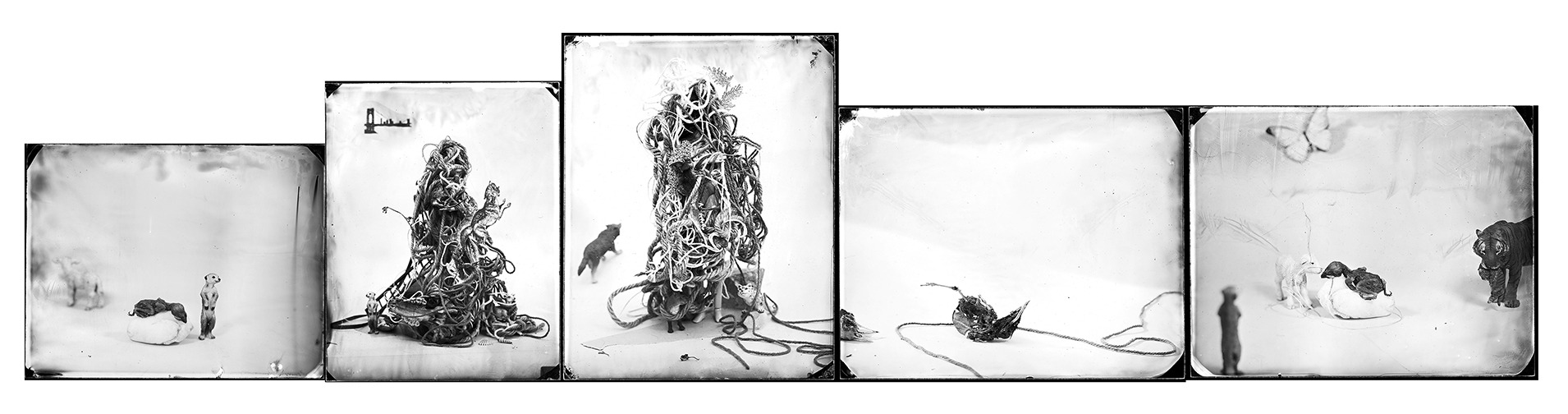
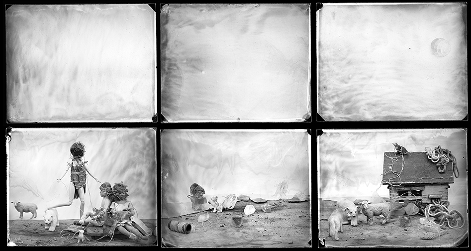
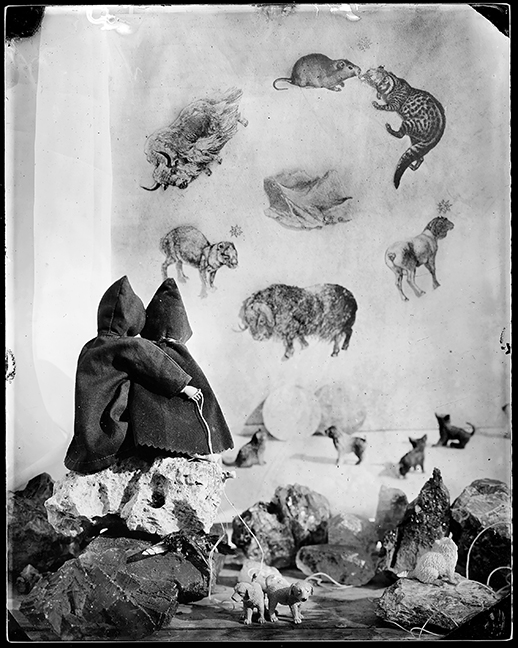
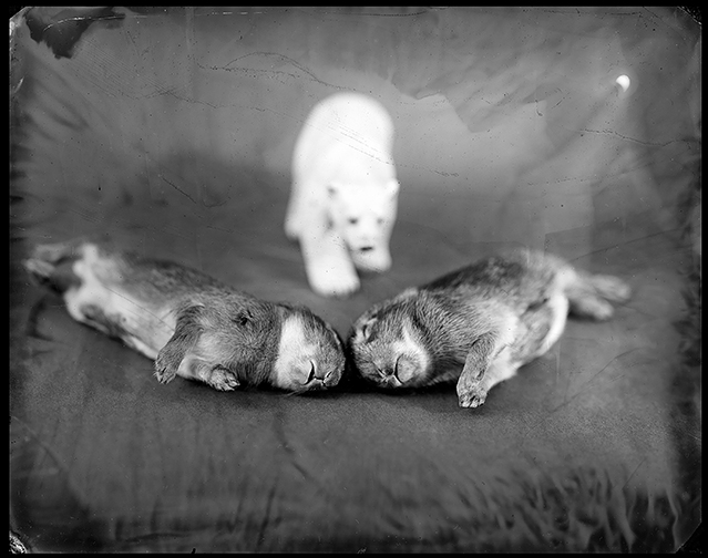
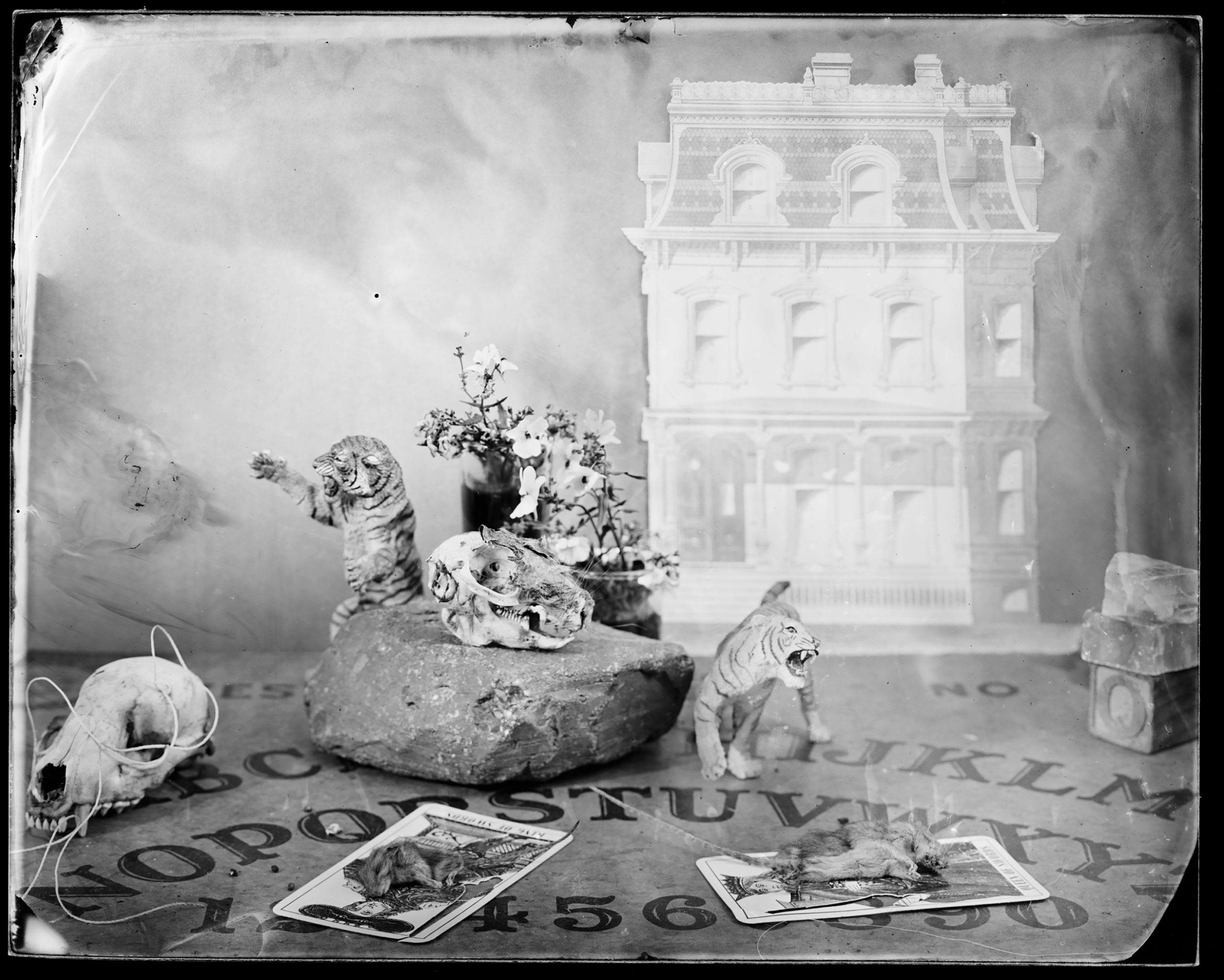
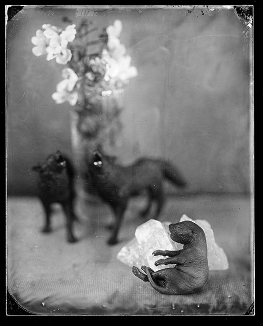
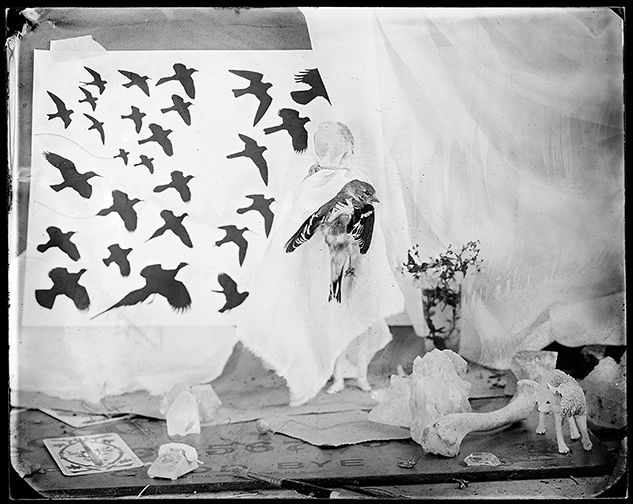
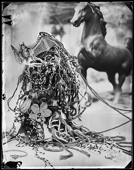
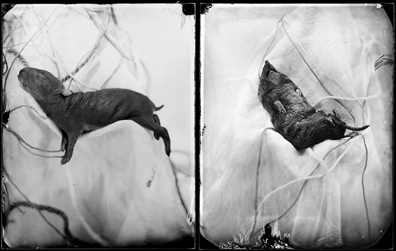
These tabletop constructions, and multi-image panels, feature dolls, little plastic tigers, but also dead creatures? They’re sad, bleak, macabre tableaux, but also, maybe a little funny too?
I was on the fence for a minute, but then I decided I like them.
Weird should always be good.
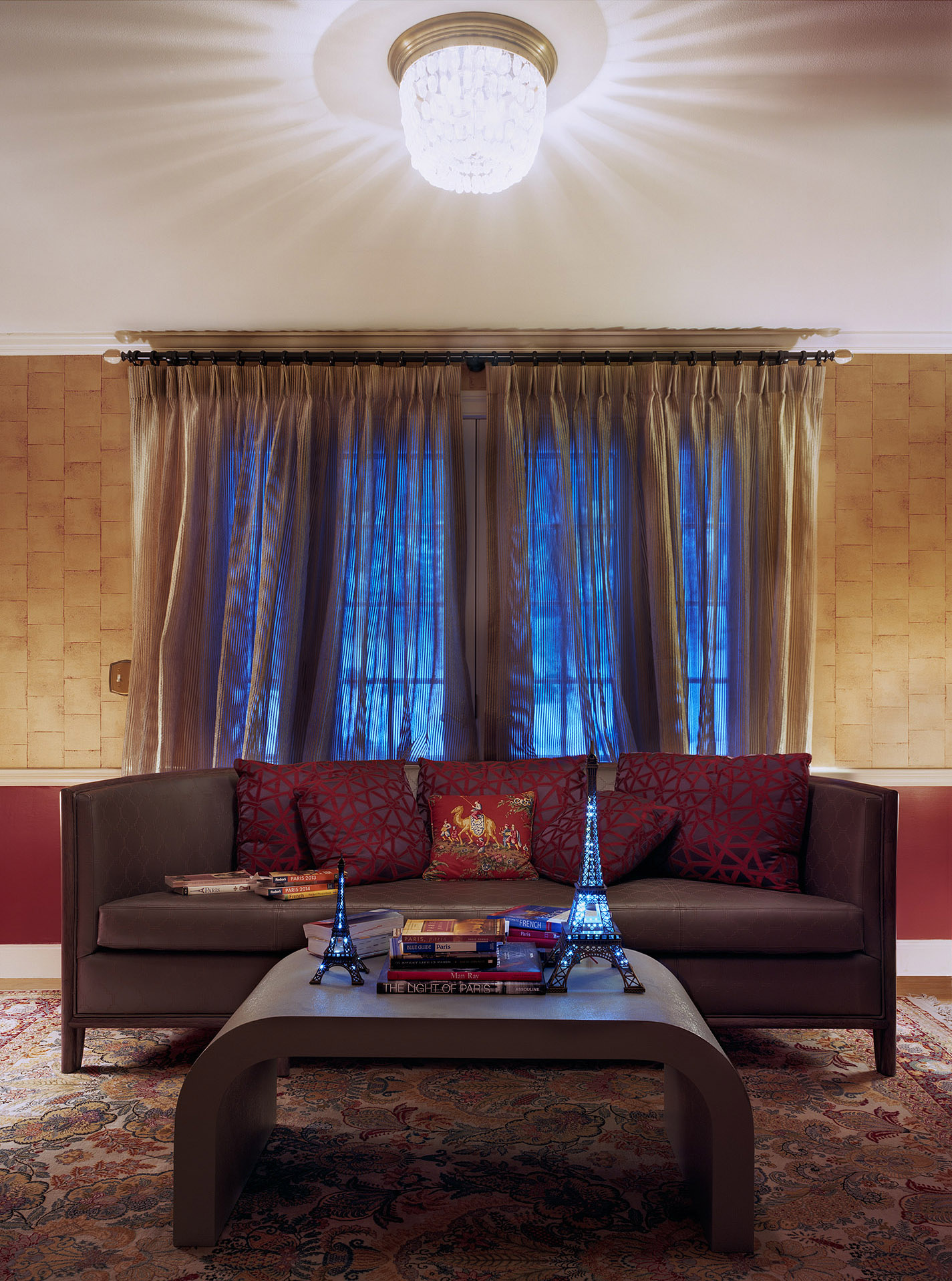
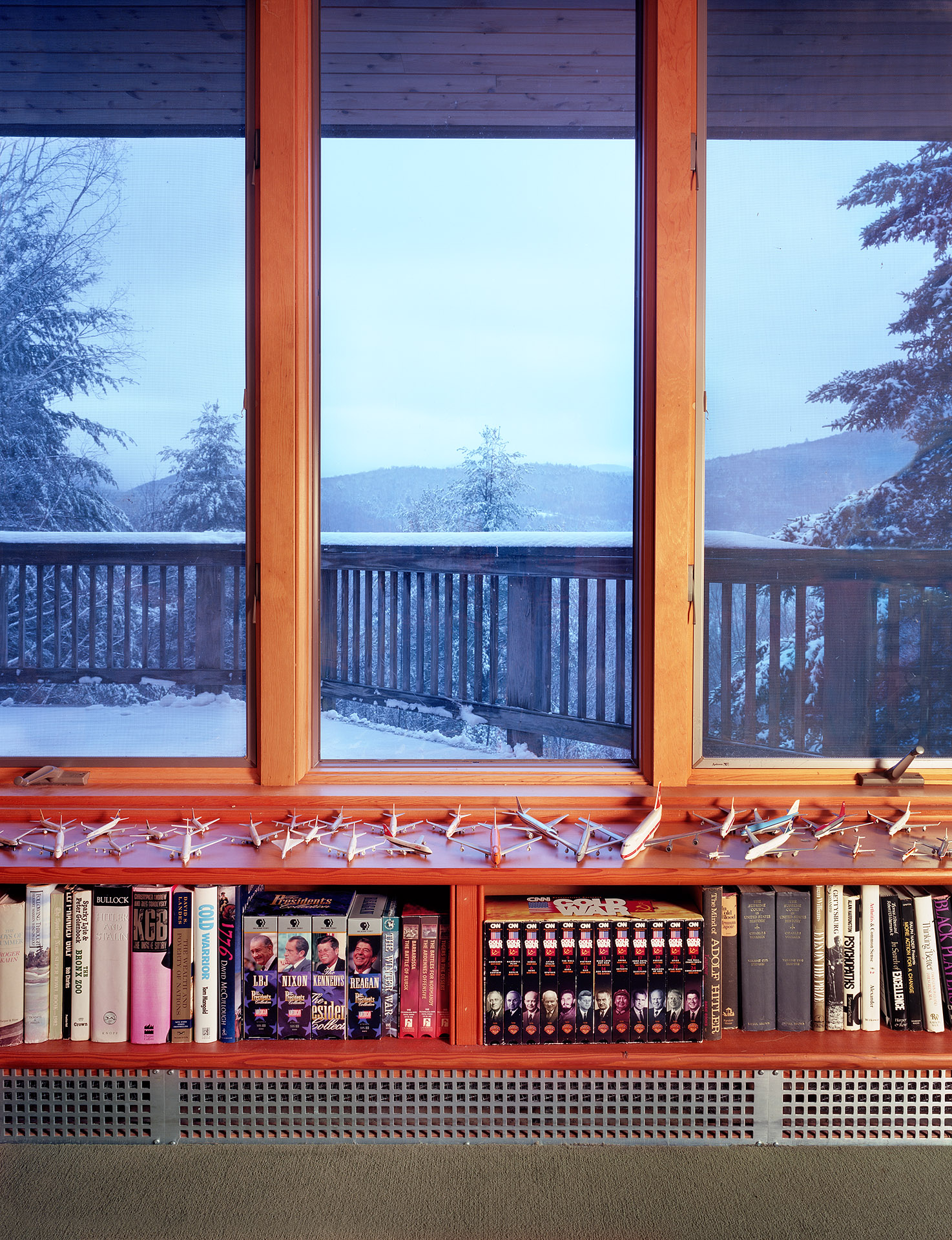
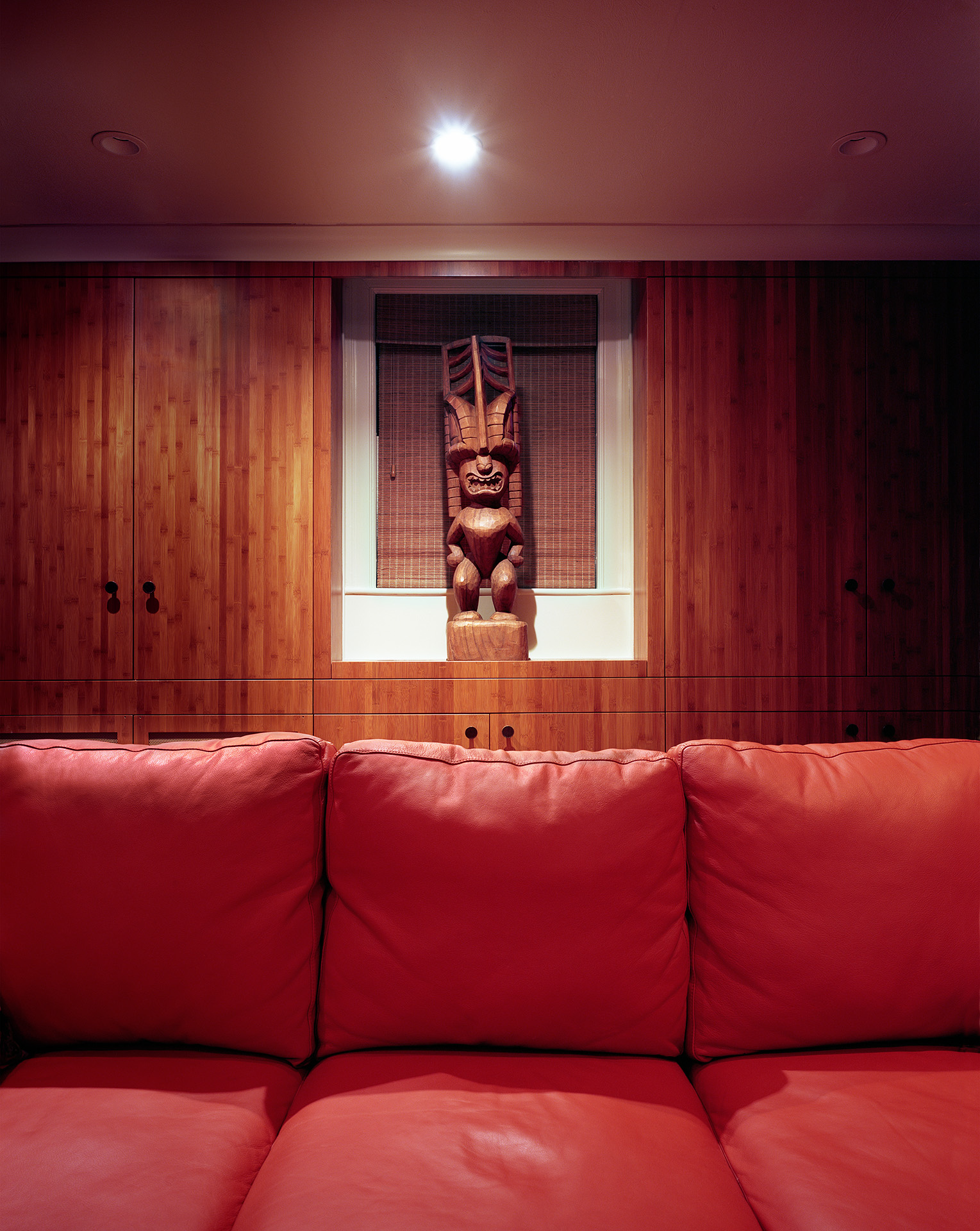
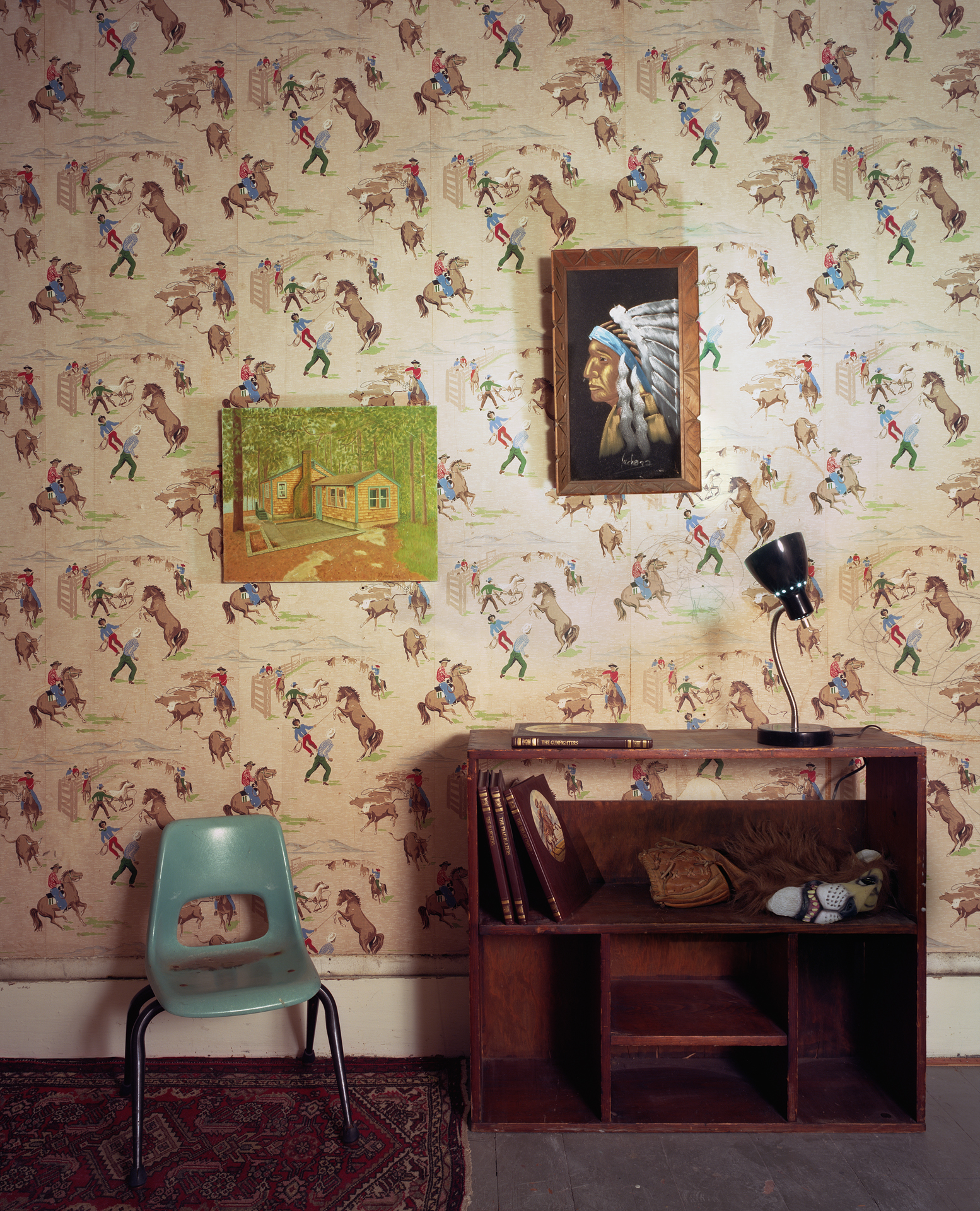
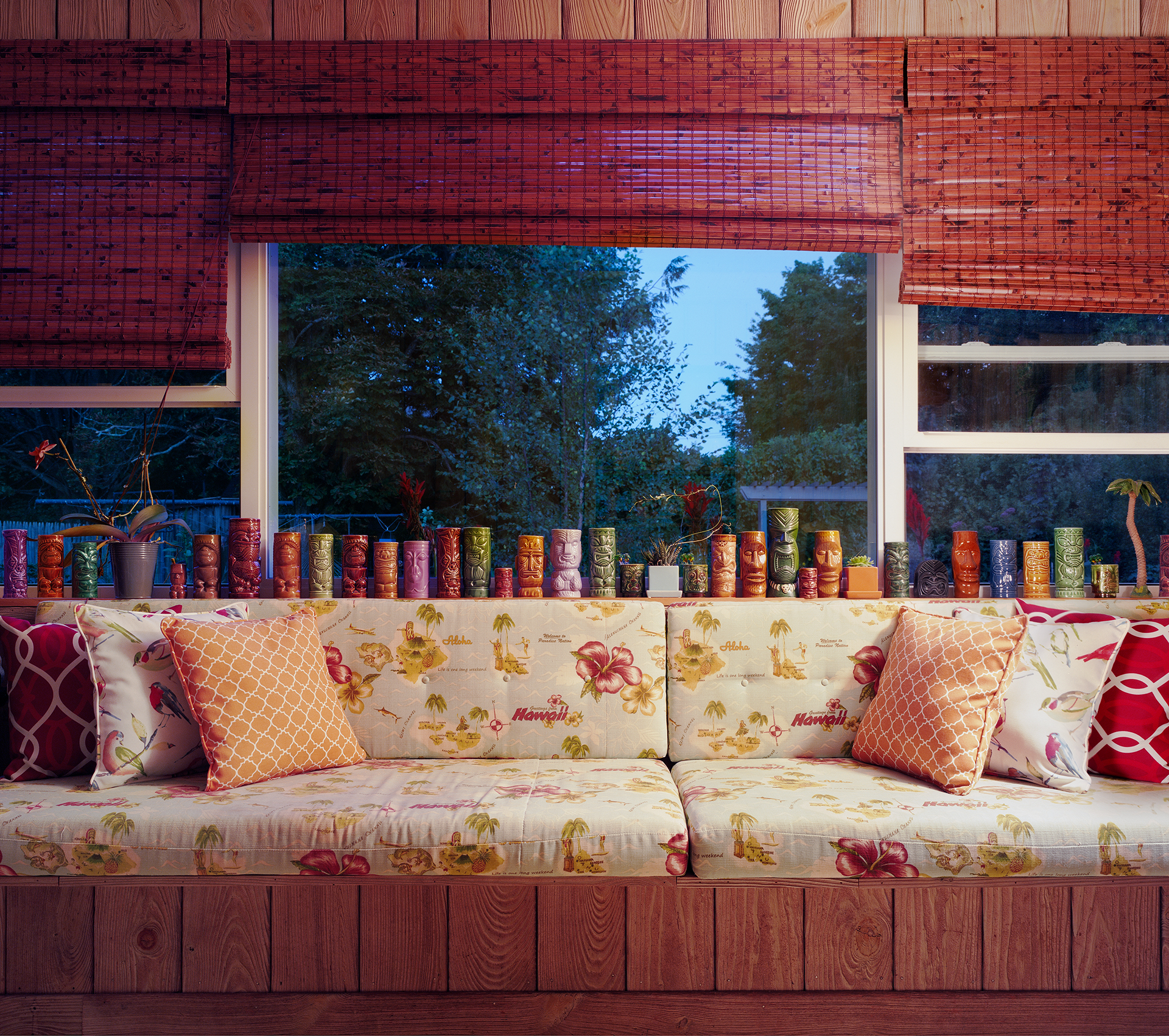
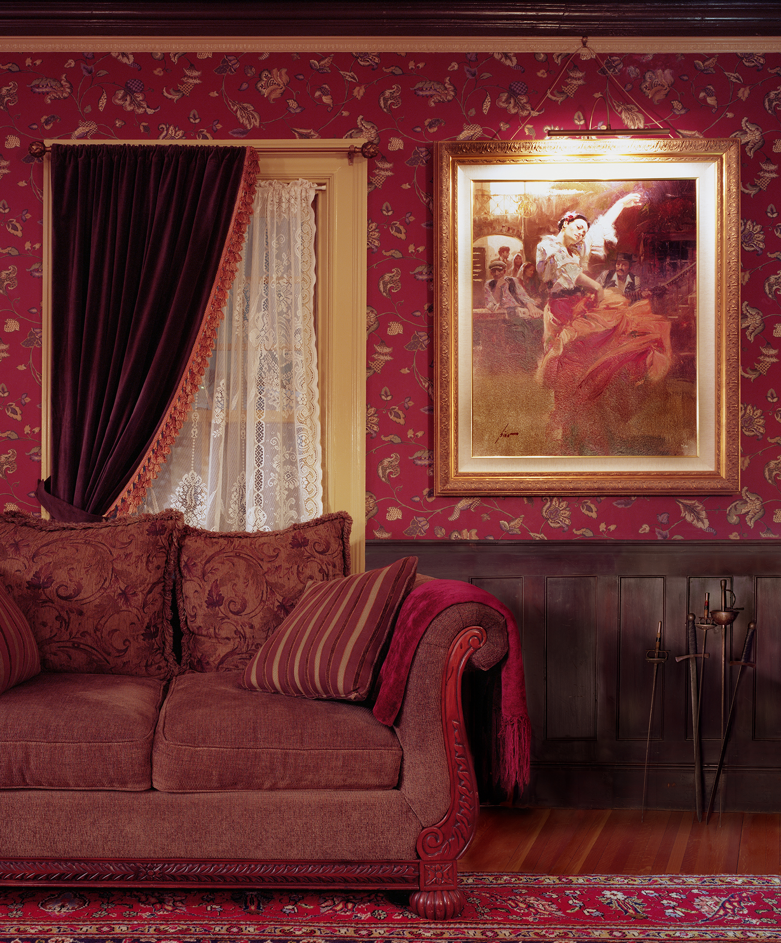
Moving along, we’ve got Sarah Malakoff, and her project was strange as well.
Sarah photographs interior spaces that are designed around cultural or historical themes. If ever there were a project to embrace kitsch, this would be the one.
We ended up having a technical conversation, Sarah and I, as her prints were super-glossy, way too glossy, and it created a reflectivity bomb that was hard to get past.
I told her that as I publish digitally, I was sure her jpegs would be good enough to show, and so they are.
Really strong portraits of people, through their personal spaces.
I have a tiki lounge, therefore I am?
Subsequently, one of my students, visiting the festival, also saw the prints and had the same problem with the gloss, so I was glad when Sarah told me she was experimenting with a different paper.
I can’t stress enough, these subtle choices make a huge difference in how our work is received, IRL.
anns 003
Finally, we’ve got a series of pictures by Daniel J. McInnis, and I admit I did hold these last for a reason. Because they’re not overtly sad, (my theme today,) so I wanted to set them up after all the other projects.
Daniel accompanied his wife on a business trip to Japan, and used a digital camera for the first time, after a long time working with analog materials. (We’d previously published some of his portraits of artists, after a prior Filter, and he was using a large format camera at the time.)
Maybe it’s the color palette, or the dry, formal sensibility, (in a formal country,) but I think the cool remove makes these photos a little lonely.
A little cold.
And after I wrote my first draft of this column, wouldn’t you know, but a night-time blizzard rolled into town.
The Art of the Personal Project is a crucial element to let potential buyers see how you think creatively on your own. I am drawn to personal projects that have an interesting vision or that show something I have never seen before. In this thread, I’ll include a link to each personal project with the artist statement so you can see more of the project. Please note: This thread is not affiliated with any company; I’m just featuring projects that I find. Please DO NOT send me your work. I do not take submissions.
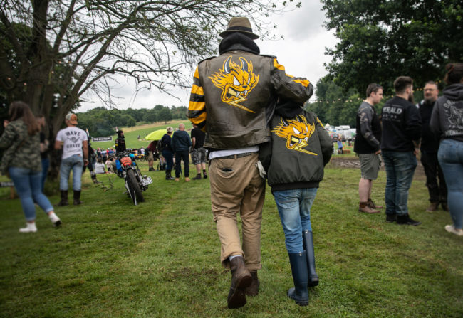
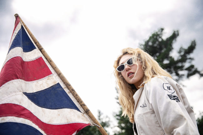
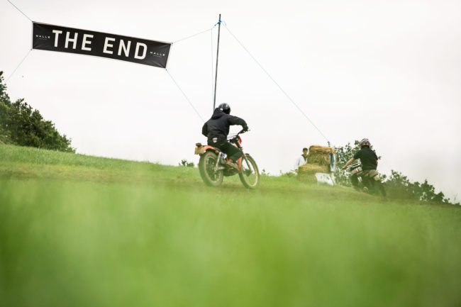
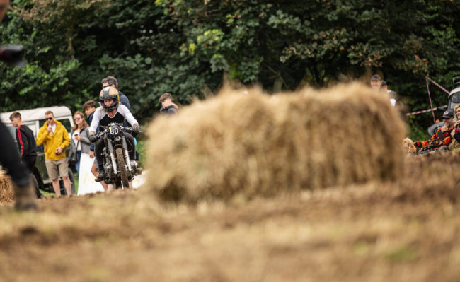
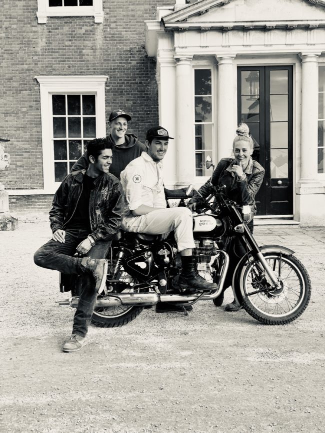
It took a year for all the pieces to come together for this project. I’d befriended UK Artist D*Face while he was working on murals in Las Vegas. Last year, while photographing him in Seattle I learned that in addition to being a world-renowned visual artist, he creates custom artwork for motorbikes and designs for the apparel brand he started called, Rebel’s Alliance. When he told me about this other business and passion project of his, my head starting spinning with ideas for photographing it. I knew I’d need to go to where the culture and creative energy was happening.
It all finally happened in July, on one of the hottest days in London’s history. I met him at his studio in Shoreditch, London and 7 of us helped load up the bikes and merch, then drove about an hour south to Kevington Hall.
I photographed 3 days from sun up to sun down at Malle Mile event and loved being able to completely immerse myself into the moto culture and community. Just about everyone there was camped out in the grassy fields around Kevington Hall. It rained half the time but it never dampened any spirits. There was mud, motors revving, great coffee and a cooler full of beers and rose’. There were people from all over the world represented on custom “built not bought” bikes.
Learning to ride wasn’t on my to-do list before this, but it sure is now.
APE contributor Suzanne Sease currently works as a consultant for photographers and illustrators around the world. She has been involved in the photography and illustration industry since the mid 80s. After establishing the art buying department at The Martin Agency, then working for Kaplan-Thaler, Capital One, Best Buy and numerous smaller agencies and companies, she decided to be a consultant in 1999. She has a new Twitter feed with helpful marketing information because she believes that marketing should be driven by brand and not by specialty. Follow her at @SuzanneSease. Instagram
Success is more than a matter of your talent. It’s also a matter of doing a better job presenting it. And that is what I do with decades of agency and in-house experience.


 –
–