The Daily Edit – The New York Times Digital: Zach Gross



The New York Times Digital
Photo Editor: Sara Barrett
Photographer: Zach Gross
Heidi: Can you give me a little back story on the project?
Zach: I started to show my newly edited portfolio around to photo editors. I reached out to Sara; we were originally in contact about a year earlier when The New York Times wanted to publish a photograph of Kalief Browder that I made a few years ago.
She agreed to meet and review my new portfolio, we chatted about my work and the various projects she was working on with photographers. I wanted to experiment with blending multiple exposures in color. I followed up with her and I asked if I could explore that technique on assignment, and she came up with the idea of working on it at Penn Station.
What was their direction?
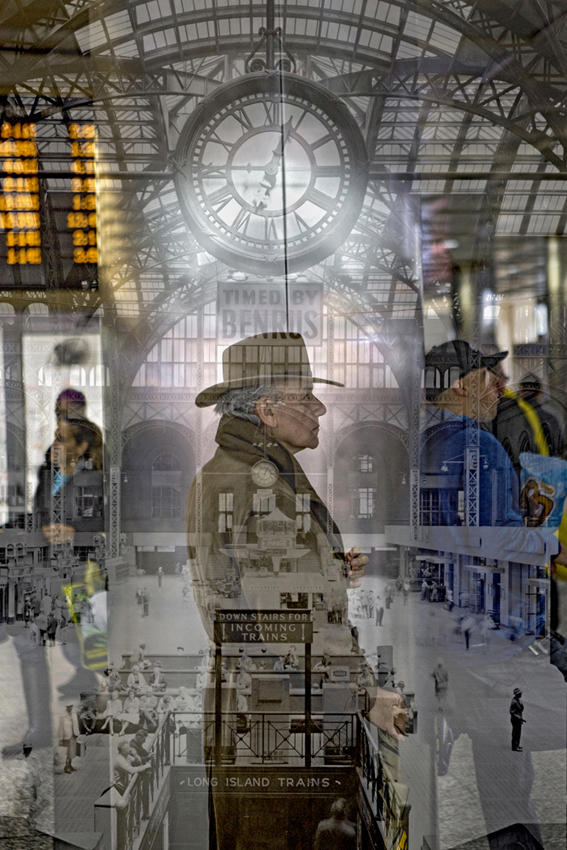
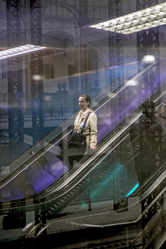
Since there is increasing conversation about renovating Penn Station, she wanted to convey the idea of hope for a better station, and to illustrate possible improvements, as I explored this idea I had trouble trying to literally show potential additions to the station. I ended up wandering around the station and noticed vintage photographs hanging around, I was drawn to how beautiful the old station was before it was demolished in 1963. I started making double exposures of the vintage photographs and moments that were going on around me.
Where will these images run?
A selection of the images ran in the Opinions Section on the New York Times website. I’d love for the photographs to be exhibited in the new Penn Station, hopefully that will happen one day.
The passage of time is a big part of it and to create a completely different perspective of the station. I like that what you are looking at doesn’t exist outside of the photograph, and it brings a good part of the past forward, and highlights how the current state of the station is not ideal.
What did this creative process underscore for you?
I enjoy working with photo editors, its nice to have some parameters and guidance, and at the same time have room to experiment and explore.
Some outtakes


The Daily Promo – Lisa Linke


Lisa Linke now represented by Picture Matters
Regarding the promo:
https://www.prodpi.com/ printed the promos. Their quality is great and I also order the prints for my portfolio book there.
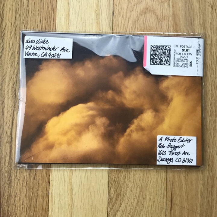
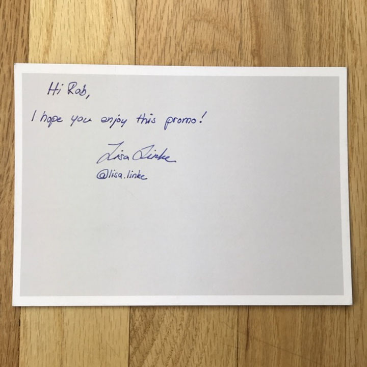
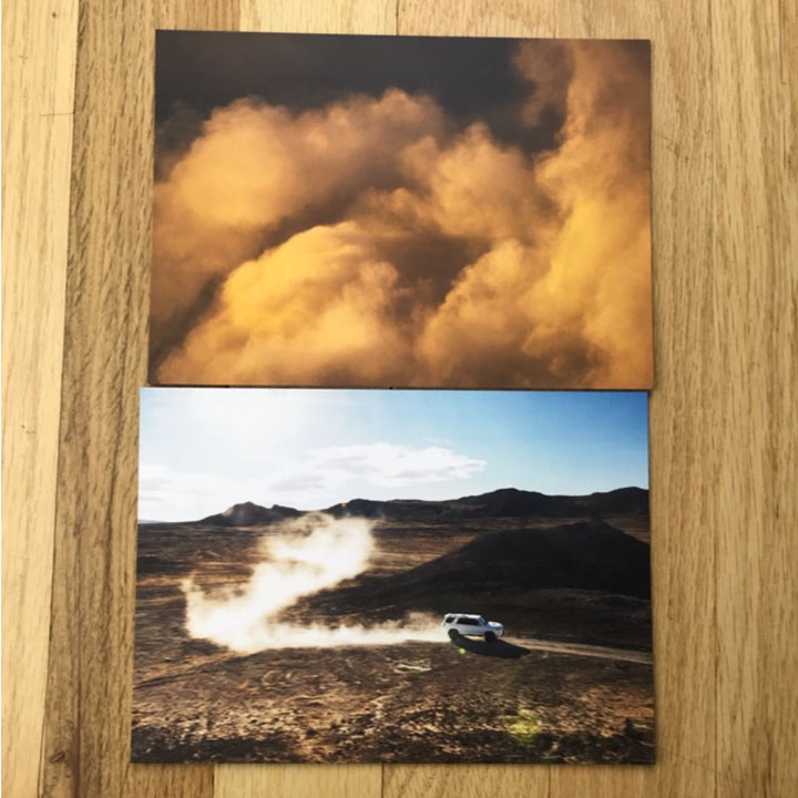
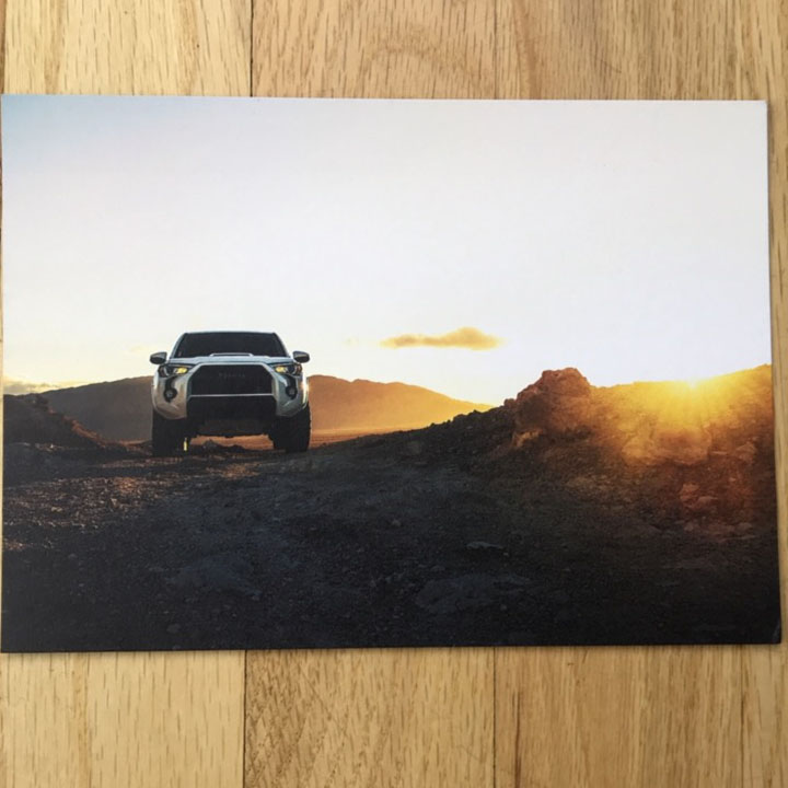
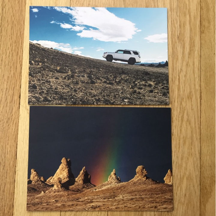
I designed the promo myself, I wanted to make a simple and cost-effective mailer, that the receiver wants to open right away. After making a really involved promo about a year ago, I felt like this was the right idea. Cards are always nice, because you can share a specific image with another creative that caught your eye. Each card has my contact info on it, so that whoever ends up looking at it, can reach out. I didn’t want to show a specific car as an opening image, instead I chose something environmental, that gives an indication on what is inside the envelope, but doesn’t tell too much. To me it was important to not only show the car, but also the surroundings. A car brings you to places and I often forgot to capture where it brought me to, so this time I wanted to show this and make it be part of my mailer.
The shoot itself was really fun and I was excited to share these images with creatives and agencies. But who doesn’t like jumping a truck in the desert?! To me this shoot was more like an adventure than work, an experience I was able to share during portfolio reviews. This adventure included me almost getting bit by a snake, a lot of dust and the most beautiful sunrise I had seen in a long while.
I actually made two different mailers, one with the off-road car and one with a performance car showing the capability of the vehicle to be used on streets as well as on a race track. Not every agency or client does shoots that involve off-roading, so I wanted to make two mailers I could send out to the right people. I made about 30 of each, so 60 total. The ones I had left I used to hand out during meetings.
This is the second mailer I made. I’m trying to send out mailers at least twice a year, simply to remind people of me and keep them posted about special projects.
I think print promos can be really effective. I personally love seeing my work printed, it shows the quality of your work. Even if it doesn’t get you a job right away, people remember you and your work and maybe at some point they get back to you.
The Best Work I Saw at the Filter Photo Festival: Part 1
I get lonely, sitting out here by myself in the middle of a pasture.
It’s very quiet.
Right now, as I look outside, heavy clouds are blocking half the mountain, as we’ve had atypical weather since I got back from Chicago.
Cold. Wet. Damp. Gray.
No thank you.
If I wanted to live in Portland, I’d move to Portland.
Even worse, when I left Chicago last week, it was in the mid 80’s each day.
Pure summer weather.
Now, I’m wearing my heavy hoodie everywhere, and sulking because I miss the sun.
Such problems.
Thankfully, they’re not the kind of troubles that require the President of the United States to pretend-foul-shoot paper towel rolls at my head.
Remember, no matter how glum you feel, things can likely get worse. And the man who’s supposed to save us, to inspire us, to console us, is seemingly as deranged as peak-nutter-Muammar Gaddafi.
Hell, when I was in Chicago, I couldn’t even look at his fancy building; the one I admired two years ago. Now, (other than giving it the middle finger on Instagram, like a gringo Ai Weiwei,) I found my Trump denial was pretty consistent.
Nobody wanted to talk about him. Except for a moment, on the subway back to the airport, as I was finishing up a half hour chat with a middle-aged African-American guy on his way to his first day on the job in a mail room somewhere.
We met on the platform, when he asked me if the train I was awaiting was right for him. I always like it, (secretly) when people take me for a local somewhere, so I told him what I knew, and that seemed enough.
We chatted easily, my new friend an I, and I told him about New Mexico, and he caught me up on Chicago. As we approached the end of the line, I told him about the time I filmed a movie in Donald Trump’s apartment on top of Trump Tower, back in 1996, and the walls were plated in gold.
Randomly, another guy, halfway down the subway car, chimed in, “‘The Devil’s Advocate,’ I loved that movie.” And before you know it, several of us, all strangers, were conversing, only minutes before we broke up forever.
(We didn’t bother trading names, much less business cards.)
Last week, I told you about Chicago in the abstract, but this stuff just keeps happening to me, whenever I visit. I attribute it to the local culture, which is of course true, but it might also have something to do with the fact that I’m lonely out here.
Working by myself.
Tapping away at the keyboard, like a white-collar jackhammer operator.
Tap tap tap.
Tap tap.
Spacebar.
Festivals like Filter are special because they allow us to confer with our own kind.
Our tribe.
It’s so powerful, in fact, that when I suggested one of my Antidote students attend Filter, (which she did,) she had a look on her face like she’d found her long-lost birth parents.
That feeling of belonging, of being understood, is powerful. It helps us all, as working in a creative field can be isolating, each of us in his or her own box.
Conversely, it also explains why this country has striated to the degree it has. In a world that is increasingly uncertain, and fraught, people take comfort sticking with their own. (Speaking which, do yourself a favor and read this brilliant Andrew Sullivan long-read on tribalism in American politics. It’s grim, but genius.)
When I’m reviewing at an event like Filter, I love feeling the rush of energy as the photographers all come in the room. The quiet gives way to a loud buzz in the span of one second.
Quiet.
Then roar.
And I get to sit there and look at people’s art, their personal secrets, and learn things about the world I wouldn’t otherwise know.
How great is that?
Over time, I’ve learned how to be critical without being harsh, so these days, all the conversations are positive, and I no longer make people cry. (Yes, it’s happened before, but not anymore.)
The next few weeks, I’m going to share the best work I saw at the 2017 Filter Photo Festival, so you can get as sense of what’s going on out there. As usual, the artists are in no particular order, and I’ll share details of our conversations as well.
I met Sara Silks towards the end of the event, which was fortuitous, as I’d already been to the Art Institute of Chicago, and could tell her about what I’d seen. As it happens, Sara and I are both inspired by Japanese art, and I gave her a suggestion about some Japanese galleries, deep in the bowels of the museum.
I’d only learned about them by happenstance, as I bumped into someone on the street in front of the museum, (a colleague I used to know in Santa Fe,) and as she works at the AIC, she gave me a tip on what the tourists never get to see.
In this case, I viewed some ridiculously gorgeous woodblock prints by Kawase Hasui, from the early 20th Century, that I was then able to recommend to Sara. Turns out, she makes Japanese-inspired, Zen-beautiful inkjet prints on special, Japanese paper.
They’re lovely, and the paper texture conflicts with the images, occasionally, in a way that evokes Wabi Sabi, the concept that roughly symbolizes the balance between perfection and imperfection. I’m sure you’ll appreciate the selection here.
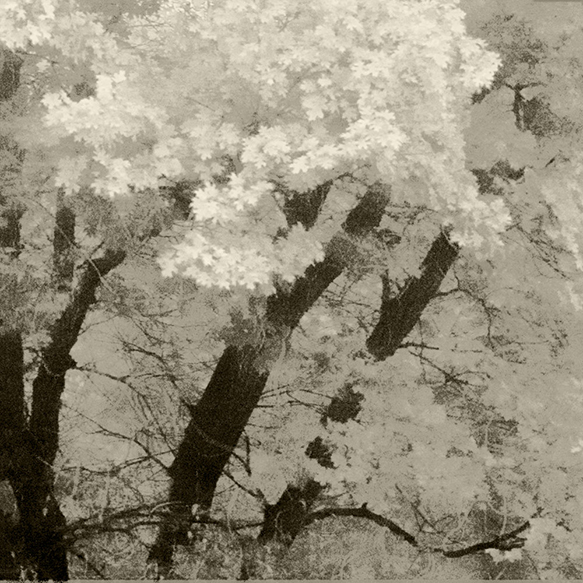

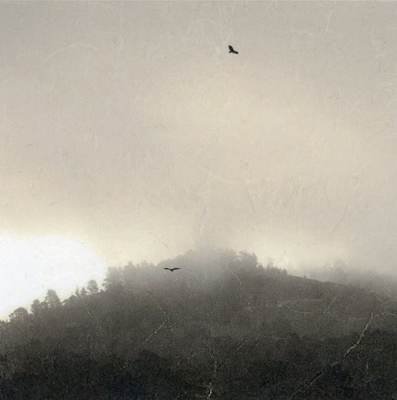
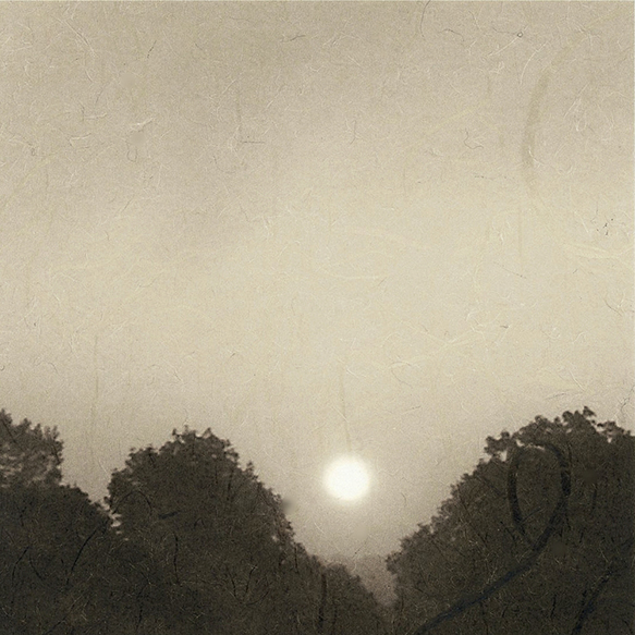
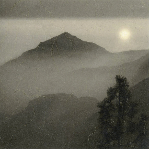
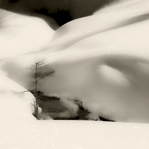

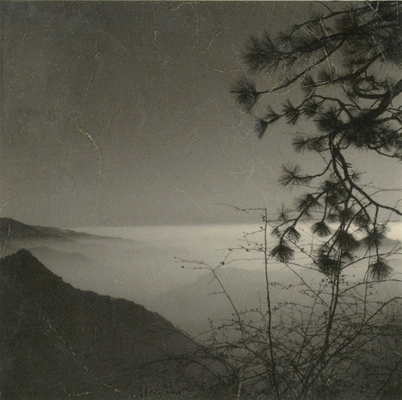
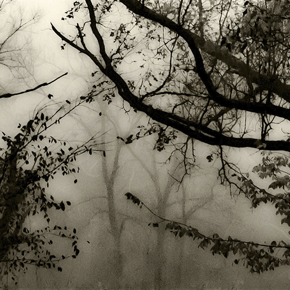

Sarah Pollman made work that I noticed during the portfolio walk, but didn’t have time to check out. She’s based in New England, and suffered a tragedy she wasn’t comfortable talking about. Not surprisingly, she ended up making work that is based in cemeteries, as a way of processing grief.
Her first set, in color, focused on a garden cemetery designed in the suburbs of Boston by Frederick Law Olmstead. Each picture features an anonymous Mother and Father gravestone, like a weird Cotton-Mather-Ghost-story come to life.


Speaking of ghost stories, they’re the literal inspiration behind Bill Vaccaro’s excellent series “The Magic Hedge.” Bill’s a long time Chicago guy who makes Ziatypes, a style of alternative process printing that was invented by New Mexico’s Bostwick and Sullivan.
Though we can’t see it on the jpegs, each print had a patterned brush stroke on the outside of the image, where he painted on the emulsion with a Japanese brush, that was absolutely dynamite.
The pictures are of a spot near Lake Michigan that used to be a US military missile site. There’s an old story about the hedges being haunted, so Bill conjured just the right amount of creepy energy. Great stuff.


Ari Neiditz is trying to walk the line between travel and documentary photography. We discussed the way he could develop thematic series, as he’s interested in Asia, where these pictures originate. I suggested he try to tackle the entire continent, because how insanely ambitious would that be?
But in general, his best images had a cohesive color palette, and a sharp sense of observation.


Vera Miljkovic is Serbian, but moved to the US years ago. Her work stems from a more metaphorical vision, as she discussed her feelings of in-between, as she waited for a visa many years ago, and how she wanted to convey that uncertainty in her work.
One or two images were too derivative of Cindy Sherman, I thought, but most of the rest had a weird, kooky sensibility that I really appreciated. The worst images were kitschy in a way that referenced Eastern-European awkwardness without irony, so we discussed how she could push that further, intentionally, in the future.


Finally, for today, we have the duo of Paal Williams and Marissa Dembkowski. (Known as PWMD) I saw their work at the portfolio walk, and immediately fell in love. All the more so when they assured me the images were straight, unmanipulated photographs.
Turns out, the prints are real pictures of elements of photoshop, and digital reality, that they summon from the computer world into 3 dimensions. Rather than give away their technical secrets, I’ll ask that you view them as what they are: images of artifacts from the ghostly machine, rather than digital creations themselves.


The Art of the Personal Project: John Kealey
The Art of the Personal Project is a crucial element to let potential buyers see how you think creatively on your own. I am drawn to personal projects that have an interesting vision or that show something I have never seen before. In this new revised thread, I’ll include a link to each personal project with the artist statement so you can see more of the project. Please note: This thread is not affiliated with any company; I’m just featuring projects that I find. Please DO NOT send me your work. I do not take submissions.
Today’s featured artist: John Kealey
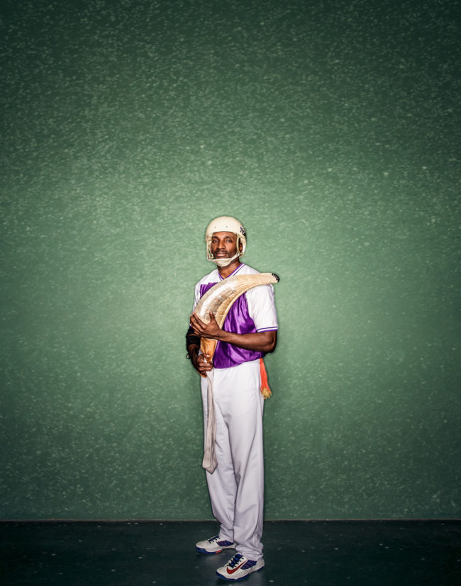
Jai Alai originated in the Basque country of Northern Spain almost four centuries ago. The sport was first played professionally in Miami around 1926. The Miami fronton is still active and often referred to as the Yankee stadium of Jai Alai.
Fronton Blvd is a personal photo study on the sport of Jai Alai in the U.S. The sport is very much overlooked and probably in it’s final years of existence with the exception of Dania Beach. Personally I wanted the project to serve as a testament to the beauty of the sport, players, courts (concha), stadiums (frontons) and makers currently surrounding Jai Alai in Florida.
A trip to the Pyrenees is in the works to photograph where it all started.
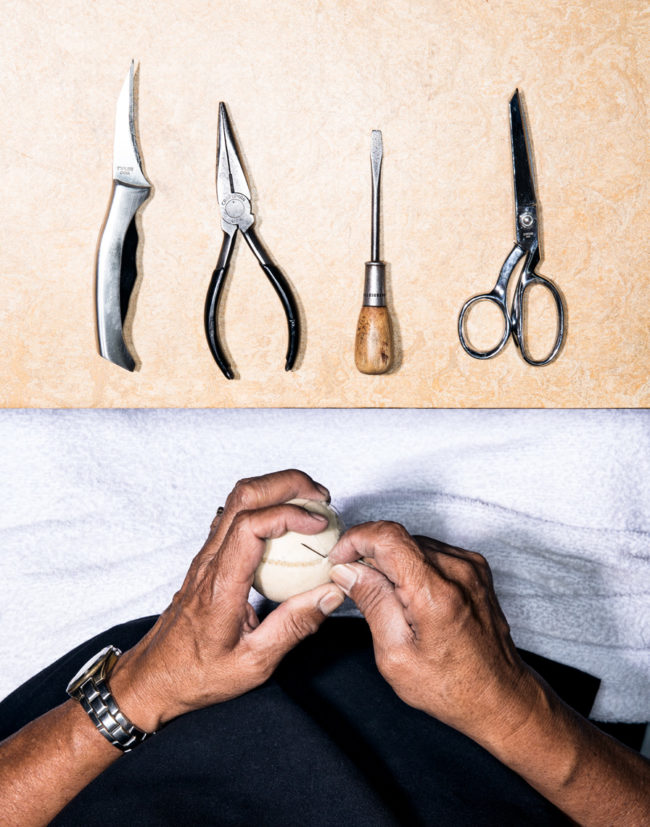
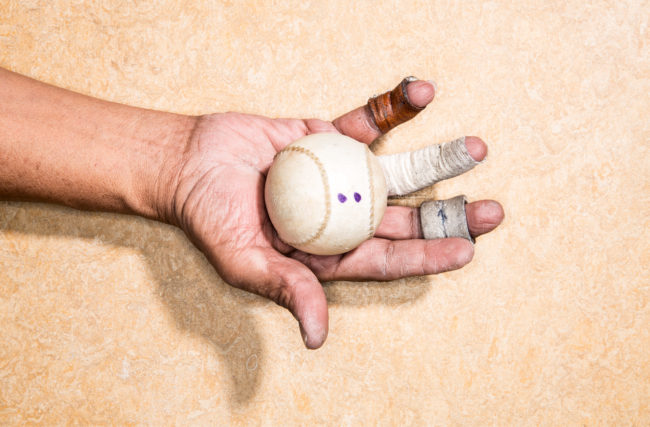
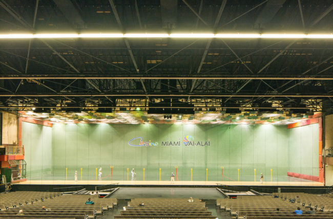
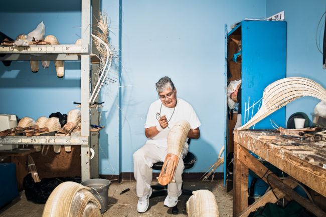
To see more of this project, click here.
APE contributor Suzanne Sease currently works as a consultant for photographers and illustrators around the world. She has been involved in the photography and illustration industry since the mid 80s. After establishing the art buying department at The Martin Agency, then working for Kaplan-Thaler, Capital One, Best Buy and numerous smaller agencies and companies, she decided to be a consultant in 1999. She has a new Twitter feed with helpful marketing information because she believes that marketing should be driven by brand and not by specialty. Follow her at @SuzanneSease.
The Daily Promo – Carmen Chan
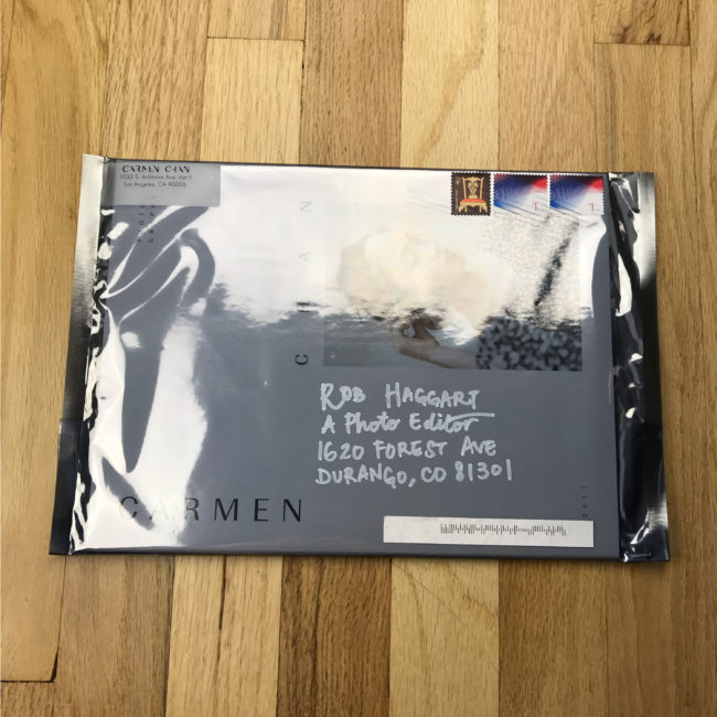
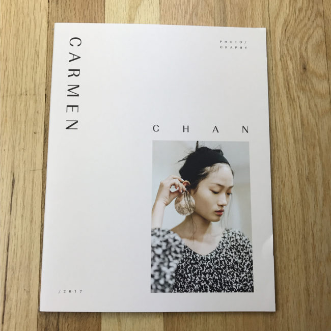
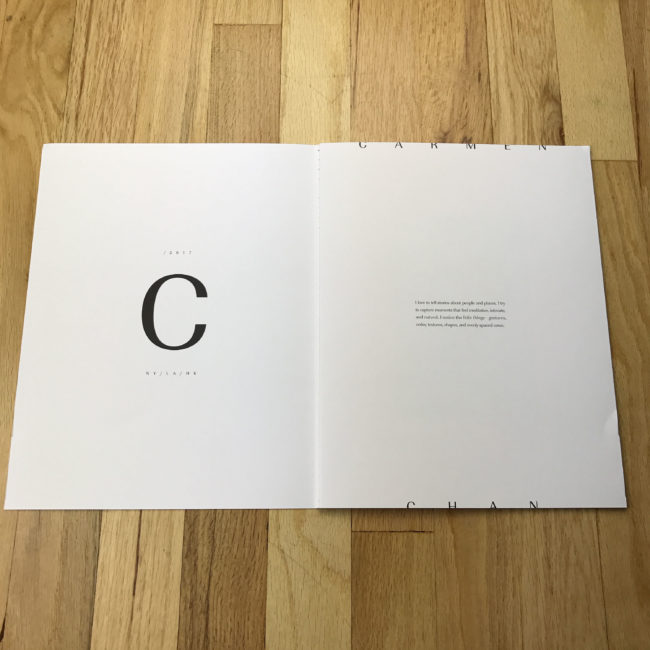
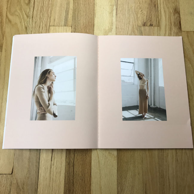
Carmen Chan
Who printed it?
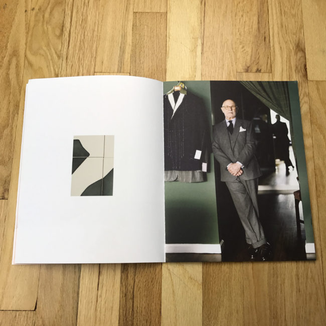
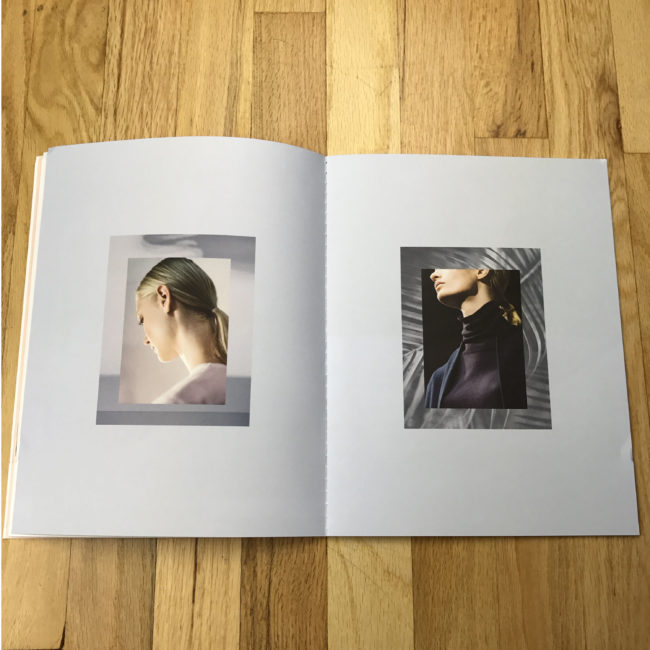
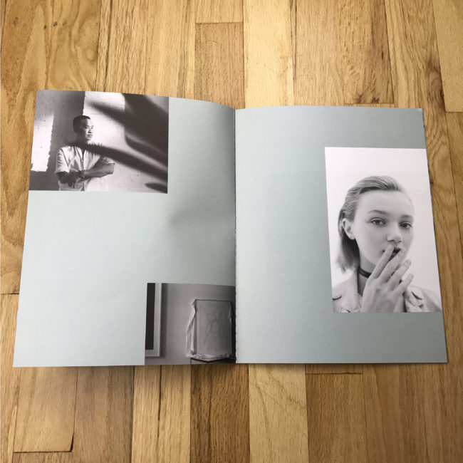
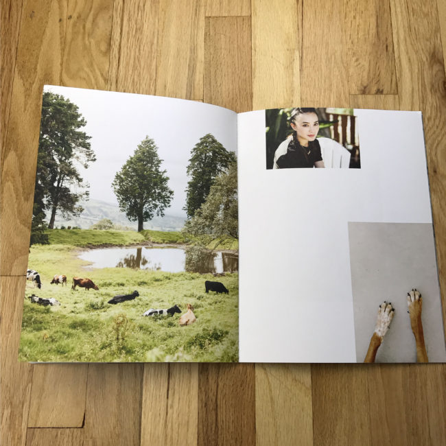
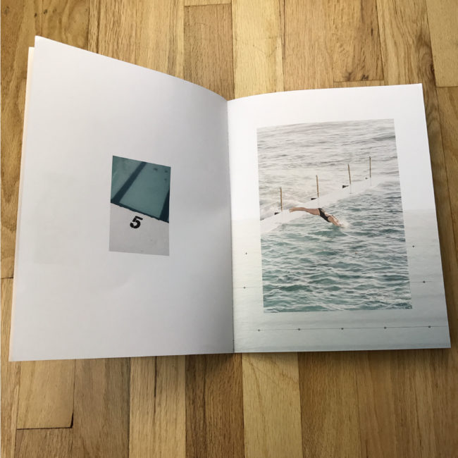
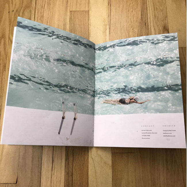
It was printed by FLASH Reproductions in Toronto. The designer found the printer and FLASH mailed us physical proofs to check color and quality before going to print. We went with them because they were able to accommodate the special binding for a reasonable rate.
Who designed it?
Kati Forner (katiforner.com)
I became a fan of her work via the print spreads she designed for other clients, and felt as though our styles aligned. She also has experience creating photographer’s pieces – coming up with a design language and format that speaks to each photographer’s work is a passion of hers. She started by presenting me with four design concepts (some of which I didn’t choose, she’s shared on her instagram) and explored cover layouts for one of them and then she went ahead with the layout.
Tell me about the images?
The images are an edit of my commercial, editorial, and personal work from the last 1-2 years for clients including WWD, Cereal Magazine, and Marriott Hotels. I sent Kati a wide edit of my favorite work and gave her free reign to make the first edit for the layout. We swapped out a few images after receiving input from a few close friends who are familiar with my body of work. I really liked the pairings we ended up with and the variety in scale and space throughout the piece.
How many did you make?
500. Half of them have been mailed to prospective clients. The rest will go to current clients, friends, and I’ll keep the rest as leave-behinds.
How many times a year do you send out promos?
Last year, I sent out my first promos – a variety of double sided 5×7 postcards. This year, I’m only sending this one. Moving forward, I’ll be sending them once a year.
Do you think printed promos are effective for marketing your work?
It’s nice to be able to share your work in a print piece that is designed in a way that compliments your work, and this piece in particular acts as a mini-portfolio. So I think they can be effective in conjunction with your work being seen elsewhere. A good example of this is a photo rep I recently met with who first saw my work in a magazine, then received my printed promo, then received my e-newsletter and responded to the newsletter asking for a meeting. Then there’s serendipity – the postcard promos that were sent last year were graciously shared on your instagram feed (@aphotoeditor) and John Cogan from GOODNOISE (goodnoisephoto.com) saw it and reached out. We worked on a commercial job together last month that wouldn’t otherwise had come about had I not shared that promo with you. Thank you so much for sharing it!
The Daily Edit – UCLA Magazine: Charlie Hess
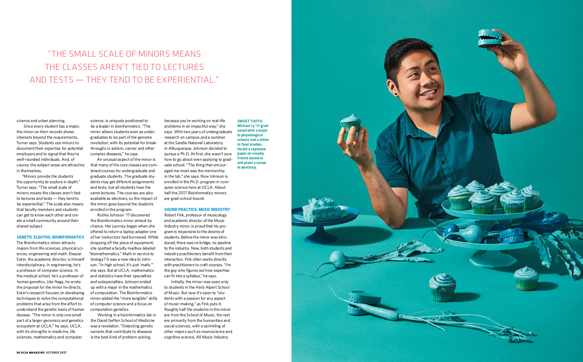
UCLA Magazine
Design Director: Charlie Hess
Art Director: Suzannah Mathur
Photographer: Stephanie Gonot
Heidi: Did you plan on the double entendres of music and academics (majors and minors?)
Charlie: At first blush this seemed like a pretty rote story about UCLA offering students minors as well as majors. But as our Art Director Suzannah Mathur and I dug deeper it turned out that many of the minors programs were pretty rad. And what the kids wound up pursuing after college anyway. The double entendres was a happy accident.
What about Stephaines style made you choose her for this project and what was your direction?
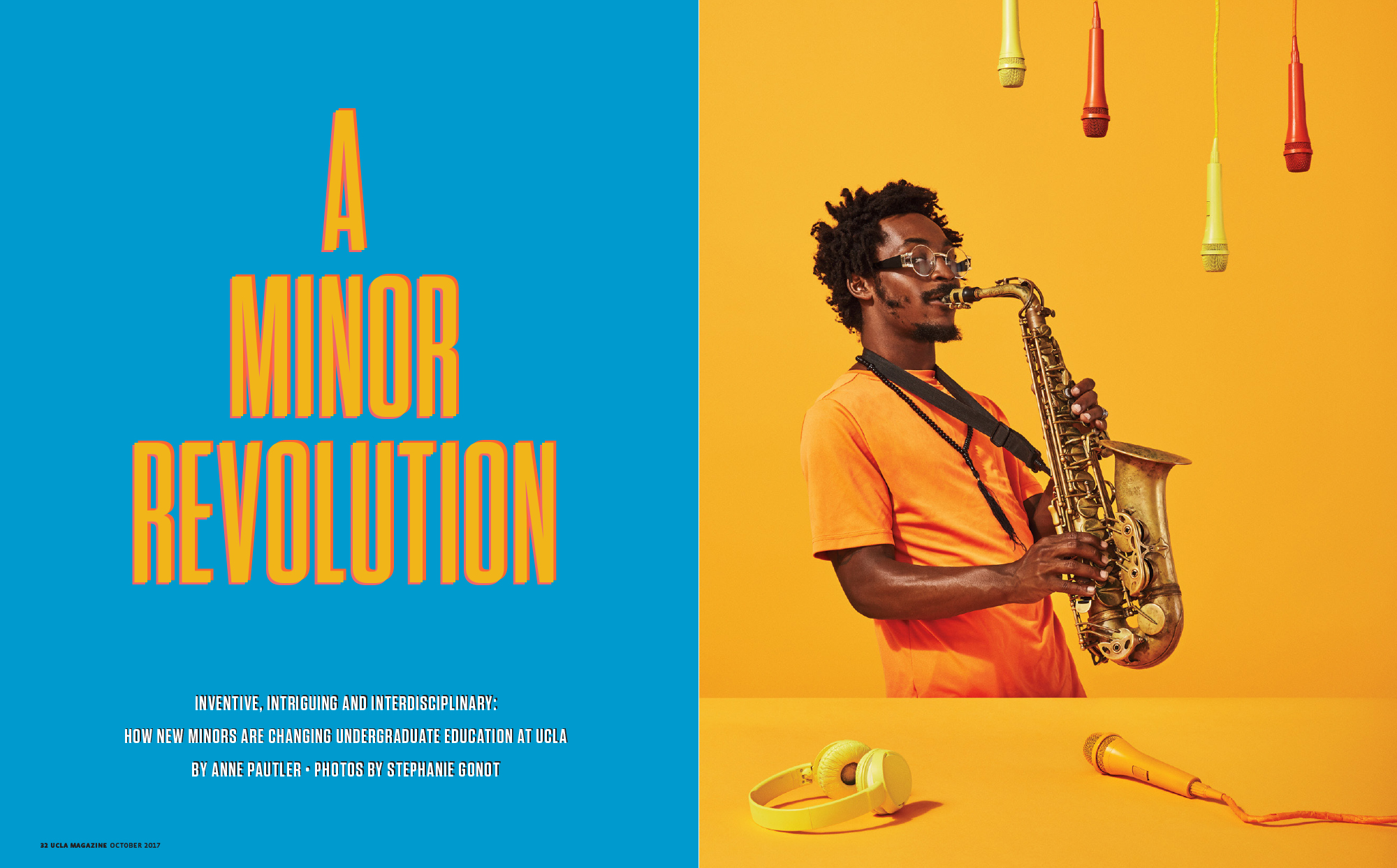
I had been looking for an opportunity to work with photographer Stephanie Gonot and this seemed like the perfect assignment – conceptual, fun, and eye catching, so this seemingly academic story wouldn’t get lost.
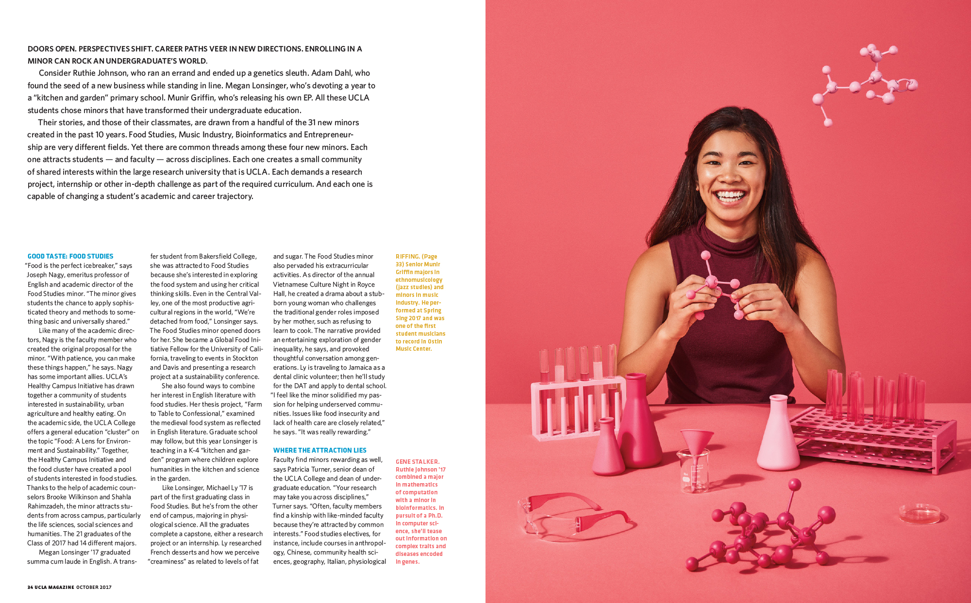
Stephanie and I brainstormed some ideas and settled on an approach. Tight portraits, each with their own color palette, and matching props.
What was the criteria for casting and did you hire models?
With public university budgets we can’t hire models. Shooting students is the right price, and generally creates a more authentic visual approach. We picked students from the fields discussed in the story, gave them their color schemes, and prepped coordinated props. Luckily the kids turned out on set enthusiastic and up for anything.
At some point in our careers we take stock and self reflect, what has this job taught you?
Working for a university is complicated, but Suzannah and I have learned how to make great work despite the limitations of cost, and an art staff of just us two. I love the challenges. And I love working with brilliant, dedicated students and faculty who are making a difference in the world. I can’t imagine going back to all the years of celebrity shoots, publicists, and entourages!
Previously this year I interviewed you about your Agency called 20 Over Twenty, what’s the update on this?
It started strong. I put together a great team of six talented photographers, each with their own aesthetic. We got some great shoots with USC, AFI, LACMA, SCI ART, LAPHIL, GET LIT, ELLE… My concept was for us to shoot cultural institutions, nonprofits and academic institutions, where I saw a gap in the market between the high end commercial clients, and the bottom feeders who wanted us to work for nearly free. I was working with marketing departments which used to have sizable staffs, and now had been whittled down to one or two people giving them no time to plan ahead. My business model was for us to book multiple shoots over a year, creating the content the clients needed. I had dreamed of a photo utopia where we would all help each other, but in reality, I think the concept of a photographic collective has its challenges and I didn’t have the bandwidth to make it viable in the long run. Consequently, I’m shutting the agency down at the end of the year. It’s hard to say that out loud but my hope is others can learn from my mistakes. I have no regrets for trying something new. We learn from our failures.
This Week in Photography Books: Sara J. Winston
I just flew in from Chicago, and boy, are my arms…
Tired.
Sorry.
Couldn’t resist.
It might be the worst joke in the 6 year history of this column, but you’ll have to forgive me. I pulled 18 hour days at the Filter Photo Festival in Chicago, talking the entire time.
Then, I came home to a full week of cooking, cleaning, driving, parenting, kung fu, and lots and lots of work.
My brain is so mushy, in fact, that I actually tried to get away with a joke so old, it makes the mottled flesh on Donald Trump’s belly look like baby skin.
Moving on, I must say, yet again, how much I like Chicago. I go to a lot of these photo festivals, (as you know,) and it allows me to show you a big slice of what’s going on out there in the American photo community.
But for all the cities I visit, Chicago is just a bit different. It fits me, like my favorite T-shirt, and allows me to feel relaxed, and understood, in a way no other city does.
It’s the little things, really, in particular the general Operating System of the local culture; the way people interact with each other. There is a friendly, grounded, openness that so many embody, and I haven’t seen it anywhere else.
(Insert random cliché about the Midwest here.)
Yeah, I hear you. Everyone says that about the Midwest. The people are just so darn nice.
My goodness!
Gosh!
But that’s not what I’m talking about. Rather, it means that random conversations come about, on the subway, on the street, in a museum, that don’t happen other places.
It happens again and again, and I find myself chatting up strangers in ways that are thrilling and comfortable at the same time. I know Chicago has all the problems of other megalopoli, what with the violence and segregation, which is what makes that openness all the more surprising.
It allows for the type of cross-cultural, cross-gender communication that this country, (and the world, I’d argue,) needs more of.
Not less.
For instance, this column is now based almost exclusively on submissions, as you know. (I can request the odd publication from PR folks, but it doesn’t happen often.)
Just the other day, on Twitter, I was discussing with my friend and colleague Patrice Helmar the sad truth that almost all of my submissions come from men. (White dudes in particular.)
We traded 140 character sentiments on why that might be, as the preponderance of people I review at these events are women. Lots of women are making art these days, but the books don’t turn up in the mail in anywhere near a representative sample.
Patrice wondered if it was confidence and/or aggression? I speculated that perhaps female artists still aren’t getting as many publishing opportunities?
What to do?
Well, in this case, I’m mentioning it specifically, in the hope that some of our female readers might send in books, or nudge their friends to submit. It’s really important for all of us to see a broader viewpoint, and I hope this helps get the ball rolling.
Because, like a random conversation with a stranger, while watching the world’s best street blues, (true story,) hearing and seeing things outside our own bubble makes us smarter, healthier, more empathetic, and better at what we do.
Luckily, when I was at Filter, Sara J. Winston gave me a book to take home, called “Homesick,” published by Zatara Press. We had a review together, and she was honest about the fact she’d been diagnosed with MS, and was using her current project to process those emotions.
She admitted to coming from a family with health issues, and how she hoped to escape the curse.
Alas…
The review was only tricky in that she showed me two discrete projects, but they were a bit jumbled in her presentation. Both had become books, so I struggled to differentiate between the two styles, and subject matters, so I could wrap my mind around her art practice.
“Homesick,” which is not directly “about” her illness, is a poetic, very-well-observed take on Sara’s home and family, I believe.
I say “I believe” because this excellent book hints, but does not state. It has a languid, referential style of making connections, in a way that seems… dare I say it… more female than male.
Patrice and I each made guesses about why I get more books from women than men, and neither of us suggested it was because our audience demo skews towards the penis.
Does it?
I don’t know.
But this beautiful, lyrical, slightly abstracted book feels like exactly the sort of thing a man might not make.
The first photograph, with a tub of margarine and a plate of bologna, is just so metaphorical. We get that food will be prominent, and the items she has chosen to represent her story have cultural baggage. (Not exactly bougie.)
Food is a recurring theme, but so is a wilted sort of sadness. A cat with a torn-up ear. Dirty dishes. A large man with electrodes attached to his chest.
Bananas in a bag.
The imprint of sheet on skin.
It ends with a wonderfully written story.
At first, as it uses the first person, I thought, “Damn, she can write too?”
But then it shifts to another perspective.
A lesbian lover from college?
Visiting the family homestead?
It seems so.
But each is written in the first person, so eventually, I had to ask myself, is this even true?
Is it?
True?
There is no direct answer until the final credits, which suggest a writer, Ani Katz, created both characters in the story.
It is made-up?
Or based upon interviews?
Does it matter?
I may well be accused of sexism for calling a book like this feminine. But then, I don’t see that word as pejorative. I’ve previously established my feminist street cred, and therefore I like this book so much BECAUSE it comes from another vantage entirely.
It treats book-viewing, or book-reading, as an experiential process, which is my favorite kind of photo-book. It tells a story, in pictures and words, and for a few brief moments, I couldn’t put it down.
Bottom Line: A lyrical, gorgeous book about going home
To purchase “Homesick” click here


If you’d like to submit a book for review, please email me at jonathanblaustein@gmail.com
Personal Project: Todd Burandt
The Art of the Personal Project is a crucial element to let potential buyers see how you think creatively on your own. I am drawn to personal projects that have an interesting vision or that show something I have never seen before. In this new revised thread, I’ll include a link to each personal project with the artist statement so you can see more of the project. Please note: This thread is not affiliated with any company; I’m just featuring projects that I find. Please DO NOT send me your work. I do not take submissions.
Today’s featured artist: Todd Burandt
ARTIST STATEMENT
I’ve been photographing rodeos as a personal project, for the last six years. When I heard about a rodeo that was held inside of a maximum security prison, in which the inmates are the participants, I had to go. It seemed like the perfect capstone to this obsession of mine. After a lot of cold calls, and lengthy emails, I was finally granted access to photograph the event known as The Angola Prison Rodeo.
The Rodeo started in 1965, and has grown in size each year. The general public originally sat on apple crates, and the hood of their cars. Now, they sit comfortably inside a 10,000 seat covered arena. Due to increasing popularity, the inmates are now allowed to sell their artwork, furniture, and jewelry to the public. All of the funds go directly to the artist’s families on the outside.
Many people are torn on the thought of inmates with no prior experience riding bulls, and roping broncos, participating in this event. But, the truth of the matter is that this is completely voluntary. My goal was to depict them as ordinary citizens, in an extraordinary place. But when the sun sets on the Rodeo, the reality of it all sets back in place.


To see more of this project, click here.
APE contributor Suzanne Sease currently works as a consultant for photographers and illustrators around the world. She has been involved in the photography and illustration industry since the mid 80s. After establishing the art buying department at The Martin Agency, then working for Kaplan-Thaler, Capital One, Best Buy and numerous smaller agencies and companies, she decided to be a consultant in 1999. She has a new Twitter feed with helpful marketing information because she believes that marketing should be driven by brand and not by specialty. Follow her at @SuzanneSease.
Expert Advice: Releases and Permits
Craig Oppenheimer, Wonderful Machine
It’s my job to love paperwork. From estimates to production books to invoices, I’m responsible for creating, organizing and understanding all of the documentation needed to manage a production. Three of the most important pieces of that paperwork puzzle are model releases, property releases, and permits. No matter how big or small a production is, proper documentation is essential to not only obtain formal permission to shoot in a specific place, but to also ensure your ability to make use of the images you capture that feature people and certain locations for a commercial project.
Generally speaking, a model or property release is a contract that documents the consent of the subject(s) or property owner(s) to allow their likeness or the likeness of a property to be used in a certain way. It’s important to understand that using a person’s likeness to promote a company for commercial gain can be incredibly valuable to that company, and the people featured in those images should understand this value. The formal documentation of consent is therefore very important, and releases protect the photographer and their client should a disagreement arise over the use of an image that includes any person or property.
Let’s start with model releases. Here is a run down on when you typically do and do not need a model release:
You DO need a model release if the subject is identifiable and the images will be used commercially (to promote a particular product, service, company, or cause). That includes (but is not limited to) paid advertising use of the images in print ads, web ads or billboards, as well as collateral use in brochures, direct mail pieces or a client maintained website and/or their social media outlets, to name a few. Additionally, while this is often overlooked, you should acquire a model release from anyone featured in an image within your print/online portfolio.
You DO NOT need a model release if the images will be used editorially (for the purpose of educating and/or conveying news or opinion). That includes placement in a magazine, newspaper or media outlet available for sale or viewing to the general public, which does not seek or accept sponsorship to, or in itself, promote a particular product, service or company. Additionally, you do not need a model release if the subject is not identifiable, even for commercial use. That being said, you should be aware that a subject’s face is not the only thing that might make them identifiable.
I should note that while a release isn’t needed for most editorial uses of an image, many (but not all) publishing companies do have clauses in their agreements requiring the photographer to obtain a model release from the subject. In my experience, this clause covers the publishing company from a liability perspective, but in most cases, both parties often ignore it unless the shoot features hired talent, kids, or if the subject matter of the article is controversial in any way. If an editorial contract states that releases are required, a discussion about this should take place, and I’d recommend asking the publishing company to provide the release they want to be signed.
So, what’s the best release to use? Well, there are a lot of forms available online (like these from ASMP and Getty) as well as many different apps (like Releases or Easy Release), many of them aren’t applicable in all situations or are a bit too broad (also, since releases are formal contracts, they are subject to state law, and it’s important to find out if there are any peculiarities that may require adjustment). For our purposes, we are typically working with professional talent (and/or their agents) who we negotiate specific usage with, for a specific fee, and therefore want to note such information on the release. Here is our model release:

You’ll notice we include a space for an image of the talent for reference. Since we often work with casting directors and hire professional talent, I’ll have their digital headshot and can drop that image on the release before getting them to sign it. Alternatively, using a Polaroid or other instant-print camera is a good option as you can staple the picture to the release after you have the talent sign it. Another method for other releases that don’t have a field for visual reference would be to take a picture of the person holding the signed release after signing it, so you can have both that image and the scanned release on file to identify the person.
Ok, you have a signed model release, so you are ready to go, right? Well, not necessarily. Property needs to be released too, and the basic rules detailed above for when you do and don’t need a release can be similarly applied to properties. You don’t need a release if the usage is editorial, but you do need a release if the property is easily identifiable and for commercial use, most of the time…
It’s understandably not always black and white, and there are a few key points to note about locations and releases. First, you need a release to include trademarks or copyright protected artworks in an image for commercial use. That includes logos on the facades of the buildings, murals, statues, and public art. Also, it’s important to know that certain architectural or design elements incorporated into a building can be trademarked. For instance, you can photograph the Eiffel Tower during the day without the need for a release, but the lights that appear in the evening are a trademarked design. You would, therefore, need to seek permission to use the image for commercial purposes if the image was taken at night when the lights are displayed.
Additionally, if you photograph a space that has art displayed, you would need a release from whoever owns the copyright to that piece of art, as well as, a release from the owner of the property in which the piece of art is displayed (if the location is identifiable) in order to use the image for commercial purposes. If you are unsure of whether or not there are any restrictions or limitations on a certain building or public work of art, you can contact your local film office, and they should be able to provide guidance on popular destinations or areas within your city.
As with model releases, there are forms you can find online from ASMP and Getty. On nearly every production I’ve worked on, our client has had location releases that they’ve asked us to use, however, we have our own as well. Here it is:

You’ll notice on our release that usage is not something we call out in the same way as we do on the model release, as usage typically isn’t a factor for locations (meaning, it typically just includes unlimited use). We do state that the release would cover unlimited use in all media, but it’s not displayed in the same way as we have it on the model release. That being said, location fees might differ based on the type of production (stills vs. video) and how big the production footprint is.
It’s also important to know the difference between a permit and a release. A permit allows you to be in a certain space at a certain time to take a photo, and a release allows you to use that image for commercial purposes. Permits are typically applied for and distributed by film offices or local government agencies, and each city typically has different rules for when you do and don’t need a permit.
Generally, it comes down to the size of the production footprint, and in many cases, a photographer acting alone with very minimal equipment does not need a permit. On the other hand, in almost all instances, if the production involves multiple people, production RVs, street closures and any lighting/grip equipment, a permit is needed. Most film offices and government agencies will tell you that if the shoot is for any commercial use, that you need a permit, although the fees will likely be less if the shoot has a minimal production footprint. The permitting process in most cities can be time intensive and almost always has fees associated with it, so it’s important to do your research and figure out the cost and turnaround time for a permit before embarking on a production.
Here are two examples of permits I applied for and was provided by the New York City Film Office and the US Department of the Interior:


Given the preparation and hard work that goes into capturing images on a production of any size, it’s incredibly important to cover your bases and make sure all the people, places and things in the images are appropriately released in order to avoid legal trouble when the images are actually used.
*Legal Disclaimer* – Please consult with an attorney to discuss legal documents pertaining to your business before putting them in use. I’d like to extend a thank you to Adam G. Garson of the firm Lipton, Weinberger and Husick for his contribution to this article. If you need professional legal counseling, please contact Adam at agarson@garson-law.com or by phone at (610) 565-7630. If you need help estimating or producing a shoot, please email me at craig@wonderfulmachine.com, or you can reach me on the phone at (610) 260-0200.
The Daily Edit – The Olympic Games and The Art of Sports Photography: John Huet


Olympic Games
Photographer: John Huet
This summer and fall the Olympic Museum in Lausanne, Switzerland is hosting several exhibitions and events related to sports photography.
One of the exhibitions, Who Shot Sports: A Photographic History, 1843 to The Present, opened at the Brooklyn Museum last summer and has since been traveling around the U.S. and Europe, making a six-month stop at the Olympic Museum before it returns to the U.S. next May.
A second show, Rio 2016 Seen Through the Lens of Four Photographers, is comprised of a series of images that were made at the 2016 Summer Olympics by four participating photographers.
John Huet’s iconic sports photography is included in both shows, as well as in the book, “Who Shot Sports”. This terrific book by Gail Buckland accompanies the exhibition and chronicles the history of sports photography from 1843 to the present.
I got a chance to connect with John about this work, his affinity for #theartofsportsphotography and the genesis of his Olympic odyssey.
Heidi: I haven’t seen much of your work on Instagram, and it’s been such a treat to see all the images you’ve been posting recently.
John: Thanks, Heidi. Part of my thinking behind the posts I’ve been doing was to share my enthusiasm for having my work in the two shows at the Olympic Museum and in the book “Who Shot Sports”, which are all part of the museum’s celebration of sports photography this year.
I wasn’t going to get to Lausanne for the opening of the exhibits in May because I was somewhere else on the planet so I thought I would bring the show to people via Instagram. That’s sort of where the thought process started. Because the show was running through the summer, I thought I’d make this “The Summer of Sports Photography.” I started posting daily on the Summer Solstice and continued until the Fall Equinox. The hashtag #theartofsportsphotography is actually the overall name of what’s going on at the Olympic Museum right now.
I noticed that # on your feed actually, so that’s why I was really curious about this new initiative.
I don’t think it was for any purpose other than I really like the idea of “the art of sports photography”. I’ve always liked the idea, without having put a name to it. I don’t think that sports photography gets the recognition it should. Of course, that’s coming from a person who shoots a lot of sports, but it’s funny to me that sports photography is rarely a category in photo competitions, and God forbid that there would ever be a museum show featuring the work of a sports photographer. It just doesn’t happen, and yet sports photography is an art in which the “decisive moment” is captured in a nano-second, and I can’t think of any other area in photography where the general population, the media and advertisers/brands alike rely so heavily on imagery. It’s a multi-billion dollar-industry that’s basically been created by the images that photographers have made over the years, and still it somehow isn’t recognized in the same way as other genres of photography.
So, when Gail Buckland decided to do the Who Shot Sports exhibition and accompanying book, I thought it was the greatest thing ever! Finally! And what she curated is just fantastic, I can’t recommend the show more highly. You don’t even have to be a sports fan, there’s just so much there to see. Photographs that you can look at and just enjoy as a photograph and not because it’s of a basketball game, or some sporting event, or a portrait of an athlete. It’s just beautiful photography and that led me to want to show more of my own work using #theartofsportsphotography. To be honest, I was hoping that other photographers would join in, using the hashtag on their images. There are so many great photographers out there shooting beautiful sports stuff, and it would be cool to have a collection of images on Instagram from a lot of different people using the hashtag. A few people joined in but not as many as I’d hoped.
Instagram is a funny thing; it’s timing, and repeatability is very important. If this hashtag is something that you really want people to use, you can just suggest it to people, I think there’s always a camaraderie in creative people. I suspect people didn’t use it simple because they’re not reading. Everybody is looking when they should be understanding the context as well.
At the beginning, I actually wrote more about the photographs themselves, and then when I’d talk to people about it, they’d be like, “Oh, you wrote that?”
I read all your captions because I think it’s what sets people apart, when there’s more content.
I agree. I definitely wanted to point out what cameras I was using, where the image was shot, and who it was for. I use a ton of different equipment, and I try not to get too repetitive, if I can help it, so it was good for me to look back and think, okay how did I shoot this? What did I shoot this with? It was a great exercise for me.
It was also good for me to go back and look at photographs that I hadn’t seen in a long time. And it’s been really nice to read comments from photographers whose work I really respect. We work in such a vacuum, which makes me really appreciate the acknowledgement and respect of my peers.
You have deep roots with the Olympics with your first assignment coming from the Salt Lake Organizing Committee in 2002. Can you tell us how that materialized?
The Salt Lake Olympics, that came about like many things for me – in a random phone call. The Director of Creative Services for the Salt Lake Organizing Committee (SLOC) saw a few images in the Communication Arts Photo Annual and called to ask if I would be interested in doing some work for them. Little did they know I’m a closet Olympic freak and have loved everything about the Olympics since I was a kid. I don’t know why, I just couldn’t watch enough of it growing up.
They flew me out to Salt Lake the next week, and we talked about what they were looking for as the run up to the games, which is basically how an Olympic city is decorated for the games. Each Olympics has a color theme and slogan; theirs was “Fire and Ice,” and we came up with the idea to decorate the city in a particular way, so that when NBC had that opening shot of the city at night, the audience would see the skyline of Salt Lake City with those beautiful mountains in the background.
We decided to wrap the 17 biggest buildings in the city in photographs. We spent two years working on computer models to help us make all of our creative decisions. We finally decided to use 17 different images, based on each discipline at the Olympics, ultimately giving each discipline its own photographic logo. The images had a similar tone, color palette and background. In addition to the building wraps, the images were all over Salt Lake and Park City – in the airport terminal hallways, at baggage claim, on the city buses, on the light posts, and at the Olympic venues, of course. It was incredible.

But things didn’t stop there, SLOC wanted me to shoot the games themselves, and they asked me to shoot the commemorative book for Salt Lake, “The Fire Within”. The host city for each Olympics produces an annual report after the games are over. It breaks down every detail about how the games were put together: the venues, the costs, the attendance. Everything right down to how many plastic spoons and napkins were used. The amount of information that’s generated for the Olympics is staggering.
It was obvious that one photographer couldn’t possibly cover everything that would be happening, so we discussed involving several photographers, and that’s when I came with that idea that I would bring in photographers who may have never shot sports or been to the Olympics. I thought it would be cool to work collectively with a diverse group to shoot the commemorative book.
When all was said and done, we had a broad spectrum of 12 photographers, ranging from a 19 or 20-year-old photographer to Shelia Metzner, a fine art and fashion photographer who had never shot a sporting event in her life.
David Burnett was the only photographer with experience at the Olympics, and we knew that he would deliver great images in the way that only he can. Michael Siemans, a photojournalist from the Boston Globe, was someone I struck up a conversation with during a rain delay at a Red Sox game, and he became part of the team.
What was SLOC’s direction for “The Fire Within”?
For us, for me, the direction was to create a commemorative book that would show the Olympics in a completely different way. They did not want straight up sports journalism; they wanted Olympic images that had never been seen before. They wanted art, and the only way we could deliver what they were looking for was by having access to areas that were off-limits to press photographers.
During the project, we had four photographers with the kind of unprecedented access that hadn’t been granted since Leni Riefenstahl shot the 1936 Olympics in Berlin for Adolph Hitler. There was one point when I was photographing the start of the luge, and the NBC cameraman was behind me. I heard him say, “there’s some photographer in front of me. I can’t go down any lower. No, we can’t move him. They told us he’s allowed to be there.” I had to smile at that point.
The experience itself was great. Working with all of the different photographers, it was awesome, and everyone was extremely happy. Some of us were working with large format antiquated cameras, hauling them up the side of a mountain and having photojournalists just shake their heads at us like we were crazy. Some of us were shooting Polaroid negatives. Holgas were being used. Raymond Meeks, who is an incredible fine art photographer, set up in the Olympic Village and was photographing the athletes using hand-coated glass plate negatives. They are some of the most haunting and beautiful images I’ve ever seen. It was an incredible adventure, and I can think of no better way to start my Olympic odyssey.
So then, how did your relationship with the games grow and develop after that?
The next Olympics was in Athens in 2004. This was my first summer Olympics, and I was hired directly by the International Olympic Committee (IOC). I covered the 2006 Winter Olympics in Torino for ESPN the Magazine, and I’ve been shooting for the IOC since the 2008 Olympics in Beijing. Shooting in Torino for ESPN was a whole different world. I went as a straight-up photojournalist with a straight-up photojournalist credential. That’s an interesting thing.
Interesting how?
Mainly because of the limitations that come with those credentials. In Salt Lake and Athens, I pretty much had full access to anything. That had been my experience, then all of a sudden, I had restricted access. It required a shift in my approach. That said, working with the photo managers was so helpful. Before then, I never worked with the photojournalists or the photo managers at the Olympics. I was on my own; and now, working with these guys, it was great because they did such a great job with getting the press what we needed.
At this point, you’ve shot the Olympics in the U.S., Athens, Torino, Beijing, Vancouver, London, Sochi and Rio. What are some of the cultural differences that you experience, and how do they inform you?
The culture of each host country is very much represented at the Olympics, particularly in the Opening Ceremony and the Closing Ceremony. I’m always interested to see what a country will showcase at the ceremonies, but so much of the experience for me comes down to the local people. The volunteers that work at the games are just so happy that the Olympics are there, and they’re very proud of the fact that they’re a part of it. They’re proud of their country; they want to show it to you, and they want to help you. Overall the experience has been amazing, and the people have been awesome. That’s saying a lot, as I’m about to go to my ninth Olympics.
So speaking of your ninth games, what are you– how do you stay engaged in it, and what are you hoping is going to be different? Or what can you tell us about the upcoming games in PyeongChang?
Each place is different both culturally and visually, and each event has been unique. Just being in a foreign city can make something that you’d think would seem similar feel entirely different. And while the Olympics are the same event to a certain extent, the actors and the stage are always different. I try to tell the broadest story I possibly can, and what gets me excited about PyeongChang is thinking about the stories that are waiting to be told, the ones that haven’t happened yet.
There are surprises at every Olympics; the story of what’s happening changes all the time. Sometimes the weather creates a scenario that you can never predict, but you have to always be prepared for, sometimes it’s the emotion of a particular country having an athlete cross the finish line for the first time in its history, or it can be that an athlete who isn’t on anyone’s radar ends up winning a medal. There’s always a new story to tell.
I was covering the Australia vs New Zealand finals of the first ever women’s Rugby sevens in Rio. I had done setup rugby shots for advertising in the past, but I had no idea what the rules of Rugby Sevens were. Luckily I was given a great introduction by the South African coach who took the time to explain everything to me when I photographed a training session with his team the week before.
So I had a new story to tell. Not only was this the first event of its kind at the Olympics, but everything about it was new to me, and this game is just non-stop, fast action with teams made up of seven players playing seven minute halves, instead of the usual 15 players playing 40 minute halves. It’s impossible to not be fully engaged when shooting a game like this. Before I even start shooting – I’ve got to decide where to position myself, and I’m constantly accessing what’s going on with this game that’s not familiar to me. Then, if I’m not getting the images that I want, I need to move to another spot where I can get them, and I need to do this as fast as possible.
This particular game was really intense. There was a controversial call in favor of Australia which swung the momentum of the game, and in the end, Australia won. The New Zealand team broke down in tears. The emotion was just overwhelming.
Fast forward 10 minutes, and the losing team in any final competition at the Olympics is expected to be at the podium to receive their medal for losing a game that they’ve trained for for years. I know it’s not really thought about that way, but I’ve watched this so many times, and I just see how hard it is for these teams to play with everything they’ve got up to the last second, and when they lose, there’s no time for them to process that before they have to be on the medal podium. At that time they usually don’t see it as, “We won the silver medal, that’s good.” They see it as, “We lost the gold. That sucks.”
So after the game was over, all of the photographers, all of the press photographers – got lined up, and there were probably 200 Olympic staffers there getting ready for the medal ceremony. Both teams had entered the field, and they were looking out to where the podiums were being put up. The Australian team was milling around, and the New Zealand team was doing the same, but they were all in tears. They were just heartbroken. As I walked over to stand behind them, all of a sudden, the crowd in the stands started to chant the haka, the traditional war cry from the Māori people of New Zealand. There’s a lot of cultural meaning and symbolism to the haka, and the “All Blacks”, New Zealand’s rugby union team, have been performing it before games to intimidate their opponent since the early 1900s.
This is one of those times when the story of what was happening, the medal ceremony, changed completely. I turned around, and I saw all of these big dudes in the stands, all standing up with their shirts off. They were sounding off this tribal chant that I’ve seen on television, but now I was 10 feet away from it. I started taking pictures of them, and I was turning and taking pictures of the New Zealand women’s team reacting to the men in the stands, and back and forth, and then the women just formed into this group. There was no gesture or comment or anything. They just formed this group and started to do the haka back to the people in the stands.
So there these women were with tears coming down, and they were doing this chant with these intensely aggressive eyes, and I couldn’t pull cameras up fast enough to take pictures; close ones, wide ones. I was doing everything I possibly could, as all photographers do, to capture those moments as fast as I could, and I kept looking out of the corner of my eye wondering, “Is anybody else taking pictures of this? Am I the only person taking pictures of this? This is awesome.”
That was a gift, and it was just incredible to be standing where I was and to be able to capture that experience.
Below are links to John’s 2016 Rio Olympic Galleries.
The Daily Promo – Kelsey McClellan


Kelsey Mcclellan
Who printed it?
Ryan Dempsey at West Camp Press in Columbus, Ohio.
Who designed it?
Blake Roberts. He also designed our logo!
Who edited the images?
I did.
How many did you make?
Only 75.
How many times a year do you send out promos?
This is our first promo as Terrence Caviar. We hope to send one out every year or as we have work that is exciting.
This Week in Photography Books: Ed Eckstein
My son just saw “Airplane” for the first time. (Thanks, Dad.)
He’s turning 10, so I guess he was ready. I certainly remember watching it as a kid, laughing so hard that my stomach hurt. But that was back when the movie was fresh, and the references made sense.
Not surprisingly, as it’s 2017, Theo felt uncomfortable with the “jive turkey” scenes, as what was acceptable in 1980 is considered highly racist today.
He also didn’t know what to make of the Hare Krishna’s. I mean, how do you explain that to the Internet generation? It’s not like we’ve got bald, dancing hippies at airports anymore.
(Instead, we have bomb-sniffing dogs, and lots of smelly bare feet.)
In a weird way, I miss some elements of the monoculture: the pop references, and films, that everyone got.
Where’s the Beef.
Joe Isuzu.
Eddie Murphy doing Gumby.
The comedic movies from the 70’s and 80’s, in particular, stand out as cultural icons that have not really been replaced. (Well, I guess Alec Baldwin doing Trump comes close.)
If you ask anyone between 30-50 about the funniest movie of all time, the odds are they’re going to say something with Bill Murray in it.
“Caddyshack,” most likely.
The fact it had peak-funny Bill Murray, Chevy Chase, and Rodney Dangerfield makes it hard to pick anything else. But I could just as easily say that about “Stripes.”
It featured peak-funny Bill Murray, Harold Ramis, and John Candy, with a scary/funny performance by Warren Oates to boot. (How sad is it that three of those guys are dead now?)
“Stripes” gets pushed down the list a bit, for many, because it was really two movies in one. The first part, with all the classic lines, (“You call me Francis, I’ll kill ya,”) was set in basic training.
Show me something funnier than John Candy mud-wrestling.
I dare you.
But the second part, which morphed into an Anti-Soviet action movie, is a bit harder to defend. Completely different tone, and seeing Warren Oates become a good guy was hard for my young brain to process. (Ah, such a simpler time, the 20th Century. Our good guys were good, our bad guys were bad, and it was OK to chant “USA” without irony.)
Seriously, I think my entire understanding of basic training comes from “Stripes,” and I guess that says a lot about me. I don’t have any family members in the military, I never considered joining up, and I was born just after the end of the draft.
For me, “The Draft” means 20 hours of ESPN each Spring, watching heavily-made-up former football players dissecting clips of college footballers whose names they can barely pronounce. (Yet still I watch…)
It’s hard for most people to relate to a world in which the government could force you to fight, and often die, no matter what you thought about the situation. We are so far removed from that time, it’s hard to imagine a world in which that many Americans had skin in the game.
These days, a small minority of American families do the heavy lifting for all of us. And, most of the time, it’s lower income kids, from rural areas lacking job opportunities, that end up dying for our “freedom.” (Yes, I’m putting quotes around the word, b/c with Trump around, it seems like a much shakier proposition.)
Thankfully, (and not unexpectedly, if you know this column,) a photo book turned up in the mail the other day that puts this issue before our eyes, straight outta the early 70’s.
“Grunts: The Last US Draft, 1972” is a new book by Ed Eckstein, published by Schiffer Publishing in Pennsylvania, and it provides a glimpse into the last draft class in American History. (This time I don’t mean the NFL.)
This photo book shows us a set of pictures that Ed Eckstein made in 1972, when he embedded with a group of draftees, and followed them from Philly down to basic training in South Carolina. No matter how hard I tried, I couldn’t get “Stripes” out of my head, when I was looking at this book. (Yes, I’m a weirdo.)
But the thing about a documentary photo project is that it shows us the unvarnished situation, in clean black and white, and eventually, I was able to see these young men as people, rather than stand in’s for John Winger and crew.
While this book gives us something we otherwise wouldn’t get to see, (a surefire way to get reviewed,) I wouldn’t say the pictures are dynamite. They’re good, and in some cases very good, but in general, I don’t think they’re terribly visceral or emotion-grabbing.
Rather, they feel historical to me.
And important, as such.
There are little bits of humor, like the little tags on the uniforms, made “For Soldiers of Distinction.”
How great is that?
Even better is the promotional poster, featuring Richard Nixon, that promises “Equal Employment Opportunity” from the Federal Government.
Let that sink in for a moment.
In one little advertisement, Richard Nixon is presented as less of a racist/sexist than our current President. Nixon, the past poster-child for how to be a terrible President, in retrospect looks like a balanced statesman compared to our current Asshole-in-Chief.
Then we get a signs that says, “When you fire think “BRAS”: Breathe/Relax/Aim/Squeeze.” No f-ing way something like that passes muster in 2017. Misogyny may still be alive and well, but with a now-partially-female military, tacky puns like that would never cut it.
And how about the guy in full karate-chop mode? How much you want to bet he’s making a Bruce Lee-esque karate-chop cry? Hiiiii-yah!
It’s true I’m making light of a situation that demands a bit more respect. It’s likely that some of the guys in this book went on to die in Vietnam.
Nothing funny about that.
But that’s kind of my point. As the military burden shifted from almost-all-of-us to a select demographic in this country, the reality of War, and its costs, has become buffeted, to a dangerous degree.
Which is why I’m glad Ed Eckstein sent this book along to remind us, in this time of “Rocket Man,” that none of this is a laughing matter.
Bottom Line: Vintage, black and white documents of the last draft class
To Purchase “Grunts,” click here


If you’d like to submit a book for review, please email me at jonathanblaustein@gmail.com
Personal Project: Joey L
The Art of the Personal Project is a crucial element to let potential buyers see how you think creatively on your own. I am drawn to personal projects that have an interesting vision or that show something I have never seen before. In this new revised thread, I’ll include a link to each personal project with the artist statement so you can see more of the project. Please note: This thread is not affiliated with any company; I’m just featuring projects that I find. Please DO NOT send me your work. I do not take submissions.
Today’s featured artist: Joey L
Overview: WE CAME FROM FIRE: Portraits of Kurdistan’s Armed Struggle Against ISIS
The ancient Kurdish homeland is partitioned between modern-day Turkey, Syria, Iraq, and Iran. Oppression by state powers led Kurds to embrace armed struggle, yet failed to produce a lasting resolution. As the new war against ISIS dismantle nation-state borders, the once persecuted have risen to secure the power vacuum.
Artist Statement:
WE CAME FROM FIRE: Portraits of Kurdistan’s Armed Struggle Against ISIS is an independent and self-funded portrait photography series that transformed into a book project. It observes a controversial ideological guerrilla movement that has manifested itself into a sophisticated army in response to a crisis threatening the existence of an ethnic minority. After a ruthless and exhausting 6 years of war in Syria, only the most ideologically strong militias have flourished, absorbing various fragmented factions and uniting them under strict philosophies. The statistics flooding our daily news cycles rarely capture the mental convictions that can turn the tide of war, often surprising analysts with years of experience observing from afar. When one crosses into the North East of war-torn Syria, and is catapulted into a worldview crafted by the Kurdish guerrilla. Conversations often drift to conspiracy theories. It seems ISIS is just the beginning of a long list of culprits plotting to destroy the Kurdish identity. Oddly, the conspiracies begin to make sense. The militia’s secretive hierarchy vanishes due to its compartmentalization, and you find yourself among individuals who left their families with the intention of defending their culture and way of life. I have never felt comfortable calling myself a “war photographer.” In the past, I have photographed projects highlighting the plight of minority groups, but never in a war environment. When finally approaching a project on the Kurds, despite my lack of experience in a war zone, it became necessary to focus on their fighters—the armed defenders of a language and distinct cultural practices outlawed by every state the Kurds live. Portrait photography is an external medium that can remind us of our shared humanity, but it is also the best device for the nearly impossible goal of depicting the inner ideology which has fueled the Kurdish movement to rise to such a position of power.


To see more of this project, click here.
Purchase the book in pre-order: https://joeylshop.com/products/guerrilla-fighters-of-kurdistan-fine-art-photography-book
Trailer: https://vimeo.com/232453075
The full film can be viewed for free here: www.BornFromUrgency.com
APE contributor Suzanne Sease currently works as a consultant for photographers and illustrators around the world. She has been involved in the photography and illustration industry since the mid 80s. After establishing the art buying department at The Martin Agency, then working for Kaplan-Thaler, Capital One, Best Buy and numerous smaller agencies and companies, she decided to be a consultant in 1999. She has a new Twitter feed with helpful marketing information because she believes that marketing should be driven by brand and not by specialty. Follow her at @SuzanneSease.
Pricing & Negotiating: Lifestyle Shoot for Technology Company
Craig Oppenheimer, Wonderful Machine
Shoot Concept: Lifestyle images of professional talent using a mobile application.
Licensing: Web Collateral and Web Advertising use of up to 15 images in perpetuity.
Location: A residential property
Shoot Days: 1
Photographer: Lifestyle specialist
Client: A technology company
Here is the estimate:
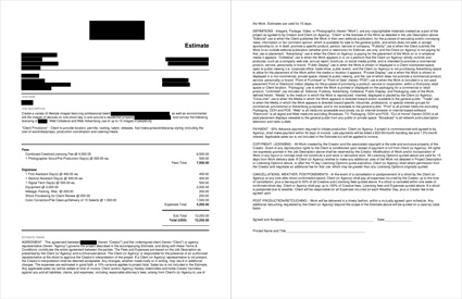
Job Description and Fees: The client was a relatively new player in the mobile app space, and while they weren’t quite a startup, they were young in the industry and about to make a big marketing push. The concept for the shoot focused on two people using the app and accompanying accessories on various mobile devices within a house, and they also needed environmental still life images of those devices as well. The usage was entirely web-based, and they planned to primarily use the images on their website, and potentially run web ads with a handful of them as well. While the requested usage included a perpetual duration, the devices themselves and the technology used would limit the shelf life of the images to about a year, as they’d quickly become outdated with new product launches (by the client and by third party retailers).
I priced the first image at $2,000, images #2-3 at $1,000 each, images #4-6 at $500 each and images #7-15 at $100 each. That totaled $6,400, which I rounded up to an even $6,500. I’d typically extrapolate this number to account for the perpetual duration, but the shelf life in addition to the fact that the client was handling the majority of the production (which meant that it wouldn’t be a huge time/energy commitment for the photographer) helped justify leaving the fee right at $6,500. Speaking of the production elements, I made sure to note everything that the client would be providing which included the location, casting/talent, hair/makeup/wardrobe/prop styling, production coordination and catering.
Photographer Scout/Pre-Production Day(s): I included one day for the photographer to go scout the property with the client. I’d typically include $1,000 for this, but we were trying to keep the estimate as lean as possible, and based on the time crunch, it was apparent that the scout day would likely be limited to just a few hours, which helped justify bringing the fee down a bit.
Assistants: Despite a request from the client to limit the crew to just one assistant, I included two for the shoot day as we anticipated the need to move a decent amount of equipment around through the house (and potentially outside) throughout the day. Based on the market, this rate was appropriate to bring on the necessary team.
Digital Tech: I included a tech for the shoot day who would help to display the images to the client as they were being captured. I included the expense of their laptop workstation in the subsequent equipment fee.
Equipment: This accounted for $800 in cameras/lenses and $700 in grip/lighting rentals, in addition to $500 for a laptop workstation.
Mileage, Parking, Misc.: Since the client was providing the majority of the production coordination, there wasn’t much else that needed to be included, however we did add a couple hundred dollars to account for minor miscellaneous expenses that might arise.
Shoot Processing for Client Review: While the digital tech would be organizing the files during the shoot, I included $250 for the photographer to go through all of the images after the shoot to remove any that they felt weren’t appropriate and create a web gallery of a reasonable number of photos for the client to consider.
Color Correction/File Cleanup/Delivery of 15 Selects: The agency wasn’t looking for any major retouching or compositing from the photographer, and only requested that they adjust color and apply very basic processing to the images prior to sending the high resolution selects back to the agency. I included $100 per image to accomplish this.
Results: The photographer was awarded the project.
Hindsight: We’ve estimated many projects previously where the client informs us that they are coordinating the majority of the production elements, and sometimes it doesn’t always go smoothly. If there’s an agency involved with an internal producer, that typically increases our confidence in their ability to line up a successful shoot day, but when an agency isn’t involved, and when a client is seemingly inexperienced, that definitely gives us pause, and it’s hard to reflect that feeling in the estimate. Fortunately, this particular client did a great job and streamlined the production with ease and professionalism, which was a huge relief. The shoot went well, and the images reflected the preparedness of the client.
If you have any questions, or if you need help estimating or producing a project, please give us a call at (610) 260-0200. We’re available to help with any and all pricing and negotiating needs—from small stock sales to large ad campaigns.
The Daily Edit – People Magazine: Bradley Meinz


People Magazine
On Set Photo Editor: Rachael Lieberman
Photography Director: Catriona Ni Aolain Lindbaek
Creative Director: Andrea Dunham
Photographer: Bradley MeinzHeidi: How long did you have for this shoot?
Bradley: I was given ten minutes total for the shoot, which took place during the press junket at the Four Season’s hotel in Beverly Hills, California. The shoot was to promote the new Samuel l. Jackson and Ryan Reynolds film, Hit Man’s Bodyguard.
What type of direction did you get from the magazine?
I had a call with the magazine’s photo director in NYC prior to the shoot, she really wanted to get a reportage style image rather than a controlled portrait on seamless, however to cover all bases I was asked to get both!
With only 10 minutes to shoot, what type of exchange did you have with the subjects and the publicist?
The publicist were mainly just a voice to keep the shoot to the ten minute limit! I introduced myself to talent when they stepped into my set (first shoot was seamless) and I gave them only a little direction asking them to have fun with it.
What are your go to tools for managing the stress of this type of shoot?
I always try and tell myself to stay in the moment, often times these types of high profile celebrity shoots take on there own personality. I never really want the photo to feel “about me” as the photographer but rather the energy of the subjects.
How did you overcome the obstacles of the uninspired hotel room and low ceilings?
I called the hotel prior to the shoot asking for the rooms measurements & ceiling height! I knew it was going to be a close fit with lighting and grip. I could of used one light on the seamless set up and called it a day, however I actually had four sources playing in that shot, it was really important to me that I had nice quality of light for these two amazing actors! The outdoor photograph was much more loose and I had my first assistant
handhold “Hollywood” the key light.

photograph by Kaiya Peralta
The Daily Promo – Jake Stangel


Jake Stengel
Who printed it?
We got it printed by Chromatic in beautiful, sunny Glendale, CA.
Who designed it?
Julie Johnson designed it in collaboration with Jen Jenkins, my rep at Giant Artists.
Who edited the images?
Jen and I edited the images together. My work is pretty wide-ranging, so we wanted to show that aforementioned range, but also keep it feeling cohesive and of one voice. The images are primarily from a campaign I shot for OpenTable last year (the main back image of the boat, as well as the top three images in the grid), the bottom left is for BMW, shot at The Whale Wins in Seattle, and the bottom right is from a Rapha lookbook in Amsterdam. We went back and forth a bit on how to simultaneously show food, environment, portraiture, and some sport, but mostly wanted to show some soul and nice colours.
How many did you make?
Enough for all of the land (the land has 1500 people on it).
How many times a year do you send out promos?
I try to send out a round of promos about once a year. Since Giant sends out promos to commercial clients, I stick towards personalized promos to magazine photo editors in the US and Europe, with sticky notes of English Bulldogs and Retrievers with cute handwritten phrases like “welcome to my brand!” on them.
This particular promo also serves as a take-away card at meetings as well as a mailer in a clear cello envelope. The size is intentional – it fits into the back pocket of a portfolio. It’s also not as small as a traditional postcard to get lost at the bottom of a file drawer. But not so big as to be obnoxious and take up valuable space. Altogether, they are a cohesive presentation at portfolio shows that have become synonymous with the Giant brand. The idea is to put a full bleed image on the front that may be more personal or fine art that someone would keep on their wall with 4-5 images on back that show your range.
Giant also creates an annual book that comes out each Fall. Each edition is themed, with a written introduction by Jen, and features a variety of work from each artist.
This Week in Photography Books: Michael Crouser
I’ll be honest with you.
I’m pretty fried at the moment.
It’s been a long year, and a long summer, and right this second, my brain’s a little spent. Just when I thought I was getting caught up with things, my Dad told me I had to get on this Equifax shit-show, and nothing brings up stress chemicals like the fear of identity theft.
That said, a weekly column is just that, as it requires me to feed the beast.
And so I shall.
Last week, I reviewed a book that was squarely in my old comfort zone, back when we worked with photo-eye: a small-batch, edgy, art-school type project that was more off-putting than embraceable.
My main criterion for reviewing a book has always been, does it compel me to sit down and write? If the ideas flow, then the book is interesting.
I don’t have to love it, and you don’t have to love it. I’d hope that, over time, we all enjoy far more books than we dislike. Given the feedback I get from you, I think that’s probably true.
So this week, (as is my wont,) we’re going completely in the opposite direction. This book couldn’t be more different than “Married to America.”
Seriously, if you tried to come up with a more antithetical project, I doubt you could. (But if you want to try, we do still have a comment section.)
I interviewed Michael Crouser here a few years ago, as he’s a talented photographer who makes pictures that yearn for yesteryear, and often lack visual markers of present day. We discussed how his black and white photographs, when shot in Europe, actually look as if they come from a previous era.
It’s like a photographic equivalent of “Midnight in Paris.” (The only good Woody Allen movie I’ve seen in the last 15 years.)
So I wasn’t surprised when “Mountain Ranch,” his new book, recently published by the University of Texas Press, turned up in the mail. Apparently, the project was just shown at ClampArt in NYC as well.
This time out, Michael spent 10 years, (2006-16) photographing the declining ranching culture of North West Colorado. If last week’s pics were the epitome of edgy/uncomfortable, these are as earnest and heart-warming as it gets.
Frankly, they’re not my favorite style of photographs. I like a bit more bite. But most of you will probably dig these pictures, as they’re so well-made, and really hard to dislike.
If last week’s review was Ted Cruz, this week we’ve got Oprah. Everyone loves Oprah, right? (Yes, I’m going to Chicago next week, so I wanted to kiss a little ass, as I think Oprah still runs that town.)
As you know by now, I grew up in suburban New Jersey. Nothing could be further from that experience, all cars and green lawns and manicured highways. But now I live in the Rocky Mountains, and can personally attest that ranching culture, with all the cowboy accoutrements, is alive and well.
This America, the one in these photographs, is alien to almost all the urbanites out there. It looks like a Red-State fantasy camp, but really, it’s a way of life that has existed as long as Westward expansion was a dream.
The book features some powerful, first person accounts, by the ranchers, of why the lifestyle is dying. Property taxes, inheritance taxes, a younger generation that wants an easier life.
Michael Crouser wants to document this world, to show us his passion, before it disappears. And today, I thought it was appropriate to share it with you. Because if I’m too cynical to enjoy some lovely pictures, then I should probably get a new job.
Bottom Line: Lyrical, old-fashioned pictures of Ranch Life in Colorado
To purchase “Mountain Ranch” click here


If you’d like to submit a book for review, please email me at jonathanblaustein@gmail.com