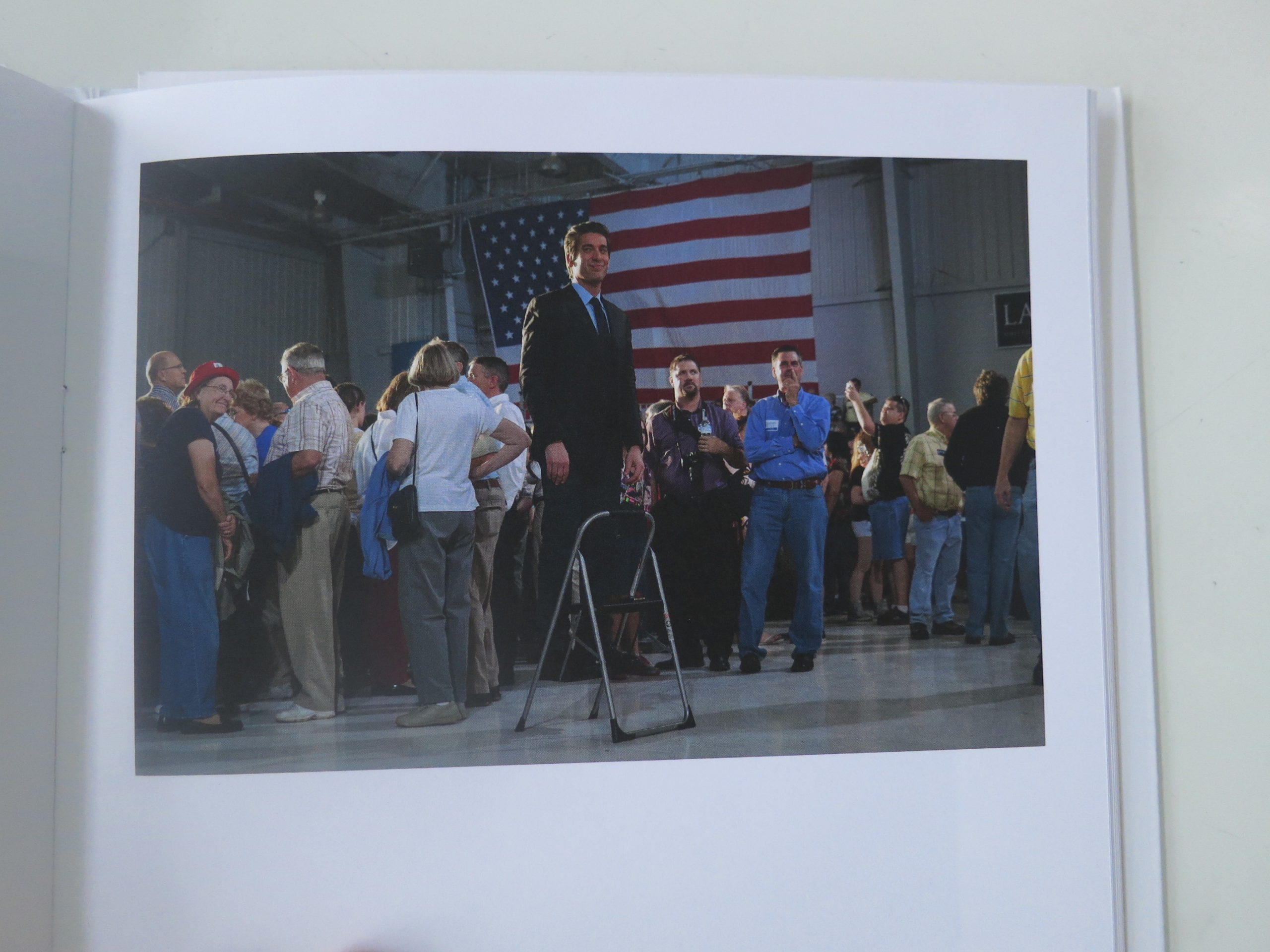
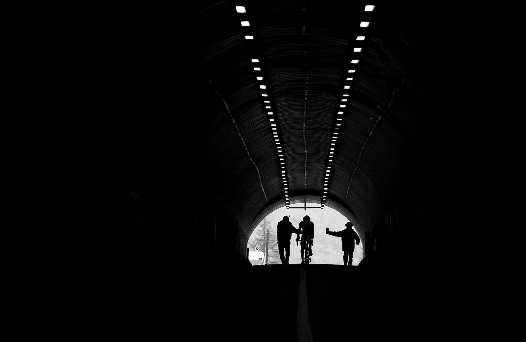
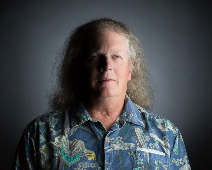
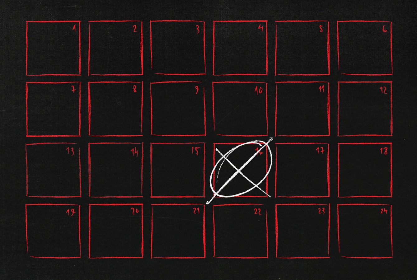
The Daily Promo – Joseph Cultice
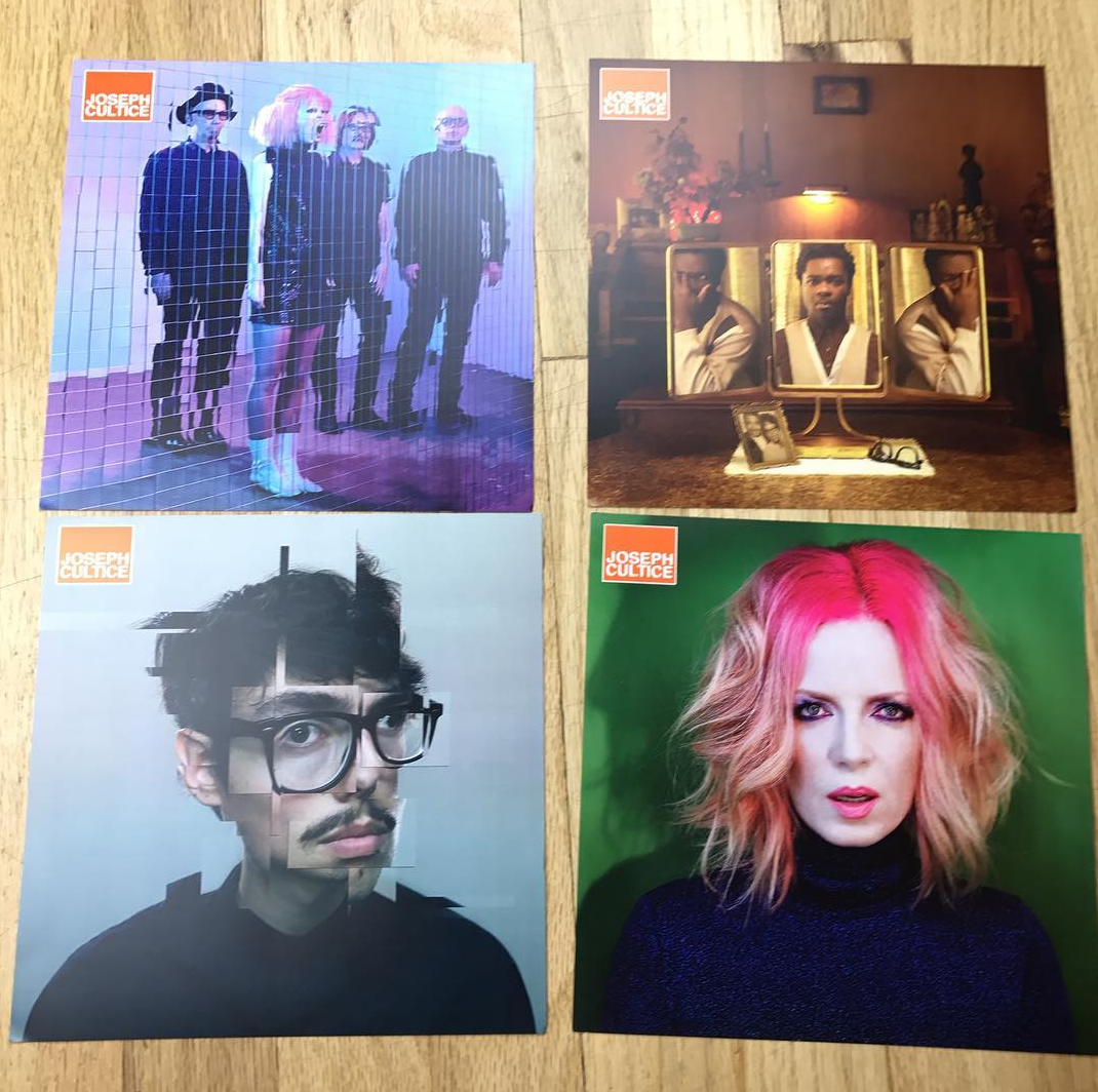
Joseph Cultice
Who printed it?
I got it printed at Type Craft, great people great prices! I worked with David Mayes.
Who designed it?
I designed it, edited it, mailed it, and with my agency help The Only Agency did the mailing list.
How many did you make?
About 300 were mailed out, printed around 350.
How many times a year do you send out promos?
I am planning on doing three promos like this next year, maybe four. Depends on if I have images I want share.
Have you noticed a difference between email promo and printed promos?
I have been a lazy photographer the past few years when it comes to mailing printed work. I have been pretty consistent with email promos and social media; both seem to be losing effectiveness. Simply put, there is just so much of it out there, it’s a sea of digital pixels. Plus the email never get through, I use mail-chimp, and less and less gets to the clients face. I’ve been in several meetings in NY and LA recently, seeing my promo on the wall that I sent out last year or even the year before feels good. I think it’s really the only way to share your work in a tangible way, it’s personal. When I’m proud of the work that gets out there, I want to share it with my friends and future friends.
The best work I saw this year that I haven’t already written about yet
Oh yes.
It’s back.
My annual, final column that never really caught on. That most rebellious of ironic year end lists. (It’s not even a list, per se, because it only mentions one thing.)
Like an ironic mustache, I get to have it both ways. I nod to the end-of-the-year thing, while simultaneously skewering the tradition by giving my version such a ridiculous title.
It’s no 10 best books list, that’s for sure. (Not that there’s anything wrong with that.) But 2016 was a witch of a bear of a blizzard of a skin rash of a melting iceberg of a year.
We know this.
The rise of Trump. The fall of Aleppo. Endless streams of millions, fleeing for their lives.
A divided US. A resurgent Russia. China flexing her military muscles. Talk of a new nuclear arms race.
And, of course, grab them by the pussy.
(Yes, that really happened.)
It seems like something you’d make up in your sleep, your subconscious big upping the nasty allure of real life into a seemingly impossible, soap opera narrative.
But it actually happened.
I know we’re all SO ready for 2017.
I had people scream in my face in 2016.
Aggress on my person. Multiple times.
It sucked.
I felt myself growing stronger in the face of adversity. Now, I’ll be the first to admit the problems I had were nothing compared to the real life and death stuff. The aforementioned Syria.
But as we’ve discussed in columns past, the things that make us grow are always the hardest. Staying comfortable is not how you become better.
And I had some truly amazing moments in 2016 as well.
I saw fantastic art exhibitions, and wrote about them, in Ft. Worth, Houston, San Francisco, Los Angeles, New York, San Diego and Chicago.
Even on vacation, in Big Sur this July, I asked my wife’s Uncle Dan what was the coolest thing he’d seen on his recent travels. He’s a booking agent for major rock bands, so he globe-trots on a regular basis.
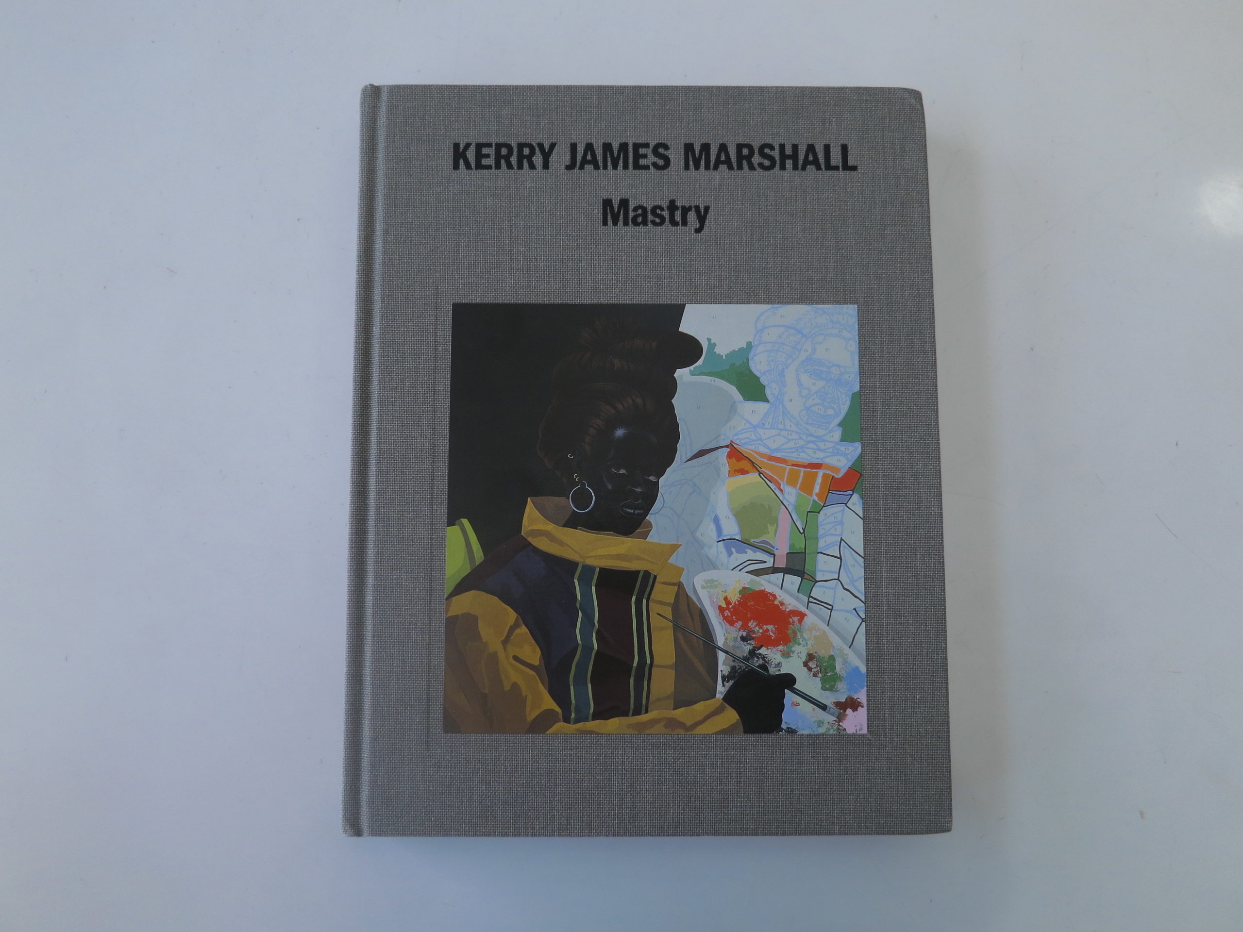
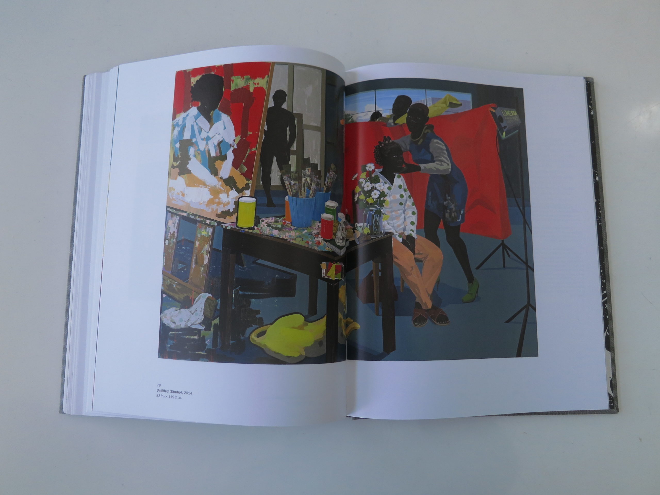
He walked into his bedroom, and emerged with a museum catalog from the Museum of Contemporary Art in Chicago: “Kerry James Marshall: Mastry,” published by Rizzoli.
Uncle Dan said this show in Chicago was the best thing he’d seen anywhere, and if I could get to it when I was in Chicago in September, I’d be glad I did.
Duly noted, I thought.
Admittedly, I mentioned the show in one or two sentences in one article this Fall, but I think it still counts as the best thing I saw this year that I haven’t already written about yet. (Don’t hate me on a technicality.)
Especially as the exhibition is now on view at the Met Bruer in New York until January 29th, I wanted to share some year-end thoughts, and show off the book.
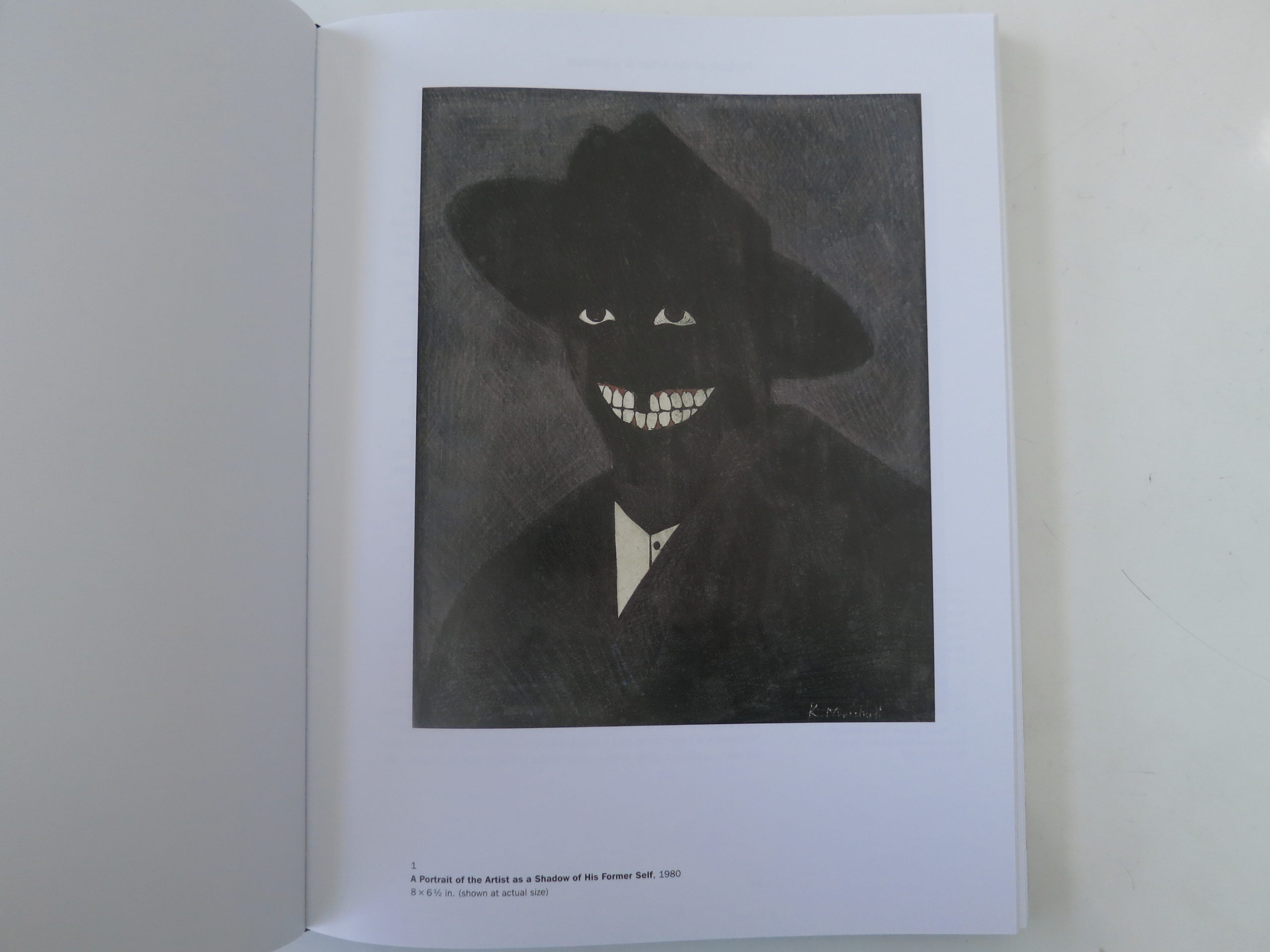
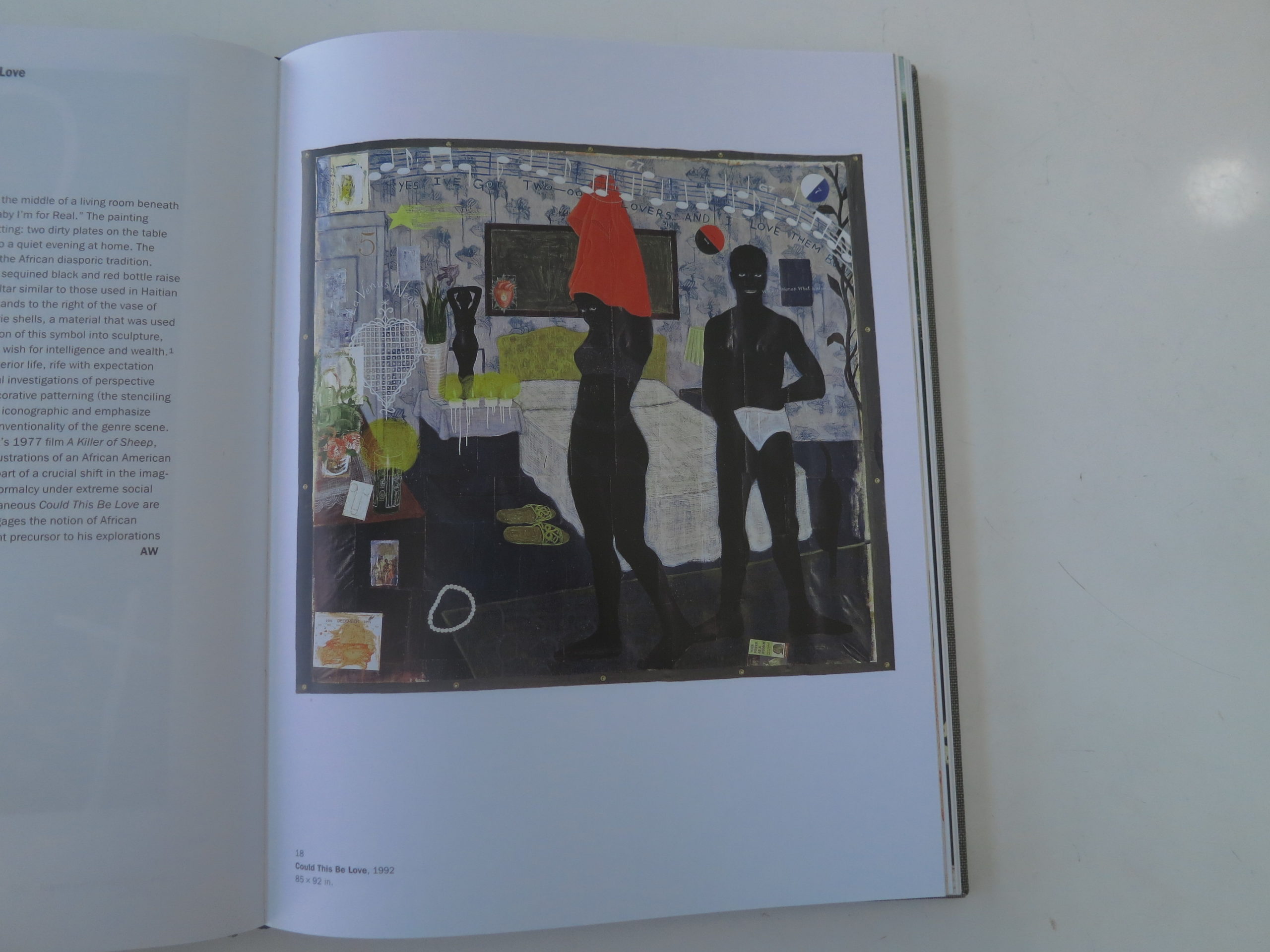
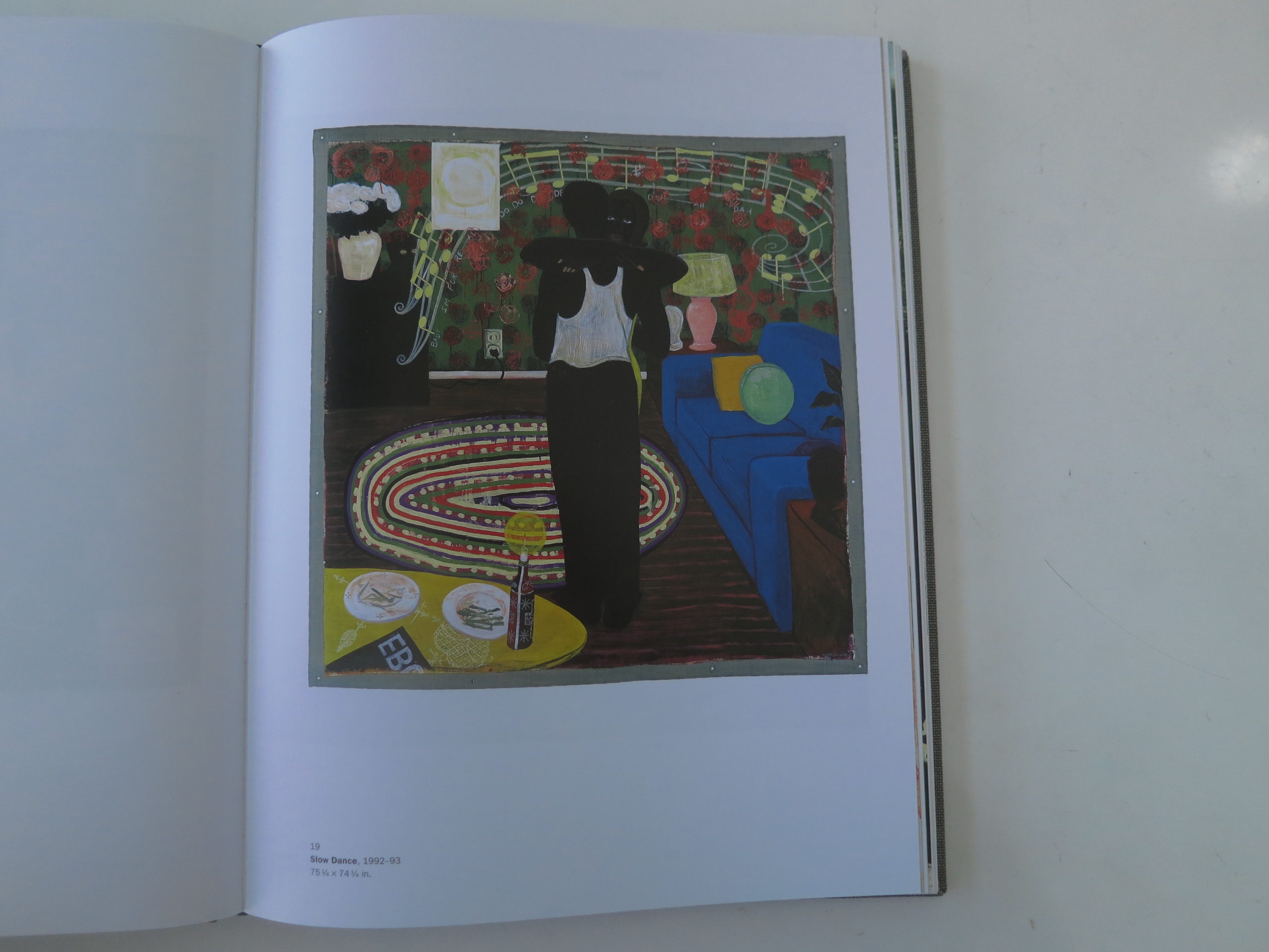
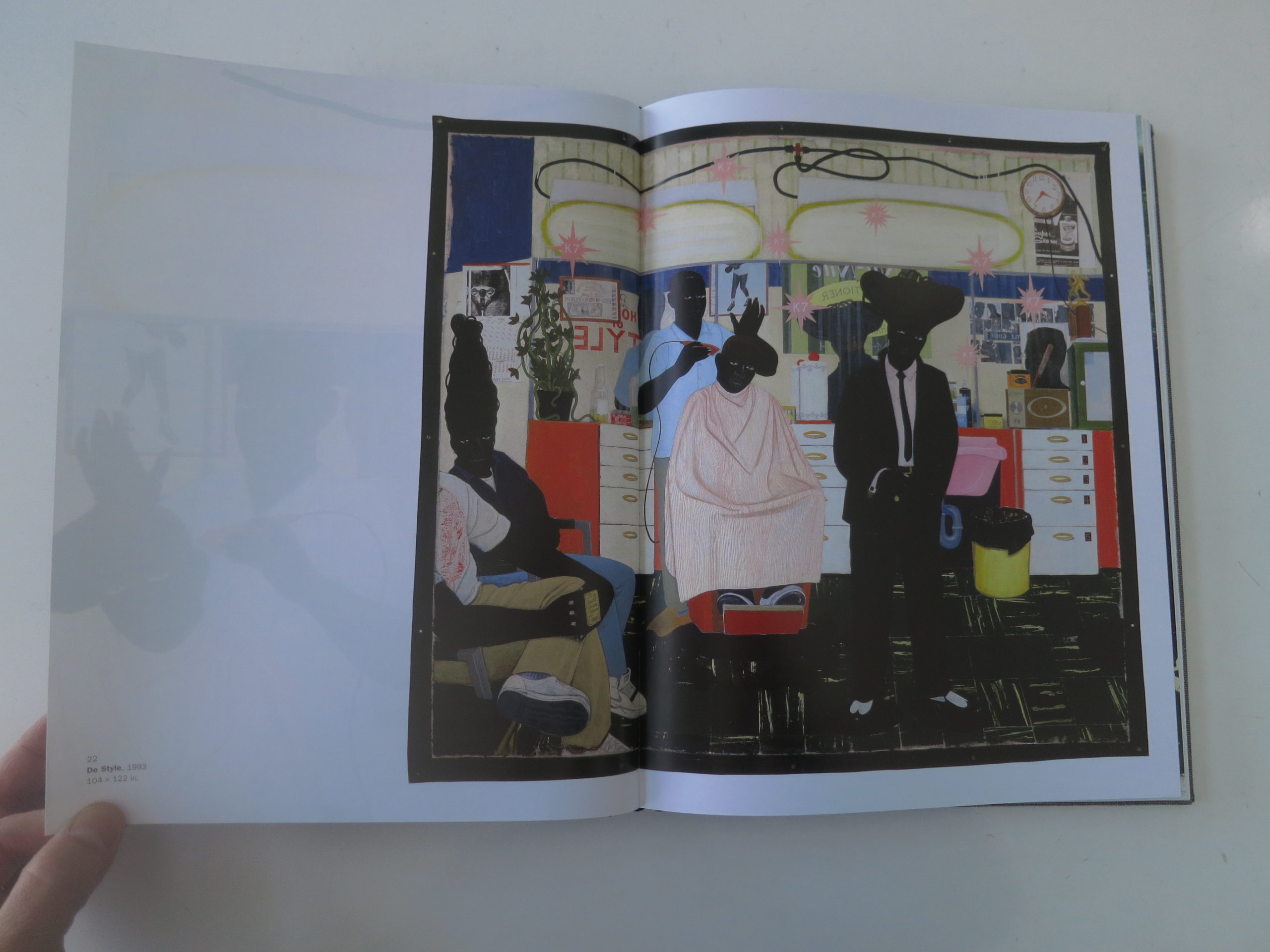
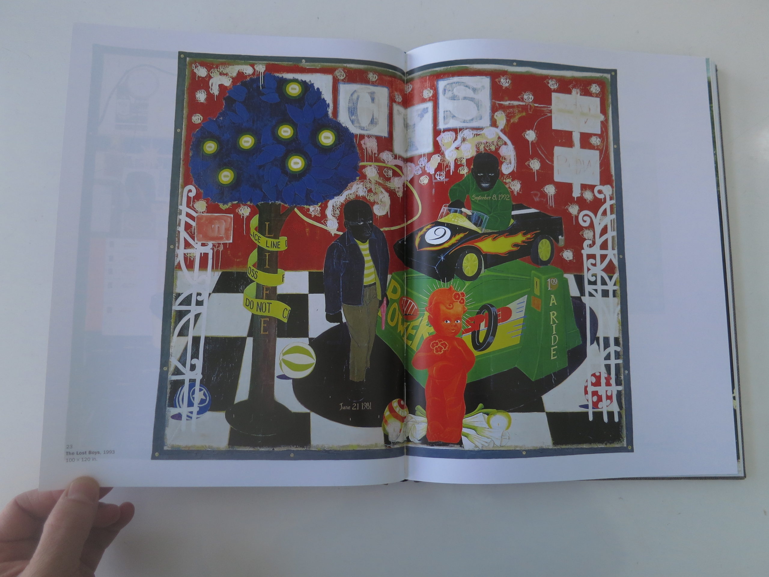
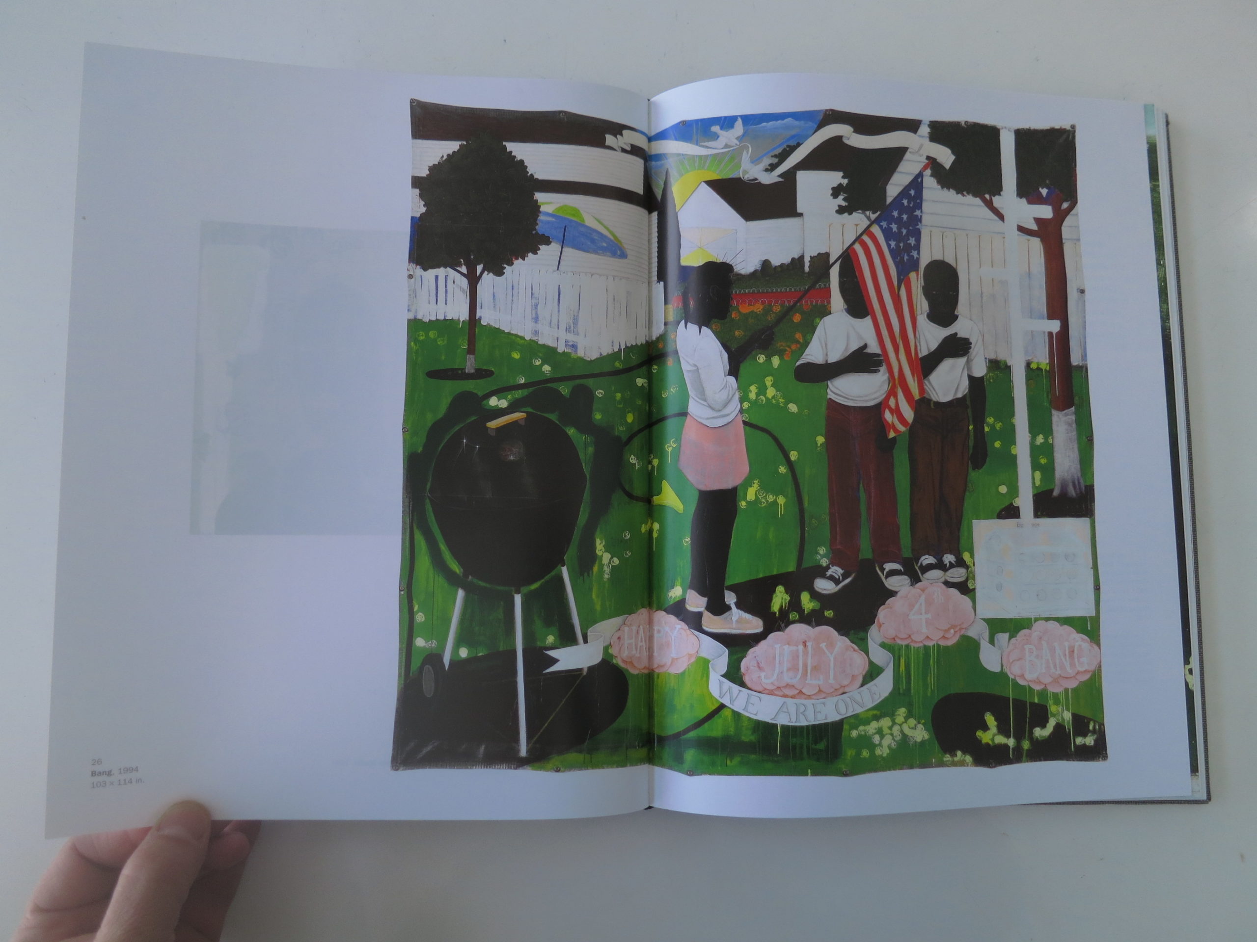
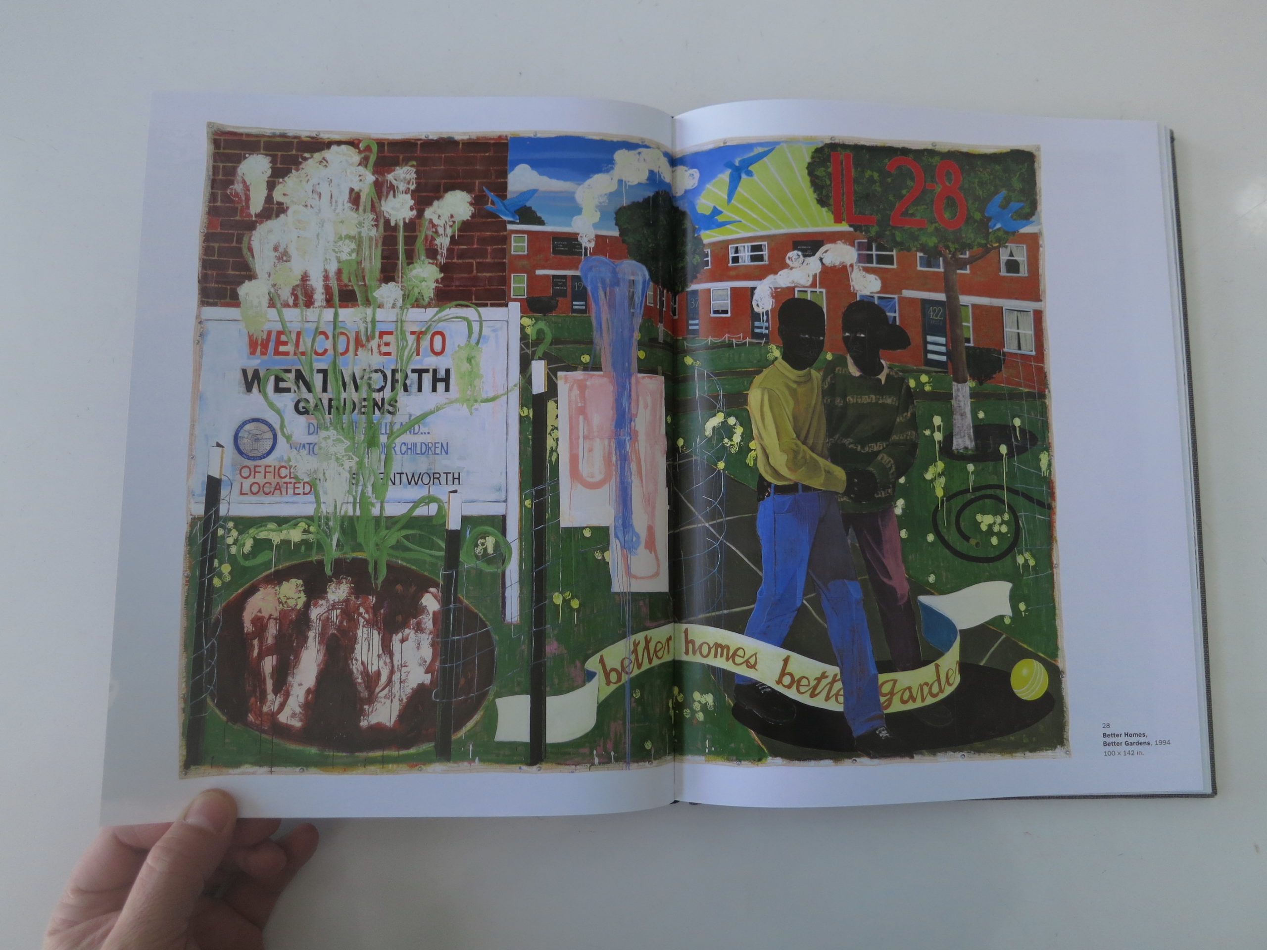
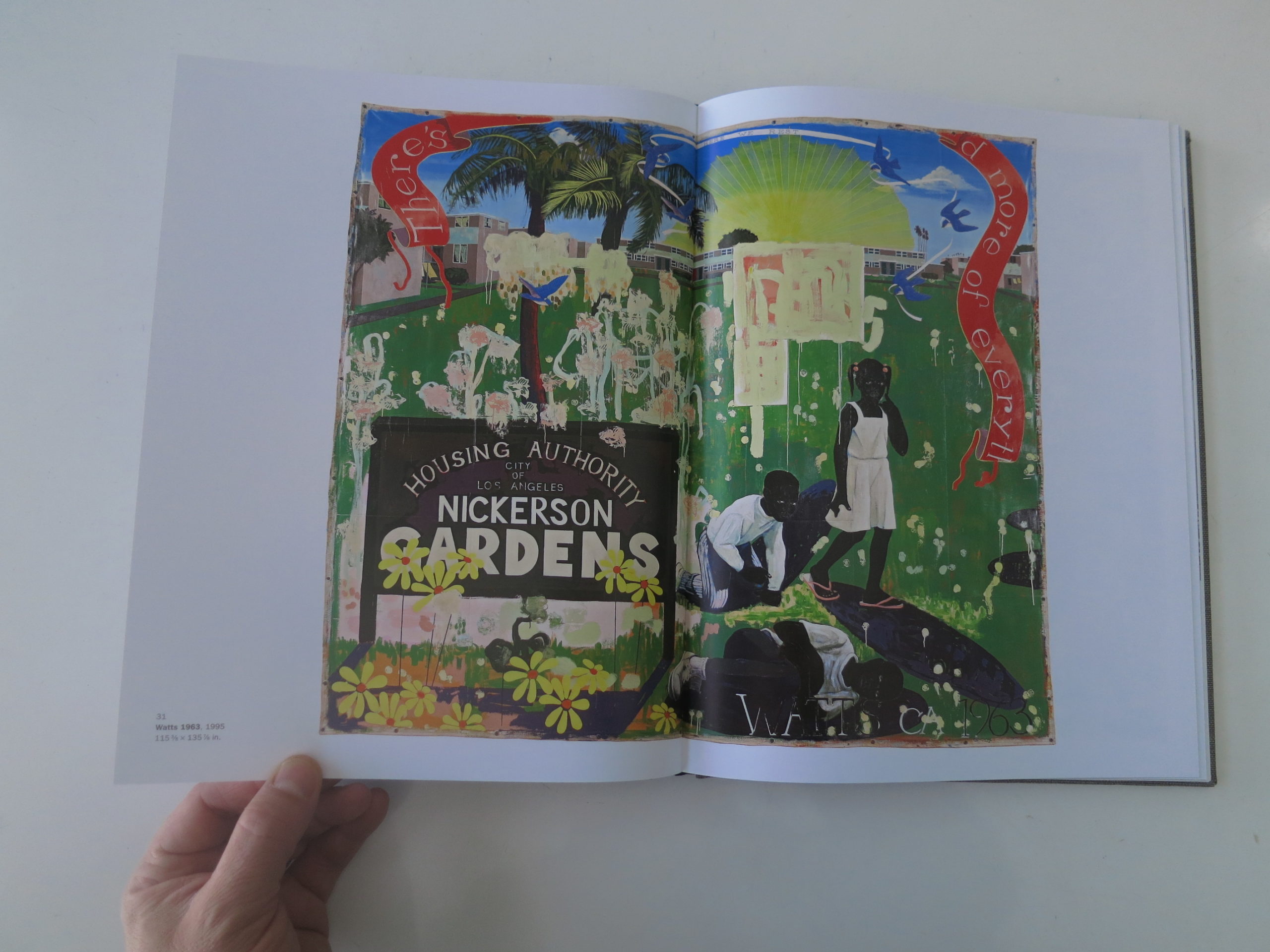
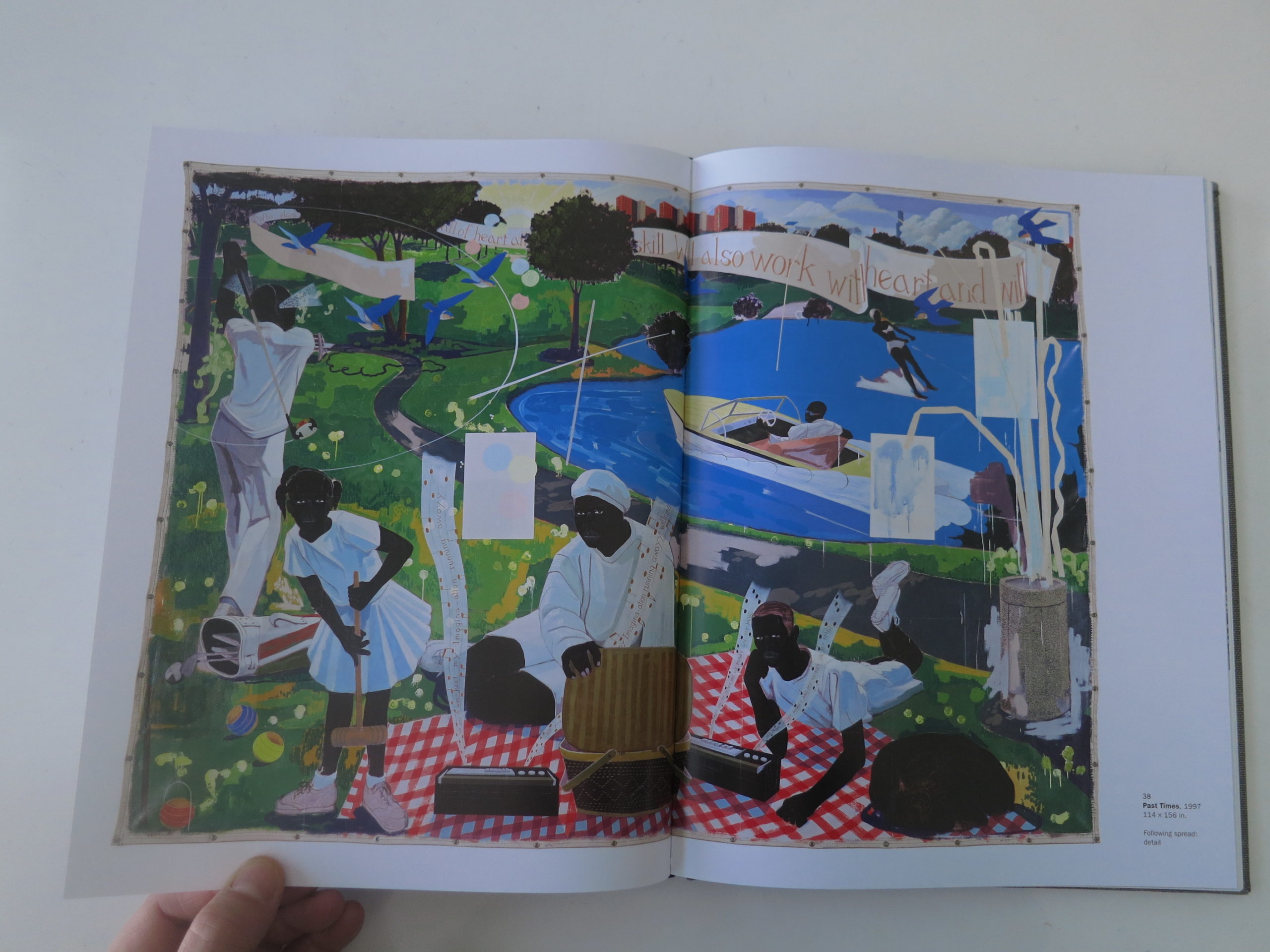
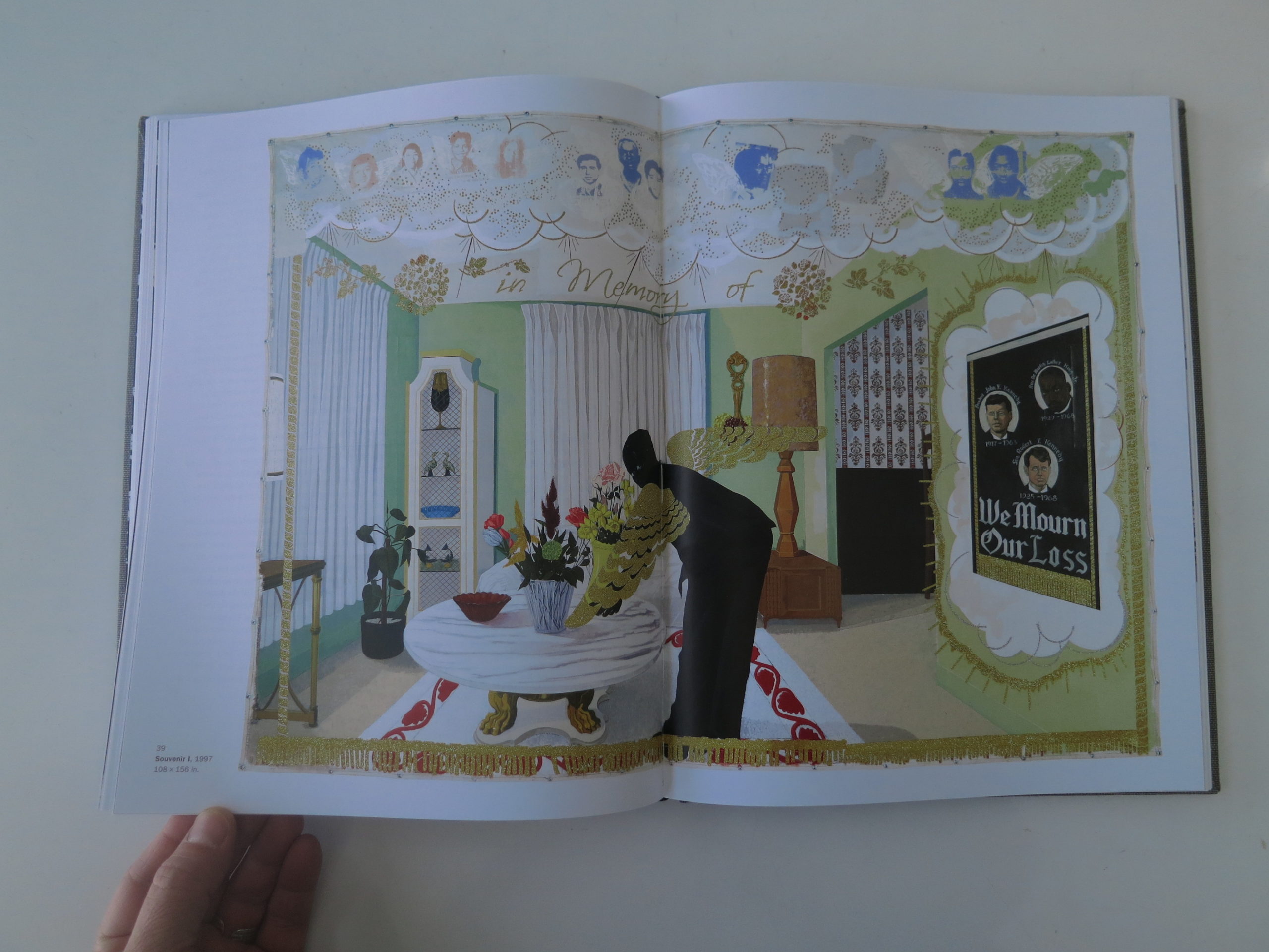
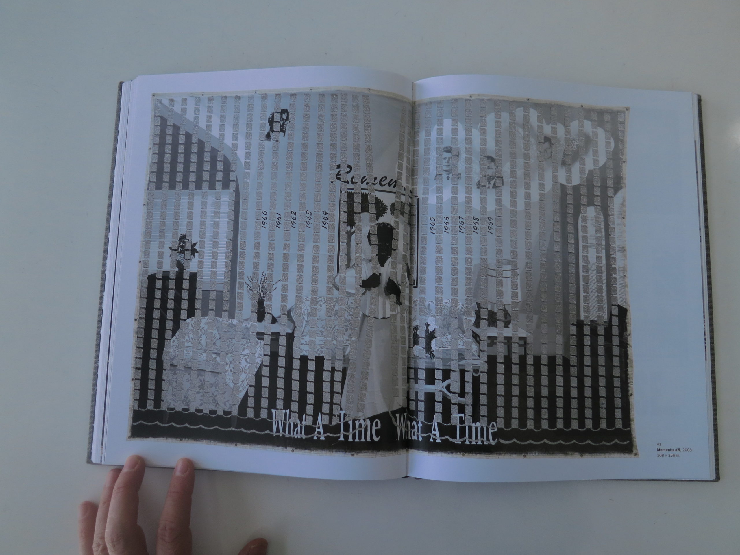
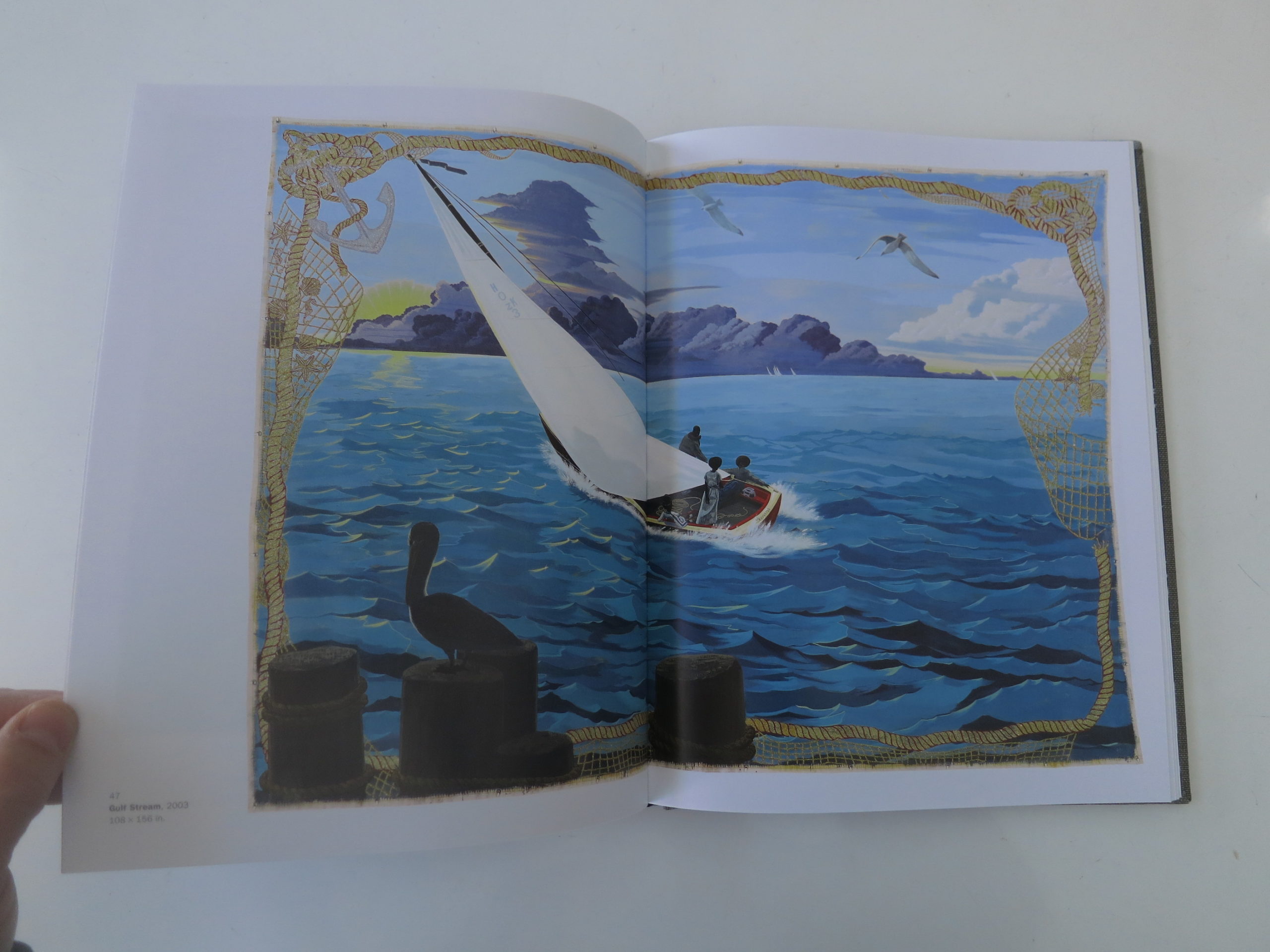
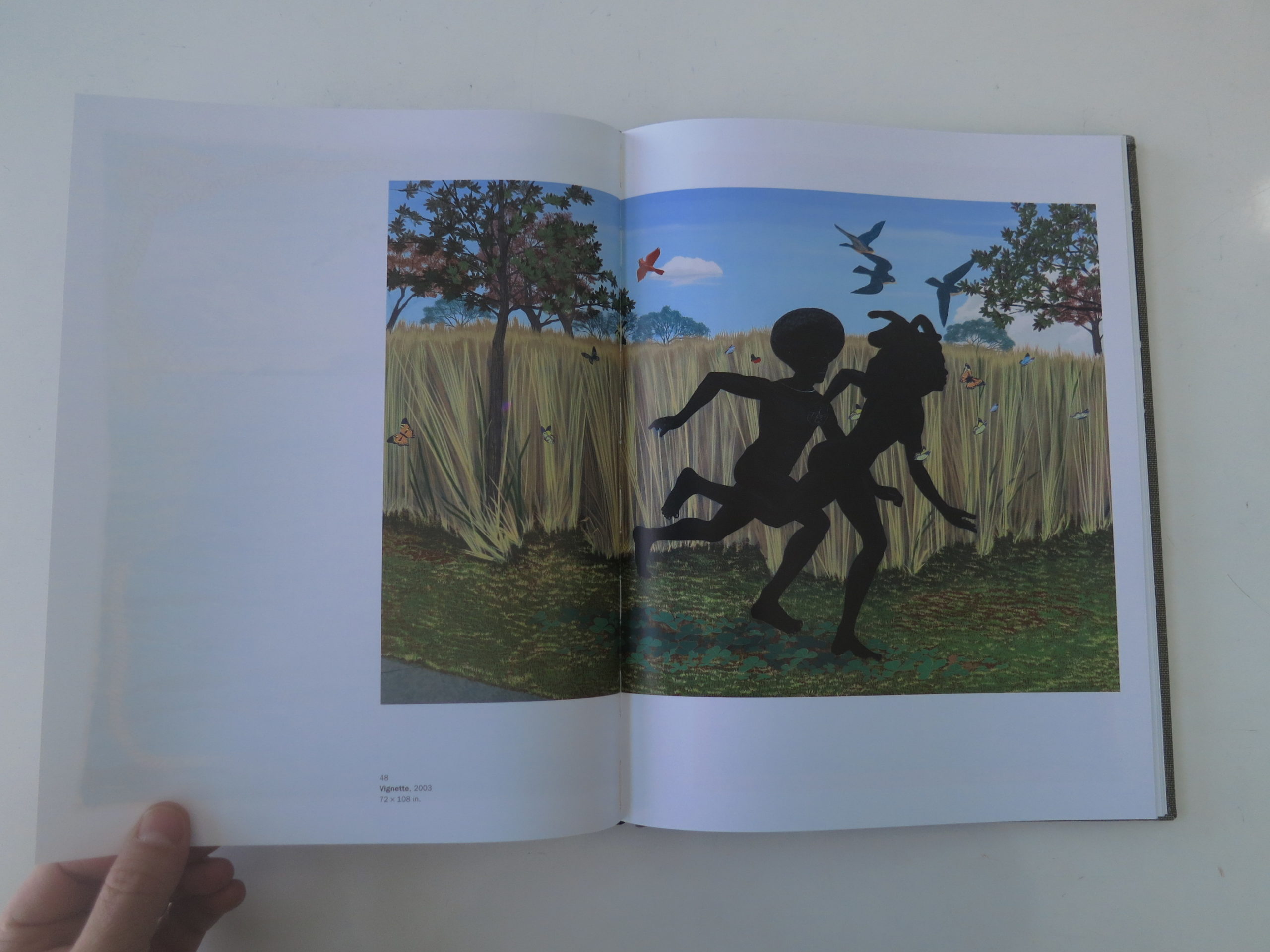
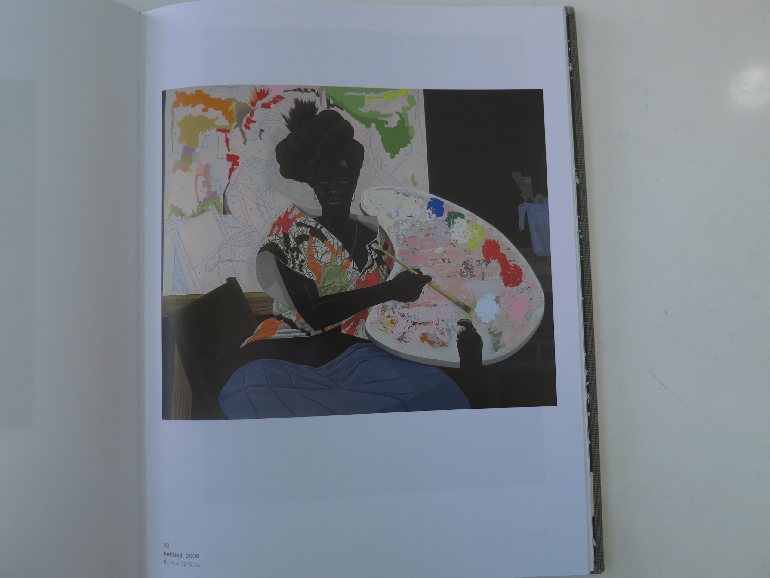
The exhibition featured an endless series of large scale, unframed canvases, done with acrylic paint. The bolt holes suggest unfinished work, but the dozens of masterpieces were nothing of the sort. The technique becomes a structural metaphor from the outset, bringing low materials to high places.
The coal-black faces speak to a history of centuries of racism, in piece after piece. (While referencing the caste system of shades of brown.) They’re defiantly dark, like Kara Walker’s silhouettes. The compositions are classical, and reference art history at every turn. (De Stijl, Rococo, Giorgione, Gericault.)
The color schemes are contrasty and exciting too, so the image structures hold up against the heavy history many of the pieces evoke.
And the subject matter feels like a hashtag of the African-American experience in contemporary America.
Watts. The barbershop. The death of Martin Luther King and the Kennedys.
There are lynchings.
And liquor stores.
Running slaves
and golden nets.
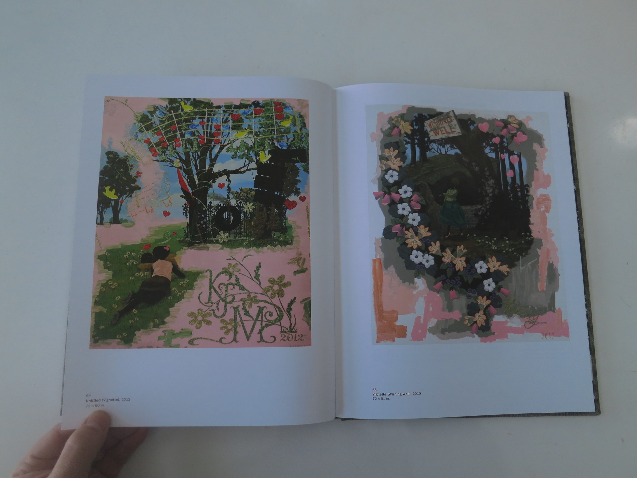
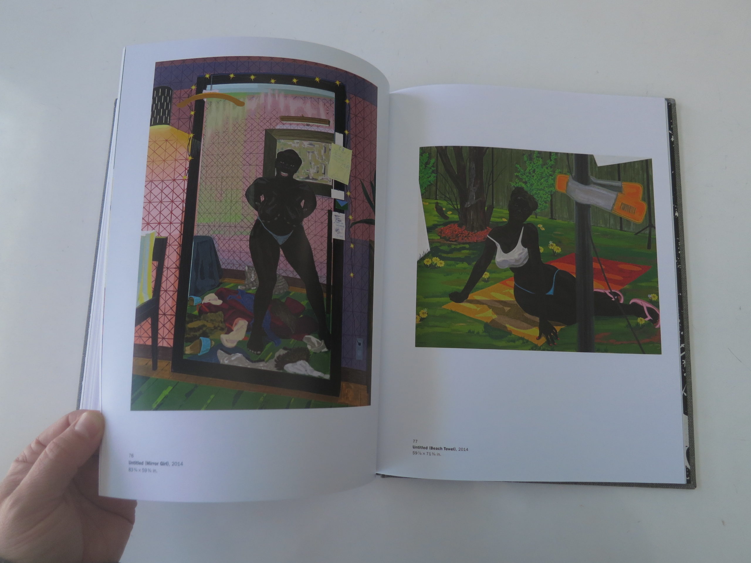
Glittering jails and subverted expectations. Like “Our House,” from 1995, which features black children inhabiting seemingly-white roles, in the suburbs, but slave shacks sit in the back of the painting as well.
Or “Past Times,” from 1997, in which a black family relaxes by the lake, Puff Daddy style, dressed in all white, waterskiing, and playing croquet.
We see pretty sunsets and plenty of paintings within paintings. He demystifies the art-making process, showing scrims, and painting by numbers, while mystifying us with how good he is at his job.
The show features private parts and private moments. Day-Glo abstractions and keen observations.
The work, taken together, distills decades if not centuries of pain and suffering, yet flips it. (Jujitsu style.) These are not dour, or in most cases, mournful works.
They’re too bright for that. They’re meticulous, too, in a way that screams joy.
Kerry James Marshall clearly loves what he does, even if what he does is critique an American society that likes to occupy the moral high ground, even though its wealth is built upon a history of slavery. (And the genocide of Native Americans.)
As for the rest of us, I’d say the lesson for 2017 is pretty clear.
Mine your experience. Share what you think. Push yourself to your limits, in a world that might not feel comfortable. Ever.
Put it into your art.
And I hope 2017 is a better and easier year for you and yours.


This Week In Photography Books: Jay Turner Frey Seawell
I’m sitting on my daughter’s white couch, looking out the window at the falling snow. There is a white sludge of bird poop on the glass, obstructing a small part of my view.
That detail is unimportant, I suppose, but it’s also true. And of course the bird dropped his little present not three weeks after we had the windows professionally cleaned for Thanksgiving. (Isn’t that always the way?)
Because winter has arrived here in earnest, and our mountains draw the biggest storms around, it’s the time of year where we build fires in our wood-stove each day.
It’s an antiquated system:
Burn wood.
Heat house.
Fire pretty.
Fire burn.
Don’t touch.
The first step, (after I sweep the ashes from the previous conflagration,) is to roll up some old newspaper. My dad taught me how to do it when I was a kid, and I still use his technique. These days, though, we add napalm bricks that make the whole process much easier.
Building the fire forces me to look at information on paper, (talk about antiquated,) and the other day I saw the most disturbing “news.” On a single page, in some random edition of the Albuquerque Journal, there was a story about a man who killed his young son by leaving him in a hot car for 7 hours, and a blurb about a woman who fed her stepchild to the family pigs, after the murder.
Unsurprisingly, I felt the cortisol drop in real time. Just looking at those words made my body change, and my mood alter. And that was only after a cursory 5 second glance, when I wasn’t even trying to read the paper. (Burn, baby, burn.)
It got me thinking though, about the idea of “news.” Where did it come from? This need to know what was happening in parts elsewhere. I can see the value of Paul Revere riding through the dark night, as the British WERE coming.
But the mass dissemination of salacious stories that have no impact on our daily lives? How did it become so necessary? And now that we’re assaulted with such information all day, every day, instead of 7 times a week, will we ever break the habit?
Not to be Debbie Downer, but I’d suggest we’re stuck with the habit, as long as such information is treated as a commodity. While the nightly news, brought to you by Cablevision, is no longer the arbiter of what everyone thinks, (thanks to the breakaway republic of FoxNewsistanBreitbartlandia,) everyone’s trying to make money off this “news.”
The entire cycle, taken to it’s absurd conclusion, just delivered the Presidency to Donald J Trump, and it’s not even clear he wants the job. Sure, he wants to be President, because it will make him even richer and more famous, but does he really want to do the grunt work that Obama clearly relished?
Highly doubtful.
But the “news” organizations essentially handed him the election by covering every rally, (for free,) writing about every insane comment, treating the entire process with a respect that it clearly did not deserve.
I guess it serves us right.
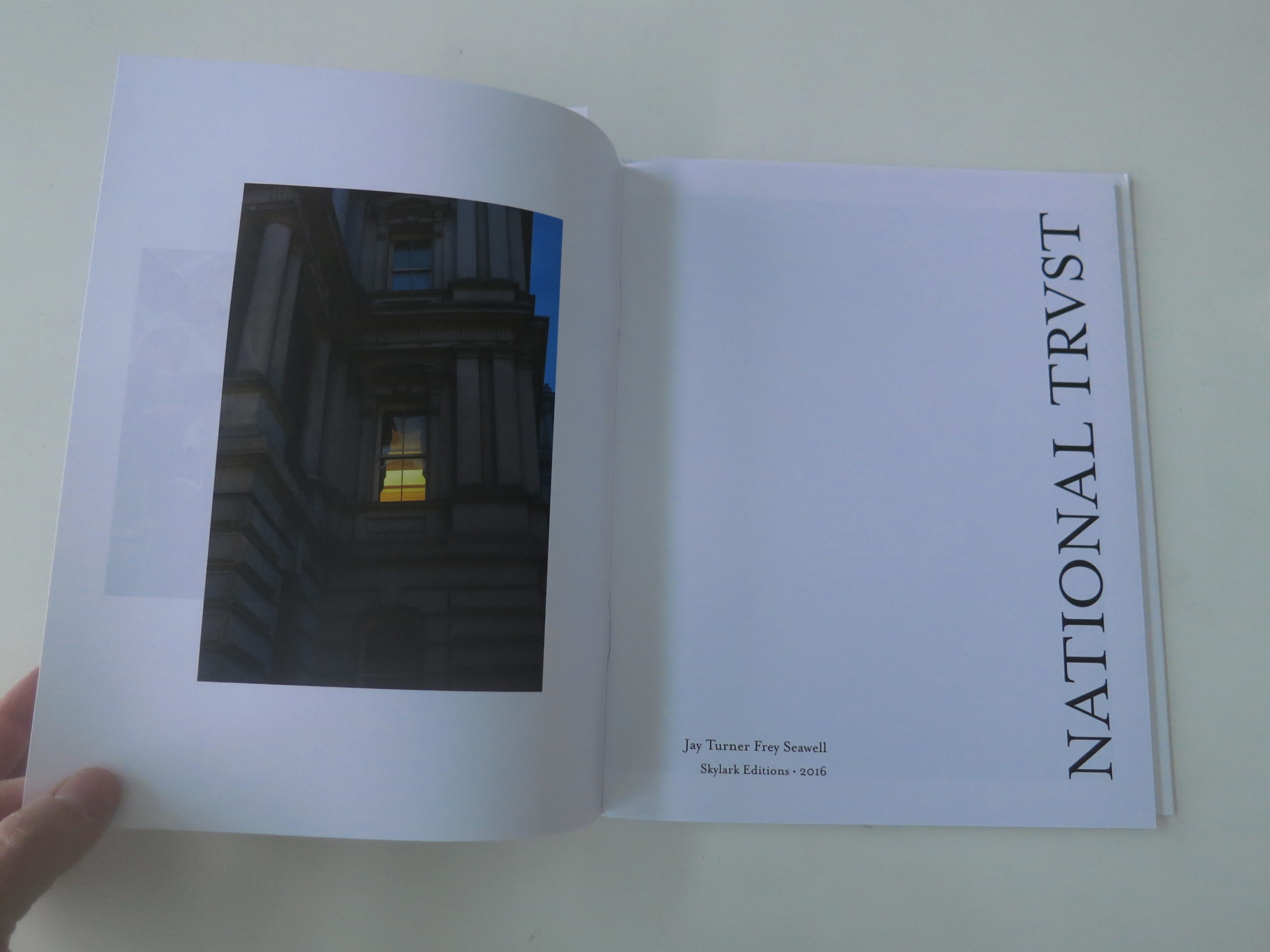
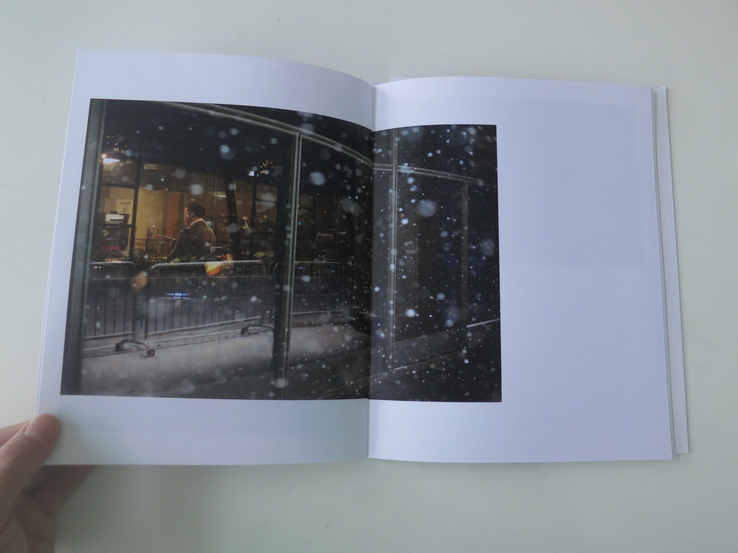
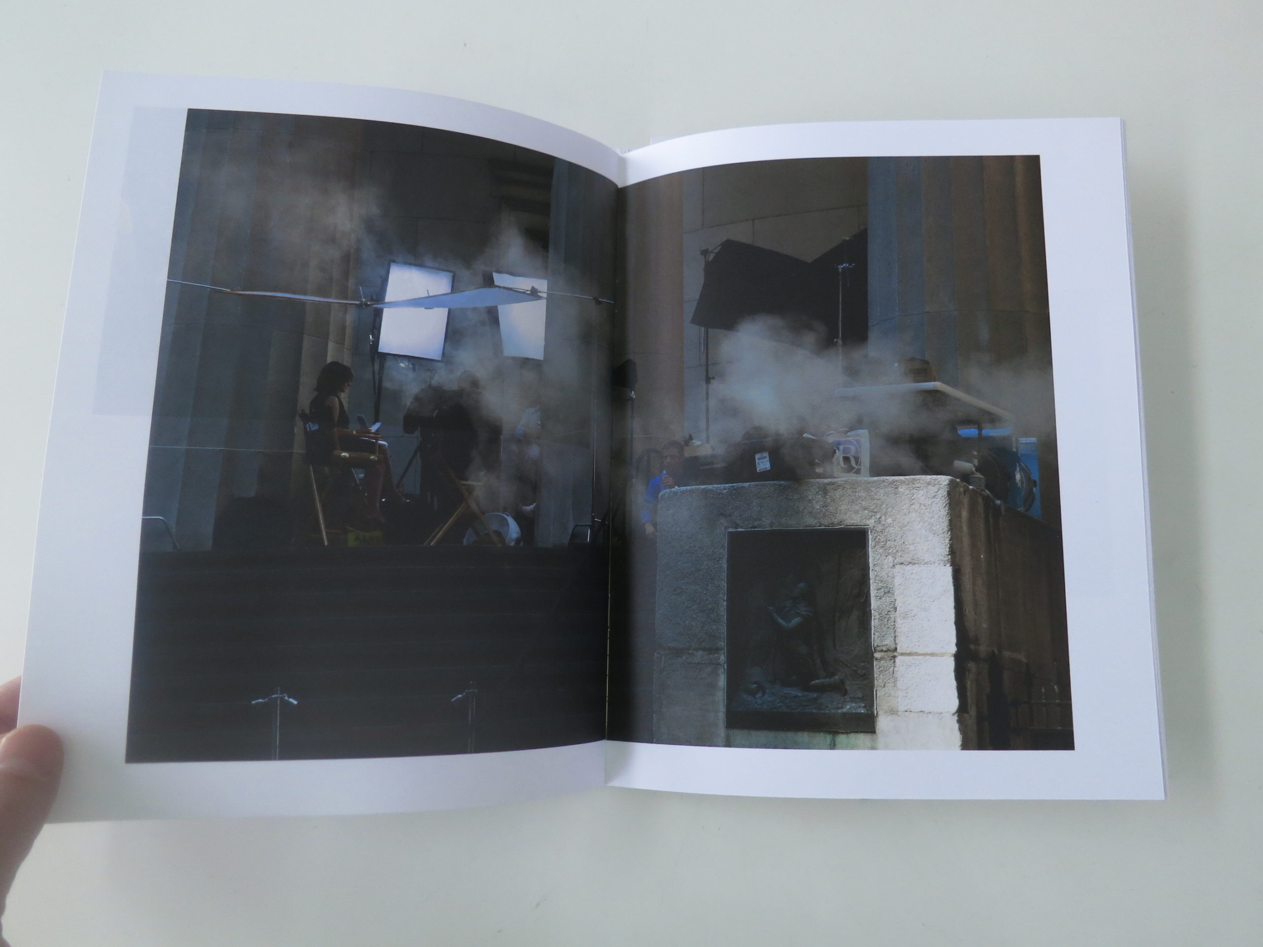
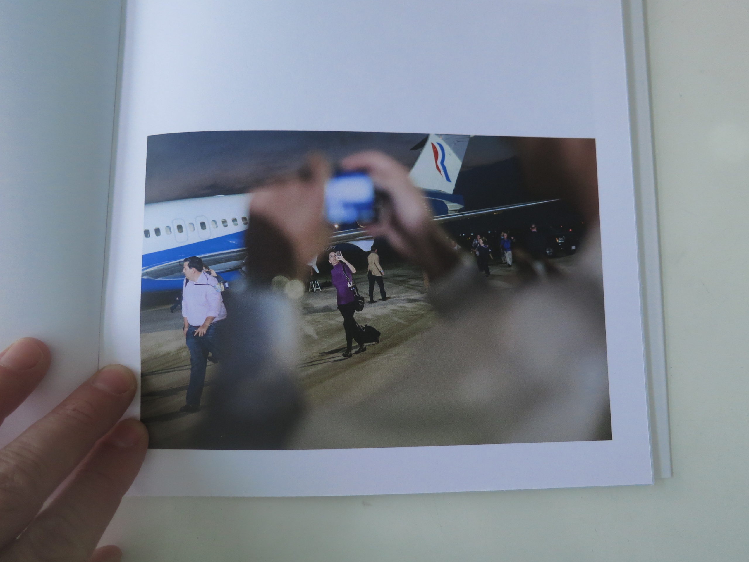
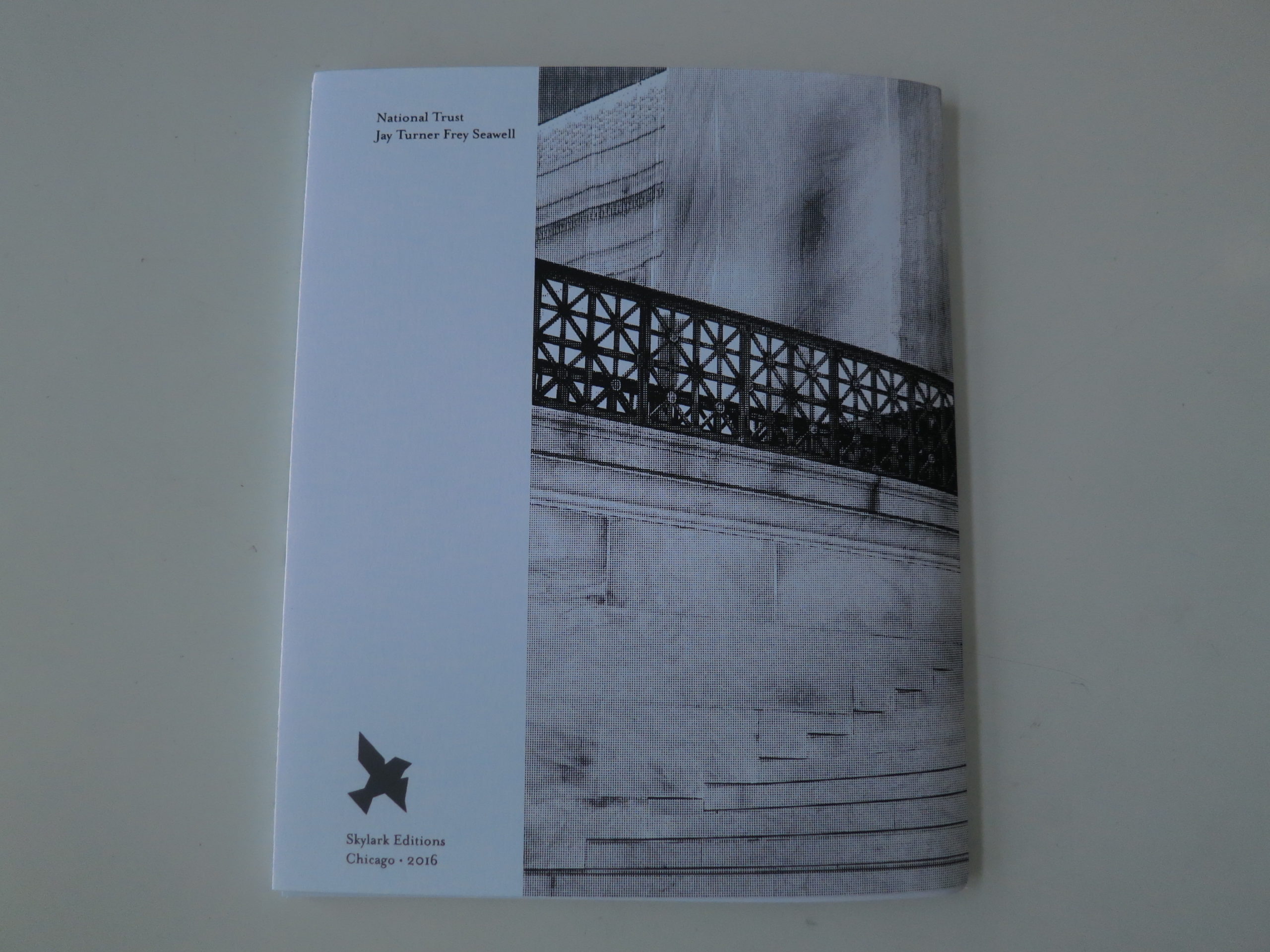
Honestly, though, while the snow out the window is somewhat calming, I’m a bit riled up having just put down “National Trust,” a new soft-cover book by Jay Turner Frey Seawell, (whom we’ll refer to as JTFS,) recently published by upstart Skylark Editions in Chicago.
Now that we’re no longer getting our books from photo-eye, I’m relying on what people send me. (Yes, we are accepting submissions, but please contact me first. I don’t want you to waste a book on something I’d never review.) JTFS and the folks at Skylark thought I might dig this book, and boy, were they right.
I hope the artist is getting some publicity at the moment, because he certainly deserves it. Much like my project “The Value of a Dollar” took off because I was thinking about food a couple of years before EVERYONE was, these pictures were shot in advance of our current political climate.
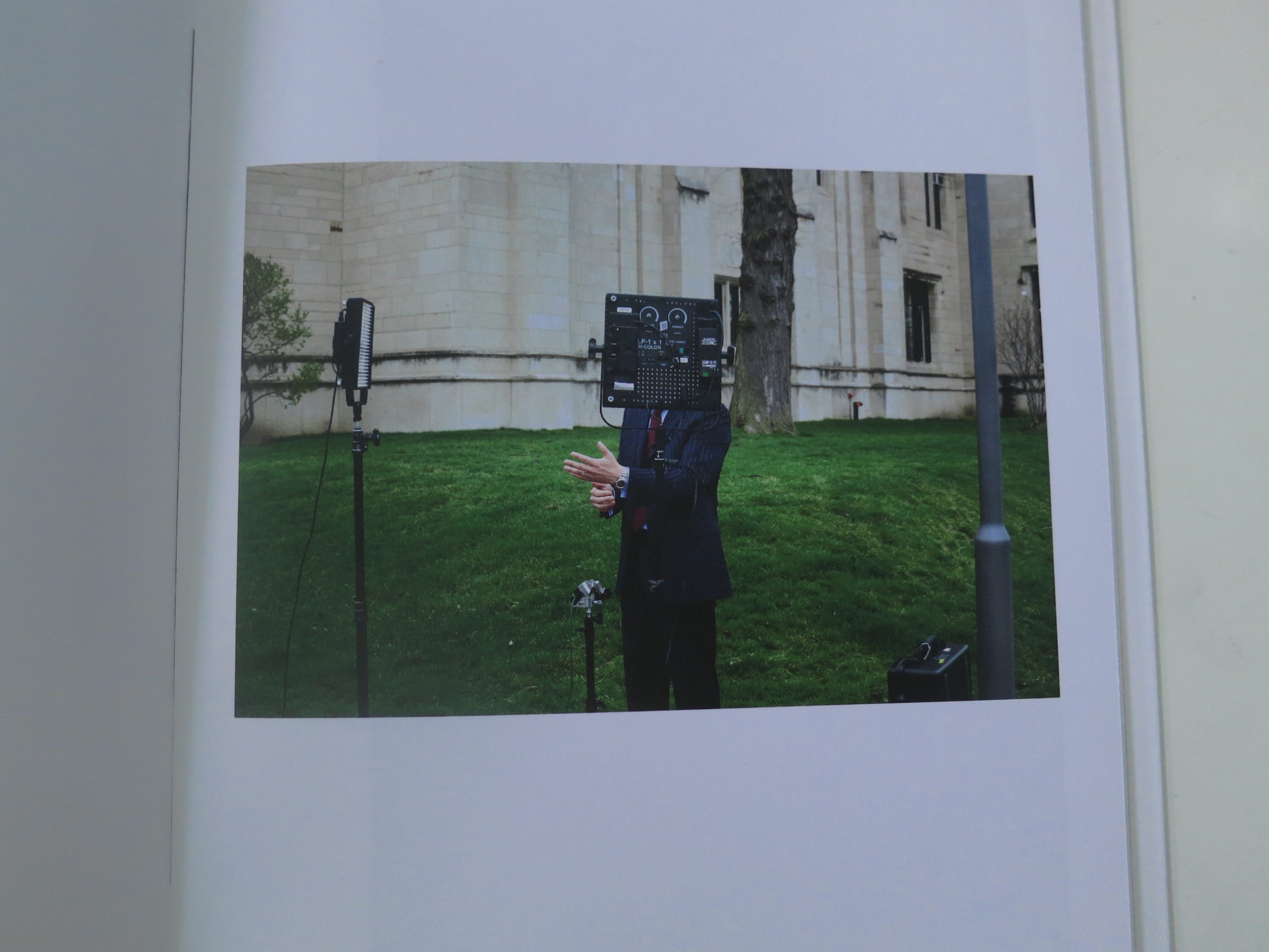
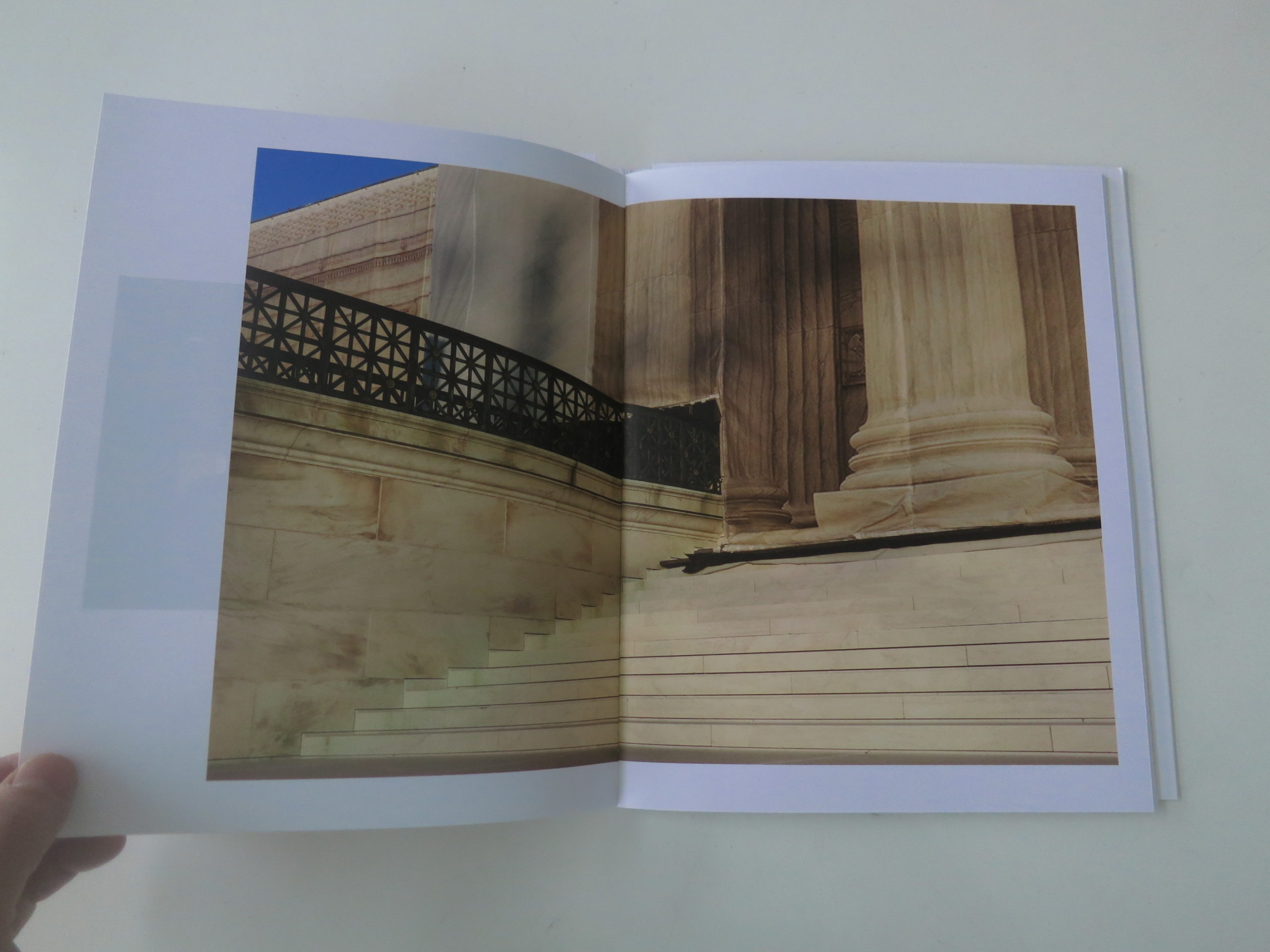
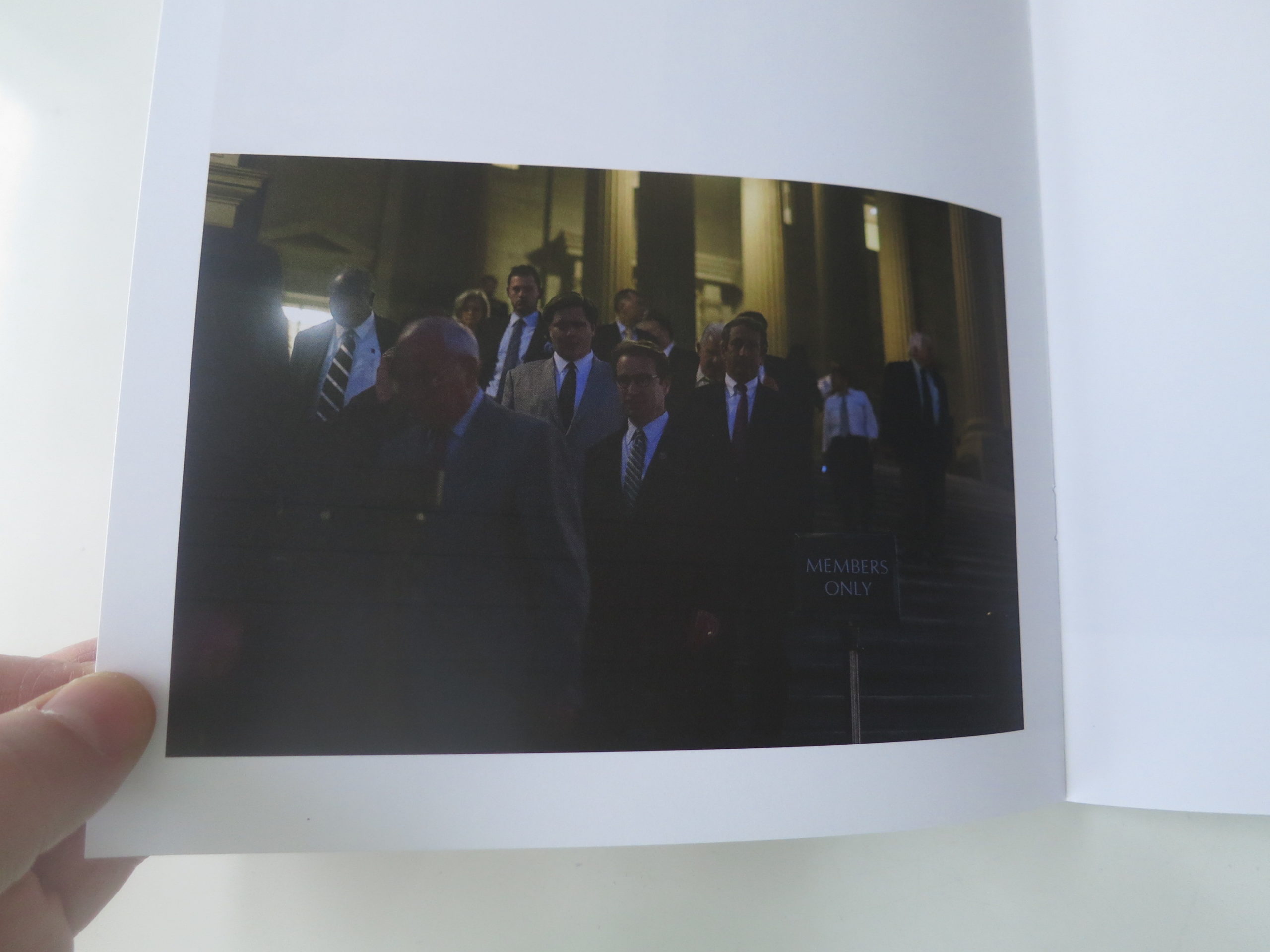
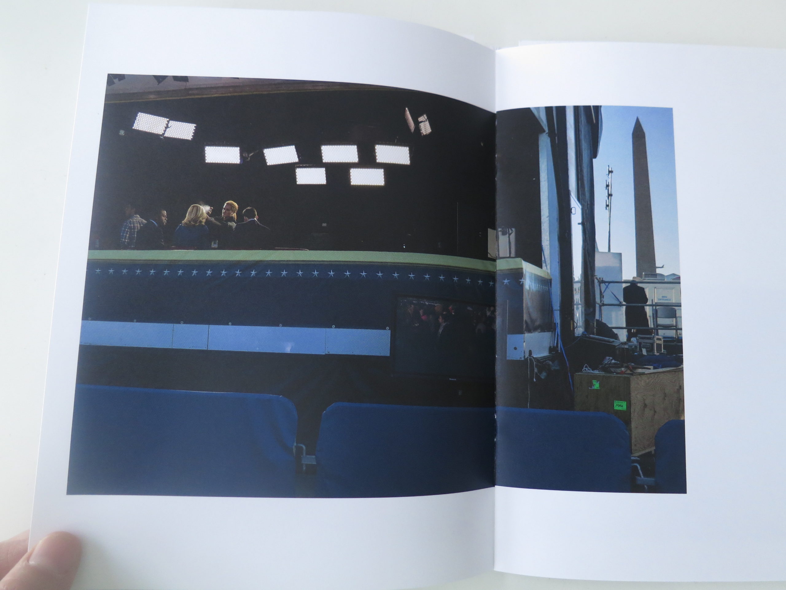
JTFS lives in Washington, DC, I believe, and from 2011-13, he photographed the media facade/political industrial complex. Man, are these pictures good.
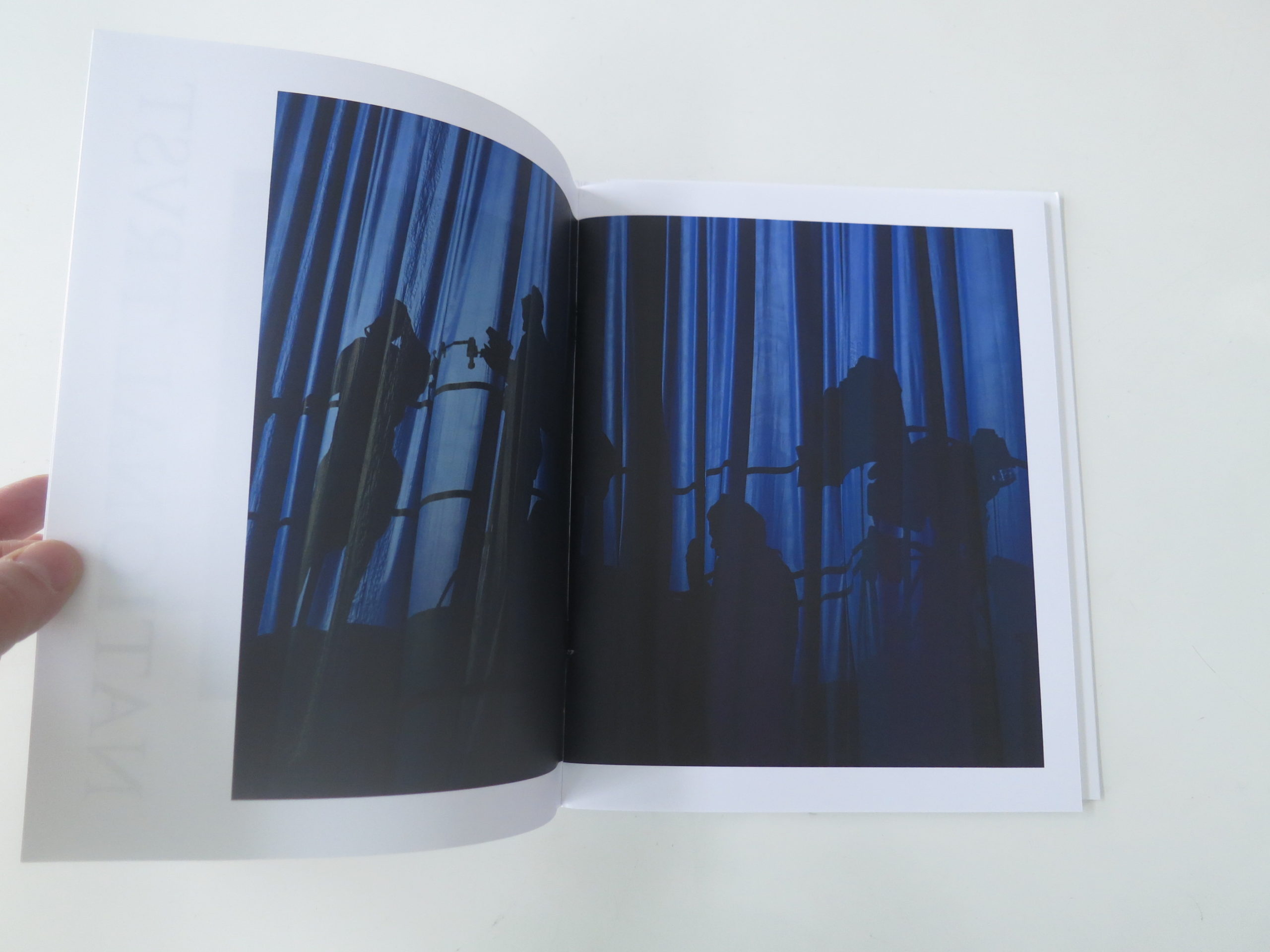
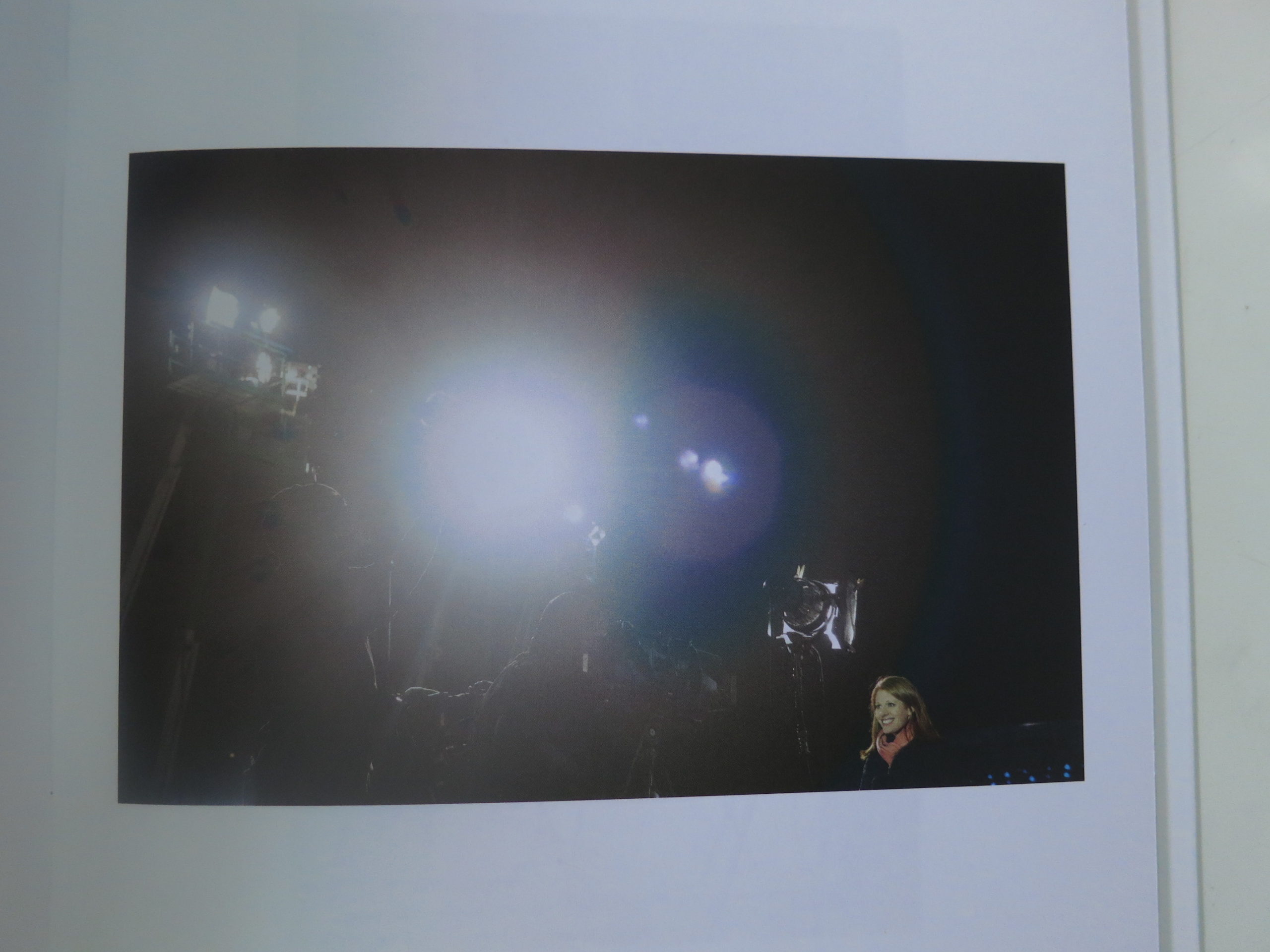
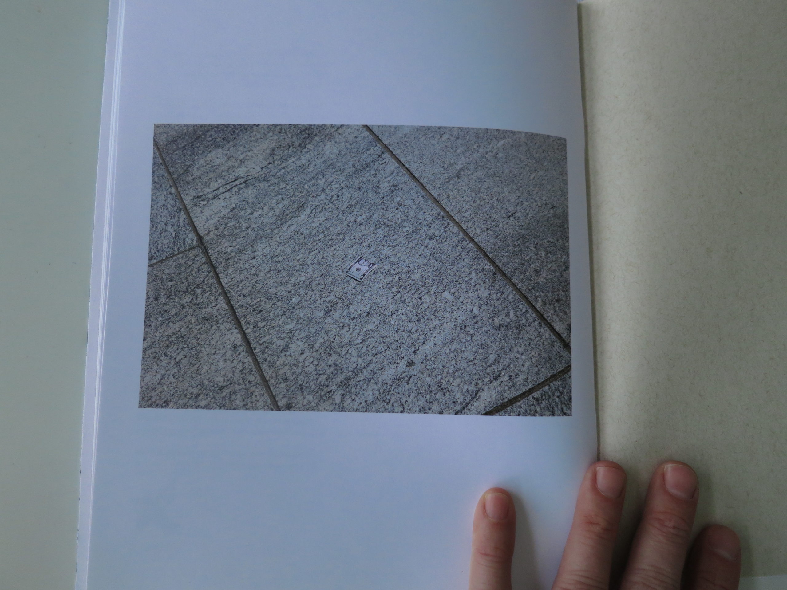
They’re sharp, both in image clarity and observational skills. They clearly pull back the curtain to reveal, what exactly? And I’m not even being metaphorical. There’s an image, called “Supreme Court,” that clearly depicts a curtain of a column, right where we’d expect an actual column to exist.
We see the bright lights, including one picture where the apparatus perfectly covers a “talking head,” as he fixes his expensive cuff-link. The compositional style, which manages to be chaotic and restrained at the same time, emphasizes the read that the world has gone amuck.
We’re all trapped in a bubble that keeps growing, even as we spend so much less money obtaining said “news.” As such, the closing picture, of a five dollar bill torn asunder on the sidewalk, made me think that somewhere in the afterlife, Abe Lincoln, who gave his life for this nation’s unity, is up there thinking, “They get what they fucking deserve.”
That’s right people. Sad Abraham Lincoln is my takeaway, as his ghost has to contemplate D Trump entertaining right wing billionaires in his own bedroom. (Maybe even in his own bed.)
All because we can’t turn off the TV. We can’t step away from the Twitter. We can’t unlike what the world has become. I rarely ask for more from a photo book, and neither should you.
Bottom Line: Exquisite, perfectly timed look at the Washington media-political-industrial-complex
To Purchase “National Trust” Go Here: http://www.skylarkeditions.org/shop/national-trust-by-jay-seawell-1


The Art of the Personal Project: Joe Pugliese
Personal Projects are crucial in showing potential buyers how you think creatively on your own. I am drawn to personal projects that have an interesting vision or show something I have never seen before. In this revised column, I’ll include a link to each personal project with the artist statement so you can see more of the project. Please note: projects are found and submissions are not accepted.
Joe Pugliese – Sunday Best


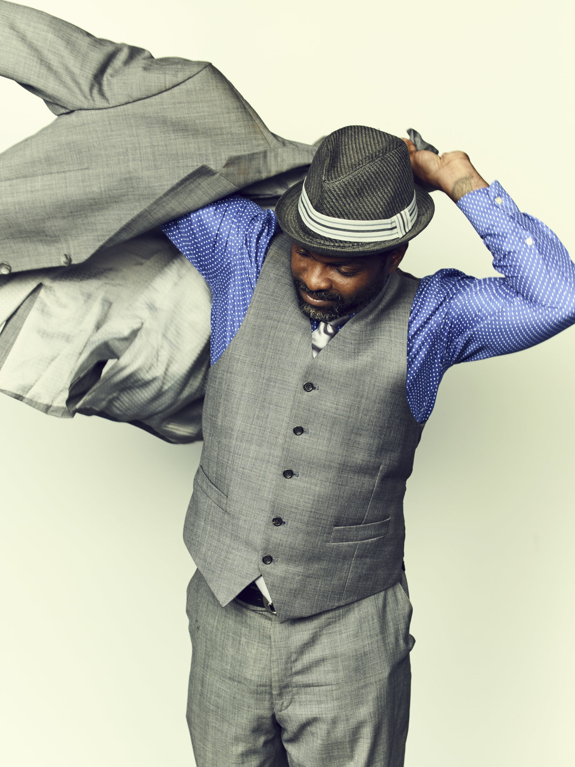
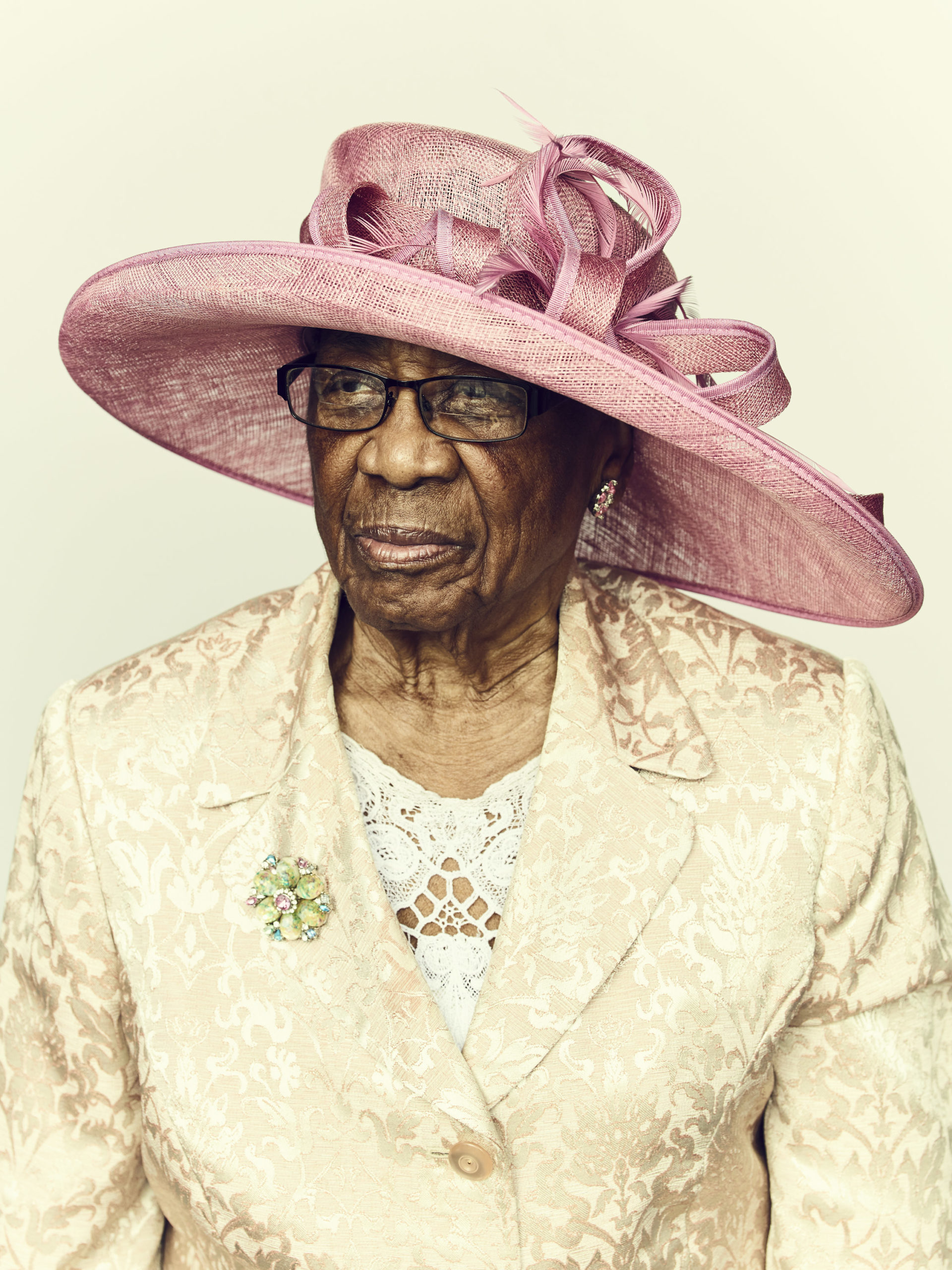
This series came to life on the heels of other portrait series I had made in which the subject matter were people in their natural environment but photographed in a way which isolated them from those surroundings. I had previously shot a series on Army soldiers coming home to their families at a military base in Texas, and an ongoing series of cyclists reacting to an extremely physical and difficult effort at the top of a hill in the LA mountains. In each case I used a makeshift studio setup to create a consistent look and feel and so that the subjects, their expressions and body language were front and center in the photographs.
Los Angeles Magazine approached me to be part of a portfolio of images along with other LA-based photographers that depicted the diversity of ways that people in Southern California worship. They were calling the project “Pray LA”. I pitched them a portrait series of the Baptist community, and set out to find a parish that was interested in having me setup at their church on a Sunday. I knew that the larger churches in the Baptist community took great pride in dressing for mass and figured it would make for a colorful and joyful set of portraits. I was aiming to photograph about two dozen subjects to be able to edit from and ended up, to my surprise, photographing over 150 subjects all in one morning. The interactions were authentic and filled with energy, and I directed each subject very loosely and had a great time engaging with each of them. It has inspired me to continue this type of series, and Los Angeles Magazine has shown interest in making a portrait page of this work available to me in each month’s issue.
You can follow Joe Pugliese on Instagram @joepug
https://www.instagram.com/joepug/
And view more of Joe’s personal work here:
http://www.joepug.com/series
—————
APE contributor Suzanne Sease currently works as a consultant for photographers and illustrators around the world. She has been involved in the photography and illustration industry since the mid 80s. After establishing the art buying department at The Martin Agency, then working for Kaplan-Thaler, Capital One, Best Buy and numerous smaller agencies and companies, she decided to be a consultant in 1999. She has a new Twitter feed with helpful marketing information because she believes that marketing should be driven by brand and not by specialty. Follow her at @SuzanneSease.
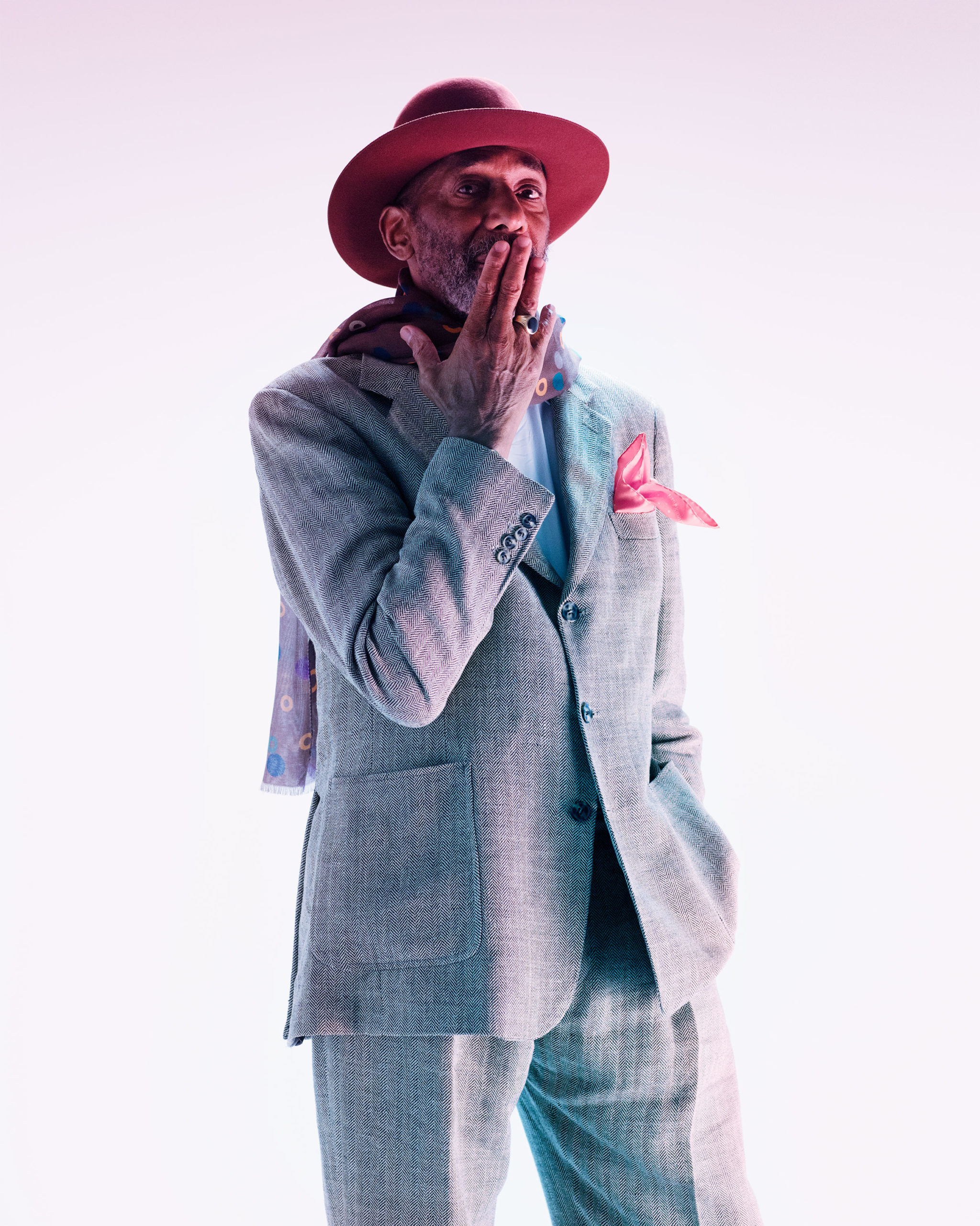
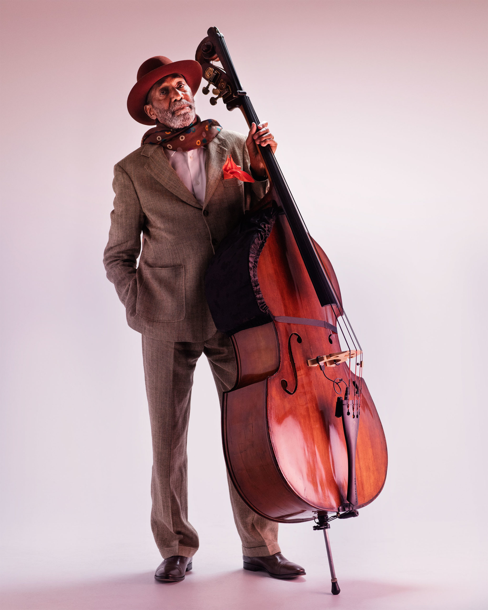
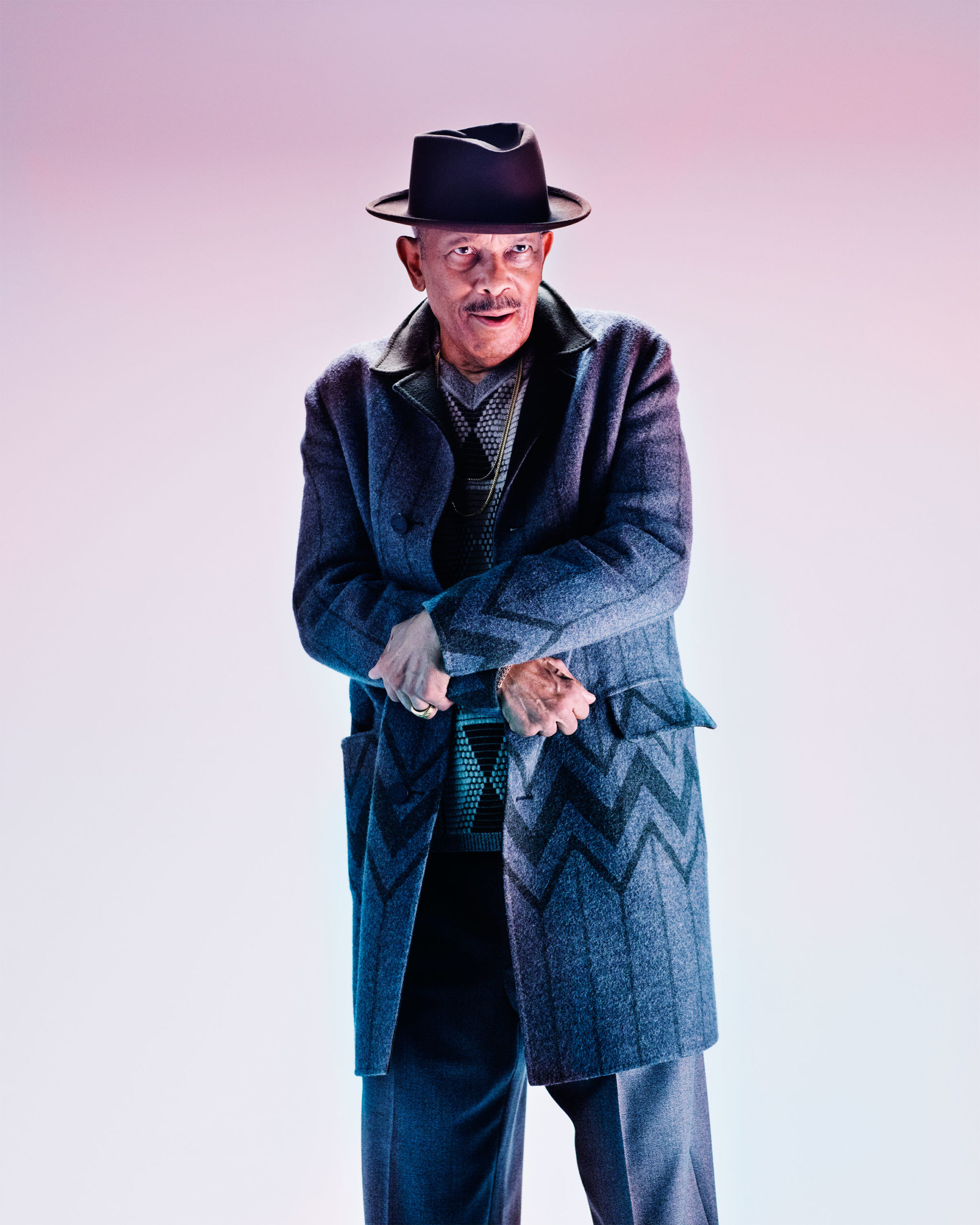
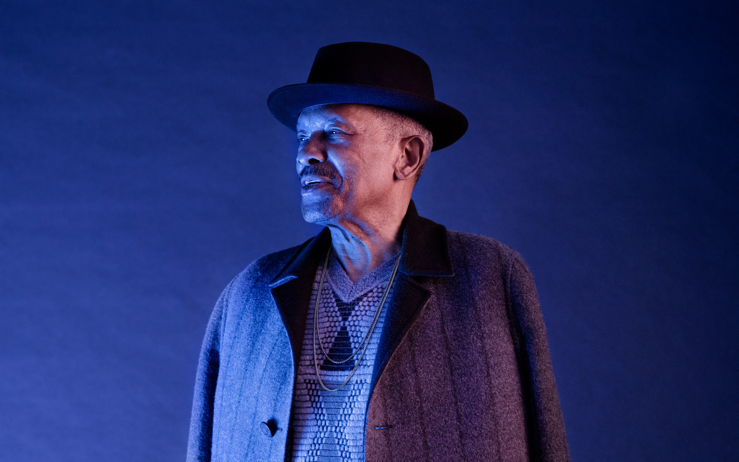
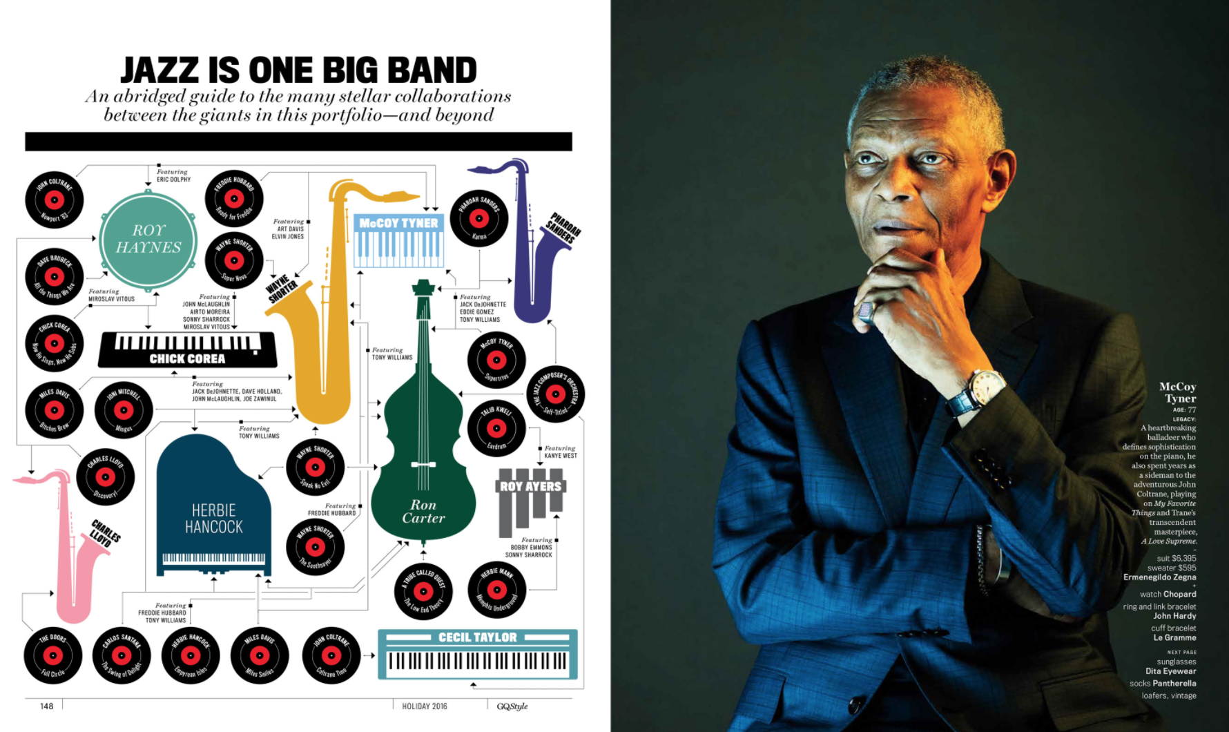
The Daily Edit – GQ: Christian Weber
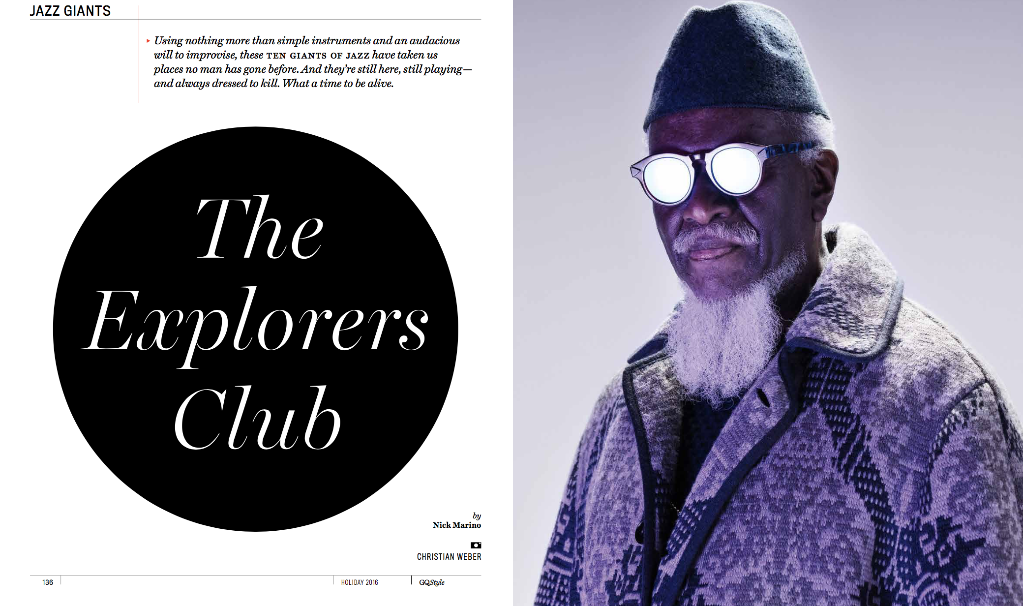

GQ
Design Director: Fred Woodward
Director of Photography: Krista Prestek
Photographer: Christian Weber
What music were you playing on set?
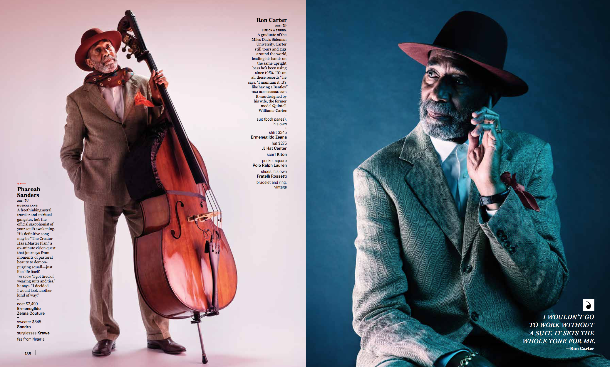
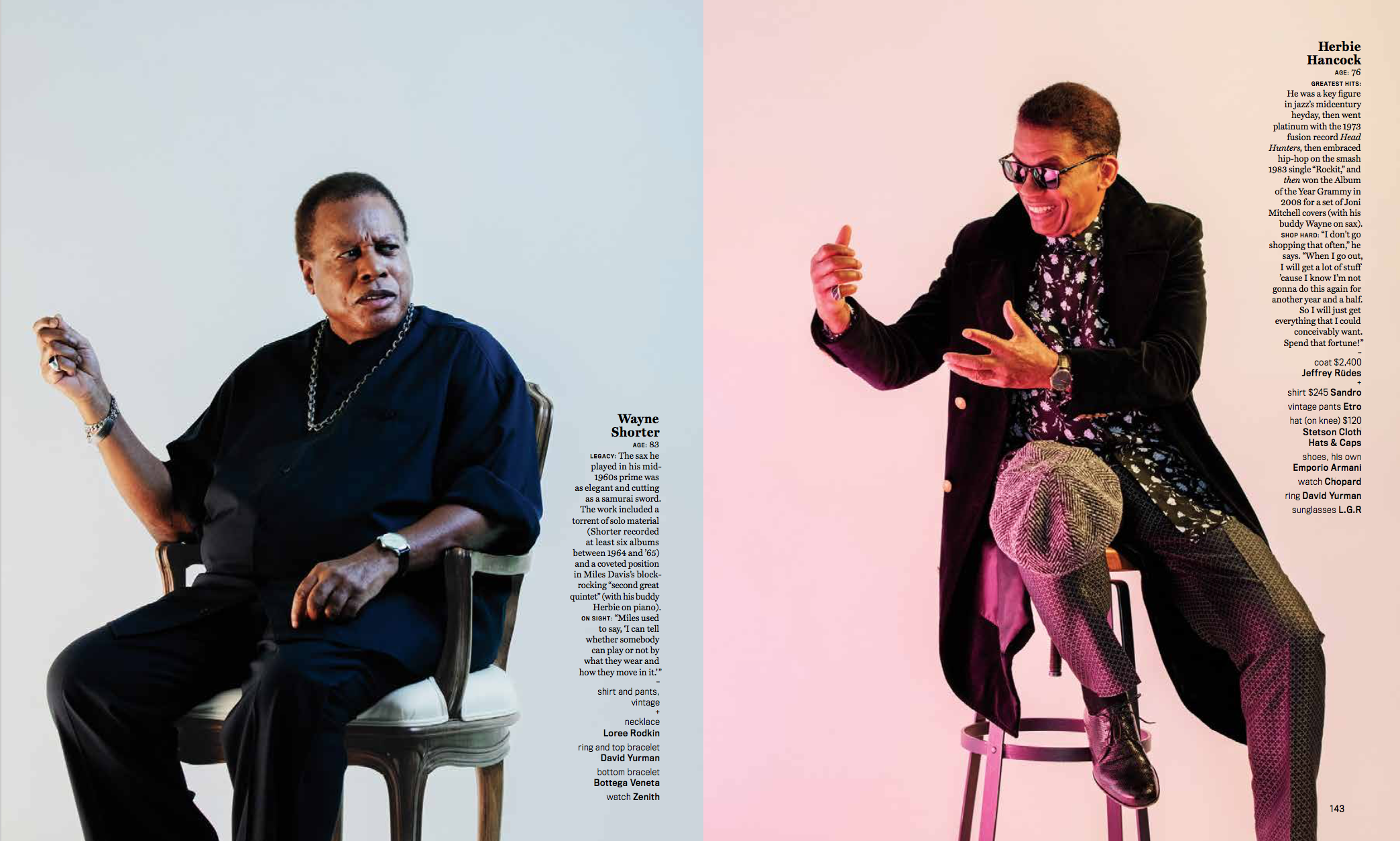
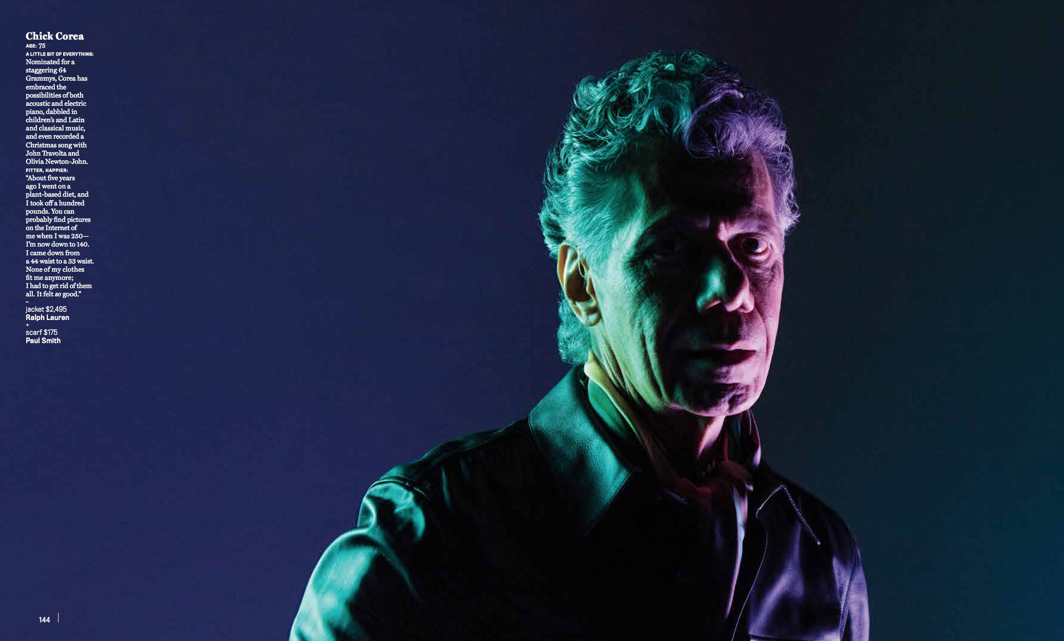
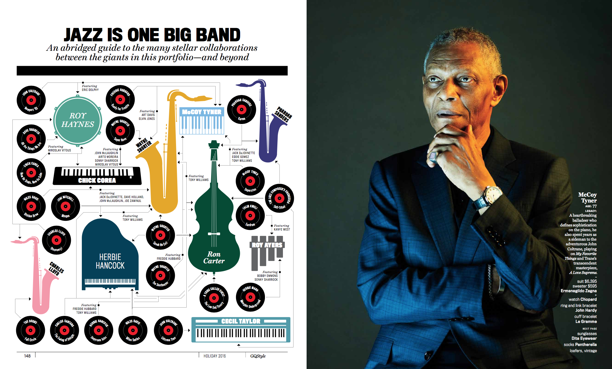
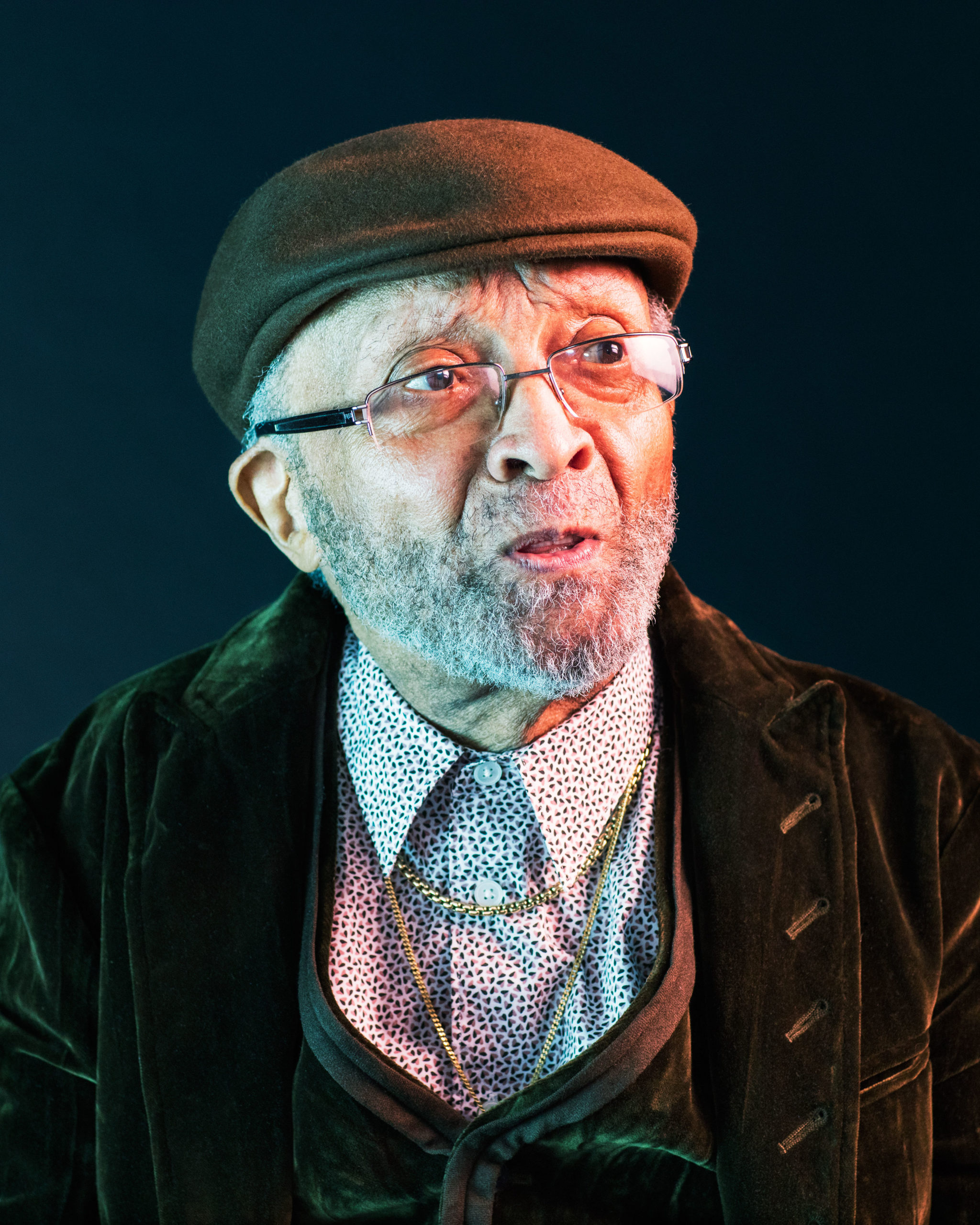
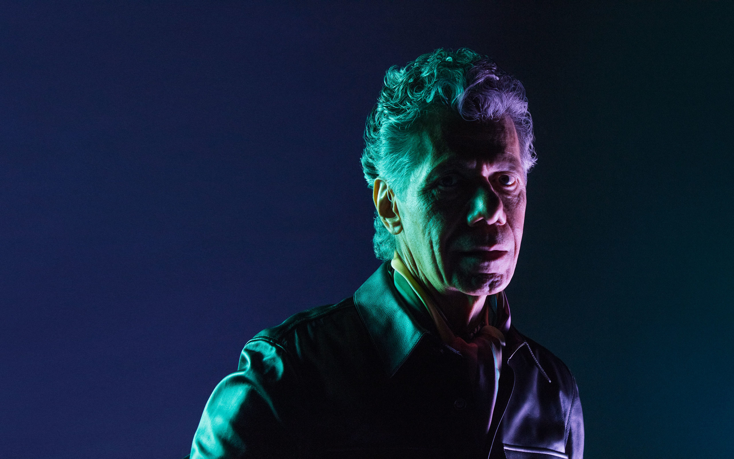
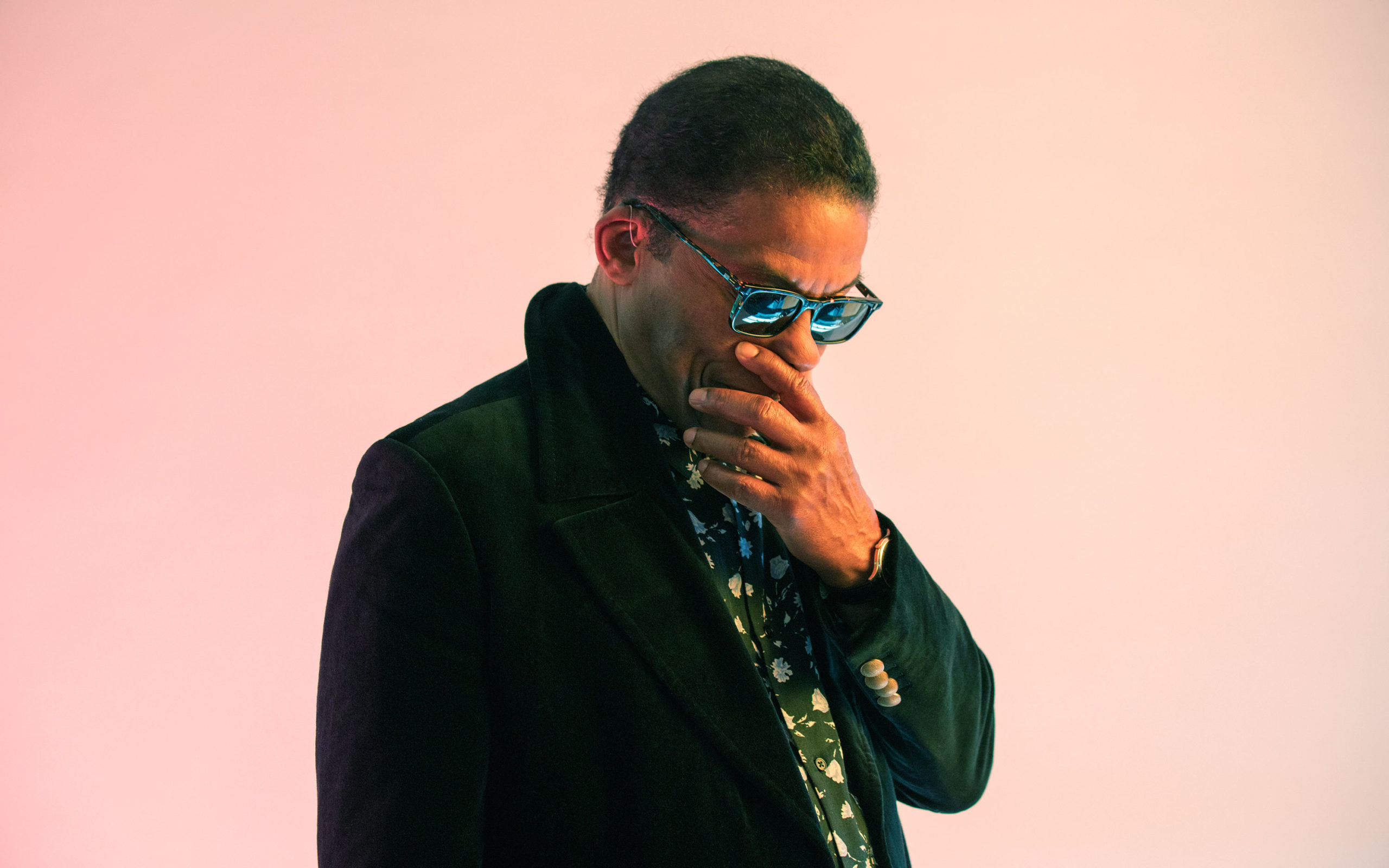
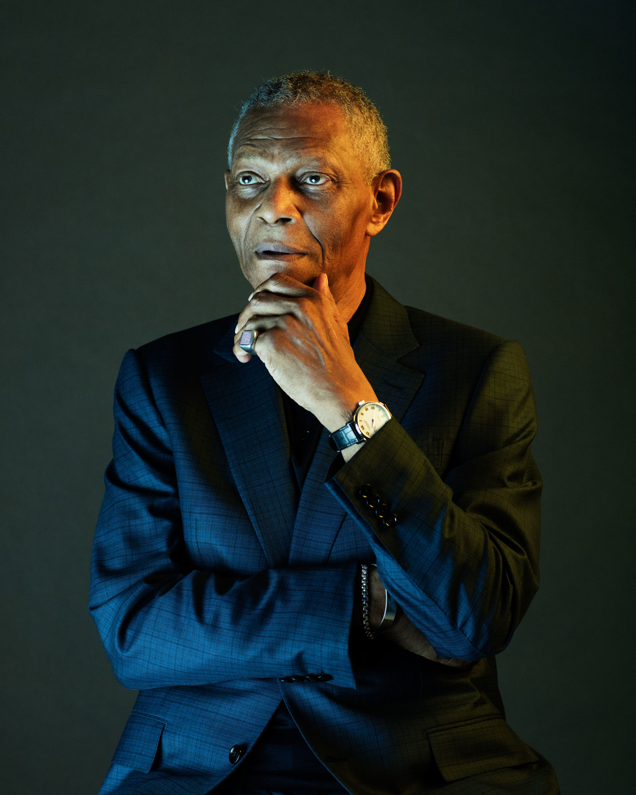
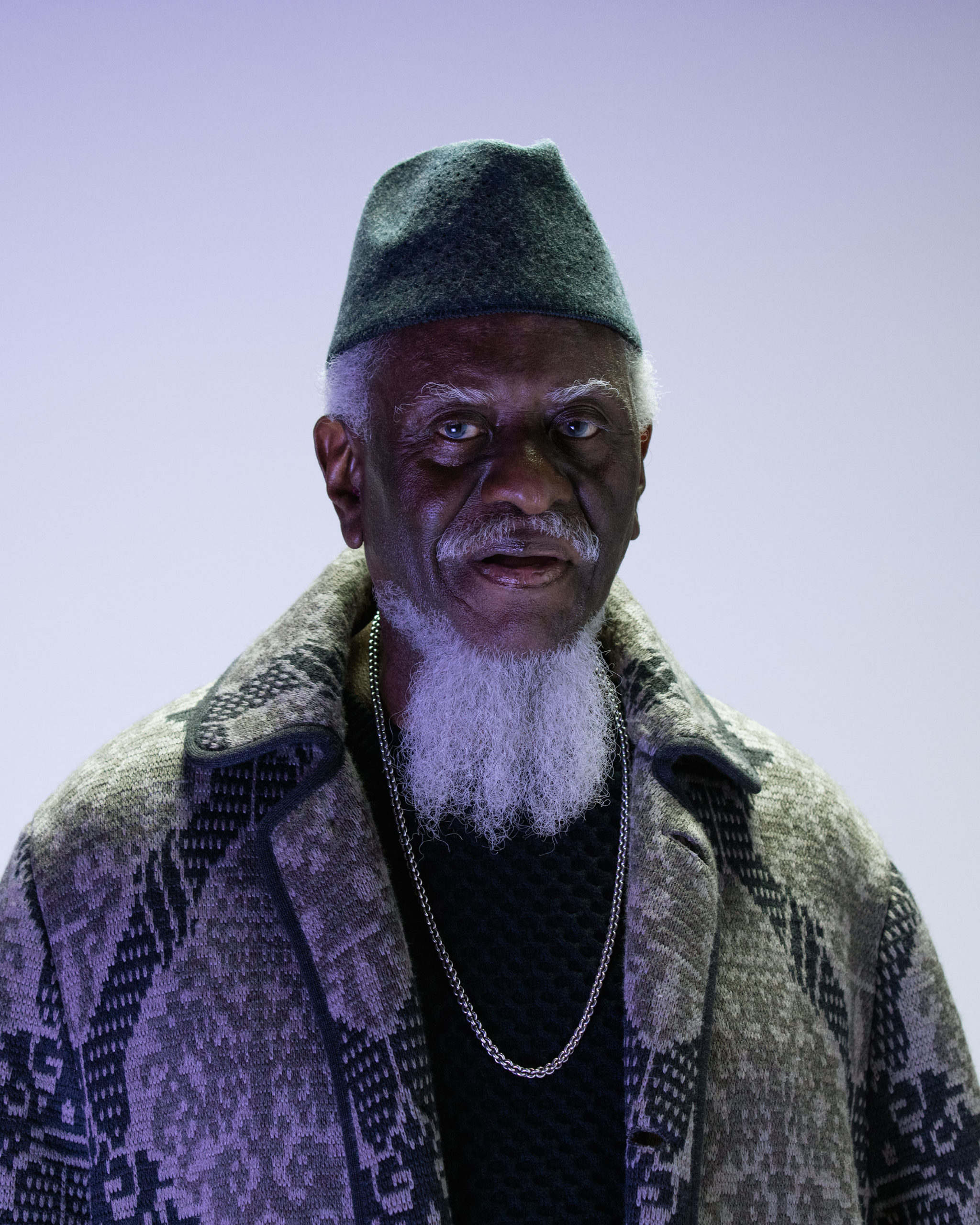
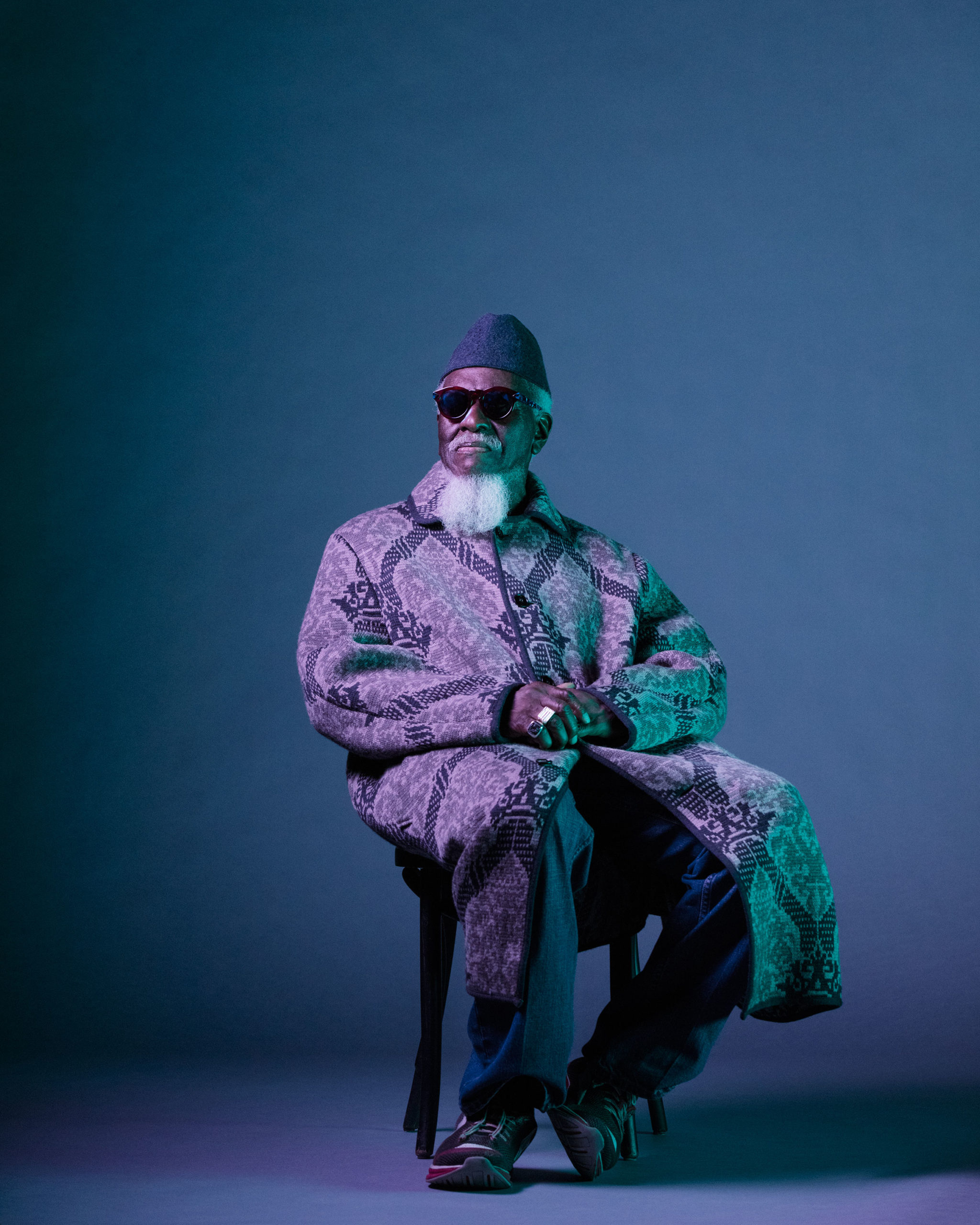
Generally I’ll play whatever I’m in the mood for unless someone has a special request, my go-to is Led Zeppelin and AC/DC. On the GQ Jazz Giants shoot none of the artists had any requests. I do remember we played Alice Coltrane’s Journey In Satchidananda while we shot Pharoah Sanders. Pharoah is a mysterious guy, very quiet and calm. The music fit perfectly with what we were doing.
What was your approach for this body of work? and why did you choose that style/color of lighting?
I wanted to create a body of work that paid tribute to these giants of jazz. Powerful images that were both modern and timeless. I am greatly influenced by the work of Irving Penn and Arnold Newman, there is an elegance to their portraits that I wanted to bring to life in this series. As for the lighting it is similar to work I have been creating lately in film, there is a hyper-real dimension to the mixed sources that I wanted to use to create a modernization in these portraits.
Did you prep by re-listening to each artist before you shot them?
I did. Once we were offered the project we created a playlist of one album from each artist we photographed. Charles Lloyd’s Manhattan Stories was a favorite.
How did you determine the approach for each one, did they always play for you?
I usually didn’t make any concrete decisions until I met the artist. Then I’d decide that we’re going to choose this set or that and which colors to play with on the spot. It was all mostly from the gut.
Not all of them played. At their age, if they didn’t feel like playing it wasn’t going to happen. But sometimes we were surprised. Cecil Taylor is known for his avant-garde piano yet he wouldn’t touch the thing. Instead he surprised us all by doing a crazy spoken word performance from his wheelchair.
How long did you spend with each artist?
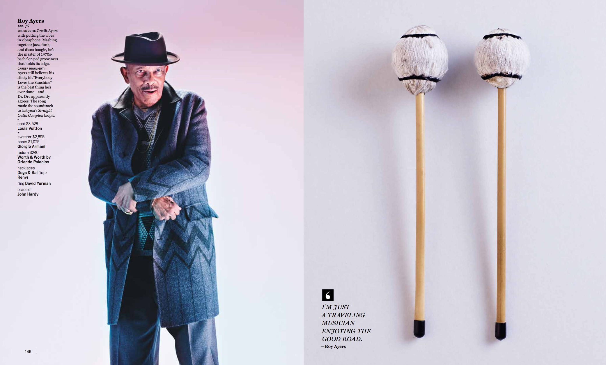
It varied. I never knew how much time they would give me until we were together. Roy Haynes is pushing 92 and he could have gone all night, he has the energy of a teenager. Nearly all were incredibly generous with their time. We had several different sets going so we could keep the pace up and energy level high. Sometimes we got a half hour. Sometimes we got two. We photographed Roy Ayers until nearly midnight.
In a few words, what was the creative take away from photographing these legends?
I know it sounds cliche, but age is just a number. These guys prove that. I felt like they’re still as sharp, funny, stylish and talented as they probably were 50 years ago.

Cecil-Taylor


Charles Lloyd
Chick Corea

Herbie Hancock

McCoy-Tyner
Pharoah-Sanders

Ron Carter
Roy Ayers

Roy Haynes
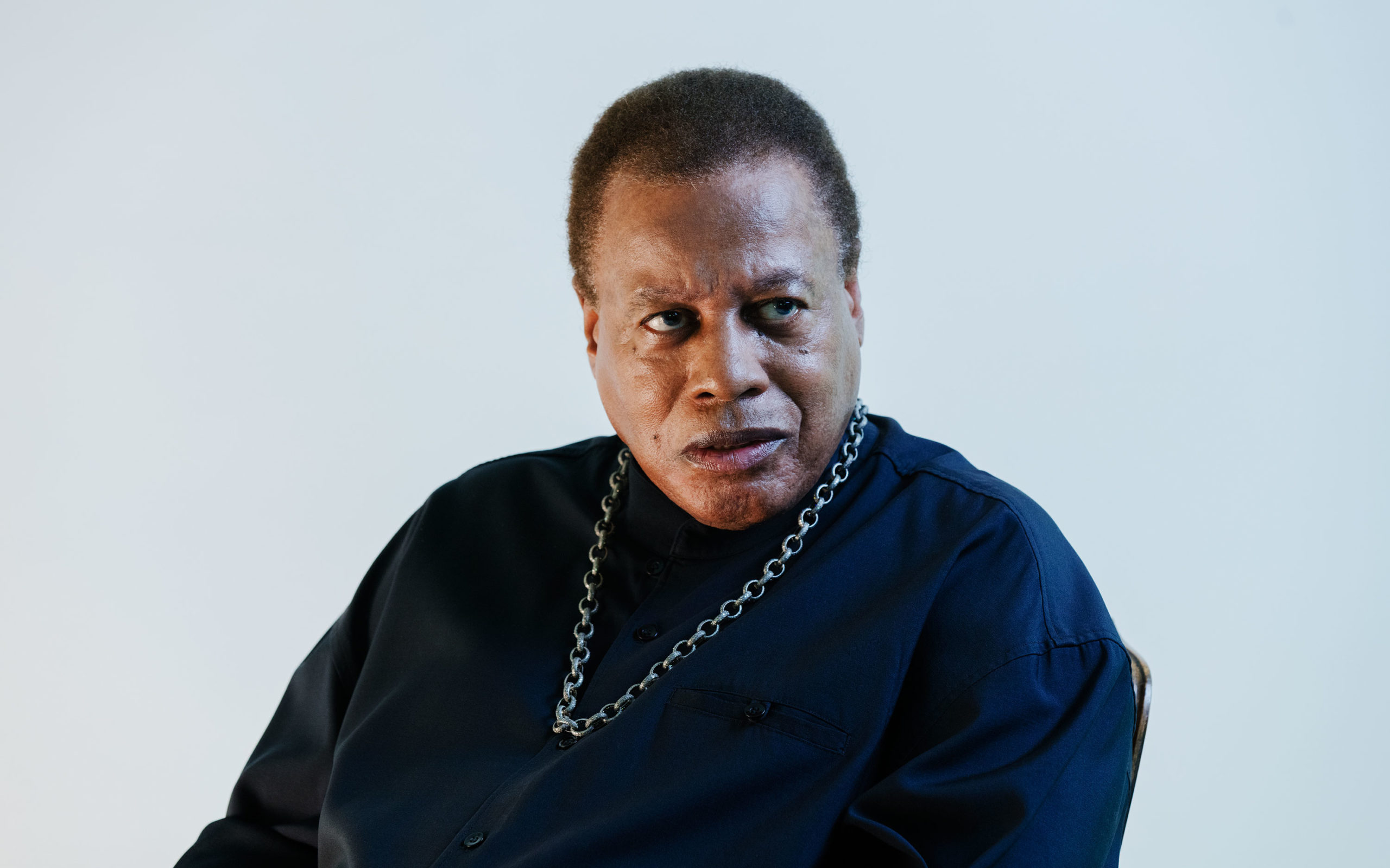
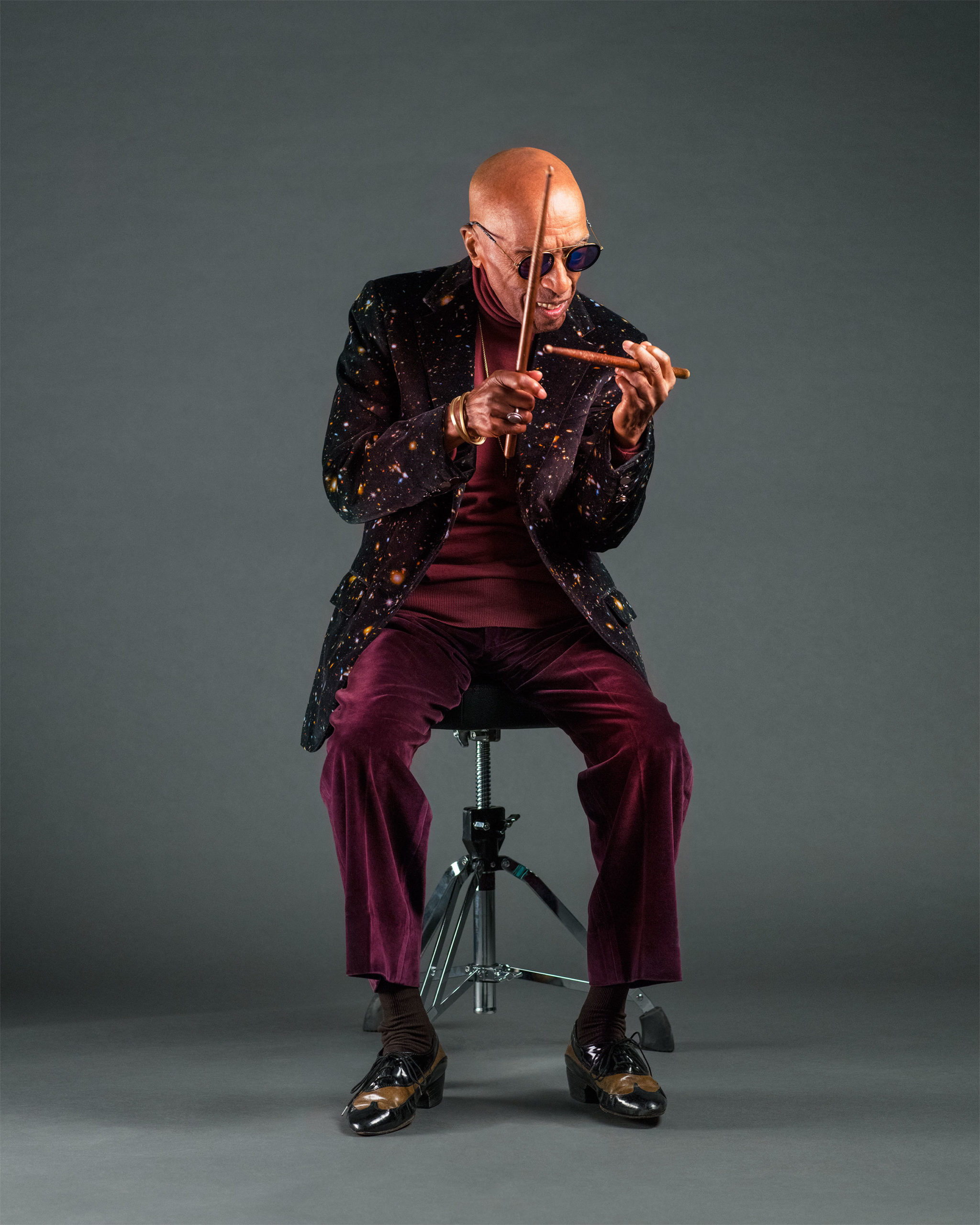
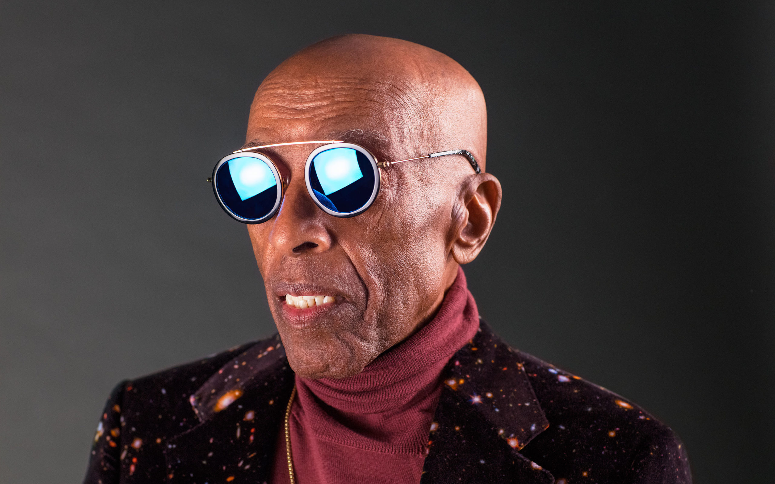
Wayne Shorter
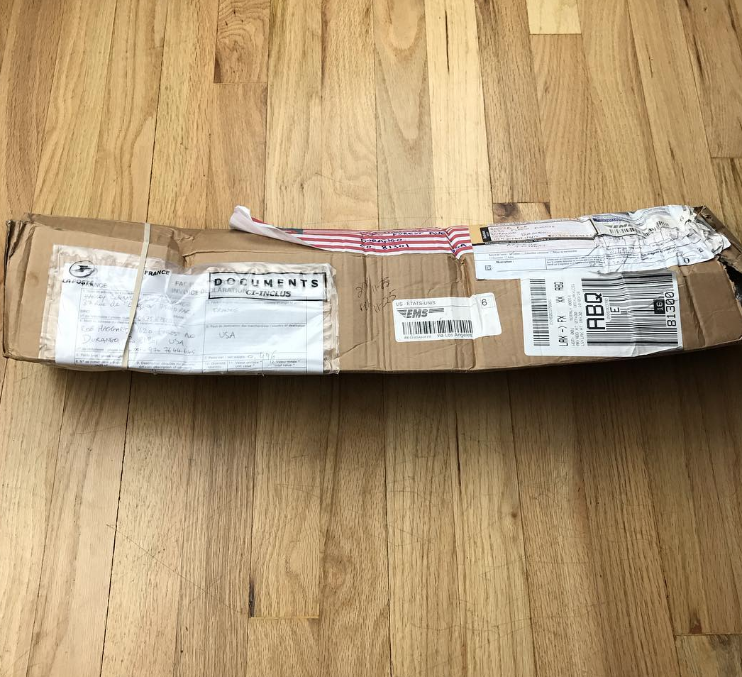
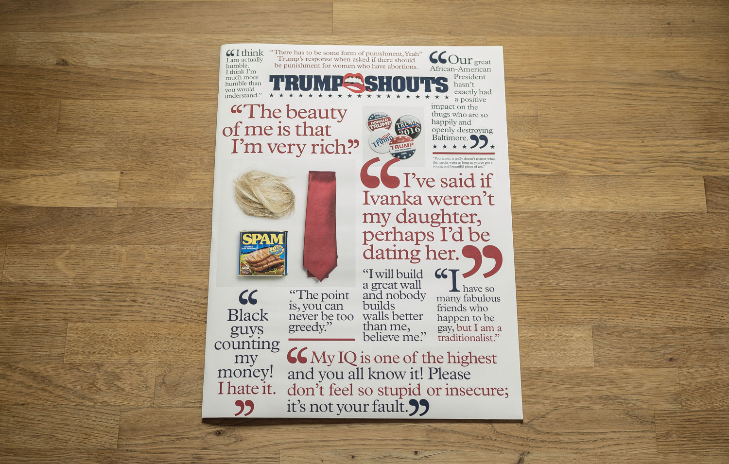
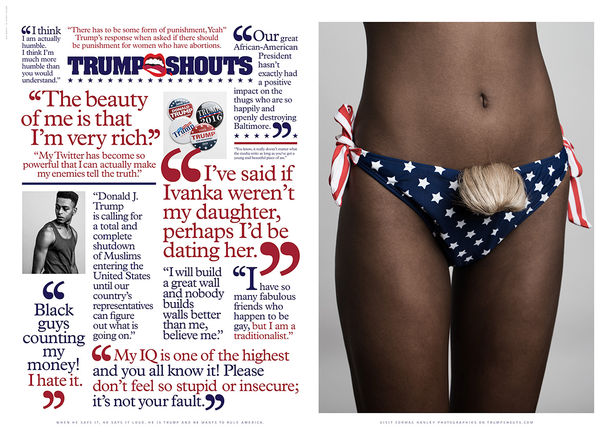
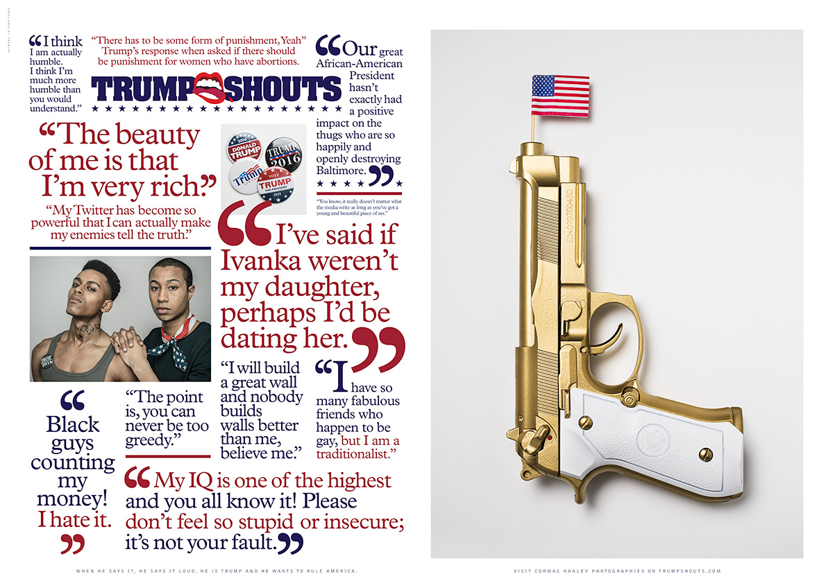
The Daily Promo – Cormac Hanley: Trump Shouts


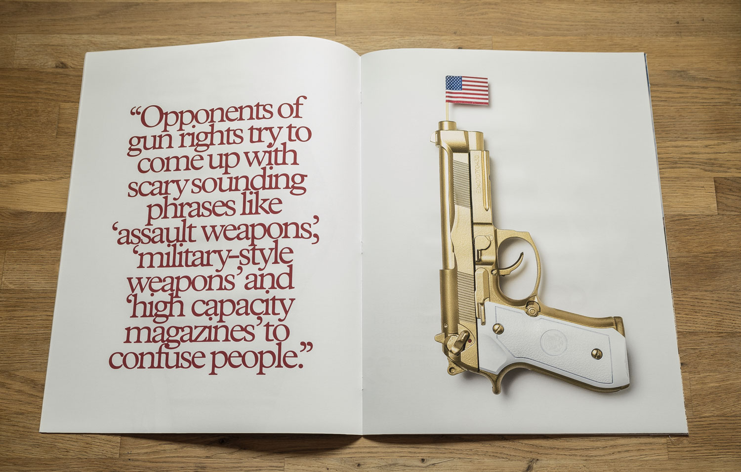
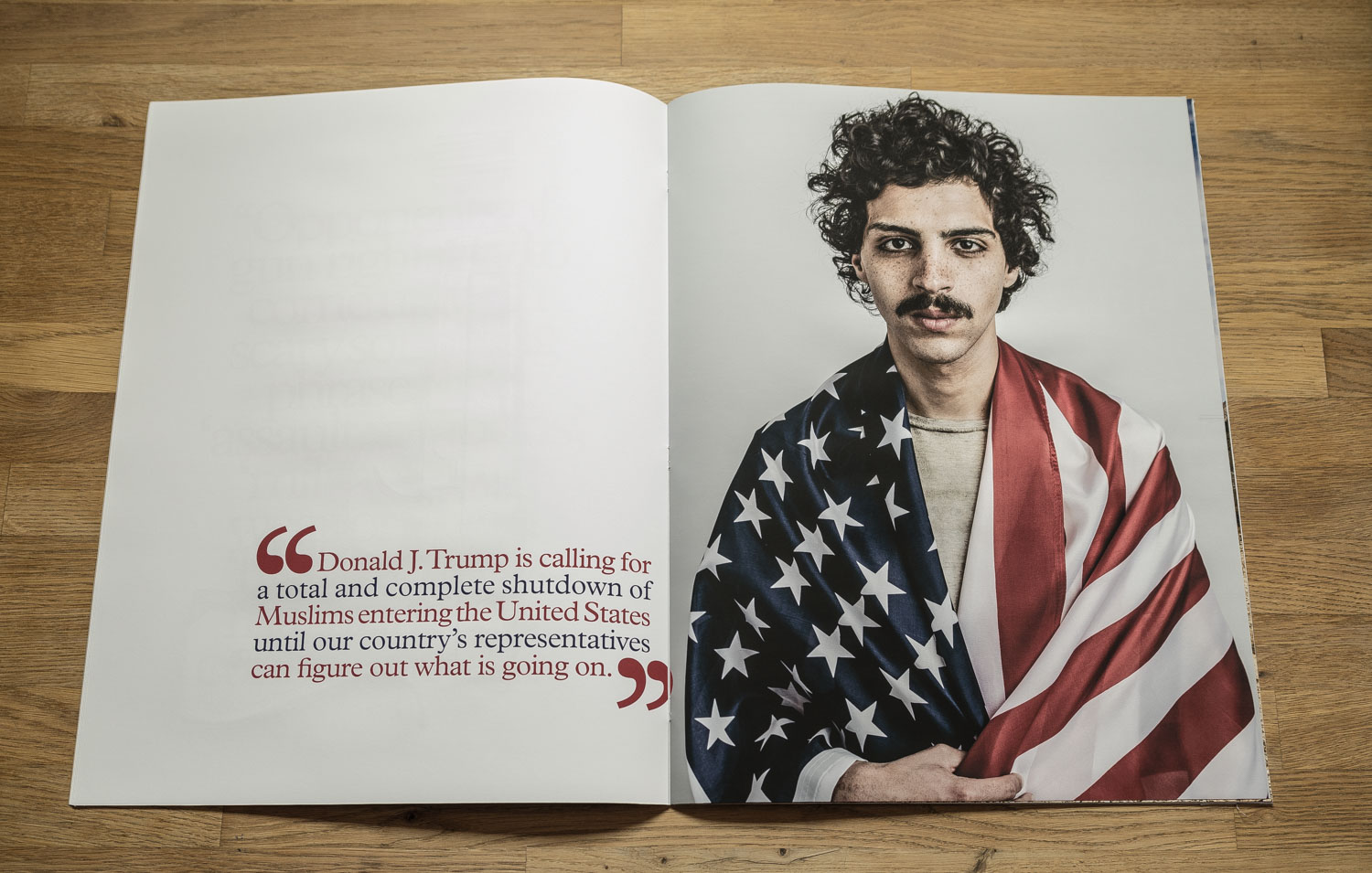
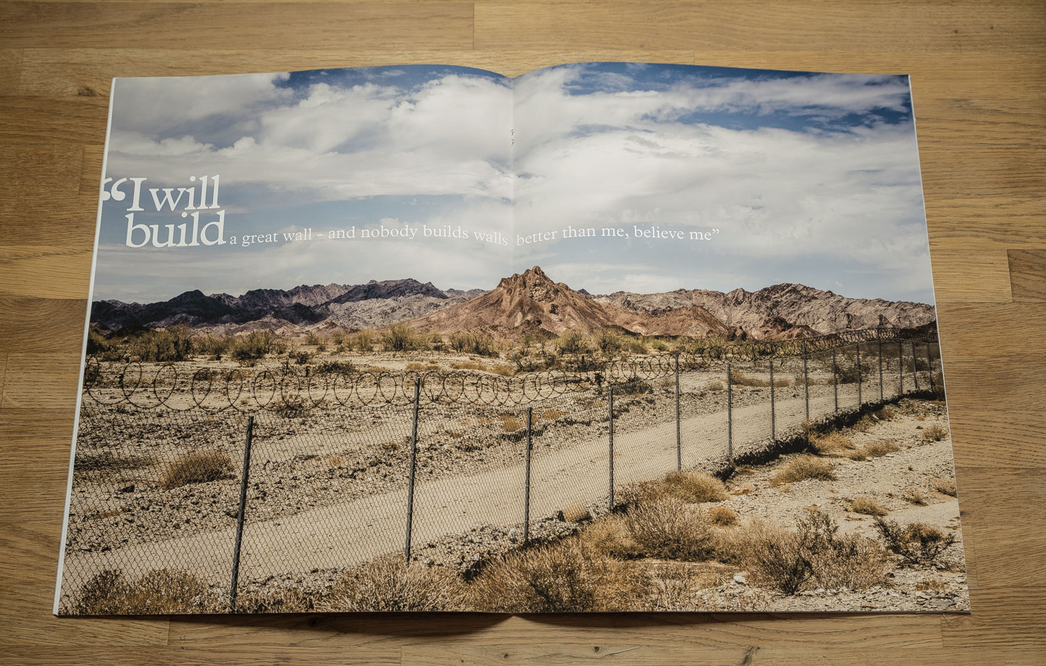

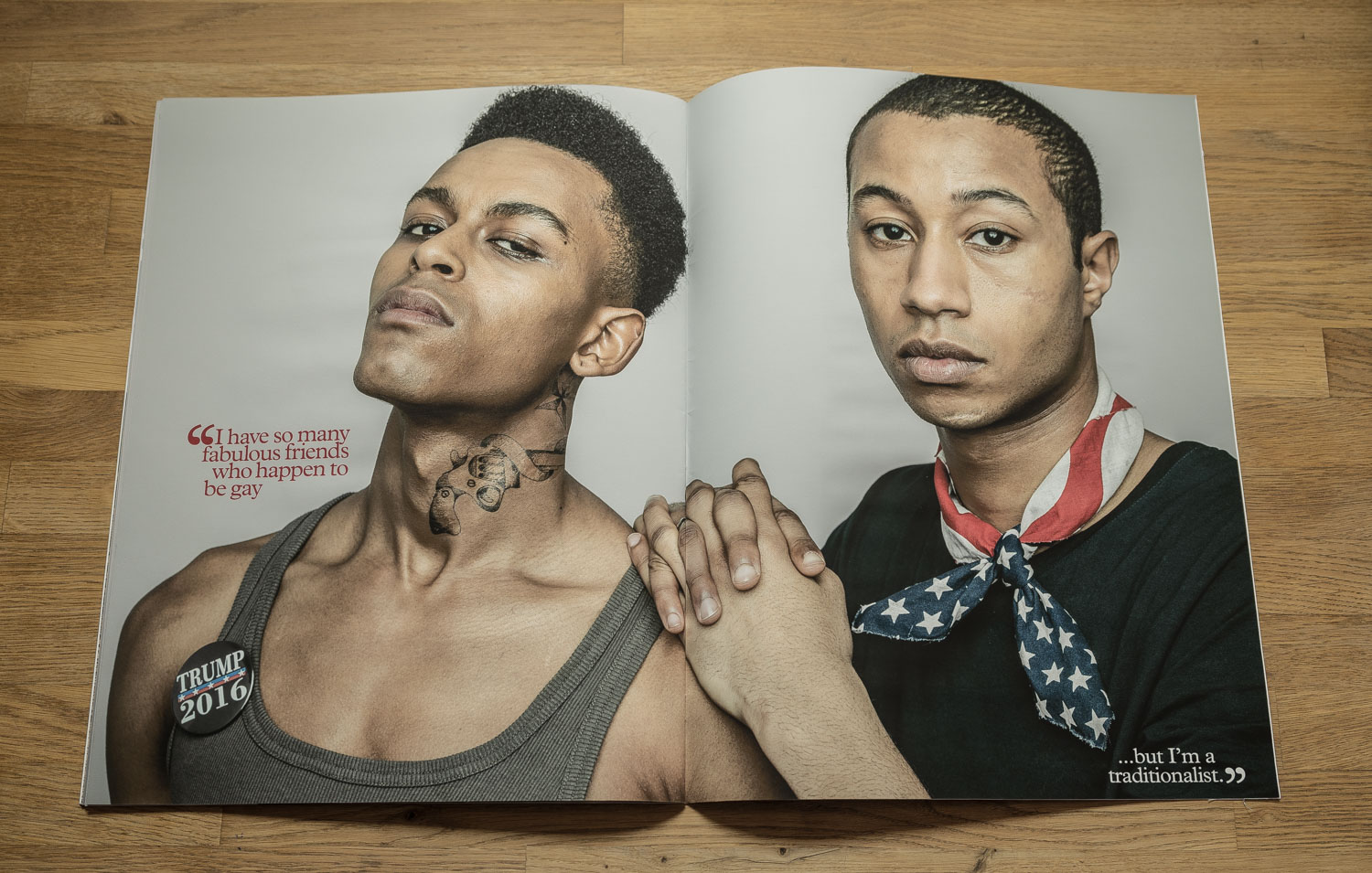
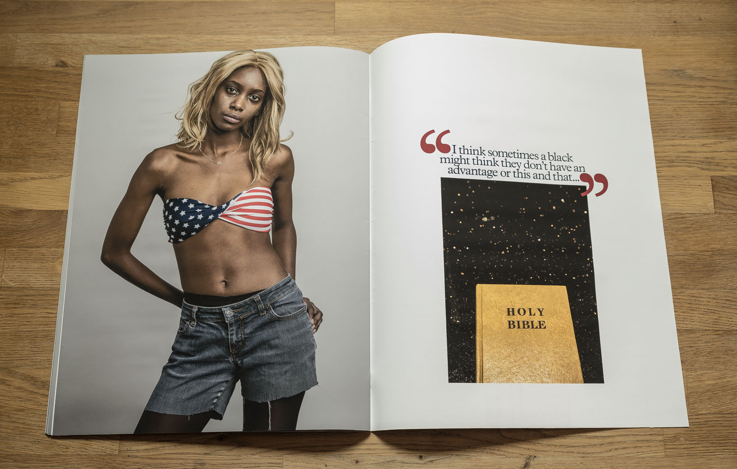
Cormac Hanley: Trump Shouts
Photography: Cormac Hanley
Casting: Olivier Duperrin, Antoine Duhayot
Styling: Emil Kosuge
Hair/MUA: Edoaurd Saussac
Graphic Design: Thierry Fèvre
Who printed it?
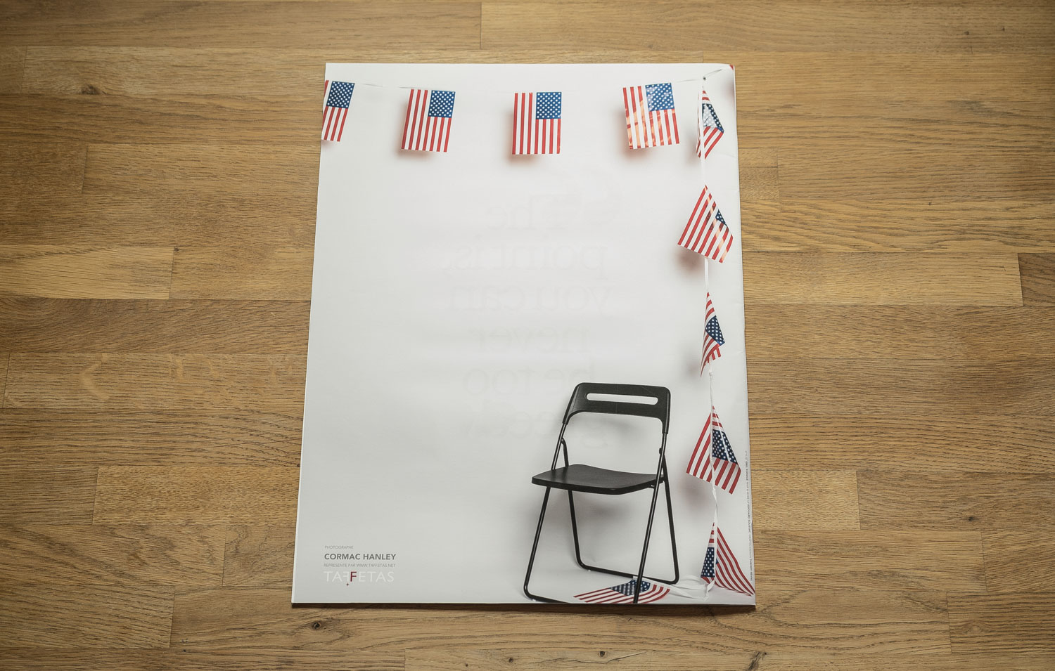
This promo was a limited run of A1 size prints on matte stock. The printing was handled by Tirage Grand Format in the Rhone-Alps.
Who designed it?
The graphic design is by Thierry Fèvre. I really appreciate his use of typography and aesthetic sense. His slobbering logo symbol is a reference to Trump’s insistence on using The Stones music during his campaign, despite their objections.
Who edited the images?
I had a clear idea of what I wanted, so when I saw the intensity I was looking for that was pretty much it. I got together with Thierry and Barbara Soulié, my agent in Paris, to finalize the running order and layouts.
How many did you make?
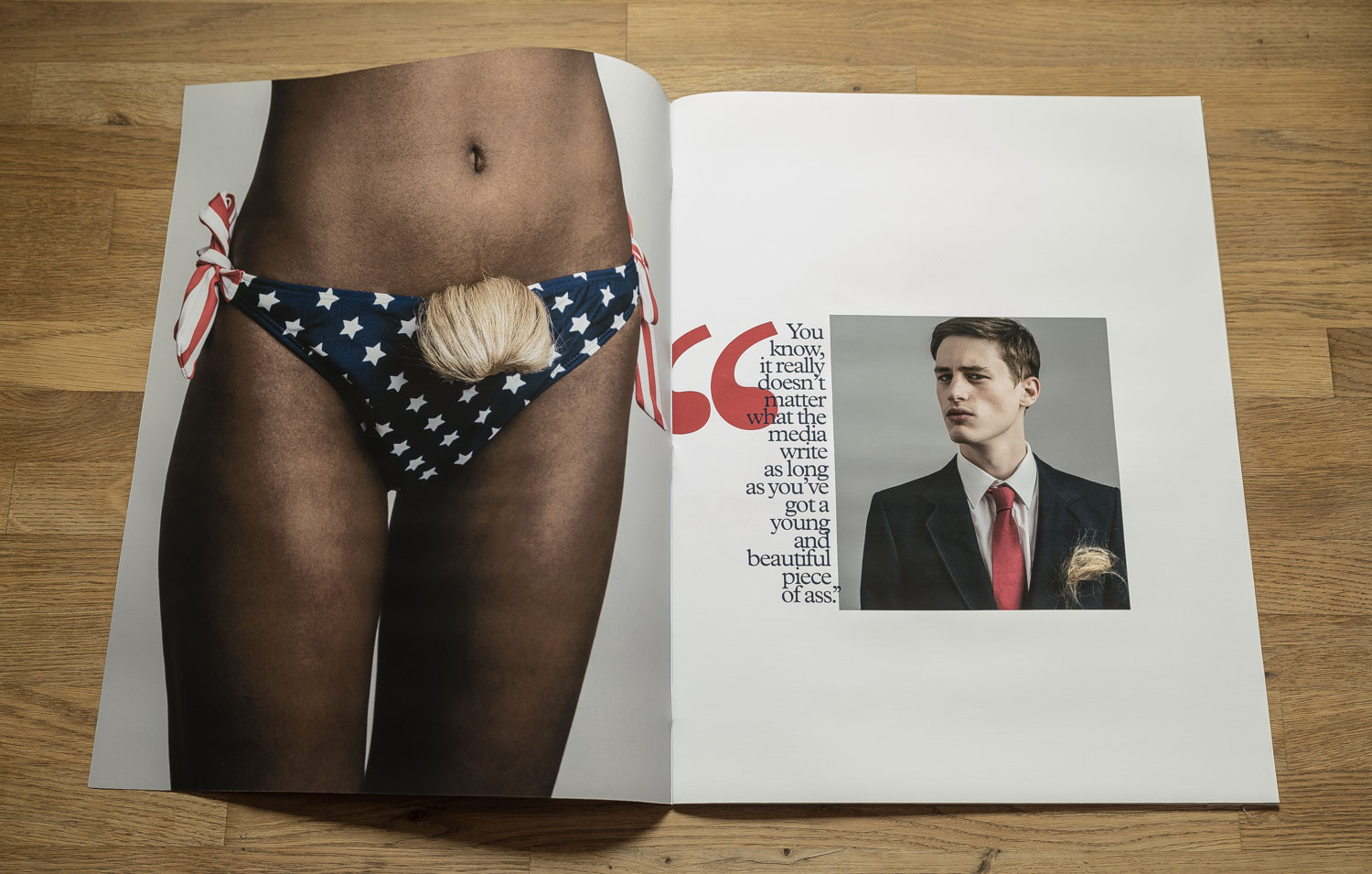
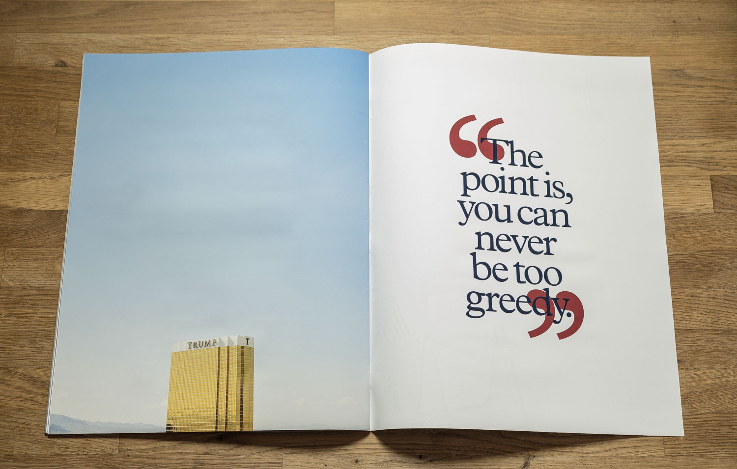
80 A1 prints in total. I wanted the image size to be large. The layout we settled on was of a mock newspaper style front page alongside one large image. We printed three variations, each with a different image chosen from the series; the bikini, the golden gun, the man wrapped in the American flag. I also ran a number of copies in the format of a 24 page ‘Newspaper’ containing the entire series.

How many times a year do you send out promos?
Once or twice a year.
Where did you get your content from?
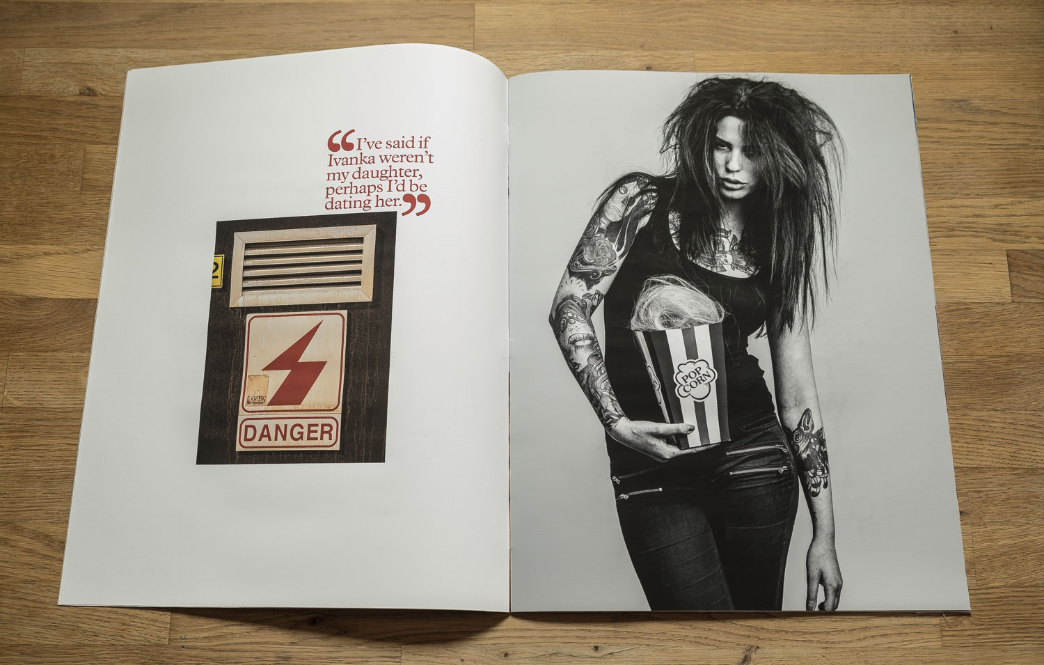
All the text is courtesy of Mr. Trump. I compiled a collection of his quotes from various media sources and this guided me when I sat to sketch out my shooting plans. The project is not photojournalism. I approached it like movie-making. The content completely choreographed, each scene having a defined and scripted intention. I placed a lot of emphasis on the casting, styling and details. Visually my aim was to present a balanced response to his words with elements of satire contrasting the darker gravity.
Where did you find the subjects, did you have a casting Director?
I worked with Olivier Duperrin for the female casting and Antoine Duhayot on male.
How did you decide which phrases to realize in images? Which came first the images in your mind, or the phrases that disturbed you?
I shot with the general idea of the quotes in mind but without trying to illustrate them directly. The bikini with wig was in fact shot before the pussy-grabbing comments were broadcast.
For the portraits, I wanted to provoke. The flag man; we don’t know his nationality, we don’t know his religion, we don’t know if he is a rapist. What would Trump have us presume?
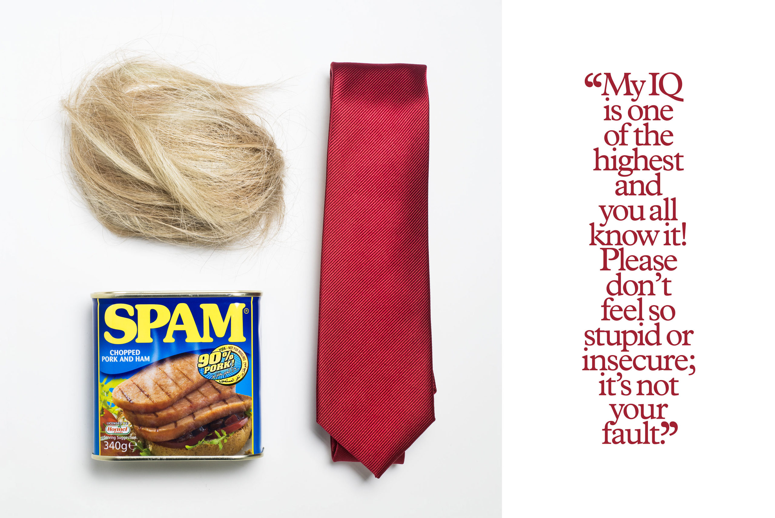
Why did you choose to photograph SPAM, assume “pork” was also a slang reference to politics?
Since I wasn’t photographing Trump in person, I shot his Portrait as a still life image. The photo with the hair, the red tie and the Spam. His persona, broken down into component parts. A representation that could not be mistaken for any other person. Right down to the warning “90% Pork – Not for Muslims”.
I see that most of your representation is in Europe, clearly you were moved by US politics which is welcomed. What was the turning point for you to use your craft to send a message?
This project was something I’d been working on since long before the election. It was born out of my bewilderment that a nation of over three hundred million people might actually contemplate replacing Barrack Obama with an individual like Trump. Basing the project on his own quotes was the natural fit as nothing I could write would ever be as damning as his own ugly words. The series was completed before the election. My glimpse at the tip of the iceberg we all now have to face.
Since this project was a real departure for me I decided to place the content on a standalone website: Trump Shouts
This Week In Photography Books: Christian Nilson
I spent a day in Switzerland many years ago. (1997, to be exact.) When I say a day, I mean just that.
A day.
My brother and I were on a backpacking trip around Europe, back when that was still a thing. We didn’t get along very well, truth be told, but thought it might be fun to range around together.
So we did.
We took a night train from Rome that got in to Lucerne in the morning, and caught a night train out that evening, so the entirety of my knowledge of Switzerland was crafted in about 12 hours.
What do I remember? Well, it was very beautiful, obviously. Jagged peaks rising up out of a clear blue lake. Crisp, clean air. Meticulous architecture.
Anyone can tell you that.
The real story, one I’m reluctant to admit, was that we went to a country fair that afternoon, and were aghast at how funny-looking people were. I recall it so clearly, as we both joked for hours that all that inbreeding had created some oddly unattractive people. (I say inbreeding because the mountainous terrain naturally meant it was difficult for people to travel from one village to the next, back in the day.)
It sounds terrible, I know, but it’s not like I make a habit of mocking people. (On second thought…) But really, the fair was just so weird. We saw local contests, like a tug of war, and there were pavilions filled with farming and industrial equipment.
Not a clown, bearded lady or tilt-a-whirl in sight.
Most people though, when they think of Switzerland, imagine banks, chocolate, watches, and neutrality. That last one seems a quaint and outdated concept in a brutal 2016. Honestly, who could be neutral about Donald J. Trump?
“Well, I suppose he has his good qualities, and his bad qualities. He is OK, I guess. Neither horrible nor amazing. I’d compare him to an under-sweetened bowl of oatmeal. It could be better, of course, but it could also be worse.”
No, imaginary Swiss person. One cannot maintain neutrality in the face of an absurdist film come to life. It’s simply not possible.
Thankfully, such stereotypes are just that. Clearly, a country with three languages and a million mountains is about more than money, sweets and grinding gears, right?
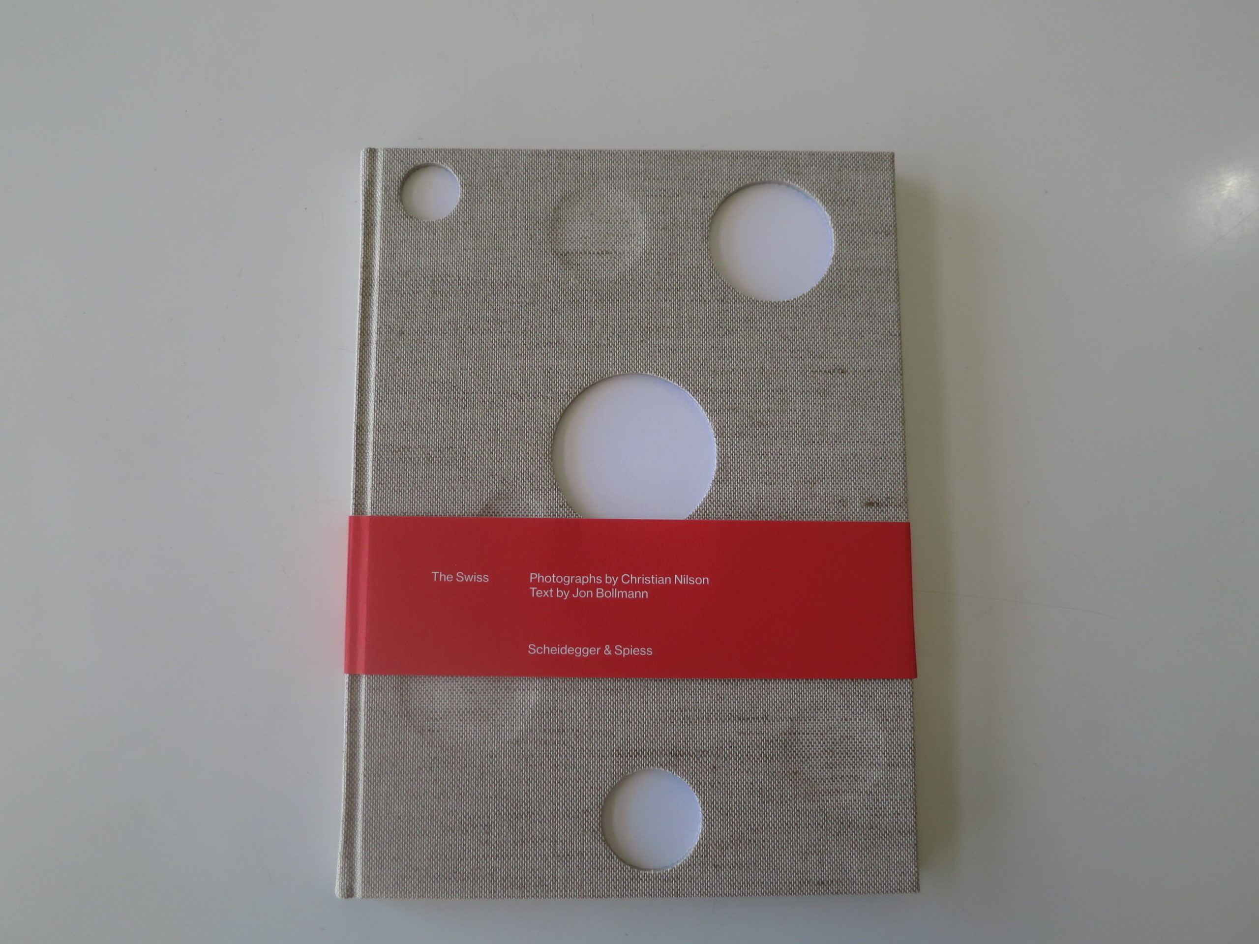
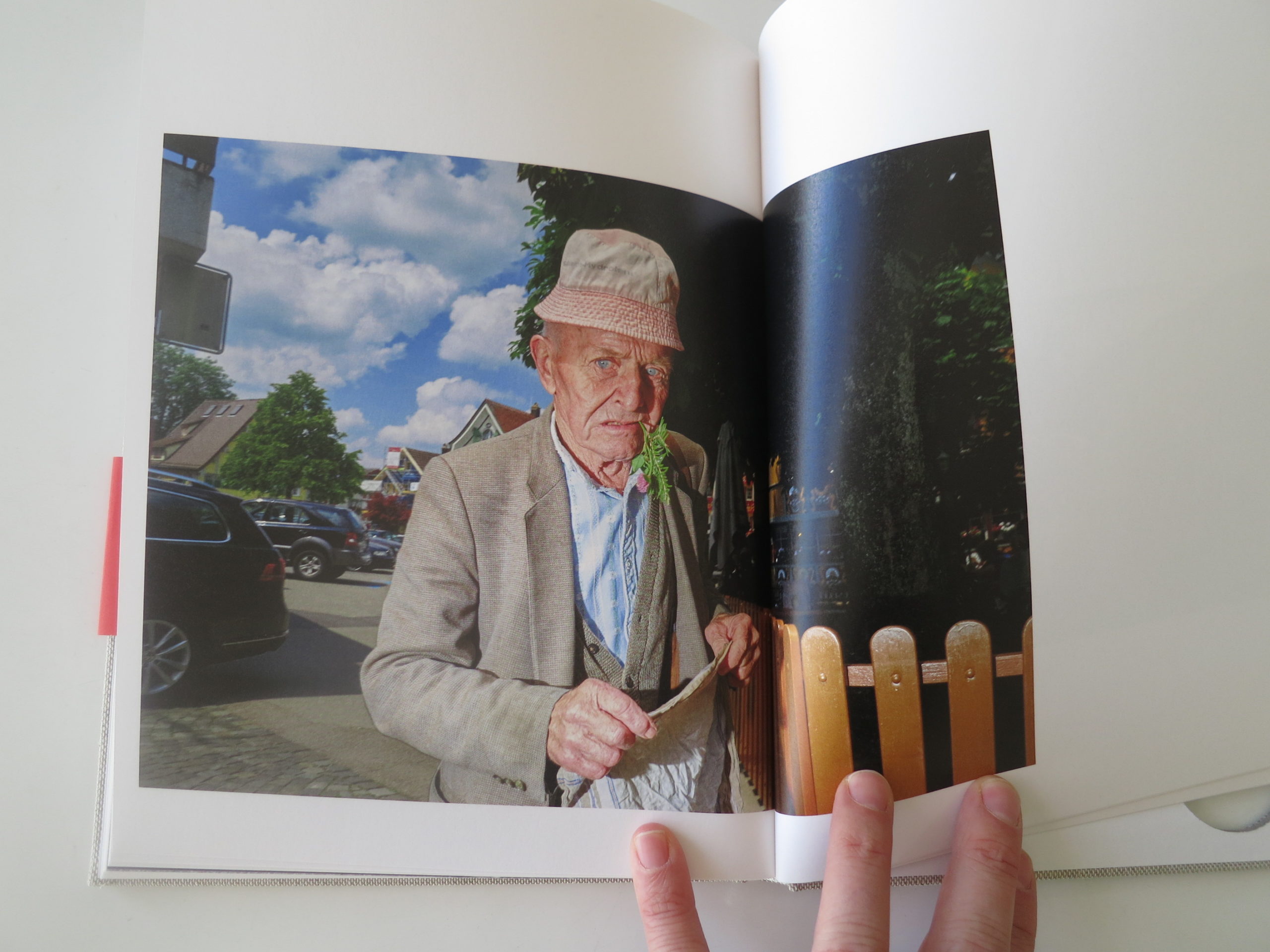
As usual, I’m glad you asked. I’m prepared to answer the question, as I’ve just put down “The Swiss,” a new book by Christian Nilson, published by Scheidegger & Spiess. Sure, the title is meant to evoke “The Americans,” by the Swiss photographer Robert Frank, but beyond that, I found it to be a refreshing and original piece of work.
Christian sent the book along because he figured I’d dig it, and he was correct. I think it’s great, as it fits in with my typical review criteria: it shows us something we haven’t seen before, and it does so with well-crafted style.
Turns out, Christian has lived in Switzerland for a while, but is originally from Sweden, so he brings an outsider’s perspective to a place he knows well, which is often a recipe for success. Throw in a heavy use of daytime flash, and you’ve almost tailor-made a book to my own personal tastes. (This being the most subjective of book-review-columns.)
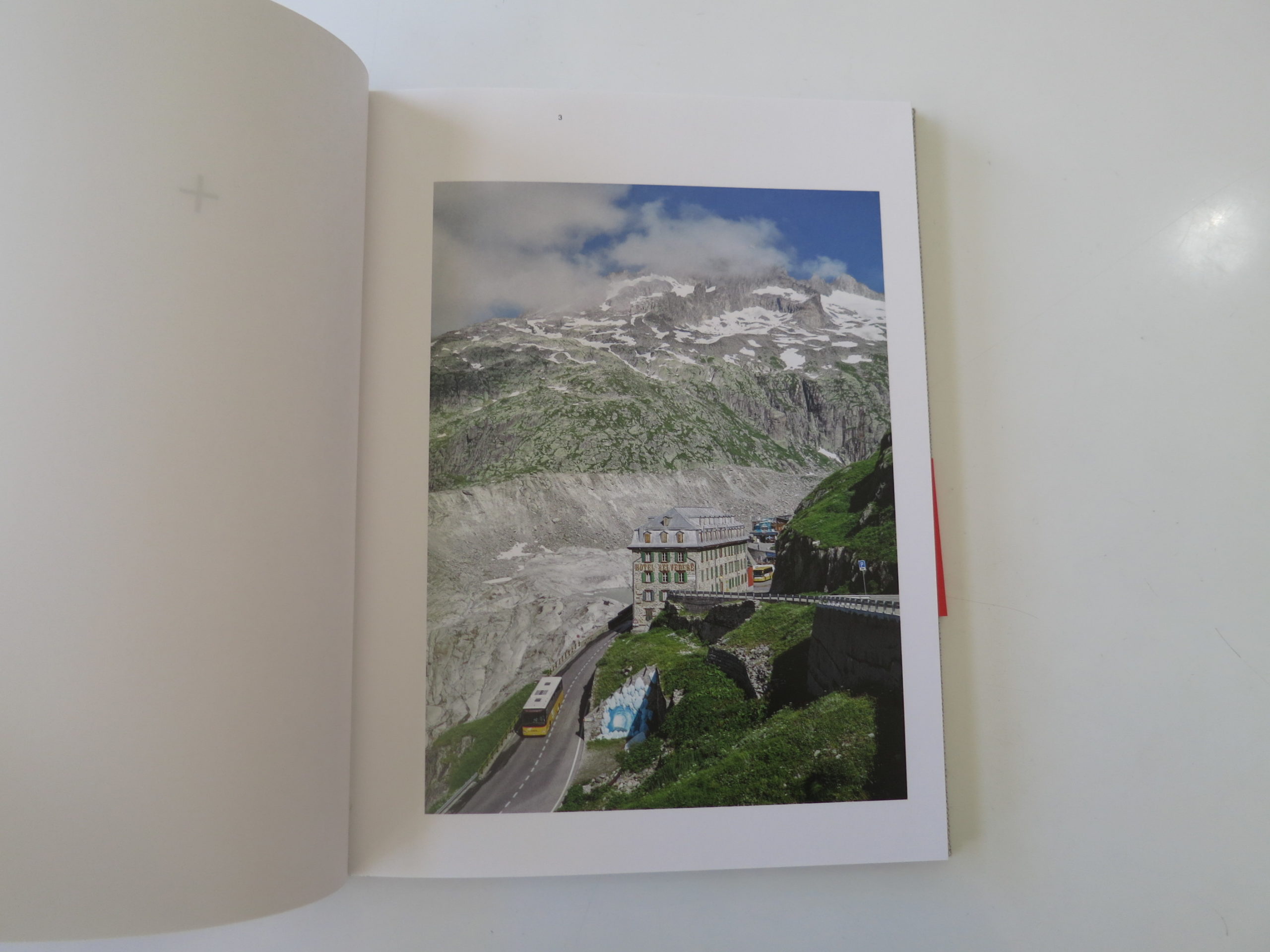
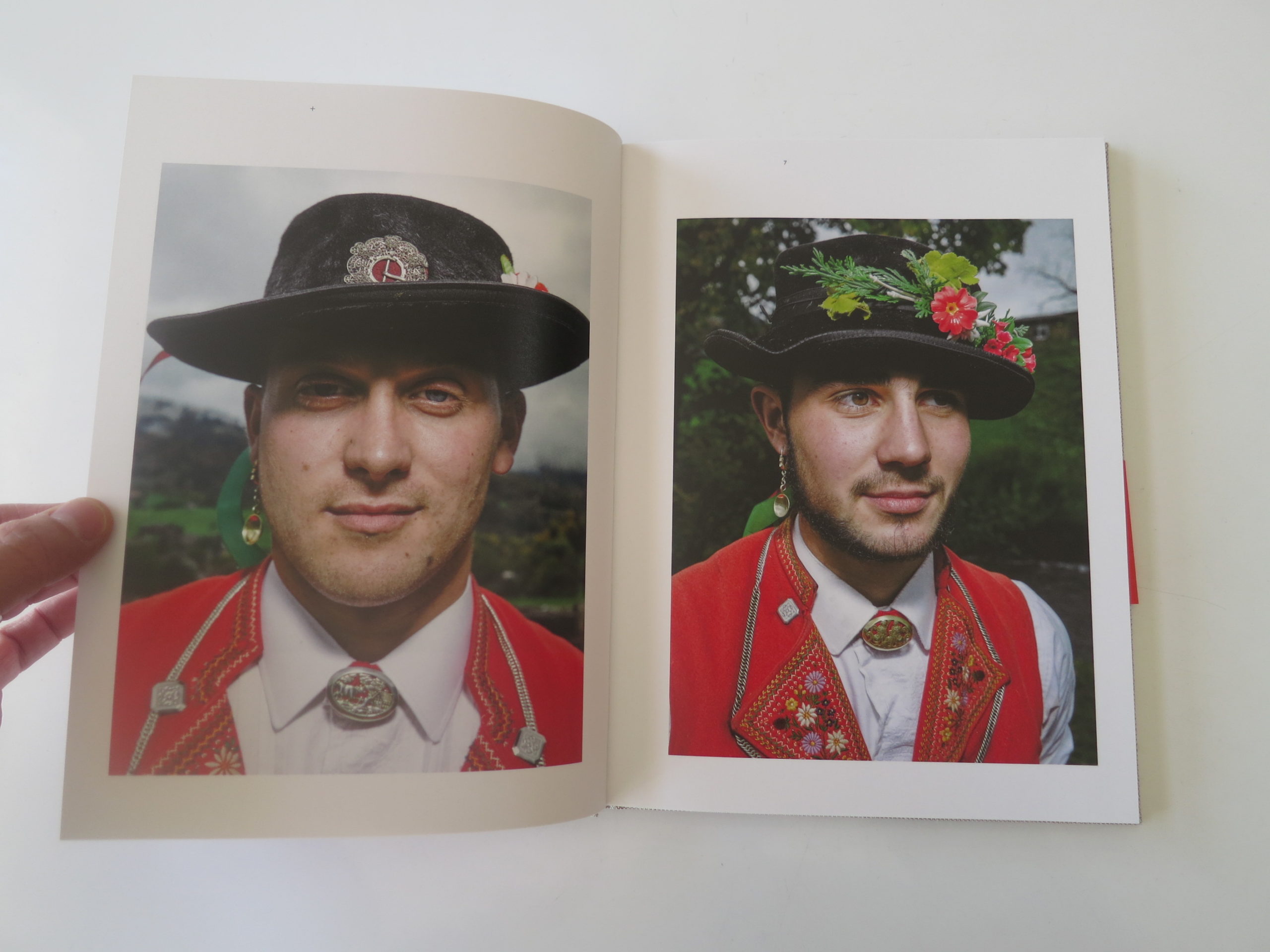
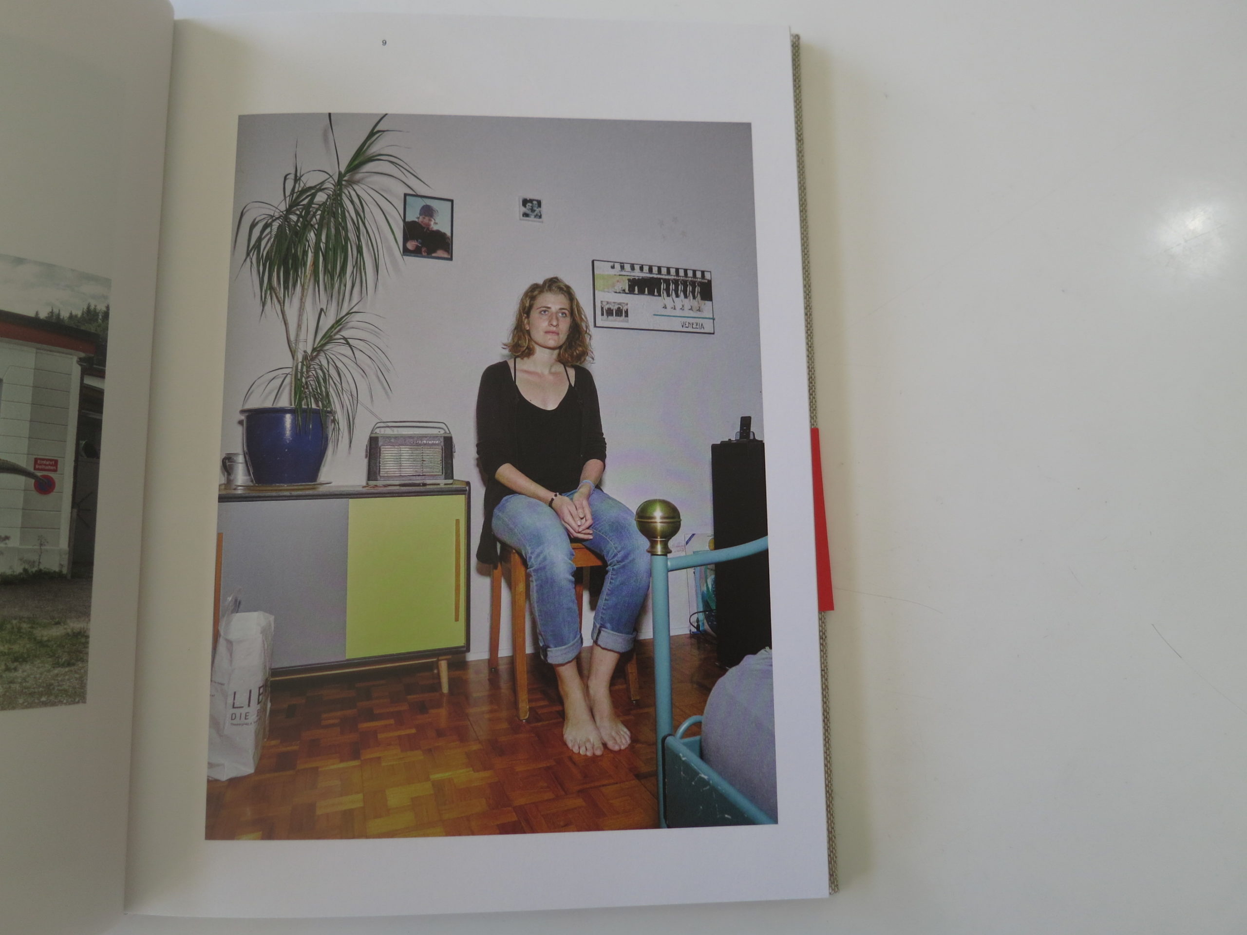
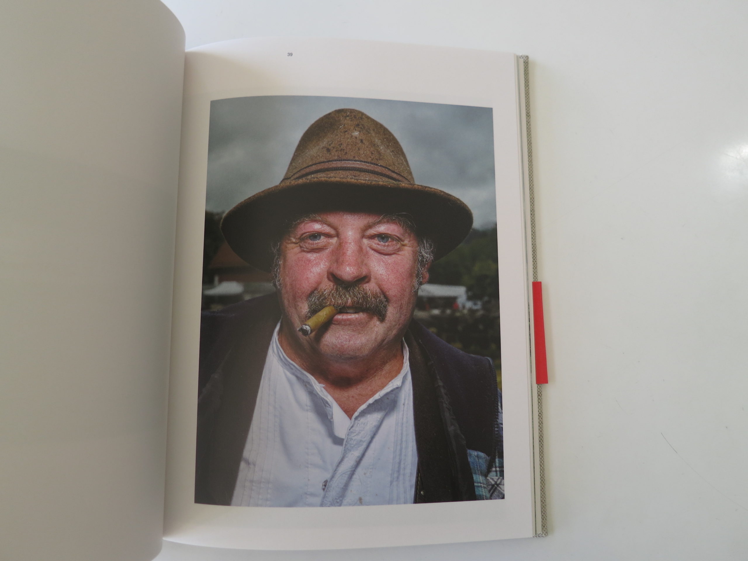
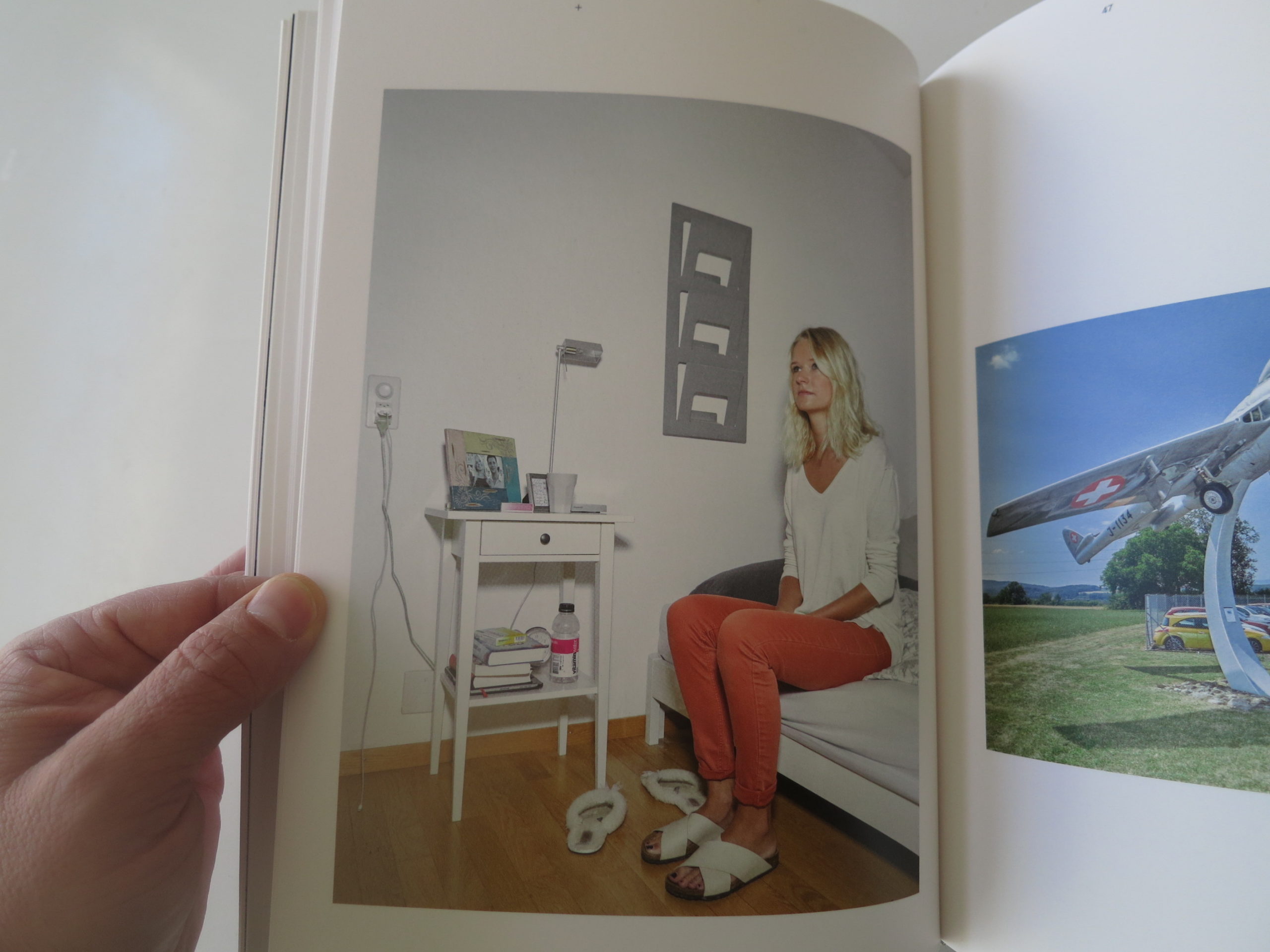
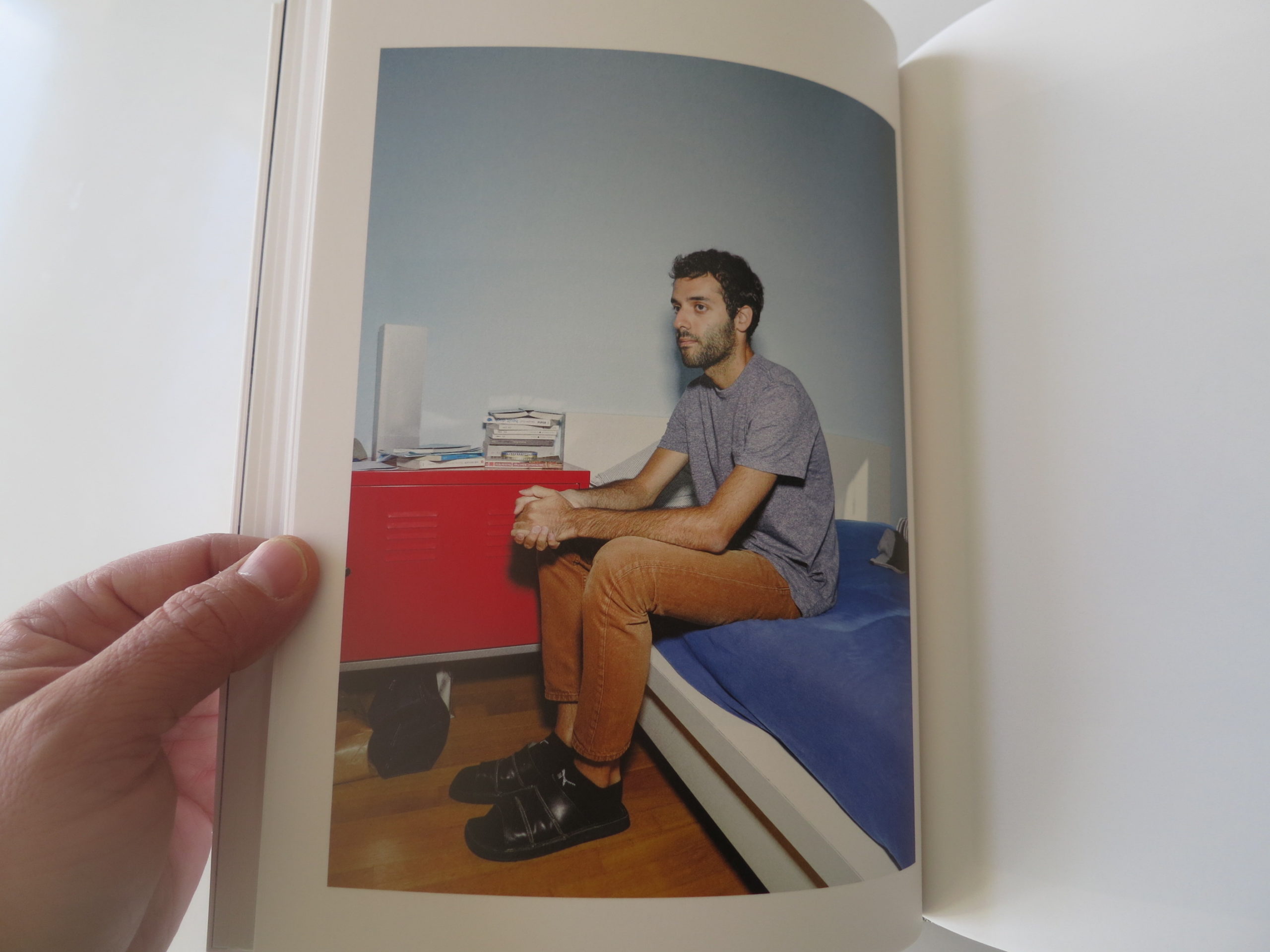
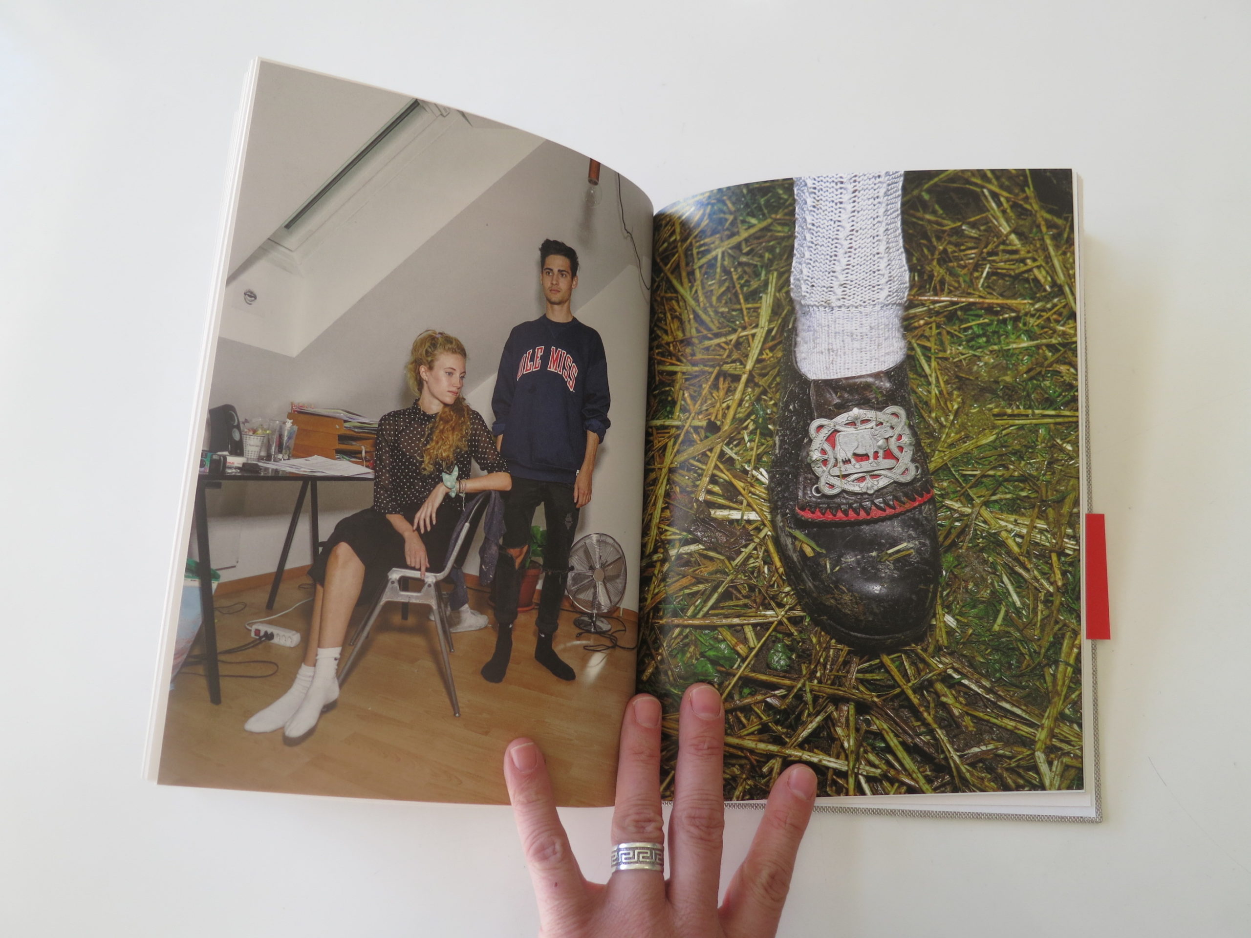
We see scenic mountains, of course, and the picture with a tiny church perched precariously on a ridge-line is pretty terrific. But it’s the strange, almost geeky absurdity of certain subcultures that really surprises.
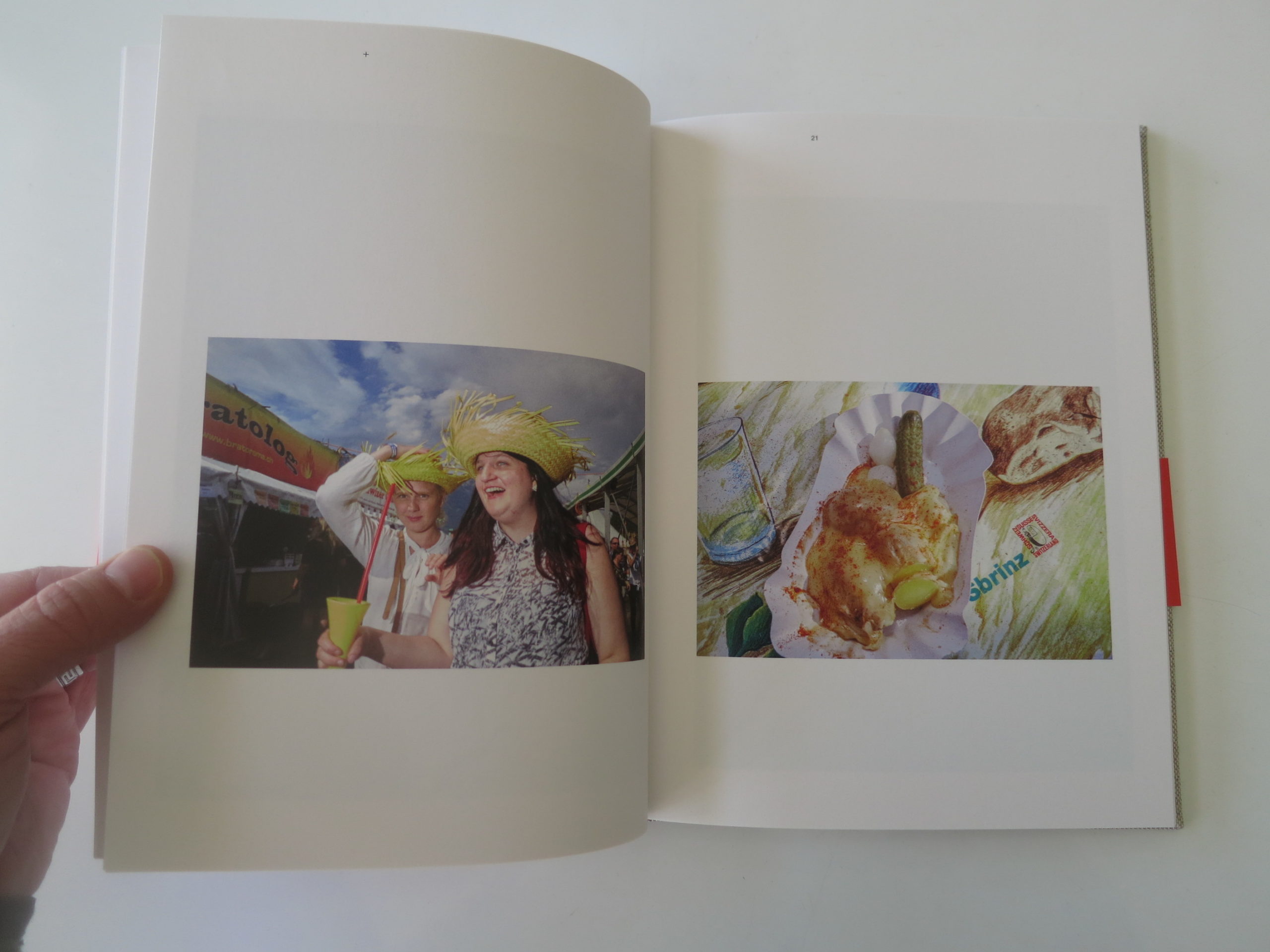
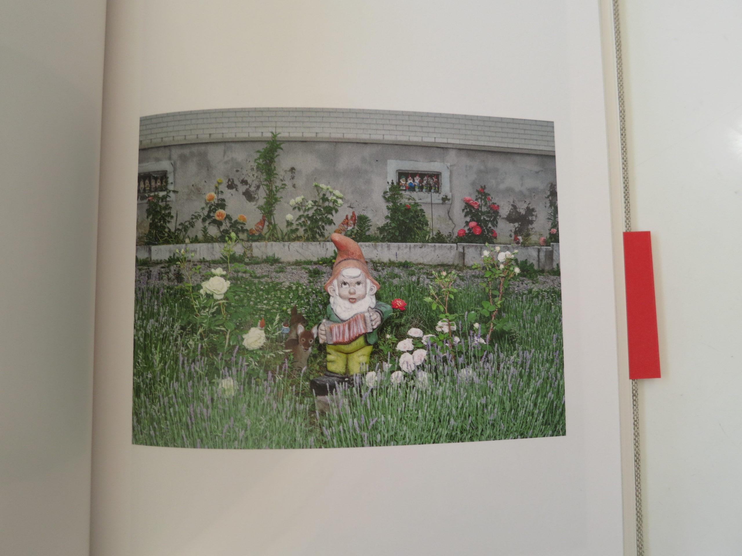
A dude in a Batman costume, holding a child in his monstrously large hands. A gross-looking plate of food that appears to contain a mass of mayonnaise covering a phallic pickle. We see men in traditional costumes, sure, but also a woman playing the accordion with a ridiculous man-bun on top of her head.
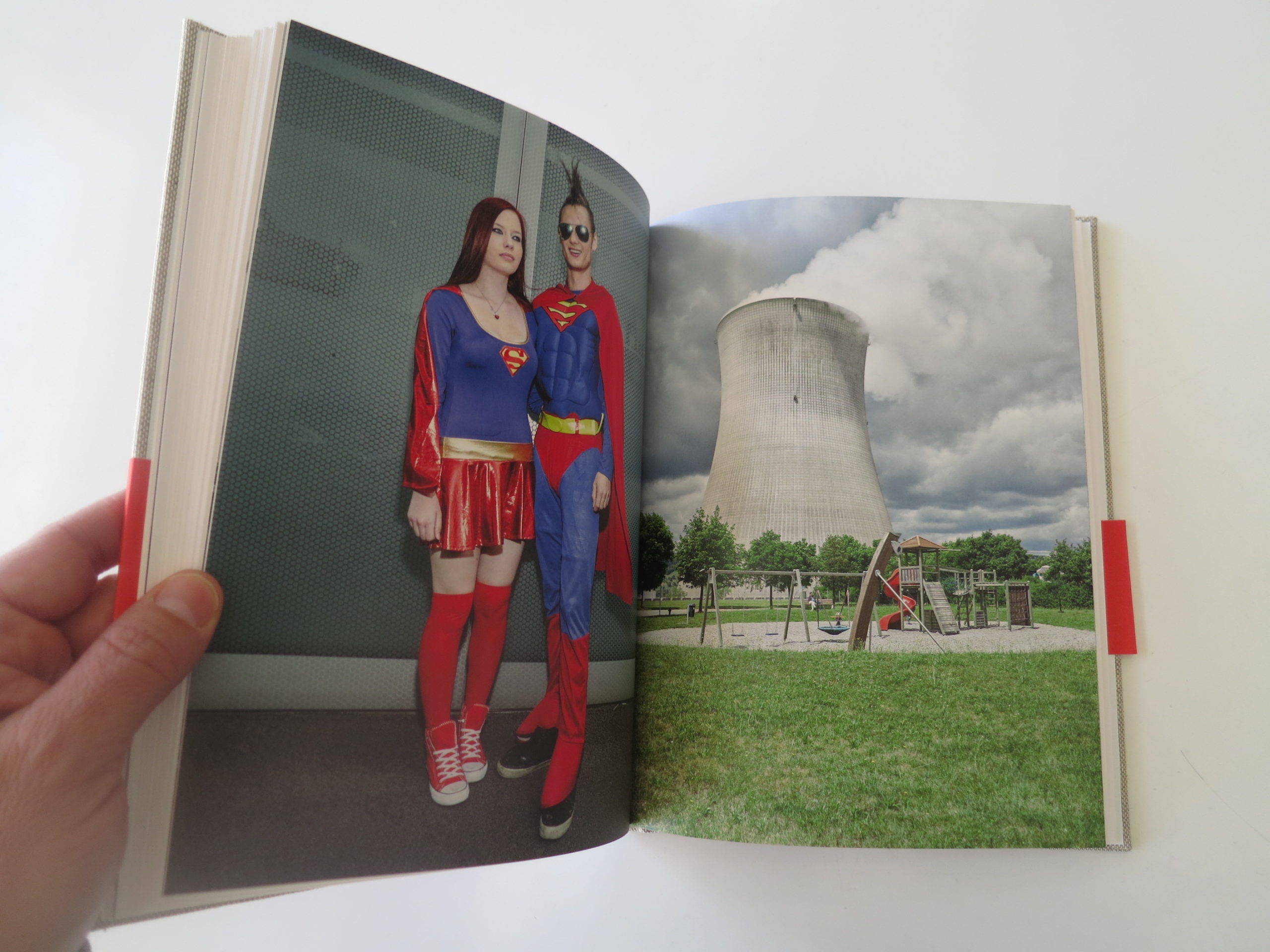
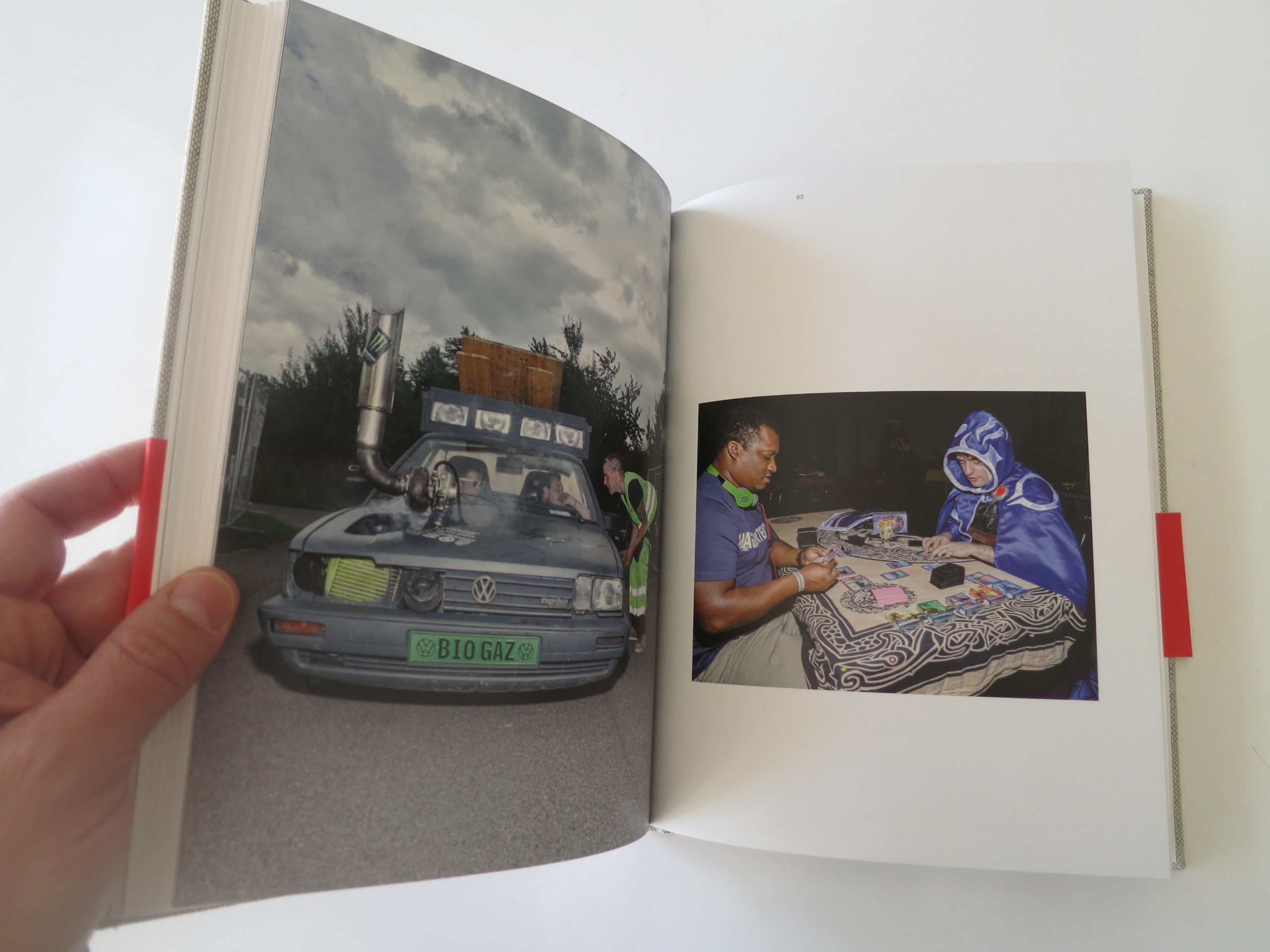
There’s a bio-diesel car jimmy-rigged with a Monster energy drink sticker on its exhaust pipe, a garden gnome, skiers being pulled by horses, an a nuclear-reactor sitting behind a dapper playground.
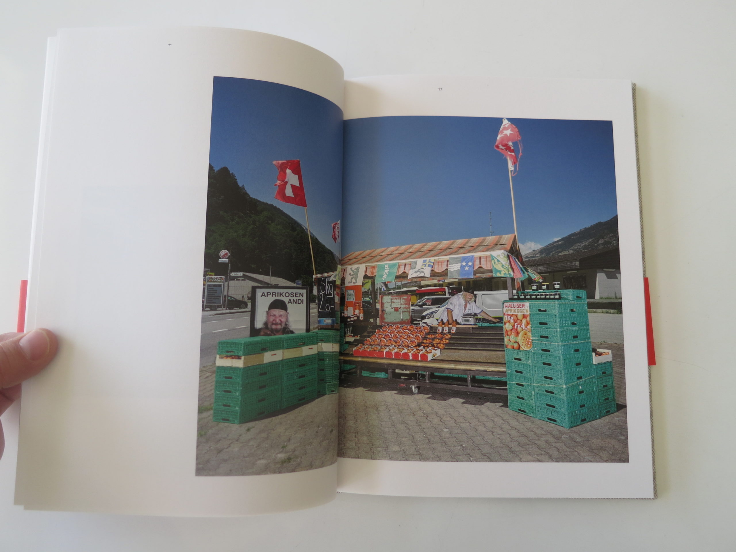
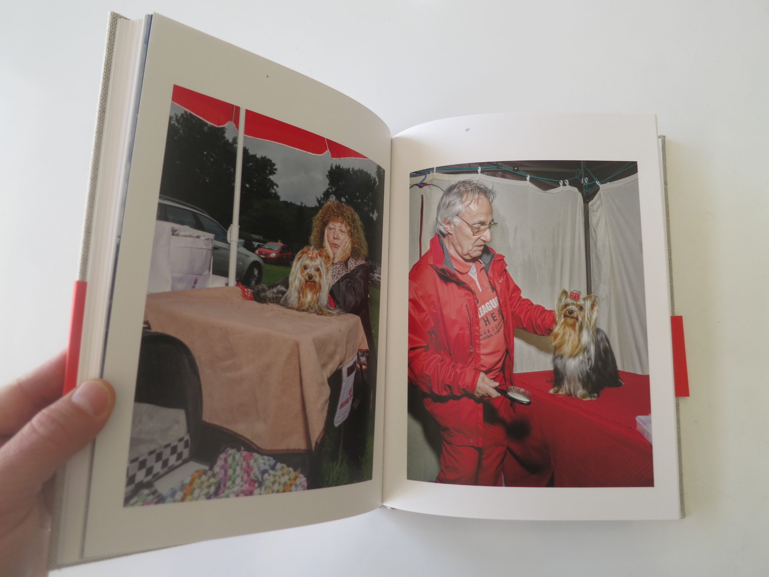
Dog shows, outdoor wrestling, and Dora the Explorer make appearances as well. And we can’t forget the picture of an apricot farmer, Aprikosen Andi, who sports a glossy advertising selfie next to his fruit stand.
Though I’ve always felt bad for remembering the Swiss as less-than-gorgeous, there is one picture of an unattractive woman at a summer festival that felt like it was ripped straight from my memory banks.
Best of all, though, is a strange sub-theme of people sitting in chairs and on beds with large, protruding feet. There are two photos in particular, of women with gigantic feet, that don’t really make any sense at all, except they’re so strange that they’re perfect.
Each time I found a new big-foot picture, I could almost see the thought-bubble pop up in front of my face. WTF, the thought bubble said. WTF?
It’s impossible, of course, to boil a country’s citizenry down to a few dozen photographs. Can’t be done. But we can get a sense of how an artist views a society. According to this book, Switzerland seems like a mix of gauche German taste, colorful Italian opulence, and a kitchy, Jerry-Lewis-loving French sense of humor.
Sign me up.
Bottom Line: Sharp, irreverent book that investigates an under-the-radar European culture
To Purchase “The Swiss” Go Here: http://www.christiannilson.com/the-swiss-book/


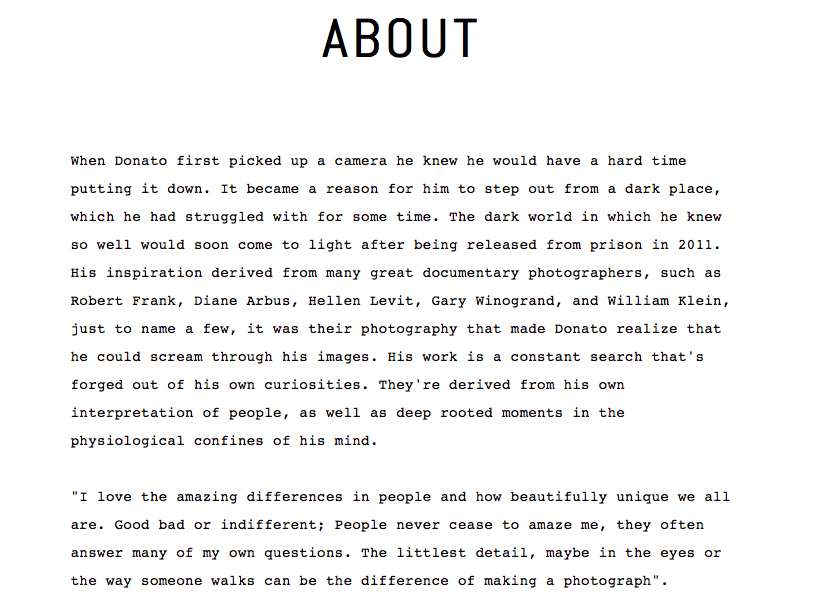
The Art of the Personal Project: Donato Di Camillo
Personal Projects are crucial in showing potential buyers how you think creatively on your own. I am drawn to personal projects that have an interesting vision or show something I have never seen before. In this revised column, I’ll include a link to each personal project with the artist statement so you can see more of the project. Please note: projects are found and submissions are not accepted.
http://donatodicamillo.com/the-fringe/


—————
APE contributor Suzanne Sease currently works as a consultant for photographers and illustrators around the world. She has been involved in the photography and illustration industry since the mid 80s. After establishing the art buying department at The Martin Agency, then working for Kaplan-Thaler, Capital One, Best Buy and numerous smaller agencies and companies, she decided to be a consultant in 1999. She has a new Twitter feed with helpful marketing information because she believes that marketing should be driven by brand and not by specialty. Follow her at @SuzanneSease.
Untitled (Cowboy) Richard Prince 1989
If you’ve followed Richard Prince and the lawsuits over the years this interview adds another piece to the puzzle.
Source: Time 100 Photos
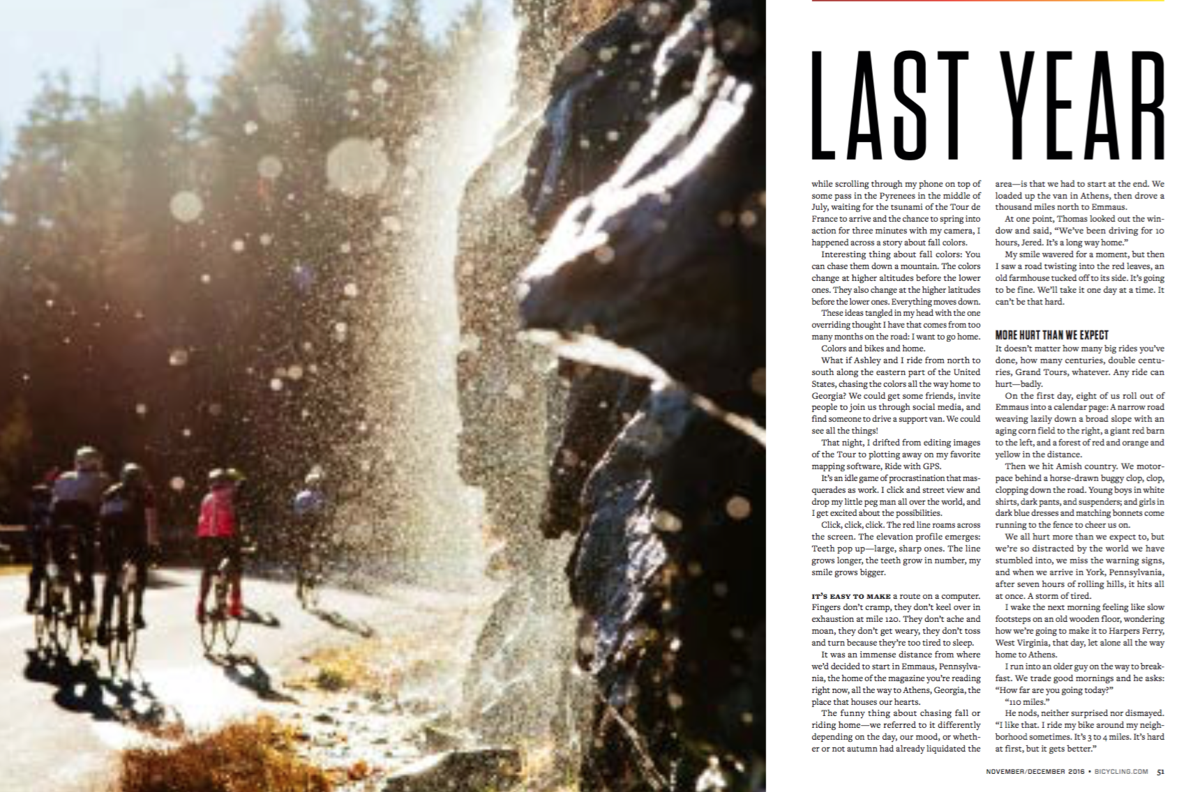
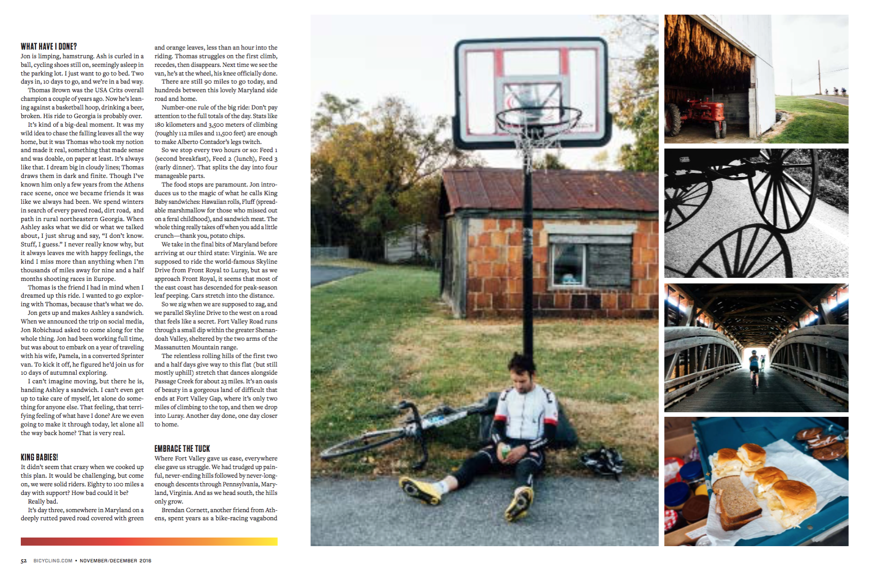
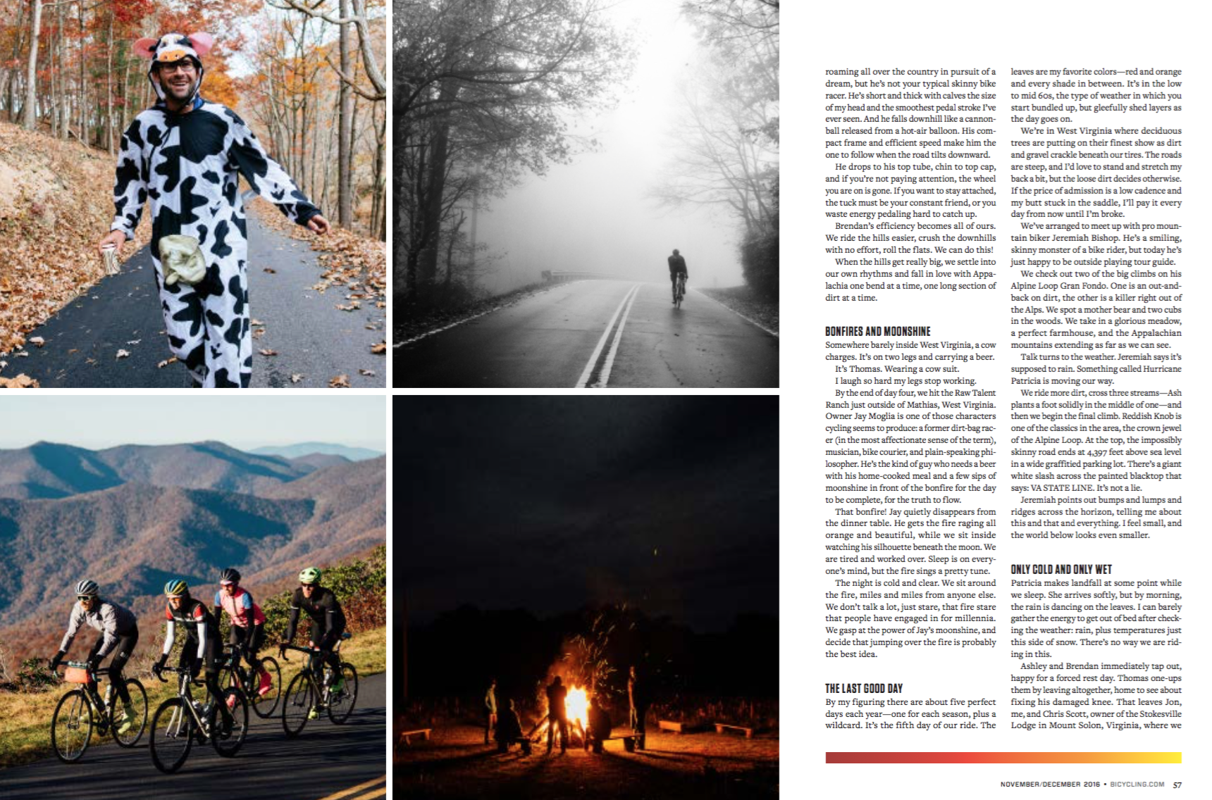
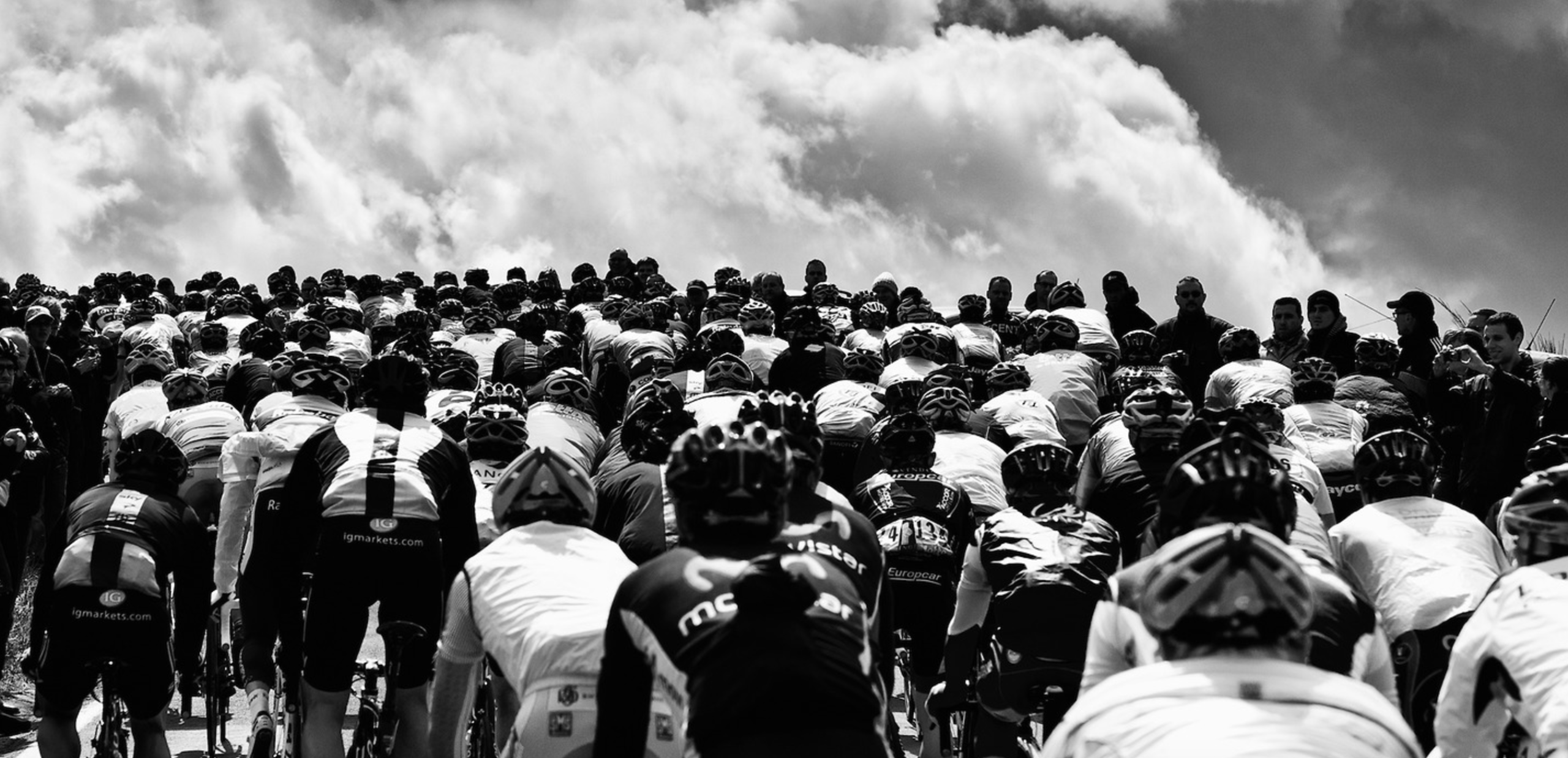
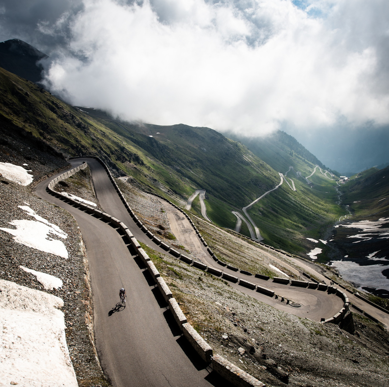
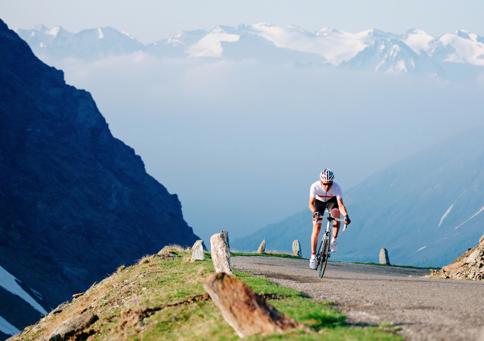
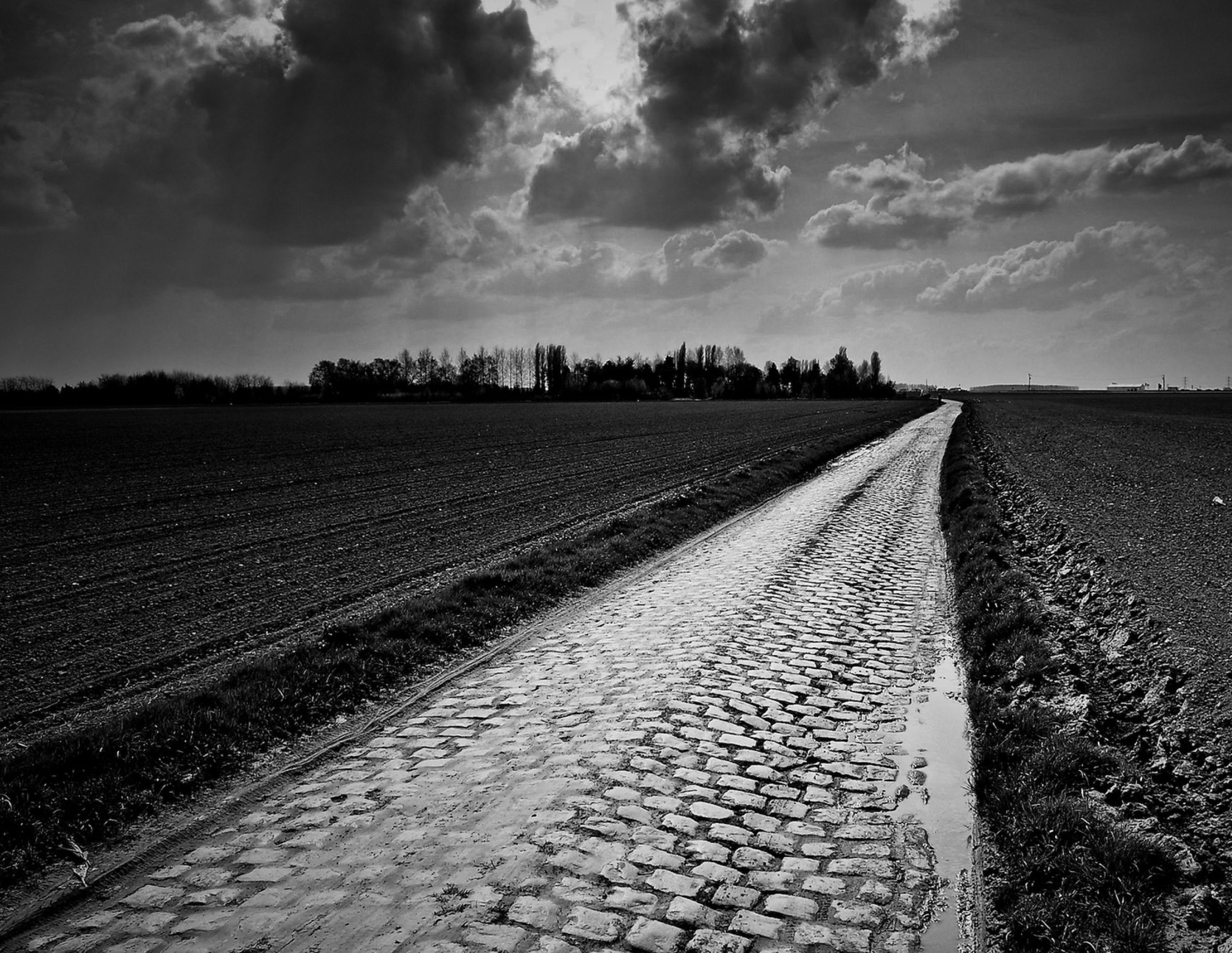
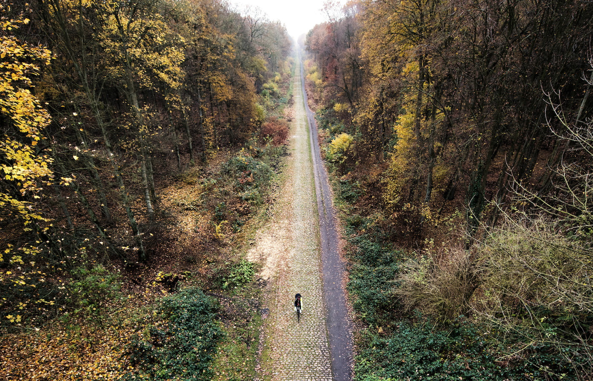
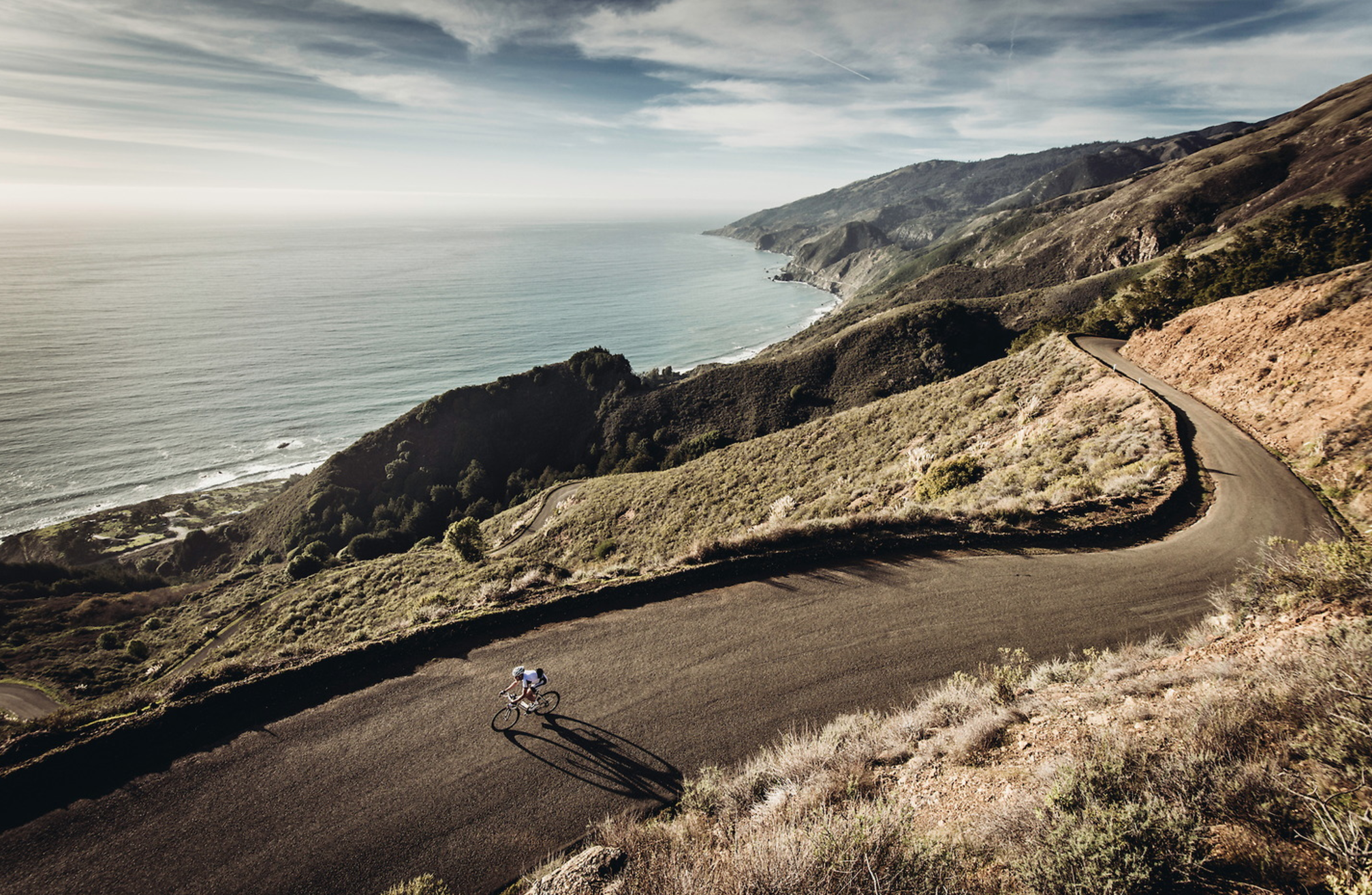
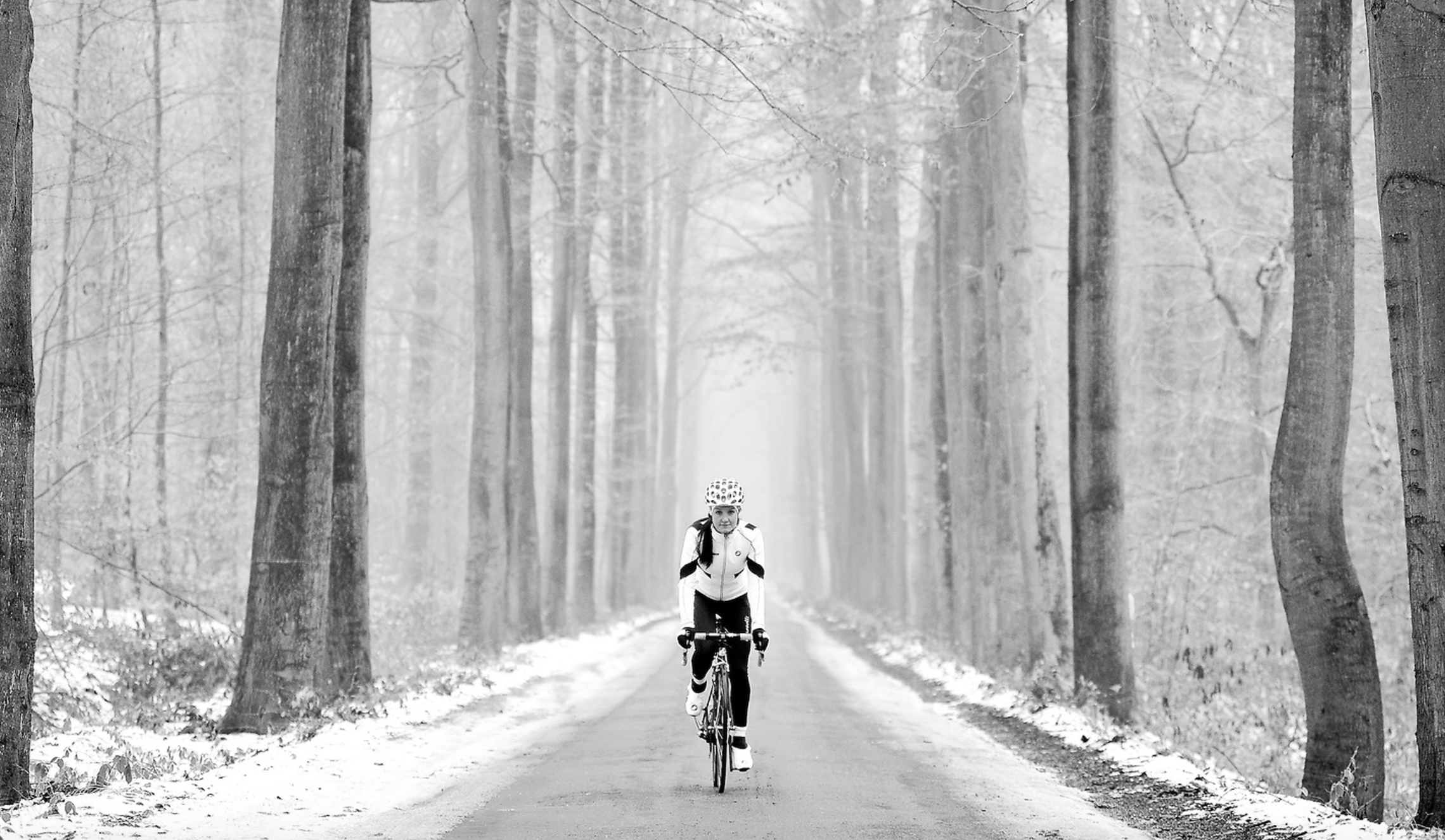
The Daily Edit – Bicycling Magazine : Gruber Images

Bicycling Magazine
Design Director: Jesse Southerland
Art Director: Colin McSherry
Photographers: Jered and Ashley Gruber / Gruber Images
Heidi: How did you get started?
Jessie: I raced bikes in the US for some years and even managed to race professionally for two seasons. I met my wife, Ashley, as she walked home from school one day in 2008. I was riding with a couple of friends, she was on foot, crossing the street – we exchanged hellos, then continued on in our separate directions. I got about a hundred yards down the road, had this feeling that I really needed to turn around, and I did. I made a quick u-turn and rode back up to her and started chatting. She immediately tried to put me off by saying she was heading to China to study in the coming months, then moving directly to Austria to study abroad for a year.
Austria was the magic word. My family is from Austria, I’ve spent a lot of time there, I studied German all my life – it was the worst thing she could have said to get rid of me. We started chatting about that one thing we had in common, which led to a phone number, which led to an evening talking over tea, which led to my entire world changing in one day. I moved with her to Austria later that summer and left bike racing behind. It was in Austria, during that time where I was decidedly in between work, that I picked up a camera for the first time. I bought a 400 dollar Nikon D40 that Christmas, then started riding my bike with it and taking pictures.
I posted shots on Facebook, wrote some articles for a site called PezCyclingNews, and people started to notice. A Facebook friend eventually put us in touch with the editors at Road Magazine, and that’s when things started rolling. We got married in September 2010, and instead of physical gifts, we asked for money. We took that money and bought two tickets to Europe, a 1500 euro red Volkswagen wagon, and spent the final months of the year in search of stories and pictures. That went well enough, so we came back the next year – 2011 – in March. We stayed until November.

How much riding do you do on your own?
In general, I ride around 10-12,000 miles per year. I try to ride as much as I can. I’m a complete addict. I don’t feel good if I’m not riding my bike, which is why shooting a Grand Tour in cycling is such a conundrum. We got into taking pictures of bikes as a natural kind of thing: I love riding bikes, and I love taking pictures of what I see on a bike ride. At a race like the Tour de France though, it’s purely business, and I understand that, and I’m ok with it, but in those low moments when I’d rather be anywhere but the Tour, I can’t help but think that something got twisted up when I’m shooting people riding bikes, but I can’t ride a bike. I work 16-18 hours a day during the Tour, eat generally crappy food, and pretty much live on an IV drip of caffeine – while shooting some of the most bad ass endurance athletes in the world. It’s hard.
In general, I ride around 10-12,000 miles per year. I try to ride as much as I can. I’m a complete addict. I don’t feel good if I’m not riding my bike, which is why shooting a Grand Tour in cycling is such a conundrum. We got into taking pictures of bikes as a natural kind of thing: I love riding bikes, and I love taking pictures of what I see on a bike ride. At a race like the Tour de France though, it’s purely business, and I understand that, and I’m ok with it, but in those low moments when I’d rather be anywhere but the Tour, I can’t help but think that something got twisted up when I’m shooting people riding bikes, but I can’t ride a bike. I work 16-18 hours a day during the Tour, eat generally crappy food, and pretty much live on an IV drip of caffeine – while shooting some of the most bad ass endurance athletes in the world. It’s hard.
How much is riding a component of our job?
We have two very different components of our jobs. There’s the first part: shooting professional bike races, and then there’s the second part: catalog and editorial shooting. When it comes to shooting races, it doesn’t play too big of a direct role, but it plays a vital part in gaining a better understanding of the roads and the landscapes where we work. I know a lot of roads in Europe, because I’ve ridden them. In the case of the Spring Classics in Belgium, France, and the Netherlands, I know the race routes very well, not only because we’ve shot them for a few years, but because I’ve spent just as much time riding my bike on them. I don’t think there’s a better way to learn about where to shoot a bike race than from my bike. We’ve also spent a lot of time riding in the big mountain chains of Europe: Pyrenees, Alps, Dolomites, etc. We recently finished a ride called the Cent Cols Challenge through the Pyrenees: 10 days, 2000k, 100 cols, 50,0000m of climbing. It was a monster undertaking, but now, when the Tour visits the Pyrenees, I feel confident in a basic understanding of what each climb will look like, and that’s something that makes me that little bit more at ease, that little bit more confident. It means a lot. Plus, again, I love riding bikes, and I like to do anything I can to make it sound like me riding my bike a LOT is good for taking pictures. haha.
For the other side of our shooting life, feature stories and catalog shoots, riding is absolutely essential. We do some shoots for companies where I’ll do the entire thing from my bike. I ride with a Nikon D810 and a 24-120, and we go out and ride bikes with some friends. When I have the chance to shoot from my bike, I will generally take it. I feel better and more in tune with the area and what I’m shooting from the bike, rather than out of the back of a car. It’s also pretty much my favorite thing ever. There’s a great line from a poem by Robert Frost that I always, always think about in a moment like this: “My object in living is to unite / My avocation and my vocation / As my two eyes make one in sight.” It’s in those moments when we’re using our friends as models, and we’re riding down some perfect road around sunset, that I can’t stop the feeling that we got really, really lucky, and I want to do whatever I can to be able to continue down this path, because I love it.
Are you shooting out of a car or on the side of the road?
For the Spring Classics, we’re often on motorbikes, but not in the way you probably think of. It’s extremely rare that we get the chance to shoot a race as an in-race moto – meaning – we can take a picture in a certain spot, and then pass the peloton on the same road they’re on. Basically, an in-race moto gets full access. That’s really tough to get, and for the most part, we don’t even try. So, we’re left chasing races outside of the race route itself, which involves finding a spot on the side of the road, then going off-course, and then coming back to the race route to either get in front of the race, or shoot along the roadside right there. It’s a wild experience, which involves a lot of planning and a lot of stress, but I kind of love it. It’s like a giant puzzle that gets easier the better you know the roads and the more experience we acquire.
For a race like the Tour of Flanders, Ashley will be on a motorbike with a bike riding friend of ours, Michael. They have a to do list of spots to shoot. I ride a small scooter with a max speed of 30mph. It’s almost just right for a race as tightly compacted as the route of the Tour of Flanders, but I’m always a little behind. It works though. It’s fun. I end up tucked behind the bars, trying to get as low as possible, trying to eke out another mile per hour in hopes of getting to the next spot in time.
At the Grand Tours like the Tour or Giro d’Italia, Ashley and I are mostly together in our car. When we get to the big mountains, we’ll often split up, so that we can cover two different locations. When we do that, one of us will take our car, and the other will go with a team car from one of the teams we work for: Dimension Data or Cannondale-Drapac. Having the opportunity to cover two different mountains, or a mountain and a finish line, which would otherwise be impossible – is pretty fantastic.
What are some of the unique challenges that we might not encounter in other niches?
Packing light is crucial, and I’m terrible at it. I have a perpetual fear that I won’t take the right lenses with me, so I overpack, and trudge around all day regretting the fact that I brought three too many lenses with me – just in case. Because, what could be worse than not having what I need? Right, carrying around what I don’t need.
On the back of the moto, we carry a pretty simple set-up: two camera bodies (Nikon D5 and D810) and three to five lenses (14-24, 24-70, some kind of long lens, a prime, and maybe something else). That’s ok, as long as we keep the 200 f2 out of the mix. Once that thing ends up in a bag, my day gets a little grumpier…until I get home and see what kind of prettiness it pulled off that day. I hate that lens in every way – until I see the pictures later.
When I shoot on my bike, I generally carry a D810 and 24-120 f4. The 24-120 isn’t the best lens in the world, but it’s more than capable, and gives me a good working range to take some different shots. I’m working on trying to find some solutions that would allow me to carry lenses ON my bike via bikepacking bags. I think there could be some cool possibilities there, which would further free me from cars.
Images from their site below


The Daily Promo: Wilson Hennessy

Wilson Hennessy
Who printed it?
It was printed by Generation Press in the UK
Who designed it?
Various people, My Uk Agent (Horton-Stephens) and I wanted to do a series of cards that promoted both my personal series, trick or treat, and also some of my commercial work. So we thought a fold out card would be nice, and still small enough people would keep it. The actual layout and design was done by Ben Fraser.
Who edited the images?
Me and my agent
How many did you make?
2000
How many times a year do you send out promos?
Once or twice a year.
Tell us about your personal series.
Trick or treat was a personal series I shot. The original inspiration was: Trick or Treaters on my porch approaching my front door. I would view them, lit by my porch light from above, through the distorted glass of my front door. The idea evolved slightly to simplify the picture into a graphic, colourful, image which intrigues and draws you in until you recognize the characters you are looking at. Each image is shot through a pane of Straight Reed Obscured Glass suspended above the masks. The series is attached below.


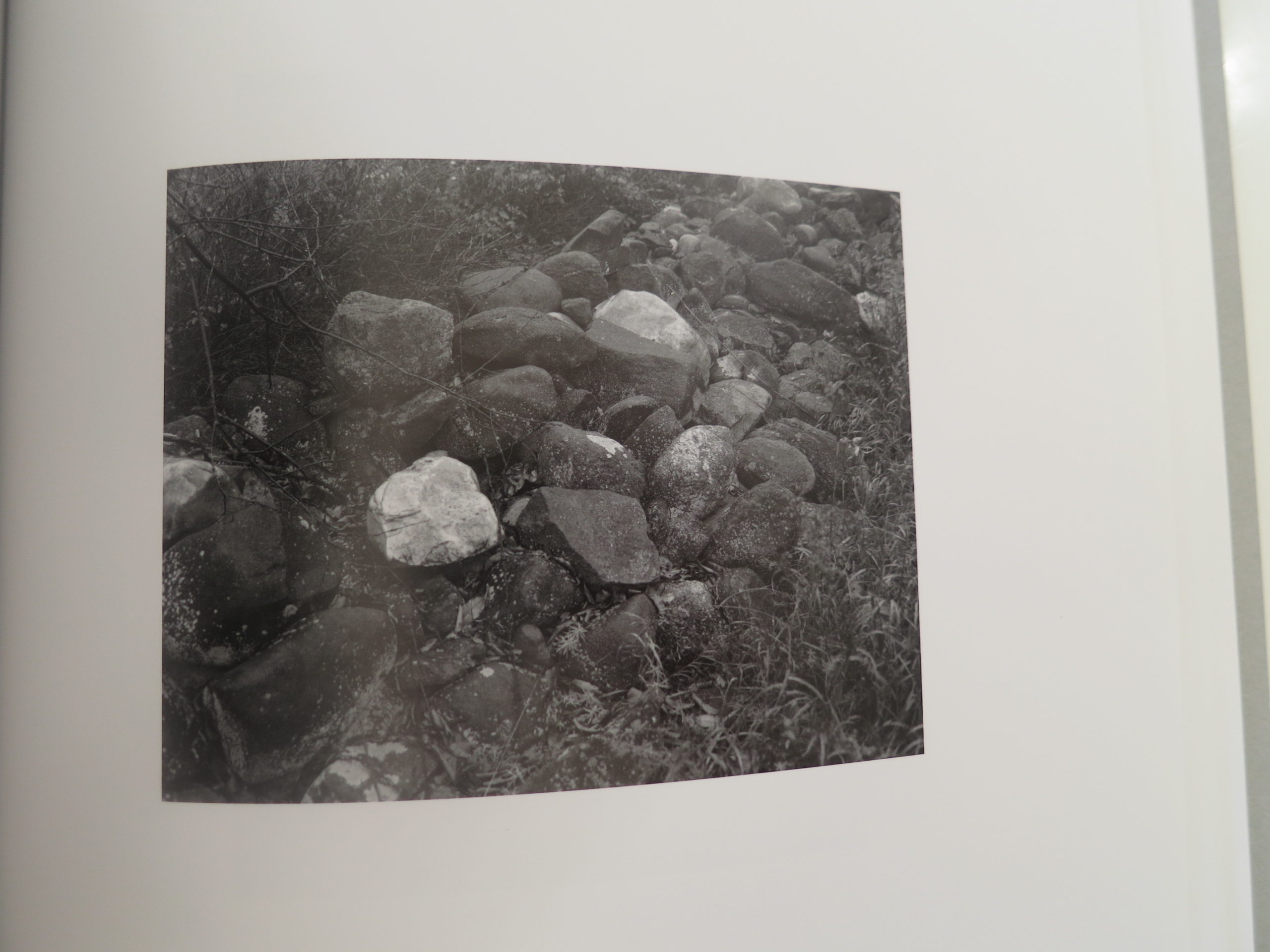
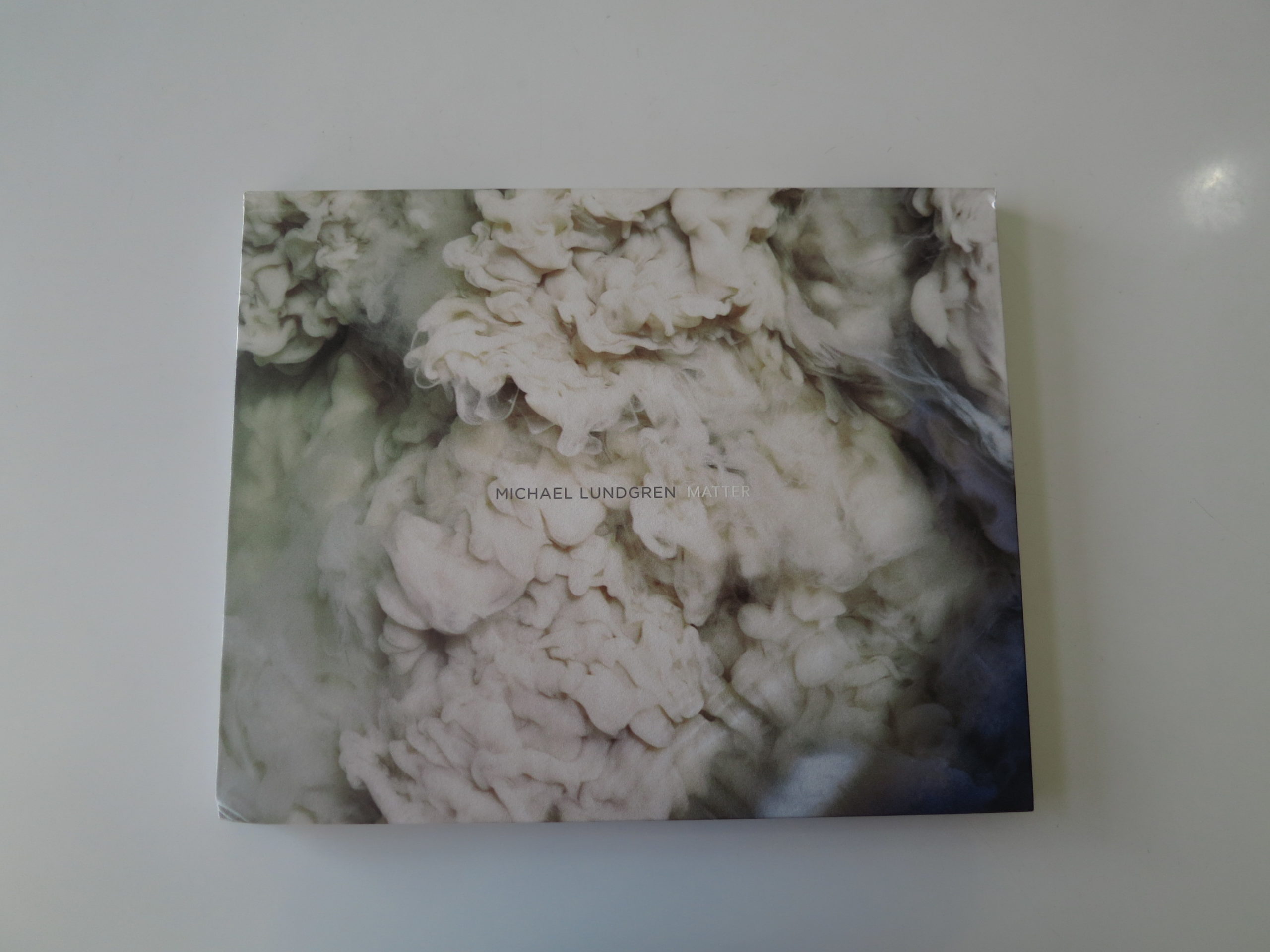
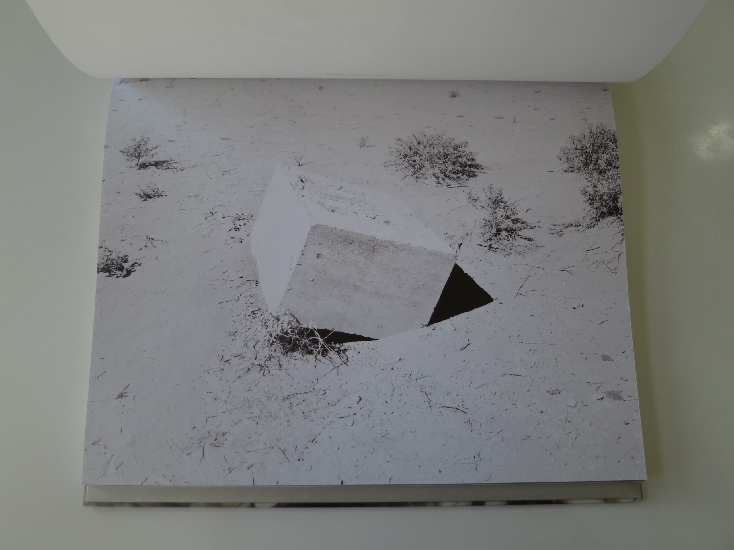
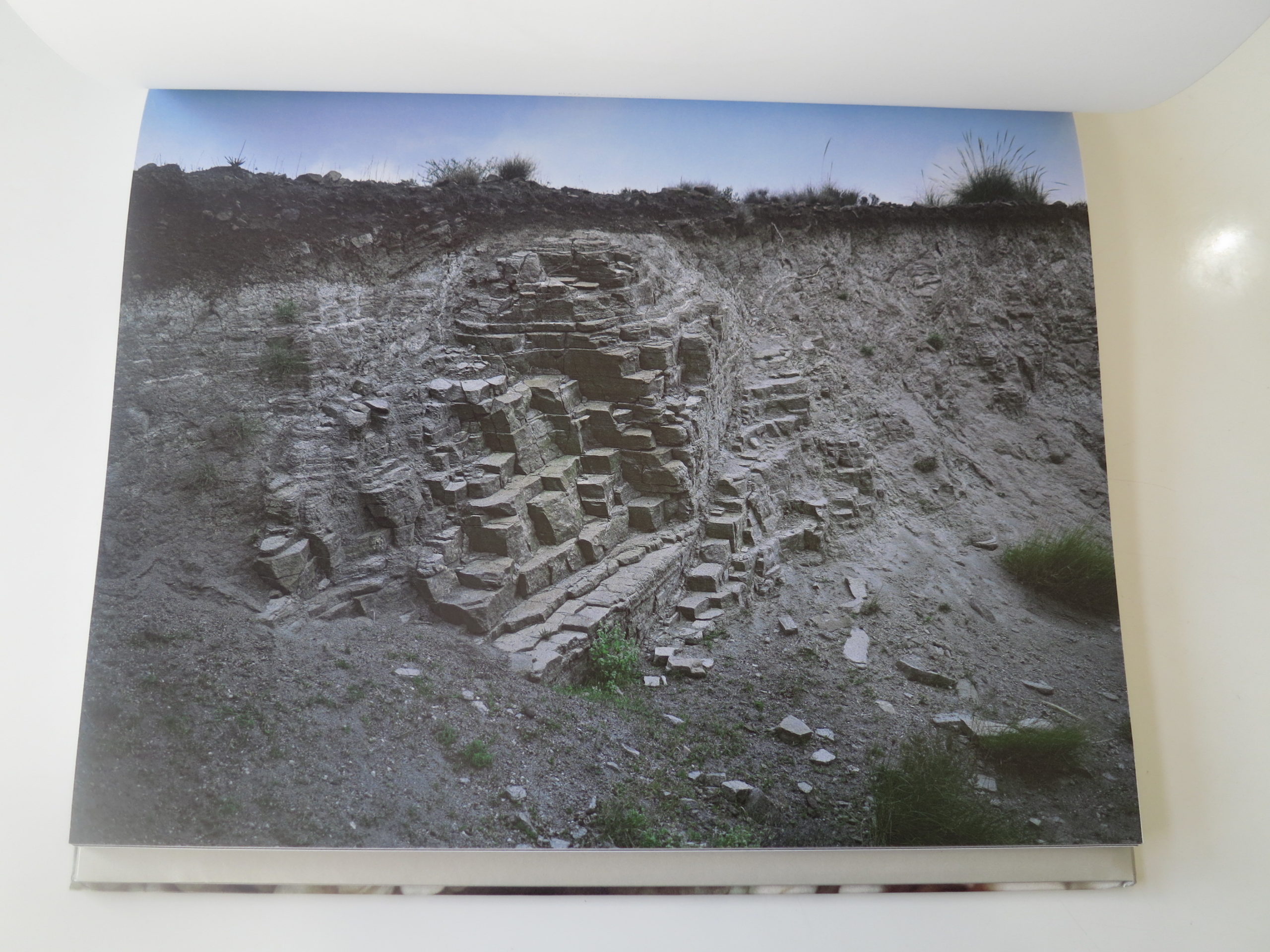
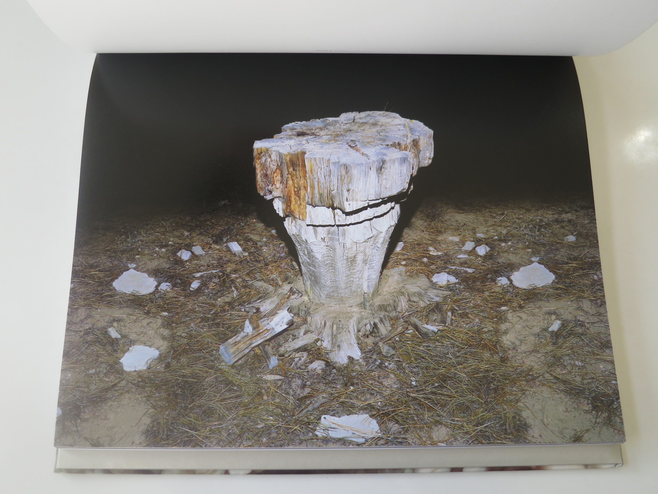
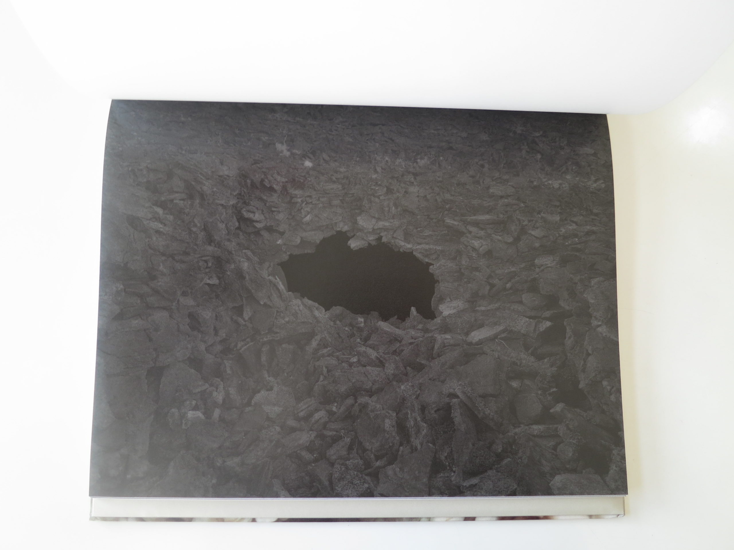
This Week In Photography Books: Michael Lundgren
Imagine if atoms had consciousness. Electrons and protons would surely be enemies, like the Flash vs the Reverse Flash, or Tomi Lahren vs Trevor Noah.
The Sharks vs the Jets would have nothing on the rivalries happening on the atomic level. The Electron King, Negator, would likely try to take over all of atomic reality. (He’s such an asshole, Negator, thinking he can do whatever he wants.)
Negator might even trick some people into thinking he’d change things for the better, but we’re not so easily fooled. Negator is all about destruction. He thinks negative energy is stronger and smarter than positive energy, and he intends to win at all costs.
Ruthless Negator. I hate that guy.
Except he’s not a guy. He’s an imaginary construct I’m presenting here for comedic/metaphorical effect. The point is, there are worlds upon worlds, and universes inside universes, existing right here and now.
Be it the atomic level, the cellular level, oozing creatures miles deep in the sea, or ant colonies living in our front yards, we human beings are only aware of the tiniest fraction of what’s actually going on out there.
Honestly, we’re clueless, no matter how much shit we can research on Google.
Our brains, our consciousness, depend upon seeing ourselves as the center of the Universe. Like astronomical knowledge before Galileo, we’re just plain wrong. The things that obsess us, myself included, are about as significant as Donald Trump’s promises.
But there are people out there, shamans, artists, academics, speakers-in-tongue, who do seem to have the ability to see past the normal. To shake the tree of life, and watch as a few apples fall to the ground, ready to eat.
Michael Lundgren seems to be such a person.
I wrote about him a few years ago, as I heard his lecture at the Medium Festival in 2013. He’s based in Phoenix, a graduate of the esteemed ASU program, and likes to prowl the Sonoran desert, looking for cracks in reality’s facade.
I’m not saying the dude takes peyote. Maybe he does, maybe he doesn’t. I have no personal knowledge either way. But he goes into the desert, a regular 21st Century American, and returns with photographic evidence of the weird, dead and unexplained.
As this is a book review column, you’ll rightly guess that I just put down “Matter,” Michael’s new book, recently published by Radius in Santa Fe. (I couldn’t talk about shamans without a New Mexico hook, right?)
The book is handsomely produced, as are all the Radius offerings, but is oriented to landscape, like you forgot to click the proper icon in Photoshop. It mostly feels like a gimmick, though I get that the images receive far more space than they would otherwise.
I’m not a big fan of turning pages that way, but accept that it’s also a rebellion against convention. As is wedging a fold-up poster of the cover-image-pictures into a sleeve in the back of the book. (I’m guessing it’s mostly intended for artist studio walls or inspiration boards.)
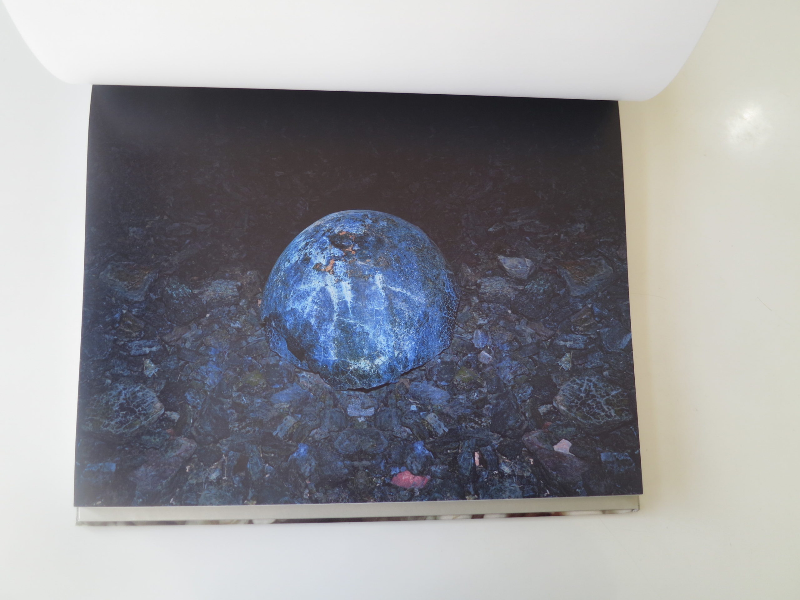
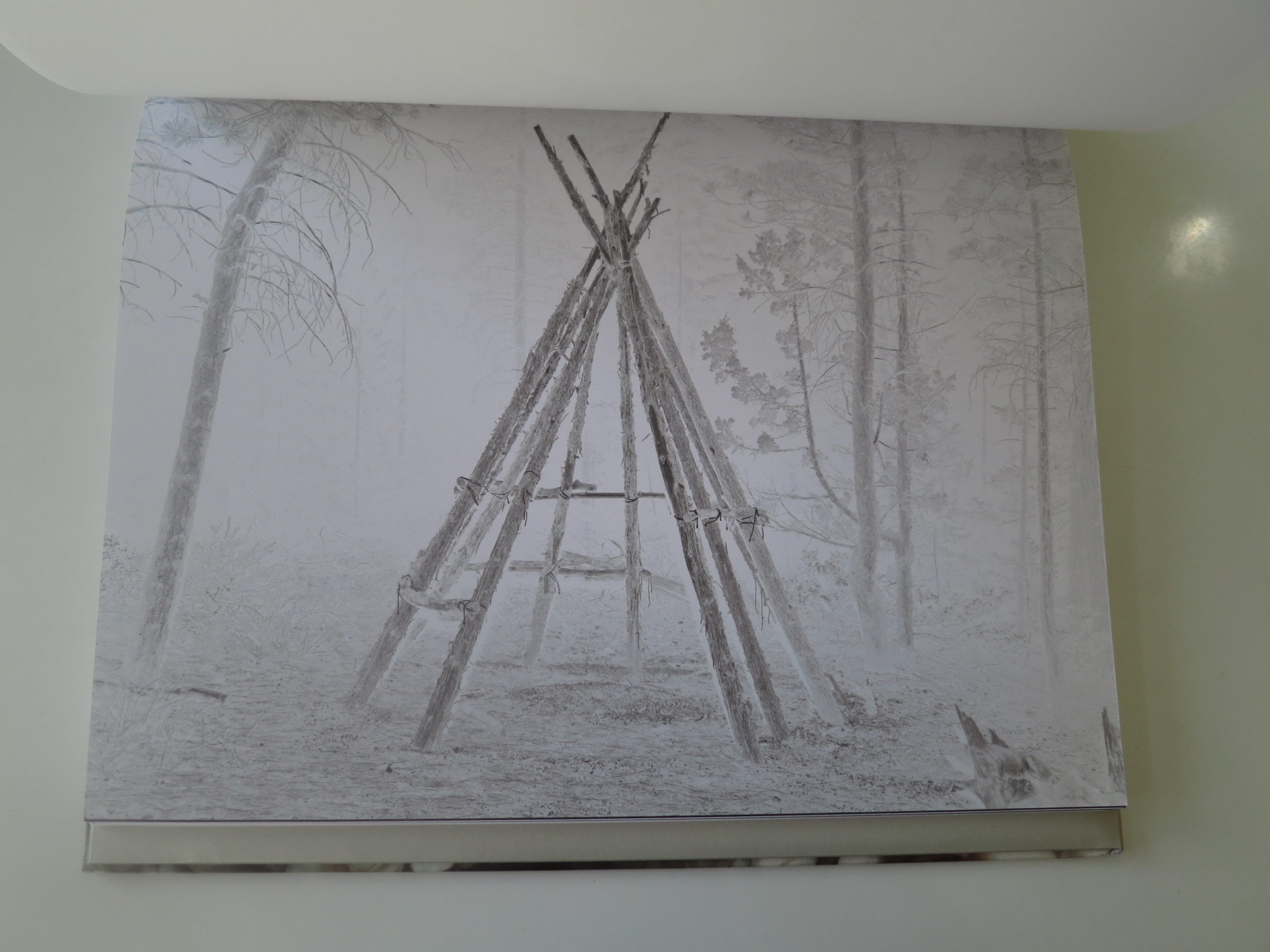
Over the years as a photographer, I’ve learned that if you stare at something really, really hard, like it makes your eyes hurt kind of staring, that intensity tends to show up in the pictures. As such, I’m guessing Michael Lundgren needs to keep some Advil handy at all times, because these pictures are so sharply observed.
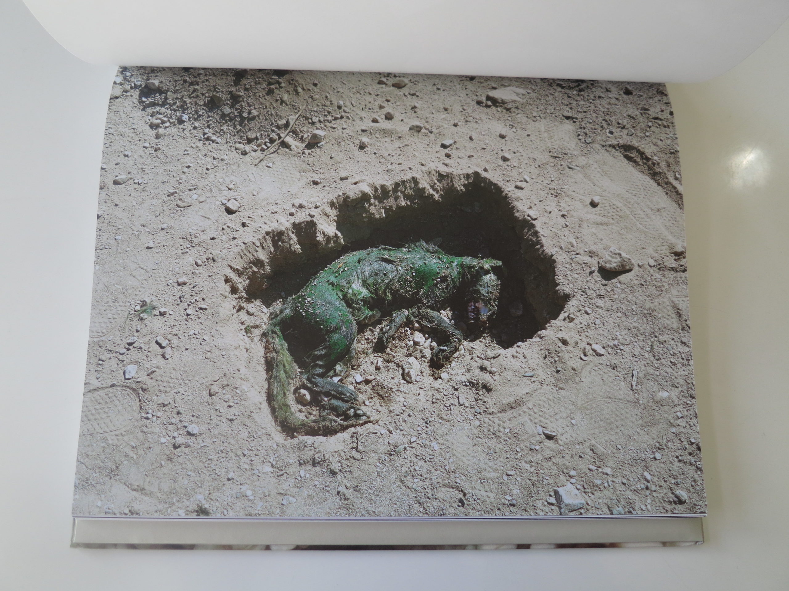
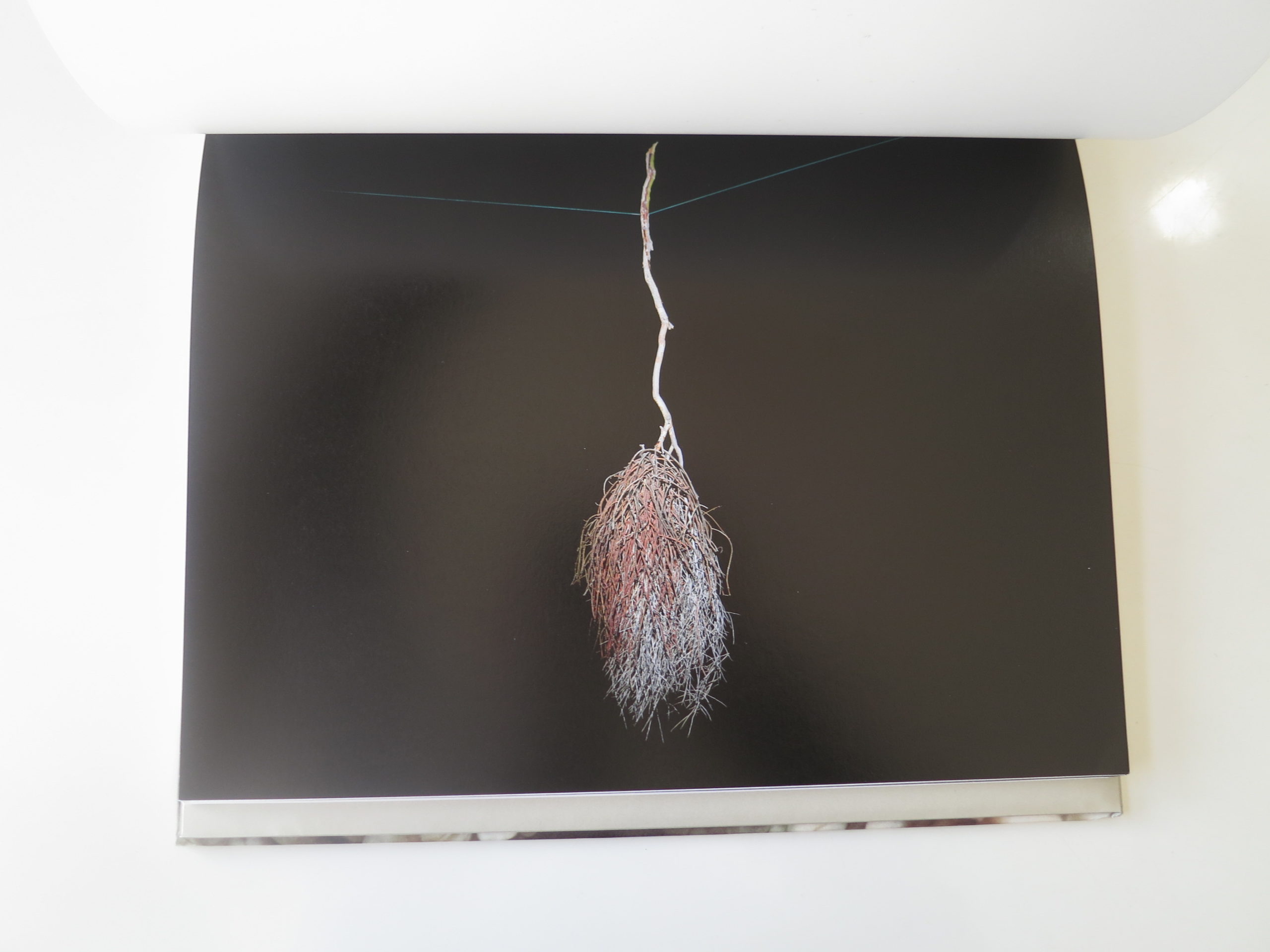
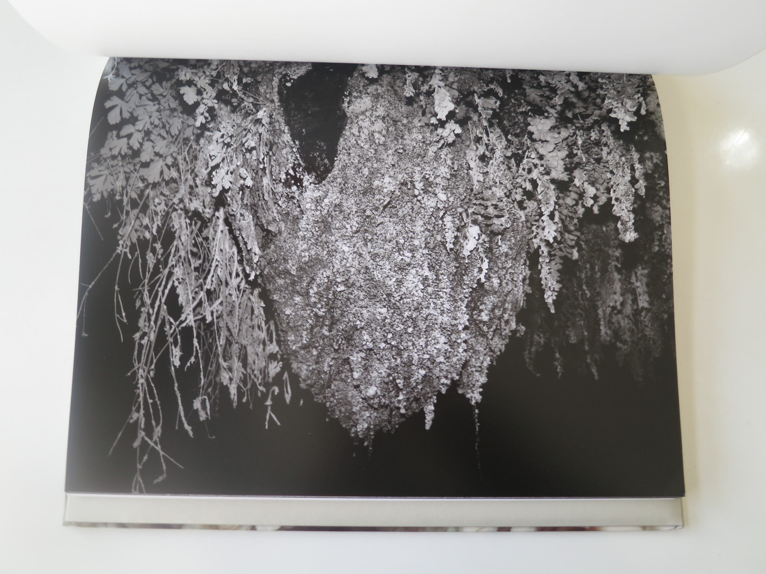
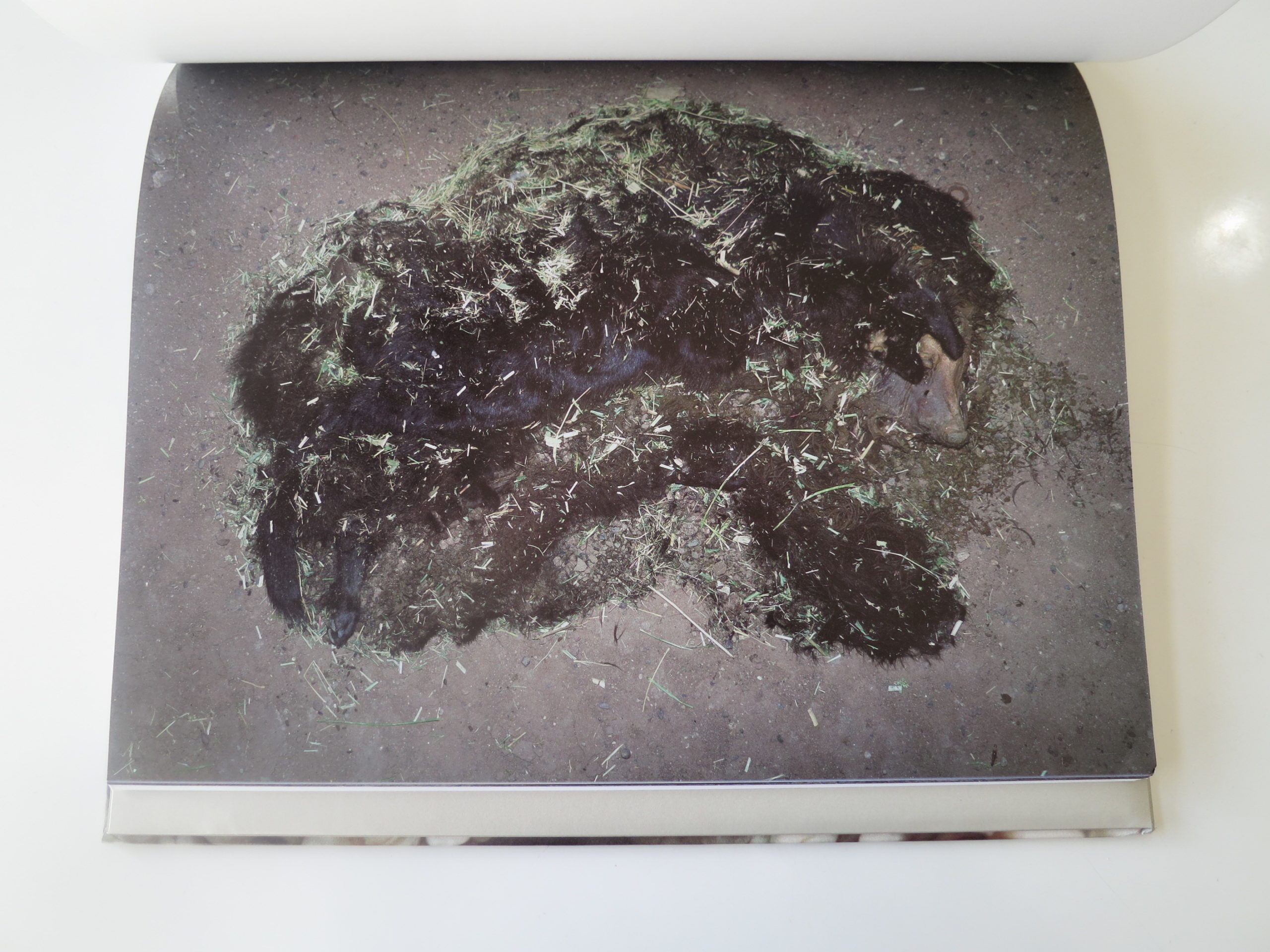
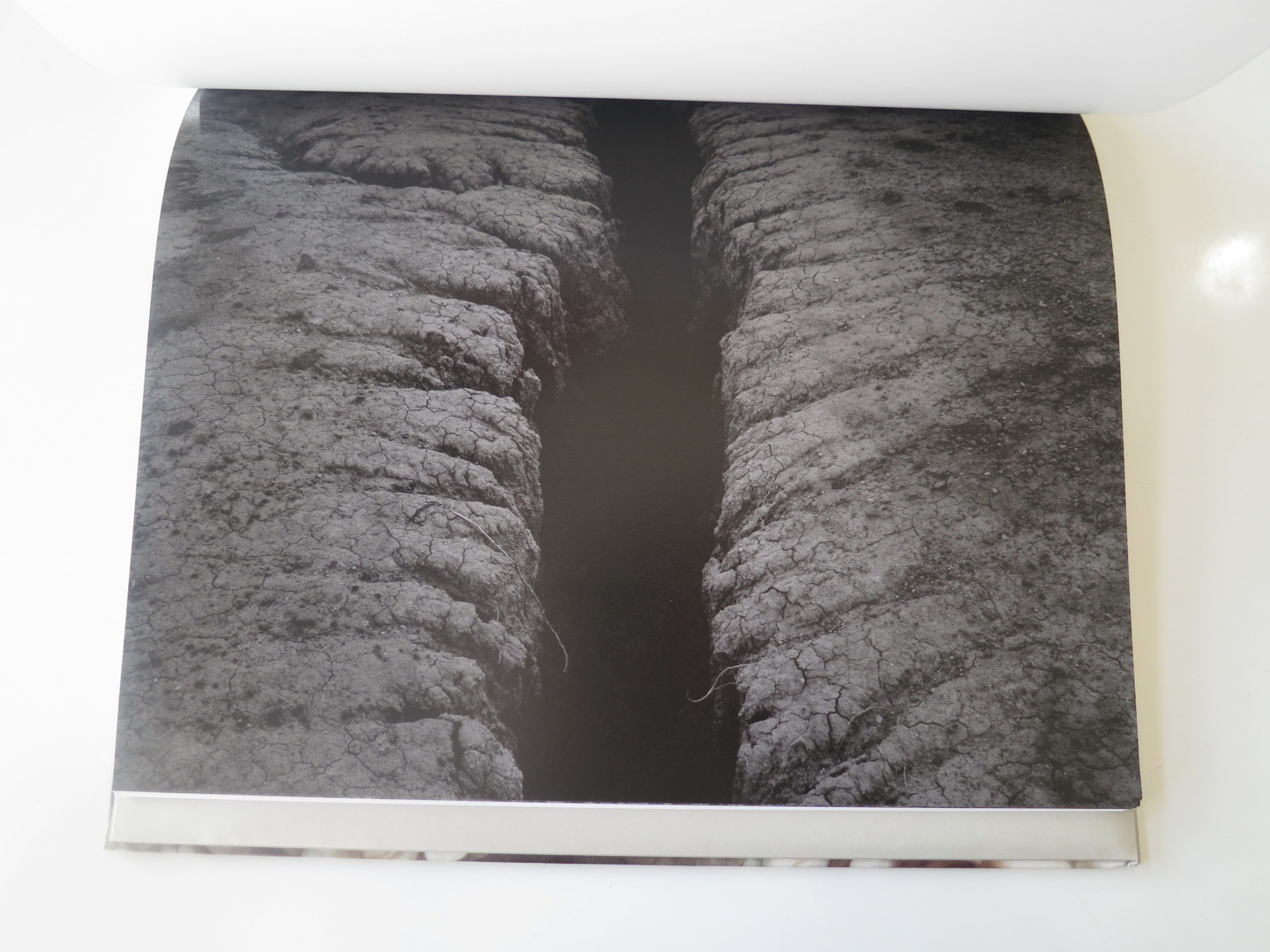
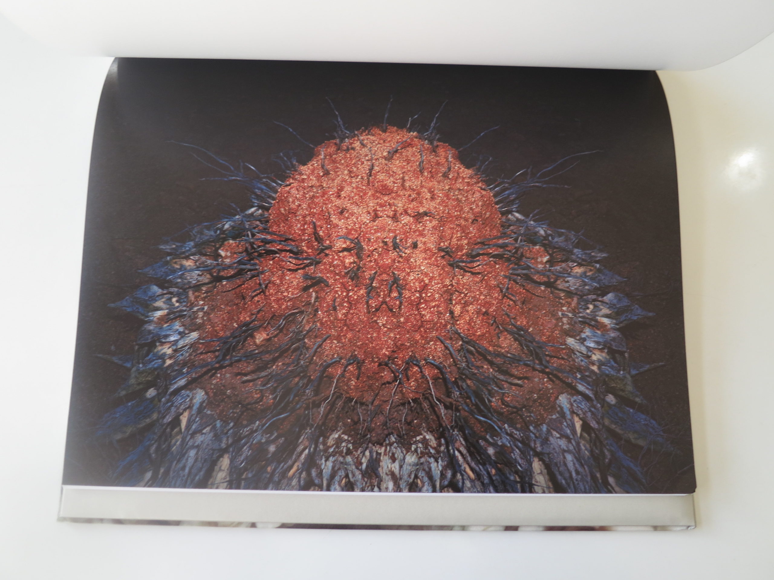
Algae-covered foxes, dog covered bears, putrid looking puddles, perfect if inexplicable orbs, naturally occurring quarries, chunks of concrete, and rifts in the landscape that reference tears in the space-time-continuum.
It’s all here.
By now, 5+ years into this column, you know I have a soft-spot for weird shit.
Strange art = good.
Derivative art = bad.
It’s not that simple, of course, but you get my drift. Some people are called to search for answers, knowing full well they’ll never arrive. I’m betting Michael Lundgren is such a guy.
Maybe one day, I’ll get invited out to a drum circle, down near the Mexican border. There will be tequila, magic mushrooms, and a roaring fire. I’ll sit down in the dirt, cross my legs into a lotus position, and crack through another level of consciousness.
But until that time, at least I have the book.
Bottom Line: Excellent pictures filled with strange phenomena in the Sonoran desert


The Art of the Personal Project: Evan McGlinn
Personal Projects are crucial in showing potential buyers how you think creatively on your own. I am drawn to personal projects that have an interesting vision or show something I have never seen before. In this revised column, I’ll include a link to each personal project with the artist statement so you can see more of the project. Please note: projects are found and submissions are not accepted.
Today feature is Evan McGlinn


It is estimated that some 400,000 people on earth suffer from Usher Syndrome – a terrible disease where people lose both their hearing and their eyesight. That’s roughly the same number of people who suffer from ALS which is now much more widely known thanks to the Ice Bucket Challenge. As of today, I have photographed over 50 Usher Syndrome sufferers for a terrific organization called Arts For USH (artsforush.org) and plan to photograph as many as I can in the years to come. In photographing these people I have done very little to manipulate the photographs except for some saturation and contrast. I want the viewer to see these people as they really are. Despite their tremendous disability, they are talented, successful, and full of natural dignity and beauty.
https://artsforush-org.presencehost.net/how-to-help/donate.html
—————
APE contributor Suzanne Sease currently works as a consultant for photographers and illustrators around the world. She has been involved in the photography and illustration industry since the mid 80s. After establishing the art buying department at The Martin Agency, then working for Kaplan-Thaler, Capital One, Best Buy and numerous smaller agencies and companies, she decided to be a consultant in 1999. She has a new Twitter feed with helpful marketing information because she believes that marketing should be driven by brand and not by specialty. Follow her at @SuzanneSease.
I Had An Incredible Ride
For the first 15 years we were like tittering schoolboys, viewing every offer, no matter how paltry, as an opportunity for naughtiness and adventure. We unashamedly piggied life on the back of work, and in the process both flourished. Photography’s like a panda; it only eats one thing. Curiosity. Without a constant diet of curiosity, it’s dead. So when you’ve reached the point where venturing away from your living room without a business class ticket seems like a hassle, or extending an assignment in Ulan Bator when nobody’s paying for the hotel doesn’t make sense; you’ve ceased to be a photographer. You might be a high-level technician, but your photographs – no matter how much money tech companies will pay for them – are shit. Because the only thing you are curious about is the day rate.
— Julian Richards
Read More Here: A conversation between photographer Mark Mahaney and former photo agent Julian Richards.
The Daily Edit – One Shot Editions: Brian Finke
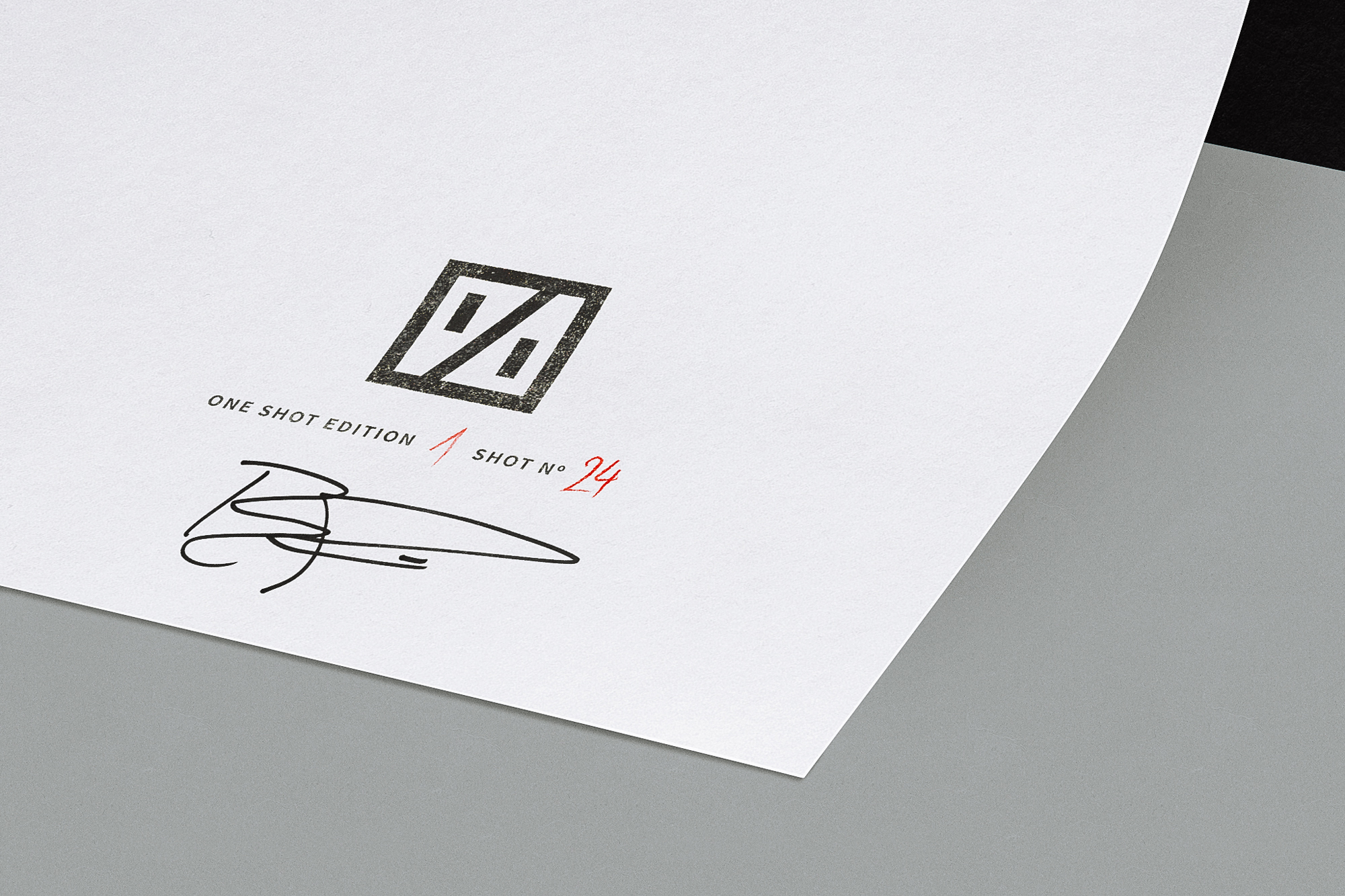

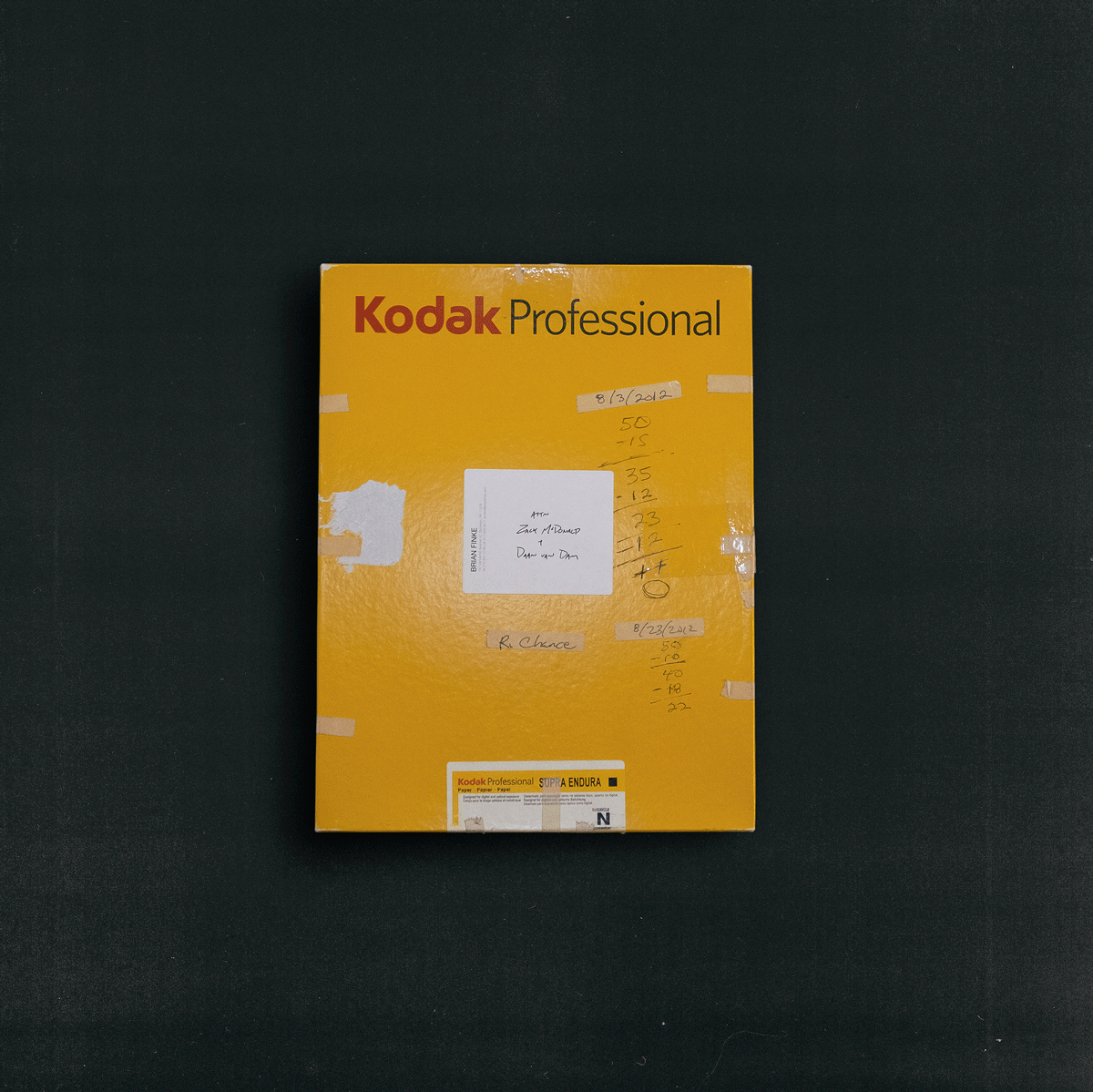
One Shot
Co-Founders: Zack McDonald & Daan van Dam
Photographer: Brain Finke
Why did you choose to collaborate with Brian?
We’re huge fans of Brian’s work. The man has an unbelievable knack for creating visual worlds that you can’t help but step into. Plus, he’s one of the nicest, coolest guys we know.
Where did this idea stem from?
We have a strong love for photography and have been watching closely as the digital revolution has really transformed every part of it.
It’s turned everyone into a photographer. For better and for worse. It’s given artists the freedom to go to new places, but it’s also taken some things away. The element of surprise, the rush of a happy accident or the joy of the unknown. We created One Shot to help people reconnect with the mysterious and fragile beauty of analog photography.
Why film?
If you take a stroll through the Internet at any given time, you’ll come across hundreds, if not thousands, of digital photos. And they’re multiplying by the second. We really liked the idea of putting something truly ephemeral and impossibly rare into the world. At the same time, we wanted to make the prints as accessible as possible so almost anyone can take a shot if they want. They’ve just got to be quick.
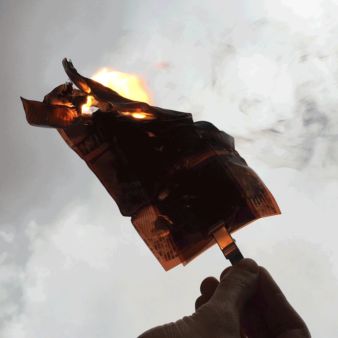
I know Brian can shoot whatever he wants, are you given any idea what he maybe up to?
We just received the prints and all we can say is they’re beauties. It’s almost a shame to destroy the negatives… But those are the rules.
If I wanted to buy one how do I sign up?
The 24 1/1 prints are on sale at oneshoteditions.com. People can select any available print from our store but once a shot has been purchased it will be gone forever. So you better be fast if you want to pick your lucky number. There’s also a limited edition zine available which includes an overview of the series, a Q&A with Brian and an essay about the origins of One Shot.
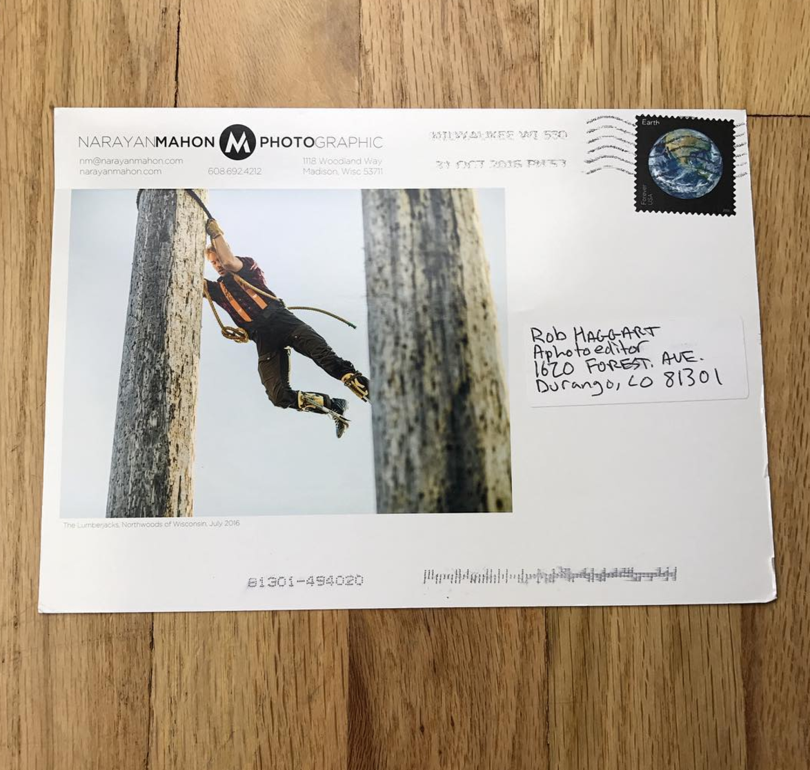
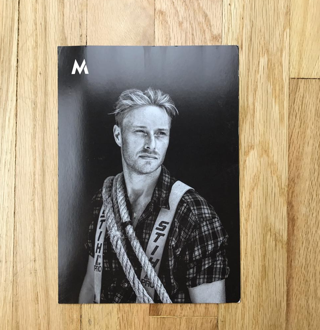
The Daily Promo – Narayan Mahon
Who printed it?
I use Modern Postcard for these types of smaller promos
Who designed it?
I do the layout and design myself for the postcard promos.
Who edited the images?
I edited the images myself, with some feedback from my wife and a few different colleagues/friends.
How many did you make?
1000.
How many times a year do you send out promos?
It depends on what I have planned for promos, when I’ve done larger promos, such as newsprint pieces, I might for one large and maybe 4 smaller promos such as this one per year. This fall I made 3 different promos at once so I could have them ready to send out as the time came and I wouldn’t get lazy about it.
Where did these images come from?
Well, this promo was a little different that most because they came from a test shoot that I did with another photographer, a friend who I consider a mentor and whose work and work ethic I truly admire, Andy Anderson and his son Zach, also a very talented photographer and supportive friend. I had photographed the Lumberjack Championships a couple years before and Andy invited me to come along with them this year so I jumped at the chance to spend some time with them and make some pictures together. It was a great experience to collaborate and learn from him and I ended up making some new work that I was proud of and that ended up being a real energizer for me.
This Week In Photography Books: James Welling
The sun is out again today.
Thank god.
After an unseasonably warm November, winter came in earnest last week. Below zero wind chill. Industrial-grey skies. High clouds looming above, like hall monitors, ensuring nobody has any fun.
This time of year always makes me sad.
It gets dark so early, and here in Taos, we’re all addicted to the sun, so when it goes away for even 2 or 3 days at a time, my mood drops off a cliff faster than Wil E. Coyote.
The morbid, bleak light.
No leaves on the trees.
There’s no snow on the ground yet, so the brown, dead grass reminds me of my own mortality. Early winter is the seasonal equivalent of angsty, teen-age poetry.
—
Why?
Why is the world so unfair and cold?
Why?
Why don’t my parents understand I’m not a kid anymore?
Why?
Why is death a part of life, when death is cruel but life
is beautiful?
Why?
My blood pumps through my veins.
I feel it.
Why must it all come to an end?
Why must I lose everything?
Why?
–
Like I said, the sky is blue today and the sun is unencumbered. It’s so bright, I had to close the shades in my daughter’s room so I could see the computer screen to write for you guys.
So I can joke about such things today.
But sometimes, I do feel sad. I miss the long, easy days of summer. I think about my children growing up so quickly.
I wonder how long I’ll be remembered when I’m gone?
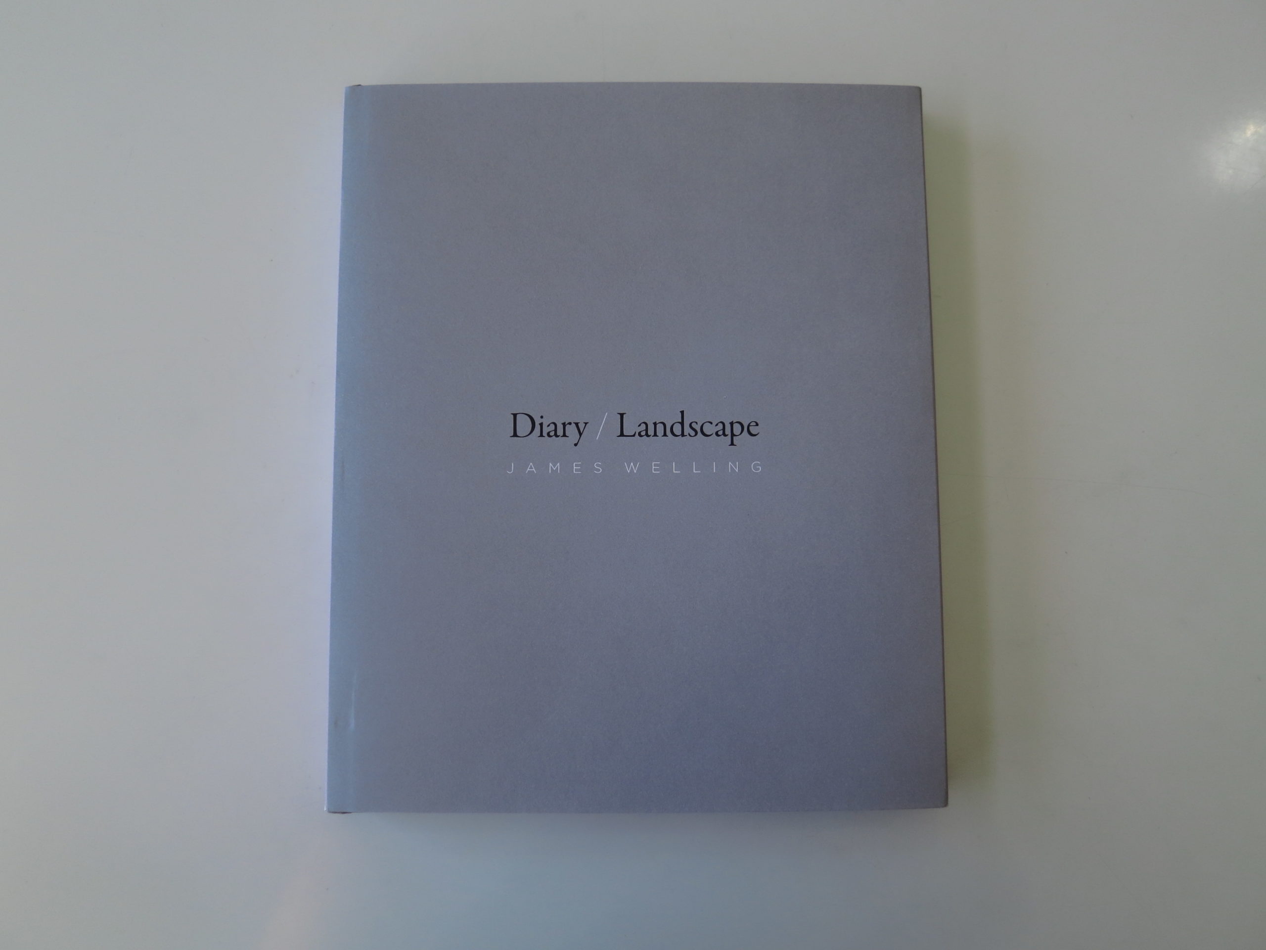
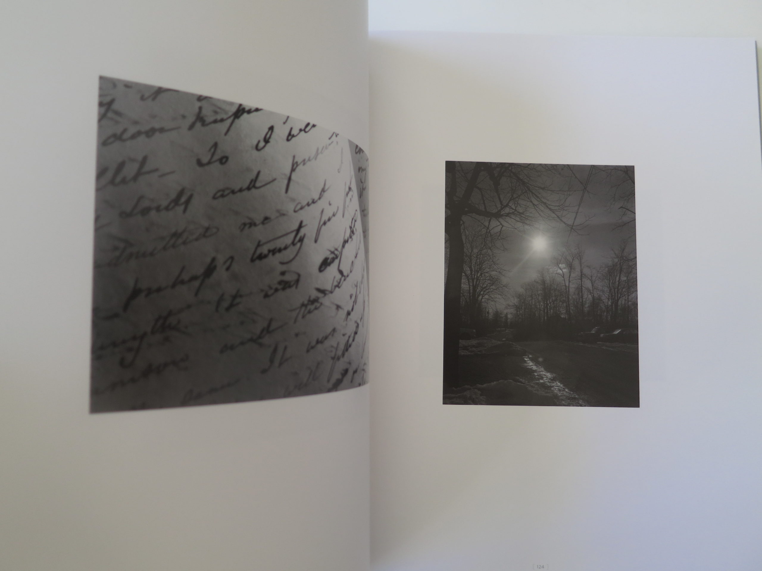
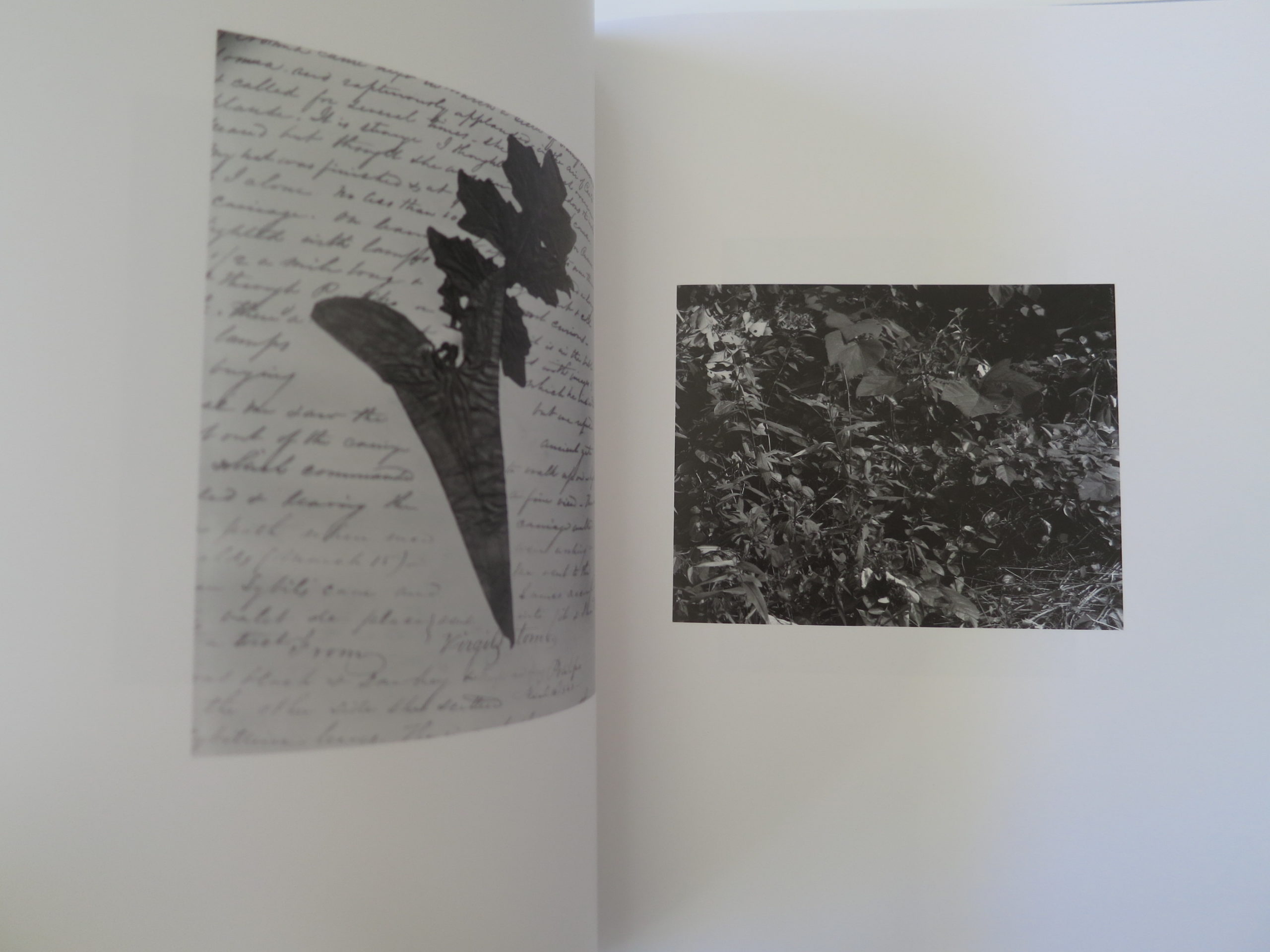
I’m in this mood now, truth be told, having just looked at “Diary/Landscape” a book that turned up in the mail by James Welling, published by The University of Chicago Press. The cover, no surprise, is gray; the font somber.
James Welling is known as a conceptual photographer, or maybe a conceptual artist, but his pictures normally look like straight photographs. While I’ve known of him for years, it’s hard for me to conjure a specific image in mind when I think of his work.
People think of ideas, when they think of conceptual art. It’s an obvious connection. But it often has as much to do with process and structure. Having a system in place, the end result of which is your artwork.
This book, perhaps because it represents an early project, really speaks more about traditional photography, and less about ideas, I’d say.
At the end of the introduction, written by Art Institute of Chicago curator Matthew S. Witkovsky, there’s a telling Welling quote. He says, “I think that all landscape photographs are a stand-in for abstract art, which is a stand-in for emotion in art. To me it seems very obvious that I’m photographing emotions.”
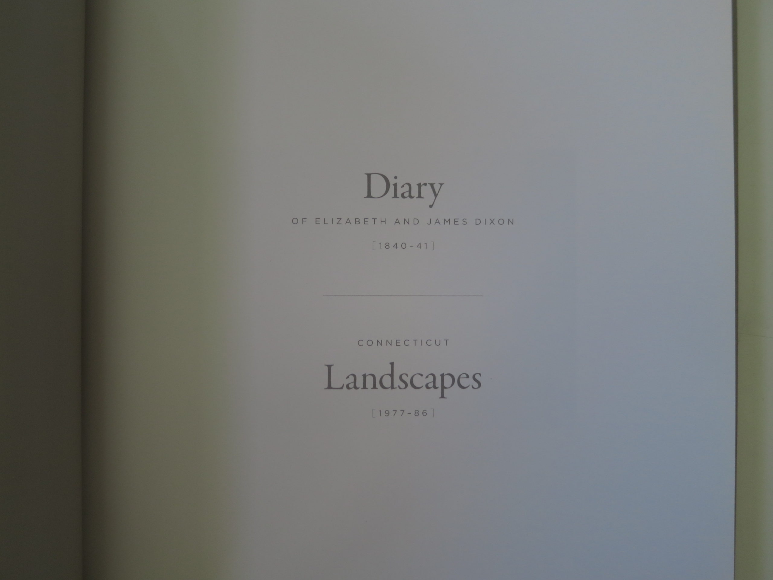
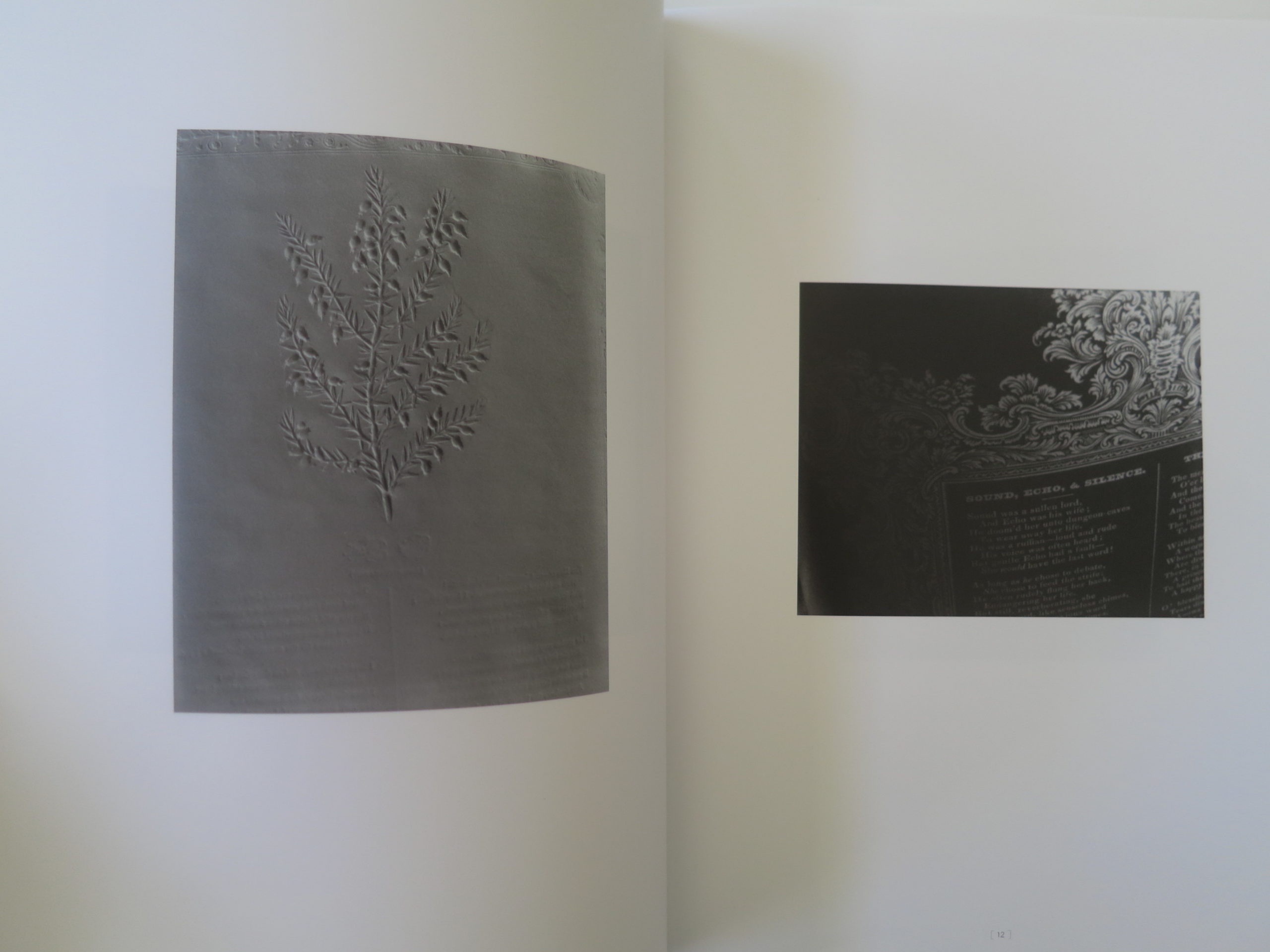
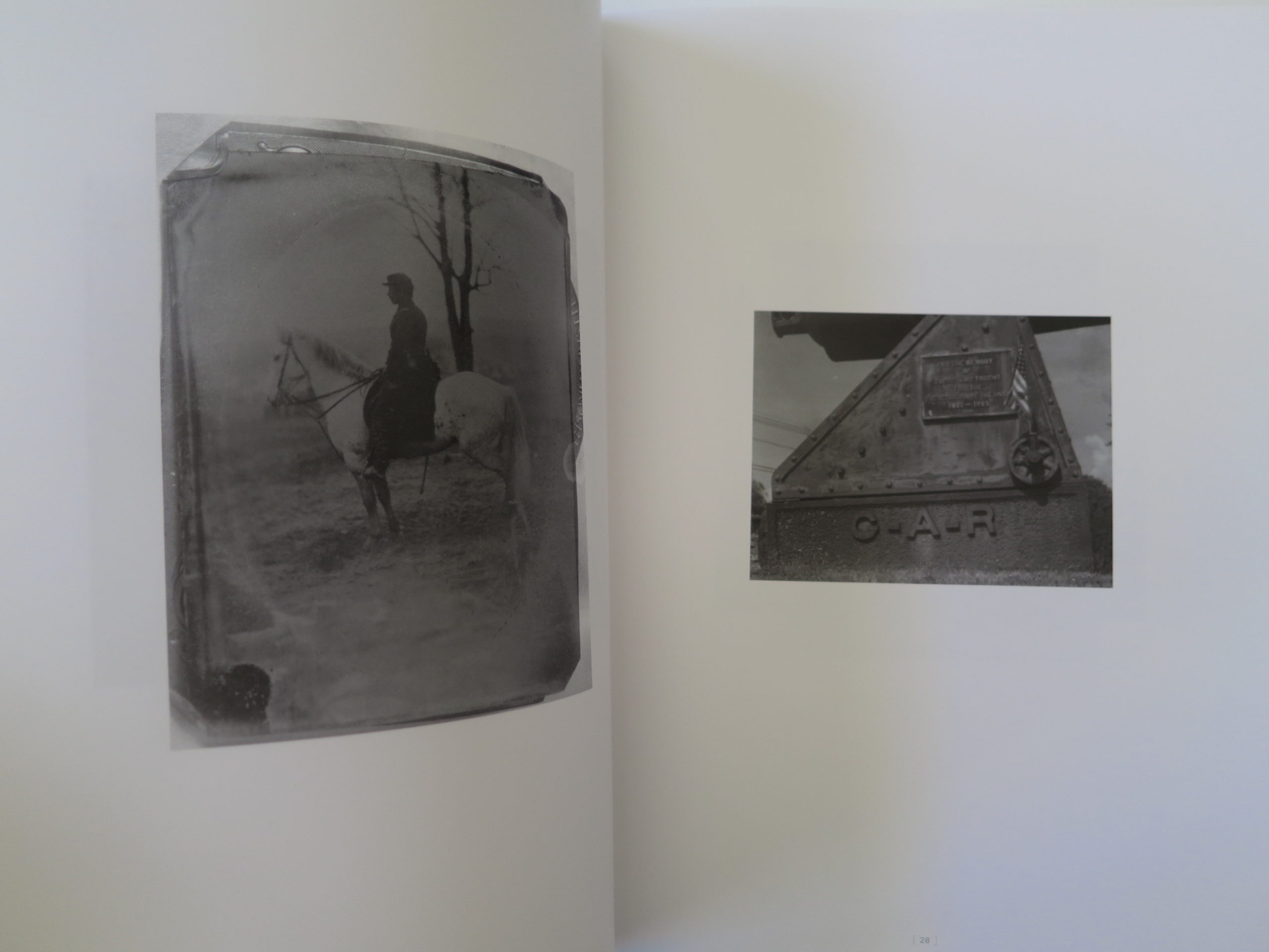
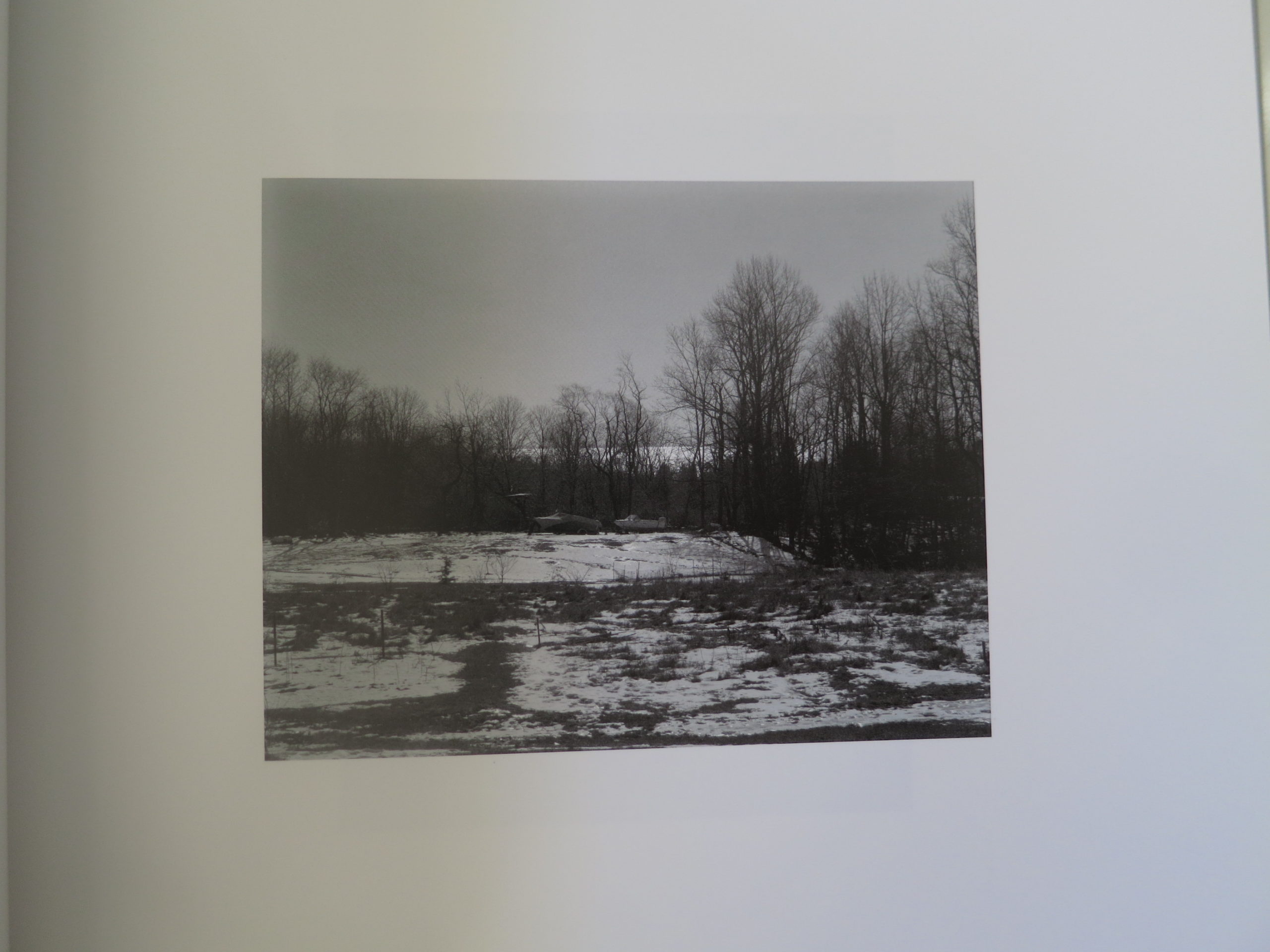
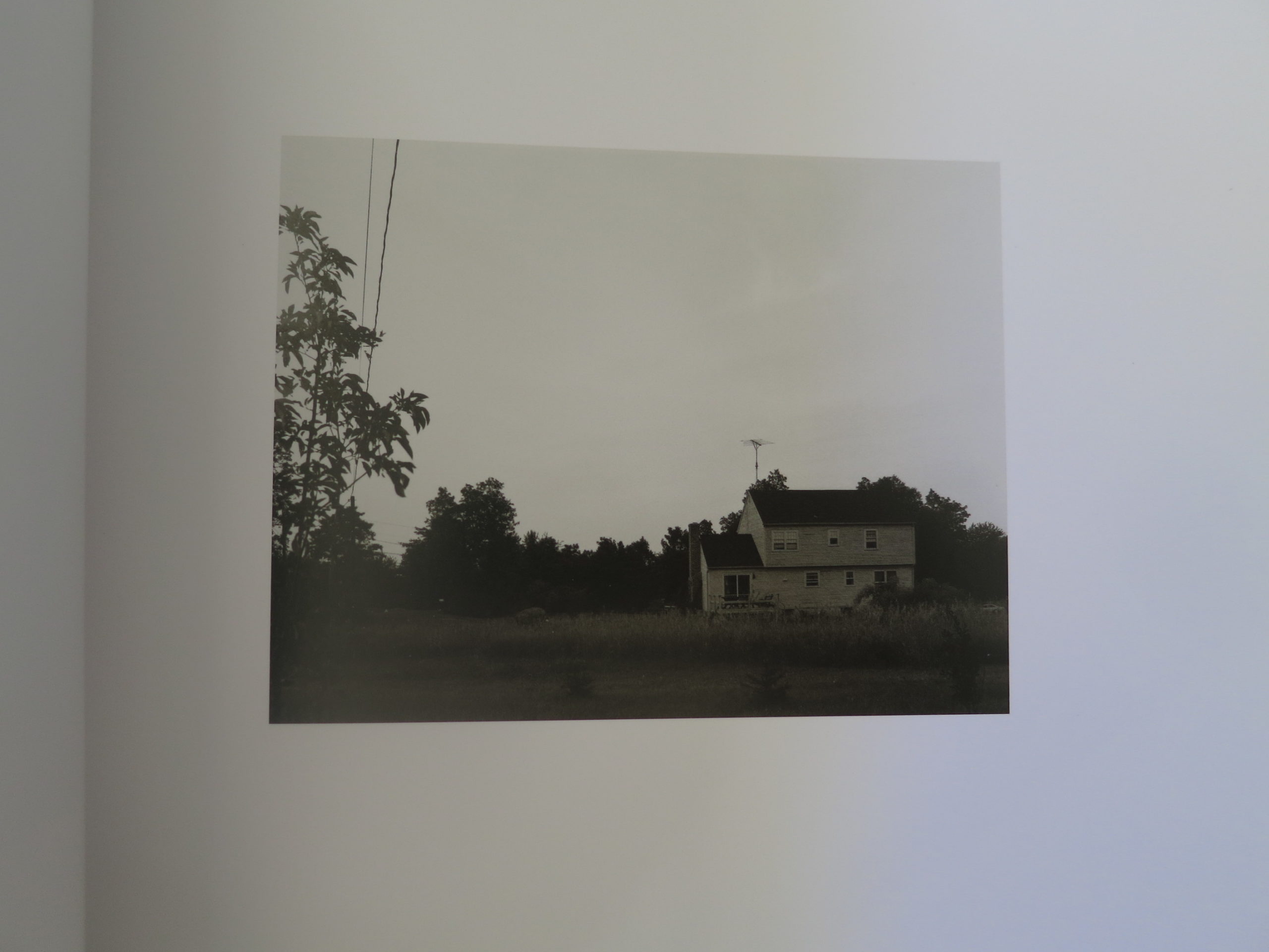
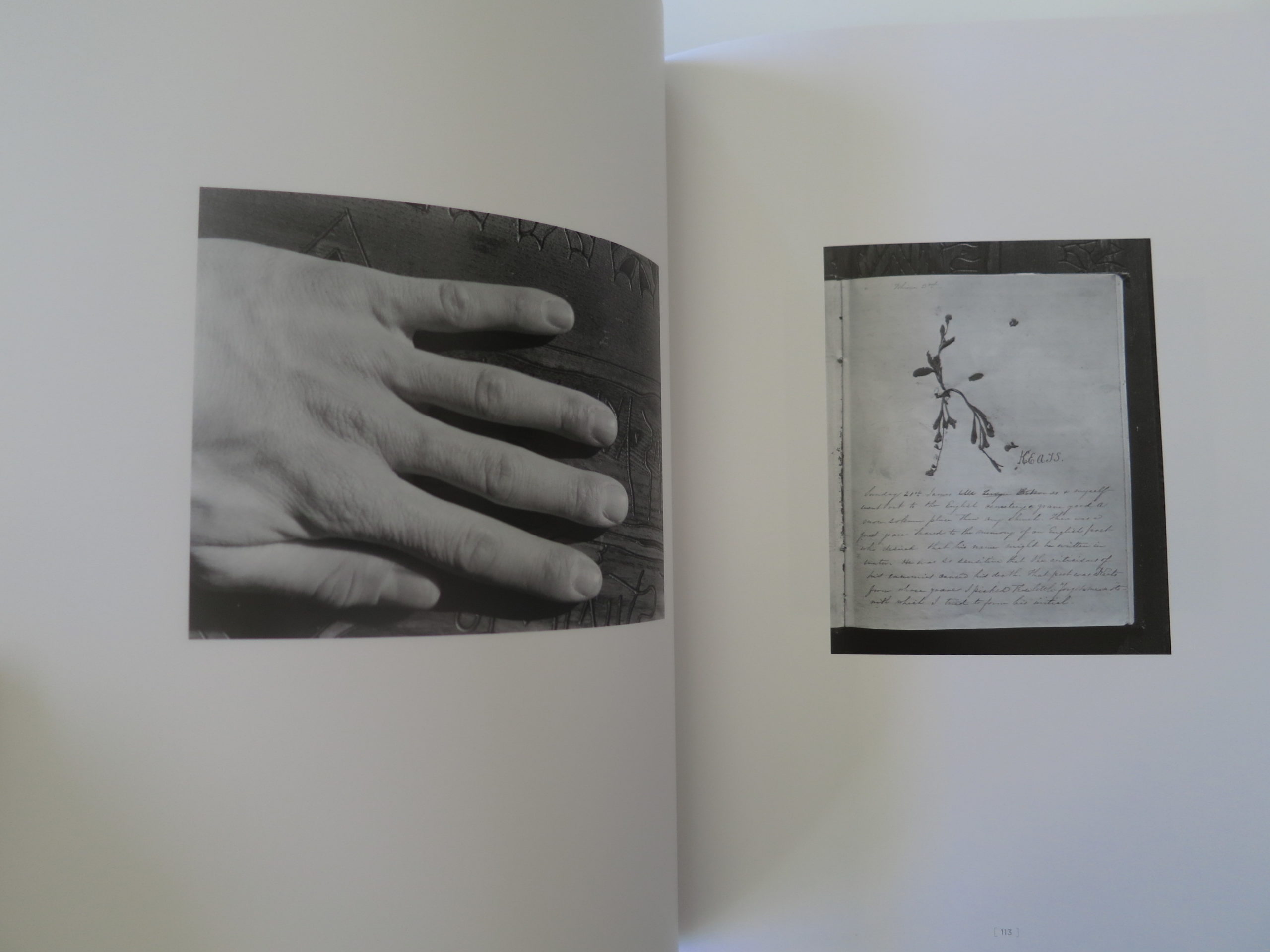
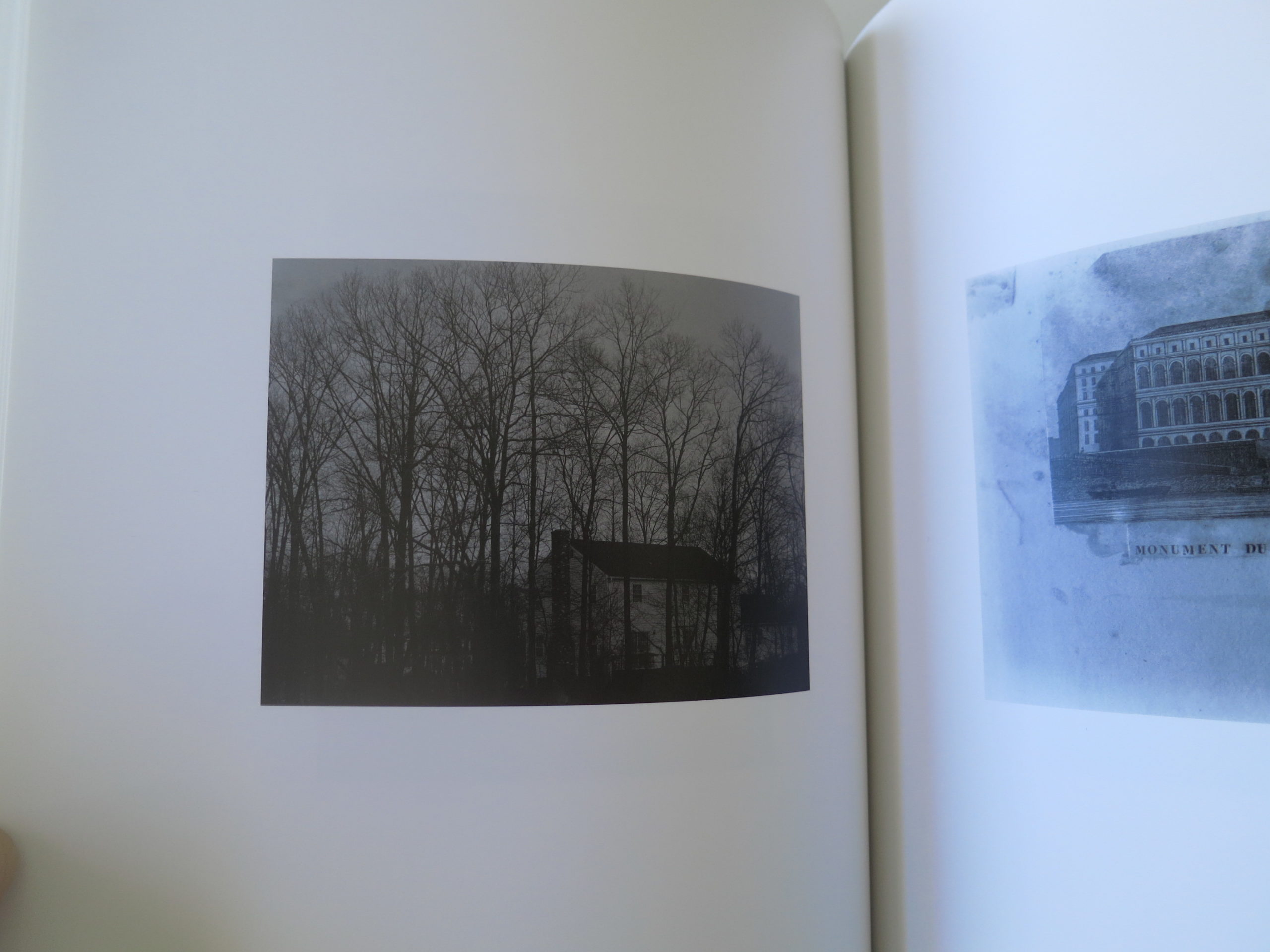
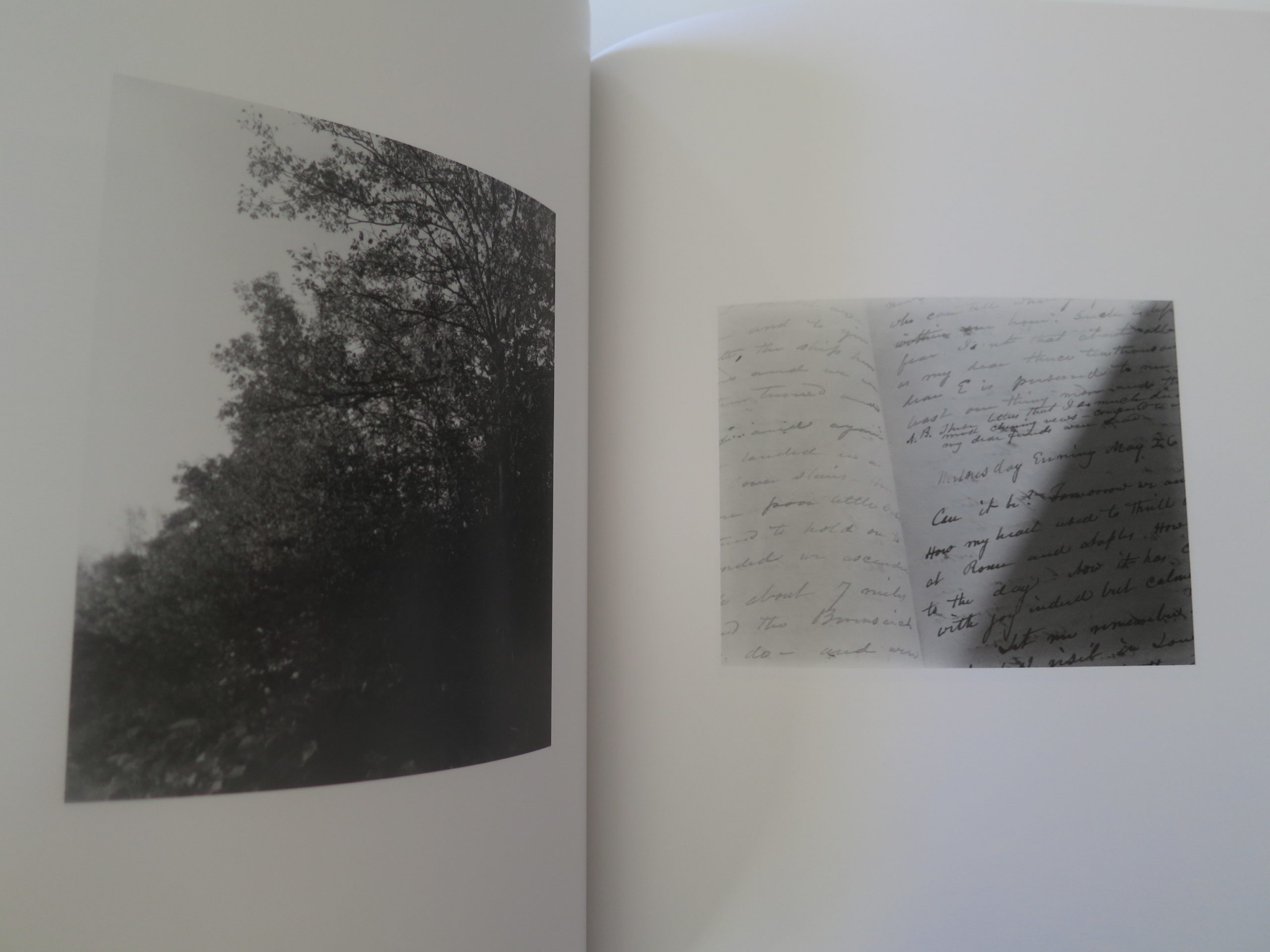
As far as I understand it, in the late 70’s, when Mr. Welling was a younger artist, he photographed the diary of his Connecticut ancestors, written by his great grandparents as they toured Europe, and he also photographed around his parent’s new home in Connecticut as well.
Black and white pictures.
Large format.
Somber.
His relatives had been prominent in the mid-19th Century: his great-grandfather both a Congressman and a Senator who rubbed elbows with Abe Lincoln. It is presumed, given the New England location and his family’s history of importance, that the Wellings are an old, prosperous, (or once-prosperous) WASP clan.
Such people are not known for expressing their emotions.
Quite the opposite.
We know this.
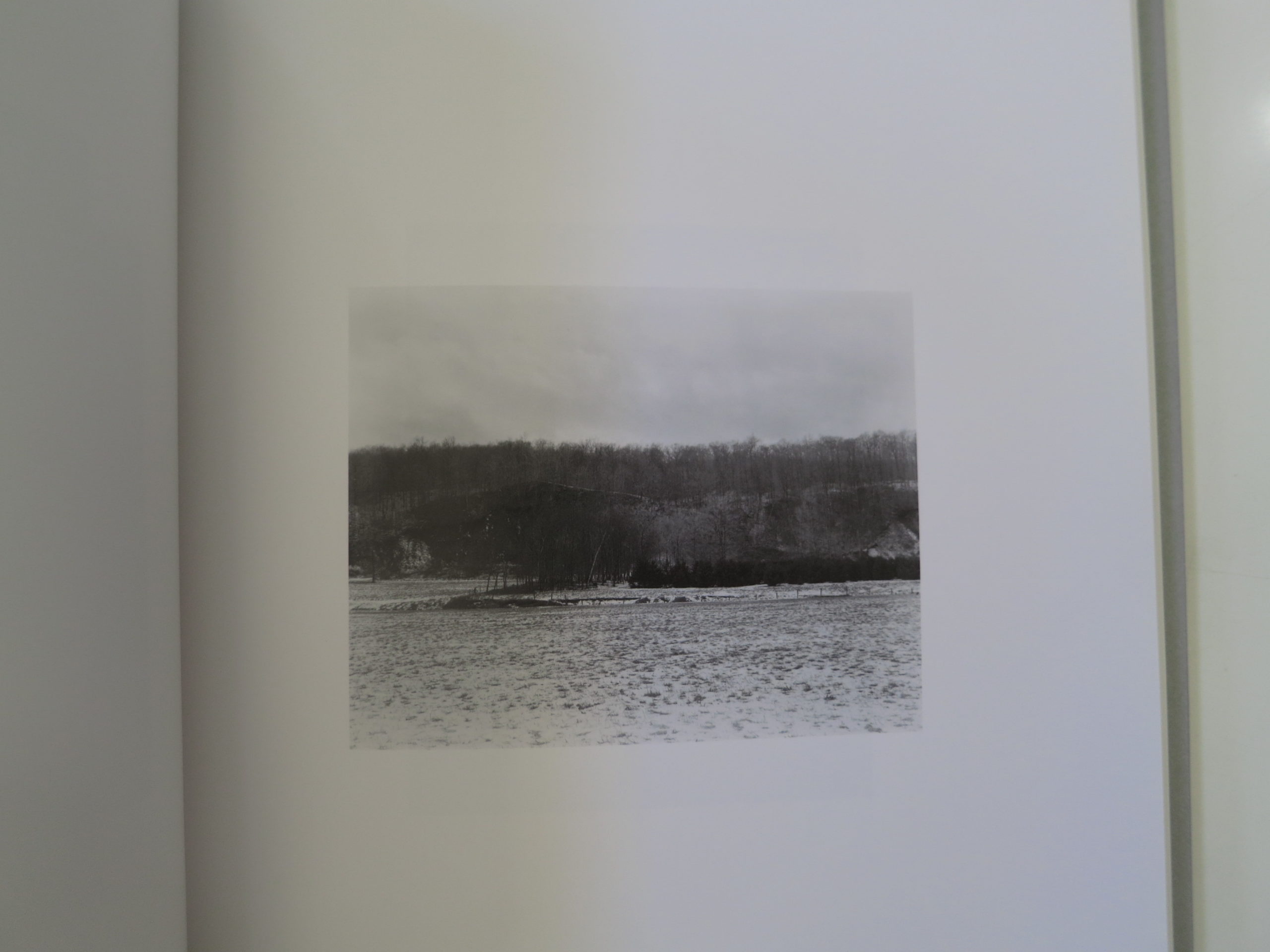
But the pictures in this book, the old diary pages and church steeples. The weathered siding and leafless trees. The barren fields and gnarled limbs.
It reminds me of those endless East Coast winters, when it can be cold and gray for months on end. You might not see the sun for 3 weeks. It’s torturous.
Just thinking of it makes me depressed.
That’s the thing about this book.
It’s kind of weepy.
Elegiac.
The pictures are beautiful, and they express emotion, which, given the cultural milieu, is a rebellious act. Though it’s certainly understated, I like it very much.
Because, like that blasted Pixar film “Inside Out” branded in our brains forever, sadness is a genuine emotion. It’s a part of our identity that cannot be ignored, nor willed away. Huge swaths of life are tragic, and having that feeling pervade an object like this is not an easy feat to accomplish.
So for all of you out there, living in places like Upstate New York, or Upper Peninsula Michigan, I’ll make sure to put my face in the sun every day for you.
I promise.
Bottom Line: Beautiful, bleak, black and white photos from New England
To Purchase “Diary/Landscape” by James Welling go here.