The Daily Promo: Trevor Traynor

ZWondrous zver 2


spread1

spread2

spread3

spread4

spread5


Trevor Traynor

Who printed it?
Printed by magcloud. I have always favored the square format and magcloud offers a great 8” x 8” template.

Who designed it?
I designed the book and edited the images; I enjoy pairing photographs and forming them into diptychs.

How many did you make?
Each volume is signed/edition of 100. Approx 20 are sent out for promotion and the other 80 are sold.

How many times a year do you send out promos?
Every January I mail out a limited book that showcases my travels, and explorations from the previous year, I’m currently up to Vol 4. The first 3 volumes are sold out and Vol. 4 has 18 more copies remaining. Shop.TrevorTraynor.com

I donate the proceeds split between 3 charities:

BEST FRIENDS ANIMAL SOCIETY.
BestFriends.org
“Save Them All”

PLANT A BILLION TREES.
PlantABillion.org
“protecting nature, preserving life”

SMILE TRAIN.
SmileTrain.org
“Help make 1 million smiles

Also I saw that you sent two promos, are you sending out two to everyone? 
I send out promos twice a year. The 2nd is usually a postcard, or foldout piece promoting my commercial and editorial work.
Vol I – Vol 3  are shot and edited using the iPhone and  Vol 4. is 97% iPhone. I had a few images I thought meshed really well to complete the collection so I included them.

How long have you been doing this project?
I started this project 8 years ago but never released the first four books. They were a collection of images created using an assortment of Film and Digital Cameras. The images were shots that I liked but never really had a home, or a series to be a part of; it started as a way to organize my favorite snapshots.

This Week In Photography Books: Melissa Ann Pinney

by Jonathan Blaustein

I got yelled at on Monday. (It was expected, but unpleasant.) Sometimes, even when you know what’s coming, you still can’t get out of the way.

We’d just changed the hours of our art labs at UNM-Taos, and as the Chair of the Fine Arts Department, a low-level manager in an unwieldy bureaucracy, it was my job to enforce the rules.

There’s an old saying about killing messengers, and as I stepped through the open door of the Print lab, I was fairly sure that drama was imminent. The door was meant to be closed, locked, the better for students to see the fresh sign declaring our new schedule.

I knew the man in the far corner of the room. He’d been to my wedding, though we didn’t speak that night. His parents were friends with my in-laws, his late Aunt one of the most famous actresses who’d ever lived.

That didn’t matter, as he’d been sharp with me in the past, and had an edge about him like a red aura. (Is red the color of angry auras? I don’t know, but it seems appropriate.) He glared at me, begging for trouble, waiting for the slightest provocation.

I tried to sound confident as I told him he couldn’t be here, even though he was. The rules had changed, it was decided by my superiors, not my idea, just doing my job. A not-my-fault ramble that was never going to succeed.

“You’re a liar,” he shrieked!

Spittle flew like paper airplanes, slowly arching towards the ground.

“A liar! This is all your fault! You’re trying to ruin the Printmaking department! I know you are!”

I could see I was getting nowhere, so I retreated to marshall reinforcements. I returned with a calm, confident administrator, one better accustomed to dealing with the crazies, and wielding bureaucratic power with a sense of finality.

He listened to her as he couldn’t with me. As I opened my mouth to speak, his face flushed again, and he bellowed, “Back off, Junior,” at the top of his lungs.

As there were now two of us to deal with problem, when only one was strictly necessary, I left the room, crossed the hall, and began to teach my photography class. The stress chemicals pulsed through my bloodstream, but I knew I’d be OK in a little while.

Back across the hall, two people still talked about rules, and systems, and why change is hard. Fortunately, this pair was able to communicate well enough. (Better than the first pair, anyway.)

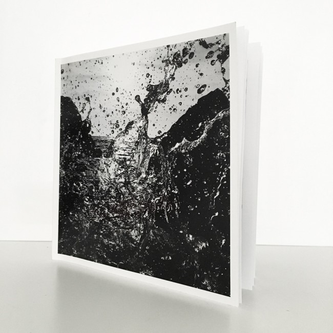
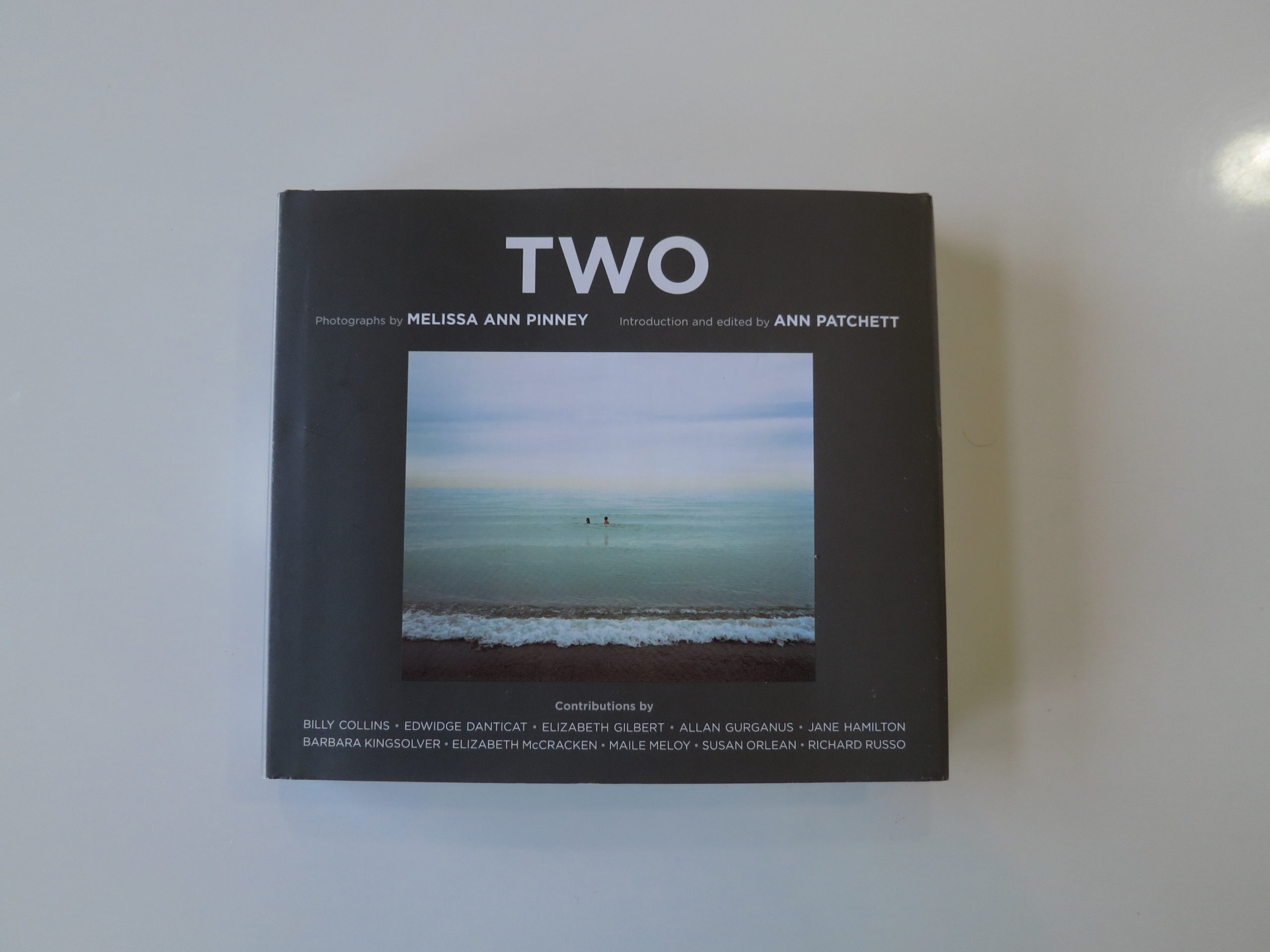
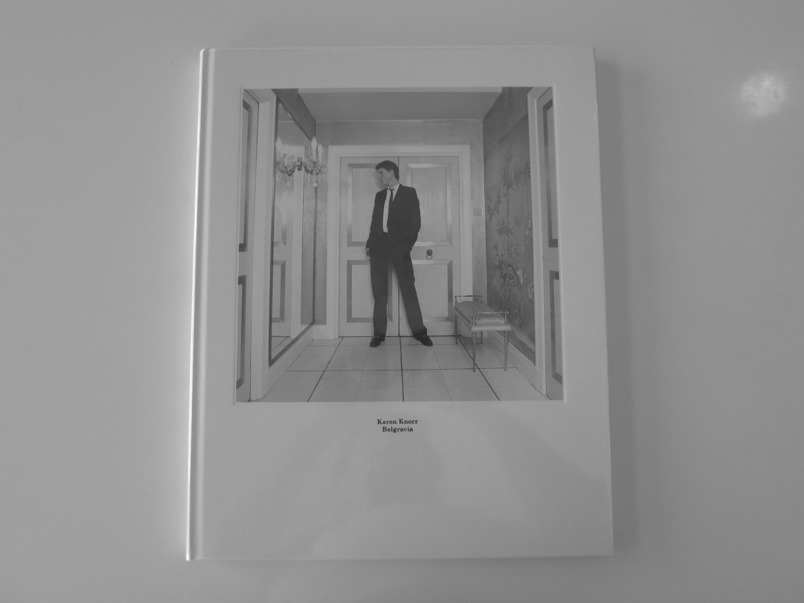
I’m in mind of such things after having read, and perused, “TWO,” a new book by Melissa Ann Pinney, edited by Ann Patchett, published last year by Harper Design.

Ms. Pinney gave me this book in September, shortly after I’d finished my “21st Century Hustle” lecture at the Filter Photo Festival in Chicago. She paid me a nice compliment, handed it over, and asked that I take a look at it when I had some time.

This happens to me fairly often, at festivals, and as there was a long line of people waiting to speak with me, I said thank you, and tucked it away. It came home with me, and my wife placed it prominently on the shelf. (At least SHE thought it was special.)

It must have been Ms. Pinney’s mellow, polite mien, because the event didn’t stick in my mind. A couple of months later, she emailed to see what I thought of the book. Embarrassed, I realized I ought to take look at the thing.

I took it off the shelf, and promptly did a double-take. No, a triple-take, when I saw the cover. This photobook featured essays by Elizabeth Gilbert, Barbara Kingsolver, and Susan Orlean.

What now?

In fact, ten prominent authors had contributed stories, and Ms. Pinney’s bio, on the back-flap, stated her work was in the collections of the Metropolitan Museum of Art, MoMA, the Whitney, the Art Institute of Chicago, and a few other massive institutions.

This was a prominent, important artist, working with major writers, and somehow, in our little micro-moment, none of that came across. No ego, no attitude, nothing beyond a few gracious words, patiently expressed.

I felt ashamed, and promised myself I’d give the book its due, once I had the time.

Well, today, 4 months later, I was able to stop my natural momentum, get on the couch, and start reading this thing. Reading pictures, yes, but reading words, more importantly, as that’s what sets this book apart.

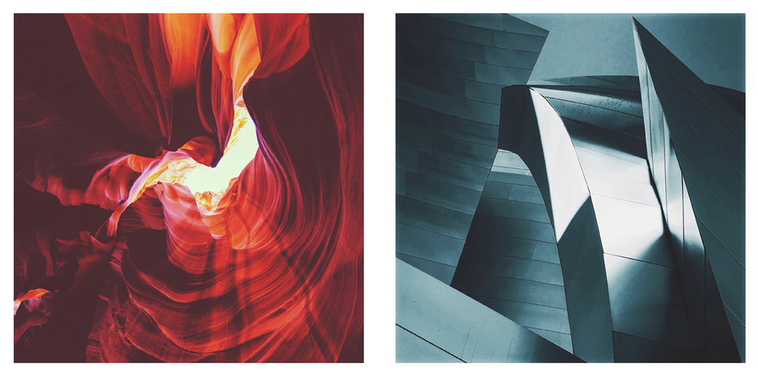
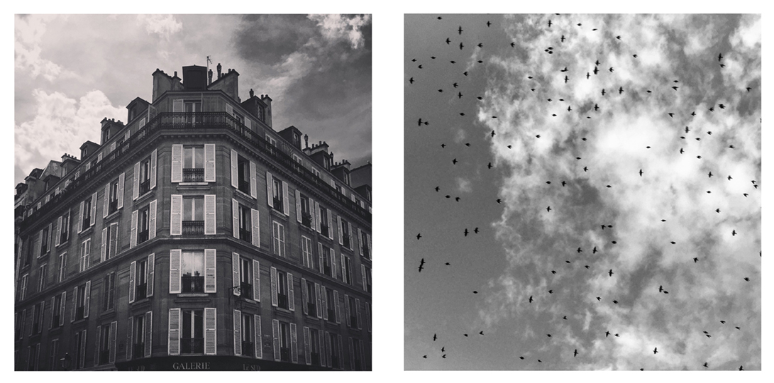
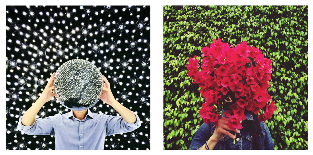
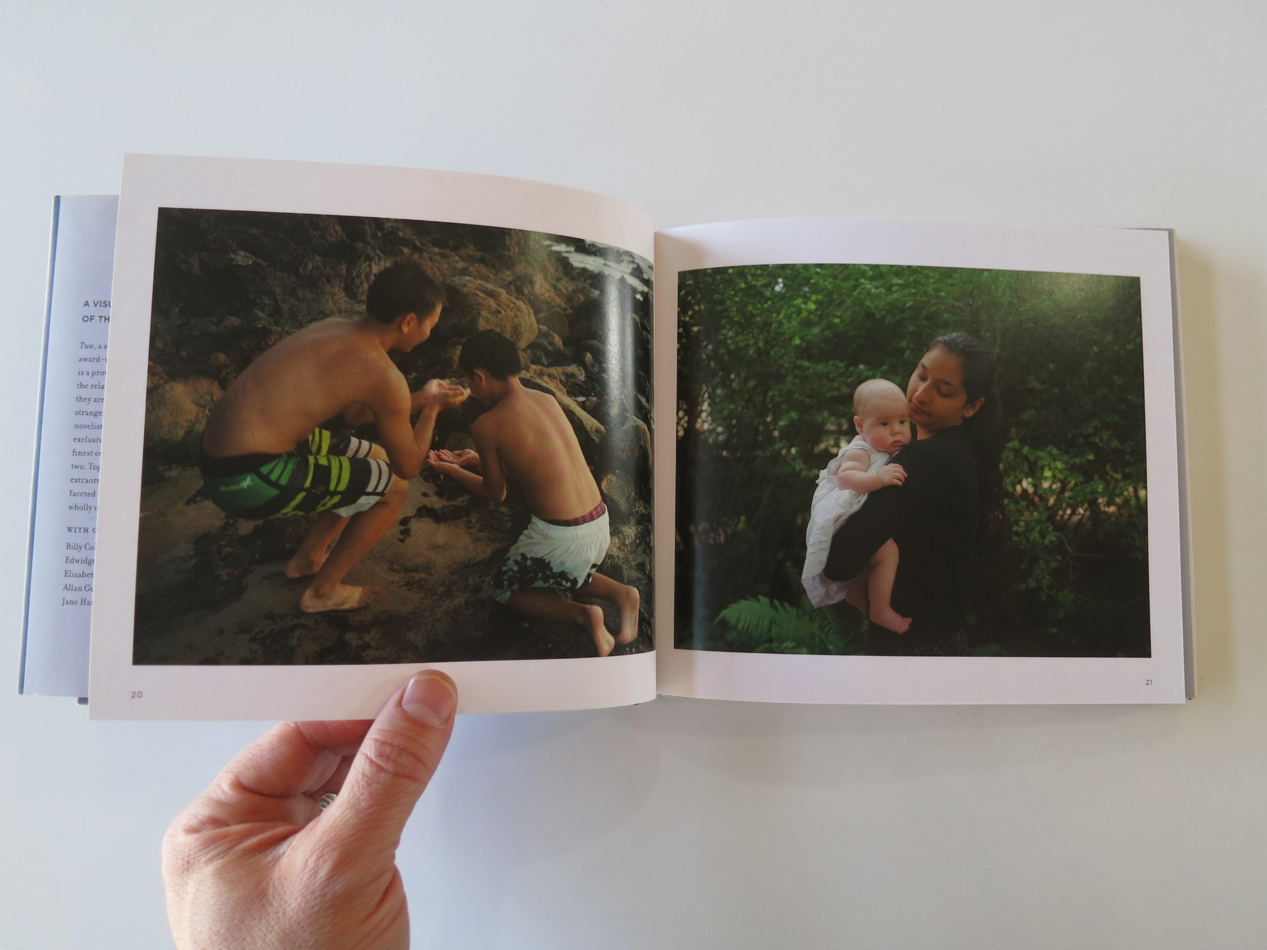
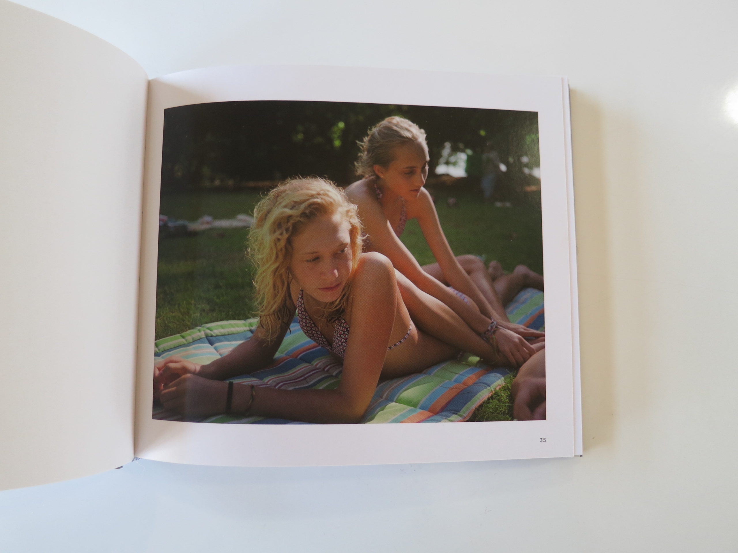
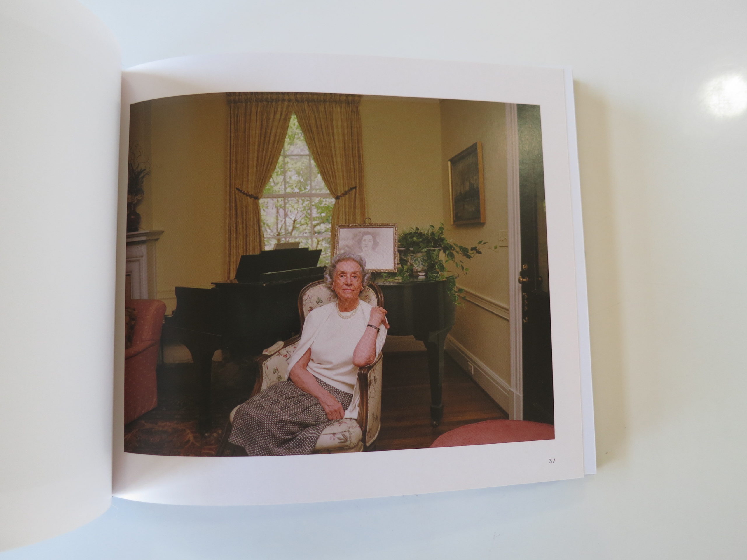
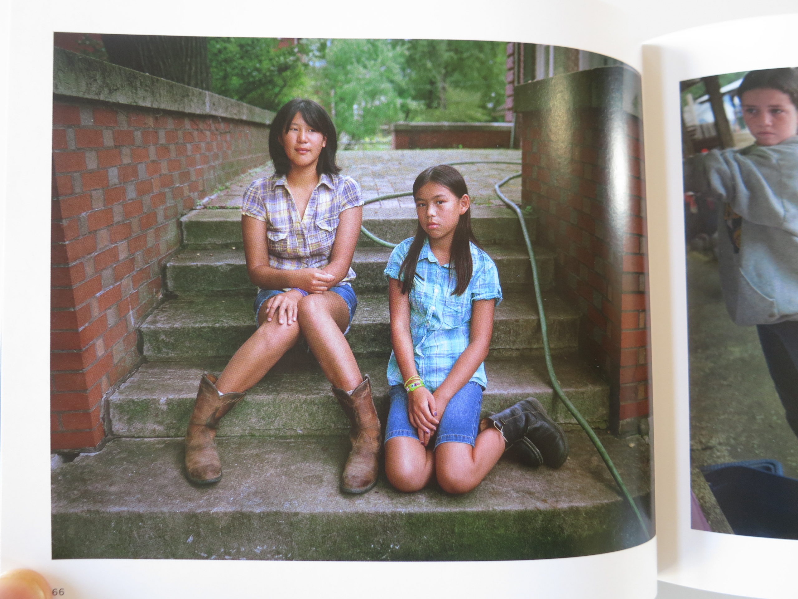
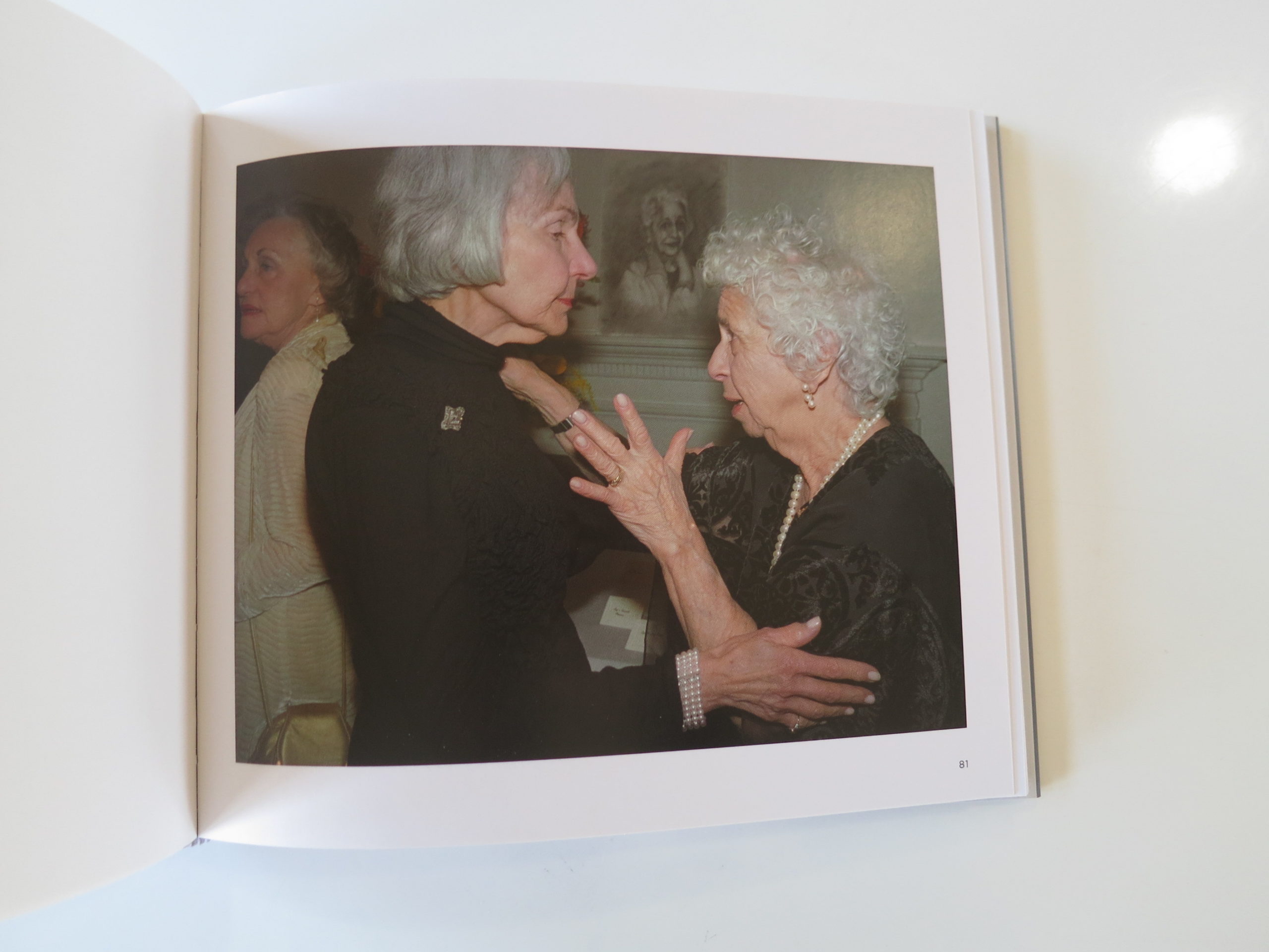
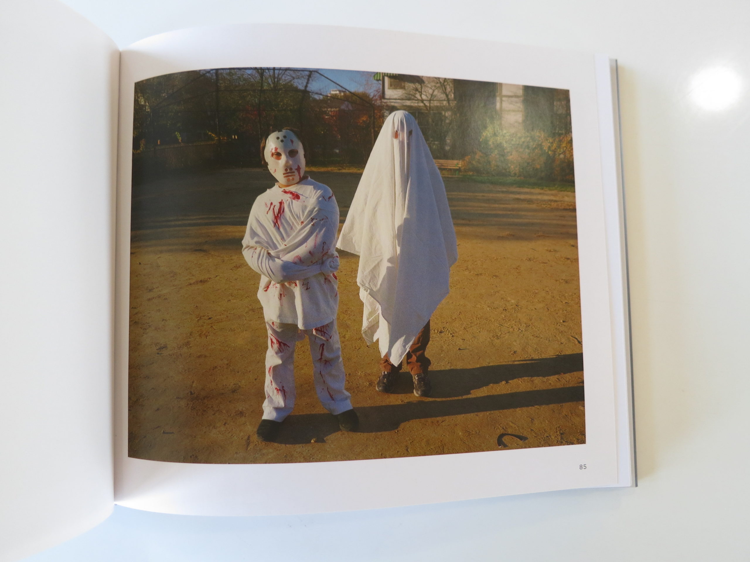
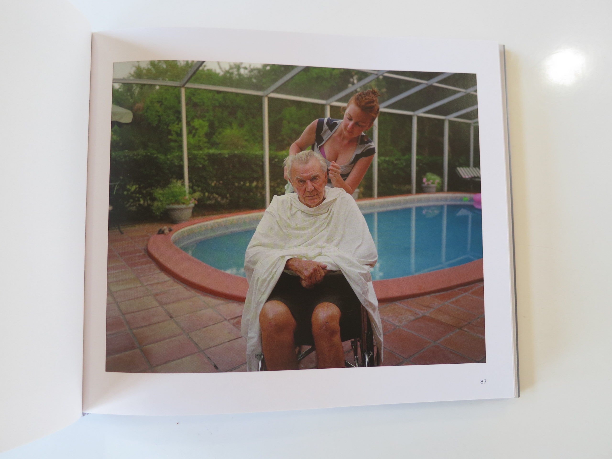
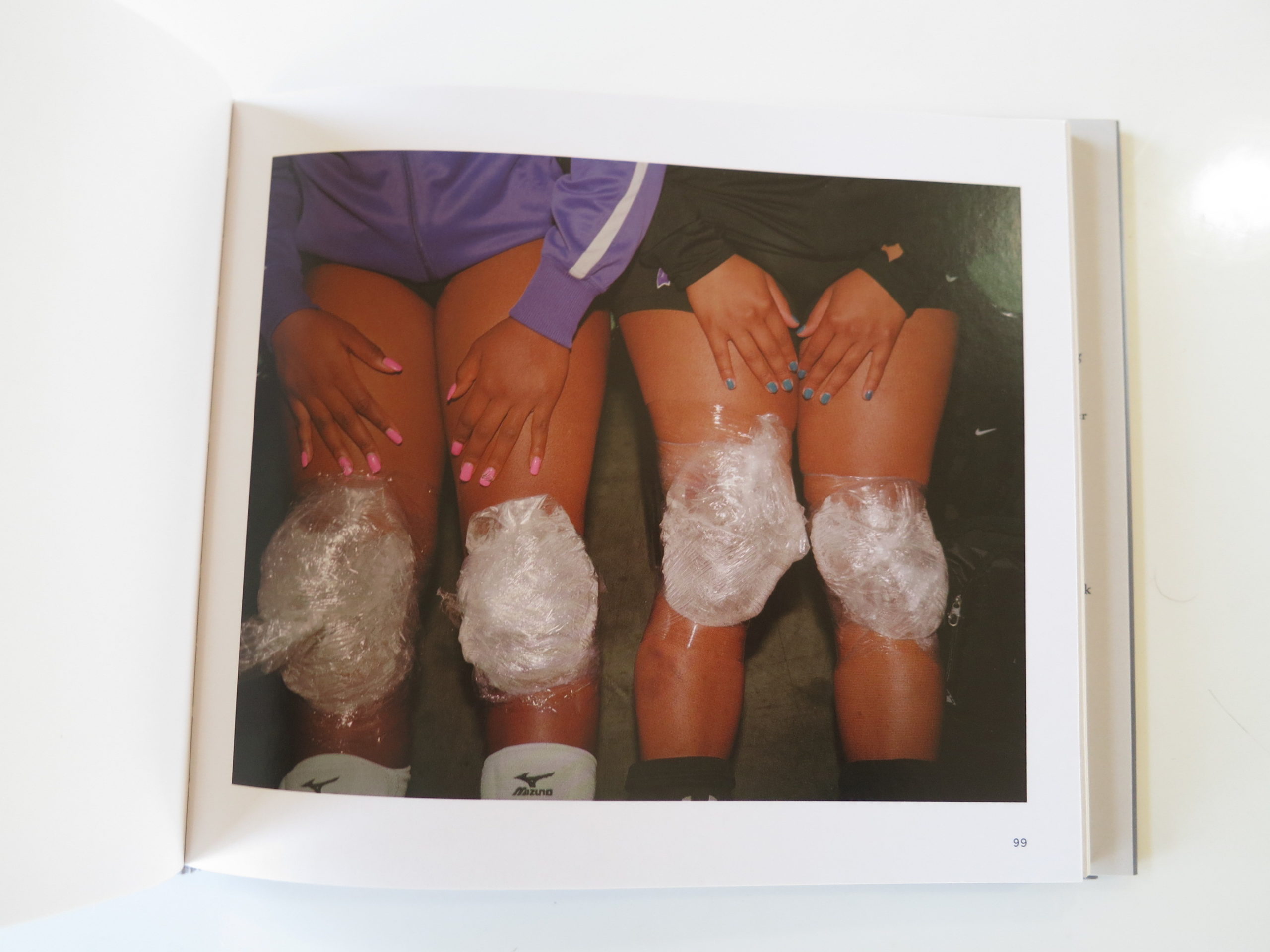
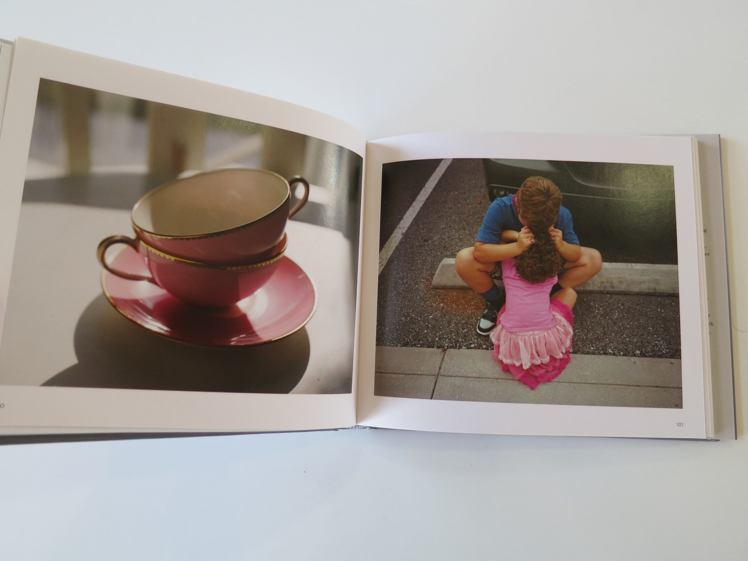
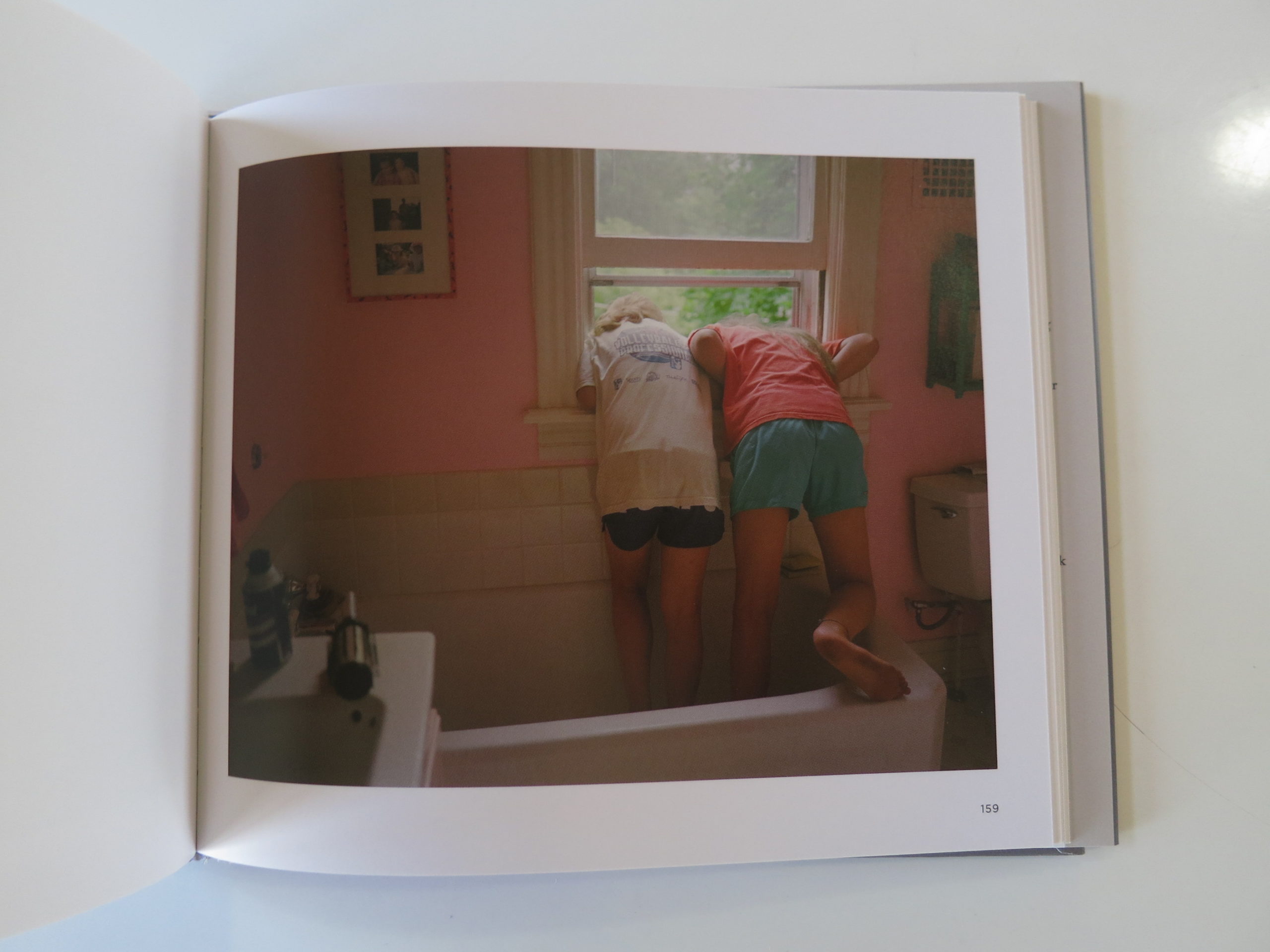
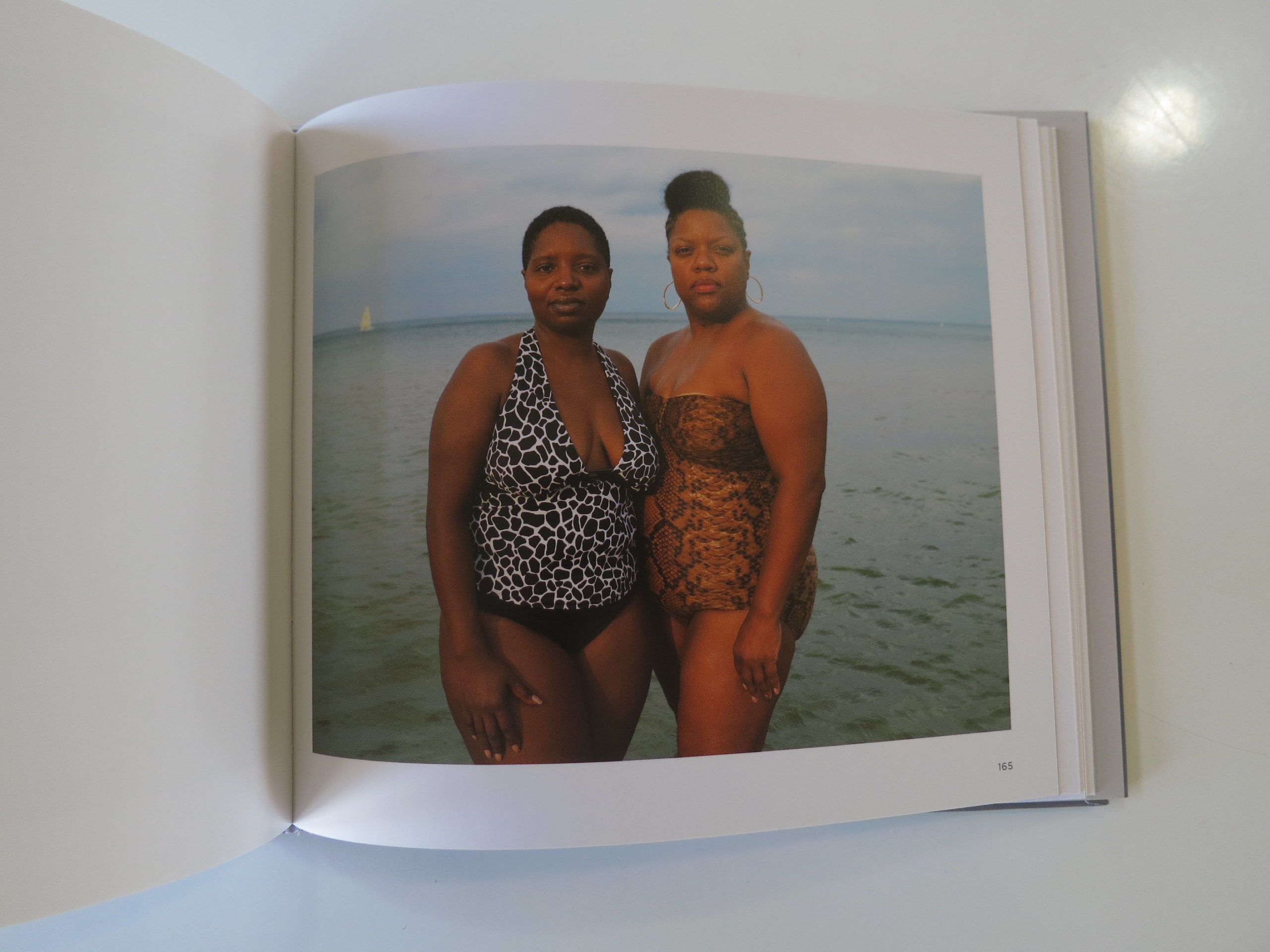
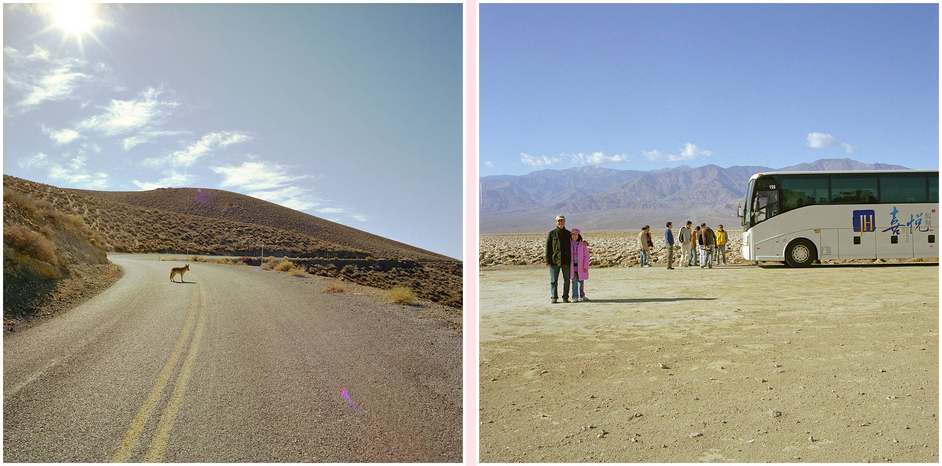
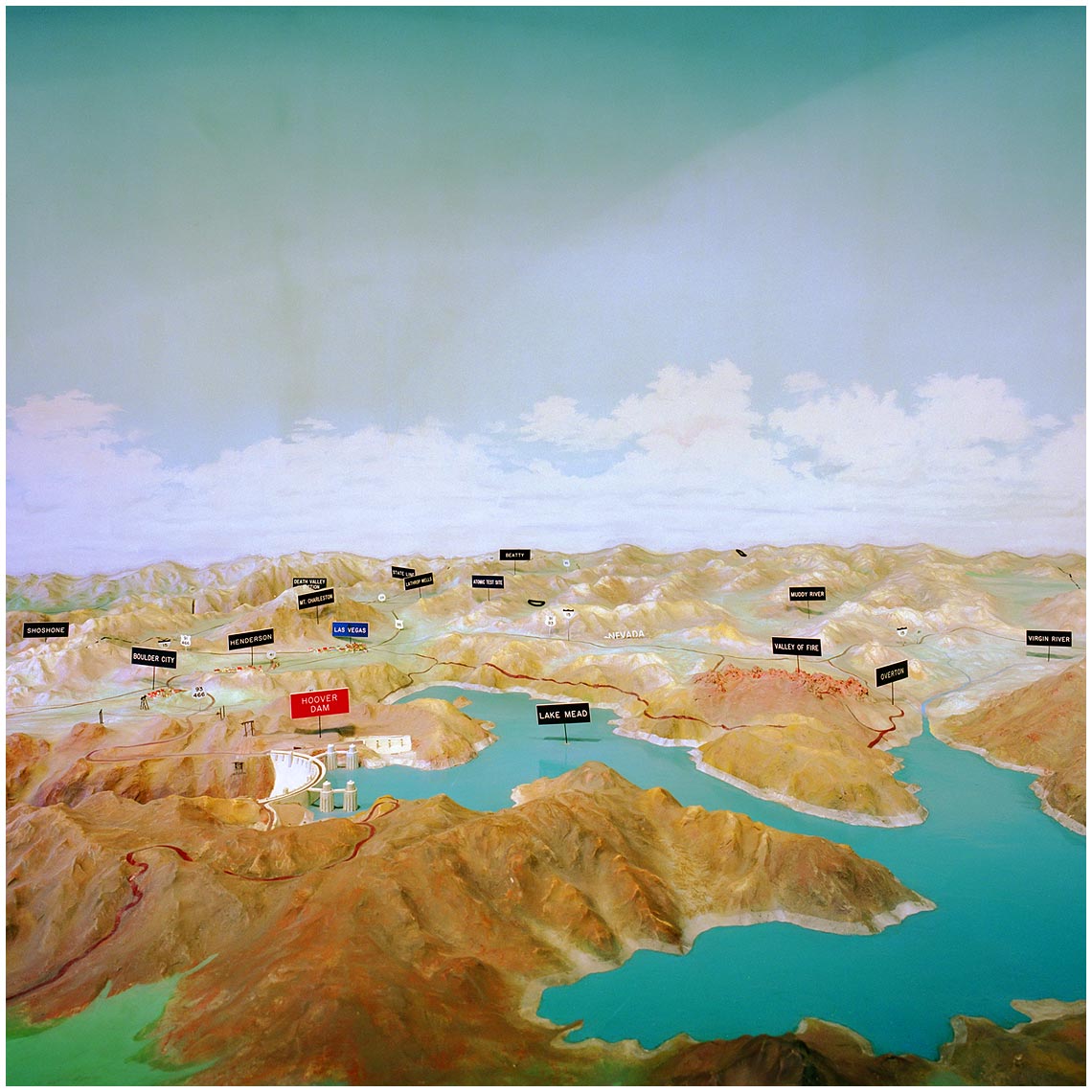
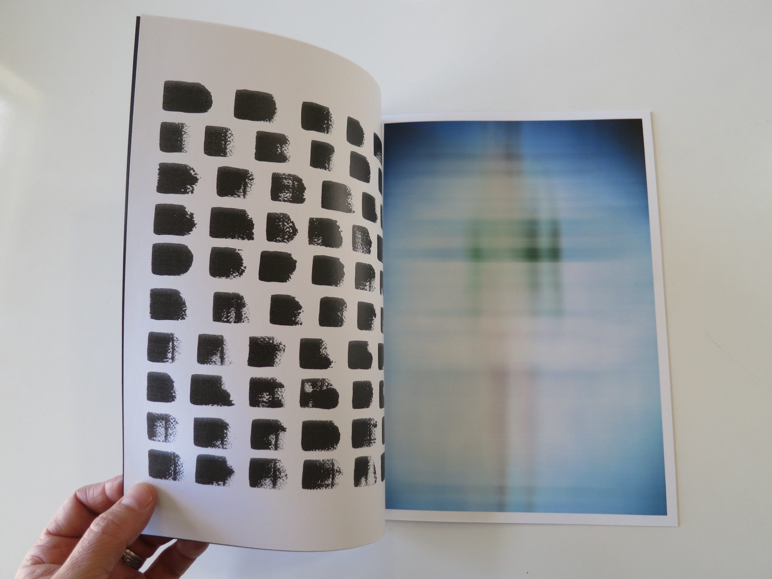
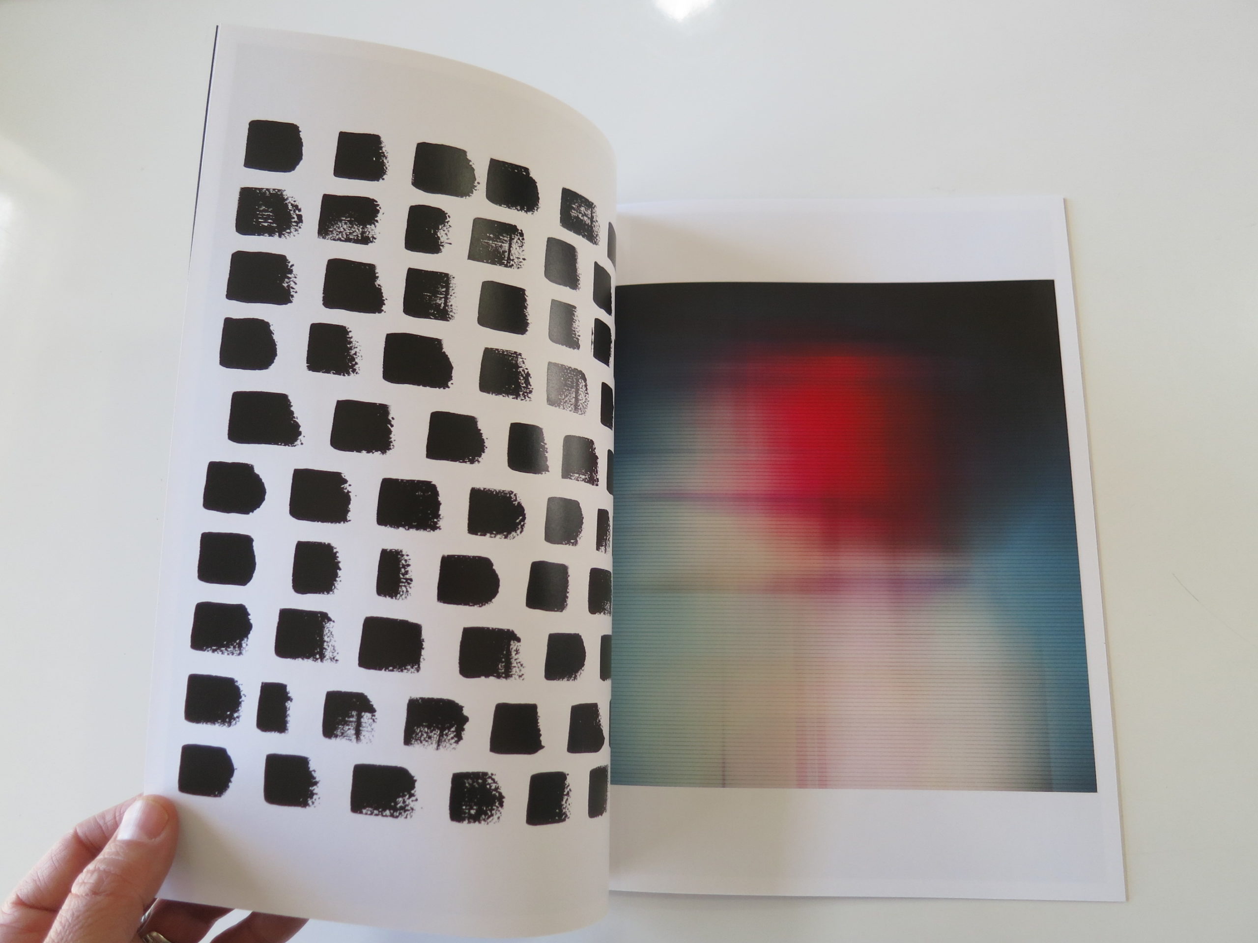
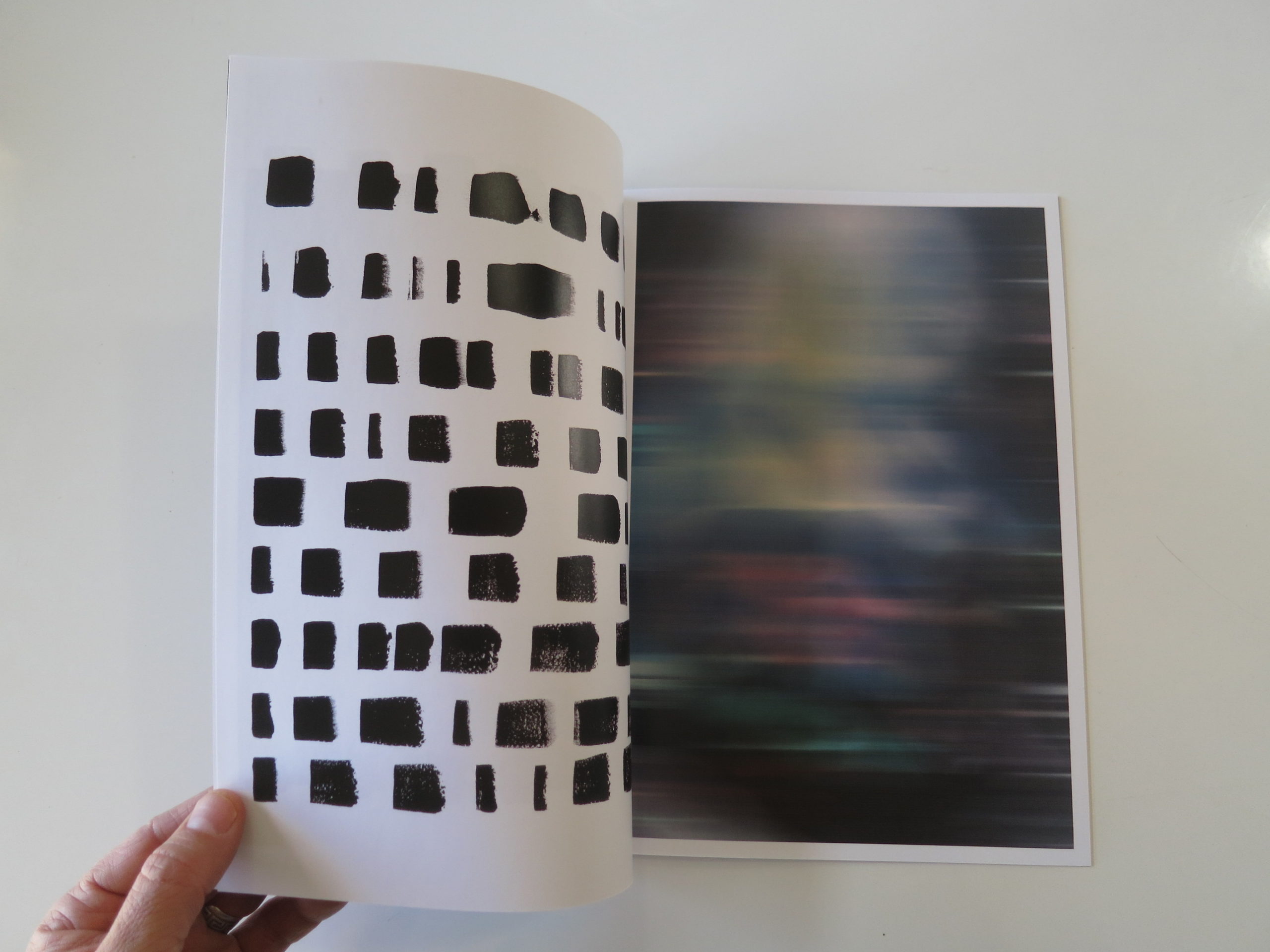
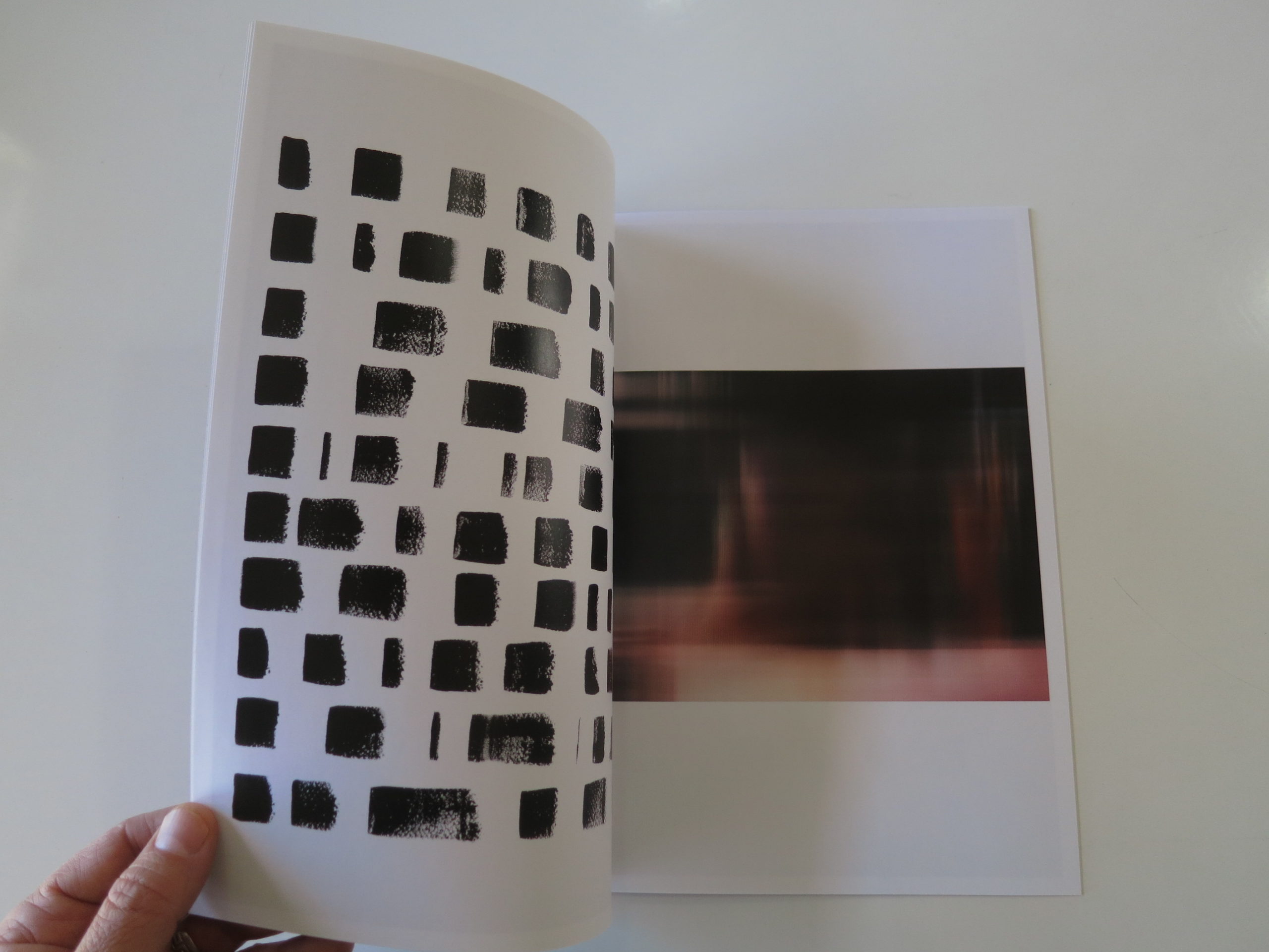
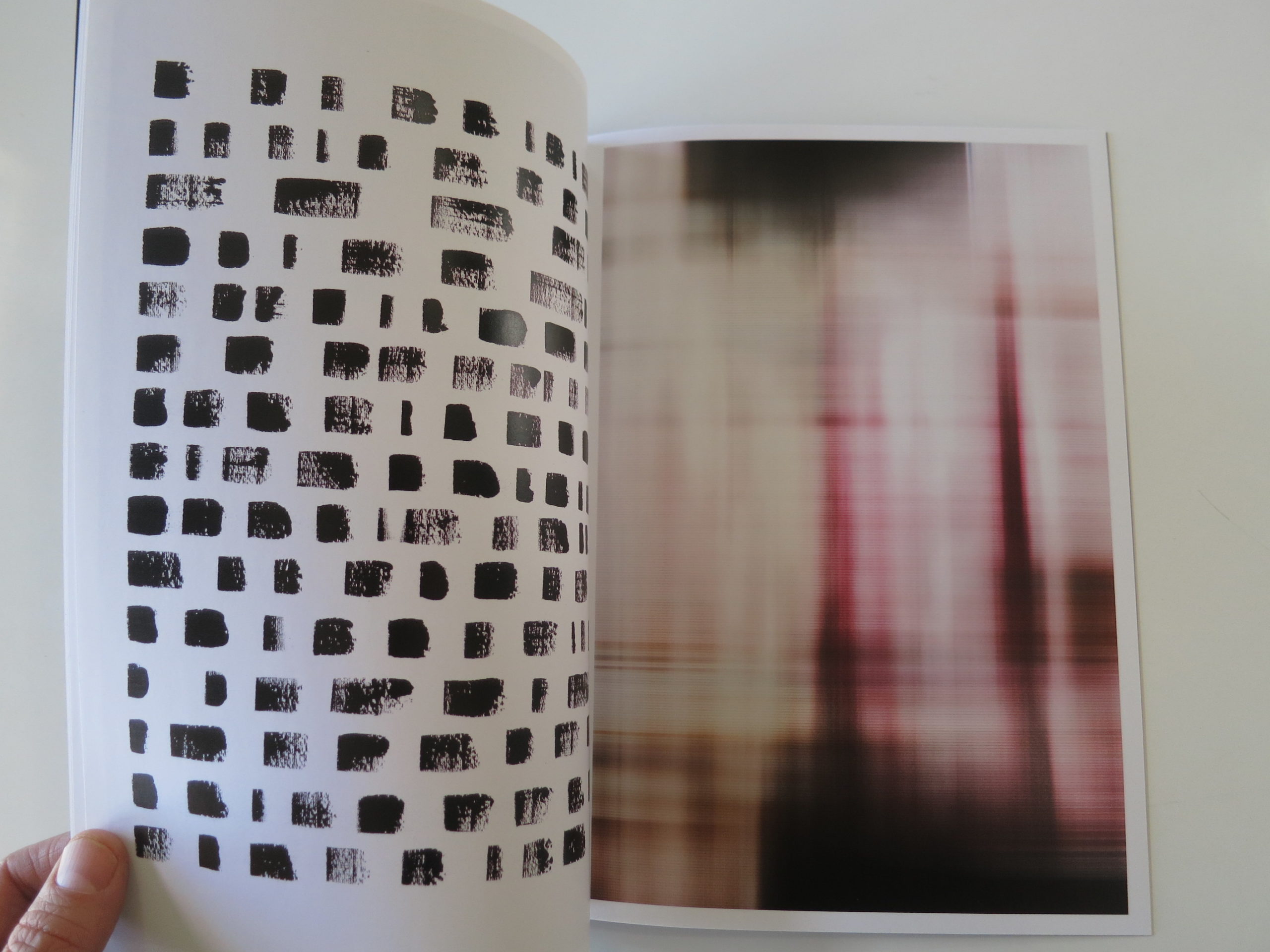
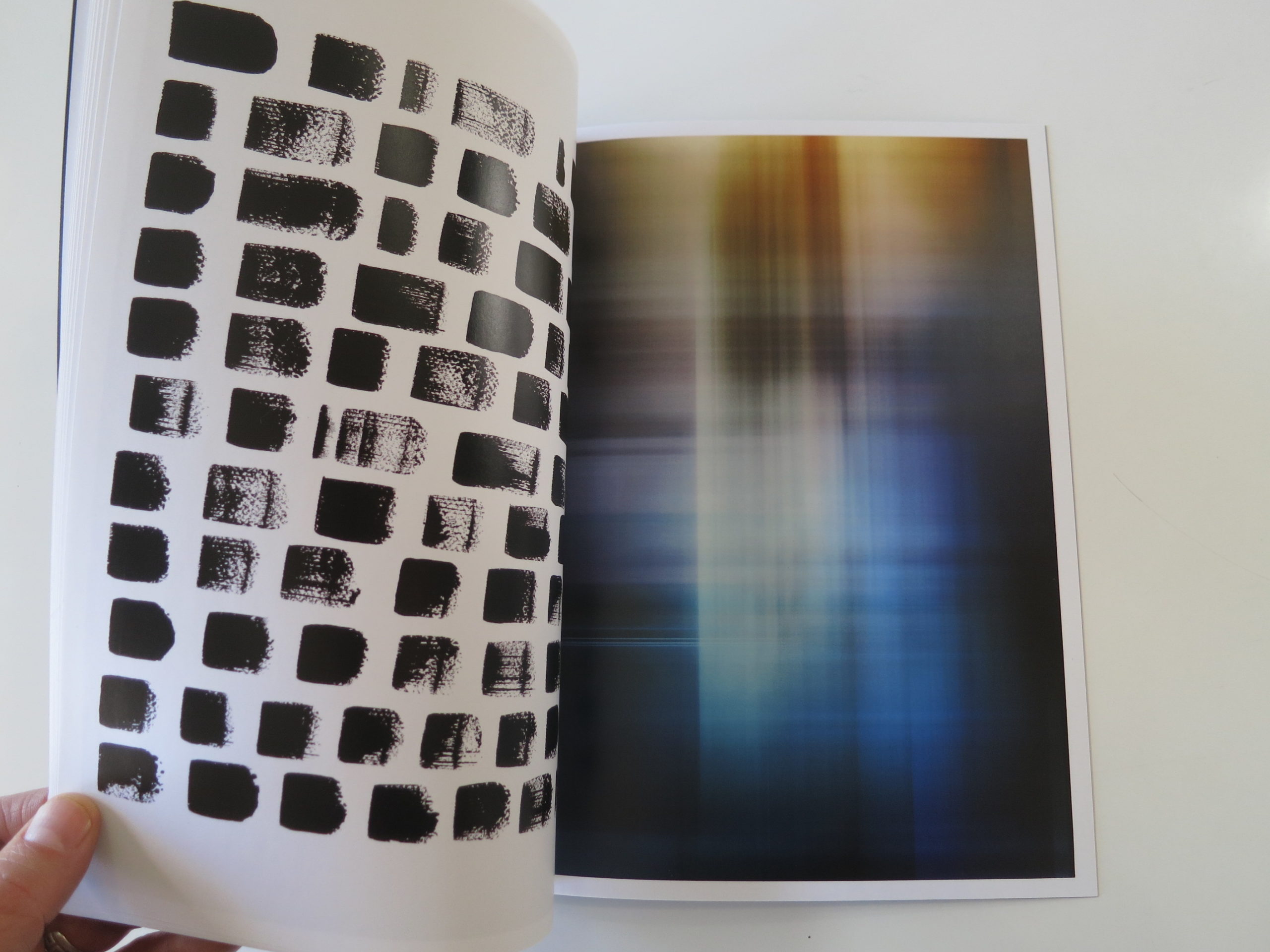
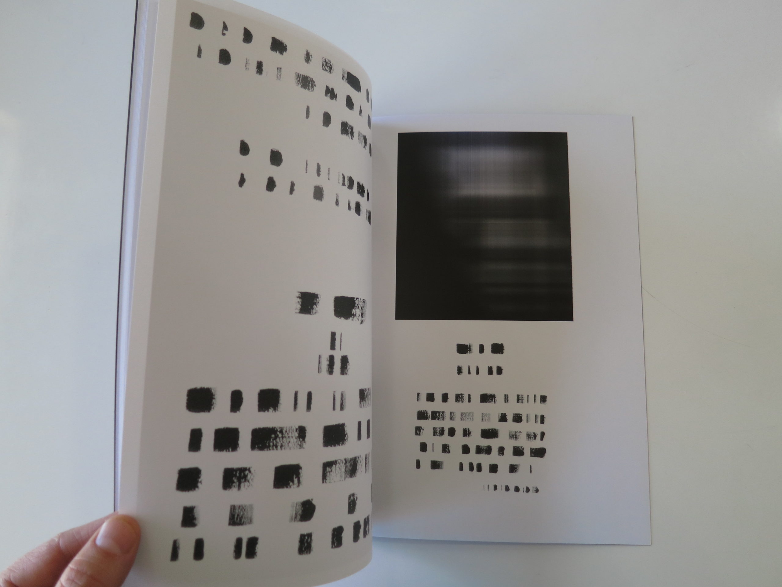
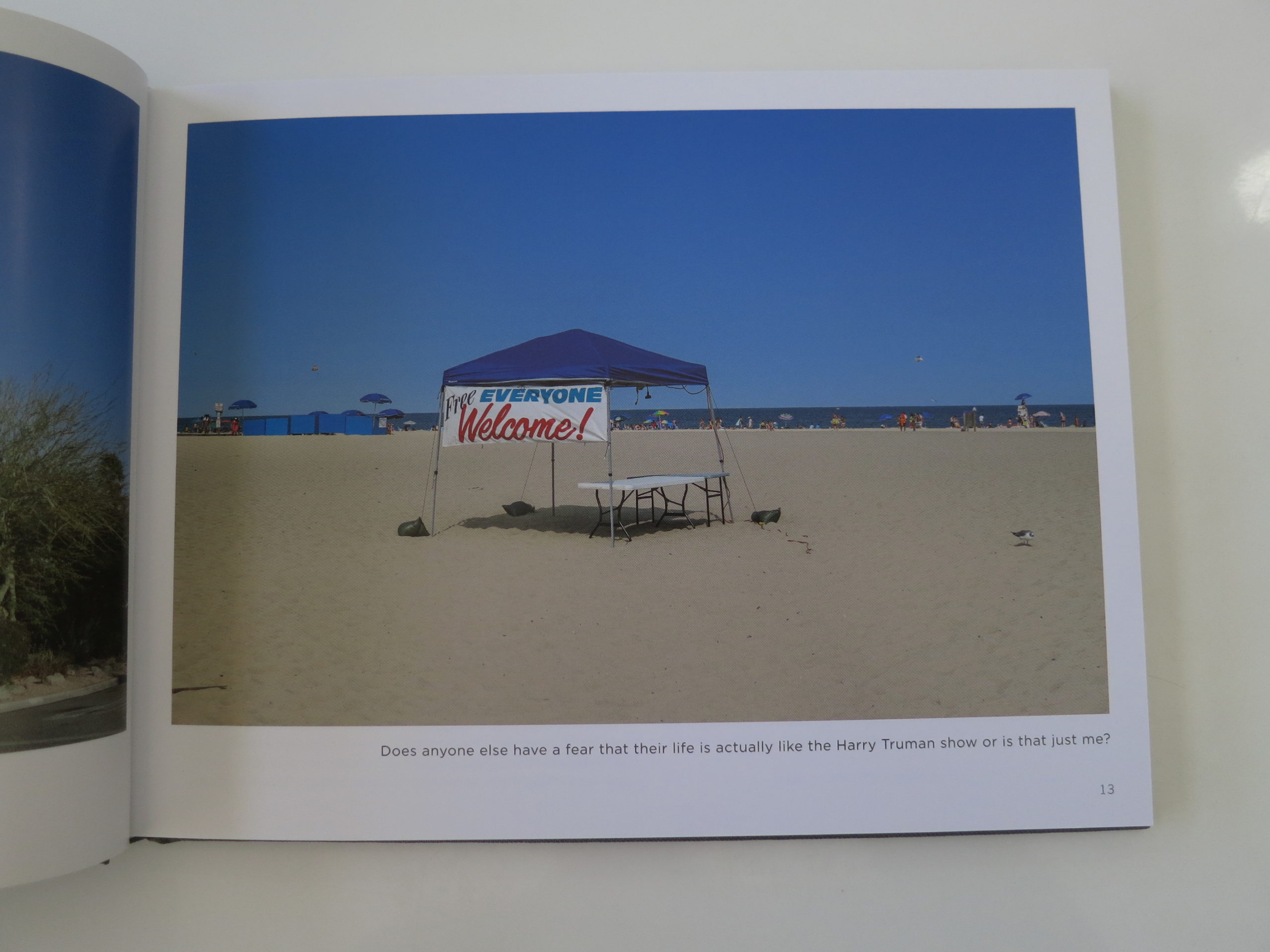
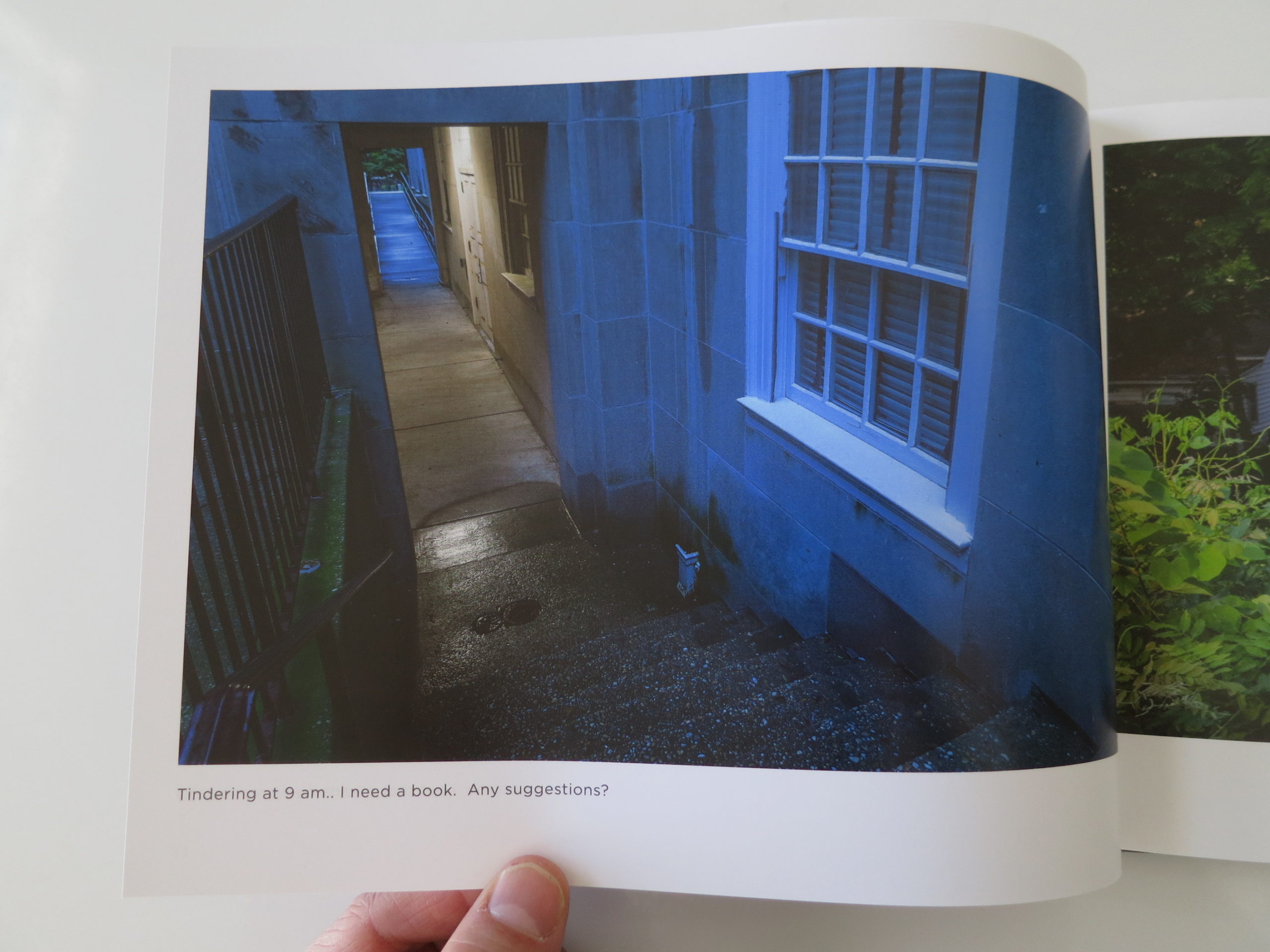
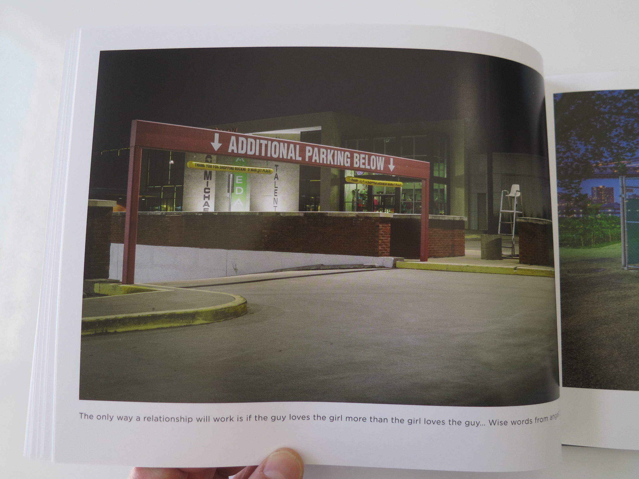
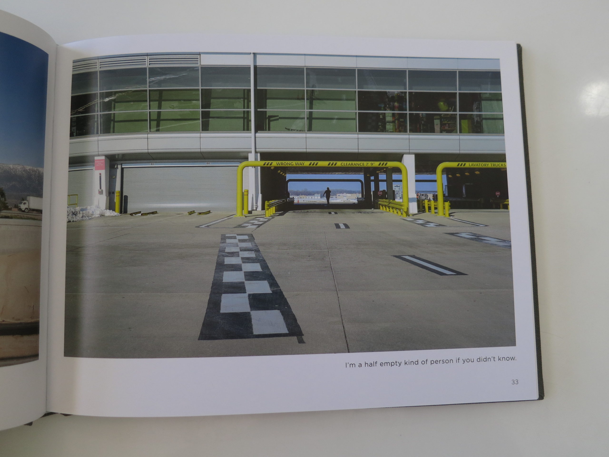
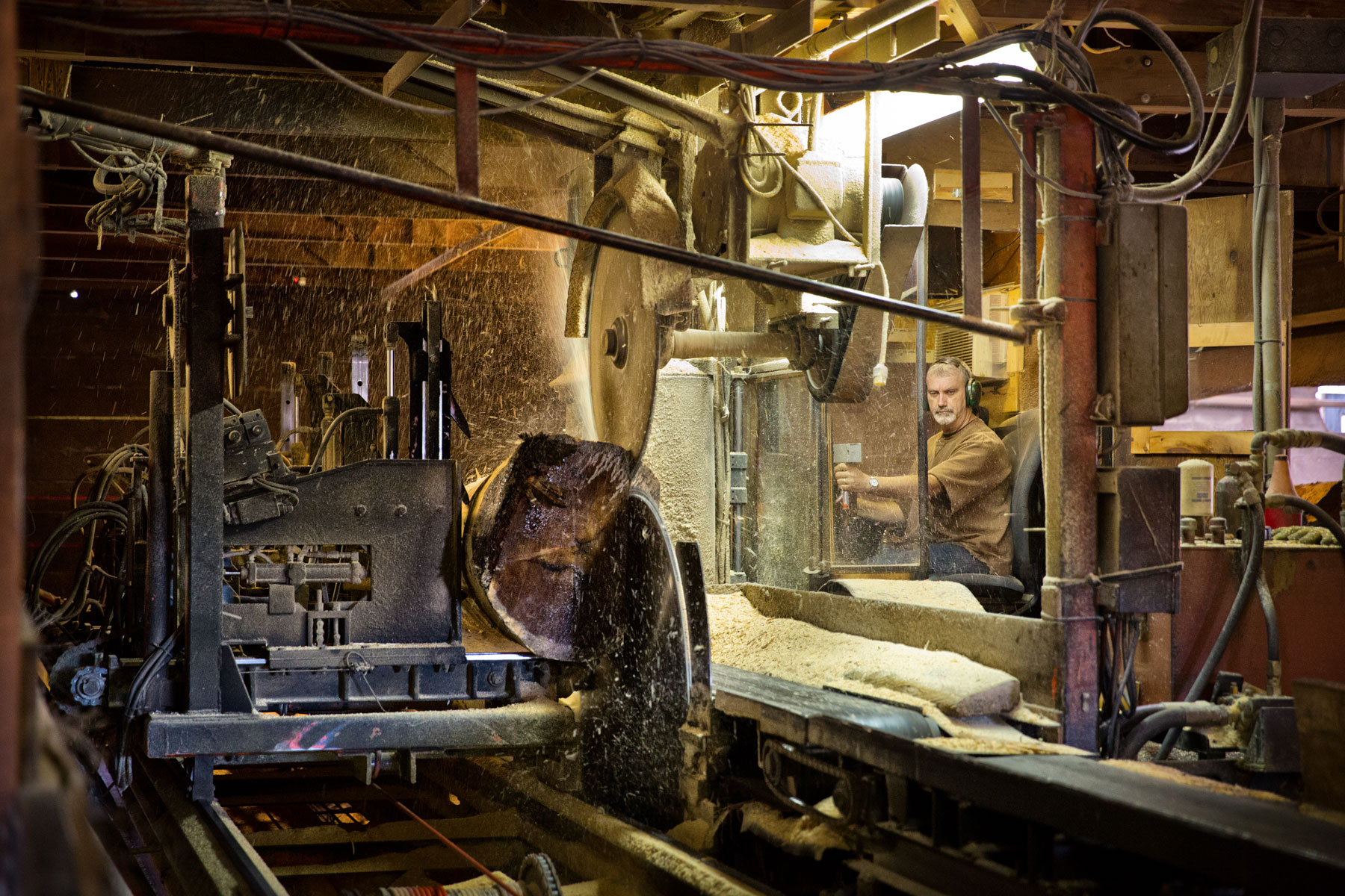
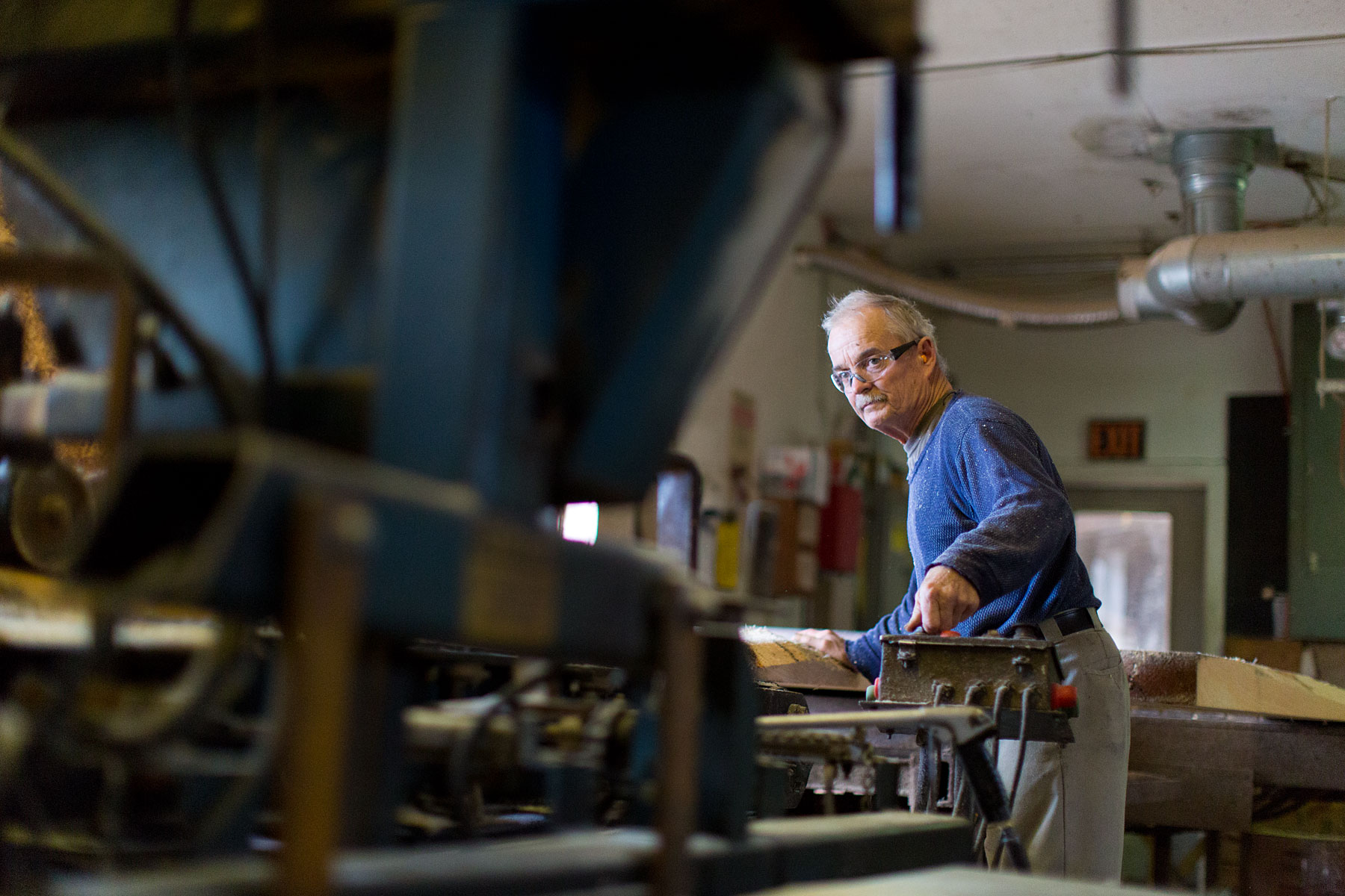
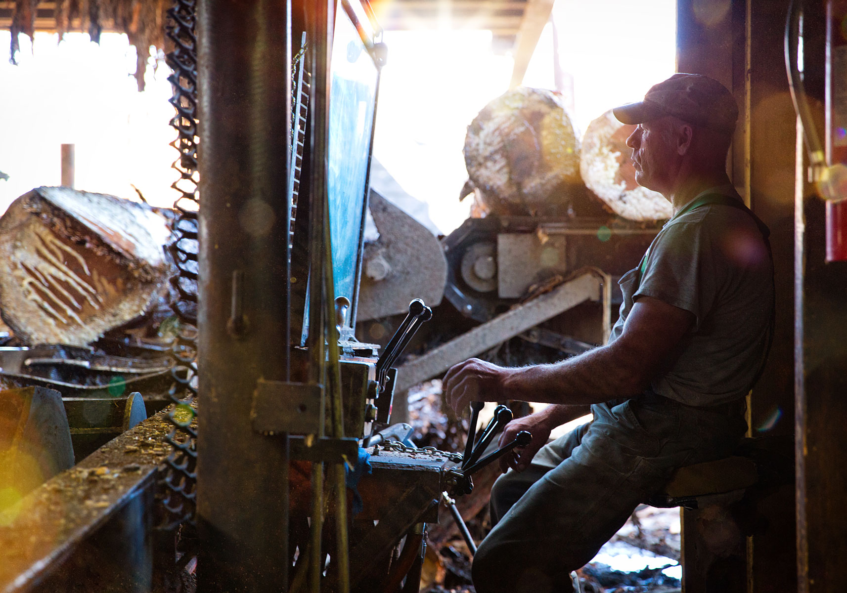
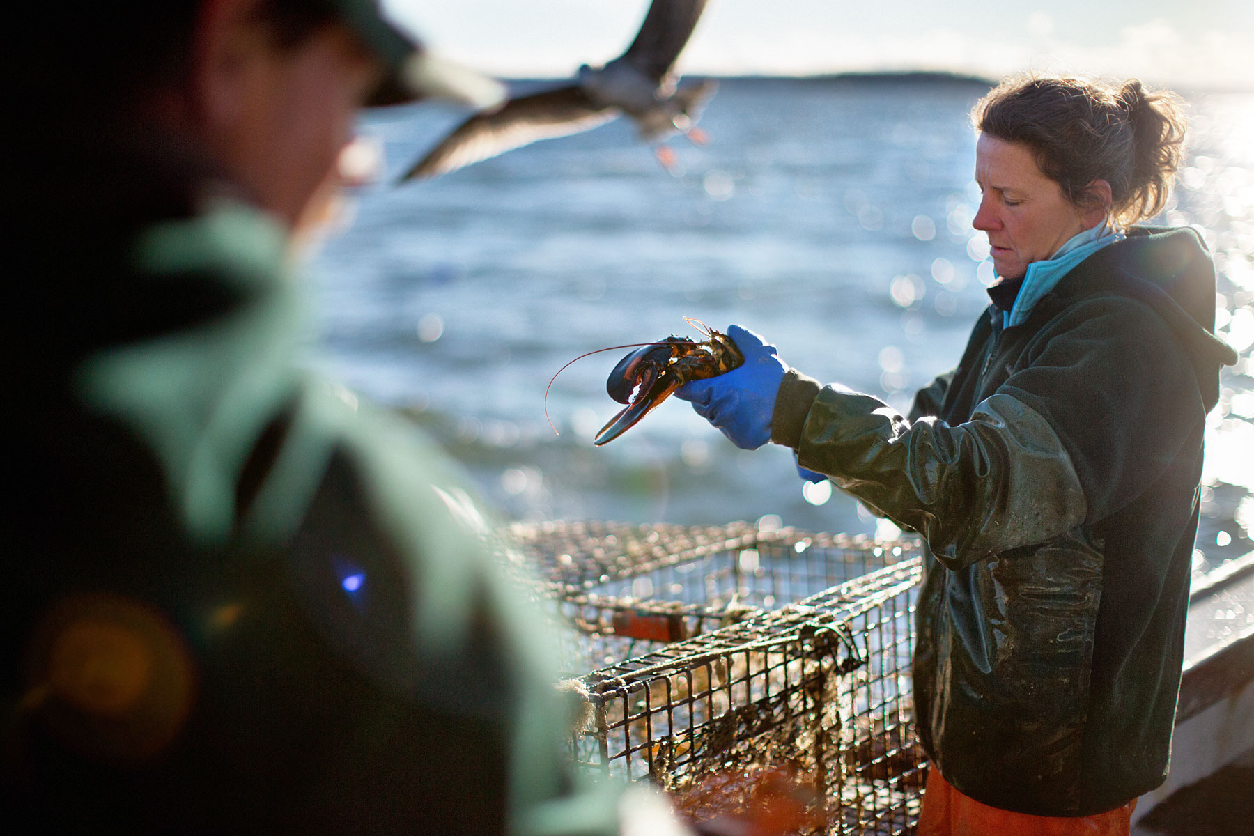
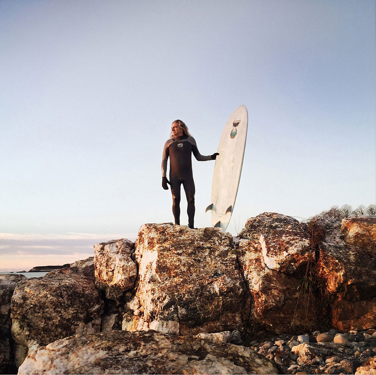
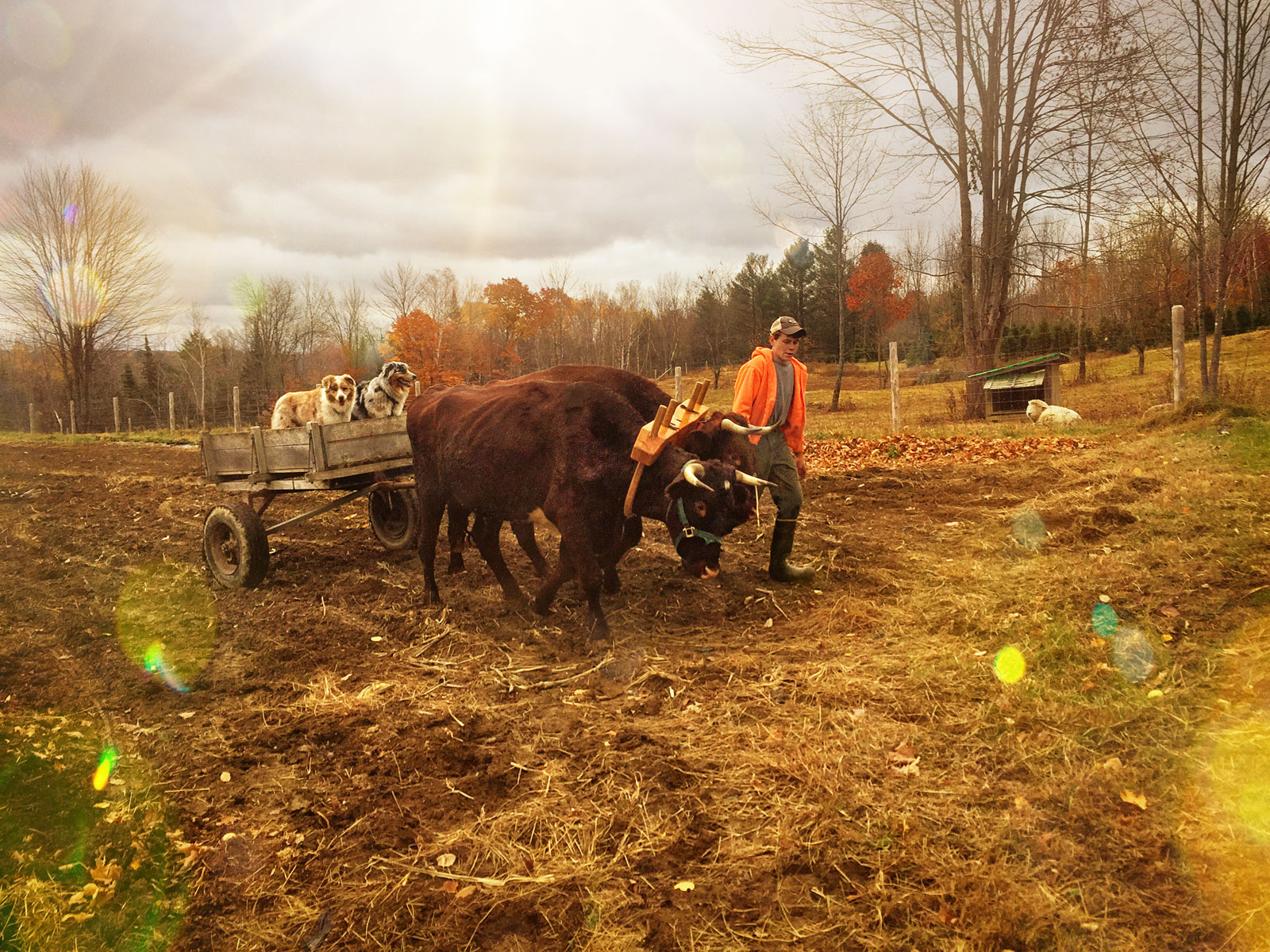
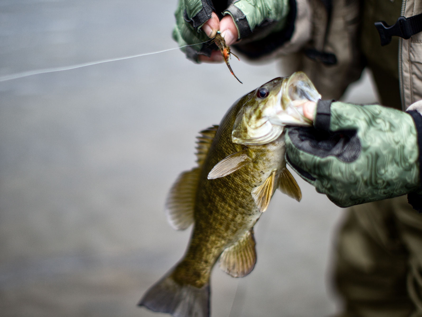
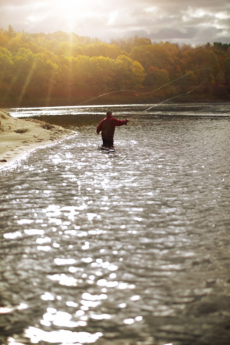
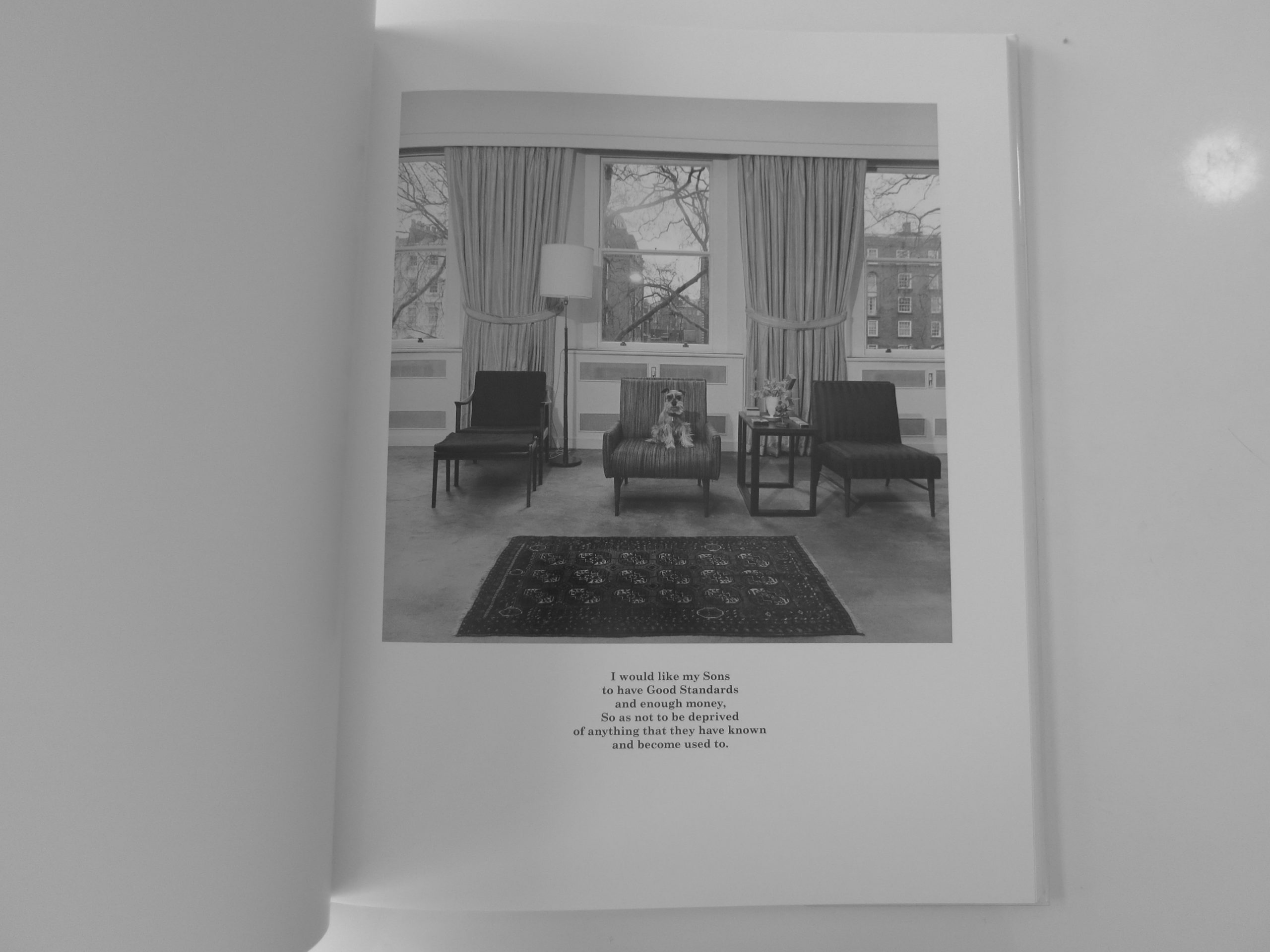
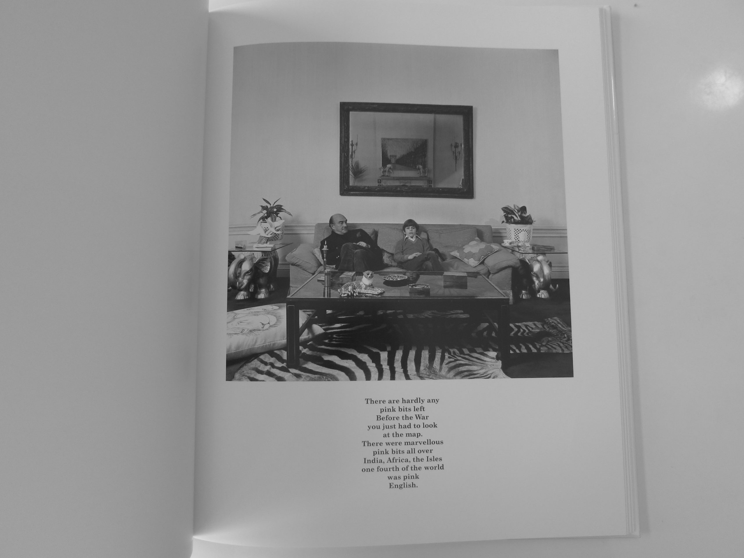
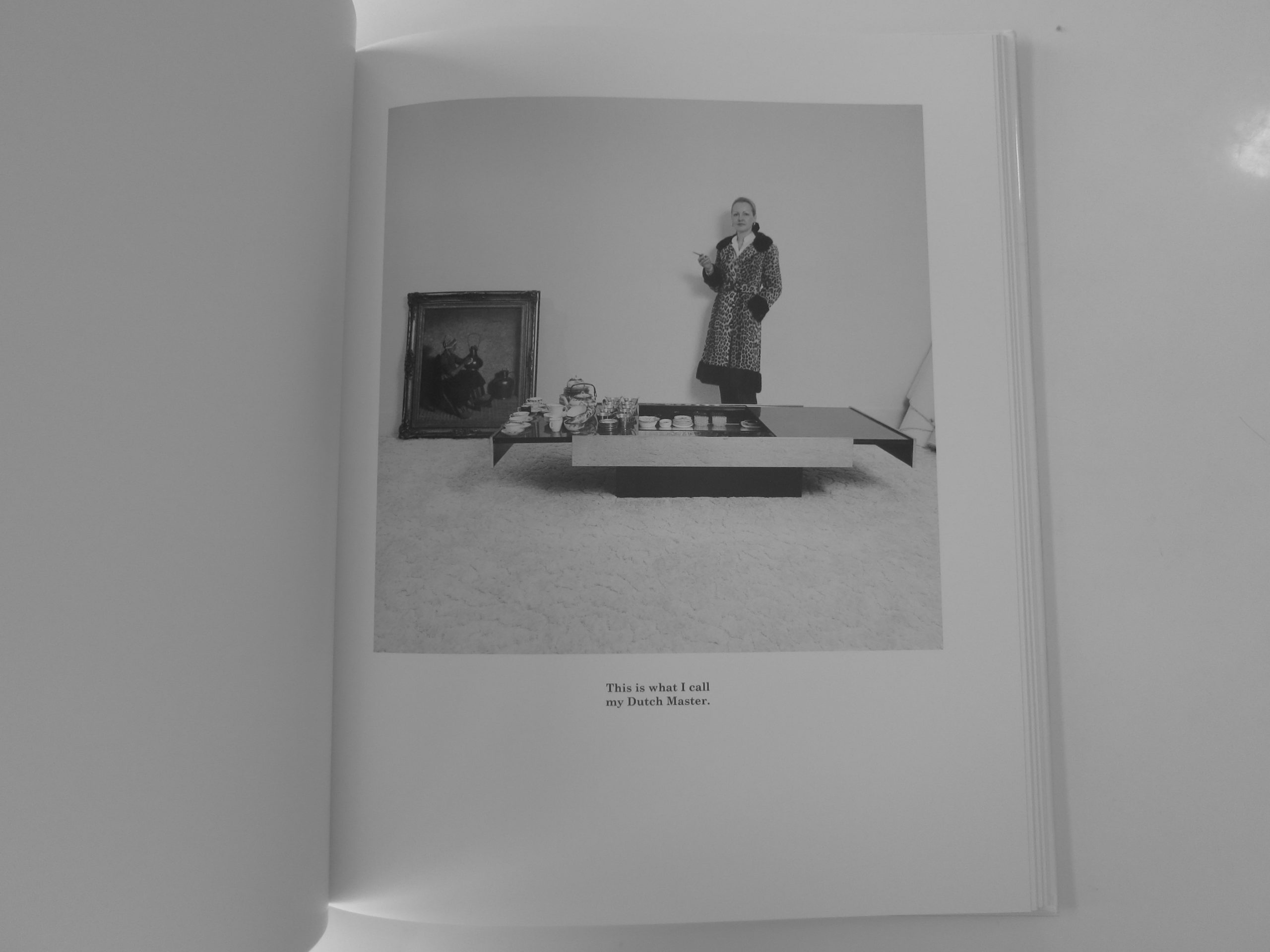
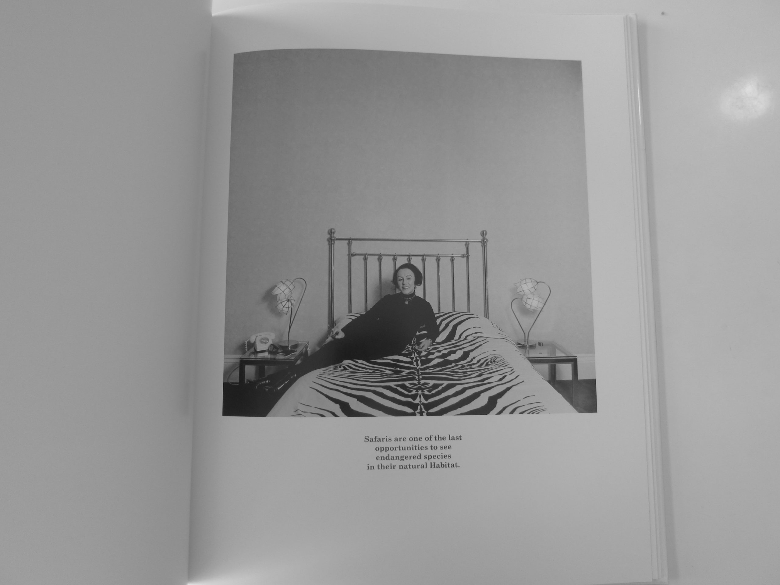
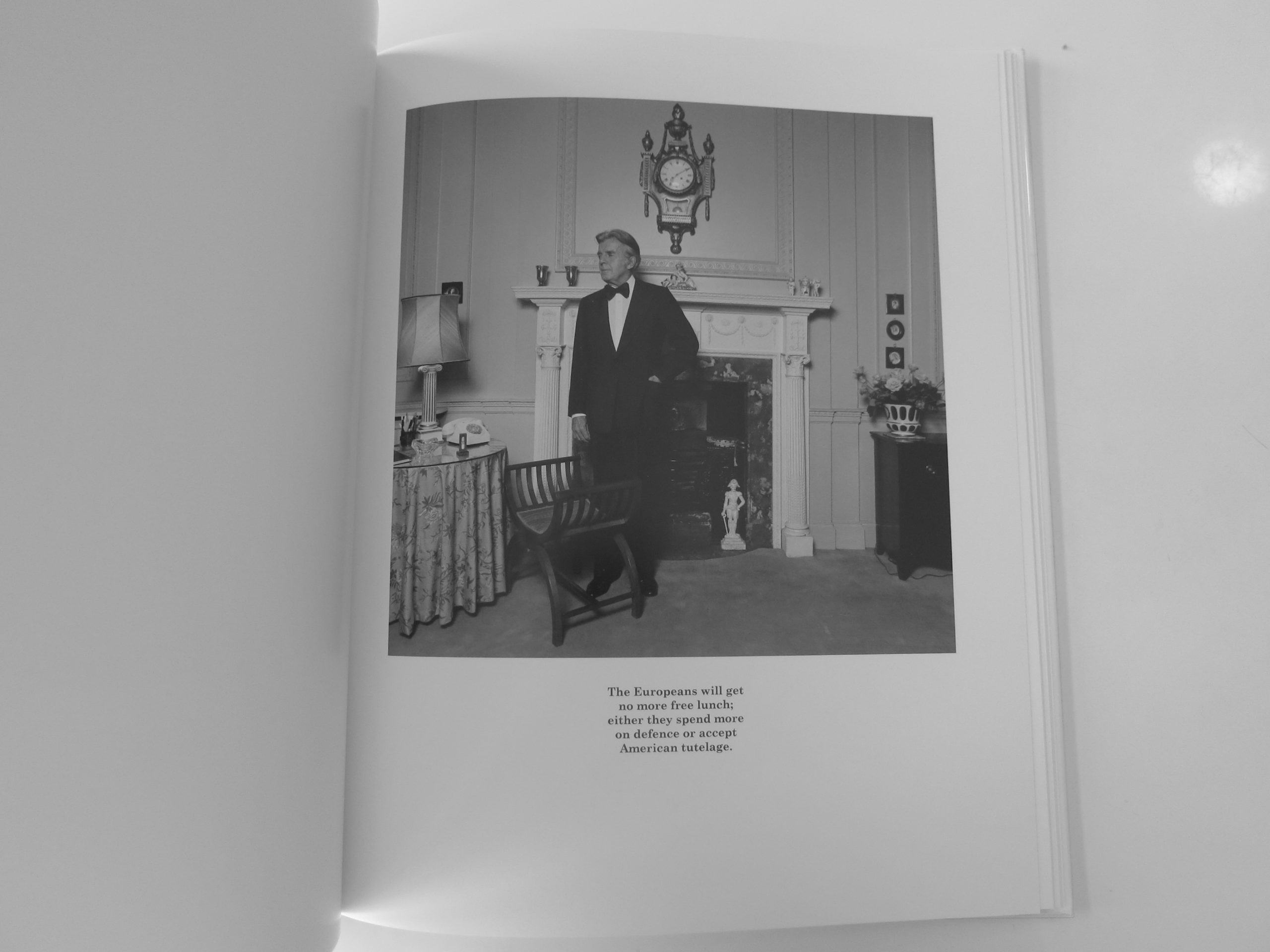
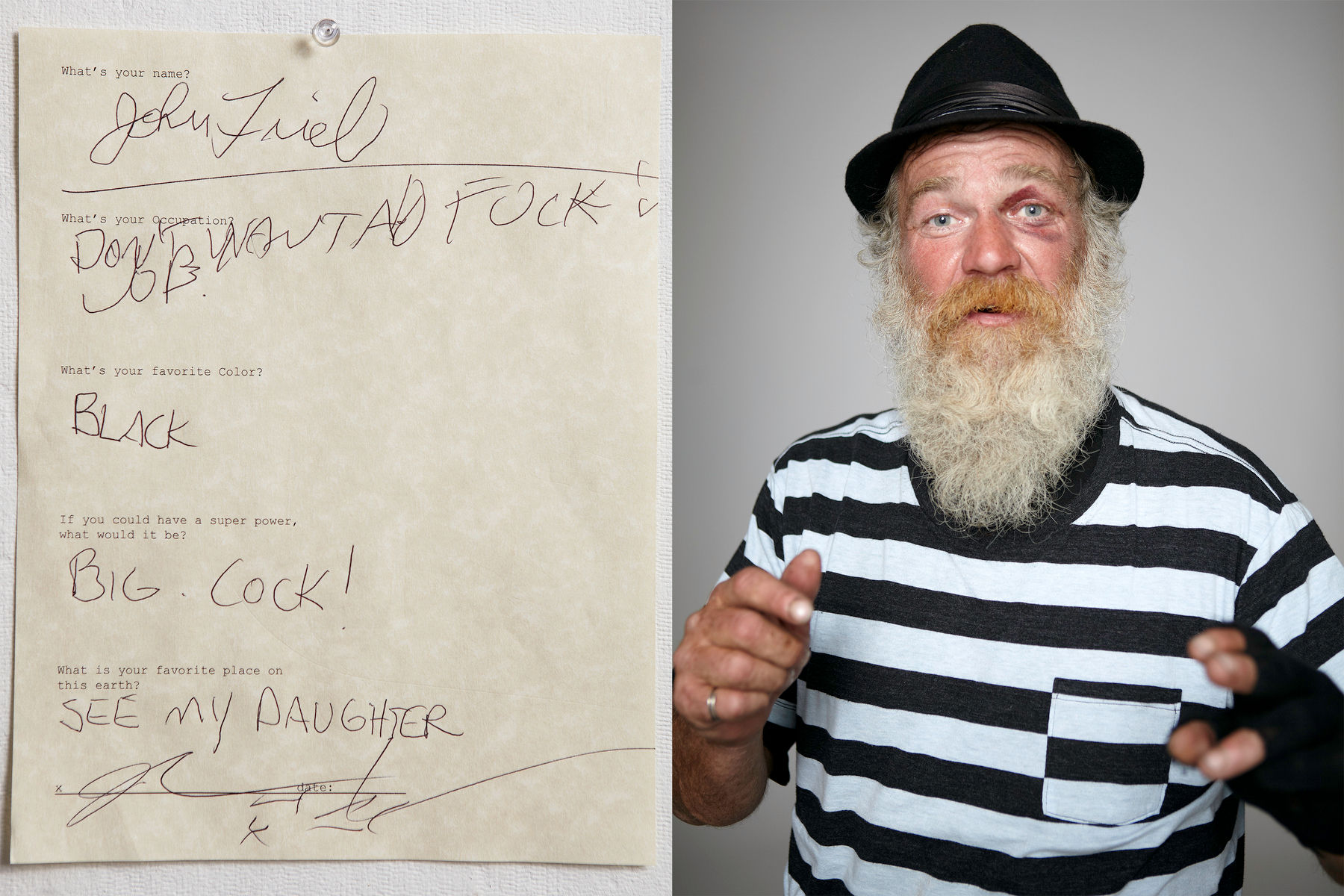
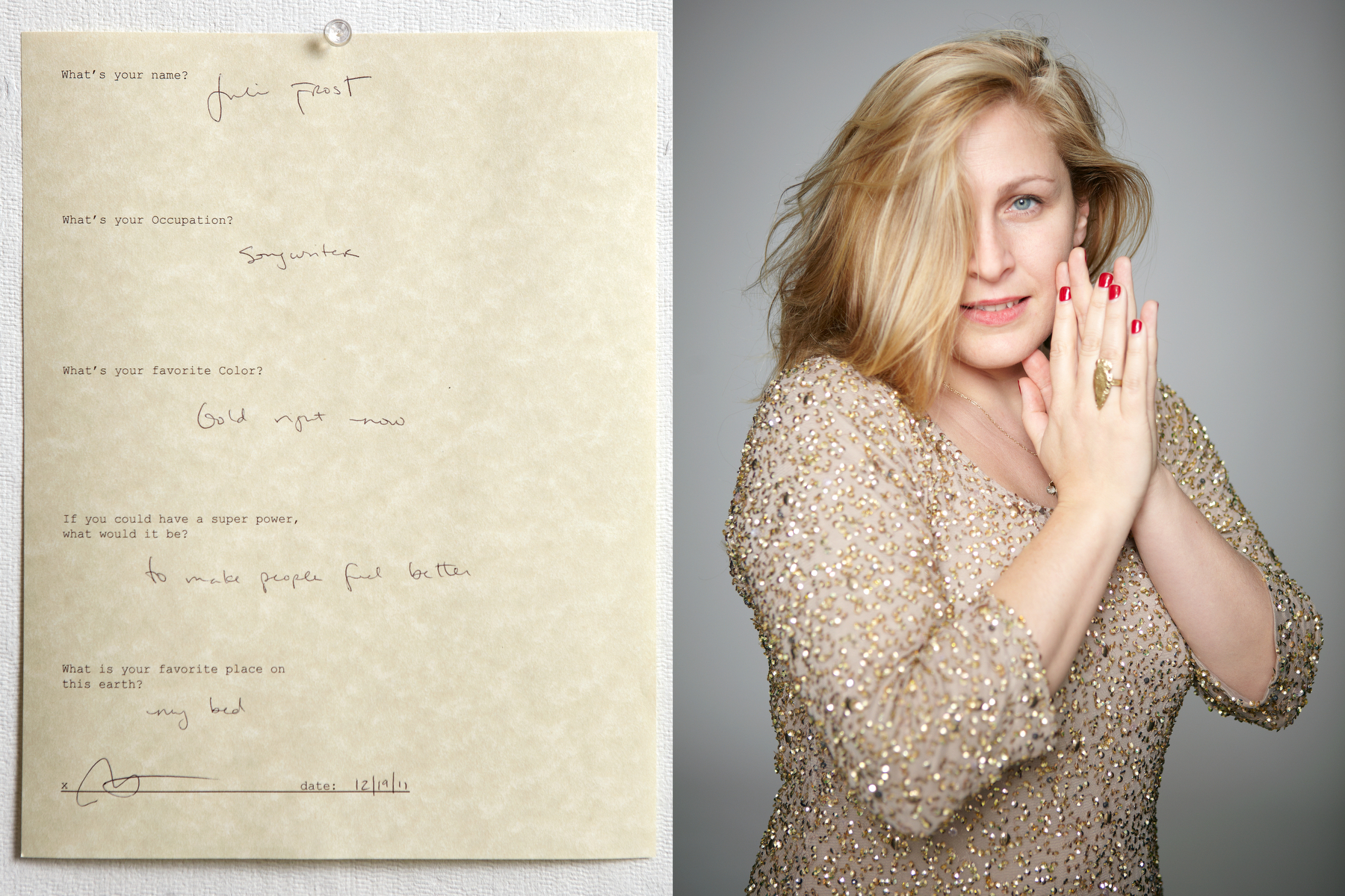
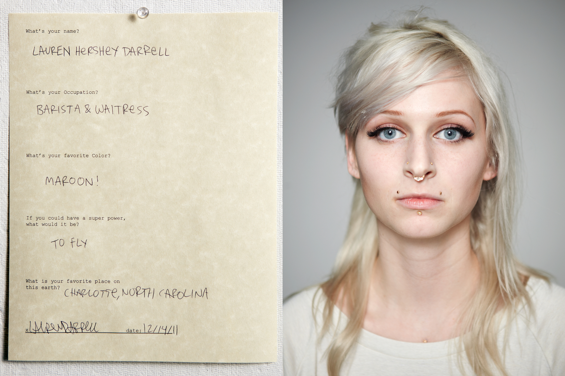
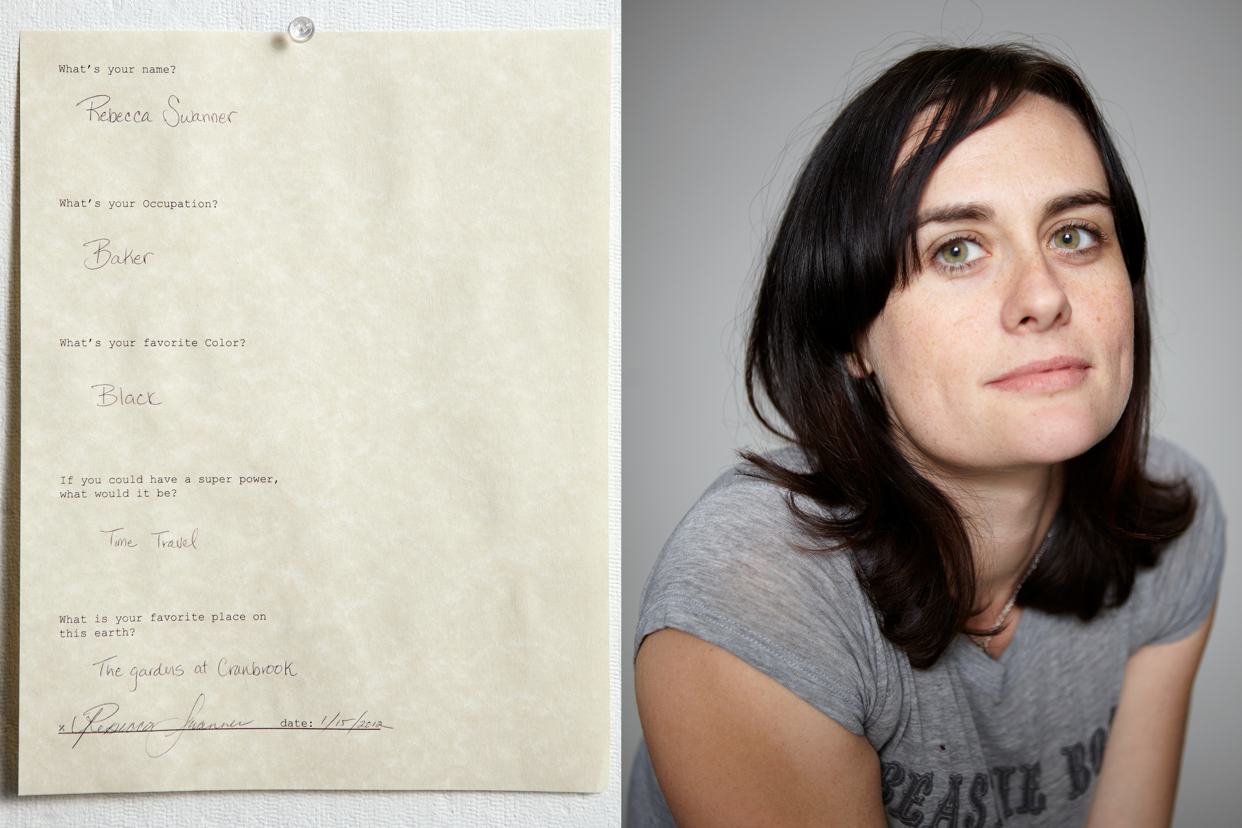
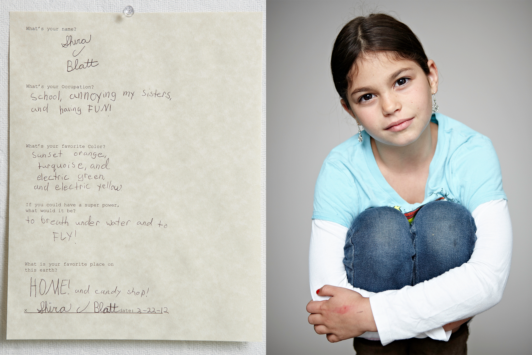
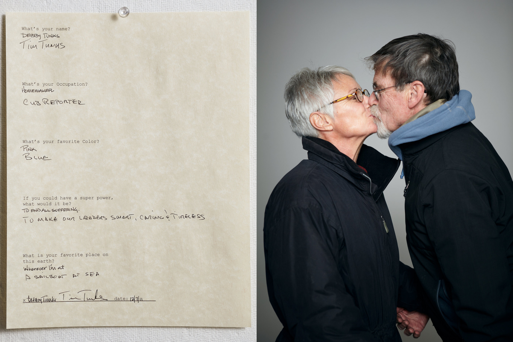
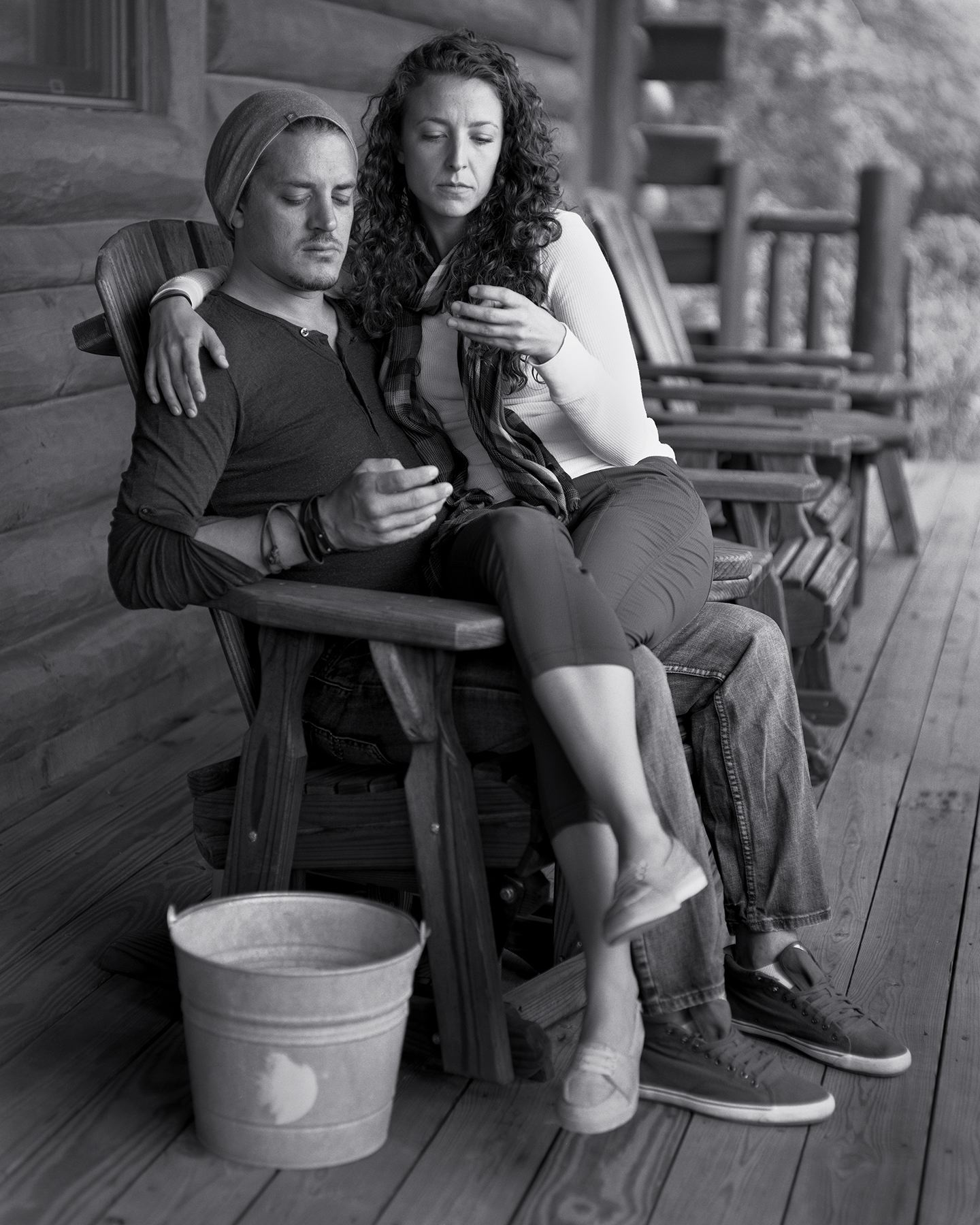
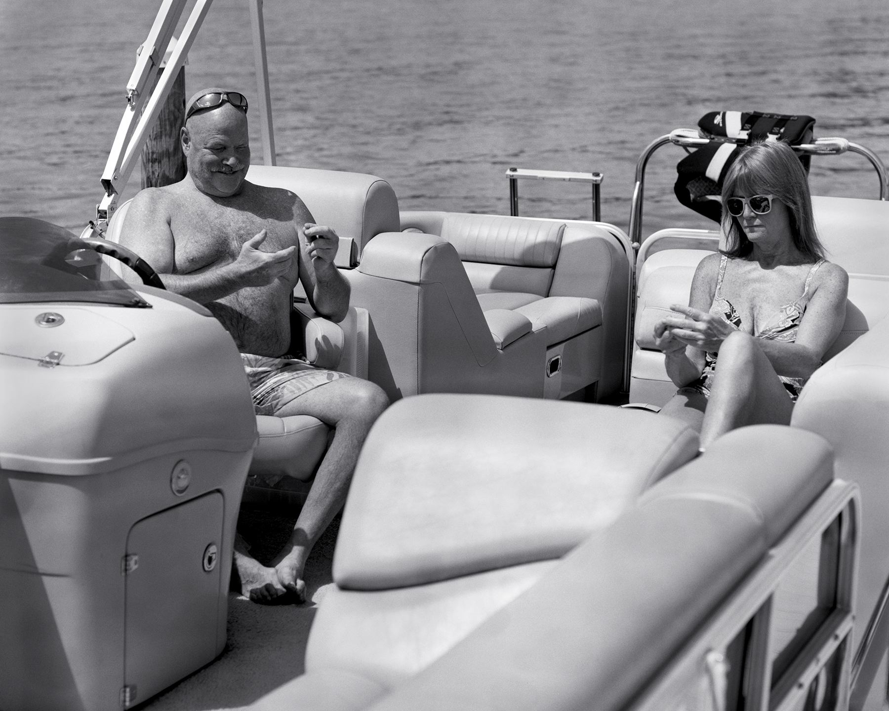
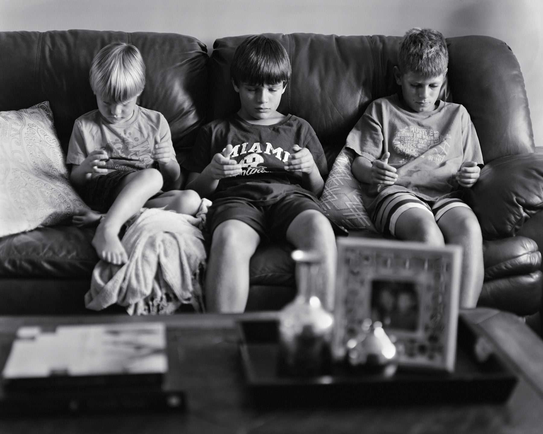
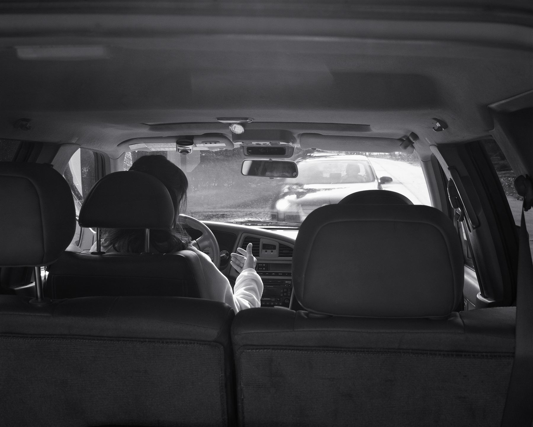
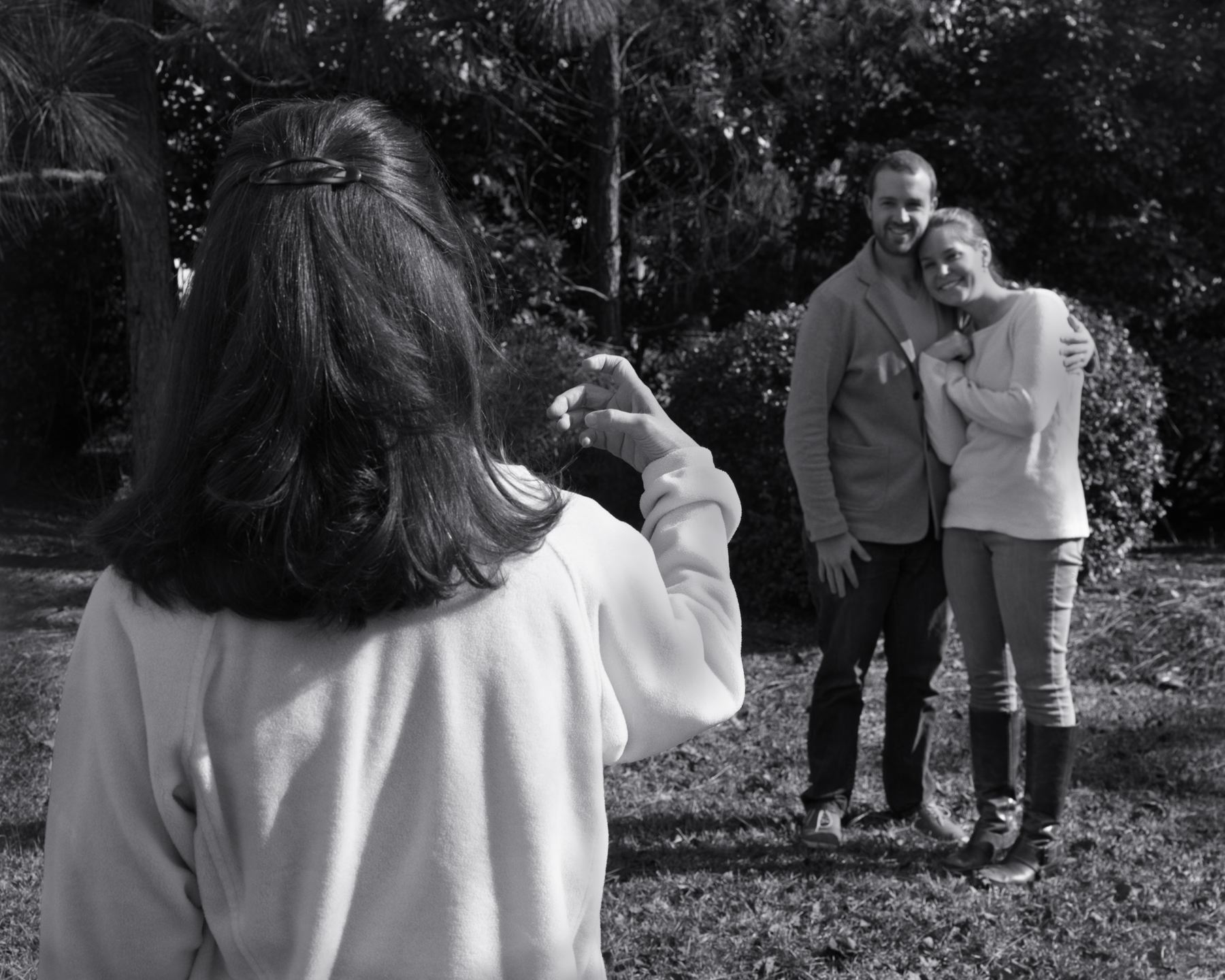
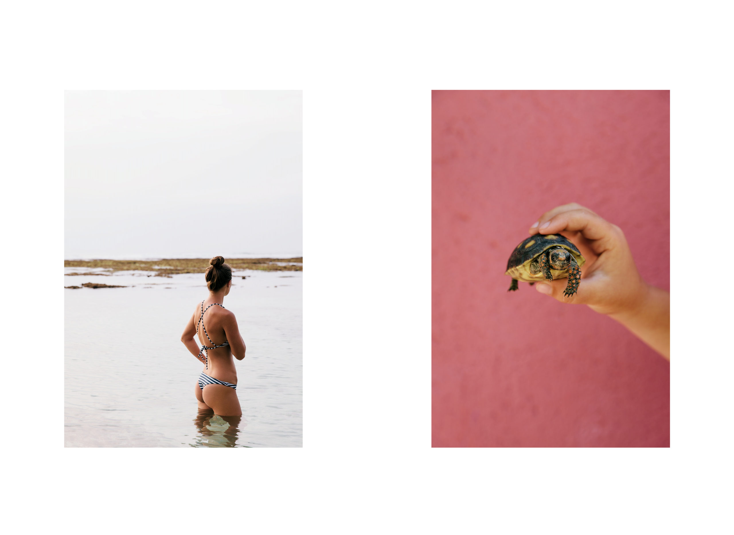
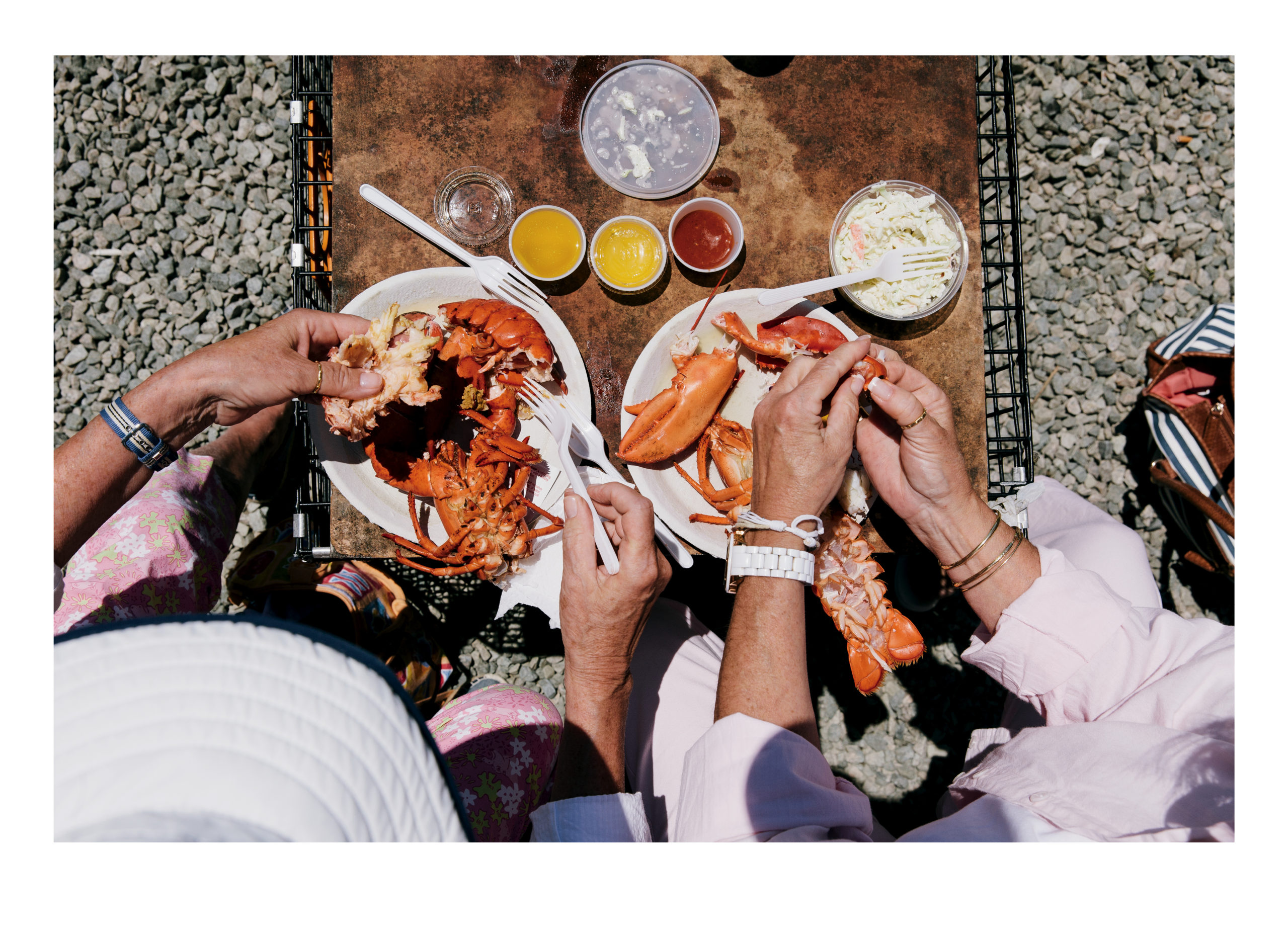
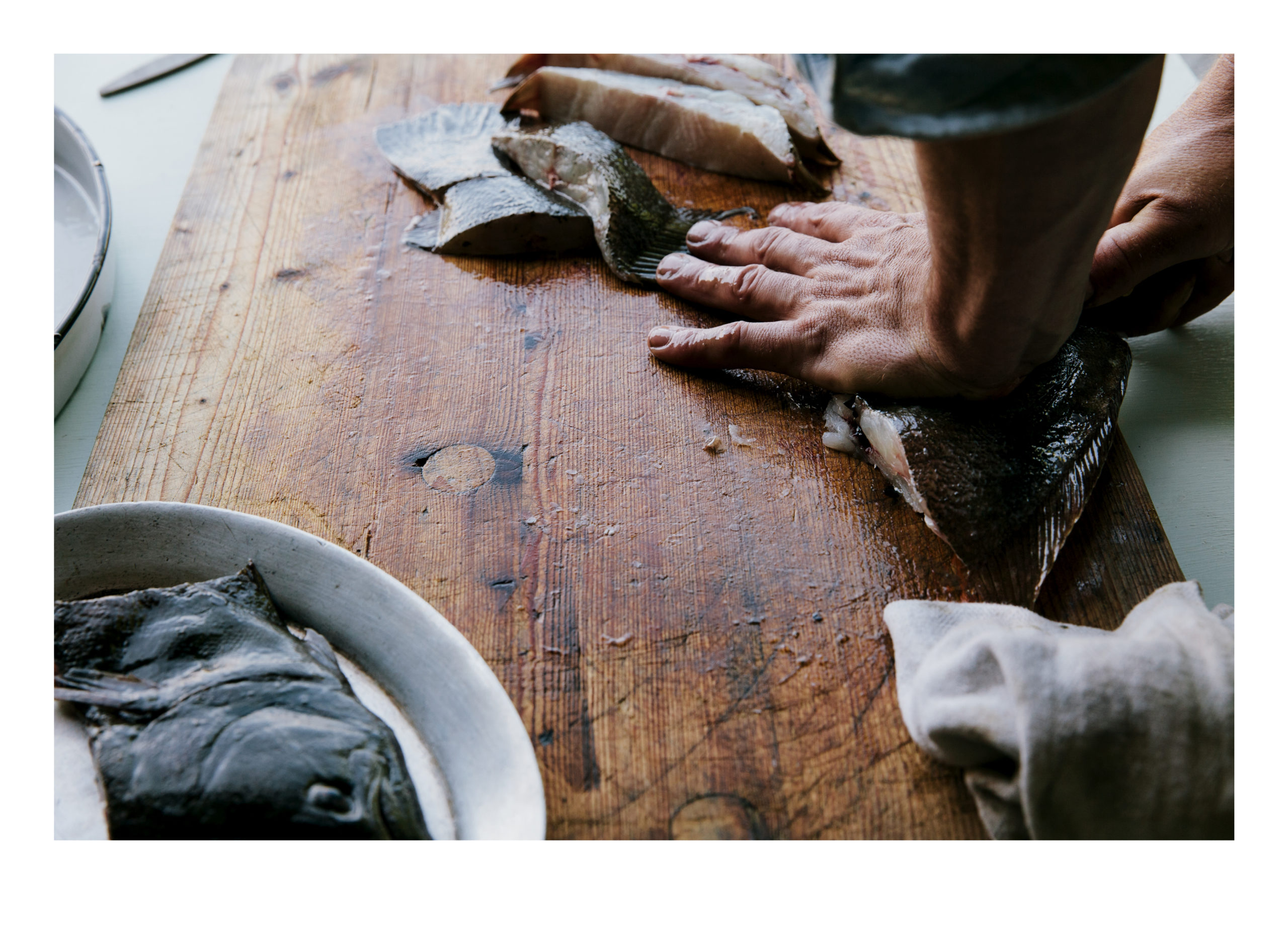
The pictures in “TWO,” shot in many places, over decades, are uniformly well-made. Good light, good color, nice balance. Always, there is two of something; a pair of objects or people that imply narrative.

Or they’re meant to. Who are they? How are they related? What are they doing? What does it mean?

Normally, that’s what I’d ask myself. But I wasn’t actually sucked in to the imagery. It didn’t grab my heart, or my gut, and force me to contemplate.

But each time I came upon a story, I read. I skipped nothing, reading, reading, and then looking at the photographs in between.

Slowly, with each passing story, the book reeled me in. It humanized the photos, to the point that I’d pay heightened attention to each successive suite of pictures, after I’d finished the previous tale, poem, or essay.

I felt like the relationship between me, and this object, was deepening with each successive minute. At first I’d been neglectful, then skeptical, and finally entranced.

In my 4.5 years of reviewing books, I can’t think of a book quite like this. The pictures need the stories, and together, the two forms of communication ably support each other, like one of the old married couples mentioned in more than one essay.

Duality, expressed by Yin and Yang, or black and white, or even 1 and 0, is deeply embedded in the philosophies and realities of human-kind. We crave companionship, and pair off to make the next generation.

It takes a secure artist to cede this much of the stage to others, to see the value in the right kind of collaboration, and I’m glad I spent a part of my afternoon embedded in this charming little world.

Bottom Line: An excellent pairing of images and words

To Purchase TWO visit: http://www.melissaannpinney.com/

IMG_1737

IMG_1738

IMG_1739

IMG_1740

IMG_1741

IMG_1742

IMG_1743

IMG_1744

IMG_1745

IMG_1746

IMG_1747

IMG_1748

IMG_1749

IMG_1750

IMG_1751

IMG_1752

IMG_1753

The Art of the Personal Project: Ethan Pines

As a former Art Producer, I have always been drawn to personal projects because they are the sole vision of the photographer and not an extension of an art director, photo editor, or graphic designer. This new column, “The Art of the Personal Project” will feature the personal projects of photographers using the Yodelist marketing database. You can read their blog at http://yodelist.wordpress.com. Projects are discovered online and submissions are not accepted.

Today’s featured photographer is: Ethan Pines

ethanpines_406D-Coyote+Bus

ethanpines_406R-04a-04_Nswr

ethanpines_406R-14B-07_tank

ethanpines_407Q-01-01

ethanpines_407Q-03-08

ethanpines_407S-05-06

ethanpines_407S-10B-02

ethanpines_407S-13B-07

ethanpines_407S-19-07

ethanpines_407S-20-09

ethanpines_407S-26-02

ethanpines_408F-07-05

ethanpines_408F-12B-02

ethanpines_408N-01-10

ethanpines_408N-07-03

ethanpines_408N-08-03

How long have you been shooting?
About 16 years, if you count the initial three years of classes, which I do.

Are you self-taught or photography-school taught?
Both. In 1999 I took a basic photography class at Santa Monica College out of random interest. I knew nothing about photography, had never set my camera to Manual. But I’d been wanting a change (I went to graduate school for journalism and was working as a writer), and this class and the ensuing ones completely opened my eyes. That sounds cheesy, but I was looking for something that used both the creative and technical sides of the brain, that got you away from the computer and out into the world, and this was it. (Of course now it’s the age of digital photography, and we’re all back on our computers.)

I spent three years in classes at SMC, a great program. But I also consider myself self-taught, because photography is a craft and an industry that wants constant evolution. I’m always working on lighting, composition, concepts, substance, process, technique. I test and experiment and learn. It’s an ongoing process.

With this particular project, what was your inspiration to shoot it?
I occasionally take photographic road trips around the Southwest; there’s a simplicity and spontaneity in shooting whatever you find, whatever inspires you, wherever you happen to be. Shooting this kind of non-commercially driven project helps me recharge and reconnect with that first magic of shooting. I didn’t set out to shoot a Tourist America project. This series arose gradually after several road trips. I had a number of images that I felt were strong, and I started wondering if a series was forming, if there was a common thread. I seemed to be drawn to tourist sites, both popular and obscure, beautiful and kitschy. Rather than continuing to shoot randomly, I decided to make it a project. And I booked flights to other areas of the country to deepen the project.

How many years have you been shooting this project before you decided to present it?
The first shots, taken before it was officially a project, were done about four years prior to posting it on the website.

How long do you spend on a personal project before deciding if it is working?
Honestly, there are so many projects I want to shoot, I consider each one carefully before even starting it. Once I do, I approach it like a job: I’m going to make it work. If something’s not working, you figure out why and adjust your approach.

Since shooting for portfolio is different from personal work, how do you feel when the work is different?
For me, both portfolio and personal shoots come from who I am. But personal projects like this one entail less production and are less commercial. Whether they are fine art, I leave to the viewer. In my case they tend to be straight photography: no compositing or manipulation, very little done in post. (Tourist America is shot entirely on medium-format film.) They might share a sensibility with my commercial work, since it’s virtually impossible to remove the photographer from the images. But they allow me a return to the pure photographic process which drew me to the field in the first place. They also free me from the constraints that can come with jobs — images can be with or without people, shot wherever I like, infused with mood, created with whatever offbeat/awkward elements, etc.

How do I feel about them? They are my babies. Whether or not anyone else cares, I know the nurturing that went into them, and I am proud of them. I feel they’re as worthwhile as projects with more production value. And I believe they help show art directors and potential clients another side of oneself.

Have you ever posted your personal work on social media venues such as Reddit, Tumblr, Instagram or Facebook?
Yes, but not nearly as much as commercial work. I have several series that I’d like to get out there more. Commercial work always seems to demand more prompt posting, while it’s fresh. I post to Instagram and Facebook simultaneously.

If so, has the work ever gone viral and possibly with great press?
I wouldn’t say viral, but the “Lost Boat” shoot I did a couple of years ago got a lot of attention and helped lead to a nice profile in Digital Photo Pro magazine.

Earlier this year I shot a portrait series of finalists at the massive California State Science Fair in downtown Los Angeles, currently on my site as “Dwarf Stars.” Once Wired online picked it up, it spread around. Again, not viral, but, say, slightly contagious.

Have you printed your personal projects for your marketing to reach potential clients?
“Lost Boat” went out as a direct-mail booklet. “Welcome Aliens” went out as a postcard. I also have two major projects — documentary work shot in Guatemala and Vietnam, still in proofsheet form — that will eventually be part of a printed mini-portfolio to accompany my main book.

Artist statement about the project:
There’s something special about American tourist sites, something unique I’ve found nowhere else. It’s the vintage fonts and infrastructure, the kitsch hand in hand with sincerity, the consumerism hand in hand with earnestness, the excited tourists in sometimes mundane experiences. The sites intend for you to feel a certain way. Once you look behind the scenes and see that the experience is packaged, it actually becomes more earnest and heartfelt, only in a different way than perhaps originally imagined. All these sites are created, maintained and visited by people who care deeply. Based on authentic foundations, they are canned experiences that ultimately become newly authentic experiences in their own right and carry forward a deep national history.

—————-

Ethan Pines is a Los Angeles-based photographer shooting conceptual, humanistic, irreverent images for commercial and editorial clients such as Dolby, Solarcity, Universal Studios, Simply Asia Foods, Forbes and Wired. He grew up on a small ranch at the edge of Los Angeles and now lives in Topanga Canyon with his wife, cat and a host of seasonally changing wildlife.


APE contributor Suzanne Sease currently works as a consultant for photographers and illustrators around the world. She has been involved in the photography and illustration industry since the mid 80s, after establishing the art buying department at The Martin Agency then working for Kaplan-Thaler, Capital One, Best Buy and numerous smaller agencies and companies. She has a new Twitter feed with helpful marketing information believing that marketing should be driven by a brand and not specialty. Follow her on twitter at SuzanneSease.

What does a video REALLY cost?

The quality and flexibility of the camera you shoot with can make a considerable difference in the finished quality and editing options for your video. Are you shooting on a $ 500 DV camera, a $2,500 DSLR, a $10,000 Full feature HD camera, a $25,000 RED, a $60,000 ARRI or are you shooting on Film? The pace of technological advancement in film and video is breathtaking and the features and capabilities of cameras are changing weekly.  Bottom Line: You should be able to see the difference in the final output quality in more expensive cameras. If you can’t, then it’s not worth paying for. Your final delivery channel will also determine the need for specific cameras. Streamed video on the internet (where the vast majority of corporate videos are seen) doesn’t require high-end camera’s to capture your content because a lot of that quality will be lost in optimization for the web.Costs: You will spend between $25/hour and $400/hour or more depending on which digital camera package is used. Film cameras, lenses and stock will take you well over $1,000 /hour.Equipment. The more experienced video production companies tend to have a wide variety of tools and equipment on hand for each shoot. Do you need a track dolly or a jib-arm to create a shot with movement? Do you have a high quality field monitor to know exactly what you are getting (or not getting) as you shoot? Do you have all the necessary audio equipment (lav’s, direction mics, booms etc) to capture the audio you need?  Lighting and framing are everything in video. Do you have lights – lots of different lights to accommodate a wide variety of shooting scenarios? Do you have a variety of lenses to create the specific feel you are after – wide angle, fixed focal length or Cine lenses for narrow depth of field, etc?Costs. Equipment cost can run anywhere from $25/hour to $100’s/hour or more depending on what specific equipment is required

More here: What does a video REALLY cost? – ChristopherHatchett.TV

The Daily Edit – George McCalman: The Promo Process

MCCALMAN PROMO_CAROLINE SCHIFF 1

Caroline Schiff

MCCALMAN PROMO_JASON MADARA 1_

Jason Madara

MCCALMAN PROMO_JASON MADARA 2

Jason Madara

MCCALMAN PROMO_JOE PUGLIESE 1

Joe Pugliese

MCCALMAN PROMO_JOE PUGLIESE 2

Joe Pugliese

MCCALMAN PROMO_LINDA PUGLIESE 1

Linda Pugliese

MCCALMAN PROMO_LINDA PUGLIESE 2

Linda Pugliese

MCCALMAN PROMO_JESSICA ANTOLA 1

Jessica Antola

George McCalman

How long were you in the magazine industry and what skills transcended into the work you do now?
I was in the magazine industry from 1995 to 2011. I started at Money Magazine and went onto Entertainment Weekly. I moved to San Francisco in 1999 and continued at Health Magazine, MotherJones, Wired, ReadyMade and finally AFAR magazine. I’ve assigned and worked with a alot of photographers and developed personal relationships with many of them. My background in the magazine world helped in a couple of ways: It gave me insight into what art directors and photo editors/art buyers are looking for. I’m designing these promos for myself in an inverse way: I’m always thinking from the perspective of: “what kind of printed matter would I like to receive?” When I started my creative studio, I was working with Jason Madara, my studio mate. I’ve been his Jiminy Cricket for years, working with him on his portfolio and visual direction. I’m passionate and opinionated about photography. I believe in the emotional power of photography, but I’m also not sentimental about it, so I make my decisions quickly and definitively.

What are some simple decisions and questions that need to be addressed in order to hit marketing goals?
I ask many (annoying) questions of the photographers I work with. I try to get into their psychology and it works in two ways: to get them thinking about things they aren’t, and it gets me into their heads to find out what direction they want to take their work. I usually have my impressions, but this kind of relationship works best when people are hearing themselves make their epiphanies. The line of questioning is ‘Who are you?’ “What are you trying to get across?” I am always surprised at how that question throws artists off. I start with the big picture philosophy first. It forces people to dig deeper and think about the work they produce in a more personal way. The work follows those conversations. If she/he understands the message they are trying to put out in the world, it makes the ‘What images are we using’ and ‘How are we packaging it’ much more fluid. I’ve had a few conversations with shooters who are pure technicians, and don’t care about the meaning of their work. It’s all about what the client wants. I respect that. But that usually means I’m not the right designer for them. And vice versa.

What is the best “formula” you’ve developed for working with photographers?
It’s pretty organic. The design of a promo is usually a piece of an overall branding initiative. It’s rare that I just design promos alone, and it means that I think the work is compelling. I’m a big photography nerd, so I get excited (on my own) and start imaging how someones work can be presented that I think is incredible. I’m a big fan of talking on the phone, scheduled right after presentations. It allows me to get honest feedback and talk through my intent in the design. I’ve worked a couple of times with photographers who want to communicate primarily over email and I absolutely hated it, so I don’t do it anymore. Sometimes the photographer has a set idea on the body of work they want to use for the promo and other times they are completely open. They send me low-res jpegs of ‘everything’ within a body of work and I play around with a few edit directions and get a narrative theme (either through color palette, layout design or story). I send it to them. We keep talking until we’re both happy with the final edit. I think most photographers are terrible editors of their own work, so I argue when I believe an edit choice is being made emotionally on their part.

How is the conversation different between seasoned pros and up and coming?
Not as much as you might think. The seasoned pros just talk more (which is great). In most of cases the seasoned photographers I know haven’t sent out much printed work, and rely on their reps for their windfalls, so there is ambivalence of what the promo actually ‘does’. I’ll used Jason as an example: we’d been talking about doing a promo for 3 years (!) before we actually did one. He was featured in his rep’s own promo book, so he didn’t have any urgency about it.  I pitched a themed poster series to him last year and he got excited. But the process was like pulling teeth. After the posters were printed, he looked and he and said: “When are we doing the next one?” Up-and-Comers are sometimes more open to pushing the envelope, but have done less thinking about who are as individual artists. But I find similar patterns working with either set.

What advice do you have for anyone defining their brand?
I ask ‘Who are you?’ What separates you from others in the industry? Others in the same lane? Play to your strengths. Don’t try and compete. It’s all well and good to admire what others are doing, you should be paying attention to the marketplace, always, but I think it’s as important to remind yourself about what sets you apart. also: I tell photographers to stop designing their own work. Get a designer. It’s as vital to your brand as having a retoucher that completes your sentences. It’s your team, it’s your brand. Find someone who understands what you are trying to say and let them interpret your visual language. Work with someone who surprises you, and who you enjoy talking to.

Do you think there are more promos in circulation OR are we simply seeing more of them due to social media?
I think there are more due to social media. And let’s talk about social media. Because I don’t believe that posting to Instagram and tumblr is the same thing (or replaces) sending out a promo piece. Mobile devices can show sequential art, but doesn’t present a narrative with a beginning, middle and end. Books, magazines and promos provide that in a way that (I believe) will always be a part of the commercial landscape in some form.

What makes a memorable promo in your eyes?
I may sound like an asshole, but I don’t think an arresting image is enough anymore. In the age of Instagram and other social media tools, people have access to generally interesting images on a daily basis. I think how you present your images is what makes it memorable. The formula is simple, the more personal the better. Art Directors and Art buyers want to know how you think, as much as. When that is transparent, it became easier to imagine how you would be on set, or on location. It’s a way in, for people that may be seeing your work for the first time; and a reminder for the people that are familiar with you, and they should be giving you more consideration. I’m a sucker for designing promos with an actual story (the original and best meaning of that annoying word: content), bold type and smart layout design, so that’s what I try to create.

Do you have a staff at your studio?
I don’t have a conventional creative studio. I’ve been mostly a one-man operation. Most of the work that I’m doing is a culmination of designing for the past twenty years in the advertising and and editorial world. I get bored doing one thing, so I’ve created a studio where I get to work on multiple projects that play to my strengths as an art director, graphic designer, typographer and painter. I’m working on four book projects (based on my own ideas) that I’m developing and designing, as well as two fine art shows (one with my colleague, Jason Madara) coming up this year. Working with photographers is something I’m always going to do professionally and personally. It makes me so happy to see an artist cultivate their unique point of view visually. I just love it. I believe it’s possible to work commercially and maintain your perspective and vision. It’s a tricky balance, but when you do, it gives you life.

Tell us about what you do in addition to working with photographers on their branding?
I’m working on a few projects simultaneously. I’ve been working on a portrait series with Jason Madara called The Individuals. It’s a study of The Bay Area through portrait photography and the people (at present count, over 200 names) who have defined innovation across industries (science, arts, technology, academia, etc). It’s an ambitious project: we’ve been shooting it for the past year and will be shooting for at least another year. Jason is the photographer and I’m the art director, but on-set we have a weird shared-unit brain. Right now, the project only exists publicly on my Instagram account (#TheIndividualsProject) and on Jason’s website, but we are working on a book and photography exhibition. You can see the images here: Individuals 1
Individuals 2

I’ve also been working on series of hand painted typography over the last year. It’s based on phrases from my coming-of-age and quotes I hear from the people around me. I’m always writing down what I see and hear around me, and one day I decided I wanted to start the exercise of painting. I’ve been using watercolor because it’s malleable. I’ve been getting magazine and private commissions the last few months, which was unintentional, and has been a lot of fun. I have a fine-art show called The Type Note Series coming this spring.

Another project with Jason Madara is a set of figure study nudes we worked on four months ago. It’s becoming a fine art photography show at the Negative Space gallery in San Francisco. It’s a rich collaboration between him and I. We push each other creatively and its very rewarding experience.

I’m painting a series of portrait of pioneers for Black History Month. I’ve been researching more unknown (a few well known notables) and painting their portraits, using pencil, pen, ink & watercolor. I’ve been approaching each portrait in its own style, finding the personality of each person and treating them as the individuals they are. The unifying factor is that they are all in black and white. You can see the work here

On the surface it’s a diffused assortment of work, but the collective thread is that it’s all my own personal interests. I’m very curious about identity, and how we, as people, present ourselves to the world. it informs most of what I’m drawn to in commercial (and fine) art.

The Daily Promo – Justin Fantl

 Screen Shot 2016-02-10 at 9.52.51 AM Screen Shot 2016-02-10 at 9.52.59 AM
Screen Shot 2016-02-10 at 9.53.18 AM
Screen Shot 2016-02-10 at 9.57.36 AM
Screen Shot 2016-02-10 at 9.53.28 AM Screen Shot 2016-02-10 at 9.53.33 AM Screen Shot 2016-02-10 at 9.53.43 AMScreen Shot 2016-02-10 at 9.55.08 AM

Justin Fantl


Who printed it?

The calendar was printed in San Francisco by Spot Graphics.
Who designed it?
It was designed by the team at Manual Creative also in San Francisco.  I had worked with CD Tom Crabtree a number of years ago on the “Looseleaf Editions” project.  It was one of the most interesting briefs I had ever received.  Basically, the concept being to interpret a landscape through still life.  I loved the way the project came together and when the idea of making a calendar as a promo piece surfaced, Tom immediately came to mind.  The format of “Looseleaf” reminded me very much of a calendar but a really cool one!  I thought that from a design sense it would make sense to approach Tom about the concept and he was very receptive to it.
Who edited the images?
The team over at Manual refined the edit.  I had given them an initial grouping of images I was interested in using and they came back with a great selection in their first version.  I think in the end we only ended up changing one image.  The one caveat I had was that I wanted to showcase both my landscape and still life work.
How many did you make?
I sent out around 1200.
How many times a year do you send out promos?
I send out 2 promos a year. One comes from my studio, and in this case was the calendar, and the other comes from my rep, Giant Artists.   I think two provides a nice balance without overkill.  The Giant Artists promo typically showcases more commissioned work and the one I put out can be a bit more conceptual.  I really wanted to make something this year that people could use and I do hope that people utilize the calendars; mark them up, cut them up, live with them, and interact with them.  It might even be that this becomes a piece that I make each year. I feel like there are so many ways to approach the promo piece. There are a lot of fun to conceptualize and use your own work in any way that you want to.

This Week In Photography Books: MBLCK

by Jonathan Blaustein

Code.

Such a simple word.
Four letters.
Two vowels.
Two consonants.

Well balanced.

Such a basic word, for such a complicated concept. Even now, as I type these clean, black letters on the bright white Retina display, I’m aware they’re not as they appear. I see letters, yes, but underneath the alphabetic structure lies a string of numbers.

Ones and Zeroes.

Code.

Most of us are aware that binary code underlies the entirety of Digital Reality, which has eaten the Real World whole, like Goya’s depiction of Saturn devouring his child. We live so much through our screens, and all is illusion.

Ones and zeroes stand in for electrical impulses. On, off. Yes, no. If, then.

Like I said, it’s complicated.

But code, or the masking of one set of information in the form of another, is absolutely necessary to our daily lives. Codes are only helpful when they’re comprehensible, and often most valuable when they’re perfectly impenetrable. (Yes, I saw “The Imitation Game” a few weeks back, but that’s not what’s gotten me wound up today.)

No, I’m thinking rather of the assumption that code can be broken; its meanings interpreted. That’s how it works digitally, as code allows numbers to appear as pixels, pixels to resolve into pictures. Photographs in our Instagram feeds are so much more interesting as images; less so in the form of a string of digits as long as a unicorn’s tail.

But what happens when those assumptions are broken? I write this column every week, and every week I discuss a book that I understand. Sometimes, they withhold their meaning for a little while. Always, though, their secrets are revealed in the end. Otherwise, what’s the point?

Why would an artist not want us to know what is going on at all? Or who they are? Or why they sent you a book?

As you might have gathered, I’m not speaking in hypotheticals. (Of course not.) Last week, a little book box turned up in the mail, and I chucked it in a corner. Just now, I opened it up.

When it arrived, I noted that there was no name on the box, and I hadn’t been expecting anything. It only said MB, with an address in Austin, TX.

I know no such person.

I was curious and opened the box. I was met with a swath of thick, white wrapping paper, covered with hand-painted black marks. Little bits of charcoal, or paint chips, spilled out as I unwrapped the parcel.

Surely, I’d never received something like this before.

Inside the protective coating, I found a slim volume titled “INDECIPHERABLE.” Fair enough.

There was no letter, no essay, nothing at all, save a definition of the word. I flipped dutifully through the pages, and each time, I found a rendering of the black marks on white, on the left-hand side of the book. On the right, some sort of abstracted image, impossible to make out.

Page by page, I wondered. What is going on here? Are the black marks a kind of coded message? Do they mean anything at all? On the right-hand side, in a few images, banded lines appear? Is it an obscured computer screen? A scrambled message? An amalgam of many different photographs mashed together? (A technique I’ve seen a few times before.)

I really don’t know.

Eventually, the black-mark-hieroglyphics migrate to the right-hand page as well. The code eats the image. But what does it mean?

Believe it or not, it’s never explained. The book ends without a clue, save for the term MBLCK on the back cover.

I re-searched the package, looking for a note. A press release.
Some sort of explanation?

Nothing.

What the hell is going on here? I’ve never seen a book I couldn’t figure out, until now. But as it’s called “INDECIPHERABLE,” that’s clearly the point.

Why? To what end? Who is the mysterious MB, and why did he or she send me this coded object?

You regular readers know how much I hate to turn to Google to understand a book. But desperate times call for desperate measures, so here we go:

(pause)

First attempt: “MBLCK indecipherable Austin TX” reveals nothing.

Second attempt: “MB photo book indecipherable” reveals nothing.

Third attempt: “MBLCK photo book” reveals nothing

Fourth attempt: MBLCK photographer Austin” reveals nothing

(bigger pause)

This is a first. A book review with an anonymous artist, whose intention is totally unknowable. Why did you send me this, MB? What does it mean?

WHO ARE YOU!!!!!!!!

Does anyone have any intel on this? If so, please write into the comment section, send me an email, drop me a DM on Twitter, FB, or Instagram. Let us know in some digital variation or other, because I’m dying to know.

Aren’t you?

Bottom Line: Weird, inscrutable, impenetrable, coded photobook

IMG_1719

IMG_1720

IMG_1721

IMG_1722

IMG_1723

IMG_1724

IMG_1726

IMG_1727

IMG_1728

IMG_1729

IMG_1730

IMG_1731

IMG_1732

IMG_1733

IMG_1734

IMG_1735

The Art of the Personal Project: Ackerman + Gruber

As a former Art Producer, I have always been drawn to personal projects because they are the sole vision of the photographer and not an extension of an art director, photo editor, or graphic designer. This new column, “The Art of the Personal Project” will feature the personal projects of photographers using the Yodelist marketing database. You can read their blog at http://yodelist.wordpress.com. Projects are discovered online and submissions are not accepted.

Today’s featured photographer is: Ackerman + Gruber (Jenn Ackerman and Tim Gruber)

Ice Racing in Minnesota.  Photos by Ackerman + Gruber

Ice Racing in Minnesota.  Photos by Ackerman + Gruber

Ice Racing in Minnesota.  Photos by Ackerman + Gruber

Ice Racing in Minnesota.  Photos by Ackerman + Gruber

Ice Racing in Minnesota.  Photos by Ackerman + Gruber

Ice Racing in Minnesota.  Photos by Ackerman + Gruber

Ice Racing in Minnesota.  Photos by Ackerman + Gruber

Ice Racing in Minnesota.  Photos by Ackerman + Gruber Ice Racing in Minnesota.

Ice Racing in Minnesota.  Photos by Ackerman + Gruber

Ice Racing in Minnesota.  Photos by Ackerman + Gruber

Ice Racing in Minnesota.  Photos by Ackerman + Gruber

Ice Racing in Minnesota.  Photos by Ackerman + Gruber

Ice Racing in Minnesota.  Photos by Ackerman + Gruber

Ice Racing in Minnesota.  Photos by Ackerman + Gruber

Ice Racing in Minnesota.  Photos by Ackerman + Gruber

How long have you been shooting?
We have been shooting professionally for 6 years.

Are you self-taught or photography school taught?
We went to grad school(Ohio University) for photography, which gave us two years to build a solid foundation to work from. That along with test shoots, commissioned work, and personal projects have all played a huge role in our continued growth.

With this particular project, what was your inspiration to shoot it?
Ever since we moved to Minnesota in 2010, we’ve been working on another personal project, Frozen, about the people and places in Northern Minnesota. This project that we are sharing here, Frozen Speed, is another chapter in that body of work. It’s also extremely quirky and we’re suckers for anything quirky so it was basically a no-brainer for us. We stumbled upon it one Saturday afternoon and have shot about 10 races so far.

How many years have you been shooting this project before you decided to present it?
We’ve been working on it for the past two years and only now are we starting to present the work.

We’re also still working on it and this winter the focus will be more on the motion side of things along with shooting stills until we aren’t finding any more surprises/gems in our take. This project allowed us to test our drone in extreme conditions so we will continue to we will continue to explore it from above.

Despite living in a social media age of immediacy we work on our personal projects quietly for years without ever sharing them. We love doing this as it gives us time to explore a subject and really formulate not only the project but our aesthetic approach for each project. Along with Frozen Speed, we have been working on two other projects that have yet to see the light of day. We also love this way of working since it’s so relaxed compared to the intense and quick nature of the editorial and commercial shoots we do.

How long do you spend on a personal project before deciding if it is working?
It really depends on the project. Some projects last a day for us and the magic just isn’t there or it wasn’t what we were hoping for so we are happy with single images and we move on. Often we give a project some time and we realize the fire hasn’t left us and there’s still things we can say with the project so back out we go.

Most of the personal projects we start seem to linger for years and just organically come to a close when we feel like there’s nothing more we can say with our images or the passion dwindles.

Since shooting for your portfolio is different from personal work, how do you feel when the work is different?
We try to approach both the same. Most of our personal work ends up in our portfolio. We’re strong believers in showing what you love shooting. Obviously commissioned work doesn’t always work out that way and the art direction might call for something else. Despite that, we always try to make an image or two that is us. The great thing about personal work is that it’s “personal” so our head isn’t muddied with thoughts of what the photo editor or art director might be looking for but rather we let our eye and mind explore and find images that speak to us. If all goes well the images hopefully speak to others as well. We have been lucky enough to have some great photo editors and art directors that allow us to go explore too and make it personal and those are the best assignments we can ask for.

Have you ever posted your personal work on social media venues such as Reddit, Tumblr, Instagram or Facebook?
Yep we use Tumblr, Instagram – @ackermangruber, Twitter – @ackermangruber and our personal Facebook profiles as outlets for our work.

If so, has the work ever gone viral and possibly with great press?
Nothing has reached the point of trending, but some of the projects have gained decent traction. One of our personal projects, Trapped, – http://www.ackermangruber.com/trapped seems to catch on in different circles (mental health, prison reform, photo) on the web so it’s been interesting to watch over the years as it gains traction in different parts of the online community and even in traditional print outlets (TIME and Newsweek). We have been invited to speak at numerous national justice reform conventions about the work and it’ll be a solo gallery show later this year because of it all gaining traction online. Another project, Miss, – http://www.ackermangruber.com/miss which documented Miss USA and Miss Universe has also received a decent amount of buzz and awards over the years with the last surge being a feature on Refinery29. The Frozen Speed – http://www.ackermangruber.com/frozenspeed project was recently highlighted on Wired and it led to a handful of emails from others wanting to highlight the work.

Have you printed your personal projects for your marketing to reach potential clients?
For sure! We do this with most of the personal projects we work on. The last personal project we used in a promo was our Blue Ribbon – http://www.ackermangruber.com/blueribbon project and we sent creatives a 20 page booklet of the work along with a blue ribbon that awarded them first place as a top creative. We received great feedback on the promo and it placed in the self-promo category of the PDN Photo Annual. We were in NYC for meetings this past fall and editors still had it pinned to their wall, which was great to see.

————–

Jenn Ackerman and Tim Gruber are a husband and wife photo team. They work as a collaborative team on shoots, sharing roles as director and photographer. The two work seamlessly as a duo to bring one creative vision to all their shoots. They take an authentic approach to their work and specialize in providing images of real people to advertising, corporate and editorial clients. Their work has been described as colorful, genuine, full of life, and soulful. Ultimately they strive to make you feel something with their work.

Their work has been honored by the Communication Arts Photography Annual and Advertising Annual, American Photography, PDN Photo Annual, Review Santa Fe Center Project Competition any many more. Their most recent documentary film won an Emmy and they were named a McKnight Fellow and to PDN’s 30 Photographers to Watch in 2012.

Their work can be viewed at www.ackermangruber.com


APE contributor Suzanne Sease currently works as a consultant for photographers and illustrators around the world. She has been involved in the photography and illustration industry since the mid 80s, after establishing the art buying department at The Martin Agency then working for Kaplan-Thaler, Capital One, Best Buy and numerous smaller agencies and companies. She has a new Twitter feed with helpful marketing information believing that marketing should be driven by a brand and not specialty. Follow her on twitter at SuzanneSease.

The Daily Edit – Mike Sakas: Editorial Story Pitching

141020SKSTajikistanMoto8887

150608SKSTajikistanMoto2540

150607SKSTajikistanMoto2205 150606SKSTajikistanMoto1946 150606SKSTajikistanMoto1861 150607SKSTajikistanMoto2344
150608SKSTajikistanMoto2639 150608SKSTajikistanMoto2661

141021SKSTajikistanMoto9475 150608SKSTajikistanMoto2598
150607SKSTajikistanMoto2374 150607SKSTajikistanMoto2342 150607SKSTajikistanMoto2252

Mike Sakas 

How often do you do spec or self assigned travel jobs?
I don’t do spec jobs that often per se but I always keep an eye open for an opportunity whenever I’m traveling.  This particular piece was conceived while on an assignment in Tajikistan. I was a part of a team going to teach a photography/story-telling workshop in Gorno-Badakhshan region of Tajikistan. To get to Khorog, the capital of the region, we flew into Dushanbe and were forced by weather to drive rather than fly. So a 2 hour helicopter flight turned into a 17 hour ride in a fully packed Toyota Forerunner. Originally we were going to fly a helicopter through the Himalayas the group was understandably a little bummed;  however the trip by road was an battering steel-lined-bouncy-castle of a ride.  I simply had to come back and do a longer version on motorcycle. As luck would have it, by the end of our assignment we had a return trip planned and I began research on what our extended route would be.  Having finished the trip and told some stories to my rider buddies, I’m convinced a lot of people would enjoy the tale and may even find it inspirational enough to go on one like it themselves.  So I’m pitching it around.

Have you had success with this before?
I have had success with this before but beyond the obvious magazine coverage, it’s always the weirder spin-off stuff that makes it more interesting.  The last time I did this sort of thing I was going to Thailand on a mountain bike trip with a bunch of guys from my local riding group.  We had planned an epic weekend around a local “friends match” and I actually didn’t intend on shooting much. However, as soon as we got to the mountain I met a couple of the event organizers and a writer covering the race and that was that.  I covered the event and the photos were picked up by a UK riding mag and a mountain bike apparel company.  It also turned into 4 more days of shooting stills and video for the apparel maker.

Who are you hoping to pitch this story to?
I’m planning to pitch the story to some of the more general travel adventure mags first: Outside, Afar, Travel + Leisure, Adventure Travel, Lonely Planet, etc. One of these guys would be ideal as they are more generally in my wheelhouse.  If none of them bite however, I’ll move on to the more specific adventure motorcycle rags:  Adventure Rider, Road Runner, Overland Magazine, etc.

 What does your pitch look like?
Basically, I write an email with a hello or an introduction if I don’t know the contact. I include a gripping (but short) narrative summary with a couple of images and then I wait.  I don’t like dropping a pitch on an editor cold if I can help it but the nature of my (non)process is such that I sometimes find myself shooting a story I probably haven’t done before. That being the case, sometimes I find an audience I’ve never been in front of before.  I try to keep it short and sweet and while I like to be friendly, I understand that most editors are swimming in work and I don’t want my pitch to be heavy. If they’re interested they’ll write back…if not, I move on.

Did you have a writer with you, or you wrote all your own content?
Almost every time I’ve gone out with writer we’ve been on assignment.  Since I tend to do these sorts of spec pieces sporadically, almost accidentally, I end up doing my own writing. It’s not that big of a stretch since I tend to journal during my travels anyways and it’s another way of creating a link between my thoughts and experiences and the audience. Interestingly, since there’s another workflow to writing about a trip vs. photographing one, in a circular way this gives me another avenue of relating to an experience while I’m having it.

 How do you formulate the story? Do you try and outline something or simply allow it to unfold organically?
Certainly I think it’s important to be familiar with your subject and to have a plan but I also believe, as they say, “strategy is only good until the first shots are fired.”   So in a sense I am a reactionary photographer in that, when I’m interacting with a subject, I not only follow it around as it does whatever it does, I let the mood of the thing inform how I photograph and tell the story.   For example, I photographed a small town, again in Thailand, during a Chinese New Year celebration.  As the day wore on and the festivities developed, things began to get more and more chaotic and fast paced. The drums and gongs turned to a near constant ear-splitting drone and the firecrackers and bigger explosions began to resonate in our bodies.  Soon I began adopting that chaotic energy in the way that I photographed the town.  The result was a series of images that were full of motion, vibrant colors, and portraits instead of the romantic images of a quaint rural town that they had started out to be.  Well, I write and photograph a story in the same way; I let the story describe itself to me. It’s my favorite thing that as I have an experience and let things develop, story eventually begins to take on it’s own form and tell me what it’s meant to be.


This Week In Photography Books: Nate Larson and Marni Shindelman

by Jonathan Blaustein

The gorilla stench clings to my nostril hairs, like Pigpen’s fog. Surely, I can’t still smell the gorillas? But my nose crinkles just the same.

I saw those gorillas in the Albuquerque Zoo on Sunday morning. We took the kids down to the “big” city, (irony intended) as when you raise your children in a horse pasture, they need to get out every once in a while.

My daughter, now 3.5, had never seen zoo animals in person before. It was time.

So we put on our coats to fight the 9am chill, and decided to walk off our big breakfast at the Central Grill, a fantastic restaurant that sits astride old Route 66. It came highly recommended by my old friend David Bram, and now I’m passing the tip along to you.

I could tweet it, if I really wanted to, but I don’t think I’ll bother.

The gorillas are the first thing you come to at the Albuquerque Zoo, and I think they might want to re-think that decision. The smell traveled across a fair distance, and felt like it took up residence in my nasal cavity. You’ll have to trust me: it was awful. (Because you’re reading it on the Internet, it must be true.)

It is one of life’s deep pleasures, to introduce a child to the wonder of a kookaburra’s surreal call, the magnificence of a family of hippos exiting their pond, or the quiet, regal menace of a snow leopard sitting in its pen, perfectly still.

For most of us, seeing such creatures from a safe distance, their danger muted by cage bars, is the only way we’ll ever experience them in the real world. Unless you have mad cash to splurge on a safari, or live in a place where a tiger might actually pounce and eat you, the mediated experience is all we have.

The only time I felt scared was walking below a mountain lion, who paced back and forth in his elevated cage. My fear was real, because those monsters live very close to my house. I could presumably see one, though I hope it never happens. My brain was able to suss out the difference, so my heart beat quickened.

Thump. Thump. Thump.

The oddest moment, by far, was at the very end. (Just before we walked through the gorilla stink, which by then had managed to hang in the air, 200 feet from their habitat.) Our last visit was to the polar bear, who had no interest in swimming in his frigid water on a cold morning.

Back and forth he walked, on a concrete precipice above his abundant blue pool.

Back and forth.
Back and forth.
Back and forth.

The problem was, to the naked eye, he didn’t look real. He was only 20 feet away, true, but my brain read him as digital. A trick of the light, I’m sure, but still, I checked with my 8-year-old, who’s been raised on screens, and he agreed.

I couldn’t shake the feeling that he was a hi-resolution projection. A figment of the digi-verse, transposed onto reality by some next-gen projector, sitting just out the frame.

What a trip.

Are you surprised? Have you ever had the feeling before, that reality was no longer real enough? That your eyes, so accustomed to screen time, could no longer tell the difference?

I’m asking, having just put down “Geolocation,” an excellent new book by Nate Larson and Marni Shindelman, recently published by Flash Powder Projects. (A new publishing venture by the aforementioned David Bram, and his partner Jennifer Schwartz. I’ve reviewed friend’s books before, so this is no precedent. But I thought you should know, and I’ll do my best to be objective.)

I’d heard of this project before, but somehow never seen it. The premise is conceptually tight: the artists take other people’s geo-tagged tweets, track down the location where they were tweeted, photograph it, and then pair the tweet with the image.

We’ve seen stalker art before, (see Albuquerque’s own Jessamyn Lovell,) but this is something new. It has to be, as it’s based on contemporary technology. But innovation is not a guarantor of quality, so I was curious to see the book and decide for myself.

The key to the project’s success is that they choose tweets that range from random and silly, to poignant and personal. Someone dies. Someone else craves love.

The tweet suggesting that life is just like the “Harry Truman” show brings the book together. Both the ridiculous faux pas, of course, and because unlike Jim Carrey’s Truman, so many of us now choose to be observed. To proffer our lives as other people’s entertainment. (Myself included. In this very space.)

The photographs are strong, as well as diverse. We see Canada, England, New York, California, Indiana, and places in between. No-place places and someplace places. It all fits.

In general, I think the work is really strong, and I’m glad to share it with you. The flaws in the book, such as they are, come in the way the sequencing of text and imagery happens. As the publishers are very new to this, (the book is their co-launch,) and I’ve reviewed at least 200 books over the last 4.5 years, I thought it appropriate to mention this.

There are too many pictures, and the poems and mini-essays that pop up, from curators and other trendy types on the photo scene, seem placed at intervals meant to challenge our attention span. Some books need smart people to tell us that they are “IMPORTANT.”

This isn’t one of them. The combination of concept and execution means that almost any audience will get this work. It’s funny and smart and the pictures are not boring.

In the best photobooks, less is more. More is not more, because it causes our eyes to glaze over, and incites a desire to skip ahead. Narrative flow, furthermore, is a delicate beast, like a hummingbird. (It needs to be handled carefully.)

So I wholeheartedly recommend this one, and give props the artists for their diligent work, done over hundreds of days on the road. To the publishers, I also give a big thumbs up, for sticking your fresh necks out to support this collaboration. I hope you’ll take my advice in the spirit in which it was intended, and I look forward to seeing what comes next.

Bottom Line: Innovative, witty, tweet-worthy 21st C photo series.

To Purchase “Geolocation” Go Here.

IMG_1694

IMG_1695

IMG_1697

IMG_1698

IMG_1700

IMG_1701

IMG_1702

IMG_1703

IMG_1704

IMG_1707

IMG_1709

IMG_1710

IMG_1711

IMG_1712

IMG_1713

IMG_1714

IMG_1715

IMG_1717

IMG_1718

The Art of the Personal Project: Pete Barrett

As a former Art Producer, I have always been drawn to personal projects because they are the sole vision of the photographer and not an extension of an art director, photo editor, or graphic designer. This new column, “The Art of the Personal Project” will feature the personal projects of photographers using the Yodelist marketing database. You can read their blog at http://yodelist.wordpress.com. Projects are discovered online and submissions are not accepted.

Today’s featured photographer is: Pete Barrett

aPhotoEditorBlog01

aPhotoEditorBlog02

aPhotoEditorBlog03

aPhotoEditorBlog04

aPhotoEditorBlog05

aPhotoEditorBlog06

aPhotoEditorBlog07

aPhotoEditorBlog08

aPhotoEditorBlog09

aPhotoEditorBlog10

aPhotoEditorBlog11

aPhotoEditorBlog12

aPhotoEditorBlog13

aPhotoEditorBlog14

aPhotoEditorBlog15

aPhotoEditorBlog16

aPhotoEditorBlog17

How long have you been shooting?
I started shooting on my own in 1995.

Are you self-taught or photography school taught?
I went to school for photography but really learned the business by doing. I assisted for a few years and then did production work for a few years for some pretty high profile shooters. I learned a lot those years and folded that knowledge into what would become a pretty decent photo career.

With this particular project, what was your inspiration to shoot it?
The American Worker Project was actually a branch of another project I am working on. You see my wife suggested a few years back how great it would be to get an RV and travel all over the country and I could plan shoots wherever we go. The plan was to set out across the country and see as much as we can see and shoot everywhere we go stopping the journey periodically whenever work calls to hop on a plane and shoot whatever jobs we get, then pick up where we left off… I had lengthy discussions with my rep and others about what types of things I could shoot while on the road. Beyond the obvious subject of shooting in the many great locations we are going to travel to, what stood out more to me were the various interesting people we will meet along the way. I’ve always been interested finding out what people do for a living. Who they are and what they do. When you dig just a little, you find that people have pretty interesting stories and there are a ton of great visual stories to be told.

Well after what seemed like a year of planning we set out on our adventure back in September. So far it has been a whirlwind trip. Out of everything we are shooting The American Worker Project seems to be taking the forefront. The idea really resonates with people and I have a nonstop stream of people who are asking to be involved or are giving me suggestions that point me in the next direction to travel. I have never been busier than we are right now. Between shooting our travels and the people I meet and having to stop and fly out for actual jobs it has been a blur. We had to hit the pause button around the holidays just to make time to actually get caught up on a huge backlog of images that I need to edit, retouch and finish and start putting out there in front of people.

How many years have you been shooting this project before you decided to present it?
We are really just getting started as I said before. But we are off to a great start. There is really no end of potential people we can shoot.

How long do you spend on a personal project before deciding if it is working?
I’ve done personal projects in the past but none that has the legs that this one does. This one is working and shows no sign of stalling out. I could see myself exploring this for at least a year or maybe longer at the pace we are doing and perhaps producing a book and/or even doing some gallery shows with the finished series.

Since shooting for your portfolio is different from personal work, how do you feel when the work is different?
This project in particular has been very freeing for me. While my normal lifestyle work is very loose and natural it still tends to feel like I have to shoot with a certain idea, subject or end client in mind, which can be somewhat restricting. With this project I have been thinking less about those things and really just concentrating on exploring the person and the environment before me and trying my best to tell their story. I have always found that when you let go and experiment, that is often times when you make some of your best work.

Have you ever posted your personal work on social media venues such as Reddit, Tumblr, Instagram or Facebook?
In addition to showing my work on the normal channels of my sourcebooks, my website and blog, I also share on Facebook, twitter, Instagram, Behance and LinkedIn. I’ve also got people working the phones a few times a month just reaching out to clients and trying to guide them to see the work.

If so, has the work ever gone viral and possibly with great press?
I’ve never had it go viral per se but I have been able to get myself some great press in the past. Less for my personal work but more for some of the higher profile national advertising work we have shot. For this particular project as it seems to resonate with so many people, I’ve hired a publicist to assist me in getting the word out as well so we can hopefully create a more rounded story that will get picked up across social media platforms and get shared over and over.

Have you printed your personal projects for your marketing to reach potential clients?
I’ve printed small runs and mailed them to targeted clients but never on a large scale like we do with my more commercial work. I will with this one though as we have so much to share. I will most likely do a series of small mini books featuring 4-5 people in each one and send them out every few months but still keep the print runs relatively small and only send out to select clients.

—————-

For nearly two decades award winning photographer Pete Barrett has created imagery for a virtual who’s who list of creatives, advertising agencies and clients on a national level. Pete’s work which spans the genres of people, lifestyle and sports lifestyle imagery is portrayed in a way that is timeless and captures real life moments in a way that is very natural and organic.

Growing up in the northeast, Pete was instilled early with a “whatever it takes” type of work ethic and a sharp witted sense of humor. Pete has a tireless, fun & creative energy about him and surrounds himself with like minded people. Regardless of the size of the production, large or small Pete and his crew apply the same meticulous attention to detail, service and creativity. This consistent level of high production value, and creativity that Pete and his team bring to every shoot, has resulted in many happy and loyal clients who repeatedly come back to work with him on many different shoots and campaigns throughout the years.

You can follow Pete and his ongoing travels and projects on his website @
http://www.petebarrett.com/ or on his blog @ http://blog.petebarrett.com/ Follow along on Instagram @PeteBarrettPhoto

http://www.petebarrett.com/Personal-Projects/American-Worker-Project/thumbs


APE contributor Suzanne Sease currently works as a consultant for photographers and illustrators around the world. She has been involved in the photography and illustration industry since the mid 80s, after establishing the art buying department at The Martin Agency then working for Kaplan-Thaler, Capital One, Best Buy and numerous smaller agencies and companies. She has a new Twitter feed with helpful marketing information believing that marketing should be driven by a brand and not specialty. Follow her on twitter at SuzanneSease.

The Daily Edit – Benjamin Rasmussen: TIME

Screen Shot 2016-02-08 at 1.14.20 PM Screen Shot 2016-02-08 at 1.14.27 PM Screen Shot 2016-02-08 at 1.14.34 PM
TIME


Creative Director:
D.W. Pine
Director of Photography and Visual Enterprise: Kira Pollack
Deputy Director of Photography and Visual Enterprise: Paul Moakley
Photographer: Benjamin Rasmussen

Was this your first project with Time?
Yes, this was my first assignment with Time magazine, so I was pretty terrified going into it. I grew up in the rural Philippines and every couple of months we would get our mail and there would be a pile of Time magazines to explore. It has always been the one that got away and has a lot of my favorite photo editors, so I was both incredibly excited and anxious. I got the call for the assignment on Thursday and then flew out Friday night and shot Saturday and Sunday.

What type of direction did you get from the magazine?
Paul Moakley wanted clean environmental portraits of newly engaged voters. He referenced work that I had done of protestors in Ferguson for Bloomberg Businessweek, which is a style that I usually shoot on Polaroid in really active and sunny situations. It is a flat lighting style that relies on the energy and personality of the person being photographed to carry the frame. I tweaked it a bit because of shooting digital medium format instead of Polaroid and because we were photographing in grey and snowy Iowa.

How did you decide who to approach for a portrait?
Because the style relied so much on the subject, I was really intentional about trying to find people who had a presence to them that could translate photographically. But because they needed to be newly engaged voters and were going to be quoted, they also needed to be thoughtful and articulate. Sam Frizell, the writer from Time, and I would talk with people in line and then tap one another if they would work visually or for the story.

How did you engage them during the shoot? 
I would chat at the beginning and build some rapport as we walked from the line to where we were set up to shoot; I would try to listen as Sam interviewed them. During the shoot I would ask them to think through a specific scenario, which would change depending on what they had said during the interview. One man said that the only candidates he had ever liked were Ronald Reagan, Ron Paul and Donald Trump; so I asked him to imagine sitting with the three of them for five minutes and what he would want them to discuss. Or I would ask a person to image the feeling of the evening of November 8 and their candidate declaring victory.   This would put people in a thoughtful and internal space, which tended to carry into the portraits.

How long was each portrait?
Sam would interview people for about five minutes or so, and I would photograph them often times for just a few minutes more. We were typically taking people in groups of two – four and were rushing to get them back to the line so that they wouldn’t lose their spot.

I know this was your first job with Time, did you send them promos? Is that how they connected with you or did you have meetings with them prior to the assignment?
Time
was near the top of my list when I started doing promo books five or six years ago. And I would always try to come by when I was in New York with my book and show new work and get their thoughts on it. My project By The Olive Trees that I did with Michael Friberg was featured on Lightbox and I have had other interactions with the crew there as well.

I tend to take a pretty long view with these kinds of relationships. I like and respect the folks at Time because I think that they are really good at what they do and they have a passion for good photography. Whether or not I work with them immediately, or ever, doesn’t directly impact how I feel about them. Some of my favorite photo editors work at places that I am not a good fit for, but I will still always keep up with them and reach out because I respect them and love getting their insights.

The Daily Promo: Daniel Dorsa

Screen Shot 2016-01-12 at 6.50.53 AM

Screen Shot 2016-02-07 at 6.24.09 PM Screen Shot 2016-02-07 at 6.24.19 PM Screen Shot 2016-02-07 at 6.24.24 PM Screen Shot 2016-02-07 at 6.24.29 PM Screen Shot 2016-02-07 at 6.24.34 PM Screen Shot 2016-02-07 at 6.26.17 PM


Daniel Dorsa


Who printed it?
The cassette tapes were made by MilkTape, I printed the J Cards myself, and the business card was printed by Mama Sauce.

Who designed it?
A long term friend of mine, Devin Jacocviello, designed the tape as well my business cards.

Who edited the images?
I edited the images myself.

How many did you make?
I made a limited run of the thirty.

How many times a year do you send out promos?
This is my first promo ever so I’ve only mailed out one a year!  I plan on sending out promos twice a year though.

How did this promo idea develop?
I decided to create this promo for a few different reasons. First off, I love music and have loved it since I was young. I would create mixtapes of the radio and share them with friends. Once CD’s and downloading became prevalent, I was making tons of mix CD’s for my friends in high school and would always be having new music bump in my car. Without really realizing it, it was my first form of creative expression.

While figuring out what type of promo to make, I was a bit unsure the best route. I was considering making a zine, but I felt like people may not really pay attention to it if the work didn’t speak to them directly. I wanted to make something a bit obscure so that people would give my work a chance, but also practical. My roommate suggested I make vinyl records and send those with a zine, but there was no real concept with that. That suggestion though got me thinking of something relating to my love for music and after some research, I found these tapes. It was the perfect blend of something practical, interesting, and personal. It took months for me to actually receive the tapes, but it was well worth it.

This Week In Photography Books: Karen Knorr

by Jonathan Blaustein

It’s Tuesday, the morning after the Iowa Caucuses. (When I’m writing this. You’re likely reading on Friday, of course.)

Today marks the beginning of the end of Donald Trump’s incessant march to colonize Earth. Wouldn’t you just love to see the TRUMP insignia emblazoned on the side of the White House? I mean, after you moved to Canada, wouldn’t you find it funny? (Instead of tragic and/or shocking?)

I’ve said since the first Republican debate that my money was on Marco Rubio, so I’m sticking with that. The Republicans have a great habit of rallying around whomever is “most electable,” and he fits the bill.

Ted Cruz, who won the contest, seems more unlikeable than a genetically engineered TRex that’s about to eat your face off. A smugger man, I’ve not yet seen. And the hubris to pretend to be a man “of the people” when you’re educated at Princeton and Harvard?

We haven’t witnessed that degree of fakery since George W. was photographed “clearing brush” in Texas. (Oh George. Where have you gone? How we miss your bumbling mispronunciations.)

No, Ted Cruz will not be the next President of the United States. You heard it here. But then, neither will the Donald, a man who would gladly take the Malkovichian punishment of living inside his own head, surrounded by clones who spoke only his own name, were he given the chance.

“Trump?”

“Trump.”

“Trump Trump Trump?”

“Trump Trump.”

If we’ve learned anything from Donald’s six-month-performance-art-piece, it’s that how much money you have is not a marker of your intelligence, nor your worth to the rest of us. That guy clearly has billions, but he acts like a scared, insecure bully on the playground, making sure to charge $5 admission to the swing-set, just because he can.

He may have money, but as they say, money can’t buy class. In this case, I actually speak from experience. Back in 1996, I worked on a movie called “The Devil’s Advocate,” and personally delivered a $50,000 check to his assistant, made out to Donald Trump, for the use of his 57th St penthouse for ONE DAY.

That’s right. 50 grand for a day, not that he needed the money. The walls were covered in plated gold, something I’ve never seen before or since. Tacky beyond belief. An Emperor is how the man sees himself. (A taller Napoleon with bad hair.)

But gold walls or gold toilets do not make a better person. Not better than any of us. Just better at wasting precious resources.

The homes we live in, the trinkets we acquire, the animal pelts we collect, these do not reflect the quality of our character. The idea of aristocracy was misguided from the beginning. Much as some would like to believe it grew out of a reality that some families are superior to others, I’d proffer that it’s simply that some are driven to acquire wealth and power by any means necessary.

And others are not.

As I rarely get political, (though I’ve staunchly avoided mention of whom I support in 2016,) I couldn’t help myself after looking at “Belgravia,” a new book by Karen Knorr, released last year by Stanley/Barker.

Once you see it, the above rant will fit snugly into context, like a medicine cap on a bottle of Prozac. As the book brings us inside the homes, and minds, of the English elite, circa 1976. (Has there ever been a more photogenic decade?)

According to the end notes, though not hard to suss out from the content, Belgravia is a posh neighborhood in London, near Buckingham Palace. It is likely to West London conservatism what the East End is to hipsterism these days. (And if I’m wrong, I’m sure one of our many London-based readers will correct me.)

The portraits, staged in fancy rooms with grand fireplaces, are paired with snippets of conversation the artist recalled from chatting with her subjects. They fit, in the sense that we can imagine “these people” saying such things, despite the obvious artifice.

My favorite part was that several of the crops are not clean. Photographs like this, of formal people in formal rooms, are so often meticulously made. Every cut is perfect. Each composition as exacting as a valet cleaning off a just-used dinner jacket.

But these are rougher than that. They’re close to formal, but often deviate in observable ways. Rebellion, via composition? And the lighting is not perfect either. It’s often flat, rather than glamourous.

I counted at least 2 zebra-pelts, assuming they’re real. And other objects collected from around the Empire. Lions, cheetahs, elephants. Knick-knacks from the hinterlands.

Honestly, I didn’t love this book. But that’s the point, no? These people aren’t lovable. They’re just rich. They look normal, for the most part. (Not the Platonic ideal of a human, like a baby made by the unholy English union of David Beckham and Sienna Miller.)

That’s what the Upper Class look like in our minds, no? All jutting, cleft chins and wide-set blue eyes. They look better than we do, attended superior schools, so they deserve to rule?

No, this book just shows some lonely-looking, repressed rich people, clinging to their religion and their guns. (Sorry. That was an Obama quote.) I mean, clinging to their fancy things and big rooms.

Bottom Line: Ironic, old school pics of the British ruling Elite

To Purchase “Belgravia” Visit Photo-Eye

IMG_1676

IMG_1677

IMG_1678

IMG_1679

IMG_1680

IMG_1681

IMG_1682

IMG_1683

IMG_1684

IMG_1685

IMG_1686

IMG_1687

IMG_1688

IMG_1689

IMG_1690

IMG_1691

IMG_1692

IMG_1693

The Art of the Personal Project: Russ Quackenbush

As a former Art Producer, I have always been drawn to personal projects because they are the sole vision of the photographer and not an extension of an art director, photo editor, or graphic designer. This new column, “The Art of the Personal Project” will feature the personal projects of photographers using the Yodelist marketing database. You can read their blog at http://yodelist.wordpress.com. Projects are discovered online and submissions are not accepted.

Today’s featured photographer is: Russ Quackenbush

5for5 John FrielV1

5for5 Julie Frost spread

5for5_Lauren's Spread

Andi's 5for5v2

Evy's 5for5

Geoffs 5for5A

Jacks 5for5 65

Jamila's 5for5v2

Jayson's 5for5

Krissy-5for5fin

Madeline-5for5fin

Rebecca-5for5v2

Shira's 5for5

Tim&Debbie5for5

Tyler's 5for5opt1

How long have you been shooting?
I’ve been shooting professionally for 20 years.

Are you self-taught or photography school taught?
I have a BFA from the Art Institute of Boston now called Lesley College of Art and Design.

With this particular project, what was your inspiration to shoot it?
My wife at the time had a storefront space on Lincoln Blvd in Santa Monica, CA. I stopped by one day while she was prepping for a job and noticed a decent amount of interesting people walking by. I learned that some of the people were getting their car washed on one side and walking buy to Starbucks on the other side. I ended up renting a space next to hers for a short period of time. So I set up a backdrop and one light and decided to photograph these people as they were passing by. I offered them 5 dollars to answer 5 questions and then sit for four minutes. Which turned into 5 minutes of total time. The inspiration was that I got to meet all these cool people that I might have never otherwise.

How many years have you been shooting this project before you decided to present it?
I only worked on it off and on for about 6 months. Then I moved out of the space and haven’t touched it since.

How long do you spend on a personal project before deciding if it is working?
That a great question! It’s something I’ve struggled with throughout my career. Not the knowing if I like it part, but the continuation of completion. I tend to get tired of projects that I start and move on. They never end, but just go dormant. I have several projects that I’d like to continue at some point. To answer your question, I guess if I like it enough to hang it on my wall then it’s working for me.

Since shooting for your portfolio is different from personal work, how do you feel when the work is different?
I don’t see the two as being different. I shoot what I like and then it goes into the portfolio. Not all my personal projects are a perfect fit for the portfolio, but I’ll still put them up online for a little while. It’s really important to follow that inspiration your feeling because it will always bring something new to your work. My Wild Kingdom series isn’t in my portfolio, but it’s something I enjoy shooting and now I have some images for my wall.

Have you ever posted your personal work on social media venues such as Reddit, Tumblr, Instagram or Facebook?
I tend to use social media more as a timeline of my personal life than for marketing. Some stuff goes up on Facebook but it’s pretty small in comparison to my personal stuff.

If so, has the work ever gone viral and possibly with great press?
Not as of yet! Perhaps, this post could be the first to get that ball rolling :-)

Have you printed your personal projects for your marketing to reach potential clients?
All the time! That’s the most important thing for any photographer. Show your personal work.

————————

Russ Quackenbush creates visual images of humanity that reflect the qualities we cherish most in each other. In his portraiture, he gently documents the relics of a subject’s life experiences as they unfold and present themselves in the emotions of their face, the language of their body, and the energy of their being. Russ’ photography gives us license to laugh, play, rejoice, or to mourn. It is through his images that we are led respectfully and thoughtfully into the life of another.

Emotionally charged landscape photography compliments his portraiture work. Russ embraces the powerful energy of place as presented to him in textures, tones, and colors. Through these he creates a complex visual record that conveys the rich history of the site. One gets a clear sense of what has come before and what is destined to be.

It is these same sensibilities that he brings to his work in commercial advertising. Traveling throughout the United States and abroad, Russ is always inspired by new environments and motivated by new challenges. Ultimately, it is his love of photography that is reflected in final result.

Upon starting his business in 1996, he has received a myriad of awards from the Photography and Advertising Annuals of Communication Arts, The Ad Club, and The One Show. Creativity Magazine, Archive, and Photo District News have all featured Russ and his work. It was 2001, that Photo District News distinguished Russ in their “30 Under 30”, presenting him as a young talent worth keeping an eye on. He has certainly lived up to that prediction.


APE contributor Suzanne Sease currently works as a consultant for photographers and illustrators around the world. She has been involved in the photography and illustration industry since the mid 80s, after establishing the art buying department at The Martin Agency then working for Kaplan-Thaler, Capital One, Best Buy and numerous smaller agencies and companies. She has a new Twitter feed with helpful marketing information believing that marketing should be driven by a brand and not specialty. Follow her on twitter at SuzanneSease.

What Happens When Your Images Go Viral: Eric Pickersgill’s REMOVED

by Efrem Zelony-Mindell, aCurator

Eric Pickersgill_Angie_and_Me

Eric Pickersgill_angie_snappin_pics

Eric Pickersgill_cody_and_erica

Eric Pickersgill_debbie_kevin

Eric Pickersgill_grant

Eric Pickersgill_headon

Eric Pickersgill_Phyllis_Photographing

Eric Pickersgill_Phyllis

Eric Pickersgill_vickis_ice_cream

You’ve probably seen and possibly heard the story of Eric Pickersgill’s body of work: REMOVED. How Eric noticed a family in a coffee shop all staring at their personal devices and simultaneously feeling disgusted dejected and realizing that he was that same family. So he created a series of images with the phones removed, “to show just how weird that can be”.

What you probably haven’t heard is what happens to a photographer when a series of images goes viral. And what can be done to harness some of that viral-ity to money and attention to the photographer whose images have been co-opted by the internet.

“It happened so fast. It still seems a little unreal,” Pickersgill chuckles. 2015 was already shaping up to be a great year for him as an emerging photographer, even before a friend at Business Insider asked to feature his work. Business Insider was the start. Views of Pickersgill’s feature quickly went from a few hundred to tens of thousands. A day later the work started popping up on other blog’s and online publications. How is a little hazy, as some of these early posts were used without an e-mail to him. This additional coverage helped push the work further; this is when sensible inquiries started. USE USE USE, WANT WANT WANT, e-mail after e-mail requesting images for publications we view every day.

The emails quickly ramped up to over 300 a day and Eric says, “money floated into my mind as an afterthought, but I soon realized I was going to need some help.” Almost without exception, the expectation was that images would be given for publication for free. He did not get too many “it will be great exposure for you” insults, but the sense was he would be eager to be published. And Eric was very eager to be published and a number of websites and blogs benefitted.

On the third day of this Eric called photo professional Julie Grahame, who he was introduced to by a mutual business friend. “I wasn’t sure the first time we spoke. I thought the work might just fizzle,” Grahame said. It’s funny to note that both Pickersgill and Grahame shared this thought upon first interactions before they agreed on working together. Pickersgill quickly came back around to Grahame after a day or so attempting the Internet solo. “Other countries started calling for the work. The Netherlands, South Africa, on and on.”

With so many inquiries on the table, Julie set out with Eric to prioritize those likely to have a budget. They agreed to just not get back to a bunch of people until they had managed the more practical clients. That was hard for Eric, he had to understand he wasn’t being rude, he was just staying sane. A couple of things likely slipped through the cracks, because it was so overwhelming, but they soon had several invoices out to various countries, and as each publication came out, they perpetuated the interest.

“Some clients I expected to have a budget said no, and when we refused to play, managed to find a little bit of cash”, says Julie of their interactions with clients. One German journalist said “I’m sure they do have a budget, I’ve just never seen it used” and then found them $200. They had to be creative and flexible – one client who Eric did an interview with had to process the fee as an equipment expense. With all the best intentions and efforts it is difficult to get a publisher to pay up-front but they did manage it on a few occasions.

Lots of people wanted interviews as well, but they still insisted on license fees for the majority of them. They also let go a bunch of websites who used images without permission that they felt it would be impractical to pursue.

“Collecting the money is the usual ongoing effort but we’ve done really well!”, says Julie, “I would like to add we have negotiated licenses that include an ad campaign, and a music video.” (As an aside, managing tax issues and incoming wire transfers from all over the world is a bit of a pain.)

There were also several requests for prints but Eric decided that “instead of jumping to make quick sales, he waited until he found a gallery who was interested in the work and who would then fulfill the print requests for him.” This manifested in an enthusiastic agreement with Rick Wester Fine Art, in New York within a month of going viral.

Family sitting next to me at Illium café in Troy, NY is so disconnected from one another. Not much talking. Father and two daughters have their own phones out. Mom doesn’t have one or chooses to leave it put away. She stares out the window, sad and alone in the company of her closest family. Dad looks up every so often to announce some obscure piece of info he found online. Twice he goes on about a large fish that was caught. No one replies. Eric is saddened by the use of technology for interaction in exchange for not interacting. This has never happened before and he doubts we have scratched the surface of the social impact of this new experience. Mom has her phone out now. This is Pickersgill’s story, this is how it all began.

The photos are deeper, they delve into a history of portraiture, and they are as sculptural as they are narrative. Pickersgill’s images bridge a gap between fine art and editorial. They are full of repose and gesture and curiously, the hands of the subjects with their devices removed, create a nebulous sense of vacuum. Composition informs the subject’s relation; tonality and print quality capture awkward moments of estranged intimacy. In Pickersgill’s own words, “I have a strong connection to the body and photographing people.”

REMOVED incites a certain sense of joy hidden in the images’ absurdity. That’s not to say they’re a joke, laughter ensues because the photos allow a viewer to realize just how complicated they’ve made themselves. There’s a freedom in that.

Eric’s future isn’t clear, but there’s a whole lot of potential. The work will continue, and so too will the obsession with REMOVED. As long as people need reminding it seems pretty clear Pickersgill will have subjects to photograph. The body goes on adapting and relying, submitting itself. And maybe that’s the ultimate realization the work can impart. I don’t get the feeling that his photos are trying to say put down the technology, but to grow with each other and to raise the platform. The blinking lights and fun little gadgets will catch up.

Efrem Zelony-Mindell, aCurator

The Daily Edit – Kenji Aoki: Real Simple

Screen Shot 2016-01-27 at 12.00.44 PM Screen Shot 2016-01-27 at 12.00.52 PM
Real Simple

Creative Director: Janet Froelich
Photo Editor: Alice Jones

Photo Editor: Emily Kinni
Photographer: Kenji Aoki


What type of direction did you get from the magazine?
The magazine was seeking something conceptual and abstract based on some of my earlier work.

Tell us about your creative process for this simple, elegant solution for stress.
The article was about stress and how stress can be a positive motivation depending on its type and cause; so I thought about these four key words from the article: “Chaos”, “Calm”, “Pressure”, and “Relief/Release.”I find working through language in this way is often the most important first step before shooting.

Is there a pattern to when or where you ideas occur?
Focusing on one word can conjure many images, in this case I felt I could best extract the essence of these concepts by using geometric conceptualizations. Rather than trying to think up ideas, I sought a resolution by ridding myself of all unnecessary information and focusing on these few words.

Do you have a journal for your ideas, sketchbook?
Having studied design, I find it very helpful to draw rough sketches before shooting, so yes, I keep a sketchbook.

What is that white ball of lines: fishing line, wire?
We used thread for “Chaos” and wire for “Calm”, but we tried to shoot them in such a way as to not be recognizable as such.

For the two contrasting opening spread images, how closely did you work with the art department on your ideas, especially for the type placement?
Prior to the magazine’s release, I wasn’t sure how exactly my images would be used. The typography and layout was done by Janet Froelich, the creative director. Her layouts are always amazing and I am always inspired by her work.


The Daily Promo : Elizabeth Cecil

EC_Promo-2015_Fall_cover6
EC_Promo-2015_Fall3 EC_Promo-2015_Fall4 EC_Promo-2015_Fall7 EC_Promo-2015_Fall8 EC_Promo-2015_Fall15EC_Promo-2015_Fall8
Elizabeth Cecil

Who printed it?
Hemlock Printers

Who designed it? Who edited the images?
Melissa McGill (melissamcgillstudio.com)

Who designed it?
Claire Ellen Lindsey
 (claireellenlindsey.com)

How many did you make?
75

How many times a year do you send out promos?
2

What was your inspiration for this promo?
I’ve been working with Melissa McGill for the past few years on branding, editing, and creative direction. We have developed various promos to highlight my portrait, lifestyle and food photography as well as my personal work, with inspiration drawn directly from the work being considered. We focus on clearly communicating my core interests; color, light, nature and authenticity. It’s a collaboration that really flows! This recent promo booklet developed from appreciating the colors on my recent trips to St. Bart’s and Bali and wanting to tell a story using color to create a unifying thread through the book.