Visiting London, Part 2: Photo London


Part 1. Why travel writing?

Staircase, outside Somerset House


I’m having a lot of fun with these articles.

Can you tell?

After 5 solid years of book reviews, I figured you were ready for something different in the column, and Rob agreed, so here we are.

At this point, I’d say a thank you is in order, to him and to you, because I’ve never gotten so much positive feedback, over a period of time, since I began the column.

Always, though, there’s a hater.

And I wouldn’t be an internet writer, born of and from the digi-verse, if I didn’t at least acknowledge the shade. (On Facebook, of all places.) Even better, I’ve got a story about confronting an old troll in person, in Portland, that I’ll share in an upcoming piece.

As to this (admittedly slight) criticism, a Facebook friend I don’t know asked when I’d be writing about photography and photo books again?

It’s only one person, and I don’t mean to over-invest in the critique, but I do have an answer to the question.

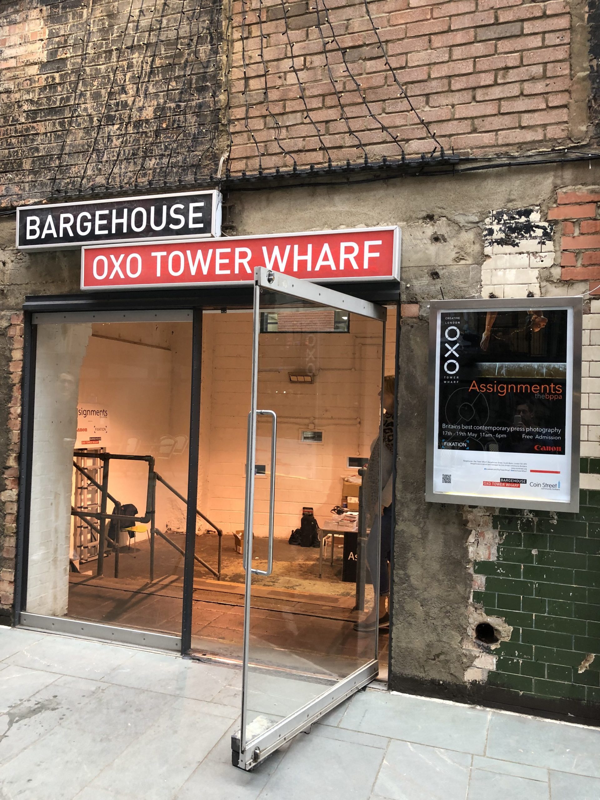
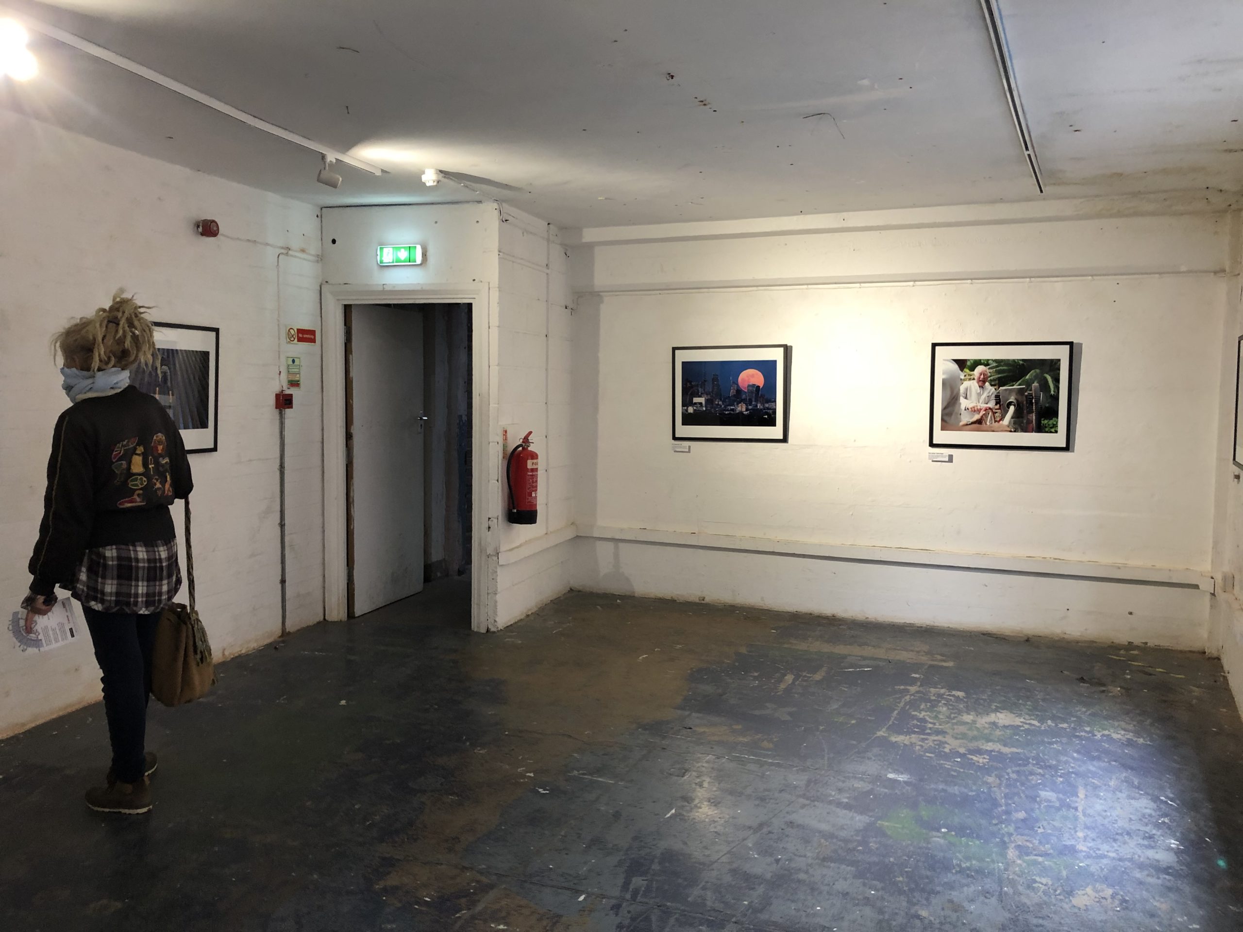
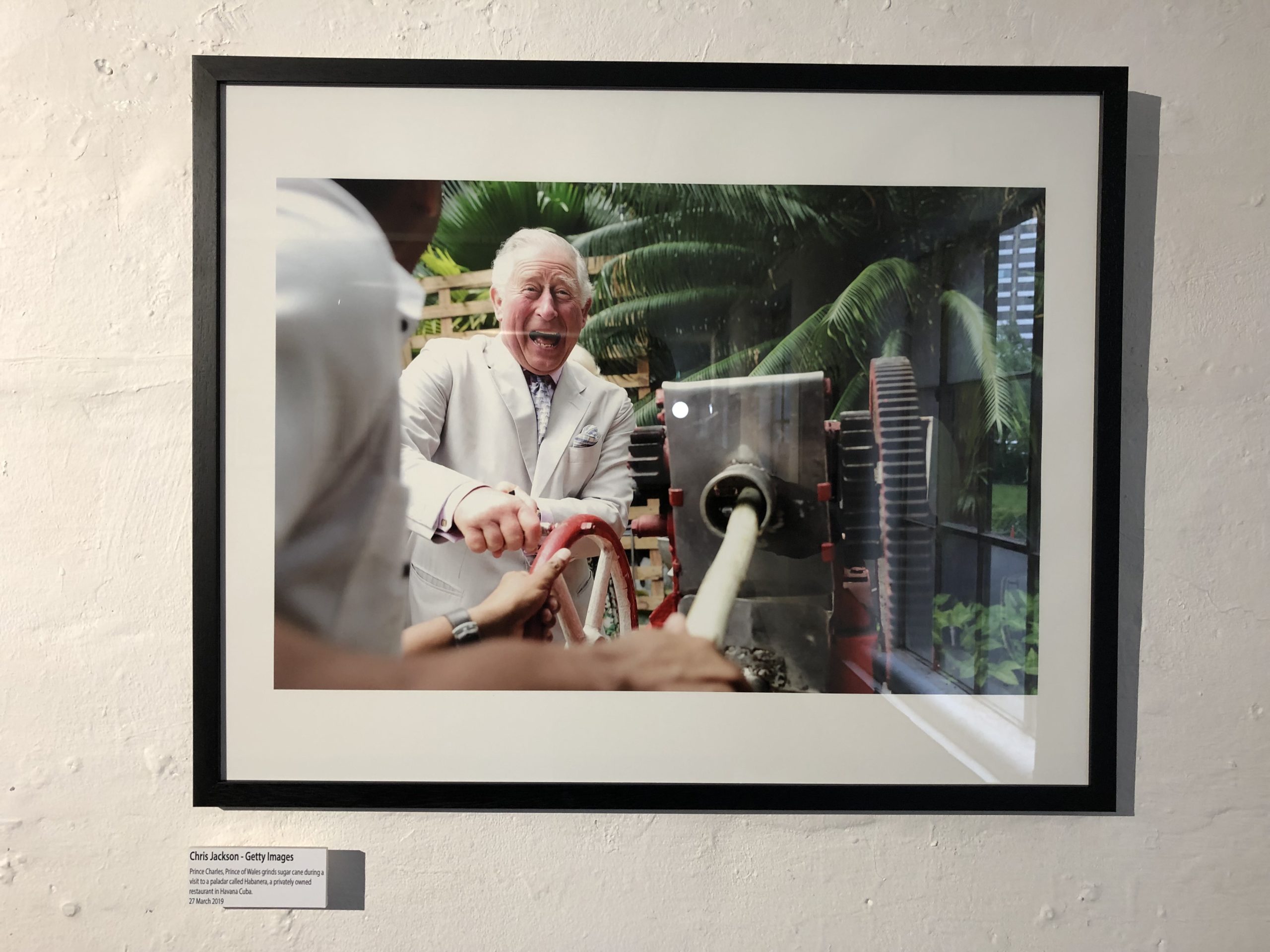
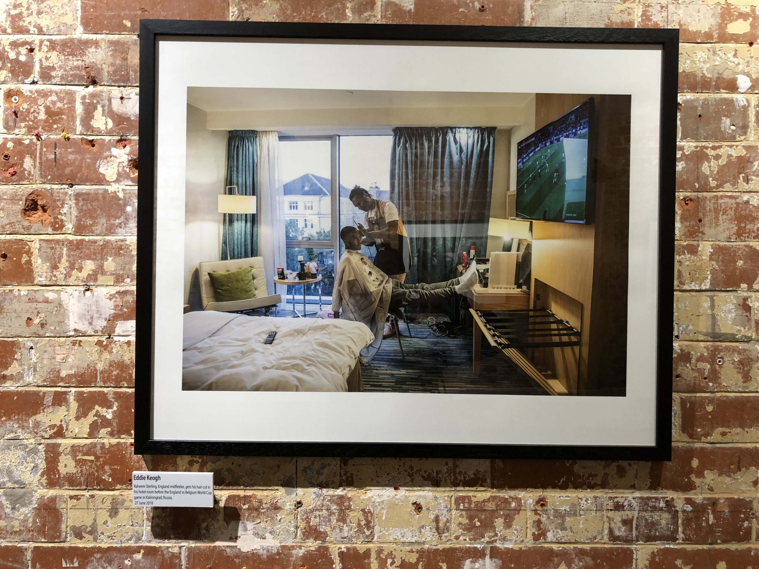
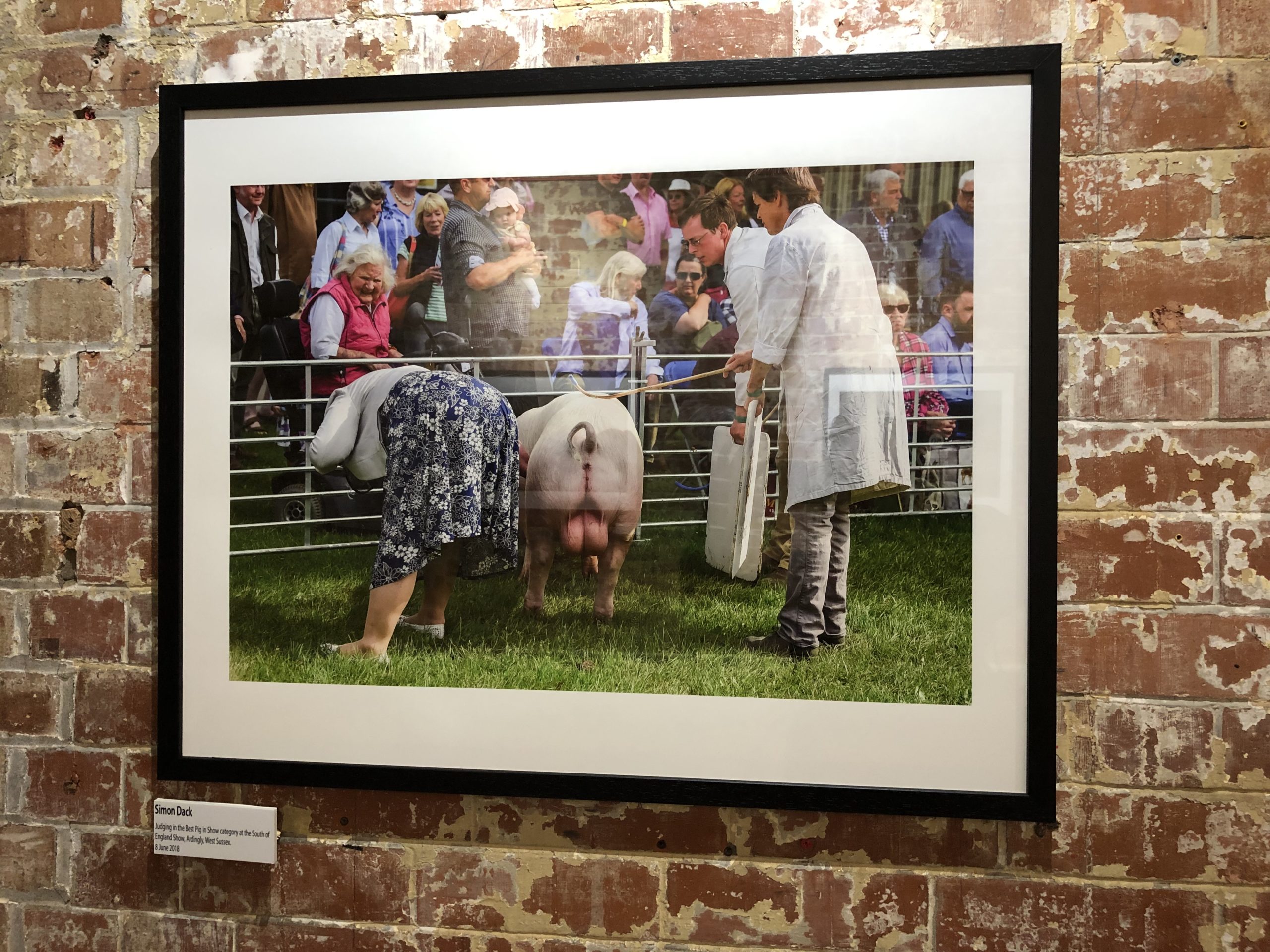
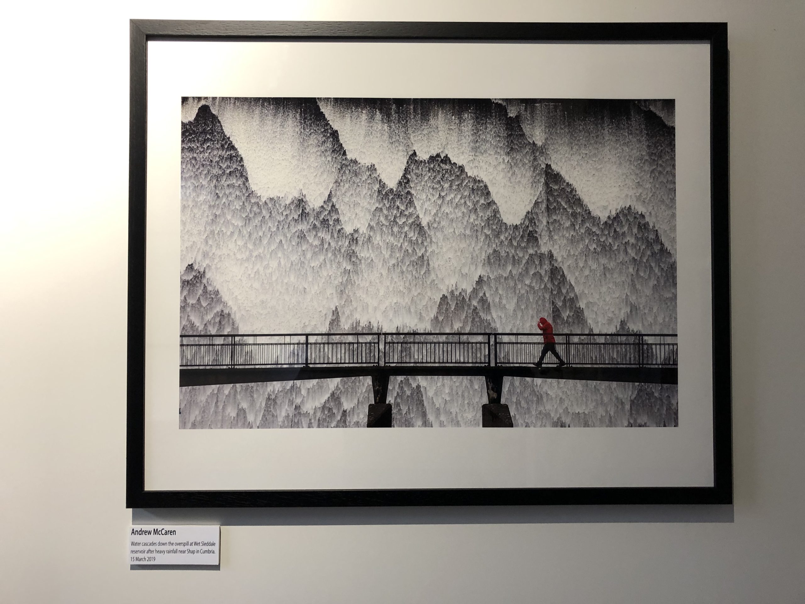
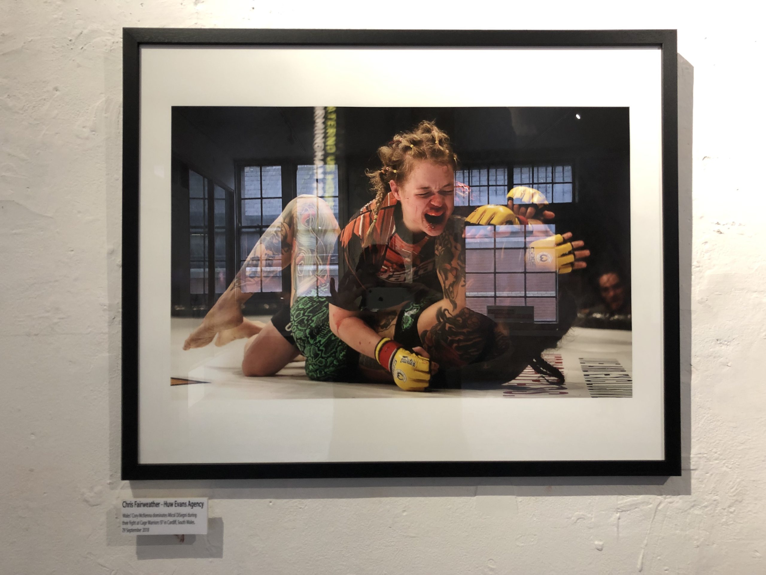
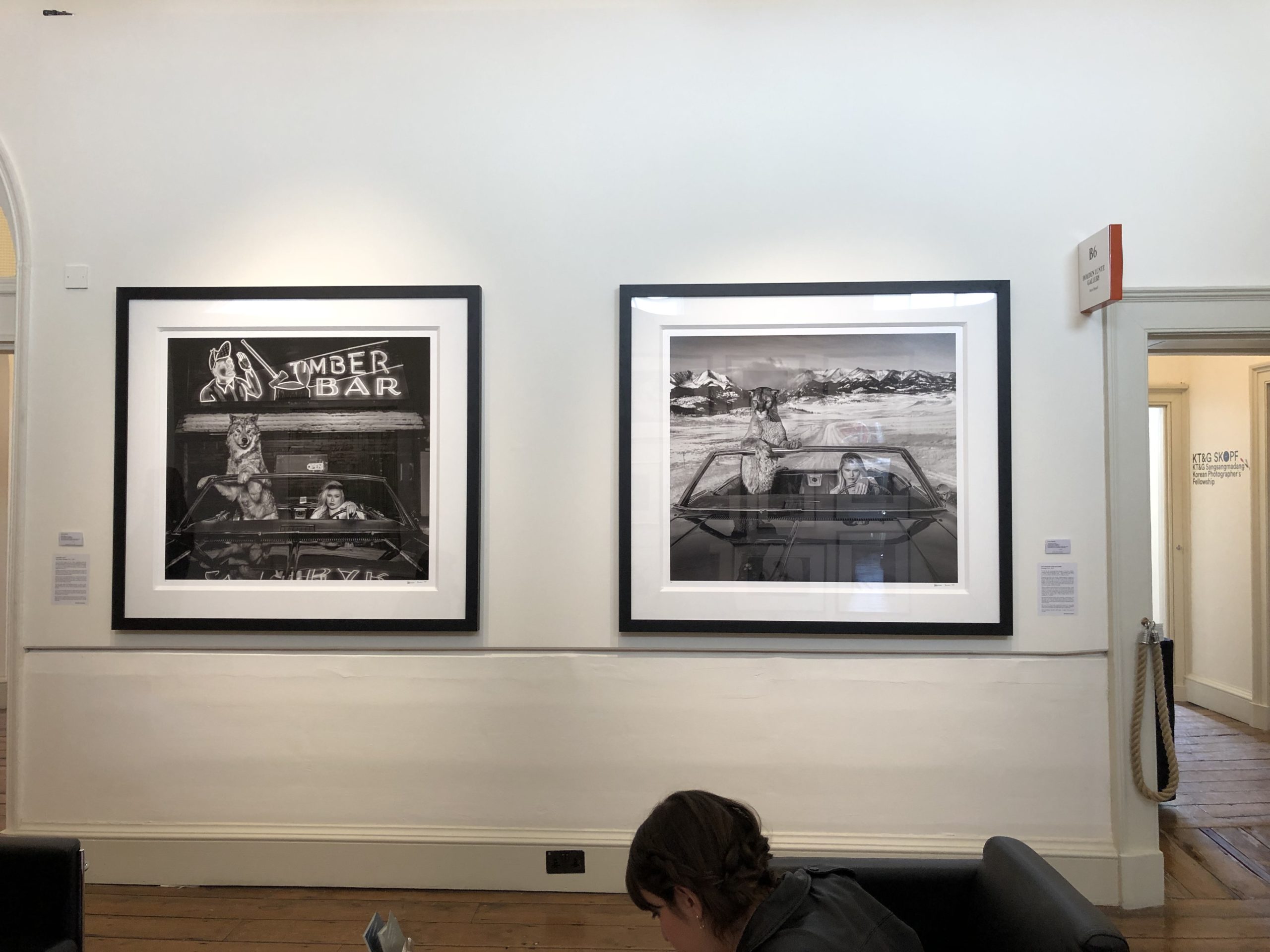
I’ll delve deeper into Photo London today, and I also saw the Martin Parr show, and an exhibition of British photojournalism at the OXO tower, put on by the British Press Photographers Association.


The Offprint Fair at Tate Modern was on the docket as well, where I presumed there would be gobs of photo-books. (Not exactly.)

The plain truth is that the photography I saw, in person, was far from the most interesting art I saw in London.

I know this is a photo blog, because I’ve been writing here for 9 years.

But this column has evolved, and as much photography as I discuss, (most of the year,) it’s important to note that the medium was not doing it for me, compared to other things I saw, ate, and experienced.

So pivoting to travel writing, here in Summer 2019, is as much about being honest about what is earth-shaking out there, IMO, as it is about keeping it fresh on a long-haul column. (And again, we’ll discuss photography today.)

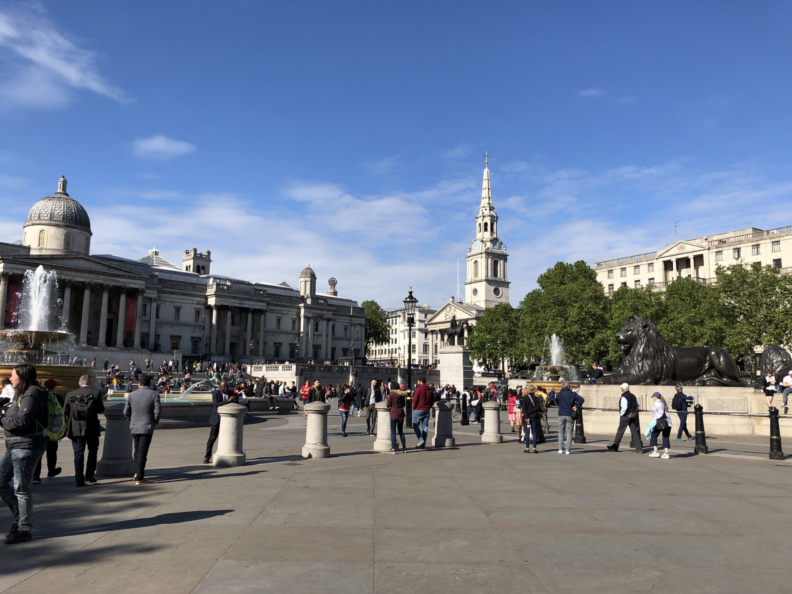
The architecture in London, (yes, that history again,) is so beautiful that it’s hard to put into words. Or capture on screen.

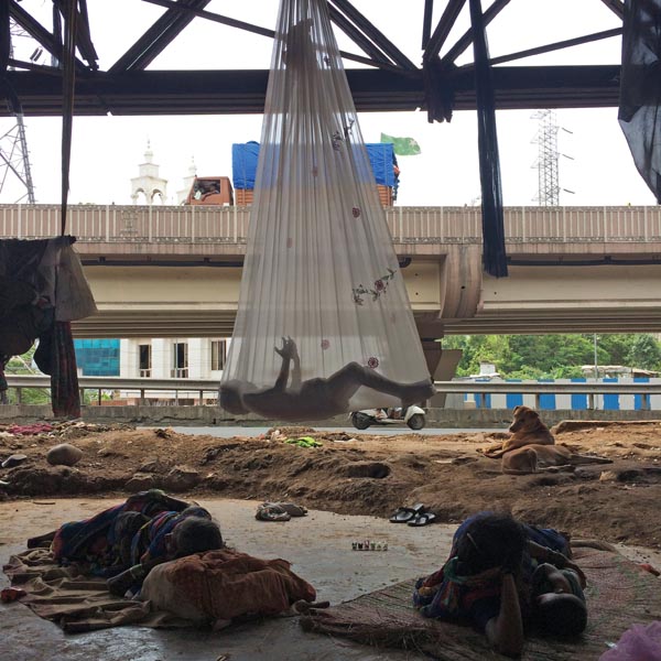
Walking the Thames riverfront feels meta and actual at the same time, like people say about the Seine in Paris, only with more grit.


Just last night, watching the latest episode of Luther Season 5, (Idris Elba has to be the next Bond,) I paused the screen, recognizing I’d stood in that exact spot, on the Embankment, just across the street from Somerset House last month.

Except on screen, there was a dead body hanging from a noose, wearing a scary mask that replicated the face of a psycho killer.

(England goes dark, when it goes dark.)

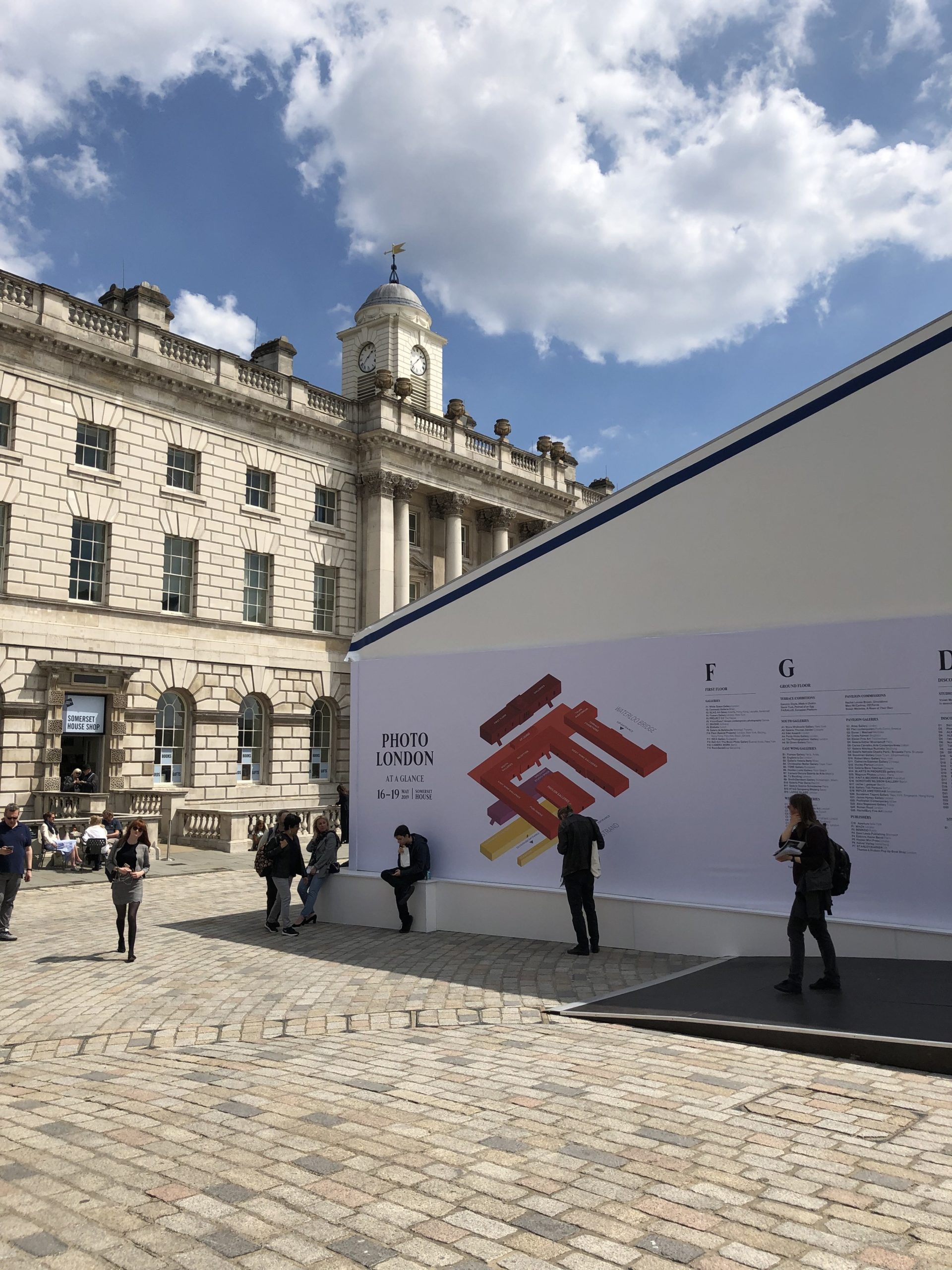
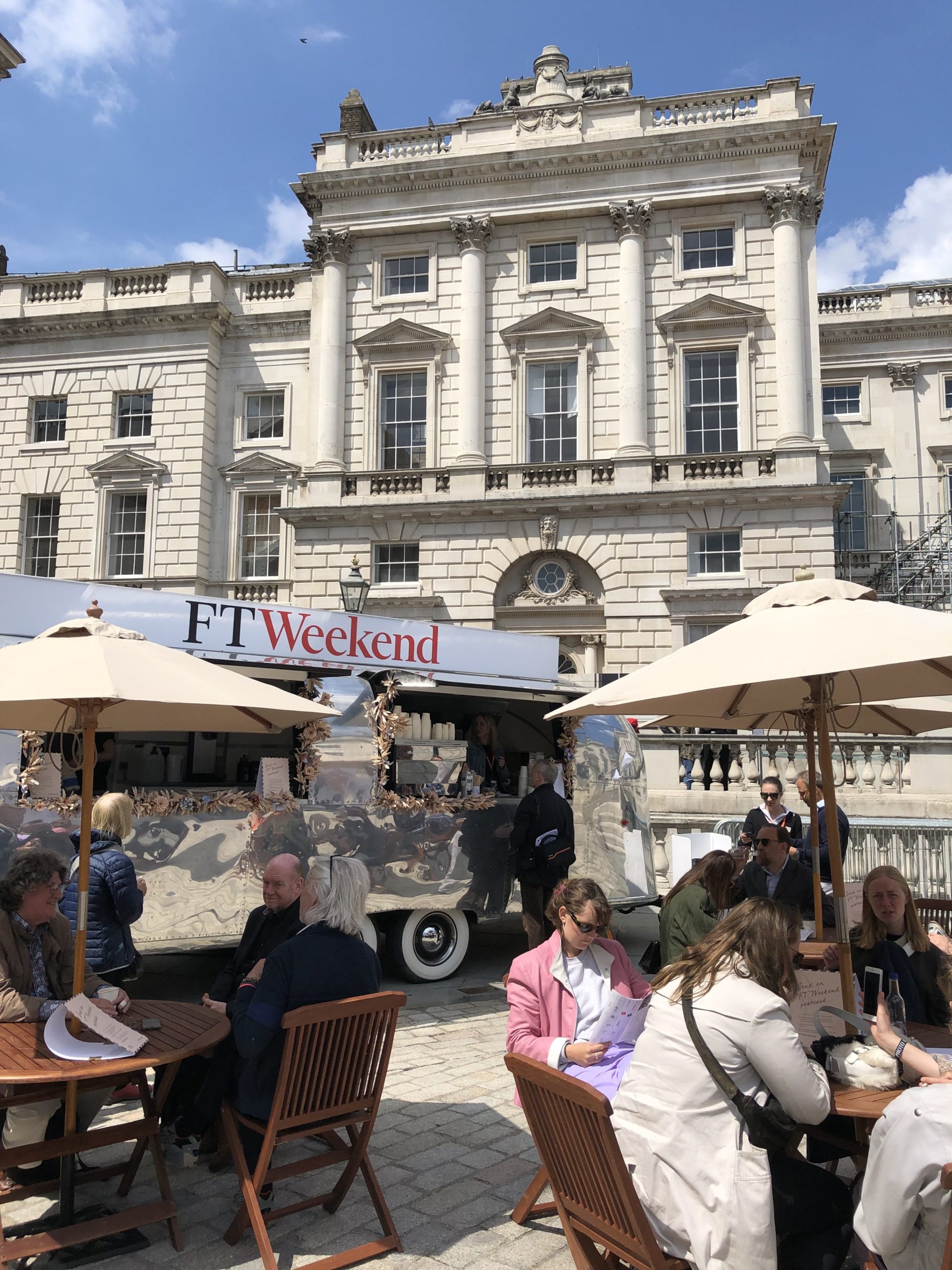
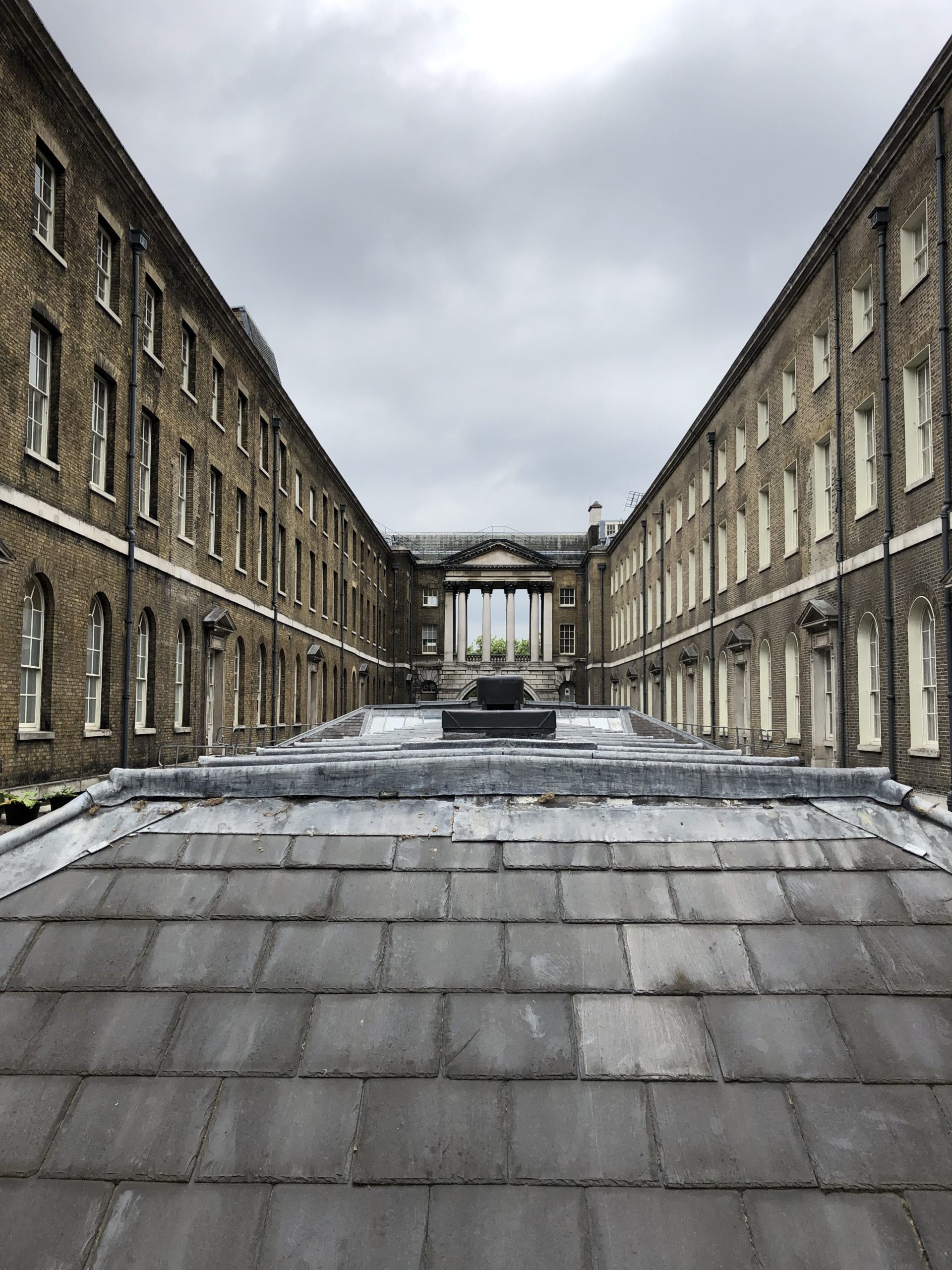
I was there at Somerset House, in Central London, to visit Photo London on three consecutive days, and I used it as something of a hub. (Wifi, bathrooms, friends to talk to.)

Given that I had press access, which was free, (Thanks, Photo London,) it allowed me to have a much deeper and broader experience than I would have otherwise. (Though no free lecture tickets means I can’t write about them. Nudge, nudge.)

So let’s break it down by day, as each experience was so different.


Part 2: Thursday at Photo London

View at Somerset House

As I said last week, I bumped into almost no one the entire weekend.

Which means I was really able to key in on the work to a far-greater-degree than I did at AIPAD.

My first move, that Thursday, was to look around the pavilion, and see if any art attracted my interest. (At that point, I was still scanning the room a bit, for people, before giving up entirely.)

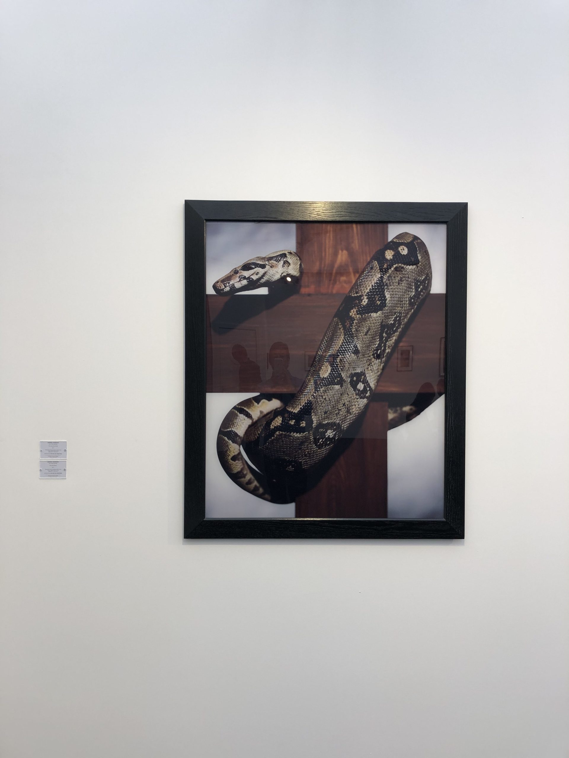
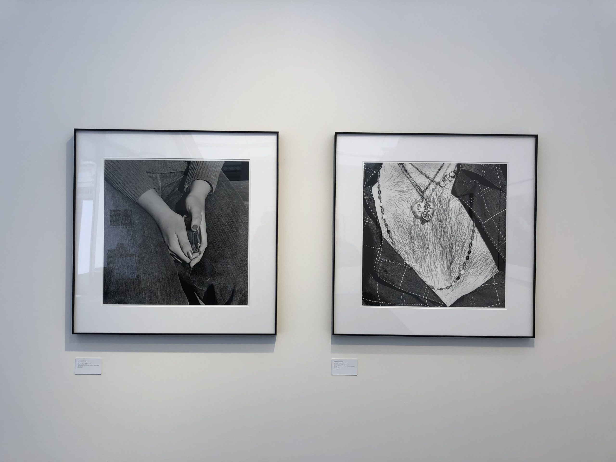
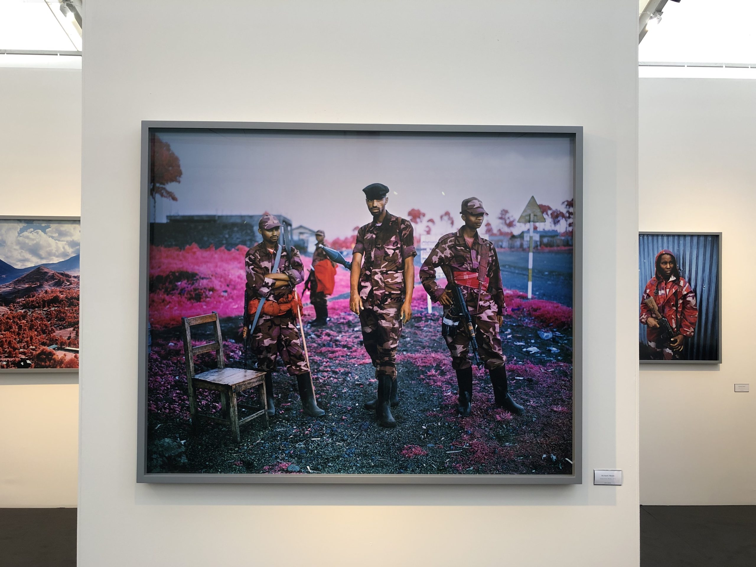
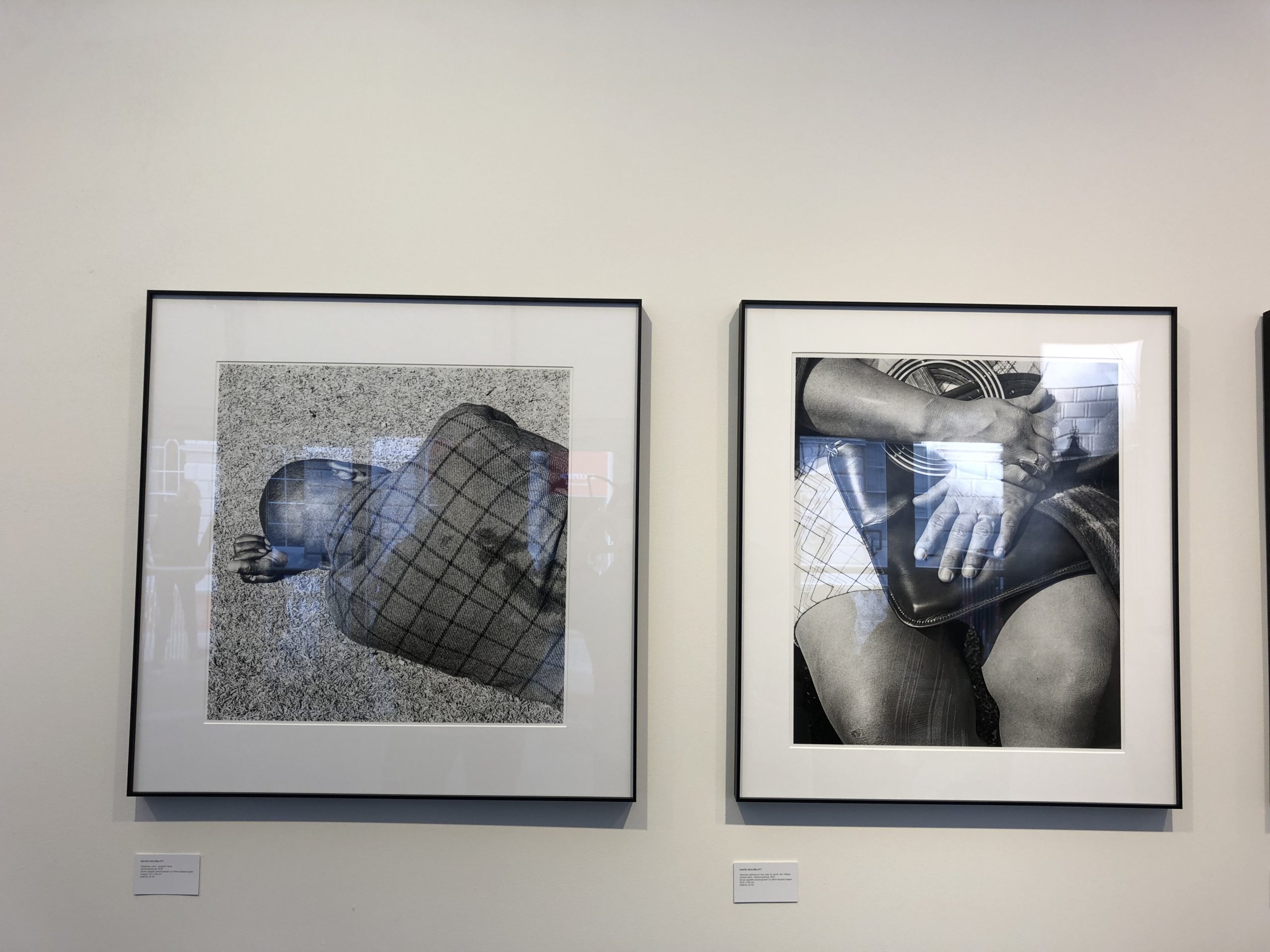
Definitely some cool work by Richard Mosse, Andreas Serrano, Paul Graham, and David Goldblatt. (But nothing I hadn’t seen before.)

I know I said these fairs are more for collectors and dealers than artists and journalists, but when I tab up all the things I saw at Photo London, the good, the bad, the interesting and the tacky, there was quite a lot on display.

Models with big cats? Ouch.

I was searching for inspiration on this trip, though, (Thanks, cousin Mike,) and I didn’t get much at Photo London.

After the pavilion, I went into the West Wing, looking for the Discovery section, which was tucked away in the labyrinth. (There was a photo book fair in the East Wing that was always hard to walk through, due to crowds.)

There were emerging galleries from all over Europe in Discovery, (located on a hidden Mezzanine that was always hard to find,) and a lot of weird, construction-based work. Nothing that made me crazy, though I did photograph a few things for you guys on a Saturday return.

One weird fact: there were human sized-niches in the Discovery section, and I saw two gallery workers emerge from them, as if they had been powered down, at a standing rest. (I guess they were.) Creepy and cool simultaneously.

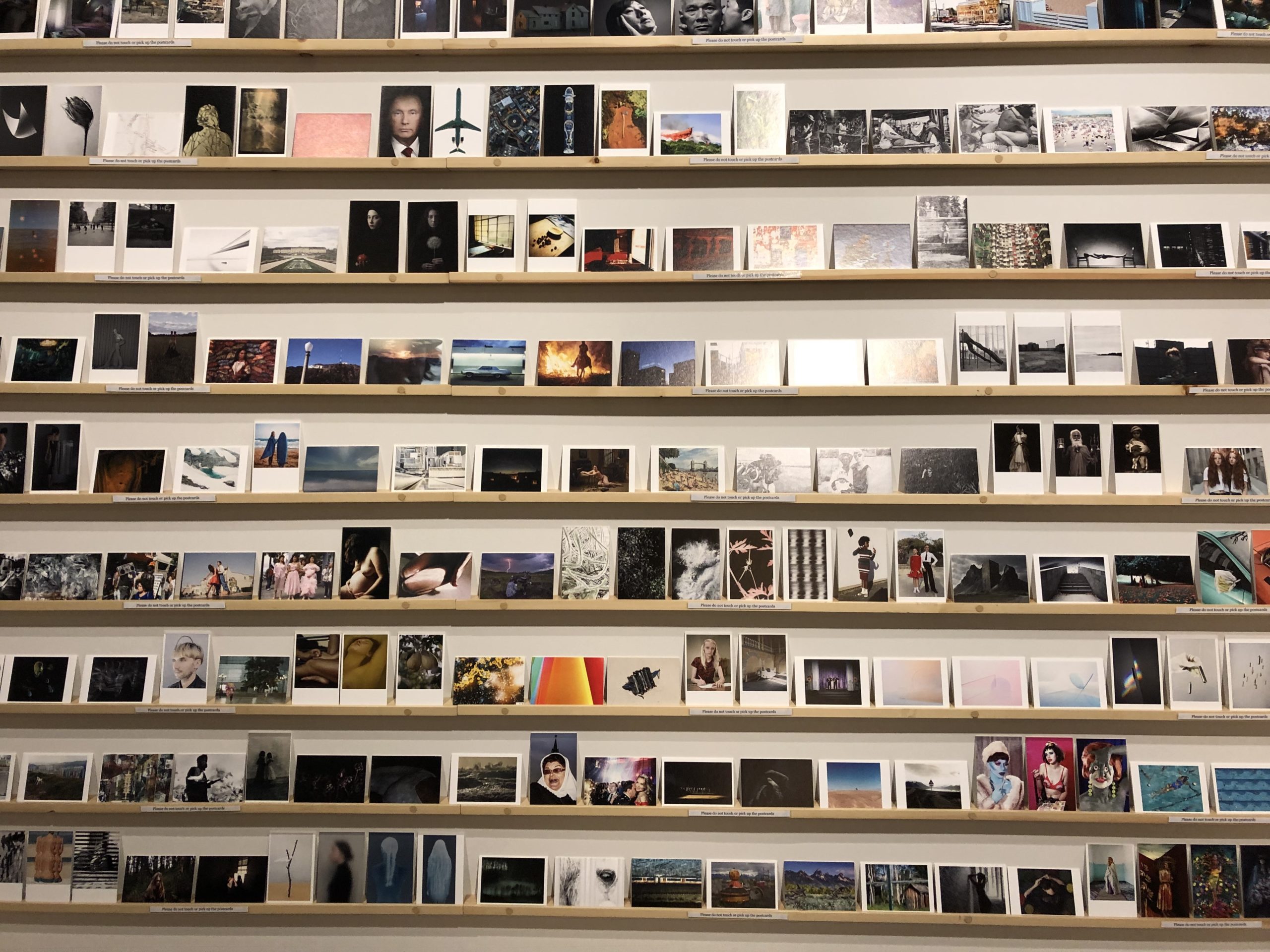
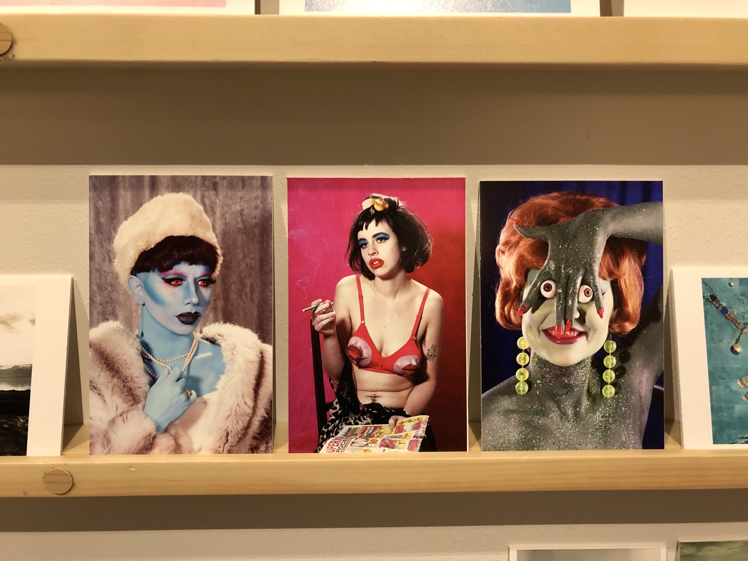
Scott implored me to spend some time with the very-tall postcard exhibition, into which lots of artists had been invited, and he was right.

There was some strange, really odd work, (including preggo nudes,) and some of the groupings were really interesting.

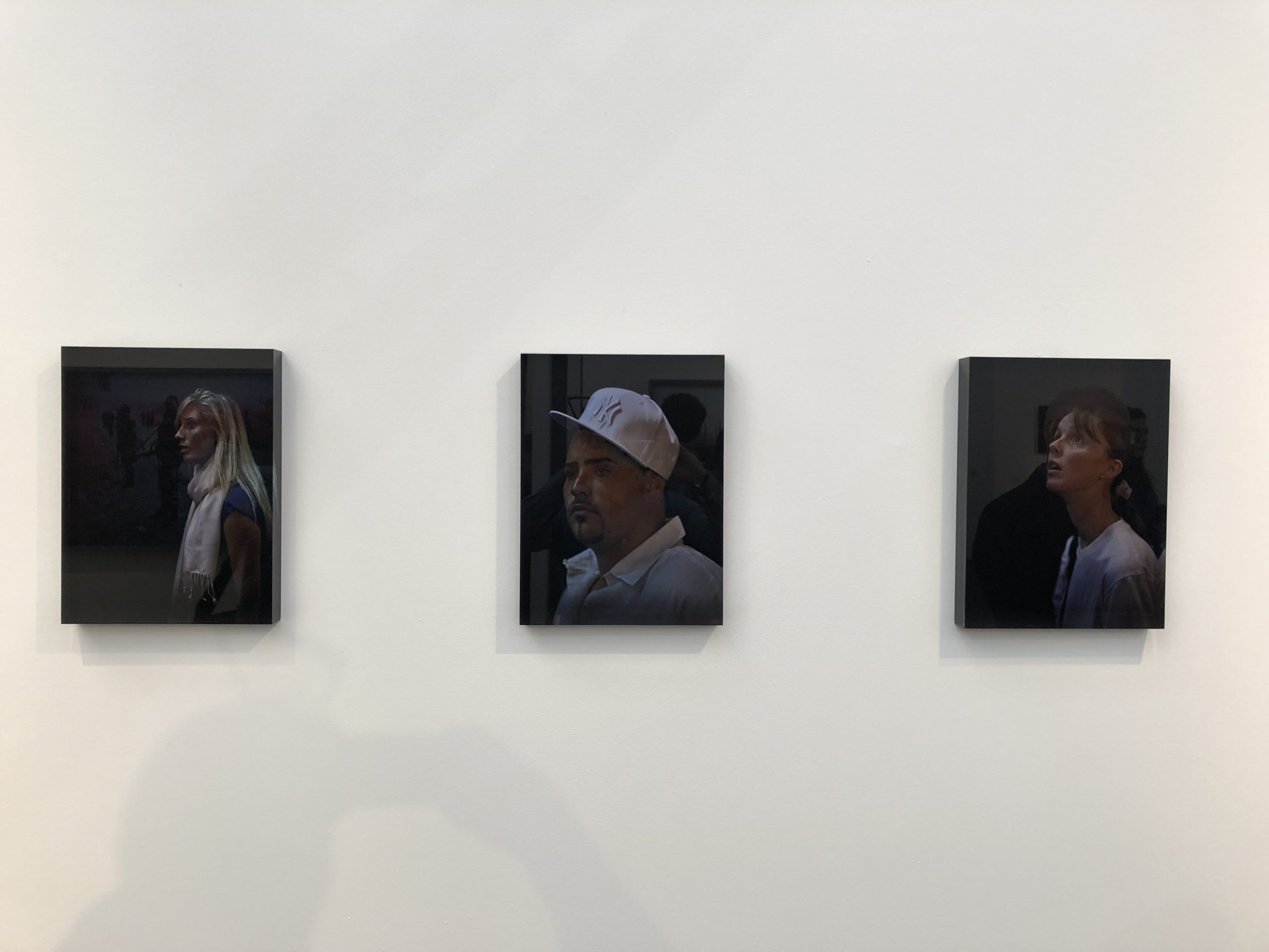
Last thought for Thursday: I was fortunate to interview Stephen Shore during my 6 year run at the NYT Lens blog, (more on that later,) and he’s a super-nice guy. I’ve traded emails with him once or twice since.

So it’s hard to admit that Scott and I saw a show of his big iPhone work, blown up large, and it wasn’t very good. He told me, a few years ago, that his Instagram feed was his primary artistic medium these days.

I believe these photos derive from that phase, and I know that not every project can be a hit, nor one creative phase as fertile as another.

But if I were Mr. Shore, I’d switch it up again.


Part 3: Friday at Photo London


Bathroom View, Somerset House

My morning was packed, with things that will come up another time, but once I finally arrived at Photo London, (Wifi and Bathroom pit-stop) I mostly wanted to talk with my Portland buddy Gregory Eddi Jones, and meet his wife Stephanie.

I wanted to get out of there quickly, though, as Hugo and I were meant to meet up, so we could head back into town to see “The Warriors,” which was playing at a revival theater in Leicester Square.

But we got to talking, and before you know it, some guy came up and asked us if we wanted a chip for a free drink.

A negroni or something else with Campari.
(I forget.)

I’m all for a free drink, and like I said, we got to talking, so of course I got home too late for the movie.

It led to an eating tour of North London, though, which combined with my Afghan lunch was one to remember. (We’ll get there too.)


Part 4: Saturday at Photo London (AKA Holy Shit what a coincidence)


Richard photographing in front of the Pavilion


Here’s where things got interesting.

I met my dear friend Richard Bram, quite by accident, as his message popped up as soon as my phone was live again, when I arrived at Somerset House on Saturday afternoon. We had a date for Tuesday, (again, more to tell,) but Richard was there, and I was there, so we made a plan to meet up.

I was a bit of a grump, because I needed some water, and likely some food, but Richard was kind enough to let me unwind, and then he bought me a fresh squeezed grapefruit juice to help with the blood sugar.

(Thanks, buddy. What a mensch.)

Richard is one of my favorite people to look at art with, because he’s very smart, knows a lot, but also isn’t pushy with his opinions.

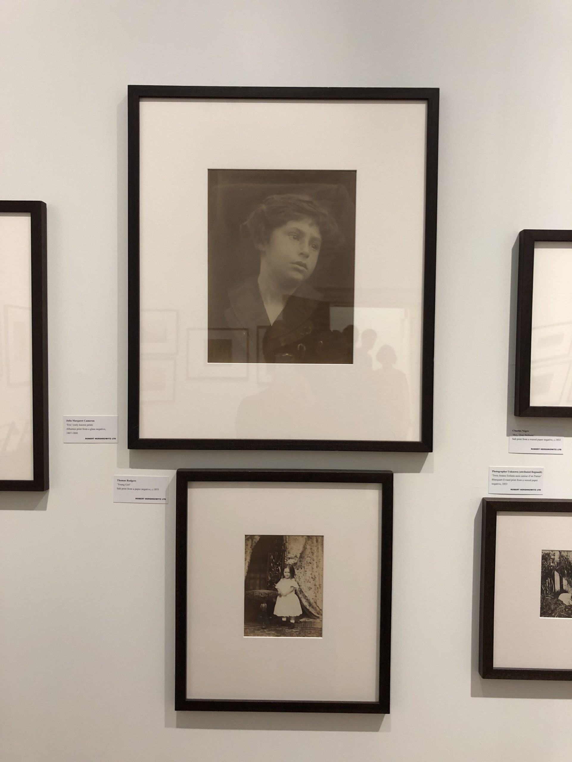
We breezed through some galleries with not-so-impressive stuff, and then, again in the West Wing, encountered a full, private gallery room filled with 19th Century gems.

Julia Margaret Cameron. Gustave Le Gray. Charles Negre.

The woman behind the counter, Paula Hershkowitz turned out to be the proprietor, and she said she ran a private dealership with her husband Robert. (In Sussex and London.)

That she was the only nice, interested dealer I met might have been because she was THAT nice, that I didn’t try hard enough to engage the others, or that it’s just the way these things go.

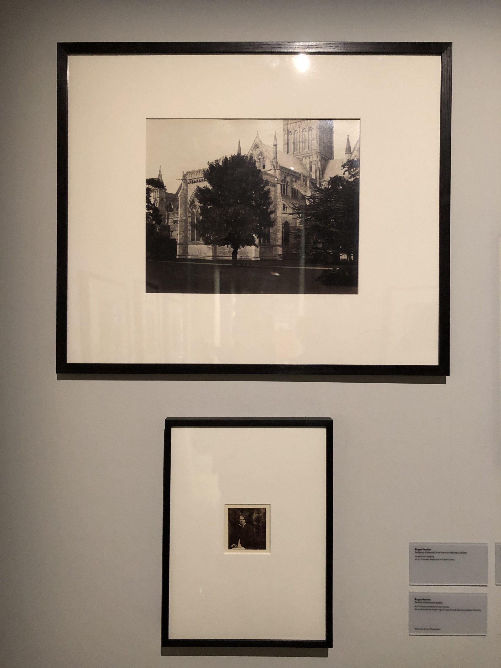
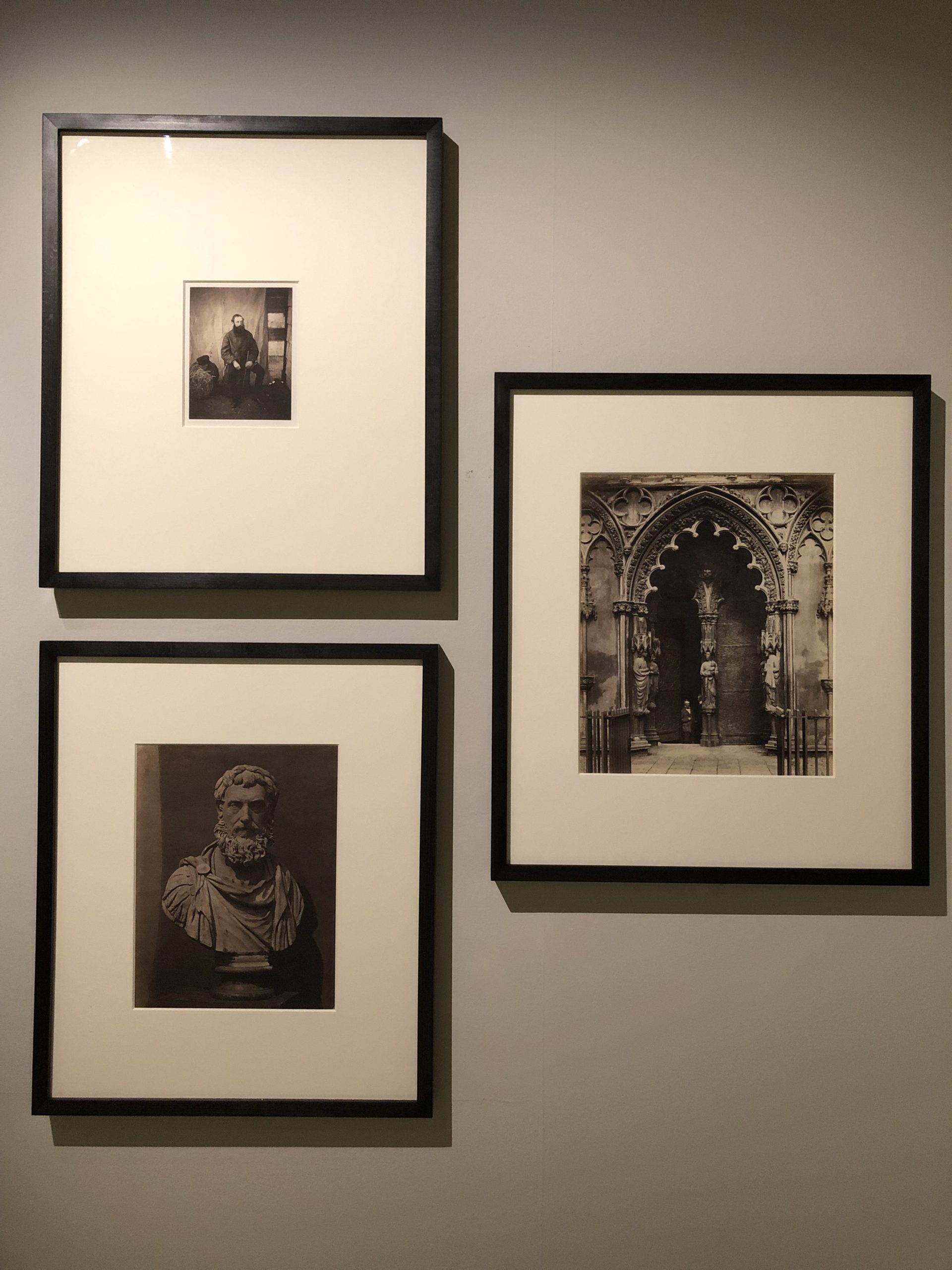
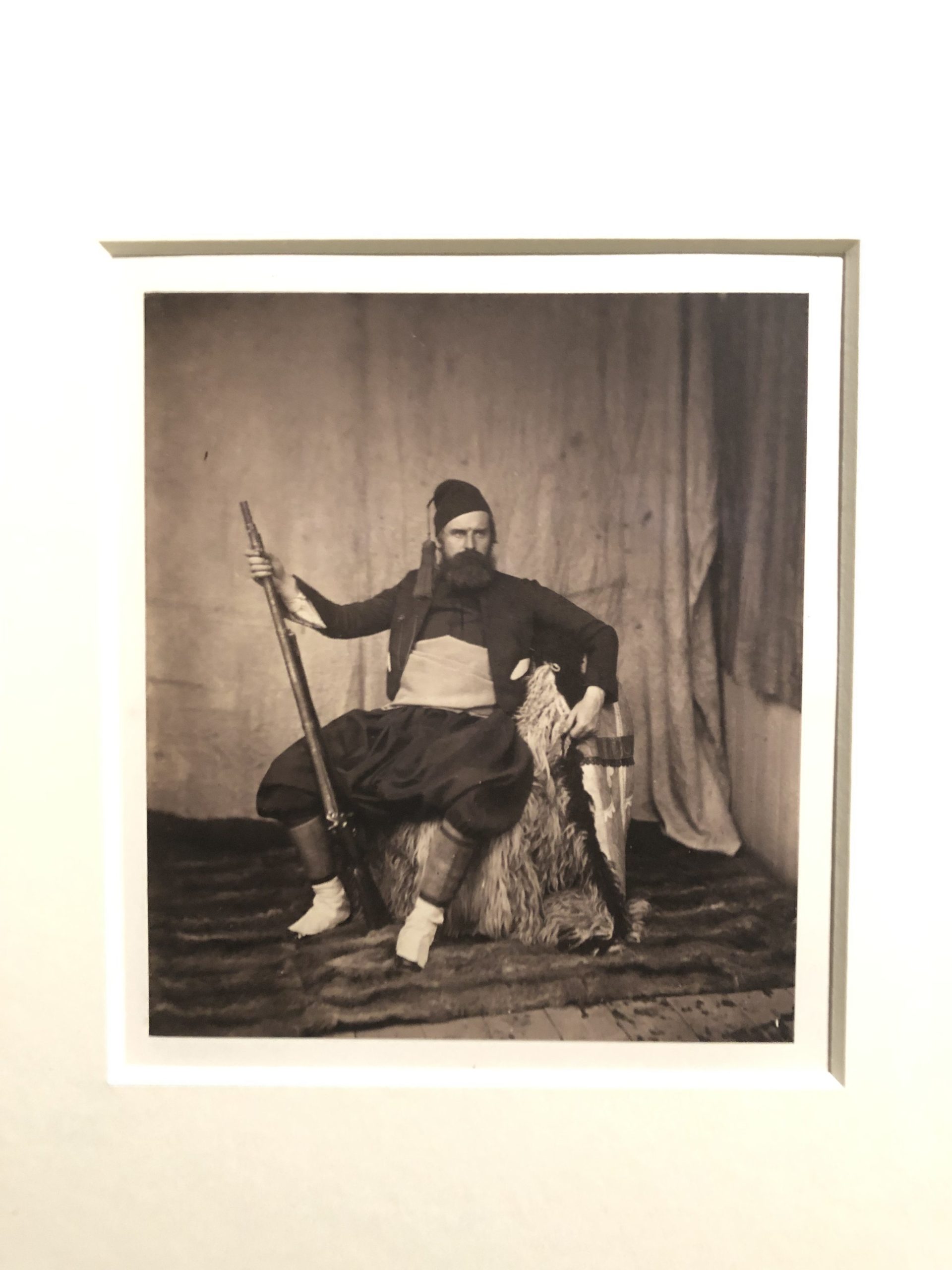
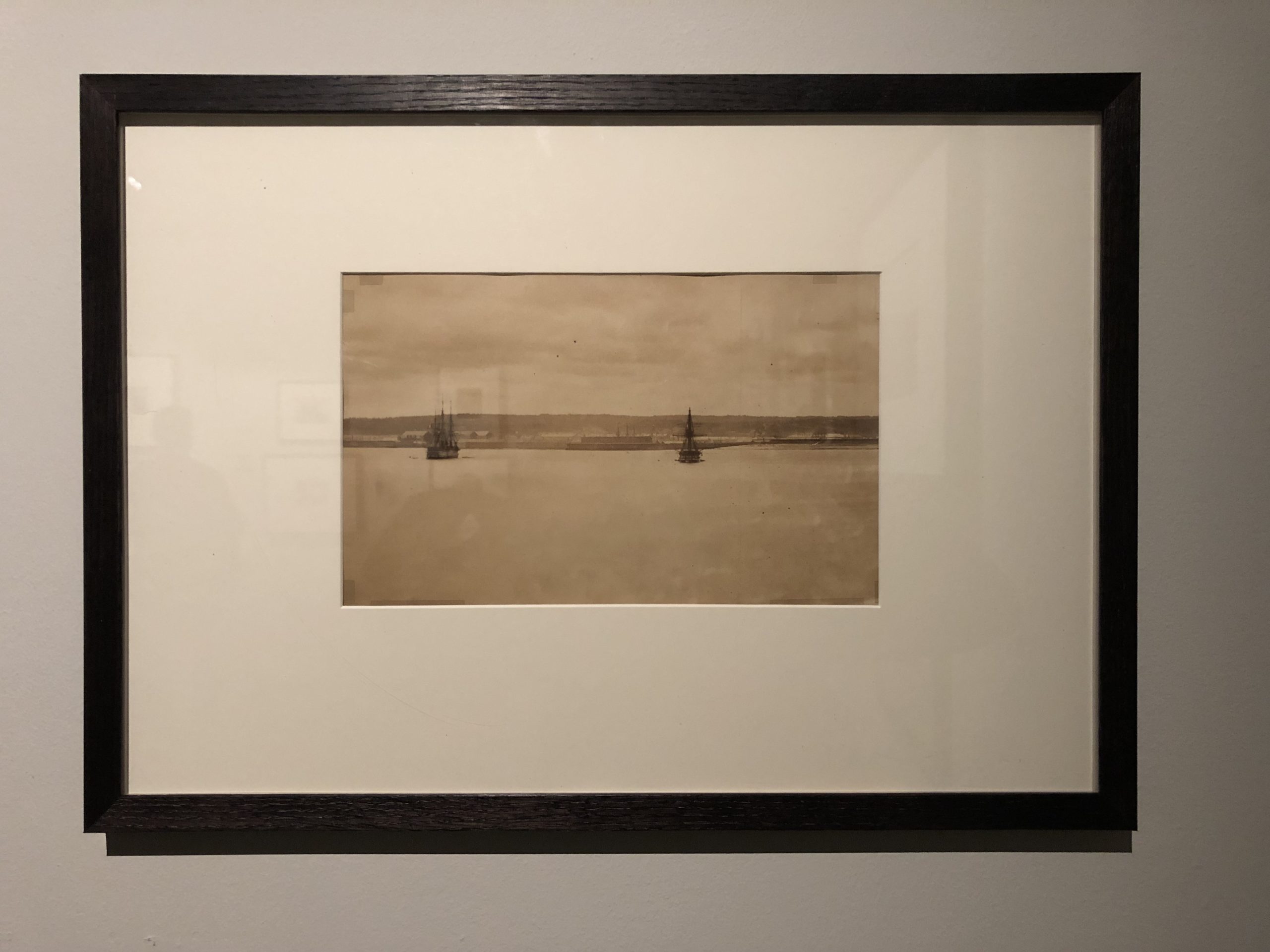
But after we ogled her wares for a while, she told us there was a big Roger Fenton show, in the bowels of the basement, that her gallery had arranged.

If we could find it.

It took a while, as we stumbled through the Discovery section again, and also bumped into the dumb Gavin Turk Instagram egg and the boring Stephen Shore show.

Then, thankfully, we found it.

And it was breathtaking, to stay the least.

(Not inspiring, though, because I’ve seen versions of this work many times before.)

Setting aside that standard, these were amazing photographs.

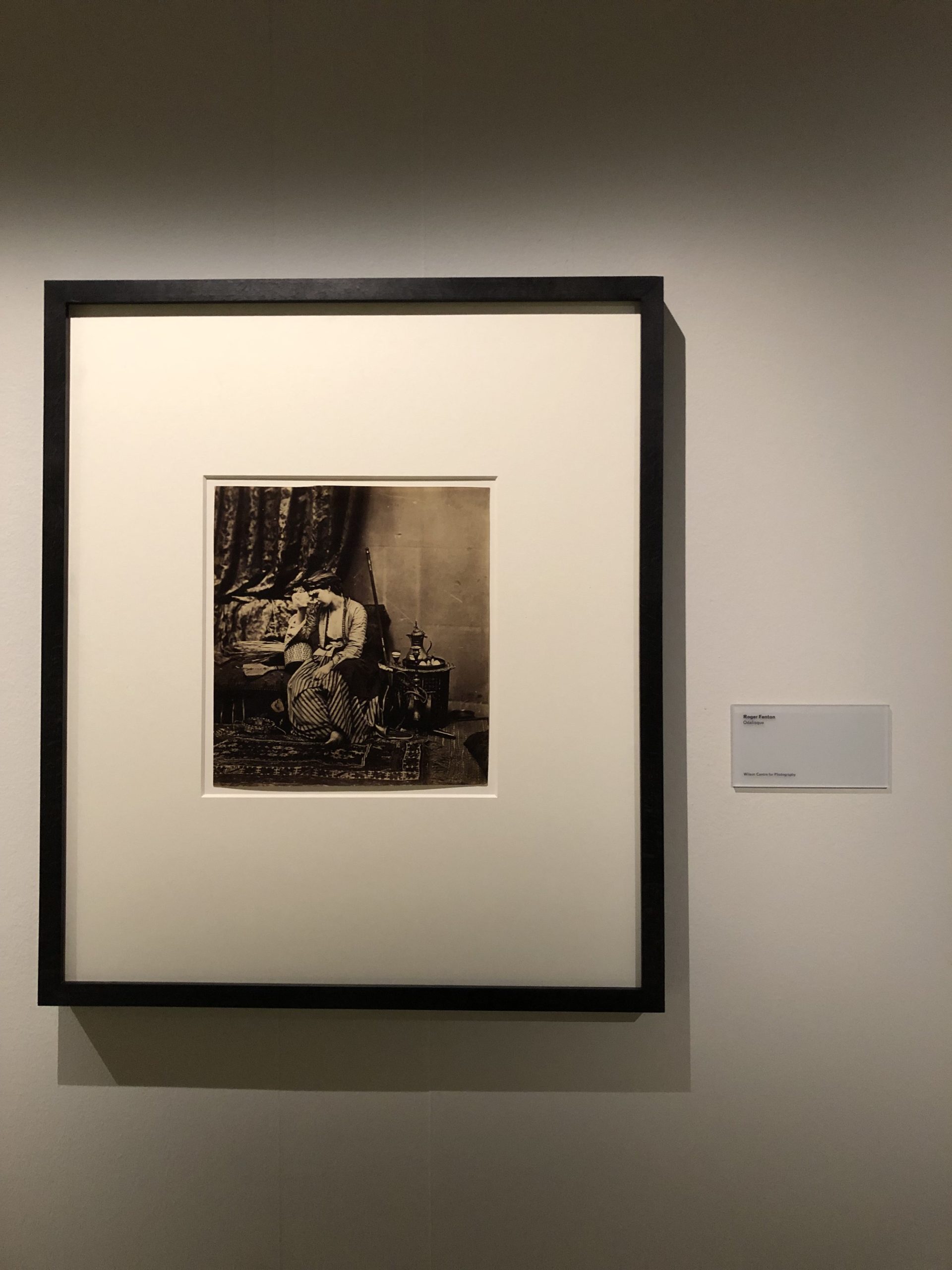
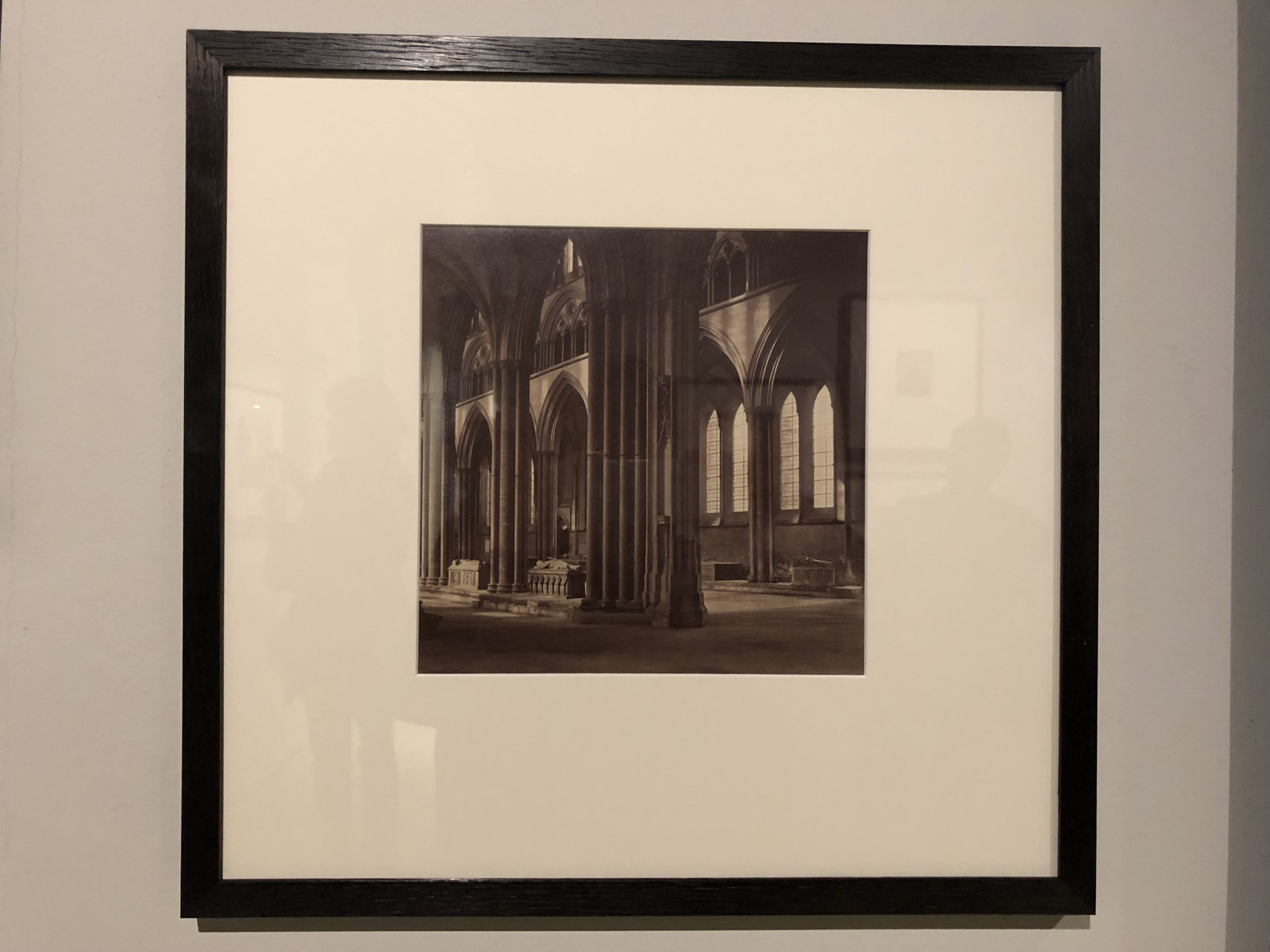
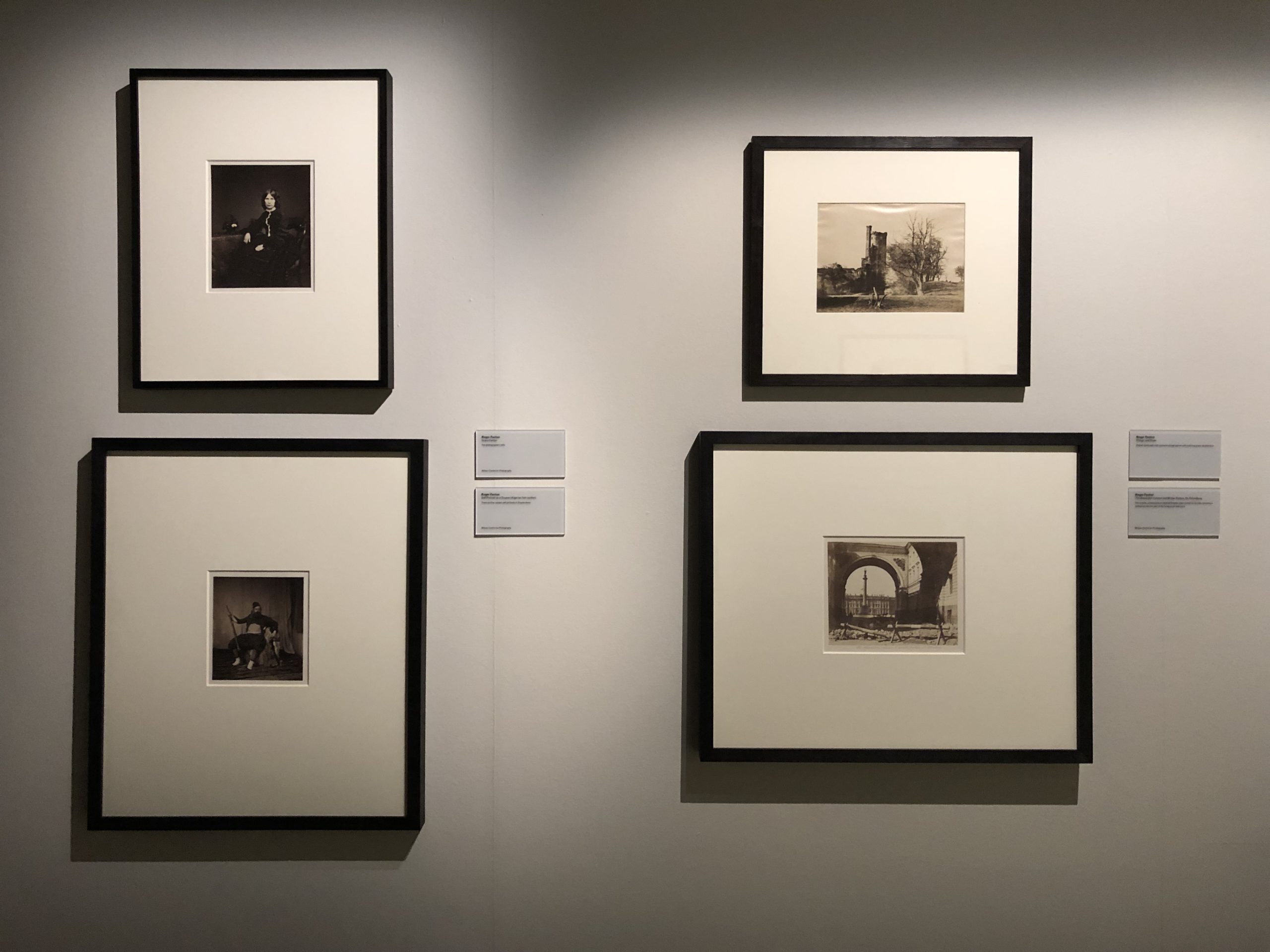
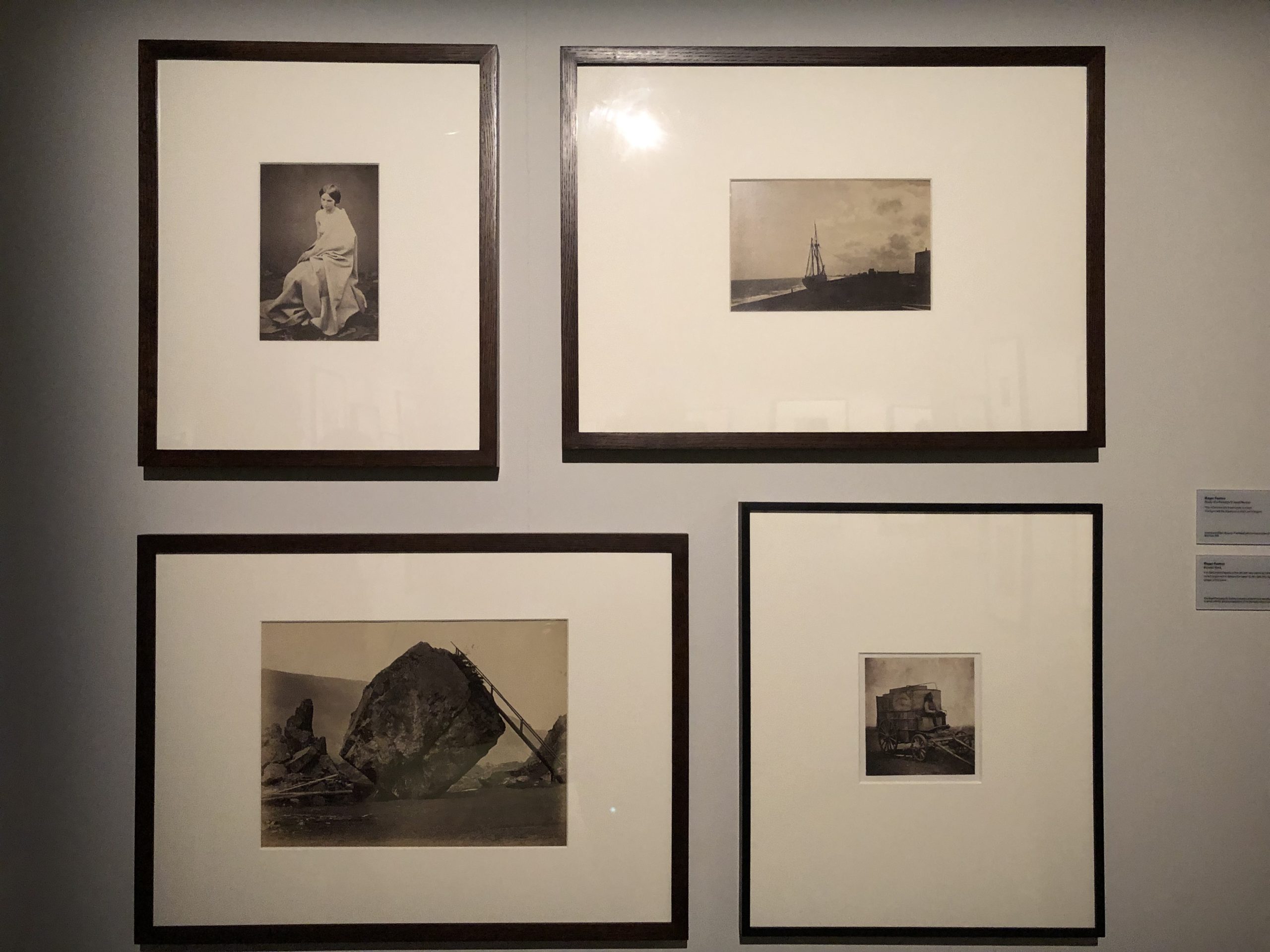
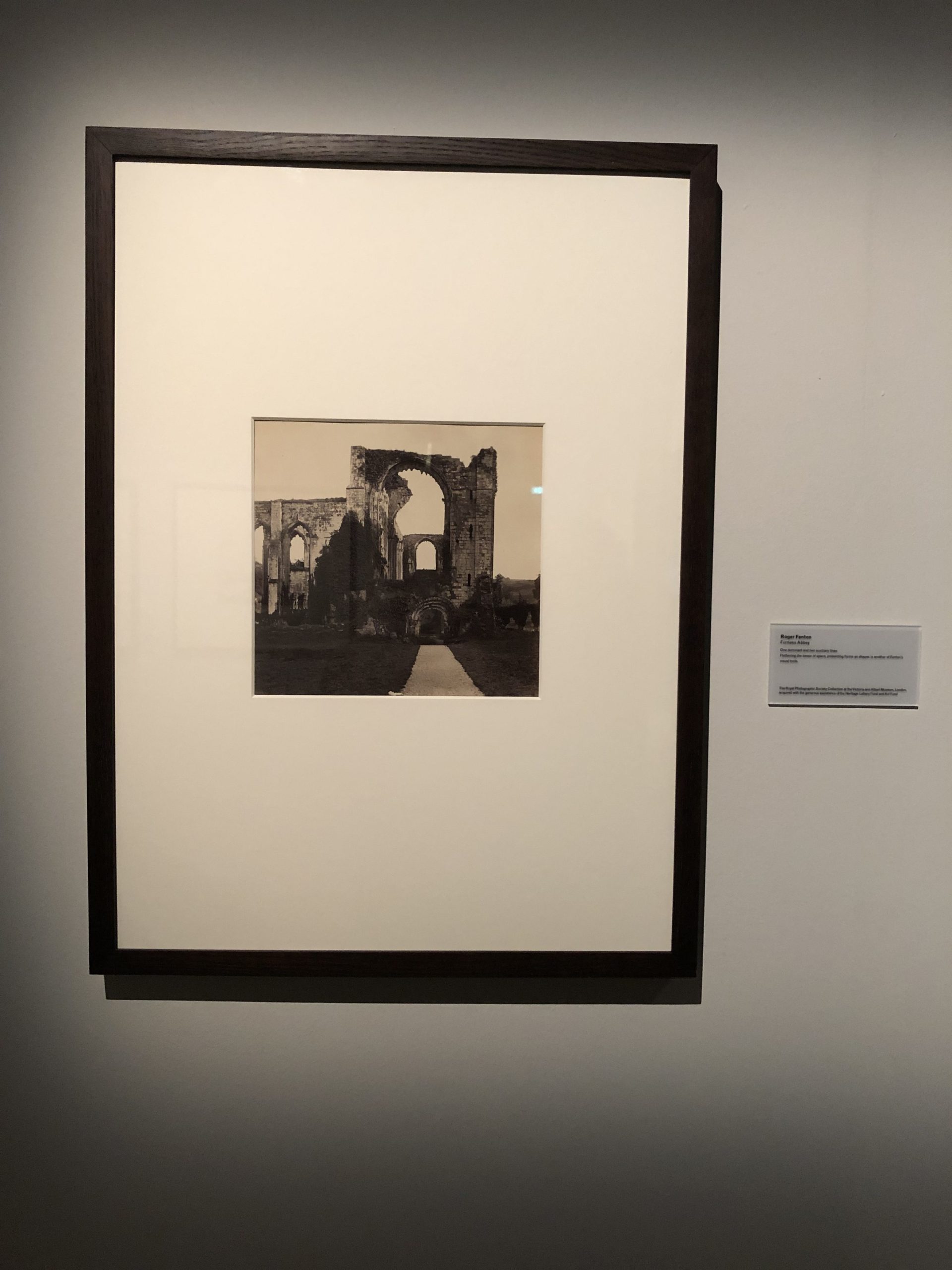
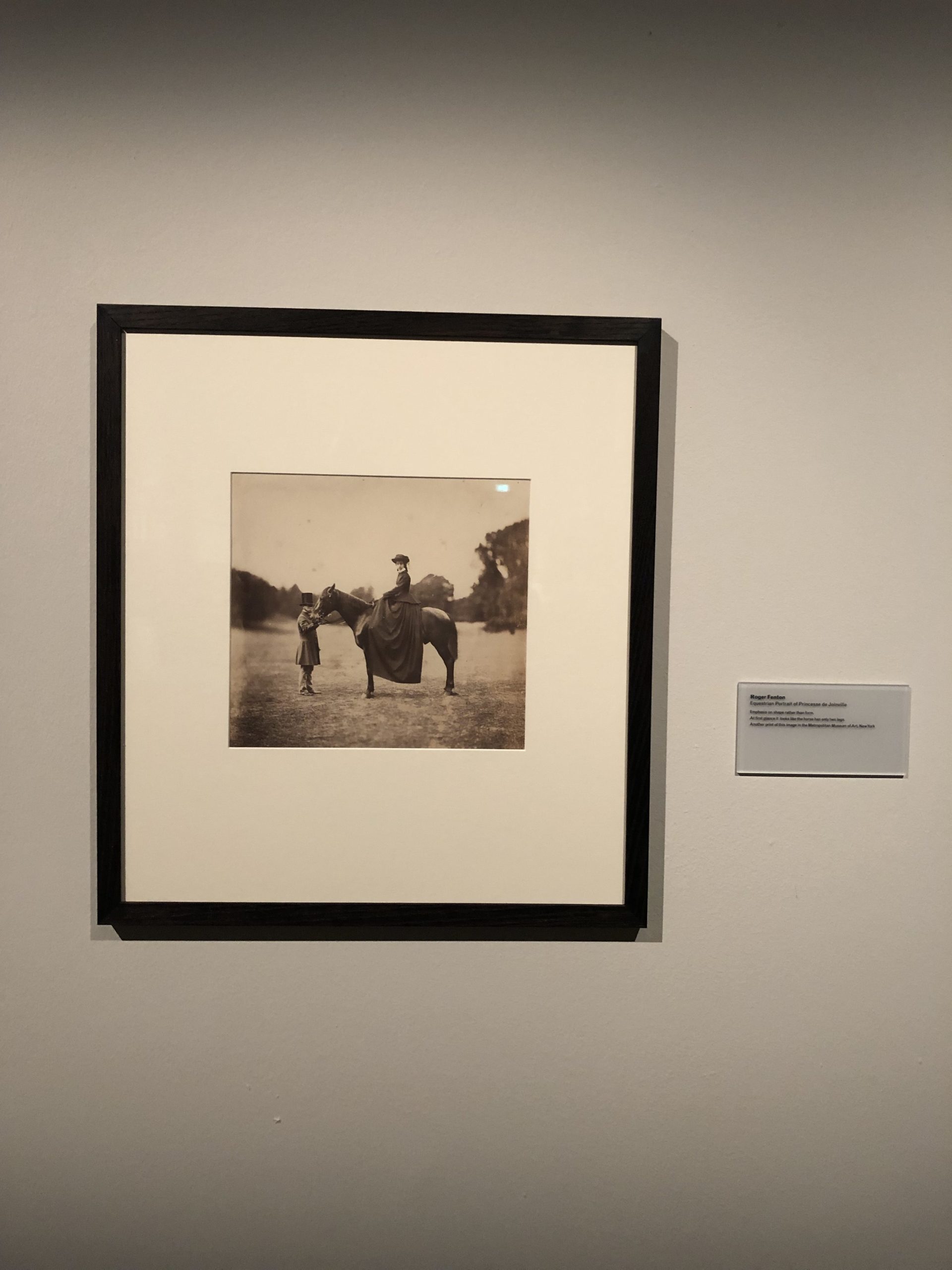
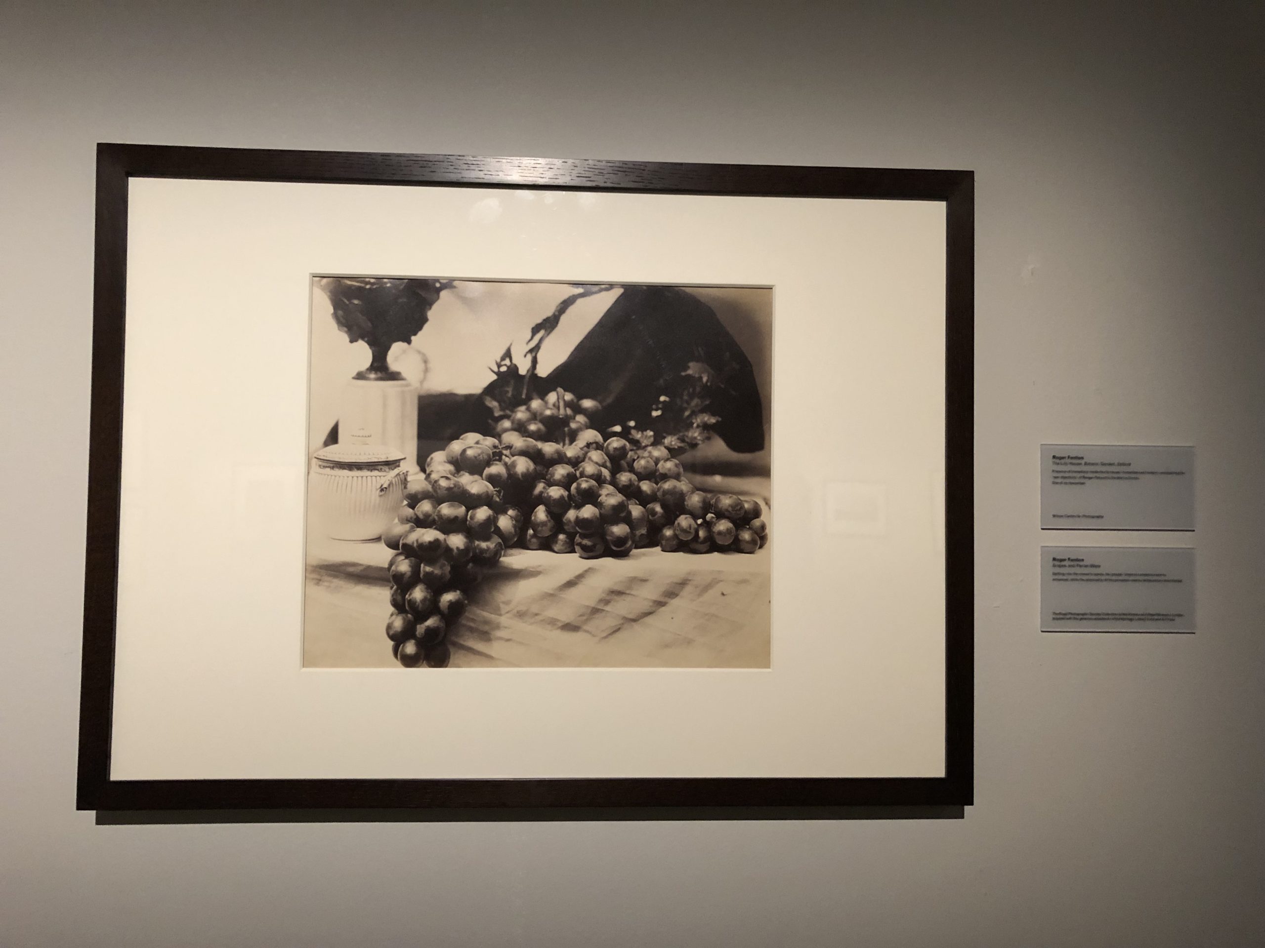
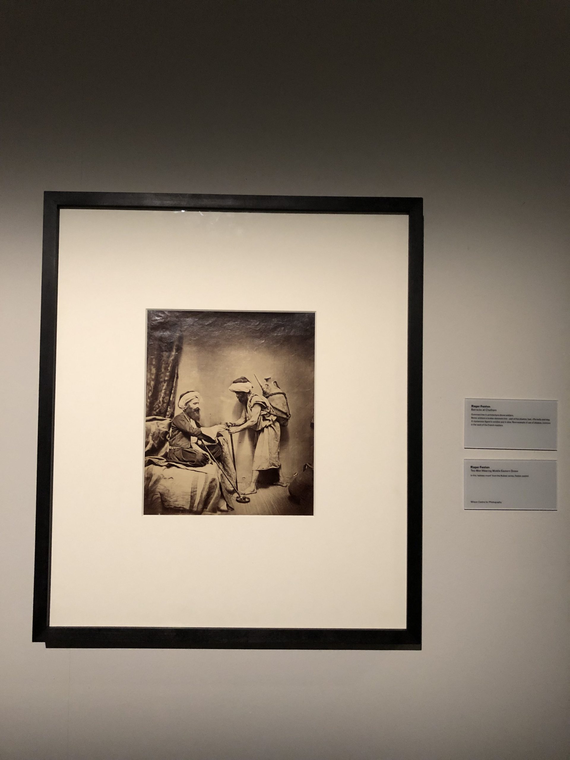
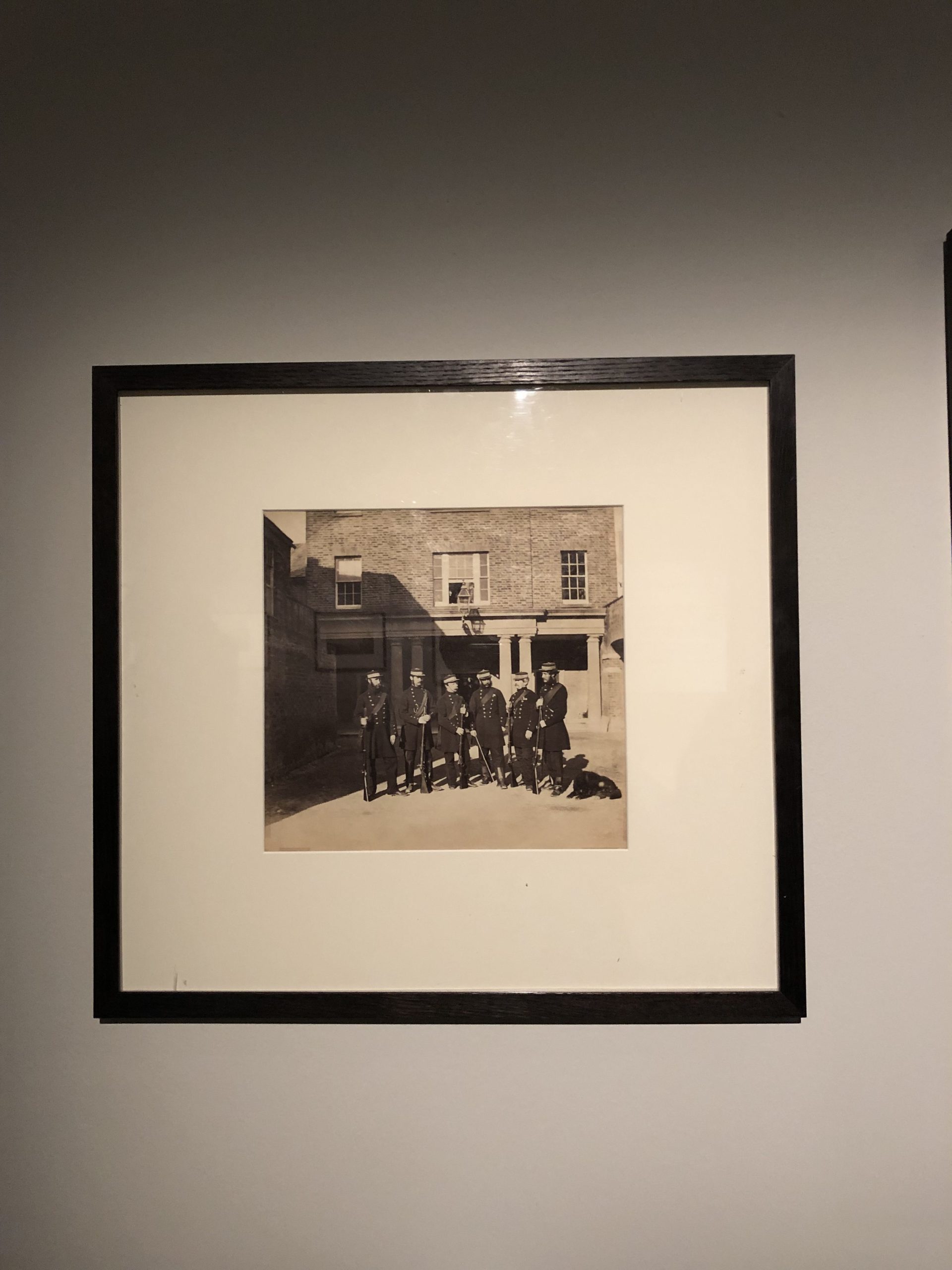
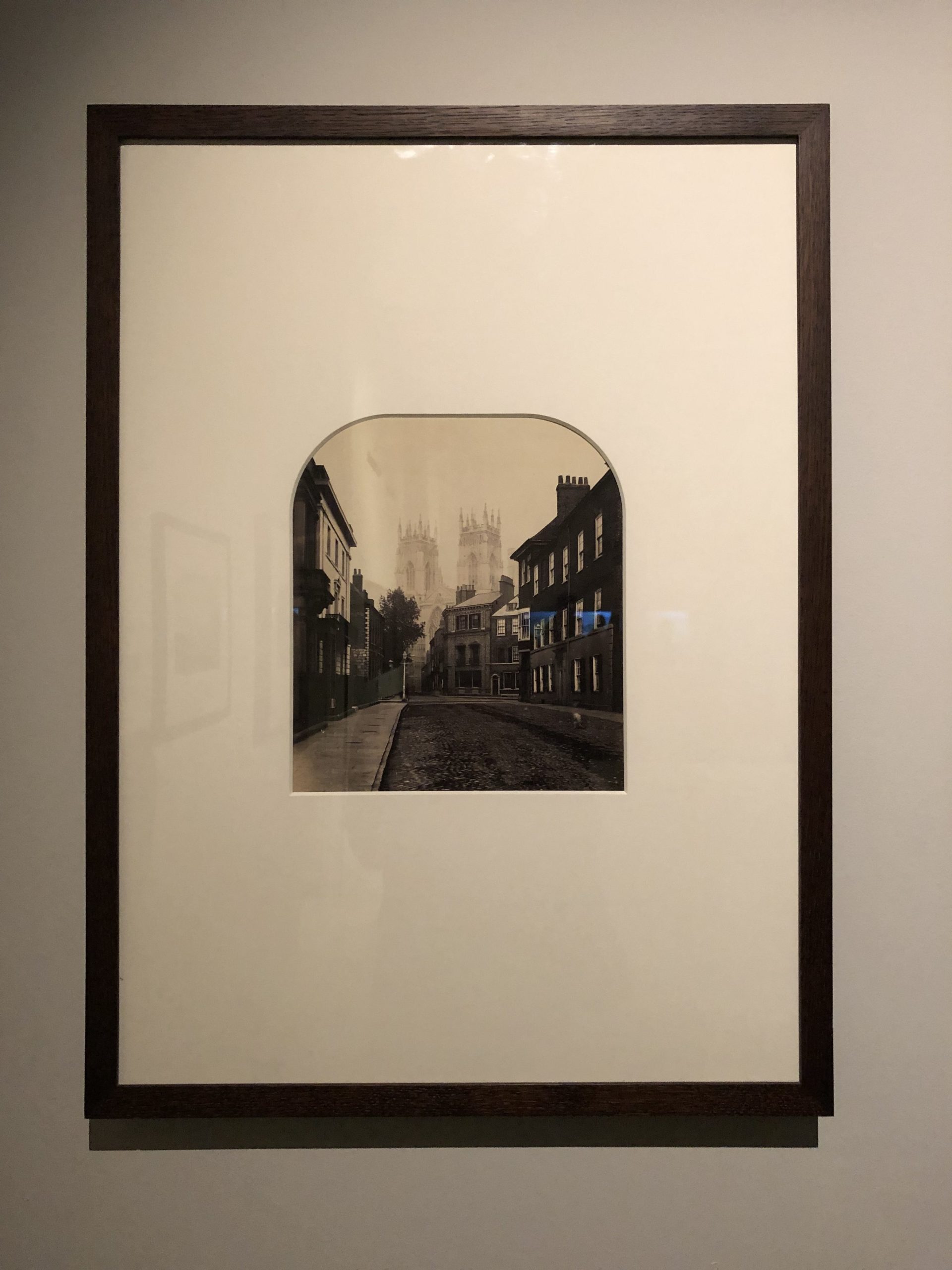
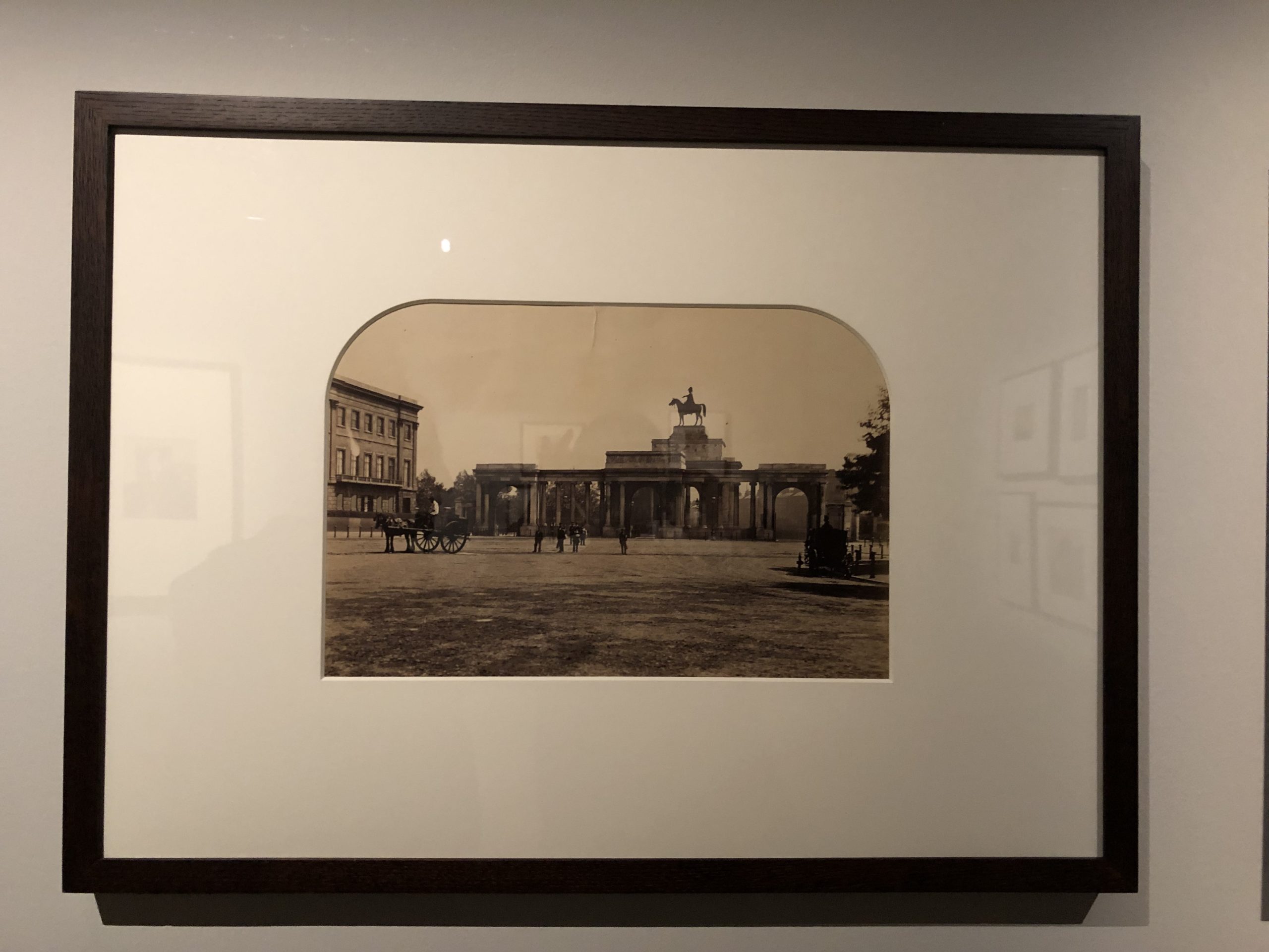
I think part of the genius, beyond the patina of age, is that the best 19th Century artists were experimenting with a truly new medium.

They were making it up as they went along, and that’s the juice I think photography lacks, these days.

It’s descriptive, and expressive, but it’s not radical in any way.

(Even that photo that just came out, of the dead Salvadoran Dad with his dead daughter clinging to his body, won’t really change anything, will it?)

Richard told me a story about one of the famous manor houses featured, and how the wall of glass was almost scandalously extravagant for the time.

Also, he recounted how a statue in one photograph had been moved, during a public infrastructure project, and how the affected courtyard’s Feng Shui was forever off.

We were chatting, enjoying ourselves immensely, when a guard came over and asked us to be quiet, as there was a talk going on in an adjacent gallery.

We had no idea about it, as Richard is my witness.

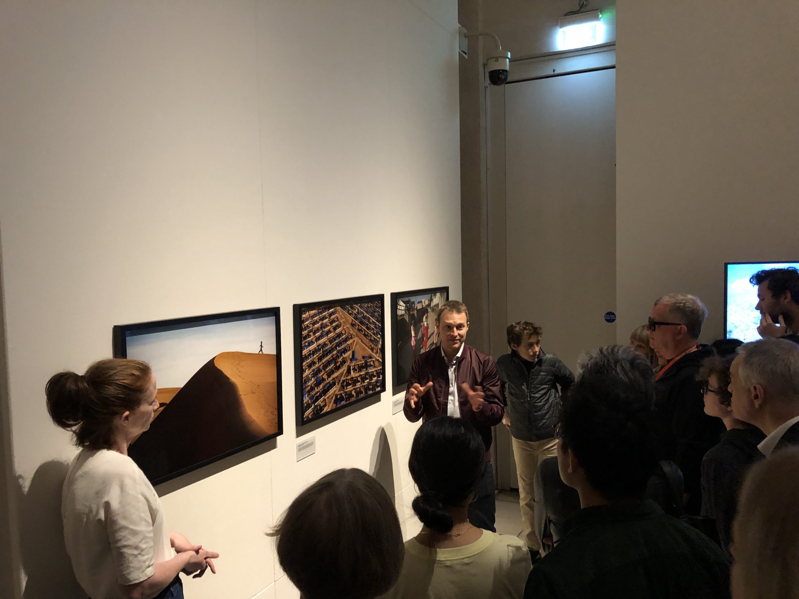
But sure enough, once we shut our traps and went to explore, we found it was a one-on-one discussion between Josh Haner, NYT Pulitzer Prize winning photographer, and Meaghan Looram, who is now the Director of Photography.

Right in front of me, stood the guy who saw “The Value of a Dollar” at a portfolio review in 2010, and offered to publish it in the New York Times Lens blog.

As a result, it went viral, and made my career.

And there he was, talking to the woman who I’m told decided to shut, or “hiatus” the New York Times Lens blog, 9 years later, thereby relieving me of my duties at the Gray Lady after 6 years and 50+ articles.

There they were.
Right in front of me.
Talking to each other.

I was stunned.

Richard asked me what was up, as I was clearly shaken, and if I wanted to talk about it. I suggested we keep our voices down, as it was sensitive information, and it likely wasn’t the right place to discuss it.

I was upset, as the whole affair was still fresh, and there are details I’ve not made public.

So we decided to get the Hell out of there, after we took a second to look at Josh’s photographs.

The truth is, he’s gotten a lot of credit for his global drone work, video in particular.

His drone videos are tight, for sure, but these landscape pictures, (which I know are supposed to make me care about climate change,) failed to move me, or seem distinctive in any way.

They’re too boring, and maybe no images can do this anymore anyway? (But sometimes they can. Ask Ed Burtynsky.)

As Richard and I were leaving, (because I was afraid I might let my emotions get the best of me,) who was standing in front of me on the stairway landing, looking me in the eye, but Whitney Richardson, who was the NYT Lens blog producer, halfway through my run.

The beginning, middle and end were all there in one room, and you’d have to be a proper idiot to miss the significance.

It was my chance to say goodbye to a phase in my life, and move on.

Whitney said she was now an event producer for the NYT, living in Islington, (where I was staying,) and that life was great. In fact, she’d produced the talk for Photo London.

That was her gig now.

It was a bit much, at the end of a very long day, (in which I missed that crucial train,) and I admitted to her I was hurt at how it went down, and that it seemed like too strange a coincidence for me to handle.

I didn’t want to express anger, nor be rude, so I wished her well, congratulated her on her new job, asked her to give my regards to Josh.

Then I left, shaking my head.

The truth is, I worked with 5 producers during my experience with Lens. They all get promoted to the good jobs, and those people make lots of money, with great benefits, and new opportunities.

They have a chain of command to go to, when things go wrong. There are union reps, and all sorts of systems in place.

But organizations like the New York Times, (or in this case, we’ll just say The New York Times,) also run on freelancers, who get paid next to nothing, have no benefits, no opportunities for advancement, and no chain of command.

As I’ve said before, my time working for the NYT benefitted me immensely, and I learned a lot.

I’m truly grateful.

But there was never a moment that I wasn’t aware of the two-tiered system. It was clear, again and again, that we were second class citizens.

The byline was the same, so to the outside world, I looked like one of them. (Before they took bylines off the home page.)

My byline said I worked for the New York Times.

But I was always disposable, with 1000 people lined up behind me to do the job for little pay.

Every time I tried to make a new connection, or ask for a new opportunity, I was told the same thing.

No.

So when I hear that blogs are closing there, political cartoons are disappearing, and perhaps other organizations are doing a better job in general, I’m not surprised.

My experience with the New York Times company was purely transactional, and they paid me more with cultural currency than hard cash.

(They could, so they did, because that’s how Capitalism works.)

And when they were done with me, I got not nary a thank you, nor even a “Good Job.”

I’m too classy to drop the details here, but it was very unpleasant.

So that’s how I wrapped up my Photo London experience.

Not fun, but highly cathartic.

(And again, those Roger Fentons.)

Thank you, Photo London, and I hope I can make it back next year. I know I got in for free, but I can honestly say the experience is worth whatever they’re charging.

The Art of the Personal Project: Ashton Ray Hansen

The Art of the Personal Project is a crucial element to let potential buyers see how you think creatively on your own.  I am drawn to personal projects that have an interesting vision or that show something I have never seen before.  In this thread, I’ll include a link to each personal project with the artist statement so you can see more of the project. Please note: This thread is not affiliated with any company; I’m just featuring projects that I find.  Please DO NOT send me your work.  I do not take submissions.


Today’s featured artist:  Ashton Ray Hansen

It’s been three years since I first discovered #vanlife and two years since my VanLife project was first featured on A Photo Editor. In those three years I have met some incredible humans and have heard some inspiring journeys. People from all over the world who have made the decision to down-size and simplify their lives while trying to minimize their footprint on this planet—finding more economical ways to live, creative ways to utilize space, and building a stronger, tighter-knit, community. This has become a lifestyle that fills them with love and purpose.

My fiancé and I have dabbled into the van life culture to experience it for ourselves and, although, this is not a lifestyle that fits our goals and needs, there is much we have adapted into our own rhythm. We’re more of Overlanding adventurists and have been able to incorporate the “tiny-living” mindset on our own adventures. We still dream of owning our own van someday, albeit, for shorter, less permanent travels. Until then, we’ll continue to admire and romanticize of those who are living “the dream.”

To see more of this project, click here.

APE contributor Suzanne Sease currently works as a consultant for photographers and illustrators around the world. She has been involved in the photography and illustration industry since the mid 80s.  After establishing the art buying department at The Martin Agency, then working for Kaplan-Thaler, Capital One, Best Buy and numerous smaller agencies and companies, she decided to be a consultant in 1999. She has a new Twitter feed with helpful marketing information because she believes that marketing should be driven by brand and not by specialty.  Follow her at @SuzanneSeaseInstagram

Success is more than a matter of your talent. It’s also a matter of doing a better job presenting it.  And that is what I do with decades of agency and in-house experience.


Pricing & Negotiating: “Real People” Lifestyle Images for Fashion Brand

Craig Oppenheimer, Wonderful Machine

Concept: Lifestyle images of real people going about their day while wearing the brand’s apparel

Licensing: Web Collateral and Web Advertising use of up to 30 images for one year

Photographer: Lifestyle and portrait specialist

Agency: Medium in size, based in the Northeast

Client: Large clothing manufacturer

Here is the estimate:

Pricing and Negotiating Initial estimate

Creative/Licensing Fees: Five models would be photographed over three shoot days in different cities, resulting in 30 total images (six images per subject). The usage was limited in duration to one year and limited in exposure to web ads and placement on the brand’s website. It was clear in our conversations that they’d likely use one hero shot of each talent for web ads, and the rest would land in a gallery on their website. For each subject, I decided the first image would be worth $1,500, the second image $750, the third $500, and the remaining ones $250. That amounted to $3,500, which I then multiplied by five to account for the number of subjects, arriving at a total of $17,500. Separately, I included a creative fee of $5,000 per shoot day. While I typically combine the creative and licensing fees, in this instance I decided to break it out. In addition to the photographer being accustomed to pricing this way, he was bringing something unique to the project, and I wanted to make sure the value of the contribution was detailed. Specifically, the photographer had recently completed a long-term personal project that resulted in a library of talent that they’d ultimately rely on for casting (more on that later).

Pre-Production Day(s): There would be a fair amount of travel coordination and crew to line up. I decided three days would be appropriate for the photographer to line everything up.

Travel Day(s): The shoot would take place consecutively over the course of a week, with a day of travel before, after, and between each shoot day.

Casting Coordination Day(s): The photographer had amassed a huge library of talent with whom he collaborated and developed relationships with while working on a personal long-term project, and he planned to rely on that network to find talent for the this production. That was, in fact, the main reason he was being considered for the project. We included two days of casting coordination for each city, allowing the photographer to reach out to talent prospects, fill them in on the project, gauge interest, present them to the agency and coordinate bookings.

Assistants: The photographer planned to travel with his first and second assistant, and I included the appropriate amount of travel and shoot days for each.

Hair/Makeup Stylist Day(s): We included one local stylist per day for each of the three cities.

Talent Fee(s): We decided  $2,000 per person was appropriate to offer to models, and this fee was in line with rates we previously paid when working with “real people” talent.

Location Fee(s)/Permits: While this was a bit of an unknown, we included $300 per subject to account for location fees and/or permits. Because it was initially unclear if we’d be shooting in their workplace or out on the street, I wanted to make sure that at least a few hundred dollars would be available to cover permitting for each subject.

Equipment: I included $1,000 per shoot day for the photographer’s own camera, grip, and lighting gear.

Airfare: This was based on research for one-way flights to each of the cities and then back home for the photographer and his two assistants.

Lodging: I based this on six nights, at $350 per night, for three rooms/people.

Per Diems: I included $75 per person per day for the photographer and his assistants to cover meals while traveling.

Van Rentals: This included transportation and fuel for two days in each city.

Lunch/Craft: We were initially told by the agency we wouldn’t need to include catering but instead should budget for craft and a light lunch. I included $35/person.

Parking, Expendables, Misc.: I included $500 per shoot day to account for these items and other unexpected items.

First Edit for Client Review: This was based on $500 per shoot day. The fee covered the photographer’s time to do an initial pass of all the images and generate a web gallery for the agency to make selects from.

Retouching: This was based on $150 per image, which I anticipated would cover an hour of retouching for each subject.

Feedback:  Even though the client requested a “lean and mean” shoot at first, it soon became clear that they wanted a higher level of production for the project. We added a wardrobe stylist and a producer, both of whom would travel with the team. Considering the addition of a producer, we decided to forgo the pre-pro days for the photographer and assign the logistical tasks to the producer. Additionally, a digital tech was requested, which we added as well. Instead of hiring another person to play to role of digital tech and budgeting for their travel, we decided that the first assistant would pull double duty. That meant we had to increase their rate, as well as travel expenses, accordingly. We were also asked to break out an option for two years of usage, which I priced at 50% of the one year rate for both the photographer’s licensing fees and the talent fees. Lastly, the client requested that production insurance be included, and we based this on approximately 2% of the production expenses. At this point we had a better understanding of the client’s budget (around 130k), which we kept in mind and were fortunately able to stay within as well. Here was the revised estimate:

Here was the revised estimate:

Pricing Negotiating Final Quote

Results: The photographer was awarded the project.

If you have any questions, or if you need help estimating or producing a project, please give us a call at 610 260 0200 or reach out. We’re available to help with any and all pricing and negotiating needs—from small stock sales to large ad campaigns.

The Daily Edit – Colston Julian: Various Publications, Various Markets


Colston Julian


Heidi: Tell us how the Kalki images came about? Was this a personal project?

Colston: I have worked with Kalki in the past; we have a close working relationship. She gives me a lot of space when we work together. She wanted to be photographed with her short hair and I was in town so we set up a shoot. She is someone that always gives to the project fearlessly. Yes, I would term it a personal project .

How do you know when a personal project is worth pursuing? do you have a journal of ideas? 
I find inspiration in cinema and travel.  Yes, I do maintain a journal with thoughts or images from my iphone  (for light I might see reflections or locations. Even thoughts in note format  and  sometimes in the form of embarrassing sketches.


You have a category called The Boys are Alright. tell us about that category and specifically the Bappi Laheri images. 
Since I shoot a lot of commercial and fashion work it can be predictable or part of a season trend, so I’m always looking for something I could photograph that is outside of that. This for me turned in to the “Boys are Alright”  specifically  men I have met with strong personalities or unique sense of style.  Bappi Laheri for example, I had the opportunity to shoot a portrait of him for RollingStone INDIA.  I was  so amazed by his warmth and humor that I requested that we shoot a few more portraits for which he obliged he even let me into his recording studio which was in a time warp of sorts in the 80’s. It’s not often that I have the opportunity to get such close access,  when I do,  I make it a point to shoot a series for myself as a personal project, that could potentially be part of a book.

I know you’ve photographed Gaurav before, what was the most interesting or different about this shoot?
Gaurav is dynamic and interesting as a person , he has a unique dress sense and personality, he also loves to be photograph so it s always fun and  exciting working with him. However, this shoot  was with you and Vogue India acknowledging his commitment to sustainability as well as his new fragrance launch; I knew it would get us different  images from the  other images I have made of him, as we had a strong narrative and direction.

Are you always shooting several different formats, if so why?
About the formats, I’m mostly a medium format person. I love what the large sensor can do to my image in terms of color texture and depth in an image, however that said, I love the flexibility a 35mm format gives me so I almost always shoot both formats, start with the medium format (Phase one IQ3 101 Trichromatic on P1Xf  platform w / Schneider optics)  I work around a few structured images, then shift to 35 mm and give my subject a bit of freedom to move because the 35 mm is faster  to work with (I work on the Sony alpha A7R3 with g master optics  & Zeiss optics), I also try and shoot some film when time permits that purely for the love of the medium and the intimacy the emulsion can have on the image.

How you straddle the Indian and the US market?  
India the US and European markets are different and diverse markets  I find keeping a focus on my people work has helped. In India I shoot a lot of fashion and celebrity /actors / cricketers / sportsperson the US market and Europe I normally get the calls for celebrity or location work. I find keep a balance on the kind of work is important. I think the key differences between the Indian and US market is that in India the agencies want the photographer to have a diverse style of work in his book, in the US I think it is critical to have a focused style and direction.

Do you have two different books that you share for those two markets?
Yes, I have two different presentations for Indian and international clients as they are two very different markets. In India the trend is for commercial large scale projects, with experience and a diversity in photographic style. While I think international markets want a defined voice and grammar in the visual direction. I am now looking strongly for an agent / agency in the US market to help bridge the markets.

You shoot both ad and editorial, what do you enjoy the most about your editorial work?
Yes I shoot Both commercial projects and Editorial , however  Editorial is what drives me and keeps me alive creatively I enjoy it the most , I love shooting fashion stories more than anything. I find it to be creatively more satisfying , it is important to find a Creative Director and a fashion Director that understand your style and sensibility so that they can use your talent and
that in turn makes for an amazing fashion story or Editorial ,  its the freedom to visualize , imagine and create is what excites me the most about editorials .

How do you promote yourself?
I find the most effective way is to showcase your work in the right manner , I prefer to always print a book of my work to show creative directors , I also have my social media channels active showing my new work. I also follow  interesting talent to work with on social media , Fashion directors , Creative Directors , stylist  , Make up artiste , I see their perspective  and mail them for a meeting , share with them my book and look at possibilities on upcoming projects .

The Daily Promo – Fredrik Clement

Fredrik Clement

Who printed it?
After moving to Klitmøller, a small village on the northwestern coast of Denmark, I wanted to try working with a local printer. He had to dust off his old machines to make me happy, because as so many other printers he persisted in trying to convince me to do it digitally. But nothing beats the smell of real ink on paper.

Who designed it?
I collaborated with graphic designer Troels Schwarz of Superschwarz (www.superschwarz.dk), who is also a friend. We came up with a simple, almost minimal design and used the same weight of paper for the cover and pages. Folding the cover makes it thicker which makes the design work well. The visible stitching and loose stitching thread completes it. It’s basically just one kind of paper, a thread, and ink. The paper is uncoated, warm toned which I think sits especially well with the black and white images.

Tell me about the images?
They’re a mix of old and new, commercial and personal work. Curating the images was important to me. Some of the images are from personal projects in Indiana more than ten years ago, some are from cycling event Paris-Roubaix 2013 and some from recent commercial work for Adidas. The promo also has images from European refugee camps; a pro bono project collaboration with UEFA Foundation for Children. My photographic approach is documentary and I wanted to make this evident in the promo by showing a wide selection of my work, in a narrow style.

How many did you make?
350 pieces.

How many times a year do you send out promos?
Not too often. To be honest, I do it when I feel like it. Less than yearly.

Do you think printed promos are effective for marketing your work?
Yes. This time around, my agent (www.unit.nl) sent out around 50 pieces and so far I’ve sent out around 150 pieces, half for existing clients with a personal, written note, and half to art buyers, direct clients and agencies I would like to work with in the future. This is ongoing, I send out the promos regularly when I’ve identified new potential clients or people that I would like to reach out to.

Visiting London, Part 1


Part 1: The Departure


Do you believe in omens?

I’m not sure if I do, but when I got in the car to drive to Denver last month, on the first leg of my journey to London, I was feeling good.

A big adventure just up ahead, I thought.

Maybe it will even be smooth?

Two miles later, though, the tire pressure light came on in Jessie’s car. (She insisted I take it, as it has some assisted driving features that can help on mountain roads.)

Shit, I thought.
Just what I need.

I hope it’s not an omen.

I called her up and asked about it, and she reminded me it happened 10 days ago, and she’d gotten it fixed, supposedly.

Must be a slow leak.

Sorry, she said, but maybe get a little air in it on the way up.

I’d already forgotten my Benadryl to sleep on the plane, so that would make two stops, on top of the 4.5 hour drive.

(It was beginning to feel like a smooth trip might be just outside my grasp.)

But I bopped my head to some great hip hop music, driving across the Rockies, and even made a video to show Hugo, of the car moving through the Great Wild West while some good music ran in the background.

(You knew it was gonna be Old Town Road, right?)

By the North side of Pueblo, (the end of New Mexico-infused Colorado,) I knew it was time to stop in the not-so-aptly-named town of Eden.

Dusty and dry, this version of Eden.

With 18 wheelers coming at you faster-than-they-should-be-going, from every direction.

There was a truck stop there, I remembered, maybe a Loves, and surely they’d have a place to get air. I went inside to use the restroom, and buy some caffeinated drink to get quarters to use in the air machine.

That done, I drove the car from one parking spot to another, right next to the pressurized air, and got myself organized.

I pulled off each tire cap, and put them in a really obvious place, one per tire.

I took a deep breath.

Then I popped the quarters, and began testing my tires, quickly and efficiently, because you know that Damn machine is only gonna give you one minute of air, if you’re lucky.

Now, did I still manage to knock over a tire cap and have to go searching, just barely avoiding hands and knees?

Yes. Yes I did.

But it was only when I got everything together, started up the car, and began to drive away that I noticed there were people living in the car parked next to me.

They’d been in there the whole time.

Watching me, all dressed up for my big European adventure, dancing around the Subaru, quick and business-like, trying to make my plane.

The whole time, I was secretly thinking of the infused edibles I was about to buy down the hill at Strawberry Fields. (I ended up with rice crispy treats. They were delicious.)

All that while, some nameless people were in their car, not four feet away, living in a completely different America.

Right there at Loves.
In the middle of Eden.


Part 2. The arrival


I lost my watch and sunglasses at the security check in Denver, or much more likely they were stolen.

Either way, that was the bad thing that ended up happening, omen-wise.

It sucked, but then I was over it.

And Hugo handed me a nicer pair of sunglasses as soon as I walked in his door, in North London. (Plus, the watch was too fancy for me anyway.)

Other than getting jacked at the airport, I don’t think one bad thing happened to me the entire time I was in England. (Unless you count one crucially missed train connection, and a middle-of-the-night-silent-vomit excursion. But we’ll get to that.)

From the moment I arrived in Heathrow, I had the opposite of an omen. As I stood there in the security line, I noticed a pair of adult, identical twins in matching outfits, a very skinny seven foot tall white guy, an orthodox Jewish family, a wealthy Indian woman with a large and exposed midriff, and a Slavic woman wearing a tacky princess T-shirt.

It was all absurd, in a good way, and I thought, this trip is going to turn out well.

I just know it.

After clearing security, and learning the officer was a Chelsea fan, I walked the long journey in endless tunnels to get to the London Underground, which comes directly into the terminals. (Though two separate trains service the airport, so make sure you get on the right one when you head back at the end of your visit.)

The Piccadilly Line runs right into the city, and it just so happened that’s the line I needed to get to Holloway, in North London. So there was one last hour-plus train ride up ahead, but at least it would be direct.

The London public transportation system is lauded, and even New York Magazine just did a piece ogling London and Paris for the breath and variety of efficient options in their overall metropolitan areas.

In this case, I spent 50 pounds on an Oyster card, which covered every local train, (overground and underground,) and bus I took for 6 days. (And I spanked that system.)

It is easily the best transportation money I’ve spent in my life.

There wasn’t even much of an overground when I was last in London in 2013, I was told, and now it’s a thriving thing. They build and build their public infrastructure, over in London, and as an American living in car culture, I was supremely jealous.

The cranes were everywhere, too.

I recently speculated that perhaps all cool cities are undergoing a boom these days?

London certainly did its part to confirm the theory.

The city is going off, so let’s get into it.


Part 3. Visiting Photo London


Like any decent traveler who just slept on a plane, I wanted a nice hot shower once I got to Hugo’s. (After he’d handed me a coffee made with some non-dairy chocolate milk.)

Once clean, I sat down, and we caught up, as I hadn’t seen him since we hit up the Morgan Library together, and walked around New York, back in 2017.

It was a nice morning, and I was ready to stretch my legs, so it was time to head back to the underground to find Somerset House, where Photo London was being held.

I jumped off the train at Covent Garden, and as Hugo said to just roll down to the river, and I’d find it, that’s exactly what I determined to do.

I remember visiting the area 6 years ago, and that there was lots of shopping about. Back then, Russian was everywhere, and not surprisingly, it was all about Chinese tourism in 2019, and I’m not sure I heard any Russian at all.

There’s a big outdoor/indoor market and restaurant area there, and I saw my first Shake Shack, though it wouldn’t be the last. There was an Apple Store there too.

But true to the directions, I headed “down,” which in this case was South, and soon I found the sprawling Somerset House complex, which I was told was the first public building in London.

Apparently, it was once the Hall of Records, and the home of the Navy as well.

Shit has a long history in England, and it gets me every time. Plus, people do seem fond of recounting that history, (when they know it,) so the conversation seems to come up a lot.

Somerset House is built around a central courtyard, and a large-scale tent structure was constructed in the middle, to house the Photo London pavilion.

There was a pop up Negroni bar in the courtyard as well, and a cafe just for the event, but part of what makes the entire complex interesting is that there are cafes and tea houses among offices and galleries.

It’s a very cool and beautiful spot to hold a photography fair.

Hard to top.

I was afforded the opportunity of press access, and might possibly have been tipped off to the wifi codes, (unless you buy a local SIM card, your American phone only works with wifi,) so in the end I visited Photo London on Thursday, Friday and Saturday.

Given that we’re already at the end of this piece, I’ll write a direct review of the art viewing experience another time, as I took a ton of photos of the exhibitions, and they sprawled over multiple floors of this ancient, overwhelmingly big space.

Instead, I’ll wrap up with some general impressions.

When I was at AIPAD in New York, and Photolucida in Portland, I seemed to know almost everyone. Really, I was amazed at the degree to which I’ve encountered so much of the American photo community, between art and journalism.

Here, though, I knew almost nobody. Everywhere I went, each face was new. And I was totally anonymous.

To be clear, I’m not complaining.

Rather, it’s obvious that once you get outside your own country, even if its one as big and important as America, you realize the world is much, much bigger than you really consider on a daily basis.

It is also an art fair, and those are not really made for artists and journalists. Dealers are trying to meet and sell to collectors, and tourists can pay 30 pounds for a proper day of art viewing, coffee drinking, and lecture-attending.

So I checked it out, made some mental notes to look further as the weekend evolved, and set off to find my buddy, who was showing his work with Euqinom Gallery from San Francisco.

I had made plans to meet my friend scott b davis, and we go back a long ways. He was featured here on that Marfa trip, I’ve written many an article about his Medium Festival of Photography, and he’s teaching at my retreat this summer as well.

It was a nice counterbalance to being in a foreign country among strangers, so we left Photo London to grab a pizza at Franco Manca, which I now know is one of the big Italian chain successes that crushed Jaime Oliver’s restaurant business.

(It went into foreclosure while I was in town, but apparently Jamie himself is still worth half a billion dollars, so no worries on his end.)

I had a solid, fresh pizza Margherita, and scott got a special, with local organic vegetables. I think my pizza was 6 pounds, which is a screaming deal, and we had plenty of space and time.

After that, we chose to stretch our legs, and walk off the pizza, and found ourselves in nearby Trafalgar Square. I walked him into my favorite church, St Martin-in-the-Fields, where I heard a concert rehearsal 6 years ago that made me cry.


The National Portrait Gallery and the National Gallery are there, next to each other, and both are free to enter. You know me by now, and great free art is one of my favorite things in the world, so off we went.

I was due at the NPG in the morning to hear Martin Parr speak about his show “Only Human,” and I’m going to review that one in a dedicated article later this summer.

Instead, we went into the National Gallery and wandered among some of the true masterpieces of Post-Renaissance painting.

Here an El Greco, there a Caravaggio.

Why, do you like this Rembrandt?
Yes, I do.

But this Velasquez is nice as well.

I can’t stress enough how wonderful it is to be able to do something like that. A casual visit to such a beautiful place, for free, chatting with a friend among the heights of human history.

There’s much more to the story, but I think we’re done for today.

I’ll share some highlights from the National Gallery with you here.

Last thought. If your museum still has a Sackler Room, it’s probably time to get on that. Those folks have caused too much misery. See you next week!


The Art of the Personal Project: Ryan Dearth

The Art of the Personal Project is a crucial element to let potential buyers see how you think creatively on your own.  I am drawn to personal projects that have an interesting vision or that show something I have never seen before.  In this thread, I’ll include a link to each personal project with the artist statement so you can see more of the project. Please note: This thread is not affiliated with any company; I’m just featuring projects that I find.  Please DO NOT send me your work.  I do not take submissions.


Today’s featured artist:  Ryan Dearth

“Heartland is a project that actually started as a documentary news assignment for the Daily Telegraph UK. It was as an outside-in spotlight on Rural America shortly after the 2016 election and eventually turned into a personal project as I came back of my accord to build the project into a more in-depth piece. The photos take place primarily in and around Wallace County, Kansas, which has a population of fewer than 1,500 people and is consistently one of the most overwhelmingly Republican counties in the nation.

The project eventually took hold for me and became a personal exploration of external factors on internal notions. I wanted the images to consider the relationship between rural communities and their surroundings, as well as the juxtaposition of isolation vs. desolation. At times these areas feel nostalgic – like a world left behind. At other times, the community feels vibrant and completely relevant in today’s world.”

To see more of this project, click here.

APE contributor Suzanne Sease currently works as a consultant for photographers and illustrators around the world. She has been involved in the photography and illustration industry since the mid 80s.  After establishing the art buying department at The Martin Agency, then working for Kaplan-Thaler, Capital One, Best Buy and numerous smaller agencies and companies, she decided to be a consultant in 1999. She has a new Twitter feed with helpful marketing information because she believes that marketing should be driven by brand and not by specialty.  Follow her at @SuzanneSeaseInstagram

Success is more than a matter of your talent. It’s also a matter of doing a better job presenting it.  And that is what I do with decades of agency and in-house experience.


The Daily Edit – Vogue India: Rohan Hande


Vogue India

Creative Director: Heidi Volpe
Assistant Photo Editor: Jay Modi
Photographer: Rohan Hande
Prop Stylist:  Aditi Dugar
Styled by Sage and Saffron
Cooked by: Aliakbar Baldiwala and Akshat Agarwal
Hand Model: Mythili Zatakia
Food Editor: Sonal Ved

Heidi: I know you did some research on old master paintings after we discussed the concept for our OTT food shoot.  What did you watch and what did you learn?
Rohan: I found this video lecture by John Walsh, the Director Emeritus of the J. Paul Getty Museum, L.A. and since these are historical artworks, understanding the narrative and motives by a specialist in Dutch paintings is better than a subjective approach. I learned a lot from Pieter Claesz’s composition and light.

How did that research translate into the final image?
The window light and textures, along with the opulence was replicated. Surrealist elements were also added to push the OTT narrative.

How difficult was the post as we had only one hand model?
It was quite straightforward to be honest. Much like a collage, it was cut and paste. The tricky bit was getting the correct hand gestures during the shoot.

Were you concerned the lights would start to deteriorate the food?
Since we were working with flash and not consistent lighting, I wasn’t worried. Some of the food had to be made “camera friendly” to draw attention and maybe a couple of them were taken back to the kitchen to “redecorate”. However, we weren’t working with any cold items, that could melt.

We knew you were the perfect person for this assignment bc of your expertise in collage/photo illustration, where did you first start experimenting with this technique and why?
Why, thank you! I started looking into this process when I was studying commercial photography. I wasn’t aware of this process until I met students from graphic design and illustration. It was a mix of that and happy accident where the model stood between 2 lights meant to light the background and ended up looking like this (tenacity_3).

Someone might have mentioned “collage” and that was it. This turned into mixed media very quickly. I found collages to be an exciting process to break out and translate my ideas and emotions in more than 1 way. And honestly, it was just a lot of fun trying out new and exciting process:


in bits

in static


into the jazz age 1 and 2

 You have great range in your work, how do you know when to execute straight forward photography vs the collage? and is all the collage done digitally?
I try not to separate the 2 processes. By nature the collages always come in later. So any photographs made can work with the narrative. Sometimes I have found photographs made 3-4 years ago, so give me a narrative element. However, that’s rare. Most collages are made with photographs I’ve made in the same time period, for example “Japan Waiting”. I do have a lot of digital collages, but not everything is digital. It comes down to which method would be most beneficial for the artwork, for example Drips. I cannot predict how the paint is going to drip and blot.

How has your personal travel influenced your work?
“Japan Waiting” and “Japan Cabs” are the best examples of explore this topic. I’ve been there twice and both times, I’ve come back with a new perspective. “Japan Cabs” happened because of the classic car models, they fully uniformed drivers and the automatic doors. The collages weren’t planned, but once reviewing all the images, it was the only way to tell a story about the taxis in the city. During this year’s visit I saw a lot of people waiting..patiently. Initially shot as a photographic series of I think around 40 images, where the Japanese who wouldn’t cross a red light even if the street was 6 feet wide, “Japan Waiting” in turn because a response to “Japan Cabs”. To me it became a series on patience.

The Daily Promo – Frances Tulk-Hart

Frances Tulk-Hart

Who printed it?
Mixam.com

Who designed it?
I did, it is half the fun of it. I really love the process of seeing how all the writing, drawings and photos can make a story.

Tell me about the images?
This project started in the New Year. I initially wanted to make a zine and then it turned into a journal of sorts. Every two months the plan is to bring a new one out. The images in each zine/journal, shall we call it a zournal, are relevant to those two month. So this one is January and February. Photos I got back from the developer, doodles I did, work that was published, thoughts, all things that happened in those two months. I can cheat a little too. Like for instance there are two images in there that are from years ago but because I was teaching a class at RISD in January and was doing research for it I was allowed to use the images I was going to show my class as examples!

How many did you make?
I made 100 for now but might do another run. I’m also thinking about selling them so might need to print up a lot more.

How many times a year do you send out promos?
The plan will be to send out a new promo 6 times this year, every couple of months.

Do you think printed promos are effective for marketing your work?
This is the first time I have done a printed promo but the feed back i’m getting is that people are amazed and thankful to be actually holding and feeling something in their hand as opposed to staring at work on a screen. I’ll let you know at the end of the year how effective it was in getting me work!! Effectivness aside though, just doing them is enjoyable, I have so much fun working on them. It’s like a puzzle trying to figure out how my work all fits together. I re designed my website and made a book last year that was about 150 pages which is where I first realized how much I loved designing the book as much as doing the art that went in it. Also what is nice is that unlike instagram, which I use as a promotional platform, once I send these babies out into the world I have no idea if they will be seen and or appreciated. I let go of them, not worrying about likes or dislikes.

The Art of the Personal Project: Aldo Chacon

The Art of the Personal Project is a crucial element to let potential buyers see how you think creatively on your own.  I am drawn to personal projects that have an interesting vision or that show something I have never seen before.  In this thread, I’ll include a link to each personal project with the artist statement so you can see more of the project. Please note: This thread is not affiliated with any company; I’m just featuring projects that I find.  Please DO NOT send me your work.  I do not take submissions.

Today’s featured artist:  Aldo Chacon

SHOE WIZ

A shoemaker once told me we have to take care of our shoes, they protect our feet, our feet carries our body that carries our head….

There was nothing else about his story, but he taught me the value of craftsmanship and dedicating a lifetime to making sure people protect their heads…


To see more of this project, click here.

APE contributor Suzanne Sease currently works as a consultant for photographers and illustrators around the world. She has been involved in the photography and illustration industry since the mid 80s.  After establishing the art buying department at The Martin Agency, then working for Kaplan-Thaler, Capital One, Best Buy and numerous smaller agencies and companies, she decided to be a consultant in 1999. She has a new Twitter feed with helpful marketing information because she believes that marketing should be driven by brand and not by specialty.  Follow her at @SuzanneSeaseInstagram

Success is more than a matter of your talent. It’s also a matter of doing a better job presenting it.  And that is what I do with decades of agency and in-house experience.


The Daily Edit – The Red Cat and Other Stories : Ritesh Uttamchandani

Warning signs of falling debris during repairs at the New India Assurance Building, an Insurance firm.
Mahim beach on a Sunday afternoon. A place where I spent many evenings of my childhood.

Flashes of light on a rain soaked street that reminiscent of walking hand in hand in the rain with my mother.

The Red Cat and Other Stories

Photographer: Ritesh Uttamchandani

Heidi: Your images were recently in Shifting City,  an exhibition that has been adapted in nine cities across the world that are considered ‘arrival cities’.  The Red Cat and Other Stories had some of the same images, tell us about the cross over.
Ritesh: Kaiwan Mehta, the curator, gave us a brief related to the Arrived In City.   In very simple words: A city where everything is kinda there, for whatever it is you wish to achieve or do; all you have to do is show up. I realized that my work on the city isn’t just looking at that aspect but I have also been chronicling the rapid expansion of the city, both in physical and mental terms. It evoked memories of the time I moved, and the mental jolt I got on seeing the socio-cultural differences. It made me think of all the conversations I have had with people I know that have shifted along with the city.

For curation I did a mammoth archive dive. I pulled out all my iphone images that went into the book, all the rejects that didn’t make it to the book and tossed them around. Over repeated edits and since I am one of those photographers who makes photos everyday, I added the new material made in the month and half leading up to the show. Final stage edit was done jointly with Kaiwan. One of my biggest takeaways, apart from many others, is his use of variants of a single image, akin to repetition. I always thought that repetition was simply a tool in writing, a figure of speech, but when done with images its quite fantastic!

What did you hope the viewer felt?
The ultimate goal of my work is empathy and introspection. And they both work in tandem. Of course, I can’t really control what people feel so some viewers found it largely entertaining, some found the pictures to be a celebration of the absolute banal and hence very relatable. Most importantly I wanted people to read the photos and enquire within instead of expecting simplified captions. The whole series also aspires to incite curiosity. Life in the city is so hard, we barely get time to reflect or be curious about anything besides the fulfillment of one’s basic needs.

Were all the images in the book and the show shot with your iphone? if so why?
in 2014 I began using the phone camera extensively, in the square format. In the process, I learnt that am a very different photographer on the phone and it began impacting the way I deal with the city and country. The phone camera is the camera of today, our generation, and what better way to chronicle and display a lived-in experience of my spaces. The phone allowed me to have a citizen like eye instead of being all professional about it.

It’s true the work is serious and heavy at times, but just like life, I am very drawn towards a certain irony in images. And India, gets a short stick on that end. People have for years photographed it in extreme ways, too much colour, too beautiful, or too poor, too tough a place. I am quite fatigued by the cliched images of lovers on Marine Drive, crowds at the Gateway, south Bombay charm etc. Landscapes so imposing that everything else in the photograph is elevated too. As a response to this tedium, I self-published a photo book last year called The Red Cat and Other Stories in which I linked a Sindhi fable my mother told me when I was younger and my way of seeing the city which I feel now, after all these years of carrying multiple and confusing burdens of influences, is inspired more by these little fables and folk stories. My goal was to create the most un-Bombay book on the island city as I can. Hence I focus largely on the suburbs, arriving at a balance of sorts in terms of representation of class and landscape.

How long did the book take to shoot?
The book took four years, from conception on a May afternoon in 2014, till going to press in May of 2018.

Tell us about the title 
The book was initially titled Ghar, meaning home, and as it developed I felt the title didn’t do justice. There are 16 stories of grit, of survival, of successes and failures that lead up to the Red Cat fable at the end of the book, where the protagonist is a young 17 year old, hence The Red Cat and Other Stories.

What font is in the title of the book?
The font is specially designed by Sabeena Karnik, who merged the handwriting styles of my 2 elder sisters Shirley and Sonia and for my name I used a font called Metropolis. If not for my sisters I would not be in a position to pursue my dreams. If not for my parents, and my father’s dogged fight to live in Bombay, we’d be in some small town and I’d probably have a corporate job. The book is an ode to that very fact that we are never self made. Everything is a collective effort and it is true for a city like ours. No one can fulfill their dreams on their own, everybody needs a Red Cat.

How did you decide on that binding?
The binding was a last minute decision fueled by an accident. The printer, sent me the final dummy and after one day the cover began to drift away from the book, exposing its spine. At first I got mad but then I was drawn to its bareness. I anyways wanted the book to have some elements that are like a lot of the city’s structures. How often do we come across a beautiful building or a home and when we go to its side we see a chaotic network of pipes and wires. I also wanted a sense of fragility, like some of our inter-personal relationships, one wrong word or action that is misinterpreted brings to collapse years of knowing someone. It happens with all of us.

No image on the book cover, why?
For the cover too, I kept it simple. I don’t want a reader to know this is a photobook. Its simply a book with photos and text! So, because of its whiteness, if you leave the book on a coffee table, there are bound to be stains, handle it roughly and it threatens to come apart. A day before printing, I reduced the paper weight from 130 gsm to 100 as well, for I wanted a certain see through to happen. Sacrilege, felt my photographer friends and the process co-ordinator at Pragati Offset. But if you hold up certain pages against a source of light, two images merge to make a third. Like life, many things happen at once, overlapping. The printer thought am being stupid or just cutting costs, but trust me, it only looks fragile, it is pretty sturdy.

Over the last year, I came across many readers who have done interesting things with it. One man wrapped it in a beautiful hand-spun cloth from his village and kept it in his safe as a gift for 4 year old son when he turns 18. Some others have refused to let go of the bubble wrap envelope that I had used to pack it. Some have simply kept it locked inside their cupboards instead of their bookshelves. Some books are beautifully personalized by food, pickle or tea stains.

How did the book push you creatively? 
The book tested my patience at all levels. Whether it was design, production or tracking of couriers. At every stage, it demanded patience of ginormous amounts! I taught myself the basics of Indesign, binding, understanding page counts to minimize wastage etc etc. As a photographer I lead a pretty sheltered life. Chasing stories, getting published and drawing a salary. And when one is doing news pictures for a long time, a false sense of superiority or a strange unreasonable dismissal of anything but news pictures had set in. So, self publishing a book, in India, when one is freelance, is like harakiri for such thoughts as well! Every step is twice as tough without institutional backing.

With regards to narrative, I knew the things I wanted to avoid. So it simply became a process of exclusion. I revisited several places to better some of the photos, one place I visited seven different times spread across two years. I was no longer chasing the perfect light, or form or anything that makes a photograph come across more dramatic than it already is. I had about 98 versions of Ghar till I abandoned that narrative and changed its name followed by 40 odd versions of The Red Cat and Other Stories. I showed the book to some photographers but I found their feedback limiting

How did you decide about the text and was there a through line in all the interviews?
I was pretty sure about having text in the book; it simply shaped up as I went along. The layout for the spreads was also quite fun. If one sits and puts together all the text columns of the book on a single page, they resemble a city skyline. The gap between some words is more, some less, for a reason. Like houses in the city, some have a single room, some have 2 room houses and so on. To the uninitiated it might seem like one giant mistake.

Why are some words in red in the text?
In addition, There are some words in red ink though that one has to join up and construct a sentence which is the last line of the Red Cat fable. This allowed me two things, one that I can keep the story open ended if the viewer does not wish to join the words. Second, its a game of sorts and you can involve kids too. A lot of photobooks alienate kids and senior citizens. They don’t set out to, but the chunky design and/or choice of topic manages to. For the same reason, I junked the hardcover and made a semi soft cover which allowed me to make gatefolds that contain short, succinct and often suggestive captions for the images. This way, you don’t have to go all the way back to some Index page. Stay with the narration and simply open the gatefold to know more.

How has your perspective of the city changed?
Change is too severe a word. Its just transformed a bit for the better. Made me a whole lot more sensitive than I was towards it. I think, that is a really good thing for its very easy to fall prey to extreme emotions here.

The Daily Promo – Danielle Atkins

Danielle Atkins

Who printed it?
AMP in Nashville https://advocateprinting.net/

Who designed it?
HEW+Co. https://www.hewandco.com/

Tell me about the images?
The images I chose are from a whole range of my clients…editorial, cookbook & advertising.
I tried to pick images that could mix and match to give a sense of my overall style of work and be able to tailor to who I would be sending them too.

The Cocktail is from a bar in called Pearl Diver and was a part of a cover story for Nashville Lifestyles.
The slices of cake are from the cookbook Everyday Little Cakes.
The first portrait is of the sommelier & executive chef of Henrietta Red. I have been working with them since before the opened the restaurant and I really wanted to include women who are doing amazing in the restaurant industry.
The knife is from a cutlery company, Hammer Stahl, that is based out of Tennessee.
The next portrait is one of my absolute favorite images. It is from a shoot I did for The Local Palette on a group doing traditional Cajun boucherie. It was a great experience and seeing the entire animal being used was amazing.
The ribs were from a recipe shoot for Parade magazine.

How many did you make?
50 of each image and I send them out in sets of 3.

How many times a year do you send out promos?
This was the first time I have sent out promos in a while but I will do this twice a year.

Do you think printed promos are effective for marketing your work?
Yes! I think having something tangible can make all the difference in the world. I was able to get hired by a publication that was on the top of my wish list for new clients because of these promos. We are so used to looking at things on screens these days that being able to hold something physical is still special. I always notice when doing portfolio reviews or handing a promo to someone their reaction to it is much greater than just looking at the same image on a screen.

This Week in Photography Books: Peter Funch


Have you heard about the Uighurs?

In Xinjiang?

They’re people, of Muslim descent, who are getting royally screwed in China these days.

According to reports, as many as 1 million Uighurs are locked up in re-education camps, in Western China, where they’re forced to eat pork and renounce their God.

Happy times!

Seriously, as far as dark humor goes, when I was discussing the Uighur situation with friends in London, I joked that at least they weren’t getting discriminated against, really.

China will re-educate anybody!

(And of course I’m joking.)

The story got a bit of press last month, as I recall reading an editorial or two about the situation. In one article, (maybe in the Guardian?) it mentioned they were using surveillance tech, and digital tracking, to follow people by their routine.

Meaning, any deviation from your normal physical travel route, or usual digital activity, and they would have reason to be suspicious of you.

While Sartre suggested that Hell is other people, the Chinese are using tech to turn your regular routine into a form of prison, if not outright torture.

Welcome to 2019!

(Cue the creepy music. Maybe low-tone piano, with a lumbering pace?)

I’m thinking of this today, having just put down “42nd and Vanderbilt,” a superb book by Peter Funch, which came in last year from TBW Books. (But was published in 2017.)

I told you guys that in the midst of a crazy summer, filled with travel and adventure, there might come a time when I’d lean back on a book review, just to catch my breath.

To create an interval, of even a week, in which I can let my experiences settle into memories, and then decide which ones are worth sharing. (Because everything feels intense and fraught with meaning, when you’re on the road and in the moment.)

So a few minutes ago, I was on the floor stretching, when this book caught my eye on the shelf, still wrapped in plastic. Paul Schiek, a friend of the column, and publisher of TBW Books in Oakland, has been kind to send books over the years, and I haven’t had the chance to review them all.

This one, apparently, was shelved without being perused.
(My apologies.)

We’ll rectify the indignity today though, while also highlighting an amazing project that I’m glad to know about.

I mentioned previously that I’m coming out with my first book this year, and just wrote a statement about how I’m always going on about context, when I write for you.

What do you need to know to understand a book?

Well, this one cuts to the heart of it like the evil dude in Indiana Jones and the Temple of Doom. (Sorry for conjuring that visual.)

The book opens with a short statement: “Between 8:30 am and 9:30 am, from 2007 to 2016, at the southern corner of 42nd St and Vanderbilt Avenue in New York City.”

In other words, you don’t need to know anything more than that.

When I first hear 42nd St, I think Times Square.
Midtown.

All the tourist hustle.

But immediately, it becomes clear this is not a story about tourists. Given that I wrote last month about NYC becoming a global city for outsiders, this book presents a series of images that is as old school as it gets.

Shit, it makes me think of Old New York in the best possible way.

Because right away, you notice that people are repeating. With ever so slight differences.

Clothing choice.
Wind in the hair.

These people are on their morning commute!

Commuters!

I love it.

But where?

New York City is famous for a grid, and the Avenues along 42nd Street are numbered.

Where’s Vanderbilt?

I thought about it for a minute or two, and though it should have been obvious, it was not. So finally I opened up Apple Maps. (I’ve been breaking my no-research rule more often lately.)

Of course, Vanderbilt runs alongside Grand Central Station!

Not only are these people commuters, they might not even be New Yorkers. Because the photographer brilliantly stationed himself right next to the biggest transport hub in the city.

(I didn’t know Vanderbilt, because as a Jersey Boy, I’ve always used Penn Station. The trains from NJ don’t go to Grand Central.)

These pictures are so damn good.

The book is like Where’s Waldo mixed with William Christenberry, with a touch of Paul Graham thrown in for good measure.

Just fantastic.

And perfect for an early summer’s day.

I wonder if the streets of New York smell like garbage yet?

Bottom Line: Amazing, conceptual NYC street portraits that play with time

To purchase “42nd and Vanderbilt” click here


The Art of the Personal Project: Kate Woodman

The Art of the Personal Project is a crucial element to let potential buyers see how you think creatively on your own.  I am drawn to personal projects that have an interesting vision or that show something I have never seen before.  In this thread, I’ll include a link to each personal project with the artist statement so you can see more of the project. Please note: This thread is not affiliated with any company; I’m just featuring projects that I find.  Please DO NOT send me your work.  I do not take submissions.


Today’s featured artist:  Kate Woodman

Growing up as a kid in suburban New England, there was always something enchanting about the west. Stories of entrepreneurial pioneers leaving everything they knew and heading out into unchartered territory read like epic fairytales–the great American quest into the vast unknown, with trials and tests around every corner, and insurmountable obstacles overcome by singular resolve, spontaneous ingenuity and some good old fashioned luck.

I think like most Americans, I have a tendency to romanticize our history.  I am often confronted by a sense of nostalgia for times gone by—a compelling ache for experiences I did not experience and never will. This nostalgia has been an ever present theme in my life since childhood, and as an adult has manifested in my work—first as a historic preservationist and then as a photographer.  It inspires in me an insatiable need to preserve that which is lost, whether through the restoration of a house or the creation of a visual narrative—ensuring that its memory is honored and lives on.

But nostalgia is a funny thing. It is a non-experience, an artifice of memory, and like the great American fables of the west, and it glosses over the day-to-day minutia and trivializes the mundane.  But there is beauty in the quiet moments interspersed between the pivotal plot points. Beauty in the last rays of sun hitting your face as you pick fresh flowers for your table; in the dust filtering the light as you pull today’s laundry off the line; in the warped and weathered wood of the front porch railing; and in the cool night air settling in as you check your herd before turning in for the night.  This series seeks to marry the romantic idealism in my mind’s construct of the era with the mundane day-to-day life of the pioneer by creating a cinematic visual narrative.

The series in part is inspired by the location itself. The Dalles Mountain Ranch, located in the rolling hills of the Columbia River along the historic Oregon Trail, was settled in the 1860s. The land proved to be harsh and unsuitable for farming, forcing the settlers to ranch cattle rather than harvest crops.  It was eventually lost in the Great Depression and subsequently whittled away parcel by parcel until eventually purchased by the state and designated as a preserve.  The ranch is an archetype of the fate of American ranching and now stands as a melancholic relic of an irretrievable time long since past.


To see more of this project, click here.

APE contributor Suzanne Sease currently works as a consultant for photographers and illustrators around the world. She has been involved in the photography and illustration industry since the mid 80s.  After establishing the art buying department at The Martin Agency, then working for Kaplan-Thaler, Capital One, Best Buy and numerous smaller agencies and companies, she decided to be a consultant in 1999. She has a new Twitter feed with helpful marketing information because she believes that marketing should be driven by brand and not by specialty.  Follow her at @SuzanneSeaseInstagram

Success is more than a matter of your talent. It’s also a matter of doing a better job presenting it.  And that is what I do with decades of agency and in-house experience.


Pricing and Negotiating: Multi-City Portraits for Tech Company

Craig Oppenheimer, Wonderful Machine

Concept: Environmental portraits of employees in six cities

Licensing: Unlimited regional use of up to nine images for one year from first use.

Photographer: Portraiture specialist

Agency: Medium in size, based in the South

Client: Technology company

Here is the estimate:

Creative/Licensing Fees: The goal was to capture environmental portraits of nine employees in front of various landmarks within six different cities. Three of the cities would focus on just one employee, and the photographer would capture two employees in each of the other three cities. All of the locations were within driving distance of one another. Upward pressure was placed on the fee due to the unlimited use requested; however, we were able to limit the licensing to regional placement for just one year. The geographic reach was even more limited, with each image being advertised only within the city where the photo shoot took place. Considering this, I priced the first six images at $2,000 each, and the three photos of employees in the same location at $1,000 each. I then added $1,250/day as a creative fee for each of the six shoot days, which brought me to $22,500. It conveniently broke down to $2,500/image. I often increase the creative fee closer to $2,500-$5,000/day, but the nature of the project and my inclination to a tight budget made me err on the side of caution.

Pre-Production: I included five pre-pro days for the photographer to line up the project or for a producer to help with pre-pro work. It included three days to work with scouts in each location and two additional days to line up crew and make travel arrangements.

Assistants: I anticipated that the photographer would bring a first assistant (who would double as a tech) and a second assistant for the entirety of the trip/shoot.

Hair/Makeup Stylist: While the talent would be asked to arrive camera ready, we included a stylist for each of the six shoot days to help with touchups and manage light wardrobe adjustments as well.

Equipment: I included $500/day for a basic grip/lighting package that the photographer would bring, rather than renting.

Mileage, Parking, Misc: I included $100/day in mileage and $50/day in miscellaneous expenses for each day, then rounded down a bit.

Meals for Crew, Per Diems: This included $50/day for the photographer, first assistant, and second assistant — covering each of their travel/shoot days. I added $30/day for lunch to cover the hair/makeup stylist. We anticipated half-day shoots at most, which is why we didn’t initially include catering.

Lodging: I anticipated $250/night for two rooms, for six nights.

Location Scouting, Location Expenses, Permits: I included two and a half days per city for each of six cities. It was a challenge to estimate, and I initially anticipated at least three different scouts would be involved — each of which could cover multiple locations, but we could have potentially needed a scout in each of the six cities depending on availabilities and the demands of the areas. They would have to make recommendations from their files, scout the location in person, pull permits, negotiate location fees if necessary, and potentially be on-set if needed. I felt 15 days total would cover the task collectively. I included $250 per city for miscellaneous expenses like mileage and meals that the scouts would likely incur. I included $500/city for permits and marked additional location fees as TBD because we wouldn’t know of any additional costs until specific locations were dialed in. Some public spaces might only require a permit, but other “recognizable” landmarks may need a location fee or a necessary payment to acquire a release. Other locations might not demand any permit depending on the local film office guidelines but could require a space for staging. I felt that the expenses we included were a good start based on the initial project description; however, we anticipated that we’d have to re-address this as the scope of the project solidified.

First Edit for Client Review: I included $1,000 to account for the photographers time to go through the assets each day and compile web galleries for the agency to review.

Color Correction, File Cleanup, and Delivery: I included $100/image for basic post-production.

Results: The photographer was awarded the project.

Hindsight: Initially, we discussed a relatively lean production level with the art buyer, assuming each day would likely be a half day and the client/agency contacts on site would be minimal. We ultimately received a lengthy list of attendees, and it became clear that they needed a higher level of production on-site. The photographer, therefore, brought on production assistants in each city to be dedicated to client services.

If you have any questions, or if you need help estimating or producing a project, please give us a call at 610 260 0200 or reach out. We’re available to help with any pricing and negotiating needs—from small stock sales to large ad campaigns.

The Daily Edit – Suitcase: Catherine Hyland


SUITCASE

Creative Director: Sebastian Bland
Editor: Olivia Squire
Photographer: Catherine Hyland

Heidi: What were some of the challenges with the shoot?
Catherine: One of the challenges was aligning energy and the personality I wanted to capture, this becomes difficult with a communication barrier at play and a middle aged translator interpreting my direction. What they’re feeling becomes a mystery. You can’t communicate to say – I’m a nice person and I want to make you look good! So that whole thing is totally cut off. Who knows what we would have made if we were able to have a laugh together.

I know you had a turning point with this project. Tell us how that came about.
Getting out of Ulaanbaatar immediately opened up new possibilities. “Ideally, you don’t really want to be doing things impulsively,” Catherine says. “But at the same time I think that’s when some of the best work gets made. When we were trying to get the older sumos together in the gym, it was actually very stale compared to the rest of the work we made.”

Do you have a journal or a way of keeping track of your story ideas? Can you describe your process for crafting something that feels the creative pursuit?
Yes, I have a journal that I use to keep track of my ideas. I also do quite extensive research into projects before they are undertaken, sometimes I will have been researching projects for a few years before they come into fruition.

Did the images come before the film you did with We Transfer?
They were shot at exactly the same time, on the same trip. I went out there specifically to make this personal project on The Rise of the Mongolians which was funded by WePresent/WeTransfer.

How did you gain acceptance into the community in order to make the work?
On this particular trip we had fixers who helped translate and introduce me to a mixture of people in the Sumo community.

How long were you there?
2 weeks

Was this the first time you were working with Suitcase?
No, they had previously published my project ‘Wait-And-See Pudding with Patience Sauce’, shot in on the island of Nevis in the Caribbean.

The Daily Promo – Gabriela Hasbun

Gabriela Hasbun

Who printed it?
White Wolf Web Printers. From day one George had the vision to print this series on newsprint and he was on point.

Who designed it?
George McCalman of https://www.mccalman.co/

Tell me about the images?
The images are from two rodeos in California that I’ve been documenting on and off for the past ten years. One is the Bill Pickett Rodeo (an all-black rodeo) in Oakland, CA and the other is the Silver Buckle Rodeo in Taylorsville, CA. I attended my first rodeo back in 2007 in Oakland and the following year I took my RZ and that was that. All of the series is shot on film. I fell in love with the people, the fashion, the horses, and the landscape.

I love learning about this part of American culture that is so foreign to me. I am a fly on the wall with my favorite camera and a couple of lenses and nothing else. It’s majestic. With this promo, I wanted to create something that editors would keep or pin to their walls. I knew it was time to share work I am deeply connected to, especially personal work of mine they might not see me share regularly.

How many did you make?
1000 printed copies

How many times a year do you send out promos?
Once a year

Do you think printed promos are effective for marketing your work?
I think art departments are quite overwhelmed with email outreach these days so I’m hoping it’s nice for them to receive a thoughtfully designed and edited zine.