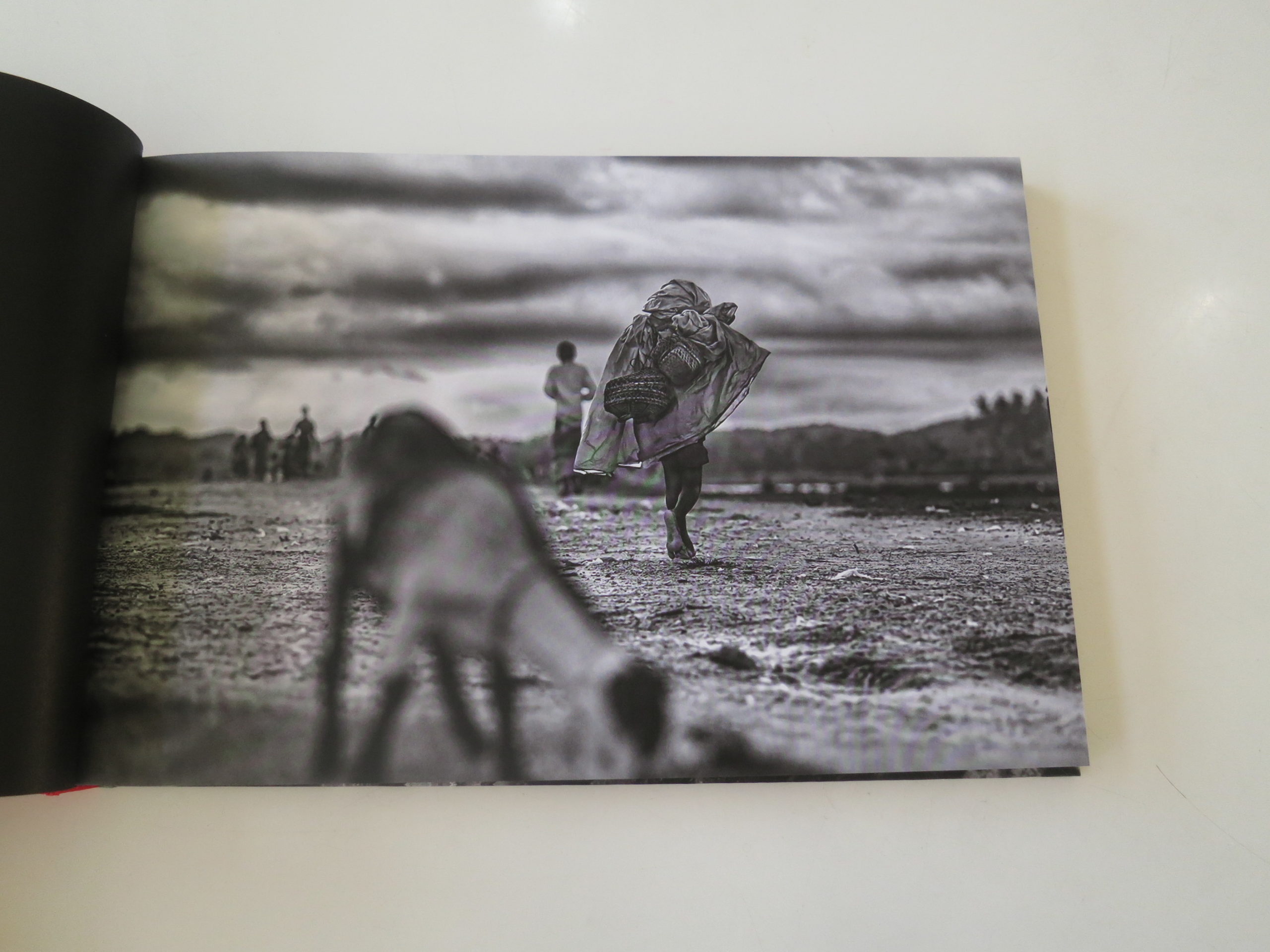
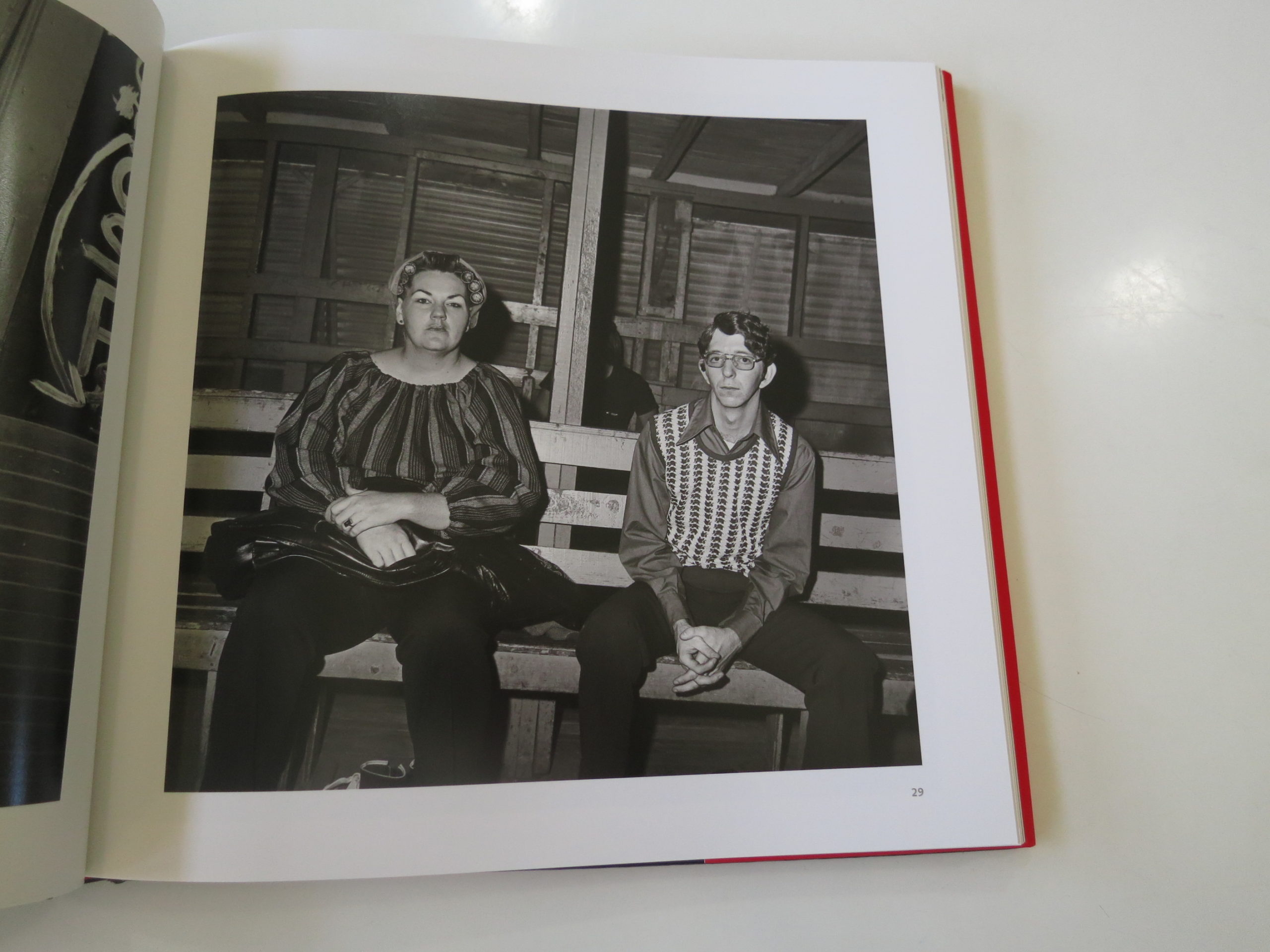
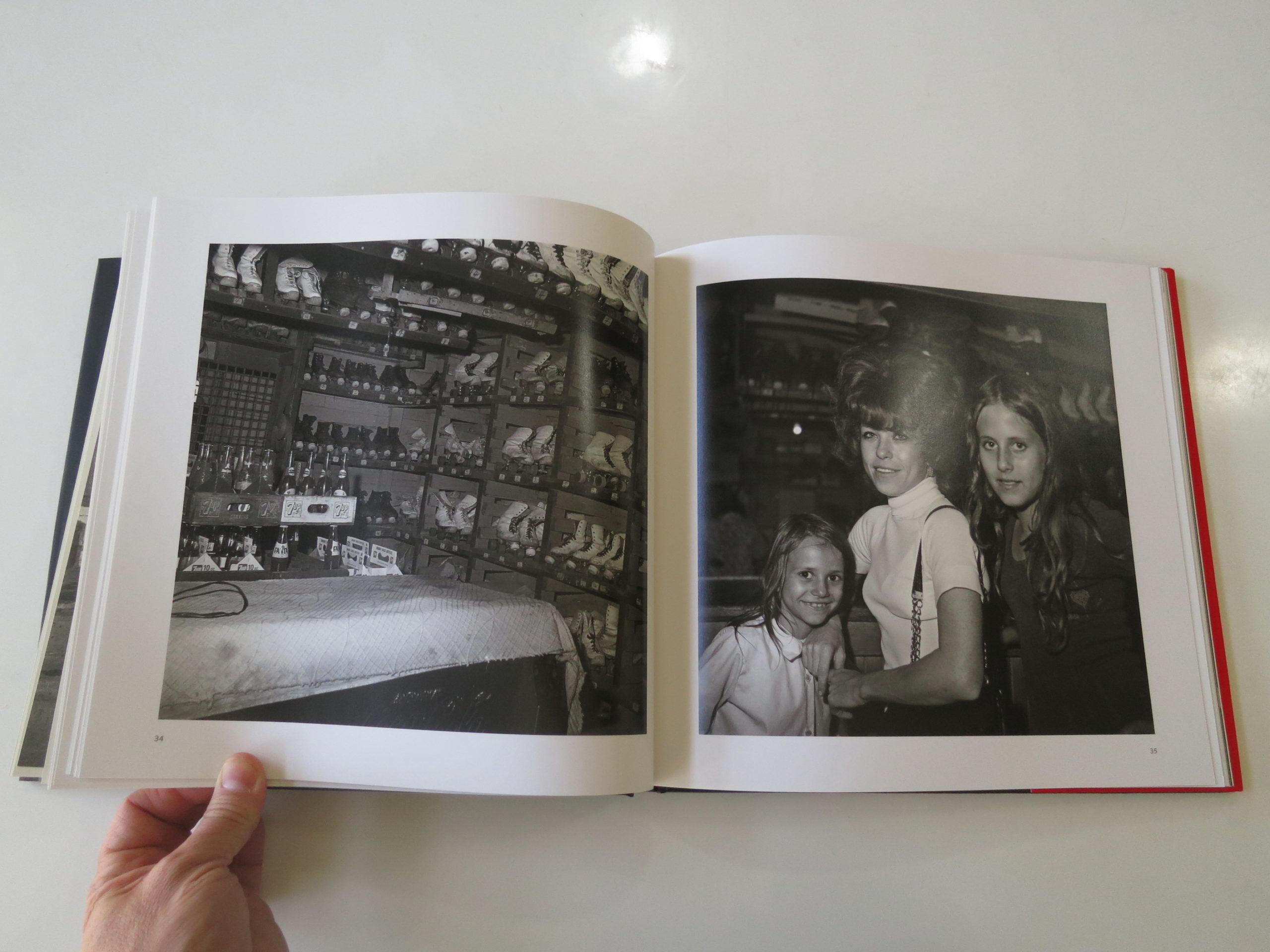
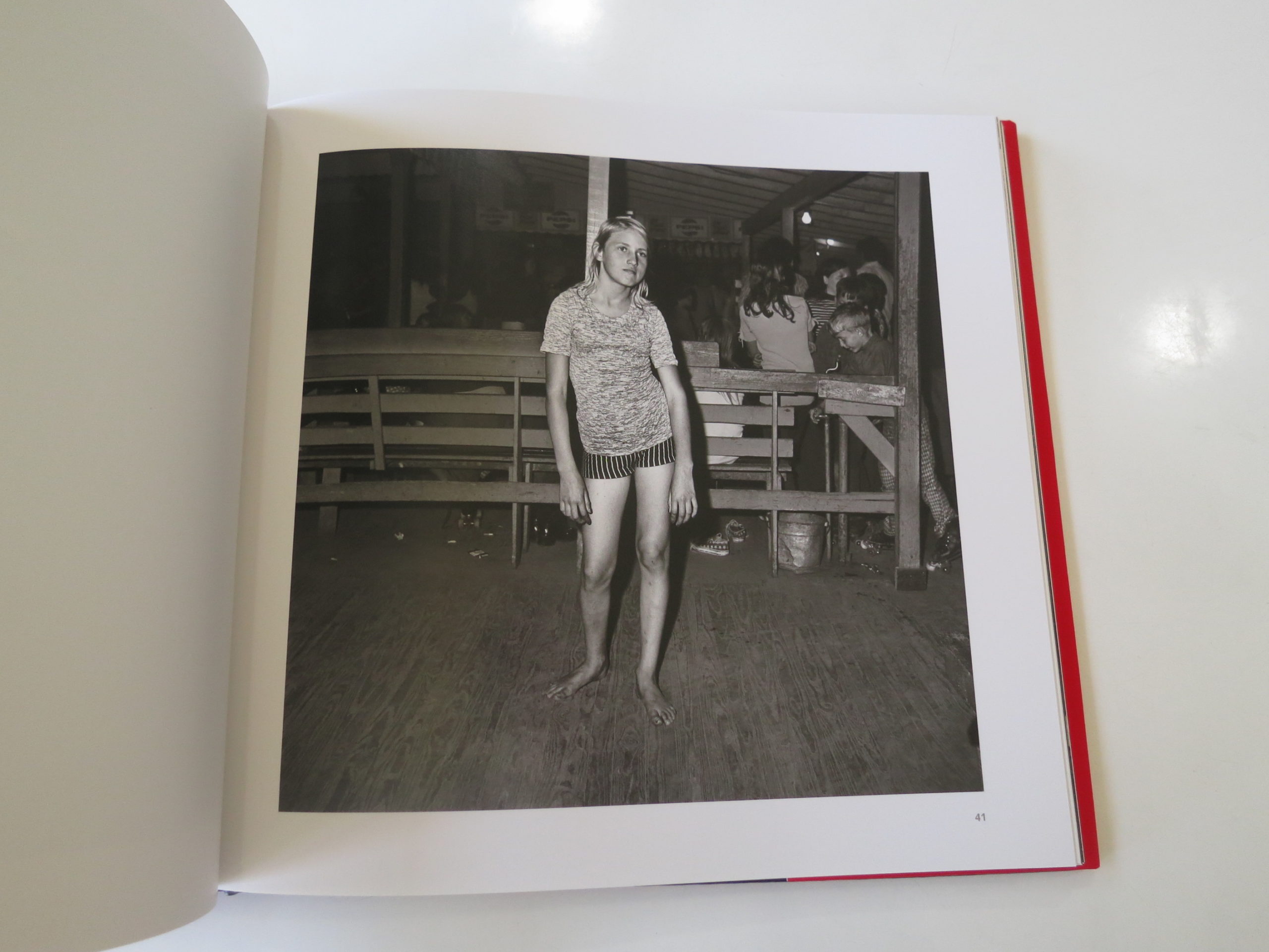
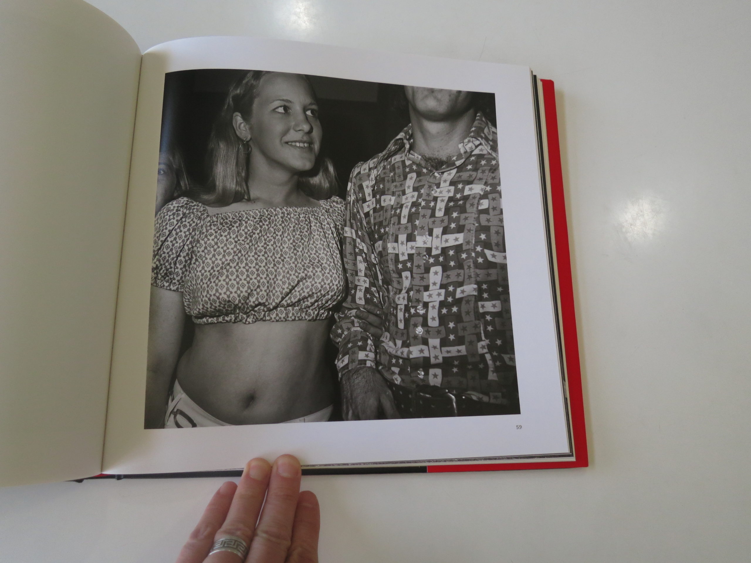
The Art of the Personal Project is a crucial element to let potential buyers see how you think creatively on your own. I am drawn to personal projects that have an interesting vision or that show something I have never seen before. In this thread, I’ll include a link to each personal project with the artist statement so you can see more of the project. Please note: This thread is not affiliated with any company; I’m just featuring projects that I find. Please DO NOT send me your work. I do not take submissions.
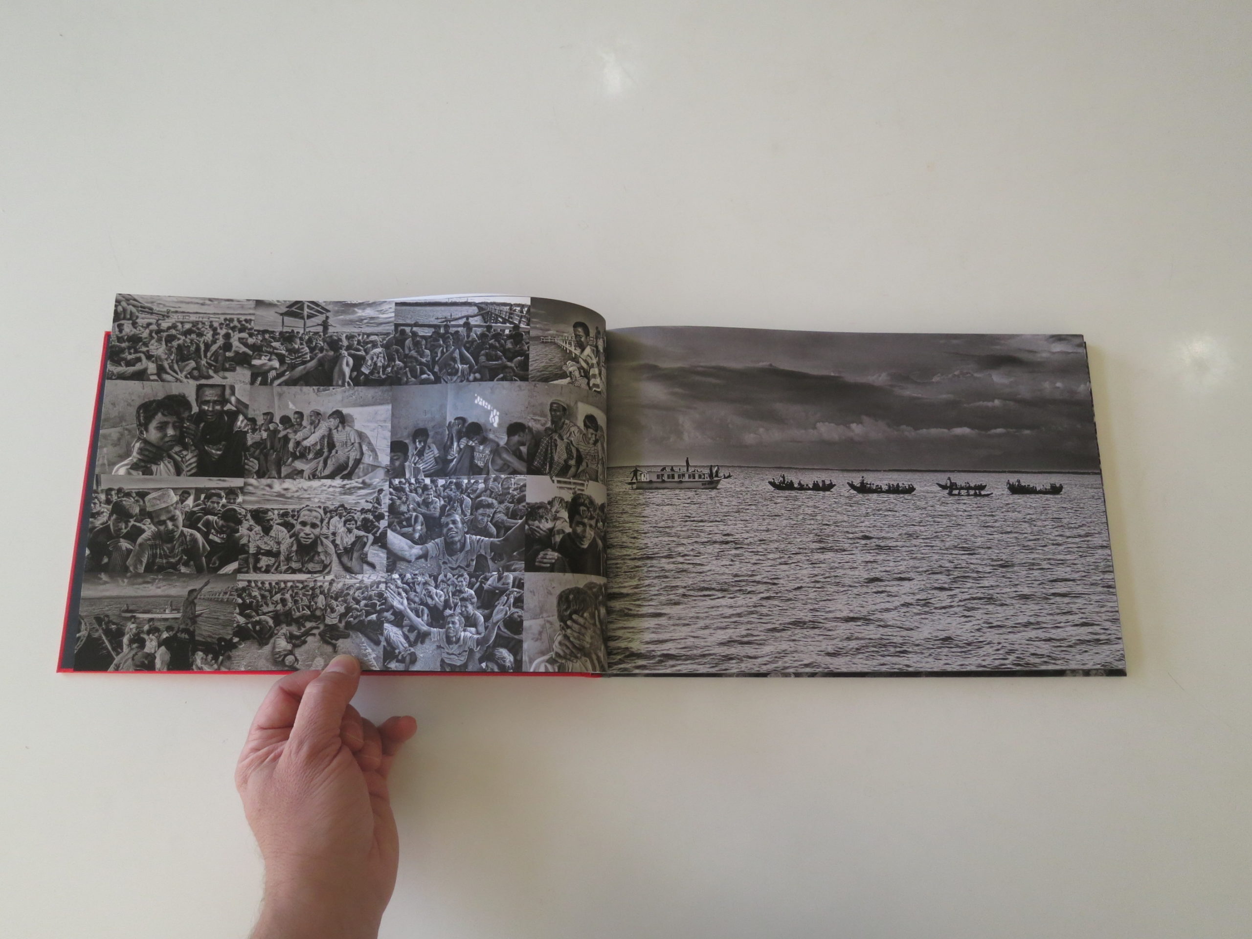
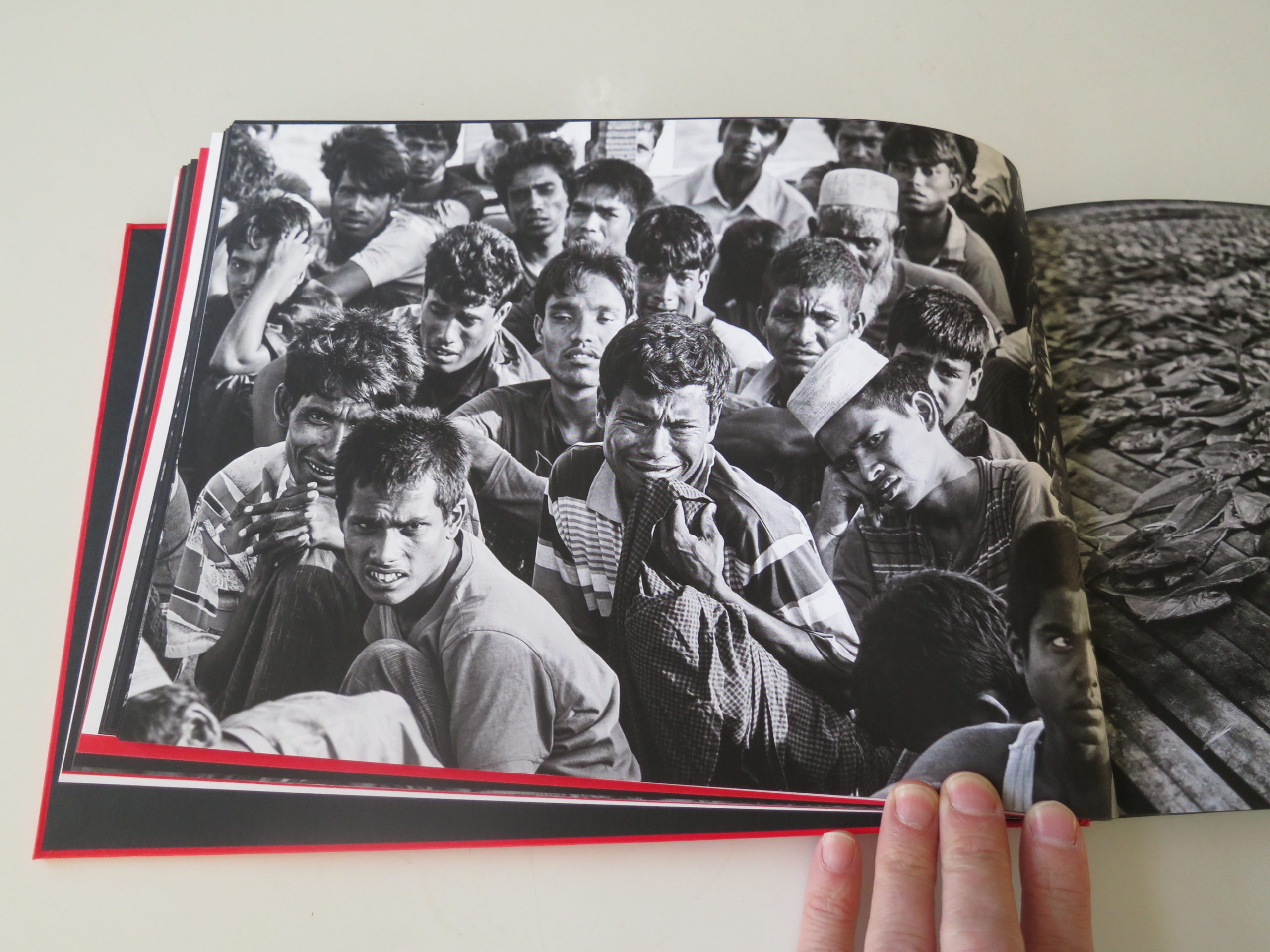
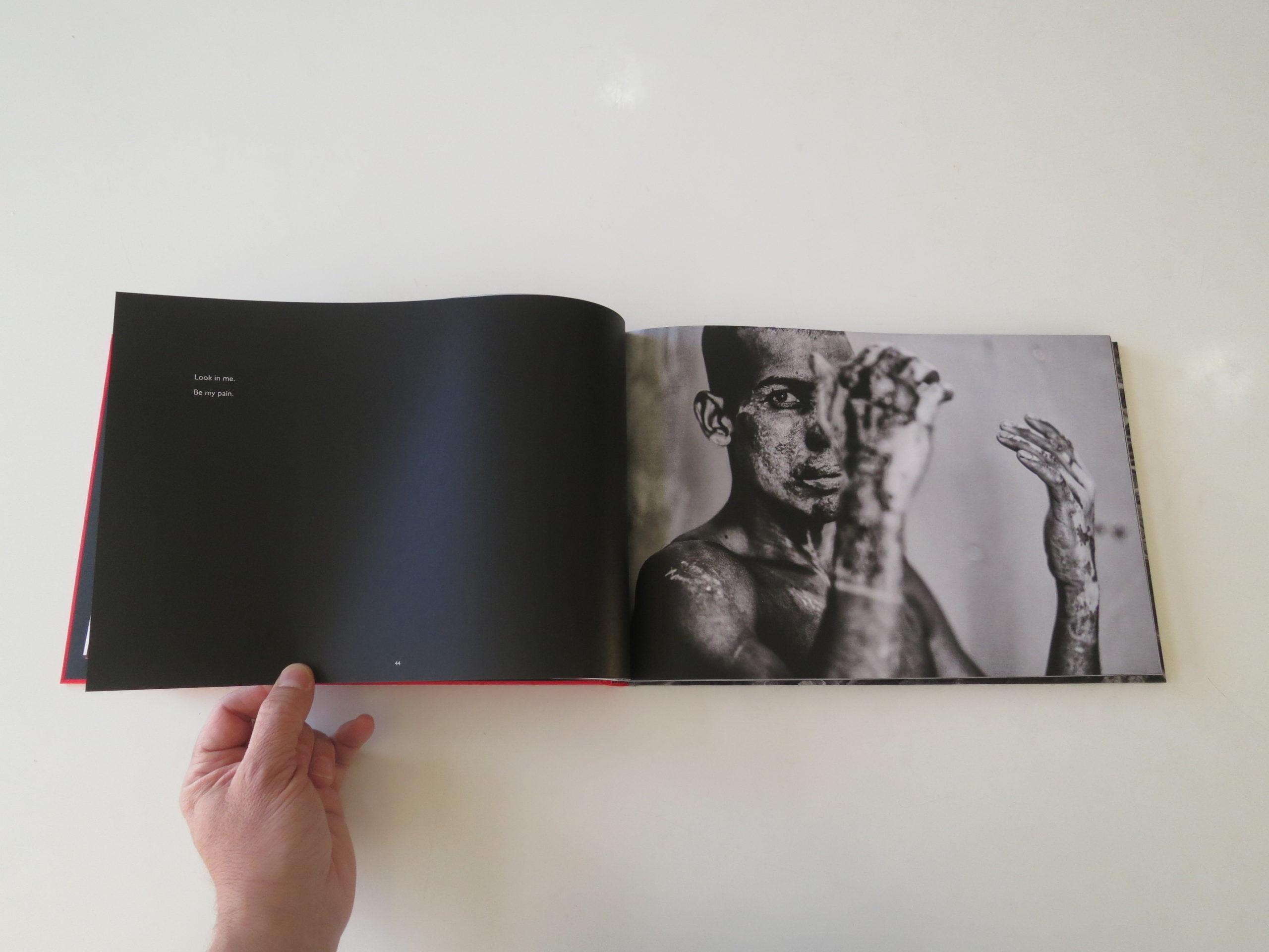
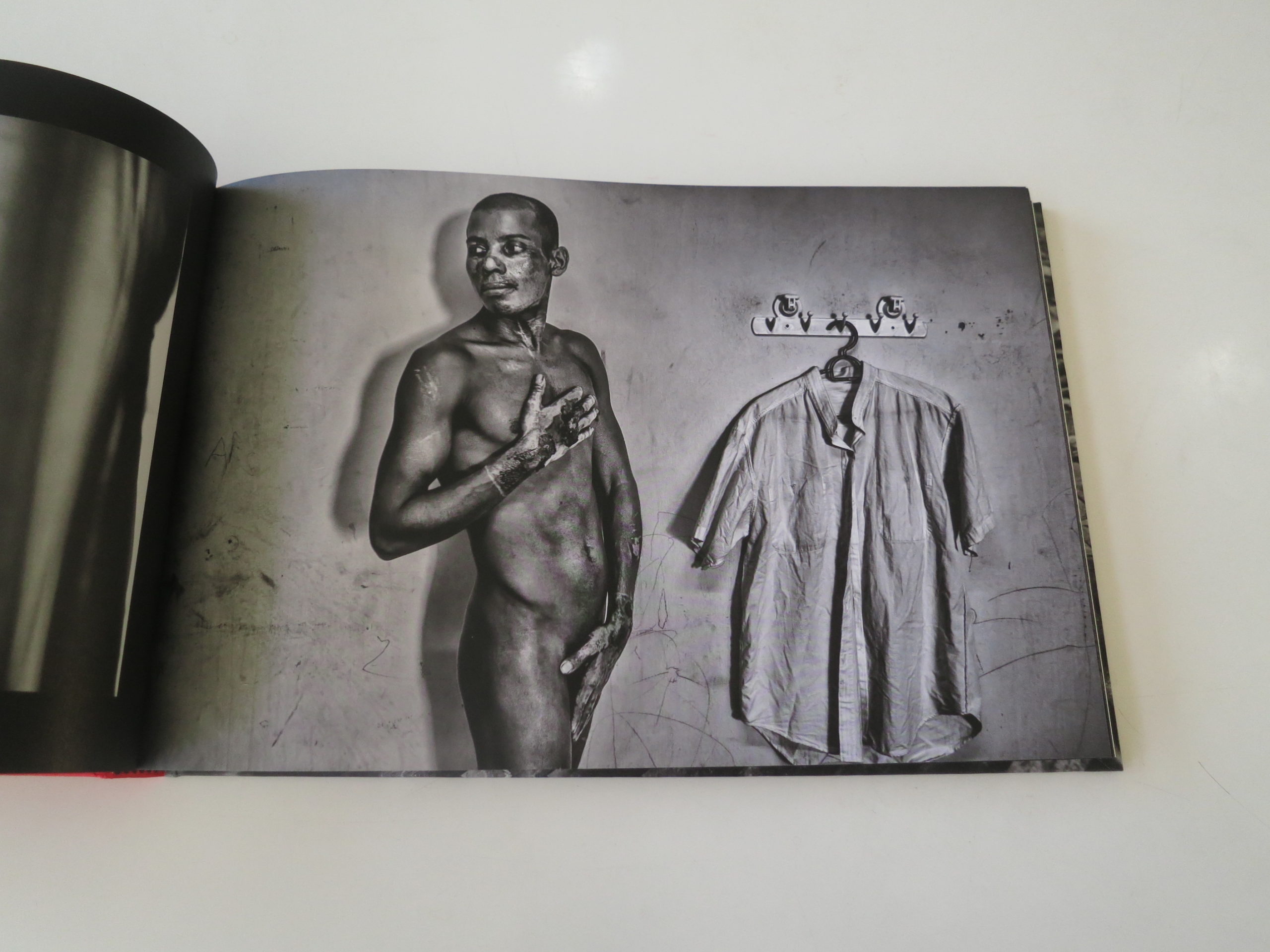
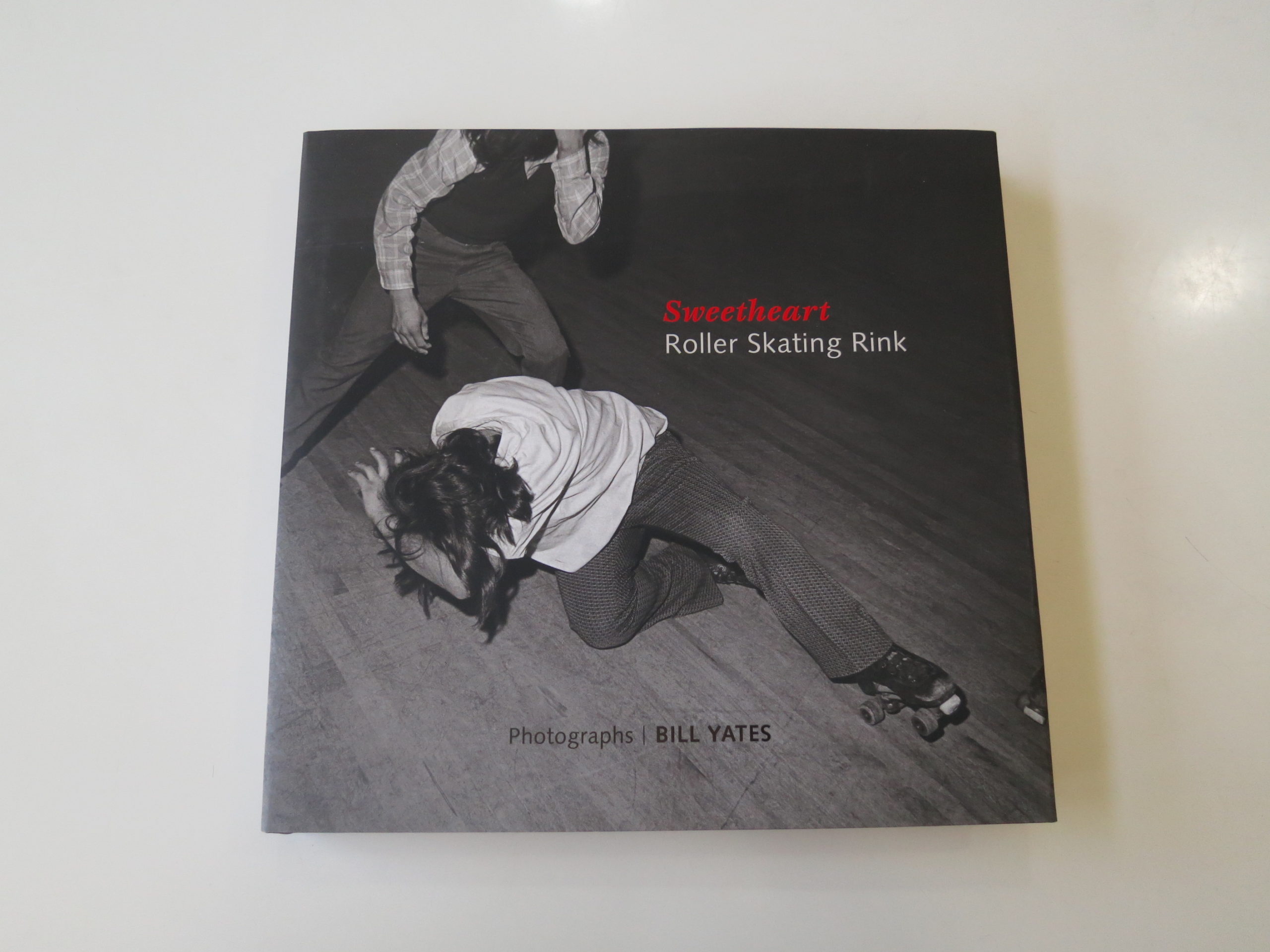
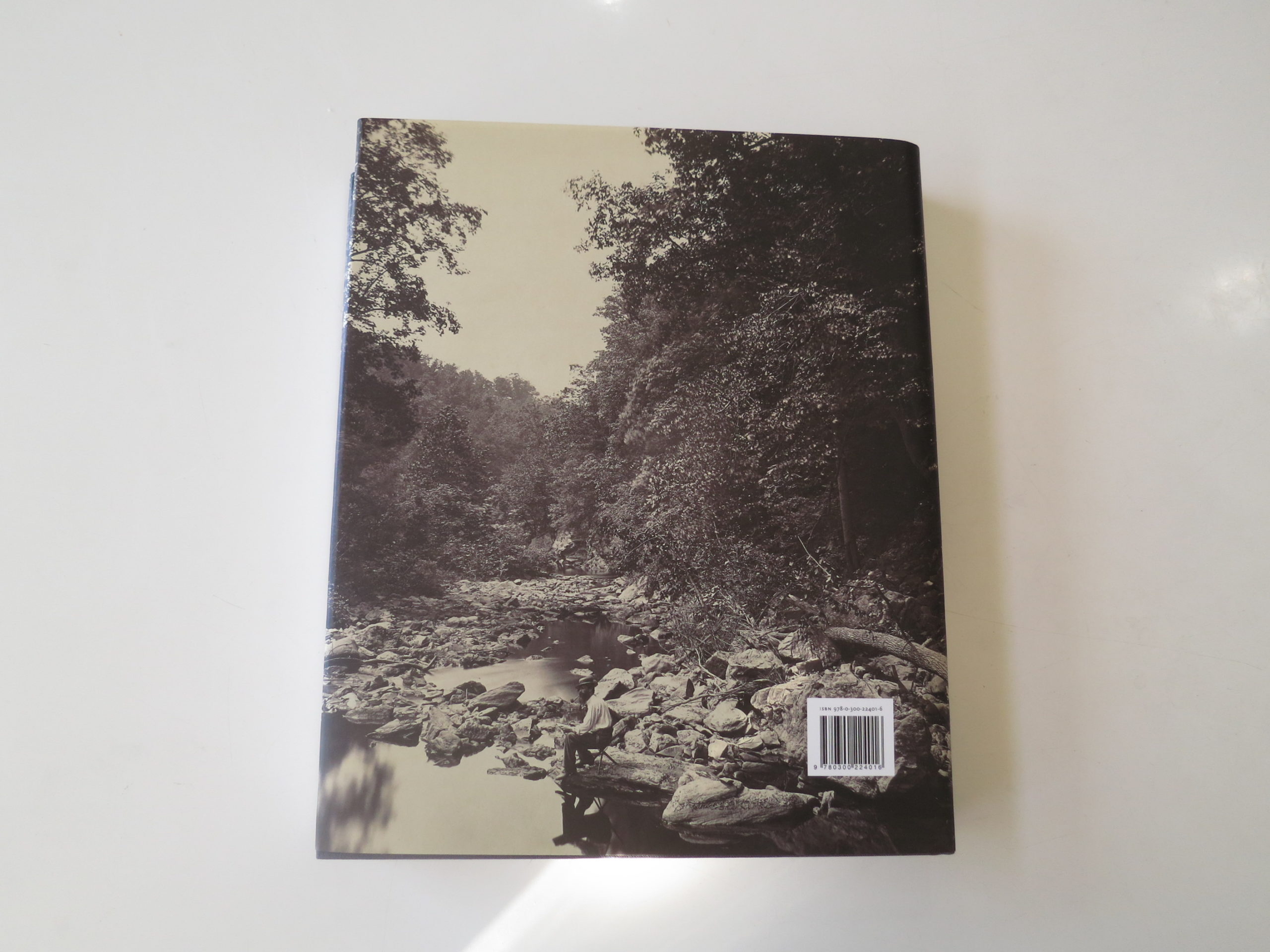
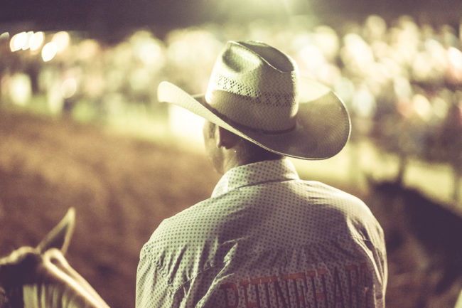
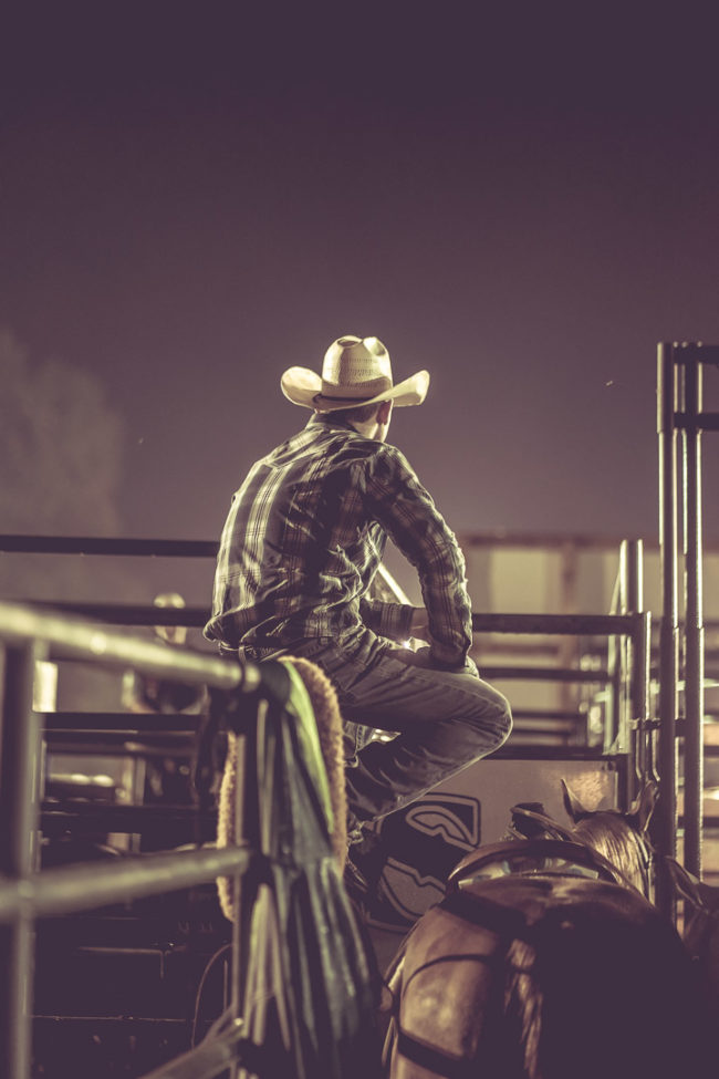
This is a personal project that I have featured before and shows the importance of personal projects. You can order this beautiful book here
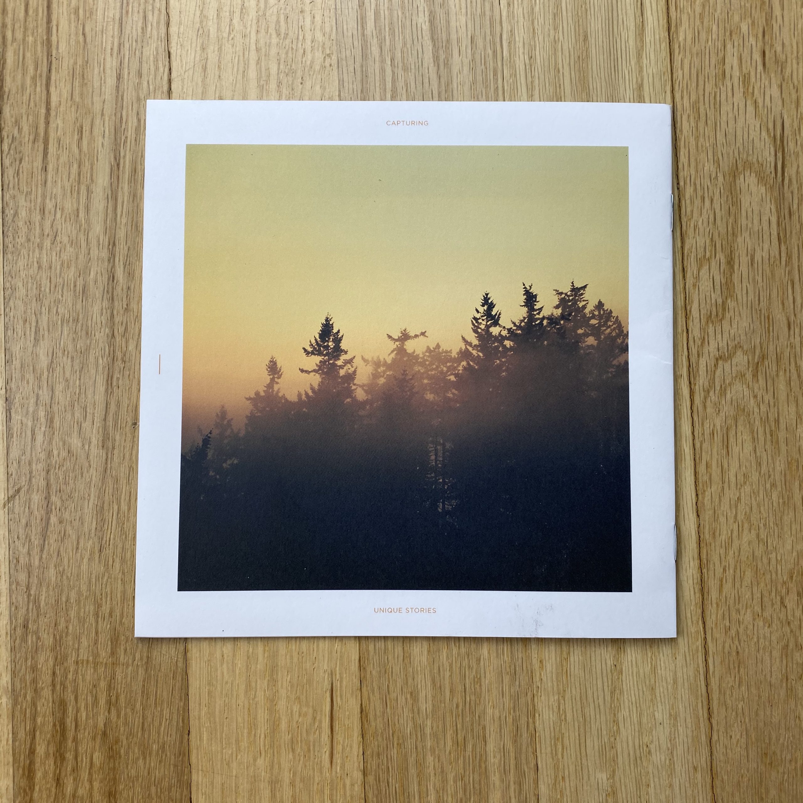
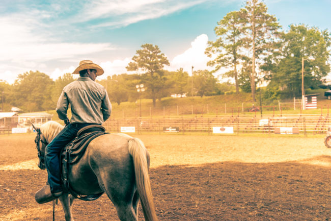
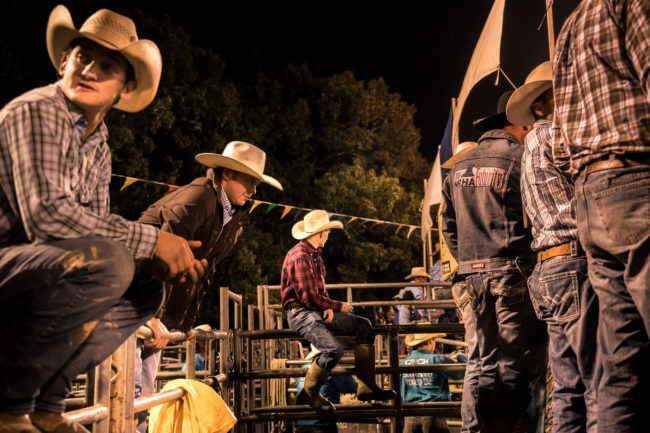
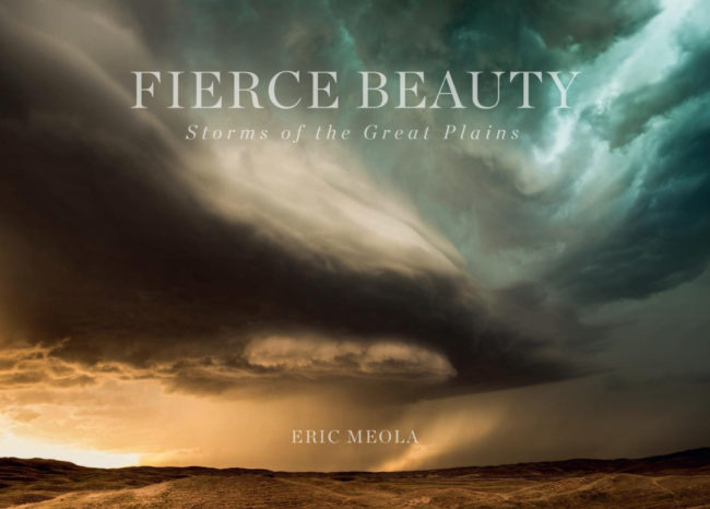
Today’s featured artist: Eric Meola
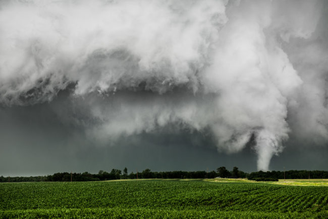
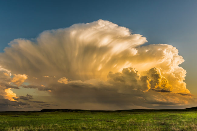
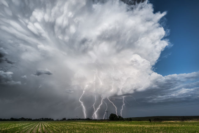
FIERCE BEAUTY: Storms of the Great Plains
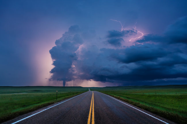
Stormy weather is a metaphor for our daily lives; and the faith of those who overcome adversity is the reason I’ve spent the past several years documenting severe weather. My passion for photographing storms in the Plains comes from witnessing and experiencing life in real time—nothing focuses the mind and human resolve more than a tornado riding along the horizon.
As climate change intensifies, I want to photograph the grandeur and fierce beauty of nature. I’m inspired by the small towns, the people, and the experiences that come with driving the back roads in the center of America. This is a place of adversity and resilience, and FIERCE BEAUTY: Storms of the Great Plains is my record of the road trips that gave me insight into a profoundly spiritual landscape.
Luck and perseverance are bookends to photographing and chasing storms on the Great Plains. Standing in gale-force winds, under rain, pelting hail, and lightning strikes, you feel a lot of adrenaline pumping as cumulonimbus clouds metastasize, spreading out over miles of land and rising tens of thousands of feet into the lower stratosphere. Weeks of long days often end in frustration as one storm collides with another, each undercutting the next one; and a more than 600-mile chase day ends in a dreary drive very late at night to a dark motel in a prairie town where even the fast-food franchises are closed. Batteries need to be recharged, lenses cleaned, and images downloaded to a laptop, as well as backed up. Then comes sleep—sometimes restless, other times instant, deep, and far too short before the morning weather briefing.
As a photographer, your vision is always evolving. What you see and how you see it are part of you, so I take notes no matter how tired I am, and then wake up early to walk the streets of the towns I might never see again. Exploring is not about the trip, but about the journey, and about looking inward.
If I have one goal, it is to capture the essence, the light, and the grandeur of the Great Plains on a two-dimensional, flat sheet of paper. The image at Wolf Point, Montana, which begins the essay “The Revelation of a Fierce Beauty,” happened in a moment of serendipity—one of our group had lost his wallet in some tall grass, and we traced it sixty miles west to our last location on the previous day. As some of the others searched along the ground, I looked out to the landscape of shadows and light, with white cotton-puff clouds hovering over the undulating green land. It was the Great Plains in a single photograph, and I knew it was an important image for the book. It was serene, vast, and in its mix of textures it personified what I felt about being in a place that wraps its arms around you and doesn’t let go.
In photographing storms, my interest is in a specific moment when a storm’s structure—its architecture—and the light, color, and texture of the clouds are revealed. In order to capture these moments, the photographs in this book were made with a series of high-resolution “full frame” digital cameras: I used a mixture of Sony, Nikon, and Canon cameras, with sensors ranging from 22 to 42 megapixels.
I used a variety of extreme wide-angle lenses, ranging from a 10 mm Voigtlander to a 14–24 mm Nikkor and a 16–35 mm Sony GM; as well as intermediate focal-length lenses, and telephotos as long as 300 mm. The technology of lenses and digital sensors is rapidly evolving, and I have become agnostic in the era of digital cameras. Wherever the ground appears in a photograph, I particularly wanted to show its texture, as it usually occupies just a sliver at the bottom of the photographs, but is so important to the scale. I like to travel with as little gear as possible, often using just two cameras, each with a “dedicated” lens so there is no risk of getting water or dust on the sensor under what are often very trying conditions. At times, just standing upright against the wind is an exercise in futility.
I electronically “processed” all of the images in this book using Adobe’s Lightroom program, reproducing the image the way it appeared at the moment of capture, but adjusting the clarity and contrast to emphasize the details that are lost when photographing through strong downpours of rain and hail. Often, the delicate character, the mood, and the soul of a photograph are lost during processing, so I come back to images months, sometimes years, later and look at them again. Many of these images were made very quickly, within only a few minutes, before high outflow winds, strong downdrafts, and large hail made photography dangerous.
I want to capture something that brings you into the photograph. There is a tendency in the age of video to shoot time-lapses of storms. Although motion—especially motion over time—can be interesting, I am more concerned with capturing the subtle beauty of one particular moment, so that it can be studied. Storms are exquisite structures of transformation, and what I love about them is that they change rapidly from second to second as the storm goes through its life cycle. At times, I have to remind myself to photograph, as a large part of the experience for me is standing at the edge of a field of wheat, listening to the wind, and watching the storm. Storms on the Great Plains are a uniquely American landscape, and they need to be listened to and watched, as well as photographed.
To see more of this project, click here.
APE contributor Suzanne Sease currently works as a consultant for photographers and illustrators around the world. She has been involved in the photography and illustration industry since the mid 80s. After establishing the art buying department at The Martin Agency, then working for Kaplan-Thaler, Capital One, Best Buy and numerous smaller agencies and companies, she decided to be a consultant in 1999. She has a new Twitter feed with helpful marketing information because she believes that marketing should be driven by brand and not by specialty. Follow her at @SuzanneSease. Instagram
Success is more than a matter of your talent. It’s also a matter of doing a better job presenting it. And that is what I do with decades of agency and in-house experience.