This Week in Photography: Black Friday


It’s 2pm on Tuesday, so that’s something different.

(I haven’t written a non-Thursday column in ages.)


I’ve worked on Thanksgiving for years, never planning ahead enough to write earlier in the week.

This year, though, I got my shit together, having promised my wife I’d take the holiday offline, to get a bit of rest.

#2020 has left me feeling like my Gi used to smell after Brazilian Jiu Jitsu, back when things like martial arts classes existed in the world.

And it seems like most people I speak with feel the same way.

Worn out. Unproductive.
Ready for a break

It’s gotten so bad, my lack of focus, that I spent most of today searching for jackets and coats on the internet.


(Normally, I’d be ashamed to admit that, but I don’t remember what the word shame means these days.)

Since I don’t have a proper Winter jacket for our climate, I’ve spent days sifting through killer Black Friday deals, looking for just the right jacket.

Or coat.

Should it be gore-tex, or down?

Maybe wool, and if so, what cut?

Jacket after jacket.
Coat after coat.

Click link.
Absorb details.
Read reviews.
Consider price.

Move on.

Jacket or coat?
Coat or jacket?
Jacket. Jacket.
Coat. Coat.
Coat.

On and on, for hours.


I’m not proud; I’ve seen hundreds of jackets over the last week. (And coats.)


Onward I shop.

My brain is mush. Clicking links like a trained monkey is all I’m good for. And when I find my perfect, Goldilocks coat, I’ll wear it with pride!


Jackets and coats.

I have plenty of them, but not the kind I need, as my previous Winter coat was ruined when I accidentally bumped into a parked bicycle on a narrow street in Amsterdam. (Right before I was almost hit by a bus.)


Jackets and coats.

They serve an important purpose.

Keeping us warm.
Occasionally, as fashion, they might even be art.


But no matter how much we gussy them up, it’s just sewn fabric to keep our bodies warm, protected from the elements.

So basic.


What’s more utilitarian than a coat?

Maybe a cooking fire?
A drinking vessel?

Or a broom?

Some little reeds or twigs tied together, lashed to another stick?


You can’t have a clean space, even if it’s a tiny hut 1000 years ago, without a broom, right?


Brooms are everywhere, and we need them desperately, but we never pay them any mind.

No one ever says, “Why thank you, Old Broom, as I wish to convey my general appreciation for the service you provide on a regular basis. Cheers and Bully to you, Sir!”

I don’t say that to my broom.

Do you?


Brooms are the Rodney Dangerfield of household items: they don’t get any respect.

Until now.

(You knew I was getting there, right?)

My friend and colleague Jason Dibley, an artist and museum professional based in Houston, offered to send me a ‘zine this Fall, so I said thanks, and that was that.

In the small envelope, tucked inside a hilarious plastic bag from Texas institution, H.E.B., I found the Minimalist white Digest sitting atop four annuals, from 2017-2020, of the Broom Zine.

These impeccable, odd, fun little volumes are so perfect for today.

One thing. Over and over again.

Brooms.
Brooms.
Brooms.
(Dustpans are a co-star in the 2018 volume.)

It forces one to think about what we ignore each day, paying no mind as we live in our heads, imagining the Amazing Technicolor Dreamcoat.

(RIP David Cassidy.)


As cool as the annual ‘zines are, I must say, I love the Digest best.


It could not be more pared down.

A graphic, stripped of context, printed and folded, on clean, white paper.


Yet the four brooms are more noble, and sculptural for it.

Regal brooms!


Happy Black Friday.

For more info on Broom Zine, follow on IG here


If you’d like to submit a book for potential review, please contact me directly at jonathanblaustein@gmail.com. We are particularly interested in books by women, and artists of color, so we may maintain a balanced program. 


The Art of the Personal Project: Paul Ernest

The Art of the Personal Project is a crucial element to let potential buyers see how you think creatively on your own.  I am drawn to personal projects that have an interesting vision or that show something I have never seen before.  In this thread, I’ll include a link to each personal project with the artist statement so you can see more of the project. Please note: This thread is not affiliated with any company; I’m just featuring projects that I find.  Please DO NOT send me your work.  I do not take submissions.


Today’s featured artist:  Paul Ernest  (originally posted in 2018)

Claimed as the 21st century Norman Rockwell, Paul Ernest’s photographic work has been received as a soulful interpretation of timelessness in today’s evolving informational and technological culture. Using the camera and his appreciation for American Realism, Paul has developed a style he calls Mise En Scene Realism. His focus on composition and lighting are primarily drawn from painters such as Wyeth, Rockwell and Johnson but with an influence from his former career as a Creative Director and designer. “We are a people of storytelling, parables and fables. Our perception of the aesthetics in life are absorbed and interpreted in a way that is no different than any style or technique that have ever been in existence. We learn from stories and the adoption of them into our way of thinking and living.”

Since 2011 Paul’s work has earned him awards from WPPI and PPA, including Diamond Photographer of the Year in 2012 and 2015 and earning his Craftsman and Master Degree. Paul’s work has been accepted in galleries such as Craighead Green and premiere arts festival throughout the state of Texas. His commissioned work hangs in restaurants, hotels and private collections including the lobby of his alma mater where he received his Bachelor of Fine Arts. He also has developed his style into a line of home interior products sold nationally.

Paul’s passion for education and continued growth in himself and others is evident in his teaching and mentoring which he does in his home state as well as across the U.S. He lives just outside of Dallas, Texas with his wife and children.


To see more of this project, click here.

APE contributor Suzanne Sease currently works as a consultant for photographers and illustrators around the world. She has been involved in the photography and illustration industry since the mid 80s.  After establishing the art buying department at The Martin Agency, then working for Kaplan-Thaler, Capital One, Best Buy and numerous smaller agencies and companies, she decided to be a consultant in 1999. She has a new Twitter feed with helpful marketing information because she believes that marketing should be driven by brand and not by specialty.  Follow her at @SuzanneSeaseInstagram

Success is more than a matter of your talent. It’s also a matter of doing a better job presenting it.  And that is what I do with decades of agency and in-house experience.


The Daily Edit – Manjari Sharma

Manjari Sharma

Heidi: How has your relationship with the work changed if at all since moving to the United States?
Manjari: It’s been an incredible journey, and one I wouldn’t change anything about. I came here to the USA at 21 and looking back I knew very little about the “history” of America. What I did know was I was going to make a lot of pictures, meet a lot of new people and ask a lot of questions. I wanted to grow and that curiosity led me across the globe. My relationship with my work over the years has become more intimate. I am more transparent with my practice and I think it’s because simplicity and complexity in equal parts are inextricably tied to aging. Time is certainly the best teacher. When I was younger things were more black and white and now I know there are multiple realities to most all stories. When I was younger I was honing my craft, and then I started telling my own stories. This is where my path changed, where the story became so important that it had to be told at any and all costs. It didn’t matter who was publishing the work or inviting it for a show. The work had its own preordained path and it had to be born.

As you gain distance, is it reinforcing something for you?
Gaining distance from that which we love is a double-edged sword. At twenty one I knew or cared very little about the duality of stepping away from my home and my family. The sense of adventure and the draw to pursue and carve my own unknown path was so strong, I wouldn’t have it any other way. I am fortunate that my family supported my unbridled wishes. Over the years I have both learned and unlearned a great deal about both my Indian descent and my adopted American culture and they are bittersweet truths. What this distance or as Pico Iyer calls it the “Gift of exile” is that it has allowed me to do is make up a culture of my own; A hybrid identity that draws from both these incredible countries that I am fortunate to straddle.

What marked a pivotal time in your career here in the US?
2008-2013 I photographed a series titled The Shower Series. I invited people I didn’t know very well to take a shower in my shower as I photograph them. The premise was risque and clothes were optional. I photographed a plethora of people showering and ended up having these unexpectedly disarming conversations with them. The water became a conduit and almost every single time I photographed someone, I felt entrusted with a really personal story. I made audio recordings of the protagonists’ short stories with their consent of course, and they were so honest and beautiful. A shower is such a sacred space that our intimacy and the cleansing aspect of water turned the experience into a really meaningful connection. I won’t lie I felt like I fell in love with every one of my subjects. I also found myself quite consumed by the process of making this work. I was addicted to hearing these raw and vulnerable stories because they turned my subjects into these complex, powerful characters that had so much depth. Somewhere during these sessions, several portraits were taken; My lens got fogged, my toes got wet and the photograph became a reason to connect to something beyond. This series was a pivotal point in my practice because I realized the camera had become an extension of my personality. Meeting a new human being, learning who they are, what takes them down, what makes them tick, is was what brought me to another country. So much of that series was a discovery that the lesson I learned here was to pay attention and follow the lure of my unconscious mind.

Now that you have lived almost half of your life in India and half in the US when you created this work, which part of you did you relate to the most?
When I look at my work I see a pluralistic lens. I am guided by American inquiry but I assess my work from an inner core that is rooted in Indian culture. Many of these experiences of growing up in India I am present with on a daily basis, and then there are others that time has made opaque, yet, I know they are deeply embedded in my inner landscape. The best example of this might be like the lyrics of a Hindi song that I forgot I knew verbatim. As an artist never losing sight of this unknown murky middle ground that lies between the known and the unknown is probably my most challenging yet rewarding part. Mining that cerebral interlude for answers is what I derive my greatest satisfaction from.

Are you talking about the lyrics to a particular song, why do you think it resonated?
Recently I was at my friend’s house Sarita, and she played a Hindi song I hadn’t listened to for a really long time, maybe even decades, but I found myself knowing it word for word. My palette for music was a gift from my mother. I specifically remember moments when she shook her head and wiped her tears because the melody and lyrics of a song could move her so much. The songs that had meaning to her were played and overplayed in my home. I listened to Indian music on my mom’s Panasonic cassette player and she exposed me to such terrific names RD Burman, Naushad, Mohammed Rafi to name a few. Anyway, I’m digressing I am using this as an analogy to share that formative experiences from 21 years in Bombay are burned and embedded into my psyche. I’m shaped by these and so is my art.

How did the sari impact you as a young woman, and how does it impact you as an adult? What life lessons can be drawn from this complex piece of fabric, once properly tied? or not tied?
Fabric in general holds a lot of meaning for me. Indian customs, rituals, and relationships are symbolically represented by color, textiles, and knots in an immense way. The act of tying and untying has great relevance in Indian culture. A knot represents a promise. The act of who ties a knot between the bride and the groom at an Indian wedding for example has ancestral significance. As a young woman, the Saree to me was regarded as a garment that commanded respect. I remember staring at my mother when she draped herself in one. Wearing a saree was an occasion in itself and from that perspective, as a young woman, I romanticized it. Walking gracefully in a saree took practice and poise and an improperly tied saree was not only sloppy but dysfunctional. In that sense spending time with folding, pleating, and draping nine-yards of fabric was a meditation in its own right. As an adult, I look at it a bit more microscopically because as life would have had it my mother (a dementia patient) can no longer drape herself in a saree. Also as I examine India from a sexist lens, I look at the saree not just as a delicate decorative but also as a symbol of patriarchal control. I have a deep and spiritual admiration for this garment, but I also critique it as a modern Indian woman. I had a teacher in a college in Bombay and her name was Putul Sathe she was a counter-culture spitfire who imbued me with radical liberal thought. The saree is incredible and incredibly limiting and I wanted to address both those aspects in my series “How to wear a saree

What was the tipping point for your recent letter titled “Love Letter to America?”
George Floyd’s death in particular shook me to the bone. “Love letter to America” as you know weaves my own experiences into the fold but what began with “Talking Pictures” came to more honest fruition with Love Letter to America. You can read it here


“Talking Pictures” was influenced by the 2016 elections, so here we are 4 years later, how has this current landscape informed your work?
Talking Pictures was an assignment through The Metropolitan Museum of Art and a big subject of that commission became the growing life inside my body as I discovered that I was pregnant during the course of the assignment. However, the outcome of the election, and particularly Donald Trump’s win was something I had to address as part of my work. Trump’s win was the first time I found myself traveling to DC on a bus at 4 am to exercise my rights and protest against the disturbing political landscape of America. I understand that we are bipartisan as a country but I have known, befriended, and even loved many republican leaning Americans. However, Donald Trump represented an America that was at odds with everything I understood and respected about this country. I am brown, grew up in India, and over the years my understanding of racism and white supremacy has grown steadily but Trump’s America permitted behaviors I didn’t realize this country was capable of. This speaks to my privilege of course, but my art practice could no longer ignore that I needed to headlong address certain racist inequities that I now found myself shielding.

There is so much expression of life in the streets of India, are you drawn to mural work?
Yes public art was vivid in Mumbai and I certainly have a sense of belonging to it. With galleries and museums being shut down due to the Coronavirus pandemic, Public Art and the vitality it brings to communities is more important than ever. This mural, A cacophony of human hands rising like a wave, is also an extension of a recent piece I wrote “Love Letter to America”

What does it mean?
Sometimes we don’t see people for what they are, we see them for who “we think” they are. Are we programmed to misunderstand each other? Can we fight this programming? The purpose of the mural is to invite the viewer to examine and self-reflect on our racial lens and actions as a community.

I know you’re on the board of the organization Art Bridge, an initiative that helps early-career artists have a brilliant platform. Tell us about this piece “Simultaneous Contrast” pictured above, in a sketch and a comp.
Simultaneous contrast is a new body of work I’m only just beginning work on. Much like my series Darshan it is currently a sketch and is yet to be constructed. It is based on a phenomenon rooted in color theory. Simultaneous contrast is a term that refers to the influence of one color when in close proximity to another. The theory is that when placed side by side, one color can change how we perceive the tone and hue of another. In reality, the colors themselves never change, but in our recognition, we see them as altered. No normal eye, not even the most trained one can see color independently. This series is an exercise in challenging the framework of our consciousness. What does the color of our skin represent in society? What is our role in shaping the perception of colors around us? Simultaneous Contrast invites the viewer to examine the illusion of stereotypes, and question our role in altering the perceptions of implicit bias.

Artbridge has an auction up for about a week and people have the opportunity to grab amazing art. You can buy this piece from my series “Surface Tension” to support this incredible organization or browse some amazing other artists here. 

Featured Promo – Stephen Denton

Stephen Denton

Who printed it?
The Promo was printed at Newspaper Club – www.newspaperclub.com. I have used them a couple of times over the years and really like the service they offer.

Who designed it?
I designed the piece myself with image sequencing help from my friend and amazing photographer, Jesse Rieser.

Tell me about the images?
The images are from a personal project of mine called “Handmade by MannMade.” They tell the story of the unique process used by two guys who share a small workshop in Fountain Hills, Arizona where they create completely custom and handmade putters. Each step of their process is done with such care, attention to detail, and deliberate intent from start to finish. Right away I thought their story was special and it was something that I would like to capture. In an industry that is fascinated by giving lengthily scientific explanations for club design, it was incredible to watch them both make putters by hand, without any CNC milling, simply “eyeballing” each part of their creations, and in the end creating top-rated, completely custom putters.

How many did you make?
I had 50 promos made. I created a more targeted list of people for this promo due to the cost of the piece and somewhat niche content of the promo.

How many times a year do you send out promos?
I try to send out at least three promos a year showing new personal work.

Do you think printed promos are effective for marketing your work?
I do think that printed promos are effective for marketing my work. I don’t always get responses to print promos, but when I do the recipients are often very thankful to have received one. To me, they seem more meaningful and thoughtful than sending out email promos. I have no idea if they’re received that way but a dear friend and longtime mentor of mine, Jeff Williams has always tried to instill in me the importance of print promotions and how effective they can be if done correctly

This Week in Photography: Skinning Monkeys


I looked at my daughter.

“You shouldn’t see the monkey face,” I said.

“No?” she replied, questioning the finality of it all?

“No, you shouldn’t see the monkey face,” I repeated, more determined, and that was the end of it.


It began, as many meta-stories likely do, with a desire to clear one’s head.

To go for a walk.

It was Thursday morning, getting late, and I had to write this column.

I was dragging, though, so I figured a walk might be just the thing to shake up my thoughts.

Get the blood pumping.

I’d just taken a look at a bonkers book, (one I mentioned picking up last week,) and knew I’d have to write, but sometimes the exercise jars loose a good idea.

I told my daughter I was headed out, (briefly interrupting her Zoom school) and before I knew it, she was joining me, as her class had just ended.

As I may have written before, she likes to talk, my daughter, so there went the chance to quietly develop some ideas in solitude.

I offered her a compromise, where half the time I had quiet to think, and half the time, we chatted about her subject of choice, but she said “No, thanks.”

So I switched tactics. I’d make use of the conversation.

Especially when she gave me an opening.

“You know, normally I’d be in recess, probably, in our old life,” she said.

“Yeah, I replied, “humans are pretty adaptable, even a shift in lifestyle this radical, where we’ve mostly been home for the past 8 months. We just kind of got used to it.

Humans can lead very different lives, sometimes almost unimaginably so. Did you realize?” I asked.

“I guess,” she replied. “What do you mean?”

“Well,” I said, “what I want to talk about will be the subject of my column, and the things we say, I could include it. This, what we’re saying now, could be the opening of the article. Does that work for you?”

“Sure,” she said.

I told her that people did things differently across the planet, because of habit, wealth, laws, history, environment or opportunity.

And I thought I’d just seen a book that was about as different from our life here in Northern New Mexico as possible.

“I think it would blow your mind,” I said.

She gave me the side eye, clearly underwhelmed. Then she paused a moment, and said, “Go on.”

I told her about “Doomed Paradise,” a photo book by Tomas Wüthrich, published by Scheidegger & Spiess, that arrived in March, not long after lockdown began.

I told her about the Penan people, in the jungles of Borneo, on the other side of the world, and how the photographer spent time with the families in this culture, to observe and photograph their traditions.

Kind of like an anthropologist.

Or a spy.

“I’m listening,” she said.

Apparently, this group of indigenous people still lives in a partial hunter-gatherer society, and they catch and kill a lot of creatures in the wild.

Like, a lot of creatures.

Many of which were included in this book, including the one picture that I am pretty sure I won’t be able to unsee, even if I wanted to.

“We’re nicer to animals than they are,” she said. “We don’t do that.”

“No, maybe not,” I said, “but we buy meat, so we support an industry that kills lots of animals. It’s kind of the same.”

I got the side-eye again.

“And this book I was just looking at was filled with images of dead creatures. I saw the one photo that I know will stick with me. That I don’t think you want in your head. Because it was… a dead monkey… with its face skin torn off!

A skinned monkey face!”

“Dad!” She screamed. “Too intense!”

“Really,” I asked? “Too intense? But now you believe I can surprise you?”

“Yes,” she said.

We laughed. And I thanked her for helping me come up with the opening of this column.

I’ll show you the photo of the monkey face.

Or the other one, with the monkey being disemboweled.

Or the snake wrapped up with its own guts.

In fairness, there is plenty more that’s interesting here, beyond the animal parts.

Road blocks, to keep out logging companies, and creation and other religious mythologies that are shared in text form.

It’s all fascinating, for so many reasons.

Not to mention my oldest rule in book reviewing: can you show us something we haven’t seen before?

That definitely happens here.

Poor little monkey.

To purchase “Doomed Paradise” click here


If you’d like to submit a book for potential review, please contact me directly at jonathanblaustein@gmail.com. We are particularly interested in books by women, and artists of color, so we may maintain a balanced program. 

The Art of the Personal Project: Sara Forrest

The Art of the Personal Project is a crucial element to let potential buyers see how you think creatively on your own.  I am drawn to personal projects that have an interesting vision or that show something I have never seen before.  In this thread, I’ll include a link to each personal project with the artist statement so you can see more of the project. Please note: This thread is not affiliated with any company; I’m just featuring projects that I find.  Please DO NOT send me your work.  I do not take submissions.


Today’s featured artist:   Sara Forrest

Aerion

I’ve always been drawn to stories of ambition.  Maybe a few fortunate souls are born doing things perfect or are just flat out lucky during their time here, but the rest of us on Earth, myself included, must be tenacious.  We must work, train, experiment and sift our way through many failures and accomplishments to get to where we ultimately think we want to go.  It all simply comes down to something being hard.  Accomplishments are things that are earned, they are not innate. I thought that the process of construction of Kali’s sailboat symbolized this in a meaningful and important way.

Kali’s father was a hobby boat builder and during his long struggle with PLS they worked on building a hand made wooden boat for her.   Following his passing, she finished “Areion.”  When conditions are right, you can see her red sails navigating the crisp blue waters off the coast of Kittery, Maine.

To see more of this project, click here.

APE contributor Suzanne Sease currently works as a consultant for photographers and illustrators around the world. She has been involved in the photography and illustration industry since the mid 80s.  After establishing the art-buying department at The Martin Agency, then working for Kaplan-Thaler, Capital One, Best Buy and numerous smaller agencies and companies, she decided to be a consultant in 1999. She has a new Twitter feed with helpful marketing information because she believes that marketing should be driven by brand and not by specialty.  Follow her at @SuzanneSeaseInstagram

Success is more than a matter of your talent. It’s also a matter of doing a better job presenting it.  And that is what I do with decades of agency and in-house experience.


The Daily Edit – Ostroy NYC: Alex Ostroy

Ostroy NYC

Photographer + Illustrator: Alex Ostry

Heidi: How did this business come about, were you disappointed in the available products?
Alex: Cycling design has a beautiful tradition to draw on, but I always thought it lacked the wit, creativity, and subversive visual power of the D.I.Y. American art forms I grew with like Punk, Rap, and the East Village art scene. I think that’s what the people who respond to our brand like as well.

Unlike in the fashion world, most cycling sportswear companies are not started by designers, so design is often an afterthought. It’s just not integral to the process and consequently, it’s often hard to tell one company from the other. The norm in cycling is to talk about what factory made a kit. We are trying to change that and lead with design.

How did the name come about?
The Ostroy brand name is a bit misleading as a name because it was really Aaron Vecchio who came to me with the vision to make my cycling design work into a real company, so most of the success the business side has had is due to his tireless work. We have been lucky to work with many other talented, devoted people. I was just the one with a six-letter URL and a small following online so I get all the glory.

How does your love of cycling come through in the design, culture, and fabrics?
The brand started as a passion project, not just with the surface design but the cuts and fabrics. A cycling jersey is a very technical garment, much more than a baseball or soccer jersey. The tighter fit is very complicated and the modern hi-tech fabrics are amazing when they are used correctly. This process took years for us to develop and we really benefited from the tutelage of our Italian partners who have been designing, cutting, and sewing jerseys and bibs for generations.

How does your 3-D illustration work transcend into this project?
I’d like to think like any artist, all of my work and personal history are woven into what I’m doing now. I’d say the biggest difference is the work I do now is far more personal than the work I did for magazines and corporate clients years ago, and of course, it has lots more bikes.

Are you also shooting the images for the brand?
As the creative department I write the copy, take photos, design packing labels, posts, etc.

Are you doing daily sketches as a daily creative exercise?
I start everyday drawing, a bit like stretching or meditation, as a way to limber up my mind. Once and a while those drawings find their way to becoming jersey design, other times, event posters or and sometimes just a drawing I’ll post on our IG: OstroyNYC. We are a small company, so as the creative department I write the copy, take photos, design packing labels, posts, etc. I think our customers appreciate the handmade attention to detail in our brand.  One day I may miss that when we are a heartless giant sportswear conglomerate, and Im spending all day yelling at subordinates and signing my name to younger more talented designer’s work.


Featured Promo – Attila Janes

Attila Janes

Who printed it?
It was printed by Cric Print, a small printing company in Switzerland. I stage and photograph their portfolio from time to time and in return they print some editions for me. It’s a win-win situation! This one is offset printed on a special paper called Blocker, a paper with a super-opaque quality. It enables 100% opacity at 100 g/m². So I was able to use a thin paper without having the problem of the images shining through.

Who designed it?
That was me! I am a former graphic designer and art director, but I asked my nerdy design friends for their opinion. They are always up to date! Last year I founded Studio Attila Janes in order to separate my commissioned work from my art projects. Now my male Alter Ego stands for all commissioned work, while the art projects are grouped together under my name tamarajanes.ch. For the photographs on the promo I decided to have a strong layout grid, which starts generously and ends up smaller and smaller. I wanted to keep it as simple as possible and let the pictures talk for themselves. However, I like to add a handwritten note, because it makes it more personal.

Tell me about the images?
The images show what happened over the last couple of years. I set my focus on conceptual work and still life photography. I want to interface photography with visual ideas and stories – inspired by everyday life. Most of the time I start from an idea or a hand drawn sketch. Then I do a material research and try to find the right objects. When I start to photograph I always have two or three set designs to shoot and then I look out for coincidences.

How many did you make?
Something around 200 in total. The half was folded twice into a A4, the other half was folded three times into a A5. Personally I prefer the smaller version. It just works better for me and, not to forget, it’s cheaper send by mail.

How many times a year do you send out promos?
An elaborative promo like this one I would send out every three years. It’s always a big effort, and there a postage cost as well. The first official promo I did when I started as a self-employed photographer seven years ago. Currently I am working on something to add to my invoices, like a bunch of different stickers and cards.

Do you think printed promos are effective for marketing your work?
I believe so. I still think people prefer to hold something in their hands instead of just looking at it on a screen. It is a fluid and digital world for pictures, and it seems they disappear so fast if I don’t print them. Besides I really love to edit images, to group and re-group them and to see what happens!

This Week in Photography: An Alternate Reality


It takes a lot to motivate these days.
To get anything done at all.


Because everything is just so wrong.


It’s hard to be creative or active, beyond writing this column, and shooting some photos on my iPhone as I walk in circles around my neighborhood.

Life has become nothing more than a repetitive routine, for 8 months now.

You know this, and I know this.
(A plague year indeed.)


I’d ask “How did we get here,” in a sweeping philosophical interrogative, but I think we already have the answer, and lord knows we’ve covered the symptoms enough in this column.

All the things I predicted about Trump, all the warning signs that were out there, and still, here we are.

With an American president questioning the validity of a free and fair election that he lost.

Or rather, he’s only questioning part of the ballots, because he is fine with accepting those results with respect to the House and Senate races they represent.

It is a new reality, this #2020, one in which some things look as they always have, they appear to be normal, but then all of sudden a trap door opens and you find yourself plunging into the underground cavern from “The Goonies,” and then Sloth starts screaming about candy bars.

(Can I get a WTF?)

#2020 is the year that keeps on giving, and I wish I were more surprised to see Mitch McConnell knowingly smirk at Trump’s audacity, while doing nothing to counter it.

I almost feel like I brought this on the world, by begging #2019 to end so at least we’d have something new in #2020.

(Be careful what you wish for.)


I was so ready for #2009 to end, begged for it, really, only to find that #2010 was so much harder on me and my family, in the heart of The Great Recession.

To think that things are so much crazier now, so much less comprehensible than they were then; those times seem almost naive, in their simplicity.

Like I said, it’s all just so wrong, and it seems like each day we all wake up, hoping things will make sense again.

But they don’t.

Even for me, with a near-decade routine of writing this column each Thursday, peeking at a book someone sent, generating smart and/or entertaining thoughts to share with you.

I picked up two new submissions today, and though they are worth writing about, (and I will,) my heart wasn’t in it.

I couldn’t motivate to process new information.

So I wandered around the house, wondering.

And then it caught my eye, on the bottom of one of the book shelves. Hidden away, perhaps so that no unsuspecting child would pick it up, and get scared by the oddity.

What is it, you ask?

“Wrong,” by Asger Carlsen, published by Mörel Books, back in (you guessed it) 2010.

I did a brief nugget-review of it, for another publication back then, and subsequently, we had an in-depth interview with Asger here too, but even that was 2012.

So long ago.

Today, the book deserves a second look, as it needs so little explication, and will allow me to land a short column, because I know how distracted we all are by the Daily-Bad-News.

As Tim Barber wrote in his intro to “Wrong”: “I cannot unsee the alternate reality that Asger has created in these images.”

Alternate reality.

How #2020 is that?

Basically, this book contains a little, cohesive, black and white world in which really good Photoshop work allowed Asger Carlsen to make people with monstrous double-heads, or wooden crutch-legs.

In which non-specific blobs exist in the world, like some CRISPR experiment gone horribly wrong, but then, somehow, people just accept it as real.

There’s a crocodile with an Australopithecus face, a dog with a person’s face, an ostrich with a human ear, and a wolf-man belting a song into a microphone.

Ironically, this being #2020, (and digital stylings having grown so much in the intervening years,) I can see the seams on some of his Photoshop work, just a bit, but now it reads as funny.

I loved this book ten years ago, and somehow, I think I love it even more now.

Because back then, it was “wrong,” but my rebellious spirit appreciated that.

Now, when I flip through the pages, it feels very “right.”

(What a mess, this #2020.)

If you’d like to submit a book for potential review, please contact me directly at jonathanblaustein@gmail.com. We are particularly interested in books by women, and artists of color, so we may maintain a balanced program. 

The Art of the Personal Project: Michael Grecco

The Art of the Personal Project is a crucial element to let potential buyers see how you think creatively on your own.  I am drawn to personal projects that have an interesting vision or that show something I have never seen before.  In this thread, I’ll include a link to each personal project with the artist statement so you can see more of the project. Please note: This thread is not affiliated with any company; I’m just featuring projects that I find.  Please DO NOT send me your work.  I do not take submissions.


Today’s featured artist:  Michael Grecco

Days of Punk, The Punk and Post Punk Era

I moved to college in the mid-seventies in Boston a music elitist. My New York upbringings had created a music snob, into only the coolest rock, Bowie, The Velvets, the Ramones, Pattie Smith and a hatred for hair bands including Alice Cooper, Sabbath and Motley Crue. Especially after enjoying Jazz in NY also, the music being produced by the mega music industry went nowhere and said nothing interesting.

I knew it all, all there was to know about music, except what was coming around the corner. One day I took the short walked into the Rat in Kenmore Square, a few blocks from my dorms and my life changed. That night was a battle of the bands, but they were all punk bands. They played a musical extension of sounds and riffs I was familiar with from early groundbreaker, but yet it was new. I also realized that I would have never heard this bands on record or on the radio of the day. This was the outlet for them, the dark, smelly seedy underground. That night changed my life and led me on over a 5-year journey of sex, drugs and punk.

I was the club kid out every night, shooting bands, partying with the bands and then getting my shit together to as a photographer for the Associated Press during the day. I would disco nap at to 6 PM after work, have dinner at 10 PM and then back out to the clubs by midnight: Spit, The Underground, The Rat, The Channel, and The Paradise Club and Cantones. The music was starting to erupt and with it the first college punk radio show, The Late Risers Club. This was my life until a staff job at the Boston Herald made the drinking and drug and staying out all night impossible.

This is the recorded history of that world and that time, the story must be told.

Lead guitarist Poison Ivy (born Kristy Marlana Wallace) of the punk rock band “The Cramps” is backstage before performing at a theater in 1980 in Boston, Massachusetts.
Musician Billy Idol poses for a portrait back stage one month after his debut solo album release of ‘Billy Idol’ in Boston, Massachusetts on August 01, 1982.
Punk rock band lead singer Wendy O Williams and the Plasmatics performing on stage on November 13, 1980 in Boston, Massachusetts.
Members of the punk rock group “Bow Wow Wow” performing on stage at the Paradise Theater in Boston. Members include Annabella Lu Win (lead singer), David Barbarossa (Dave Barbe) on drums, Matthew Ashman (guitar), Lee Gorman on bass in Septemeber 1981 in Boston, Massachusetts.
Lead singer Lux Interior (born Erick Lee Purkhiser) of the punk rock band “The Cramps” performing on stage at a theater in 1980 in Boston, Massachusetts.
Members of the pop music group “Human League”, Susan Sulley, performing on stage at a theater in 1980 in Boston, Massachusetts.

To see more of this project, click here.

To purchase the book, click here


APE contributor Suzanne Sease currently works as a consultant for photographers and illustrators around the world. She has been involved in the photography and illustration industry since the mid 80s.  After establishing the art buying department at The Martin Agency, then working for Kaplan-Thaler, Capital One, Best Buy and numerous smaller agencies and companies, she decided to be a consultant in 1999. She has a new Twitter feed with helpful marketing information because she believes that marketing should be driven by brand and not by specialty.  Follow her at @SuzanneSeaseInstagram

Success is more than a matter of your talent. It’s also a matter of doing a better job presenting it.  And that is what I do with decades of agency and in-house experience.


Featured Promo – Erin Borzellino

Erin Borzellino

Who printed and designed it?
Peter Dennen of Pedro & Jackie (@pedroandjackie) did the bulk of the work choosing the photos and designing the layout. He really was a master at finding photos I forgot I created and organizing them to tell a story of childhood. The cover and title page were designed by Cody Cirillo (@codycir) using a couple of my double exposure images.

Having Peter’s eye on my work was invaluable. It naturally progressed to an editing and reorganization of my website, which I feel now better represents my strengths.

The booklet was printed by Smartpress. And I actually ended up having them re-print a small batch after I sent yours to fix a couple of problems and change to a thicker cover before sending to certain clients. Live and learn. I’m happy to send you a new one so you can see the difference.

Tell me about the images?
The bulk of my business and passion is photographing children and families. These images are a mixture of personal work of my own kids and commissioned work for families. I really wanted it to be full of images that were not over-produced and felt like true moments.

How many did you make?
The promo was meant to serve a dual purpose of beginning to market my style of shooting to a more commercial audience but still be appropriate for my existing retail clients. I printed 100 and have so far just mailed to about 70 of my retail and prospective corporate clients. I also made it into a digital flip book using Flip Snack and it resides on my website – which I plan to link to in an e-promo to a larger mailing list.

How many times a year do you send out promos?
This is my first printed promo and the experience was great working with Peter, so I think 2 a year would be realistic for me. I would gear the next one to a slightly different audience and will probably use either images from an upcoming corporate shoot or a personal project.

Do you think printed promos are effective for marketing your work?
I believe this has been very effective for getting my name out and making an impression in the NYC/Westchester area. I’ve heard they have been passed around and shared and that clients are hoping that a photo of their kids will make the cut in the next edition. Even in a year with so many challenges, this has been my most successful fall season.

This Week in Photography: Aliens Among Us


Do you know the Spanish word for fun?


It’s divertido.


In English, we use the word diverting, but that’s a far cry from fun.

To divert is to shift one’s attention.
Diversion is distraction.

To me, that’s a totally different concept from pleasure, or joy, both of which I associate with “fun.”

Right now, however, much of the human population of Earth is looking for distraction.

We want to be diverted from the raging pandemic, or the still-unresolved US Presidential election. (As I write this, on Thursday morning.)

{Ed note: Biden has pulled ahead as I post this.}

People want something, anything else to think about, because there is just so much depressing, bad news out there, and in most of the Northern Hemisphere, the leaves have now fallen, and winter will be here before you know it.

(Last Monday, for example, I awoke to 2 feet of snow, which put a serious crimp in my 5 mile a day walking habit.)

Just yesterday, I wrote my monthly Arsenal column for the English blog Le Grove, and my editor published it within two hours of the time I first began to write.

If the shit is readable, slap it up there, so people have something, anything, to focus on, beyond the uncertainty of this unique moment in time.

So please allow me to divert you today, with a really cool photo-book that arrived in the mail in March, just as the initial wave of lockdowns set in. (Always, I go for the hook. You should know that by now, as I’ve been doing this for almost a decade.)

I got a box from Surrey, England, but as usual, I put it in my review pile without knowing what it was.

Today, as it felt like the right package, I opened it up, and found “Some Kind of Heavenly Fire,” by Maria Lax, published by Setanta Books.

I had no idea what it would contain, but was not surprised to find the perfect book for the moment, because that synchronicity has happened literally more times than I can count.

The book has a hunter green, fabric cover, with the ochre word “heavenly” embossed, but not a hint of what lies within.

On the inside cover, a glued-down text page shows photo-copied newspaper articles, with the term “Ufo” present, and the language appears to be Finnish. (I’m guessing, having learned such things from reviewing hundreds of books over the years.)

Staying here, on the interior cover, you can really see the way the book was bound, both the pages to each other, and the interior to the cover, and I liked the touch of handmade.

The opening text, printed in a hand-written-type font, says, “In this town, we have always waited for someone, or something- God, a millionaire or aliens- to come and lift us from this misery.”

Between the cover, and those words, we can now guess that aliens/Ufo’s are the book’s subject in some way.

Next, we discover a set of vintage images mixed with contemporary photographs, and the idea of spectral lights becomes evident.

(The reindeer with glowing white eyes is a big tipoff to locale as well, in addition to being a badass photograph.)

This is the kind of object that reminds me that a photo-book, being experiential, does not need to be a collection of genius, mind-numbingly good pictures.

The art in here is cool, for sure, and some of the photos do stand out on their own.

But mostly, I loved it for the production values, including taped in pictures, and a copy of a newspaper article, which then had hidden images beneath.

The narrative structure and storytelling were standout as well.

In the end, from the final text, we learn it is indeed Finland, and that the artist grew up in a small town with a history of alien activity, even though she only learned of it recently, from the stories told by her grandfather, who has dementia.

Did the lights really follow people around in the 60’s?

Does it matter?

Maria Lax writes that Finland at the time was in crisis, and people needed distractions.

Sound familiar?

For more information from the publisher about “Some Kind of Heavenly Fire” click here 

If you’d like to submit a book for potential review, please contact me directly at jonathanblaustein@gmail.com. We are particularly interested in books by women, and artists of color, so we may maintain a balanced program. 

The Art of the Personal Project: Hugh Kretschmer

The Art of the Personal Project is a crucial element to let potential buyers see how you think creatively on your own.  I am drawn to personal projects that have an interesting vision or that show something I have never seen before.  In this thread, I’ll include a link to each personal project with the artist statement so you can see more of the project. Please note: This thread is not affiliated with any company; I’m just featuring projects that I find.  Please DO NOT send me your work.  I do not take submissions.


Today’s featured artist:  Hugh Kretschmer 

PLASTIC “WAVES”

PURPOSE: Plastic “Waves” is a chapter of my ongoing project, Mirage— a visual commentary on the effects of human behavior on our natural water systems. Each image is constructed using recycled, repurposed or rejected plastic; a foreign element that is now, unfortunately, ever-present in our natural water systems. For these examples, I used recycled garbage bags.

My intent is to engage my audience with the alluring beauty of these images. But upon closer examination a deeper awareness of their intended message is revealed; a future where bodies of water, in their purest form, may only be seen through artificial means— something like a museum diorama.

These examples are the early stages of a long and in-depth exploration of sculpture and photography. My philanthropic purpose is to benefit a nonprofit organization devoted to water conservation through proceeds generated from gallery print and book sales.

INSPIRATION: Initially influenced by Robert Longo’s Epic Wave charcoal drawings they now include Wave Photographer @raycollins artwork as inspiration.

PROCESS: The construction of the water effect starts with a recycled chipboard base that is formed and teased into the basic shape. Then repurposed pillow batting is spray mounted to the surface and shaped in a way to give the wave visual volume. An aluminum screen is the next layer and is tacked down in certain points using hot glue. On top of that, a recycled paper pulp with a binder is applied and shaped in three layers, consecutively adding more detail with each application. Lastly, two varieties of recycled garbage bags were applied to the sculpture— a black lawn bag style for the waves’ base and a thin translucent type was used to represent sea foam. The blur effect of the sea foam was captured using a combination of a long exposure, enhanced by a variable neutral density filter, and a compact electric leaf blower.


To see more of this project, click here.

APE contributor Suzanne Sease currently works as a consultant for photographers and illustrators around the world. She has been involved in the photography and illustration industry since the mid 80s.  After establishing the art-buying department at The Martin Agency, then working for Kaplan-Thaler, Capital One, Best Buy and numerous smaller agencies and companies, she decided to be a consultant in 1999. She has a new Twitter feed with helpful marketing information because she believes that marketing should be driven by brand and not by specialty.  Follow her at @SuzanneSeaseInstagram

Success is more than a matter of your talent. It’s also a matter of doing a better job presenting it.  And that is what I do with decades of agency and in-house experience.


Pricing & Negotiating: Combining Food Still Life Projects

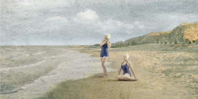
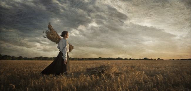
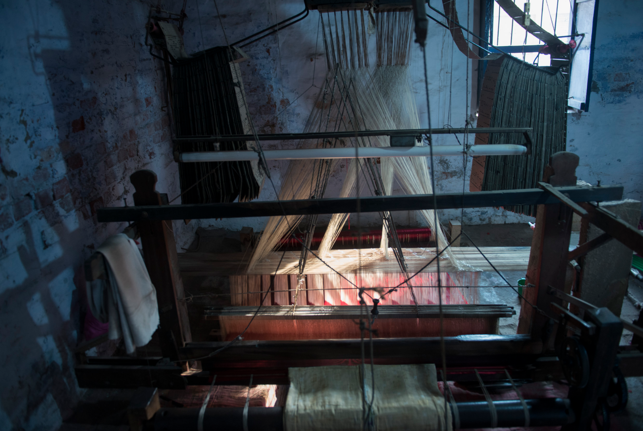
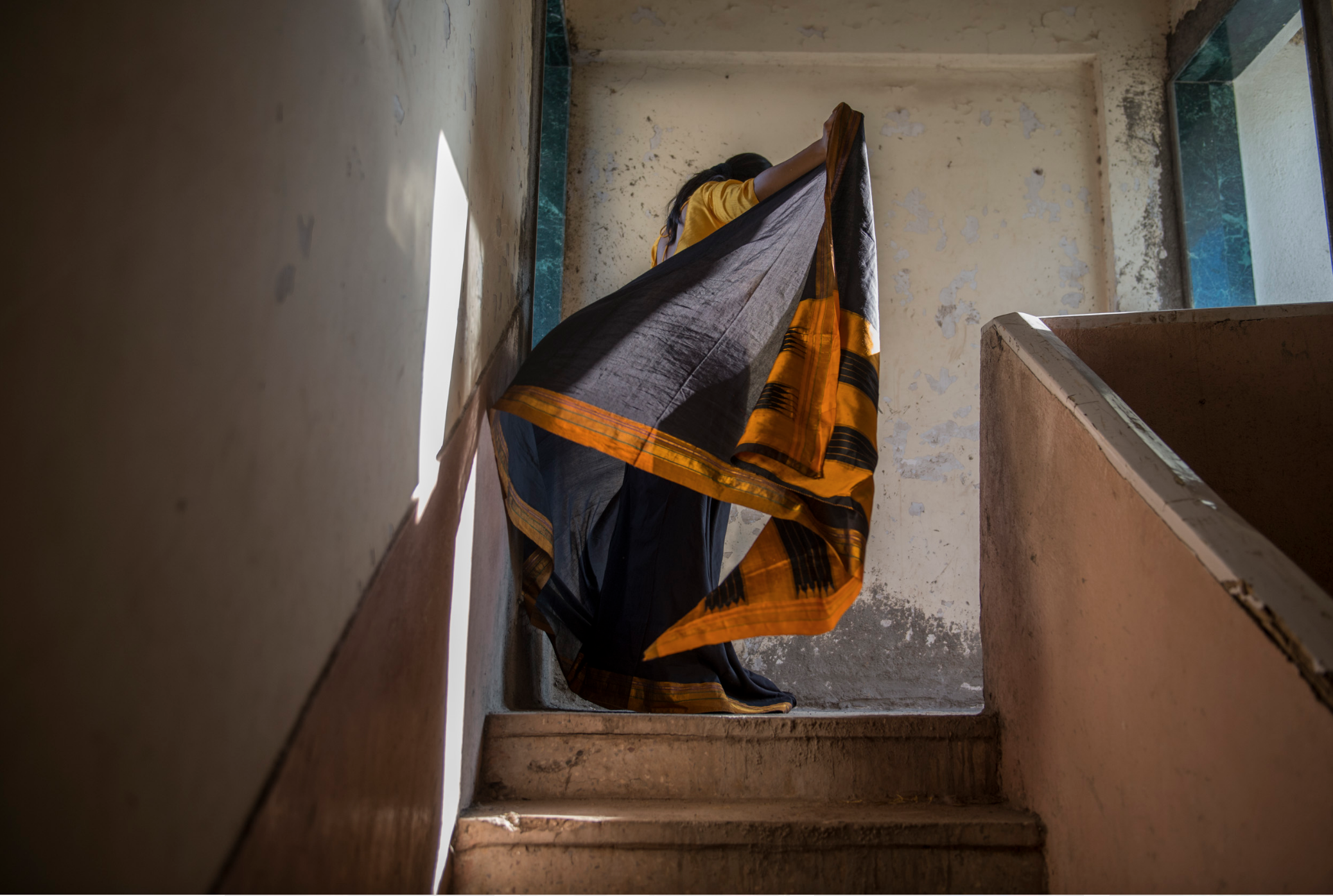
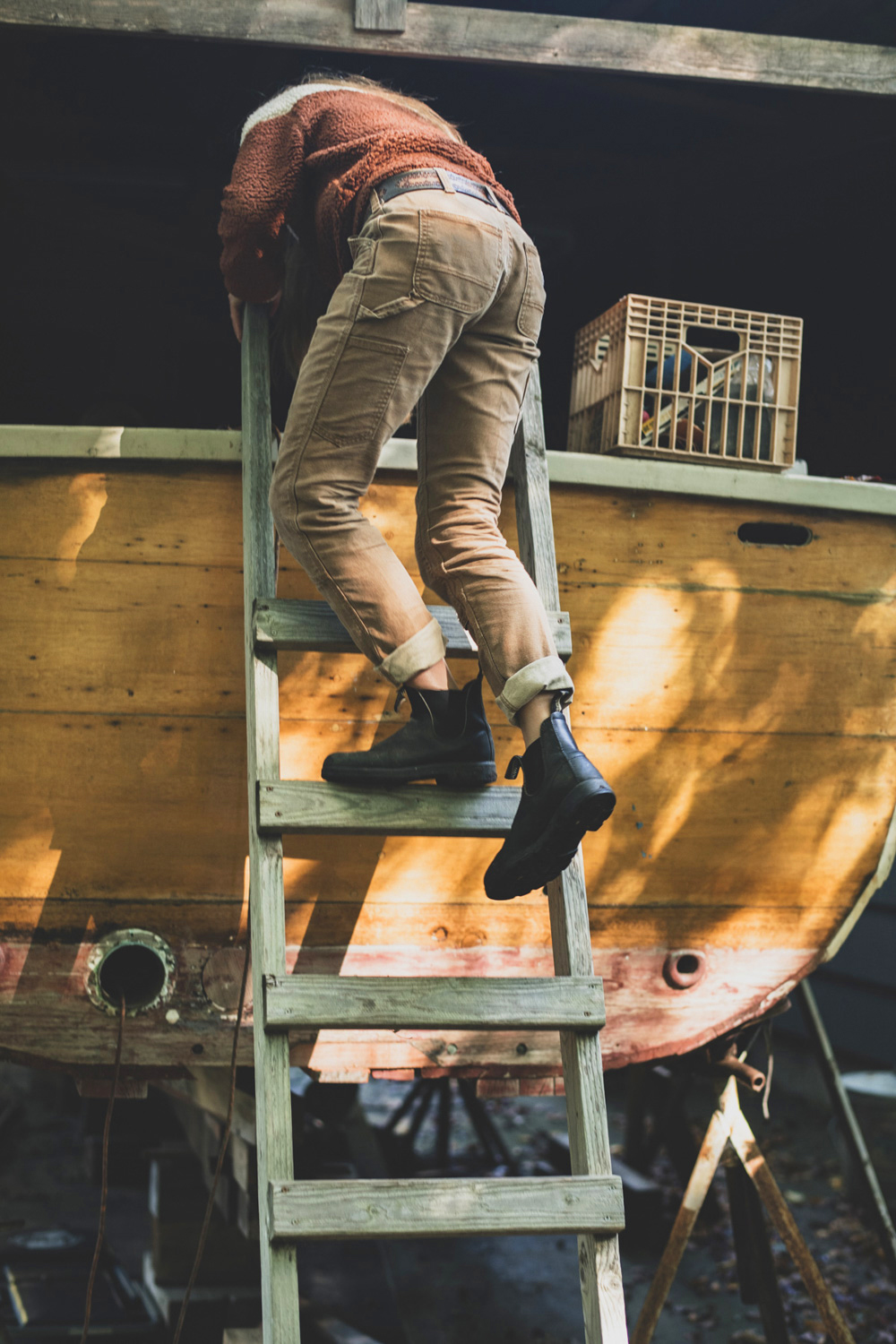
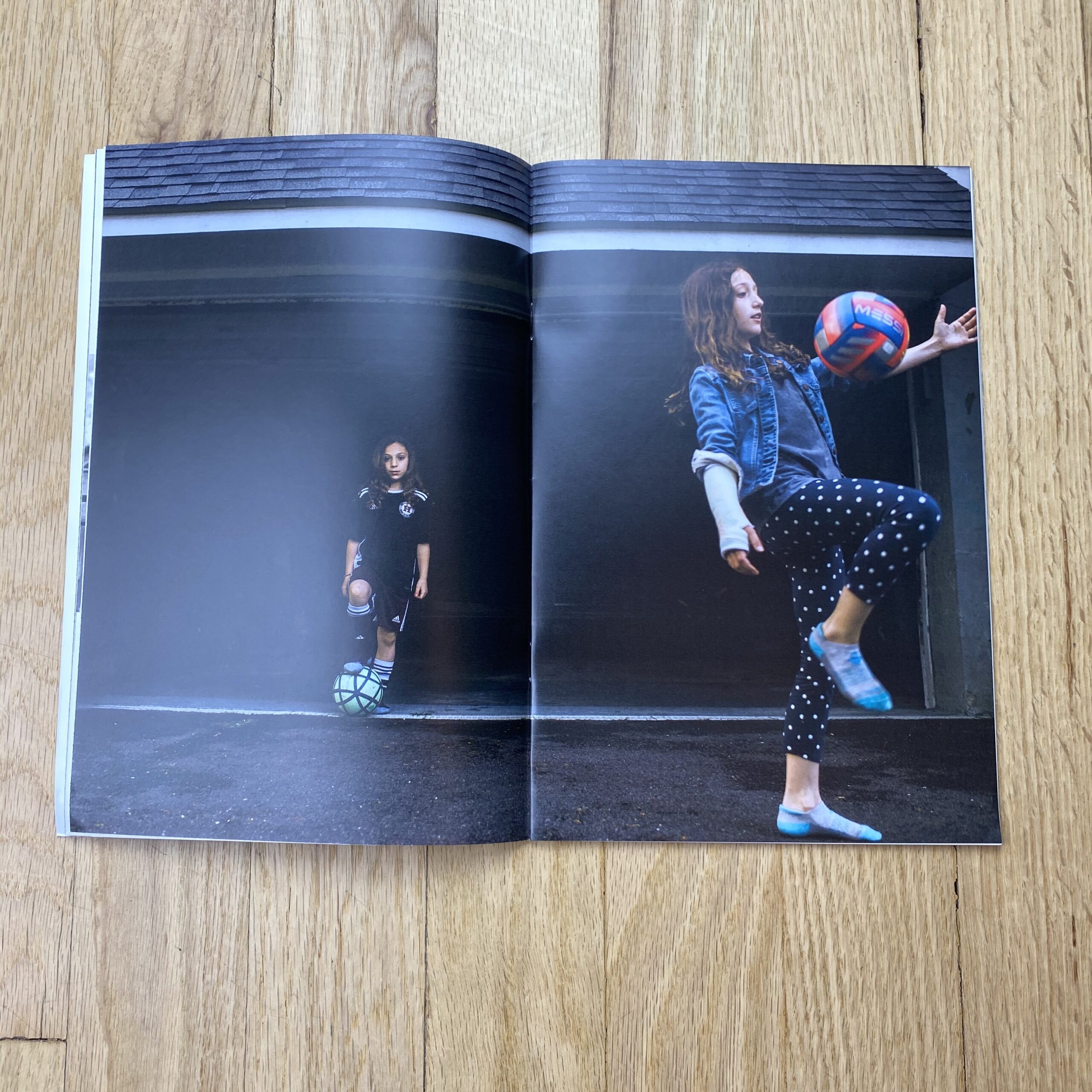
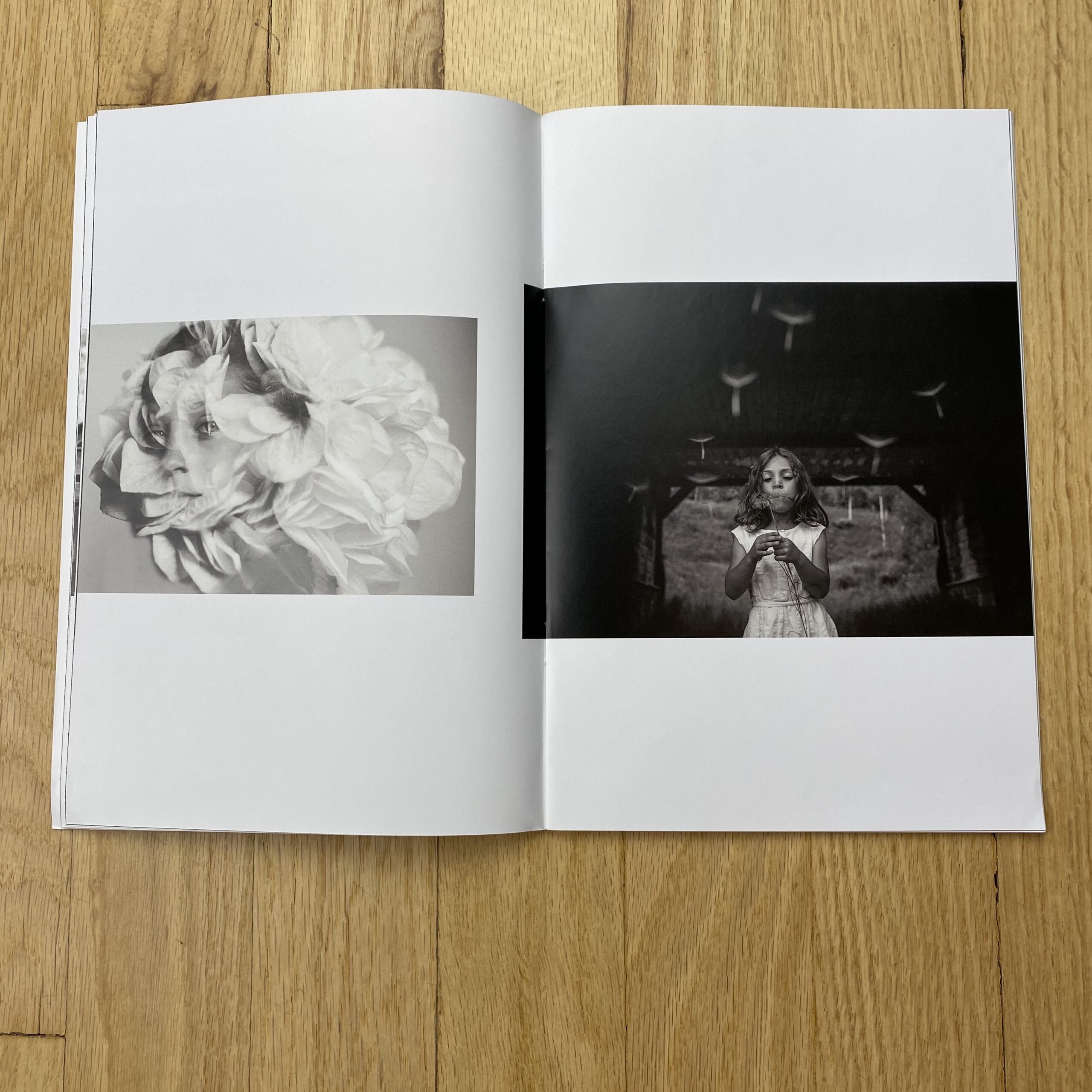
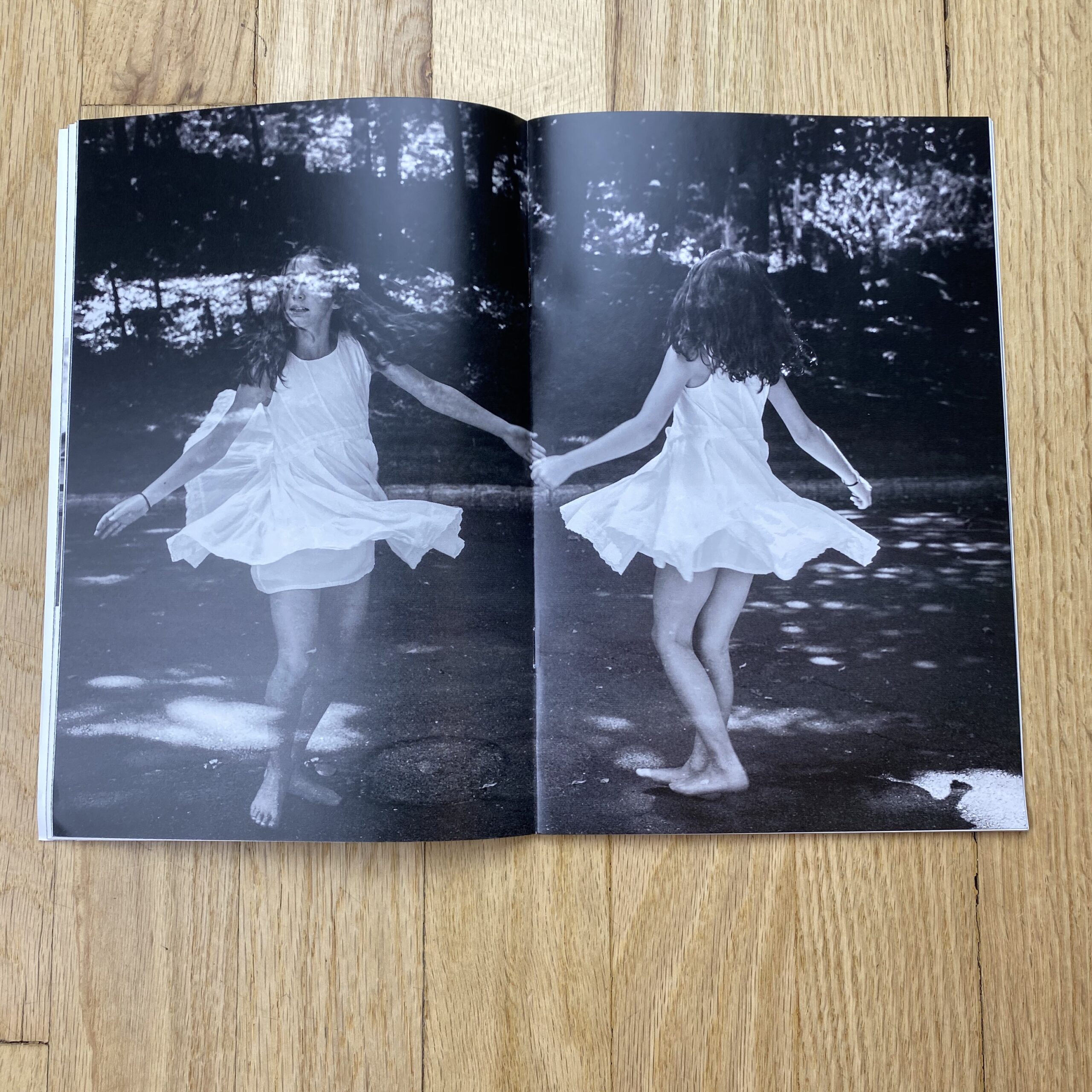
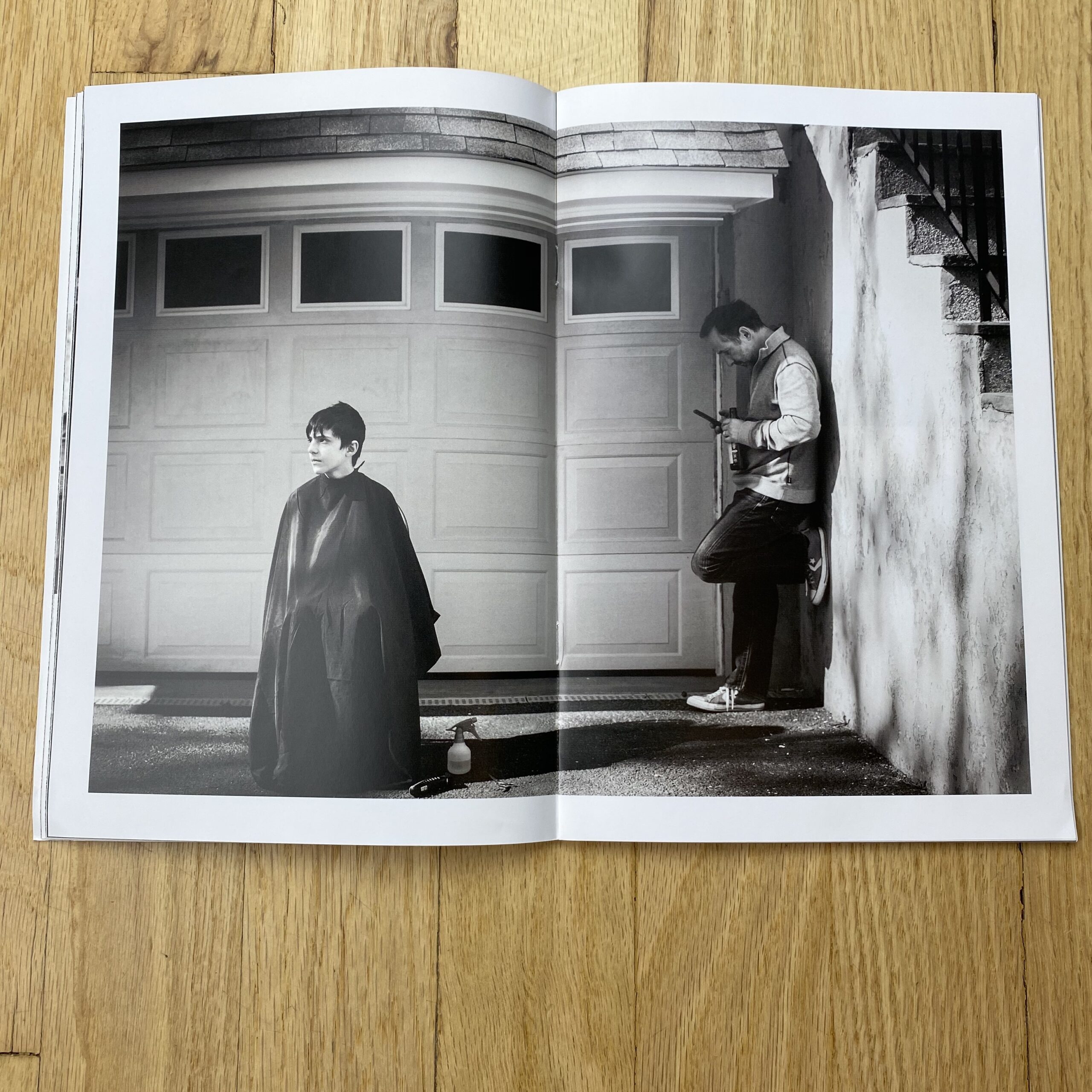
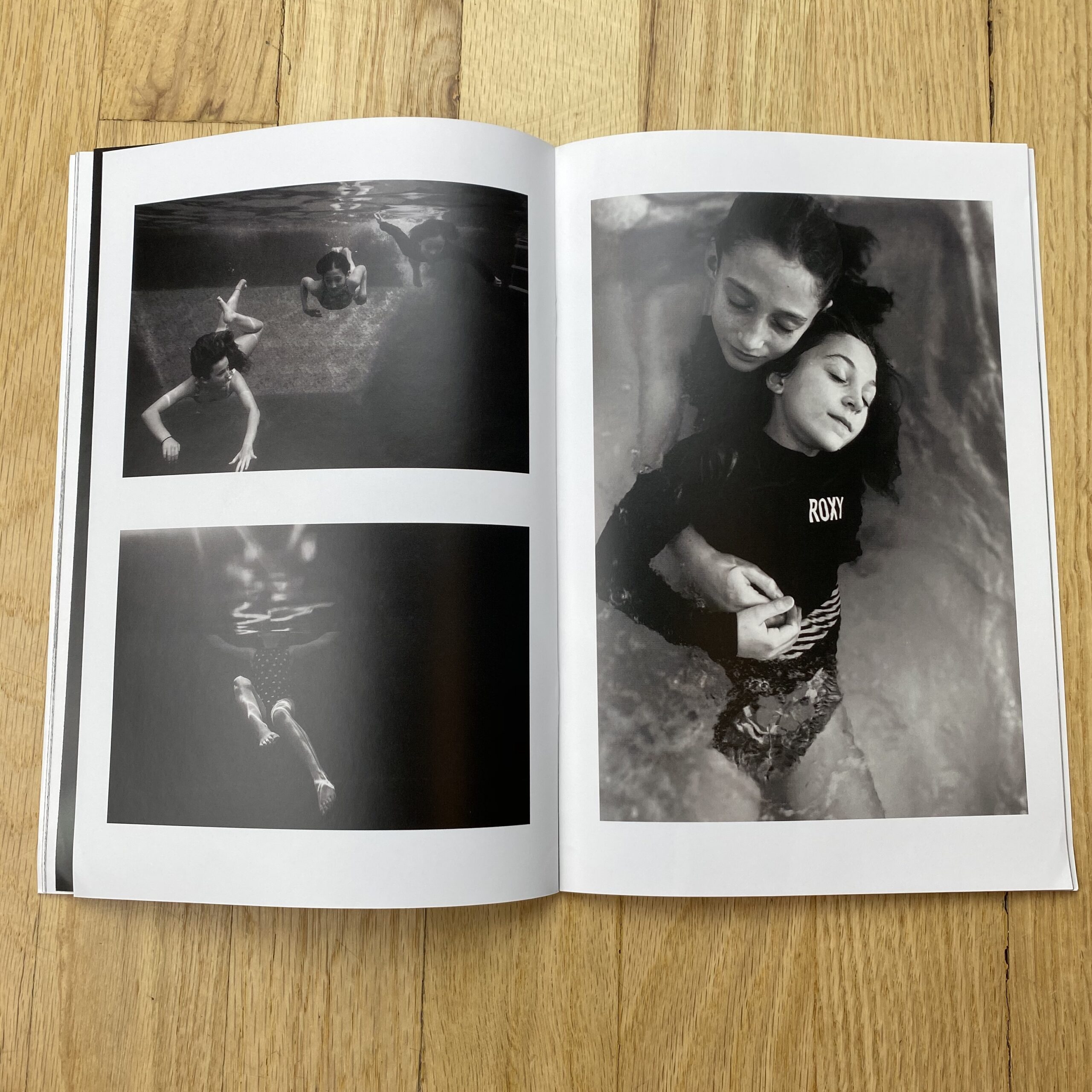
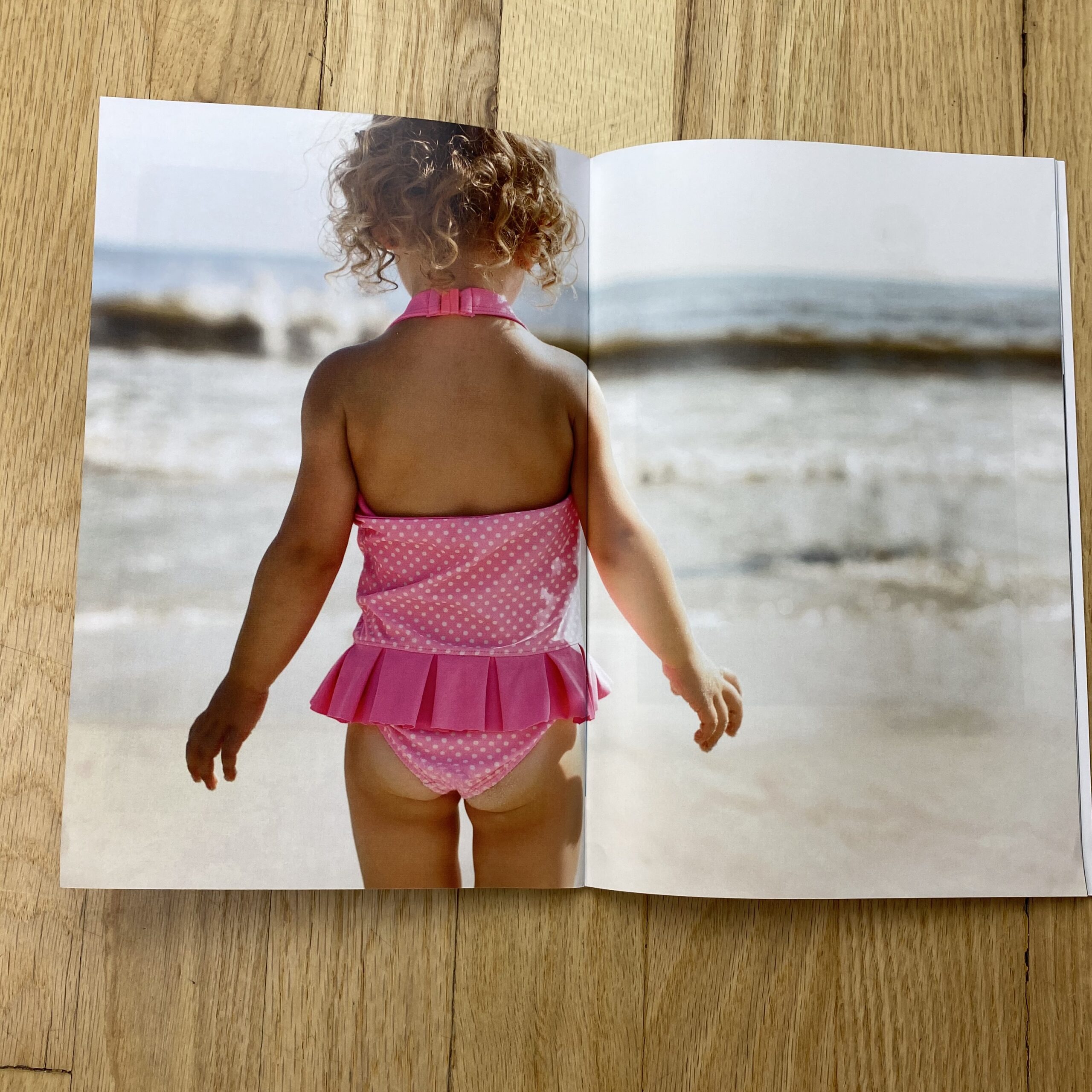
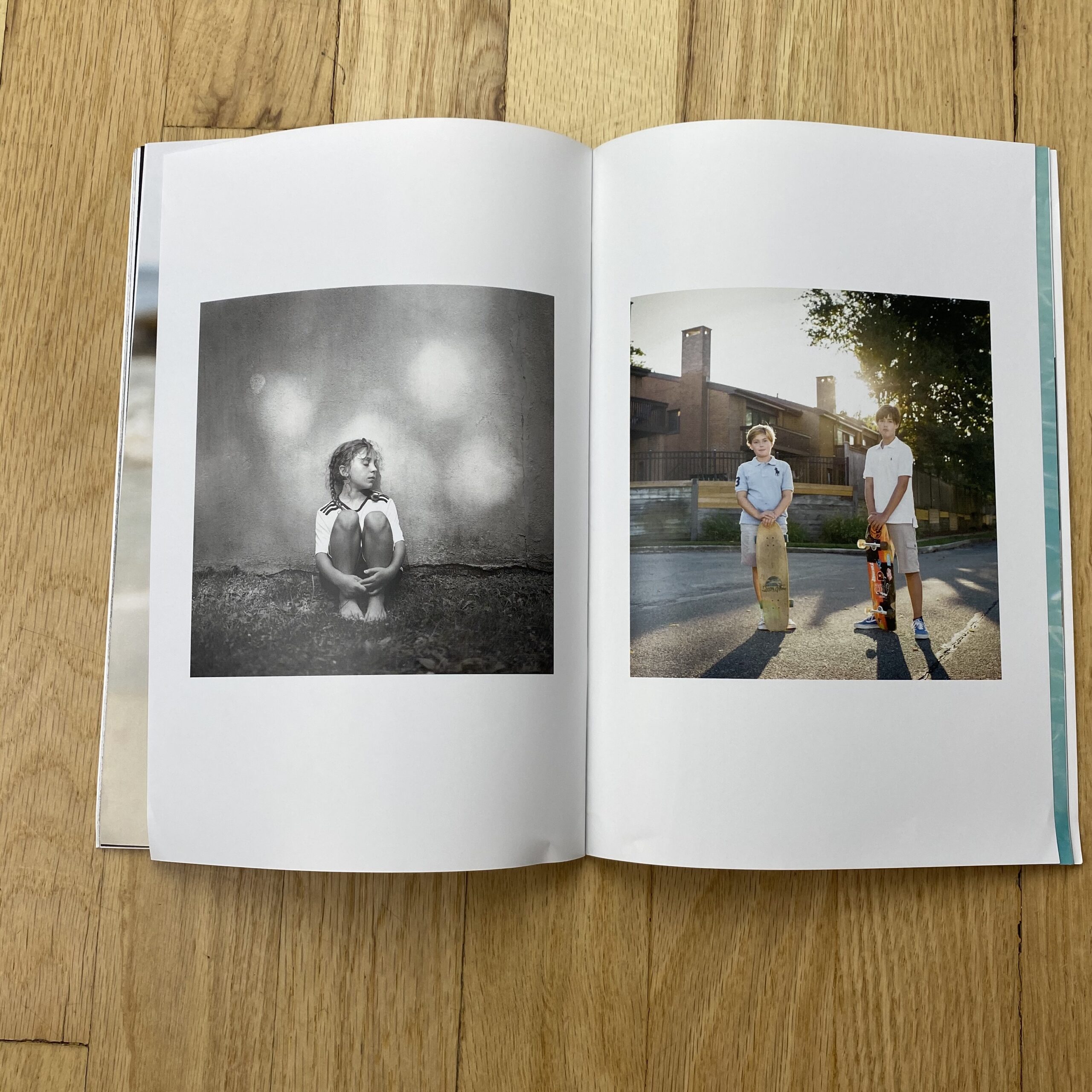
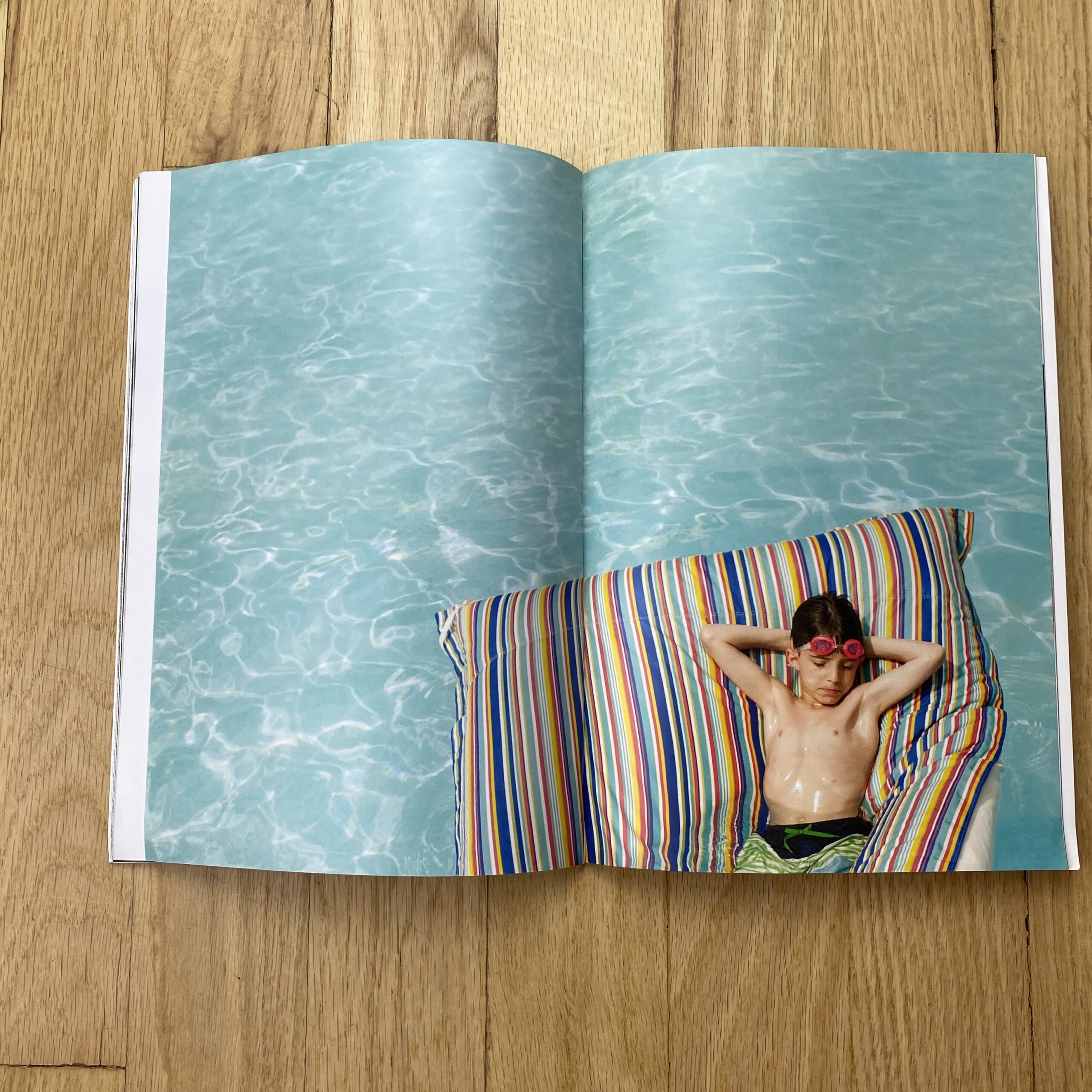
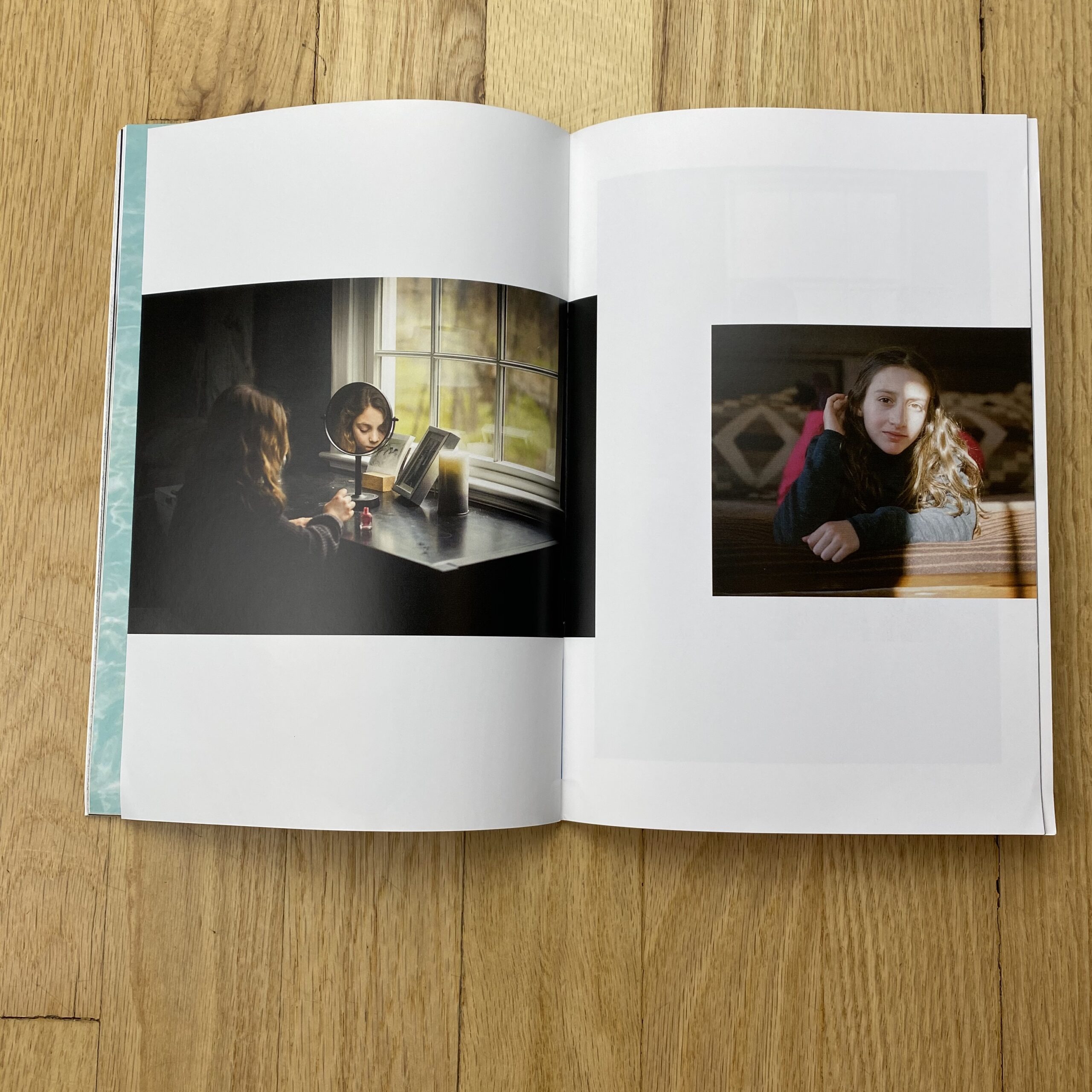
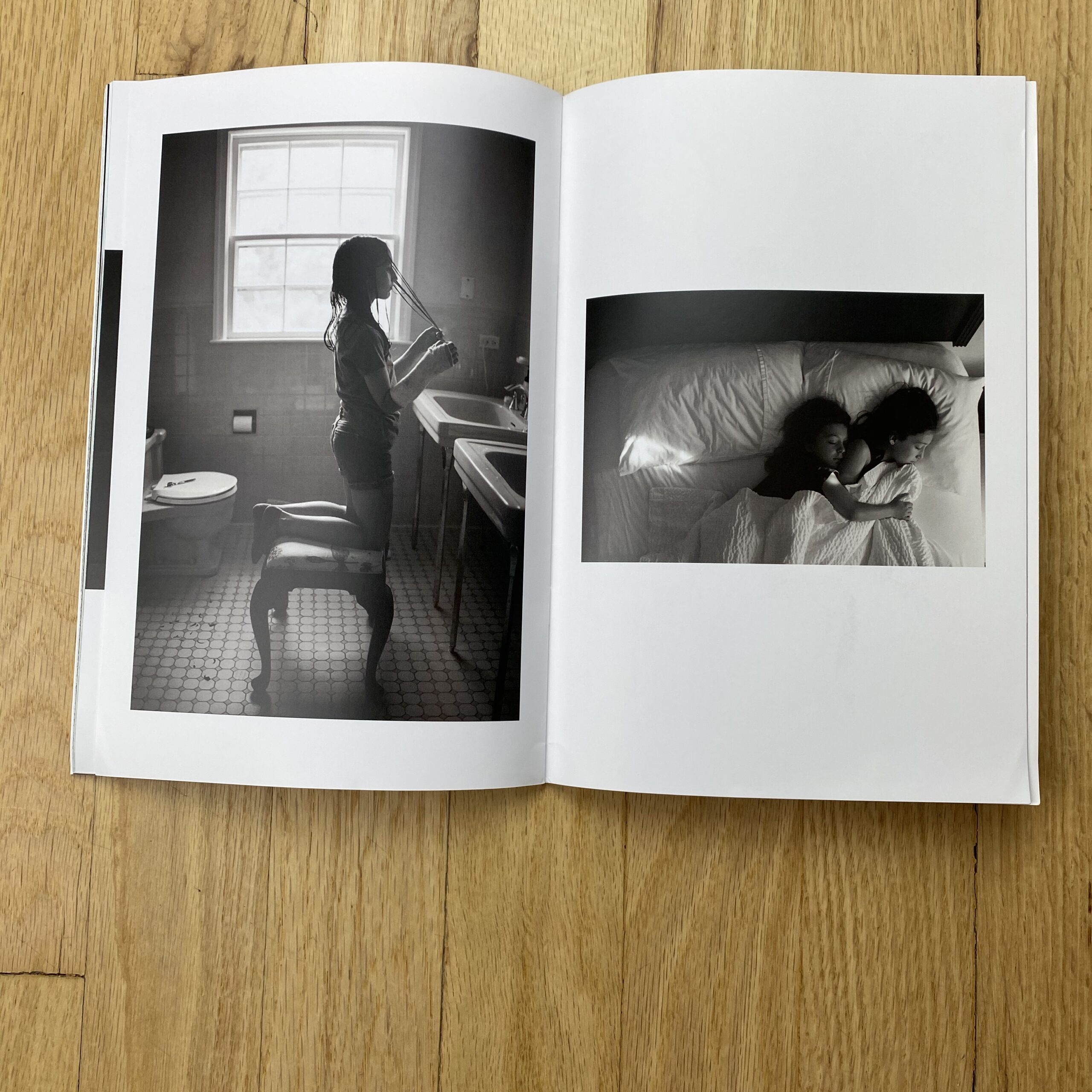
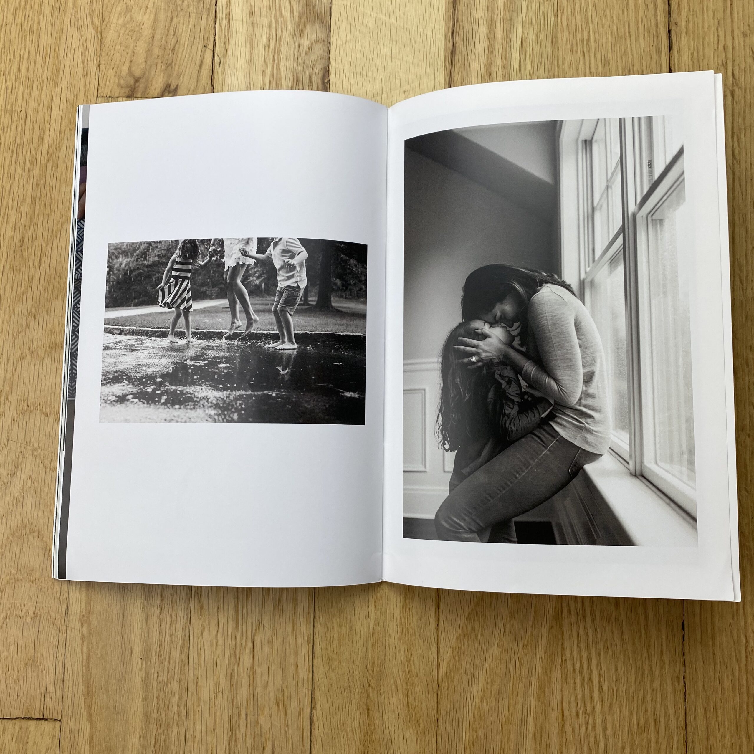
Shoot Concept: Lifestyle images of professional talent and still life shots of plated food.

Licensing: North American Advertising (excluding Out of Home) and Collateral use of 5 images for 1 year.

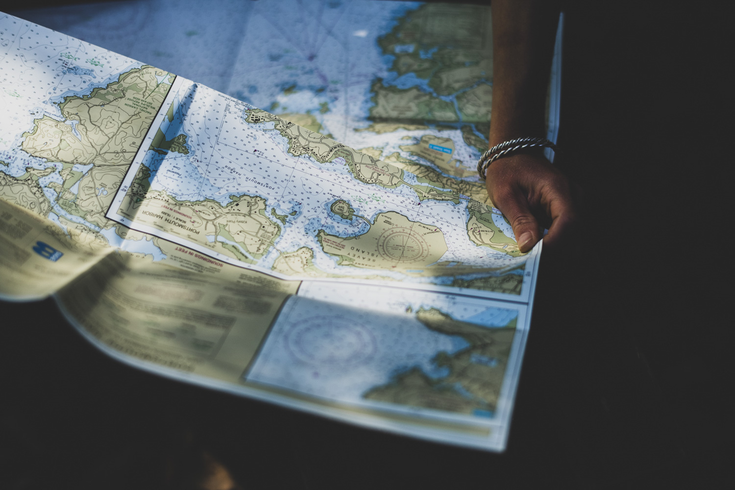
Location:  A residential property

Shoot Days: 2

Photographer: Portrait and lifestyle specialist

Agency: Mid-sized, based in the Southwest

Client: A well-known food company

Here is the estimate (click to enlarge):


Concept/Licensing:           

The agency provided a detailed spec sheet featuring two images of adults and children interacting and three images of plated food. Based on the layouts and my discussion with the production manager, it was apparent that the two lifestyle shots would be used in magazine ads and in-store marketing materials, while the three still life images would be used only for the website and in-store marketing materials. I also learned that, while they were requesting a licensing duration of one year, the images would likely be promoting seasonal products, and would therefore have a lifespan of just a few months.

I decided to price both lifestyle images at their full value (rather than discounting the second image) because they would be promoting two different types of products, and after weighing the factors, their full value was $7,500 each. The three supplemental still life images were much different than the lifestyle shots, but were quite similar when compared to each other. For this reason, I decided to price the first still life image at $5,000 (2/3 the price of a lifestyle image) and the other two at $3,750 each (1/2 the price of a lifestyle image).

After coming up with these fees, I checked a few other pricing resources to see what they recommended. Blinkbid priced one image between $7,000-$10,000 for one year use in print publications and collateral. Getty priced one image around $6,000 for North American advertising use in magazines and about $4,000 for point of sale use for one year. Combined, $10,000 would have been an appropriate starting point for the full value of a single image for a prominent client like this, but this didn’t take into account the short lifespan of the images. Corbis suggested $12,500 for one image for one year within their “Print Ad, Web, and Indoor Display” flexible use pack, while FotoQuote priced similar usage at $14,000. However, these fees included a bit more than the intended use I discussed with the agency.

Assistants: The photographer would be traveling for this shoot, and I anticipated that the he would bring his first assistant while hiring a local second assistant for the two shoot days. I included five days for the first assistant to account for two travel days, two shoot days and one prep day on location.

Digital Tech: The digital tech would help to manage the flow of file intake and display for client approval on set. I included $500 for the digital tech, and then added on $750 for their workstation for each shoot day.

Producer: A project like this required a producer to help wrangle and hire the crew, coordinate casting and location scouting, make travel and catering arrangements and work closely with the photographer and agency to compile a detailed schedule and production book. The producer would also travel to the shoot and be on set to manage the crew, schedule, and handle the invoicing process after the shoot.

Photographer Travel/Scout/Fitting Days: This took into account two days for the photographer to travel there and back, and a third day to scout the location and participate in a fitting day where the models would try on the clothing and the agency/client would make wardrobe decisions prior to the shoot.

Hair/Makeup Stylist: We’d be photographing four talent and capturing one lifestyle scenario per day. I anticipated that we’d have plenty of prep time for these shots each day, which would only require one hair/makeup stylist (as opposed to an additional hair/makeup stylist assistant) on each day.

Wardrobe Stylist and Wardrobe: I grouped the stylist and the assistant into a single line, and anticipated paying the stylist $800/day and their assistant $300/day. The four days accounted for the time it would take them to shop, attend the fitting day, be present at the shoot and return the clothing. The wardrobe costs were based on the need to have two final outfit choices for each of the four talent, and I estimated $200 per outfit. The wardrobe stylist would of course purchase many different options, but this budget accounted for the wardrobe that would be non-returnable.

Prop Stylist: During a call with the agency, they made it clear that the mix of still life and lifestyle images would call for a wide range of very specific seasonal props…and we’d need to find these items off-season. At $700/day for the stylist and $300/day for their assistant, I anticipated that they would need two days to shop/prep and a day to return props on top of the shoot days.

Props: In addition to the specific prop list that we were provided, we’d be shooting at a residential property, so I accounted for a few additional home/garden props to spruce up the interior and exterior. Also, the still life images would need a wide range of tabletop props such as plates, bowls and napkins, and $1,500/day would be appropriate after discussing our needs with a few prop stylists.

Food Stylist and Food/Supplies: We’d only be photographing food on one of the shoot days. I included a half-day for the stylist to shop for ingredients and a full day for them to cook and prepare for the shoot day. I typically don’t estimate half-days for crew members, but the ingredients needed were quite simple and I couldn’t justify the need for a stylist to spend an entire day shopping. However, the food that the stylist would need to bring to the shoot would in fact require a full day to prepare. In addition, many of the ingredients would be shipped to the food stylist from the client, and our food/supplies budget would therefore be minimal.

Location Scout and Location Fee: Based on the comps, layouts and discussions with the agency, I knew they would be very picky when choosing a location. Sometimes a location scout will charge a fee to “pull” from their files and deliver a gallery of locations they’ve already photographed. If needed, many scouts charge a fee of about $650 plus expenses to go out and scout new locations. Since I didn’t know which scout I was going to use yet, I included three days for a scout to find us the perfect residential property, and figured that one of those “days” might be dedicated to pay for their “file pull”.  Based on estimates from previous projects, I felt confident that $2,000/day would be appropriate for they kind of property we were looking for.

Casting Day: I planned on hiring a casting agent to help us find talent, and this covered their time, shooting space and booking of the talent.

Adult and Child Talent: We’d need two adults and two children on both shoot days. Typically I’d include backup children if they are young enough to potentially have a meltdown on set, but I didn’t’ feel that we’d have this issue with kids in the 8-10 age range. After speaking with a few casting and talent agencies in the city we’d be shooting in, I determined $2,000 per talent per day plus a 20% agency fee would be appropriate for the adults. For the children, I felt that $1,000 per talent per day plus 20% would attract a decent pool of options. In addition to the shoot days, we’d also need each talent to come to a fitting day before the shoot, and I felt that $1,000 would be an appropriate compensation for this.

Fit Day Location Fee: We would need a location for our fit day, and we could have approached this a few different ways. A photo studio would have worked, but it might have offered more than what we needed. Another idea was to pay for a conference room in a nearby hotel, or even rent a large room in a hotel at a convenient location. After making a few calls, I determined $800 would be more than enough to cover either a high-end spacious suite or a conference room.

Airfare, Lodging, Car Rental: I used Kayak.com to determine that it would be about $400 per person (including baggage fees) for the photographer, first assistant and producer to fly to/from the location, and that $200/night for 4 nights would afford decent hotel rooms for each person. I also used Kayak.com to find pricing for a minivan rental for the duration of the trip.

Production RV:  With a crew this large on location, an RV would allow the producer to keep as many “cooks out of the kitchen” as possible, while also providing a staging area, bathrooms, WIFI and an area for catering outside of the residential property. I confirmed with a local RV company that $1,500/day would afford us a nice vehicle including a driver, fuel, cleaning/dumping fees and mileage.

Catering: I anticipated $40 per person per day for light breakfast and lunch.

Equipment: After speaking with the photographer about his equipment needs, we determined that $900/day would be appropriate for the gear he was bringing and renting. This included a camera body and a few lenses (~$400), power packs and heads (~$300) plus miscellaneous modifiers, reflectors and grip equipment (~$200).

Image Processing for Editing: This covered the time, equipment and costs to handle the basic color correction, edit and upload of all of the images to an FTP for client review.

Retouching: The photographer and I determined that each of the 5 images could take up to 4 hours to retouch, and $150/hr would allow us to farm out the work to a retoucher if the photographer became unavailable.

Miles, Parking, FTP, Misc: This was to cover any additional minor miscellaneous expenses during the shoot days and while traveling.

Feedback: The agency told us that our numbers were in line, but that they’d be unable to issue the photographer an advance prior to the shoot, and they also wanted the talent to bill the photographer (rather than billing the agency directly). In addition, after reviewing our terms/conditions, they asked us to remove the clause detailing that if they don’t pay the photographer within 30 days of the final invoice, that they will be billed a $20.00/month handling fee and 1.5%/month interest.

This feedback raised some pretty serious red flags. This basically meant that the photographer would have to front approximately $38,000 out of pocket to cover the production expenses without a contractual guarantee for reimbursement or payment of the final balance.

Results: The photographer was awarded the project (and he accepted it despite the financial risk), and I produced the shoot.  The client did pay within 30 days.

In addition, the client decided to add on two product still life shots and one additional food shot to the project. While we were able to accommodate their requests within the estimated shooting time, we charged them an additional $5,000 for the first unique still life image, $2,500 for the second similar still life image, and $2,000 for the additional food image plus expenses for the stylists and retouching time. We originally quoted $2,500 for the fourth food image, but they asked if we could work with them and come down to $2,000, which we did. A few months after the shoot, we were already in discussions about extending the licensing duration.

Hindsight:

Our terms and conditions document states that “the expenses are estimated in good faith” and “actual expenses, which may be greater or less, will be invoiced”. We didn’t have any issues with overages (in fact, I was able to produce the shoot and come in about $11,000 under budget), but I did find out that our proposal was treated as a bid, rather than an estimate.

In a bid scenario, a photographer provides an invoice for the bottom line of their estimate, rather than providing receipts and billing for fees and actual expenses. If they come in under budget, the balance goes into their pocket. However, in many cases, if the expenses go over the estimated costs, the photographer is not granted an overage and they have to absorb the additional costs. This brings up the issue of including markups in estimates. We feel that billing for actual time and expenses is the most honest way of doing business (and most of the purchase orders we receive require that copies of receipts be provided with an invoice), but there are times when a client specifically asks for a bid, and in those cases we may estimate on the higher end just to cover potential overages.

You can find all of our Pricing & Negotiating articles here. If you’d like to hear more about our Pricing and Negotiating or other consulting services, please send us an email or give us a call at 1 610 260 0200!

The Daily Edit – Patagonia Fall Journal 2020: Drew Smith


Patagonia Fall Journal 2020

Photographer: Drew Smith

Why is it important for you to vote for wild places?
Voting for wild places is imperative to protect the earth itself, our home. Wild places are not sustainable without our protection and preservation. I want future generations to be able to enjoy and admire open spaces with clean air and water. We need to work together to ensure the health of our ecosystems and the most effective way to do so is through voting. We need to protect our right to be wild.

With the roll back of the roadless rule, what concerns you the most?
The fact that it will be legal for logging companies to build roads and destroy National Forest land is disheartening, especially since native tribes rely on this land to fish and hunt as they have been for generations. Dominick DellaSala, chief scientist with the Earth Island Institute’s Wild Heritage project said “While tropical rainforests are the lungs of the planet, the Tongass is the lungs of North America”. I find it troubling that not only the findings of scientists but also the public consensus and native tribe’s opinions about the Roadless Rule were not taken into consideration. If anything, we should be vastly expanding protected land, not taking it away.

Thoughts on the future of our planet?
What concerns me most is that if we continue to undo our work of protecting these vital ecosystems, climate change will continue more rapidly, and our quality of life will be affected. At 19 years old, I had the opportunity to spend time in the Tongass. I returned for three more summers and that time affected me immensely. I wouldn’t be who I am today without experiencing the forest in its pristine state. I want that for future generations.

Where was this cover shot?
This shot was while climbing Zeitgeist IV+ M7- WI5R on the northwest face of Mount Ball in Banff National Park, Canada.

You’re always multitasking: enjoy the moment, take the image or focus on the climb; does that ever get hard?
For the most part, I find so much joy in capturing moments throughout the day and at this point, photography has become part of the climbing. Sometimes when it’s cold or when I’m exhausted it’s really hard to get the camera out, but I force myself to because that’s when you get the best shots. I feel fortunate to have these amazing experiences and also the images to reminisce on and relive those days.

What made you stop and capture this moment?
I always climb with a small camera attached to my harness or in a backpack, it’s just become a habit while out in the mountains. After finishing a pitch and at the belay, the first thing I do is take my camera out not knowing when I’ll see a good shot. Michelle Pratt and I were just getting ready to follow Quentin Roberts up an ice pitch he had just climbed, when spindrift from above started pounding us. I huddled against the rock and looked down, taking a few shots before we cast off.

How many days were you out?
This was just a long day in the mountains which is the norm while climbing in the Rockies. We awoke in Canmore around 3 am, drove an hour, then started a freezing 3-hour hike arriving at the base of the climb early morning. We bailed off of the climb not far from the summit, knowing it would be getting dark soon. I’m not sure how long the day was but we returned to the car safely with smiles, well after dark.

Climb partners: Michelle Pratt and Quentin Roberts who both live in Canmore, Canada.


Featured Promo – Kara Brodgesell

Kara Brodgesell

Who printed it?
Newspaper Club https://www.newspaperclub.com/. I decided on them after diving into the archive of newspaper promo information on your website and was very happy with the results. I especially appreciated the informative samples they sent over before I submitted my order.

Who designed it?
My husband Noah, who works as a public programming director, but his InDesign skills are far superior to mine. We had a number of discussions about what I was hoping to achieve and which businesses should be featured, and then he helped me select the final images and he crafted the layout. I’d wanted to do a promo of this project for a few years and always stalled once it came to deciding how to format it, so his participation was invaluable.

Tell me about the images?
This was the classic personal project in that I pursued it all in my free time because I wanted to be hired to create photographs like this. I also loved having the chance to shoot such a wide variety of types of images. I lived in the Dogpatch neighborhood of San Francisco when I shot it, which has a unique patchwork of small businesses and manufacturing. It felt like I was surrounded by people making things and spaces and I wanted to celebrate that. It now also feels like a memorial for businesses that once were, as many have closed or moved out of the area.

How many did you make?
100

How many times a year do you send out promos?
This was my first one. I’ve been fortunate to be freelancing in the Bay Area for 9 years and I set a bunch of goals in early 2020 about how I wanted to grow my businesses and find new clients – all of my work thus far has been through references. A significant printed promo was a big part of that plan. The shipment arrived in early March and I was going to send them out by the end of the month, and continue with two more over the year. Instead, we went into lockdown days later, everyone is working from home indefinitely, and the box of promos is sitting in the corner of my office. It’s a bit heartbreaking.

Do you think printed promos are effective for marketing your work?
I’ll let you know! I’ve listened to so many panels, read interviews, and talked to other photographers about how to promote your work and I feel like, in the end, it comes down to: do it all, as much as you can. Social media, emails, printed promos… whatever may keep you in people’s minds. I certainly value printed pieces. I save promos and magazine/newspaper features that I respond to. And I thought that this body of work lent itself better to a newspaper-like format with many spreads, rather than an email or post with just a few small images.

Why did you choose a personal project for a promo?
My favorite way to photograph is to take a documentary approach with minimal equipment, in a place I may never get access to otherwise. This project afforded me that so many times, and it was a great exercise in finding shots quickly in new environments – there were no scout days or pre-production meetings. I’m also deeply grateful to the number of artists and business owners who let me wander around their spaces and ask a lot of questions. It’s one of the many things I’ve missed during this pandemic, not being able to explore and be inspired in this way.