
Tracy Barbutes
Tracy: This was my first intimate experience with wildfire, as a photojournalist and as someone directly impacted by the fire. Our neighborhood was asked to evacuate, but I returned home each night to a smoky home, where I watched from my kitchen window as flames encroached into our community. I observed national and international media materialize into and out of our rural, gateway community, bringing with them certain ideas and prejudices, many of whom had almost no experience in a wildfire landscape. I witnessed fear and uncertainty in the region, especially in the early stages, which brought about a lot of mis- and dis-information. I listened to many Monday morning quarterbacks. With each new large fire, I cringe when I see similar behaviors. Here’s what I learned to be true – the firefighting personnel (firefighters, dozer drivers, sawyers, air attack, water tenders, incident commanders, etc.) – all share the common goal of wanting to protect people and property. All of this informs the work I generate with each new fire. At the time, the fire was the third largest in the state: it burned 400+ square miles. Given what the state has experienced since then, it now seems almost quaint.
How did the Public Information Officers impact your understanding of how to safely document fires?
I owe the Rim Fire PIOs a world of gratitude. I spent many days on the fire line with them, often 1-1, and they gave me the tools to walk confidently, knowledgeably into a wildfire. They also taught me about chain of command, and most importantly, they encouraged me to take the US Forest Service Basic 32 (it’s now called Basic 40). The following spring, I took the course, training with folks who went on to become firefighters. The course gave me an understanding of how fire burns in different conditions, as well as what it’s like to be on the ground as a firefighter. All of it, the PIOs, the courses – informed the work I create and how I create.


The Art of the Personal Project: Janelle Jones
The Art of the Personal Project is a crucial element to let potential buyers see how you think creatively on your own. I am drawn to personal projects that have an interesting vision or that show something I have never seen before. In this thread, I’ll include a link to each personal project with the artist statement so you can see more of the project. Please note: This thread is not affiliated with any company; I’m just featuring projects that I find. Please DO NOT send me your work. I do not take submissions.
Today’s featured artist: Janelle Jones
This personal project grew out of a desire to inject energy into my work, creatively and visually, and to explore the human form. I’ve focused on still life for most of my career and part of my interest in that is due to how careful and considered still life photography can be. It took me a long time to learn the technical skills of still life photography, but a longer time to figure out how a “Janelle Jones” still life photo should look, and once I did, I didn’t want to get stuck there. I wanted to push myself to be less cautious and to figure out how I could photograph new, less predictable subjects while keeping my own distinct visual sensibility.
I had also been wanting to photograph my sister, Lindsey Jones, a talented modern dancer who also lives in New York City. Watching a professional dancer like Lindsey at work, particularly in rehearsal or before the movement is polished and perfect, can be a truly revelatory moment about beauty and caliber of the human body. Dancers practice to be able to control their bodies’ most minute muscle movements. Lindsey’s movement is particularly impactful because of her long limbs and acute awareness of shape and space.
She’s also very energetic. So a collaboration between us seemed like the perfect way to inject energy into my work, and challenge myself on how to light and represent the human body and movement.
Lindsey and I also share a visual sensibility, and we have both long loved the work of Norman McLaren, a Scottish Canadian animator whose short animations are bold, colorful, and often hypnotically repetitive. McLaren’s Canon (1964) and Pas de Deux (1968) are both studies in motion and play on manipulation of time and space. Those two animation pieces inspired the decision to use in-camera multiple exposure and motion blur to play with how we translated dance, a medium dependent on time and space, into a single-frame photograph. Lindsey’s clothing in the photographs was also influenced by the eye-popping colors of McLaren’s works.
This project was a true experiment and collaboration between photographer and subject. It’s an exploration I hope to continue finding fresh ways to challenge myself, collaborating with other artists, and bringing new ideas into my work while staying rooted in the precision and intentionality that have always defined my photography.


To see more of this project, click here
APE contributor Suzanne Sease currently works as a consultant for photographers and illustrators around the world. She has been involved in the photography and illustration advertising and in-house corporate industry for decades. After establishing the art-buying department at The Martin Agency, then working for Kaplan-Thaler, Capital One, Best Buy and numerous smaller agencies and companies, she decided to be a consultant in 1999. Follow her on Instagram
Pricing & Negotiating: Business Owner Portraits For A Beverage Brand
By Craig Oppenheimer, Wonderful Machine
Each month, we explain a recent cost estimate, contract, or purchase order in the form of a Pricing & Negotiating article. By redacting the names of the photographer and the client, we can share useful information that would otherwise be confidential. You can read more about our Pricing & Negotiating services on the Consulting Services page of our website.
Concept: Portraits of business owners, and images of them interacting with products at a manufacturing facility
Licensing: Unlimited use of up to 30 images for five years from first use
Photographer: Portraiture specialist
Client: Beverage brand
Summary
I recently helped a portrait photographer create an estimate and negotiate a project for a beverage brand. The client was launching a new product within a larger portfolio of beverage companies and wanted to capture portraits of business owners interacting with their products at a manufacturing facility. The images would help tell the story of the product’s origins and the people behind it.
The shoot took place over a single day and focused on five main setups with variations on the same themes. The photographer and crew worked to capture 30 final images. Although the client initially requested unlimited use across all media, based on the creative brief and our discussions, the images were primarily intended for use on their website and social media. While they were not willing to restrict media use, we did convince them to limit the duration of use to five years.
Fees
Traditionally, photographers in this market have undervalued usage, and local clients, such as this one, were accustomed to more conservative rates compared to other major markets. I priced each of the five main setups at $1,500, totaling $7,500, and added a creative fee of $2,500, bringing the total fee to $10,000.
Crew
We kept the crew lean, including a first assistant for both the scout and shoot days and a Digitech for the shoot day, all at rates appropriate for this market.
Styling
After a call with the agency, they asked that we include light prop styling in our bid, with a dictated prop budget of $750. We factored in a prop stylist for both prep and return time, in addition to the shoot day, and detailed the prop budget as instructed, while noting that the final amount would depend on the creative direction. We also added a hair and makeup stylist and noted in the “client provisions” section at the top of the estimate that the client would be handling their own wardrobe.
Equipment
We allocated $1,000 for the rental of the photographer’s own gear as part of the production.
Misc.
We allocated $750 to cover mileage, parking, meals, and any other unforeseen expenses on the shoot day.
Post-Production
We allocated a few hundred dollars for the photographer’s time to create a web gallery for the client and set a rate of $100 per image for retouching, allowing up to one hour per image for each of the 30 images they would select.
Feedback
The estimate was received well, but they asked if we’d be willing to reconsider the time limitation and grant perpetual usage. I suggested that we at least double the photographer’s fee, but we ultimately included an extra $5,000, bringing the total creative/licensing fee to $15,000. While I would have preferred a higher fee, I think the shelf life of these images would likely have been around three years.
Results
The photographer was awarded the project.
Follow our Consultants @wonderful_at_work.
The Art of the Personal Project: Patrick Fraser
The Art of the Personal Project is a crucial element to let potential buyers see how you think creatively on your own. I am drawn to personal projects that have an interesting vision or that show something I have never seen before. In this thread, I’ll include a link to each personal project with the artist statement so you can see more of the project. Please note: This thread is not affiliated with any company; I’m just featuring projects that I find. Please DO NOT send me your work. I do not take submissions.
Today’s featured artist: Patrick Fraser
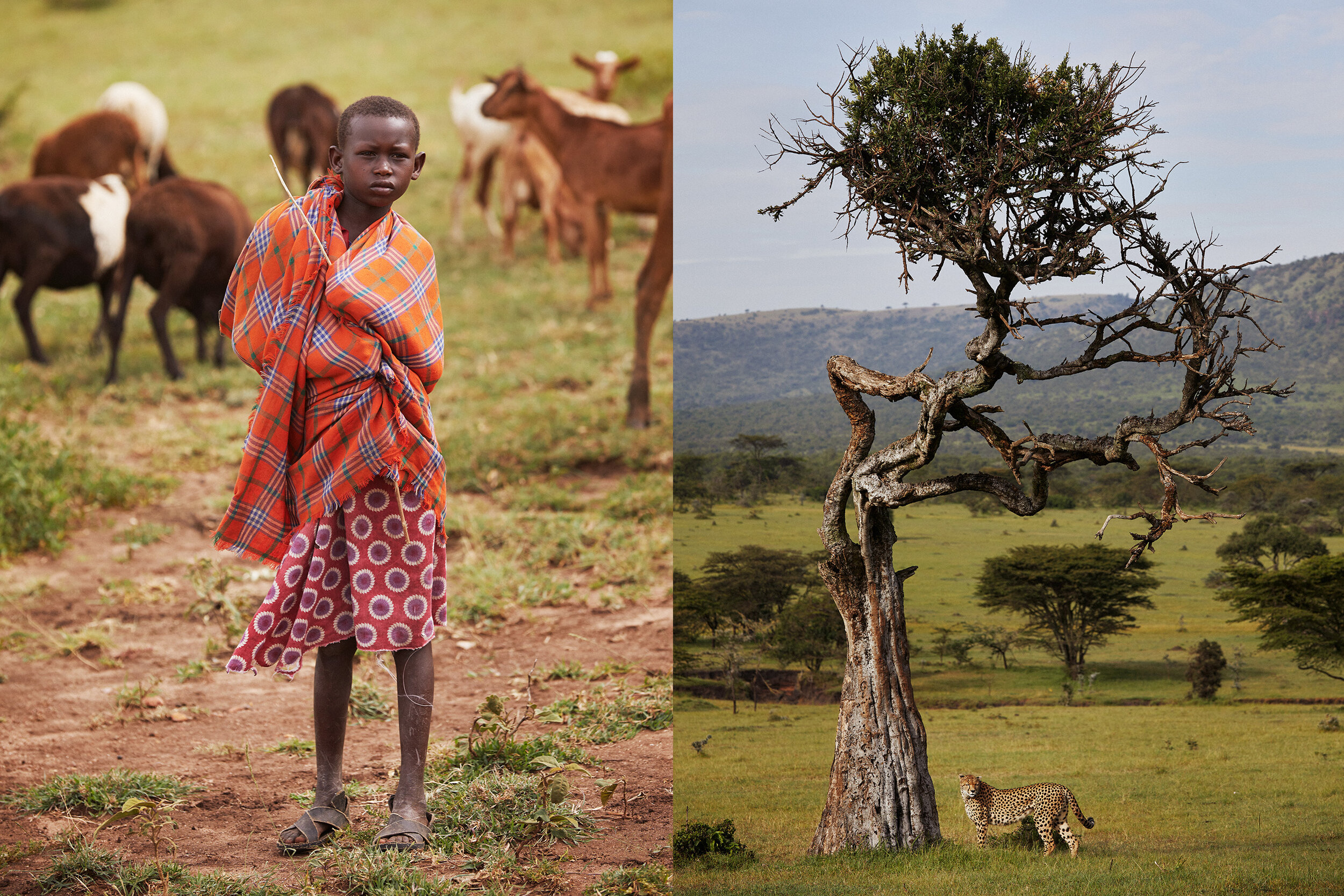
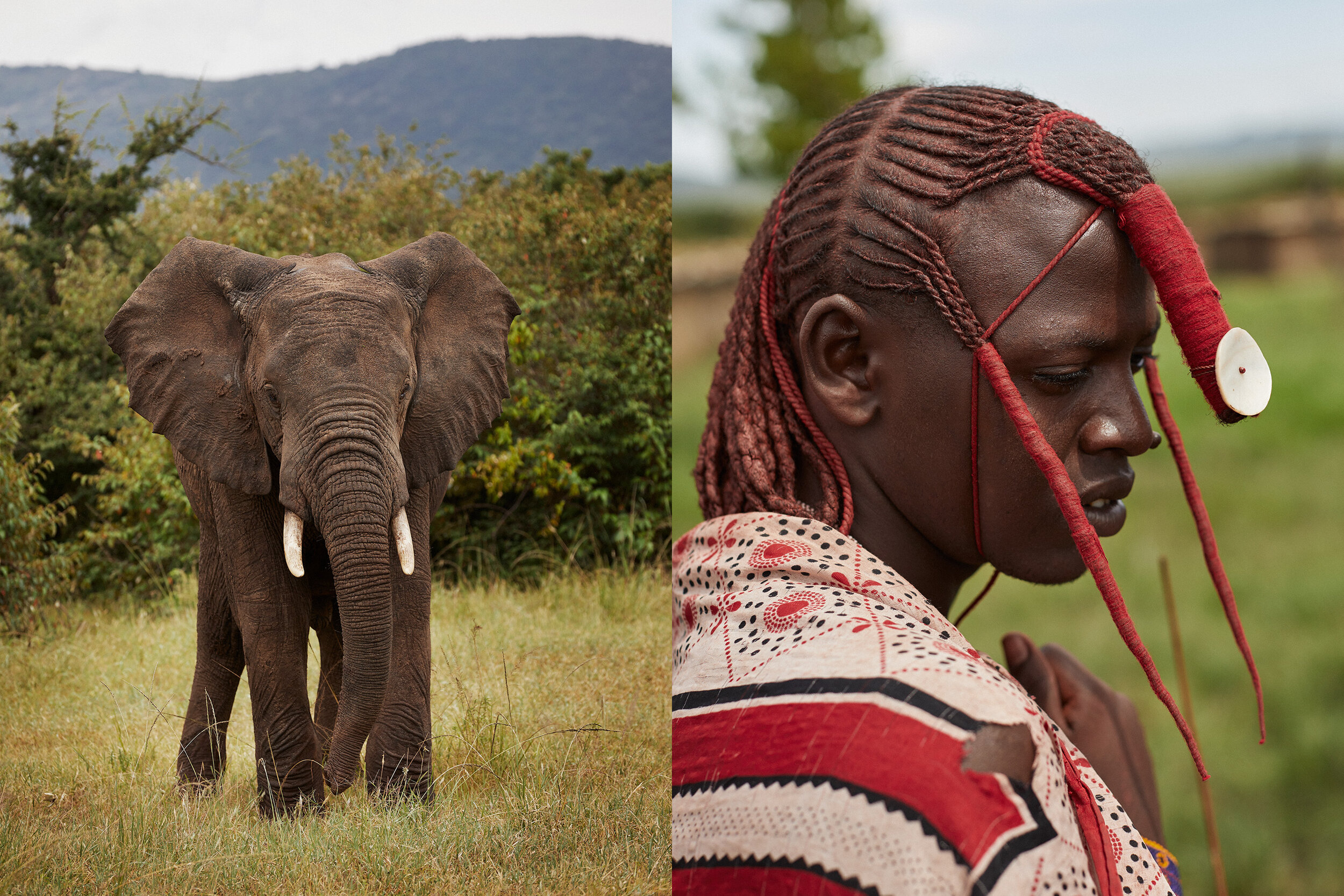
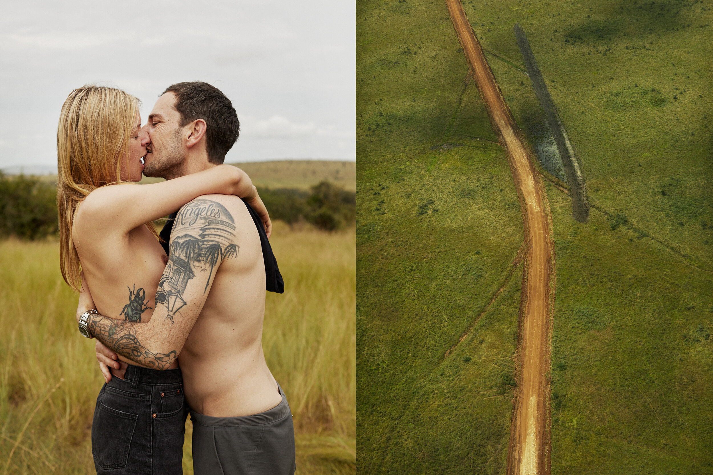
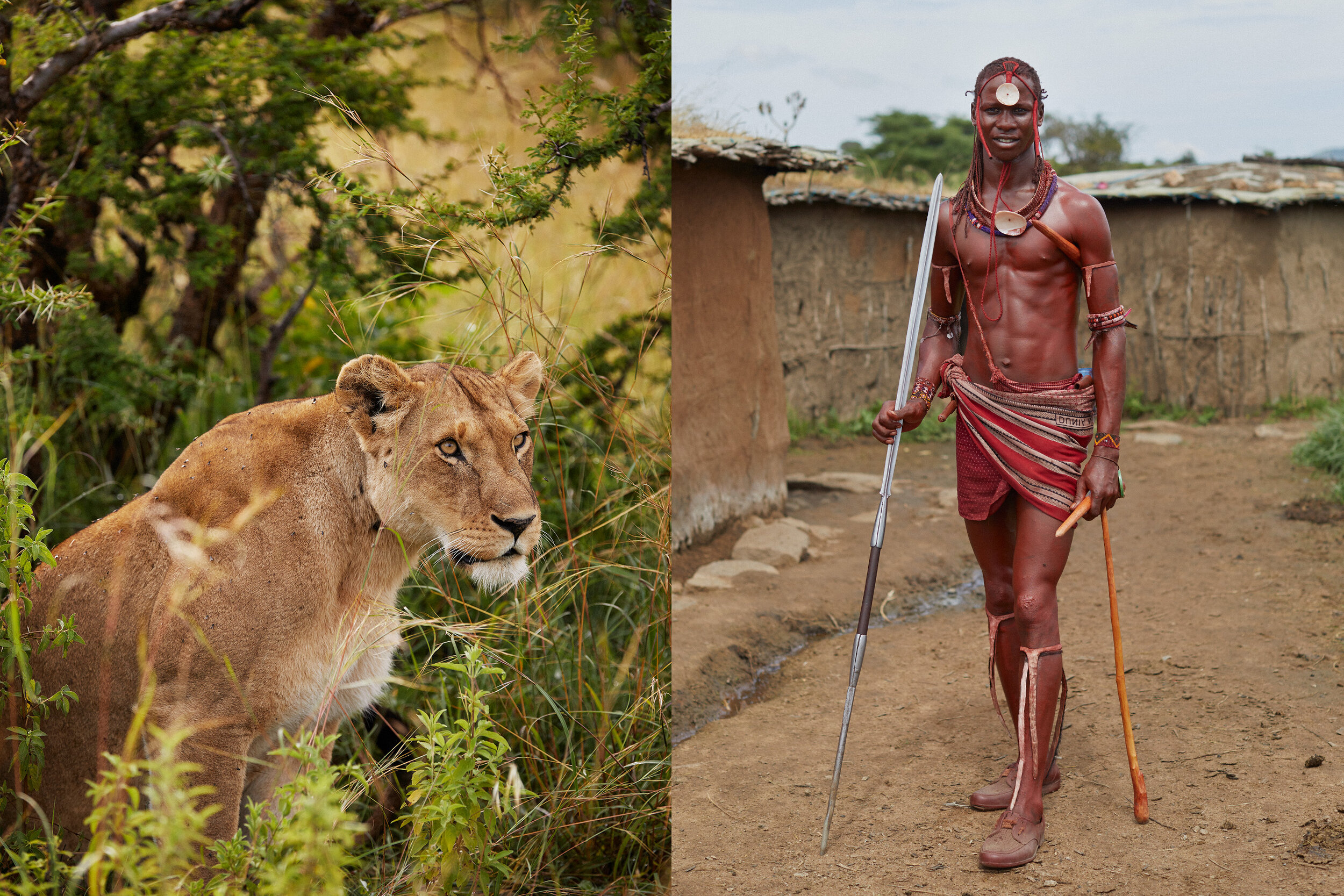
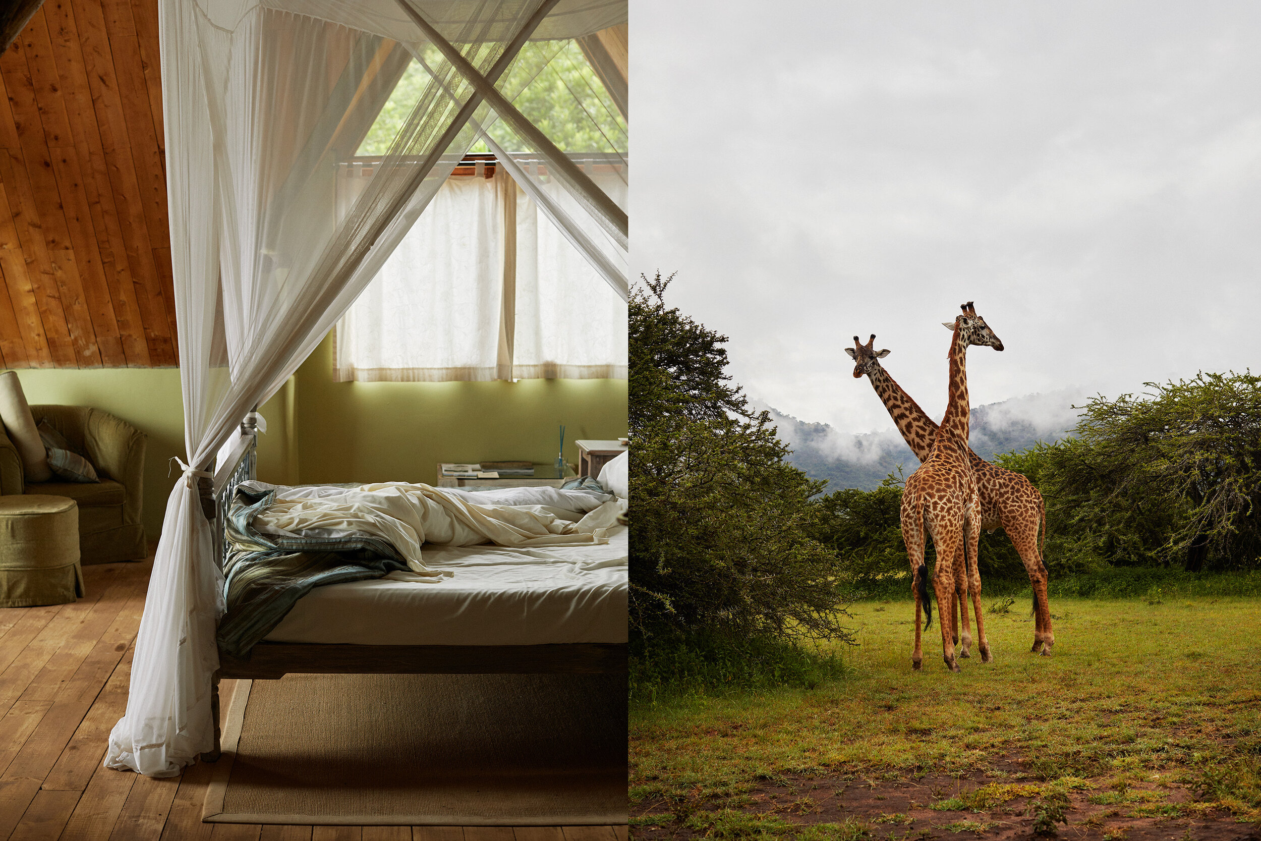
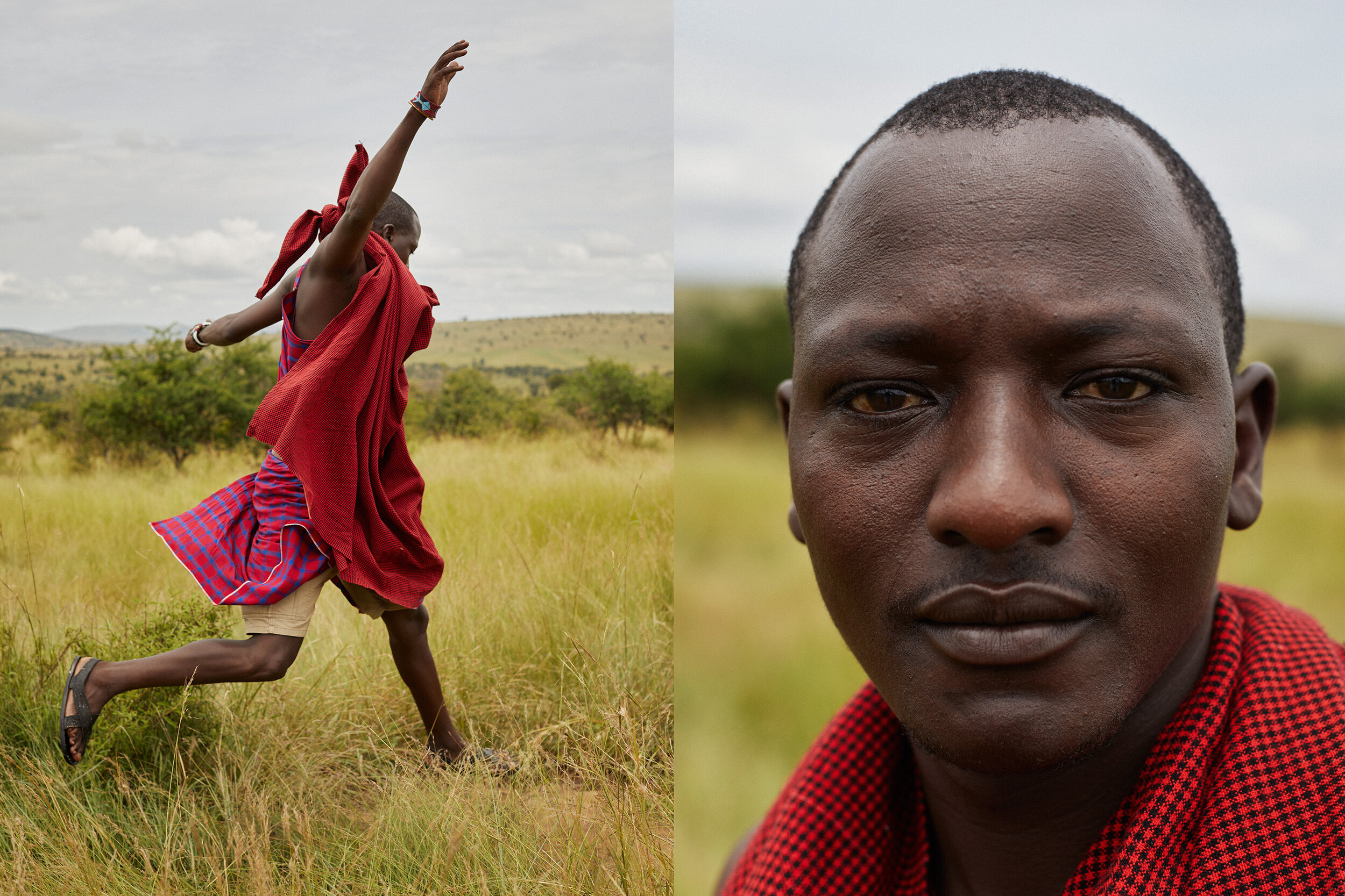
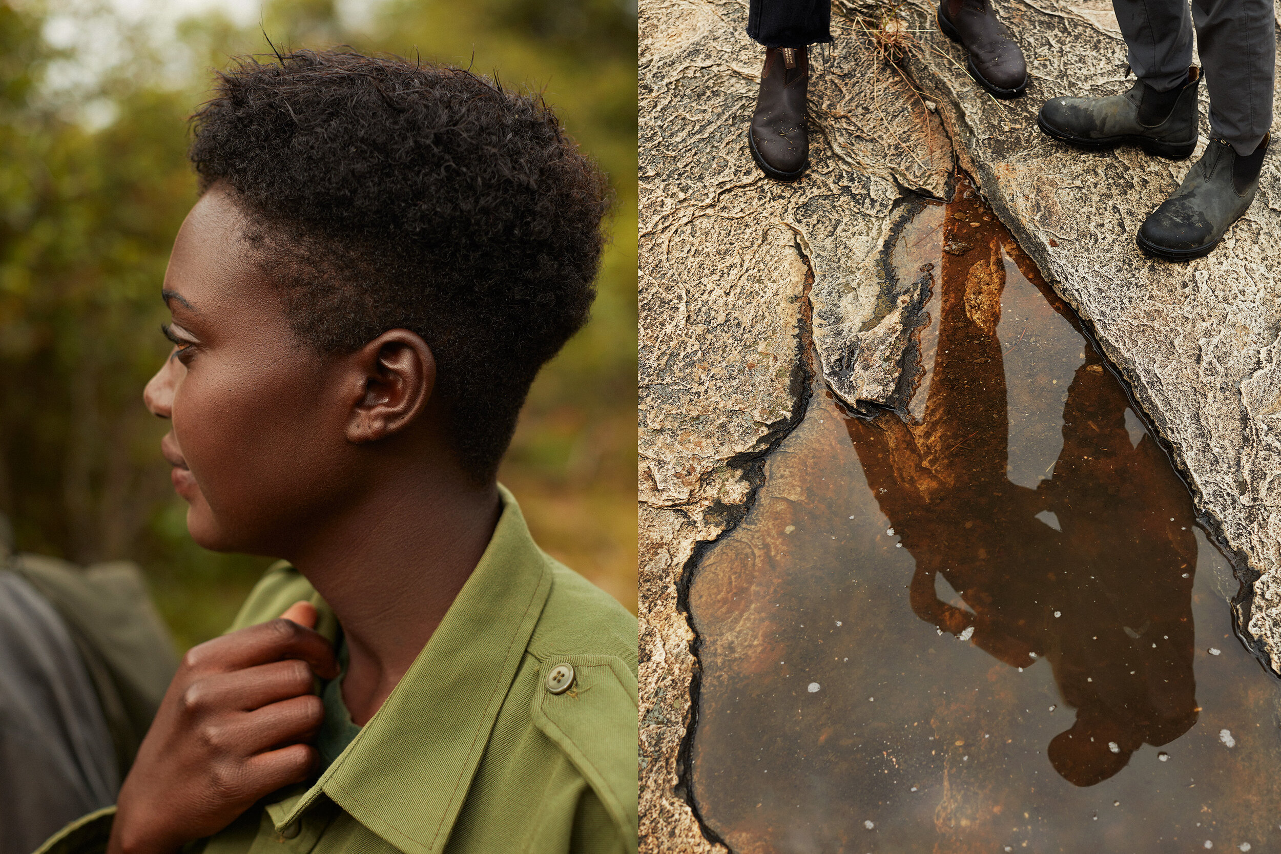
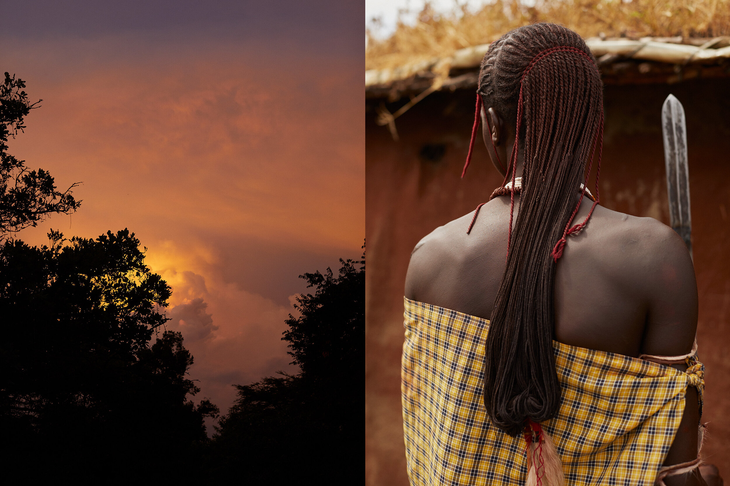
My friend Phoebe called me and said would I like to come and take pictures in Kenya. She was co-guiding a group
that would be exploring biodiversity in a stunning part of East Africa. We would be based on a nature conservancy in the greater Serengeti surrounded by the cultural heritage of the Masai people.
As I had never explored Kenya I jumped on a plane to Nairobi.
While I was there, I took pictures which told the story of the group who were traveling which they could use for their personal use.
I did however manage to capture a personal series of images which I thought would pair together well. We often were with local Masai people and in the village, we would run into nomadic tribes who were passing through.
Once I edited my series I mixed local people, landscape animals and some off the western travelers. I saw similarities with us humans and the wild animals. The costume of the tribal people was particularly vibrant against the greens of the Mara.
Since returning I read the Peter Beard bio “Wild” which laid out his wild life and his love for Kenya. I definitely would like to return there, hopefully with my family sometime as the land and the animals are truly unforgettable.
To see more of this project, click here
APE contributor Suzanne Sease currently works as a consultant for photographers and illustrators around the world. She has been involved in the photography and illustration advertising and in-house corporate industry for decades. After establishing the art-buying department at The Martin Agency, then working for Kaplan-Thaler, Capital One, Best Buy and numerous smaller agencies and companies, she decided to be a consultant in 1999. Follow her on Instagram
Pricing & Negotiating: Brand Narrative, Lifestyle, And Product Photography For A Large Clothing Brand
By Bryan Sheffield, Wonderful Machine
Each month, we explain a recent cost estimate, contract, or purchase order in the form of a Pricing & Negotiating article. By redacting the names of the photographer and the client, we can share useful information that would otherwise be confidential. You can read more about our Pricing & Negotiating services on the Consulting Services page of our website.
Concept: Photos of Olympic-hopeful athletes modeling the client’s clothes at a university sports facility.
Licensing: Unlimited use (excluding Broadcast) of up to 10 images for 6 months, and Web Collateral & Web Advertising use of up to 65 images for 6 months.
Photographer: Brand Narrative, Lifestyle, and Sports/Fitness Specialist
Client: Large clothing brand with over 200 retail locations.
Summary
I recently helped a photographer build an estimate and negotiate a project for a client developing a campaign tied to the 2024 Olympics. Ultimately, the photographer nailed the creative, and the client licensed additional images.
The project involved a single-day photo shoot at a university athletic facility in a major US city. The shoot centered on four athletes, each modeling and using the client’s athletic products within their respective sports disciplines. This shoot was conducted simultaneously with video production, each team having separate creative objectives and crews.
The initial deliverables included a series of images that captured the athletes using the brand’s apparel. Most of the photos were intended primarily for use on the client’s website and social media feeds, with some images for print and web advertising, in-store displays, and potential OOH advertising.
The client was responsible for providing all production support, products, styling, locations, coordination, talent, and talent management. They also handled all insurance, payroll, and image retouching.
Fees
It’s worth noting that this RFQ came to the photographer less than a week before the anticipated shoot date. We learned that the client had been working with another photographer, but they were not moving forward and needed a replacement quickly. The photographer and I were on the same page that their availability and attention to the last-minute project would put upward pressure on the fees.
Considering the client, creative brief, shot list, the photographer’s past work with this client, and the intended uses, I estimated $19,750 would be on the higher end of what the client might expect for a one-day shoot. However, we felt the total fees were fair, especially considering the cost breakdown: $1,000 per image for the 6-month unlimited use and $150 per image for web collateral and web advertising. We made sure the client understood the per-image pricing during the bidding process, which helped later on when additional licensing requests came up (jump to the bottom to see the final invoice).
Also, we added one pre-production day at $1,000 to cover creative meetings, planning, and crew booking. We added a tech scout at $1,200, along with $750 for a single travel day home, since the first travel day overlapped with the tech scout.
Crew
We included a First Assistant at $1,000/day for the Tech Scout and Shoot days, along with a Second Assistant to manage lighting and camera equipment on the shoot day. The client asked us to exclude a Digital Tech in the estimate, which seemed a bit unusual given the scale of the shoot, but the photographer was okay with it. The client also requested two Production Assistant swings (crew that would work for both the photography and video productions) for the shoot day to help streamline the still and video shoots and save money. Initially, I pushed back on including shared crew, concerned it would inflate the stills estimate with unnecessary items for the photographer and lower the video estimate, which we couldn’t control. However, the client insisted on including these line items while noting our concerns about inflating the bottom line.
Equipment
We included $3,000 for cameras, lenses, lighting, and grip rentals. While the photographer planned to use their own cameras and lenses, they intended to rent lighting, C-stands, sandbags, and other gear from a local rental house. We also added $450 per day for the photographer’s personal digital workstation, which includes their laptop and other peripherals. Lastly, we allocated $320 for three hard drives, one of which the client would keep.
Travel
The client would book and pay for the airfare and lodging directly. We included the photographer’s out-of-pocket travel costs such as baggage fees, airport transfers, and per diems.
Miscellaneous
The client asked us to exclude insurance since they would take care of it. Having encountered this with them on previous projects, we included a note clarifying that they would provide insurance for the production to eliminate any ambiguity.
Post-Production
We added $500 for the photographer to do a First Edit for Client Review, delivered as a web gallery. We also included estimated costs for the photographer to handle light cleanup and color work on the 75 requested images at $150/hour. The client had initially requested that they would handle all retouching themselves internally.
Results
The photographer was awarded the project the same day the estimate was delivered! The shoot was a huge success, with perfect weather, awesome talent, and a thrilled client. It was a great day filled with lots of smiles.
Additional Licensing
After reviewing the photography, the client loved the work and requested an additional 37 images. They wanted 15 images for web collateral and web advertising use, and another 22 for the retailer’s catalog and web advertising. The client also requested that the photographer do some light retouching on the images. We invoiced an extra $2,250 for 6 months of use for the 15 web collateral and web advertising images ($150 per image), and $4,950 for 6 months of use for the 22 collateral (including client catalog) and web advertising images, at a rate of $225 an image.
The final invoice included a Creative/Licensing fee of $26,950, plus an additional $5,587.50 for the post-processing/light retouching.
Follow our Consultants @wonderful_at_work.
The Daily Edit – Gate44 Artist in Residency : Colin Sussingham


Graphic Design / Art Direction: Elle Rotstein
Photographer: Colin Sussingham
Heidi: Was the desire to make something tangible born from getting away from the computer, screens, and behind a lens?
Colin: I’d say the goal generally for my personal work always has that in mind. Making something physical, whether it’s a book, zine, poster or just prints is really important to me. As a society we’re obviously fed way too much imagery through social media, streaming and advertisements, so making something that is tactile and can give the viewer a moment to pause and actually hold printed work is something special and meaningful to me.
In this age of digital overload, what suggestions do you have for those who want to get started making something physical?
My advice would be just go for it and don’t be afraid to experiment or mess up. I’ve been making zines since 2009 and to this day I still make some on a shitty laser printer at my house, and I still mess up my sequencing and flipping pages incorrectly when trying to print front and back. It’s all part of the fun and the process for me. There’s a ton of websites that offer affordable and high quality zine printing and many helpful tutorials on how to lay out artwork for print. Or if you have any friends that work corporate jobs you might be able to get them print some off for you at work. I did that for years.
How much did the cultural immersion of being in Milan for the Gate 44 residency inform the work?
Milan as a city didn’t play much of a role. All the photographs were made prior to us arriving in Milan, and my wife, who attended the residency with me, had completed 75% of the layout prior to us arriving as well. We treated the residency like a full-time job, so we mainly got to explore the city in the evenings and on the weekends.
What was the creative intent of the book Constructive Interference?
This will be a long answer because there were multiple steps that brought us to the book concept and title. Originally we didn’t have a fully thought out idea. I took 100s of photos based off of Elle’s creative direction and my personal inspirations and then she sat with everything and made connections between the new images and many from my archive. Since she’s also an artist that mostly works in analog, we both collaborated on altering my digital works through collage and painting and then retaking photos of the new pieces to bring them back into the digital world. The concept grew organically from Elle’s layout where she was making physical connections between my photos, one image would bleed into the other through the seam. While we were at the residency we didn’t have a title but we knew we wanted to express how human beings and nature are intertwined if you just pay attention. While we were brainstorming titles I started researching water ripples since we had a few images in our layout. The term “constructive interference” refers to when two waves or pulses (whether it’s water, light, sound) align in sync and create a wave of greater magnitude than it’s original parts. We felt that it was a perfect title and metaphor for the book for many reasons. First, we were making connections between images that felt stronger once paired together, second, we were actually interfering with the images through our collaboration, physical touch, and all the printing methods. Lastly, the fluidity of the accordion binding and the silkscreened water pattern connected back to the water ripples that lead us to the title.
Are these pairings commentary on biomimicry?
Biomimicry definitely comes into play. A lot of the work I’ve been shooting over the past few years has related to that theme in some way. Not only how we as humans copy what we see in nature, but finding moments within nature that relate to each other. Finding connections and also moments of contrast. There were some pairings that came from happy accidents and some that were much more intentional. A lot of it is to the credit of Elle’s art direction though. She spent a lot of time composing the layout
How did this idea evolve, and were you and your partner involved in the program?
We were invited to do the residency in March of 2024. Our time slot was going to be the first two weeks of September that year, so we started working on the project pretty much immediately after we found out.
My wife is an artist and we collaborate often on projects, she did the art direction and design/layout of the book. We hand-printed it with two print/book binding technicians from the residency.
Was this more of a book-making process and photography sequencing experience?
Yes, our intention was to create something special between the two of us, and different from what we both typically create as artists. Both Elle and I have printmaking experience from our college days, but this was a totally new direction for me in terms of creating an art object. I’ve been combining analogue techniques with my photos for many years now, but I had never thought about hand binding my work. This experience definitely opened my eyes to another level of photography and presentation that I would like to continue to explore. In terms of the concept and photography sequencing, it was very fluid and experimental. We didn’t have a concept at the start, we just gathered inspiration and let the idea behind the book unfold naturally.
This looks like 4 accordion signatures, hand-bound with a belly band – were all these new techniques for you?
Yes these were new techniques for us. One of the technicians at the residency is focused solely on book binding, so she was there to walk us through the process and bind the book while we worked on printing and the design.
If the book is open end to end, it’s about 18 feet or more. We printed on two different kinds of paper, so the pages had to be glued page to page with an overlap at certain points.
Tell us about the overlap.
They had to overlap because the book is made up of two different kinds of paper. Due to that we couldn’t print in one continuous sheet. We printed on a paper with a metallic sheen and some that were more matte. So there were spreads where those two papers met and therefore had to be glued together on their backsides.Elle’s art practice involves drawing with graphite and black ink, and she felt strongly about using a paper that could create that same metallic shine effect as another nod to combining our two art practices. Once printed I also felt it added a level of depth that the book wouldn’t have had if we printed the whole thing on one kind of white paper. We individually silkscreened the back of each page with an inverted water texture from the book.
Can you describe a typical day in the Gate 44 program?
There’s an apartment at the residency so you’re staying right next to the studio. We would normally start working around 9am, break for lunch, (Italian work lunches are apparently around 1.5 to 2 hours, which we loved) fresh pasta from a small family run spot that everyone who works at the residency goes to. Of course finish with a coffee or tiramisu before going back to work until 6pm. Then we’d explore the city, have dinner or meet up with friends at a bar, sleep and repeat.
Assume all the photography was collected before the project and then the body of work took shape while there?
All the photographs were taken before, the majority of the design and layout as well. The first week was mostly experimentation and troubleshooting with a variety of media and printing methods (collage,silkscreen,relief printing,painting,burning). The second week was focused mostly on printing and binding. We made an edition of 4 books.
What are you working on now?
I’m working on publishing a new personal photo book that I’ve been shooting since 2020. In the process of reaching out to publishers currently.
The Art of the Personal Project: Karan Kapoor
The Art of the Personal Project is a crucial element to let potential buyers see how you think creatively on your own. I am drawn to personal projects that have an interesting vision or that show something I have never seen before. In this thread, I’ll include a link to each personal project with the artist statement so you can see more of the project. Please note: This thread is not affiliated with any company; I’m just featuring projects that I find. Please DO NOT send me your work. I do not take submissions.
Today’s featured artist: Karan Kapoor
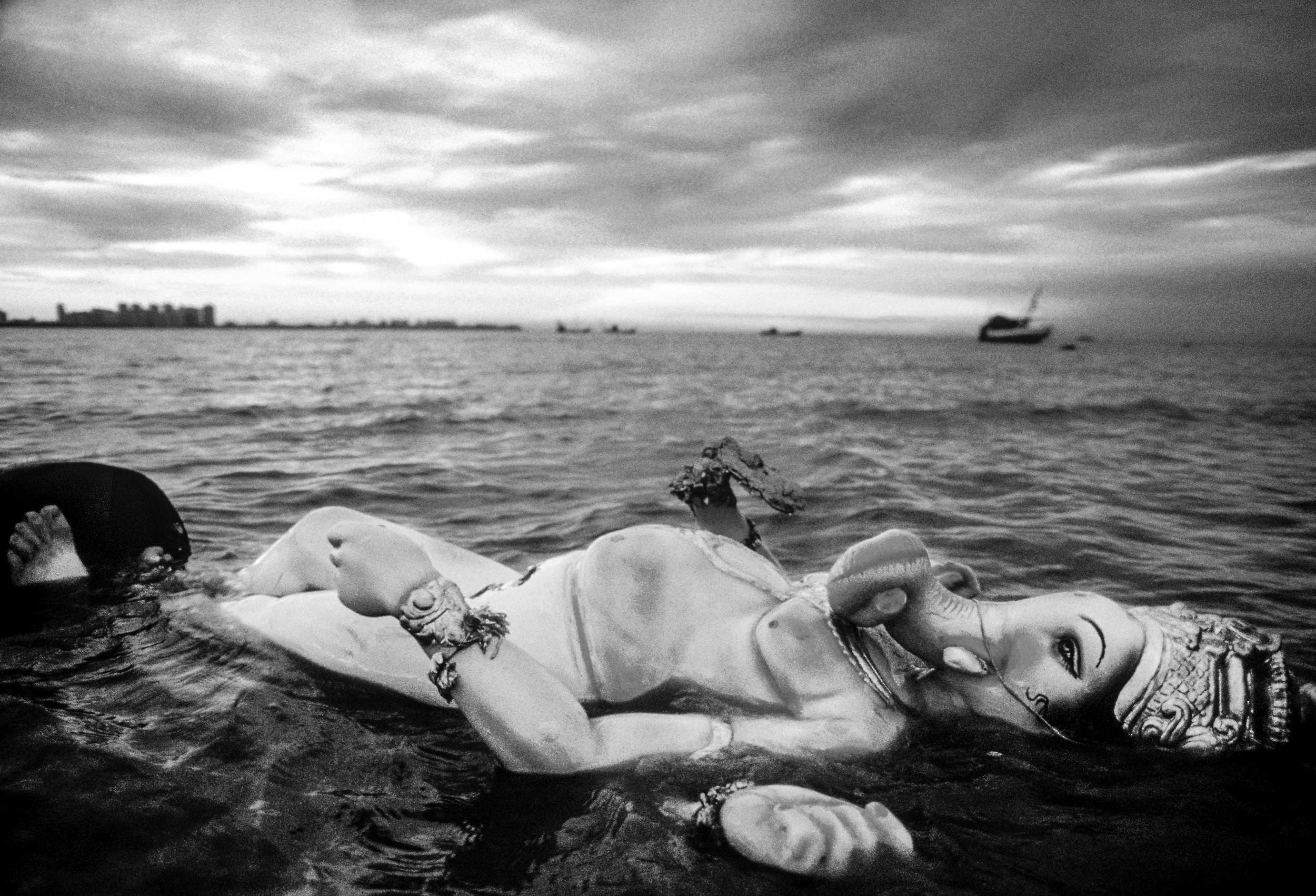
Ganpati Immersion: My First Project
This series holds profound significance for me—marking both my return to Mumbai, the city of my birth, after years at boarding school in England, and my debut as a photographer. Through the lens of the Ganpati festival, I sought to reconnect with the city’s energy, its traditions, and its soul.
The festival culminates in a moving ritual: the immersion of Lord Ganesh idols into the ocean, symbolizing renewal and impermanence. With a pair of Nikon FM cameras loaded with Kodak Tri-X 400 film, I ventured into the vibrant chaos and quiet beauty of the celebrations the morning after… At the time, Tri-X film was hard to come by in Mumbai, and I had only 3-4 rolls for the entire project. Every frame mattered, and each shot demanded intention and precision—a limitation that shaped my approach to storytelling.
One defining moment came when one of my cameras slipped into the sea—a loss that mirrored the themes of the festival itself. Fortunately, the camera was repaired, reflecting the spirit of resilience and restoration that characterized those times and became an ethos for my creative practice.
Shooting in black-and-white with Tri-X film allowed me to focus on texture, contrast, and emotion, stripping the visuals down to their essence. Each photograph captures not only the event but the layers within it—the intricate artistry of the idols, the shimmering water, and the heartfelt devotion of the people.
This project was a deeply personal journey. Returning to Mumbai after my time in England gave me a fresh perspective, allowing me to see the familiar through new eyes. Documenting the Ganpati festival reaffirmed my belief in the power of photography to preserve fleeting moments, honor traditions, and reveal the extraordinary within the ordinary.


To see more of this project, click here
APE contributor Suzanne Sease currently works as a consultant for photographers and illustrators around the world. She has been involved in the photography and illustration advertising and in-house corporate industry for decades. After establishing the art-buying department at The Martin Agency, then working for Kaplan-Thaler, Capital One, Best Buy and numerous smaller agencies and companies, she decided to be a consultant in 1999. Follow her on Instagram