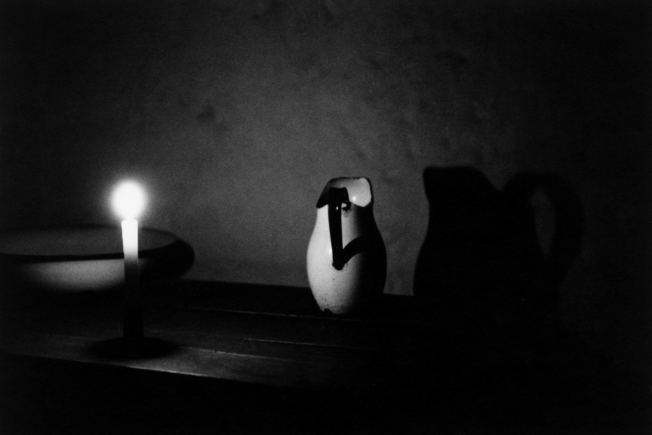
TIM BLANKS: Do you think you were looking for yourself in those photos? There was a strand in your work for a long time of very ambiguous, beautiful people with long black hair.
Steven Meisel: I think I’m in every picture that I take, regardless of whether it’s a super-commercial something; it’s all me. So am I looking for myself in those kinds of photographs? It’s not intentional; it’s just a sensitivity. Thinking of the Sean pictures: Am I looking for me in them? No, I am them.
TB: Does that mean that everyone in your photos is an alter ego in a way?
SM: Um, not in every one, but yes, to a certain extent, sure.
TB: Thinking of your photos of Linda [Evangelista], for example, there’s a real symbiosis in those images.
SM: Yeah, that’s me, absolutely. That’s a part of who I am. But I have to be honest—I don’t know what I do. I learn more about what I do from other people asking me questions or commenting. It’s nothing I think about; I just do it.
TB: But are there moments when you stop to think, “God, I did that one well”?
SM: No.
TB: You mean it’s always on to the next thing?
SM: Yes. Emotionally, it’s very difficult for me to look at old work. That’s why it was so hard to do the Phillips thing. I either look at what I could have done better, or I start crying. I’m ridiculously sensitive, that’s just who I am, so it’s really tough for me to look at old pictures.
TB: Even when you’re looking at those pictures which I think of as a conspiracy between you and Linda? You don’t feel a thrill?
SM: I always get sad.
TB: You mean melancholy at the transience of everything?
SM: I’m not going to get into the whole meaning of life—of which there isn’t one anyway—but yes.
TB: What thrills me is your ability to re-create atmospheres, to evoke times and places and artists that meant so much to me. I’m assuming they meant a lot to you too.
SM: It’s a part of who I am, of who you are. It’s our experiences and our eyes and our hearts, of growing up when we did.
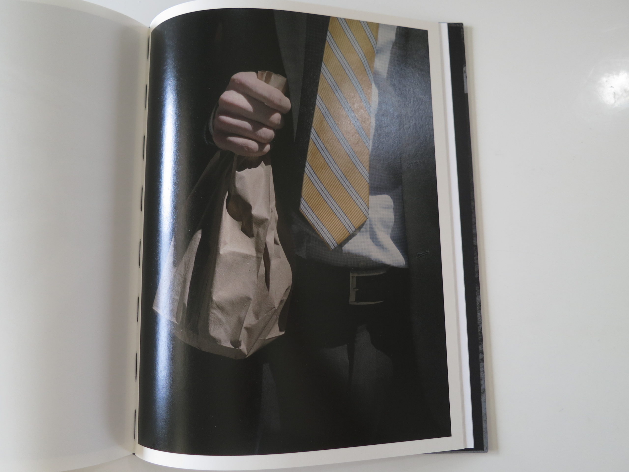
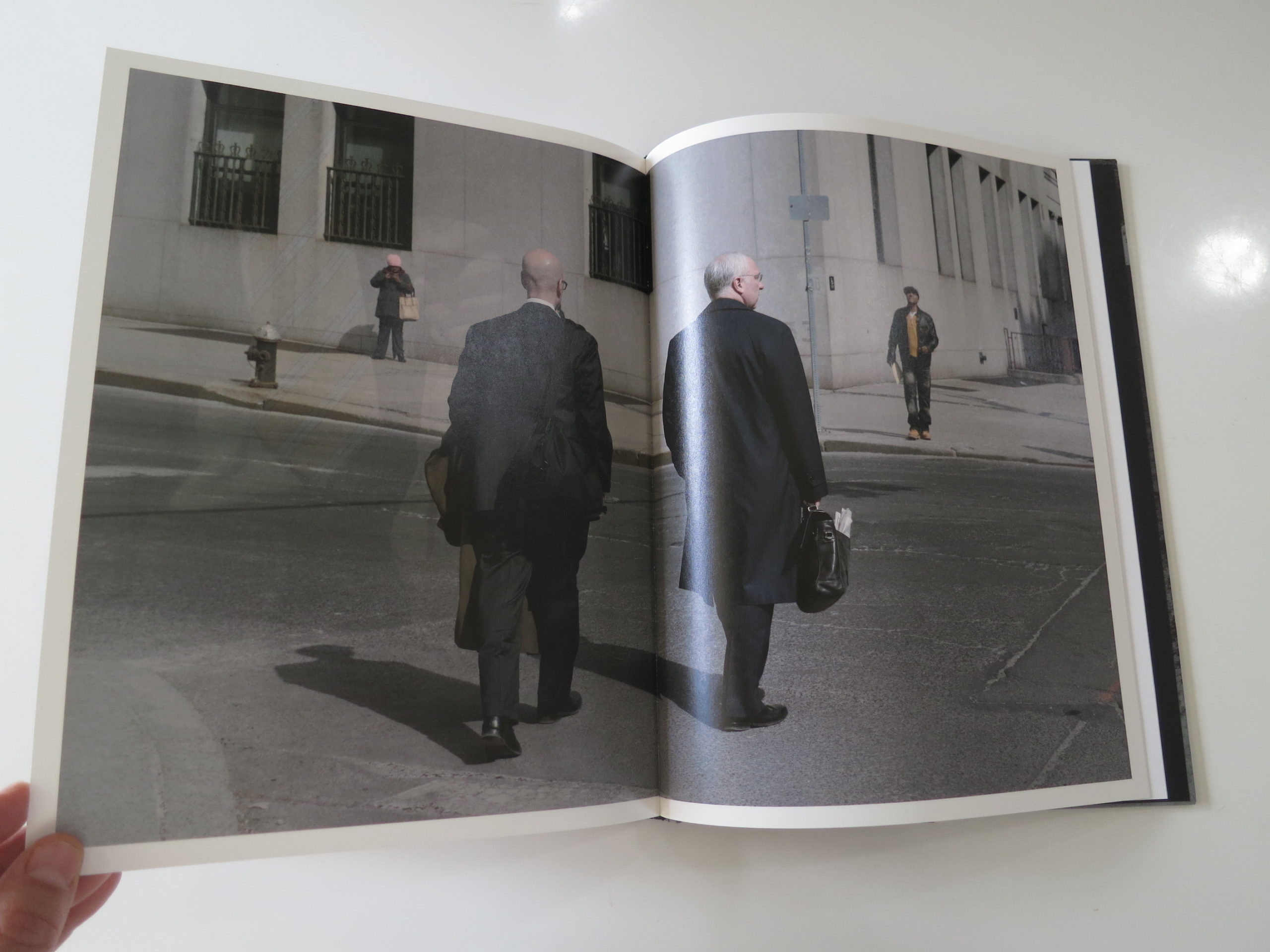
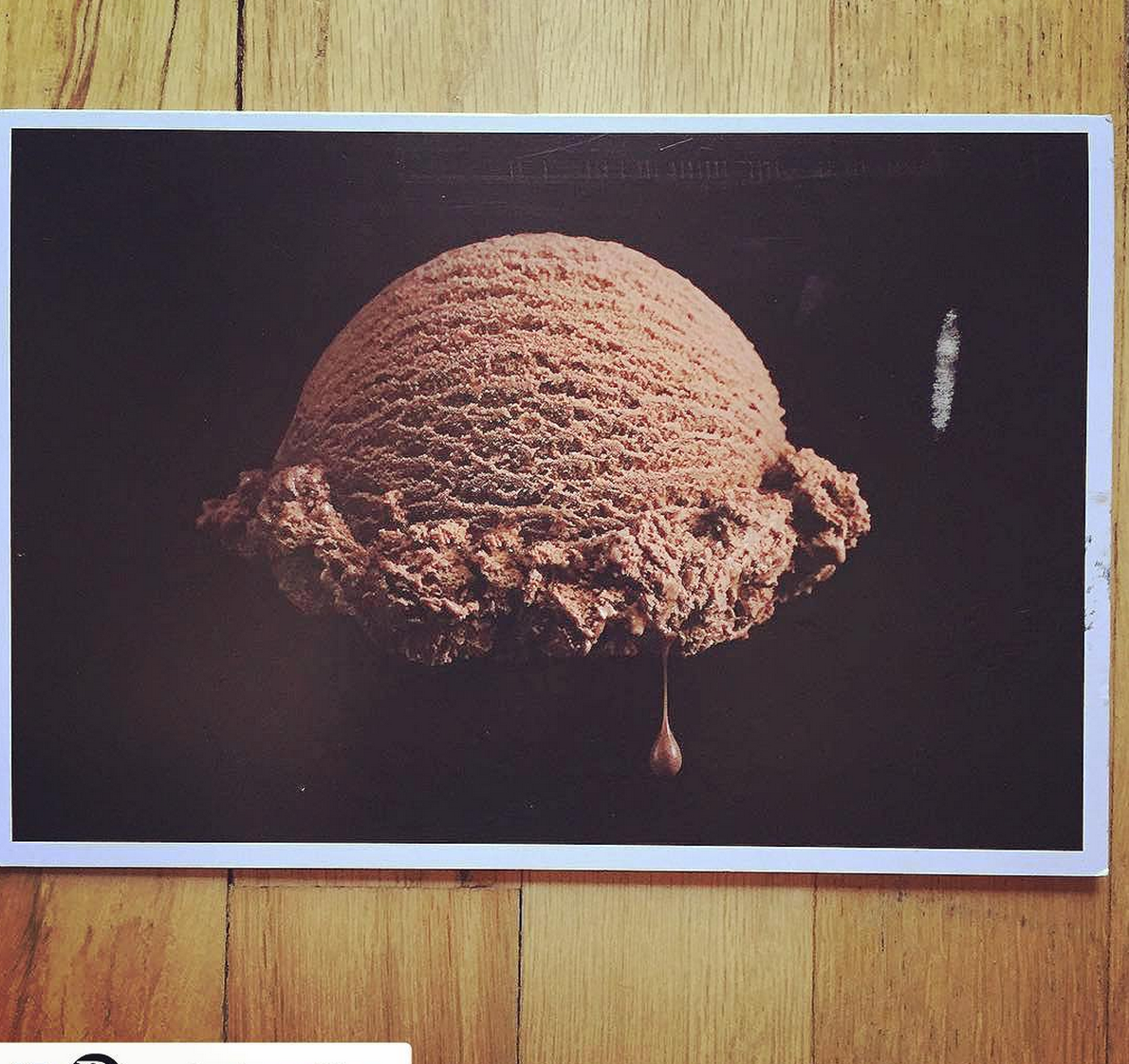
The Daily Promo: James Worrell
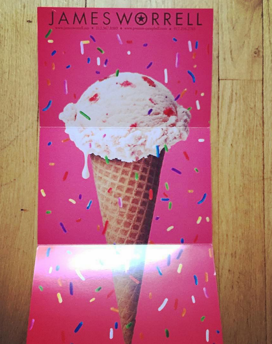

James Worrell
Who printed it?
The Card was printed at Modern Postcard.
Who designed it?
I designed it and edited the images with a little help from my Food Stylist, Brian Preston-Campbell and my agent Mary Dail at Big Leo.
How many did you make?
We printed 500, mailed out about 425, the rest are for leave behinds, etc. An email campaign followed up the printed mailing about a week later.
We printed 500, mailed out about 425, the rest are for leave behinds, etc. An email campaign followed up the printed mailing about a week later.
How many times a year do you send out promos?
This year I plan on doing three printed promo mailings in this format, last year I only did one and the year before that I did a couple with what I call a “special promo.” That was an involved piece that involved printing my logo on M&Ms and a small booklet. For awhile people got tired of the printed promo but it seems to be having a resurgence, or maybe that’s just me. The email promo is hated by most at this point and the printed piece seems so much more substantial. I consistently promote myself, if anything, my biggest problem is that I get bored and do other things. I am currently advertising for the second year in Atedge.com, they print five books each year, two books feature our ice cream shots.
Do you always work with the same stylist and do you set out with a plan for the promos?
I work with Brian a lot on various editorial and advertising jobs. He does a lot of the ice cream you see on packages out there and always has funny stories to tell about the process. We devised a scheme to test ice cream shots, promote them and take over the world of ice cream shooting. The real story is that I have a loose plan of doing shoots with my favorite stylists and then promoting our work together. It’s a way to combine creative forces and share the costs. It also is really great to work on a collaboration with a mind to promote as opposed to just sending out work that I was paid to do. Of course, I have been paid to shoot ice cream, just not these. And while I did all the shooting, retouching and layout design, Brian and I planned and did two separate shoots for this promo, and have plans for one more as a follow-up. I have another shoot coming up soon with one of my favorite conceptual prop stylists for a winter promo as well.
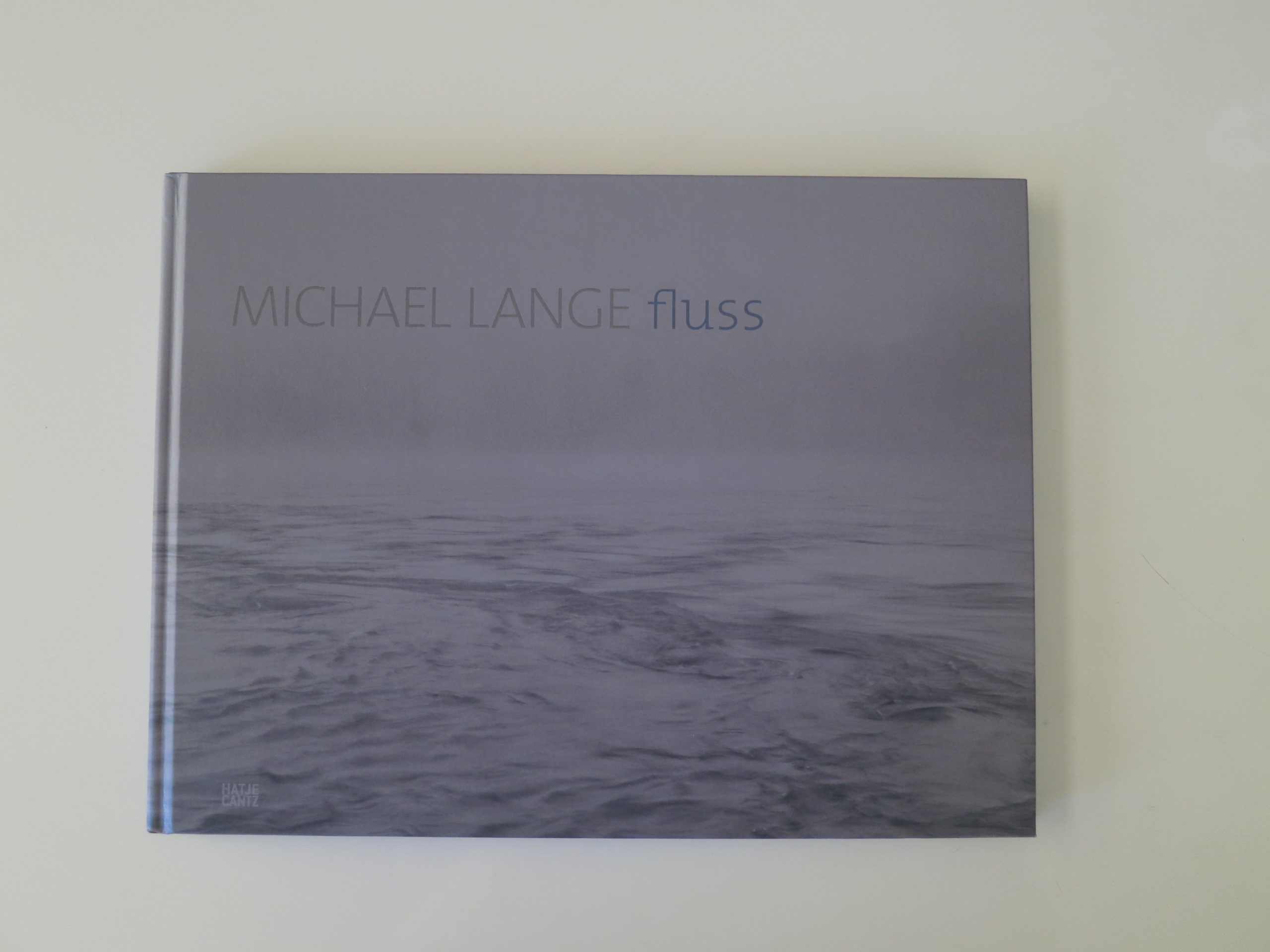
This Week In Photography Books: Michael Lange
Sometimes, I can’t believe I live in the high desert. Not given where I come from. Back in New Jersey, the humidity was stronger than a body builder’s underarm stench. Water hung in the air, always ready to cling to the first thing that passed by.
This Summer has had its share of rain, but still, most days, the sun beats down on the Northern New Mexico landscape, daring people to test its fiery glow. Within a week or so of the last rain, our pasture grass will turn pea green, then tan, then harsh brown, if not irrigated properly.
The dry even invades your body, if you’re not looking. The back of my feet tend to crack, like sorry horse hooves, if I don’t slather them with moisturizing cream. (Cue the vision of me buying some expensive hand cream at Kiehl’s, in the Cherry Creek Mall, not-so-subtly pretending it’s not really for my feet. Awkward.)
Needless to say, by now, early September, I’m ready for Fall; for a release from the heat. I dream of moisture. Of cool, wet, boggy places, that bear no resemblance to my own world. I close my eyes, and mentally evoke some misty rivers. Maybe in Northern Europe? (Avoid mention of human migrant crisis here.)
Sometimes, when you want to leave your mind, and your physical locale, there’s an easy solution. Open up a photo book. Flip through the pages. Imagine you’re somewhere else.
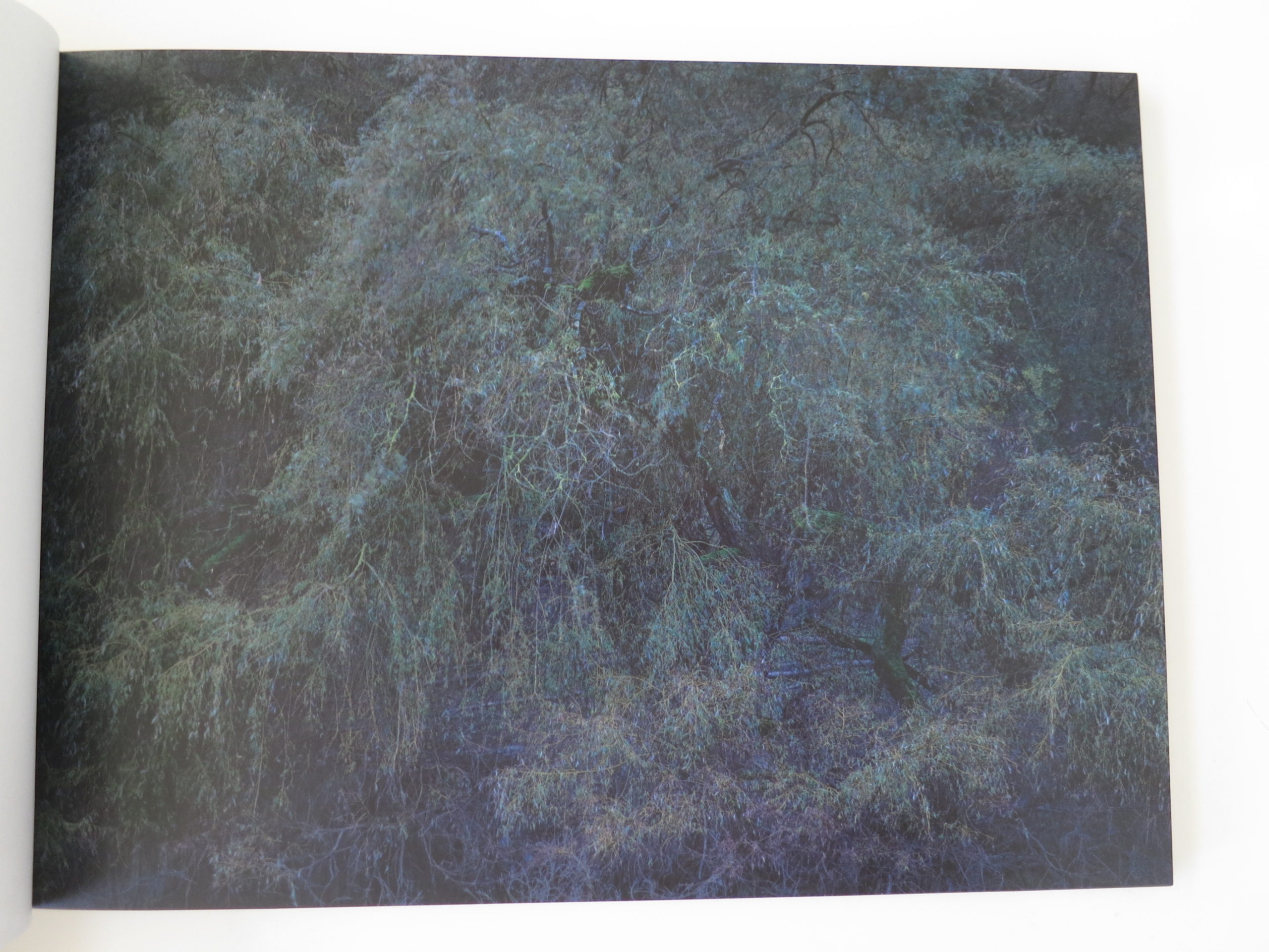
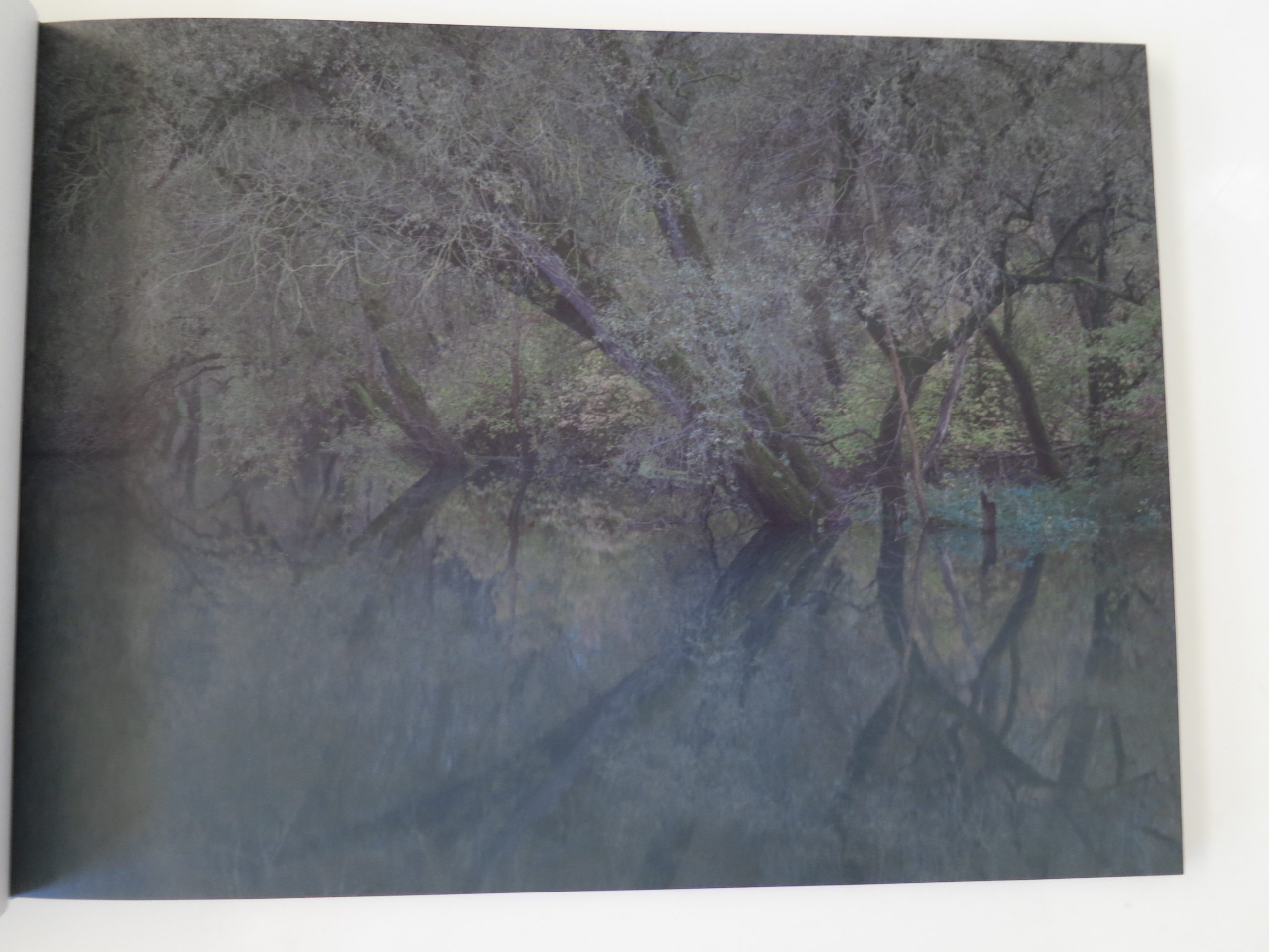
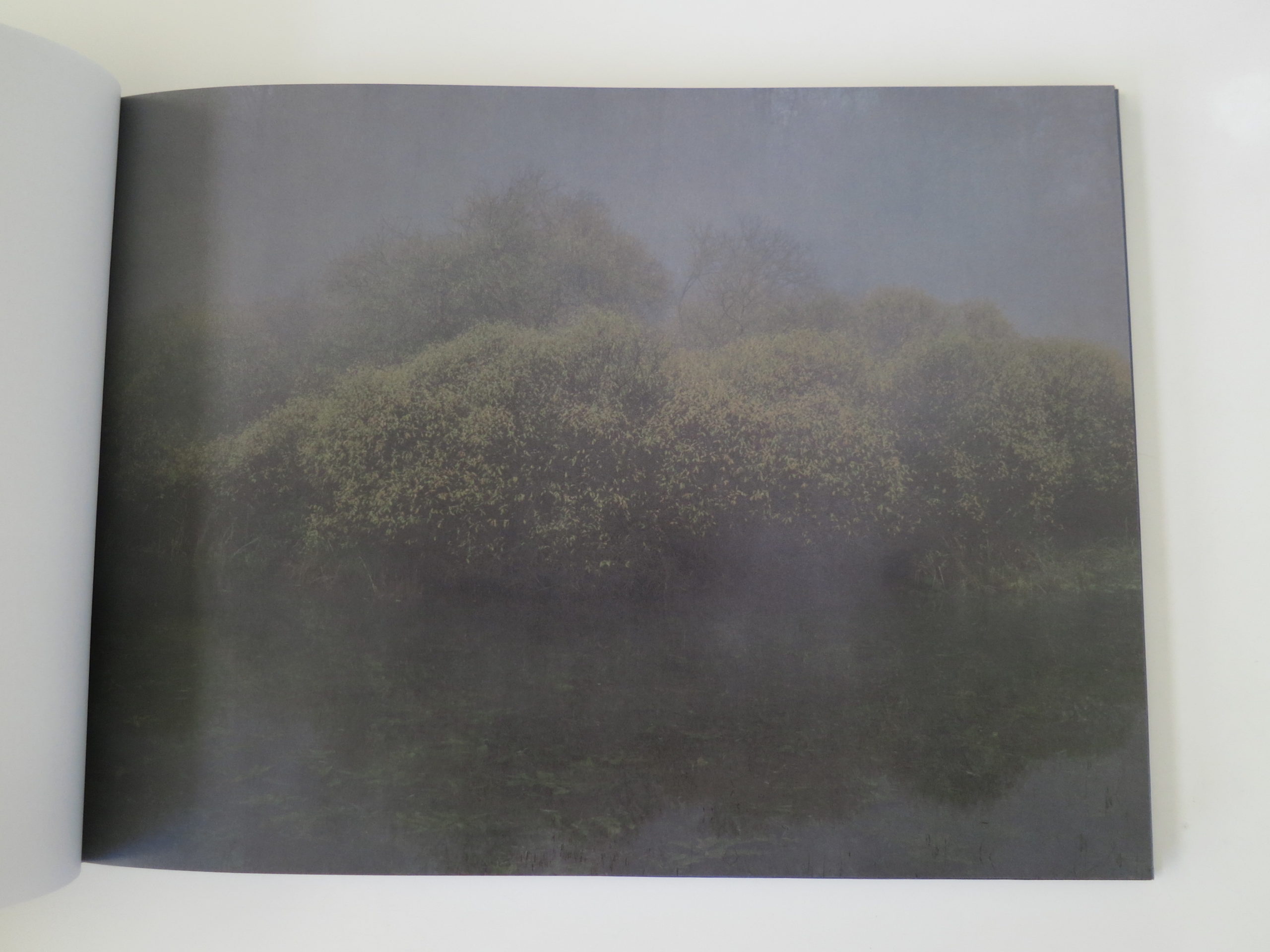
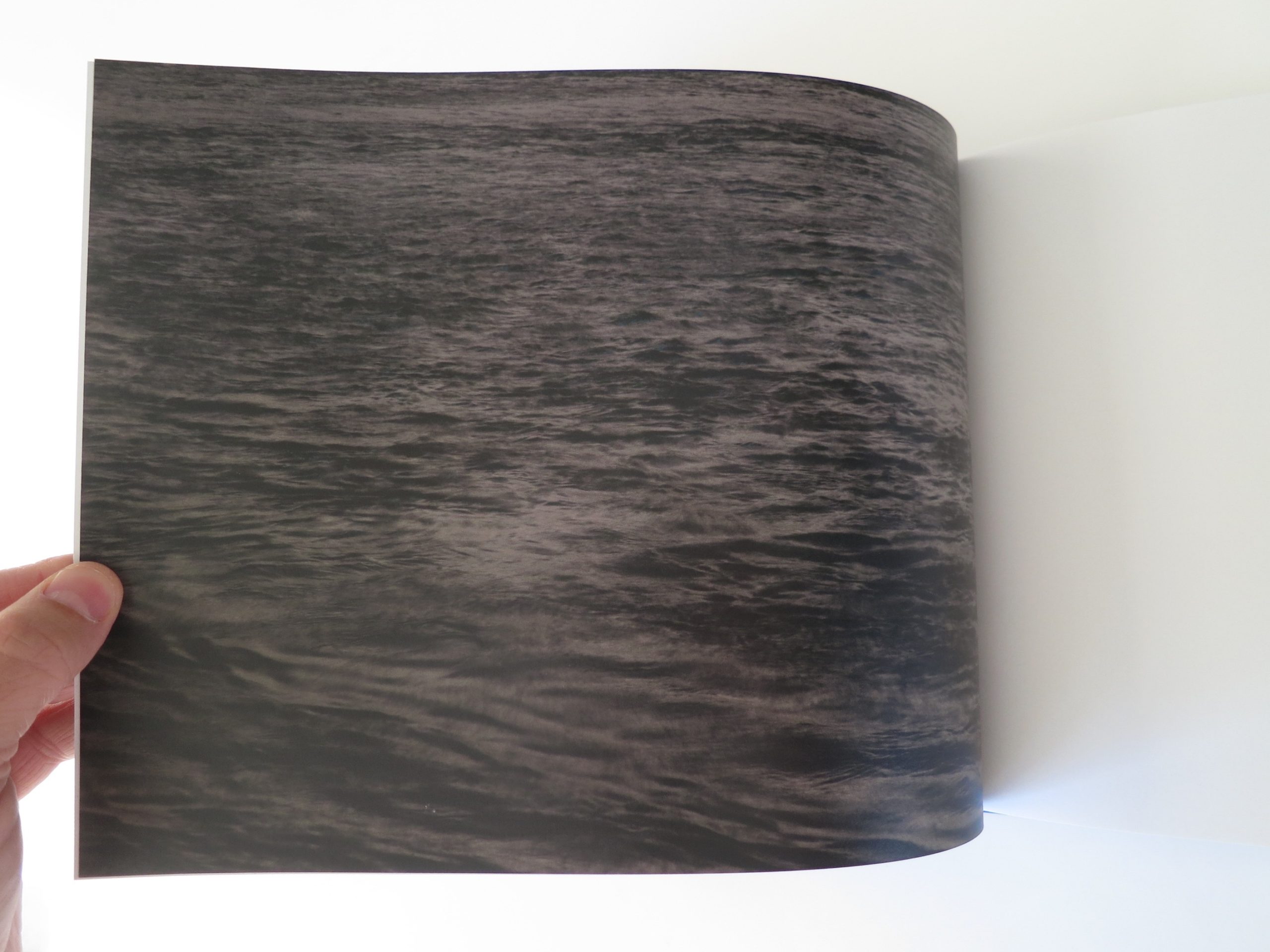
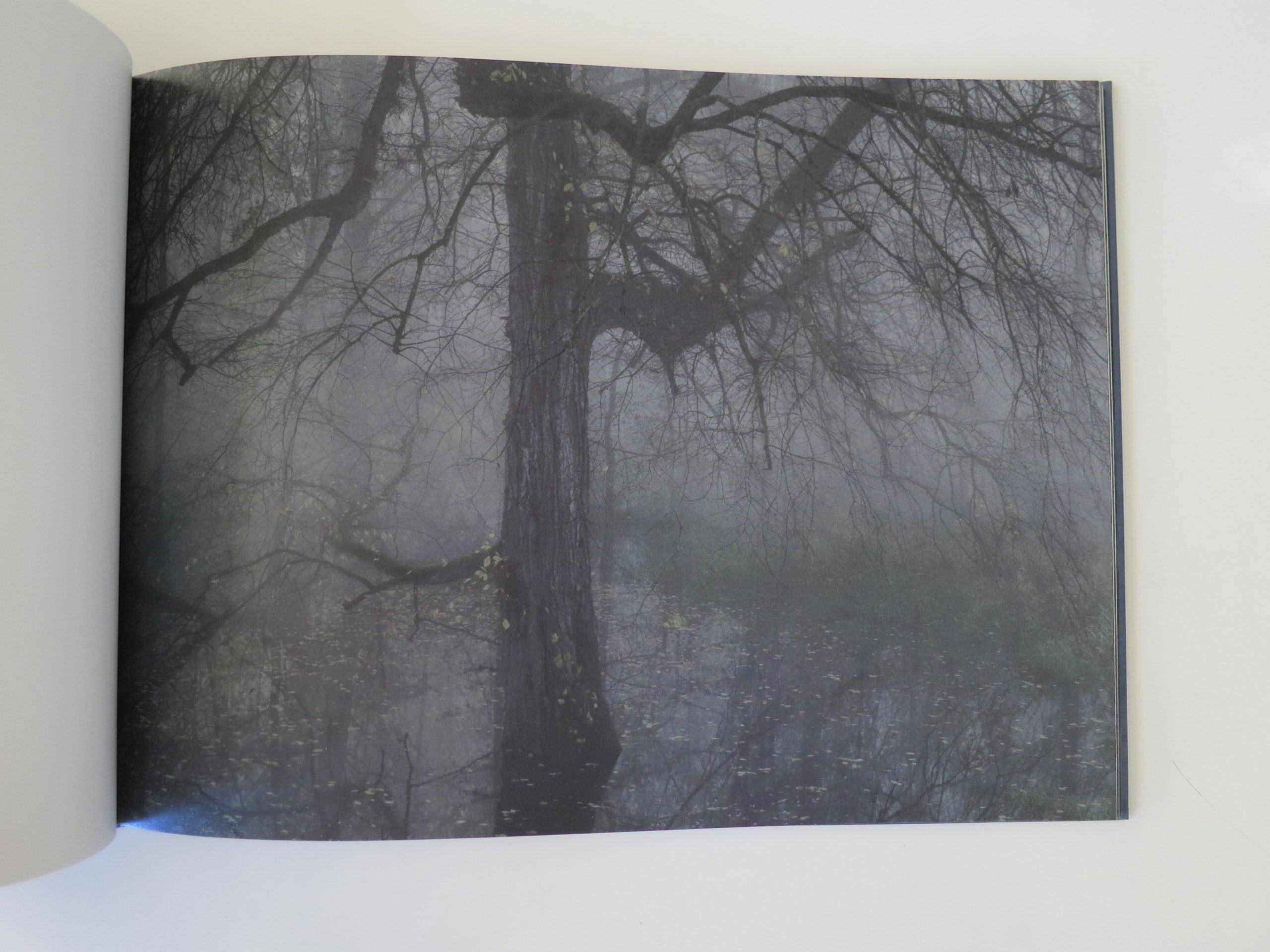
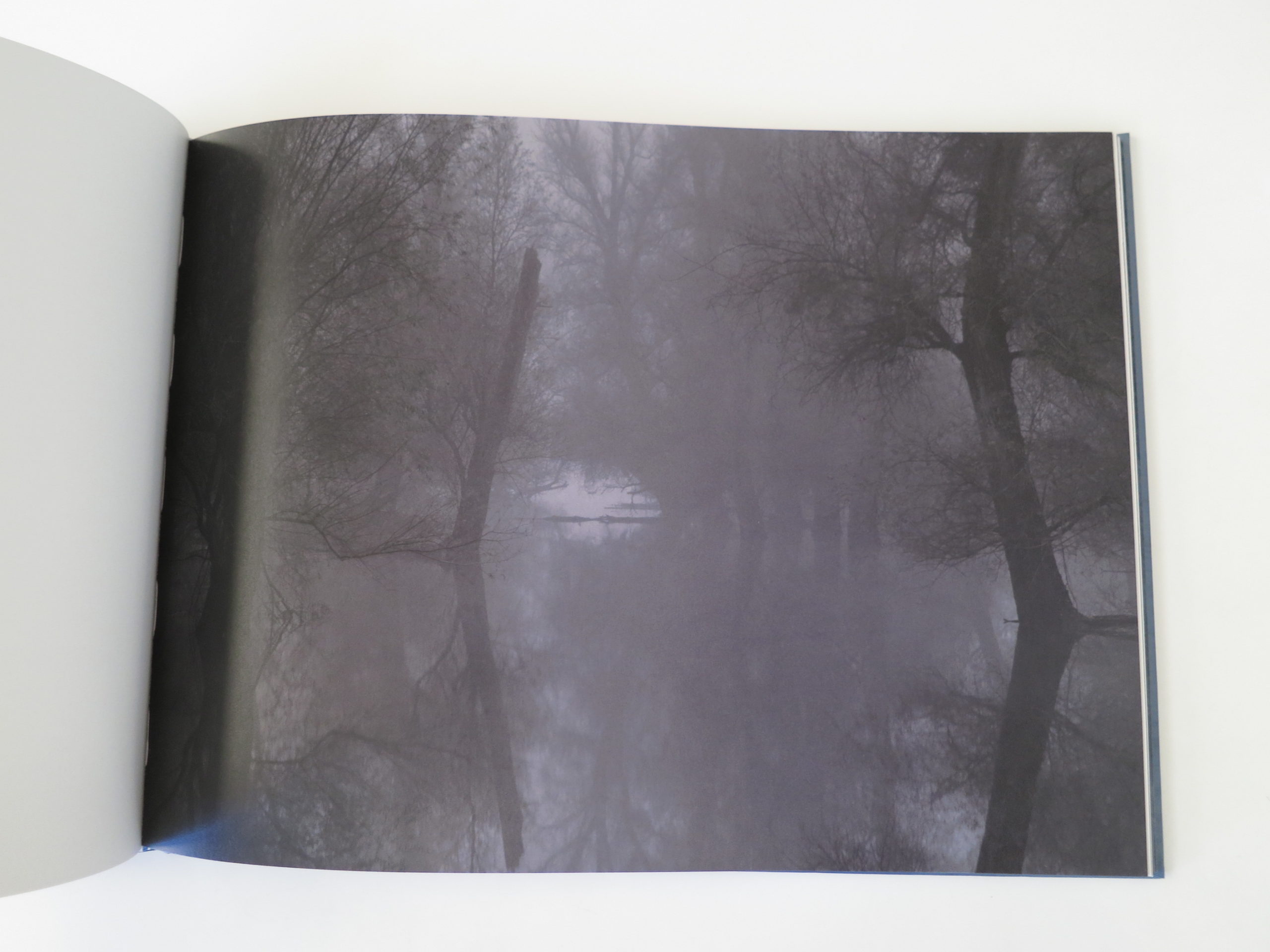
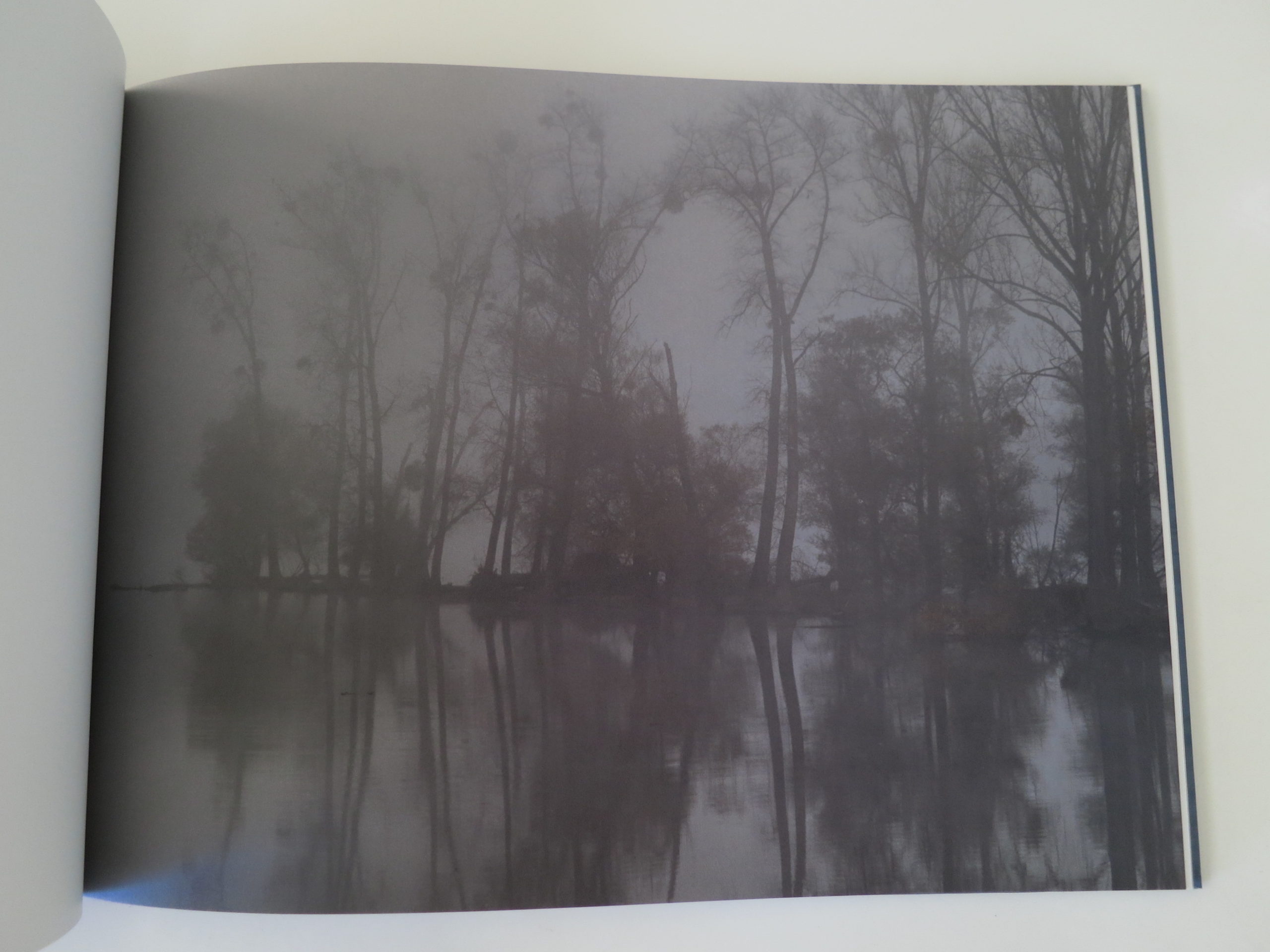
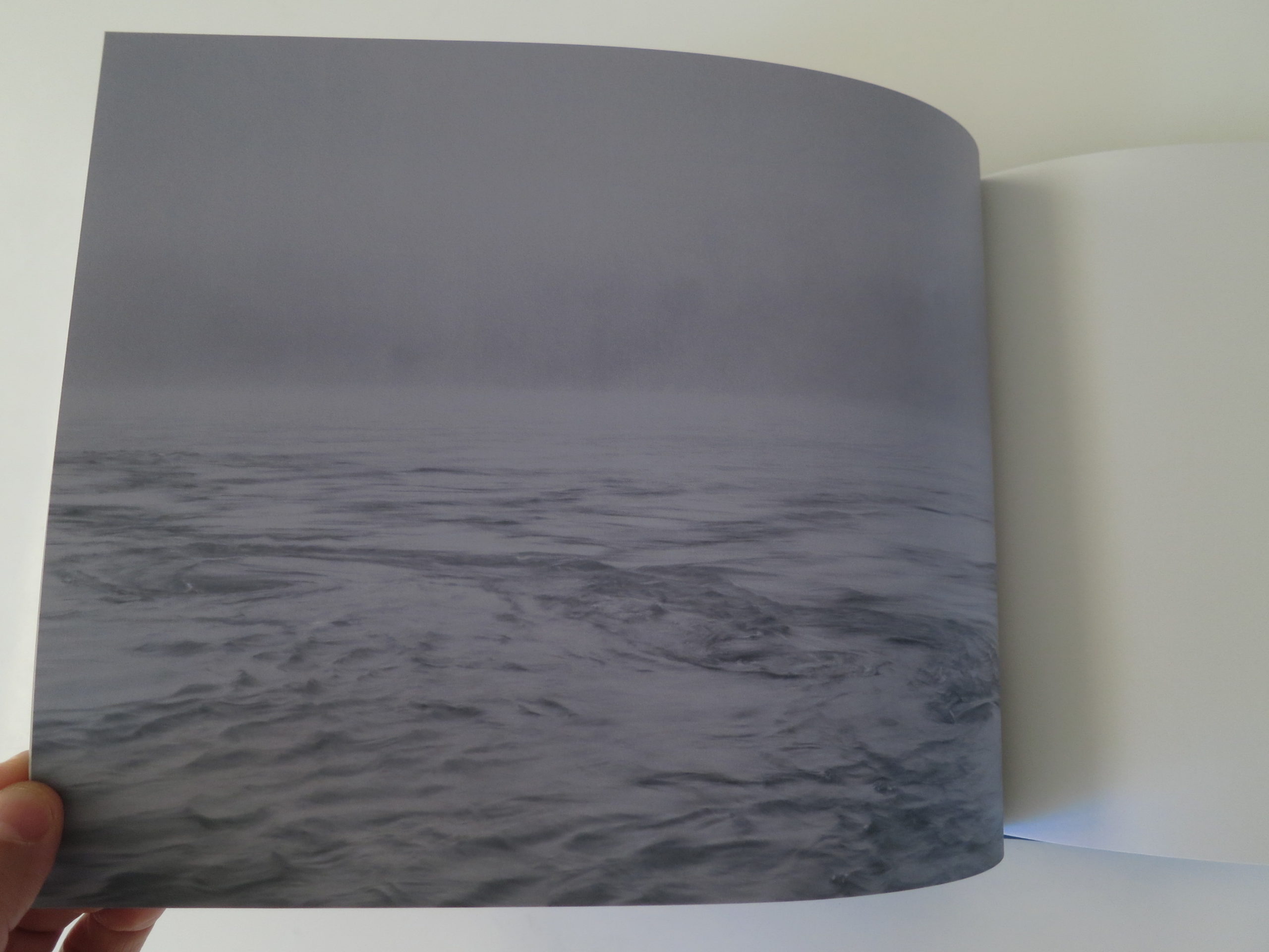
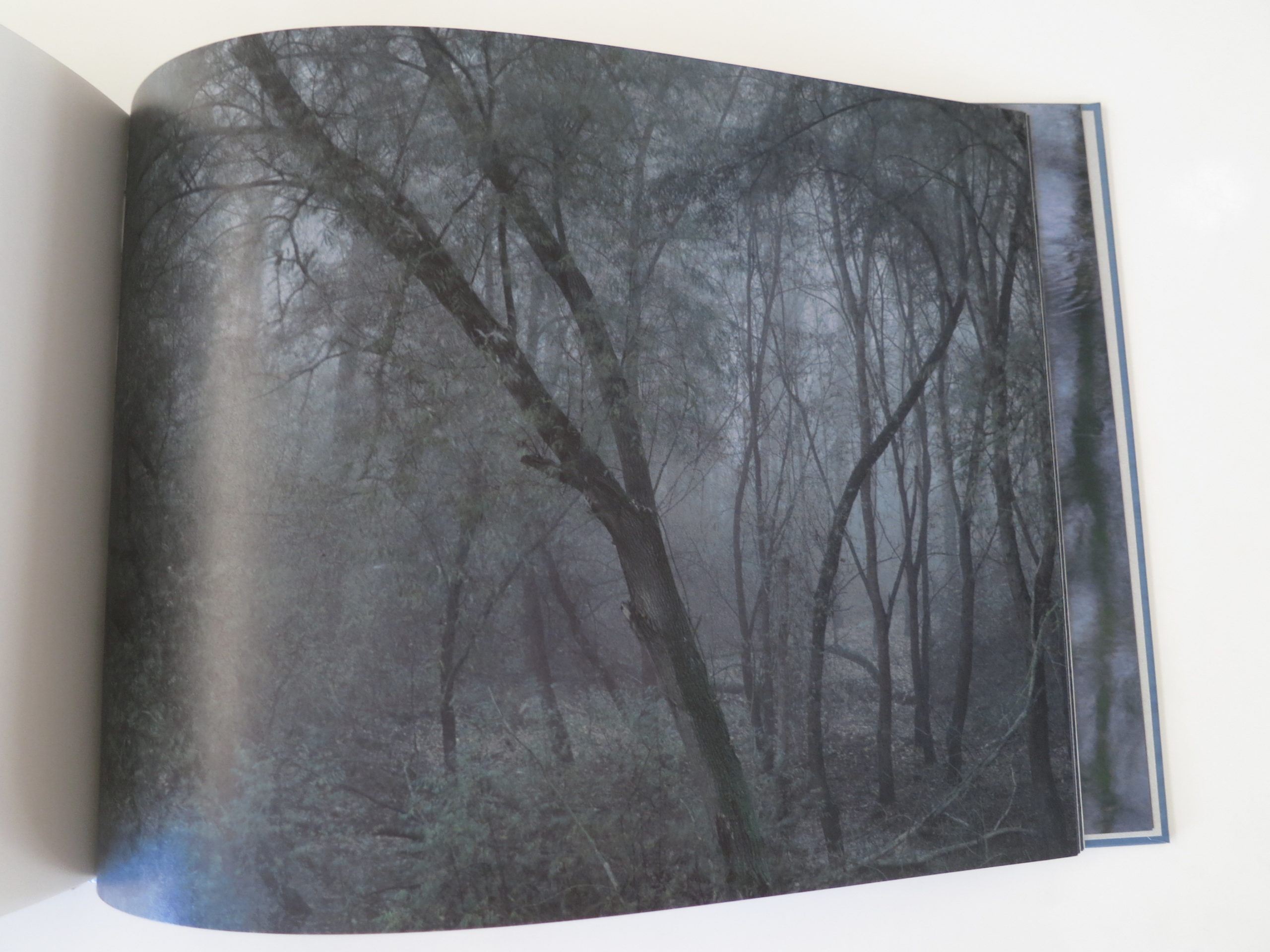
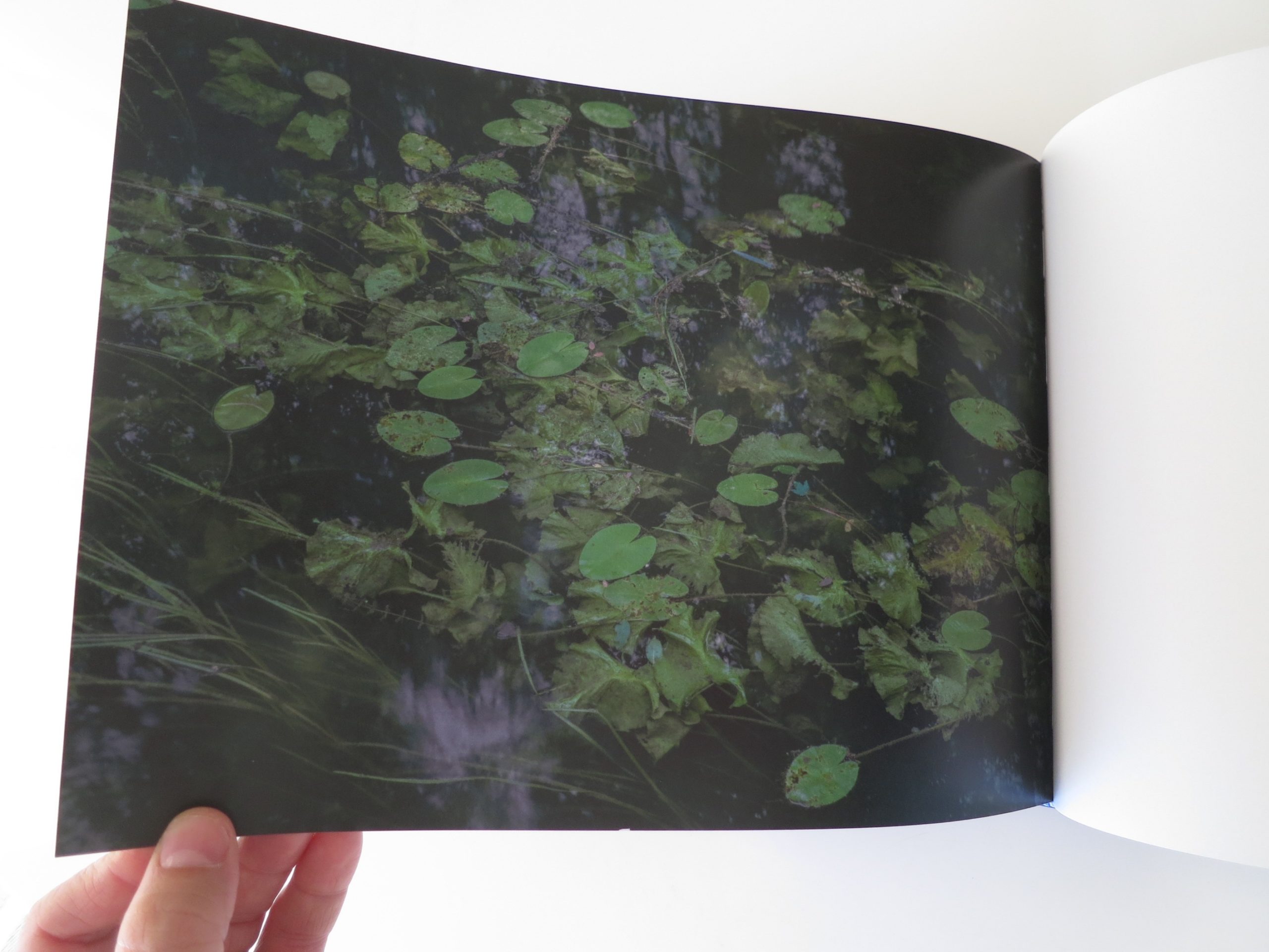
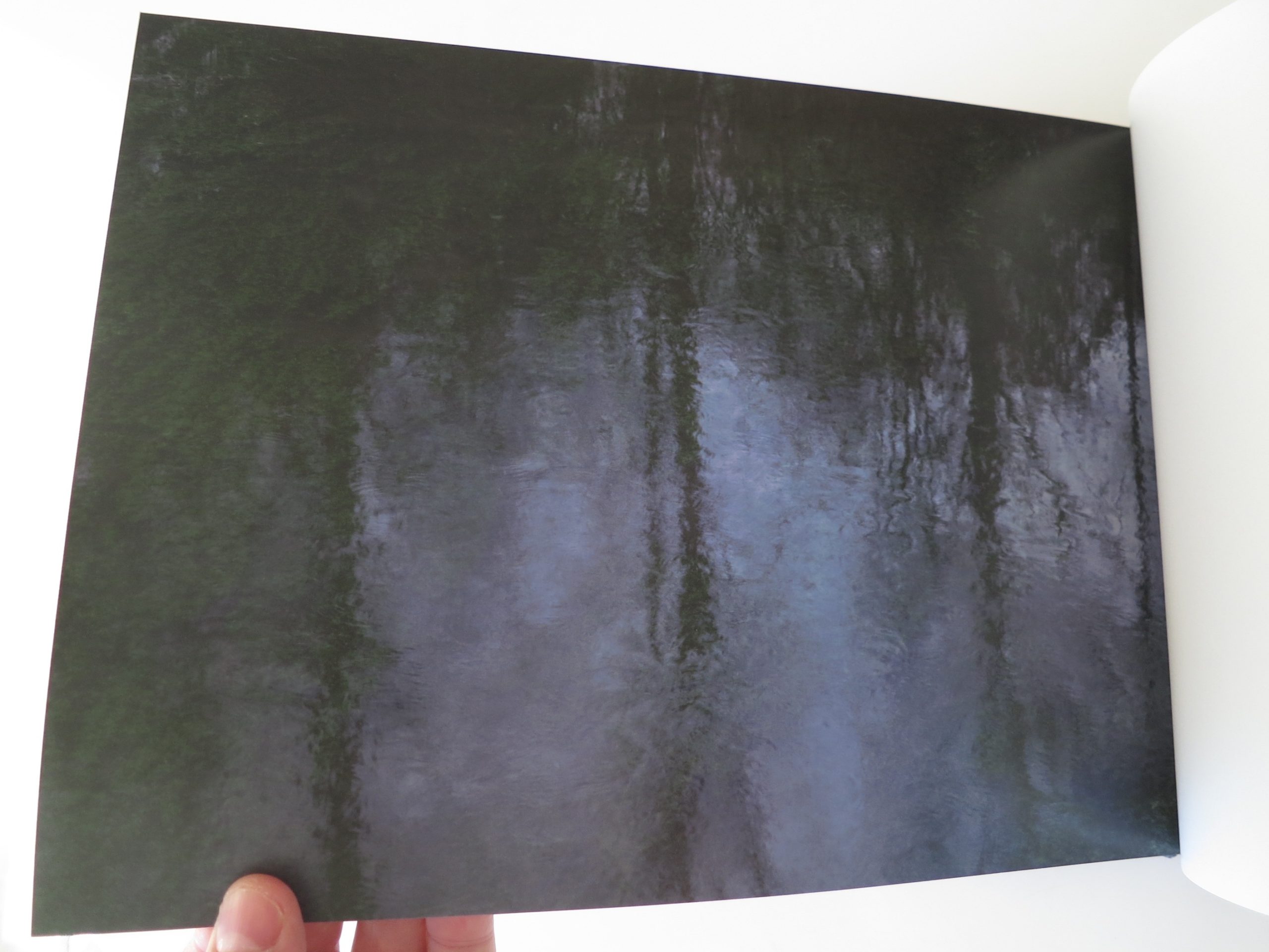
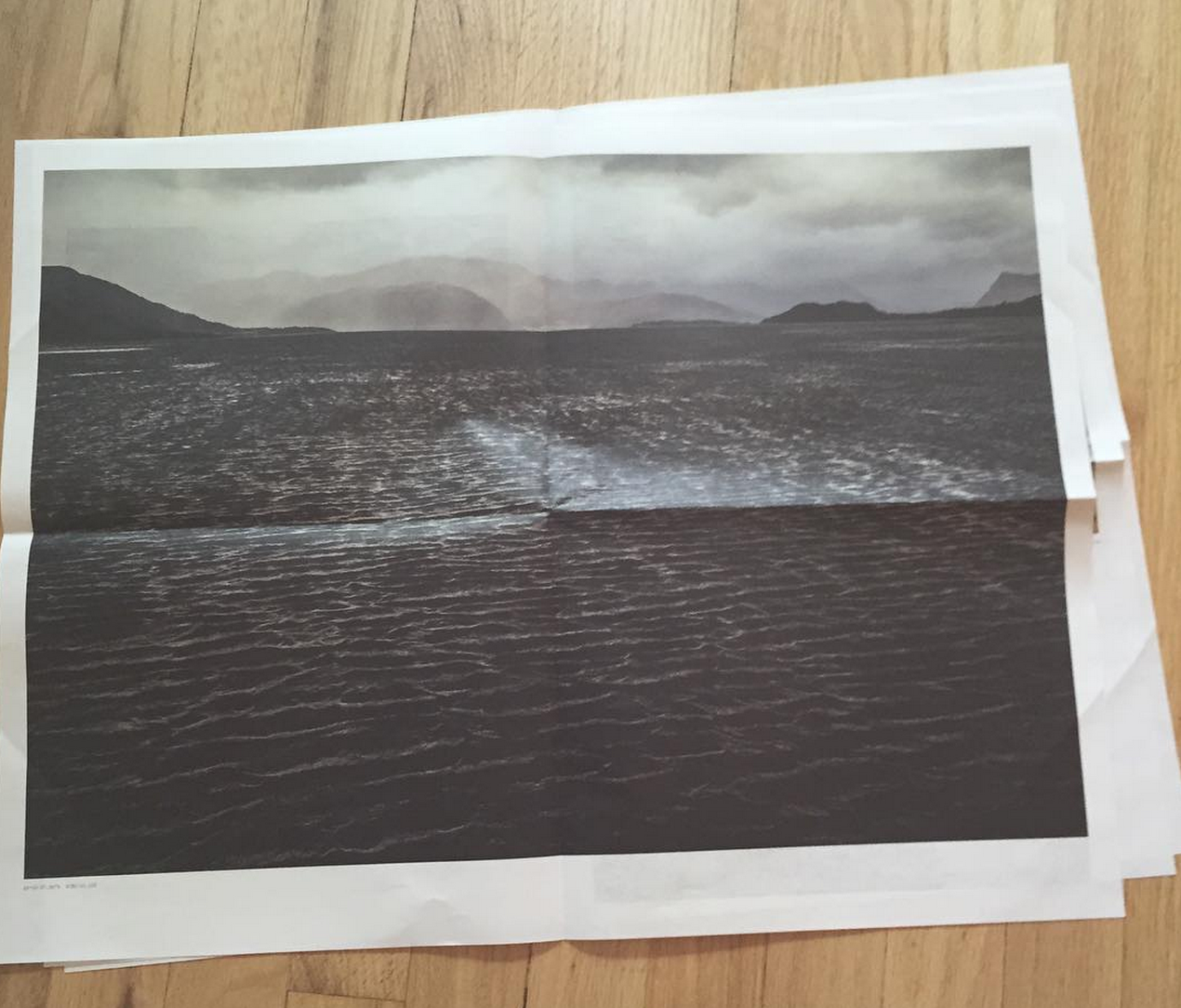
In this case, I’m not sure exactly where I’m going, when I look at Michael Lange’s new book, “fluss,” recently released by Hatje Cantz. The project can also be seen in exhibition form at photo-eye in Santa Fe, our book benefactor, so if you’re in town, be sure to check it out.
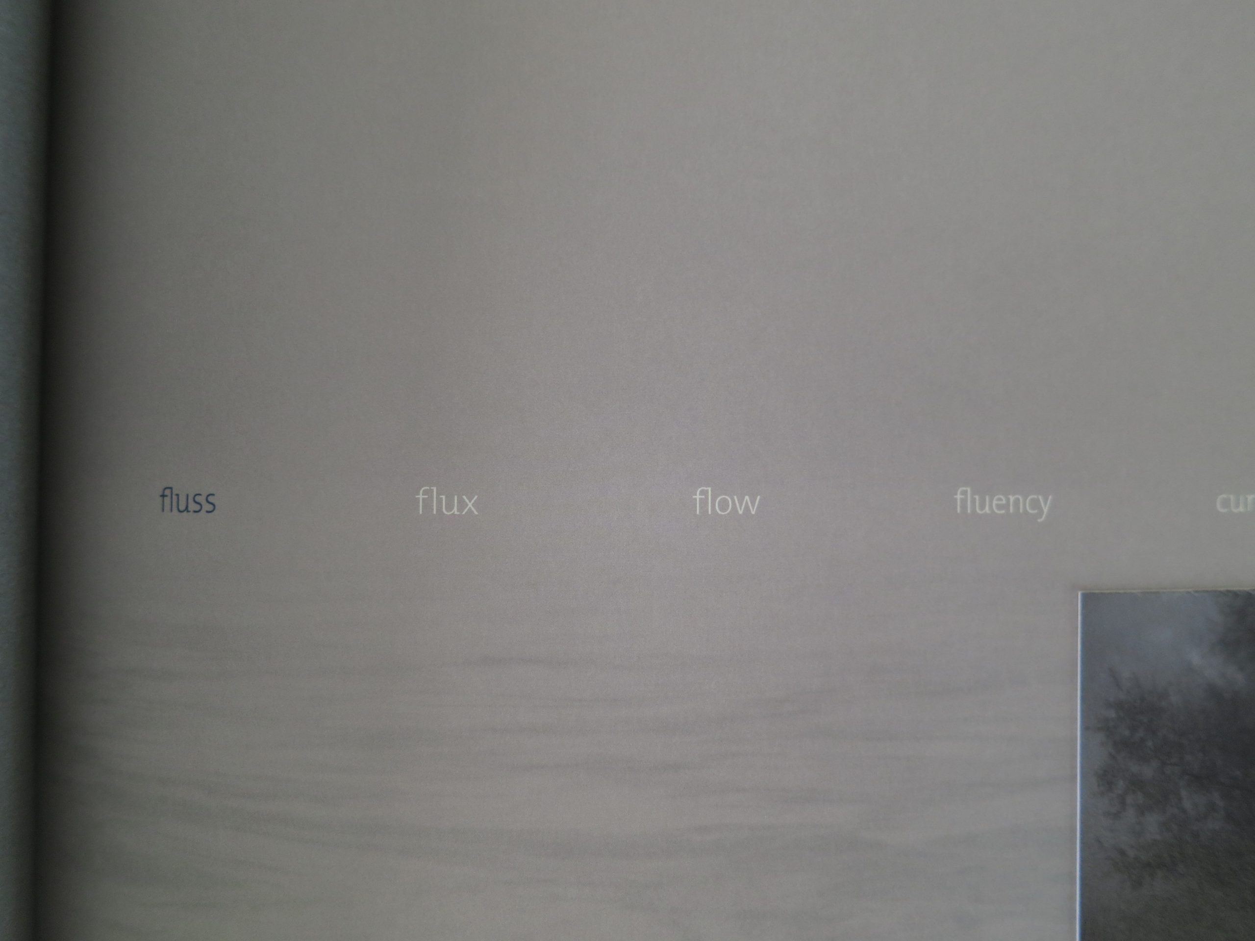
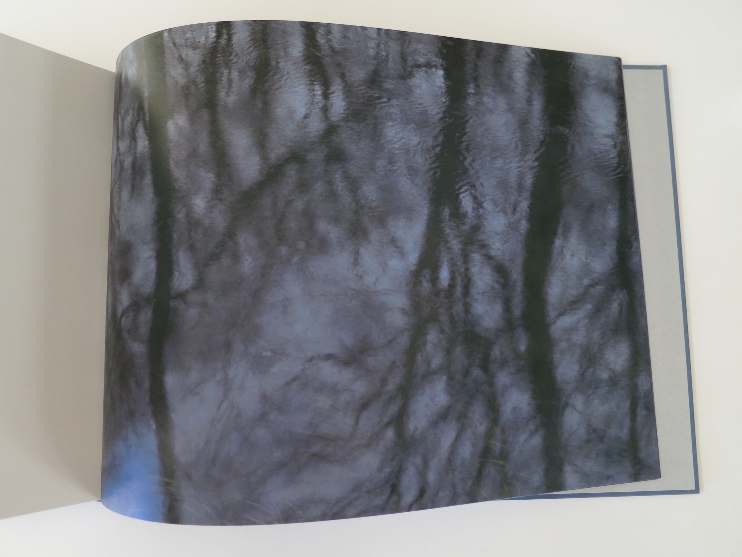
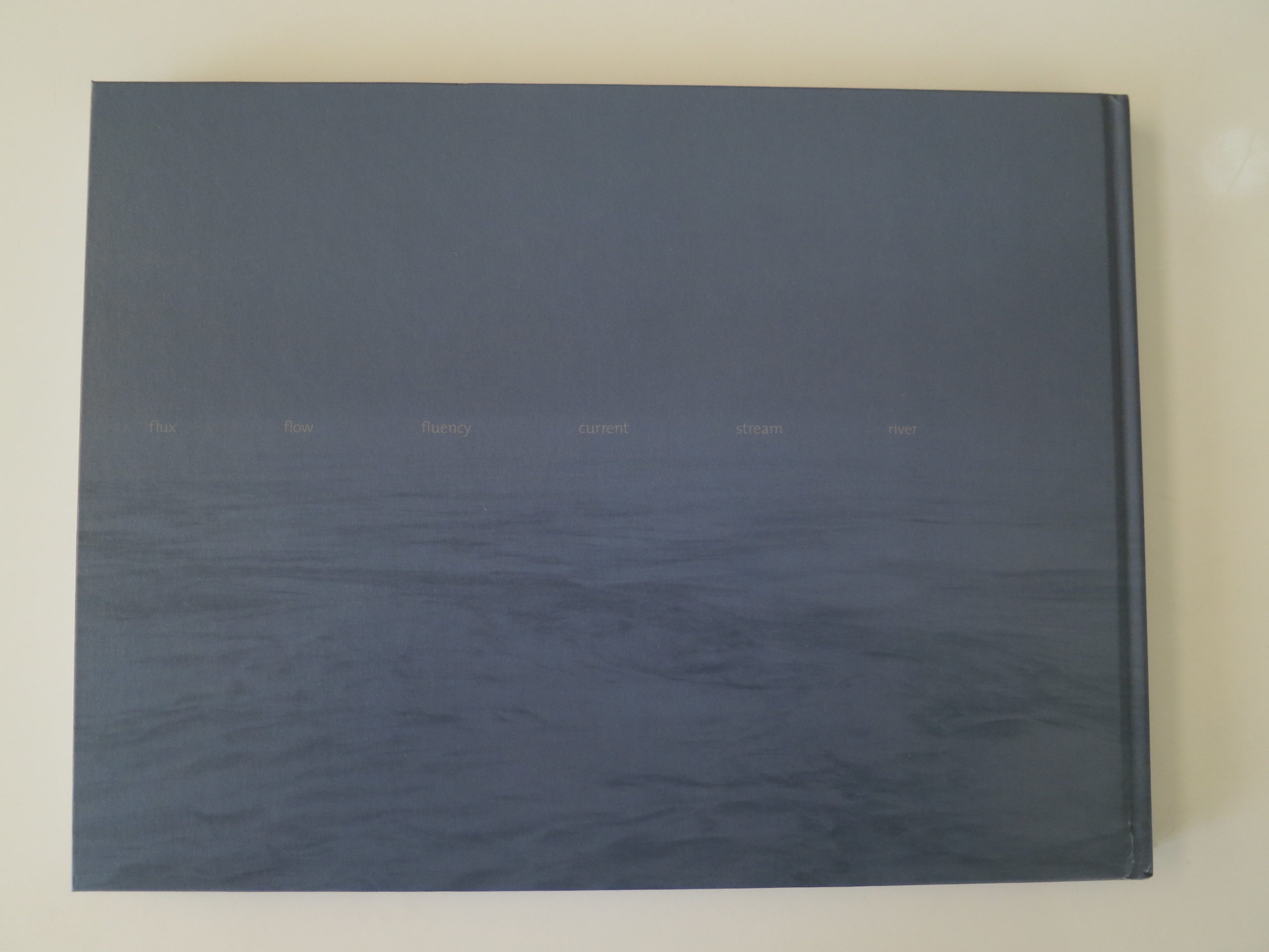
This book is dreamy, alright. Just perfect to take me along on this moody, morning ride, away from the unceasing sun that fostered my musings. The book contains few words, but does open up with a little word association to give it context, beginning with the title: fluss, flux, flow, fluency, current, stream, river.
Is that enough to get the gist? In this case, I’d say yes. Later, we get a poem, translated from German. So that might allow us to guess the setting, if we don’t turn to trusty Google to provide the answers.
These are very visual photographs. What you see is what you get. But the color palette, and murky movement, all those purple grays… I’m transported, all right. It almost makes me want to wrap a blanket around me, or put on a wool sweater, to ward off the bone chill.
There are water lilies here, so of course I think of Monet. But his palette had a brightness that is lacking here. These pictures aren’t creepy, but they have just the slightest hint of menace, which makes them more interesting. (If not overtly sublime, they’re well beyond the realm of simply pretty.)
This book is like a temporary vacation, for me, from the end of Summer. As I’ve been known to complain from time to time, it won’t be long before I’m whining about Winter, and begging for some supplementary sun. But until that day comes… we’ll take what we can get.
Bottom Line: Lovely, marshy, wet photos of lakes and rivers
To Purchase “Fluss” Visit Photo-Eye


The Art of the Personal Project: Dave Moser
As a former Art Producer, I have always been drawn to personal projects because they are the sole vision of the photographer and not an extension of an art director, photo editor, or graphic designer. This new column, “The Art of the Personal Project” will feature the personal projects of photographers using the Yodelist marketing database. You can read their blog at http://yodelist.wordpress.com. Projects are discovered online and submissions are not accepted.
Today’s featured photographer is: Dave Moser


How long have you been shooting?
I’ve been shooting all my life, my father used to give me odd little medium format cameras to play with growing up. Professionally, I started shooting in college but went all in in 1994 after 3 years of assisting, so 21 years full time.
Are you self-taught or photography school taught?
I received a BFA from the University of Dayton but photography, as in all the arts, is something you really learn from doing. College helped me with the context for learning and perspective of history, but shooting is the only way to learn.
With this particular project, what was your inspiration to shoot it?
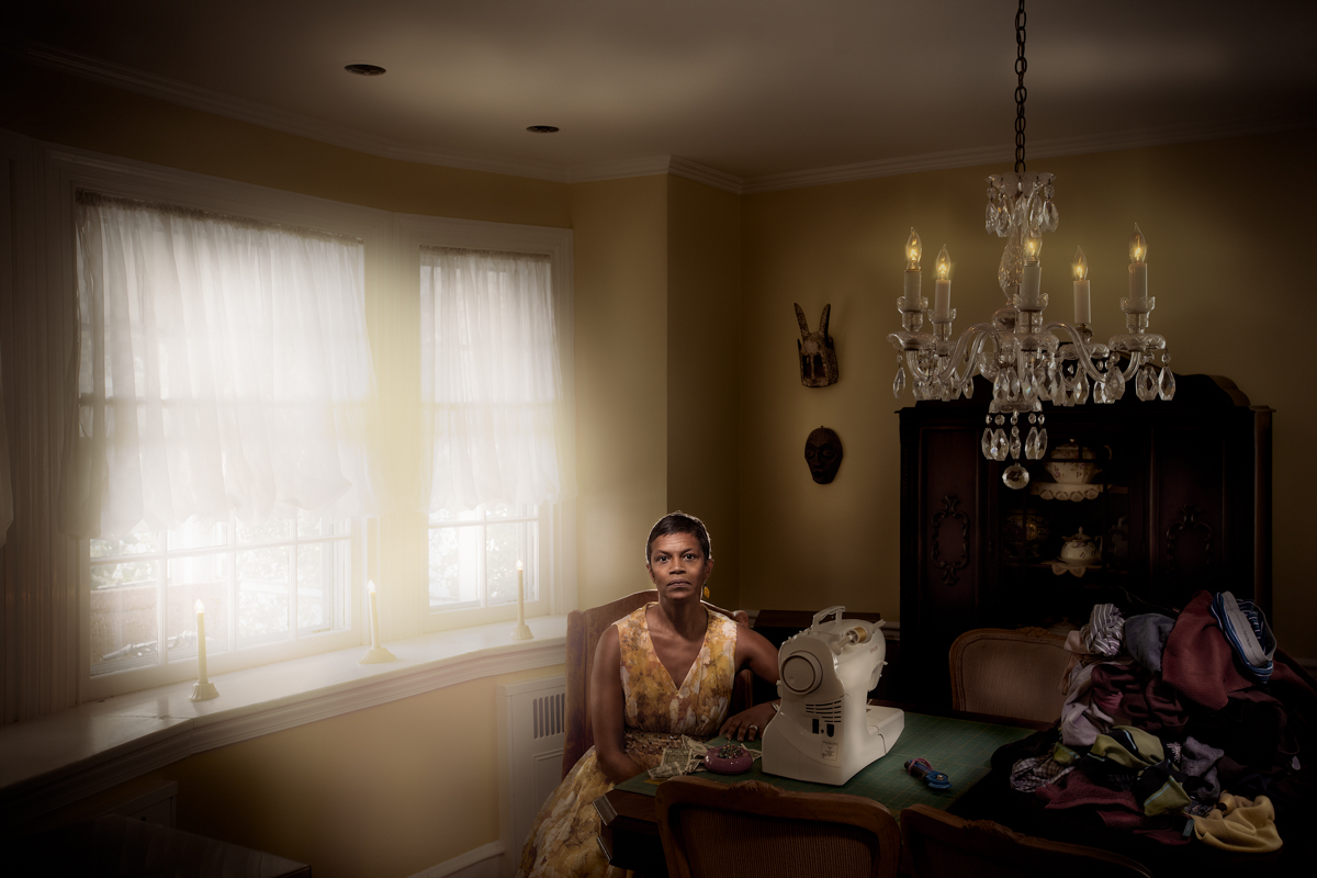
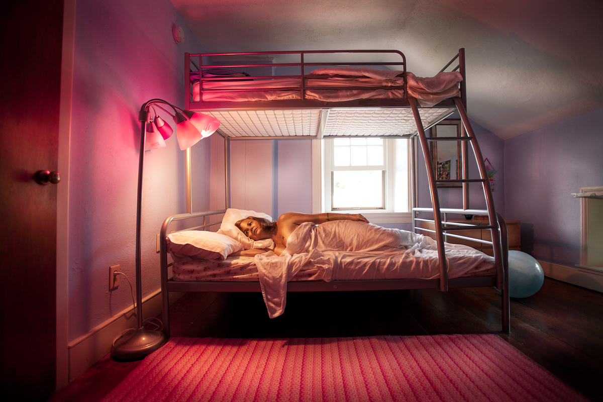
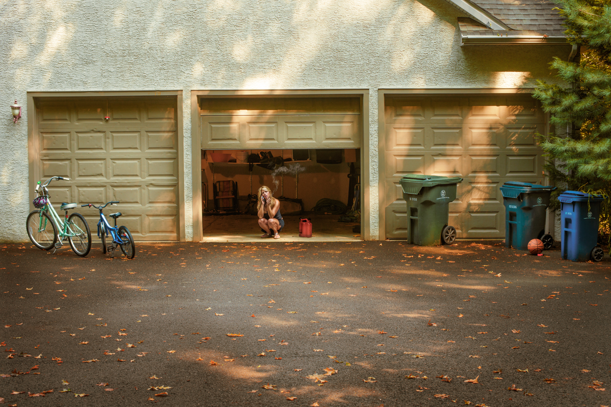
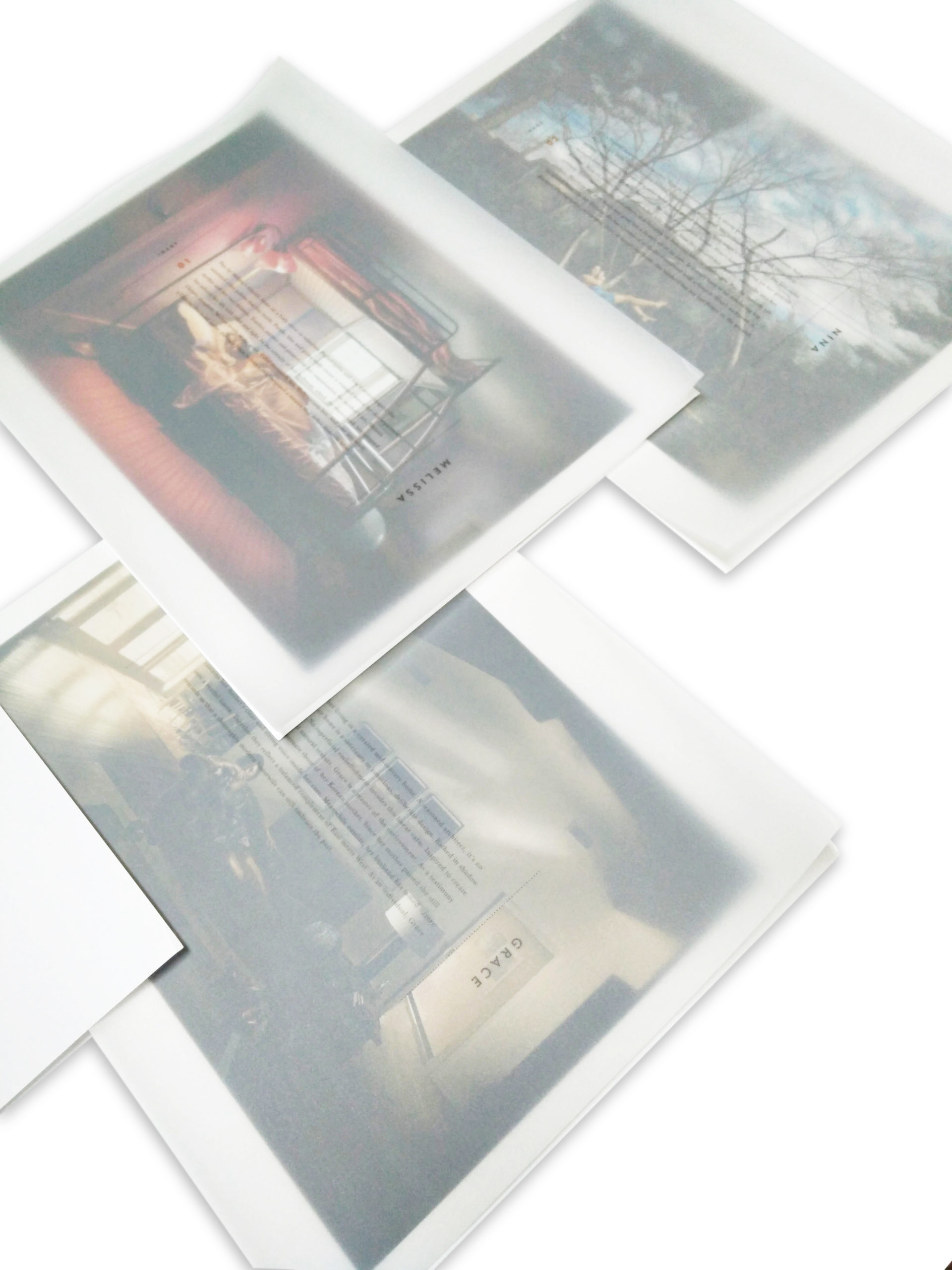
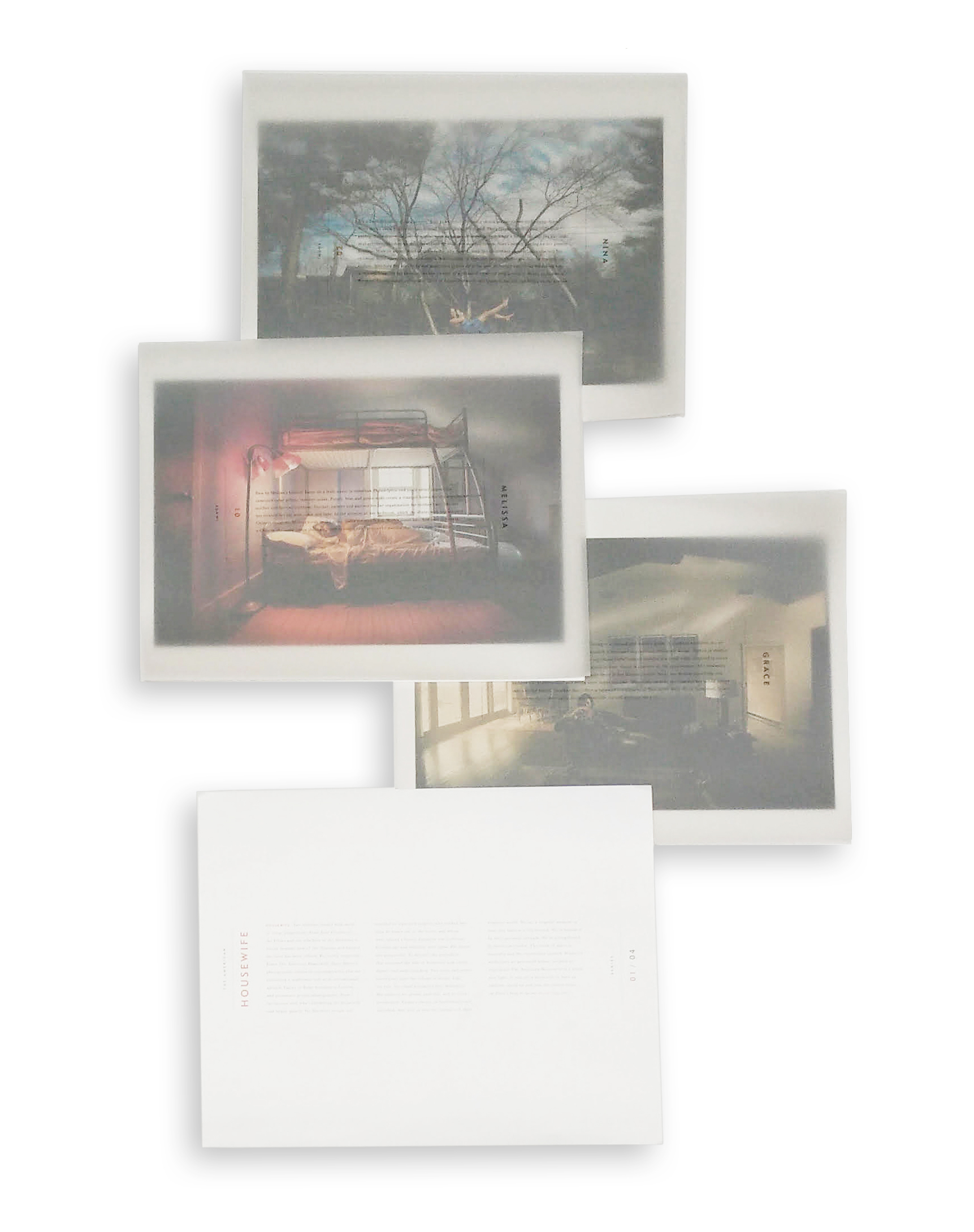
Most of my personal projects grow from groups of people I feel are misunderstood. My wife is a stay at home mom, and I found that when we were in social situations, folks had no interest in what she did. I believe the occupation of being a stay at home parent is challenging, isolating and disrespected but yet one of the most important roles there is-raising the future generation. I wanted to redefine the perception of this role, and used the provocative and antiquated term of “Housewife” in the title.
How many years have you been shooting this project before you decided to present it?
The images started to “leak” out after the first year and a half when I was then approached to do a book by Bob Tursak of Brilliant Graphics. Along with Partners Design we decided to present this project as a four part series of interviews, biographies, quotes and limited edition prints as a co-promotion. We are just completing work on the last two subjects now.
With this particular project discussions were started with a writer who ended up not being able to pursue the project as she did not want to be associated with it. She felt association with the project would damage her career-which speaks to the core of our intention. Additionally, most subjects were scheduled multiple times as I was bumped for kids staying home sick, in-law visits and home emergencies such as a hot water heaters going. These delays only support the premise of the importance of this role.
How long do you spend on a personal project before deciding if it is working?
When I start a series, I am unattached to the outcome. Personal work is typically an exploration with an emphasis of growing and stretching. I am tenacious and will work to change and shape the work until it becomes something I want to present. It is energizing and exciting to work without outside direction.
Have you ever posted your personal work on social media venues such as Reddit, Tumblr, Instagram or Facebook?
Yes, routinely. I do wait until the series is pretty far along as I want the vision of the project to be established before I open myself up to the influence of outside opinion.
If so, has the work ever gone viral and possibly with great press?
The work has not gone viral but the work has been shared and reposted quite a bit as well as garnering publicity internationally. The work has attracted interviews such as this along with numerous prestigious top awards with Px3 and Graphis over multiple years. I have been discussing commercial representation with one of the best. I am also negotiating with a well respected fine art gallery. I am often invited to speak to various groups and businesses. , one in particular led to a significant ongoing job with a new client.
Since shooting for your portfolio is different from personal work, how do you feel when the work is different?
I do at times shoot for specific applications to demonstrate my abilities or “test”, but all the unpaid and consequently personal work I do is for me. The main intention of these projects is to evolve my vision, challenge myself, stretch, go beyond my “everyday work,” stimulate and exercise my curiosity and contribute to the world. My personal projects directly feed my commissioned work.
Have you printed your personal projects for your marketing to reach potential clients?
I have found that my personal work drives my most rewarding commercial work. Savvy creatives can see what I am capable of without direct application to their accounts. It shows a thread of vision in it’s more pure state. The promotion of this series has opened/re-opened doors for me at large agencies and magazines. The recipients of our promotions have often responded with fascinating and insightful responses to the work and has led to bids and jobs.
The American Housewife (artist statement)
The American Housewife attempts to redefine the modern housewife by portraying housewives in their own homes, wearing their own clothing, with their own belongings. Each image is a collaboration with the subject — investigating and learning what this role entails through imagery.
———————
I am a seeker, an artist, a photographer, a father, a husband, a lover of all things eclectic, a listener, a cook, a marketer, a business person, an outdoorsman and voyeur.
I graduated from The University of Dayton with a BFA in photography. After discovering commercial photography, I fell in love with the problem solving, collaborating, accessing and working with different people in different environments everyday.
I have found portraiture to be the most fascinating aspect of photography due to the connection and understanding it offers. I’ve found that if I understand someone, not necessarily agree with but understand – I have love for them. Often while photographing people, they become younger, the effects of time fall away and I witness the openness we all shared as children. Portraiture, listening and the discipline of seeing are the aspects of my craft that inspire and energize me.
Dave’s portraiture has been featured on the covers of and in national magazines and in advertising campaigns worldwide and has led to awards with Communication Arts, PDN, Graphis, Applied Arts, Prix De La Photographie Paris, ASMP and many more. http://www.davemoser.com
APE contributor Suzanne Sease currently works as a consultant for photographers and illustrators around the world. She has been involved in the photography and illustration industry since the mid 80s, after establishing the art buying department at The Martin Agency then working for Kaplan-Thaler, Capital One, Best Buy and numerous smaller agencies and companies. She has a new Twitter feed with helpful marketing information believing that marketing should be driven by a brand and not specialty. Follow her on twitter at SuzanneSease.
Know Your Rights: Photographers
Taking photographs of things that are plainly visible from public spaces is a constitutional right – and that includes federal buildings, transportation facilities, and police and other government officials carrying out their duties. Unfortunately, there is a widespread, continuing pattern of law enforcement officers ordering people to stop taking photographs from public places, and harassing, detaining and arresting those who fail to comply.
Your rights as a photographer:
- When in public spaces where you are lawfully present you have the right to photograph anything that is in plain view. That includes pictures of federal buildings, transportation facilities, and police. Such photography is a form of public oversight over the government and is important in a free society.
- When you are on private property, the property owner may set rules about the taking of photographs. If you disobey the property owner’s rules, they can order you off their property (and have you arrested for trespassing if you do not comply).
- Police officers may not confiscate or demand to view your digital photographs or video without a warrant. The Supreme Court has ruledthat police may not search your cell phone when they arrest you, unless they get a warrant. Although the court did not specifically rule on whether law enforcement may search other electronic devices such as a standalone camera, the ACLU believes that the constitution broadly prevents warrantless searches of your digital data. It is possible that courts may approve the temporary warrantless seizure of a camera in certain extreme “exigent” circumstances such as where necessary to save a life, or where police have a reasonable, good-faith belief that doing so is necessary to prevent the destruction of evidence of a crime while they seek a warrant.
- Police may not delete your photographs or video under any circumstances. Officers have faced felony charges of evidence tampering as well as obstruction and theft for taking a photographer’s memory card.
- Police officers may legitimately order citizens to cease activities that are truly interfering with legitimate law enforcement operations. Professional officers, however, realize that such operations are subject to public scrutiny, including by citizens photographing them.
- Note that the right to photograph does not give you a right to break any other laws. For example, if you are trespassing to take photographs, you may still be charged with trespass.
Read more here: Know Your Rights: Photographers | American Civil Liberties Union.
The Daily Edit – Lollipop: Joshua Paul

Lollipop Magazine

Founder & Editor in Chief: Joshua Paul
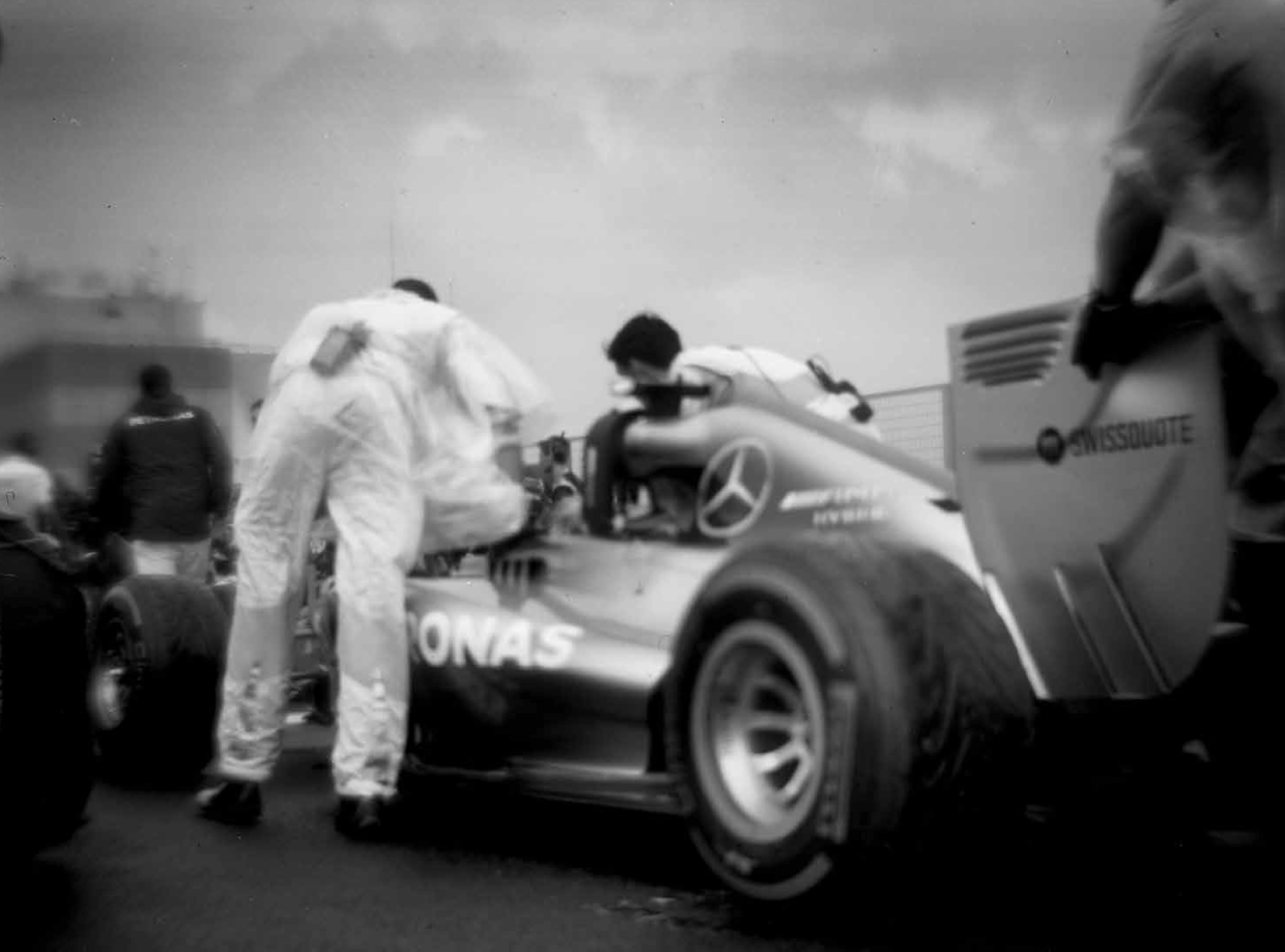
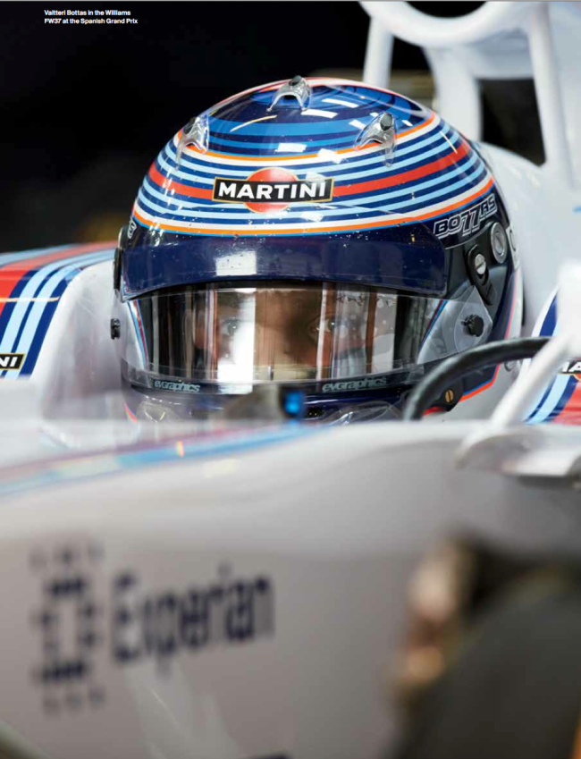
Heidi: Was it your intention to be a Formula 1 photographer?
Joshua: I never intended to be a Formula 1 photographer, editor or publisher of a magazine. There was no concept, savings, or business plan, just a perfect sequence of events, dating back to childhood that brought this to fruition. I was born with innate love of cars and racing, specifically grand prix racing. I also subscribed to Road & Track magazine for as long as I can remember. As a photographer, I have been sent to over 85 countries, on some very dodgy shoots, traveling so frequently, I used to pre-pack my bags for subsequent trips. Lollipop couldn’t have happened more organically – Formula 1 brings together my love of cars, racing, travel, adventure, photography, and magazines.
How did the project get it’s start?
On a freezing day in February of 2013, I woke up to KCRW, and heard about an upcoming music festival in Barcelona, called Primavera Sound, with Blur as the headlining band. I spontaneously bought a ticket, and booked a flight and room for the month of May.Over the next few weeks, realizing the Spanish Grand Prix would take place during my trip, I asked my friend and the new Creative Director at Road & Track, Dave Speranza, if I could shoot the race for them. They were into it, and helped me attain accreditation for the Spanish Grand Prix.
I didn’t see this as anything more than fulfilling a dream to shoot a Formula 1 race, before the concert the following weekend. I was psyched to be there, and nostalgic to be shooting for Road & Track. When I arrived at the circuit in Barcelona, the first person I saw was the NBC broadcaster, Will Buxton. I said hello, and with a very warm welcome, he encouraged me to introduce myself to the person who gave me accreditation, Pat Behar, and insisted I go to the Ferrari, Mercedes, Lotus and McLaren motorhomes, ask for the Press Officers, and tell them I’m with Road & Track, and ask if I can photograph the drivers, the cars, the garages, etc. I immediately went to say hello and thank you to Mr. Behar, who not only knew my name, but he knew my website thoroughly, referencing specific images, telling me, “That’s why I gave you accreditation.” Then he offered, “You should come to Monaco,” the next race on the calendar. Then I went to Ferrari and Lotus, and they too generously offered to let me shoot the drivers getting suited up in the garages, buckled into the cars, and speeding off onto the track. That night, I called a friend back in New York to tell them what the hell had just happened, and his response was, “Dude, you’re in.” I didn’t feel that way at all, but knew something special was happening, I accepted the invitation to Monaco, sacrificing my Blur concert.
Did you have a previous relationship with Road and Track?
Not as a photographer, but as a long-time subscriber, since I was about twleve years old. My connection was through the Creative Director, Dave Speranza, who gave me one of my first assignments, for “Golf for Women” magazine, in 1999.
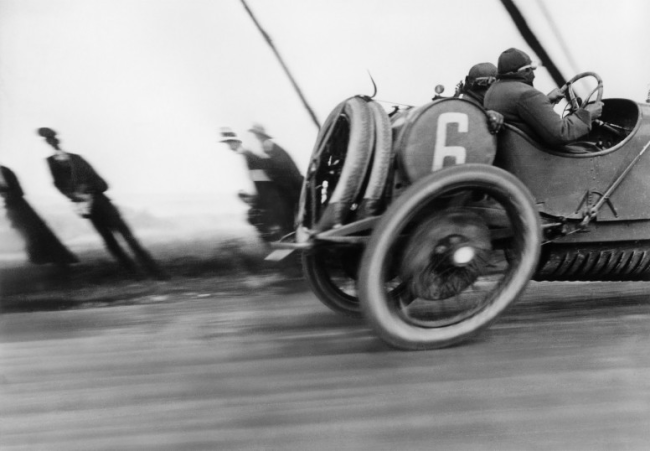
What was it specifically in this image by Jacques-Henri-Lartigue that inspired the project?
I love everything about this image! It looks fast, dangerous and romantic. The drivers are wearing leather helmets, there is an exposed gas tank behind the driver’s heads, and the wheels are bent to an oval, with two spare tires, suggesting there will be a flat tire. The people in the background look upper class, which hasn’t changed in F1 racing, and they are skewed in the opposite direction of the car, emphasizing speed. It’s also muddy, and I feel like I can hear the engine and smell the fuel. Mostly, what intrigues me about this image is the odd crop. I so badly want to see the whole car, but it’s as if this was all he could capture at that speed. He leaves me craving more. I’ve always wanted to create timeless images, and I’m trying to do it in F1.
I know self publishing is a challenge, what was your driving force?
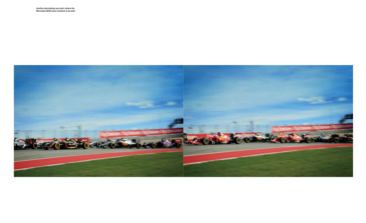
After Road & Track told me they could no longer sponsor my accreditation, an idea arose to publish an independent, American Formula 1 magazine, as a photo-narrative of every race. Most F1 magazines report news, driver gossip and the business deals. To stay in Formula 1 as a photographer, you must attend 12-14 races each season, and publish hundreds of photographs. Lollipop helped achieve some of these requirements, but I had no idea how intense the travel would be. There are twenty races in twenty different countries, taking place every other weekend, from March until November! Had I known in advance what this would take, I’m not sure I would have done it, but taking it race by race was exciting and achievable. I kept discovering new things about the sport, uncovering different layers, and I woke up every morning totally inspired to go explore, shoot something new, play with shutter speeds, etc. The more races I shot, the more I discovered, and realized I had access to not only the race track, the cars and drivers, but also with permission, to the team garages, the mechanics, engineers, teams trucks, and factories. There is so much to shoot – it’s the ultimate travel story.
Where did the funding come from Lollipop and what’s the backstory on the name?
Lollipop is self-funded. I looked for sponsors and advertising, but Formula 1 is not well known in the United States, and there was no circulation to speak of. I took a loan for the printing of the third issue, but the sales are offsetting the costs, and inherent expenses. The name Lollipop pays homage to a piece of racing equipment formerly used during pit stops. The crew chief held a long pole with a disc at the end of it, affectionately called the lollipop. It was used to communicate with the driver of when to stop, and when to go. Now they are electronic, like stop lights.
Why is there no video allowed in F1?
The rights holder of Formula 1 owns the broadcasting rights worldwide. He provides a live feed of each race, bringing all the cameras, microphones and cameramen around the world, from race to race. We are only allowed to shoot still frames, which is amazing for me, because I love the still image and narrative.
You’ve traveled to 22 races and been to 40/50 countries, are you also shooting other jobs?
I have taken a few races off here and there, to regroup and shoot other assignments. It’s more a matter of letting my clients know I’m back in the United States. This is where social media sometimes backfires. If I post images from around the world, everyone assumes I’m gone, so I need to be careful about that. I also keep in touch and let everyone know I’m back – this goes for friends too. I’m grateful that they have been patient with me, and still call. As far as shooting assignments, I would like to concentrate on motorsports and the automobile industry. I would also like to see Lollipop expand to different genres of prestigious racing, like LeMans. I am enjoying the challenge, and as much as I love being a photographer, I love every aspect of publishing, it’s exciting, empowering and new.
How many different cameras do you have for each race?
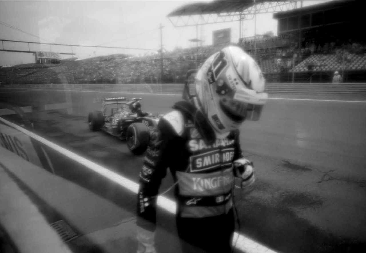
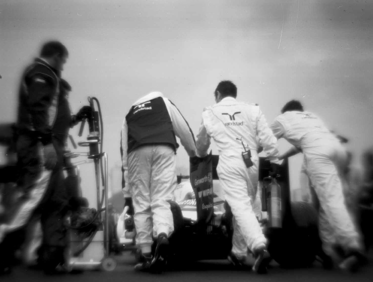
I bring one camera, and sometimes a backup body. I’m not a gear head and don’t like carrying all the weight. I also like to choose a focal length and stick with it. If I can do this from race to race, mixing it up a bit, it keeps me fresh, the work fresh, and gives a different look to each race. More important than the camera, I shoot with fixed focal length lenses. I bring a Zeiss 35mm, 50mm, and a vintage Nikon 105mm, along with an autofocus 24-70mm, as a back up for portraits. Both Nikon and Canon reps come to every race to service our gear, and bring crates of cameras and lenses for us to use. I occasionally try a long lens, but I prefer to shoot wide. Last season, as I started to repeat races from the year before, and decided to bring along my 1913 Graflex 4×5, and shoot black and white film. I wanted to try to recreate some classic images with modern cars, and deconstruct the cars a bit, concentrating more on their form, than the sometimes garish advertising. It’s a huge challenge, but keeps me intrigued, and really slows things down. Instead of shooting infinite frames on memory cards, I shoot about twenty sheet per session, and I feel like a photographer again, thinking about composition, framing, and point of view.
How are you sustaining yourself, does the magazine have advertising?
Lollipop is produced on a shoestring budget, with no overhead or employees. I’ve slept in tents, stayed in far away hotels, walked, taken public transportation and have asked for rides to and from the various circuits. Besides paying the designer, and expenses for the fashion shoot, all the money went into printing. That couldn’t be sacrificed, and we printed it based on the paper and ink we wanted, vs. cost. I have not taken any advertising, not that I didn’t try, but in the end, I am happy we didn’t get any ads, because I want Lollipop to be exclusive and collectible. I would like to think, if you picked up an issue ten years from now, you’d still say wow, and not be distracted by outdated ads. I know this is very idealistic, but I think it would be better to try to advertise by association, or by a single, per-issue sponsor, or through custom packaging. I also think and hope that when Lollipop is discovered by F1’s hundreds of millions of fans worldwide, the distribution will grow and help make it sustainable and profitable.
Are you selling any of there images?
I have supplied images to several magazines, but I decided I wanted to publish exclusive content, and simply try to create the most beautiful racing magazine ever.I would like to publish and exhibit the black and white work, and it’s a matter of time and priorities. I’m doing my best to set realistic goals, and unfortunately, it’s not an immediate goal.
What’s the greatest challenge with this project?
The biggest challenge was getting to that first race. Formula 1 has a bad reputation, based on how the sport was governed over a decade ago, but the people are incredible, and they are incredibly supportive. The challenges now are my stamina, and finding a financial solution to keep this going. A lot has been achieved in two years, including permanent accreditation. I believe in it, the response has been overwhelming, and I think money will come.
How have you grown from Lollipop?
If there was ever a more significant right of passage, this is it. I came to a point in my life to take a real risk, and stopped caring what anyone thought, or failing, and ignored any discouragement. After 17 years shooting professionally, I feel like I’ve finally found my voice as a photographer and writer. I feel more articulate, acute, and in the moment. It’s hard to explain, but it’s like having a new career, doing exactly what I love to do.
What would you tell other photographers that have a deep passion for a hobby or sport?
I have always been very encouraging and I say go for it! You have nothing to lose, and I think every day, if Lollipop stopped tomorrow, it was a huge success. Very few people take big risks in their lives, for fear of failure, lack of stability or peer pressure. Nothing has been easy for me, but I work hard and I’ve had a lot of luck! My first assignment was to shoot shampoo bottles and I was psyched! Then I shot a garden, and then a restaurant. It took three or four years before I got a big travel shoot, and even then I took a deep breath and thought, okay, that’s one, now let’s try for two. You have to believe in yourself, and not be discouraged. There is every reason to not try to be a photographer right now, or think it’s already been done. Everyone is a photographer today. We all have phones, but what do we do with them? Photography is about nuance, and if you look at Robert Frank’s, or Irving Penn’s contact sheets, you’ll quickly see this is a working process, and the great frames jump off the page.Before my first race, a friend asked, “Why F1? It’s already been done.” Not to me it hadn’t, not even close.
Are you also writing all the interviews?
Yes, and that’s empowering. I was an English major in the creative writing program at the University of Washington. I have always felt comfortable writing and have kept a journal for about fifteen years. But again, this happened by accident. One day the Press Officer from McLaren called and asked when I would like to interview their rookie driver, Kevin Magnussen. I thanked her, and explained that I was a photographer and more interested in taking his portrait. She kindly welcomed me to do both. I laid awake the night before, nervously thinking of questions to ask, and just went for it. It wasn’t the best, but it was a start, and it helped me get over being star-struck, and talking to the drivers. I had no idea how difficult it is to dictate an interview and make sense of it. It is really challenging, and massively rewarding. After that, I asked the other teams for interviews, and tried to approach the interviews a little differently. It got better, but drivers expect to hear questions about that weekend’s race, with the Press Officer by their side, so it’s hard to do a lifestyles piece. When I interviewed Pirelli Motorsports Director, Paul Hembery, I felt much more comfortable to just chat and listen. It felt more like we were sitting in a pub drinking a pint, with him telling me about his life. I learned a lot, especially that the most interesting people in Formula 1 are not necessarily the drivers.
How long does on issue take to produce?
I have learned so much in the last two years, and most of it the hard way, but that’s kind of my style.The third issue was a redesign, which took about six months from inception, with three months of hard work to finish. We missed our initial two deadlines, but benefitted by having more time to add written content, like an extra interview and an article about my camera repair with Lotus. Production took over four weeks, because our pages were so heavily coated in ink, it literally took three weeks for the paper to dry. I have to factor that in for the next issue. And then of course, shipping, which took a week. I hope the next one comes together much quicker, but then again, there is a lot of content to gather and the season is long. I want to mix up the design to continue to keep it fresh.
The Daily Promo: Embry Rucker

Embry Rucker
Who designed it?
I worked with Dustin Ortiz on the design. He has done a few newspaper catalogs and print jobs that I loved so his experience and skills were invaluable.
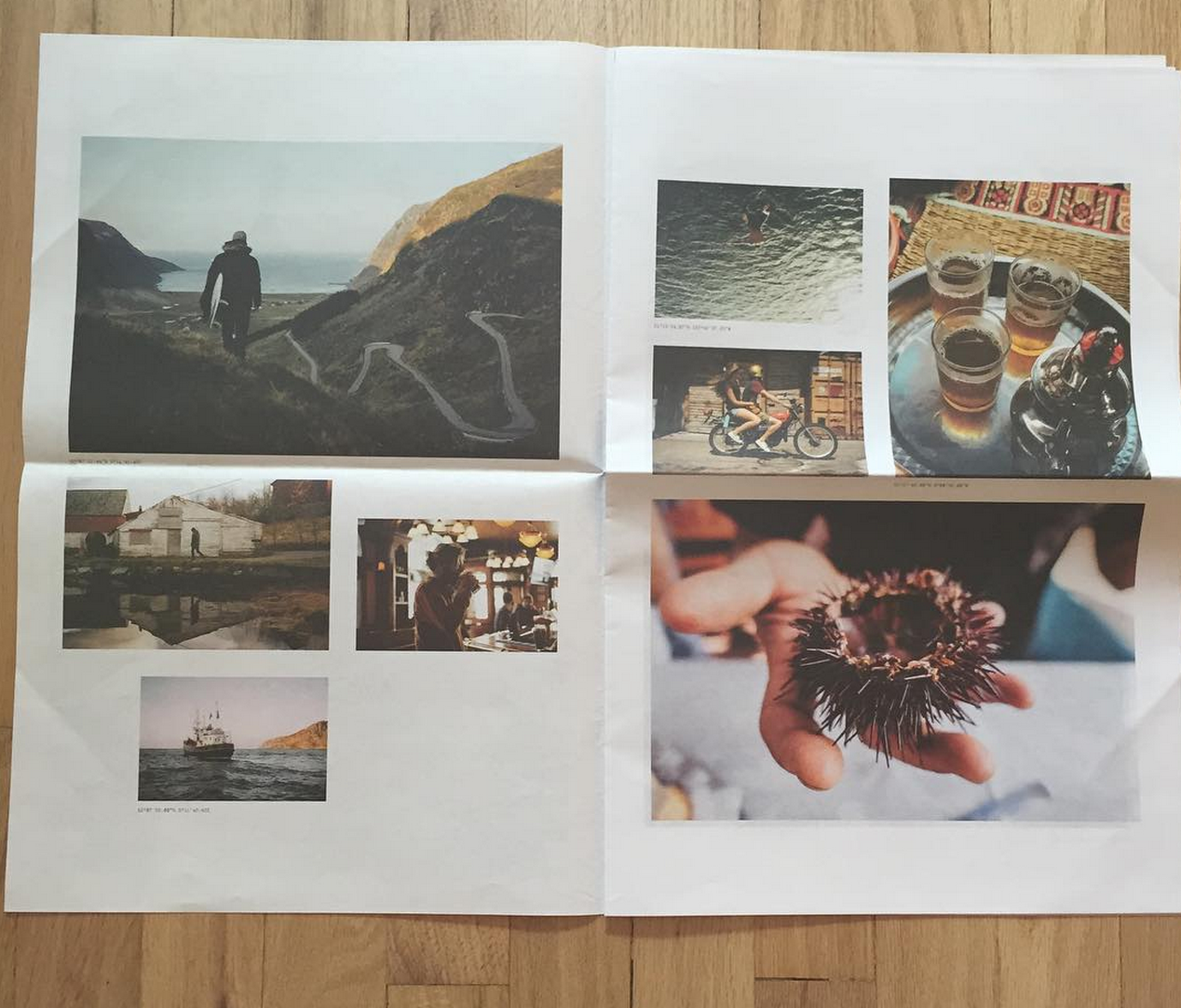
Who edited the images?
I had a collection of images I loved and wanted to include. Dustin helped me cull the herd and pair images that I normally wouldn’t see together. I tend to associate images by shoot. It’s cool to see what fresh eyes see and think work well together.
How many did you make?
We mailed out 2500 and I think we printed 3,000 so we would have some to hand out and use to light fires with.
How many times a year do you send out promos?
I suppose everyone says ‘not often enough’ right? I probably send two realistically, but I think four is probably a good number. With the ‘mass’ mailing like this I’m less convinced it has much of an impact. I prefer to stay in touch with my smaller select group of people I work with, have worked with, who I believe would be a good fit in the future. Something more personal, like the package I sent Rob with the zine, patches, stickers and note…
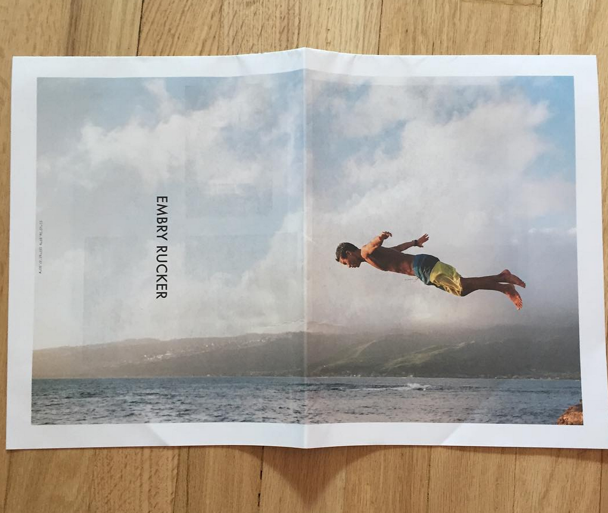
What was the most creative use of your promo and why the newsprint instead of the card?
No real back story other than just wanting to break away from the postcard, grind. I like the newspaper size it’s like a zine and it gives you a tactile experience. Here’s my Daughter using it for shade at the beach…lots of possibilities!
This Week In Photography Books: Aapo Huhta
I just had some company in town. The official end of Summer. One last big dinner party to cook for, as my Aunt and Uncle came in from Jersey to meet my daughter, for her third birthday. Pasta and eggplant and cupcakes. (Oh My!)
It felt like an obligation, due to my general overtired-orneriness, rather than the pleasure I’d have normally taken it to be. My Uncle even commented that I didn’t look very happy, for a guy with lots of good things going on.
It was an odd conversation, because it was obviously true, but I knew I’d be a lot happier if I were relaxing all weekend, rather than chasing my kids and nephews around. Not a kind thing to say… so I kept it to myself.
Sometimes, there are things we ought not discuss. Either because they’re hurtful, or because they lead down dark, shadowy paths. Take politics. It’s a subject my Uncle and I avoid, as he’s a Fox-News-Addicted Republican, and I’m not.
We learned years ago, (when I was younger, and more easily riled,) that if we started talking politics, within 5 minutes, I’d be screaming and ranting like a frightened Drivers Ed instructor. (No, Jimmy, press the brake. The brake!)
Now that I’m past 40, and have a slightly better sense of how the world works, I know not to push those buttons. I’ve learned his opinions, and I choose not to pointlessly inflame his passion. (Back away from the bull, Timmy. Back away!) I love my Uncle despite his taste; not because of it.
As for my taste, I’ve got a nearly 4 year track record of writing about books I find cool and/or interesting. Is there anyone out there paying attention to my likes and dislikes? Is there a style that people expect I’ll praise?
I’m guessing yes. I suspect some astute readers have me pegged: if it’s weird, odd, discomfiting, and razor sharp, I bet Blaustein will have a field day. He digs the artsy stuff.
Is that right?
I’m starting to wonder, as Kehrer Verlag just sent me a book, unannounced. That rarely happens, where a publisher will drop something on me without checking in first. Even the artists will often feel me out, before spending the resources to get a book into my hands.
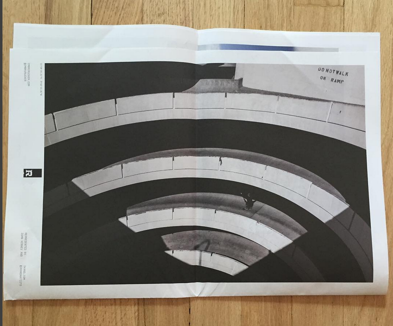
I opened up the packaging, swiped away the plastic wrap, and found a book called “Block,” by a Scandanavian-sounding artist named Aapo Huhta. (Turns out he’s Finnish.)
This seemed to be a book for me, as it opened up without any explication, and thrust me into a situation I needed to suss out. But right away, weird, odd, discomfiting pictures, razor sharp. (Either hi-res digital, or some good scans off of a medium or large format camera. Hard to tell, these days…)
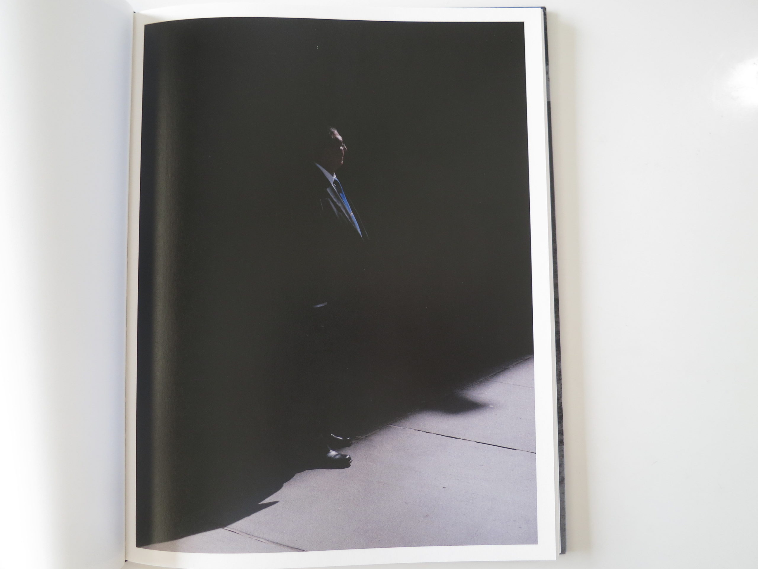
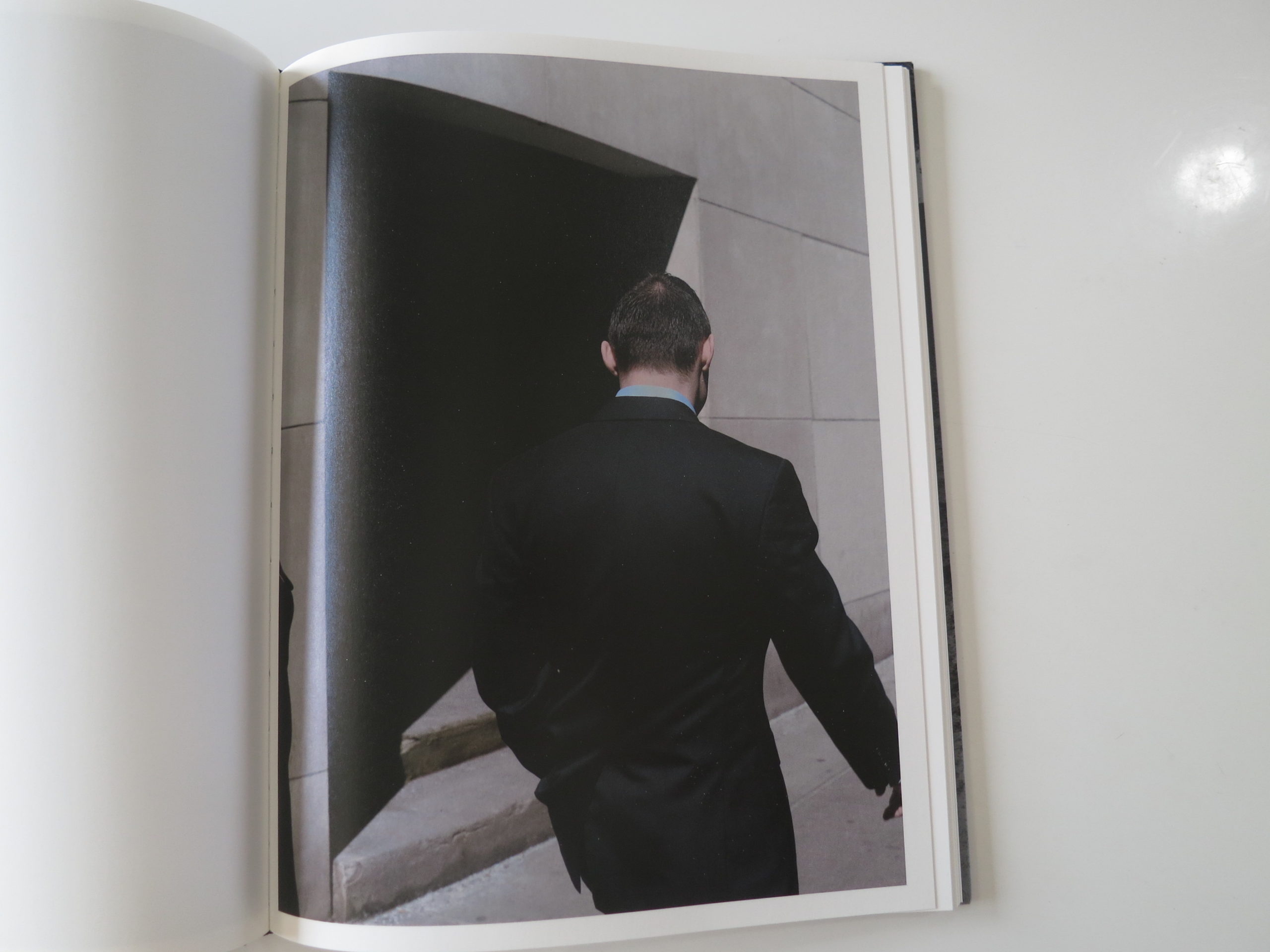
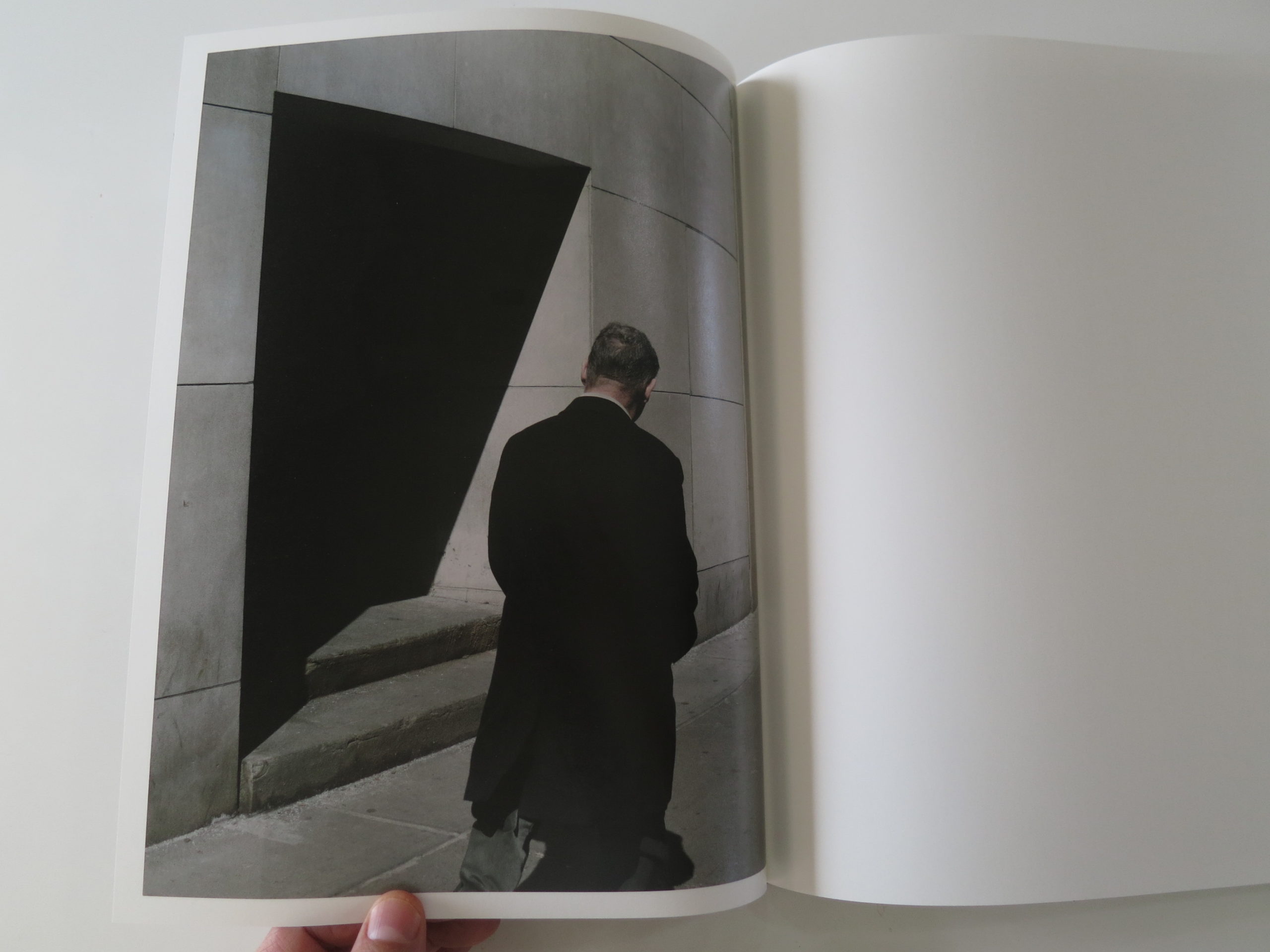
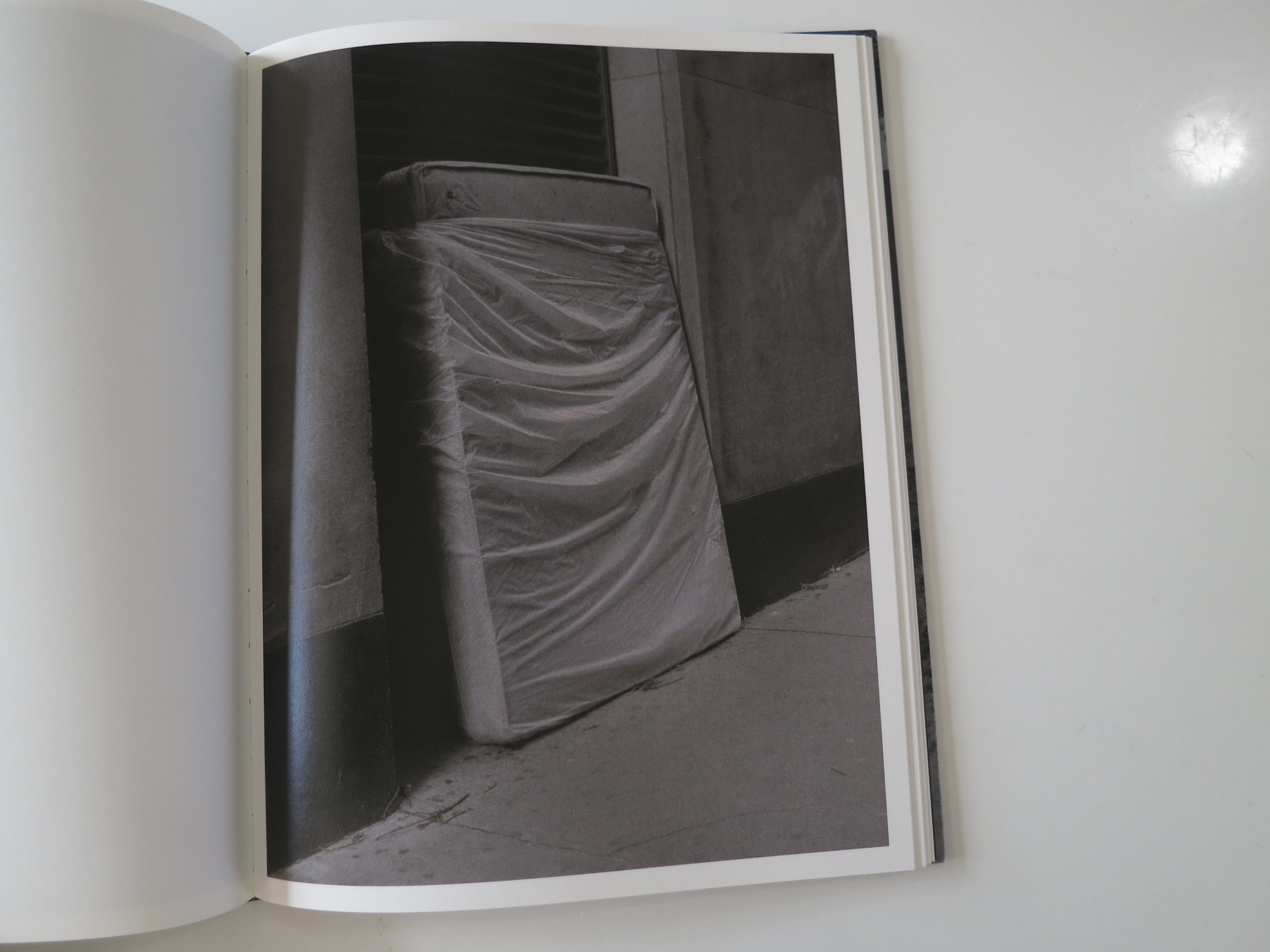
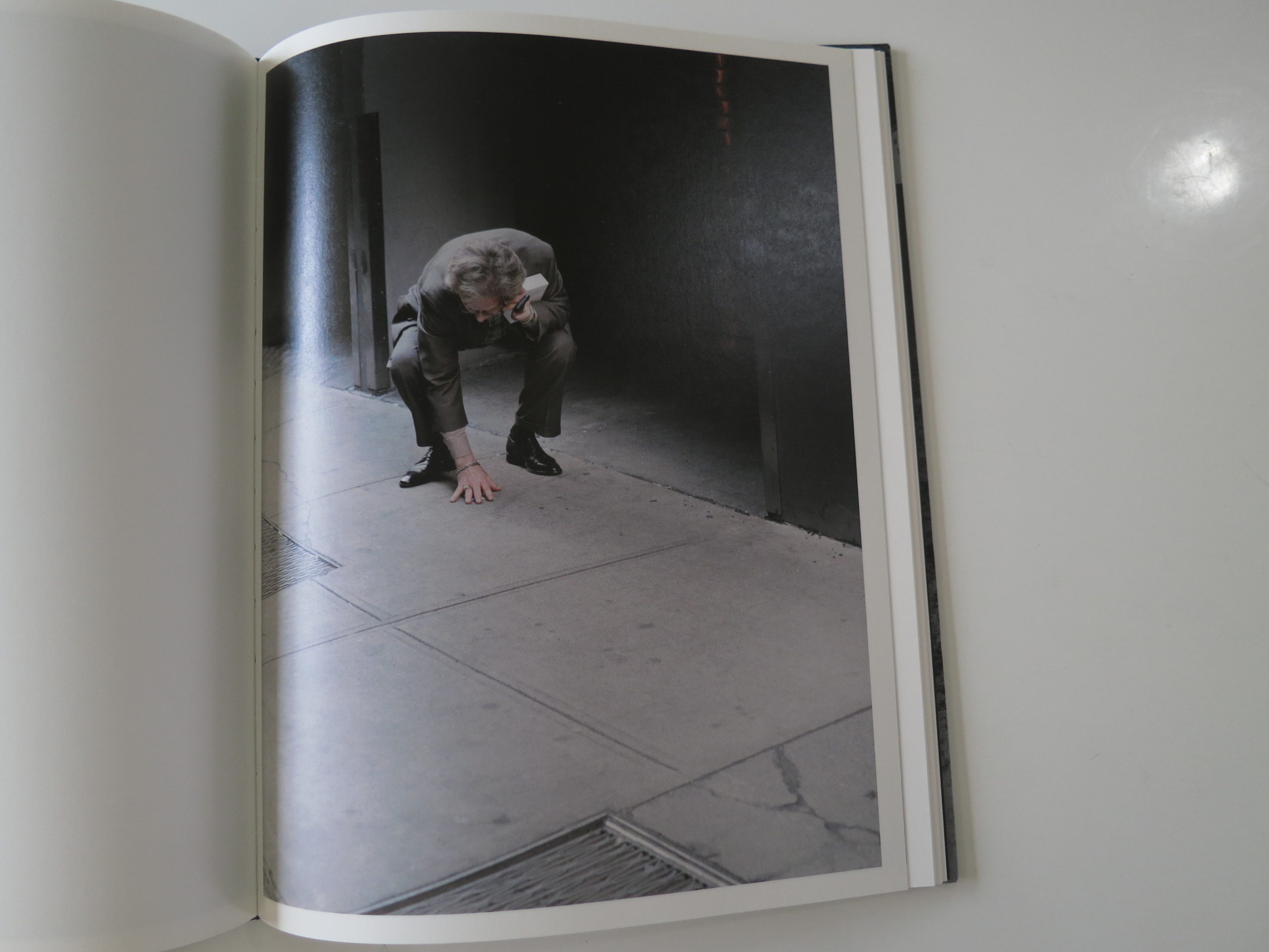
It says “Block,” and then we’re in an urban environment that quickly resolves itself as Lower Manhattan. Is it one block? In the Financial District? I don’t know, but that’s the general read. These would be normal street photos, taken by a different photographer, but instead, we have that “slightly-Haruki-Murakami-parallel-universe” vibe that I love so much.
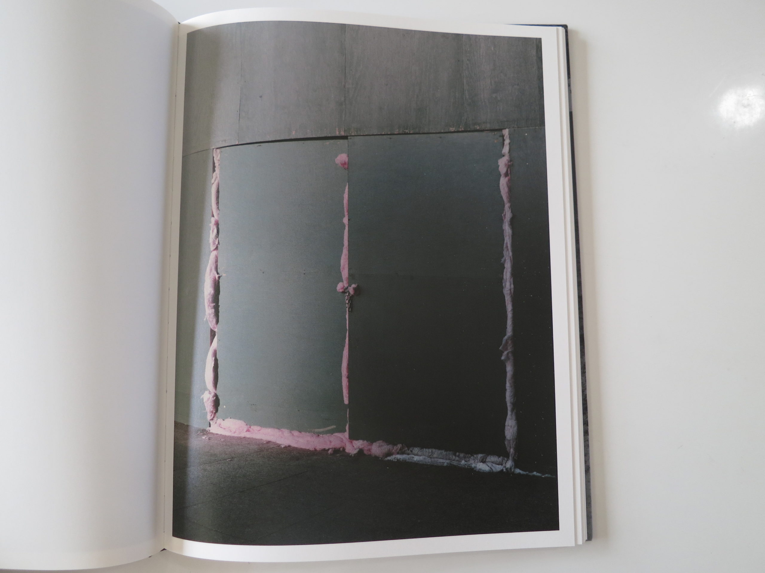
Why do some photographers have the ability to see paranormal energy in a mattress leaning against a building wall? Or in the candy-pink of some insulation melting out of a joint, sealing up a makeshift door to a construction site?
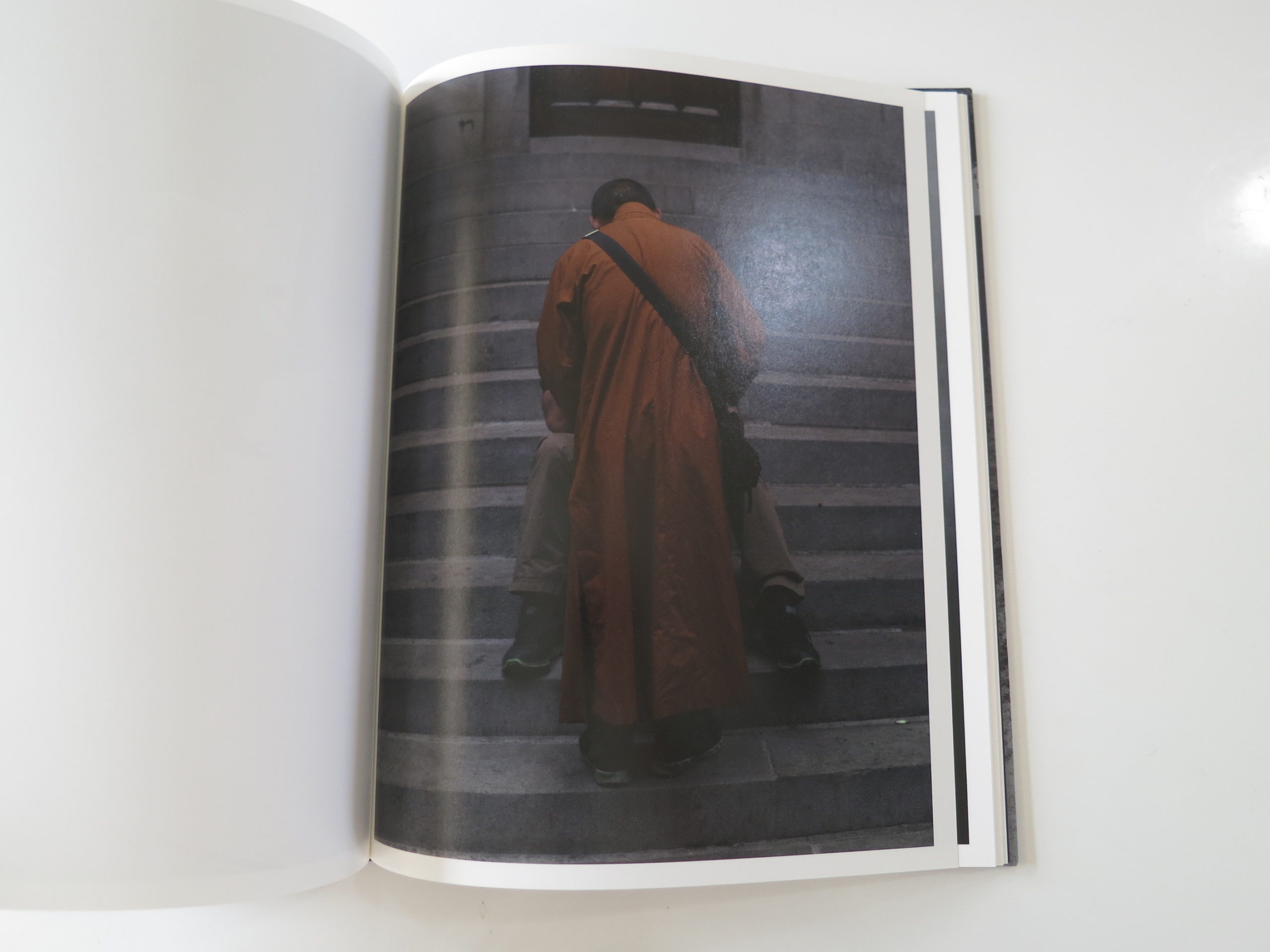
Who would make a photo implying a Buddhist Monk was being fellated by a faceless stranger, sitting on some steps outside a building? (This Guy, that’s who.) Again and again we see banker types, disappearing into shadow, which makes me think of Robert Frank’s amazing photos of British Bankers, made before he came to America.
And there are some similarities to Paul Graham’s book, “The Present,” which I reviewed a few years ago. (Image repetition, compositional style.) So I’m not suggesting that this work is radical, rather that it takes a certain kind of artist to find such weird moments, surrounded by normality.
With respect to context, there is only a small short story, by Jenny Hollowell, at the end. It doesn’t do much contextualizing, though it is a poignant read. (A mini-version of the super-sad opening of the Pixar movie “Up”.) Then, the thank you notes, and the first name listed was my former graduate school professor Allen Frame, whom I’ve mentioned here before. (Does that explain everything about where my preference for the awkward comes from?)
Regardless, we’re back on schedule. A book a week, each week. What will I write about next week? I don’t know. But I accept there are folks out there parsing the subtext, and bravo to Kehrer Verlag for getting it right, in this last week of August, 2015.
http://www.aapohuhta.com/BLOCK
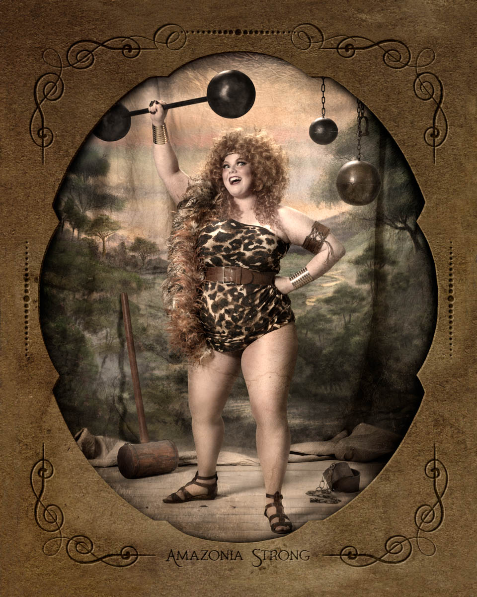
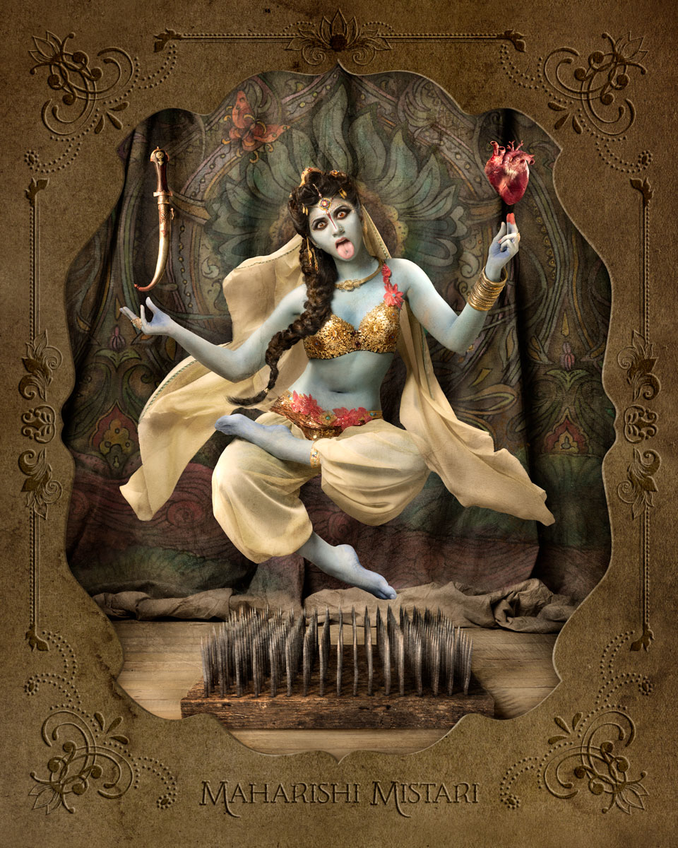
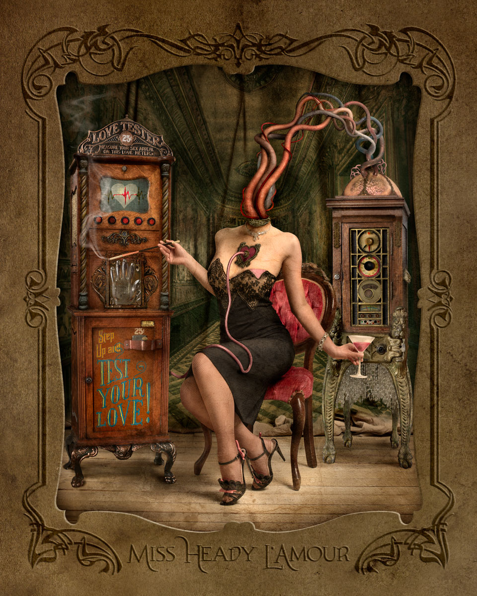
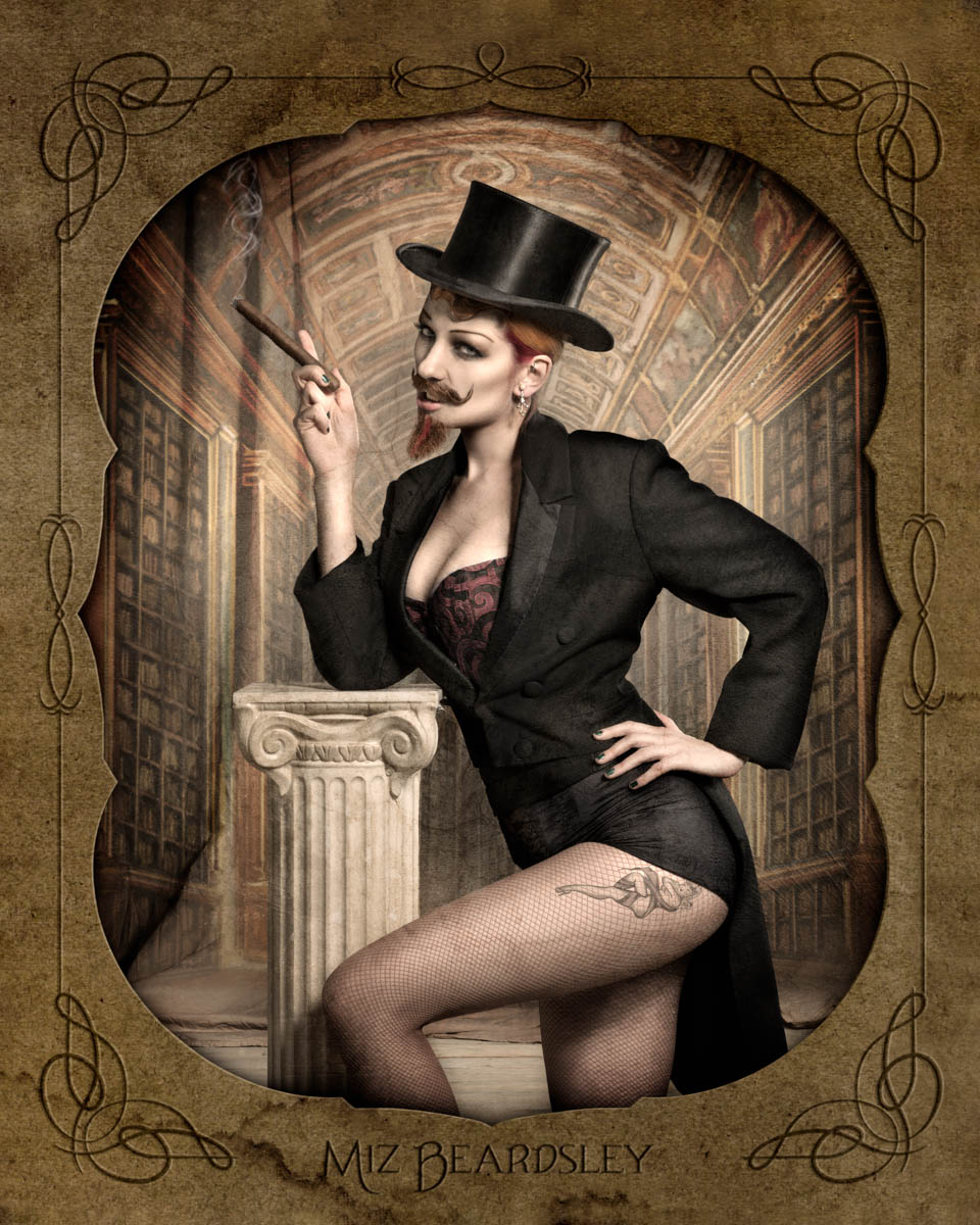
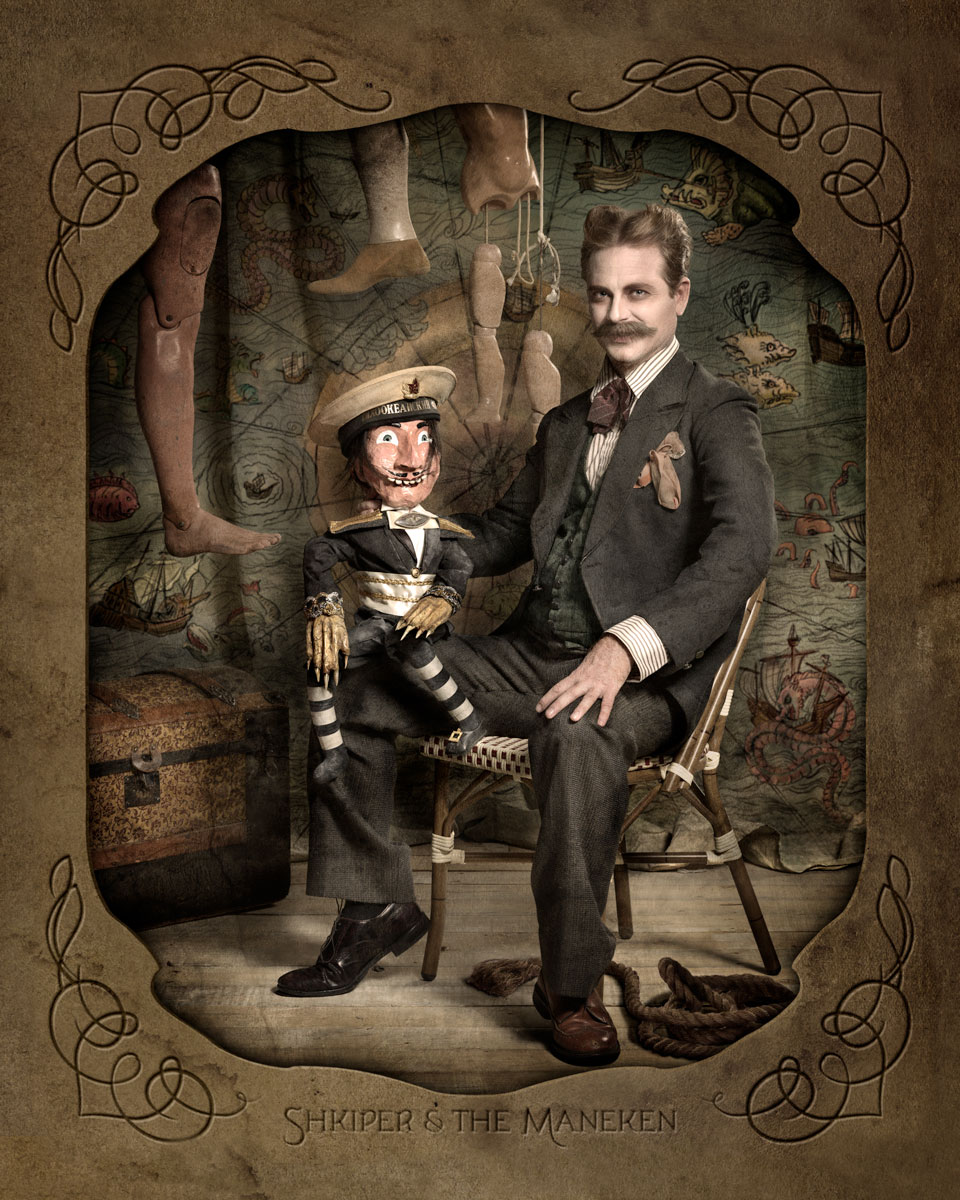
The Art of the Personal Project: Ransom & Mitchell
As a former Art Producer, I have always been drawn to personal projects because they are the sole vision of the photographer and not an extension of an art director, photo editor, or graphic designer. This new column, “The Art of the Personal Project” will feature the personal projects of photographers using the Yodelist marketing database. You can read their blog at http://yodelist.wordpress.com. Projects are discovered online and submissions are not accepted.
Today’s featured photographer is: Ransom & Mitchell — the collaborative storytelling team of Digital Artist + Set / Prop maker Stacey Ransom and Director + Photographer Jason Mitchell.


How long have you been shooting?
We’ve been working together with a focus on still production as a team for six years. Prior to that, our main focus was narrative film production. We both had been working in or near the industry for over 20 years.
Stacey started out art directing photoshoots while working in-house for major retail brands like Limited Stores and Columbia Sportswear. She then was the VP Design Director in charge of visual design and branding at the VIA San Francisco office. Soon after she transitioned behind the camera, to get back in touch with her roots as a set and prop maker for photos and film.
Jason was a broadcast journalist in the Navy for seven years before moving to San Francisco. There he began working in studio and field production for corporate clients which evolved into freelance commercial production as a cinematographer and director.
Are you self-taught or photography school taught?
Interestingly enough, Stacey majored in photography at the Bauhaus-focused Columbus College of Art and Design, but it was the set design and art direction that really captured her interest. Jason first studied acting at Carnegie Mellon University, then decided to jump behind the camera. He joined the Navy and went through their year-long journalism school that incorporated photography and motion production. After working as a Navy broadcast journalist that included four years in Japan, he came back to the States and finished a degree in Cinema at San Francisco State University.
With this particular project, what was your inspiration to shoot it?
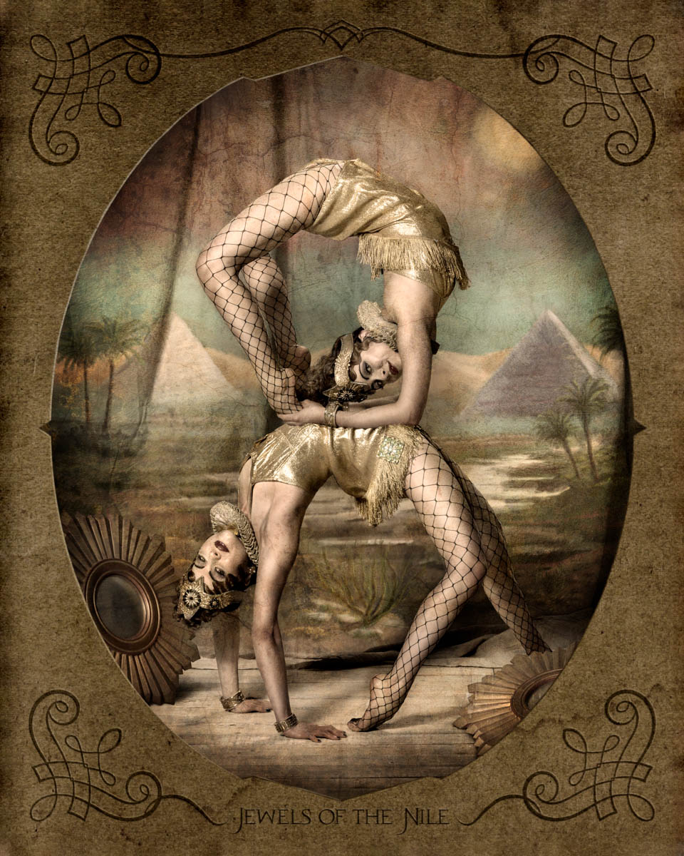
We had been looking to create something that could take advantage of all of our skills, from photography to digital painting and compositing, to CGI. We also wanted to develop a body of work that lovingly recreated the once-common side show that was so filed with curious tales of mystery. It was wonderful to have so many different ideas to pick and choose from! Since many of the carny characters are infamously iconic, we were able put our own personal spin on the subjects and they were still very recognizable.
How many years have you been shooting this project before you decided to present it?
The initial release of this project was slated for a gallery show we had at Bash Contemporary in San Francisco in October of 2014. We shot the first series in May of 2014 and worked on the post production over the next few months. We approach all of our shoots in much the same way as we would produce a commercial shoot. In this case, we pulled together the right team of costume design, hair design and make-up artists to tackle the 10 shots of the various talent in two days (and we actually added on two other concepts to maximize our time). The post end was much more intensive, with each image requiring around 20 hours each to finish. Some images required a bit of CG and the gathering of other elements to be composited together.
The series has been received very well, and it has gone on to show at Scope Miami, The LA Art Show, and Vanilla Gallery in Tokyo. For the Vanilla show, we did another shoot in February of this year and finished two new images in the series, and we still have three more pieces from that shoot to release. One will be released in early fall 2015 with Loved to Death, the infamous shop of curiosity from the TV show “Oddities.” Two more will debut in a soon-to-be-announced gallery.
How long do you spend on a personal project before deciding if it is working?
We often will develop an idea anywhere between weeks and months until we feel that the concept is solid. In truth, we don’t move forward with any project until we feel it is 110% dialed in. We meticulously plan all of our shoots and treat them in many ways, the same way we treat a commercial job, often building treatments to communicate clearly with everyone on the project so very little is left to chance. By the time we move into production it becomes more of an execution with room for flexibility and collaboration.
Since shooting for your portfolio is different from personal work, how do you feel when the work is different?
We try to satisfy both worlds whenever possible, or at the least, gather something for each. More and more, we’re finding that we tend to keep our portfolio pieces simpler in presentation, whereas our personal projects can become much more baroque and elaborate The artistic work is tremendously satisfying, and there are many, many roads we see that are worth exploring. The portfolio projects are great for really exercising our restraint, and challenge us to focus on the core concept of the image.
Have you ever posted your personal work on social media venues such as Reddit, Tumblr, Instagram or Facebook?
Instagram is our favorite outlet as we get to share so much of our art from works-in-progress, to on-set behind the scenes, to final pieces. We each have our own accounts (Stacey is @hld4ransom and @impureacts for Jason) where we share our individual processes, and we both use our artist account @ransom_mitchell to mostly focus on the finished work. These all feed into our Facebook and Twitter accounts, and occasionally Tumblr. Our recent expansion into international markets has us a little more focused on interacting on Twitter directly. We also participate in Behance, and we keep a few personal blogs such as http://www.fakebelieve.net that shares the Ransom & Mitchell process, http://jasonmitchell.org/blog/ where Jason shares his process and observations, and http://www.ransom-notes.net where Stacey writes about various artists and their work.
If so, has the work ever gone viral and possibly with great press?
We had one really evocative image called “It Will Be Ours,” http://art.ransommitchell.com/overview/1 of a young boy in a bare room watching TV with the room behind him consumed by an embodied Mother Nature. It was shared on Facebook a couple of days before we planned to released it for a gallery show — they had pulled it off of our website where we had parked it in preparation for our PR release. There was a sudden influx of hits — a quick Google image search showed us the breadcrumbs to find the first share. By the time we saw it, it had around 40 thousand likes and been shared thousands of times and was all over the place (mostly without attribution). We still find it here and there, and have thankfully seen an uptick in it leading back to us.
Jason’s personal nude series Dream Away http://jasonmitchell.org/dreamaway/ was just shown in May of 2015 at 111 Minna Gallery in San Francisco and was also a finalist for Critical Mass 2014. That series has been picked up by a number of international art and culture blogs as a result.
Have you printed your personal projects for your marketing to reach potential clients?
We love using our personal work for marketing as it can really show off how much we can flex our talents. And this work is always nice to send as a follow up to make a personal connection.
We created an art card box set of our bizarre “Die Familie” series which is sold through our art store. http://store.ransommitchell.com/product/die-familie-postcard-set Since it’s such an elaborate and unique set, it made a great impression on the select folks in the ad world who we sent it to as a gift. We find that sending unique art pieces that art Directors and Art Buyers can have for their own personal collection is a welcome way to reach out.
We’ve used “A Curious Thing” from our Undertow series http://art.ransommitchell.com/undertow/2 and “The Last Good Man” http://art.ransommitchell.com/artist-portraits/3 from our Artist Portrait series as postcard mailers. We then further our outreach by using the remaining postcards to increase our social media followers and fan mailing list. We simply ask followers to email us with their address and we send them an art postcard for free anywhere in the world. It’s amazing how the meager cost of postage creates incredible “share buzz” which in turn really increases our fan base.
——————
Ransom & Mitchell is the the creative team of director – photographer Jason Mitchell and digital artist – set and prop designer Stacey Ransom. Together they create highly-detailed and visually-lush photographic portraits and scenarios. By seamlessly weaving their photography, digital artistry, CG, and motion skills, their unique style blurs the lines of photography and illustration. http://www.ransommitchell.com
The results of this pairing have been selected for Lürzer’s Archive 200 Best Ad Photographers, twice for their 200 Best Digital Artists Worldwide, and included in the Photokina 2014 Best of CGI Gallery. Their clients include Young & Rubicam, DDB, DDB Remedy, Hub Strategy, Duncan/Channon, JVST, Virgin Records, KVP, Juxtapoz, Hi-Fructose, Decibel, Magnet, Apex, Kixeye, and The Oakland Museum of California.
Their fine art work draws upon the darker undercurrent that exists within all aspects of society. Described as pop-baroque, their art has exhibited worldwide at art fairs (Scope NY, Art Miami, LA Art Show) and galleries in cities including New York, San Francisco, Los Angeles, Miami, Seattle, Berlin, Tokyo, and Melbourne.
APE contributor Suzanne Sease currently works as a consultant for photographers and illustrators around the world. She has been involved in the photography and illustration industry since the mid 80s, after establishing the art buying department at The Martin Agency then working for Kaplan-Thaler, Capital One, Best Buy and numerous smaller agencies and companies. She has a new Twitter feed with helpful marketing information believing that marketing should be driven by a brand and not specialty. Follow her on twitter at SuzanneSease.
What Is Photographic Vision Or Voice?
A reader sent me this question awhile back:
Lately I have been hearing about photographers with ” vision” or “photographic voice”. I guess with everyone being able to do everything technique is kinda not as important as vision? Some quotes I’ve read heard recently”true style is vision” “those who are in demand have vision or a voice and people want to buy into that”. So my question is…what do you think photographic vision or voice is? And who do you think displays it? What photographers would you point to who have “it”?
and then I ran into this interview John Keatley made with his agent Maren Levinson and I think it has some good advice on the questions asked:
The Daily Edit – Parade: HollenderX2
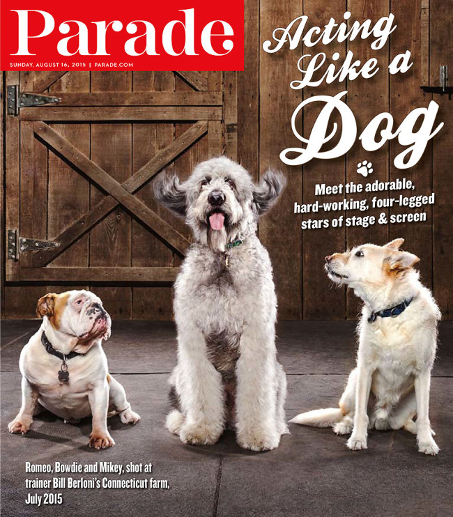
Parade
Photo Director: Nicole Kopperud
Senior Art Director: Matt Taliaferro
Photographer: HollenderX2
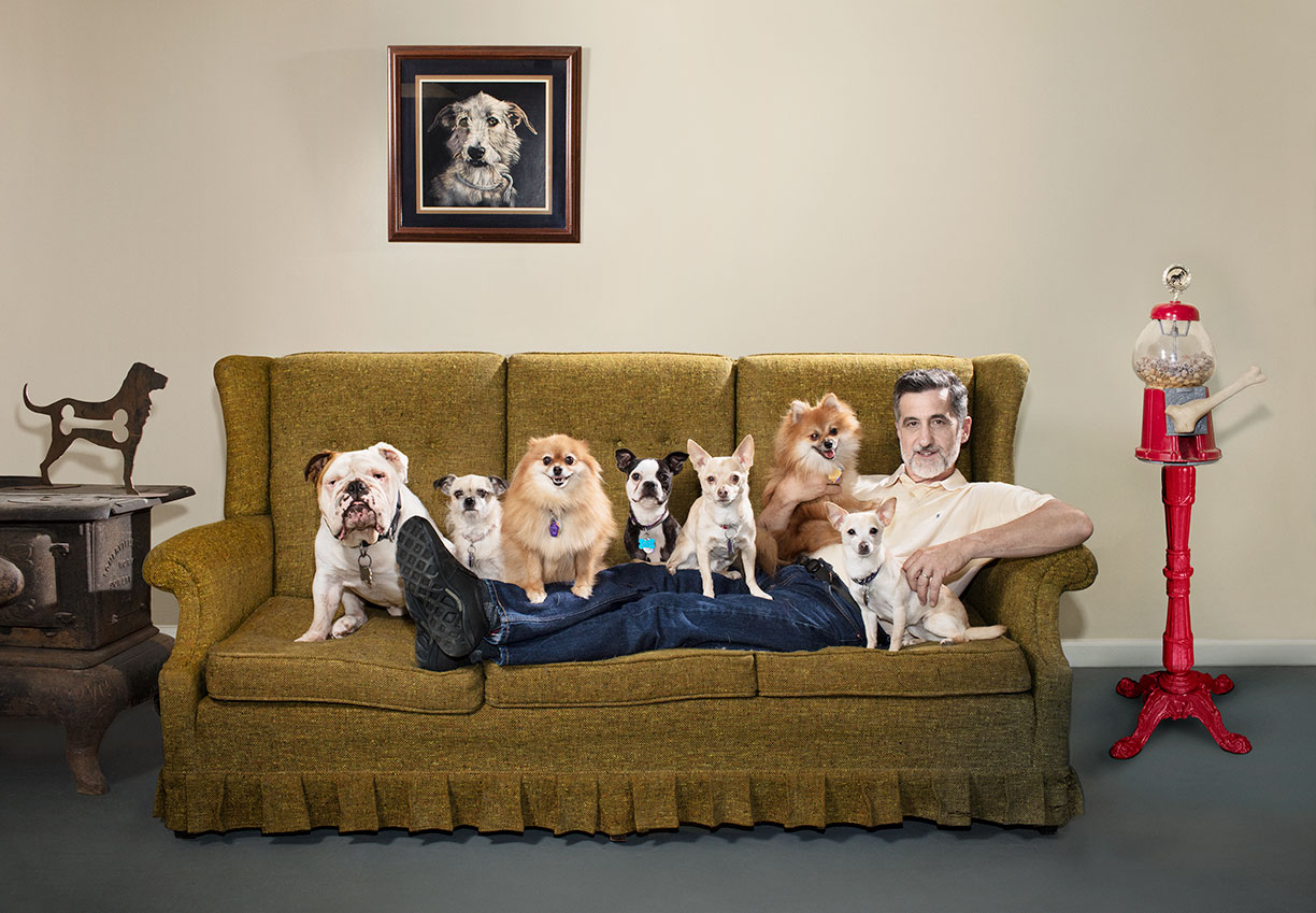
Heidi: Tell us about the subjects.
Jordan: Bill Berloni and his dogs were photographed in Connecticut on Bill’s farm. We were able to choose the dogs we wanted to work with (he has about 30 dogs). We knew we were in for a treat as his dogs are some of the best trained in the country, with high day rates. Fortunately they weren’t divas. He has a new show “From Wags to Riches” on the Discovery Channel that just came out where he turns shelter dogs into stars.
How hard was it to manage the dogs?
The magazine didn’t want a studio setup for the cover shot of the dog, so we photographed them outside. After we set up the cover shot, we were told that they needed to bring the dogs out one at a time. We then shot the dogs individually in our scene and later composted them together. The biggest challenge was the heat. We had a van with AC near the set for the dogs to stay cool — we were able to shoot each dog for a few minutes. Since our subject is a master trainer and has such a unique connection with these dogs we needed to do less wrangling from camera than usual, but that didn’t stop us from doing some kazoo blowing of our own.
Did you have treats on set?
There were treats and tons of different noise makers ranging from kazoos to the plastic trombone-like- whistles which were a big hit and seized the most attention from the dogs.
Were you concerned about any of your equipment with dog hair?
No – whether we are sippin’ a cappuccino in studio or rollin around in the dirt with dogs, we usually know what we are in for and plan accordingly. In this case, we had plastic bags under our equipment.
Can the dog really make his ears go up or did you do that in post?
Ah, unfortunately no, or at least not in the short time we had to shoot him!
We wanted to create an organic movement from the centered “star” dog, so we had Bill pick up his ears and drop them to get this effect.
What was the most remarkable training command of the day?
I wish I could say there was a word but it turns out its mostly about hand signals.
There was this one thing Bill would do to get the dogs to run. He would simply walk away and get into his car, and they would come a runnin’.
How hard was it to get all of the dogs looking for the group shot or was that done in post?
For the group shot, they were all so well trained that we were able to position them on the couch and with hand signals, they would stay in place. There was an assistant dog trainer behind camera for that shot to help us. It was done in camera and felt like a small miracle to have them all just sitting and looking at us like that. Had we not been in the company of such well trained animals and top notch trainers this would have required lots compositing.
Here’s some BTS shots by Tye Worthington and another shot from the day. Their subject gave Jordan a dog bone handkercheif and it came in real handy!
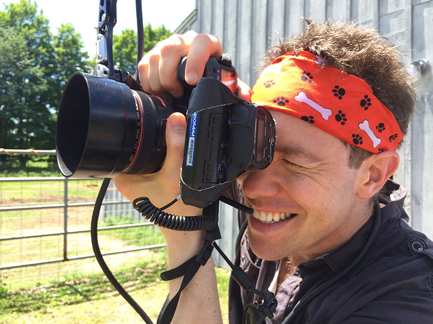
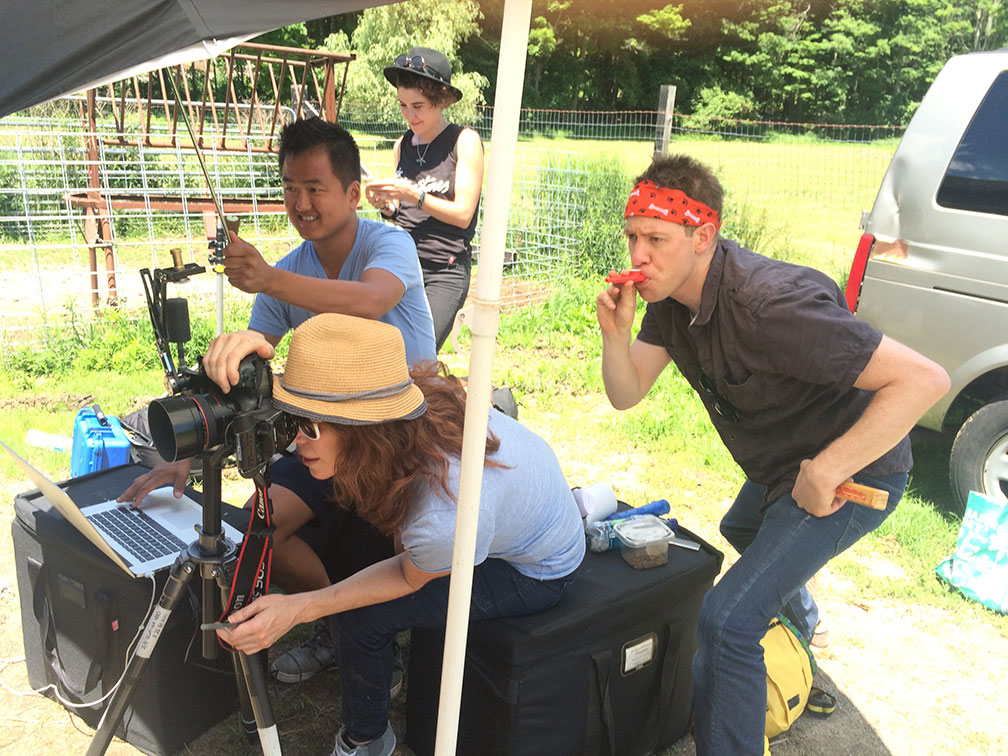
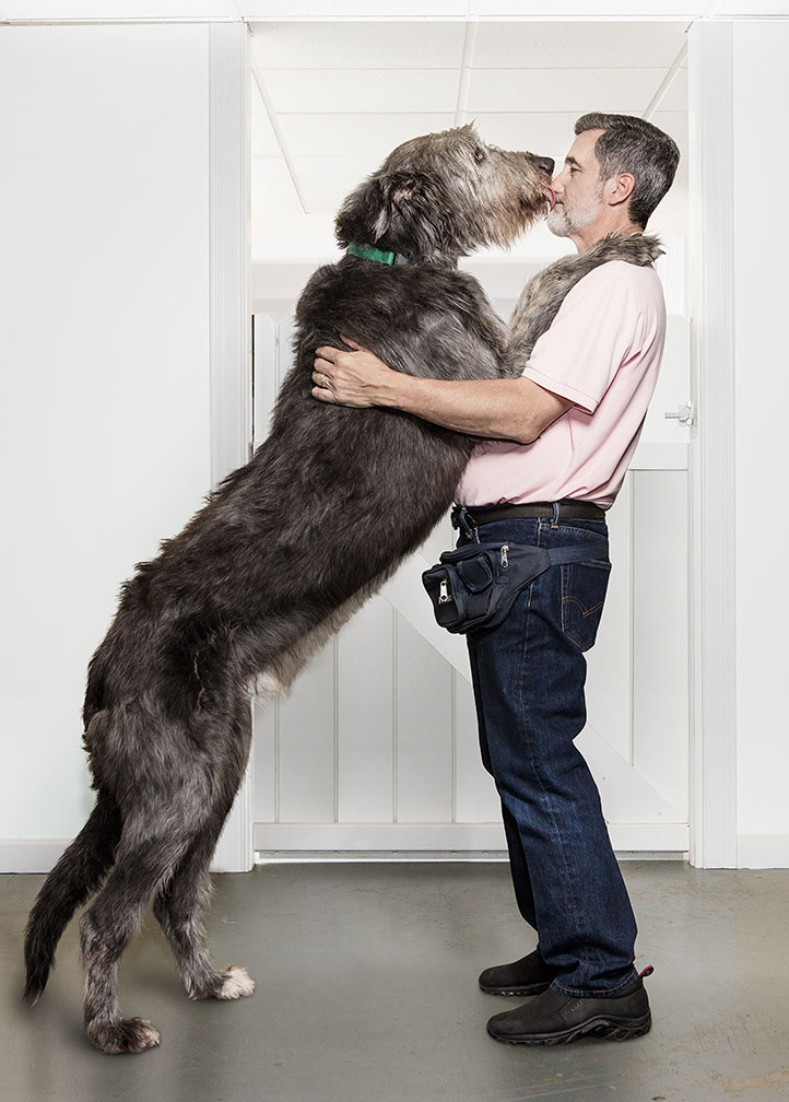
The Daily Promo – Blair Gable

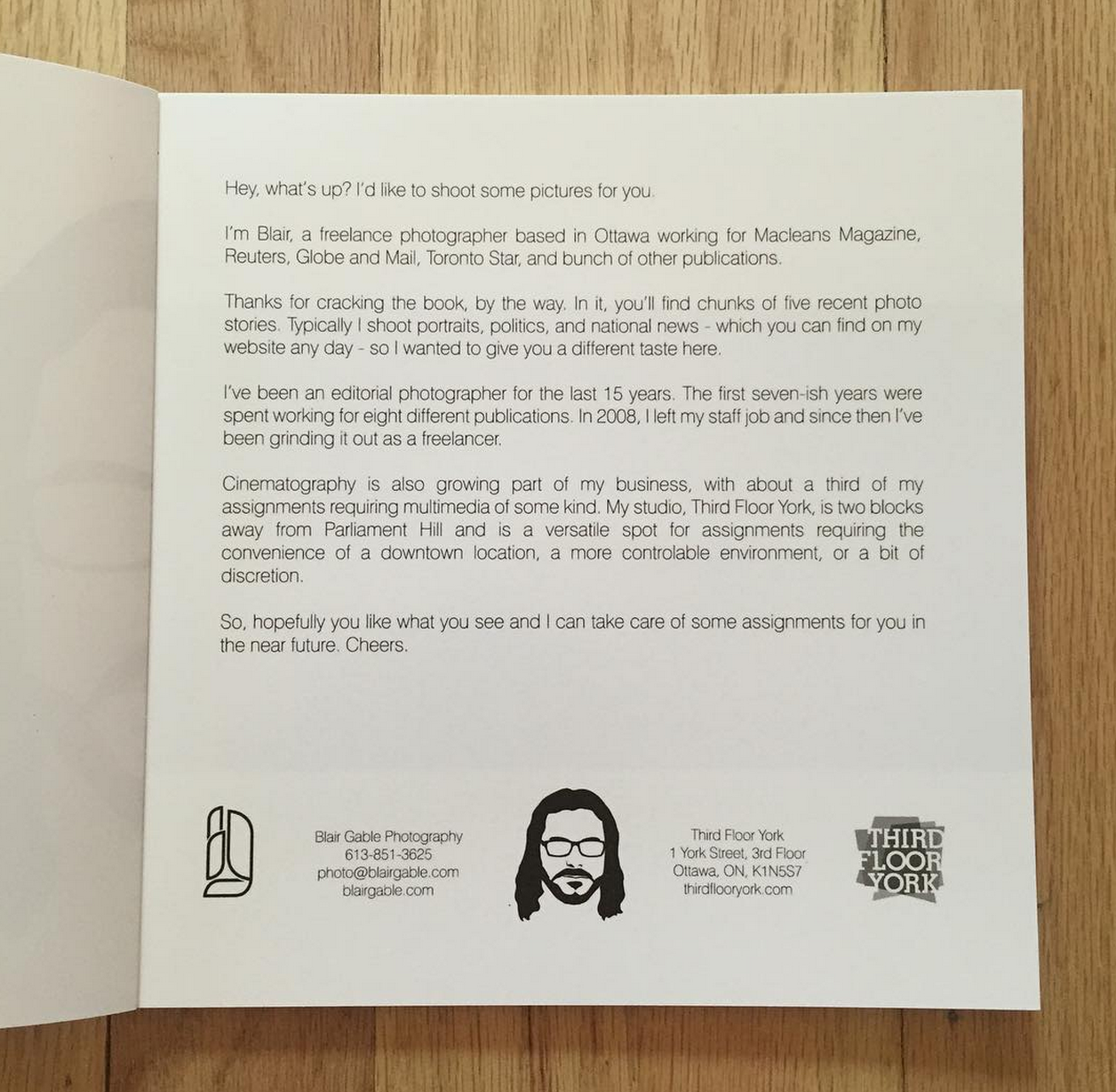


Blair Gable
Who printed it?
The books were printed by Photobook Canada – 40 copies. The postcards were printed by Vistaprint and the stickers were printed by Loudmouth Print House in Ottawa.
Who designed it?
The Gablehead, Blair Gable Photography, and Third Floor York logos were designed by Jason Harper at Strongvine Visual Communications. I designed the book and postcard myself – layout using Photo Mechanic and page design with Fundy Designer.
Who edited the images?
I edited the images myself, though I showed a pre-production book to close family and friends to see if there was anything missing.
How many did you make?
I send out packages to editors that I regularly work with at least once a year. This was my first time sending promo kits to a large number of new editors.
How many times a year do you send out promos?
I mostly shoot politics and portraits for my editorial clients and rarely have time to work on personal or self-assigned projects. I worked on a number of projects last year that I shot first and sold later, so I thought I would showcase that work in this particular promo package.
I like the title, did you write that and was impact the goal?
I did write the title, it came from the topics of the projects, but I thought together they were compelling enough to make someone crack the book. So I guess the goal was to make it as enticing as possible, as quickly as possible.
Work from Review Santa Fe 2015, Part 3
I’ve got my hands full at the moment.
In the last two weeks, I’ve begun a new job as the Chair of the Fine Arts Department at UNM-Taos, had a articles published online by APE, the NYT and The New Yorker, edited a new photo series of my own, put together the newest issue of Photographers Quarterly, and got my kids ready for a new school year.
Hell, just writing that sentence gave me a headache, much less living it.
Why am I complaining? As always, there’s a reason. In this case, it’s because I promised a book review this week. Back to normal, I assured you.
Alas…
I hate to be a liar, but in the mad rush to get everything done, I actually forgot to include an artist in last week’s article. Not something I’ve ever done before, but hopefully, given that my current to-do list is as ornery as a drunk barn owl, I’m hoping you’ll forgive me.
And of all the people to forget, I actually omitted the most memorable. I met Gloriann Liu at Review Santa Fe a couple of years ago. She showed me some pictures she’d made of Syrian refugees on the Turkish-Syrian border, as she’d spent significant time in the region, determined to see for herself what was happening.
I was floored for several reasons. To begin with, Ms. Liu had an Asian surname, but was a middle-aged, relatively small, blonde-haired woman. That’s the kind of detail that will stick in your mind. (It’s her husband’s name. Easy answer to that one.)
She also told me that she funds her travel herself. It’s art, for her, as she is so heartbroken and angry at the injustice that exists in the Middle East and Central Asia. As such, she spent much of her own savings making trips over there, reporting, working almost as a one-woman NGO.
And she shook with anger as she discussed what was happening to poor and vulnerable people. Literally, she was seething; physically manifesting her rage at a violent and unpredictable world. I’d never met anyone quite like her.
Most people who set foot over there have grant funding, or work for a major media organization. They have institutional protection of some sort. Gloriann was doing this as a private citizen, an artist whose inner necessity put her squarely in harms way. INCREDIBLE!
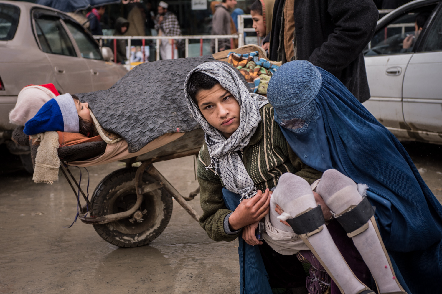
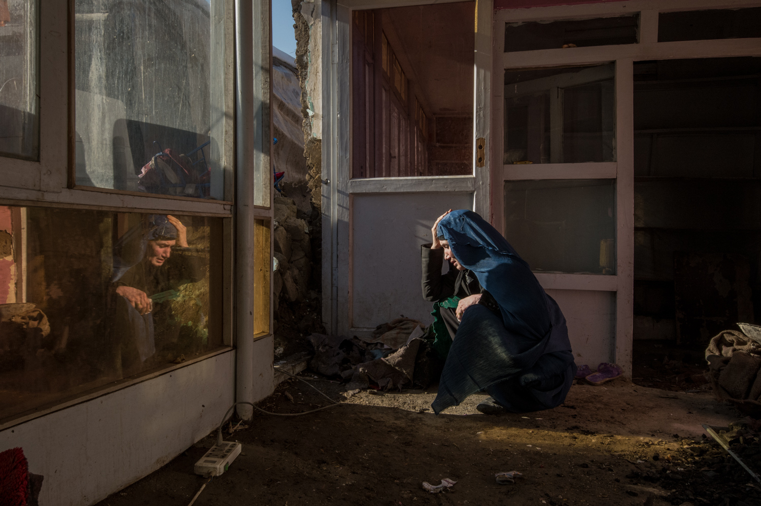
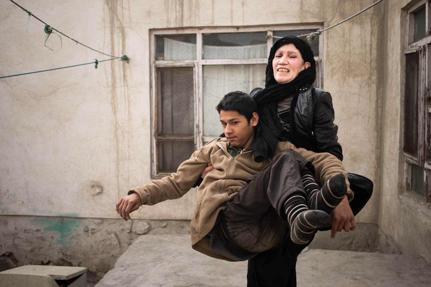
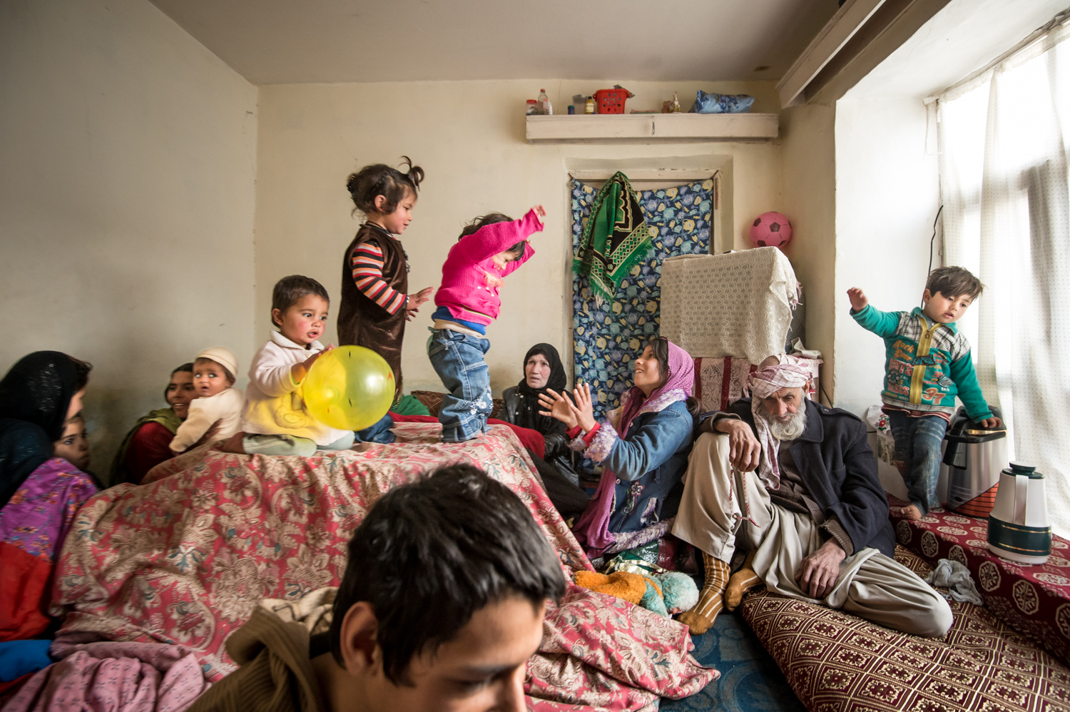
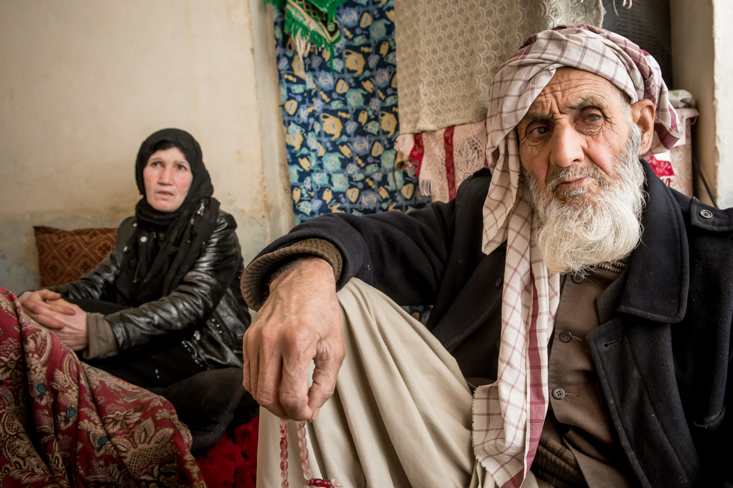
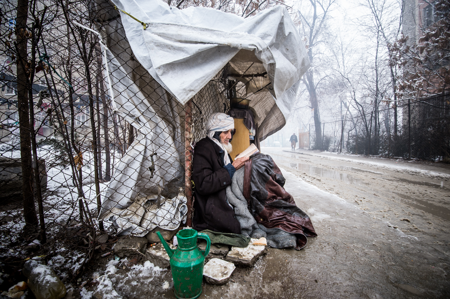
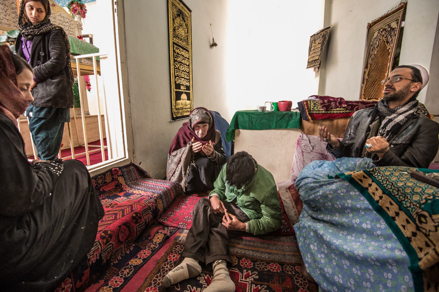
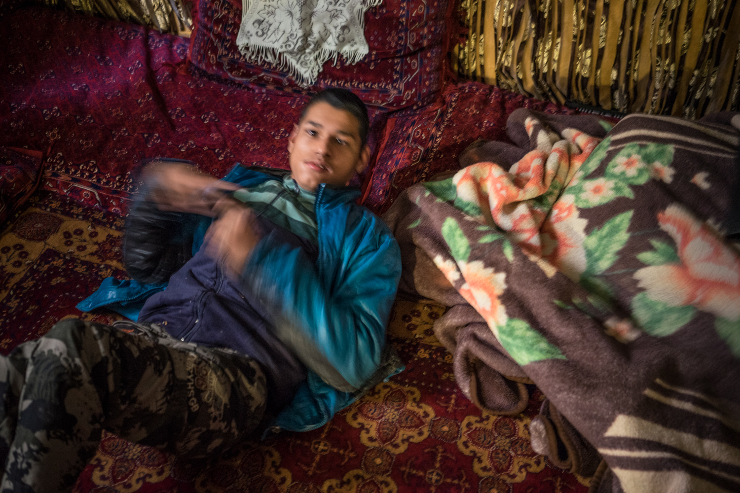
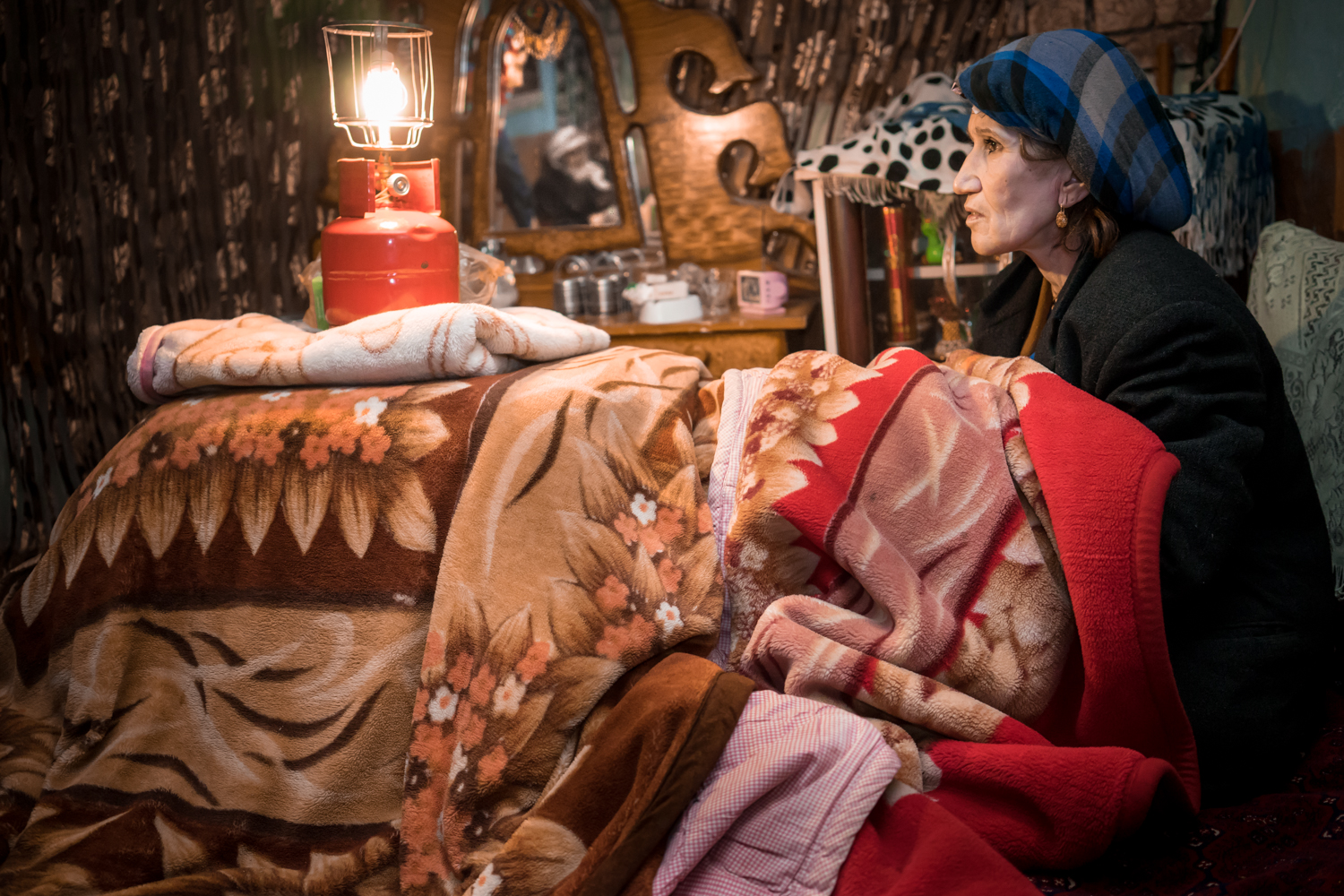
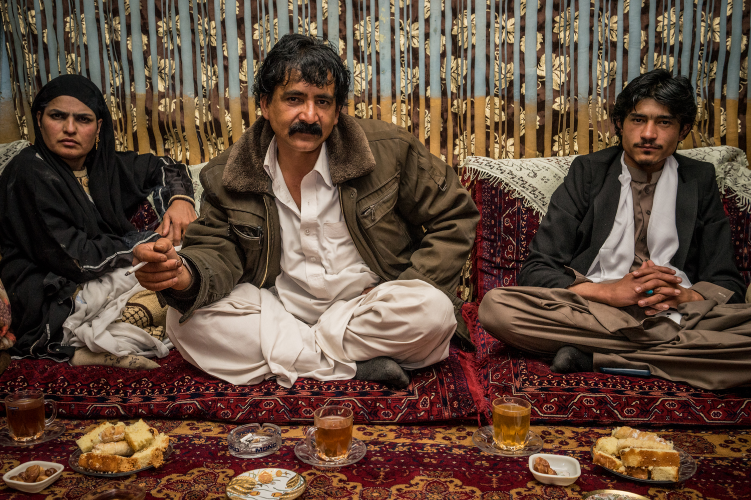
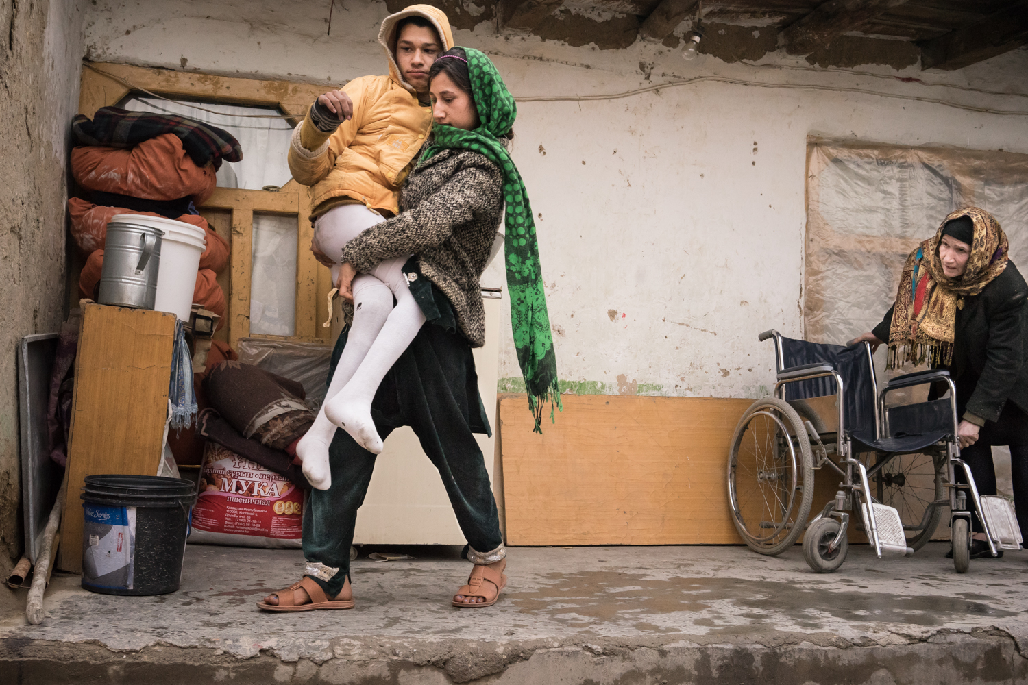
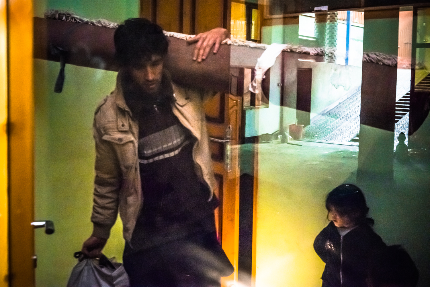
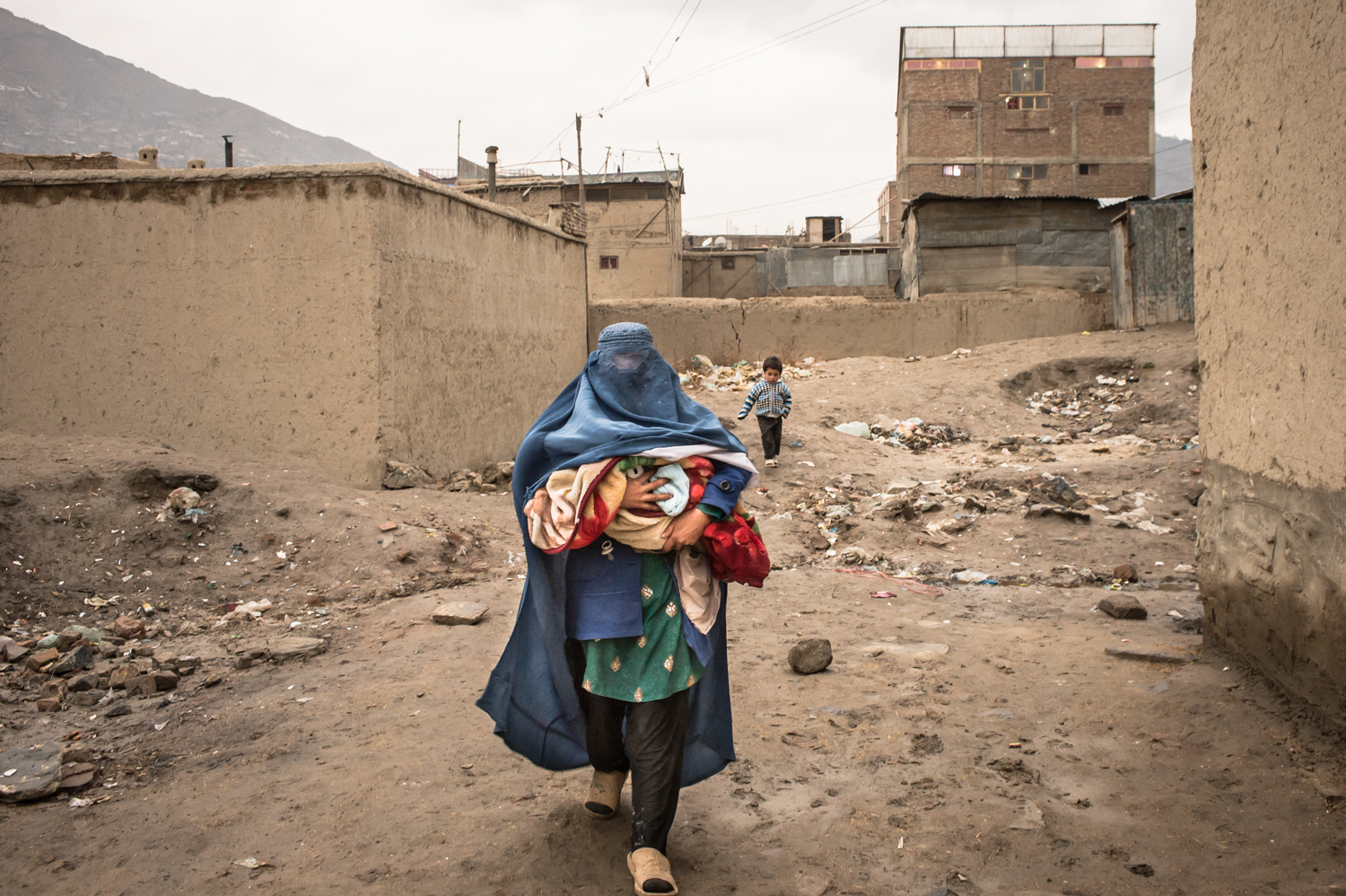
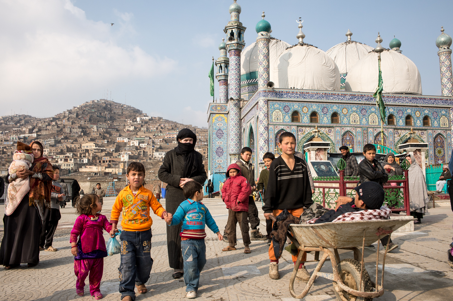
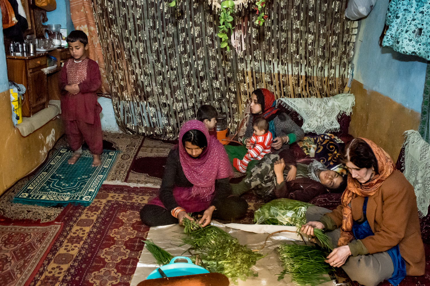
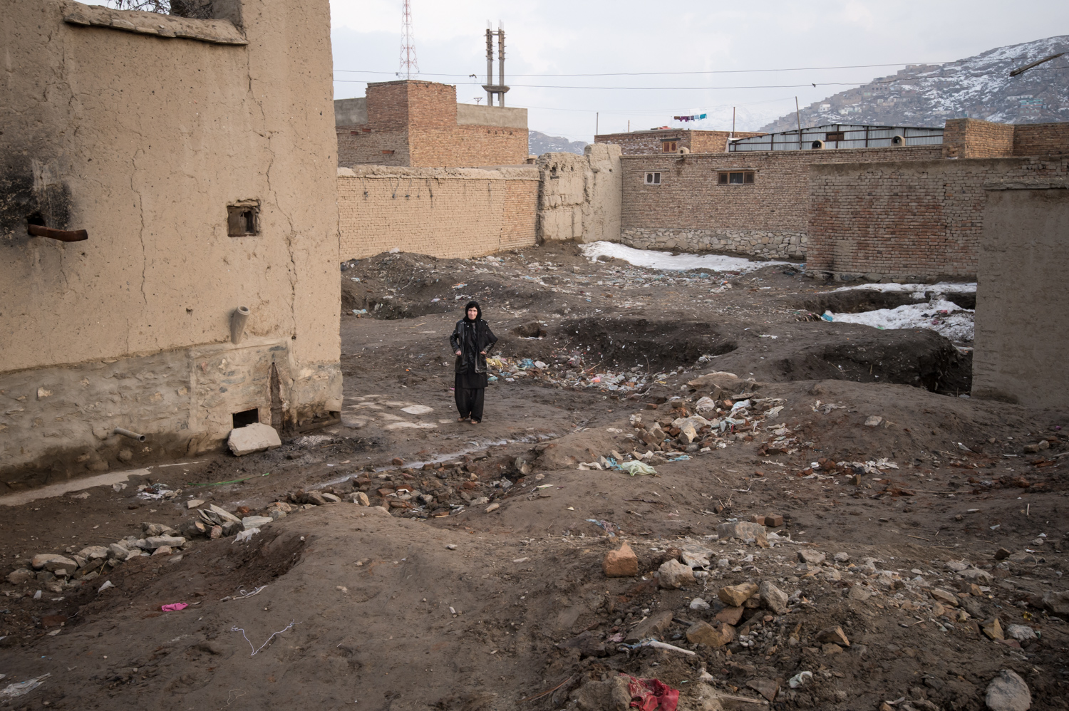
Fast forward to RSF ’15, and I reviewed her work, officially. She showed me a portfolio of images she made of Zarghona, a former Afghan child bride, now older, and the family she supports. One son, Barialy, who was injured by rocket-fire during the Afghan Civil War, is featured prominently in the project.
He has to be carried around, and sometimes his mother hires a man to cart him in a wheelbarrow, so that he can accompany her as she begs for money. Shocking stuff.
The only rational explanation for how I forgot to show you these photographs is that I was overwhelmed with life. It happens. But we’re rectifying things by showing Gloriann’s portfolio today, all by itself. The pictures are strong, of course, but also a great reminder that while we sometimes get wrapped up in our own lives…there are people out there who would kill to have our First World Problems.


The Art of the Personal Project: Christina Richards
As a former Art Producer, I have always been drawn to personal projects because they are the sole vision of the photographer and not an extension of an art director, photo editor, or graphic designer. This new column, “The Art of the Personal Project” will feature the personal projects of photographers using the Yodelist marketing database. You can read their blog at http://yodelist.wordpress.com. Projects are discovered online and submissions are not accepted.
Today’s featured photographer is: Christina Richards


How long have you been shooting?
About 10 years
Are you self-taught or photography school taught?
I studied photography at the Savannah College of Art and Design.
With this particular project, what was your inspiration to shoot it?
As a kid I loved flipping through the family photo albums at my great-grandmother’s house. Her name was Georgena, everyone called her Ena. Ena also had a painting of a house on a green hill. She told me this was the house she was born in, at Lake Ainslie in Cape Breton, Nova Scotia. I loved hearing stories about the house, Ena was a great story teller. When I found out that the house was still there and was still owned by a family member I knew I had to go and see it for myself. Once I got to Cape Breton it was such an adventure to actually find the house, there was no address and no one had lived there for years. I had the painting, a picture, and a verbal description from my grandmother and her sister. We knew it was at Lake Ainsley but not much else. When we finally caught a glimpse of the house we drove as far as we could then hiked up the overgrown drive and there is was. Being inside was thrilling. It was a dream come true to finally be there.
How many years have you been shooting this project before you decided to present it?
The idea to photograph the house and the land that surrounds it was in my head for years. I was working as a photo assistant when I finally had the opportunity and the means to make the trip. I spent about a week there, visiting the house, exploring the beautiful island of Cape Breton and of course taking pictures. The house is no longer standing, but I would love to go back and see what has happened to the land.
How long do you spend on a personal project before deciding if it is working?
It really depends on the project and how excited I am about it. I really value the input of my peers and friends when I start a project. I’ve started many projects that don’t end up working but they hopefully lead to something else.
Since shooting for your portfolio is different from personal work, how do you feel when the work is different?
For me shooting for the portfolio is a balancing act, I want it to feel like a personal project but also be marketable, fill a gap in the portfolio, strengthen my brand, etc. With personal work you are just working for yourself and it’s such a joy when it’s working and so discouraging when you can’t find inspiration or the images aren’t what you imagined they would be.
Have you ever posted your personal work on social media venues such as Reddit, Tumblr, Instagram or Facebook?
No, I still can’t quite figure out the social media aspect. I’m working on it!
Have you printed your personal projects for your marketing to reach potential clients?
Not yet, but I’m working on a new promo piece and it’s possible some of these shots will make it on at lease one version.
Artist Statement
My great-grand mother, Ena was a wonderful storyteller. I loved to hear the stories of her life in Cape Breton, Nova Scotia. Her stories sparked a curiosity about family history and how it shaped my life and the lives of others. Discovering Ena’s childhood home was the beginning of a continued exploration of memory and family.
—————-
Christina is an east coast native who calls California home.
She is fascinated by the fleeting, honest, and spontaneous moments of life. Her photography explores the themes of family, childhood, memory, and a sense of place and time. Christina spent her youth in New England and studied photography at the Savannah College and Design. After college she moved to NYC and finally to the bay area where she now lives with her husband and dogs. Christina loves exploring the wild and urban spaces that surround her. She often takes along one of her many film camera’s with the hope of finding magic in everyday life.
www.christinarichards.com
APE contributor Suzanne Sease currently works as a consultant for photographers and illustrators around the world. She has been involved in the photography and illustration industry since the mid 80s, after establishing the art buying department at The Martin Agency then working for Kaplan-Thaler, Capital One, Best Buy and numerous smaller agencies and companies. She has a new Twitter feed with helpful marketing information believing that marketing should be driven by a brand and not specialty. Follow her on twitter at SuzanneSease.
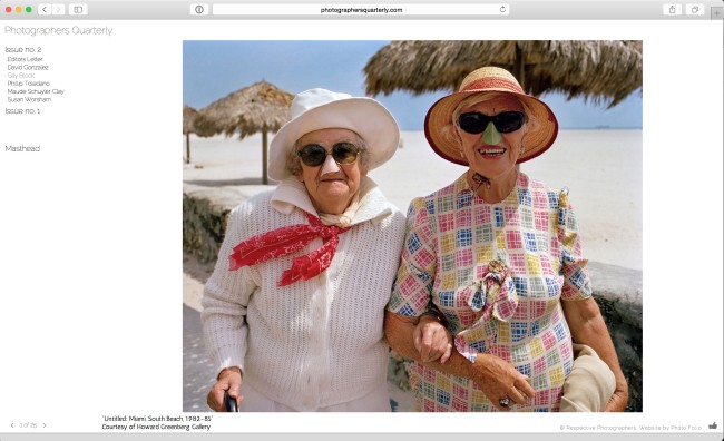
Photographers Quarterly Issue No. 2
Photographers Quarterly is a new online magazine edited by Jonathan Blaustein and designed by myself, that gives us an opportunity to to show portfolios and make something purely about the photography. And of course, being an online magazine, we can do whatever the hell we want with it, which I love.
Please enjoy the Summer issue of Photographers Quarterly featuring the work of David Gonzalez, Gay Block, Phillip Toledano, Maude Schuyler Clay, and Susan Worsham.
http://photographersquarterly.com
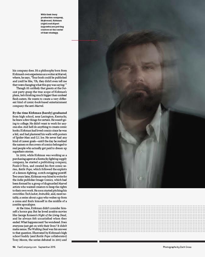
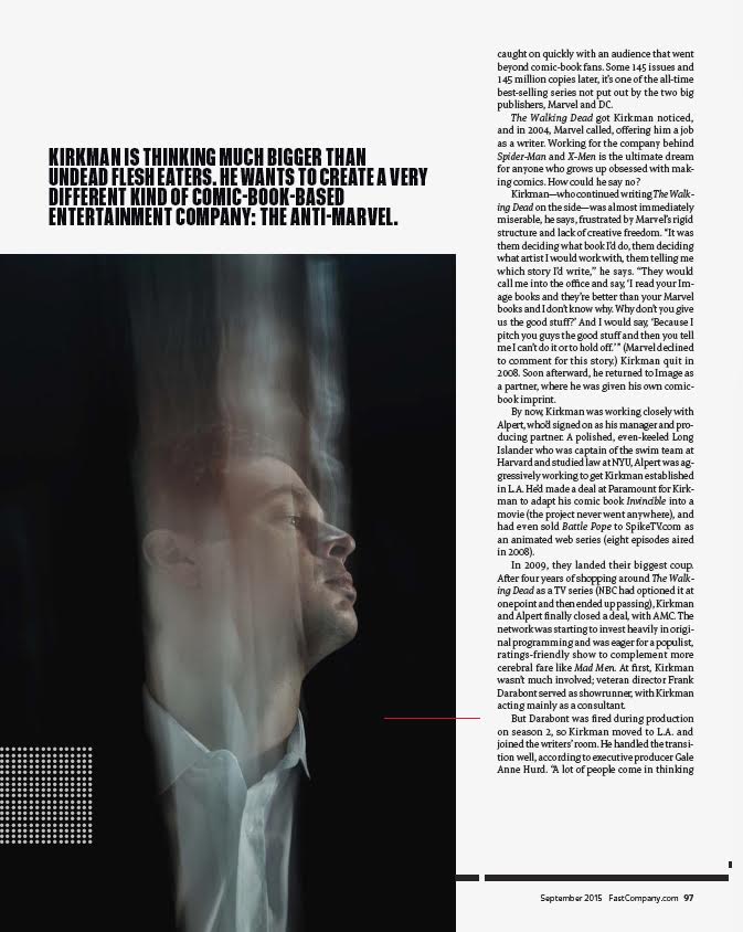
The Daily Edit – Fast Company: Zach Gross

Fast Company
Photo Director: Sarah Filippi
Photo Editor: Annie Chia
Photographer: Zach Gross
Heidi: What type of direction did you get from the magazine?
Zach: Annie asked me to do something a little creepy and eerie: using double exposures and shutter dragging to distort/obscure their faces. She wanted the portraits of David and Robert to look a little unsettling like their television show, The Walking Dead.
What was your technique for this?
I used three strobes mixed with the ambient light coming down from a skylight in the studio, and a smoke machine to create a hazy atmosphere.
How much time did you have to do the portraits?
Because of their tight schedules, I had thirty minutes with each subject.
It’s so refreshing to see a different style of portrait that suits the content. Have you done this type of portrait before?
I’ve experimented with this type of technique before while photographing dancers and performance artists. This time it was a bit different because the subjects were not performers. I had to direct them more and suspend their literal interpretations of a portrait, asking them to perform a little more then they were used to.
Did you do any testing for this?
I arrived at the studio early, and did some tests for about an hour to adjust the light and get the technique dialed in. I came to the studio with specific ideas and goals. I sketched out some ideas on paper to help visualize the shoot. During the process, details get adjusted and tweaked but it was good to have a blueprint.
The blurs seem to be directional, how did you do that?
The blurs are directional because both the subjects and I were moving. The shoot was a bit of a dance trying to find the convergence of all the elements: strobe light, natural light, smoke, and expression. A lot of exploring different compositions…it felt like choreography.
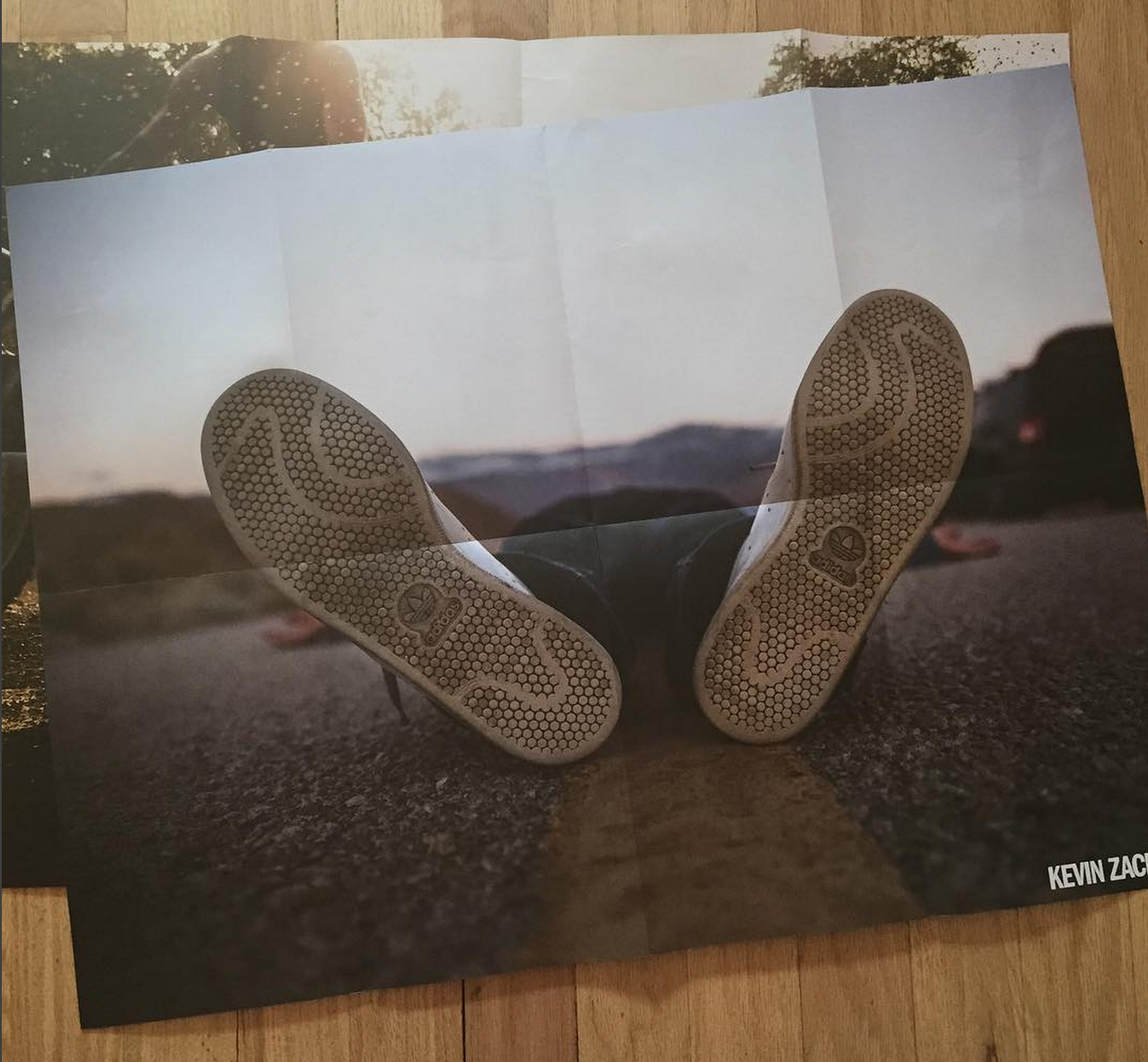
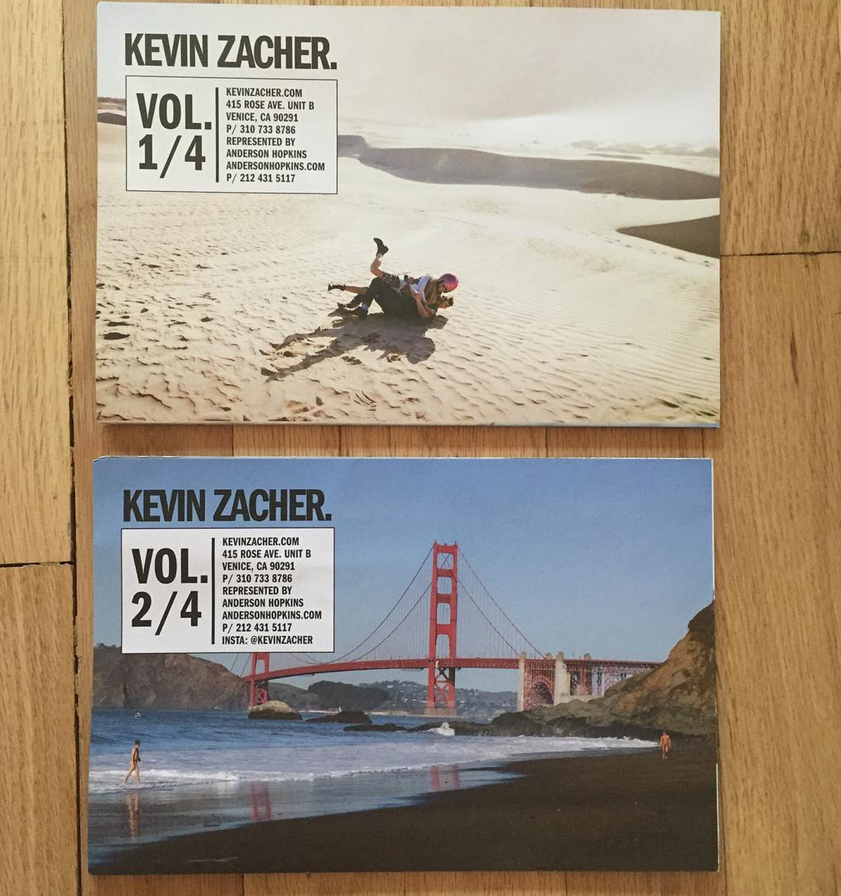
The Daily Promo: Kevin Zacher
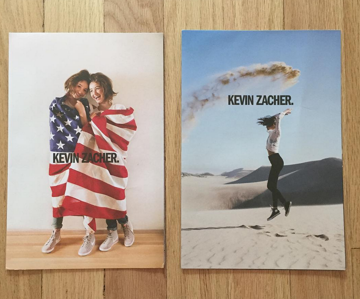
Kevin Zacher
Who printed it?
Source Print Media in LA. I like to keep it local and in America. We used a traditional litho process but with the new technology of UV inks and UV lamps. This allows the printer to not have any dry back issues in the uncoated stock which in turn keeps the colors more vibrant. There is also less waste in this process.
Who designed it?
Eric Pfleeger who is a freelance art director in LA and formerly in New York and Amsterdam doing the agency thing. He’s done promos for Christa Renee, Amanda Marsalis, Karen Caruso, Justin Hollar and logos for Peter Bohler and Brian Stevens. He is currently working on a super cool top-secret book project with an entertainment artist. He’s been doing all my promos for the last 2 years and has a great sense for simplicity and editing. He did a mini book for me that I shipped a couple of years ago and it looked beautiful so I just kept going with him.
We wanted them to be more or less simple and utilitarian. A promo that isn’t so much about the design, but the work, the ease of use and the fun of a poster. The fold is very specific, that is because I wanted the images to be upright almost no matter how you look at it. If it’s completely folded you can sort of flip it like a magazine and the images will be right side up. And then of course for those who are into posters we offer that. Who doesn’t like a good poster. All time best poster? Farrah Fawcett in the one piece swim suit. Don’t know it?? Look it up- you won’t be disappointed male for female.
Who edited the images?
A mix between myself and Eric Pfleeger. Each promo is built from photographs from one specific shoot, not a montage of many shoots or images over time. I wanted to challenge myself to do a promo I was happy with from a limited amount of work. Limited in that it’s not curated from anything I’ve done in the last year, but from a single shoot that might last a day or a week. I shoot a lot, but it’s still a challenge to commit to so few images. I will send Eric as broad an edit of a shoot as I can and he will whittle it down and put into 3 to 4 layouts for me to review. I will then bounce back some images I don’t like or add ones that weren’t included and then we will battle it out until we are both happy. I want him to be happy, because it’s not just about me. It’s about the integrity and I want Eric to gain something for himself as well.
How many did you make?
4,250. 4,000 get shipped out and 175 go to my agent Anderson Hopkins for hand outs and I keep the rest to hand out and mail to awesome people as they come into my life like Rob Haggart!!! If anyone wants one hit me up!
How many times a year do you send out promos?
This year I am doing 4. Roughly every 3 months or when the timing and work seem right. I’ve shipped two so far: Vol. 1 and Vol. 2. I would ship more if I didn’t think it was wasteful and that people aren’t already tired of getting promos. I will fill in with some email promos here and there when the work calls for it.
Work From Review Santa Fe 2015 – Part 2
I never get drunk anymore. It’s true. I can’t even remember the last time I was woozy and boozy, swaying like bamboo in a disorienting world.
I know, I know. Just last week I was bragging about throwing back shots of whiskey in my car with Paccarik, but that was just a little tipple to prepare for the onslaught of chatter. I barely even get a buzz on at portfolio reviews, these days.
It’s not about the drinking per se, these reviews I’m always on about. The key is to have just enough alcohol to be extra social, but not so much that you can’t speak coherently about your work. (And definitely not so much that you make an ass out of yourself in front of some VIP.)
Is this all obvious to you? Am I once again preaching about things that don’t need to be said? I’m not sure.
But the social aspects of Review Santa Fe, and other events like it, are where the long-standing relationships are built. That’s the reason I always recommend people attend a good festival: you can make things happen that you wouldn’t have predicted.
Case in point: in last week’s article, I highlighted the work of Shane Rocheleau. I edited out a few comments I made about Shane being a massive Massachusetts meat-head, once the beer was flowing. He was hilarious, his humor infectious, but I needed to mind my word count.
The story I was planning to tell was how Shane organized a little print trade/after-party in a room in the Drury Hotel. As it was booked into room 145, they cheekily called it The Gallery 145. People flocked, after the last evening’s final event, and I was handed a beer before I even knew what was happening.
There was a board of directors in place, a set of rules, and each trade was documented with ironic flair. Unfortunately, the organizers were unaware the hotel was filled with families and older folks, so by leaving the door wide open, at midnight, they were begging for trouble.
I was there when the hotel cracked down, shutting the party tight within three and a half minutes. Everyone moved on to a more suitable location, on a nice balcony, and that was the last I heard of it. But clearly, a few people who’d never met each other before organized something cool, that benefited others, and showed people a good time to boot.
I checked back with Shane yesterday, so he could remind me of the room number, and he said the whole endeavor morphed into a collective, and a website. It’s right here, if you don’t believe me. The Gallery 145 is a thing, and the leaders: Shane, Will Douglas, Eric Pickersgill, the aforementioned Paccarik Orue, and Marcus DeSieno intend to re-stage print trades at upcoming portfolio reviews, including one in Japan at the end of August.
Then, the guys decided that just staging print trades at portfolio reviews might not give them a ton of momentum. So they went ahead and founded the collective website Mall Pretzel, where they’re highlighting contemporary photography, seeking submissions, and planning exhibitions, IRL.
How cool is that?
I know that some people must think I’m always championing Review Santa Fe because I know the people there, and they helped launch my career. True enough, I suppose.
But really, those who read me regularly know how seriously I take this platform, and how much I’d like to help others realize their dreams, and pay the bills at the same time. If you don’t want to go to RSF, cool beans, but if you’re on your way up, and trying to make a name for yourself, you really ought to consider attending a top shelf festival.
That said, the point of this article is to highlight the best work I saw at RSF’15, so let’s get to it. (Once again, in no particular order.)
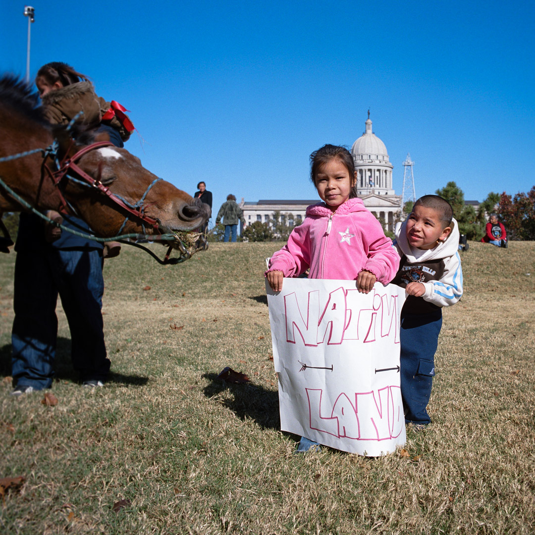
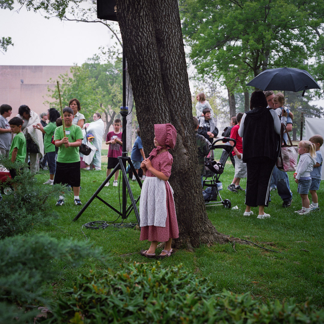
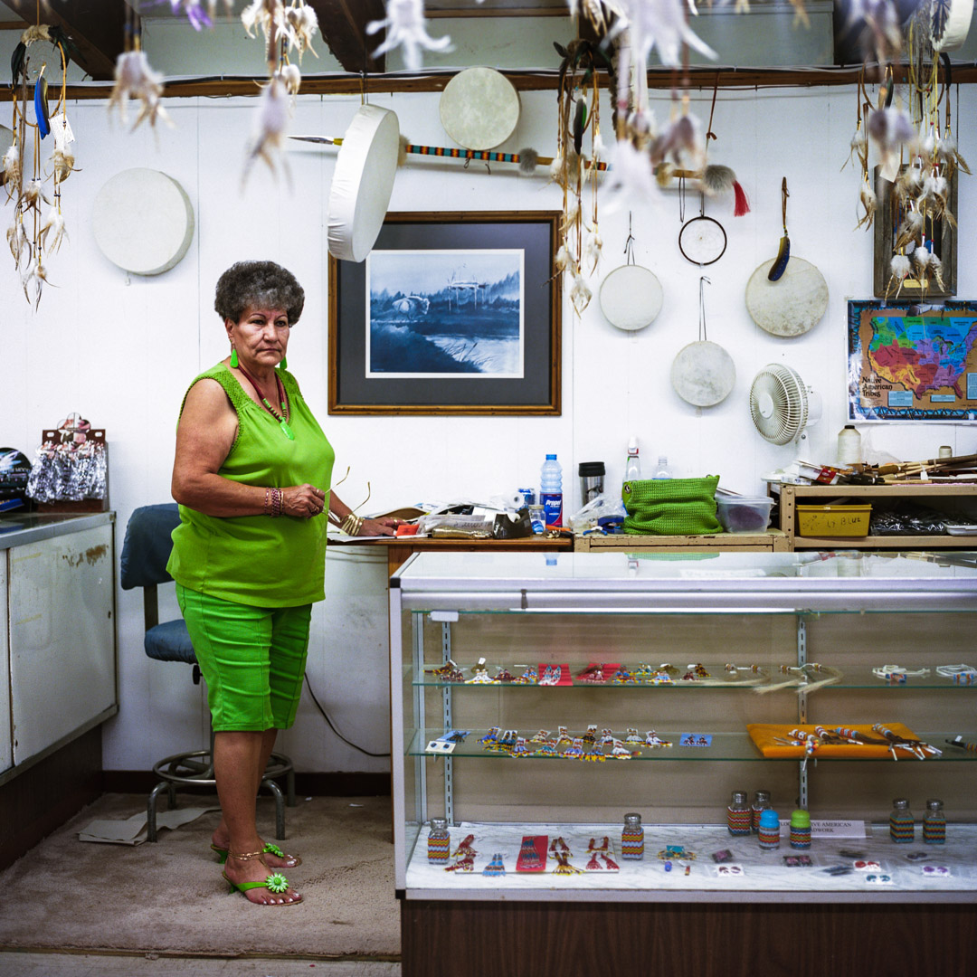
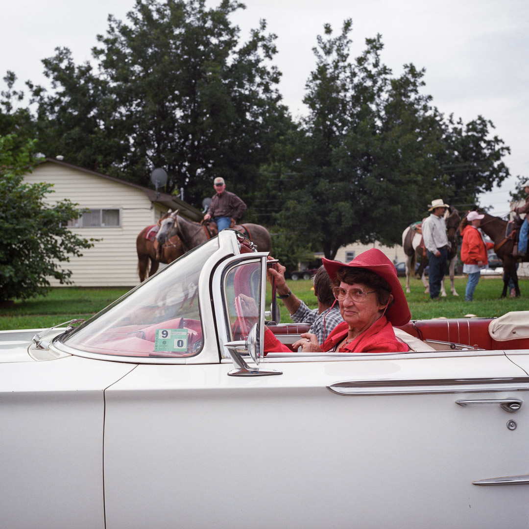
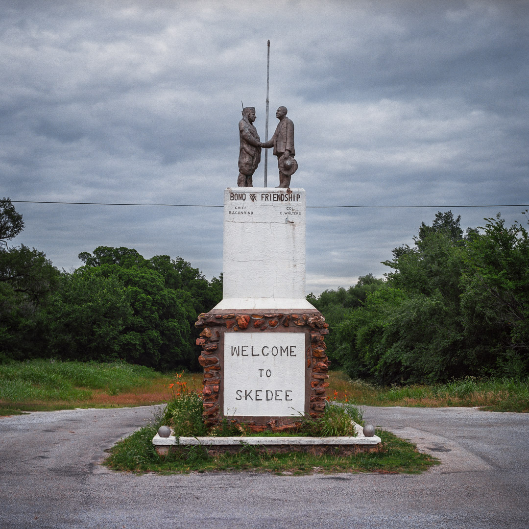
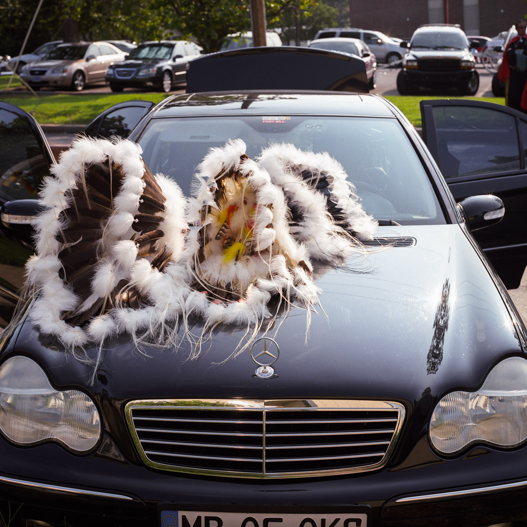
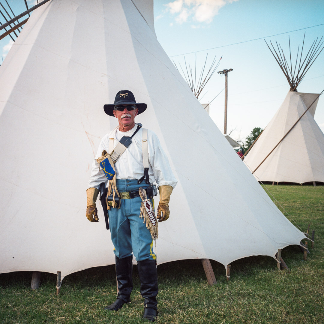
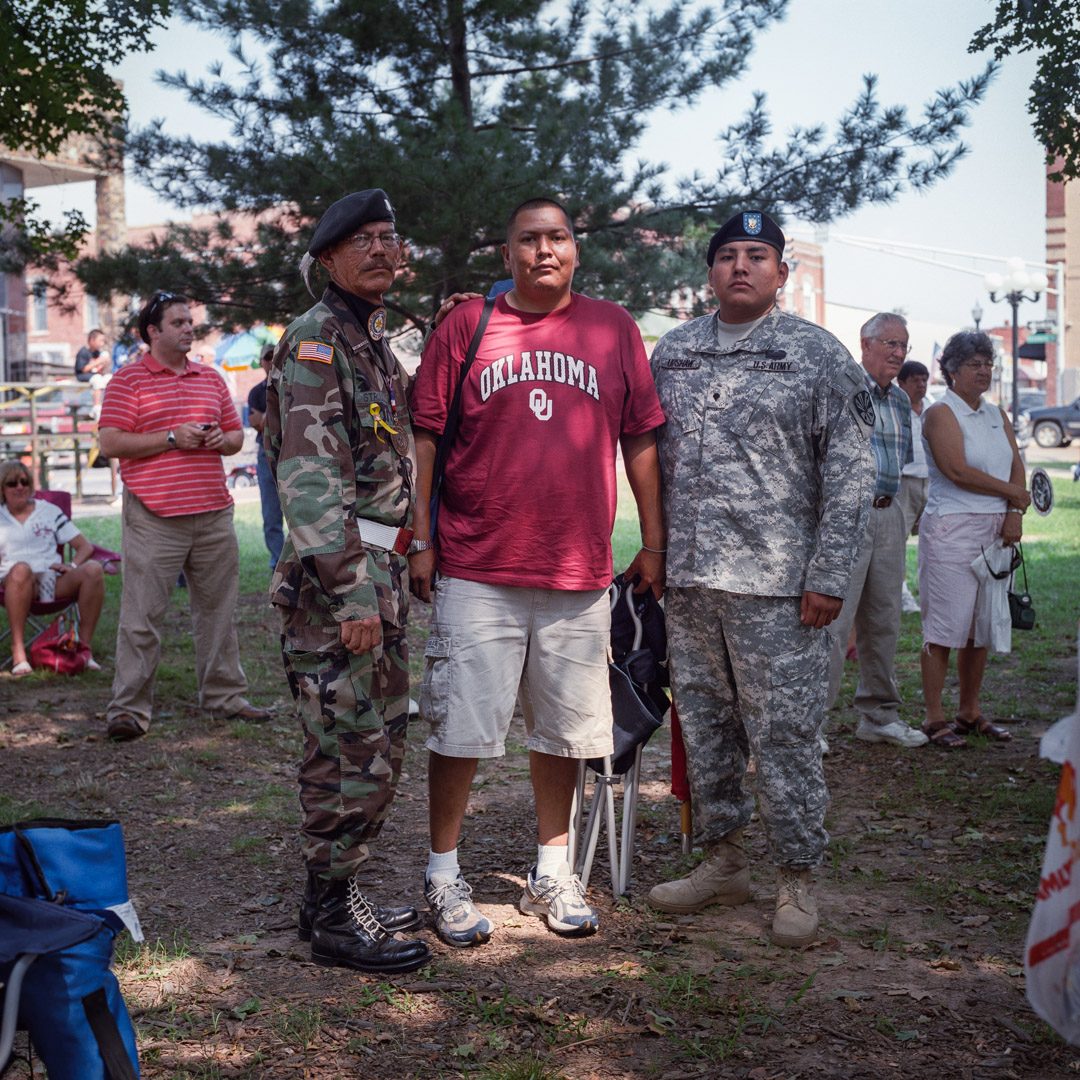
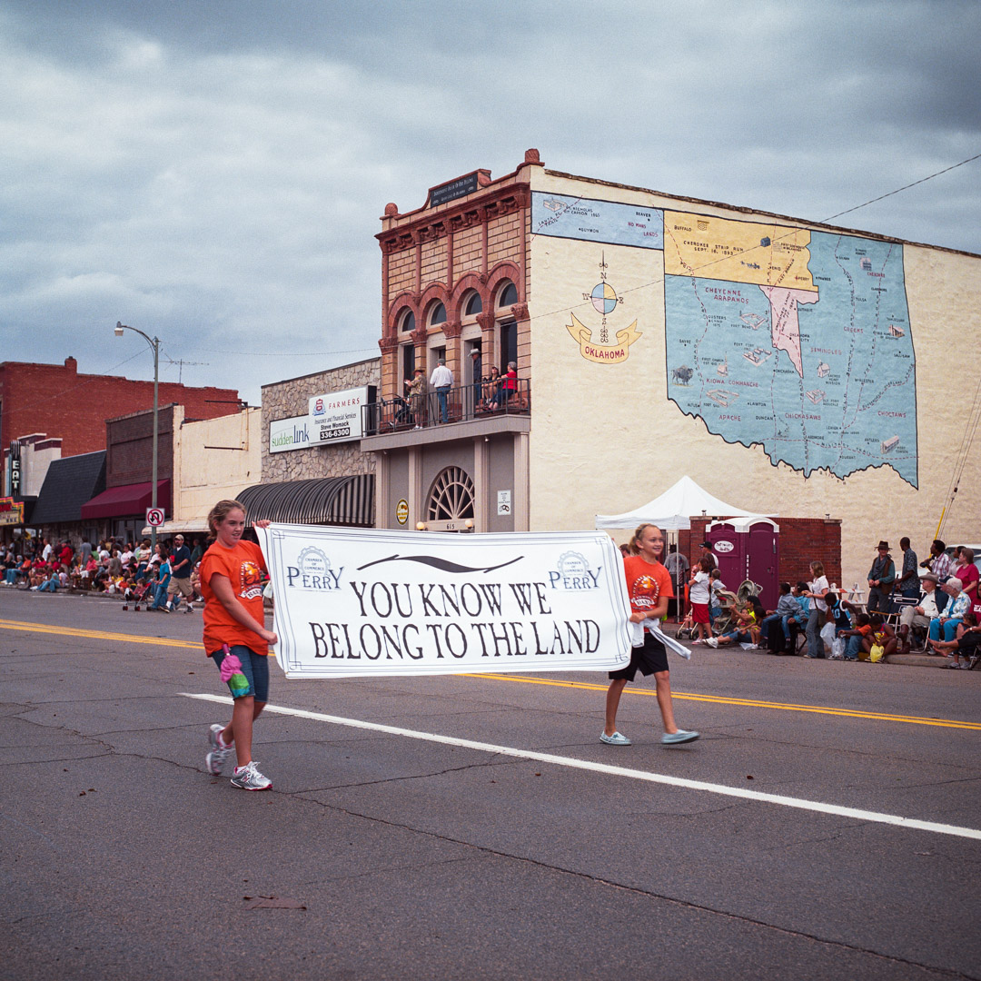
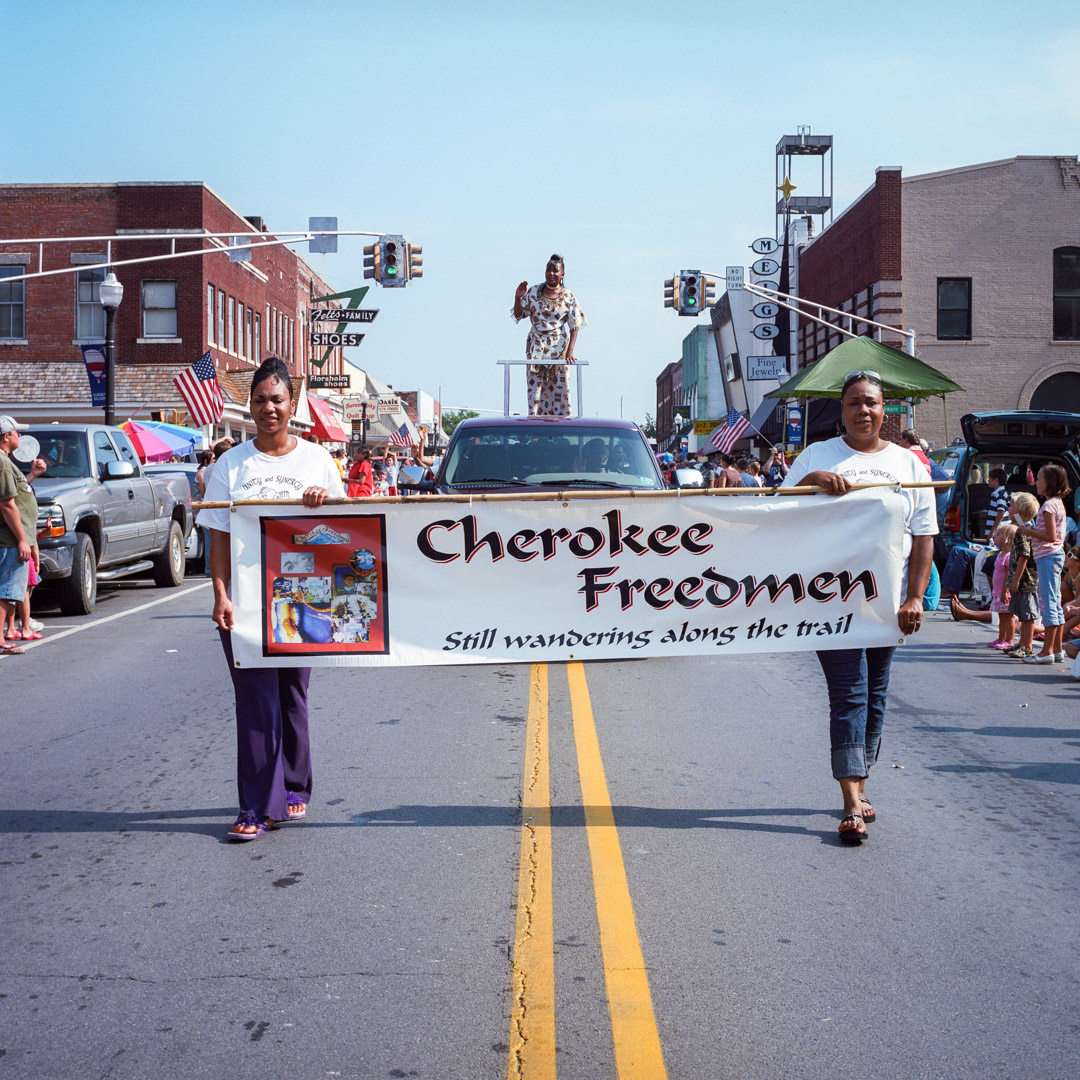
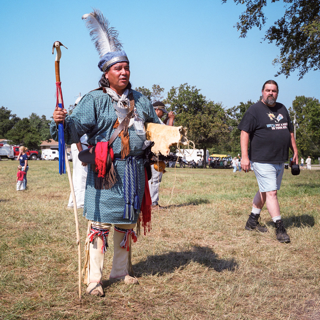
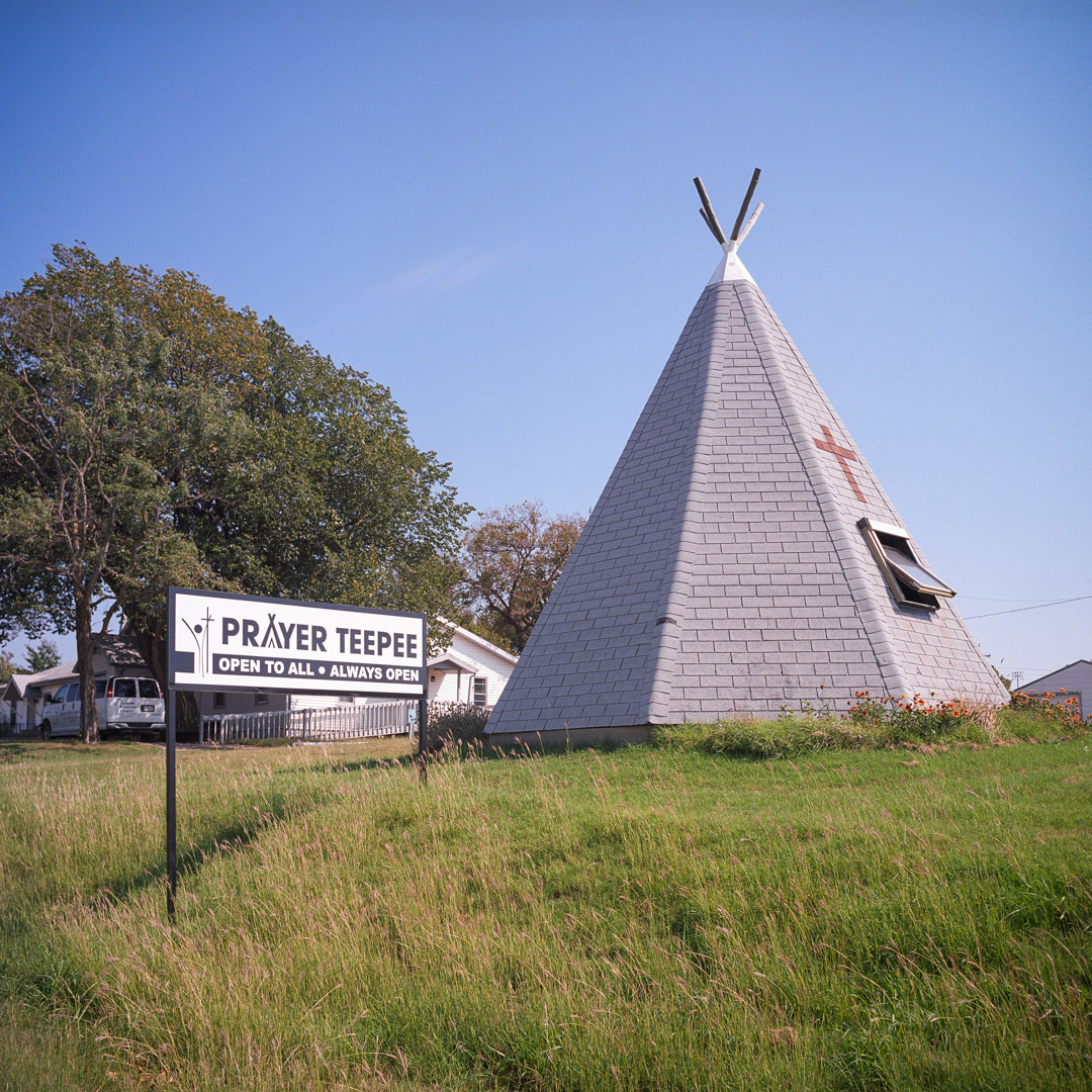
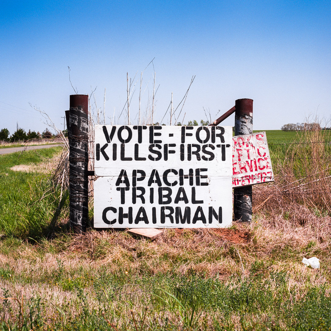
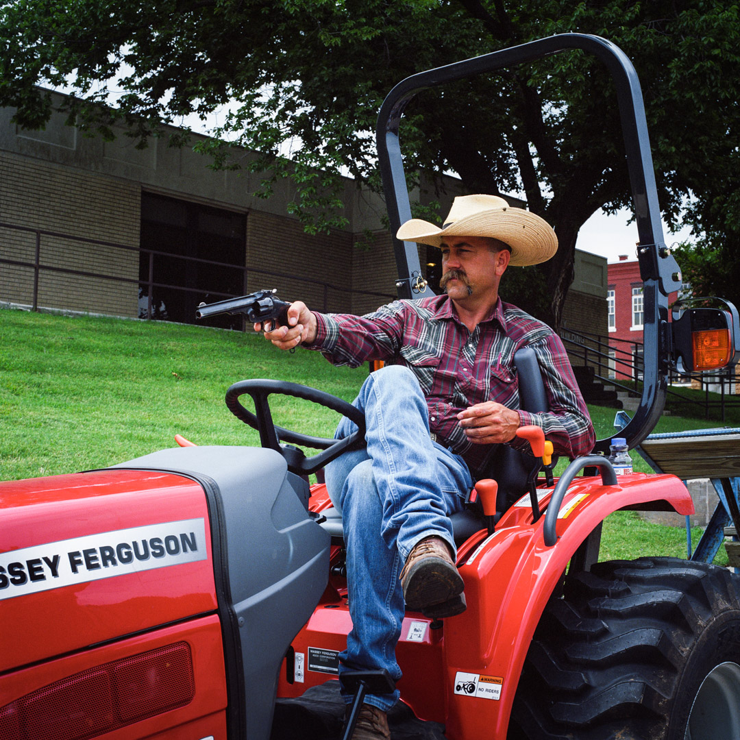
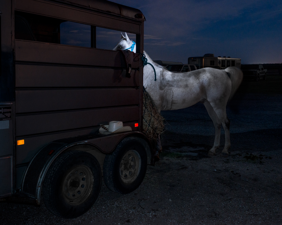
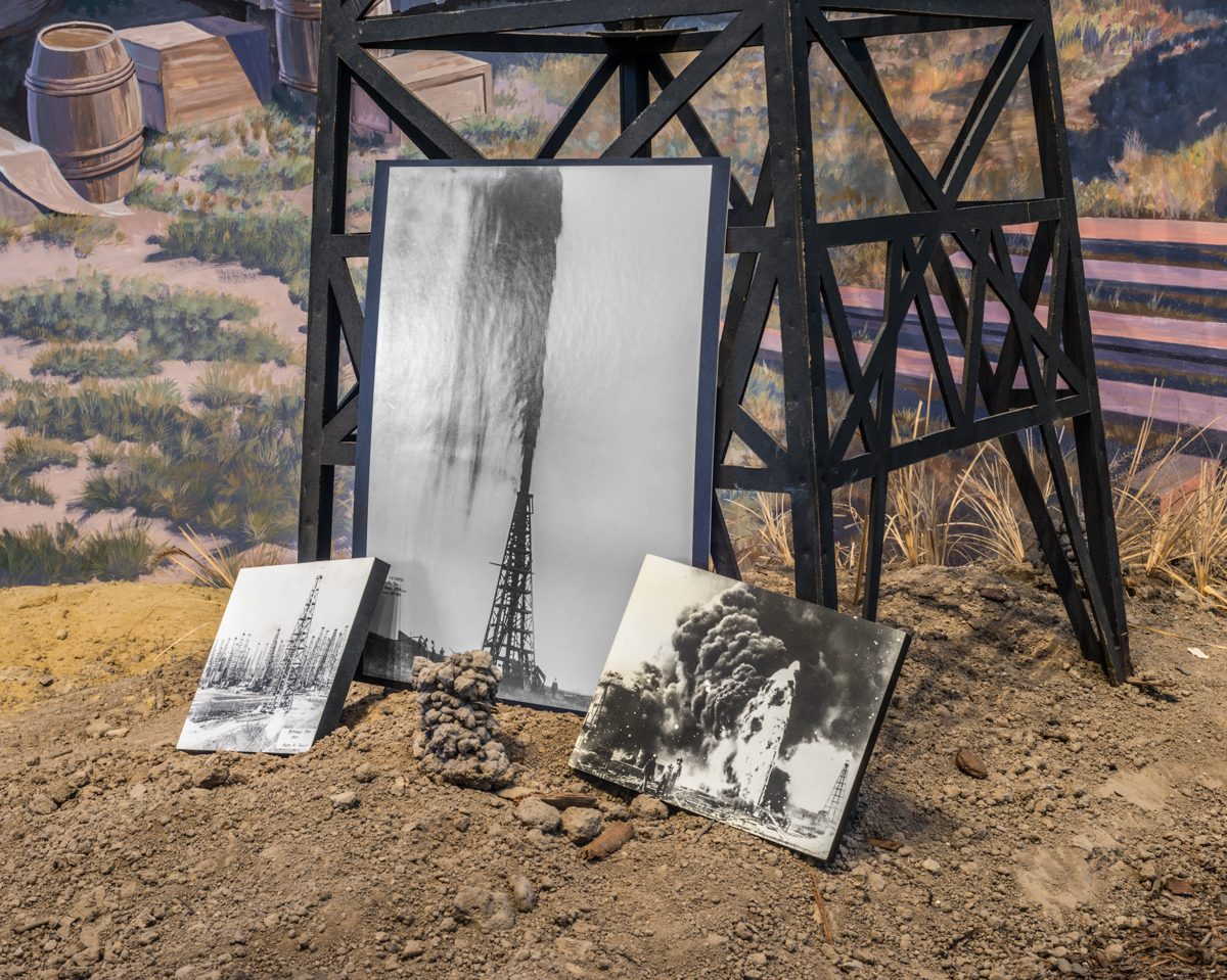
Shane Brown, (yes, two Shane’s today,) is a part-Native American artist from Oklahoma, where he still resides. (Otherwise known as the New Jersey of the Southwest.) Shane’s project, “In the Territories,” gives us an inside look at a State that was mostly known for football, historically, and is now infamous for man-made earthquakes caused by fracking.


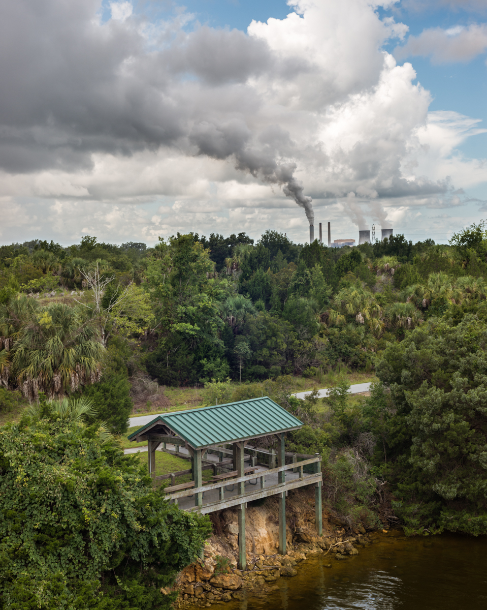
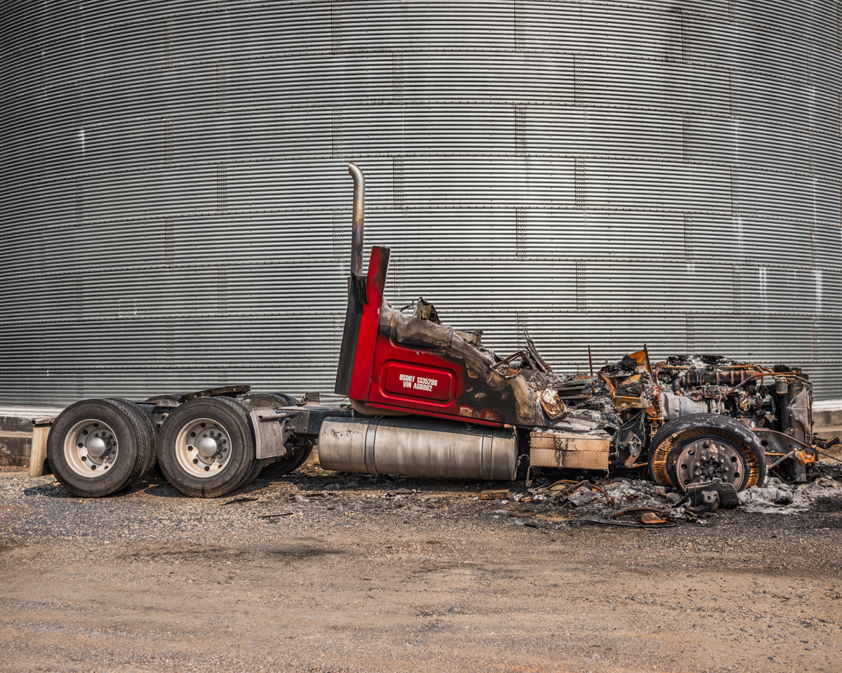
Camilo Ramirez teaches in the Boston area, and brought some work to RSF that he’s shot on the Gulf Coast, where he once lived. Camilo was interested in seeing what the region looked like, post-Gulf Oil spill, though the photos are not about that, per se. To me, they attempt the capture the spirit of a place in time, which is always an admirable goal for a photographer.


Svetlana Bailey is a Russian-born photographer, but she spent much of her life in Germany, and then did a long stint in Australia. (Have you got that?) Now, she’s studying at RISD, and will be featured in the Fall issue of Photographer’s Quarterly, alongside 4 other global female artists I met at RSF.
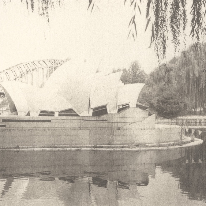
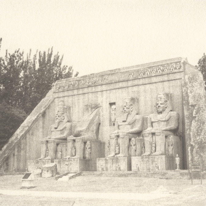
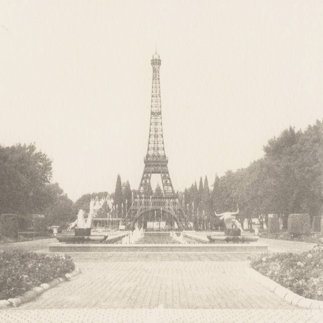
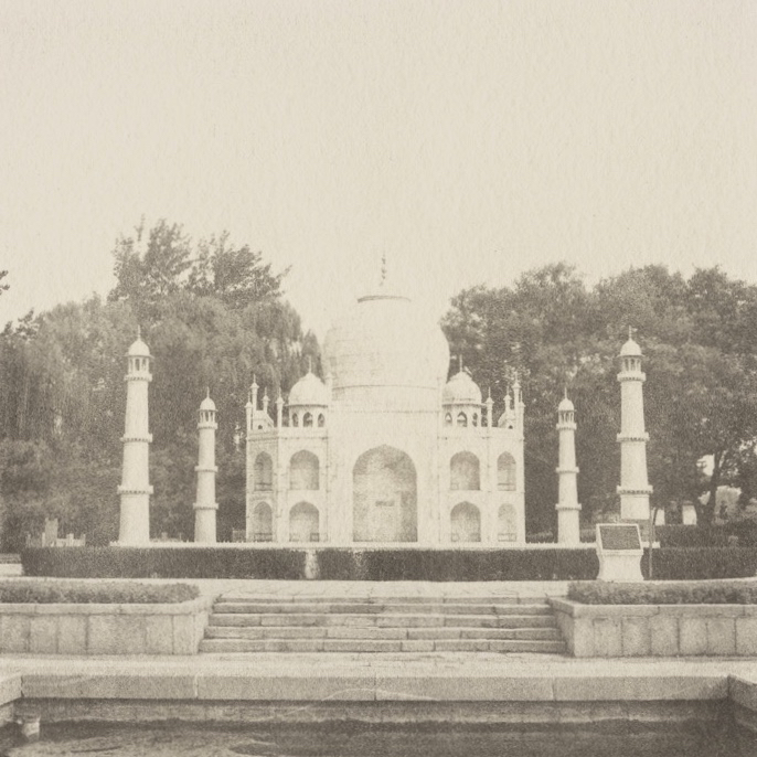
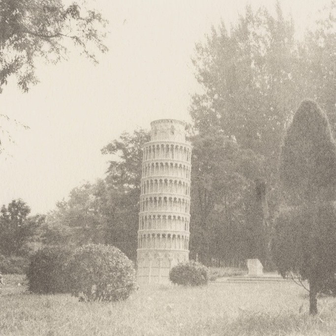
Beyond her primary project, which we’ll show in a few months, Svetlana also brought a few palladium prints made in an amusement park in China. That’s right, all the landmarks below are fakes. Fugazi. I guess they really do make everything under the sun in the PRC.

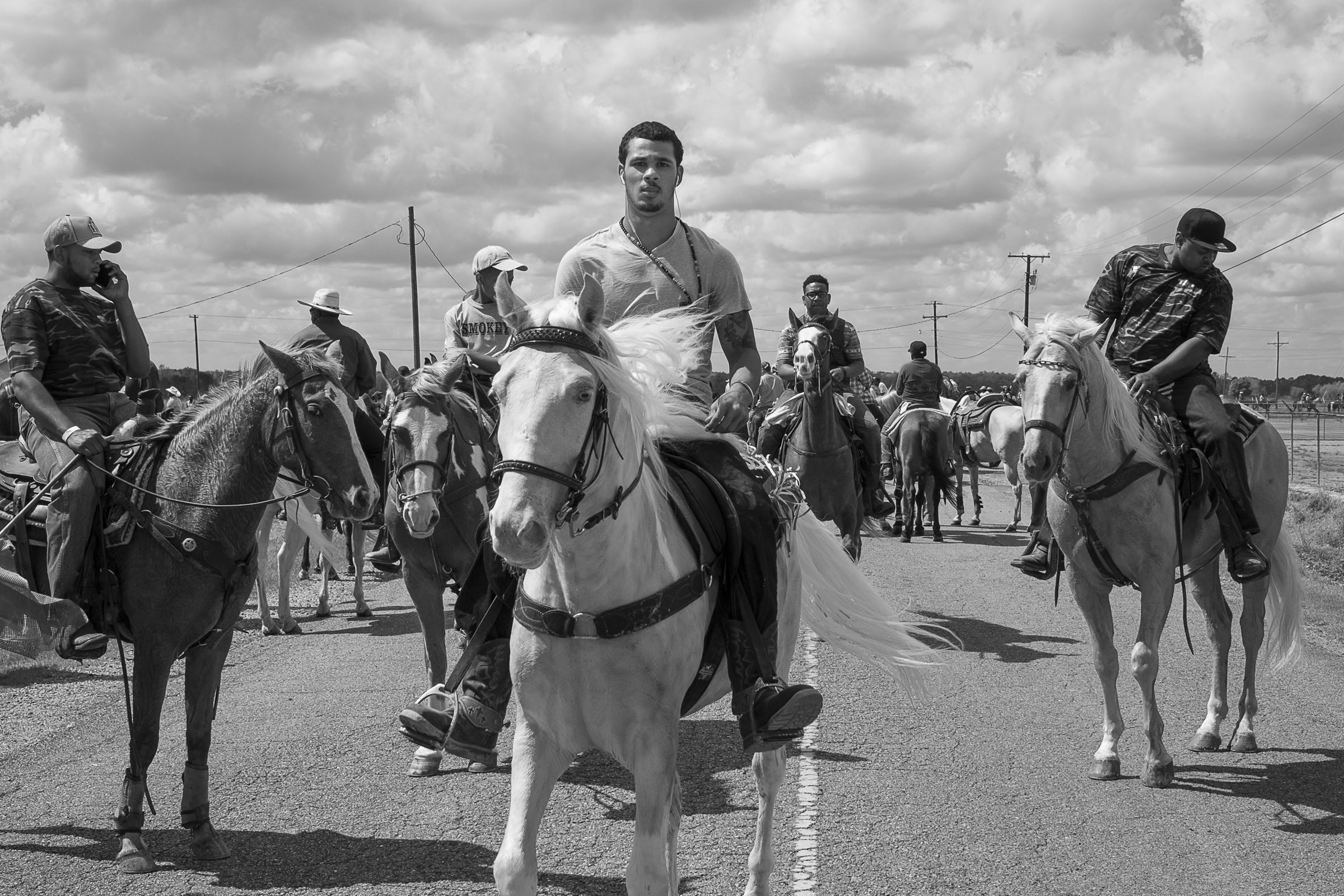
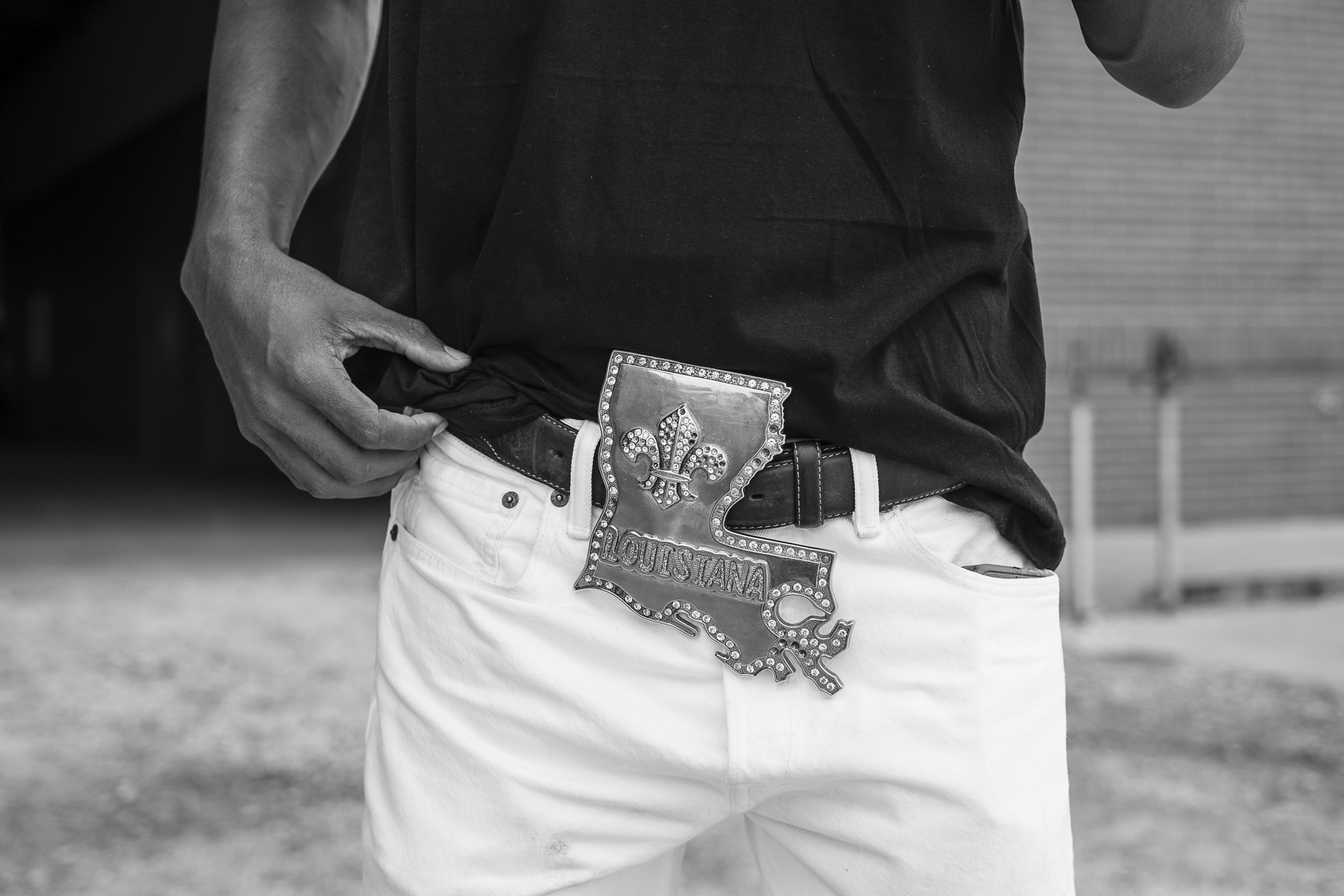
Jeremiah Ariaz strolled in 5 minutes late to his review, just when I thought I was going to get a break. (He was my second-to last meeting of the final day, so my brain was beyond fried.) Therefore, it was going to take a lot to get me back on his side. Fortunately for Jeremiah, his pictures were wild.
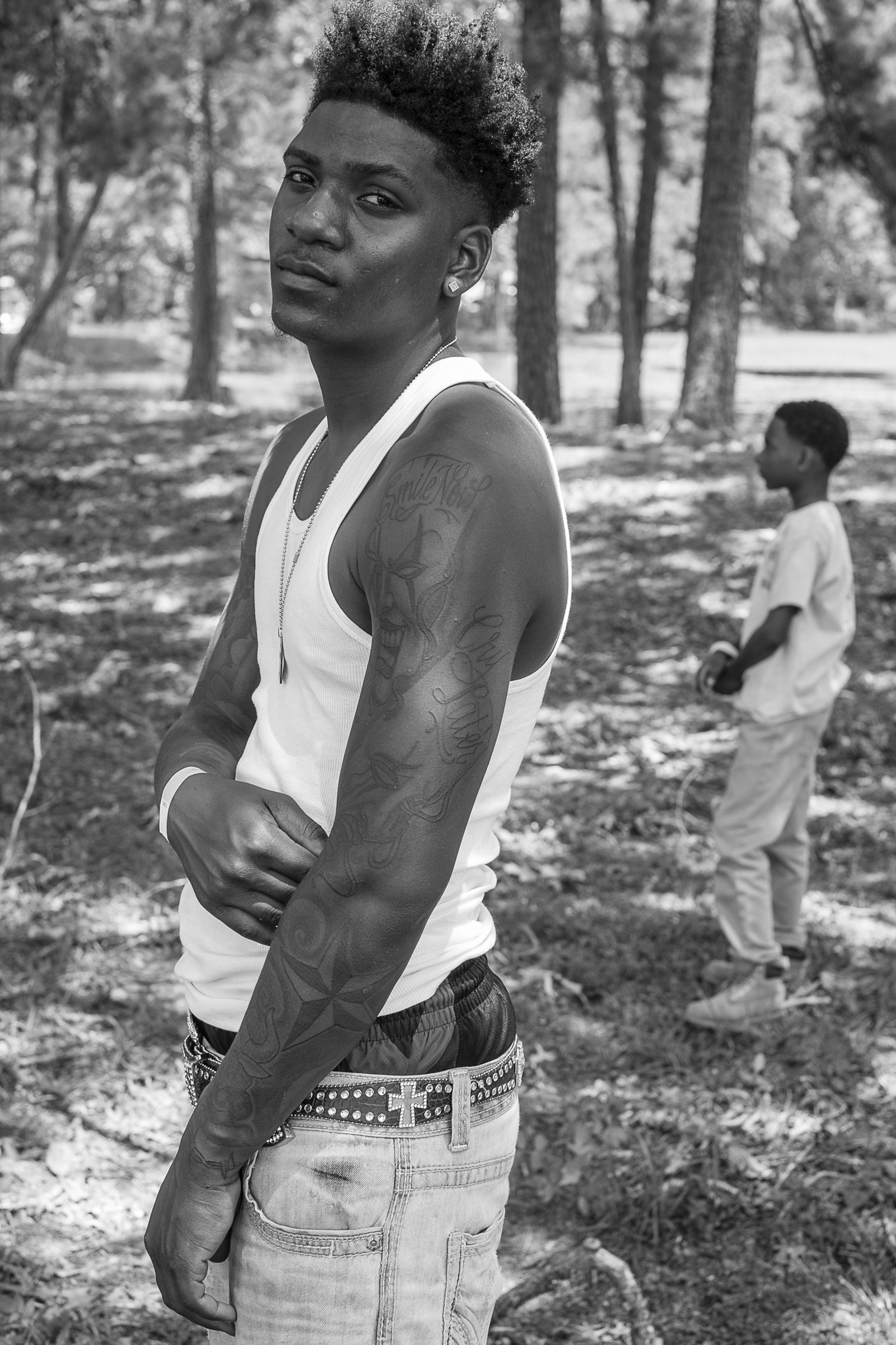
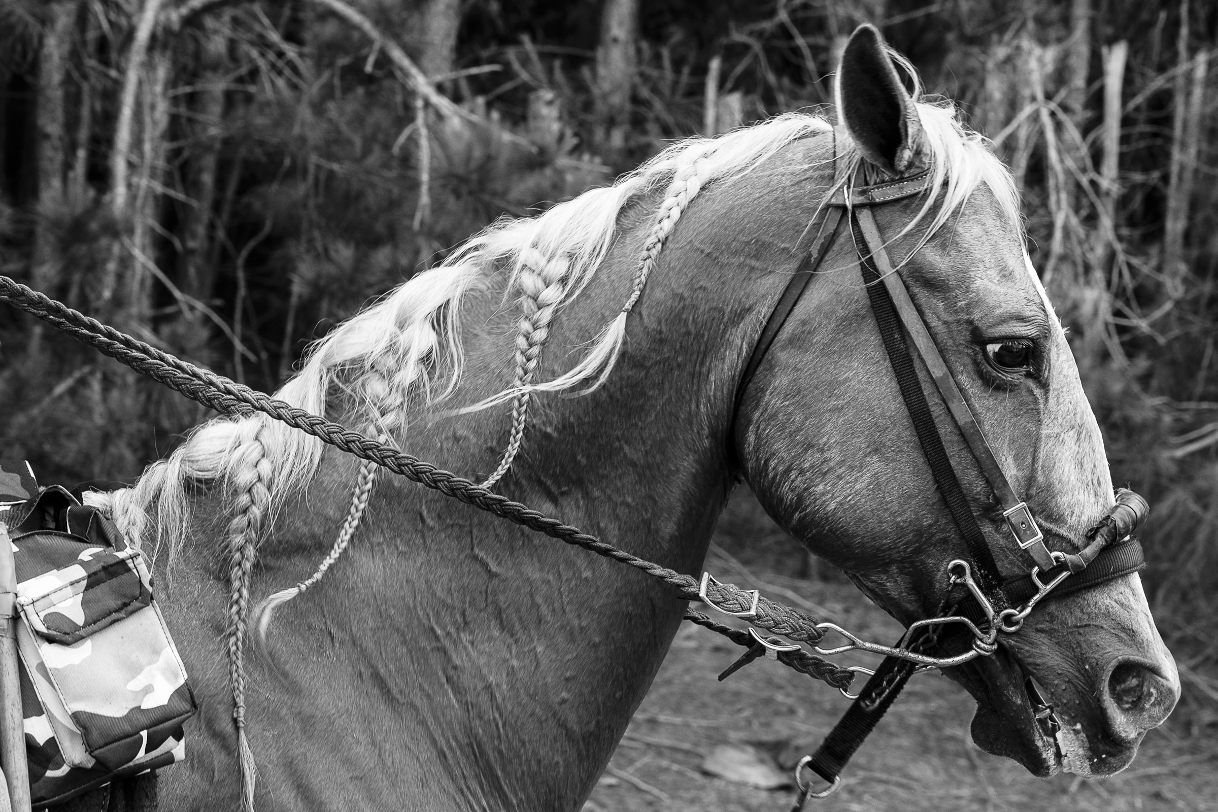
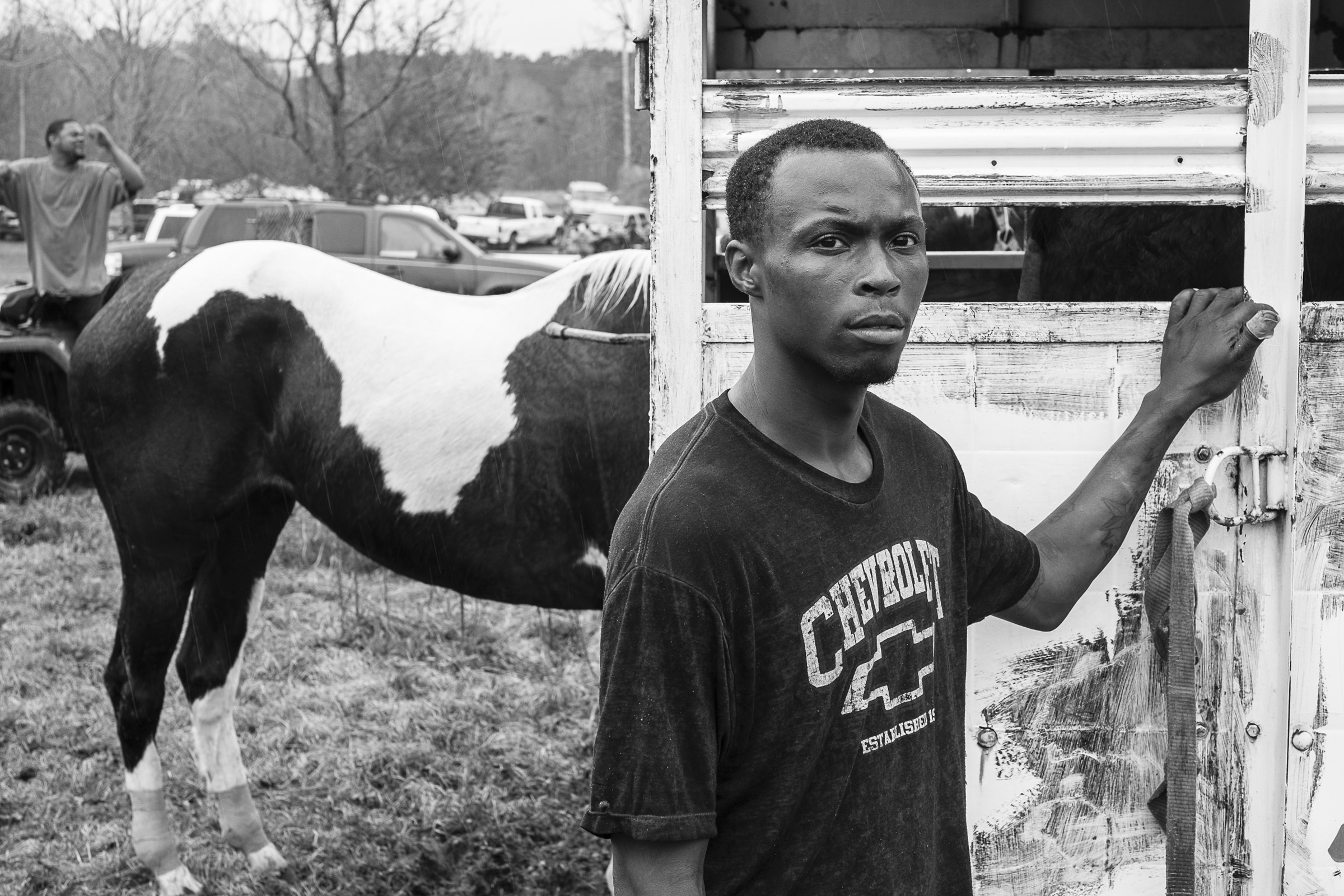
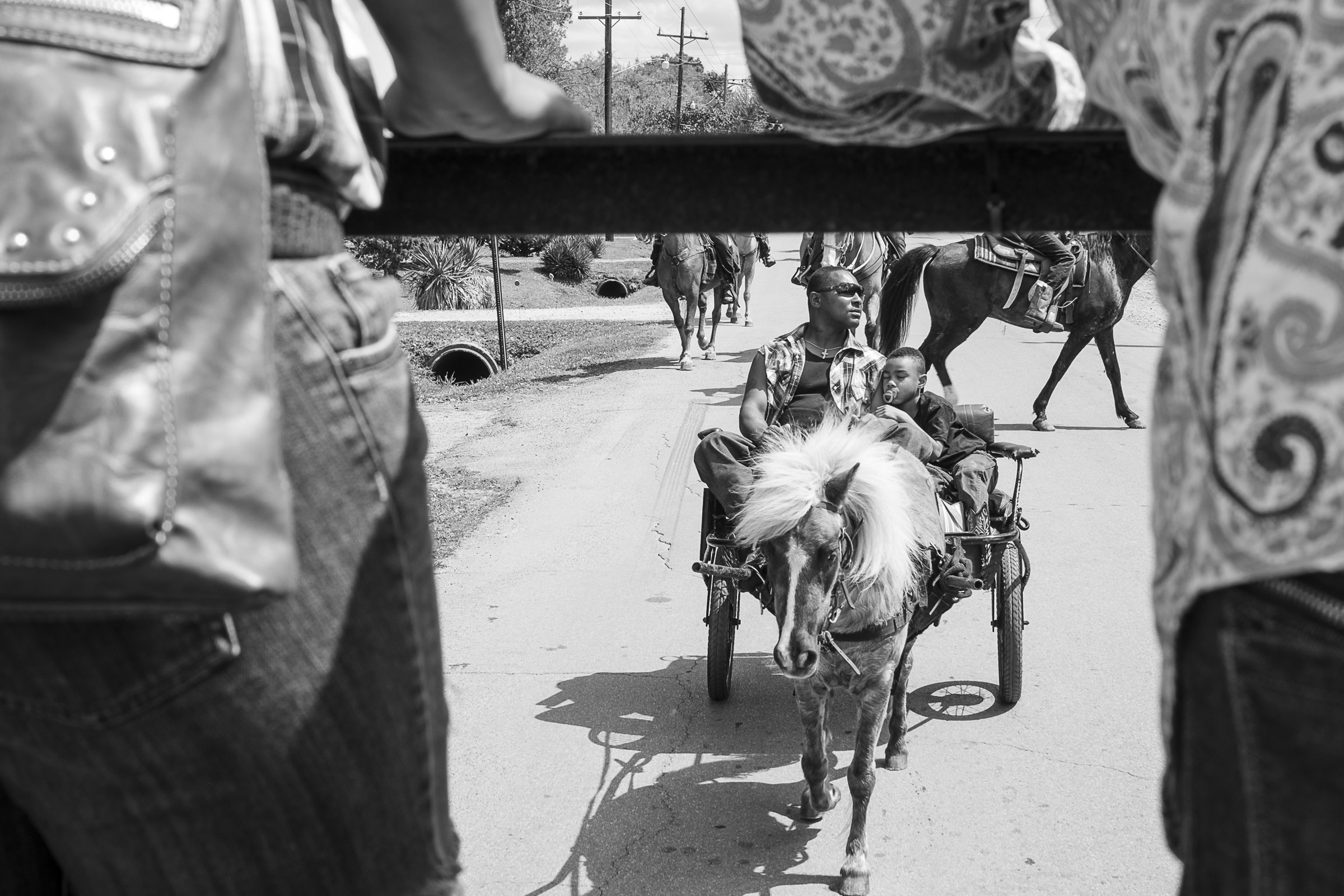
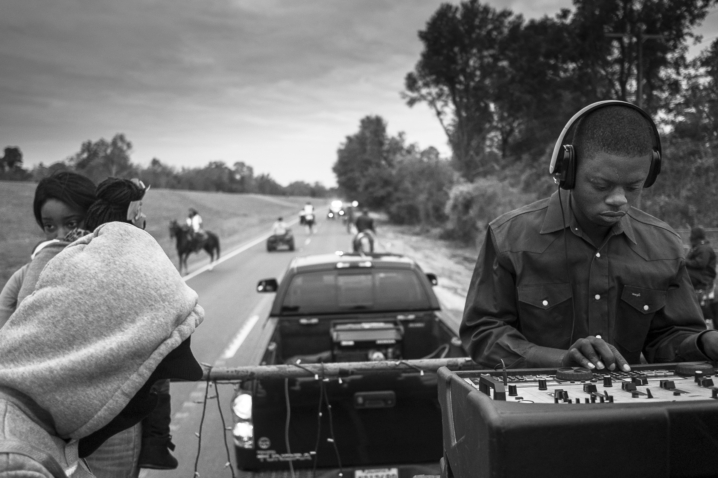
Jeremiah is a professor at LSU, in Baton Rouge, and had recently discovered a fascinating subculture, while riding his motorcycle around Southwest Louisiana. He happened upon a group of African-American men who have a Trail Riding club. No typical cowboys, these, as they tow a truck with a DJ to keep them company as they tool around on their horses. Badass, no?


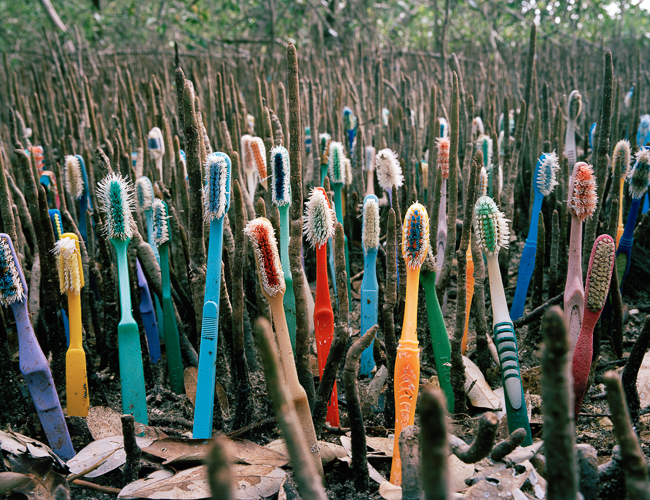
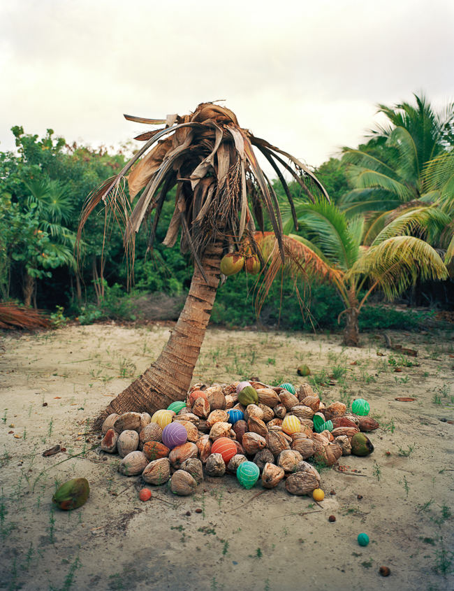
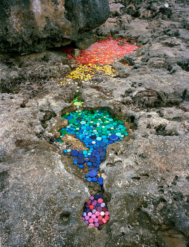
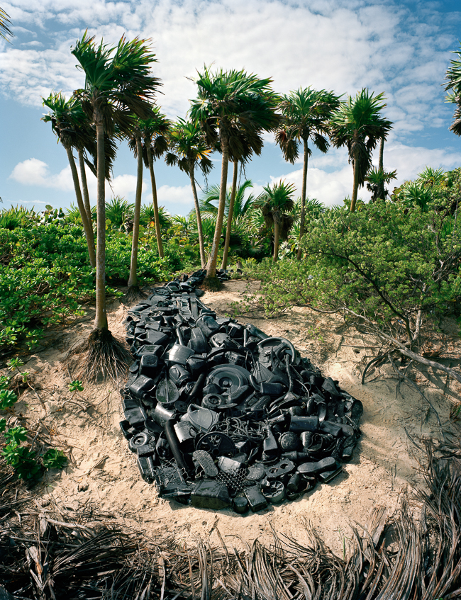
Alejandro Duran, a Mexican photographer based in Ft. Greene, Brooklyn, was one of Center’s competition winners, so his work was displayed at the Center for Contemporary Arts. As I was schmoozing non-stop that night, I didn’t even get to see the pictures.
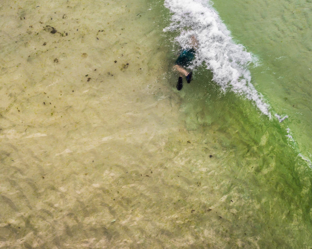
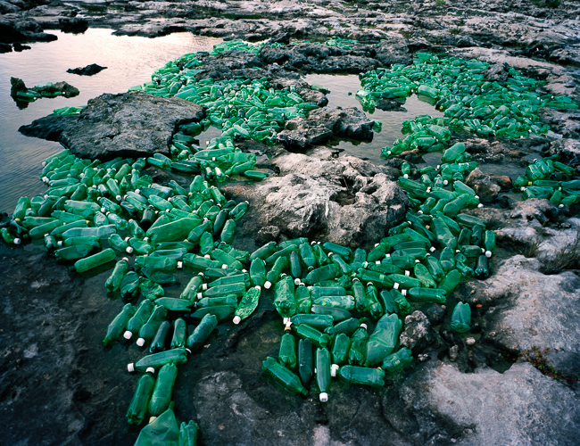
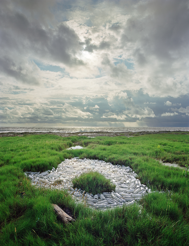
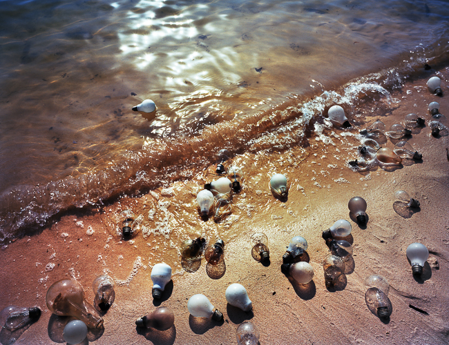
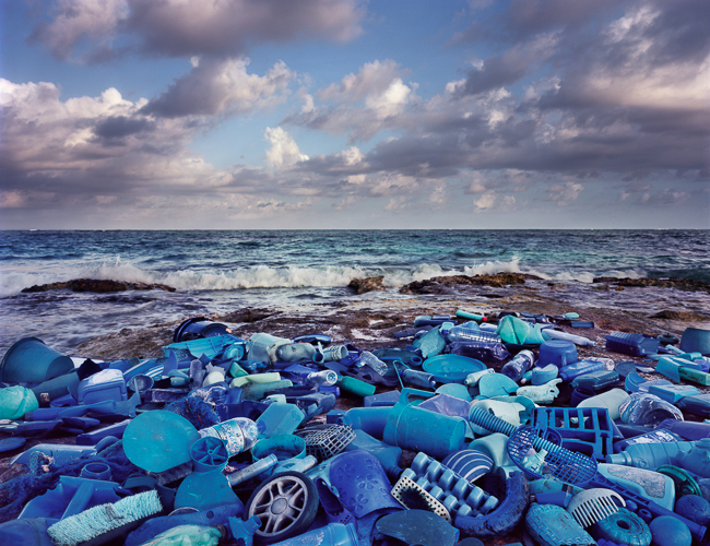
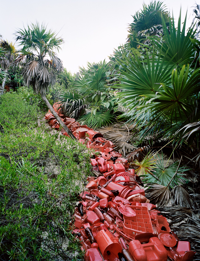
Thankfully, I had a review with him, and got to see his portfolio up close. Alejandro spent time in the Sian Ka’an biosphere reserve in Quintana Roo, Mexico, just south of Tulum. He was troubled to find washed up garbage, on the beach, from 50 countries around the world. (Can I get a WTF?) So Alejandro turned the trash into beach installations, which he then photographed. The work has been making the rounds on the Web this Summer, as it is clearly compelling stuff.

Finally, we’ll get to our last two artists, who were my dining companions at the Saturday night dinner honoring the legendary Anne Wilkes Tucker. To my left sat Tarrah Krajnak, a seemingly Peruvian artist based in LA.
I say seemingly, because Tarrah confided that she was from Ohio, and didn’t speak Spanish. A sharper person might have figured it out for themselves, but Tarrah told me she was adopted. Therefore, one might read into her project, “Dark Messengers,” shot in the American Southwest and South America, as an attempt to get in touch with her roots. Regardless, there is a mystical vibe I find alluring.


To my right that night sat Shawn Records, a photographer from Portland with whom I’d corresponded in the past, but never met. He’s been a part of the Photolucida organization for years, and I wrote a blurb about one of his books in the early days of my weekly column.
On a laptop, Shawn showed me a mockup of a book he’s been working on, called “Hero,” that’s modeled on Joseph Campbell’s famed ideas about the hero’s journey. Shawn has spent a couple of years combing through his massive photographic archive, trying to create a through-line that will parallel the aforementioned narrative.
There are a ton of pictures in his resulting effort, but we’re showing just a small sample, for obvious reasons.


All right, our coverage of Review Santa Fe 2015 is officially complete. We’ll be back to the book reviews from here on out, and then I’m headed to the Filter Festival in Chicago late next month, so we’ll have fresh portfolios for you in October or November. Have a great weekend.