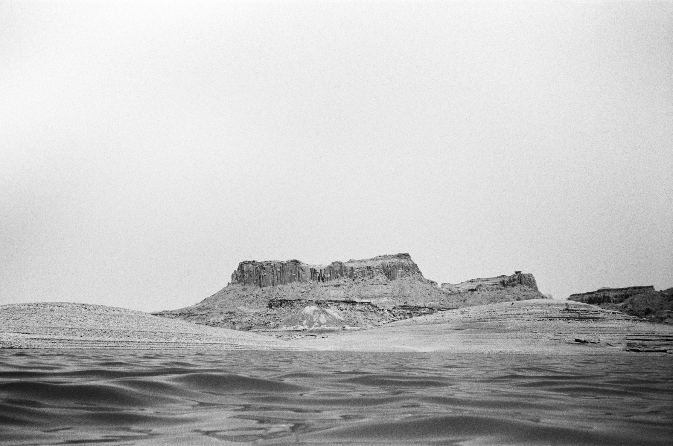
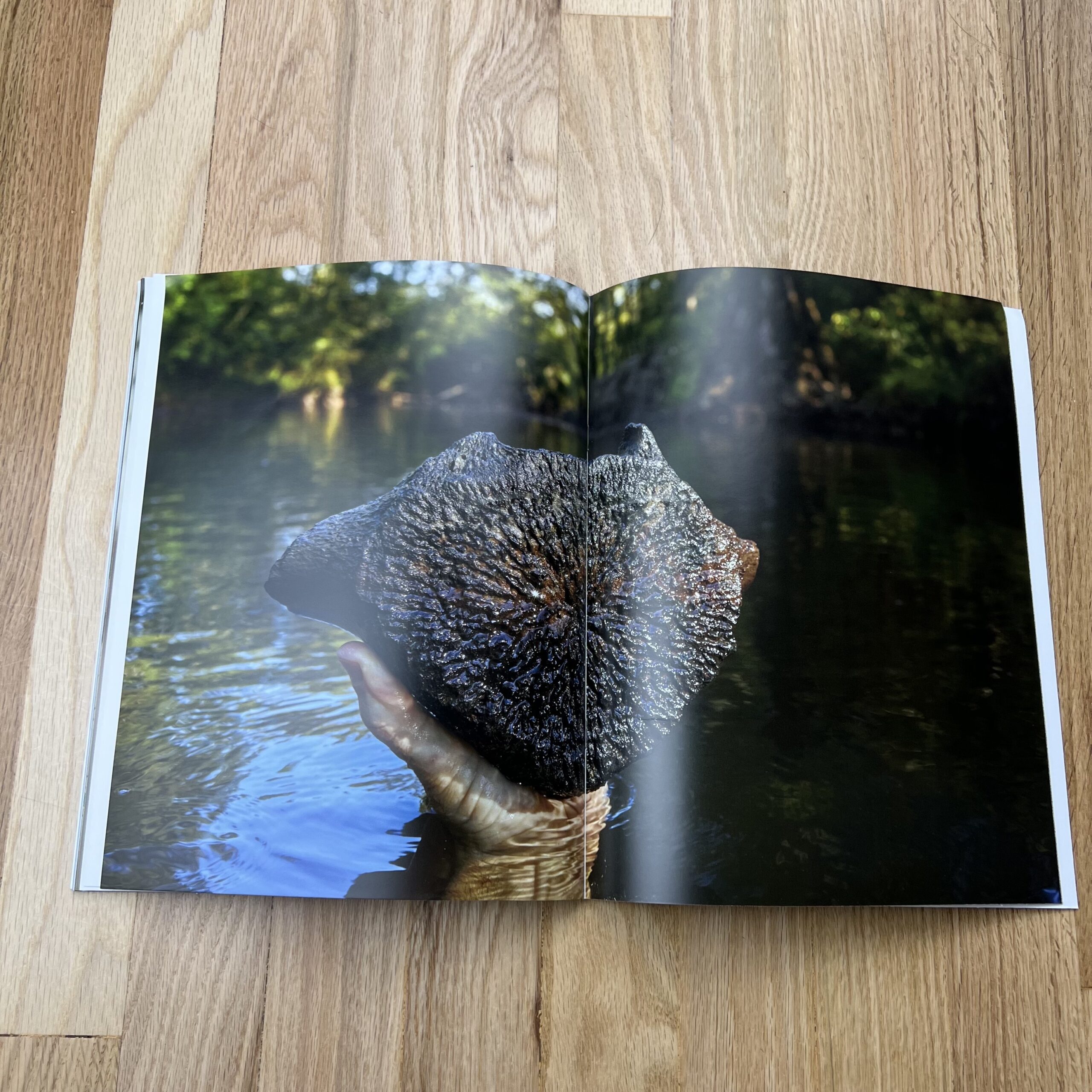
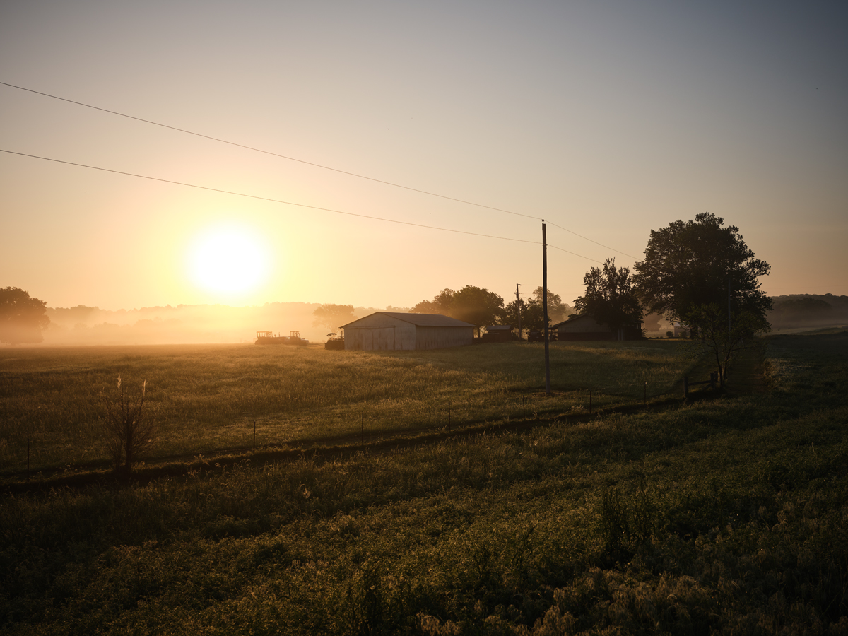
This Week in Photography: The End


This weekly column is coming to an end.


JB, 9:15 am MST, 08.26.22


I’ve sat on the news for a while, waiting for the right time to drop it.

(And today is the day.)

I should say, straight off, that I won’t be going away entirely.

You’ll still get to read my rambling, discursive musings every other week, here at APE.

But on October 7th, 11 years after I began writing for you each Friday, the streak will be snapped.

The photo industry is not remotely what it was, when I began the column in 2011, and change is a healthy and natural part of life. (Especially as this blog is supported by neither subscription fees nor ads.)

It is what it is, but I must admit, after living under the yoke of a weekly deadline for this long, I’m excited to see what it’s like without the structure.

So after today, only five (weekly) columns left.


It all began when I was on the hustle, during The Great Recession.

In the late spring of 2010, Rob Haggart put out a call for images of the cataclysmic economy on APE, (a colleague was looking for photos for a story,) so I sent him a project I had.


Gas station grocery shelf, Antonito, CO, 2009


I was psyched Rob replied, liking the pics, so I told him I was about to attend two big photo festivals, back to back, and as a burgeoning blogger, perhaps I could report on them from the field for APE?

He agreed to publish my articles, and liked the work, so he then offered to pay my expenses on a trip to NYC, to cover the PDN Photo Plus Expo for the blog.

(As you might image, I was blown away, and jumped at the chance.)

A guy I knew on Twitter, Richard Bram, told me he’d be there too, so we agreed to meet up in the cavernous Jacob Javits Center on the West side of Manhattan.

We connected, and I found Richard charming, knowledgable, agreeable, and just fun and easy to be around.

In the end, I mentioned Richard in the article, and so began a long and fruitful friendship.

He’s been featured in more articles than anyone else, as off the top of my head, I recall a festival in Houston, museum visits in Brooklyn and London, eating in a little Ramen shop in the East Village, and a fish and chips joint on the Thames in 2019.


Fish and Chips, Limehouse, London, 2019


And wouldn’t you know it, but for the first time ever, Richard came to visit last Friday, and stayed the night here at our place.

The timing was perfect.


I’ll be in New Jersey next week for my first major photo/writing gig for a big-time, international publication.

(I can’t share details yet.)

As such, I’ve spent weeks checking my gear, ordering new equipment, and building a battle plan to be the mobile, nimble, 21st Century digital journalist on the go.

So of course Richard and I would end up testing equipment, talking endlessly about the intricacies of fill flash, and geeking out as hard as we could.

Richard admitted he’d been in the theater growing up, with parents who acted in local community productions.

He also has a distinguished face, and knows how to use it.

Therefore, Richard modeled while I switched cameras and lenses, tested out my lighting kits, and did a deep dive into a different type of photography.

(Most of the time, I think myself more artist than photographer, but I’ve shot my share of weddings, headshots, passport photos, graduation pics, etc.)

Here are a few of my favorites.


Richard was there with me at the beginning, in 2010, and was here at the end too, in 2022.

{Ed note: To reiterate, this is the end of an era, not my time here as a writer. You’ll still get me 2x a month.}


As gifts, Richard brought a lovely woodblock print he’d made in Oaxaca this winter, and a ‘zine that came out last year.


Normally, I look at submissions in the order they arrive, but have made exceptions over the years, (including with Nancy Baron’s ‘zine recently,) so we’re going to check it out, but keep it brief.

(Since I dropped some big news on you at the outset, we’ll go short and summery today.)

The ‘zine is called “The Red Cube,” was was published in 2021 by Bump Books.

It features many looks at Isamu Noguchi’s classic sculpture in Lower Manhattan, which was a block away from where Richard and his wife lived during their New York years. (In between stints in London, but in case it’s not clear, Richard is American.)

The ‘zine, too, (with that big red cube in the background,) spans an era, between 2011-2020.

There’s not much to say about this that the photos below won’t show.

It’s a series of street photographs in the Financial District of NYC, and feels like a love letter to the city, now that he’s moved on.


New York has been featured more times in this column than any other locale.

I’ve covered countless NYC gallery and museum exhibitions over the years, hit the High Line, eaten at the cronut shop, dodged snowflakes the week before Superstorm Sandy, gorged on pizza, and done a 6 year stint at the NYT, all during the time of this weekly column.


Me and Jessie on the High Line, 2018


I had a daughter, got two dogs, built a career, saved my wife from the ravages of clinical depression, made countless friends, lost some too, was a college Art Department Chair, traveled the US, blogged for The New Yorker, and learned more about the world, my craft, my community, and myself, than I ever could have imagined.

So I hope you enjoy this last 6-week run, (including today,) before I retire the weekly-columnist-mantle.

I appreciate all the time and energy you’ve given us over the years, and the opportunity Rob has provided.

Hope all is well, and catch you next week!


The Art of the Personal Project: Jennifer MacNeill

The Art of the Personal Project is a crucial element to let potential buyers see how you think creatively on your own.  I am drawn to personal projects that have an interesting vision or that show something I have never seen before.  In this thread, I’ll include a link to each personal project with the artist statement so you can see more of the project. Please note: This thread is not affiliated with any company; I’m just featuring projects that I find.  Please DO NOT send me your work.  I do not take submissions.


Today’s featured artist:  Jennifer MacNeill

Assateague Island is a barrier island on the East Coast of the United States facing the Atlantic Ocean. The northern portion is part of Maryland, and the southern end is in Virginia. Children’s book author, Marguerite Henry, brought attention to the island in her 1947 classic, Misty of Chincoteague, acquainting young people all over the world to the spirited equines that call it their home. It was first through her books that I formed an interest in this land and its animals, however I had to wait until I was an adult to visit in person.

Since 2010 my family has been visiting Assateague Island every year at least once. We prefer to go off-season when the biting flies and beachgoers are lessened. Even in the middle of winter there is so much appreciate. I used to only go to view the feral ponies but they’re sometimes hard to locate in the cold months, so I learned to see the beauty in the overlooked elements, lichen covered branches, a mushroom growing out of a manure pile, a tree bent over time by the strong ocean winds. While the ponies are still my favorite part, Assateague has helped teach me to appreciate the beauty of nature in all seasons and I seek to show others what I have learned to see there.


To see more of this project, click here

Instagram

APE contributor Suzanne Sease currently works as a consultant for photographers and illustrators around the world. She has been involved in the photography and illustration industry since the mid 80s.  After establishing the art-buying department at The Martin Agency, then working for Kaplan-Thaler, Capital One, Best Buy and numerous smaller agencies and companies, she decided to be a consultant in 1999. She has a Twitter feed with helpful marketing information because she believes that marketing should be driven by brand and not by specialty.  Follow her at @SuzanneSeaseInstagram

Success is more than a matter of your talent. It’s also a matter of doing a better job presenting it.  And that is what I do with decades of agency and in-house experience.

The Daily Edit – Forest Woodward: Personal work, Lake Powell

Lake Powell

Photographer and writer: Forest Woodward

Heidi: Why did you choose to photograph this only in black and white?
Forest: My entry point into the photographic world was, at a very young age, through the alchemical space of the black and white darkroom. It was a place that shaped the foundation of my vision, and my way of seeing in the world. Over the past two decades I have learned to work in color, and it has served me well for interpreting editorial and commercial assignments in the mode of the times. I have always however, reserved a special place in my practice for black and white, a place that I most often visit when I am working on personal stories. It is a way of seeing and working that helps distill the world around me into essence, light and form.

Was it exclusively shot on film? 
Yes – all of the work was shot on film, a mix of medium format and 35mm.

How did your connection to nature, movement and climate work inform this work?
There’s a lot in that question. My work and interest in the human relationship to nature and our effect on the climate goes way back. As does the process of movement through land as a way of coming into conversation with it. Growing up as a kid roaming game trails in the mountains around our home, and later working in the outdoor industry climbing and running and navigating rivers, movement across land has always connected me to a deep source of intrigue and creative inspiration.

Today so much of the work I encounter in the world comes from a place of talking about nature, about the human effect on climate, about what projections of past and future show us. Those stories are important. But I also think we need more stories that are in conversation with the land, that are informed by a process of immersion, a reappraisal of the importance of emotional and immersive relationship to specific biospheres. Lake Powell is running dry, the West is in a mega drought, Glen Canyon was drowned. These are things that we know – that the data reveal, that science supports, and history has catalogued. These facts are important to consider – they will shape the decisions we make going forward, the policies and actions we take both individually and collectively.

But beyond what can be extrapolated through the analysis of data sets in an air conditioned office in DC, I am interested in what the landscape might offer when it is involved in the conversation in a less abstract manner. This is where the “movement” comes in. The idea of immersing in landscapes and spending long periods of time moving by foot (or in this case by paddle) across the land. It is in this way of moving, watching, listening and interpreting (through words or images or other creative expression) that allows (in my mind) a more nuanced  and emotionally vibrant conversation to emerge around the human relationship to the land.

This was an immersive project, you did the writing as well as creating a body of work, what did you enjoy about that process?
Yeah I really enjoyed that way of working. There are some encounters in a project like this that call for a photograph, others for a words. Rarely do I find a single mode of working is the best for all situations. To have the opportunity to weave words and images together, to let them inform and come into conversation with one another allowed for a more relaxed and honest approach. Neither medium was asked to do more than I could will it to do, but through the relationship created between words and photos I feel at times a third creative form emerges in the space between them.

What did this 130 mile packraft* journey teach you about yourself as a creative?
(*it was a mix of packraft and sea kayak and hiking)
This project in particular was a good reminder to carve out longer periods of time to immerse in a landscape, to return multiple times, and to remain curious. I did a lot of research and reading prior to embarking on this project, and so came into the project with a lot of preconceptions. That was fine, important even, but then the work becomes letting go of those preconceptions in order to see what is actually there. This project reaffirmed my beliefs that the best pictures are not the ones that we set out to make – but rather the ones that find us along the way.

My role as a creative is to be disciplined and in touch with my craft in a way that allows it to be a nearly subconscious endeavor. This requires research combined with a technical and physical proficiency with the tools and in the landscapes being navigated. And then, those foundations being set, it requires a letting go, a release of preconceptions in order to actually be present and tuned to the complexities of that which is being experienced. Experiencing. In the rare instances that this is achieved I think the result is to make work that is honest. To me, that is the highest calling of the creative.

What would you tell your younger creative self?
I think actually I’m going to take some advice from my younger creative self, and give it back to my older creative self today. This is from the interview you and I did a few years back for aPhotoEditor, and it grows more true to me with each passing year:

“Do good work. Be kind to the people around you, and to yourself. Balance your idealism with healthy doses of action. Embrace failure and continually seek opportunities to learn – in whatever form or medium they might take. Question societal definitions of success. Make your own. Surround yourself with good people. And be one, as much as you can. Watch, listen, and when the time is right, act with conviction. Be willing to adapt, to move with the currents, to see from different angles, but don’t ever give up on the unique point of view that makes you you.”

Lake Powell

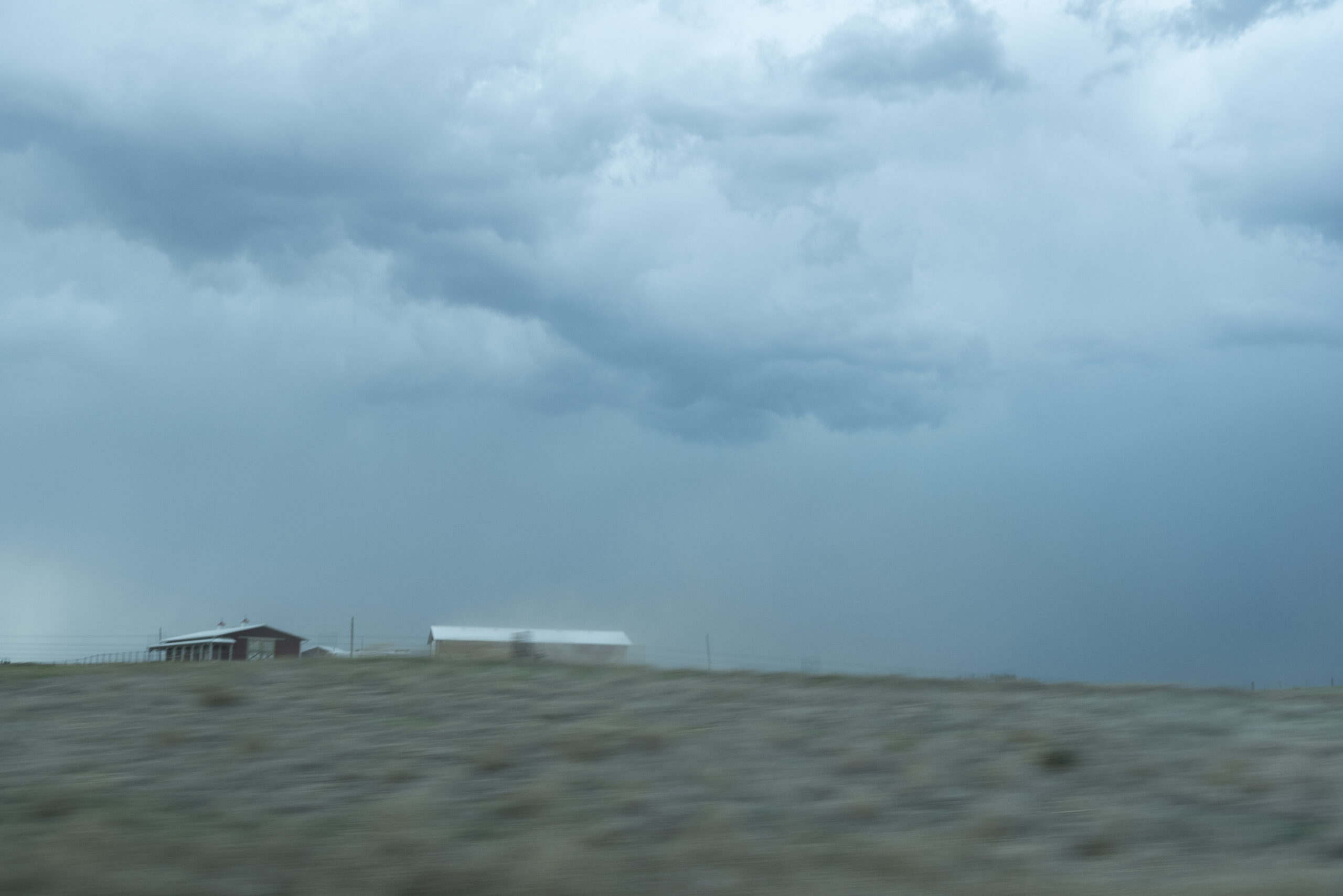
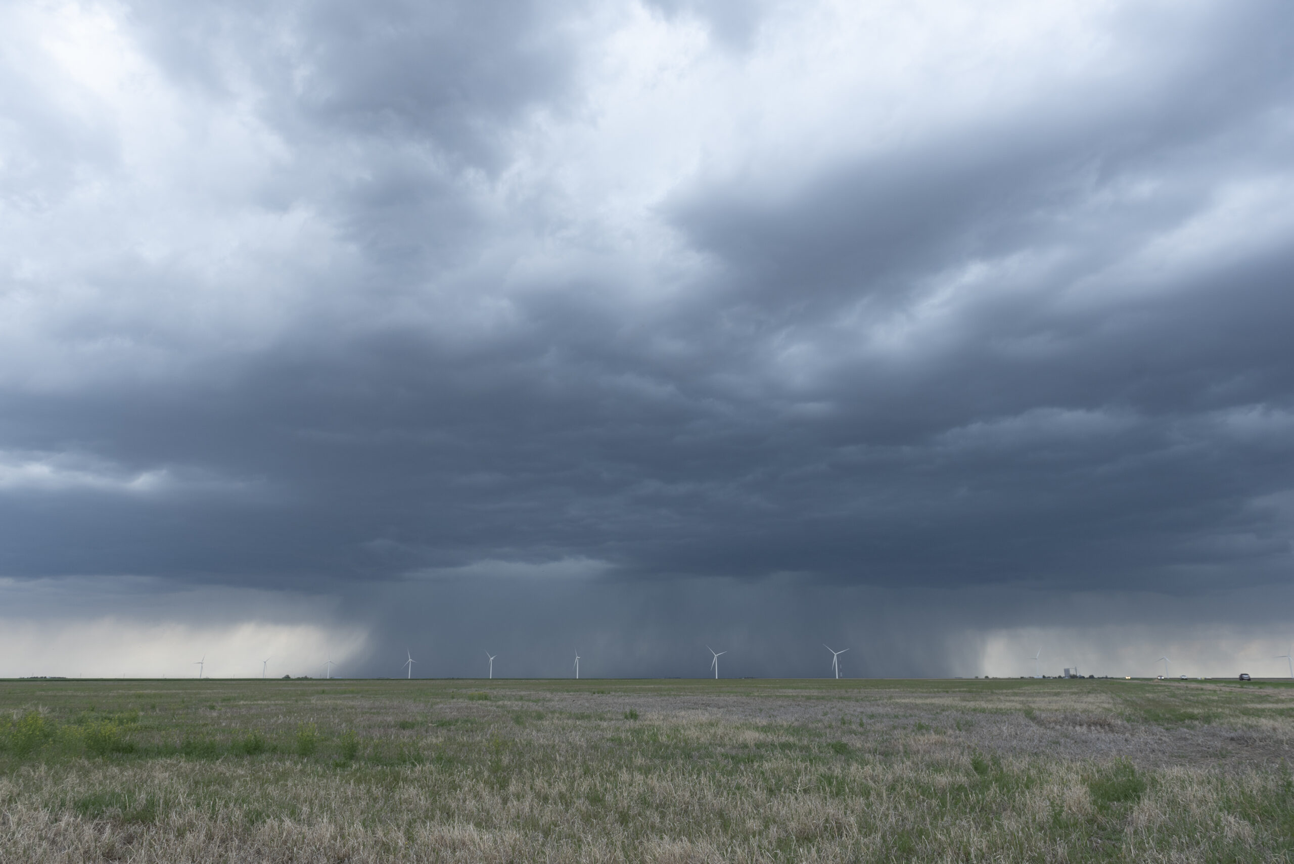
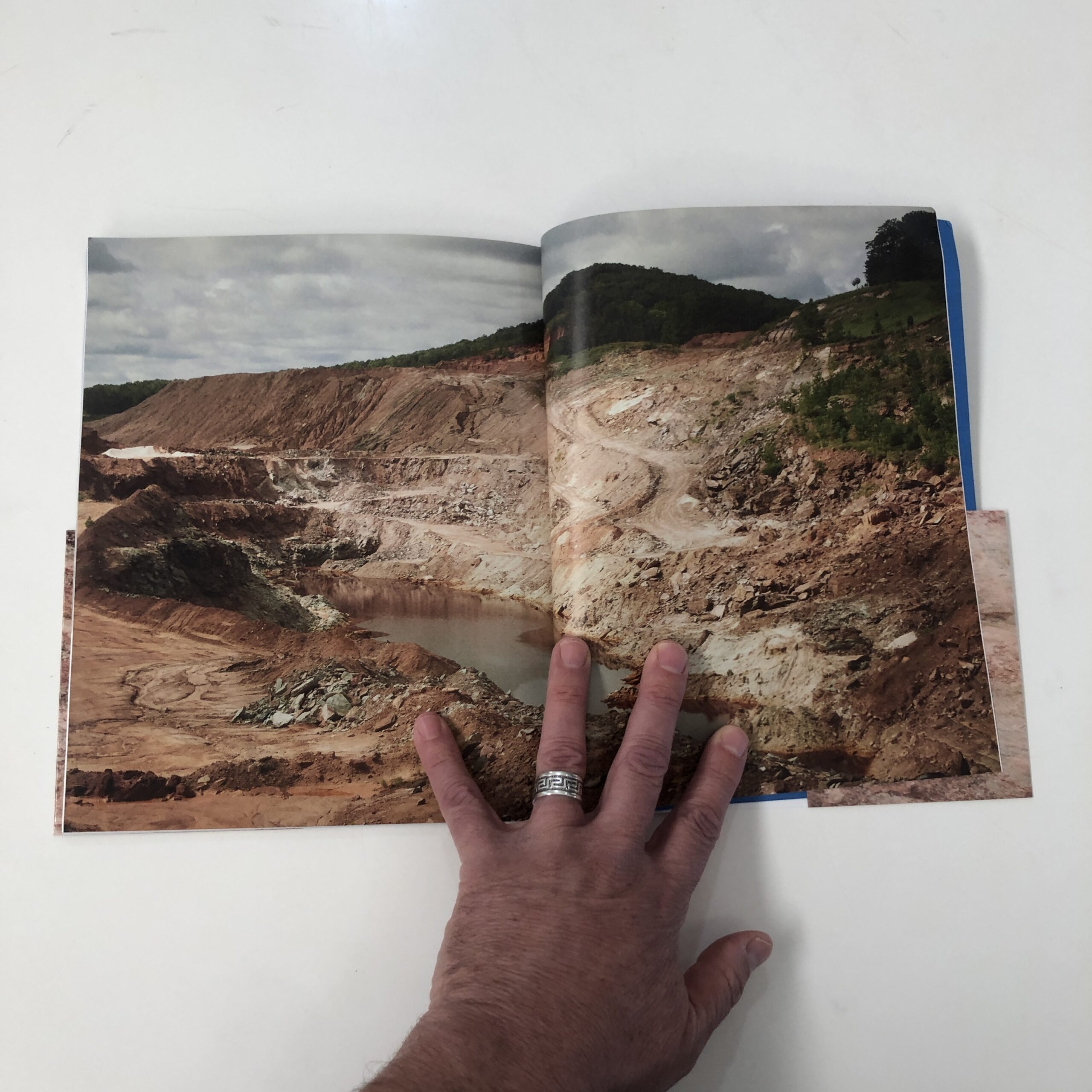
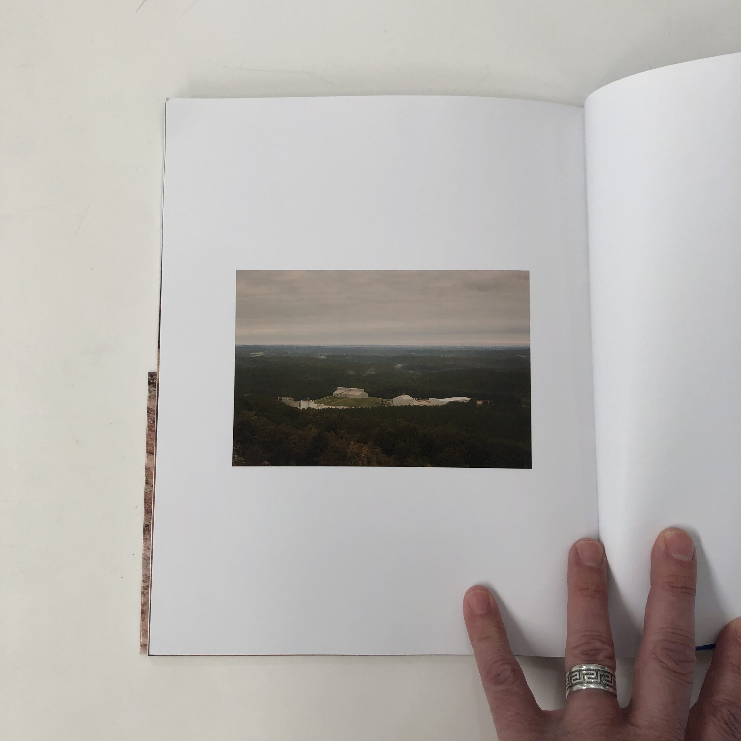
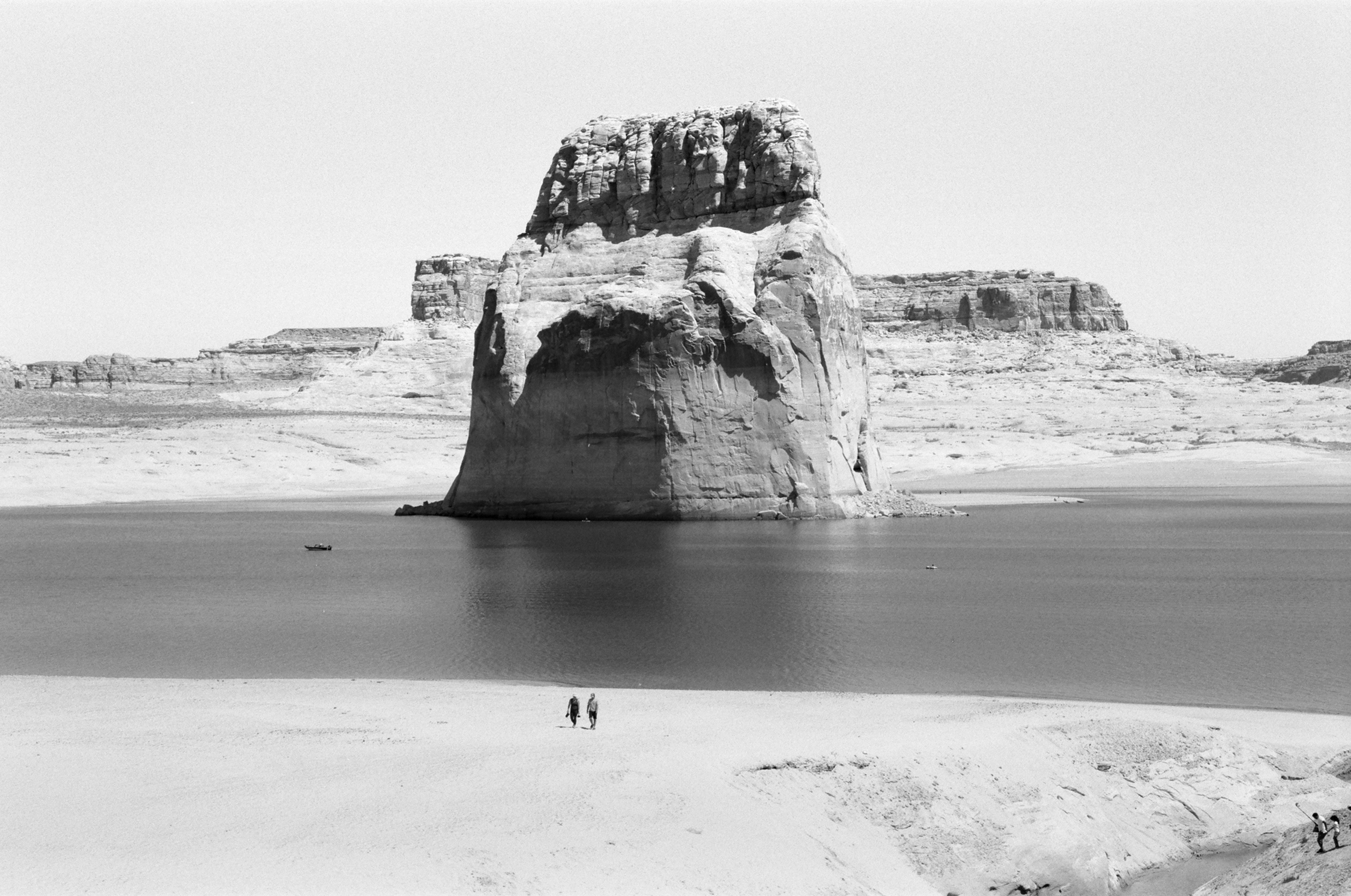
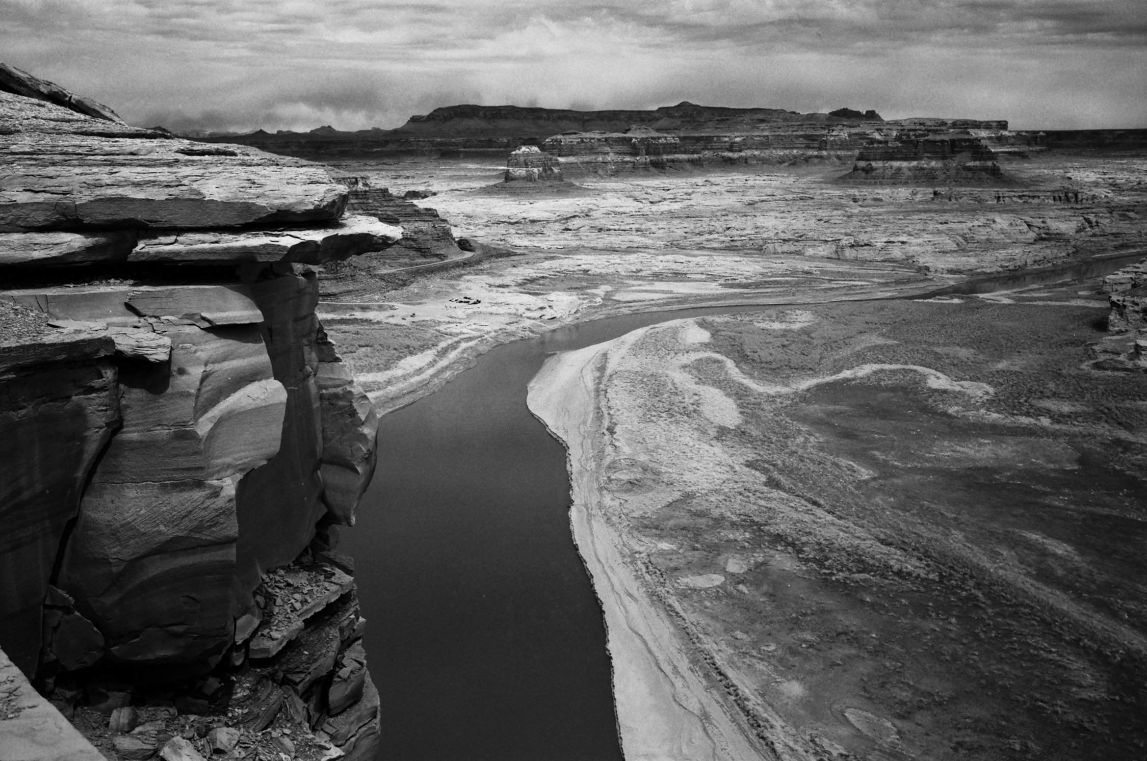
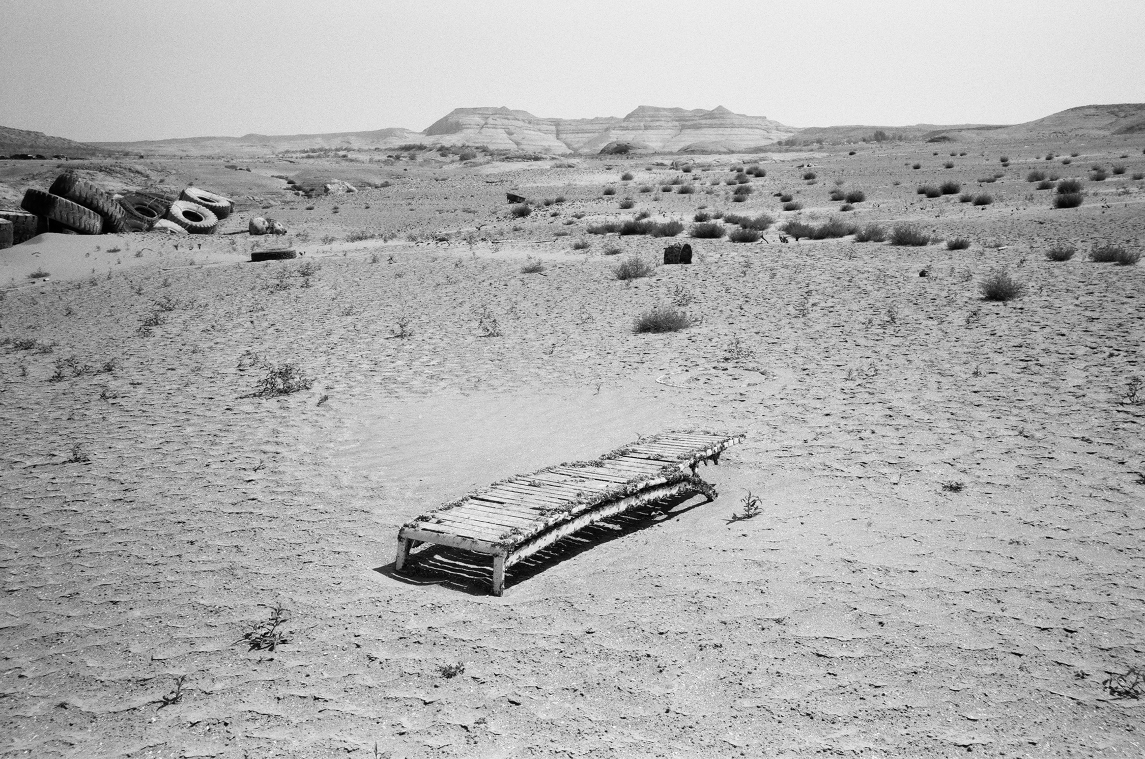
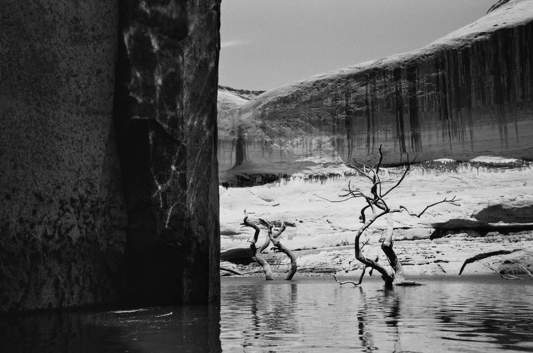
In the spring and summer of 2021, as Lake Powell plummeted toward its lowest recorded water levels since reaching full pool in 1980, Forest Woodward set out on a long unscripted meander through what was once Glen Canyon. Over two visits, in April and July, he sea kayaked and packrafted some 130 miles of the lake as the Colorado River muscled again through long-buried side canyons. When these images were made, the lake surface was between 3,565 and 3,559 feet, on its way down to this spring’s low of 3,522 feet—dangerously close to the level, at 3,490 feet, when the dam may no longer generate electricity. This April, the Bureau of Reclamation announced a plan to push more water down to the lake from Utah’s Flaming Gorge Dam, 730 miles upstream, while simultaneously slowing releases out of the lake from Glen Canyon Dam. Climate and drought may ultimately have the last word on Lake Powell’s future. Until then, these pictures and notes are Woodward’s attempts to hold on to threads of tangled beauty and the strange markings of a shifting world.

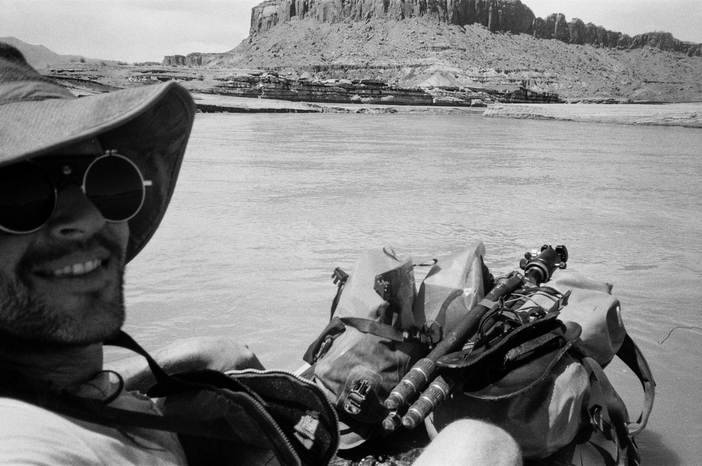
Images and words By Forest Woodward

April 4, 2021

I slept by the river last night. Smoked too many cigarettes. I watched a translucent spider weave a strange dance and woke to the Paria greeting the Colorado, the laughter of kindred currents gurgling downstream. Condors dozing, wings wrapped in clay, dreaming Pleistocene dreams in the cradle of a brown god that never sleeps. Breakfast in Page. Last-minute supply run, sunscreen, mezcal, apples, oats, coffee, jerky.

I have four days and a packraft, and I am fairly open to seeing where the wind and my stubby craft will take me. Emergent design if you will. In 2015, I sea kayaked 90 miles from Hall’s Crossing, on the lake’s western edge, to Glen Canyon Dam, and these two trips will mean I’ve paddled it end to end. A rather arbitrary achievement, and one that takes no account of the most interesting part—that the landscape here is never the same twice, and each canyon holds its own beauty and melancholy.

I walk out to a spot below the dam where someone not too long ago sat amidst the hum of turbines and carved the outline of a buffalo into the rock, along with an inscription that everything that was grasped by man would one day be free again. But now it’s gone.. Erased from the soft stone along with all the other marks of passing. I watch a canoe pick its way up the Colorado towards the base of the dam, slow strokes against deep current. It looks cool down there in the shade of the canyon, where the water moves again.

4.8.21
The body of a dead cow lies decomposing in the mud at the water’s edge when I arrive at Farley Canyon, on the north end of the lake. Even in the dark, I can see evidence of a struggle. I wonder how much this scene resembles what John Farley might have encountered when he ran cattle here back in the 1880s, when the Colorado River flowed free.

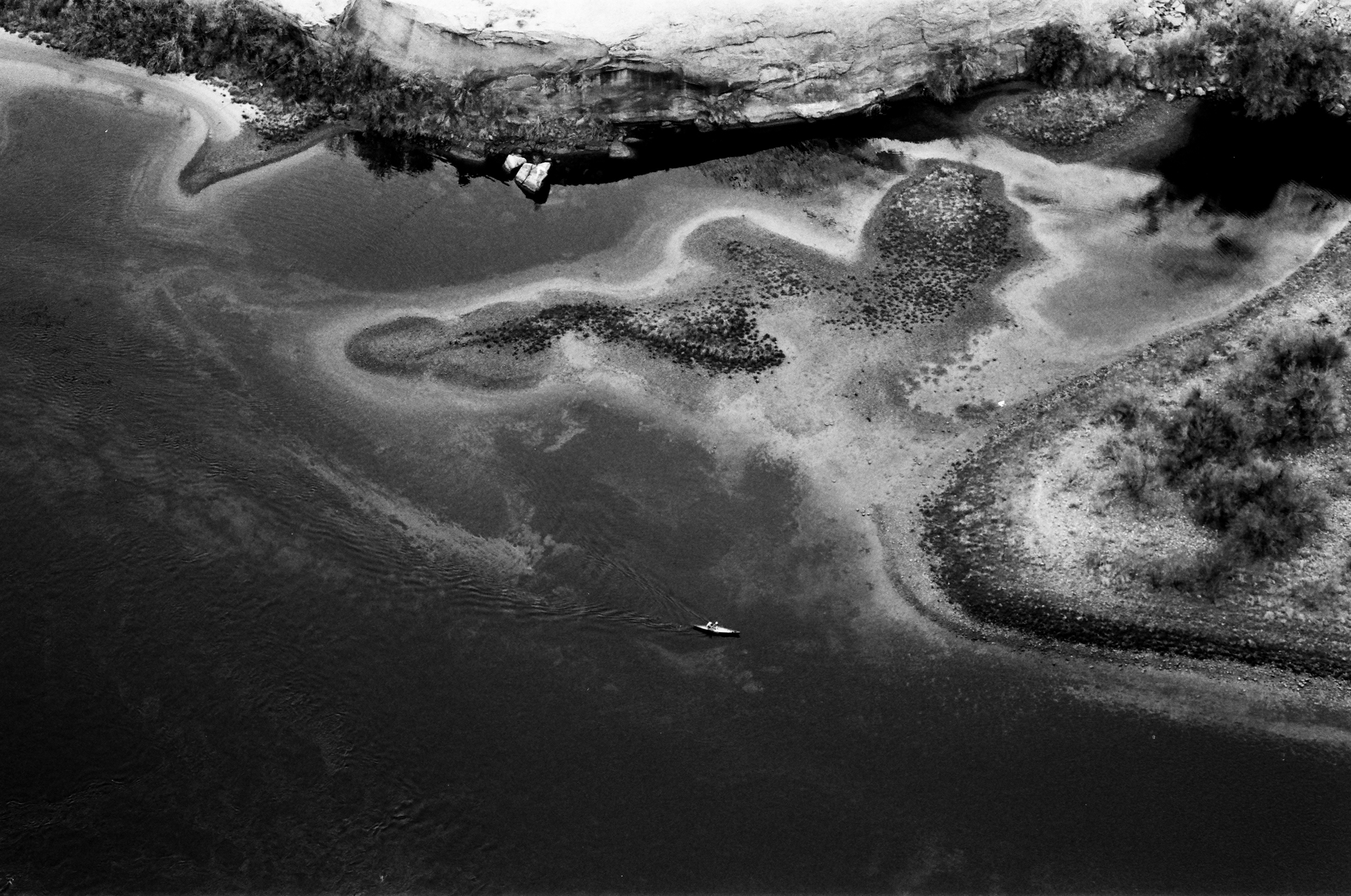
Trying to pinpoint the exact confluence of river and lake is a moving target, but Farley Canyon seems as good a launch point as any. Before the reservoir flooded this area, Utah State Route 95 crossed the river here, and I figure I can put in at the mouth of the canyon. In the morning, I push off past the dead cow and a couple fishing for largemouth bass. Swamp Donkey Jill, one introduces herself, and offers me some live bait. “Usually the lake’s coming up a foot a day right now,” she says. “It’s sad to see.” She motions towards the mud rings that stretch some 80 feet up from the water’s edge. It’s hard to imagine that a post office and general store sit somewhere under all this silt.

I paddle for a mile, only to find that this finger of the reservoir is orphaned, cut off from the main body of Powell by the receding water. I pack my boat up and hike across mud flats. I check my GPS. It shows me in the middle of the reservoir, surrounded by water on all sides. I look back down at the cracked mud below my feet and walk on, avoiding bubbling sinkholes and gaping cracks between shifting mud pillars. Eventually I reach water. Water moving swiftly in the form of a river. Still no lake.

Unsure of what lies ahead, I cautiously put in, floating quickly through high banks of silt. After a couple miles, the river widens, rushing shallow and fast across riffles of sand. The movement swirls me into a fitful sort of calm, punctuated by the splash of carp and the awkward flapping of seagulls and pelicans. Bewildered and excited, I paddle on until dark and make camp beneath a large sandstone formation called Castle Butte.

The names we name things are telling of our ambitions.

4.9.21

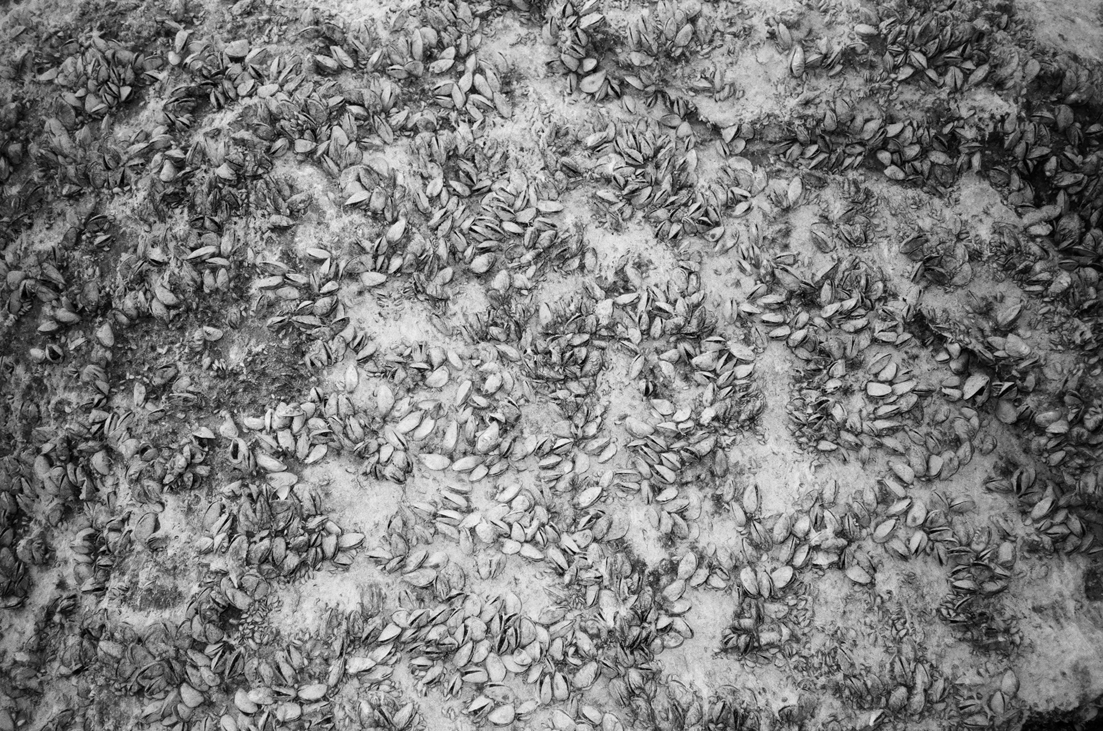
Nothing is fixed, nothing is quite as it seems. All of the death out here—the cow, the drowned cottonwoods, the fish turned wrong side up—is evidence of that, evidence of how this place is ever so slightly out of balance. It is something felt, that can’t be seen from a plane or a boat. You have to get mired in the mud. Struggle to escape. Clamber up rock after rock covered in sun-bleached quagga mussel shells, razor-encrusted tombstones of the nonnative species that have infested Powell. You have to see the death, smell it, hear the buzz of flies, the stench of stagnation. You must also hear the raven’s laughter and the fighter-jet hum of ducks landing in isolated sink pools, the juvenile heron shitting himself as he cautiously learns to hunt, the trio of otters, the coyote who trots away out across the mud flats, seemingly quite content with the state of things.

4.10.21

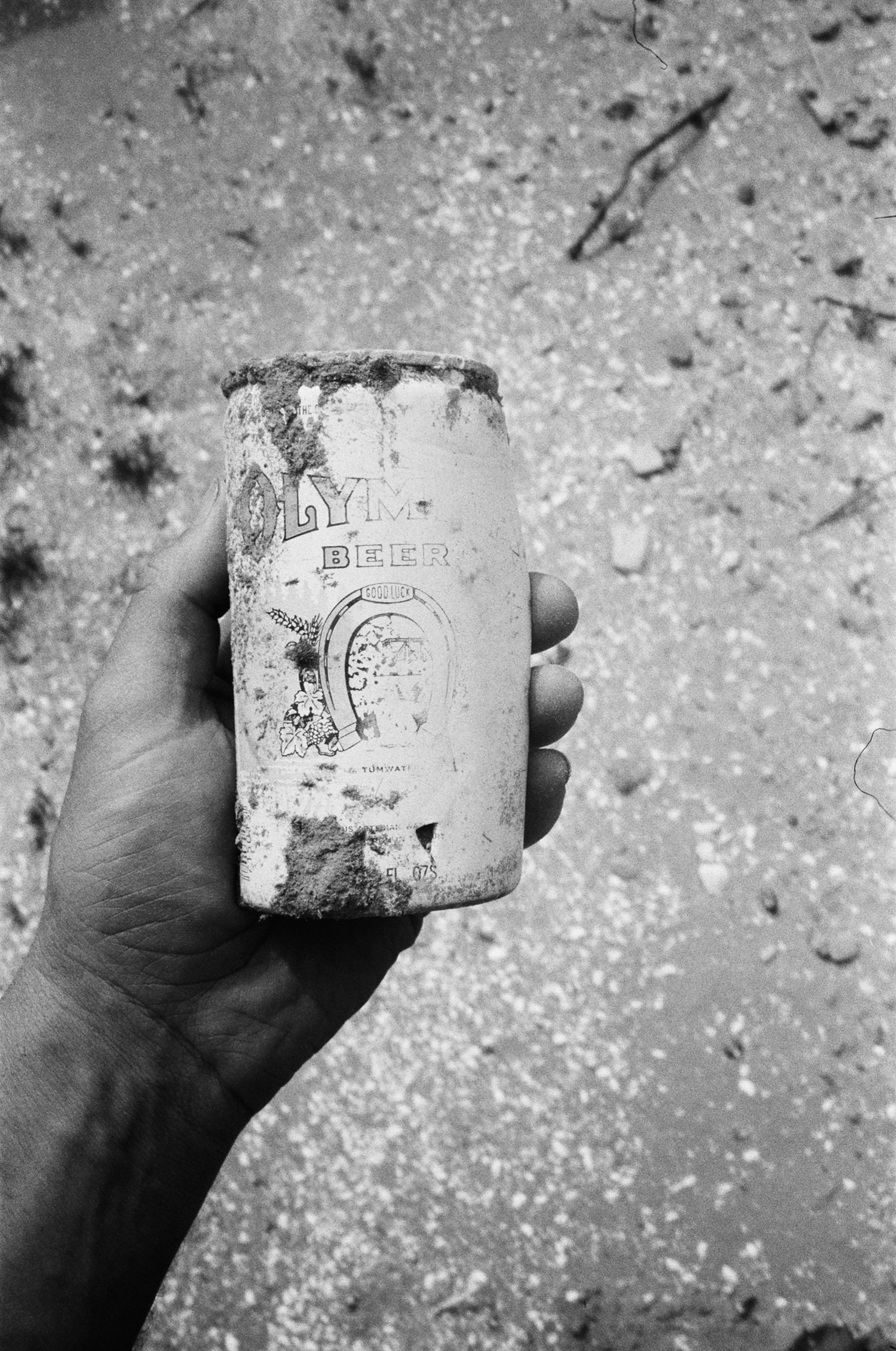
I stop for lunch at a nondescript break in the rocks. Nudge a beer can out of the mud with my foot. Wonder who held it last and when. Turning it over in my hands, one side is bleached by sun and water, the other side looks like it could have been set down yesterday. I can barely make out the words “Good Luck” in faded print below a logo of a horseshoe. Good luck to whom, I wonder? To the person who threw it overboard? To the one who finds it? To the waters that covered it? To the drought that revealed it? To Glen Canyon? To Lake Powell? I flip the can end over end. Horseshoe

up, goodluck, horseshoe down, bad luck. Or is it the other way round? I wonder at this place, at the way it holds paradox. Does a thing have to be lost to be loved, destroyed to be appreciated? I toss the beer can into the bow of the boat. Horseshoe up, let’s hope we catch some luck—whatever that is.

4.11.21
I don’t think I possess the language to properly convey the strangeness of paddling through the desert as cliffs of sand calve like glaciers around you, rounding a bend only to be greeted by flocks of pelicans and a stagnant lake.

From my camp at the confluence of river and lake, I survey an old uranium-mining road running along the base of an imposing band of red Wingate cliffs, leading back to where my truck is parked. I expected to be able to paddle back to my launch point, no walking needed. But there’s a metaphor here about best-laid plans. The need to adapt. What happens when our best-laid plans rest on a flawed foundation? What does the West look like without her brimming reservoirs?

Me, I can just pack down the raft, strap it to my pack, and hike back the way I came. If only everything were that easy.

7.8.21
My packraft had proved about as efficient in the wind-chopped lake as a unicycle in quicksand, and for my trip in July, I find an old British sea kayak on Craigslist and head for the old Hite boat ramp, four miles upriver from Farley Canyon.

There is no lake now, just sand and rock and the muddy muscular flow of the Colorado carrying the last winter snowpack out of the high country. The flow carries me quickly through the layers of lakebed, 30-foot mud gendarmes calving like rotten glaciers into the flow. I stay towards the middle of the channel, bobbing over 5-foot standing waves carved from the sandy bottom. Dust devils tower and dive. A coyote carefully leads her pups down to the river to drink, scrambling away to a safe distance when she sees me. Rich green grasses have sprouted across the silt plain, and a rogue herd of cattle pause their meal to watch me pass.

Later, I will sit quietly at the head of the lake and watch as three otters play on the long mud banks below Wingate cliffs. This feeling of quiet and space will change as I move down into the reservoir, closer to the marina traffic and weekend crowds, but here, in this landscape of flux, I feel acutely aware of my human presence.

7.9.21
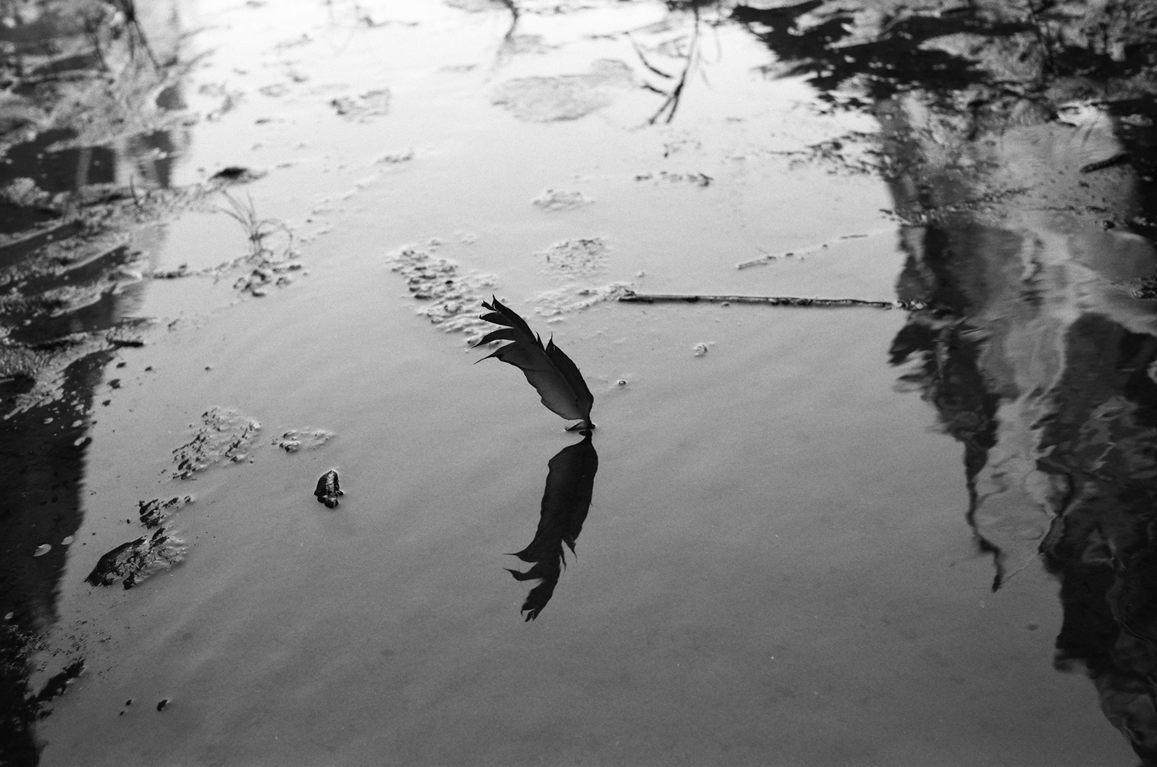
You try to come to a place properly. To greet the raven at the canyon’s mouth. To whistle with the wren as she sits on the lone branch. To walk slowly. To look about. There is a gravity to some places that is felt, not spoken or measured. You give a prayer of thanks; whatever that means to you.

I find the first feather in Ticaboo Canyon, a raven tail, and place it as an offering by the dark pool. The second feather is covered in mud, hung up in some branches. Raven wing. I place it in the creek to rest. The third feather is unmarred, as if just left, curled upwards, the down of a dark chest, I think. I hesitate. Look around. Reaching for it, I place my thumb and forefinger gently on the quill. As I lift it, I hear the raucous calls of a pair of ravens watching from downcanyon. I do not know what they are saying. I don’t know the difference between a good and bad omen, only that it is an omen.

7.10.21
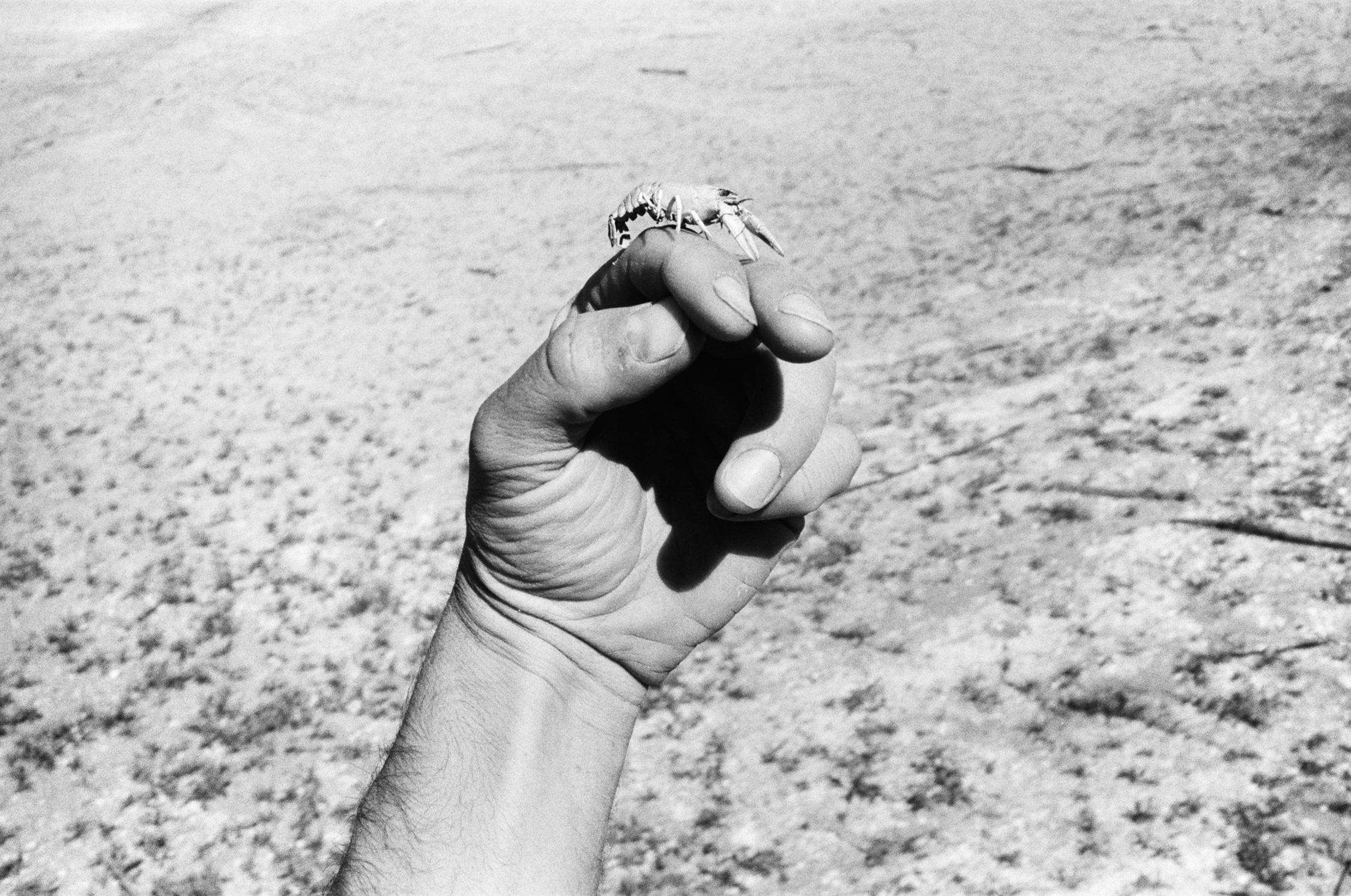
I wake to the sound of wind-pressed waves and the sun low but already scorching across the shimmer of the lake. Pushing off , I soon encounter a Forest Service research crew hauling in an endangered razorback sucker, monitoring the spawning range of the fish. There’s a surprising amount of animal life out here. I’m curious how when a landscape becomes less desirable for humans, it might in some ways become more desirable for other life forms.

Animals I’ve encountered on Lake Powell:

Ravens (a dozen)

Coyote and kits

Blue heron

Egret

American koot

Schools of stripers

Osprey

Golden eagle

Egret

Cattle

Sparrow

Bat

Swift

Weasel

Carp-eating clams

Razorback sucker

Lizards, 4 species

Otter

Human

7.10.11
Walking up from the water’s edge in the side channels of Moki Canyon is a walk through the many cultures of spring breakers that have come and gone here. Glow sticks. Sunglasses. Beach towels, a boomerang, ice bags, squattie potties. These canyons are sacred to many peoples, but none more so perhaps than the spring breakers—at least that is if we are to judge by the artifacts. I grew up on stories of Glen Canyon, but even if the reservoir were to fully drain, it would still leave us with a silted shifting world, far from the Glen Canyon of waterfalls and hanging gardens known by the ancestral Puebloans. I kick at a half-buried piece of towel, unearthing a red Solo cup.

It’s interesting how unaware of their wake people are. In one narrow stretch of canyon, a beefed-out wakeboarding boat throttles past me, shouting out a request for directions, which I give them with the motion of a hand. They wave a friendly thanks, disappearing around the bend as their 4-foot wake ricochets off the canyon walls and threatens to swamp my little craft. They mean no malice—they’re just unaware of their effect, the reciprocity between them and water and rock and me. Somewhere in there I suppose there’s a lesson. We all drive big boats some days.

7.11.21

I race a houseboat from Forgotten Canyon, where the ancient Defiance House sits just above the bathtub ring, to Moki Point. I don’t think they know we are racing, but still I win, and that feels good. I swim in the lake—well, I fall in, trying to get water, but it’s my first swim after many trips here, and it feels nice. The lake is a place of reciprocity, it seems. I pick an old Coors can out of the mud, and not ten minutes later am gifted a full Dr Pepper (my favorite!) floating in a side channel. Maybe the canyon is more like the giving tree—giving a place to keep water, then giving the water away.

People talk about caring about the earth, but what they’re usually talking about is caring about a select few playgrounds, curated parks where they climb or bike or hunt. Would we believe someone who said they loved us but only ever saw us dressed up for Sunday service? To really care for something, we’ve got to become acquainted with all sides of it—the dark, the ugly, and the painful alongside the beauty and softness. In my mind, if I’m going to say I love nature, I’ve got to go out and into these seemingly desecrated landscapes and see if I can sit within them, with the discomfort.

I struggle the 12 miles from Moki Canyon to Bullfrog Marina in a heavy headwind and stash my boat in a cove. The bustling energy feels harsh as I walk down the baking asphalt to the restaurant overlooking the marina. I slurp up a cold beer and fork down a salad, watching the Stanley Cup Finals as the sun ripples red gold across pockets of orphaned reservoir.

As I’m finishing my third beer and getting ready to head back down to my bivy bag, an older couple from Salt Lake City sidles up to watch the game. We get to talking about the glory days, decades past, when the reservoir sat high and proud on the land. They’re water skiers, and they tell stories of carving cursive lines across glassy expanses of water under deep redrock walls, secret canyons and sprawling bays blossoming up from dry earth. A place of endless possibility.

The water skiers mourn the reservoir of thirty years ago. I mourn the Glen Canyon I never knew. And while I get the feeling our political beliefs might be polar opposite, we sit here over our beers looking out onto a lake that is now miles away from where it once lapped at this deck, and we agree, this is sad. Ugly, beautiful, changing, and sad.

We agree the water is leaving the West, and something must be done. We agree that as long as this water is tied up in money, it will be difficult for people to agree what to do with it.

We agree that it would be better if more people understood the finite nature of the systems that support life in the American West. Water is what allows us to be here. When it runs out, so does our time on this land.

This Week in Photography: Breaking Good


“Better Call Saul” ended this week.

{Spoiler Alert.}


Bob Odenkirk as Saul Goodman in the finale, “Saul Gone,” courtesy of imdb.com


It seems an antiquated concept: a “television program” that “came out” once a week, on a cable channel, with commercials.

(It ran on AMC, the network behind early century masterworks “Breaking Bad” and “Mad Men.”)

“Better Call Saul,” if you’re not familiar, was set in Albuquerque as a prequel to “Breaking Bad.”

The two shows were part of the Vince Gilligan IP Universe that also includes the Netflix movie “El Camino,” and doubtless more to come.

But I digress.

That’s not what I want to talk about.


What I want to talk about is, “Better Call Saul” was a masterpiece.

10/10
*****
Five Stars
100%


I loved “Mad Men,” sure.

Not saying this is necessarily better. (Though it is probably as good, like “The Wire” level excellent.)

And just talking about all these anti-hero shows with straight White male leads gives me the queasies.


Courtesy of Rotten Tomatoes


Despite his name being in the title, “Better Call Saul” was about so much more than Bob Odenkirk’s Jimmy McGill/Saul Goodman/Gene Takovic.

Week in, week out, the acting was inspirational. Along with Odenkirk, Rhea Seehorn’s Kim Wexler performance was an all time great, as was Jonathan Banks as (for most seasons) co-lead Mike Ehrmentraut.


Among regular players, off the top of my head, Michael Mando, Giancarlo Esposito, Tony Dalton, Patrick Fabian, and Michael McKean all put in next-level work.

The legit heartbreak I felt as a viewer, watching Mando’s fan-favorite Nacho Varga sacrifice himself to save his father, earlier in the final season, was “Old Yeller” level sad, and that was just one part of the ride.

Or Tony Dalton swaggering around every scene he’s in as the menacing/charming, near-superhero level badass Lalo Salamanca?

So fucking good.


No day-player, walk-on ever slouched, either. (Can we give a shout out to “Parks and Rec” legend Jim O’Heir, who killed it in a late season cameo!)


The writing was mind-blowing, with respect to nuance, symbolism, plot and character development.

New Mexico was more an integrated backdrop than a heavy hitter, but that felt organic to the story too.

The cinematography so often made me think, or hit the pause button, with meticulous framing and camera placements.

Beyond that, I loved the emotional resonance, and non-traditional storytelling styles.

The way they used black and white versus color, as a way of separating timelines, and then weaving in entirely black and white episodes, with Carol Burnett at the end?

We’re talking Kurosawa-level craftsmanship.


Akira Kurosawa’s “Ran,” courtesy of RogerEbert.com


“Better Call Saul” was a slow-burn tragedy that always had Bob O around for a quick “sad clown” laugh.

And this is an actor talented enough to have won fans for his absurdist “Mr. Show with Bob and David,” in 1995, before morphing into a John-Wick-level badass in the 2021 sleeper action hit “Nobody.”


“Nobody,” image courtesy of Allen Fraser/Universal and the NYT


Who has more range than that?

For six seasons, no matter how many times it looked like Plucky Jimmy McGill might just turn the corner and make good, you’d remember you already knew where the finish line was: he ended up as Slick Saul Goodman, and then Sad-Sack Gene Takovic.

(Time to make the Cinnabons.)

This character would have would have no redemption, until the end.

Facing a mere 7 years in a cushy federal prison, he burned down an agreement with the government, and came clean in open court, in order to win back his self-respect, and the love of the great Kim Wexler.

They gave him 86 years in a freezing Colorado Supermax instead.

What an ending!


The penultimate scene in “Saul Gone.”


After six seasons spread over 7 years, the BCS creative team stuck the landing with a brilliant extended finale on Monday night, and maybe I’ll leave it there.

I guess you could watch the entire show, in a binge, on AMC+, if you were so inclined.

As an art critic, I’d highly recommend you do so, but hey, what do I know?

See you next week.


The Art of The Personal Project: Amira Karaoud

The Art of the Personal Project is a crucial element to let potential buyers see how you think creatively on your own.  I am drawn to personal projects that have an interesting vision or that show something I have never seen before.  In this thread, I’ll include a link to each personal project with the artist statement so you can see more of the project. Please note: This thread is not affiliated with any company; I’m just featuring projects that I find.  Please DO NOT send me your work.  I do not take submissions.

Today’s featured artist:  Amira Karaoud


Eleven hundred years ago, a remarkable early Arab historian, al-Mas’udi, compares the task of telling the Arab story to that of ‘someone who has found a scattered hoard of gemstones of all different kinds and colors, and has then strung them in order and turned them into a precious necklace.

By contemplating the individuality of immigrant and first-generation Arab women living in the United States, Heya contemplates their relationship with their identity in contemporary society. By highlighting these women’s diverse beliefs, up-bringing, and experiences, this project strives to illuminate the unique color and nuance of these Arab Women, adding color to the precious necklace of an empire.

Aida Al Masalkhi, 28 years old lawyer, born and raised in Kentucky to Syrian parents.
Mette Loulou Kohl, 33 years old, born and raised in NYC to Palestinian Lebanese mother and Danish father. Mette is an artist and educator.
Nadia Al Masalkhi, 23 years old born and raised in Kentucky to Syrian parents. Nadia is a graduate student at UC Berkley in sociology.
Linda Omar, 30 years old born and raised in Chicago to Palestinian parents. Linda is a postdoctoral research fellow in the department of health promotion and behavioral science in the school of public health, University of Louisville.
Joy Ameena Garnett 52 years old born and raised in NY to Egyptian mother and American father. Joy is a painter and writer.
Dina Fahmi, 27 years old born and raised in Kentucky to Egyptian parents. Dina is a consular at a residential center for violent teenager girls.

To see more of this project, click here

Instagram

APE contributor Suzanne Sease currently works as a consultant for photographers and illustrators around the world. She has been involved in the photography and illustration industry since the mid 80s.  After establishing the art-buying department at The Martin Agency, then working for Kaplan-Thaler, Capital One, Best Buy and numerous smaller agencies and companies, she decided to be a consultant in 1999. She has a Twitter feed with helpful marketing information because she believes that marketing should be driven by brand and not by specialty.  Follow her at @SuzanneSeaseInstagram

Success is more than a matter of your talent. It’s also a matter of doing a better job presenting it.  And that is what I do with decades of agency and in-house experience.

Pricing & Negotiating: Ambassador Portraits For An Apparel Company

PRICING & NEGOTIATING: AMBASSADOR PORTRAITS FOR AN APPAREL COMPANY

Craig Oppenheimer, Wonderful Machine

Concept: Studio portraits of four brand ambassadors for an apparel company

Licensing: Web Advertising, Web Collateral, OOH (out-of-home), and POS (point-of-sale) use in the US and Canada of up to 24 images for one year from first use.

Photographer: Portraiture specialist

Agency: Medium-size, full service

Client: Apparel company

The client had four brand ambassadors that they wanted to photograph in a studio on one shoot day, and we were provided a creative brief showing them interacting with a few props while dressed in the apparel company’s clothing. They needed two looks with three poses each for all four talent, which would yield 24 images.

Fees

While the licensing could be limited to one year, they did have broad usage plans, including potential placement on large out-of-home displays and within the retail environments (POS) where the apparel would be sold. Even though they wanted multiple looks and poses for each talent, it was clear from the brief that they’d likely use one final image per subject. I decided to price the usage by the subject, and included $4,500 for each, totaling $18,000, and then added a $2,500 creative fee on top of that. While we typically combine creative and licensing fees into one line item, we were specifically asked by the agency to break these two line items out on our estimate. In addition to these two fees, I also added a pre-light/fit day fee for the photographer at $1,000, which included one day in the studio prior to the shoot — to set up lights and for the styling team to assess wardrobe with the talent.

Crew

We included a producer to help line up all aspects of the production, along with two assistants, all of which would attend the pre-light day as well. Additionally, we included a digital tech and a production assistant. Typically, I don’t include half days for crew members, but the photographer had crew at the ready who could jump in for a half-day to help set up lights on the pre-light day, and I based these numbers on local knowledge of rates in this specific market.

Styling

While the client would provide all of the apparel, we included a wardrobe stylist for both the pre-light day and the shoot day to manage inventory, prep the outfits, and help the talent try on and ensure proper fitting. We also included a hair/makeup stylist and a prop stylist to acquire a few minor items. We anticipated the prop stylist could procure these supplemental items and just drop them off at the studio, rather than needing multiple shop and return days.

Health and Safety

We included a covid compliance officer and testing as requested by the agency. As a cost-saving measure, they asked us if we could include PCR tests just for the subjects (two of which would have parents in attendance who would also be tested) as well as the two clients attending. Everyone else was approved to just use rapid tests prior to the shoot.

Location

The photographer had a studio in mind that offered a flat $2,000 fee for a half-day pre-light and a full shoot day.

Equipment

We included an adequate fee for both the pre-light and shoot day for cameras, grip and lighting equipment, plus a fee for the digital tech’s workstation on the shoot day.

Meals

I included $60 per person for a light breakfast and lunch on the shoot day.

Miscellaneous

I added a bit of a buffer for unforeseen minor expenses and also a nominal fee for insurance to contribute to the photographer’s existing policy.

Post Production

We included $500 for the photographer to perform basic color correction of the content and delivery of a gallery, plus $300 for a hard drive. The agency would provide further retouching on the selects.

Results

The photographer was awarded the job.

This Week in Photography: In the Mood for Love


Someone was selling firewood.

In a truck.
By the side of the road.

I saw it this morning.

(Winter is coming.)


It’s August 11th, (high summer some places,) and my kids just went back to school.

My daughter is in 5th grade, and when I began this column, in September of 2011, she wasn’t born yet.

(It’s been a wild ride.)

Over the course of my time here, (week in, week out,) I’ve had the chance to travel to some pretty amazing places, and report back to you.

Beyond Derby, London and Amsterdam, all my city reports have come from here in the good old US of A.


Hotel room view, Amsterdam, Feb 2020
Taking a selfie in a room full of people talking selfies in the Eric Gyamfi exhibition, Foam, Amsterdam, Feb 2020


Off the top of my head, since 2011, I’ve written about Austin, Albuquerque, Carmel, Chicago, Dallas, Denver, Houston, LA, Marfa, Monterey, New Jersey, New Orleans, NYC, Portland, Santa Fe, San Diego, San Francisco, Taos, Tucson, and Washington, DC.

I’m a lucky guy.

As of now, I’m supposed to visit NJ, Chicago and New Orleans later this year.


Lake Michigan, Chicago, Oct 2021
The French Quarter, New Orleans, Dec 2021


So we’ll have plenty more travel content in 2022-3, with the attendant gallery, museum, restaurant reviews, etc.

It’s a far cry from pandemic lockdown, thank goodness, when so many people just stayed home.

(Including me.)

Traveling, visiting new ports of call, seeing new cities, tasting new foods…

Few things are better for our personal (and brain) development.

Doing new things makes new neural pathways in your brain, and every moment in a new travel environment counts as doing something new.

(Yes, that was 4 uses of new in one sentence.)

But getting to truly see the world, put my eyes on China and Japan, Australia and Brazil?

Egypt and India?

I mean, to see all of it?

I can’t even imagine.

Yet that’s the feeling I got, when I put down today’s book.

That I’d just taken a wild, elegant, extremely well-seen and well-crafted journey around world in the 21st Century.

The work felt current, fresh, edgy, and smart, with great technique.

But let me back up a second…


I found two boxes at the bottom of the pile today, from March 2021.

Somehow, they’d been skipped, so of course they’re both vaulted to the top of the pile.

The first of them was called “Ibidem,” by Giovanni Del Brenna; seemingly self-published with a professional team.

But I’ll flip the script, for once, and share a bit of info from the back of the book.

One essay, by Carole Naggar was dated 2011, and I thought, that’s odd?

Why publish an essay written so long ago?

Then the copyright on the next page said 2012.

Yet my initial impressions were the book was super current and of the moment, and it was submitted in 2021?

Strange.

In an excellent footnote section at the end, the artist writes he was born in Genoa, Italy, (but never lived there,) raised in Brazil in a French school, and has lived in many other places.

It seems he comes honestly by his Sofia Coppola/”Lost in Translation,” globetrotting, “In the Mood for Love”/Wong Kar-wai, seen-it-all before, and I know the best noodle shop in 30 cities vibe.


“In the Mood for Love,” image courtesy of RogerEbert.com
“In the Mood for Love,” courtesy of The Criterion Collection and the NY Times


Saying how all cities are alike in some ways.

I love it.

As I turned the page, page after page, the photographs were standout.

The edit jumps at you, like a bored dog seeking affection.

Lots of dynamic use of color and light, with emotional energy.

Inspiring stuff.

And the design was on point too, with photos bleeding onto subsequent spreads, with smaller spreads mixed within, so you’re changing paper sizes constantly. While each spread connects to the next through fabulous color, and repeating motifs, like flying fish.

The photos challenge our sense of perception, with lots of figure/ground manipulations, use of repeating patterns, and then optical illusions like advertisements or painted buildings.

Just standout.

The design and photographs also wrong-foot us by reclaiming the gutter space, where most artists fear to tread.

(I mean, it’s literally called the gutter.)

Again and again, the gutter creates a symmetrical split, with vital info right there over the seam.

Scandalous!

I found the book to be flawless, right up until the end.

Page after page of nodding my head, saying, “Yes, that’s just right!”

And then towards the back, there was one image, of some guy in a jacket and tie in the light and shadow of a doorway, and it broke the spell.

Like, every single other photo I loved, but then why this guy?

Right afterwards, there were two traditional-type-explanatory-essays, and I felt they, too, were unnecessary.

(The pictures spoke for themselves, meaning-wise.)


I recognized photographs being made in Japan and China, Italy and France, but clearly there were many more locations I couldn’t place. The excellent thumb-nail index, at the end, tells us the book records travels from 2002-8, in those places, plus London, New York, Berlin, Hong Kong, and a host of other locations.

(In fairness, I did pick out a sleeping London banker on a train, and could recognize NYC on my second viewing.)

I kept saying to myself, as I looked, “Is that Italy, France, or somewhere else entirely?”

How do these things feel chic and generic, yet universal?

Which gorgeous city are we seeing in this photo?

Does it even matter?

With the index and footnotes, we get just the right bit of context, if we MUST know which city we were seeing, or what his travels were like, where his brother lived, all from the artist’s own perspective.

Ending there, followed by an insert in French and Italian, the book sticks the landing.

And last page credits Del Brenna, Teun van der Heijden, and Fred Ritchin as editors, and Heijdens Karwei for the design, so major kudos on this one.

So glad I found it at the bottom of the pile.

See you next week!


To purchase “Ibidem” click here 


If you’d like to submit a book for potential review, please email me at jonathanblaustein@gmail.com. We are particularly interested in books by artists of color, and female photographers, so we may maintain a balanced program. And please be advised, we currently have a significant backlog of books for review. 


The Art of the Personal Project: Randal Ford

The Art of the Personal Project is a crucial element to let potential buyers see how you think creatively on your own.  I am drawn to personal projects that have an interesting vision or that show something I have never seen before.  In this thread, I’ll include a link to each personal project with the artist statement so you can see more of the project. Please note: This thread is not affiliated with any company; I’m just featuring projects that I find.  Please DO NOT send me your work.  I do not take submissions.

Today’s featured artist:   Randal Ford

As a young kid, I grew up skateboarding.  I loved the movement, flow and challenge of new tricks.  But I also gravitated towards the skate fashion, style and music.  While I haven’t skated in many years, I shot this personal project as a chance to jump back into that world.  I connected with a few young kids at a local skatepark who had unique looks and styles.  I wanted to shoot a combination of action, portrait, and lifestyle shots to show the entire experience of being at the park and skating with friends.  This multidisciplinary series dips into action, fashion and lifestyle photography.  It brought me right back to those days when I was kid, spending all my time at the skatepark.  The only thing that was missing was Nirvana.

To see more of this project, click here

Instagram 

APE contributor Suzanne Sease currently works as a consultant for photographers and illustrators around the world. She has been involved in the photography and illustration industry since the mid 80s.  After establishing the art-buying department at The Martin Agency, then working for Kaplan-Thaler, Capital One, Best Buy and numerous smaller agencies and companies, she decided to be a consultant in 1999. She has a Twitter feed with helpful marketing information because she believes that marketing should be driven by brand and not by specialty.  Follow her at @SuzanneSeaseInstagram

Success is more than a matter of your talent. It’s also a matter of doing a better job presenting it.  And that is what I do with decades of agency and in-house experience.

Featured Promo – Justin Cook

Justin Cook

Who printed it?
I work with Smartpress in Minnesota. Their ordering process is super simple, and they have file prep and print guides.

Who designed it?
I did! One of my best friends, photographer Jared Soares inspired me to make these zines. He makes some killer zine promos too.

Tell me about the images.
The images are a collection of my photos that I made in 2021 while on assignment, and from on-going personal projects, such as my work in Princeville, North Carolina, the oldest town in America founded by Black people, and its complicated relationship with the Tar River and climate change.

I love making zines because print is not dead, and my annual zine is a way to reflect on the year and celebrate my work and the people who helped me make it. Also, I often end up making images while on assignment that are never published, so it’s a way for those images to have life, and to see how my photographs speak to one another.

I am an avid fossil hunter, so at the end of the zine are photos from my fossil hunts in waterways of eastern North Carolina, where you can find the remains of prehistoric sharks and whales from when the eastern part of the state was an ocean millions of years ago.

For the cover, I chose a portrait of a huge old tree that is growing out of the Tar River. My friend and fellow photographer, Megan May, helped me light it as I waded out into chest deep water to make the photograph. I love making lit portraits of old trees using the same techniques I’d use to make a portrait of a person. The name “Old Growth” is a mantra for how I want to work and grow: slow and steady, like that tree.

How many did you make?
This is an edition of 25.

How many times a year do you send out promos?
Once a year. I send them to editors I love and editors I’d love to work with. I made my own imprint called Tiburon, so I also sell them in my online store so everyone has access to my printed work. I also keep extra copies so I can give them to people I am photographing on long term projects so they can understand my work and see themselves in it.

Do you think printed promos are effective for marketing your work?
I hope so! I often don’t hear back from editors, and many editors were not working in their offices during the pandemic so I have no idea if they see the zines. But I still make them because it’s a fun exercise.

This Week in Photography: The 70’s


Have you ever heard of Jack Reacher?


I was (mostly) unaware he existed until this year, when Amazon Prime dropped an easily-bingeable series, called “Reacher.”

At some point, I’d heard Tom Cruise starred in a movie or two called Reacher, and that a global fan base was pissed off about it, given how little he resembled the character.


Courtesy of Imdb.com


I’m mentioning it today, because a few weeks ago, I noticed a stack of soft-cover Reacher books on a new friend’s shelf.

He lent me one, and after I devoured it, he passed along 5 more.

I’m about to start the final book, so I have a better understanding of how this character, (and the extensive #1 best-selling book series Lee Child wrote based upon him,) could occupy such a powerful spot in the collective imagination of millions of people.


It’s easy to see why people rejected Tom Cruise.

(Despite the fact he’s since become an actual super-hero, jumping out of planes and climbing the Burj Khalifa w/o a net.)

Jack Reacher is 6’5″, 250 lbs, and that fact is repeated again and again.

(In one book, they even call him Bigfoot and The Incredible Hulk.)


Courtesy of jack-reacher.fandom.com


His sheer size makes him attractive, as he’s a true badass, in all the important ways.

(Great at hand-to-hand combat, weapons trained, you name it.)

Beyond that, Reacher is always the smartest guy in the room, and the wisest.

It’s part Sherlock Holmes, (with all the great deductive reasoning,) part Mr. Wolf from “Pulp Fiction,” (able to fix any jam, and dispose of any body,) and part Batman, minus the cape and extreme wealth. (Reacher is basically a vagrant.)

The character just roams the world, (like David Carradine in “Kung Fu,”) helping people, free of charge, based upon a moral code he learned in the US Army. (Where he was a Major as a top-level MP.)

Interestingly, Lee Child is an Englishman, (born in Coventry,) so near as I can tell, he came up with the archetype of a Wild West gunslinger meets UFC champion, and sends him into one, violent, dramatic, insane-but-slightly plausible situation after another.

And people just can’t get enough.

Because they want to be Jack Reacher.

The want to have it all.

Be the biggest, the strongest, the smartest, the wisest, the most honorable, and to always get the girl.

Reacher owns nothing but a tooth-brush, and goes when and where he pleases.

He can take out seven bikers all by himself, and is therefore the embodiment of the type of American power most people see as slipping into the dustbin of history.

So there’s also a wistful nostalgia about the whole thing.

If Dirty Harry captured the American id of the crazy 70’s, Reacher is just right for the 2020’s, as he kicks ass, but also treats people with respect.

(Were you to meet Reacher in real life, you would feel seen, and understood.)


I mention all this today, having just put down a photo book.

The submission came in a year ago, so I had no idea what was inside the box, and was therefore surprised to see “Snapshots 1971-77” by Michael Lesy, published by Blast Books in New York.

(I reviewed another of his books a few years ago, which also featured images from a historical archive.)

That appears to be his thing, sifting through archives, (as we learn in the opening essay,) so this fits neatly into Michael Lesy’s life obsession.

He confirms this in the essay, but also drops an interesting theory on us:

“Looked at individually, as visual documents, they reveal- or allude to- the hopes, fears, and desires of the people who made them. Sometimes snapshots tell the truth, sometimes they lie, and sometimes they do both.

Looked at in large numbers- in batches of a dozen or a hundred or a thousand- they line up lie bits of colored glass in a kaleidoscope and form patterns… patterns of shared belief, patterns of shared meaning.”

I took that to mean if you glance at archives out of the corner of your eye, and digest image after image, you get a sense of a culture.

A place in time.

(And we’ve all heard the clichés about how to make a photograph meaningful: put it in a box for 40 or 50 years.)

The book features a host of snapshots scrounged from garbage dumpster; the outtakes of a San Francisco photo lab in the early-mid 70’s, but there are also some images from a photo lab in Cleveland.

(Not the tidiest premise, mixing them both up, but hey, you get what you get.)

I came away with a few impressions.

First off, Damn!, have Instagram filters, and the ease of cell-phone-camera operation, made regular people better at photography.

We’ve got a lot of bad crops, blurry images, and downright strange compositions overall.

The fashion is great, (as it is in all old pictures,) but mostly we see celebrations, or human gatherings.

Birthdays, weddings, confirmations, funerals, and drinking with one’s buddies.

There are a few images that would have been described as “racy” at the time, and one in which a topless, awkward woman is juxtaposed against a photo of a painting of a clown, which I thought was unnecessarily mean.

Overall, though, the book is fun.

It was a funky, crazy, powerful, illogical time, the 70’s, and I was reminded of “Airplane,” which mocked the whole era.


Just the other day, I encouraged my daughter to read a book alongside me, and we found “Deenie,” by Judy Blume, on a shelf in a closet.


It was written in 1973, and I was aghast at how much culture has changed.

Everyone was named Midge.

It was acceptable to insult people based upon appearances.

And there were words used that aren’t even in the dictionary anymore. (Have you ever heard of Klunk?)

I’m not sure I learned too much more about 1970’s America, looking at today’s photo book, but then again, I lived through it.

So maybe it’s important, that books like this explain the past to the future.

All those Gen Z kids need to know what it looked like back then, to understand where the world was, and where it’s going.

See you next week!


To purchase “Snapshots 1971-77” click here 


If you’d like to submit a book for potential review, please email me at jonathanblaustein@gmail.com. We are particularly interested in books by artists of color, and female photographers, so we may maintain a balanced program. And please be advised, we currently have a significant backlog of books for review. 


The Art of the Personal Project: Michael Greenberg

The Art of the Personal Project is a crucial element to let potential buyers see how you think creatively on your own.  I am drawn to personal projects that have an interesting vision or that show something I have never seen before.  In this thread, I’ll include a link to each personal project with the artist statement so you can see more of the project. Please note: This thread is not affiliated with any company; I’m just featuring projects that I find.  Please DO NOT send me your work.  I do not take submissions.

Today’s featured artist:  Michael Greenberg

The Kung Fu Nuns (also known as the Cycling Nuns) are a large group of Buddhist nuns in Kathmandu who travel around Asia and other remote regions on bike spreading women’s rights. They travel in the hundreds and roll into villages known for oppressed women on mountain bikes (many of these areas bar women from riding bikes) and teach the women valuable life skills like engineering, how to drive, ride bikes, fix cars, etc… They also do an “Eco-Pad Yatras” (about 400 miles long or longer) on foot to pick up plastic litter and educate locals on environmentally friendly alternatives. They practice Shaolin Kung Fu for self-defense purposes and as a way to build confidence and inner strength.

To see more of this project, click here

Instagram

APE contributor Suzanne Sease currently works as a consultant for photographers and illustrators around the world. She has been involved in the photography and illustration industry since the mid 80s.  After establishing the art-buying department at The Martin Agency, then working for Kaplan-Thaler, Capital One, Best Buy and numerous smaller agencies and companies, she decided to be a consultant in 1999. She has a Twitter feed with helpful marketing information because she believes that marketing should be driven by brand and not by specialty.  Follow her at @SuzanneSeaseInstagram

Success is more than a matter of your talent. It’s also a matter of doing a better job presenting it.  And that is what I do with decades of agency and in-house experience.

Pricing & Negotiating: OOH Campaign For International Non-Profit

By Bryan Sheffield, Wonderful Machine

Concept: In-studio, on white, portraits of 2 client advocates. With various set-ups.
Licensing: Unlimited use of up to 10 images for 1 year.
Photographer: Lifestyle/portraiture specialist.
Client: International humanitarian non-profit

I recently helped one of our East Coast photographers quote on and negotiate a project for a well-known NGO. The creative brief from their ad agency described still photos showing the client advocates in heroic poses on a white background. The photos would be stripped into other backgrounds provided by the agency (and the agency would be handling the post-production).

The photos were intended for an OOH (Out of Home) campaign honoring those employees and would be primarily used on billboards and bus shelters in the U.S.

The photographer would be one of several photographers shooting subjects in different cities around the country.

Here is the estimate:


Fees

After creative calls with the agency and client, and with the understanding that the client wanted to stay within a $15k budget, I put the fees at $500 per unique image for each of the 10 images, totaling $5,000. They asked for the cost of additional images, and I priced each with a 10% discount at $450 each. The per-image fee is low for OOH use, but the photographer is a supporter of the non-profit’s cause and was eager to be a part of this project. I added $500 for the photographer’s pre-pro time to include meetings and securing crew and lighting equipment.

Crew

We included two assistants to make sure the photographer had enough help with lighting. We added a DigiTech to manage the files as well as run a Zoom remote viewing for the NYC-based agency not on set. These fees were consistent with previous rates the photog had paid these people on past productions. We added $1,000 for a producer to help book the studio, confirm crew, organize catering needs, and manage the remote viewing and client communications during the shoot.

Equipment

I included $1,100 for cameras, grip, and lighting rentals. The photographer brought their own cameras and lenses and rented lighting and grip from the studio. $500 was estimated by DigiTech for their needed gear rentals. I also included $350 for 3 hard drives.

Styling Crew and Expenses

We included $750 for a combo Hair/Makeup stylist. This rate was estimated by the stylist.

Locations

We included $1,300 for a studio rental day at a studio the photographer had worked in previously and found suitable. This fee included the studio cleaning fee.

Meals

$675 was estimated to cover a light breakfast, and lunch needs for 9 people on set. The $75pp also included simple craft services the photographer would bring to the set. Water, soda, snack bars, fruit, etc.

Covid Safety

We included $2,000 for third party on-site testing. The testing agency would bring PPE as well for the 9 folks on set.

Miscellaneous

We had $350 as miscellaneous expenses. This would include $200 of insurance for the photographer for, cover mileage and parking for the crew, as well as any additional snacks/beverages before or after their time on set each day, and tiny bit of buffer for any unforeseen expenses that might arise.

Post Production

Retouching was to be handled by client, we chose to not charge for the first edit in order to keep the estimate under $15k.

Client Provisions

We included a Client Provisions note that all talent, talent coordination & releases, wardrobe and props styling, as well as all image retouching, would be handled by the production company.

Results

The photographer was awarded the project, and the shoot was a huge success! OOH ads for the project were running this past winter up and down the East Coast I-95, as well as a few locations in Detroit, Chicago, St. Louis, and SoCal.


If you have any questions, or if you need help estimating or producing a project, please reach out. We’re available to help with any and all pricing and negotiating needs— from small stock sales to large ad campaigns.

This Week in Photography: An Elegy


I published Jim Ferguson’s work in the column a while back.

(Probably five years ago, if I had to guess.)


I met Jim at the Filter Photo Festival in Chicago, but had already heard of him, as he was buddies with my client Allen.

I always encourage artists to build out their friend and peer network, (especially at festivals,) because no matter how much we cross our fingers and hope the gallerist/curator/publisher/editor across the table will give you your “big break,” as often as not, it’s your friends who hook you up.

(Anyone who’s gone to art school knows this is true, and of course it’s not like I invented the concept.)

Art education is literally built upon the idea that other peoples’ informed opinions help you grow.

Of course, knowing whom to trust is a learning process, and occasionally we all have to tune out the noise and listen to our internal compass.

But 9 times out of 10, if your peer network is telling you the same thing, that means something.

So when Allen said he and Jim did that for each other, and were in critique groups together, I took that as a good sign.

By the time I met Jim, I expected to like his work, and in fact I did.

He showed me a series of urban, abstracted (but not abstract) images he made that reflected his “compromised” vision.

As I recall, Jim had little-to-no depth perception, so his photographs flattened out the picture plane, to the point a viewer could sense how that type of vision might affect a person.

Most of his photos were black and white, and the compositions and tonality were also strong, so it was easy for me to include him in one of my lengthy, rambling articles featuring the best work I saw at Filter that year.


Images courtesy of jimfphoto.com


I’m pretty sure I bumped into Jim once or twice again in Chicago, but wouldn’t bet my life on it.

Regardless, I was impressed by the man, and his talent, but I meet more than a hundred photographers each year, (due to my regular travels on the festival circuit,) and that was that.

Not-quite-a-year ago, I noticed a book come in the mail, with Jim’s return address, so I chucked it in the submission pile with the rest of the books, and didn’t give it another thought.


Not long thereafter, (probably a month or two,) Allen reached out to tell me Jim had been diagnosed with an aggressive form of cancer, and was very ill.

The end was imminent, Allen wrote, and then he followed up a day or two later to tell me Jim had passed away.

It caught me off guard, because within a year or so, I’d also learned of the passing of two artists I’d reviewed at festivals: Paula Riff and Nicholas Fedak.

Everyone dies.

I get it.

But I have a near-photographic memory, (for faces as well,) so I remember almost everyone I’ve met in the photo world over the past 13 years.

(Since I attended my first portfolio review in 2009.)

And up until that point, everyone was still around, as far as I knew.

They say things come in threes.

I get it.

This, however, was no fun at all.

And as soon as Allen told me about Jim’s death, I realized eventually, I’d need to open the book package and see what lay inside.

Today is that day.


Two days ago, here in Taos, the season changed.

It went from high summer to late summer, and it happens every freaking year, right around now.

The light shifts, and if you didn’t live here, (and weren’t a photographer,) you might not notice.

But the temperature changes subtly as well, so you need a long-sleeve shirt and sweat-pants in the mornings, and an extra blanket at night.

My daughter actually grabbed a fleece jacket this morning, when she woke up, and I didn’t blame her.

While much of America basks in pure-summer-frivolity, at the end of July here, I start thinking about winter.

It’s strange, I admit, but then again, my next-door-neighbor still has lights on a Christmas tree, inside his insanely-expensive-but-abandoned barn, so things just work differently in New Mexico.

(I’m not in Jersey anymore, that’s for sure.)


Frankly, if Jim hadn’t passed away, I’m not sure I’d be reviewing this book.

It’s a self-published, Blurb-book-type offering, called “Deflated Xmas,” and inside it has the subtitle: Ohhh, the plasticity!

The pictures read like point-and-shoot-pics, (more likely from a cell phone,) and given the rigorous craftsmanship of Jim’s previous work, I was taken aback.

This doesn’t seem like a serious art project, but it is fascinating as a cultural artifact, without question.

(Where I live, houses don’t look like this.)

And no one has inflatable Santas.

Nor reindeers, Olafs, or Abominable Snow Men.

But in Chicago, (or perhaps the Greater MidWest,) they’re obviously popular, because Jim was able to fill a small book with images of sad, wilted, nearly-dead Santas.

What stands for celebration, joy, and seasonal good cheer, when they’re inflated, reads as garbage when they’re crumpled on the brown, dead grass.

(Though more than one image featured a verdant lawn, so I guess Sad Santa sat out there for a while.)


True story: I had an inflatable Elmo balloon in my “Party City is the Devil” exhibition at the Harwood Museum of Art, here in Taos, in 2019.

(It closed one month before Covid was discovered in Wuhan.)

One night, a new janitor walked through my show, decided Elmo must be trash, (despite the accompanying placard, and the fact he was tethered to the wall,) so he cut the ribbon and threw it away.

The museum called me the next day, mortified, and they actually went to Santa Fe to get a replacement.

Deflated Elmo was so pathetic, the janitor could not conceive of him as art, so tossed him in the bin.


And that’s what this book feels like.

It’s a well-observed take on a strange-ass phenomenon, one I definitely have not seen before.

(Which makes it review-worthy.)

I don’t know the circumstances under which this book was made, and I can’t ask Jim Ferguson.

I feel like he’d be psyched to have it reviewed, and perhaps he used this little side-project as a distraction, while his body betrayed him.

I guess we’ll never know.

But this summer has felt like an inflection point, where big changes are afoot, even beyond the calendar ticking from high to late summer.

And no one really knows what’s up ahead, do they?

See you next week, and I hope you’re enjoying some relaxation, or vacation, should you have the chance to take it down a notch.


To purchase “Deflated Xmas,” click here 


If you’d like to submit a book for potential review, please email me at jonathanblaustein@gmail.com. We are particularly interested in books by artists of color, and female photographers, so we may maintain a balanced program. And please be advised, we currently have a significant backlog of books for review. 


The Art of the Personal Project: Jay Fram

The Art of the Personal Project is a crucial element to let potential buyers see how you think creatively on your own.  I am drawn to personal projects that have an interesting vision or that show something I have never seen before.  In this thread, I’ll include a link to each personal project with the artist statement so you can see more of the project. Please note: This thread is not affiliated with any company; I’m just featuring projects that I find.  Please DO NOT send me your work.  I do not take submissions.

Today’s featured artist:  Jay Fram

Tahlequah is a small town in Cherokee County, Oklahoma. It’s in the northeast corner of the state, with rolling hills and lush greenery, and it’s where I grew up. Earlier this year, I leveraged my personal history there to land a job to produce a “rural America” image library for a major telecommunications company. I was really excited to produce this high-level project in Tahlequah, to feature the people and places of my hometown and bring some economic benefit to the area. I assembled a crew and hired a local to help me connect with potential subjects, but a few weeks prior to the shoot date the client killed the project. I was disappointed but decided to take advantage of all the time and effort invested by shooting it anyway, as a personal project.

I set out to document the land and the people of my hometown as a sort of straightforward homecoming, but I found myself unable to ignore the political and geographic polarizations that are so prominent in our country in this moment. They’re nothing new for me – as a kid with country roots living in big progressive cities for the past thirty years, I’ve often felt a tension between my love for the land and family friends of my hometown, and my desire to create some distance from it. I felt pulled to make some sort of statement about that tension through this work, and indeed there were some captures in the first edits of this series that carried a more cynical gaze. In the end, though, that wasn’t the story I wanted to tell.

Instead, what I found myself making was a tender reminiscence: a portrait of generous people and hard work in a rural part of middle America, the close heaviness of heat and humidity, undergrowth, weeds, open spaces, tradition. Rather than an uncritical celebration or a caricature of rural America, I wanted to hone this project to give a sense of how it feels to actually live there, from someone who can honestly say, “I grew up just down the road.”

Tahlequah, Oklahoma
Three Springs Ranch organic farm owned by Mike and Emily Oakley in Rocky Ford, Oklahoma
Cherokee County, Oklahoma
Three Springs Ranch organic farm owned by Mike and Emily Oakley in Rocky Ford, Oklahoma
Cherokee County, Oklahoma
Family owned logging company Denton Timber on job site near Proctor, Oklahoma.
Cherokee County, Oklahoma

To see more of this project, click here

Instagram

APE contributor Suzanne Sease currently works as a consultant for photographers and illustrators around the world. She has been involved in the photography and illustration industry since the mid 80s.  After establishing the art-buying department at The Martin Agency, then working for Kaplan-Thaler, Capital One, Best Buy and numerous smaller agencies and companies, she decided to be a consultant in 1999. She has a Twitter feed with helpful marketing information because she believes that marketing should be driven by brand and not by specialty.  Follow her at @SuzanneSeaseInstagram

Success is more than a matter of your talent. It’s also a matter of doing a better job presenting it.  And that is what I do with decades of agency and in-house experience.

The Daily Edit: Ecru: Pam Lau

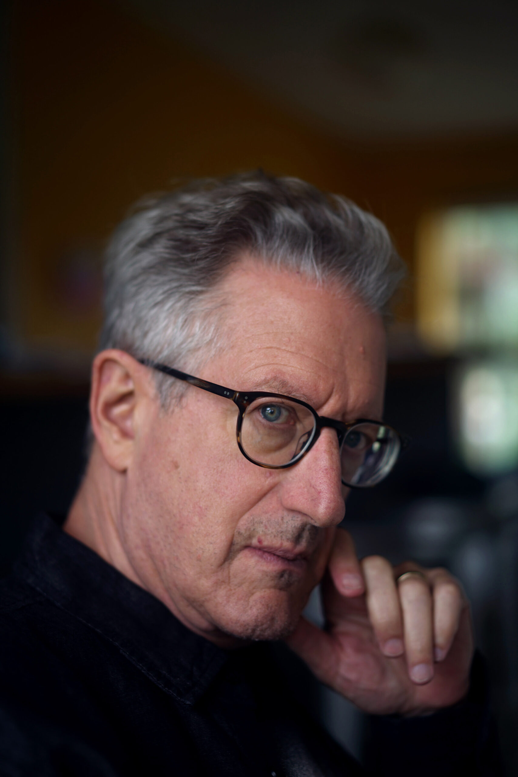
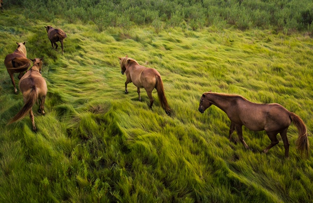
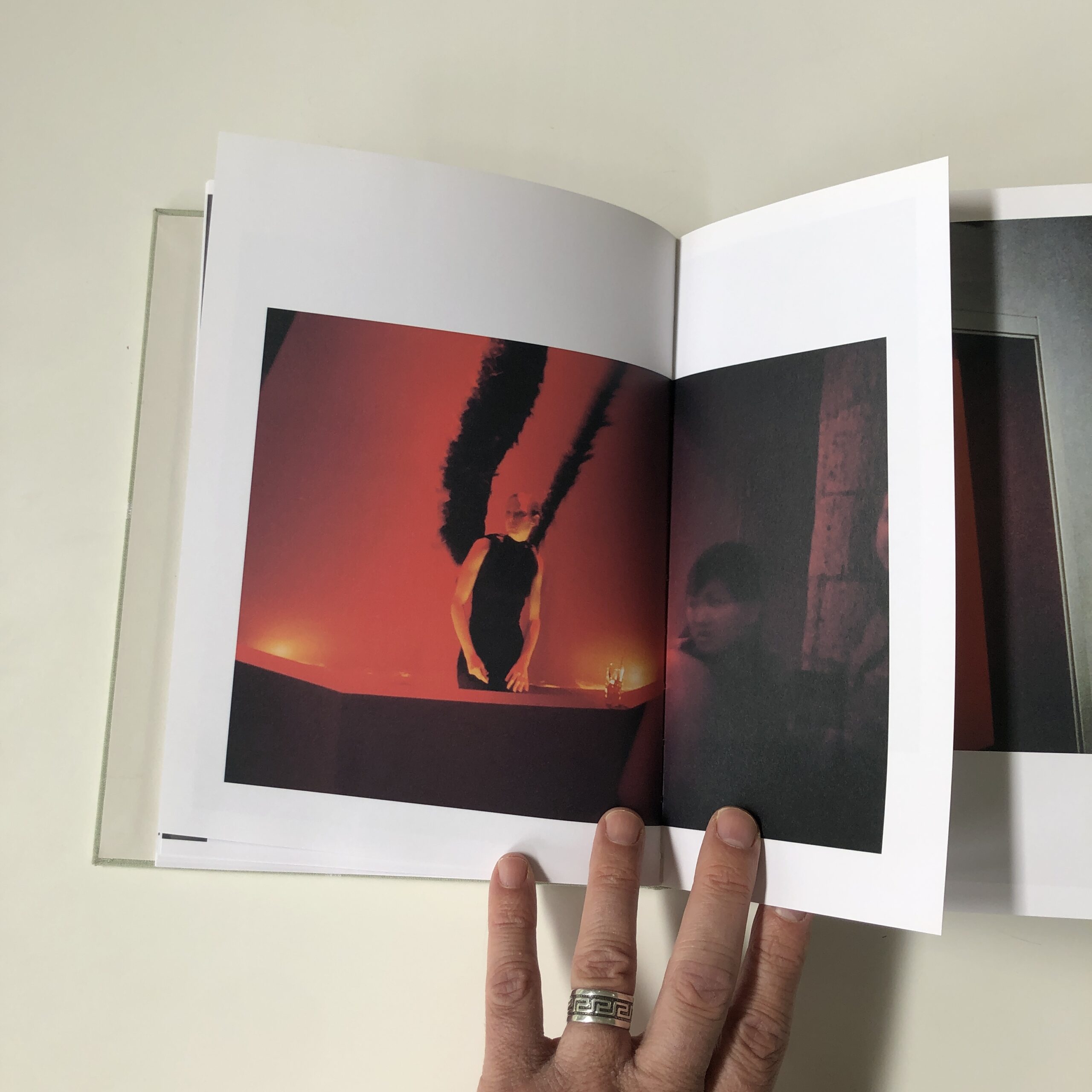
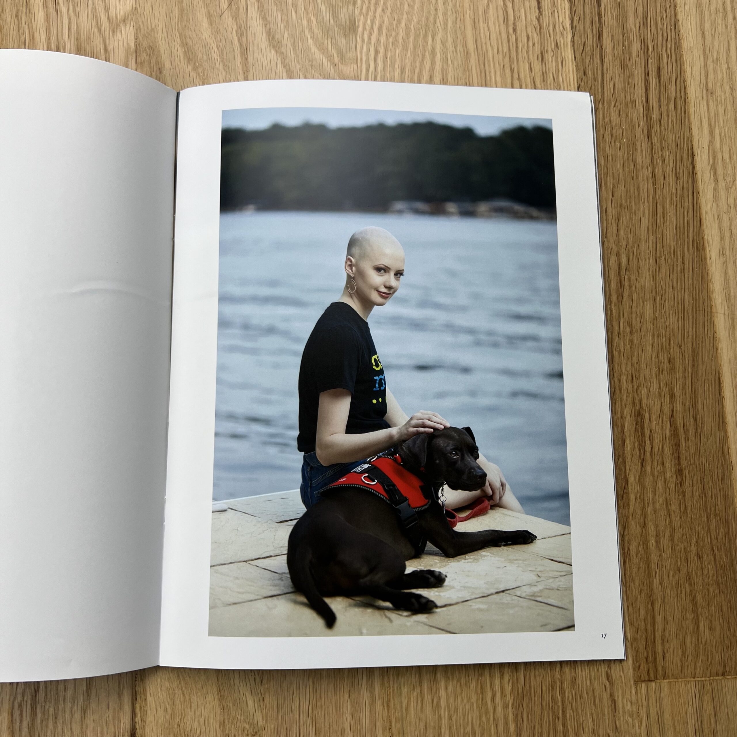
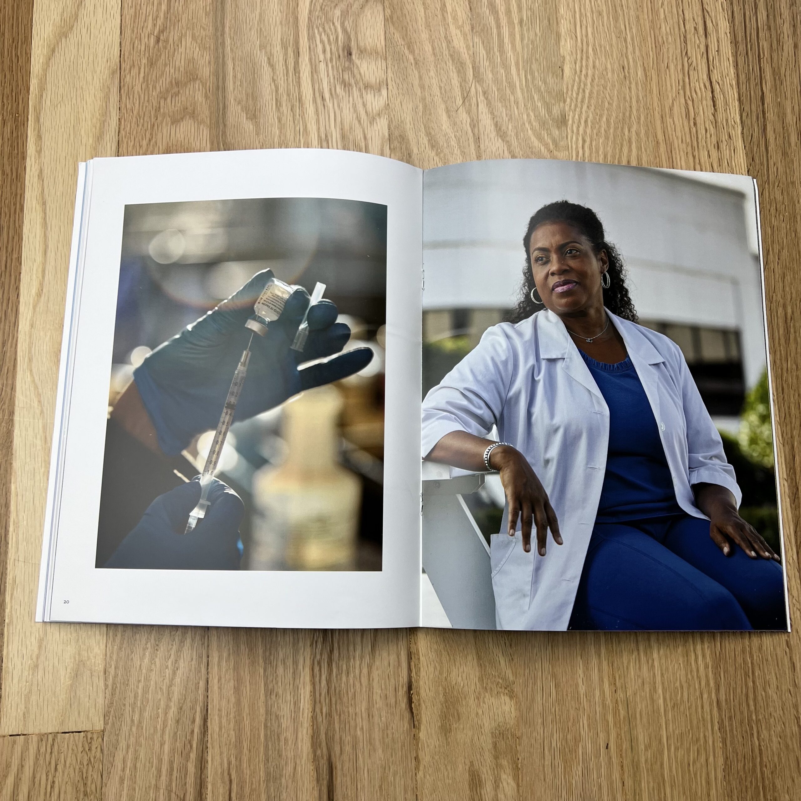
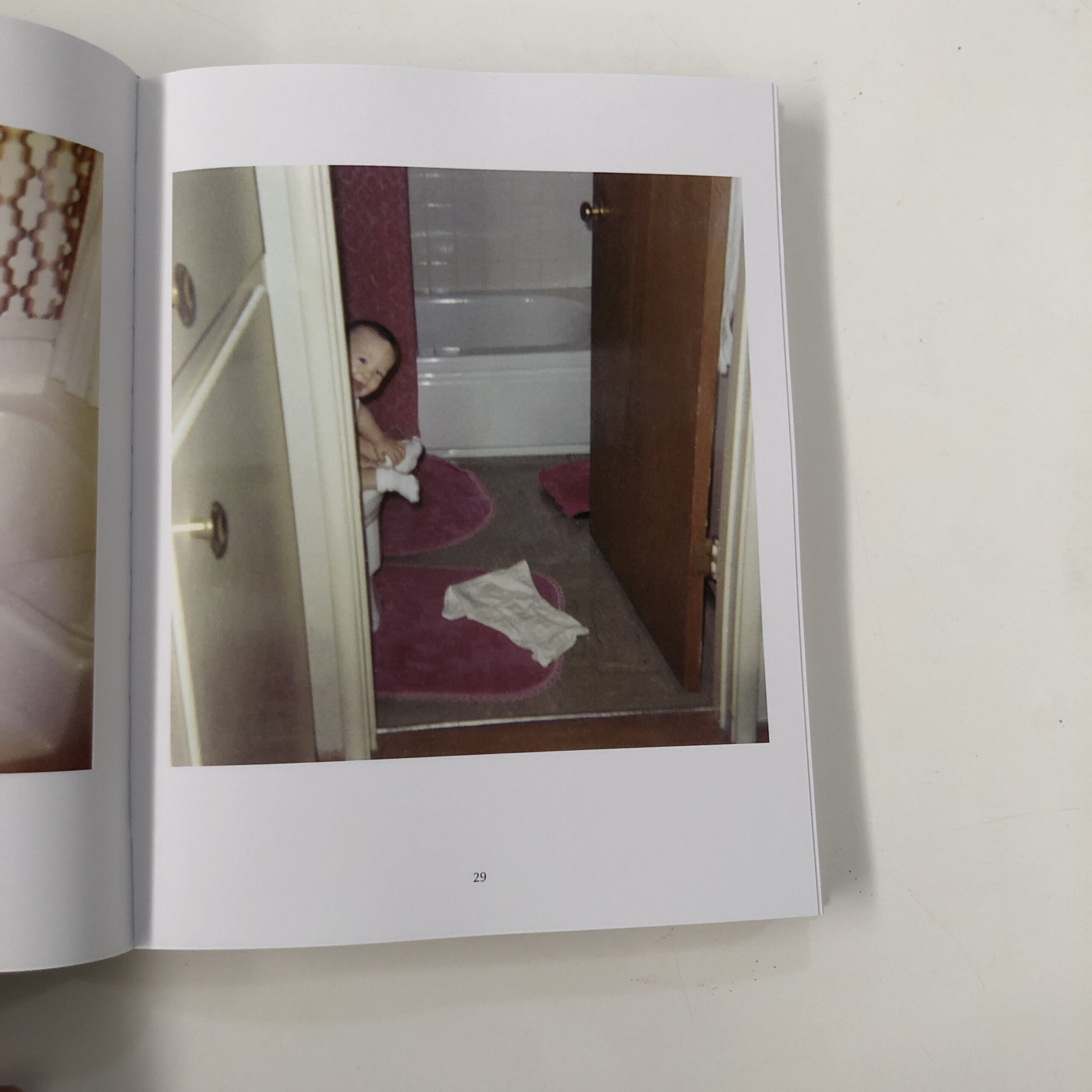
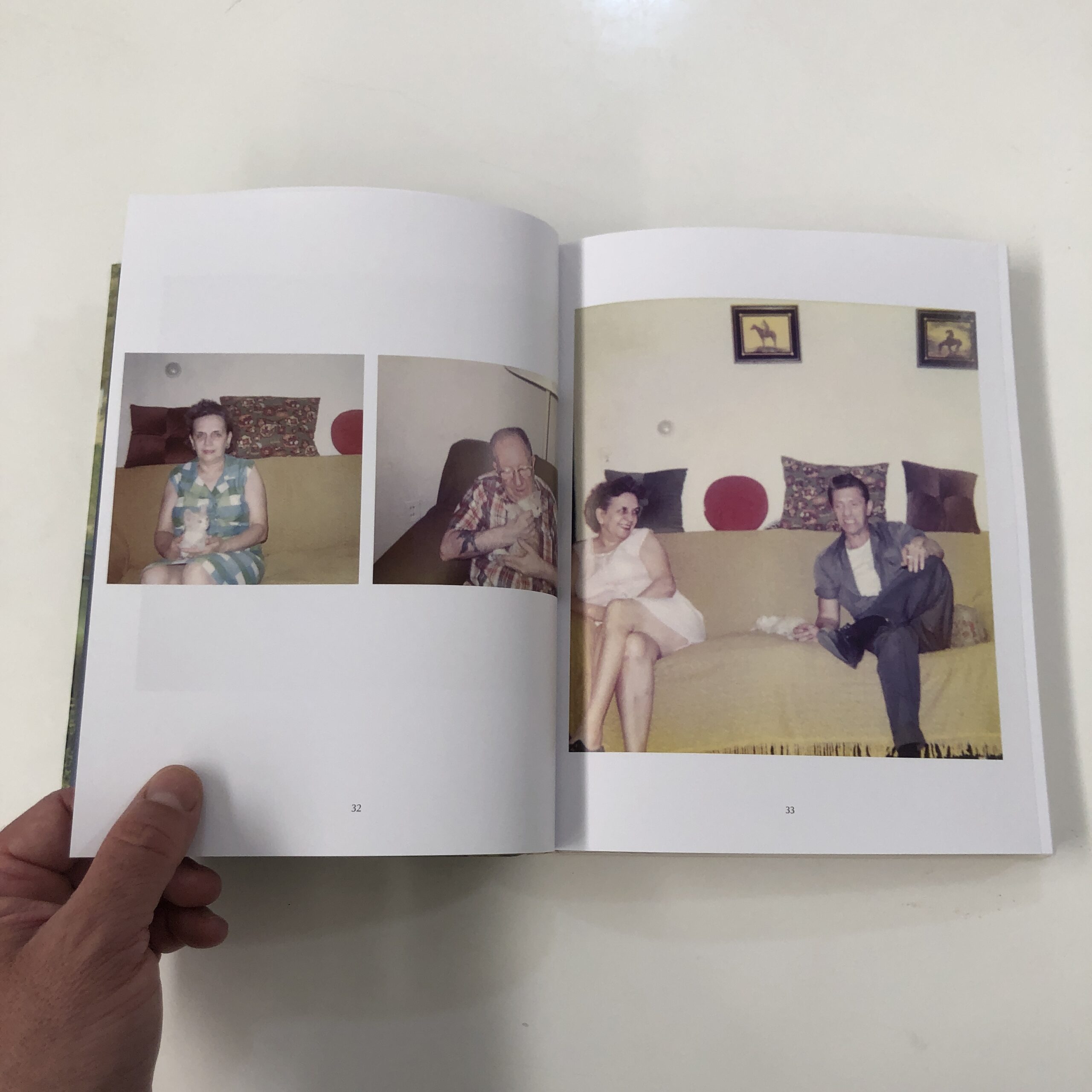
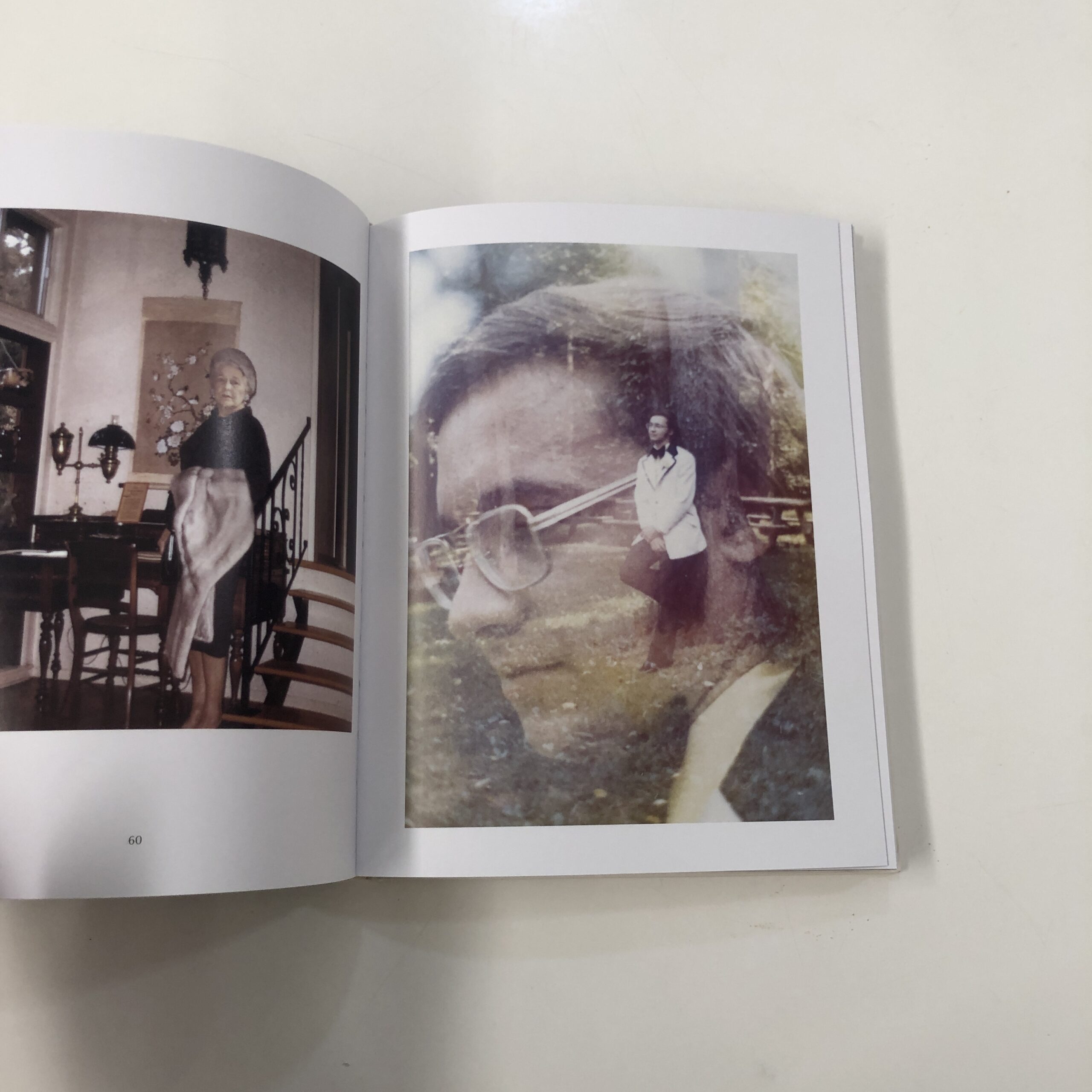
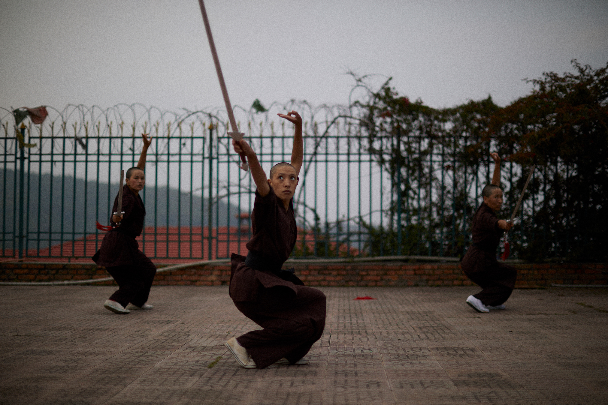
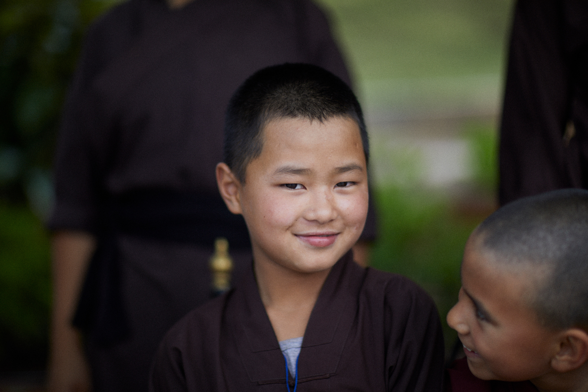
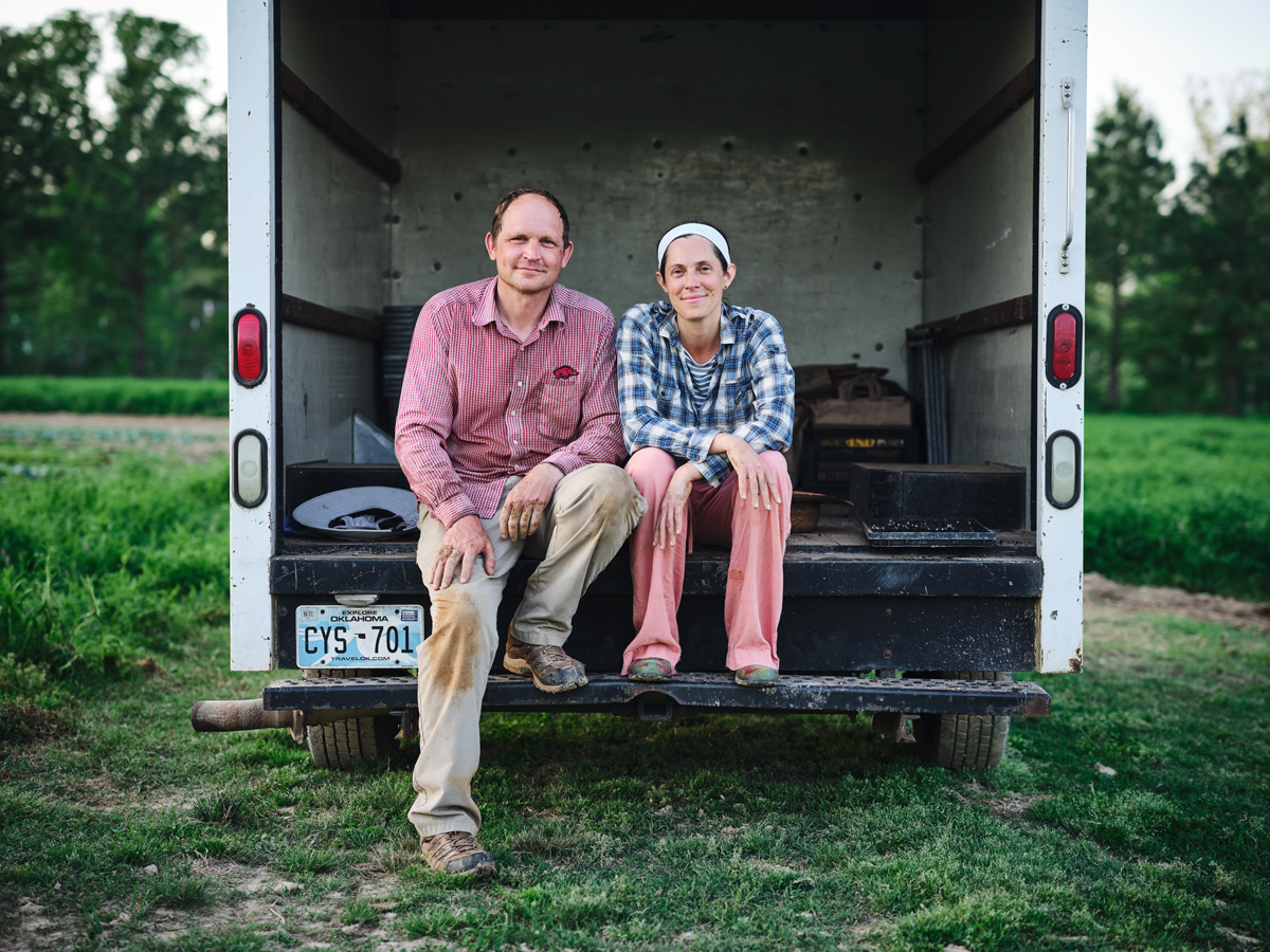
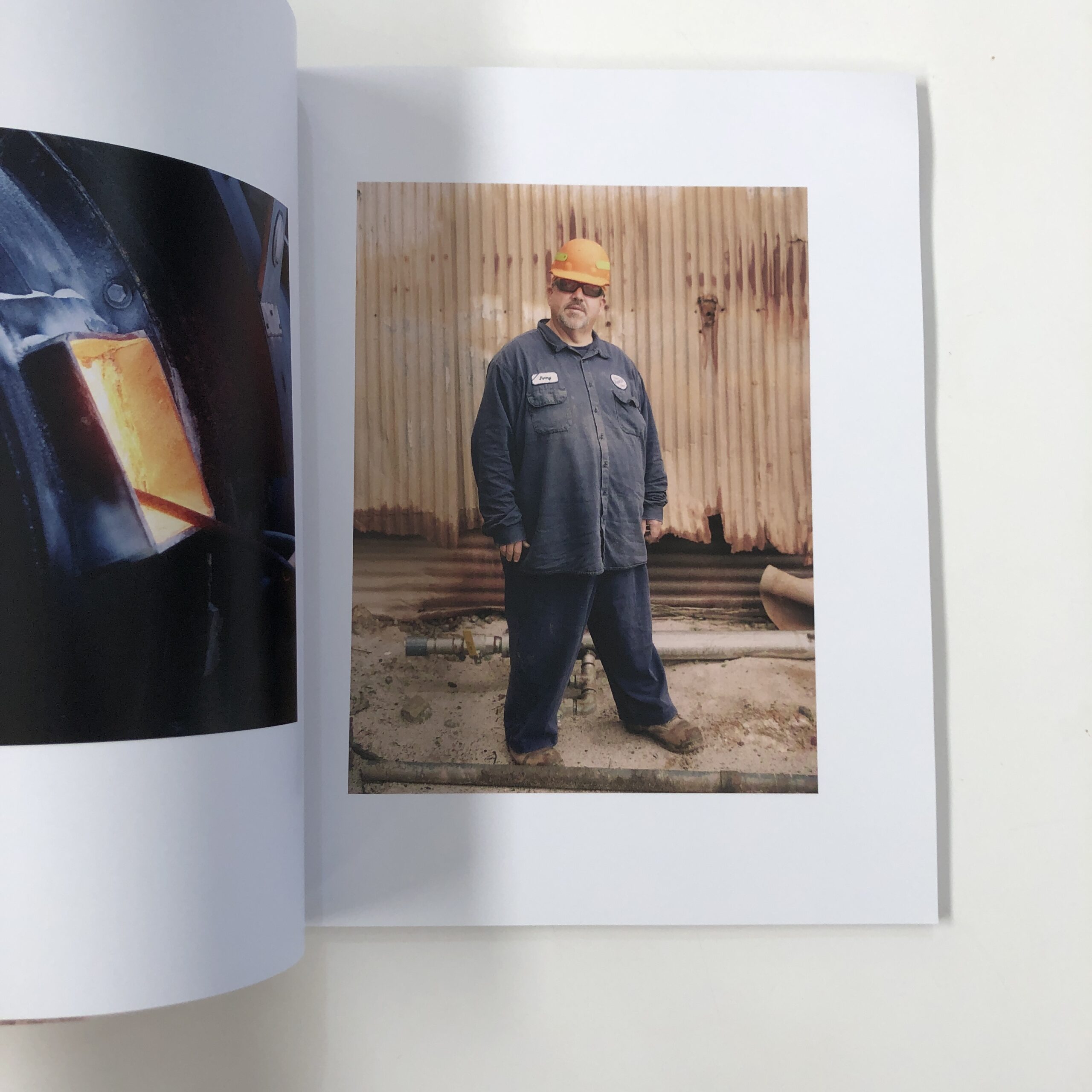
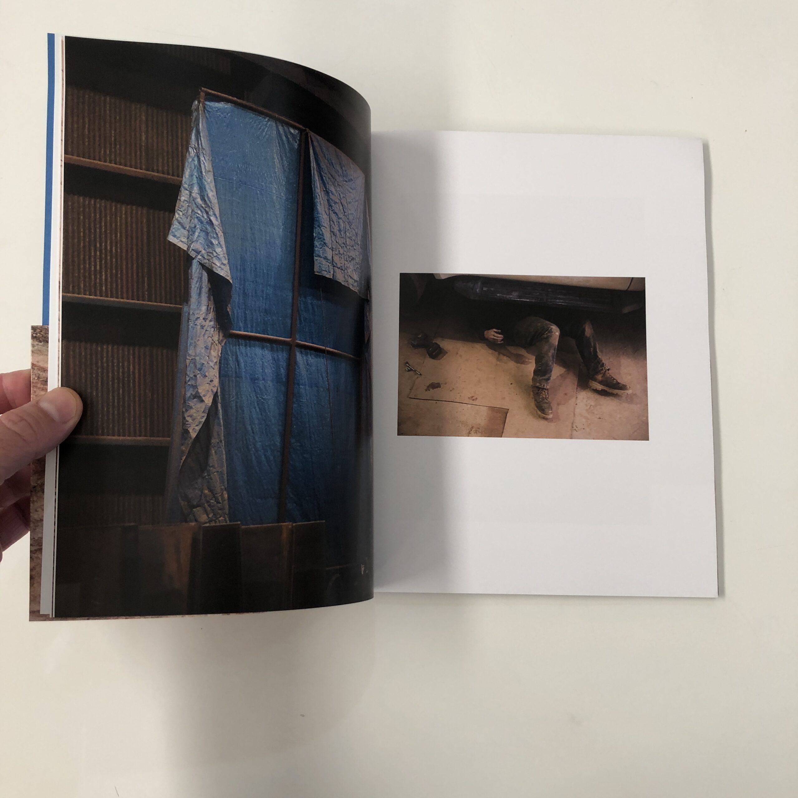
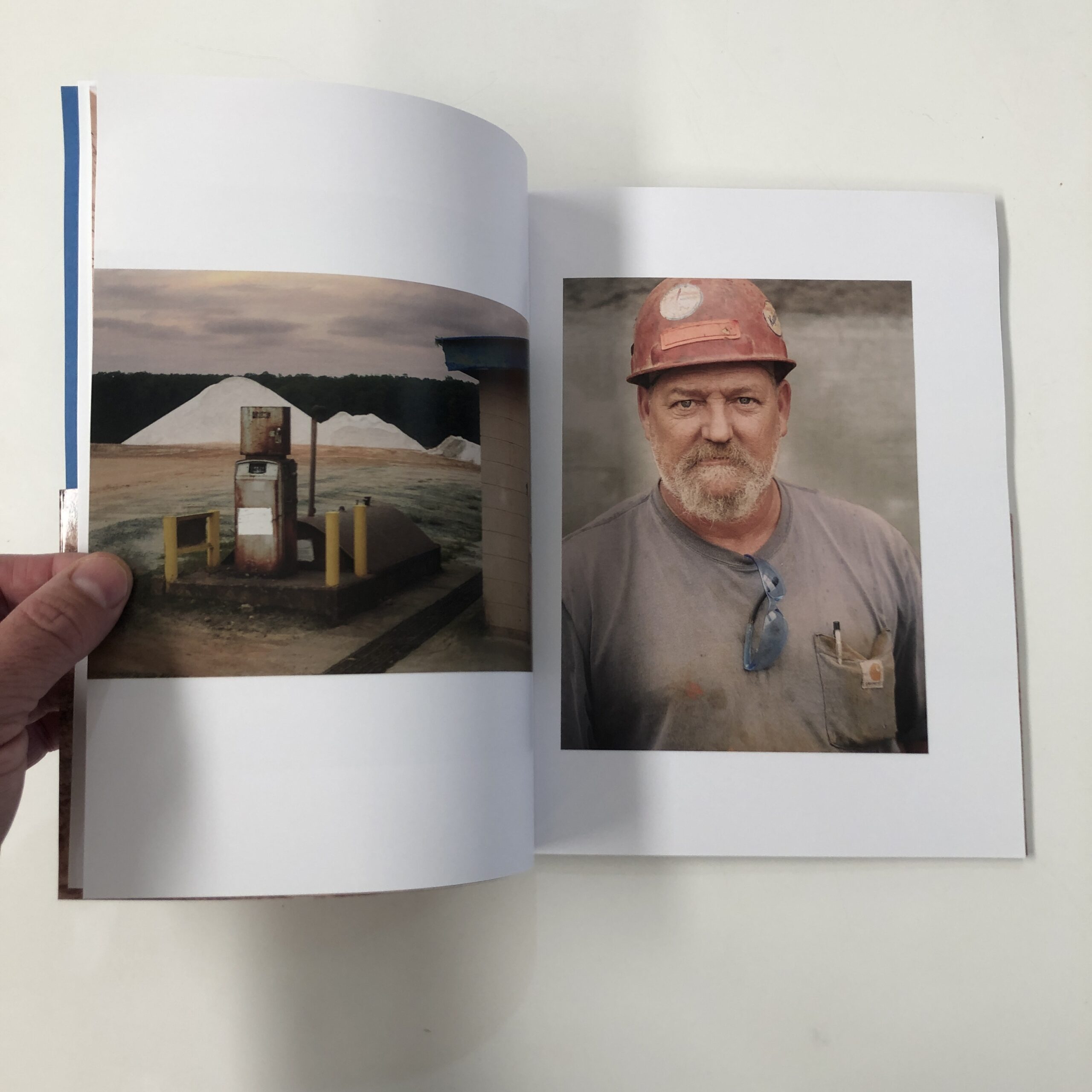
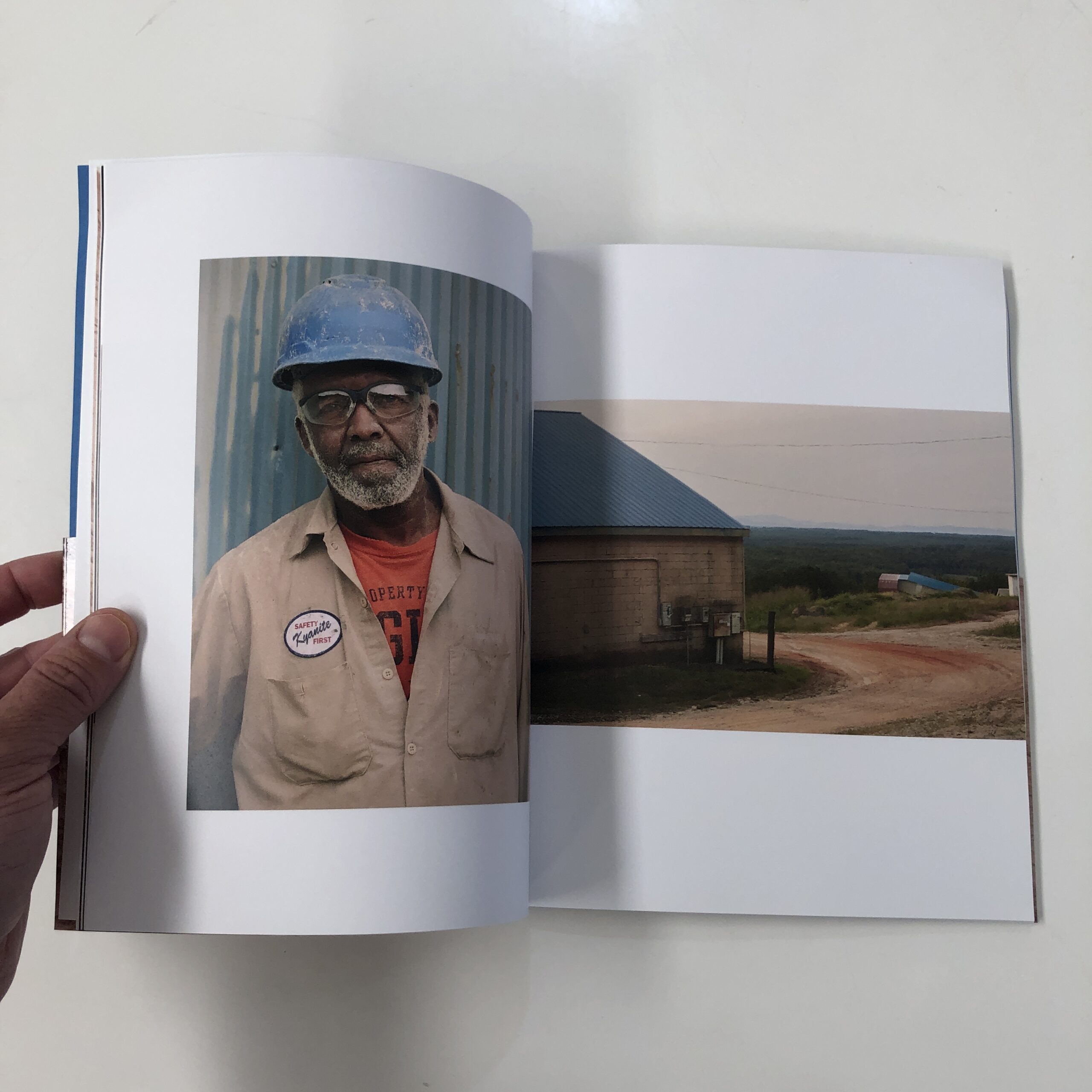
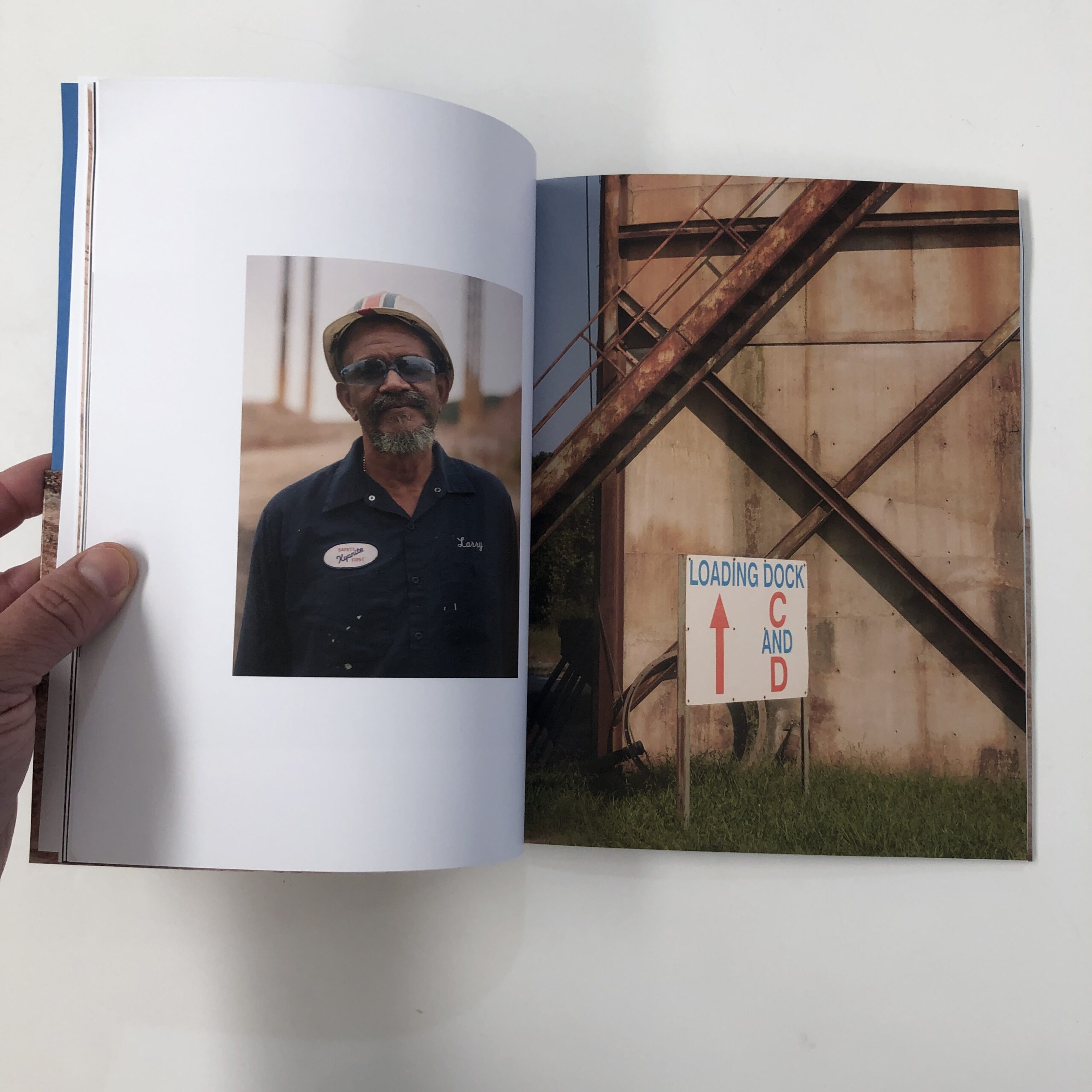
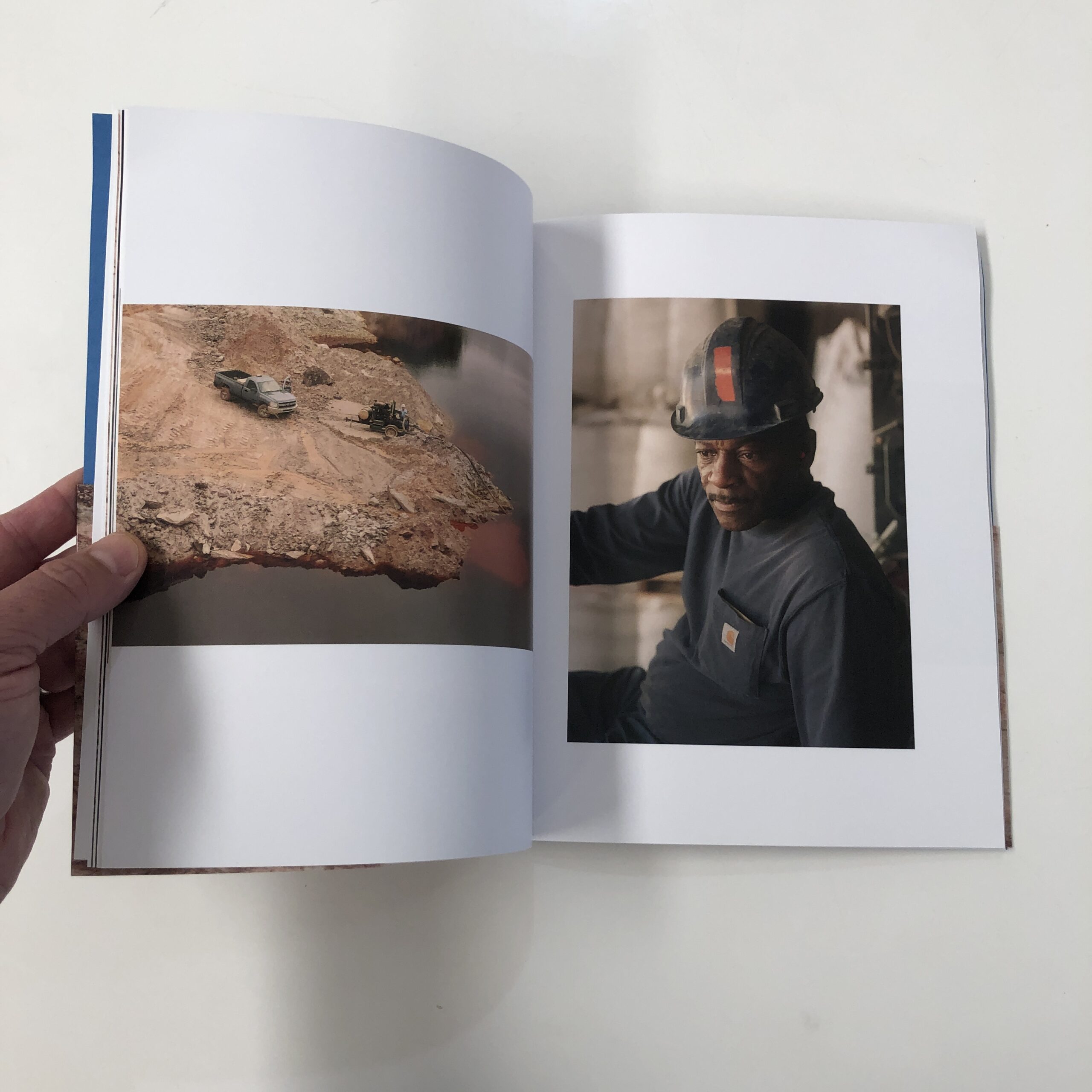
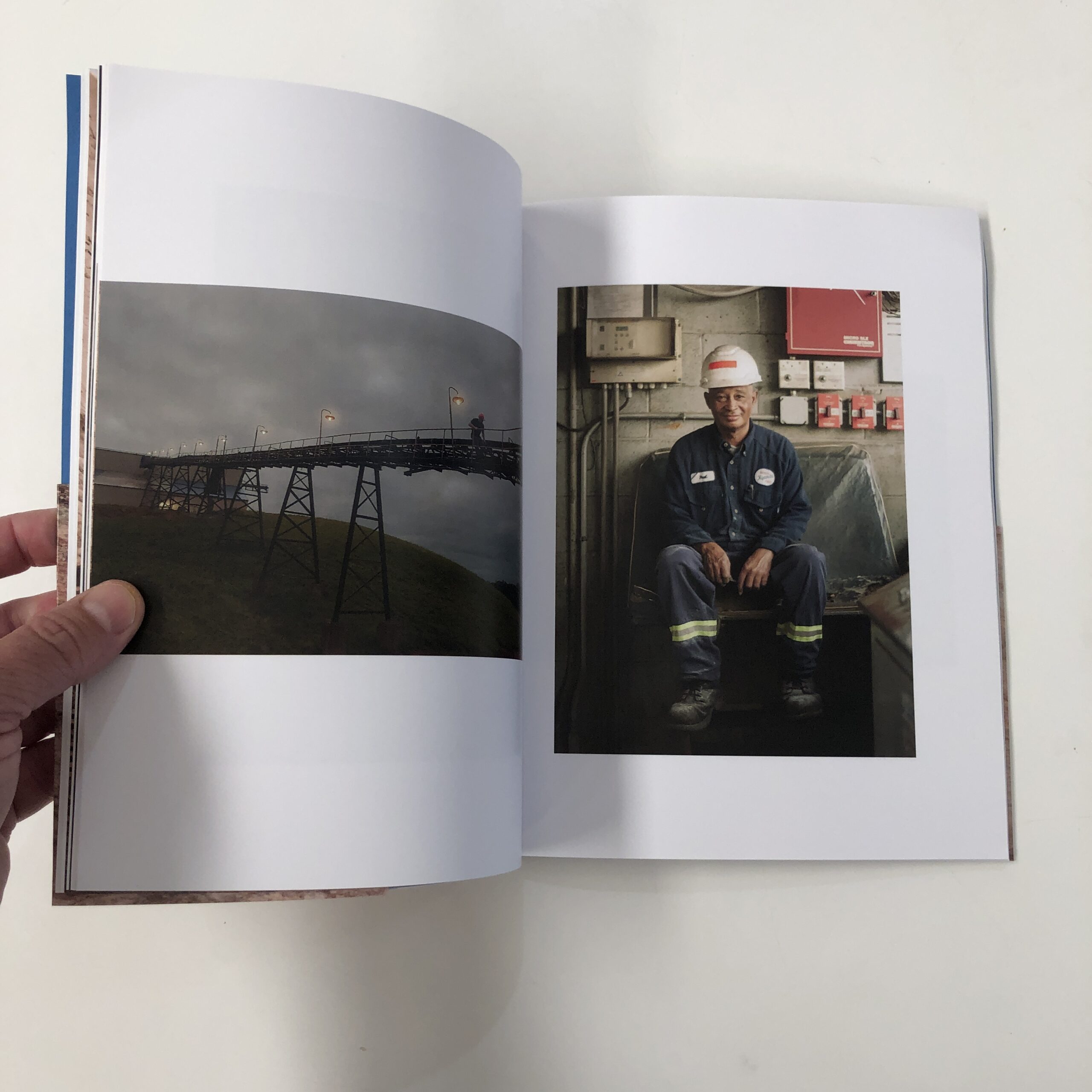
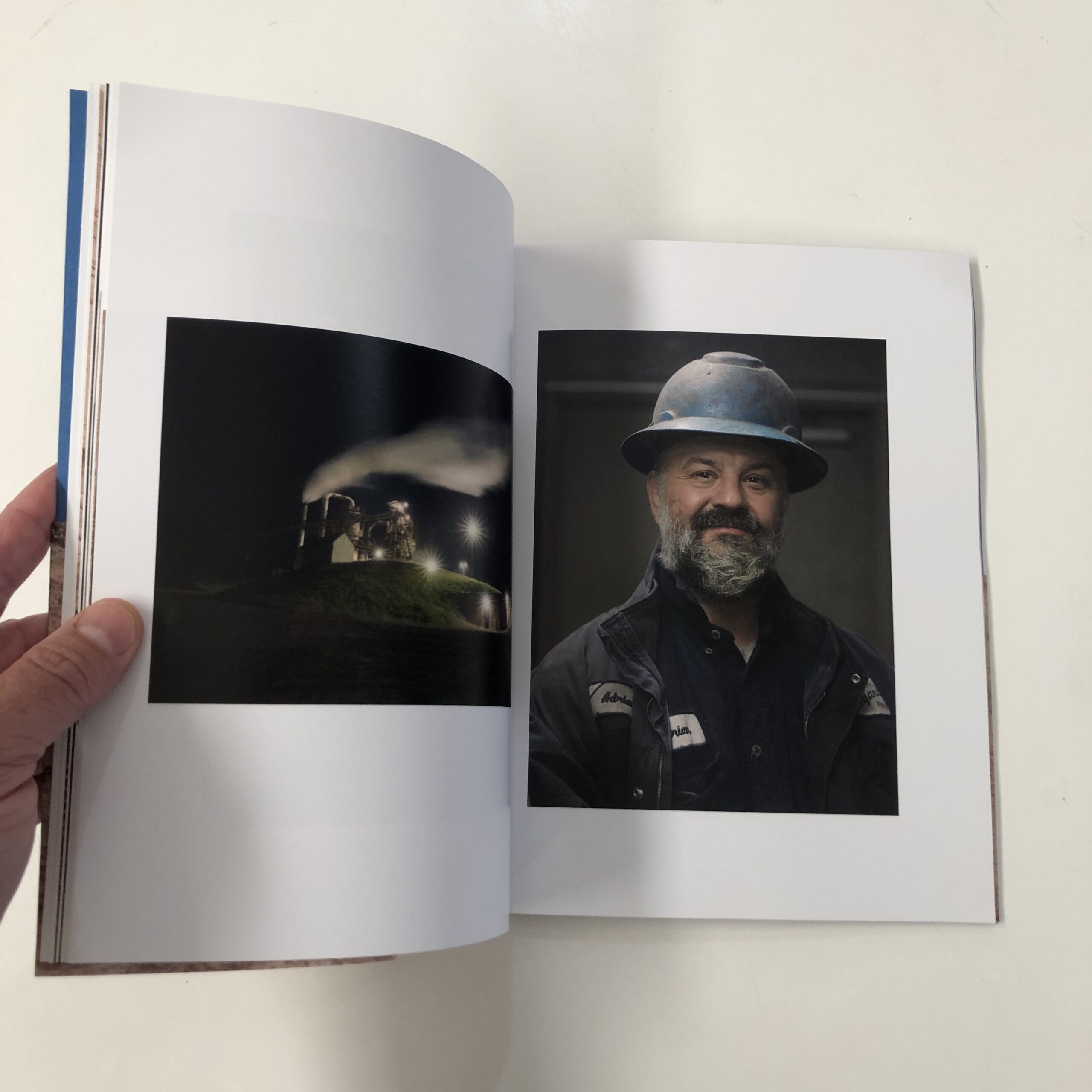
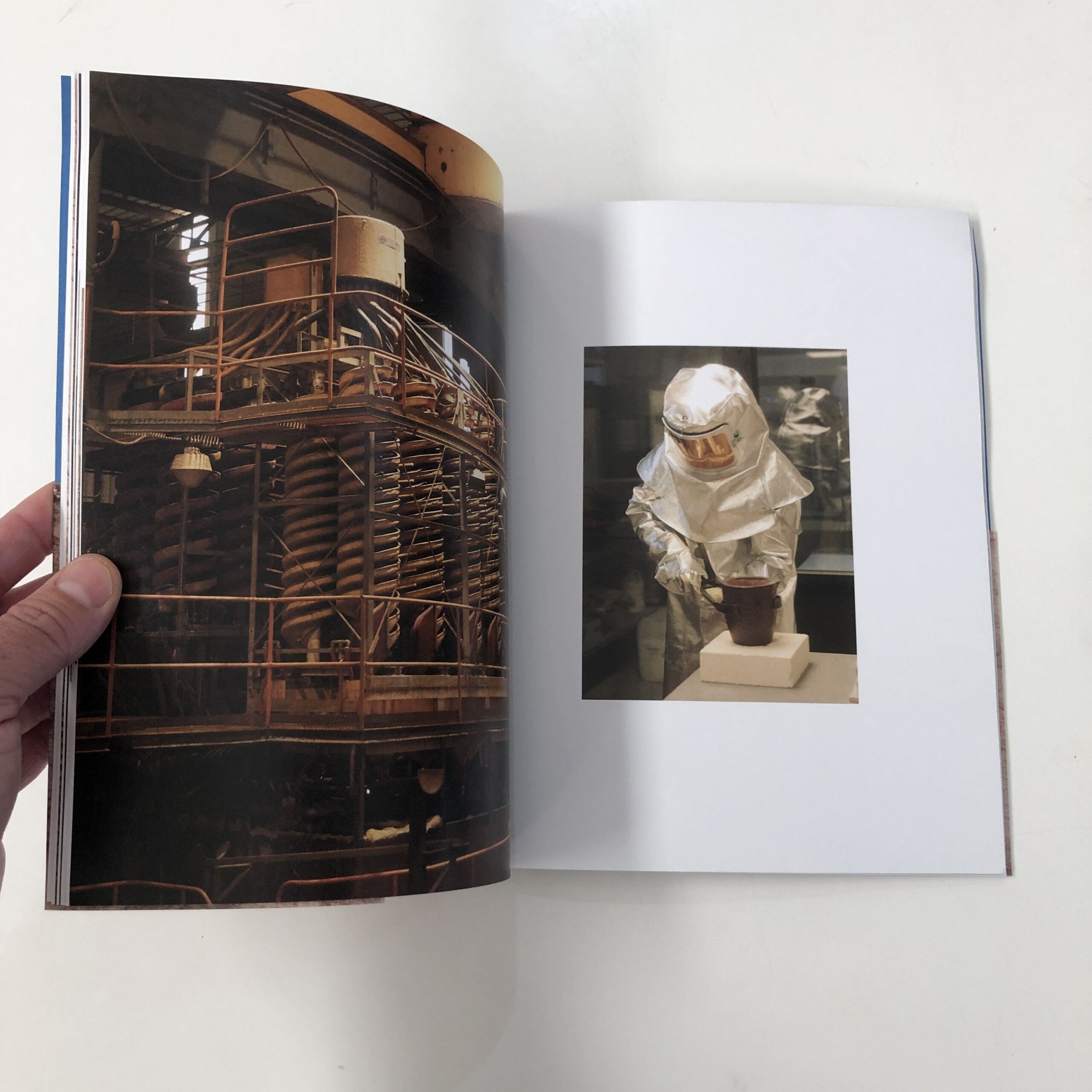
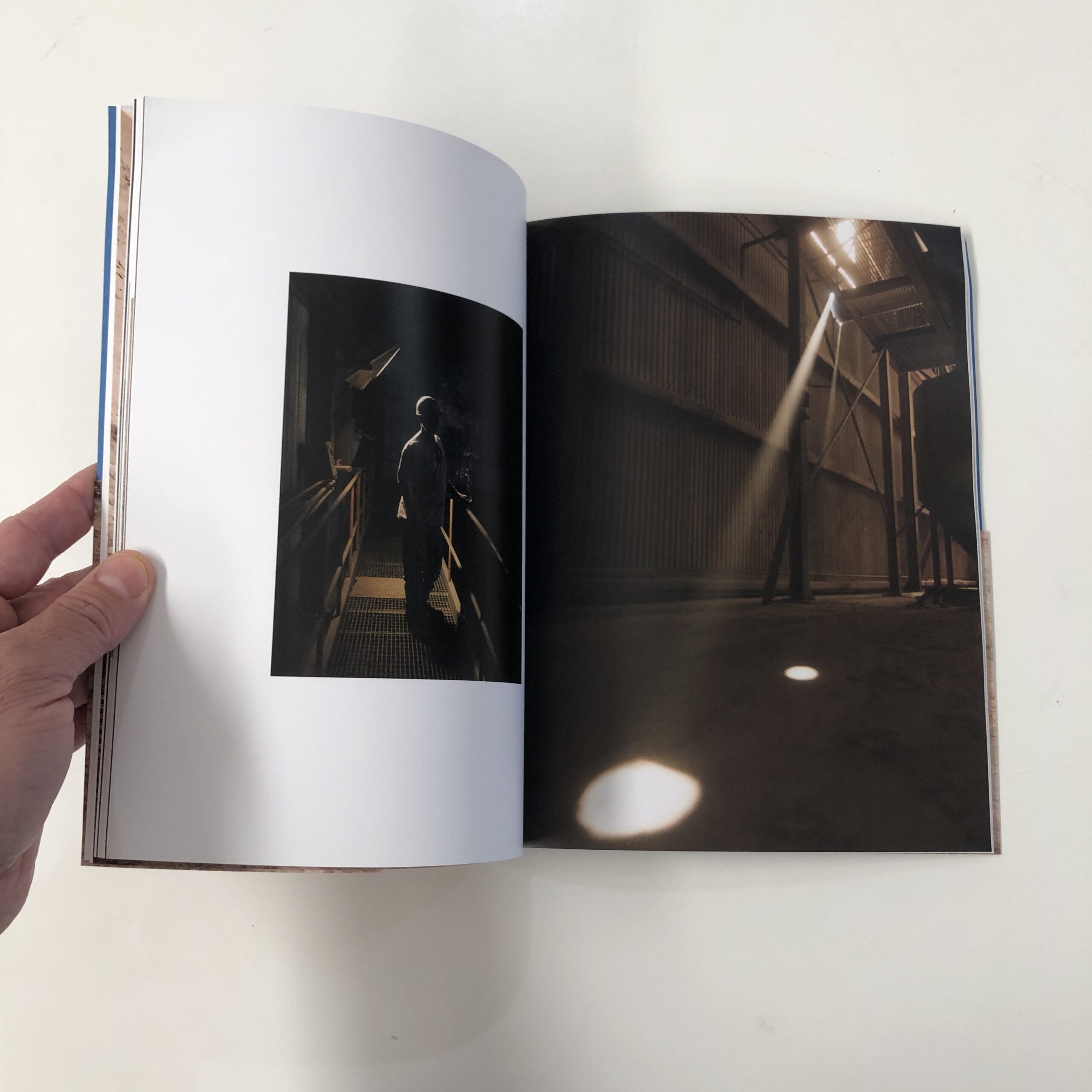
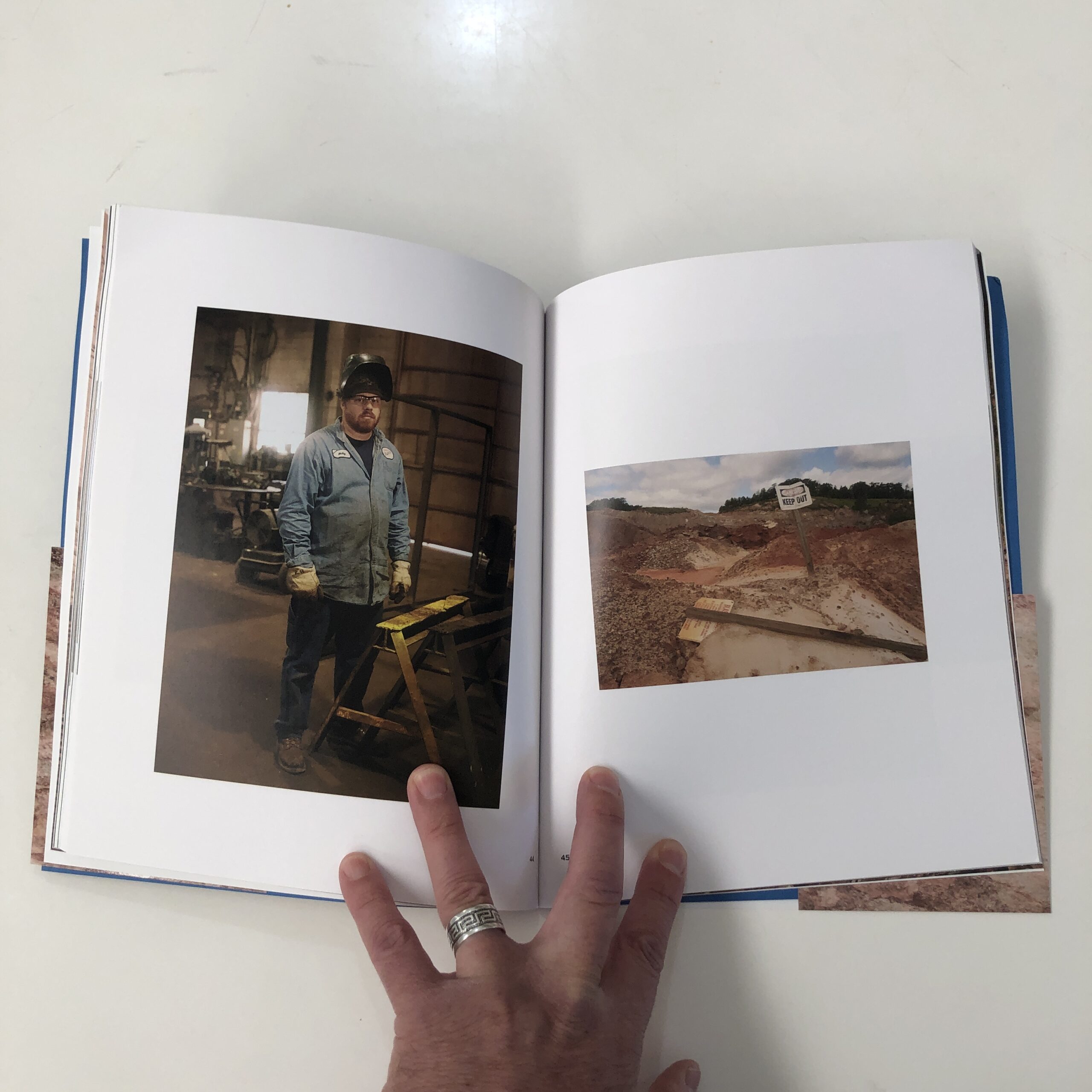
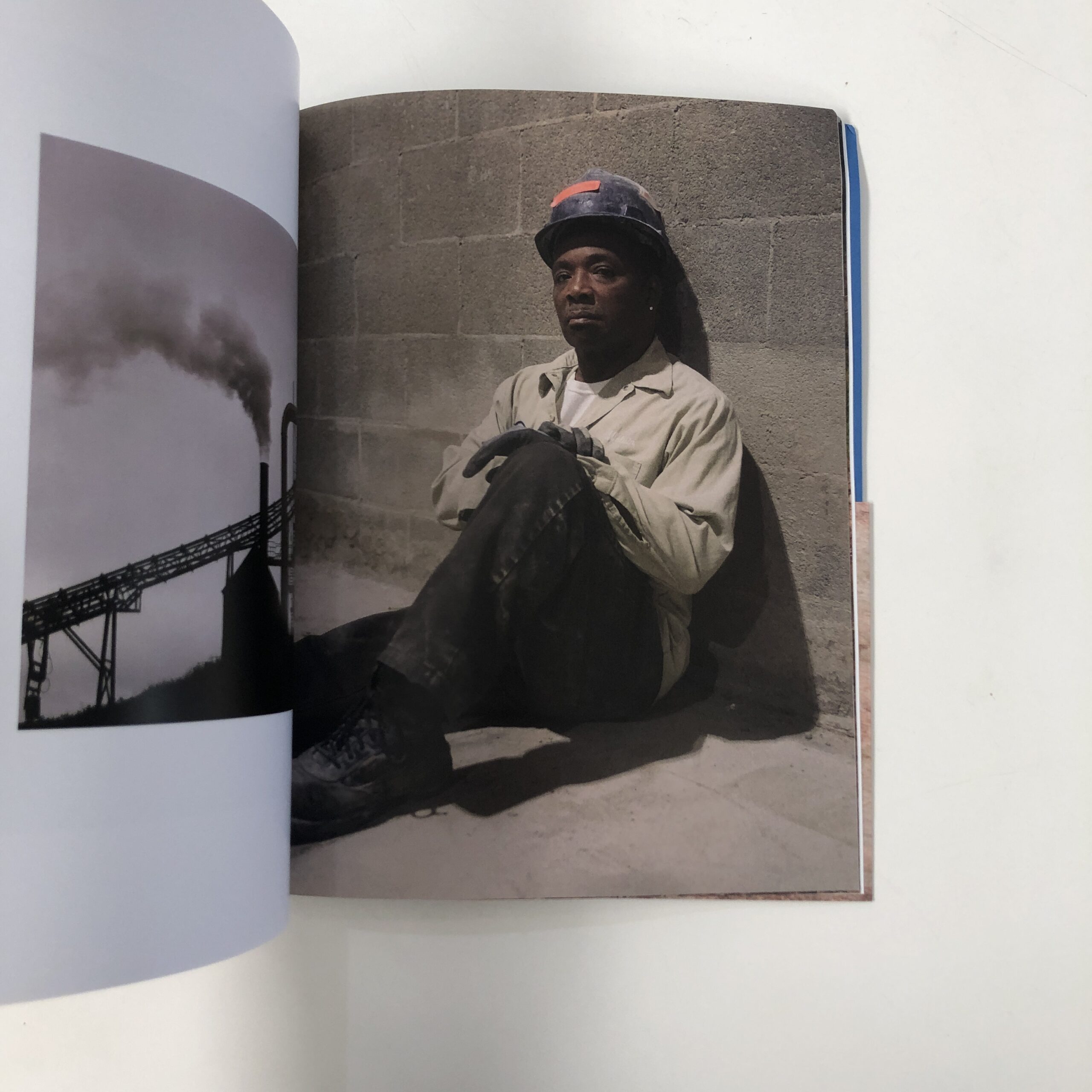
Photograph by Gladys Lou (2021)
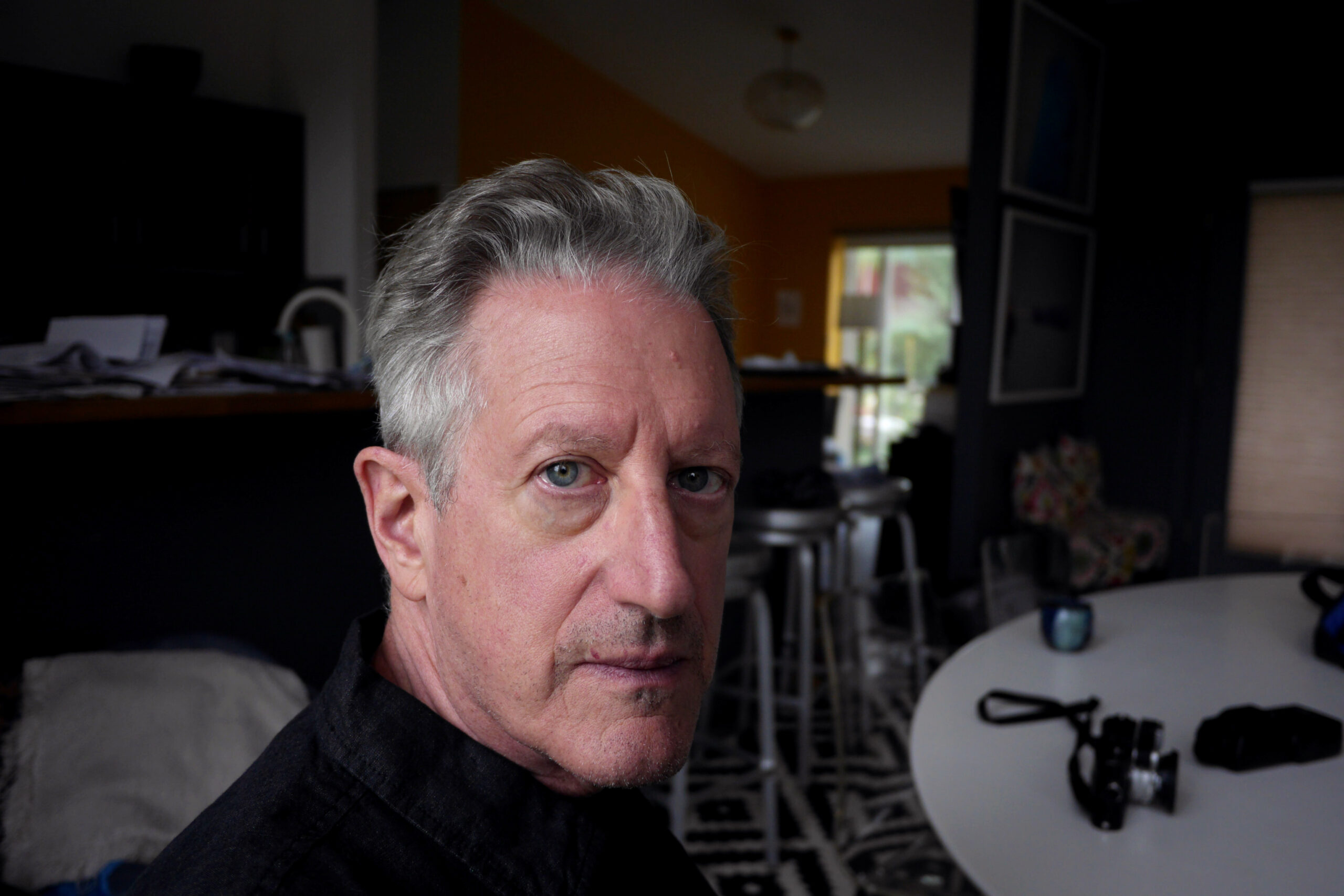
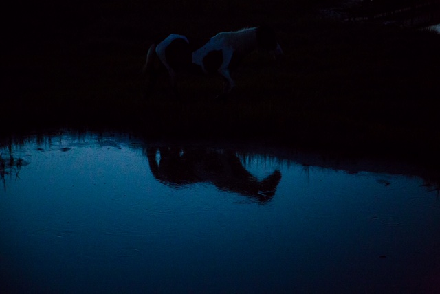
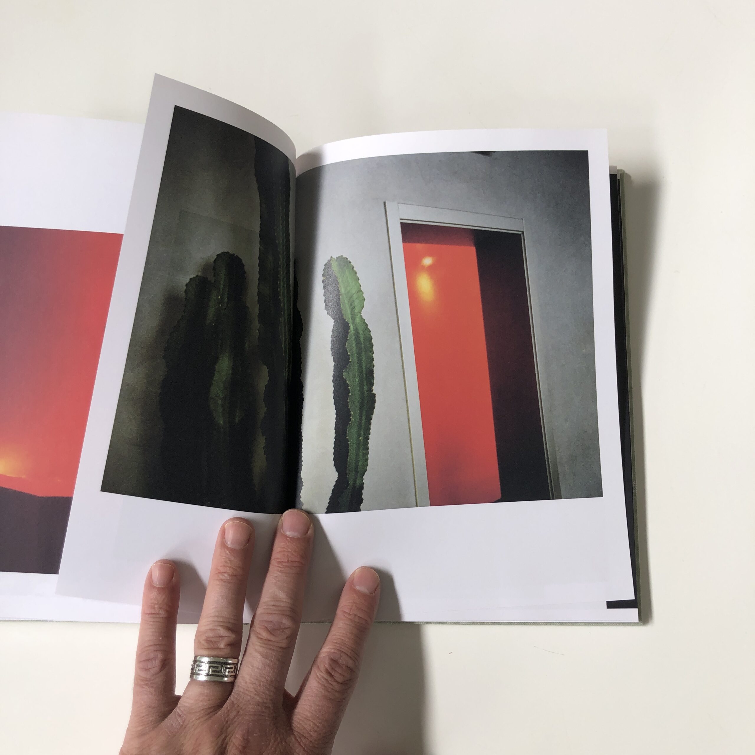
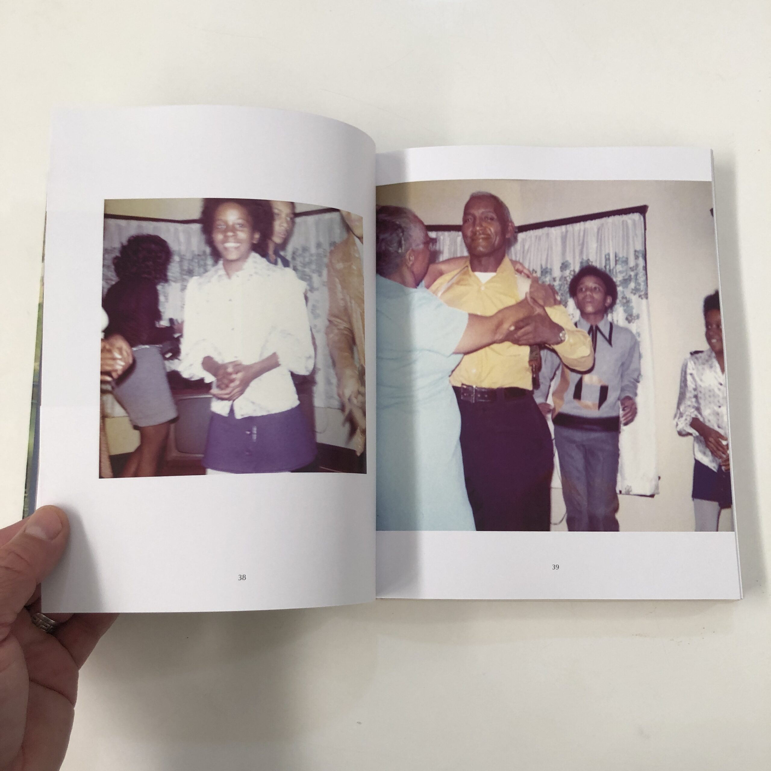
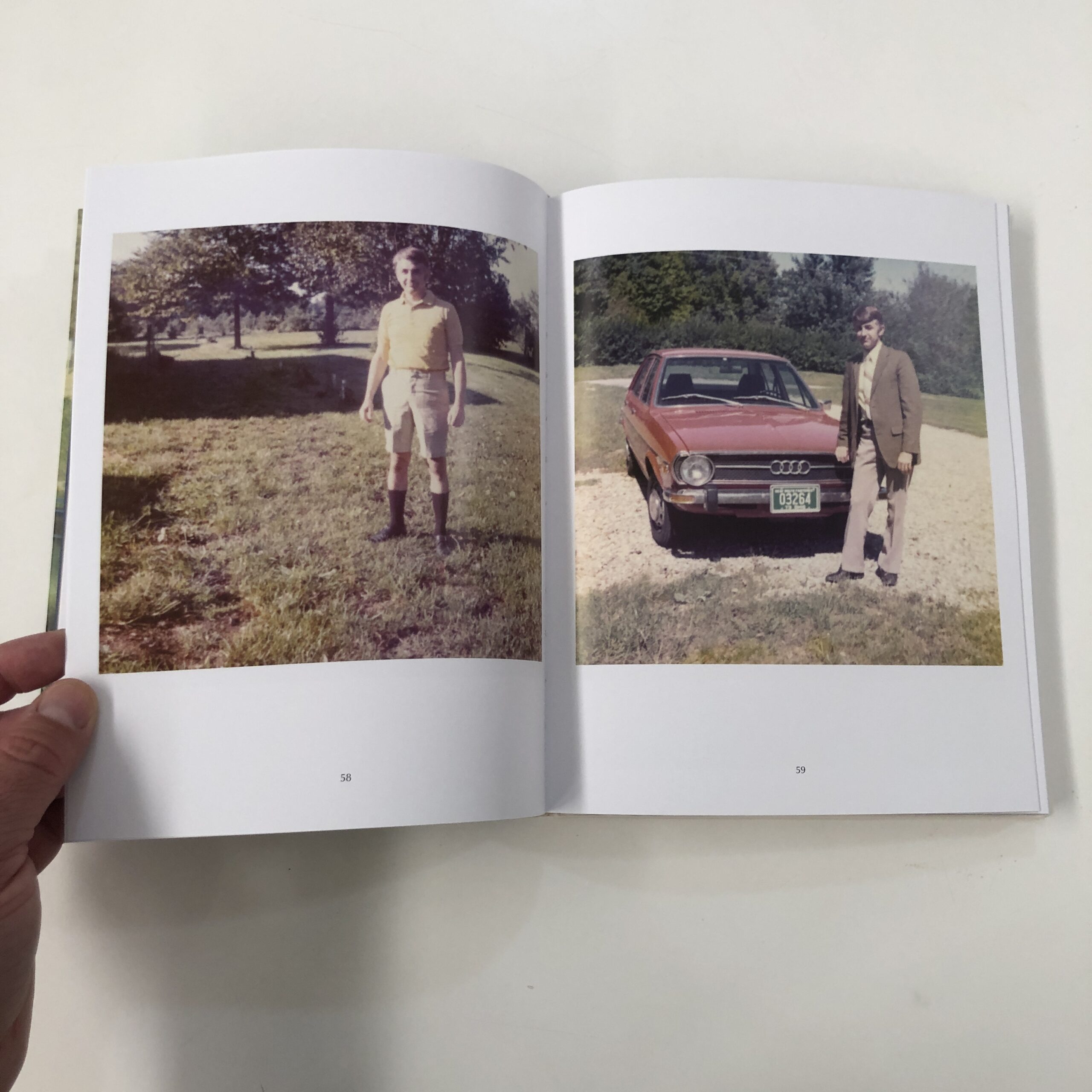
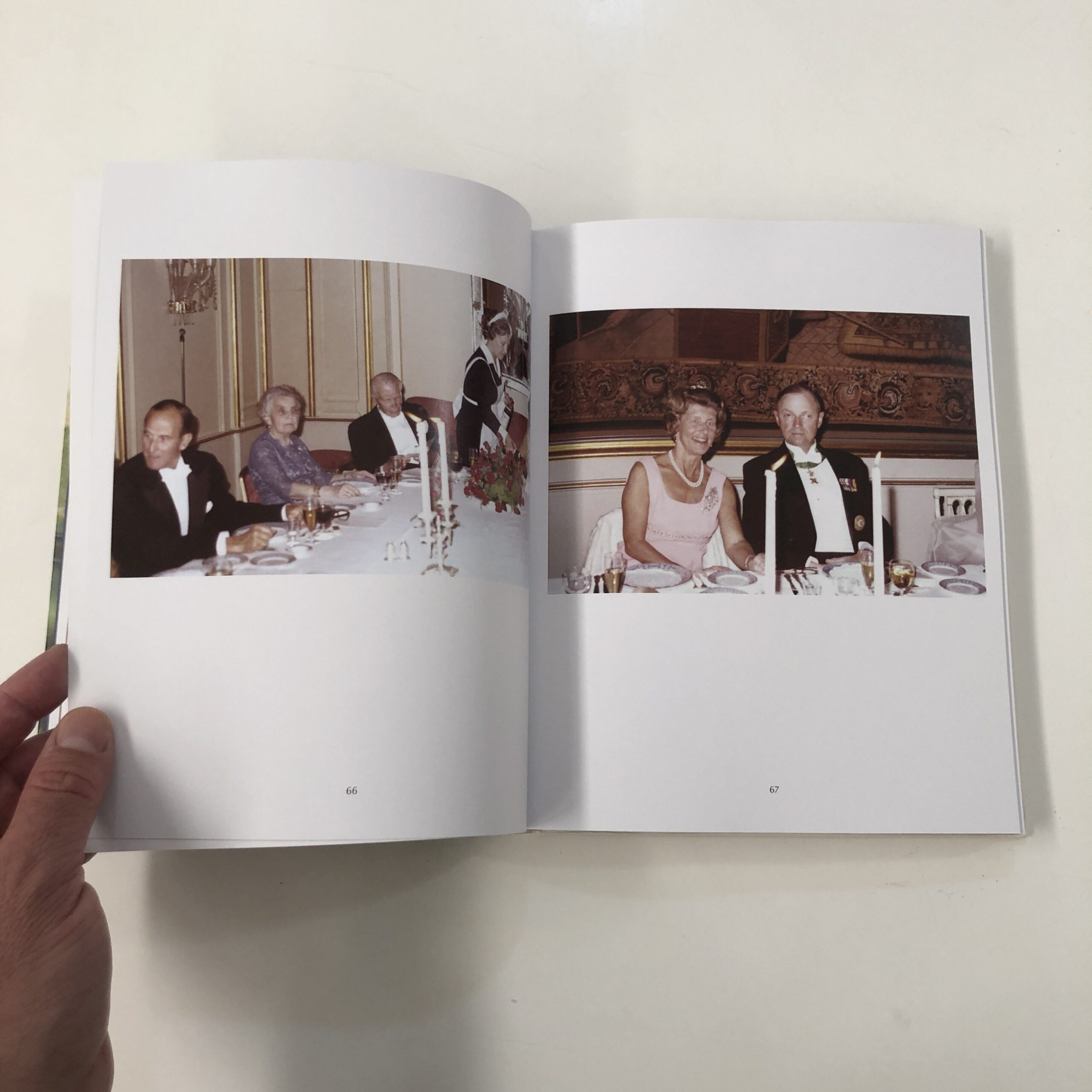
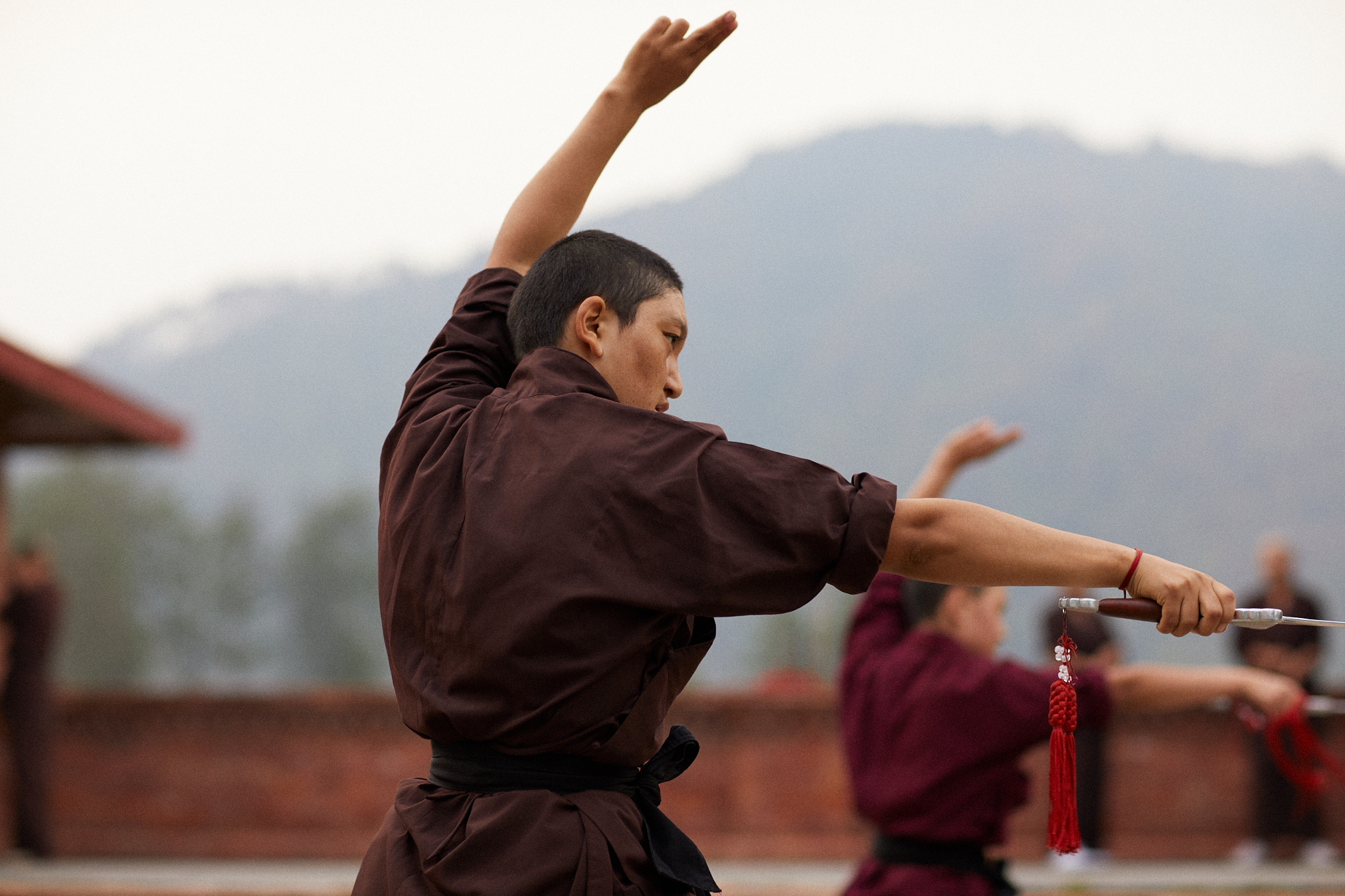
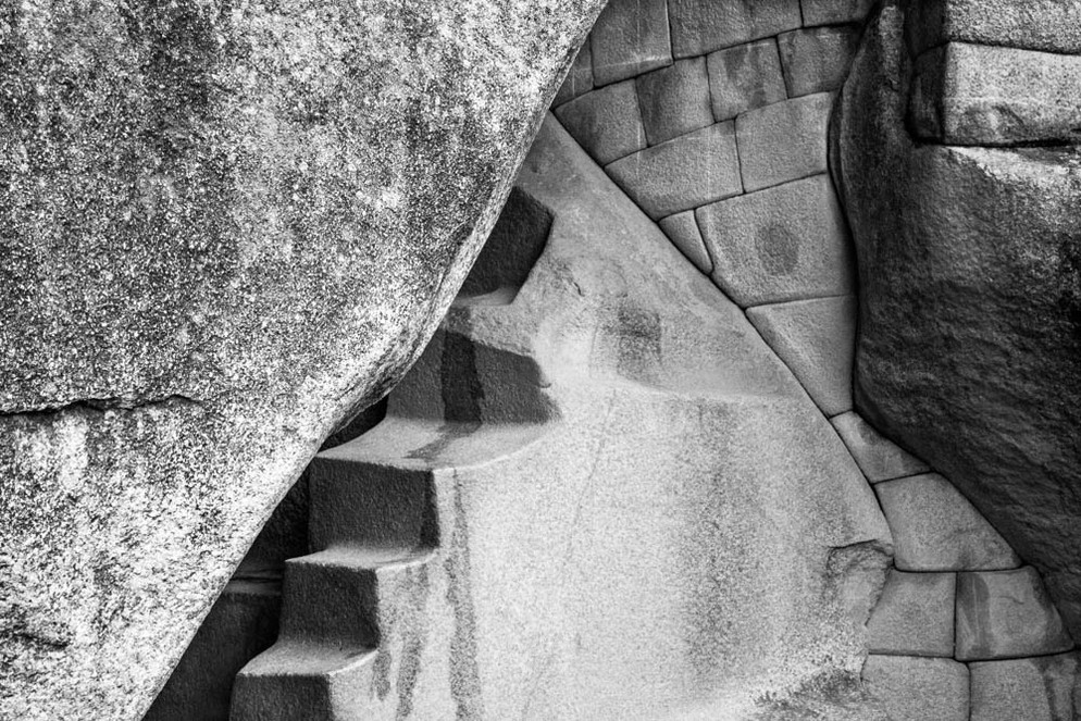
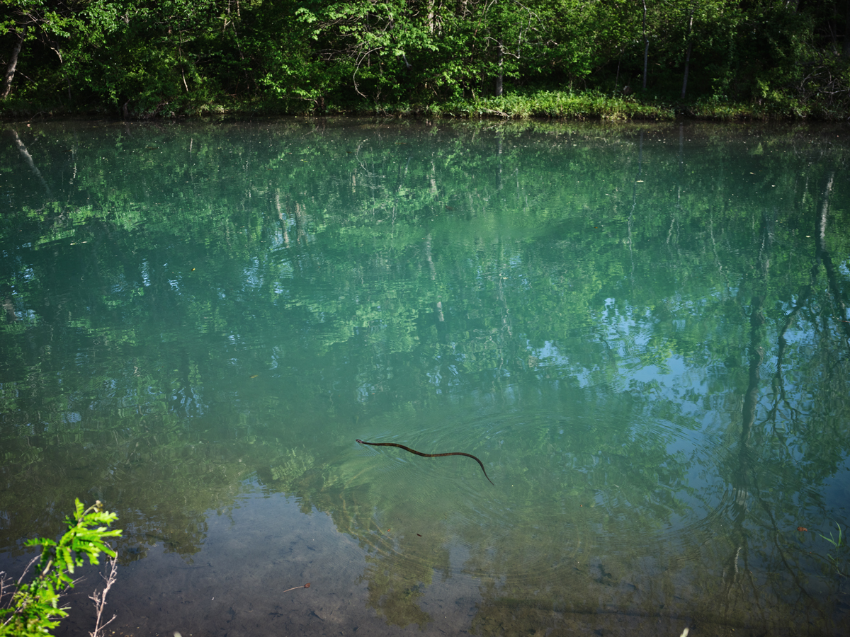
Photograph by Kat Castro (2021)
Photograph by Mark Gallardo (2021)


Ecru


Founders: Pam Lau and Jimmy Vi

How did you and Jimmy meet and is this your first collaboration?
Pam: Jimmy and I met at a photowalk in 2016. At the time we were part of two different grassroots community arts groups in Toronto. Over the years I watched him quit his job as an art director in advertising, teach himself filmmaking, and transition into a music video and commercial director.

In 2019 we loosely explored starting an agency together and called it Ecru. We ran into the typical problems; we lacked strategy and direction. We were all creative people and we had no business dev, ops, or finance. We were just friends that wanted to work on projects together. One of us, Kerwin, ended up branching off and starting his own creative studio

Jimmy and I decided to pivot Ecru away from creative services and instead focus on mentorship and community building.

Tell us about the name of the program.
Jimmy came up with that one. It was 11:55 p.m. We had just spent something like 10 hours working on the grant application, and we had five minutes to come up with a name before the deadline closed. We started rapid-fire brainstorming options and this one was short and catchy enough.

How did this free program come about?
We applied for a grant through ArtReach; a funder via Toronto Arts Council and the City of Toronto mandated to support high-quality arts-making programming for marginalised youth. It took us three tries; the first two years we were rejected. After each time we sought feedback and reworked the program and in 2021 we received funding to pilot the first cohort of ‘Ideas From I’.

The 2021 grant covered 5-9 participants. We received funds from a private donor and were able to expand to 12 participants and offer mico-grants to put towards development of the concepts they made the treatment decks for in the program. This year we’ve received the next phase of funding from ArtReach and have a partnership with Gallery 44 in Toronto where participants can get access to studio space and gear to shoot their projects in the Fall.

How did your career in photography get started and what are you hoping to build with this program?
I’m self-taught and started taking photos in high school, never thinking that I could turn it into a career. I started freelancing during school because I always had a camera on me, and after graduation, I started working at a trade publication called Marketing magazine (acquired by Strategy magazine) that reported on the Canadian marketing, media, and advertising industry. I got to sit in on CDs deliberating over what creative was award-winning and I started to build my network from the conferences and trade shows that I covered.

It was very lonely in the beginning of my freelance career and I felt like I had nobody in my corner. Jimmy and I talked about the stress and high-pressure we put on ourselves to make it work, when it felt nearly impossible. I’m starting to recognize it now as a lack of internal validation after growing up feeling guilty or divergent for wanting something other than what others expected of me. The words “You can do it” and “I believe in you” are extremely powerful when said earnestly. With this program we want to be that extension of support that our younger selves lacked for the next generation.

How does one get involved?
Follow us on Instagram (@ecru.club), check out the application form, and send it to someone who comes to mind. We’re also looking to bulk up the micro-grant portion and are open to sponsorship and donations from individuals, production houses, agencies and brands that identify with the goals of the program.
application form is here

Where can find out the specifics of the program?
We’re sharing the application form, testimonials from alum, and answering questions this week on Instagram at @ecru.club.

What does the program offer?
As photographers and directors, vision and concept is at the core of what we do. ‘Ideas From I’ teaches the importance of communicating your ideas through imagery and words. Participants learn about referencing and develop a concept by analysing and drawing a personal connection to what media and art they respond to.

We walk them through creating a treatment deck and effectively pitching it, and support them through the groundwork of pre-production by offering the resources for them to bring their idea to life. We support a range of experience because even if you don’t know how to technically execute something yourself, you can find collaborators and bring a team together that can make it happen.

Most of all, we’re doing it in an environment where we want participants to feel seen, heard, respected, and validated.


The Daily Edit – GEO Magazine: Storm Chasers by Laure Andrillon


Geo Magazine

Photographer: Laure Andrillon
Producer: Nadège Monschau
Photo Editors: Nataly Bideau and Magdalena Herrera 

Heidi: How did this assignment with GEO come about?
Laure: I pitched a story idea about storm chasing to GEO in December and this reporting trip happened in May of 2021, which is the beginning of the chasing season in the Tornado Alley. The magazine was interested in the idea of extreme tourism but also intrigued by the environmental aspect of the story, as storm chasers often contribute to field research around tornadoes and their behaviors. There is a lot of unknown when working on such a story. I couldn’t really tell my editors beforehand where we would go, what kind of landscapes to expect, because there is no set route and we would just follow the weather. Although we all hoped I would get to witness a tornado, nothing was certain. Pretty early on, we decided to make this a first-person story about the experience itself: my editors told me to photograph the waiting as much as the thrills, and to take a lot of notes about smells, varying temperatures, whether the air felt humid or dry, in order for my captions to convey a sensory experience.

Did they introduce you to the meteorologists?
I did some research online and had multiple phone conversations with several meteorologists before I decided to travel with Lanny Dean, a 46 years old storm chaser from Oklahoma. He was experienced (he had already witnessed about 600 tornadoes when I met him), good at explaining the scientific side of his job and importantly, he really was a character. He usually only takes 3-4 guests at a time and likes to get to know them really well, so I thought I would be able to tell his personal story and also understand why his guests were fascinated by storms to the point of dedicating their only annual vacation to chase them.

How long was this assignment?
The tour itself was a week long so my total traveling time from California was around ten days. I initially thought of this as a one-off assignment but it may become part of a long term project about alternative ways to experience the wilderness.

How did you earn their trust?
We drove about 1700 miles together, so it gives you quite a bit of time to chat. There were two storm chasers, Lanny Dean and Tyler Schlitt, their three guests, and me. We would share meals, stretch our legs together at every gas station. We tried to laugh together at our own disappointment when a gigantic supercell turned into nothing before our eyes, or when we failed to see a rare cold-air funnel cloud because it took us to long to get out of the van. When we experienced our first tornado from up close, in McAlester, Oklahoma, it created a deep bond between the other guests and I. It was a dream for them and I was there to see it fulfilled. There was a lot of joy but also an element of fear. It is a very unique experience to share with someone.

How did the project inform your photography moving forward?
This project encouraged me to pay more attention to the quiet moments when I photograph. I knew a lot of talented and fierce photographers had already captured the tornadoes in a way I wouldn’t be able to achieve with no previous chasing experience and with so little time. My editors at GEO wanted me to convey the internal feeling of searching for the tornadoes and to give a glimpse of the other side of storm chasing: it’s not always glamorous!

I know you recently finish the program at ICP, what are your future photo goals?
I just moved back to San Francisco after I graduated from the documentary photography program at the International Center of Photography in New York City. I am hoping to find a balance between doing assignment work and developing long term projects. I am mostly interested in stories about the environment, health and aging, and the exploration of alternative lifestyles. I am currently preparing for two exhibitions in the Fall, at the Encontros da Imagem photo festival in Braga, Portugal, and at the Festival for Ethical Photography in Lodi, Italy. I am very excited to explore different spaces where my projects can live: in magazines, on social media, on gallery walls and in public spaces. It gives me the opportunity to work with a variety of editors that often have very different perspectives on my work, which makes it a very good learning experience.

This Week in Photography: City vs Country


I just had some friends in from Houston.

(Texas clears out in summer.)

As is our custom with visitors, I took them on a big hike around the farm and adjoining neighborhood.

It was a gorgeous, sunny morning, perfect for a nice long walk, and as they’d already acclimated to the altitude, all was good.

Except for Houston. (The dog. And her name is pronounced HOW-ston, like the street in lower Manhattan.)


Houston St, NYC. (Image courtesy of Joshua Bright and the NYT.)


Houston, from Houston, had the time of her life.

A city-dog, born and raised, she was used to civilized walks around her Texas-urban neighborhood. (Meaning, low-density, car-driving city life, unlike NYC.)

Apparently, Houston has a best friend in Houston named Gracie, and they play together in dog parks.

(Those small patches of land devoted to off-leash dogs; a city-dog salvation.)

Here, however, on a 60 acre spread, with hills, cliffs, a stream, and an acequia, Houston went ape-shit.

For real.

That cute little terrier was sprinting around, smelling everything, rolling in horse dung, splashing through the water, and generally acting like a proper-wild-animal.

Given she resembled a black-and-white version of the famous dog from “Frazier,” it was quite the visual, and definitely entertaining.

Little Houston even snarled at, and backed down, our part-Pit Bull Haley, who is Wild-West-battle-tested.

I wouldn’t have believed it if I hadn’t seen it, but that little city-dog came out to the country, and made it her turf.

Well done, Houston!


Houston. (Image courtesy of her parent.)


Of course, I had no idea she’d inspire the column.

I hadn’t looked at a book yet, much less grabbed one from the submission stack.

But once I did, everything fell into place.

I happened to pull a package from Wray Sinclair, which arrived in August of 2021, so I was clueless as to what laid within.

I found “Kyanite Miners,” a well-produced, self-published book, which was made in a remote, rare-mineral mine in Central Virginia.

One of my oldest desires as a critic is for a book, (or any work of art, really,) to show me something I haven’t seen before.

To introduce me to a world, a micro-community, or subculture that gives me more insight into existence than I had before.

These days, I review pretty-much every book that comes in, but some obviously are able to open my eyes, (or my mind,) while others leave me wanting more.

Today’s book, “Kyanite Miners,” fits the bill, because I’ve never even heard of Kyanite before.

Much less had I any knowledge of the landscape or culture of Central Virginia, so that’s one point for Wray Sinclair right there.

(Yes, I use the point system IRL, but only brought it to the column last week, for Nancy Baron’s cool ‘Zine.)

The book opens with a contextualizing essay, (as so many do,) but it took a slightly more philosophical approach, specifically referencing the detrimental nature of the Urban/Rural divide in America.

We all know it’s there, and I remember calling out John McCain, in 2008, for his coded Republican Presidential campaign slogan, “Country First,” which is a double-entendre, if you think about it.


(Image courtesy of Mary Altaffer/AP, via the NYT.)


These days, Country folk love to mock City folk, and vice versa.

Hating the other side has become a force of habit, yet how many people ask themselves whether America can properly function without either crew respecting the other?

Everyone knows that personal interaction can minimize prejudice, but also that Americans have self-segregated into area-bubbles that reinforce their worldview.

(And that’s likely to get worse, once people start choosing their State based upon abortion access, or a lack thereof.)


So, to get to the point, I like this book.

The portraits are well-made, and show the subjects in a respectful light.

(This is one of those books where the dudes will appreciate the way they’re depicted.)

The flow of portraits, “action” shots, and landscapes is good, especially as it’s a short book, and I love that the proper “establishment shot” is saved for the end.

(Most editors would have started there.)

The closing credits admit that Kyanite Mining was a client here, so we need to keep that in mind.

These images were likely NOT made solely as art, or a personal project, but I don’t think we ought to consider that a black mark on the artist.

(Everyone’s got to eat, after all.)

Wray wrote me a nice note, in which he admitted being a fan of the column, so I’ll return the favor.

Nice job, Wray!

Thanks for sending your book along.

As to the rest of you, see you next week!


To purchase “Kyanite Miners” click here


If you’d like to submit a book for potential review, please email me at jonathanblaustein@gmail.com. We are particularly interested in books by artists of color, and female photographers, so we may maintain a balanced program. And please be advised, we currently have a significant backlog of books for review. 


The Art of the Personal Project: Paul Edmondson

The Art of the Personal Project is a crucial element to let potential buyers see how you think creatively on your own.  I am drawn to personal projects that have an interesting vision or that show something I have never seen before.  In this thread, I’ll include a link to each personal project with the artist statement so you can see more of the project. Please note: This thread is not affiliated with any company; I’m just featuring projects that I find.  Please DO NOT send me your work.  I do not take submissions.

Today’s featured artist:  Paul Edmondson

State of Main

For the last 25 years I’ve been taking extensive road trips across the American west, searching for desolate locations for my landscape photography work. Most often on these trips I try to avoid driving on major highways and instead choose the smaller, county roads that crisscross the country. As a result of this slower, off-the-beaten-path approach to road travel, I started to become curious about the towns, street corners, buildings and farms that occupy so much of rural America.

After Trump won in 2016, it felt like many of the communities I was passing through started expressing the MAGA ethos in ways that I never could truly understand or grasp. And the visuals relating to American patriotism suddenly seemed politically charged and deeply partisan. But there was also the timeless and sometimes quirky small-town iconography that often caught my eye. I wanted to see if there was a way to combine these different elements into a cohesive body of work that expressed my own interpretation of today’s small-town America. I was also deeply inspired by Walker Evans, Stephen Shore, and many others.

When I started the series in late 2020, the working title was simply ‘Main Street’, but as the project neared completion I asked my gallerist Jenn Singer what else she thought might work – was there a more effective way of describing what the images conveyed? We agreed on ‘State of Main’, which I think more accurately describes the work. In many ways the series is an expression of the American dream – for opportunity, independence, and patriotism. But it’s also a study of hard times, abandoned homes and shuttered stores. It’s these dualities that interest me the most, and how in the end, it’s nature that almost always seems to win.

Paul Edmondson is an award-winning photographer best known for his minimalist landscapes of the American West, often in the places where humans and the natural environment intersect. He lives with his family in Seattle, Washington.

To see more of this project, click here

Instagram

APE contributor Suzanne Sease currently works as a consultant for photographers and illustrators around the world. She has been involved in the photography and illustration industry since the mid 80s.  After establishing the art-buying department at The Martin Agency, then working for Kaplan-Thaler, Capital One, Best Buy and numerous smaller agencies and companies, she decided to be a consultant in 1999. She has a Twitter feed with helpful marketing information because she believes that marketing should be driven by brand and not by specialty.  Follow her at @SuzanneSeaseInstagram

Success is more than a matter of your talent. It’s also a matter of doing a better job presenting it.  And that is what I do with decades of agency and in-house experience.