“Poor man wanna be rich, rich man wanna be king,
And a king ain’t satisfied ’til he rules everything…”
“…it ain’t no sin to be glad you’re alive…”
From “Badlands,” by Bruce Springsteen, written in my hometown of Holmdel, NJ, 1978.
I’m re-watching “Marco Polo” on Netflix.
Such a brilliant show.
It was the first thing I binged, when we finally got high-speed internet in 2015, thanks to Barack Obama.
He’d given a massive chunk of money to the Kit Carson Electric Co-Operative, here in Taos, to bring fiber-optic cable to every rural home in the County.
The funds were allotted in 2009, as The Great Recession began crushing so many Americans, yet it took 6 years for them to wire up our home.
And we were lucky, as the money ran out soon after, and some people got screwed.
Now it’s 2021, and I wouldn’t have been able to work through the pandemic, without Obama’s largesse.
(Thanks, Barack! We miss you!)
How could I have Zoomed without the good WiFi?
I really don’t know, but hopefully the new Biden infrastructure package will help those left behind without sufficient bandwidth.
(Hopefully.)
That said, “Marco Polo” is fascinating.
I was just telling Jessie, it’s the kind of entertainment that helped launch Netflix, paving the way for all the streaming services to follow.
It’s also the kind of content no one is making anymore, as it was far-too-expensive.
The amount of money spent, to recreate 13th Century China and Mongolia, must been seen to be believed.
The costumes, thousands of extras, the palaces, the horses, the piles of corpses; no expense was spared.
To achieve that degree of verisimilitude alone was a feat, but the acting is also terrific, the story-telling taut, (well, they do drag things out a bit,) and the kung-fu is stupendous. (Shout outs to Tom Wu and Michelle Yeoh.)
Doing a bit of research, I learned the show runner, John Fusco, also created “Young Guns,” “Thunderheart,” and “Spirit: Stallion of the Cimarron,” so the Dude is obviously a unique talent.
John Fusco, proud of being 62
But massive productions like this rest on the collective skills of hundreds of people, not just one, and that kind of lucre is now only dropped on Marvel movies. (That Benedict Wong, who was genius as the lead, Emperor Kublai Khan, is now a side-player in the MCU is definitely ironic.)
I could shout out so many of the actors, but Olivia Cheng deserves particular mention.
{Caveat: I’d be remiss not to state this was a Weinstein Company co-production, and the heavy nudity included would not be acceptable these days, if such shows were still being made. Which, again, they’re not.}
Olivia Cheng played a concubine/assassin, (a combo she reprised in the underrated “Warrior,”) and she is such a badass.
Olivia Cheng in “Warrior,” Courtesy of Elle
There is a scene, relatively early in the first season, where to show off her skills, (to the audience,) she fights, and kills, three soldiers intent on raping her.
She does this, it should be said, entirely naked.
It did take me out of the narrative, just a touch, because I empathized with the actress, wondering how vulnerable she must have felt, to be in front of the camera like that, without even the meagerest of fabric defenses?
The scene reminded me of the unbelievably cool fight in the steam room, in “Eastern Promises,” in which a nude Viggo Mortensen takes out a Russian Mafia thug.
Courtesy of Flickering Myth
But that scrap is brutal, lacking grace, while Olivia Cheng’s triple-murder is filmed as if she barely breaks a sweat.
Girl power, indeed.
I mention all of this for a reason, of course.
This morning, I looked at one of two remaining 2020 submissions, a slim, self-produced book of poems and images, by Roxanne Darling, called “I AM: For the Love of Nature.”
It arrived in December 2020, and features a series of self-portraits, in which the artist took her clothes off, in nature, in a feat of self-empowerment, declaring the aging female form should not be ignored.
(She was photographed from ages 63-66.)
As an honest critic, I’ll say these images are not the type I’d typically review, just as art.
There is an audience for every style of photography, for sure, and this is not exactly to my taste.
But I’ve written countless times, books are experiential, not just a collection of successive images.
Pictures do not need to be brilliant for a book to have power, and one like this, in particular, in which an artist is taking control of her own narrative, often gets extra-juice from that context.
The opening essay states Ms. Darling has a history of trauma and abuse, and we learn at the end that her first nude-in-nature photo came just after she buried her mother, who died at 92. (We’re also told her partner, Shane Robinson, took the photos, so it’s not a tripod-and-timer photographic system.)
A fit of instinct pushed Roxanne to disrobe, and then she continued to do so, in various landscapes around the American West.
When I watch something like “Marco Polo,” I occasionally feel the naked women are being exploited by the camera.
If you’d like to submit a book for potential review, please email me at jonathanblaustein@gmail.com. We are particularly interested in books by artists of color, and female photographers, so we may maintain a balanced program. And please be advised, we currently have a significant backlog of books for review.
The Art of the Personal Project is a crucial element to let potential buyers see how you think creatively on your own. I am drawn to personal projects that have an interesting vision or that show something I have never seen before. In this thread, I’ll include a link to each personal project with the artist statement so you can see more of the project. Please note: This thread is not affiliated with any company; I’m just featuring projects that I find. Please DO NOT send me your work. I do not take submissions.
Having grown up in a reform Jewish household in Northern California, my initial perception of the Hasidic community when I moved to NYC was that it almost looked and felt like a completely separate religion. But I wondered: how are we similar? In this portrait series, I wanted to bridge the gap between the reform Jewish community I grew up in and the Hasidic Jewish community that I lived adjacent to in NY.
There’s a difference between watching people and really seeing them. To that point, many photographs of the Hasidic community in New York have a voyeuristic and documentary quality to them since there is a lack of permission and trust by many of the individuals in the Hasidic community. I did not want to replicate that. Rather, I wanted to elevate them and treat them the same way I would treat any individual or celebrity coming into my studio. I wanted consent and permission.
For many reasons, sitting for a portrait within the Hasidic community is seen as taboo. There is not a rule written in the Torah that expressly prohibits doing so. However, one of the main unwritten rules within the Hasidic community is to do what everyone else does and avoid what everyone else avoids. Without a doubt, the toughest part of this project was gaining the access and permission to find willing subjects to sit for a portrait.
My main goal was to make each person feel comfortable enough to reveal their unique characteristics and personality. Oftentimes, the outside world only notices the surface level trademarks that are reflected in the Hasidic community — their intricate hats, their beards, and their payot. I strived to go beyond that.
I used these photo sessions as an opportunity to learn more about the Hasidic community and share my experiences as a reform Jew. Through this sense of shared humanity, I was able to capture something timeless, personal and honest.
Many people have asked why I didn’t include women in the project. I had a few Hasidic women who were willing to sit for portraits, however they didn’t feel comfortable having their images shared publicly.
APE contributor Suzanne Sease currently works as a consultant for photographers and illustrators around the world. She has been involved in the photography and illustration industry since the mid 80s. After establishing the art-buying department at The Martin Agency, then working for Kaplan-Thaler, Capital One, Best Buy and numerous smaller agencies and companies, she decided to be a consultant in 1999. She has a new Twitter feed with helpful marketing information because she believes that marketing should be driven by brand and not by specialty. Follow her at @SuzanneSease. Instagram
Success is more than a matter of your talent. It’s also a matter of doing a better job presenting it. And that is what I do with decades of agency and in-house experience.
Concept: Images of people enjoying a luxury vacation
Licensing: Unlimited use of up to 30 images for two years
Photographer: Lifestyle and Portraiture Specialist
Client: Luxury vacation brand
Here is the estimate:
Fees: The client hoped to promote their brand and a new vacation they were offering with a lifestyle shoot featuring talent partaking in a luxury vacation over three shoot days. They would primarily use the 30 images requested for collateral purposes, with the slim chance of print ads in industry specific publications. I started with a creative fee of $2,000 per day for three shoot days, and added $300 per image on top of that to arrive at a creative/licensing fee of $15,000. While I wanted to go higher on the per image fee, I felt collectively we would probably be pushing the limits on a fee for this brand based on an initial call with the client. On that call, they also confirmed that they would be able to provide the locations, any necessary lodging, meals and prop styling.
Crew: We included a small crew consisting of a producer (including prep, shoot and wrap days) and two assistants for the shoot days. The client was comfortable without a dedicated digital tech.
Styling: In addition to a hair/makeup stylist, we include a wardrobe stylist and a wardrobe stylist assistant to shop and provide clothing for six talent. Each talent would have two outfits each, which we estimated at $250 per outfit. We also included a bit of padding for styling kit fees, and expenses incurred while shopping.
Casting and Talent: As a cost savings measure, we included a line item to cover casting from cards, rather than working with a casting agent and having a live casting. We included session fees to cover six talent for three days each, as well as modest talent usage fee, which we felt would work for the market and licensing needed.
Equipment: This covered the photographer’s own gear, and the potential need for a few rented lenses/supplies for three days.
Misc.: We included a few hundred dollars to cover any unforeseen expenses that might arise.
Post Production: This covered the time it would take the photographer to do an initial edit and then a per image fee for retouching of 30 selects.
Feedback: The estimate was well received, however we heard back a few days later letting us know that they determined their budget was $50k, and they asked what we could do to come down to that number. We discussed the production approach, and the client was comfortable taking on those responsibilities while reducing the talent needs as well. We removed the producer (while adding a pre-pro day for the photographer to help line up her crew), reduced the talent to 4 instead of 6, reduced the styling and equipment expenses, while making a few other additional tweaks, and submitted the following estimate:
Results: The photographer was awarded the project.
Cree Land Defender Lady Chainsaw Lady Chainsaw, chained to another wheelchair on the river camp bridge ready to confront the RCMP. Her fierceness is contagious, arrested more than 60 times
Heidi: Fairy Creek is located on the territory of the Pacheedaht Nation, RCMP began enforcement of an injunction to clear forest defenders out of the way of logging company Teal Jones. The battle to protect this area is still ongoing, what drew you to this protest? Agathe: In all honesty, when things started intensifying at Fairy Creek, I was swamped. I was working on a film about a double amputee going to the paralympics, pushing for the Sinixt (some of the Columbia River indigenous) to retrieve the rights back to their territories and get their voice heard through another film. I was working on a massive coastal cleanup. I didn’t have a lot of personal time then. I felt very isolated from the pandemic and in need of some girl time and community connection. So when Marie-France texted me to join her and Leah and a few other girlfriends, I knew deep down I had to show up, for the ecosystem, for the forest who gave me so much peace and to connect with the girls.
There were several female activists in your images; of course, men were present but was there a sisterhood afoot? Definitively! It’s actually quite fascinating how Fairy Creek gathered so many caring women. When the police force was so intense, knowing that we had each other and could take care of each other and laugh, sharing food or resources was an absolute force. These friendships are forever changed and so much stronger because we shared that experience together. Building community, in this case, a sisterhood around the things you love and care for, I think is the key to flight for environmental and human justice.
The violence against Indigenous women appears to be much more pervasive than publicly available data would indicate. This suspicion was confirmed in 2013, when the RCMP released a report revealing 1,181 cases of missing and/or murdered Indigenous women and girls. The 2015 update document now unavailable on the RCMP’s website added 19 female Aboriginal missing cases, for a total of 174 Aboriginal females missing for at least 30 days as of April 1, 2015.
Missing Murdered Indigenous Women MMIW is an essential and necessary movement that gives voice and raises awareness for mothers, daughters, sisters, wives and friends that have gone missing from reservations. What did you want your images to say and or how did making those photos hit you as a woman? I was quite intimidated to take photos of these incredible indigenous women. Knowing how much they had been through and suffered and how hard it was for them to show up for their right in hopes of a better future for their daughters, sisters and grandchildren. That was a very humbling experience! In these images, I was trying to convey their fierce and strong nature, that enough is enough, and you just don’t mess with indigenous women, period. In each woman I could see a set of Russian dolls standing, lineage of generations standing into each woman and saying: “No more, we have had enough, and we will not put up with the abuse anymore”.
It was like drawing a clean line with the past, acknowledging the intergenerational trauma and choosing to end it at all cost. I still have shivers going through my body when I think of how I felt taking these photos. I still feel so much shame for our society to have allowed that to happen and so much anger when I look around and see how people keep ignoring the harm. Some photos will change you forever.
When you are in the forest, what type of energy or messages do you get from the trees?
The forest is hands down my favorite place to recalibrate. Bathing in big trees sparks my senses so much. I love observing the leaves unfolding and the sun sparkling through the branches, hearing the sounds of the wind passing through…I grew up playing in a forest every day and visited the big lumpy tree daily, wishing it well. That tree had motherly energy to it; it was comforting, safe, always there for me until they built the golf course. I still go by that same place when I go back East, and it’s sad now, endless rows of suburban houses that look all the same.
I was given my first film camera at seven, and the trees were the first thing I photographed. I feel like I still haven’t broken down the code to give them justice. I never thought of them as male or female; they are the perfect balance between standing solid and sturdy yet swaying with the wind and adapting beautifully like a gracious feminine dance. It’s the ideal mix between the feminine, caring quality of nurturing and community and the more individualistic strong male nature of pushing upward towards the light.
How has the environment and or the outdoors informed your work?
I grew up in nature between a forest, a river and a lake that was the city water reservoir. The environment was always everything for me. I was a little bit of a black sheep and felt quite lonely at times with all my passions and big dreams; nature was my safe place.
I was stealing my dad’s Handycam daily, wrapping it in my sweater on my way to school and making movies secretly. I stormed into the minister’s office at 13 with it and my concerns about pollution. I wanted answers because it didn’t make sense that we were polluting our planet with aerosols.
I brought one film to show my school. It was about the seal massacre in northern Quebec (my mom and sister had agreed to play the dead seal covered in ketchup). My parents were teachers, so they explained everything we saw: how the glaciers formed, the river flow, how everything evolved through time. I was raised with curiosity and a thirst to explore.
When I went to BC for the first time at 19th years old, I felt like I didn’t deserve to be enjoying the mountains. I didn’t understand why there were volcanoes amongst the coastal mountains, so I went to do a geology degree. That was a first-hand experience in seeing the inside of “the industry” that didn’t feel good. When I graduated, I worked in Peru, and our team was kidnapped. That experience was eye-opening, I was so naive. Eventually, I went to work as an environmental scientist specializing in contaminated soil and water, knee-deep cleaning up the industry’s pollutants. Unfortunately, because I was on the front line there, my health took a hit. I went back to school to do a graduate certificate in environmental education and communication. I feel like I am finally finding where I belong, bridging science and storytelling to show up for what I think is the most important. An incredible editor (you) told me once “you can express those motherly caring and loving qualities towards the causes you care for” and that is how I have resolved my own life purpose. Hopefully, seeing my work published and creating tiny ripples of change has brought me to hope that love, perseverance, and trust can do anything.
What message do you hope to share?
The balance with our environment is very fragile. Ecosystems are getting affected to a level they may not be able to recover, and I hope to help people understand we need to take better care of our mother. We need to look after her rivers, bring salmon back, leave the glacier alone, forbid development that brings crowds of selfie sticks, have the cruise ships gone so that whales can communicate, and regenerative design systems that prevent single-use plastics, hold industry accountable for ghost net and contamination, to name a few solutions.
Healing our mother comes hand in hand with healing social justice issues and healing ourselves because consumerism is a bandage. How much do we really need? What if we gave back the love our mother gave us?
Who printed it?
I chose Mixam.com to print the Saffron cookbook. I first learned about Mixam from reading aphotoeditor.com, so here we are, full circle! Mixam has great customer service and I’ve been very happy with their print quality.
Who designed it?
My boyfriend an illustrator/graphic designer, Daniel Peacock, and I designed the Saffron cookbook together using InDesign. I knew that I wanted the Saffron cookbook to be a blend of my travel and food photography and designing the layout flowed easily – starting with a brief written intro, a short history of saffron, tips on how to use and store it, followed by twelve recipes featuring saffron, and finishing with a photo story of the annual saffron harvest in Krokos, Kozani, in northern Greece. I also collaborated with Greek-American chef, Christina Xenos, who co-authored this project and developed the recipes for the cookbook.
Saffron crocus flowers bloom for three weeks, only once a year. Every aspect of the saffron harvest is done by hand – picking and gathering thousands of flowers each day, separating the red saffron stigmas from the rest of the flower, and skillfully drying and packaging the spice. I wanted the Saffron cookbook to reflect this level of care, too. So, I wrap each book, add a handmade stamp of a crocus flower on the front, tie the book with red twine in a way that’s meant to mimic the red saffron stigmas, and include a handwritten note.
Tell me about the images.
There are a few categories of photos:
A photo of the saffron that I grew at home and a bowl of saffron corms were taken with my iPhone.
The recipe photos were shot over three days with prop stylist, Robin Turk. I used natural light, a diffusion panel, and several reflectors. I shot everything on the Canon 5D Mark II with the 100mm lens.
Daniel and I traveled to Krokos, in the town of Kozani, to document the annual harvest over ten days. I shot stills and Daniel shot video. We met many wonderful people we are still in touch with via social media. As a thank you, I sent 20 Saffron cookbooks to Greece to the folks who allowed us to photograph them. The majority of our shooting time was photographing outside, in the saffron fields – mostly of the saffron flowers being picked, and shooting various portraits of the harvesters. We spent one morning photographing the dried saffron as it was being weighed and packaged at the Kozani Saffron Producers Cooperative. That evening, we documented the saffron sorting process. At one point, it was good to put the cameras down and join the women sorting the saffron.
While out shooting in the saffron fields one day, it occurred to me that I would really like to get a shot of a single saffron crocus flower on a black background. It was windy and hot outside, so I sat inside the rental car and photographed a single flower on my lap (I was wearing black pants). When we returned home, Daniel retouched the shot and it became the cover of the cookbook.
How many did you make?
I’ve printed 350 Saffron cookbooks so far. I’ve been sending them out to clients, family, and friends. I’m also selling the cookbook, along with a few prints from the saffron project, in my Etsy shop, Xploria. www.etsy.com/shop/xploria
How many times a year do you send out promos?
I usually send out promos twice a year – but with a big project like Saffron, I think it’s going to be my only promo for a little while.
Do you think printed promos are effective for marketing your work?
Yes, definitely. There’s something wonderful about sharing a printed promo/book with someone who understands and resonates with the work.
Where did you get the idea for the project?
It’s amazing to me that a big project can start from such a small question: what is saffron?
Before this project, I didn’t know much about how to use saffron beyond a few recipes, so my little jar of saffron sat mostly on the shelf, unused. I knew saffron was pricey but wasn’t exactly sure why. I was cautious about using the precious red threads in a casual way and unsure of what to make with them. This spice held a lot of mystery.
My journey with saffron started because I was looking for something new and interesting to grow in my Los Angeles home garden. Then I got a job opportunity to photograph in Bulgaria and Crete and decided to extend the trip to photograph the saffron harvest in Greece. The only catch was that I had to wait a month for the saffron harvest to begin!
One of the best pieces of advice that I ever got from art school came from the late photographer, James Fee. I had asked him how he mentally/innerly prepared himself for a photoshoot. He responded, “Don’t be afraid to shoot on the way to the shoot.”
So, in preparation for the saffron harvest shoot, and because we had plenty of time to explore, Daniel and I did some photo/video mini-stories together: an organic olive mill on Crete, the cultivation of citron on Naxos, and the production of Kitron (a special liqueur made only on Naxos), and a family farm growing Greek mountain tea.
I want the Saffron cookbook to inspire others not only to understand and appreciate what saffron is but also to give some practical, easy ways to enjoy this beautiful spice – to demystify it a bit. Simply put a few saffron threads in warm water, add some honey, and, ta-da! saffron tea. Full of health benefits and tasty, too.
Chef Christina, Daniel, and I put together a video presentation of the saffron cookbook: https://www.youtube.com/watch?v=p9ToGVUkKcM Christina demonstrates how to make a few recipes and there’s a video of the saffron harvest that Daniel and I created.
I only consume occasionally now, as it’s better for my body.
Beyond the perpetual munchies, (which make you fat,) marijuana tricks the brain into dumping extra serotonin into the blood-stream, so once you stop, the emotional crash is no fun at all.
Like booze, with its famed “hair of the dog,” weed entices you to stay on the ride, because getting off is a bitch.
Thankfully, I prefer life sober, and only smoke for “special occasions” these days.
As such, the first thing Jessie and I did, once we dropped our bags at the Millennium Knickerbocker Hotel in Chicago last month, was head to Verilife, the closest dispensary we could find.
Given our stressful day, and that we were sort-of on vacation, it was a lock we’d go buy some reefer, as dealing with the maskless hordes all day was a big-fat-drag.
Verilife was a slick operation, with lots of digital interactions, a well-organized rope-line, and a succession of people who’d check you in.
The guy who verified our ID’s noticed we were from New Mexico, and asked about Ojo Caliente, the famed hot springs resort on a Native American Pueblo, about an hour from Taos.
When we made it to the front of the line, where you pre-order on an iPad, I asked the helpful bud-tender for a good pre-rolled Indica joint, to chill us out, and he massively up-sold us to an $80 Sixpack of pre-rolled, half-gram joints, which came in a fancy box, replete with matches.
He was right, of course, as who needs to go right back to the dispensary, and that box kept us good and happy until Sunday morning, when we went back for a pre-rolled Sativa joint to power us through our last day.
Just for context, I went to Chicago last month for three reasons:
1. To have a romantic weekend with my wife, by the ocean-esque Lake Michigan, as we hadn’t been away from the kids together in years. (Thanks for the help, Mom and Dad!)
Jessie by the lake
2. To hang out with some of my photo-world buddies, whom I hadn’t seen since March 2020, in Houston at SPE, the day before the entire world shut.
3. To visit some art museums and galleries to write reviews for you, and just enjoy the city, eating and having fun for a travel article. (The one you’re reading right now.)
Therefore, having some killer, chill, smiley joints to smoke as we walked around the lake, and the city, made everything so much more dramatic.
Looking South along the lake
I highly recommend it.
Just going to 7-11 for some blue Gatorade, right after we left Verilife and lit up, was great, as you get the woozy feeling, where everything looks hyper-real, but without the lack of control and potential for disaster that comes from getting too drunk.
(Luckily, I didn’t overdo it with alcohol at all, even though I almost always had a drink in my hand when kicking it with my buddies.)
The first night, I went to Sparrow with three friends, and it was my first time in an indoor bar or restaurant since April.
The experience was awkward, to say the least, as masks were required to enter, but then everyone took them off the second they got inside.
One of my buddies kept his mask on the entire time, when he wasn’t sipping, and I would put mine on for a few minutes, realize I couldn’t be heard when I spoke, because it was so loud, and then I’d take it off again.
There was no doubt my mask-wearing-system was pointless, but the human brain often needs time to process, in new situations.
And my friends assured me the vaccination rate was so high in Chicago, (higher than I was,) that I should feel comfortable no one would breath Corona-air on me.
(They were right. No Covid the entire trip.)
One line for negative
The highlight of the weekend, if I’m being honest, were the long walks Jessie and I took by the lake.
Each day, we spent hours ambling along the concrete shore, staring out at the beautiful blue water, watching the high rise buildings jut up at its edge.
Walking along, smoking joints, taking in the people-watching, was worth the price of the plane tickets and hotel.
No doubt.
Part of why I chose the Millennium Knickerbocker, (beyond the nostalgia of having been there for 4 Filter Photo Festivals,) was it’s the closest place to the Oak Street Beach, other than the Drake Hotel, which is across the street.
You only have to walk a half block, then a very-short-block, to get to the entrance to the park, and being that close meant we could really utilize the gorgeous Lakeshore.
Additionally, the entrance features a phenomenal mural, by Jeff Zimmermann, which sets the tone each time you head to the beach.
One thing we noticed is Chicago is a town full of grown-up frat boys. Or, at least, the Magnificent Mile area is full of them.
I cannot tell you how many massive dudes I saw, (like, really big,) and they all wore a similar outfit: hoodie, baseball cap, shorts, and sneakers.
Always, no matter how cold it got, (and it was pretty nice when we were there, if windy,) they wore shorts.
Somewhere, there must be a memo, describing the Chicago-bro uniform, because no one deviated.
Well, almost no one.
We did see one guy walking past us, heading South, and he was so fabulous it’s hard to put into words.
His skin was brown, and it made me think of Persia, not Mexico or India, but who can say?
My man was nearly naked, wearing only a floral-print banana hammock bathing suit, to go along with his brilliant mustache, well-chosen footwear, hairy chest, sunglasses, and mohawk.
Jessie and I tried not to gawk, as he was so compelling, strutting with confidence, and I felt it was too rare a moment to pull out the camera. (I mean iPhone.)
“You only see someone like that once in your life,” I said to Jessie, so we made sure to describe him to each other, to remember details for me to share. (Here. Now.)
Needless to say, we were shocked, thirty minutes later, to see him walking North as we headed South, as I guess the walk-up-and-turn-back thing is pretty common at Lake Michigan.
The second time, I had no reservations about grabbing some photos, so here you go.
Beyond the walking, people-watching, drinking with friends, and art-viewing, (which I’ll cover in a separate article,) we spent a fair bit of time eating.
Some people I know, (yes, I mean you, Louie,) insist on bagging on Chicago deep-dish pizza, calling it a bread bowl, a plate of hot cheese, or something other than pizza.
As a born-and-raised Jersey boy, I still Stan for East Coast pizza, but have no problem opening my mind to other styles of the World’s Best Food.
However, in my 5 previous visits to Chicago, I’d never had brilliant pizza, despite many attempts.
I’ve surveyed folks over the years, and heard Lou Malnati’s is everyone’s favorite local chain, so for lunch on Friday, we ordered a monster pie.
(We skipped dinner and breakfast to properly feast.)
The River North Lou Malnati’s is located just off a public plaza, which I’m told is called the Viagra Triangle, as it has a series of high-priced, outdoor restaurants where rich, older guys take their young, pretty girlfriends.
We stopped in and ordered a Deep Dish Malnati’s Chicago Classic, which featured sausage with extra cheese and sauce, and I asked them to add the garlic spinach, and olives, so it would have more of a Mediterranean feel. (Plus, you need get your vegetables where you can when you’re eating pounds of melted cheese.)
While waiting the 30 minutes, we walked down to Walgreens to buy more Gatorade, an umbrella, and some OTC Covid tests, (so I could prove to my buddies we were clean, before attending a small house party.) Then we walked up Rush St to grab the pizza, in full-food-crash-mode, and brought it back to the hotel to eat.
If I’m a truthful critic, it needed a touch of finishing salt, and some fresh ground pepper, but beyond that, the jazzed up Malnati’s pie was super-delicious.
Totally worth the hype.
The sauce was sweet, but not overly so, (and there was enough of it,) while the spinach cut some of the richness of the sausage.
Lou Malnati’s Three and a Half Stars
That night, at my friend’s house, we had even more deep dish pizza, this time from the opposite of a chain restaurant.
Instead, Doug ordered from Milly’s Pizza in the Pan, the kind of joint that popped up during the pandemic, where you have to be in the know, call ahead, take what they’re offering that day, show up at the appointed time, and they bring the pizza out to your car from a commercial kitchen.
It’s not remotely a restaurant, and I must say, the bougie food did have more flavor than Sweet Lou’s.
Photos courtesy of Doug Fogelson
Each pie, (one vegetarian, one with meat,) utilized various colored peppers, which added freshness and balance, plus you could actually taste each ingredient.
The pies were a bit thinner, while still being deep dish, and it was more food to savor than stuff in your face, as you desperately try to get all the fat in your stomach to soak up the booze.
Milly’s Pizza in the Pan Four Stars
I know today’s column is long, and I never want to go on forever, but there are three more restaurants to cover.
First off, on Saturday, we did a big takeout meal from Silver Spoon, which is an underground Thai restaurant I discovered in 2015, and continue to visit each time I come back to Chicago.
It’s literally below street level, and is always full when I go, so I’m not the only person who realizes how good the food is, and reasonably priced as well.
It’s near a Giordano’s, so watching the tourists line up, waiting for an hour to get mediocre pizza, when there is such great Thai food three doors down, always makes me giggle.
We had veggie eggrolls that tasted like they could be from a Jersey Chinese joint, (massive compliment,) vegan summer rolls that were as delicate as Donald Trump’s ego, some dumplings that seemed deep-fried, rather than in a pan, a brilliant Pad Thai, and a Pad See Eiw that was too spicy. (My fault for asking for medium-spicy.)
Silver Spoon Four Stars
On Sunday, rather than join my buddies for coffee out West, we wanted to maximize our time downtown, as the hotel allowed us a late checkout. So we went to Tempo Cafe for brunch, a classic diner of the type rapidly disappearing in America.
There was a long wait, but all those schmucks wanted to eat inside, so we grabbed a semi-private outdoor table, on the sidewalk, straight away.
Tempo Cafe has been my go-to hangover breakfast three times now, and it’s always delivered.
Though they brought us coffee super-quickly, and kept re-filling the cups, (thankfully,) we had to wait ten minutes to order, then half an hour for our food, which was a huge bummer.
I distracted myself by looking up, staring at the buildings, and making up stories about the people walking by.
Sidewalk views at Tempo Cafe
Given what I said about getting your veggies when you can during a weekend bender, I ordered an egg skillet with broccoli, spinach and mozzarella cheese, and was excited for it to arrive.
Unfortunately, when the food finally came, they brought me a skillet loaded with sausage, instead of spinach.
My face fell faster than Carl Lewis, (the 1984 version,) and I had a decision to make.
Wait for the server to come back, (5 minutes,) and then for the cooks to make a fresh breakfast, (30 minutes,) or suck it up and dive in.
Jessie and I joked about the short order cook, reading the ticket the server handed in.
“Spinach and Broccoli? Are you fuckin’ kiddin’ me? It’s Sunday brunch, and this poor schmo is just orderin’ vegetables? Nah, I don’t think so.”
“What do you mean, Morty?”
“I don’t think this guy ordered right. The dum-dum. He forgot the sausage! I’m sure he meant sausage, not spinach. So we’re gonna fix it for him.”
Thankfully, I’m not a vegetarian, so I trusted Morty, ate most of the plate, and wasn’t hungry again for hours.
Tempo Cafe Two and a Half Stars
Finally, I need to mention our Lyft ride, heading West to a brew-pub on Sunday, for our last visit with my crew before we schlepped to O’Hare again.
Her name was Delisa; she had an electric blue car, and electric blue nails.
Jessie and Delisa got to talking, as both were social workers for years, and though my mind was elsewhere, I kind-of followed along as they talked about helping kids in the system.
Eventually, (no surprise,) we got to talking about pizza, and she was a fan of Uno and Due, (which I’ll try another time,) but also said Parlor Pizza might be her favorite in town.
Sure enough, after we finished day-drinking at The Perch, (which has great beer, and good food, but was not-quite review worthy,) the remaining revelers walked down the street, in Wicker Park, looking for one last bit of sustenance.
There it was, right in front of us, Parlor Pizza Bar, so how could we not trust Delisa?
Sitting outside in the sun, savoring our last hour in the city, knowing we’d have a subway ride, the airport security line, then the plane flight home, and a 2.5 hour drive from Albuquerque, I hoped Delisa knew her pizza.
This time, it was more bar-pie-style, with a thin crust, and thankfully it was delicious. (Oddly, the menu was QR-code-only, which is apparently a thing now.)
The pizza margarita was amazing, a true gem of a pie. Our friends ordered a specialty number with honey and vegetables, which was also super-good, and I went off script, choosing a make-your-own, with burrata, heirloom tomatoes and meatballs.
In a place like that, with a long list of pre-selected options, the cooks obviously want you to go with their creations, and not do it yourself.
So the JB Special was good, but not THAT good.
The JB Special, which wasn’t so special
For some reason, they don’t put meatballs on pizza in Chicago.
It’s a sausage town.
And when I said it like the New Yorkers do, (SAUW-szige,) I was told that’s wrong.
From there, my friend Jeff dropped us off at the “L” train, where we waited in the late afternoon light, (with very full bellies,) hoping we’d make it back to New Mexico in one piece. (We did.)
The Art of the Personal Project is a crucial element to let potential buyers see how you think creatively on your own. I am drawn to personal projects that have an interesting vision or that show something I have never seen before. In this thread, I’ll include a link to each personal project with the artist statement so you can see more of the project. Please note: This thread is not affiliated with any company; I’m just featuring projects that I find. Please DO NOT send me your work. I do not take submissions.
The photographs in this book are images that came to me after the loss of my father. I followed these images and saw them into actualization over the course of two years.
Located on the edge of Death Valley, Cerro Gordo is a ghost town that was once the greatest producer of silver in California. In the early 20th century, Eastman Kodak used the silver mined at Cerro Gordo to manufacture early motion picture film stock. The film was then utilized by an emerging Hollywood to capture the most popular genre of the time: Westerns. Western films were then exported all over the world and used to define a vision of the West.
For me Cerro Gordo is a steep winding street in Echo Park – behind Dodger Stadium – where I lived during the years that this work was made.
The house I lived in was a crumbling mission style from the 1920s. It was in that house, on that street, I experienced both love and heart break. This book represents what I learned about the paradoxical duality of Los Angeles during that period.
APE contributor Suzanne Sease currently works as a consultant for photographers and illustrators around the world. She has been involved in the photography and illustration industry since the mid 80s. After establishing the art-buying department at The Martin Agency, then working for Kaplan-Thaler, Capital One, Best Buy and numerous smaller agencies and companies, she decided to be a consultant in 1999. She has a new Twitter feed with helpful marketing information because she believes that marketing should be driven by brand and not by specialty. Follow her at @SuzanneSease. Instagram
Heidi: Where is this artist based and is this a long term project?
Alex: Yes, great project and still on-going, in fact I’m working on a short film about Lina Prairie this week! She is an artist based in Point Reyes National Seashore. She collects kelp, bones, and other coastal artifacts, then uses the material to weave intricate baskets, wall hangings and other sculptures.
Was this a brand project or personal project?
Personal project.
Did you spend a day with her in the studio? Did you forage together?
I’ve spent multiple days with Lina in her studio and foraging along the coast. We are in the process of writing a monolog for the film and still have two more days of shooting together.
What was the art direction for the images?
I wanted to tell her story is a beautiful, cinematic and artistic way. Less doc style and more conceptual since her work is highly conceptual. The material she uses also has a life of its own and a beautiful all onto itself. It almost reminds me of lines in a midcentury drawing.
Your body of work ranges from stills to lifestyle, and portraits. How does one inform the other, or what is the common thread you are looking for in all three genres? Good question – People, landscape, still life form a triangle to me. They are the language of the world and also the buckets that help me round out my stories. People and lifestyle is the humanity, still life helps the viewer understand the details of the story and the landscapes drive a sense of place. The landscape or environment is the cradle that holds it all together.
What have you been shooting more these days?
I’ve been shooting a lot of travel and hospitality lately. One project I did was for SENSEI, which is a new hotelier concentrating on full approach to wellness travel. The project is a great example of giving me the freedom to express my photographic style while being in-line with the clients needs.
Who designed it?
I designed the poster, book, and postcards. I wanted the poster and the book to have a very early 90’s NYC art feel when you would get posters in the Voice, and artists would hand out their work in cards and books. I am from New York, and its artistic history has really influenced me.
Tell me about the images.
The book and poster represent the spark that made me want to be a fully professional photographer. Two of the cards are images from West Texas, I really enjoy traveling and these images never really have a place to live. The third image is a product shoot I did for the Company Palms.
How many did you make?
I made 100 books, I have friends asking me for more so I am thinking of printing more! I made 100 posters and 100 of each postcard. When I run through them, I make more as I use them as a business card.
How many times a year do you send out promos?
I am continually making digital promos. Some of my first internships for photographers involved running around New York handing out their promos to various clients and editors. I am continuously making promos, but sending them out to a client list becomes less frequent. Quarantine afforded me a lot of time.
Do you think printed promos are effective for marketing your work?
I am not sure. I have had clients reach out to me years after I had sent them a promo. I would say for every 25 promos I send I hear from one person. The book was a bit different as I sent it more to work friends as opposed to a traditional marketing campaign. I find that handing out cards to people has a greater impact than a standard business card. I find it is a good way to continuously foster relationships with various clients.
Both of those famous clichés collided for me this week, and as a result, I’m shaking off some serious PTSD.
That kind of stress will melt your brain, so we’re going a bit non-traditional this week.
(It is what it is.)
As to the details, I had my first proper Covid test, my first colonoscopy, and was held at gunpoint, by a raving lunatic, who might well have killed me had things gone differently.
(Like I said, it was a crazy week.)
Let’s unpack some of these things, so I can create a functional column, and offer the educational and entertainment value for which I’m known. (Or so I tell myself.)
It would be cruel to keep you in suspense, given the drama bomb I dropped a few sentences ago, so let’s get to it.
And before you ask, no, I’m not exaggerating.
It really happened.
On Saturday, I walked up to the basketball court behind the firehouse, to shoot hoops, and burn off some stress.
I’d been dreading the colonoscopy, for obvious reasons, and the fact I had to go into the hospital the day before, to get tested for Covid, was also weighing me down.
Nothing like a bit of exercise to combat the stress.
Right?
Of course I brought my camera, because as I wrote last week, I’m shooting every day now, (or close to it,) and this autumn light will only last so long.
Around here, November brings high clouds, gray skies, windy days, and brown grass.
Once the leaves drop, and until the snow comes, Taos is often dreary, no lie.
But Saturday was beautiful, and the afternoon light was great, so I was excited to shoot hoops, and shoot pictures, but it never occurred to me the verb might pop up in the worst possible way.
For the most part, I don’t trespass.
People around here like their privacy, a hallmark of the Wild West, and almost everyone has guns.
But I’m also known around the neighborhood, having lived here for 12.5 years, and my wife’s family has been here half a century, so that carries some weight.
I’ve also been shooting my project for 10 months, so I’m confident the neighbors have seen me around, which gives a sense of protection.
Plus, I’m a trained fighter, and carry a knife.
(Normally, that’s enough.)
As I was walking home from the court, I noticed a glowing, wooden, religious statue in a neighbor’s driveway, sitting next to a blue tarp, which was electric in the light.
It was a sure-fire photo, and there were no cars in the neighbor’s driveway, that I could see.
Frankly, I’d shot the trailer a couple of times already, as the place was normally empty, and no one had ever looked at me twice, much less said a word.
January, 2021August, 2021
I yelled “Hello,” and began walking the twenty feet or so up the driveway, when I saw a big, white pick-up truck parked there, and the door was open, so I immediately turned around and left.
Didn’t want to intrude.
That said, as soon as I walked another five steps, I saw a group of chickens right in front of me.
The chickens
They belong to my neighbor, Morris, who lives across the street, and while the light wasn’t hitting them perfectly, of course I pulled out the camera to rip off a few shots.
There I was, crouching along the road, in full view of the trailer, with my camera, doing nothing but make art.
It got my blood pumping, but in a good way. All those creative juices flowing, combatting the stress chemicals I was trying to purge.
I got excited.
And it was totally quiet.
No one around.
So I got cocky, I guess.
And nearly paid with my life.
Having the camera out of the bag, watching the chickens literally cross the road, I wanted to keep going.
The chickens crossing the road
And as I said, it was totally silent.
So I waved at the trailer window, as I could clearly be seen, walked back up the neighbor’s gravel driveway, and took two quick photos of the wooden Santo sculpture, the blue tarp, the driveway detritus, and a part of the white truck with the open door.
The Santo and the blue tarp
Trying to be respectful, even though it seemed there was no one around, I walked quickly back towards the road.
But before I could get there, out of the corner of my eye, I saw the door of the trailer burst open.
A large, White, bearded man came charging.
Fast.
He had a gun pointed right at me, with his finger on the trigger, was obviously very angry, and started screaming at the top of his lungs.
“GET THE FUCK OFF MY PROPERTY,” he yelled! “Do you hear me? Move! Move the fuck off my property. NOW!”
I put my hands up, started walking backwards, immediately, trying to create distance between me and the insane, armed man implicitly threatening to kill me.
“That’s right, motherfucker. I’m the kind of guy who carries a loaded weapon. You better get the fuck off my property right now,” he threatened, all the while, keeping the gun trained at my head.
“Listen, man,” I stammered, “I’m very sorry I trespassed. I shouldn’t have done that. Very sorry. That wasn’t cool. But I announced myself, waved at your window, and I’ve lived here in the neighborhood a long time. I’m an artist, and was just taking a quick picture. That’s it.”
I continued to walk backwards as I spoke, calculating how quickly I could get to the property line, as he kept coming at me with the gun, enraged.
“I just moved here,” he said. “I don’t know who the fuck you are. And I got robbed last night. So you better get the hell off my property. Now. MOVE!”
I kept my cool, and trained my eyes on the gun.
“Listen, like I said, I’m sorry. I apologize. My bad.”
“GET THE FUCK OFF MY PROPERTY,” he screamed again!
I kept back-tracking, but he stood his ground, instead of charging, or pulling the trigger, thank God.
Finally, when I was in safe range, I went with empathy.
“I’m so sorry you got robbed. That’s awful. I can’t imagine how you feel. Really, there are a lot of nice people in the neighborhood too. I’m sorry you got robbed, and that it’s affected your experience here.”
“Yeah, well,” he replied, “as long as you get the fuck off my property, and never come back, we’ll be good.”
With that, he turned around, walked back into the trailer, and stared at me through the window. The same window, I should add, I waved at a minute before, so anyone might see me approach.
“Listen,” I added loudly, “please, let me bring you a beer, to make it up to you. I shouldn’t have trespassed, and I’d like to make amends.”
“You don’t need to,” he said, “just stay away from my property, and we’re all good.”
But that’s tricky. We walk by there every time we go to the basketball court.
So I headed home, got a beer from the fridge, wrapped it in tinfoil to be discrete, and walked back up the road, my heart pounding quickly.
I stayed by the property line, yelled towards the window, and told him I was back with a beer, as a show of good faith.
“I don’t drink,” he said, more calmly than before.
Are you kidding me? The only truck-driving, gun-wielding, large White guy in America who doesn’t like beer?
Courtesy of The Great American Disconnect
Just my luck.
But the tone of his voice had changed. I could tell he no longer perceived me as a threat.
“You don’t need to do that,” he said, more calmly still. “We’re good.”
“Listen, man, we’re neighbors. It’s important there be no bad blood. I just wanted to show you I’m a good dude.”
“Don’t worry,” he said. “We’re good. You’re peaches and cream.”
“OK,” I replied.
“I’m peaches and cream.”
So I re-wrapped my beer, turned on a dime, and walked home.
I’m going write about Chicago soon enough, but one thing was clear to me, traveling through two airports: people in America are ready to blow.
There is a seething anger that is not even below-the-surface anymore.
In both Albuquerque and Chicago, despite the Federal mandate, I saw people without masks, or confidently wearing masks below their noses, and under their chins, constantly scanning the area around them.
Woman with a mask under her nose; man with a mask under his chin
These people were waiting for someone to step to them, baiting anyone into speaking up, so they could unload.
They wanted to fight; to spew their anger at the world.
It was so unsettling.
You know I’ve been writing about the decline of America for years now, and when I came home from San Francisco in 2019, I did a big article reporting the social fabric in this country was badly frayed.
Clearly, the pandemic pushed things over the cliff.
People are ready to shoot, punch, or stab, and ask questions later.
I’m truly concerned.
When you have to kiss someone’s ass, and beg forgiveness, just so they don’t kill you, we’re in really bad shape.
But there’s one last part to this column, before I jump off and meditate some more. (It’s been helping with the PTSD, for sure.)
Today is Thursday, (as usual,) and this time on Tuesday, I was under anesthesia, having my intestines probed with a digital camera.
The whole thing was humbling, to say the least.
And it all came to pass, because my brother and Uncle both reached out this summer, within a week, to tell me the medical guidelines had changed, and people were supposed to get a colonoscopy at 45 now, instead of 50.
Then, my Uncle and Mom told me my grandfather had died of colon cancer, in his late 50’s, which meant I had a family history of the disease, making it vital I get checked ASAP.
Even typing the word, colonoscopy, I cringe a little, as it’s so much easier to say procedure.
Or surgery.
I really don’t want to evoke any visuals for you, (unlike last week, with the yellow hot-air balloon,) but I promised the surgical staff I’d use my platform to spread the word.
Colon cancer is deadly, and took down Chadwick Boseman last year.
Courtesy of Crazy Eddie’s Motie News
Black Fucking Panther, dead, in his prime.
(Scary stuff.)
But it is also preventable.
Listen, getting this cancer screening sucks.
I won’t lie.
Having the Covid test, with a Q-tip jammed almost into your brain, then taking all these medicines to clear out your insides, sticking to a liquid diet, following all the rules.
It’s laborious, and given the reality of many people’s work schedules, and insurance situations, I can see why so many put it off, or don’t do it at all.
Truly. I get it.
But having faced down the fear, and gone through the process, (with a clean bill of health, thankfully,) I wanted to at least share what I’ve learned.
There are so many things that can take you down, these days.
The Art of the Personal Project is a crucial element to let potential buyers see how you think creatively on your own. I am drawn to personal projects that have an interesting vision or that show something I have never seen before. In this thread, I’ll include a link to each personal project with the artist statement so you can see more of the project. Please note: This thread is not affiliated with any company; I’m just featuring projects that I find. Please DO NOT send me your work. I do not take submissions.
On a Friday night at Beth Shalom in January 2020, only 70 of the 270 synagogue seats were filled — at least a quarter of them by tourists. Adriana Quiñones, 19, led the evening services, chanting at the bema in Hebrew beside her ex-boyfriend, Jonathan, in a highlighter-yellow dress. While Quiñones can read Hebrew beautifully, she doesn’t actually understand what it means — a qualification that has been overlooked in light of the fact that the synagogue does not have a rabbi.
There isn’t one rabbi living in the whole country of Cuba. Currently, only about 1,200 Jewish people still call the island home, down from 15,000 prior to Fidel Castro’s revolutionary rise to power in 1959.
Beth Shalom was built in Havana’s Vedado neighborhood in 1952. It’s one of three synagogues in Havana, and only five in all of Cuba.
Most of Cuba’s Jewish population over the past hundred years has existed as a result of displacement and persecution elsewhere. Jewish people fled from Turkey and Eastern Europe in the 1910s and ’20s, then again from Europe in the 1930s and ’40s as Nazis seized power. Many considered Cuba a stopover point on the way to the U.S. but stayed after the U.S. shut them out.
Beth Shalom’s current president, Adela Dworin, is the child of Holocaust survivors. Quiñones’ paternal great-grandparents emigrated from Turkey after they faced discrimination, while her maternal grandparents are Cuban natives.
In deciding to remain in Cuba, the Quiñones family is part of a striking minority. After Fidel Castro came to power, more than 90% of Cuba’s Jewish population fled, primarily to cities such as Miami. Many were middle-class business owners who suffered under Castro’s economic policies.
Jewish people are a minority around the world — a tiny fraction of 1% — but particularly so among Cuba’s 11 million people. Their small numbers have made Cuba’s Jewish community extremely close-knit.
And like in other Jewish communities around the world, the onus for continuing the practice of the religion rests on the young. Quiñones is one of a small number of Cuba’s Jewish youth who are under immense pressure to preserve an already minuscule religious group.
When Quiñones was in her second year of pharmacy school at the University of Havana, she would travel an hour from her university to Beth Shalom each week — spending three nights at the synagogue for services, Sunday school, youth group, and recreational activities.
Alongside her friends, the other members of the youth group, Quiñones participated in dances, played hours of domino matches, practiced pingpong, and learned to bake challah from Ida, another member of the congregation. Quiñones was slated to attend the JCC Maccabi Games — an Olympic-style sporting competition held each summer in Israel — for pingpong in 2021, but the event was canceled because of COVID-19.
As an explanation for her commitment to the synagogue, Quiñones offered, “Why would I want to be anywhere else? All my friends are here.” Besides, she said, her school classmates know so little about Judaism that they try to make fun of her with Islamophobic jokes, not knowing the difference between Islam and Judaism.
Since the onset of COVID-19, Beth Shalom has been closed to its congregation. Quiñones’ father, Isac, taught Sunday school each week. He’s now teaching virtually.
“We’re doing online activities, but it’s not the same,” Quiñones says. As for the coronavirus’s effect on all of Cuba, she says, “the situation is really bad.”
Cuba kept case numbers low in 2020, but they started rising in 2021, with more than 1,000 a day by May. Widespread vaccinations haven’t started. Cuba is not using vaccines from abroad, instead developing its own vaccines, which are still undergoing trials.
The lack of tourists during the pandemic is hitting the Jewish community hard, as they rely heavily on tourism for service attendance, monetary donations, and simply a reminder that they are not alone.
Quiñones says, “I like that visitors from other countries come to our community. It makes me feel proud of it and also allows me to compare what we do here with what is done in other countries … and these visitors are what support the daily life of our community.” After more than a year at home, she says, “it’s hard … but there’s nothing I can do.”
“Really,” she says, “We need a miracle.”
Rachel Wisniewski is an independent photojournalist based in Philadelphia. Follow her on Instagram @rachelwizphoto.
APE contributor Suzanne Sease currently works as a consultant for photographers and illustrators around the world. She has been involved in the photography and illustration industry since the mid 80s. After establishing the art-buying department at The Martin Agency, then working for Kaplan-Thaler, Capital One, Best Buy and numerous smaller agencies and companies, she decided to be a consultant in 1999. She has a new Twitter feed with helpful marketing information because she believes that marketing should be driven by brand and not by specialty. Follow her at @SuzanneSease. Instagram
Success is more than a matter of your talent. It’s also a matter of doing a better job presenting it. And that is what I do with decades of agency and in-house experience.
Heidi: Did you know that image was being used for an editorial cover? I was not aware of it until TIME tagged me on Instagram.
When you saw the composed cover, describe your reaction. Delighted and very surprised. I have not been published on the cover of TIME before, so it was certainly great to see!
What was the original scenario around that image, before it was part of the getty collection? Was it the from the testimony before the House Judiciary Subcommittee on Antitrust, Commercial and Administrative Law? Due to the pandemic, there are restrictions on the number of photographers who can photograph certain events at one time. There is a pool duty rotation on Capitol Hill that was put in place to accommodate this. I was on pool duty the day of the House Judiciary Subcommittee Hearing on Antitrust, Commercial and Administrative law. I knew ahead of time that it was a virtual hearing. As a prelude to this, I feel I should include a long back story…..
I have photographed Mark Zuckerberg before. In 2018 he came in person to Capitol Hill to testify before a joint hearing of the Senate Commerce and Judiciary Committees, about the use of Facebook data to target American voters during the 2016 election. I have photographed many important figures before, including the president, but I will admit that seeing Mark Zuckerberg in person had me just a tad star struck. Zuckerberg was wearing a perfectly tailored suit, he had a rather strange, generic haircut, perfectly manicured nails, and very pale skin. During this hearing, Twitter was going crazy with tweets. People were commenting on his somewhat robotic appearance. There was also a meme going around comparing Zuckerberg to the android character, Data, in Star Trek. All of this sparked my interest in him further.
After seeing all the reactions on social media, I started to think about a film I saw as a kid in the early 90s called The Lawnmower Man. It’s a movie about an experiment on a man to enhance his intelligence through virtual reality. The experiment goes wrong, and he becomes completely obsessed with evolving into an electronic being. I wasn’t quite sure what to make of Zuckerberg in the flesh, but I was starting to think of him as someone who exists in digital form, in a sort of electronic ether. Or as Zuckerberg himself has referred to it as the “metaverse”. Essentially a virtual reality world where people would interact just as they do in real life.
All of this brings me back to that hearing where Zuckerberg was in attendance via video. A virtual hearing. I saw Zuckerberg’s face on the multiple tv screens in the room, flickering, pixelated, flat against a plain white background. It made perfect sense. During the hearing I took many pictures on the large screens, including one of Zuckerberg on a screen in front of the dias where the members of Congress sit. This picture was used the following day by The Washington Post and The New York Times.
How did you start your photo journalistic career and why an interest towards post conflict societies and reconstruction? I started my career back in my home country of New Zealand. After finishing college, I worked freelance and was part of a book project about New Zealand going into the new millennium. I later moved to the UK where I continued to freelance. I worked with NGOs in Russia and the former Yugoslavia. My interest in post conflict areas began as a young college student where I took an interest in the work of many photographers such as Don McMullin, Ron Haviv, and Susan Meiselas. I also looked at images in magazines such as TIME, from the war in Bosnia and later Kosovo. I wanted to see these places myself and was curious what was happening in these parts of the world after the news media had left.
Do you remember your first assignment or when you knew this was the kind of work, you’d dedicate yourself to? When I was in college, I spent time reading about these places that I would later go on to document – post conflict societies such as Azerbaijan, Chechnya, and Bosnia.
Once I moved to the United States, I started to transition into covering politics and daily news in Washington D.C and other part of the U.S.
How long have you been at the Washington Examiner?
I’ve been staff with the Washington Examiner since 2011. I also work with other corporate and news clients. I cover Capitol Hill regularly. Coming from New Zealand, a relatively quiet place politically, covering American politics over the last 10 years has been a chaotic whirlwind for me. In recent years, I have become more and more interested in portraiture. I draw my influences from various fields – television and cinema, pictorialism, chiaroscuro art, many, many photojournalists, and well-known portrait greats such as August Sander, Diane Arbus, and Yousuf Karsh.
Who printed it?
After considering Modern Postcard, I ended up going with Moo because I had printed my business cards with them and was curious about their offset print quality. The images turned out well with the exception of some subtle color banding on one of the black and white images. Moo provides specific file output instructions to ensure color accuracy and use an online previsualization tool that’s helpful for the bleed/crop.
Who designed it?
Initially I asked a couple of graphic designer friends for help, but I was going to have to wait for their schedules to clear and so decided to do the simple type design myself. I picked a couple of fonts I thought would work well and simply laid it out in PS. Next time I’d like to do more with design.
Tell me about the images.
I chose a mix of editorial and commercial portraiture and decided on five images:
The first image in the set is from a shoot with LA actress/model Chelsea Debo. (Otto, Eris Talent) She was amazing to work with – very relaxed and generous with her time. The vintage wardrobe for the shoot was sourced from Casablanca Vintage by co-owner Mx. Ashley Baeufille Cook, and Chelsea styled one look with her own clothes. Actually, I think it was her brother’s Motorhead t-shirt. I gave Chelsea the wardrobe after the shoot and we finished by eating pancakes at a Waffle House. Chelsea recently landed her first leading role in a feature film!
The second image of good friend Courtney Dozier (formerly Next MIA, New View) was from a shoot at my former loft studio space. Courtney had brought a pair of white, knitted beach pants by Andi Bagus, and she was so tan at the time that they were a great, contrasty look on her.
The third image was from an editorial shoot for YogaOutlet featuring Erica Miramontes (Wilhelmina) at the Cincinnati Ballet, styled by Jessica Rathbun and assisted by Robert White and Aly Schneider. When I asked Erica’s agent how experienced she was with yoga from 1-10 she unhesitatingly answered “a 10”. She was a joy to work with for the entire team.
The forth image was shot for a story about entrepreneur and owner of Black Owned Clothing and Black Coffee, Means Cameron, for Polly Magazine. Polly Magazine’s Editor and Creative Director Deogracias Lerma assisted with styling by Camille Bacon. An image by talented Brooklyn-based photographer Billy Kidd served as lighting inspiration for this shot.
The fifth image in the set features model Emma Karle (The Rock Agency, New View) who I immediately wanted to put in menswear. Luckily for us Philipe Haas Bespoke Tailoring provided us with a beautiful suit that fit her perfectly.
How many did you make?
I printed 50 sets of 5 for a total of 250 cards. I sent the full sets out to Art Directors and Creative Directors, and to creative agencies who represent photographers. I was reluctant at first to send this set to the photo agencies because they’re not the most produced images in terms of editorial, but then went ahead anyway with the thought that it would help to build name/brand recognition. Some of these agencies included LundLund (Stockholm), Artsphere (Paris) and East (NYC).
How many times a year do you send out promos?
Biannually.
Do you think printed promos are effective for marketing your work?
I have always loved printed work and postcards especially. There’s a physicality and a ‘boots-on-the-ground’ quality to printed media that I think is still appealing. You have to have your brand represented digitally on multiple platforms, but there’s definitely still a place for print.
From 2006-20, I worked in little bursts in the studio, not-shooting for long stretches of time.
Now, though, I’m taking pictures out in the world, all the time, and it’s blowing my mind.
When you shoot constantly, (I now realize,) it locks-in a certain kind of seeing.
Your general awareness heightens, and you begin to feel where the photos might be.
(The Spidey-Sense.)
It’s been in over-drive lately, trying to capture the hyper-saturated Autumn light we’ve had here in New Mexico.
(Or not capture, as you’ll soon see…)
This morning, I was heading North on 522, in-between Taos and our little valley.
(We live 25 minutes away from my kids’s schools, and leave the house to commute before the sun is up, so that’s part-context.)
I was 4/5 of the way back home, after the double-school turn-and-burn, and hadn’t had my morning coffee yet.
But I HAD been to the grocery store, on a two-minute-mad-dash, and was really hungry, already visualizing how I’d make breakfast with the food I just bought.
{ED note: It was delicious.}
There I was, driving, in my head, day-dreaming, listening to The Beatles on Satellite Radio.
All of a sudden, like a jolt of electricity to the mid-section, I saw a flash of yellow to my left.
It snapped me back to reality, like getting hit in the eye with an errant-flying-rubber-band.
What the fuck, I thought?
It was a massive, bright-yellow, candy-colored hot-air balloon, hovering low in the sky to the West.
It had no markings, just that unmistakeable yellow.
The sky looked like Carolina blue had a baby with purple.
(Yes, it was THAT blue.)
I turned my head, and could see only the yellow hot-air balloon, the digital-blue sky, and the ancient, extinct volcanoes that fade in the distance to the Southwest, where they give way to the silhouette of the Jemez Mountains.
I had my camera in the back, and thought, my God, would that make an amazing picture!
The perspective was just right, from where I was driving at that second.
But at 65mph, that perspective was changing, quickly, getting worse and worse.
Do I slow down, make a U-Turn, pull onto the side of the highway, risk getting killed, for a photo of that beautiful, yellow hot-air balloon, against the perfect blue sky, with the insanely gorgeous mesa view that goes for 80 miles?
Do I?
No…I do not, I thought.
Hungry, bleary-eyed, ready to make breakfast, do I trust myself not to lock the keys in the car, or to avoid getting hit by a truck?
To make that photo?
No.
I don’t.
So it will have to live in my memory.
However…
However, I finished up a walk later in the day, down at the stream. After washing my face in the water for a minute, I saw a pooling of yellow leaves on the opposite bank.
They were in a little eddy; such a beautiful, different yellow than the puffy hot-air balloon.
Behind me, water flowed over a rock, making the most-amazing-sound.
I grabbed my cell phone and made a short video, so while you’ll never get to see the photo I chickened-out of making, at least I can share a moment of Zen with you now.
And by evening, while walking the dog, I looked up and saw the warm, just-before-sunset yellow light, illuminating the mustard-yellow leaves on a Cottonwood tree, and sure enough this time, I had the good camera with me.
So here you go.
While I admittedly Google beach-real-estate every few months, living in the Rocky Mountains is pretty amazing.
We’re blessed.
And speaking of the Rockies…
As I wrote a few weeks ago, Denver is not-too-far away.
It’s actually the biggest city around these parts, by a long stretch, as Phoenix and Dallas are thrice as far, and Albuquerque doesn’t count as a massive metropolis.
(No offense.)
Last March, I attended virtual portfolio reviews for the Month of Photography Denver, and saw a lot of excellent photographic projects.
Today, we’re going to take a peek at some of the work I viewed, as we’re happy to share The Best Work I Saw at the MOP Denver Portfolio Reviews.
As with most virtual events, attendees came from all over the place, but I saw a few Colorado photographers.
Today, it’s time to share their disparate, interesting work with you. As usual, the artists are in no particular order, but maybe we will start with the locals, out of respect.
We’ve since bumped into each other over the years, and I was very into her Covid-inspired series, as Susan rarely left her home, and lived alone, for the pandemic.
The window-sculptures are whimsical, and also a little sad. She actually told me sometimes she “put things in the window to change the landscape.”
It shows.
Cypriane Williams is a veteran, had studied in CPAC’s Veterans Workshop Series, and was doing a social justice portraiture series called “3 Questions.” (Which was featured as a billboard in Denver.) For her project, she asked women of color, from the Denver area, three questions, and the answers are written on the women.
The questions were:
1) “Who are you?” 2) “What do you believe?” 3) “Given the chance to say whatever you want to the world, what would you say? What do you believe the world needs to hear from you?”
Julia Vandenoever and I also met years ago, at a photo festival in New Mexico, and she’s been based in Boulder for ages.
Julia showed me a set of images, “Still Breathing,” that she’s publishing as a book with Conveyor. The photos focused on tense little moments within the visual narrative of our family lives.
They’re totally on point.
I’d first seen multidisciplinary artist Krista Svalbonas’s work at an IRL NYT portfolio review event in 2018, as the laser-cut physical pieces have an impact rather different from 2D paper prints. (She’s represented by Klompching Gallery in Brooklyn.)
Krista told me her relatives were immigrants from Latvia and Lithuania, and as her heritage was important to her, she went over to the former Soviet Republics and took photographs.
This series features actual architectural photos from Lithuania, which have been altered with patterns from local textiles, via the machine tooling of a 21C laser cutter.
Jim Hill, who’s a retired geologist, brought night-time-alleyway images from Chicago, and they make me cold, just looking at them. (Meaning, I feel physically cold, not that they leave me feeling cold, emotionally.)
These night shots are terrific, and reminded me a bit of Dave Jordano, who also prowls the Upper Midwest.
I recommended to Jim that he ditch his zoom lens for a sharper prime, and he’s since reported he made the switch, and is much happier with his photos as a result.
André Ramos-Woodward was about to receive their MFA from UNM, when we spoke in March, and they’ve since graduated and moved back to Southeast Texas.
I recognized their work right away, having seen it in Critical Mass in 2020. The series is called “BLACK SNAFU (Situation Niggas: All Fucked Up,) and André reminded me one piece was an animated .gif in its original form.
You can feel the dynamic creativity in these images, which feature drawings mixed with photos.
Given that André wrote powerfully in the first person about this work, I’m going to share two paragraphs from his artist statement:
“I’ve been told plenty of times that in order to understand the present, I’ve got to know the history. I find that funny as a Black person born and raised in America. It’s not that I disagree, it’s just that I know that my history on this land—Black history—has been distorted and fucked-up to perpetuate the racist repercussions of European colonialism and white privilege in this godforsaken country.
Anti-Blackness at the hands of racist America seems inescapable no matter what context I place it into; literature, science, government, health, art… look into any “field” and see for yourself. My people have had to cry, scream, and fight for respect throughout all these fields of study for centuries, and we still haven’t gained the respect we deserve. Even in the visual arts, the field I’ve chosen to dedicate my life to, the history of racism against Black bodies runs rampant. In order to move on from this shit, we must acknowledge the many ways that this country has implemented a racial hierarchy since these lands were first colonized and stripped from indigenous peoples, and Black people were stolen from their native land and brought here.”
Suzanne Revy and I actually met at the virtual portfolio reviews at Photo NOLA, last December, but I made a rare mistake, and forgot to follow up when I wrote the article about the best work I saw there.
I don’t f-ck up often, so when I saw Suzanne in the waiting room for the Denver festival, I reached out and offered to publish her here in instead.
Unlike my Rocky-Mountain-Centric opening, this work is straight out of Massachusetts. So East Coast. It’s a series of triptych landscapes from Emerson and Thoreau country.
Super pastoral, for sure.
Becky Behar had two projects for me to see, and I preferred the latter, as the former reminded me of a style I was seeing a lot of in the photo world of late.
These images, “Homespun,” were made with her family during lockdown, as her children became interested in knitting. They’re reminiscent of Rennaissance stylings, but in a perfectly modern, it’s Covid and we’re hanging out with our adult children in the basement kind-of-way.
Last, but I promise you not least, we have Shelby Meyerhoff, a multidisciplinary artist who’s also from Massachusetts. Shelby had some of the strangest work I can recall seeing in quite a while, but it’s definitely perfect for Halloween week.
We chatted about trying avoid veering into full-on-kitch, but her selfies painted as animals and nature are weird-wonderful.
The Art of the Personal Project is a crucial element to let potential buyers see how you think creatively on your own. I am drawn to personal projects that have an interesting vision or that show something I have never seen before. In this thread, I’ll include a link to each personal project with the artist statement so you can see more of the project. Please note: This thread is not affiliated with any company; I’m just featuring projects that I find. Please DO NOT send me your work. I do not take submissions.
The ocean surface is the thinnest of lines between two worlds—”molecular thin”— underwater photographer David Doubilet calls it. Below is what Jacques Cousteau called “the silent world,” a realm as alien as outer space with galaxies of fish and kaleidoscopic corals as spectacular as the burst of a supernova. Above lies the world of human habitation with the clang and clatter of cars, factories, and fishing fleets, all of which imperil the world below.
Doubilet has married those realms in Two Worlds: Above and Below the Sea(Phaidon) to be published on November 3. The images, relating those “two worlds,” are a particular passion made over a trajectory of 50 years of underwater photography for National Geographic. We spoke with Doubilet by phone. The interview has been edited and condensed for clarity.
A hat tip to Jacques Cousteau who inspired you: “Civilization vanished with one last bow,” he wrote of moving from the cacophony of the world above to the silence below. But you also brought your own experience to the worlds of air and water at an early age. You were 8 years old when you asked your parents for a mask and fins…
I had devised a daring plan to circumnavigate the jetty at the Ocean Beach Club on the Jersey shore. While I was out there, I was spotted by a screaming lifeguard. I sank until I could see, but not hear, him and discovered I could be in two worlds at one time. I could see him red-faced, blowing his whistle, and could look down at this world of green shafts of light and see tautogs admiring my new flippers. It was a world I wasn’t just happy in, but comfortable in as well. It was all mine.
That was a first step on the road to what you call “the unalloyed joy of making images underwater.” Talk about the role technology played in creating these over/under photographs.
They were made possible by the invention of an underwater camera housing called the OceanEye by National Geographic photographer Bates Littlehales. I began making these [above/below the sea] pictures on every assignment. I realized I could create a window into the sea, a way to invite people through a portal into a world just out of their sig
One of your memorable half and half images was made in the Cayman Islands: stingrays below; clouds above.
Want to see the power of the photograph? When National Geographic ran the story, everyone went to the Caymans to see the stingrays. Now thousands of people a day get off cruise ships [before COVID, at least] to meet those gentle ocean ambassadors and go home thinking and talking about them.
With half a century of underwater photography and more than 77 stories under your weight belt, you’ve had an unprecedented opportunity to compare then with now. Let’s consider the Great Barrier Reef. What changes have you witnessed?
We did a Great Barrier Reef story in 2001, then another in 2009. Reefs are the glory of the planet. They are the most vivid and visually diverse environment in the world. I always think of coral as weightless architecture if an architect didn’t have to worry about gravity. One of the best examples was Opal Reef off Port Douglas [Australia] one of the places the snorkeling boats went to. It was dreamlike. When we went back in 2018 that section of reef was devastated. We made those 2009 pictures with the same crew, so we knew we were in exactly the same place — a 5,000-year-old reef dead in eight or nine years!
Climate change strikes again. Explain how that impacts reefs.
If you want to know what climate change looks like, look at a reef. Reefs are the thermometers of the world. When the water gets more than 89 degrees and does so repeatedly, the algae that lives inside and powers the coral—a kind of underwater photosynthesis—is expelled. The coral turns white, a process known as bleaching. The reef becomes a boneyard. But the ocean has resilience. Scientists like Peter Harrison in Australia are working on ways to reseed and reconstitute reefs.
So, all is not lost?
There’s always hope. We can change. We can improve things. As of January 2020, 80% of Palau’s waters are protected— an island nation preserving their reefs for the next generation. In 2011, the Bahamas became a shark sanctuary, setting an example that a living animal is more valuable than a dead one.
Though you are most often associated with images made in tropical waters, the book includes some spectacular photos of icebergs.
I came late to the ice. An iceberg is a metaphor of the ocean. There’s a little bit above which we can see and understand, and the rest is out of sight. You are also talking climate change. As glaciers melt more and more icebergs are being produced.
You’ve called natural history photographers like yourself the frontline reporters of the world.
The greatest story on earth is the earth itself. It’s all we have. There is no Plan B.
Cathy Newman is a former editor at large at National Geographic whose work has appeared in The Economist, The Wall Street Journal and Science. Follow her on twitter @wordcat12.
Zayrha Rodriguez photo edited and produced this piece. Follow her Instagram @zayrharodriguez.
APE contributor Suzanne Sease currently works as a consultant for photographers and illustrators around the world. She has been involved in the photography and illustration industry since the mid 80s. After establishing the art-buying department at The Martin Agency, then working for Kaplan-Thaler, Capital One, Best Buy and numerous smaller agencies and companies, she decided to be a consultant in 1999. She has a new Twitter feed with helpful marketing information because she believes that marketing should be driven by brand and not by specialty. Follow her at @SuzanneSease. Instagram
Success is more than a matter of your talent. It’s also a matter of doing a better job presenting it. And that is what I do with decades of agency and in-house experience.
I don’t have one submission left from 2020, but three. (Well, two after today.)
As you know, I review exhibitions, write about photography festivals, and share travel stories throughout the year, so I’m not able to get through my book stack as quickly as I’d like.
We’re fortunate that artists keep sending books in, for my perusal, but it means occasionally a book will linger here, in the stack, and for that I apologize.
Therefore, while I mix in tales from Chicago, (the trip was awesome,) I’ve decided the next books I review will be the ones that came in last year.
(It’s time.)
Today, though, we’ll be looking at a submission I purposely sat on, as I wasn’t ready to write about it until now.
As I got home after Midnight Monday morning, and have been going non-stop ever since, I hope you’ll allow me a more direct, less metaphorical transition.
There’s an English expression I like, where they just say two words: “Needs must.”
So there we are.
I reviewed a book by Portland artist Jason Langer years ago, and we remained in touch. I was enamored of his “timeless” style, as he often makes black and white photographs that appear conjured from the 19th Century.
It’s a “look,” I suppose, and of course removing 21st Century temporal artifacts helps as well.
Sometimes, even when the details are current, (or end of the 20th Century,) they still feel ripped from the space-time continuum, as I vividly recall an image he took of a cowboy at a payphone in a bar in San Francisco, and it stuck in my memory banks.
Payphones?
Kids today don’t even know what the hell those are. (Just ask Eric Kunsman, he’ll tell you.)
But back in the summer of 2020, I wrote an article discussing male photographers, and the power dynamic imbalance when they photograph naked women, after stumbling upon an almost soft-core-porn Instagram account.
(I’m rarely naive, but really, I had no idea those things are out there.)
Whether it was via email or Facebook, I can’t recall, but Jason, who’s photographed nude men and women for years, reached out, saying he thought it was a far-more-nuanced conversation, and could he send me something that might open my mind a bit?
I said “Sure,” because that’s how I roll.
And here we are.
“Erika,” published by Reflecting Pool Editions, is not a traditional book, by any means, which Jason acknowledged in the letter that was taped to the brown-paper-wrapped offering.
Frankly, it looks like a portfolio of loose images, brought together in a fancy box, and if that’s how you see it, I won’t argue.
But experientially, it’s a book, as the narrative unspools over time, (15 years,) via multiple photo shoots the artist undertook with Erika, his muse.
To begin with, there are only a few “nude” images in the book, but I held off looking at it until today, as I was afraid it would be more graphic than that, and we’ve avoided publishing nudity for many years now. (Rob gave me permission to include a couple of the photos, but really, it’s a small percentage of what’s in the box.)
Erika, who is obviously beautiful, is an actor, writer, director, producer and photographer, who made a career working in experimental theater, both in the US and around the world.
Each photograph includes a piece of her writing, printed on the back, and we learn from Jason’s ending essay the text comes from a series of interviews they conducted in 2019.
These are current reminisces, looking back at New York in the 90’s, her past relationships, and what it meant to become a mother.
Certainly, some of the images fit with Jason’s style of stepping out of time, but to me, that’s not really what this book is about.
Rather, it makes me think of agency, and collaboration, as when I wrote about men exploiting women last year, Jason, and one photographer with whom I traded off-the-record IG DM’s, both said many models love the work, and feel empowered by doing so.
(Foreshadowing here, but I saw some nude art in Chicago that gave me the creeps, as it so clearly fit with my sense of men commodifying women.)
But this doesn’t.
Erika is a performer, and in some images, you can feel her embodying a character.
She knows how to present herself, and there was no part of my viewing experience in which I felt she was an object.
As you read her thoughts, and the stories of working in Europe, having love affairs, living the artist’s life in rapidly gentrifying New York, it’s clear Erika is a powerful, intelligent, talented, confident woman.
She and Jason grew together, over time, which he confirms in his ending statement.
Working with Erika opened up his feminine side, and helped him push his photographic career forward.
At some point, over the last five years or so, commenting on someone’s appearance became verboten.
It’s not PC to call a women beautiful, outside of a very strict set of parameters, but certainly not in any professional setting.
I get it, and have no beef with that at all.
But you can’t look at a book like this without understanding Erika is lovely, she knows it, and as a performer, her face, mind and body are her tools of expression.
I’m still not sure I understand why it’s necessary for her to take her clothes off, but perhaps the prevalence of pornographic imagery in the 21C has skewed our cultural sense that the human form can ever be anything but sexualized.
(Certainly here in America.)
After looking at this book, though, I accept that if two collaborating artists, exploring the world, choose to make art this way, it’s not right for me to dismiss it out-of-hand.
Especially when it results in something I found captivating, enriching, and thought-provoking.
If you choose to disagree, that’s totally cool.
It’s still a free country, after all.
(At least until 2024, when all hell breaks loose.)
Please be advised, two of the images below feature nudity.
If you’d like to submit a book for potential review, please email me at jonathanblaustein@gmail.com. We are particularly interested in books by artists of color, and female photographers, so we may maintain a balanced program. And please be advised, we currently have a backlog of books for review.
The Art of the Personal Project is a crucial element to let potential buyers see how you think creatively on your own. I am drawn to personal projects that have an interesting vision or that show something I have never seen before. In this thread, I’ll include a link to each personal project with the artist statement so you can see more of the project. Please note: This thread is not affiliated with any company; I’m just featuring projects that I find. Please DO NOT send me your work. I do not take submissions.
When photographer Karen Marshall was in her 20s, she couldn’t shake the feeling that friendships between women were, she says, “special” and “different.” She had grown up in a liberal household in the 1970s and was surrounded by discussions of women’s liberation and consciousness raising. She was finding a lot of meaning in her own female friendships. So, she wanted to get to the root of it.
“I remember going to bookstores and trying to think about films I had seen about women coming of age and that kind of thing,” Marshall remembers now. “And I couldn’t find hardly anything. Like I could find teenage stories, but I couldn’t find anything about what women share with each other. So, it was pretty specific, just thinking about my chronology, girls in history and even Greek myth, and all that stuff.”
So, Marshall decided to create the work herself. After being introduced to 16-year-old Molly Brover, a junior in high school in New York City, Marshall started photographing her and her friends’ daily lives. She wanted to catch glimpses of that ineffable bond between teenage girls. She followed them on walks and to parties. She photographed them at diners and at sleepovers. The project began in 1985, and no one could have guessed how many decades it would span, or the tragic event that made the project feel necessary for Marshall.
Ten months into the project, Molly died after being hit by a car while on vacation on Cape Cod. Her death turned the collection of photographs into something heavier and much more personal for Marshall.
“I had lost a friend in high school who actually was my first photography friend,” Marshall says. “And that was very emotional. But then I realized that lots of people had. There’s this pivotal thing that happens when there’s the death of a friend in those teenage years or early 20s. It’s like, you’re not going to live forever, things can change fast.
Marshall continued photographing the friends through their senior year of high school, and then off and on for years until all the work culminated in an exhibit in 2015, and a book to be released later this year.
She watched their friendships wax and wane, sometimes influenced by the reunions Marshall orchestrated in order to photograph and interview them. Two of the women had a falling out, and one didn’t invite the other to her wedding. Reuniting during a session with Marshall only created more tension between them. Later, another friend in the group shared that one of estranged friends was pregnant — a discovery that renewed their bond. And even later still, the newly reunited friends were pregnant at the same time and got to share the experience of motherhood together.
It was a pattern that Marshall recognized in her own life. “I actually knew much better as the years went on in my own life that I had friends that I will call my ’emblematic friends,’ ” Marshall says. “There are times I might not talk to my best friend from high school for like seven years. And then we have a phone call. And in about three minutes, we actually are on the same page.”
The birth of her daughter in 1992 is another event in Marshall’s life that brought extra meaning to the project. “There was a day, I’ll never forget, when she was probably 14, when two girls came over to our house,” Marshall says. “And I looked over, and I was like, this is like a repeat pattern. It’s a different generation of girls, and they’re doing exactly the same thing.”
To Marshall, that moment proved what she’d always suspected and the reason why she started photographing the girls in the 1980s in the first place. “It’s part of what I always knew: that this is cyclical, it’s things that happen everywhere.
“I do really believe these universal ideas about bonding,” she continues, “that even though you could be below the poverty line, or uber rich, or you could be in a very different culture, that a lot of these same things happen — maybe at slightly different times in people’s lives, but they happen.”
But there’s an even deeper reason Marshall spent decades photographing the same group of women, beyond the search for universal truths about emotional bonding.
“When I began, this notion of using documentary photography and visual storytelling as a way to talk about emotional bonding was an abstract concept for a lot of people,” Marshall remembers, “because their notion of documentary practice was that something was a conflict or something was how to be about human rights, or something about how to be exotic.
“Things are not just all about conflict,” she continues. “And I truly believe that in order to understand who we are as human beings, we have to look at how we get along.”
Melody Rowell is a writer and podcast producer living in Kansas City, Mo. You can follow her on Twitter@MelodyRowell. This article written by her was found on NPR.
APE contributor Suzanne Sease currently works as a consultant for photographers and illustrators around the world. She has been involved in the photography and illustration industry since the mid 80s. After establishing the art-buying department at The Martin Agency, then working for Kaplan-Thaler, Capital One, Best Buy and numerous smaller agencies and companies, she decided to be a consultant in 1999. She has a new Twitter feed with helpful marketing information because she believes that marketing should be driven by brand and not by specialty. Follow her at @SuzanneSease. Instagram
Success is more than a matter of your talent. It’s also a matter of doing a better job presenting it. And that is what I do with decades of agency and in-house experience.
Licensing: Unlimited use of up to 10 images in perpetuity
Photographer: Industrial and Lifestyle Specialist
Agency: Medium in size, based in the Northeast
Client: Large Food Manufacturer
Here is the estimate:
Fees: The shoot was to take place over one day at a manufacturing facility, and they hoped to capture images of employees preparing various food products for distribution. The photographer specialized in this exact type of project, and he would be on his own to create content throughout the day based on a loose shot list, and without the oversight of agency/client attendees. While they requested unlimited use, their primary usage was for collateral purposes and marketing within the food industry. The photographer had previously shot for this client on a larger campaign during a rebranding effort, and this seemed to be a supplemental project to capture additional content, but with more limited intended usage. Based on the previous shoot, and with an understanding that the client had a rather limited bottom-line budget, we included a $9,500 creative/licensing fee. It happened to break down to less than $1,000 per image, which for the licensing duration felt a bit low but also felt in line for the limited intended placement. The photographer planned to scout the location beforehand, and we included $1,500 for the day to account for his time to do so.
Crew: We included an assistant who would accompany the photographer on the tech/scout day, as well as a digital tech for the shoot day. While the client/agency wouldn’t attend, there would be a potential need to remotely gain approvals over Zoom, so the tech would be beneficial to help facilitate that.
Equipment: We included the expense for the digital tech’s workstation, as well as the expense of the photographer’s cameras, lenses, grip, etc. as well.
Misc.: Just to add a little buffer for unforeseen expenses on the shoot day, we included $200.
Post Production: As a cost-savings measure, the agency opted to handle retouching in-house, however, we still included $750 to cover the photographer’s time to go through all of the content, provide a gallery for the agency to review, and then send over their 10 selects.
Results: The photographer was awarded the project. When we received the purchase order from the agency, we did have to negotiate a bit further on payment terms. They told us their standard terms were payment within 65 days, which felt far too long, and we were able to get them to agree to payment with net 30 terms.
Need help estimating or producing a project? Please reach out. We’re available to help with any and all pricing and negotiating needs, from small stock sales to large ad campaigns.

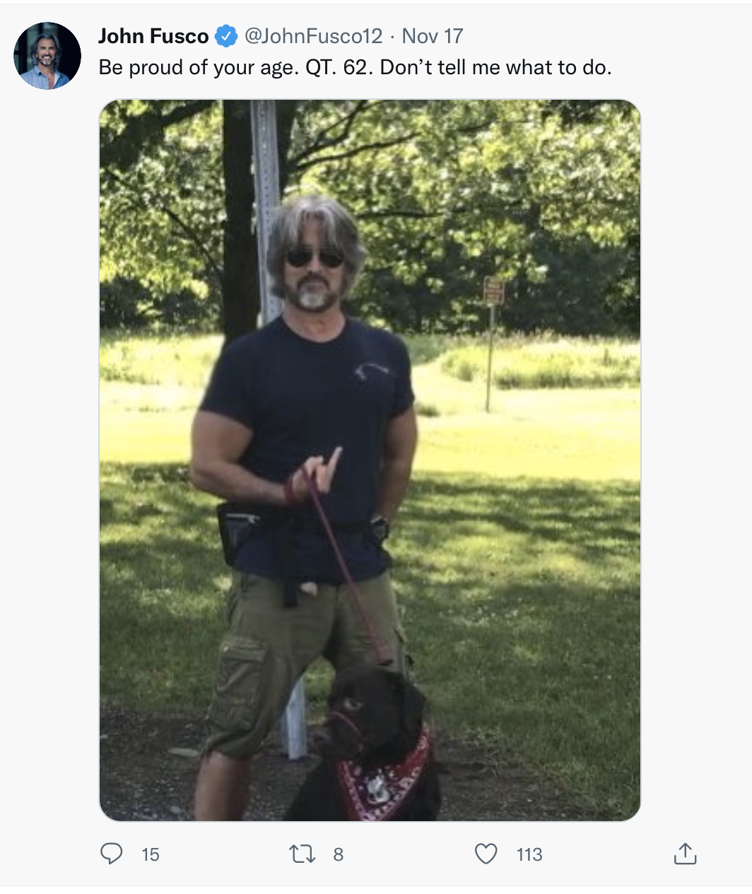
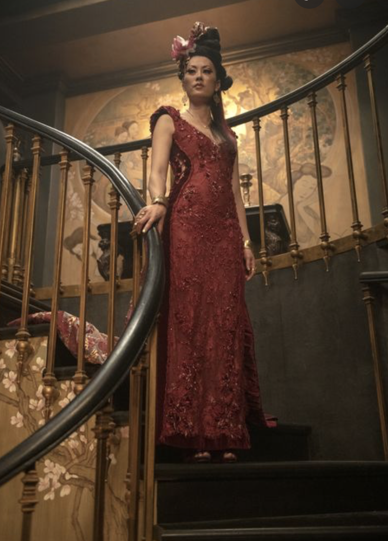
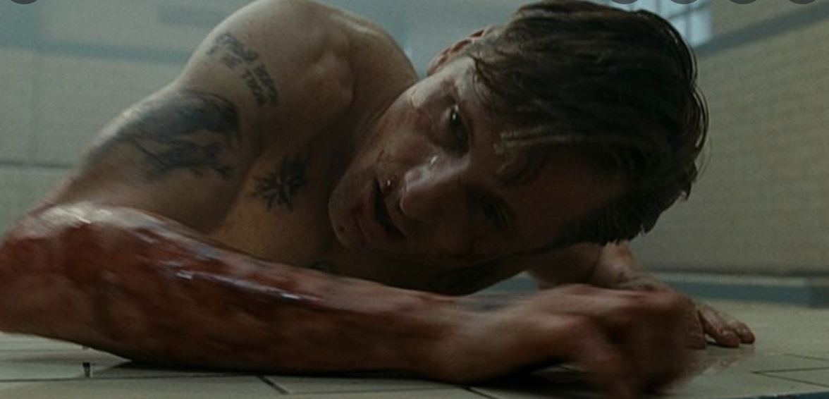
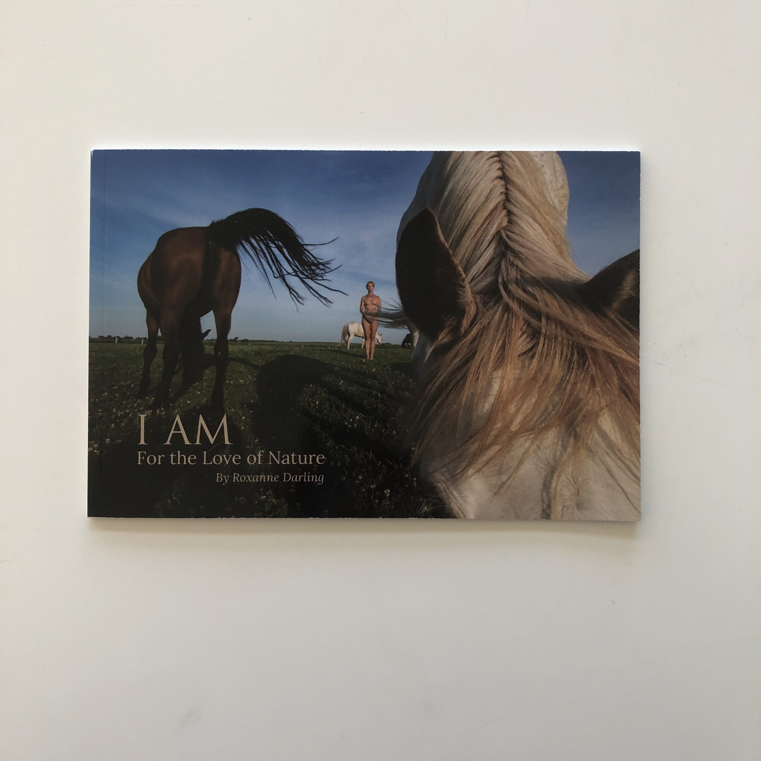
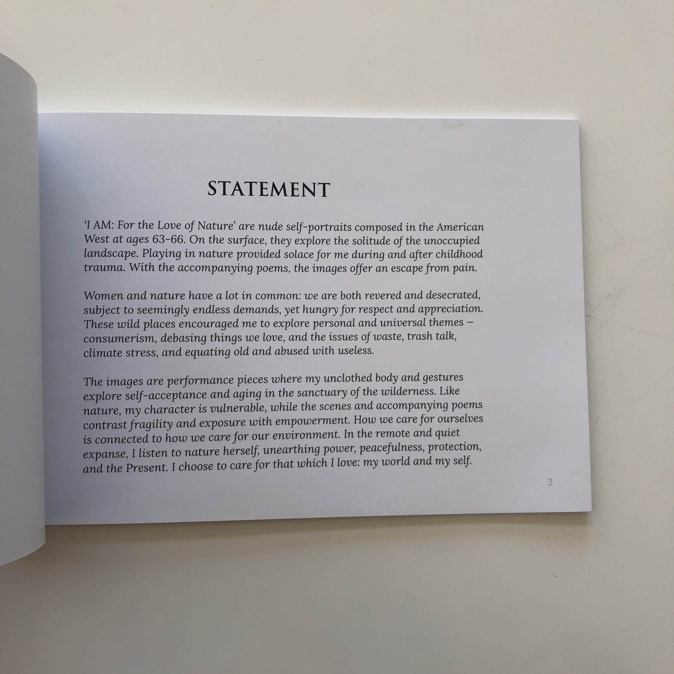

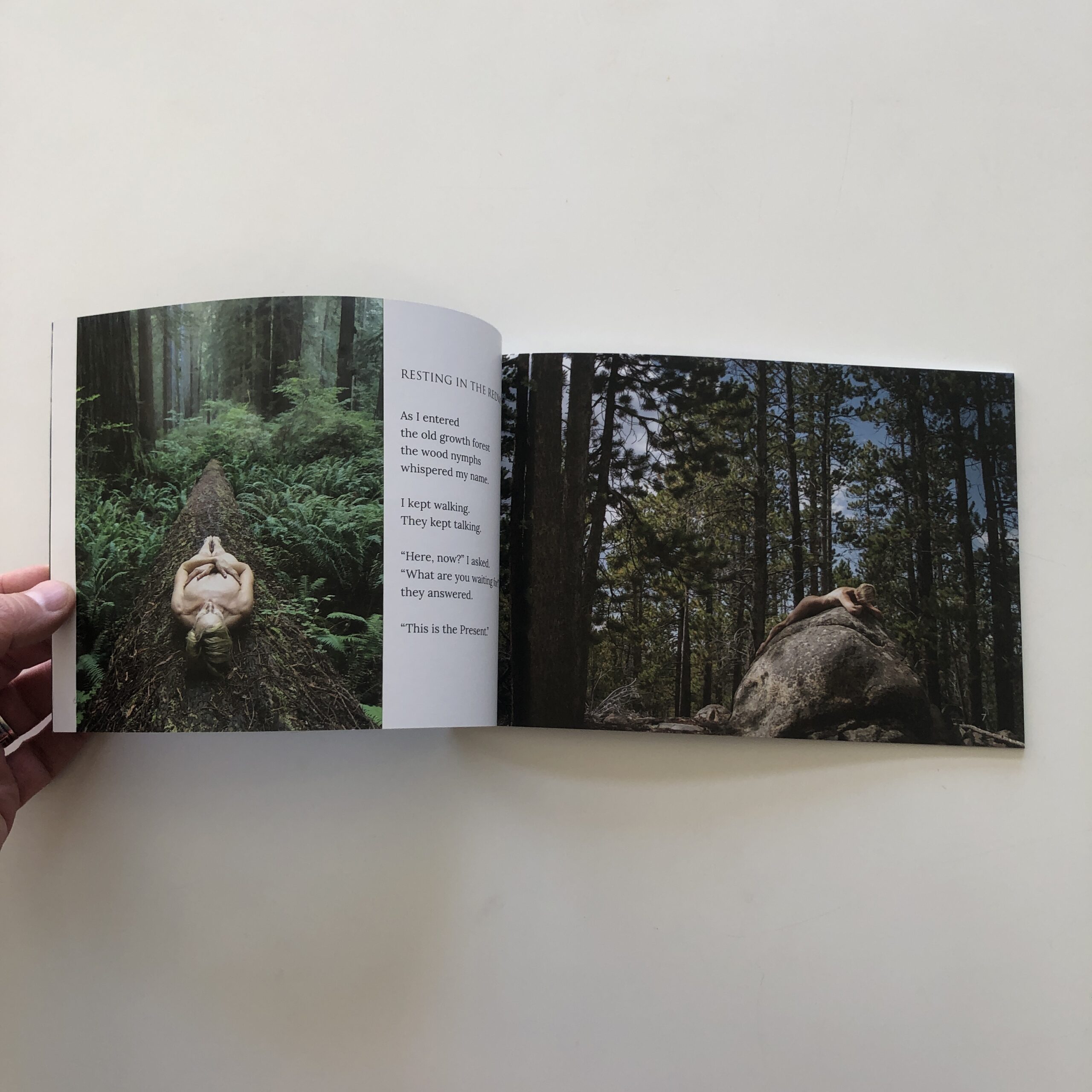
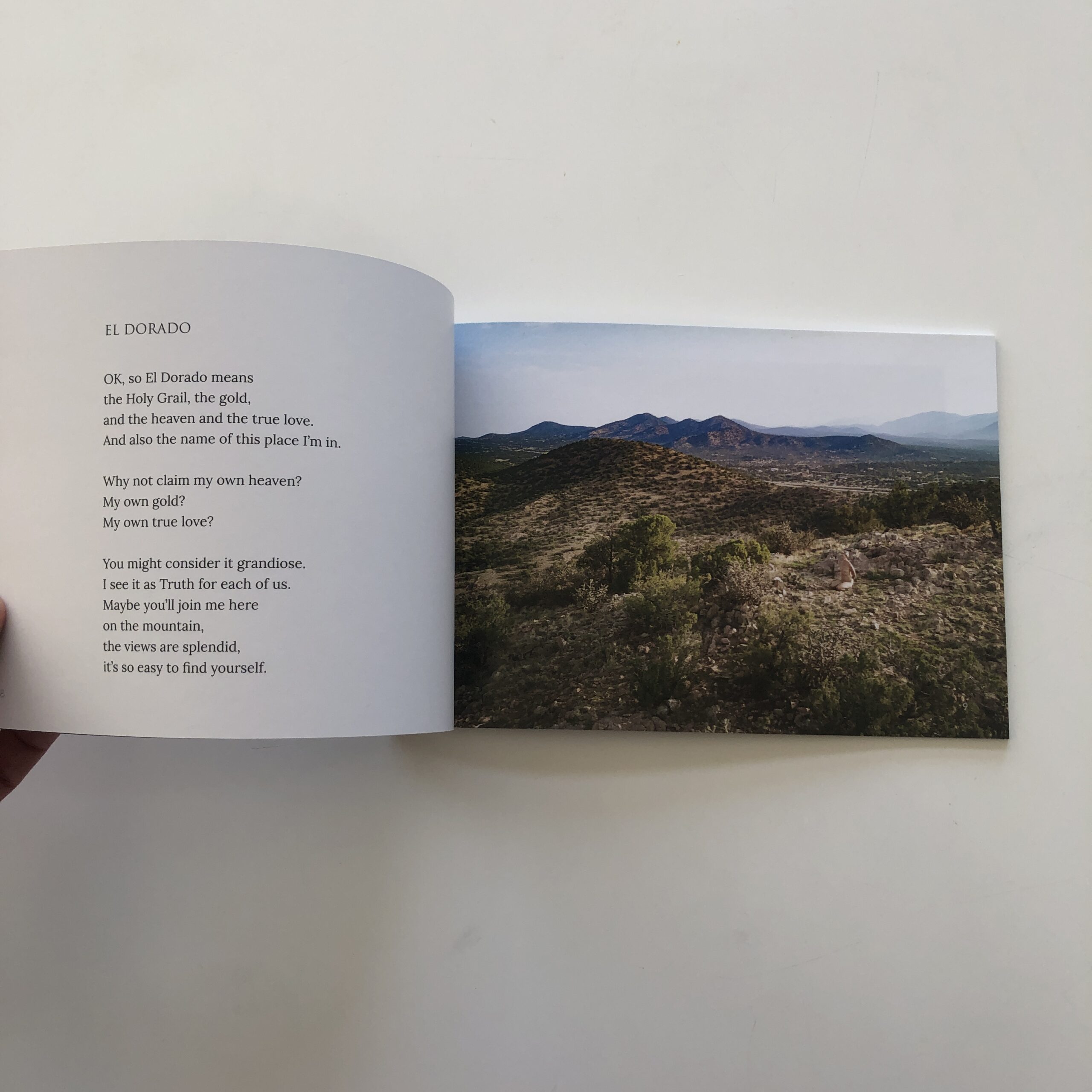
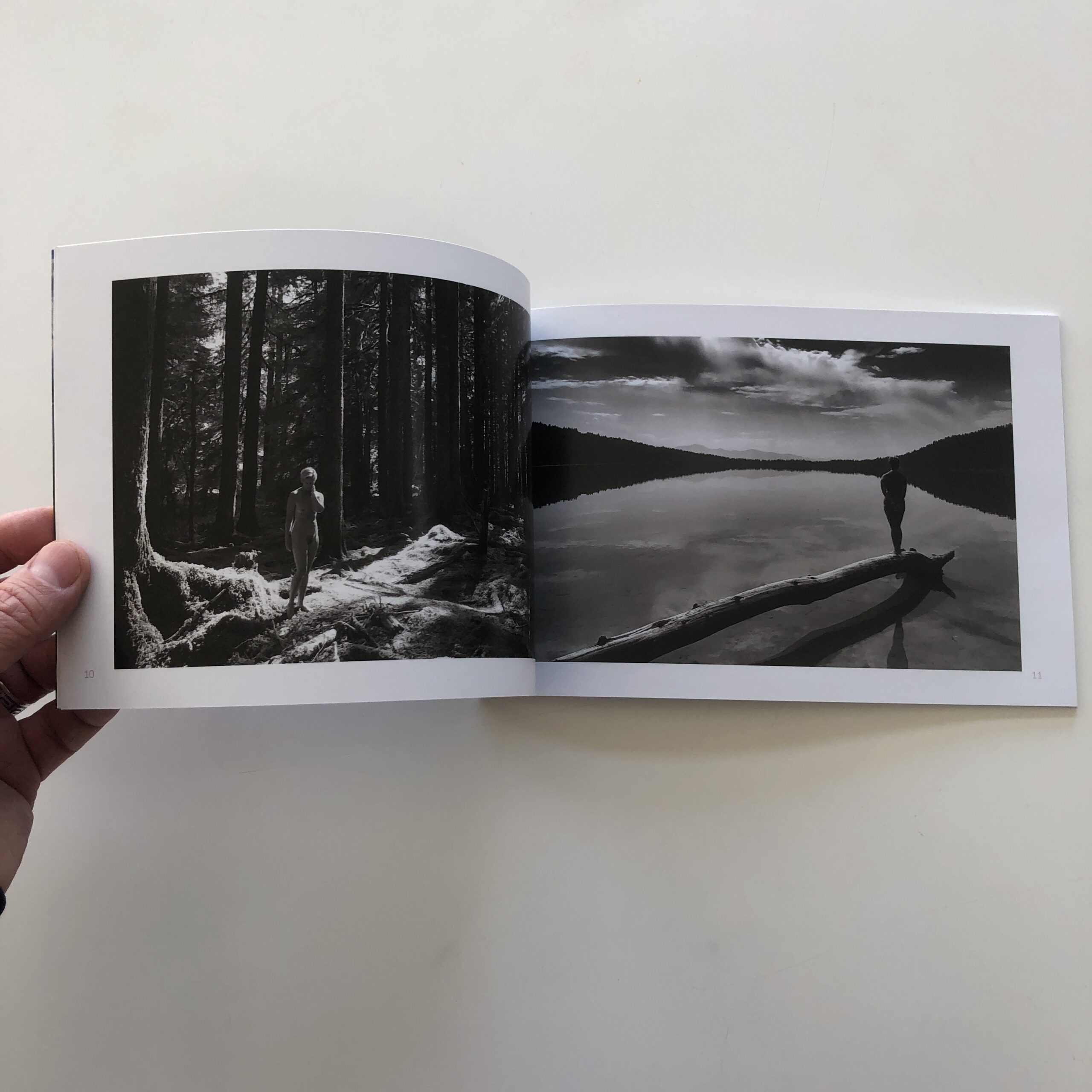
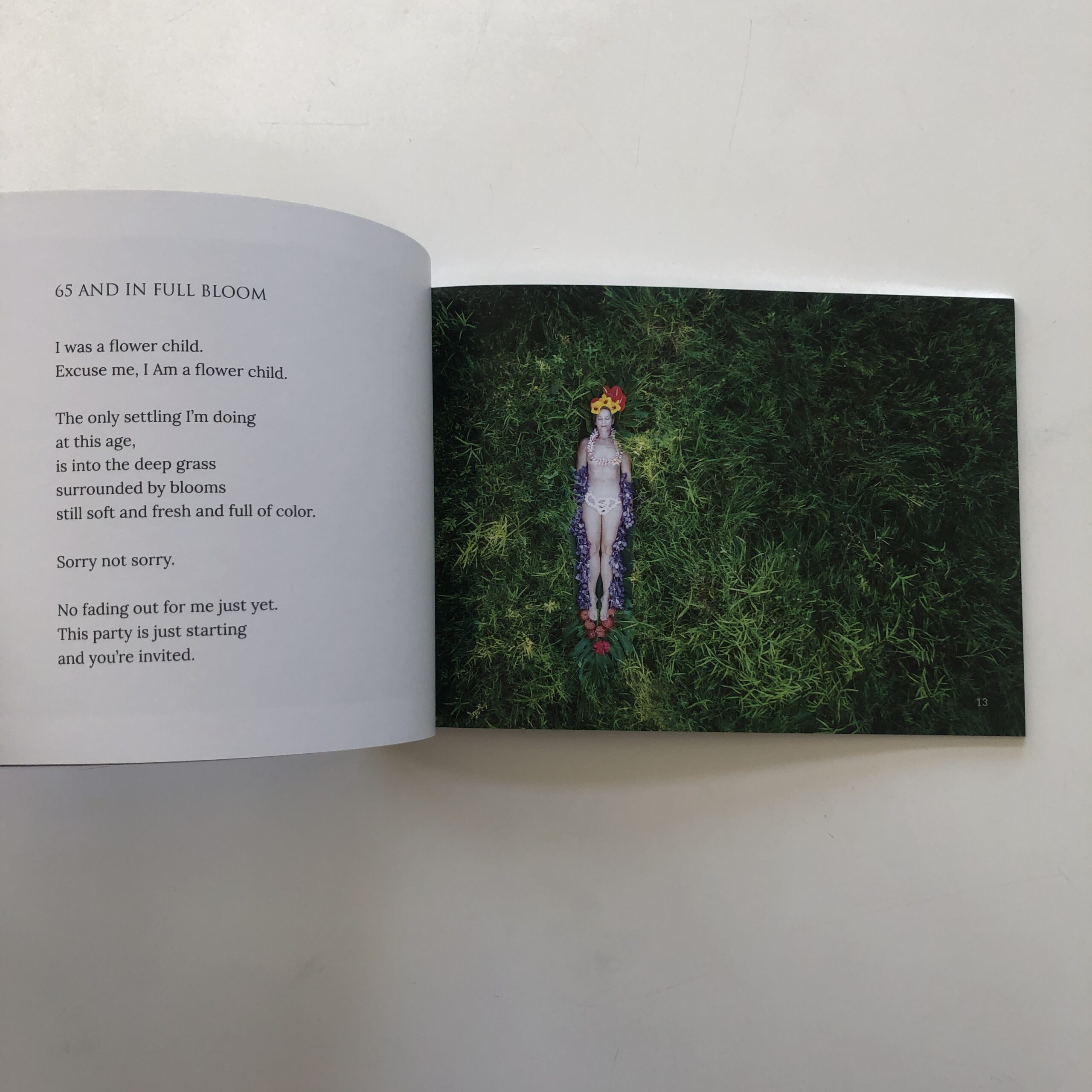
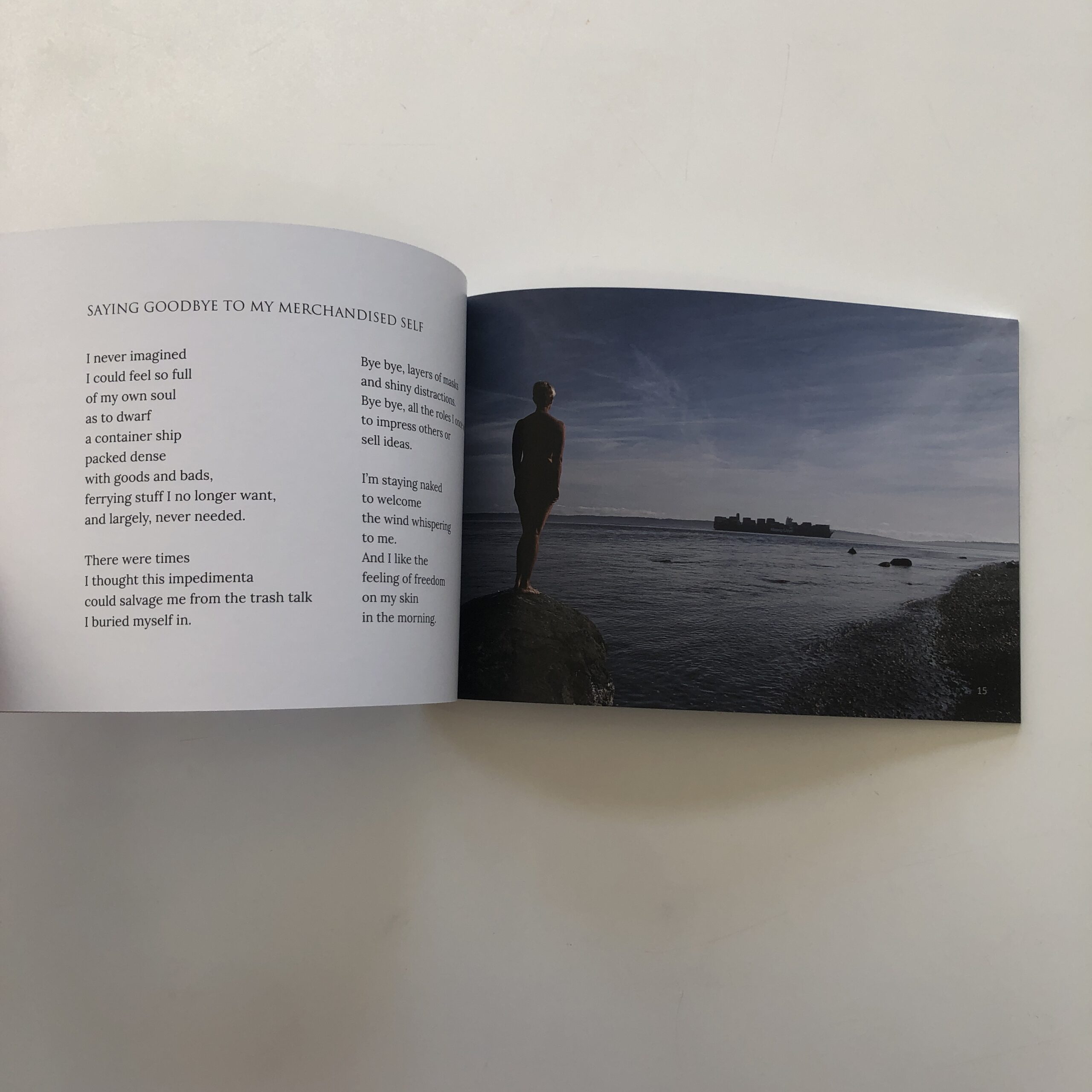
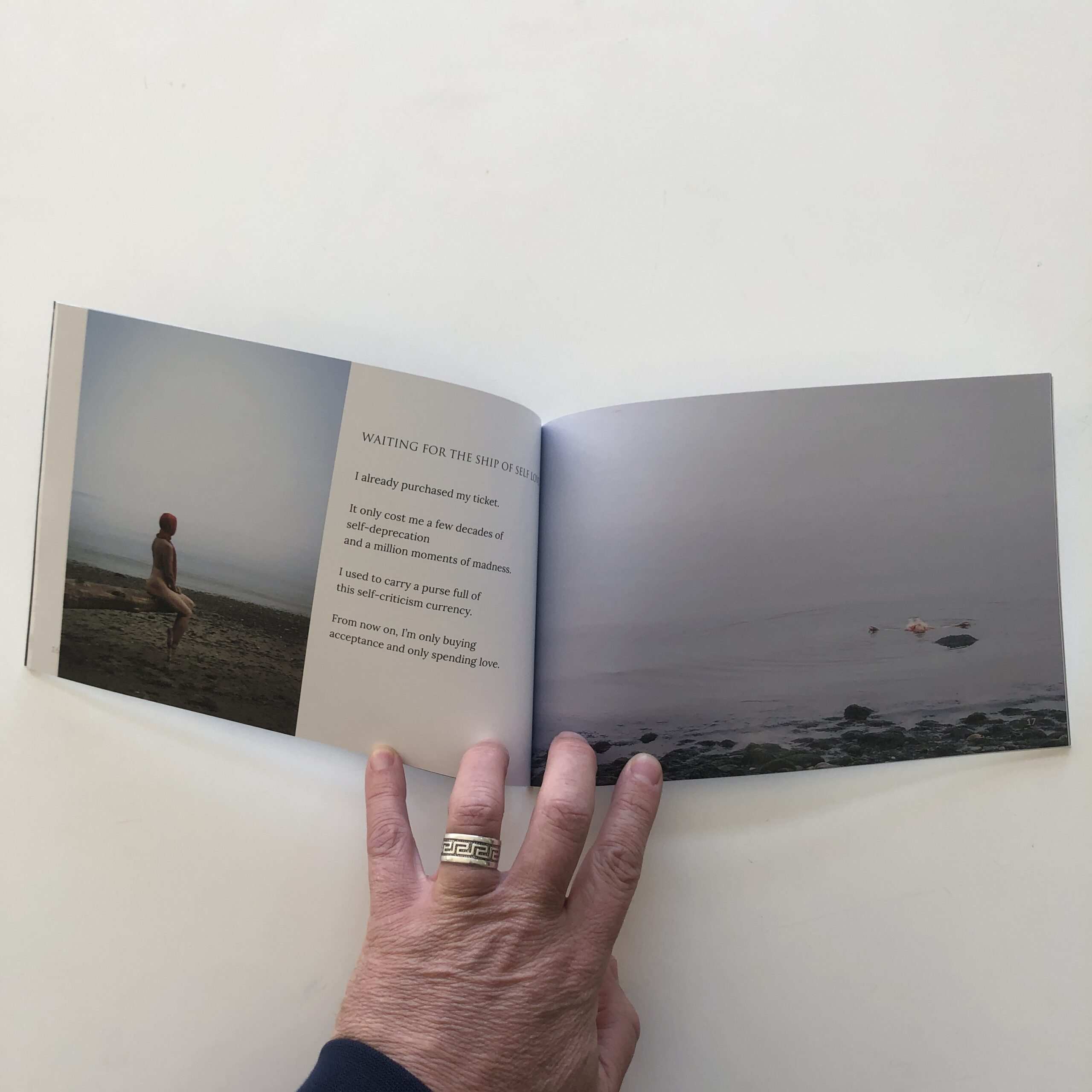
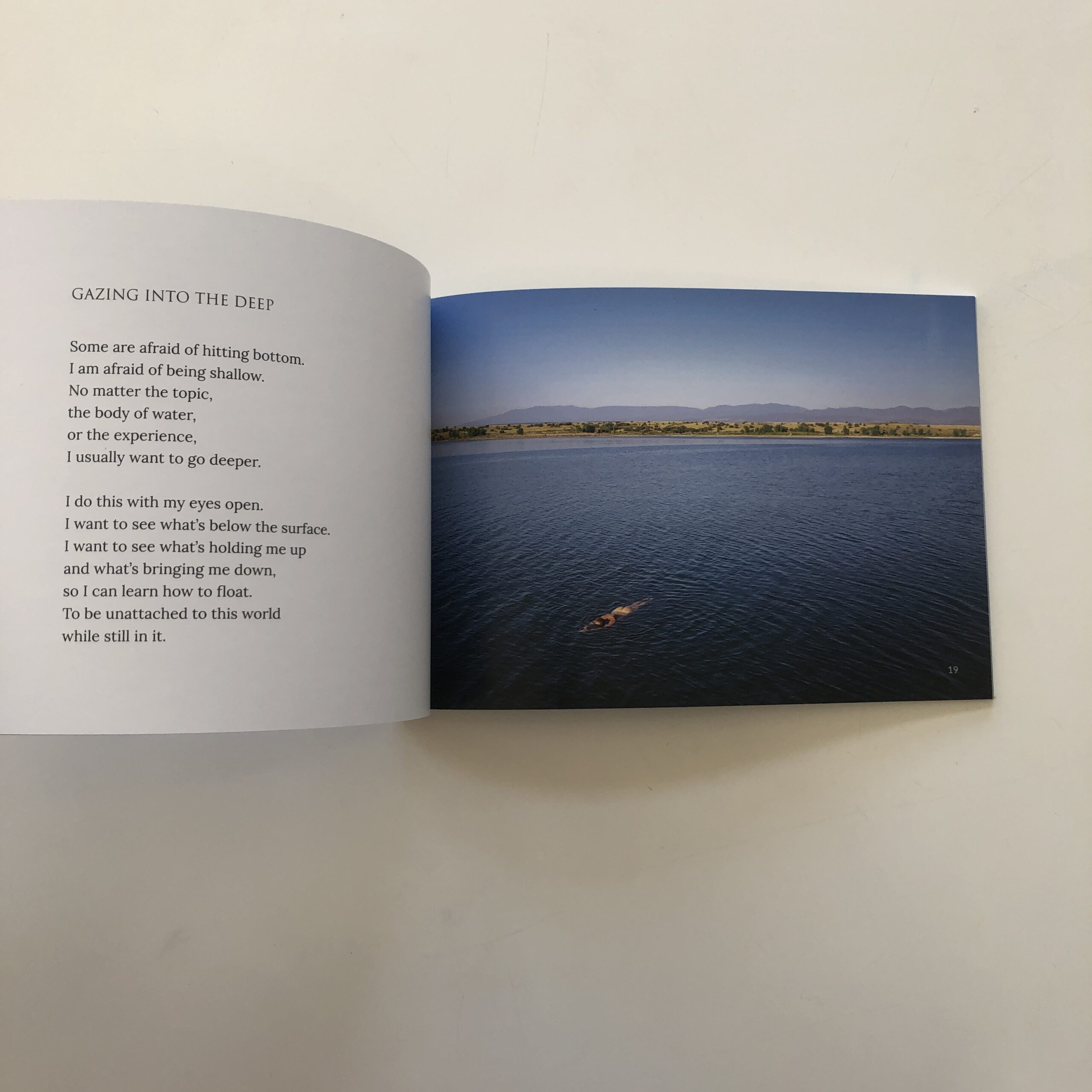
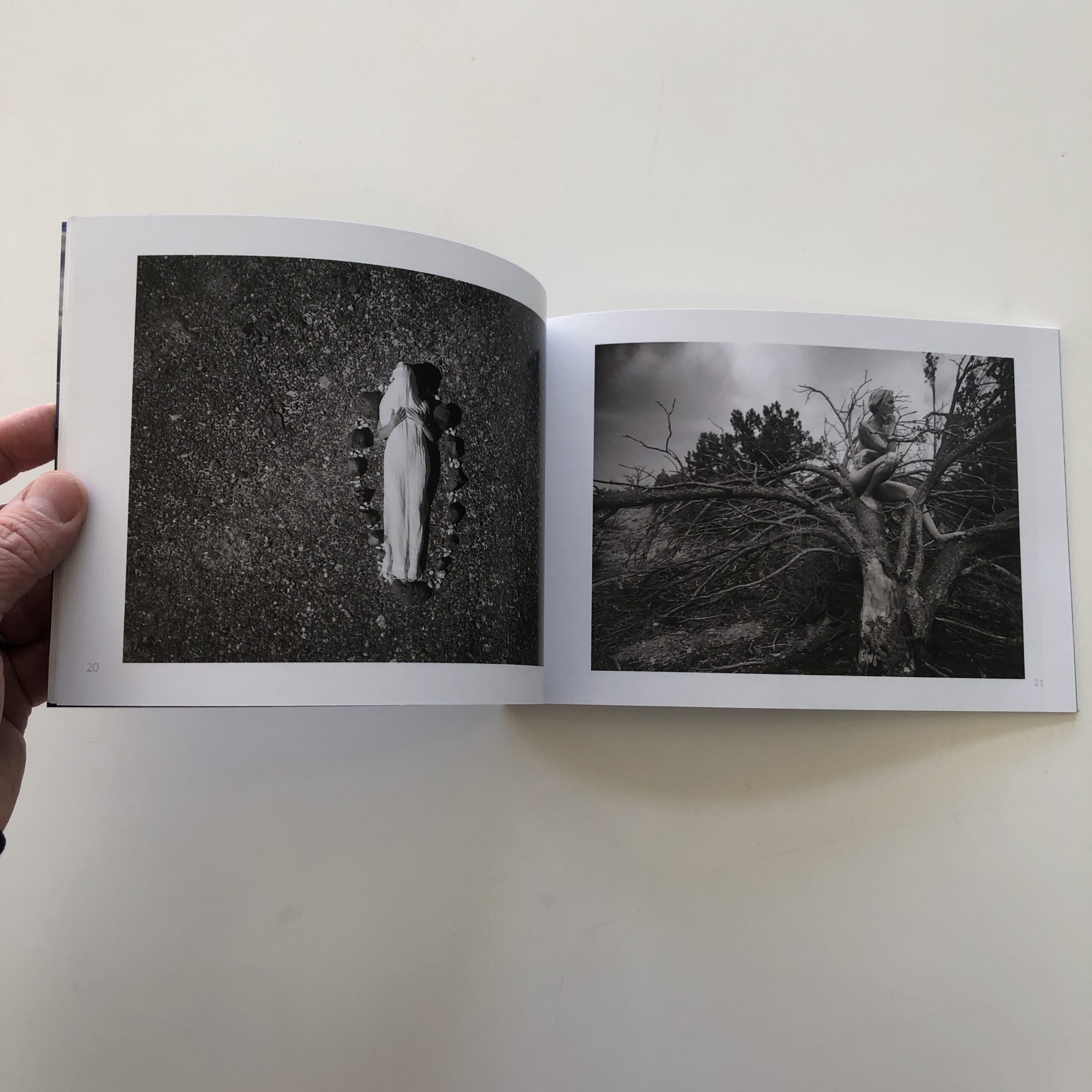
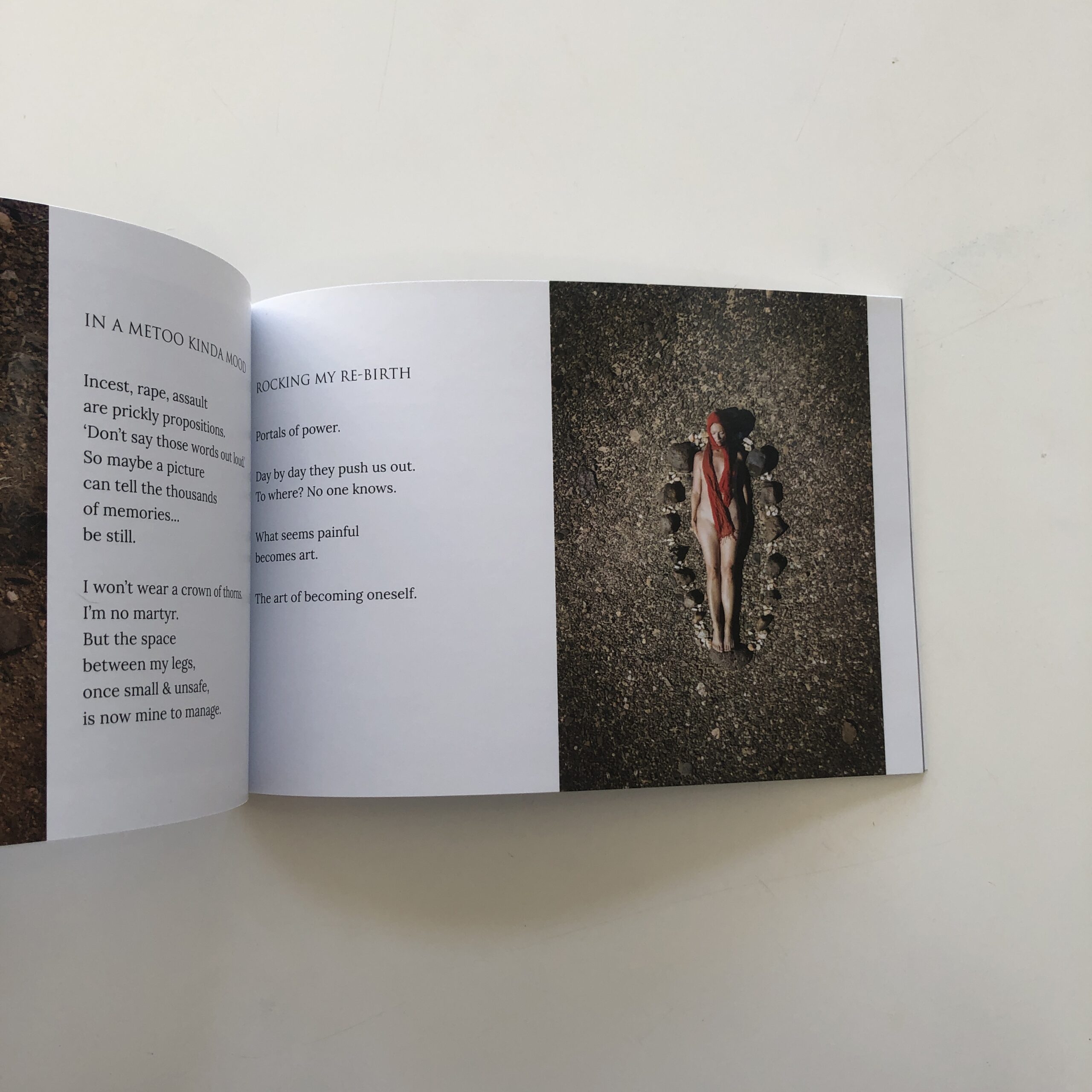
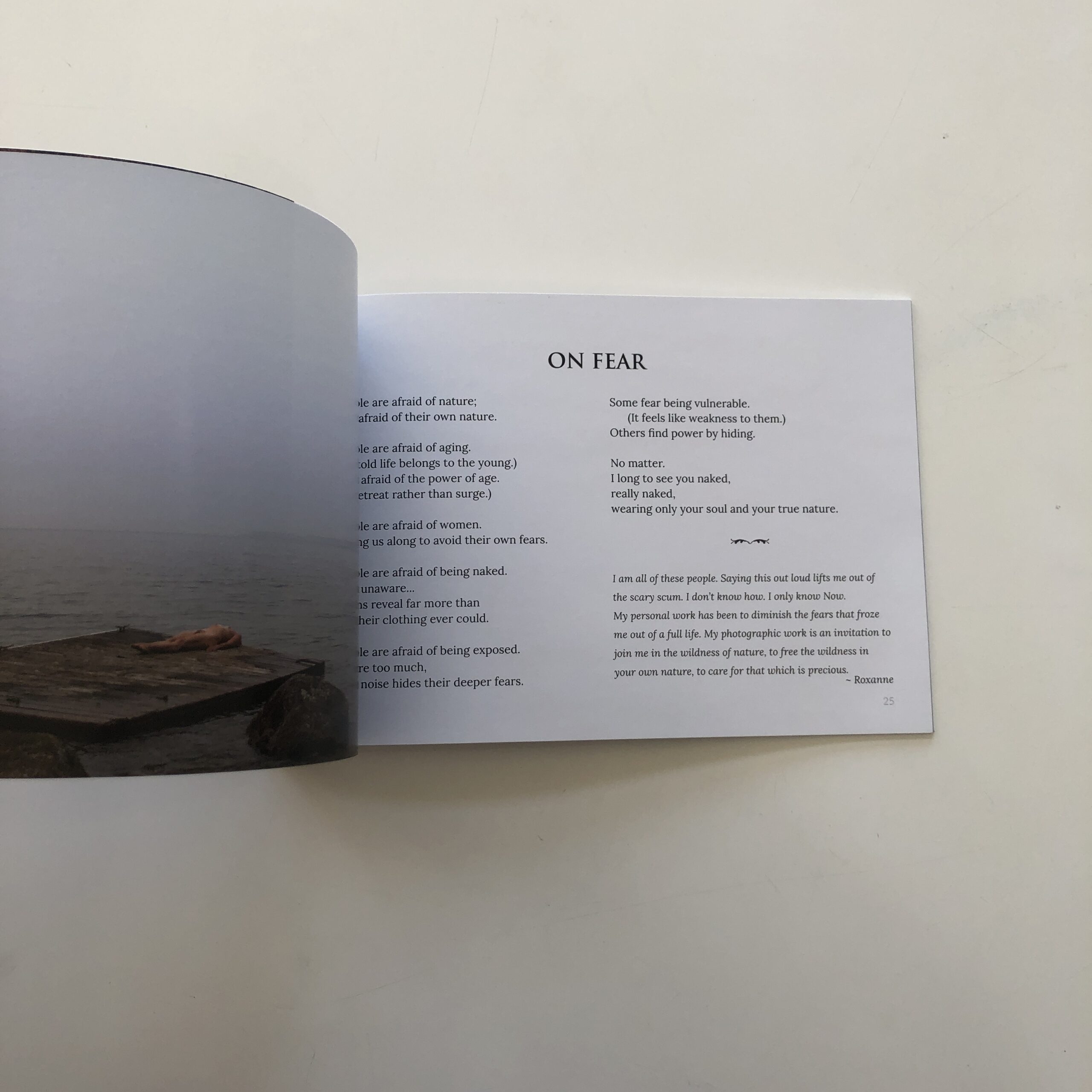
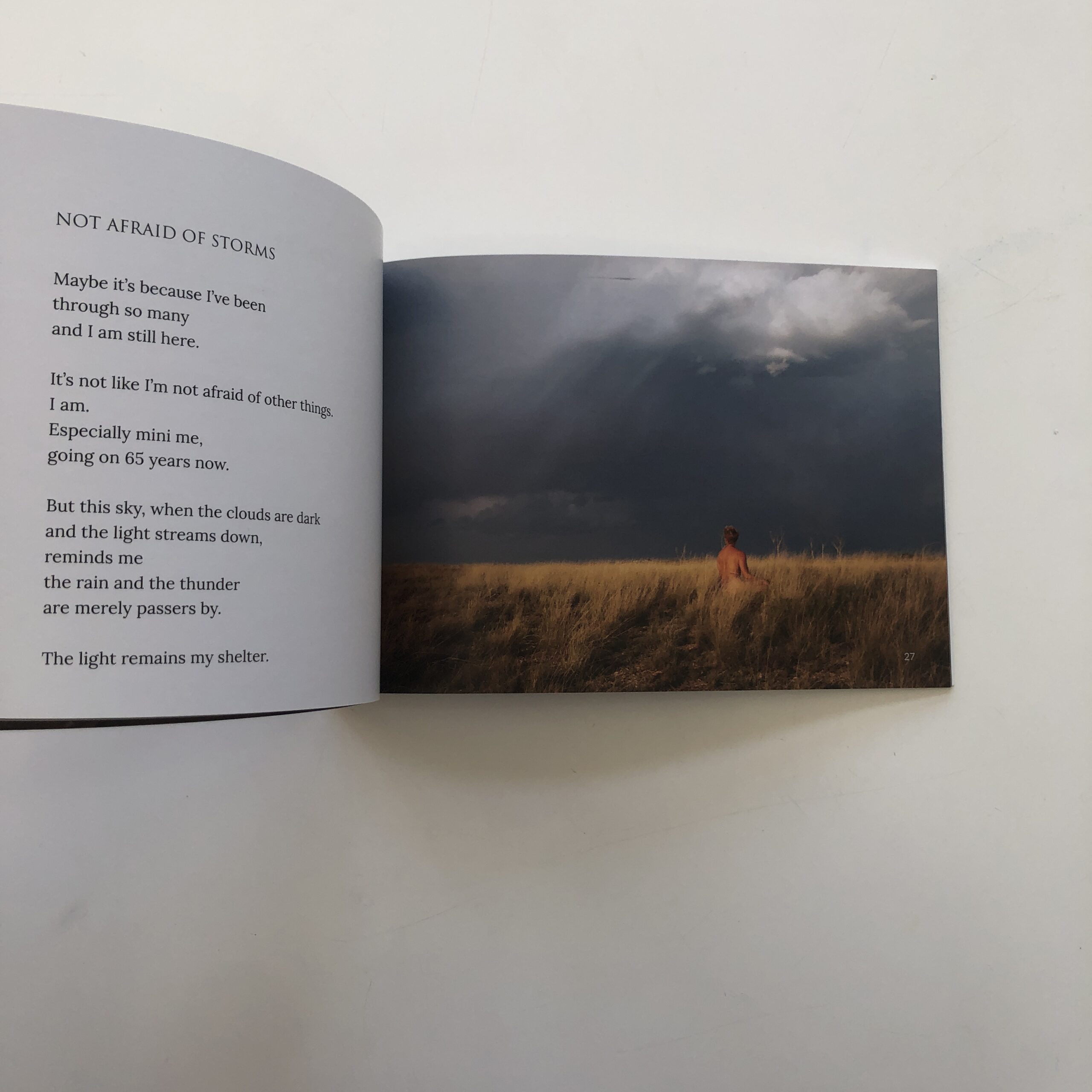
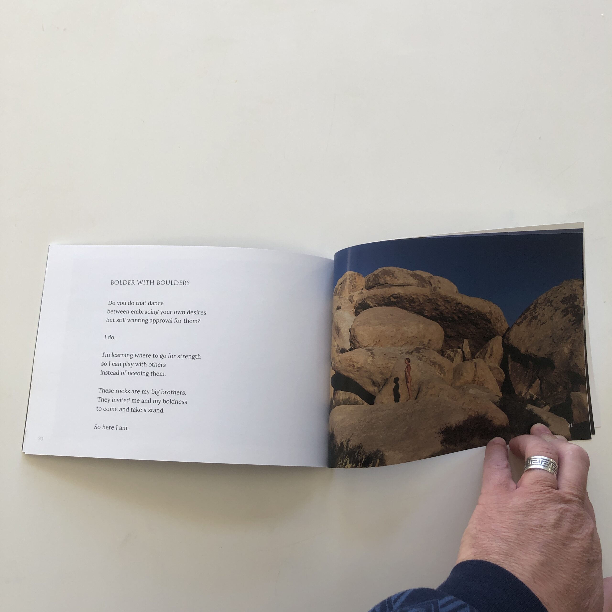
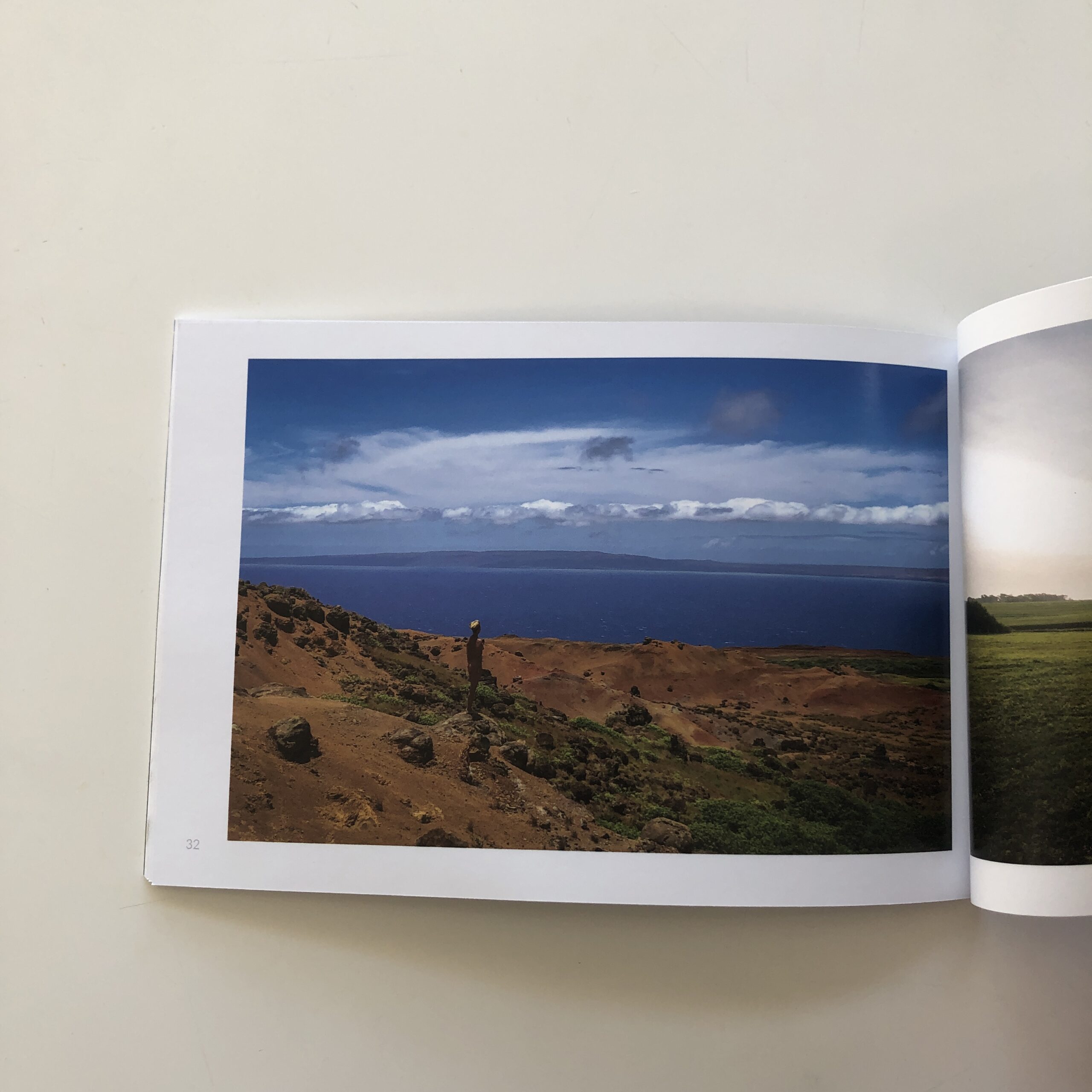
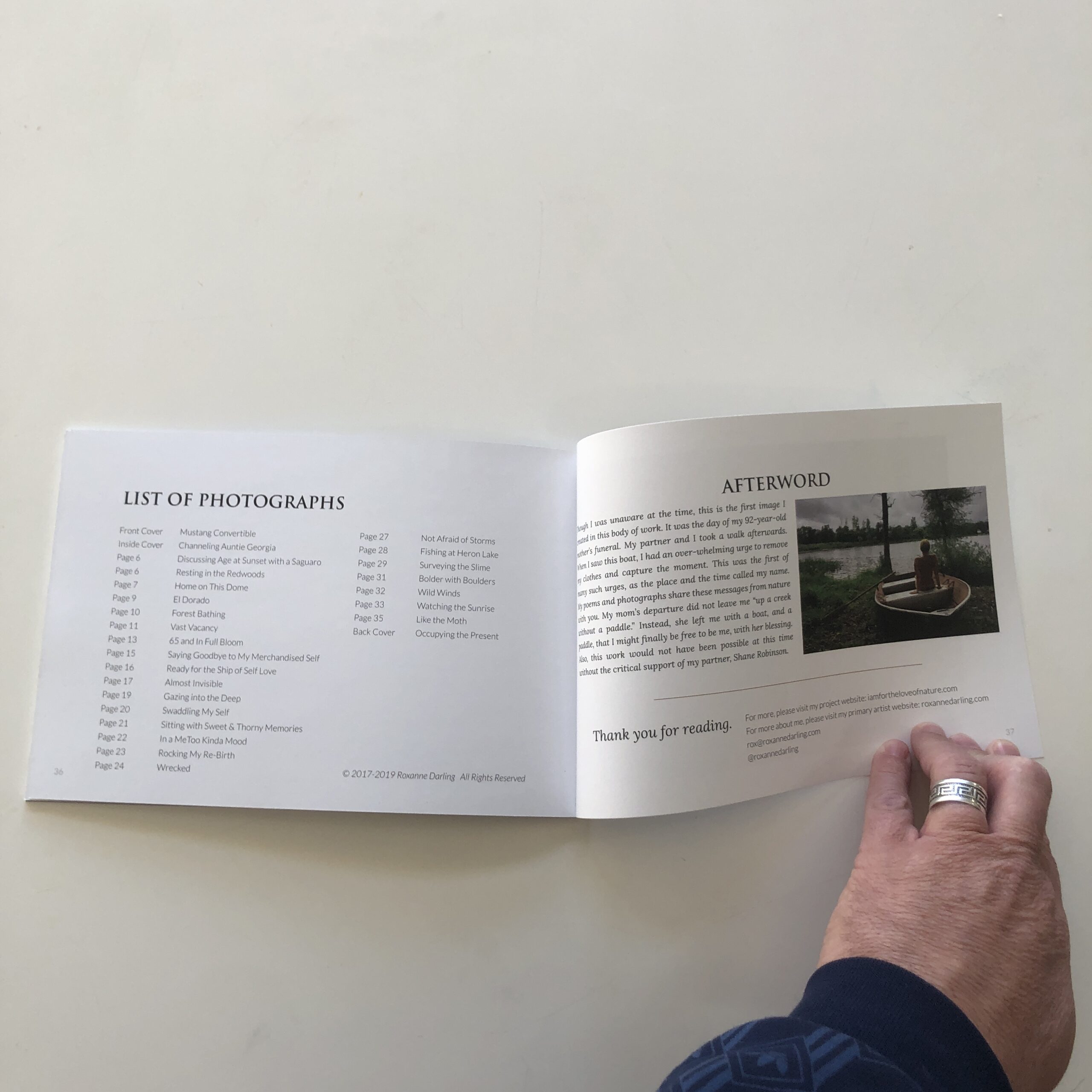
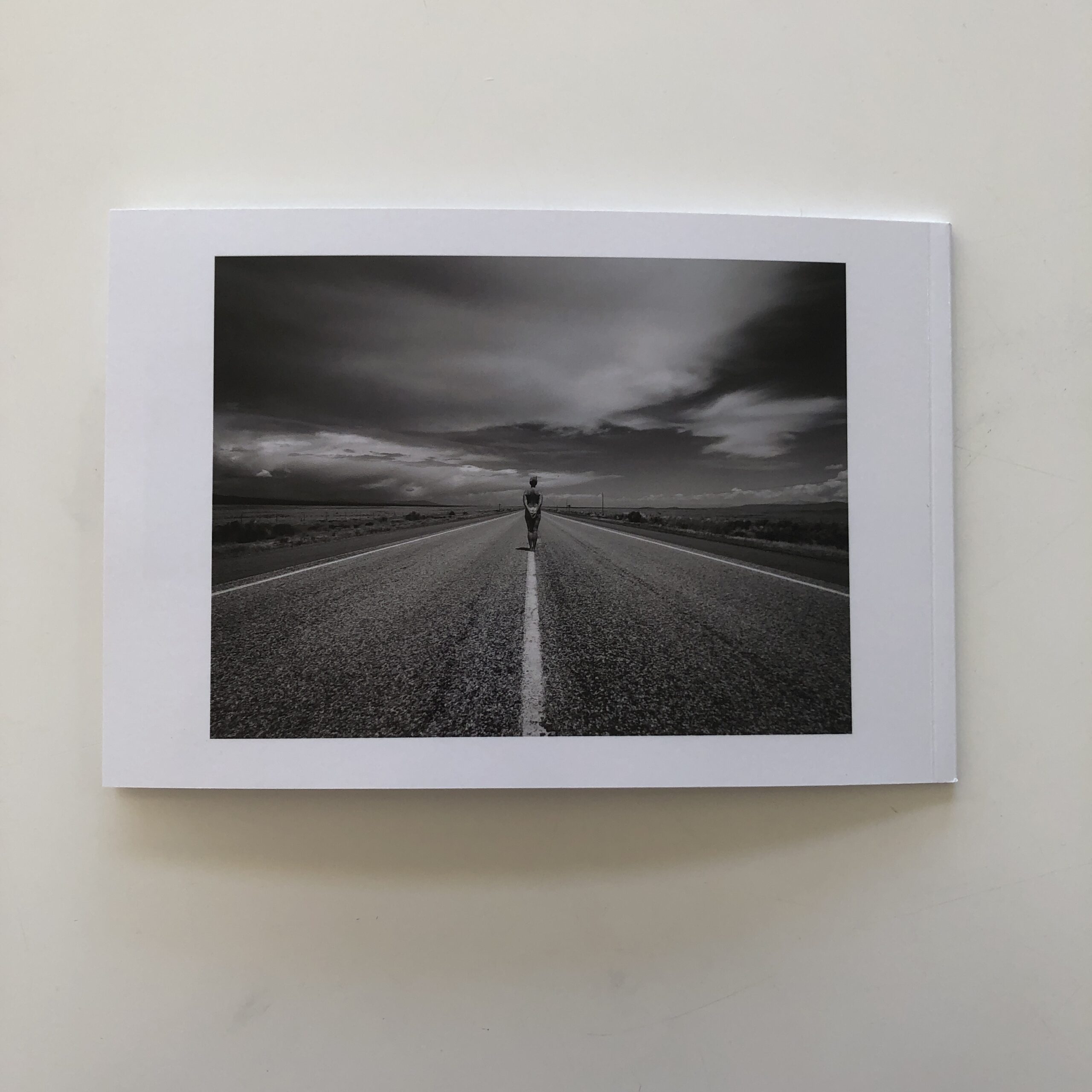


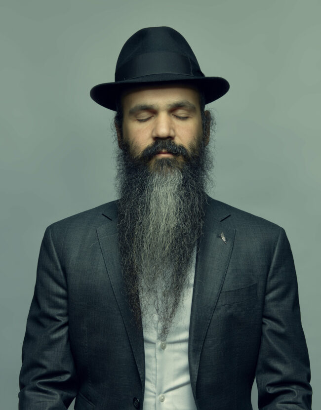
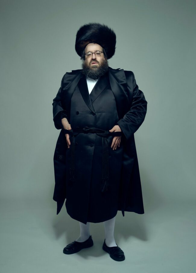
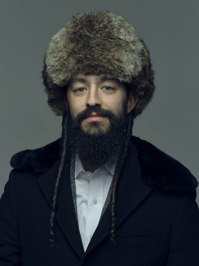

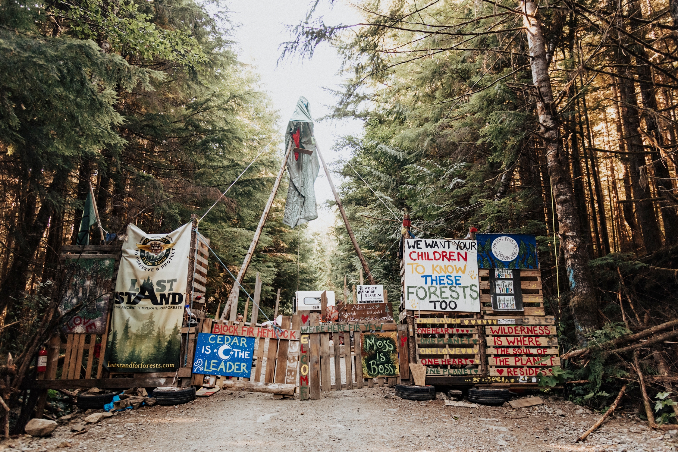
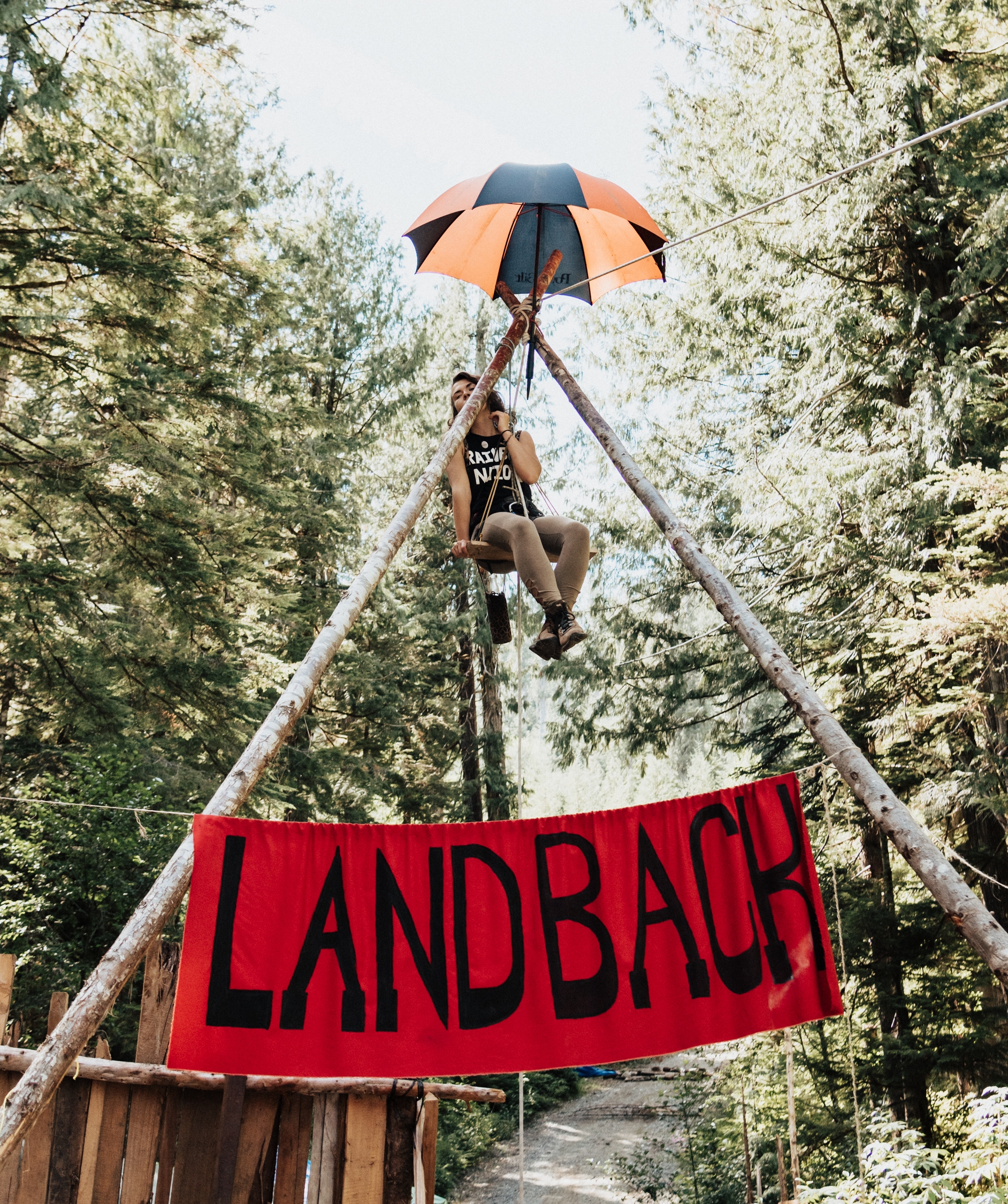
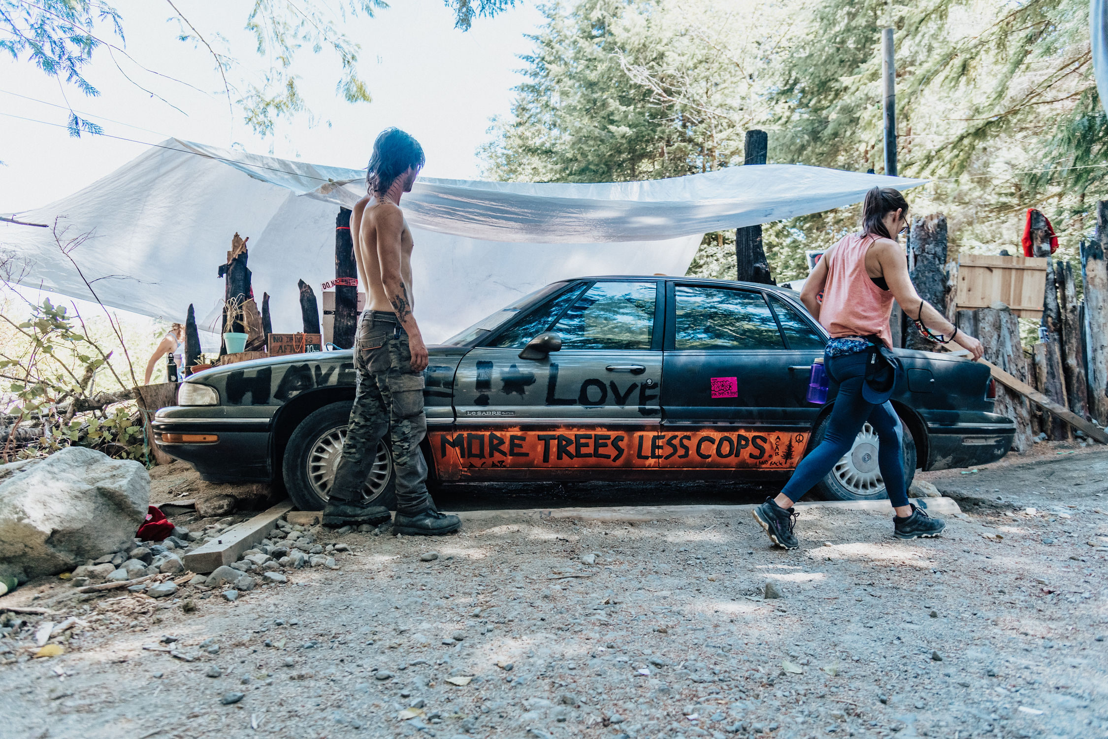
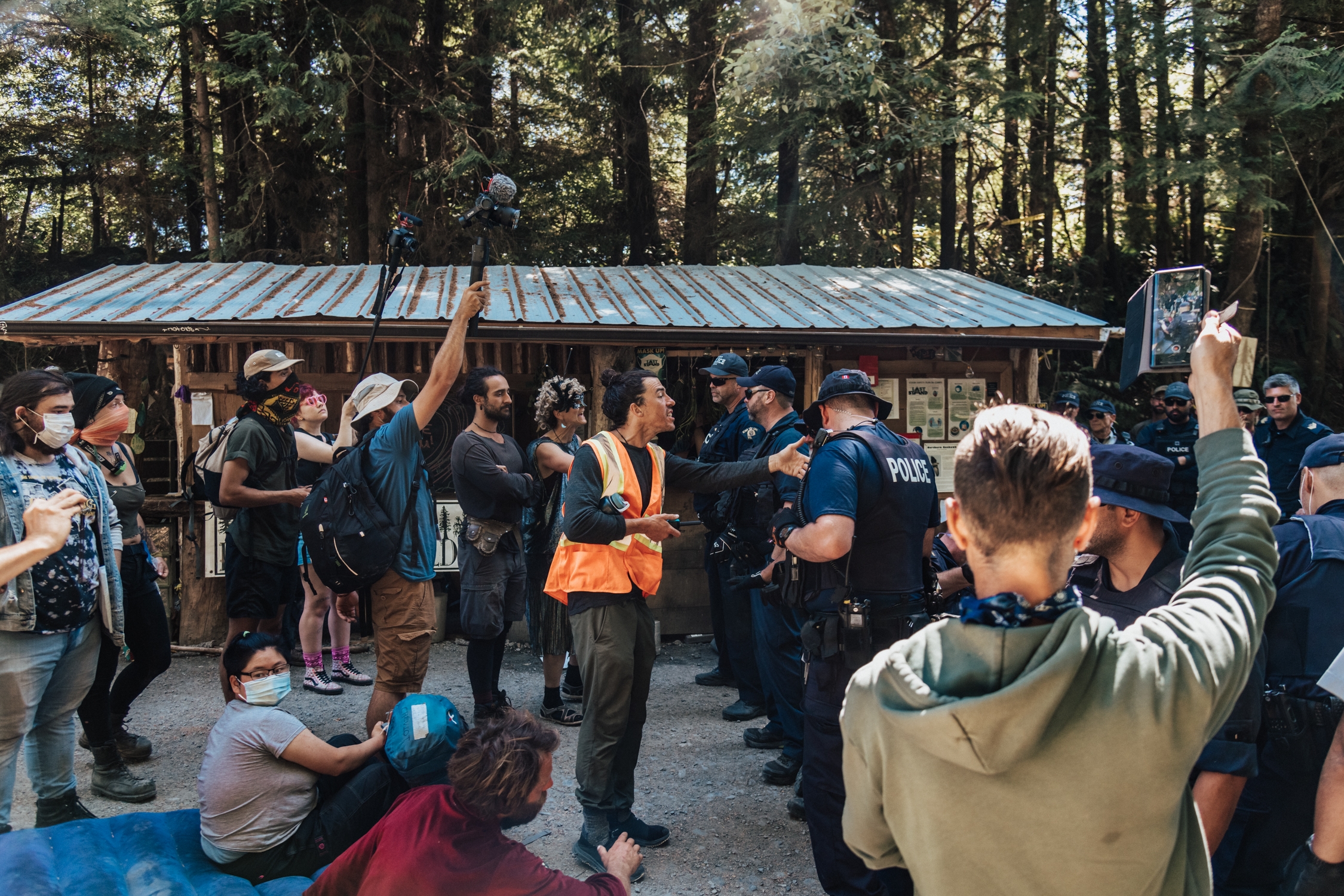
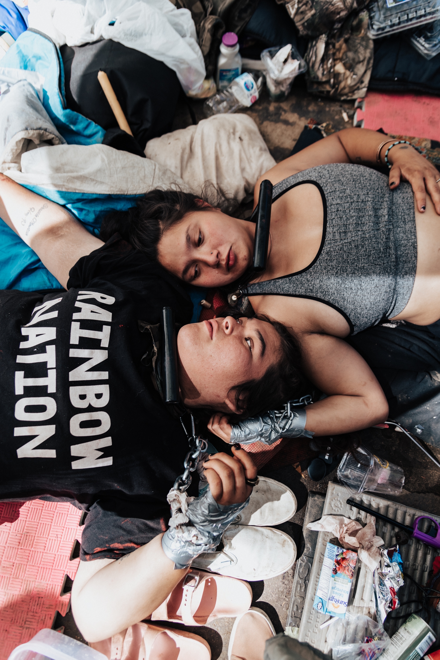
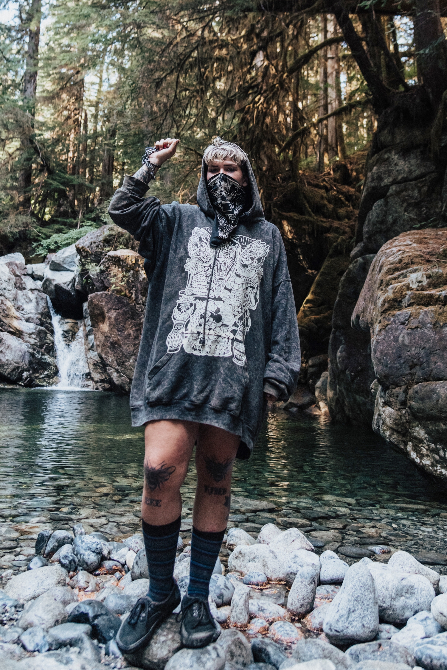

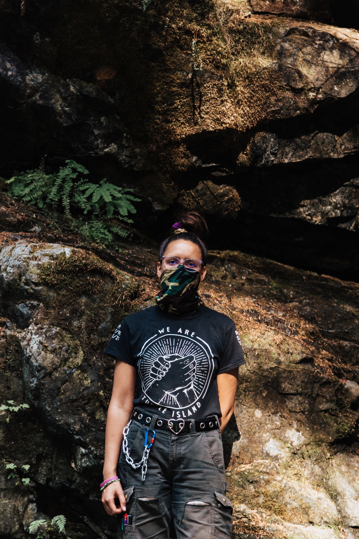


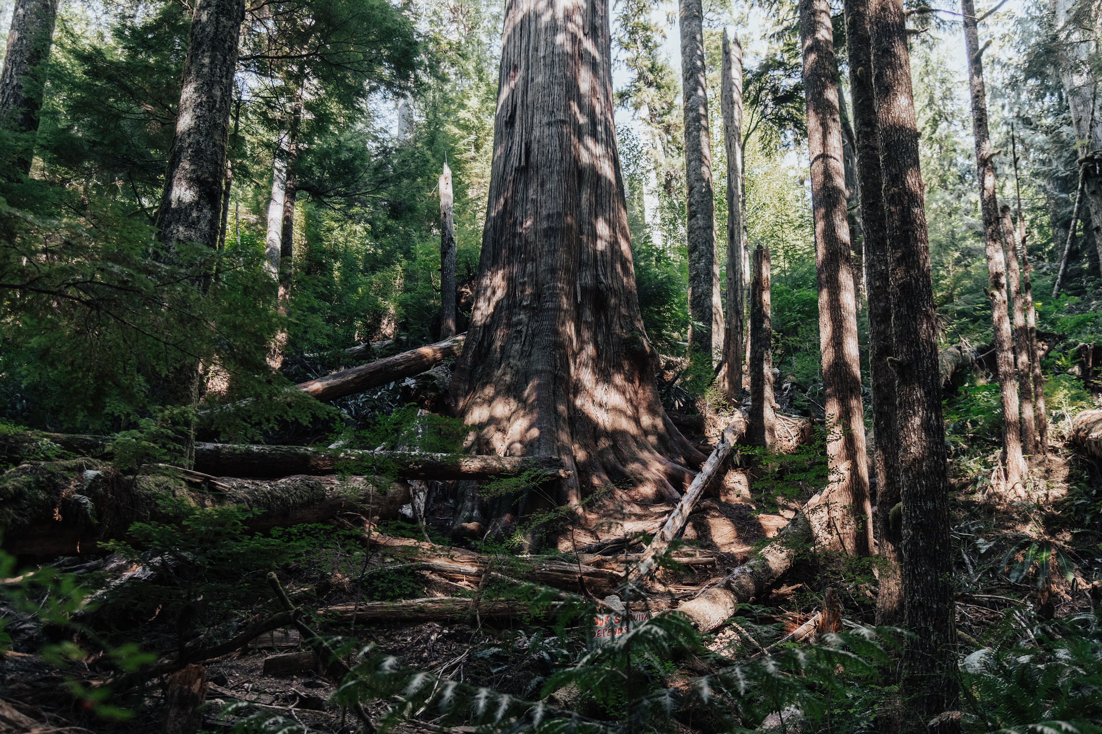
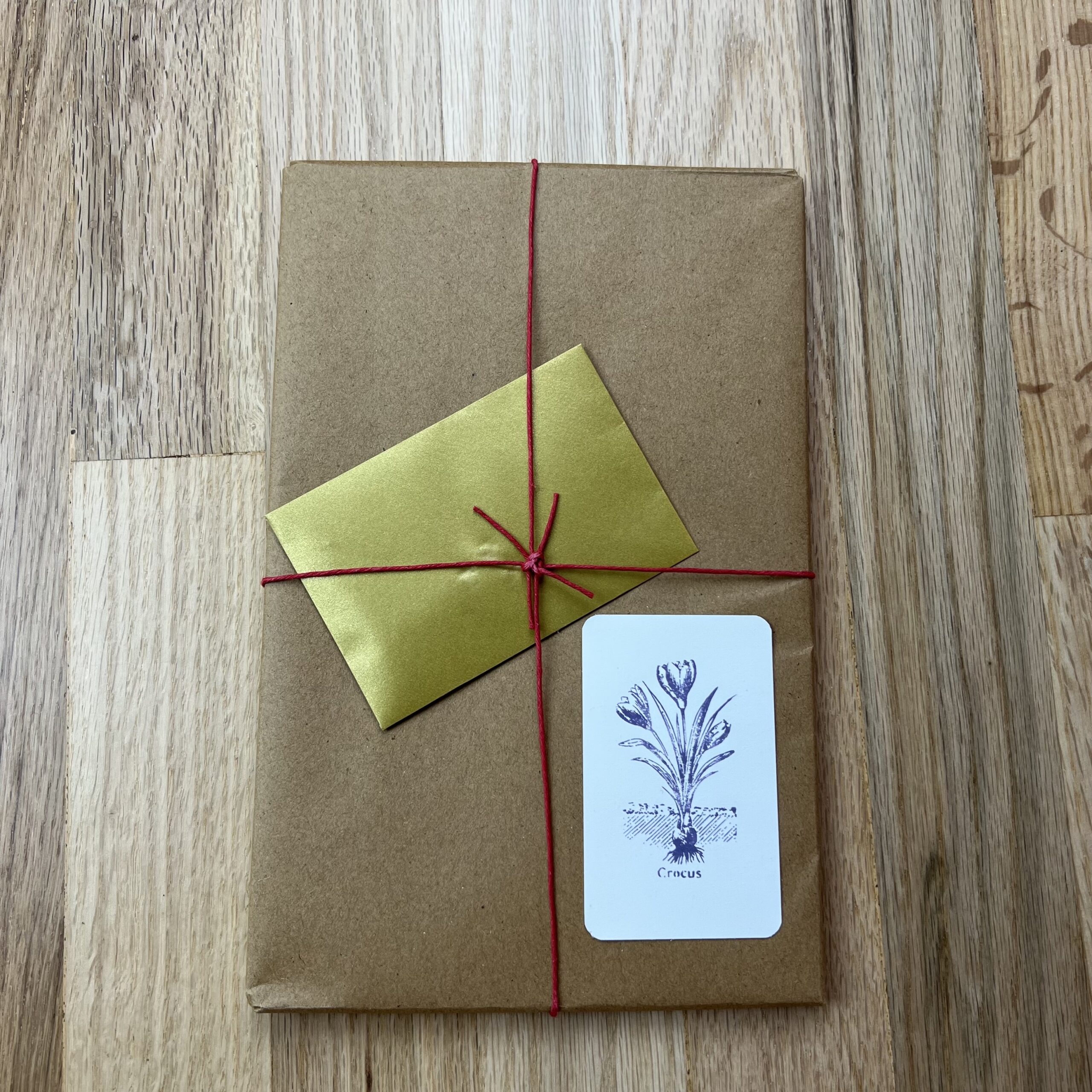
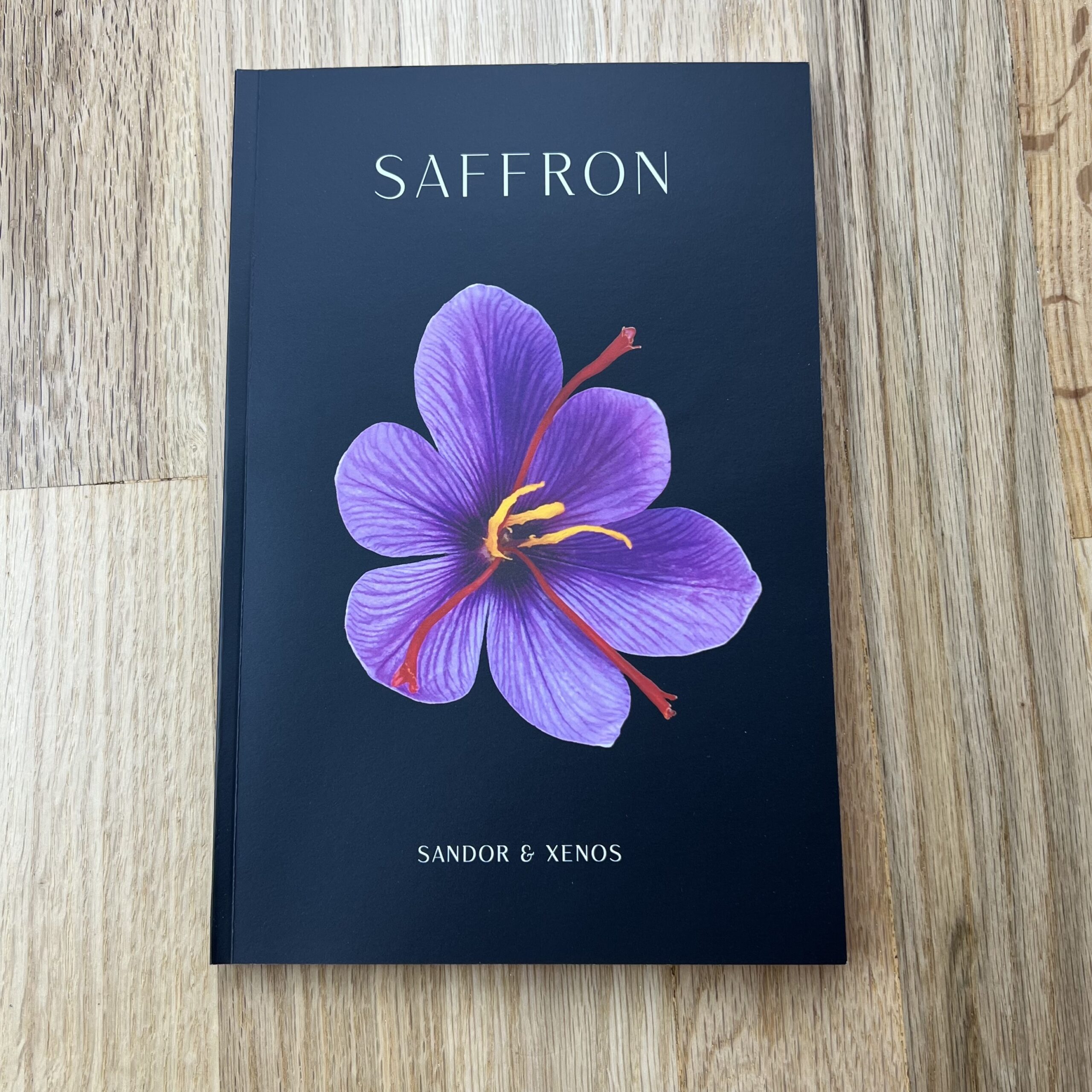

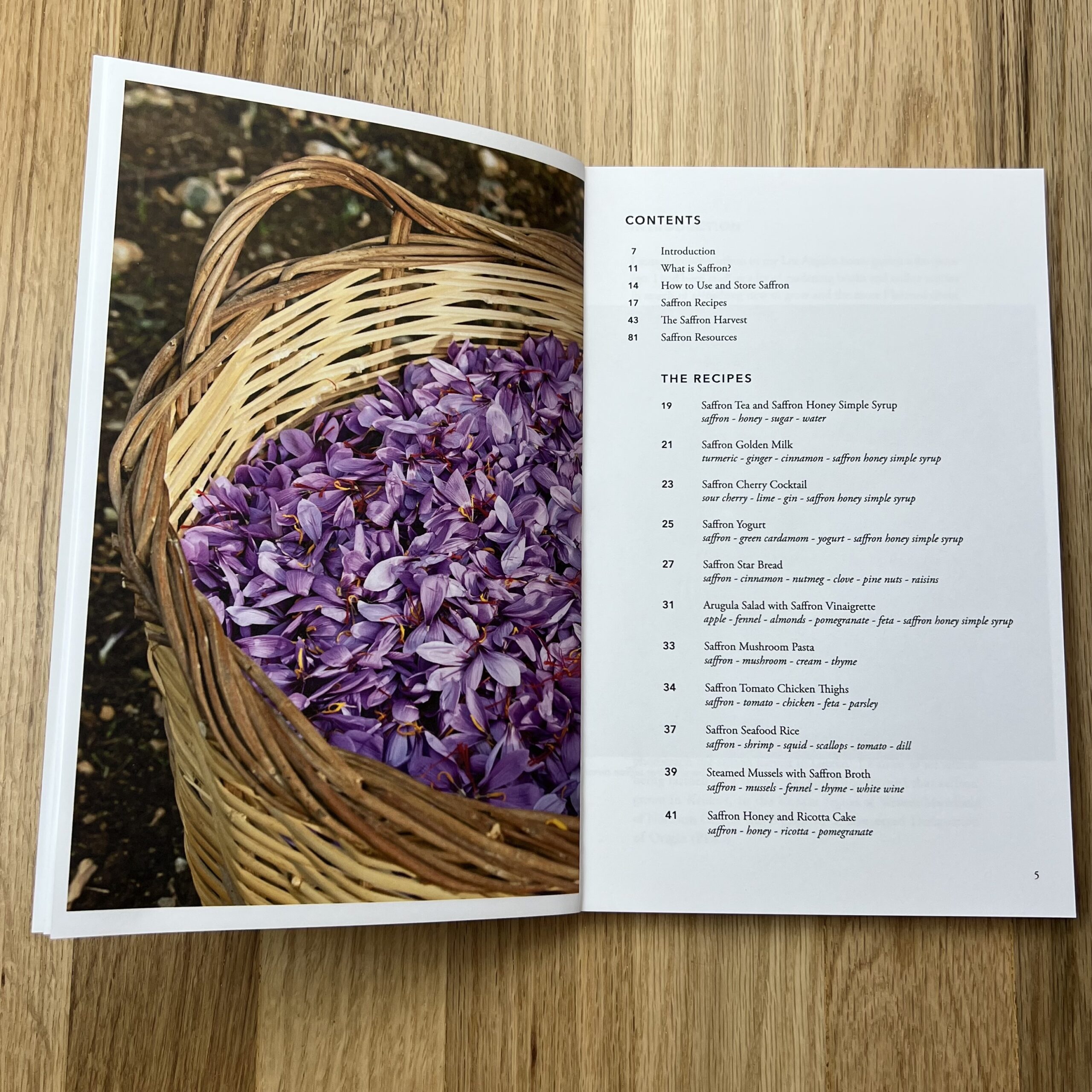
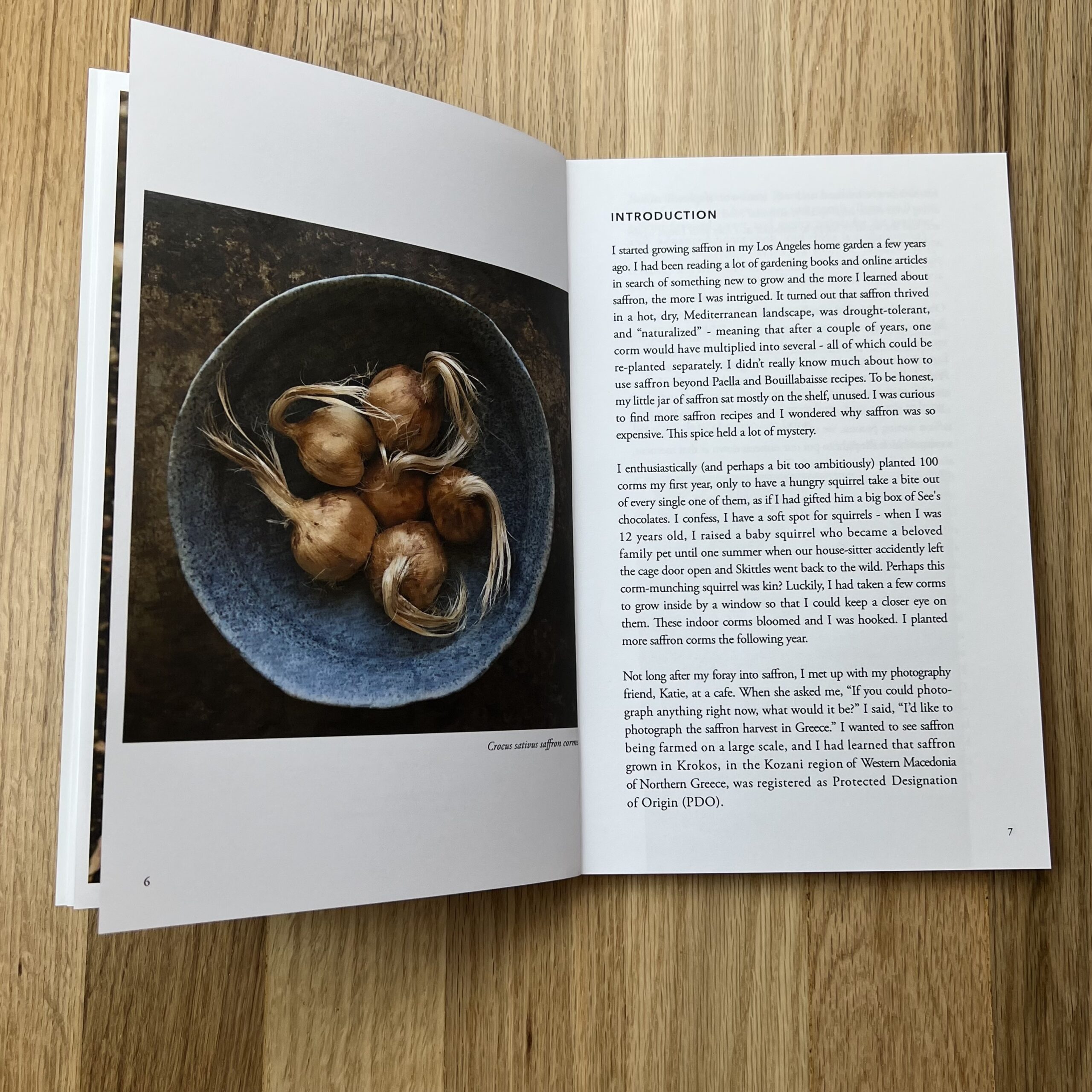
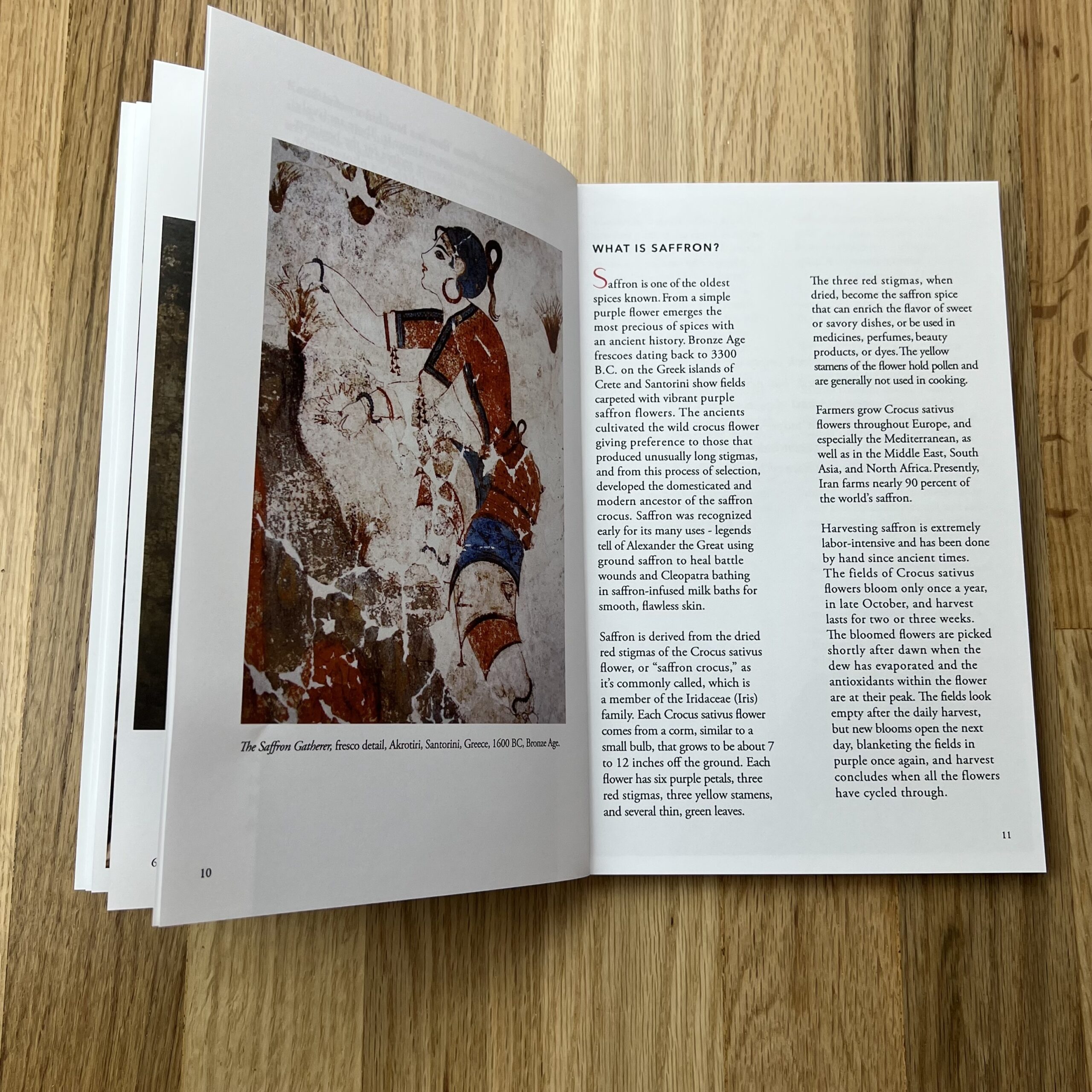
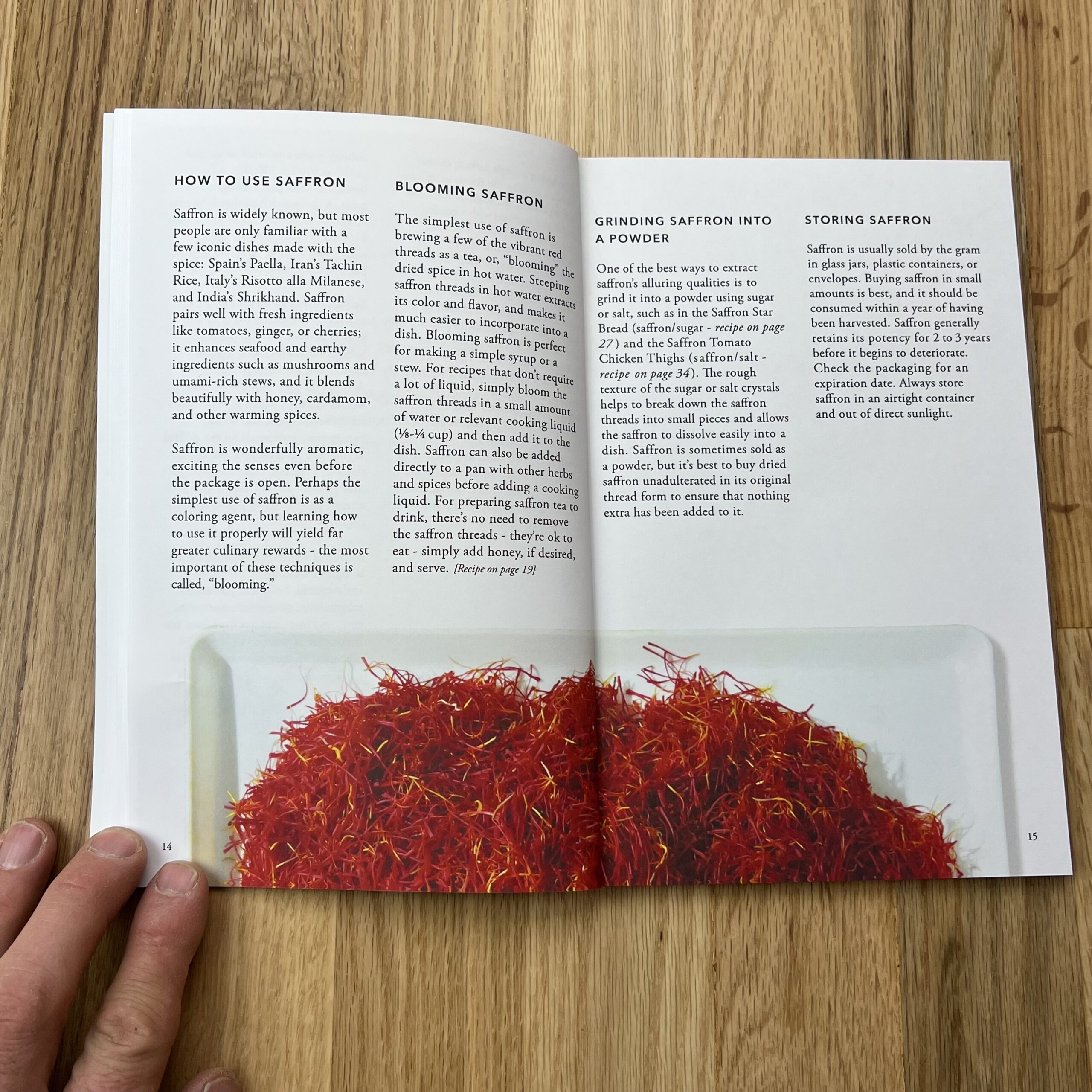
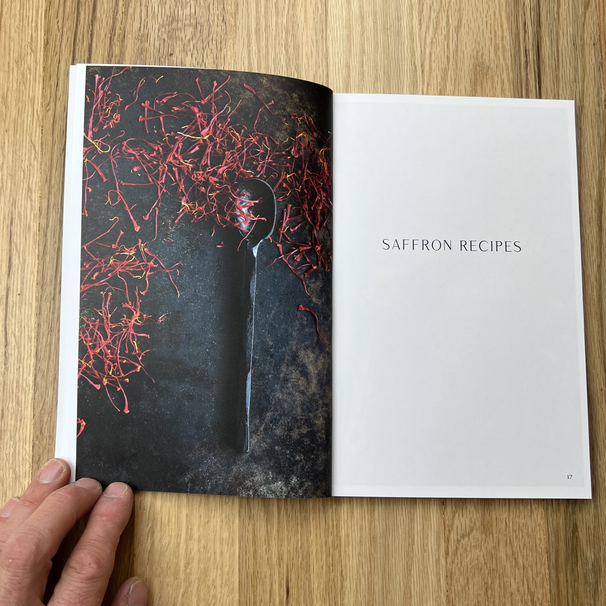

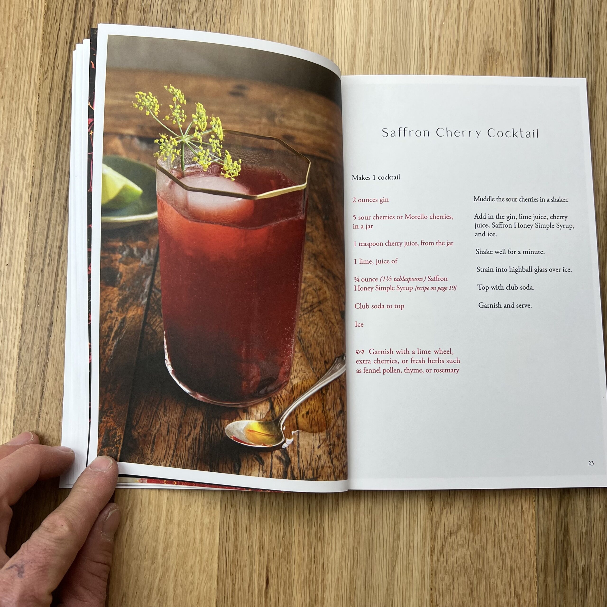

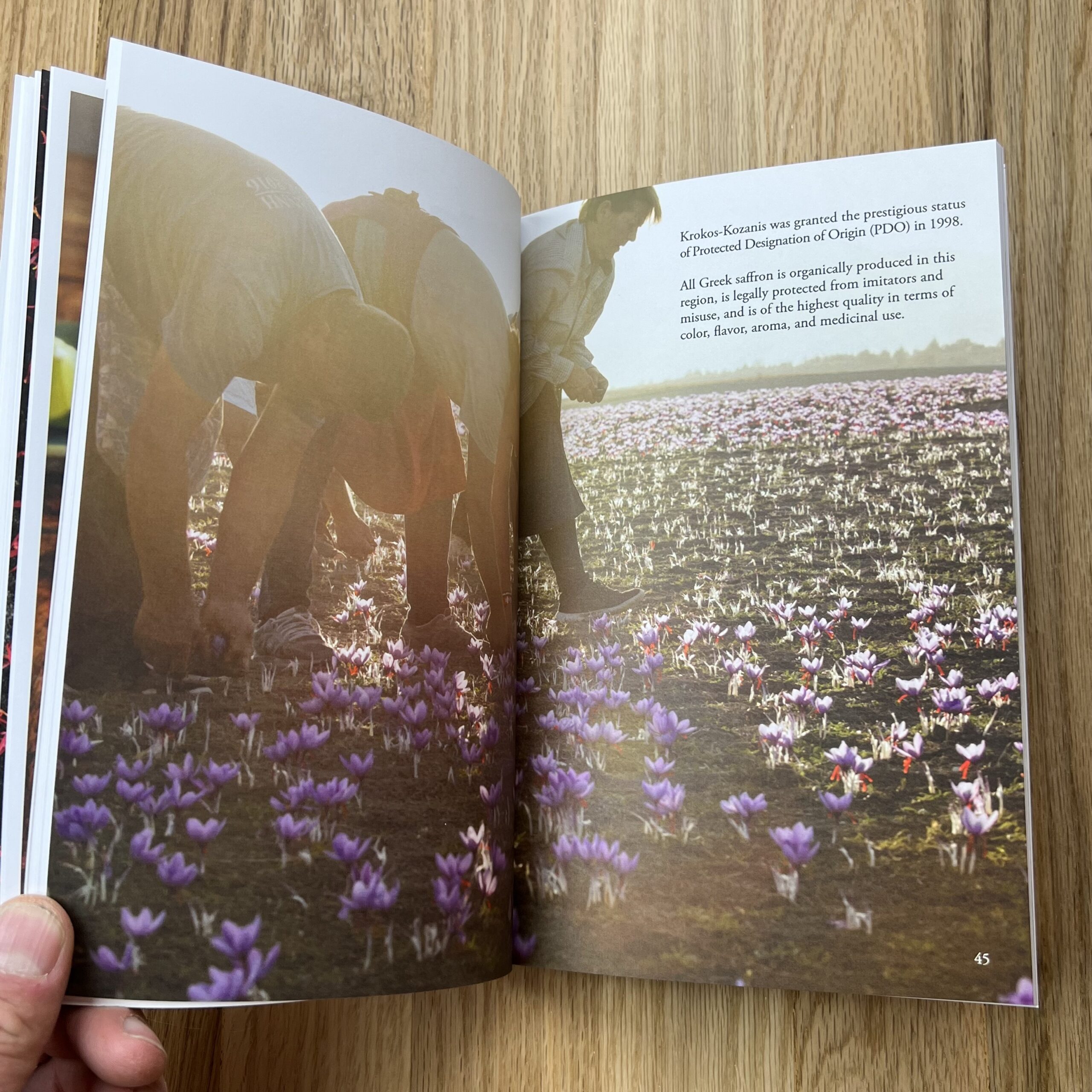
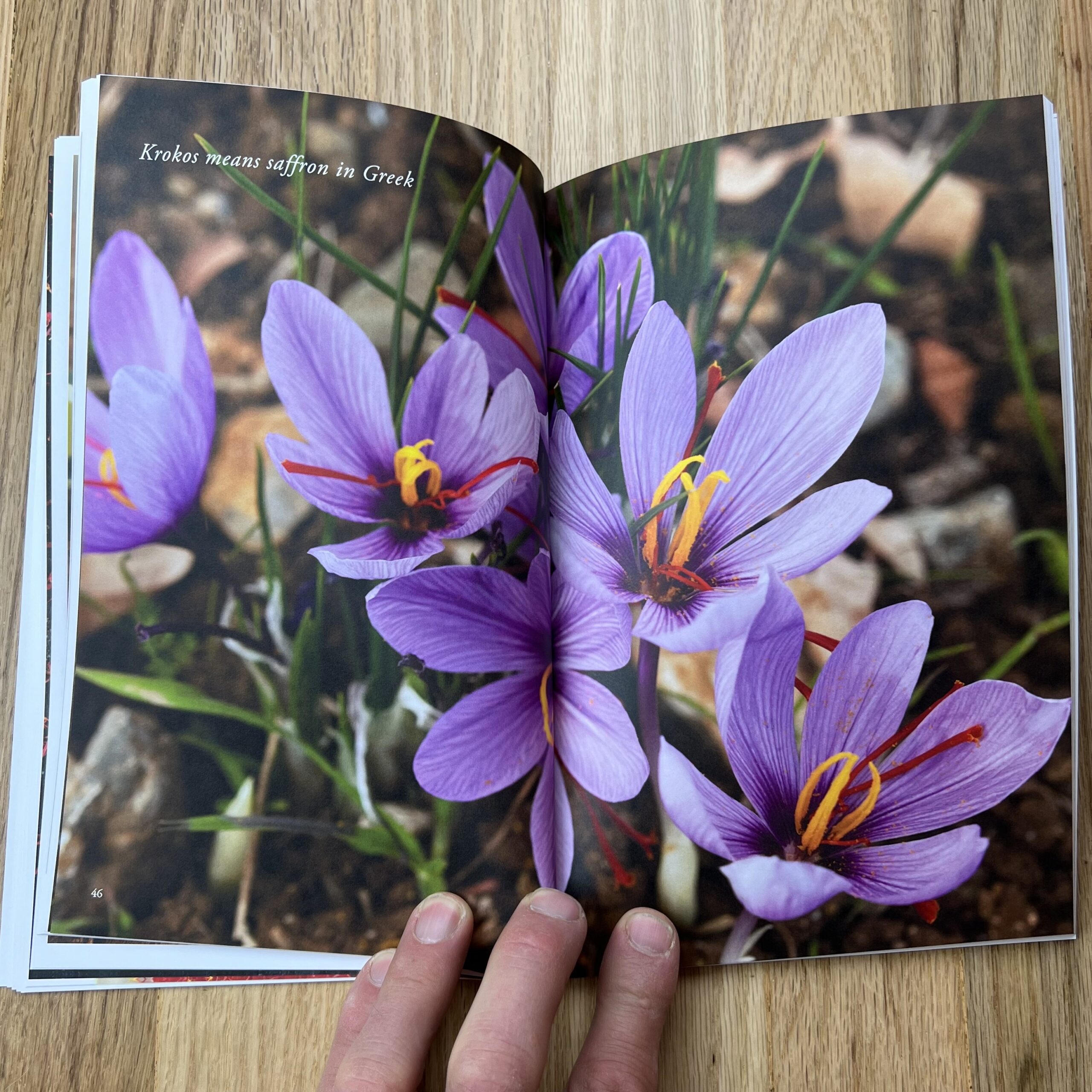
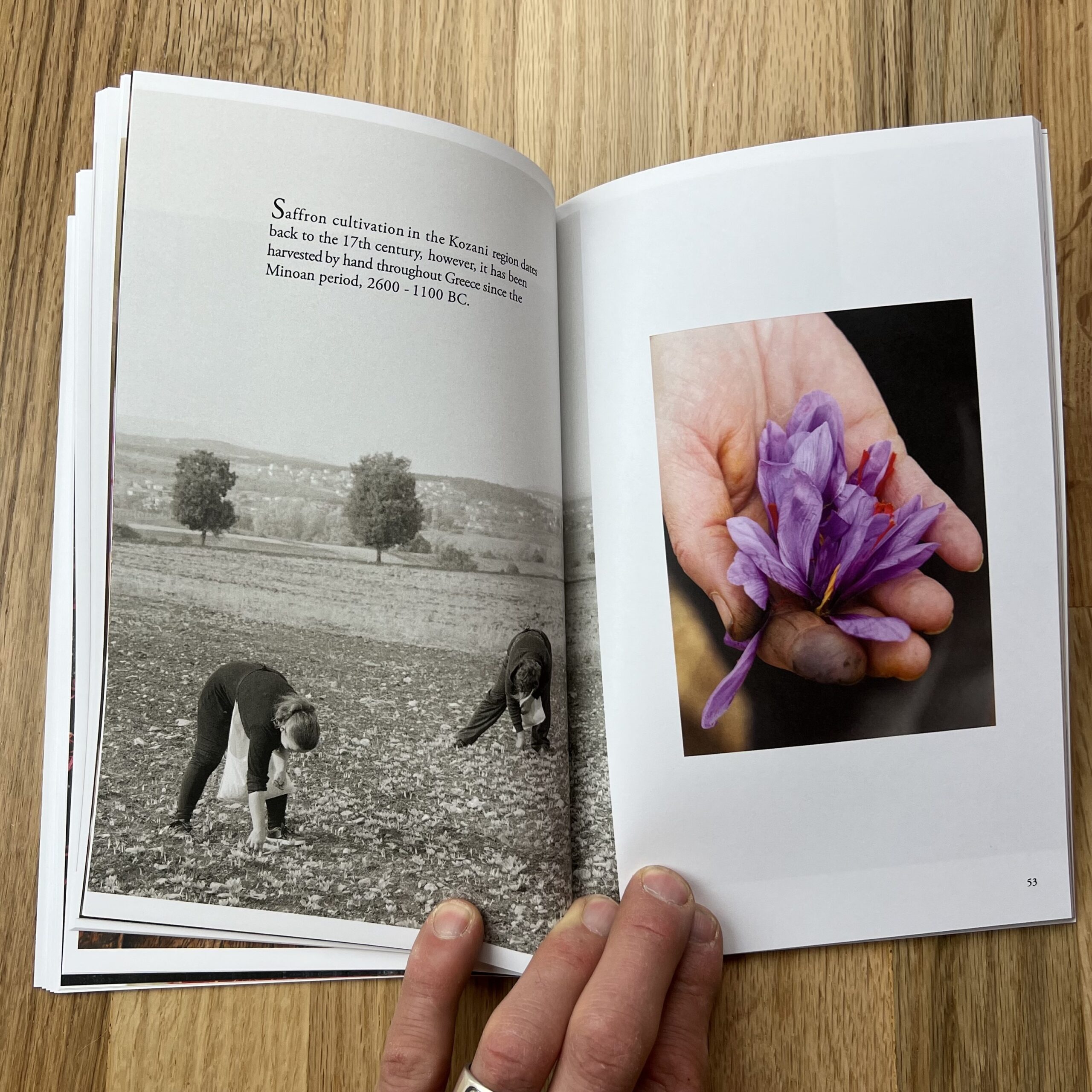
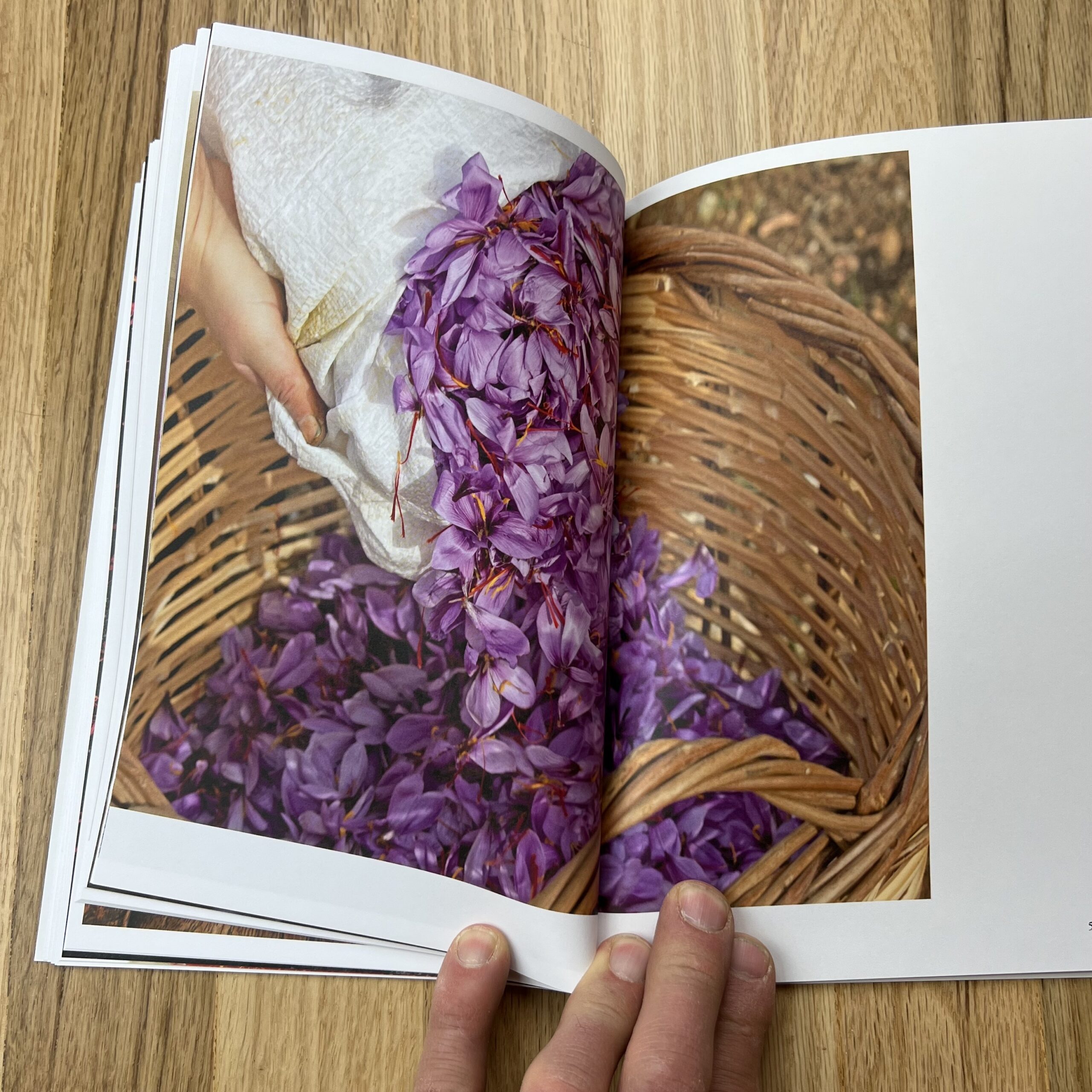

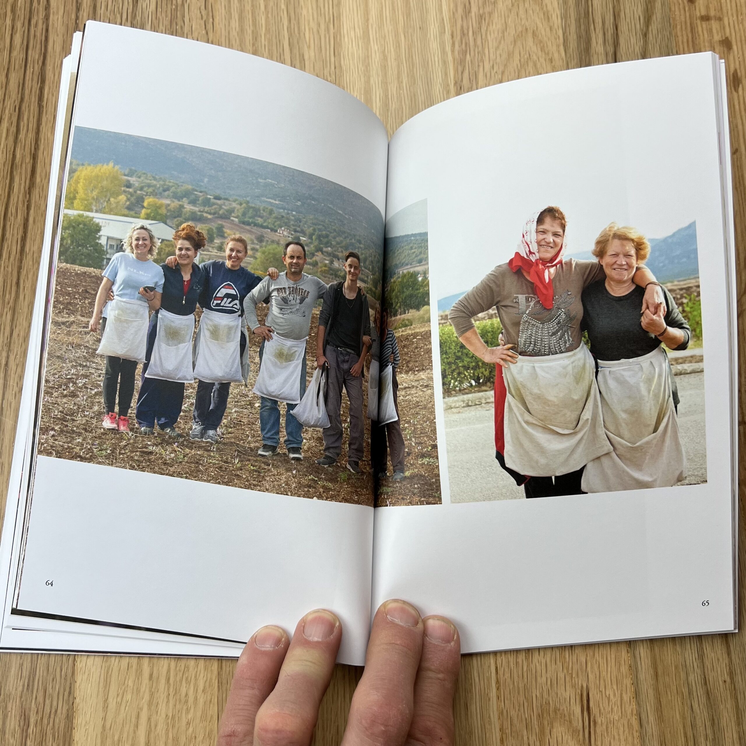
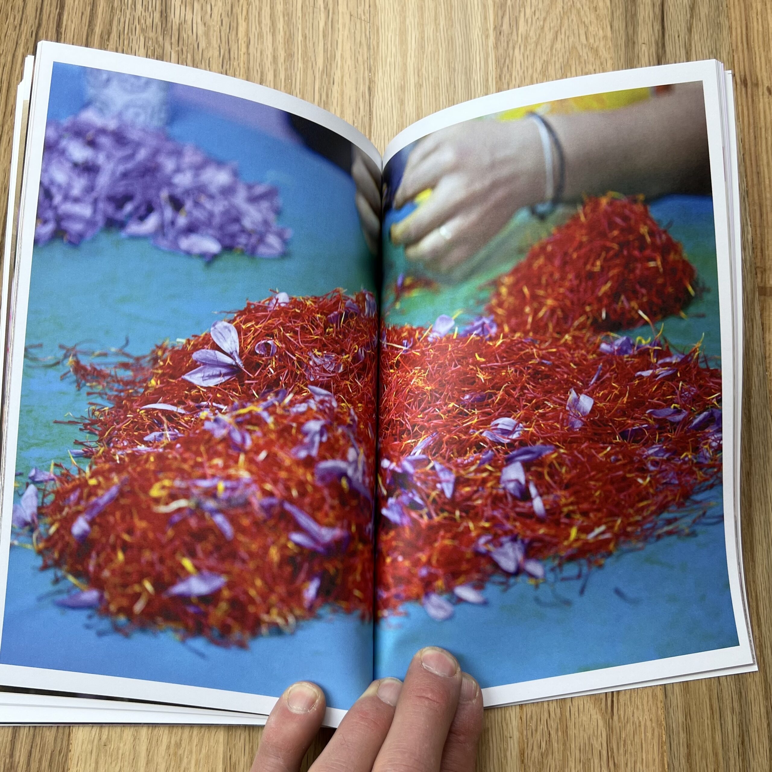
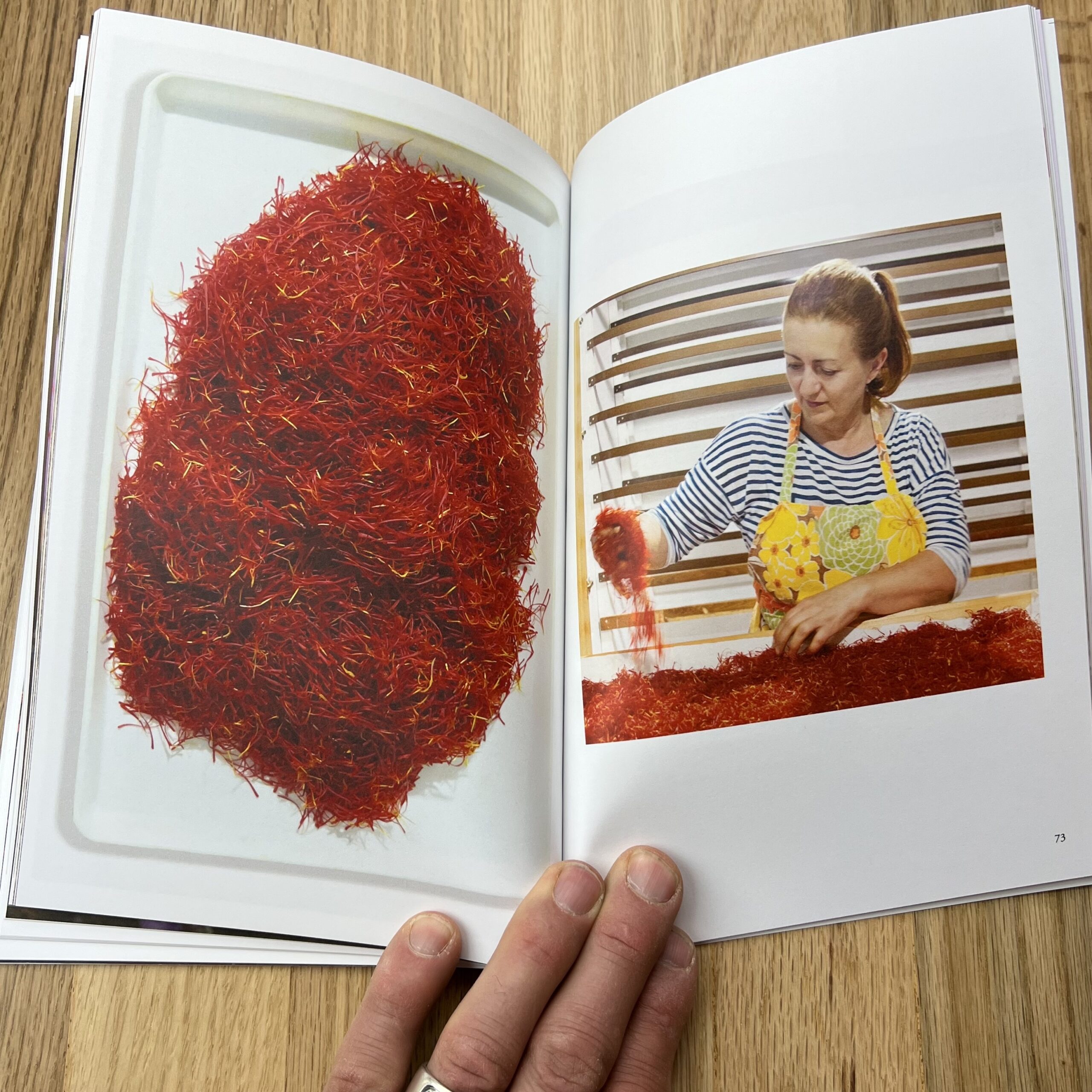


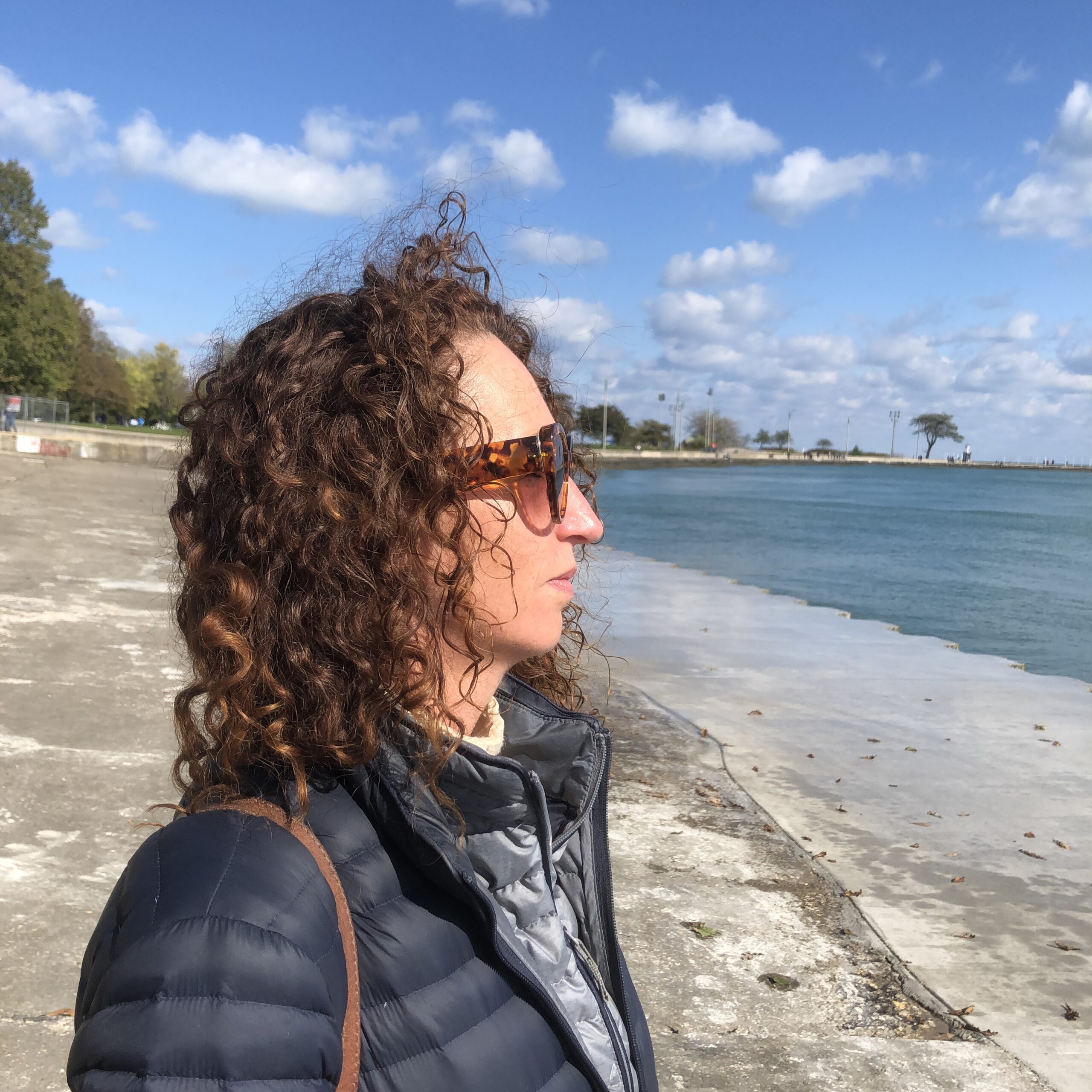
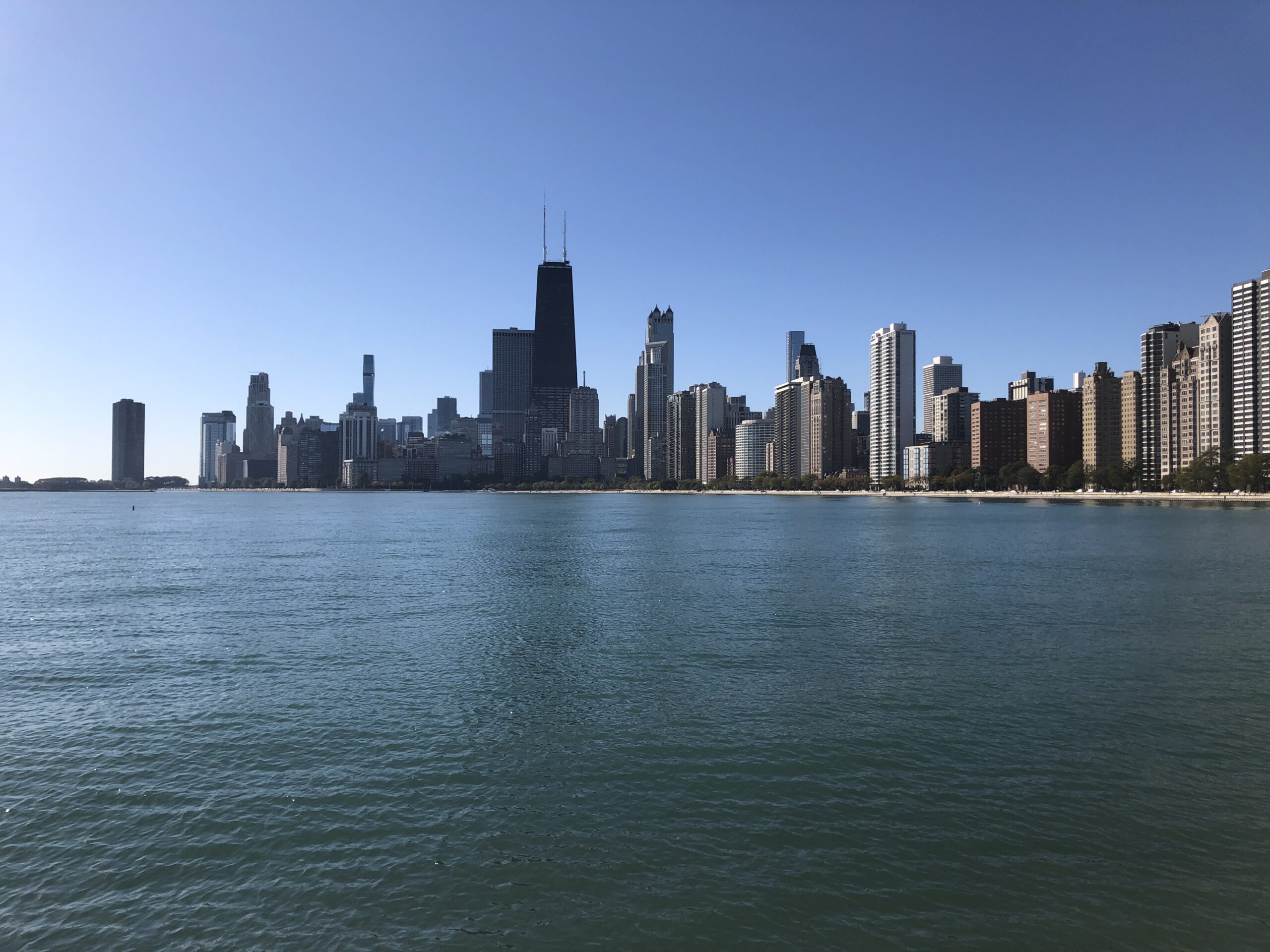
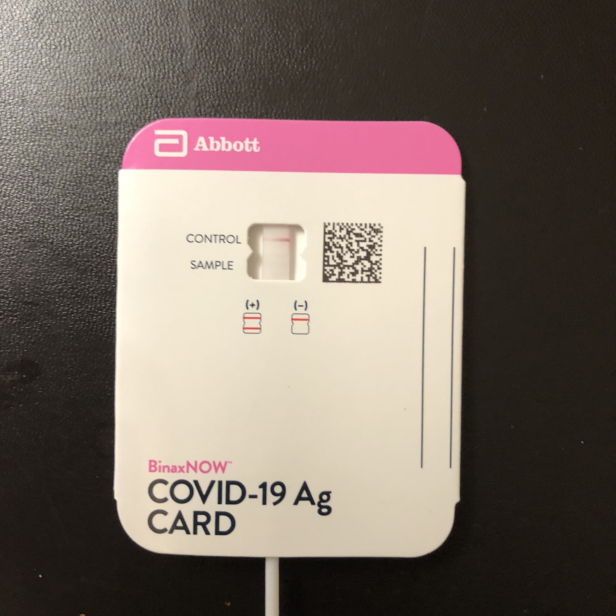


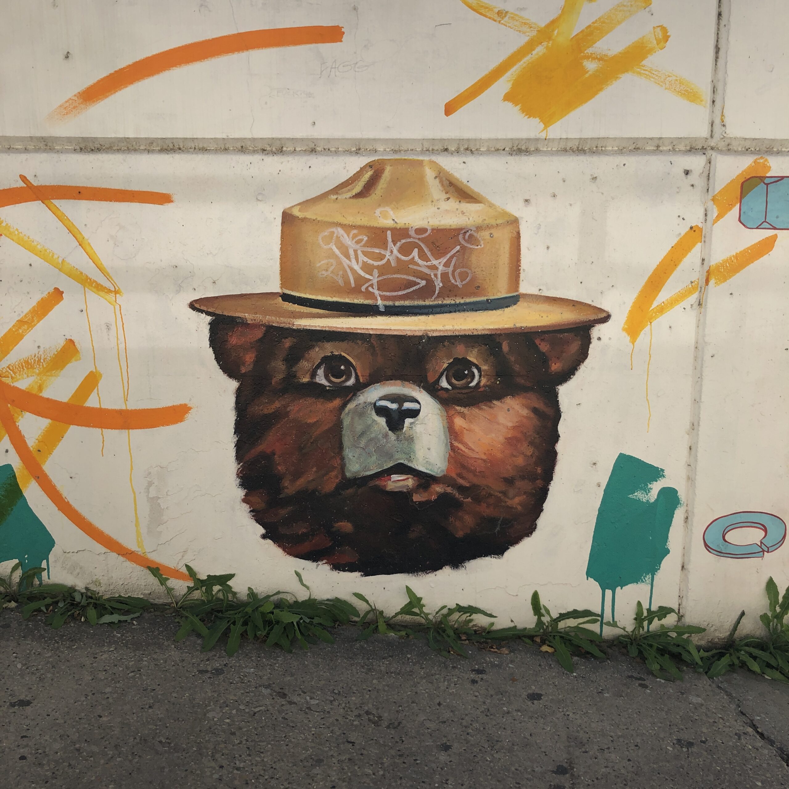
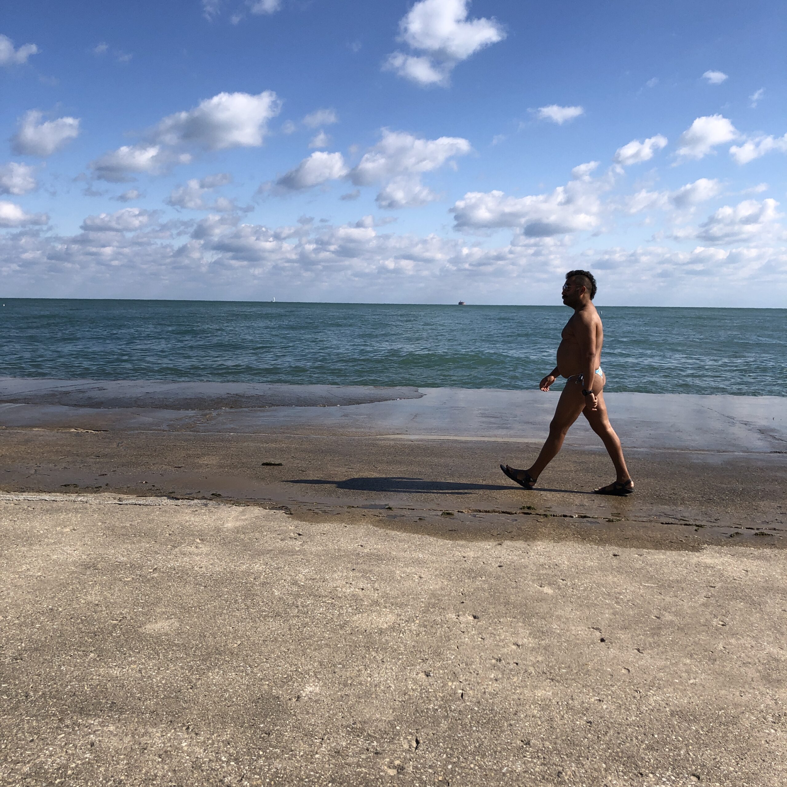
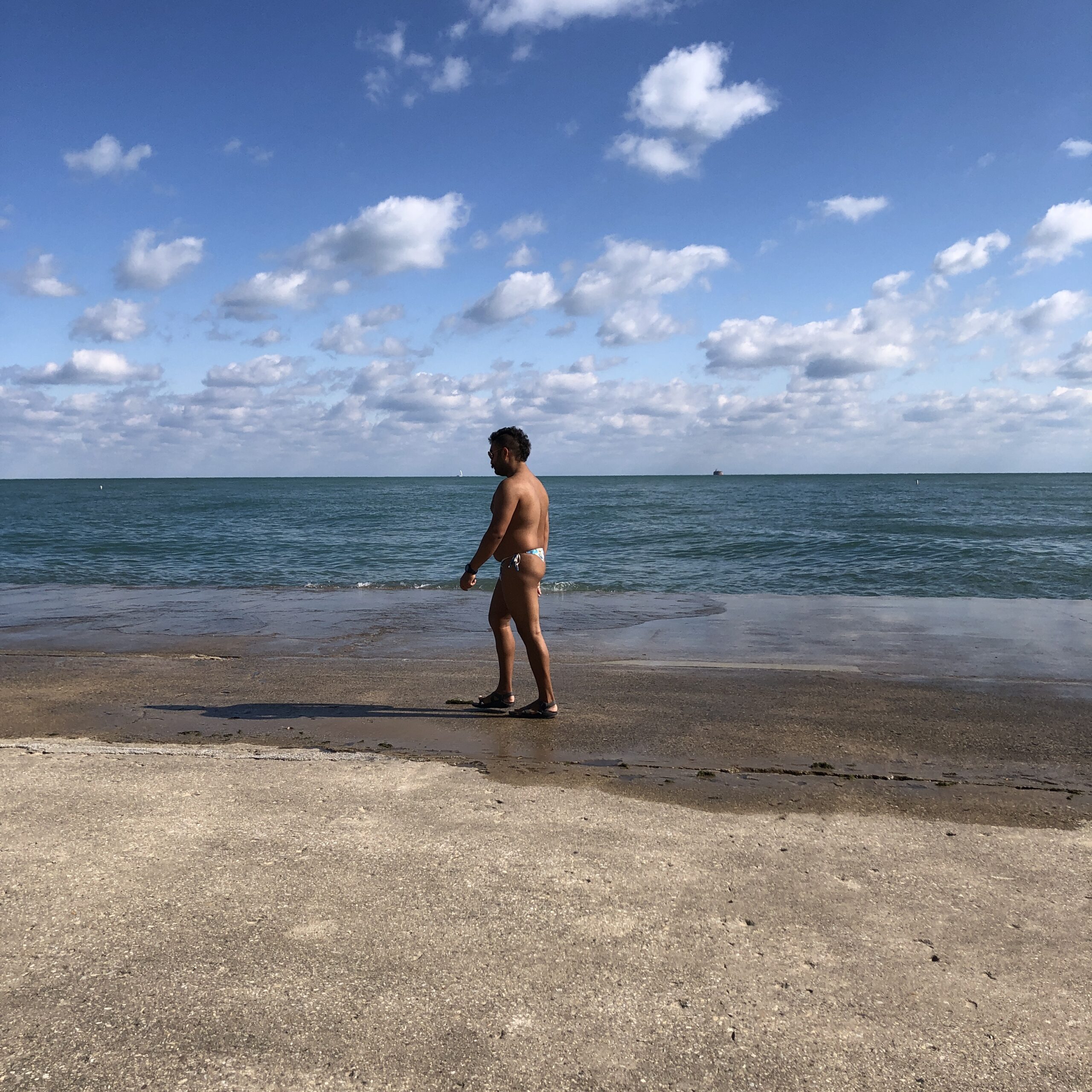
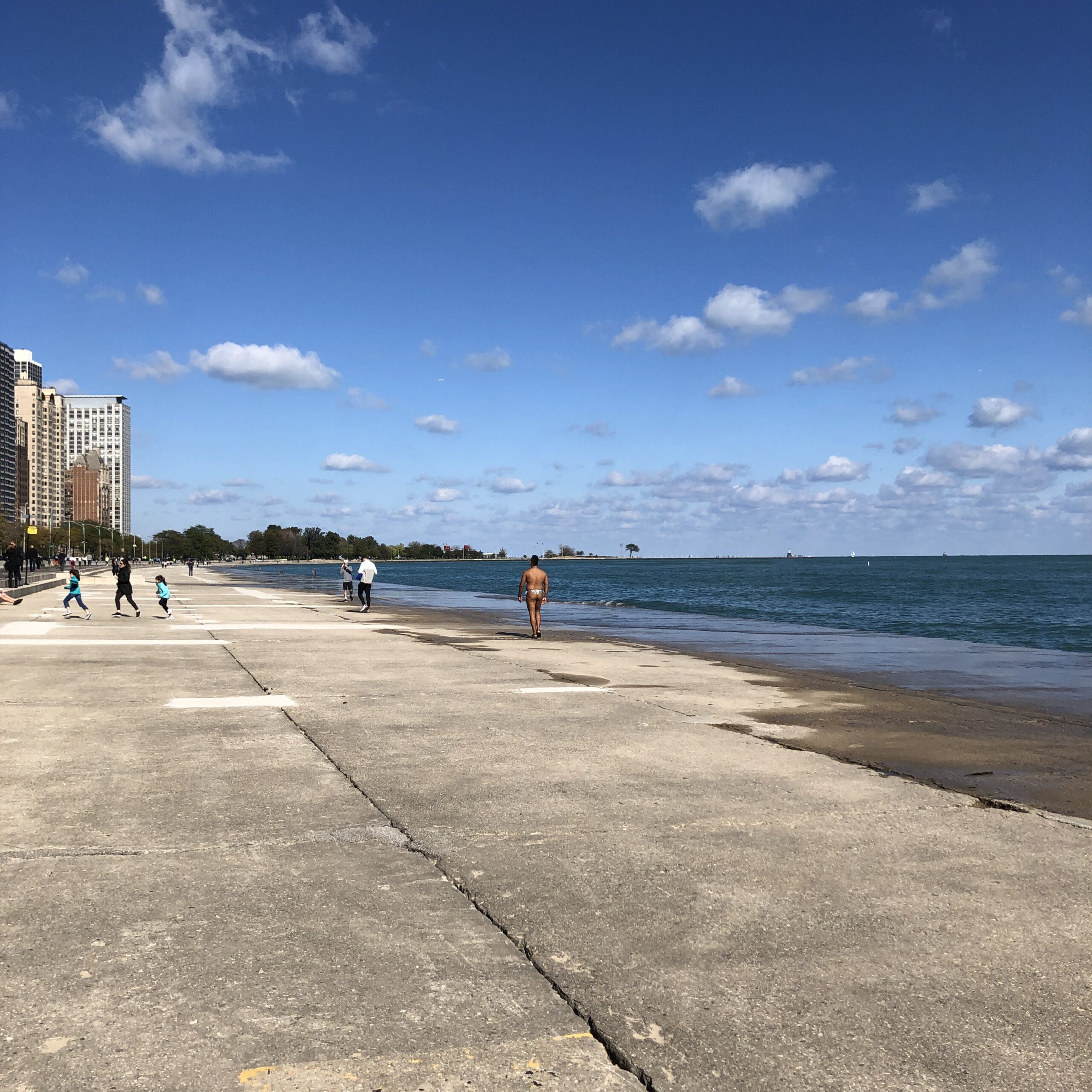

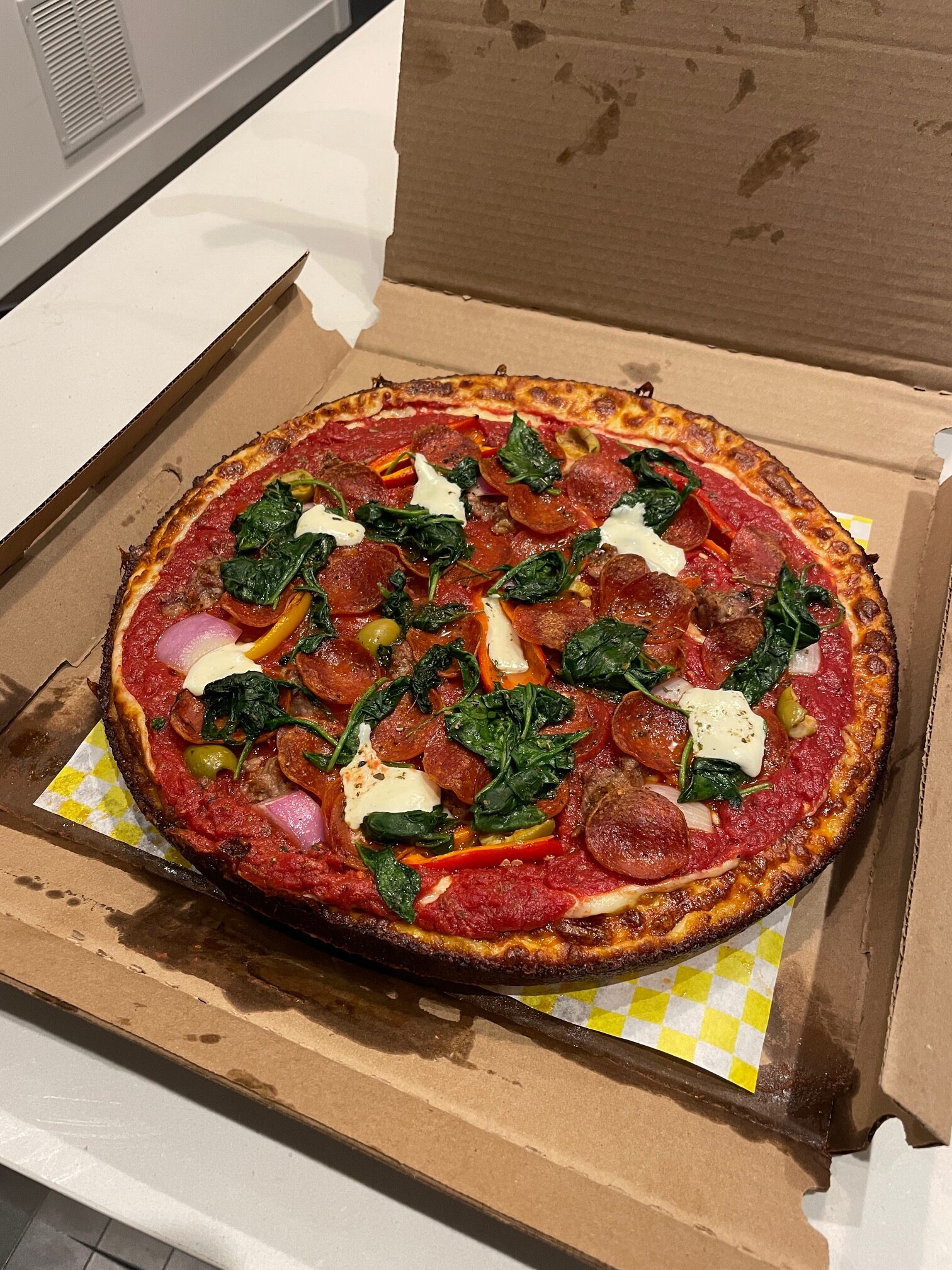
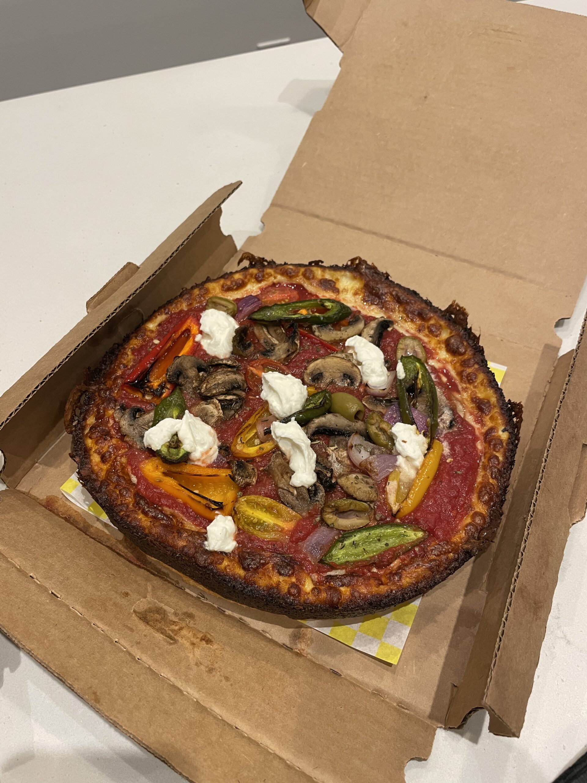

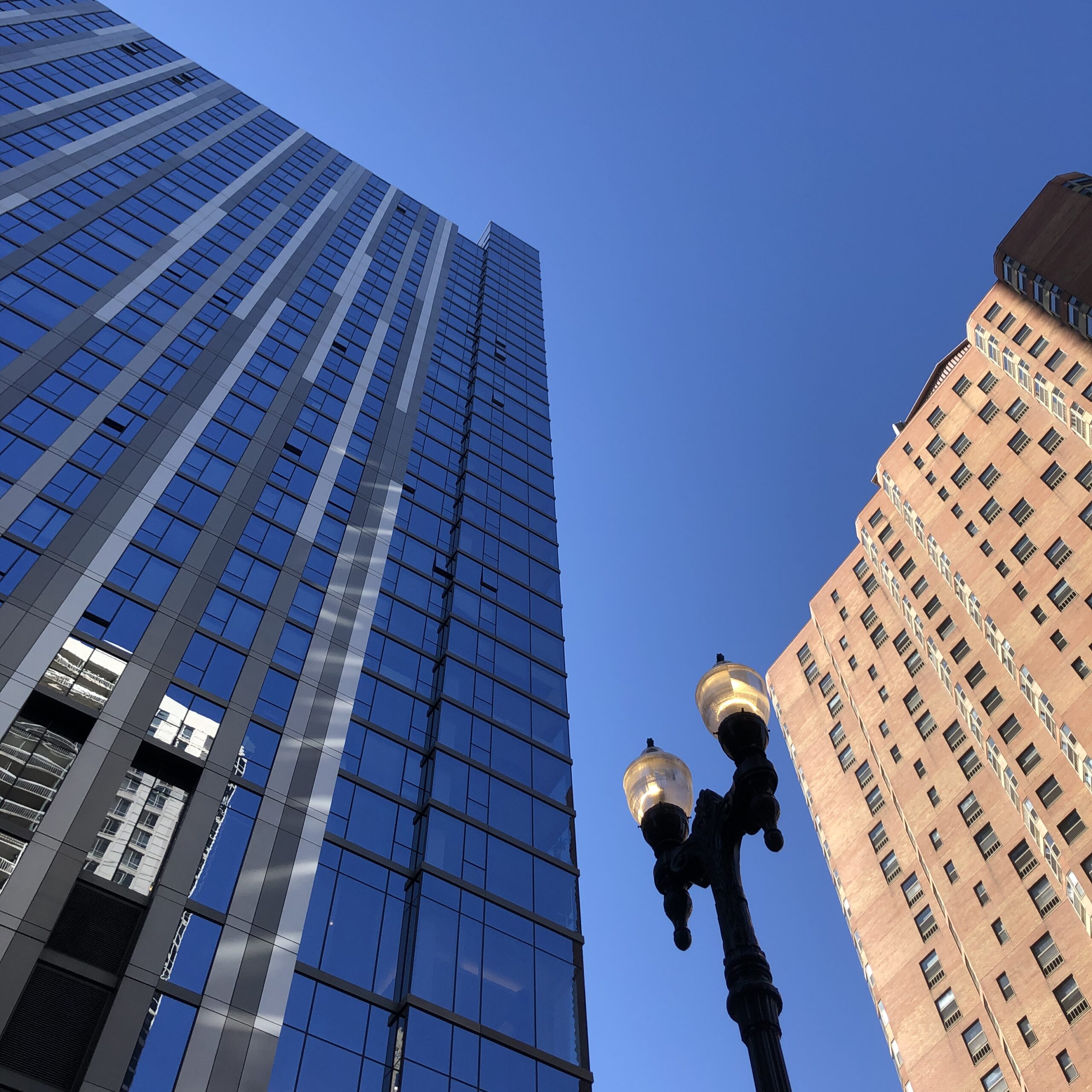

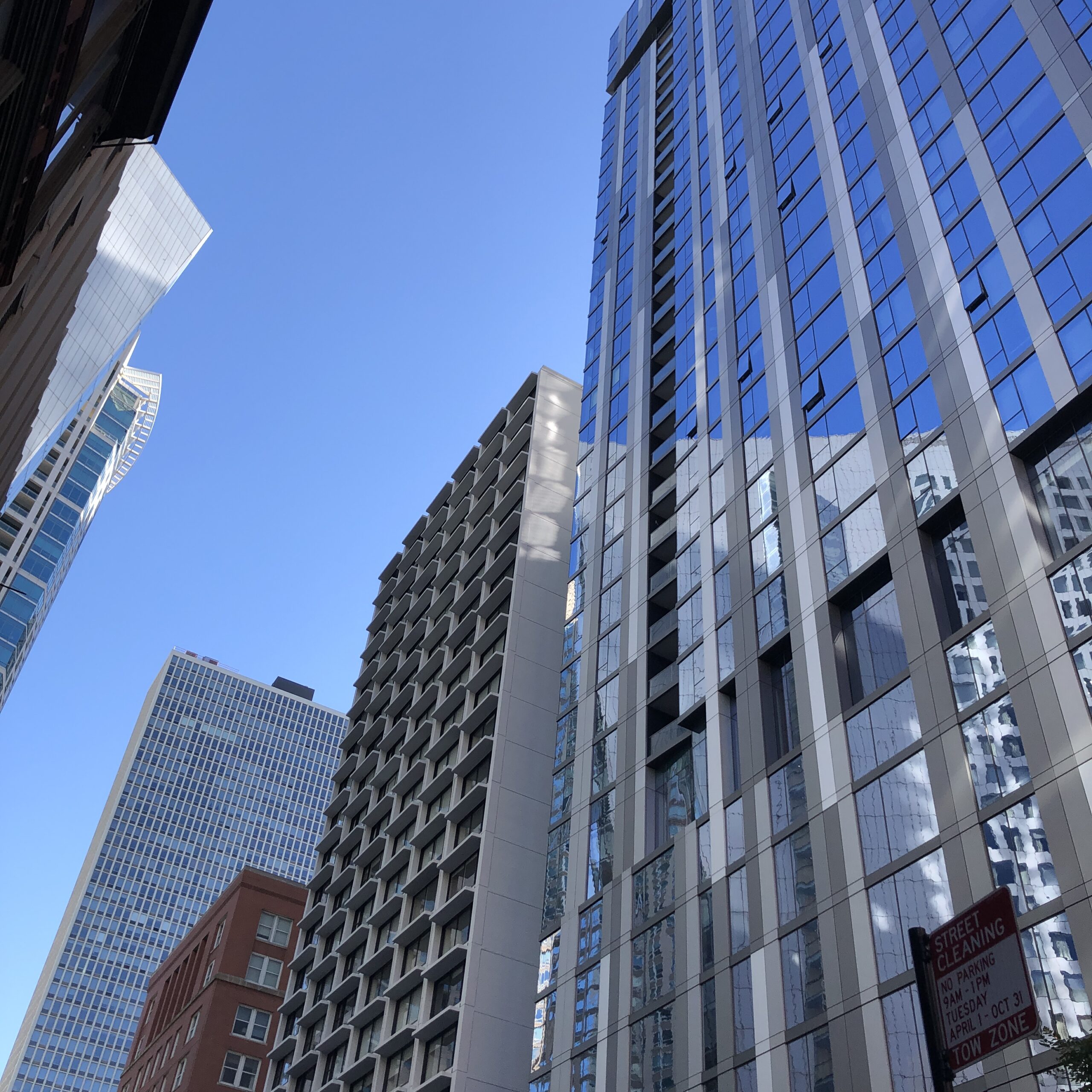
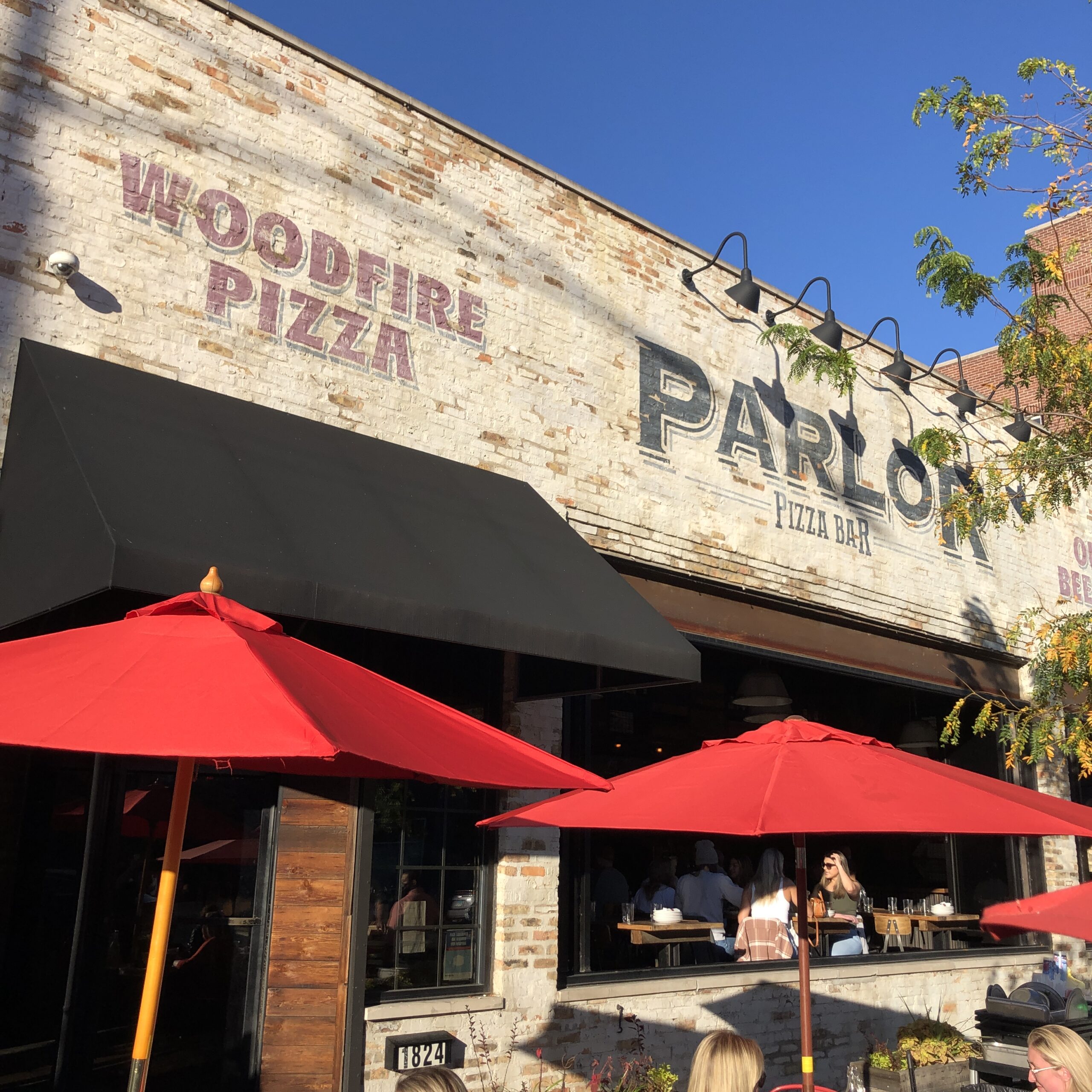
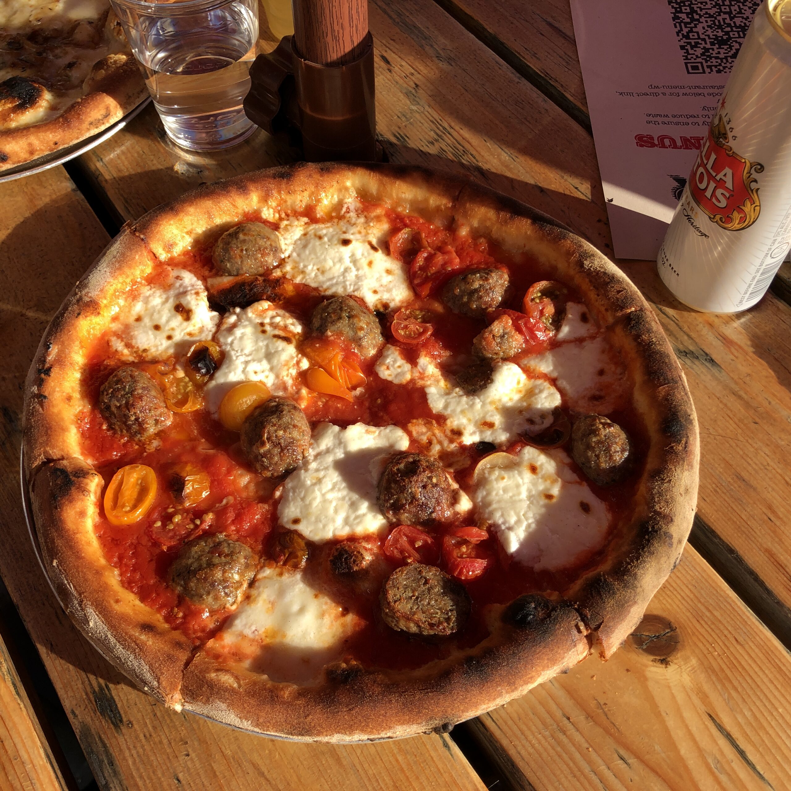
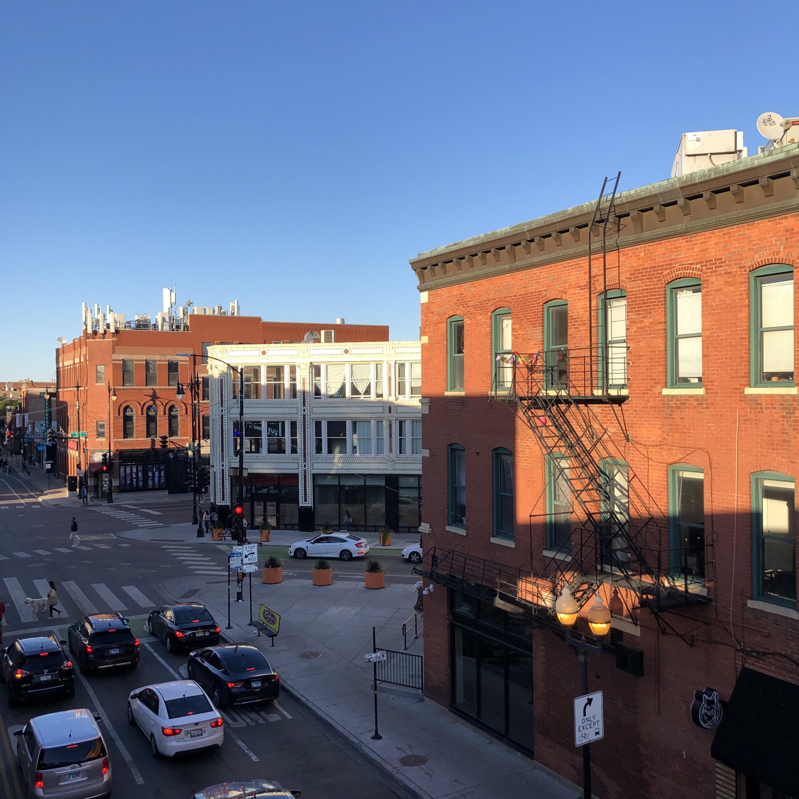
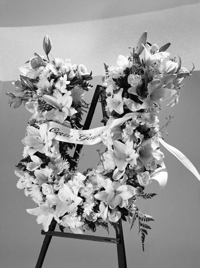
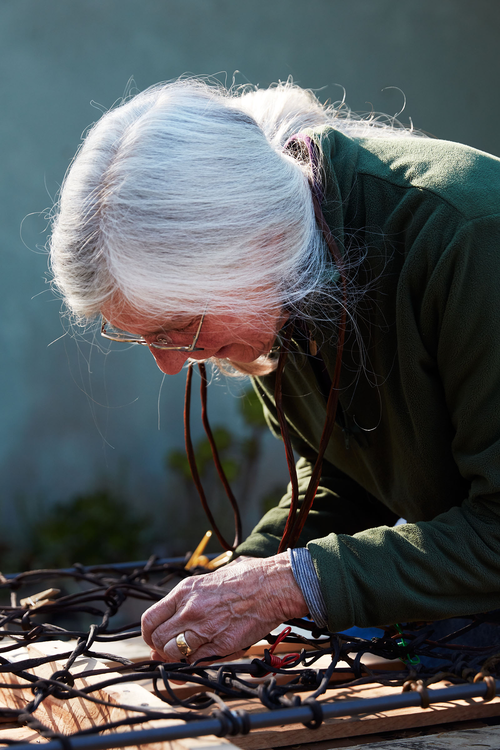
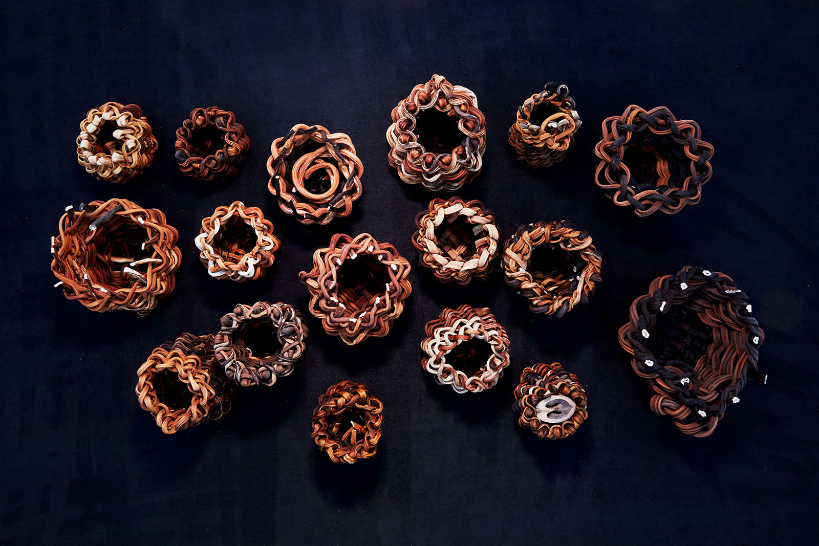
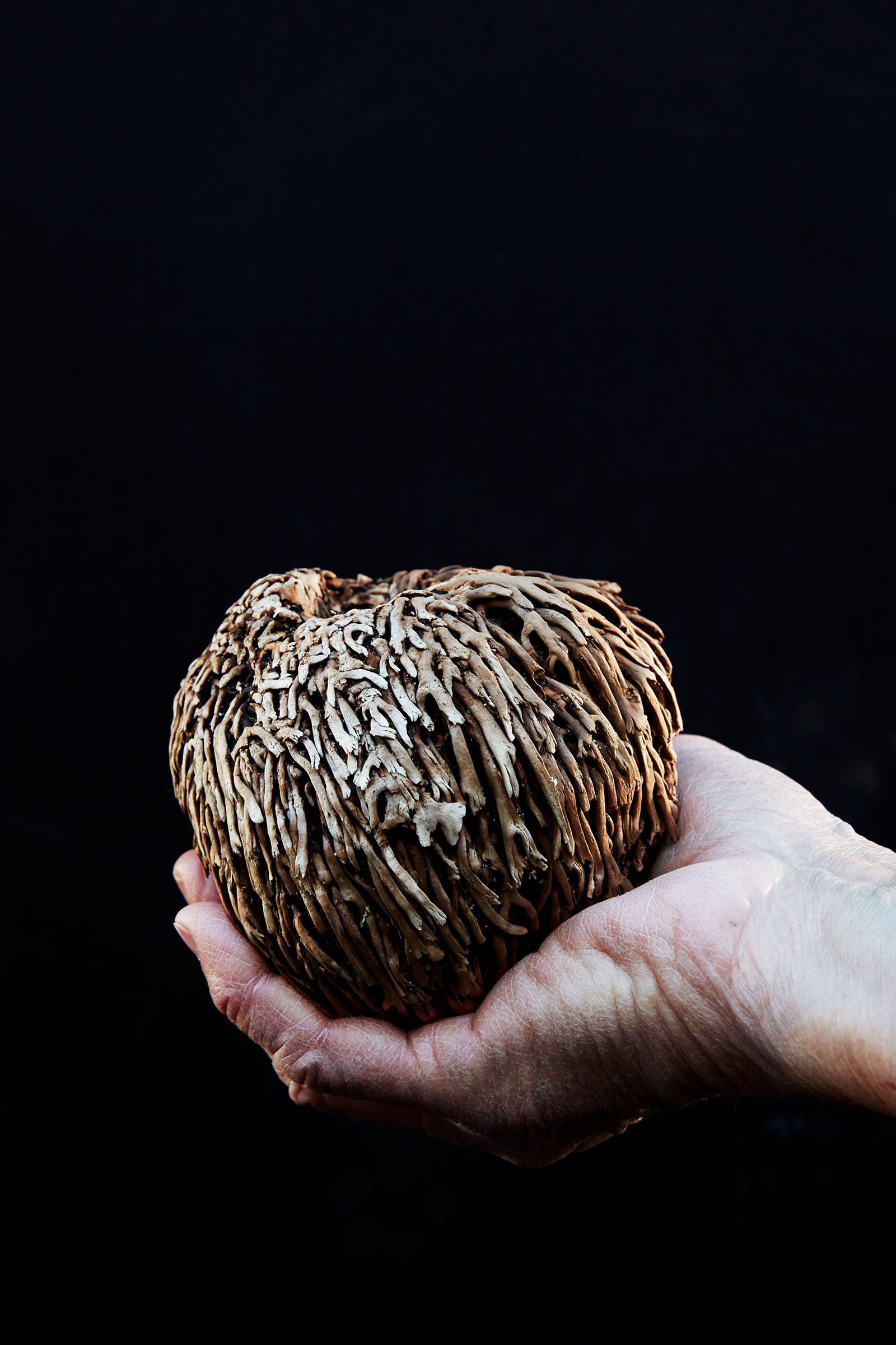
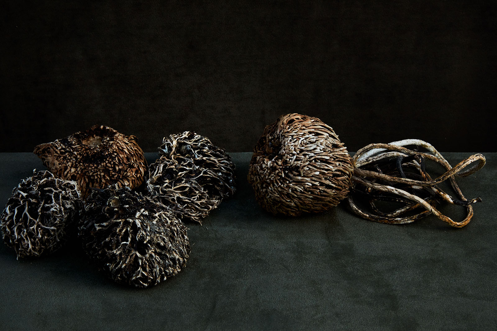
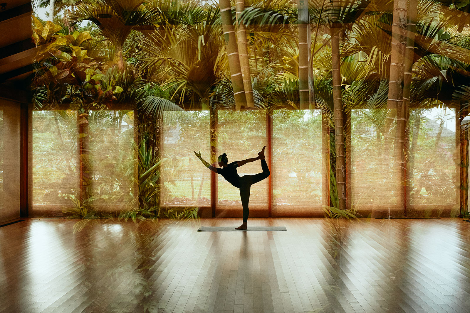

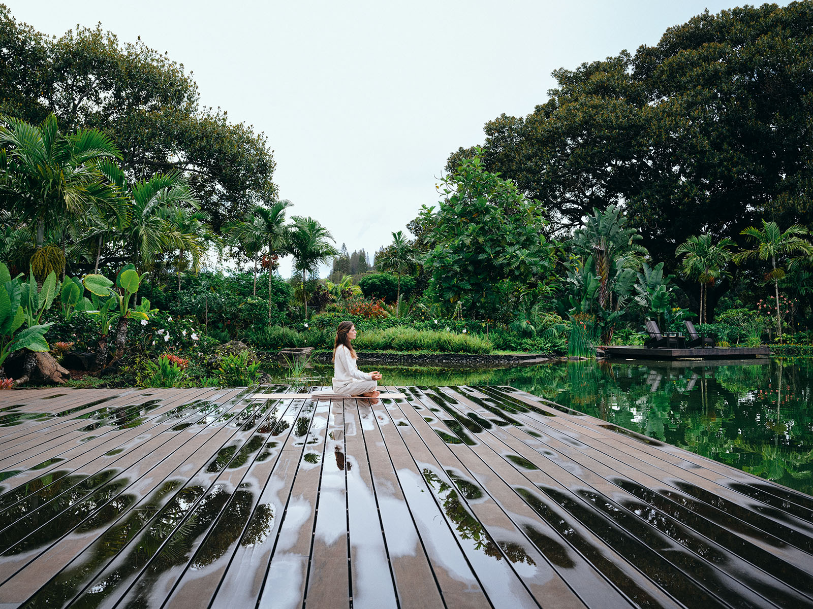
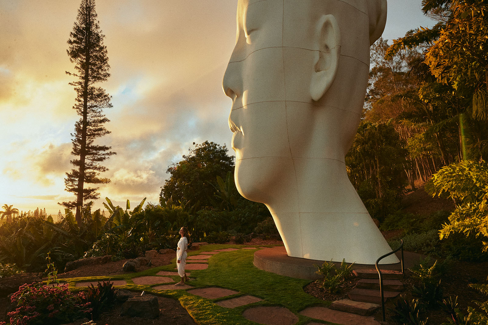
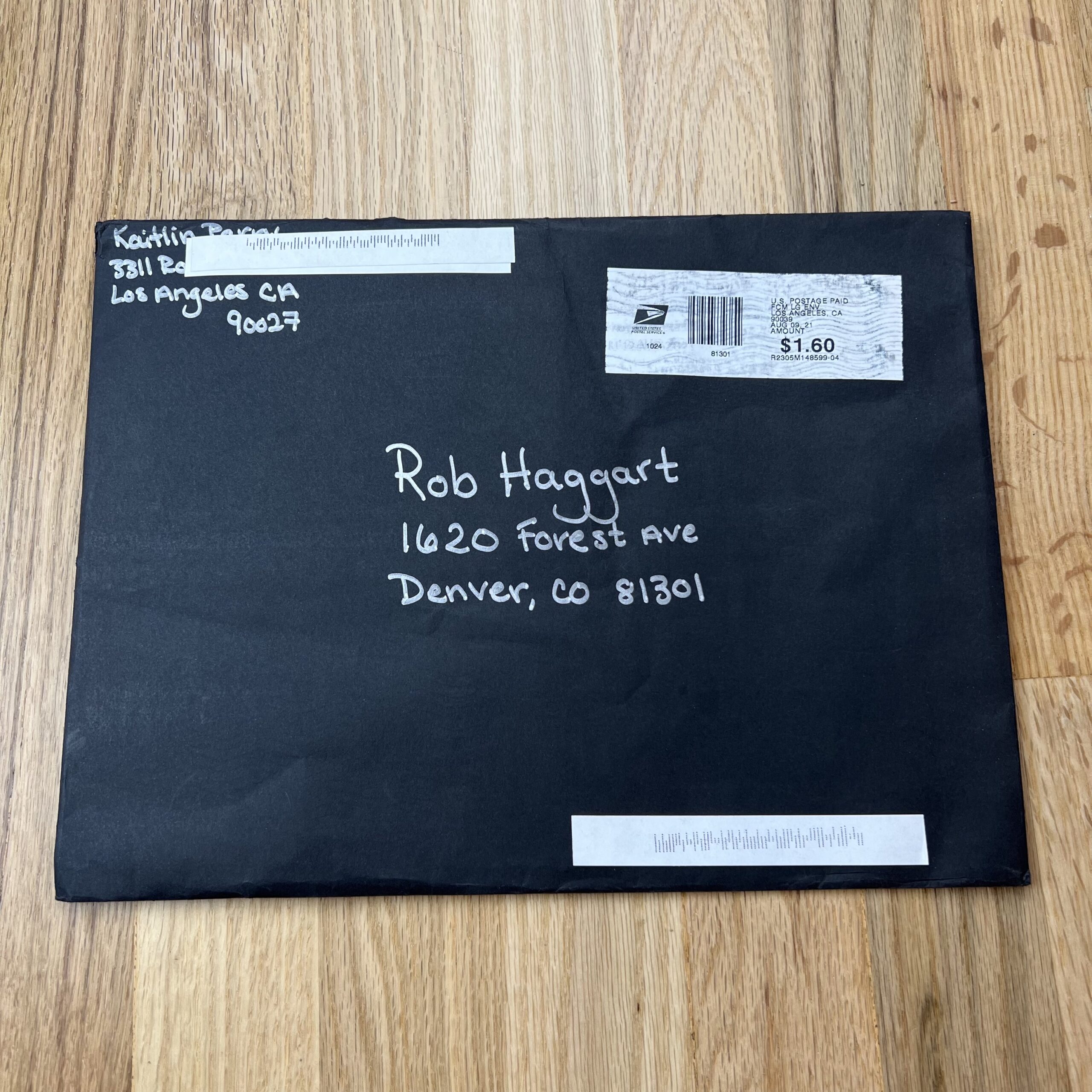
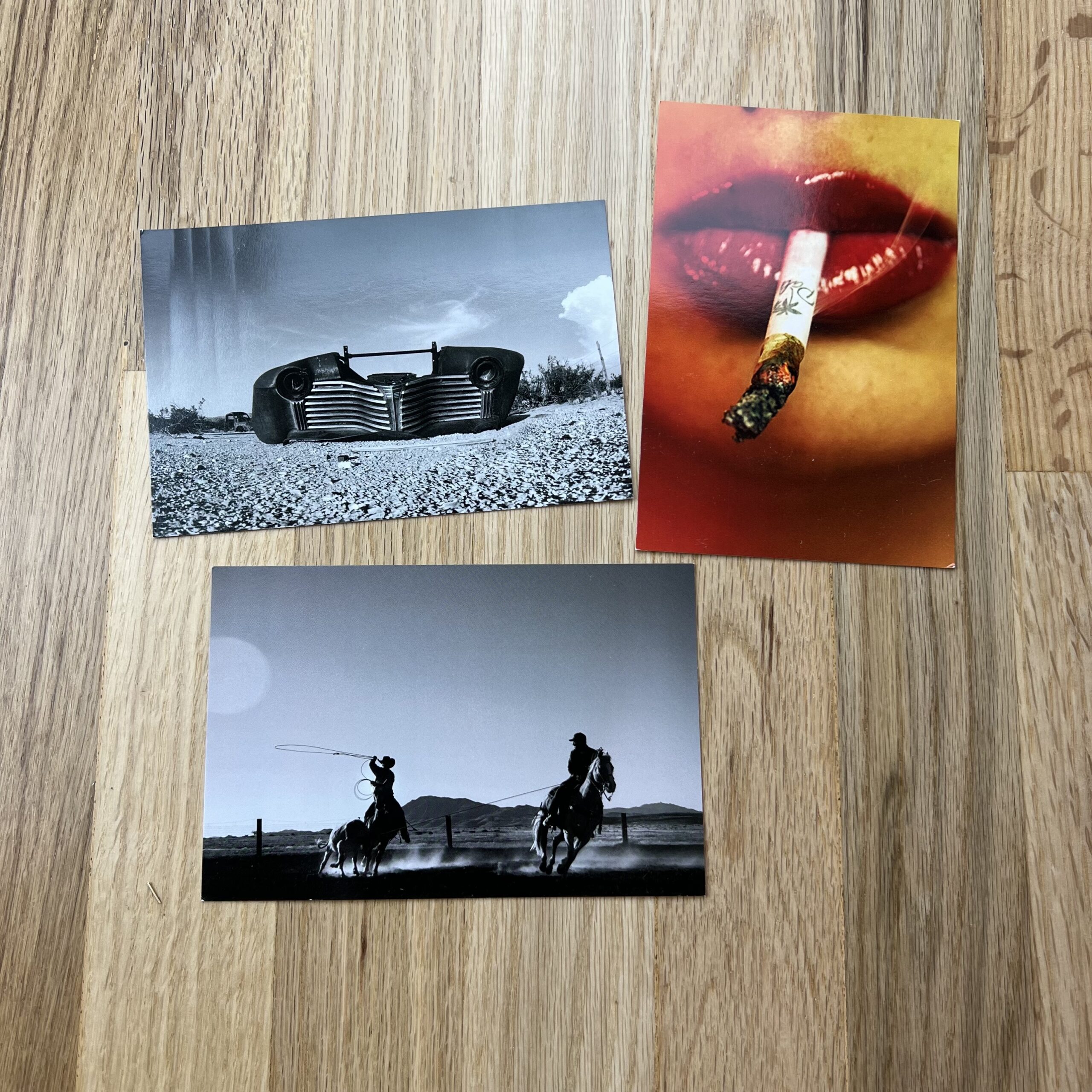


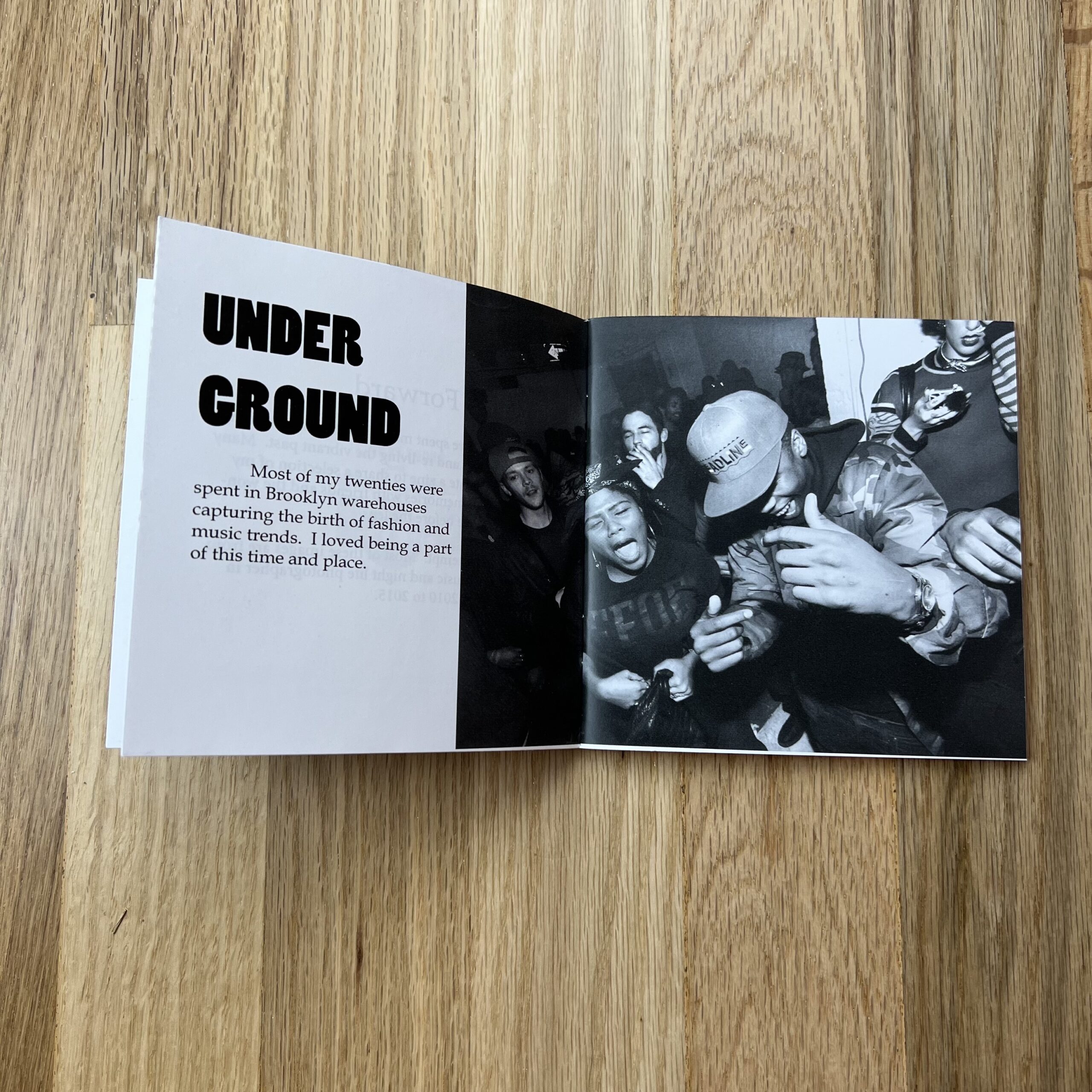
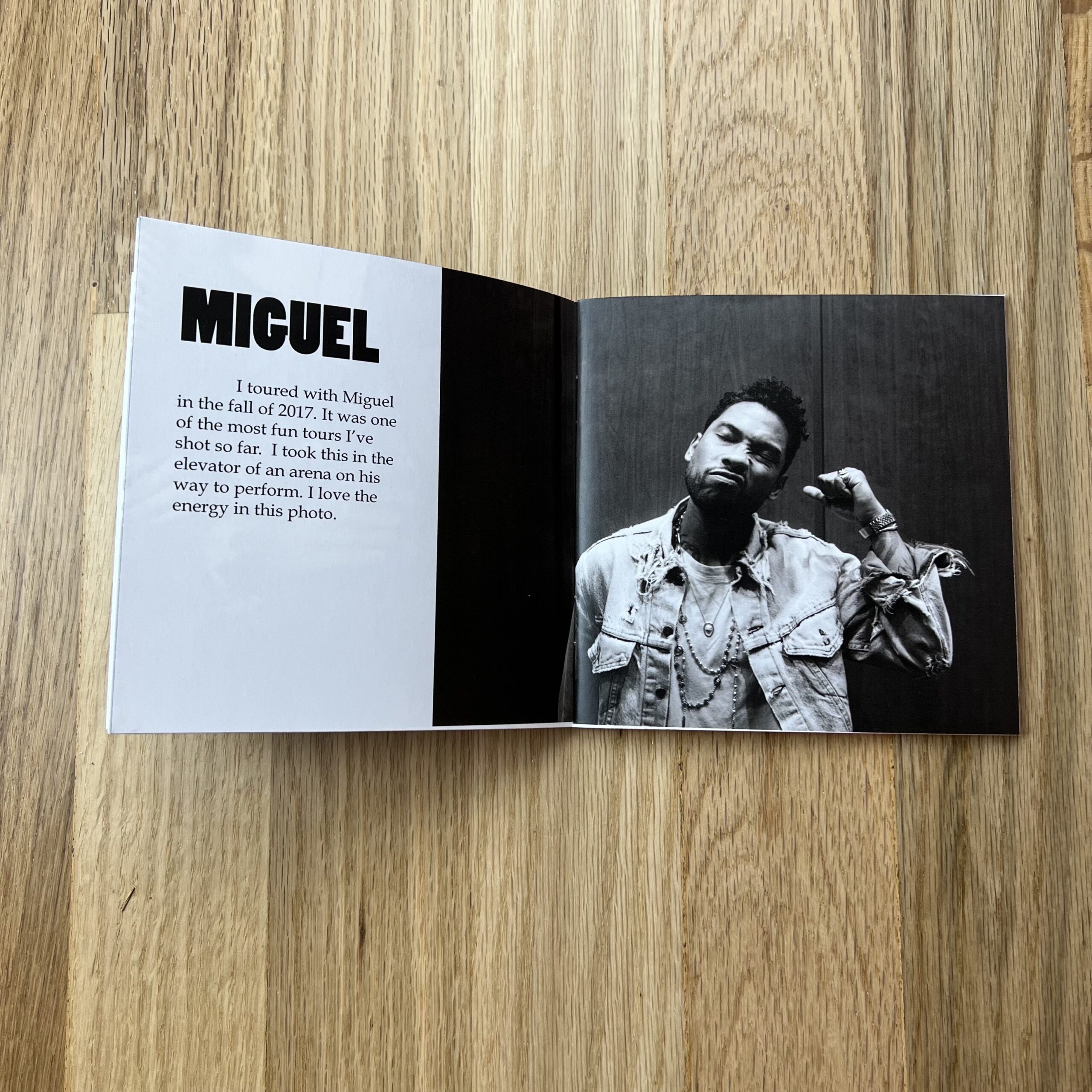
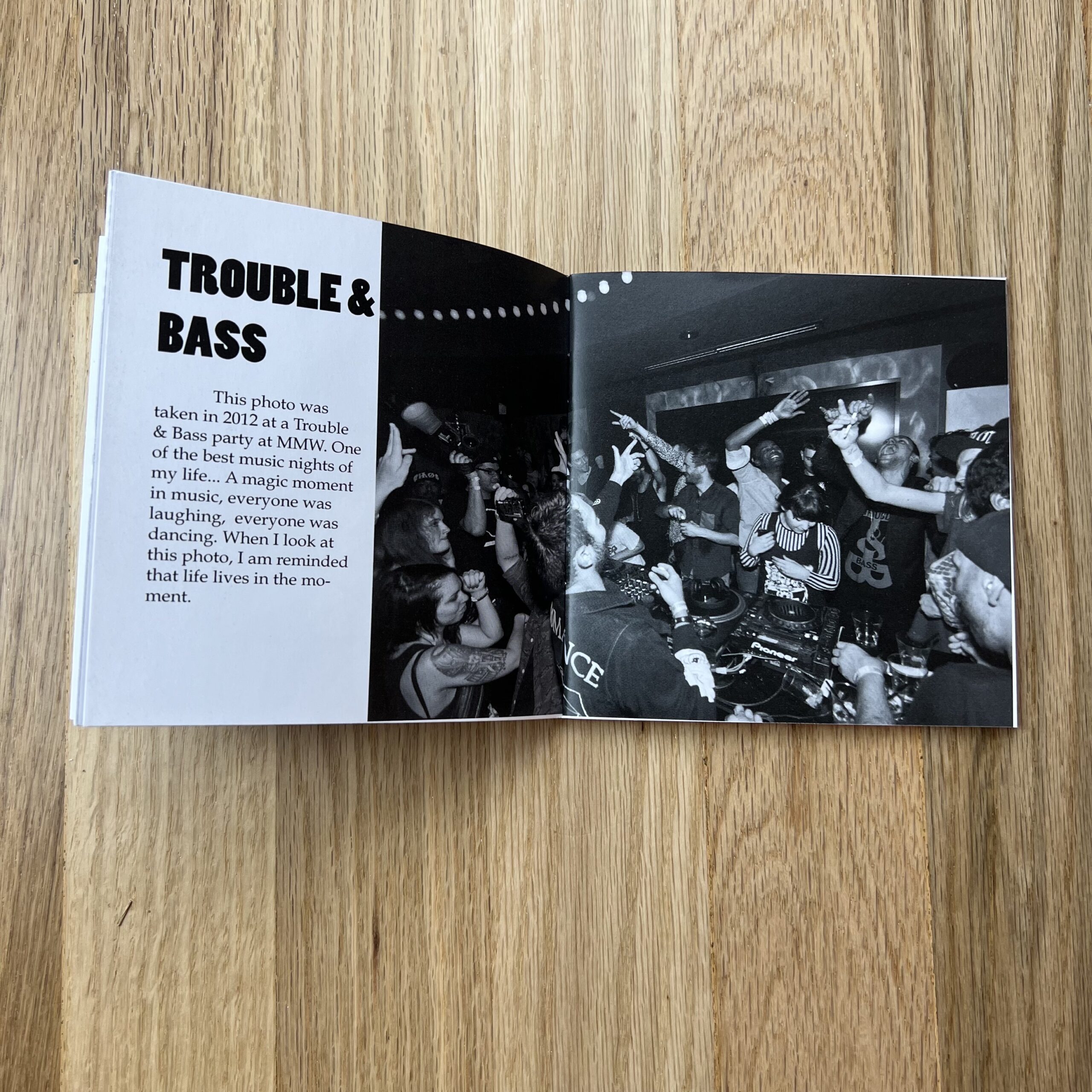


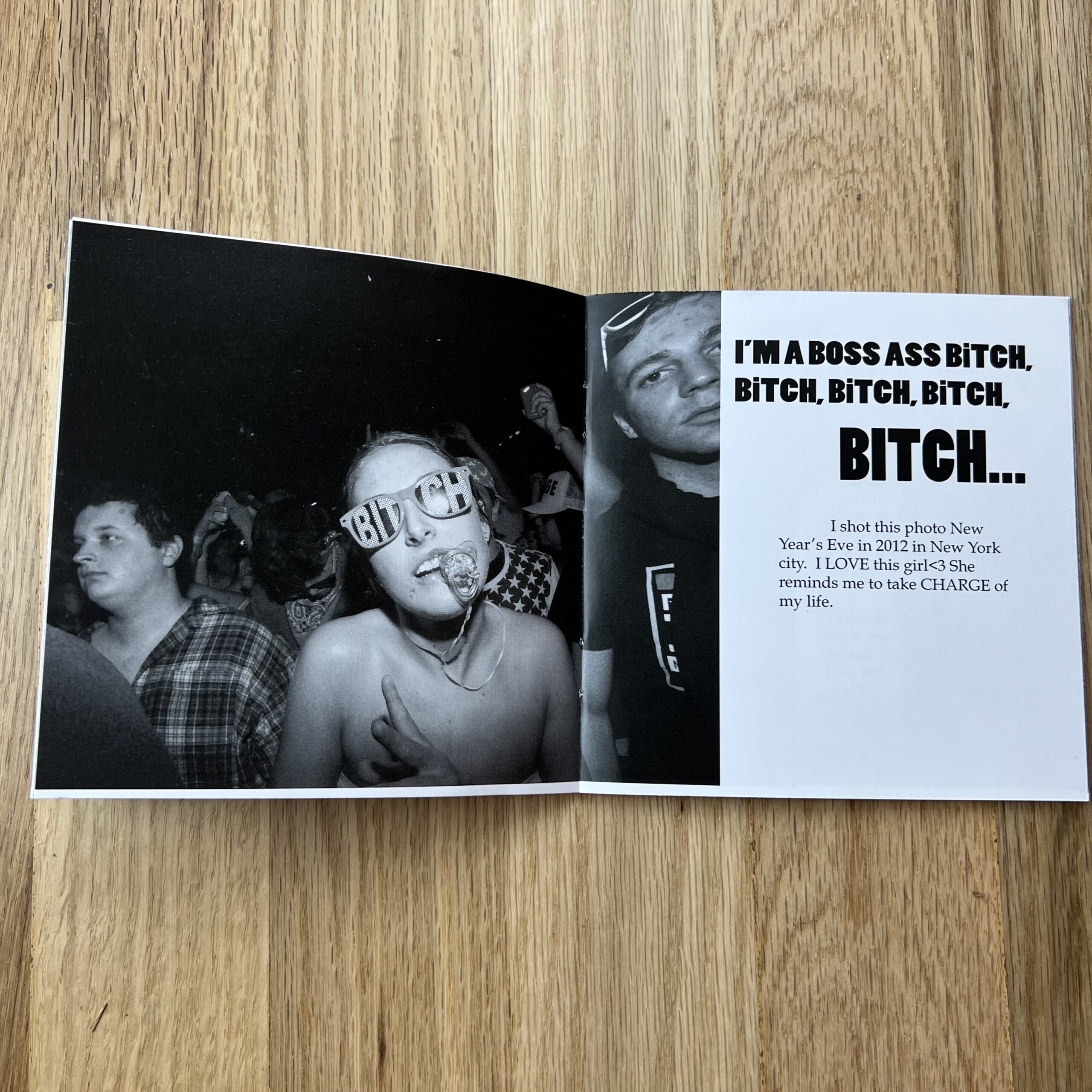
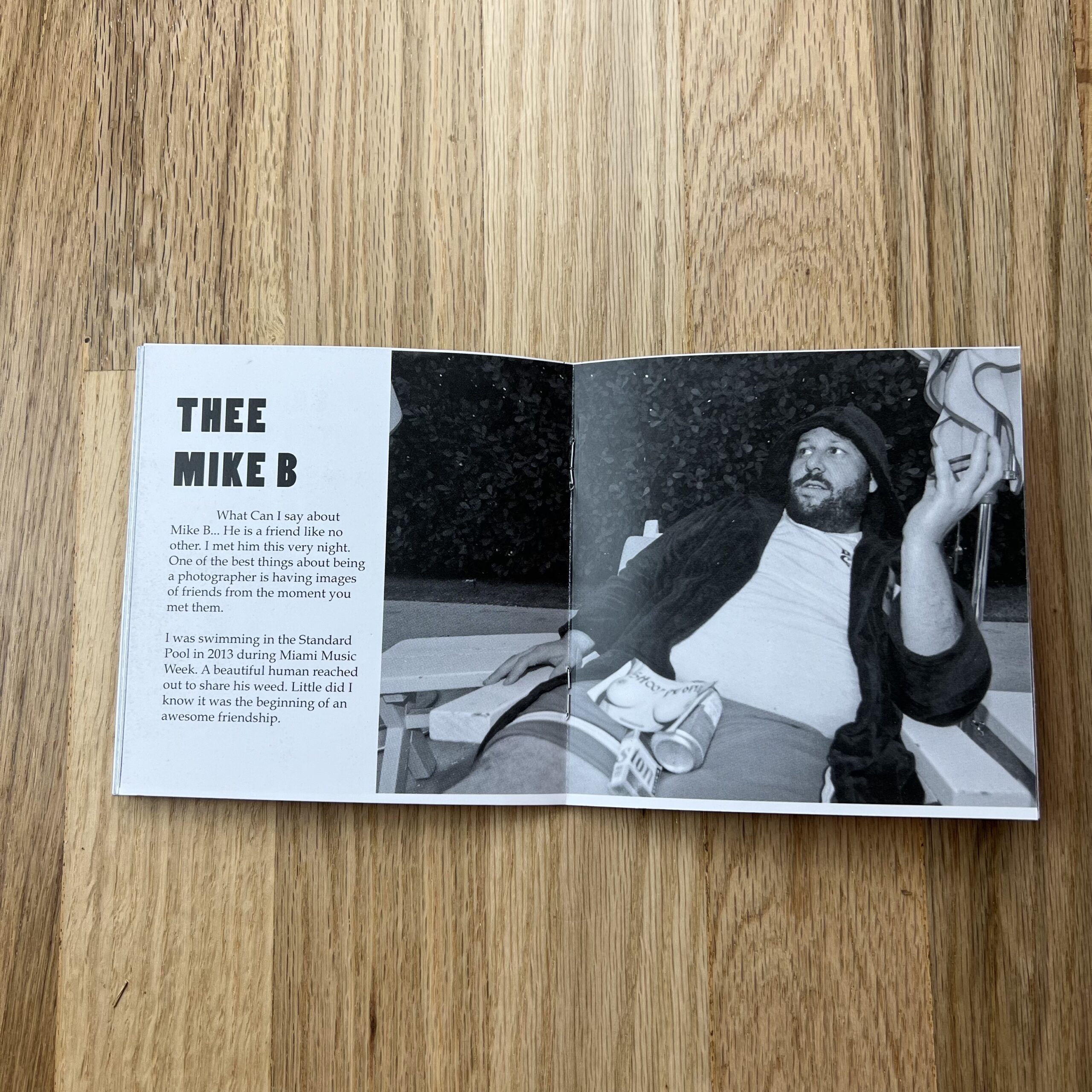
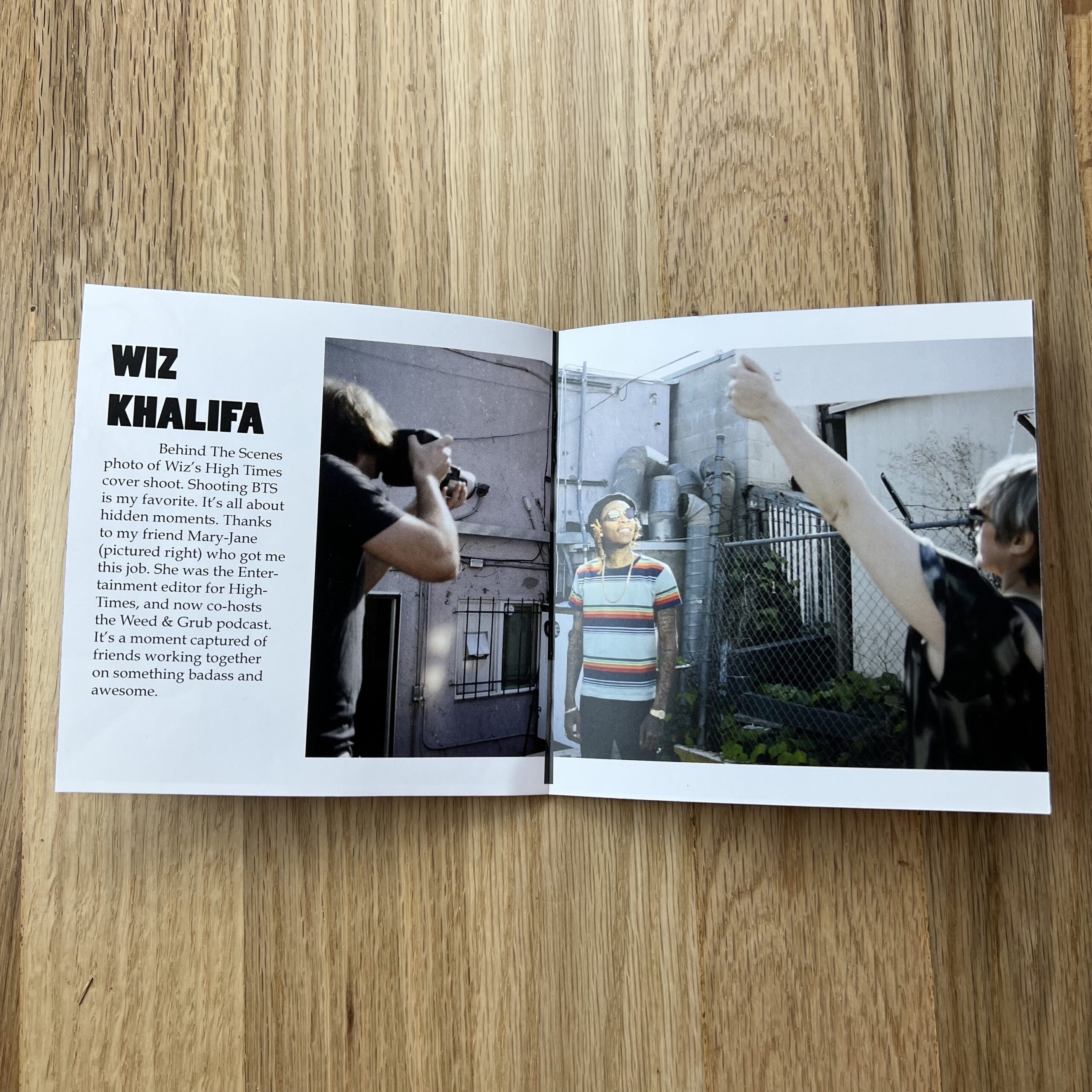

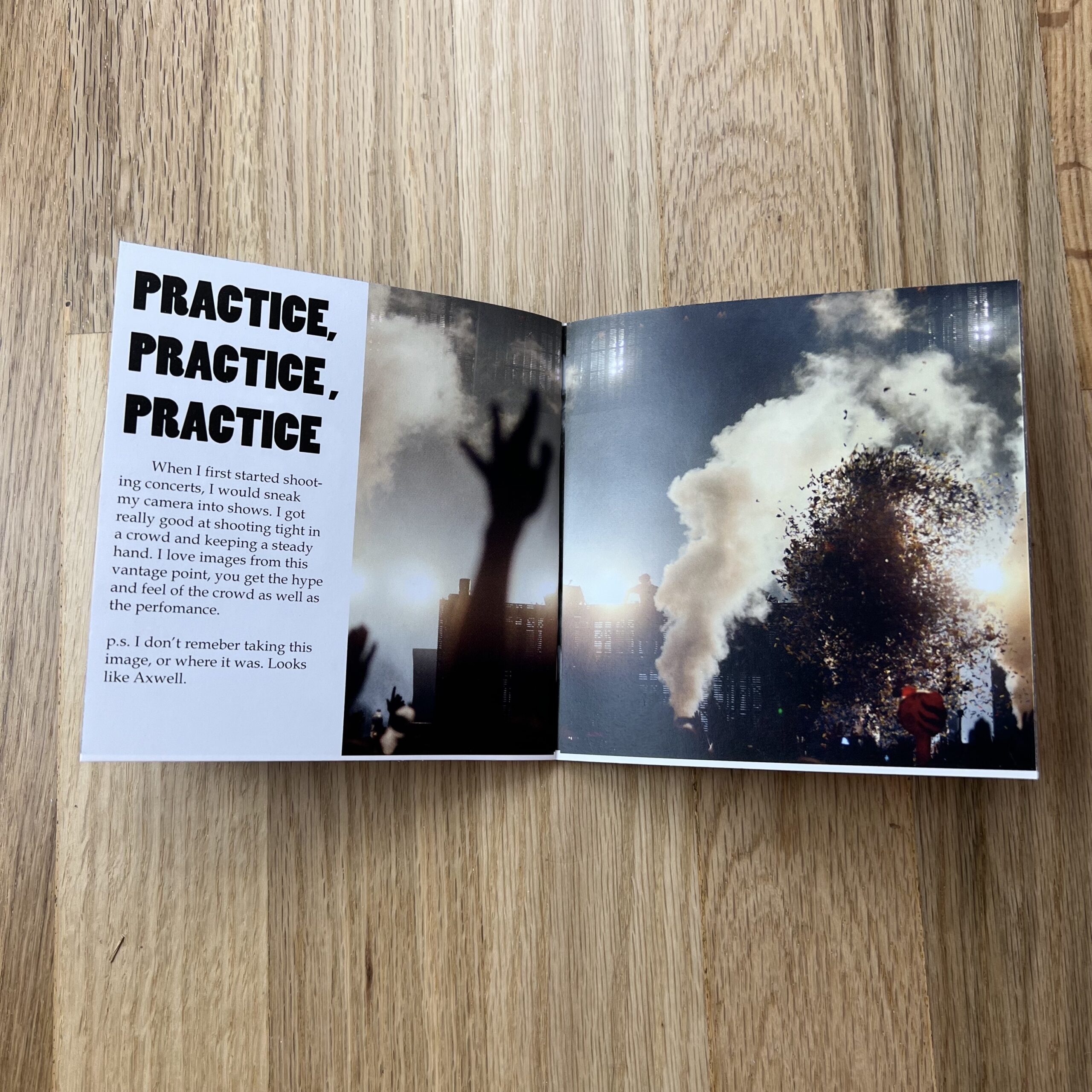
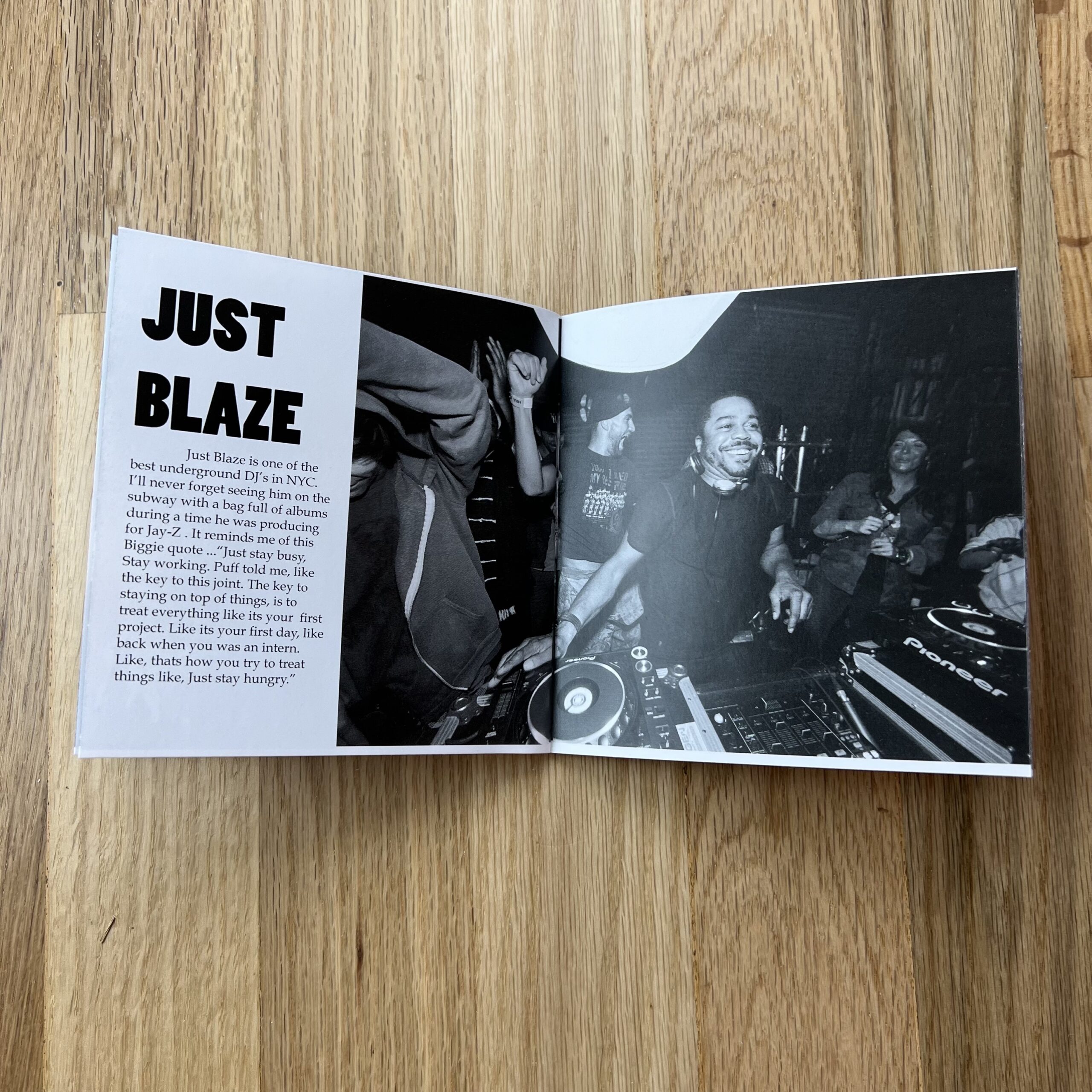
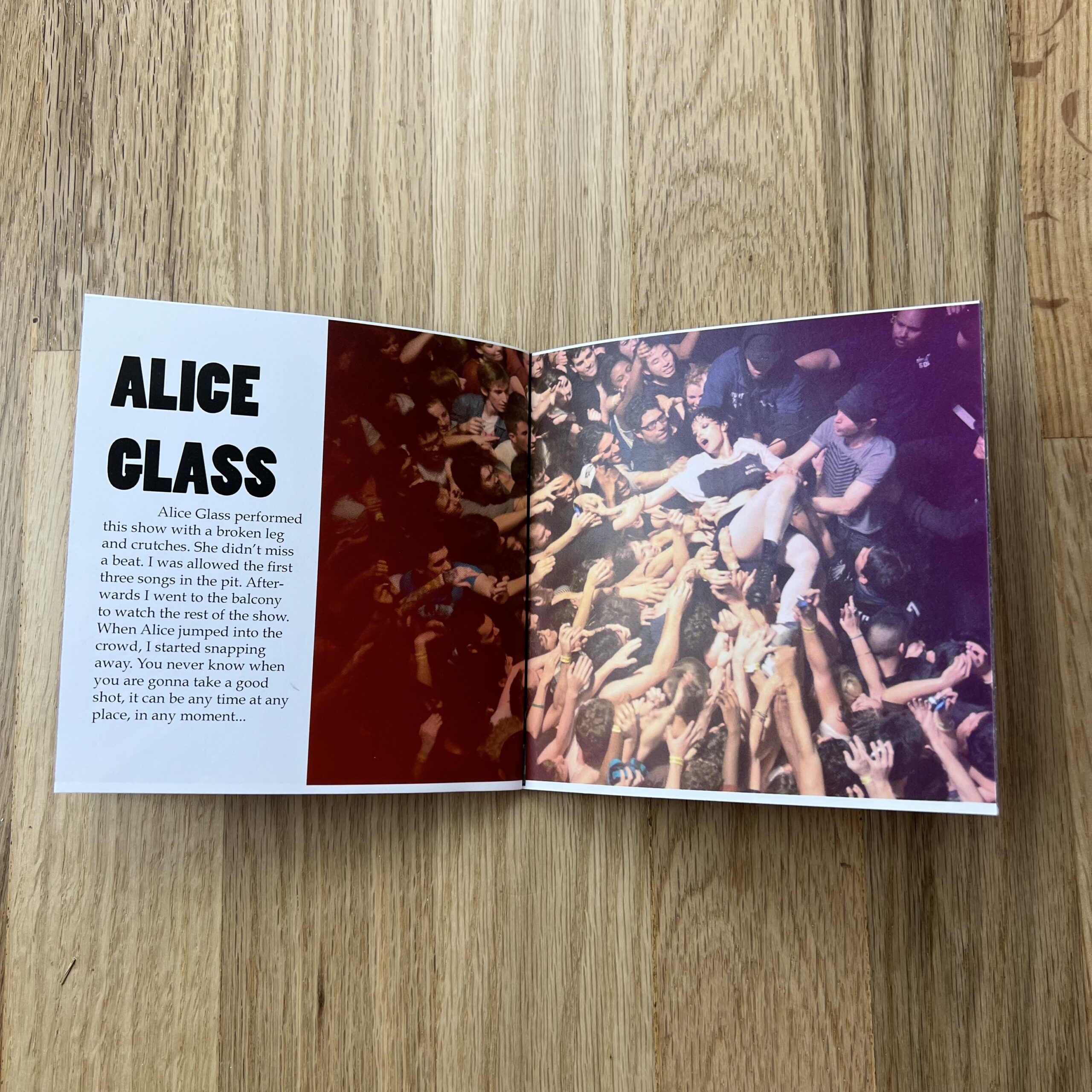
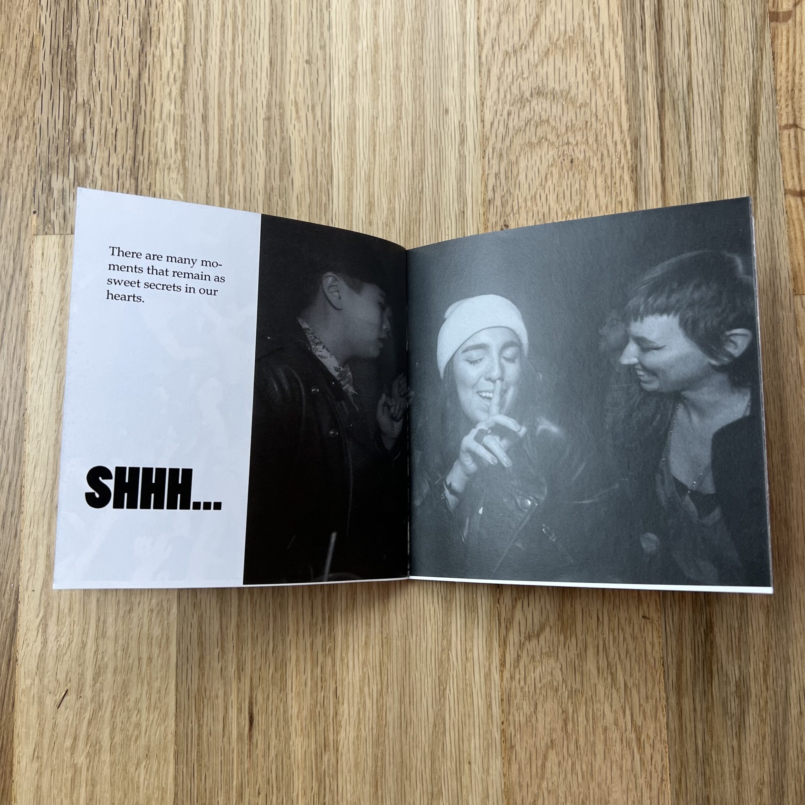
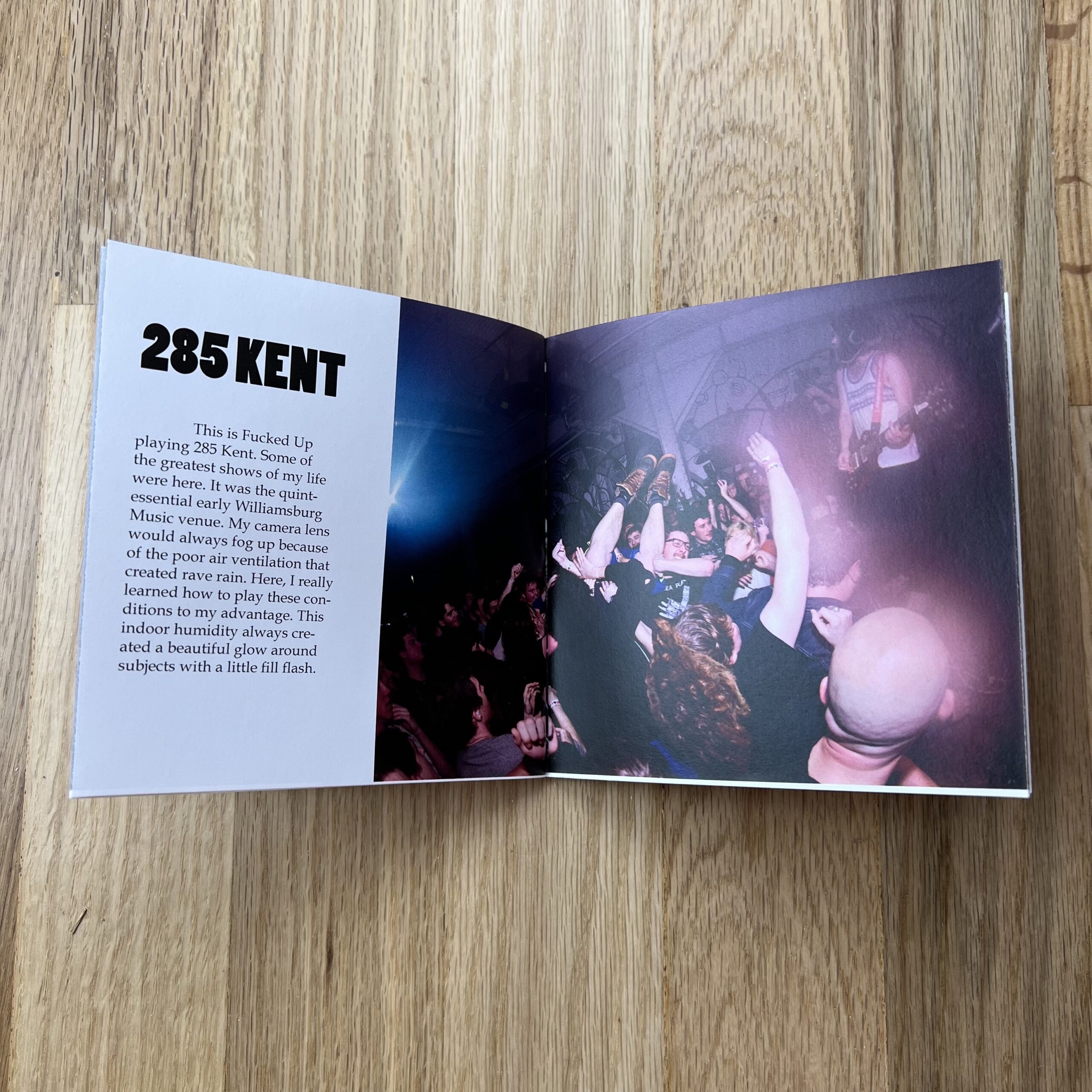
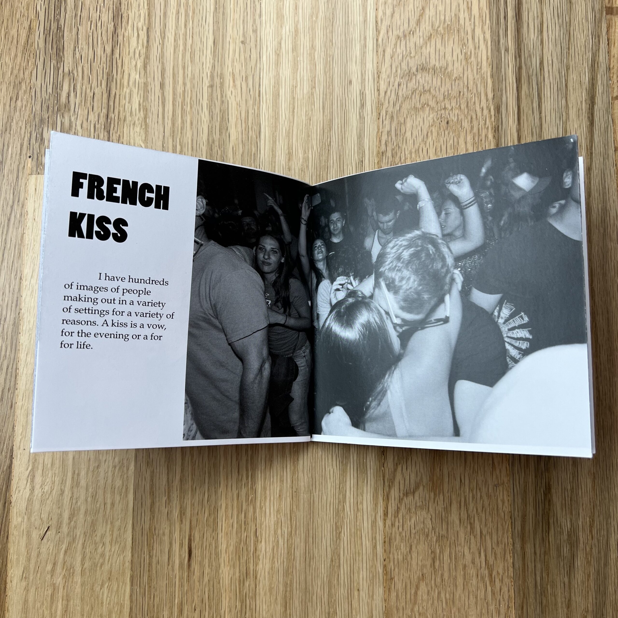
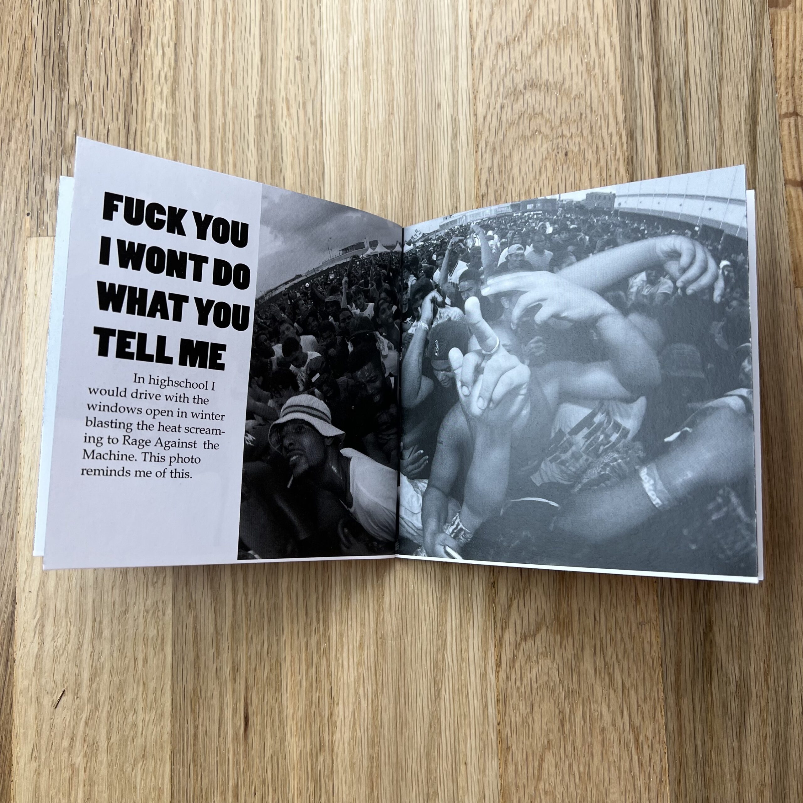

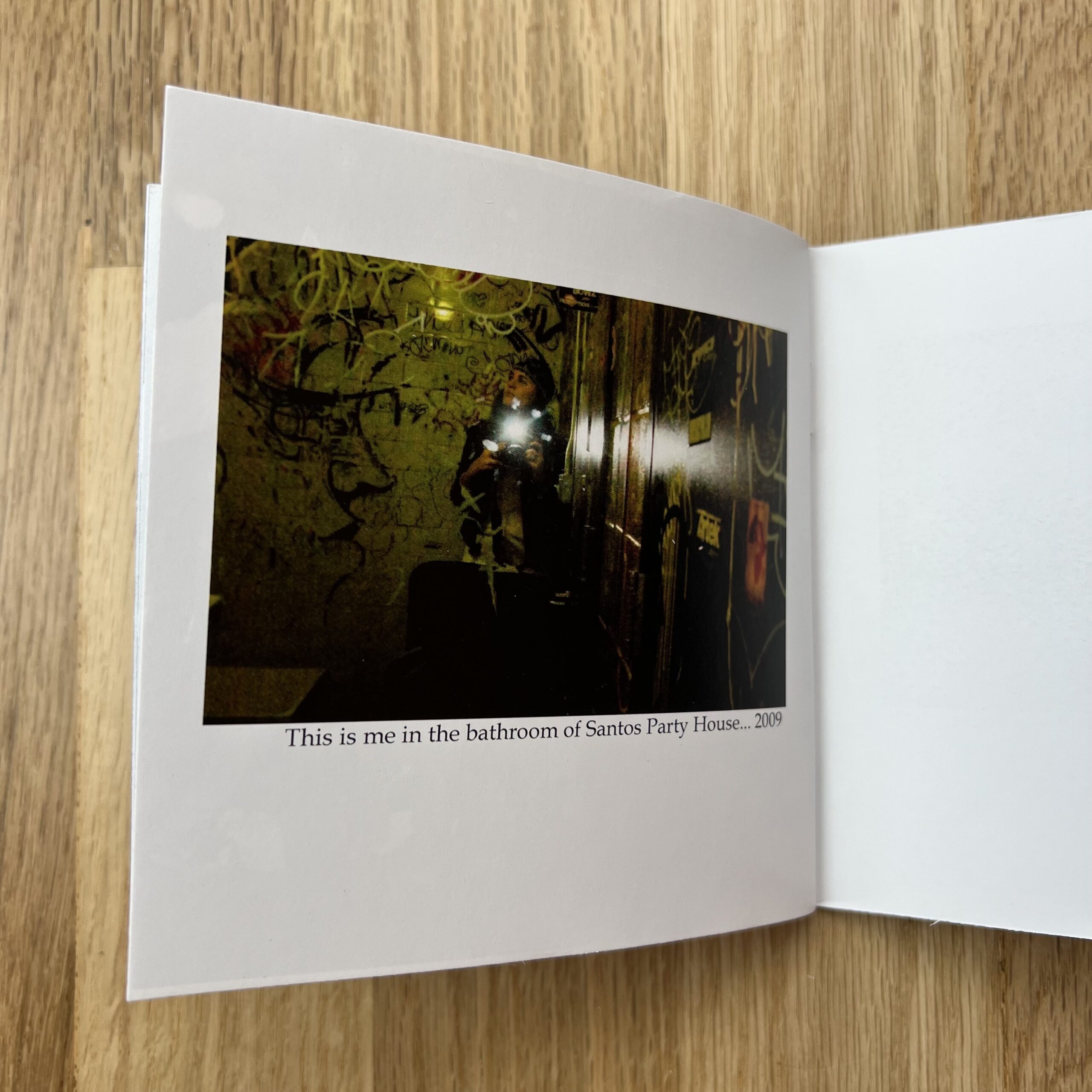

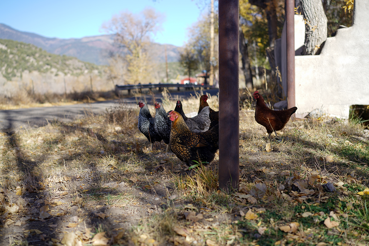
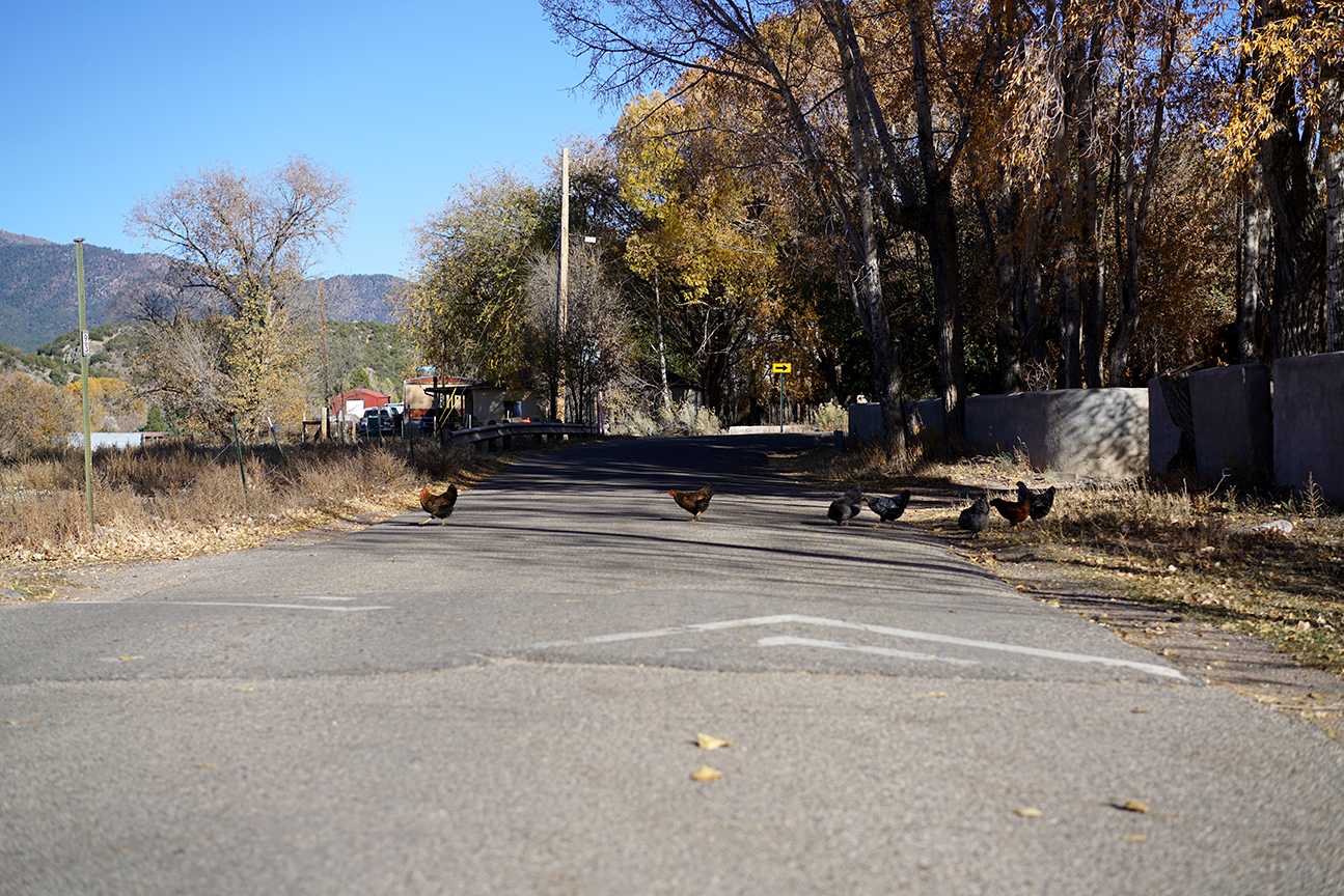
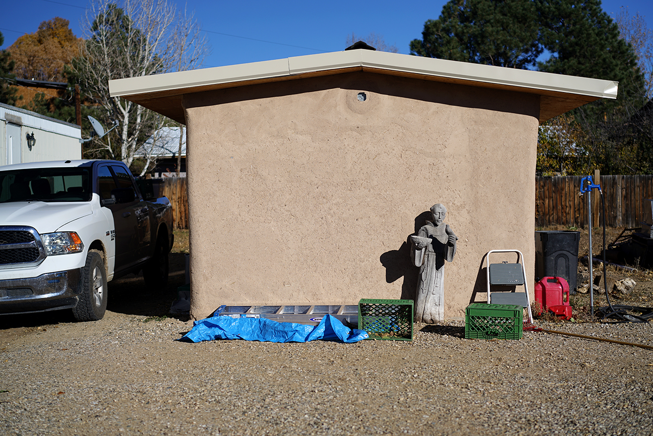

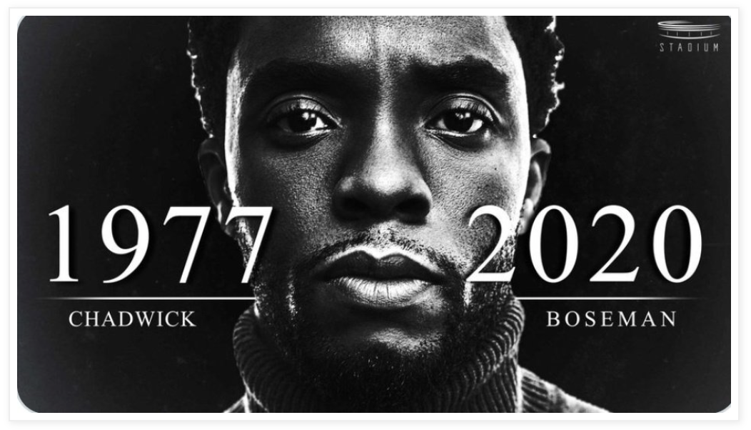

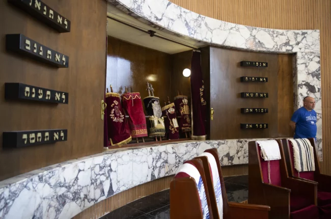
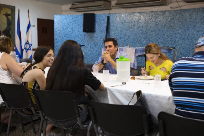


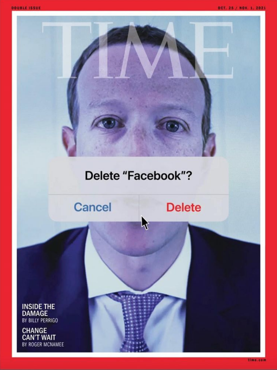
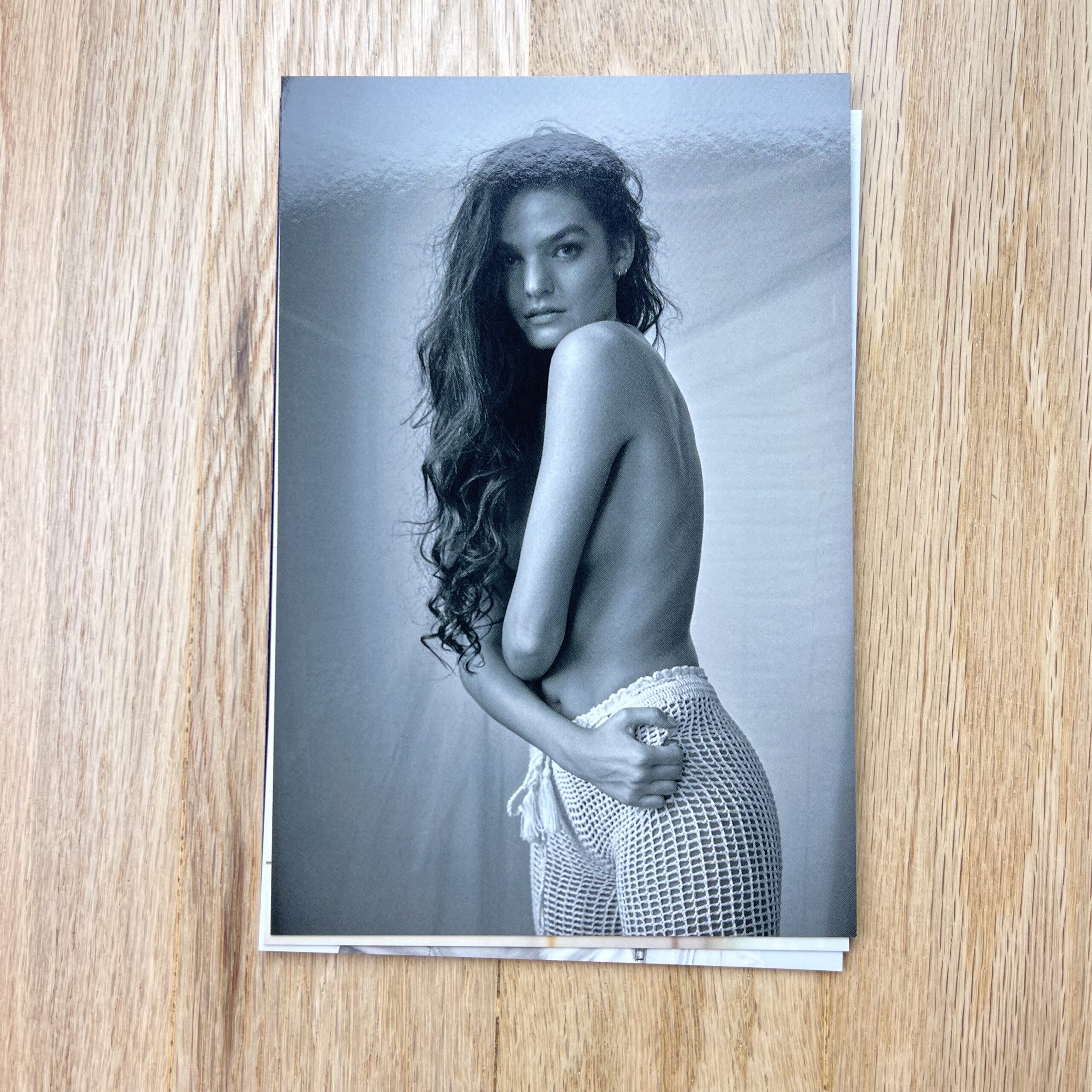
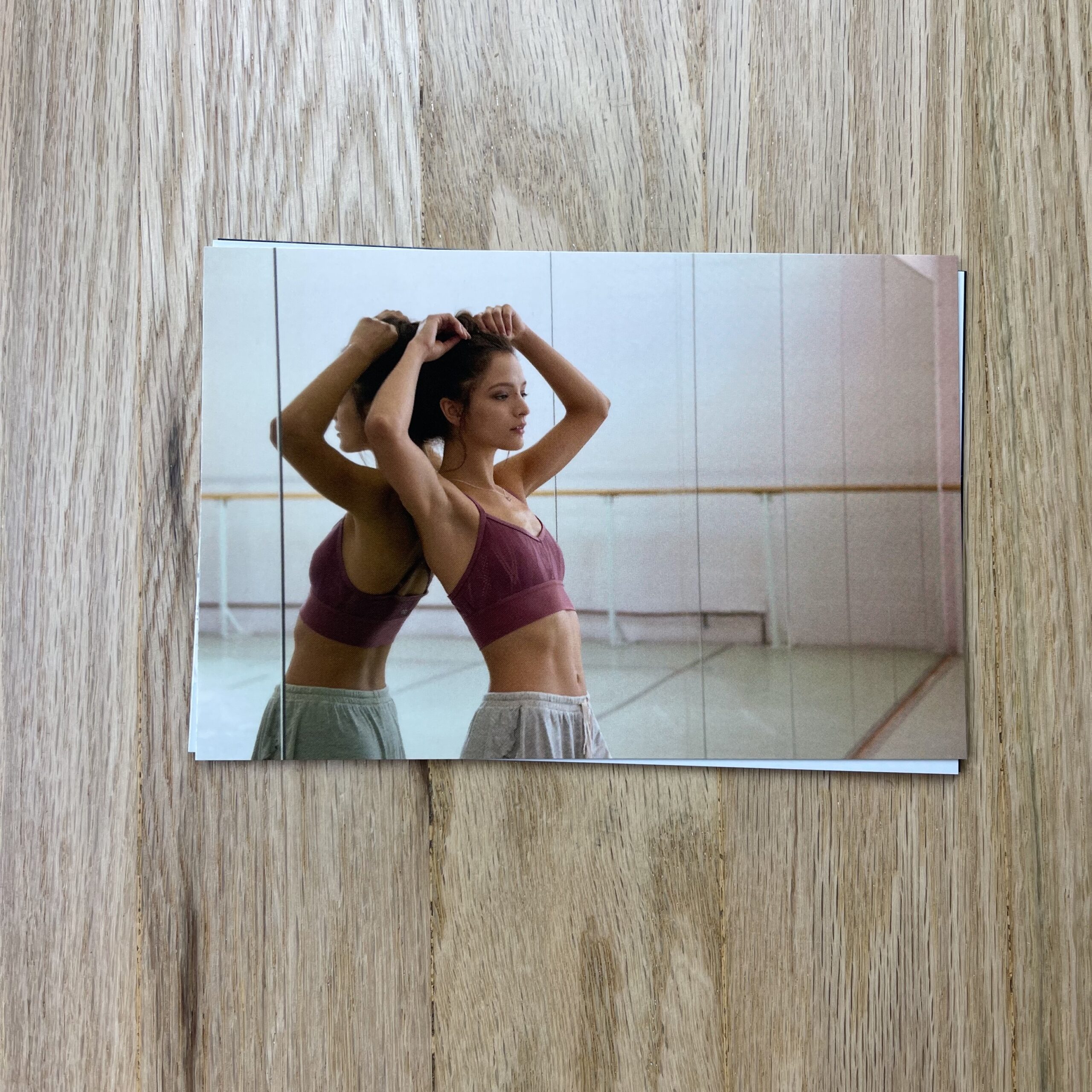
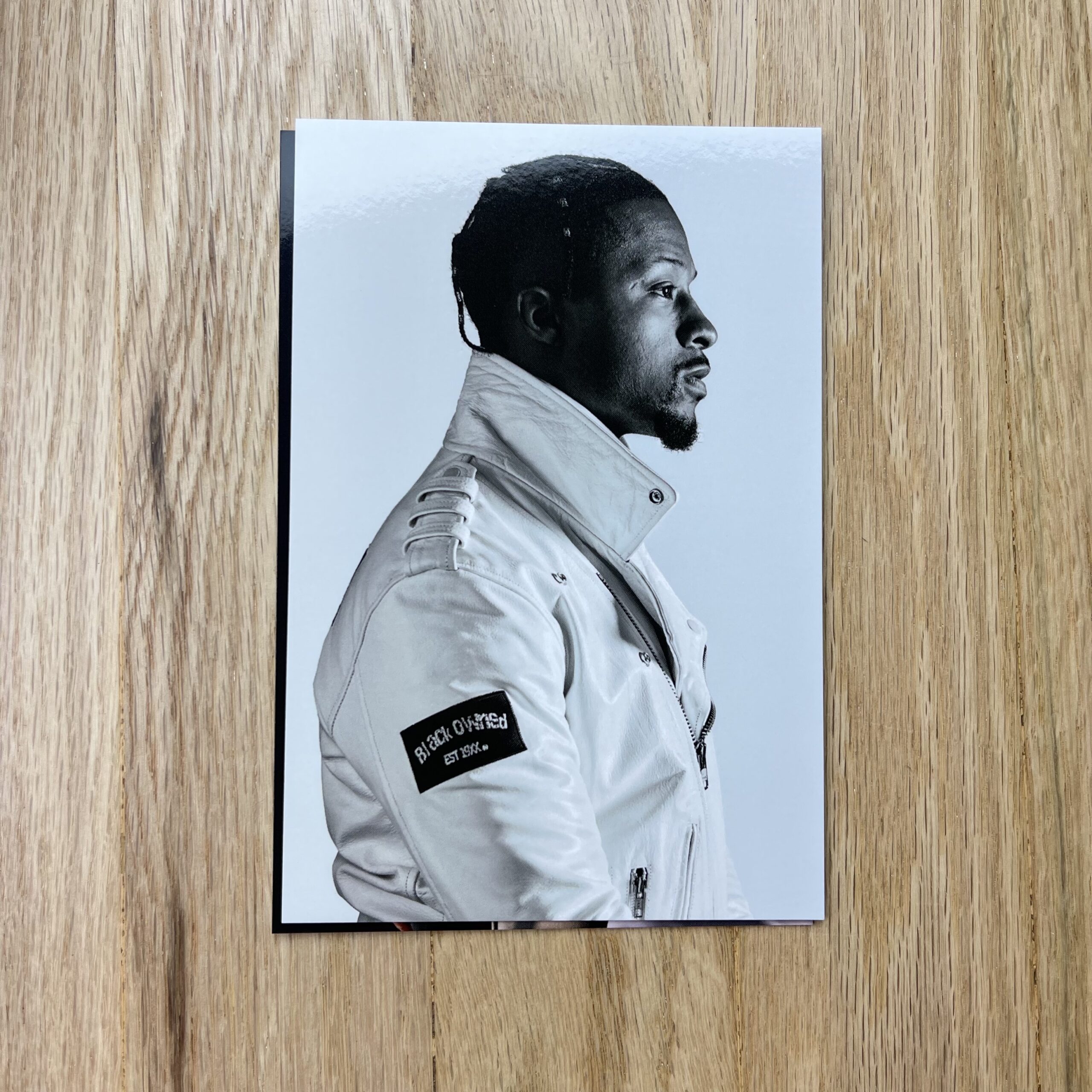
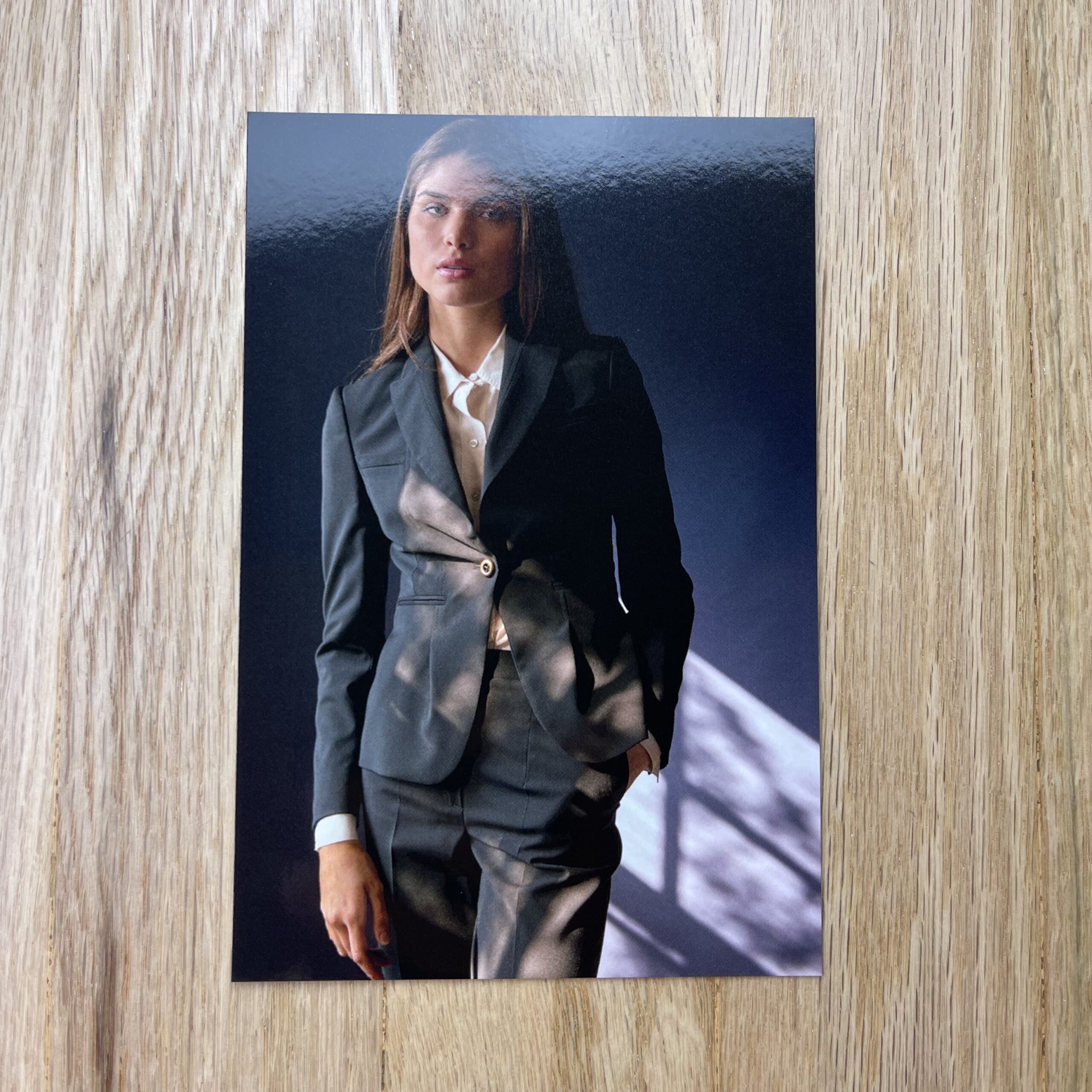


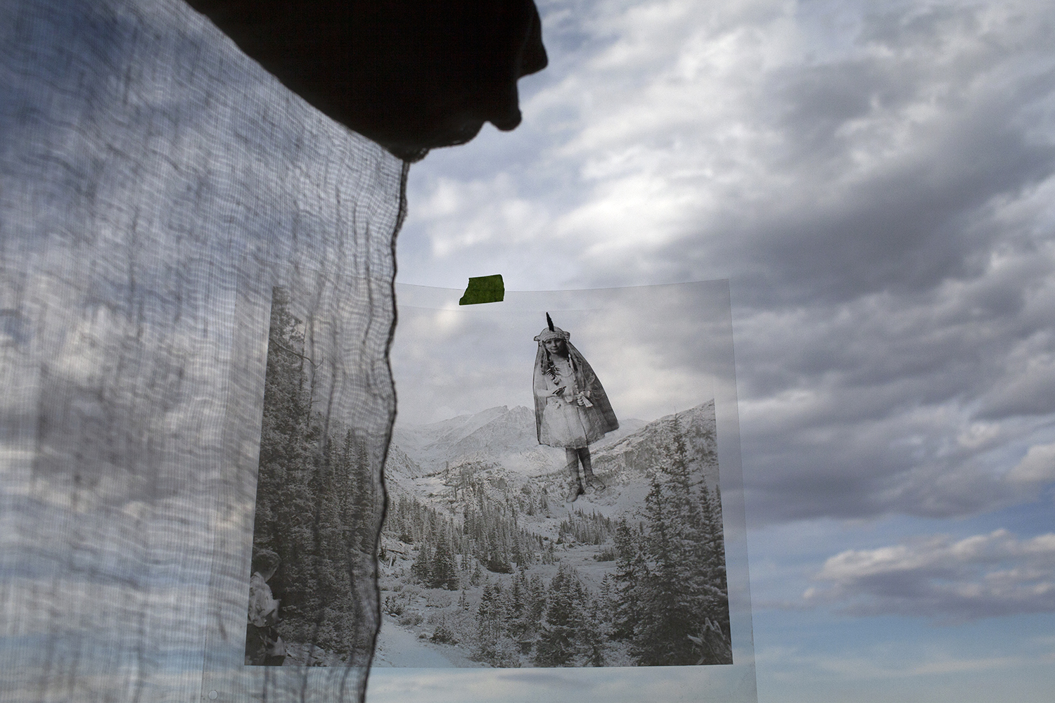


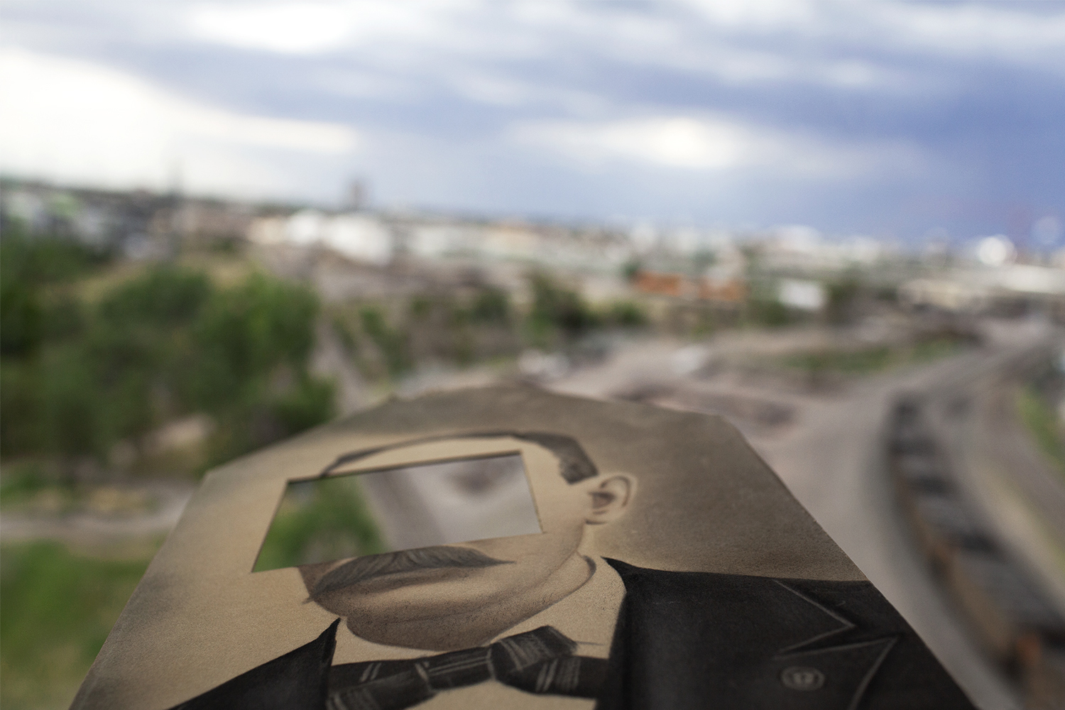
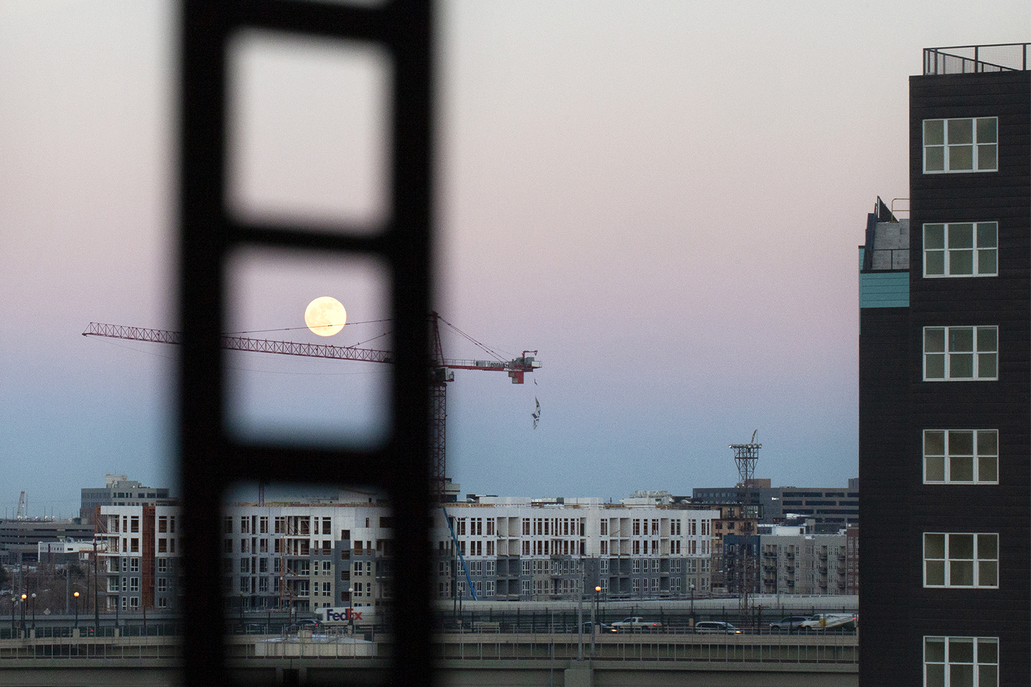


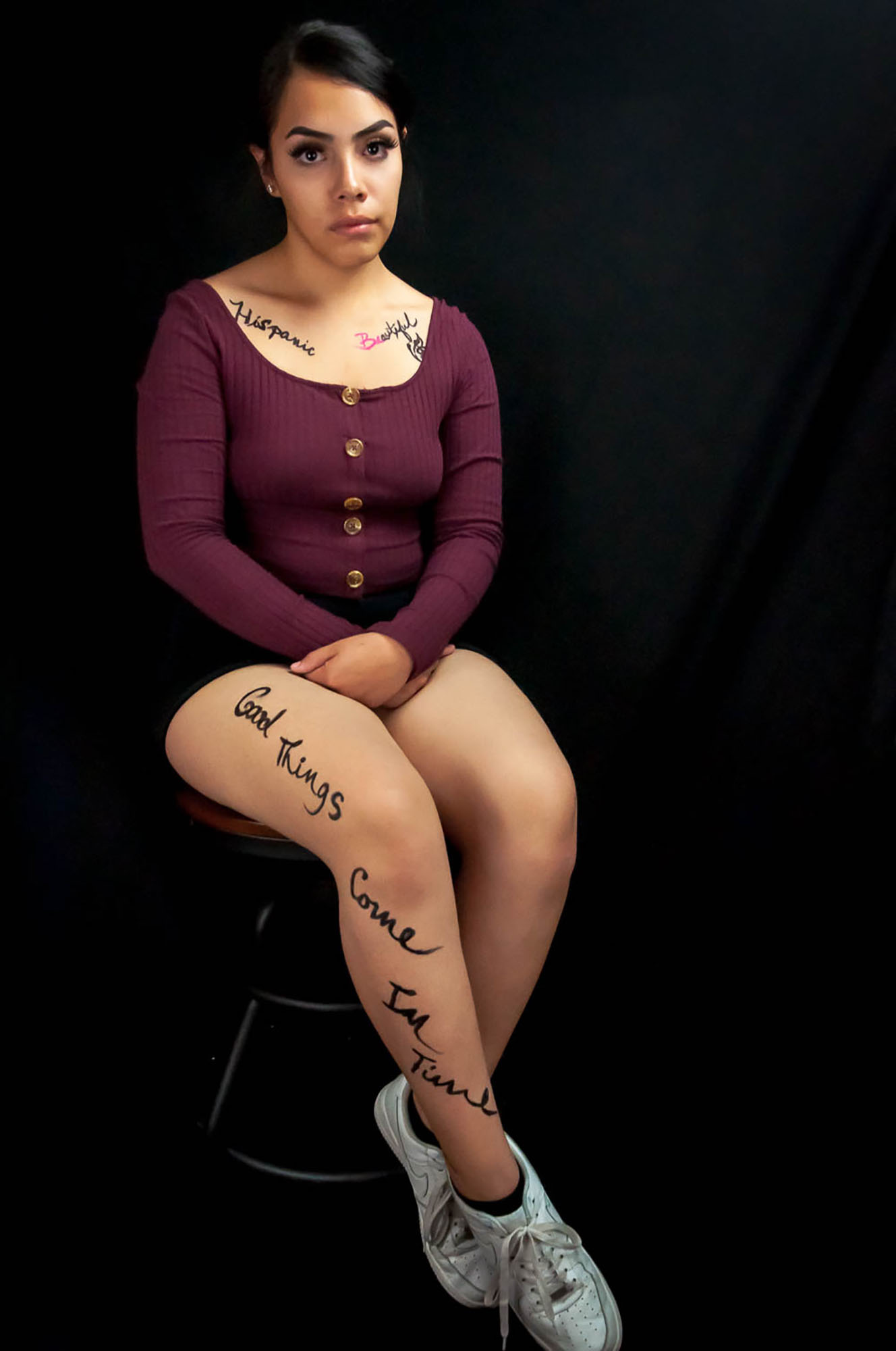
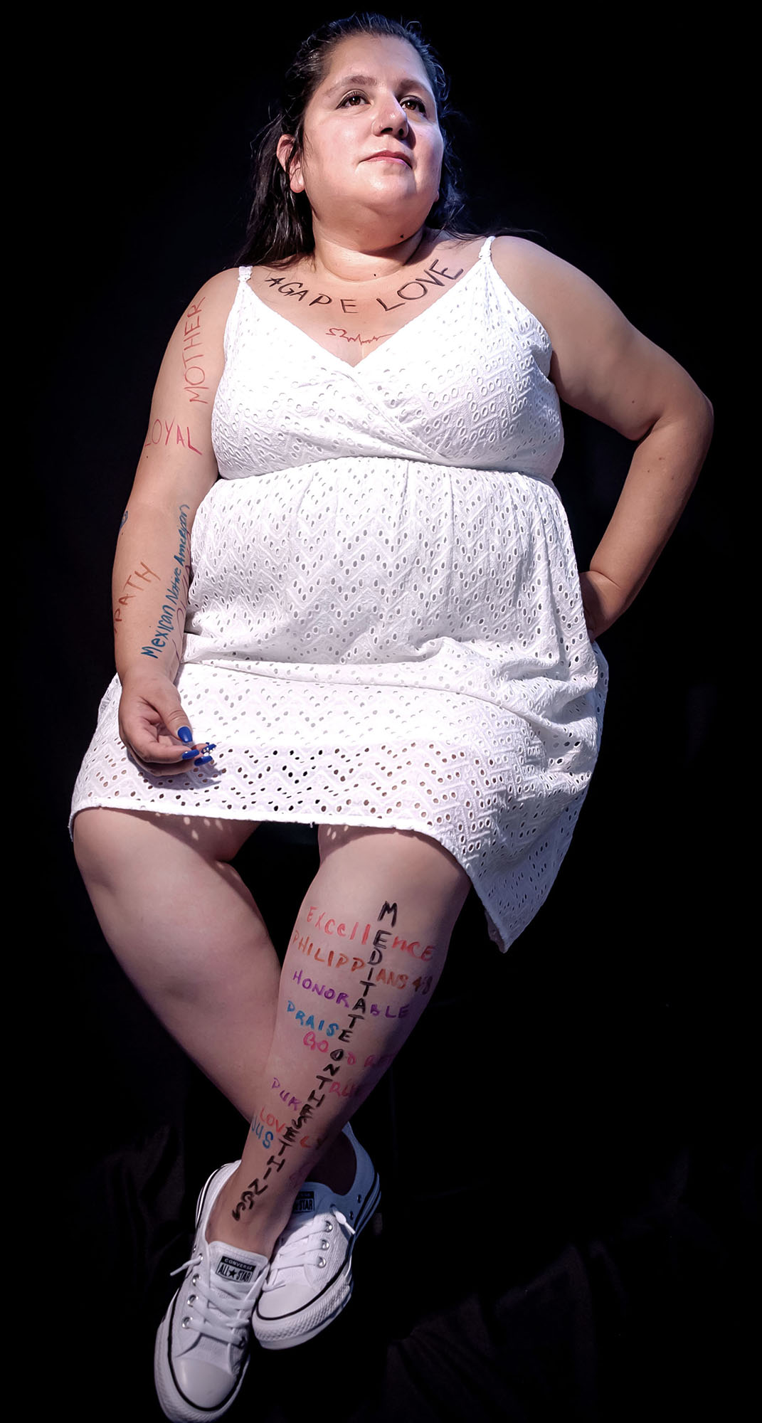
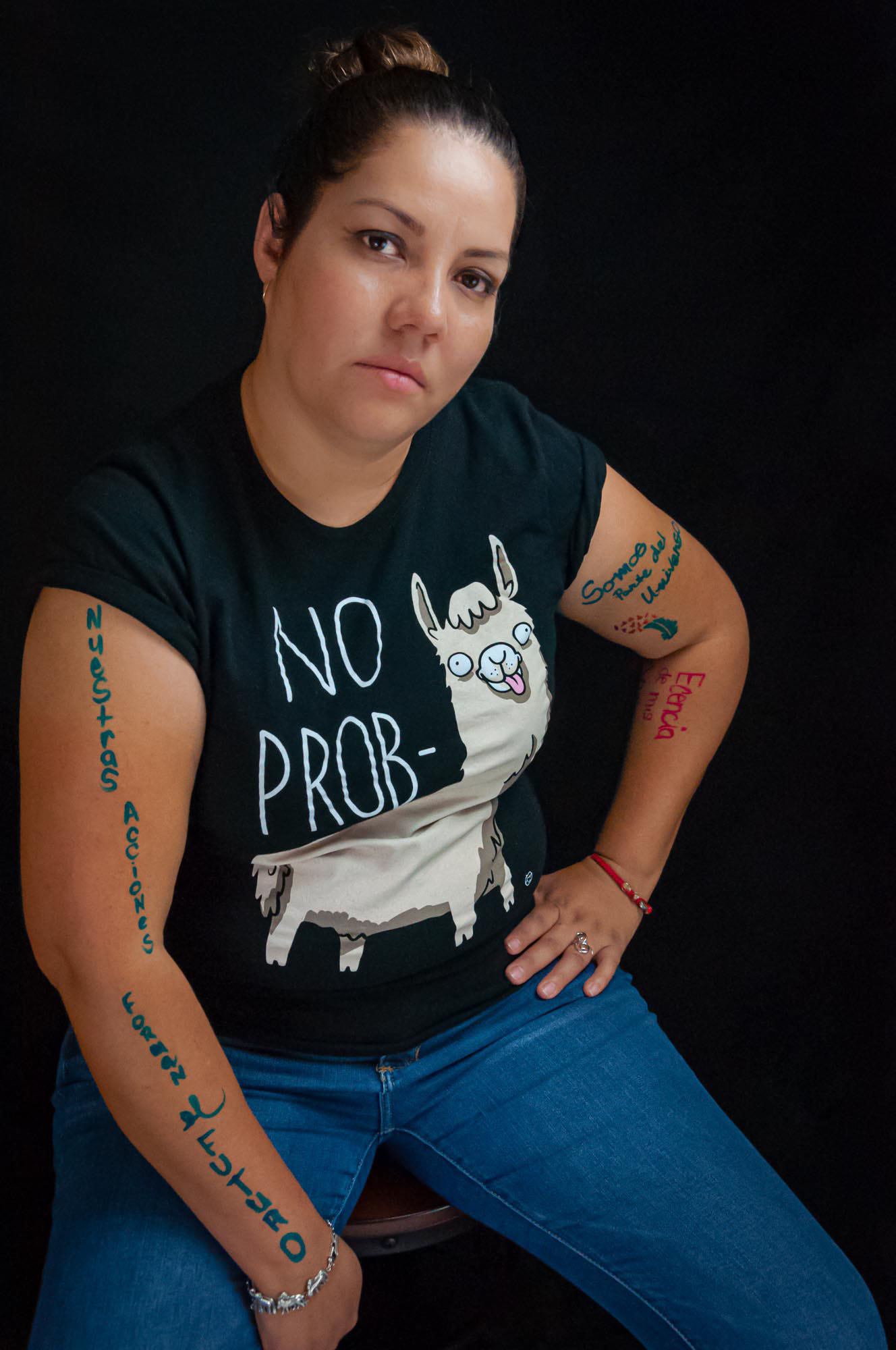


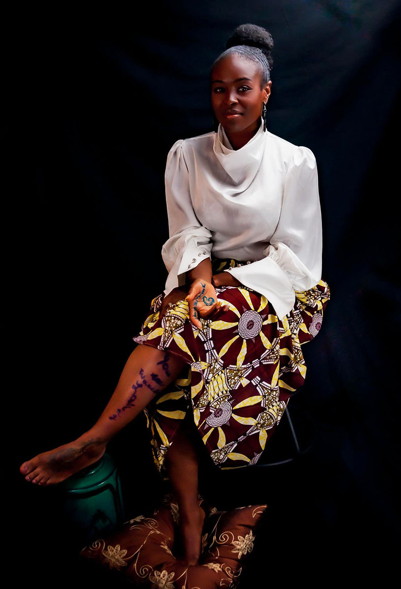
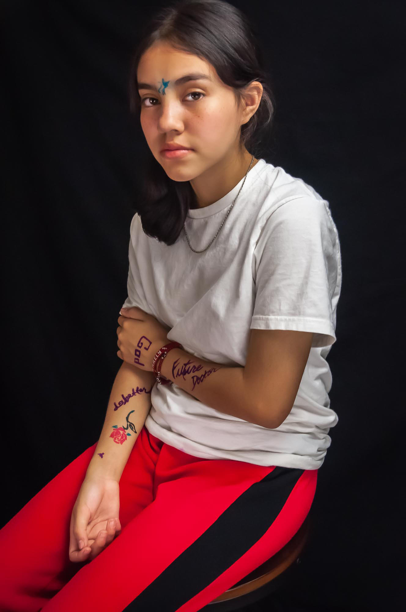


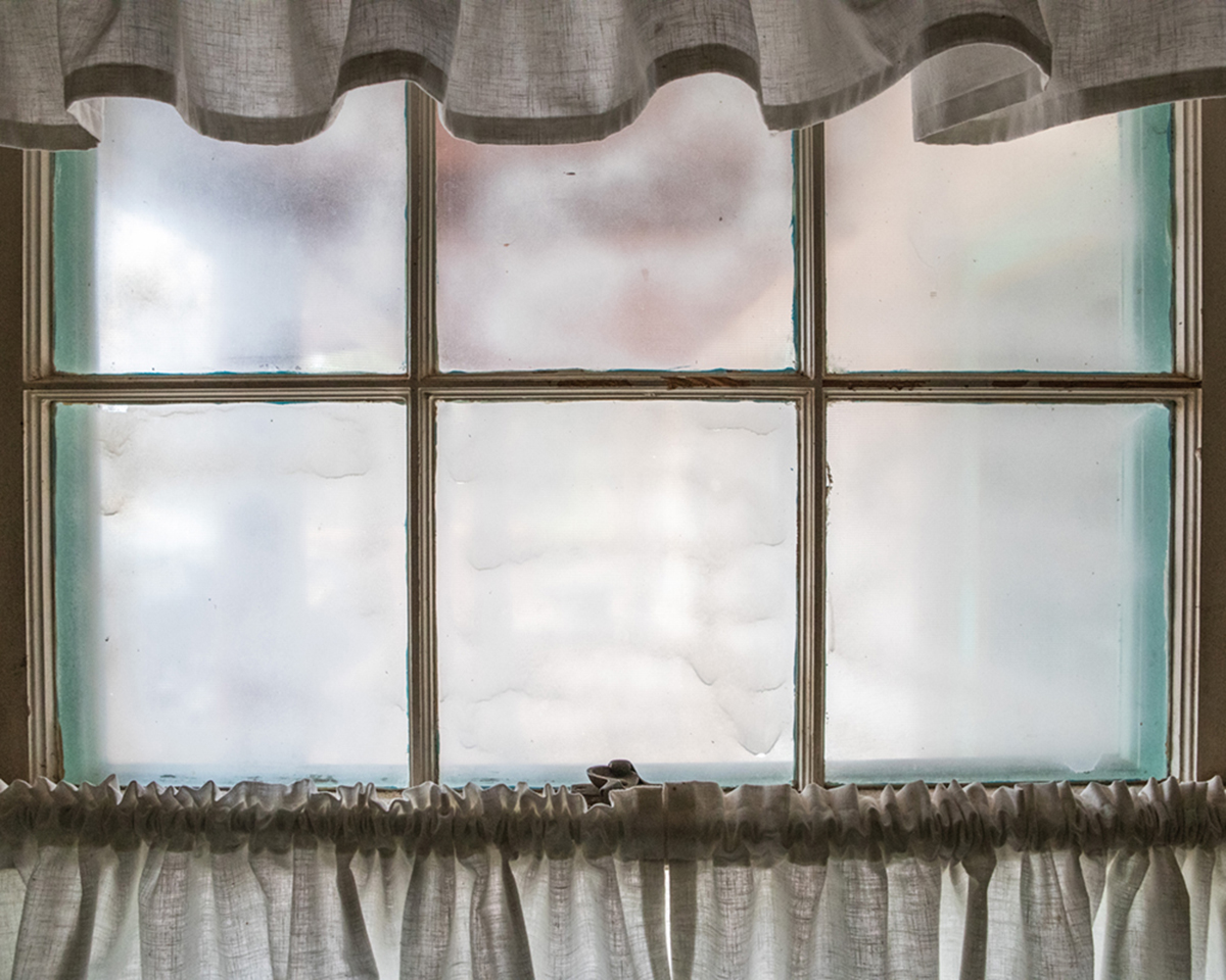

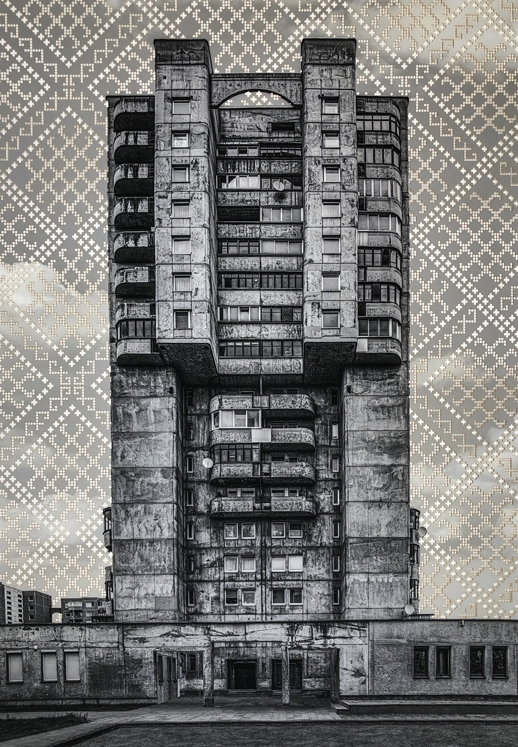
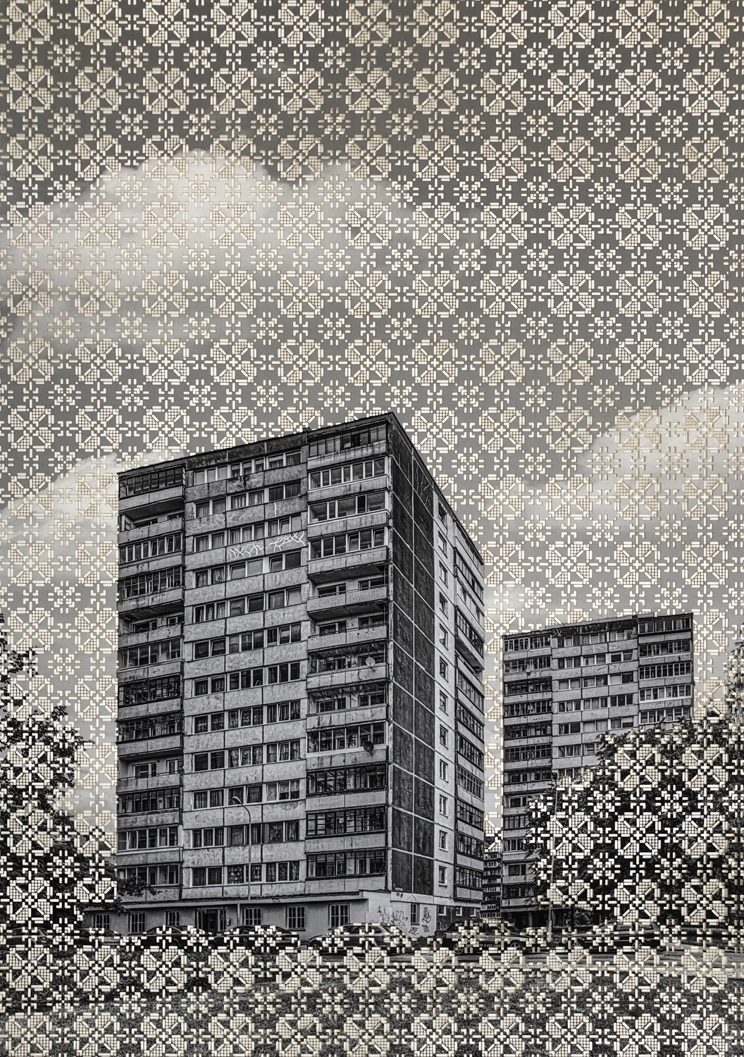
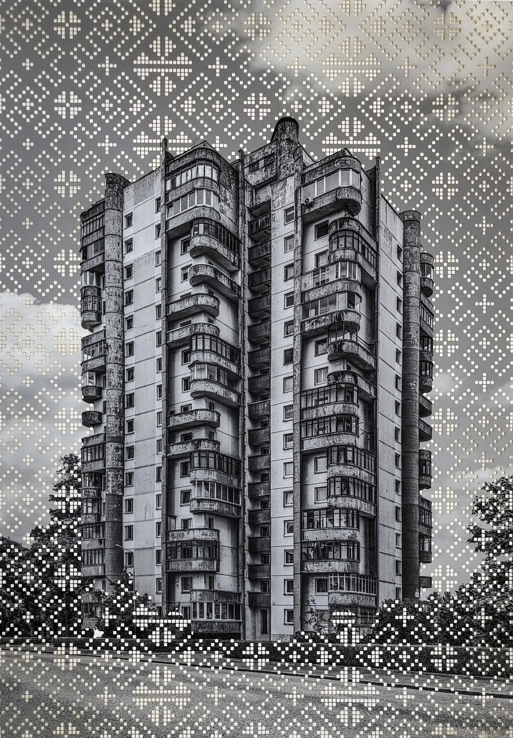
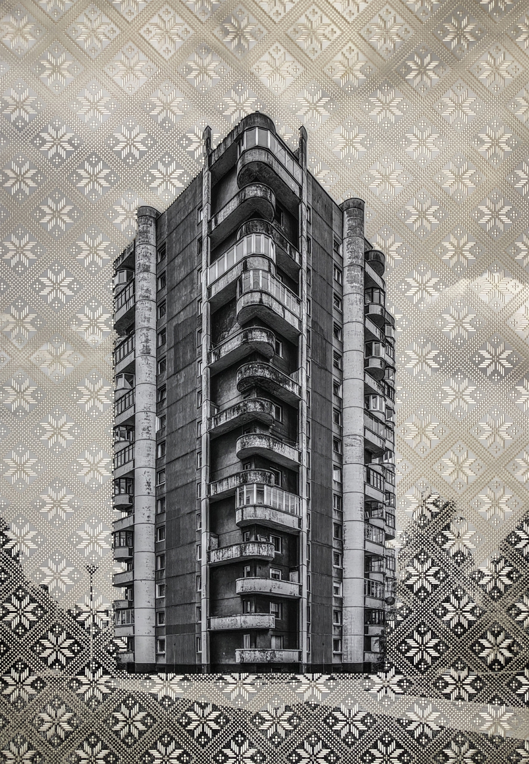
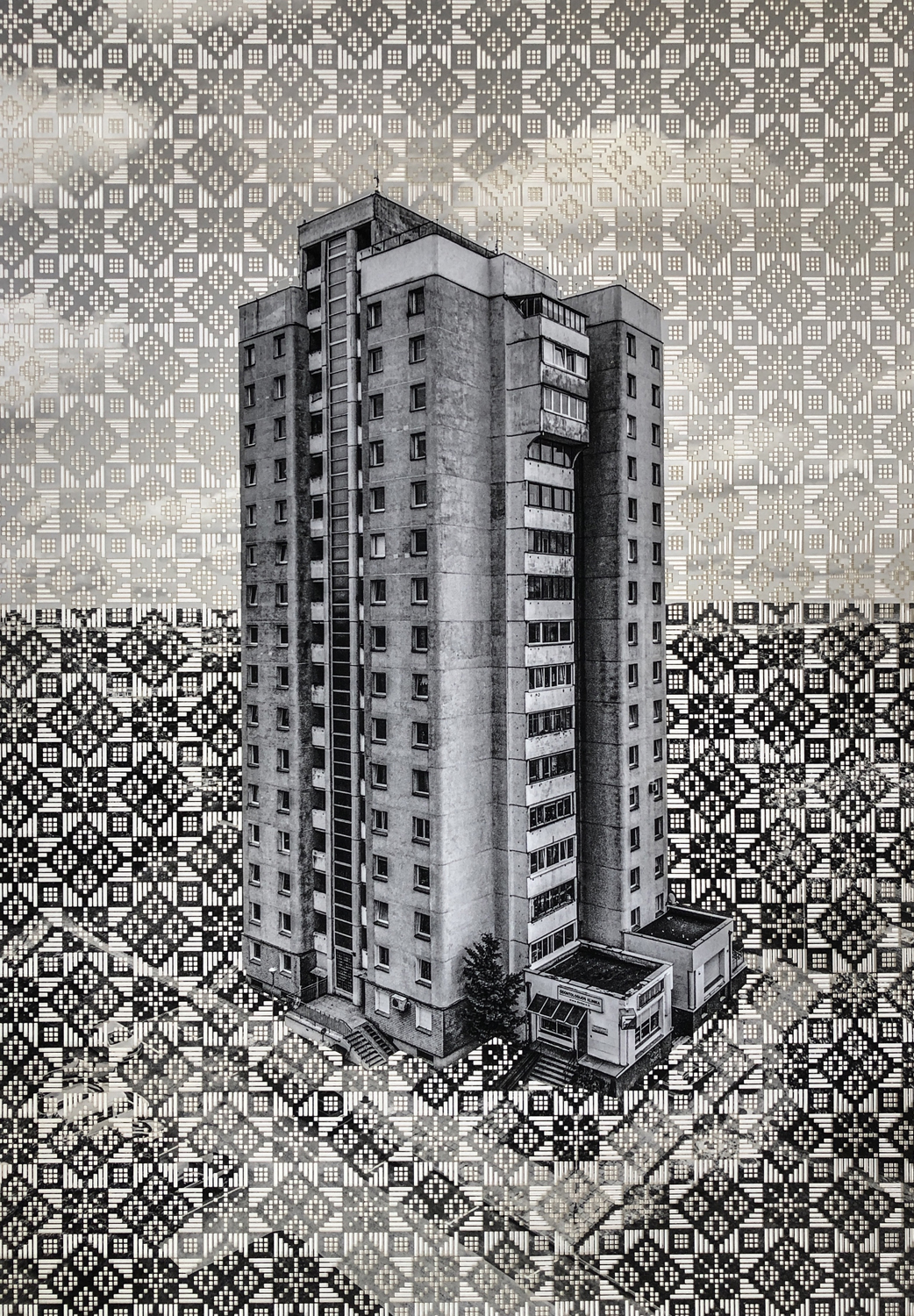
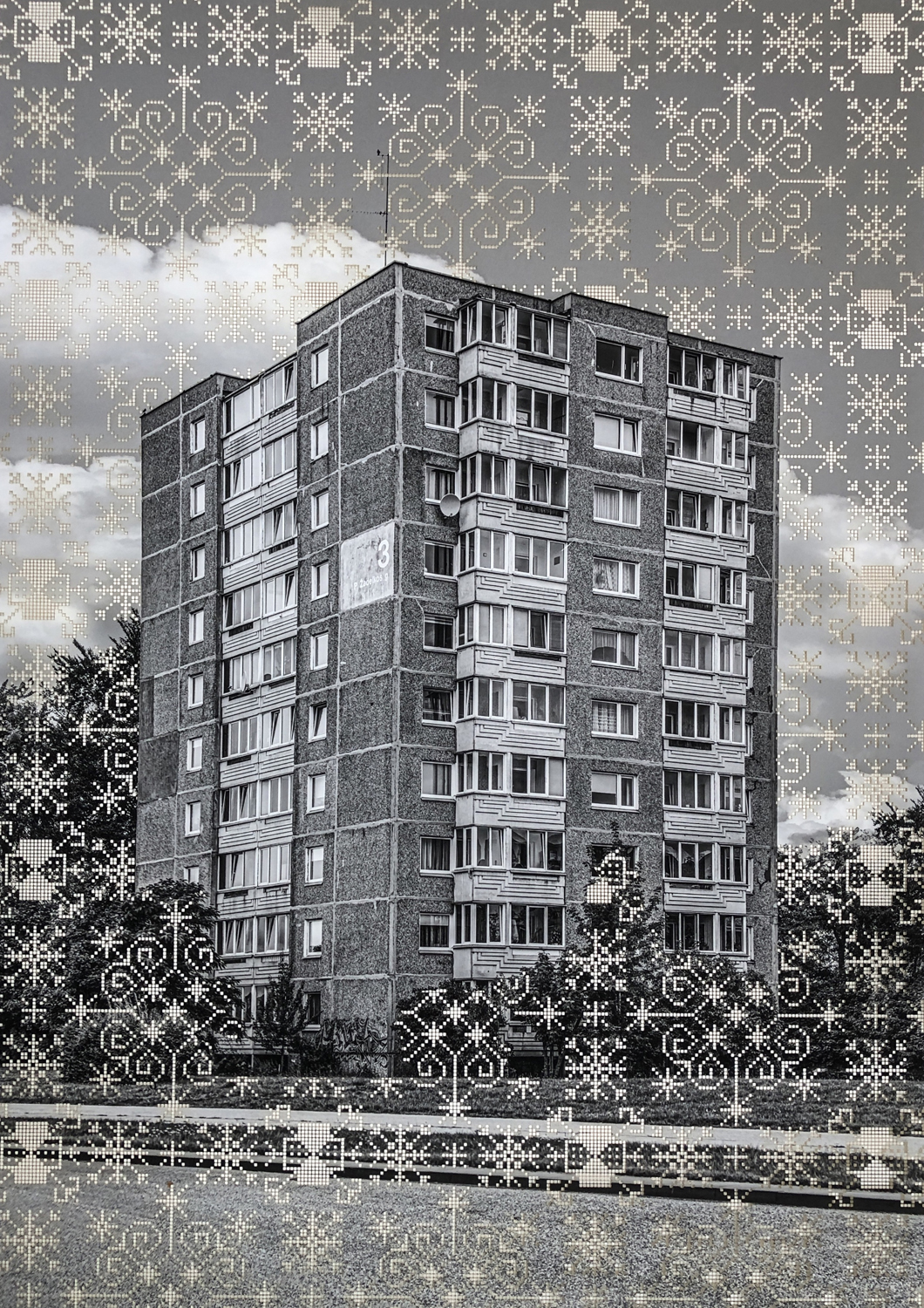
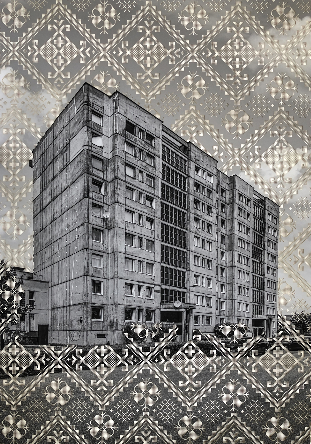

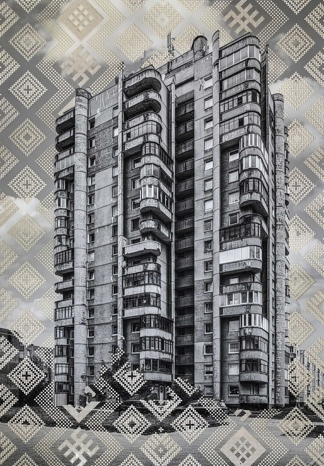
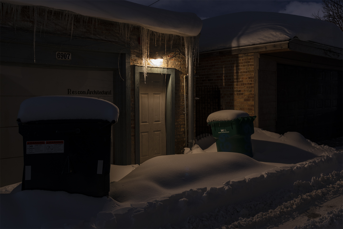
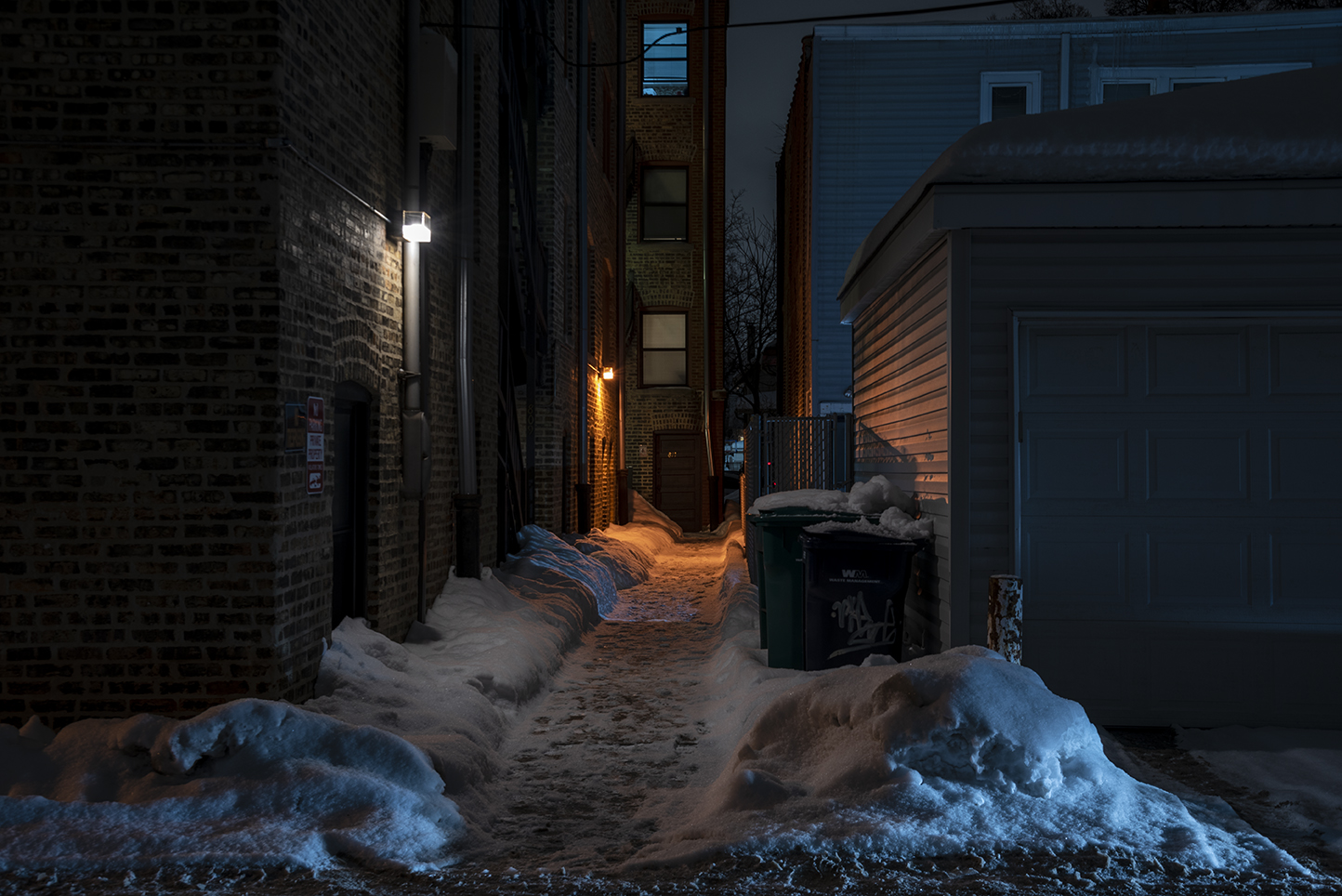
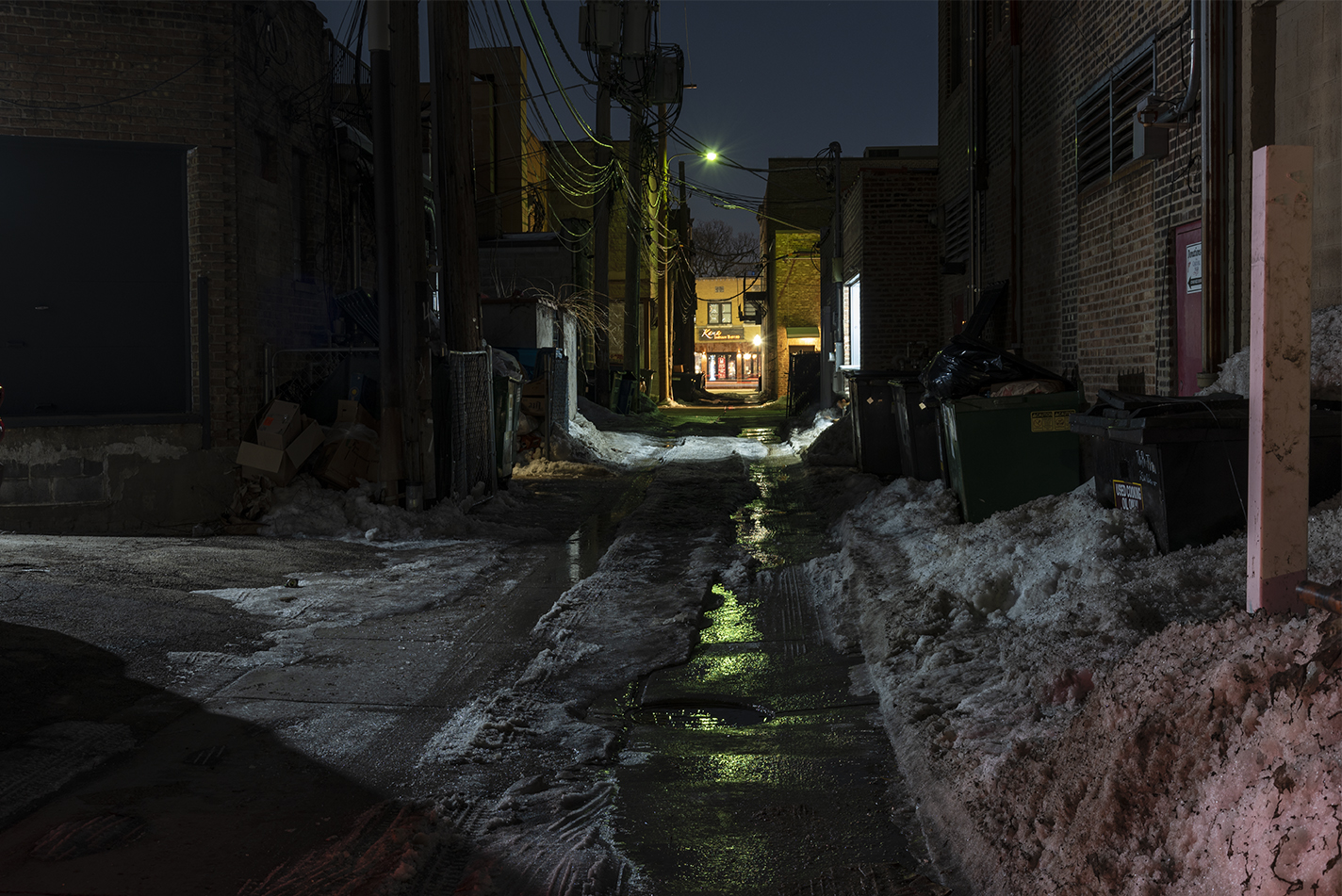

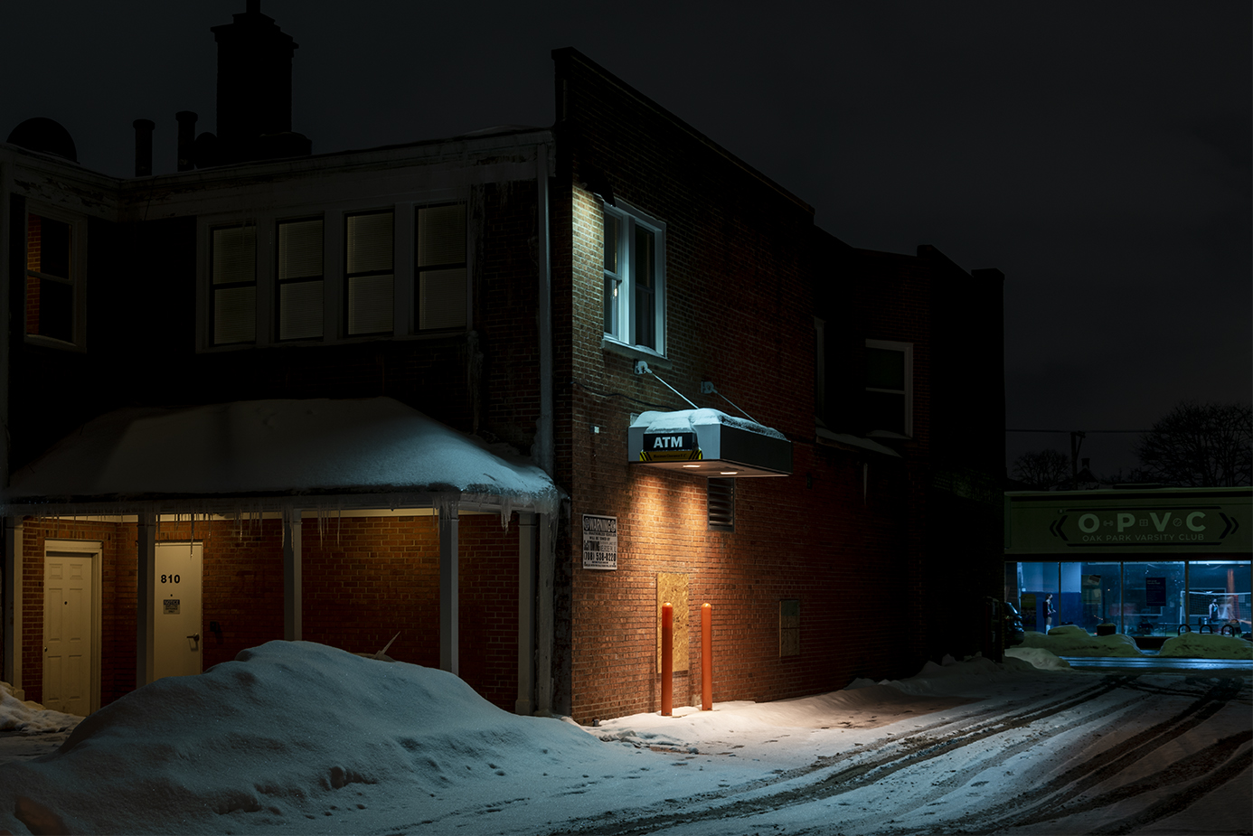
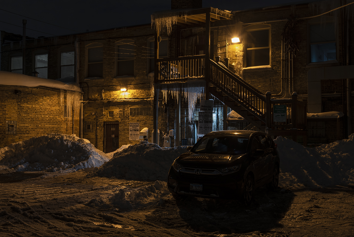
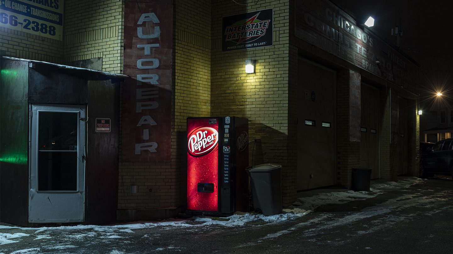
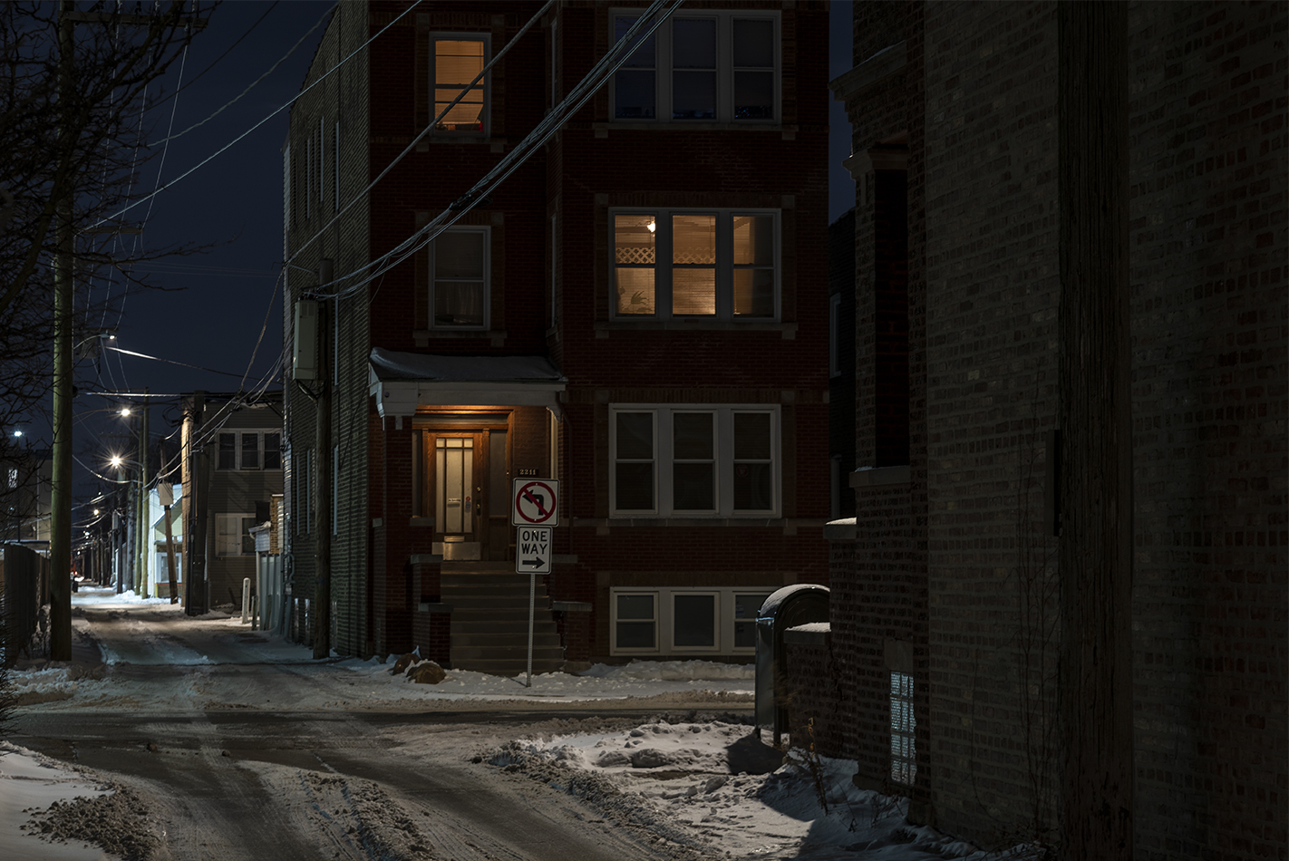
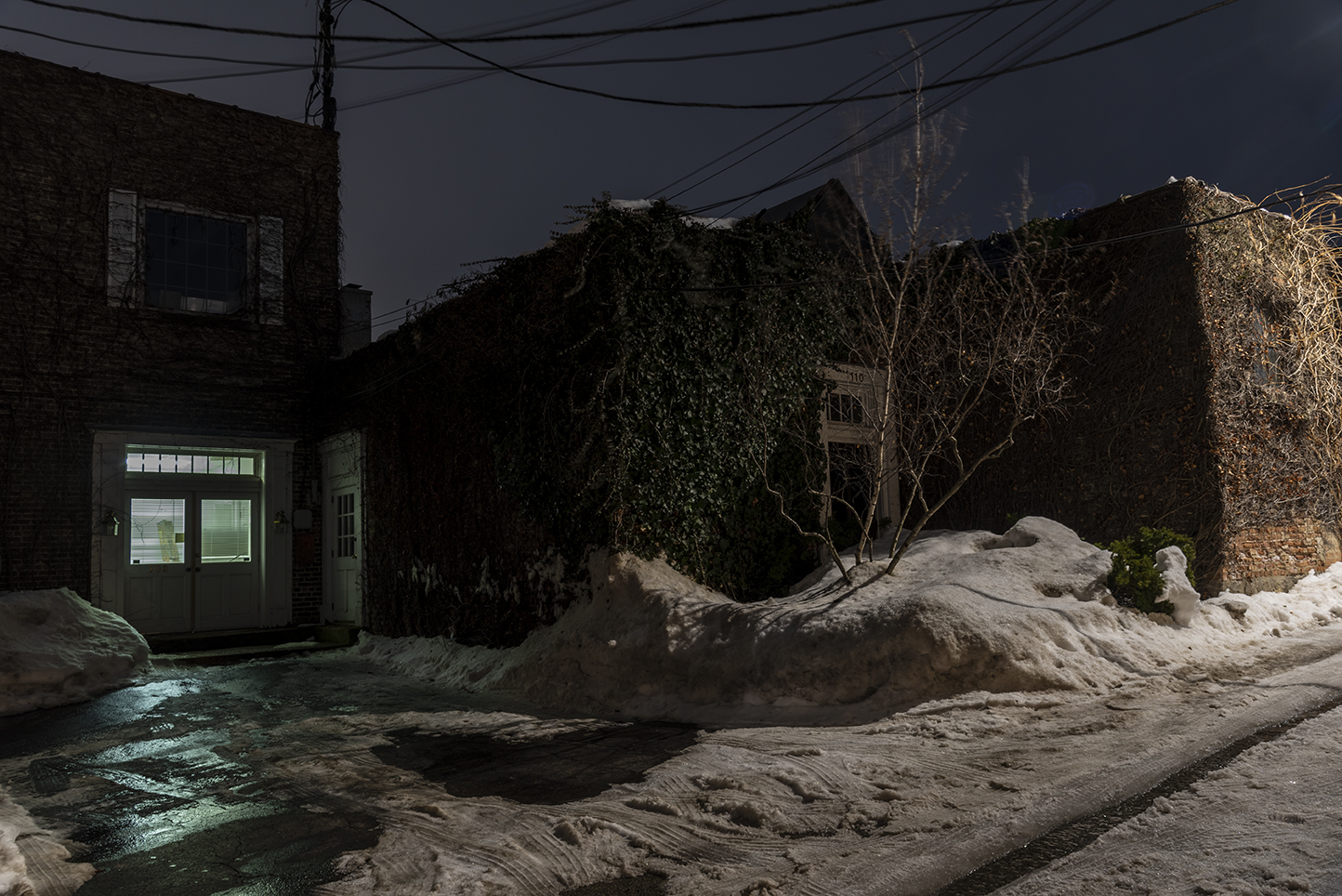
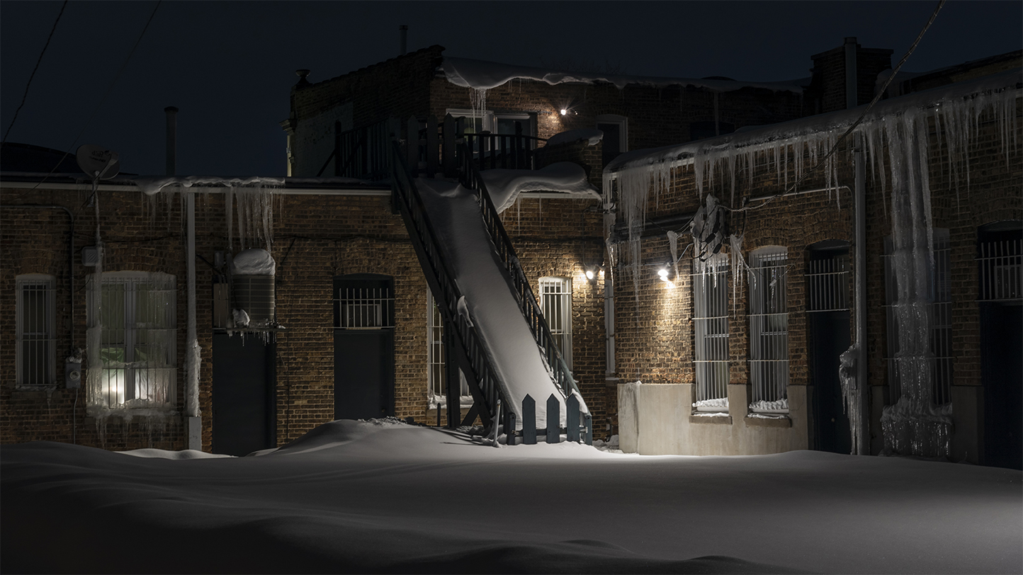
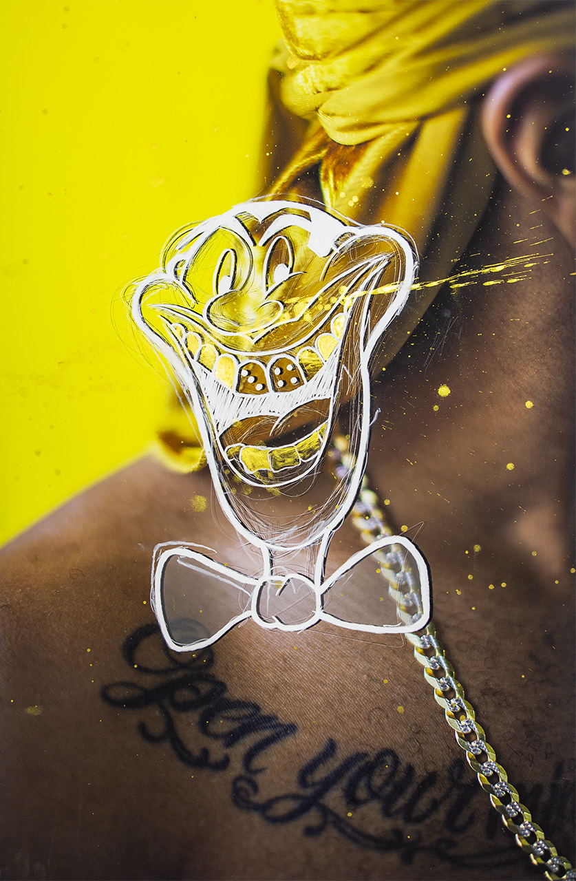

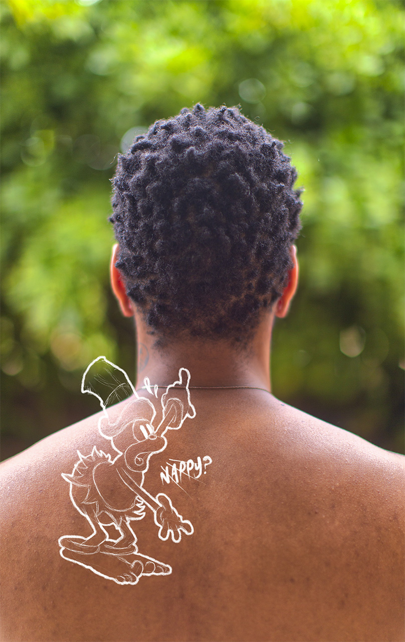
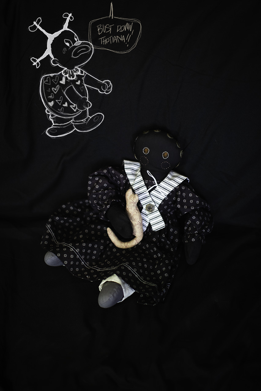
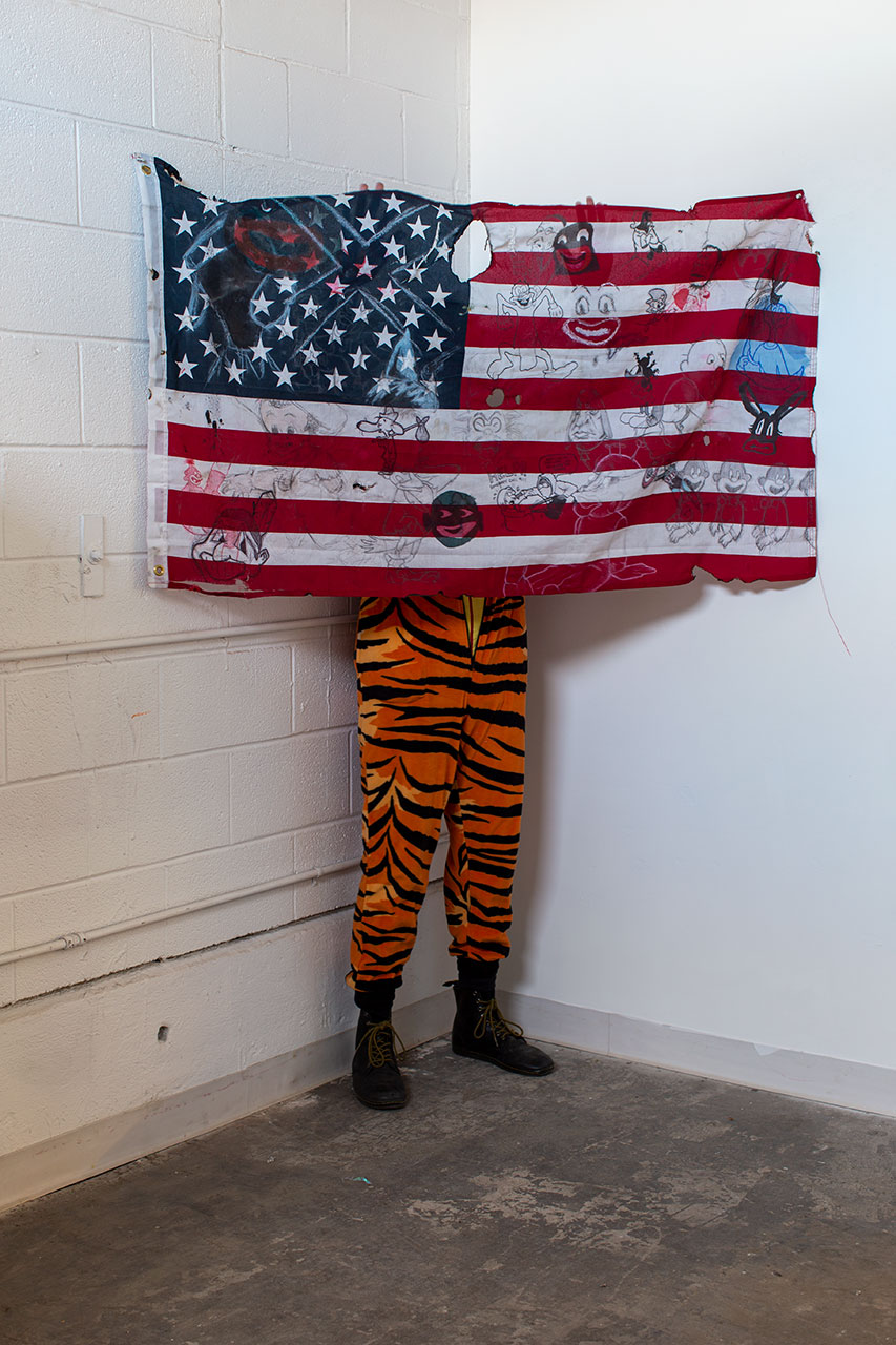


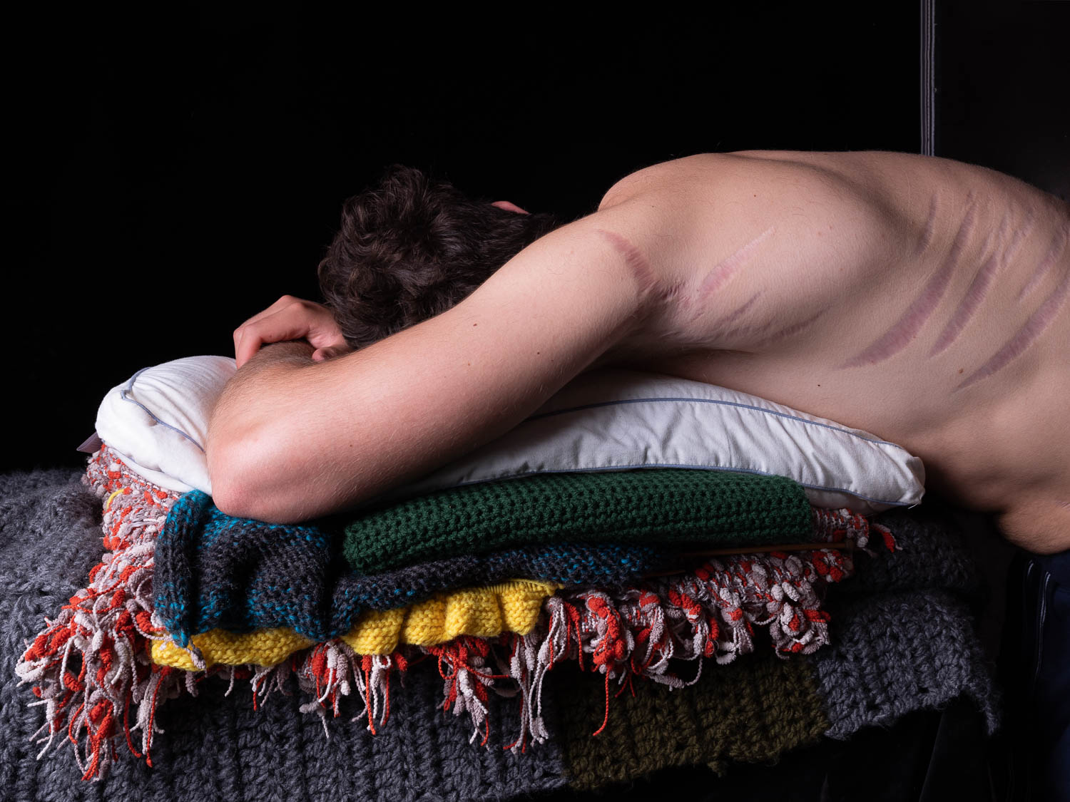
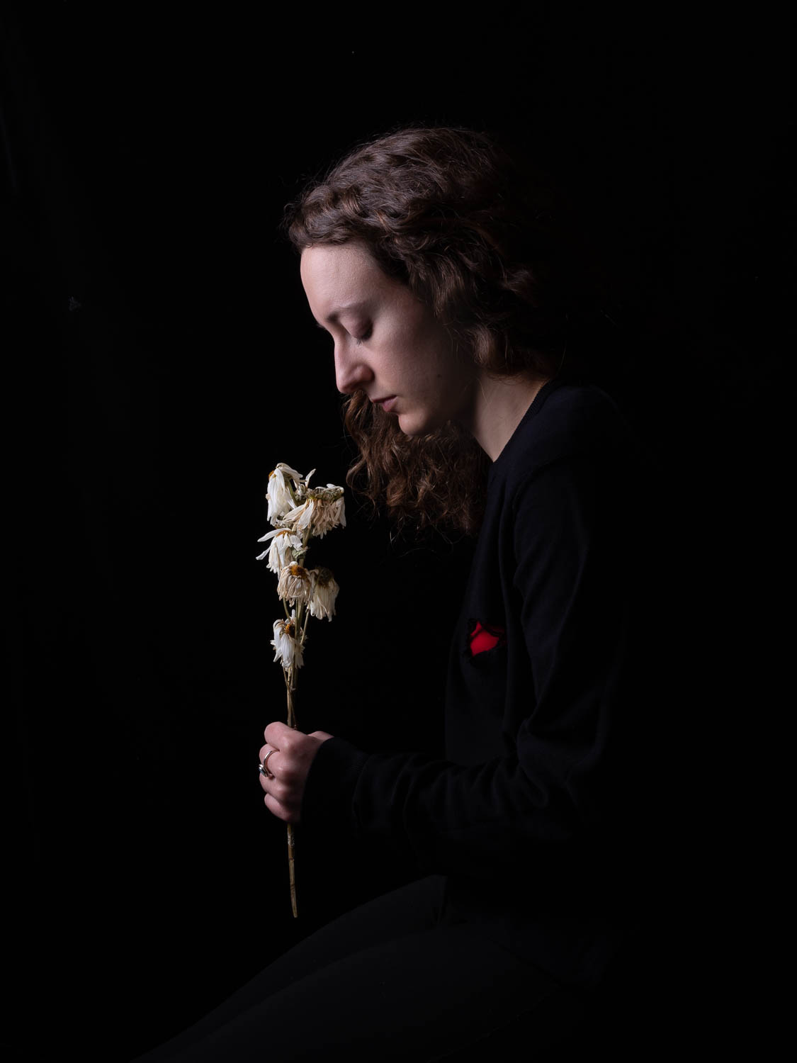
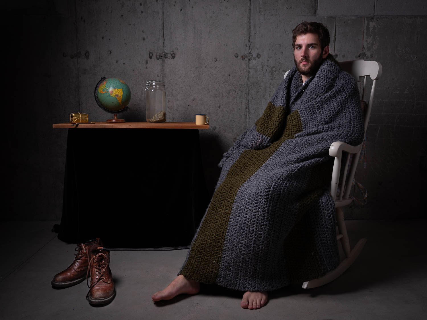
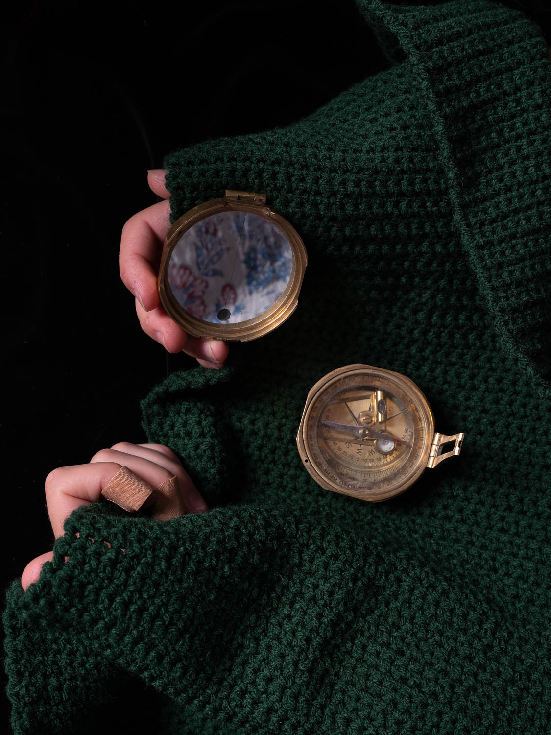


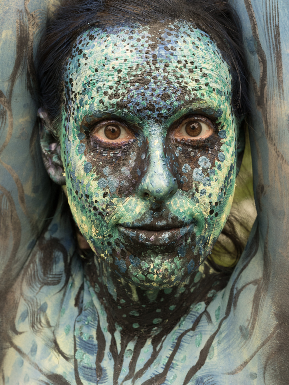
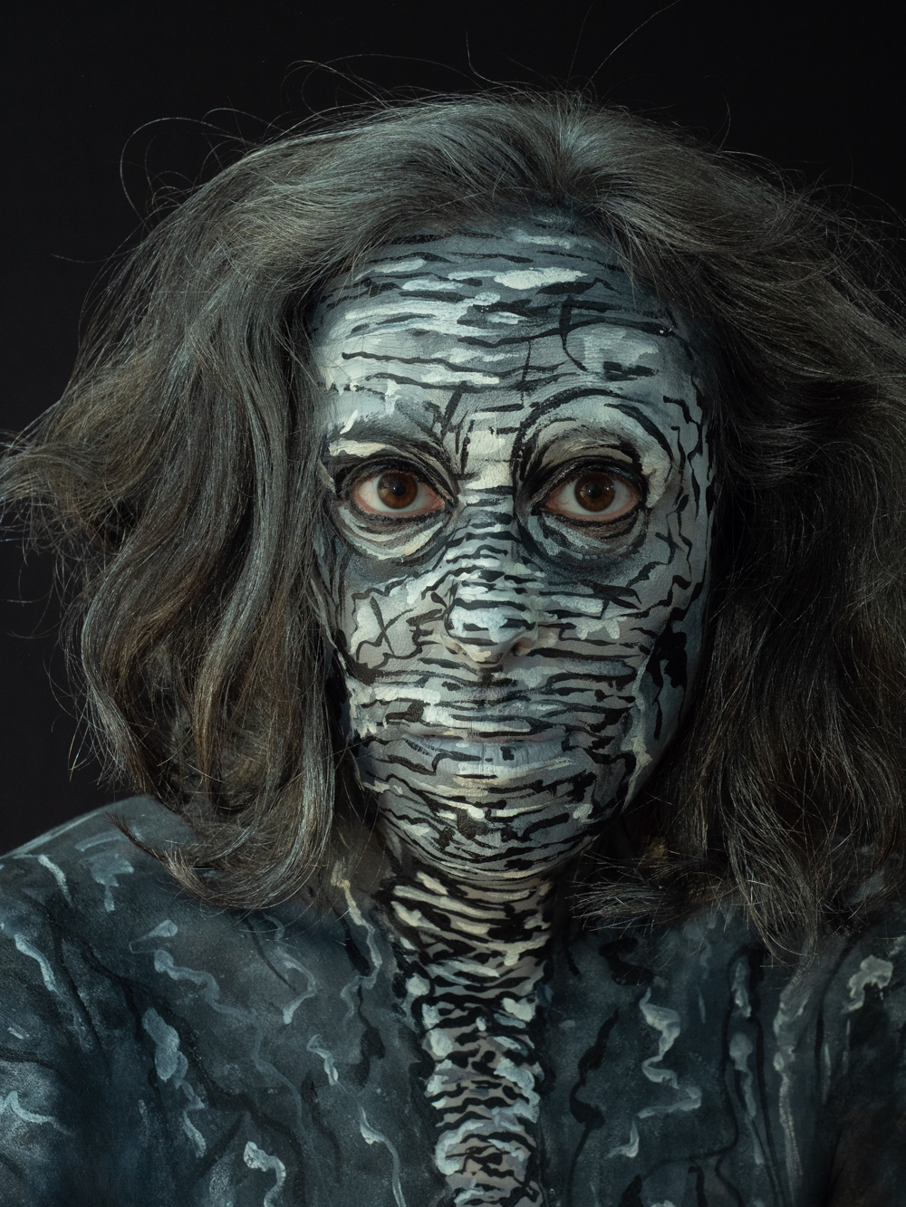
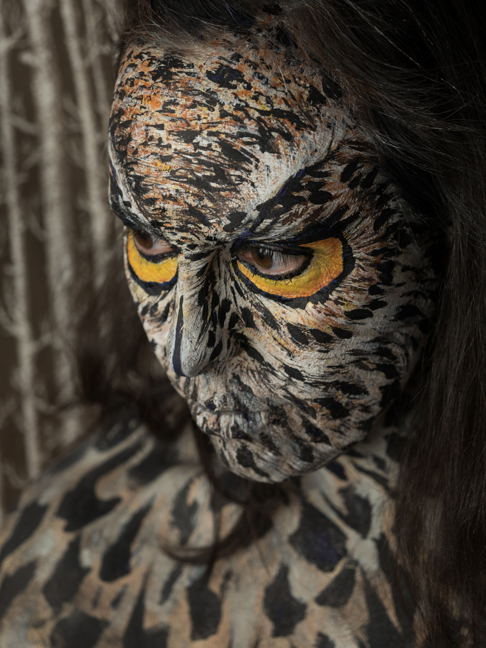

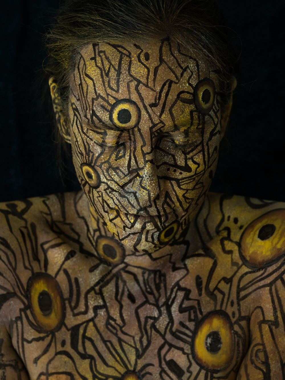
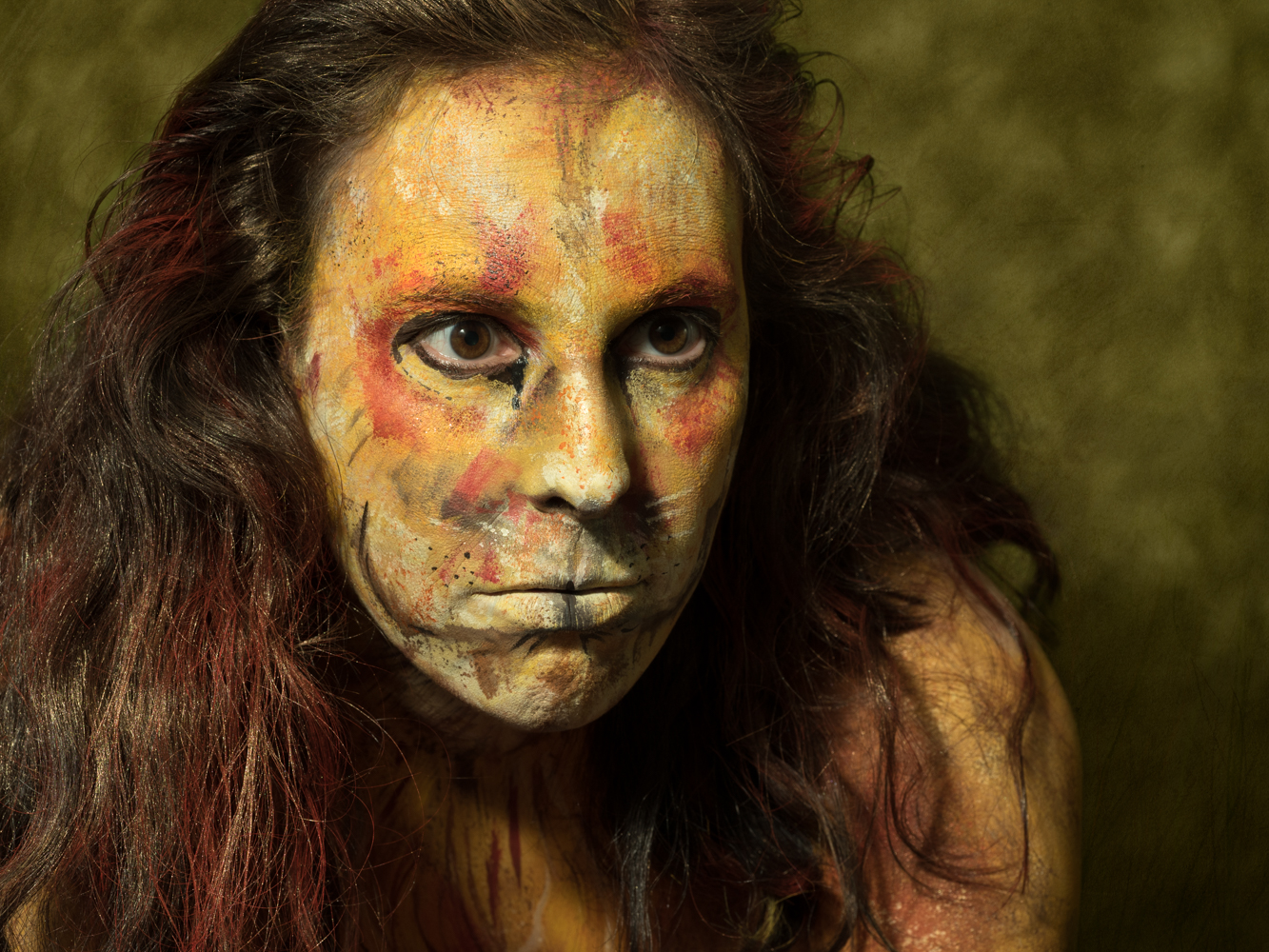


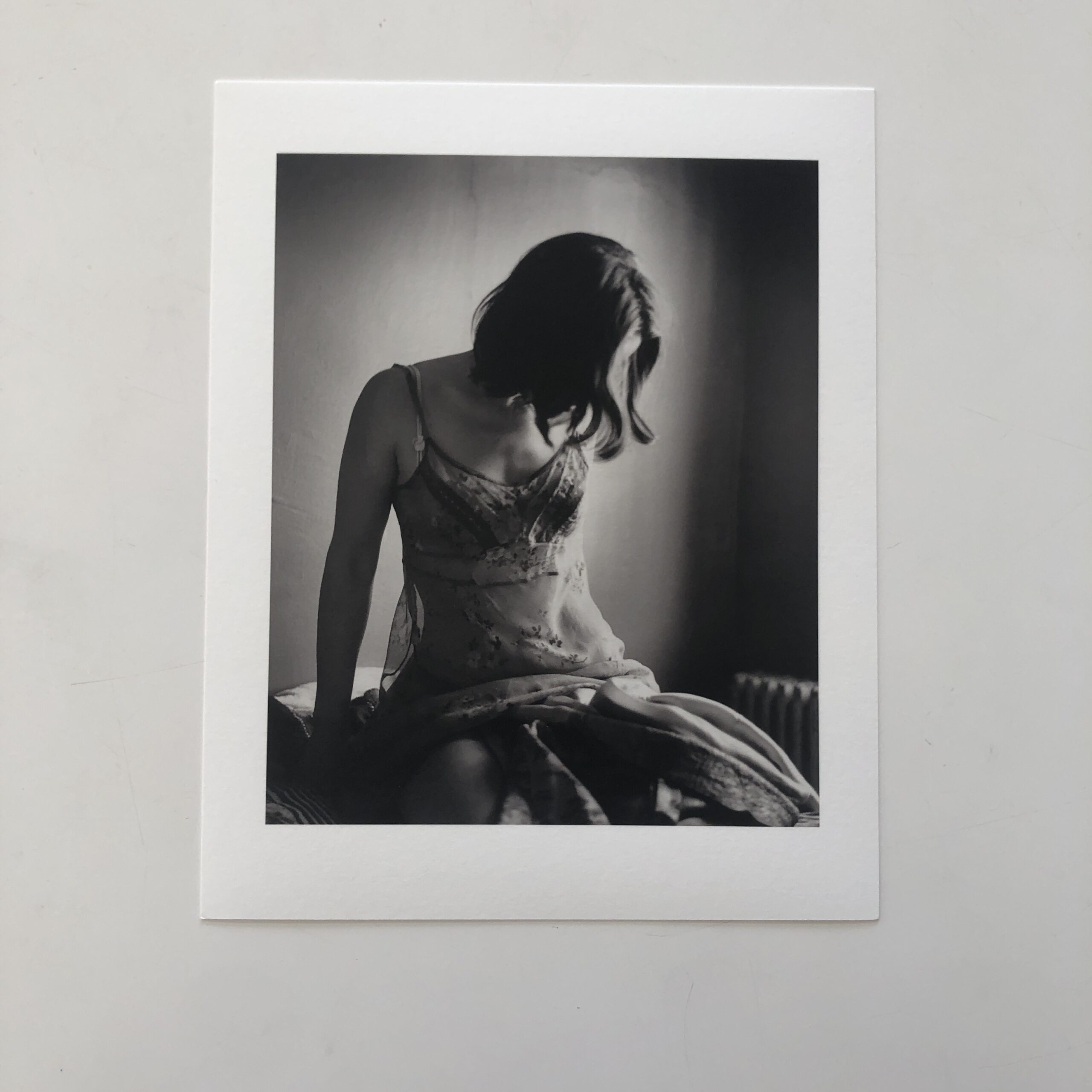


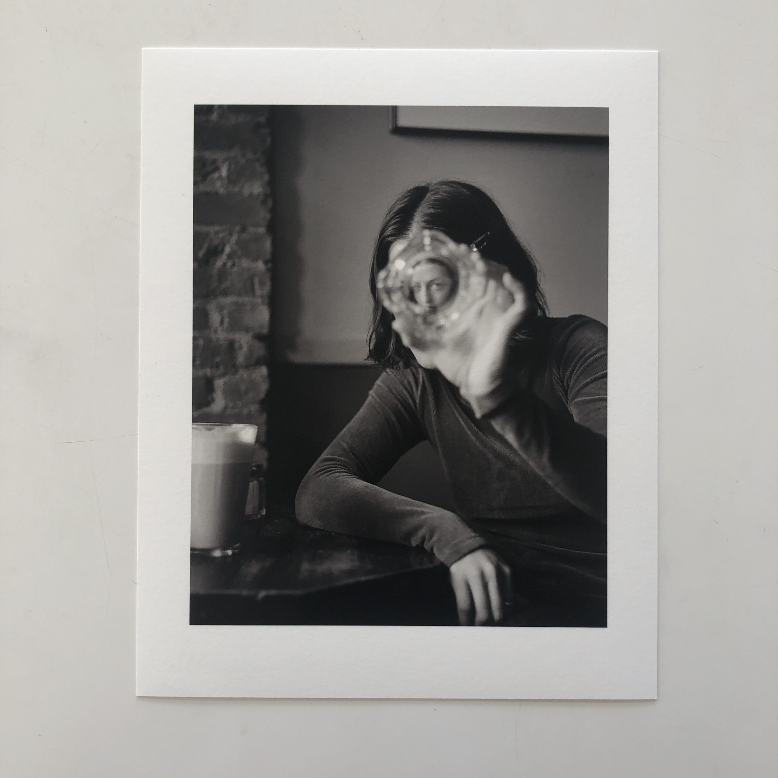
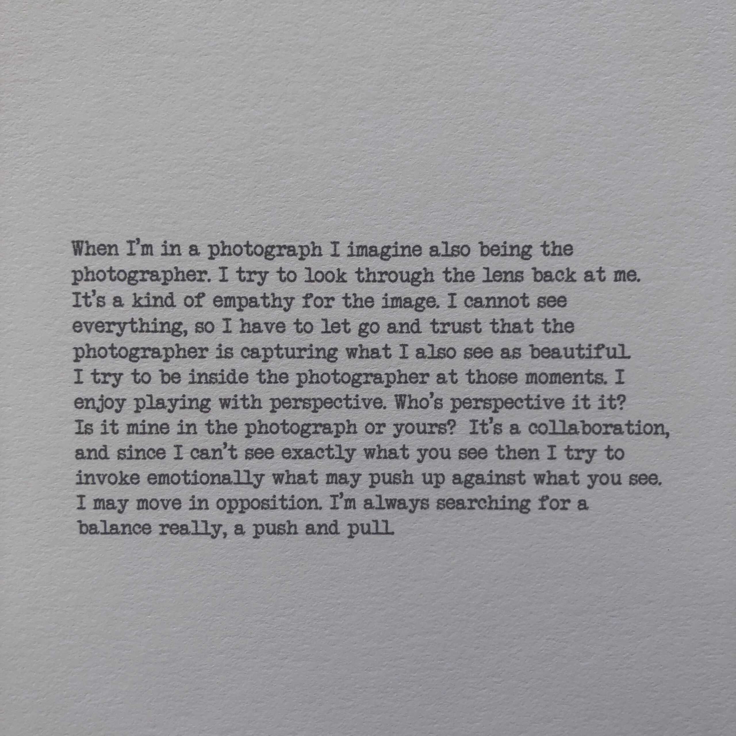
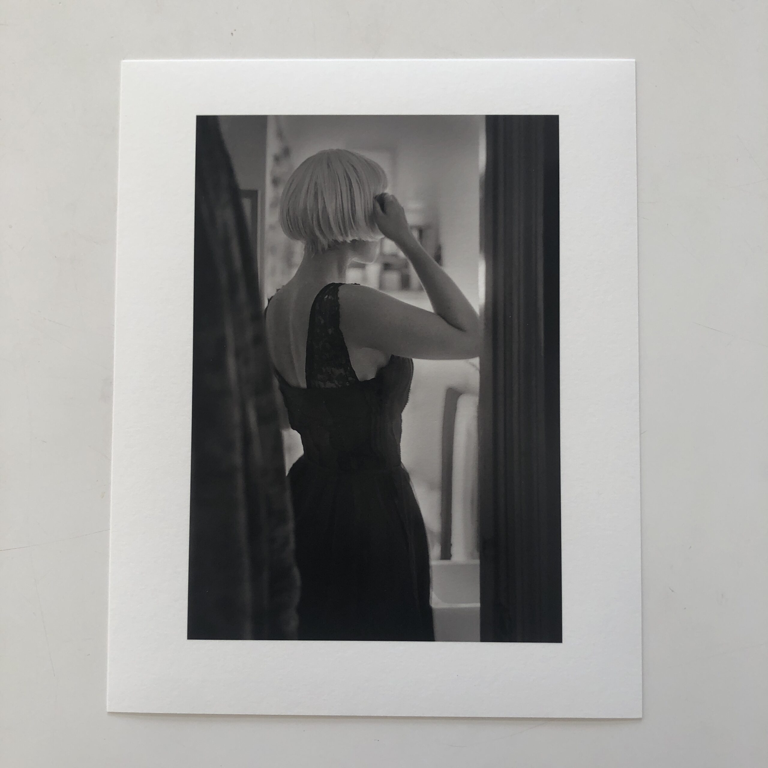
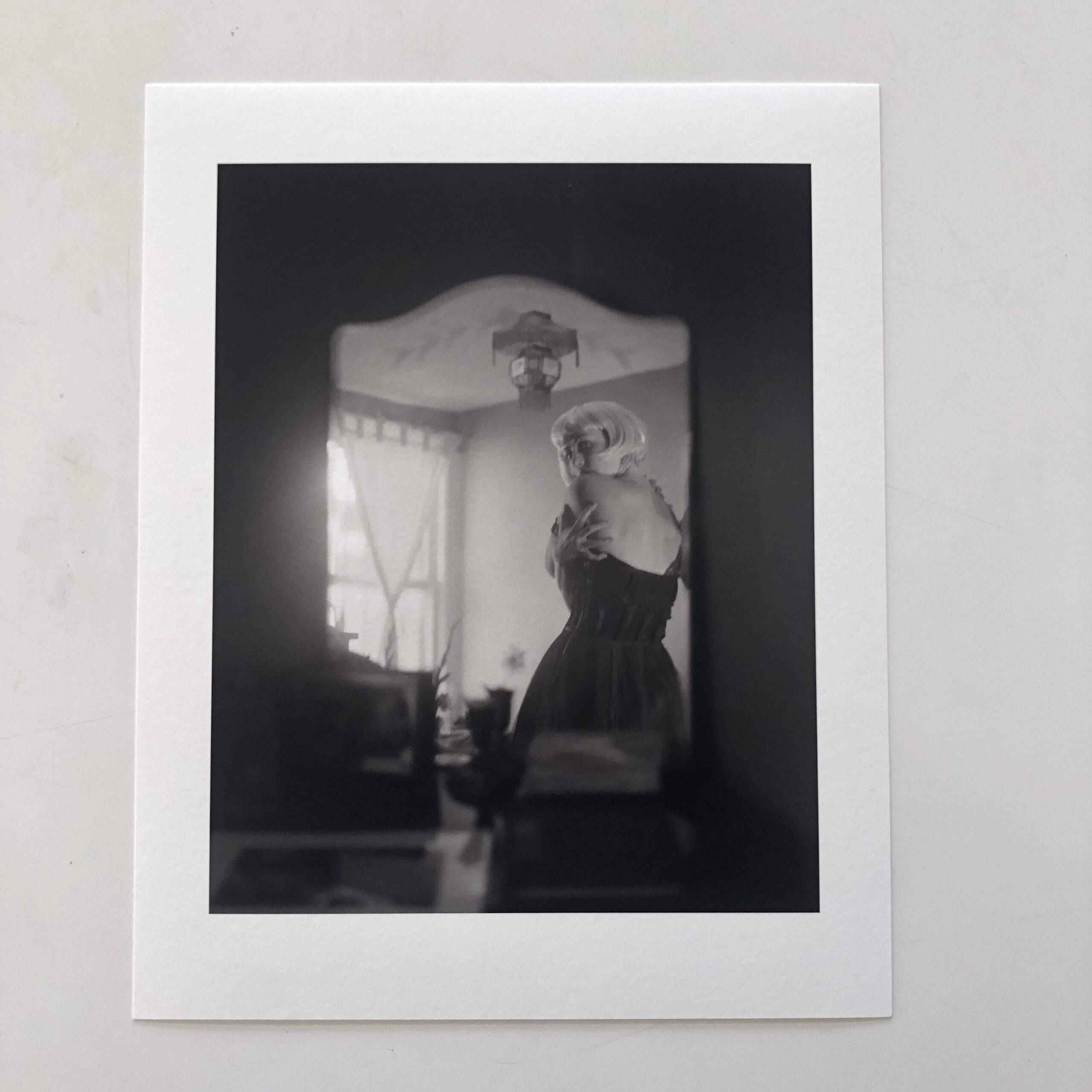
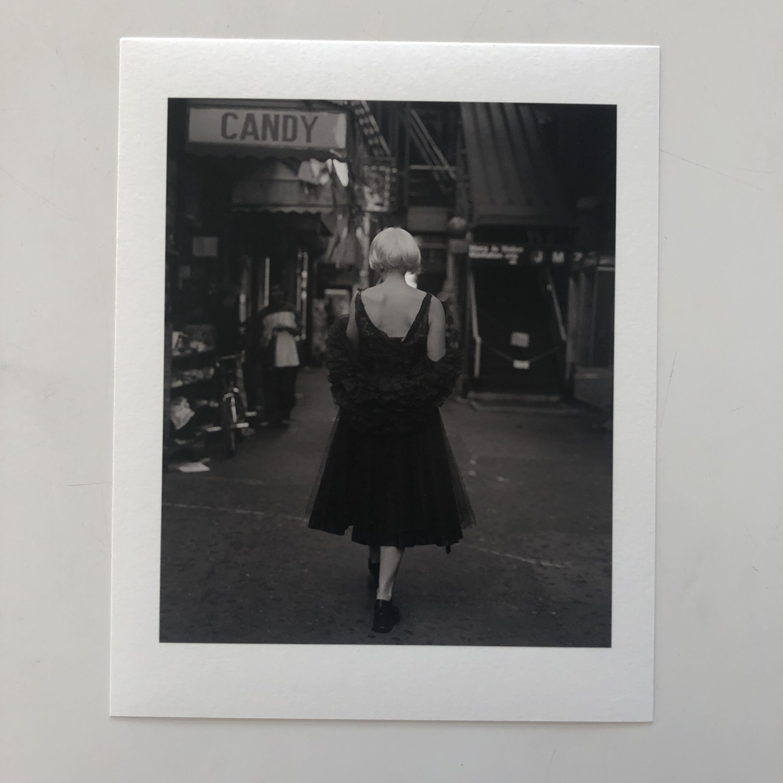
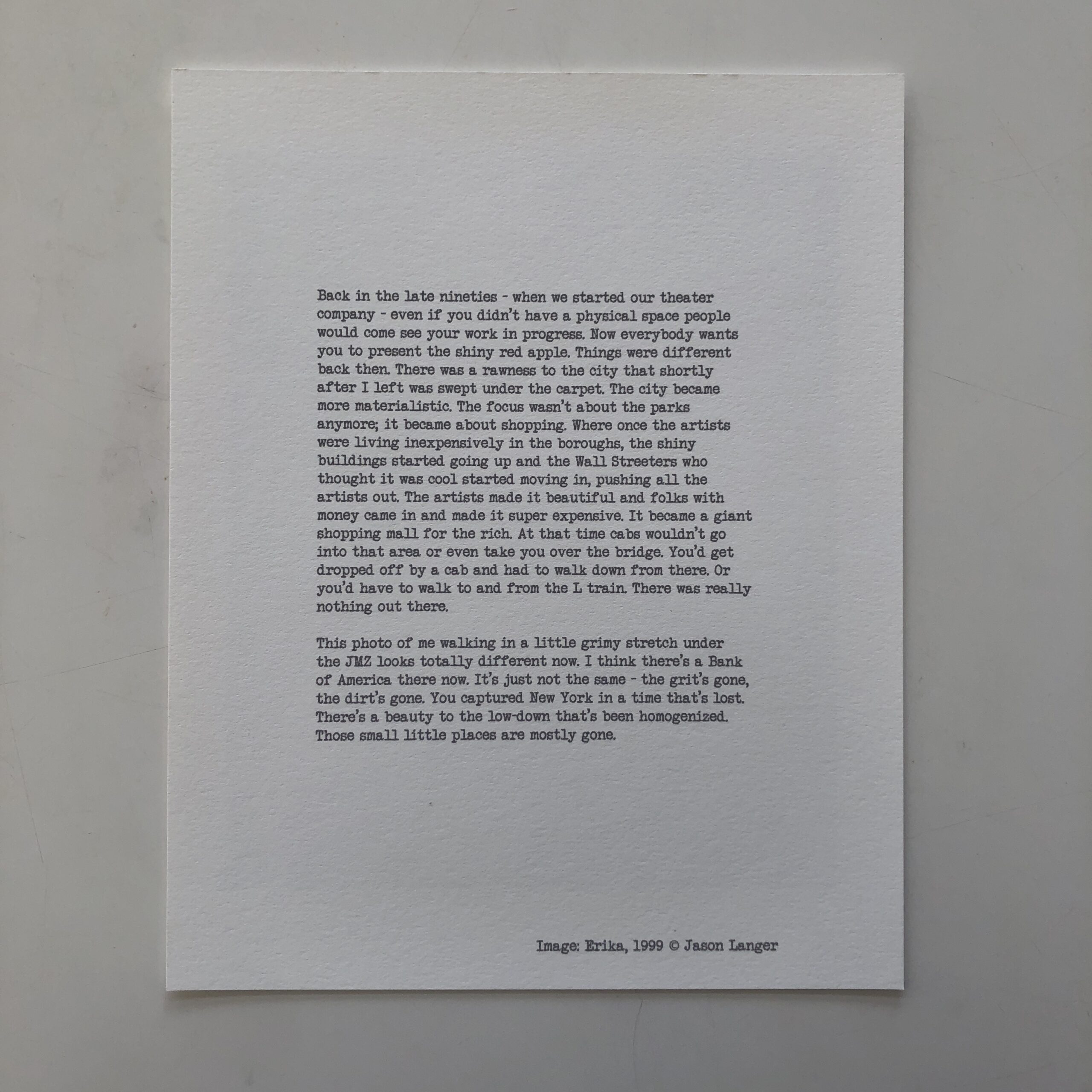
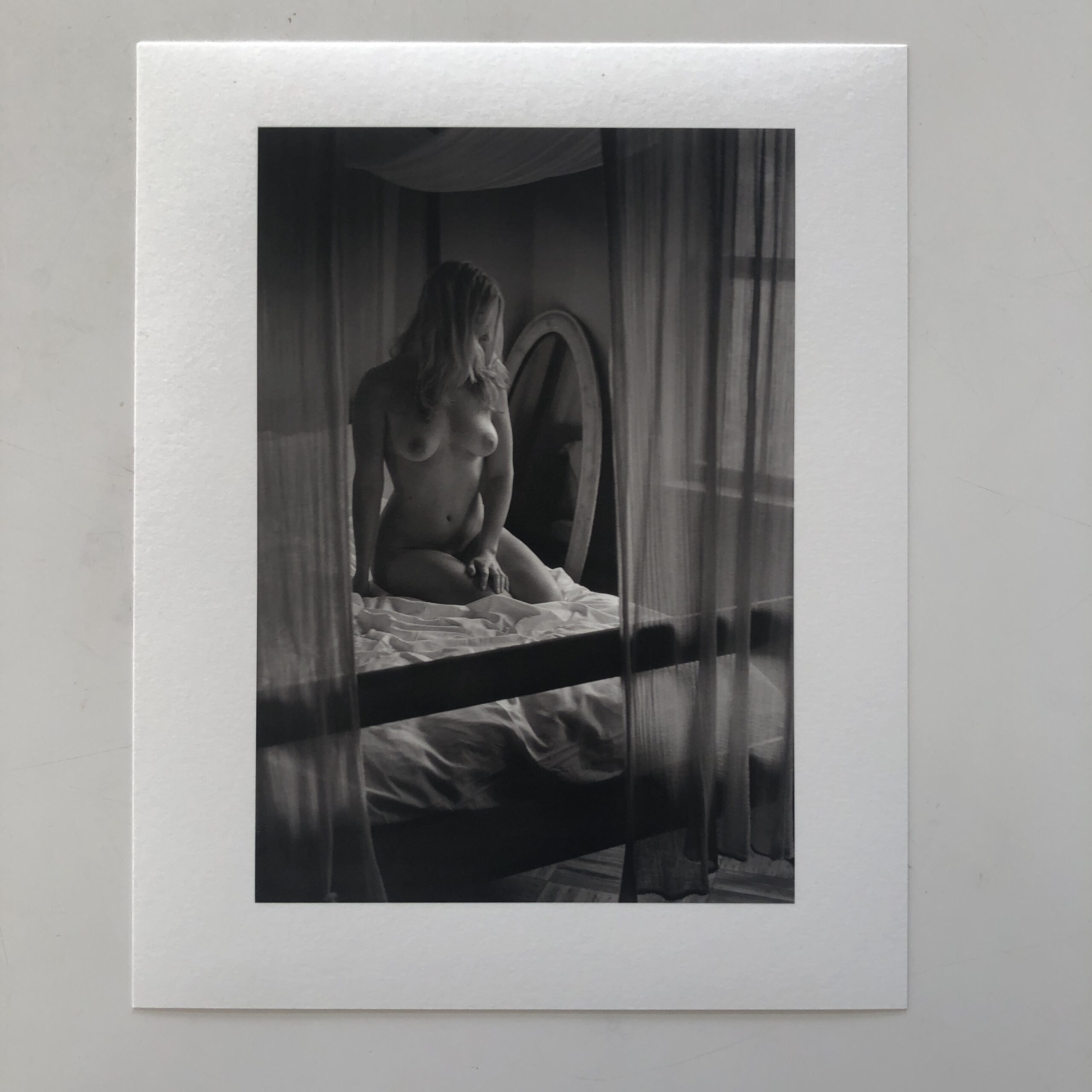
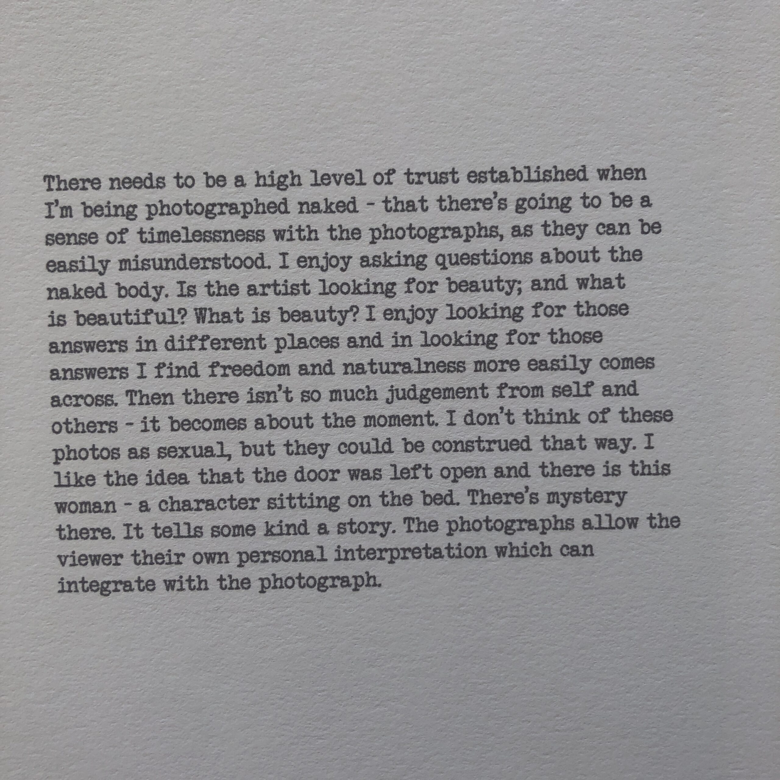
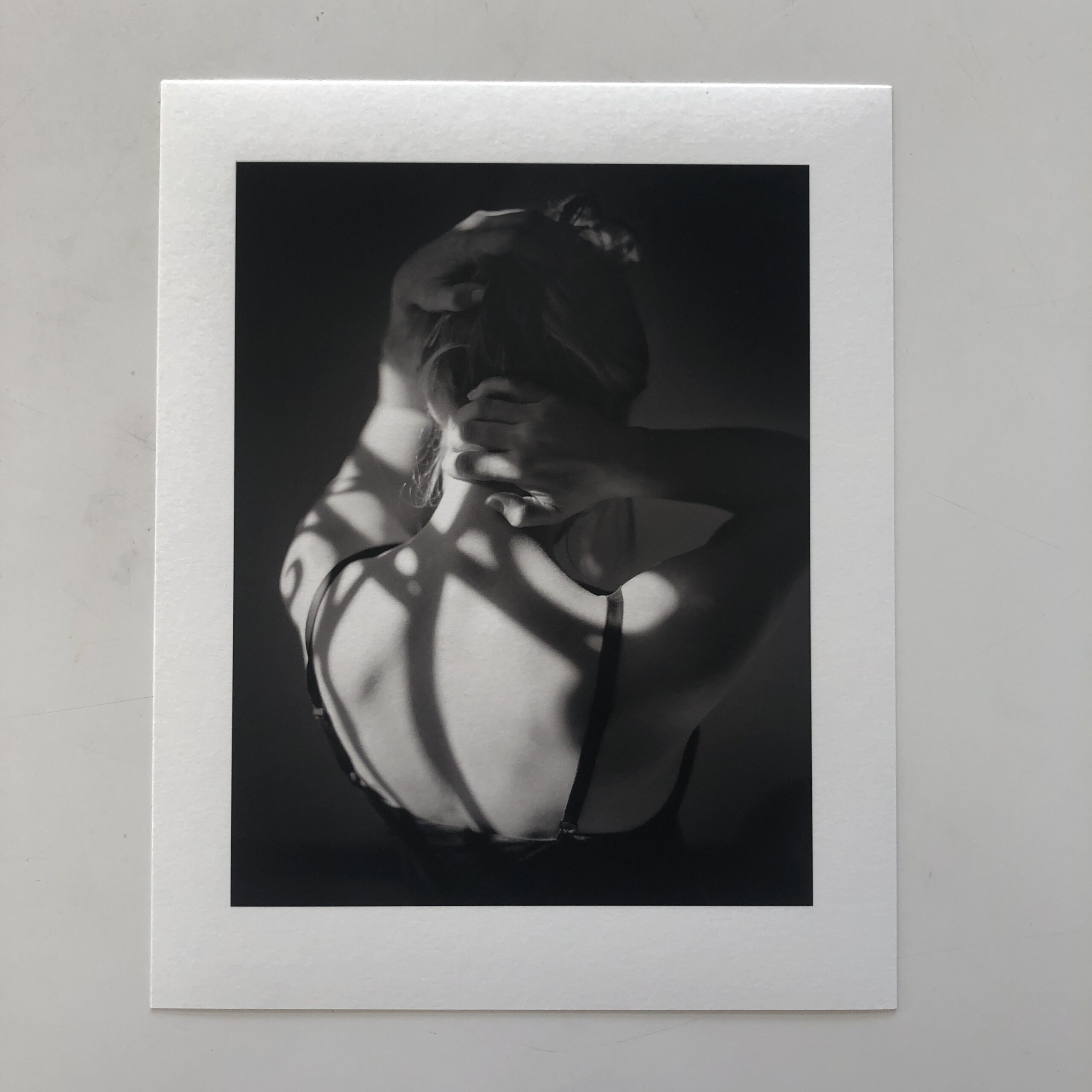
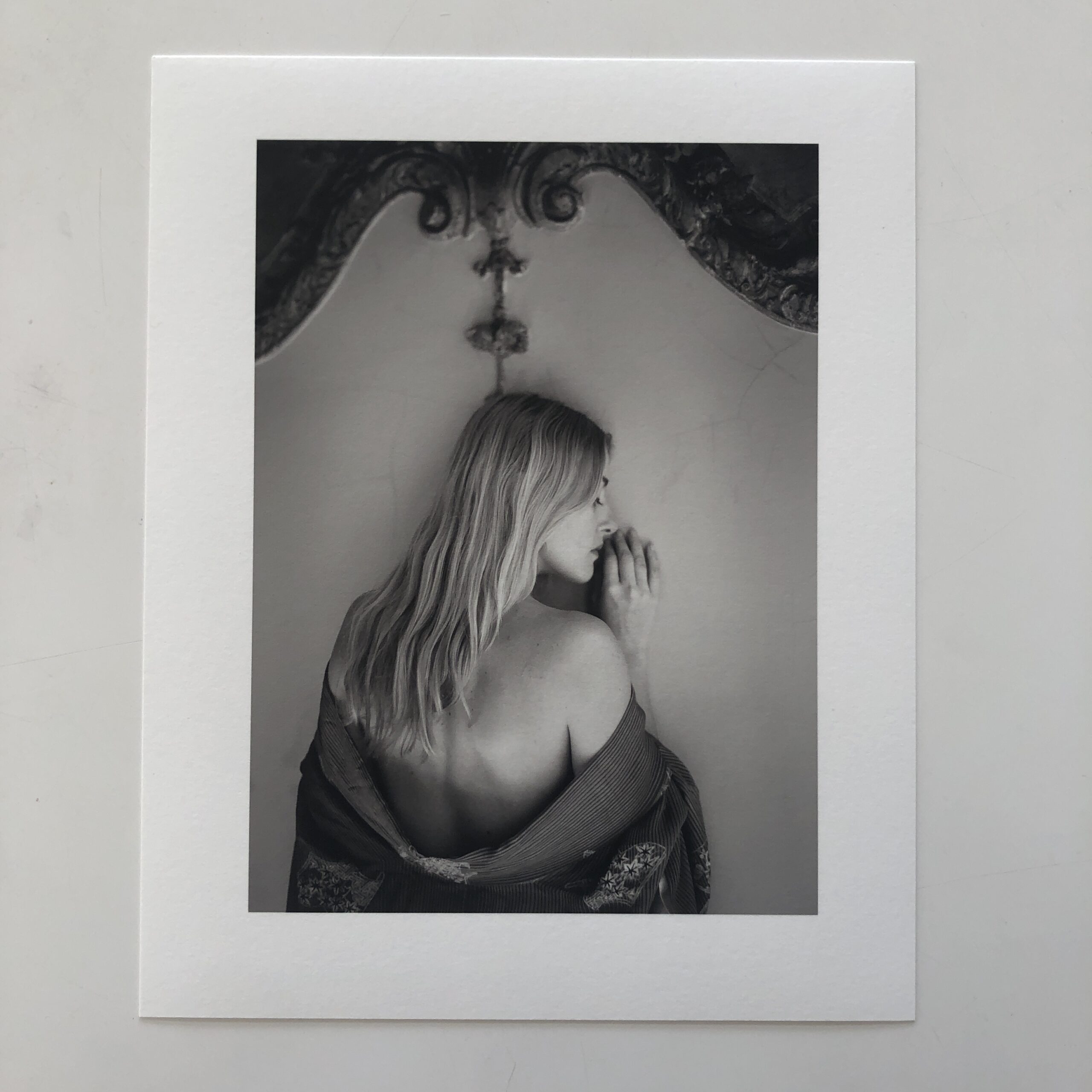


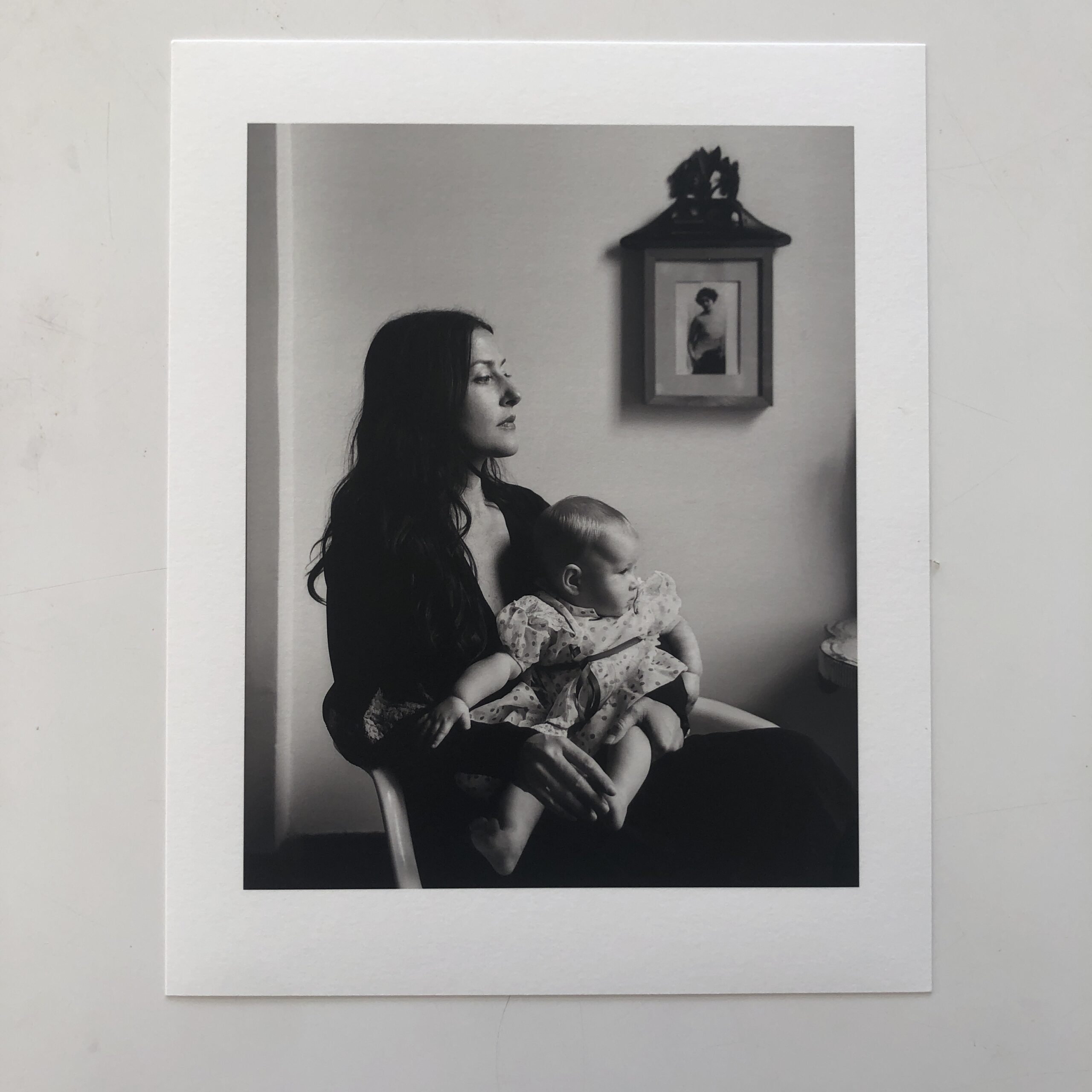

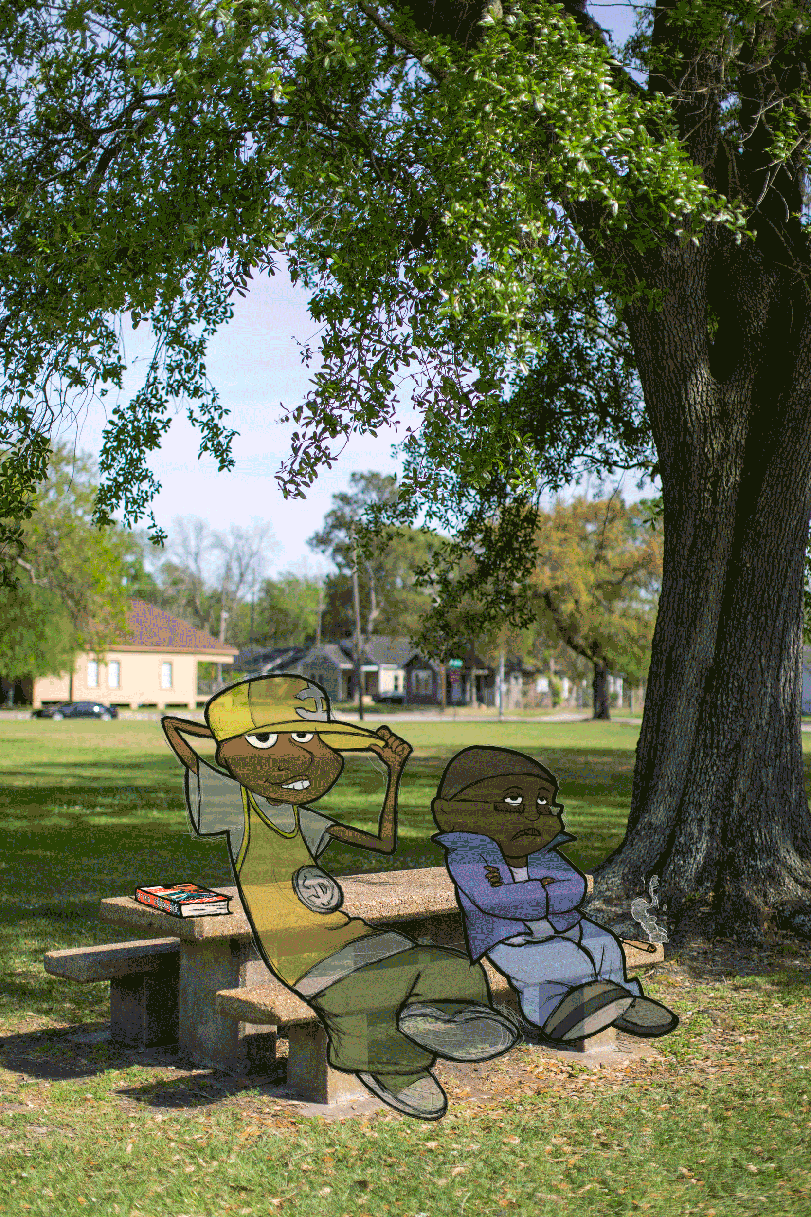