This Week in Photography: Laughing at a Scary World


Part 1. The Intro
Believe it or not, I used to be funny.
And this column was often absurd.

For years, I made fun of Donald Trump, before he ran for President. Even after he won, I still joked about him all the time.

For a while, anyway.

It was never my intention to become serious, though 6 years working for the New York Times certainly discouraged my sillier impulses. (If you can find a less light-hearted group of colleagues, I’ll be very surprised.)

The strange thing is, I never set out to be funny.

In my extended family, back in Jersey, I had some properly hilarious cousins. One even became a stand-up comedian, yet, (behind his back,) everyone always says he’s not even the funniest one in his family. (Sorry, Ken.)

So, just as I never planned to write an absurdist, rambling, continuous, personal narrative each week, where I joked about poopy diapers, overweight, narcissistic, rich-boy real estate developers, or the insanity of the modern condition, I also never planned to get serious.

That’s just the way it worked out.

The other day, for example, I had a group of college students from Dallas in my home for a 2 hour private lecture.

I told them about how, back in 2013, before I was hired by the NYT, I mostly saw myself as a pretend-journalist who said fuck and shit a lot, and then wrote about a photo book.

Fuck.
Shit.
Asshole.

(See, I can still do it.)

For a while, at the Times, I tried to inject my trademark parenthetic references, and Easter egg jokes into my Lens stories, but ultimately, my humorless, condescending editor ground it out of me, and by the end of my run, my stories became rather formulaic, I’ll admit.

I’m not blaming those guys for making me serious here, though.

Rather, I think that has more to do with the state of the world. The relentless nature of the bad news we’ve all been ingesting, daily, eventually wore me down.

It’s hard to find the world funny these days.

Right?


Part 2. Will he ever get to the point?

During my talk to the SMU students, I was asked why, even though I live in one of the most gorgeous places on Earth, I choose to make socially critical, conceptual photographs in the studio?

Why not take pictures of the pretty mountains outside my door?

After a long pause, I dove into a mini-rant on the nature of a photographer’s evolution. I told them how I was essentially kidnapped by photography, back in 1996, as I went from never making art, to devoting my life to the medium, over the course of a 5-day, solo, cross-country road trip.

We discussed the way an artist grows, over 24 years, and how at the beginning, I was just like everyone else.

Photographing abandoned buildings, pretty landscapes, junk piles, and, of course, graveyards.

Who doesn’t love a good graveyard?

All that powerful juju leaking out of the ground. All that creepy energy, just waiting to be photographed. (And yes, I shot a headstone or two on that original journey, including some eerie, forgotten spots in North Texas.)

Eventually, though, if we continue our artistic journey, we want to do things differently.

To innovate, and experiment.

To learn new skills, and change things up to ensure growth.

I had to pivot pretty quickly, as they were beginners, and I promised it was more than OK for them to make photographs of the Rio Grande Gorge, the Pueblo, or Taos Mountain.

To revel in the beauty of flowers or snow-covered aspen trees, if that was what gave them joy.

We discussed how beginners might love photographing sunsets, but professional artists, like Penelope Umbrico, would rather make a wall of appropriated sunsets from Flickr than just point a camera at the real thing.

I think I did a good job explaining it all, as the group left inspired, but it’s not like I was doing a comedy routine or anything.

It was a serious discussion, and then they were gone.

In the aftermath, I’ve been wondering, am I still funny?

I mean, really?

Am I funny?

How am I funny?

Am I here to amuse you?

Tell me, how am I funny!

(Goodfellas never gets old.)

The truth is, no matter how smart you are, or charming, no matter how hilarious you may be, or good-looking, there’s always someone out there who’s got more sauce than you do.

Just when you think Jon Stewart is the funniest guy in the world, along comes John Oliver.

If you’re positive that Jerry Seinfeld was the proper genius behind his show, you watch Larry David, and all of a sudden, your begin to wonder.

Or maybe you’re Joe Montana, confident you’ll always be the GOAT, (and the most handsome quarterback ever,) and along comes Tom Fucking Brady, the robotic asshole with the perfect cleft chin, and he goes and takes your throne.

Frankly, I remember the moment I knew I’d been bested.

It was 2015, and I was partying with some new friends at the Filter Photo Festival in Chicago. A long night became longer, and eventually I found myself in a private room in a Japanese sake bar, doing Karaoke properly for the first time.

It was more fun than I’d had in years, and I was feeling my oats.

I called for a Michael Jackson song, for some reason, but when I realized I didn’t know the words, I started free-styling, making up lyrics about the dead singer’s “accused” history of abusing children.

Not a funny subject matter, by any means, but at the time, I still found myself reveling in absurdity. (As my buddy Pappy used to say, if you don’t laugh, you cry.)

All of a sudden, a guy got up to sing, and I was barely paying attention. Frankly, no one was, because between the endless high-end sake, the fact it was 2am, and the periodic trips outside to get stoned, most people were sloshed and wobbly.

But this guy, Jeff Phillips, started a freestyle song about the Rapture.

The end times.

Before I knew it, he was singing about Armageddon, Jews killing Jesus, and all sorts of perfectly Un-PC things, and I couldn’t believe what I was hearing.

It was raw, honest, offensive, and definitely the funniest thing I’d heard in person. (Including the time my parents were insulted by Andrew Dice Clay, because we made the mistake of sitting in the front row of his performance in the late 80’s.)

I went from feeling like the King, to feeling like the headless King, in a matter of moments.

Jeff has since become a good friend, and though when I first met him, I knew him as a Filter board member with a day job as a business consultant, eventually I learned he was also an artist, who made silly, ridiculous projects on a regular basis.

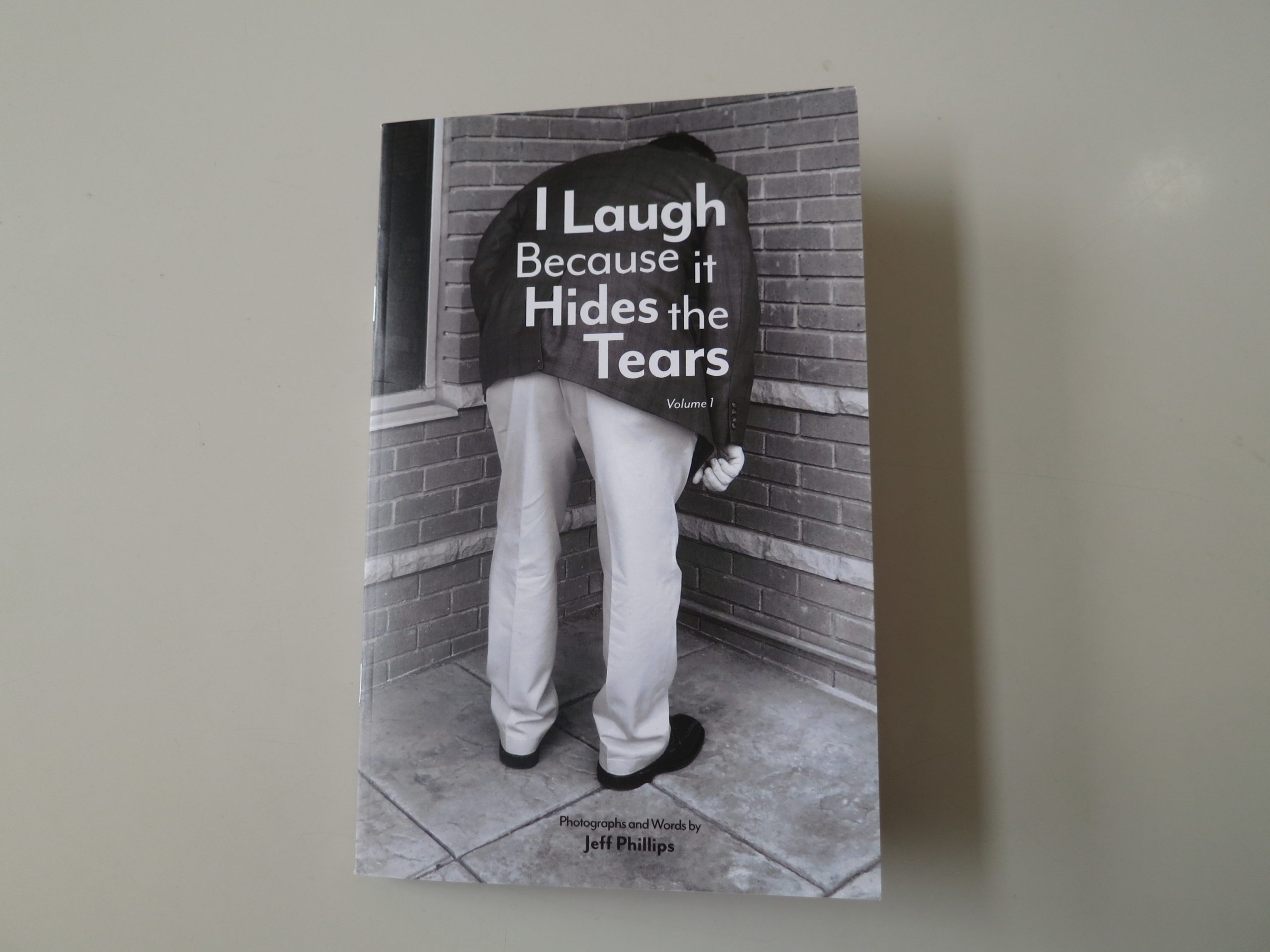
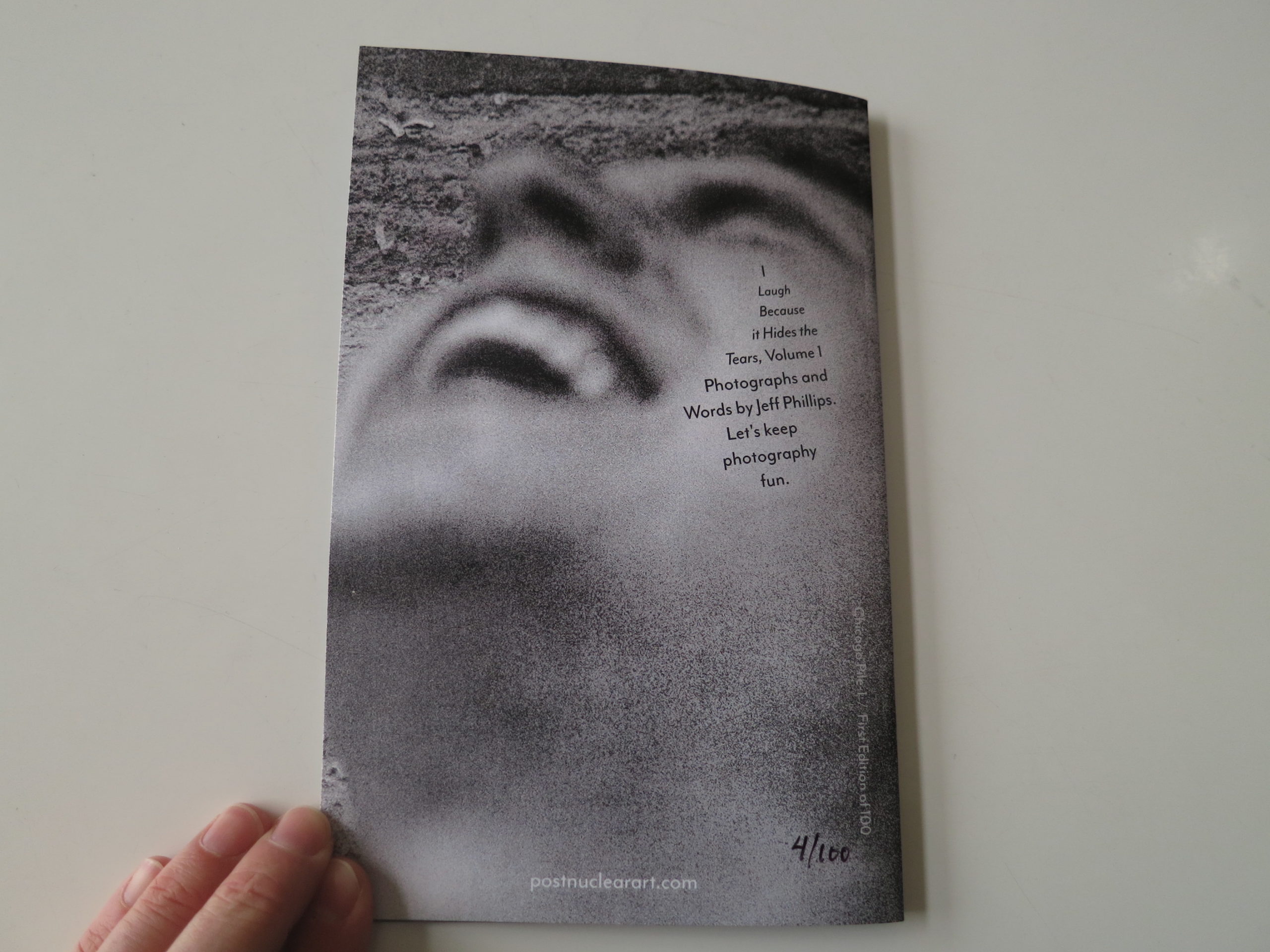
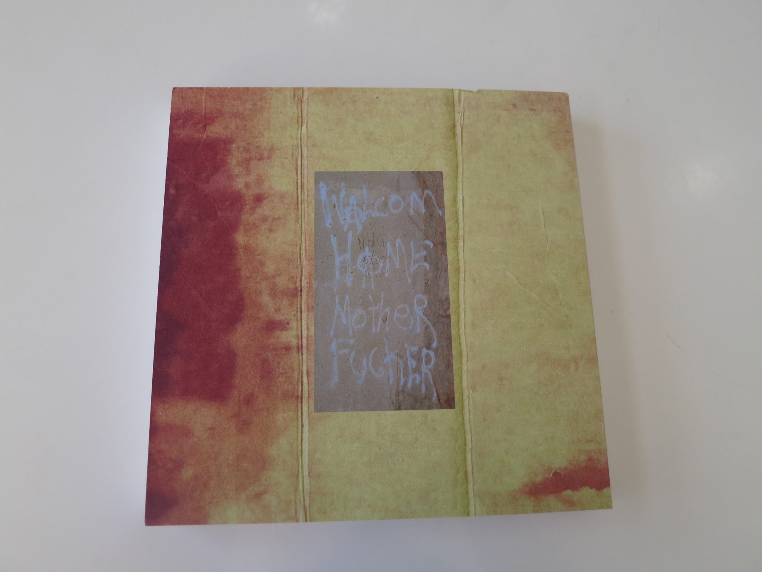
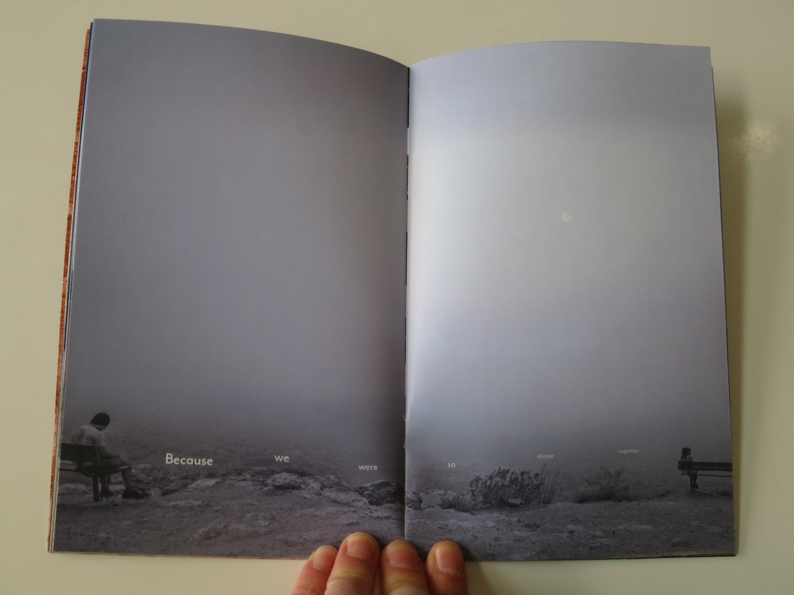
Eventually, we reached the end of #2019, and a blue envelope showed up in the mail, featuring his new self-published zine, “I Laugh Because it Hides the Tears: Volume 1.”


Part 3. Sad clowns

You knew I’d get to a book review eventually, right?

I don’t think Jeff sent the zine hoping for a review, but was just offering a gift to a buddy.

(That’s my take, anyway.)

But when I opened it up this morning, and read it through twice in quick succession, it codified so many things I’ve been thinking about lately.

How do we laugh at a world that no longer seems funny?

I mean, on Tuesday, noted funny-man Patton Oswalt tweeted out a video of Donald Trump badly mispronouncing the word accomplishments, and while I giggled, really, it made me sad.

Meanwhile, Sacha Baron Cohen keeps attacking Mark Zuckerberg with facts, as himself, rather than with jokes as Borat or Ali G!

How has it come to this?

Thankfully, this zine seems to have found the perfect middle ground that has eluded me for the last year or two. (As does Bill Hader’s brilliant “Barry” on HBO. Highly recommended!)

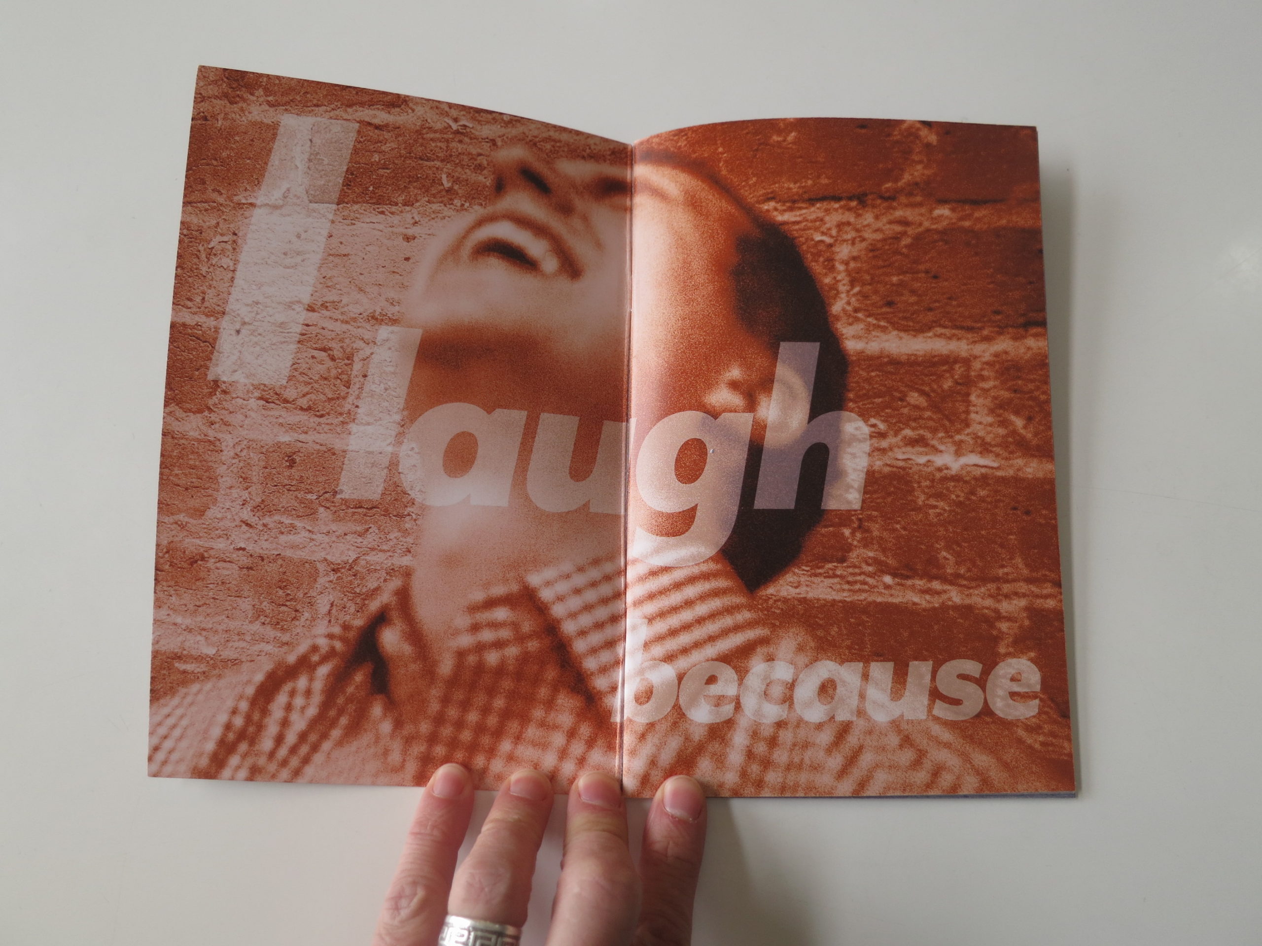
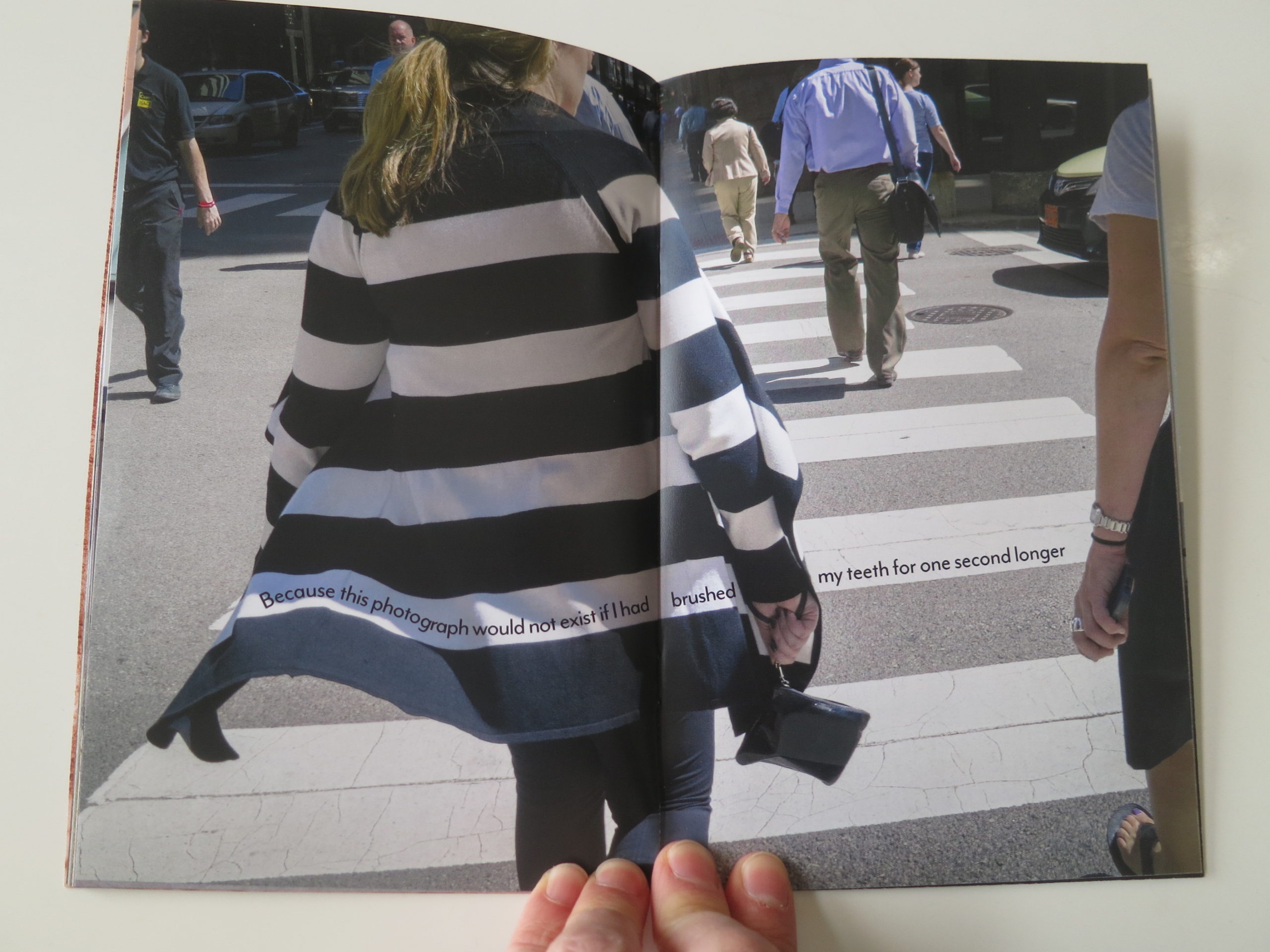
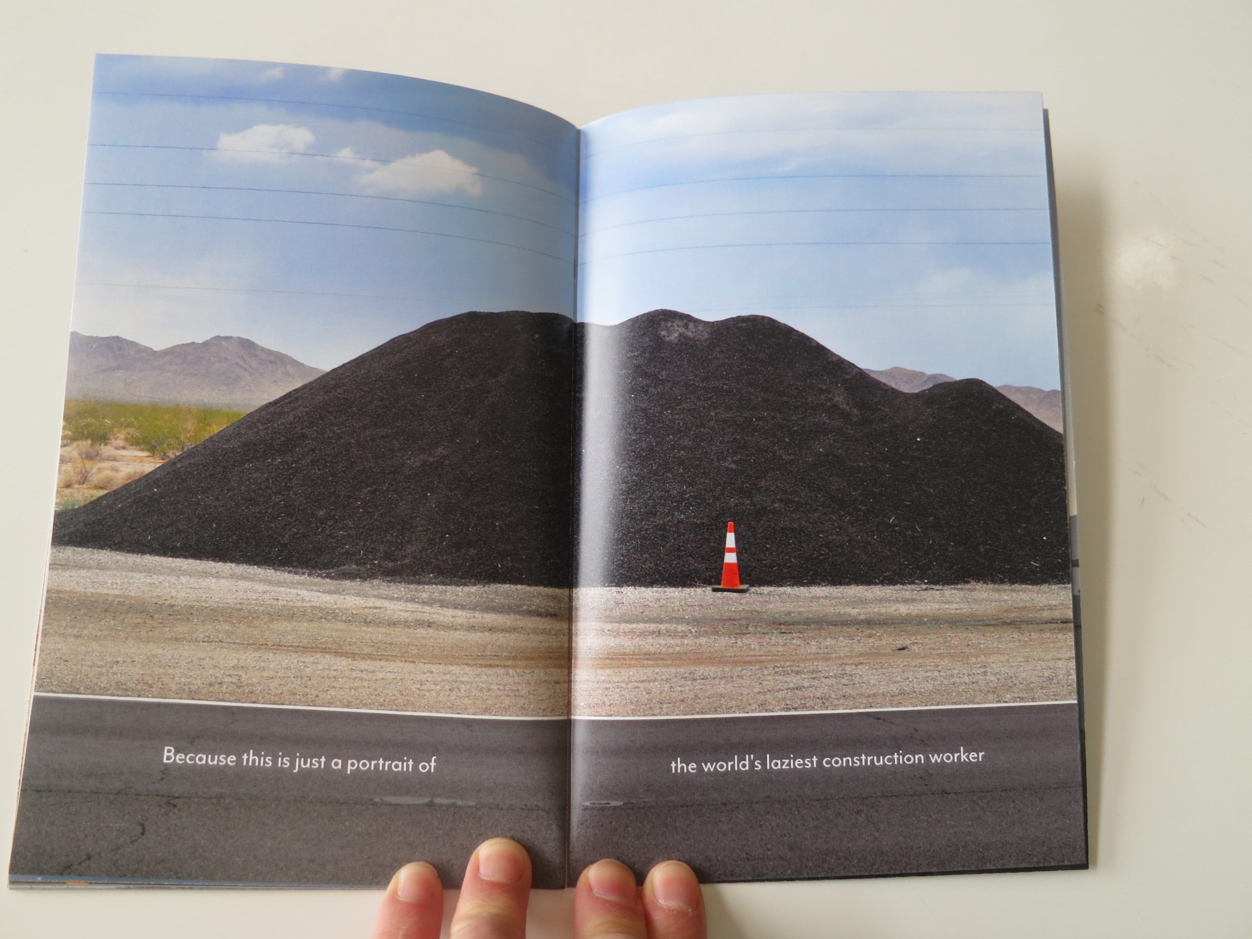
As the zine is short, I’ll photograph its entirety, because it all fits together like a jigsaw puzzle made out of unicorn sweat and crocodile tears.

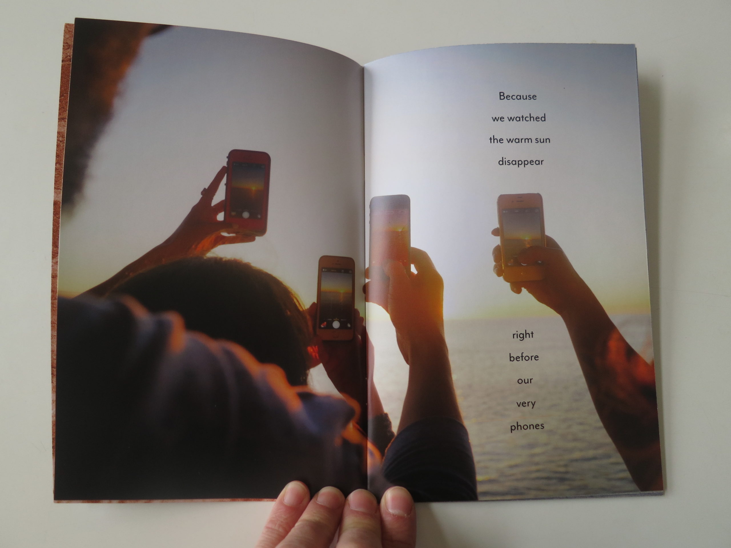
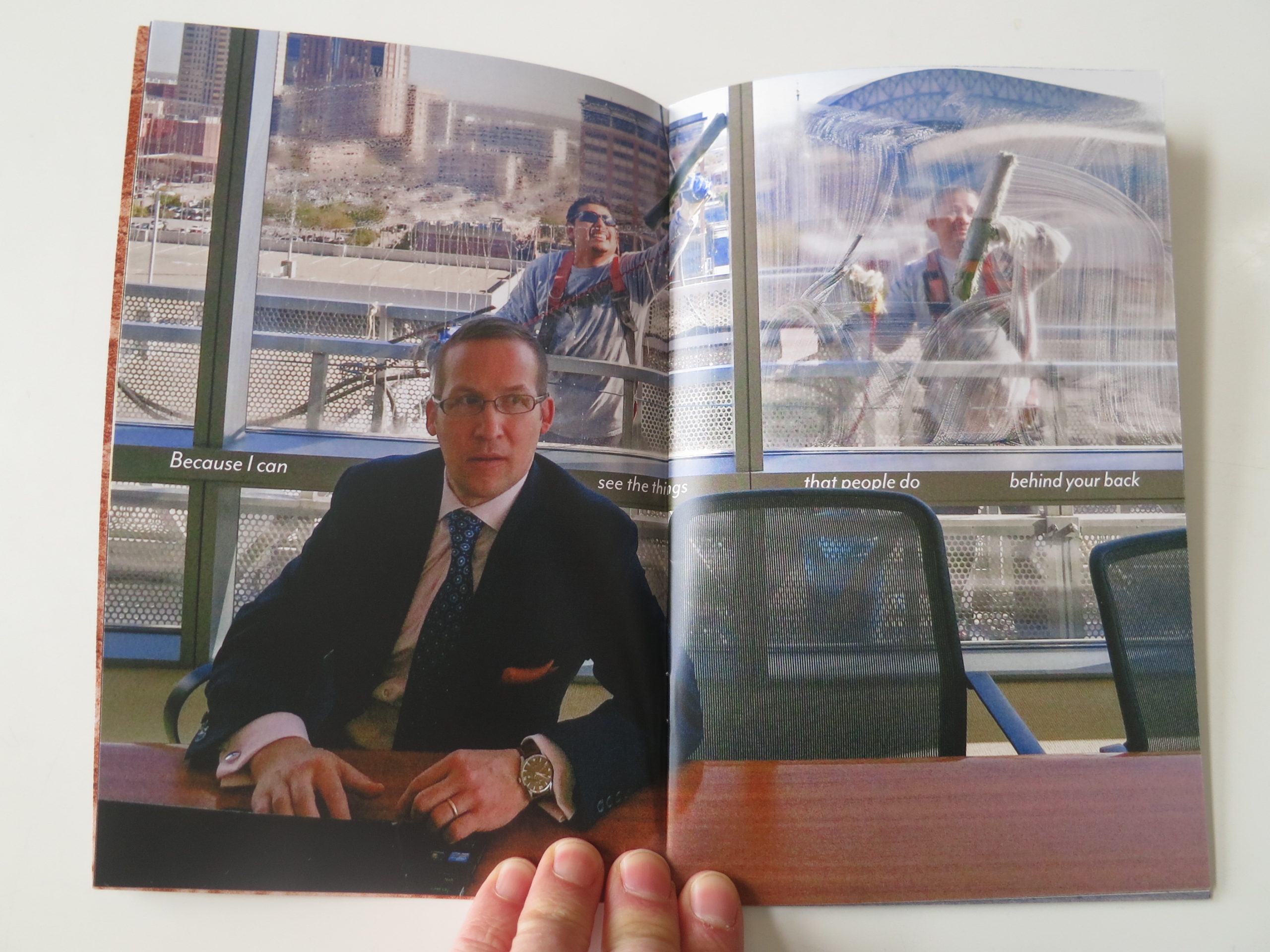
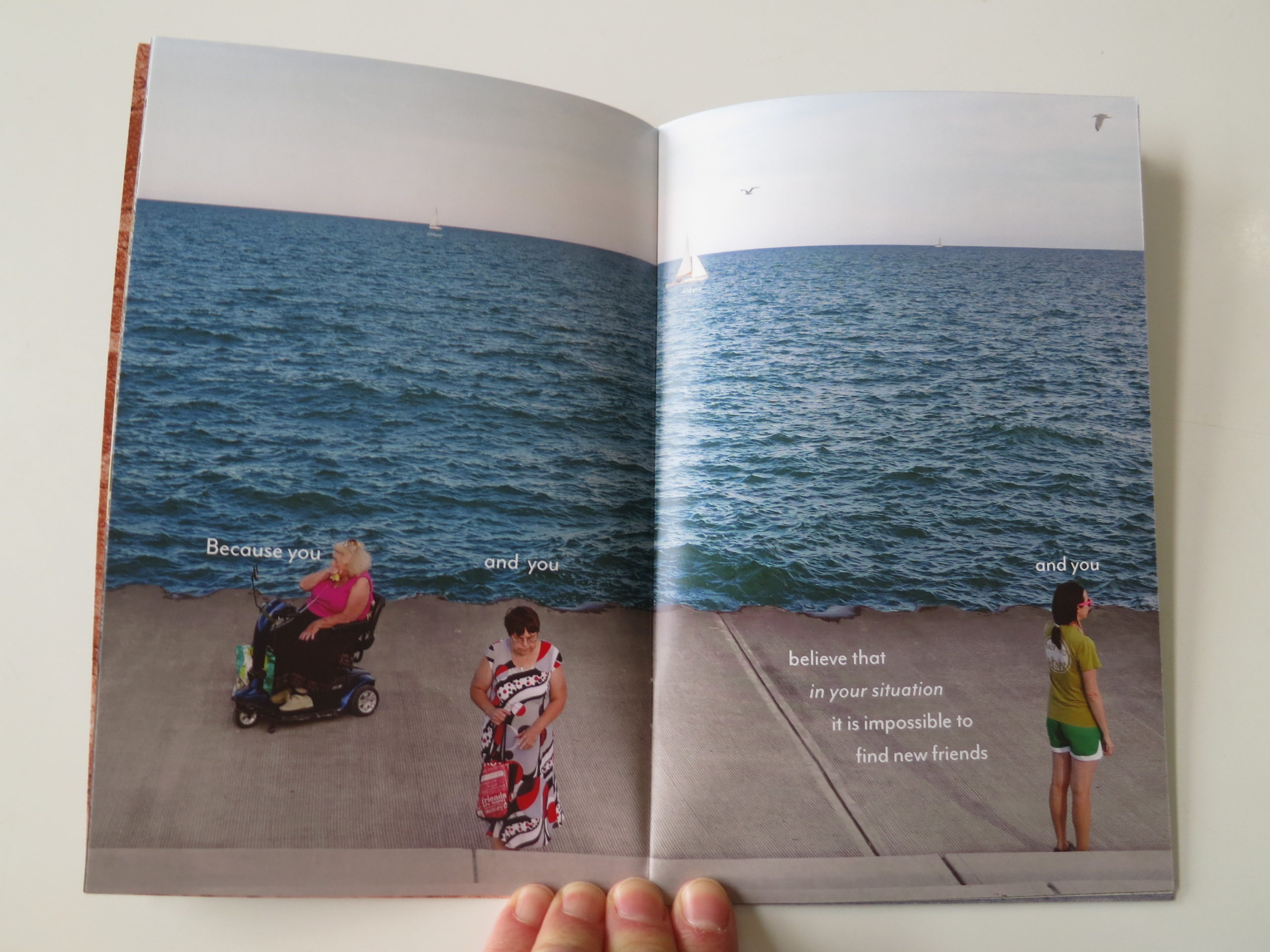
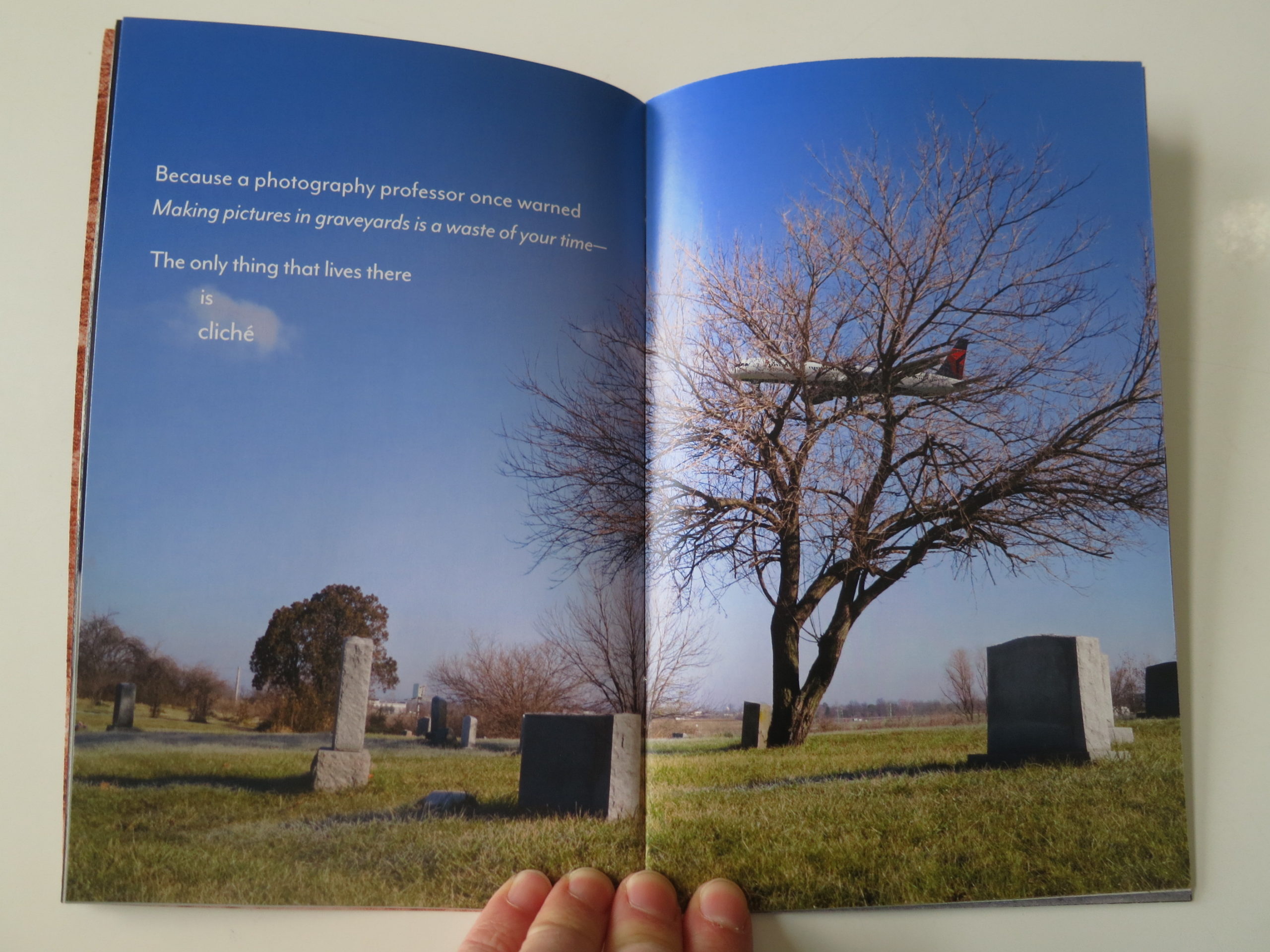
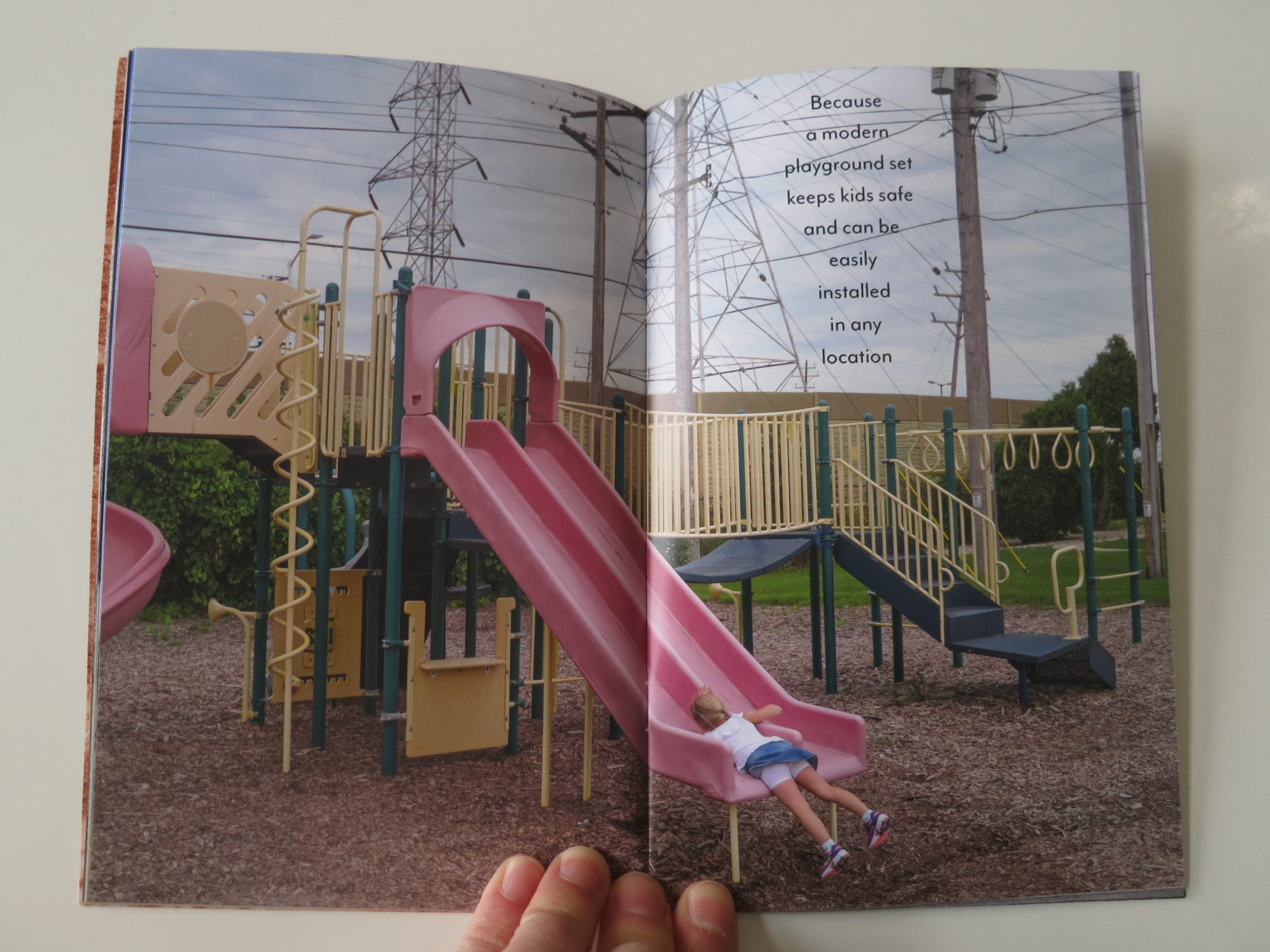
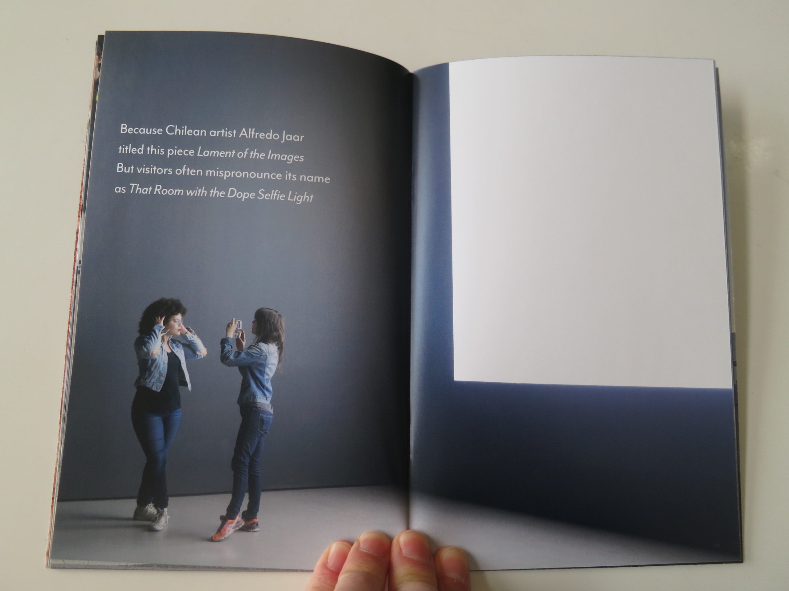
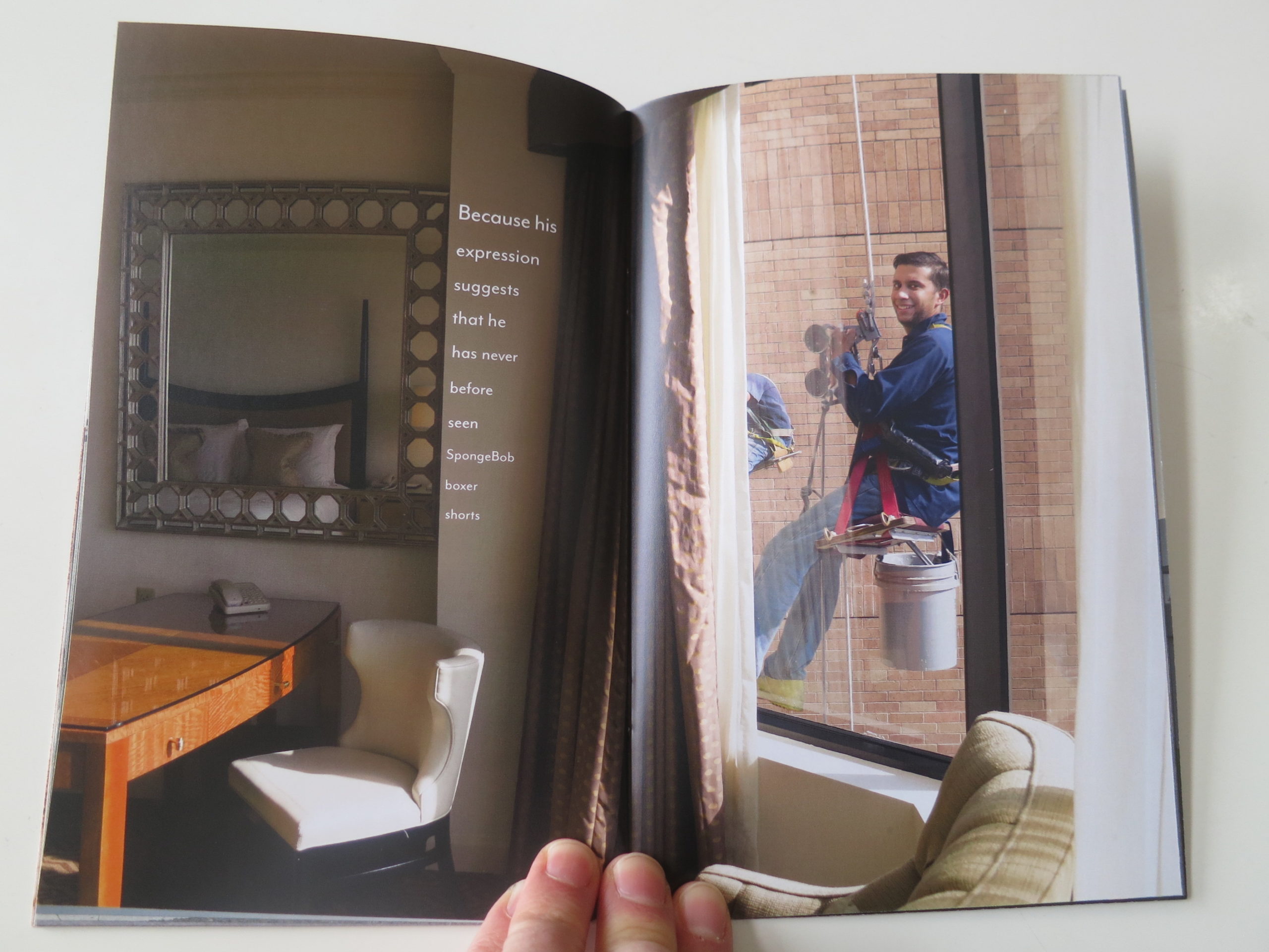
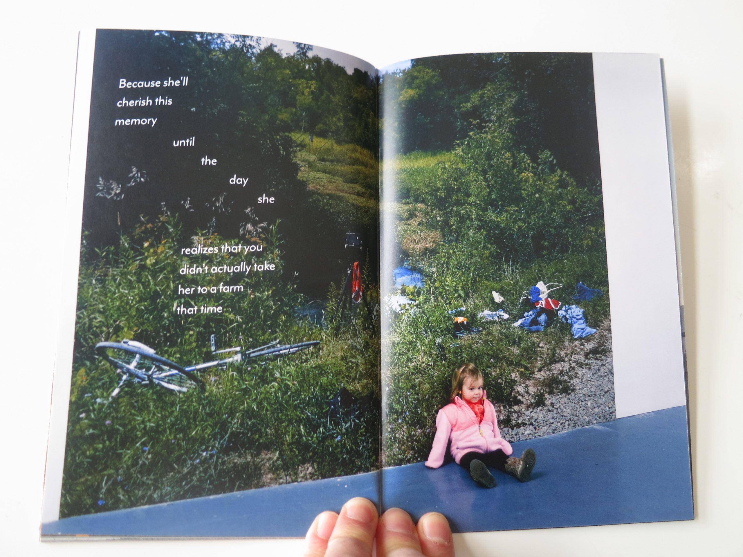
We see cellphone cameras with sunsets, a picture in a graveyard that goes directly at the trope, and off-camera, we learn that Jeff likes to wear Sponge Bob boxer shorts, because of a peeping-tom-window-washer.

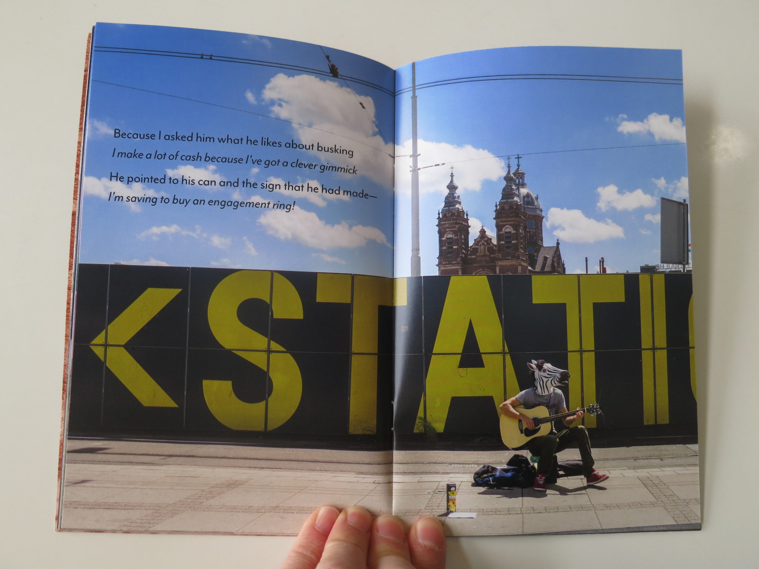
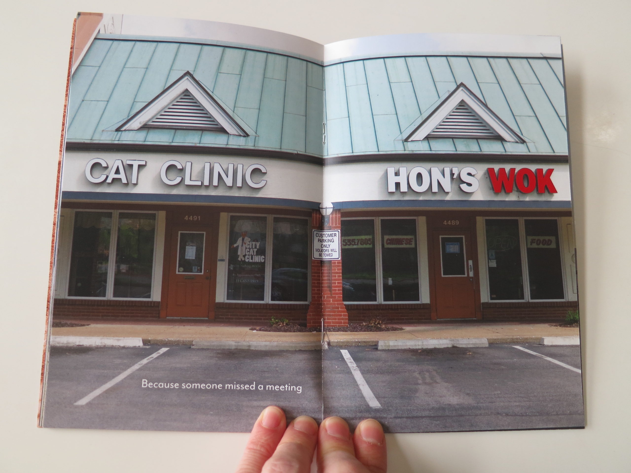
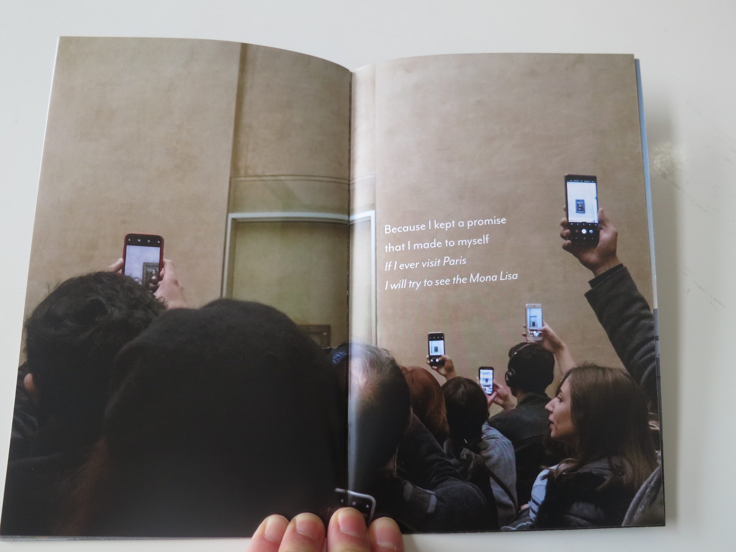
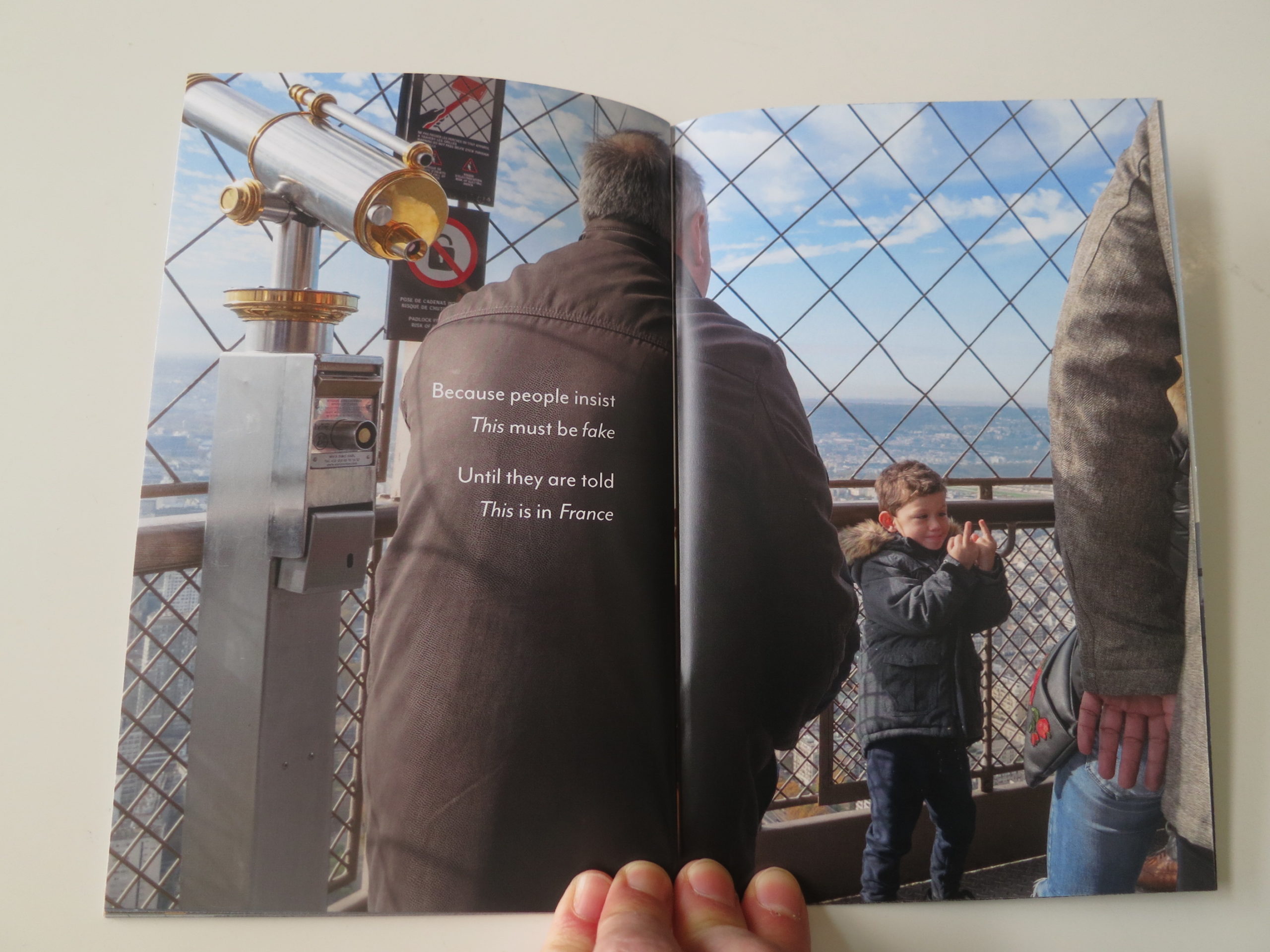
There’s an (offensive) joke about Chinese restaurants serving cats, (though it’s subtle,) a busker wearing a zebra mask, more cellphones showing the Mona Lisa, and the perfect joke about French people.

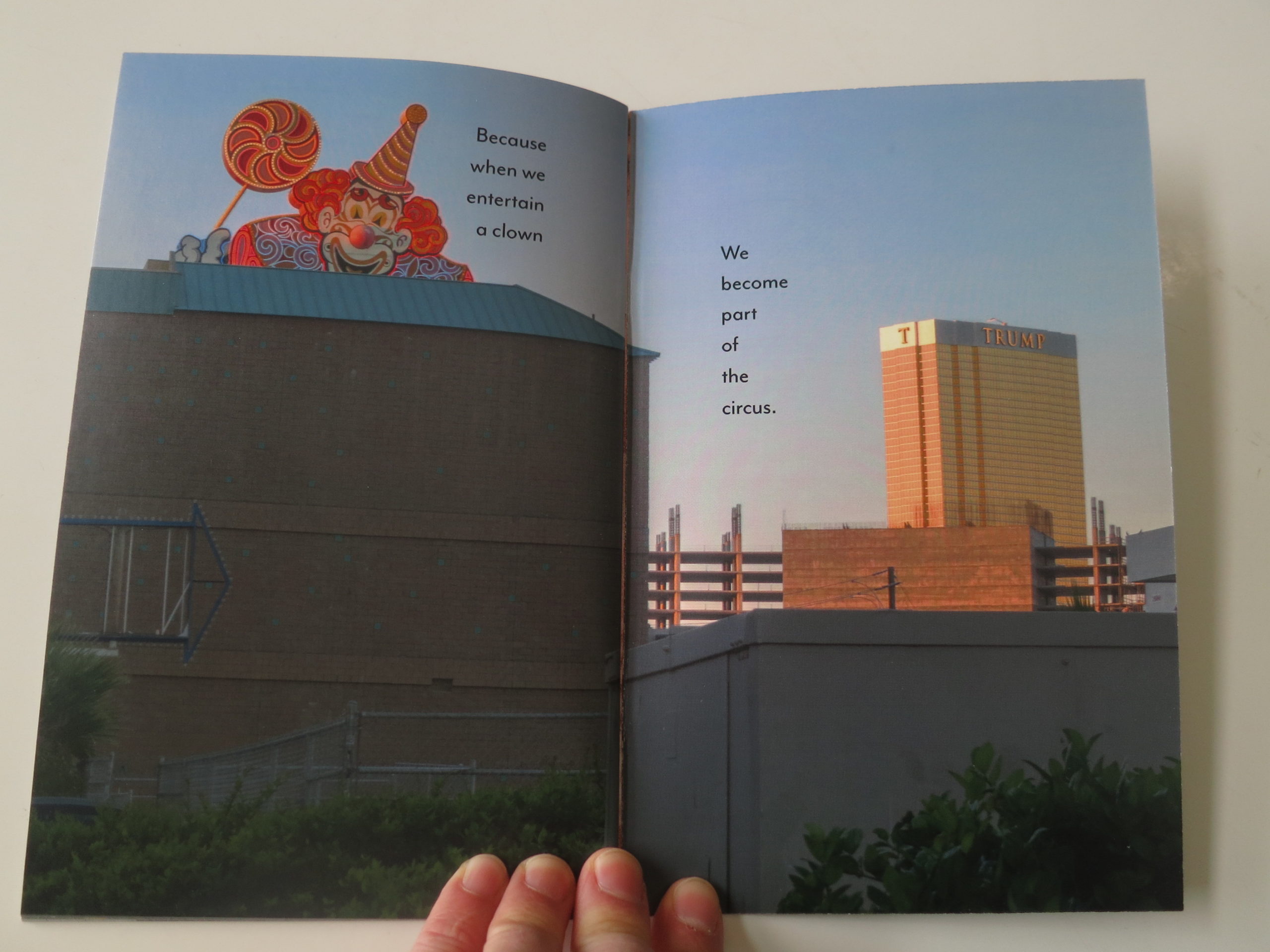
DJT is there in spirit, (and reference,) because he looms over the whole world right now, but it’s just the right amount of reality, mixed with sorrow and joy.

Our Instagram-Selfie obsessed culture comes in for a roasting, as does environmental-electrical-pollution, but my favorite photo in the zine is actually straight.

And I had to look at for a minute before I figured it out.

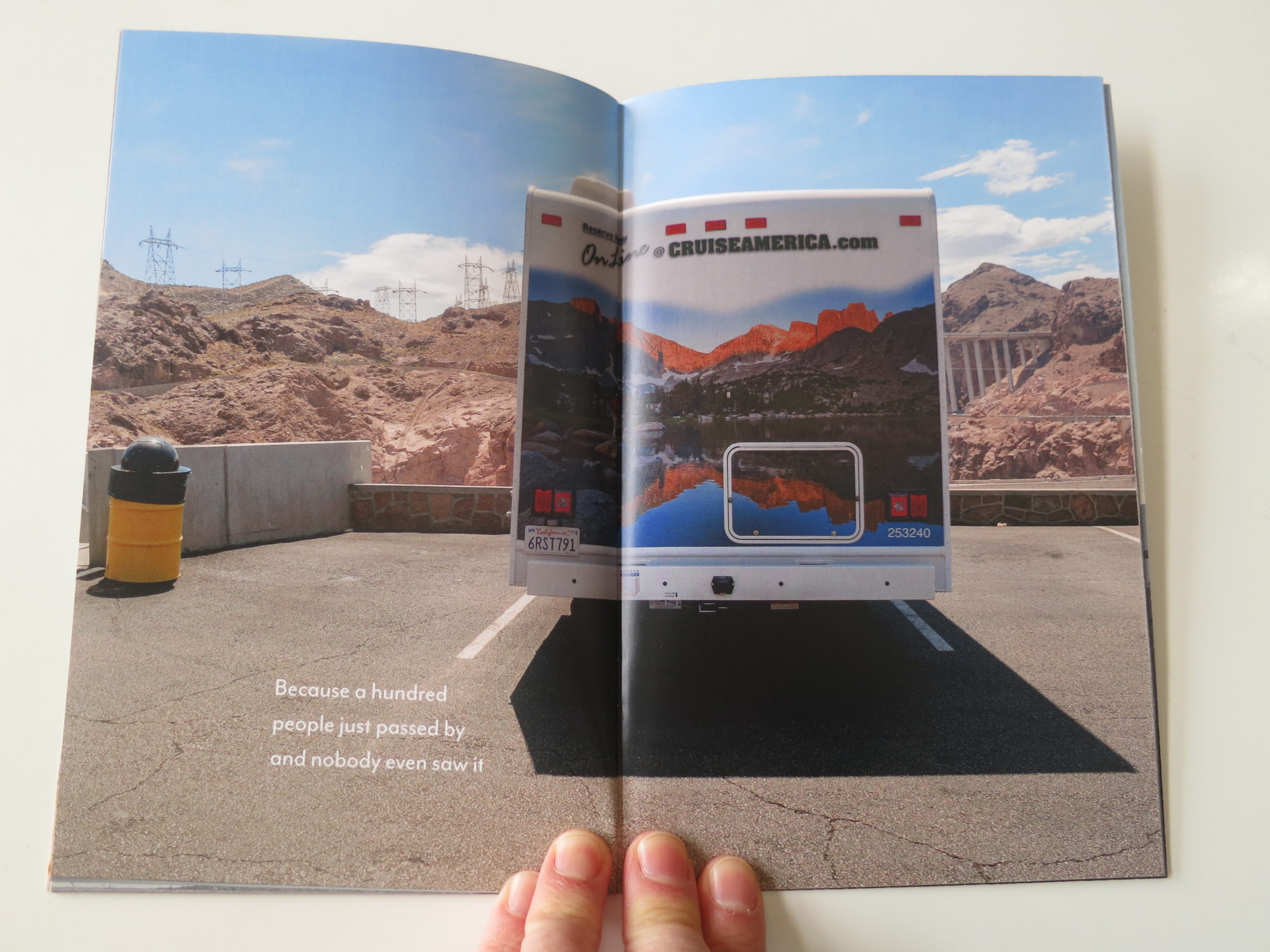
There is an RV parked in a lot, and I’m guessing it’s Nevada or Arizona. (Where Jeff was raised.)

The caption is: “Because 100 people just passed by, and no one even saw it”

What, I wondered?

What did they miss?

What am I missing?

And then it clicked into place, like a lego block you just can’t seem to make fit.

The horizon!

The painting of the fake mountains on the rented RV matched up perfectly with the real thing, right there in front of us. (Or really, in front of the photographer who stood there IRL.)

The virtual and the real, seamlessly locked in a dance of confusion.

How could I have not seen it?

How did those 100 people miss it too?

And that, my dear readers, is why the world needs art, and artists.

Some of us try to do this for a living, exclusively, and our side-hustles have side-hustles.

Others, like Jeff, have demanding day jobs, using their art as an outlet, and when they advance enough, get to have second careers as successful as the first.

And as for the middle-aged columnists out there, the ones like me that forgot how to be funny, sometimes, all we need is a reminder that it’s OK to laugh at our crazy world.

Even if we feel like crying.

Bottom Line: Insightful, funny and poignant look at contemporary America

To purchase “I Laugh Because it Hides the Tears Volume 1,” click here 

If you’d like to submit a book for potential review, please email me directly at jonathanblaustein@gmail.com. We are interested in presenting books from as wide a range of perspectives as possible.

The Art of the Personal Project: Pedro Oliviera

The Art of the Personal Project is a crucial element to let potential buyers see how you think creatively on your own.  I am drawn to personal projects that have an interesting vision or that show something I have never seen before.  In this thread, I’ll include a link to each personal project with the artist statement so you can see more of the project. Please note: This thread is not affiliated with any company; I’m just featuring projects that I find.  Please DO NOT send me your work.  I do not take submissions.


Today’s featured artist:  Pedro Oliveira

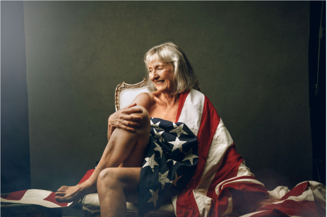
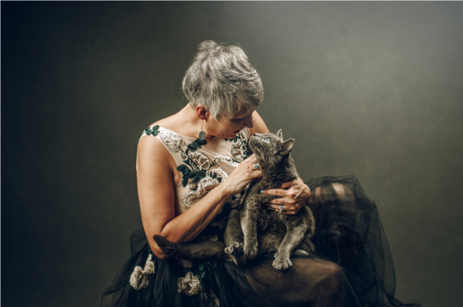
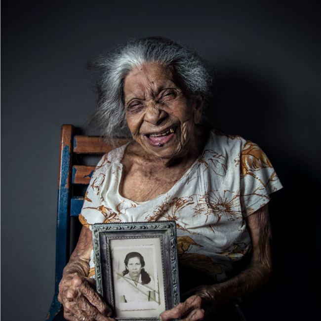
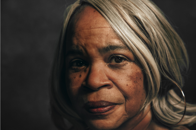
In the wake of 2017 Women’s March and the fierce #metoo movement, on which brave women stood for themselves bringing down some of the most powerful men in the United States, I decided to start a project that would have as subject equally fierce women.

“Beyond the 60th Sense” is a photo essay done over the course of two years on which I photographed and interviewed females over 50s and listened to their opinions and experiences on relevant topics such as body empowerment, body shame, ageism, work/payment equality, mental health, sexuality, among others.

“Beyond” is about breaking the paradigms of arbitrary perfection when it comes to female beauty. It is a silently loud protest against the fallacy of feminine beauty being linked to youth, so widely advertised and spread nowadays.   Finally, “Beyond the 60th Sense” is also about hearing the voices of an important part of our society on relevant and sensitive topics without judging their position but rather cherishing the paths that took them to such views.

To see more of this project, click here.

APE contributor Suzanne Sease currently works as a consultant for photographers and illustrators around the world. She has been involved in the photography and illustration industry since the mid 80s.  After establishing the art buying department at The Martin Agency, then working for Kaplan-Thaler, Capital One, Best Buy and numerous smaller agencies and companies, she decided to be a consultant in 1999. She has a new Twitter feed with helpful marketing information because she believes that marketing should be driven by brand and not by specialty.  Follow her at @SuzanneSeaseInstagram

Success is more than a matter of your talent. It’s also a matter of doing a better job presenting it.  And that is what I do with decades of agency and in-house experience.


The Daily Edit – The New York Times Sunday Magazine: Dina Litovsky


The New York Times Sunday Magazine

Director of Photography: Kathy Ryan
Former Art Director now Partner at Pentagram: Matt Willey
Photographer:
Dina Litovsky

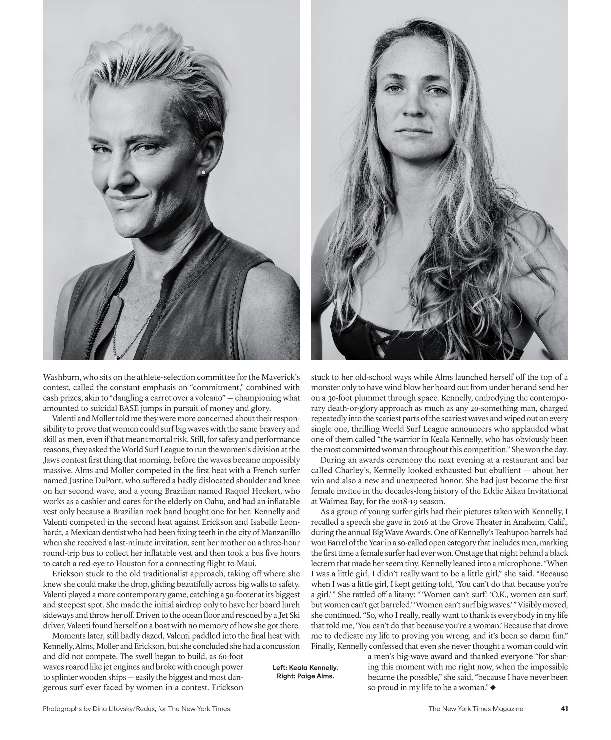
Heidi: How much time did you spend with each athlete before taking their portraits, was it before or after Mavericks?
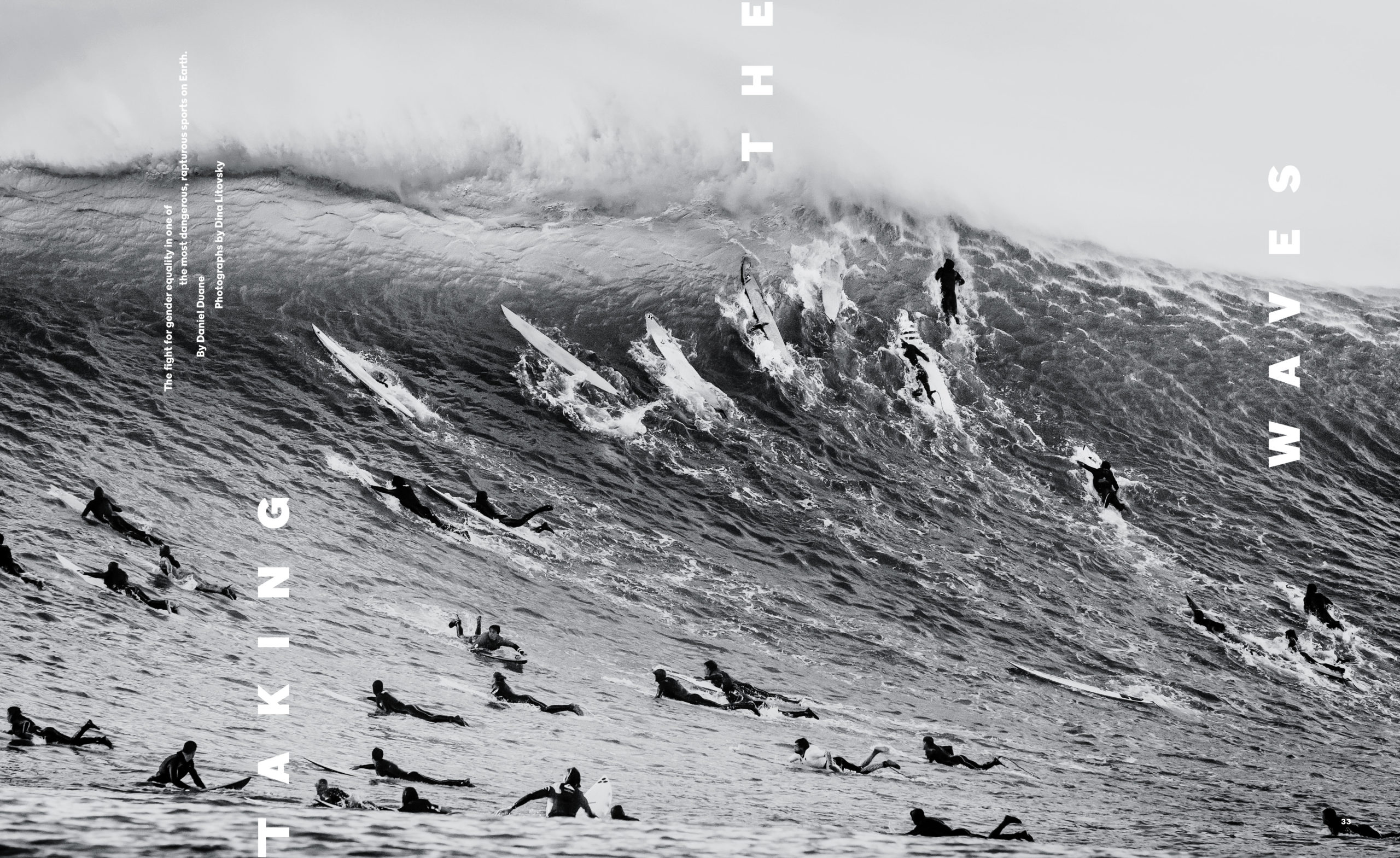
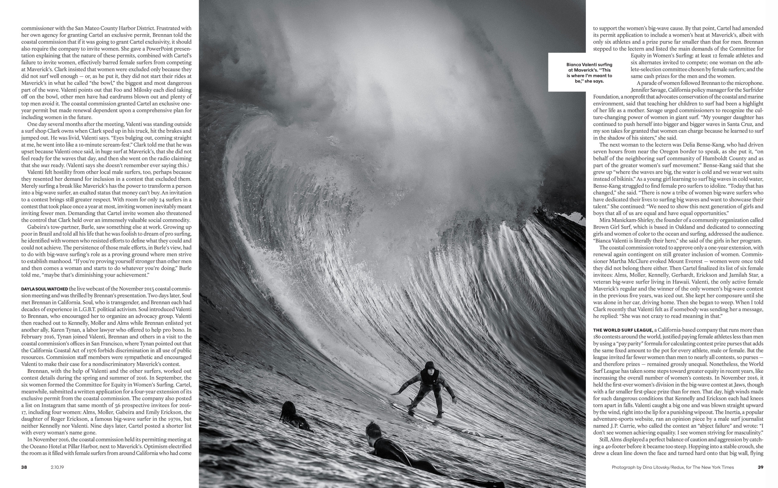
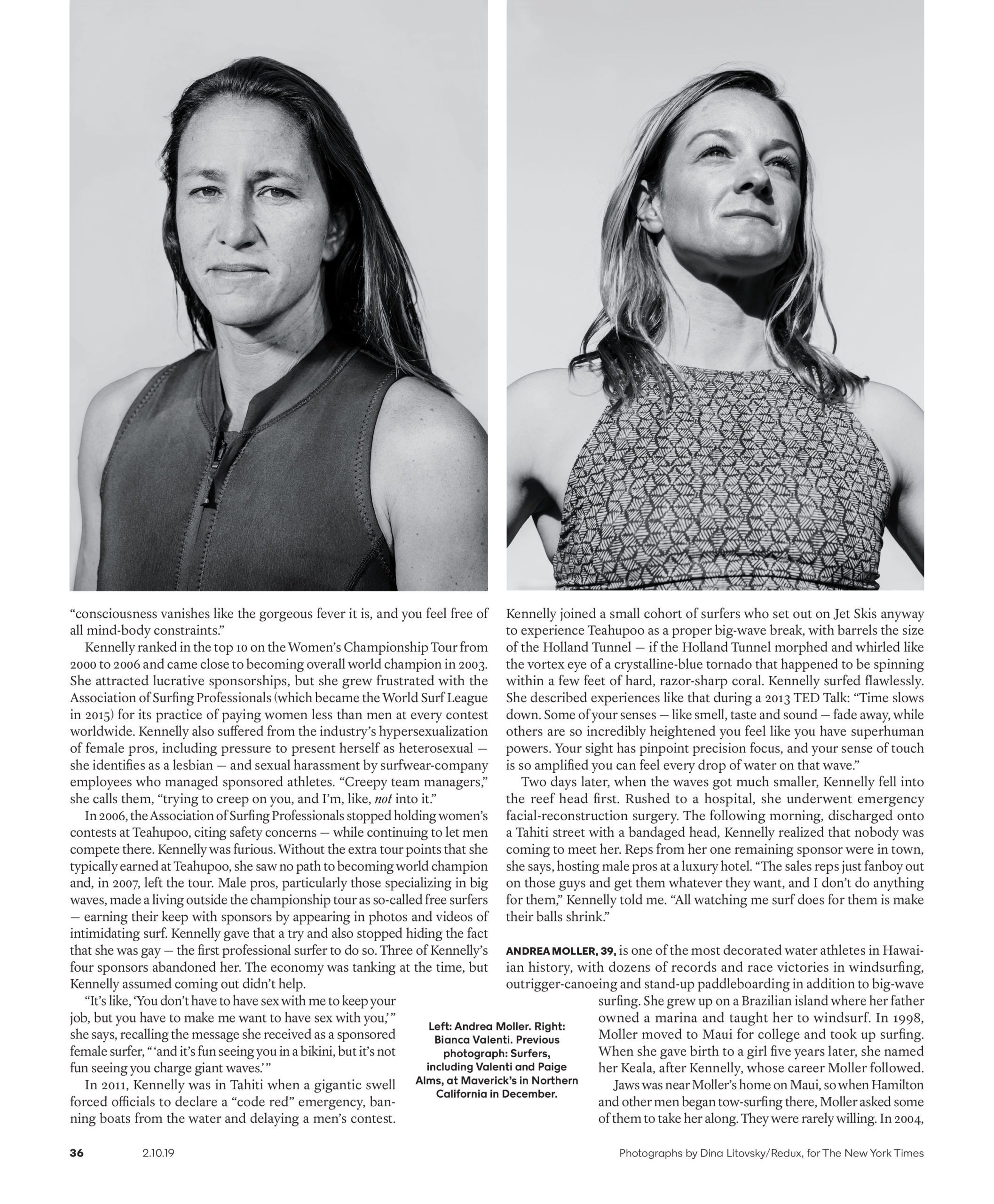
Dina: I did two trips for the story, to Maui, Hawaii and Mavericks, San Francisco. Traveling to catch the waves is tricky, there is only a 24-42 hour notice of when the waves will swell. I had to be packed and ready
, waiting for the last minute green light. When I got to Maui, the weather was too dangerous for me to get on a boat for the shoot so I concentrated on making portraits of the athletes.

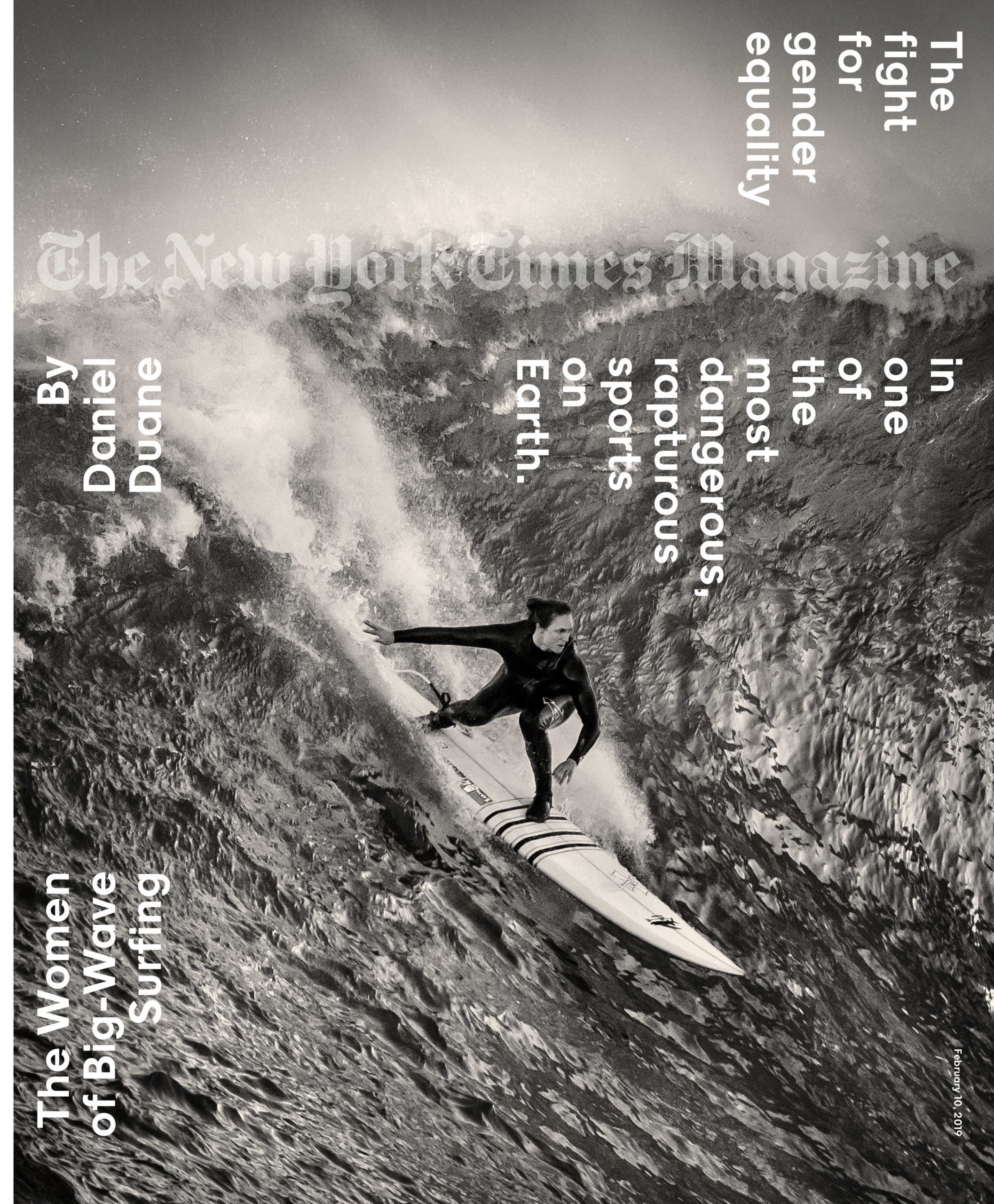
Tell us how you got the cover image, where were you in the water?
This was taken at Mavericks. I had 3 days to shoot the waves before the swell was over. The shoot was done on a small boat, aboard with both of the surfers, Bianca Valenti and Paige Alms (cover). Each day trip took from 3-5 hours. The boat had to keep circling around the waves to avoid being overthrown. That, with the combination of looking through a 400 lens trying to pick out Bianca or Paige among the 30 other surfers, contributed to my first ever seasickness. The cover image was taken on the second day when I came more prepared with anti-nausea pills. Physically this was probably the most difficult shoot I’ve done. In the end, I came out with less than 30 images of the women surfing, and one of them ended up on the cover.

Was the photo direction in Black and white?
Mavericks is one of the most dangerous places in the world to surf the big waves and I wanted to translate that into a mood that was a bit threatening and ominous. Once I took away the bright blues and greens of the sky and sea, the waves seemed to turn into stone, both overwhelming the surfers and freezing them into a moment of stillness. Right away I knew that the images had to be black and white. I sent Kathy Ryan both options of each image, color and black and white, and was thrilled to learn that she chose the monochrome versions for the whole story.

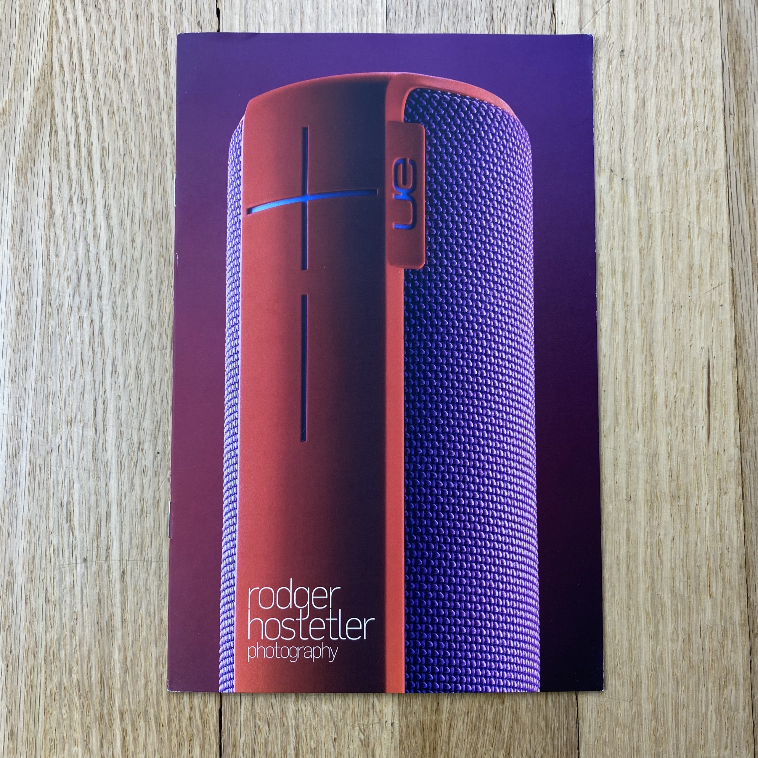
The Daily Promo – Cory Foote

Cory Foote

Who printed it?
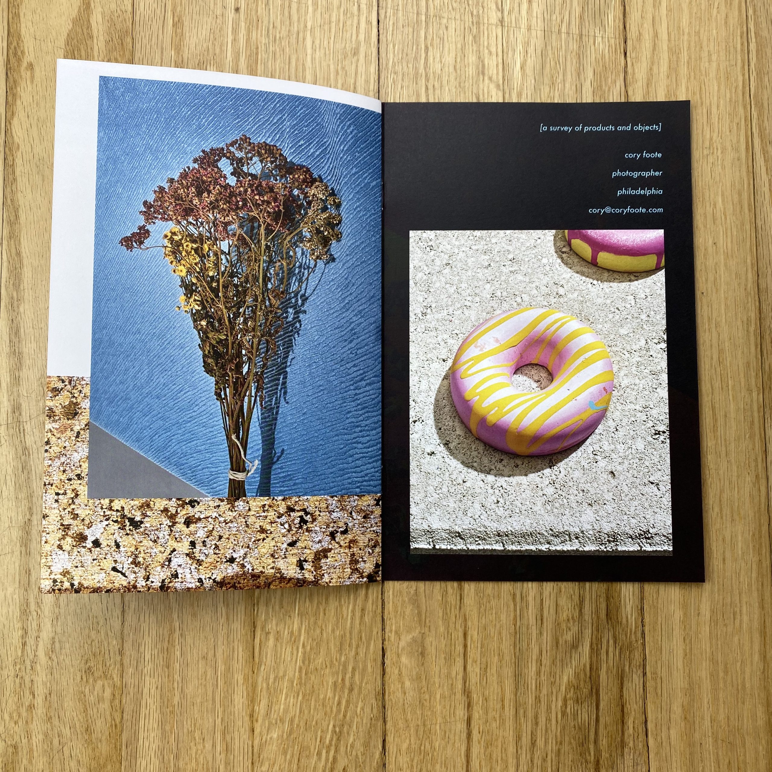
The booklets were printed by the wonderful folks at Fireball Printing in Philly. Not only was it great to work with creative types who actually care about printed photographs on paper, but there was the added benefit of them being located within walking distance of my studio space. Initially, I thought I wanted a small run of offset mailers; because I’ve never been fond of the digital printing that I’ve seen ( that would be in my price range). After Fireball relocated into a new studio space, I believe they invested in a new digital printer. After getting proofs back and seeing the results, I had to rethink my concept because I thought the print quality and the paper stock was so stunning. Moreover, the team was super gracious and was never annoyed when I kept modifying the asset files for color correction and asking for more proofs.

Who designed it?
Unfortunately, I had to take over the design. It would have been great to collaborate and pay for a professional, but I’m not there yet. I had a few amazing friends in the creative field that I could go to with mock-ups and then get feedback. I just wanted to make sure I wasn’t committing too many design sins. The major thing I wanted to know was “ if this was on your desk would you want to open it?”

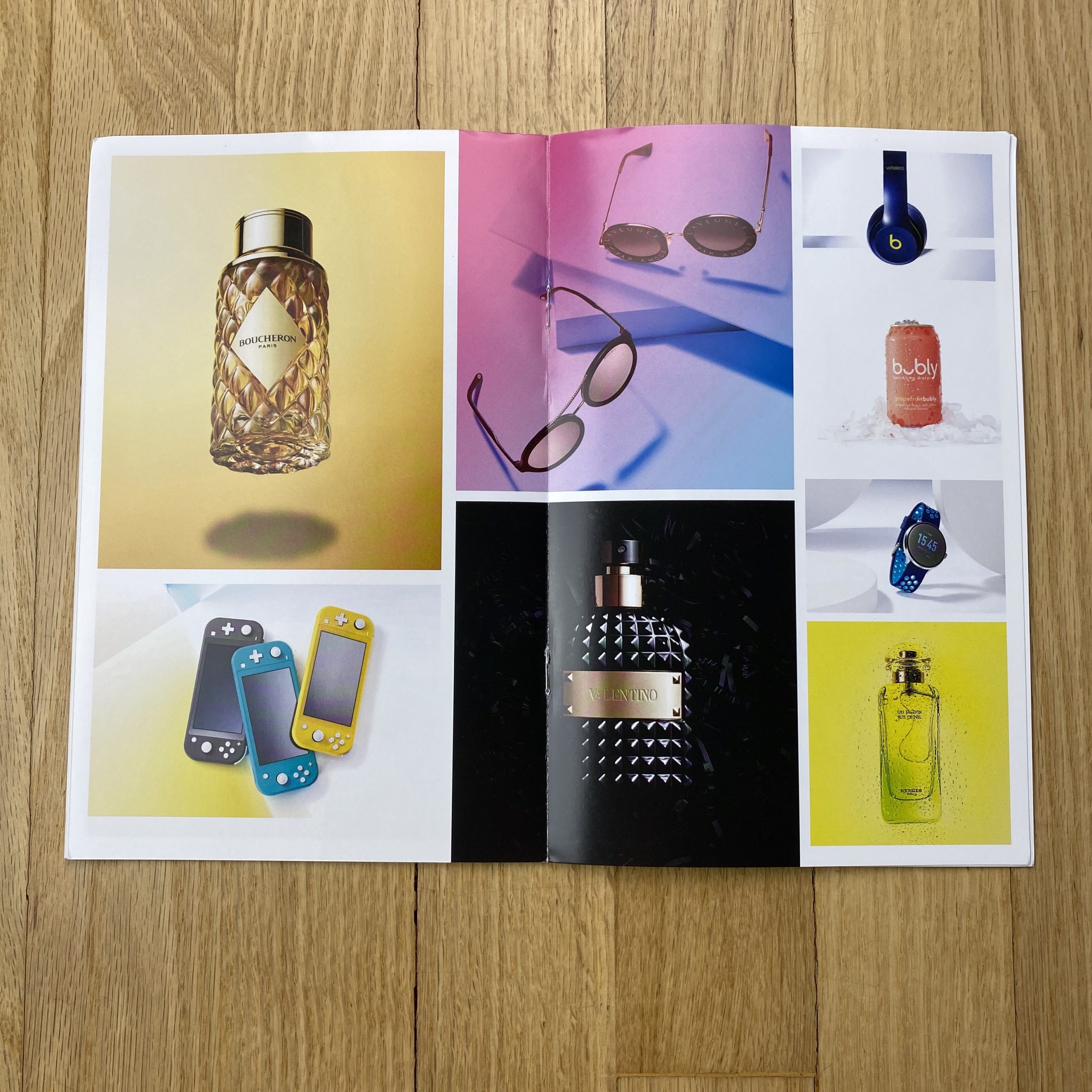
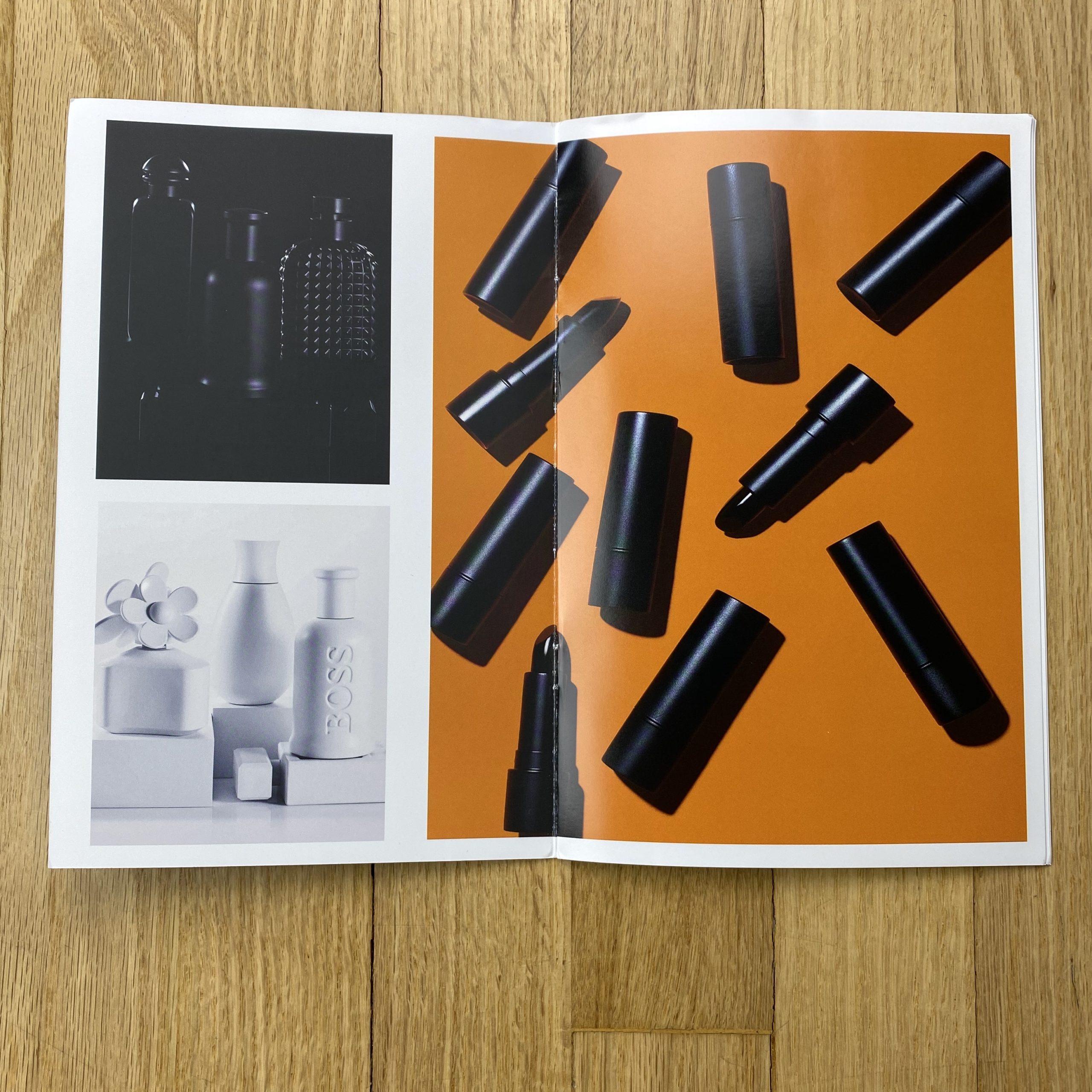
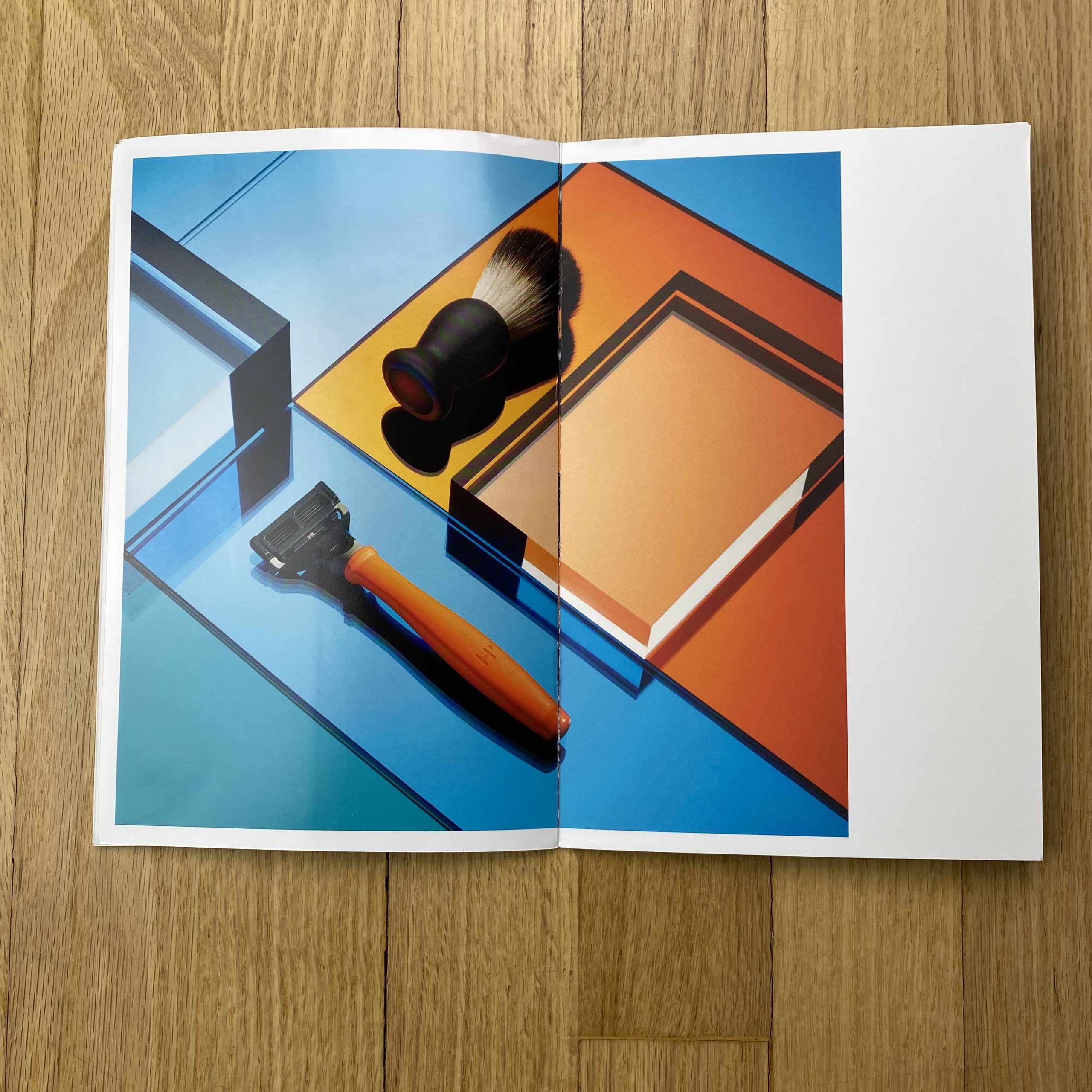
Tell me about the images?
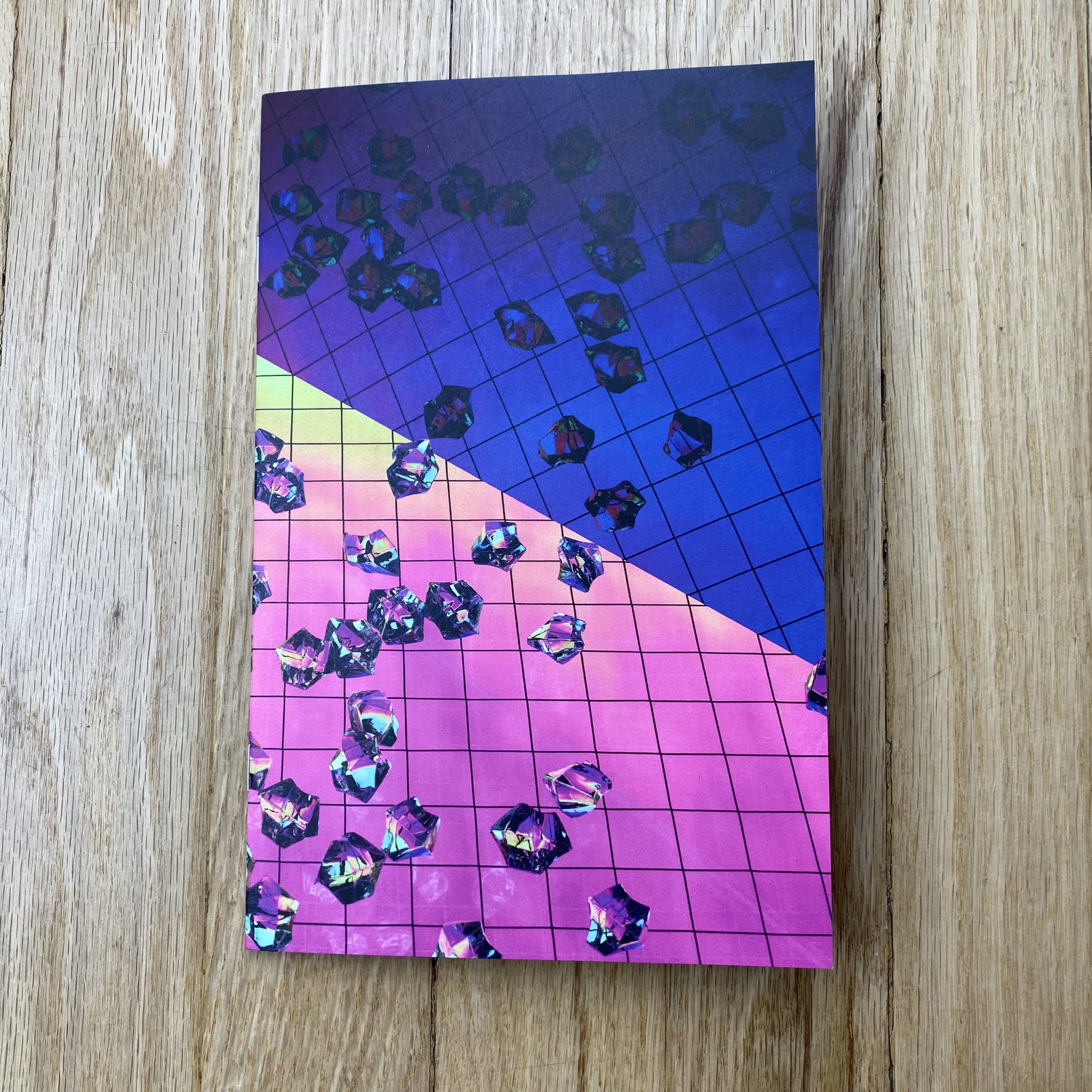
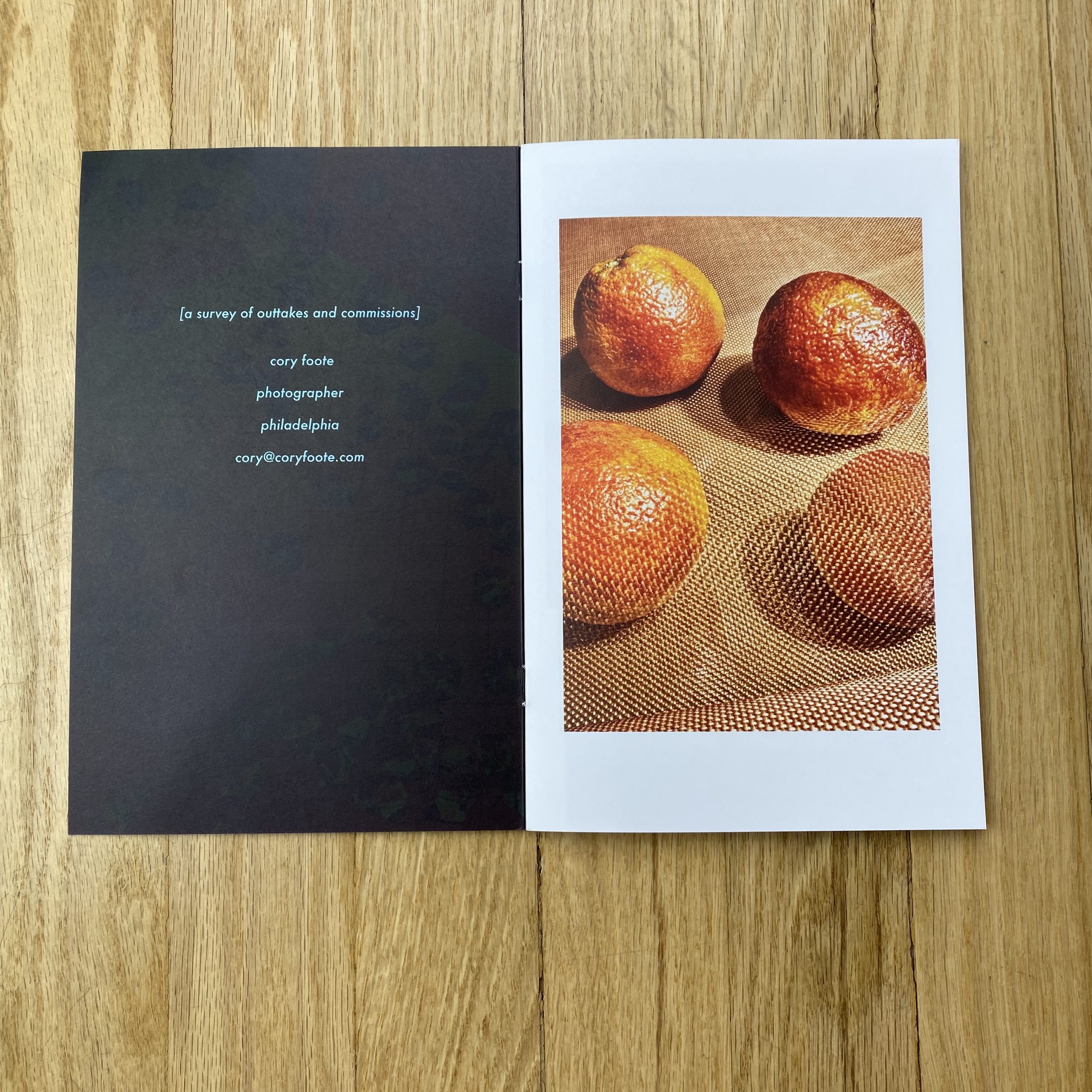
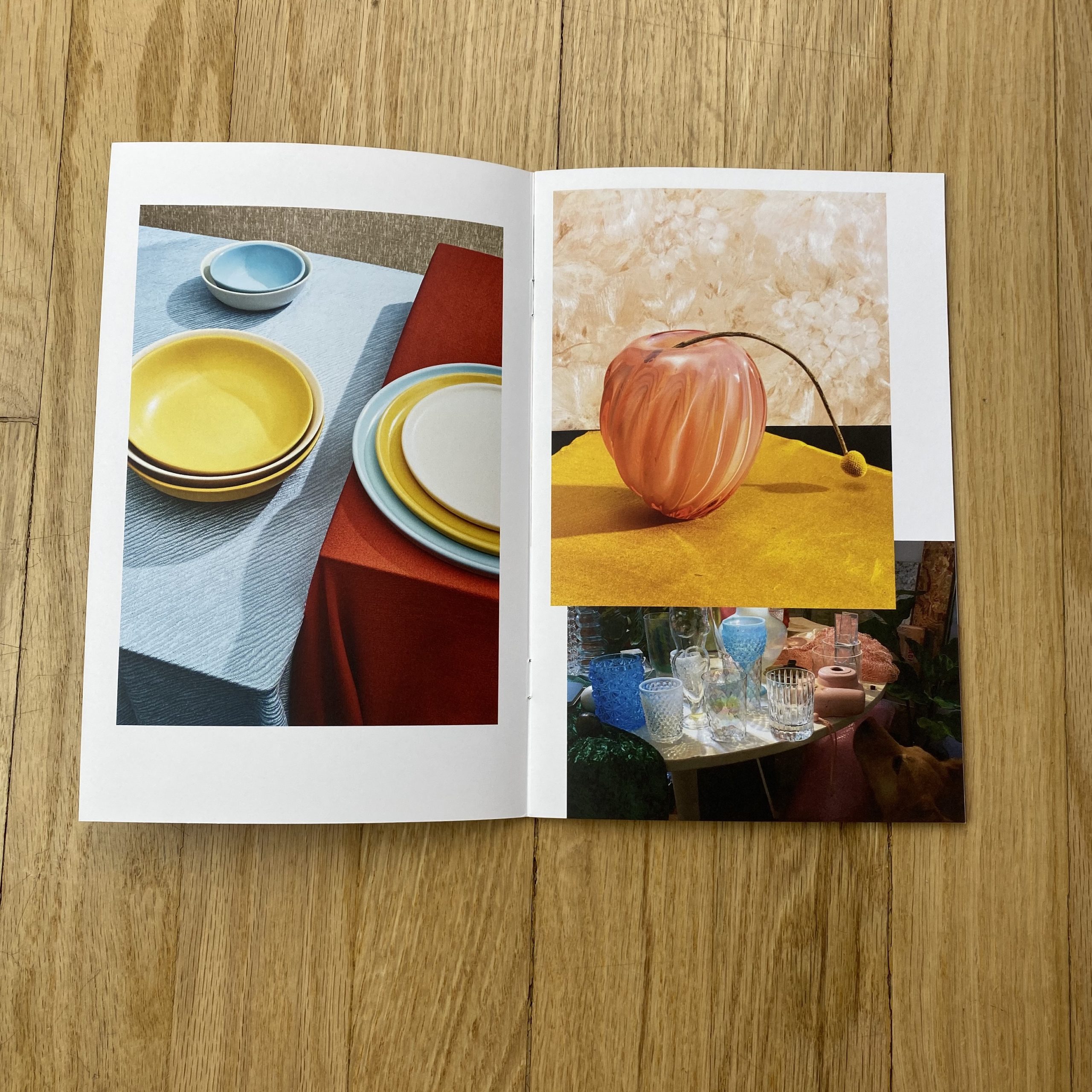
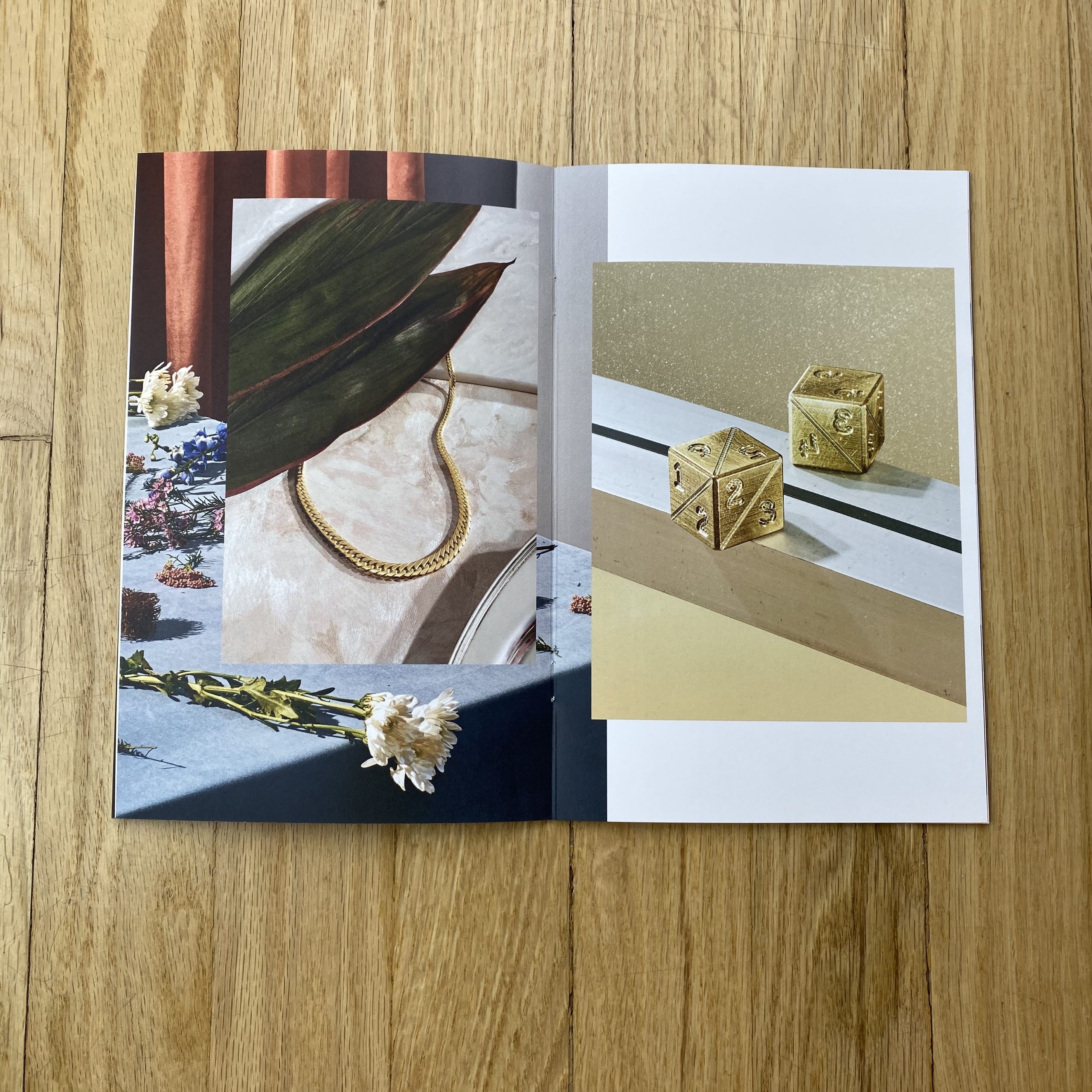
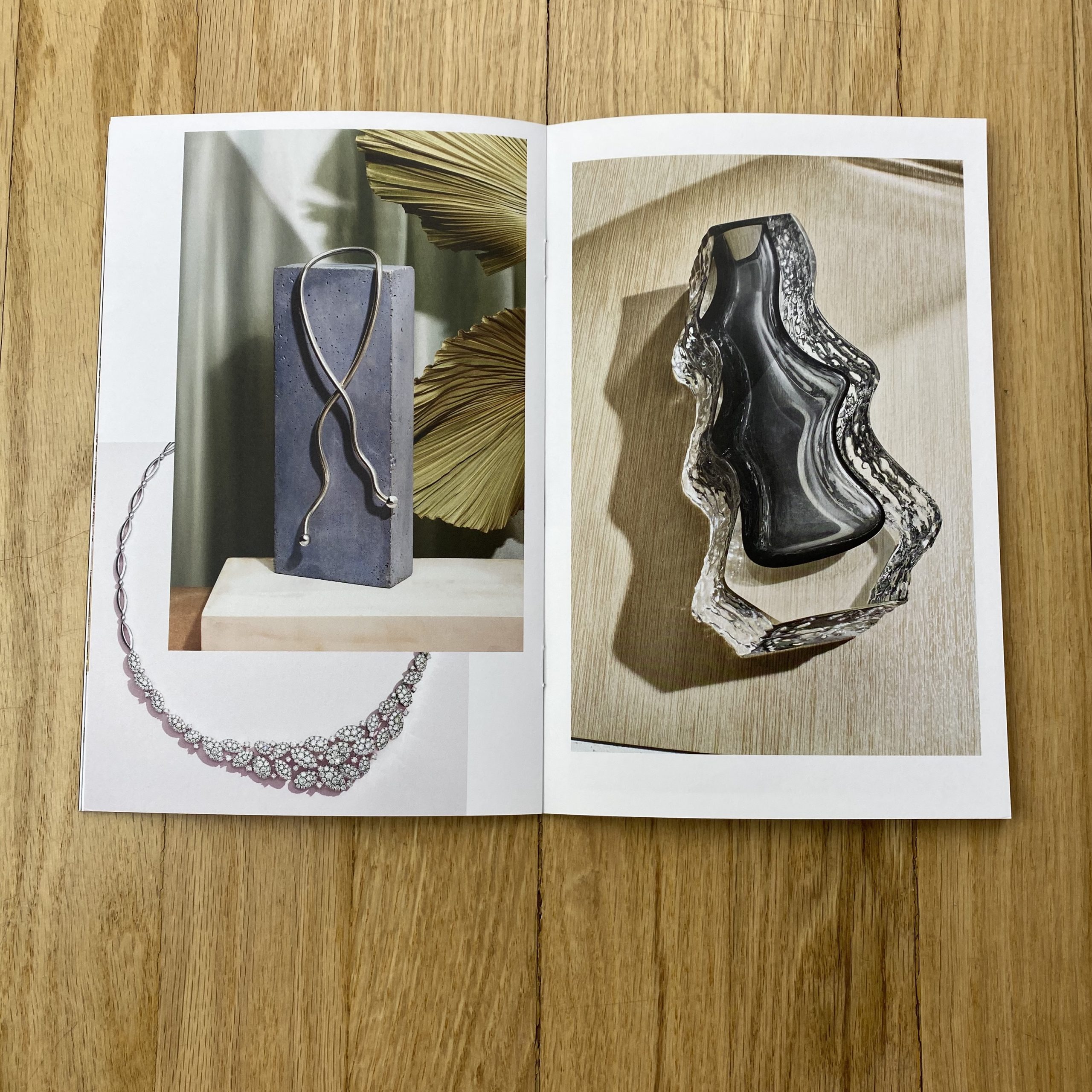
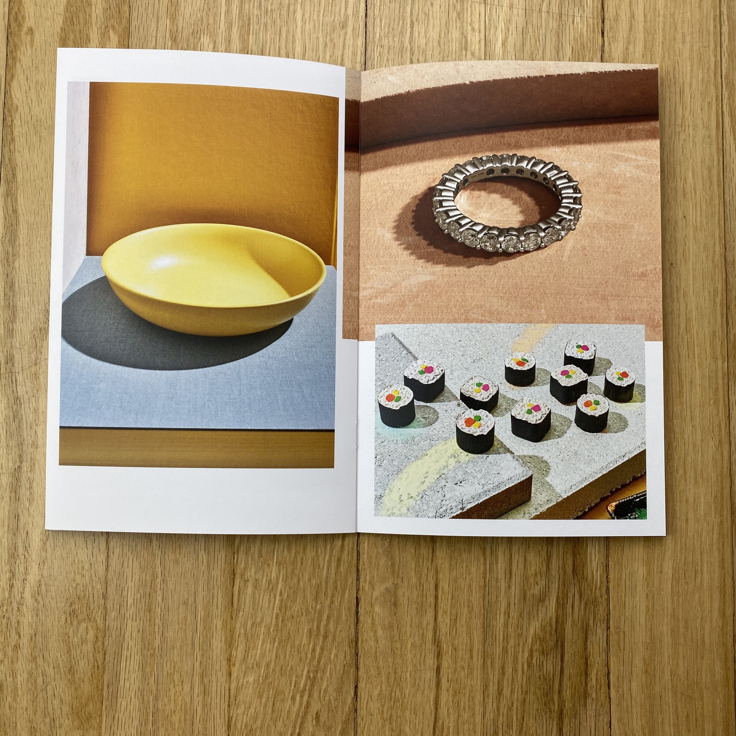
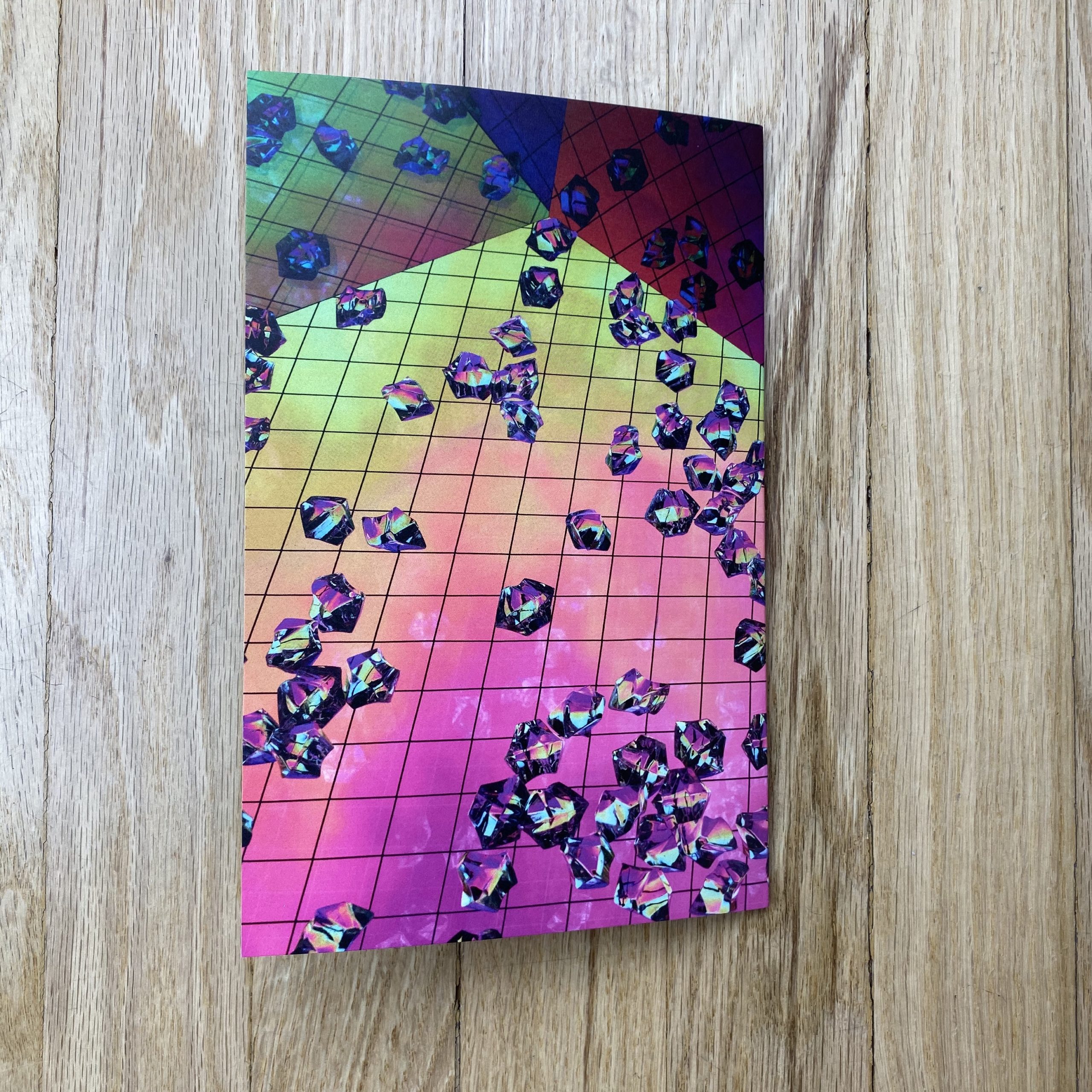
The mailer is a small collection of images from client work that I loved over the past two years, mixed in with pictures that were created on the side during shoots or after with the leftover set materials and props. Often at times, creatively you are drawn to the test images and sketches and experiments that happen throughout the shooting schedule that aren’t necessarily appropriate or useful as final client assets. The goal was to create a playful space for those images to exist together in a messy visual pile. I wanted to share a mood board featuring a quirky layout with a luxury image from a jewelry retailer and a product shot for a local artist coexisting on a spread, photographed with the same appreciation and respect due.

How many did you make?
150 were printed. That was what I felt comfortable with cost-wise factoring in mailing expenses. I tried to target specific persons who would hopefully actually open and look at the booklet.

How many times a year do you send out promos?
This is my first promo of any kind. I’m really just starting my solo career. I love the idea of creating more concept-based mailers in the future, but there is always the creative fear of not working on vanity projects and only sharing useful information with clients that I wish to reach.

Do you think printed promos are effective for marketing your work?
I sure hope so. I’ve always loved and been inspired by physical prints and bound books. There is a magic to seeing images beautifully reproduced in an interactive way. In sending out a little booklet potentially worth looking through; a conventional means of self-promotion will cut through the digital hellscape of emails and newsletters. As someone who struggles with sharing and social media, the Printed page just makes more sense conceptually.

This Week in Photography: “The Unwanted”


Happy New Year, everybody!

Welcome to 2020.

(You’ll notice I’m not hashtagging it yet, as I did for the tumultuous, endless, and now departed #2019.)

It’s freezing outside, and my kids are still off from school, so I’m holed up in my bedroom with a fan on for white noise, and blankets huddled over my legs and feet, as the good heater is in the other room.

When I say freezing here, I don’t mean it simply as an adjective, in the descriptive sense.

I mean below 32 degrees F or 0 degrees C. (And as I’ve mentioned many times that I can’t do the conversion, we’ll stick to F for another year.)

Each year, in Deep Winter, it gets down to 0 F or below, with the wind chill.

When I woke up this morning, it was -5 F.

(And that level of cold will typically kill a person, so we don’t have a big homeless population here in Taos half the year.)

As I had last week off from the column, and finally got a chance to rest, I took advantage of a week of free HBO to catch up on “Succession,” which I’d heard was an important new show.

A friend who recommended it knows about the mega-rich, so I figured it would have authenticity. And the Uber-wealthy-megalomaniacal family it follows is clearly inspired by the Rupert Murdoch clan, with his conservative news empire.

The picture of sad, insecure narcissists, constantly fighting and betraying one another for proximity to wealth and power does feel relevant for our current era, which skews towards Oligarchy in much of the world. (All of the world?)

The acting is superb across the board, and I’ll bet that Jeremy Strong, who plays sad-boy son Kendall Roy, was using a fake American accent, so I’ll take a rare Google break.

Be right back.

Nope. He’s American, from Boston. (I guess that partially explains the nasally speech.)

Like most HBO shows I’ve seen since “The Sopranos” or “Curb Your Enthusiasm,” “Succession” is less proper art than intelligent, guilty pleasure, and the comps to Showtime’s “Billions” are rather obvious.

As the series writer, Jesse Armstrong, is English, and there are large set pieces in European castles and schlosses, there is a sense of insider-aristocrat-old-money-and-power vibe that adds to the glamour.

The differing, WASP, Massachusetts-liberal values of a rival media family, the Pierces, allow yet another window into the world of the .001%

And what of it?
What’s the takeaway?

Well, it echoes something a friend told me at a recent dinner party. He is super-successful, and mentioned that he’d recently heard about a study that super-rich and super-poor people were often equally unhappy.

He said he could believe it, from what he’d seen.

And we all know about the stereotypes of addiction, suicide and self-sabotage attributed to really rich kids as well.

Unhappy they may be, but EVERYTHING the Oligarchs experience in life is “better,” as depicted in “Succession.”

Better cars, (driven by others,) better food, (which is ever-present in every room,) prettier rooms, bigger spaces, private planes, visits to castles, private yachts, well-dressed servants, omnipresent helicopters, all of it.

What does it mean?

That the rulers of the world want as much physical space, and personal resources, as possible. They want transportation options that allow them to EXIST separately from the hoi polloi, and their money (almost) always protects them from accountability.

We see that people of unimaginable power, raised in the hothouse of extreme wealth, will often do and say anything to retain or increase that power and wealth.

Wait a second…

“Succession” is definitely about Donald Trump, in as much as it’s a metaphor for how that degree of wealth can warp a person, as we see with our President.

And in an age of extreme income inequality, maybe it’s important for history to have a document that shows this lifestyle for posterity? (Even if it’s fiction.)

There are many ways to present a narrative, though, and it’s equally important to understand the other side: the emergent street class in America.

In this column, we’ve discussed California shanty towns long before some in the mainstream media, and I’ve previously shown books by Anthony Hernandez, Joshua Dudley Greer, and Scot Sothern that depict elements of Post-Great-Recession American street living.

Last year, we also published Cecilia Borgenstam’s pictures of the artifacts of homeless life from Golden Gate Park in San Francisco.

But in the photo world, (as I’ve also written,) the subject has been contentious recently, with some suggesting that no one should ever photograph the homeless, without themselves being homeless.

I can see how it’s an endpoint philosophically, and certainly with the help of non-profit organizations, some homeless people can undoubtedly take pictures, and be supported to have them printed or exhibited.

To show the world, from the inside.

But honestly, if you’re living on the street, survival is your primary concern, not documenting your condition for history.

And from my art training at Pratt, I’ve never believed in the insider-only rule. Outside of the vilest racism, or child pornography, I think that artists should be allowed to explore anything they want, and then have the resulting work judged on merit.

I think male novelists should be allowed to write deep female characters, and African-American film-makers can direct Asian-American actors.

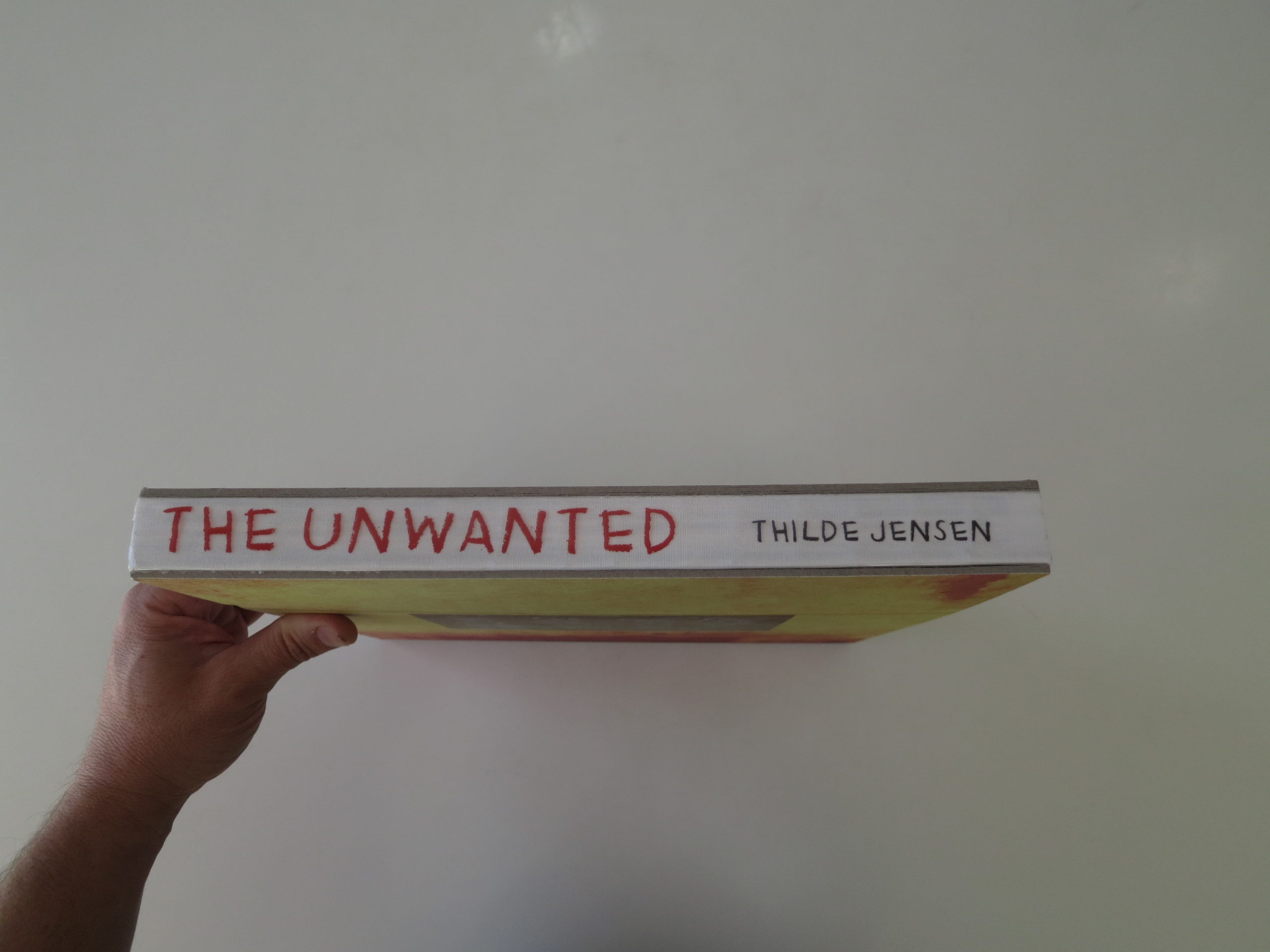
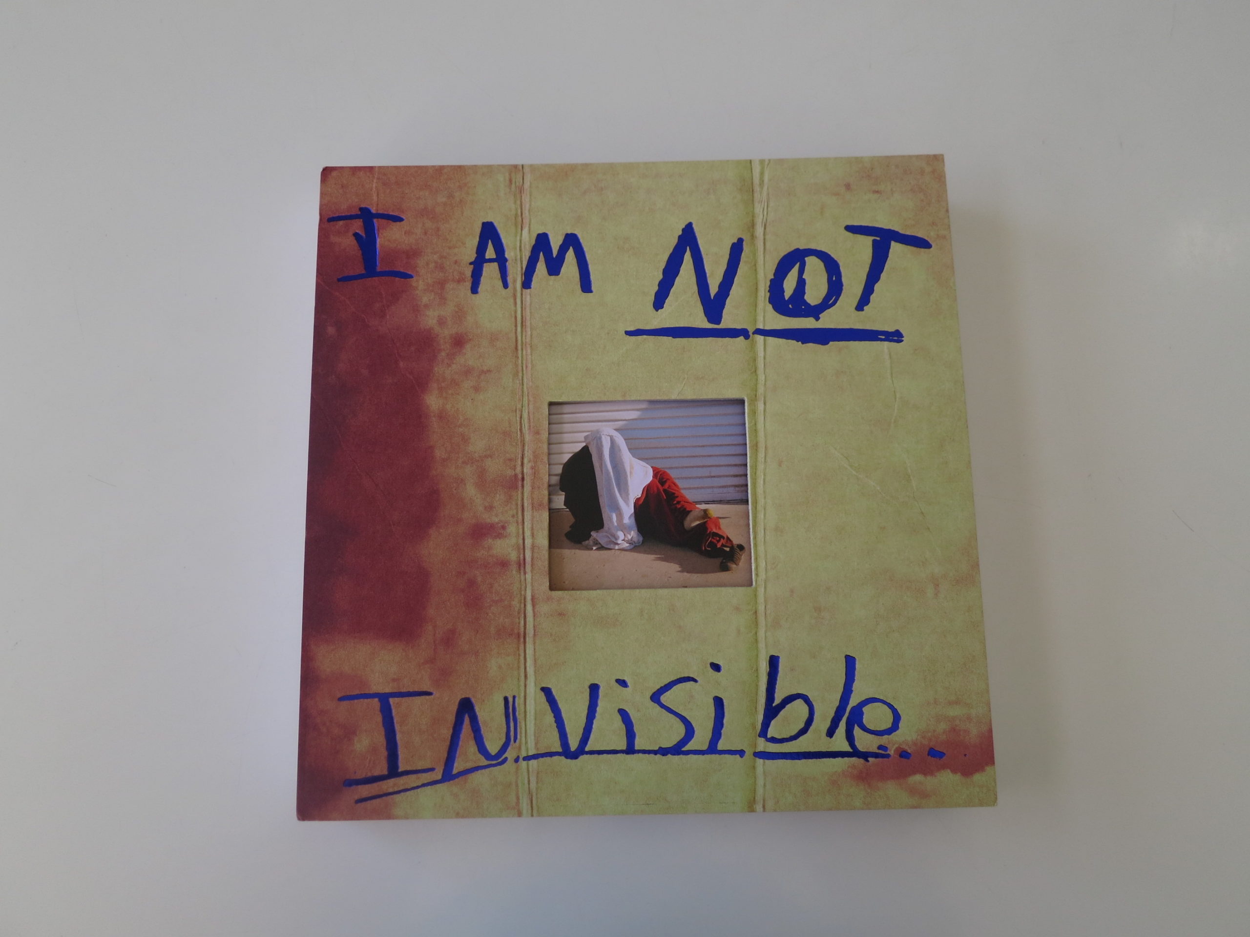
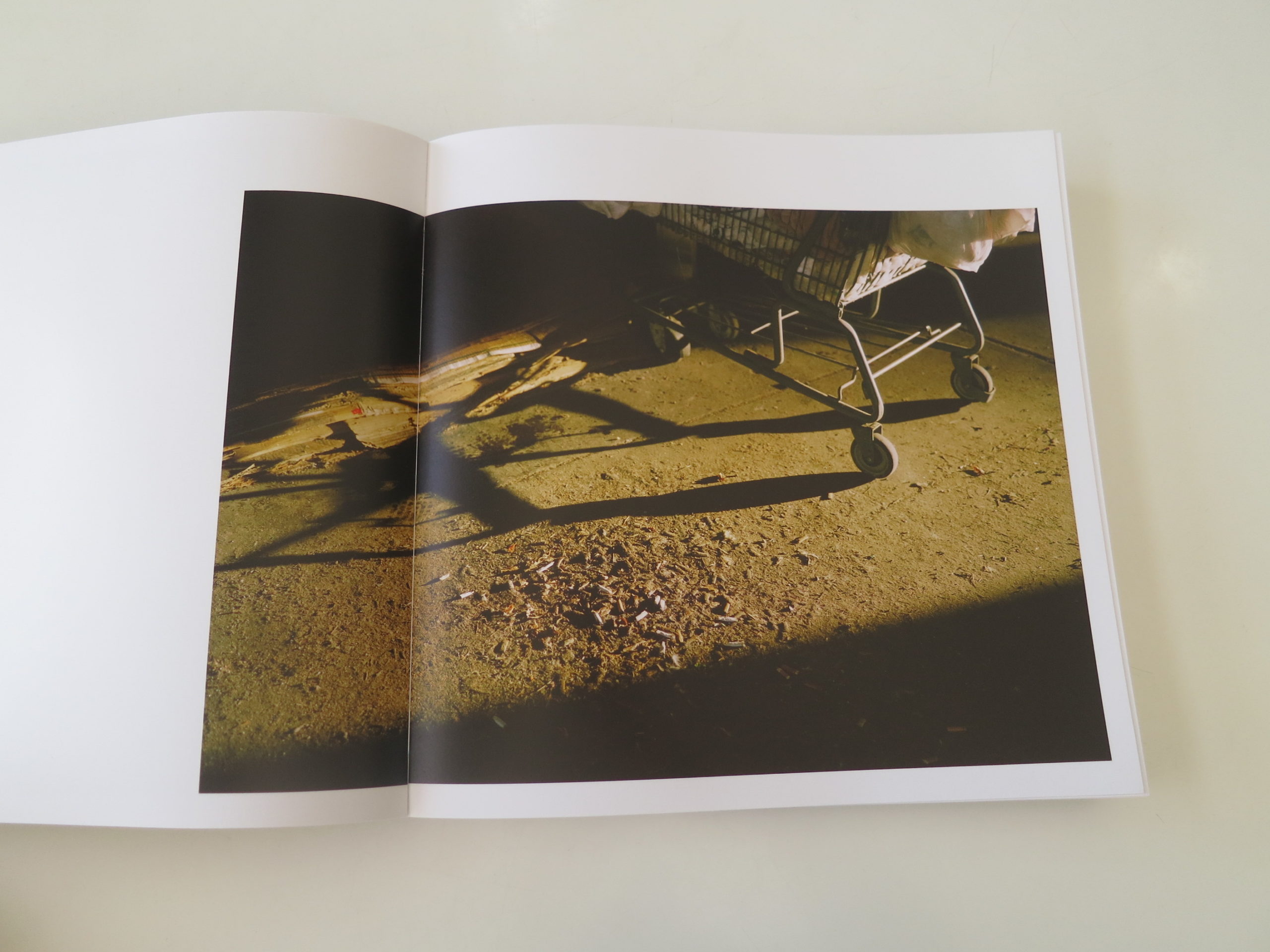
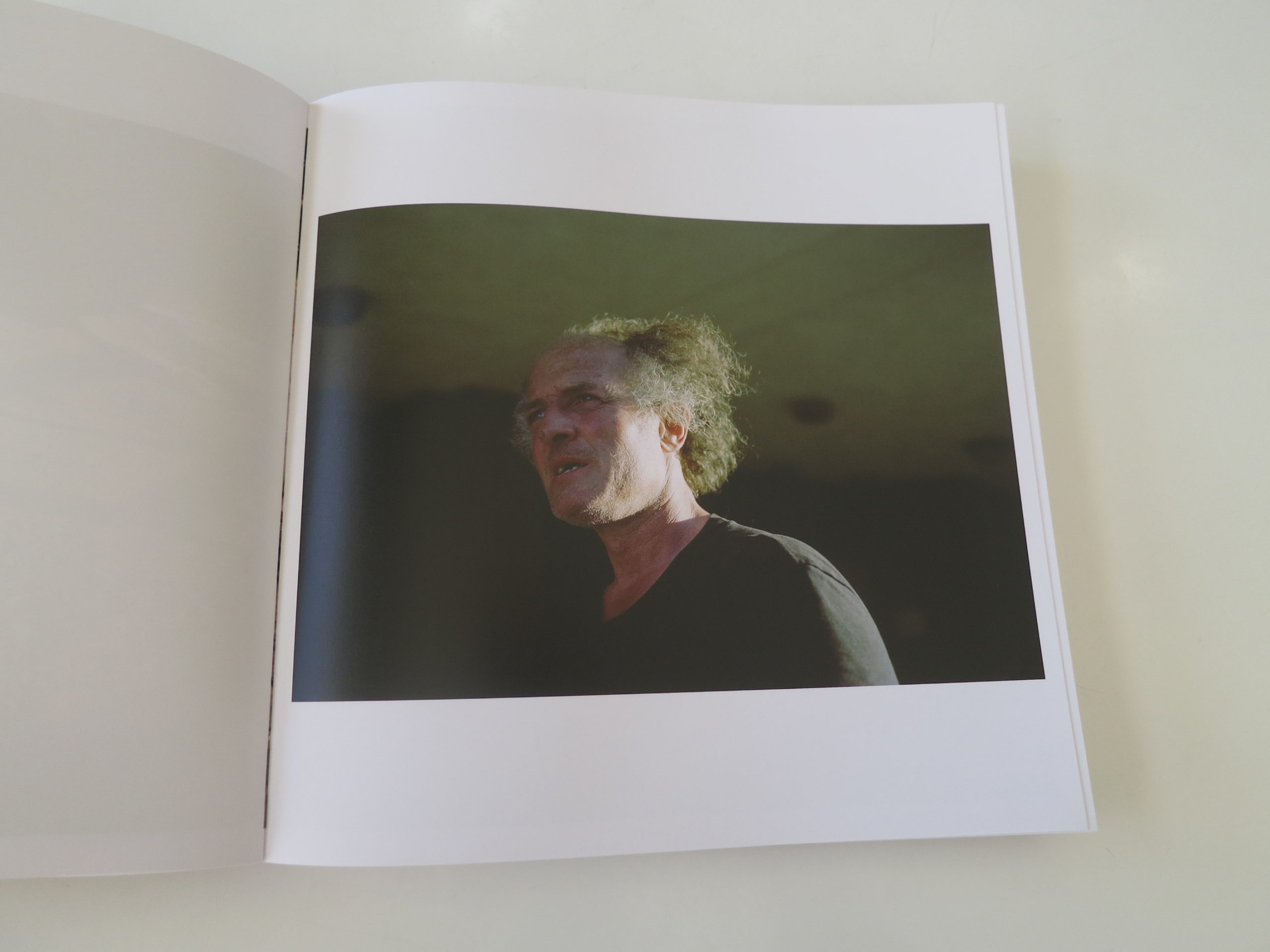
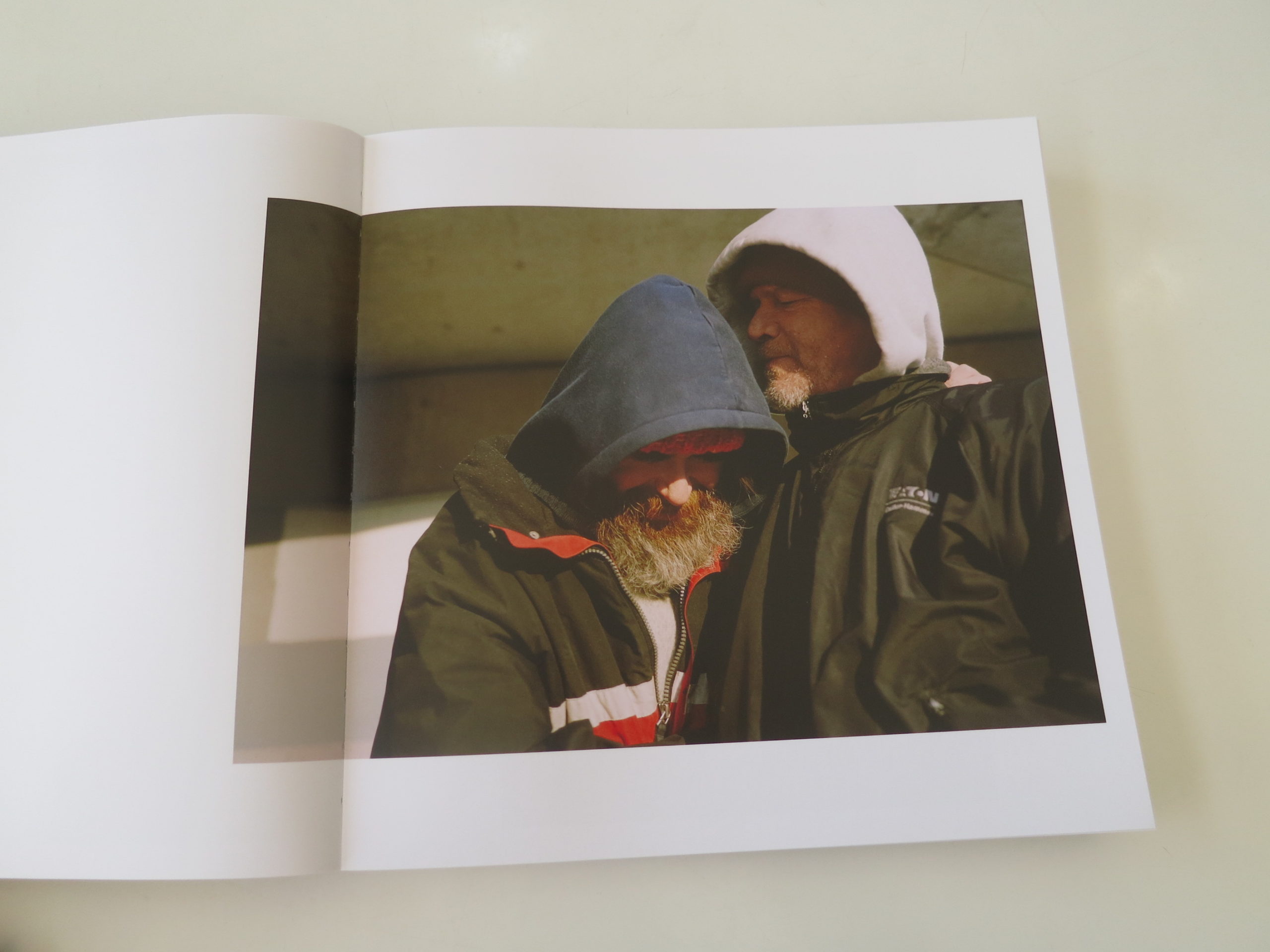
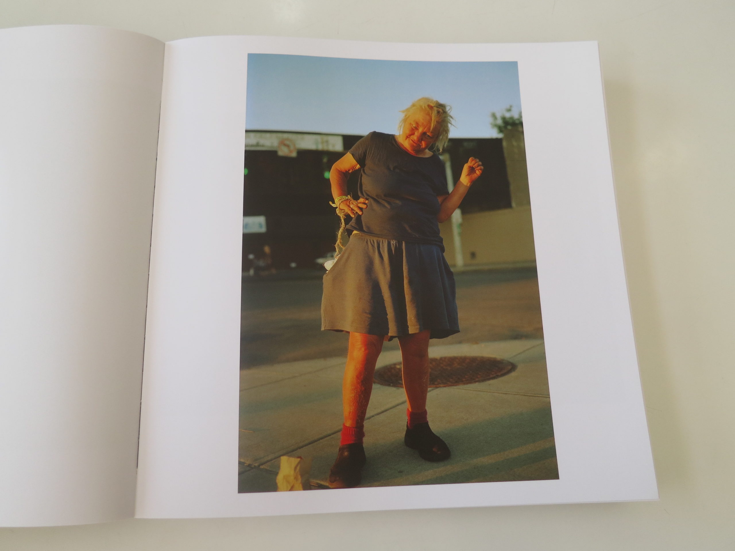
So after all that build-up, (a lot, I know,) for our first column of 2020, we’re going to look at “The Unwanted” an impressive book by Thilde Jensen, by LENA Publications, which turned up in the mail last year.

While I’ll admit that Ms. Jensen did give me a heads up about the subject matter when we corresponded, with my crazy #2019, I forgot what the book was about by the time I opened it.

So I was able to create an experience without preconceptions.

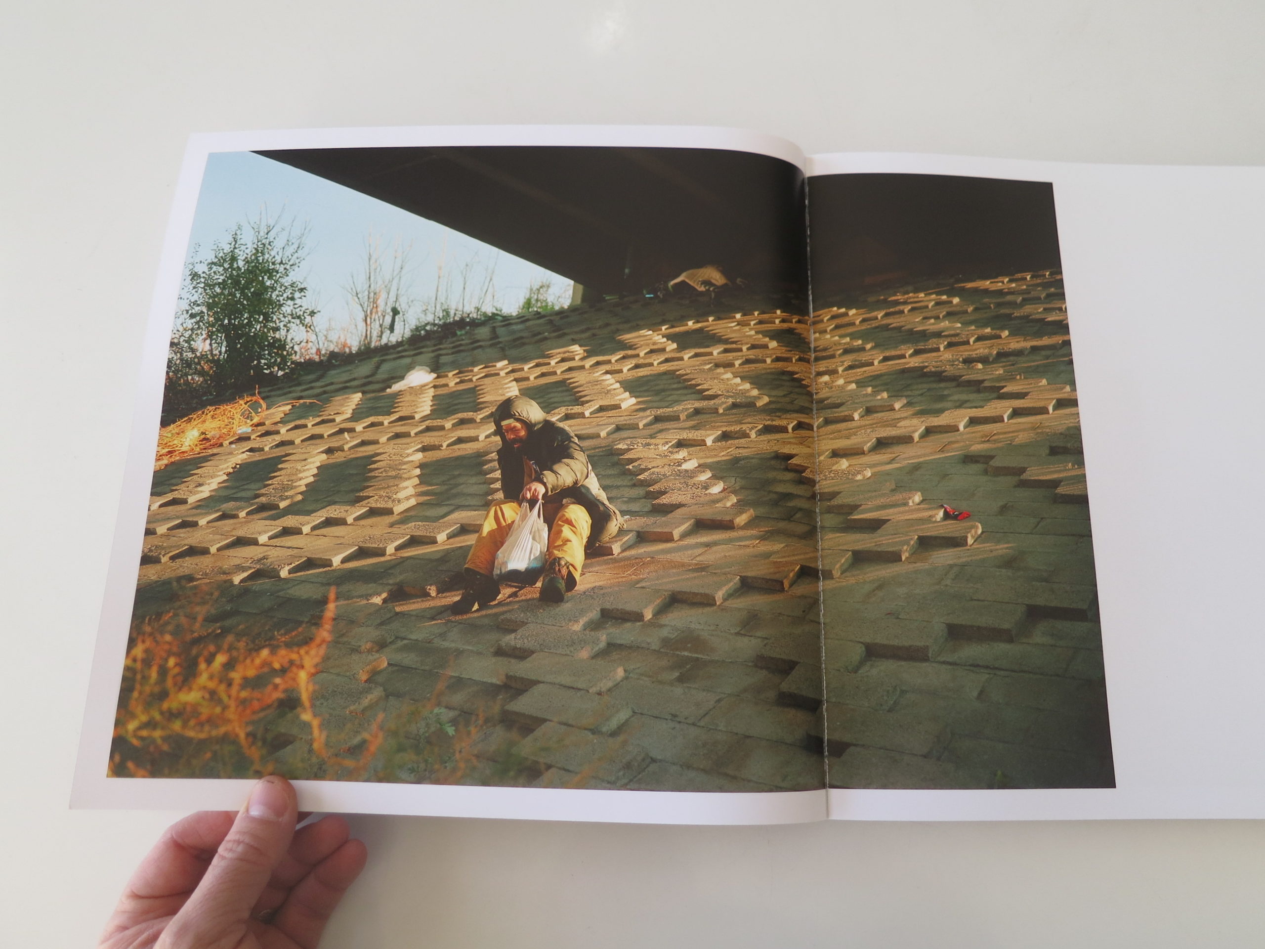
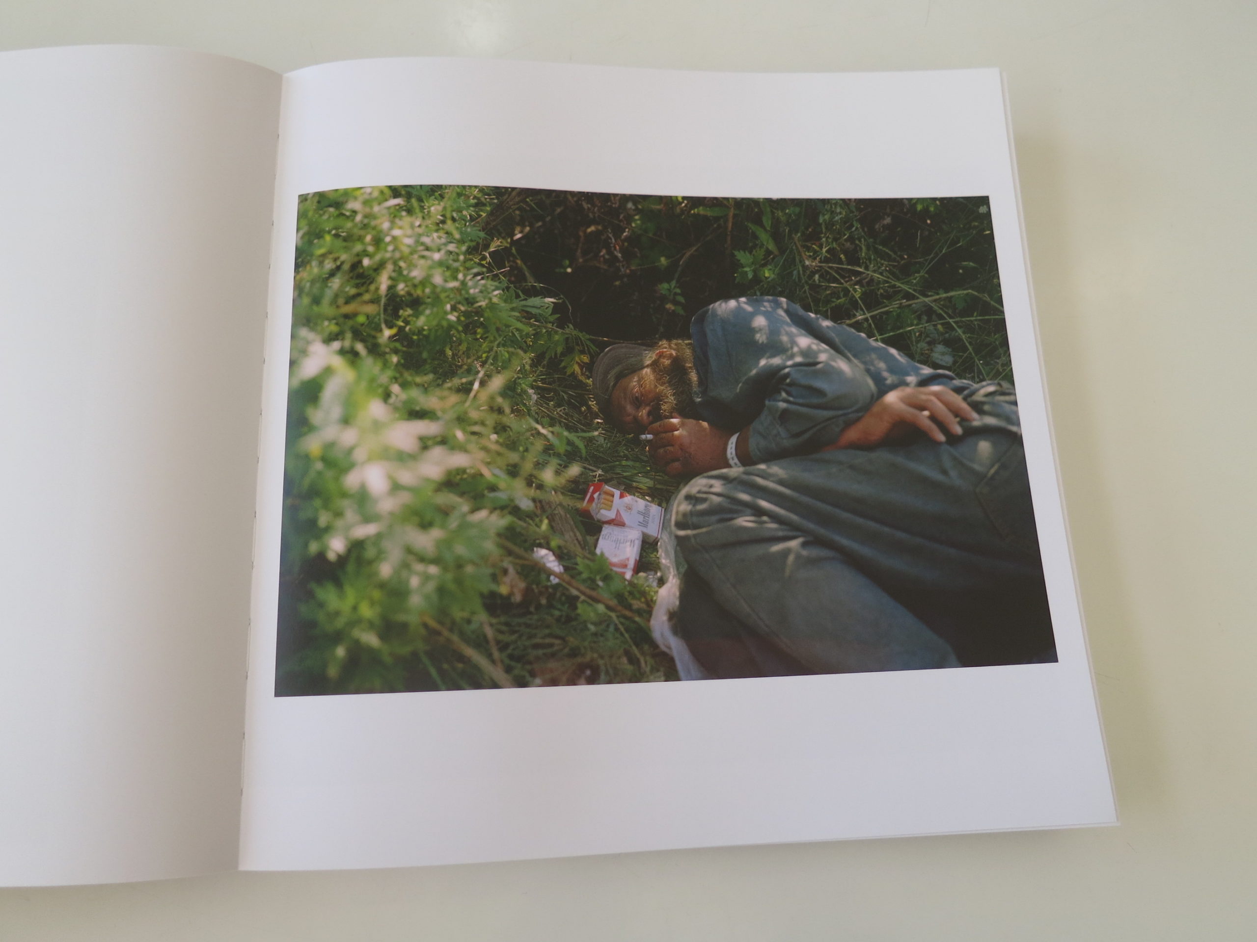
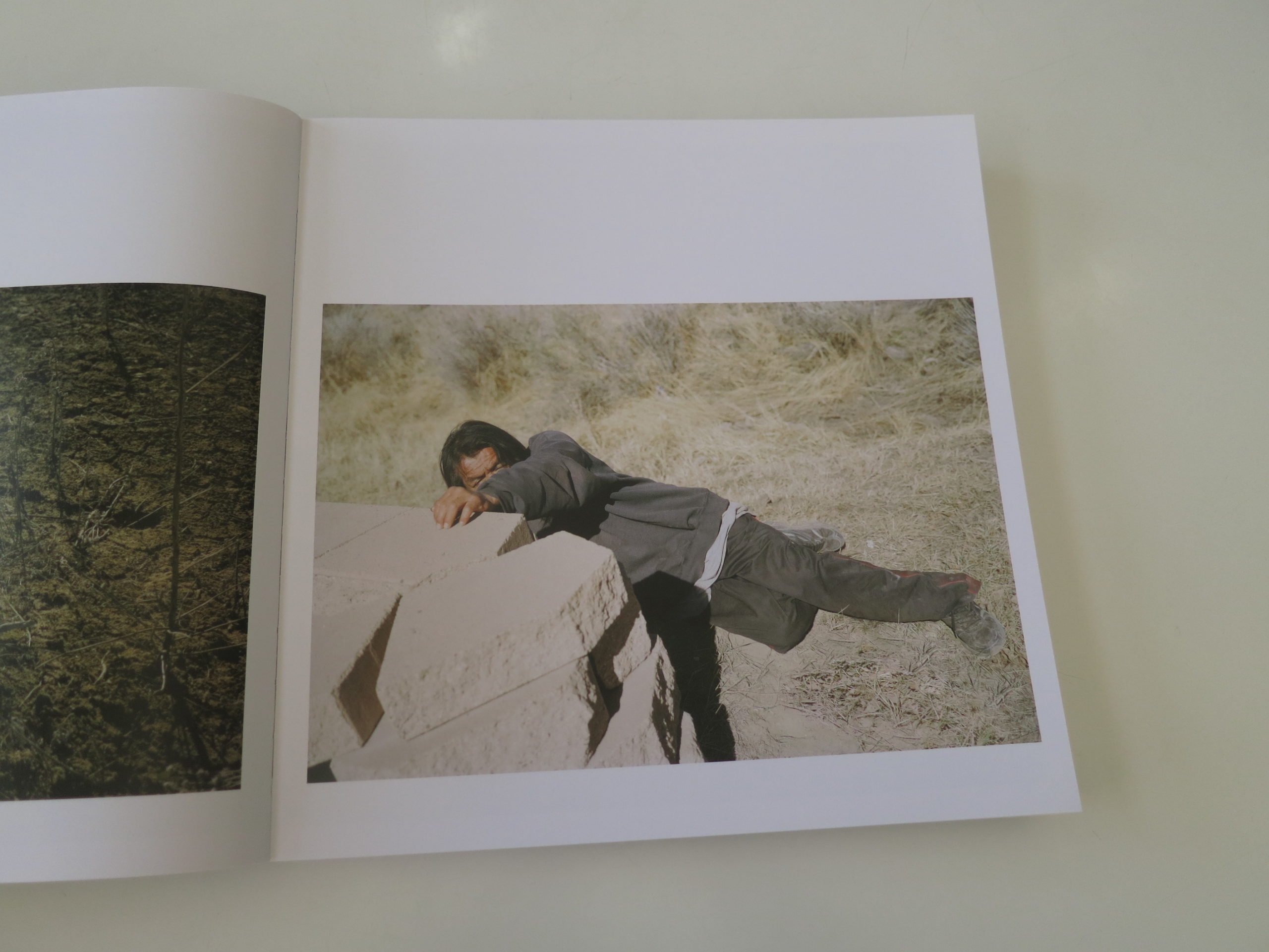
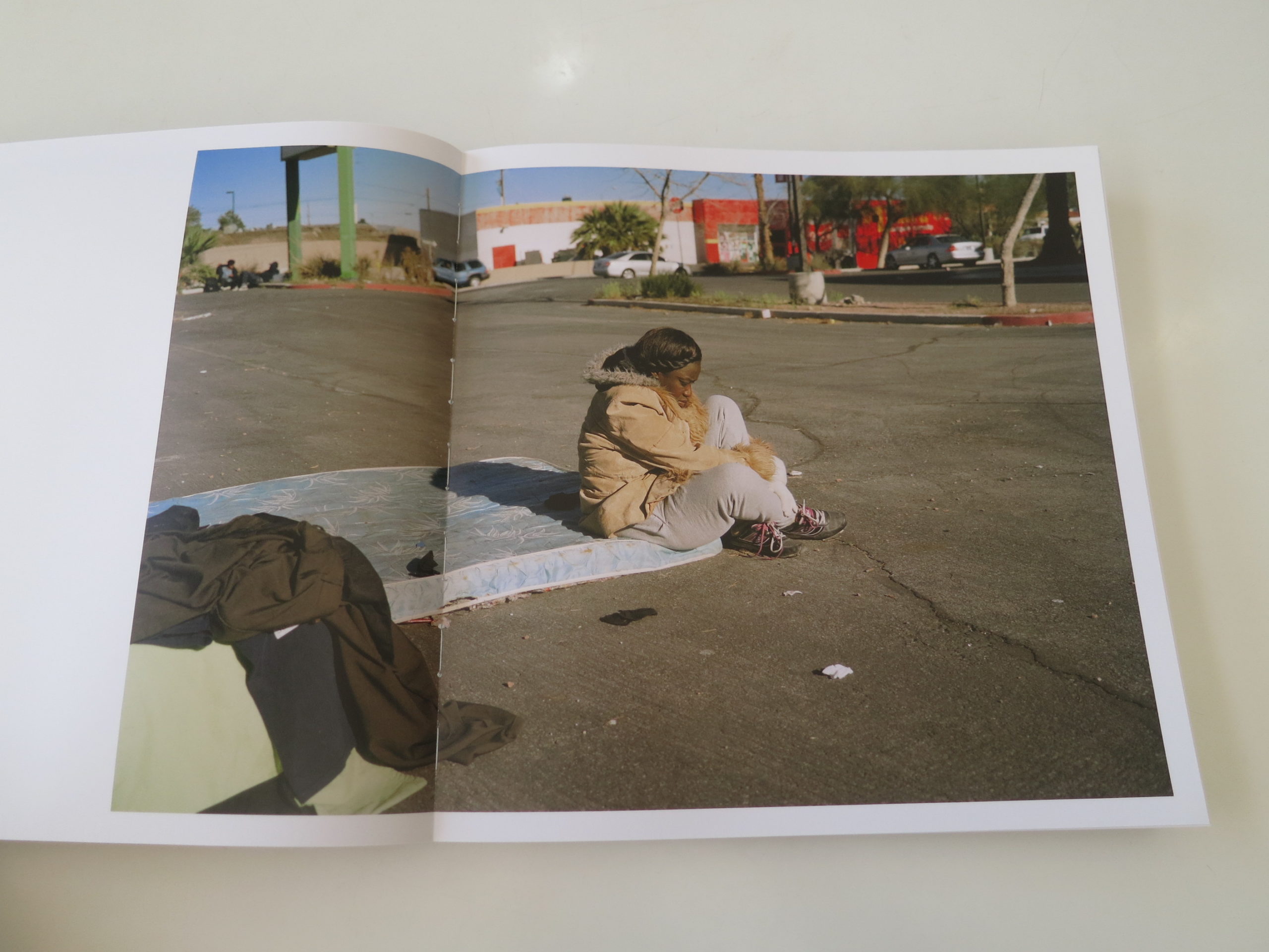
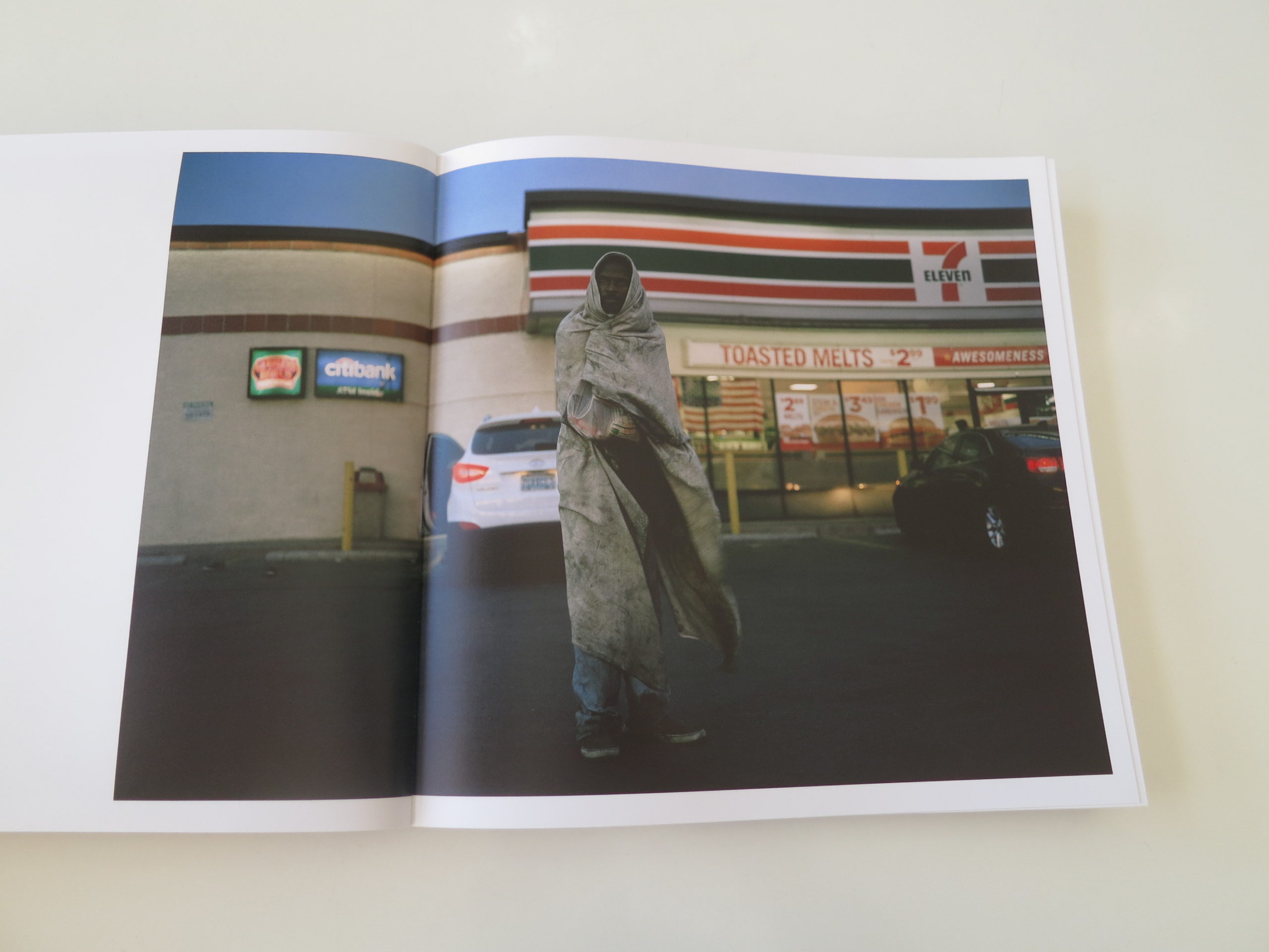
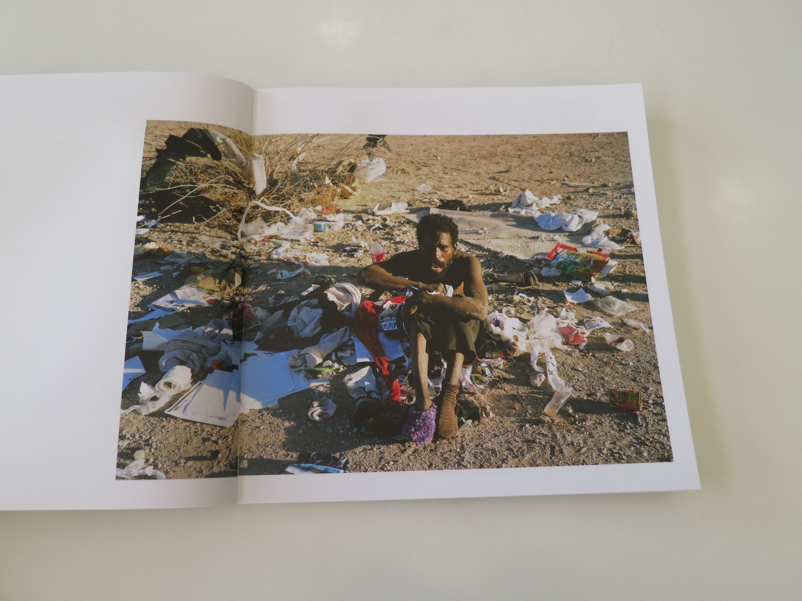
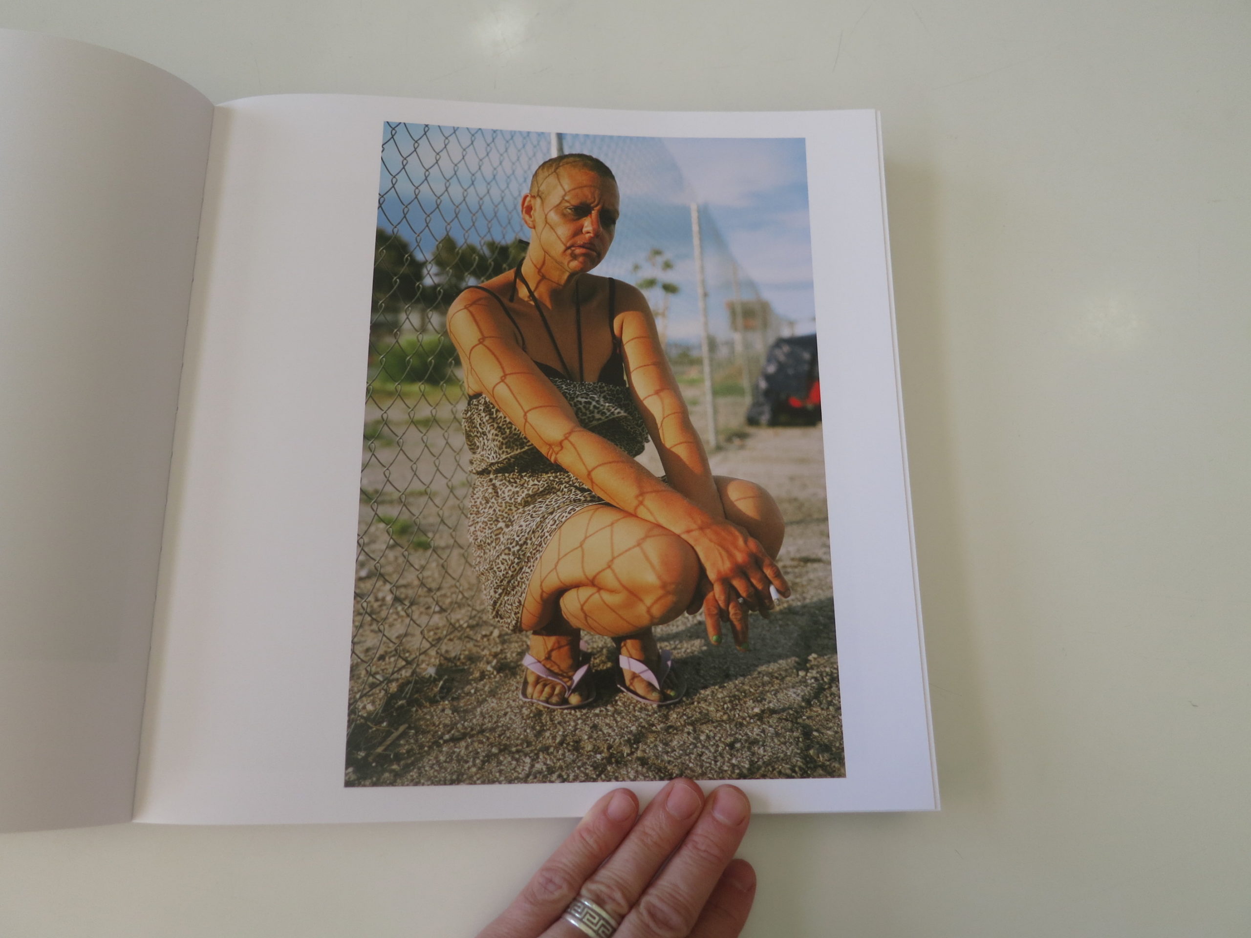
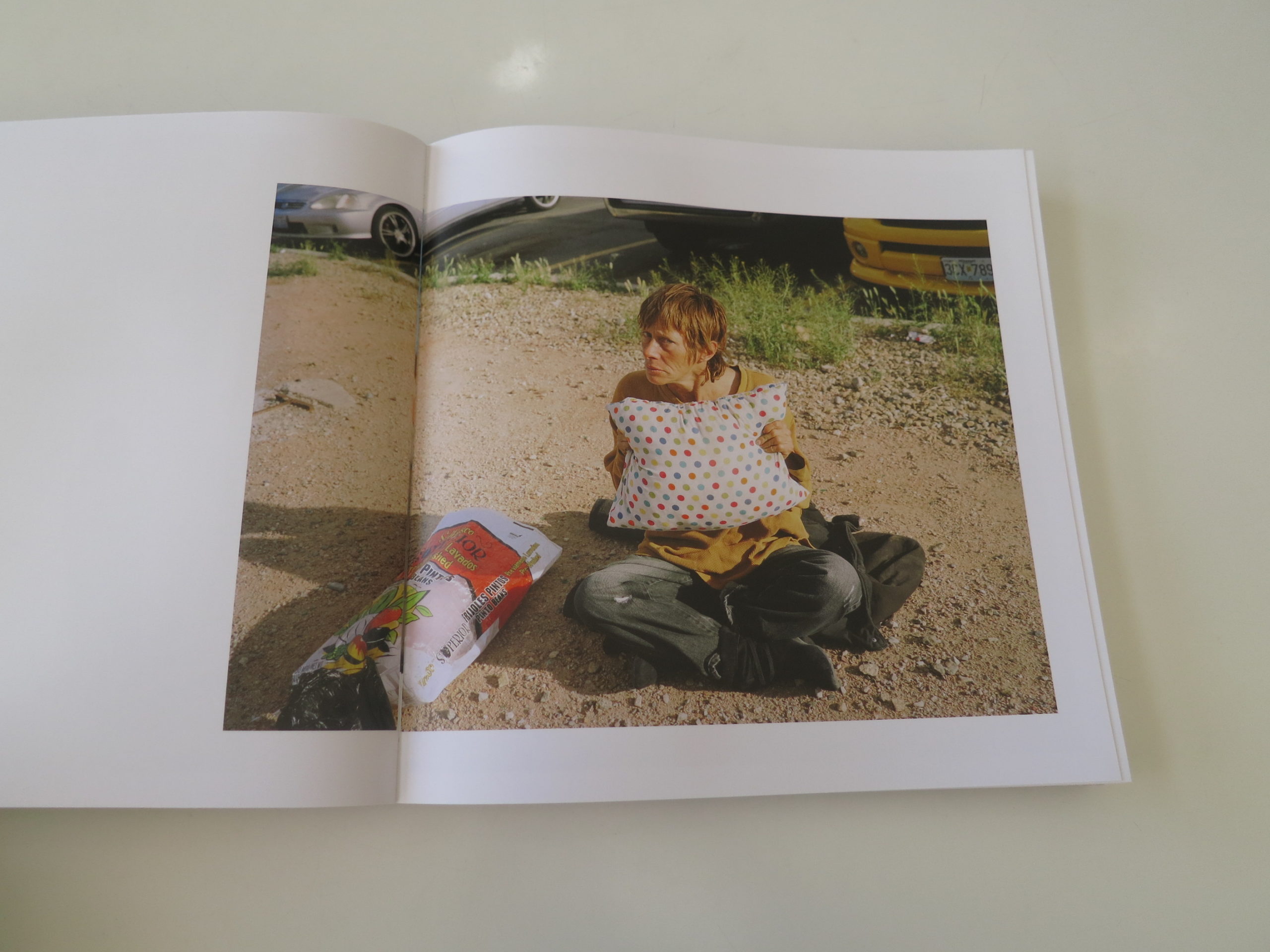
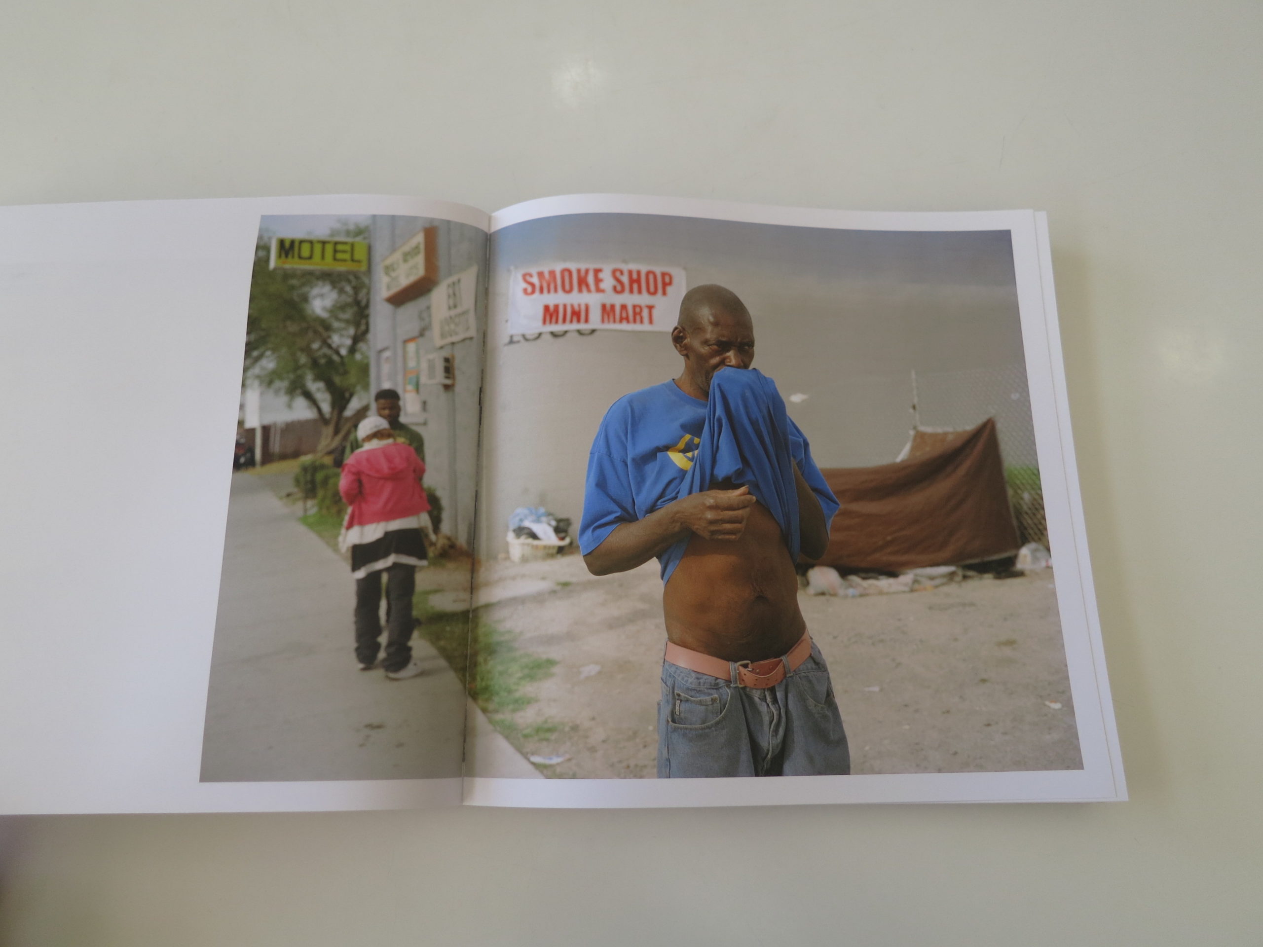
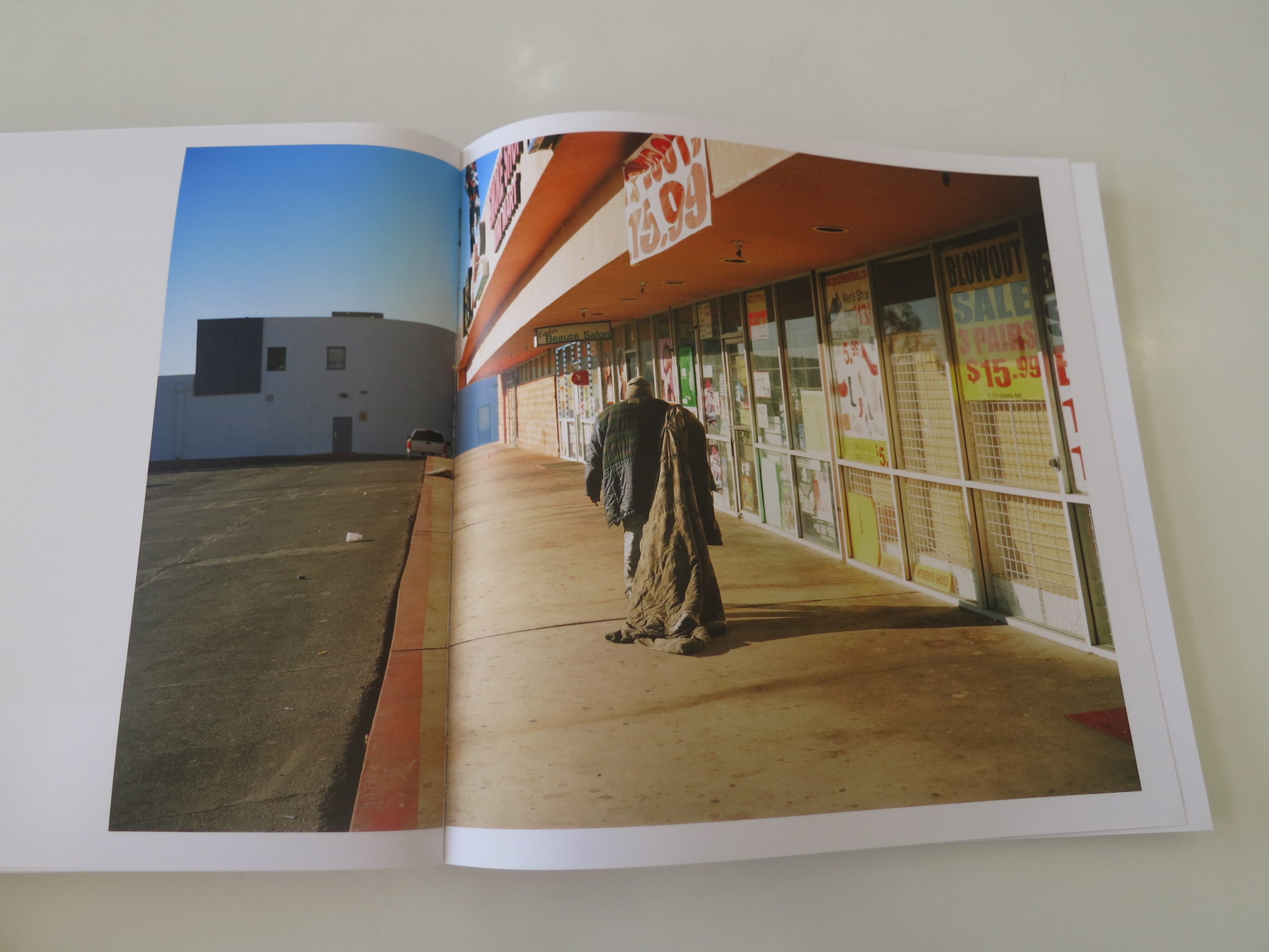
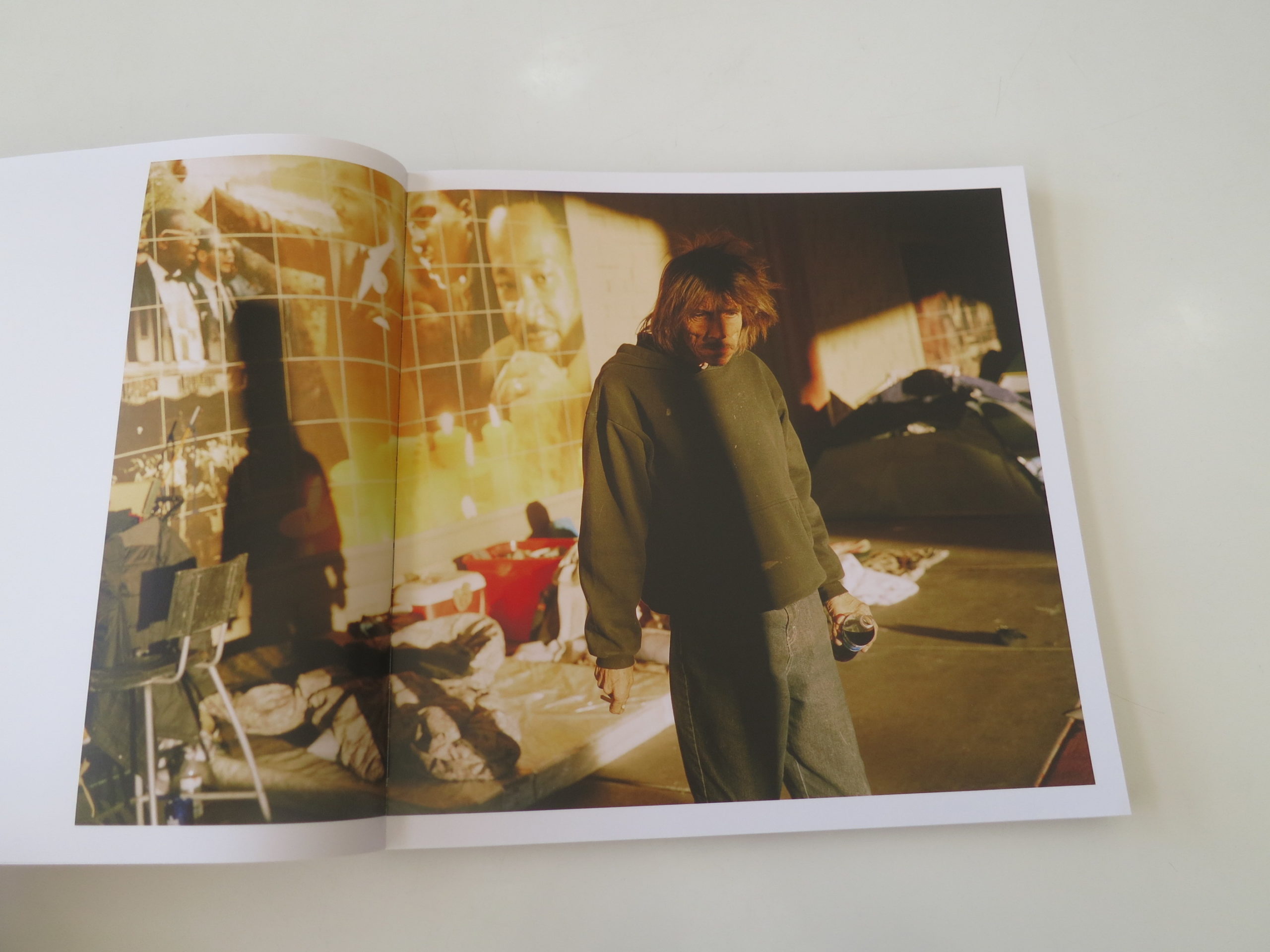
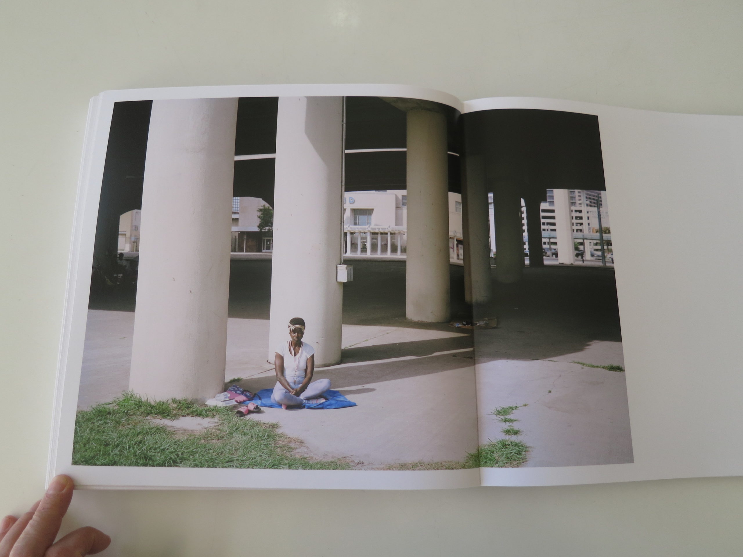
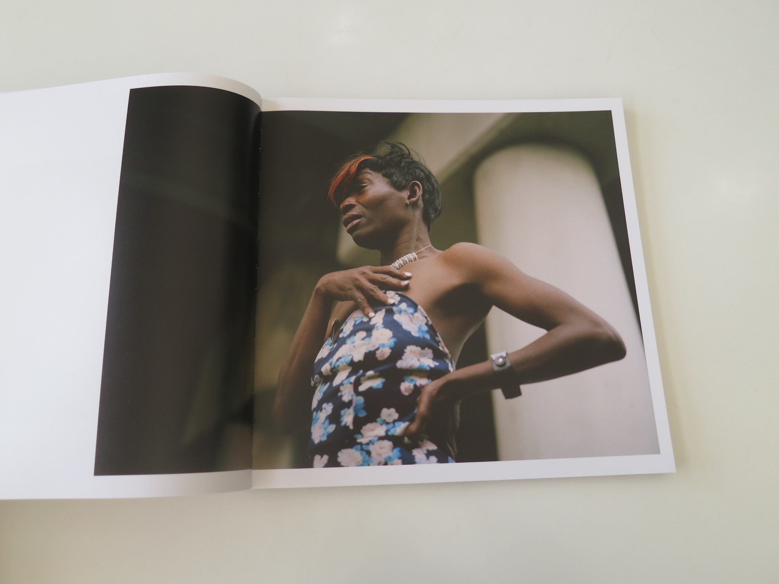
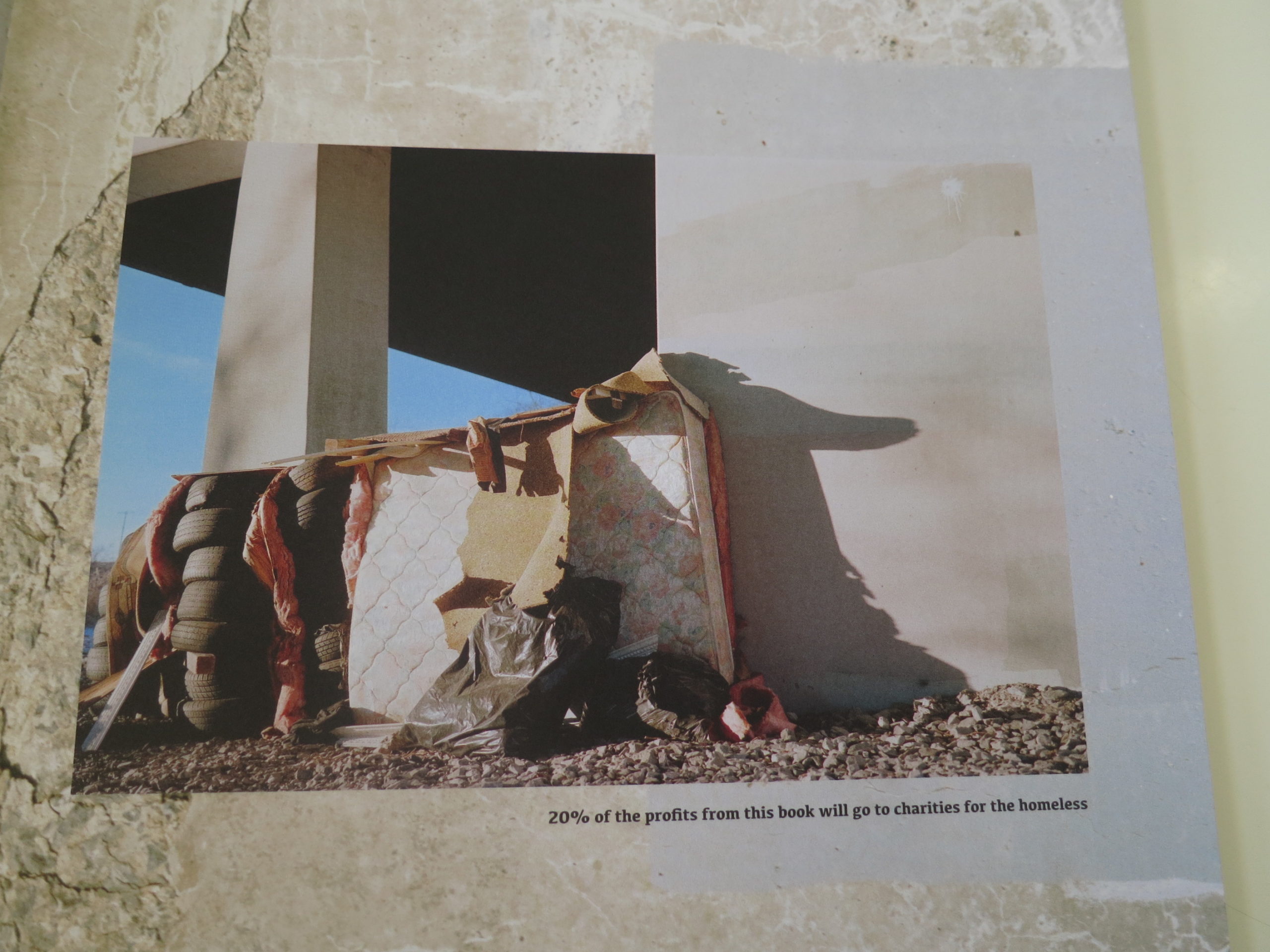
The thick cover, in yellow and purple, with a cut-out featuring a person sleeping in the street, with red pants, is jarring. As are the opening images of an underpass, and of a bearded white man sleeping on cardboard palettes, with his head propped against a brown, brick wall.

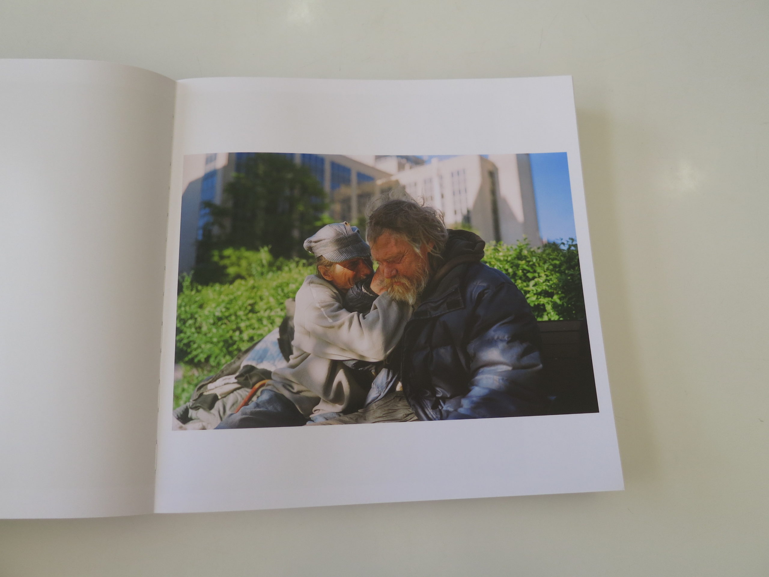
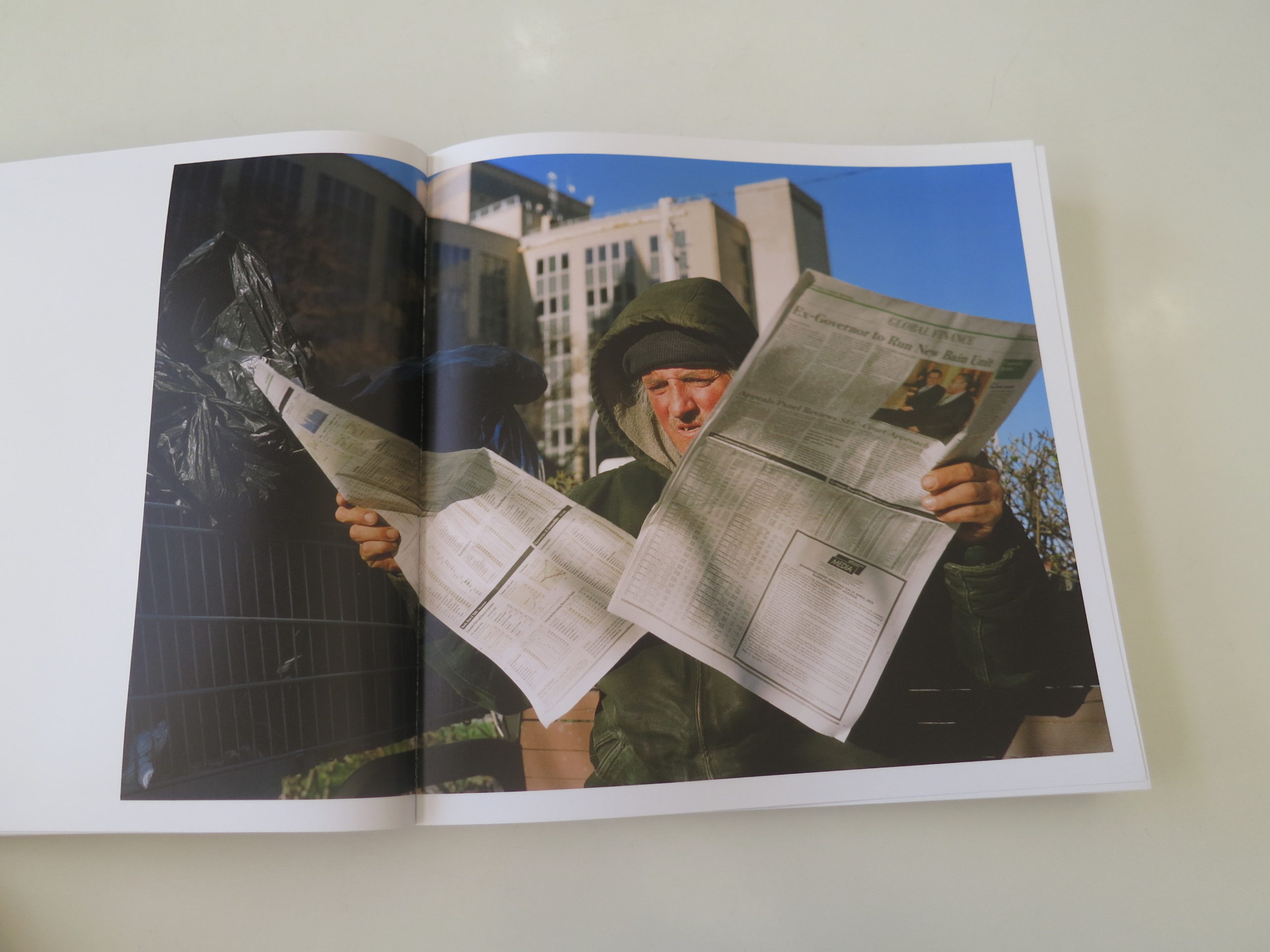
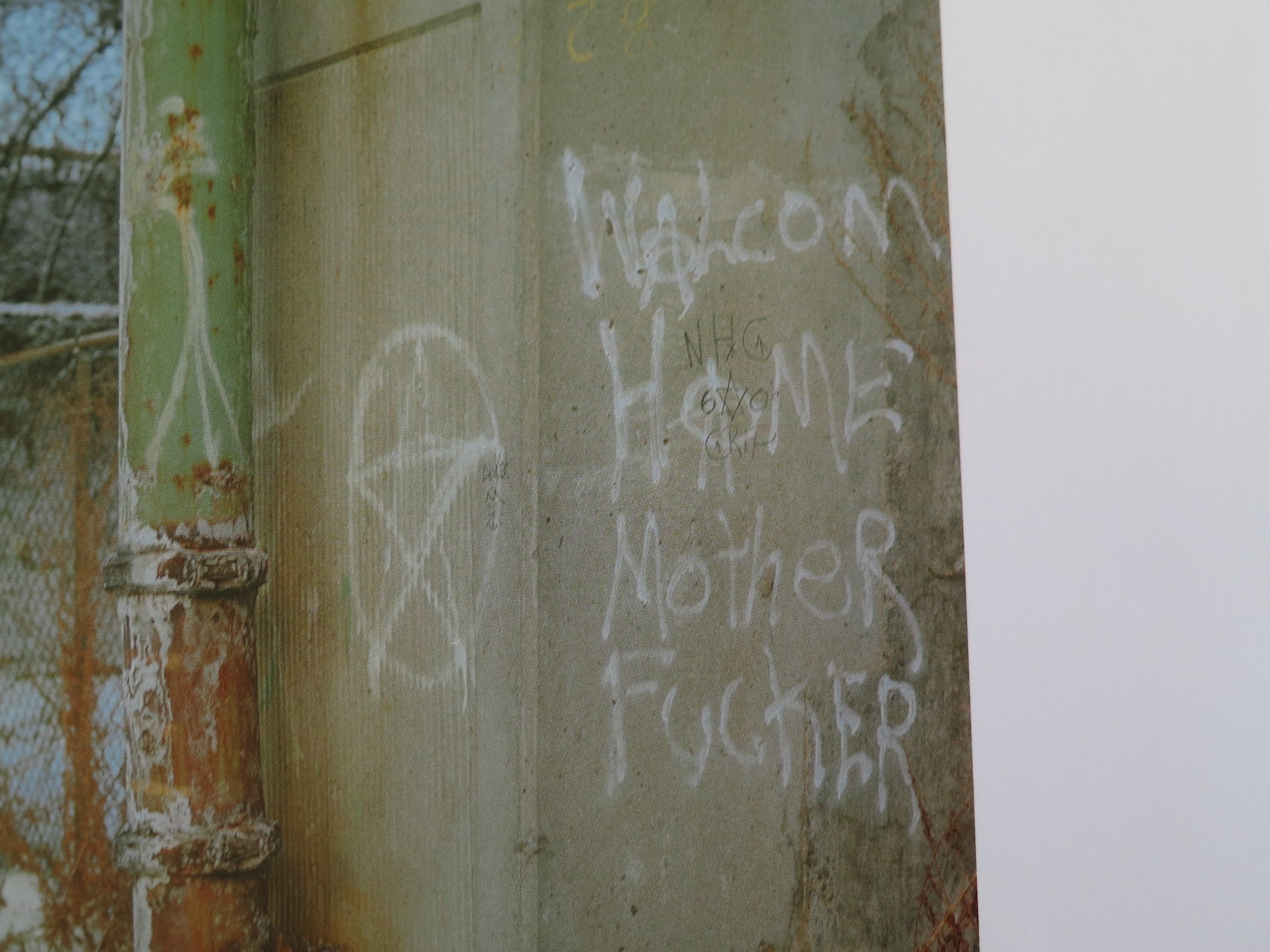
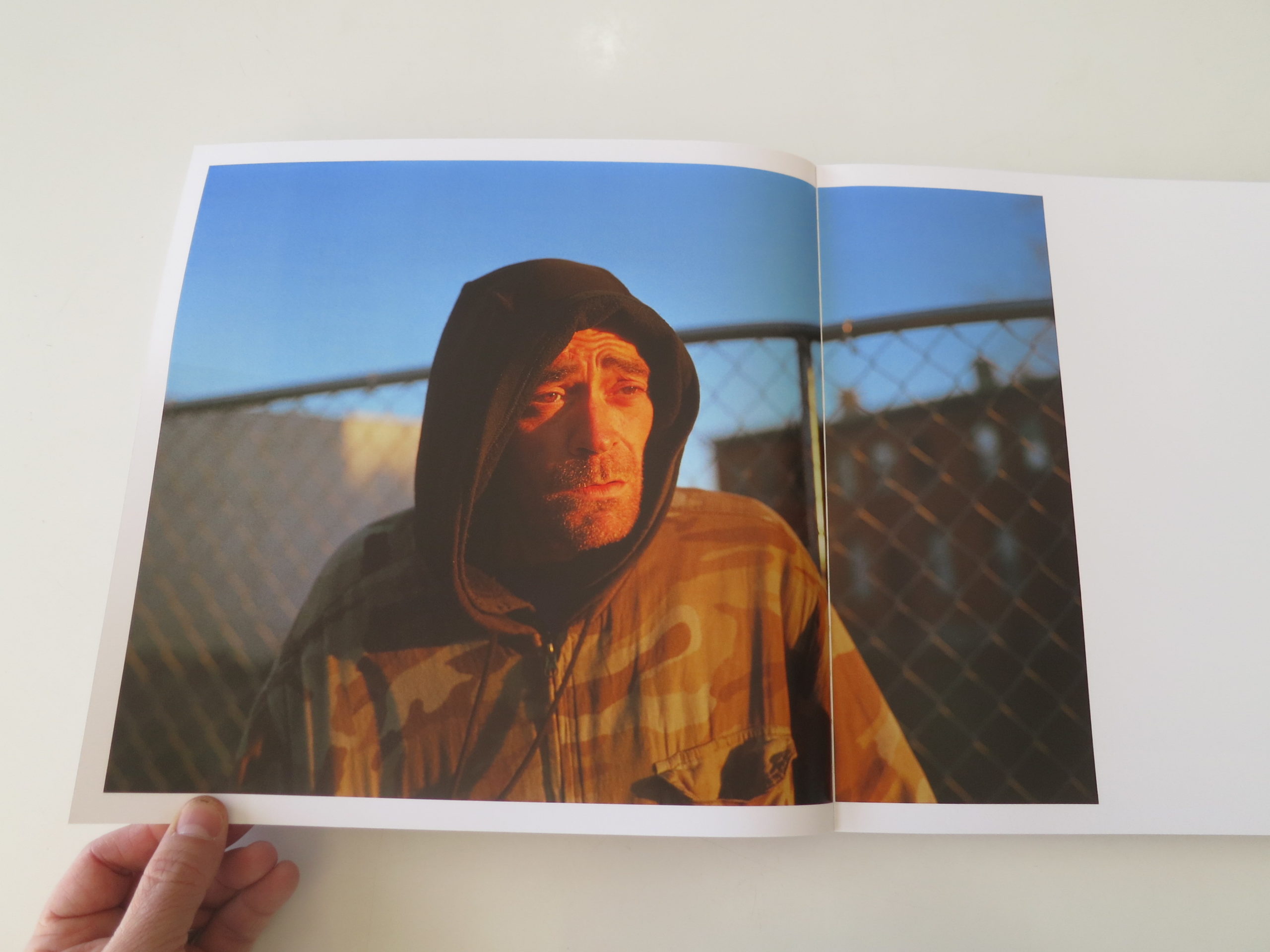
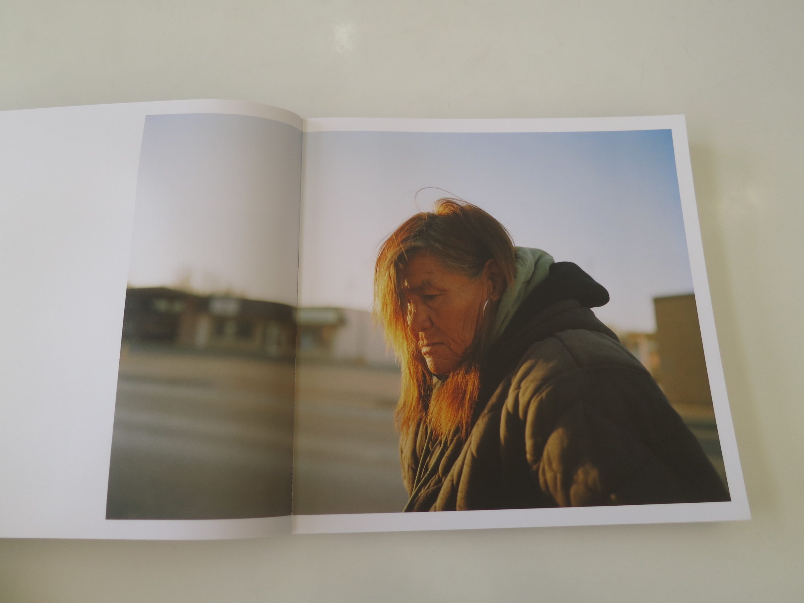
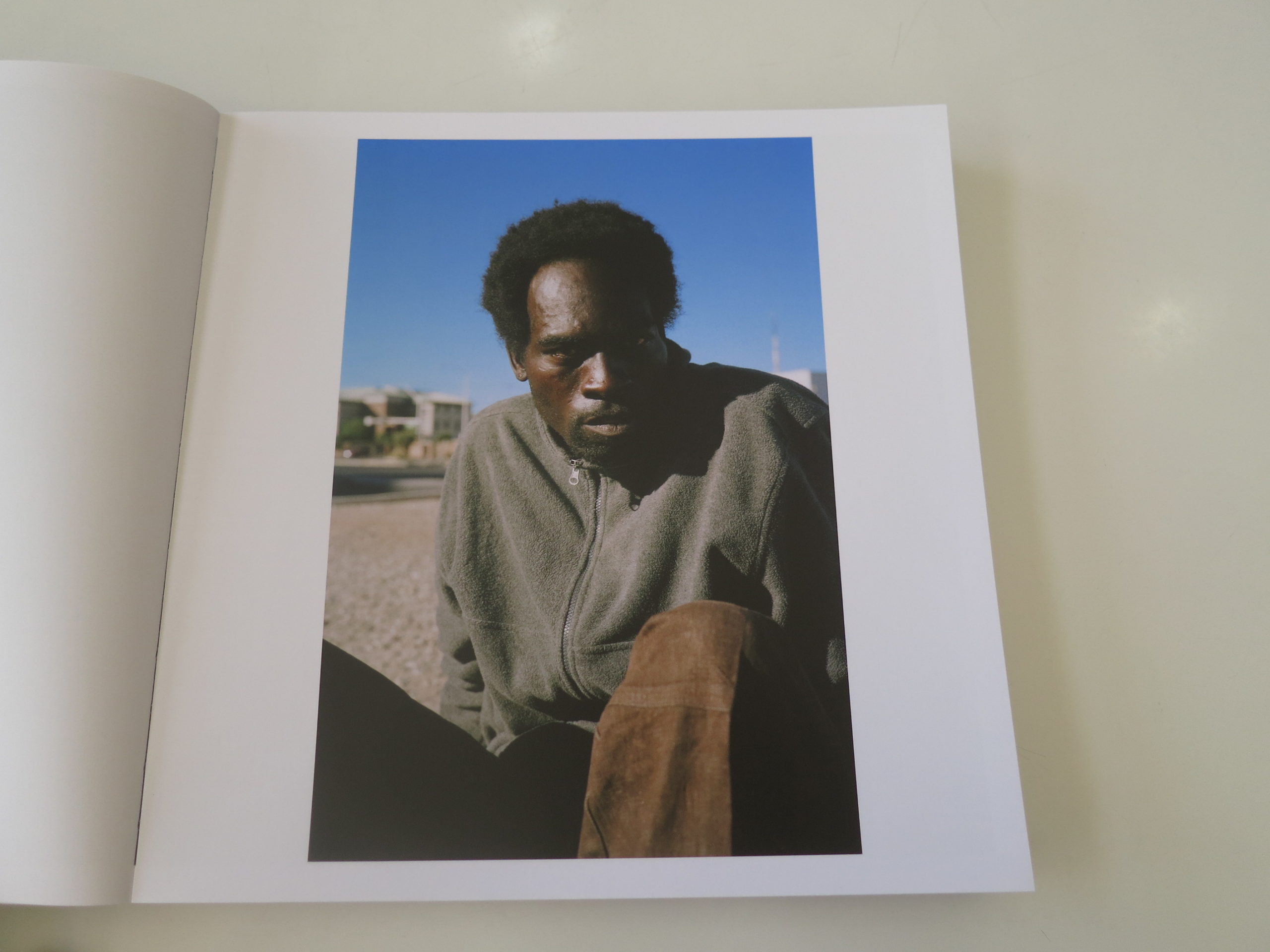
Truth moment: these pictures are bleak. And there are many, many of them.

In my mind, when I first connected the book’s size to its contents, I realized this was going to be a long, unpleasant ride, even if it was to be graceful.

Given Ms. Jensen’s artistry, the work is compelling, and I did continue to turn the pages without skipping. I wanted to take my medicine, so to speak, as the book feels like it was meant for posterity.

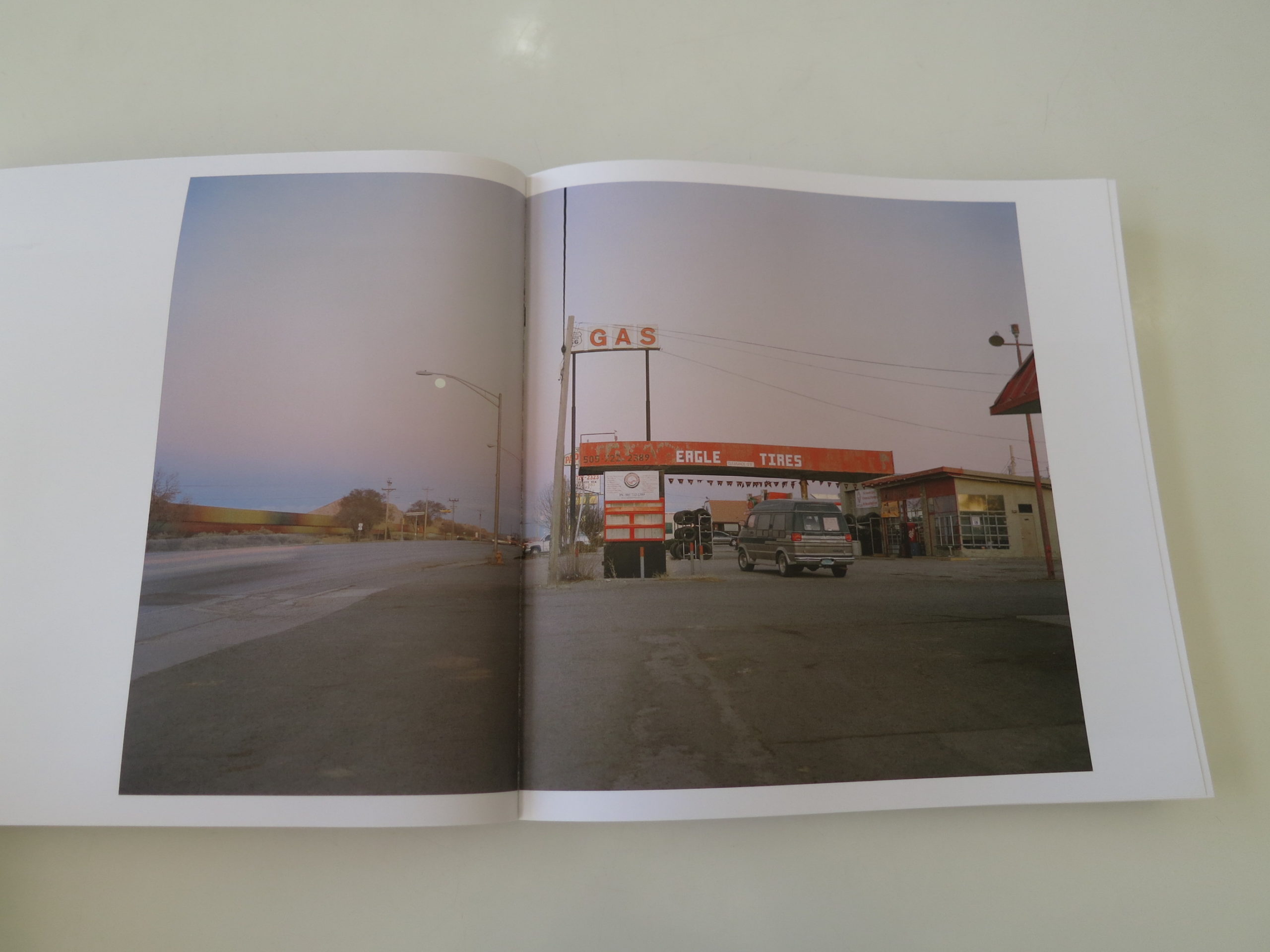
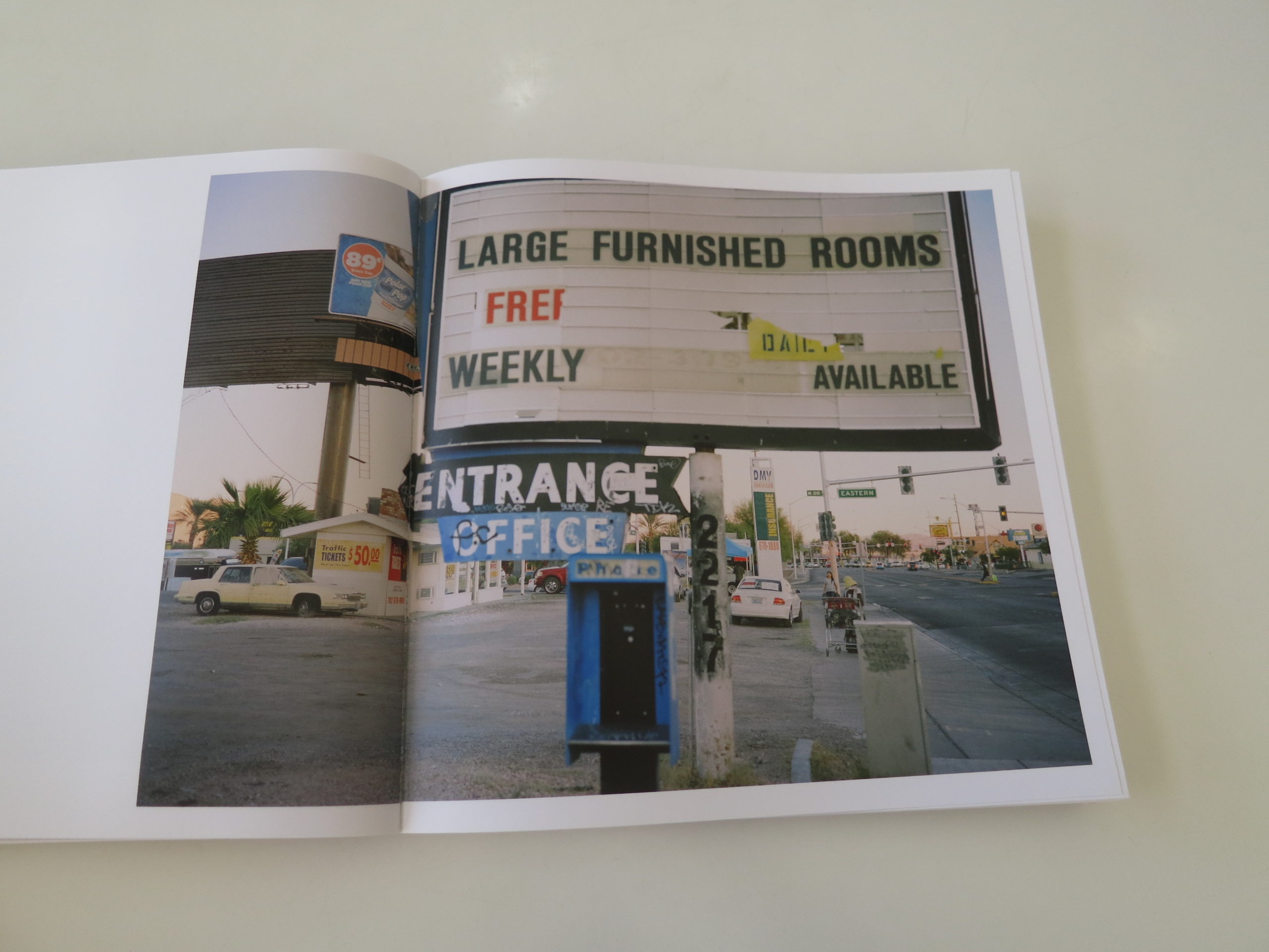
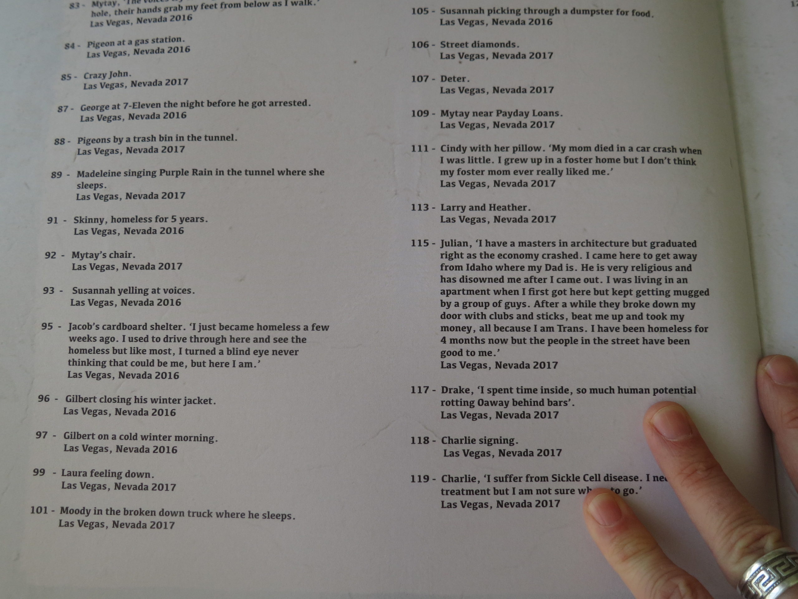
The locations change, though all relevant text is reserved for the end, so there’s some guessing at first. There was East Coast landscape, for sure, and I thought I recognized Las Vegas, and then New Mexico. (The end notes confirmed it was Gallup, which we saw last year in Cable Hoover’s project, “From Gallup.”)

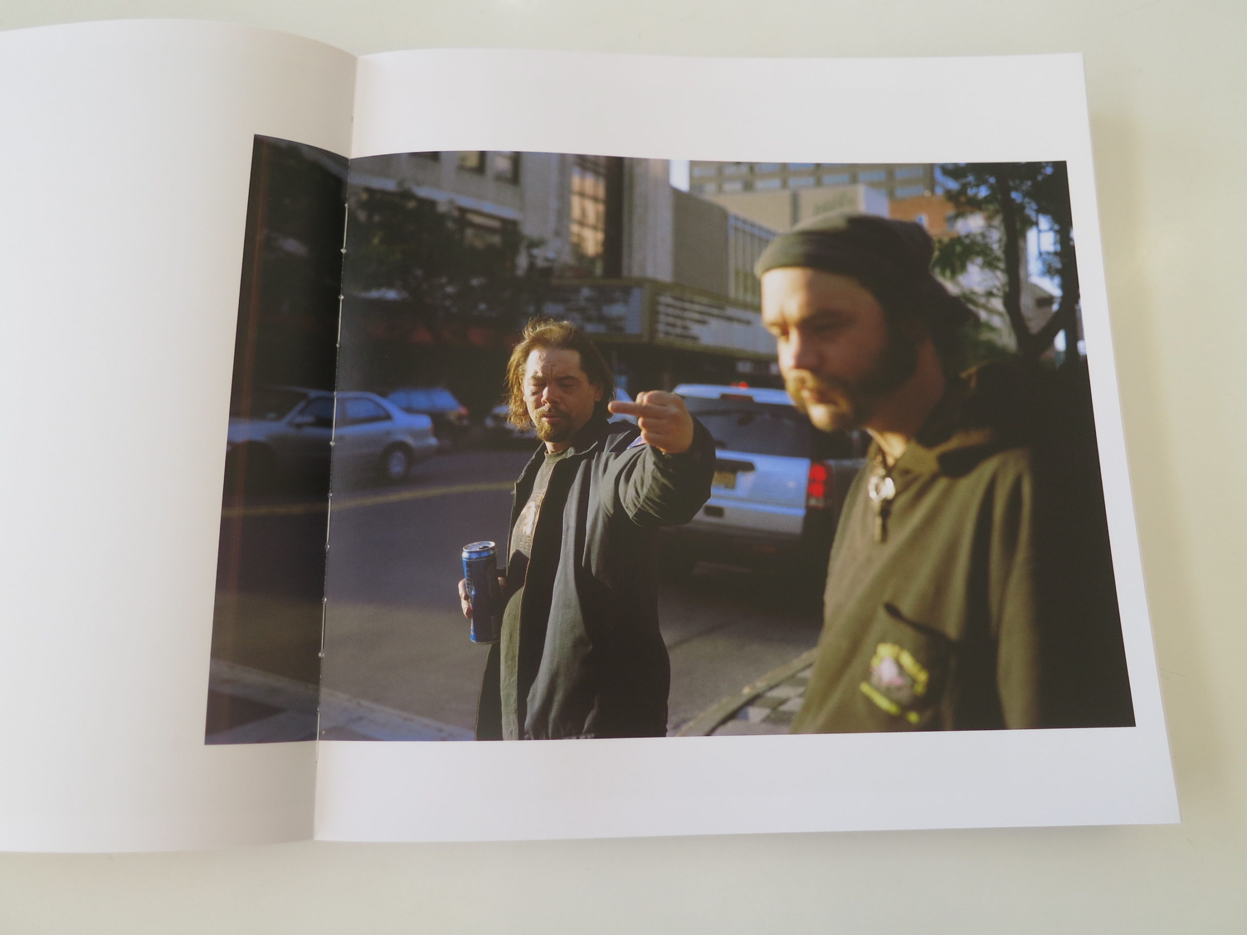
There are pictures of so many broken people, living day to day. But unlike our fictional billionaires, these humans have as close to nothing as possible.

We’re not told where we are until the end, when the notes confirm NM and NV, and that the pictures were also made in Syracuse and New Orleans.

The notes also suggest that Ms Jensen received both Light Work and Guggenheim fellowships, which would mean this project has been blessed by the heights of the art world too.

In Gerry Badger’s essay, we learn that Thilde Jensen, (who herself writes of having suffered deeply,) was afflicted with an Environmental Illness, highly allergic, and was forced to live in a tent in the woods for two years, on a respirator.

She photographed that culture as an insider in a previous project, and brought that capacity for empathy to her coverage of America’s homeless, who often suffer from mental illness and/or addiction.

We also read, at the close, that 20% of the book’s profits will be given to charity.

As I once reported here long ago, the Library of Congress collects photography around themes. If I were in charge there, (which I’m not,) I’d be acquiring this project, along with some of the others I mentioned earlier, because I think this period in American history will need to be faced, down the line.

The last time income inequality was this bad, it led to the Progressive era, and the breakup of big monopolies. President Teddy Roosevelt, (admittedly Upper Class and racist,) became the trust-buster extraordinaire.

This time around, we’ve got Trump.

So who the hell knows what’s going to happen?

Bottom Line: Powerful, scathing look at homelessness in America

To purchase “The Unwanted,” click here

If you’d like to submit a book for potential review, please email me directly at jonathanblaustein@gmail.com. We are interested in presenting books from as wide a range of perspectives as possible.

The Art of the Personal Project: Zach Anderson (repeat)

The Art of the Personal Project is a crucial element to let potential buyers see how you think creatively on your own.  I am drawn to personal projects that have an interesting vision or that show something I have never seen before.  In this thread, I’ll include a link to each personal project with the artist statement so you can see more of the project. Please note: This thread is not affiliated with any company; I’m just featuring projects that I find.  Please DO NOT send me your work.  I do not take submissions.

Today’s featured artist:  Zach Anderson

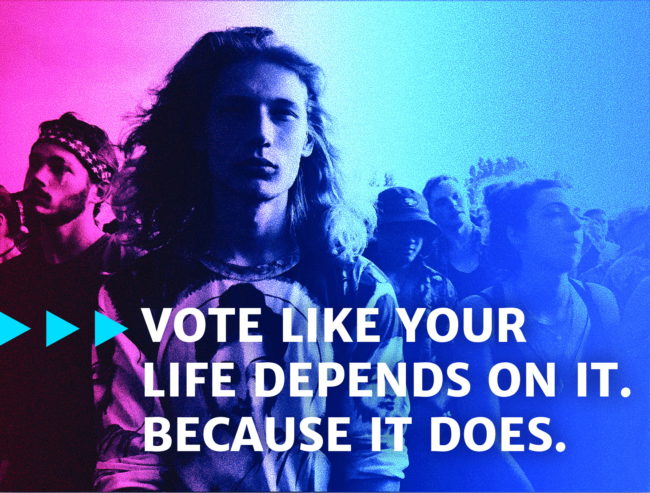
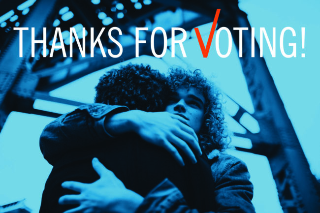
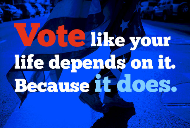
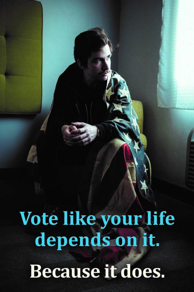
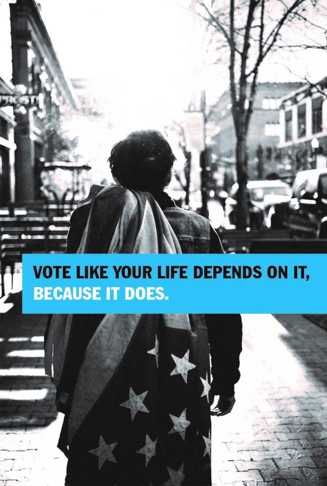
Bobbi Wendt has been consulting with Photographer /Director Zach Anderson for several years and they collaborated on a personal project using Bobbi’s oversized vintage flag.  Bobbi mailed Zach her flag and suggested that he pack it with his gear so when an opportunity presented, he could make photos utilizing this beautiful prop so we could use the images to promote Voter Registration and Voting in future elections…everything from City Council to President.

Bobbi came up with the headline  “Vote like your life depends on it.  Because it does.”

John Kehe designed the layouts for the social media campaign and the project continues to evolve.

Everybody please make sure you’re registered and Vote.  A thriving Democracy requires the participation of We the People.


To make sure you are registered to vote, click here

Or if you need to register, click here


To see more of Zach’s work, click here.

Zach Anderson is represented by Candace Gelman Associates.

http://www.candacegelman.com/


APE contributor Suzanne Sease currently works as a consultant for photographers and illustrators around the world. She has been involved in the photography and illustration industry since the mid 80s.  After establishing the art buying department at The Martin Agency, then working for Kaplan-Thaler, Capital One, Best Buy and numerous smaller agencies and companies, she decided to be a consultant in 1999. She has a new Twitter feed with helpful marketing information because she believes that marketing should be driven by brand and not by specialty.  Follow her at @SuzanneSeaseInstagram

Success is more than a matter of your talent. It’s also a matter of doing a better job presenting it.  And that is what I do with decades of agency and in-house experience.


The Art of the Personal Project: Leah Stauffer 

The Art of the Personal Project is a crucial element to let potential buyers see how you think creatively on your own.  I am drawn to personal projects that have an interesting vision or that show something I have never seen before.  In this thread, I’ll include a link to each personal project with the artist statement so you can see more of the project. Please note: This thread is not affiliated with any company; I’m just featuring projects that I find.  Please DO NOT send me your work.  I do not take submissions.


Today’s featured artist:  Leah Stauffer

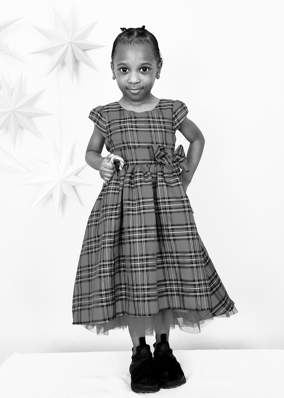
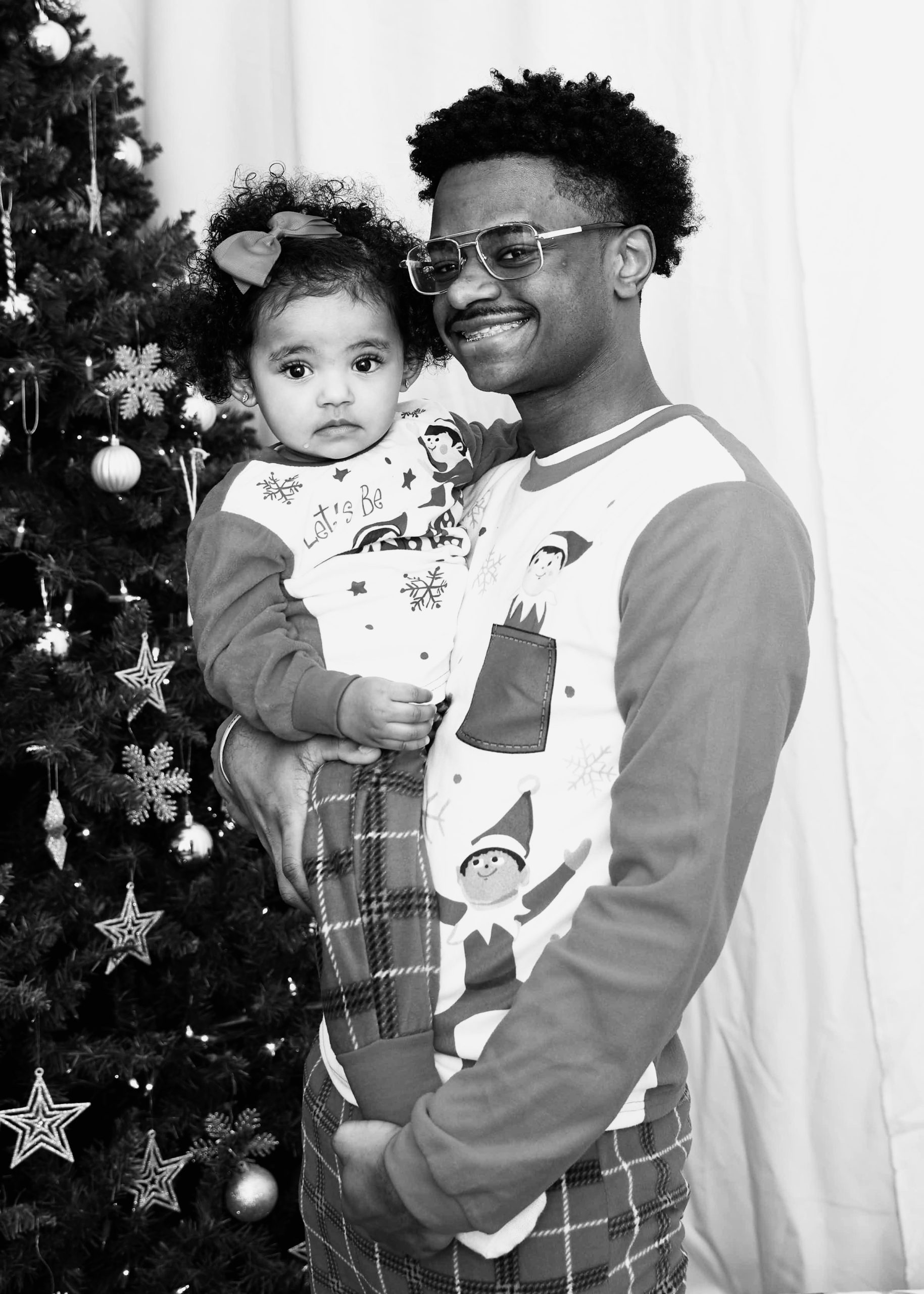
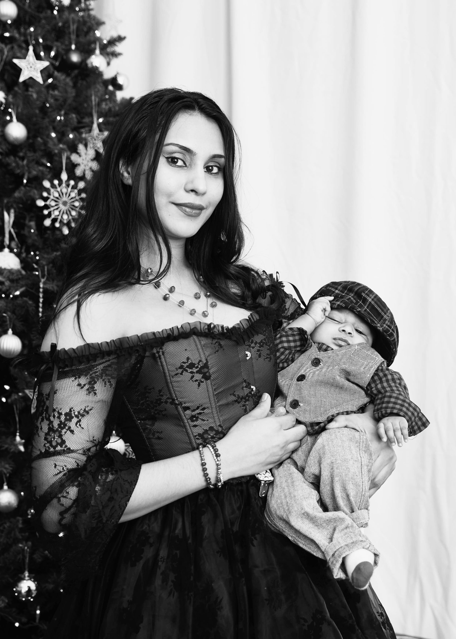
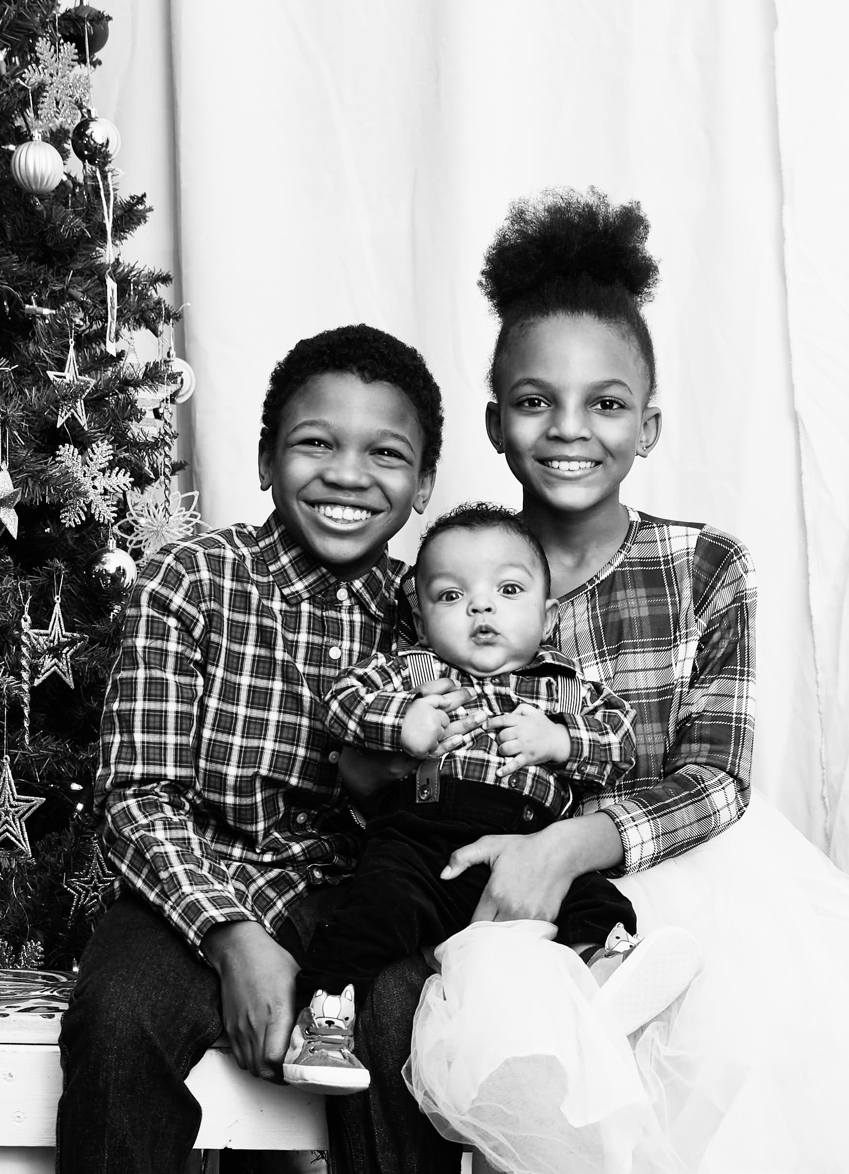
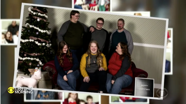
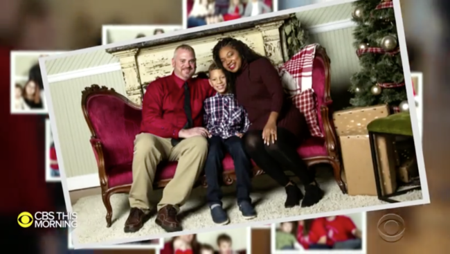
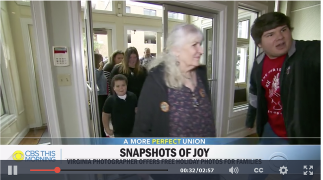
It was an offer almost too good to be true, but when the doors opened, they discovered it was real: a photo session in a festive setting with a team of pros behind the lens.

For Delisha Dickerson and her sons, and every family that comes to The Christmas Studio, the offer of a holiday photo came without a price tag.

Twelve-year-old Breanna Layne came with her mom and sister Kaylee.

“I’ve dreamed of doing this but it’s never really happened, and now my dream came true,” Breanna said.

Her mom, Brandy Layne, is a caretaker who seldom has the chance to be cared for. Brandy said she would never be able to pay out of pocket for the photo shoot on a limited budget. Before today, Brandy had only selfies of her family.

Photographer Leah Stauffer dreamed up the idea.

“I’ve come across a lot of families throughout the years that ask for like, ‘Hey can I have that photo? That’s the only good family professional photo we have.’ And I just started thinking about those families,” Stauffer said.

So she put out a call for help, everyone she asked said “yes” and then she let the community know.

“When I started doing this, I was worried that no families would show up. And someone told me, ‘Leah, if one family shows up, that’s all that matters,'” Stauffer said.

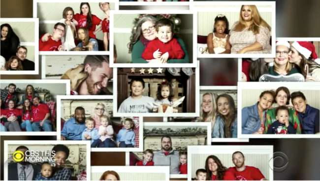
She needn’t have worried. They hoped for 40 families, and 87 signed up. Each one got the star treatment, including hair and makeup, and a holiday photo.

For Brandy and her girls, it was just what they needed.

“We’re just kind of starting over but we’re getting there. This is a good start,” Brandy said.

It’s a moment captured forever – and a gift for which there is no price.

These are TV screen grabs from CBS This Morning.


To see more of this project, click here.

APE contributor Suzanne Sease currently works as a consultant for photographers and illustrators around the world. She has been involved in the photography and illustration industry since the mid 80s.  After establishing the art buying department at The Martin Agency, then working for Kaplan-Thaler, Capital One, Best Buy and numerous smaller agencies and companies, she decided to be a consultant in 1999. She has a new Twitter feed with helpful marketing information because she believes that marketing should be driven by brand and not by specialty.  Follow her at @SuzanneSeaseInstagram

Success is more than a matter of your talent. It’s also a matter of doing a better job presenting it.  And that is what I do with decades of agency and in-house experience.


This Week in Photography: A Secret Chapel Under London


Part 1: Words of Wisdom

Man plans, God laughs.

It’s an old saying, sure, but that doesn’t make it any less true.

I’m 45 now, and that qualifies as middle-aged. (Which means I’ve accrued enough life experience to know a thing or two about human nature, and its foibles.)

Furthermore, without ever intending to, I’ve become an opinion columnist, a political pundit, and a travel writer, in addition to being deeply versed in photography and art.

As I’ve been writing weekly here for so long, in a way, I’ve grown into a more mature, wiser, successful person during the course of this continuing narrative.

I’ve learned so much about the world, through the photographs I’ve viewed at festivals, the books people have sent along, and the trips I’ve taken to most of the great cities in America.

And yet, despite all that, some mistakes, I continue to make.

In particular, I still haven’t accepted that setting a deadline in life when things will get calmer, or easier, or better, never seems to work out well.

That idea, that we can externalize the process of getting that extra bit happier, or more rested, that we can outsource it to some future magical time, is a fool’s errand.

(Which makes me a fool, I know. So much for our reliable, omniscient narrator.)

This year, #2019, has been the most exciting, challenging and exhausting year of my professional life. I ping-ponged around the US, (and even the globe,) and you went along for the ride.

Thanks to my awesome, open-minded editor Rob, we took this column to new places, including straight travel reporting, restaurant reviews, and even film criticism.

Then I produced our Antidote retreats, had a huge museum show, co-designed my book, and ran my first crowd-funding campaign, all while full-time parenting, being a good husband, and volunteering at my children’s’ school.

So I should have known better than to say things like, “As soon as that Kickstarter campaign is over, I’ll get a chance to rest. Once we get to December 7th, things will be easier. I’ll finally have that mythical chance to recharge.”

(Like I said, that kind of thinking never seems to work out the way we’d hope.)

In this case, my daughter got super-sick, so we ended up at the hospital, and she had to be connected to an oxygen tank for nearly a week, because she couldn’t breathe properly.

I became her full-time caretaker during the day, and between that experience, the extra trips to the doctors, and the added medical expenses, my stress level shot through the roof.

All during the week I’d “planned” to chill out.

To be clear, most of the things I poured myself into this year were great, and I’m not trying to complain.

Rather, I want to do you a solid, and suggest that in the coming year, (with all the guaranteed political strife,) you invest in yourself a bit, in particular with self-care.

I know it can seem like a bougie concept, or perhaps New Age, but the truth is, if you don’t take care of yourself, who will? Exercise, classes, new hobbies, travel, walking, cooking, getting together with friends, making art, building community, all these things make us healthier on an on-going basis.

Just this morning, when I almost lost my shit after one extra unexpected stressor, I made a drawing, and called my best friends.

(And I’m writing, so of course my mood has improved.)

Even now, I’ve closed my eyes, and am imagining the calmest place I can think of.

I’m typing with my fucking eyes closed, all so I can conjure visions of the secret chapel at the far end of the crypt.

Say what now?


Part 2: Meet me at the London

Back in the day, I used to have a year-end column about the best work I saw that I hadn’t already written about yet. (I did it for years.)

Instead, I’m going to tell you about the best place I visited this year that I haven’t already written about yet.

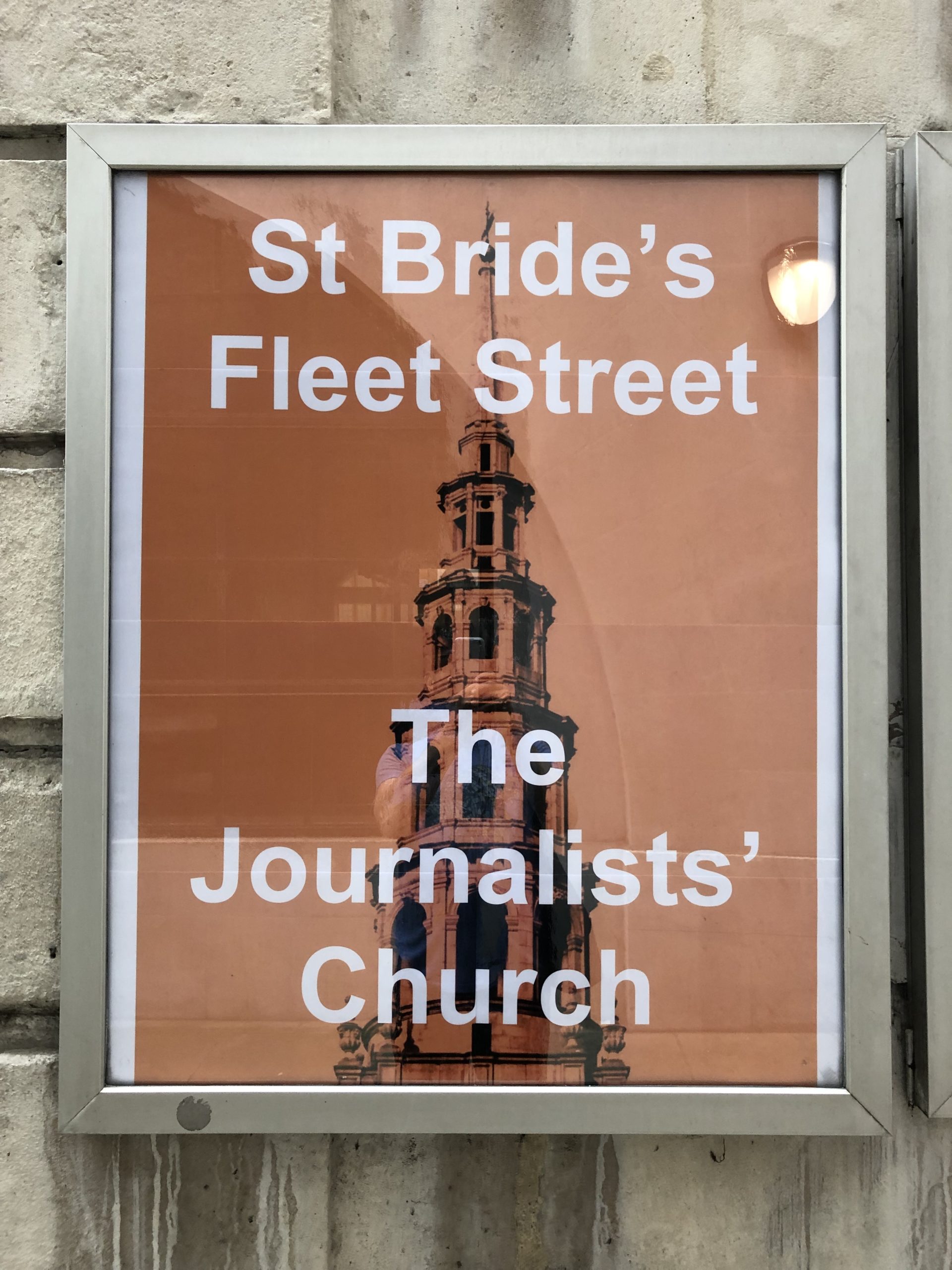
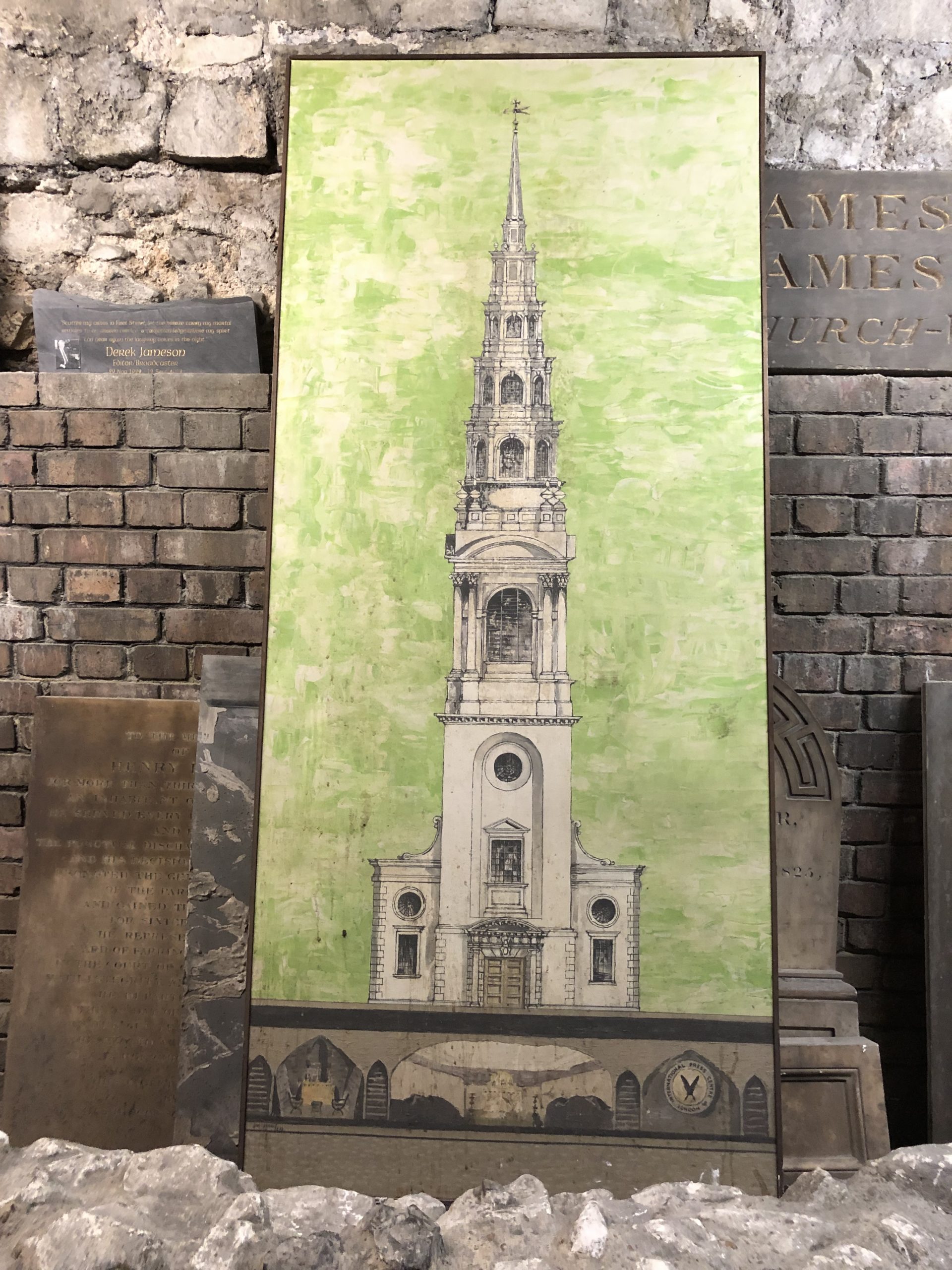
After 5 London articles this summer, I hit the wall, and never got around to telling you about St. Brides of Fleet Street, the journalist’s church in London.

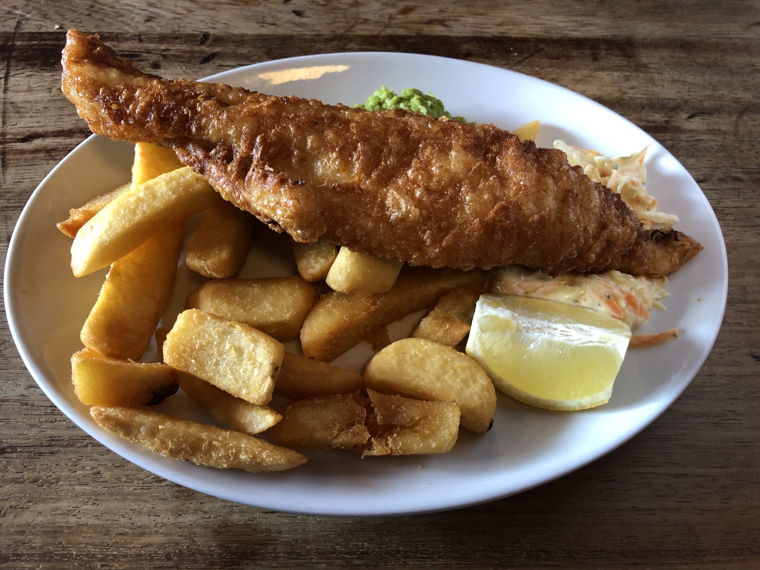
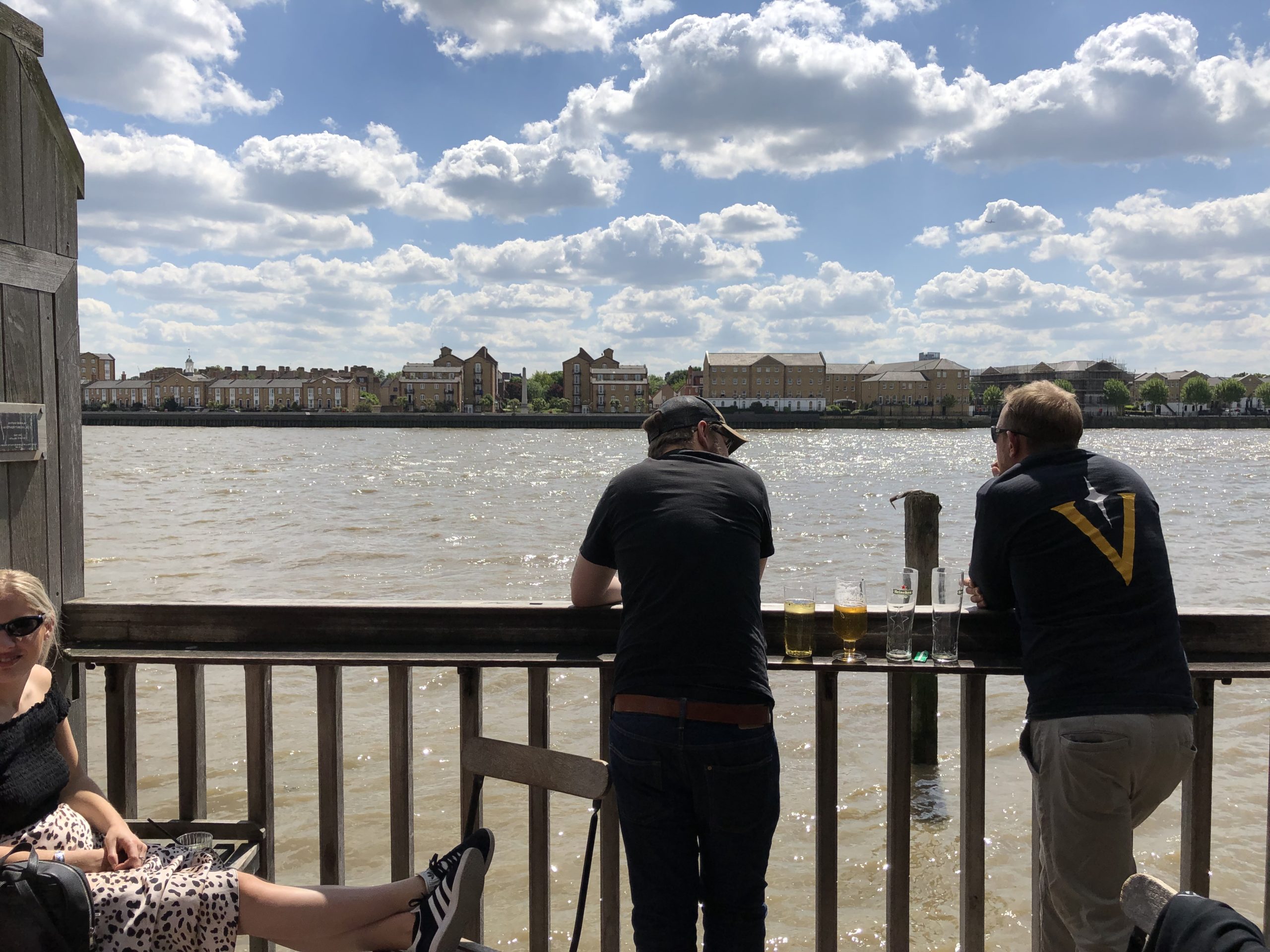
On my last day in town, my friend Richard Bram, after a brilliant fish and chips lunch in Limehouse, told me that if I wanted to see the oldest part of the city, (so much had been destroyed,) that Fleet Street was the place to go.


And while it was unintentional that I found it, after a long wander past St Paul’s cathedral, where I heard the bells tolling like a mad hatter, I soon realized I was in the vicinity of Richard’s recommendation.


Just a touch more wandering, and I found St, Brides. (What American isn’t a sucker for an old church, right?)

When I saw stairs heading down, I followed them.

Down into the crypt.
Down into the bowels of the city.

Down into the heart of European history.

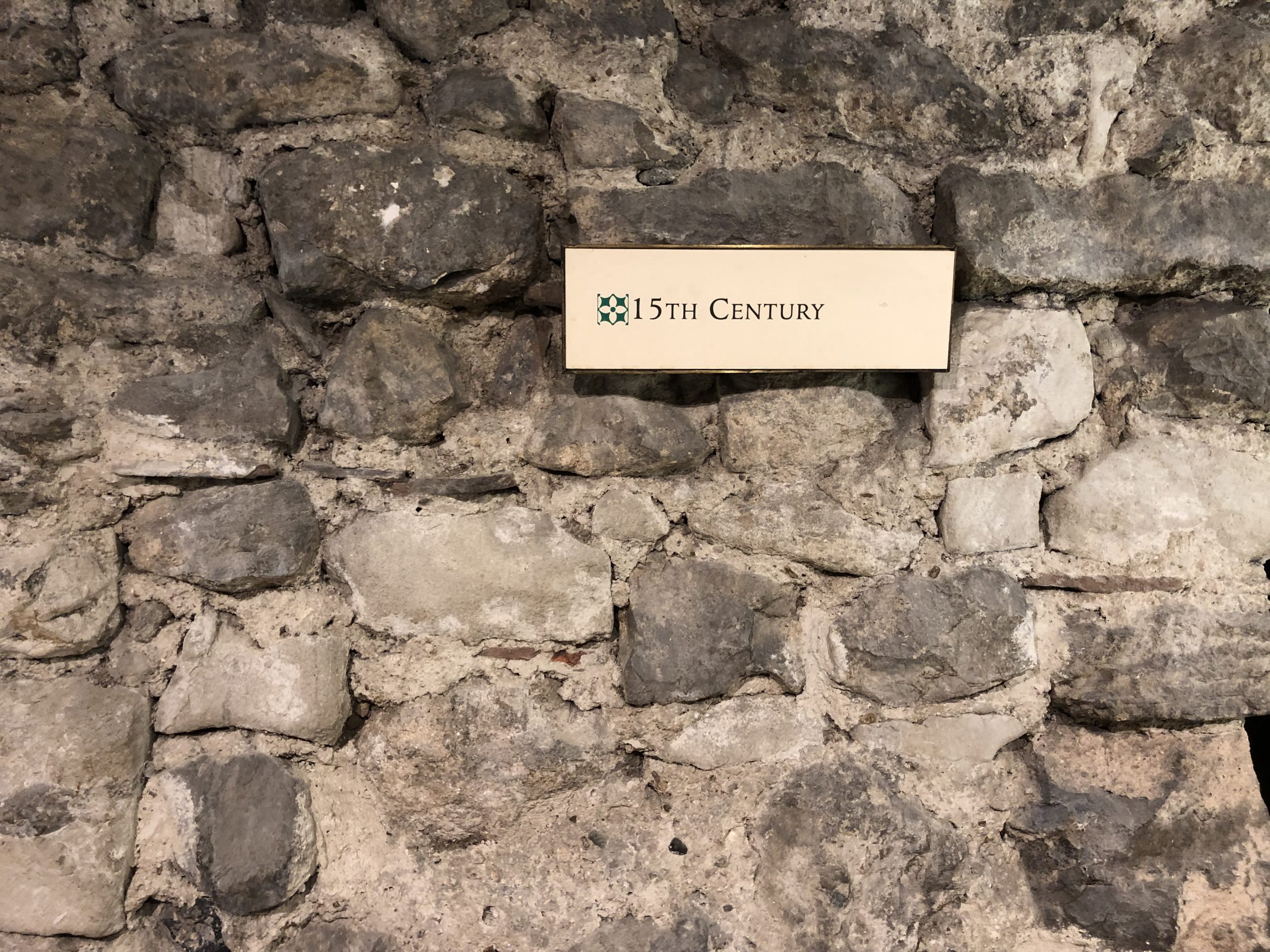
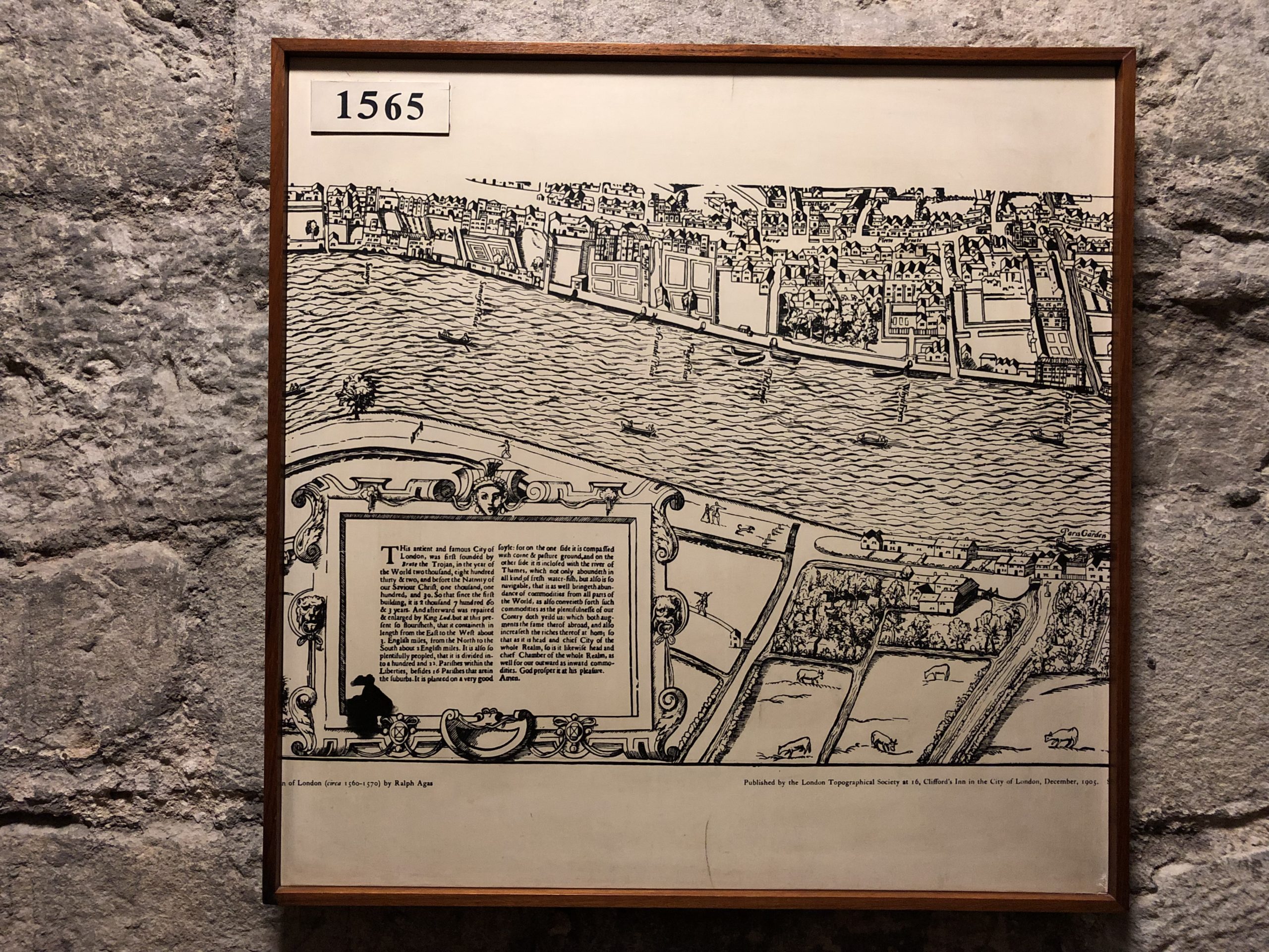
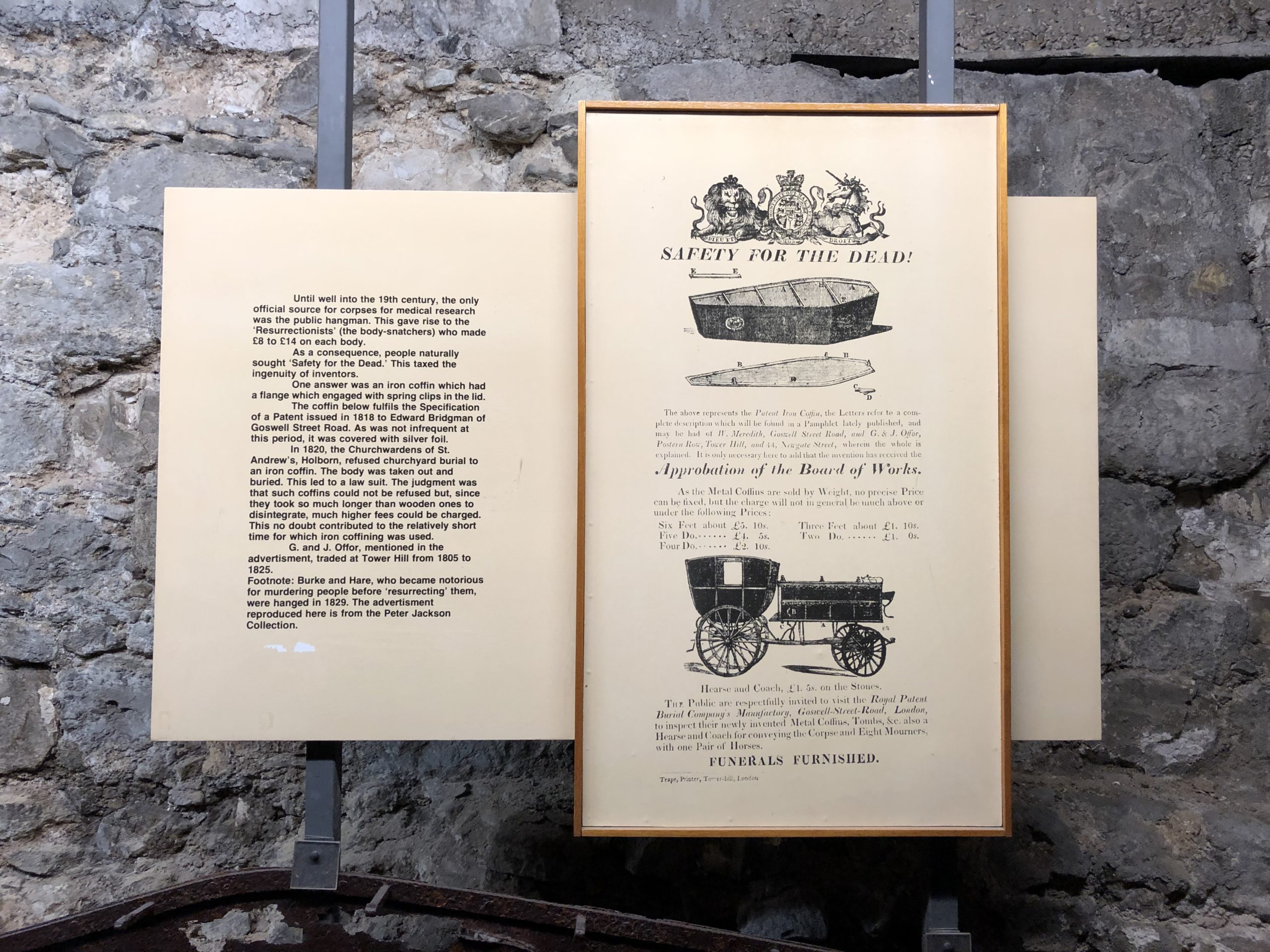
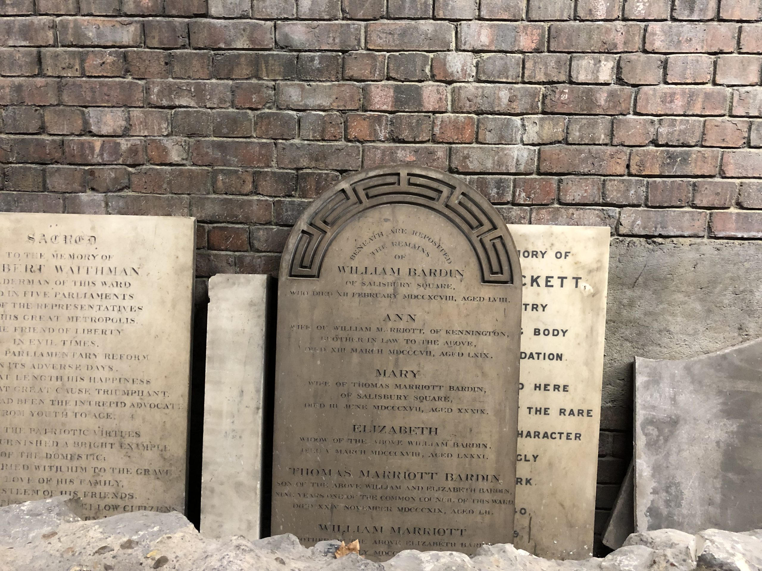
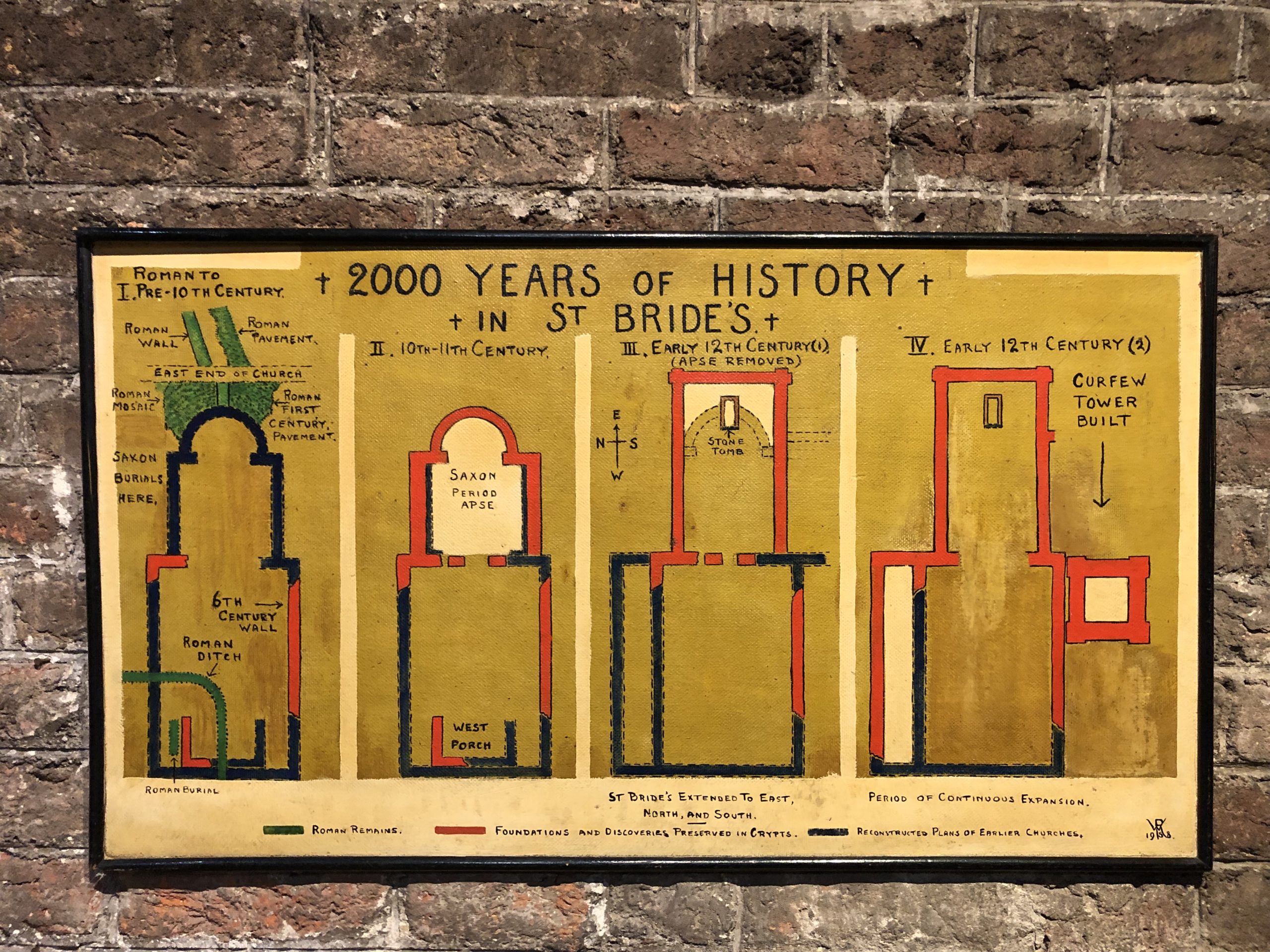
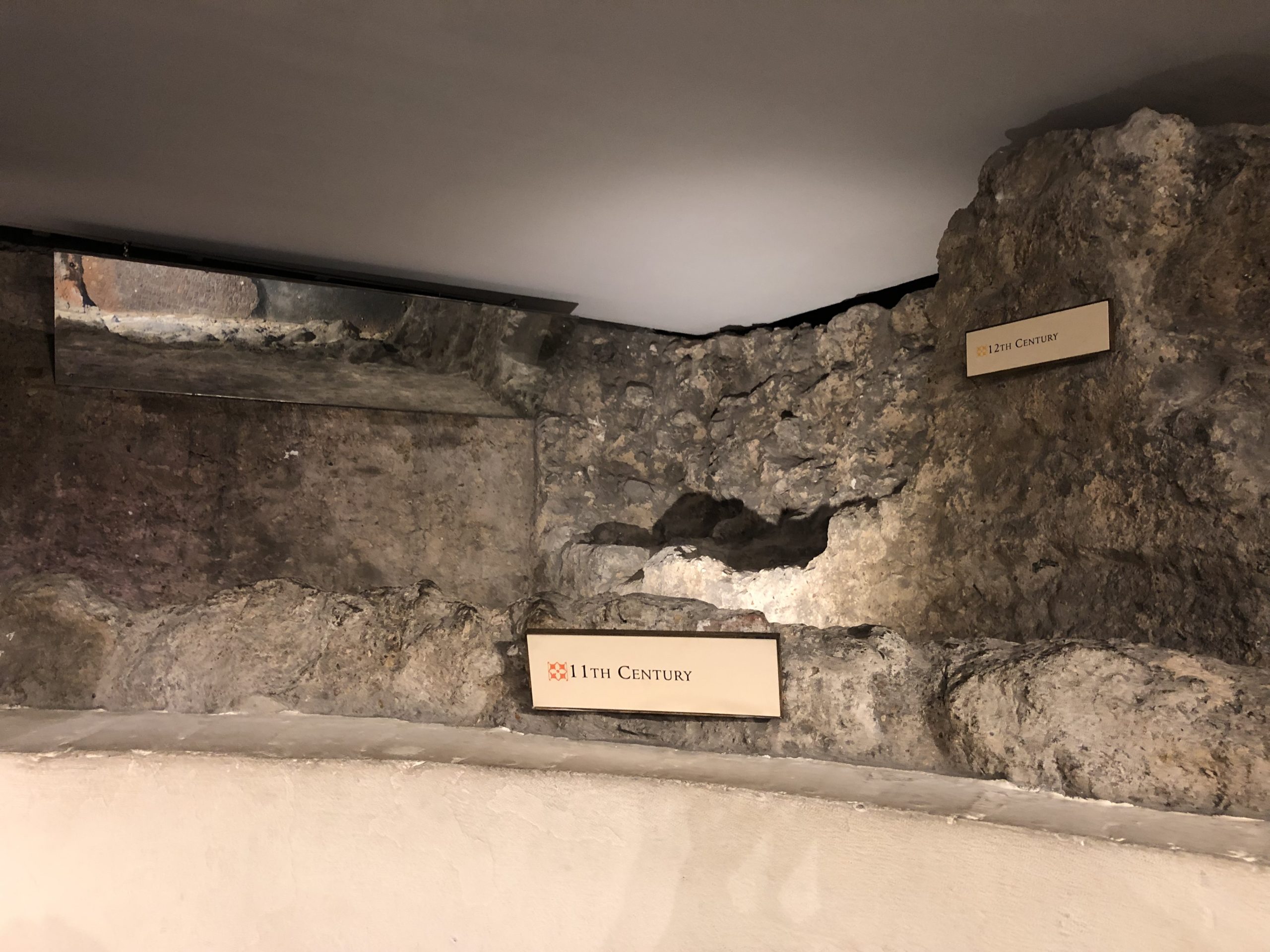
(There was signage all around, explaining why the place was famous, and properly ancient, so you can read a bit about it in the photos.)

I walked past head stones, a coffin, and walls built in different centuries. It was quiet, and obviously creepy, but still, I followed the path, deeper underground.


Deeper and deeper.

What would I find?

I’d be lying if I told you I thought such a place existed.

The tiny chapel, when I found it, seemed like a modernist art installation, or the private altar of a stylish Billionaire in Miami Beach.

Anything but what it was; properly Christian, hidden behind ghosts and spirits, buried under one of the oldest cities in the world.

The white walls, the glowing green, the sound of silence.


I sat down on a cushioned bench, and didn’t move.

Transfixed.

If teleportation existed, I’d go there right now. (No doubt.)

I prayed for the journalists out there, for the truth tellers, risking their lives to report on power. And I meditated, reveling in my favorite-new-secret-place.

So listen up, people.

If you can, go there.
If you go, you will thank me.

(I guarantee it.)

Even now, just thinking about it, I feel warm and fuzzy.

So as these will be my last words to you in this crazy #2019, (I’ll be off next week,) I wanted to say thank you for reading along this year.

For following my journey, and for all the kind words so many of you have passed along this year too.

We appreciate you!

Hope you have a lovely Holiday season!

The Art of the Personal Project: Kate Warren

The Art of the Personal Project is a crucial element to let potential buyers see how you think creatively on your own.  I am drawn to personal projects that have an interesting vision or that show something I have never seen before.  In this thread, I’ll include a link to each personal project with the artist statement so you can see more of the project. Please note: This thread is not affiliated with any company; I’m just featuring projects that I find.  Please DO NOT send me your work.  I do not take submissions.


Today’s featured artist:  Kate Warren

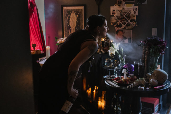
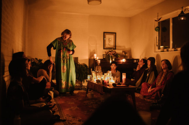
American Witches began as a project examining spiritually for the Washington Post Magazine. Deeply reported over the course of a month, photographer and writer Kate Warren set out to examine contemporary witchcraft. Ancient magick and witchcraft practices are experiencing a mainstream resurgence in response to the gender reckoning occurring in American culture. Contemporary witchcraft is intersectional: magick is most commonly practiced by women, people of color, poor communities, and queer people, all of whom have been disempowered by traditional patriarchal religion. From hoodoo practitioners to Amazonian plant medicine tribe to herbalists to vodou priestesses, there are all types of witches practicing across America. Rooted in a spiritual connection to the natural world, witchcraft allows them to connect to their intuition and ancestors, manifest their desires and protect themselves. By showing the breadth and normalcy American witchcraft, practices become demystified, opening a path for greater understanding of these folk spiritual traditions.


To see more of this project, click here.

APE contributor Suzanne Sease currently works as a consultant for photographers and illustrators around the world. She has been involved in the photography and illustration industry since the mid 80s.  After establishing the art buying department at The Martin Agency, then working for Kaplan-Thaler, Capital One, Best Buy and numerous smaller agencies and companies, she decided to be a consultant in 1999. She has a new Twitter feed with helpful marketing information because she believes that marketing should be driven by brand and not by specialty.  Follow her at @SuzanneSeaseInstagram

Success is more than a matter of your talent. It’s also a matter of doing a better job presenting it.  And that is what I do with decades of agency and in-house experience.


The Daily Edit: Anthony Smith


Anthony Smith

Heidi: How much did you shoot for Bike while you were the Photo Director?
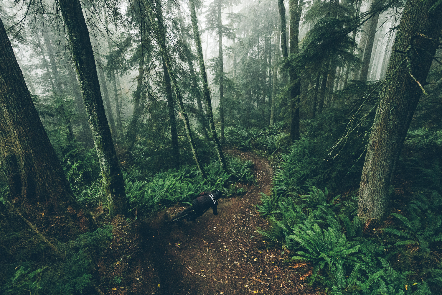
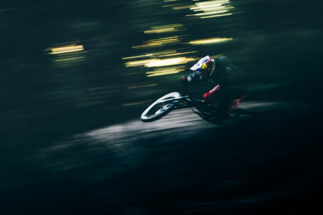
Anthony: A big part of my workflow while I was Photo Director was studio work actually. In each issue of Bike Magazine, a fairly large percentage of the pages are gear coverage, and I would shoot all the studio images for those pages. With 8 issues per year, it was a pretty substantial workload, but in a way, it put me in a fortunate position to be selective with the editorial pieces that I shot.

How did being a photographer inform your editing?
Being both a photographer and a mountain biker was paramount to being an effective editor for Bike. Understanding the moments that are going to tell an authentic story was an incredibly important part of Bike’s success over the years.

Do you find it easier to edit your own work?
It’s incredibly difficult to edit my own work. It can be really hard to look at images objectively if there were challenges to capturing them. Perhaps an athlete is battling a trick, or your battling weather, light, or just can’t find that magic angle. When you get the image it’s hard not to let the journey of making the photo influence your perception of its worth. It’s much easier to look at a contributor’s work and make those tough decisions I find.

What do you miss about the office life?
I miss the collaboration the most. Working with the team at Bike was the most satisfying creative time in my career. Everyone on the team had so much to offer to our creative process, and when we nailed it on a piece, that feeling was hard to beat.

Being on my own and out of the office has given me more time to focus on my creative process. I’m able to shoot work outside of my comfort zone and see how those explorations inform my work.

What do you think photo editors could do better when working with photographers?
It’s always been really rewarding when I feel as though I’m being asked to look past the obvious and capture images that will challenge the audience. Knowing that the easy image won’t cut it and that they trust you and the audience to engage the images on a deeper level. That relationship and trust is key to creating meaningful work.

The Daily Promo – Lauren Pusateri

Lauren Pusateri

Who printed it?
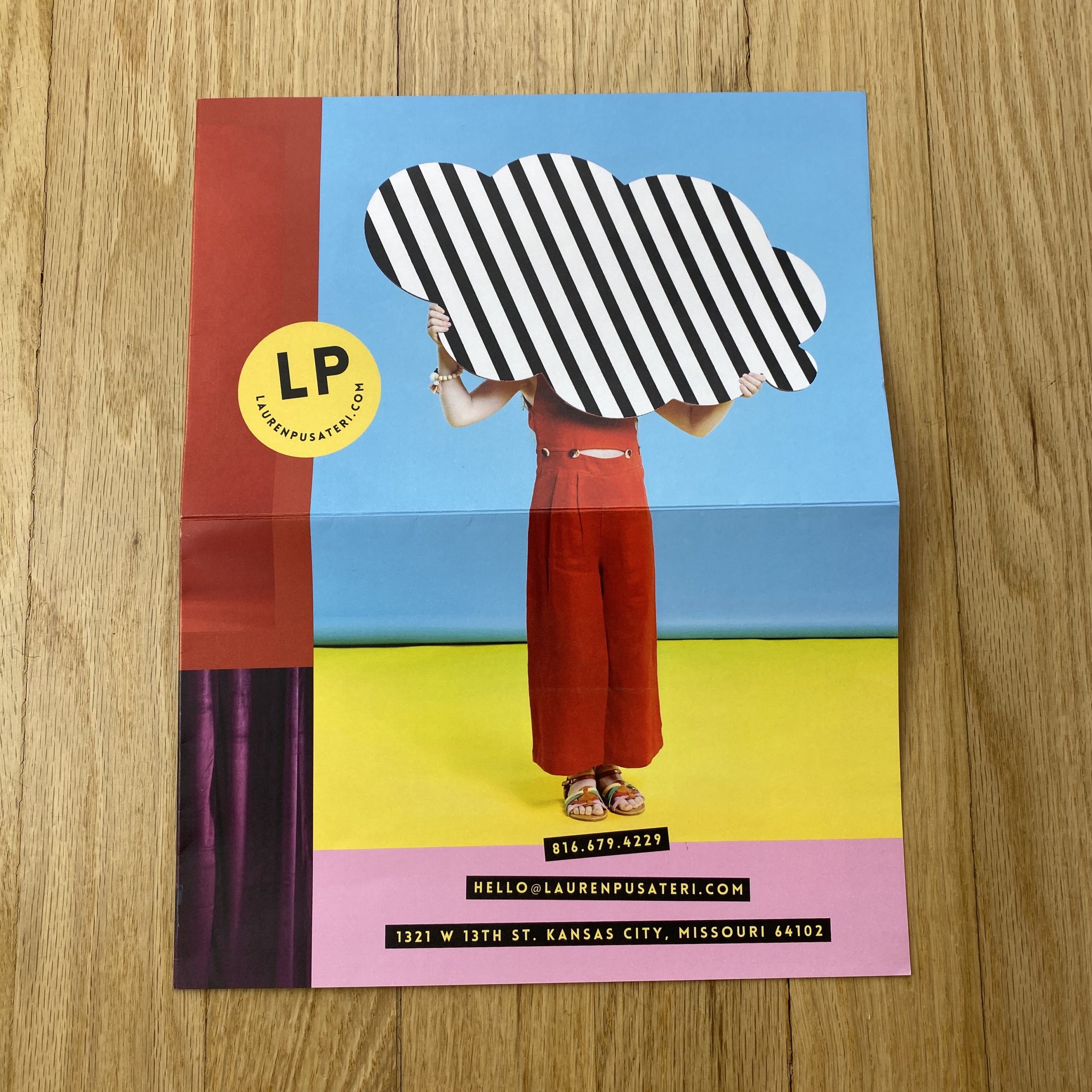
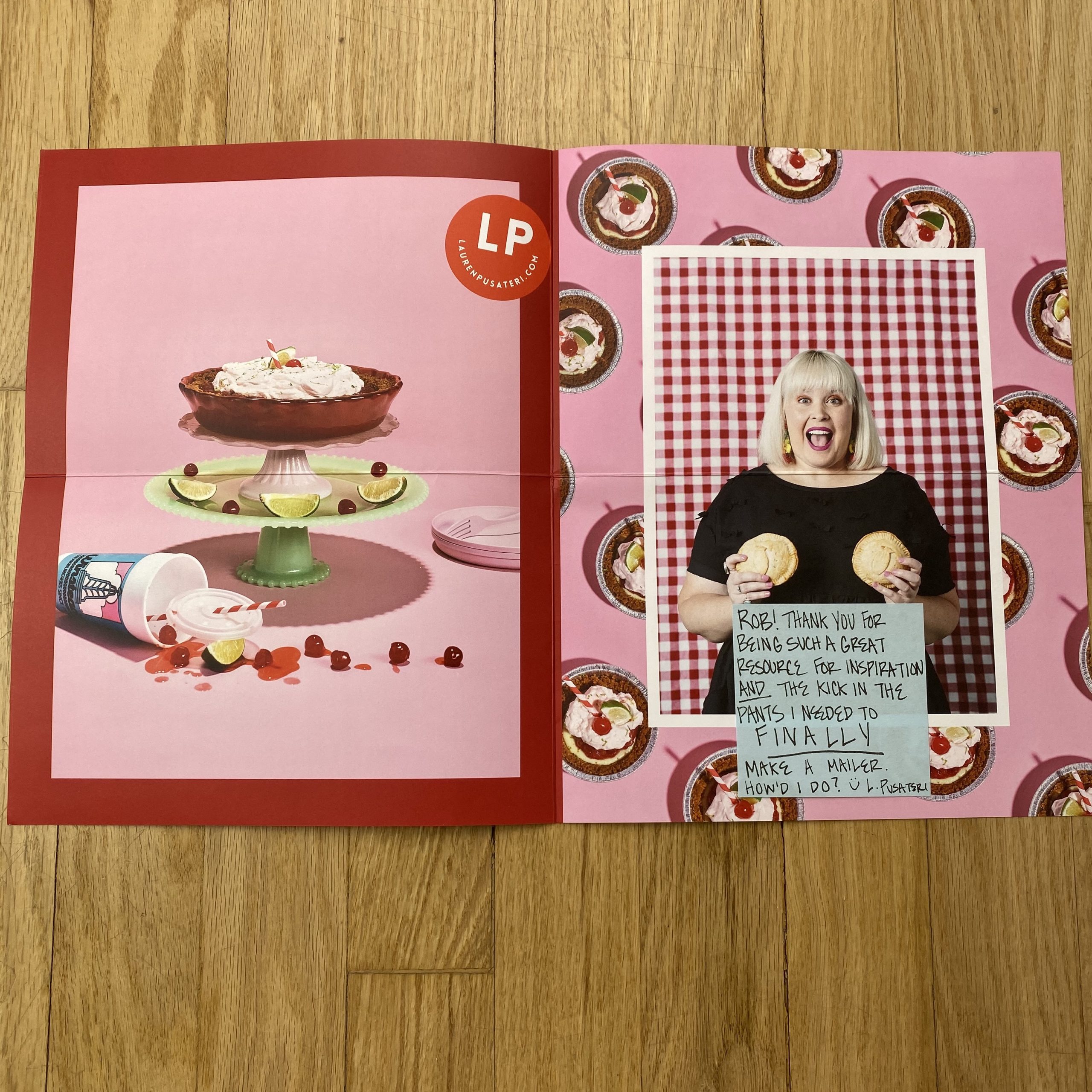
Paper Chase Press. I fell in love with their folded tabloid posters (thanks to your feed) and knew that’s the route I wanted to go. I liked the folded poster because it allowed a lot of real estate for images but folded up to a size that wouldn’t be obnoxious for the recipient to keep on file (and wouldn’t be a headache for me to mail). I like that the posters lend themselves to be designed as cohesive spreads — this allowed for spread 1 to be a mix of work and spread 2 to focus on one project specifically.

Who designed it?
Shelby Maggart, we connected a couple of years ago on a job and since then, we’ve had many opportunities to work together for various clients. This was our first time working on something just for me. I trust her eye and I love the way her brain works. I knew her background in packaging design would be a boon with these posters. I left the image selection up to her but curated the images I wanted her to pick from.

Tell me about the images?
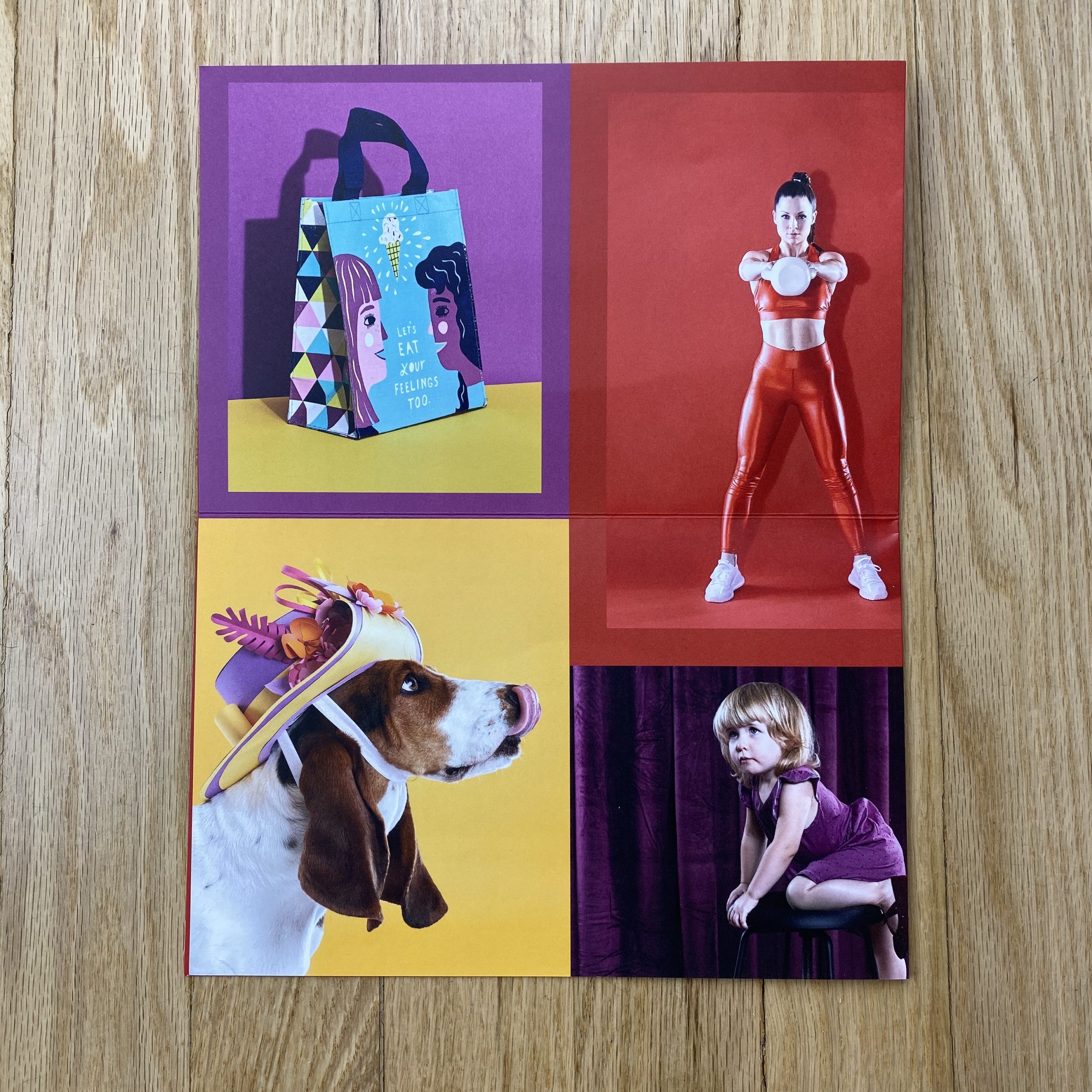
If you’re like me when you’re busy fulfilling client-driven creative you can forget to make work just for you. When 2018 came to a close I realized that 70% of what I’d shot the past two years was animal work…and yes dogs are the best and I enjoy photographing them, but I’d never intended to pigeon-hole myself into a singular specialty. So I made a goal for 2019 to carve out time to make some work for me, to make what I wanted to see — and in the process fill some holes I felt existed in my overall portfolio.

All the images in my promo came from personal projects I shot between March-August 2019 with all-female teams. I challenged myself to create new work in areas I hadn’t played in for a while (kids, fitness, food). I sought out local female-owned small businesses and female creative talent to collaborate with so that the work I was making would have additional use outside of just being portfolio images for myself.

How many did you make?
150

How many times a year do you send out promos?
Up until this fall, I’d never created any kind of promo for my work. I learned a lot through this first promo experience and the process overall feels less daunting now. I’m *hoping* to send out promos twice a year going forward.

Do you think printed promos are effective for marketing your work?
Totally. It’s a way to further communicate your vibe/what you’re all about and show people what you have to say. I feel that having a tangible representation of your work has more shelf-life than an email campaign or social media.

The Best Work I Saw at the Filter Photo Festival: Part 3


Part 1: The Intro

Hi there, everybody.

How are you?

Now that Thanksgiving is behind us, and Christmas will be here before you know it, most people are ready to wind down a bit.

To slow the pace, bitch about the weather, fantasize about being on a warm beach somewhere, and then begin to plan for 2020.

(You know it’s true.)

Honestly, my ass would have been in coasting mode weeks ago, if it hadn’t been for the (now successful) Kickstarter campaign for my upcoming book, “Extinction Party.”

As for the cold and the gray, I spent the better part of Saturday plotting and planning to drive to a clean, beautiful beach, where we could swim in the warm water, and feel free.

I searched and searched, finally settling on South Padre Island in Texas, on the Gulf Coast next to Mexico, before realizing that a 16 hour drive each way would wash off any bliss imparted by the serene salt water.

(Staycation #2019 instead.)

As for the planning, I think right around now, people begin to look at the calendar in earnest, visualizing the trips they might take in 2020.

One year ends, the next begins.

I know it’s a big lede, but I was building to a point, which is that people often ask me which photo festival they should attend, or which ones are the best?

It happened twice in the past week, and once was a public query on Twitter.

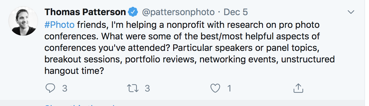
Thomas Patterson, a photographer and writer for PDN, asked me and a few others the following:


As I’m currently in the middle of my series on the Best Work I saw at the Filter Photo Festival, and have said many times that Filter does it right, it seemed like a great way to answer the questions for you ahead of time, in case it helps you book out next year.

So let’s get to it.


Part 2: Which Festival is Best?

I’m going to cut to the chase, and let you down, simultaneously.

There is no “best” festival, though of course I might have a personal favorite.

There are now so many options, in almost every major city, that I think a photographer can base his or her decision on a number of factors. And I will say this, there are several annual festivals that I think are at the top of the heap, and I name-check them all the time.

Filter Photo Festival in Chicago.
PhotoNOLA in New Orleans.
Medium Photo Festival in San Diego.

All three have different strengths, but few weaknesses, and all share some common strategies, with respect to wraparound programming.

I’ve already written that I know the staff at each place, and think they’re amazing people. The three cities are beautiful tourist destinations, with superb leisure activities and incredible food.

Each of the three features lectures, exhibitions, parties, keynote speakers, partnerships with important local museums, and are run by artist-driven non-profit organizations.

They’ve had stability in leadership and staff, and take place in excellent venues, where they remain each year.

(Cohesion and teamwork are important.)

Basically, I’d vouch for all three festivals, strongly. They’re different of course, as Filter has the massive-city-blue-collar vibe, New Orleans is a party-forward city, and Medium is a bit smaller and homier, set in a poolside, SoCal hipster hotel.

I’ve been on gallery tours in both Chicago and New Orleans before, and Medium now does one in Tijuana.

You will get your money’s worth in each place, and that money is going to support a non-profit that gives back massively to its local community.

As to the biennial festivals, I had a good experience at Photolucida in Portland, which I chronicled here this year, and it too has great relationships with its local city. (And amazing food, music, and legal reefer.)

FotoFest, which is coming up this March, is the oldest American portfolio review festival, and I made two of my best friends in the world while attending. (In 2012 and 2016.)

Ironically, though, I think it’s the least social of the festivals I’ve gone to. I love Houston, but the downtown business district, (where FotoFest is held,) is not super-lively in the evenings, and while it’s a great city in which to have a car, parking downtown is expensive.

FotoFest a place to get business done, as you’ll have approximately 20 portfolio reviews, and I know colleagues who go for two sessions each year, as they always make enough money to justify it.

So there’s my two cents.

And just to reiterate, in my copious experience, it’s the partying, the social experiences, the eating and drinking, that really brings people together.

(It’s not an accident, as human beings like working with people they know and like.)

If you get out there, invest the time in broadening your network and making new friends, it will have a positive impact on your life in so many ways.

And with that, we’ll move on to the final piece of today’s puzzle: more of the Best Work I Saw at the Filter Photo Festival in September.

As usual, the artists are in no particular order.


Part 3: The Photographers

Sometimes, a project just jumps off the table at you, often due to technical prowess. And as a teacher and a critic, I typically recommend artists make work about what they’re expert in, or something they’re so curious about that the art practice itself makes them an expert.

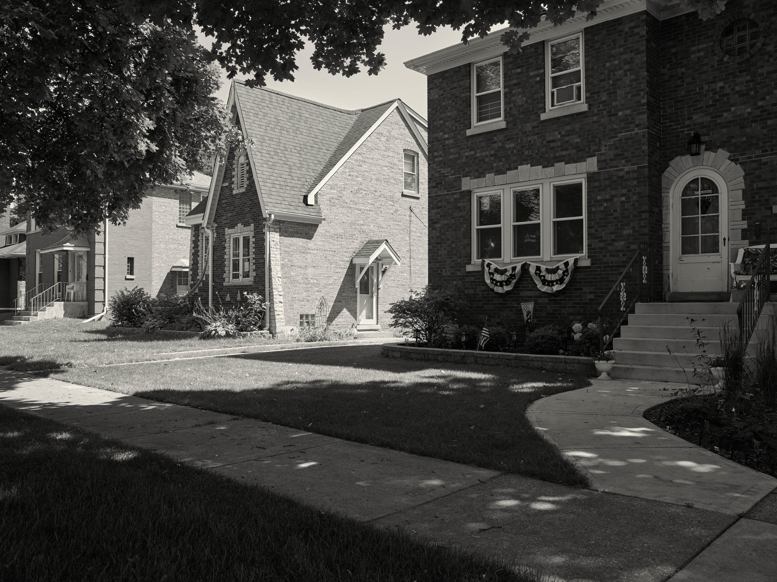
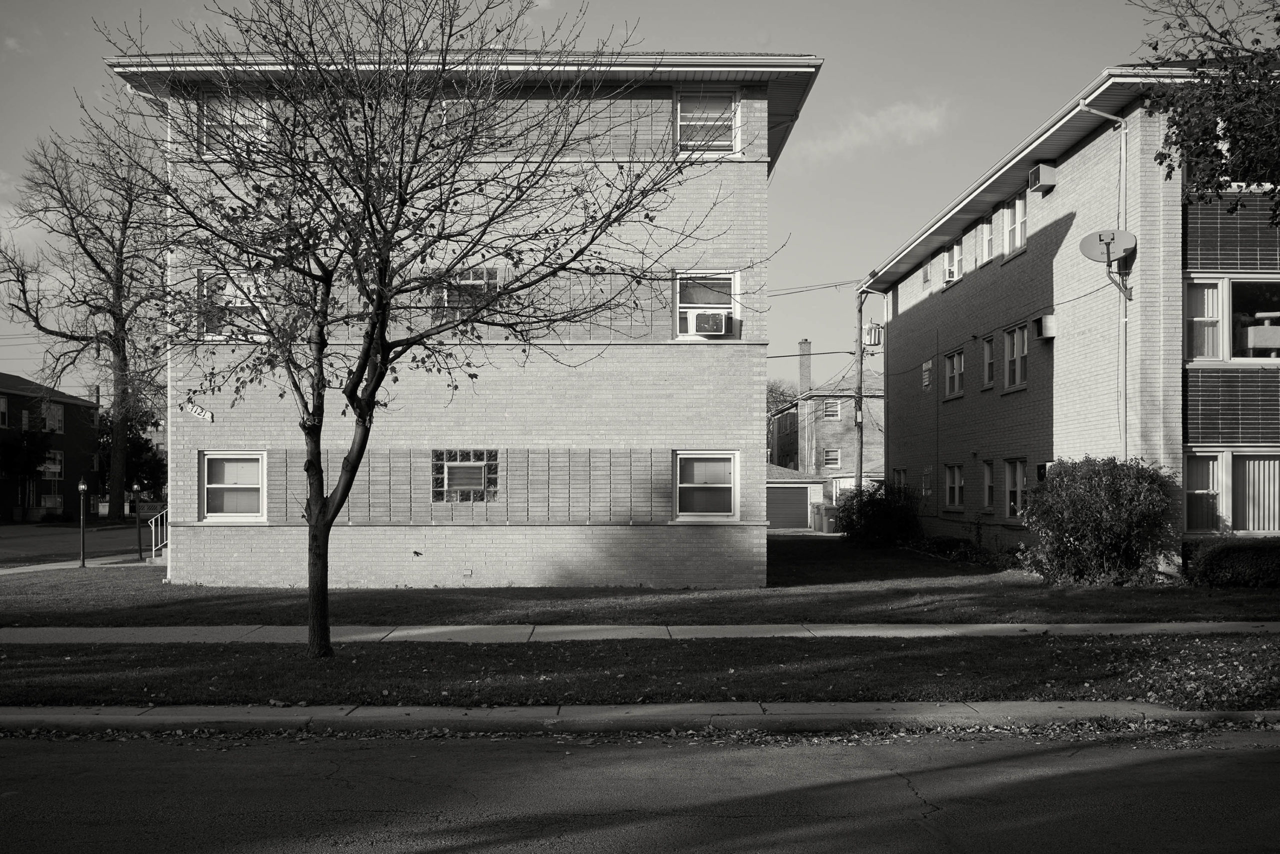
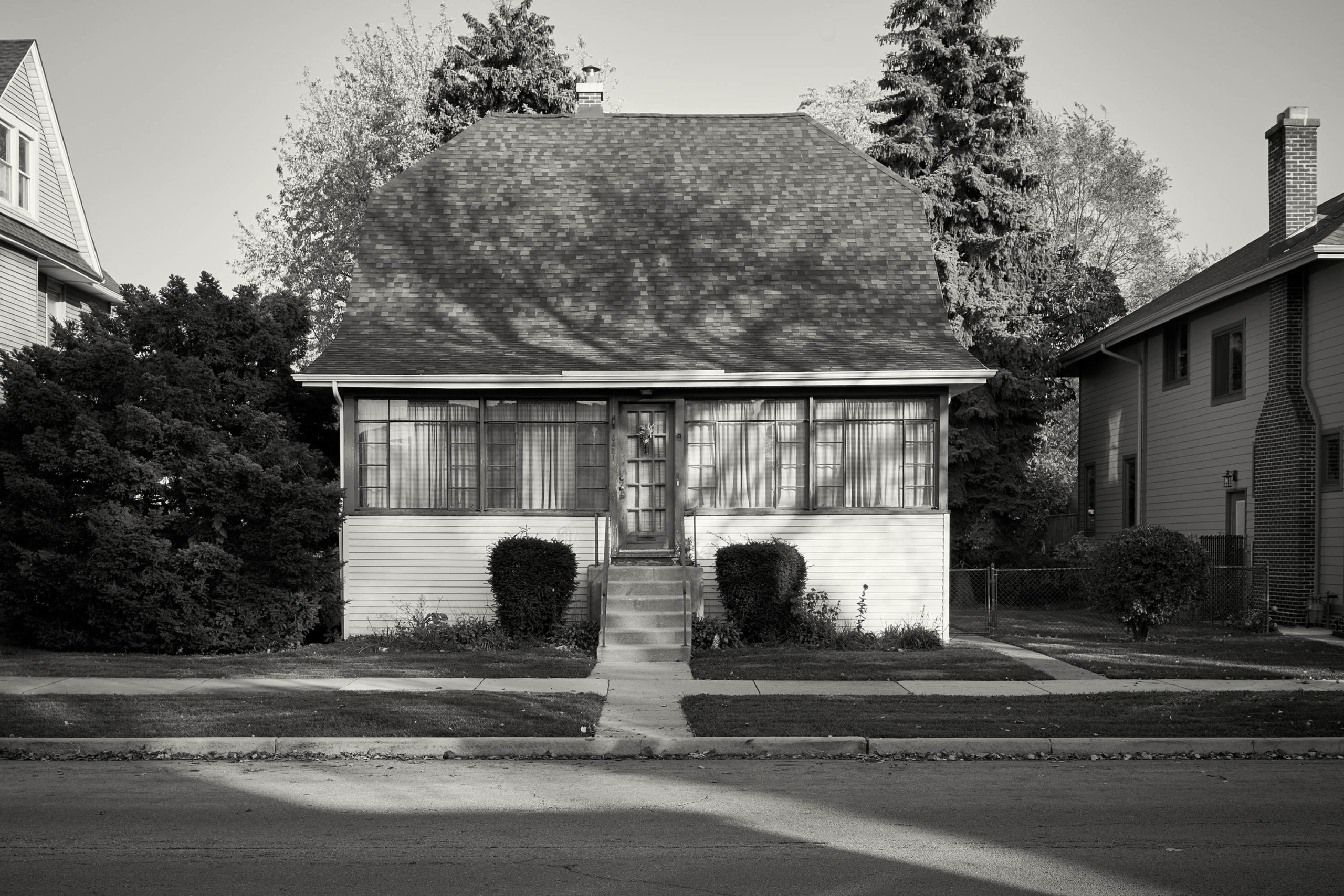
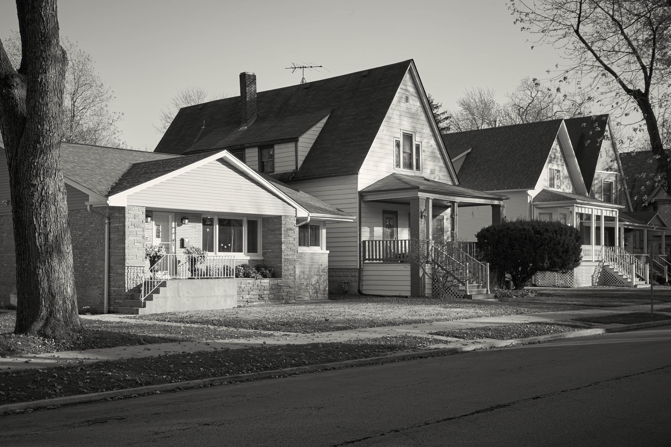
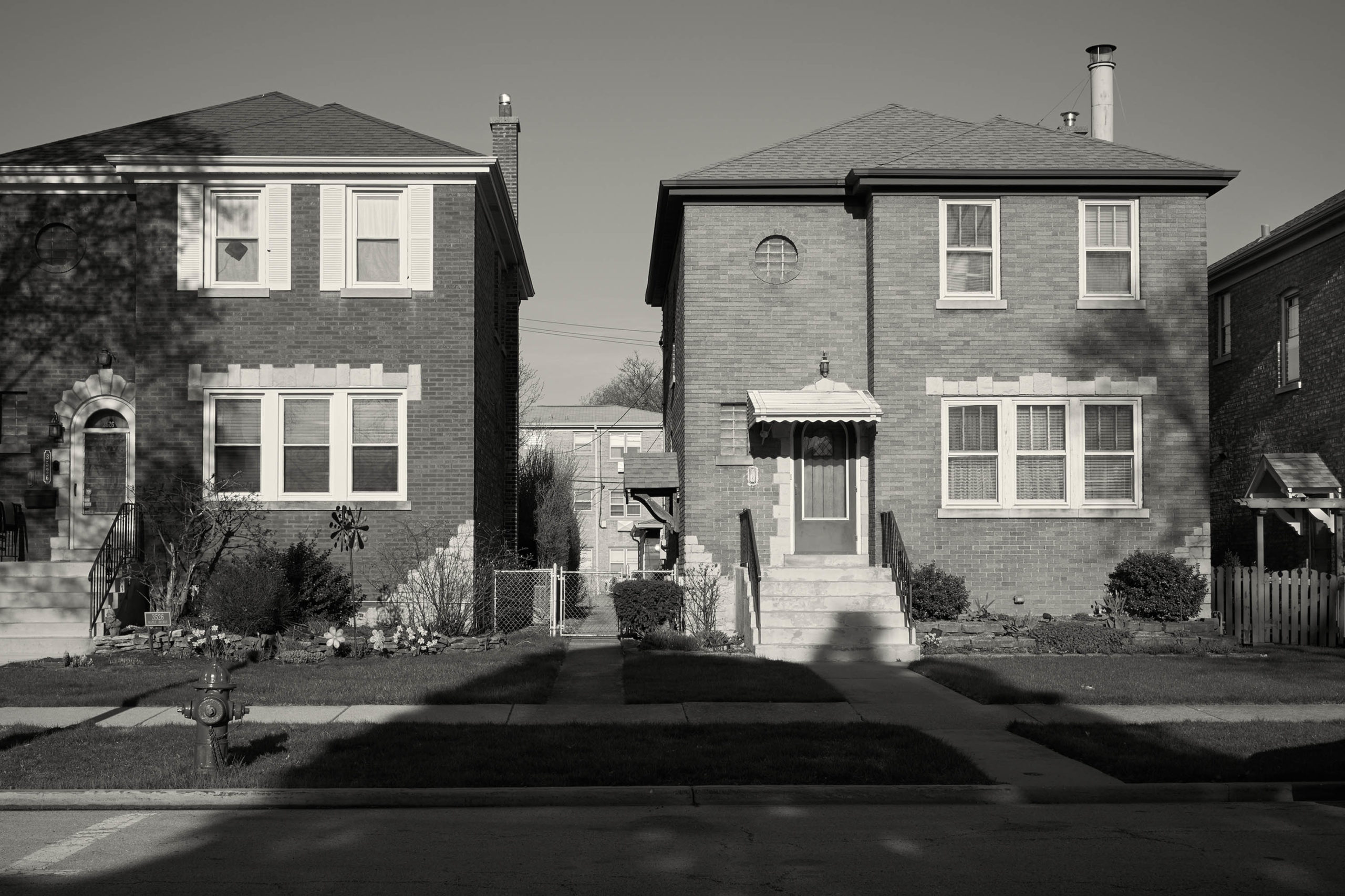
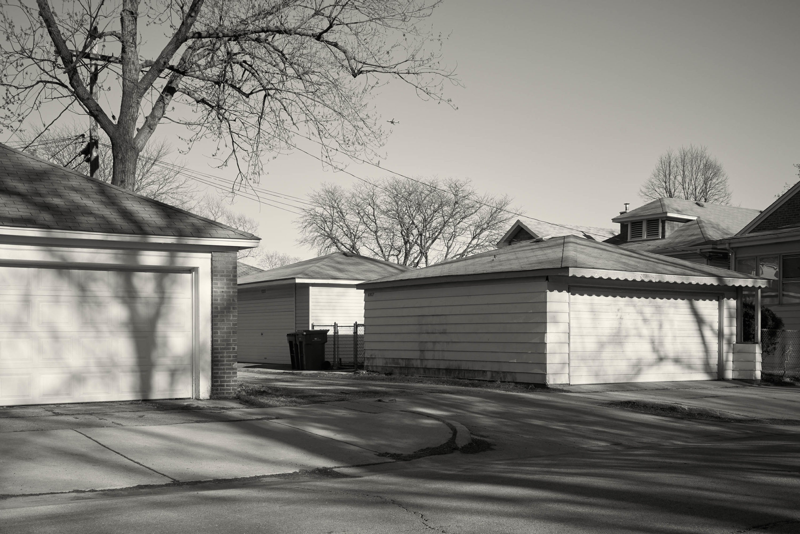
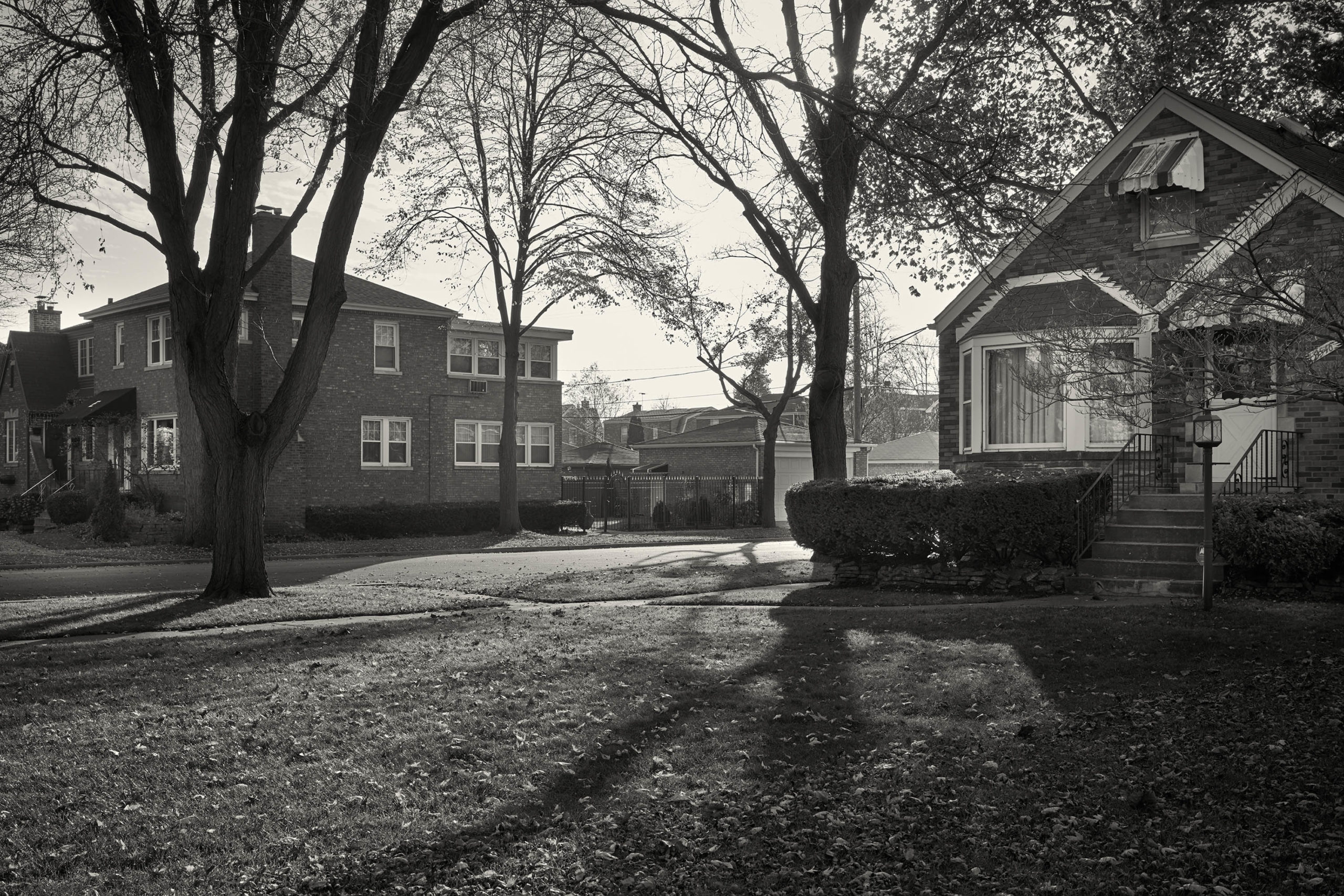
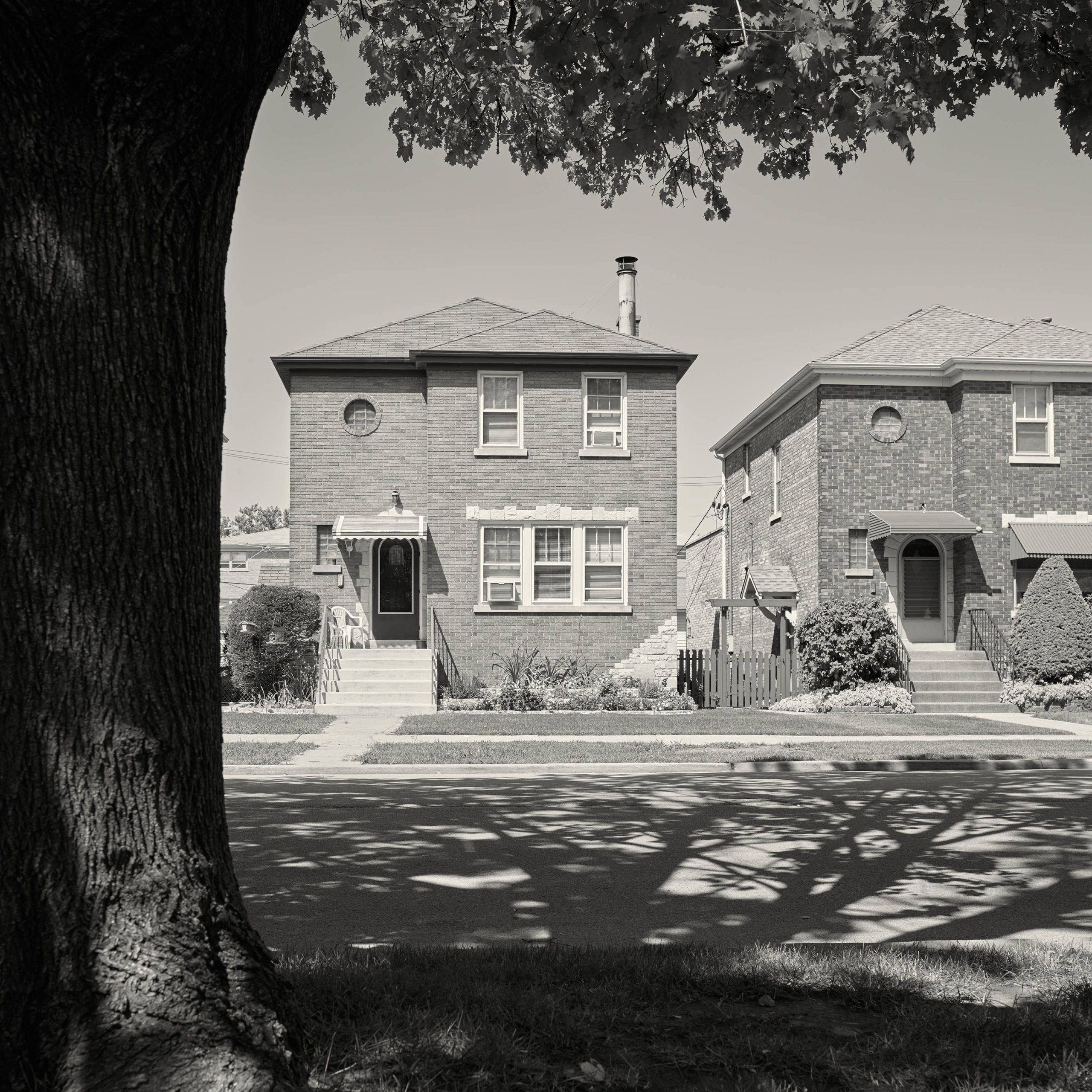
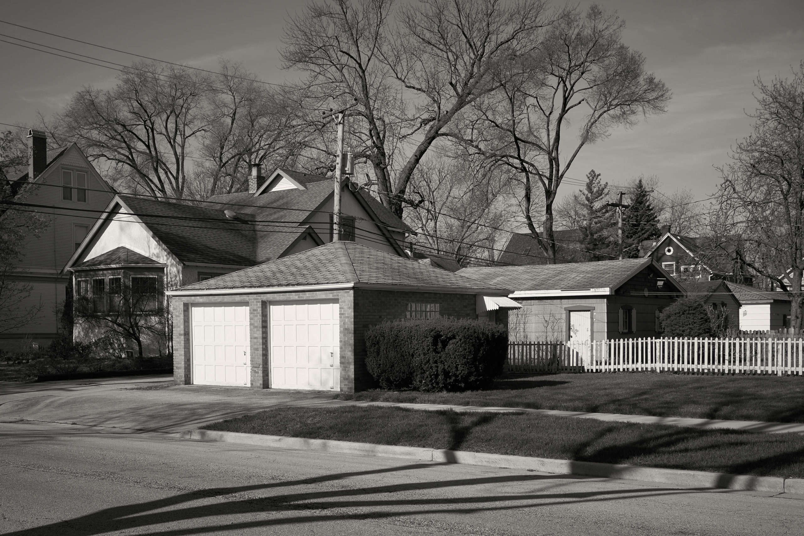
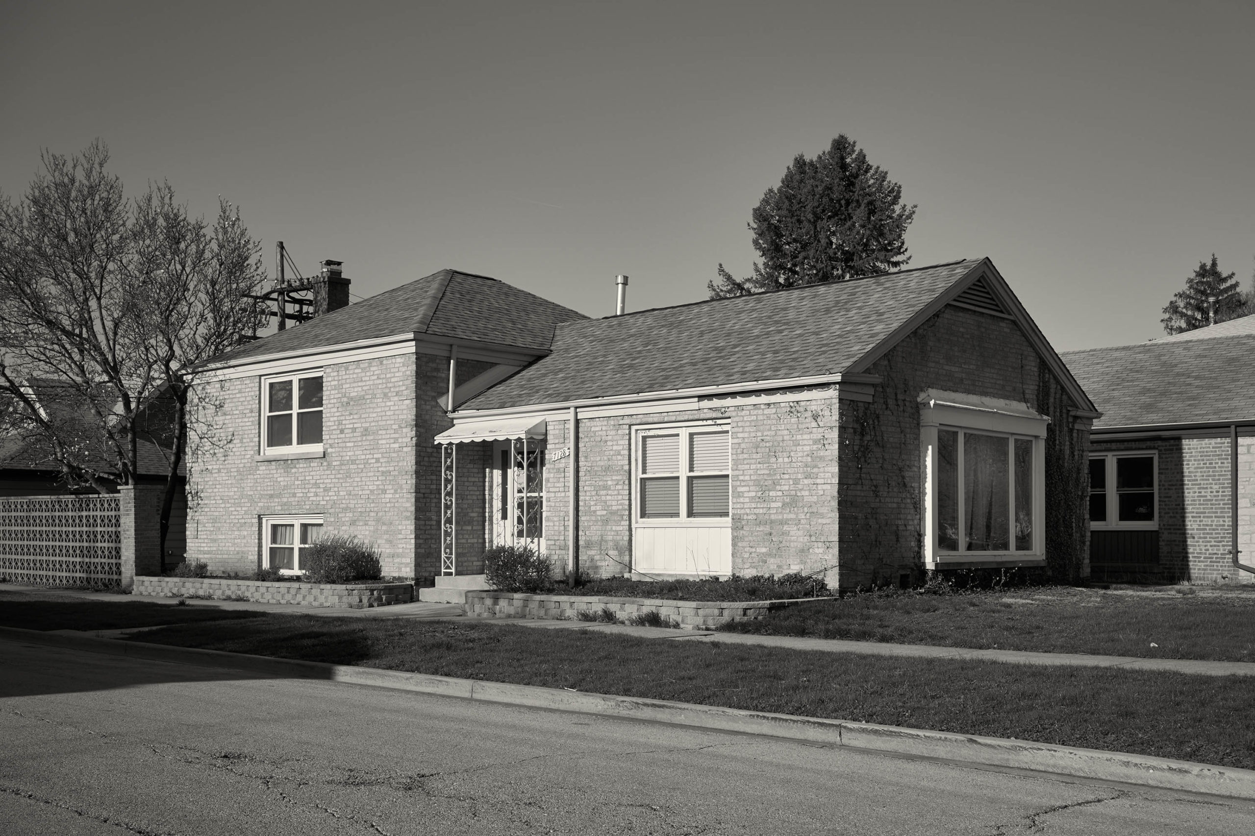
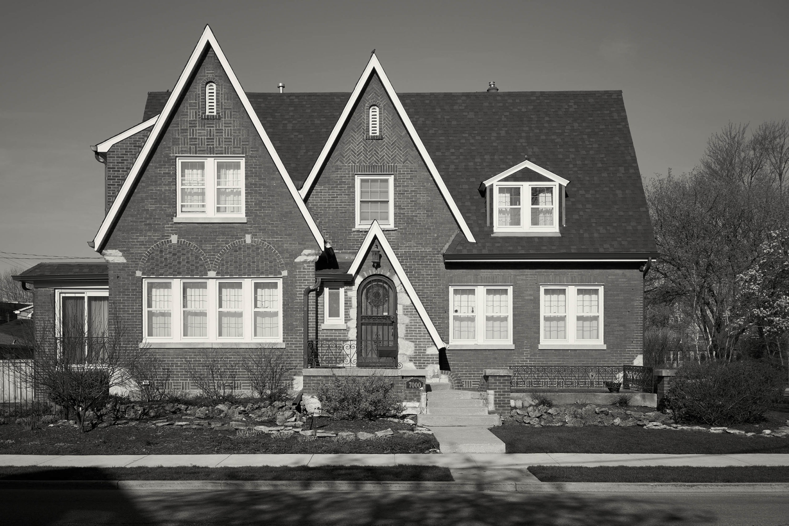
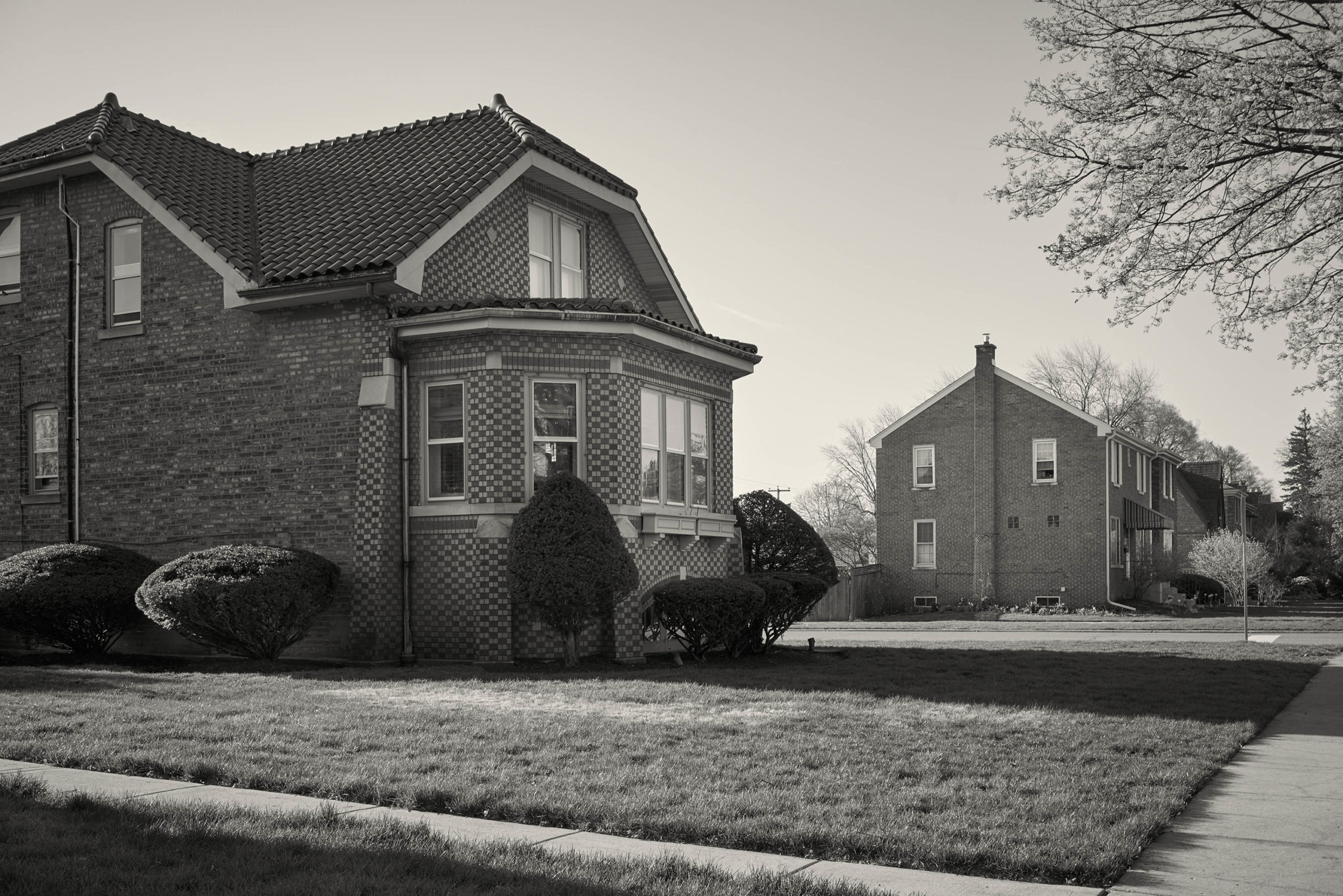
With Christoper Barrett, it was an interesting confluence, as he works as a professional architectural photographer in Chicago, and chose an art project that allowed him to put those skills to use.

He began taking walks around his neighborhood, photographing the mishmash of local architectural styles. At the same time, he created a tense, boxed in, claustrophobic view of emo Americana.

The series feels like a snapshot of an empire in Decline, devoid of color. And the formal constructions, super sharpness, and solid tonal range make for a powerful group of pictures.


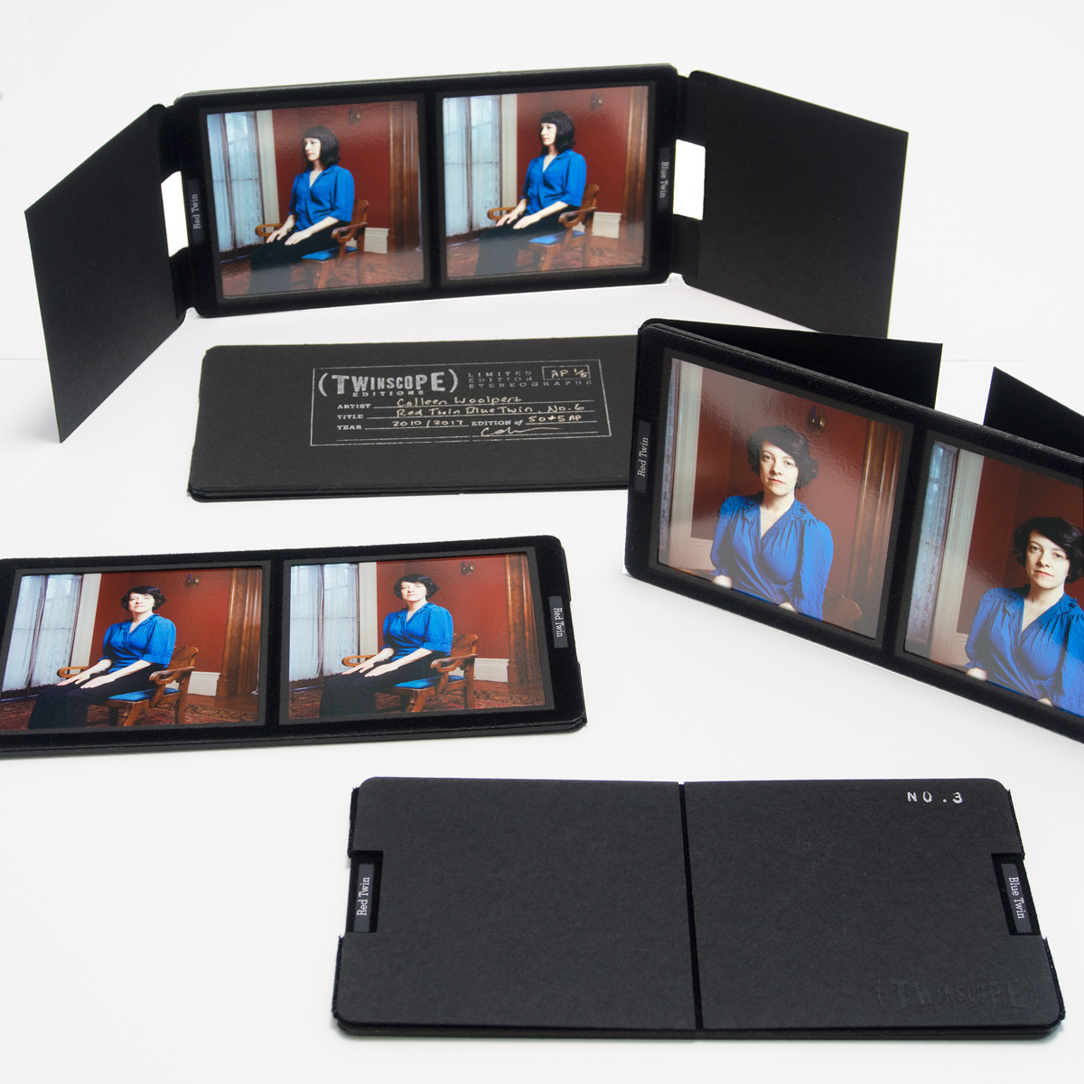
Speaking of expertise, Colleen Woolpert must have found it strange to tell me her story, given the massive coincidence we shared. She described a rare eye condition called strabismus, in which vision and depth perception can be severely impaired.

Colleen is a twin, and her sister has it, but she does not. (The coincidence is my son has strabismus, and after nearly 10 years of treatment, one surgery, and some strong eye-glasses, he sees really well.)

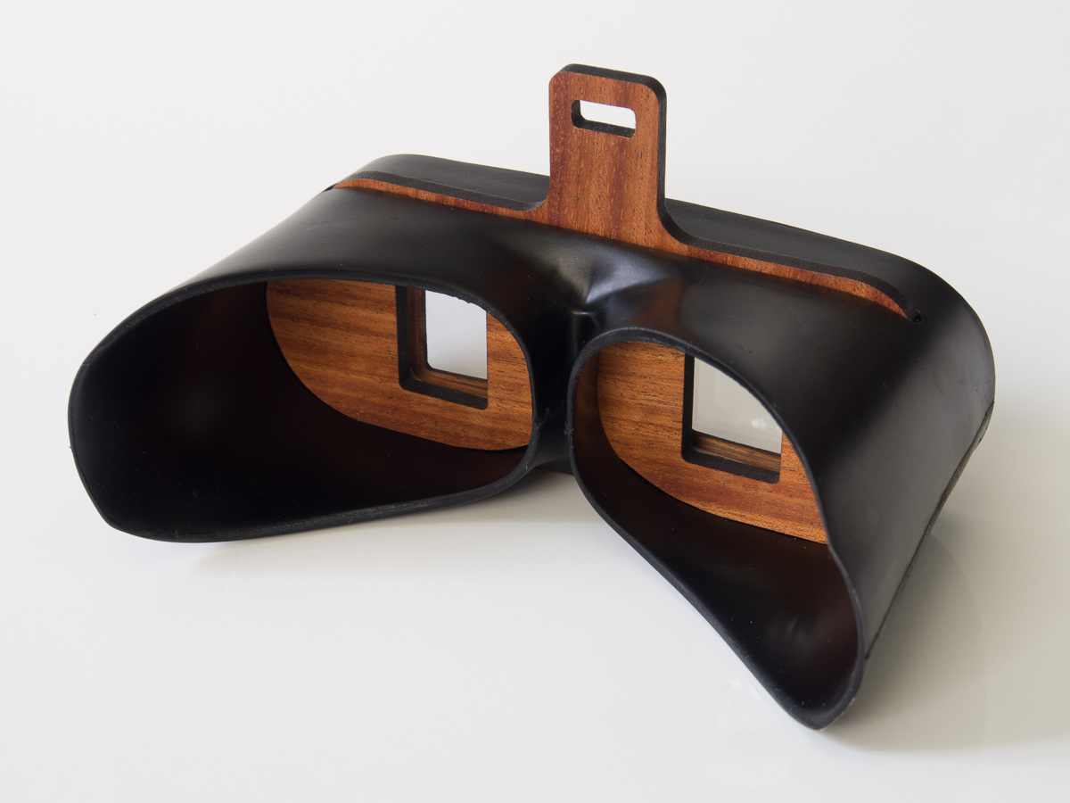
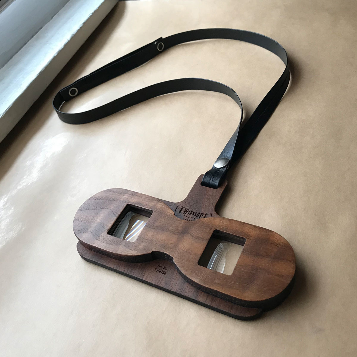
Apparently, Colleen wanted to help her sister, (as the impairment was believed to be permanent if not fixed in childhood, ) so she built a stereoscopic device to help her sister improve her vision, and it worked!

Then she patented it, and now it’s in pubic use.

You can’t make this shit up!

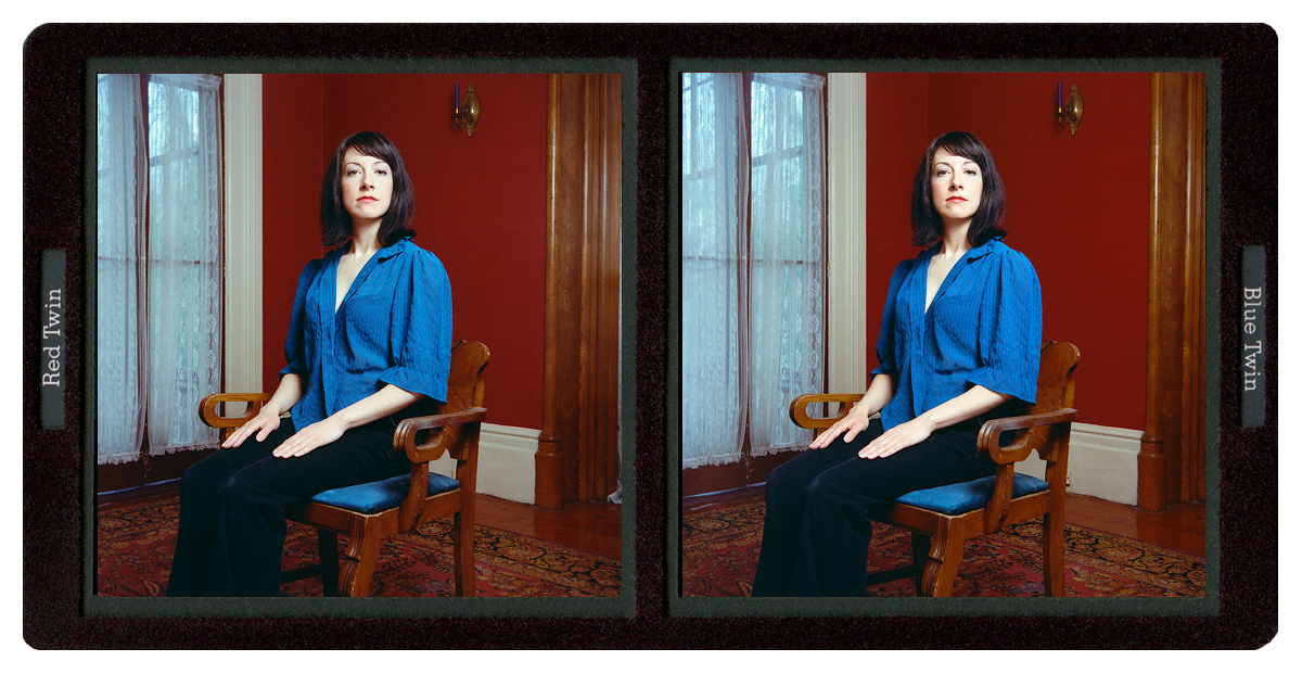
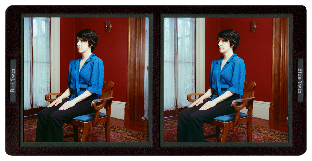
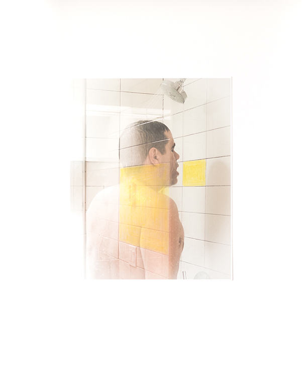
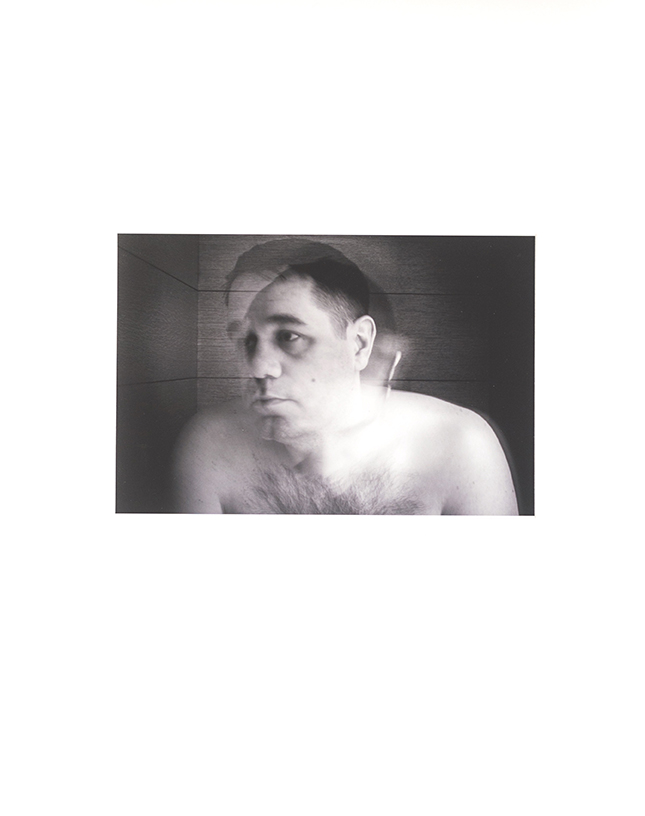
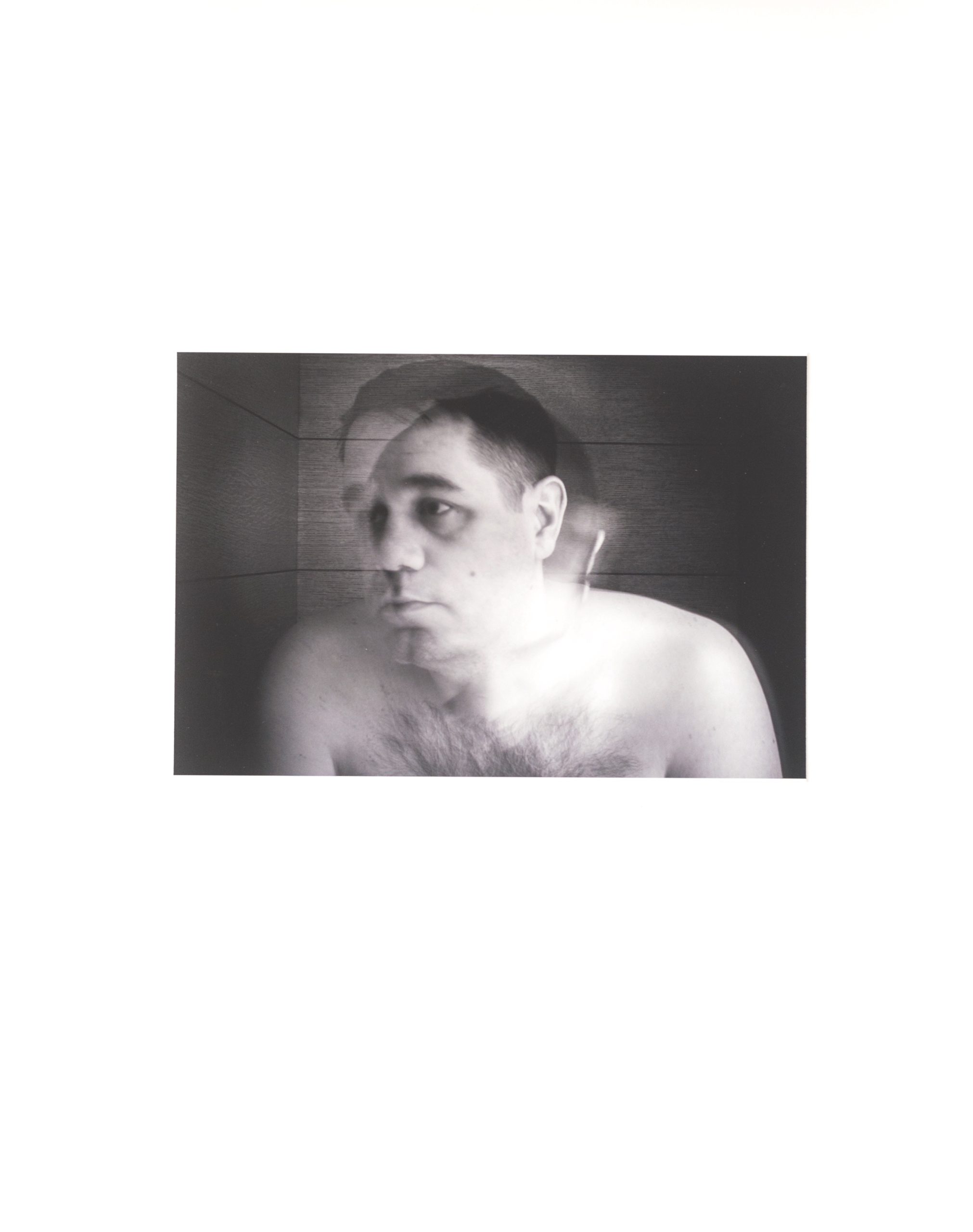
Her art project uses the stereoscope to depict images of Colleen and her sister, where they blend together into one person. Radical stuff!

Next, we have Mitch Eckert, who’s a professor at Louisville University in Kentucky. I always ask photographers about their background, and then dispense advice accordingly.

Mitch told me he was trained up, and that he thought his work was ready to go, so I was prepared to be a tough critic. Thankfully, I found his work to be cool and a bit exciting.

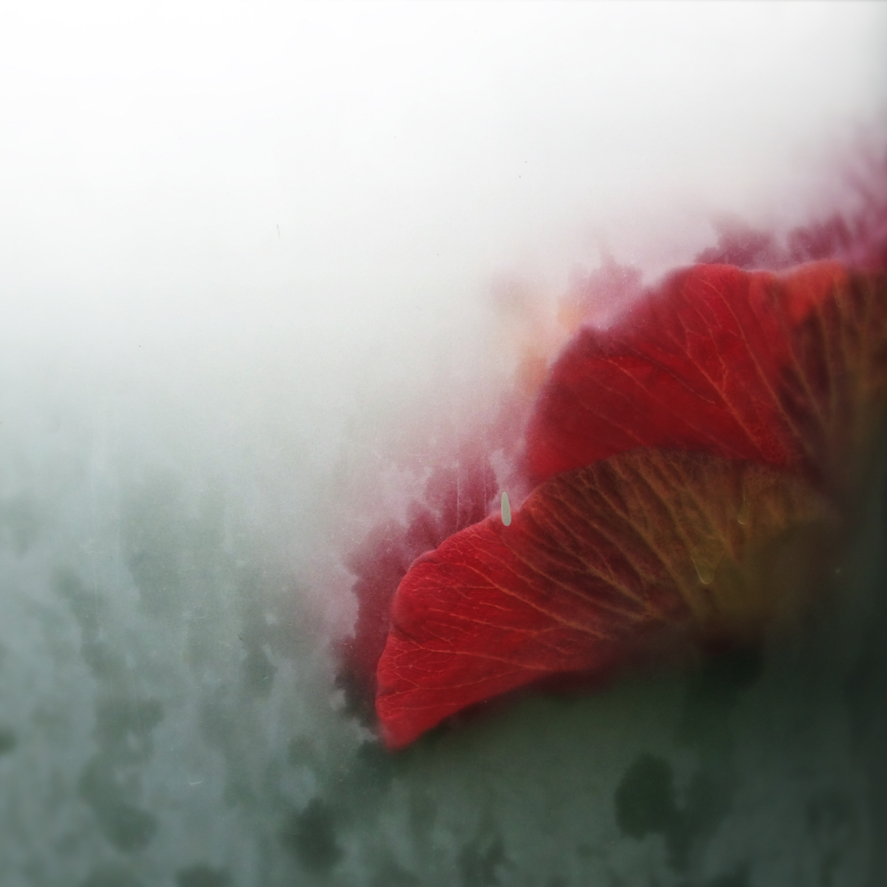
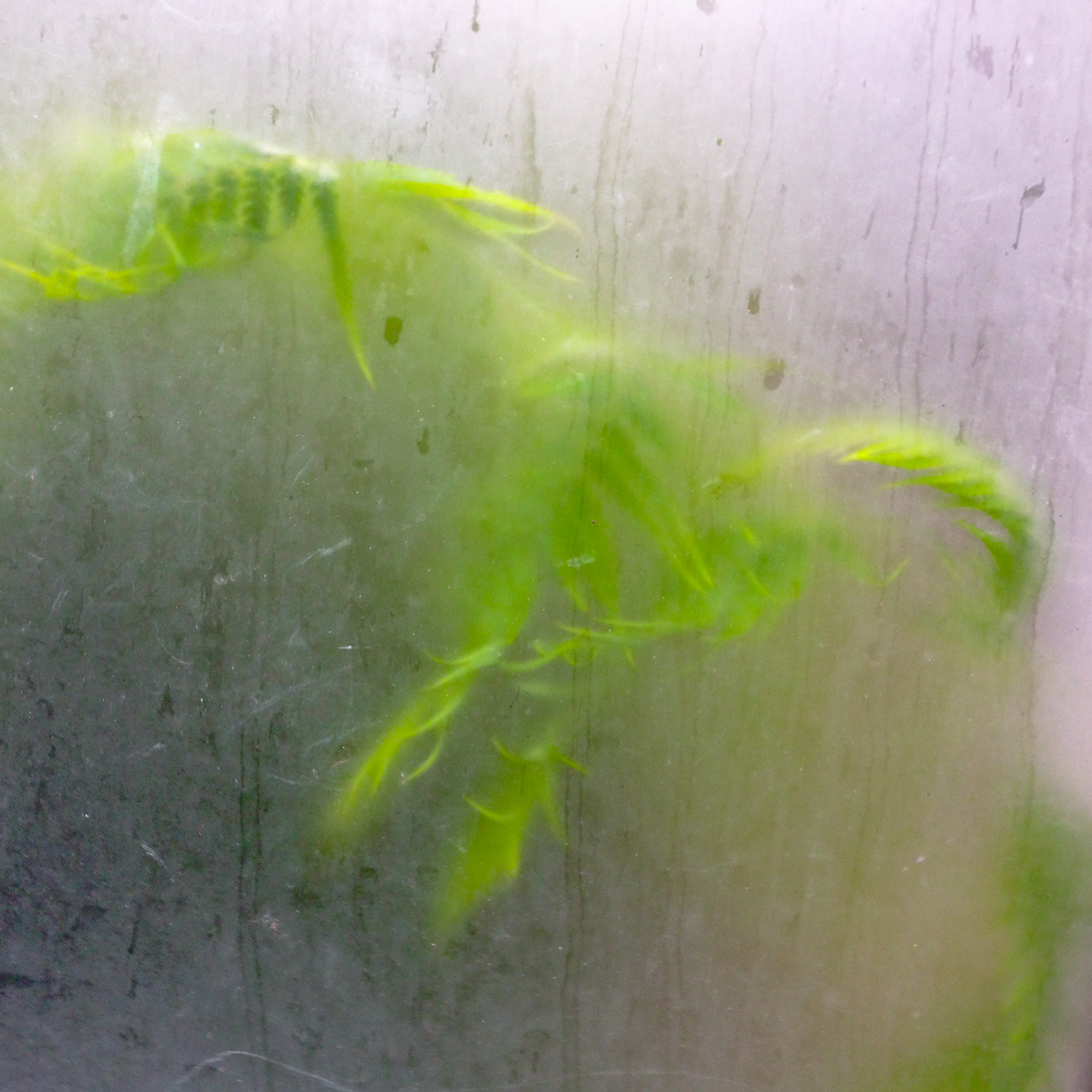
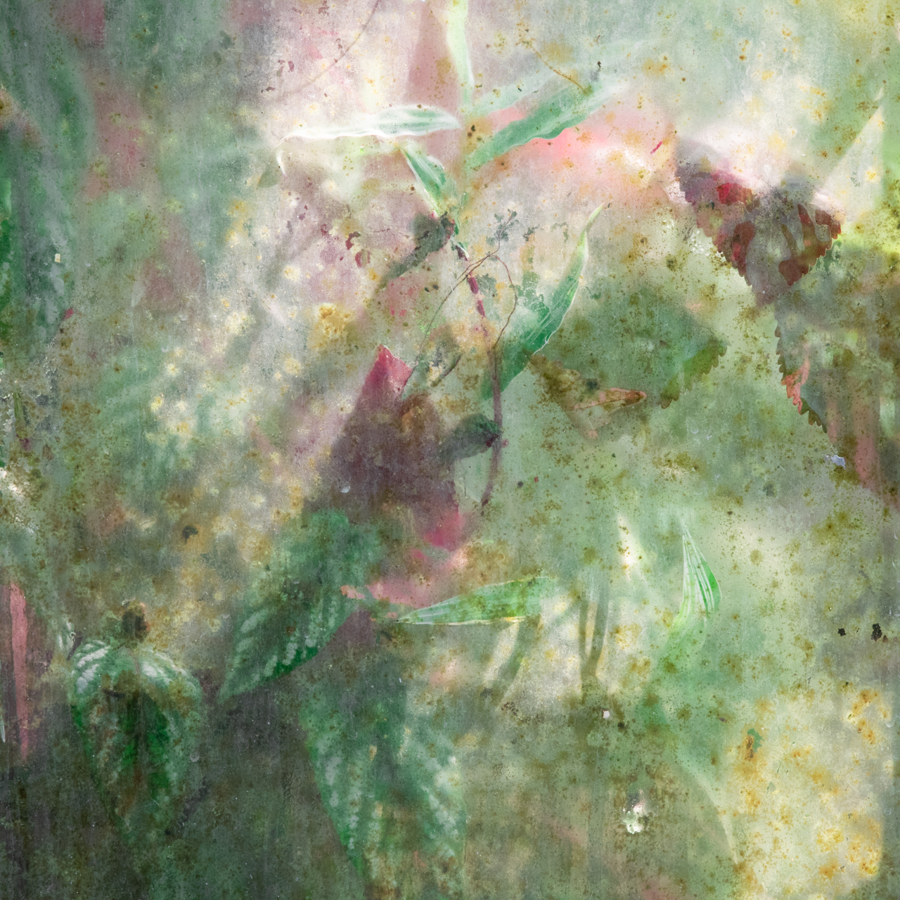
Normally, I think zoos, aquariums, botanical gardens and museums are too easy as subjects, but Mitch brought a hyper-real compression of space to the game.

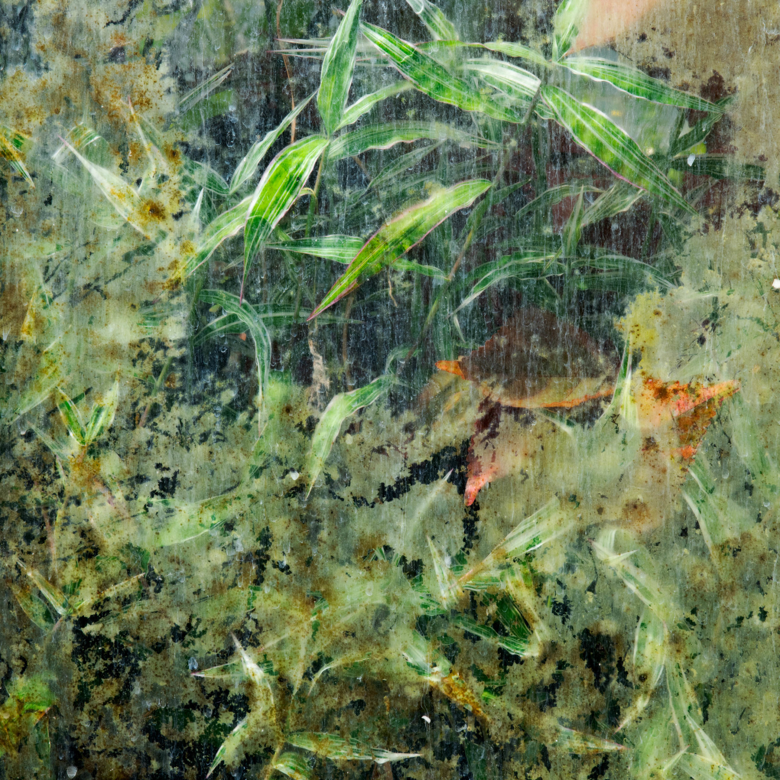
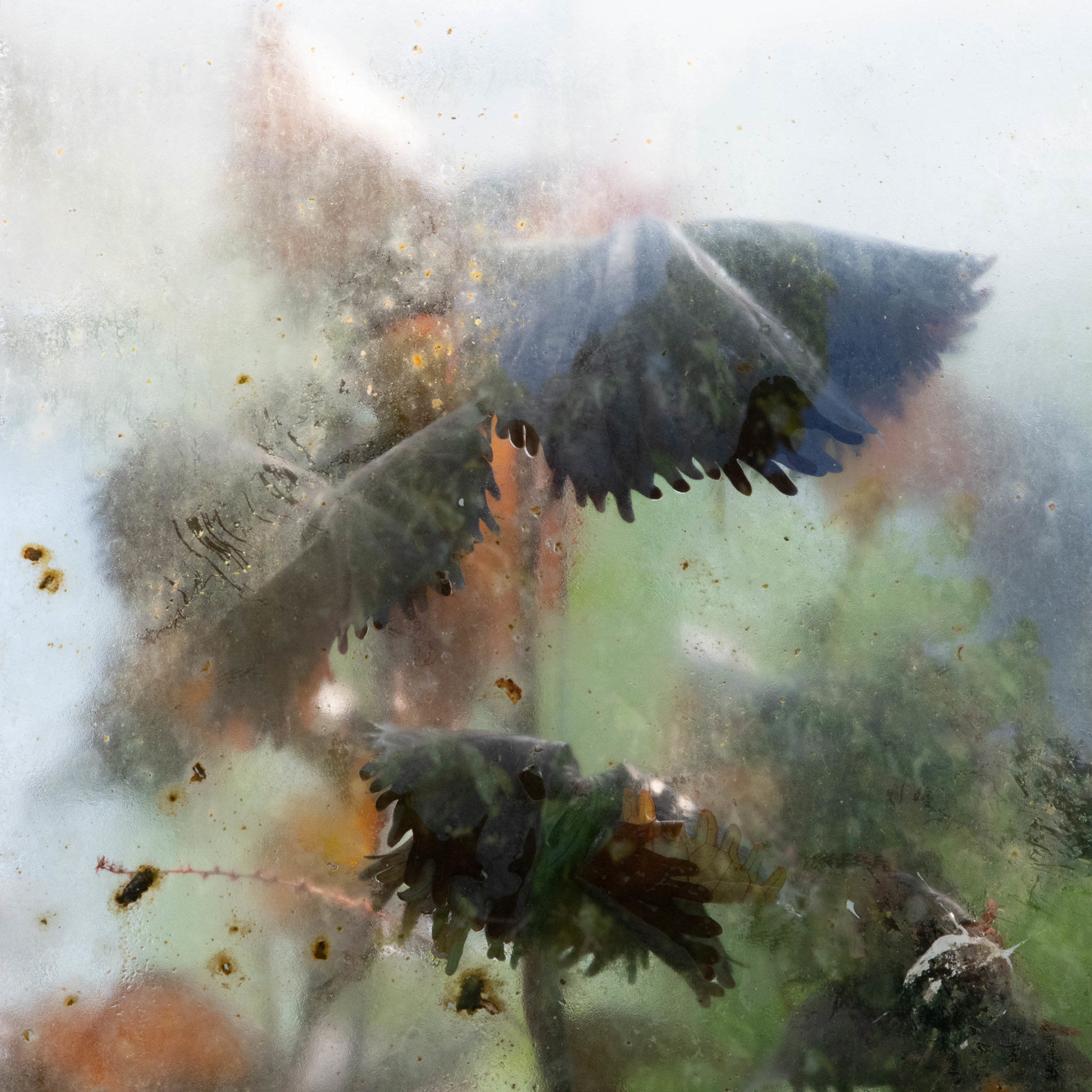
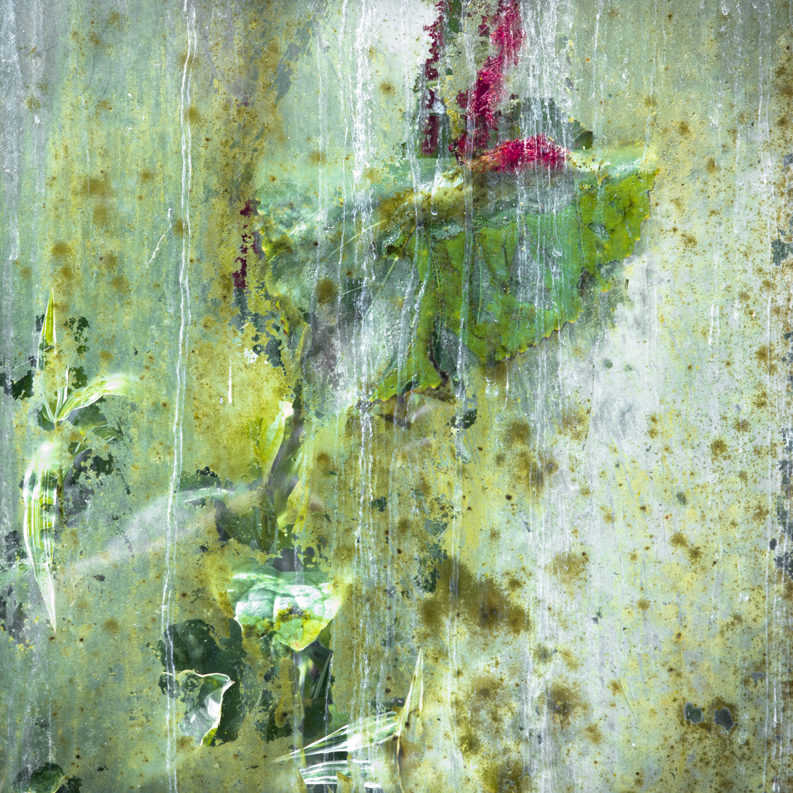
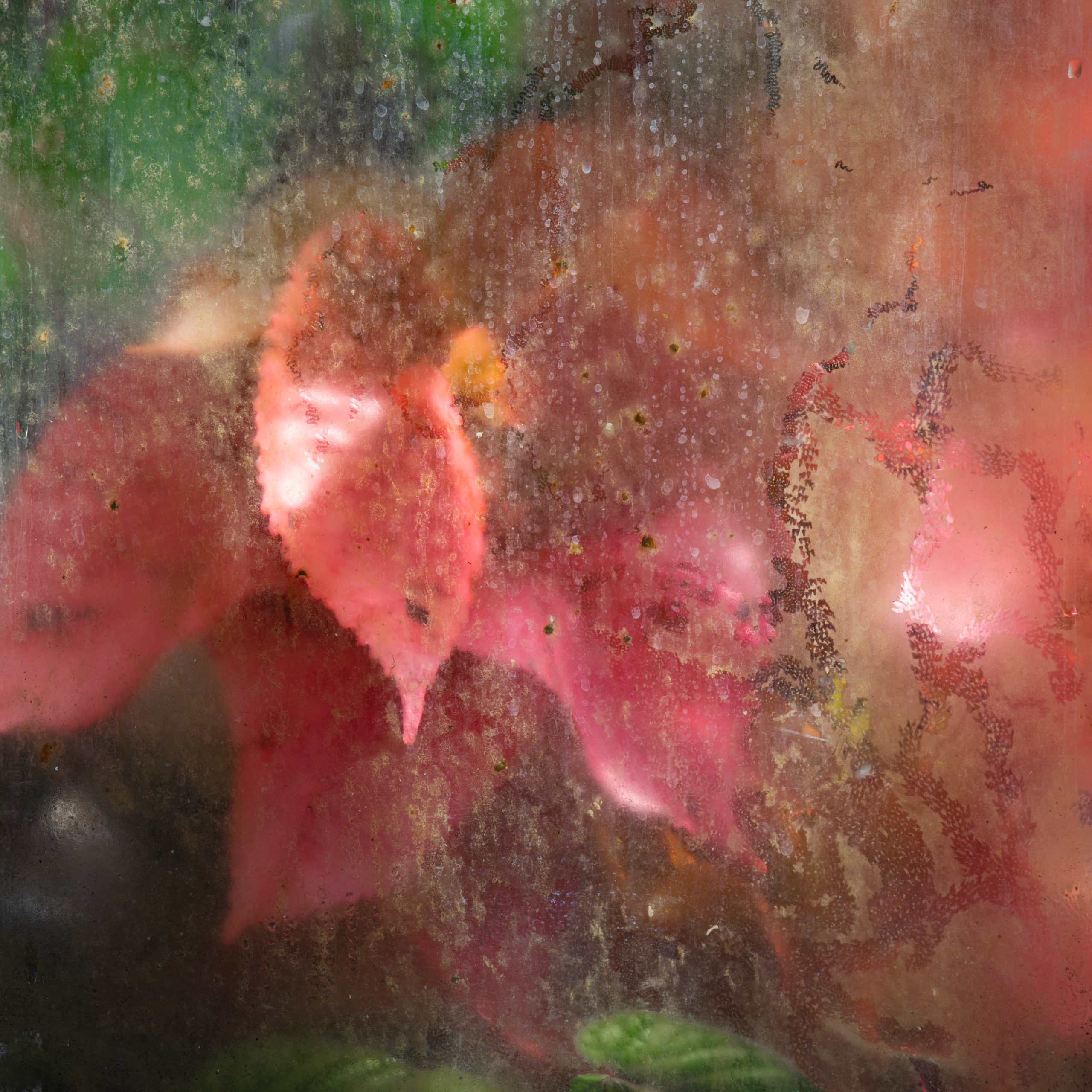
His plants, trapped behind glass, sweating, breathing, pushing up against the see-through constraints, feel very compelling as environmental pieces in #2019.

Ruth Adams and I had an editing session, as we discussed how to create solid through-lines, or connection points, via subject matter and style.

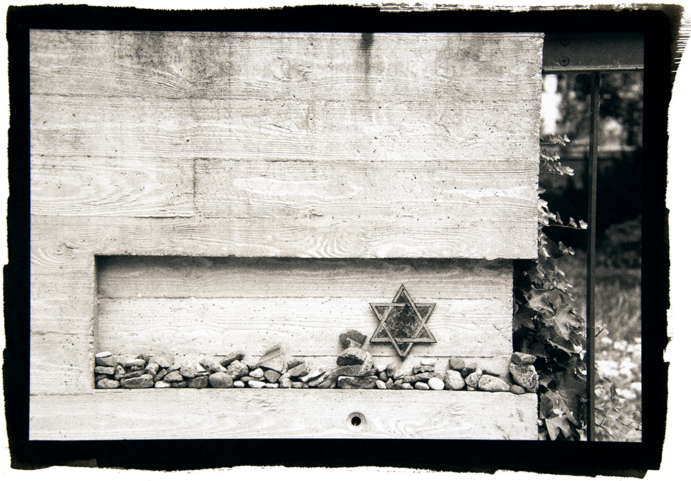
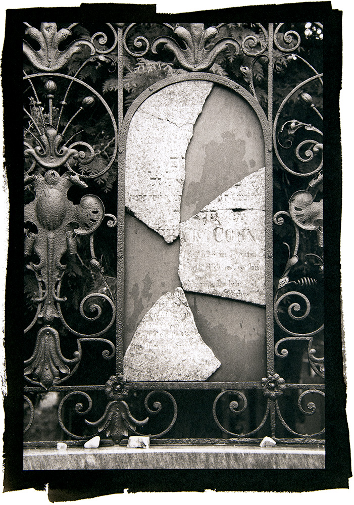
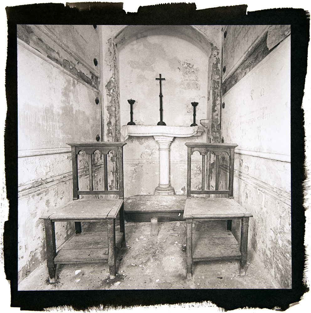
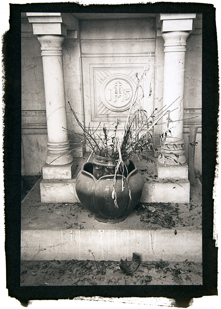
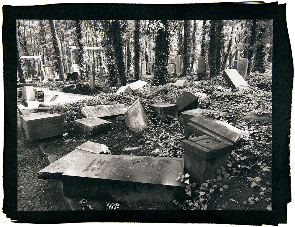
Ruth had been shooting in Berlin, and what she first described as being about Jewish cemeteries quickly expanded to include other religions as well, and other cities.

I zeroed in on the images that felt most connected to each other, and encouraged her to keep things tight and make more work. As with Christoper’s project, the tonal range here really is impressive.

Anastasia Davis, in from Pittsburgh, let me know she had studied with good people, and was connected in her community. She also said that she used her work to cope with, or process, her history of panic disorder and depression, which is of course one of art’s highest and best uses.

Anastasia showed me two groups of photographs, both of which were meant to conjure a different emotional experience. And as the images are made separately, and then edited together, it does share much with poetry, vibe-wise.

Really lovely stuff.


Last, but not least, we have James Kuan, whose work caught my eye at the portfolio walk at Filter.

I always make sure to do a quick visit at a festival’s portfolio walk, (always,) because I ALWAYS find cool stuff to show you from people I would not otherwise meet.

In this case, I learned that James is a surgeon based in Seattle, and has studied at PCNW.

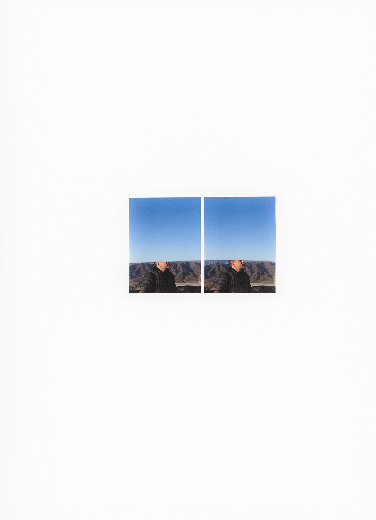
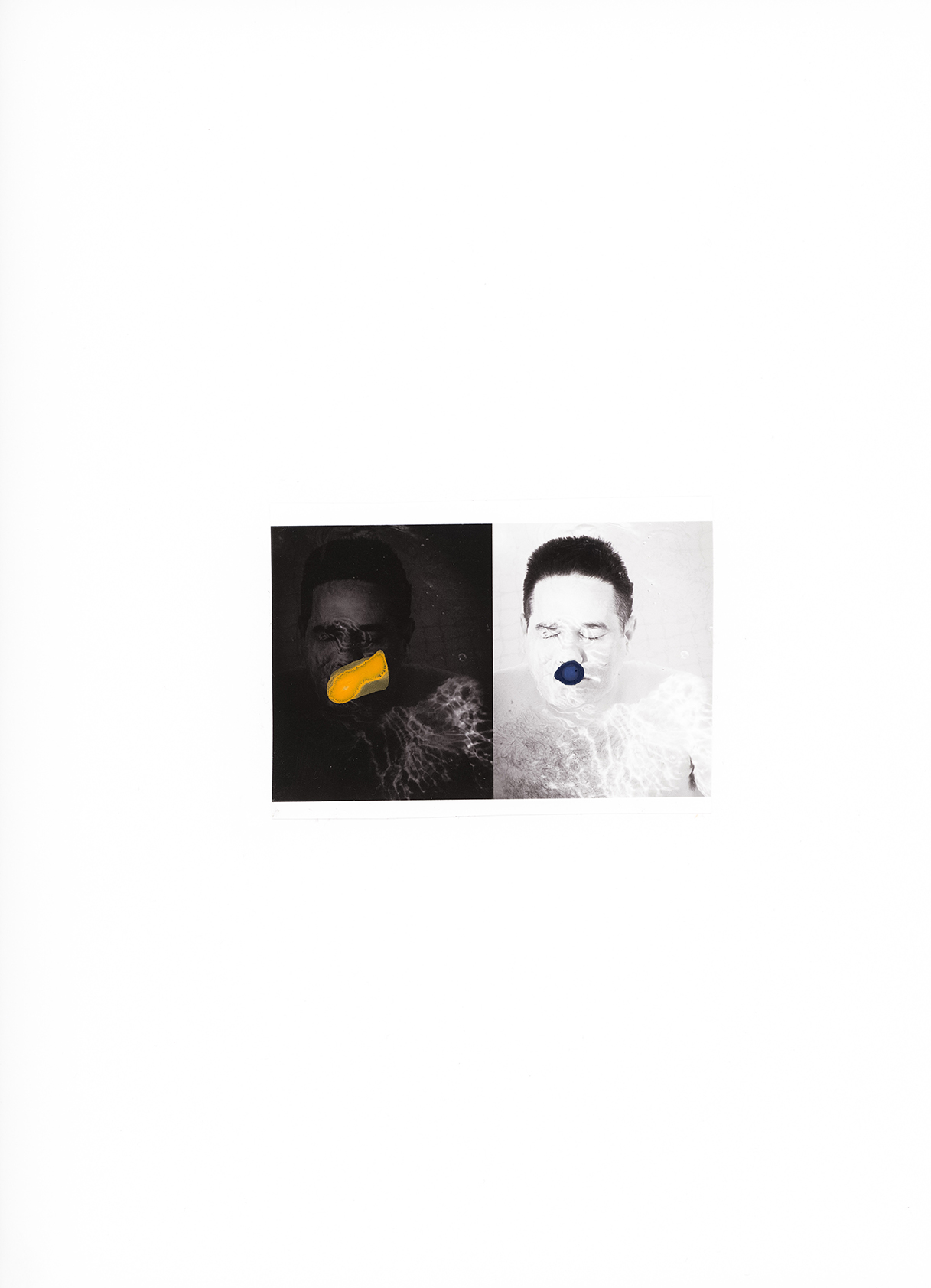
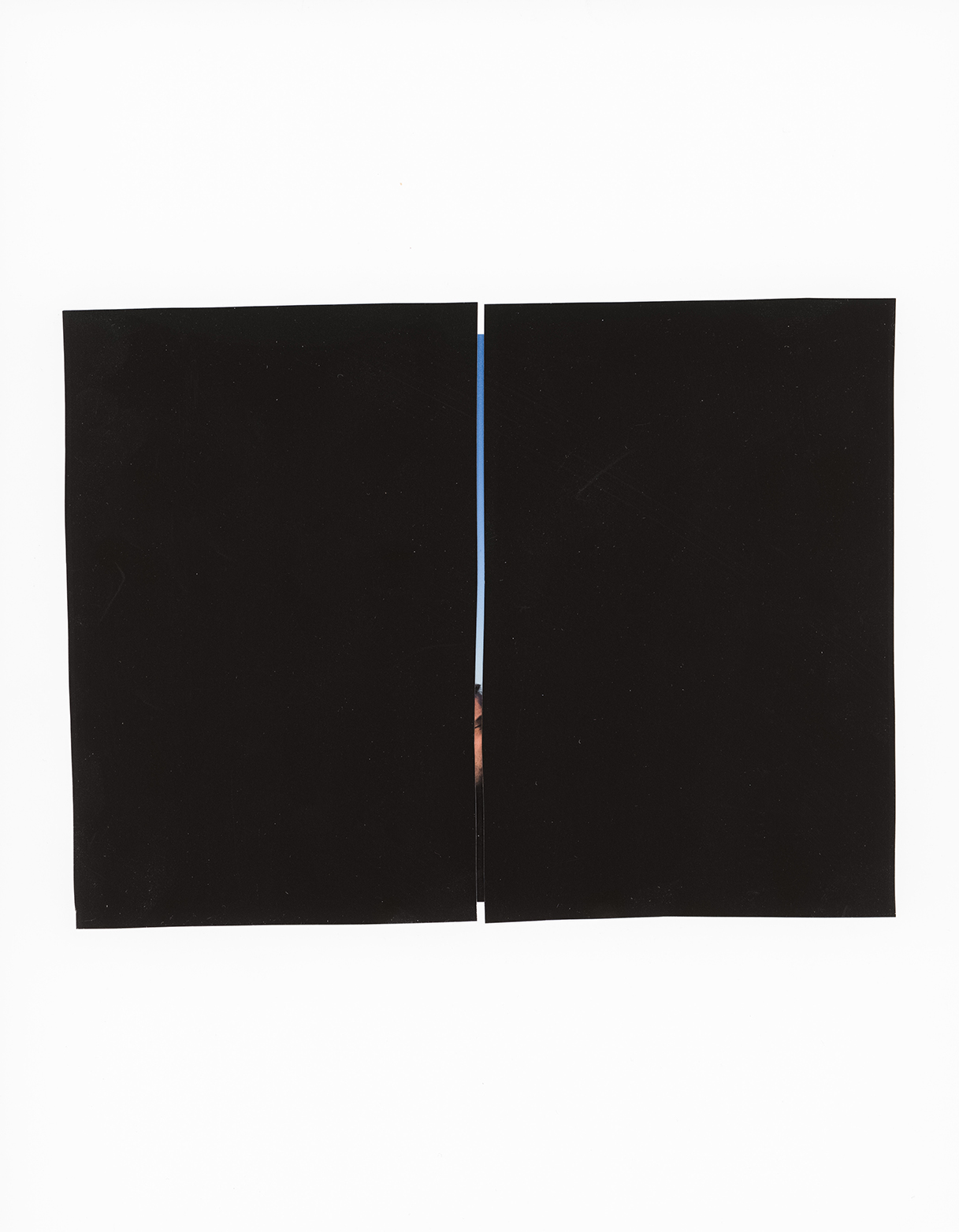
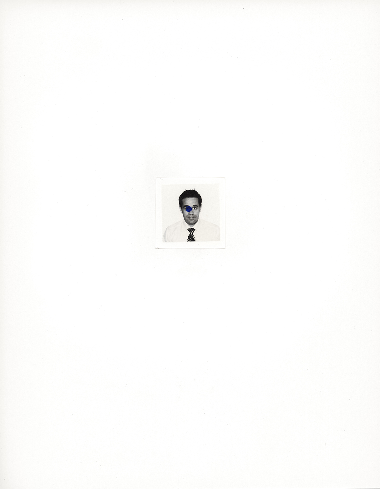
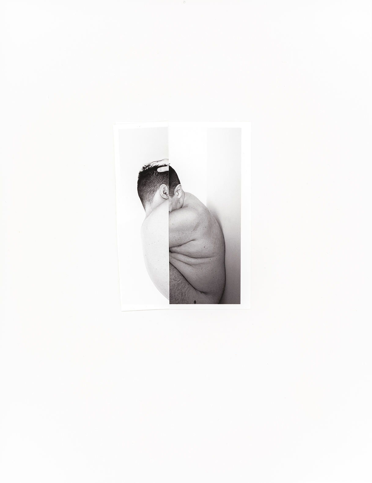
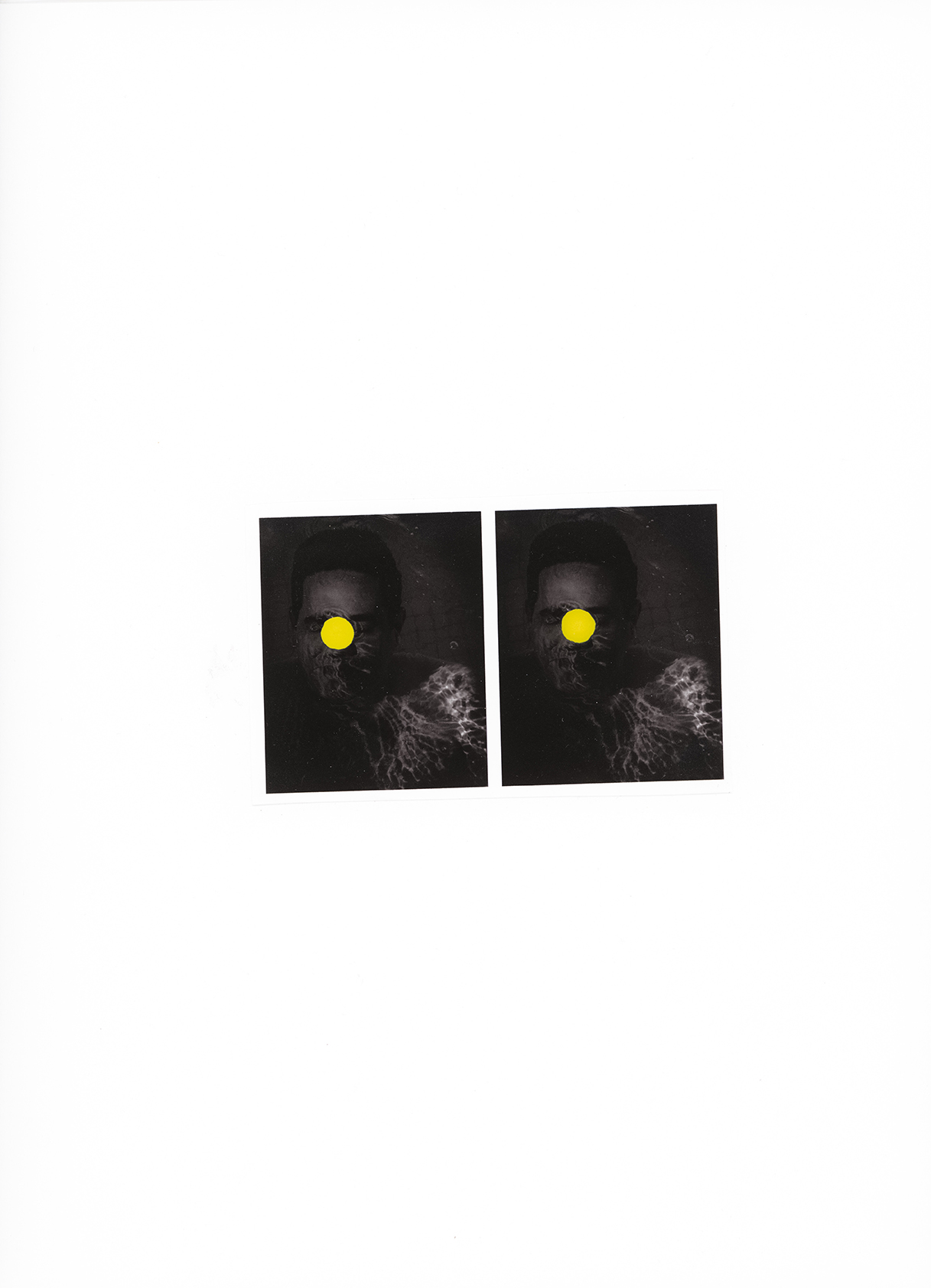
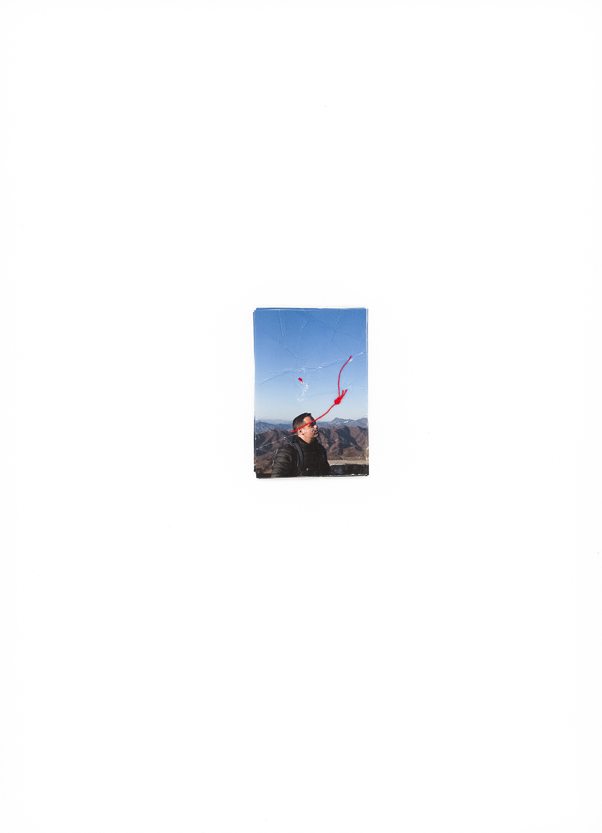
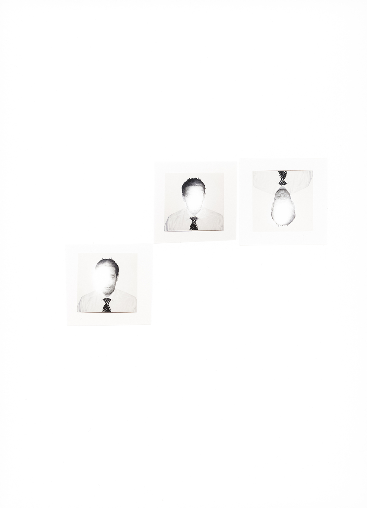
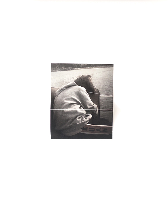
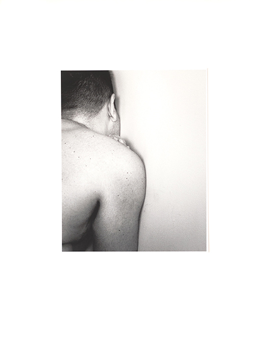
This project, about identity, is all about cutting and pasting. Slicing and replacing.

Cool stuff, and I’m sure you’ll like it.

See you next week!

The Art of the Personal Project: Published Books from this year interviews

The Art of the Personal Project is a crucial element to let potential buyers see how you think creatively on your own.  I am drawn to personal projects that have an interesting vision or that show something I have never seen before.  In this thread, I’ll include a link to each personal project with the artist statement so you can see more of the project. Please note: This thread is not affiliated with any company; I’m just featuring projects that I find.  Please DO NOT send me your work.  I do not take submissions.

Today’s featured artist: Holiday Photo Books as Gifts  2019


Andy Anderson: 

Salt:  Coastal and Flats Fishing Photography

https://www.barnesandnoble.com/p/salt-andy-anderson/1117795077/2675169959636?st=PLA&sid=BNB_ADL+Marketplace+Good+New+Books+-+Desktop+Low&sourceId=PLAGoNA&dpid=tdtve346c&2sid=Google_c&gclid=Cj0KCQiAiZPvBRDZARIsAORkq7d4lX7-sz1zs9M8rCs5RslEVa-JH7u_tecABhyqgEPHL0k3anX7J0EaAlI-EALw_wcB


Naomi Harris:

EUSA

http://naomiharris.com/eusa/


Mark Laita:

Serpentine

https://www.amazon.com/Serpentine-Mark-Laita/dp/1419706306


Eric Meola:

Fierce Beauty

https://www.amazon.com/Fierce-Beauty-Storms-Great-Plains/dp/1864708387


Max Hirshfeld

 Sweet Noise : Love in  Wartime


https://www.sweetnoisebook.com/store


APE contributor Suzanne Sease currently works as a consultant for photographers and illustrators around the world. She has been involved in the photography and illustration industry since the mid 80s.  After establishing the art buying department at The Martin Agency, then working for Kaplan-Thaler, Capital One, Best Buy and numerous smaller agencies and companies, she decided to be a consultant in 1999. She has a new Twitter feed with helpful marketing information because she believes that marketing should be driven by brand and not by specialty.  Follow her at @SuzanneSeaseInstagram

Success is more than a matter of your talent. It’s also a matter of doing a better job presenting it.  And that is what I do with decades of agency and in-house experience.


The Daily Edit – Tracy + David Stills and Motion

Tracy+David

Heidi: Were you both involved in photography prior to joining forces?
Tracy+David: We’re both former news photojournalists who left our staff photography positions at newspapers almost 10 years ago, and moved to Southern California to begin freelancing. David was formerly an Art Director and Photo Editor at The State Journal-Register in Illinois, before returning to grad school for visual communication through the Knight Fellowship at Ohio University. Following grad school, he started shooting full time as a staff photographer at the Naples Daily News in Florida (a medium-sized paper that was known for its strong tradition of documentary storytelling).

Tracy fell in love with photography in high school, practically living in the darkroom when she wasn’t in the pool (she was a serious competitive swimmer), and beat down the door of the local newspaper in New Haven, Conn., to learn the ropes of photojournalism when she was 16. After college and a number of summer internships at newspapers around the country later, she landed a job at the Naples Daily News where she met David. After a couple of years there, Tracy was offered a position at The Plain Dealer in Cleveland, as a staff photojournalist and sports photographer.

While we love what we do now and haven’t looked back, we’ve always felt that our work as photojournalists was the best bootcamp, where we problem solved all day everyday, learned to be extremely flexible and nimble, and learned to work with people from all different walks of life. We became extremely adept at working in a fast-paced, ever-changing environment, thinking quickly, staying calm in stressful situations, and creating large libraries of images under seemingly impossible deadlines.

Do you both shoot for each project?
Yes. We shoot together on almost every project, working as a team to get more images, angles, ideas, etc. Most often, we’re both shooting from different angles simultaneously, capturing essentially double the images and angles that one of us could do on our own. For this reason, we like to work with natural lighting or continuous lighting, if feasible, as it allows us to shoot at the same time. If we’re shooting with strobes or if it works better for a project, we’ll pass a camera back and forth, both directing and working a scene slightly differently to get a wider variety of images, but almost always, we both have a hand in creating images.

Occasionally, if we have an extremely tight schedule or we need to shoot at two locations at once, we’ll both shoot simultaneously on different sets/locations for the same project. In those cases, we aren’t together, per se, but are both shooting at the same time, and know very clearly what we’re trying to accomplish, how everything needs to fit together, and what the end goal is, so we’re still very much working as a team on the project.

Sometimes we’ll do an underwater shoot or a drone shoot, and one person might be underwater shooting images or flying a drone to get an overhead view, while the other is on land shooting from a different angle. We love to work together to photograph a project from multiple angles at once, and really enjoy getting to see the perspective the other person captured.

What are the best aspects of shooting as a team?
We’ve developed and share a cohesive vision and style, but we are still individually creative with unique ideas. We love that by having two sets of eyes and two minds working through ideas and projects, we can merge our perspectives together and come up with something greater than what we’d do individually. We (and our clients) also love that we can produce more work in the same amount of time than one of us could do on our own. Together, we push things further, find different angles, and push each other to see and think differently, which results in a better final product.

Are you able to turn off your photographic minds and conversation when you’re not working?
Many people often tell us that they couldn’t imagine working full time with their spouse, but now about 9 years into working together, we really couldn’t imagine doing this any other way. Our work is incredibly important to us, and we do find that creating a work/life balance is always a challenge. We pour so much into our work, that we’re often still thinking, talking about, and working on our projects when we’re technically supposed to be off. If we’re on a run or a hike with our dog before or after work, it’s rare that photography or something about the day doesn’t come up. We do make sure we have a number of activities and hobbies we like to do together outside of work as well, which really helps give us some down-time and keeps us connected personally so we aren’t simply business partners. We’re really fortunate that we can spend so much of our time together, and still love being with each other.

Best advice for any photo duo?
Find your individual strengths and figure out how to best divide and conquer — especially on the business side of things. We have many overlapping strengths but also different strengths that complement one another, and it took us a few years to understand what these were and how best to utilize them in the office and on set. We realized that we couldn’t both be equally good at everything, and that having each of us focus on developing certain skills that we gravitated towards would make us much stronger as a team. Once we figured this out, we became more productive and efficient, clearer about our roles, and ultimately much better individually and as a team.

The Daily Promo – Darren Carroll

Darren Carroll

Who printed it? How many did you make?
Smartpress in Minneapolis. I like them because they can do short runs, and offer a multiple-version option whereby there’s only one setup but, as was the case here, you can swap out multiple images. So for example here I had 100 cards printed of each of the 6 versions, but instead of charging the (higher) price for 100 cards 6 times over, the charge is just for a 600-card run.

I had a small, targeted list of about 150 creatives that I wanted to send these to, and not all of them really needed to get all 6 cards. So there were some who got all 6, but others who got only 2, 3 or maybe 4, depending on who they were and what kind of work I thought I could potentially get from them.

Who designed it?
I designed these myself.

Tell me about the images?

–The female golfer is an image from a shoot for the Dick’s Sporting Goods/Golf Galaxy golf catalog, which I’ve shot for the past 8 years each December. Even though the shoot is highly produced, we try to shoot everything on-location with natural light, using real people (we cast for low-handicap golfers), as the creatives at DSG and I insist on giving the images a realistic feel–when you’re trying to sell $500 drivers to a demographic that’s extremely educated about the product and the game, you don’t want to fake it because there’s no better way to turn off an audience than by insulting its intelligence.

The image of the kid playing basketball is also for Dick’s Sporting Goods, shot for a Christmas online and print ad showcasing the company’s Techgrip line of products.

–The tennis image is of Kei Nishikori at the 2018 U.S. Open; that year was the first year of the new Louis Armstrong stadium which meant that it provided an opportunity for some new pictures and new spots to shoot from. So I went and scouted it on my first day there, before the tournament started, both for positions and to see what the light did as the day went on. (For scouts, I usually take the SunSeeker app with me and walk around to various spots on and off the court to see where the sun is going to be and what potential there is for shadows, backlighting, etc. Same thing for golf courses I’m seeing for the first time.) It turns out that the way the stadium is oriented, there’s about a 5-minute window as the sun crosses the sky that the shadow from the (open) retractable roof parallels the south baseline in the morning, right about when the first match of the day starts. And within that 5-minute window, there are about 2 minutes where the light is just right, slicing in and hitting the player’s upper body and casting a long shadow, while also rendering everything behind the baseline dark. So I would put myself in a position on the concourse to make this frame during the morning match. But then, of course, you have to have a player serving, who has to be right-handed, on that side of the court, precisely during that 2-minute window, to make the whole thing work. I can’t remember how many times I had to go back before it all came together, but I do know for sure that this was not from the first day of play…

–The Tiger Woods shot was photographed at the Dell Match Play Championship this past March, where I was playing around with some new, silent Sony mirrorless gear so as not to incur the wrath of Mr. Woods.

–The black-and-white image of the charro is from a personal project I’m working on about charreria, a Mexican form of rodeo, as it’s practiced in Austin and San Antonio. I’ve had to take a little hiatus from it just because I haven’t had the time to devote to it lately, but it’s probably the most rewarding personal project I’ve ever done and I’m looking forward to getting back into it next year.

–The gentleman with the flag is Jose Luis Sanchez, a retired Marine sergeant who lost his left leg to an I.E.D. in Iraq. He ran and finished the 2017 Boston Marathon, carrying a pole with the flag he has draped around his back, which was given to him and signed by members of his unit. This was shot for the cover of Competitor Running magazine.

–The pit room portrait is of Leamon Parks at Wilber’s BBQ in Goldsboro, North Carolina, where he had worked for over 40 years. If you follow me on instagram you know that I’m a sucker for barbecue, but I’m even more of a sucker for the atmosphere and light in old-school barbecue joints and love to photograph them, just as personal work. My wife and I were visiting her family in North Carolina, and on our way to see her grandfather’s home town she insisted on taking me to Wilber’s, where she had gone with him as a kid. Without telling me, she told the manager about my interest in places like this, and he invited us to come to the back for a little tour. It was there that I met Leamon and asked if I could make his portrait.

–Zion Williamson is the basketball player. He was the top pick in this year’s draft; every year the NBA brings a large group of rookies together for a pre-season photo and video session, where they move from station to station shooting various portraits, league marketing materials, etc. I was there for Panini America, which holds the trading card license with the NBA, shooting portraits for his rookie card.

–The yoga image and the image of the woman in the blue truck are from personal test sessions.

How many times a year do you send out promos?
Not as often as I should. This was my only effort this year. This leads me to your next question…

Do you think printed promos are effective for marketing your work?
I think they can be, but I have to be more consistent. I’m shooting for a quarterly effort starting with these, which means my next one should go out in January. I do think that it can be a successful way to get my name and work out there if done regularly.

This Week in Photography: A Review of “newflesh”


Recently, my cousin Mike referred to my wife and me as “the last adults.”

(I think he meant it as a compliment.)

He’s 31, and has described in detail the problems that many Millennials face as 2020 approaches.

Between the travesty that is the student loan mess they’re all in, or a job market that went full freelance-independent-contractor-side-hustle when they got out of college, to the fact that certain segments of the economy never recovered after The Great Recession.

My other cousin, who grew up in the same town as I did, (and who’s also about 31,) had 15 (or so) high school friends die from overdoses related to pain killers or heroin.

That’s insane!

Kids who went to the same High School I did, and came from the same background (NYC-suburbs-American-ethnic-professional,) and they died by the thousands.

Because they had access to the pills in their parents’ medicine cabinets, and then later, to the cheap Mexican smack that flooded the country at just the wrong time. (For those kids.)

Add in the Climate Change catastrophe we’re all in, the fact our divided country is about to impeach a President, and that the robots are taking over, and it’s easy to see why some people might be pessimistic about the future.

Millennials in particular.

But it’s not all doom and gloom, is it?

As a father, one who is pre-disposed to look for signs of the positive out there, (Wall-E’s green shoots,) I have some ideas.

Some things are better than they used to be.

This, I know.

Off the top of my head, and as a middle-aged-heterosexual man, (does that make me cis-gender?,) I can point to the drastic improvement in the rights of the LGBTQ community here in America, and in its depictions in popular culture as well.

Before you tell me there is still a long way to go, let’s stipulate that. But at my age, I can remember growing up, and there were really no gay characters on TV at all, and most of mainstream gay America was closeted.

What few instances there were on TV were always unflattering. (Was Don Knott’s “Three’s Company” character, Mr. Furley, secretly gay I wonder?)

When “Will & Grace” came along in 1998, and I saw gay characters on TV who were depicted in positive ways, it was revelatory.

And I’m just speaking as an artist, and a person.

To have representation like that within the community, for the first time, must have been a big deal.

These days, classic LGBTQ shows like “Will & Grace” and “The L-word” are back, rebooted, because things have catapulted so far in twenty years. (Gay marriage, etc.)

Things have come SO far, in fact, that I recently binge-watched the excellent, underworld show “Animal Kingdom” on Amazon Prime, (originally broadcast on TNT,) and was barely surprised to see a plot line about a criminal, gay, SoCal surfer.

Including sex scenes.

When the character Deran Cody, who grew up in a family gang, finally gets ready to come out, (as he was super-conflicted,) his soft-hearted, surfer-bro, thug brothers embrace his sexuality easily.

As does his gangster Mom.

Even better, there’s a scene where one brother looks at some bikini-clad women, nods to Deran and says, “You’re really not into that?”

In reply, he looks at a half-naked-surfer-dude, nods to his brother, and says, “You’re really not into that?”

To me, that was proof that some things in the world are simply better, more open, more accepting, than they used to be.

But isn’t that what art is supposed to do?

Reach into the Zeitgeist, shake things up inside the Collective Unconscious, and come out with something fresh? Something relevant?

A Frankenstein’s monster of answers, wrapped up in the enigma of form and content.

I ask you, having just put down “newflesh,” a recent exhibition catalogue just published by Gnomic Book, curated and edited by Efrem Zelony-Mindell.

This book challenged me, and I want to admit that up front. I admire it, and like it in many ways.

I also have some problems with it.
But that makes sense.

This book represents art of the now.
Made by young people.

(In New York City in particular, but not exclusively.)

I kicked in a bit to the Kickstarter for this book, when I first saw it, because it seemed like a cool project.

And so it is.

When I was offered the chance to review it, I said sure, because I was certain it had to be interesting.

It’s a group show of what’s happening now.

How could that not be interesting?

So, what IS happening?

If the work in this book is to be believed, nothing and no one is ever to be “believed” again. Silly humans, using concepts like “truth,” “believe,” and “freedom.”

We robot cyborg overlords have no use for feelings. Flesh is weak, and we use it only to harvest the BRAINS we need to run our cyborg bodies.

Sorry.
Got off track there.

What I meant is, all this work is constructed, in one way or another. (Physically, digitally, or both.)

Some of them are a bit subtle for my taste, symbol-wise, but everything is cut and pasted, chopped and changed.

I loved the erased twin towers, silicon body parts, melting faces, plastic food, apples wearing orange skins, and intertwined bodies.

Taken together, the message is unmissable: in Trump’s America, one of dueling narratives, rather than objective reality, everything is built, even our identity.

That I haven’t mentioned yet that the book is intended to be about Queer identity is probably a strength, because it’s designed to be about rebellion, and challenging the status quo. About that energy that people of a certain age once called “Punk Rock.”

(As an adjective, not a noun.)

Mr. Zelony-Mindell’s writing alludes to identity as fluid, changing, among the young artists of today.

“These works…have many things in common; homosexuality is not one of them. And yet they are totally queer…They allow for imperfections and unfamiliarity. There’s a cleansing ability of clarity in that uncertainty.”

We hear a lot about that in media as well, with respect to Millennials and Gen Z.

Here in the art, we can see it with a lot of literal shrouding, and the layering of objects behind other objects.

Of silhouette and shadow.

My issue, such as it is, is that so much of the work does look alike. And has common roots.

From my pasture here in New Mexico, I can see the network connections between artists studying in the same art schools in New York. Columbia definitely, SVA I’d say, and probably Pratt. (Which now has a photo program built by a Columbia grad, Stephen Frailey, whose work features in the book too.)

I see Yale, I’d venture, and definitely the Charlotte Cotton, “Photography is Magic” school of art.

Moment of truth: I was definitely NOT surprised when she popped up with a letter, mid-way through the book, which used a lot of words to not say very much.

My other biggest takeaway, honestly, is the bleak vibe I got turning the pages.

It’s not a criticism. Let’s be clear.

Rather, it brings us back to where we started today.

If we see this book as a generational mood-ring, as a barometer of the vibe out there, I’d say it’s pessimistic for sure.

Lots of this art was abstracted, which means I have to go on feeling, rather than idea.

By suggestion, rather than direction.

And if the American Empire is indeed on the decline, (of course it is,) and if this generation of Americans will have a lower standard of living than their parents, (seems likely,) and if the planet is rebelling against us at the current moment, (somewhat obvious,) then this is the kind of art young people would make.

Isn’t it?

Where’s Obama with his Hope and Change when you need him?

Bottom Line: An excellent, queer, hyper-current exhibition catalogue from New York

To purchase “newflesh” click here 


If you’d like to submit a book for potential review, please email me directly at jonathanblaustein@gmail.com. We are interested in presenting books from as wide a range of perspectives as possible.

The Art of the Personal Project: Michael Greenberg

The Art of the Personal Project is a crucial element to let potential buyers see how you think creatively on your own.  I am drawn to personal projects that have an interesting vision or that show something I have never seen before.  In this thread, I’ll include a link to each personal project with the artist statement so you can see more of the project. Please note: This thread is not affiliated with any company; I’m just featuring projects that I find.  Please DO NOT send me your work.  I do not take submissions.

Today’s featured artist:  Michael Greenberg

Climbing Sherpa’s: Everest’s Heroes

These are the giants whose shoulders serve as the stepping-stone for westerners to become hometown heroes by summiting Everest. Little consideration goes to the climbing Sherpa’s who make sure the conditions are safe. They do the heavy lifting and take on the bulk of the risk. The Sherpa’s are the front line and have lost friends and relatives. The westerners do it for the challenge, thrill, bragging rights, and fame. The Sherpa’s do it because it’s the biggest paycheck available to feed their families.

Dasonam Sherpa
53yrs old
Summited 10 times ’97, ’98, ’99, ’02, ’05, ’06 (twice), ’07, ’08, & ’10
Saw the 2012 Khumbu ice fall accident from the Lola side where 16 climbing sherpas died. Decided to retire.
Owns 4 yaks and uses them to transport goods for Everest expeditions.
Ang Tshering Sherpa
64yrs old
Summited 3 times ’96, 2000, & ’01
Started at age 40 “to get rich”
Retired in 2004 after having an accident in 2002 where he fell 35m through the ice carrying 9 empty oxygen tanks he was transporting them down to replace.
Ang Dorje Sherpa
49yrs old
Summited 19 times
Was the climbing Sherpa for Rob Hall’s Adventure Cunsultants 1996 Everest expedition in 96 when a storm lead to the deaths of 8 climbers. The story from Everest / Into Thin Air
Currently a mechanic in Boise Idaho
Lakpa Dorjee Sherpa
63yrs old
Summited once May 14th 1983
He guided 3 climbers to the summit. The climbers abandoned him at the summit without equipment to get down. All he had was a “crumby old ice axe”. Fell and rolled down about 300m. Lost consciousness and woke up hours later without his goggles or axe, meters from the cliff. Rested 10 mins had some water. couldn’t sleep all night wondering who is going to take care of his parents when he dies, when he woke up he prayed “I’m sorry but thank you for chumulumu for saving my life” (Nepali name for god?) Remained a climbing sherpa on other mountains but refused to ever summit Everest again despite be offered more money. Kept his promise.
Kanchha Sherpa “The Living Legend”
Age 87
Summited 7 times- ’53, ’63 (twice), & last time in ’71
Last living Climbing Sherpa from Sir Edmund Hillary’s May 29, 1953 climb. The first successful summit of Mount Everest. He was 20yrs old when he snuck out of his parents’ house to meet up with Tensing Norgay in Darjeeling because he heard Tensing “had a job”.

To see more of this project, click here.

APE contributor Suzanne Sease currently works as a consultant for photographers and illustrators around the world. She has been involved in the photography and illustration industry since the mid 80s.  After establishing the art buying department at The Martin Agency, then working for Kaplan-Thaler, Capital One, Best Buy and numerous smaller agencies and companies, she decided to be a consultant in 1999. She has a new Twitter feed with helpful marketing information because she believes that marketing should be driven by brand and not by specialty.  Follow her at @SuzanneSeaseInstagram

Success is more than a matter of your talent. It’s also a matter of doing a better job presenting it.  And that is what I do with decades of agency and in-house experience.


Pricing & Negotiating: A Corporate Lifestyle Project With an Expanding Scope

Craig Oppenheimer, Wonderful Machine

Concept: Corporate lifestyle images of employees at work

Licensing: Collateral use of 30 images in perpetuity

Photographer: Portraiture specialist

Agency: Mid-sized, based in the Midwest

Client: Large law firm

Here is the estimate:

Corporate lifestyle photoshoot initial estimate.

Creative/Licensing Fees: The project started like many others I’ve seen. A law firm needed corporate lifestyle images of their employees at work within their offices. Based on the brief we received, we decided that two shoot days would be necessary to check off all the boxes and to make sure that all the key employees were available to participate. They hoped to license 30 final images, primarily for use on their website and for other collateral purposes. Based on my experience on other similar projects, I anticipated that a fee somewhere between 4-5k/day, or a few hundred dollars per image would be appropriate, despite the perpetual duration requested. I decided to include $4,500/day, or $300/image, to arrive at a creative/licensing fee of $9,000.

Scout/Pre-Production Days: I included $1,000 to account for the photographer’s time to look at the location prior to the shoot, and discuss the project with the agency/client.

Assistants: We wanted to keep a relatively small footprint, and we included one assistant who would play double duty as a digital tech, as well as a second assistant to lend an extra pair of hands for both shoot days.

Hair/Makeup Stylist: We anticipated the need for light hair/makeup styling, and included a stylist for both days.

Equipment: This included the photographer’s camera, grip, and lighting equipment for both days.

Mileage, Parking, Meals, Misc.: We anticipated $35 per person per day for the crew for meals, and included approximately $100/day for mileage, parking, and unforeseen expenses that might arise.

First Edit for Client Review: This included the photographer’s time to do an initial edit through everything captured, and provide a gallery of content for the client to review.

Color Correction, File Cleanup, and Delivery of 30 Selects by FTP: We based this on $50/image for the light post-production that the photographer would perform on the selected images.

Feedback: The agency was receptive to the fees/expenses and told us that there was a chance this project could potentially grow in scope, but they needed to continue the conversation with their client. About two months later, they finally got back in touch to inform us that they wanted to expand the project to include five cities. Additionally, rather than corporate lifestyle images, the creative scope shifted to focus more on environmental portraits of individual employees, and there were 353 employees collectively in each of the five different cities/offices. While it wasn’t completely dialed in, we acquired a rough breakdown of approximately how many people were in each office and developed a plan for ten shoot days. Five days would be at a location local to the photographer, and the rest of the shoot days would be at a mix of locations, a few of which required a bit of travel.

Here was the revised estimate we sent:

Second estimate for corporate lifestyle photoshoot.

We included a breakdown of subjects in each city along with an itinerary to ensure we were on the same page with the agency regarding the approach for the project. Since the scope changed to individual portraits, I thought that each image might be a bit less valuable than evergreen corporate lifestyle shots, and there was less of a chance they’d use a portrait of a lower-level employee as the face of any larger marketing campaigns. I decided to go with $100/image totaling $35,300, which also broke down to just over $3,500/day, and I felt this was reasonable given the additional fees the photographer would make for their travel days, equipment and post-production time.

For the crew, I broke out separate prices for travel days and shoot days for the first assistant/digital tech, who would be traveling with the photographer. We anticipated hiring local second assistants in each market, and while the plan was the same for the hair/makeup stylist, we included a slightly higher rate for them for a shoot in a larger market that would demand a higher fee for such a role. We kept equipment charges modest compared to the first estimate since the photographer owned his gear, and used Kayak.com to estimate travel expenses. For post-production, we brought the per image fee down from $50 to $25 for the color correction and file cleanup.

After reviewing the estimate, the agency let us know that they wanted to add back in the corporate lifestyle shots, along with some group photos of staff and detail shots of the office environments as well. However, they only wanted to do this at their headquarters where most of their staff was, and focus solely on the individual portraits at the other locations. We submitted the following revised estimate:

Third estimate for corporate lifestyle photoshoot.

In order to accomplish the new project scope, we felt that we would need two additional days at their headquarters, which was the location local to the photographer. Additionally, we needed to account for 24 additional images. While I discussed pushing the fee higher with the photographer, I also wanted to stick around the $3,500/day mark even though I felt the value of these additional 24 images was higher than the individual headshots. We also wanted to include a slight discount in return for a commitment to hiring the photographer for so many days. Ultimately, we landed on $42,500 as a creative/licensing fee, which was based on a candid conversation with our agency contact on what would be palatable to the client.

Additionally, we were asked to remove the hair/makeup styling, and were informed that they had hoped for us to stay around an 80k bottom line. We removed the styling, dropped equipment down a bit, and came down even further on the post-production on a per-image basis (while still including what we felt was appropriate overall for the time dedicated to retouching).

The project was awarded, and the shoot went off without a hitch.

If you have any questions, or if you need help estimating or producing a project, please give us a call at 610.260.0200 or reach out. We’re available to help with any and all pricing and negotiating needs—from small stock sales to large ad campaigns.