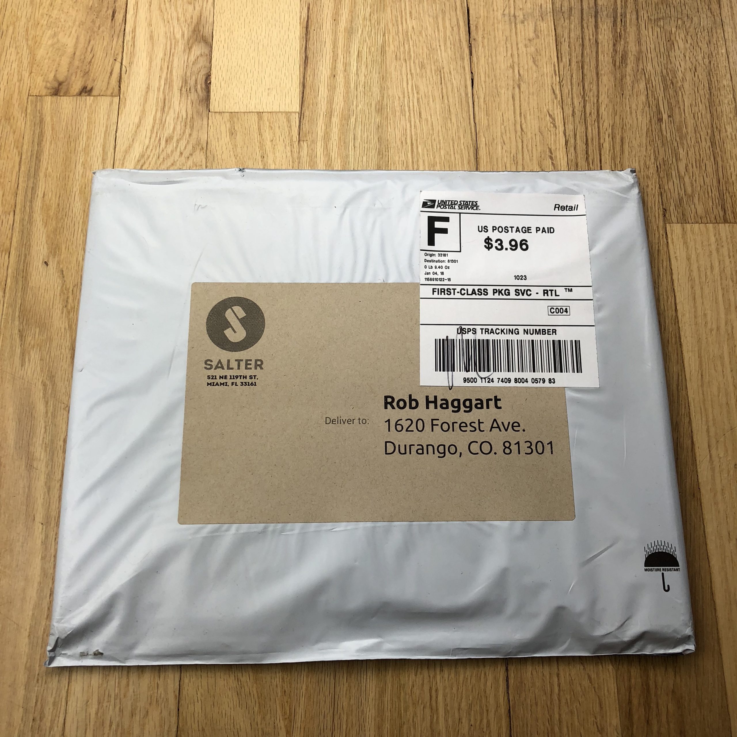
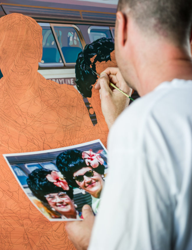
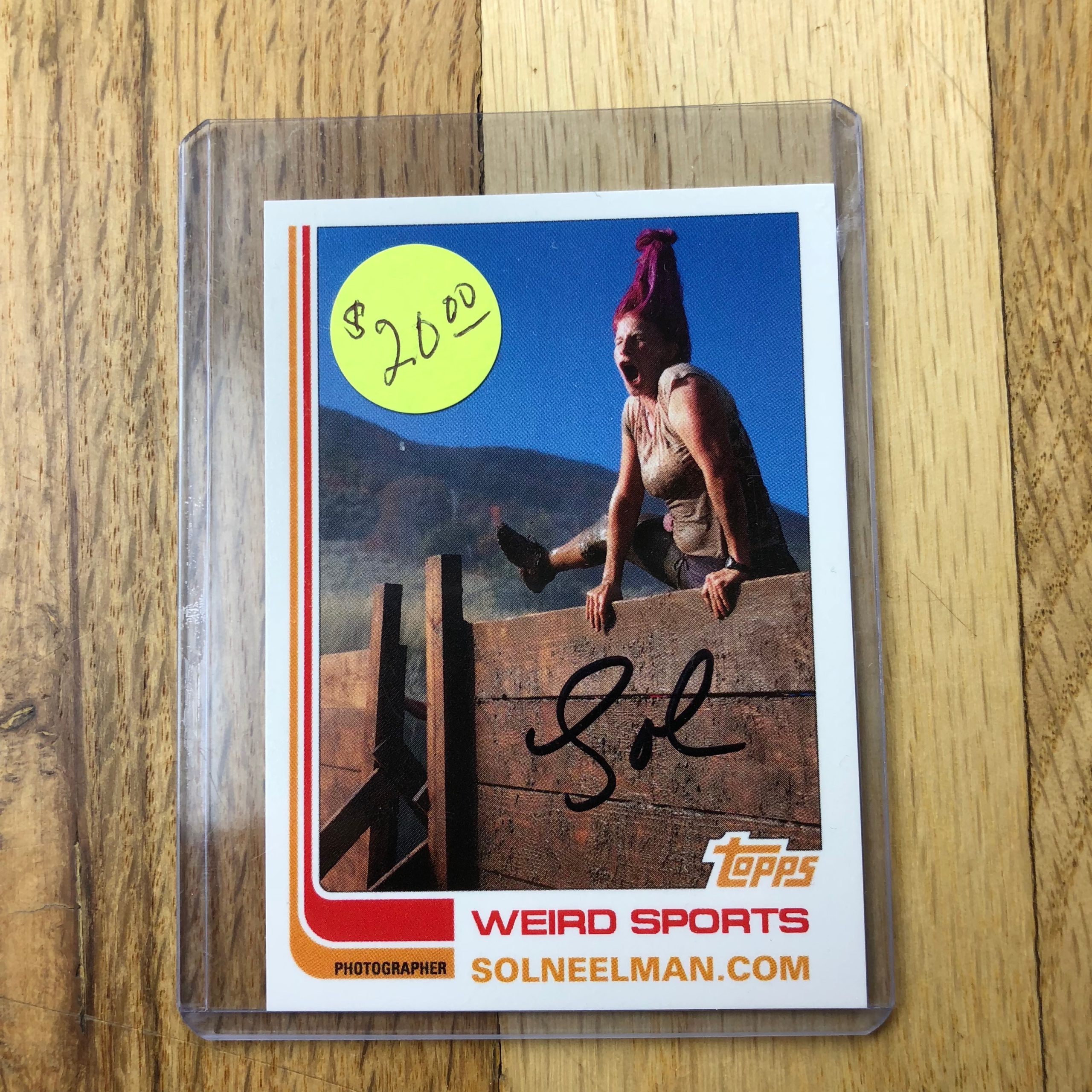
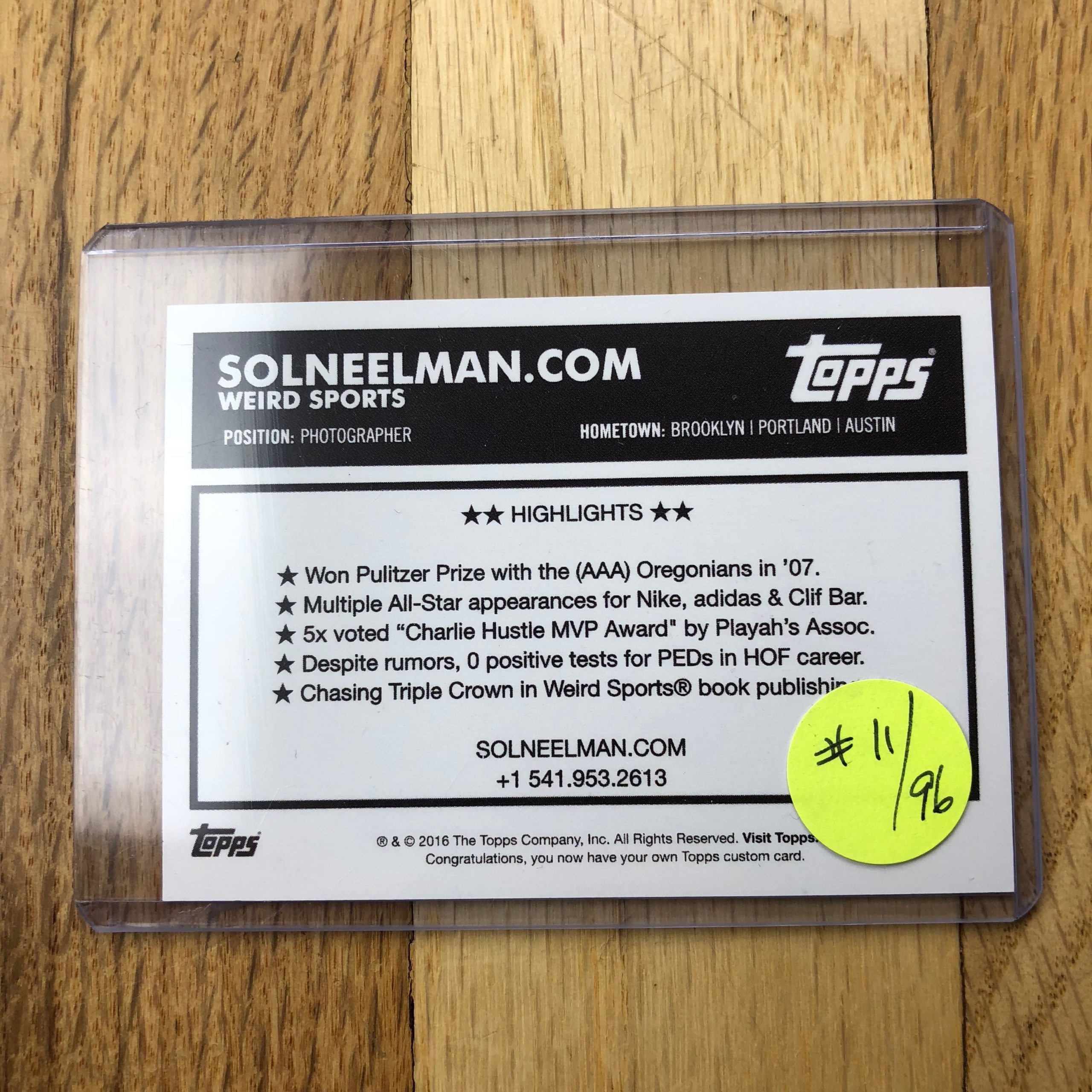
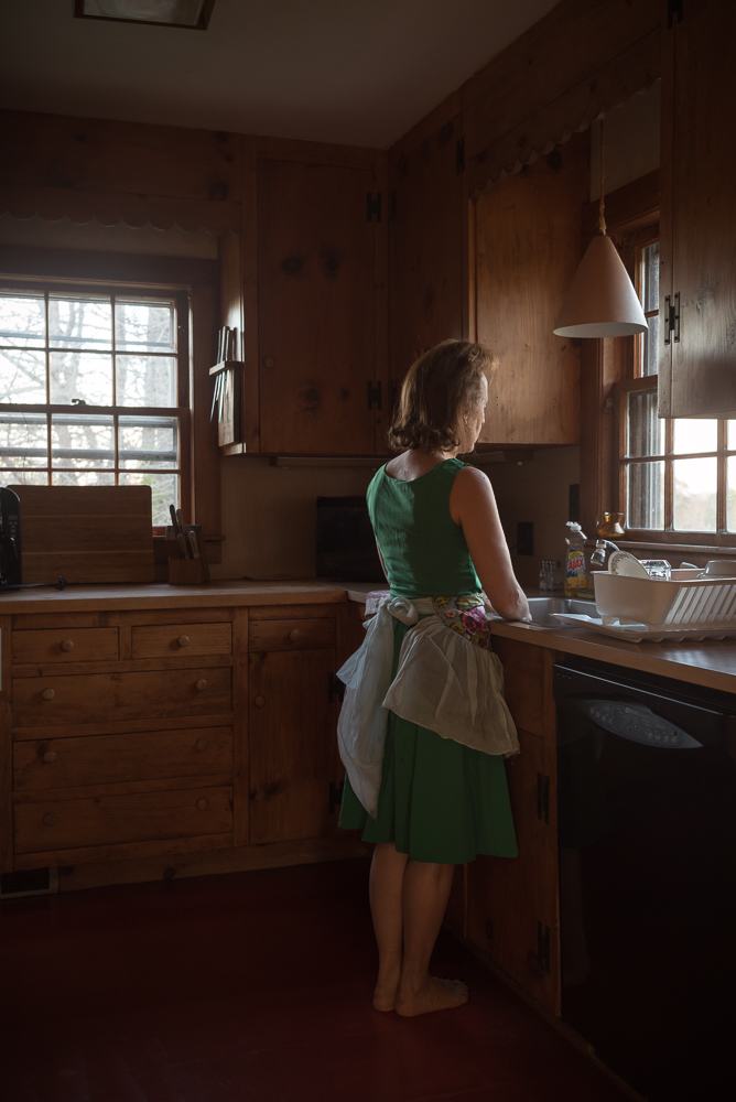
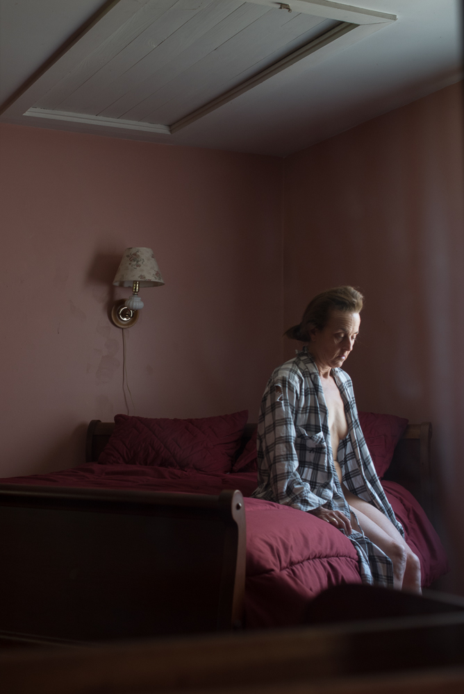
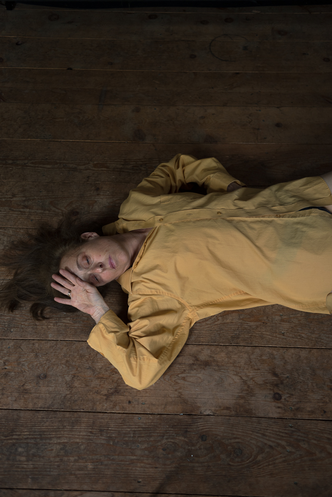
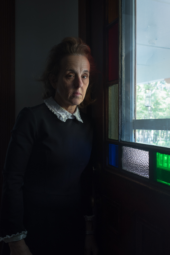
Who printed it?
Anthony Wright who is the owner of Aw Litho a printing firm which specializes in high end offset printing. He’s been doing this for 10 years and is a master of his craft.
Who designed it?
I was blessed to have Heidi Volpe layout and design the promo. She has the wonderful ability to see clarity in chaos combined with an admirable amount of patience. It took me quite a while to choose which images to show. It was great to have an objective pair of eyes of a good editor to select, organize and paginate. She saw connections and relationships in feeling, light, color, mood, textures, and tone in my photographs. Heidi is currently the design director of Vogue India.
I would prefer to be out taking pictures, it can be difficult for me to sit still at computer culling and editing images. What really helped me with the initial image selection was printing 8 x10s and taping to them my office wall. Seeing the images every day, reminded me that sometimes the most dramatic image wasn’t necessary the picture which lingered in the mind.
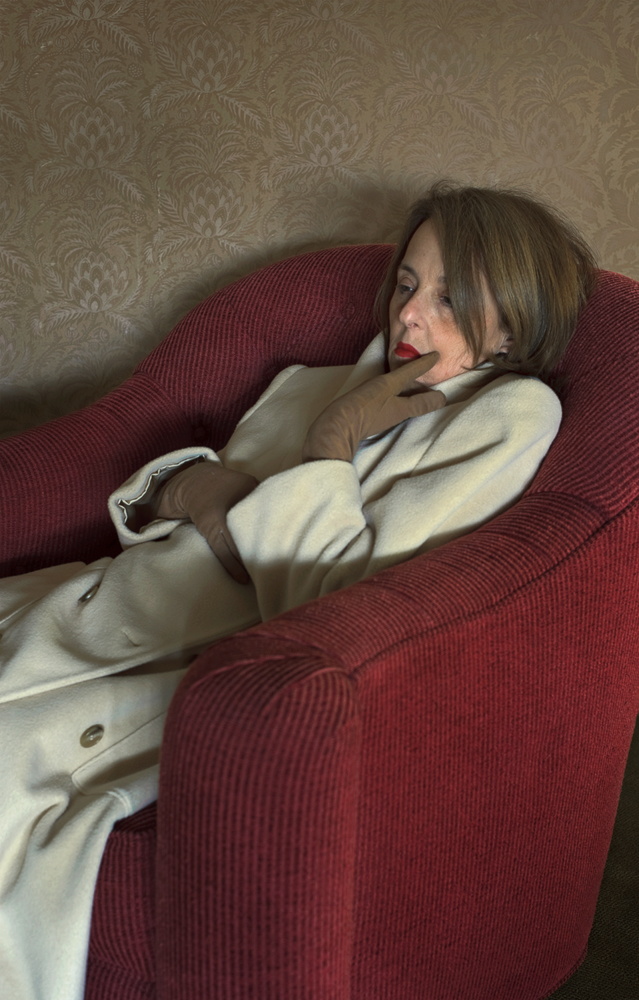
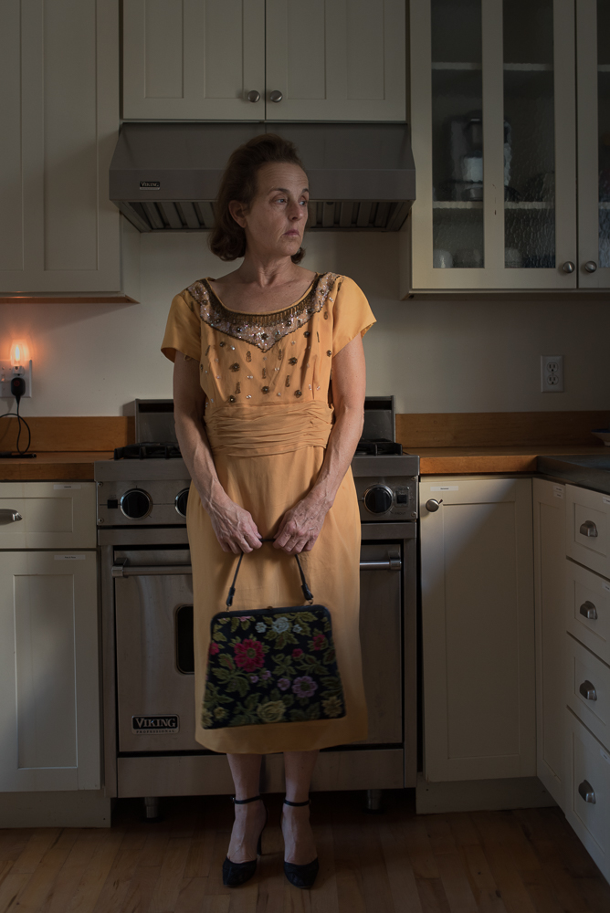
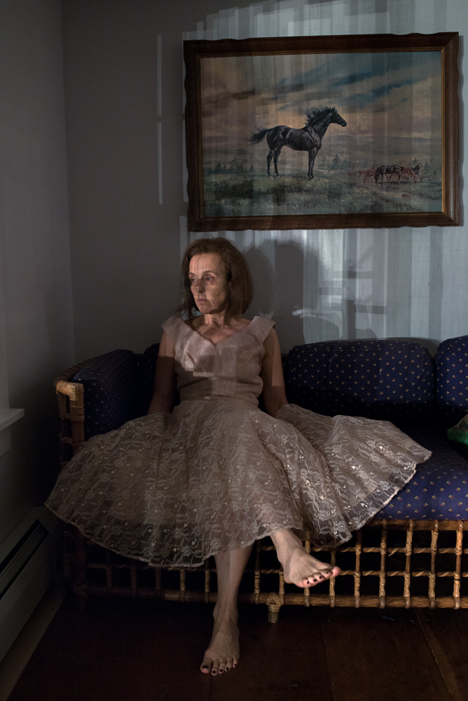
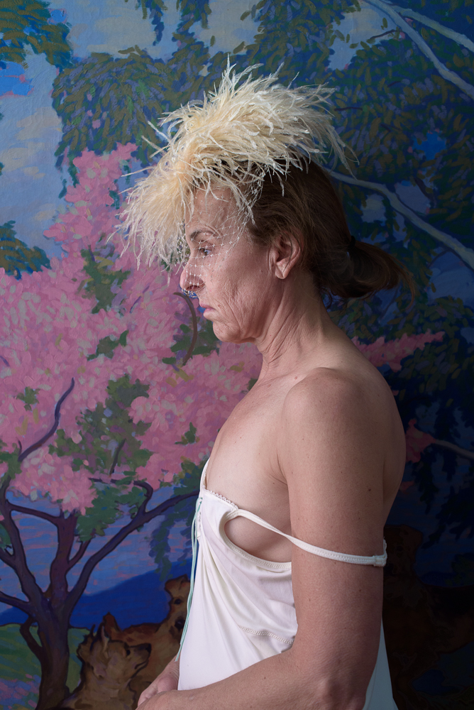
Tell me about the images?
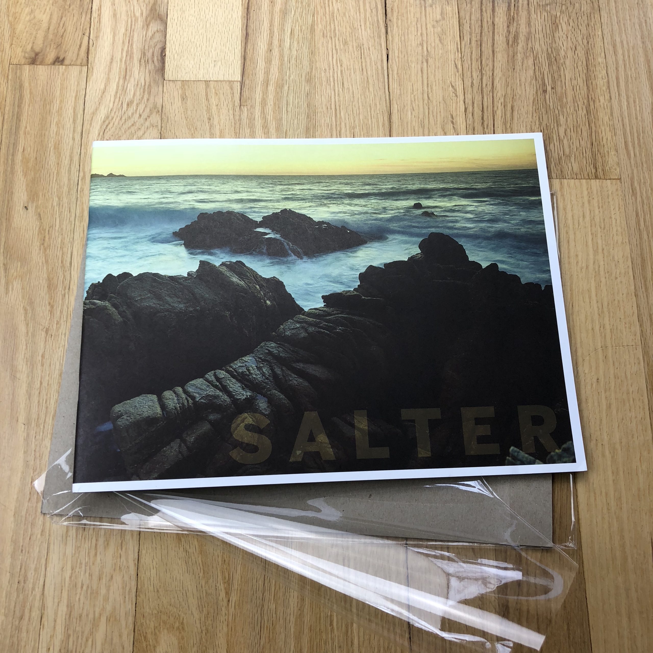
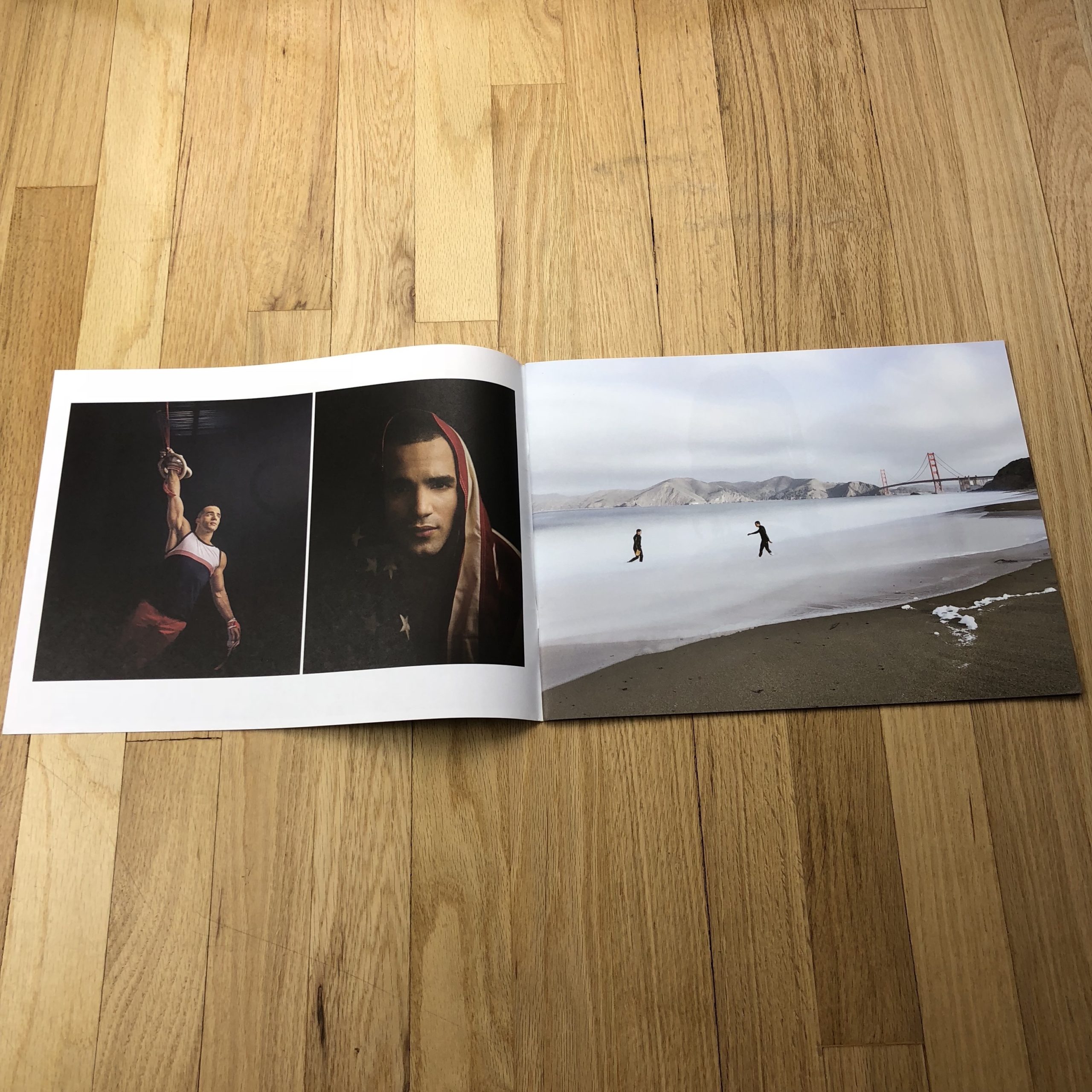
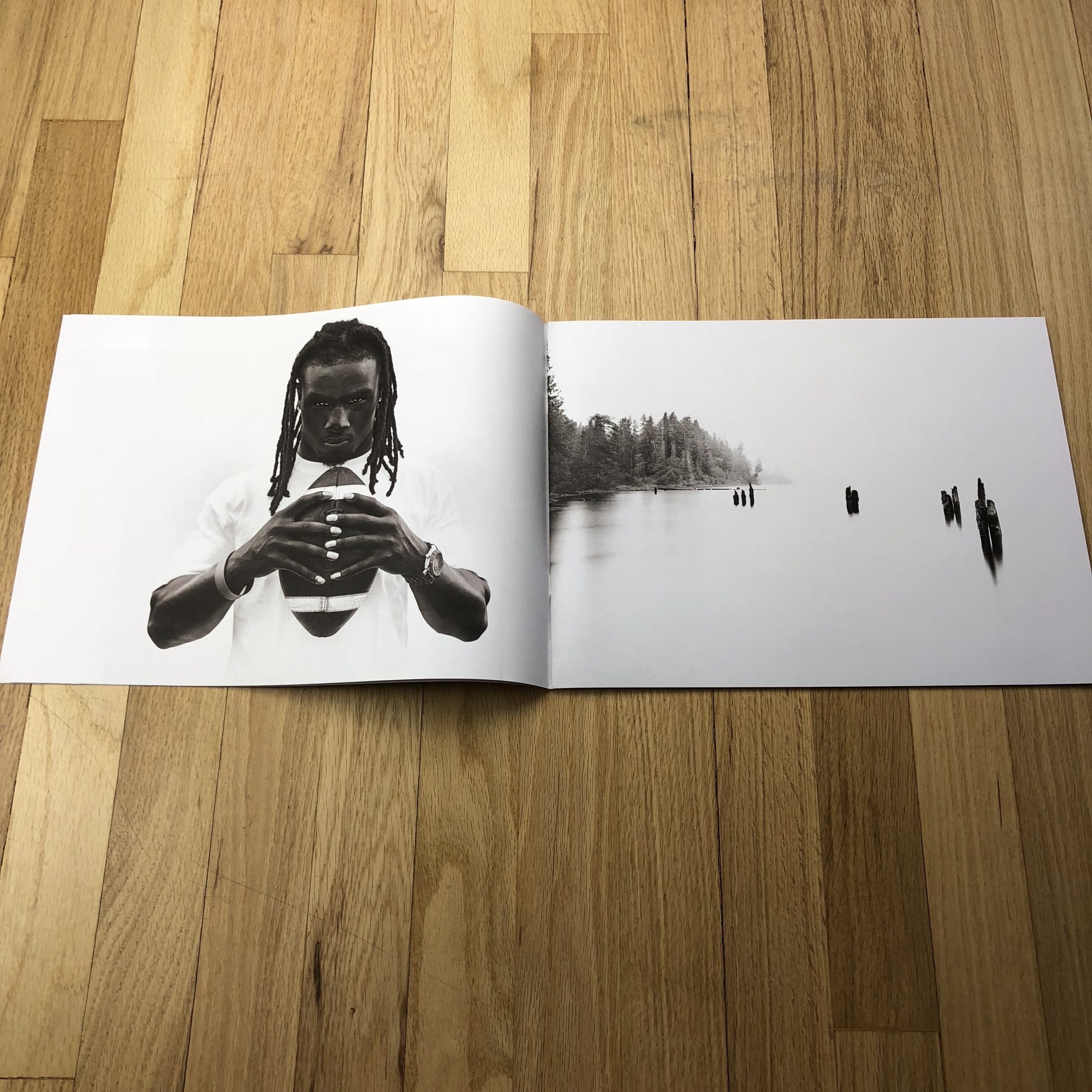
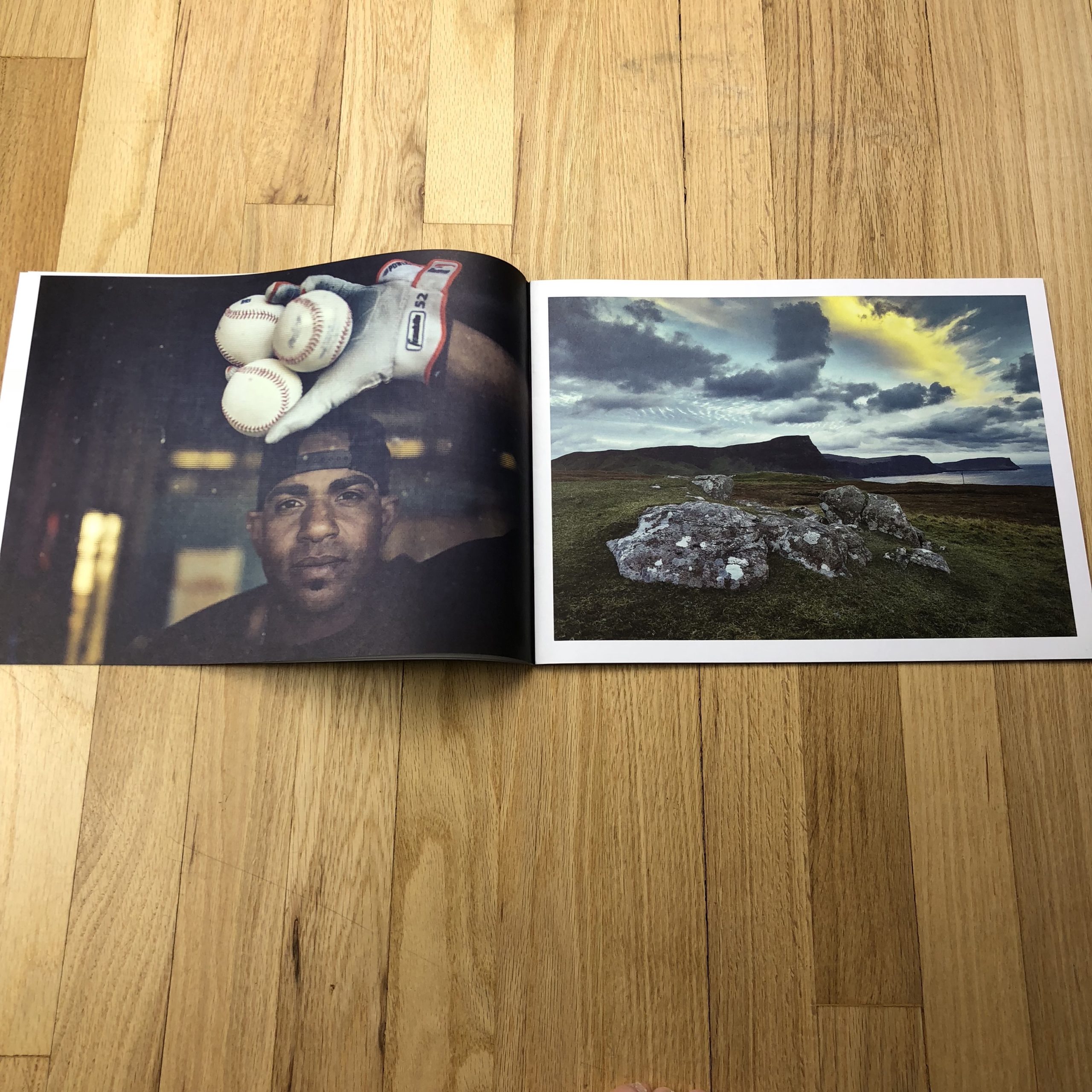
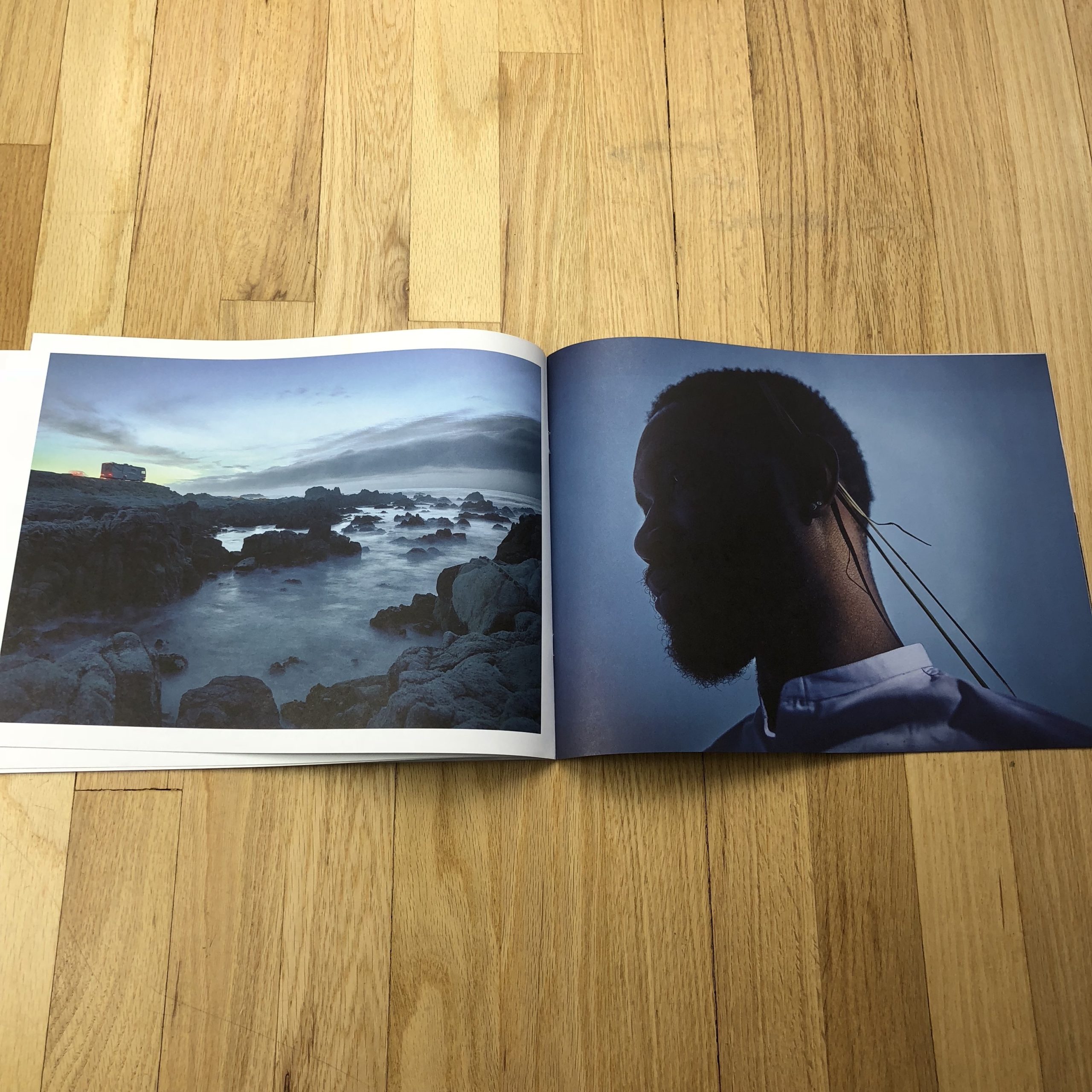
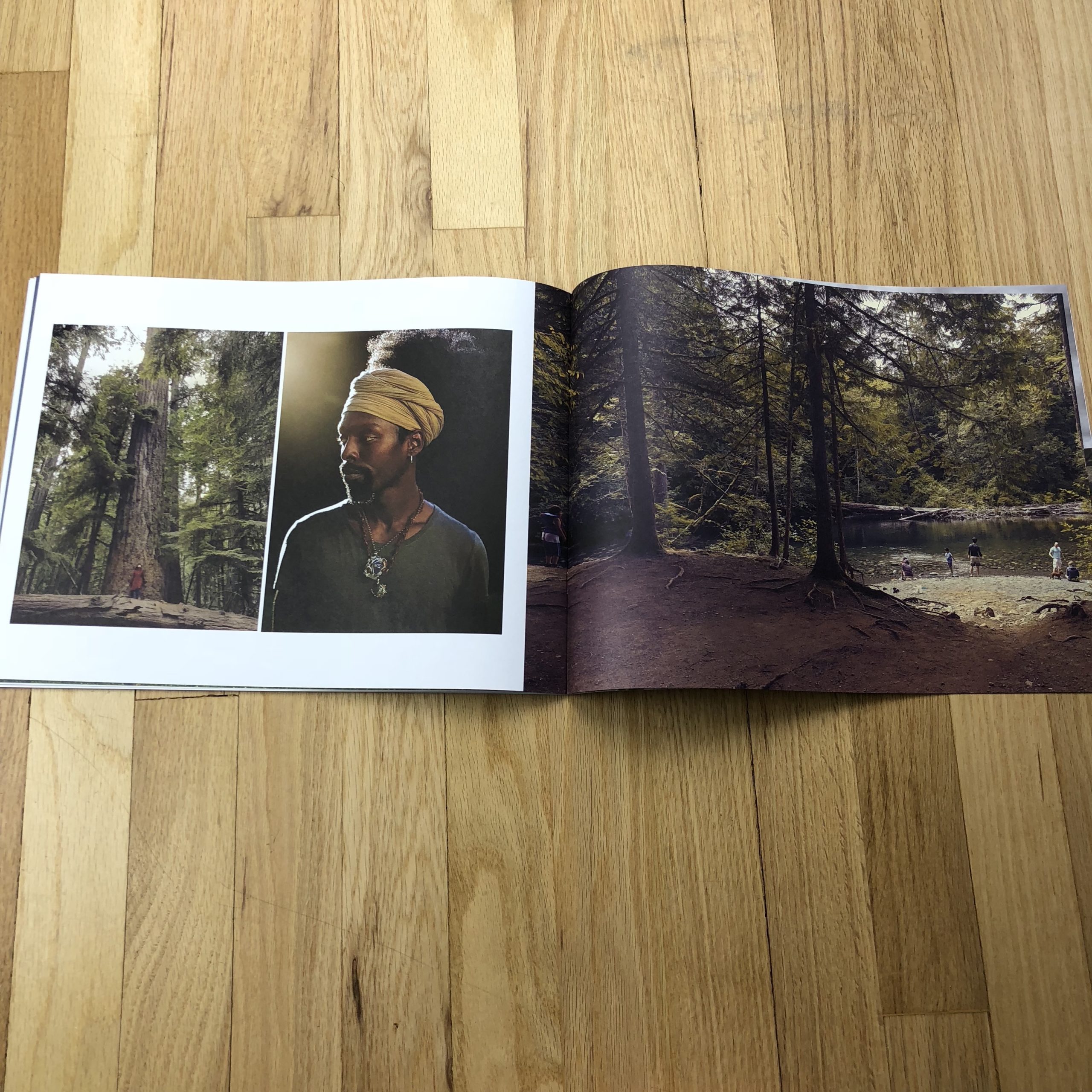
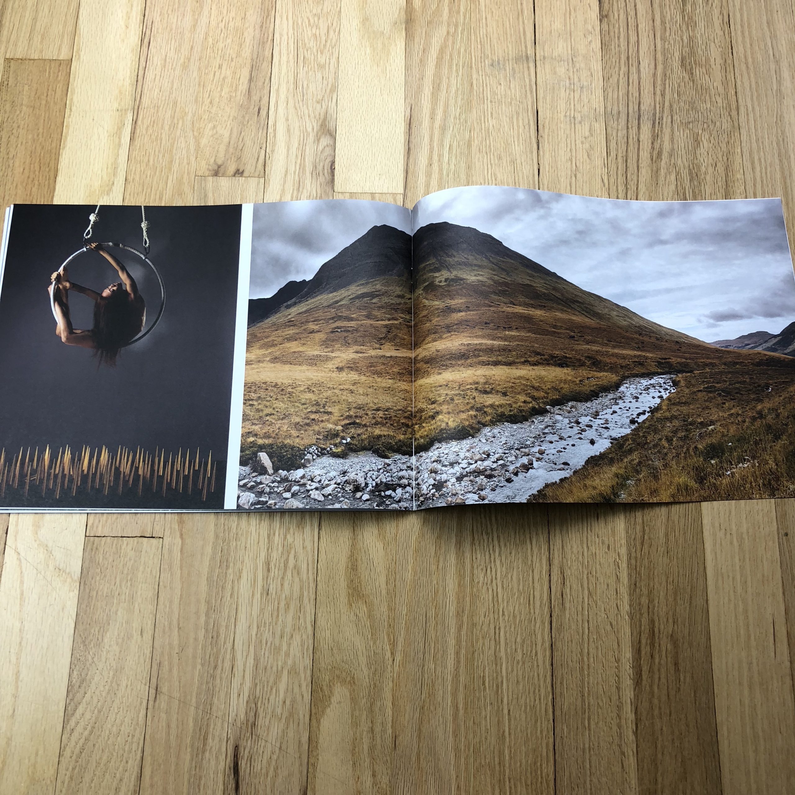
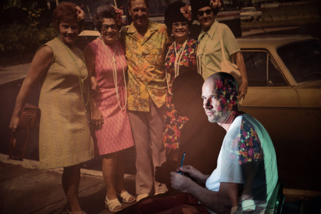
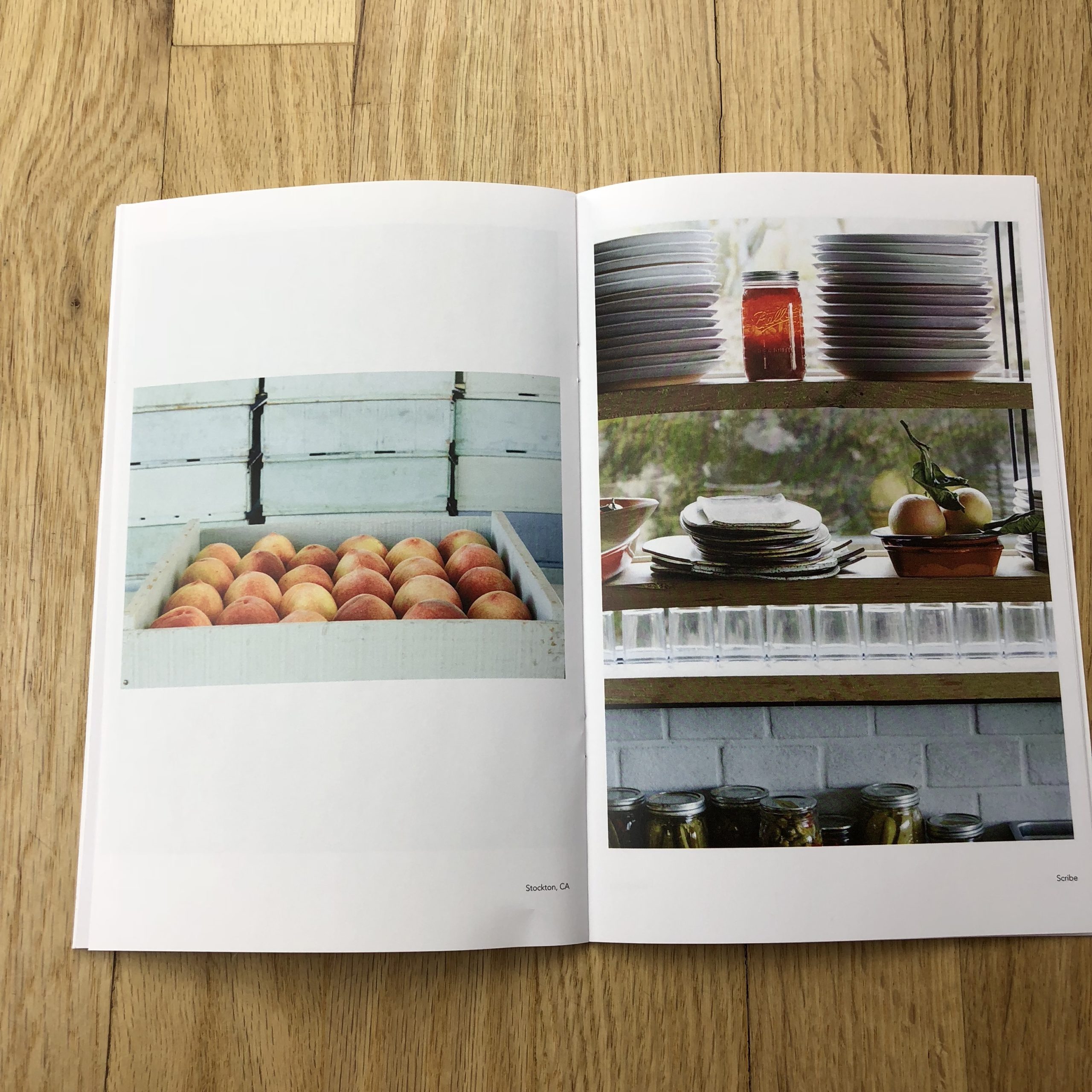
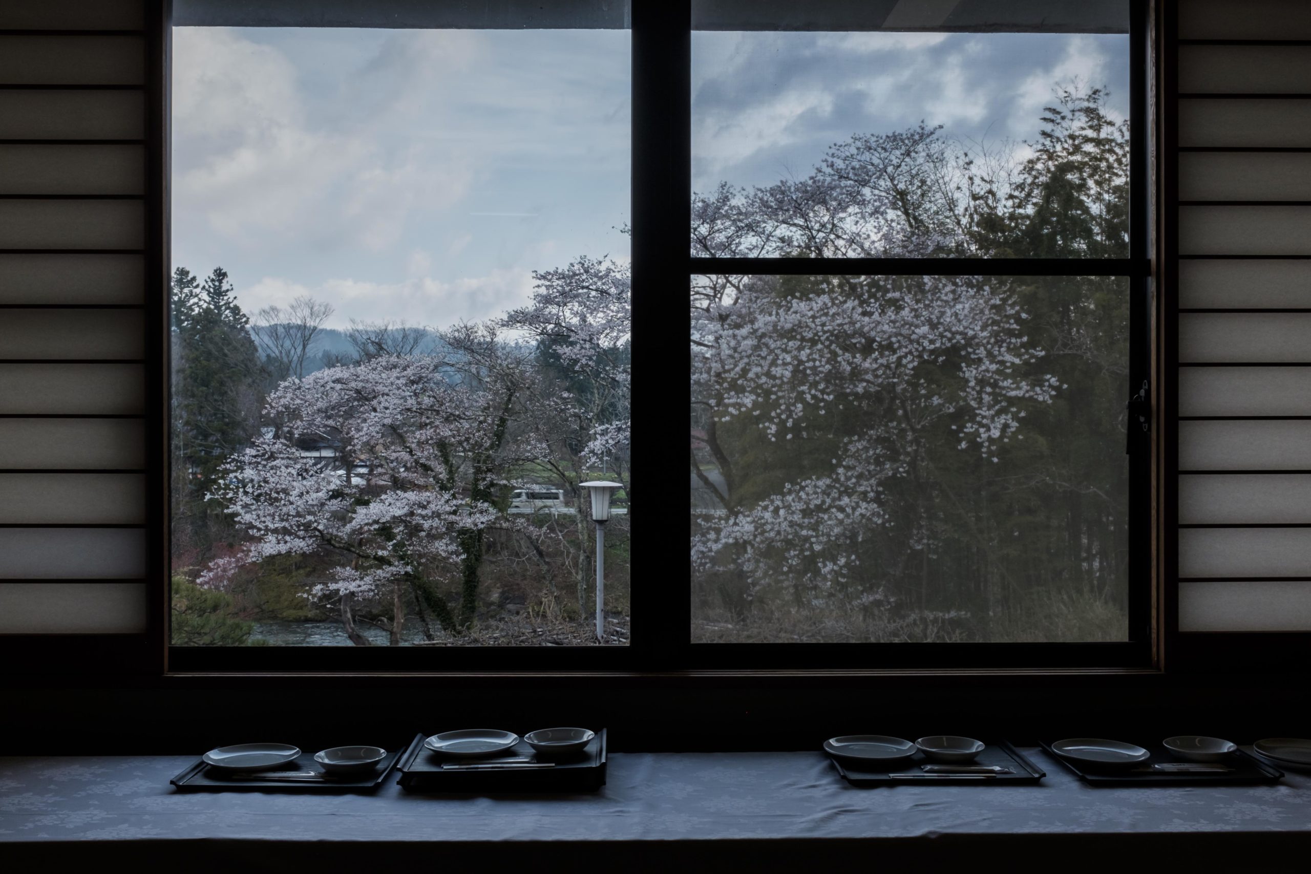
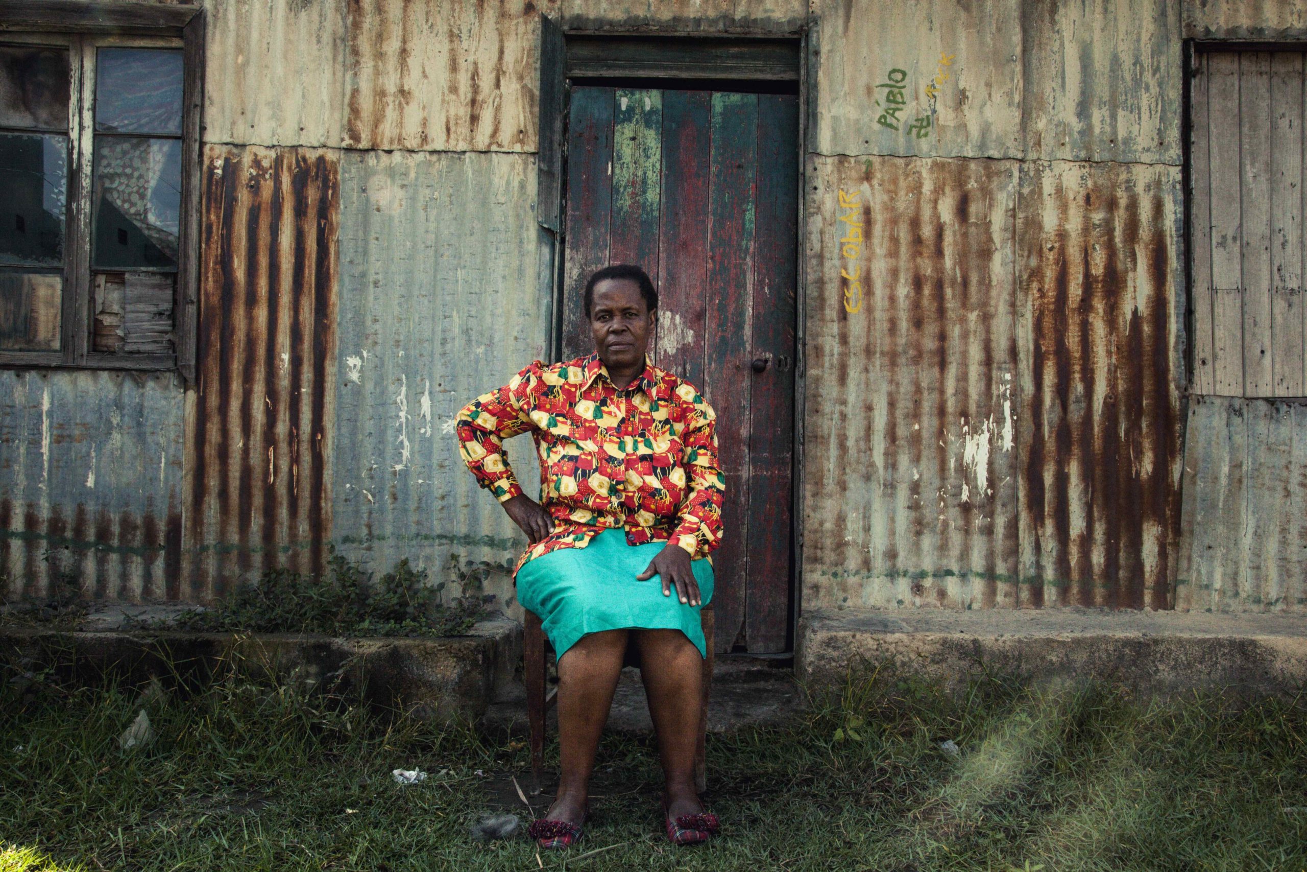
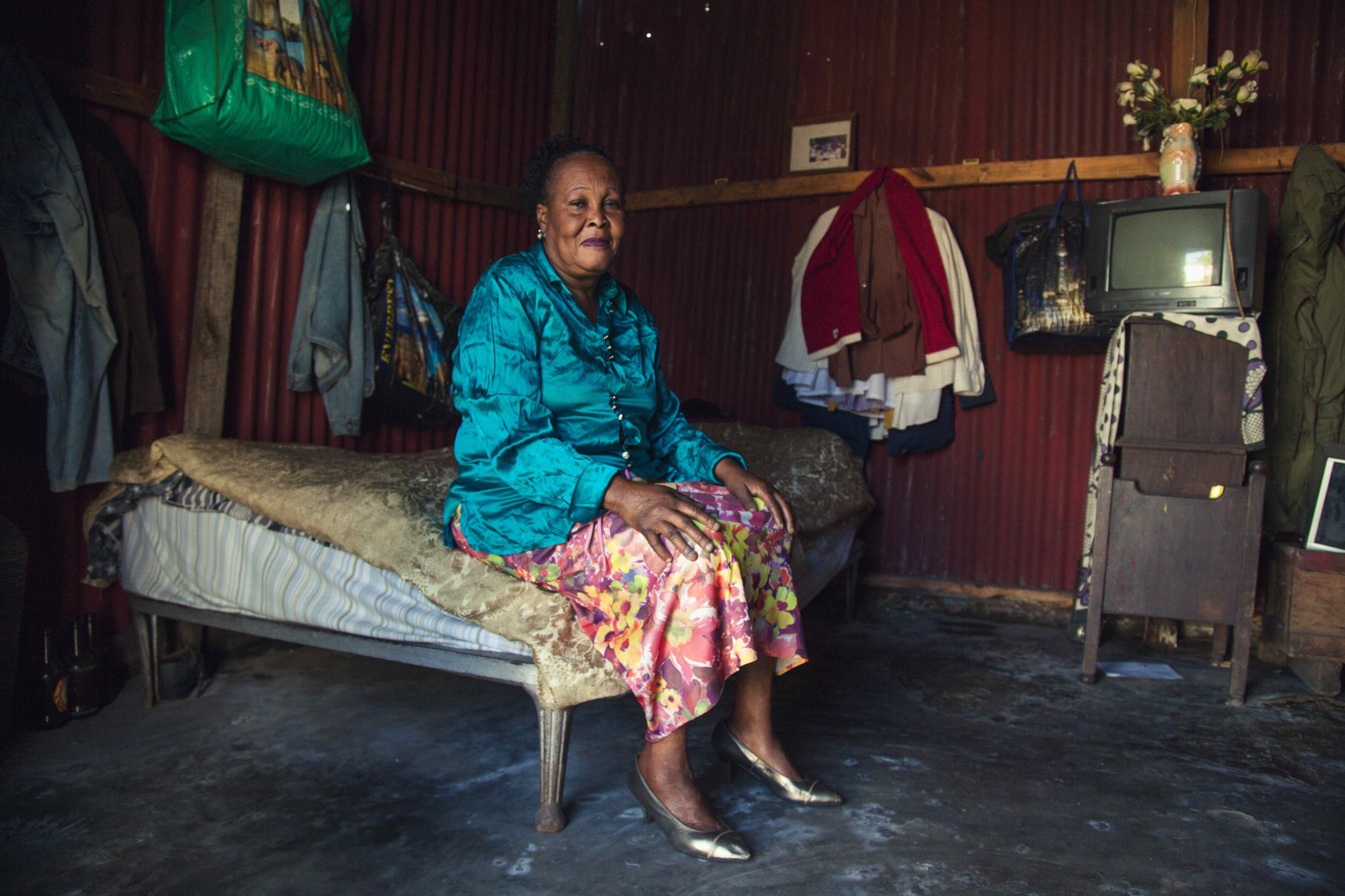
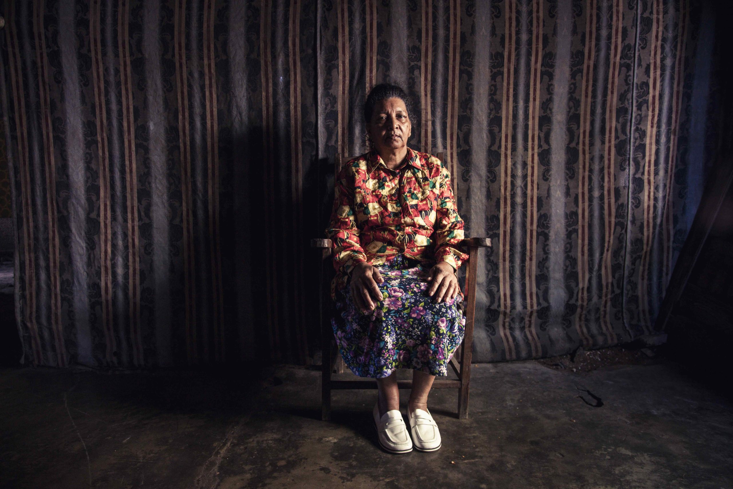
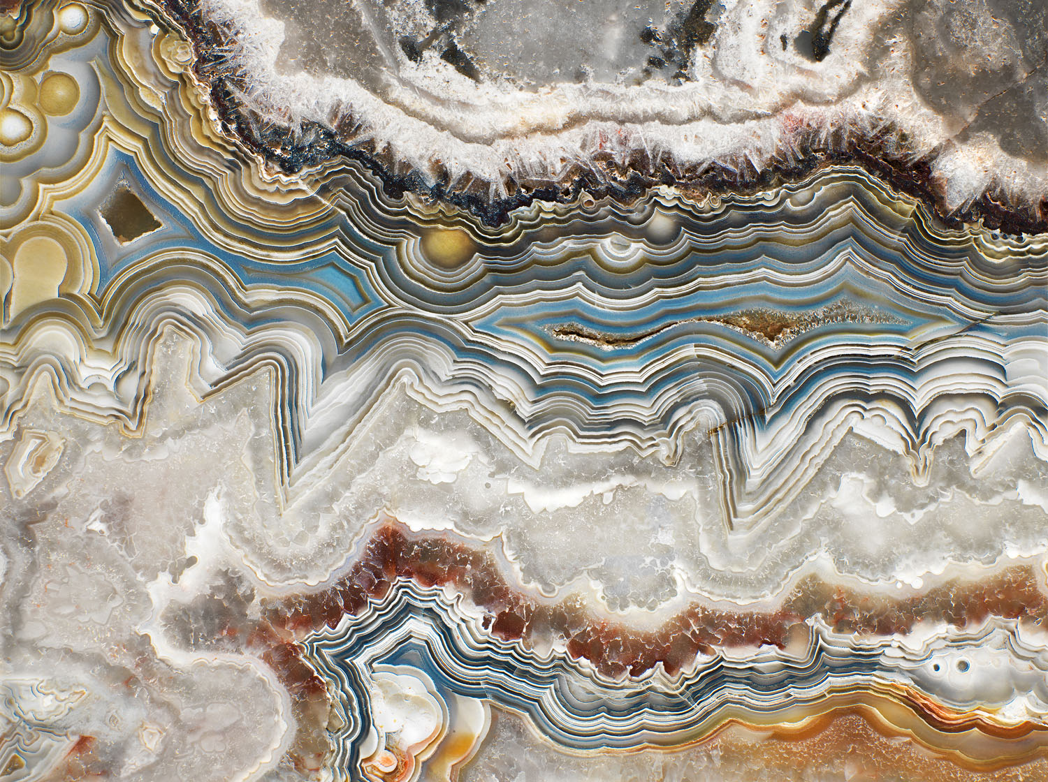
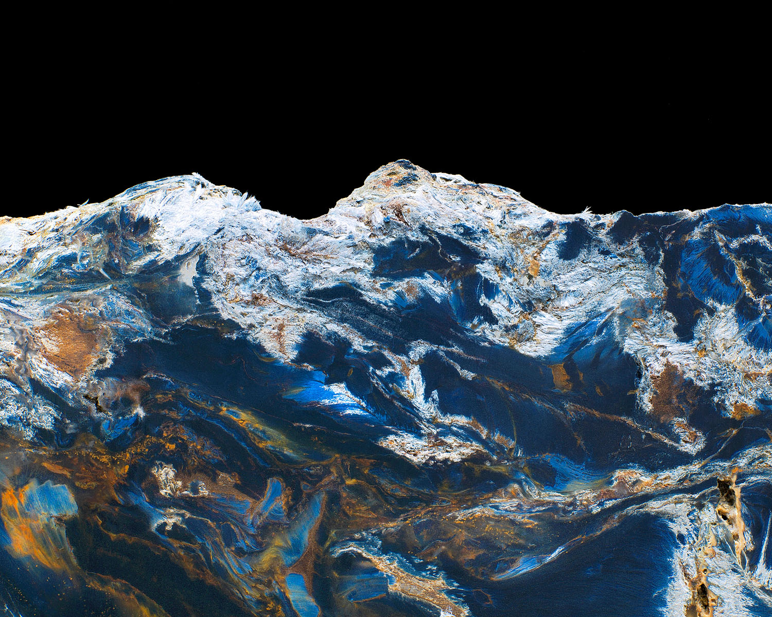
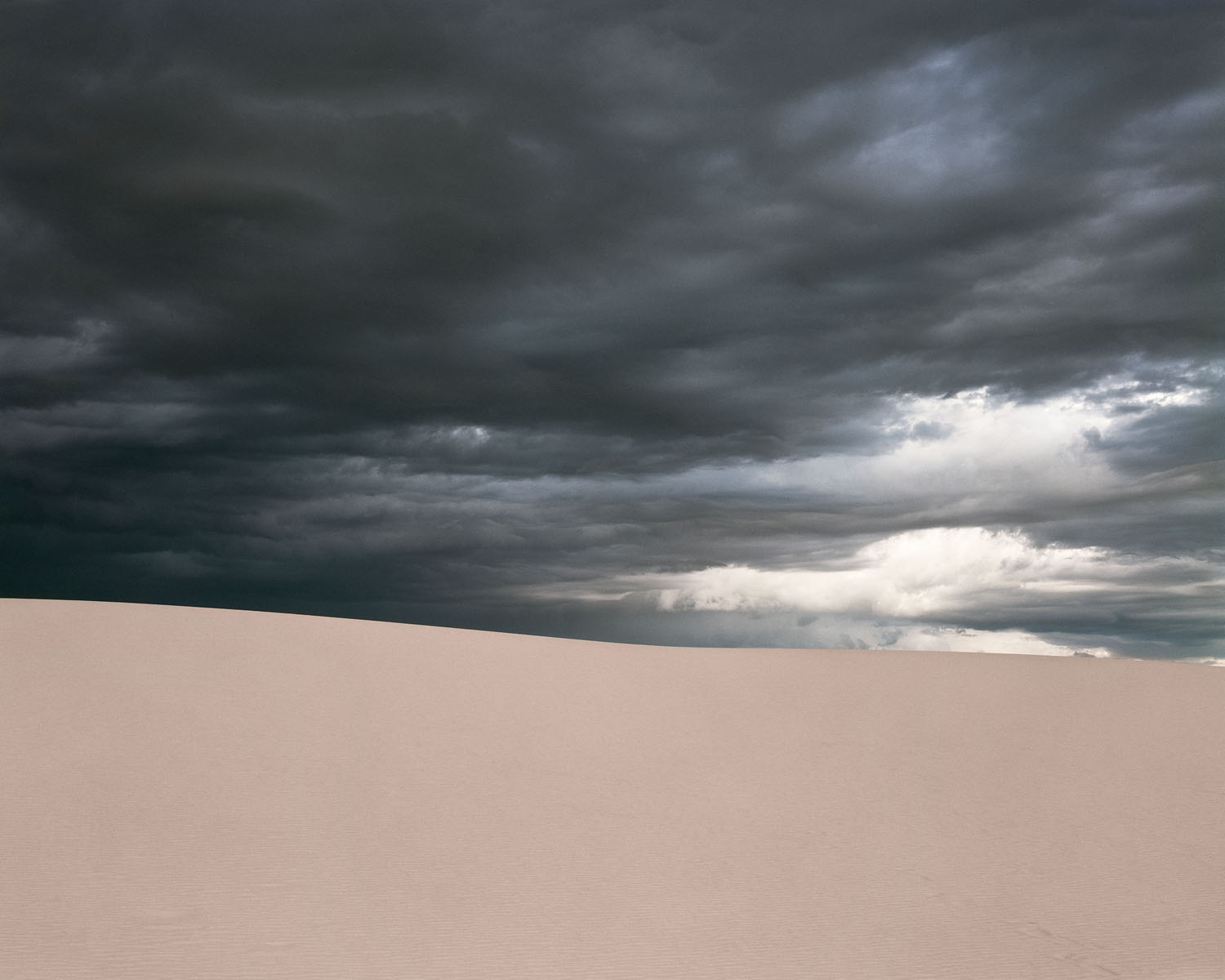
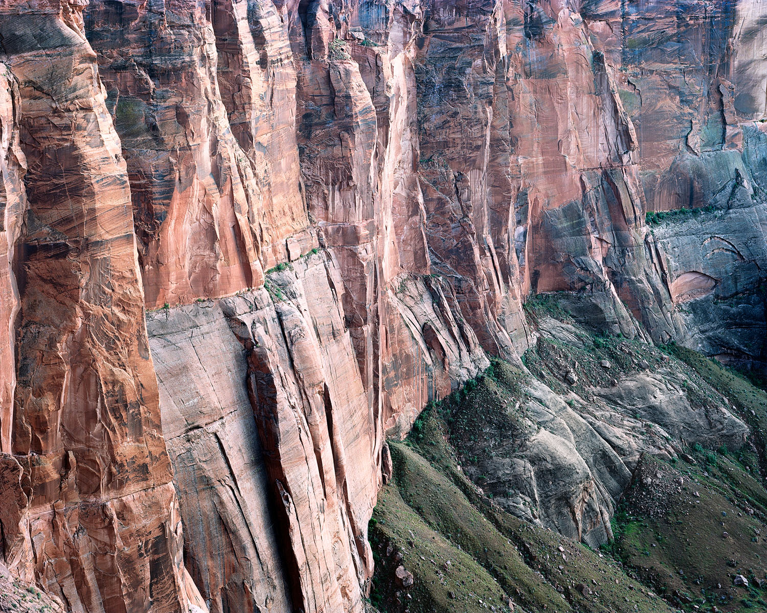
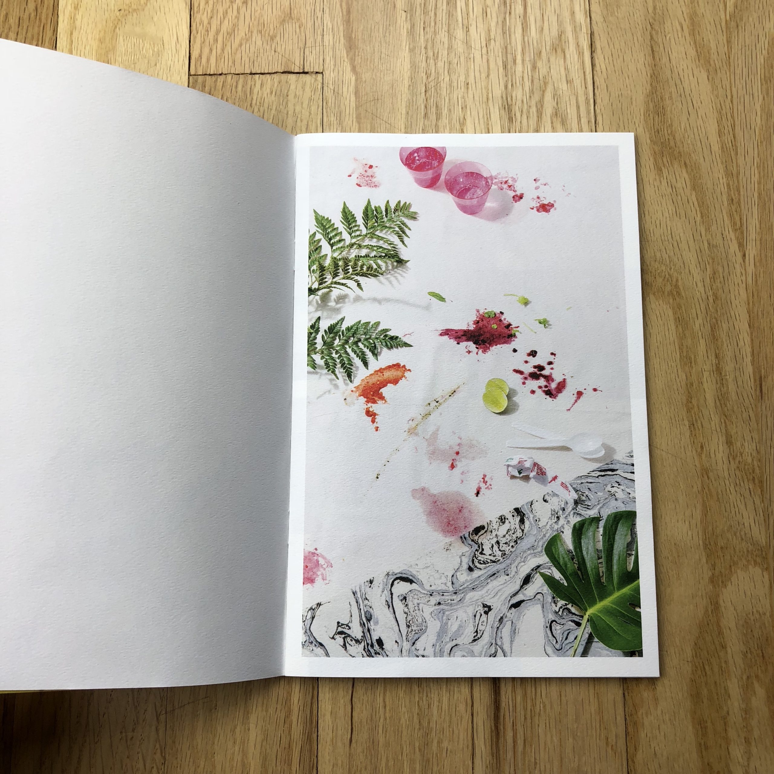
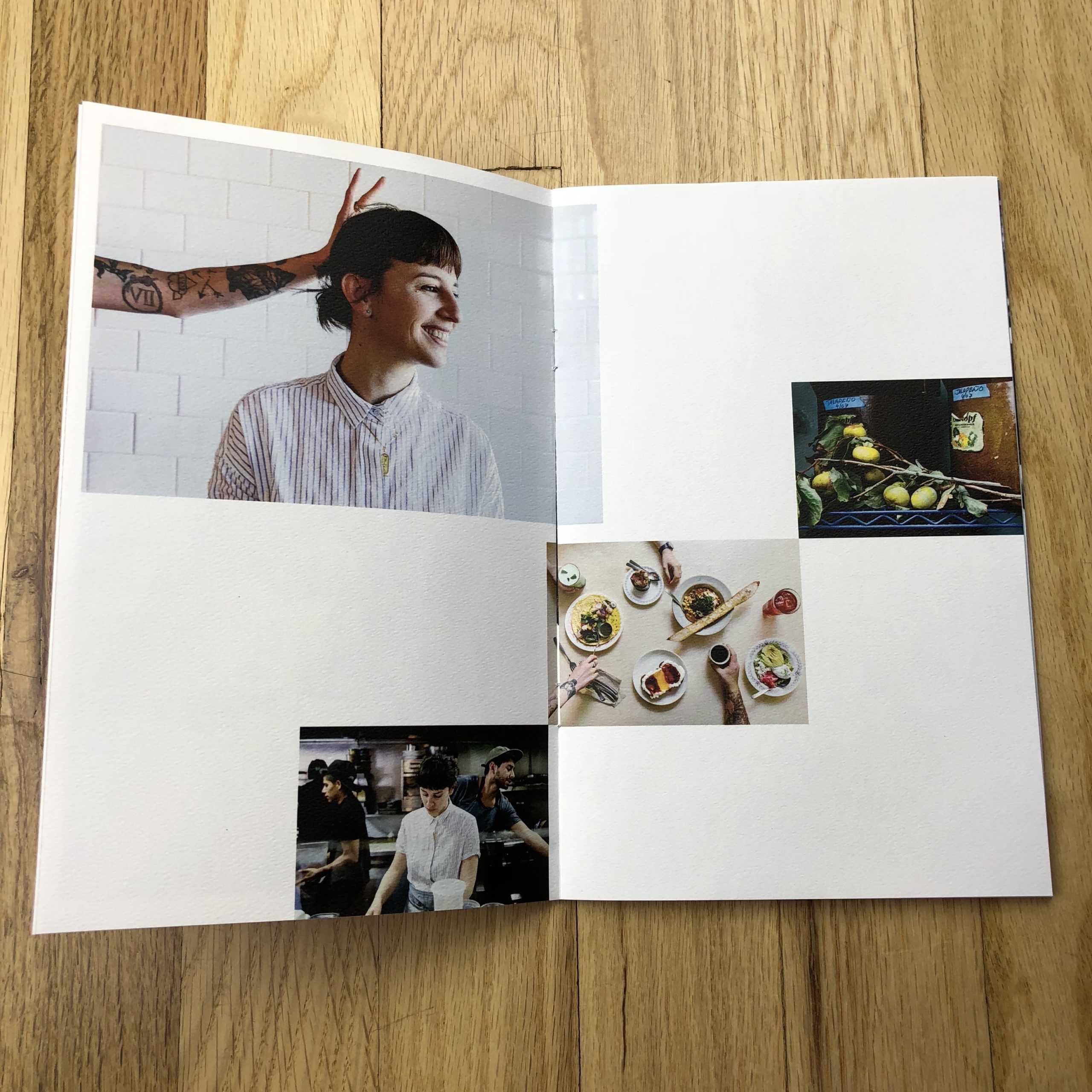
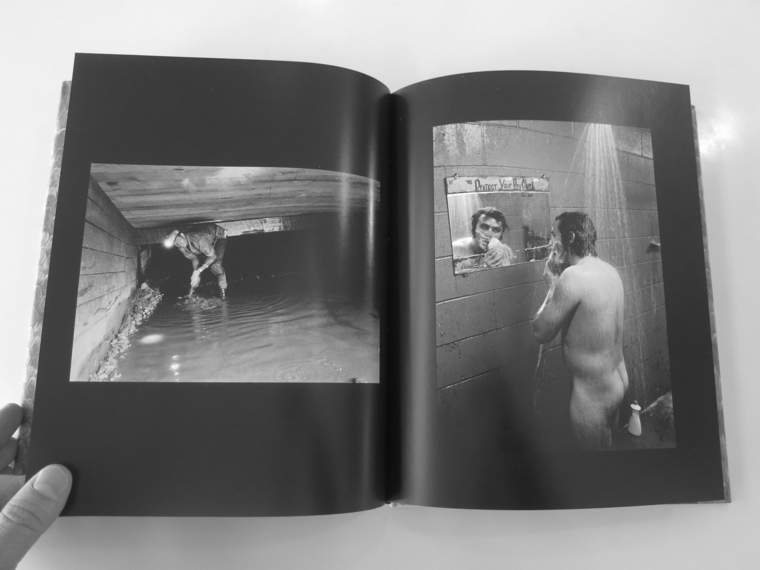
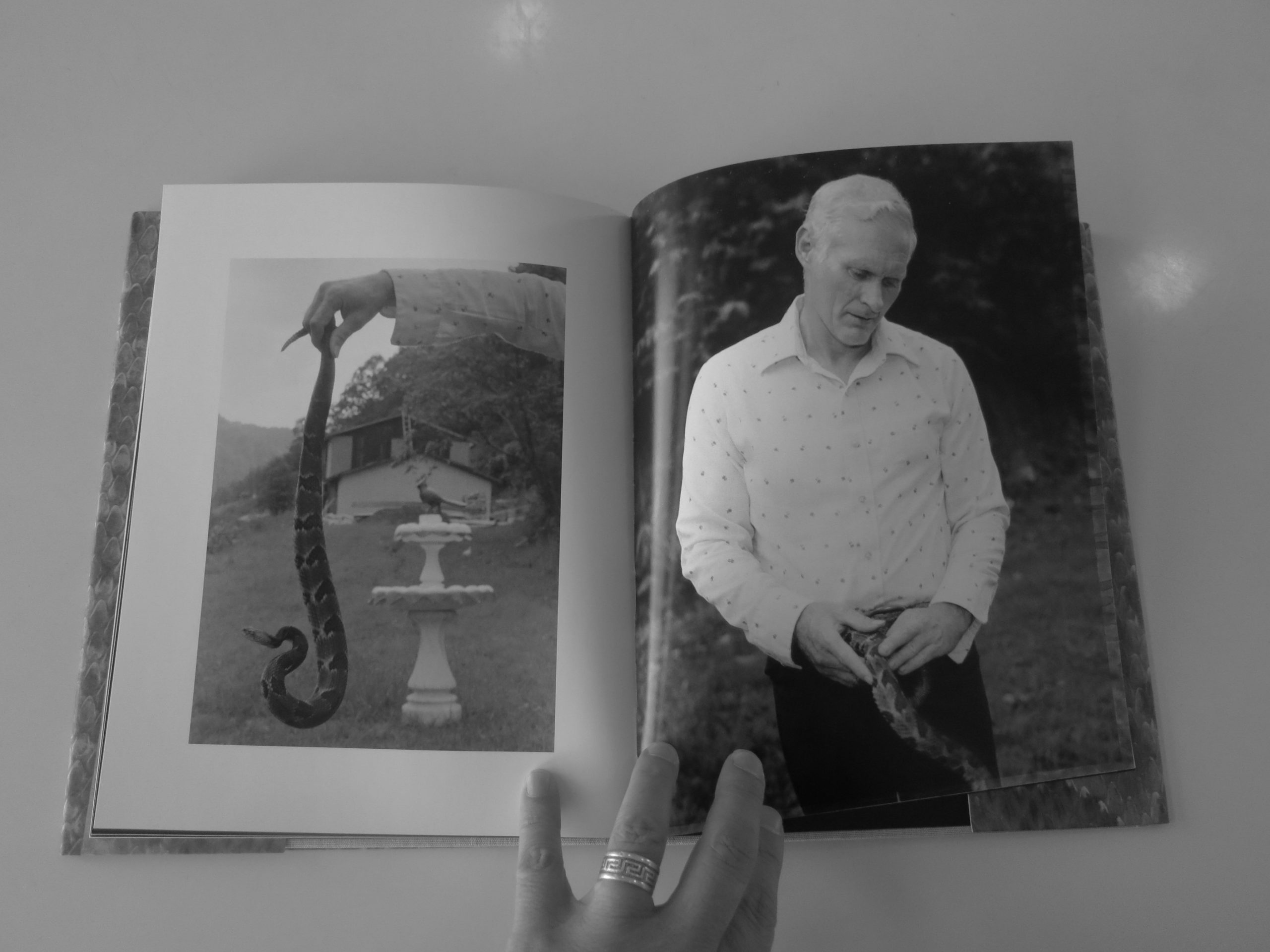
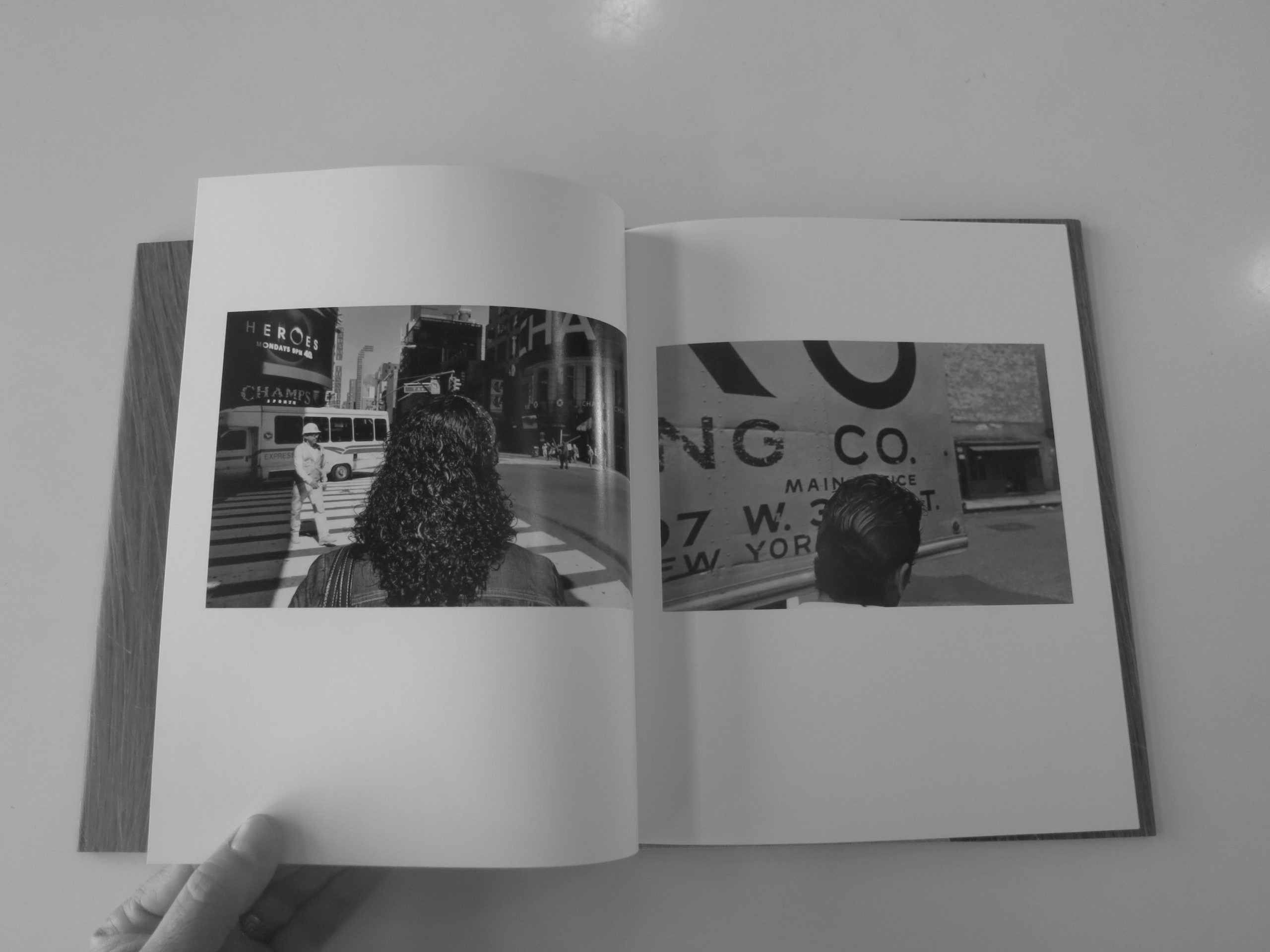
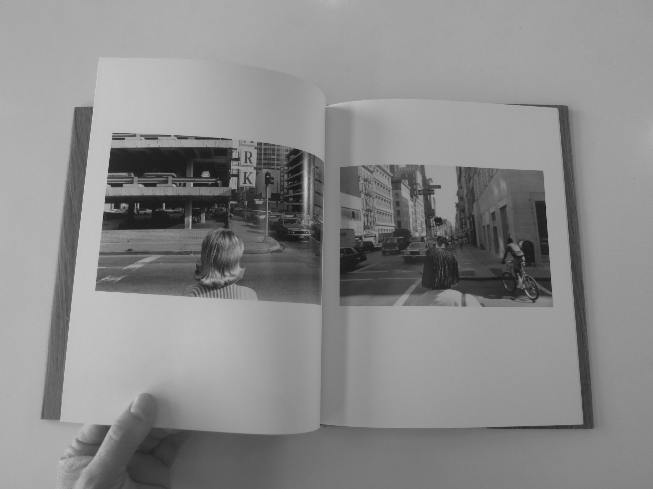
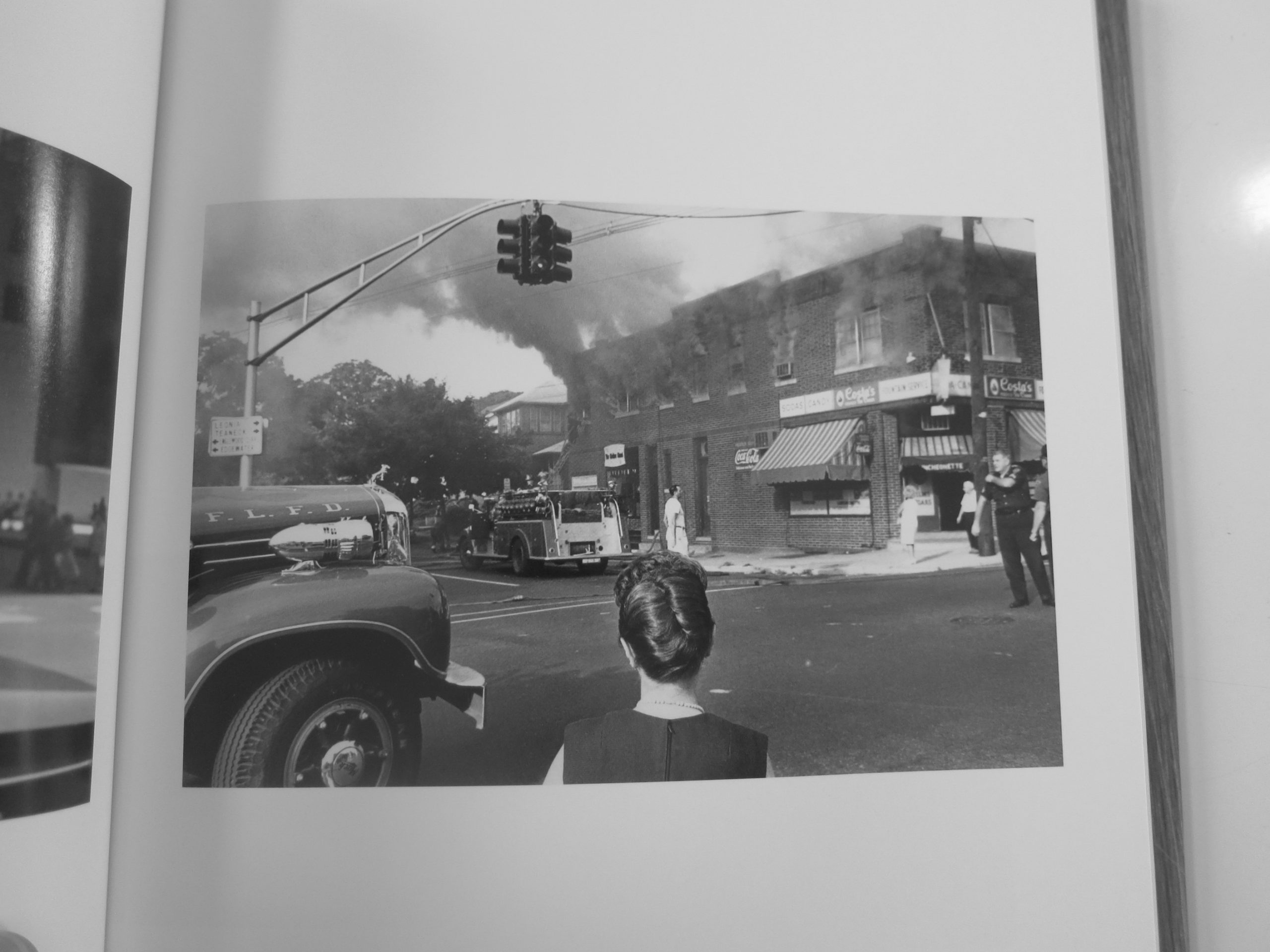
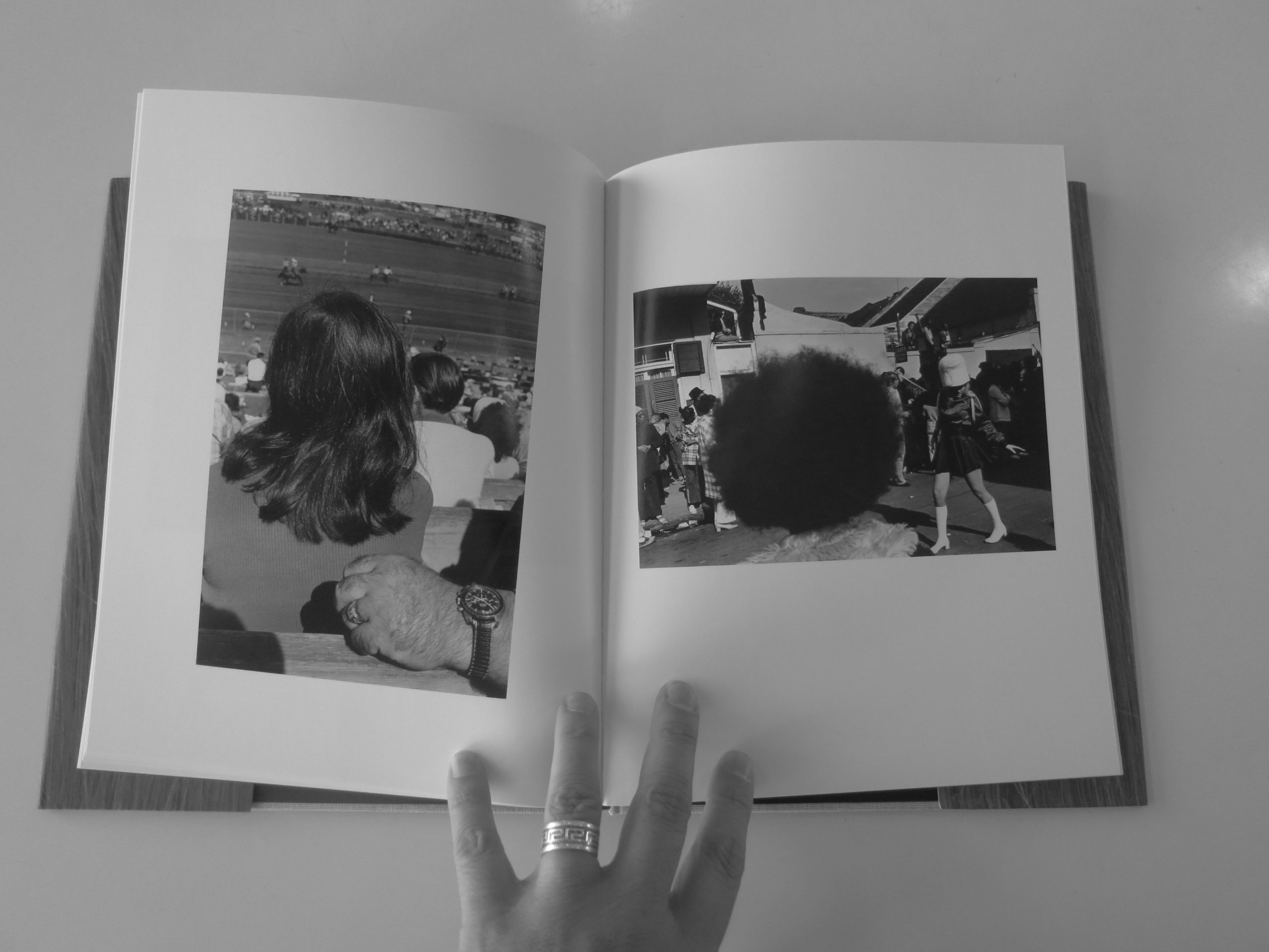
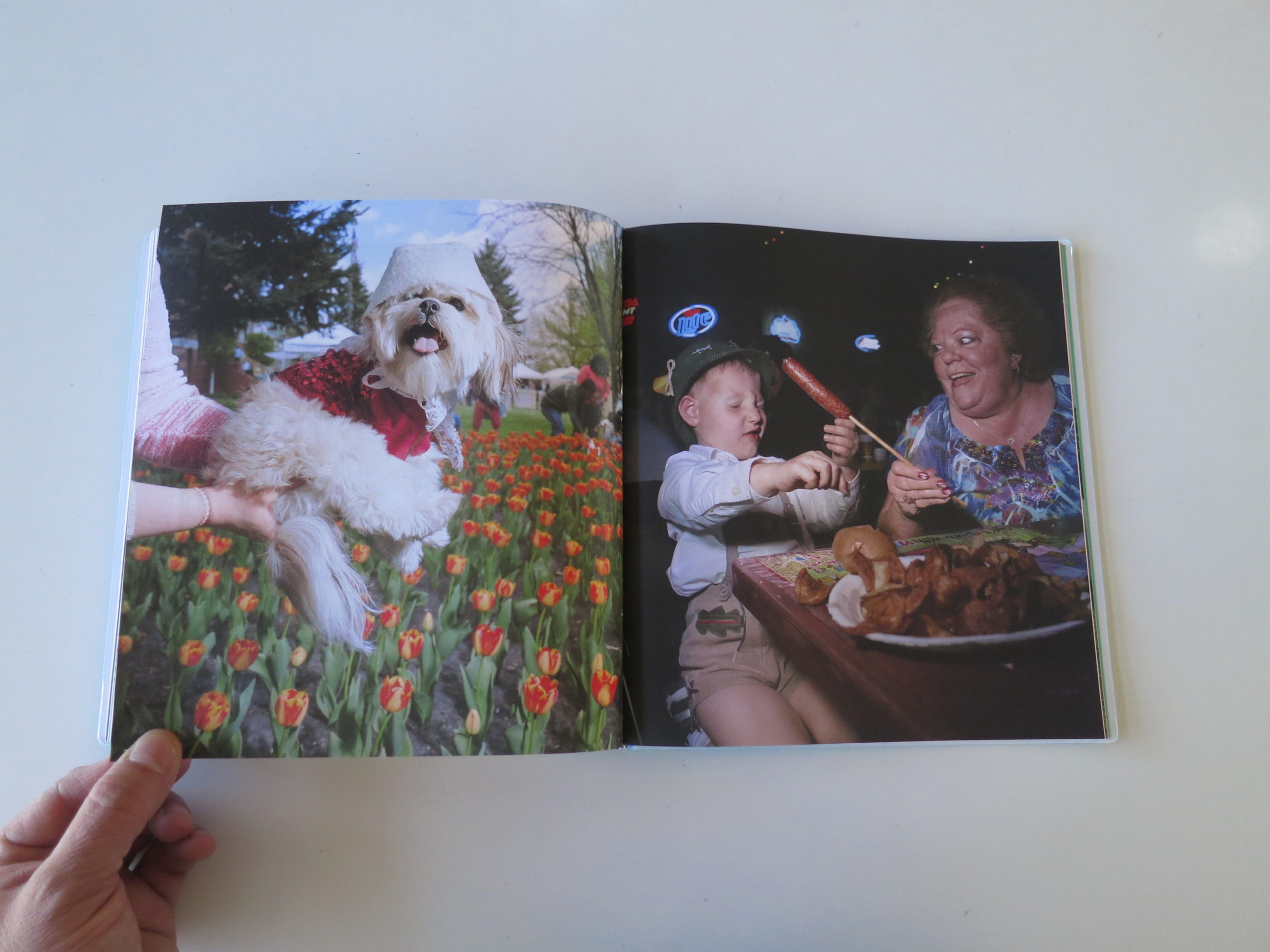
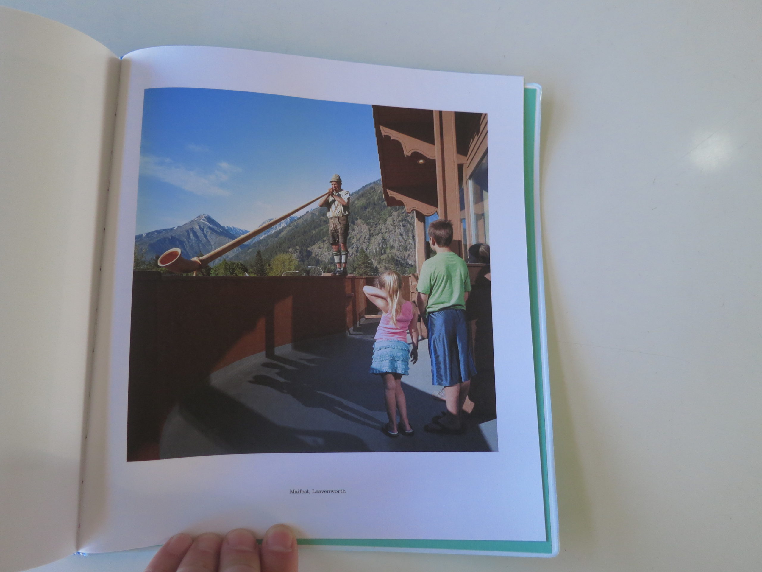
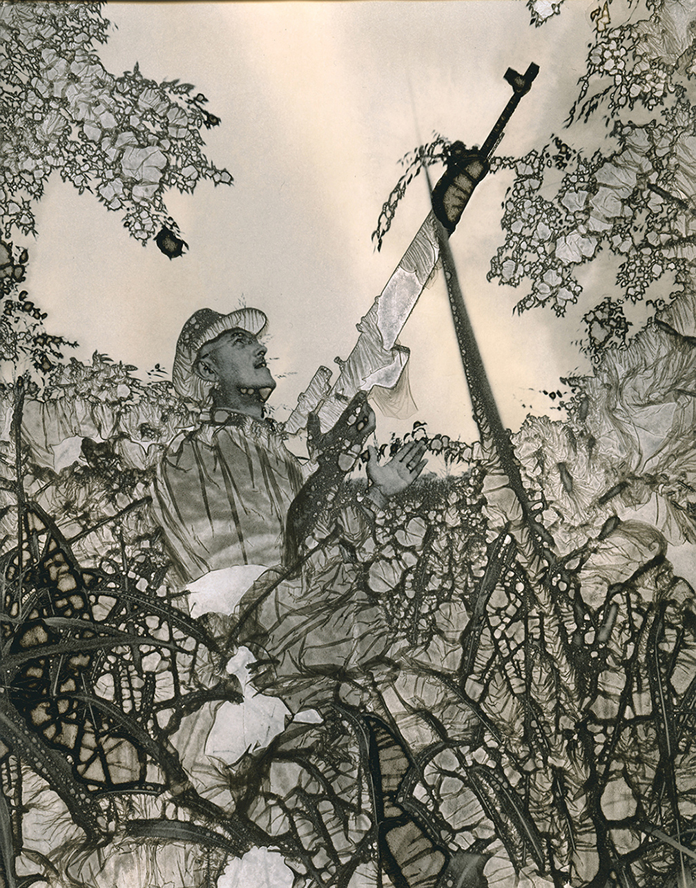
The photographs in my promotional magazine are a mix of terrains, in the human face and landscapes. The portraits are from commissions, magazine, advertising and personal work with subjects ranging from pro athletes, cowgirls in Florida to an 80-year-old hiker and everything in between. The landscapes were taken in the Highlands of Scotland, rainforests in Olympic National Park and along the rocky Pacific coast, from Carmel to Vancouver Island.
It’s funny that my approach or method to each was vastly different, yet the images each have a connecting thread running through them. With landscape photography it’s up at dawn, lace up the hiking boots and head out with a single pack containing a camera and a lens. Once reaching a potential location, along a waterway, down in a valley or up the side of a hilltop, I like to sit and clear my mind, to see the patterns, shapes, lines or curves that bring order to the visual chaos of nature. As they say in landscape photography, the composition is the stage and lighting is the performance.
Portrait photography, be it for an advertising campaign or personal photo essay is about control and overcoming any limitation. My goal is to make a connection with my subject in order to help reveal something about them. Additionally, it’s my job to control the lighting, choose the composition, location and or set all within whats typically a limited amount of time. Even when you have a shooting script or mood board you still have to be flexible enough to capture a great image when it reveals itself. Maybe it’s more accurate to say that the lighting and composition is the stage and the connection with the subject the performance.
How many did you make?
The first print run was 500. I’m mailed out about 300 and kept the rest for leave-behinds during portfolio presentations. There are a total of 32 images, in the 9.75” x 11” magazine, including the horizontal cover image that wraps around to the back. The paper is 70# uncoated smooth opaque text with Saddle stitch binding and printed with CMYK UV inks.
How many times a year do you send out promos?
This is the first mailer of this type for me and it’s been quite awhile since I have sent out any printed promos. The new plan is to do one magazine a year targeting dream clients and to follow-up with quarterly trifold mailers.
Do you think printed promos are effective for marketing your work?
Yes, I believe in the power of the printed photograph. Printed promos showcase images which for better or worst linger in the viewer’s mind, compelling a second or third look. A printed piece is tangible, it screams “touch me, hold me”, rather than just swipe left or right. As much as I appreciate and enjoy digital marketing via email blasts and social media, I think some images are meant to be printed, held, and looked at.
At the end of the day, images reflect who the photographer is and the depth of his/her’s visual vocabulary.
But lately, my home state has crept back into the dark recesses of my consciousness. It began recently enough, when I found myself reading Benjamin Franklin’s autobiography.
My son, Theo, was writing his first term paper, and chose Franklin as his subject. I saw the book sitting there, and picked it up out of curiosity, more than anything else. When I read that old Ben first landed in New Jersey at Amboy, not 10 miles from where I grew up, it definitely piqued my curiosity.
The book was a bit of a tease, if I’m being honest, because as fascinating as it was to be inside Franklin’s mind, he died writing it, before he got anywhere near the Revolutionary War.
The man spent pages and pages describing a system for removing dust from the streets of Philadelphia, but never thought to speed it up so we could hear what he thought of George Washington, or the Revolution in general?
Mind-melding with Ben Franklin, straight out of the 18th-century, reminded me of the feeling I had walking the Monmouth Battlefield, or going on school field trips when I was young, and being told that Washington had slept there.
At the moment, I’m deep into binge watching an AMC show about the Revolutionary War, with the awkward title of “Turn: Washington’s Spies.” (Seriously, for all the money these people make, nobody thought to come up with a better title?)
The show is exceptional, so you certainly have my recommendation to watch it yourself, but it’s also been feeding the odd homesickness as well. (As an aside, the show gives good evidence that the New Jersey/Long Island Island rivalry goes back to the old days, when Jersey was Patriot territory, and Long Island was a Tory stronghold.)
My hometown, Holmdel, had its fair share of 18th-century architecture. Not to mention graveyards. (Can you imagine how scary it would be to live next to some of these places?)
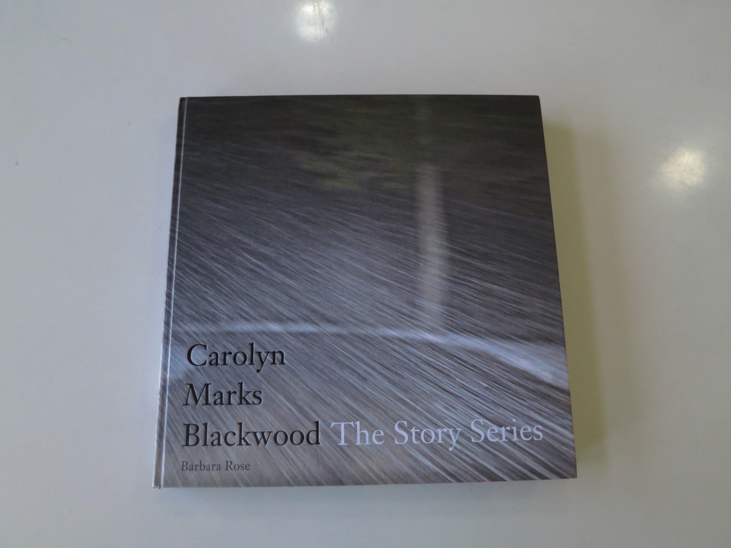
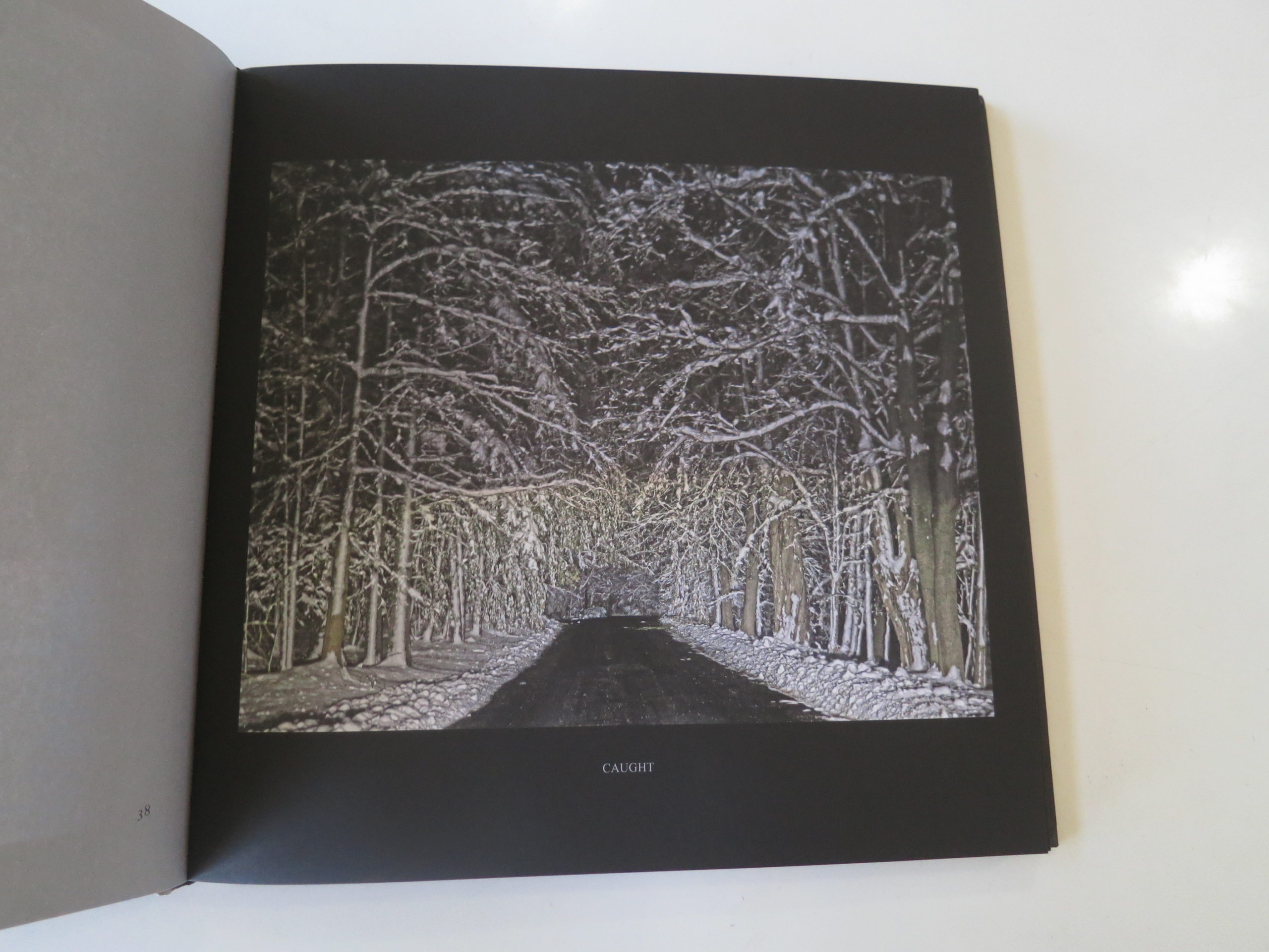
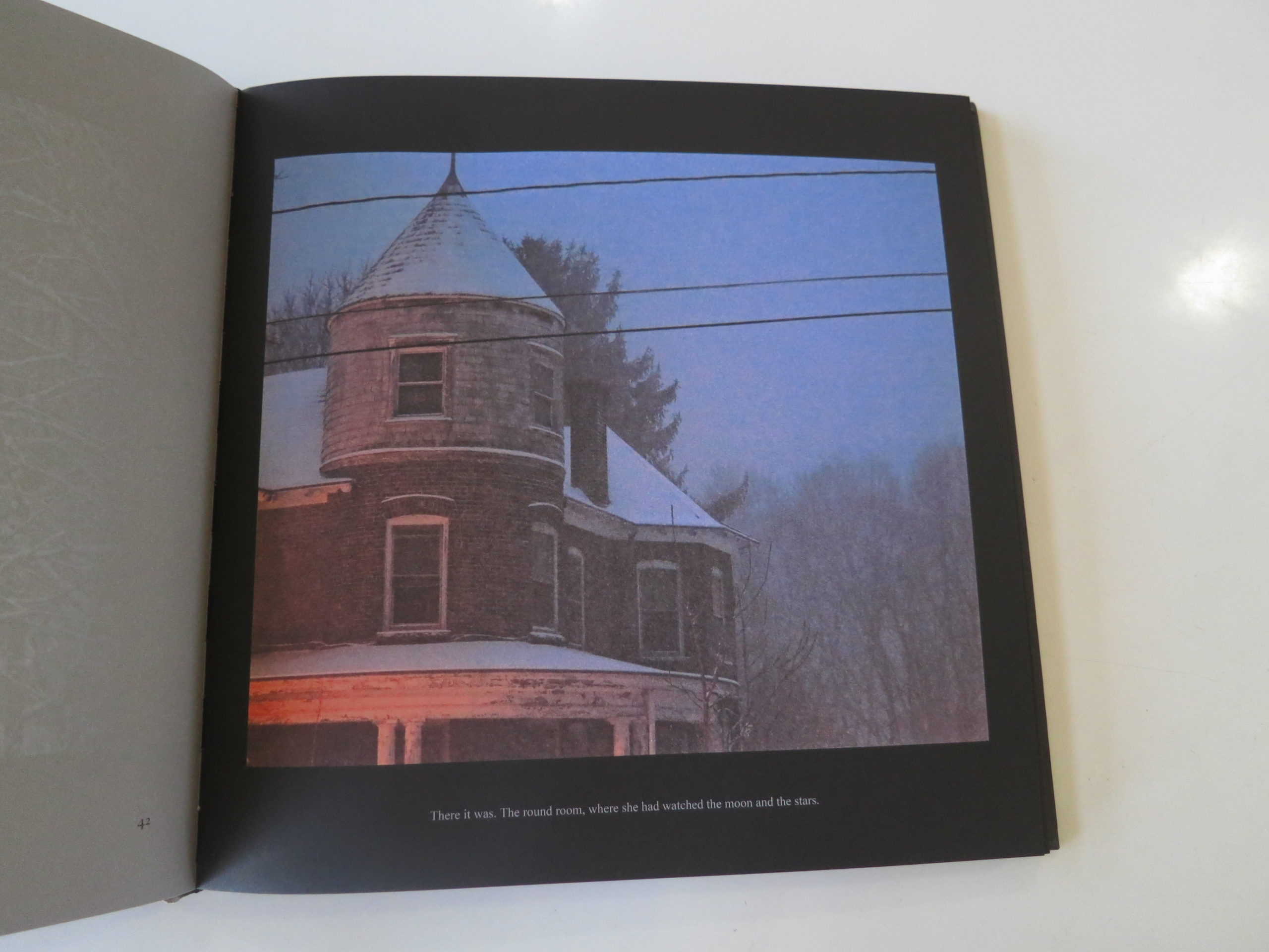
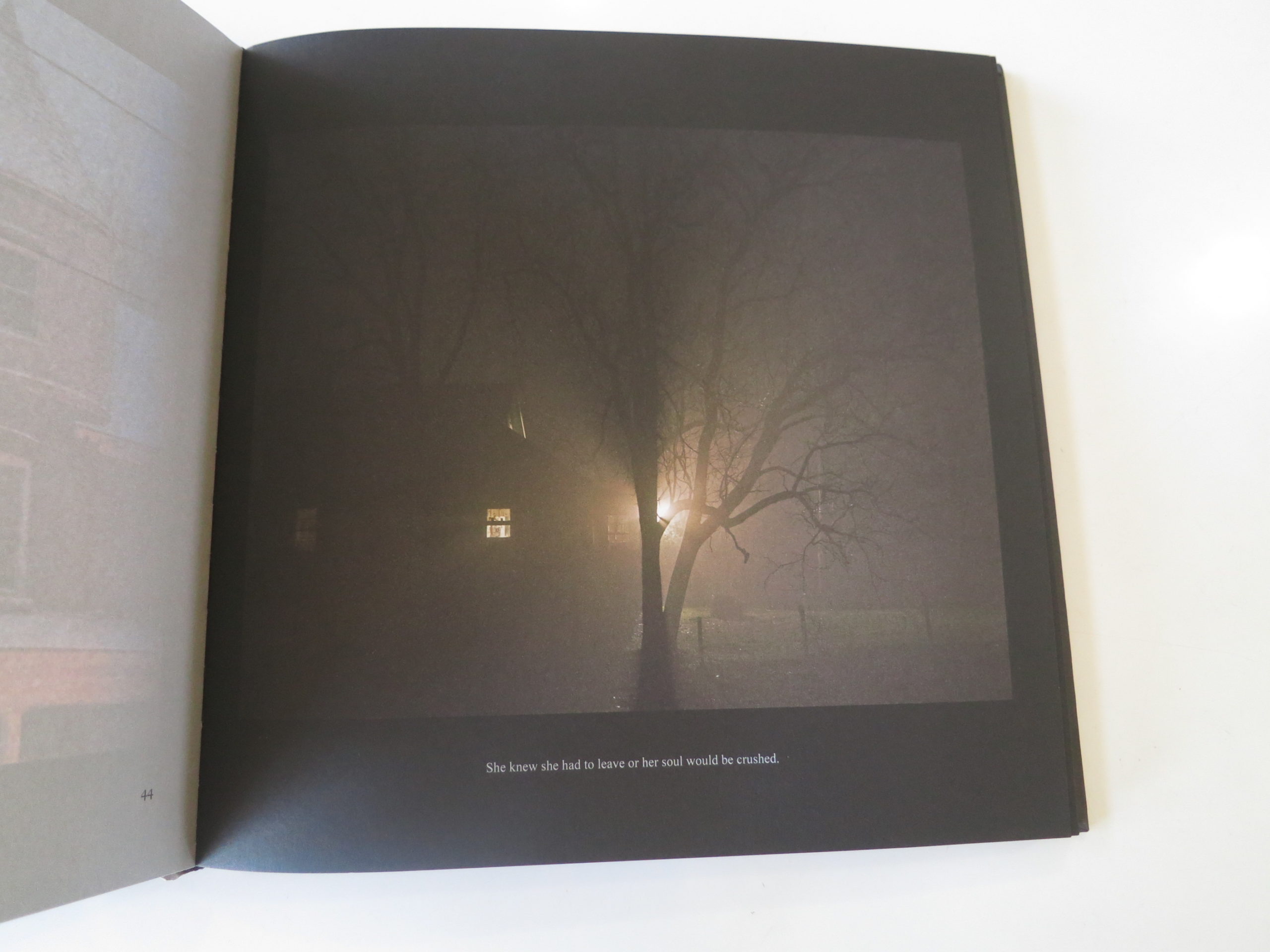
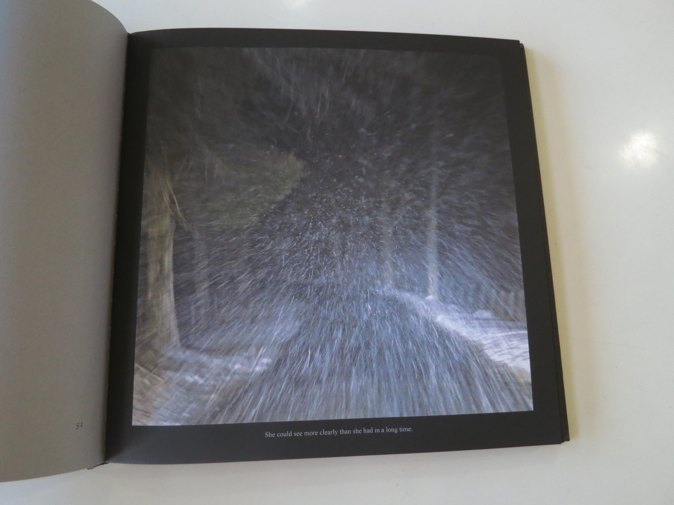
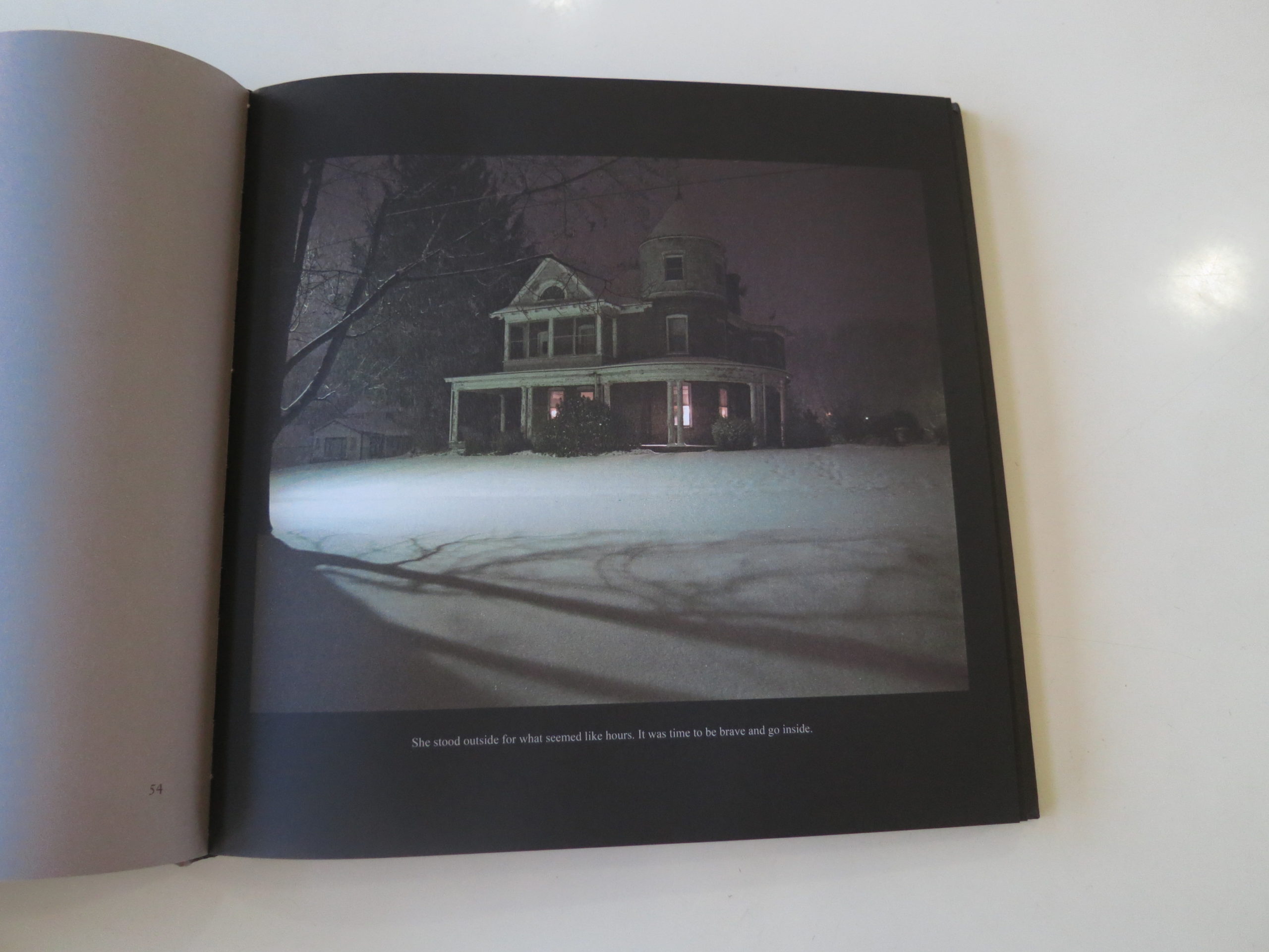
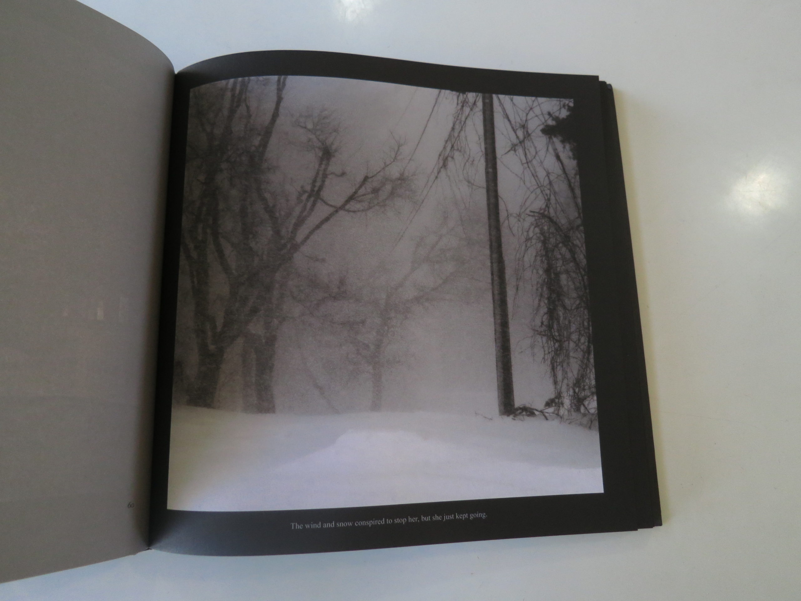
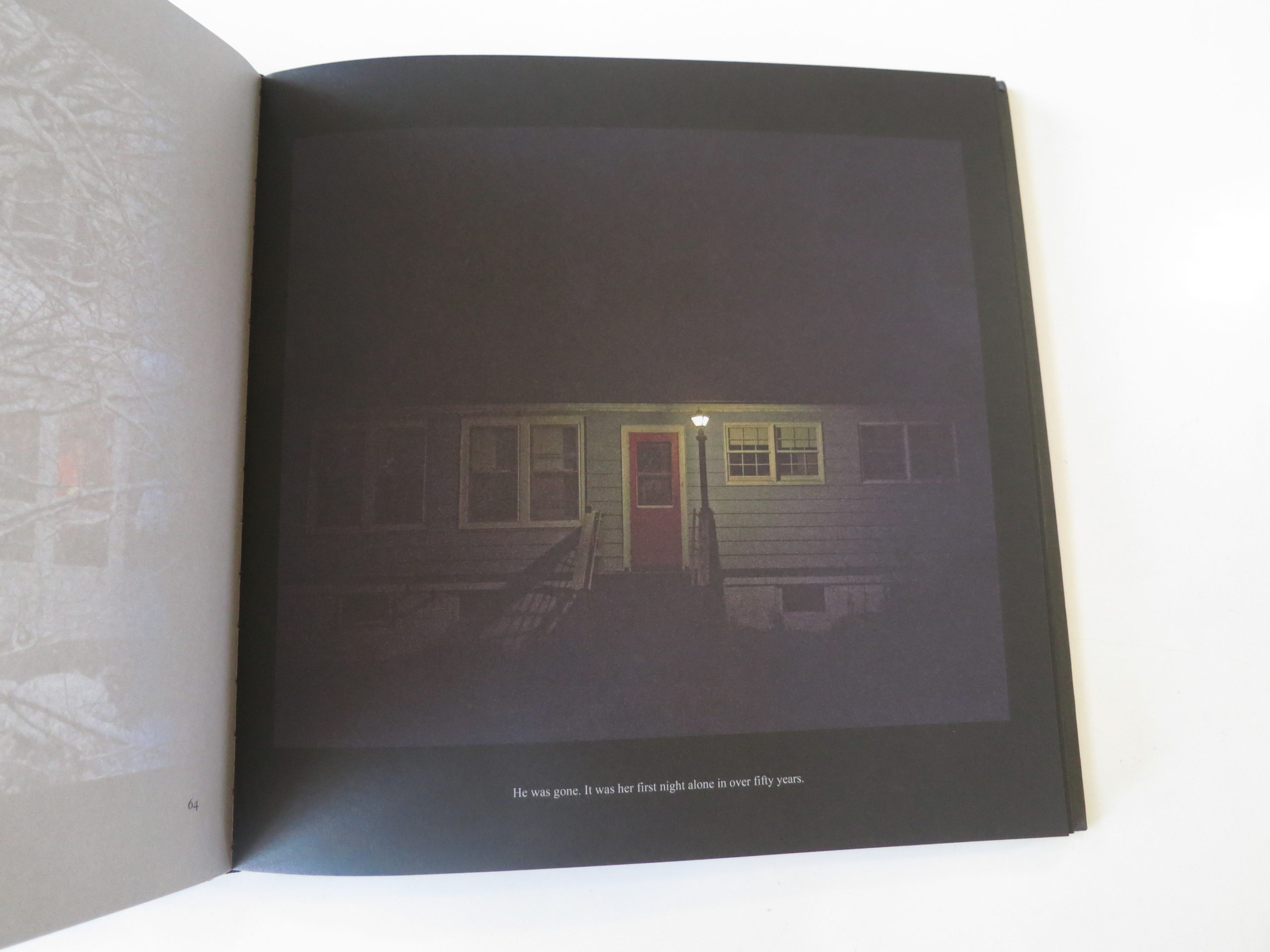
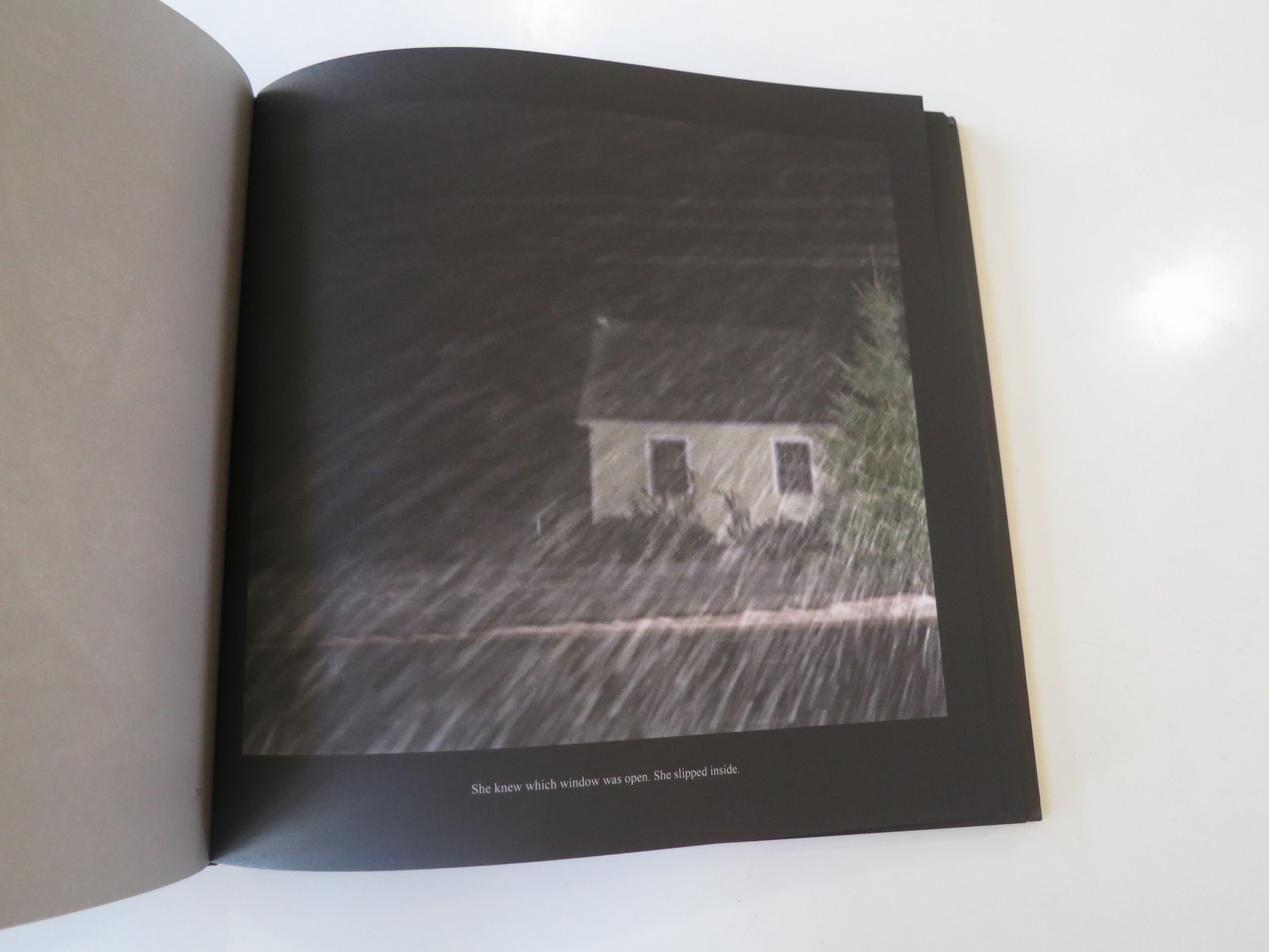
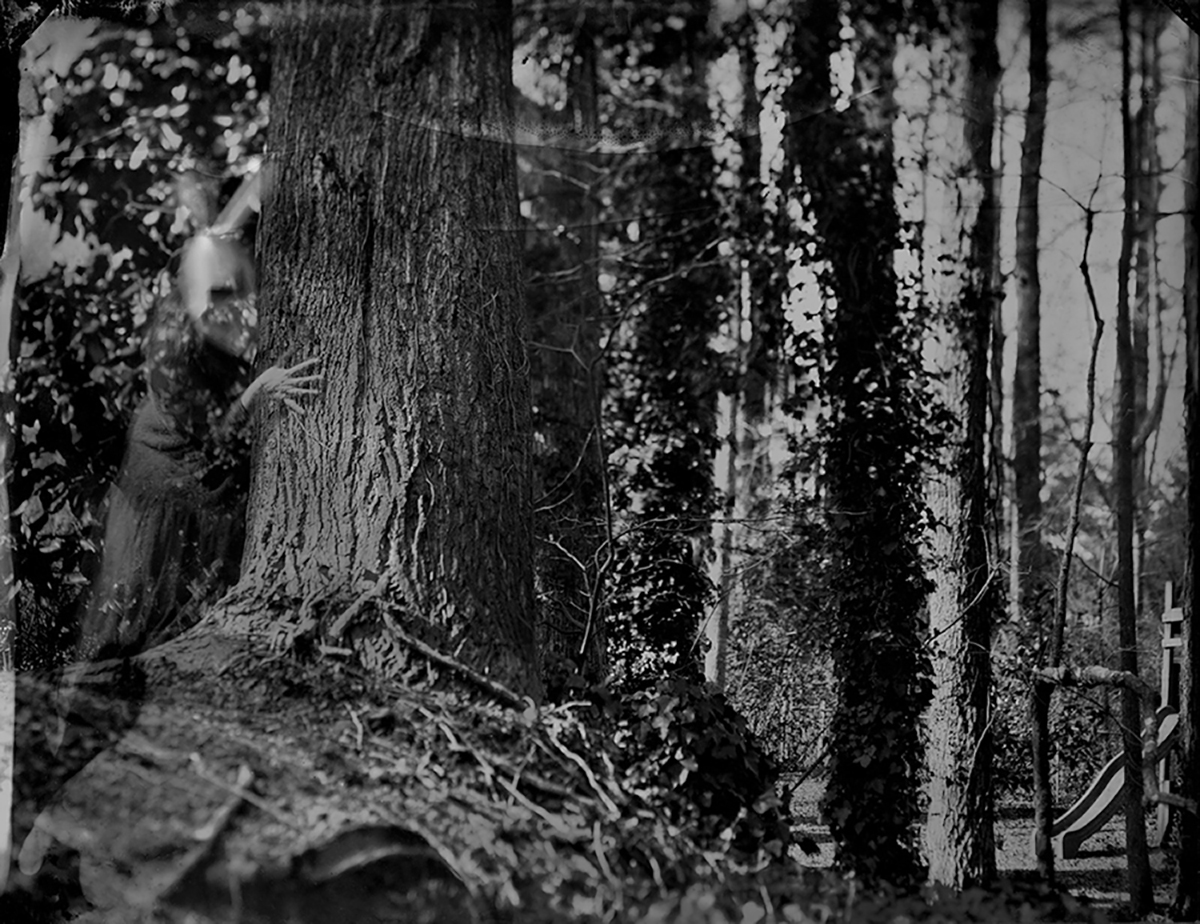
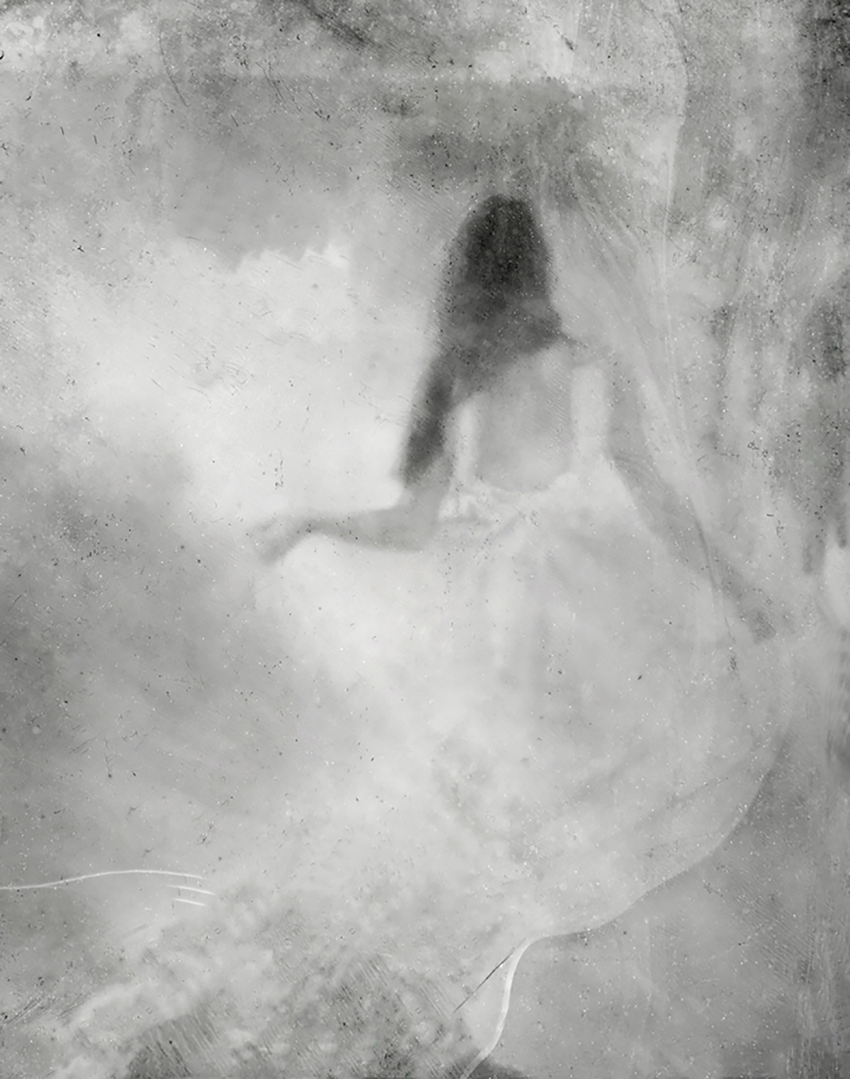
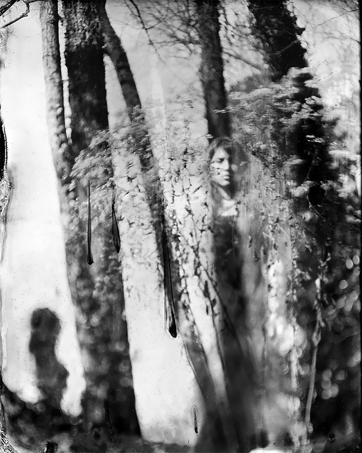
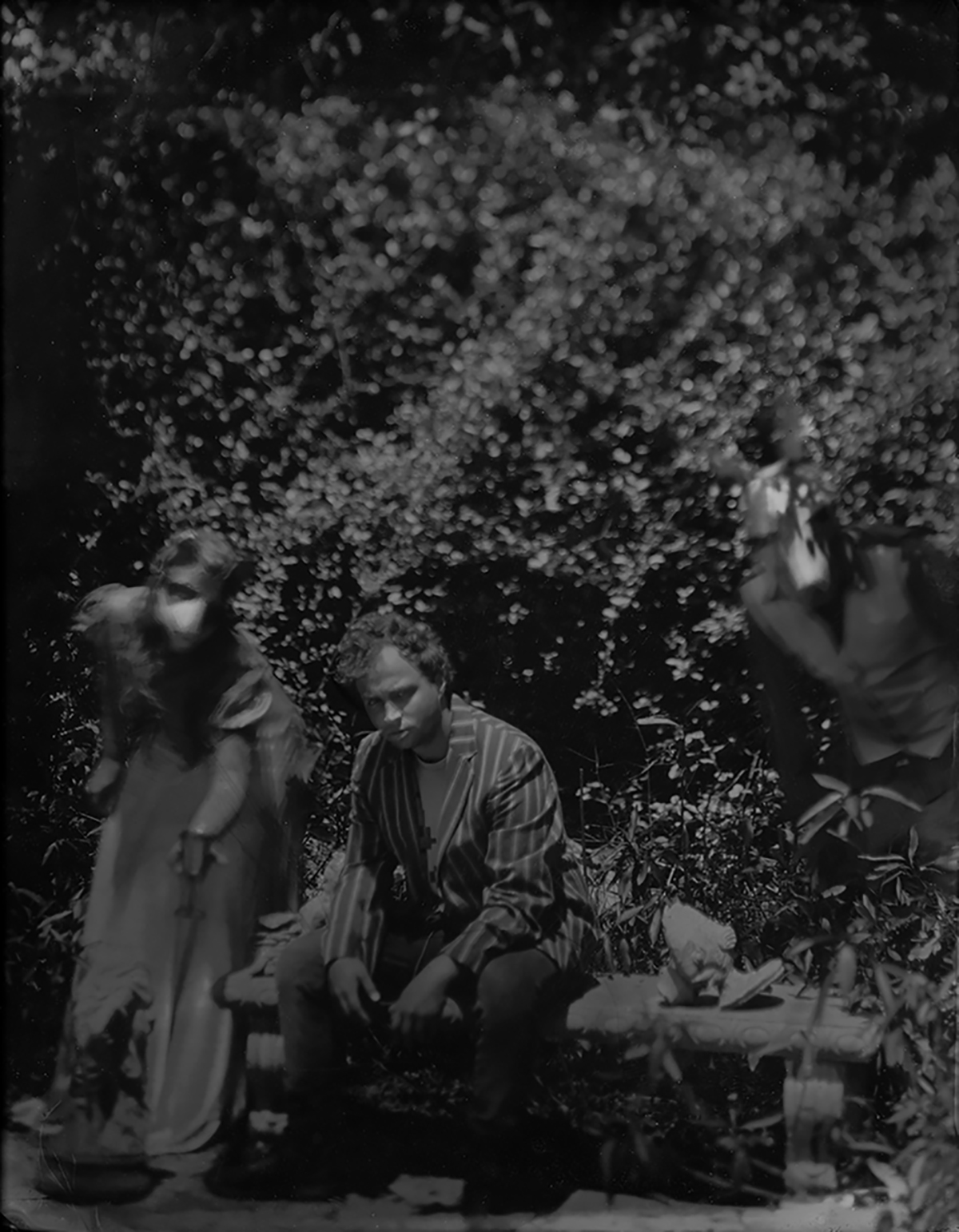
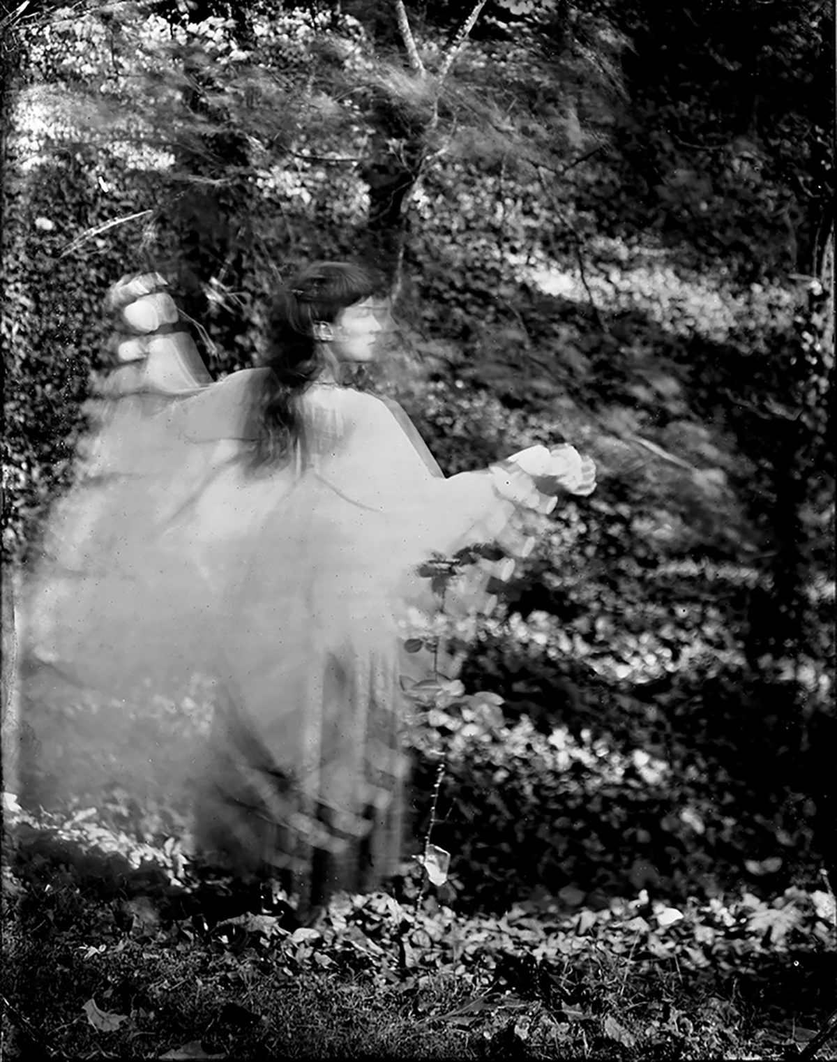
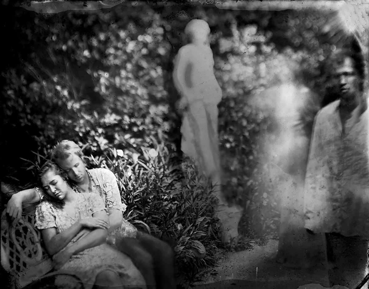
Right now, I definitely feel some chills up my spine, having just put down “The Story Series,” a new book by Carolyn Marks Blackwood, recently published by the Roberto Polo Gallery in Brussels. (She just had a show there, and it’s now up at Von Lintel in LA.)
When Ms. Blackwood originally wrote me, she mentioned that she lives in upstate New York. In a sense, it doesn’t matter, because the pictures in this book channel that 18th-century creepy vibe better than just about anything I’ve seen.
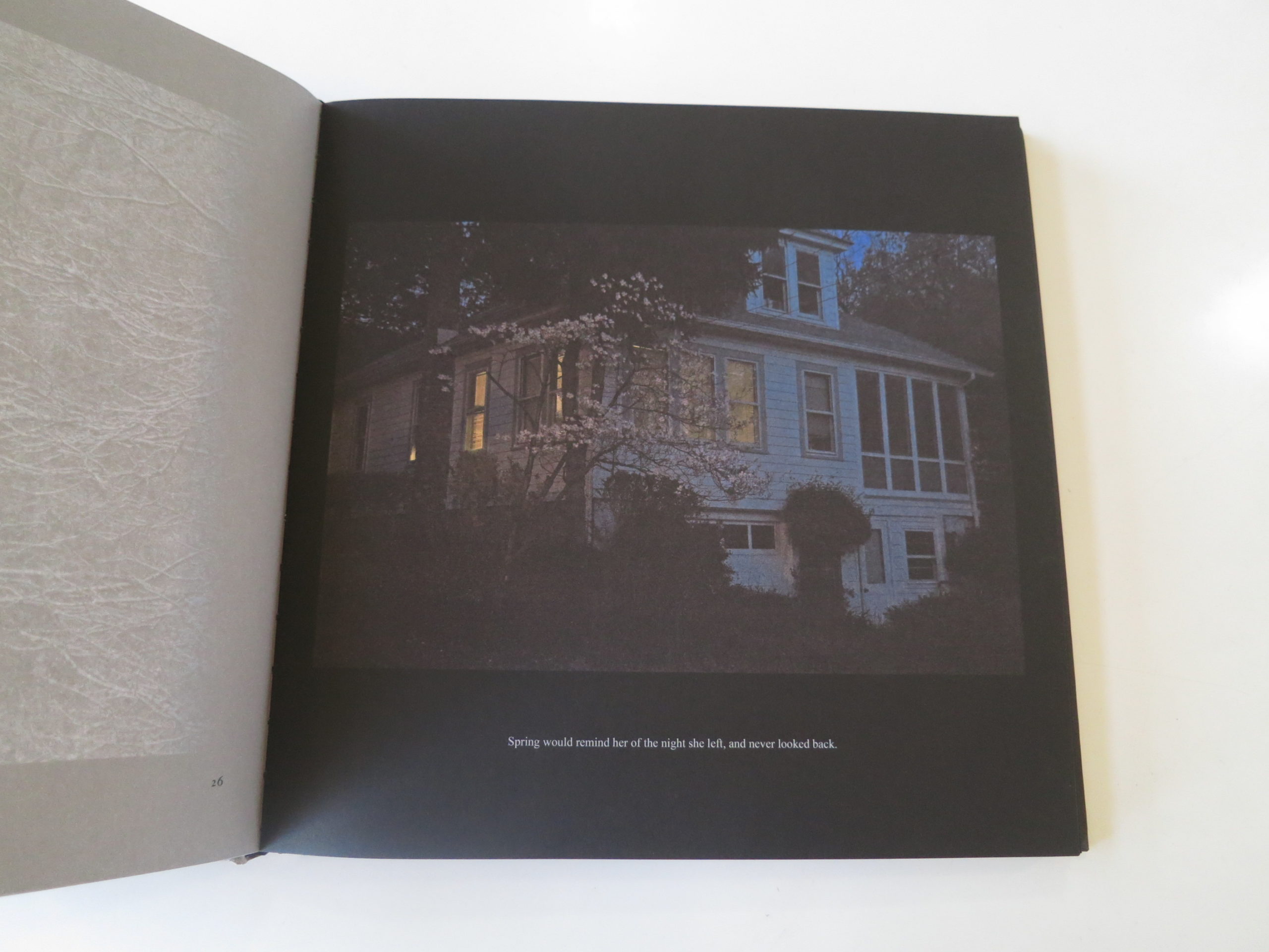
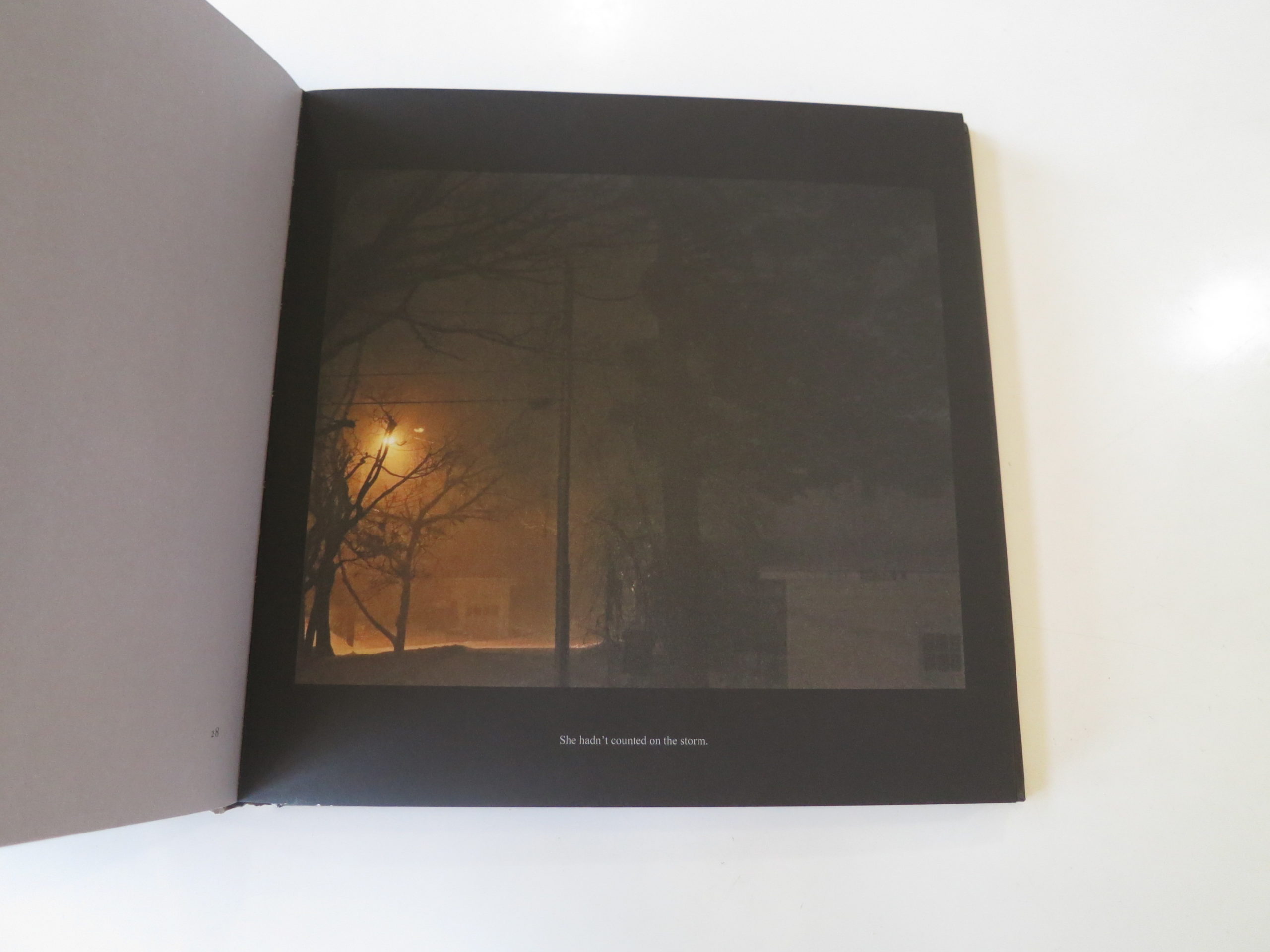
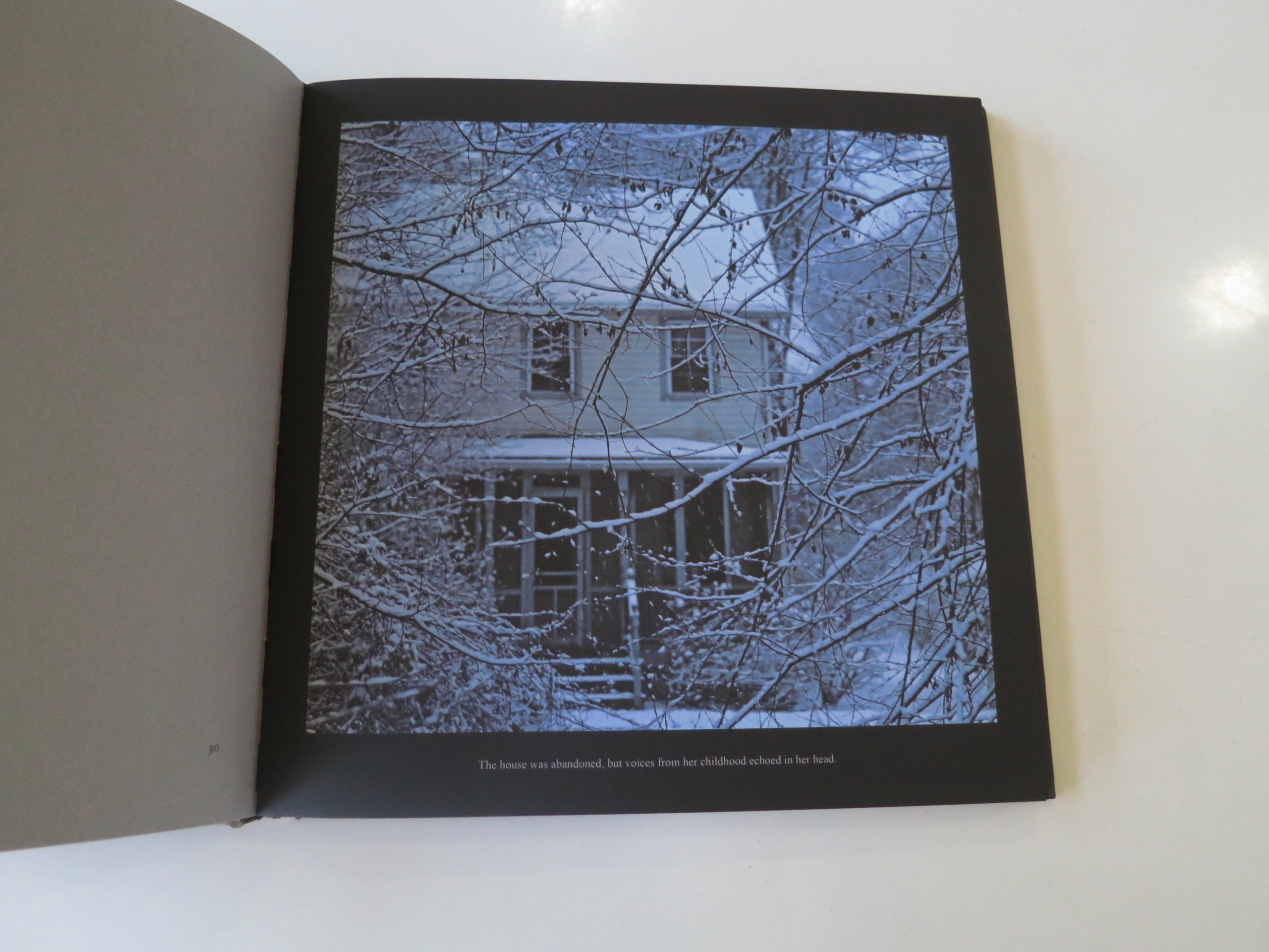
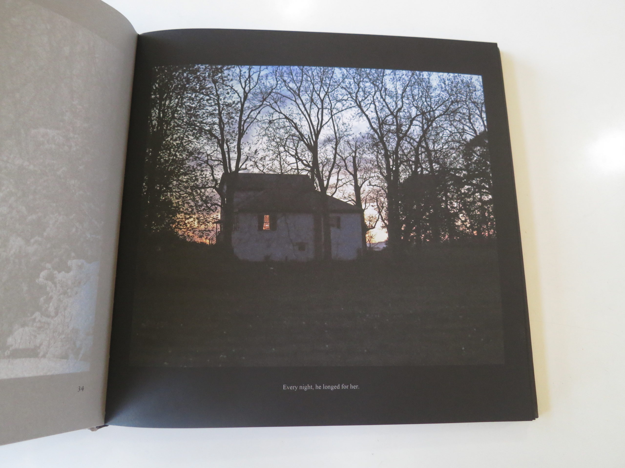
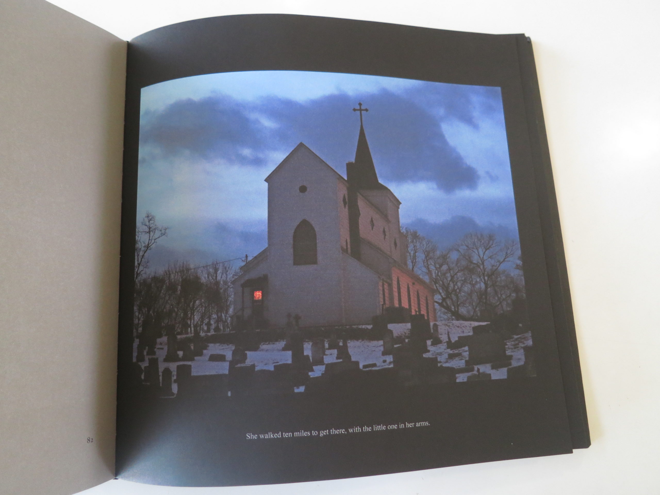
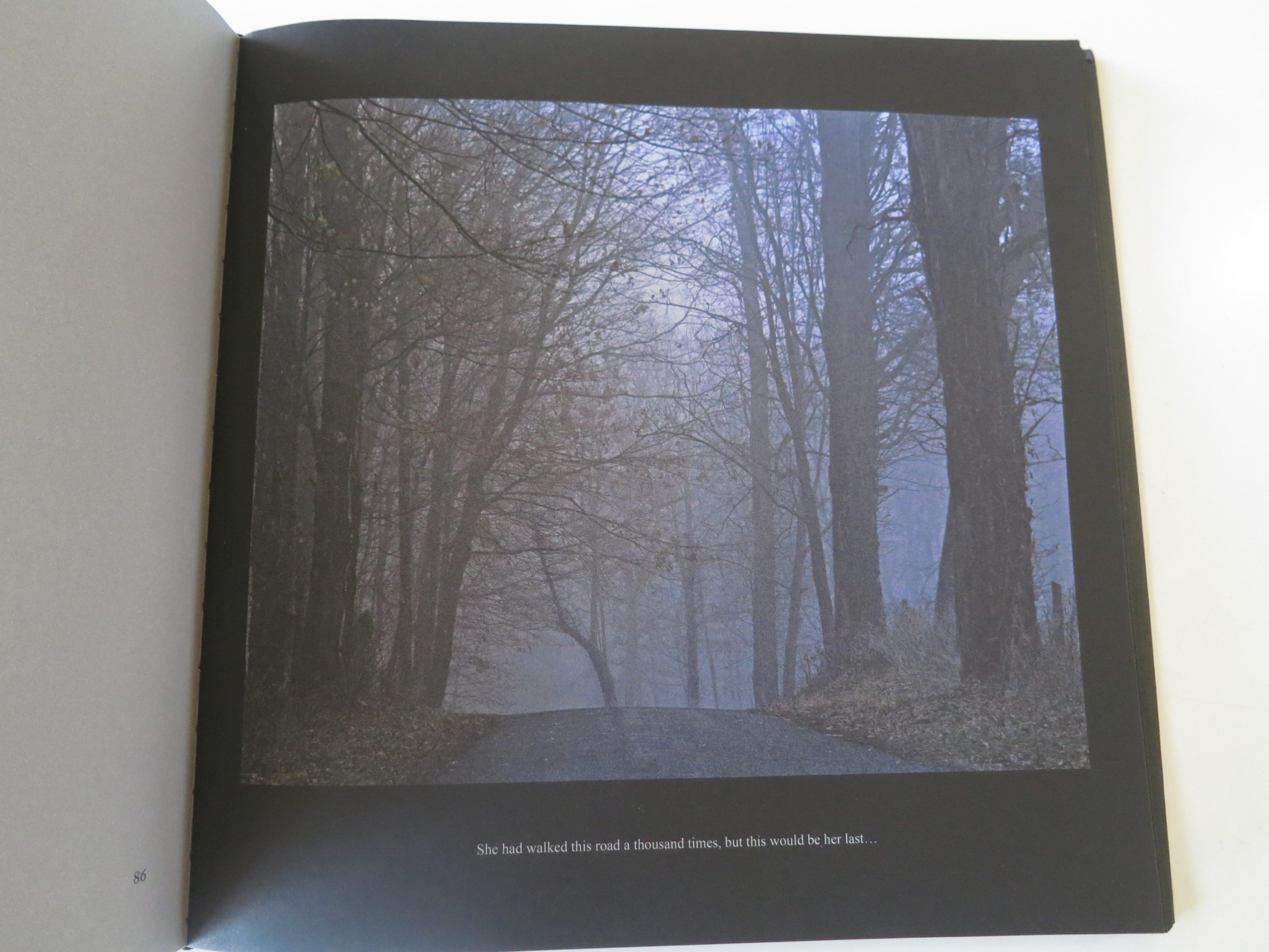
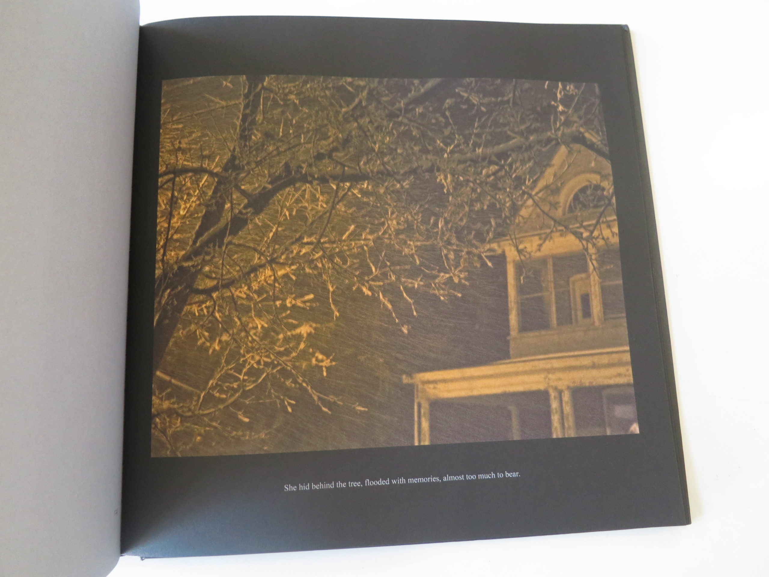
The book mentions that these pictures are meant to be exhibited at a very large scale, so when I was looking, I tried to imagine projecting them as wall size, which helps explain the sort-of-painterly, soft focus, lower-resolution aesthetic presented within.
According to an opening interview, Ms. Blackwood is also a screenwriter. It makes perfect sense, as each of the snowy, or dark, wintry pictures is accompanied by a one or two sentence narrative.
They’re novels, for the Twitter age.
I think there’s a range in quality between the pictures, and some would be banal, without the text. Regardless, when combined, I think they give off a strong, local, historical mood.
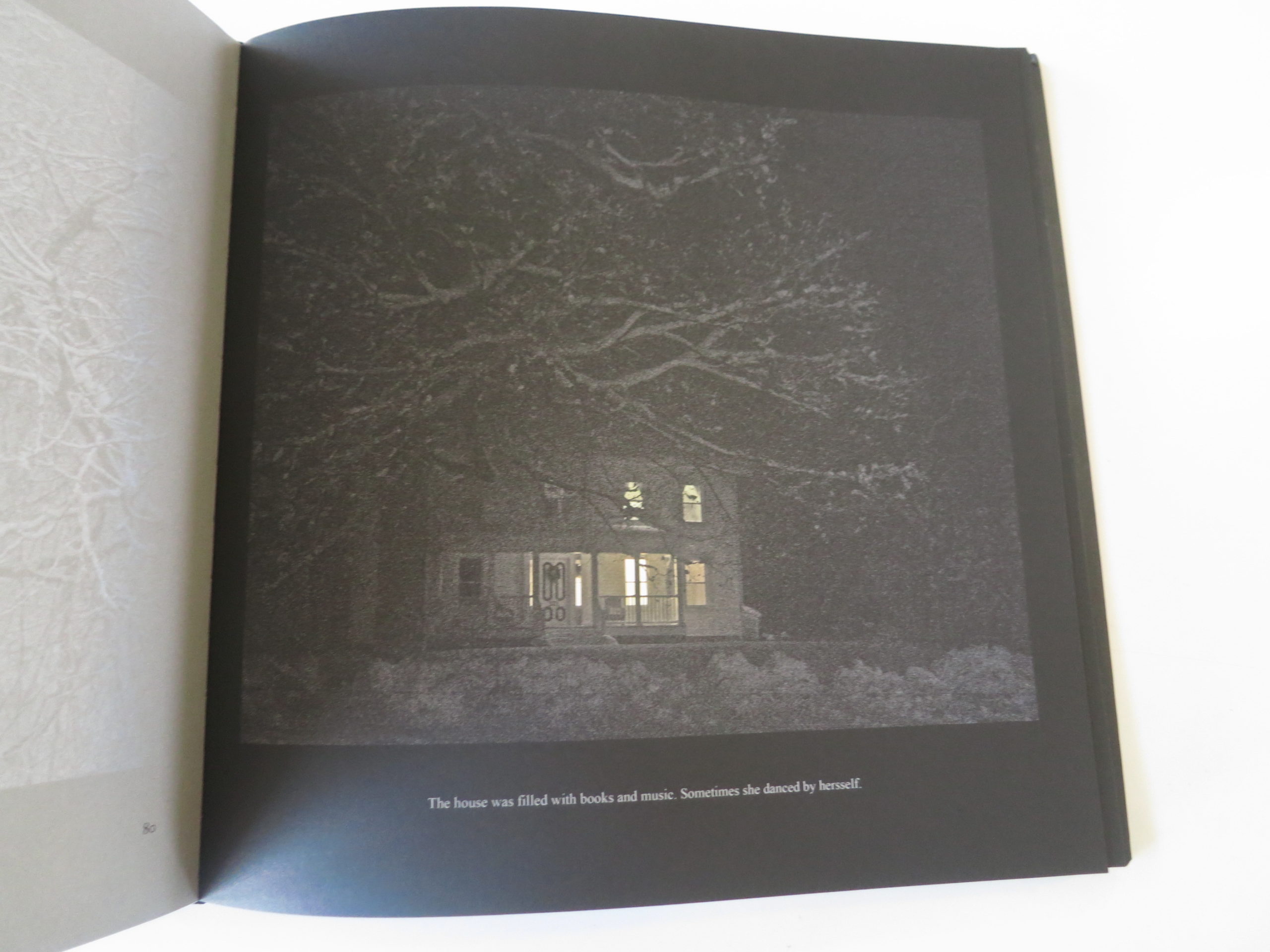
The paper is dark. The pictures are dark. They’re like ghost stories, without the ghosts.
My one quibble here, and it’s something I’ve mentioned a bit lately, is that I think there are too many pictures. I know that books differentiate themselves from catalogs by being bigger, and having more images, but I definitely think that more is not more, in most cases.
Less is more.
See you next week
Bottom Line: Cool, creepy, painterly book of East Coast landscapes
The Art of the Personal Project is a crucial element to let potential buyers see how you think creatively on your own. I am drawn to personal projects that have an interesting vision or that show something I have never seen before. In this new revised thread, I’ll include a link to each personal project with the artist statement so you can see more of the project. Please note: This thread is not affiliated with any company; I’m just featuring projects that I find. Please DO NOT send me your work. I do not take submissions.
JEN SERENA, PHOTOGRAPHER: Many years ago, on a trip to Ecuador, all of my gear was stolen – including the cards with all of the images I had taken. It was my first time shooting with the potential for a photo gig and it seemed like a message from the universe that maybe this wasn’t my path. The next day, I watched dozens of hummingbirds all fluttering their wings at hundreds of beats per minute just to stay relatively still and grab a meal. If they could work that hard just to survive, surely I could put forth more effort to pursue a career I absolutely love. A decade later, I still push hard for every job, working to best share my subject’s story through my diverse styles, and striving to always get a little something more than we’d planned. (And, I’ve become really protective of my backups.)
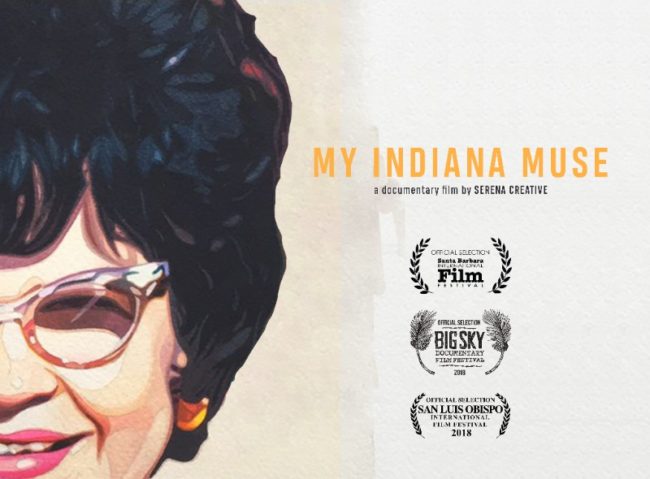
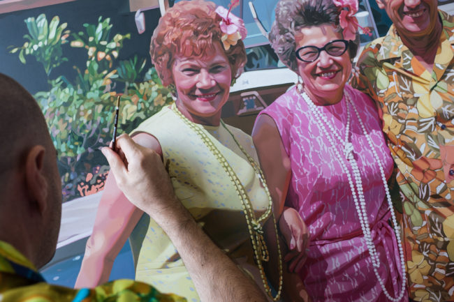
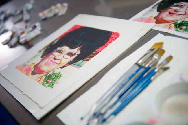
My Indiana Muse Documentary. The film is about an artist who discovers a muse (from Indiana). I co-directed/produced and shot stills for BTS and promo and designed artwork.
APE contributor Suzanne Sease currently works as a consultant for photographers and illustrators around the world. She has been involved in the photography and illustration industry since the mid 80s. After establishing the art buying department at The Martin Agency, then working for Kaplan-Thaler, Capital One, Best Buy and numerous smaller agencies and companies, she decided to be a consultant in 1999. She has a new Twitter feed with helpful marketing information because she believes that marketing should be driven by brand and not by specialty. Follow her at @SuzanneSease.
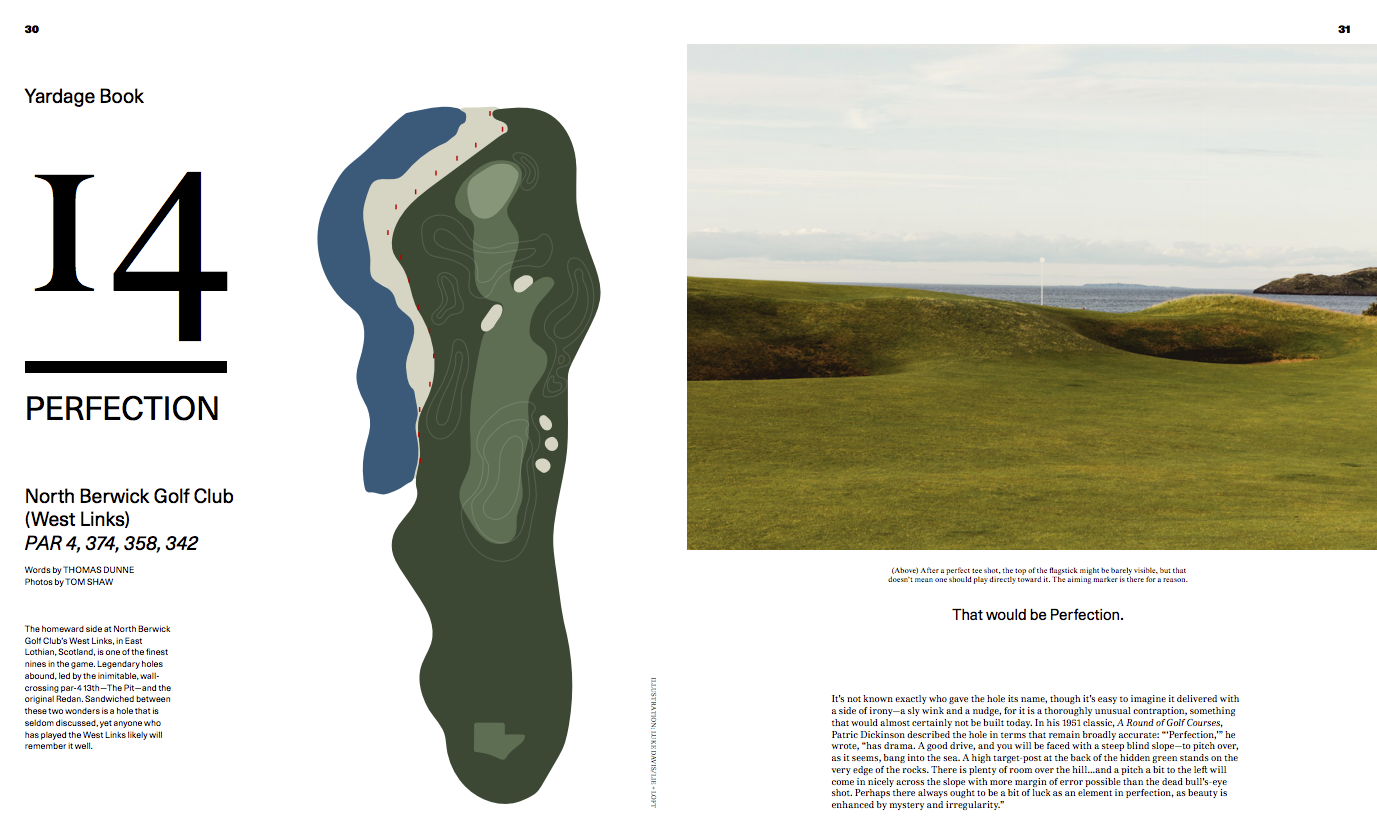
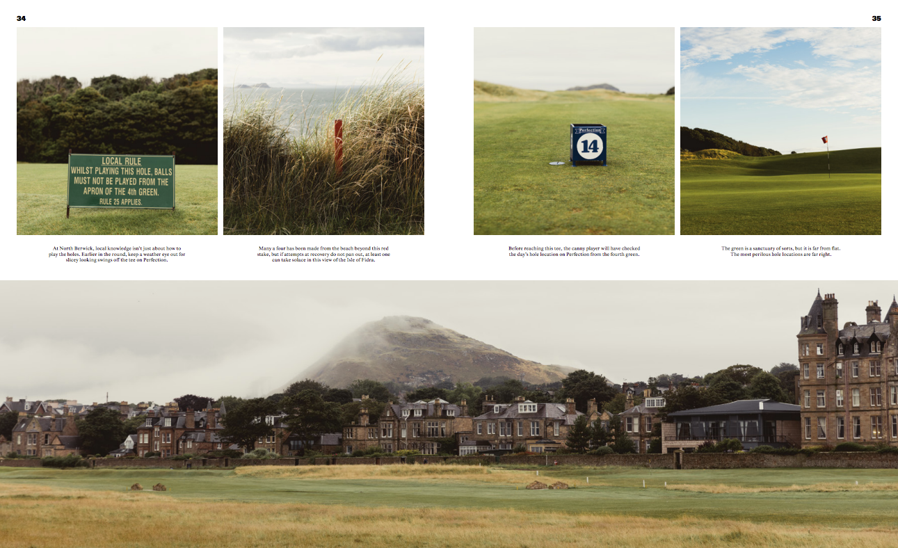
Art Director: Jim Newitt Photo Editor: Grant Ellis Photographer: Tom Shaw
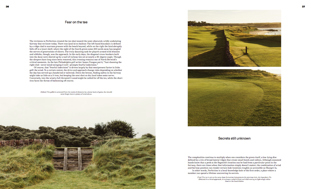
Heidi: What was different about this course that was a challenge for you to photograph? Tom: The biggest challenge with this course was the Wind and the light. The course, and this particular hole, is quite exposed so you get your share of wind and rain. I love this kind of wild weather though – it feels good to spend a day walking in it.
Did you purposely choose to shoot more end of day?
Yes I did. I tend to plan these shoot around and evening and a morning – this gives me two chances at getting the best light. I was lucky as an old school friend lived within yards of the course so I stayed with him and had a very short walk to the course.
What type of direction did you get from the magazine? They explained about the detail of the course and pretty much gave me free reign to shoot it in all its elements – from wide DPS views to the fine detail such as the cut grass. Because Summer in Scotland the late evening light lasts so long (almost until 10pm), I had plenty of time to really walk the hole and see all the details.
When you are approaching such a legendary course which is heavily photographed, is your process any different? I don’t really do much research – I’m not the biggest golf fan, but I am a fan of the landscape in which it sits, so I won’t look at other pictures, as I need to see how and where the light is, and I want to see it with fresh eyes.
I enjoyed your sporting landscape gallery, would you say these image fall into that category or does there need to be some type of architectural element to anchor the image.
These Images do fall into the sporting landscape category, but I feel that they do need people in the image to give it scale and context. Some of the images do have that and I think that it is important. But this image is shot with a specific brief to be about the hole, not the people. In some of my other work with surfing and cycling – the people play a very small but important part in the image as it is all about scale and context.
This kind of work – the sporting landscapes – is pretty new to me as I have spent a lot of my career shooting athletes and sporting events, but this is going back to shooting what I love, landscapes. I grew up in Scotland and my love of photography started by being out in the hills and mountains, and seeing the light dance across the hills. I’m looking to combine these two passions of sport and landscape so it seemed a natural progression to shoot this way.
Who designed it?
Me! I used InDesign and retouched the photos myself as well. I actually love the process of editing and laying out the images and find it a nice way to process through the year’s work. I also find it interesting to make visual connections with spreads and the sequencing of images.
Tell me about the images?
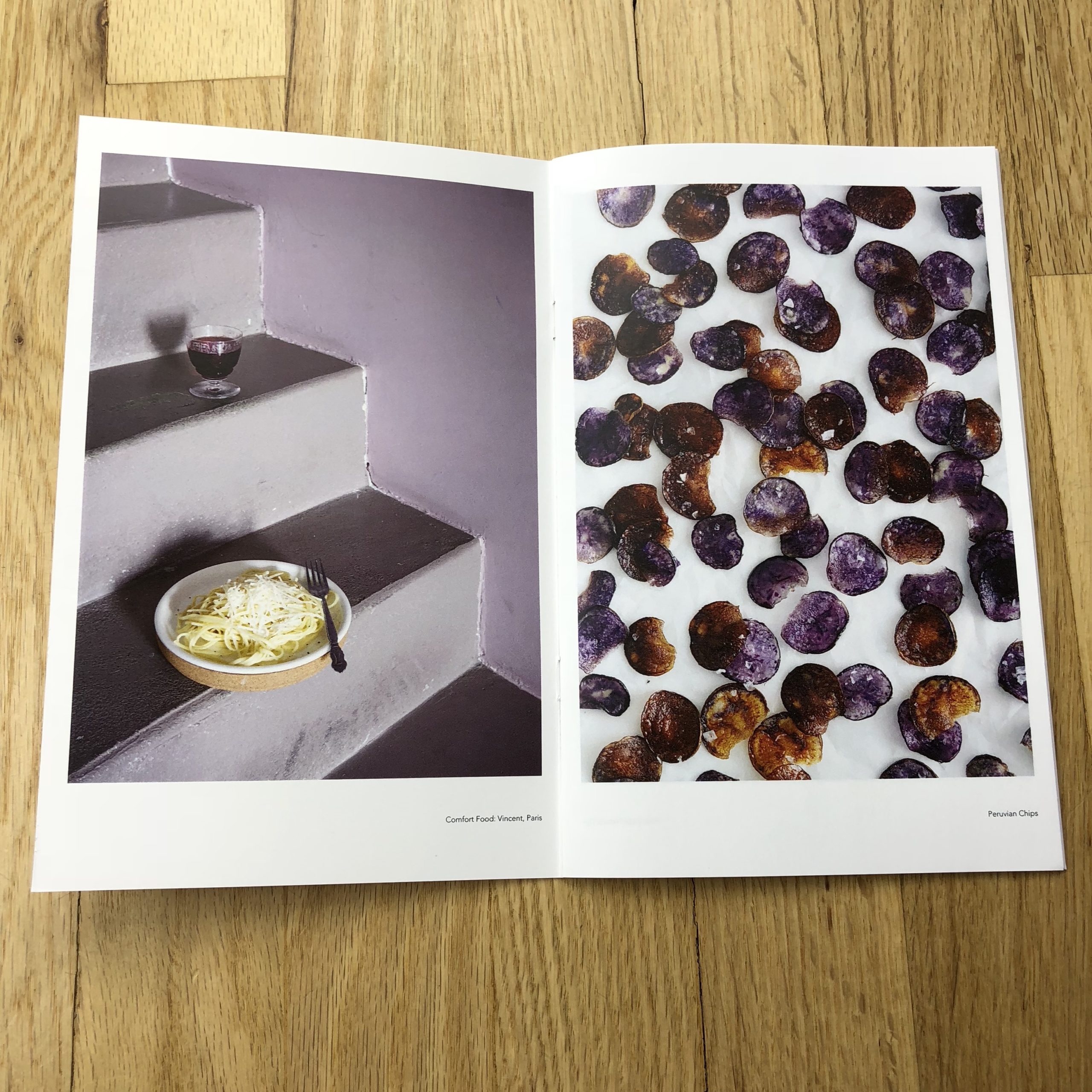
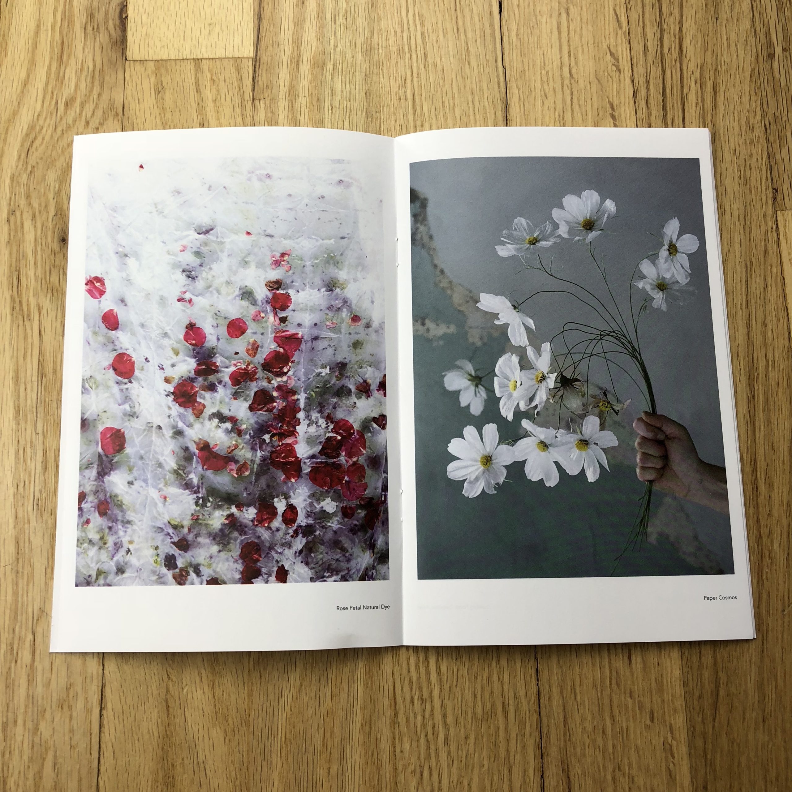
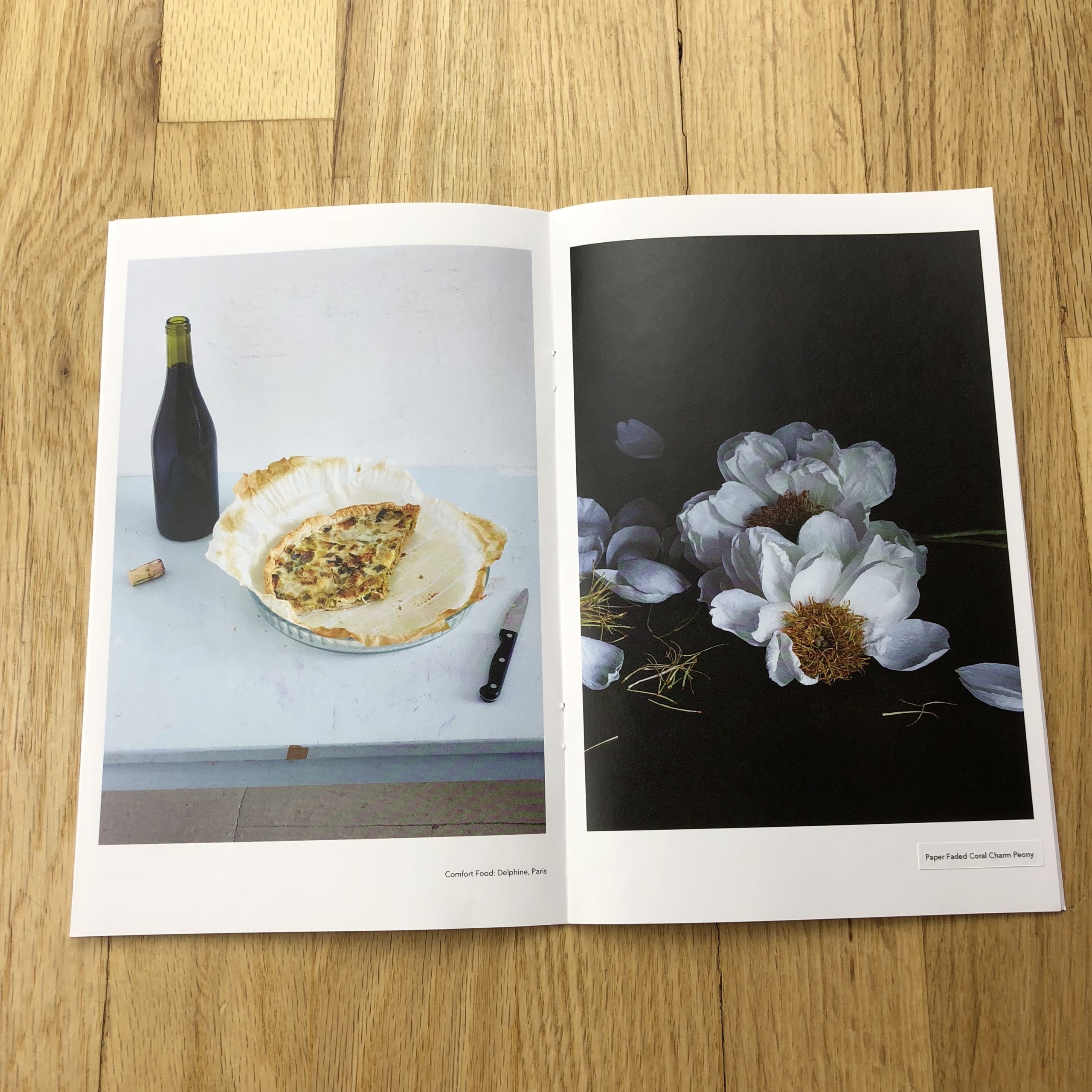
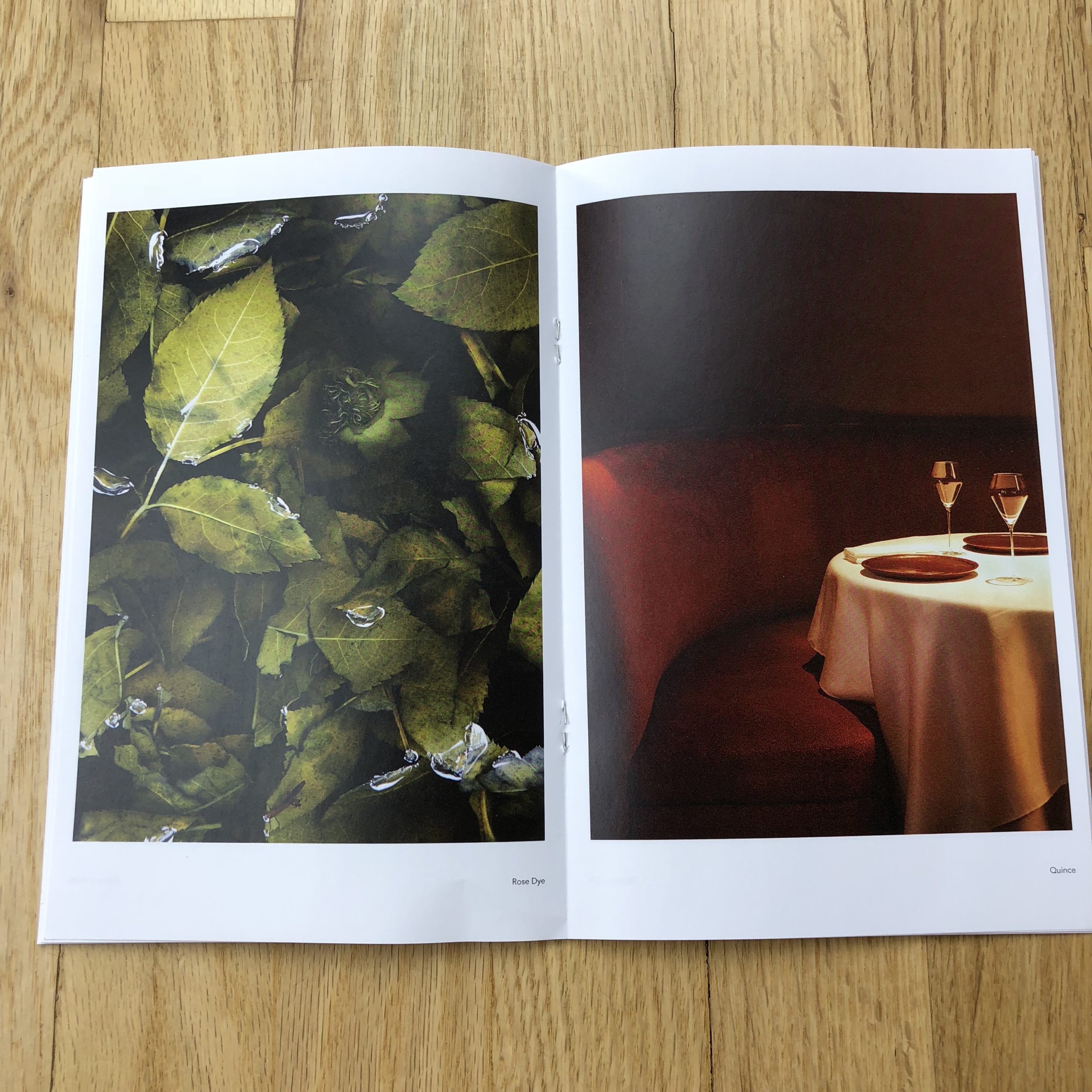
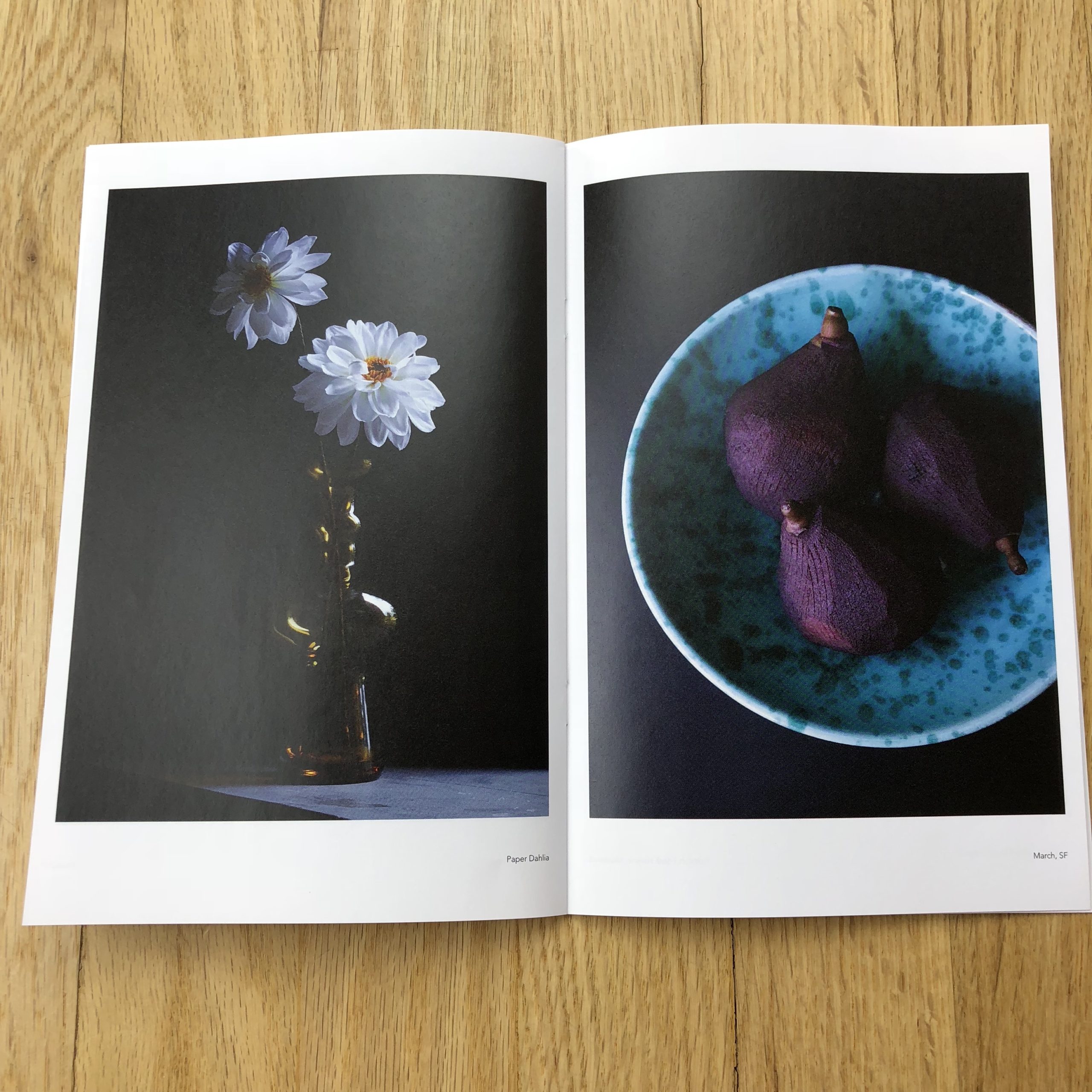
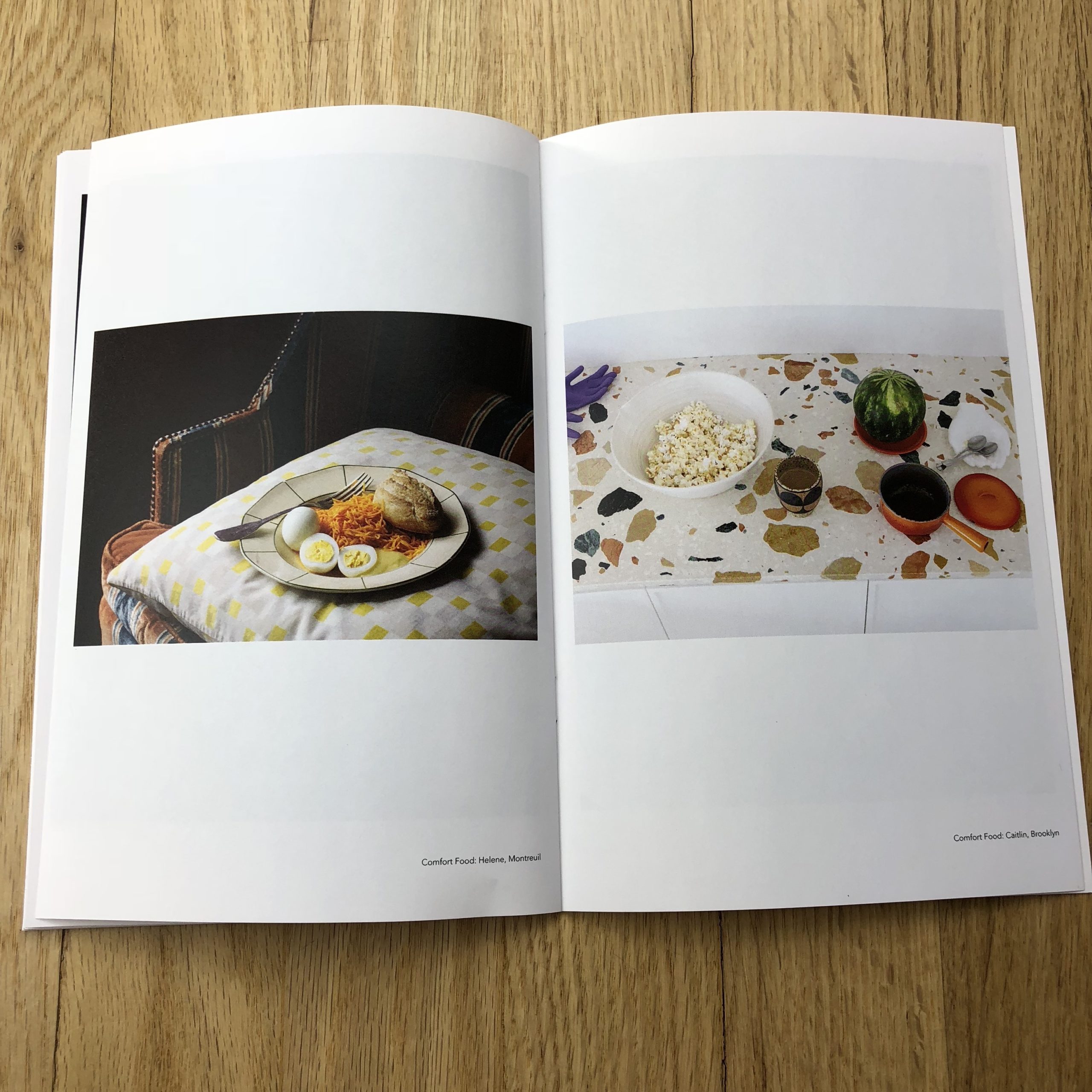
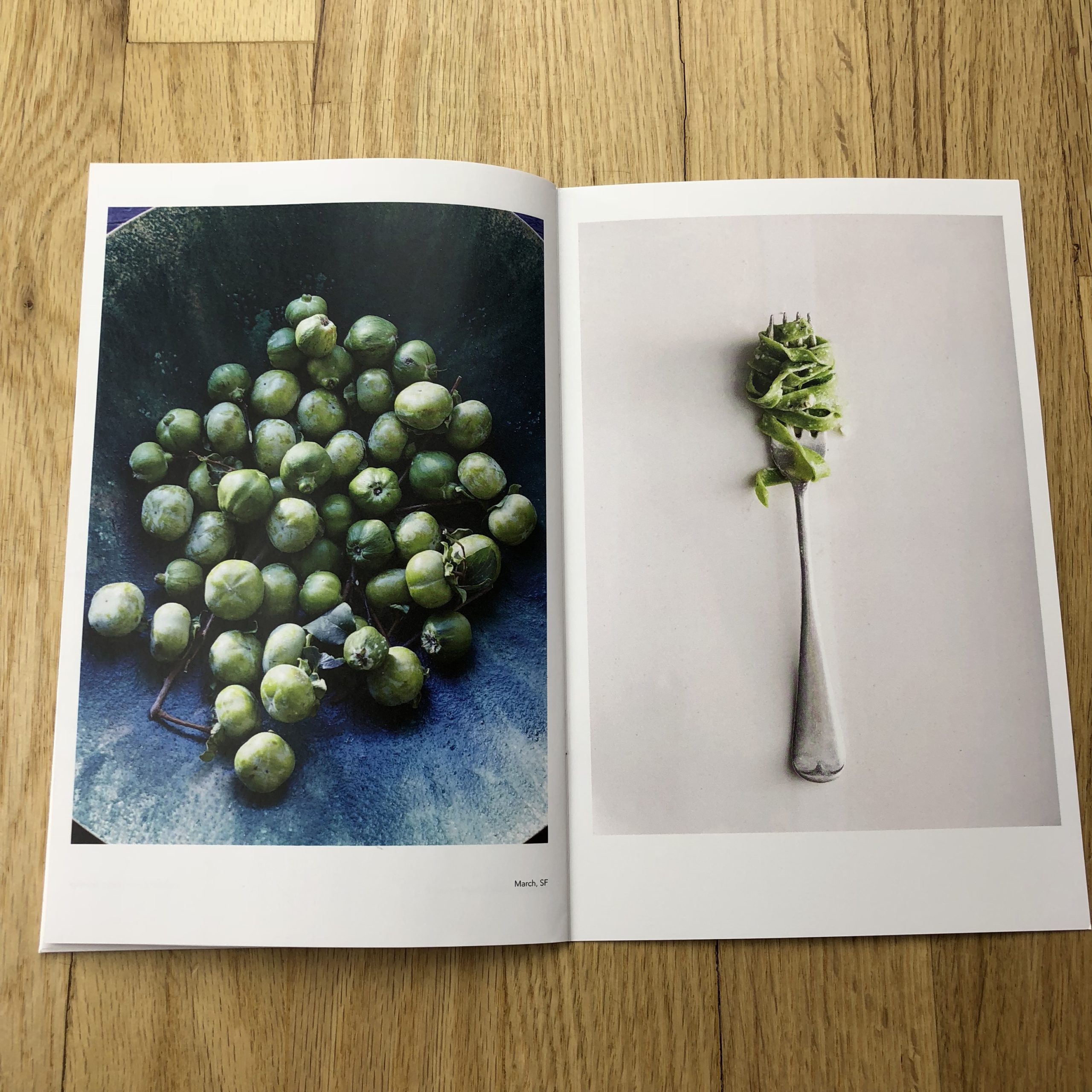
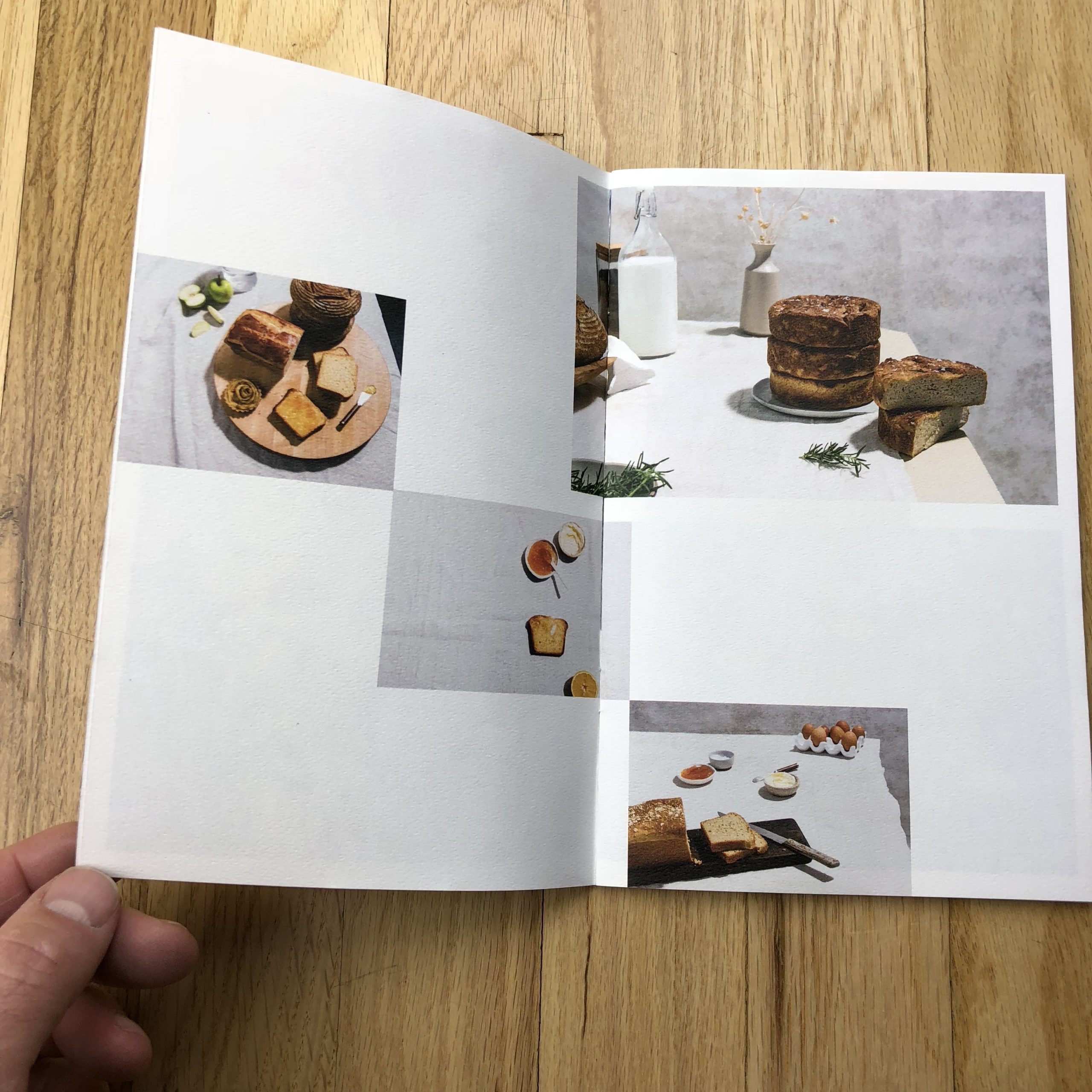
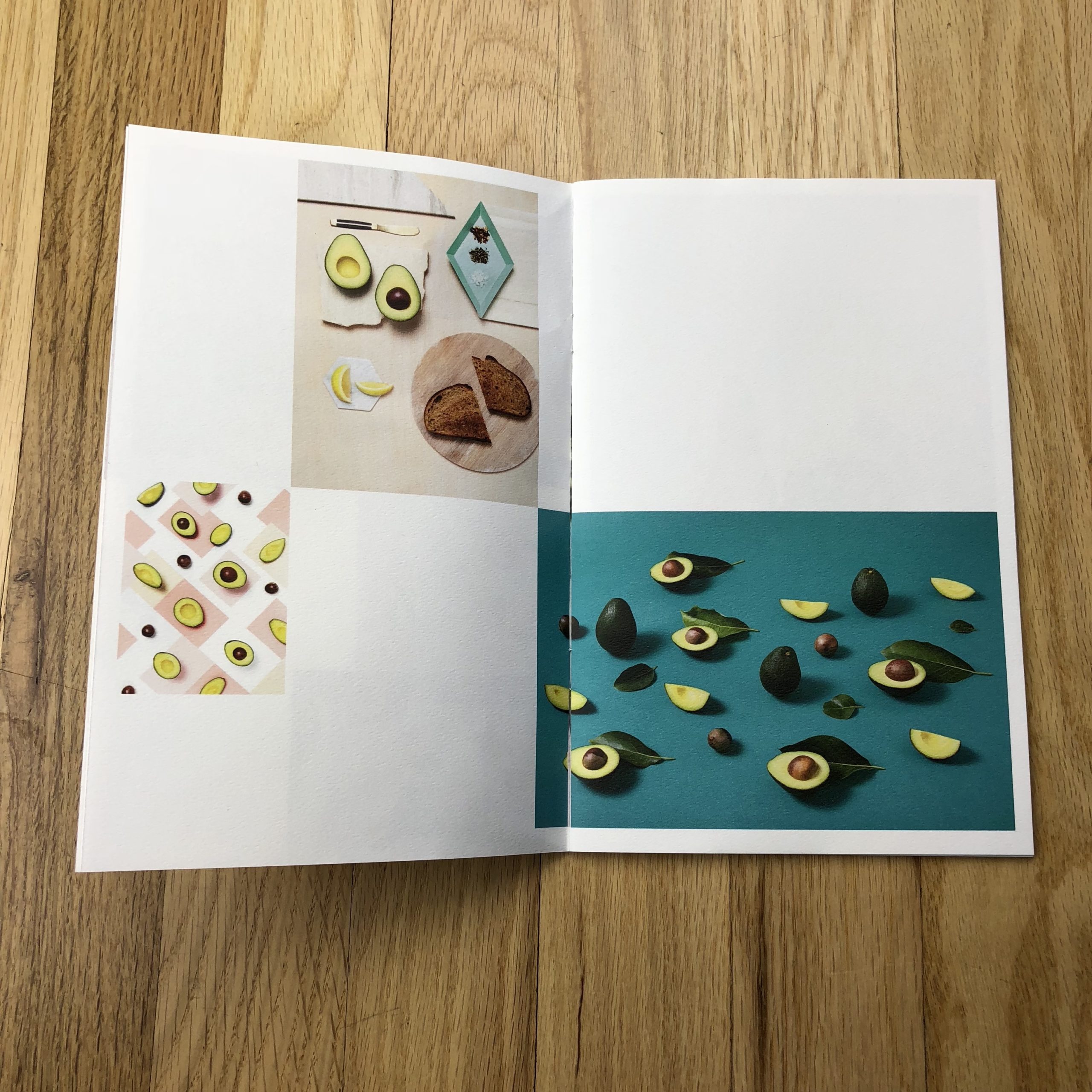
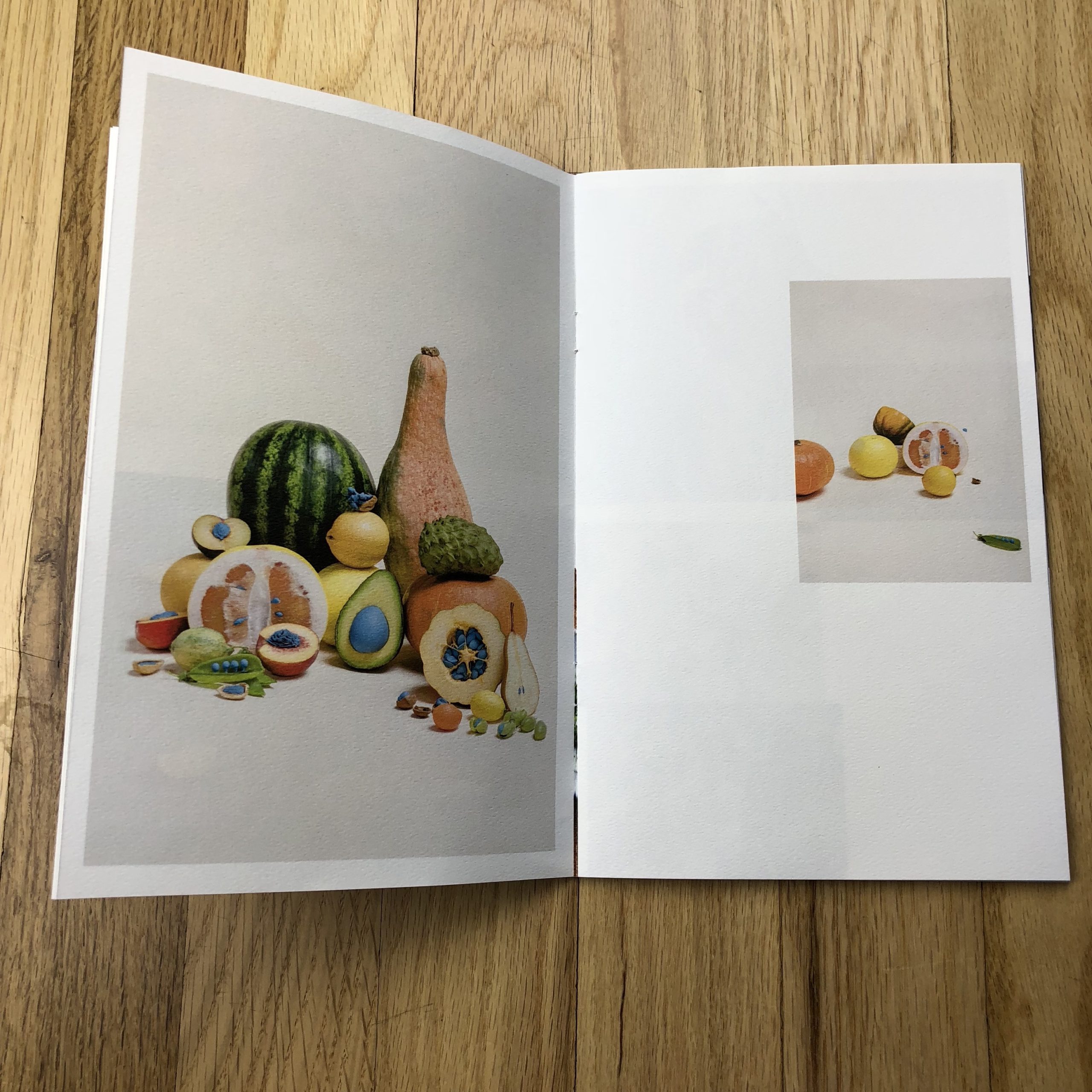
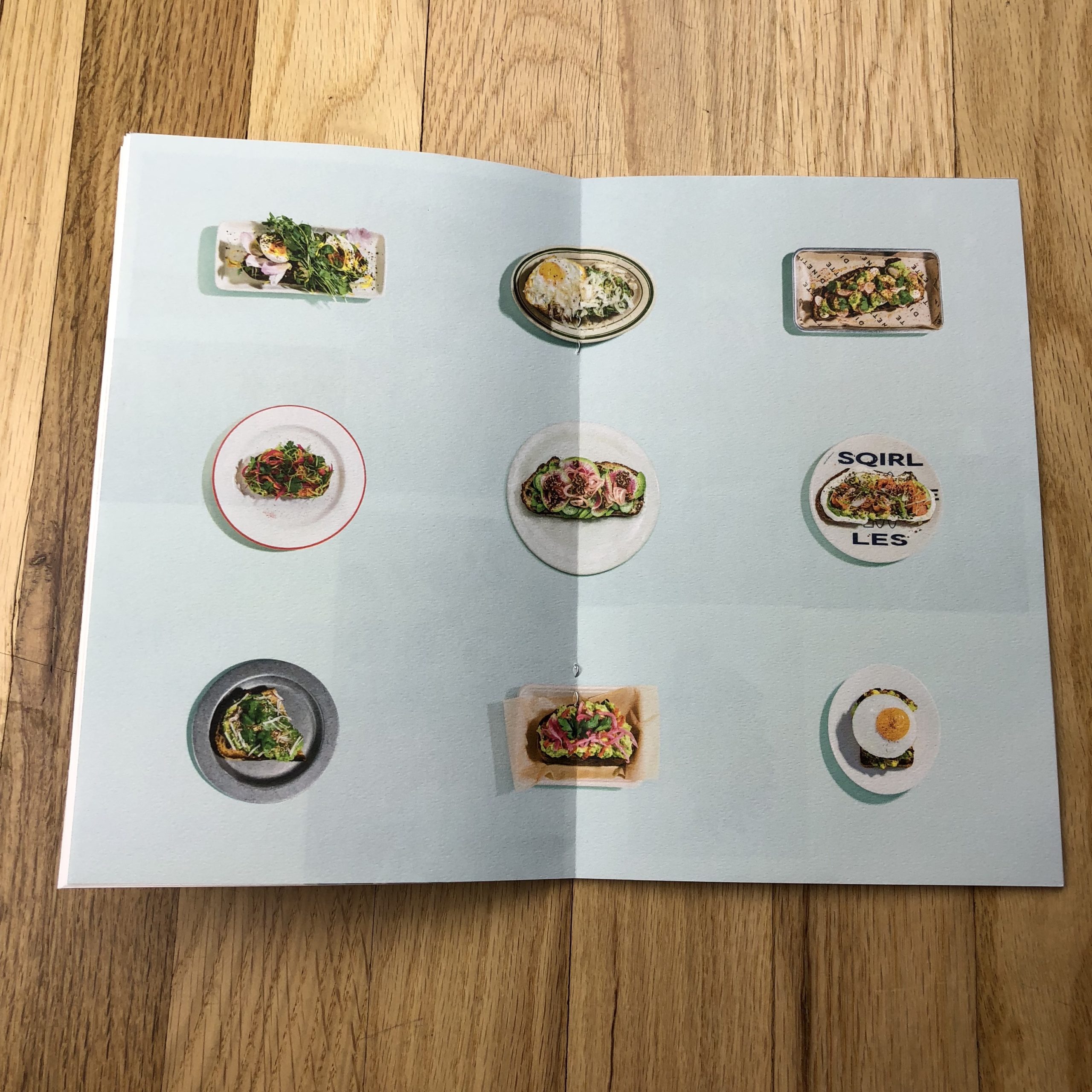
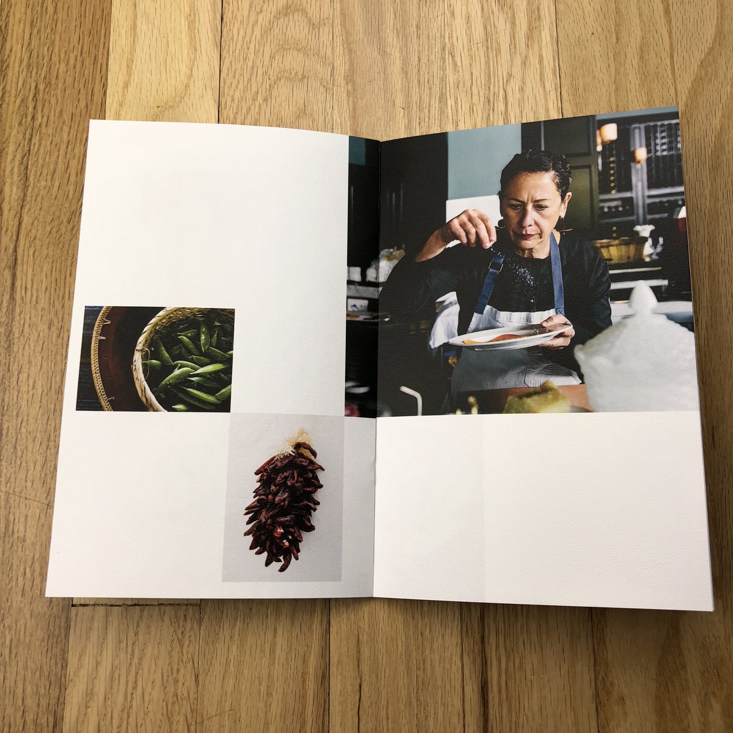
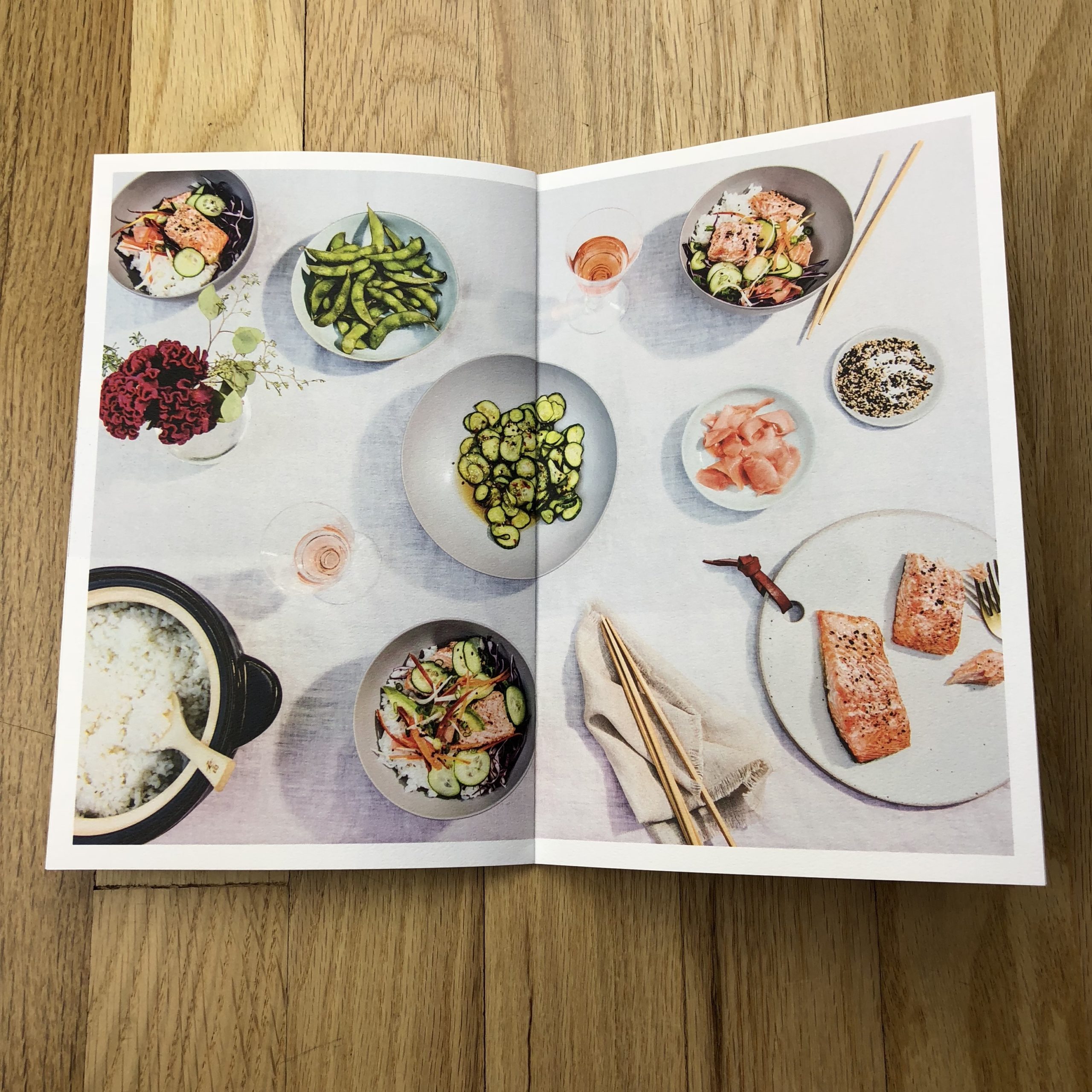
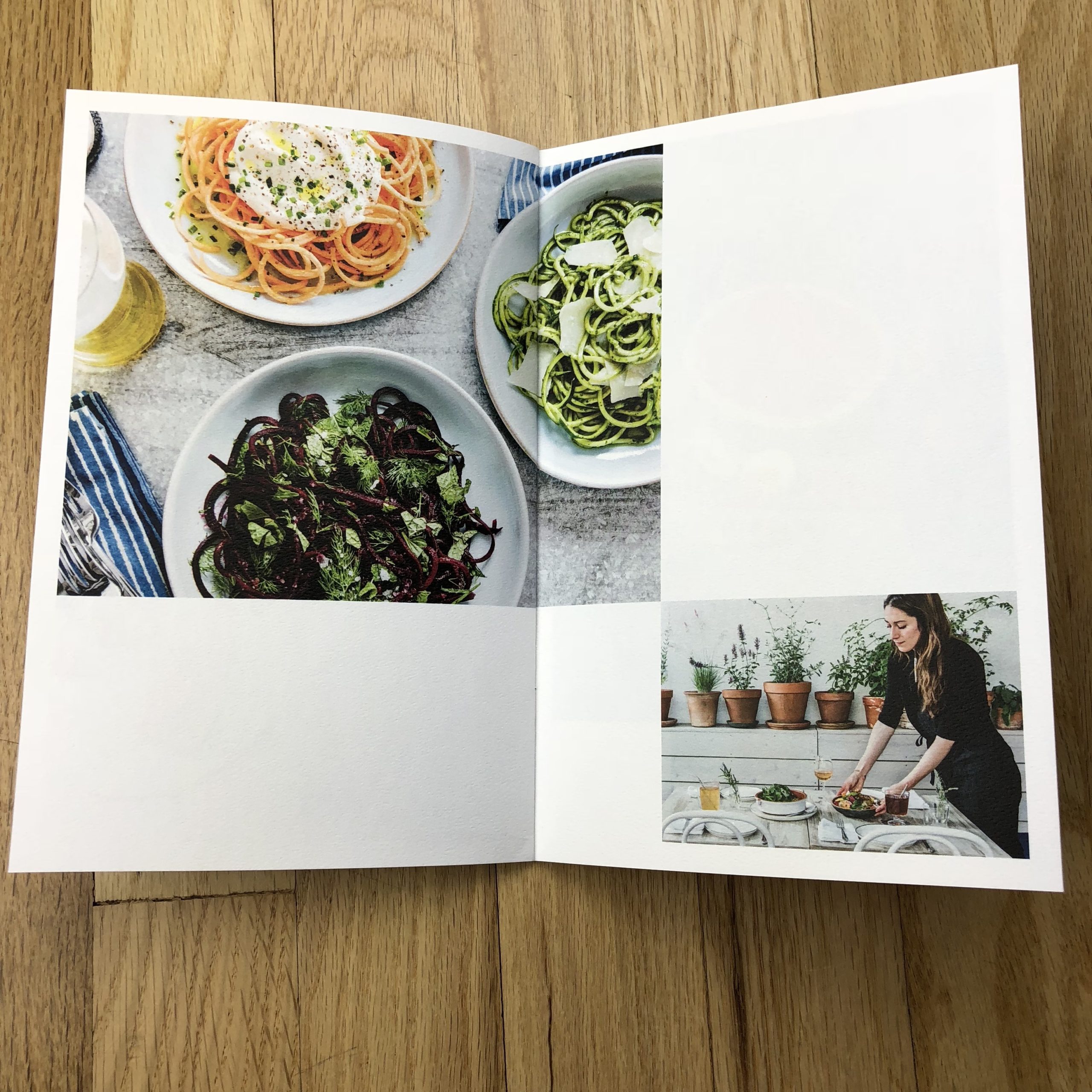
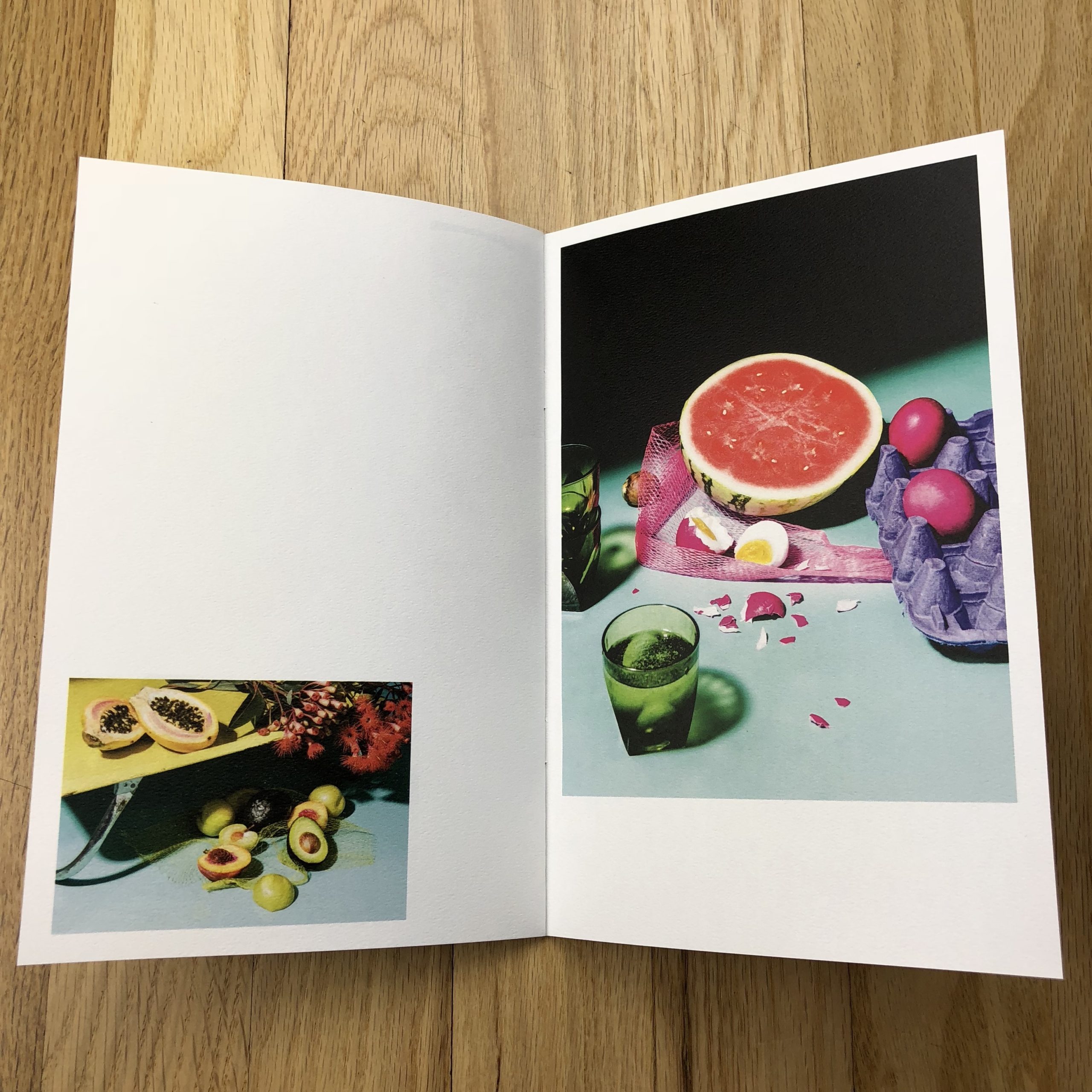
They are a collection of my favorite images from editorial, commercial and personal work from the past year. Some images were taken from an upcoming cookbook I did with Mark Bittman (Clarkson Potter, 2018), some from a personal photo series about people’s comfort food (which I’ve been working on for the past 5 years) and some from commercial shoots. Even though it was tempting to add more photos, especially portraits, I tried to limit myself to mostly still life and food so the portraits didn’t appear too random. I also like to send out the kind of images I like to take so people think of me for these kinds of shoots. And I like food and still life A LOT :)
How many did you make?
I typically do a smaller run and this was just 200 booklets. I send to a select group of my favorite creative directors, photo directors, photo editors and other people whose work inspires me such as chefs, restaurateurs and artists. I really want to target the people whose call for a collaborative project would make me excited.
How many times a year do you send out promos?
Typically I put together a book or booklet at the end of the year for an annual summary of my favorite work from that year. I often also send out limited edition prints to my best clients.
Do you think printed promos are effective for marketing your work?
Yes, absolutely. I crave tactile paper books and prints and I think clients do as well. I also think it’s important to have something that you can hold and look at without online distractions. I hope to make something interesting and visually exciting enough that people will save and keep them hanging around their desk.
If you live long enough, you’ll see all manner of science fiction come to life.
Like right now, for instance.
My busted hand is healing more slowly than I might like, so I just figured out I can dictate my column on my new-ish computer.
It’s blowing my mind.
So many of us use technology, these days, to take us out of our everyday world, away from the thoughts that clutter our minds. Whether we’re looking at computers, phones, tablets, watches, or television screens, digital reality transports us away from our mundane lives.
I’m getting a rush, at the moment, because I’ve had the same way of writing for the last nine years, (you know, typing…) and it feels like the 21st-century has finally come in earnest to my remote little horse pasture in the Wild West.
If you’ve been reading this column for a while, you’ll know there are some themes I return to again and again over the years. One idea I like to consider, from time to time, is the way art functions in the very manner I’m currently discussing technology.
Art can expand our minds.
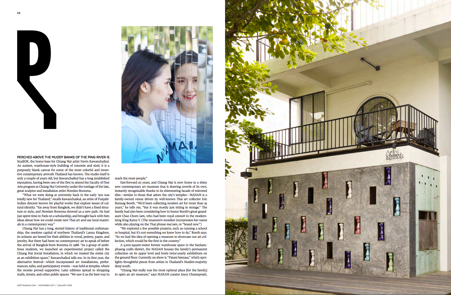
Like the perfect psilocybin trip, movies, paintings, books, photographs, (etc.,) help us understand more about the world we inhabit. Art can definitely make us smarter, which is why some people find it so threatening.
But art can also make you forget the world. It can wipe your mind clean, and leave you feeling all sorts of emotions, as your neurons blaze with bio-electrical energy.
Last year, during my travels, (which I reported on extensively here,) I had a couple of art experiences that transcended what I normally get out of looking at objects on the walls of a museum.
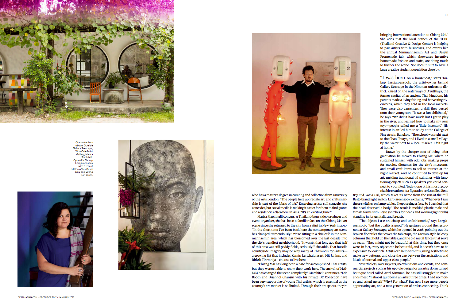
Each time, I got swept up in the music.
I admit that back in the 90s, I went to my fair share of concerts, and had a shit-ton of fun. But it’s been so long since I’ve seen live music, what with dinners to cook and kids to put to bed.
So when I was in Chicago for the Filter Photo Festival back in September, I found myself eating late night scraps at a party with some local jazz musicians who had just wrapped their set. I asked them where they would go if they were me, to see something special, and they mentioned a place called The Green Mill.
When I told my friends, they assured me it was famous, as it used to be a hangout for Al Capone. Now that I’ve been to Chicago three times, I get the sense there’re a lot of places that lay claim to the old gangster. His name still comes up constantly, this deep into our futuristic present.
Anyway, there was a cheesy-old-timey-white-guy-jazz-band playing when we arrived, which my friend Erin likened to listening to NPR live, and the bouncers kept insisting everyone be quiet to listen. (Lots of shushing.)
It was a total bummer.
All of a sudden, the band welcomed an Old-Spanish-Female-Gypsy singer to sit in with them, and within seconds of her opening her mouth, I was transfixed. Everyone shut up willingly, like something out of a movie, when the odd duck walks into the wrong bar.
Oh my God, it was so good.
Before you know it, I was the one telling Erin to shut up, and then after two songs, she was gone. The band went back to its lame previous set.
Then this December, when I was in New Orleans for the Photo NOLA festival, I swore I would not leave town without hearing some kick ass music. New Orleans is renown for being one of the best music cities on Earth, yet I had never seen so much as a tambourine rattled on previous visits.
Certainly, no Second Lines, or anything special like that.
Each time I’ve gone, I’ve been told that Frenchmen Street is the place to go, but I hadn’t ventured that far before. This time, I refused to take no for an answer, and luckily recruited a great group to join me. (We hailed from Chicago, London, Taos, Savannah, Dallas, Atlanta, Tucson, and Phoenix, so it was a polyglot affair.)
The first bar we went to had some hack singing “Happy Birthday” to a bunch of drunk tourists who didn’t know any better, even though we were told this was more a local’s part of town.
We left, (of course,) and found a bar called d.b.a. The bouncer let us in for free because the cover charge hadn’t started yet, but told us if we left we’d have to pay 10 bucks to get back in, because the band was THAT GOOD.
He suggested if we were smart, we’d hang tight for a couple of hours, and wouldn’t be sorry. Man, was that dude right. (Thanks for the advice, random-NOLA-bouncer-guy.)
It was a Mississippi Hill Country Blues duo featuring Cedric Burnside, the grandson of the famous bluesman RL Burnside, and his sometimes partner Lightnin’ Malcolm.
Holy shit, could these guys wail. The music was violent, but in a good way. I was yelling and screaming, dancing like a teenager, and sweating from the heat of their awesomeness.
It was one of the best art fixes I’ve had in a very long time.
I know on this blog we show photographs, and there’s rarely any sound, beyond the odd-random-video-link. You guys come here to read the writing, and look at the pictures, and I hope in the best case, some of the things you look at might take you out of your head, in addition to expanding your mind.
Some artists I meet have political things to say, and critique the cultures in which they live, and others just want to make something beautiful, peaceful, or memorable.
So today, I’m showing you the second and final group of portfolios that represent the best work I saw at Photo NOLA last month.
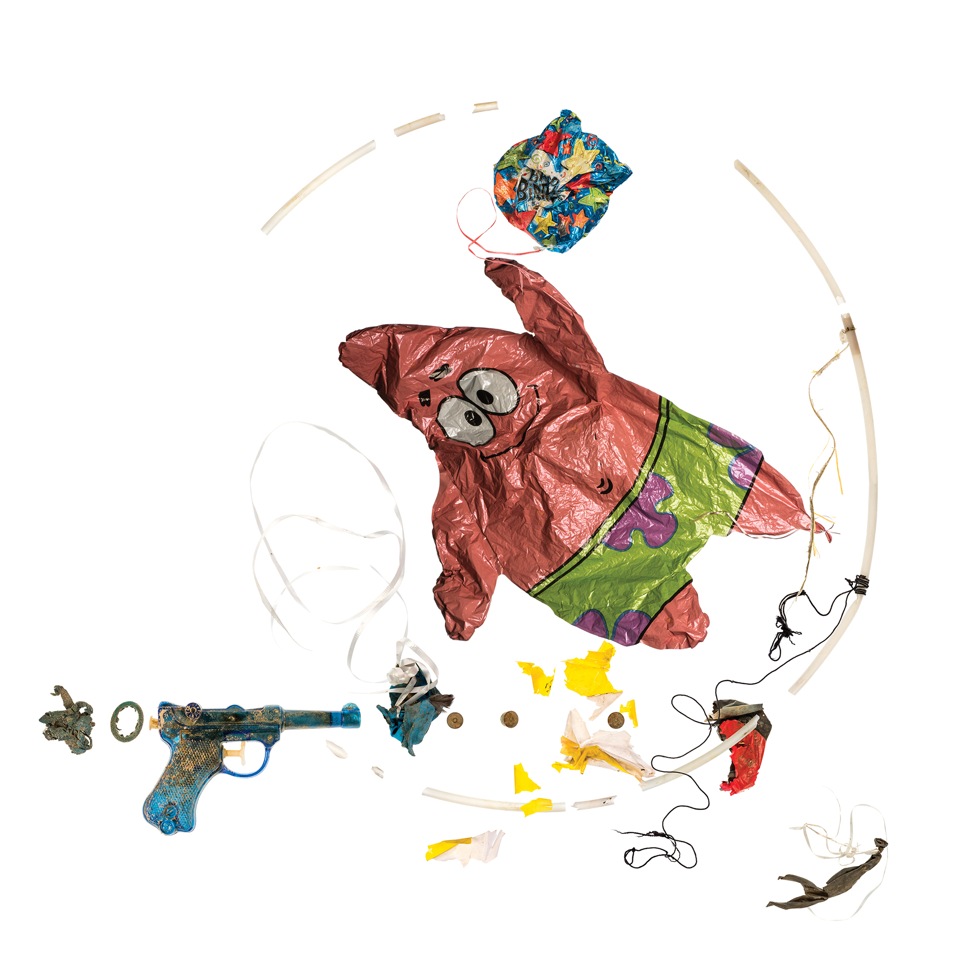
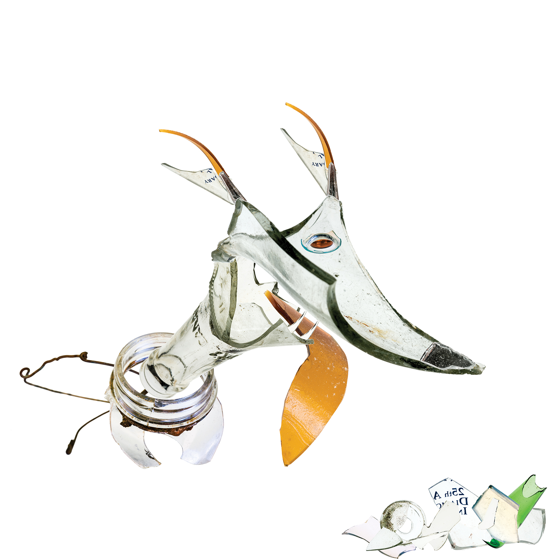
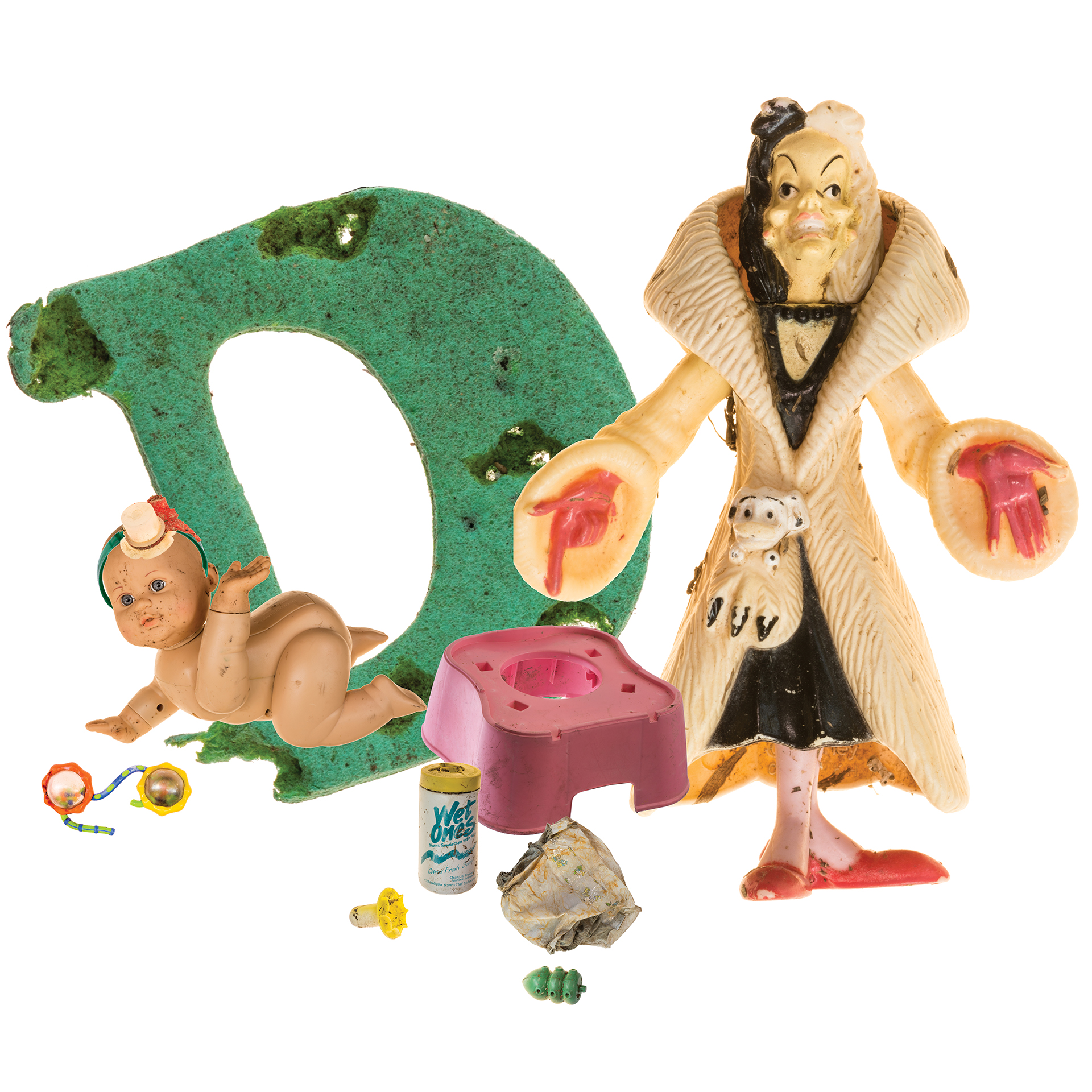
Becky Wilkes hails from Ft. Worth, Texas, and has a house on a lake down there. She likes to go on walks, and picks up trash that she finds along way, before taking it to her studio to make art. She showed me one group of pictures that was very linear, and literal, and I felt it could use a little loosening up.
Then, she had a second series that was far more playful and light hearted, as she makes little tableaux. It presented the objects in stark contrast to the manner were normally accustomed to seeing them. I think they’re kind of cool, and I’m sure you will too.
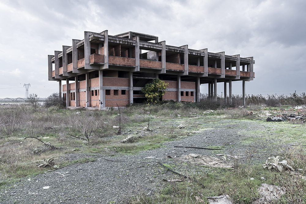
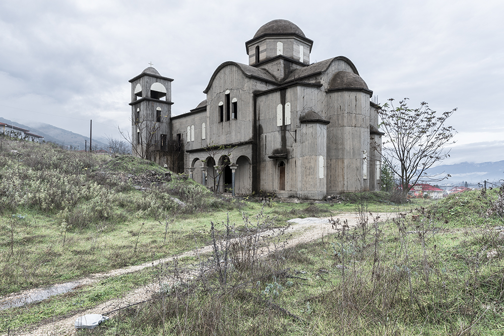
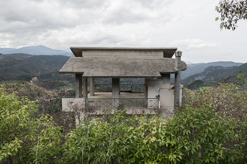
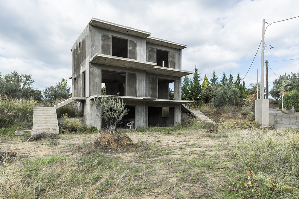
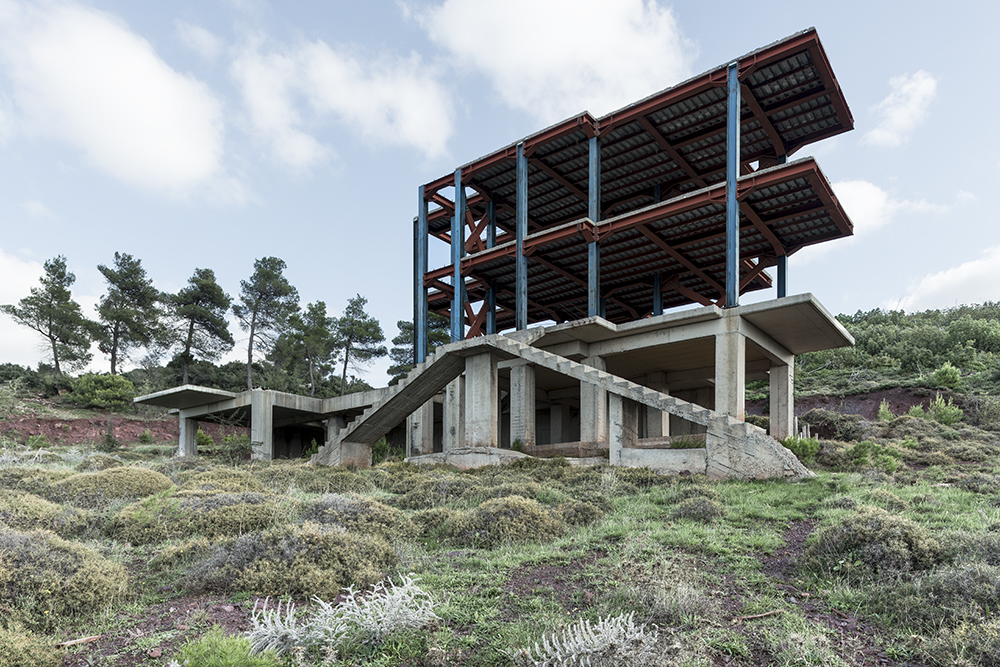
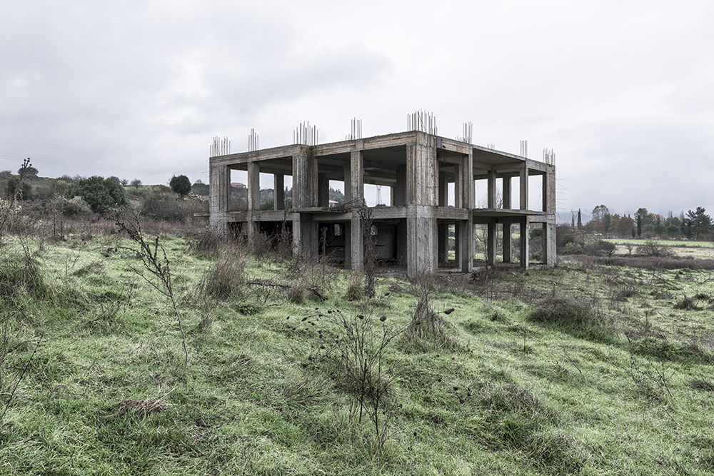
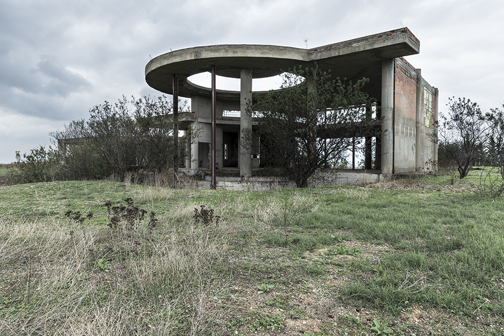
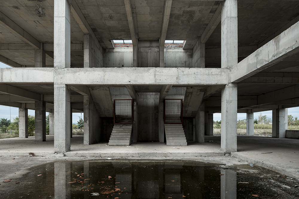
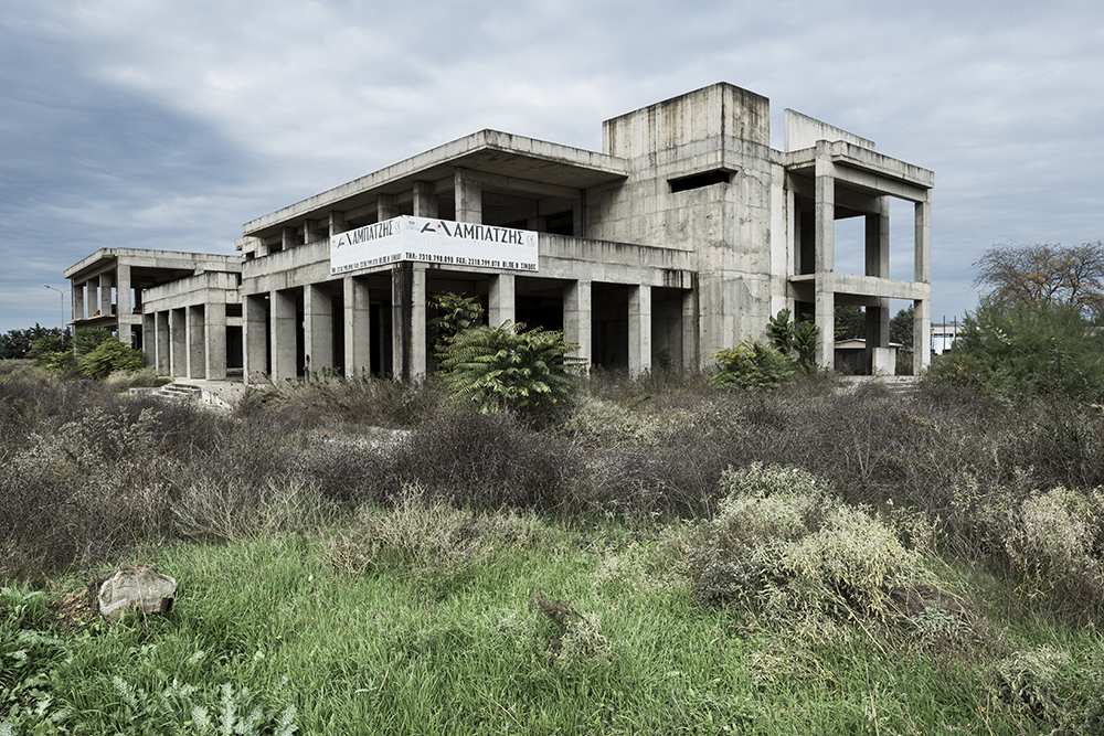
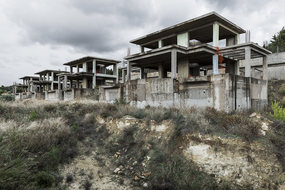
Christos Palios is a Greek-American hailing from the Baltimore area. Rather than showing me pictures of the Inner Harbor, or all the locations David Simon filmed in during “The Wire,” he had a series of photographs from across the world in Greece.
The pictures represent unfinished, concrete structures dotting the landscape, abandoned after The Great Recession. Christos prides himself on his craftsmanship, and I don’t blame him, as he’s teasing some really high resolution landscape imagery out of a full frame digital 35 system.
Technical-speak aside, I think the pictures a really interesting. There’s a calm, bleakness to them, but they’re also traditionally beautiful as well, with their formal structures and subdued-but-evident color palette.
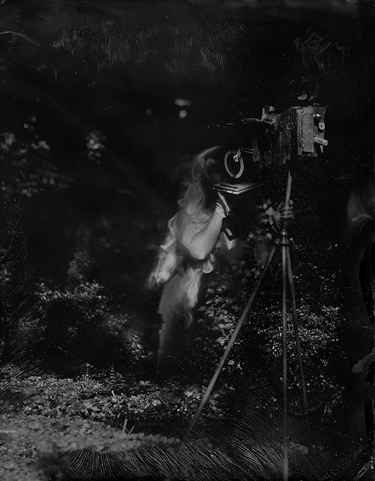
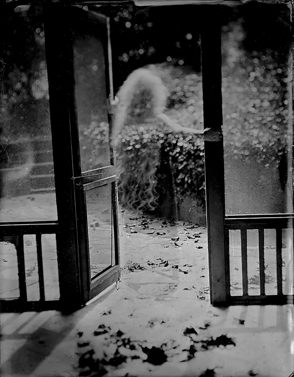
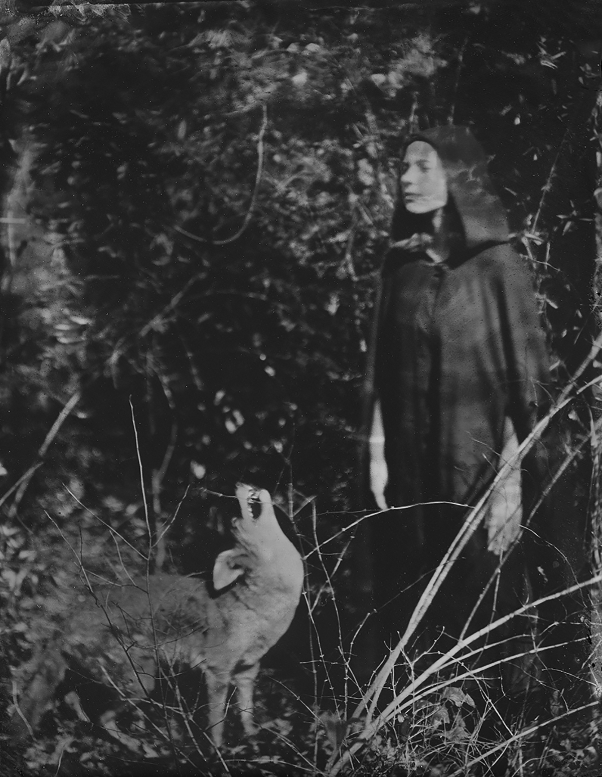
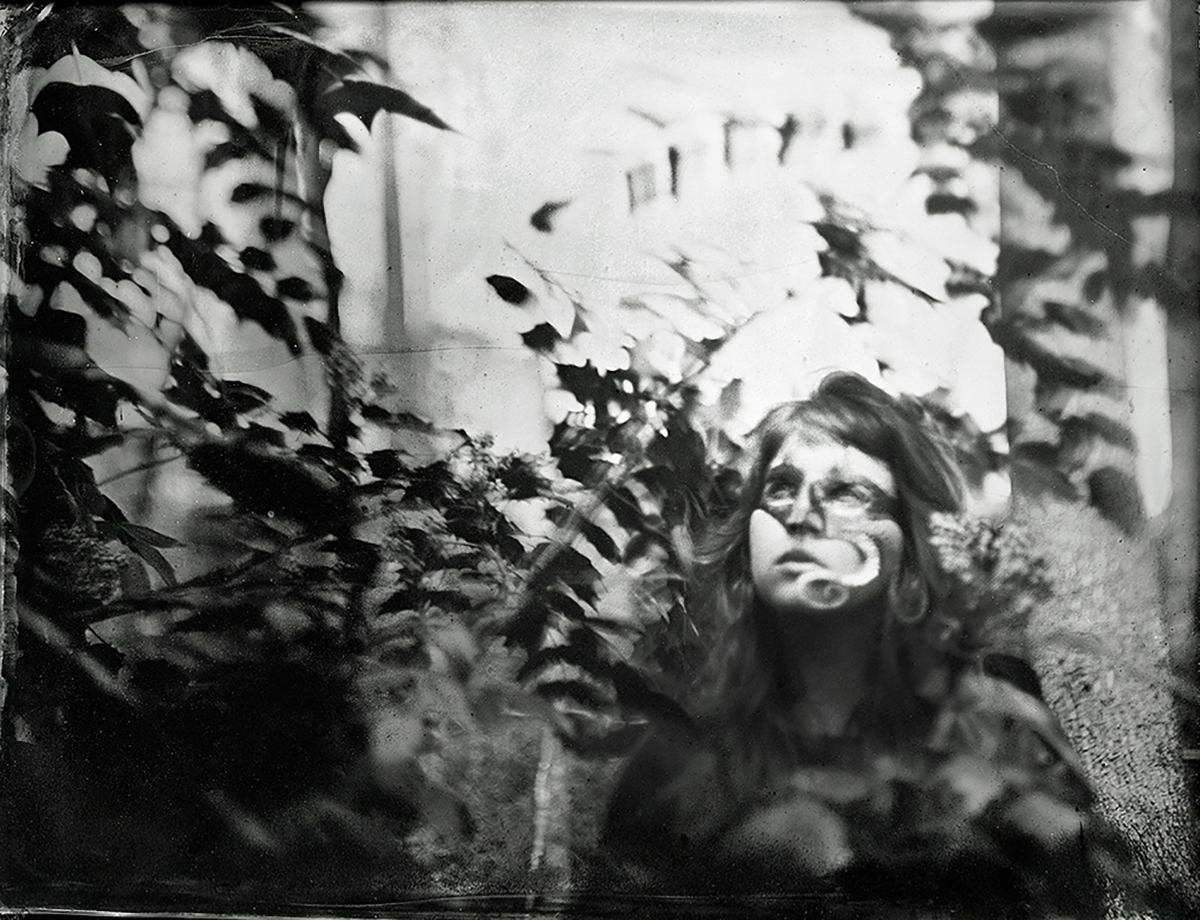
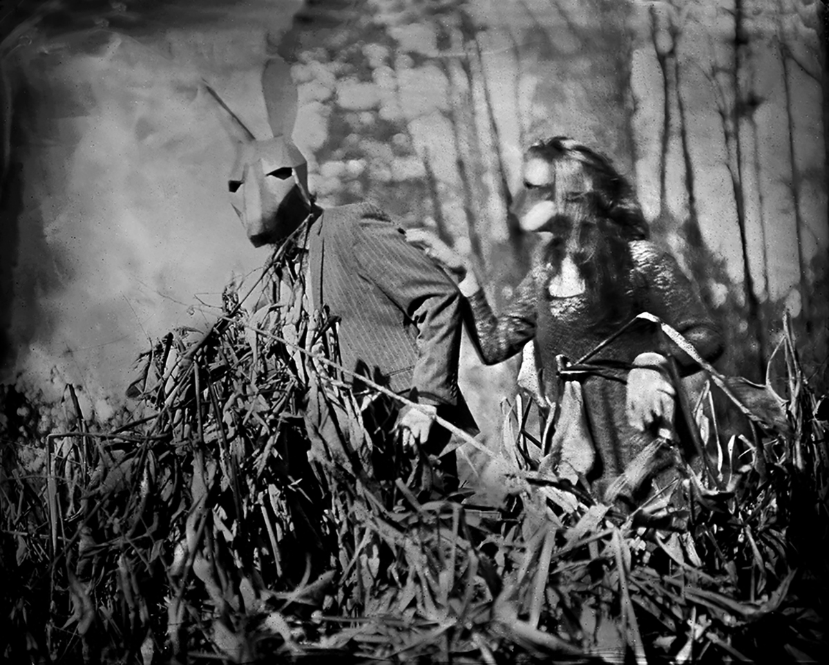
I first saw Mary Anne Mitchell’s work out of the corner of my eye at the portfolio walk, and it appeared she was working with tin types, which were popular at the festival. (Frankly, now that I think about it, I saw a fair bit of that style of work in 2017.)
When we sat down at the table the next day, she showed me that, like others I’ve reviewed, she had scanned and enlarged the tintypes, and was printing her images digitally. At first I questioned the technique, because why bother going old-school if the final results don’t really show the work?
But then I saw the large prints, with all sorts of texture captured from the plates, and I thought they were great. Mary Anne, who’s based in Atlanta, shoots mostly in her backyard, and uses friends and family as models, yet involves masks in ways ways that reference photo history, and art history in general. (Like Julia Margaret Cameron meets Ralph Eugene Meatyard.)
Crazy stuff.
Jan Arrigo was one of several people who returned to my table to show me how their work has evolved from a previous meeting several years before. (I took that as a compliment.)
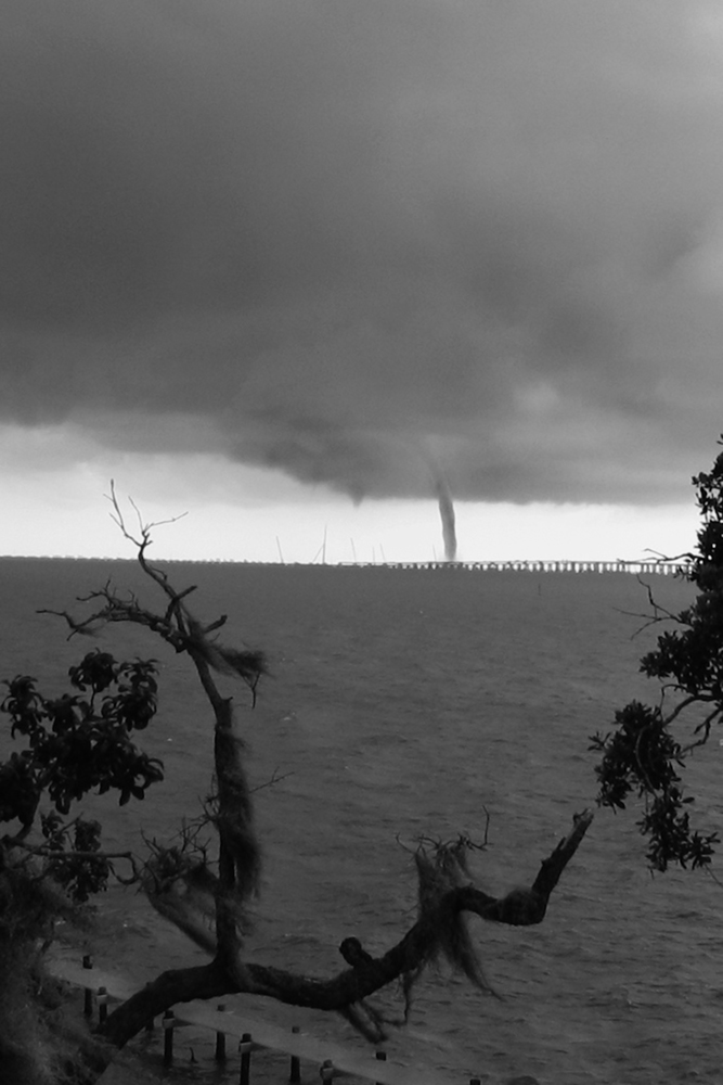
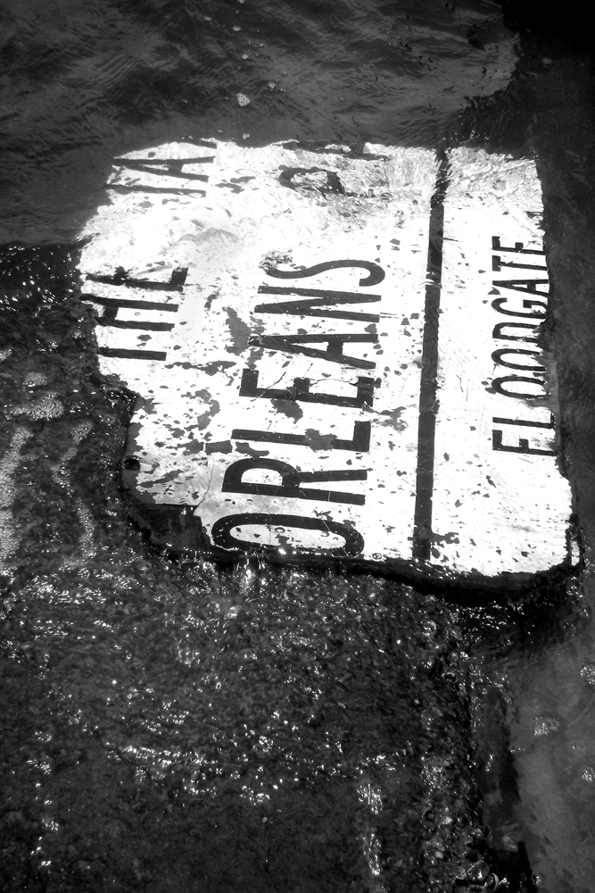
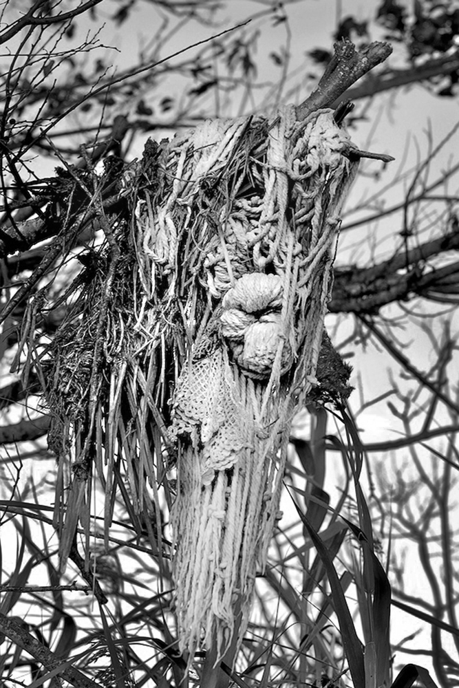
Jan lives nearby, on Lake Pontchartrain, and had multiple series of well-crafted pictures that showed off the lyrical, Southern, baroque beauty of the landscape. In particular, I liked a group that tracked the place in the years before, during and after Hurricane Katrina.
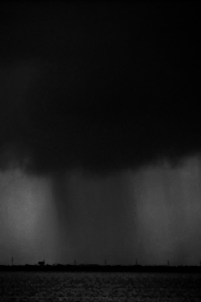
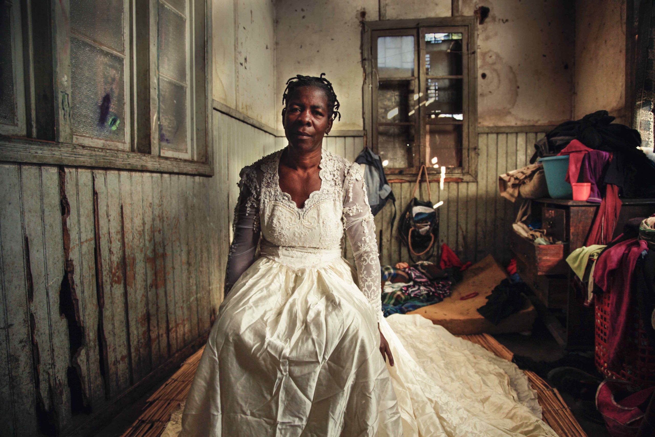
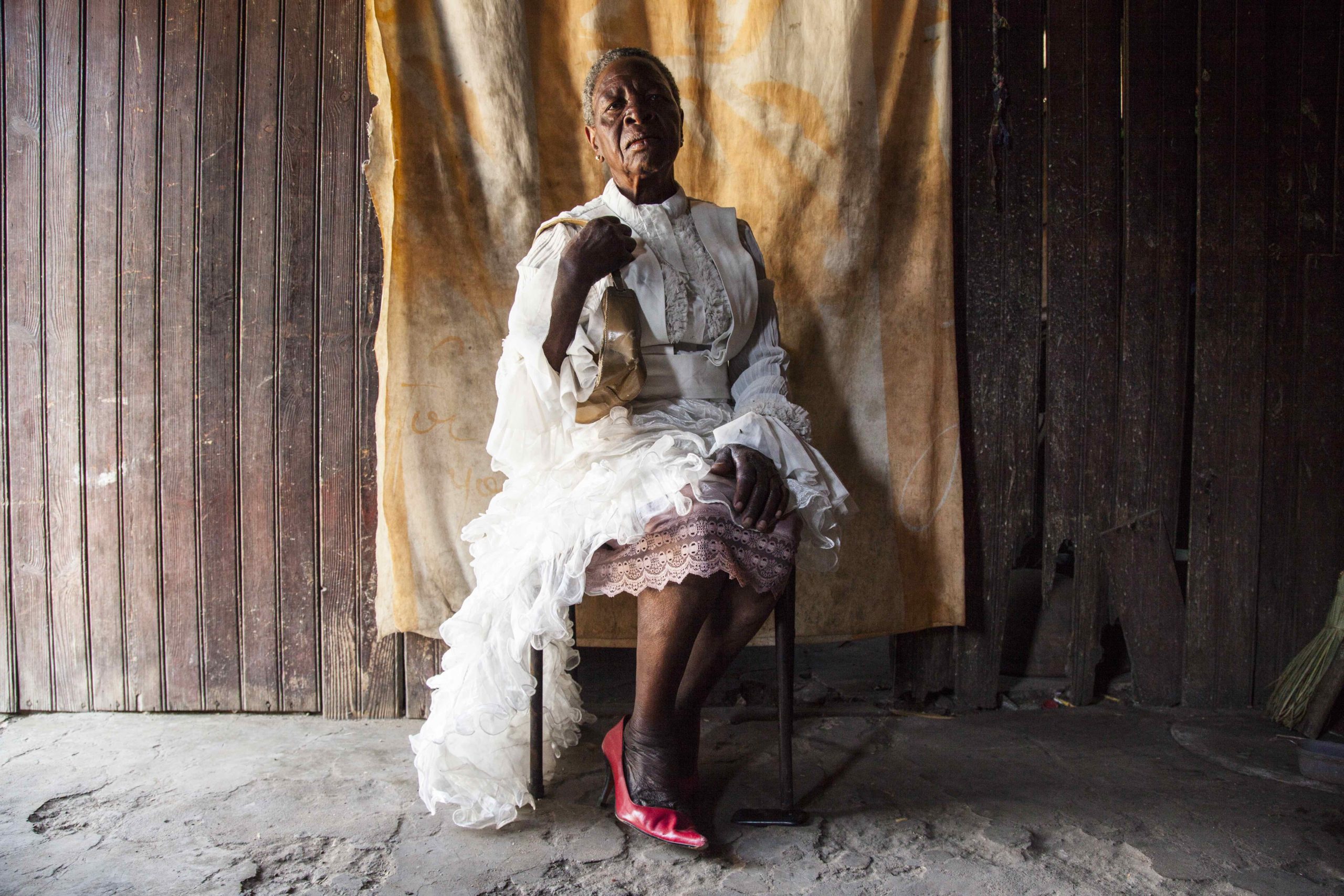
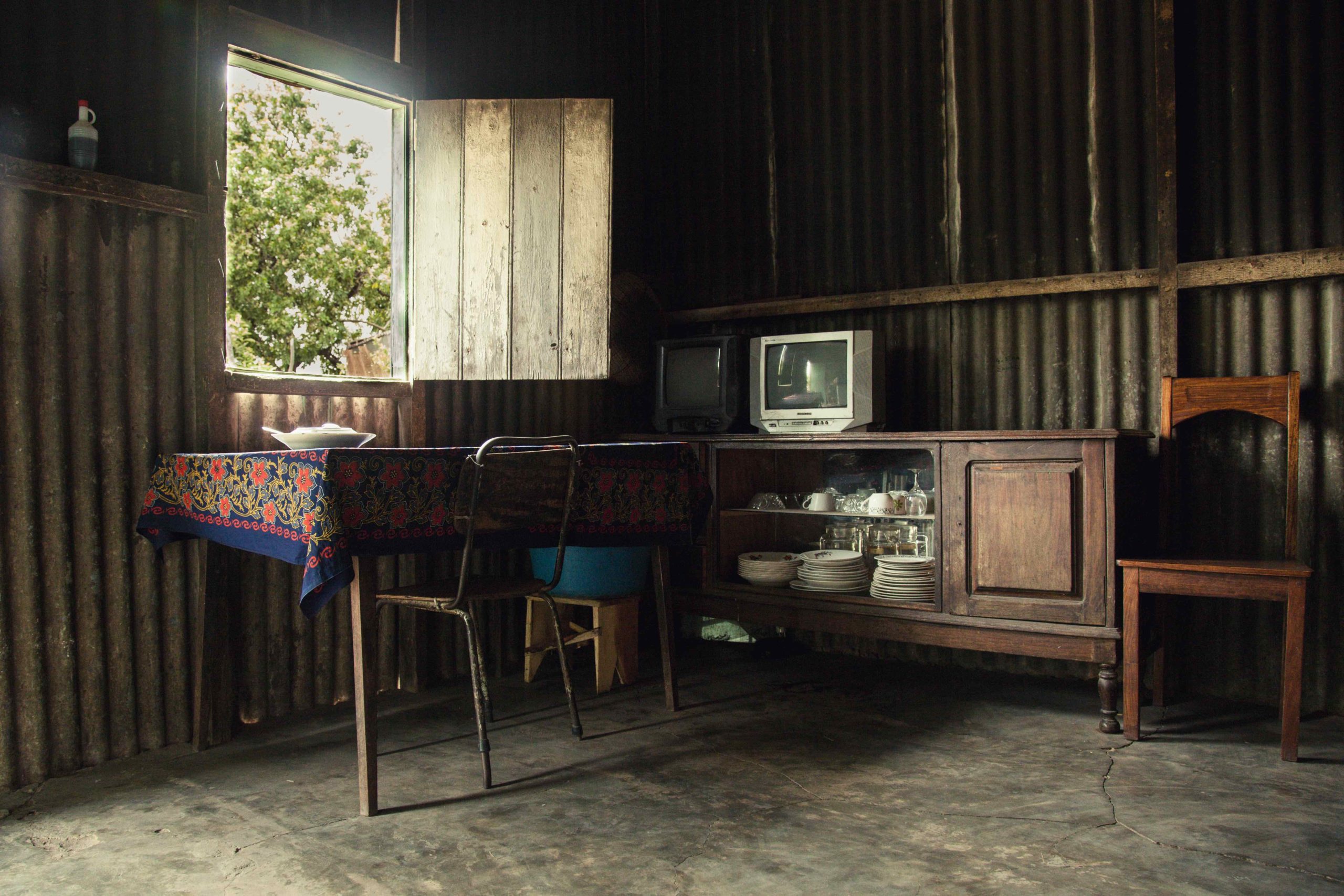
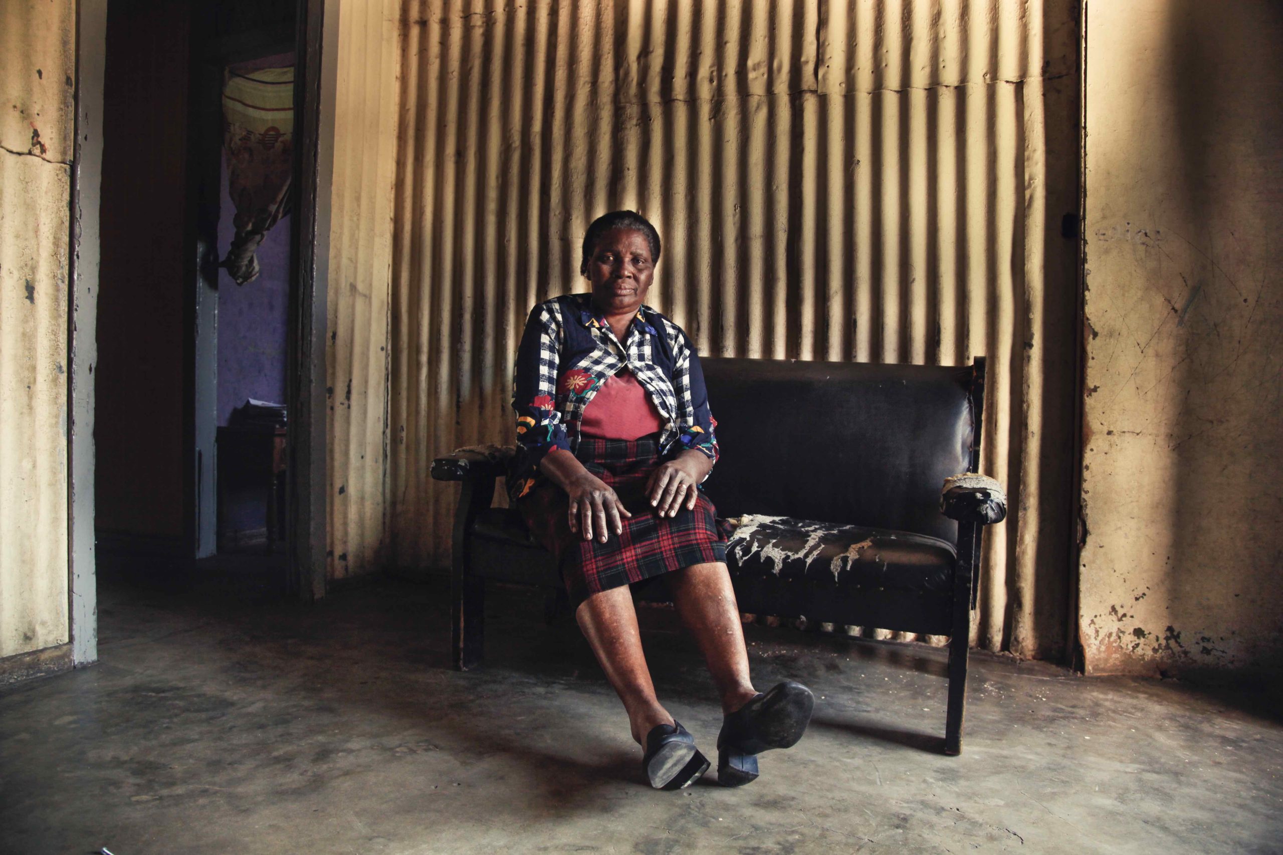
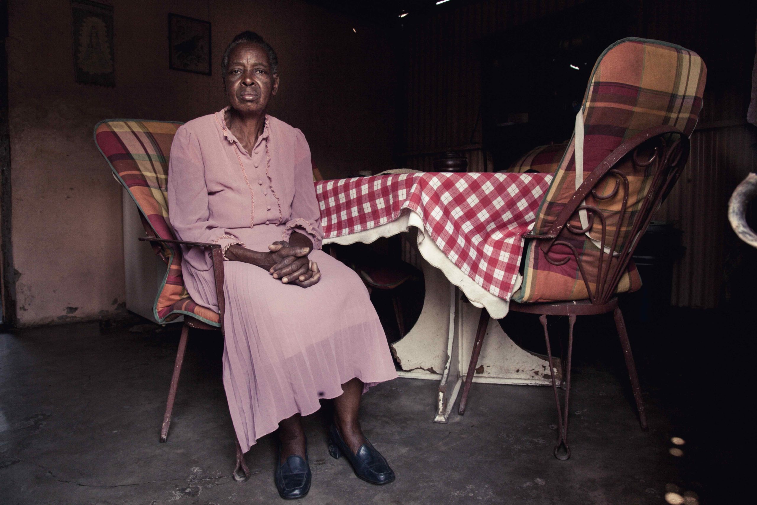
Black and white photo of a wooded area in Slidell, Louisiana taken after a storm shows bent tree trunks leaning into each other under a grey sky.A black cloud releases a darkend sheet of rain over Lake Pontchartrain in this black and white photo vertical seascape taken in Slidell, Louisiana.A funnel cloud appears to touch down on the Twin Spans bridge in this black and white photo taken in Slidell, Louisiana.This black and white photo portrait of a piece of floodgate sign washed up on Lake Pontchartrain includes the printed words Orleans and floodgate.Crochet design and yarns draped inside a tree appear as fiber art created by hurricane Katrina in this black and white photo by Jan Arrigo taken in Slidell, Louisiana.An open-beaked flying black bird is captured in motion inside a foggy landscape in this black and white photograph taken in Slidell, Louisiana. Following Hurricane Katrina the photographer, Jan Arrigo began to document her surroundings and this image continues that series.Hanging organic matter dangles from a tree in a awampy area of Slidell, Louisiana two years after Hurricane Katrina in this black and white still life photograph.A black bird in shadow looks down with his beak behind a tree branch torn and storm tattered in this black and white photo still taken in Slidell, Louisiana.Extreme close up of a hibiscus blossom stamen shadow black and white photo taken in New Orleans by Jan Arrigo.MOSS SCROLLFive seagulls in shadow fly among and over clouds in this black and white photograph taken of the sky in Slidell, Louisiana.
Finally, we’ll end with George Nobechi. (As someone wrote me in an email this week, sometimes you save the best for last.)
George was visiting from Japan, though he’s Japanese-Canadian, and told me he was heavily inspired by the National Geographic photography done by legend Sam Abell. As I often think of that style as being represented by “single images,” and George said he had traveled the world by himself, but the resulting pictures did not have a coherent theme, I admit I was concerned.
But all it took was one pass through the photographs to see how tight, and Zen his vision was. I could look at some of these pictures all day, and walk away totally blissed.
The fact that I ran into George at the end of the festival, and he offered me some brilliant sake from a tiny distiller, high in the remote mountains of Japan, had no bearing on my opinions about his photography. (But it definitely made me like him more.)
Okay, that’s all for now. Hope you have a great weekend, and I’ll have a book review for you next Friday, as usual.
The Art of the Personal Project is a crucial element to let potential buyers see how you think creatively on your own. I am drawn to personal projects that have an interesting vision or that show something I have never seen before. In this new revised thread, I’ll include a link to each personal project with the artist statement so you can see more of the project. Please note: This thread is not affiliated with any company; I’m just featuring projects that I find. Please DO NOT send me your work. I do not take submissions.
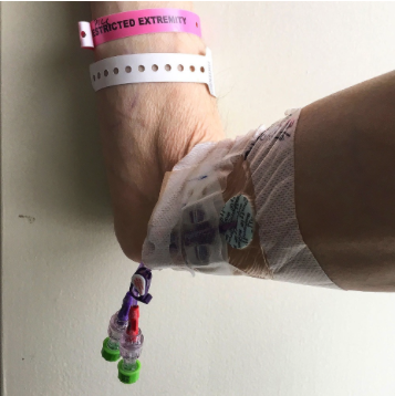
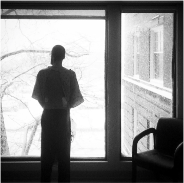
It was midnight on March 3, 2017, and Jonathan Beller decided it was time to go out. This time, he wasn’t going out into the cold Providence night, to the local punk rock club or one of neighborhood hipster bars. It was time to go the hospital.
He put on a vintage t-shirt and then he rested. He got up, put on pajama bottoms, and then he laid down again. Get dressed, rest, and repeat. A task that would have taken a couple of minutes had taken him three hours to complete.
At 3 AM, he called an Uber and waited. He sat with the excruciating pain and the extreme fatigue and looked at how bony his hands had become, and wondered for the thousandth time what the fuck was wrong with him.
The ten-minute Uber trip to the hospital in the middle of the night turned into a month-long stay. The first few days were filled with tests and acronyms: two MRIs, a CT scan, EKGs, an X-Ray, and PIC IV.
After the tests, the doctor told him what the fuck was wrong with him: sepsis and diabetes that had gone untreated for years. “You were on death’s door when you got here. All of your organs were shutting down. A forty-five year old man of your height should weigh about 150 lbs. You came in weighing 109. You’re very lucky.”
This is a great way to celebrate just turning 45, he thought as he listened to his doctor and the beeping of his machine, and stared at the IV bag above his head.
Jonathan and I had dated for nine months in 2014 and 2015. I was always concerned about his health – he was losing weight and sleeping excessively. I only recall a couple of days together when he didn’t drink excessively. I told him a number of times to go to the doctor, but he always told me not to worry about him.
Of course, I still worried.
I knew deep down that he would end up in the hospital. I spoke to him from experience. I had had my own mortality up in arms when I was 25 with a cancer scare. I knew what I was talking about.
When I saw the first photo Jonathan had taken at the hospital, his arm mangled by syringes, it was my worries manifested. The series that Jonathan created during his month-long stay in the hospital illustrates the black and white tedium of the hospital, filled with bad TV marathons and fluorescent lighting. The waiting as time slowly ticks by. But it also illustrates someone who was on the edge of life and death, and is now reaching towards life.
APE contributor Suzanne Sease currently works as a consultant for photographers and illustrators around the world. She has been involved in the photography and illustration industry since the mid 80s. After establishing the art buying department at The Martin Agency, then working for Kaplan-Thaler, Capital One, Best Buy and numerous smaller agencies and companies, she decided to be a consultant in 1999. She has a new Twitter feed with helpful marketing information because she believes that marketing should be driven by brand and not by specialty. Follow her at @SuzanneSease.
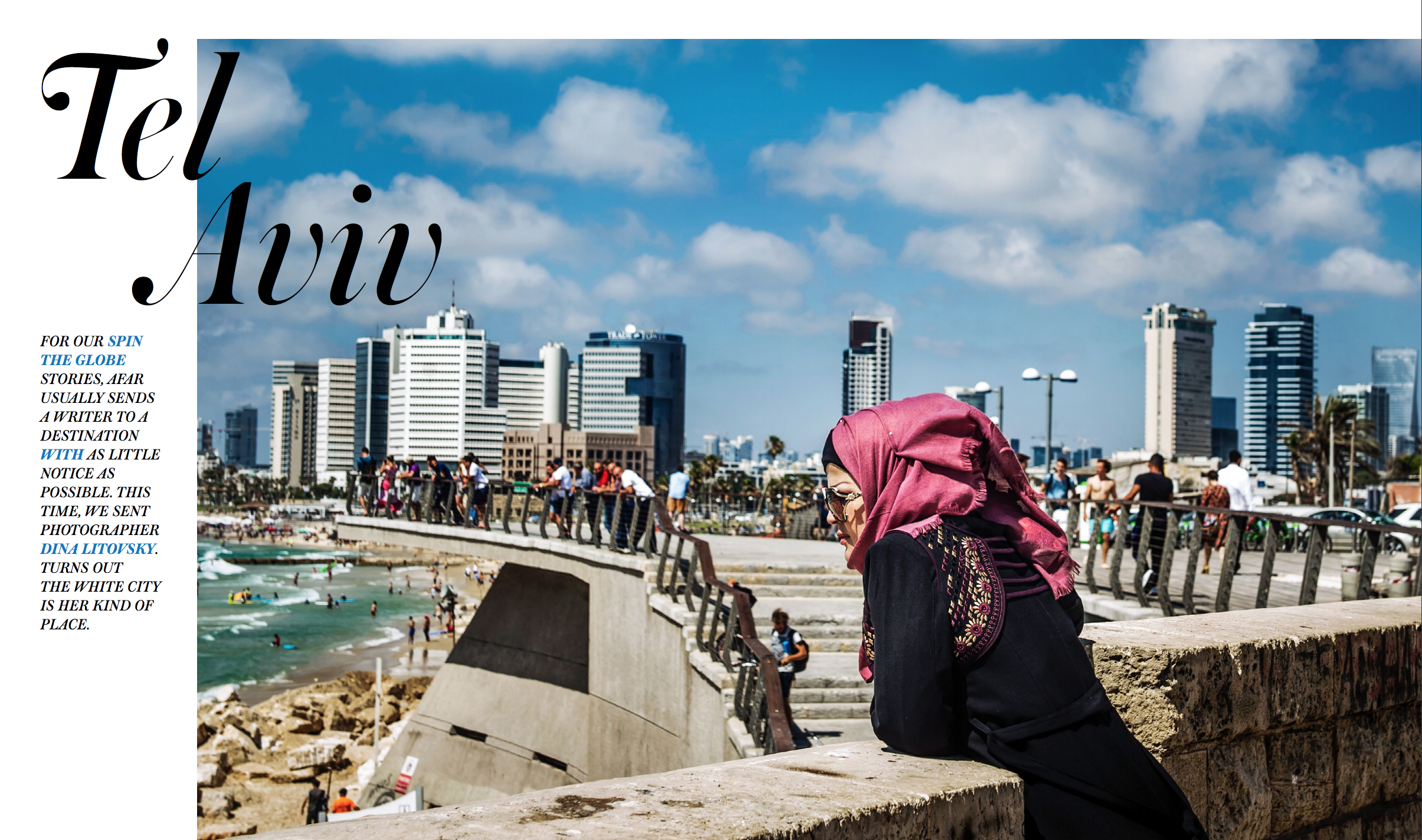
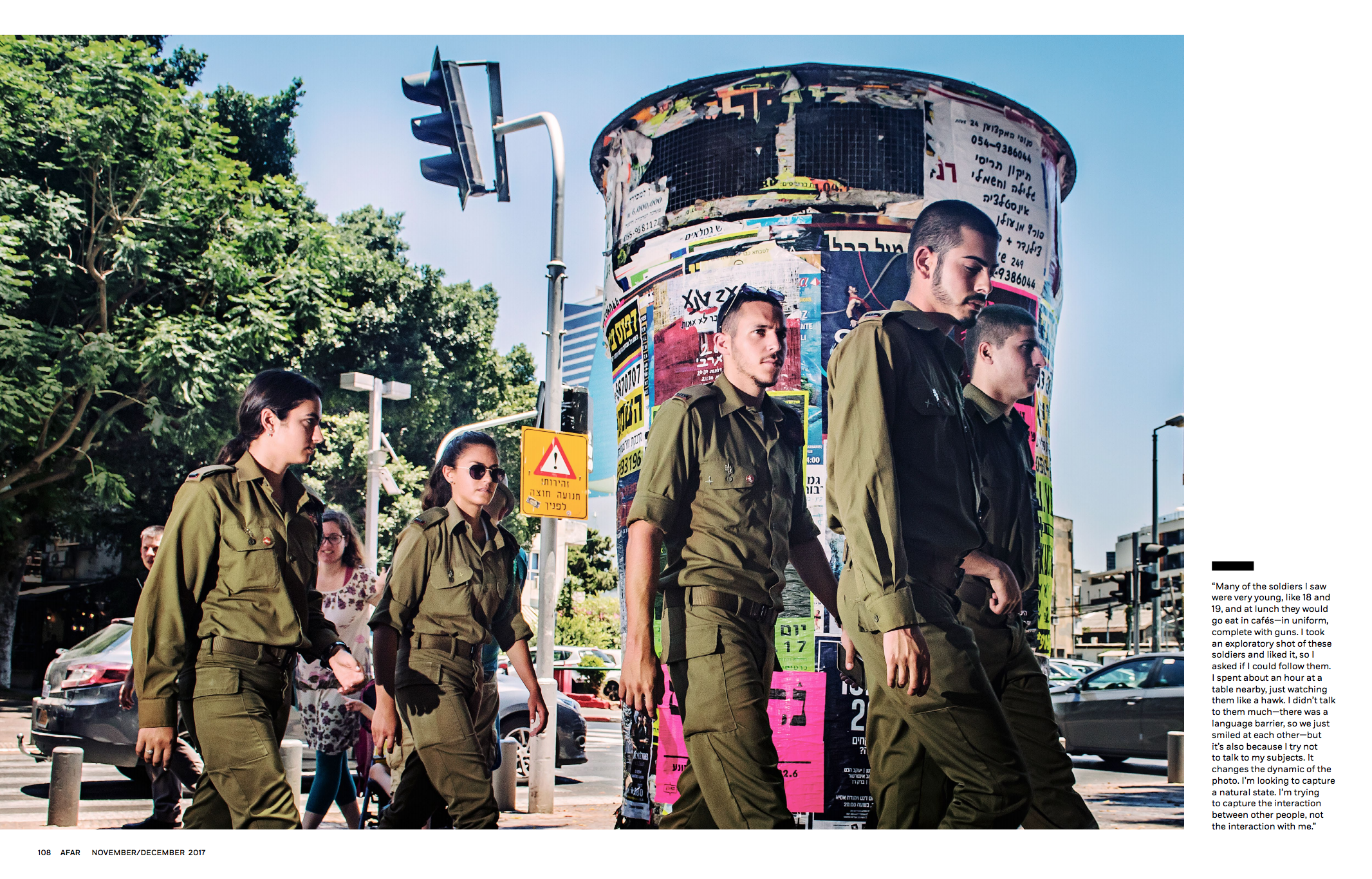
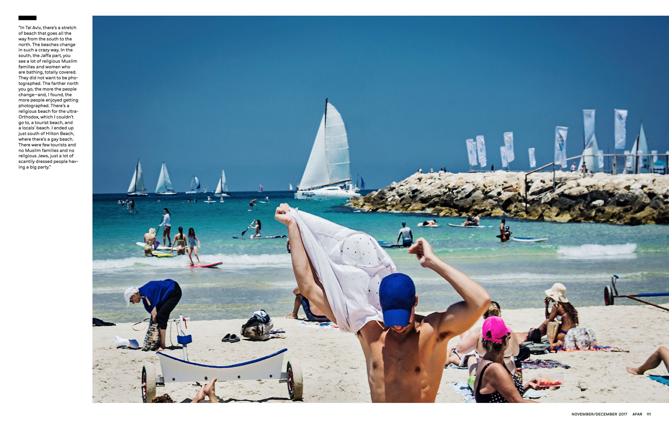
Director of Photography: Tara Guertin Art Director: Jason Seldon Assistant Photo Editor: Rachel McCord Photographer:Dina Litovsky
Heidi: How do you approach travel stories? Dina: I always like to do a fair amount of research beforehand. That involves reading up about its culture, people and landmarks. A useful place to start is past travel articles, which are also great for initial photo research. Looking at previous images of a city both gives me an idea of what to expect as well as what to avoid. It’s fun to be seduced by certain things when at a new location – everything seems exciting – but then it’s very easy to unwittingly repeat existing images of an over-photographed place/landmark.
Once on location, I like to have a first day where I walk around the city only with an iPhone, getting a feel for the city and making quick images of locations where I’d like to come back to.
In certain cultures locals are leery of being photographer, how do you deal with this? Learning the rules of that culture and respecting them. Even if there is no big language barrier, I like having a local guide who can help me navigate the intricacies of unspoken street rules.
How many days was your shoot. 6 days.
Do you give yourself an extra day to fill in any gaps or round out the full narrative? I try to do that as much as possible with each assignment. I always start editing my work after the first couple of days, during which I allow myself to shoot on instinct. After that, I approach the shoot with more intent, filling in the gaps daily and fleshing out the story.
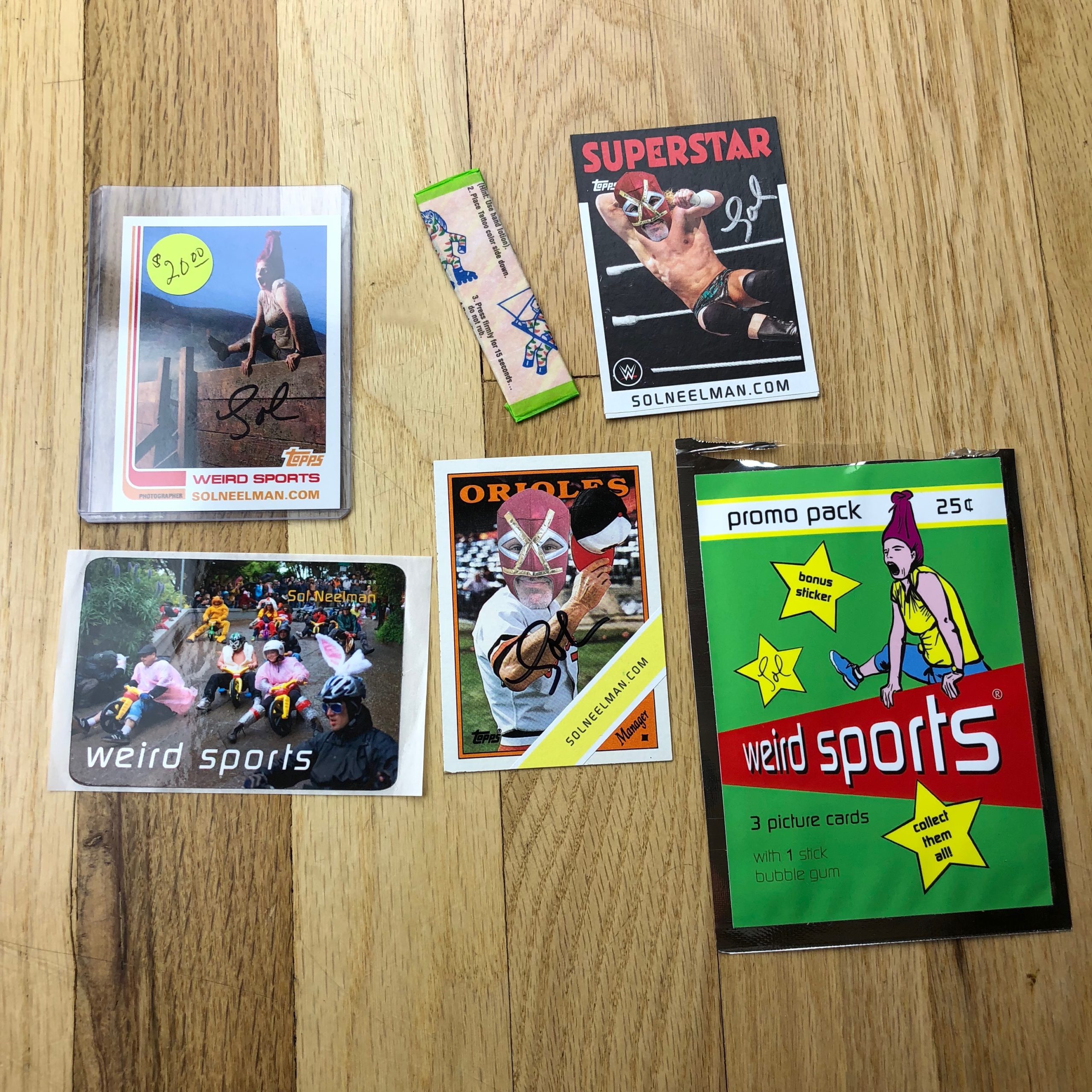
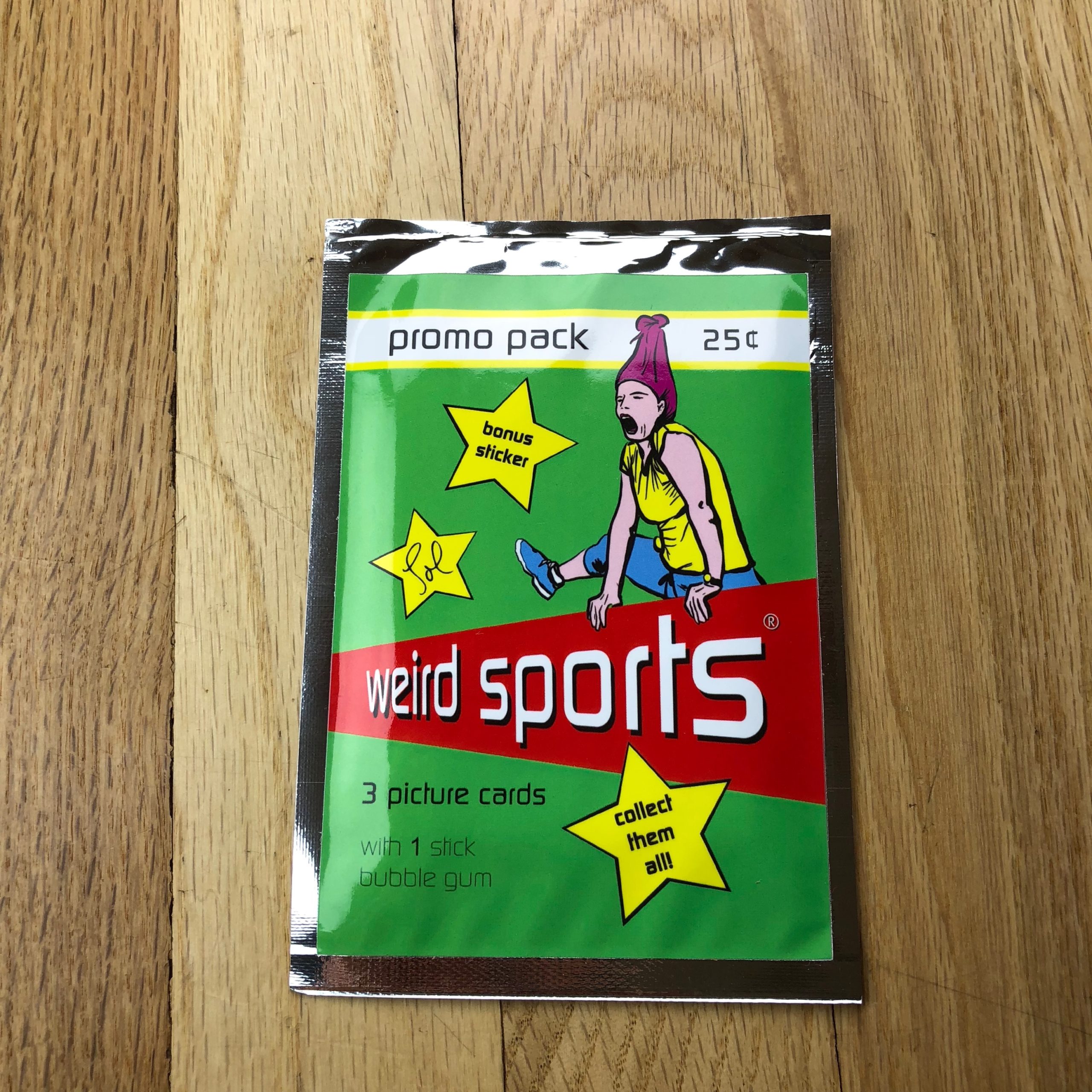
Never thought I’d be able to boast that Topps printed my promos, but they did. You can upload your photos on their site and pair them with designs from some of their vintage trading cards.
For common cards to fill the packs, I collected old baseball and pro wrestling cards and defaced them with stickers of my masked face. Those were printed at home on shipping labels with my temperamental Epson R2880.
As for the photo stickers and packaging labels, I used stickeryou.com. Can’t believe how great a job they did.
Who designed it?
I borrowed basic design elements from Topps cards and wrappers over the years for my DIY promo pack.
The front sticker features a sketched version of my photo on the cover of Weird Sports 2. Tanyia Johnson, an old friend and talented graphic artist, drew that. She also held my hand – a lot! – and gave great feedback throughout the process.
For better or worse, baseball cards and wrappers back in the day were not designed by anyone nearly as talented as TJ. Many times, I got away with using my basic design skills.
The sticker insert is a slightly modified version of the cover of my first book, Weird Sports, designed by Katha Stumpf at Kehrer Verlag.
Tell me about the images?
With the advice of friend, agent and consultant Maren Levinson (redeyereps.com), we chose 5 images from my Weird Sports book series: Redneck Games, Frog Jumping, Dirty Dash, Ostrich Racing and Drag Queen Softball.
Because of the size and dimensions of the trading cards, I needed images that could hold up well small and were quick hits. I put just one of those 5 collectibles in each pack.
Since my goal with this entire project was simply for folks to check out my updated web site (solneelman.com), I was able to lean more on the WTF?! factor for the entire presentation. Trying to showcase work on a 2.5” x 3.5” piece of cardboard is seldom ideal.
How many did you make?
I made 500 promo packs, and I’ll likely do follow-up special editions for special occasions.
While most of those promos have already been mailed out, I am sending out a little something fun and weird for those that mail me a self-addressed stamped envelope. (My addy: 589 Park Place #14, Brooklyn, NY 11238 USA.)
How many times a year do you send out promos?
Honestly, this is really my first-ever promotional mailer.
This process for me started when Maren asked me this very same question. When I replied that I never mail out promos, she told me to get on it. I wanted to do something that was unique, weird, memorable and – most importantly – felt like me. Also I wanted to create something that was less likely to be immediately trashed.
Usually, when I meet with clients and art buyers personally, they’ll get a signed copy of one of my Weird Sports books, along with a custom luchador mask. Individual leave-behinds have always been fun for me to dream up. Mailers for the masses, not so much.
I loved unwrapping packs of cards as a kid, excited to discover fun gems inside, and I hoped to share that feeling with others. I’ve been toying around with something like this for years, just needed the kick in the rear to get on it. (Thanks, Maren!)
Do you think printed promos are effective for marketing your work?
I have no idea, Rob. Having been in this game for awhile, I’ve learned that there are many seeds planted before anything bares fruit. I’d love to think that advertising art buyers got one of my Weird Sports promo packs in the mail, laughed their asses off, checked out my web site and tossed my name in the ring for a fun gig. But who really knows? At least I had fun making them.
Each visit, I’ve gone in December. It’s not entirely a coincidence, as that’s when the Photo NOLA festival takes place. (I’ve attended in 2012, ’14 and now ’17)
Despite the fact that New Orleans is situated on the Gulf Coast, and is reputed for its lovely winter weather, two of my visits were met with freezing-rain-ice-storms that made me want to cry in a pillow.
(The other two times I was met with humid, sunny, 70-80 degree weather, so I guess it all depends on luck.)
The fact the weather was awful this year was mitigated by the fact that I’d planned the trip with little time scheduled outside the International House Hotel, where the event is held each year. (It’s just a few short blocks outside the French Quarter.)
Mostly, I was either in the hotel or adjoining conference center, or safely ensconced inside a bar/restaurant/museum/gallery/party/Uber. So any whinging I now provide is mostly for comedic effect.
There was a brief moment, the first night, when I couldn’t figure out how to turn on the heat in my hotel room, and I actually did cry into a pillow, but beyond that, I had a smashing time at Photo NOLA last month.
Like many portfolio review events these days, Photo NOLA is run by a non-profit, in this case the New Orleans Photo Alliance, which is a member-supported organization. (We did an interview on the subject years ago with Jennifer Shaw, if you’d like to learn more about it.)
So Photo NOLA is imbued with a sense of mission, and everyone clearly loves being a part of such a vibrant local photo community. Like Filter in Chicago, another of my favorites, this festival puts heavy emphasis on socializing, as they have several parties and events lined up, including a gala at the New Orleans Museum of Art, and a yellow-school-bus-led gallery tour.
Photographers have a lot of choices these days, as far as review events to attend, so I think the fact that you can have so much fun at Photo NOLA, in addition to the fact they clearly get a few reviewers each year who normally aren’t on the circuit, makes it a very wise place to invest your obviously-limited resources.
(If you’re one of the few out there who’s doing really well, getting rich off of being a photographer, you can ignore the previous comment, but have the decency to keep it to yourself, OK?)
For whatever reason, I had a lot of people visit the table this year who were looking for advice and feedback, but weren’t quite ready to be shown here. I do the best I can to help, obviously, but only publish work in the column that demonstrates a high degree of craft, if not concept, over 8-10 pictures.
As such, I’ll show you a handful of projects today and next week, and then we’ll be back to the book reviews. I attend most of these events in the summer and fall, so this will be the end of the review stories, for a while.
As usual, the photographers are in no particular order.
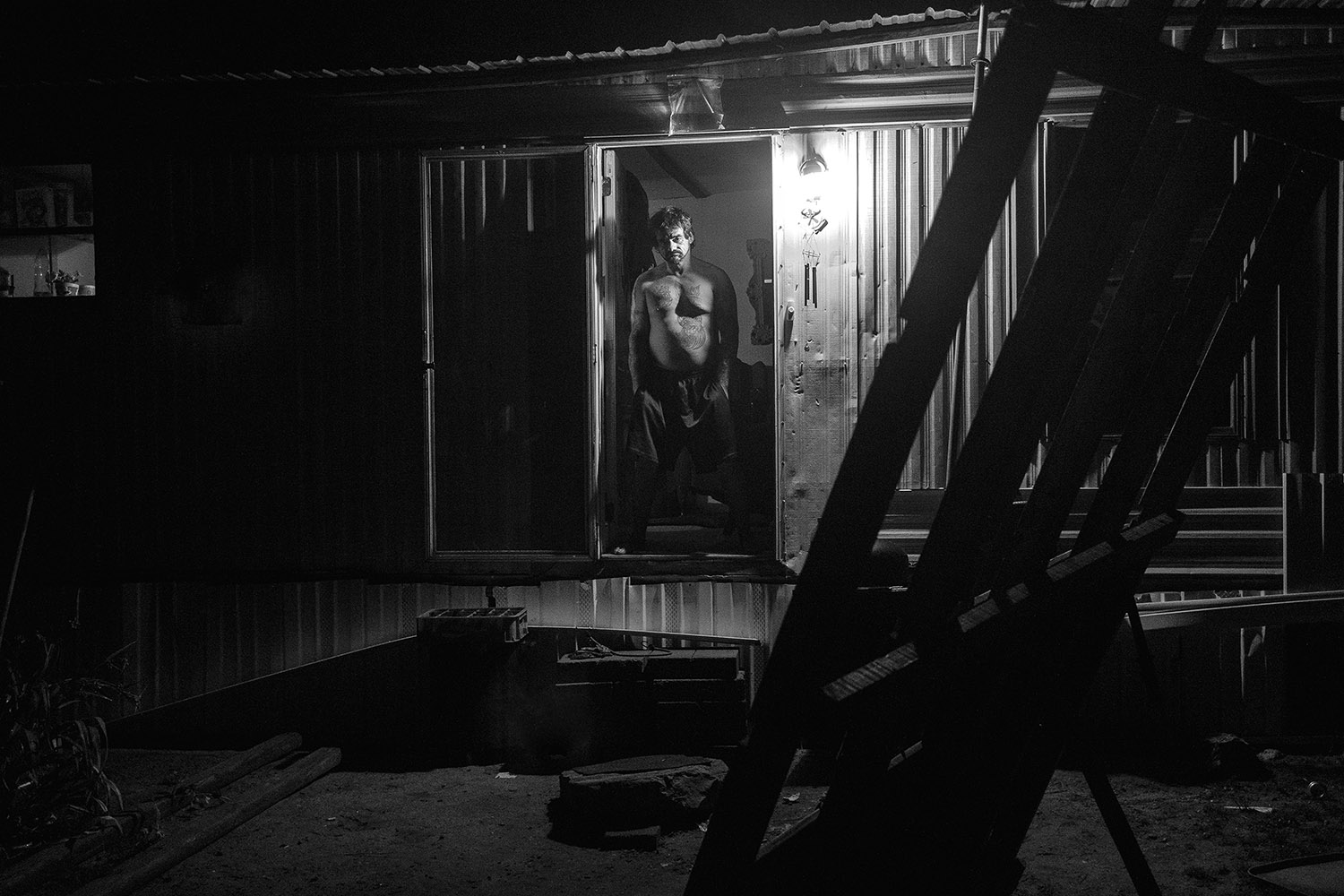
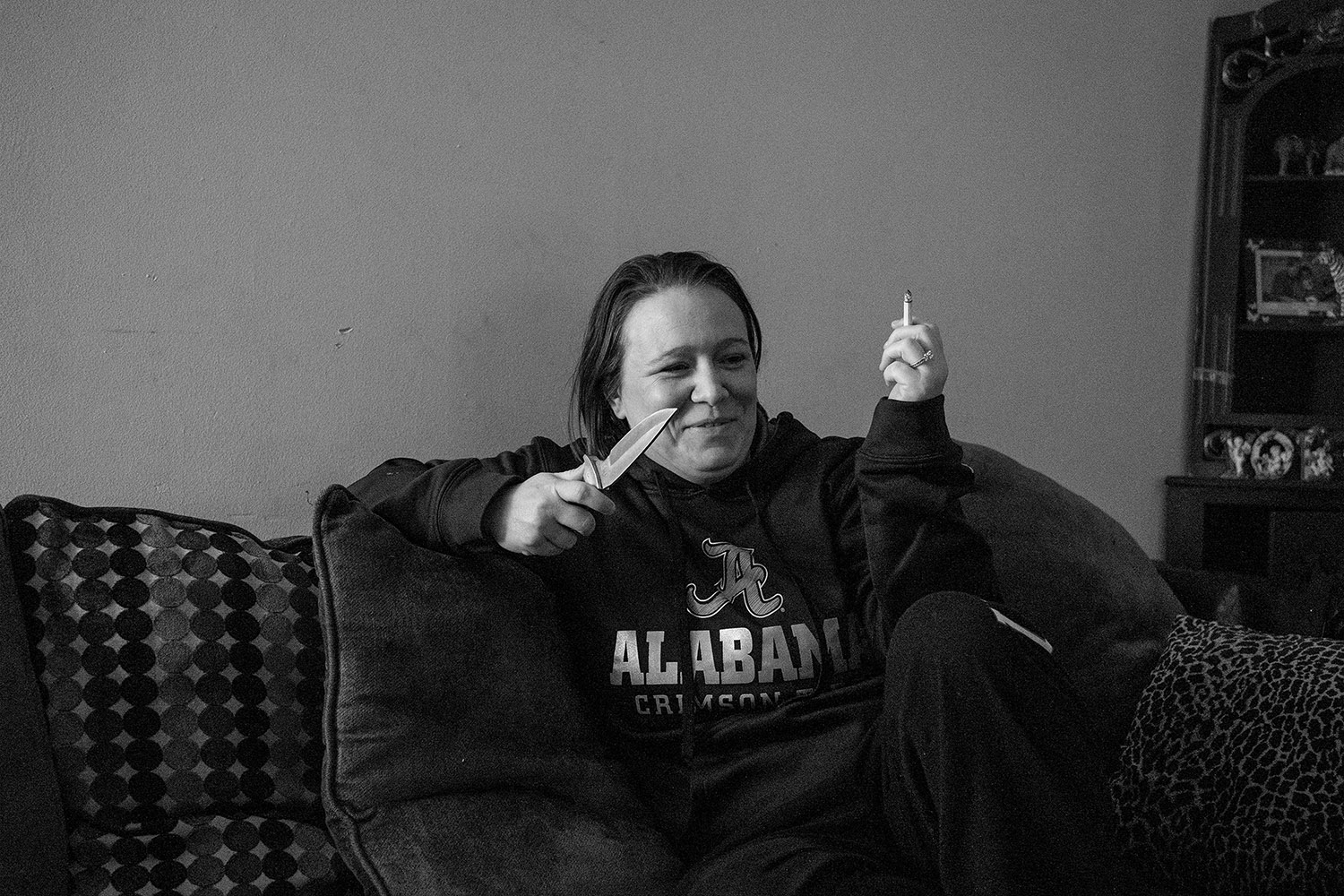
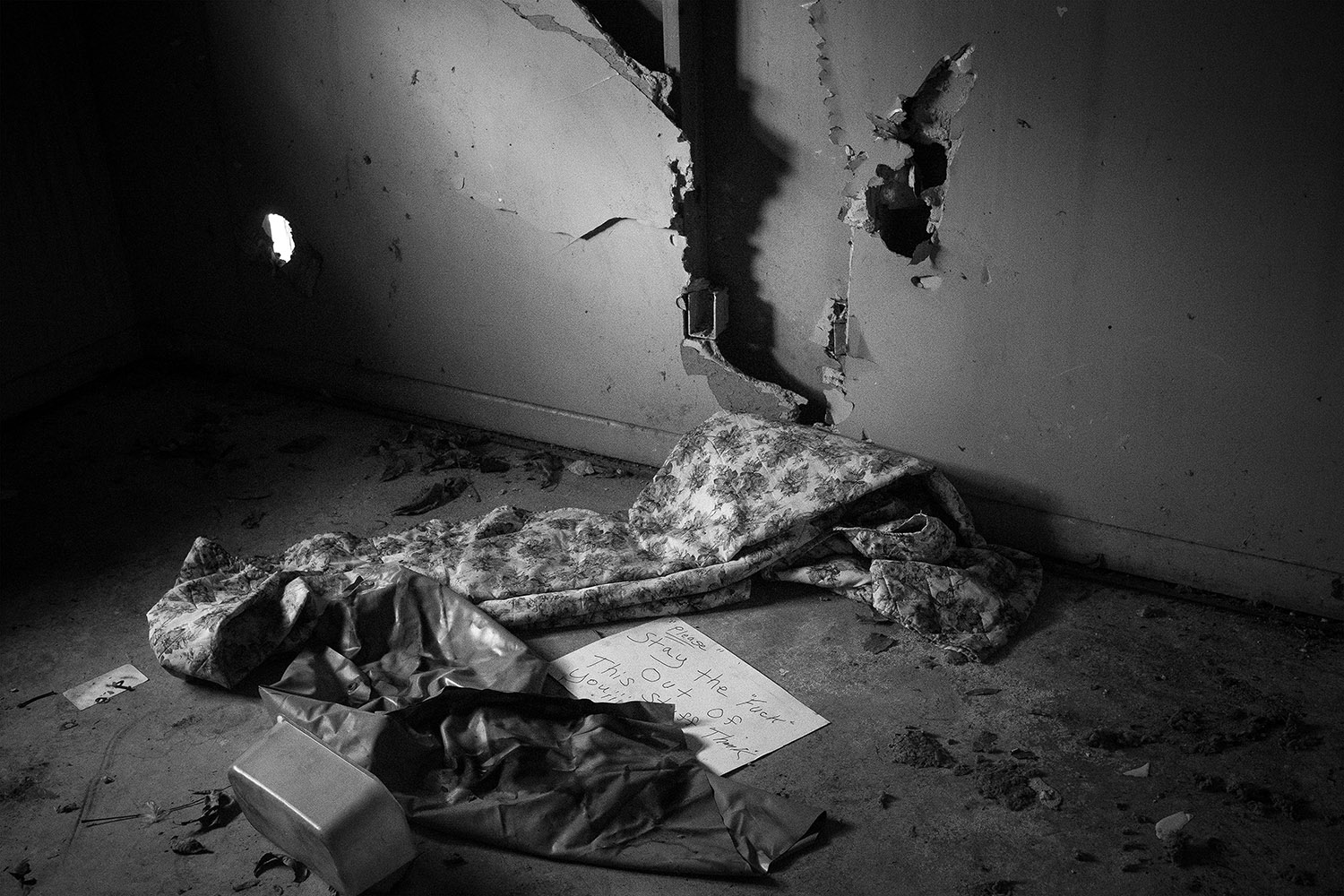
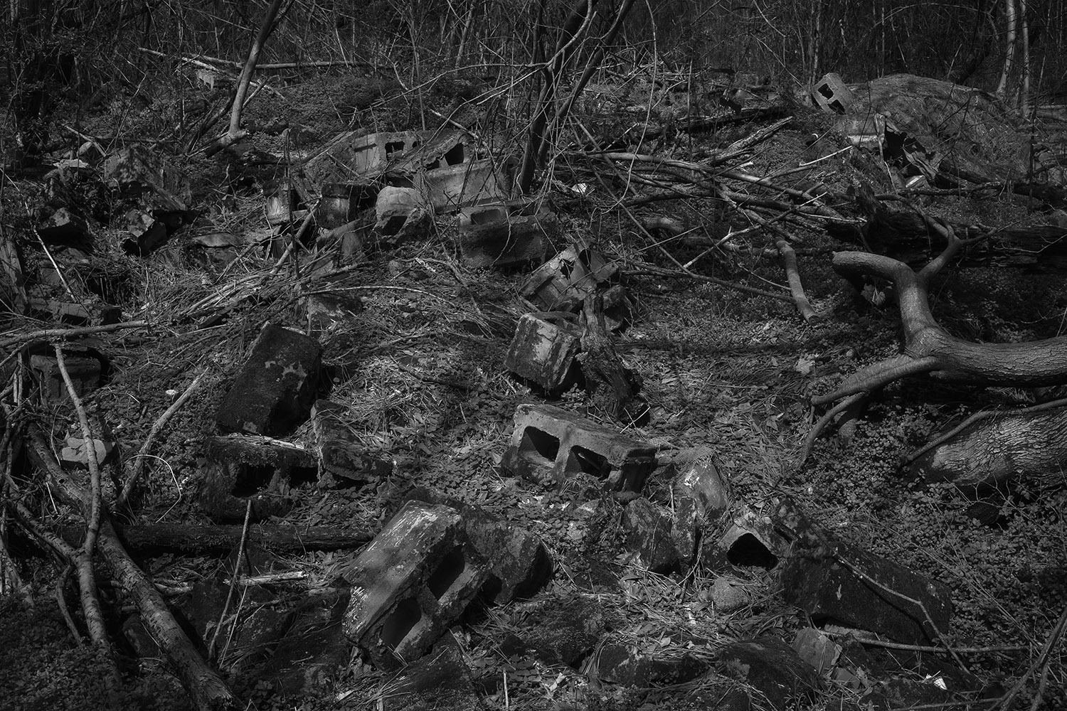
Ok, they’re in no particular order beyond the fact that I’m starting with Jared Ragland. His work was the most complete, compelling project I saw, and I voted for it for the Photo NOLA prize.
Jared used to work with Pete Souza in Obama’s White House. (An era that now seems like Martin Sheen’s TV presidency, for all the similarities it shares with contemporary reality.) But Jared is originally from Alabama, and returned home to turn his attention to the meth epidemic that is ravaging the NE part of the state.
The pictures are genuinely visceral, as they make a viewer feel uncomfortable. They show something decidedly ugly, and real, but the strong aesthetics give the ride a bit of turbo boost. Additionally, Jared worked with a sociologist to give the project a sense of academic rigor.
Brilliant stuff.
Jared Ragland, from the series, GOOD BAD PEOPLE: Methamphetamine Use on Sand Mountain, Marshall County, Alabama. jaredragland.comJared Ragland, from the series, GOOD BAD PEOPLE: Methamphetamine Use on Sand Mountain, Marshall County, Alabama. jaredragland.comJared Ragland, from the series, GOOD BAD PEOPLE: Methamphetamine Use on Sand Mountain, Marshall County, Alabama. jaredragland.comJared Ragland, from the series, GOOD BAD PEOPLE: Methamphetamine Use on Sand Mountain, Marshall County, Alabama. jaredragland.comJared Ragland, from the series, GOOD BAD PEOPLE: Methamphetamine Use on Sand Mountain, Marshall County, Alabama. jaredragland.comJared Ragland, from the series, GOOD BAD PEOPLE: Methamphetamine Use on Sand Mountain, Marshall County, Alabama. jaredragland.comJared Ragland, from the series, GOOD BAD PEOPLE: Methamphetamine Use on Sand Mountain, Marshall County, Alabama. jaredragland.comJared Ragland, from the series, GOOD BAD PEOPLE: Methamphetamine Use on Sand Mountain, Marshall County, Alabama. jaredragland.comJared Ragland, from the series, GOOD BAD PEOPLE: Methamphetamine Use on Sand Mountain, Marshall County, Alabama. jaredragland.comJared Ragland, from the series, GOOD BAD PEOPLE: Methamphetamine Use on Sand Mountain, Marshall County, Alabama. jaredragland.comJared Ragland, from the series, GOOD BAD PEOPLE: Methamphetamine Use on Sand Mountain, Marshall County, Alabama. jaredragland.comJared Ragland, from the series, GOOD BAD PEOPLE: Methamphetamine Use on Sand Mountain, Marshall County, Alabama. jaredragland.comJared Ragland, from the series, GOOD BAD PEOPLE: Methamphetamine Use on Sand Mountain, Marshall County, Alabama. jaredragland.comJared Ragland, from the series, GOOD BAD PEOPLE: Methamphetamine Use on Sand Mountain, Marshall County, Alabama. jaredragland.comJared Ragland, from the series, GOOD BAD PEOPLE: Methamphetamine Use on Sand Mountain, Marshall County, Alabama. jaredragland.com
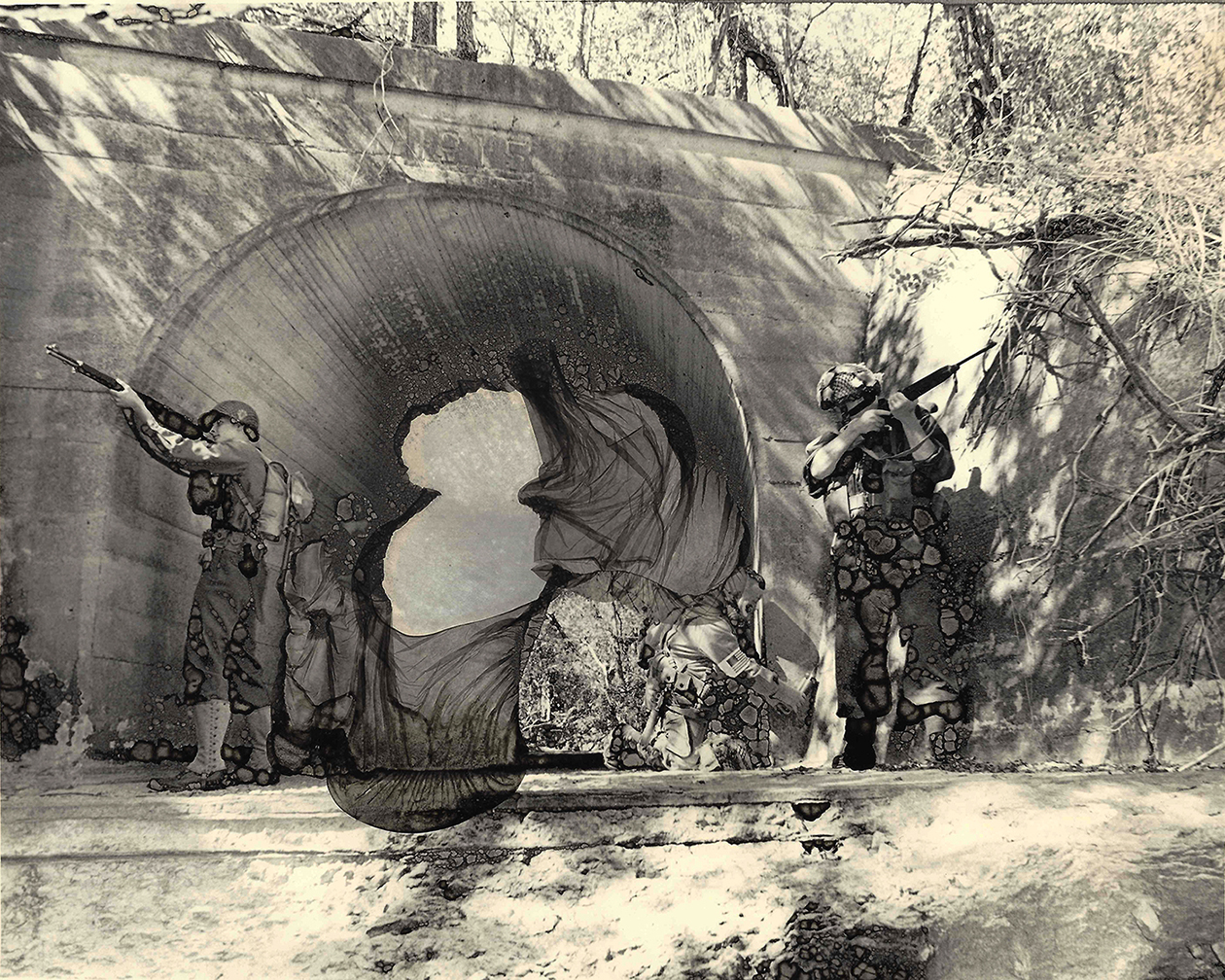
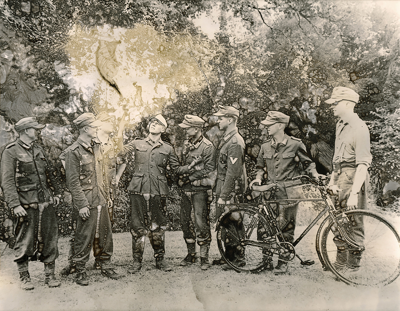
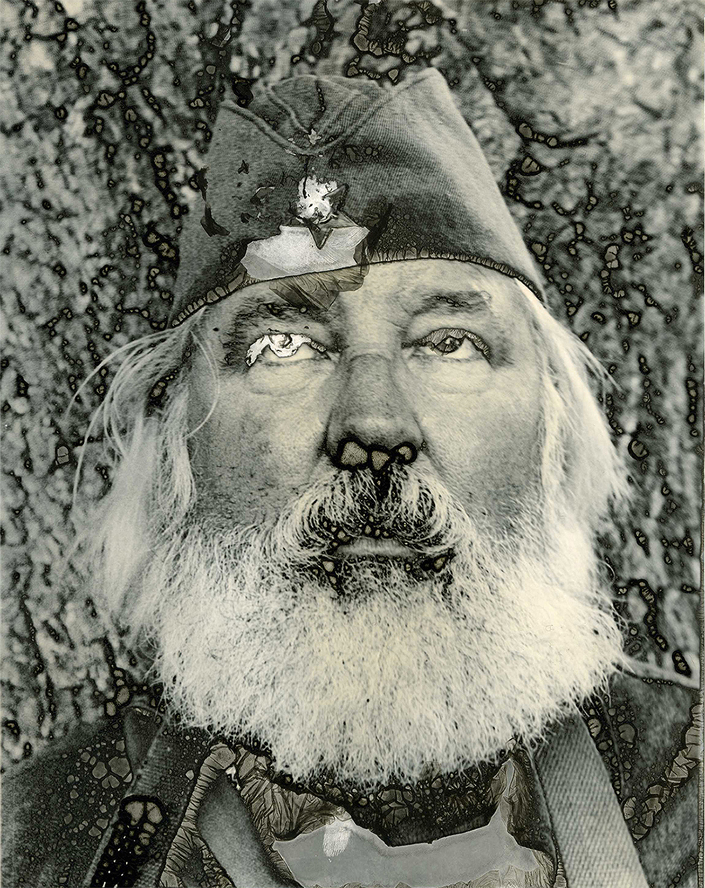
Ellie Ivanova had a new take on a subject matter we’ve all seen before: war re-enactors. It’s not hard to see why people are drawn to the subject, as it’s incredibly visual, and also goes pretty far down the road of creating the impression of time travel.
I feel most photographers neglect to really push the element of time in their work, so when the clothing and props are already there for the taking, it’s not hard to see why people with cameras get curious.
Ellie is from Bulgaria, but based in Denton, TX, where she got her MFA degree. She is using a fairly original analog technique to make prints that don’t look real, using some strange acid trick. The chemistry acts in funny ways, and eats away at the emulsion, so the visual effects enhance the emotionality, I think, and also imbue the subject with a bit of originality.
I first saw Amilton Neves‘s work during the portfolio walk, and stopped in my tracks, as it is clearly compelling. Luckily, he had a review with me the next day, so I got the full backstory.
Amilton recently moved to Tampa from Mozambique, where he was both a photographer and an anthropologist. Back home, he became intrigued by a community of women who’d been encouraged to write letters to Portuguese colonial soldiers during a war of independence in the 60’s and 70’s.
Portugal was eventually ejected, after 500 years of Colonial exploitation, and the women were deemed enemies of the state. Surprisingly, they’re still demonized, all these years later, so Amilton photographed them in their homes, and gained access to some of the letters as well.
I think it’s a striking project, and look forward to seeing what he comes up with down there in the craziest state in the Union. (Keep f-cking that chicken, Florida.)
Jo Ann Chaus and I got along swimmingly. She’s a Jewish grandmother from Northern New Jersey, and we openly discussed how hard it can be to focus on a career in the arts, coming from that local culture. (I’m sure I wouldn’t be an artist today if my folks hadn’t left for Taos in the 90’s.)
Though I admit women of her generation doing self-portraiture-based projects is a bit trendy at the moment, (which I told her,) I found an honesty, and visual strength, in many of these pictures, and heartily encouraged her to continue, and push it even further.
Lisa, who’s represented by our friends Klompching Brooklyn, got a lot of traction years ago for her project, and Kehrer Verlag book “Snowbound.” They were lovely, meditative, large format images, which she followed up with a series about the sea.
Though I know she was not enamored of Tucson on first site, apparently she made her peace with the desert, because I think this new group of pictures, Terrestra, rocks. I saw it at the portfolio walk, and the prints, trimmed borderless, were the best I saw in NOLA. (The show is up at Klompching as we speak.)
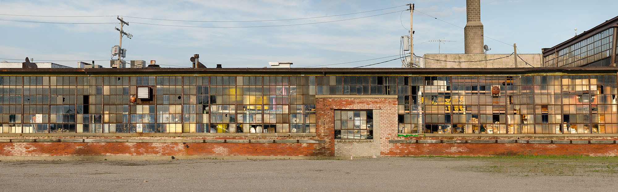
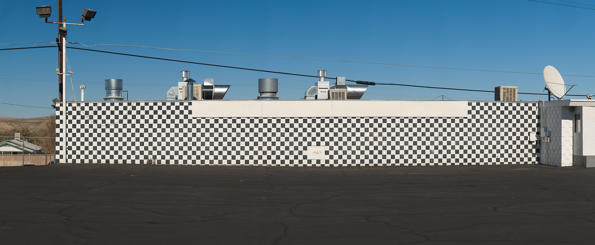
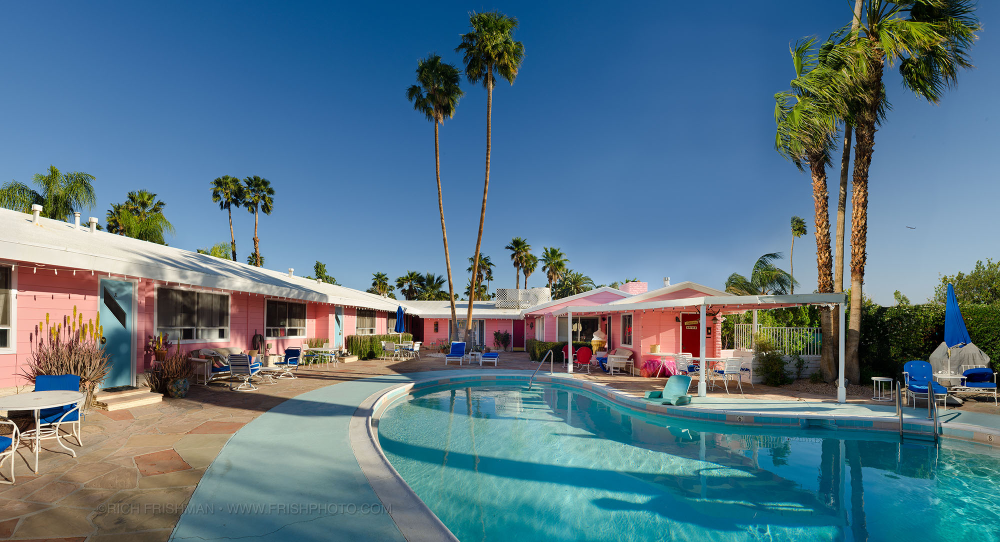
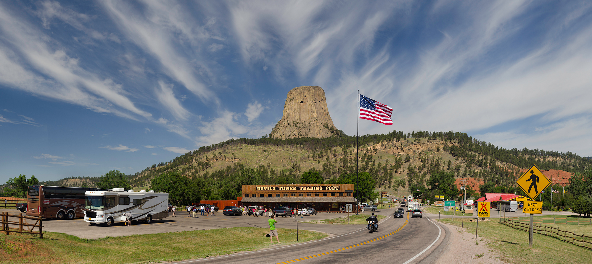
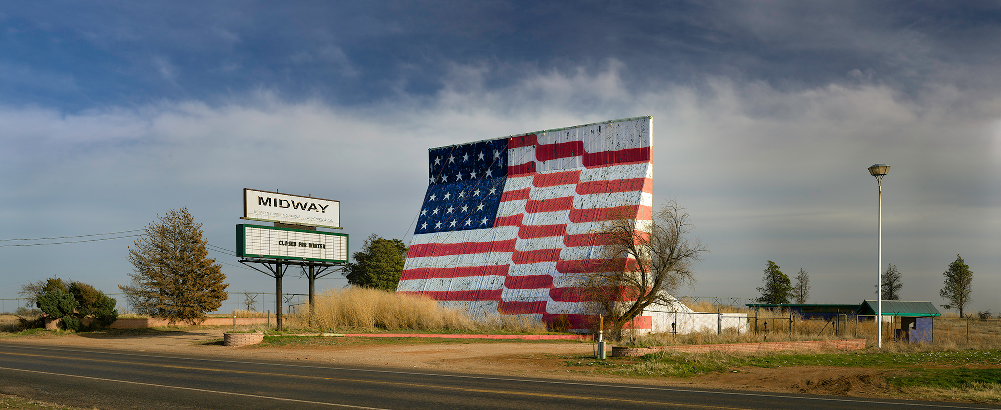
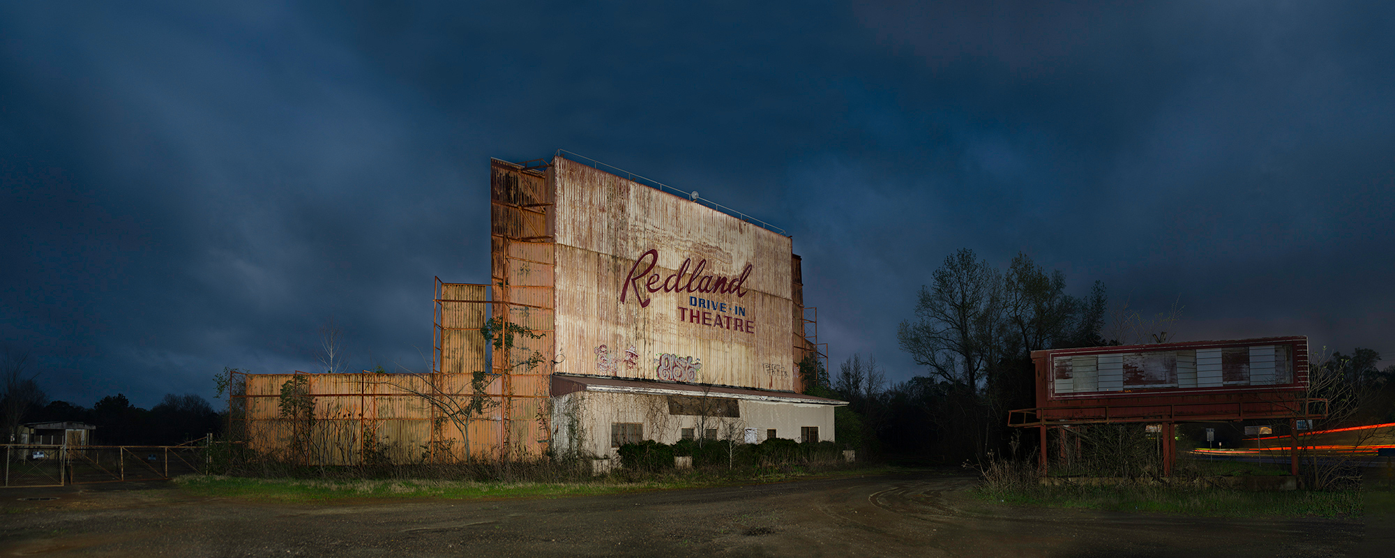
We’ll end today with Rich Frishman, a funny guy who’s based in Washington. I was talking with Frish Brandt, the Director of the Fraenkel Gallery, who was my table-mate, when Rich walked up to my table, and she said he was her brother.
They both smiled, and I was totally sure they were spontaneously busting my balls. You know, two people who get in on the joke immediately, like improv performers.
But no, they insisted, her name Frish came from Frishman, the two hugged, and then she told me he should have been a better big brother when they were young. (He confirmed as much.)
In all my years reviewing, it was one of the most surreal little moments I’ve had. (Is there a book in that? All the craziest stuff I’ve seen at portfolio reviews? Probably not.)
Rich’s pictures are panoramic visions of Americana, shot across much of the country, and are meant to be printed very large, so people can dive into the details. The photos are obviously likable, and kitschy, but I told him the more visually compelling they were, the more people would engage with his vision.
The Art of the Personal Project is a crucial element to let potential buyers see how you think creatively on your own. I am drawn to personal projects that have an interesting vision or that show something I have never seen before. In this new revised thread, I’ll include a link to each personal project with the artist statement so you can see more of the project. Please note: This thread is not affiliated with any company; I’m just featuring projects that I find. Please DO NOT send me your work. I do not take submissions.
Steven Laxton Brings Voice to LGBT Refugees In New Show
American politics is on fire and moving at a blistering pace, it’s hard to pay attention to anything else. But for Steven Laxton, the moment that precipitated this chaos, the 2016 election, was a wake-up call to see the horrors happening on the other side of our borders. “I was very disgruntled and confused about the election and Trumpism and all the xenophobia and sexism and racism that transpired,” says Steven. “I realized that I rather than just post disgruntled posts on Facebook and go to a few rallies, I have a craft that can tell stories.” He started creating projects around immigration and came across Immigration Equality, the leading LGBTQ immigrant rights organization. Once he started hearing their stories, a whole new perception of what it means to be a refugee opened up for him and inspired his project “Free To Be Me,” on view at The LGBT Center in New York starting today.
“It occurred to me that I didn’t really think about this enough myself,” Steven explains. “When I think about refugees I think of people seeking political asylum or economic asylum or people fleeing from war zones. It’s not often you think about LGBTQ asylum but there’s over 70 countries in the world where it’s illegal to be gay basically. Some of the stories are horrendous so I realized this was something that was worthy of doing.” Steven sat down with a host of LGBTQ refugees to get their stories and act as a conduit for us to meet them, understand them, and recognize the injustice happening all over the world. Things aren’t perfect in the US, but they’re good enough that for many, the US is an escape and a step towards living a freer and fuller life.
It’s not just about facts and figures, as appalling as those are. It’s about the humanity behind those numbers and the absurd laws in other countries governing what is and what is not okay about being an LGBTQ person. “It’s important for people to know the stories and where they come from,” says Steven. “There’s one gentleman from Egypt who’s an architect. He went out on a date when he was younger with a guy, they just kissed, the cops saw him and he was locked in prison for three months only because he was a minor. If he had been older it would have been five years.” He was able to come to the US and build a new life here, a more honest life, and contribute to his new community here.
Check out Steven Laxton’s “Free to Be Me,” presented in cooperation with the LGBT Center and Immigration Equality, is on view starting November 14th and running through the end of the year.
APE contributor Suzanne Sease currently works as a consultant for photographers and illustrators around the world. She has been involved in the photography and illustration industry since the mid 80s. After establishing the art buying department at The Martin Agency, then working for Kaplan-Thaler, Capital One, Best Buy and numerous smaller agencies and companies, she decided to be a consultant in 1999. She has a new Twitter feed with helpful marketing information because she believes that marketing should be driven by brand and not by specialty. Follow her at @SuzanneSease.
Who printed it?
The book was printed by Smartpress. I printed and bound the vellum cover myself onto the front of each book.
Who designed it?
The cover was designed by my friend, Joel, from This is Forest.
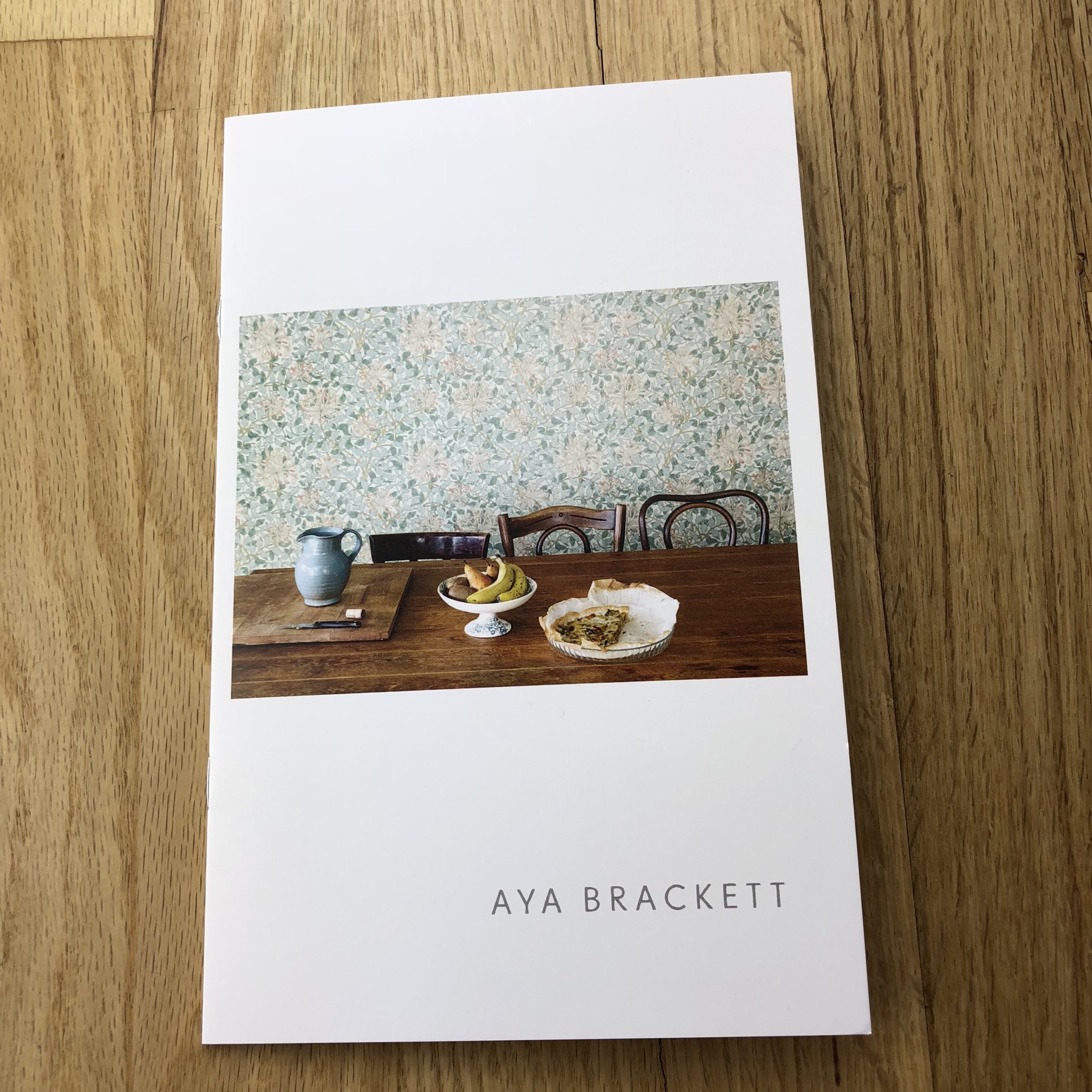
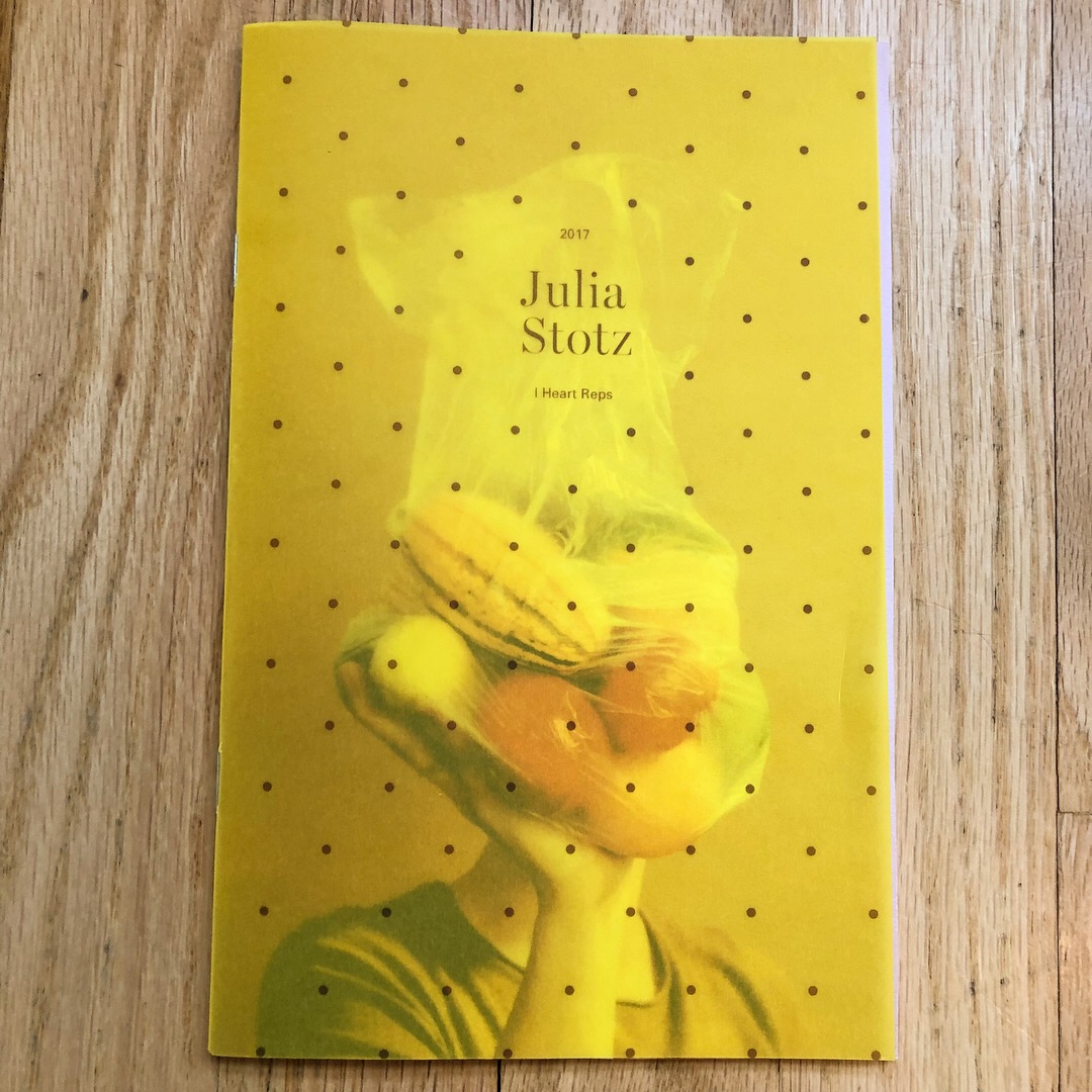
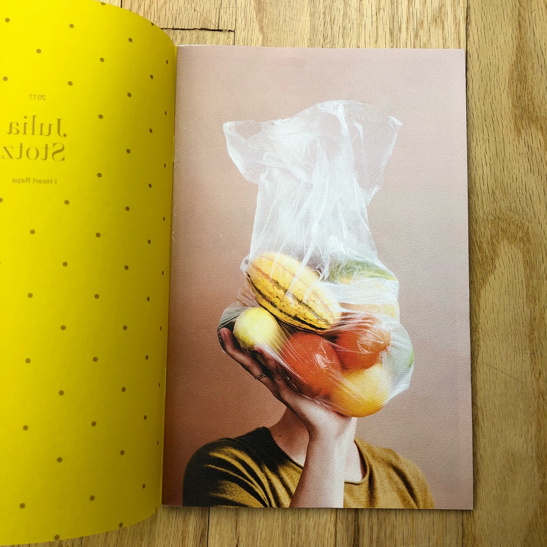
Tell me about the images?
I normally create a shoot specifically for my printed promos. But for this round, I wanted to show a range of food photos that were specific to my aesthetic style. I felt it was the right time to connect the dots from my studio work, to restaurant and chef portraits, to tabletop scenes. I wanted to express a tone, color palette, and voice within the contemporary world of popular food imagery that was my own.
How many did you make?
I made and sent out 120 promos. I’d rather mail less and spend more time on the overall package, then create something super quick to send to many. I think an email newsletter is better for that. I wanted these to specifically go to people who I’ve loved working with in the past, and to dream clients. Each promo ends up being such a labor of love, that hopefully, it goes to someone who will care to receive the object.
How many times a year do you send out promos?
I try and send a printed promo out every year or two, and I send around 2 or 3 email promos as well. It’s such a science trying to figure out how many times people want to receive updates, and what feels like too many notifications amongst the sea of self-promotion.
Do you think printed promos are effective for marketing your work?
I think printed promos are one of the few times a year that I get to see my work beautifully designed, printed, and bound together. So maybe I partly do it for myself to view my own growth, but I think it also creates a visual voice that’s very different than the way work is presented on a screen. I don’t think there needs to be a lot of printed work sent out annually since I know it can be wasteful, but hopefully, that one tactile piece better represents your personality and style to a client and they hold onto it for a while.
I personally love printed pieces, yet I know I receive them way less than any photo editor or art buyer does, so maybe the specialness gets lost. But it always feels like such a great mail day when I get a zine or book that you can see the love that was put into it. Not even the most extraordinary of emails will give me that same tactile effect.
When making anything printed that has multiple steps or people involved, without fail it always ends up taking longer than anticipated. So I always try and set goals in the beginning for when I want my promos to go out, but always add a lot of padding and understanding to that timeline. Anything worthwhile takes time and care. And I want the final creation to represent that.
Photography Director: David Reddick
Art Director: Tyler Hartlage
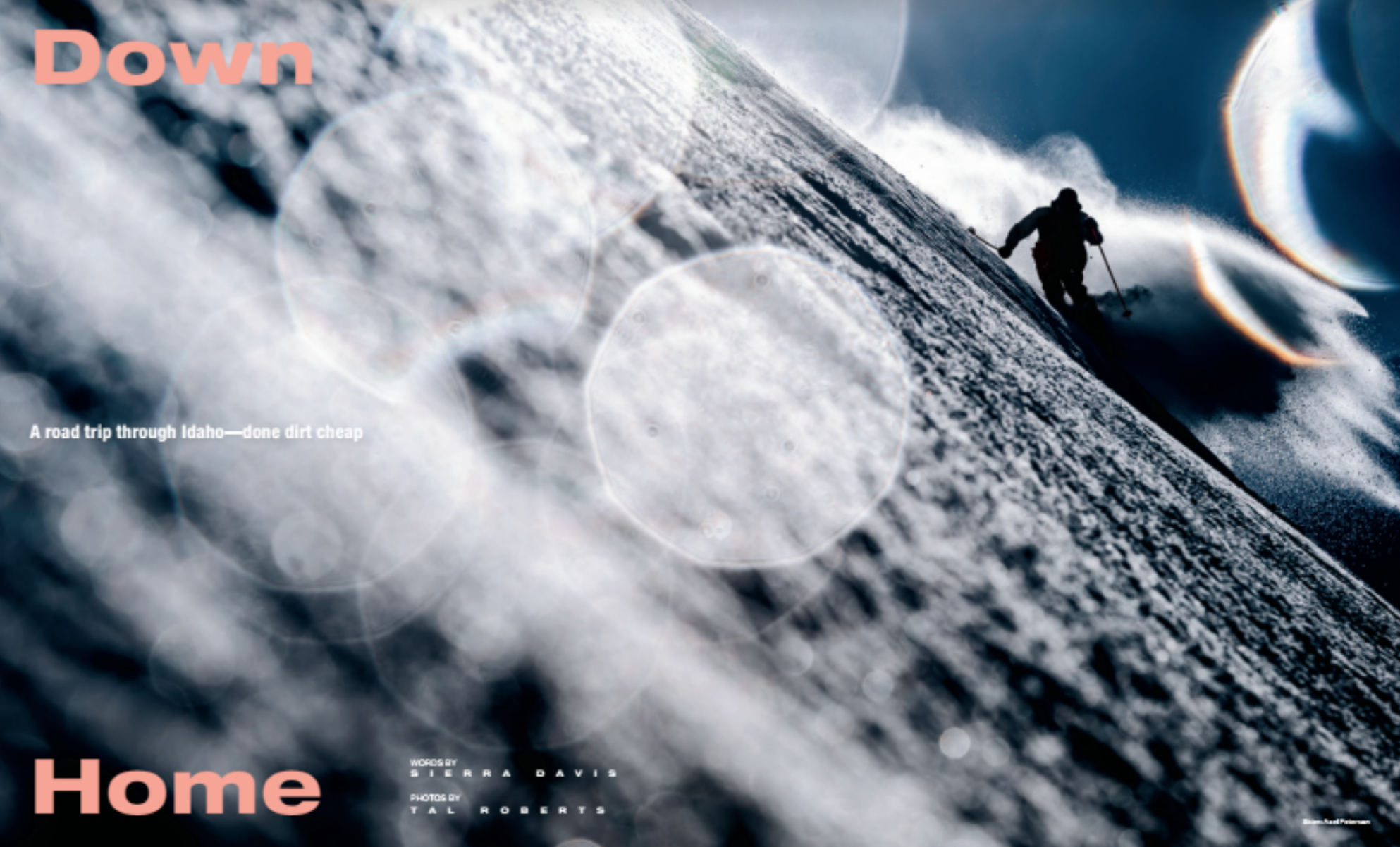
Photographer:Tal Roberts
Heidi: Who were you photographing for this story?
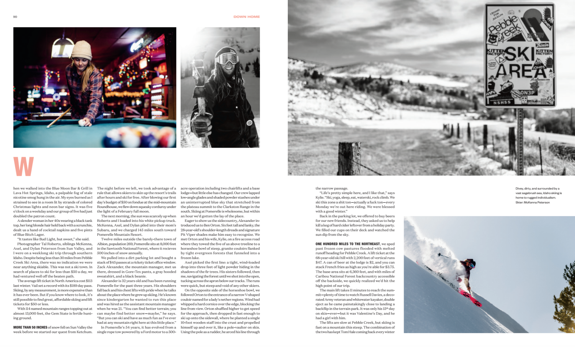
Tal: I joined three siblings, McKenna, Axel, and Dylan Peterson who happen to all be amazing skiers for a road trip through Southern Idaho with a plan to ski some of the smaller ski hills where you can still get a lift ticket for under $50. I got the chance to do the assignment because I had lived in Sun Valley, Idaho for a long time and had been a regular contributor to Powder.
What type of direction did you get from the magazine? Drive around to these smaller ski hills, get a feel for the area, ski with the locals, and show that you can still find great places to ski for under $50 in the age of the $100 plus lift tickets.
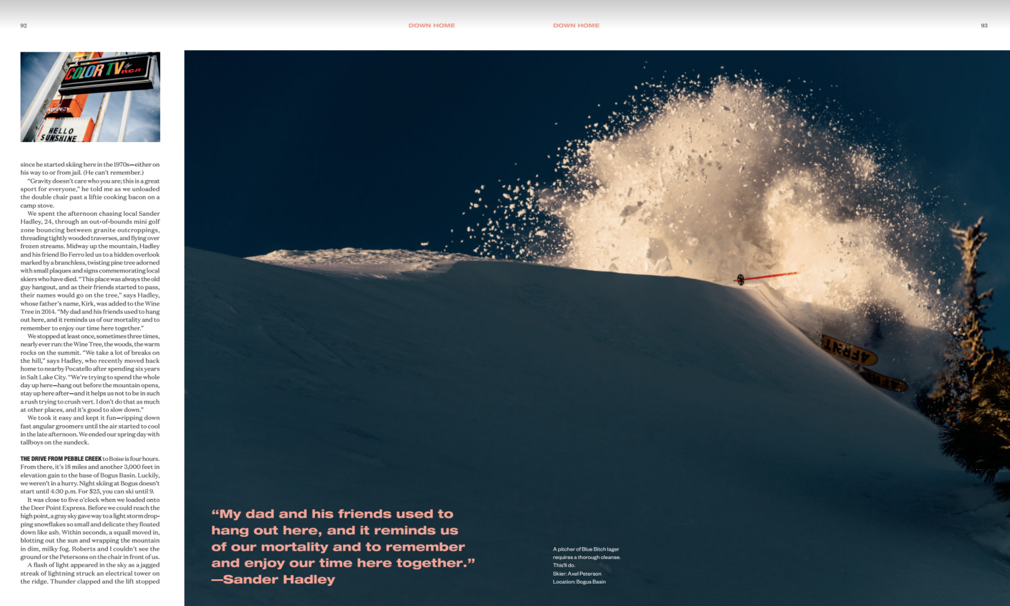
Tell us about the opening spread image, how did that come about? That shot is from an early morning at Pebble Creek Ski Area. On the shot before this I had the skier make a turn really close to me, and because it was really cold the snow was spraying up really high and got all over the front of my lens. Since the sun was still really low I decided to leave the snow on the lens and try a backlit shot next which creates that aperture shape print on the image.
What is going on in the shot with the snow explosion, was that luck? The snow exploding like that isn’t really luck. It’s a result of communication with the skier to know where and how they are going to make their turn and having a good idea of what the snow condition is like and how it will react. Where we did get lucky was with the light. On our first chairlift ride up the mountain lightning struck an electrical tower really close to the chairlift while we were on it and shut down power to the whole mountain for a few minutes. When the chair began to move again we had ski down and stay in the lodge for the next hour until the thunder and lightning passed. The wind blew the storm clouds away and when we got back on slope this was the first image we shot.
How many takes for the shot with the nice line and the basin down below? Just one, but I shot it in high-speed continuous mode so I had a few to pick fro
How many days a year do you ski and do you deliberately ski/train to garner these types of shoots? Counting days that I was shooting and days just riding for fun I think I was on snow around 40-45 days last season. That’s a bit lower than it used to be since I used to live in Sun Valley, Idaho 2 minutes from the chairlift and now I live in Portland, Oregon. I wouldn’t say I train directly for shoots like this, but I do work to stay fit as it helps out a ton when hiking and riding with a heavy camera pack on. I wouldn’t really look at this as training either, but I have done years and years of snowboarding and without that experience I wouldn’t really be able to keep up and navigate more difficult terrain that we often shoot on. For example, this week I have been in British Columbia on a heli-skiing shoot in pretty wild, remote terrain with some of the deepest snow I have ever ridden, which would be a major struggle without a bit of experience in the backcountry.
Our mountain is sacred, and considered one of the world’s energy vortices, if you believe that sort of thing.
So people around here are pretty open to seeing the hand of fate, rather than ascribing any and all oddities to coincidence and chance.
As such, last summer, I chose to take a different route home, which I never do, and drove past my former Kung Fu teacher, walking a dog with a little girl by his side. (I hadn’t seen him in years.)
Not believing it was a coincidence, I parked the car, walked across the street, and said “Hello.” It felt like a sign, so I decided to start studying again, and have been training now for nearly 5 months.
Wing Chun is not for everyone, but I’m enjoying myself immensely. It’s exercise, self-defense, and Buddhist/Daoist philosophy all rolled into one.
The downside, though I hadn’t really contemplated it, is that you can get hurt. Fighting, apparently, can lead to injuries. (Who knew?)
My left hand is strained at the moment, as I hurt it punching a bag a couple of weeks ago, and re-injured it during training last week. Typing right now hurts like hell, and I have to keep it to a minimum, so I can get better and drop 1200 words on you next week.
As such, I”m going to keep it short today. Like super-short. Shorter than DJT’s attention span. Shorter than the line at Chipotle. (You get the picture.)
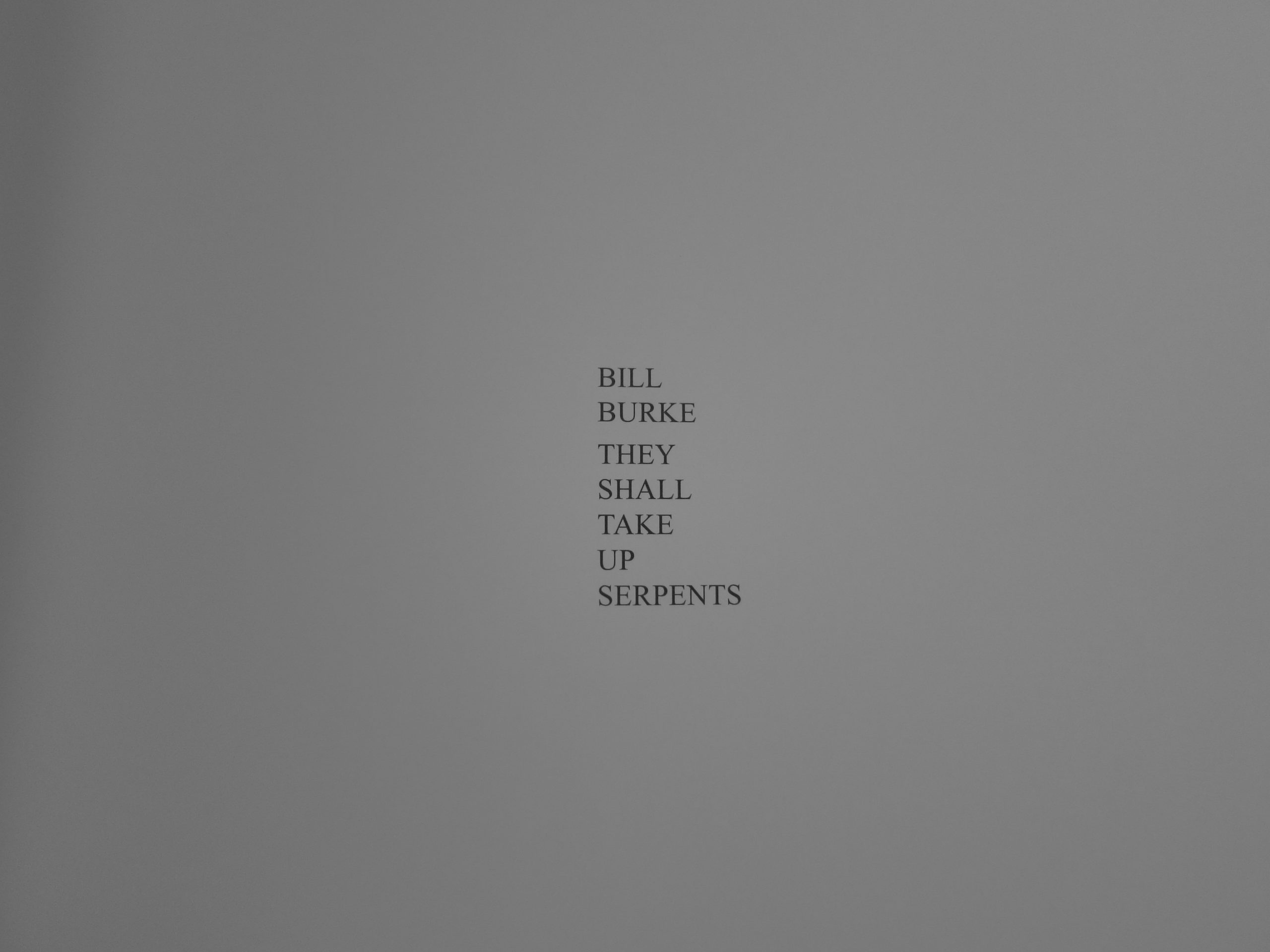
But to counteract the effects of an abbreviated review, I’m going to show a 4 book set, called “Subscription Series No. 5,” put out last year by our friends at TBW Books in Oakland. (We hate the Warriors in my household, but love Oaktown.)
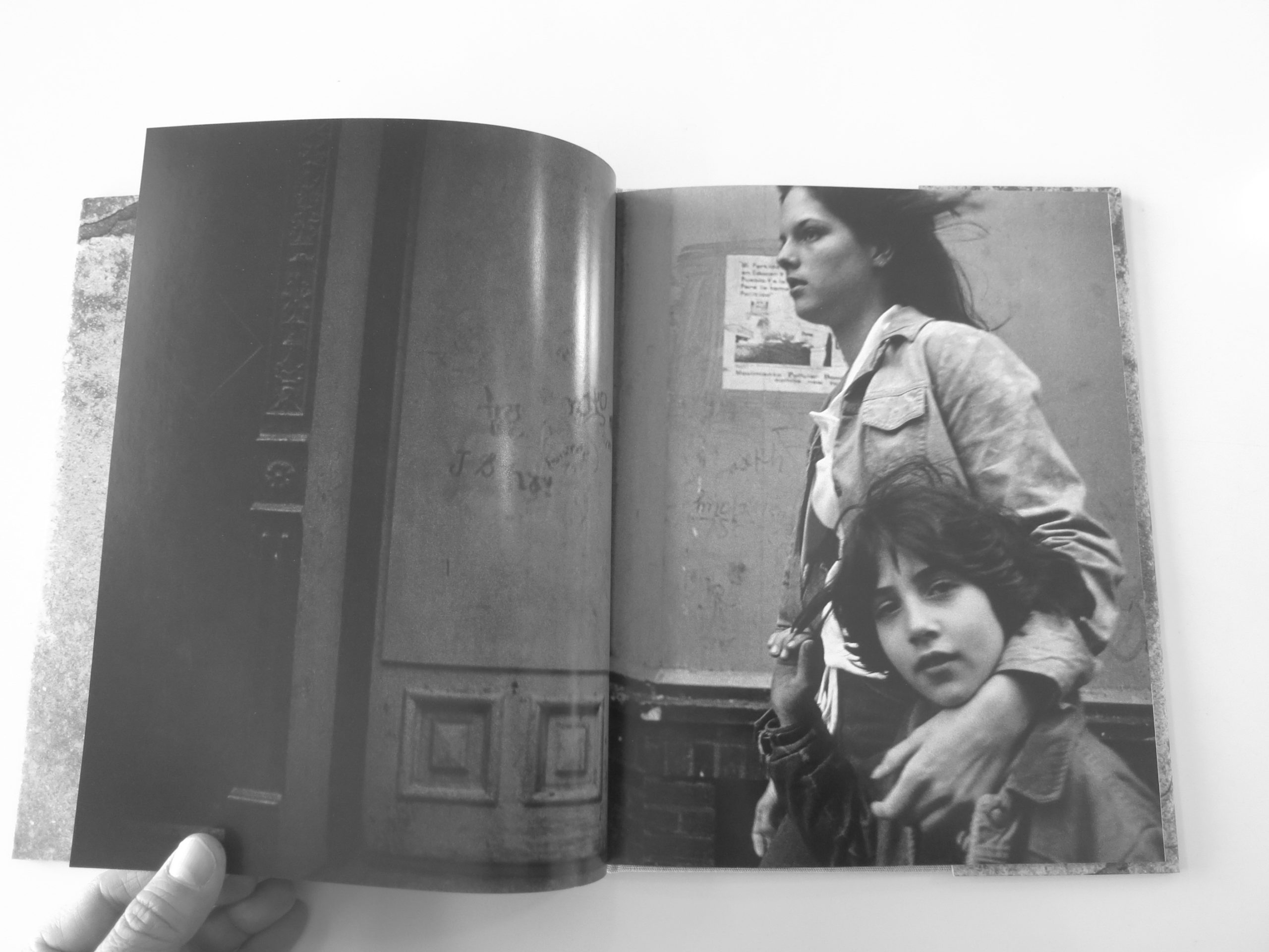
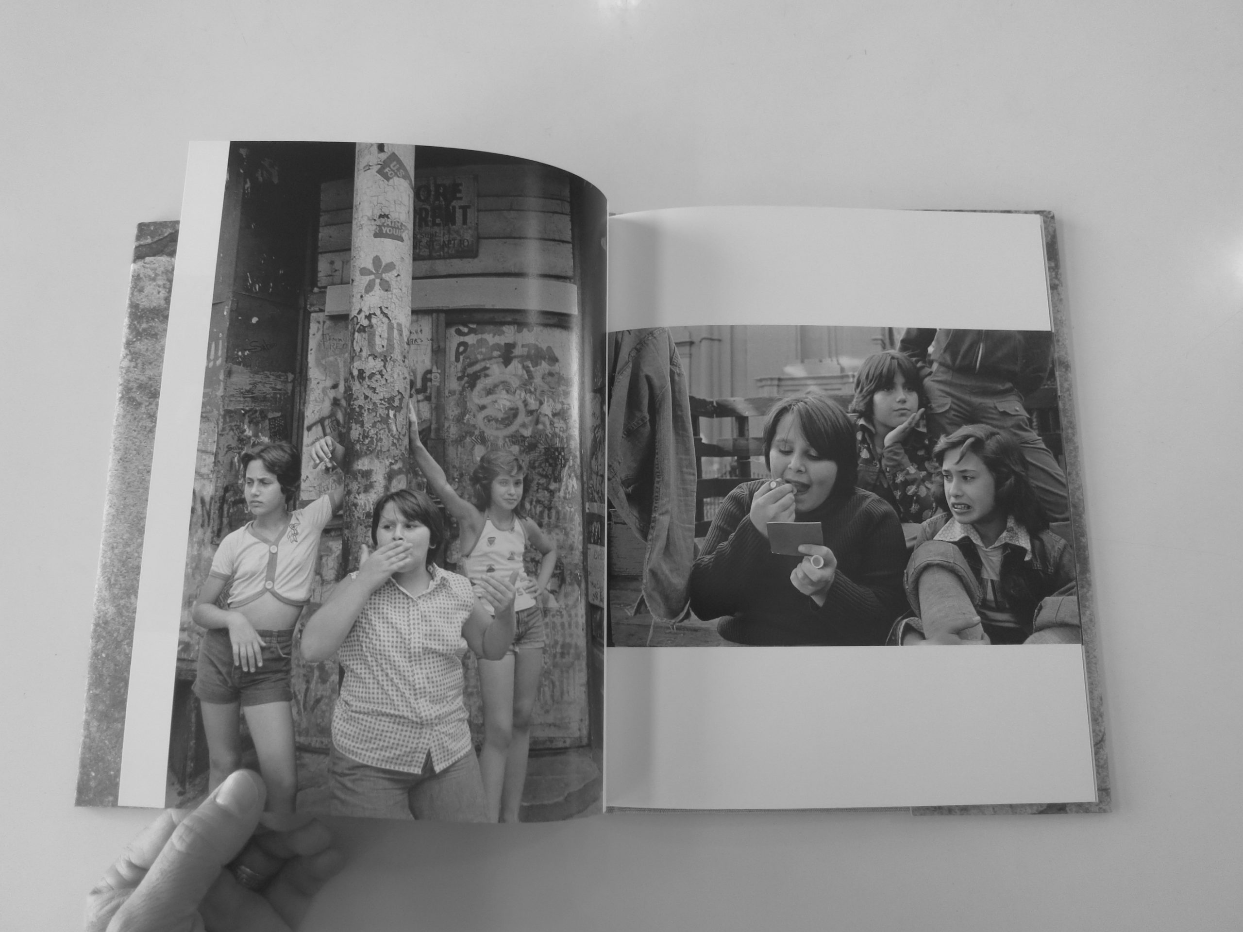
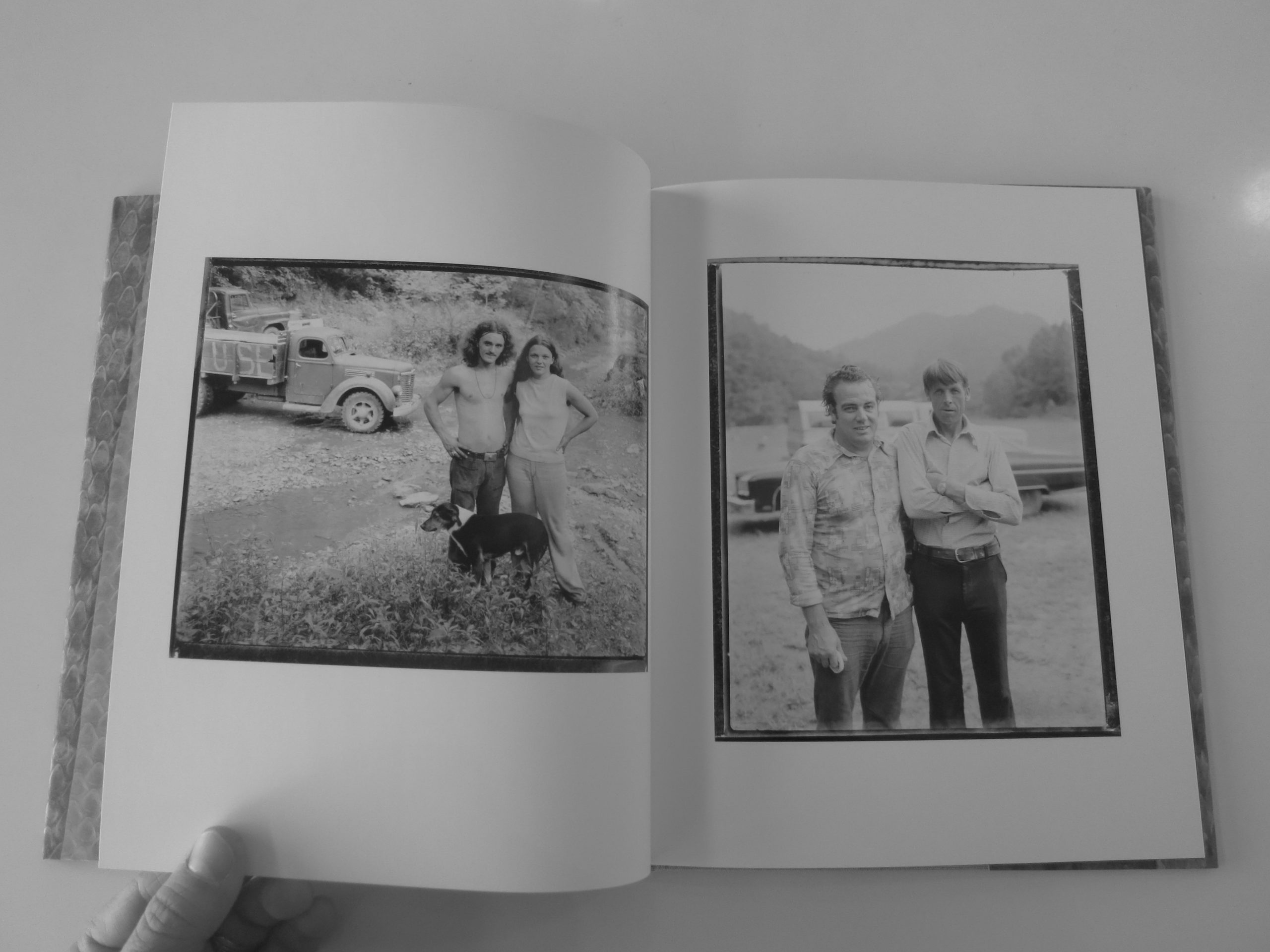
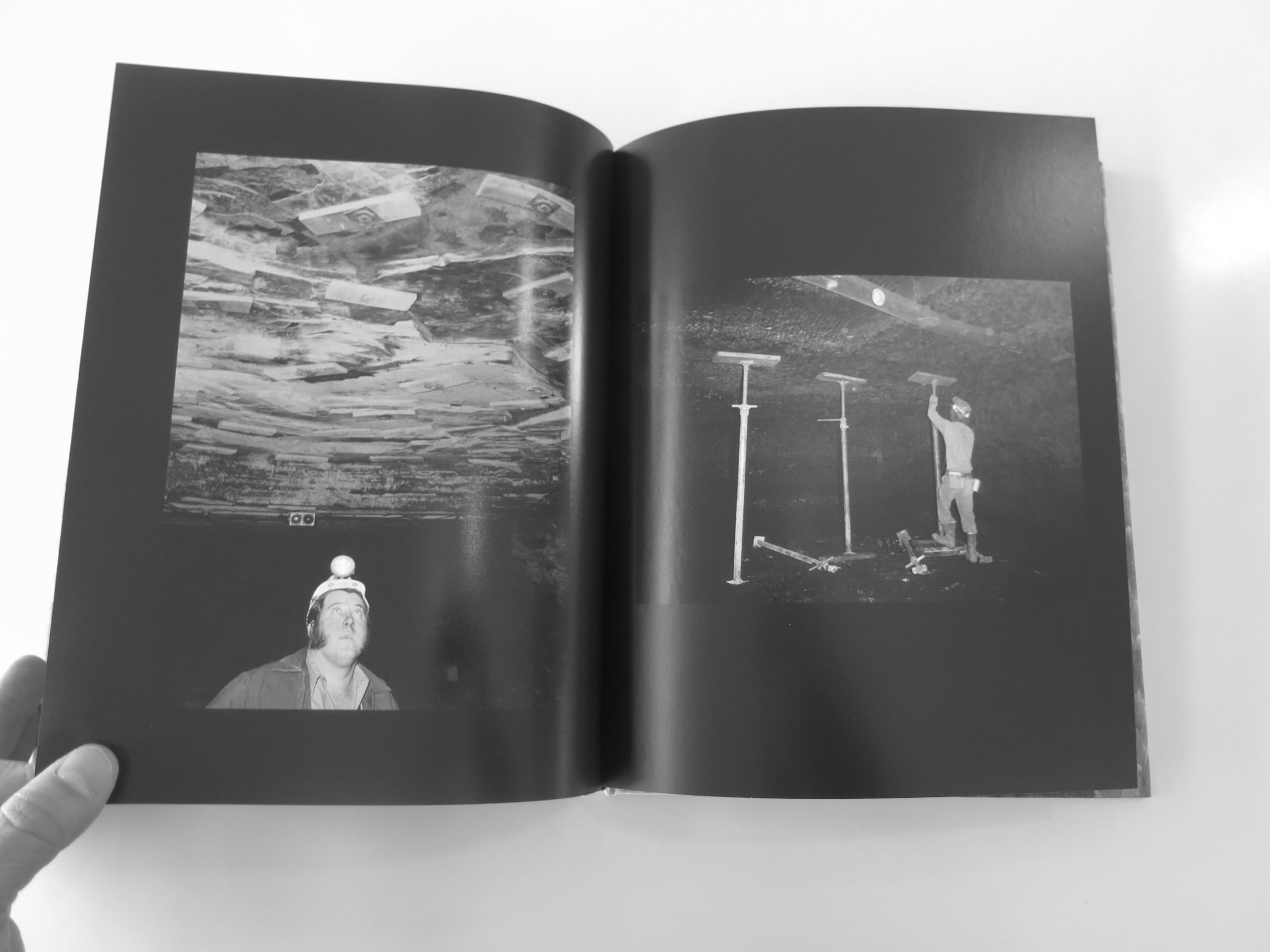
The series, overseen by Paul Schiek, features books by Mike Mandel, Susan Meiselas, Bill Burke, and Lee Friedlander. How’s that for a line-up?
Pretty badass.
Each grouping comes from the past, though Friedlander snuck a few contemporary images into his edit.
What do they have in common?
I’m not sure.
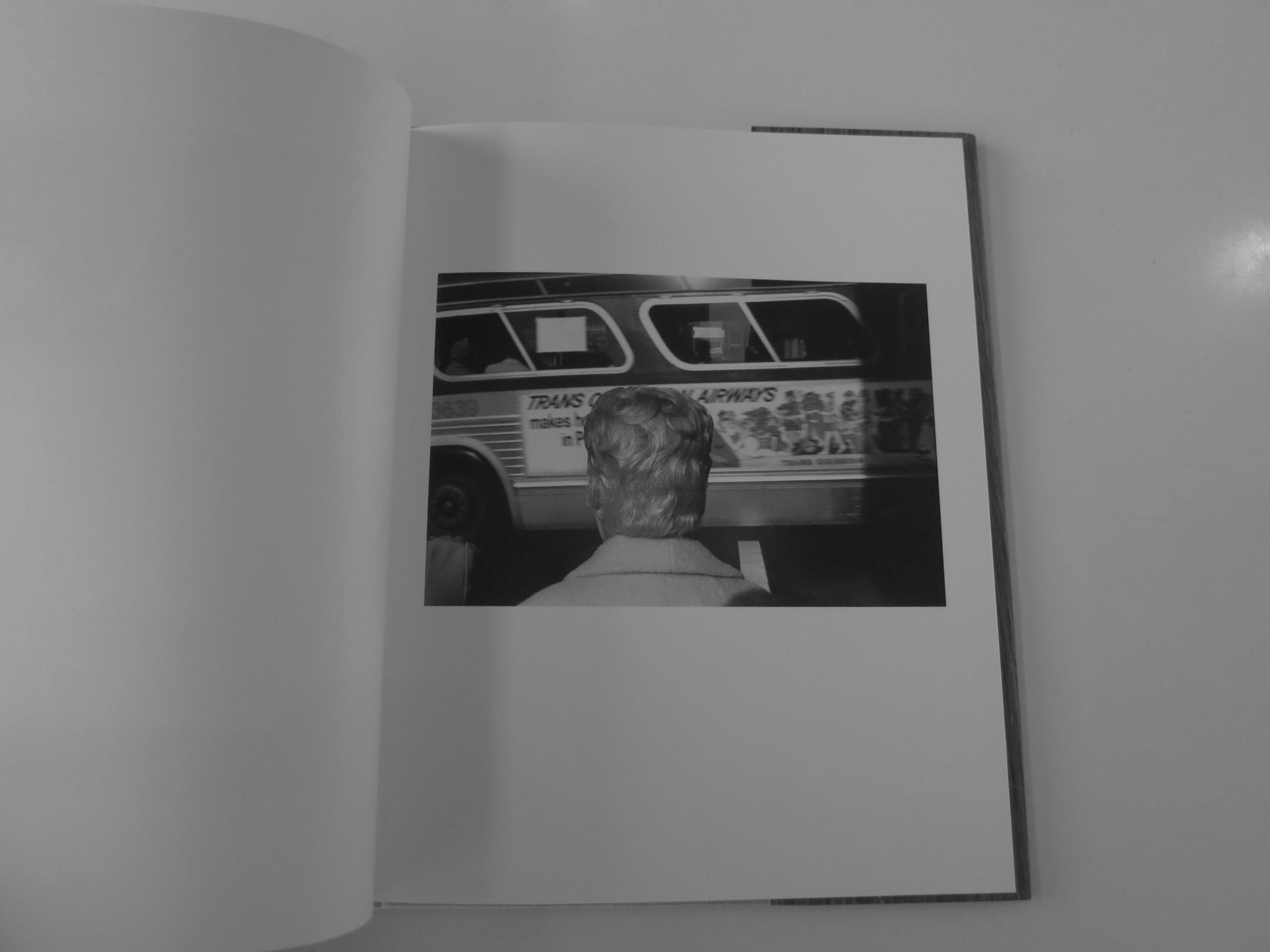
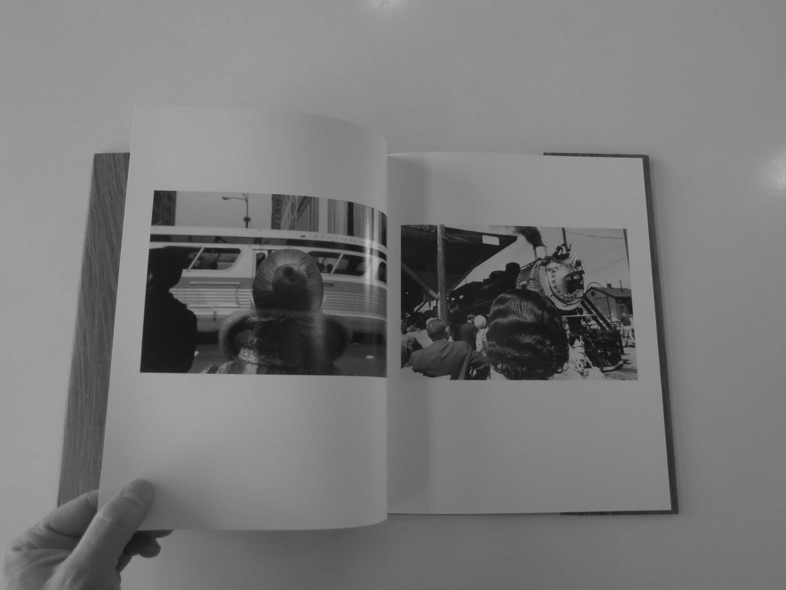
They’re all black and white, and show people in interesting subcultures: Santa Cruz boardwalk beach kids, Downtown NYC schoolgirls, Appalachian snake-handlers, and people with heads. (OK, “people with heads” is not a sub-culture, but I’m trying to tie a bow on this, so I can stop typing and ice my hand.)
The suite of books is really cool, and Mike Mandel even features images of cunnilingus behind a beach shack, which I have never, ever seen before. (And I won’t photograph here, as Rob likes to keep things SFW.)
Anyway, I’m out, and will be back next week with portfolios from Photo NOLA.
Have a good one, and if you’re going to punch a bag this week, make sure to use proper technique.
Bottom Line: Beautiful, slightly absurd book series by some masters
The Art of the Personal Project is a crucial element to let potential buyers see how you think creatively on your own. I am drawn to personal projects that have an interesting vision or that show something I have never seen before. In this new revised thread, I’ll include a link to each personal project with the artist statement so you can see more of the project. Please note: This thread is not affiliated with any company; I’m just featuring projects that I find. Please DO NOT send me your work. I do not take submissions.
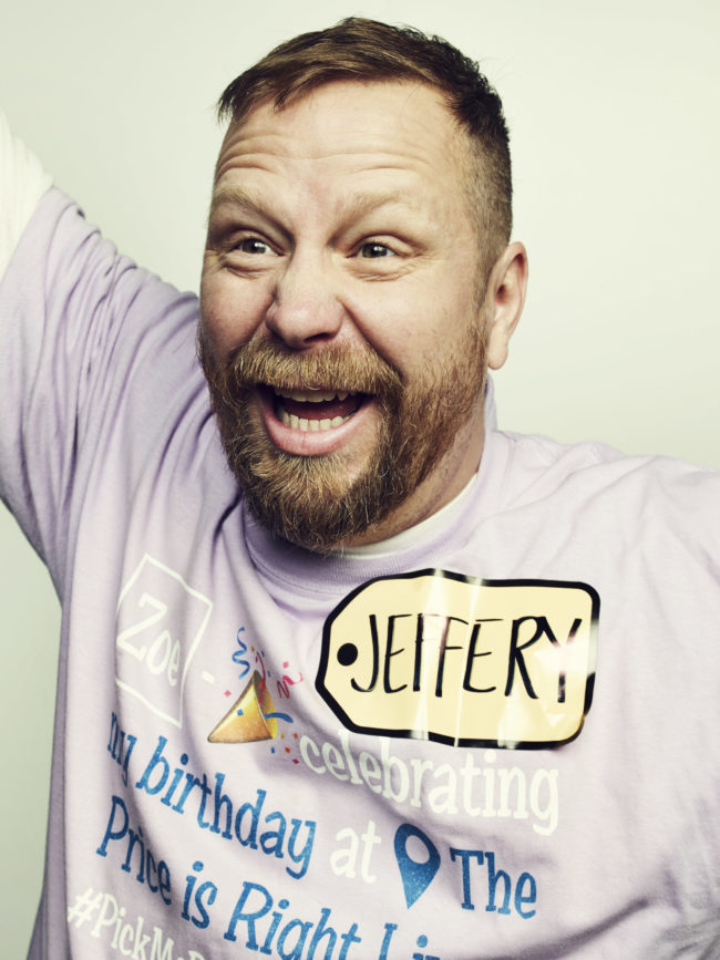
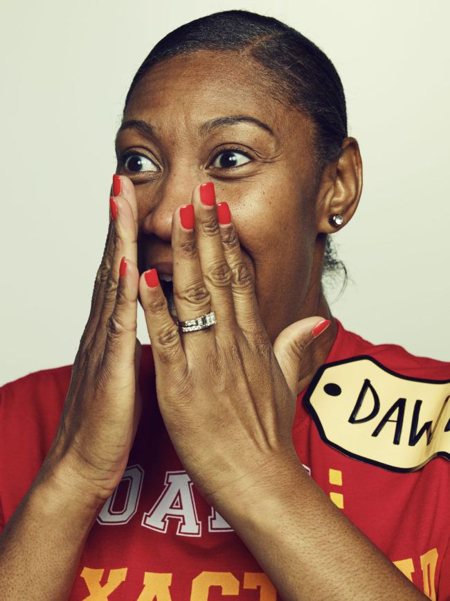
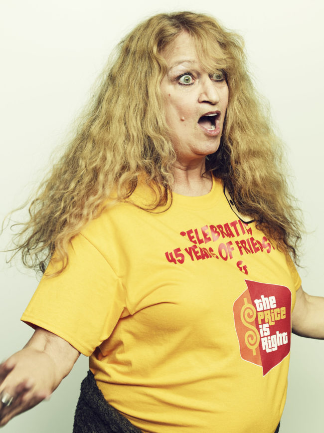
The long-running game show “The Price Is Right” shot at CBS Television City, is one of L.A. ‘s most durable icons. The more excited you can be as an audience member, the more outrageous your reactions and wacky your attire, the more likely you are to hear the legendary command to “Come on Down”
This is a series of personal projects that to be published in LA Mag, which is something I pitched them and they agrees. I have a grid of 9 images that run on the last page of the magazine each month called “Gatherings”, It’s up to me to shoot and provide the material, and there is very little editorial oversight from the mag, it’s really my project which is great.
I’m donating individual and family portrait sessions to raise money and awareness for The Pablove Foundation and their mission to invest in pediatric cancer research and improve the lives of children living with cancer. Sessions are still available at the link below. Come to the Valentine’s Celebration on February 11th for all kinds of art, crafts, food and fun for the whole family!
APE contributor Suzanne Sease currently works as a consultant for photographers and illustrators around the world. She has been involved in the photography and illustration industry since the mid 80s. After establishing the art buying department at The Martin Agency, then working for Kaplan-Thaler, Capital One, Best Buy and numerous smaller agencies and companies, she decided to be a consultant in 1999. She has a new Twitter feed with helpful marketing information because she believes that marketing should be driven by brand and not by specialty. Follow her at @SuzanneSease.
Concept: Exterior and aerial architectural photography of an oil refinery.
Licensing: Public display of 15 images in a corporate office.
Photographer: Architectural and landscape specialist.
Client: Large oil and gas company.
Here is the estimate:
Creative/Licensing: The photographer had a longstanding relationship with an architectural firm who was working with the client to develop new office spaces, and they connected the photographer directly to the client to discuss the creation of artwork to fill the new space. They hoped to capture images of their oil refinery both from the ground and from above to showcase the scale of their complex in an artistic way. They were interested in 15 images, and after speaking with the photographer about different angles/shots, they anticipated needing two shoot days to accomplish the project. Based on conversations with the client, they intended to make use of the images in various ways, ranging from a large-scale display in the lobby to smaller-sized prints throughout the office.
Since a few of the images were going to be more prominently displayed than others, I developed a tiered pricing model starting at $2,500 for the first image, $1,000 each for images #2-4, $500 each for images #5-8, and $250 each for images #9-15. That brought me to $9,250, which I initially doubled considering the potential shelf life of the images. When pro-rated, that brought me close to $1,250/image, which I felt was a bit high, so I brought down to $1,000/image and an even $15,000 (breaking down to $7,500/day when viewed that way). Given the size of the client, it felt a bit light, but with expenses bringing our bottom line up near $25k, I felt this was appropriate based on other similar projects I’ve estimated.
Photographer Scout Day: Before shooting, the photographer would do a walkthrough of the location to determine the best angles and time of day to capture each shot.
Helicopter Rental: The photographer had previously rented helicopters for projects, and anticipated paying $450 per hour. Based on where the helicopter would take off/land, and the few shots that were needed, we included 2 hours and rounded up just a bit. Sometimes chartering a helicopter for this purpose requires the rental of special safety or stabilization equipment, however, it was not required in this instance.
Equipment: This included the photographer’s camera, backup body, and specialty lenses for two days.
Mileage, Parking, Meals, Misc.: I included $50/day for meals and $100/day for mileage and miscellaneous expenses that might arise.
Shoot Processing for Client Review: This included the photographer’s time to transfer all of the images from the cards to his computer, review and batch color-correct the content, and prepare a web gallery for the client to choose from.
Retouching: I included two hours of retouching, based on a rate of $150/hour, for each of the 15 images.
Results: The photographer was awarded the project.
Hindsight: Considering the size of the client and the lack of negotiation, I think we could have aimed higher on the creative/licensing fees. It can actually be reassuring when a bit of resistance is met, which lets me know when we’re at the top threshold of a budget range, but since there wasn’t any pushback, there may have been some room to charge more initially. That being said, considering the market and the limited usage, I still feel the fees were appropriate.
If you have any questions, or if you need help estimating or producing a project, please give us a call at 610.260.0200 or reach out. We’re available to help with any and all pricing and negotiating needs—from small stock sales to large ad campaigns.
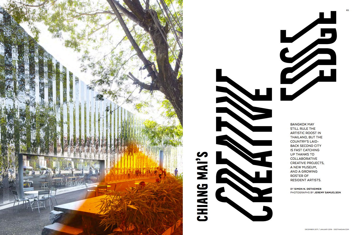
Editor in Chief and Photo Director: Christopher Hill
Photographer:Jeremy Sameulson
Heidi: Did you travel with the writer? Jeremy: The writer did not join us but instead I traveled with my family, though not on the shoot of course.
Is the magazine both print and digital?
Yes
Are you familiar with Chiang Mai? I lived in Chiang Mai for 4 years when my kids were younger, we took them there so they would have a bigger world view. We knew no one, we just arrived with 2 suitcases apiece (2 kids and wife) and made it work. I would commute back and forth to the USA for shoots. I did do some magazine shoots while there and hence had a relationship with the magazine but really it was a place for personal work. The timing just happened to be right when they asked about my availability for the shoot, as I was planning a visit anyway. We still have a small place there and are starting to spend time there again as my kids are off to college.
What inspired you about this shoot?
As you know magazine budgets are low (especially in SE Asia ) but stories like this are one of the reasons I became a photographer. It gives you an opportunity to meet people and places that you would otherwise never meet or see, especially in a foreign country.
Tell us about the color treatment in these images.
The color effect was done in camera with gels not in post and is a technique I’ve been playing with for awhile, it’s influenced by James Welling and his work at the Glass House.
Did you have any language barriers?
I used a Thai assistant for some of the shoots as my thai skills are not very good, it is a tonal language and quite hard to master. But these artists are working on the international level and were often quite english proficient.
How did you integrate with the community while you were there?
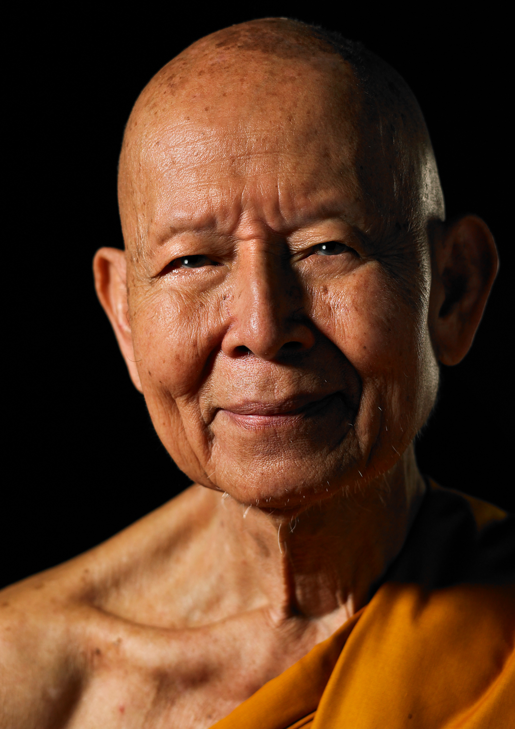
While I lived there I had a column in a local expat magazine, Chiang Mai Citylife, called Ti Naa ( face, in english) where I did double page spread of portraits( large face shots done in my little studio) of interesting Thai people. For example, Miss Chiang Mai ( beauty queen), local singers and artists, the head monk for all of Chiang Mai province. Below is a jewelry designer I photographed. Again it served as a way for me to meet people whose paths I would never cross, especially there.
Mostly because we don’t have any snow. As I’m writing this, the East Coast is under a blizzard watch, and the American South just got more snow in a day than we’ve had in a month.
But I’m not going on a Climate Change rant today.
Rather, I’m moping because I miss flying down the white mountain while the snow falls all around me. It’s magical, standing on top of a white peak, frozen conifers dotting the landscape.
I’ve been skiing in Taos Ski Valley since I was 14, and now I’m 43, so the place is like a second home. Furthermore, one of my wife’s good friends is a Blake, the family that owned the resort for 60 years, so that always made it more special.
Though Taos is famous for our adobe-style architecture, most of the buildings in TSV were designed in a Swiss Alpine style, and feature European names like the Edelweiss, or the Bavarian.
And there are trails named after the men who engineered a failed coup against Adolph Hitler, for crying out loud. (Stauffenberg, Fabian, Oster, Tresckow)
To be clear, Taos Ski Valley sits on land once “owned” by the Taos Pueblo Native Americans, which was then appropriated by colonists from the Spanish Empire, before being taken as war spoils by the United States in the 19th Century.
So where does the Euro-centric architecture/culture come from?
Well, Ernie Blake, the founder, came to America as Ernie Bloch. He was a Swiss German Jew who left Europe, founded a little ski area at the edge of the world, yet still wanted to create an atmosphere like home.
Pretty weird, right?
Well, yes and no.
Because all of contemporary America was founded by European expats who came over here to begin again, and brought their culture with them. (To be clear, I’ve written many words over the years about the exception that is African-American history, but we’re not going there today.)
If you drive through parts of Texas, you see signs advertising kolaches, a Czech snack food that is fairly far from home. Why? Because it was mostly Czech and German immigrants who beat back the Comanche in the 19th Century.
We all know there are a shit-ton of Scandinavians in Minnesota, Polish-Americans in Chicago, Irish in Boston, French descendants in Louisiana, and so on.
There are weird-ass European town names that pop up all over America, including places like Brooklyn, which has become synonymous with American cool. (Or obnoxious, bearded hipsters, depending on your POV.)
How could it be otherwise, when an entire Continent has been populated with riffraff from elsewhere?
That much I understand.
But what about the other way around? Are there places in Europe that are obsessed with America, even though our histories officially diverged around the time of the Boston Tea Party?
I’m glad you asked.
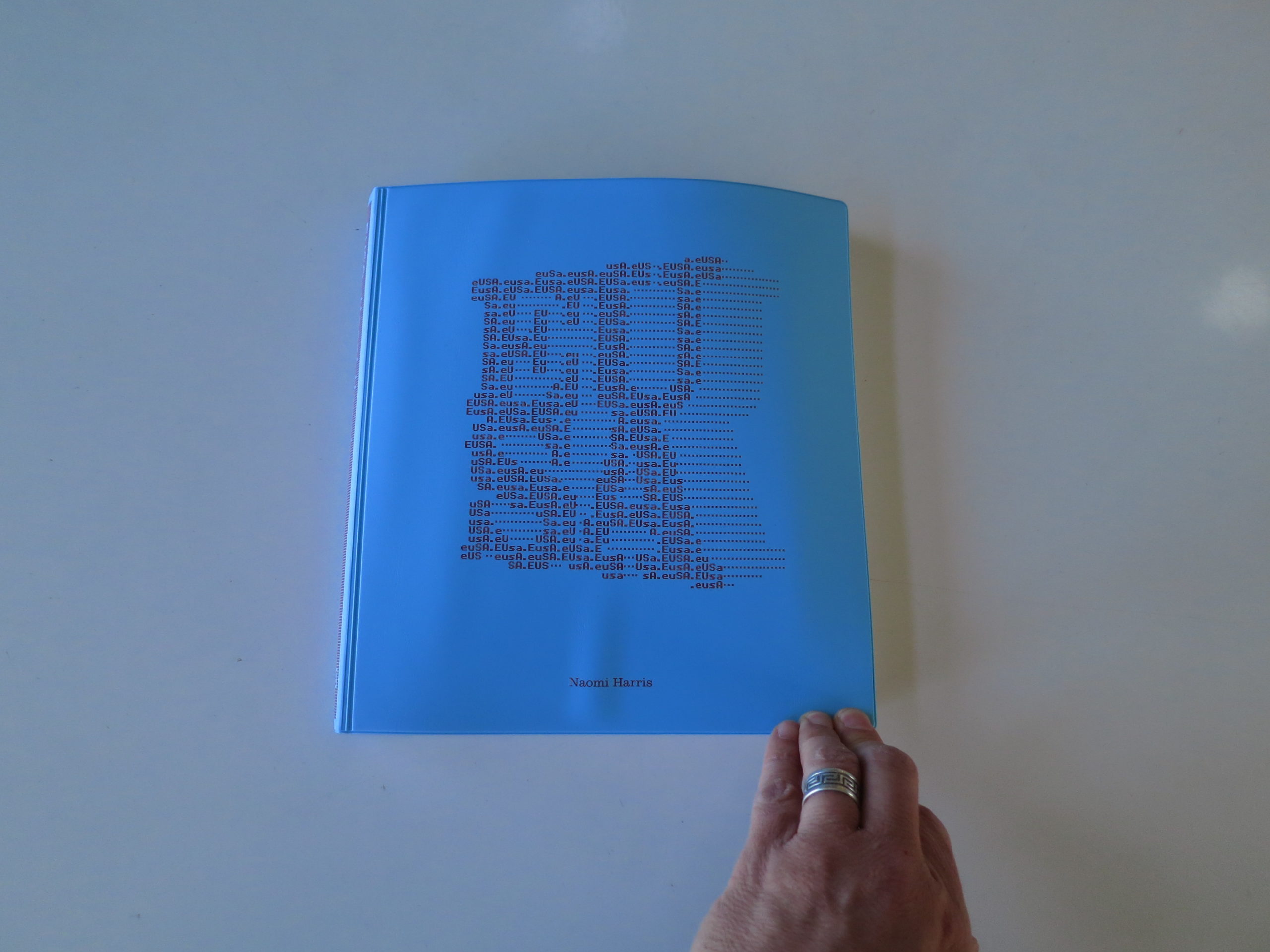
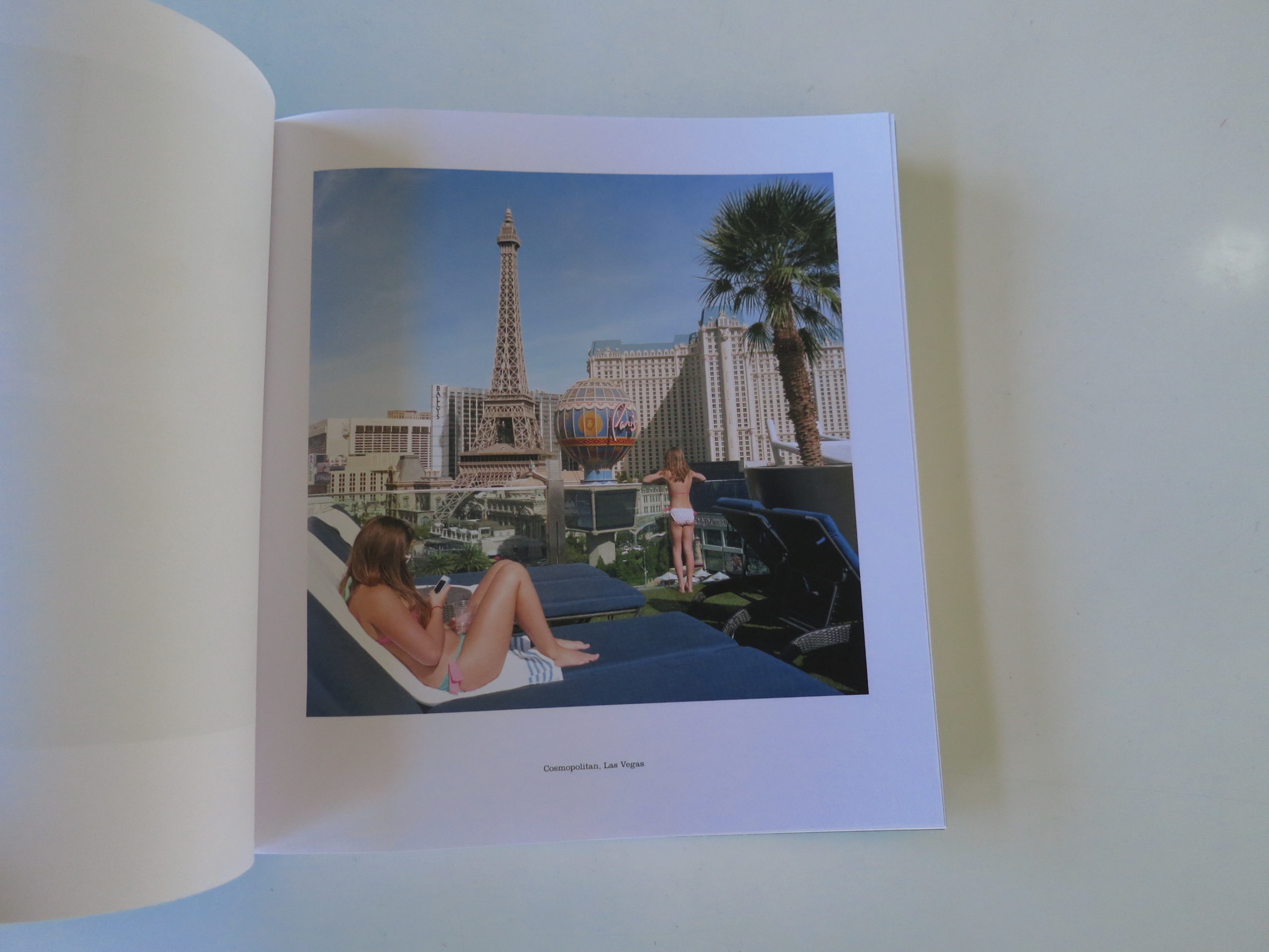
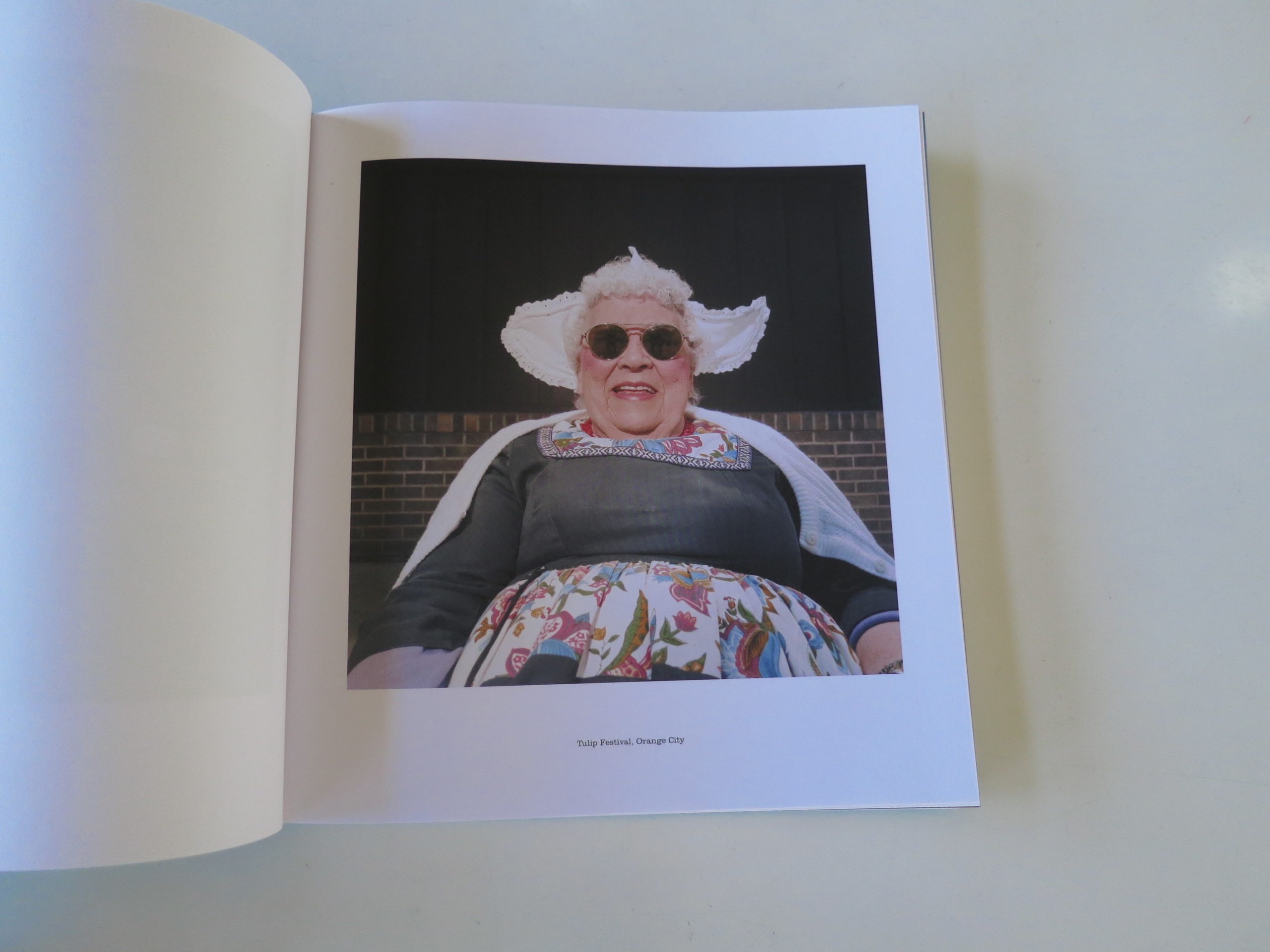
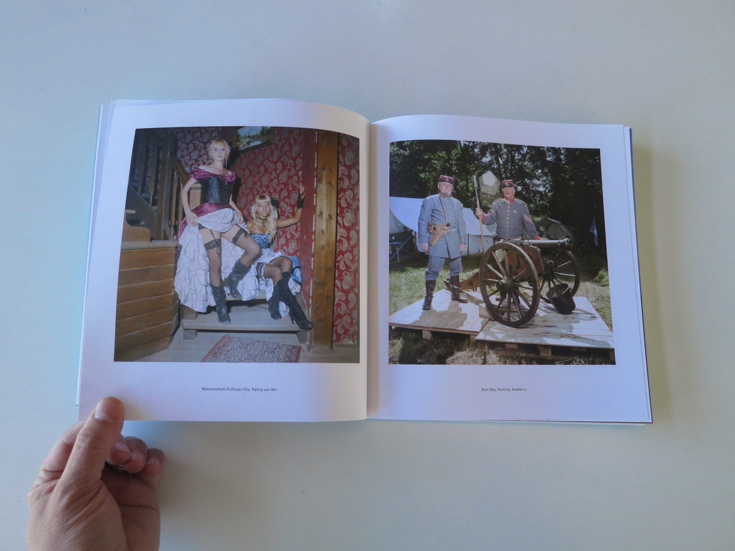
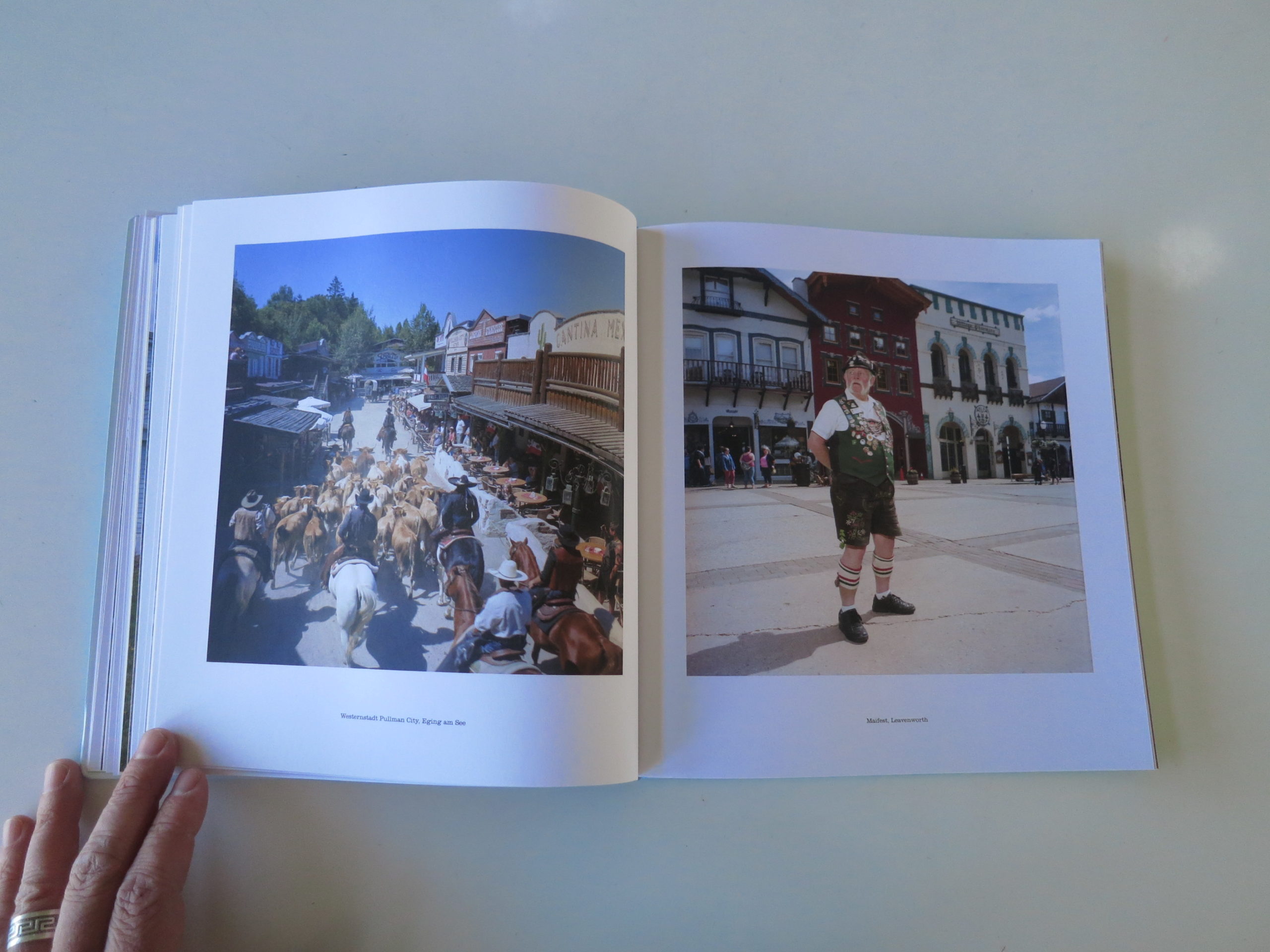
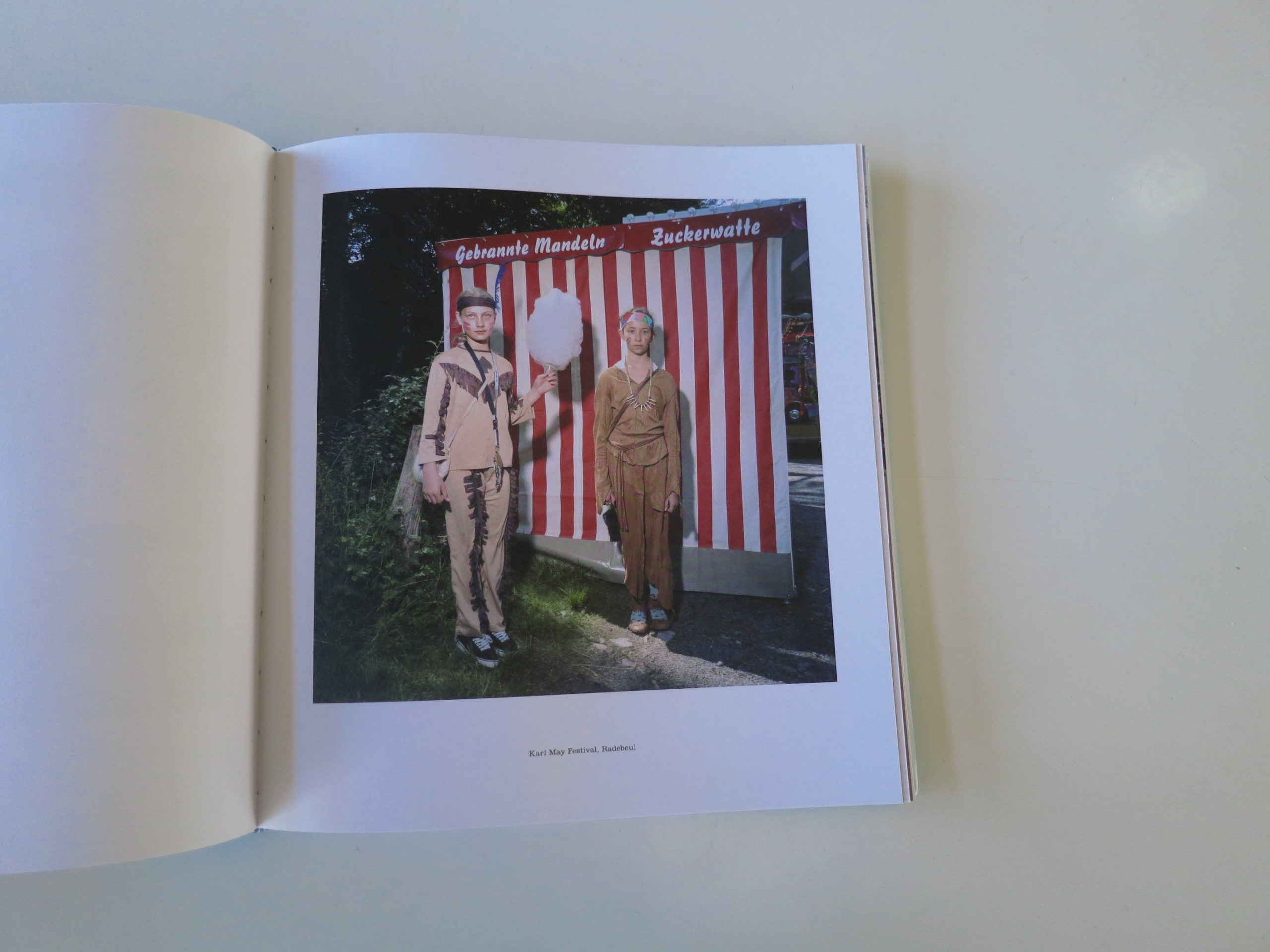
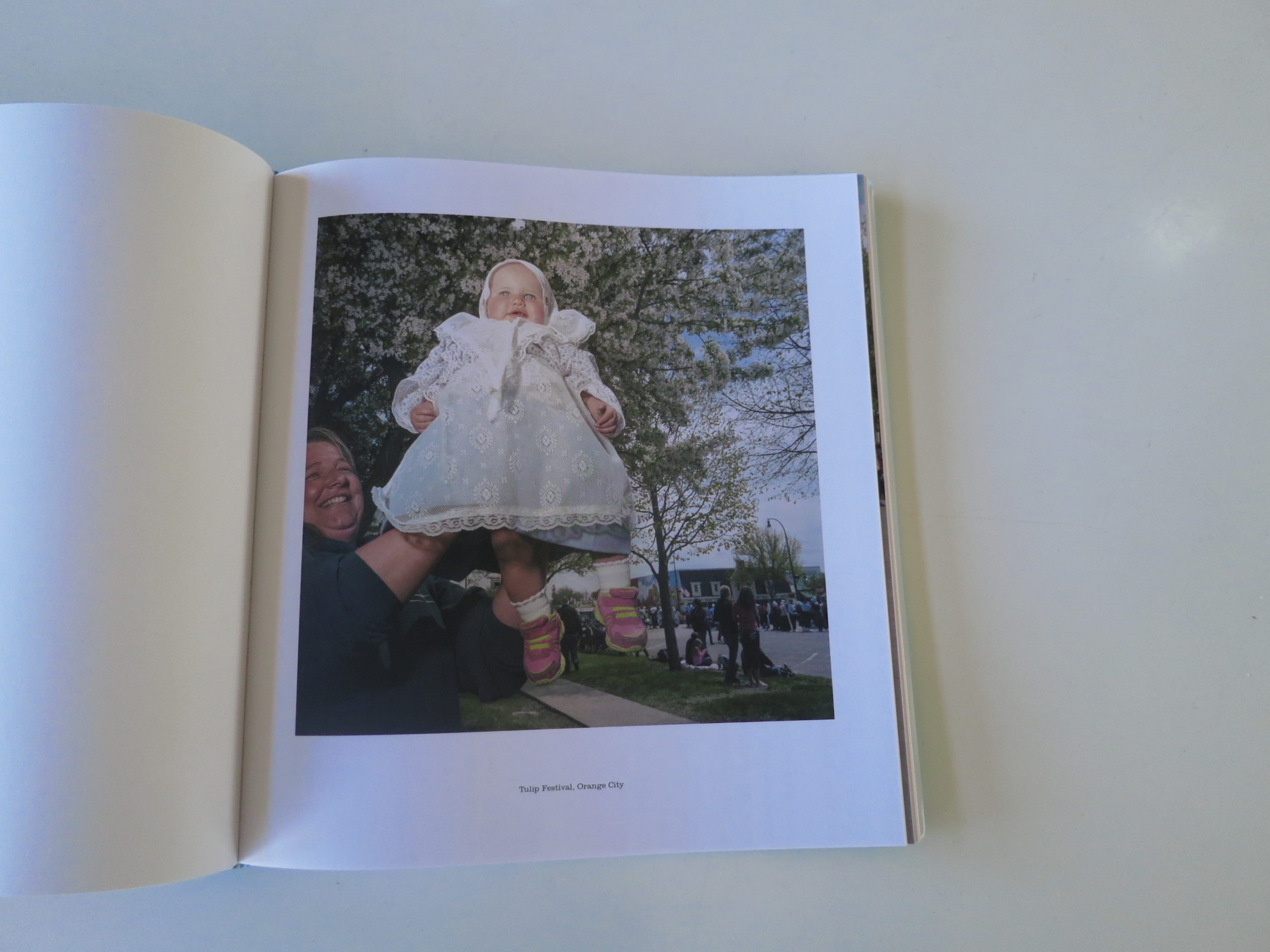
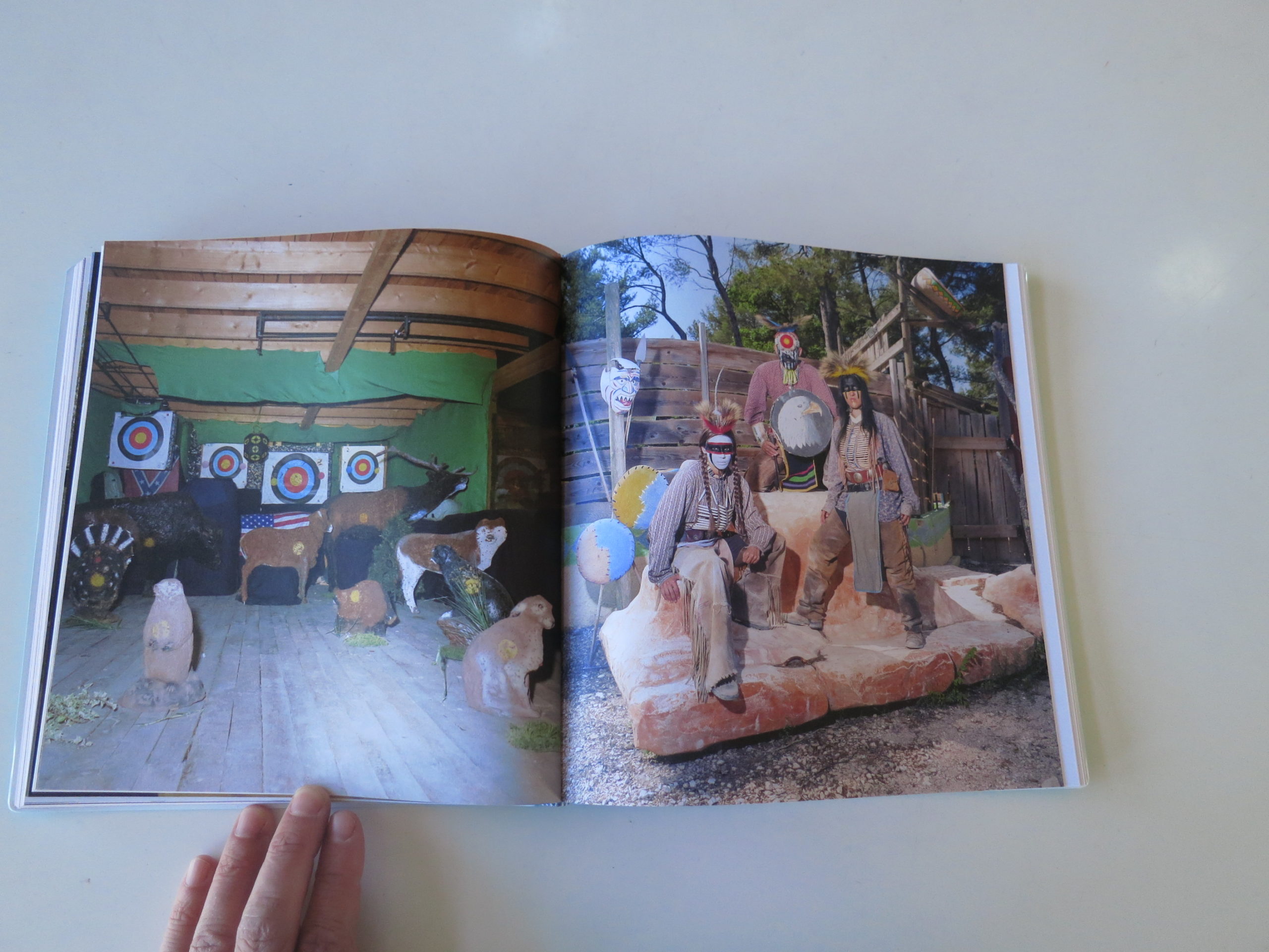
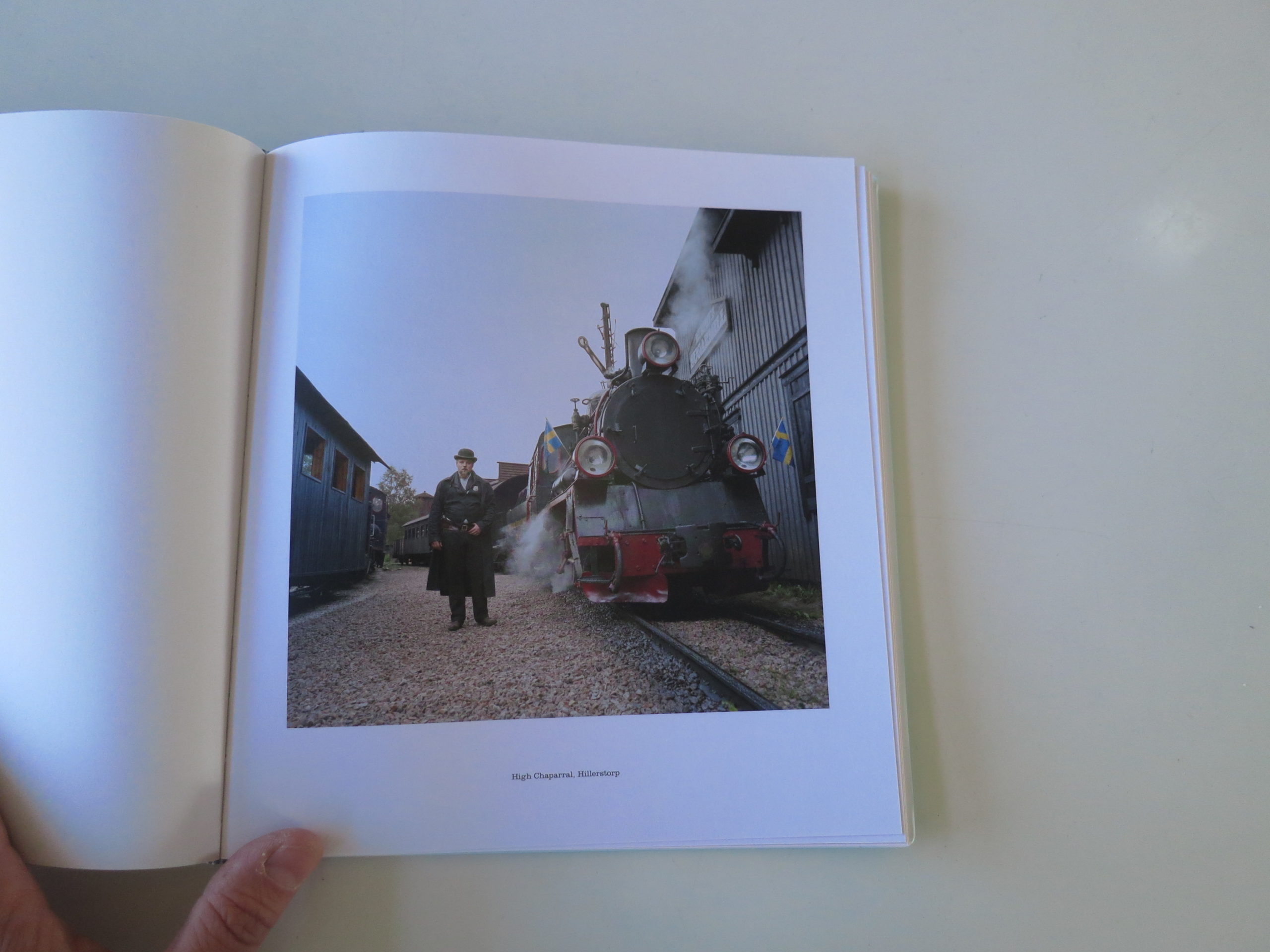
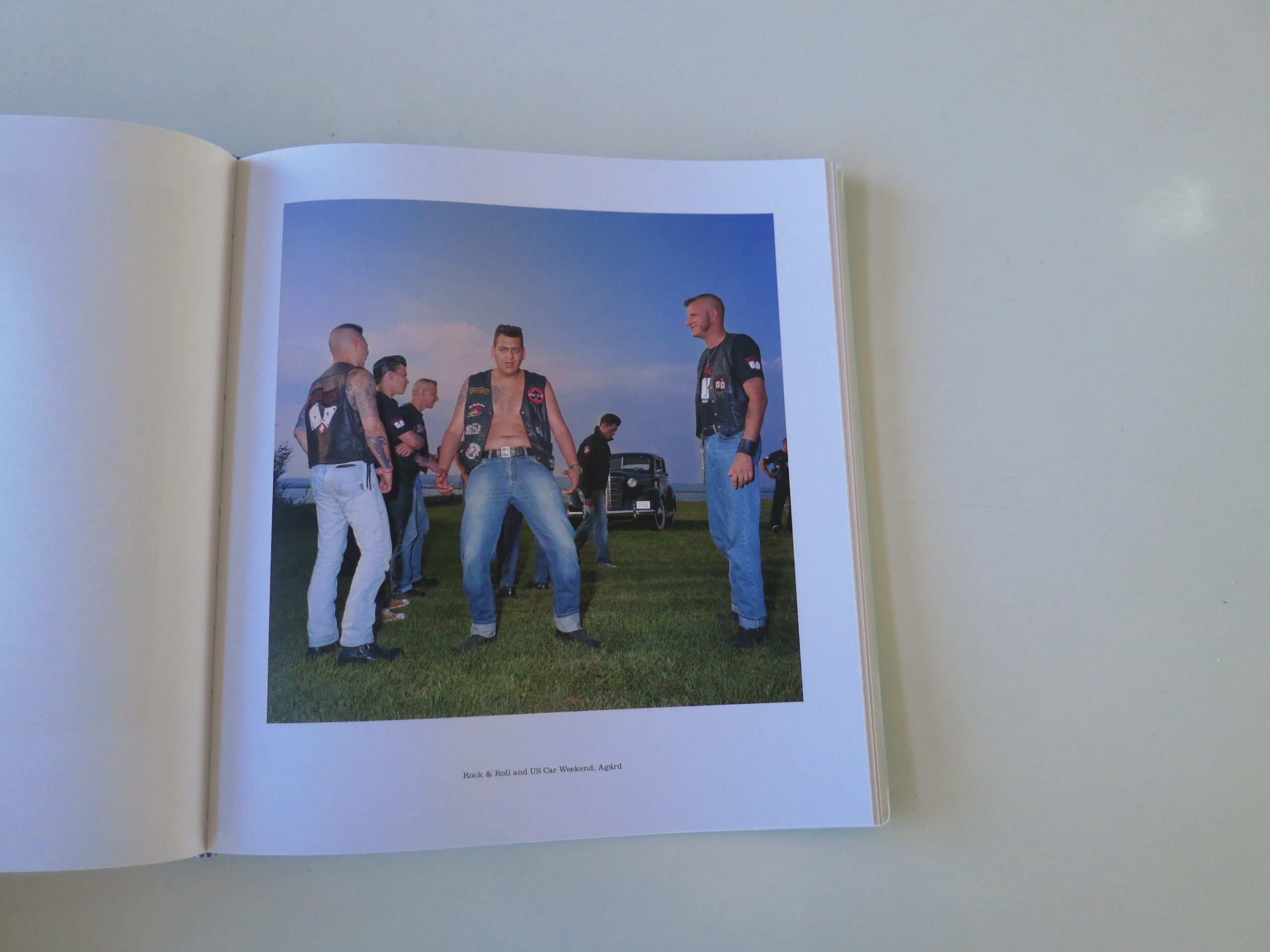
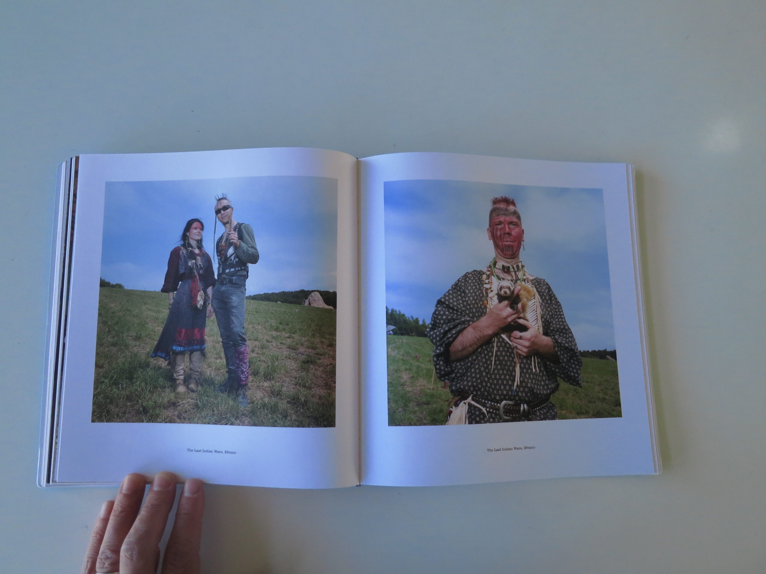
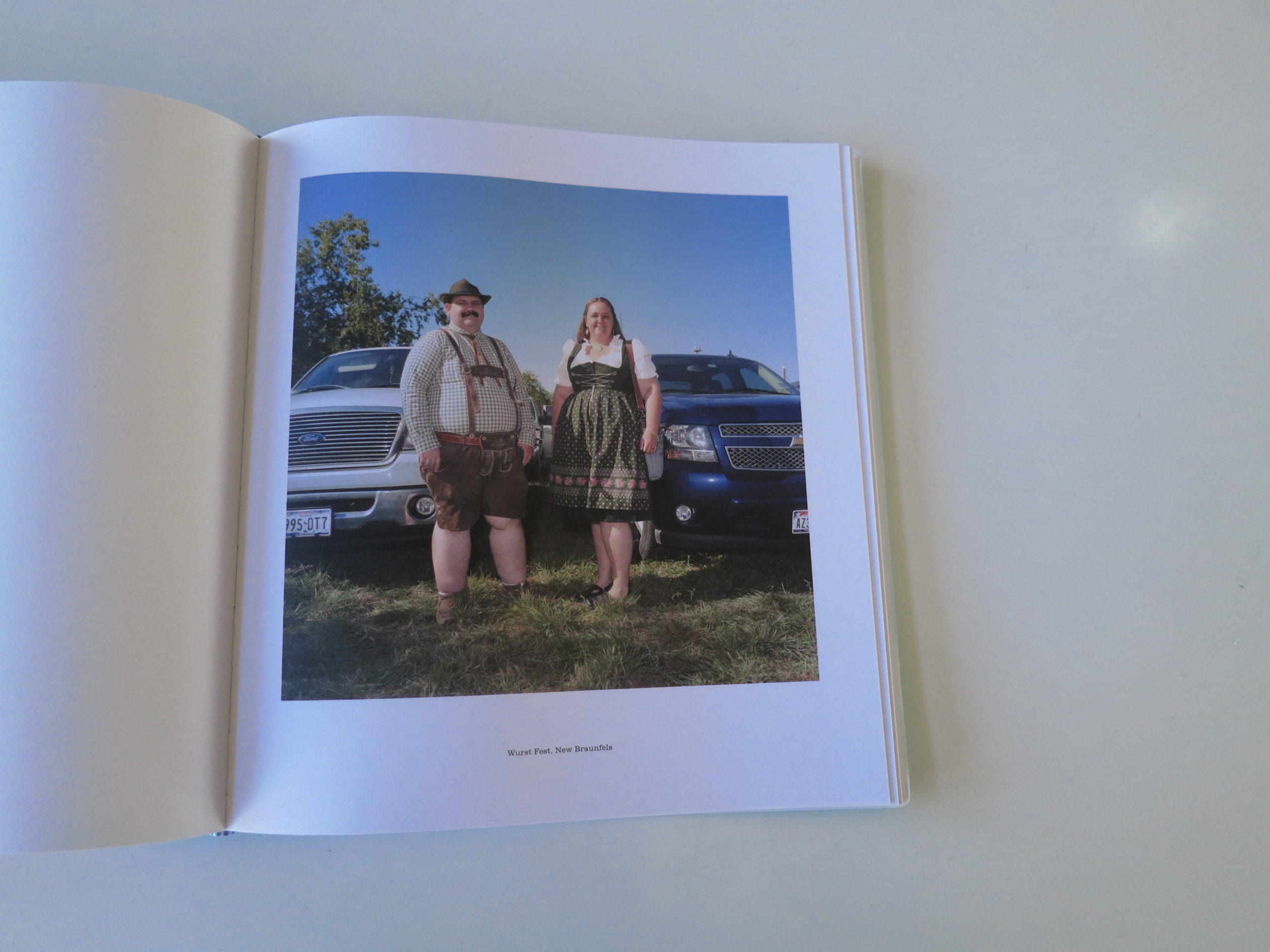
Because I just put down “EUSA,” a fun, new book by Naomi Harris, recently published by Kehrer Verlag in Germany, so I feel pretty qualified to answer your question.
To begin with, I believe Naomi Harris is Canadian, so the entire premise of a book looking at the overlap between America and Europe begins with a touch of absurdity. Thankfully, it meshes perfectly with the vibe of the book, and the style of the images, so don’t bother with this one if you lack a sense of humor.
The last few weeks, I’ve discussed how certain books utilize the cover to generate interest. This is no different. As the below picture attests, this cover is made from the sort of plasticy-rubbery composite that makes one think of travel guide books of old, or maybe textbooks you might have bought in college.
The title is also built out of smaller versions of itself, which I had to squint to understand, upon first viewing, thereby grabbing my attention further.
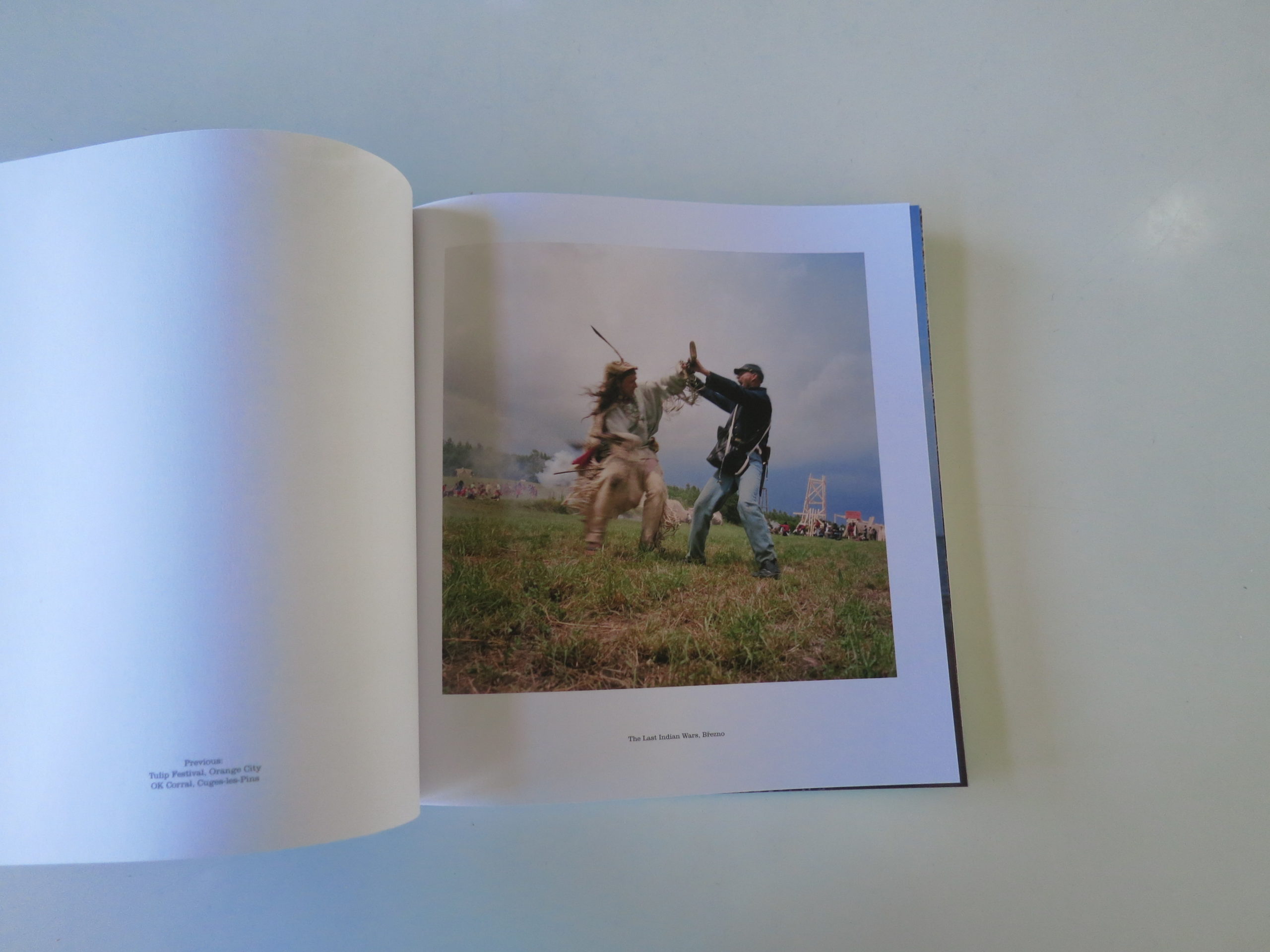
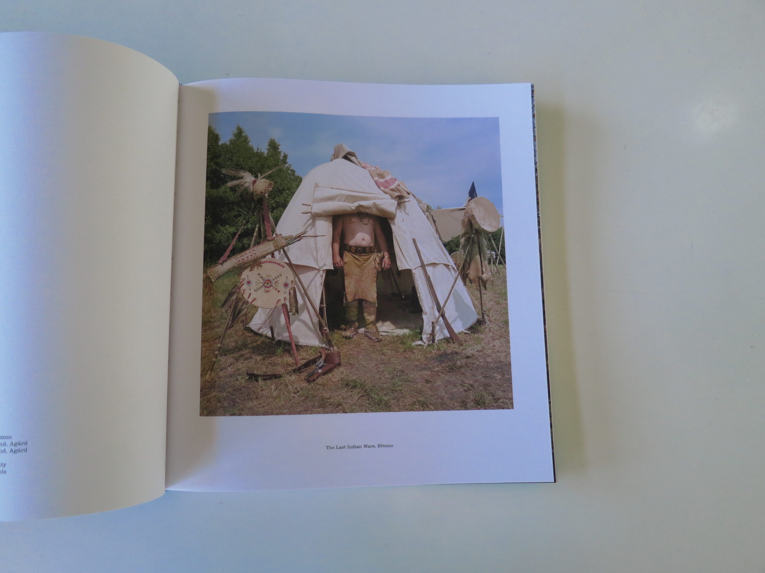
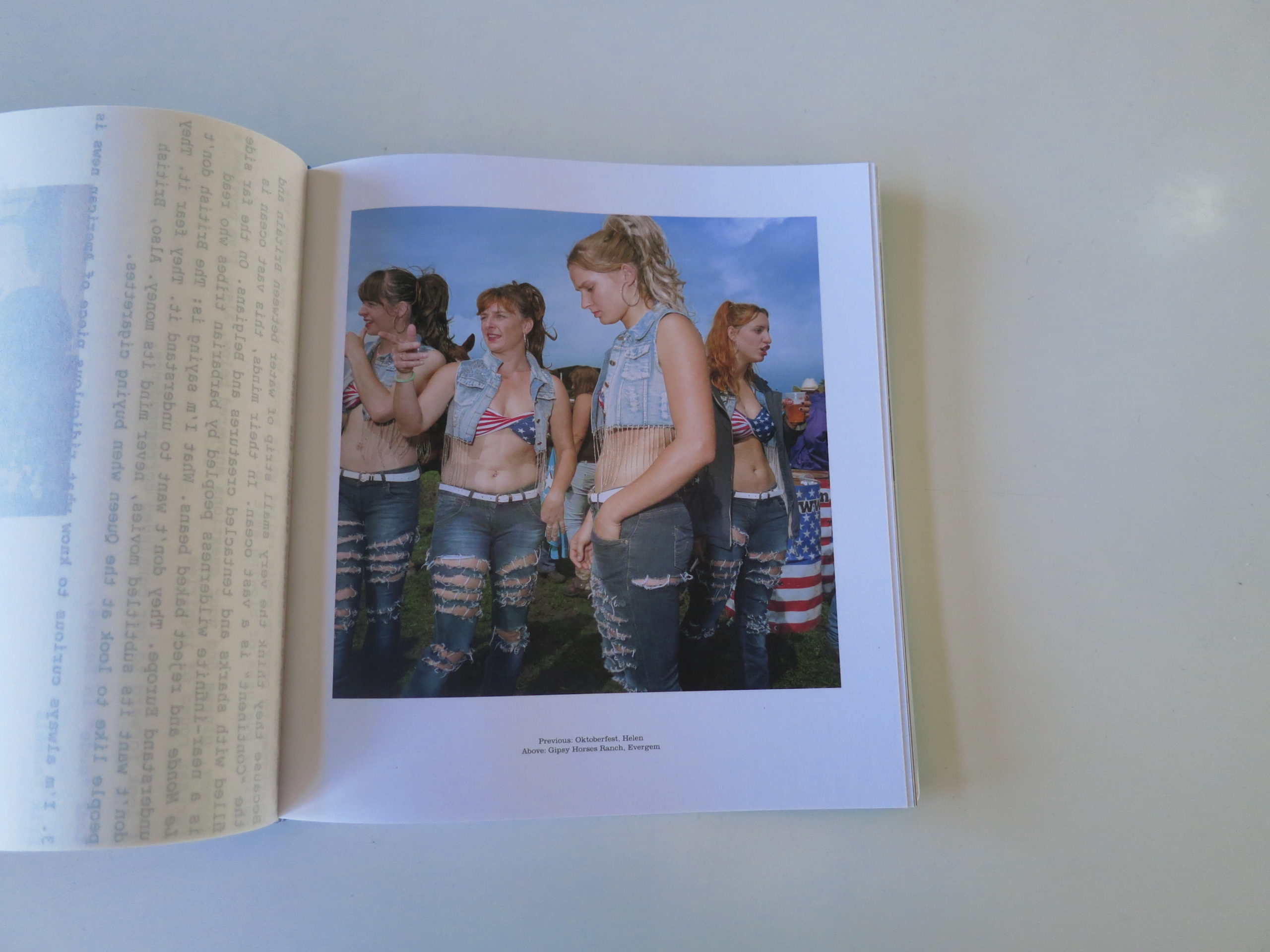
Inside, we’re met with a well-written explanatory essay, by the artist, laying out the parameters of the project. Ms. Harris visited tourist-type-places in the US that honor the heritage of the local founding culture, but also spots in Europe that display a fascination with American culture.
Mostly the Wild West.
You know, like, where I live.
The short version of my opinion is that it’s a cool, smart, funny project, and the images are really well made. (There are also more than a few images of scantily clad ladies, so there’s a slightly sexed-up energy as well.) As Gen X is famous for its embrace of irony, I can only imagine that Ms. Harris is no Millennial, but I’m too classy to Google her birthday and out her age.
The long version is that I think the book is flawed, which is OK, because it’s clearly reaching out towards some edge, without knowing exactly where it is.
The idea that global culture, in particular urban culture, is becoming homogenized is nothing new. We’ve heard plenty about it, and the rebellion against globalized culture struck fiercely in 2016-17, giving us Brexit, Trump, and the incessant use of the word “cuck.”
(Seriously though, I’m willing to bet that EVERY guy who uses the word “cuck” on Twitter hasn’t gotten laid in at least 5 years.)
So by giving us a visual mashup, and intentionally creating images that force you to look hard, trying to surmise which Continent you’re seeing, the book takes its place on the frontline of cultural exploration, here in 2018.
My problems come more from the book’s structure. Frankly, I think there are too many images, and it’s been slightly over-designed. It’s not that some images are of a lesser quality, rather I question whether this many are necessary to make the point, or present a cohesive vision?
Sometimes, less is more.
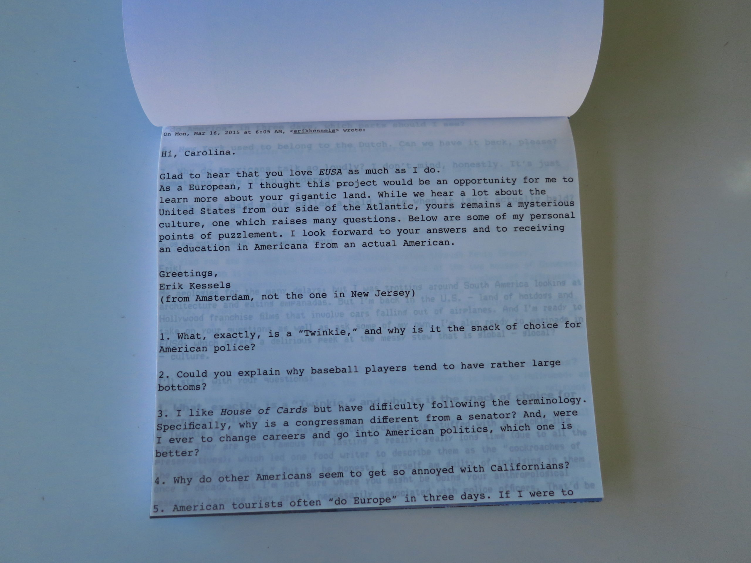
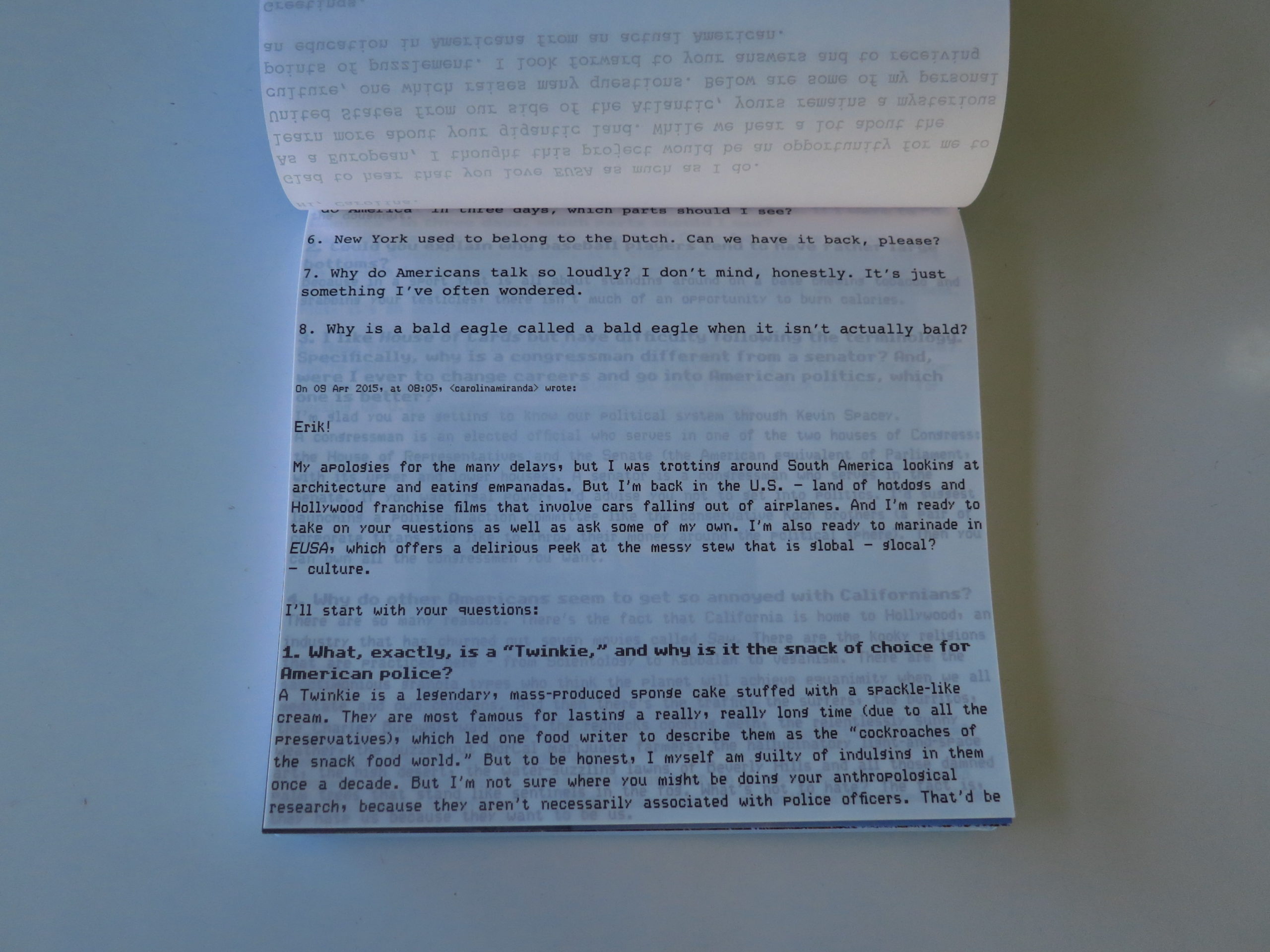
Secondly, the book is regularly interrupted by an email exchange, printed sideways on vellum paper, between two art world insiders: Erik Kessels of Holland, and Carolina Miranda of LA.
Yes, I knew who they were without having to look it up, but at this point, I’m something of an insider myself, I suppose. (Though I’ll carry my rebellious streak until I die.)
But most readers, outside our small circle, would not know such things. The interviews are witty and interesting enough, but lacking context, and showing up randomly, they take me out of the narrative a bit, and I question whether it’s an effective technique.
(Again, edgy projects take risks, so I’m not trashing her for doing so, just wondering if it’s as successful as hoped.)
At the end of the book, there is a bit of explanation as to who the two writers are, emailing each other across the ocean. (He’s an artist and ad man in Amsterdam, she’s a cultural critic for the LA Times.) So the editorial team understood context was necessary.
I just think they put it in the wrong place. (I suppose I’m quibbling, but that is a part of the job.)
Overall, I think it’s a smart, cool project, with many compelling images within. The irony works well, the saturated colors refer to digital reality, and the sum total presents a world in which we can be fascinated by the Other, rather than simply afraid.
That’s a message that bears repeating in these tumultuous times.
Bottom Line: Very cool book about the intersection between the Old and New worlds.


