 .
.The Wrap
Creative Director: Ada Guerin
Assistant Photo & Art Director: Laura Geiser
Photographer: Justin Bettman

The Guardian
Deputy Creative Director: Chris Clarke
Art Director: Bruno Haward
Picture Editor: Nick Pritchard
Photographer: Justin Bettman
Was your preparation for this shoot different due to him being such a combination of talent?
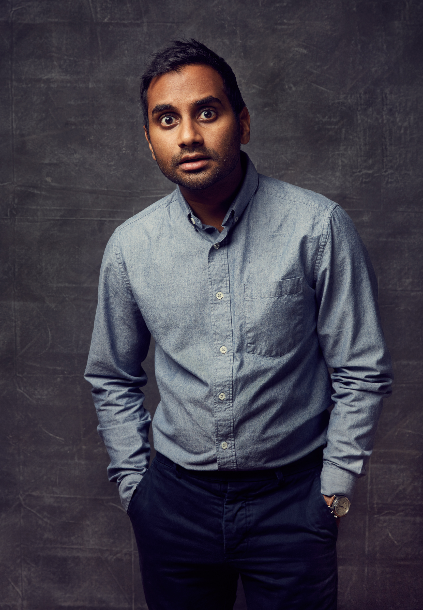
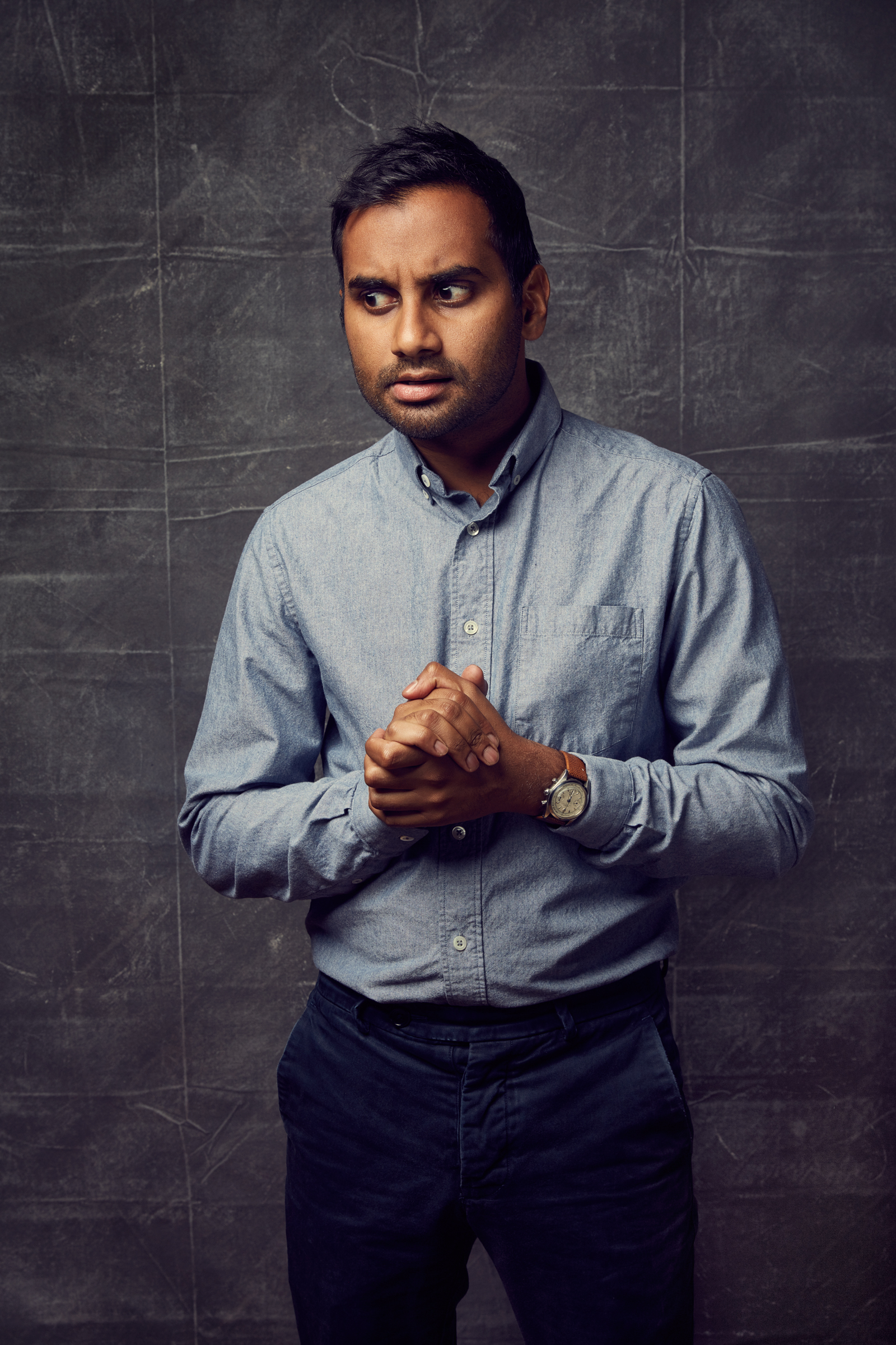
I ended up liking the shots on the white seamless outside since I got the most unexpected shots there. Since there weren’t flashes constantly going off, he let a different side of him come through in those photographs.
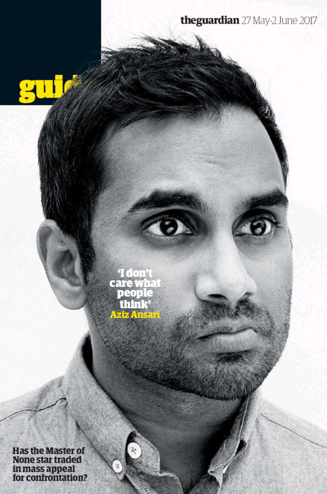
I initially shot these photos for The Wrap, an LA-based film industry magazine. The Guardian reached out to me as Master of None Season 2 was coming out and asked if I’d be interested in licensing them a photograph from my previous shoot with Aziz Ansari. When I saw the final cover in layout I was super stoked since this is my first cover I’ve shot.
In Master of None, you can see Dev is a sincere and caring guy. These characteristics on screen definitely translated to who he was during our shoot. As I touched on before, he wasn’t quite as energetic as I was expecting, but I think with comedians it’s hard to be “on” and cracking jokes all of the time. Overall it was a really pleasant shoot working with Aziz.
The Daily Promo: Maria del Rio
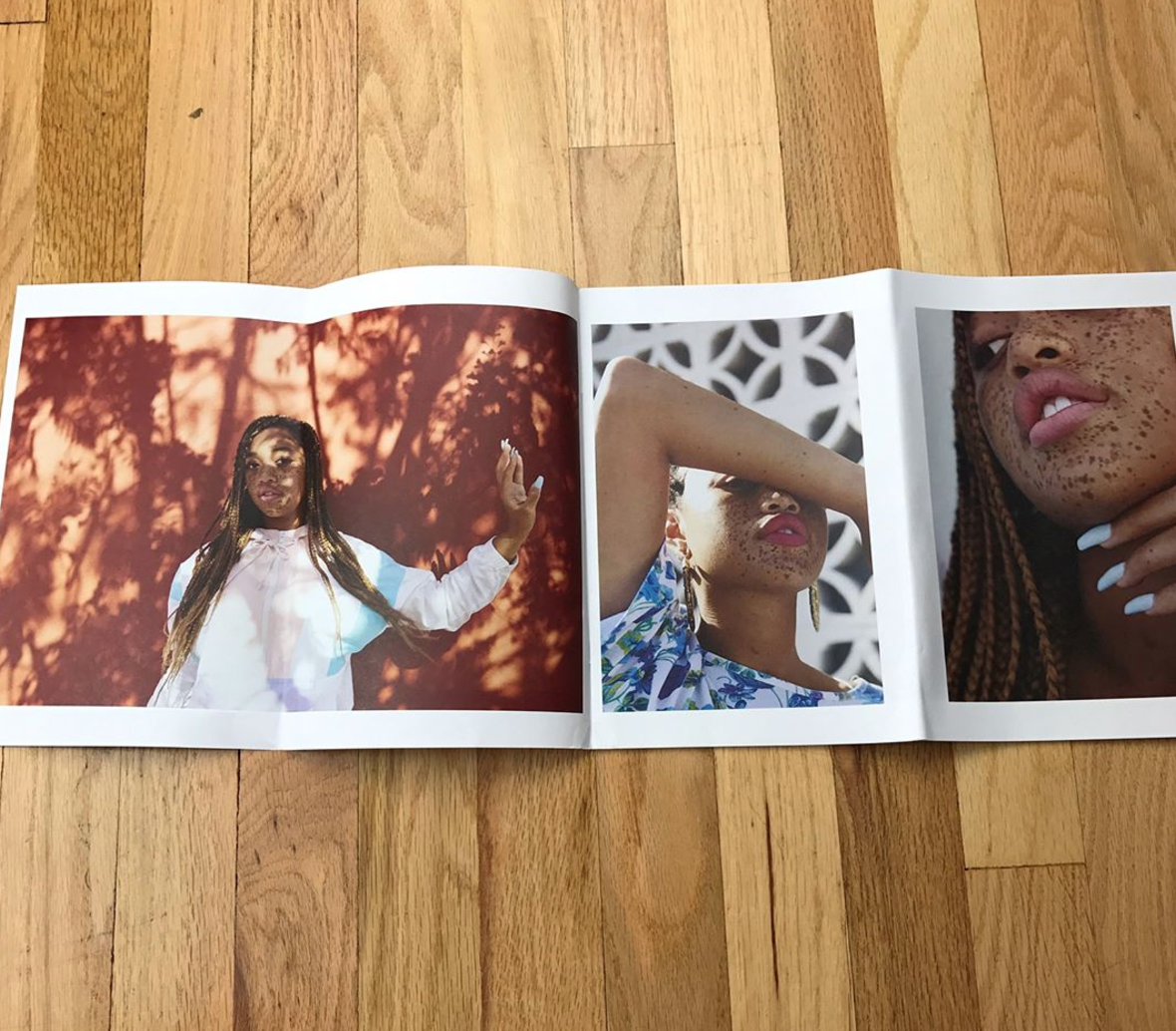
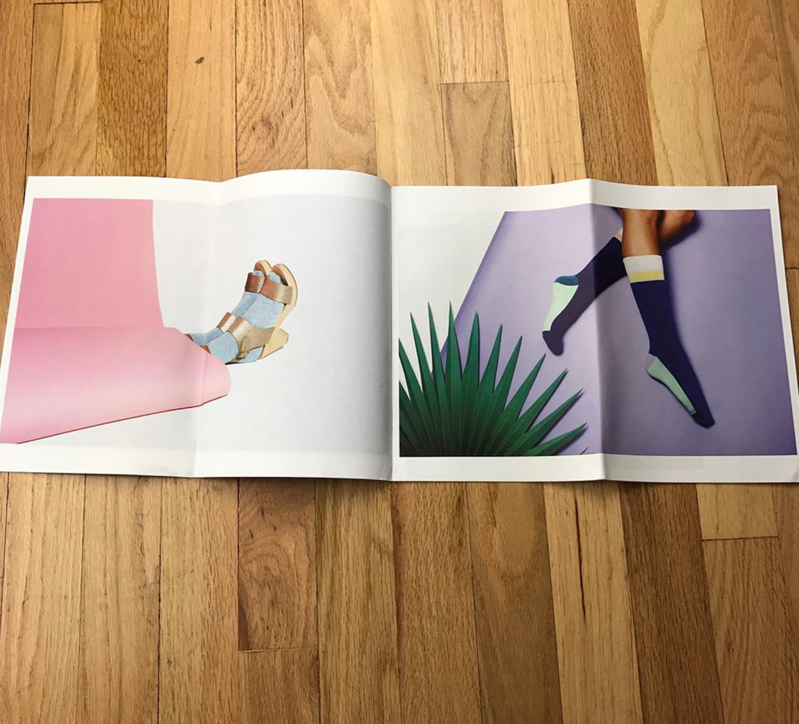
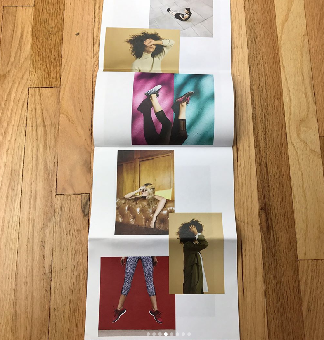
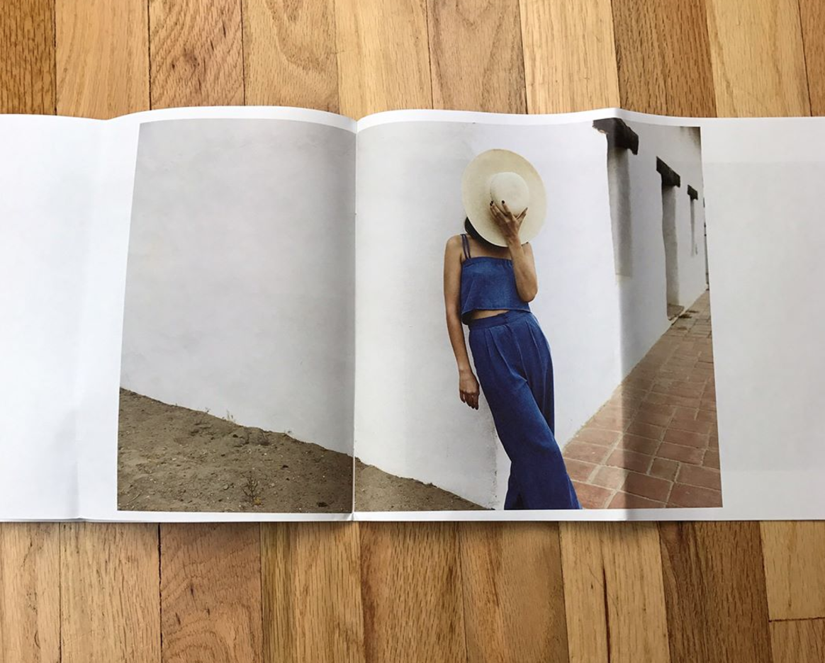
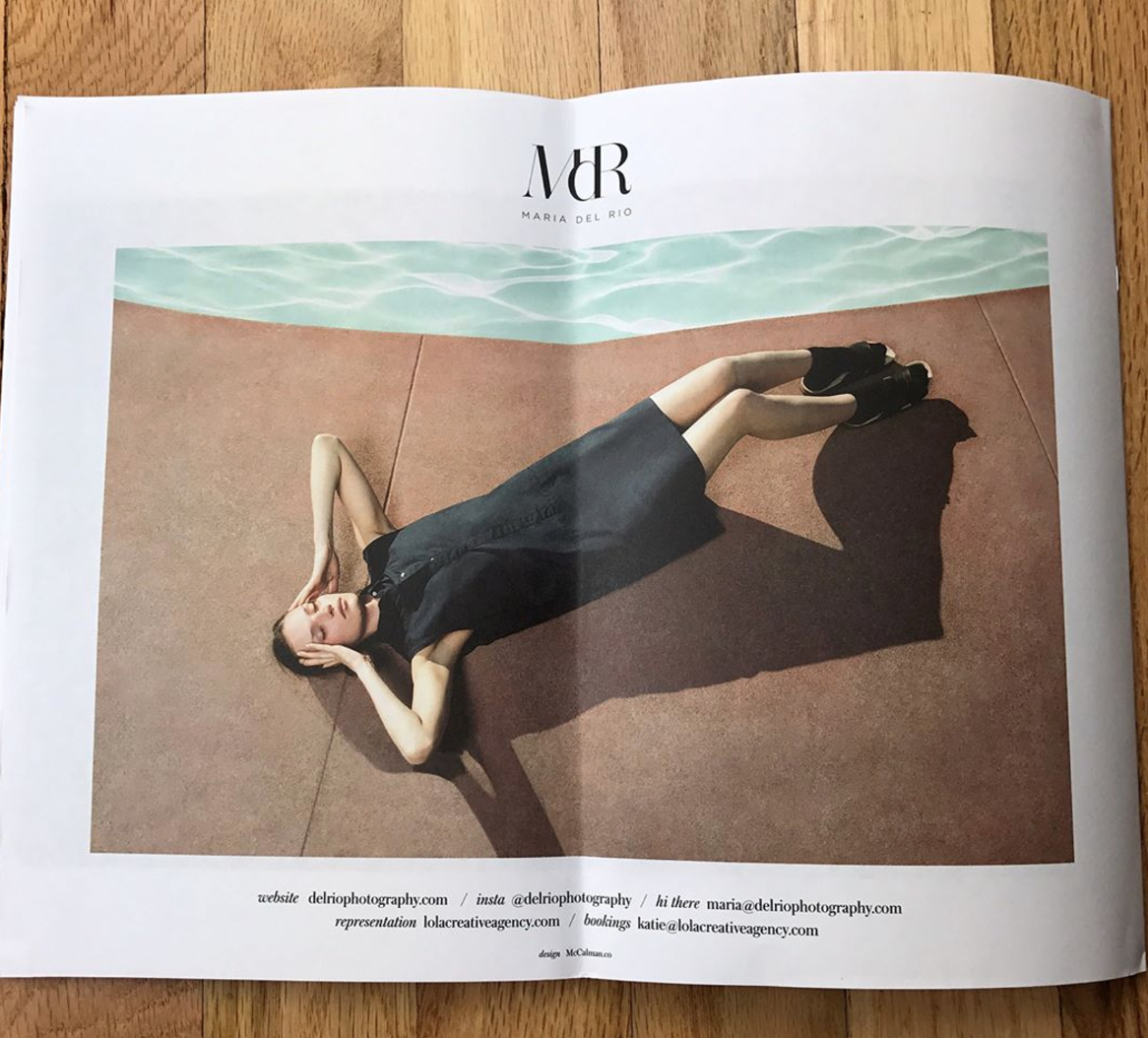
Maria del Rio
Who printed it?
Anthony over at AW Litho. He was great. He worked directly with George, the designer on layout, and then mailed me color proofs. From there we tweaked things and got the colors just how I liked them.
Who designed it?
I worked with art director and designer George McCalman. We’ve worked together on shoots in the past and have lots of mutual friends. I had been wanting to work with him for a long time, I really respected his design skills, and equally important to me, his social values and voice.
Who edited the images?
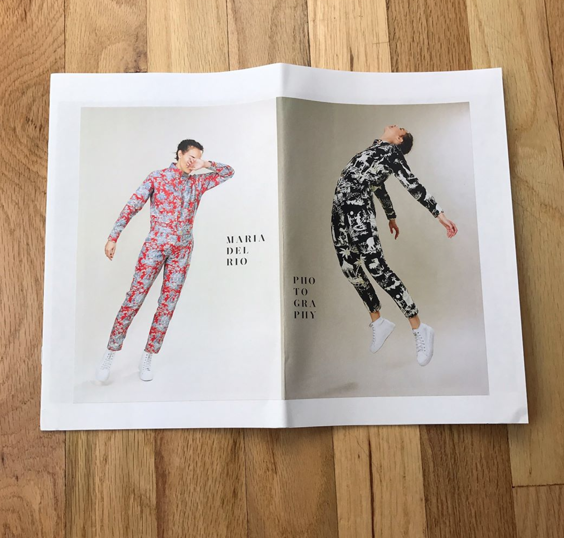
George did, mostly. We met up before he began the design process and discussed what I was looking for. This was my first mailer promo, the ones I had done before were smaller and used as leave-behinds. He walked me through the process and gave me lots of great advice. He suggested we use this one as more of an introduction to my work, rather than just new work because for most of the people receiving it, it would be their first time seeing my photography. He asked me to send him around 100 of my favorite images and then he narrowed it down to his tops. There was a little back and forth about what images I wanted to shine more than others and several layouts and cover variations we discussed but mostly I trusted his eye.
How many did you make?
1,000. Before that, I had never done more than 300 so I felt like I was swimming in promos. It’s been a good challenge for me to broaden my net of contacts. I’m packaging them and mailing them out by hand, so it’s a slow process and I’m still sending them out. I know a lot of photographers and agents do way more; and I have a new found respect.
How many times a year do you send out promos?
Never. I was a little intimidated by the process because of the expense and time so this is my first official mailer. Previously I would just make promos as a leave-behind after portfolio reviews or meetings and update it one to two times a year. My agent Katie, from Lola Creative, has done some small batch promos as well. I think one a year.
Tell us about how you overcame a few obstacles.
Ya, it still stresses me out but it’s definitely been a learning lesson. This is more than triple the amount of promos I’ve ever printed, and obviously, the expense of printing promos is rough. I finally convinced myself the importance of doing it properly and accepted it as an investment. George and I went back and forth so many times over the design, I triple checked the spelling of my name and contact. I showed people in my network, other designers, people from my agency, and friends for feedback. I’m Mexican, so everything is a communal process. I had several rounds of parties where I bribed my friend’s with alcohol and food to help me package up the promos. I’d have my assistants helping package promos on mellow set days. I recruited everyone’s help.
After several rounds of this, my little sister came over to help one night (she is a science and math person, the complete opposite of me). She took one look at the promo cover and said, “Did you mean to spell Photography wrong?” PHOTOGRAPHY was spelled wrong! It was missing the second “h”, but because of the layout, your mind sort of just puts the word together. But still, photography was spelled wrong; on the cover; on 1,000 promos. And at least 20 people had looked at it before I sent it out and no one noticed! Not me. Not George. Not my agent. I panicked. I couldn’t afford to reprint them all. I had already been sending out a ton. George and I talked it out, debating my options. George and Anthony, the printer, discussed it and we came up with a great solution. Rather than reprinting a handful, which would be really expensive to print and ship, Anthony created a sticker, matte paper sticker, that would go over the cover with the correction. I couldn’t swing it on all of them, and like I mentioned some had already gone out. But for the ones with the sticker, I’m super happy with how it looks. As far as the ones that have the misspelling, I have to just let it go. Most people won’t notice. Some people will. Like a social experiment of the artist brain vs the science brain. Maybe I’ll be remembered as the Photographer who couldn’t spell Photography. Hey, if it makes my name stand out to even one art director, I’ll take it.
The Best Work I Saw at the NYT Portfolio Review, Part 2
Today was meant to be a book review.
Aaron Hardin, whom I met at the New York Times portfolio review in late April, had given me a copy of his self-published photo-book, “The 13th Spring.”
Aaron’s a Southern photographer who got an MFA from the Hartford low-residency program, and lives in Tennessee, where he teaches college. His pictures are of that genre of Southern photography that is lyrical, poetic, vibrant, evocative, (insert appropriate adjective here.)
We’ve discussed the genre many times in this column over the years, and Aaron’s work reminds me a bit of my friend Susan Worsham. But that’s the point: from Eggleston through Sally Mann and right on down, photographing the South is a grand tradition, and I never hate on anyone for being an adherent.
I think Aaron’s pictures are strong, and he’s able to communicate a warmth and emotional sensitivity that separate his work from many a Southern photographer.
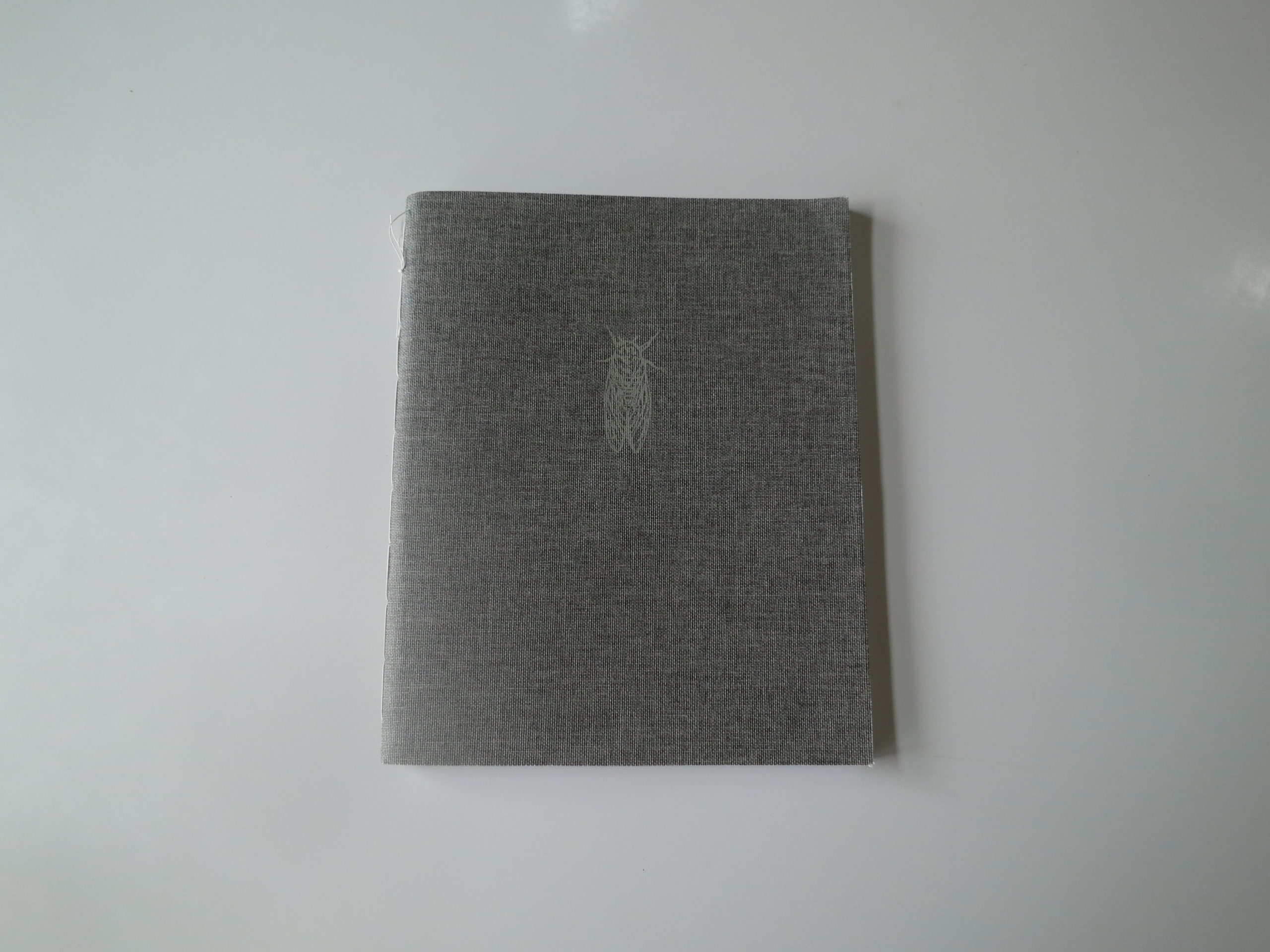
The book chronicles the time around his daughter’s birth, which a poem, (at the end,) says happened during a birth year for cicadas. Hence the little bug dude on the front cover, which was imprinted on a stately piece of canvas.
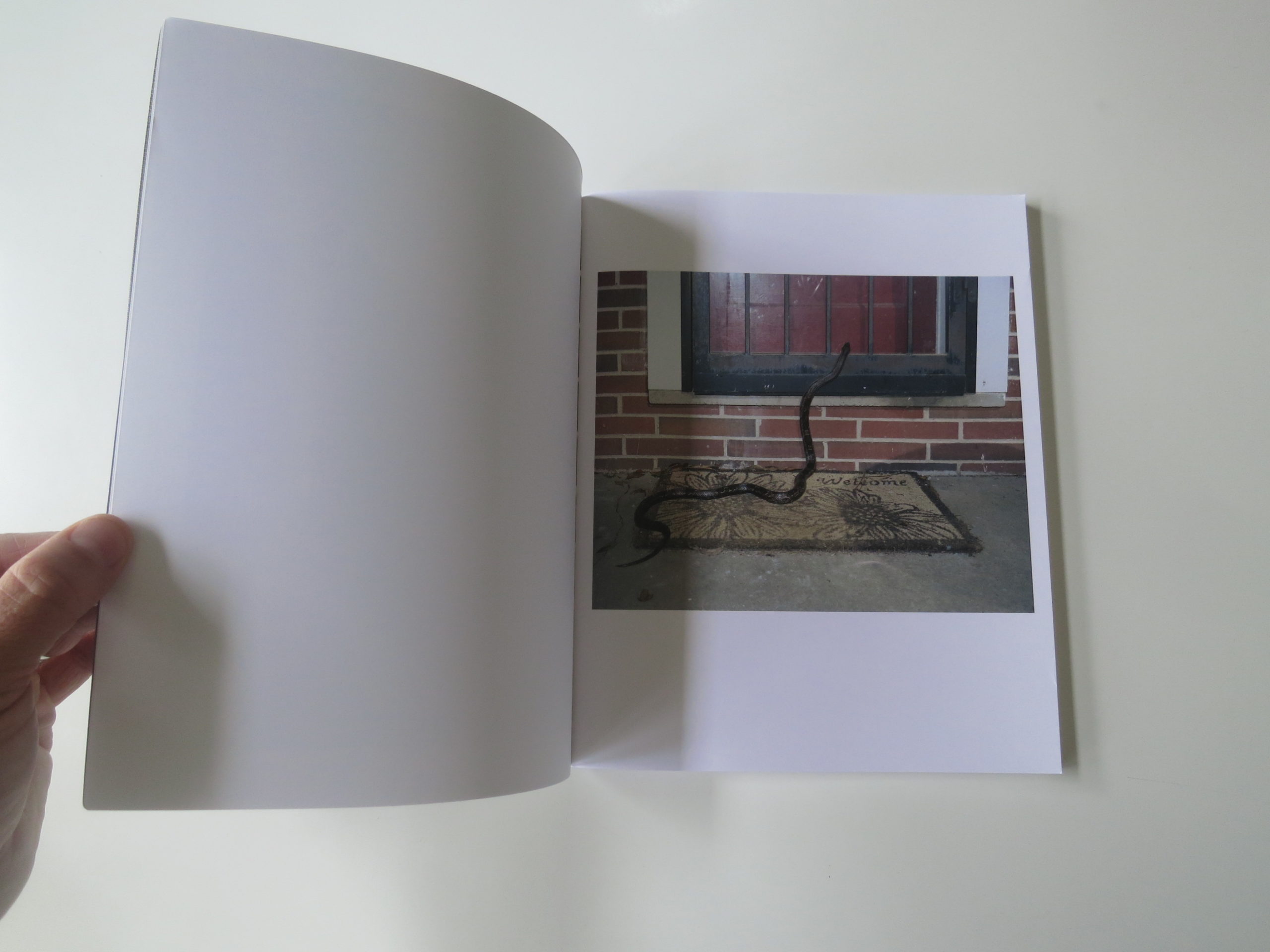
The second photograph, of a snake trying to sneak into a house, (despite the two door obstacle,) is pretty fantastic. He swears the snake was trying to get in, that it wasn’t set up in the least, and I believe him.
But it’s a photograph I’m sure he’ll get asked about for years.
The peacock as a repeating motif is pretty cool too. We’ve got the bearded, Jesus-looking guy, the tree growing up through a house, a white cat, a boarded-up shotgun shack, and some nasty bug-sex. (Hence the title.)
It’s a very cool book, I must say. Really well done. Alec Soth and Doug Dubois teach at Hartford, and one can see the influence of their styles, which make for an interesting mashup with Aaron’s Southern roots.
It’s like how the Three Six Mafia represents Memphis, but still sampled from artists on the coasts too. (Big shout out to “Hustle and Flow.” That movie never gets old.)

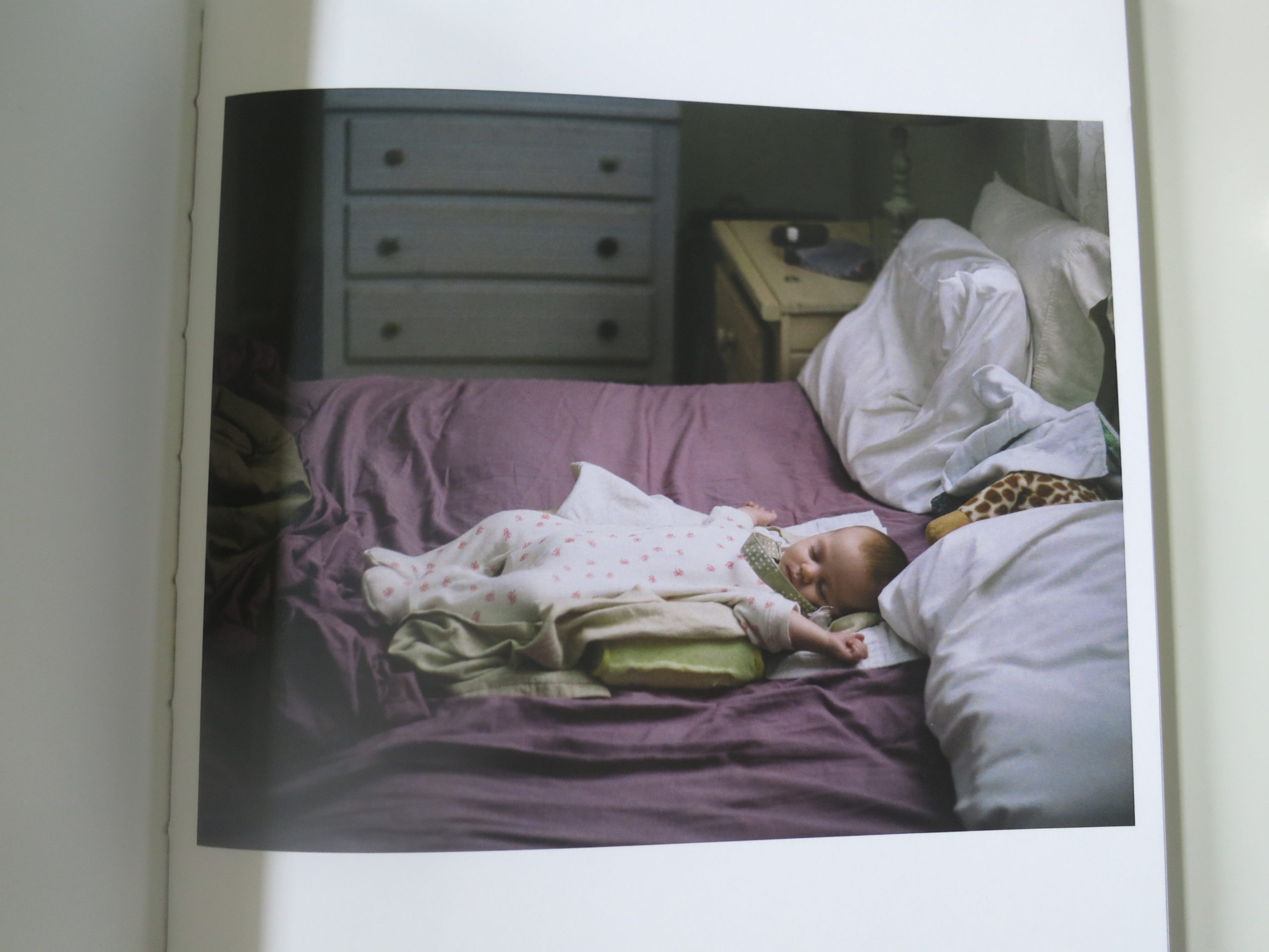
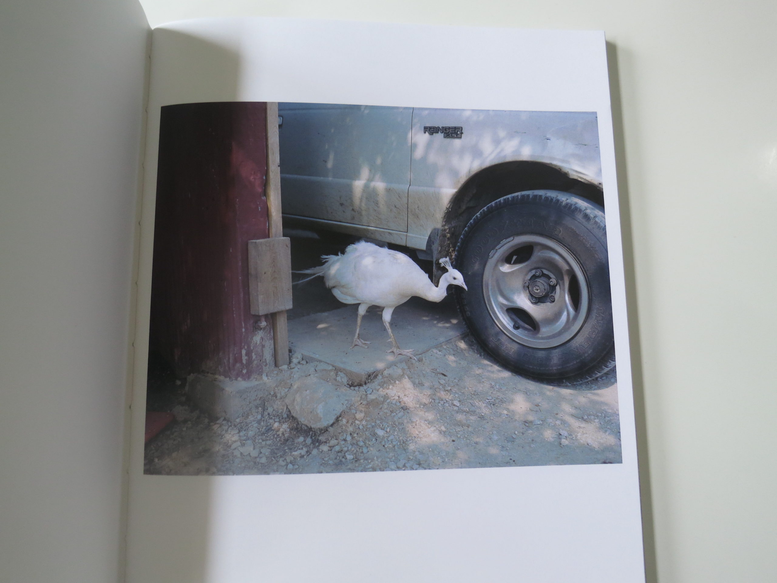
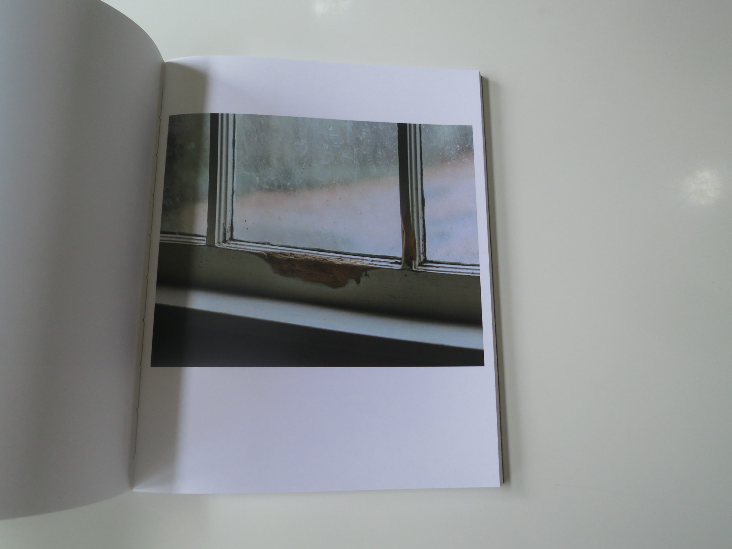
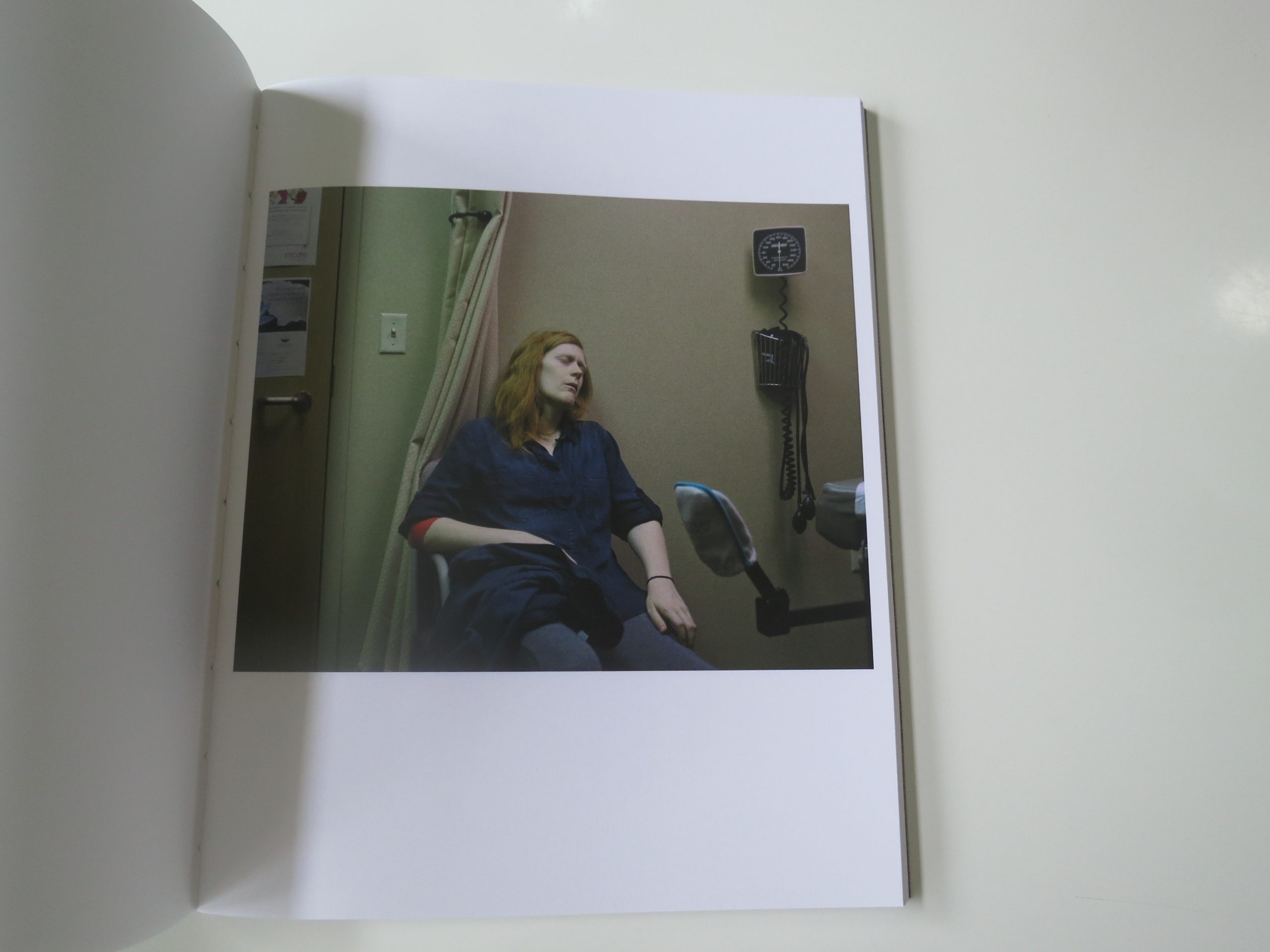
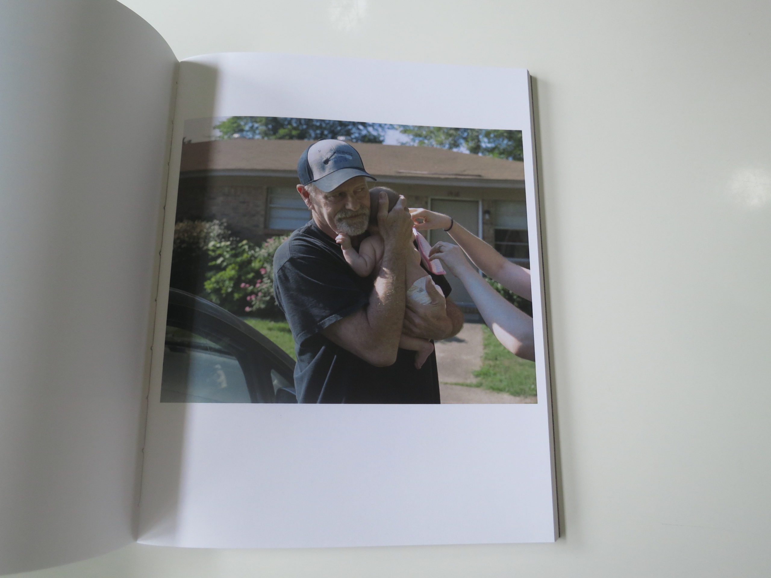
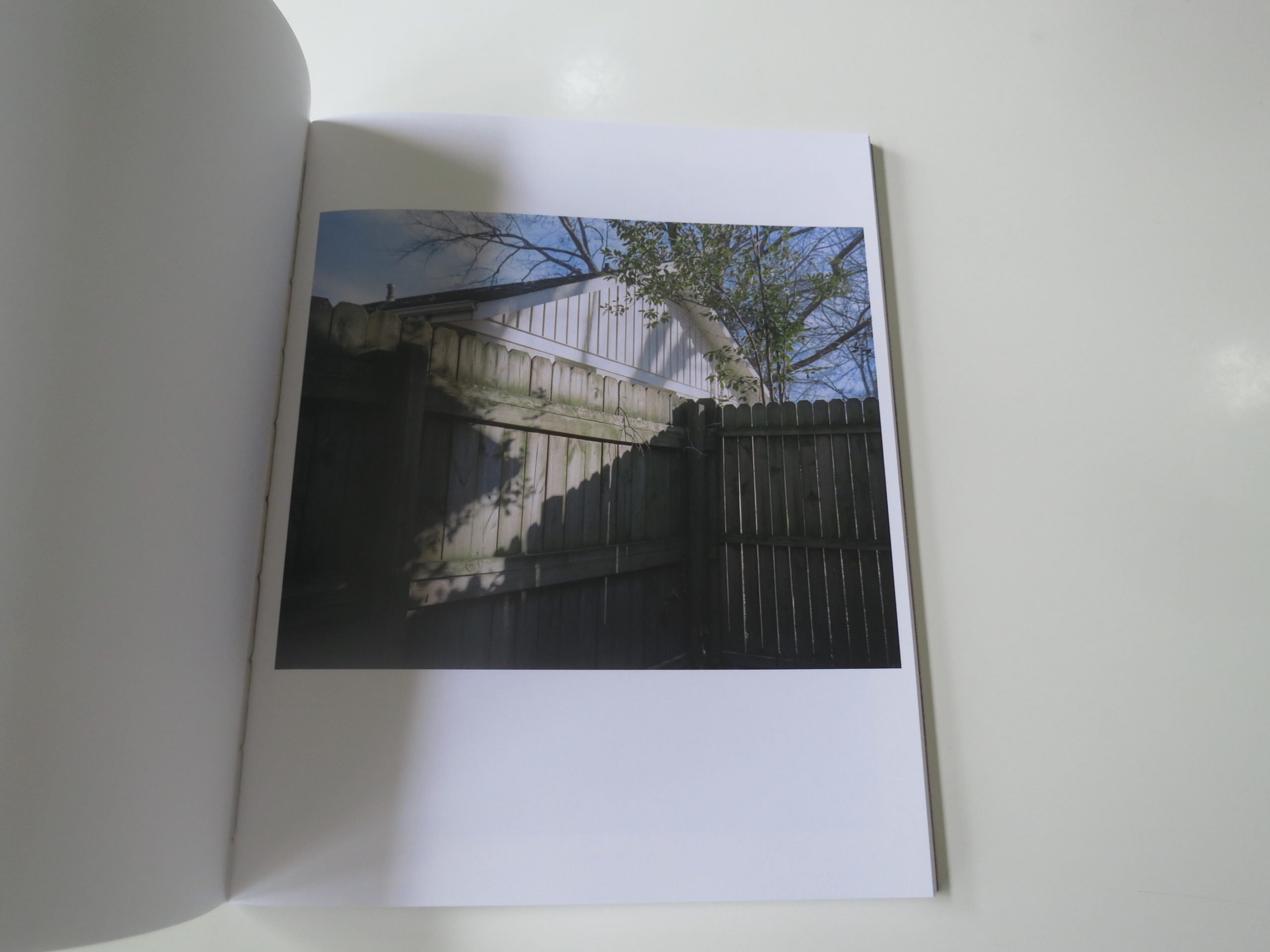

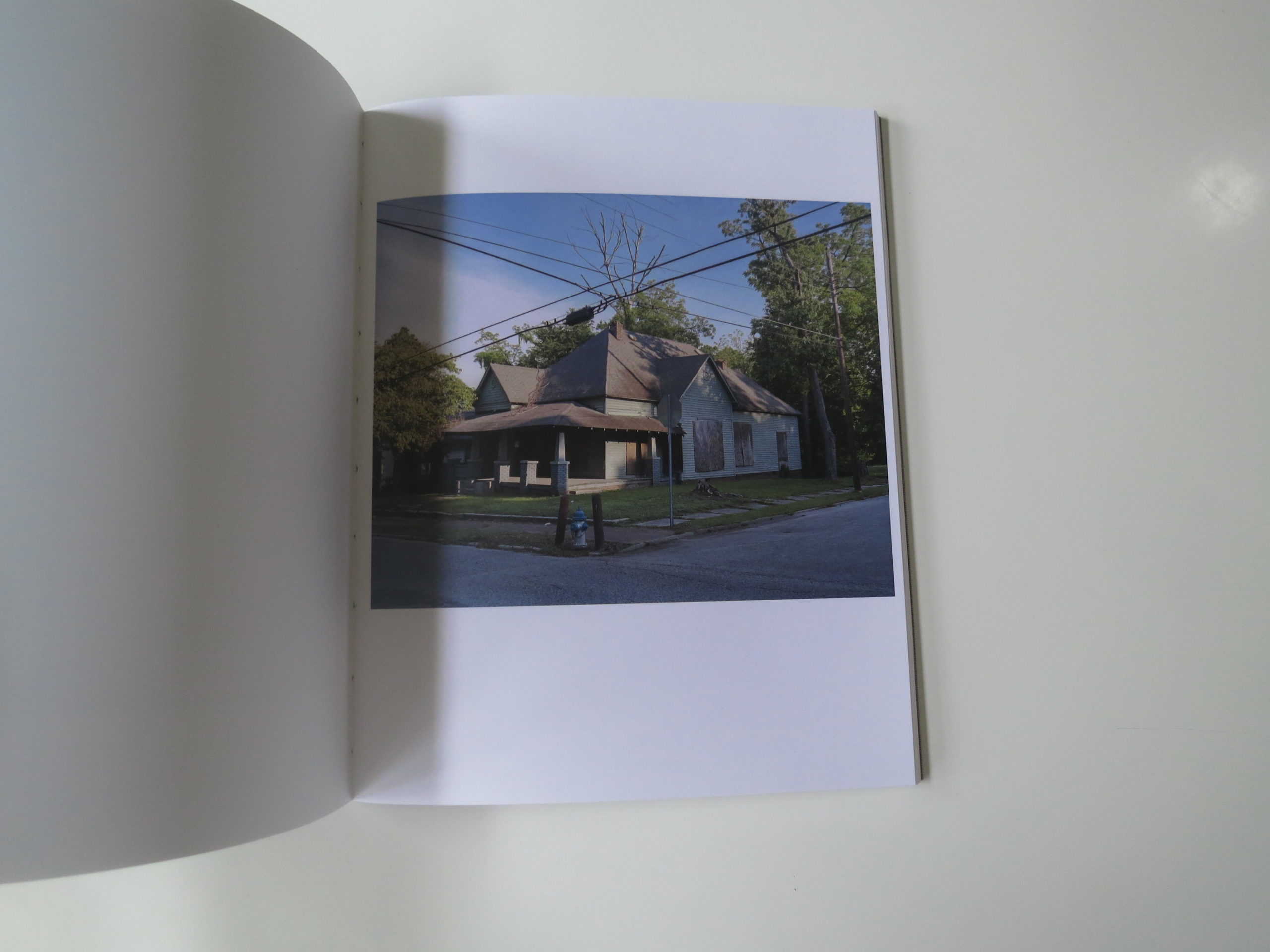

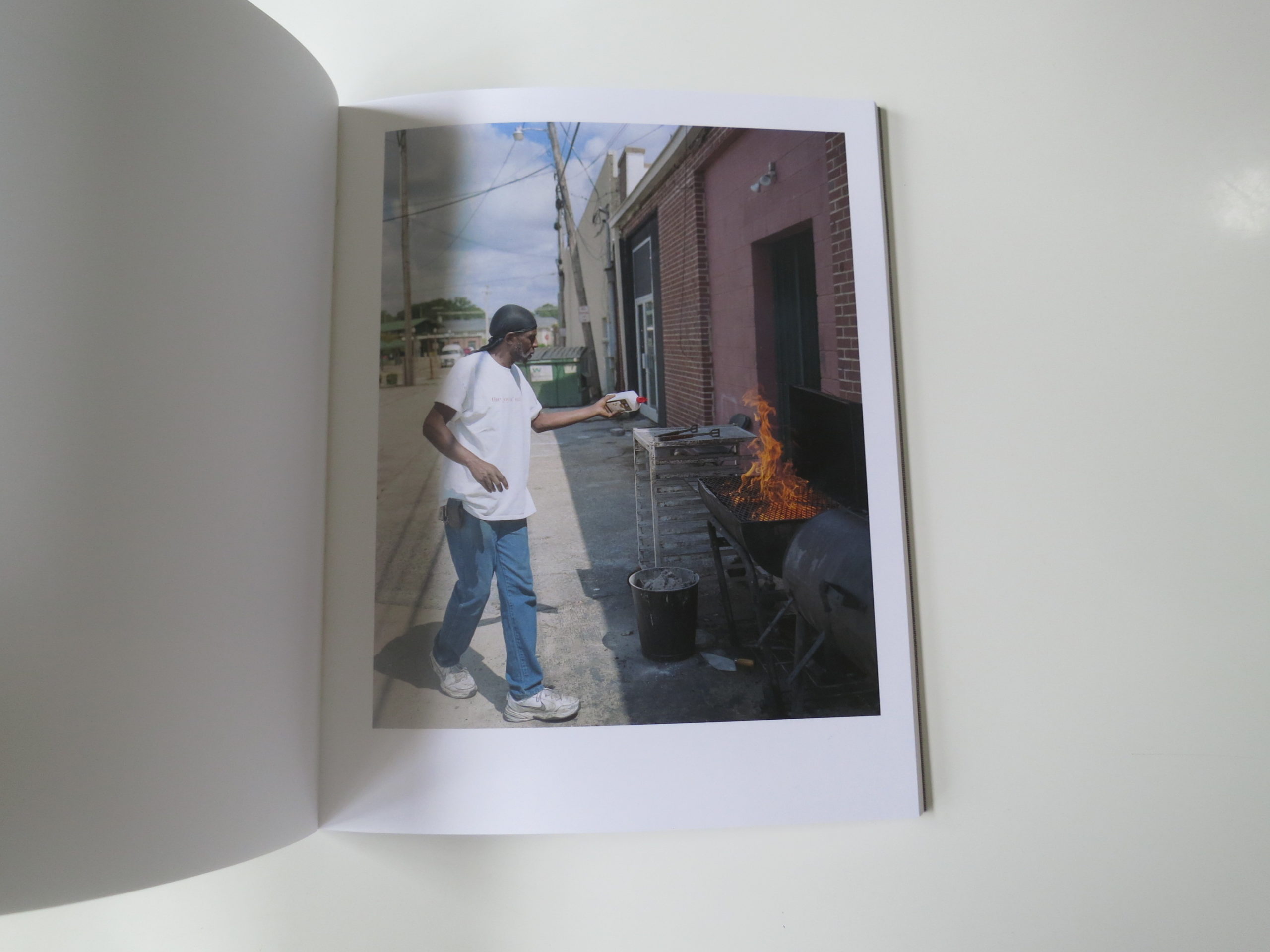
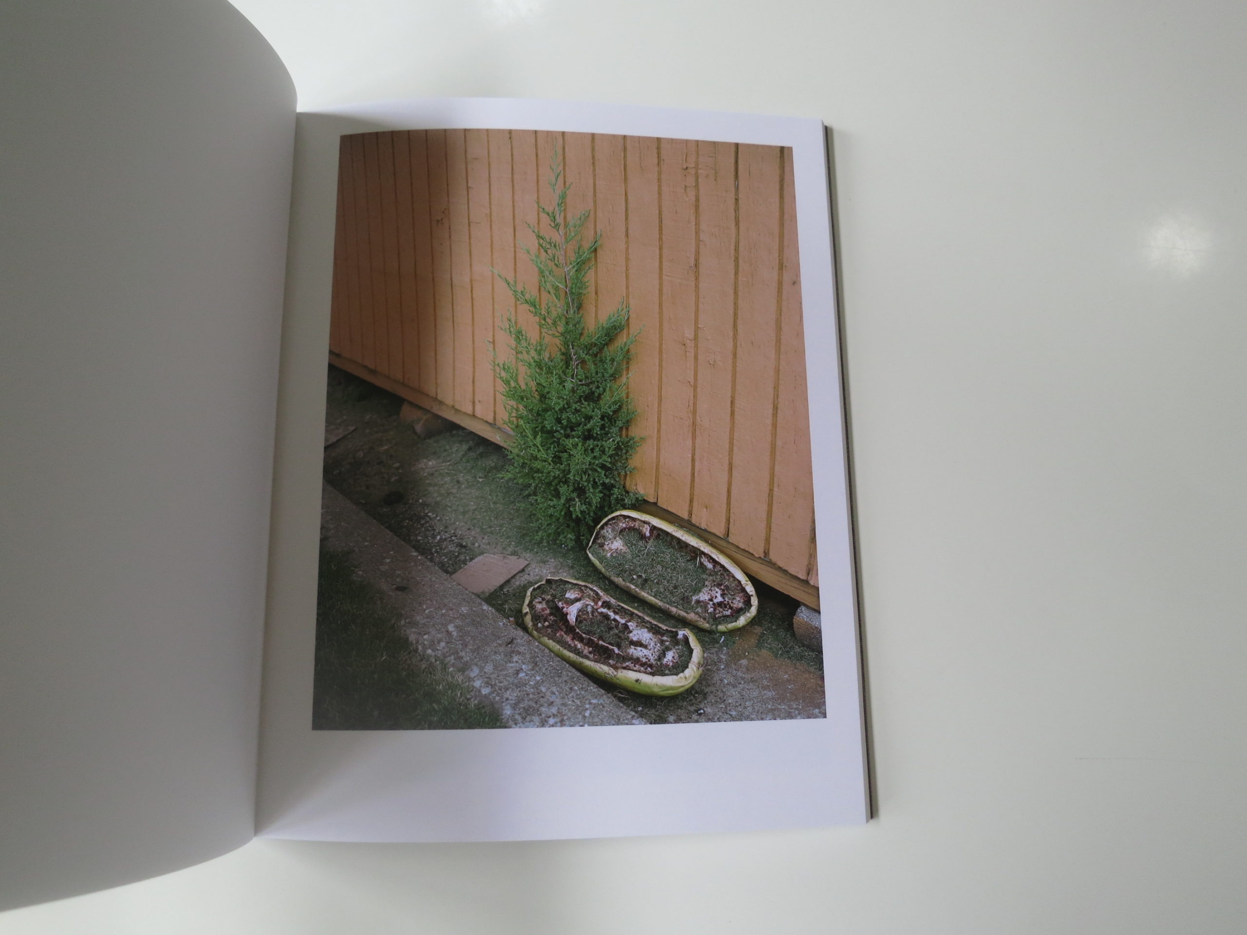
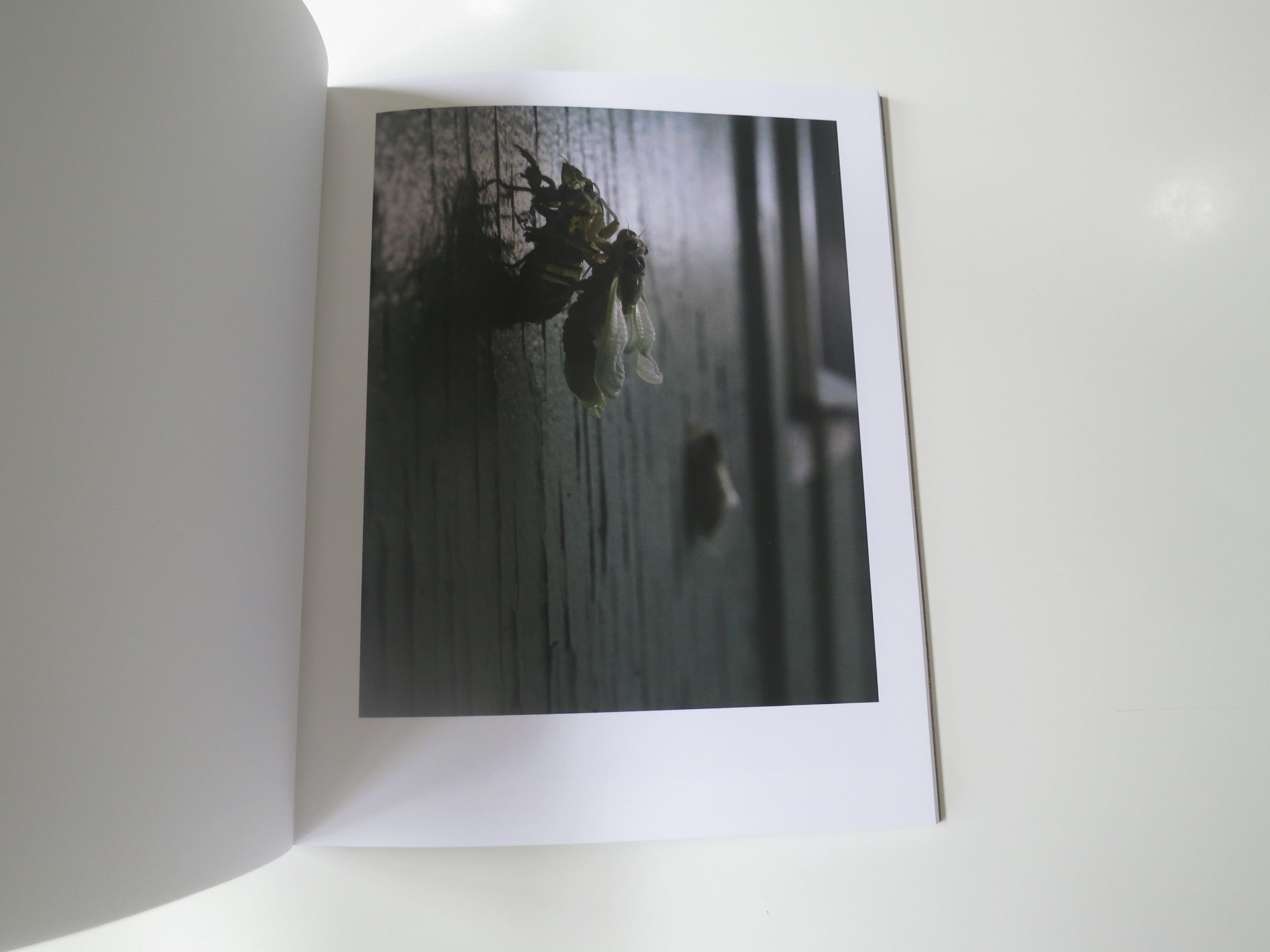
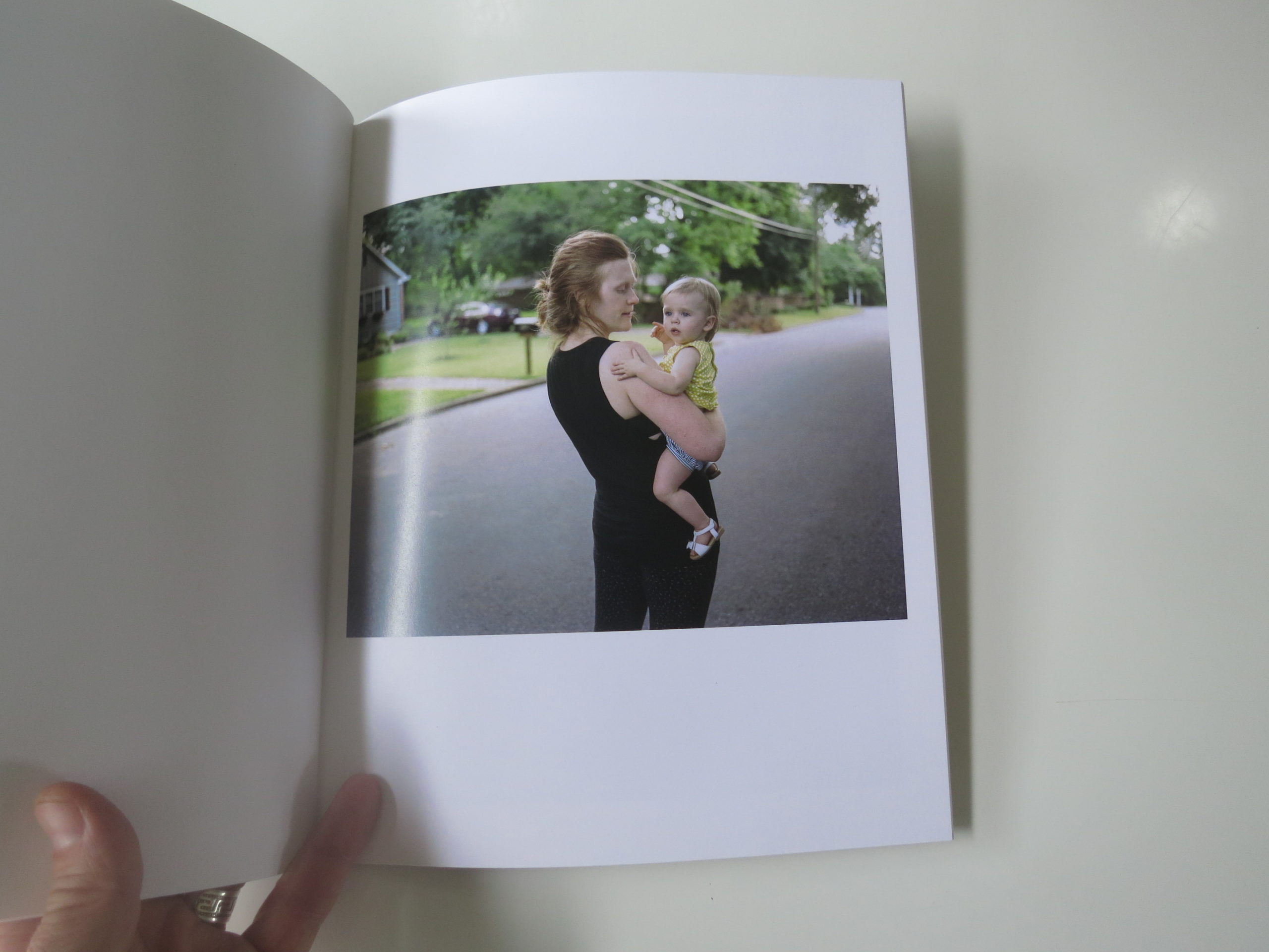
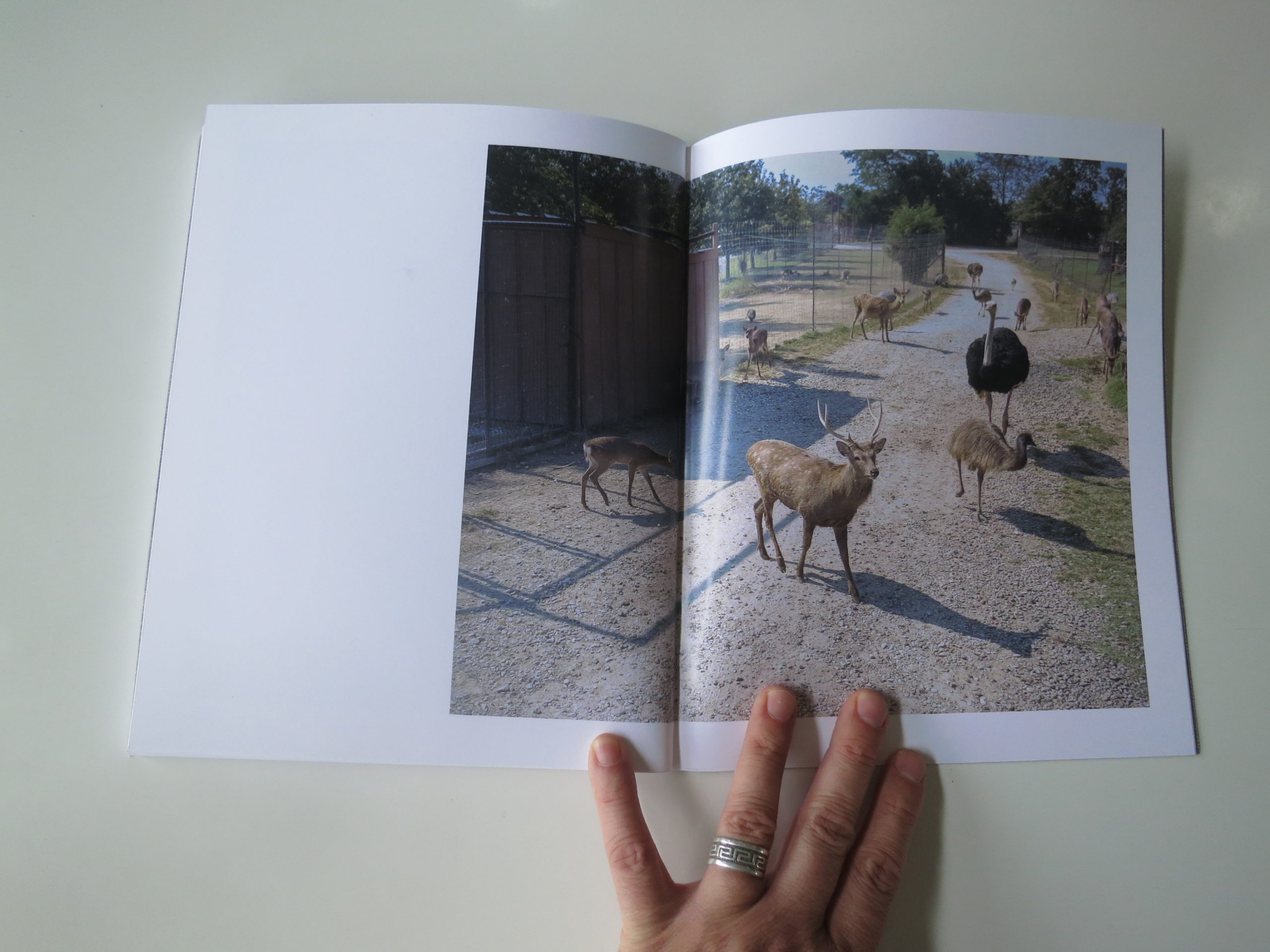
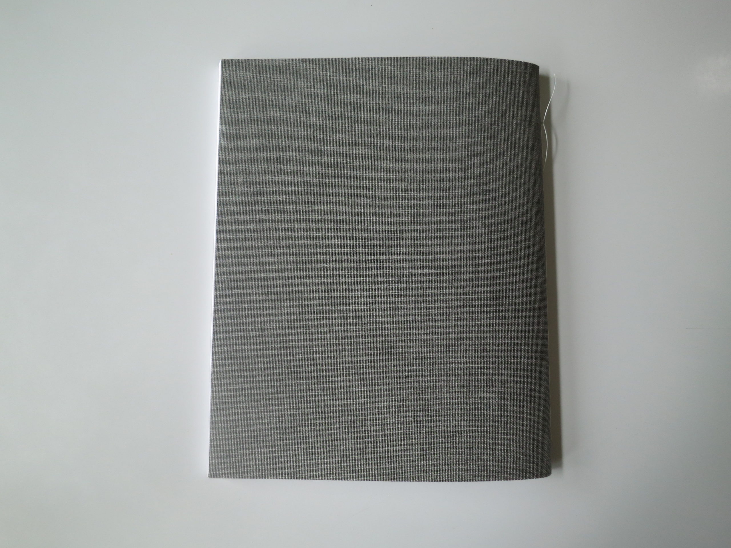
But like I was saying in the beginning, Aaron was going to get a book review all to himself.
Was.
Past tense.
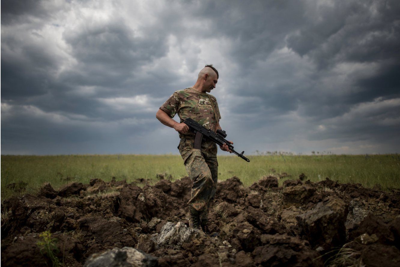
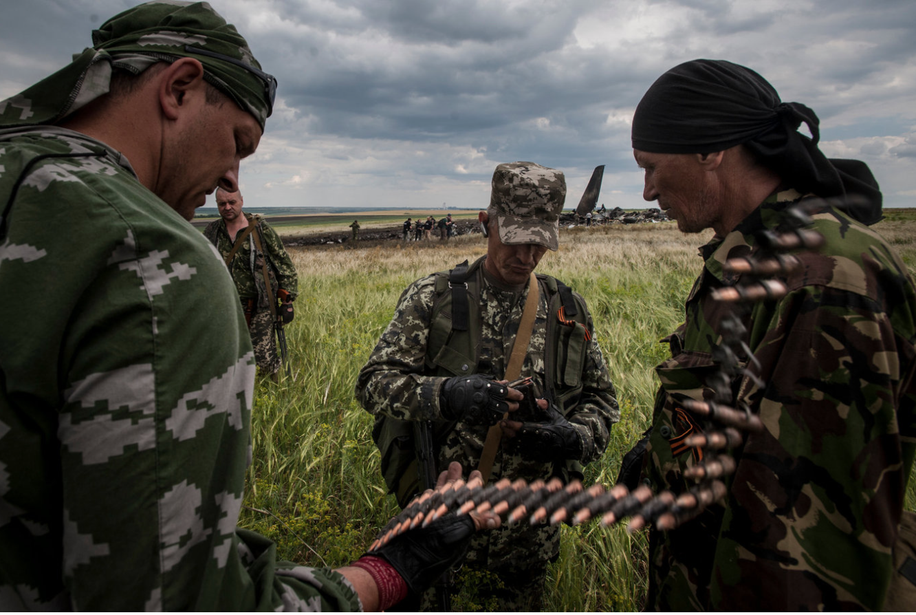
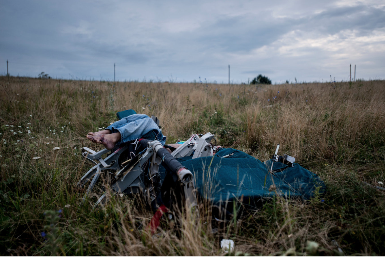
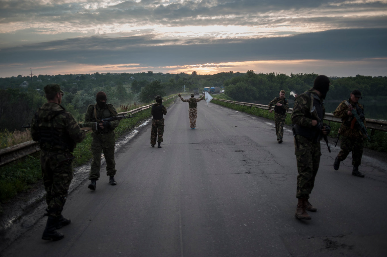
No sooner did I plan a column on his book alone, than two journalists I met at the review, Evgheny Maloletka and Emelienne Malfatto, emailed me after getting back to internet service in the danger zones in which they were shooting.
Given what we discussed last week, you almost couldn’t make this up. Evgheny was working in the war zone in Eastern Ukraine, near where he grew up, and Emelienne is down in the chaos of Venezuela.
As such, I’m able to show you some of their work as well. So Aaron’s will have to share the spotlight a bit, but as he’s a nice guy, I’m pretty sure he can handle it.
Emelienne Malfatto is a French-Italian documentary photographer who is rather itinerant. When we met in New York, she’d come off of a stint in Iraq, a country at war at the moment, but then jetted off to Caracas, which is not a safe place. And then she pushed off to the hinterlands of Venezuela.
Pretty hardcore.
She showed me pictures of a community in Iraq that had risen against Saddam Hussain, and to retaliate, he drained the swamps of their native lands. I thought some of the pictures were great, but she wasn’t able to access those for me, being out in the field with little internet.
Emelienne is resourceful, though, and managed to transfer me a group of photos she made in the Kurdish area of Northern Iraq. They’re dynamite.
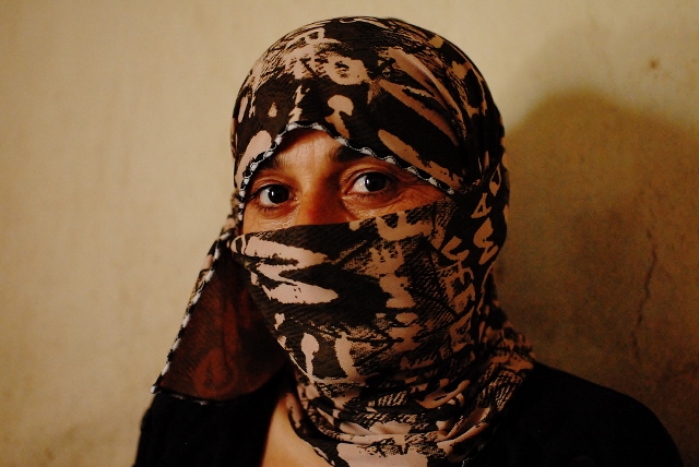

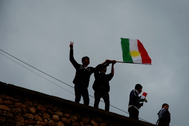
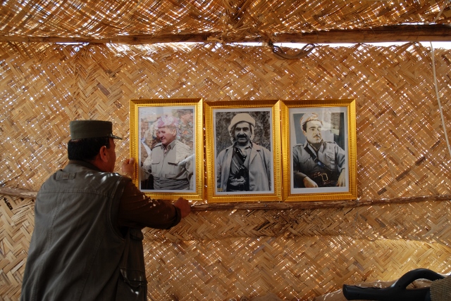
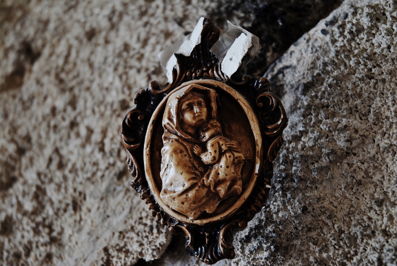


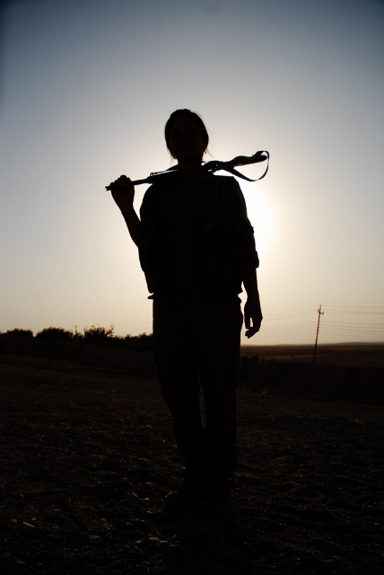
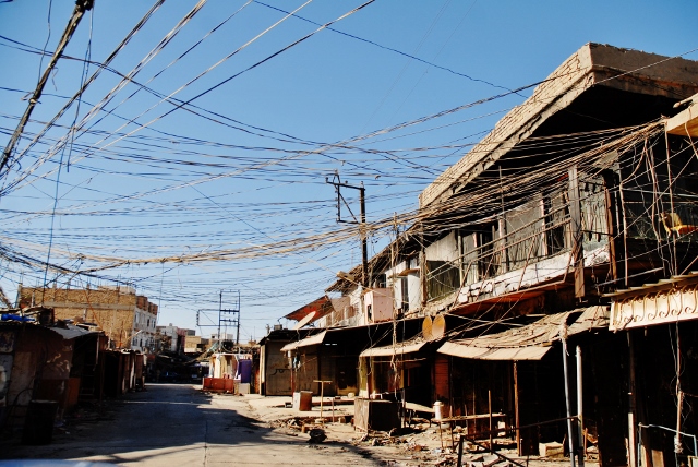
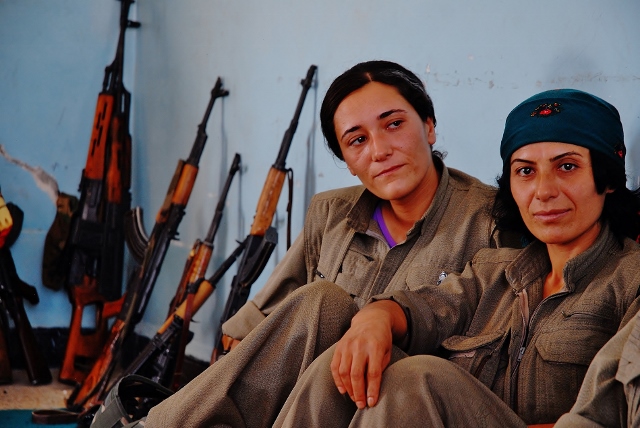
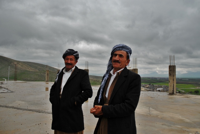

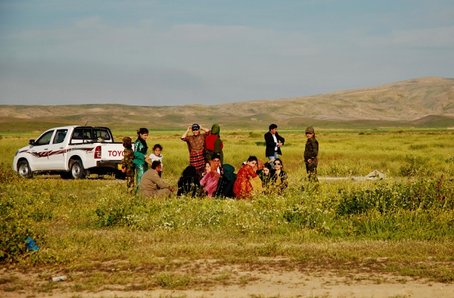
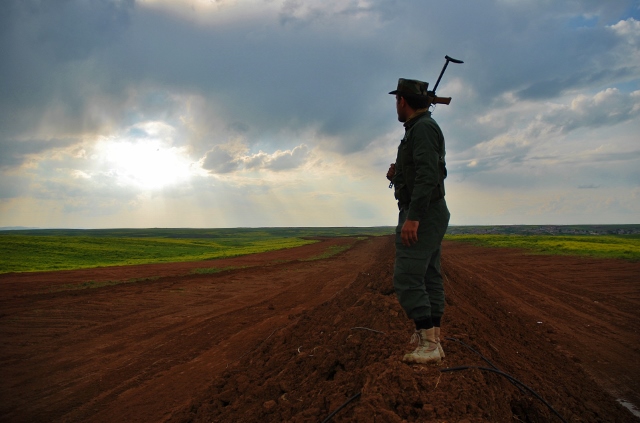
Evgheny Maloletka and I met at the review in New York, and then again on the F train to Brooklyn. Zenhya came up and introduced himself before the review, and was the only person to do so. Given that we use this blog to help educate young professionals, (among other things,) I have to say, things like that make an impression.
He said he had me on his list, and Good Morning, nice to meet you, I hope you have a good day.
You remember things like that.
Even better, his pictures were great. He showed me photographs of the war in the East that were so raw, but were made with visual sophistication, which is a difficult combination. Like Aaron’s pictures are clearly of the South by someone from the South, I’d argue a foreigner would be hard-pressed to make such emotional news photographs.
We also looked at a series about young cheese-makers in the Carpathian Mountains that had echoes of a medieval lifestyle, here in the 21C. And then we saw a project about a community of Romanians who were trapped in Ukraine, when the borders were redrawn.
We’ll look at the war photographs today, but I could easily show you any of the three projects. The dude is very talented, and I expect all three of the young people we’re featuring today will go on to have great careers.
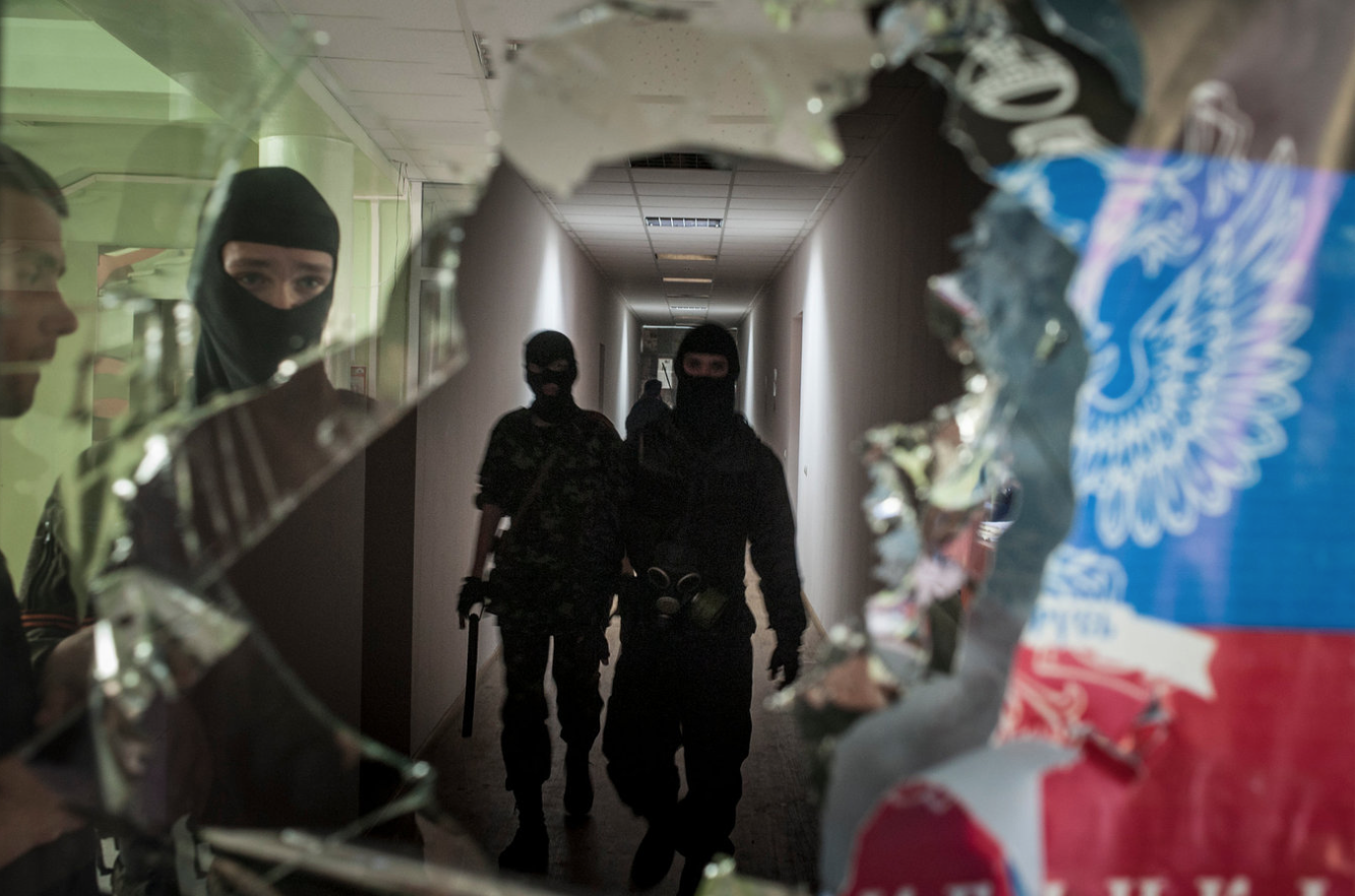
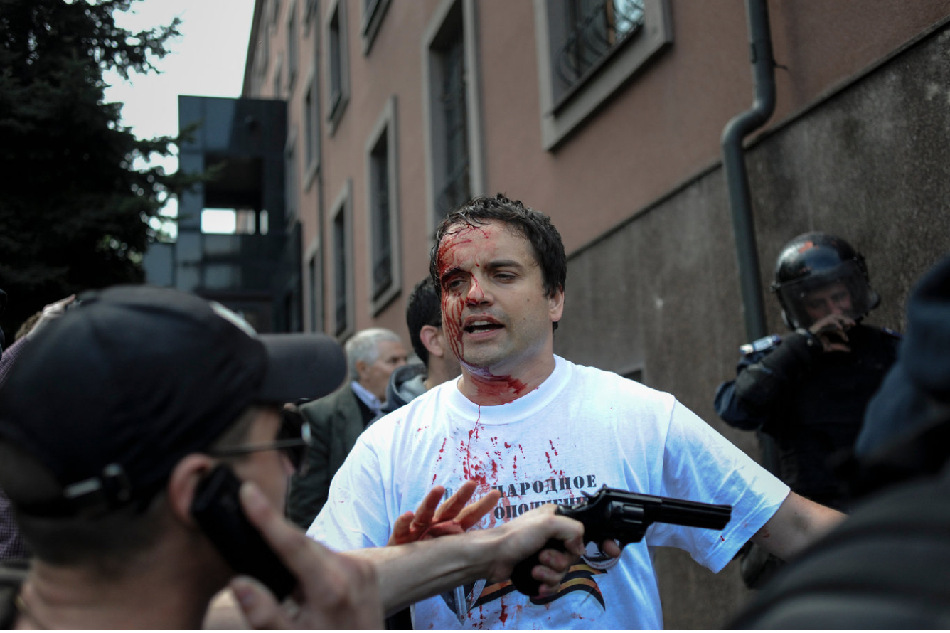
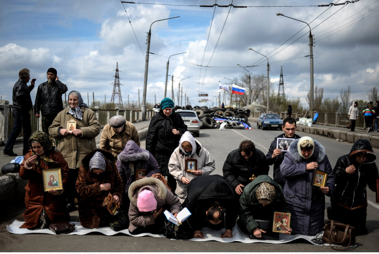
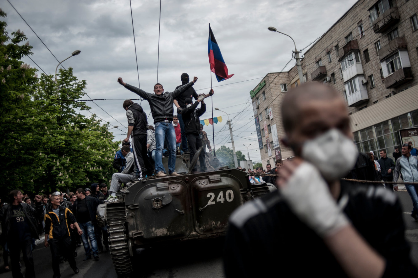
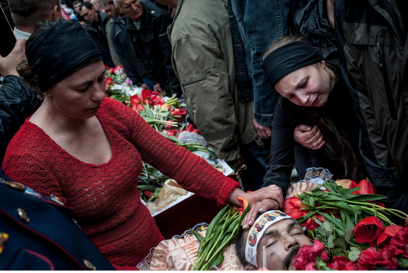
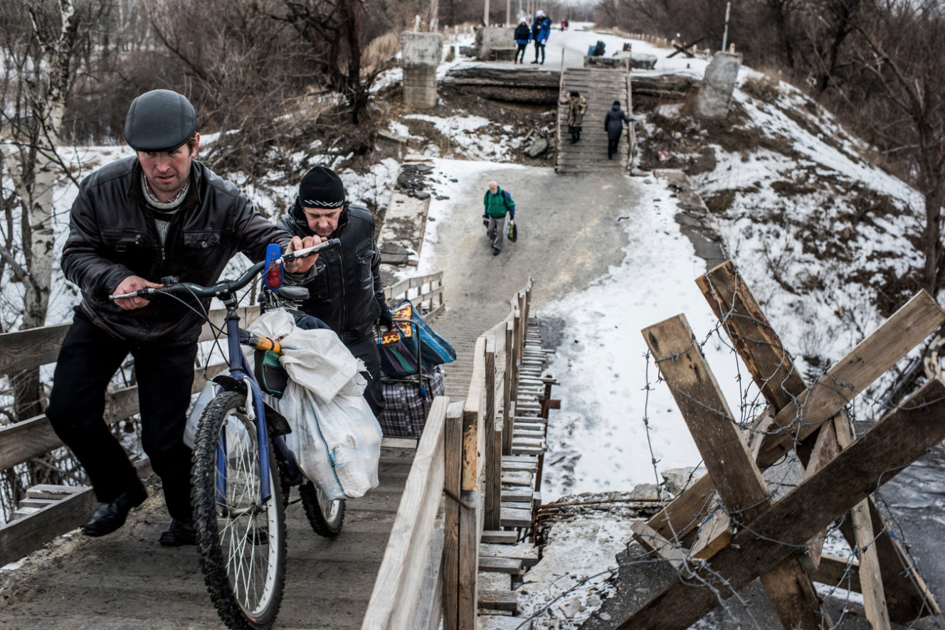
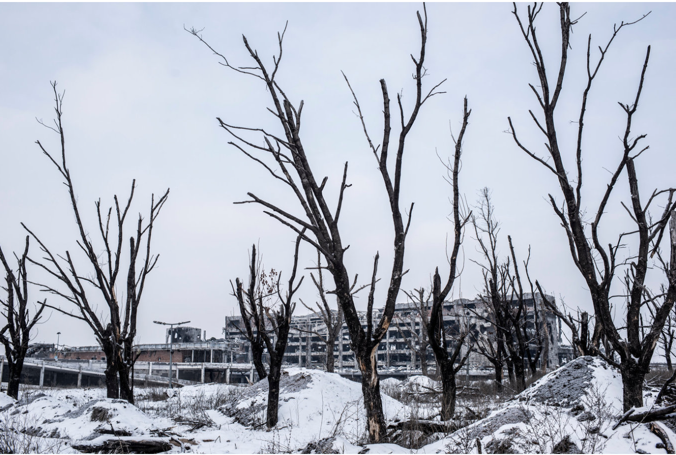
Overall, I was thrilled with the quality of the work I saw in New York, and am glad to be able to share so much of it with you guys. Enjoy the beginning of summer, and we’ll be back with a book review next Friday.
Personal Projects: Steve Babuljak
The Art of the Personal Project is a crucial element to let potential buyers see how you think creatively on your own. I am drawn to personal projects that have an interesting vision or that show something I have never seen before. In this new revised thread, I’ll include a link to each personal project with the artist statement so you can see more of the project. Please note: This thread is not affiliated with any company; I’m just featuring projects that I find. Please DO NOT send me your work. I do not take submissions.
Today’s featured artist: Steve Babuljak
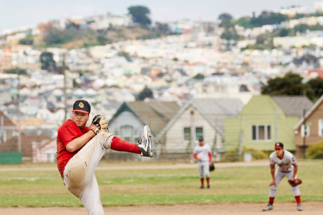
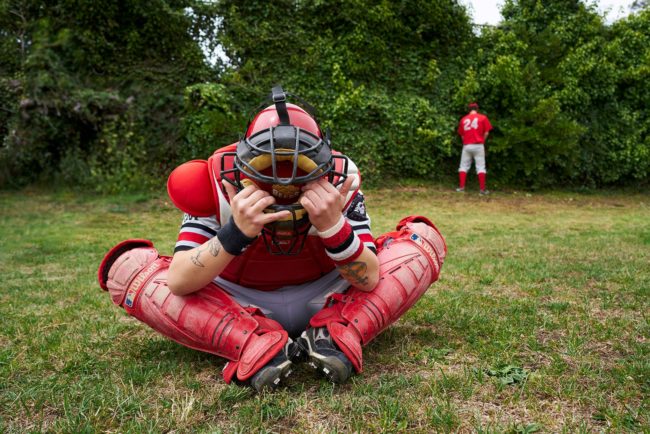
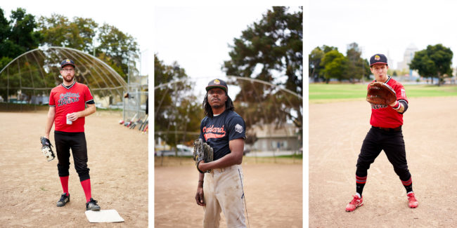
The Oakland Beers baseball team was first introduced to me by a friend on the team. As soon as I heard their name I knew I needed to photograph them. I started going to their home and away games, practices, and hang out spots. Each time I went out I looked to capture something beyond the sports action. What intrigued me was the relational moments of the team and the one-of-a-kind creative details they each brought to the table. Without fail, every visit brought new visual surprises I could have never dreamed up. Capturing their story brought me back to a time before I entered commercial photography. A time free of pressures and expectations, a time with no one watching. It was just us, a field, and time to kill having fun.
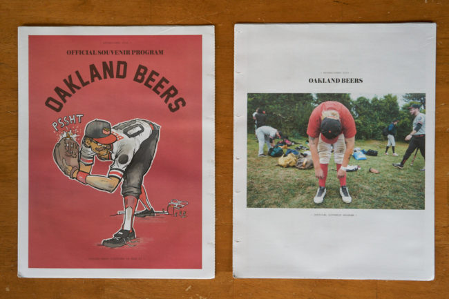
After narrowing down the selects with consultant Peter Dennen I presented the project to freelance creative director Aaron James. He and I brainstormed the idea I had about a newsprint tabloid. He ran with it and thought of making it a program guide like the ones you might get at a game. The intention was to keep the project loose and gritty with a yesteryear feel to it. He also brought in illustrator Leo Zarosinski who blew us away with his Beers player characterization for our front cover.
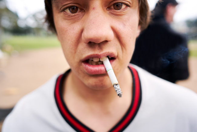
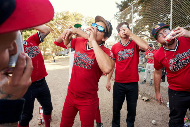
To see more of this project, click here.
APE contributor Suzanne Sease currently works as a consultant for photographers and illustrators around the world. She has been involved in the photography and illustration industry since the mid 80s. After establishing the art buying department at The Martin Agency, then working for Kaplan-Thaler, Capital One, Best Buy and numerous smaller agencies and companies, she decided to be a consultant in 1999. She has a new Twitter feed with helpful marketing information because she believes that marketing should be driven by brand and not by specialty. Follow her at @SuzanneSease.
The Daily Edit – Ted Cavanaugh
Men’s Health
Creative Director: Mike Schnaidt
Deputy Director of Photography: Sally Berman
Deputy Art Director: Raymond Ho
Food Editor: Paul Kita
Food Stylist: Eugene Jho
Prop Stylist: Kaitlyn DuRoss Walker
Photographer: Ted Cavanaugh
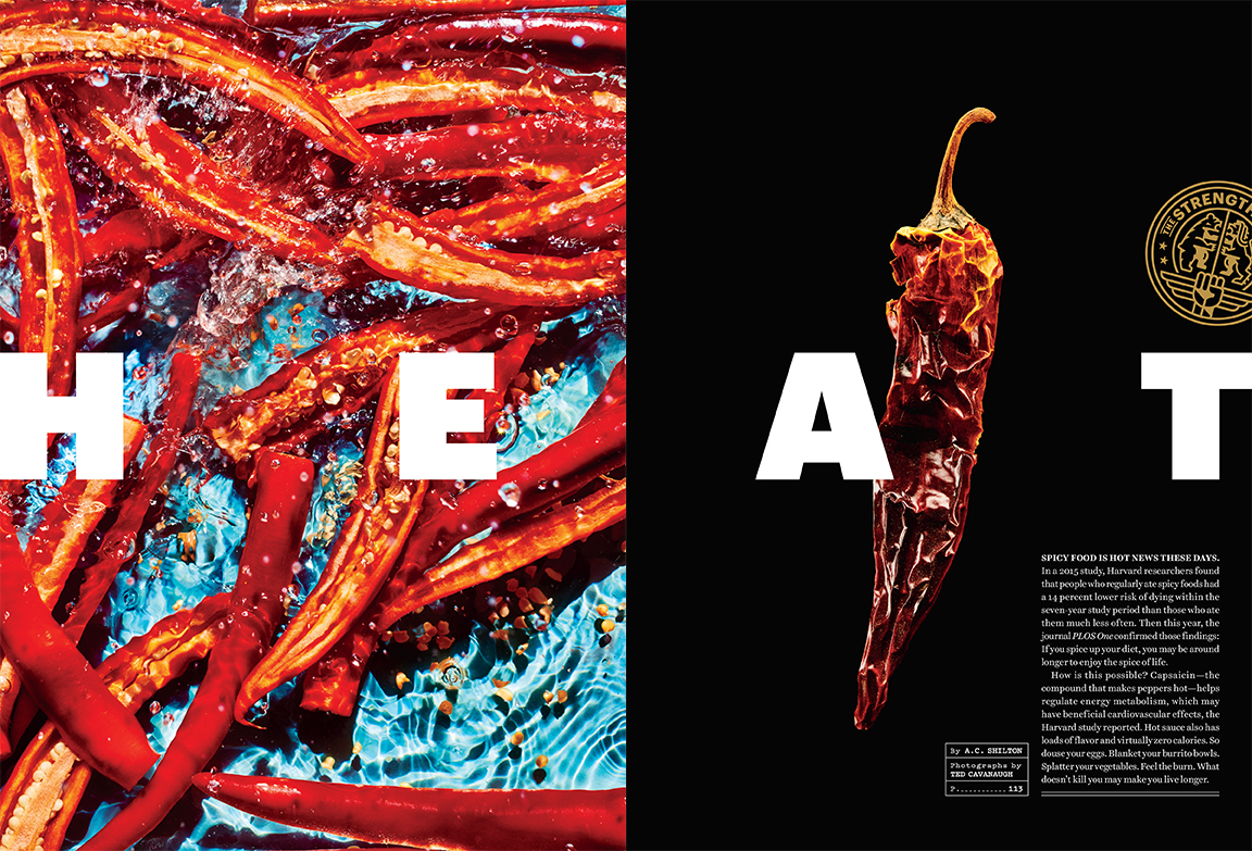
Our wonderful food stylist Eugene Jho found some pretty amazing dried peppers from all over Manhattan, but in the end, the reason we loved that chili pepper was that it had an insane fiery orange color at the top, and graduated to a more traditional dark amber color at the bottom. I thought this would be perfect on black because it would make the colors that much more vivid.
I didn’t, but Eugene certainly did!
For this image, our concept was showing peppers in liquid, almost as if they were being pickled in a jar. We initially layered the peppers in a large plexiglass tray in water and a white background. It was immediately clear that the water didn’t read as well as we were hoping. In fact, the water was almost invisible. After a few frames, I realized the white background and the stagnation of the water weren’t working. So, we switched the background to a beautiful blue and made the water as active as possible. To me, the most exciting thing about water is the textures and shapes it can easily create with the right amount of agitation. Part of what I love about working through concepts on set is the spontaneity of it. There can be long discussions beforehand about what the intended outcome is, but in the end, it’s more about the physical limitations of how the subject reacts with the light and the camera’s sensor….you know, physics and stuff.
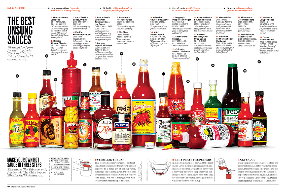
The wonderful designers at Men’s Health put that spread together.
When I got the call from Sally, she had some images in which she was drawing inspiration from, but she gave me the go ahead to make really cool pictures. The main focus was absolutely all about hot sauce, so we needed to get a really solid composed photo of all the hot sauces. But after that, we just went wild and got as many different variations of graphic chili peppers in different scenarios as time allowed.
Refinery 29
Senior Photo Editor: Deb Wenof House
Photo Assistant: Megan Madden
Senior Food Editor: Zoe Bain
Food Stylist: Victoria Granof
Prop Stylist: Megumi Emoto
Photographer: Ted Cavanaugh
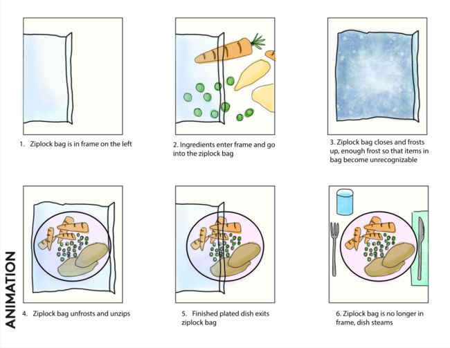
I got an email from the wonderful Deb Wenof House in February regarding a shoot in which they wanted to illustrate the convenience of prepping a meal, freezing it, and having it ready for you when you get home late and are famished. One thing I really love about the ladies at Refinery 29 is that they know their brand very well, and come prepared with a storyboard of how they envision a concept. Deb’s associate, Megan Madden, came up with this dazzling sketch. I enjoy collaboration, so if a client has an idea they would like me to make come to life, I’m all for it. One of my favorite parts of being a still life photographer is being able to turn a vision into an image.
Luckily that day, I was lucky enough to work with Victoria Granof, she’s a food stylist that is always creative and always creating. She puts her twist on food and it’s a pleasure to be a part of that. In my creative process, I make sure to stop and observe something that we might have otherwise taken for granted. I remember a few years ago, in an airport, I noticed how beautiful the lighting was and took note of why. It’s just little things like lighting or textures that I find most inspiring. Part of my DNA is always wondering, always asking weird questions. I think a lot of my daily life is inspired by starting a phrase with, “I wonder if…” or, “I wonder why…” Generally speaking, it’s hard for me to turn creativity on and off. It’s more of me being a quirky, inquisitive person who happens to take pictures as well. A lot of my personal work is actually trying to answer those questions. Lots of caffeine never hurt either. My wife, Chelsea Cavanaugh, who is also a still life photographer, inspires me as well. We work together on every shoot, and she has an amazing vision for composition and styling. Lately, if I’ve been feeling anxious or need to change things up, I do some simple calligraphy on a post it note. Something about the process of calligraphy to me is so relaxing. I’m terrible at it, but it’s relaxing none the less.
It averaged out to be 70 frames per animation.
Yes! Our prop stylist Megumi Emoto took a straw and sucked out all of the air in each bag for the animation. The steam was created with a handy little thing called smoke sticks, which I, unfortunately, can only find at a local store in NYC.
The Best Work I Saw at the NYT Portfolio Review
Though art and news photography commingle these days, artists and journalists are very different breeds.
I studied art at the undergrad and graduate level, and spent the last 20 years learning to understand the language, so it’s pretty natural to me, at this point.
The journalistic ethos I’ve learned on the fly, as I went from starting a little blog here in New Mexico, (that nobody read,) to writing for the New York Times in 4 short years.
Artists mostly do the work for themselves, because they enjoy it. Maybe it’s a path to sanity, or for those with ambition, to having a conversation with an audience of strangers.
But while a small group of artists are overtly political within their practice, for most, it’s about personal expression. (I paint the mountain because the mountain is there.)
Journalists, though, are more mission-driven, on the whole. They might have been nerds in high school, rather than hipsters, but they use their intelligence for the greater good.
Journalists face tough job prospects here in America, and dangerous violence in other places around the globe. Six Mexican journalists have been killed this year alone.
This very morning, in fact, the Republican candidate for Congressman in Montana physically assaulted a reporter from The Guardian, because he asked the man a question.
And just when things seem like they could not possibly get more surreal, the Fox News team, who were about to interview the politician, supported their British colleague as fully as possible.
Their first-hand accounts led to the jerk’s arrest. (And he’ll still probably win the election.)
The point is, while most artists have a cushy, if poorly paying job, many journalists, in order to tell their stories, are forced to put their lives on the line.
When I went to the New York Times portfolio review last month, I was very aware that the young journalists I met were on something of a quixotic trip, as far as careers go.
It’s been said that data, and information in general, are the world’s most valuable currency. Reporters and photojournalists traffic in highly dangerous information, and it makes them targets for murder. More so now than ever before.
I don’t mean to be an alarmist, but it truly is a slippery slope from reporters being beaten to reporters being killed. If we’re not careful, we’ll find our voices here in America, creative or journalistic, have been intimidated into silence.
Most, but not all of the photographers I reviewed came from the journalistic arena. Beyond admiring their gumption, several times I offered technical criticism suggesting the photographers consider embracing a more geometric, formal, “artsy” structure into their compositions.
Clean crops and solid shapes help pictures pop, in my opinion, whereas most news compostions care more about dynamism than structure.
I wasn’t able to procure images from all the photographers I met, but a quick memory-trip tells me they hailed from Colombia, France, China, Egypt, Ukraine, Nigeria, Argentina, South Africa and the United States. (Plus, the Argentine was based in Mexico.)
Today, we’re going to show you the best work I came across at the review. As usual, the photographers are in no particular order.
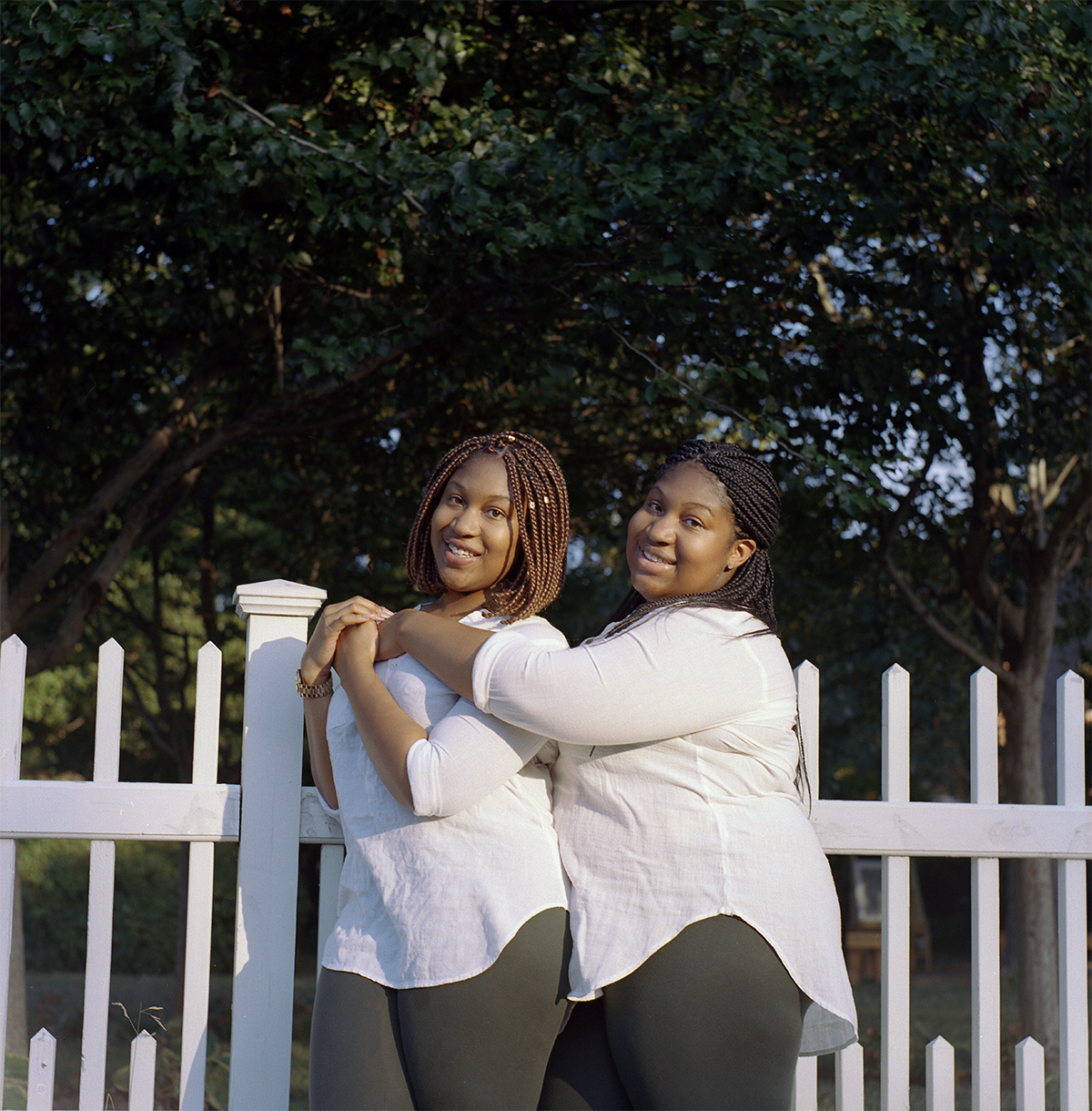
Miranda Barnes caught me completely off-guard, because she looked like she was 12 years old. Her big smile was disarming, and then her story was even more interesting. She’s born and raised in Brooklyn, and was currently studying law. But she’d fallen in love with photography.
I highly encouraged her to keep both things in her life, for now, because it can be so hard to make a living in photography these days. Miranda taught herself how to use a medium format camera, and then scan the negatives, with a truly impressive level of skill.

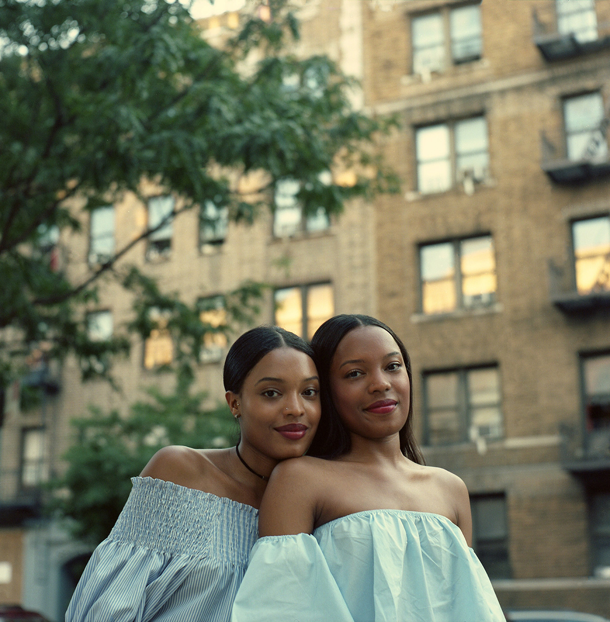
She showed me two series; one looked at Upper East Side rich folks after Trump’s election, and the other, which we’re showing here, featured African American Twins. When I asked her why she chose the latter subject, she said that when she’d looked up twins in Google Image, there were no kids of color at all.

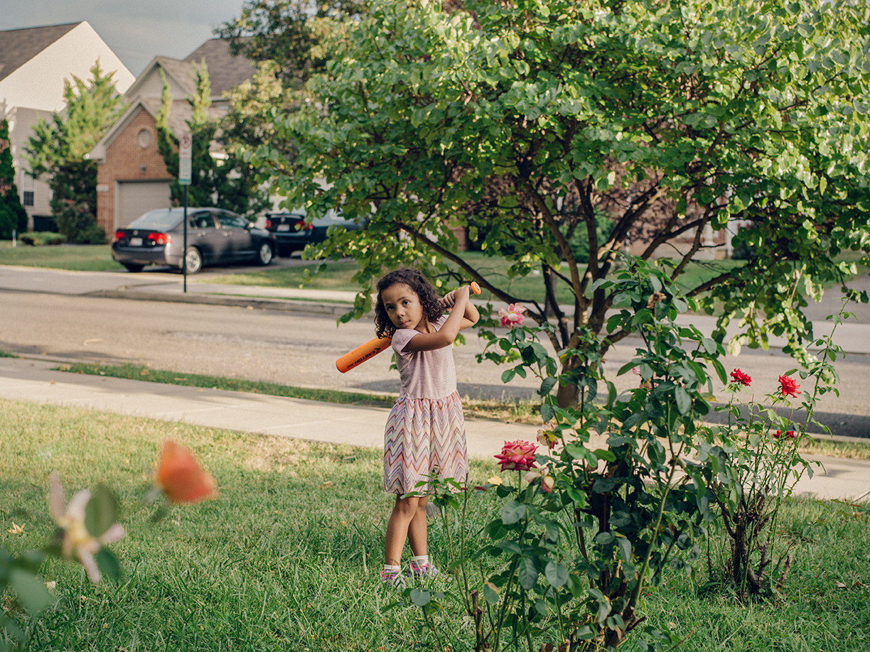
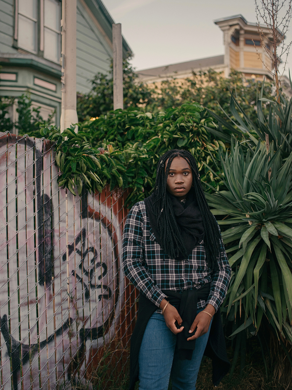
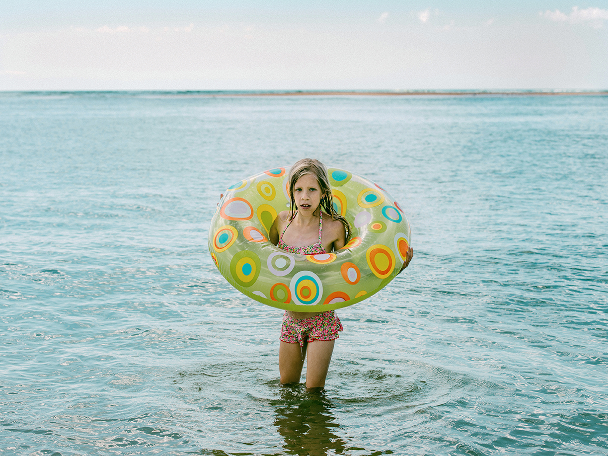
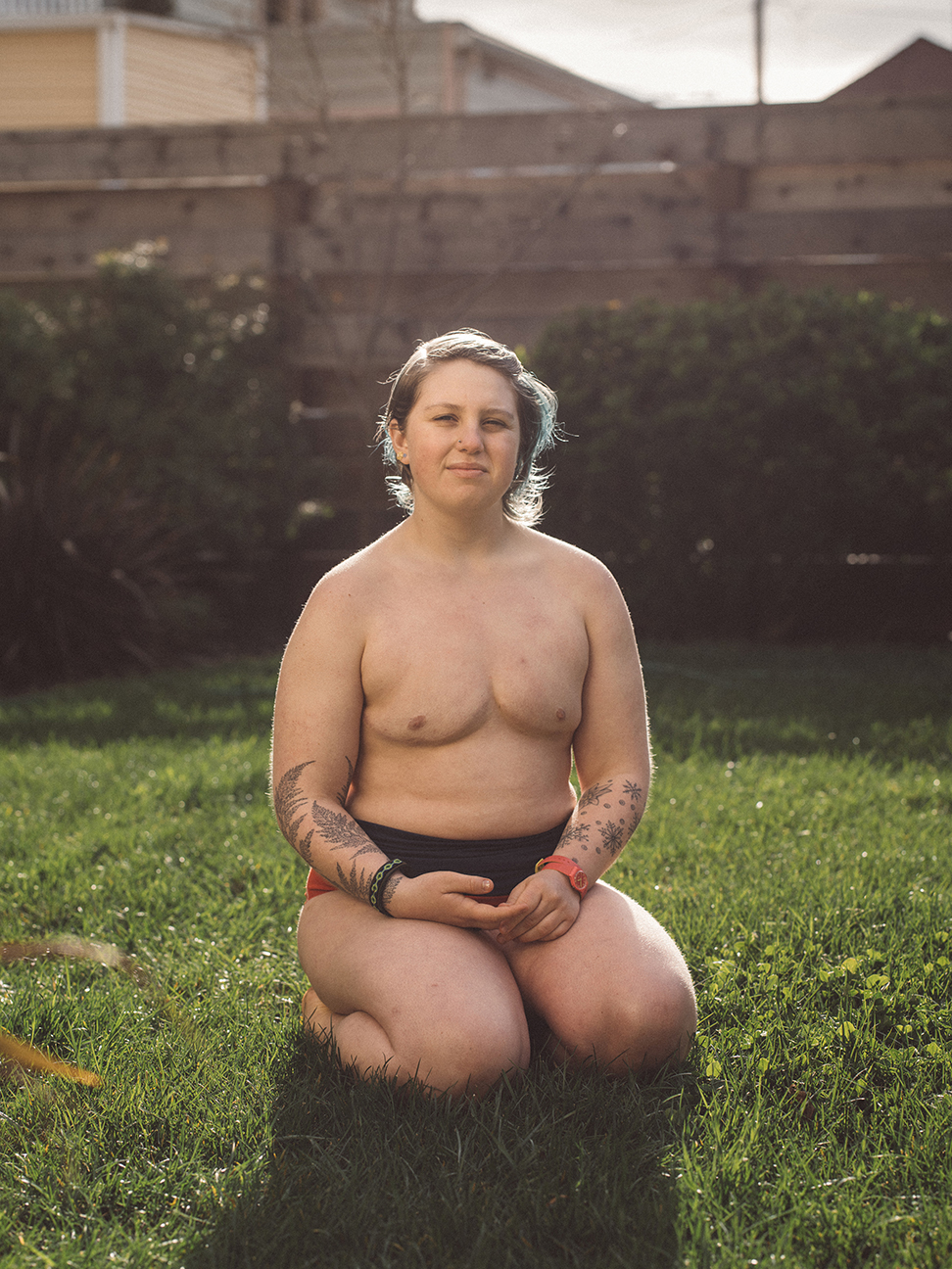
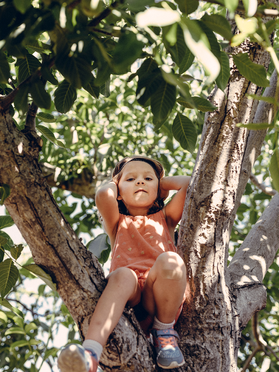
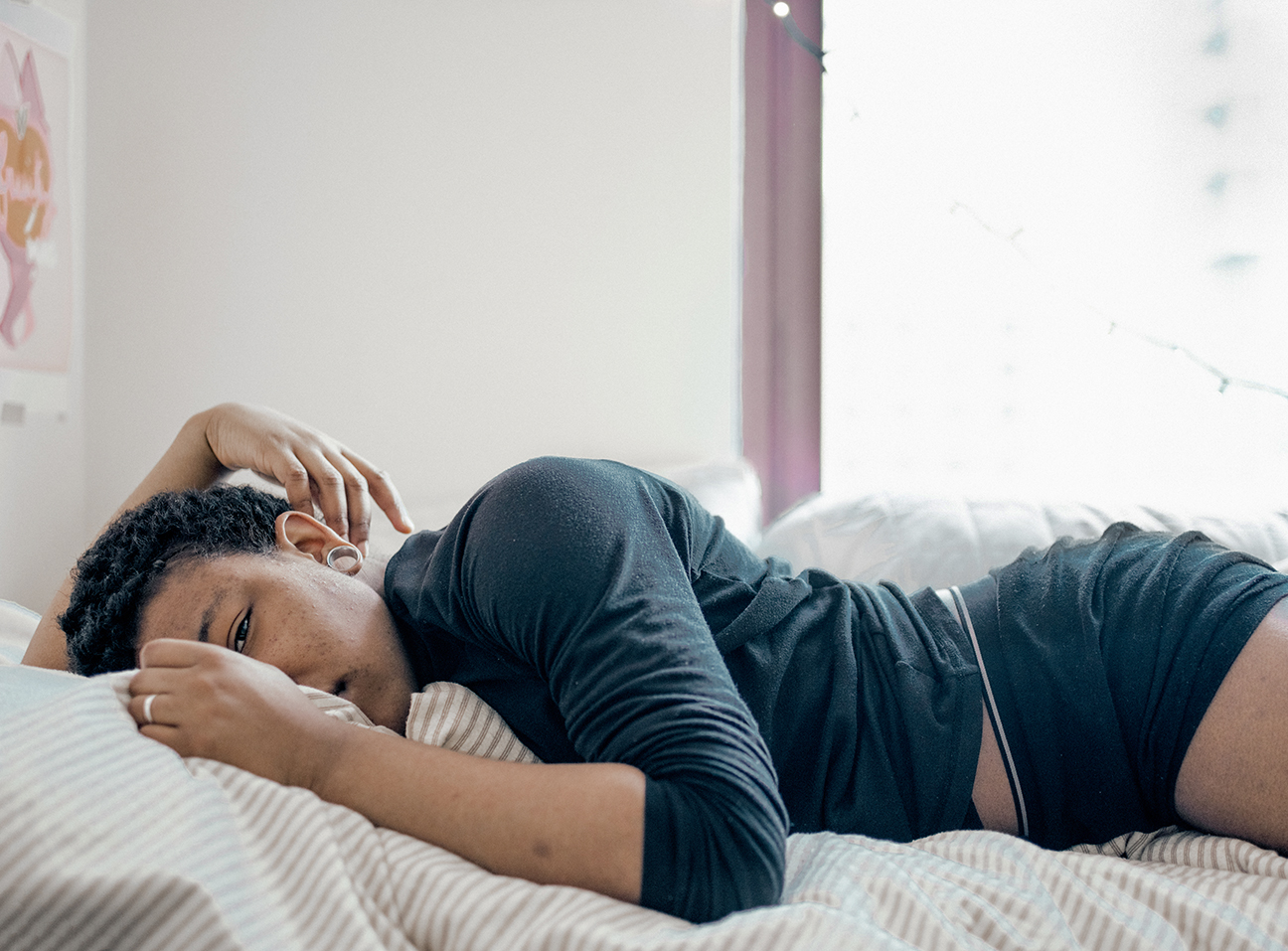
Annie Tritt, who shoots editorially, had a project “Transcending Self,” about transgender and gender expansive children. It’s a subject that’s getting a lot of media coverage, so I appreciated that the pictures were topical, as well as being well-made.
We discussed whether she might want to do a deep dive on one particular subject, rather than a survey of many, so that the viewer can get a richer, more nuanced take on an issue that can be hard for some people to understand.
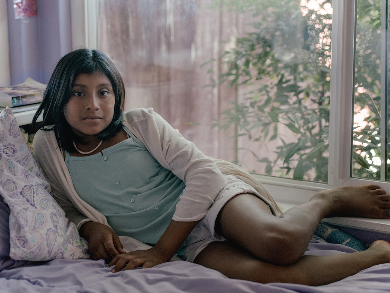
Yan Cong is a Chinese photojournalist and blogger, and she showed me a pretty strange project. Apparently, Beijing is preparing for the 2022 Winter Olympic games, which I didn’t know. That, along with the city’s wealth, created the need for ski areas in Northern China, within range of Beijing.
Yan is documenting the changes in one small town, as it’s transformed over the next five years. But that project is ongoing, and not ready to show, so I checked out a multi-media piece she’d made about the trafficking of Cambodian brides in China.
I found the audio track to be remarkable, and extremely sad. It’s worth a watch/listen, as it’s a good lesson in how adding to the photographic experience can increase a viewer’s emotional connection.
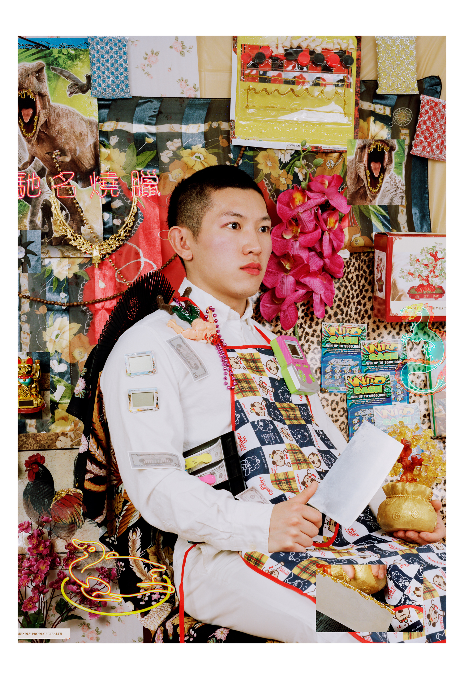
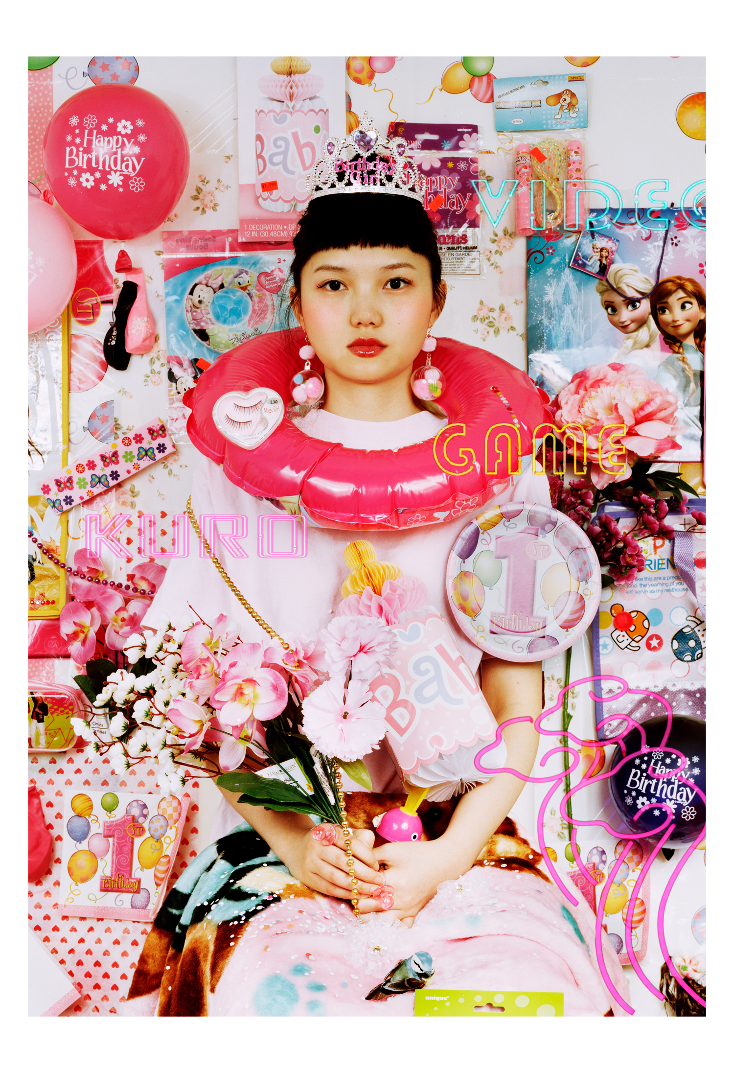
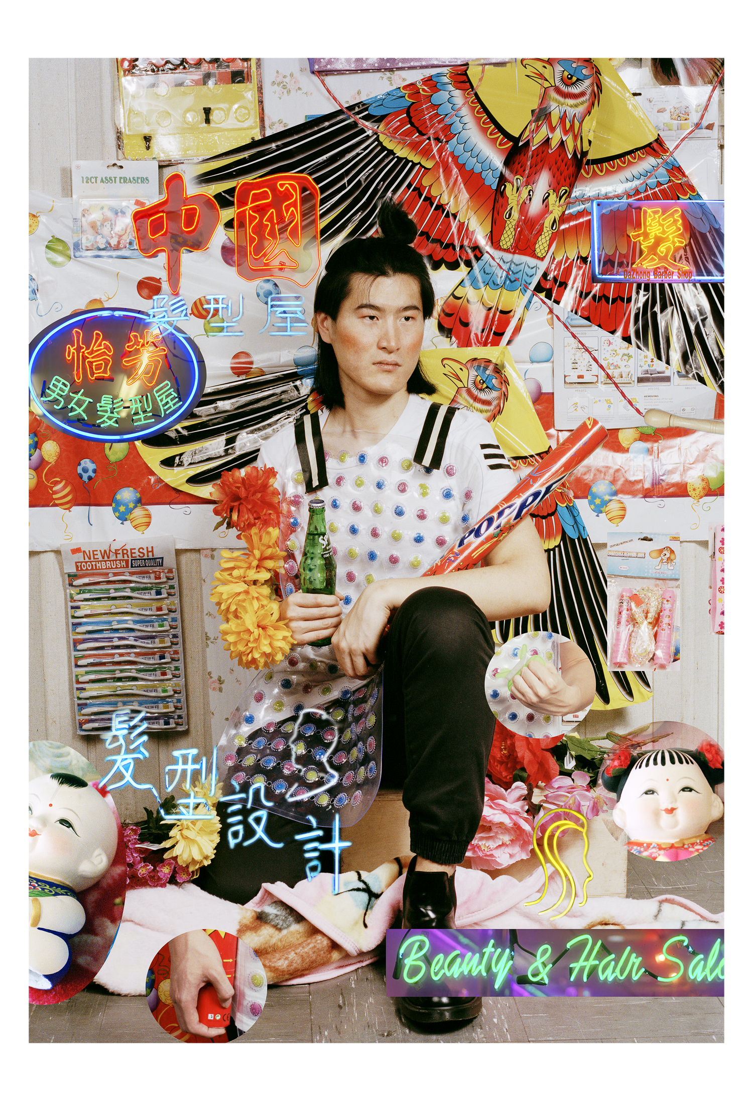
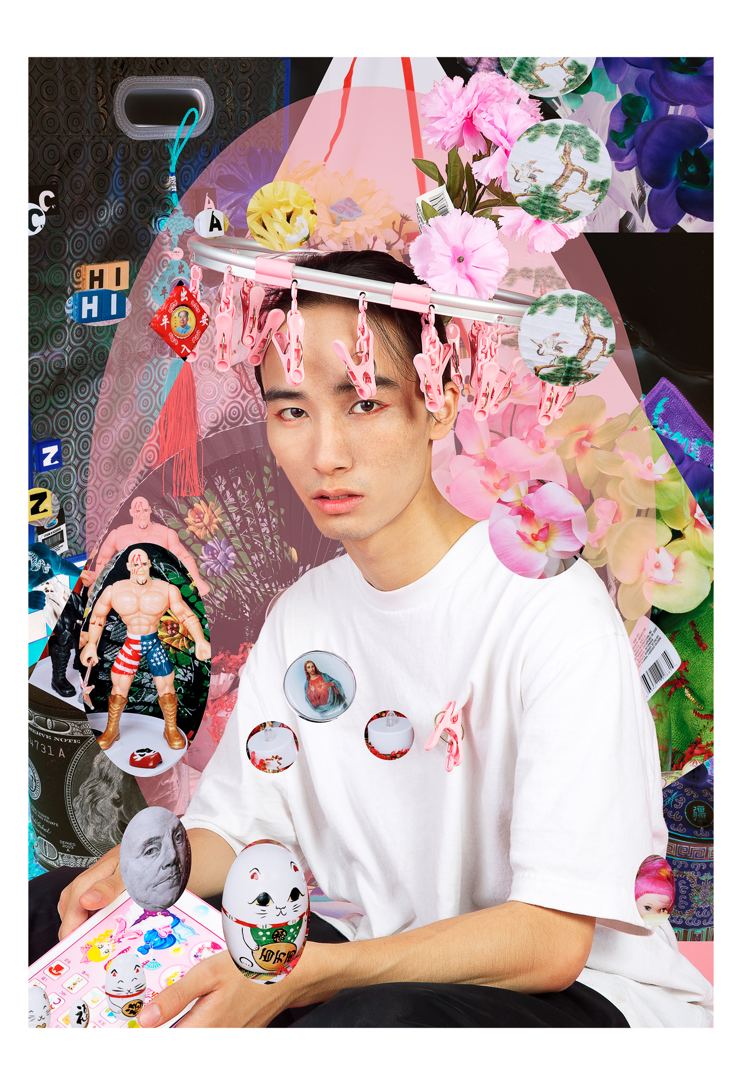
Rujie Wang was also from China, and was finishing up her BFA at the School of Visual Arts. I really loved her project, “Made in China,” in which she photographed cheap crap from the dollar store, alongside her friends from China, who were the models.
Eventually, she started composting in the studio, so the kitchy objects and neon palette create a visual aesthetic that is very contemporary. Even better, she’s begun to turn the photographs into .gifs, in which certain image layers dance around the surface of the picture, like characters out of Pokemon Go. Once she’s sorted out the proper way to exhibit the .gifs, I think they’ll be massively successful.




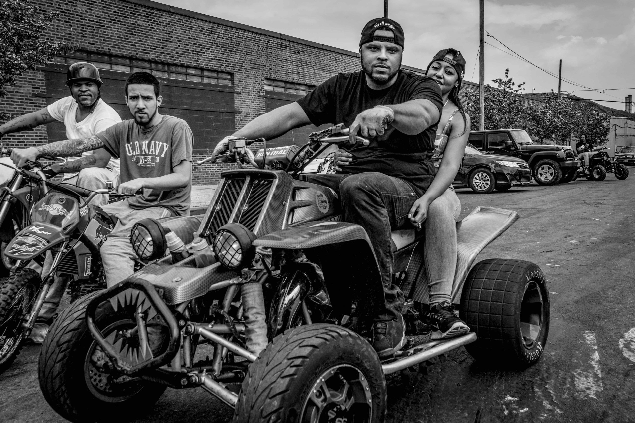
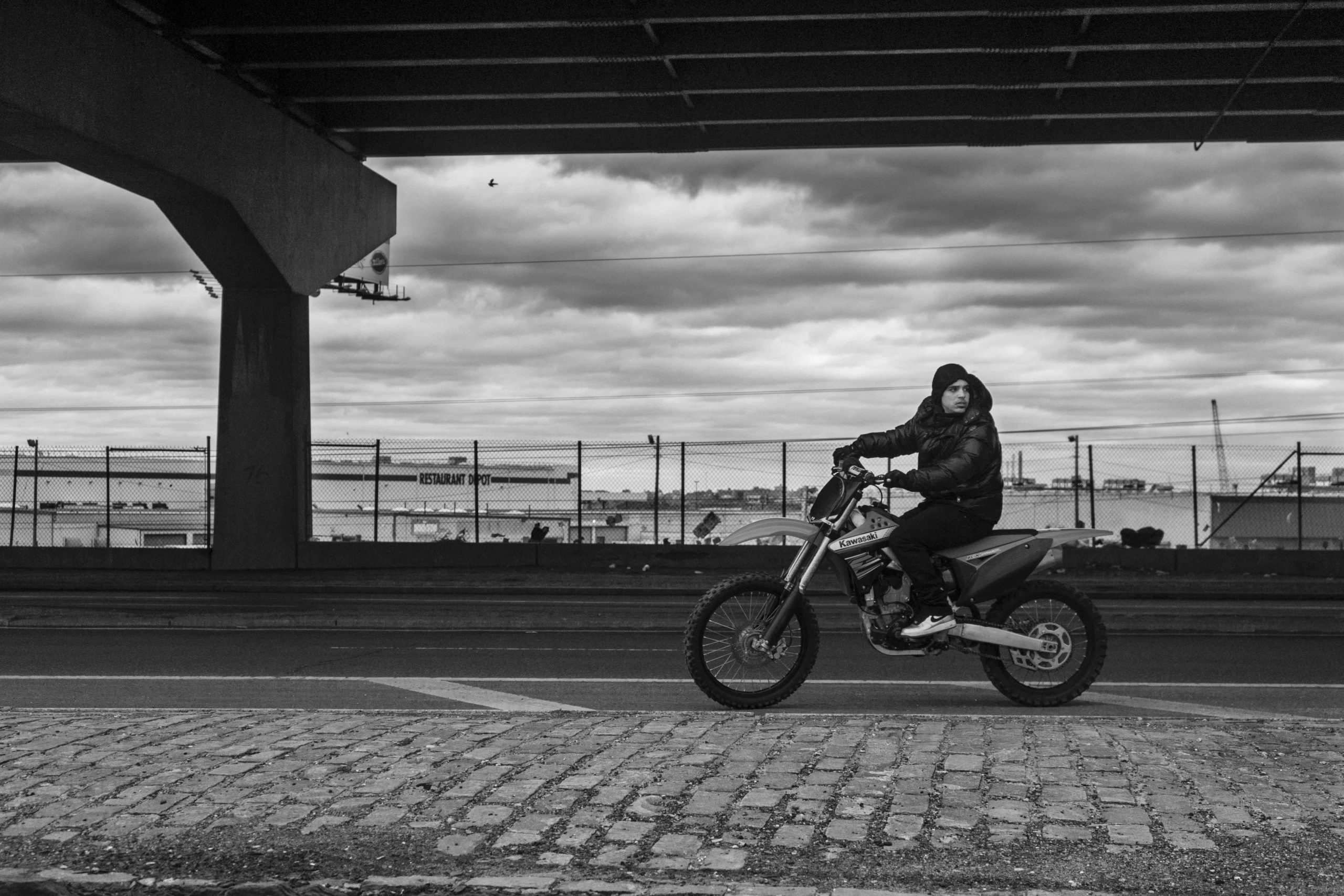
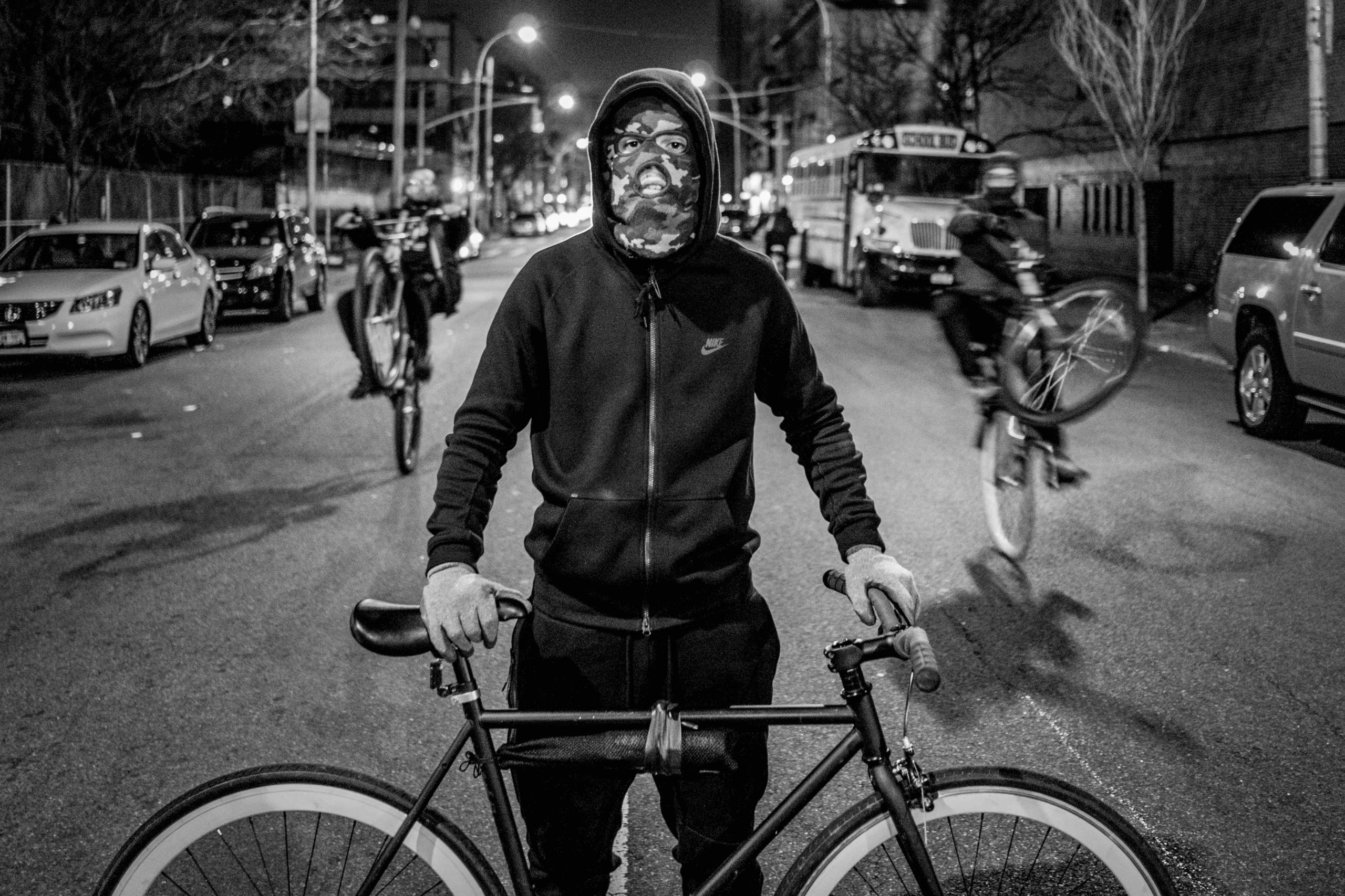
David “Dee” Delgado was my room captain for the review on Sunday, and we chatted a bit during breaks. I always offer to look at people’s work once I get home, if we can’t sit down, so Dee sent me a set of files the other day.
Apparently, for “Bike Life,” he’s shooting street riders in his home borough of the Bronx. I’m always telling you guys I want to see things I’ve never seen before, and these pictures definitely qualify. The high-contrast, hyper-real, black and white look makes them feel of the moment as well.
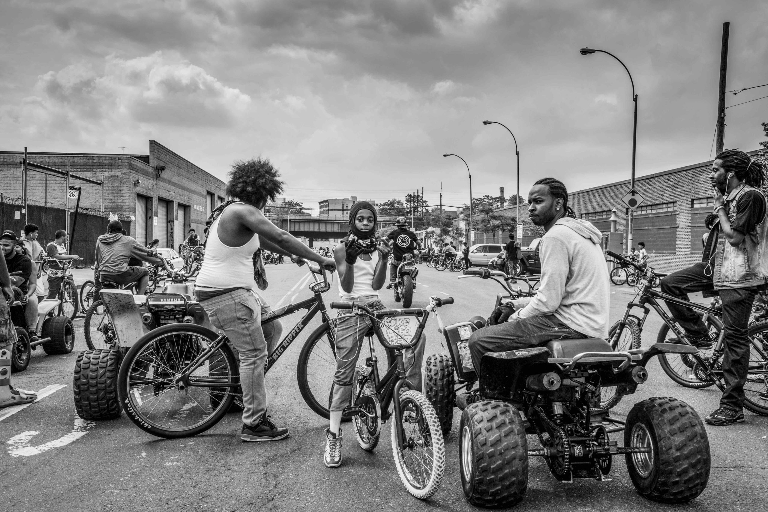
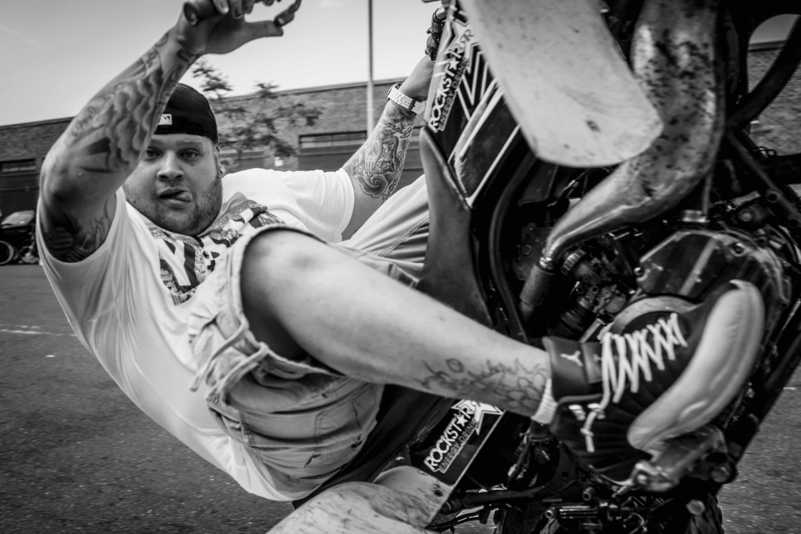
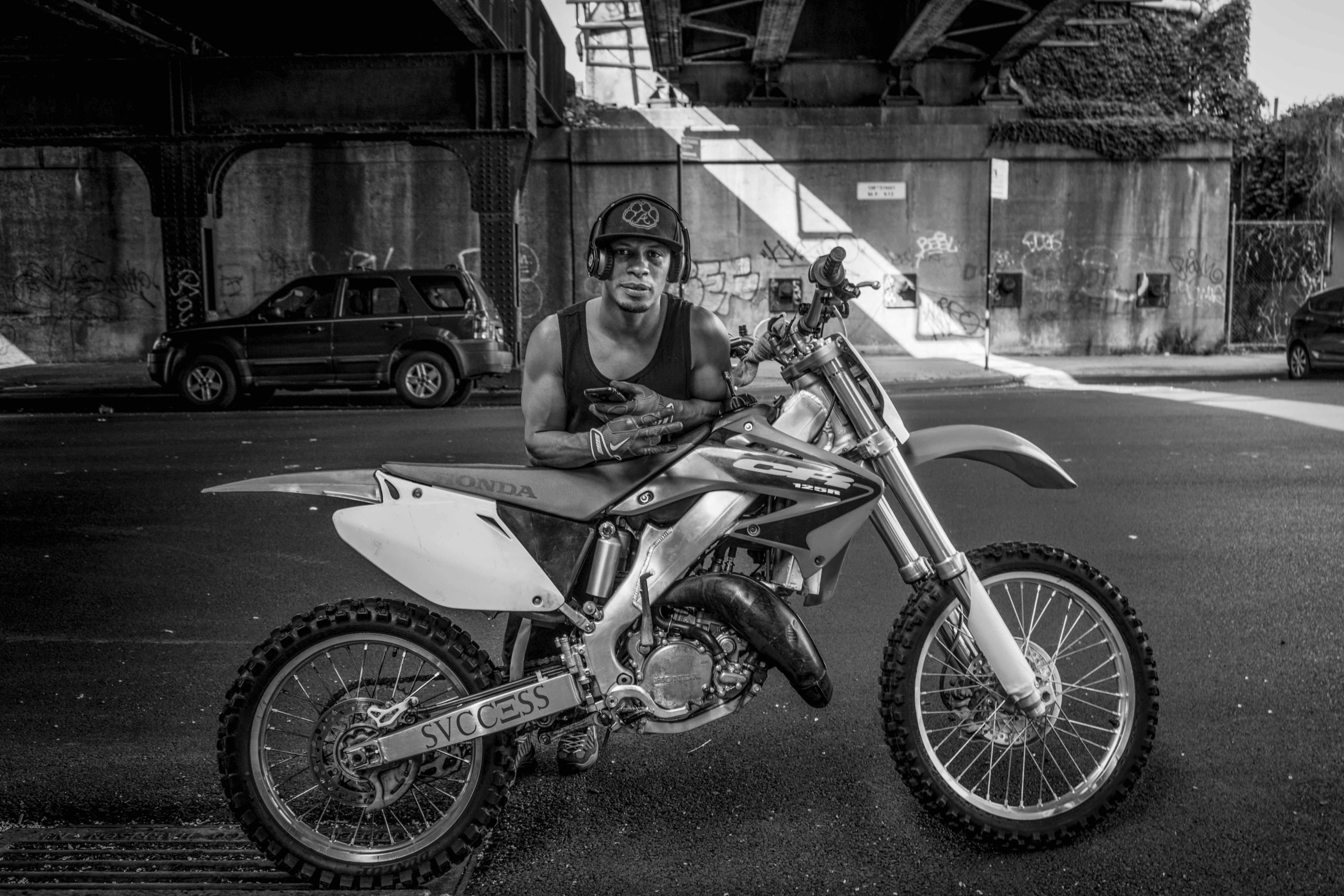
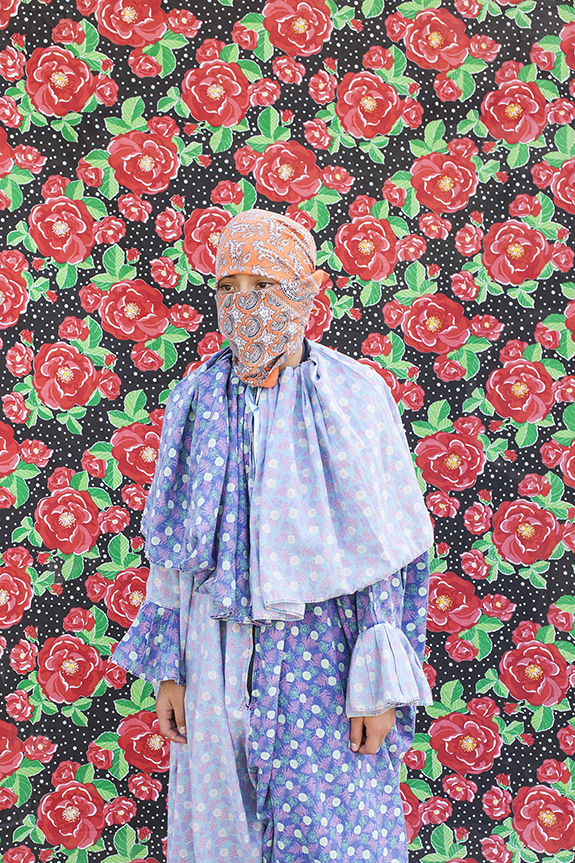
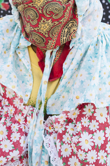
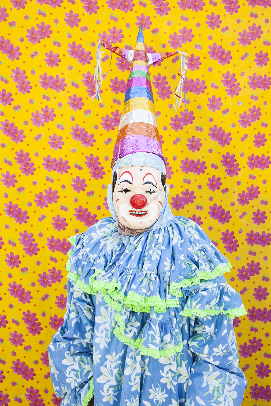
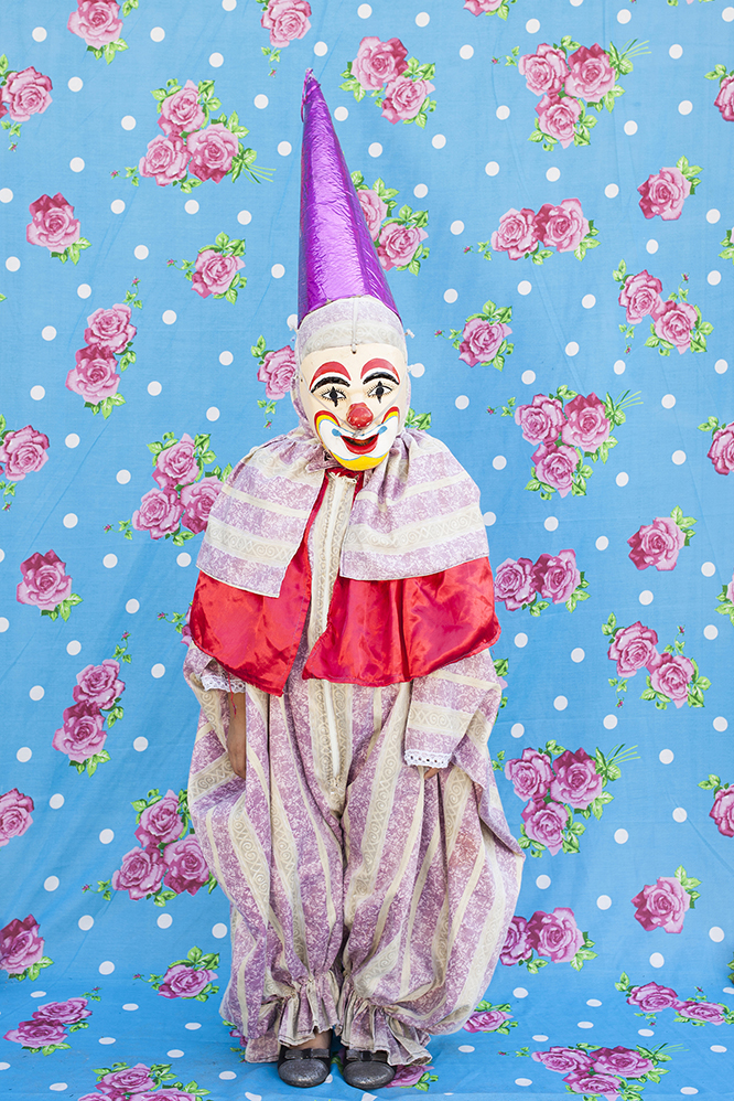
Lujan Agusti had maybe my favorite work, at least of the things that were totally resolved. Though she’s Argentine, she’s based in Veracruz, Mexico, the Western Hemisphere’s most dangerous place to be a journalist.
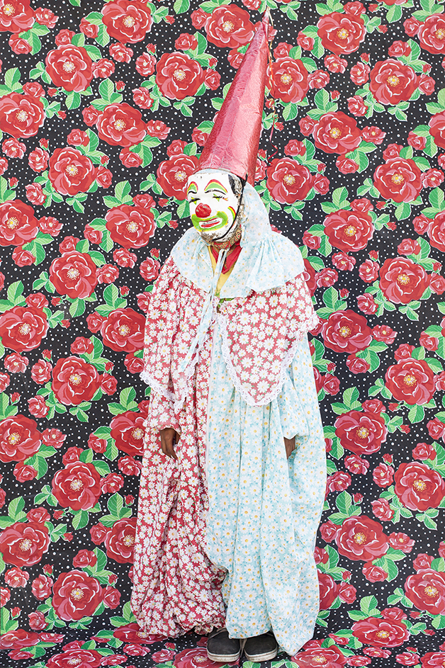
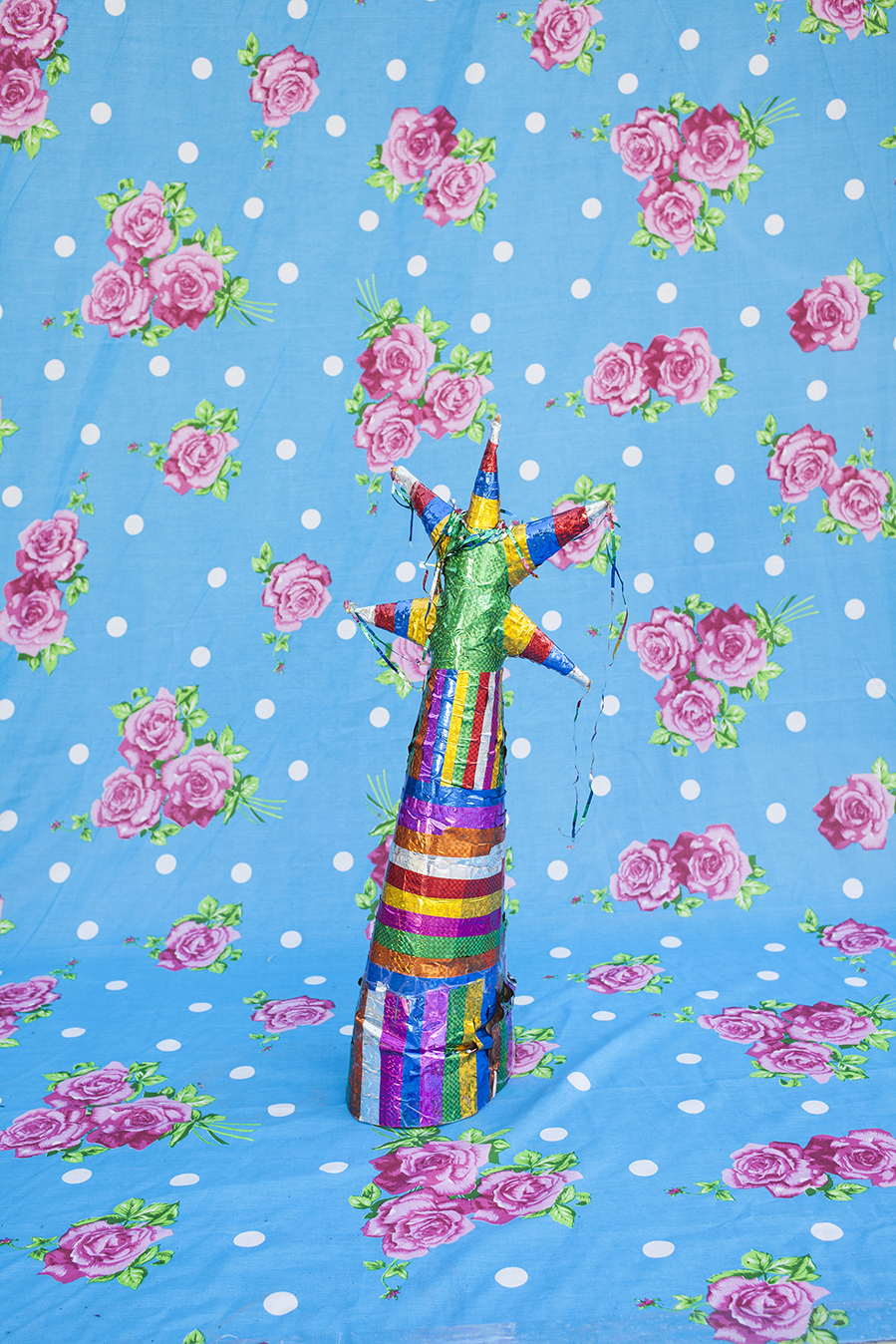
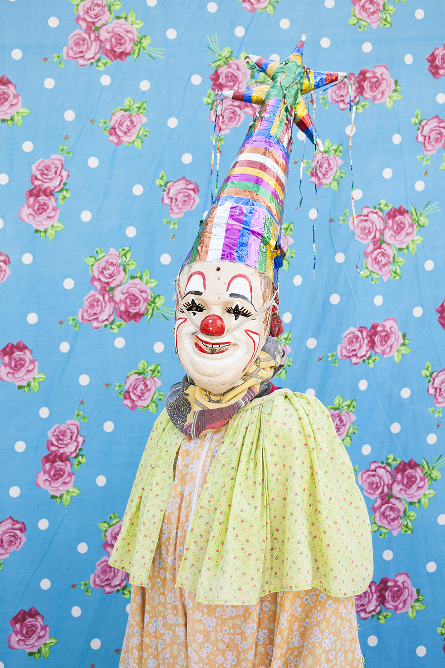
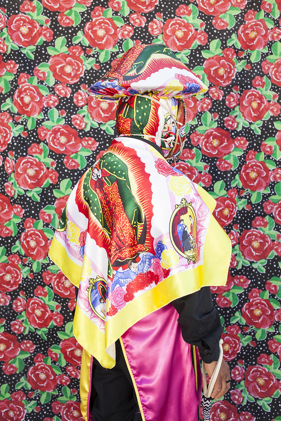
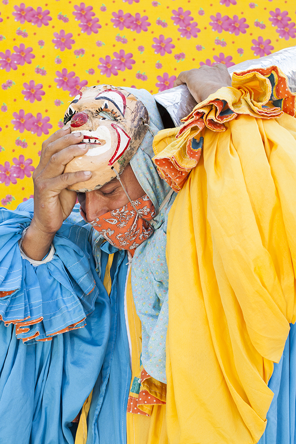
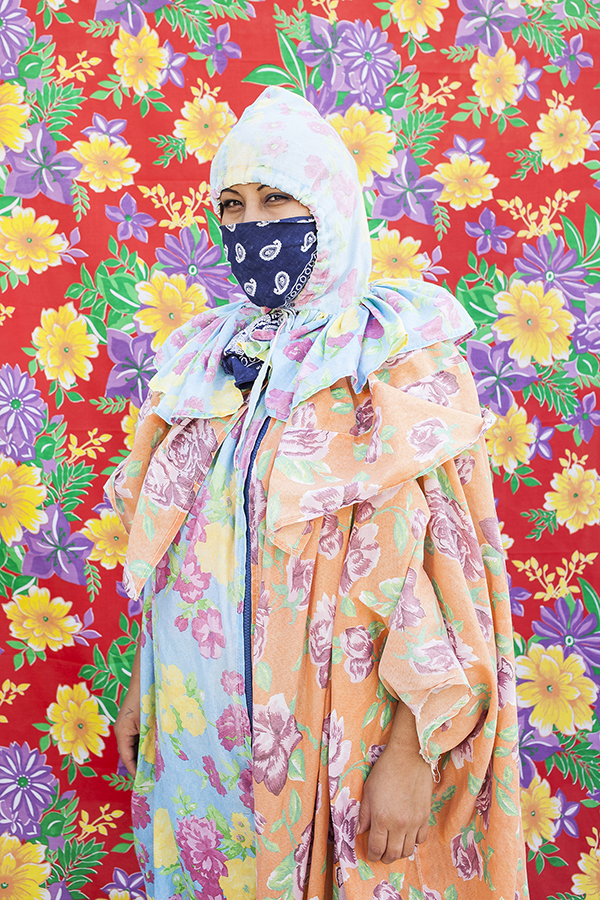
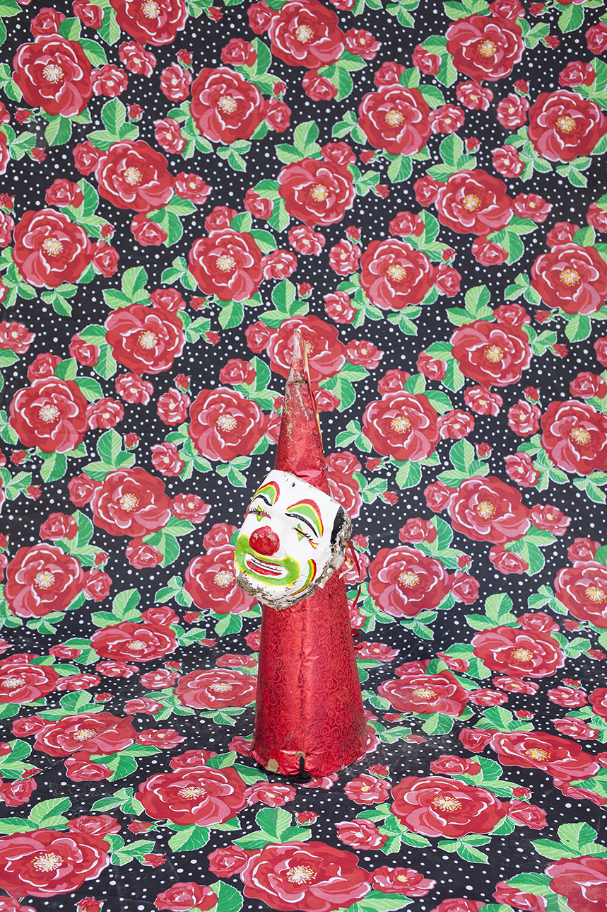
Lujan has photographed indigenous Mexicans from the area, in the clothing they wear for local festivals and ceremonies. I love that she updated a trope by bringing the subjects into the studio, and using their costume fabrics as backdrops.
Along with the creepy-clown vibe, the colors and patterns give these pictures some major visual tension. They’re great, and I love the way they manipulate color to channel the festive, reverential spirit of the ceremonies they’re meant to represent.


Last, but not least, we have Andres Millan. My editor Jim Estrin grabbed me, at one point, and said I had to talk to this young guy, so I said sure.
Andres had two projects I thought were very cool, the first of which featured panoramic images of Colombians battling illness. They were excellent, and the odd aspect ratio definitely helped them to stand out.
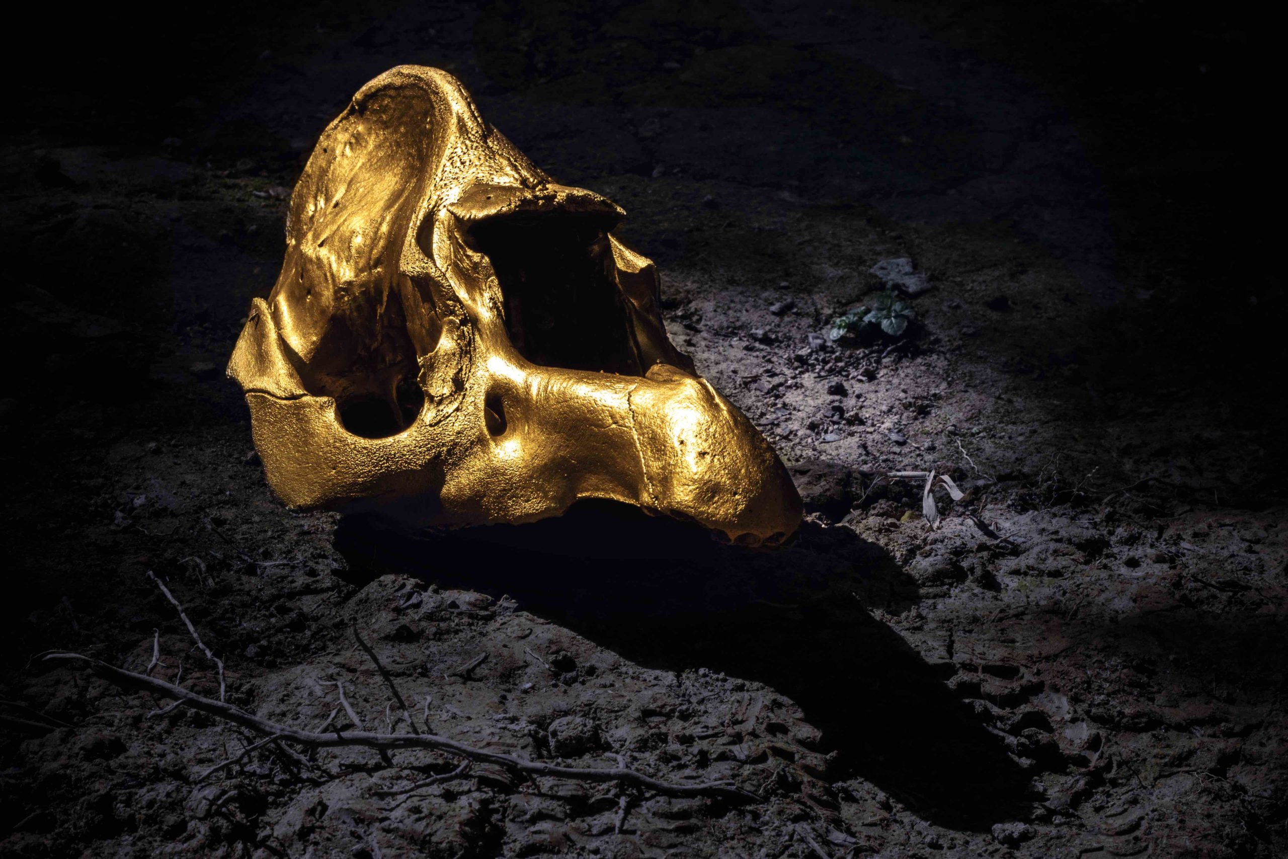
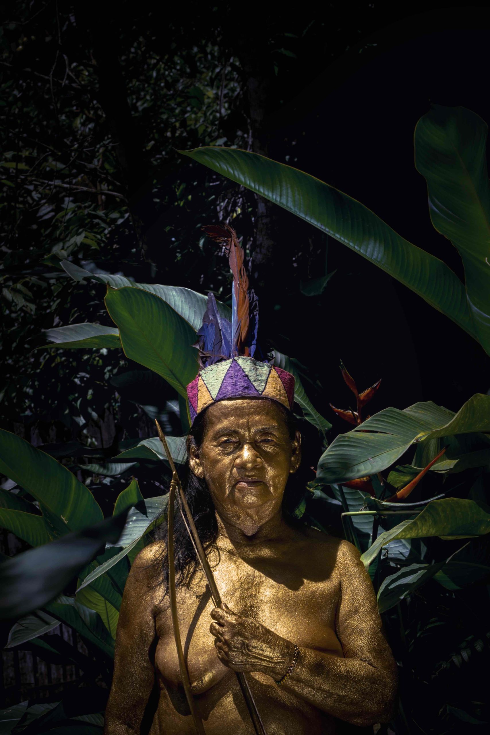
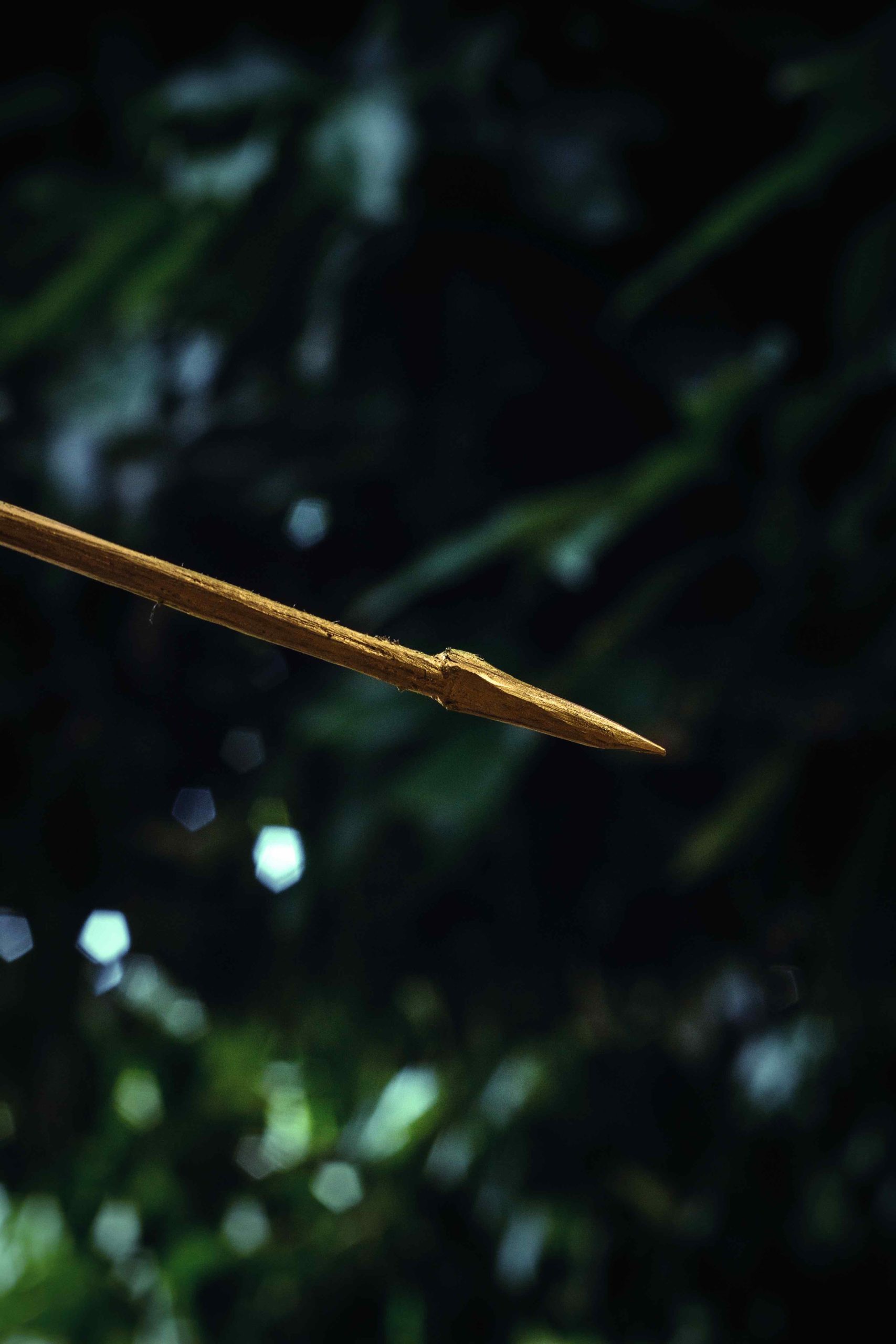
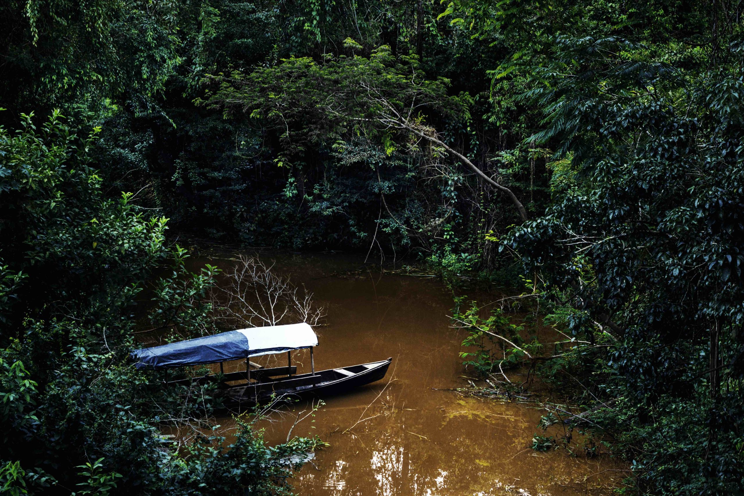
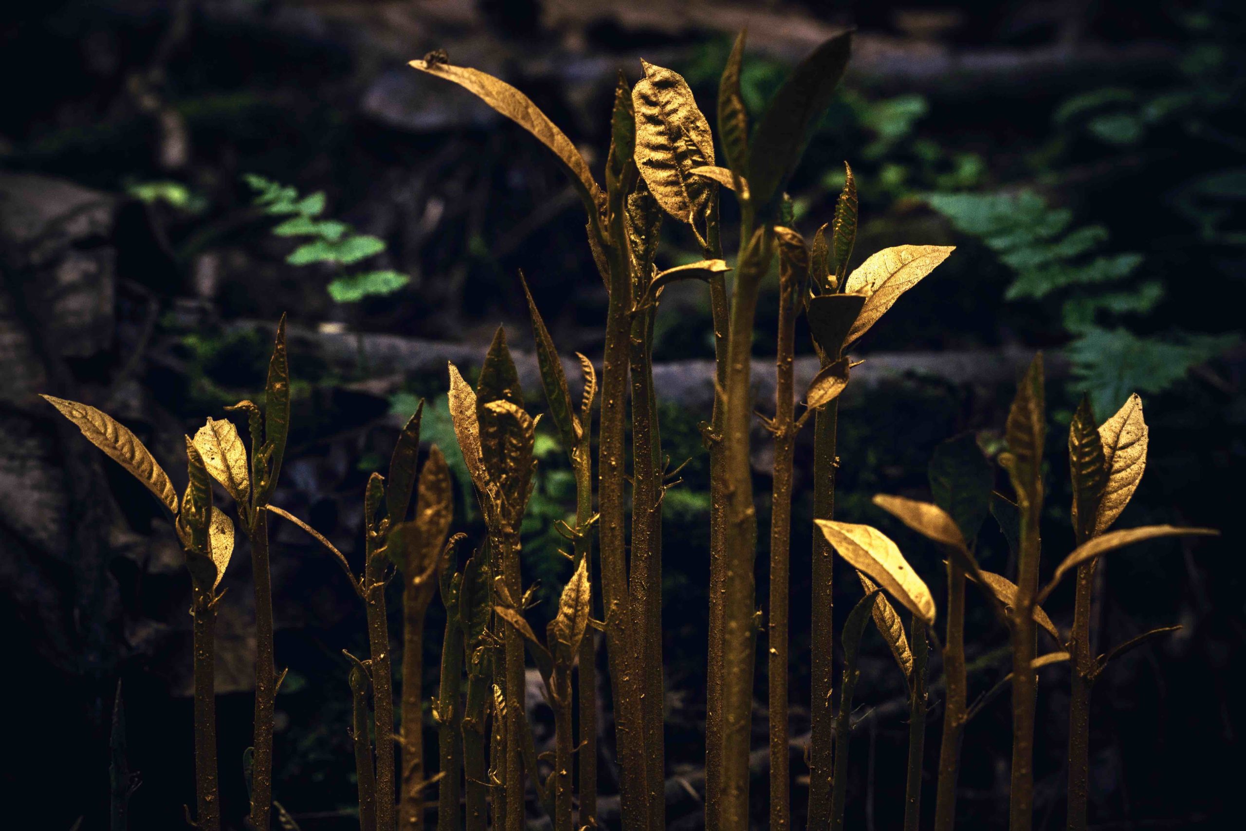
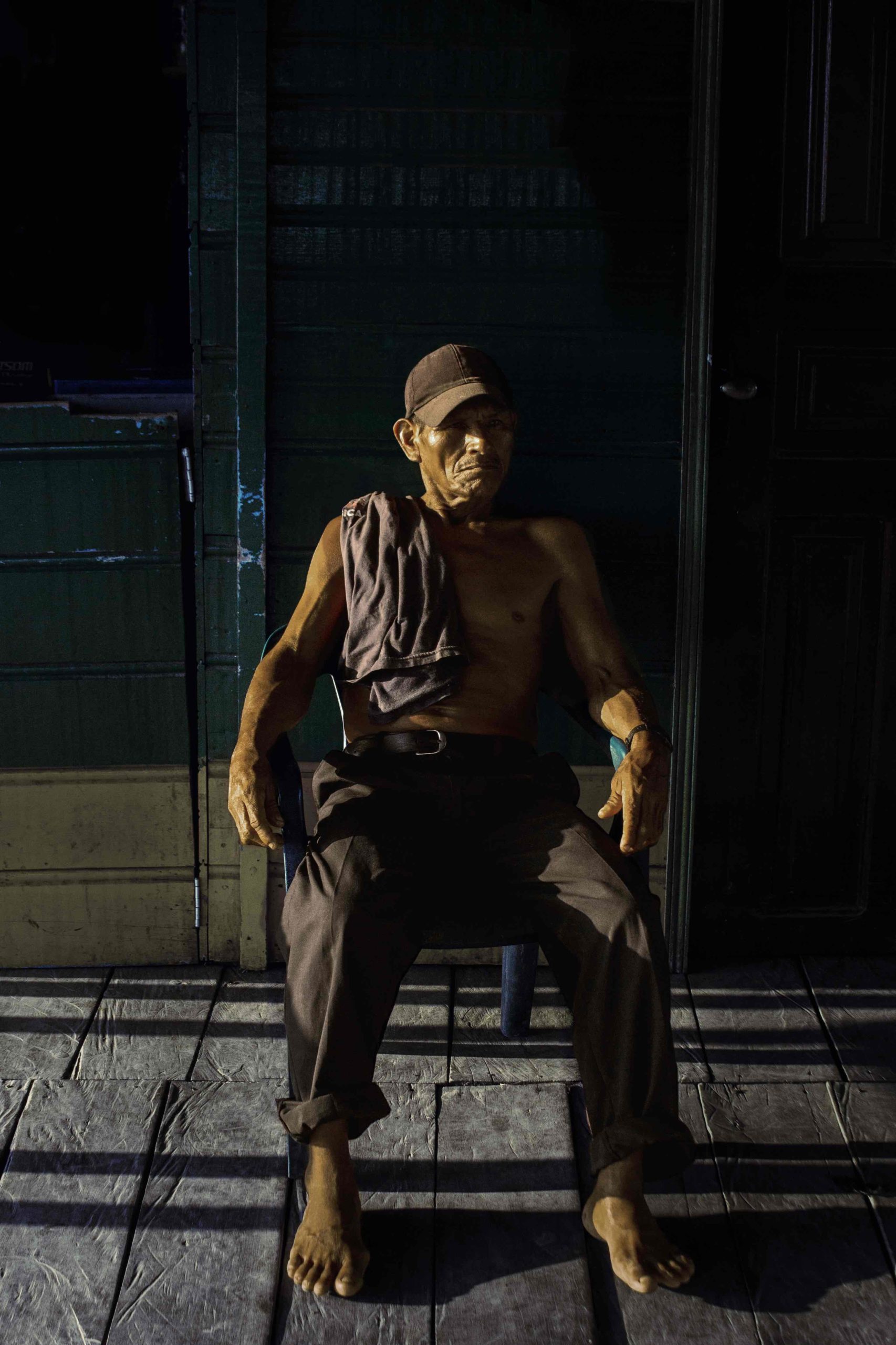
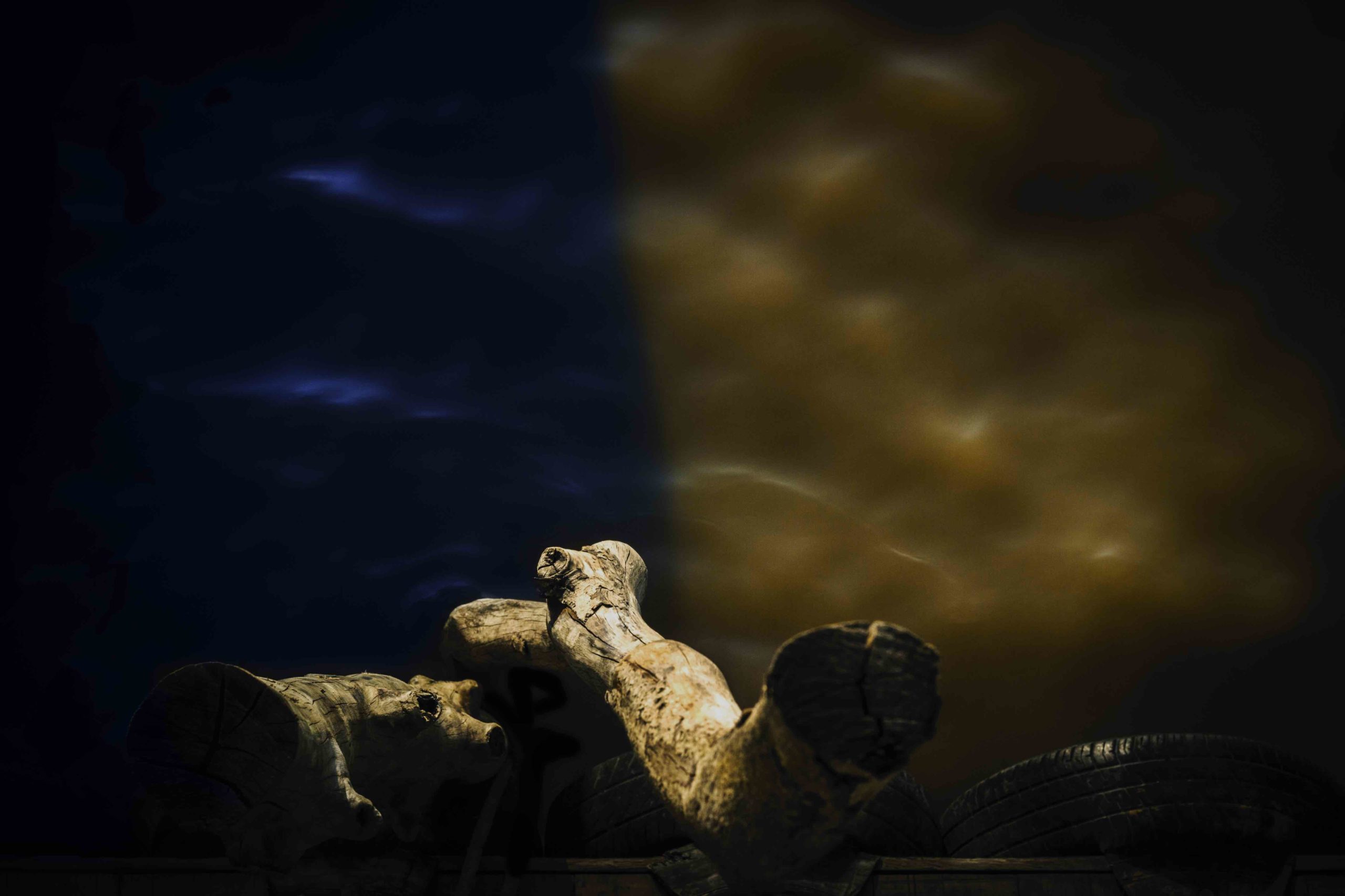
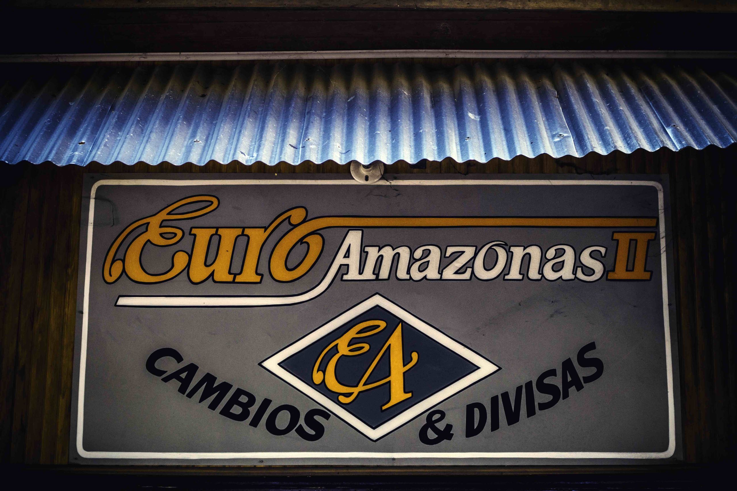
The other project, “The New Gold,” which we’re featuring here, contains pictures made in the Amazon basin. I liked that he intervened in the landscape, painting things gold to match the title, as it made the pictures more memorable. (Always a good thing at an event where you’re seeing so much work in a compressed amount of time.)



Personal Projects: Jennifer Davidson
The Art of the Personal Project is a crucial element to let potential buyers see how you think creatively on your own. I am drawn to personal projects that have an interesting vision or that show something I have never seen before. In this new revised thread, I’ll include a link to each personal project with the artist statement so you can see more of the project. Please note: This thread is not affiliated with any company; I’m just featuring projects that I find. Please DO NOT send me your work. I do not take submissions.
Today’s featured artist: Jennifer Davidson
Seeing Clearly
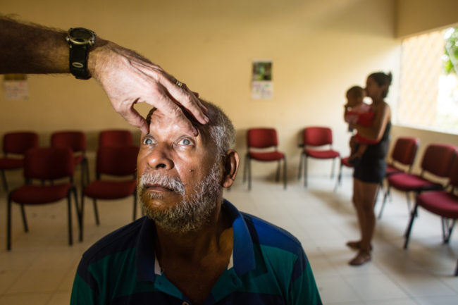
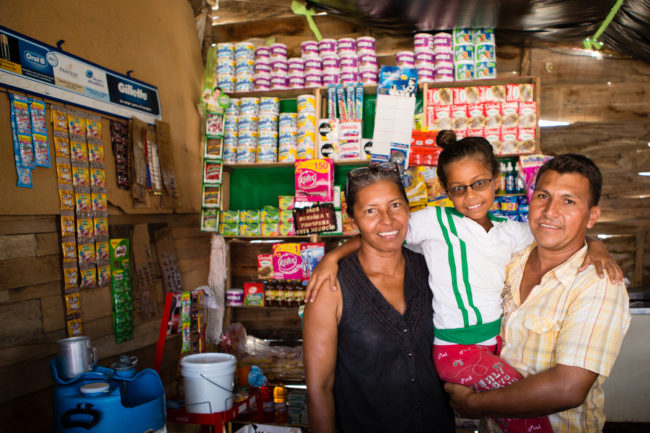
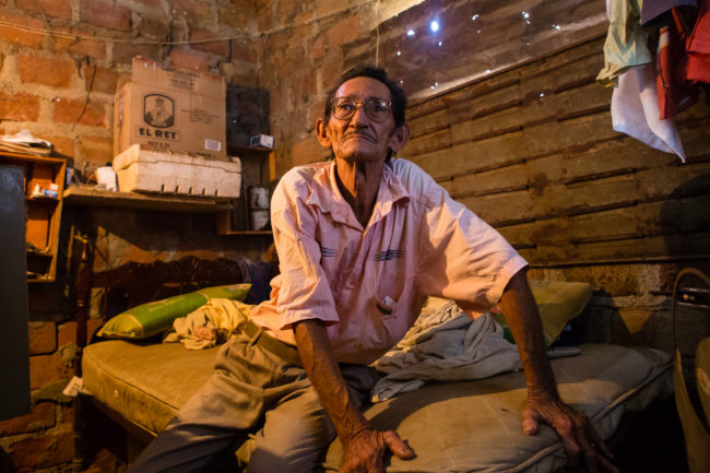
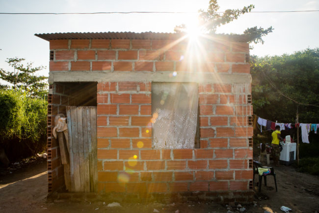
Ciénaga, Colombia, home to ~120,000 people, is perched between the Caribbean Sea and a large estuary. These two bodies of water are vitally important to locals who rely heavily on fishing for sustenance and income. Poverty is a hard reality in this area: many relocated here after they were displaced from violence in Colombia’s recent past. Eye and vision problems are very common, stemming from a combination of the intensity of the sun reflecting off water, poor nutrition, and inaccessibility to quality healthcare when accidents occur.
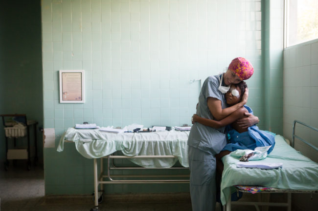
For over 20 years, a group of doctors from the US and Canada have been traveling to Colombia with Medical Ministry International to provide services for better eye health around the country. In 2015, I joined this team to document their work in Ciénaga, both in the clinic and operating room, and to connect with the people who were coming, some from great distances, to take advantage of these services. Through smiles and tears, people generously shared their stories and homes with me. I met a man with cataracts whose life was filled with tragic loss but has found solace in a family down the street. With his eyes straight after a strabismus surgery, an 11-year old boy expressed how eager he was to go back to school knowing that the kids there would no longer have reason to make fun of him. A young mom showed off her prosthetic eye and beamed with joy as she told me her story, now full of hope. This new eye meant social acceptance and the ability to pursue her dream job of hotel management.
When I ventured to the surrounding towns supported by Ciénaga, I found 10-year old refugee camps where people lived who had been displaced from their small towns by FARC guerillas. Even though it is safe for many them to return, these barrios are now their home, these people their family. There were isolated fishing villages built entirely on stilts deep in the estuary where a good fishing spot eventually became a community. Fishermen talked about having to raise their homes when the floods came though, a huge undertaking, but they preferred life in these quiet villages to the crime and noise of the cities where economic opportunities can be greater.
During the two-week program, over 5700 people came to the clinic, with 100s of surgeries performed and 1000s of glasses handed out, but what impressed me most was the resiliency of the people I met. It is easy to forget the power of simple things like reading glasses, which are abundantly available to many of us. Seeing someone who is able to read for the first time in years and the smile that brings to their whole being is unforgettable. So is the tenderness of people living in pieced-together houses with light beaming through cardboard walls, as they tell stories of lives filled with hardship, but also with family. With their new glasses or cataract-free eyes, people were able to see the world more clearly. Those who had come to the clinic with an eye crossed, or even missing, left looking forward to the way their culture would now see them. And I, who arrived with my vision physiologically sound, departed with a new perspective on the daily trials people survive and how, while they may be lacking in material comforts, together, can even thrive.
To see more of the project, click here
APE contributor Suzanne Sease currently works as a consultant for photographers and illustrators around the world. She has been involved in the photography and illustration industry since the mid 80s. After establishing the art buying department at The Martin Agency, then working for Kaplan-Thaler, Capital One, Best Buy and numerous smaller agencies and companies, she decided to be a consultant in 1999. She has a new Twitter feed with helpful marketing information because she believes that marketing should be driven by brand and not by specialty. Follow her at @SuzanneSease.
The Daily Edit – Bonobo: Neil Krug




Photographer: Neil Krug
Artist: Bonobo
Record Label: Ninja Tune
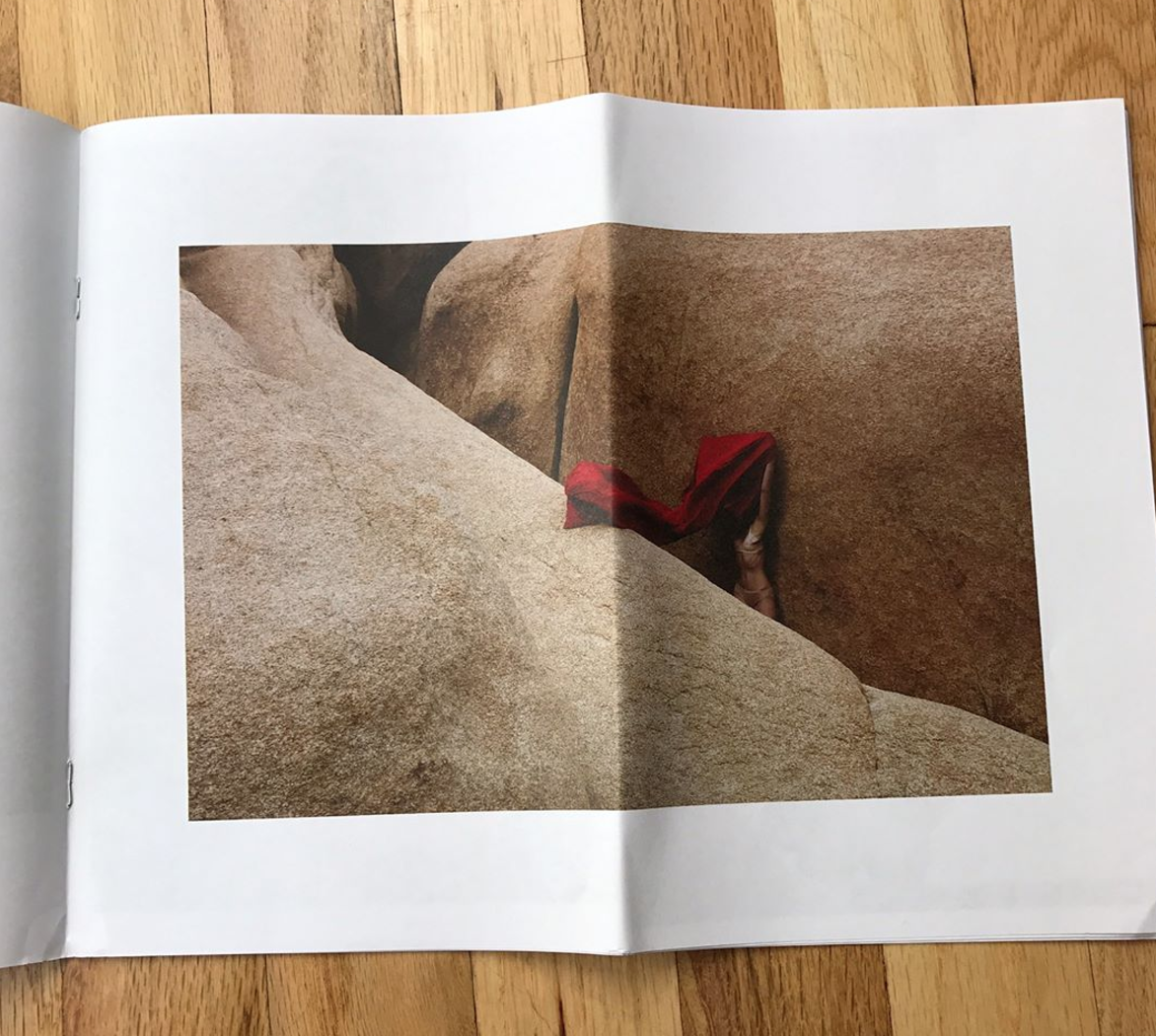
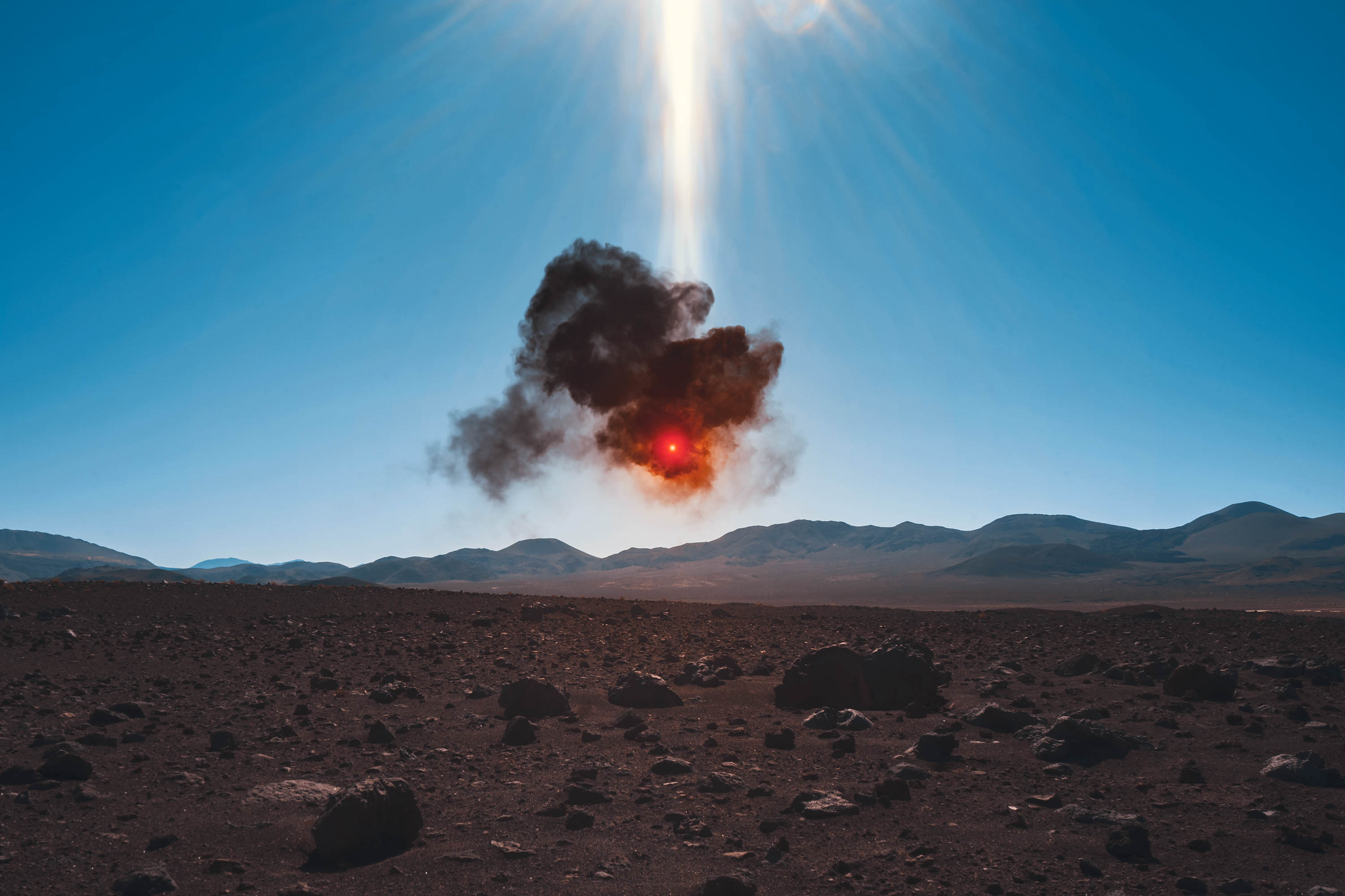
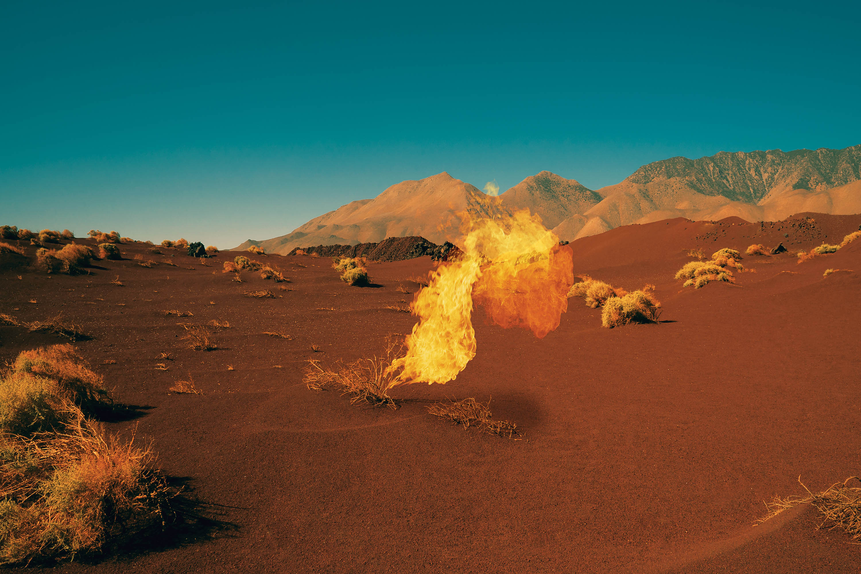
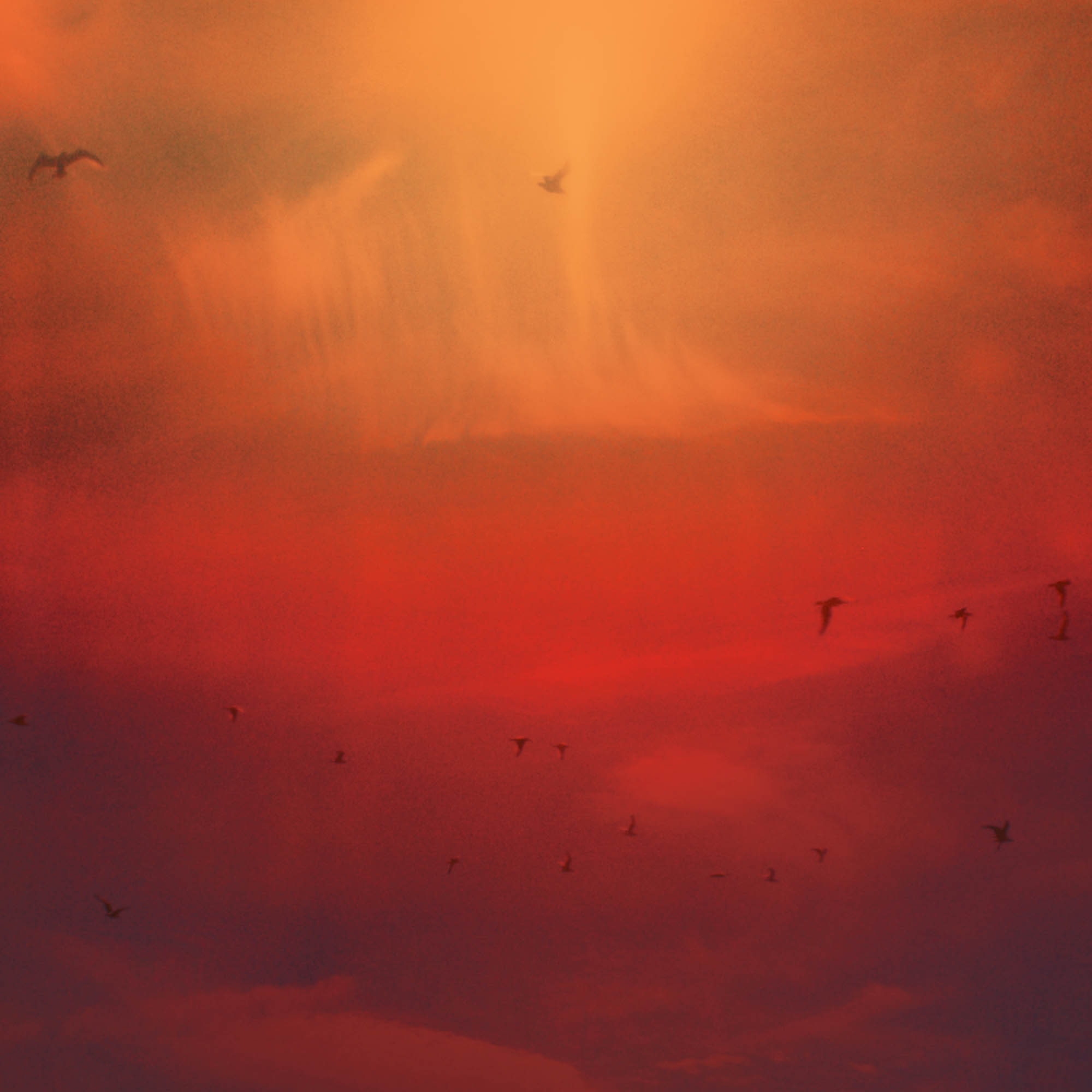
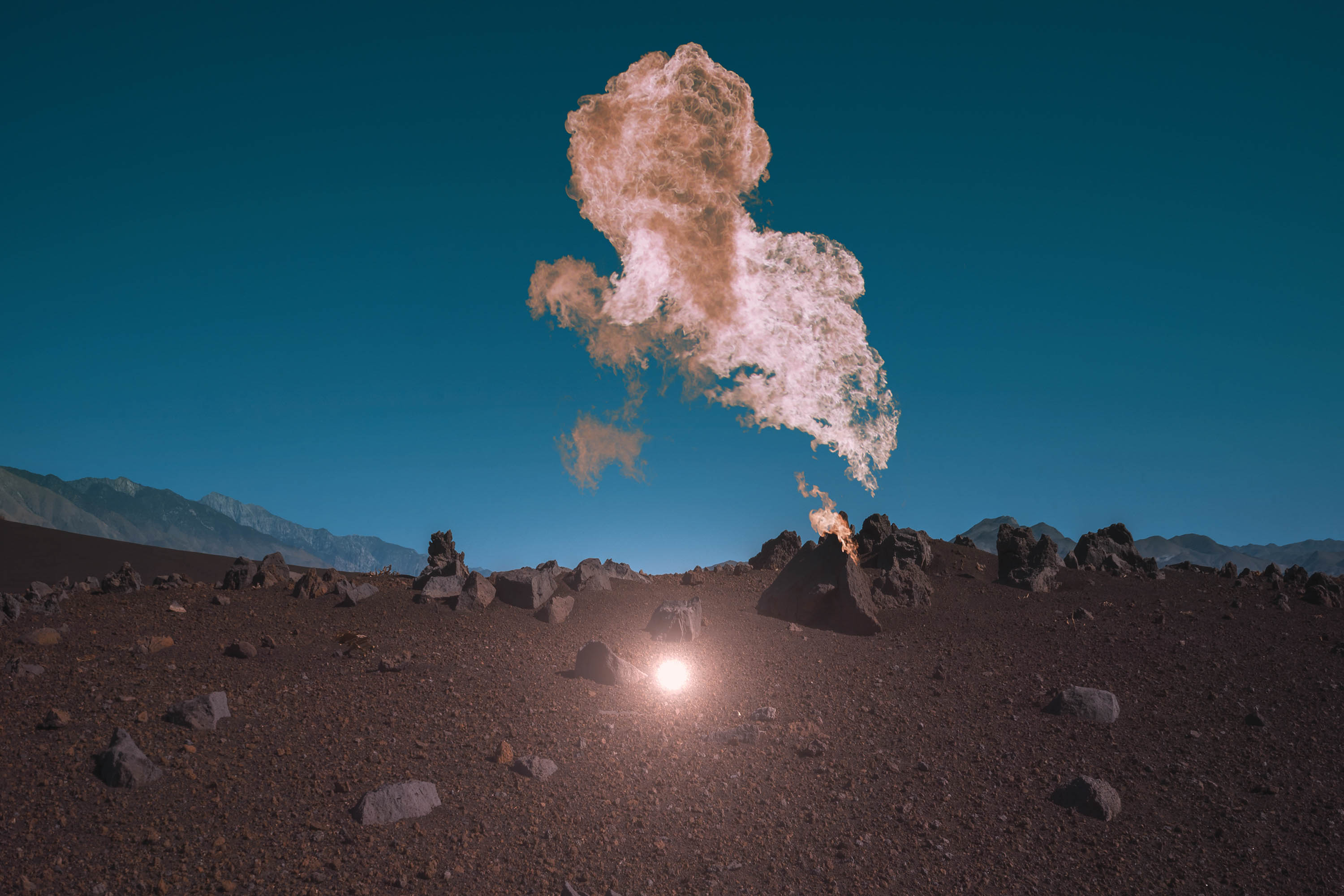
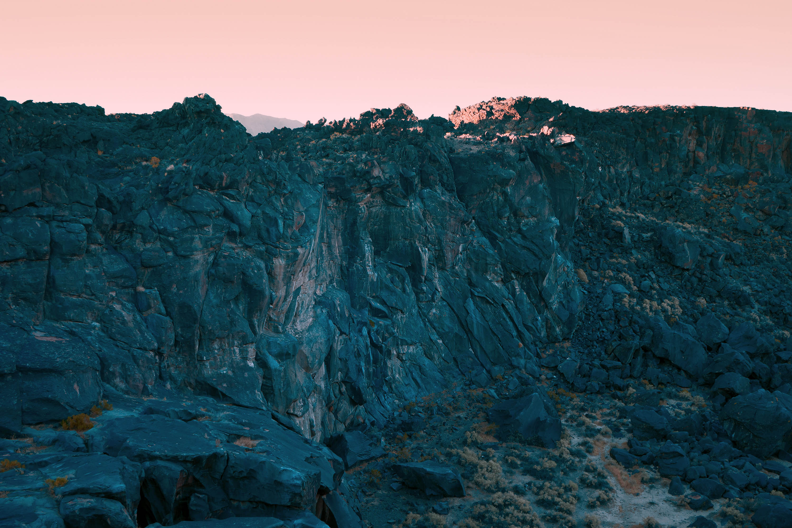
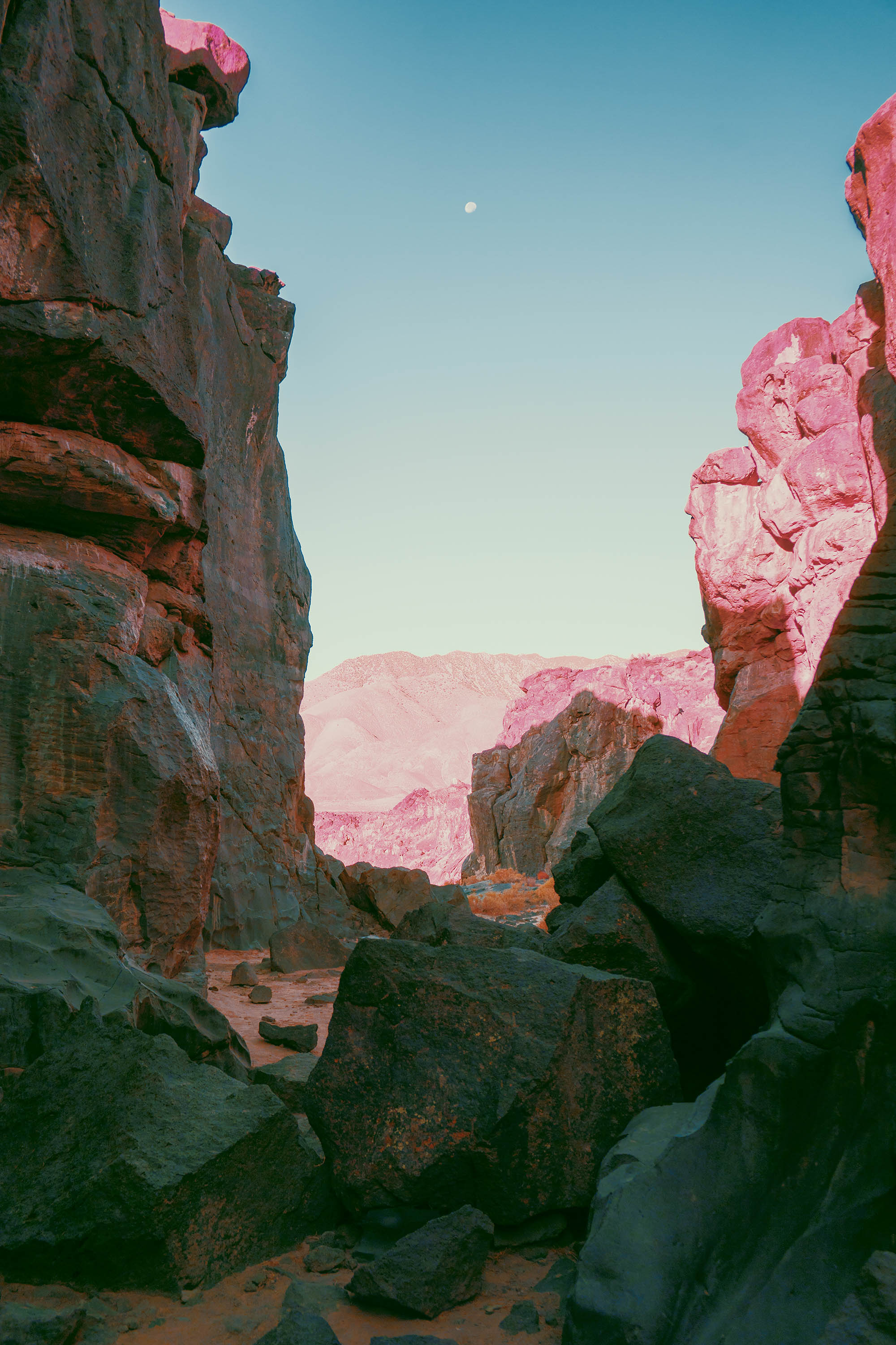
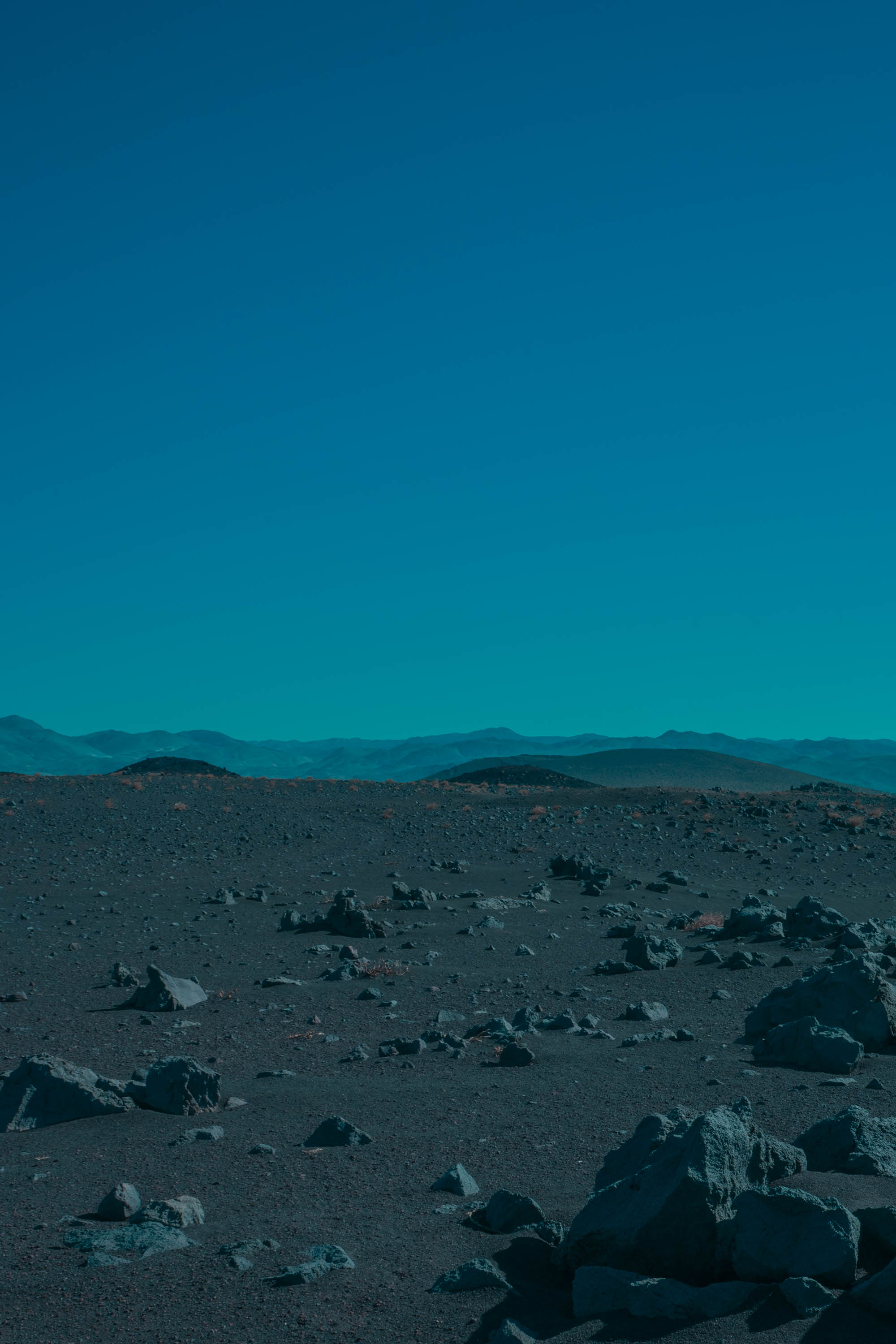
I think the mantra we both took away from our meeting was “beautifully sinister”. Once I honed in on those words and placed myself in the mojave desert at 4am, the imagery began to spill out. I wanted the work to feel primal and alive, building in momentum into the earth cracked open. That feeling was materialized into the image that became the cover.
It’s hard to say, as it’s something I don’t reflect on often. If anything, the self-taught method allowed time from me to grow a thick skin, and more importantly to trust the work. I’m not certain I would be here now if I didn’t pay attention to these things early on.
I’ve began working with FORM during the fall of last year and it’s been a rewarding working relationship ever since. Having a great team to work with on a day-to-day basis is an important part of the process, so it’s a blessing to be in the company of people who share your vision.
The Daily Promo: David Studarus
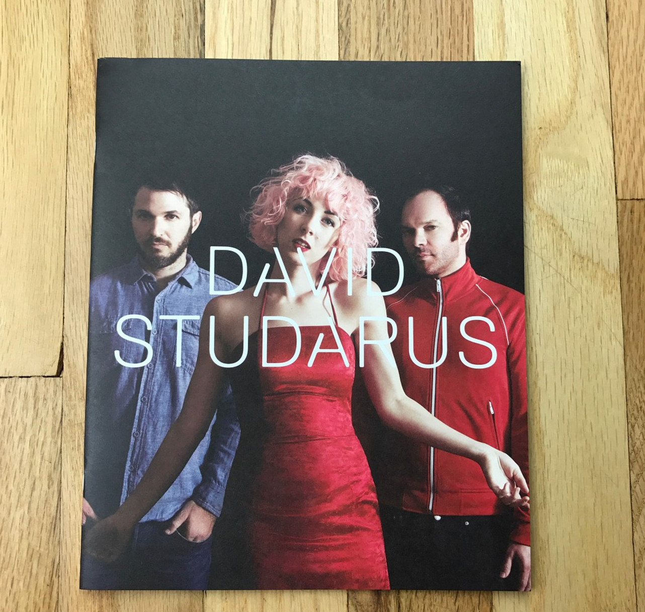
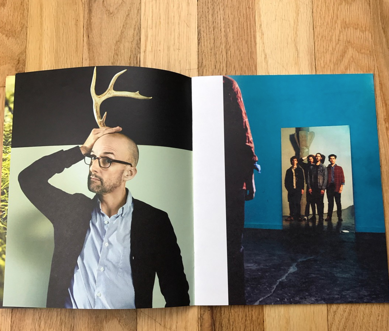
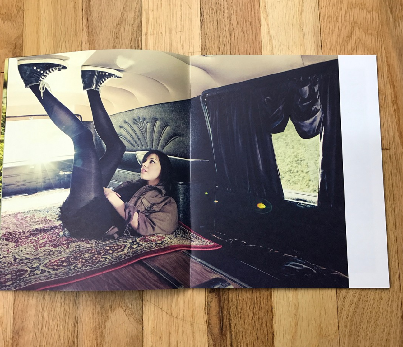

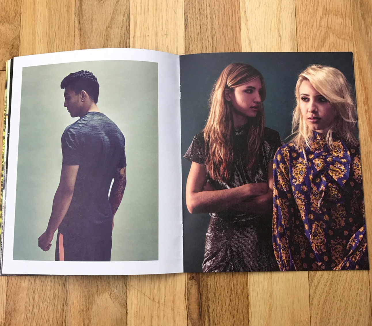

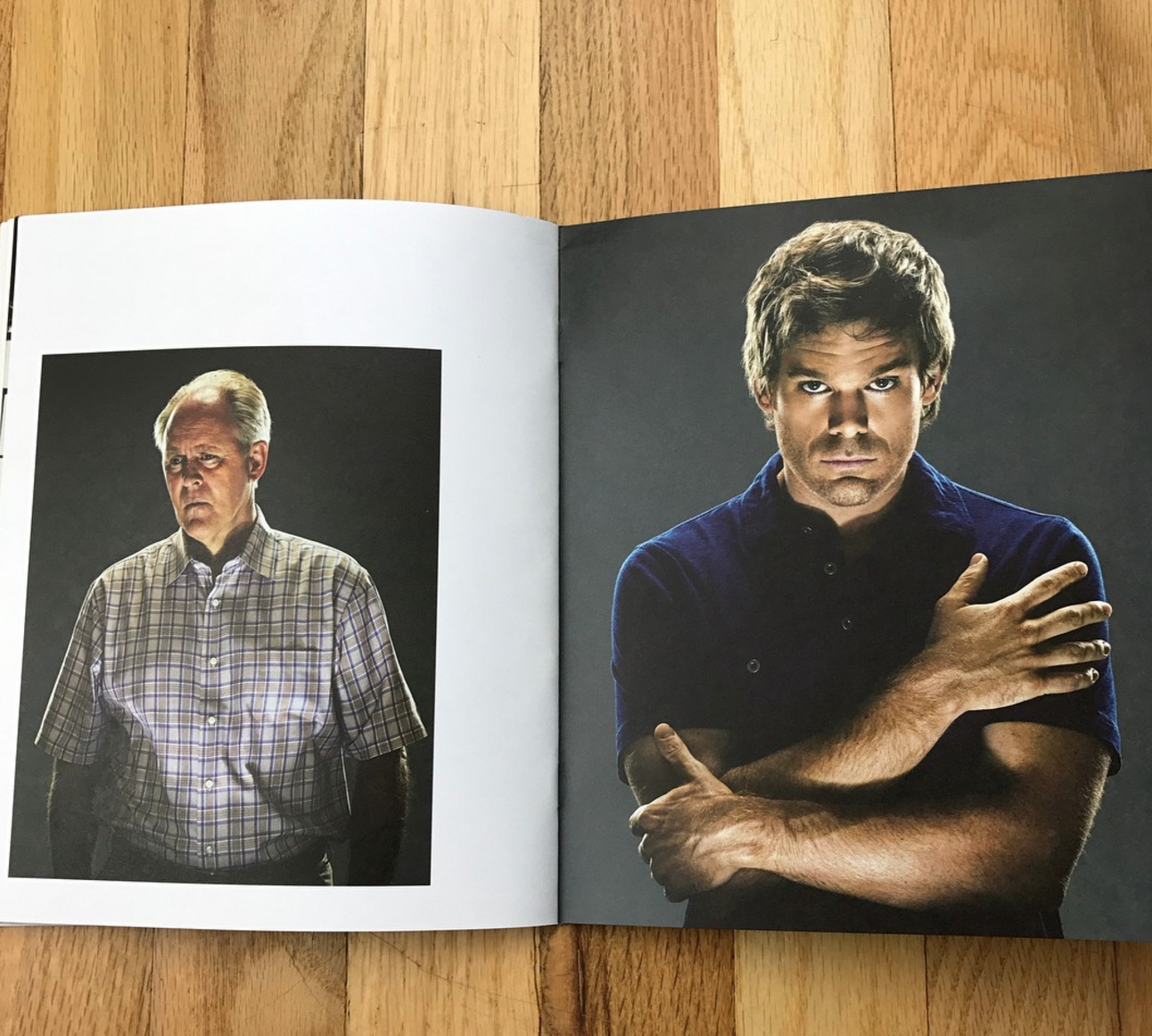
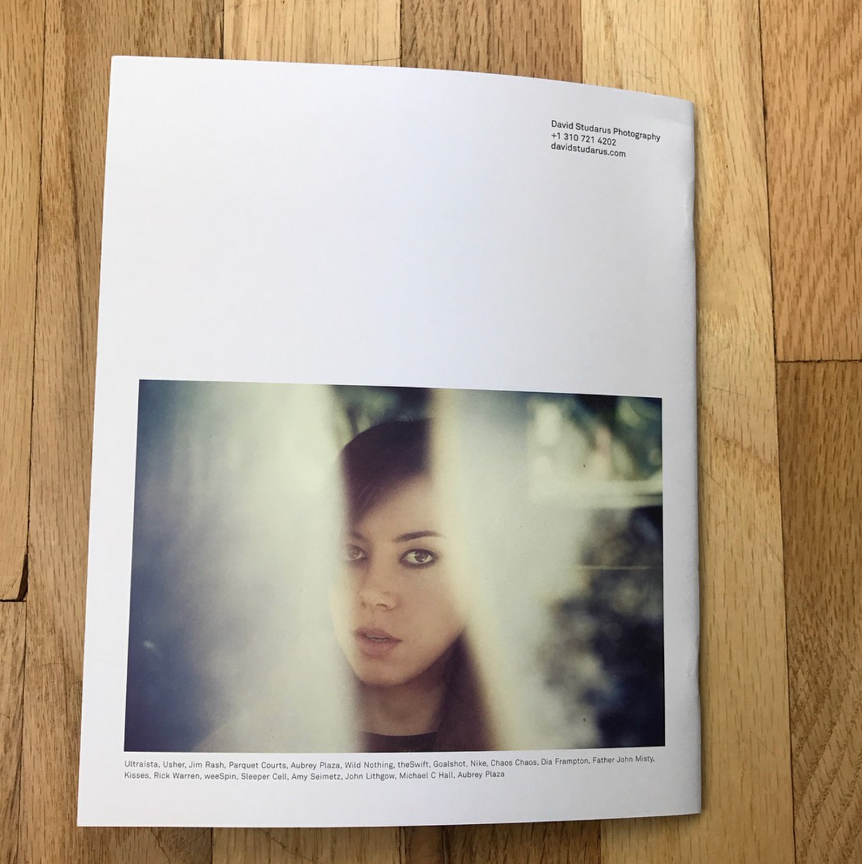
David Studarus
Who printed it?
Printing was handled by Anthony Wright, awlitho.com – he was a total pleasure to deal with, and does great work!
Who designed it?
Jennifer Rider was my designer. When we first met, I was intrigued because she has worked on a lot of fine art and gallery publications. She’s also currently working with me on a few other pieces that are for leave behinds, a new biz card, and an email promo. We’re really focusing on having everything work together to support the brand.
Who edited the images?
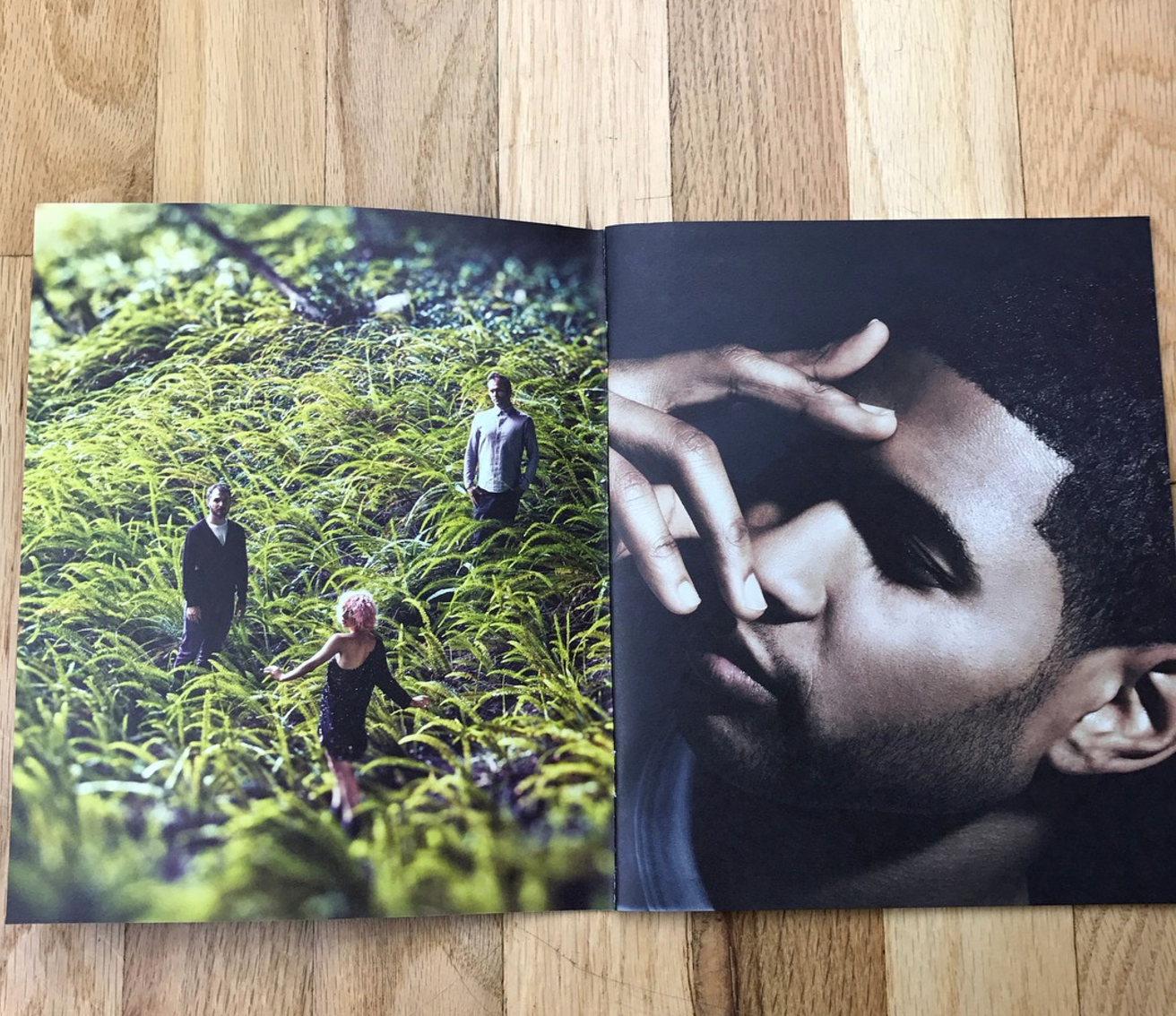
Both Jennifer and myself. I started off with maybe 8 images I told her had to be included, then she selected the rest from within a larger body of work I gave her. She put a lot of effort into the pacing and flow of this piece! This is the first time I’ve ceded that much control, but I’m really happy with the outcome. This particular piece lent itself to that process; for the next piece I’m doing, I’ll provide a tight edit and then let her work out how to best use the images together.
How many did you make?
1500
How many times a year do you send out promos?
This year I am planning for 2 larger, significant, pieces (this being the first). I also have some ideas for a few very small run targeted pieces.
This Week in Photography Books: Anthony Hernandez
There are more photo-books out there than ever before.
The market has proliferated, with the advent of crowdfunding, and publishers who will make you a book if you’ll pay their fee.
So if you’re planning on joining the crowd, I’d recommend you ask yourself a few questions first.
Why do I think my work needs to exist in book form?
Who is the potential audience?
Why will it be necessary for people to buy it?
Occasionally, I like to get you guys thinking about the reasons behind this photo-book industry I cover each week. By now, my tastes are well established, if broad.
One week, I’m praising pictures from the 19th Century, and the high quality of the packaging in which they’re presented. The next week, I’ll big up a little ‘zine that looks like it was made by some very talented teen-agers.
Any type of book can be excellent, if it gets the right balance of content, form, and intentionality. And I’ve interviewed several artists who prefer books, for their permanence, to exhibitions, which are ephemeral.
I love a good show, myself, because it allows scale to become a far more valuable element. Just as people go to the movies to see things on the “really” big screen, I like that in museums, I can see paintings that are 40 feet long, or photographs 8 feet high.
The book’s strength, in addition to longevity, is that it’s intimate. You control the experience in a more personal way. No pushy crowds. No bumping into people in the elevator. No dirty looks from the uptight gallery staff.
You can turn the pages backwards and forwards. Skip ahead. Or dash back to a favorite picture.
But in general, photo-books are linear narratives. The viewer will pick it up, start at the beginning, and carry on through to the end.
Therefore, what you do or don’t tell someone at the outset determines the context in which they understand your work. Some books want you to guess what’s going on, (like last week’s offering,) others ask you to read dense, academic essays before you even get to peek at a pic.
If I’m thinking about these things as a reviewer, I expect you to consider them before you spend the money to make a book.
What are you trying to say, and to whom are you speaking?
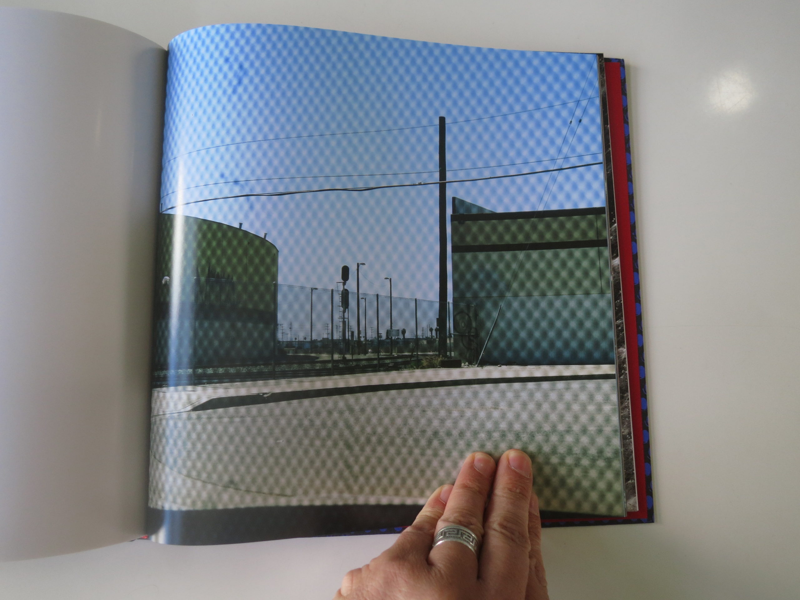
Given what I know of Anthony Hernandez’s work, I was a little surprised with what turned up in the mail the other day. The folks at MACK, in London, were kind enough to send me a copy of Mr. Hernandez’s new book, “Forever.”
I reviewed his excellent Amon Carter Museum exhibition, “Discarded,” last year, and was lucky enough to interview him a few months later about his retrospective at SFMOMA. (Since closed.)
He grew up in Boyle Heights, Los Angeles, and has been making some pretty smart, considered, and at times beautiful photographs in and around LA for most of his life.
Much of his career has focused on examining the secret haunts and hidey-holes of the city’s homeless community, and the bleak public spaces left for those without Maybachs and mansions in Beverly Hills.
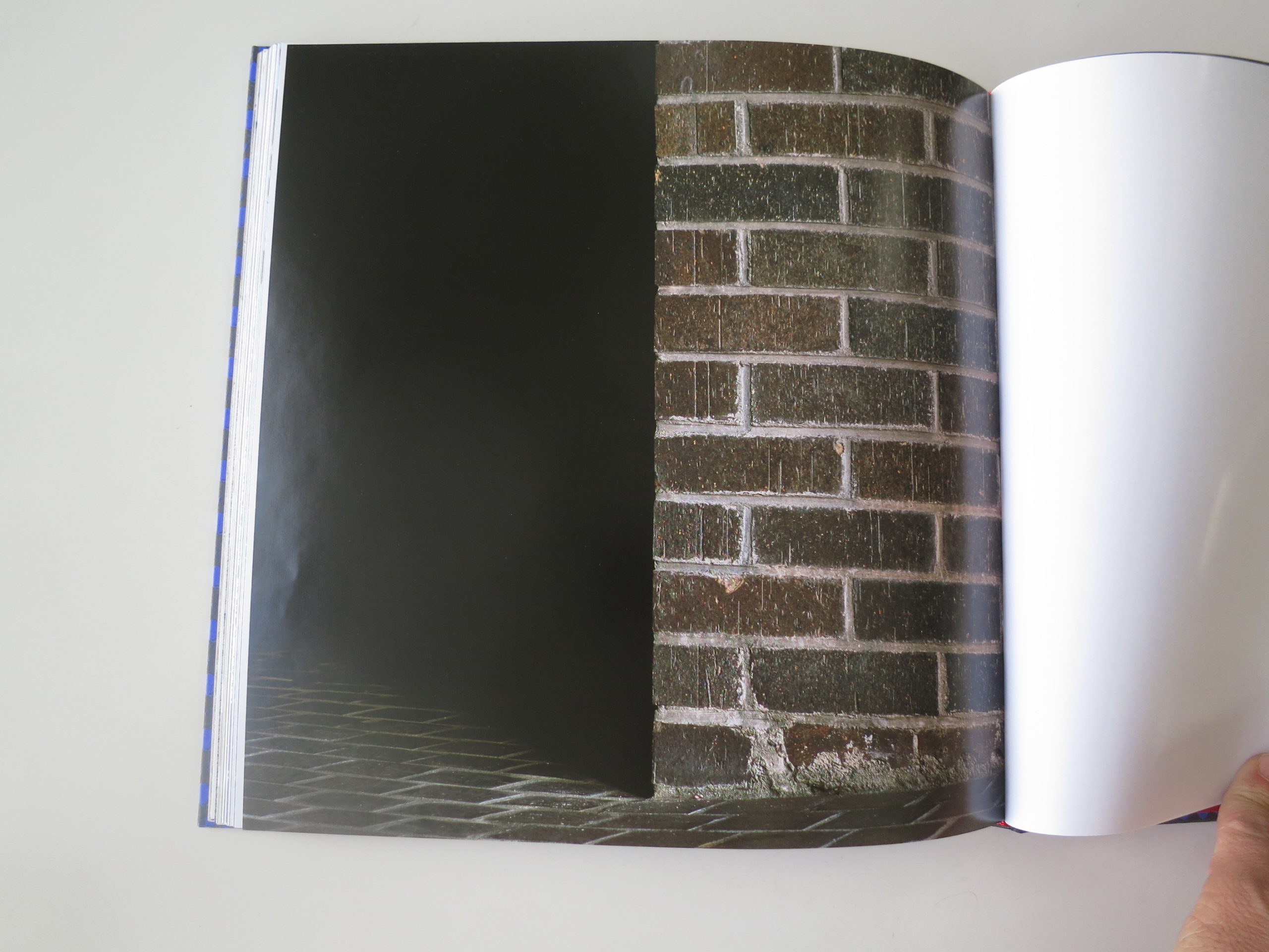
“Forever,” I learned, is a project in which he visited homeless encampments, boxes and jimmy-rigged shelters, and laid down where people sleep. Or where they catch a few minutes of rest, in the midst of the stress-horror-show that is life on the street.
Then he photographed from that vantage point.
I was entranced, as he said, “If you stop, and start thinking about, where I am? How can I be sitting here, or laying down on this bed, you won’t be out there. You won’t be making those pictures.”
I think it’s vital to know that about the photographs, to truly appreciate them. Some are too dry, or too reminiscent of things I’ve seen before, but others are absolutely perfect.
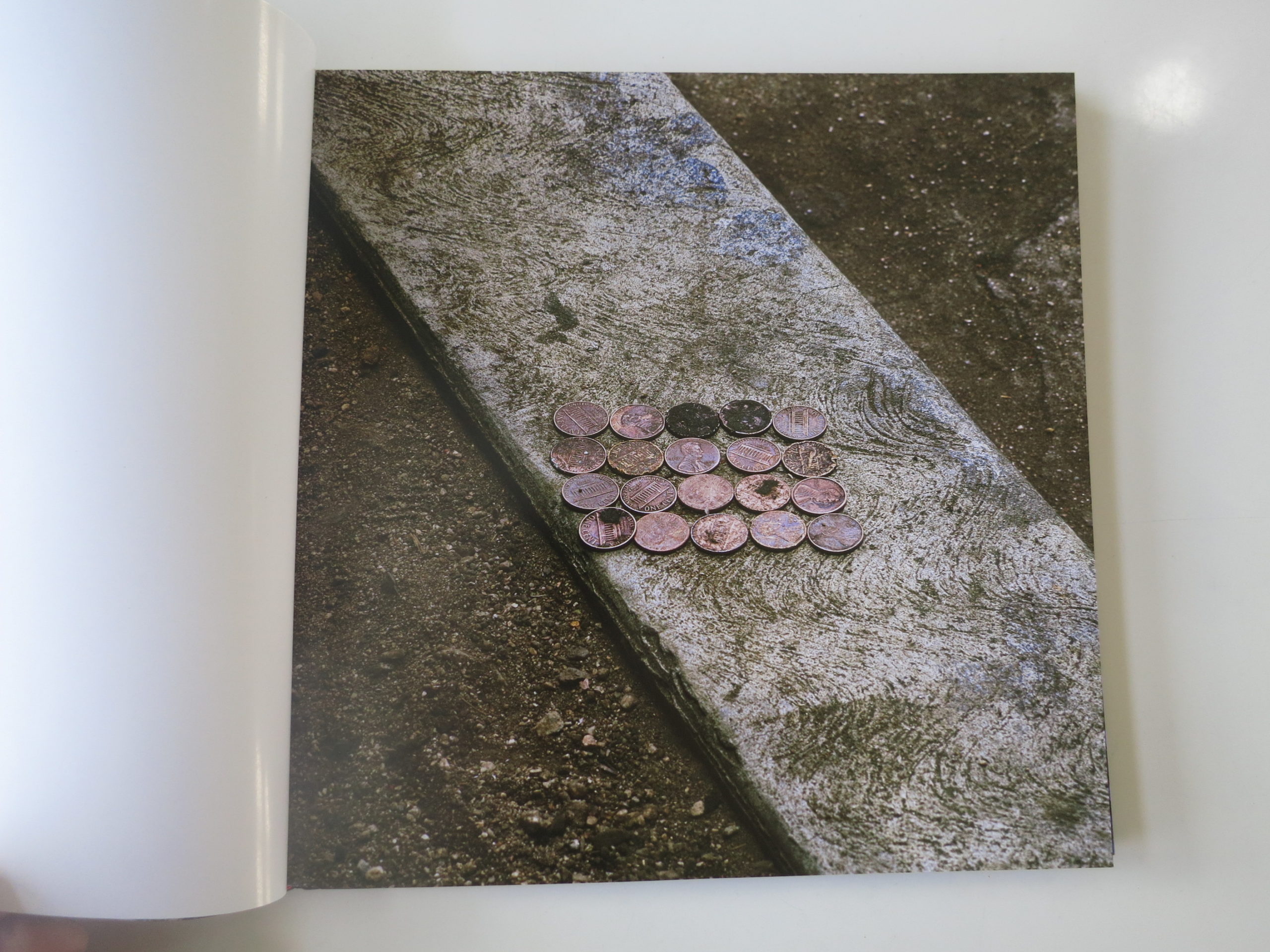
Like the twenty, beat-up, sad-looking copper pennies in perfect rows, sitting atop a thin strip of curb, set against the less-shiny brown of the pebbly dirt.
I think it’s amazing, visually. You can sense how deeply he stared at it. And then, you think, why would anyone living on the street leave money like that?
Are pennies now that worthless?
Or was the place tucked-away-enough they considered it safe?
Maybe they took off in a hurry, or were too high to remember the change?
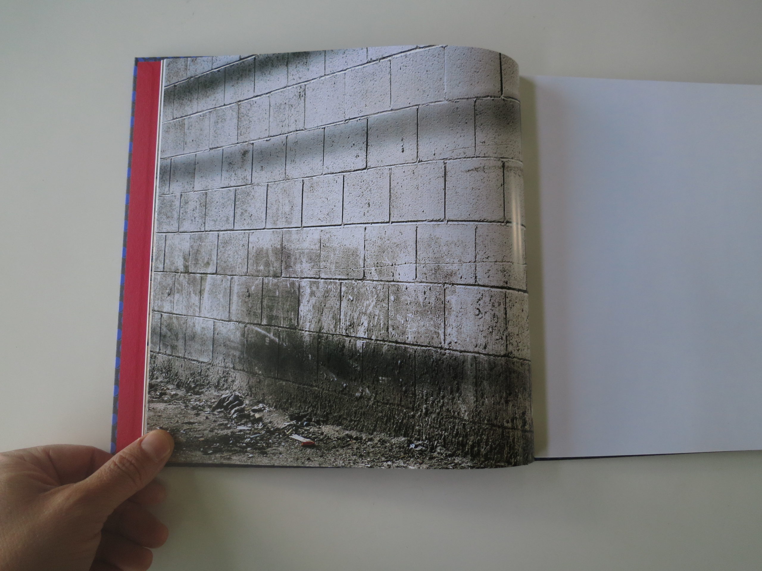
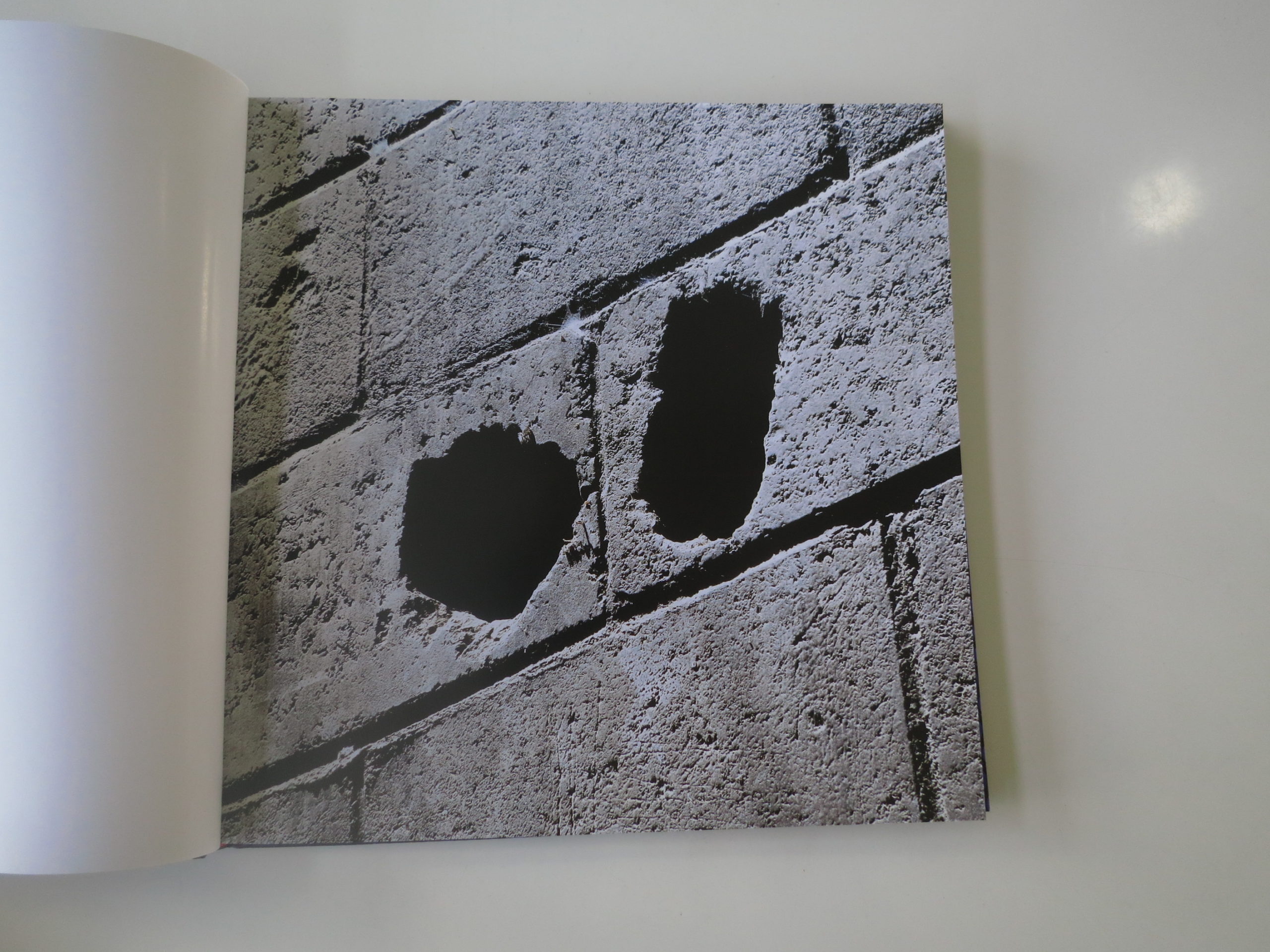
It’s only one picture, and there are seven or eight I thought were that mesmerizing. Like the matchbook. The brick wall. The concrete block wall. (He does walls well.)
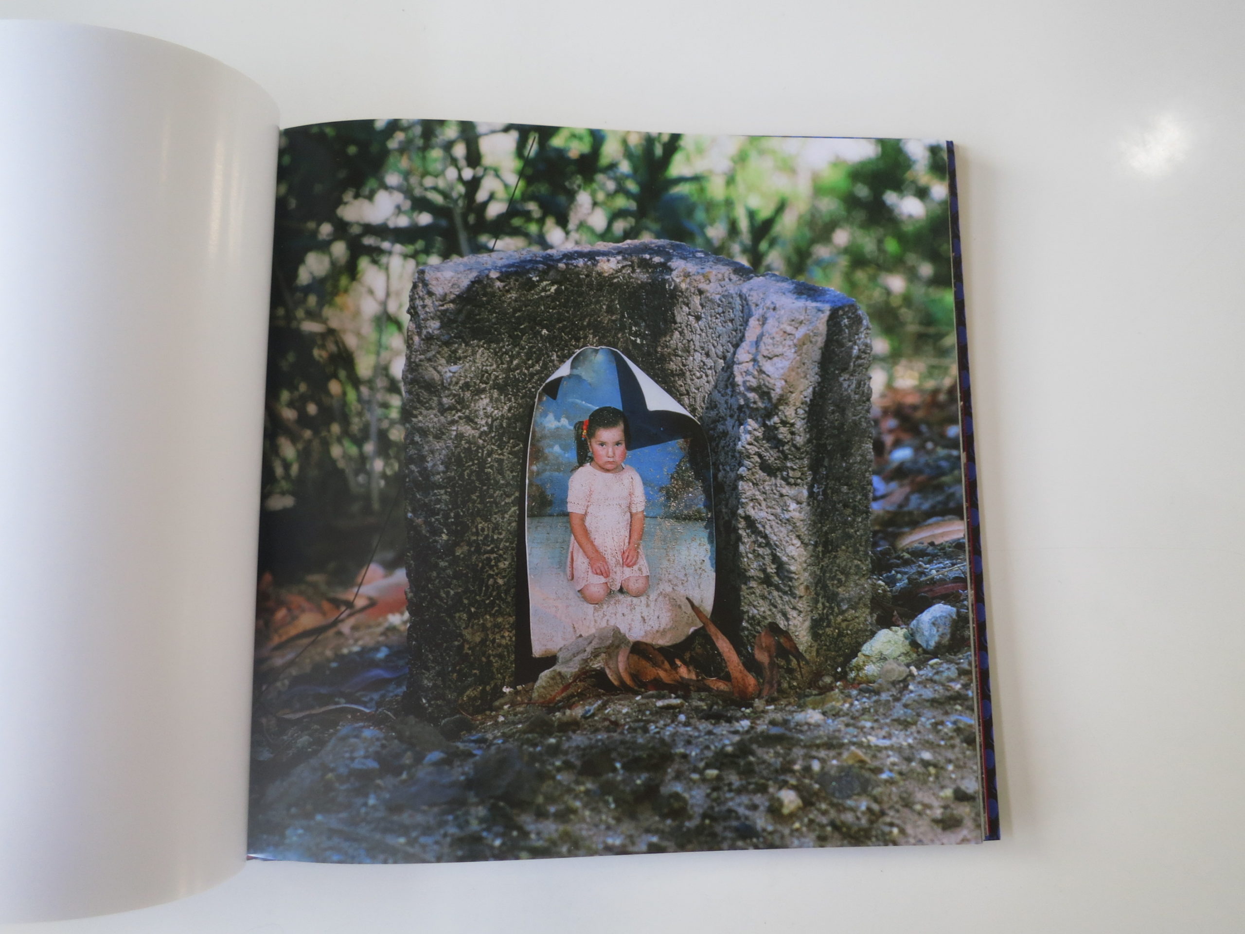
And, most of all, the curled, slightly faded portrait of a weepy-looking young girl. A studio portrait, made somewhere, by someone.
It’s taped or glued to the front of a hollowed-out concrete block. Presumably, in this context, it’s the first thing someone sees after they wake up, and the last vision before closing their eyes at night.
The picture is screaming in my ear: This is the last place I’d ever want to end up. The worst spot in the world. Alone, sleeping on rocks, thinking of the daughter I left behind.
Or maybe she’s dead? And the grief drove her father or mother insane?
The book is set up in such a way that it’s difficult (or impossible) to acquire this context, before looking at the pictures. I suspect it’s intended for art world people, who already know what his work is about.
They bring the knowledge with them, as I did. And I think MACK figured the book buyers would be cool with it. No didactic description necessary.
We can agree to disagree.
There’s only a bit that really hints at it, in the book’s closing essay by Judith Freeman. She uses a style in which the narrative and interview bits are jumbled together, distinguished only by font style.
Her words say, “To find a bed or chair, a place you can sit, look out from their point of view.” As it shades towards inscrutable, on first reading, I’d say they’re still assuming people will know what’s going on.
There is nothing wrong with making a book for art collectors and photo geeks. Most established photo book publishers are definitely going for just that market.
But, setting aside one’s preference for knowing versus guessing, I think it’s a very cool book. The best pictures are almost perfect examples of the anti-aesthetic.
Of ugly beauty.
I know from our interview that Mr. Hernandez was friends with Lewis Baltz, (RIP,) who was a genuine master at that skill. Composing so well within ugliness, mastering tone and texture, amid garbage and industrial spaces, that beauty emerged despite itself.
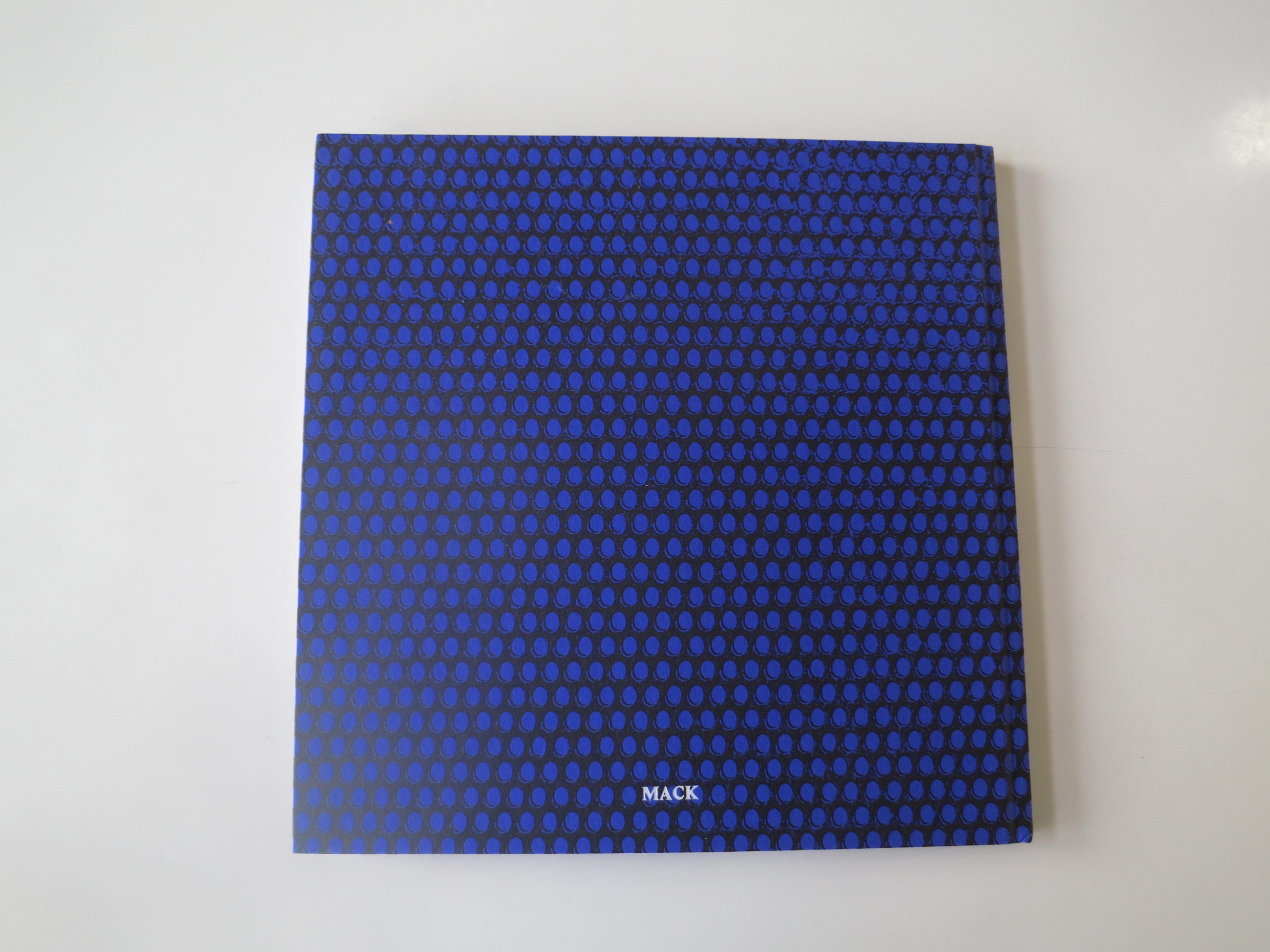
Design-wise, I have to give a shout out to the patterned purple cover followed by a rich, red, inside-cover paper . It’s pretty gorgeous, and makes me think of tailors on Saville Row with a taste for the naughty.
It’s a pretty interesting contrast to the glumness inside, and hearkens back to earlier in this article. Every choice you make, when you build your book, reflects your intention.
MACK, as a publisher, tries to make art objects. They don’t see books as information dissemination vehicles, but rather art itself. And art objects, unlike opinion columnists, need not explain themselves.
Bottom Line: Cool, well-designed, but slightly inscrutable take on homelessness
To purchase “Forever,” click here



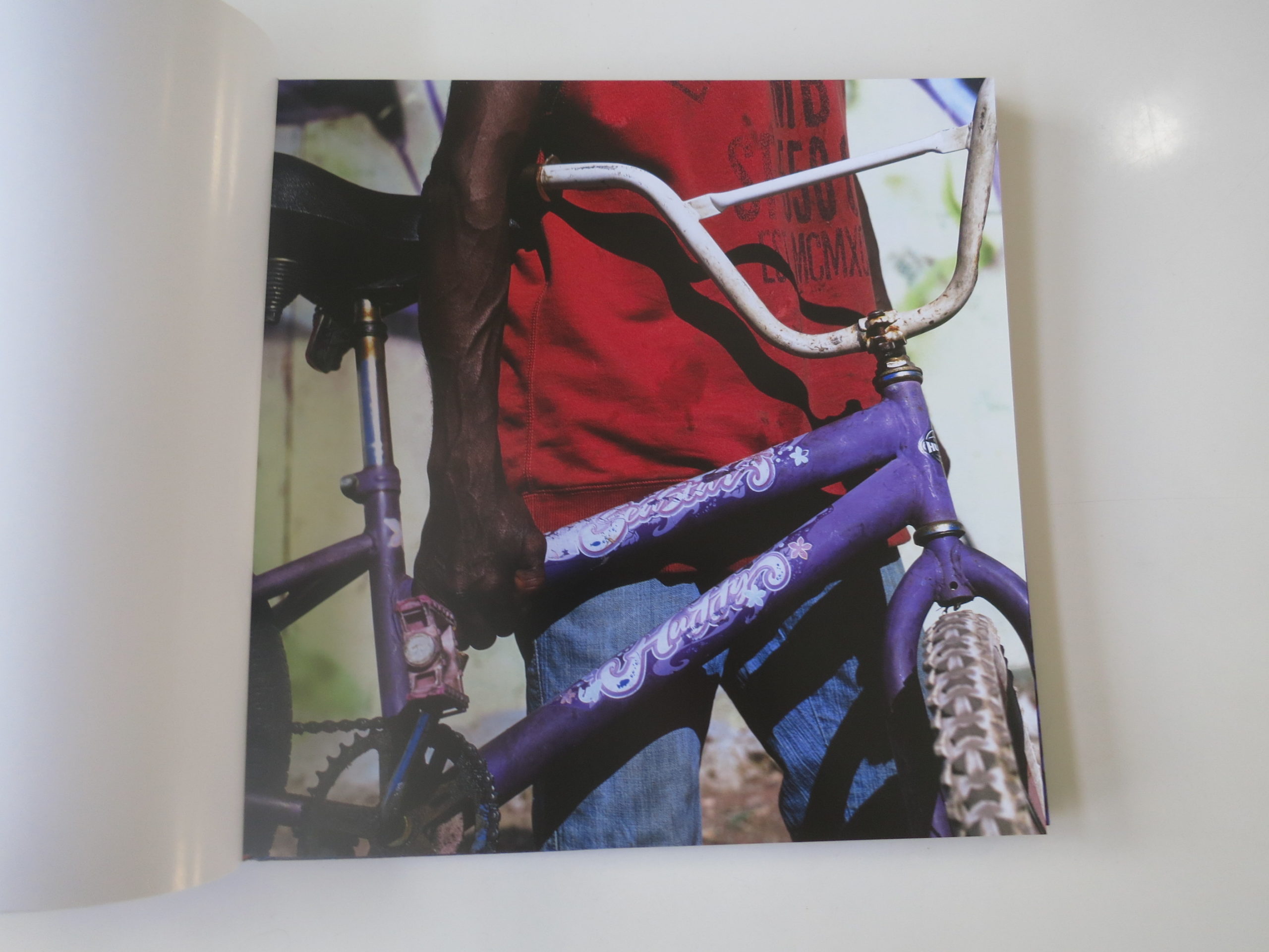
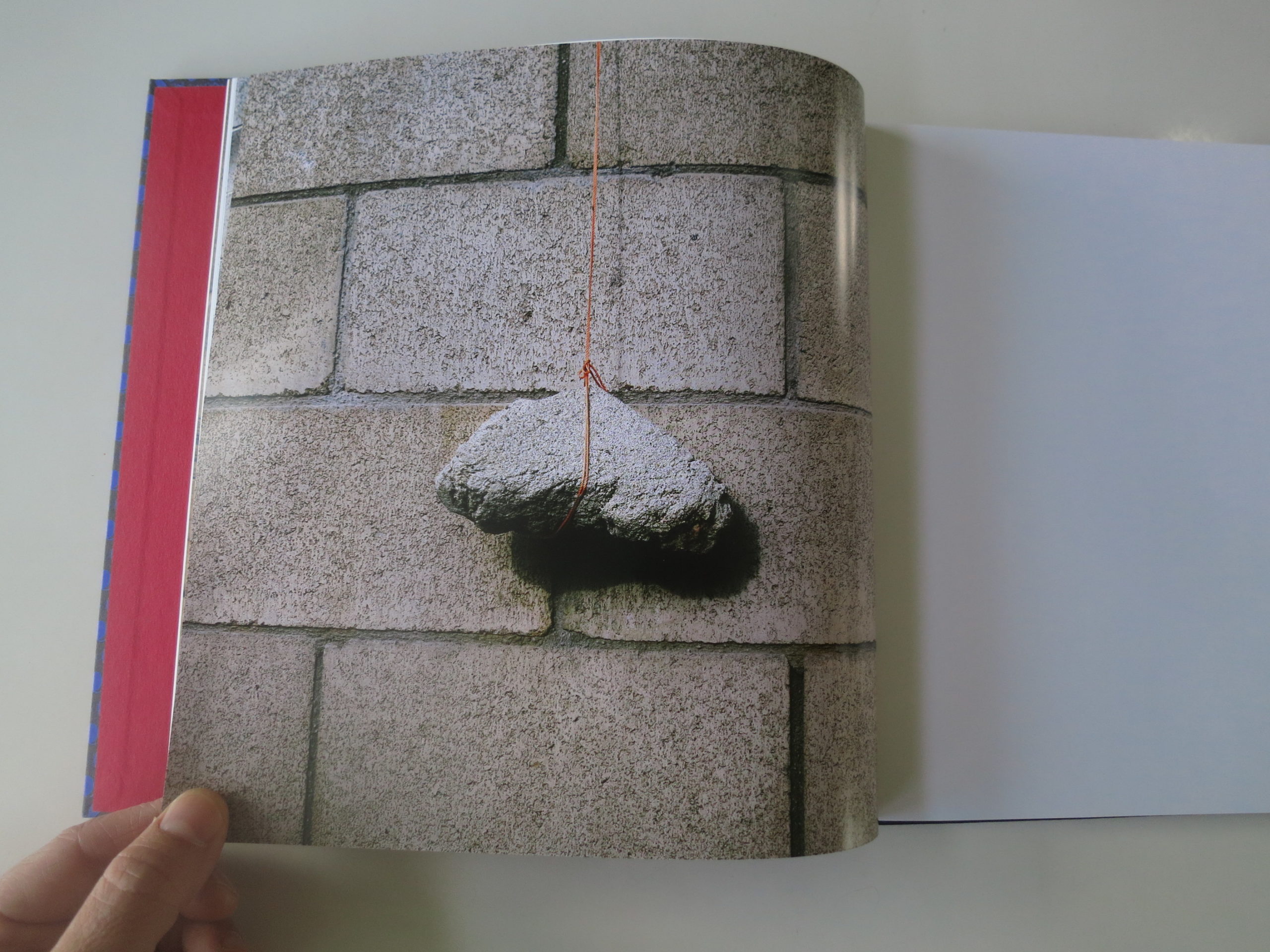
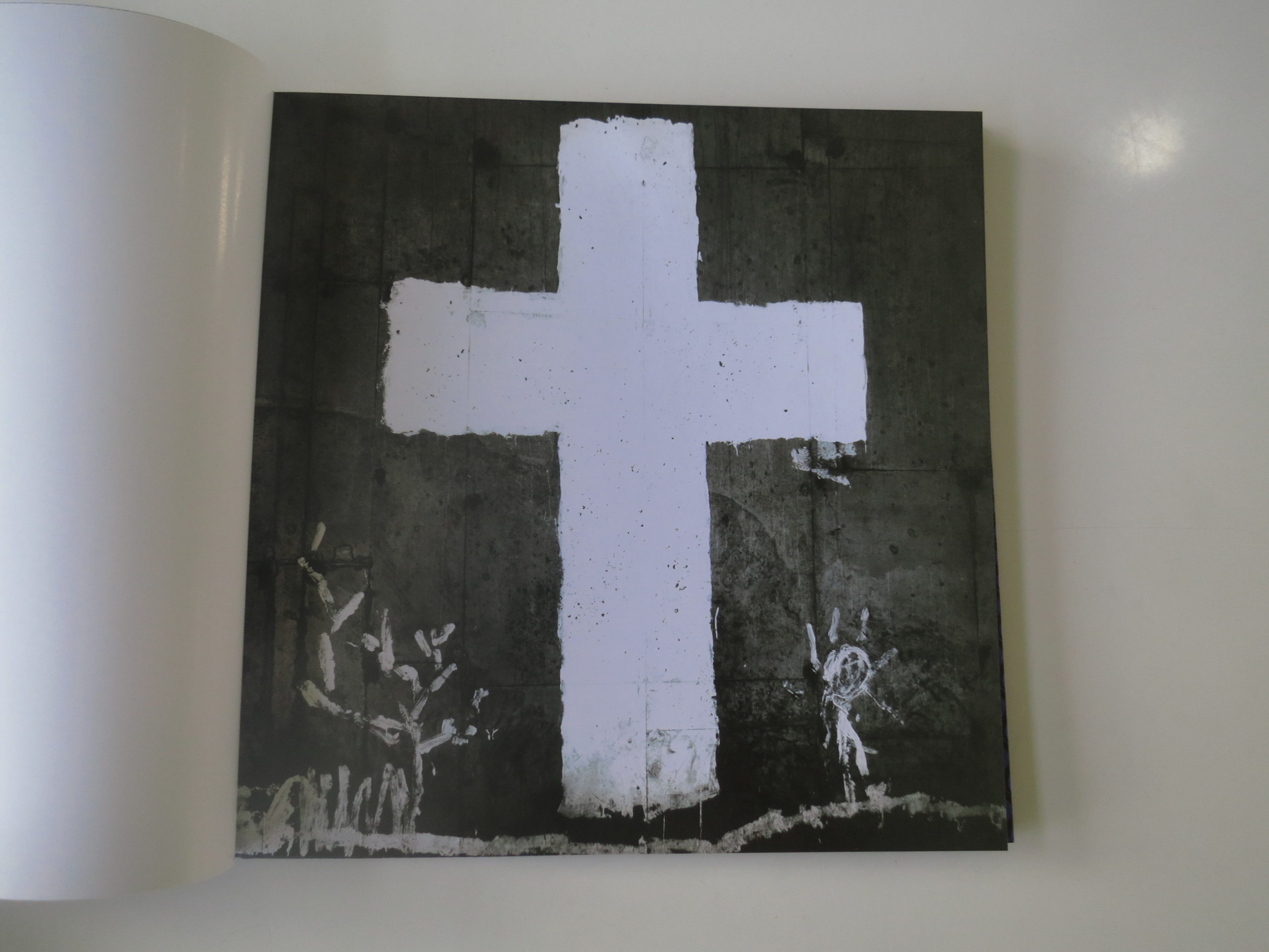
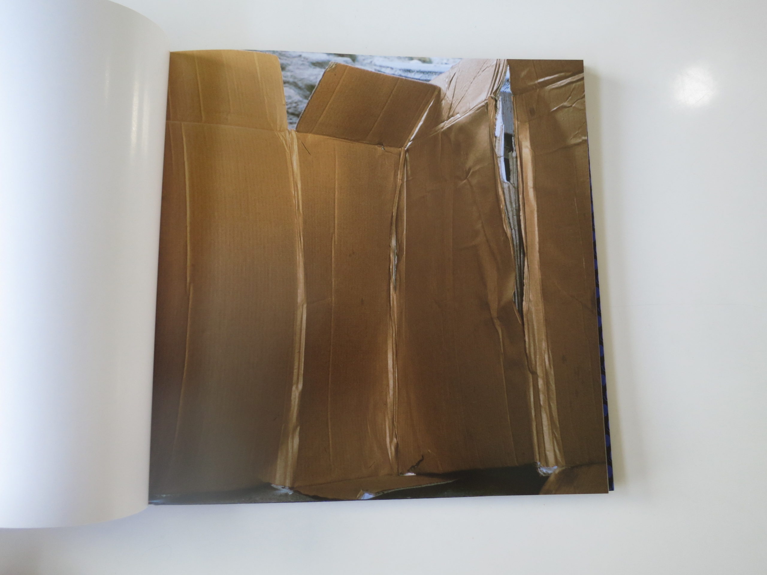
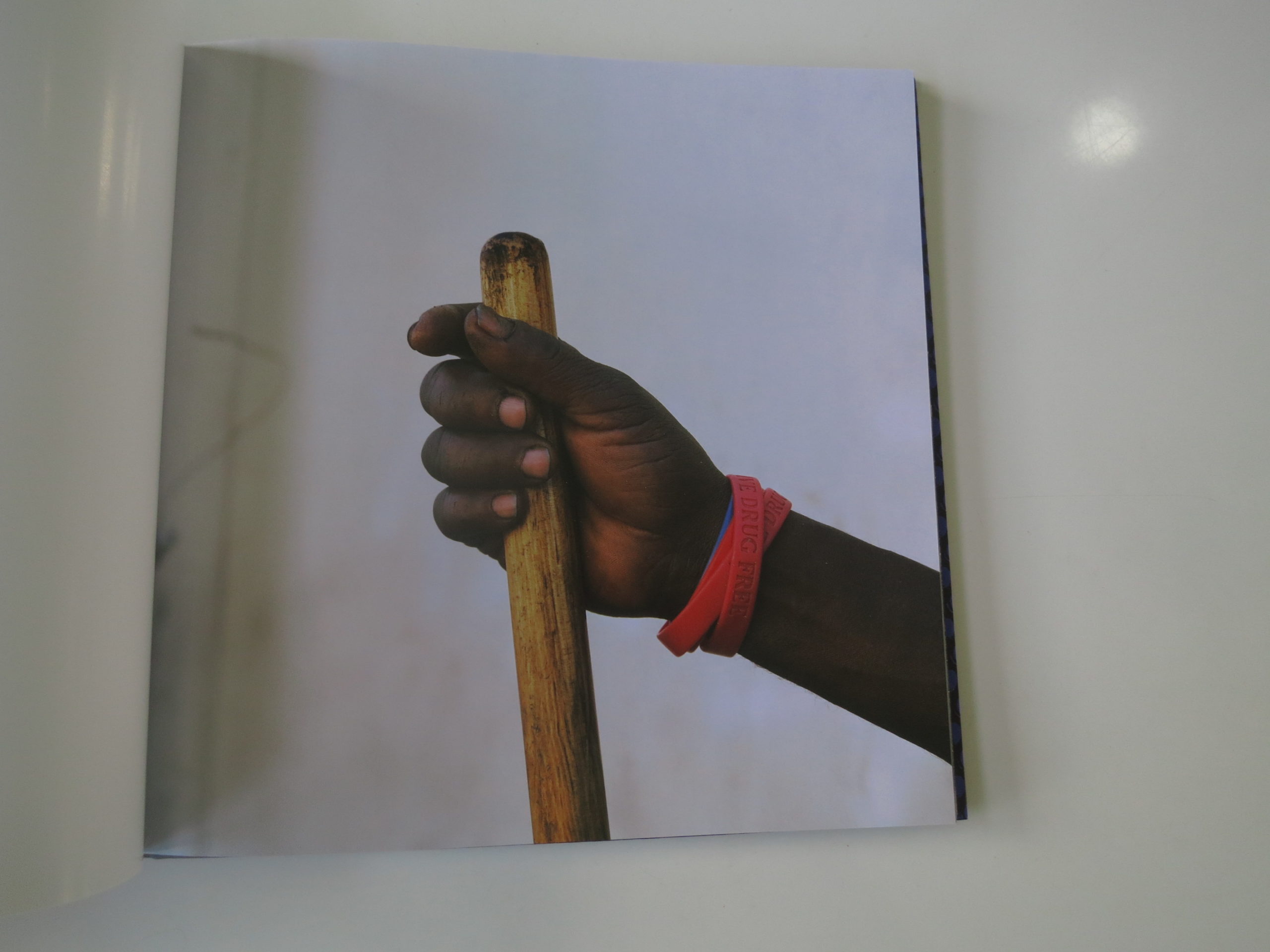
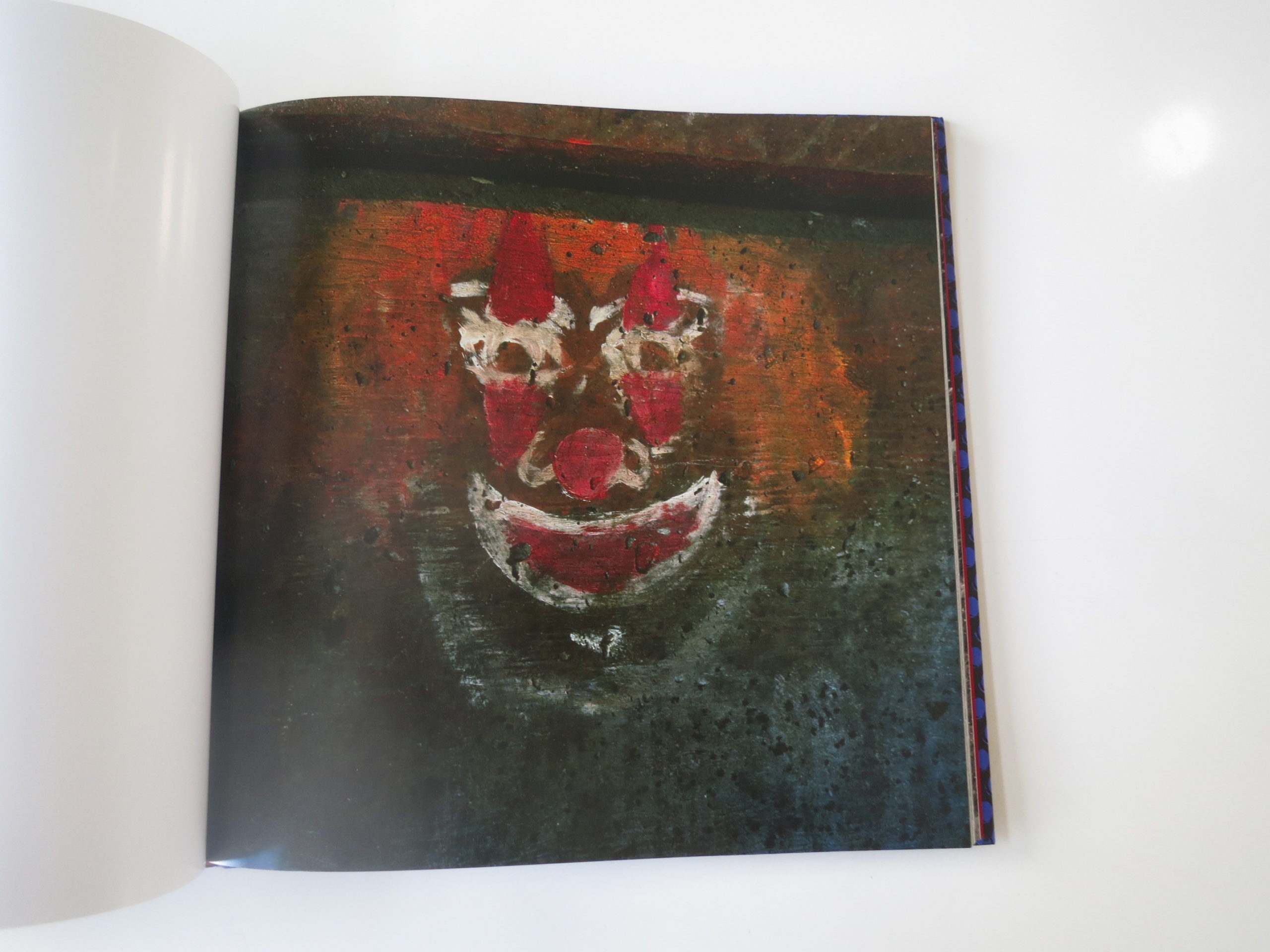
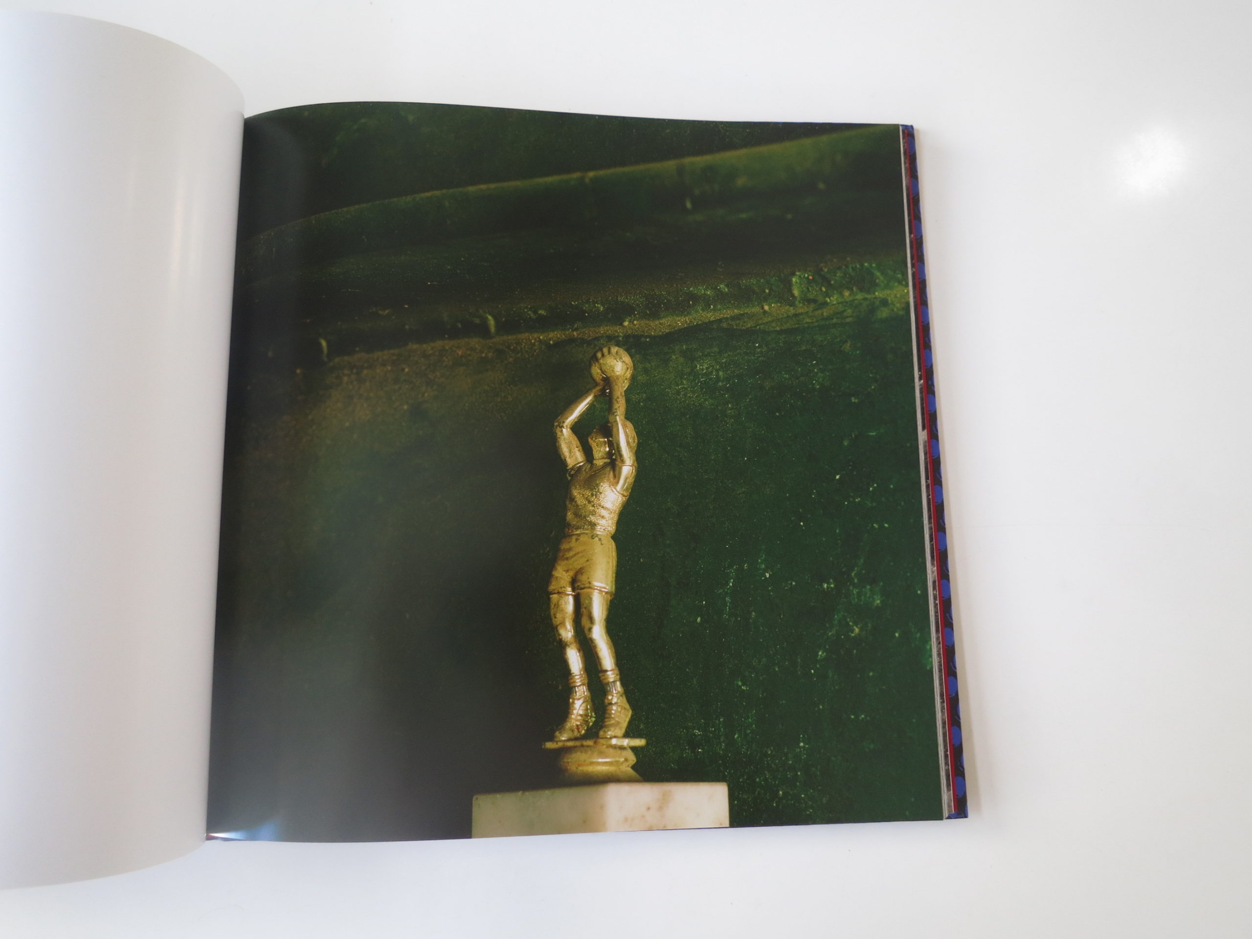

If you’d like to submit a book for review, please email me at jonathanblaustein@gmail.com
Personal Projects: John Huet
The Art of the Personal Project is a crucial element to let potential buyers see how you think creatively on your own. I am drawn to personal projects that have an interesting vision or that show something I have never seen before. In this new revised thread, I’ll include a link to each personal project with the artist statement so you can see more of the project. Please note: This thread is not affiliated with any company; I’m just featuring projects that I find. Please DO NOT send me your work. I do not take submissions.
Today’s featured artist: John Huet
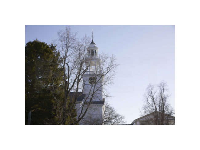
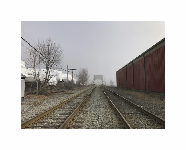
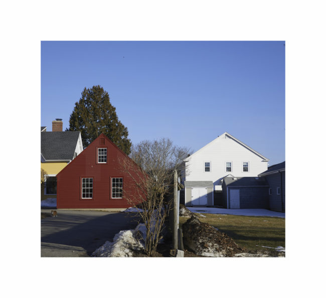
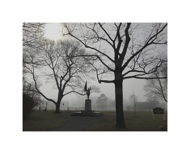
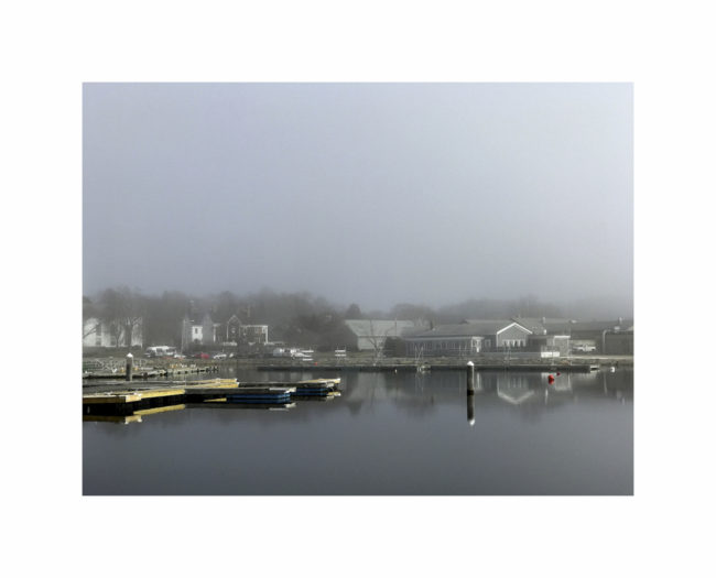
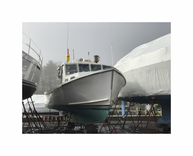
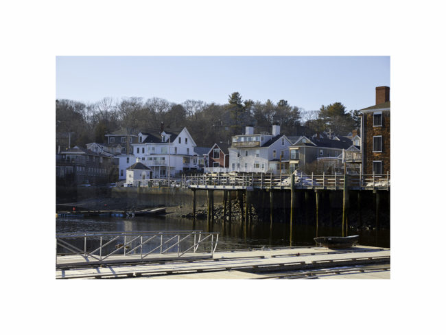
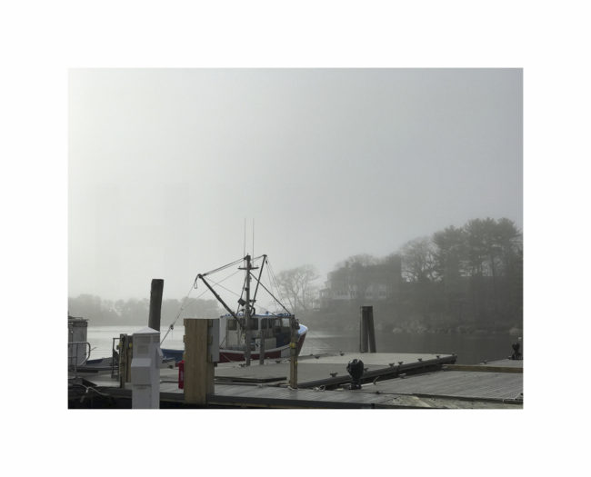
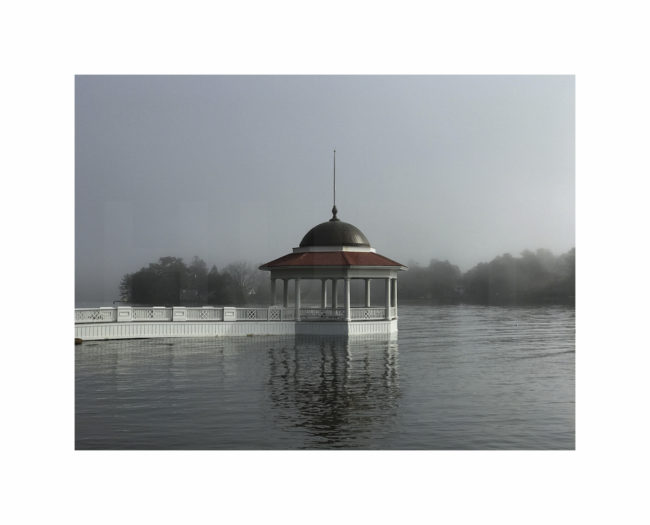
About 20 years ago my wife and I moved to Manchester-by-the-Sea, a small coastal New England town north of Boston on Cape Ann. With a population of about 6,000, not a lot happens here. The small town aspect of living here has made it a great place to raise our family. I doubt that many people were even familiar with Manchester-by-the-Sea until the award winning film starring Massachusetts’s native, Casey Affleck, came out last year.
I’ve been photographing this town for as long as I’ve lived here, and after seeing Manchester by the Sea, I went back and took another look at some of my images from the vantage point of the movie. I’m always inspired by the quiet beauty of this little town, and that’s a big part of what this body of work is about for me.
See more of this project by clicking here.
APE contributor Suzanne Sease currently works as a consultant for photographers and illustrators around the world. She has been involved in the photography and illustration industry since the mid 80s. After establishing the art buying department at The Martin Agency, then working for Kaplan-Thaler, Capital One, Best Buy and numerous smaller agencies and companies, she decided to be a consultant in 1999. She has a new Twitter feed with helpful marketing information because she believes that marketing should be driven by brand and not by specialty. Follow her at @SuzanneSease.
Pricing & Negotiating: Pharmaceutical Portraits
Jess Dudley, Wonderful Machine
Shoot Concept: Portraits and photojournalistic manufacturing lifestyle images
Licensing: Unlimited use of all images captured in perpetuity
Location: On location at a pharmaceutical manufacturing facility in the Northwest
Shoot Days: One
Photographer: Northwest-based portrait and lifestyle specialist
Agency: A Small Northwest-based agency
Client: A mid-sized pharmaceutical company
Here is the estimate:
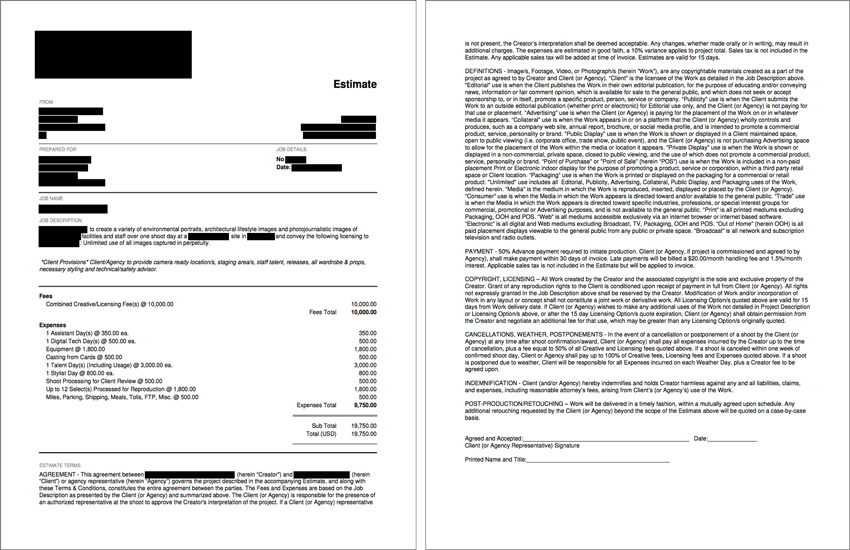
Creative/Licensing: One of our Northwest-based photographers reached out looking for help pulling together an estimate for a library shoot for a local mid-sized pharmaceutical manufacturer. The agency had contacted the photographer requesting a quote for a one day shoot on location at one of their client’s manufacturing facilities. The project called for 12 setups: four environmental shots of the facility/labs, seven photojournalistic lifestyle images of employees “at work” and one lit/staged portrait. The client required unlimited usage of the library of images. We see a lot of projects along these lines, but this project was a bit unusual because the 12 setups were relatively specific. They didn’t seem to offer a lot of opportunity for variations (as opposed to more dynamic scenarios that may allow for a greater degree of variety in the space, subjects and available actions/activities). Shot one, in particular, was much more carefully composed and art directed because it would be used in trade ads, while the other 11 shots would only appear in collateral pieces. After speaking with the photographer about the hefty shot list, we wanted to make sure the client was aware that it was doable, but perhaps a bit ambitious, and that the day may require some prioritization if we were unable to move around as freely and quickly as expected.
Library fees can start around $7500 a day and will often include unlimited or perpetual usage of all images captured. It should be noted, however, that “library” does not necessarily mean unrestricted use (although it did in this case), and may be used to refer just to the volume of imagery. Accordingly, it is important to make the initial assumption that the client is willing to limit the use in some way. Often, clients are willing to limit either the duration of use or quantity of images for a library shoot, so it is best to begin the conversation with that assumption in mind to avoid inadvertently “giving away” more than necessary. Unfortunately, this was not one of those instances, and the client did, in fact, require unlimited, perpetual use of all images captured. Interestingly, the ambitious shot list helped to minimize the value of the library because the photographer would have to move so quickly from one shot to the next that the variety captured would be severely limited. Additionally, five of the 12 shots were very specific and didn’t allow for variations of any substance. Factoring the volume of shots, limited production footprint, type of client, intended use (including the very specific trade ad shot) and otherwise straight forward nature of the shoot, I set the rate at $10,000 for this shoot.
Client Provisions: I was sure to note exactly what the client and agency would provide: locations, staff “talent,” staging area(s), wardrobe, props, releases and necessary technical and safety advisors. The advisor was important to highlight since we wanted a client rep to be on set to ensure the facility and staff were up to snuff from a technical and safety standpoint. There’s nothing worse than wrapping up a shot and finding out that the subject was supposed to have been wearing safety goggles, so we were sure to put that responsibility on client’s shoulders.
*Tech/Scout Day: Due to the challenges associated with accessing this particular facility, the client was unable to allow for a tech/scout day. It’s generally a very important part of a production such as this, but unfortunately, our hands were tied.
Assistants & Tech: I estimated for a first assistant and a digital tech for the shoot. All but one shot would be captured using available light, and mobility within the facility was a concern, so the smaller the crew footprint, the better. The photographer wanted to tether a laptop on a tripod, so we didn’t need a full workstation rental from the tech, hence the lower rate.
Equipment: I estimated one day of gear rental from a local rental house including a DSLR system, a backup body, a handful of fast lenses, a small lighting and grip kit and a laptop to tether.
Styling: I included one stylist to manage basic hair, makeup, and wardrobe needs for the staff and talent. The talent would be wearing a branded uniform which the client provided, so we didn’t need to do any wardrobe shopping.
Shoot Processing for Client Review: This covered the photographer’s time for the initial import, edit, color correction and upload of the entire shoot to an FTP for client review and final image selection.
Selects Processed for Reproduction: I included basic select processing as a lump sum based on 150/image in this case. This protects the fee in the event the client ultimately selects more or less than 12 images.
Casting and Talent: Since the portrait concept called for a relatively tight shoulder up shot of the talent, they agency was comfortable with a digital casting and reviewing recent comp cards to make their selection. The casting fee covered the photographer’s time to reach out to a couple of local talent agents to request current head shots and share them with the agency for review and selection. The talent fees, in this case, were quoted by the local talent agency. Though this is a very reasonable fee for the usage, we’re often able to negotiate slightly lower fees. The fact that this was for a pharmaceutical client put a little bit of a premium on the talent cost.
Mileage, Meals, and Miscellaneous: Finally, we estimated for miles, meals for the production at the on-site cafeteria, and a bit extra to cover any unanticipated miscellaneous costs.
Results: The photographer was awarded the project and luckily, both the client and agency were very easy to work with, and the facilities proved to be as manageable as we had hoped, all of which allowed the photographer to crank out the entire shot list in a normal 10-hour day.
If you have any questions, or if you need help estimating or producing a project, please give us a call at (610) 260-0200. We’re available to help with any and all pricing and negotiating needs—from small stock sales to large ad campaigns.
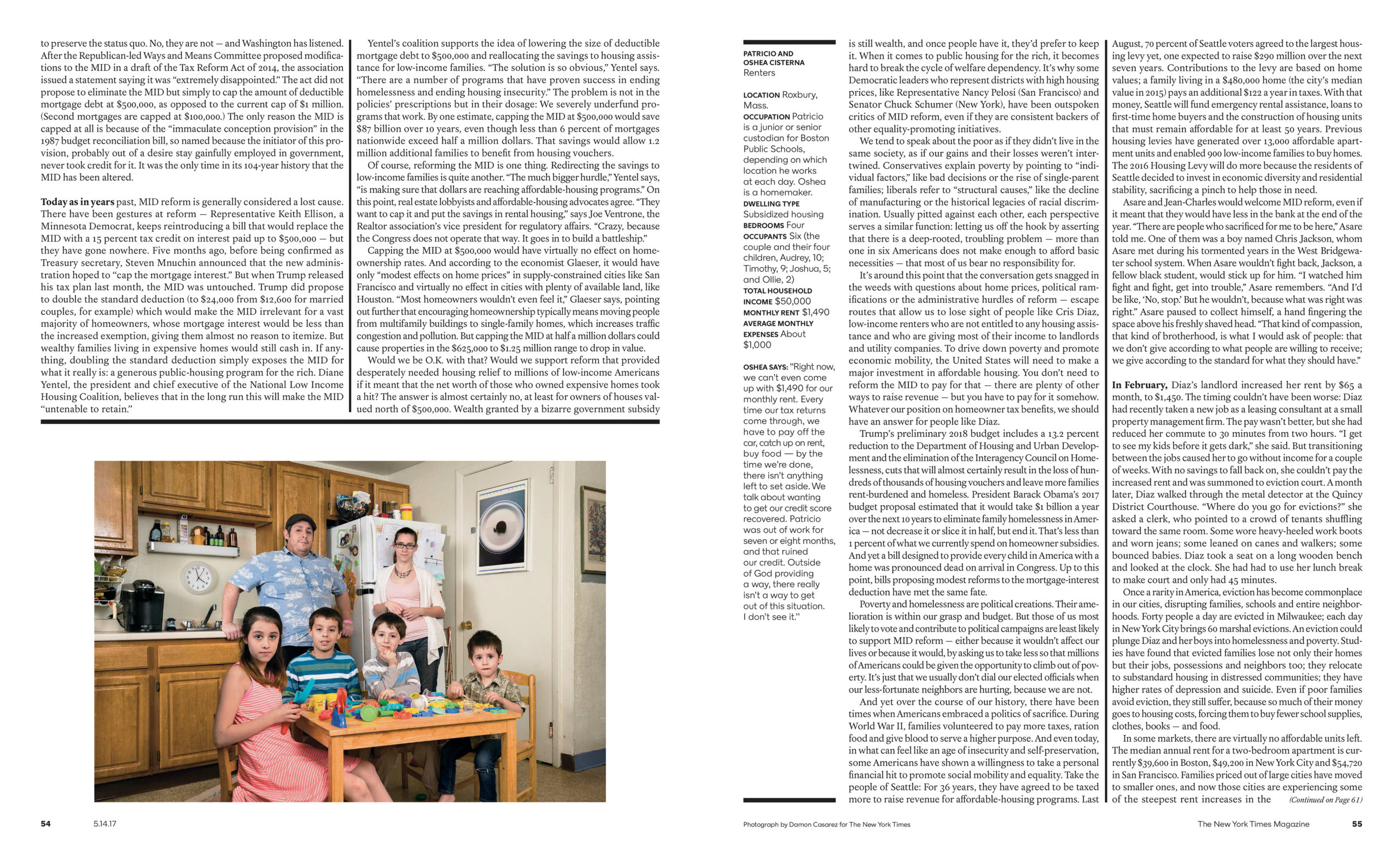
The Daily Edit – New York Times Sunday Magazine: Damon Casarez
The New York Times Sunday Magazine
Photo Director: Kathy Ryan
Photo Editor: Stacey Baker
Photographer: Damon Casarez
read about the story here
Heidi: Did you bring this story to the magazine or did you conceptualize the idea and bring to them?
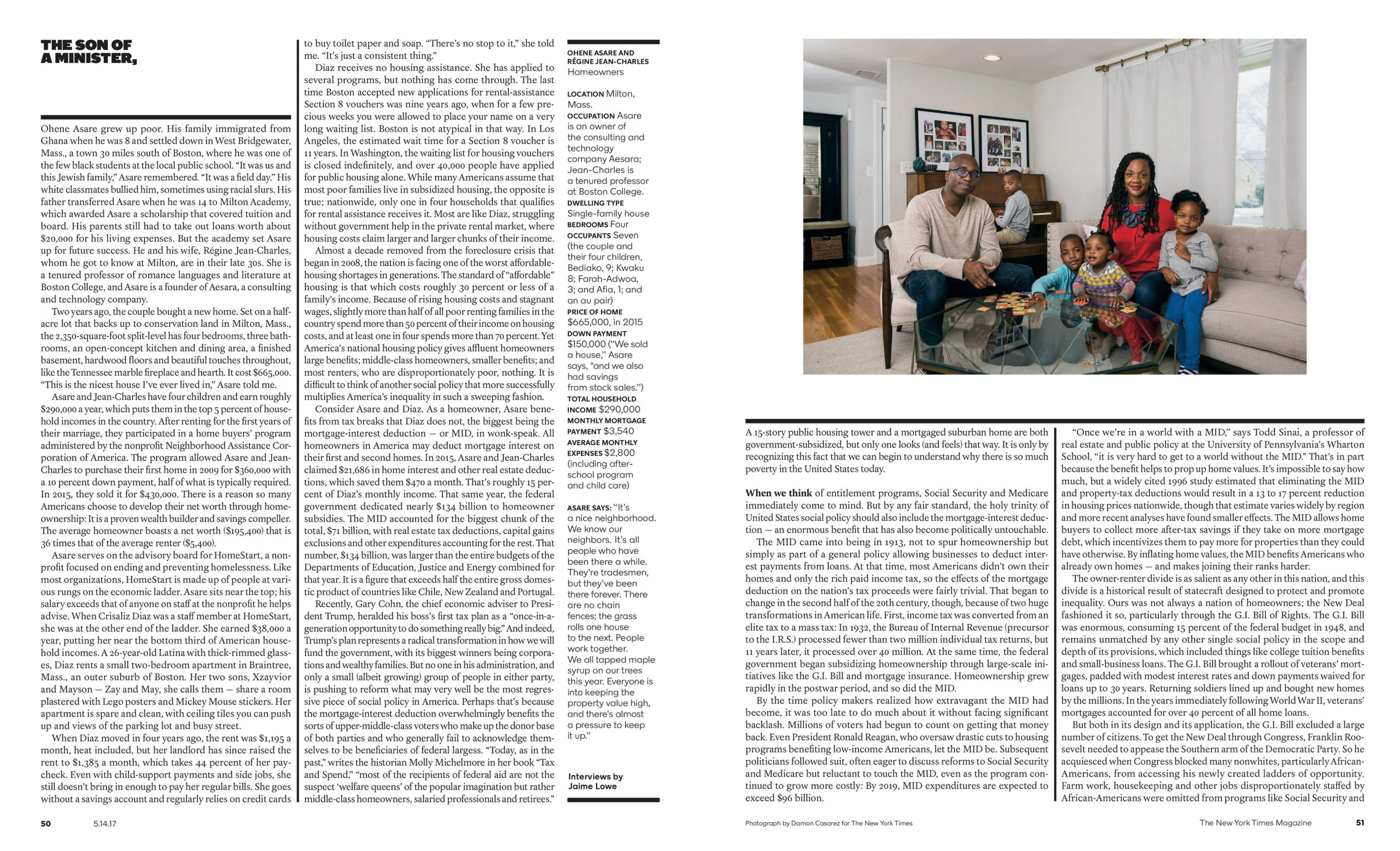
Damon: The photo editor Stacey Baker brought this story to me. I believe I was assigned this project based on the success of my previous assignment work with them on boomerang kids across the country as well as an assignment on LGBTQ canvassers. Boomerang kids was a series of moody, mostly interior portraits and the canvasser story was shot in a South L.A. neighborhood in front of homes the volunteers were canvassing.
How long did the assignment take and what type of direction did you get?
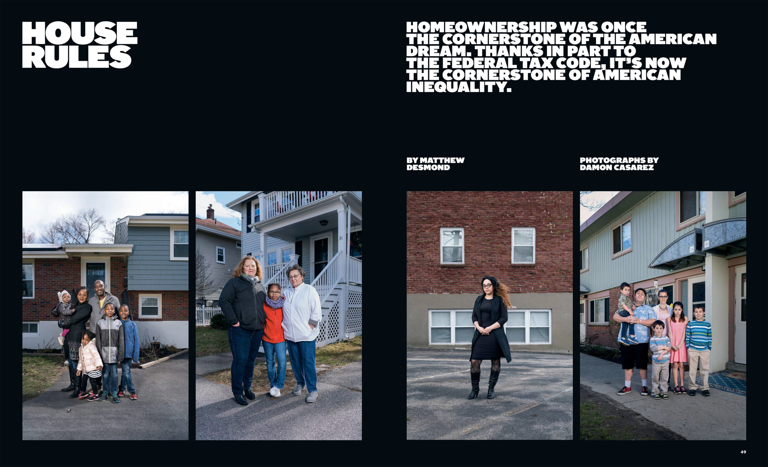
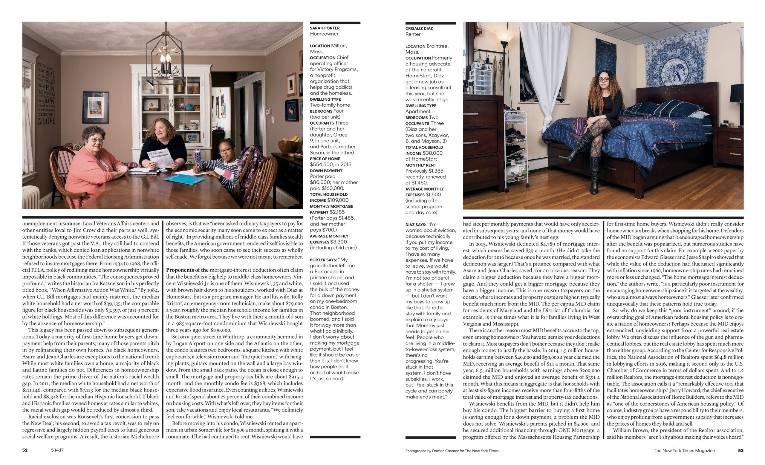
The project was about a week of shooting in Boston and the surrounding cities with 1-2 shoots per day depending on the schedules. The direction was pretty simple from their end; create a strong, natural interior portrait of each family/subject and also create an exterior portrait that’s a bit more formal outside of their homes. After reading the article and taking some notes, Stacey and I talked about having consistency with the exterior portraits and being a bit looser with the interiors. Working with the Times mag is always an amazing experience because they will give some simple directions and trust you to do the rest.
What were the determining factors for interior and exterior images?
The challenge of the interior part was walking into a space I’ve never been in and meeting families I don’t have much info about and creating a dynamic family portrait in a way that is comfortable for them while still being visually interesting and revealing. But, that’s also the challenge of almost every portrait assignment. When meeting each family, I would take some time to talk with them so that we were both comfortable with each other and then we would start to figure out what would be a natural space for them to be photographed. One goal for the exterior shots was to have an option where they would all be executed in the same manner for possible layout options. They were of course open to me doing other options for the exterior but their direction worked out best visually.
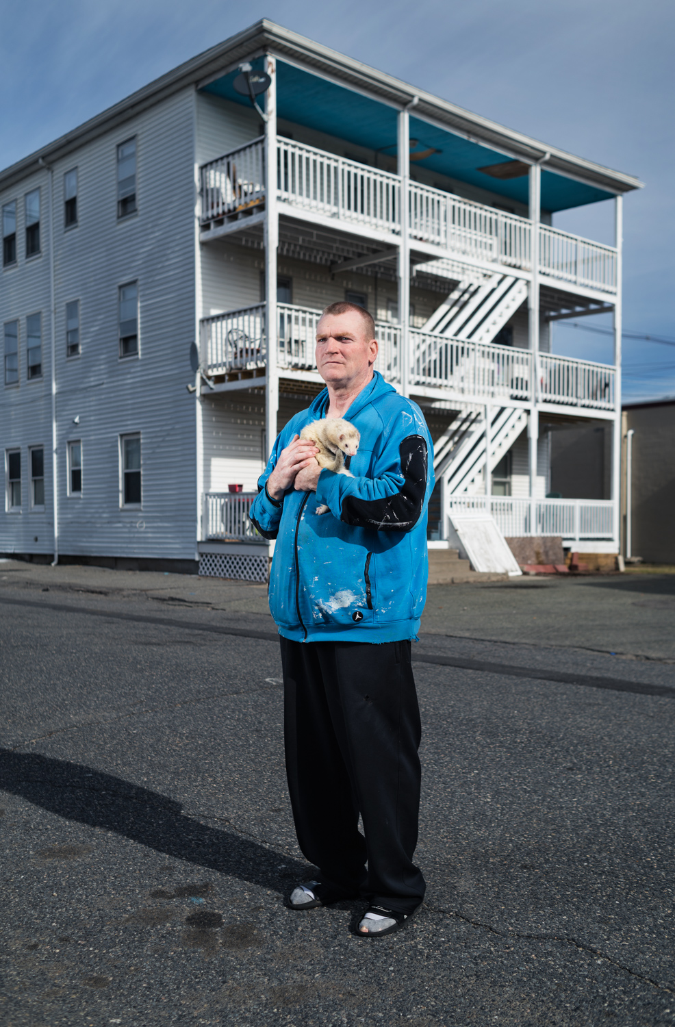
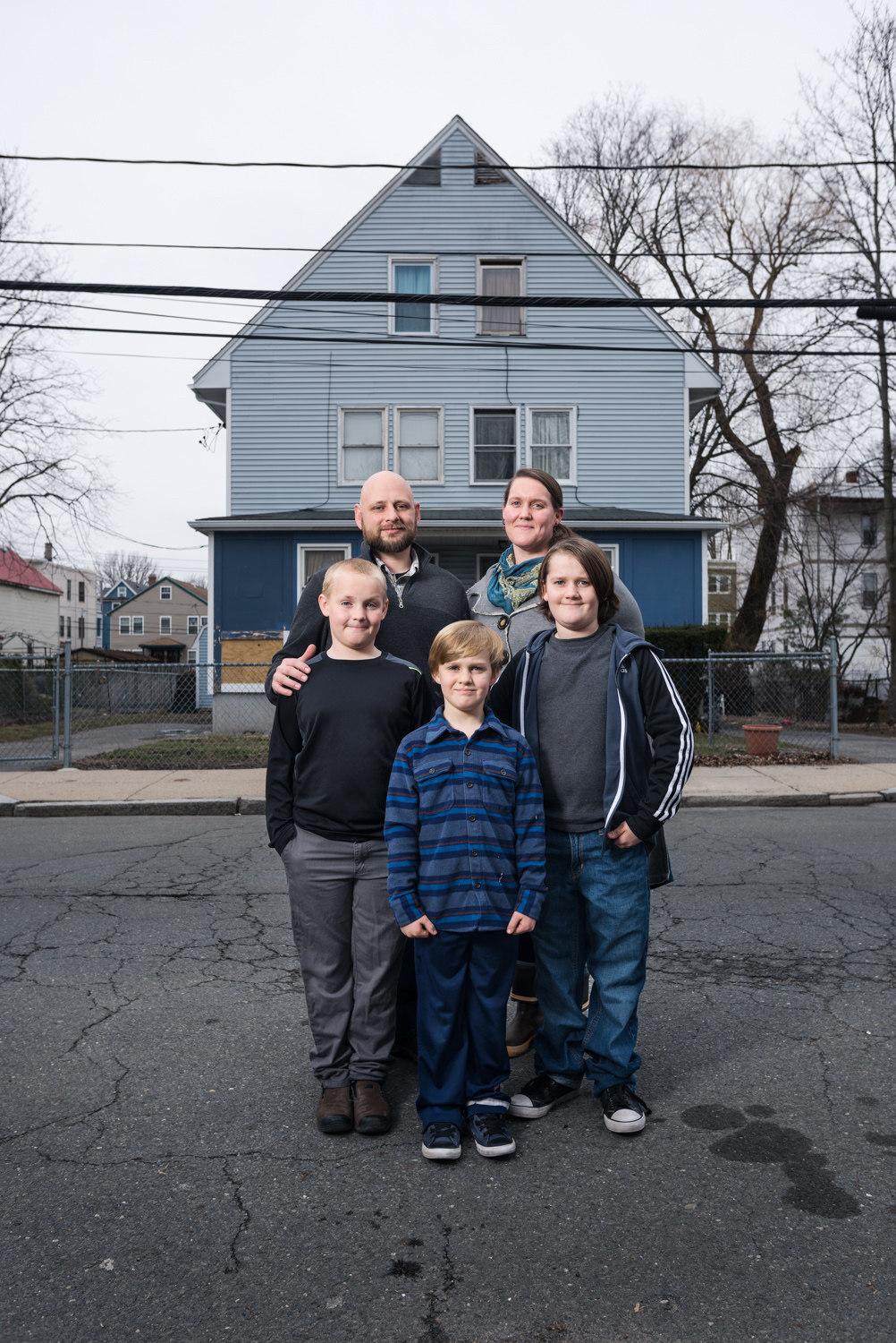
How did you handle the dynamic of kids, multi-subject shoots and families? Did you take more frames, direct a bit more?
This was my first assignment with families and multiple kids in a confined portrait setting. My assistant and I would try and make things easy as possible by having lighting tested and ready for the family. The struggle with photographing kids is trying to get their attention to us at the same time and having them be still. One of the kids would be playing and making faces at me while the younger one would be running out of the frame! Sometimes you have no control and let them do what they’re going to do and it works out better and becomes a more natural photo. What helped was taking some breaks to release some energy and showing the kids my camera and having them take a couple of frames. We also had to negotiate with some of the kids. If we were struggling to get the shot, I would tell them that we would only need 5 more frames and they could go play and it would work. Once we had the kids in a good place, we shot a burst of frames to try and nail the shot. It was a super fun learning experience.
The Daily Promo – Norman Maslov Agent Internationale
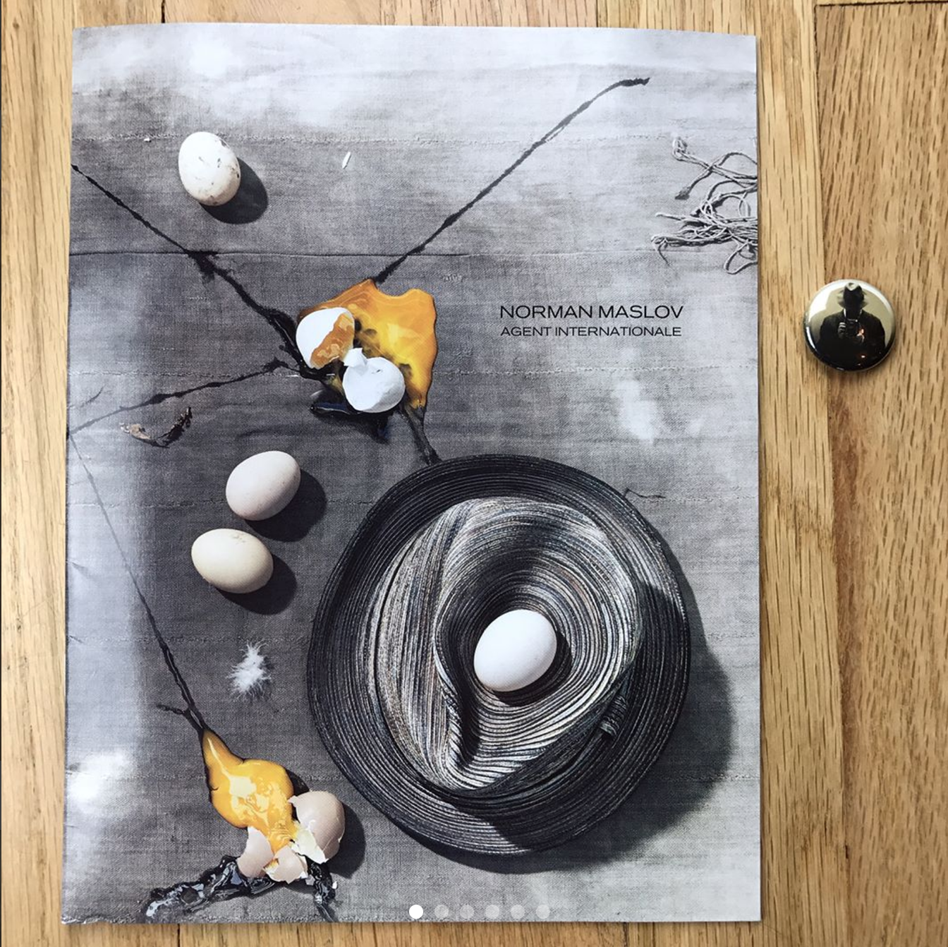
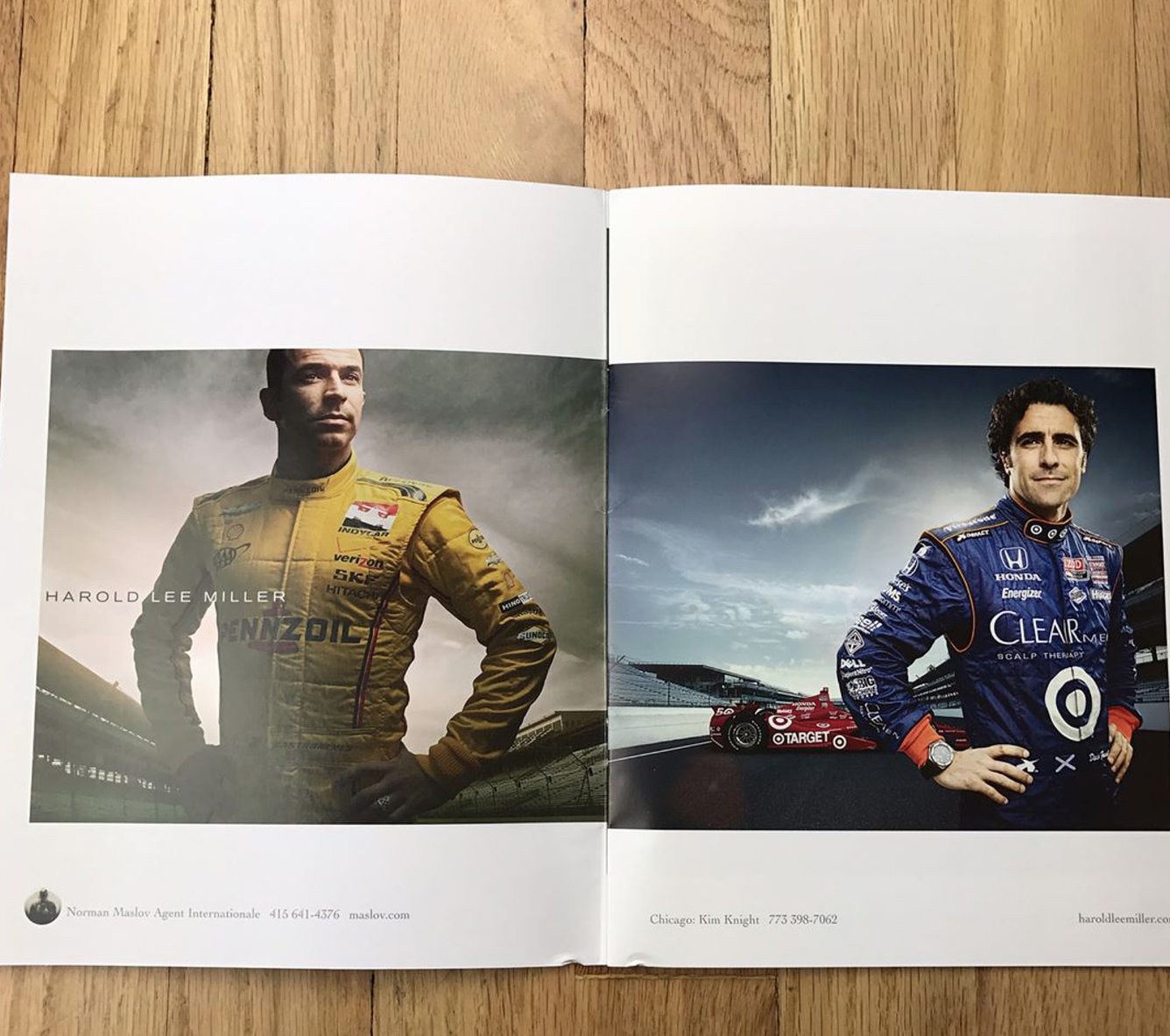
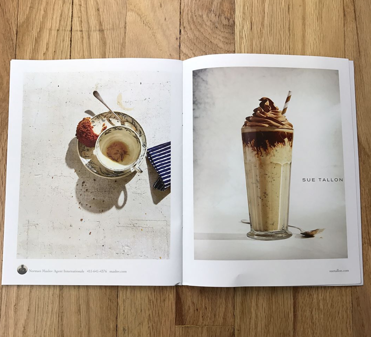
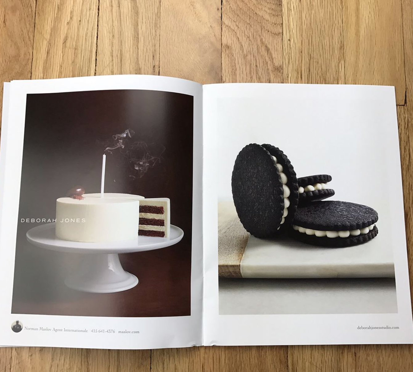
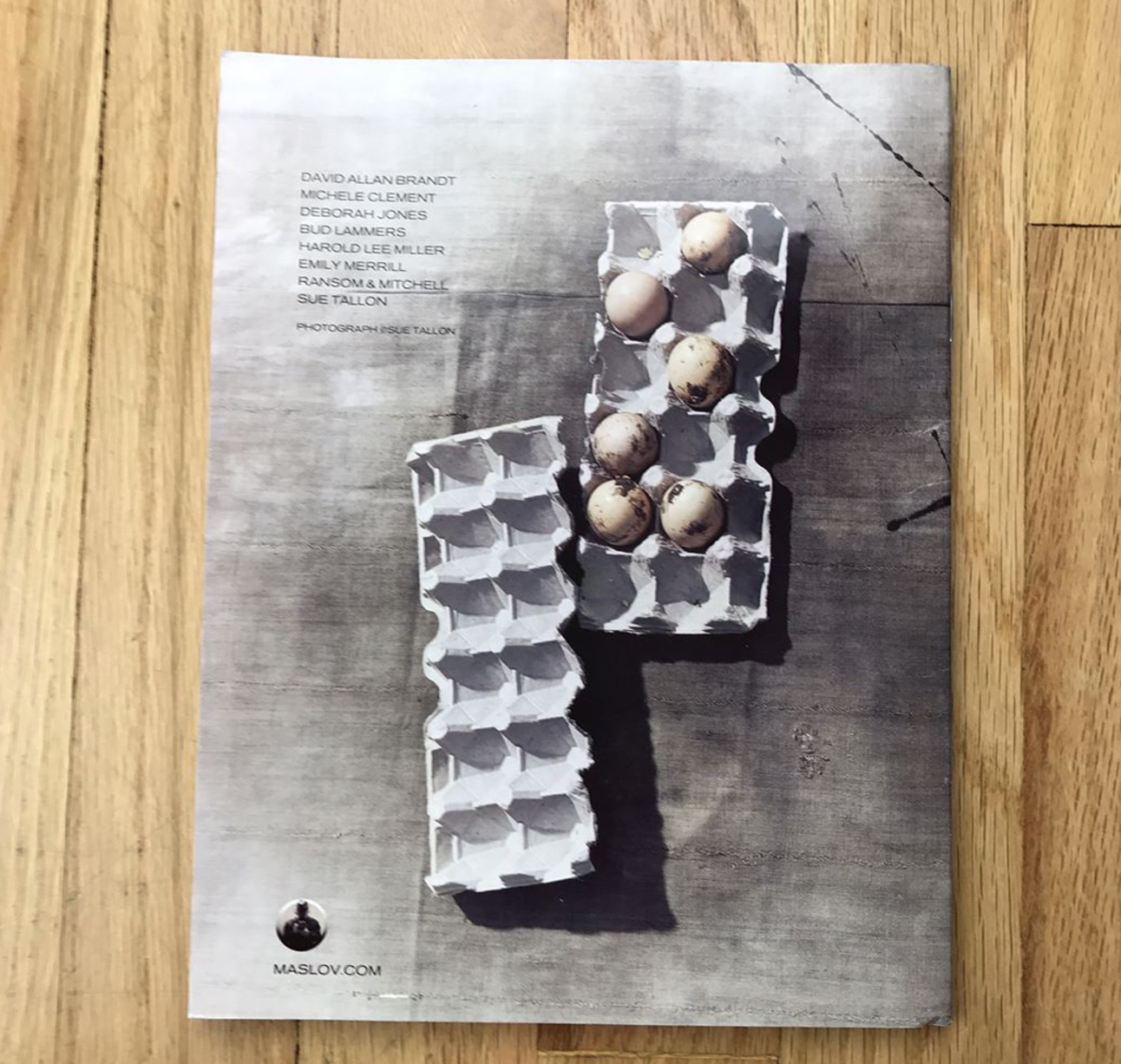
Norman Maslov Agent Internationale
Who printed it?
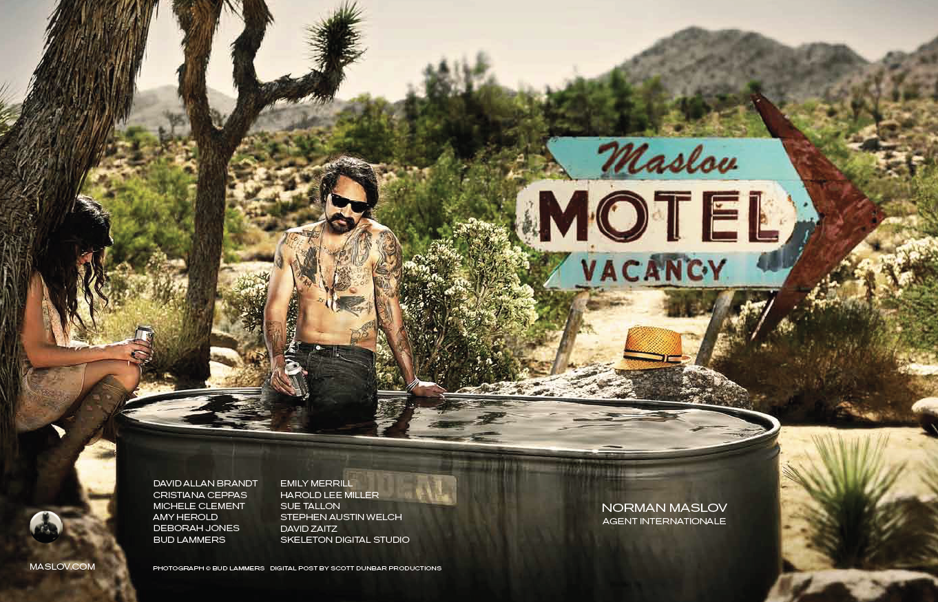
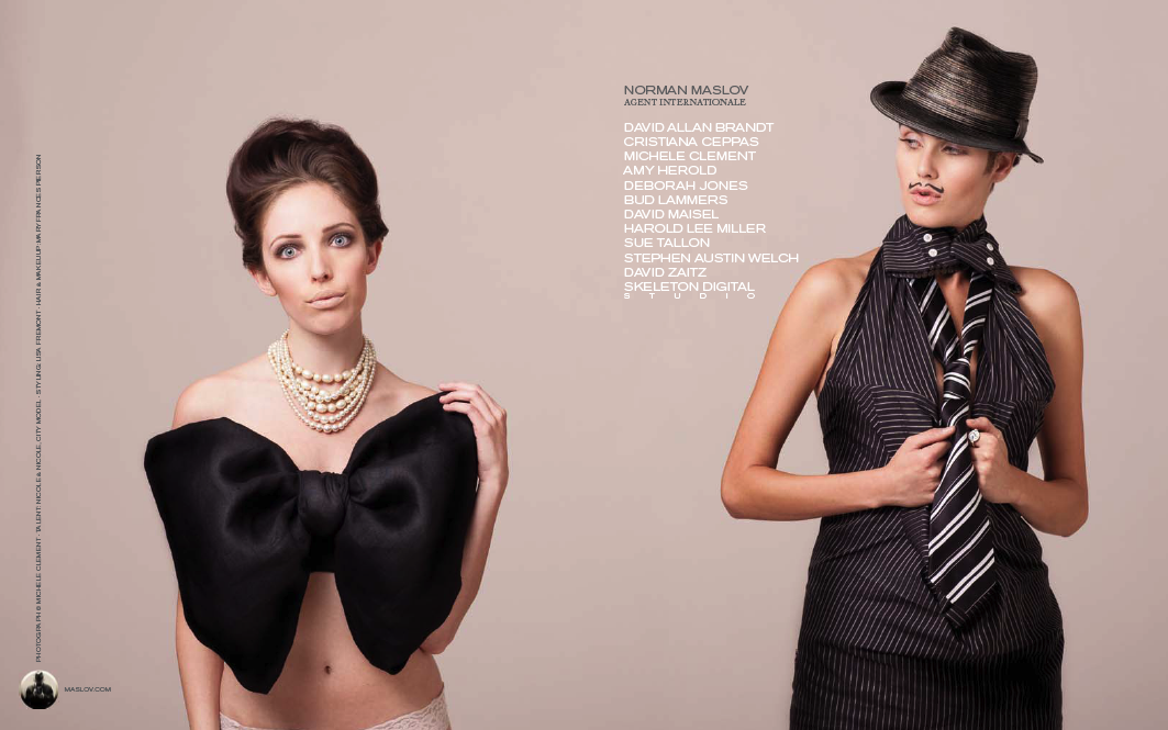
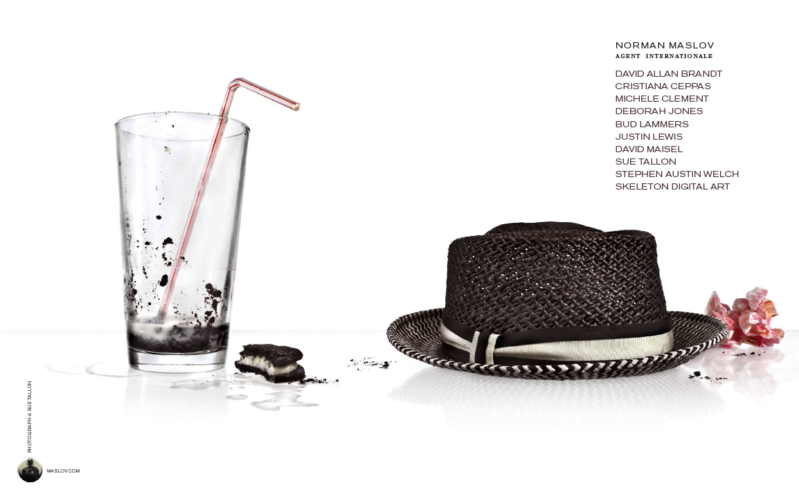
The Agency promo catalog was printed in Asia in coordination with The Workbook.
Who designed it?
Designed by Anita Atencio at the Workbook and our upcoming promo-catalogue has been revised by the Workbook’s new designer, Andy Carey. The booklet is an expanded extension of our Workbook directory advertising.
Who edited the images?
My photographers submit images to me and we discuss what we want to showcase each year. I edit the order.
How many did you make?
2500 copies each year. Mailed to creatives nationally and given out at portfolio shows.
How many times a year do you send out promos?
This is the one full agency group mailing we do once a year. The only one that includes all of our talent. Other mailings throughout the year are separate pieces from the individual artists.
Where did you get the buttons made?
Buttons made by the Busy Beaver Button Company in Chicago. Designed by Scott Miller
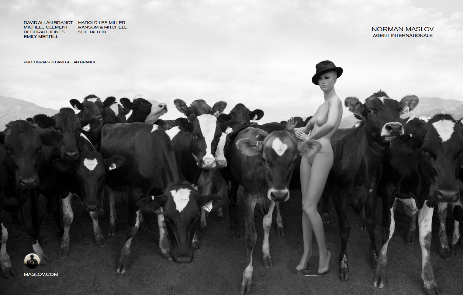
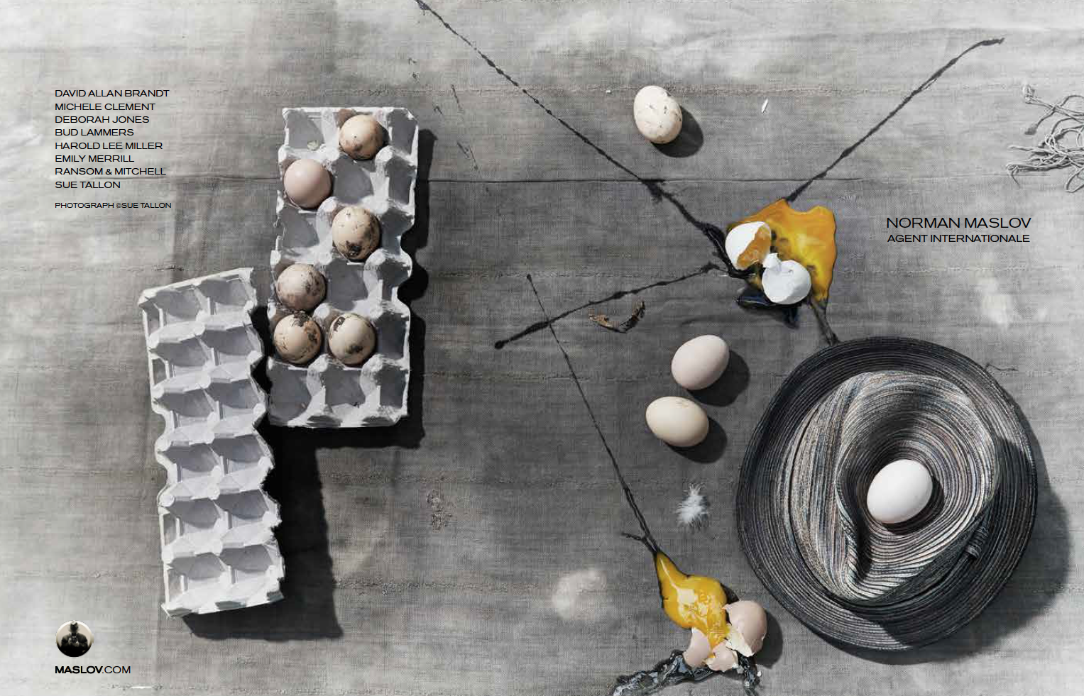
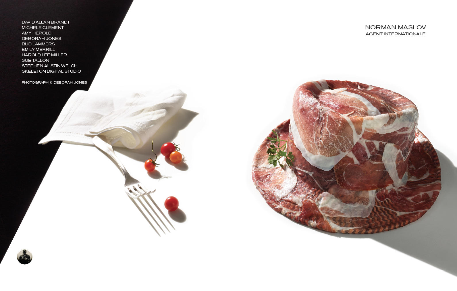
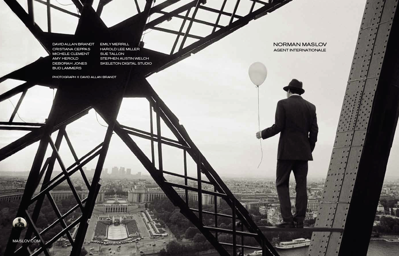
What photo is on that button and why?
The photo is an image that has been a primary part of our identity for over twenty years. We have modified its use over time depending on the application. Hats are an ongoing part of the Agency’s image identity. The round button version was adapted by designer Scott Miller.
Tell us about the Hat theme.
We’ve been doing the Hat Cover theme on our promotional catalogs for about 12 years. Each year I select one of my photographers to create the wrap around cover/back image. I send them a selection of my hats and they can concept and shoot anything they want with any of the hats as long as it fits the booklets design and front and back cover needs.
This Week in Photography Books: Jim Jocoy
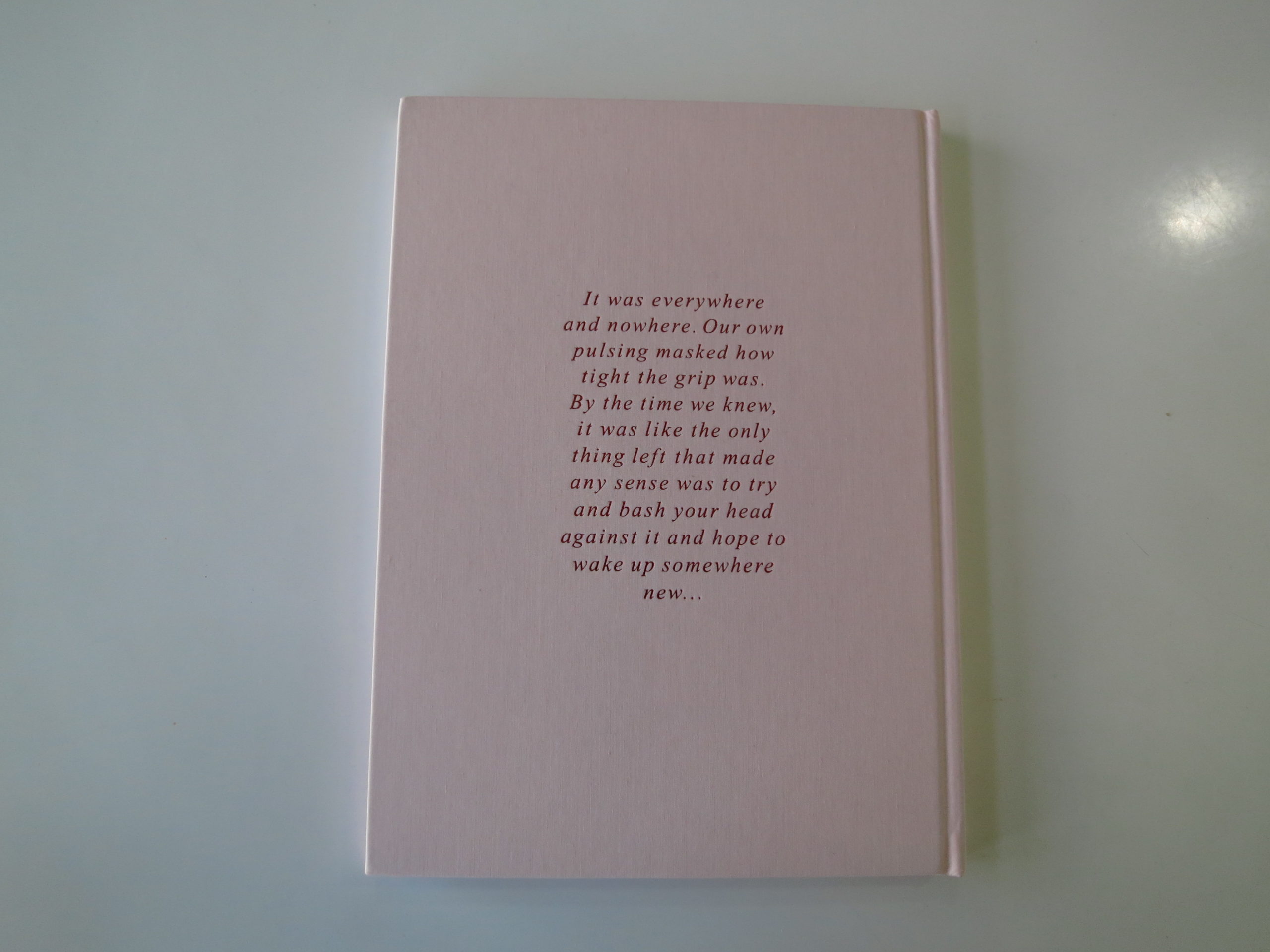
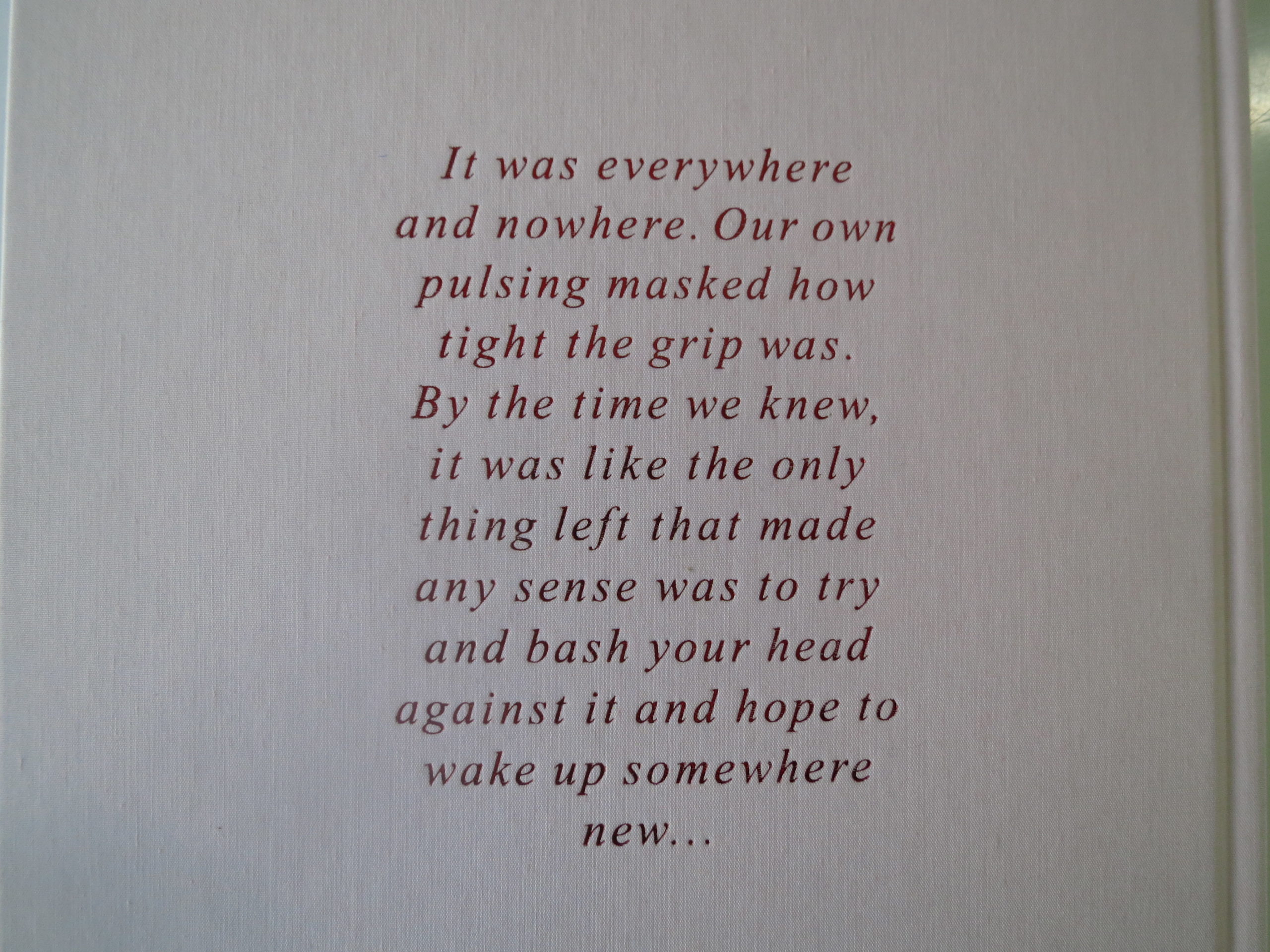
“…it was like the only thing left that made any sense was to try and bash your head against it and hope to wake up somewhere new…”
Unlike other book reviewers, I detest opening my articles with a quote. In all the years I’ve been writing this column, I think it’s the second time I’ve pulled out this trope.
Why now?
Well, when I woke up this morning, (Wednesday,) I learned that President Trump had just dismissed FBI Director James Comey.
He had his personal security guard deliver a letter that basically said, “YOU’RE FIRED!!!”
It finally happened.
“The Apprentice” and the government of the United States of America have finally merged into one massive entity, all in the service of money and power.
I’m in a tough spot, myself, as I spent a year and a half before the election warning about our now-lunatic-Commander-in-Chief. And given the ridiculous nature of what’s transpired since he won, I find myself reluctant to continue the barrage here.
It all seems so pointless.
A few months ago, when everyone was talking about how “unprecedented” this all was, I scratched my head, and asked, “What about Nixon?”
I even asked my father directly, as Nixon’s break-in buddies were indicted on the day I was born, March 4th, 1974.
How is this not the same, I wondered?
“No, this is different,” Dad said then, though I suspect he’s since changed his tune. (Though in fairness, he has said for months he thought a 9/11-style special commission would eventually be empowered to look into the Russia mess, leading to Trump’s ouster.)
To be clear, I’m no sage, as I certainly didn’t predict the Donald would win. And I’m wrong often enough, so this is no ego-trip.
Rather, it’s the honest admission of an opinion columnist that I’ve reached the point where the degree of absurdity has exceeded my capacity to ruminate.
Sure, he must think, let’s fire the one guy who has the power to indict my buddies. Maybe no one will suspect my motives? And even if they do, at this point in time, there are no human beings alive who can stop me. So I’ll just have a private meeting in my office with the very Russian operatives that caused this whole mess to begin with.
What does a simple, rural, photo-book reviewer have to say that will stand up to a Hollywood-nightmare-plot-gone-wrong-from-which-none-of-us-can-wake-up?
The answer, my friends, is Punk Rock.
I was never a Punk Rocker, if we’re being honest, even though my cousin Jordan caught on to The Clash and all that good stuff while I was still bopping my head to Billy Joel.
My parents would play Donna Summer all night long, as the Disco era and then the early-80’s-one-hit-wonder phase dominated our 8-track, and the car stereo.
I wore my Izod shirts, and let my mother comb my hair like a good boy. I grew up playing sports, in the suburbs, and didn’t even know my parents hated Reagan until I was older.
“Just say no, Nancy Reagan? Ok. If you say so. Good boys don’t smoke weed.”
That was me. (Then.)
Punks were true rebels. They stuck pins through their flesh, and wore ripped clothes. Nowadays, I’m pretty sure you can spend $1000 on a pair of pants that are sold covered in fake mud.
Back then, in the late 70’s, after Nixon’s fall, this country was hanging on by a thread. (Sound familiar?)
And kids responded by throwing up their hands, saying “fuck it,” and then vomiting on each other. Or pissing in their own van.
Mohawks and skinny jeans and a sense that the world was too crazy to change. Political organizing was for squares, man. Punk was about violent music, fighting with your friends, and living with the calm assurance that the grownups running the world were morally and financially corrupt.
(Sound familiar?)
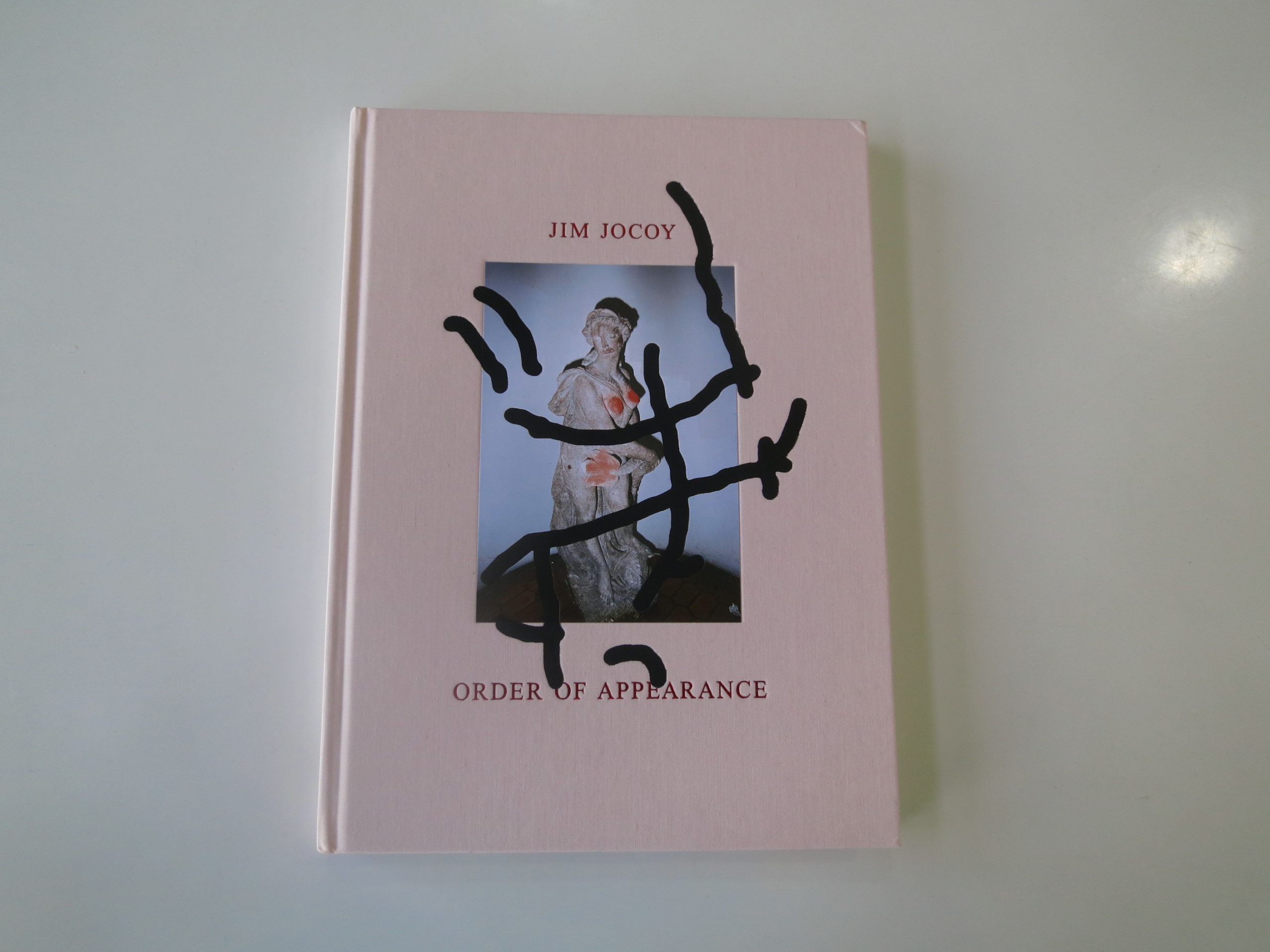
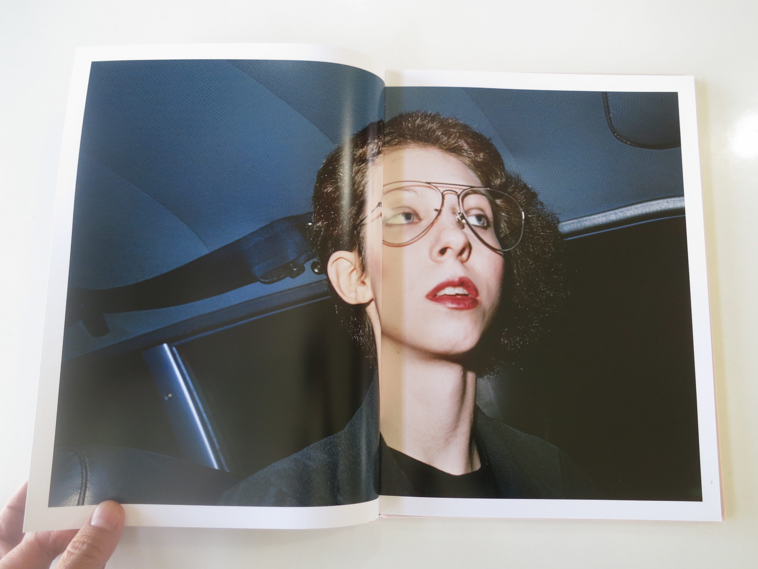
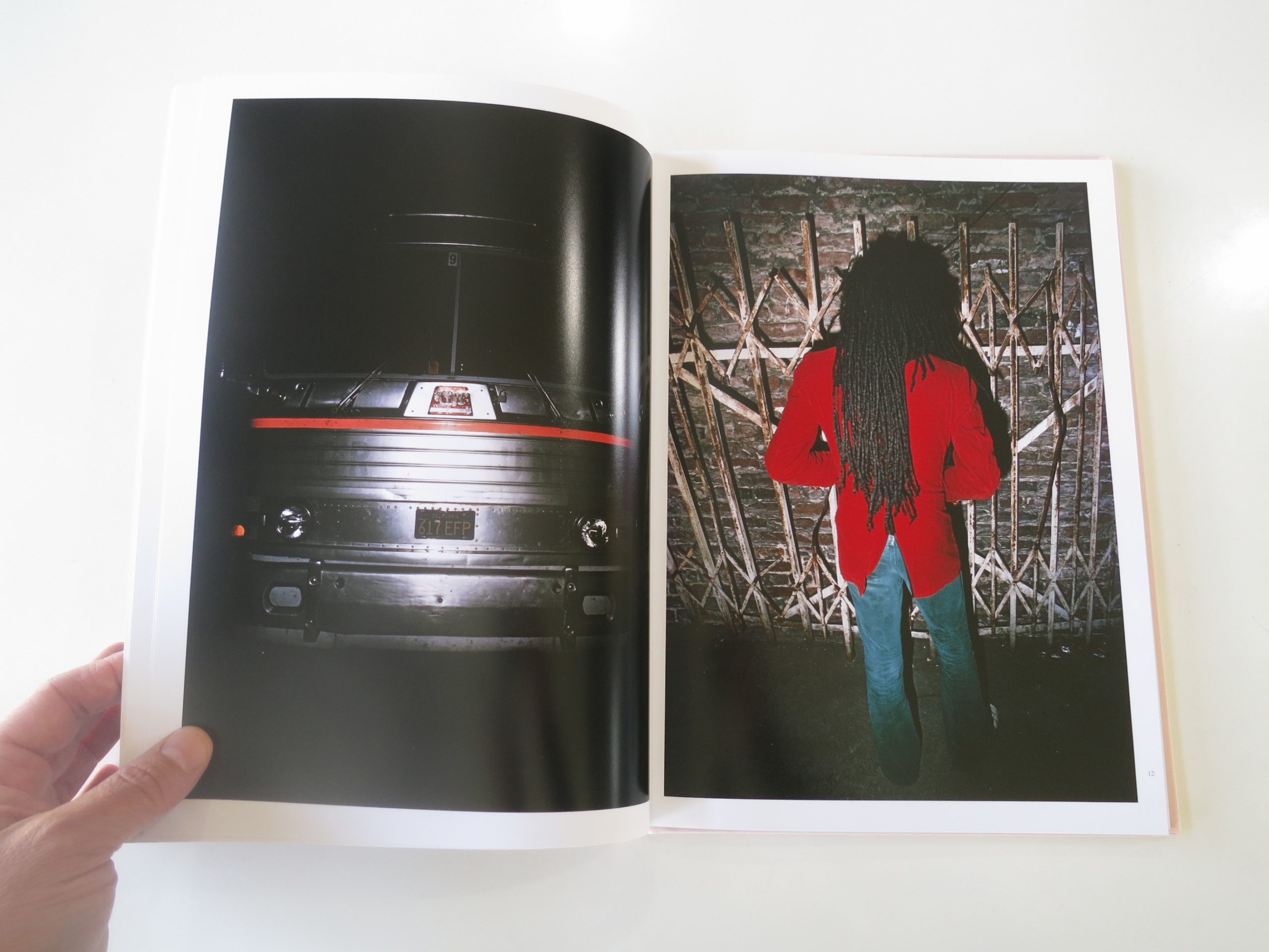
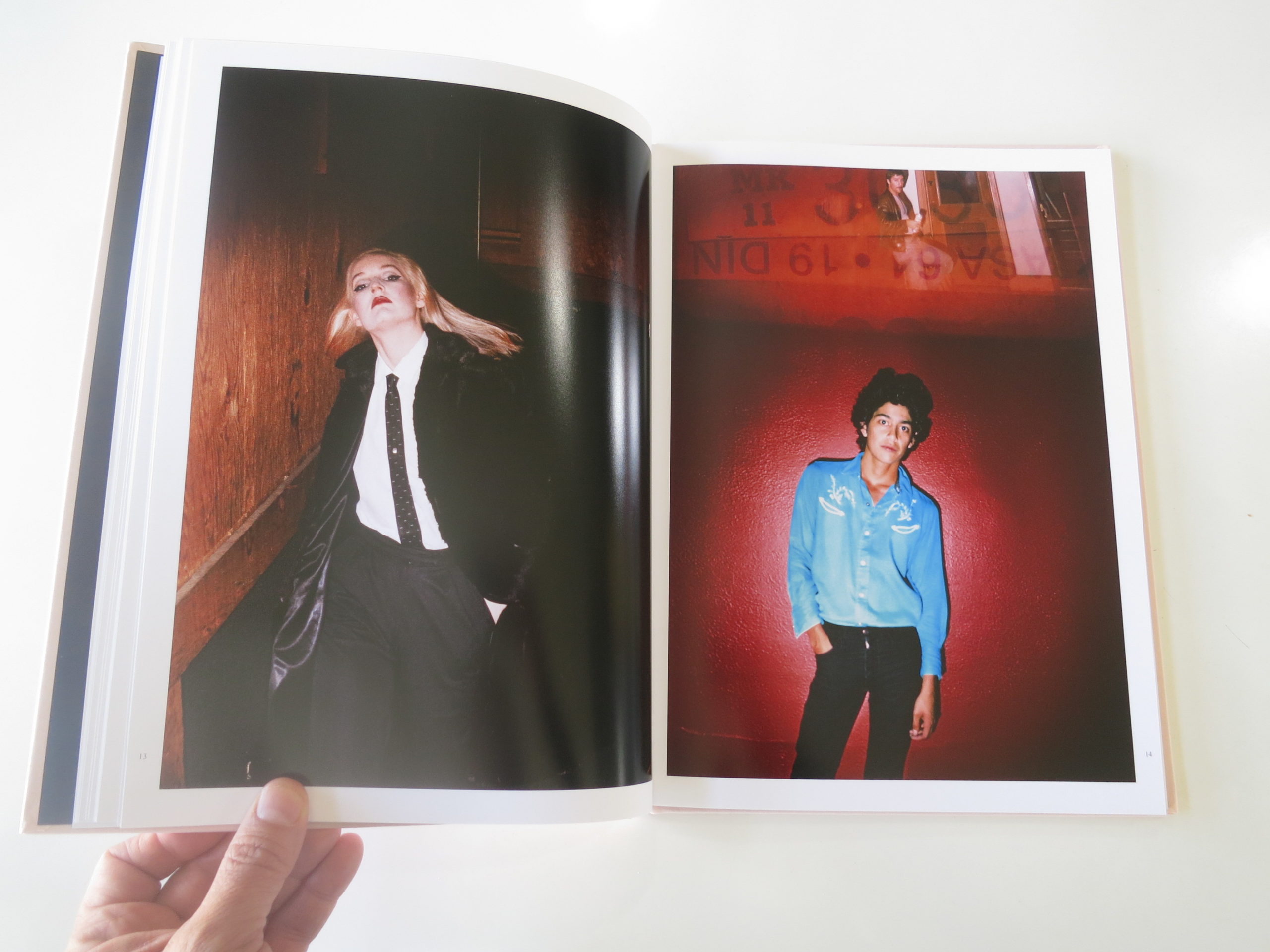
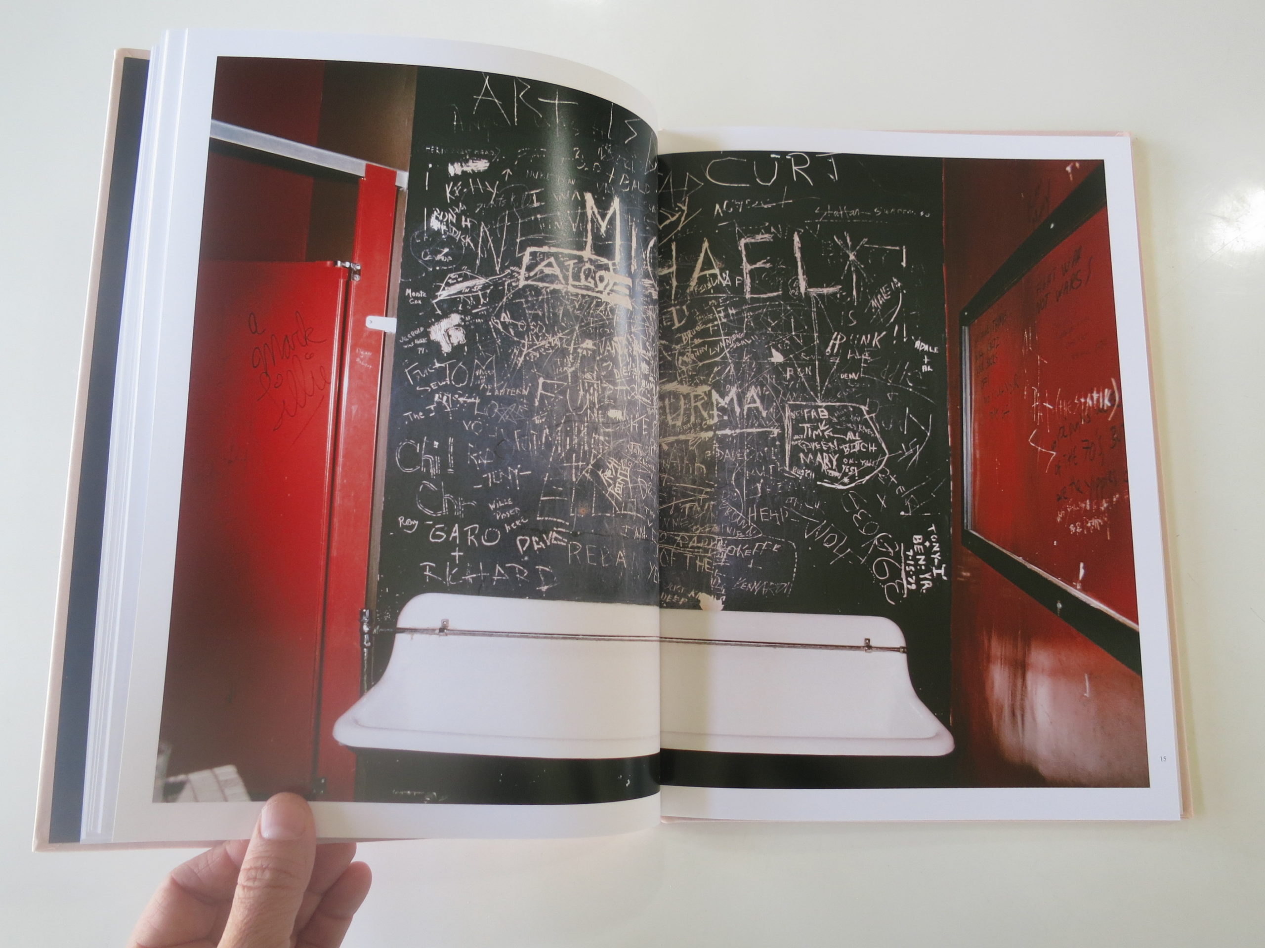
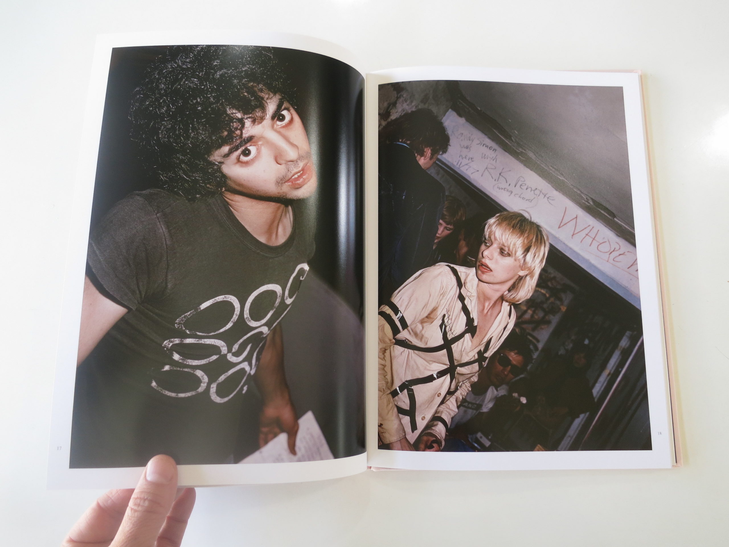
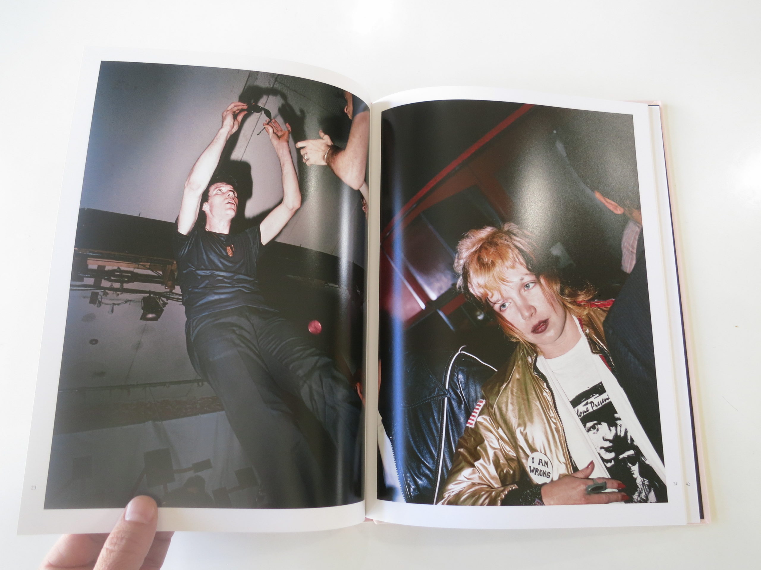
Rather than claim my current ennui stems from a Punk Rock ethos I’ve never possessed, I’ll just admit this rant was inspired by “Order of Appearance,” a new book by Jim Jocoy, recently published by our friends at TBW Books in Oakland.
I’ve interviewed their publisher Paul Schiek before, and that man, unlike me, is Punk Rock. He lived it, and told us so. He met his buddy, Mike Brodie, (he of the train-hopping punk photographs,) at a party where I’m pretty sure the pink puke was fresher than the beer.
So seeing this book turn up in the mail, from his imprint, made sense to me. I’d never heard of Jim Jocoy before, nor did I know this book was about Punk Rockers.
But it didn’t take much time to figure that out. The vibe, the style, and people were all just right. The book, however, denies us any dates, times or places until the end.
It’s sly, but a sticker affixed to the shrink wrap contains a quote from Sonic Youth’s Thurston Moore, so I guess that’s the only clue that sets the scene, until the captions.
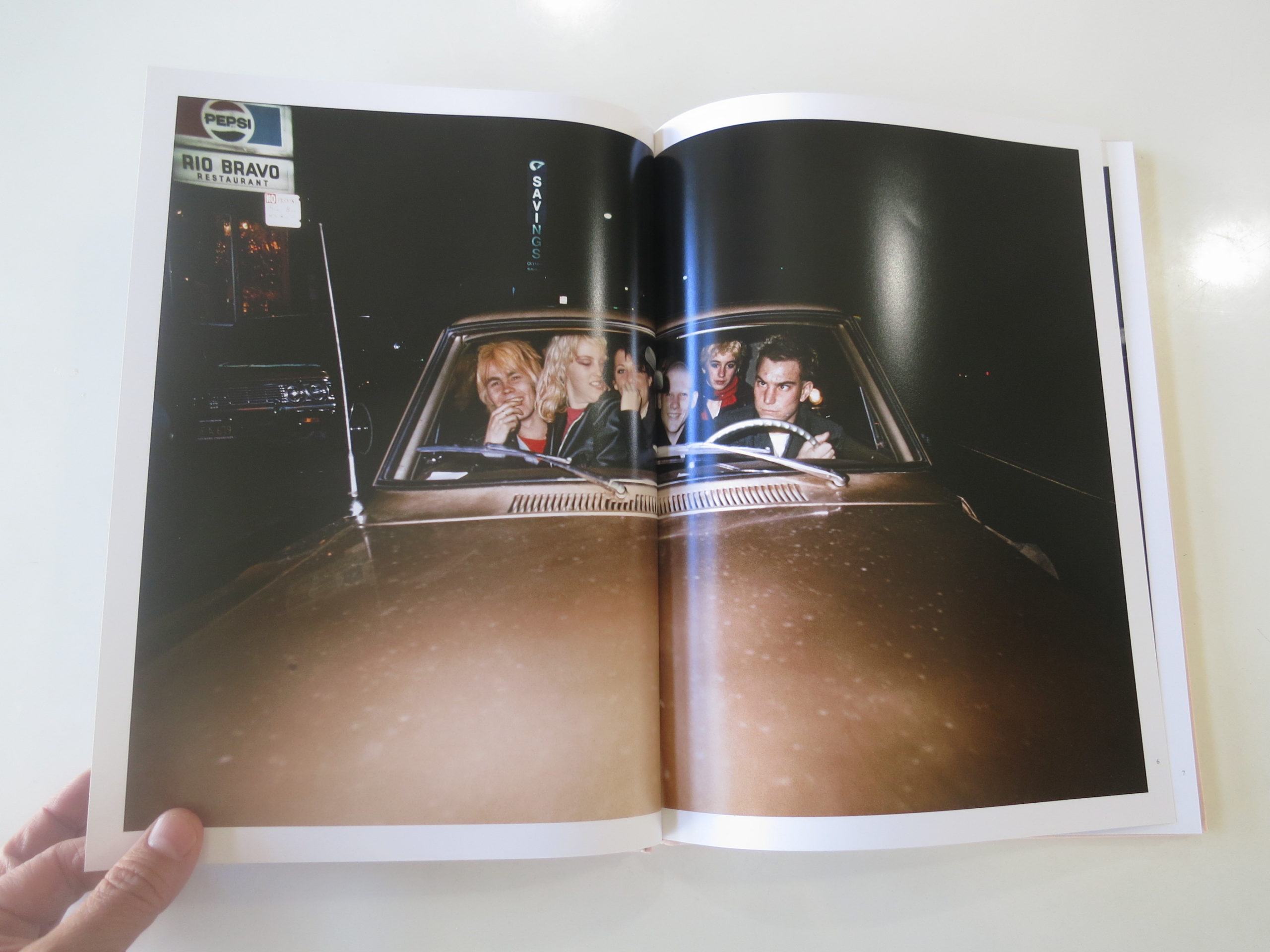
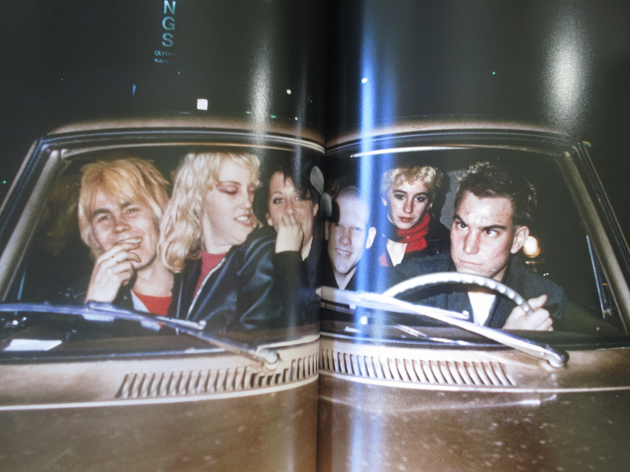
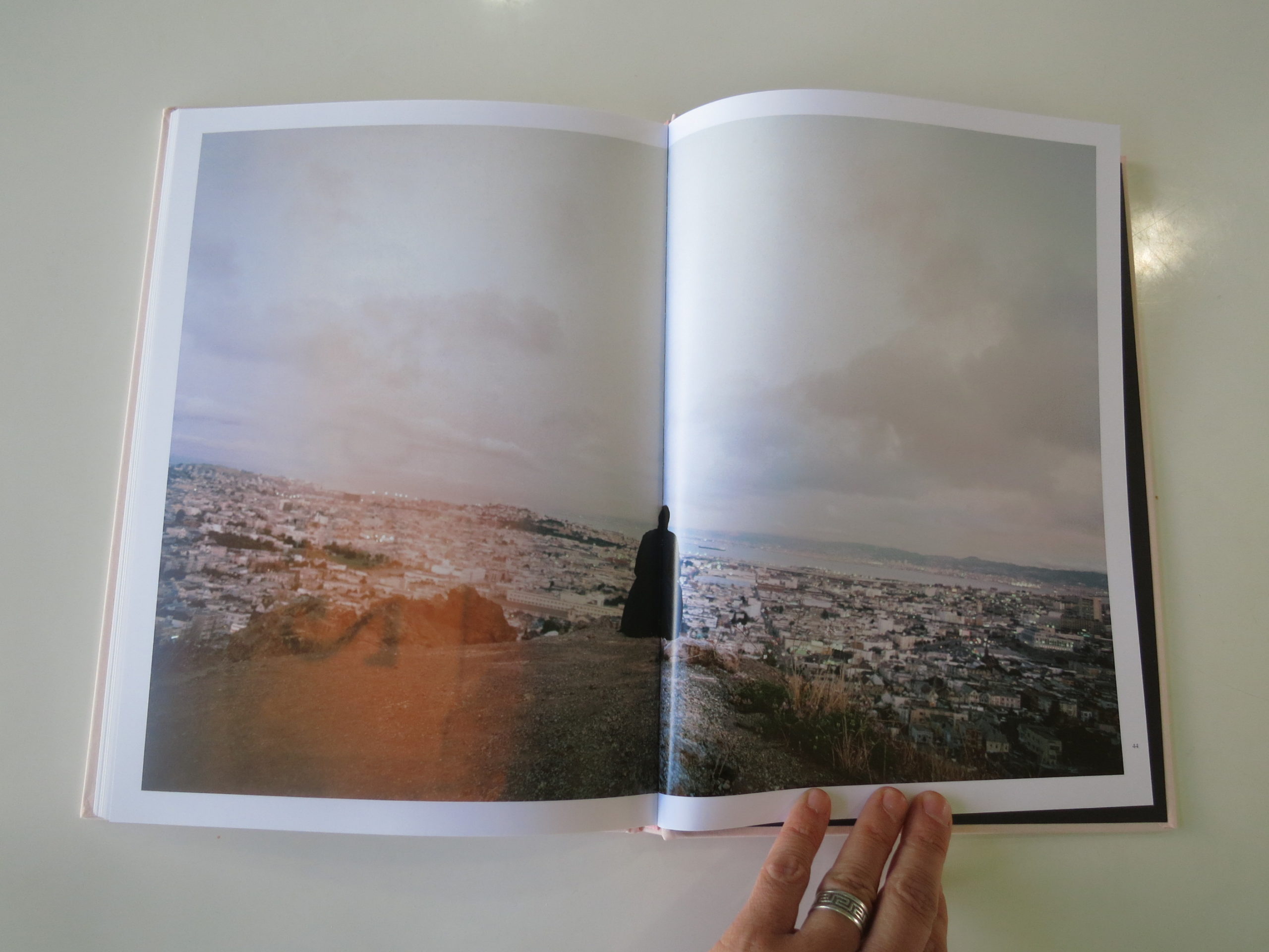
The book features a look at the original Punk scene in San Francisco in the late 70’s. Mr. Jocoy, like many a photographer before him, was the guy in his crew who liked to take pictures. (I’m guessing, but the proof is in the pudding.)
These photos, which were recently scanned from nearly-40-year-old slides, feel like they’ve been rescued from some old age home for Punks.
Can you just imagine?
The furniture would all be ripped. The carpet smelly. The fridges filled with only ketchup and a few stray cans of PBR, and the nurses would give you your pills at random times during the day, just to screw with you.
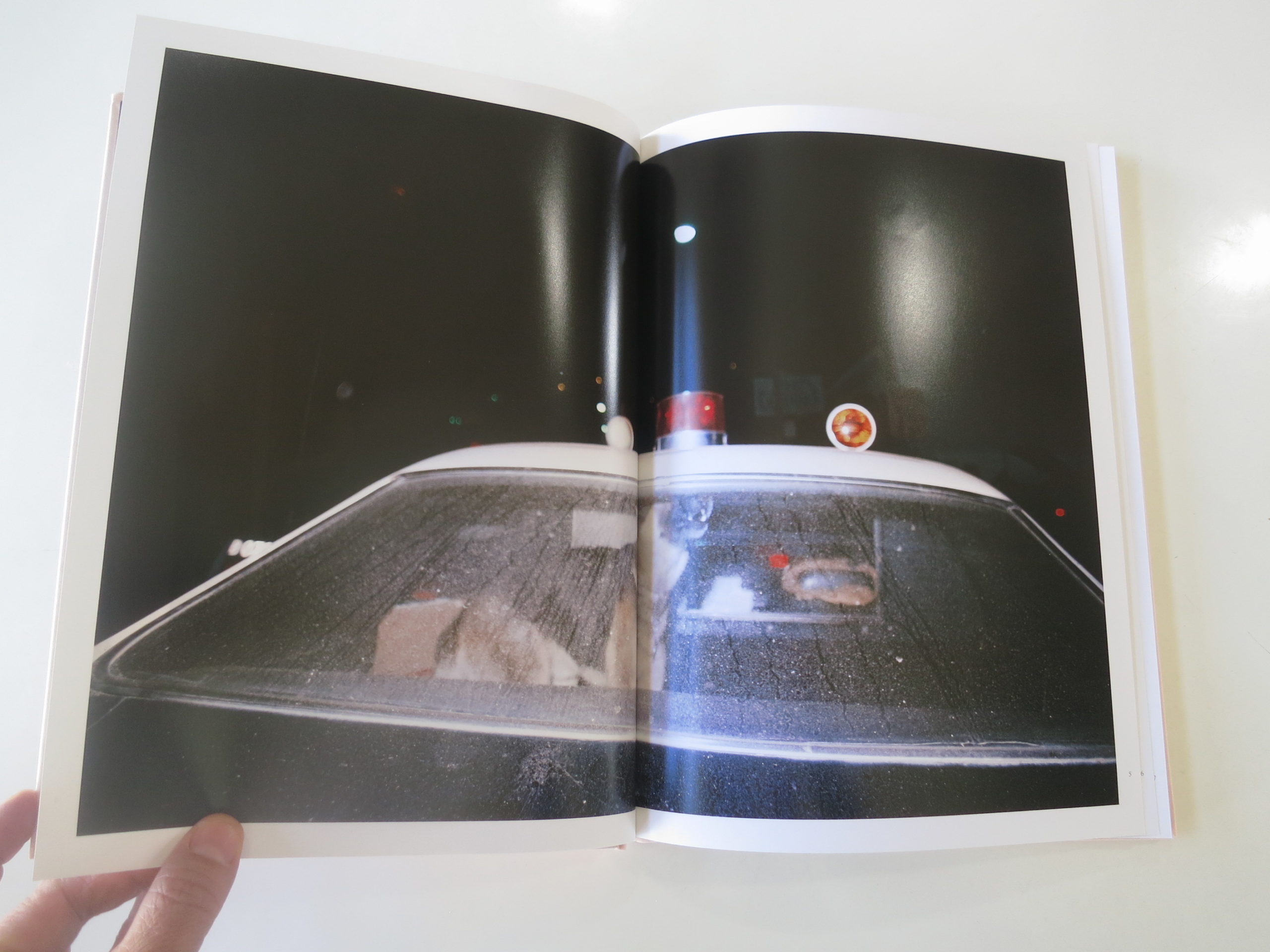
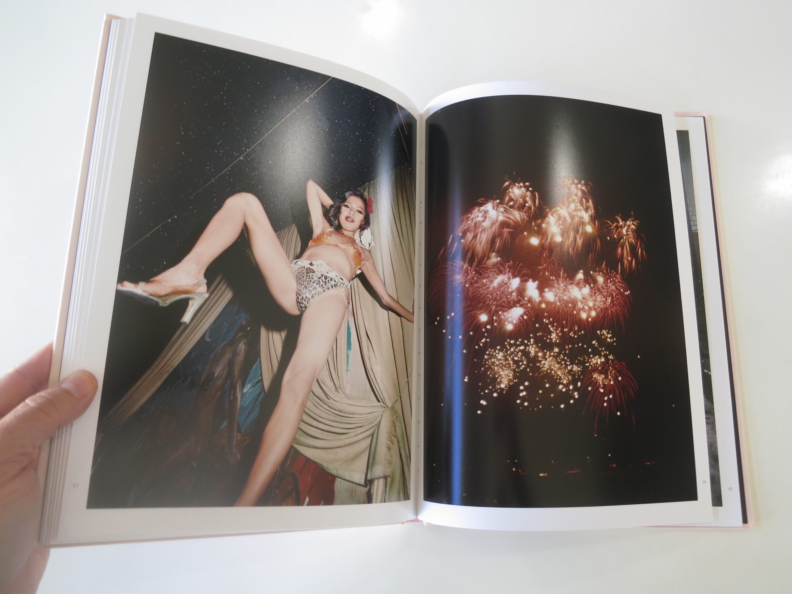
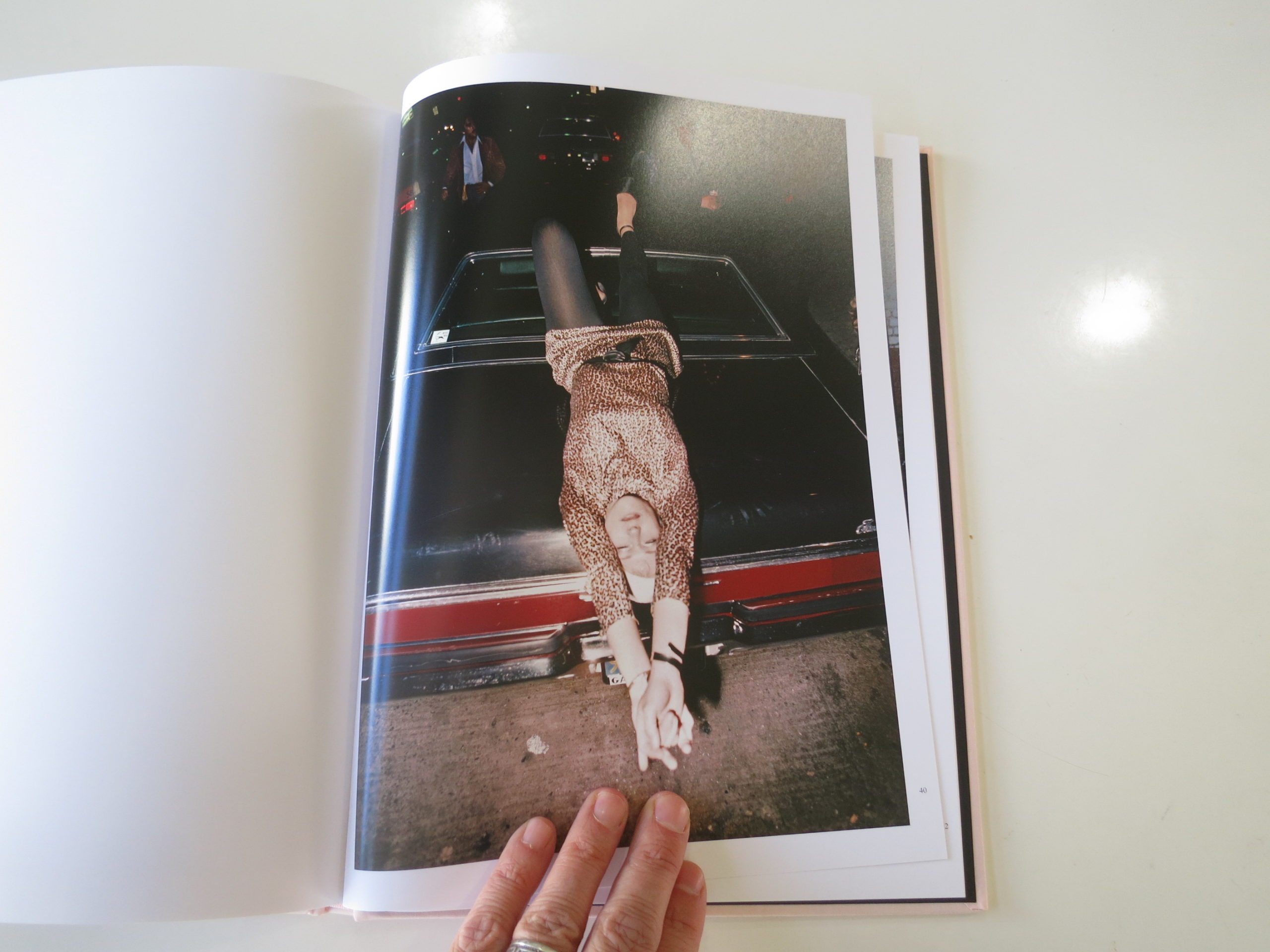
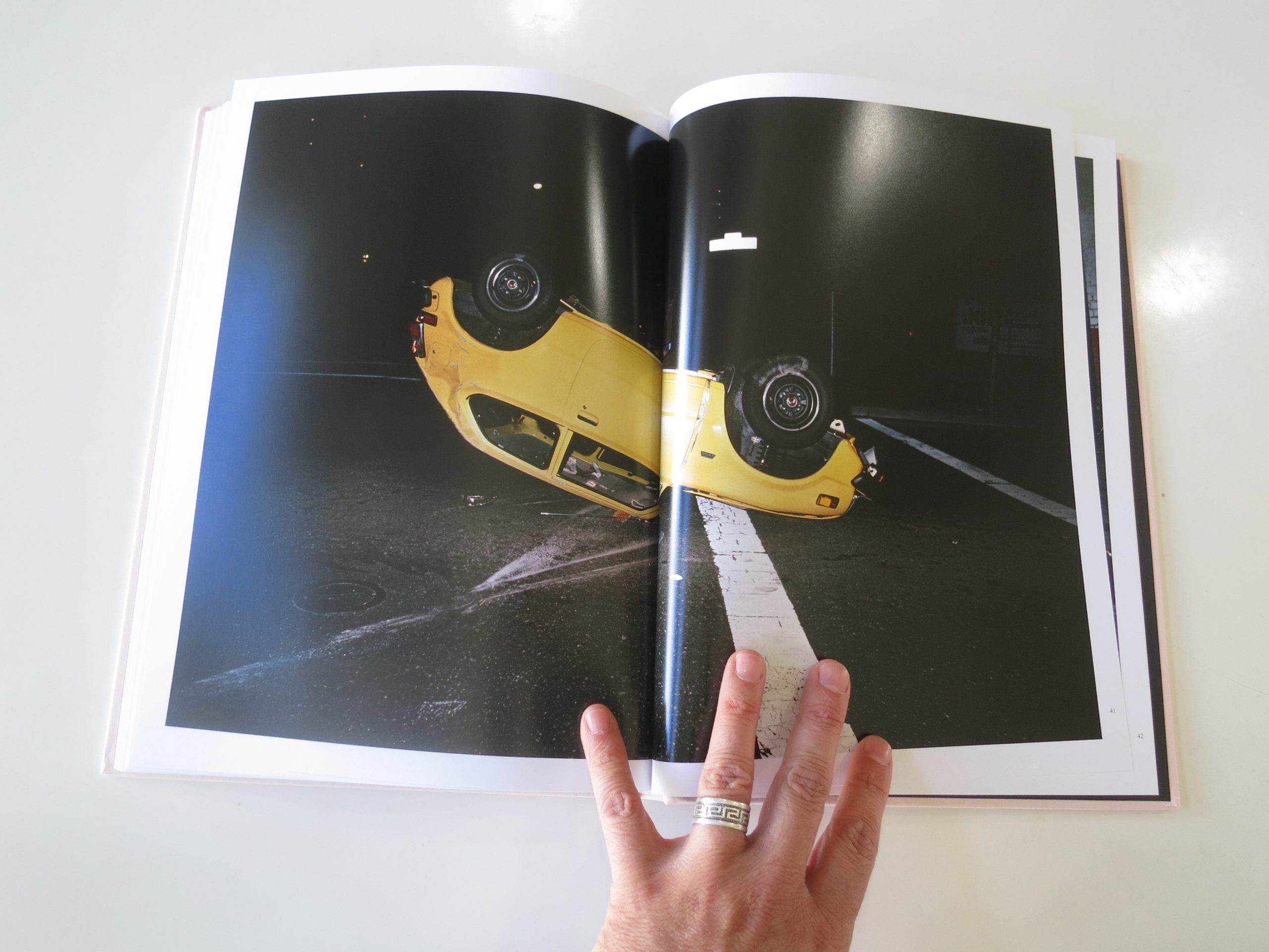
Some pictures are sharp, others blurry, and the color palette is vibrant, but not hyper-real. The blue of dyed hair, the ochre of Allen Ginsburg’s man-purse, the yellow of a club wall all feel like they were made in a world of chemical color.
The San Francisco I knew when I lived there, from 1999-2002, was on a roller-coaster ride of consumption and decline. The dot com boom, the dot com bust.
The San Francisco of these pictures was more dire, as there was no Internet. No email. No cell phones. No one to have your back, unless they were standing right beside you.
The photographs don’t scream action. They are more structured than that, though we do have an up-the-crotch vision of a dancer, probably at some club on Broadway. (The caption confirms as much, though I guessed b/c that’s where the go-go bars have always been.)
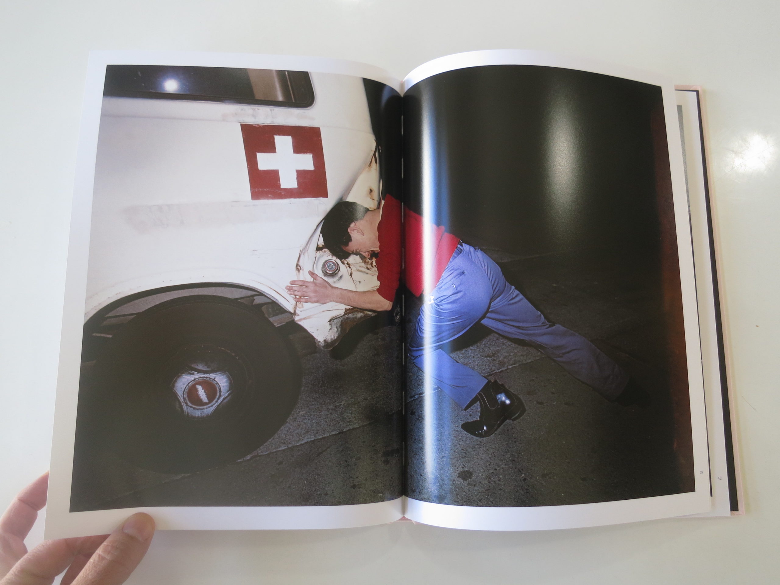
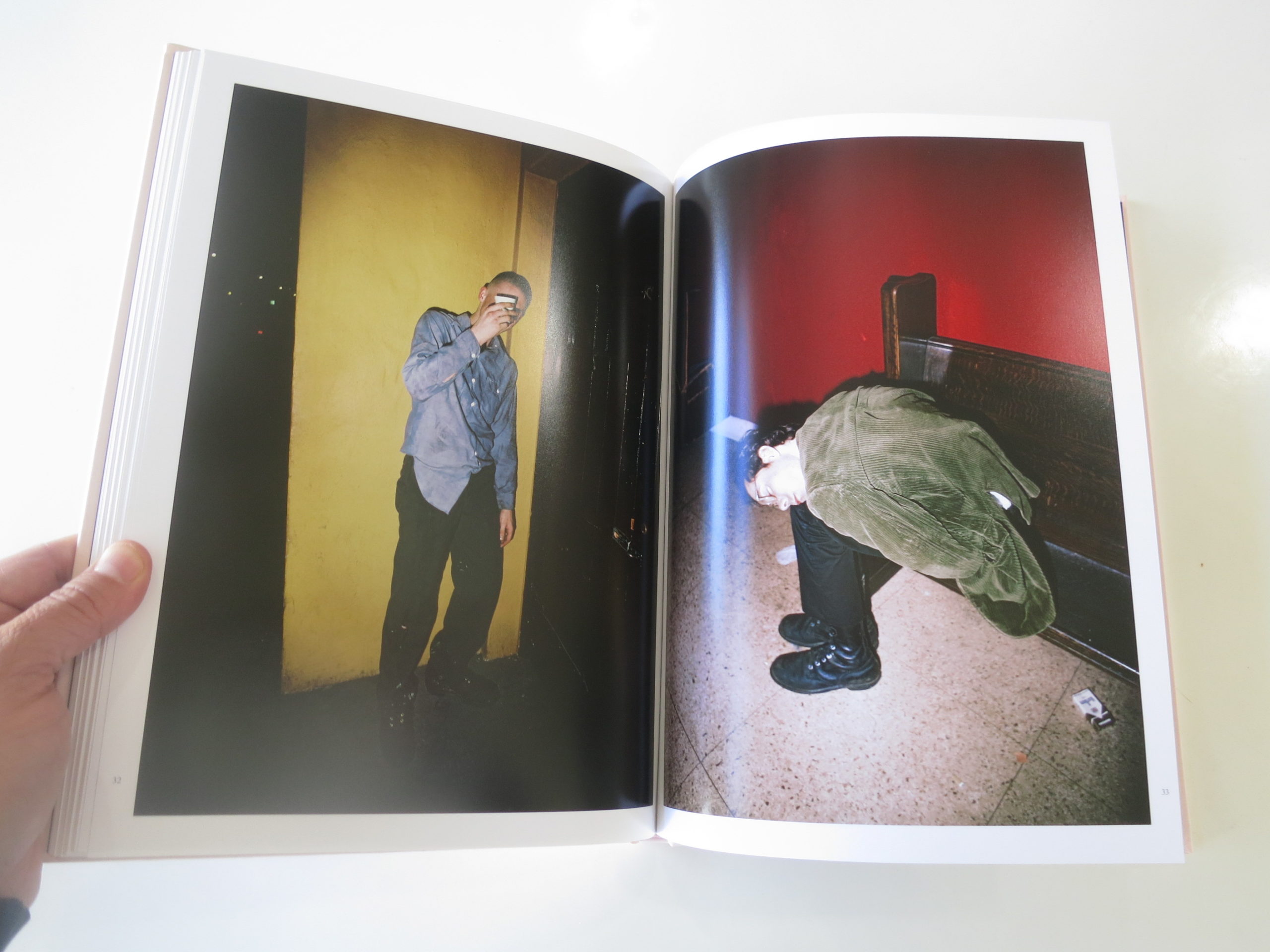
There’s an overturned car, a dude bashing an ambulance with his head, and a bevy of people passed out from whatever cocktail of booze and drugs they chose that evening.
I can’t say I’ve never seen anything like this before, as other books by TBW have mined the same broad territory. (Rebellious or down-scale white folks. Like “Lost Coast,” which we also featured.)
But what I like most about this book is that it’s not broad. It’s super-specific. These were the kids, and musicians, that responded to 70’s America with disdain, and an arrogant sense of their own righteousness.
They weren’t trying to change the system. Rather, they chose to opt out, in their own way.
These days, we don’t really have that option. It’s hard to hide when you’re bombarded by information and noise, no matter where you lay your head.
Which is why I opened this review with a quote. Sometimes, we do all want to “…bash your head against it and hope to wake up somewhere new…”
So if you’re feeling that way this week, take comfort. You’re not alone. And also remember, they got Nixon in the end. Trump might be on top now, but history has a way of flipping the script.
Bottom Line: San Francisco OG Punks, back in the day
To purchase “Order of Appearance” click here





If you’d like to submit a book for review, please email me at jonathanblaustein@gmail.com
Personal Projects: Ashton Ray Hansen
The Art of the Personal Project is a crucial element to let potential buyers see how you think creatively on your own. I am drawn to personal projects that have an interesting vision or that show something I have never seen before. In this new revised thread, I’ll include a link to each personal project with the artist statement so you can see more of the project. Please note: This thread is not affiliated with any company; I’m just featuring projects that I find. Please DO NOT send me your work. I do not take submissions.
Today’s featured artist: Ashton Ray Hanson
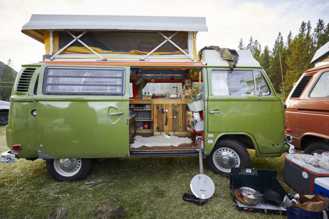
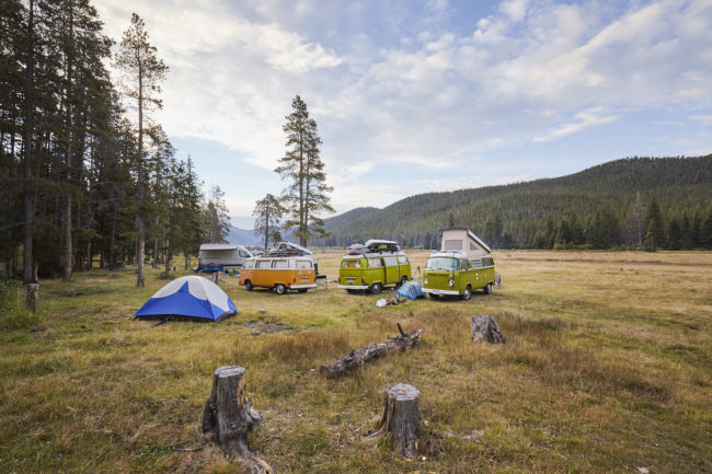
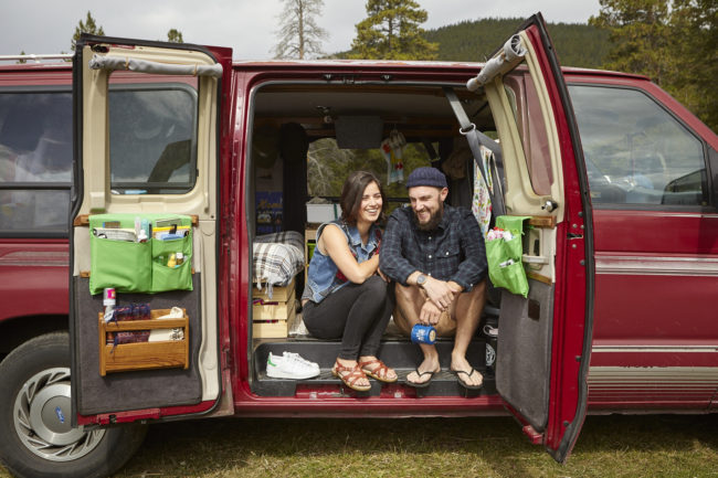
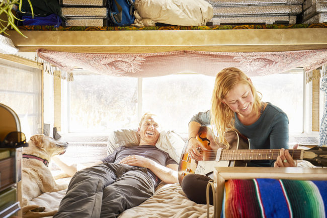
Van Life is a new project I am excited to work on. This project focuses on the lives of individuals who have left their homes to explore this beautiful planet by means of modified vans. These people come from all over the world and are from all walks of life. What wonderful people I have met so far!
To see more of this project, click here
APE contributor Suzanne Sease currently works as a consultant for photographers and illustrators around the world. She has been involved in the photography and illustration industry since the mid 80s. After establishing the art buying department at The Martin Agency, then working for Kaplan-Thaler, Capital One, Best Buy and numerous smaller agencies and companies, she decided to be a consultant in 1999. She has a new Twitter feed with helpful marketing information because she believes that marketing should be driven by brand and not by specialty. Follow her at @SuzanneSease.
Jerry Saltz: My Life As a Failed Artist
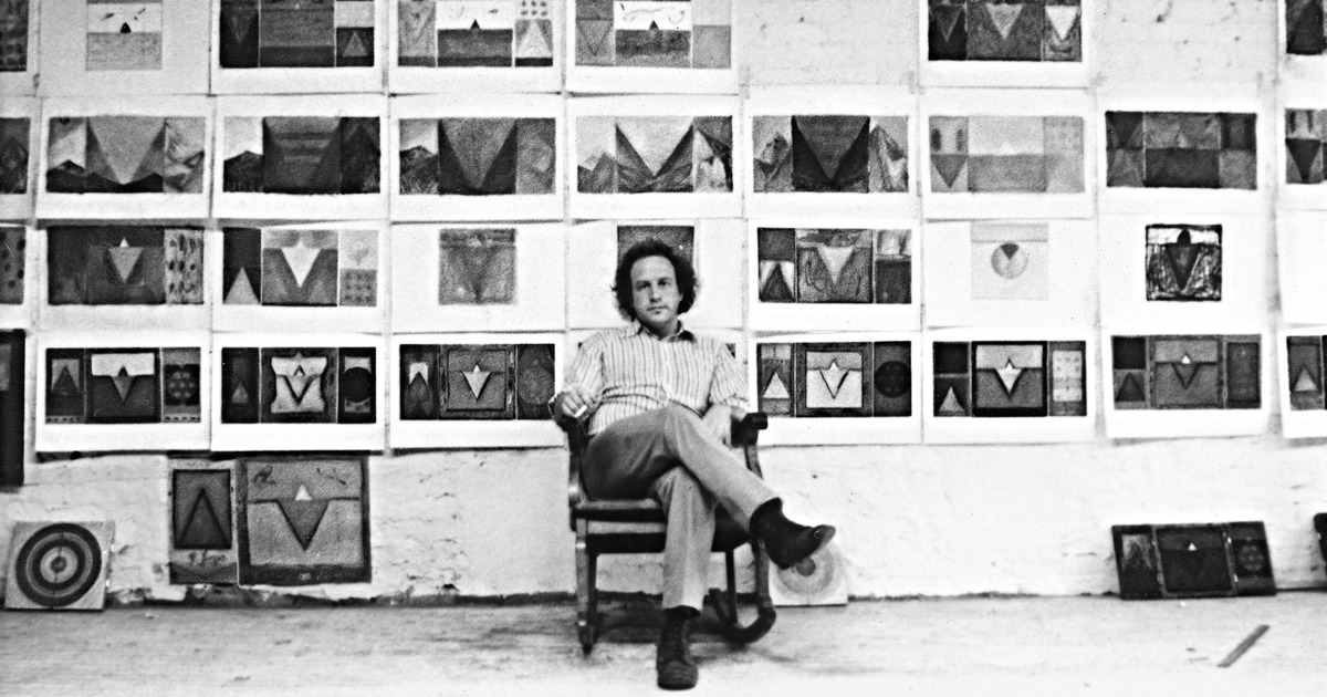
But then I looked back, into the abyss of self-doubt. I erupted with fear, self-loathing, dark thoughts about how bad my work was, how pointless, unoriginal, ridiculous. “You don’t know how to draw,” I told myself. “You never went to school. Your work has nothing to do with anything. You’re not a real artist. Your art is irrelevant. You don’t know art history. You can’t paint. You aren’t a good schmoozer. You’re too poor. You don’t have enough time to make your work. No one cares about you. You’re a fake. You only draw and work small because you’re too afraid to paint and work big.”Every artist does battle, every day, with doubts like these. I lost the battle. It doomed me. But also made me the critic I am today.
Read More: Jerry Saltz: My Life As a Failed Artist
The Daily Edit – Shea Evans: Technicolor


Shea Evans


Heidi: How has this style evolved into your editorial and commercial work?
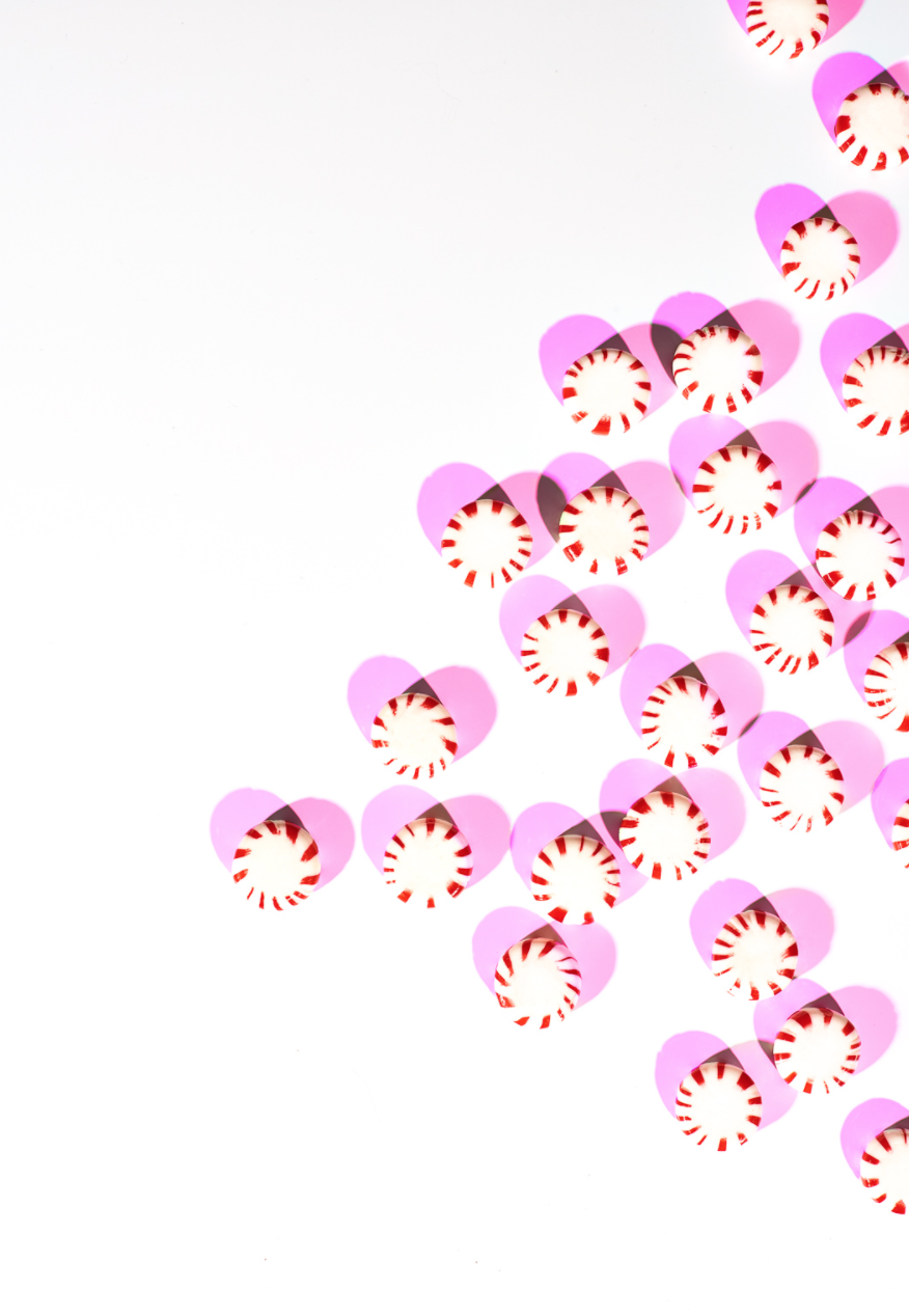
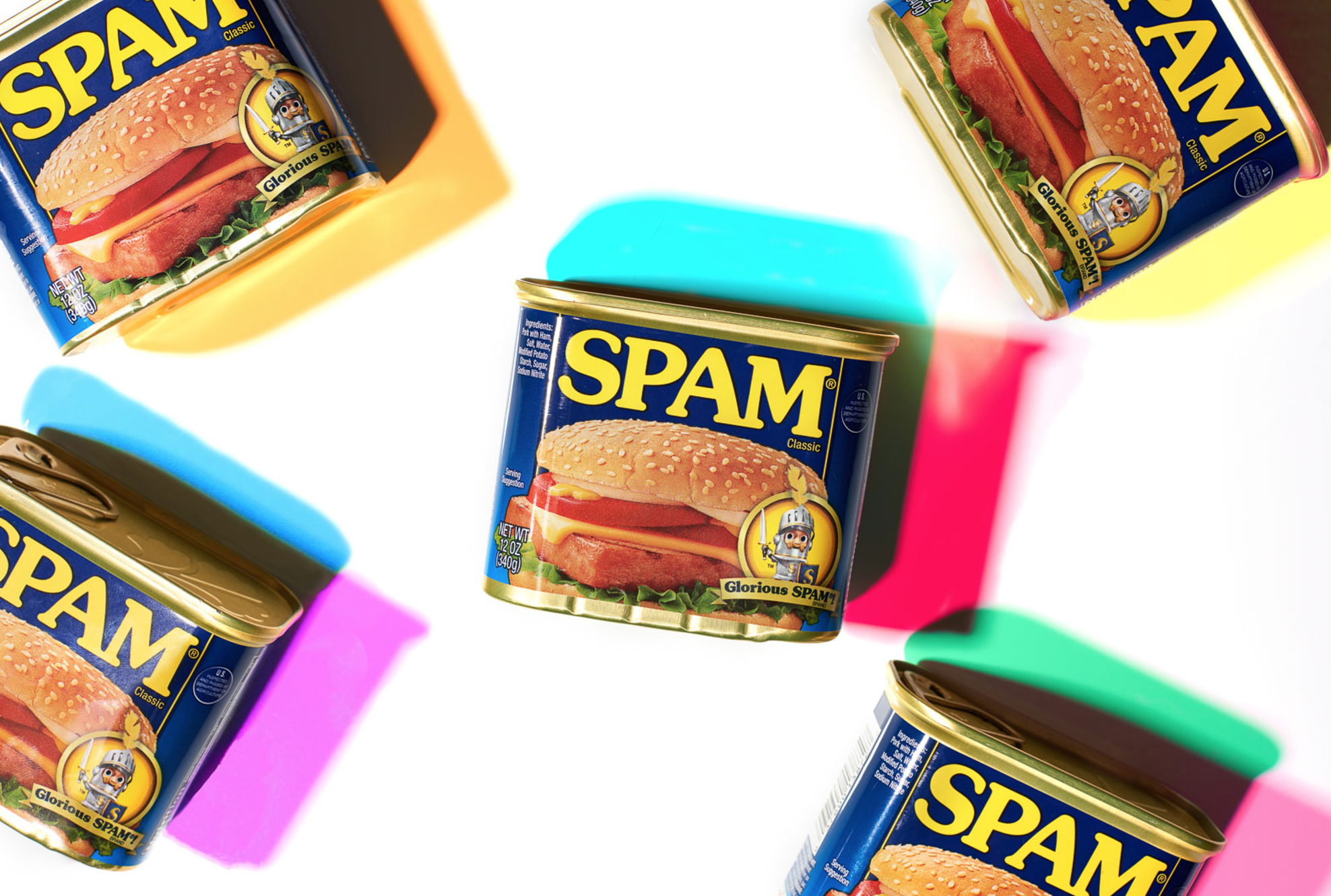
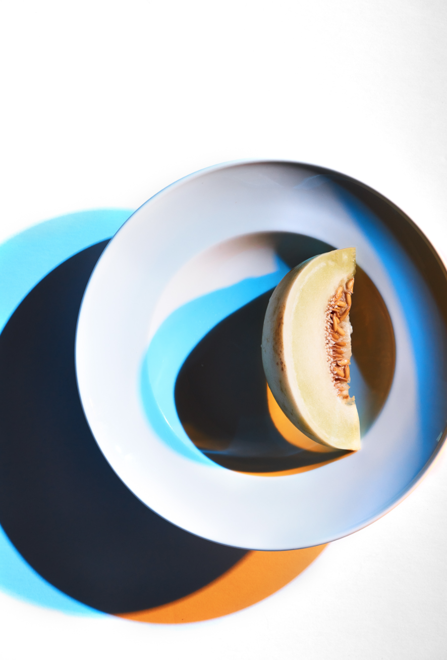
Shea: After building up a small amount of these images, I began to wonder if they might have some commercial applications for product shots. Once I had five or six images to show, I reached out to a creative director I had worked with previously. This was really casual, just over text (her preferred mode of communication), “Hey, I’ve been working with this style recently, I haven’t seen it around before, if you think you might have a client that it would be a good fit for, I’d love to work with you again”. Just so happened that she was looking for a new style to match an imminent project. We ended up working together to craft four images for her client in this color shadow style. The end client was thrilled with the unique look and used the images as large storefront window posters.
What type of feedback are you getting from the personal body of work?
I’d say the feedback has been positive. Certainly, with this type of work, the reaction has usually been “whoa!”, but part of that is because it’s such a departure from my previous work, which has a very natural, real and organic feel to it. This has none of that. I had a previous personal project, Deconstructed Flavor, that always seemed to excite people. It leads to a lot more interviews than it did actual work (though I sold some prints and did do a commissioned cover). But interviews can be great marketing, so I think if nothing else personal work can help in that way. I don’t think you can really do personal work with an eye to turn it into jobs, it’s just not going to be genuine that way.
How did this style develop?
I started this particular project not as personal work, but more an exploration of technique. I had had an issue on a shoot with mixing color temperatures from ambient and strobe light sources and so I began experimenting with using gels on my lights to try to match up temps, and really just see what my options were. I had only used a warming gel here and there in the past but didn’t have much knowledge beyond that.
Pretty quickly into experimenting though, I started to notice the shadow effects I was getting out of combining gels. And I started to play with multiple gels and subjects. I got completely distracted from my original purpose.
Just on a creative level, it felt good to completely go away from my style of “real, natural, organic”. In this way, my personal work has served as a kind of release valve for built up pressure by being boxed in by my own commissioned work.
What are the brain twisting gear elements you are referring to in your comment?
The shadows themselves are related to lights and gels you choose to use. That’s pretty obvious. What isn’t obvious though, is that the color of the shadow is related to the gel of the opposing light, not the one casting the shadow. Also, depending on what combination of gels you use, that affects the color combination of shadows, change one gel out and the one that remains will also be affected and won’t be the same shade in the new image. In addition to this, power in your light source has a great effect on the color, from a deeper color to a more pastel depending. On top of this, some gels are denser, requiring more or less power from a light, so any change involves this total recalibration of your lighting setup to achieve a balance. Then there’s the middle shadow to consider. If you have an image where the shadows overlap, that creates a third color/shade or shape element. How do you want that to look? Then there’s the shape of the shadows themselves, long or short? How can you turn the subject to get a more interesting shadow or a less interesting one? Is that shadow too distracting? Is it too small? This work has a much more fine line between “Cool!” and “Crap!” than I’m used to working with on my more “normal” tabletop food work. On the other hand, it makes it that much harder for someone else can replicate. Lately, it feels like everyone can offer a “window-lit looking food/product beauty” so it feels good to have a difficult shot like this in my offering to clients.
How do you see this work influencing your current brand and style?
I don’t know if it represents a departure point as much as a branch. I’m not evolving into a new style so much as adding something to my toolbox. Any photography is partially about light and how you use it. I love playing with big soft light and also really hard light and everything in between. I think this is just another option and an expansion of that knowledge of how to use light.
Are you concerned about having too wide of a range with your style and becoming fractured?
A little? Certainly, it is a little hard working this into the rhythm of my larger portfolio book since it looks is so different. On the other hand, I’m running a business. I’m a photographer but what I sell is products. Before this shoot, my products were, “editorial food beauty”, “food lifestyle”, “portraits of people in the food industry”, “environments in the food industry”, “product in the food industry in a natural setting”. This simply adds “product in the food industry in a DYNAMIC UN-natural setting” to that list. It’s still under the umbrella of food/product and I think if I keep it like that, I’ll still be “niched” while really being able to keep my options open for client’s needs.
How do you decide what style to use?
I think that simply comes down to client preferences. What look do they want for their product? This could simply be another look I could give them, but of course, I’d be happy to continue with the “natural look” as well. I’m not in this to force my artistic vision on the world.