The Daily Edit – Stock Pot Images: Ophelia Chong

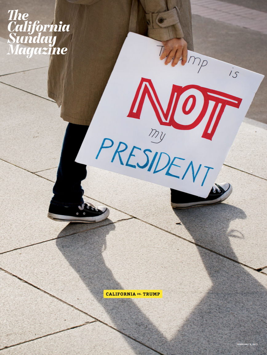
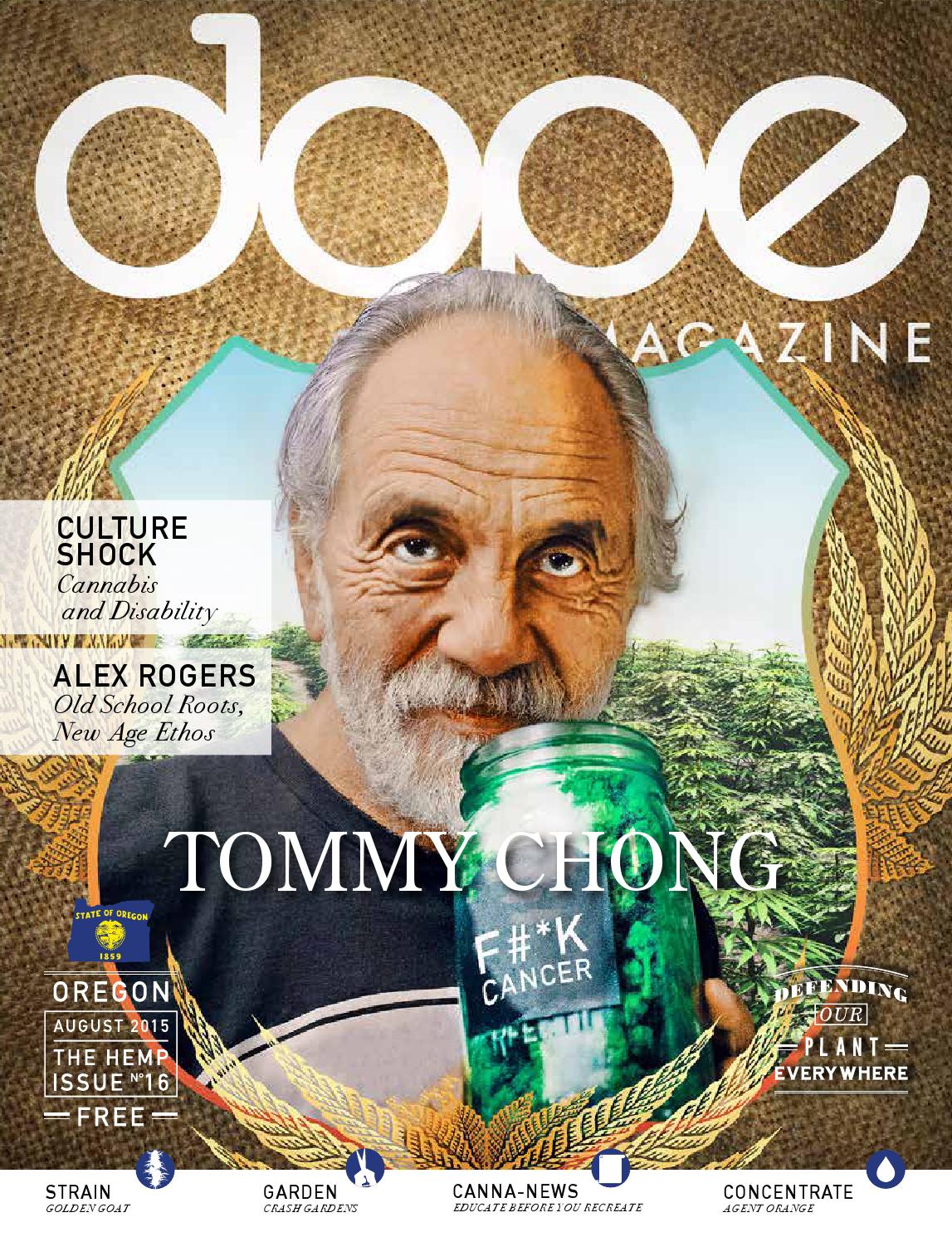
Cover photo by Bettina Monique
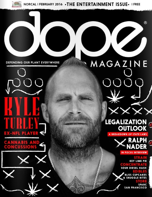


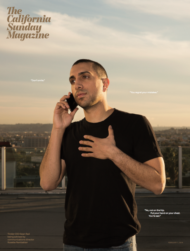
Feature story by Josh Fogel
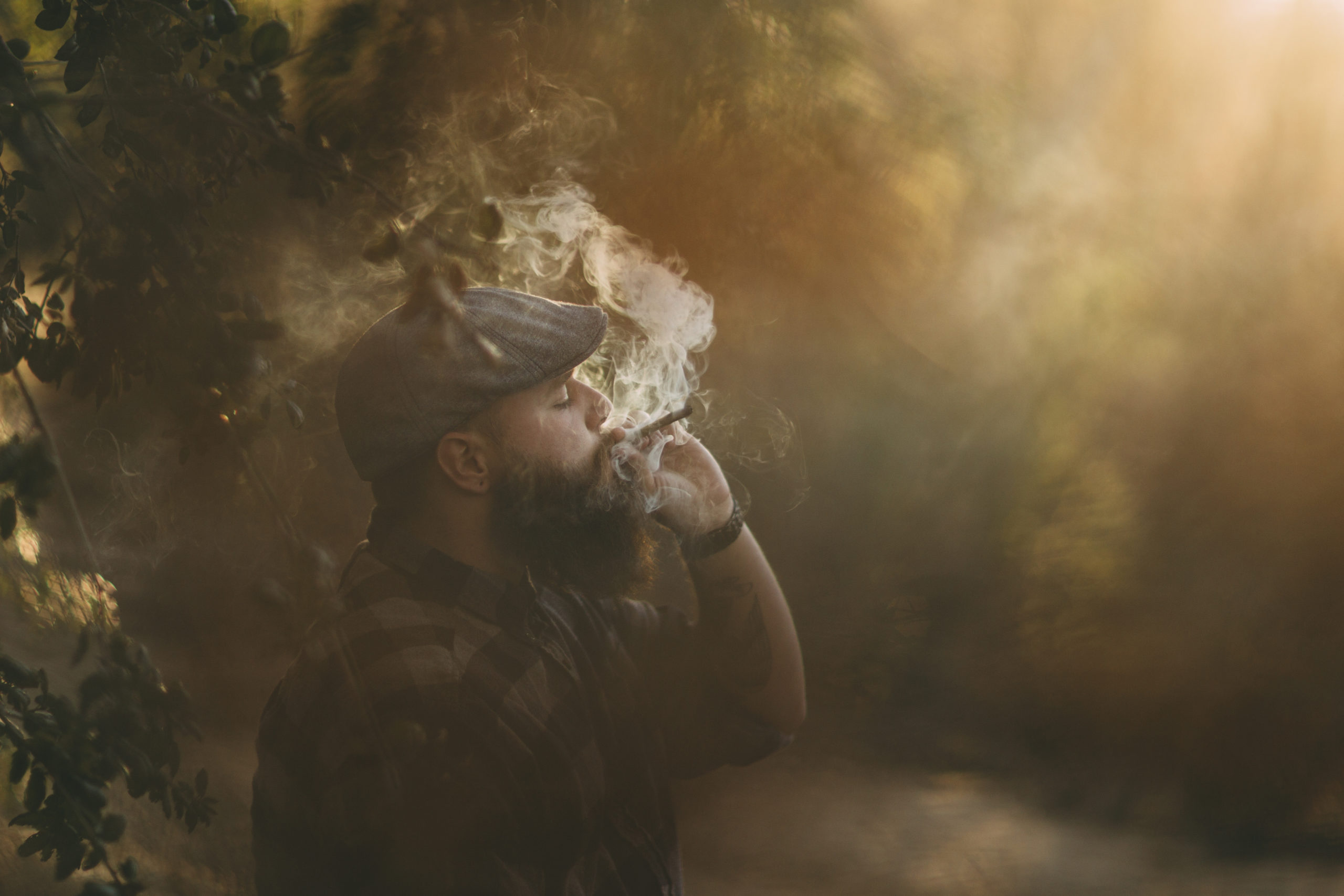
 

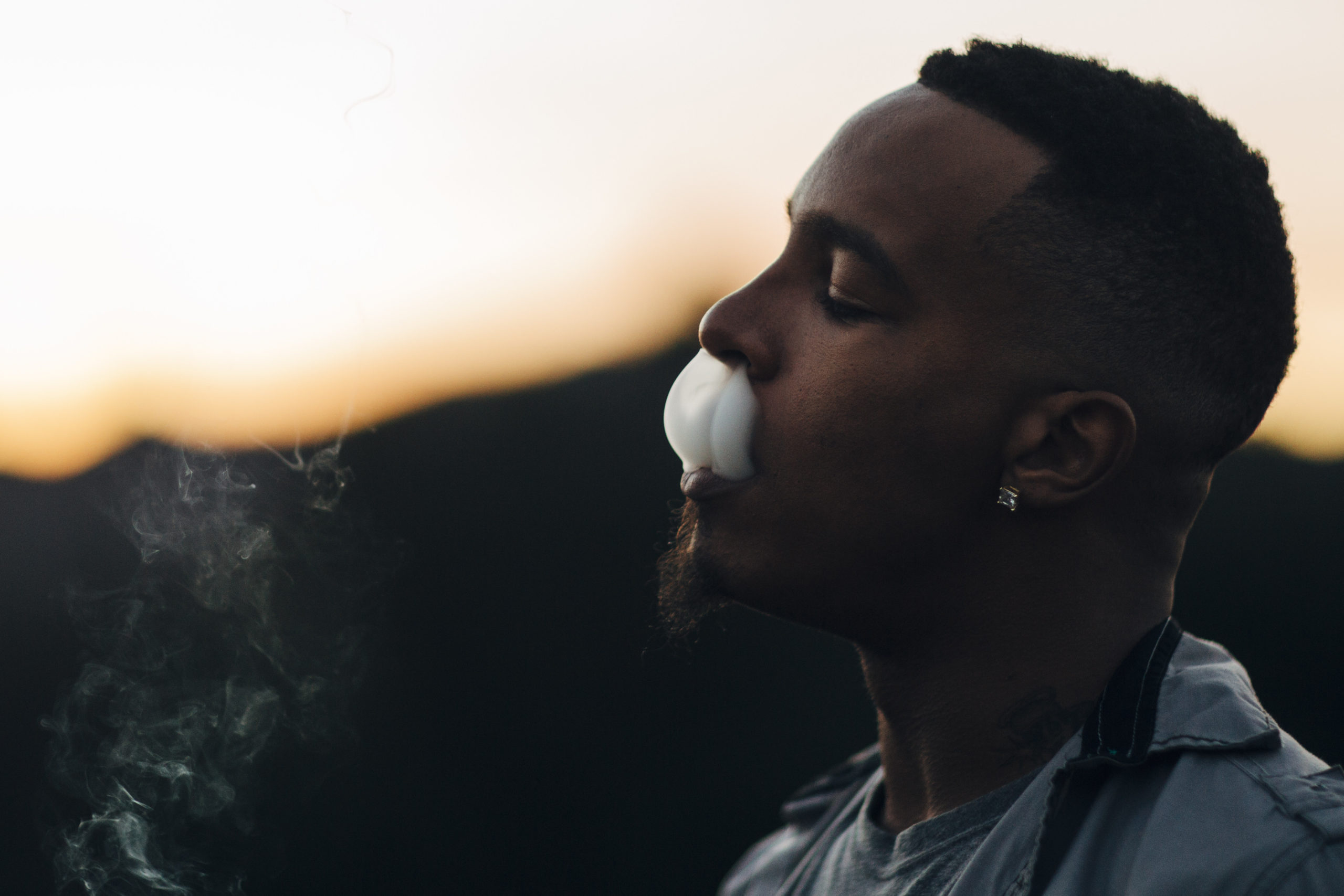
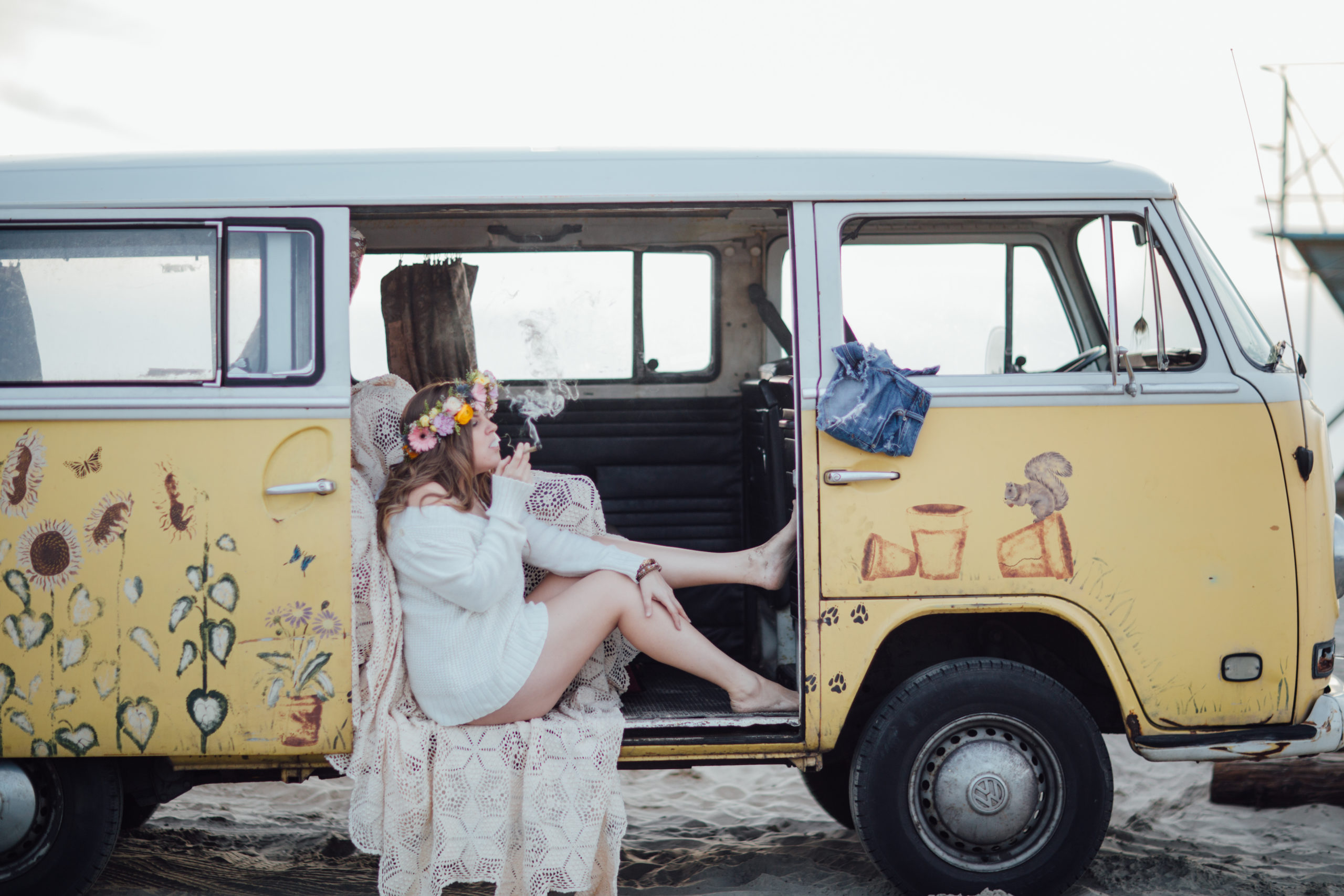
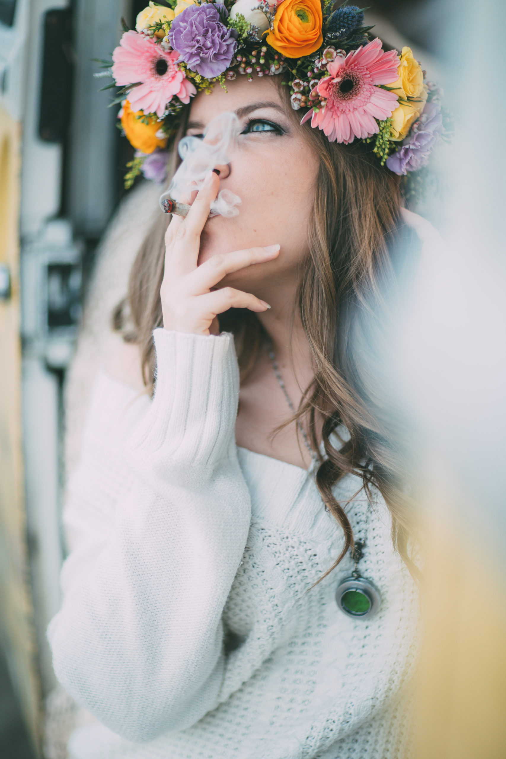
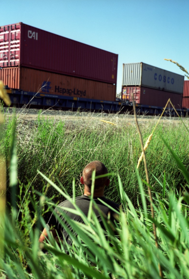
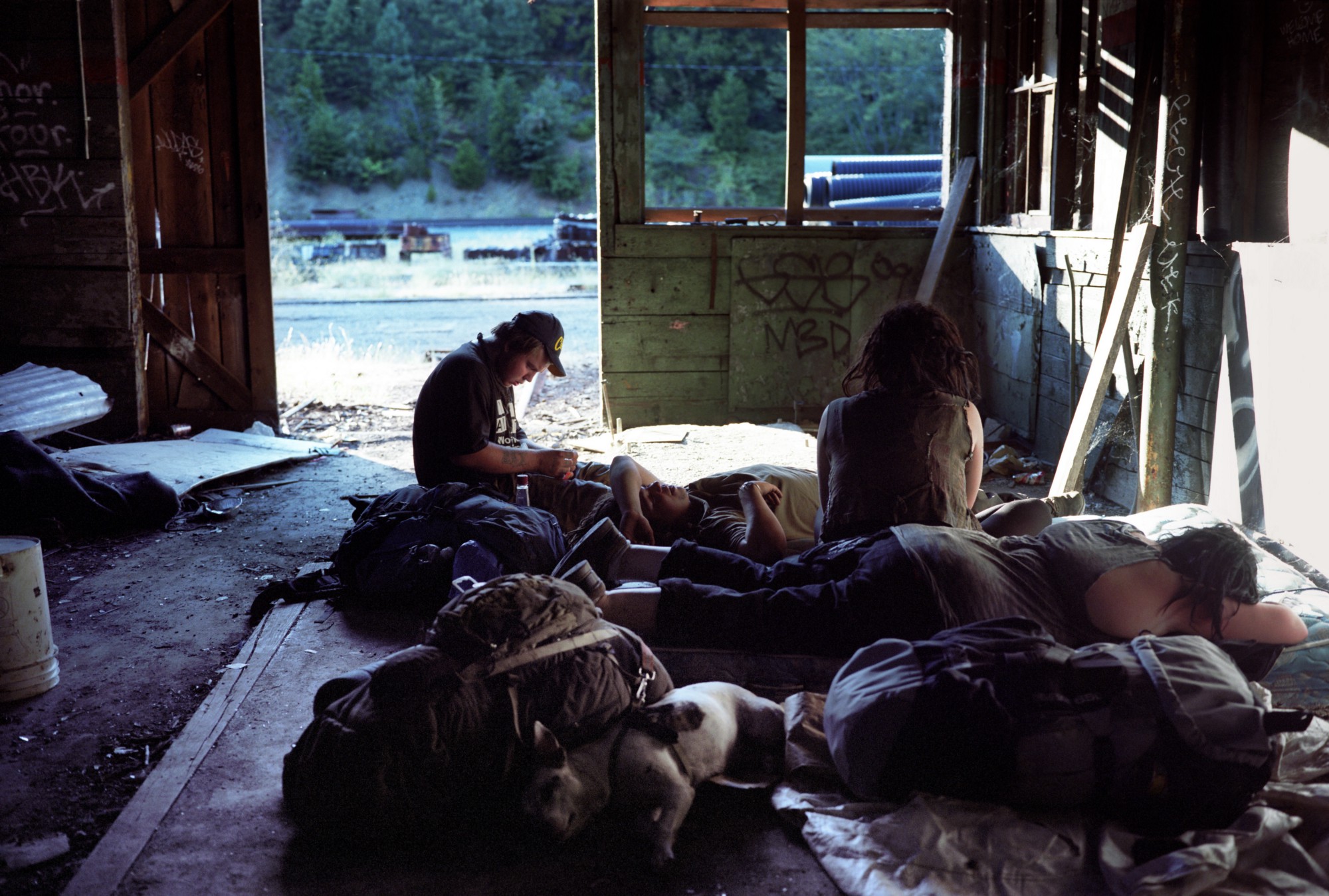
Above Images: Seagrass Photography


Photographer: James Walker
Stock Pot Images

Heidi: How long did you watch the trends in market before you felt it was a viable business?
Ophelia: My sister came to visit and she has an autoimmune disease, and she took a chance on ingesting cannabis to see if it could alleviate her condition, as I was watching her I thought “whoa, she’s a stoner”, it made me sad to think she would be stereotyped as that and not as a medical patient. A day later I had an epiphany that came to me in the shower to start a cannabis stock agency, I jumped out of the shower and started to google images, and found all of them lacking and stereotypical. A month later I had the LLC in my hands. Before January 8th, 2015, I might have smoked cannabis about ten times. I hit the ground like a tornado, read, got a medical marijuana card, went to dispensaries, attended cannabis events, I dove in like a crane after a sardine. With 28 states including DC having some cannabis legislation, the timing was perfect. California just passed Prop 64 which allows adult use of cannabis, and the prediction is $6.46 billion by 2020, and StockPot Images is there to service the needs of this unstoppable industry. After launching 4/20/2015 we are now over 200 contributors and over 17K in images and video. After careful consideration of the wonderful agencies that approached us, last Monday March 6th we signed an exclusive agreement with Adobe Stock to carry our library in the Premium Collection, this was a wonderful validation of our hard work over the last two years.  NOTE: Predictions from Forbes and revenue estimates from Time Magazine.

Have you observed market trends before and responded?
When I was the creative director for Workbook Stock, I was a huge fan of DIY zines, I started to see a resurgence of the hand-made, the guerilla style, the collageing of emphera and what I wanted to do was to take that for Workbook Stock’s marketing. I pitched the idea to give an artist our stock photography and to add their own illustrative style and incorporate it into a piece that spoke about creativity inspired by stock photography. I hired Adam Larson to create his sensual photo collages, his work won multiple awards and set him on his path out of an agency to his own.

If I wanted to be a contributor for the agency, what’s the process?
Cannabis has been prohibited in the US for 80 years, and because of that access to the plant was controlled. That being said, there are not many photographers of cannabis out there, at the beginning I searched Flickr, and social media to sign my first photographers, after 3 months I no longer need to search, I get inquiries every week and on the average sign 2 – 3 a week. All anyone has to do is to reach out to me and send me a portfolio to look at.

Do you have a team that reviews the caption and strains?
No, I am a one woman band, from curator to office manager to keyworder to bill payer.

You were the creative director at Workbook, what sets your agency apart ( features, specificity?)  
The most obvious is that we specialize in cannabis digital media, and I went from a staff of many to just myself, what I learned while at Workbook was what everyones’ responsibilities were. I observed and asked questions, and learned on the fly, under at times the most stressful times. I remember there was a period where I was designing a magazine, two stock books on top of my normal workload. I produced, curated, designed and sourced everything, and because of that I was able to get the full spectrum from idea to fulfillment.

How else are you connected to the industry?
Community Liaison: THC Design
I have been given the chance to lead the community outreach for a company that has the most diverse staff I’ve been a part of. I am working with veterans, LGBT, disabled and minority communities. My program is not about putting the THC logo on an event or to get “likes” on social media, it is about grass roots work to build a community that we advocate and become advocates for cannabis.

Creative Consultant:  PUSH MAG
I have worked with Abigail Ross at Dope over a year, and we produced feature articles and covers for Dope together with the photographers of StockPot Images. After Abigail left, we along with five other women created PUSH MAG, a magazine that is for the millennial woman in cannabis. Our mission is to be a voice that pushes back, to encourage other women, to celebrate the intrinsic need to be a strong community by saying it’s okay to scream and kick out of the box.

Asian Americans for Cannabis Education: Co-founder / Presently running the whole shebang

I took over AACE from my other co-founders, they had a full plate so I am not carrying the mantel. My goal is to find like-minded Asians in the cannabis community to help de-stigmatize the medicinal use of cannabis. In the last month I’ve found many who are going to join this journey with me, from all walks of life.

What other organizations are you involved with that an aligned with Stock Pot Images?
I am involved with Supernova Women, we are women of color in the cannabis industry, we educate, we promote, we support. ( I am going to be on the board of directors in mid march)

How did that name come about for the agency?
I had names on the whiteboard; all of them were too “weed-centric”. One day I was standing in the kitchen staring at a pot….

It took me a year to get the trademark, because each time the USTPO attorney clicked on the site, their “warning” radar came up. Then it was that the term “stock pot” was too generic, so my attorney suggested “stockpot” and it went through.

My banking story is since I am ancillary, I can get a bank account. However the bank I was with over 2 decades turned me down, I took all my money out of the bank and walked across the street to another bank and they took me on without a word. Cannabis is a schedule one drug so therefore you cannot have a bank account, it is a major downside to the industry that we have to manage all of in cash.

What’s the creative ethos behind the imagery?
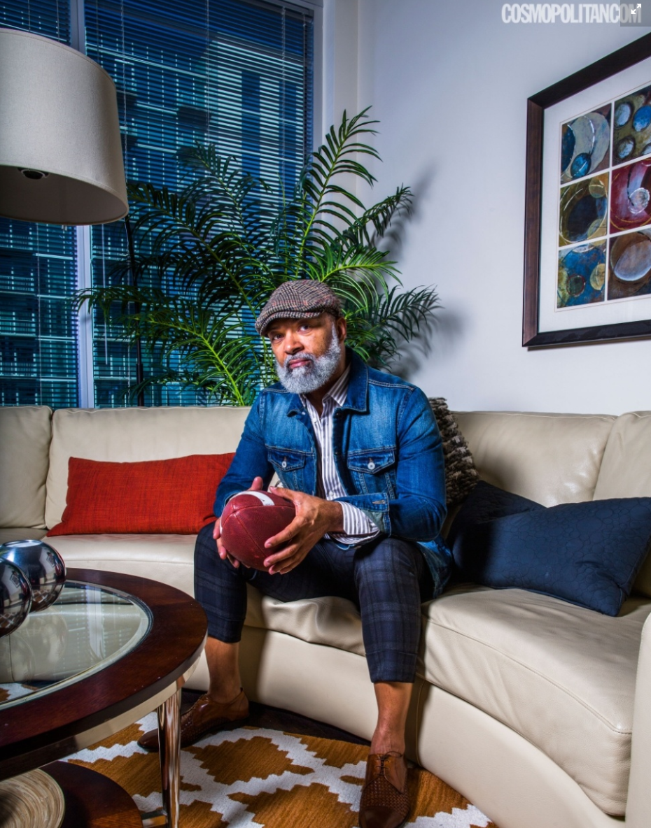
Our mission is to offer the true faces and communities of cannabis, none of the subjects are models, and all are real users who signed model releases because they believe in our mission. We have two portraits that I am most proud of, one is of a 70-year-old African-American man, in his Sunday best holding a joint, the other a 90-year-old Chinese grandmother tending to her small cannabis plants. The gentleman is heavy with history, the history of incarceration of African-American men for the simple possession of cannabis.
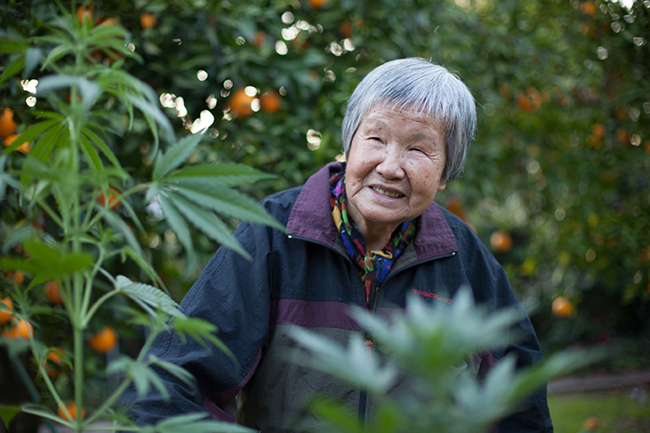
A Chinese Grandmother tends to her Cannabis Plants by Linus Shentu

African-Americans only make up 13% of the population of the US, yet they make up 25% of prisoners, 60% of the people in jail are people of color. The Chinese grandmother represents the duality of the Chinese immigrant to follow the law and to not rock the boat; she is changing the paradigm by doing what she does on a daily basis.

Do you art direct photographers?
I only art direct my photographers (195 of them) when we need specific images. I am delightfully surprised by each of their uploads, it’s Christmas everyday.

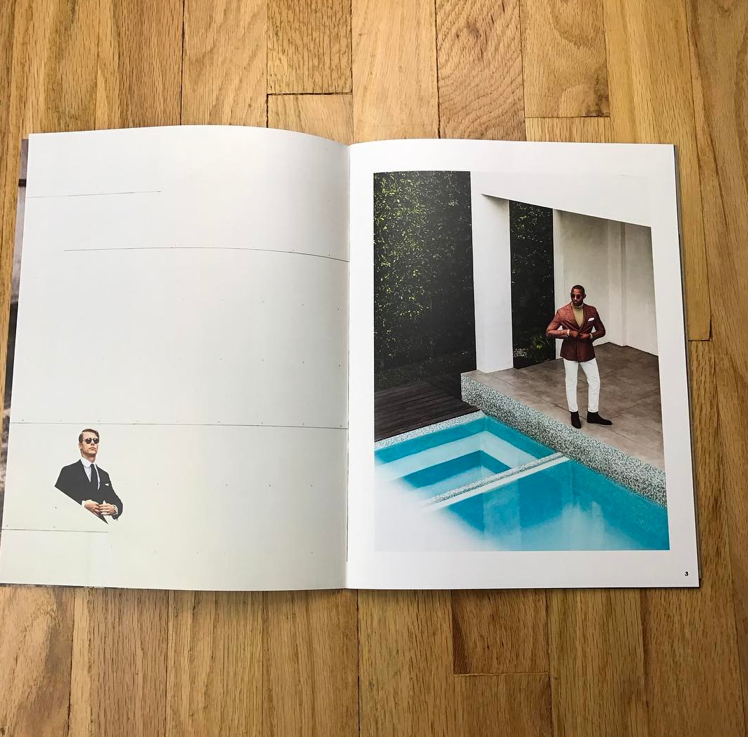
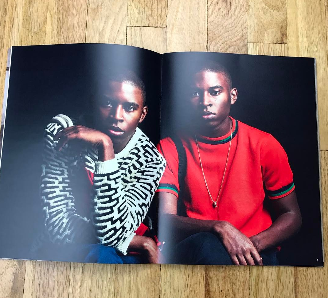
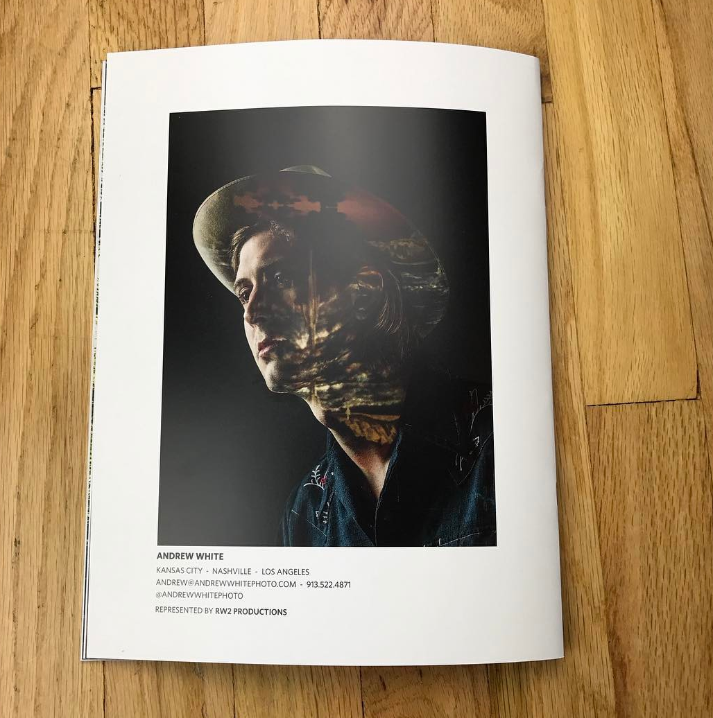
The Daily Promo – Andrew White

 
Who printed it?
I printed this piece as well as my print book at Soli in Kansas City. They’ve always been good to me, and guided me through paper stocks and printing processes. Added bonus that I can pedal from the studio to check out proof sheets, and they let me bring my bike inside.

Who designed it?
Gage Wente at RW2 and I designed it. We wanted different dimensions than an internet printed 8.5 x 11 book so that it had more impact, but close to it to capitalize on shipping and envelope costs. It ended up being a taller format based off the cover option that worked best.

Who edited the images? and did the pairings?
I edited the images with input from Lyndon Wade of The Wade Brothers. My work is split among sports, music, and portraiture, and all needed to be represented evenly. Similarly, I made sure there was a good mix of advertising, label, editorial, and personal work.

How many did you make?
I printed 250. 100 went in the mail, 50 were handed out in person, and the rest are on hand for leave behinds or for new contacts that come up.

How many times a year do you send out promos?
This piece is pretty comprehensive of my work from the past 18 months so I don’t imagine I’ll do another like it till next year. But I plan on sending out specific project promos. I just wrapped a book for the Nashville Visitors Bureau, so I’ll do a piece with those images around mid-year. And I’m directing a live action sports project which I’ll do an accompanying marketing campaign for.

I had this piece set to release in December, but held off until January. Didn’t want it to get lost in holiday party hangovers, better to land on desks when work ramps up and budgets are fresh. Here’s a digital version to check out. It’s a not as cool as the printed version but at least I’m certain the mailman won’t lose it!

This Week In Photography Books: Bruce Morton

by Jonathan Blaustein

Whether you realize it or not, this column has undergone a sizable change over the last few months.

For five years, almost all the books we reviewed were borrowed from photo-eye in Santa Fe. They have a great selection of photo-books, for sure, but the types of books I wrote about were limited to what they had.

Furthermore, photo-eye is famous for getting small batch publications from weird, artsy publishers, so I often wrote about books like that. My friend Melanie, who worked there forever, would handpick a large stack of books, and they mostly consisted of big-time artists and the aforementioned edgy/Euro/Japanese stuff.

As of November, though, we ended our long relationship with photo-eye. Though people began sending me books a few years ago, our selections were heavily filtered through photo-eye, but now they’re coming from you.

It’s true that I can (and do) request books from publishers now, whenever I get a particularly juicy press release, but the guts of what I write about comes from the audience that reads this column.

What a populist notion.
How Trumpian of me.

I’m not saying the books will be better, nor worse, and I do hope we’ll be able to maintain our global perspective. But I think you’re already seeing that some of my selections seem more off-beat than they used to.

Things turn up in the mail.
I look at them.

So much of what I’ve reviewed in the last 5+ years has trended international. I can conjure images of Kazakstan or Calcutta as easily as I can pictures of New York. (OK. I admit it. We do show a lot of stuff from NYC. You got me.)

But it’s 2017 right now, Bub.
Get with the times, you know what I mean.

Trump might wear a blue tie to fool the gobsmacked, but he knows that his supporters are red-meat-and-red-hat-loving white people in the middle of the country. In so many cases, their lives are no better than they were in the late 90’s, and in some cases they’re worse.

The jobs that came back in the Obama recovery, Post-08, skipped rural America, and still others that were there even fifteen years ago have fled, like highwaymen who know the Pinkertons are coming.

Opioid epidemics and underfunded educational systems mean that large parts of rural America have been left behind by gleaming cities and Iphone-robot-sex-dolls and Silicon Valley and arugula-eating elites.

(My Republican Uncle even wrote the word “Proletariat” in a Post-Oscars Facebook post. What is this, Russia?)

Trump is right about one thing, though.
I’ll give him that.
He says the media is biased, and liberal, and of course that’s true.

We are the media. Right?
And we ARE highly educated, occasionally elitist, but most definitely liberal.

When we visit places, like Appalachia or El Salvador, we’re carrying our politics and context with us, so it often takes an insider to give us a more nuanced perspective. And given the state of the times, wouldn’t it be nice to get a glimpse into the world of heartland white people?

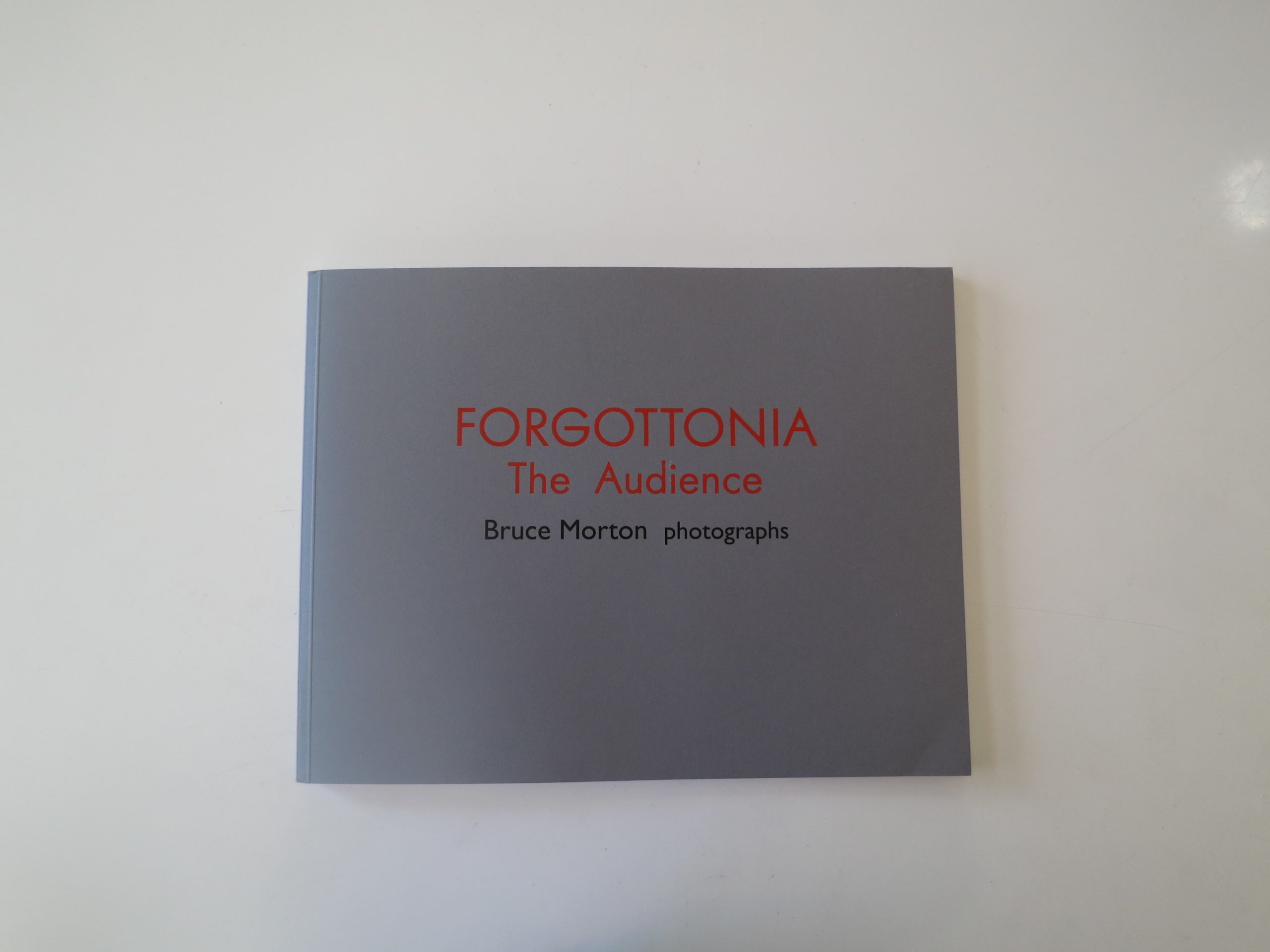
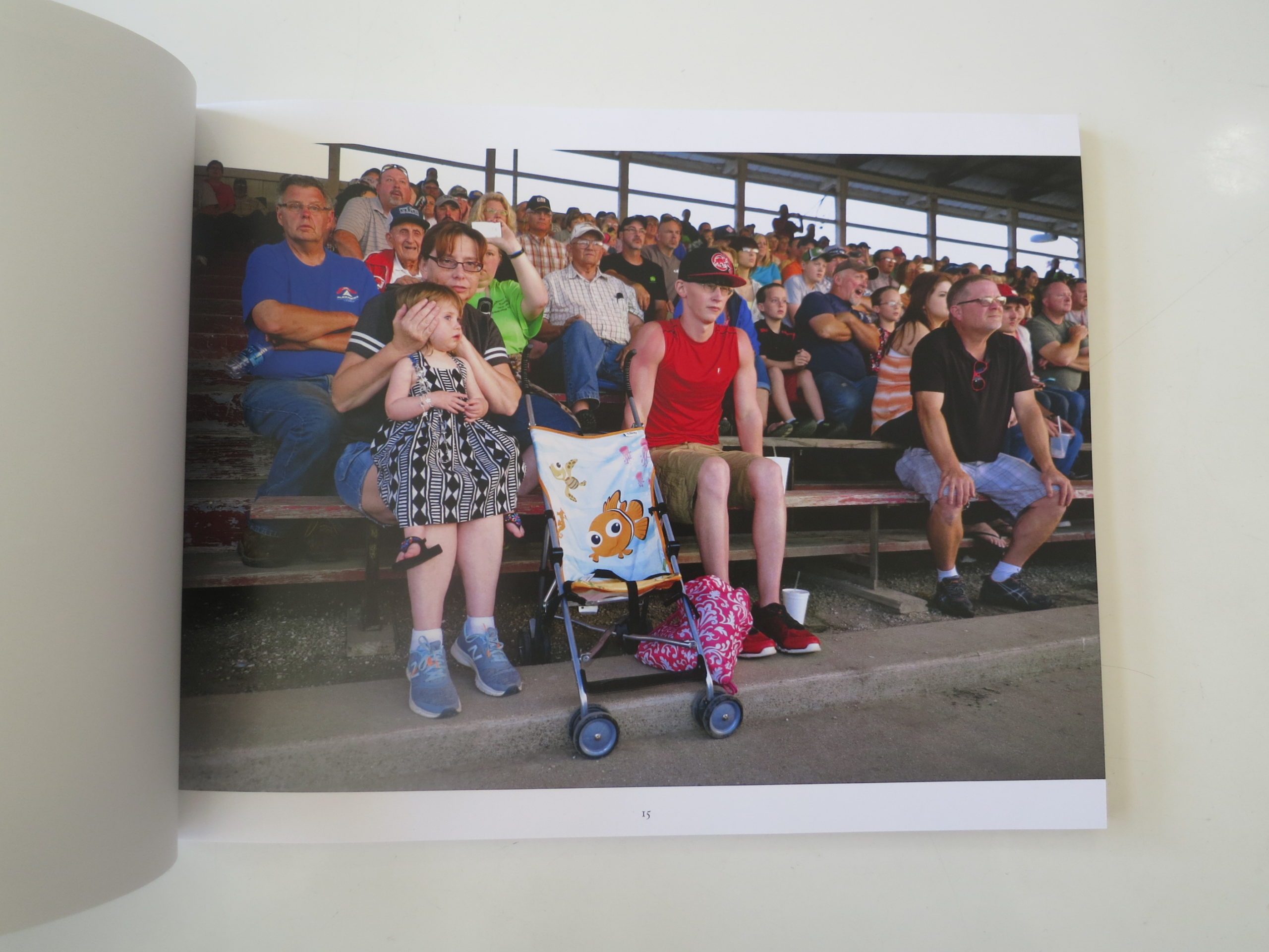
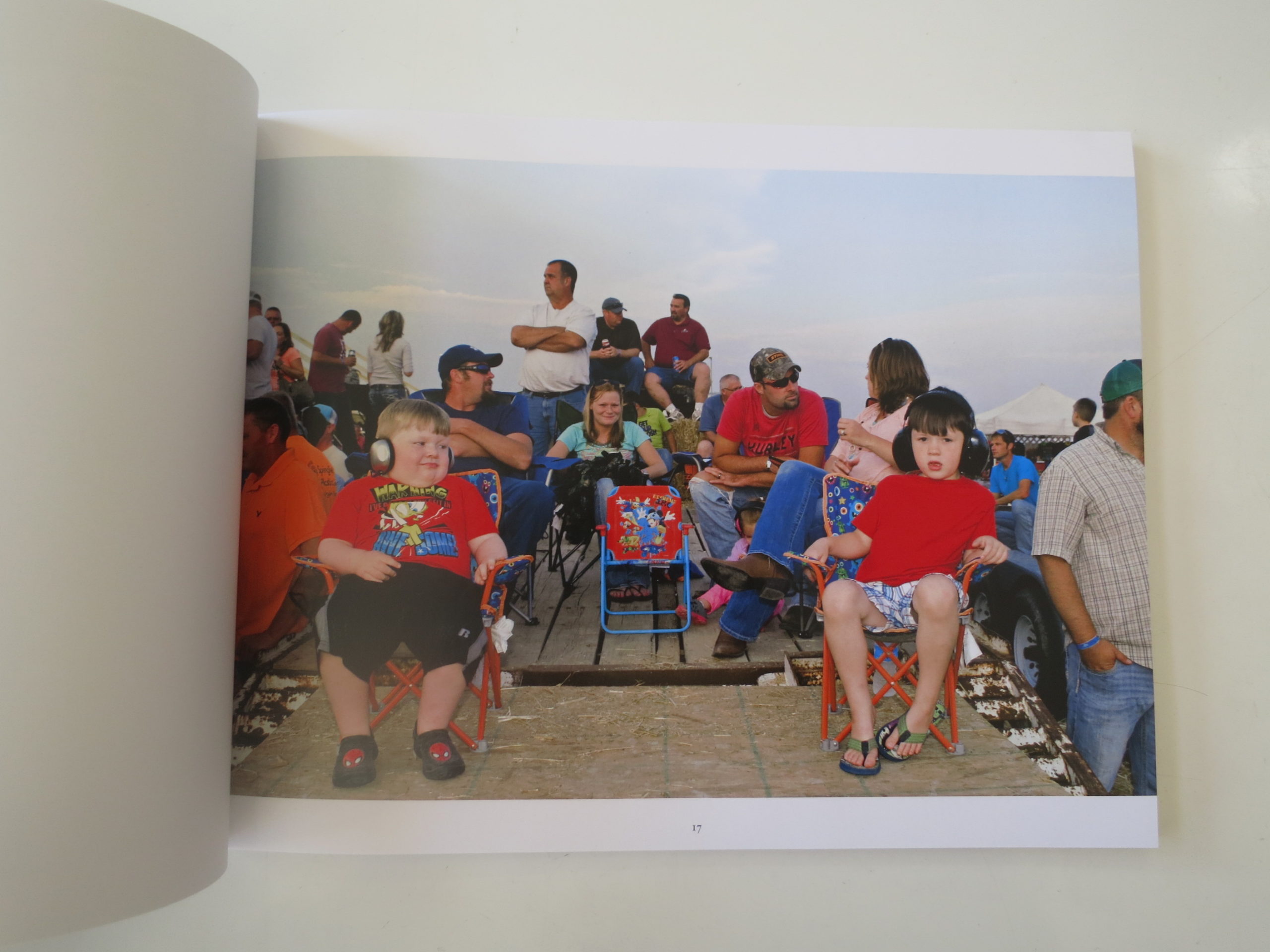
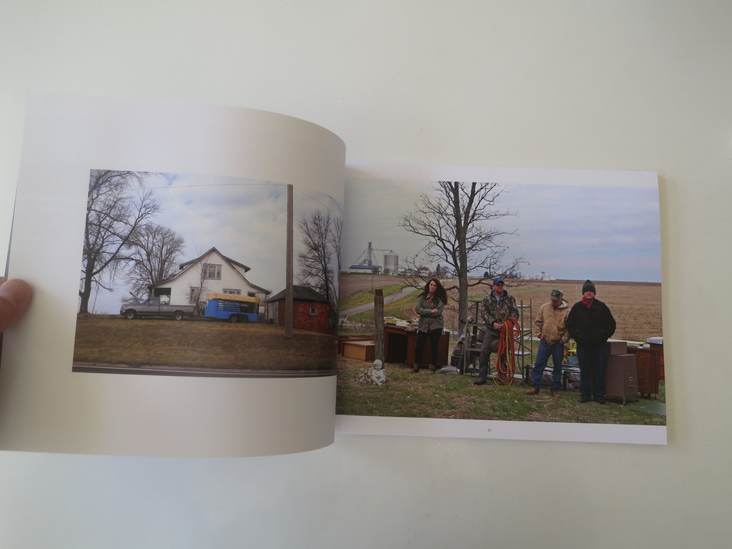
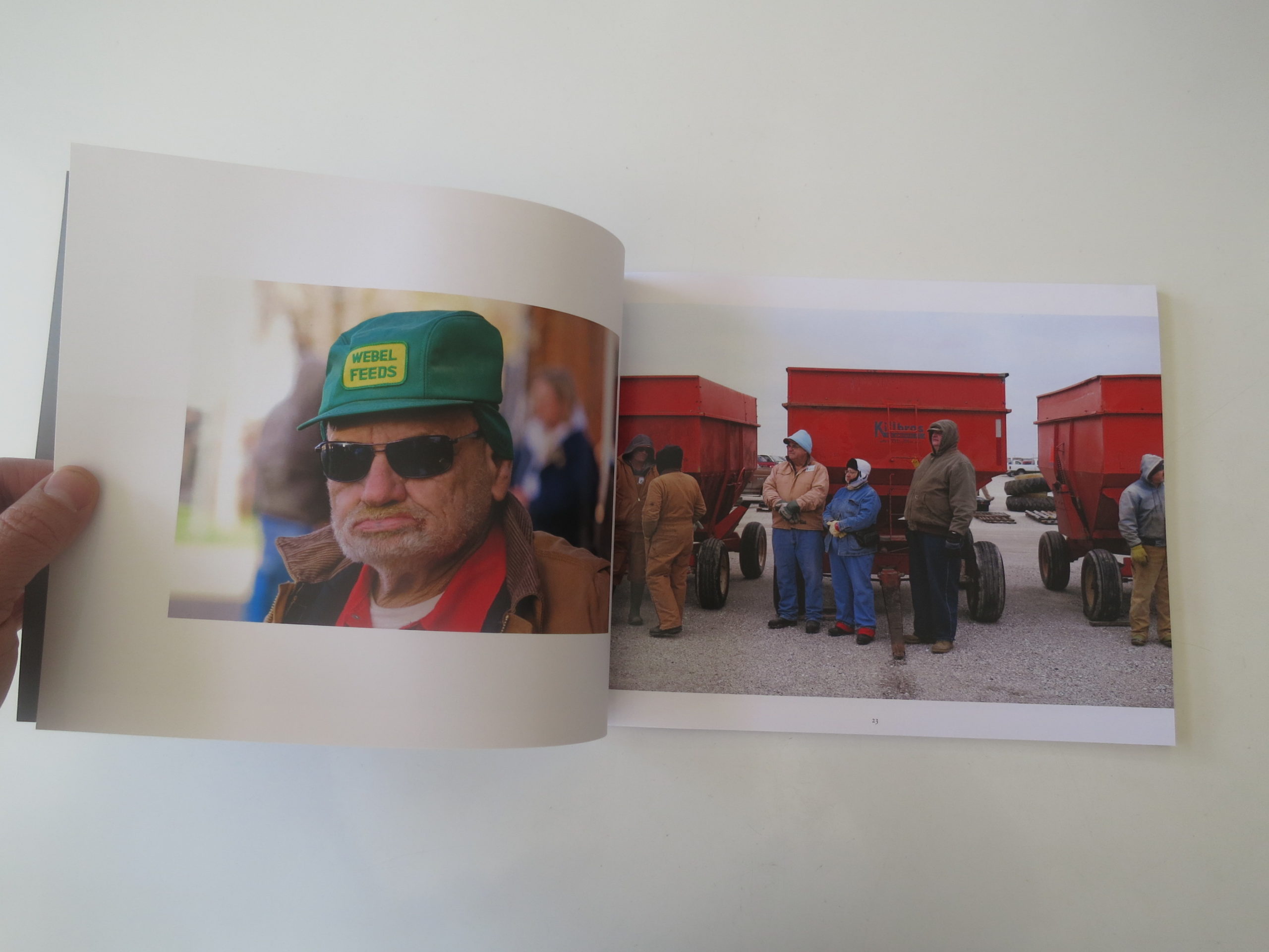
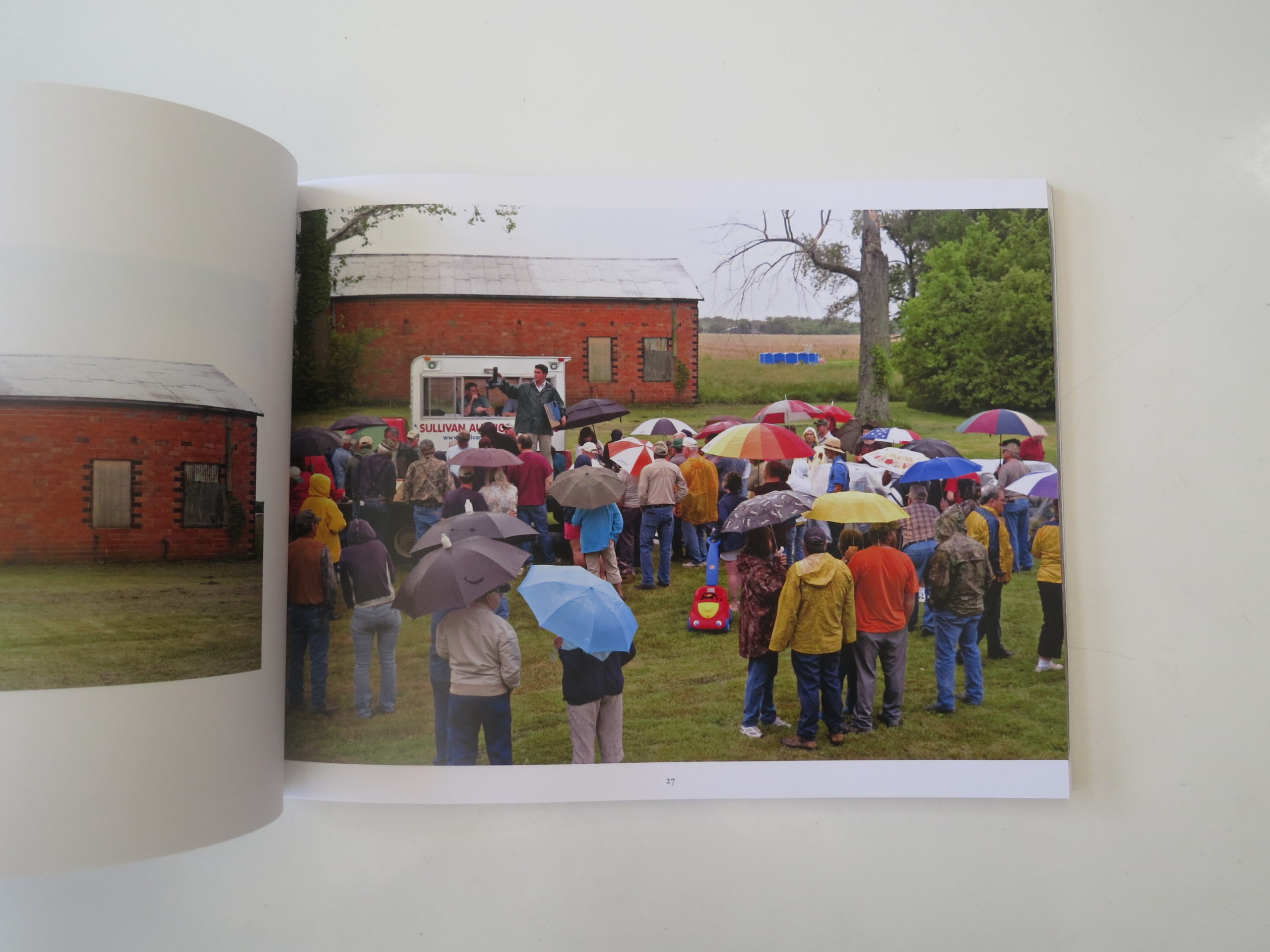
Luckily, “Forgottonia: The Audience,” a new self-published book by our friend Bruce Morton, turned up in the mail a month or so ago. Like Jeanine Michna-Bales the other week, Bruce is an artist I met at portfolio reviews whose work I’ve featured in this column before.

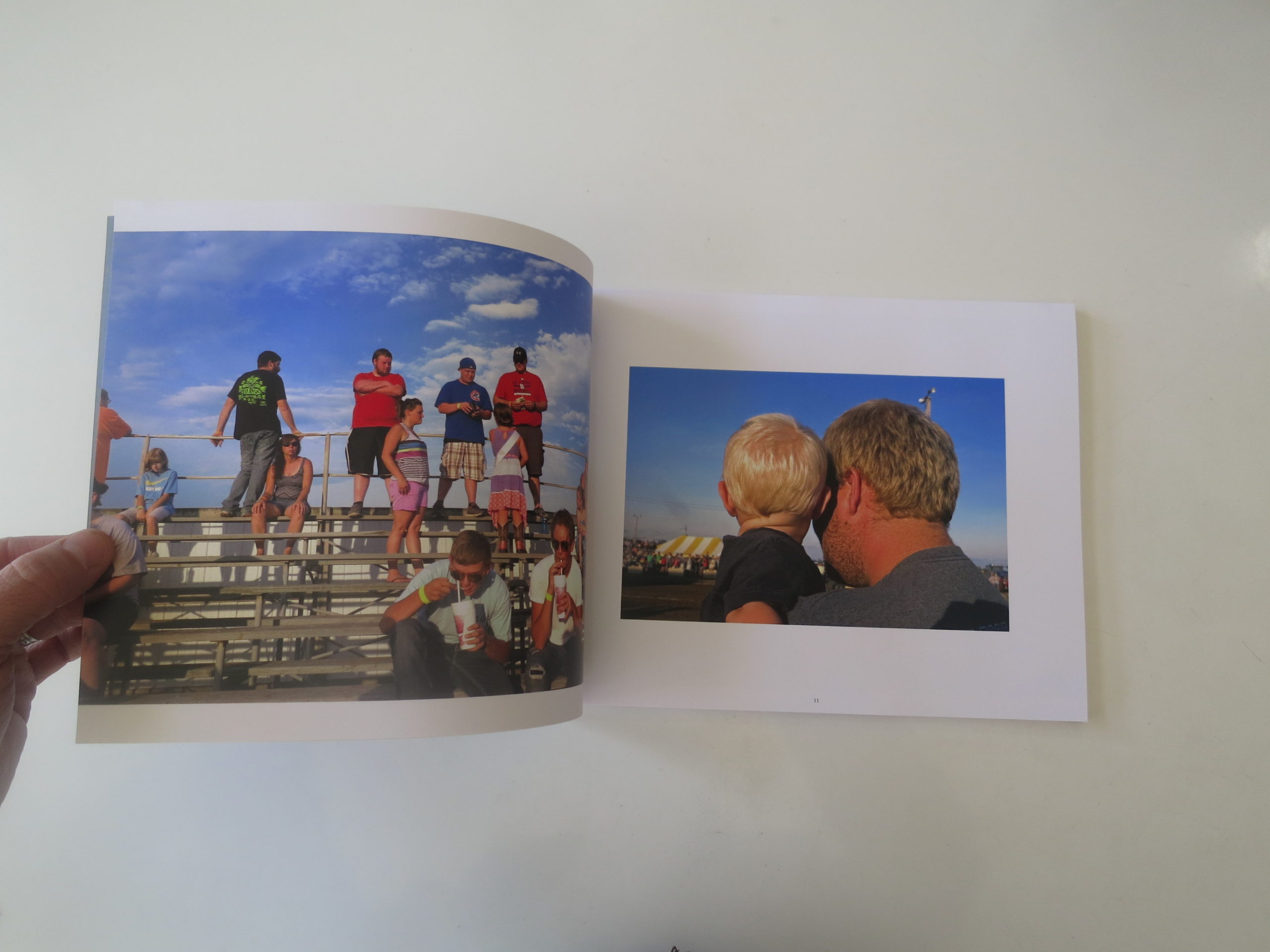
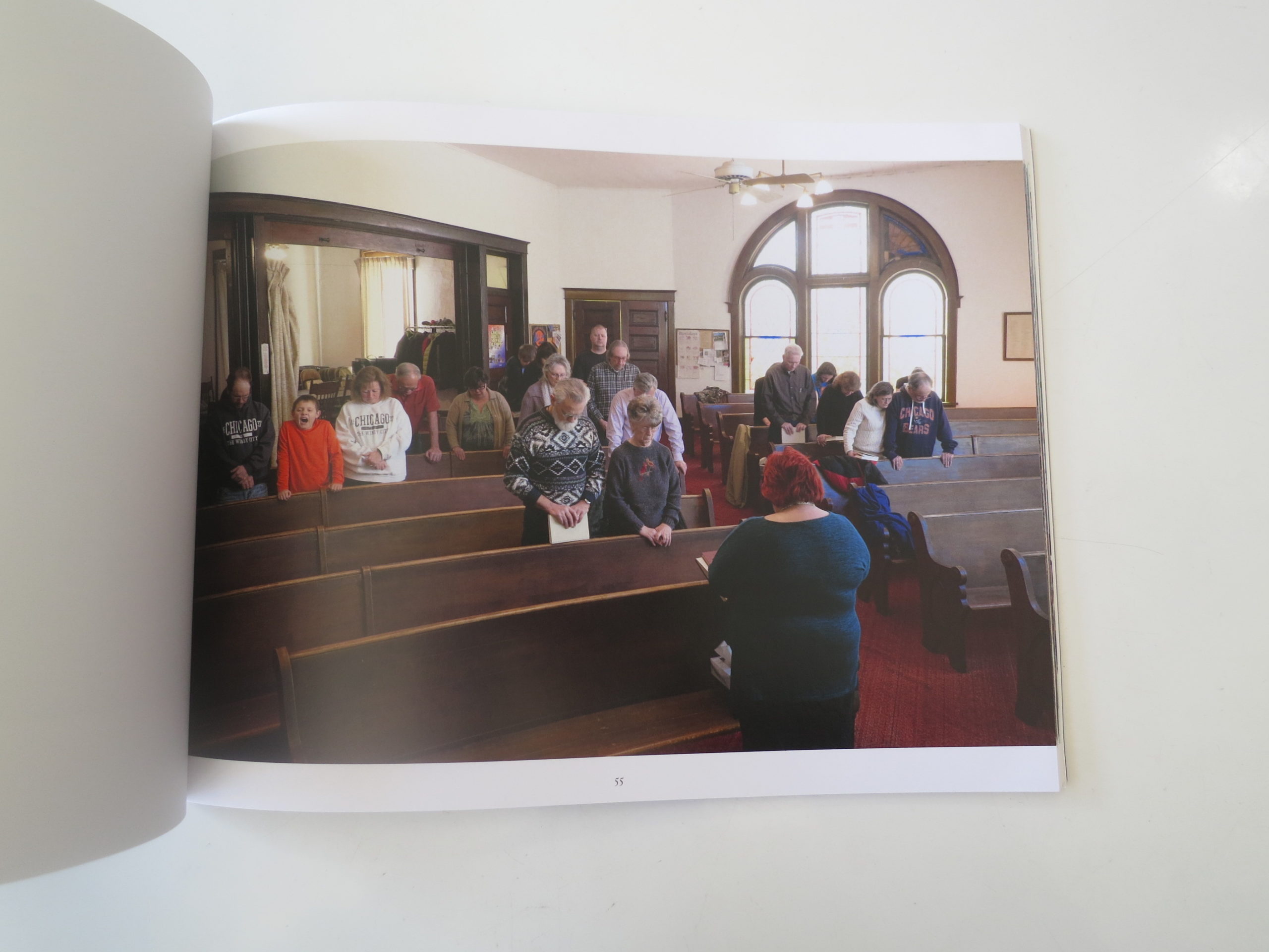
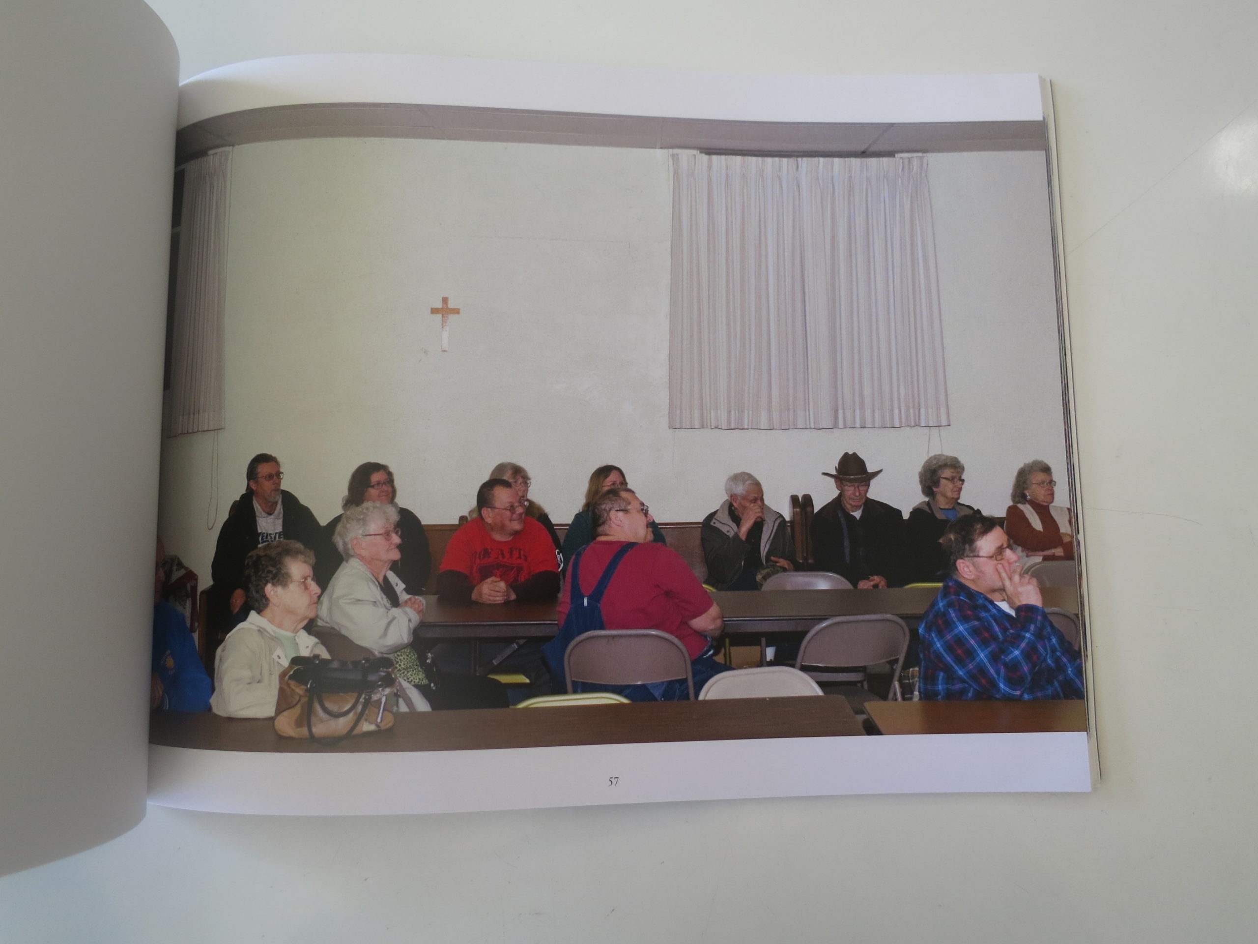
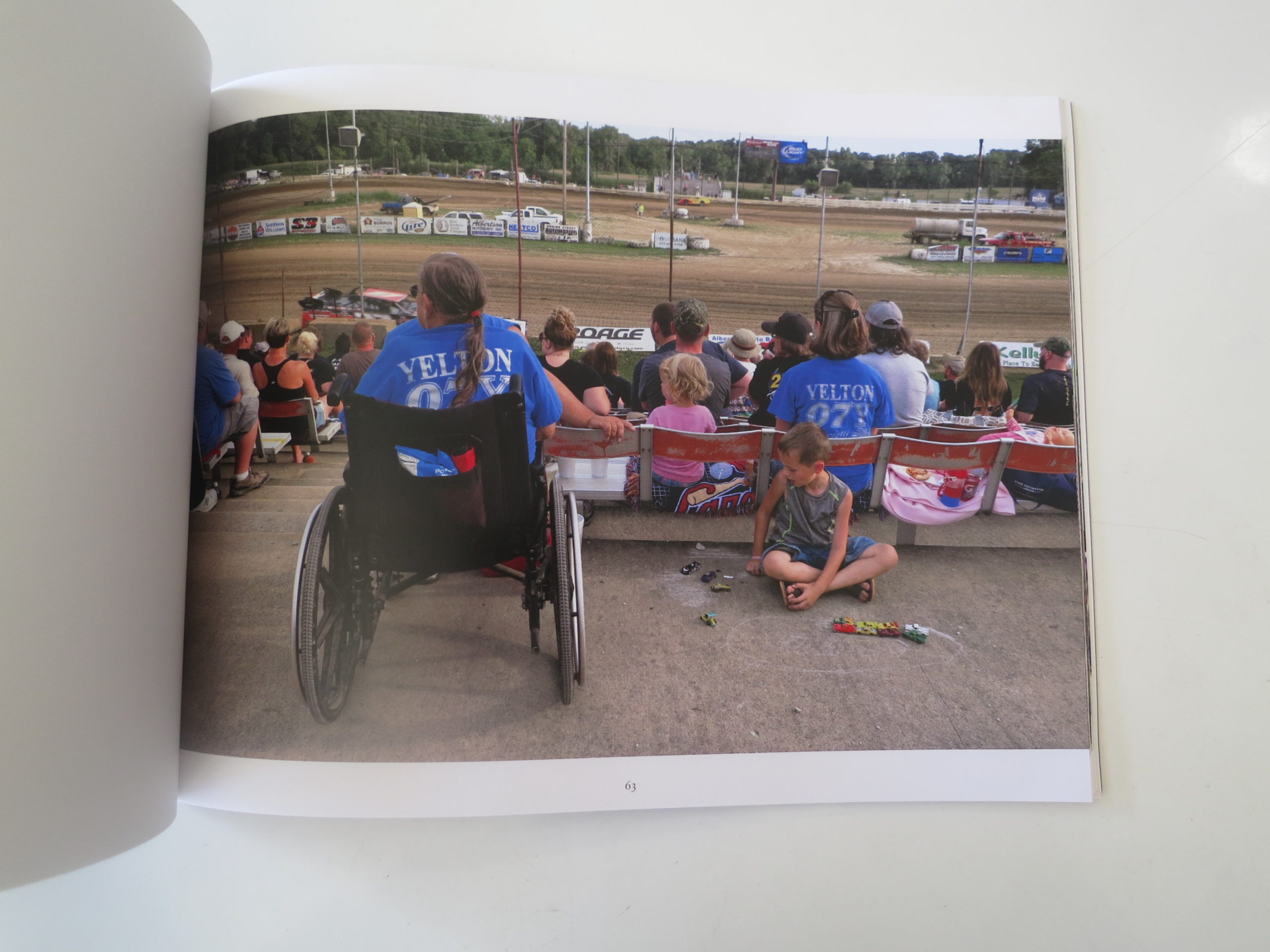
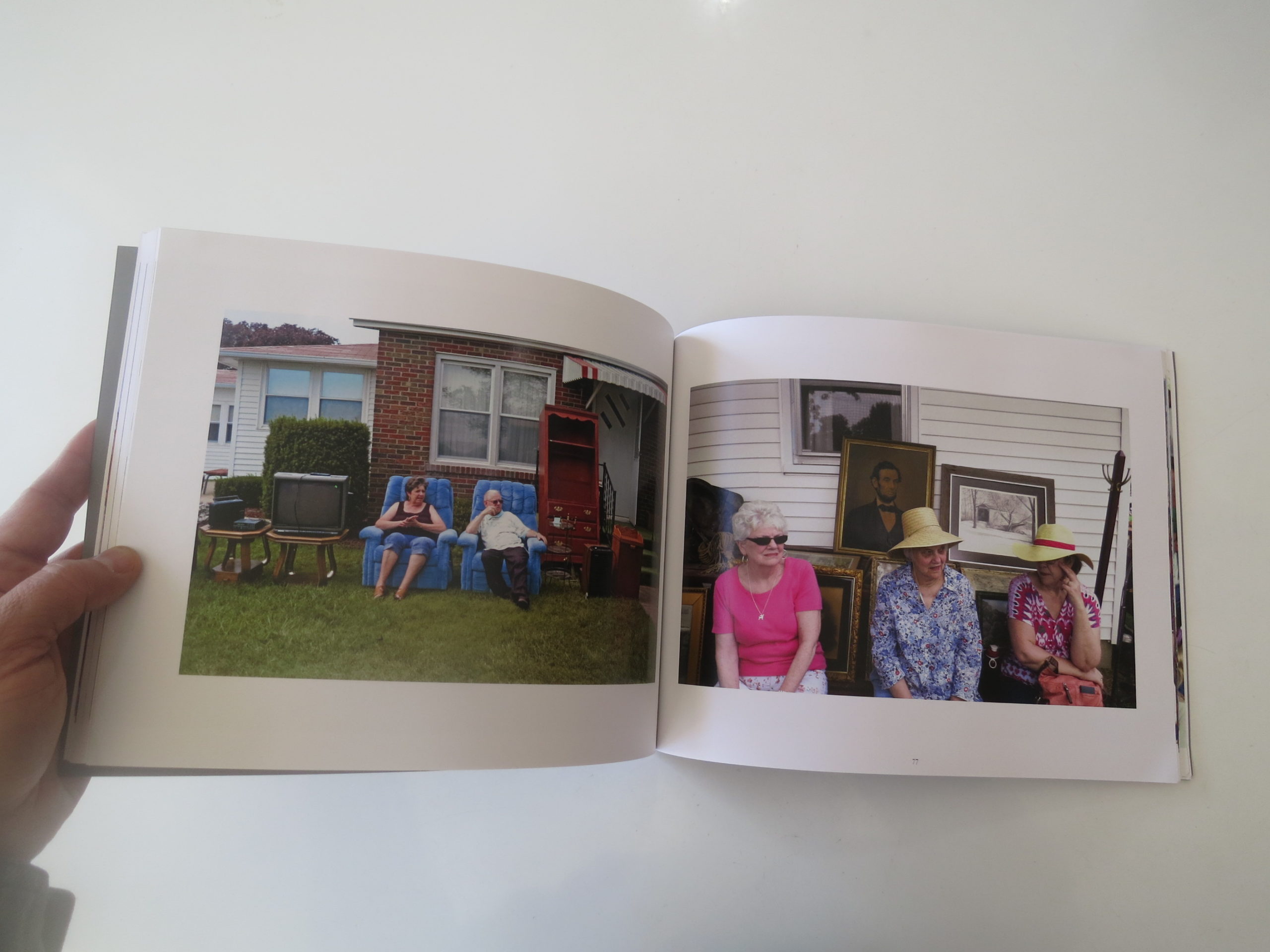
In fact, I showed a few of these very images a year and a half ago. Bruce was getting the project up and running, and I remember thinking that these color pictures of people in gatherings, in Bruce’s home area of Western Illinois, were just snarky enough to be a naughty.

The people were large, in so many cases, and I could feel class distinctions tallying up in my head like abacus figures.

Click Clack.
Click Clack.

But in Bruce’s handsome, gray, soft-cover, perfect-bound book, the tone is completely different. His take on things is interesting, in that he moved back to his hometown of Bowen, IL a few years ago after decades in Phoenix, where he got an MFA in photography at the great ASU program.

Bruce is of this place, then got his head filled with technique, theory, and decades of living amid other cultures, before returning home. That combination of curiosity mixed with empathy mixed with a local’s knowledge makes this one of the most interesting books about rural America I’ve seen.

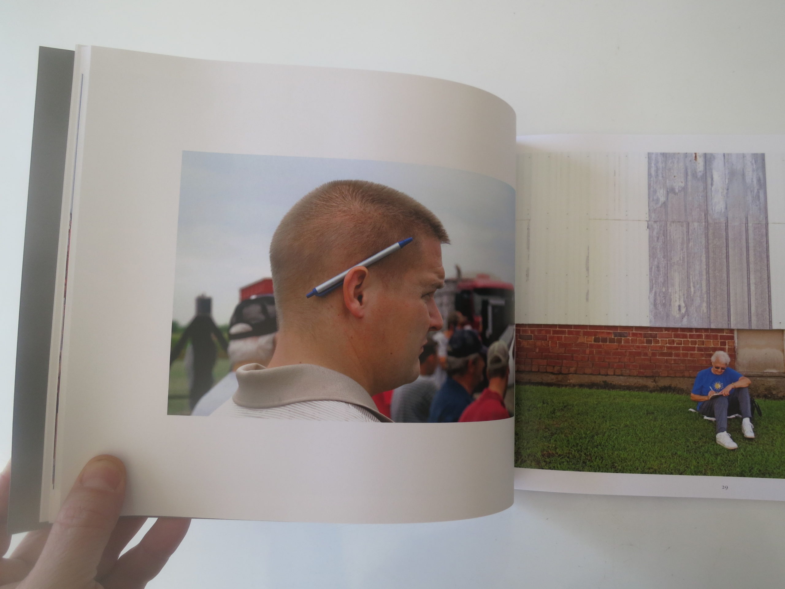
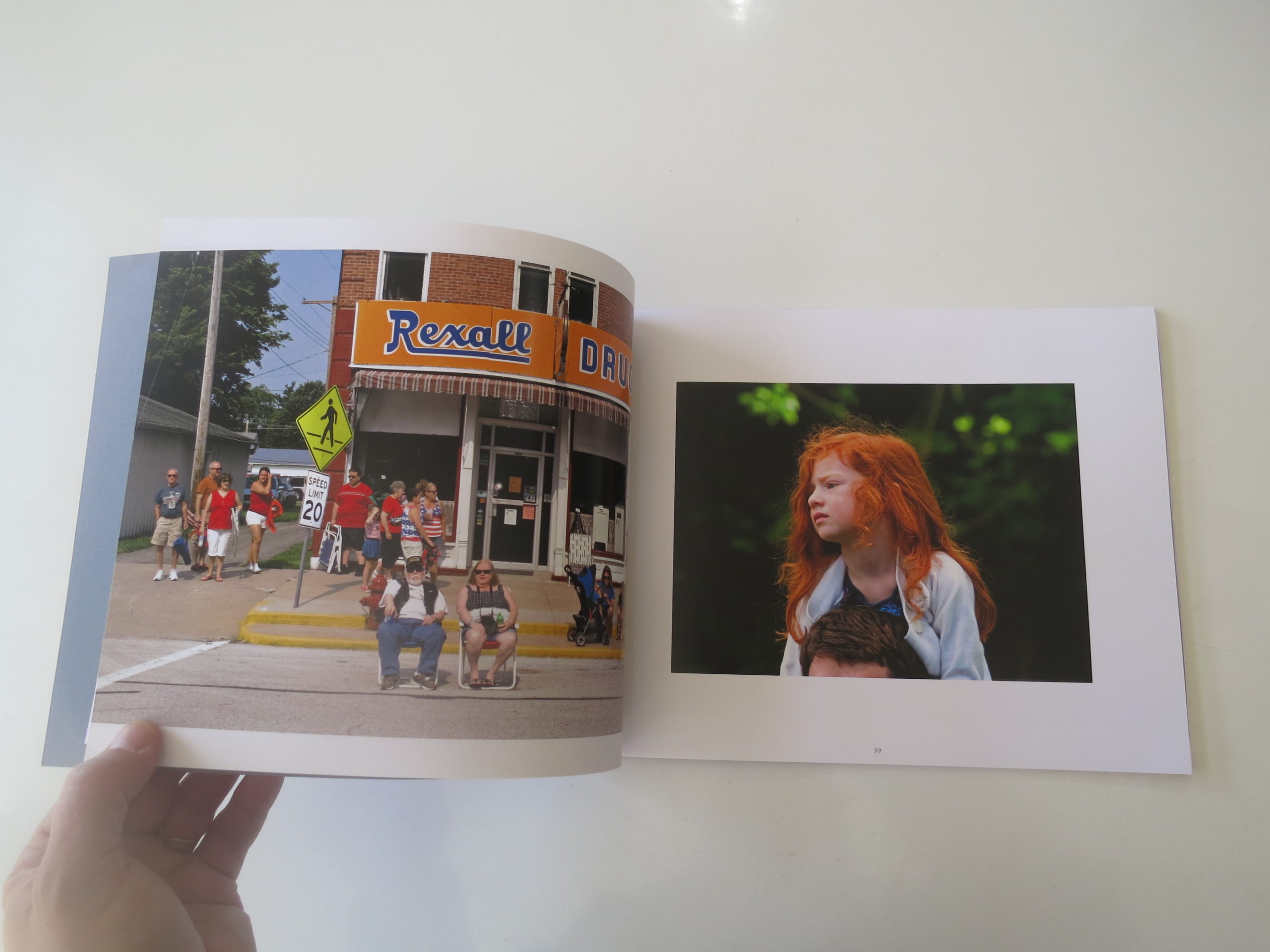
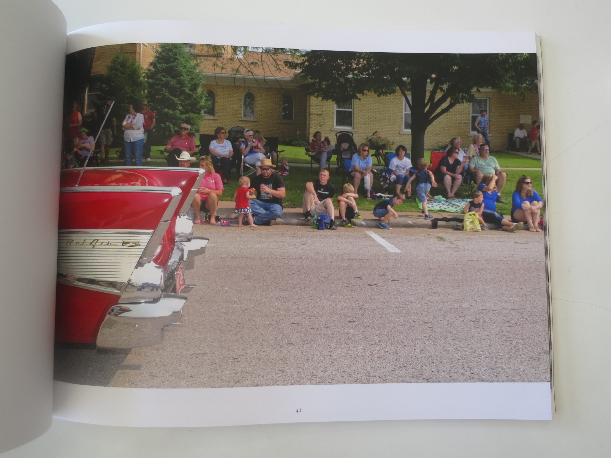
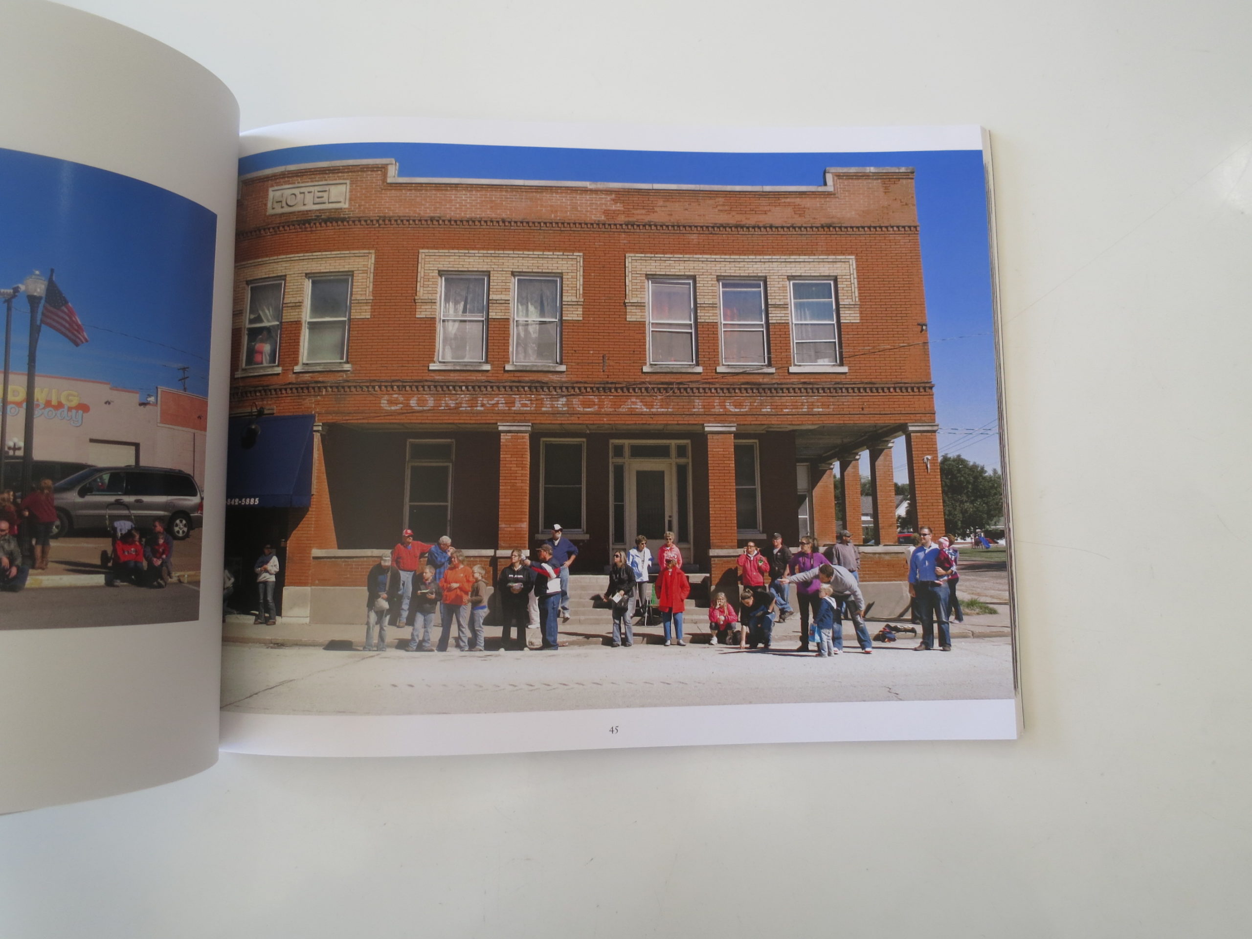
I’ve typically been impressed by Bruce’s image-making craftsmanship, but these are far more casual than I’m used to. The photo professor in me occasionally blanched at some of his snapshot-style cropping.

But these pictures are honest, direct, and most certainly not condescending. They take us inside a world that looks like a different American reality, because it IS a different American reality.

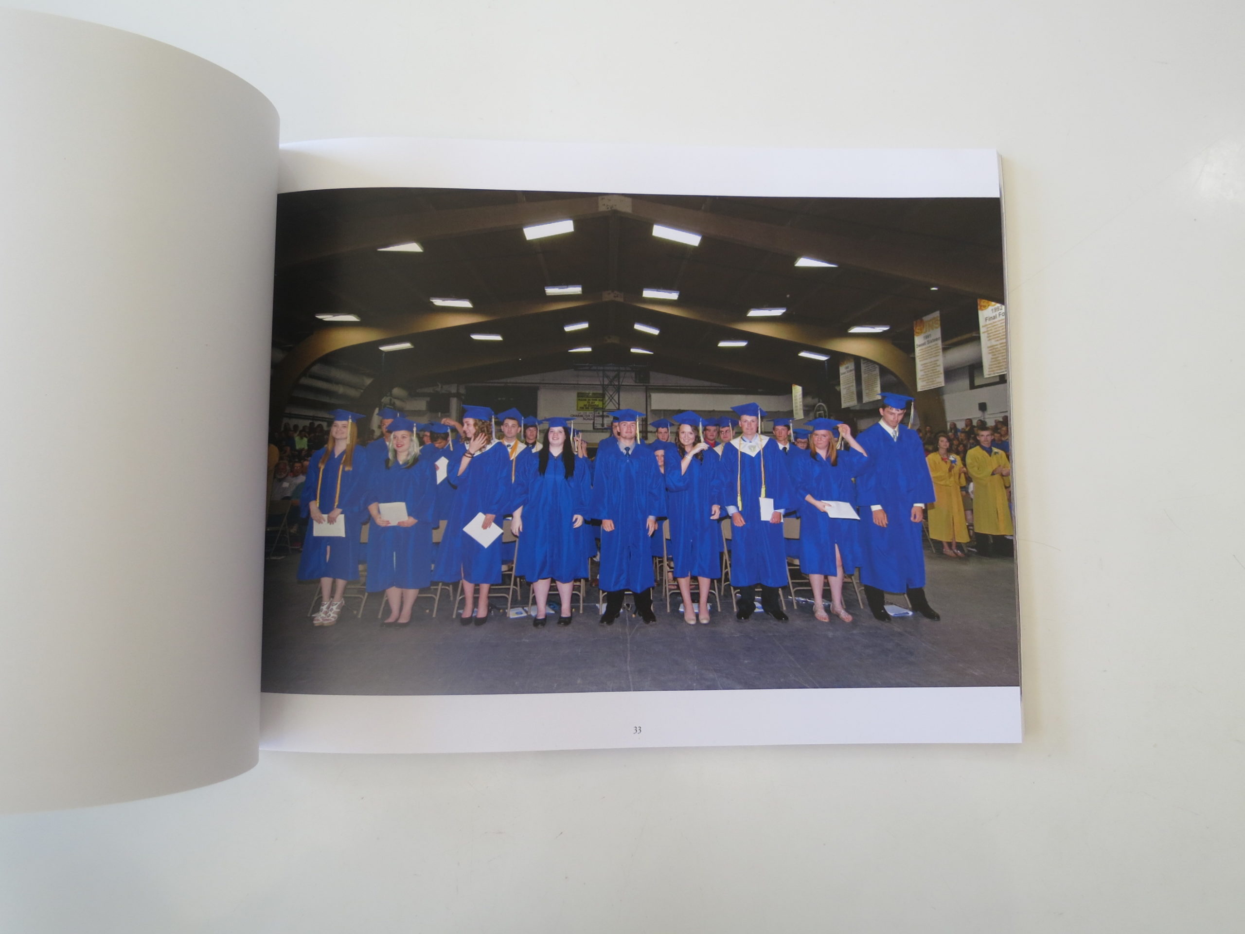
I almost blushed when I saw the heavy acne on the forehead of a high school basketball player. I felt it in my gut, yet also had flashbacks to sitting on the bench, against Mater Dei, the night George HW Bush invaded Iraq to kick off the First Gulf War.

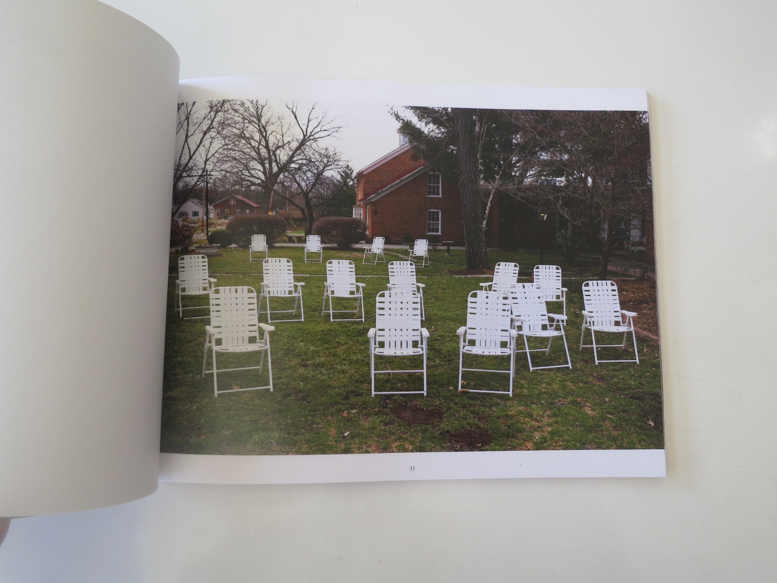
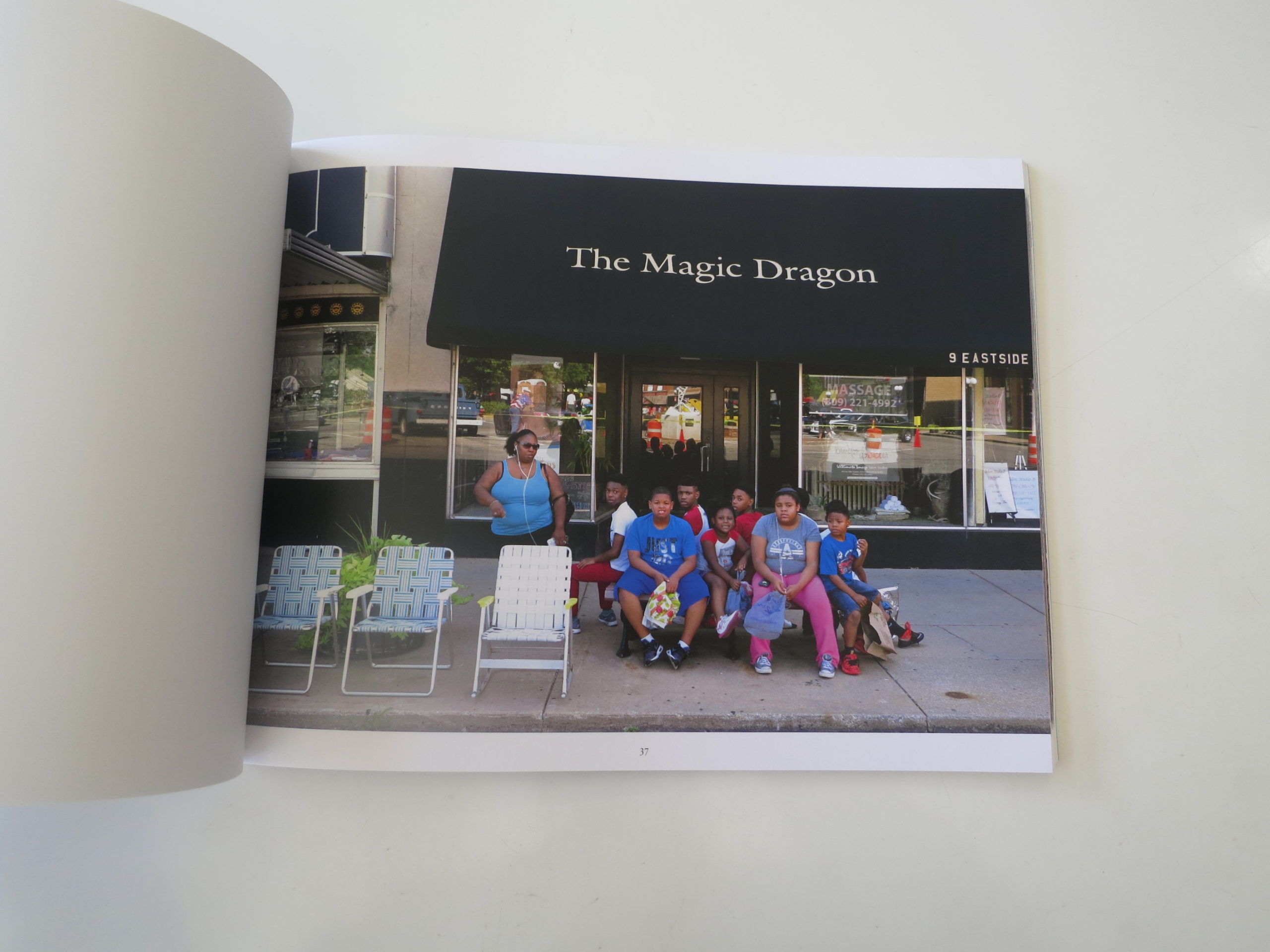
About half-way through, there’s a really slick bit of editing that bears mention. First, we see a wonderful shot of a yard strewn with empty white chairs. Then, the very next picture features a gaggle of African-Americans, crowded together on a public bench, while a few nice fold-up chairs sit empty before them.

Gut-punch.

Of course it’s the only photo of African-Americans, or any people of color for that matter, in the entire volume. (Shout out to Paula Gillen, who’s credited with the editing.)

There is a delicacy and a sweetness to this book that is the opposite of snark and derision. It’s respectful in a way that perhaps only a native son could muster, especially one who has seen the outside world, then still come home in the end.

Bottom Line: Fascinating, warm-hearted look at heartland America.

To Purchase “Forgottonia: The Audience” Go Here: http://www.bruce-morton.net/books/forgottonia-the-audience

The Art of the Personal Project: Cade Martin

Personal Projects are crucial in showing potential buyers how you think creatively on your own. I am drawn to personal projects that have an interesting vision or show something I have never seen before. In this revised column, I’ll include a link to each personal project with the artist statement so you can see more of the project. Please note: projects are found and submissions are not accepted.

Today’s Featured Artist: Cade Martin

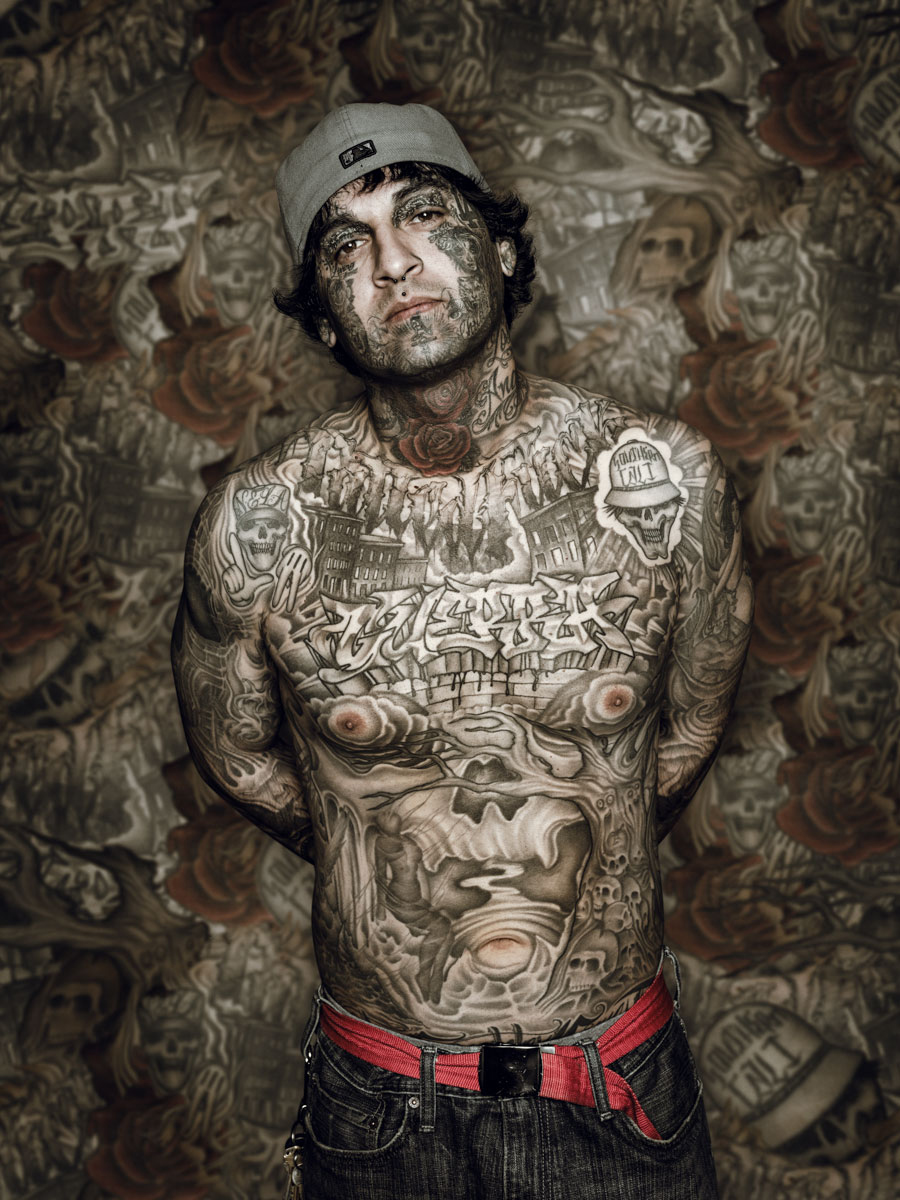
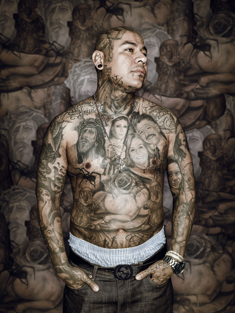
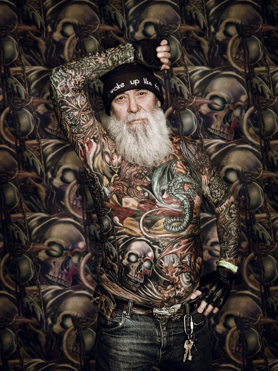
Cade Martin – Tattoo Series

To see more: http://cademartin.com/personal/

So often my personal projects are sparked by something small, and just as often I take that idea and run with it on a moments notice. This series of tattoo portraits came to be when on a break during a project, a client and I somehow got to talking about tattoos – I don’t think she had one. She mentioned a tattoo festival – the DC Tattoo Arts Expo – being held the following week in the Washington DC area and asked if I was going. I don’t have any tattoos myself but I was intrigued. My personal projects, a lot of times, have me chasing characters and stories they put forth. The thought of all those people with their stories essentially written on their bodies at one location was something I wanted to experience. From there I hustled to rent a space at the tattoo expo and set up a photo booth. 
 
I have used the photo booth set up before for portrait projects, having a ready backdrop and a space for people to step out of the commotion of the convention hall, seems to create an instant curiosity. At the tattoo expo, we simply asked people walking around the convention hall if I could create their portrait. I photographed everyone against a grey backdrop within our makeshift studio – a few minutes with each person, lights and all. 

In postproduction, we went to work exploring & sampling the tattoos on each of the subject’s torsos; from there we created a unique personal tapestry background for every subject. The idea was to create a uniquely textured and scene into which the subjects would be immersed, promoting the rich, multi-layered stories and characters.

The people I gravitated to had complete coverage and amazingly detailed tattoo work, it was such a clear commitment & passion on their part. The whole experience turned out to be a blast – talking and working with people from all walks of life bonded by their common interests.

I followed the DC shoot with another tattoo event south of LA and it was an equally amazing experience, both as a spectator and as a photographer. As is always the case with my portrait projects, I feel truly honored to be let in and given permission to share what I capture. It was amazing to spend a few passing minutes with these people and to see how they are expressing themselves – I found it captivating, equally mysterious and revealing. But, I still don’t have any tattoos.

You can see the behind the scenes video here: https://vimeo.com/175869636

http://www.briteproductions.net/cade-martin

—————

APE contributor Suzanne Sease currently works as a consultant for photographers and illustrators around the world. She has been involved in the photography and illustration industry since the mid 80s. After establishing the art buying department at The Martin Agency, then working for Kaplan-Thaler, Capital One, Best Buy and numerous smaller agencies and companies, she decided to be a consultant in 1999. She has a new Twitter feed with helpful marketing information because she believes that marketing should be driven by brand and not by specialty. Follow her at @SuzanneSease.

The Daily Edit – The New Yorker: Victor J. Blue

The New Yorker


Director of Photography:
Joanna Milter

Art Director: Nicholas Blechman
Photo Editor: Thea Traff
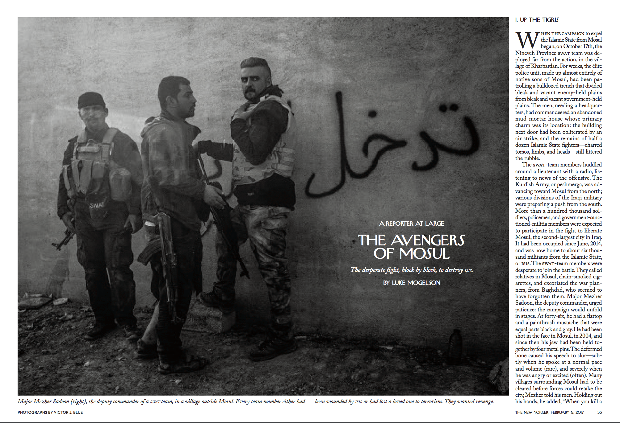
Photographer: Victor J. Blue for The New Yorker
Full story here
Photo Booth feature with Victor here


Heidi: How long were you on assignment for this story?
Victor: We worked on the piece for 6 weeks.

What was the hardest aspect of this assignment?
As with any military operation, there was a lot of “hurry up and wait.” It was tough to stay sharp and keep shooting when the down time dragged on, and to balance it with the more dynamic times.

Did you learn anything new about yourself for this project?
I learned that I need to trust a little bit more, and I need to count on my second and third impressions of people and situations as much as my first one. A few times, guys that I thought weren’t really into our presence ended up being some of the ones I eventually connected to the most.

Did you have any protection?
Well, we had body armor and helmets. But we did not work with a security advisor or anything like that. It was just me, Luke Mogelson the writer, and our buddy Sardar, our fixer and translator. We looked out for each other.

How many languages do you speak?
I speak English and Spanish. The Spanish didn’t help me out much on this one.

For each published image how many frames were shot in that scenario?
That’s really hard to say. It just depends. Sometimes only a few, sometimes hundreds. I can say that we ended up publishing like 22 photos total, and I ended up with about 300 selects.

You have a gift for being accepted into closed/difficult communities, how do you earn their trust?
I just try to be really open with people, and easygoing. I try not to be a “bro” or fake about who I am or what I’m doing there. Folks usually seem to relate to that and while it doesn’t ingratiate you off the bat, it earns trust over time.

What coping skills to you use to deal with the intensity of the work you do?
When I’m working I write quite a lot, and I think that helps. When I get home, one of the hardest things for me is not wanting to let the experience go- to not slip back into my spoiled first world existence. But that happens and I guess that’s natural. I make a concerted effort to reconnect with my friends and loved ones. I usually get sad sometimes, and I try to pour that into the editing of the pictures.

This is your life’s work, what cues do you now have that tell you it’s not the right moment to take a photograph or the situation is too intense?
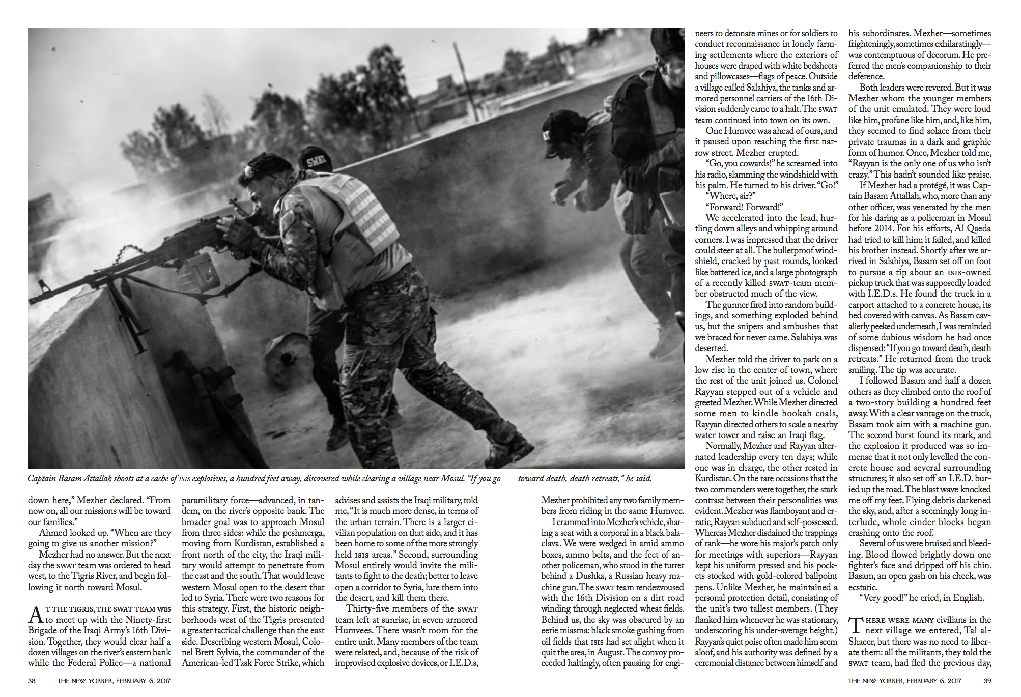
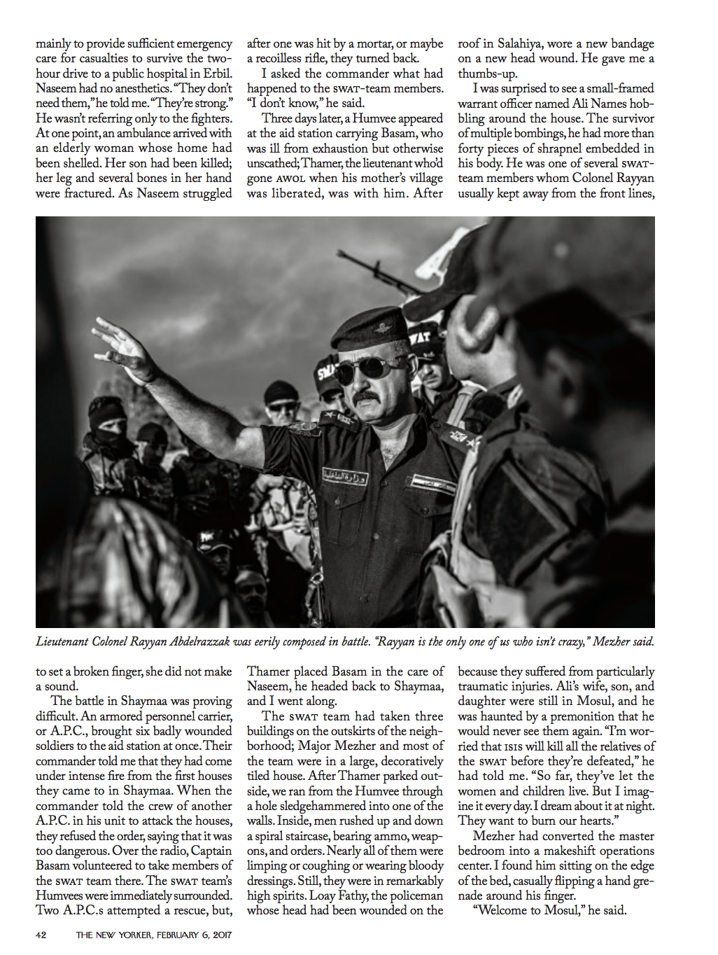
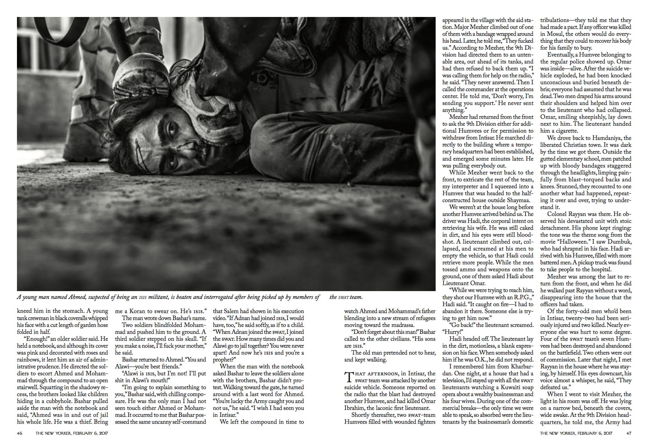
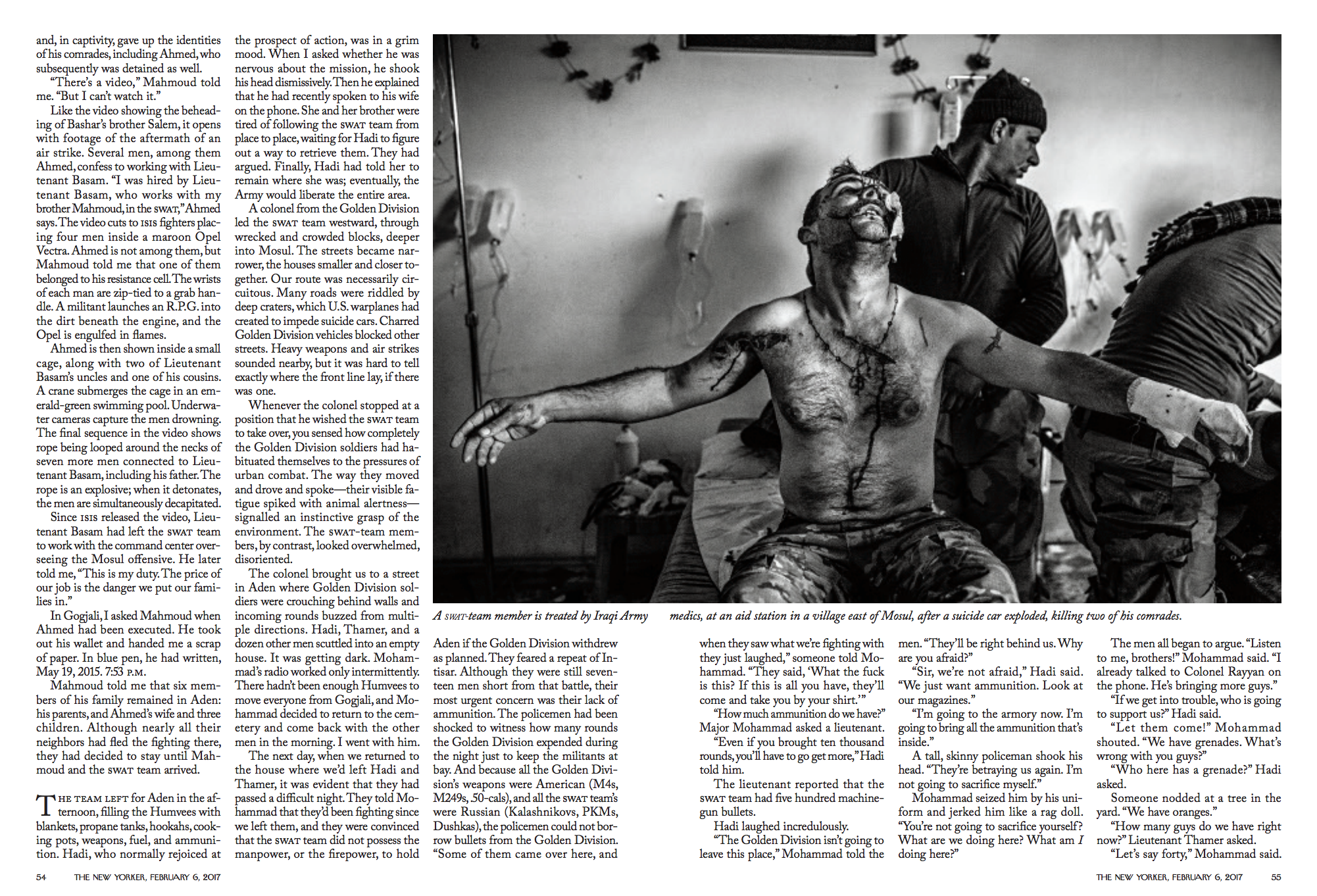
There was a moment that happened like the second day- one of the SWAT members came tearing into the base collapsing and crying- he had just found out his wife and children had been taken by ISIS. It was a really intense moment and we had just shown up. I was torn about what to do, but I hung back and didn’t really make a picture. I was betting that taking it slow with these guys, earning their trust before I jump in their face like that would pay off, and it did. Later, when things were way crazier, no one ever got mad at me making pictures. You just have to take it slow, figure it out, and be smart as well as brave about raising your camera when things get intense.

You are documenting some horrific situations, how do you cope with this form of photography while you are doing it? and after 
I just try hard to concentrate on the pictures, on understanding what’s going on, and making powerful images of that. It’s my job to take pictures of very serious circumstances. If I couldn’t cope with it, that would be fine, but it would be irresponsible for me to go there to do it. Then I ought to be shooting other types of stories. That’s what makes us professionals- our ability to function in what are difficult, fluid, and at times dangerous scenarios.

Have you ever self-edited feeling that an image was too much to share?
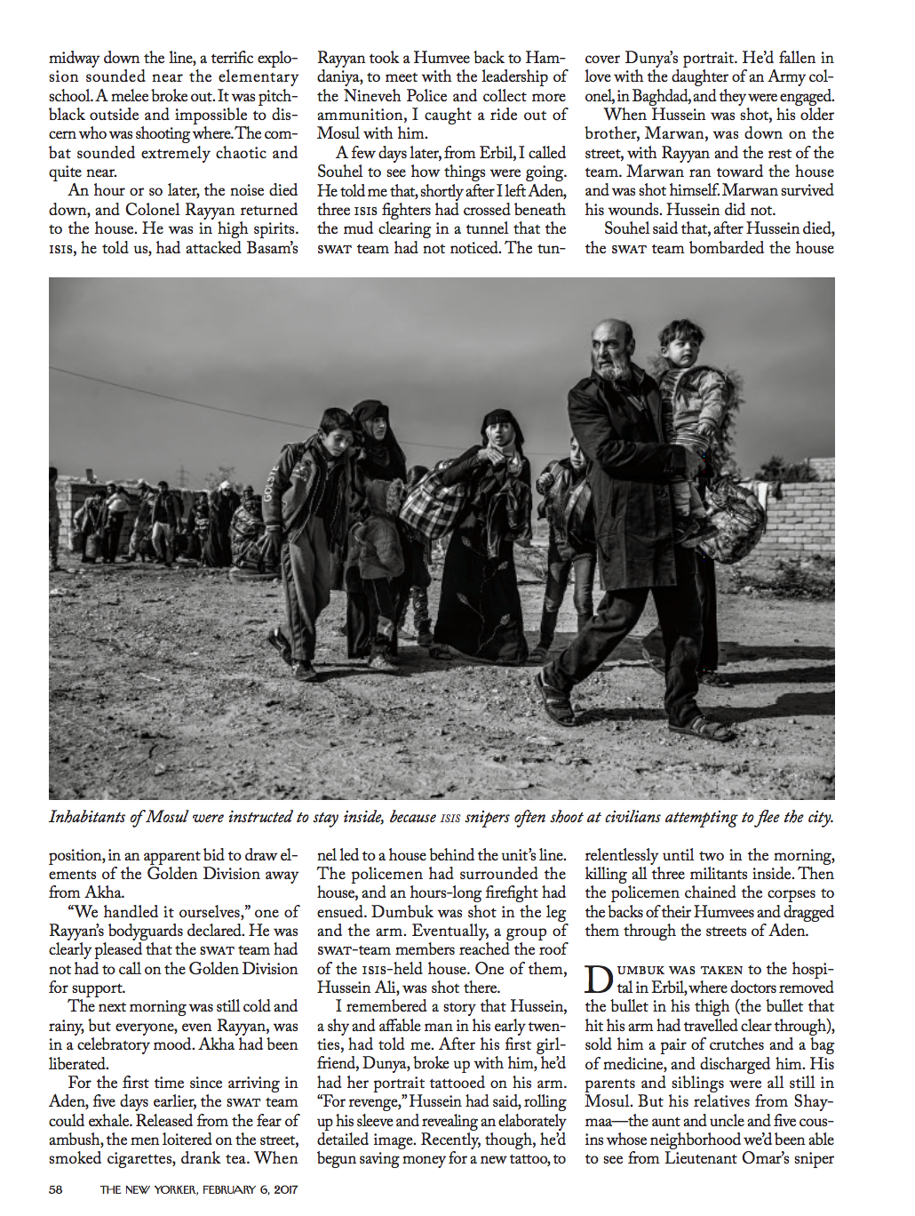
I’m not sure I believe that anything is too intense to photograph. It’s my job to interpret something horrific and make a picture of it that people can look at. I don’t think I pull too many punches. Of course sometimes the circumstances around making pictures require me to think about what’s going on- I have to be careful to be an honest witness and not work as a propaganda arm for anyone. If I feel like folks are trying very hard to manipulate the pictures I am making, I am wary about publishing them. But that was never an issue on this story.

When people look at your work are you hoping they see composition and balance in some of the photos along with your message?
For sure! I am trying to make visually dynamic photographs. My goal is a set of pictures that both inform people intellectually and move them emotionally. If the pictures are poorly made, if I’m not working really hard to “see” them, then I am not doing my job. They have to arrest you visually, make you stop and feel something, then want to know something about the people and the circumstances they depict.

Do you find beauty in cataclysmic images? Just because something is terrible doesn’t mean it can share something wonderful.
It’s an interesting question. Beauty per se isn’t a goal I’m concerned with personally. To me there are much more important aspirations for my pictures- truth being the first. Like I said, I am trying to make the most visually powerful pictures I can- but I believe in photojournalism and I am consciously working within its conventions. I work hard to be creative, but I am not making art. Wars, social crises, marginalized people- I don’t see these as legitimate vehicles for my artistic aspirations. I believe that making well-observed documentary pictures of their experience is how I can best serve as a bridge between them and the moral imagination of the readers that will see the pictures.

The Daily Promo: Patrick Marinello

Patrick Marinello

Who printed it?
I got my promos printed at Overnight Prints.

Who designed it?
I designed the promos.

Who edited the images?
I edited the photos.

How many did you make?
I originally made 30 but I went the cheap route and didn’t go with the hard-cover for the booklet thinking it would save money, and that it would look fine. When I got the them they looked unfinished so I decided to make another 30 which I was pretty happy with, minus some color issues.

How many times a year do you send out promos?
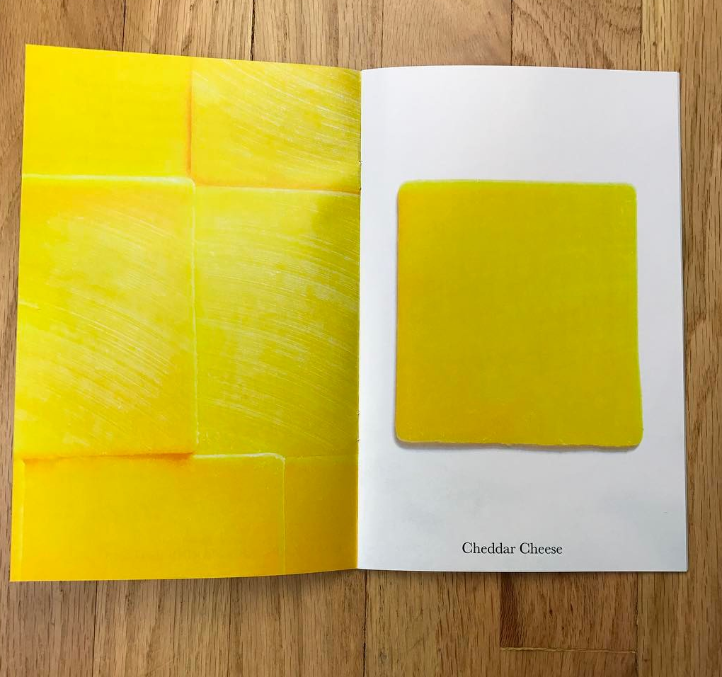
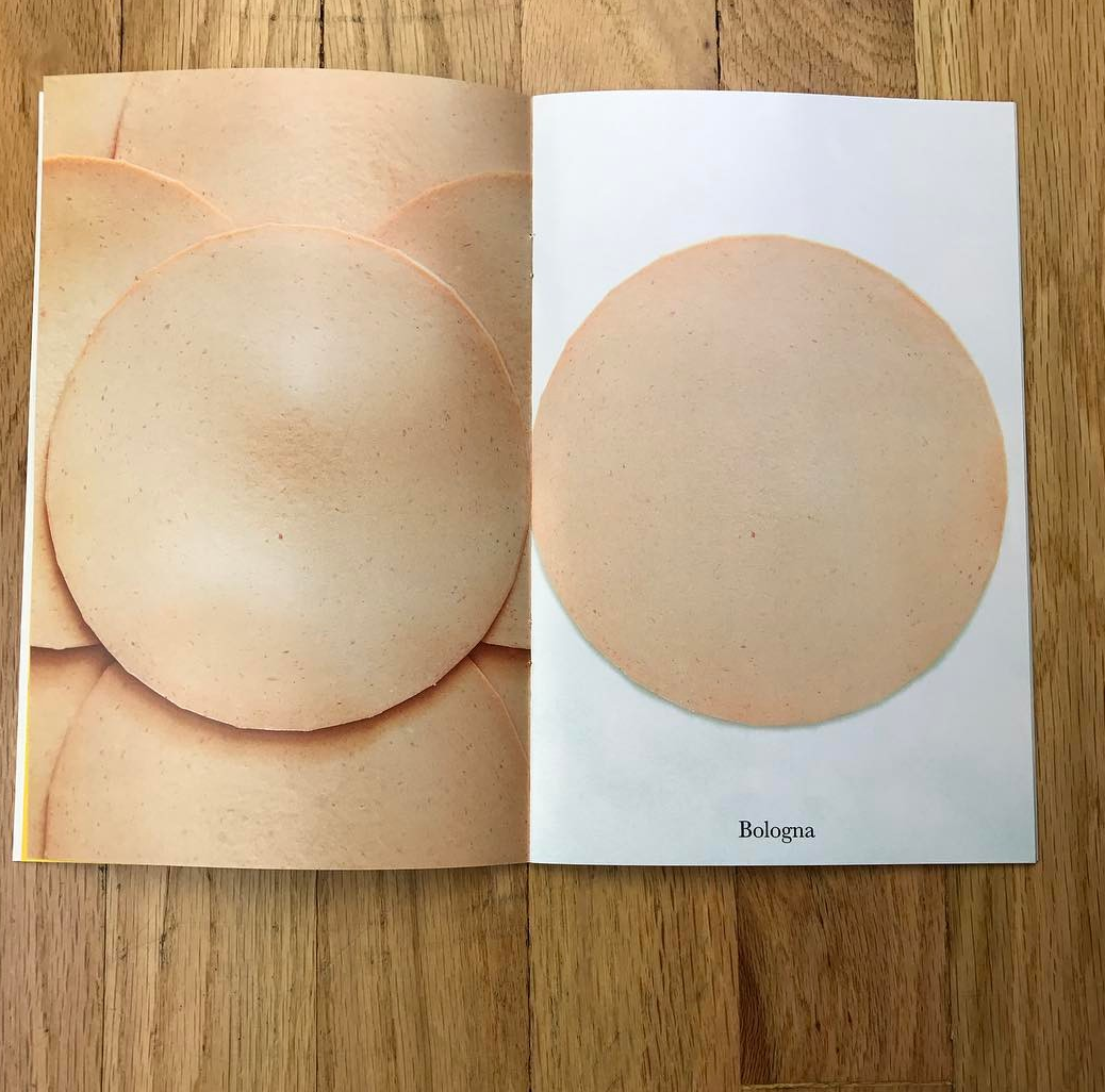
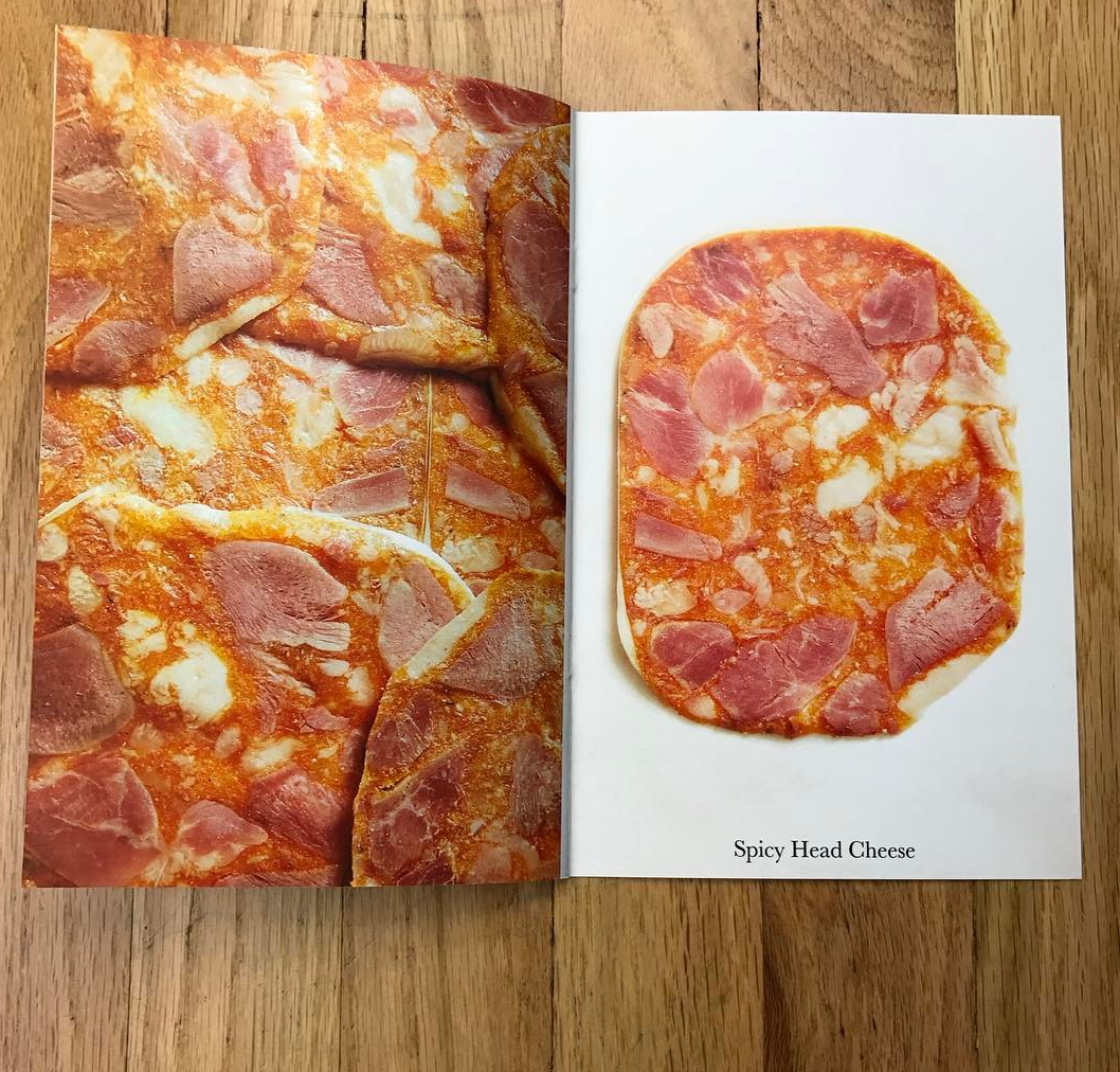
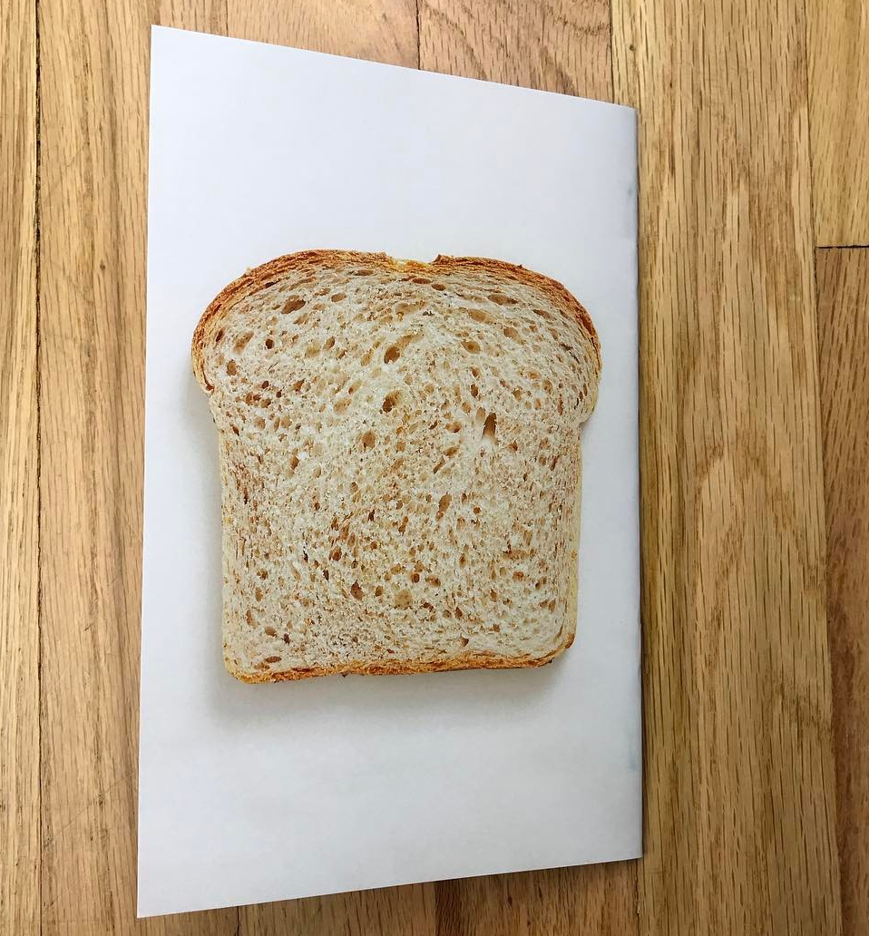
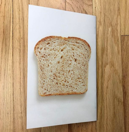
This was the first promo I’ve ever made; I wanted to do something different. I didn’t want to put my best work on a postcard and then have the same images on my website. I wanted to do some something unique and really creative. Plus even if you hate the promo who’s going to forget someone mailed you a booklet that resembles a sandwich?

What made you want to do bread and cheese?
The idea behind the sandwich promo was that I was shooting a photo series on cold cuts. I wasn’t really sure what I was going to do with the series. At the same time I was figuring out how to get paid photo work. I’ve never made a promo before so I came up with this crazy idea to turn the cold cuts into a booklet that resembles a sandwich. I told a few people and they thought it was a great idea so I  decided to make the booklets. I figured photo editors get so many promos, I really needed to stand out.

How many slices of bread did you review before picking that one for the closing image?
There is a bakery I go to by my house and I tried 2 styles of bread. A round loaf and a more classic pullman loaf. I shot a couple slices from the round loaf and then a day later I wasn’t happy with the the shape of the bread so I went with the pullman since it’s more of a classic sandwich bread.

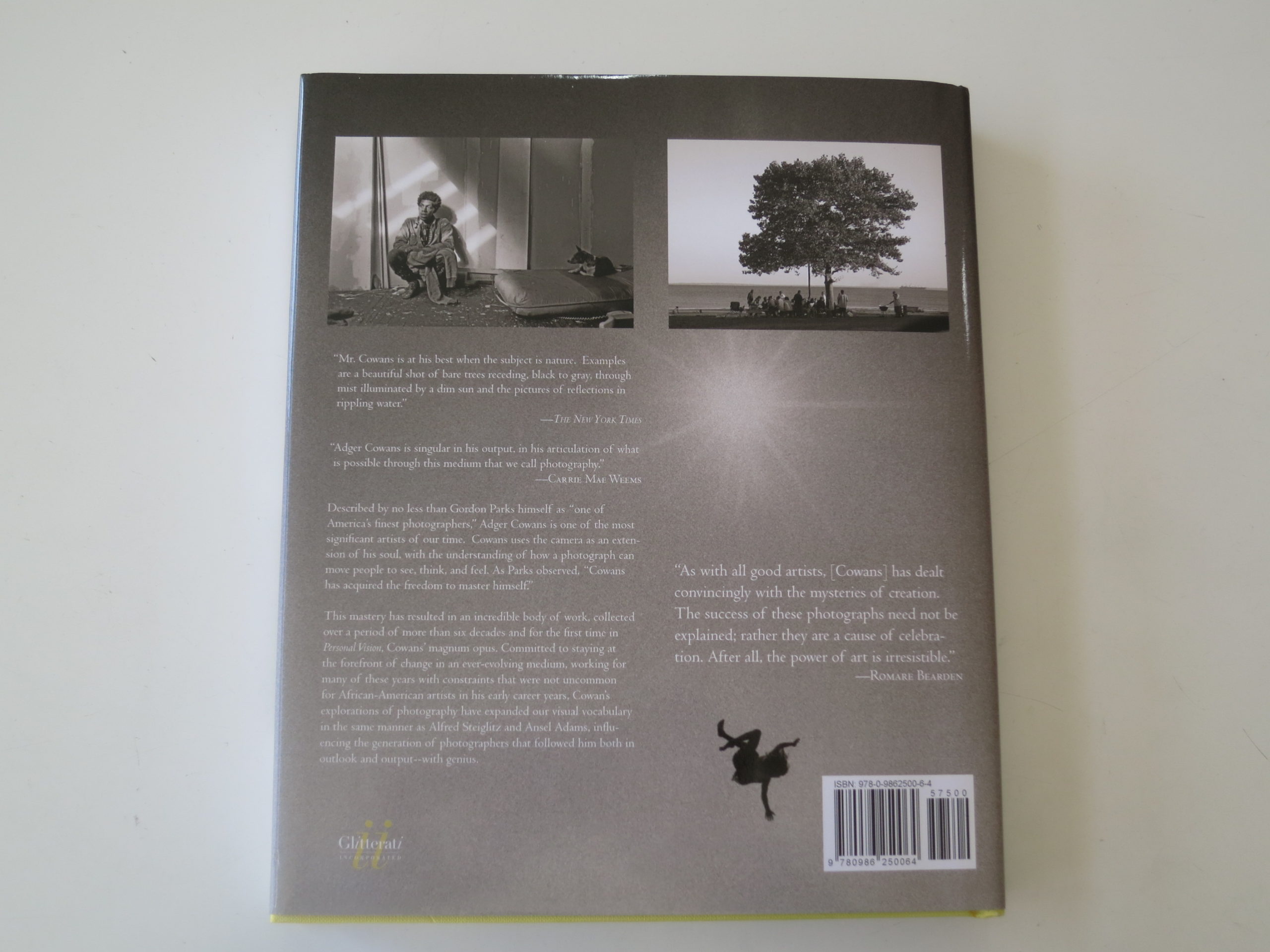
This Week In Photography Books: Adger Cowans

by Jonathan Blaustein

Over the last six years, I’ve become addicted to Arsenal Football Club, a soccer team that plays in London. It’s gotten so serious that I even write about the team, for fun, at 7am kickoff, a popular American-run Arsenal blog.

It all started out innocently enough.

After I sold a chunk of photographs, when “The Value of a Dollar,” took off, I was able to buy a nice television, and hook it up to Dish Network. Straight away, they piped in all this international soccer, (for free at first,) and once I was hooked, they yanked it away.

I’ve had to pony up a lot of scratch to maintain the habit ever since.

While I could have ultimately supported a handful of teams, when I first started watching, (and might be happier had I chosen otherwise,) I was successfully charmed by Arsenal’s famed mega-manager, Arsene Wenger.

He’s hard to encapsulate quickly, partly because he’s so multi-talented. He grew up in Alsace, and therefore speaks French and German, in addition to English, Spanish, Italian and a bit of Japanese. He was trained as an economist, is known as a progressive globalist, and brought a certain Continental, Gallic, professorial cool to the thug-life English league in the late 90’s.

He went on to massive glory with “The Invincibles,” his undefeated 2003-4 team, which was immortalized in Nick Hornby’s “Fever Pitch”. Then Wenger, who had previously managed in Monaco and Japan, designed a new stadium for Arsenal, and kept them in the black through years when the club was heavily debt-strapped.

Basically, I became an Arsenal fan, in large part, because Arsene Wenger was “The Most Interesting Man in the World.” Now, though, his temperament is too tetchy. He knows his time is coming to a close, but is battling with every ounce to hold onto his perch.

The short version is that Arsene Wenger is a legend, albeit one whom most fans and pundits feel has hit the retirement zone. He’s good enough to be good, but no longer good enough to be great.

I don’t think he deserves the “MIMITW” title anymore.

Therefore, we need a new “Most Interesting Man in the World.”
Thankfully, I have a proposal for the perfect replacement. You might not have heard of him before, as I hadn’t, but this dude has been involved in SO many interesting things in the 20th, and now 21st Centuries.

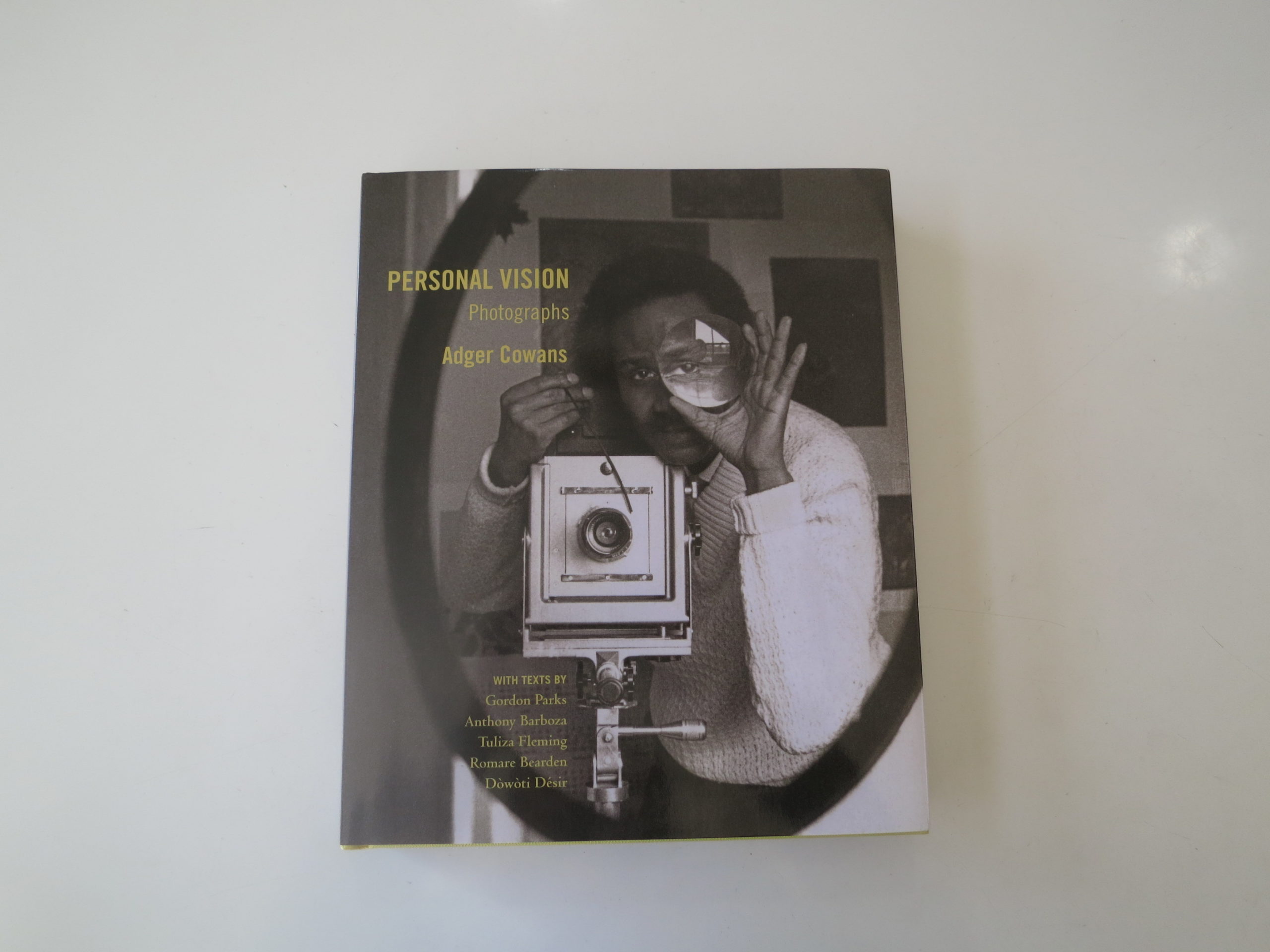
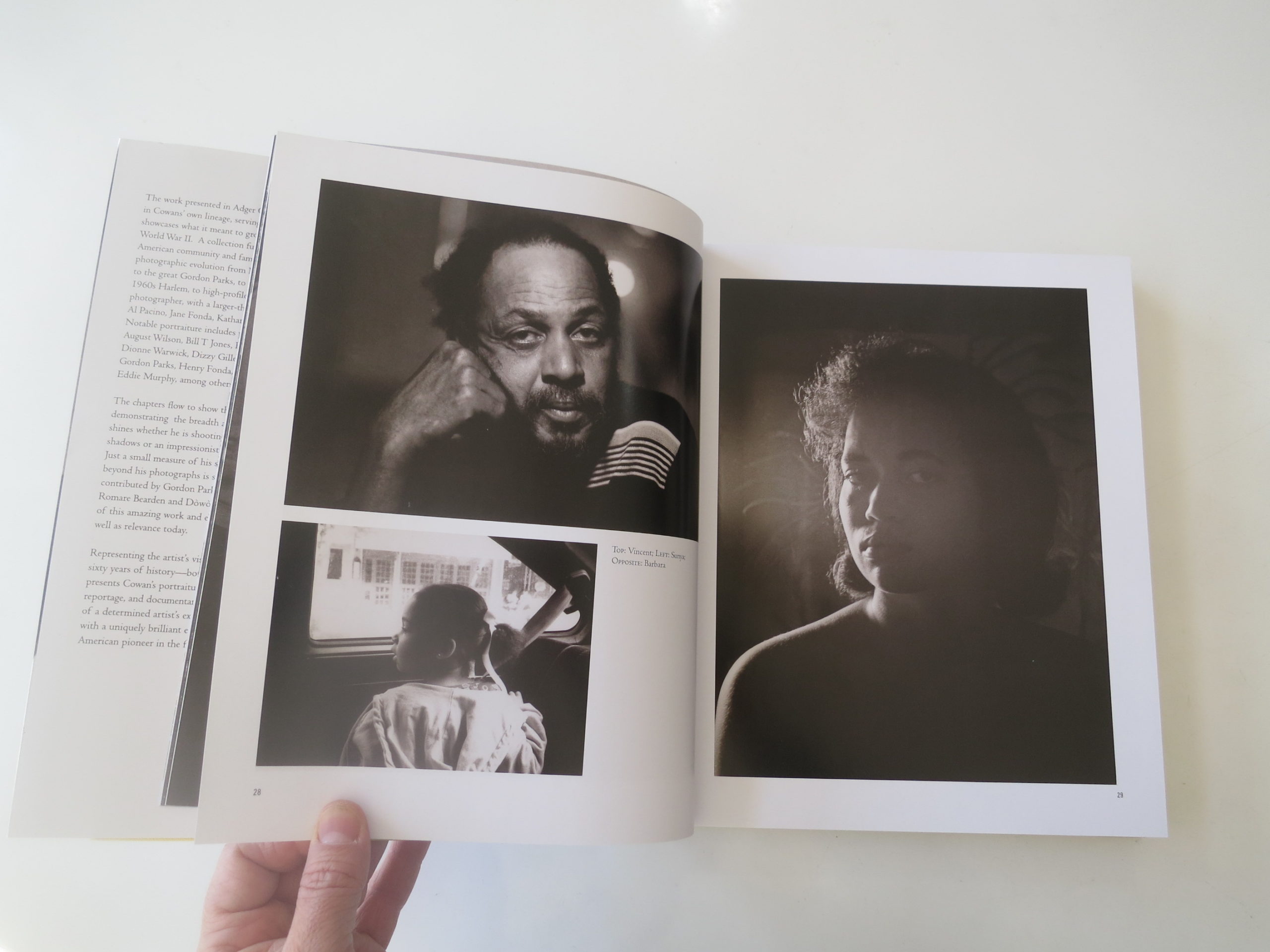
His name is Adger Cowans, and I just finished looking at his new book, “Personal Visions: Photographs,” recently published by Glitterati. Take heed, as Mr. Cowans seems like a genuine candidate for the title, if this book is to be believed.

Adger Cowans grew up in a creative family in Ohio in the 1930’s and 40’s, and was surrounded by art and photography from a young age. There’s context provided for his hyper-productive career, which is then backed up by various statements referring to his massive charisma. Tuliza Fleming, a curator at the new National Museum of African American History and Culture, specifically mentioned she’d noticed the power of his personal “cool.”

Better yet, in an afterward, Dowoti Desir, a writer described by the New York Times as a voodoo scholar and practitioner, writes things about him that can only be described as mystical.

One example: “His sacred counterparts are nested among the forces of the Afro-Atlantic spiritual traditions such as the Marassa, the twins of the Haitian Vodou system.”

Another: “Cowans is the silent warrior on our path, the mayuba or the chameleon whose most powerful attribute is its ability to emulate or recreate the environment around them in every meticulous detail, while remaining true to its core.”

I bet he has your vote for “Most Interesting Man in the World” already, and we haven’t even talked about the pictures yet.

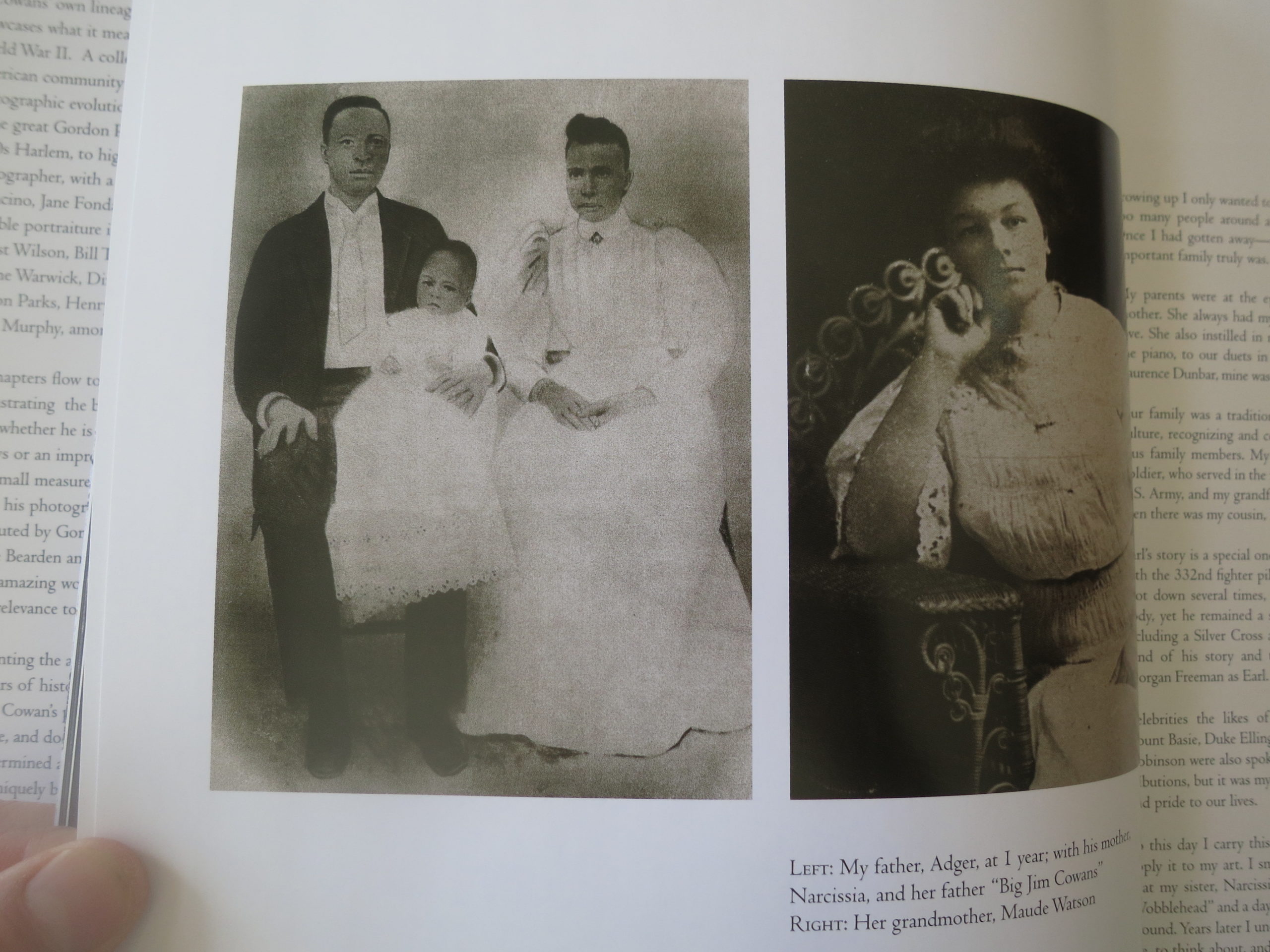
The book opens with essays and a personal narrative, including photographs of his family. (This book is built around his life, as well as his work.) There’s actually a picture at the very beginning, of his father, grandmother, and great-grandfather that is so creepy I almost don’t want to photograph it later. (But I will.)

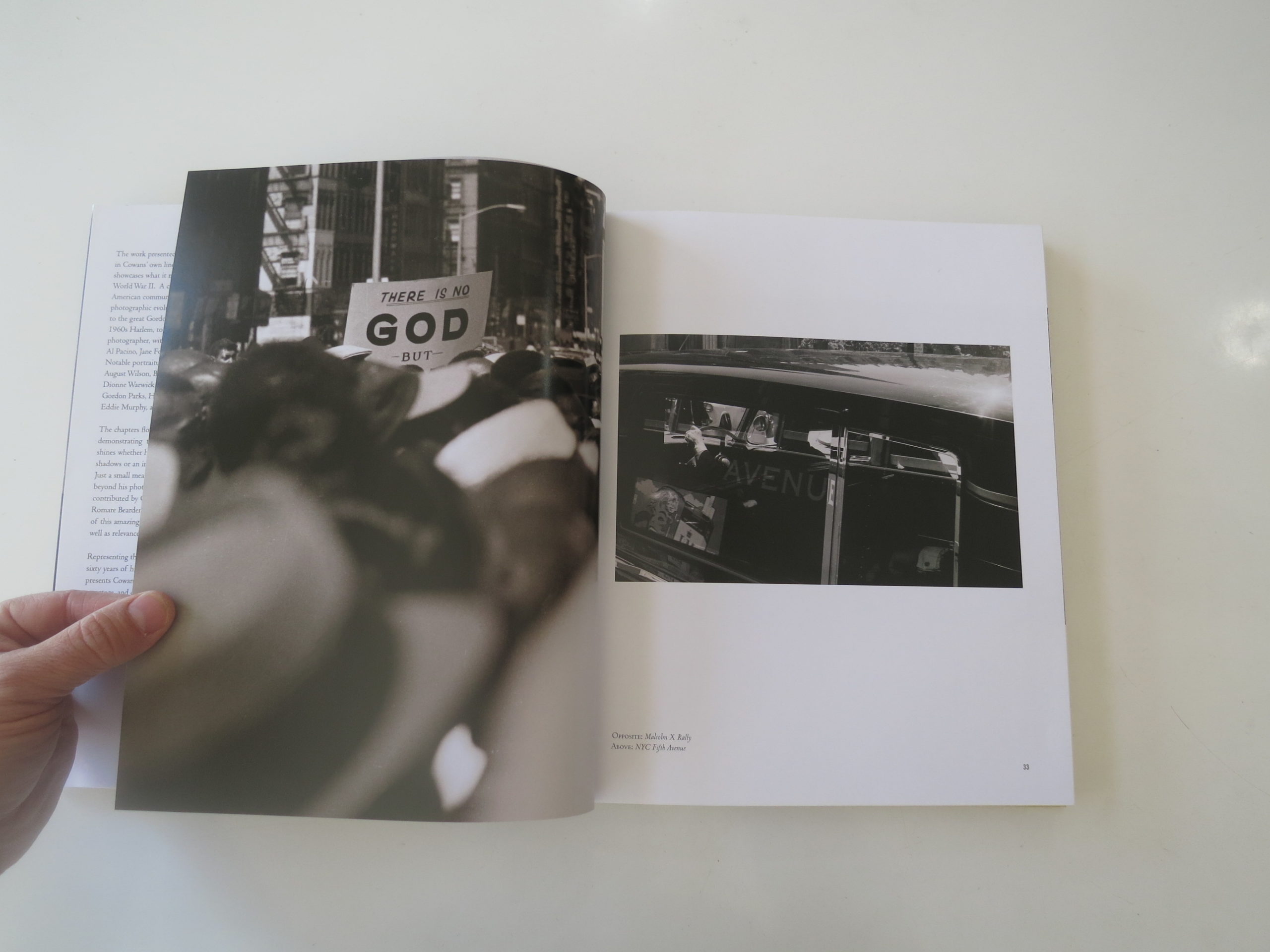
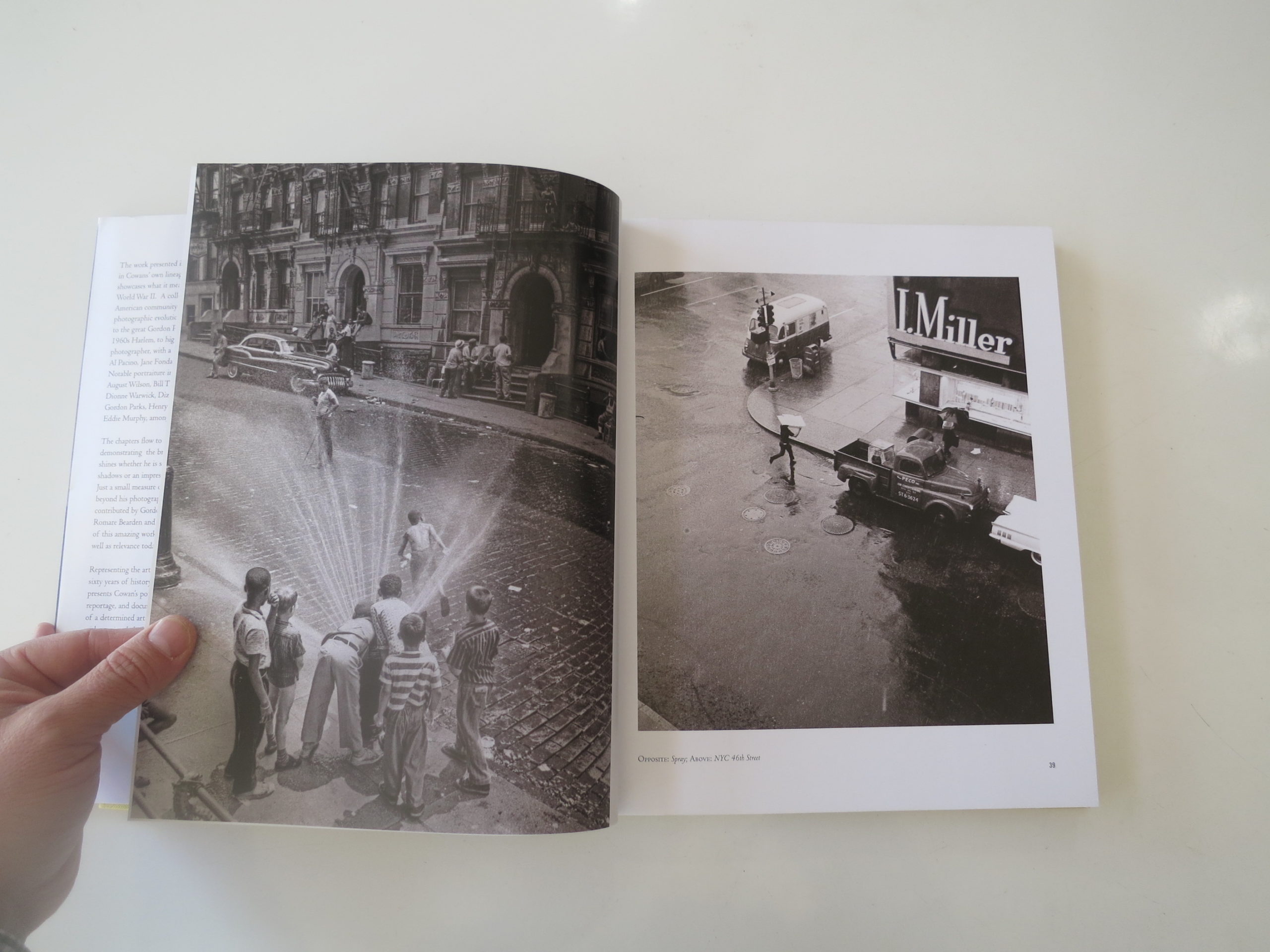
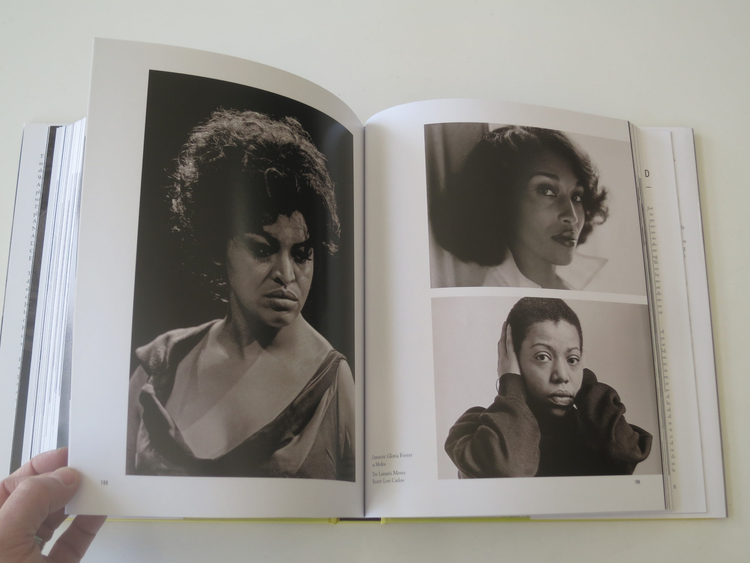
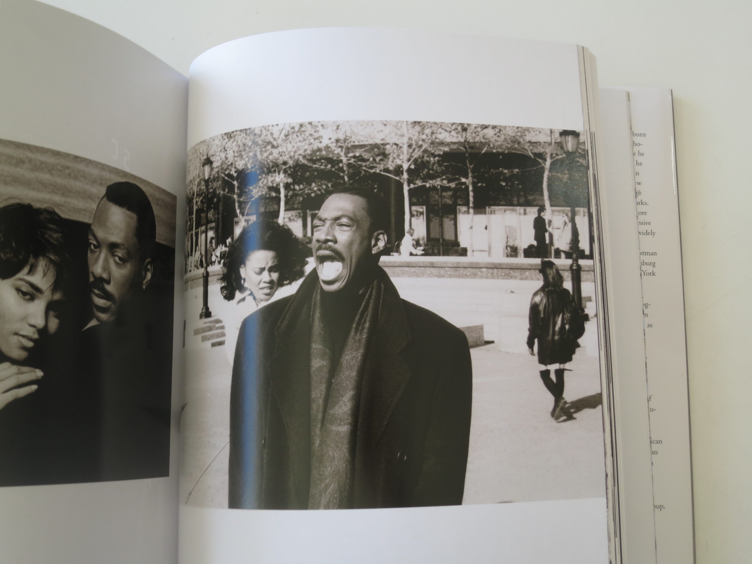
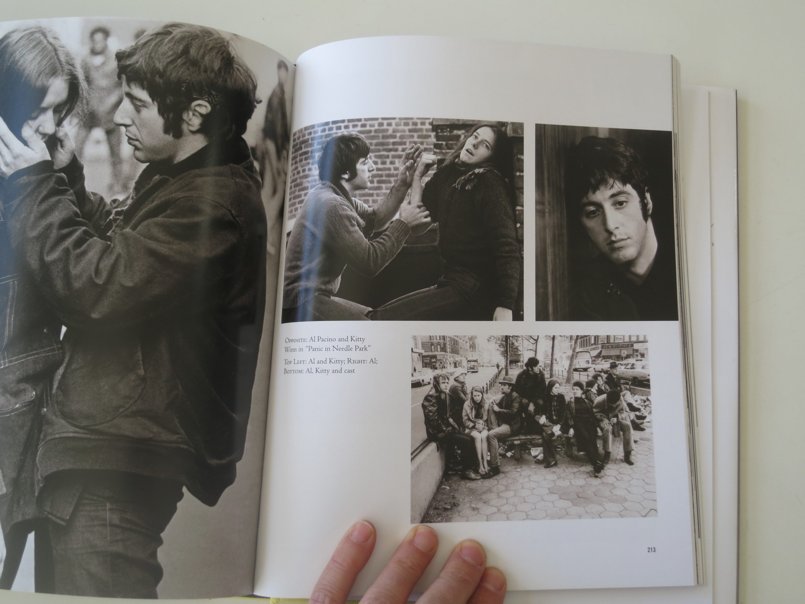
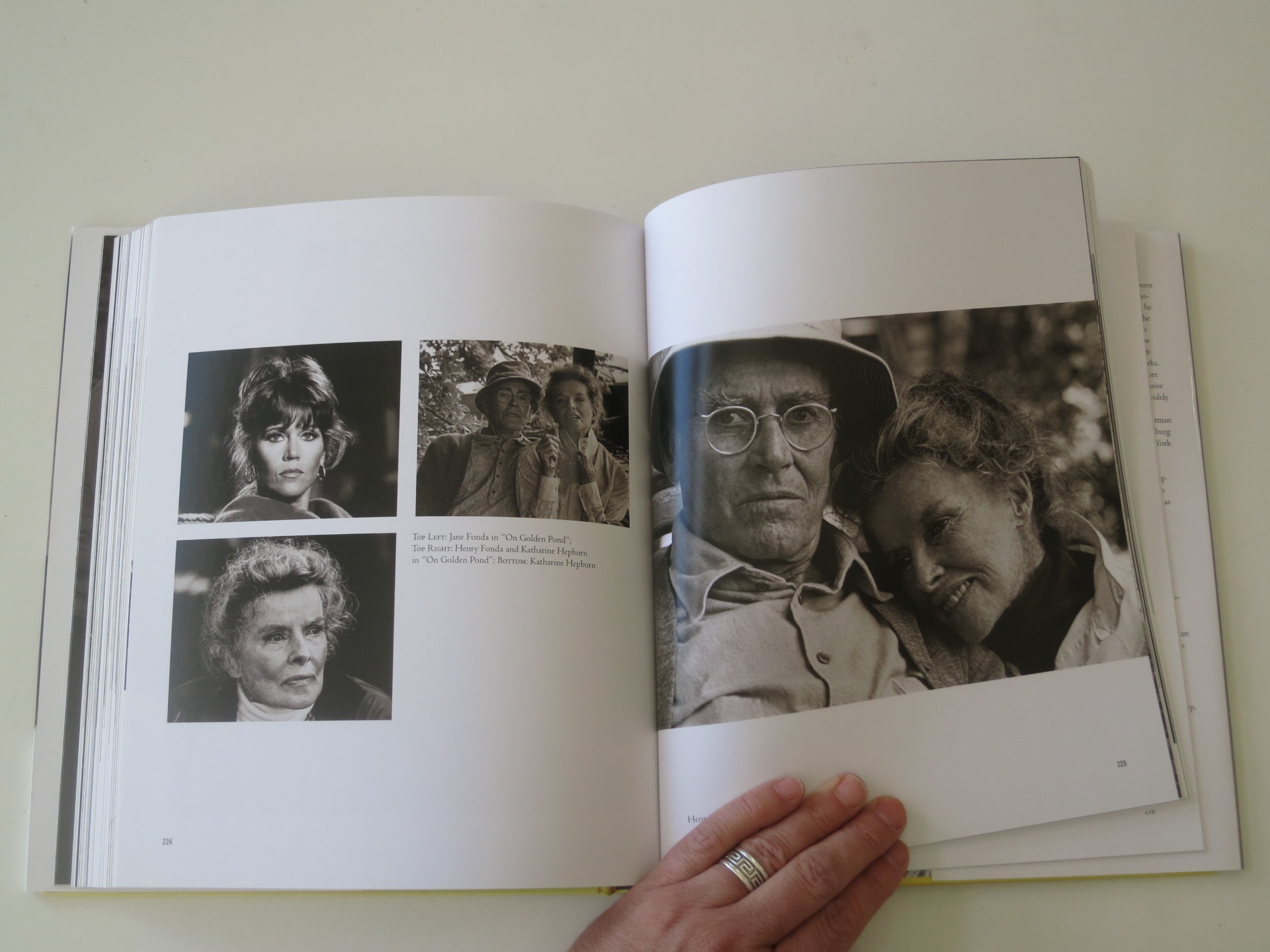
After a stint in the Navy, Adger Cowans went to New York to apprentice with Gordon Parks, have a stint as a street photographer, shoot countless musical celebrities, and work as the set photographer for more than 20 movies in the 70’s and 80’s, including seminal films like “On Golden Pond,” “School Daze” and “Dirty Dancing.”

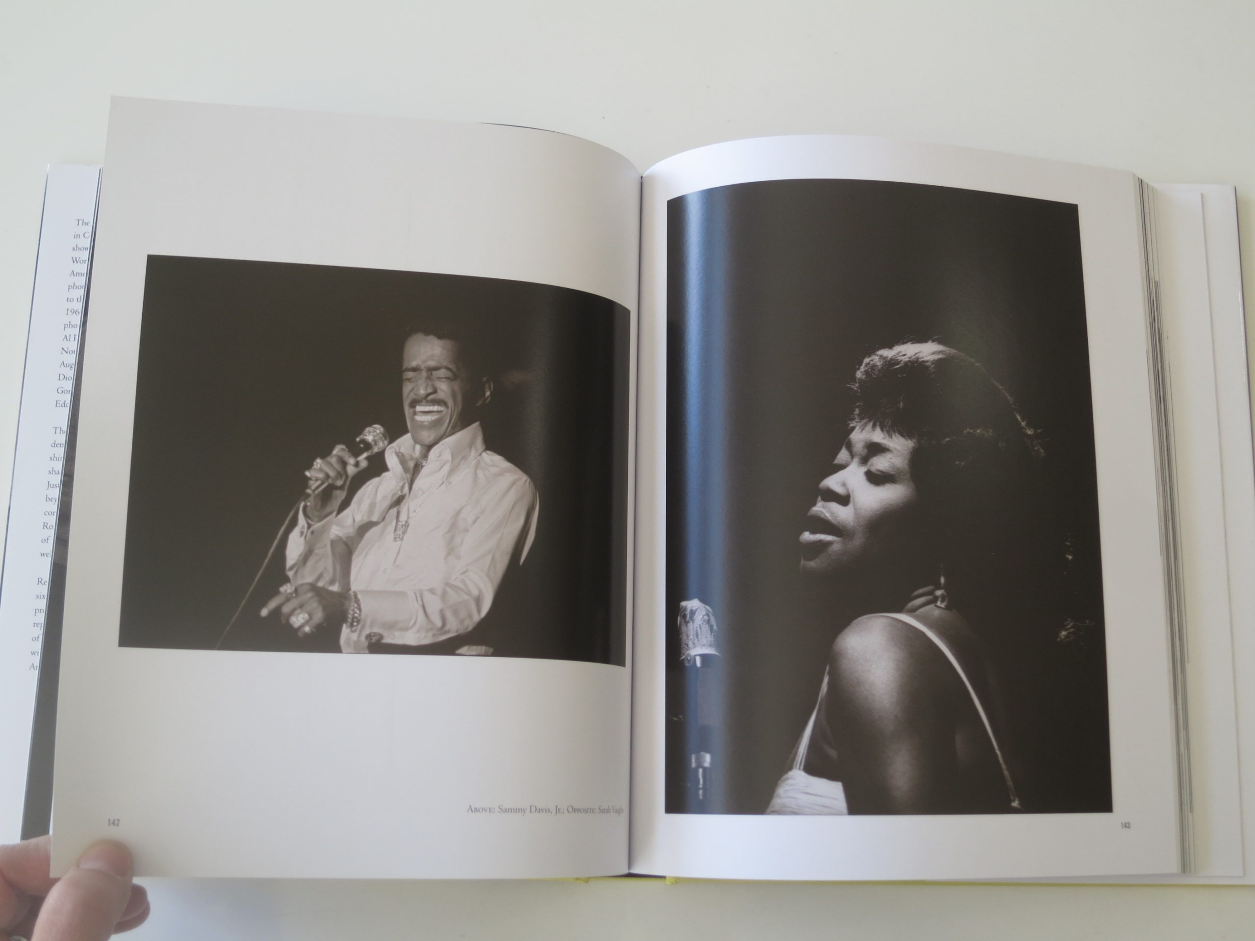
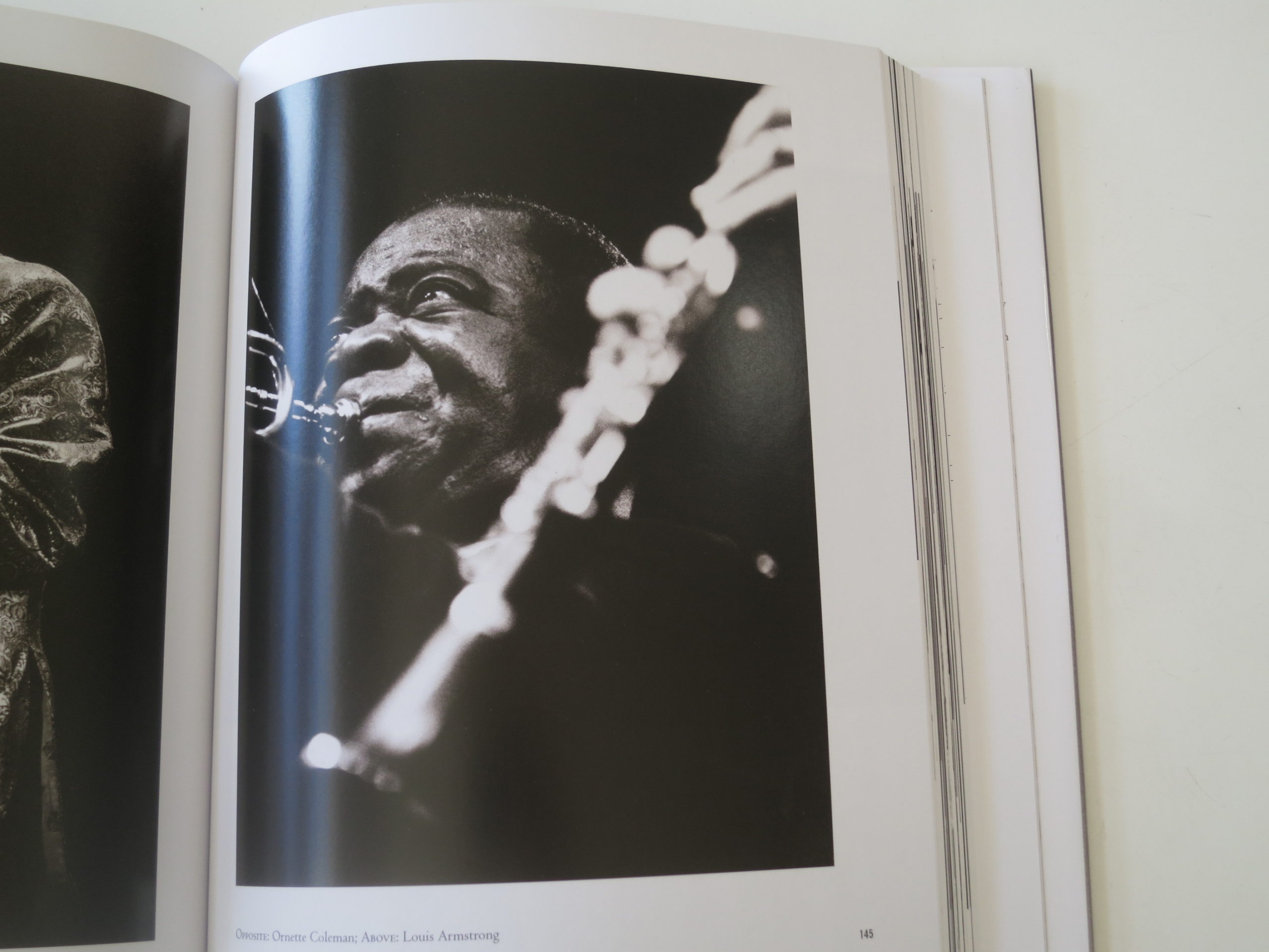
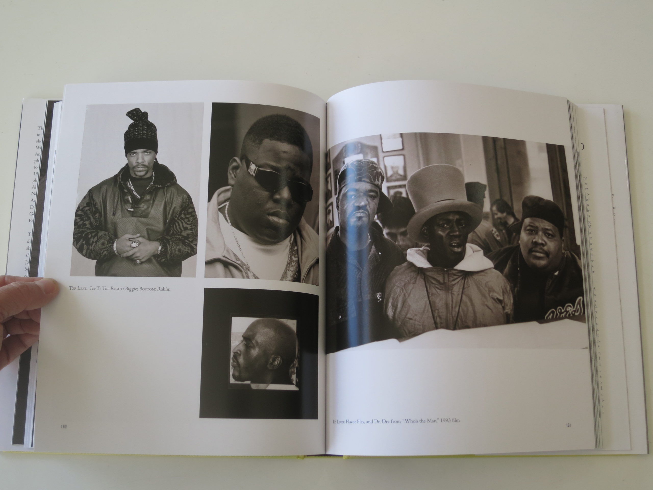
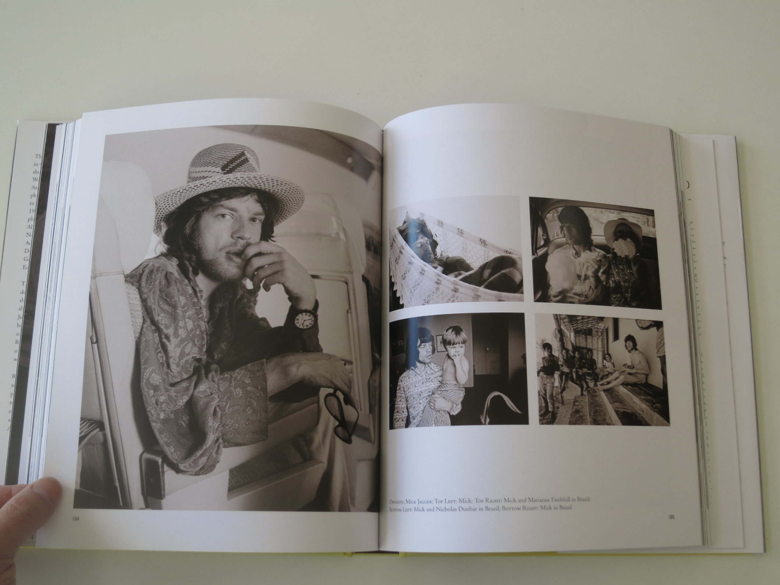
Adger Cowans has photographed Malcolm X, Muhammad Ali, Mick Jagger, Henry Fonda, Jesse Jackson, Samuel Jackson, Louis Armstrong, Sarah Vaughn, Biggie Smalls, Al Pacino, and so many, many more.

The book doesn’t seem to be tied to any current exhibition, so it’s more likely a career-encapsulator, as I think Mr. Cowans is “approximately” 80. I’m not exactly sure of his age, as the book’s only weak spot is that it doesn’t provide dates for any of the photographs.

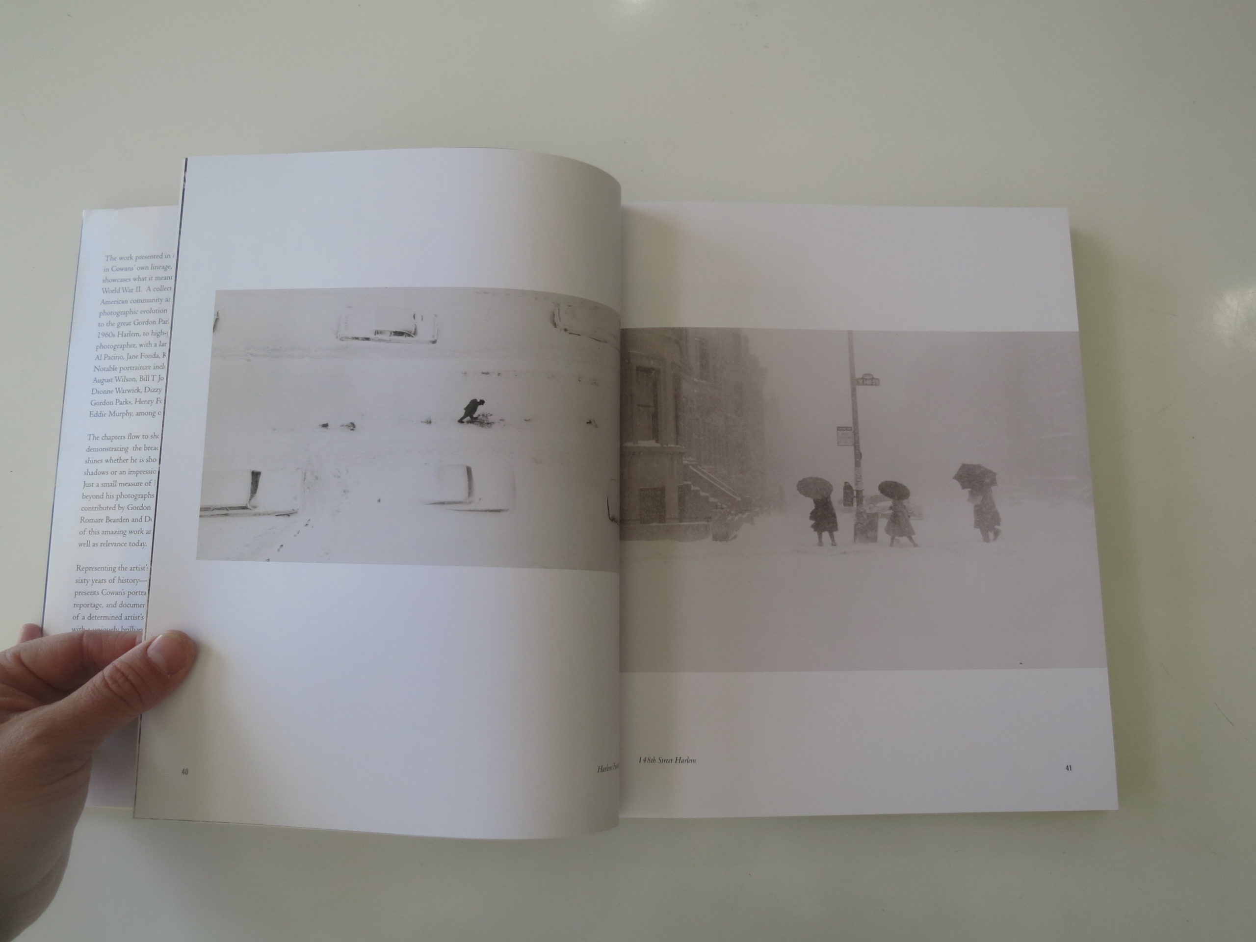
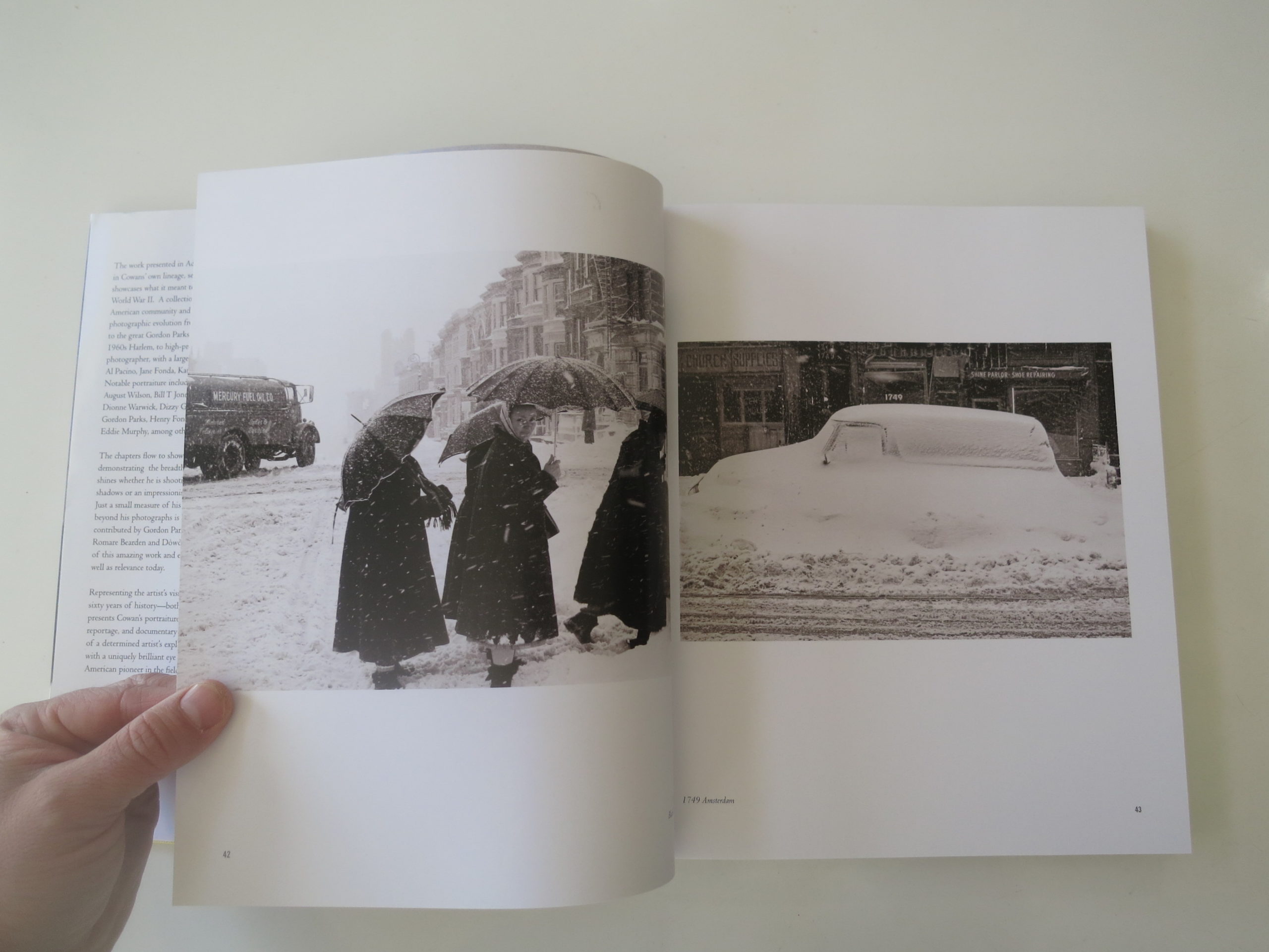
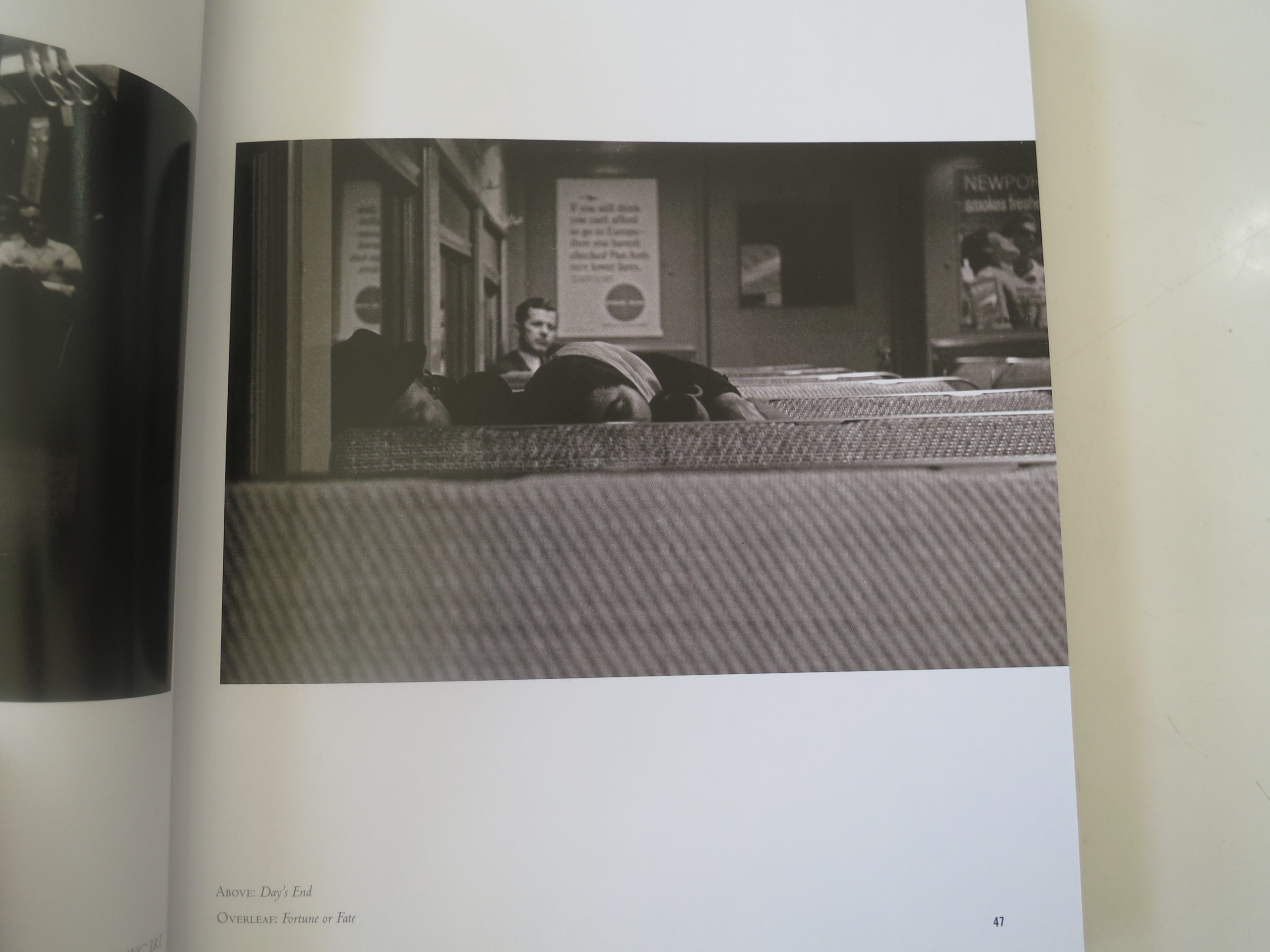
There are multiple sections, and each opens with a quote from an established photography master. (Erwitt, Sander, Weston et al.) The first, featuring street photos from the late 50’s and early 60’s was my favorite, as the best evoke a romanticized version of New York, even though they’ve got uptown street cred. (The snow-covered car and umbrellas-in-the-snow couplet was particularly magical.)

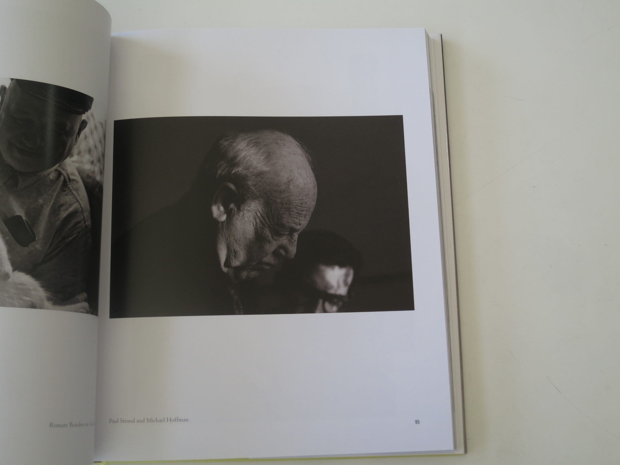
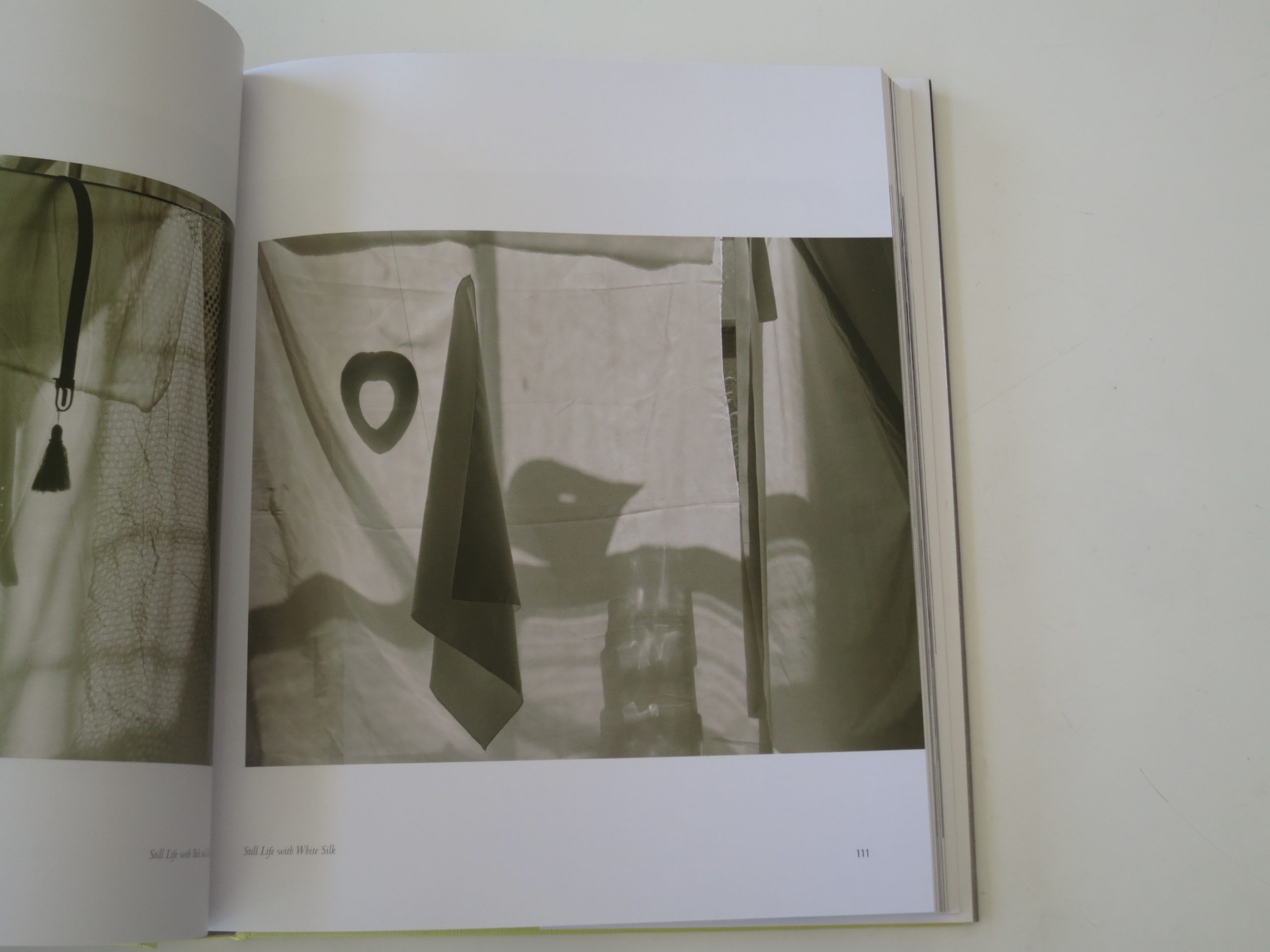
Apparently, Mr. Cowans also paints, makes music, and works with fiber, bolstering his Renaissance Man stature. The book riffs on that distinction, showing different phases of his photography discretely, including digital concoctions, still lives, and experimental imagery.

Not all of the photographs are classics, it should be said, but many of them are really excellent. In particular, I loved the early portrait of Barbara, whom I believe is the mother of his son Eden.

It is oddly intimate to have that family-album-element, but it definitely hooked me into this book. By digging in, I learned about elements of the African-American art community of which I was wholly ignorant. (He was a part of two important art collectives, Kamoinge and AFRIcobra.)

My experience writing about this book was unique, as it strangely enticed me to spend more time than I’d originally planned. First, I looked at it, thought it was cool, and then sat down to write, as I always do. I tried and tried, and then gave up after 6 attempts.

That’s never happened before.
Ever.

Instead, I sat down by the fire, and read it cover to cover, then skimmed back over several parts again. I looked at the images few more times as well, to better understand his career arc.

For whatever reason, this book required more of me than a flip-through and a witty response. I’m not surprised though, now that I know Adger Cowans might just be the Most Interesting Man… you get the point.

Bottom Line: A Funky, fascinating lifetime of work by an African American photographic badass

To Purchase “Personal Visions: Photographs” Go Here: http://glitteratiincorporated.com/products/personal-vision-by-adger-cowans

The Art of the Personal Project: Kris Davidson

Personal Projects are crucial in showing potential buyers how you think creatively on your own. I am drawn to personal projects that have an interesting vision or show something I have never seen before. In this revised column, I’ll include a link to each personal project with the artist statement so you can see more of the project. Please note: projects are found and submissions are not accepted.

Today’s Featured Artist: Kris Davidson

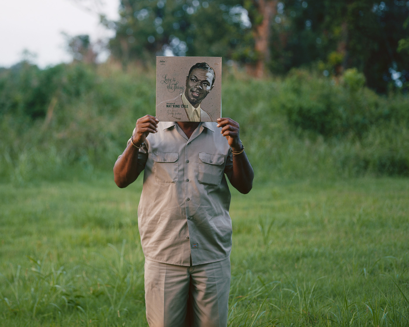
Walter as Nat King Cole (Love is the Thing)
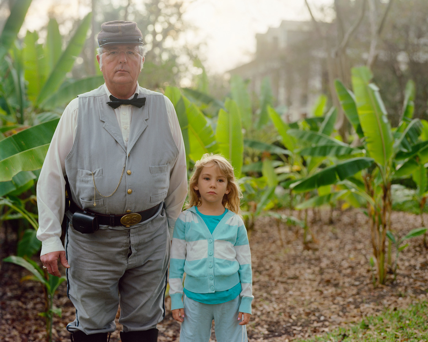
Sasha and the Confederate Colonel
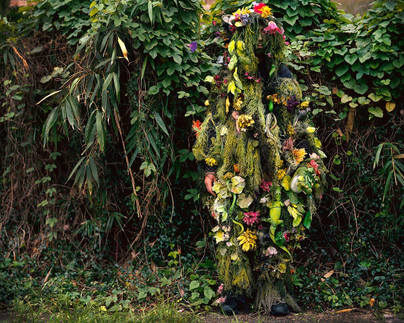
Swamp Thing, French Quarter street performer in New Orleans, Louisiana.
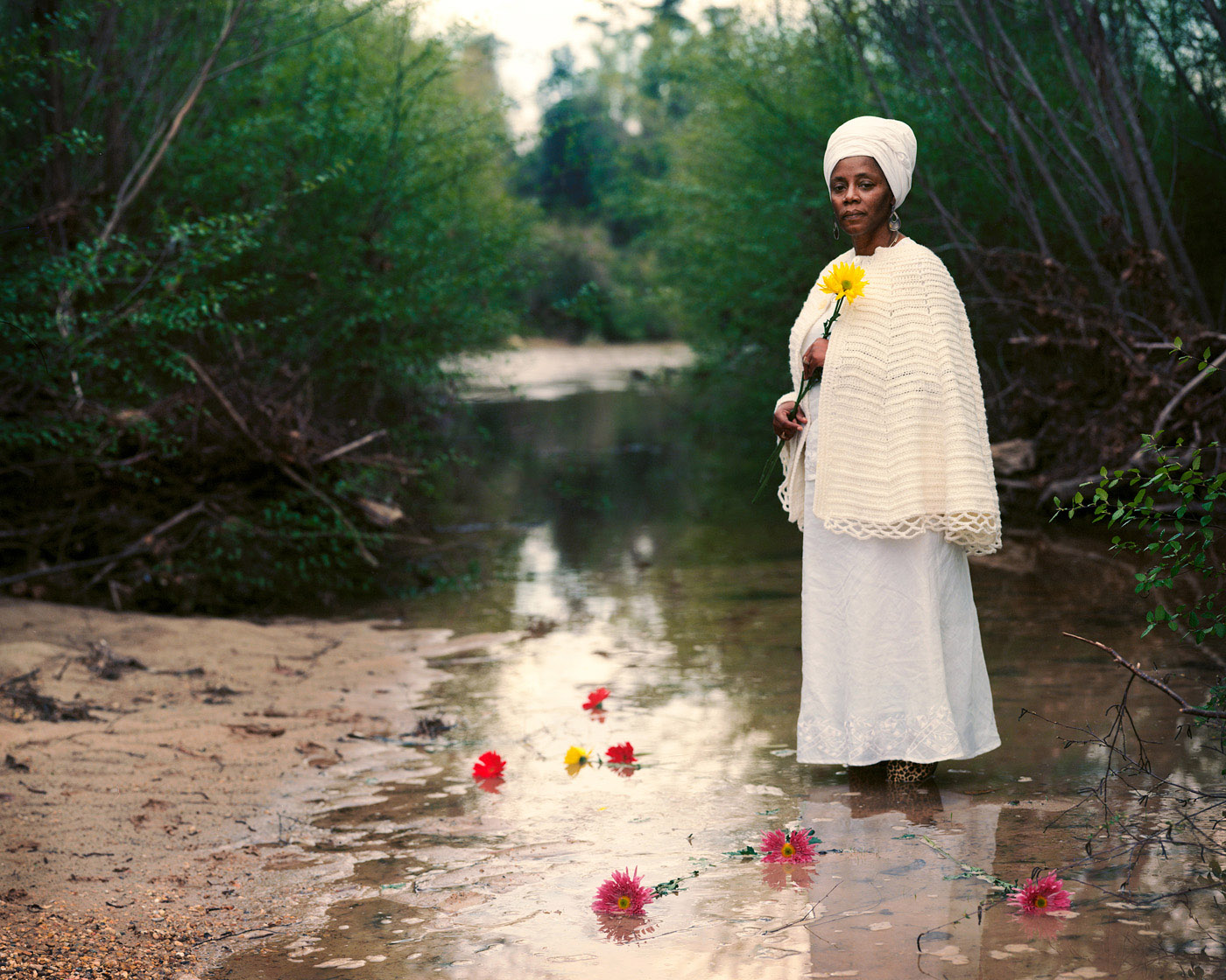
Antoinette, a slave genealogist, performing a commemoration for her ancestors in Kentwood, Louisiana.
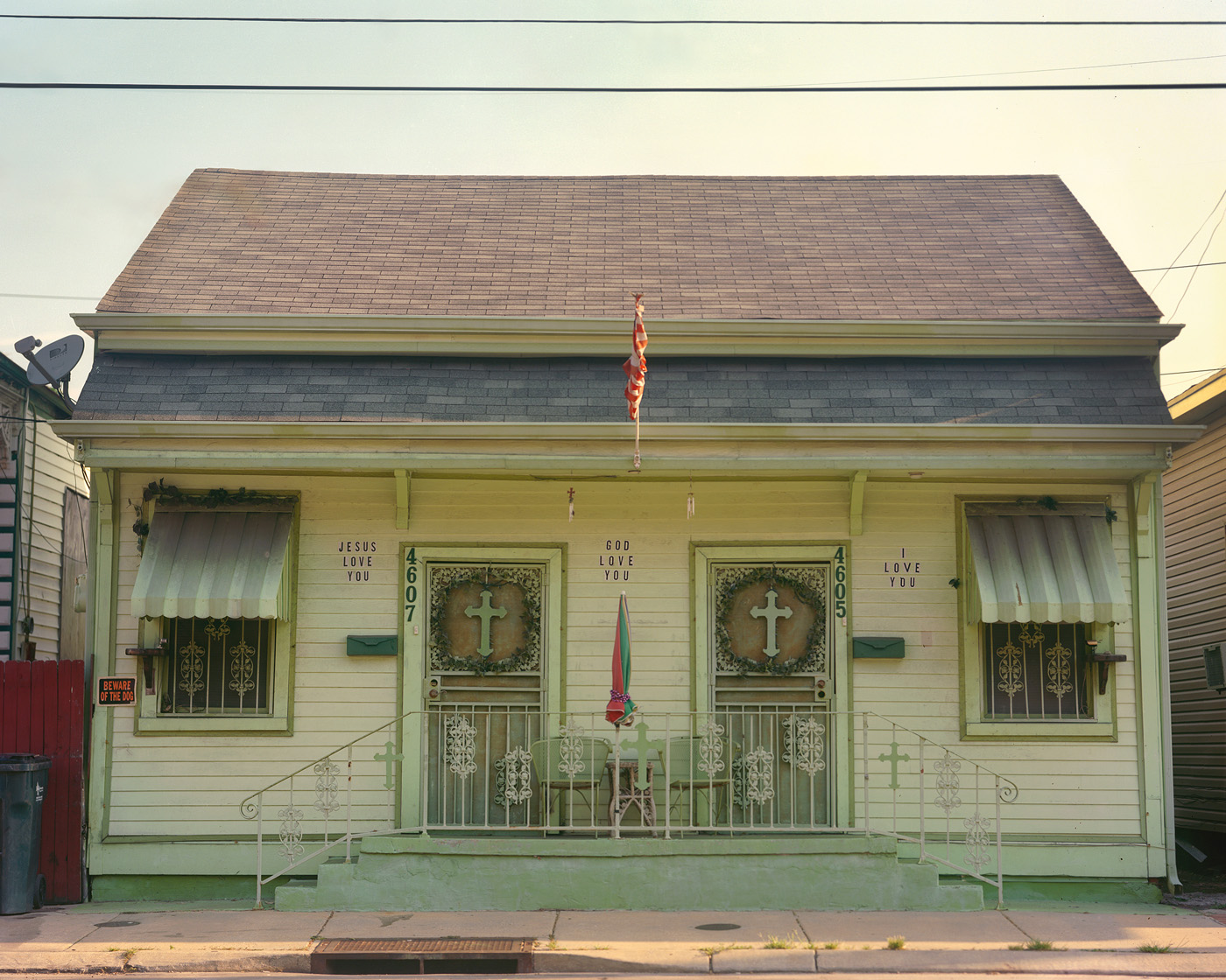
Jesus Love You, God Love You, I Love you – house in New Orleans, Louisiana.

http://www.krisdavidson.com/PROJECTS/IN-THE-SOUTHERN-GARDEN/thumbs

KRIS DAVIDSON // PROJECT STATEMENT // In the Southern Garden
MEDIUM:  20”x 24” and 30”x 40”prints on archival matte paper. 
SUMMARY: In the Southern Garden is a photographic study of how history lives on in the American South; primarily a portrait series, the project depicts southerners from all walks of life wearing their history

“The life of the dead is placed in the memory of the living.” — Marcus Tullius Cicero

In the Southern Garden is an exploration of how individual identity and everyday life continue to unfold in the American South, a place where the past is always present and constantly in a state of revision by the people who tell and re-tell their stories over time. Using a 4×5 view camera, the image-making process is slow, deliberate and collaborative. This project looks at how Southerners understand and wear their own history. 

The American South is lush, green and dominated still by vast expanses of the arable land that gave rise to a slave economy. The idea of a garden serves as a metaphor for the nature of memory, which is seeded and cultivated, and yet, grows wildly when left untended.  The portraits are typically made in garden settings, farming areas or in nature. Some of the portraits feature subjects directly referencing their embraced history (such as Confederate re-enactors or Harriet Tubman) while others are more subtle in every-day dress. It is in bringing all of these portraits together, that history conflates, strangely revealing parallels and intersections of the African-American and white narratives. Every subject is treated with respect. Every subject is an American.

The American South is a place that is tragic, strong, graceful, insolent, optimistic, beautiful, conservative yet wild — teeming with memories that are overgrown and intertwined like untended foliage along the banks of the Mississippi River.

—————

APE contributor Suzanne Sease currently works as a consultant for photographers and illustrators around the world. She has been involved in the photography and illustration industry since the mid 80s. After establishing the art buying department at The Martin Agency, then working for Kaplan-Thaler, Capital One, Best Buy and numerous smaller agencies and companies, she decided to be a consultant in 1999. She has a new Twitter feed with helpful marketing information because she believes that marketing should be driven by brand and not by specialty. Follow her at @SuzanneSease.

Pricing & Negotiating: Athlete Portraits for a Beer Brand

Craig Oppenheimer, Wonderful Machine

Shoot Concept: Portraits of a professional athlete against a solid background captured on location alongside a video production

Licensing: Advertising and Collateral use (excluding out-of-home and broadcast) of up to two images for one year

Location: A stadium in Los Angeles

Shoot Days: One

Photographer: Portraiture and active lifestyle specialist

Agency: Medium in size, based in the Midwest

Client: A beer brand

Here is the estimate:

Creative/Licensing: The agency was in pre-production for a video shoot featuring a professional athlete and they hoped to capture portraits of the athlete alongside that project on the same shoot day. Given the availability of the athlete and the busy shoot day, the agency anticipated that the photographer would have about 30-45 minutes to capture two types of portraits; one posed shot of the athlete holding the product, and another shot of the athlete in action with various equipment. Other than the time constraint, the portraits were rather straightforward, especially considering the agency planned to provide the location, styling and general production coordination through the video team.
Based on the layouts/comps we received, it was clear that they intended to use the images primarily for in-store displays and other collateral pieces, however the requested licensing included use for all advertising and collateral purposes for a year. Based on this, I valued the first image at $8,000 and the second image at $4,000, totaling $12,000. They also asked for an option to extend the licensing to include an additional year, which I priced at 50% of the 1-year rate.

Pre-Production Day: I included one day for the photographer to line up his crew and correspond with the agency and video team to prepare for the shoot day. It’s often expected that a photograhper will bring on a producer when shooting alongside a video team to handle correspondence with the client, agency and video production team, but for this project it was clear that the art buyer from the agency would be filling this role.

Assistants: I included two assistants for the shoot day, both of which would help with lighting and grip equipment while also lending a hand with any last minute needs during the short window of shooting time.

Digital Tech: The digital tech the photographer works with charges $500/day plus $350 for a mobile laptop workstation, which would help the agency/client see the results as they were being shot. We also anticipated the athlete’s publicist would be on site as well, since we knew they’d want to approve the images being captured.

Equipment: This included about $800 for camera bodies and lenses, and $700 for grip, lighting and expendables.

Van Rental: One of the shots required the athlete to jump in the air and land on a large pad. The photographer needed a van to transport this pad (which he already owned) to the shoot, along with his equipment.

Shoot Processing for Client Review: This accounts for the photographer’s time to edit the images and deliver a web gallery for the agency to choose from, as well as the delivery of their two selects. The agency was to provide any retouching, so we didn’t include any additional post processing fees.

Mileage, Parking, and Miscellaneous: This covered parking at the stadium and miscellaneous expenses throughout the shoot day.
Results: The photographer was awarded the project, and the client came back a few months later with another similar project featuring a different athlete.
If you have any questions, or if you need help estimating or producing a project, please give us a call at (610) 260-0200. We’re available to help with any and all pricing and negotiating needs—from small stock sales to large ad campaigns.

The Daily Edit – California Sunday Magazine: Jacqueline Bates

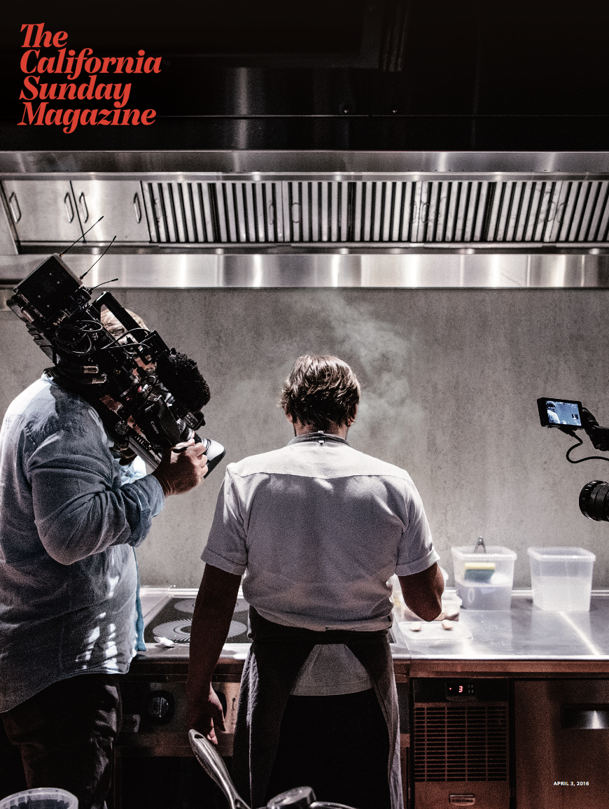
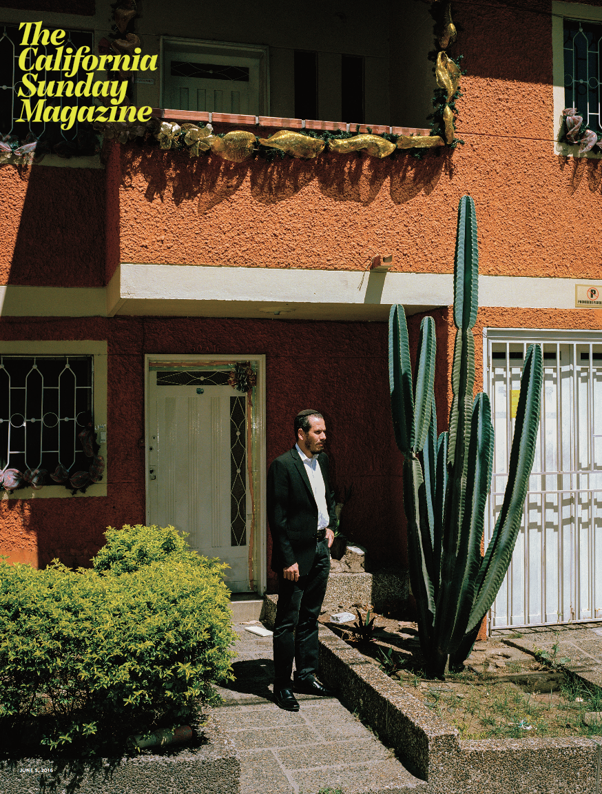
We interviewed Mark Manahey previously about this cover

Mateo Gómez García

Benjamin Rasmussen

Erin Brethauer

Gillian Laub

California Sunday Magazine

Creative Director: Leo Jung
Photography Director: Jacqueline Bates
Photography Editor: Paloma Shutes
Production manager: Thomas Bollier
Designer: Annie Jen

Have you kept with the same format since you launched or have you introduced any new sections?
We are always open to experiments and trying out new formats. In September, we published our first-ever themed issue, in which we asked writers and photographers, “What do California and the West sound like right now?” We gathered stories about entertainment, criminal justice, science, design, business, music, sports, culture, and technology. We asked our contributors to record the sounds they wrote about, and these snippets appear throughout the magazine as audio footnotes — readers can play them on their phones as they read the print edition. We divided the issue into three chapters, each with a separate table of contents, beginning with the quietest stories and ending with the loudest. It was a really fun challenge, and we are gearing up for another themed issue later this year.

How does Pop Up complement the magazine and are you also photo directing that as well ?
Leo Jung (our creative director) and I work on all the visuals for Pop-Up. He and his fantastic new designer, Annie Jen, commission all the illustrations. Paloma Shutes (our photo editor) and I work on the photography. Pop-Up is a multi-sensory experience, and there are so many ways to craft a story for a live audience rather than the printed page– we have to think about the pacing and the sequencing of images in combination with the dialogue, when our live orchestra should play. It’s a fun complement to making a magazine.

What are some of your favorite photo essays from the last year, and why?
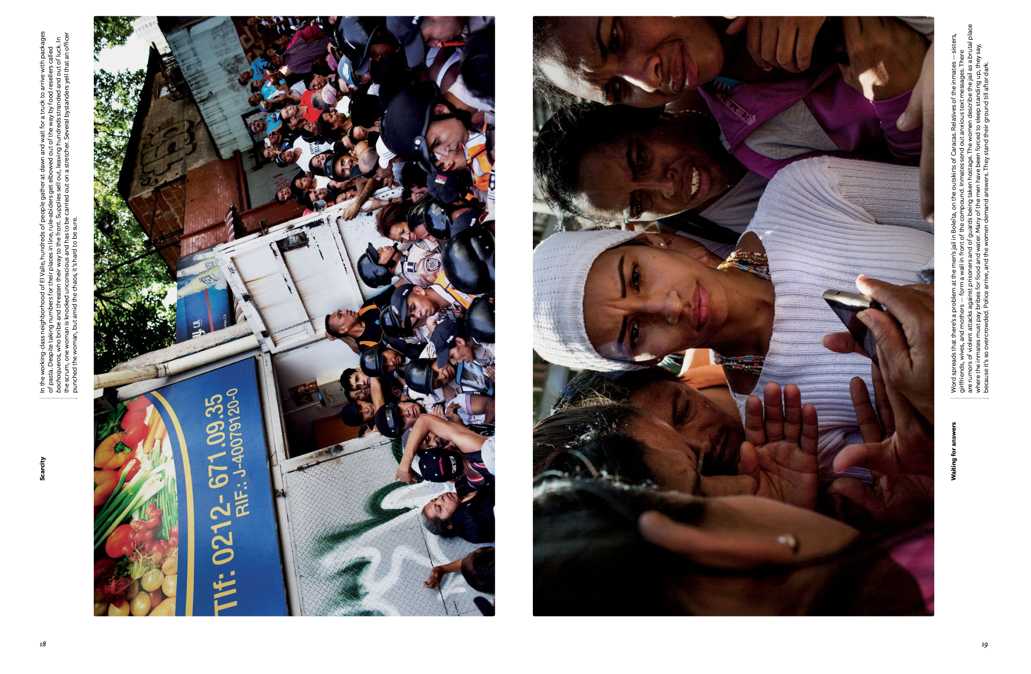
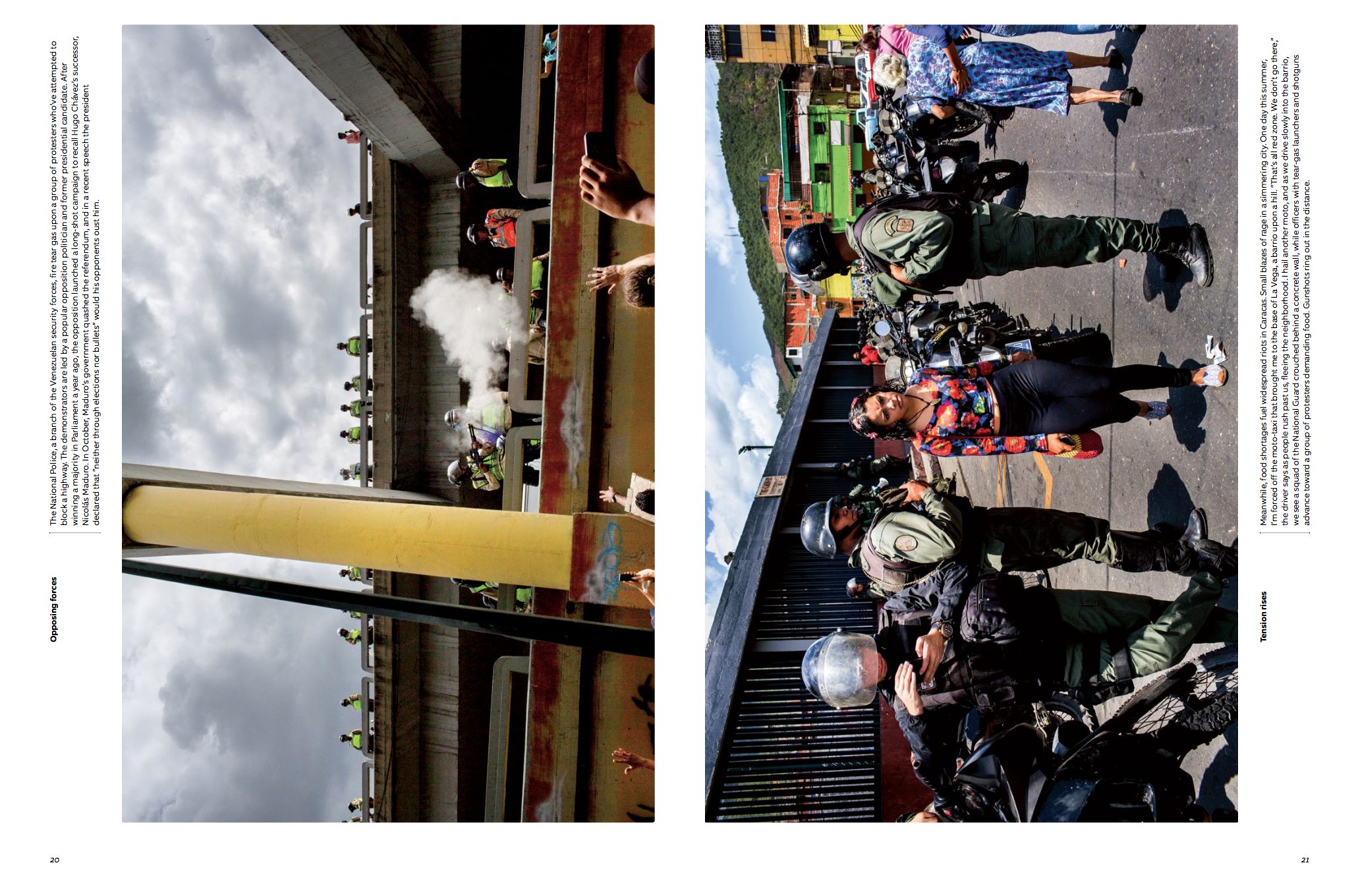
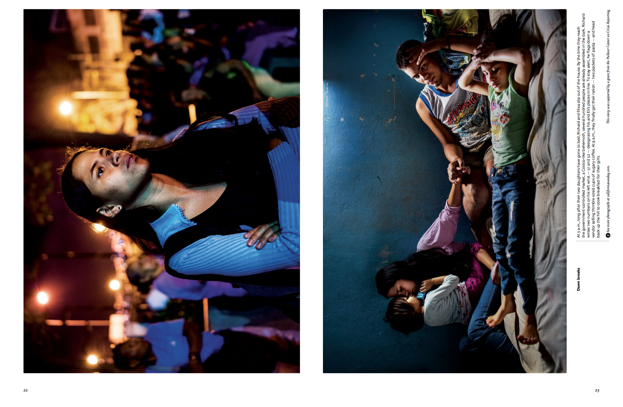
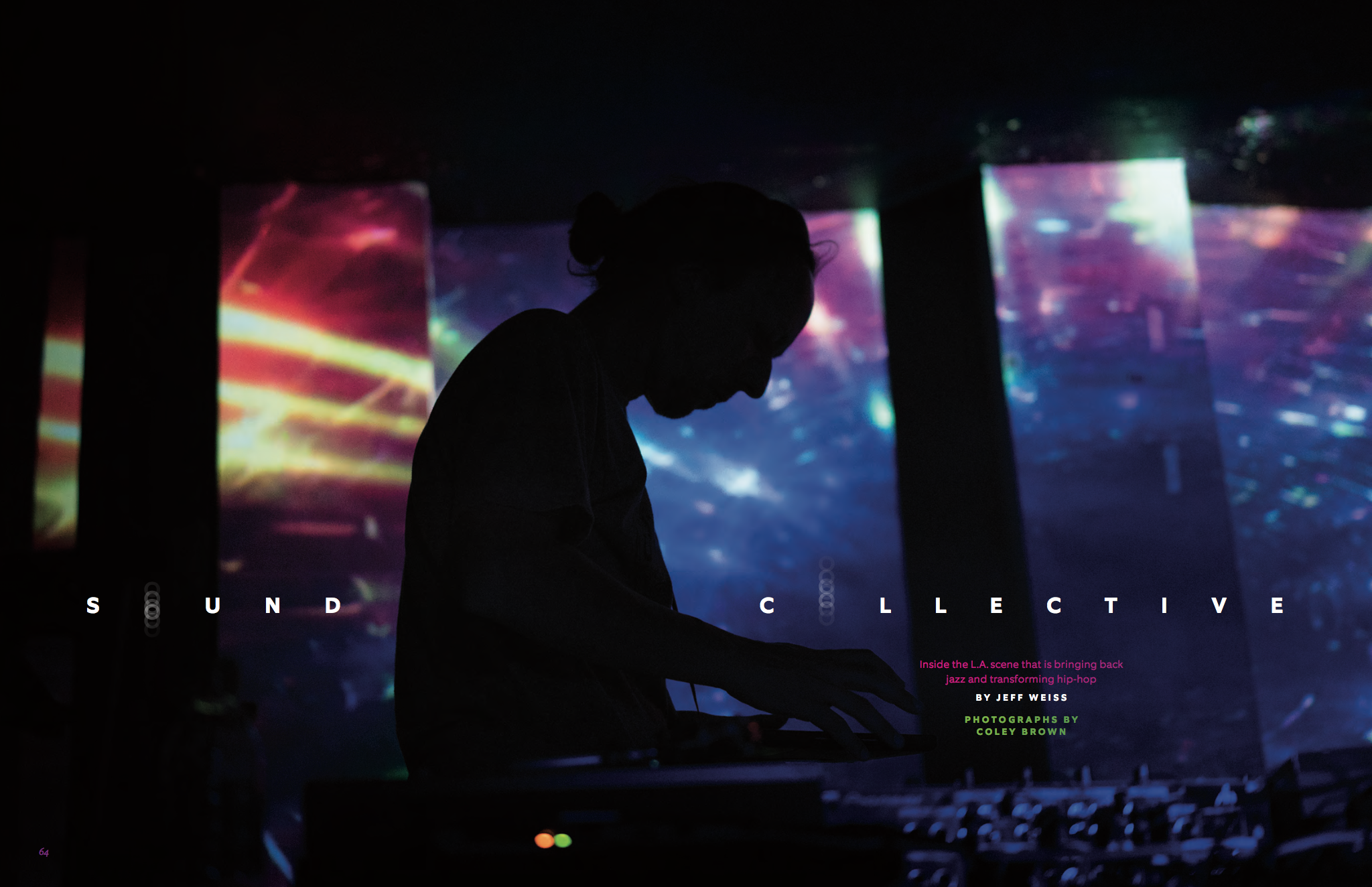
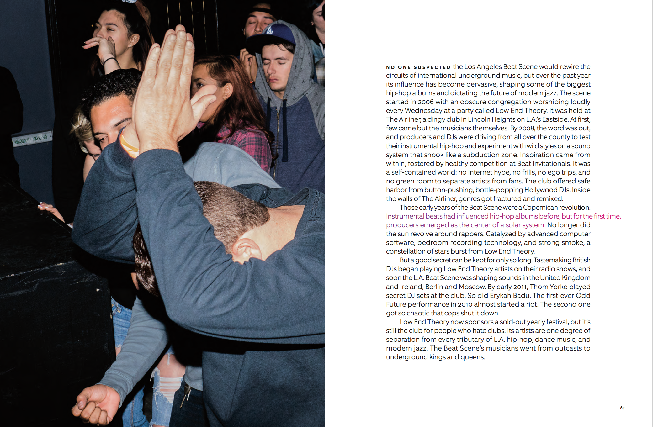
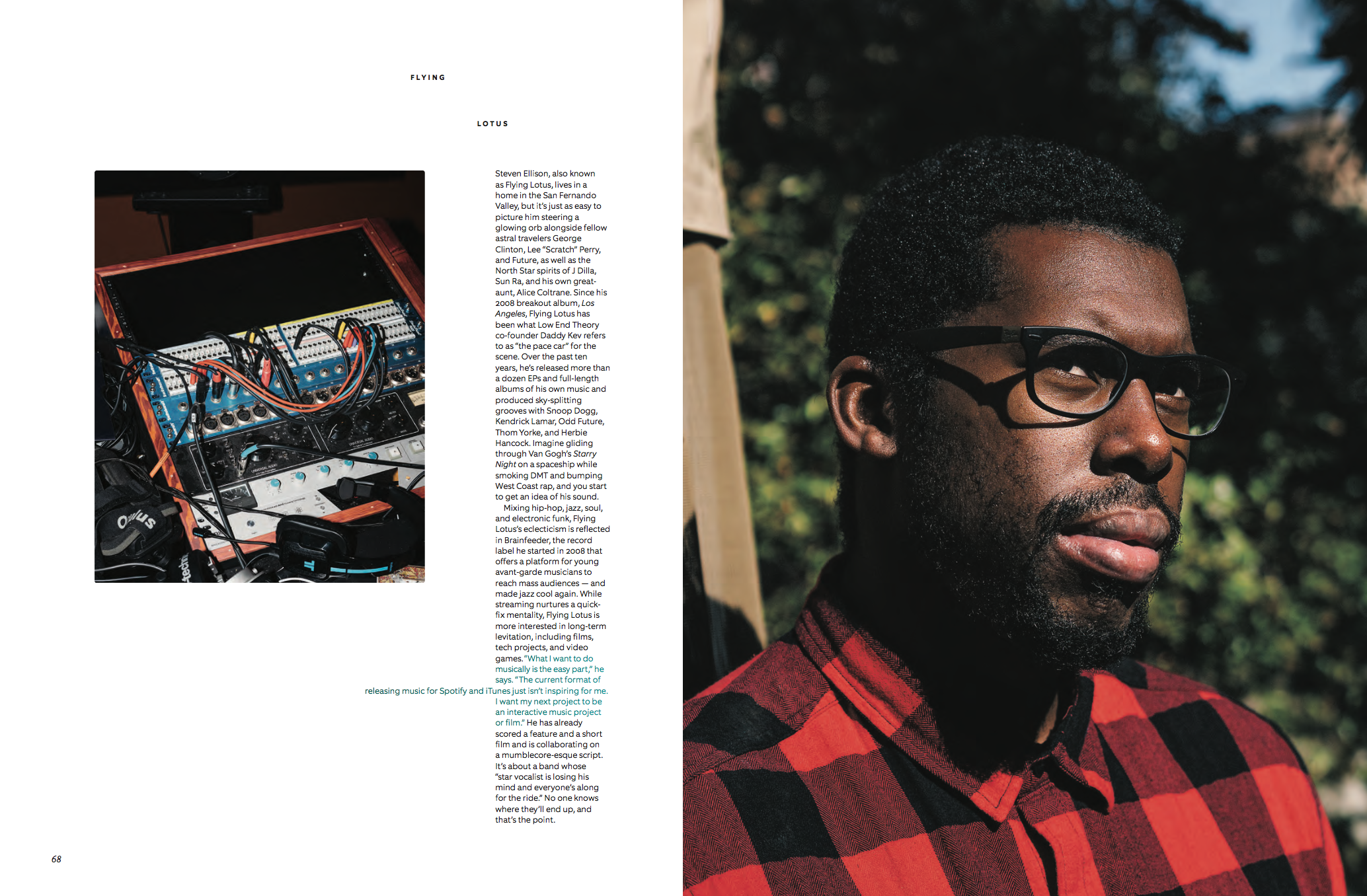
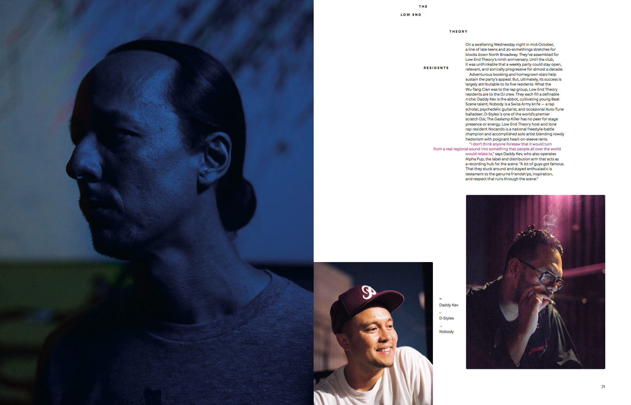
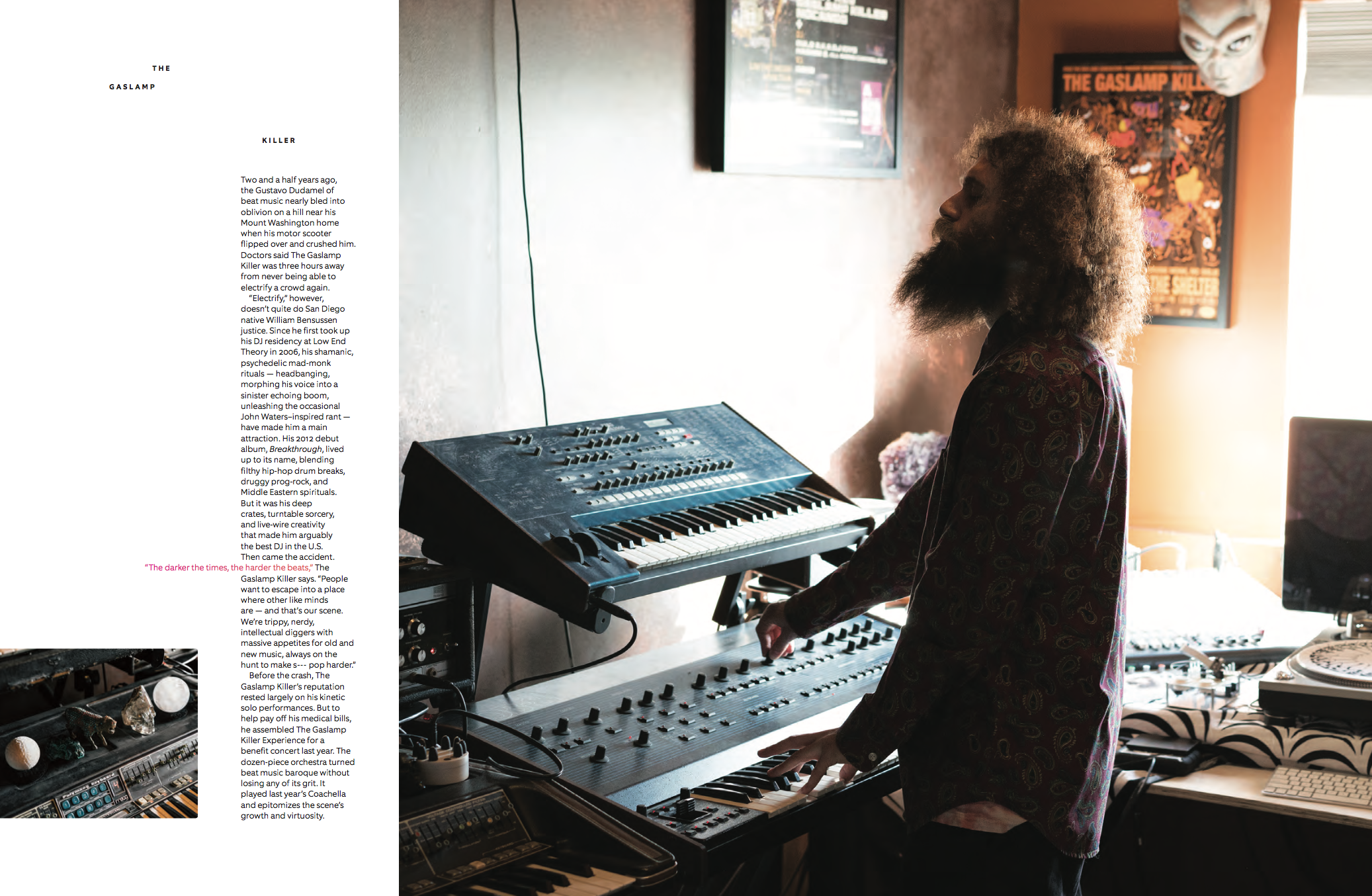
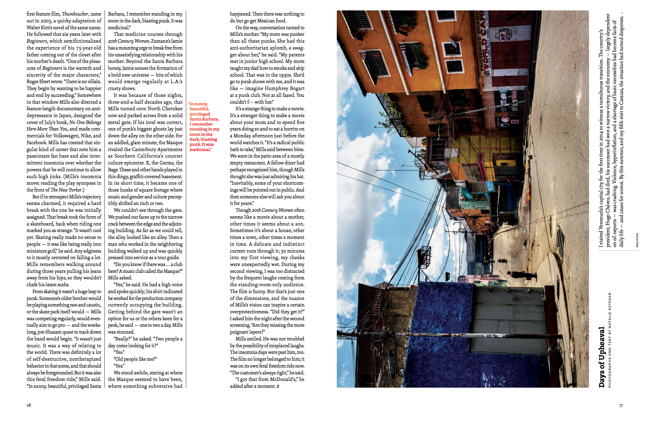
We’ve published so many stories that I’m proud of this year, from a four-part photo essay centered on youth homelessness (as part of a coordinated effort by more than 80 media outlets to shine a light on homelessness in the Bay Area), to a Natalie Keyssar  project documenting political unrest in Venezuela, to an underground LA music scene shaping modern jazz and hip hop, photographed by Coley Brown.


Underground LA music scene shaping modern jazz and hip hop, photographed by Coley Brown

Congrats on the ASMEs—which categories did you win?
Thank you! We won the National Magazine Award for excellence in photography in 2016 and 2017. This year we also won for design, and were finalists in the single-topic issue and magazine of the year categories. It was a huge honor to be recognized among such iconic magazines. We are still in disbelief.

How if at all are you evolving the photography?
Four months ago, we hired a fantastic photo editor, Paloma Shutes, to join the photo department (For our first few years, it was just me). February was her first full issue at the magazine. I think it’s so important so have a coworker who has different sensibilities and distinct photography interests—it will only make the magazine more dynamic, and help it evolve. I’m so lucky to work with her and learn from her every day.
What has been the biggest surprise creatively this past year? 
I never could have imagined we’d win a National Magazine Award two years in a row. That hasn’t happened since 1992,  when National Geographic won a second consecutive award. This sort of recognition validates a young brand, and it also proves that when you have a boss who believes in you, anything is possible. Leo and I feel so fortunate to have Doug McGray as our editor. He adds so much value to our process and gives us breathing room to dream up things we are immensely proud of.

What has been the best lesson that you can share with other PDs?
I think it’s so essential for editors to share knowledge and to not work in a bubble. I’m really excited about the recently launched-site Women Photograph, a database of female photographers that features work from more than 400 women from 67 countries. It’s an incredible resource. We need more of these. I always tell photographers to slow down and research everything about the particular subject they are interested in shooting—and I think editors could do the same. Whenever I have a story in a particular region that I might not have any photographers in, I research everything I can about that world —we always try to hire local photographers whenever possible because of their close connection to that place.

How many photo essays or visual shorts do you get pitched in a typical month?
We get pitched a significant amount, and Paloma and I have weekly meetings to present ideas to our editor-in-chief and senior editors. Photographers are welcome to pitch unpublished projects or ideas to: art@californiasunday.com

The Daily Promo: Sam Zide


Sam Zide

Who printed it?
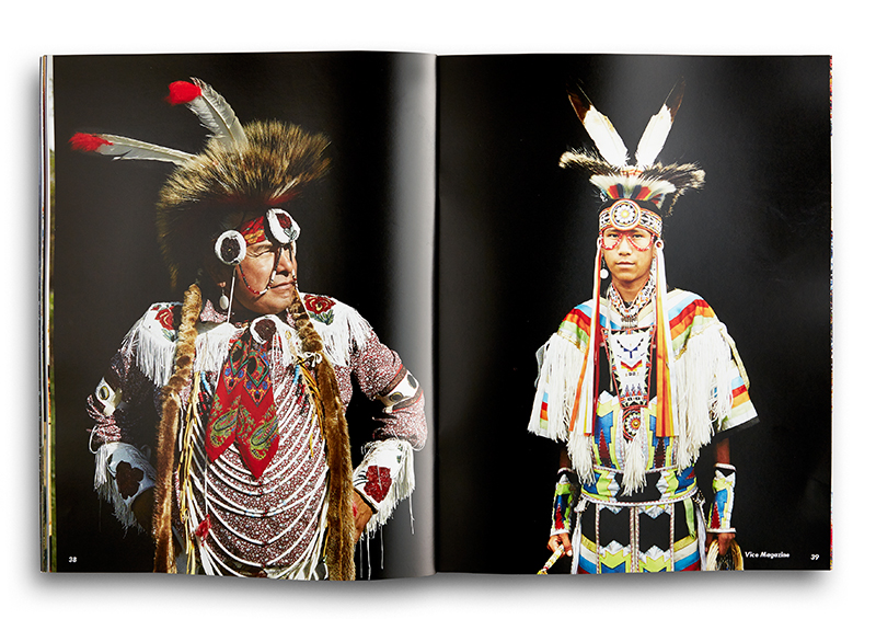
The portfolio piece was printed by GSB digital in Long Island City. Their print shop was located above our Macy’s photo studio, I took a tour of the facility and got to know the designers. They do a lot of commercial catalogs, but have passion for working with artists for portfolio pieces. I thought they were perfect for this larger piece.
Who designed it?
The piece was designed by myself, but was shown to 3-4 designer / art directors for feed back on the entire process. Working in the Macy’s studio was great resource for talent, a few of the freelance Senior Art Directors sat with me through out the process.
Who edited the images?
The edit was made myself and one Art Director I work closely with, I thought it best to get direction from one source, whose work I admire. We sat down daily over a weeks time, and edited the images down to the ones seen.  I did all the retouching and color balancing

How many did you make?
Only 25 were printed at this time. I like the idea of keeping the run very small on this larger promo piece, and sending them out numbered and in series.
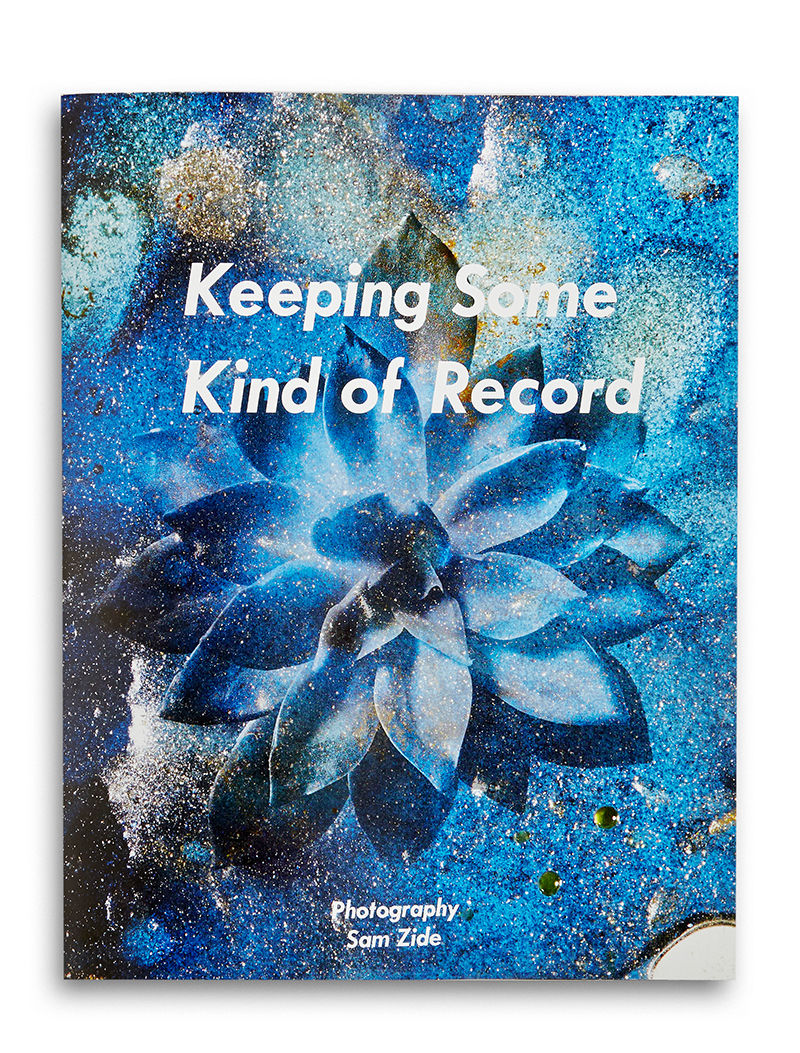
My wife and I just made the move to Oakland from Brooklyn, I have been on staff shooting for Macy’s the past 2 years full-time. Before that I was freelance working mainly in NYC for the 10 previous years. I tried to send out promos twice a year, now I need to get back in the swing of things, and would like to send out quarterly postcard pieces, with an annual large piece showcasing the years work to a much tighter pool of clients and friends. Going from full-time to freelance while moving across the country is quite an undertaking, but I pan to have my next card promo out and new website relaunched in early February.
What inspired you during your creative process?
While I was putting this piece together, I was listening to Leonard Cohen a lot, He has a lyric from his song Famous Blue Raincoat were he says “I hope you’re Keeping Some Kind of Record” The lyric just stuck out to me while editing through the images. The images shown I feel represent a very wide gamut of my work, while I might want my next book to have a more specific theme. So I thought that name for this book was a perfect fit.

This Week In Photography Books: Jeanine Michna-Bales

by Jonathan Blaustein

Let’s face it: most photobooks are for photo geeks.

Publication runs for most photobook publishers are very small: 500, 1000, maybe 3000 on the high side. As we’ve discussed through the years, in multiple interviews with artists and publishers, photobooks rarely make money, or even make their money back, and are often seen as glorified business cards.

That’s hard truth, but I’ve heard first-hand of an artist who had to rent storage for his/her remaindered books. This after paying out of pocket/crowdfunding tens of thousands of $$$$$ to make the production in the first place.

There are exceptions, of course.

Major artists with a solid history of book-sale-success will get the costs fronted. (Martin Parr being an example we discussed in our interview with Dewi Lewis.) And I’ve heard that one or two publishers still take care of productions costs.

The obvious benefit of the tight-knit-market is that by focusing on quality, and charging enough to provide it, photobooks are art objects themselves. Many sport spiffy cover textures, oversized paper, innovative construction, and crisp, snappy print quality.

They’re collected for a reason: because they’re (relatively) rare and beautiful.

On the flip side, there are projects that crack over into the mass market: photobooks that aim for coffee tables. They’re able to speak to larger audiences, as perhaps they document or explore issues, beyond the photo community, that have wide resonance in popular or mainstream culture.

They feature subjects like religion, sports, nature, and history.

Books like this can sell 100,000 copies, even in an era devoid of Barnes and Noble. These books often use less expensive materials, allowing for a lower price point that enables the larger audience.

It’s a trade-off, and one I suspect most artists would be willing to make, especially those whose work is message-driven.
Because the ability to speak to a large group of people is a huge motivator for artists with something important say.
Especially those with a taste for the extreme.

In this case, I’m thinking of Jeanine Michna-Bales, a Dallas-based photographer whose work I’ve featured in this column before. I first met her at Review Santa Fe, and saw her inspirational project, in which she reconstructed and photographed the Underground Railroad at night.

I loved her portfolio-sized, meticulously printed fine art work, as the inky blacks were darker than Steve Bannon’s soul. The pictures are so dark, literally, and they represent a shameful time in our nation’s history.
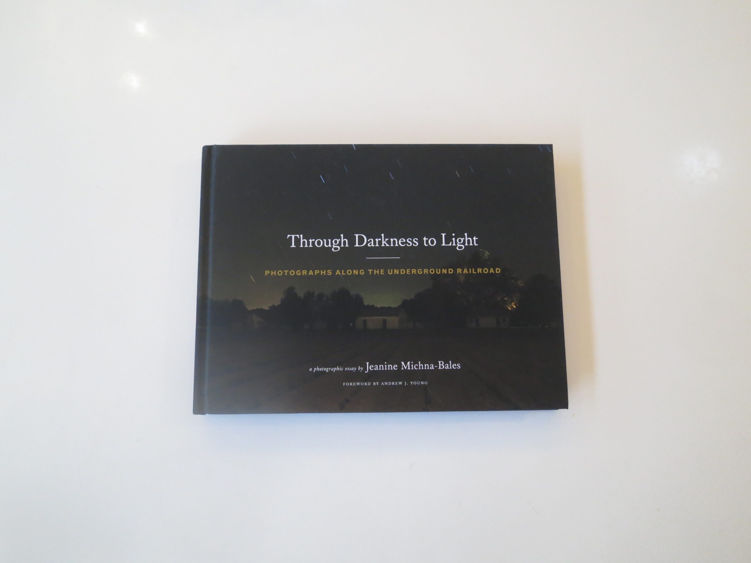
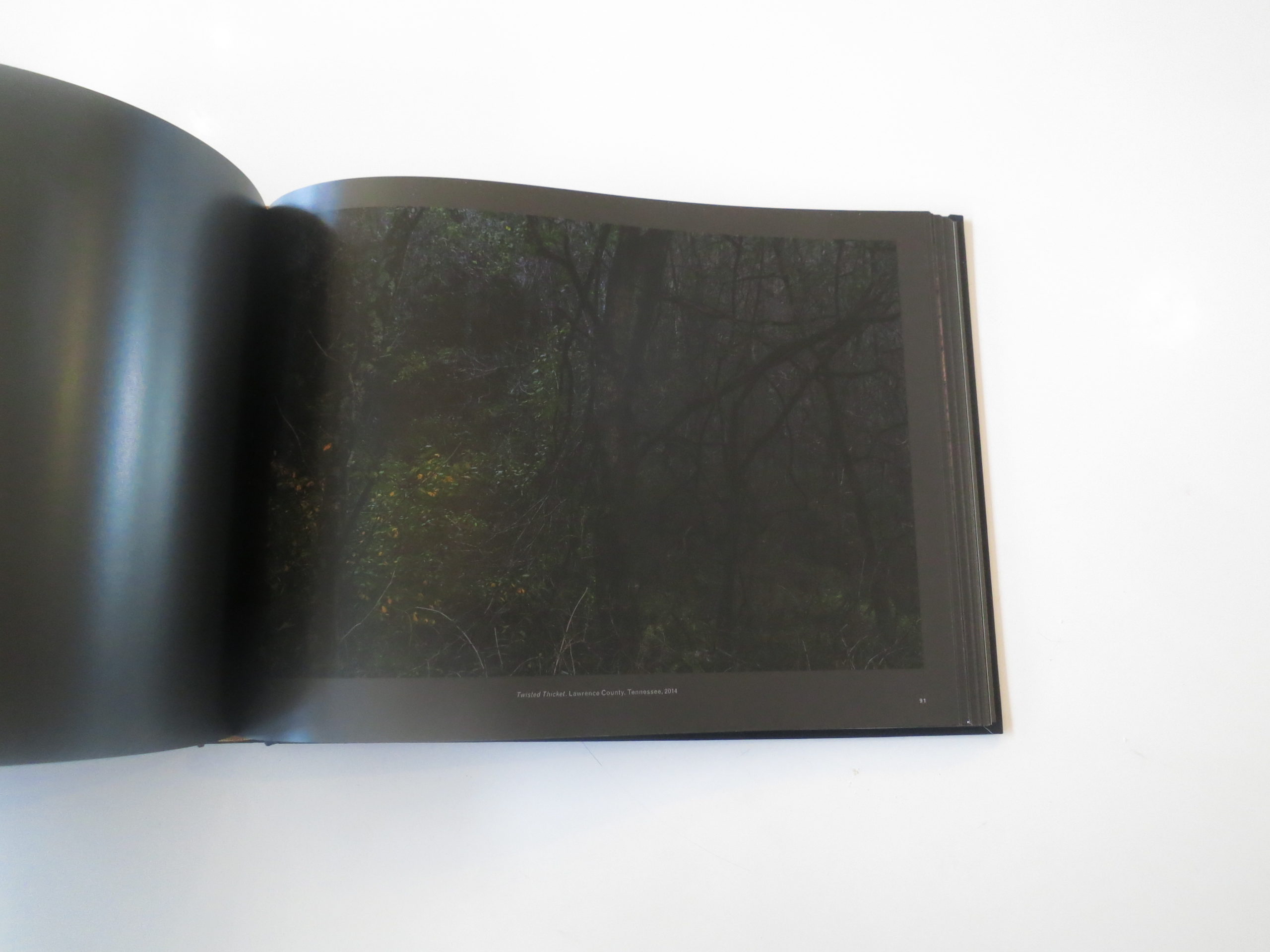
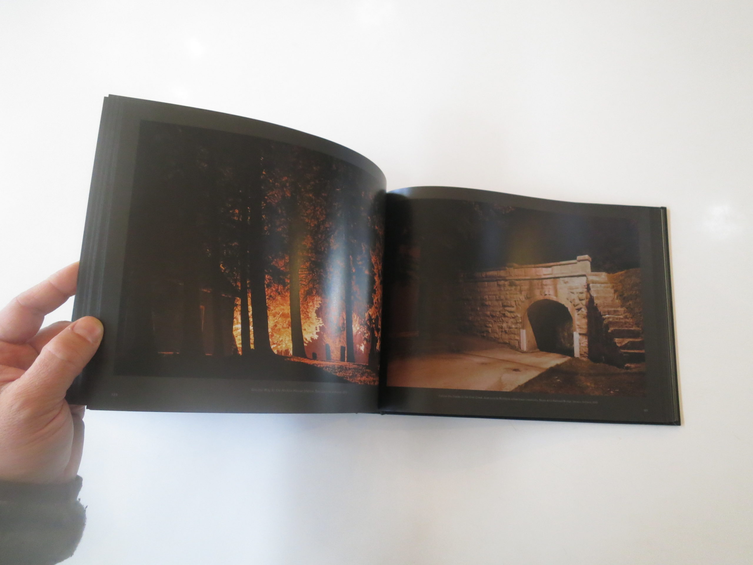
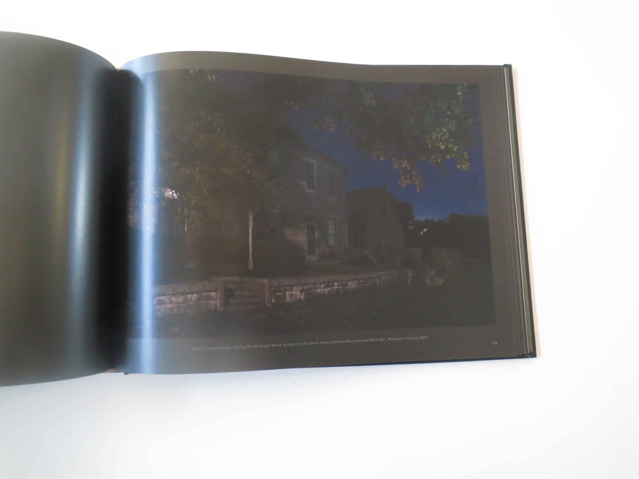
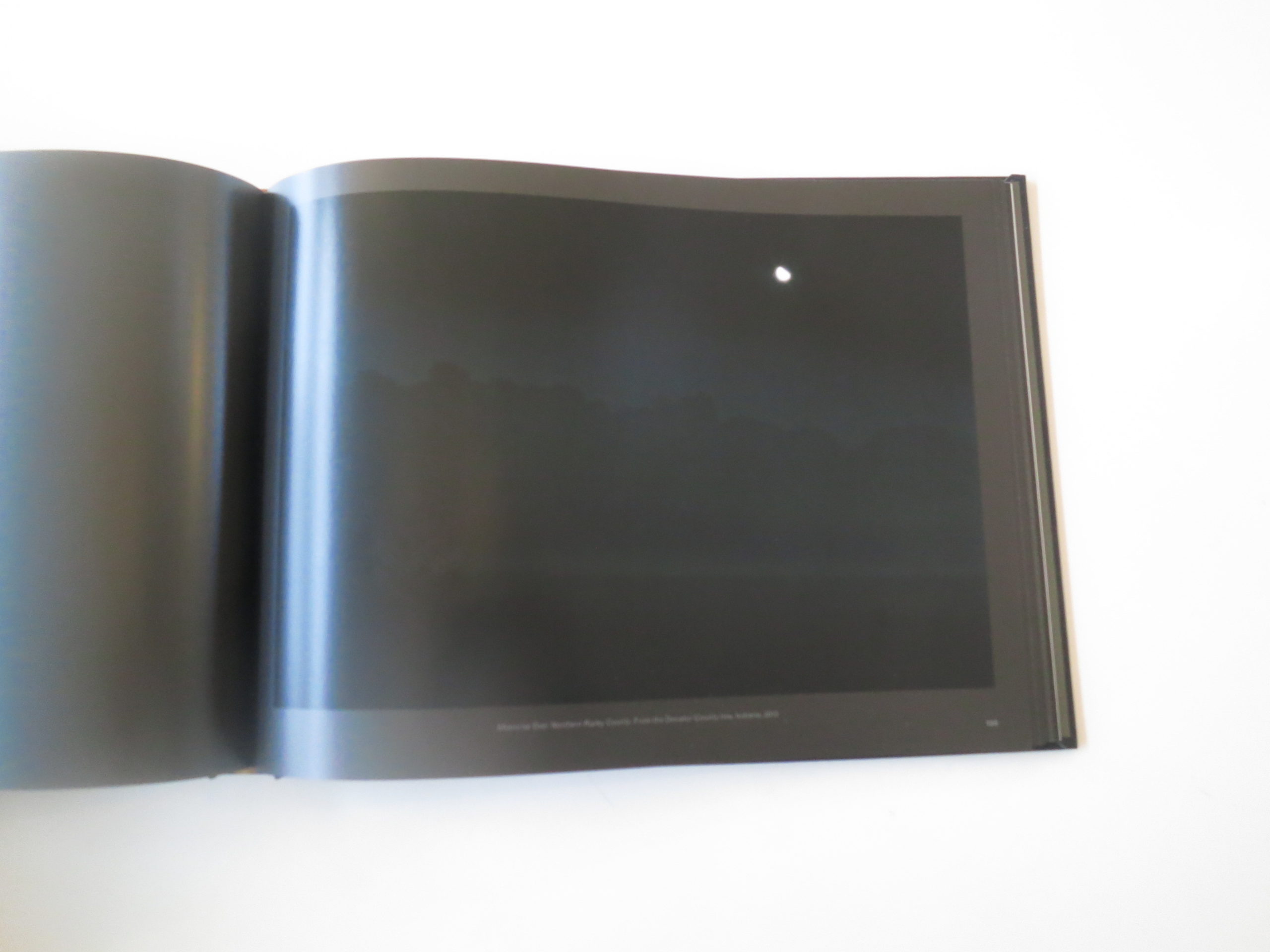
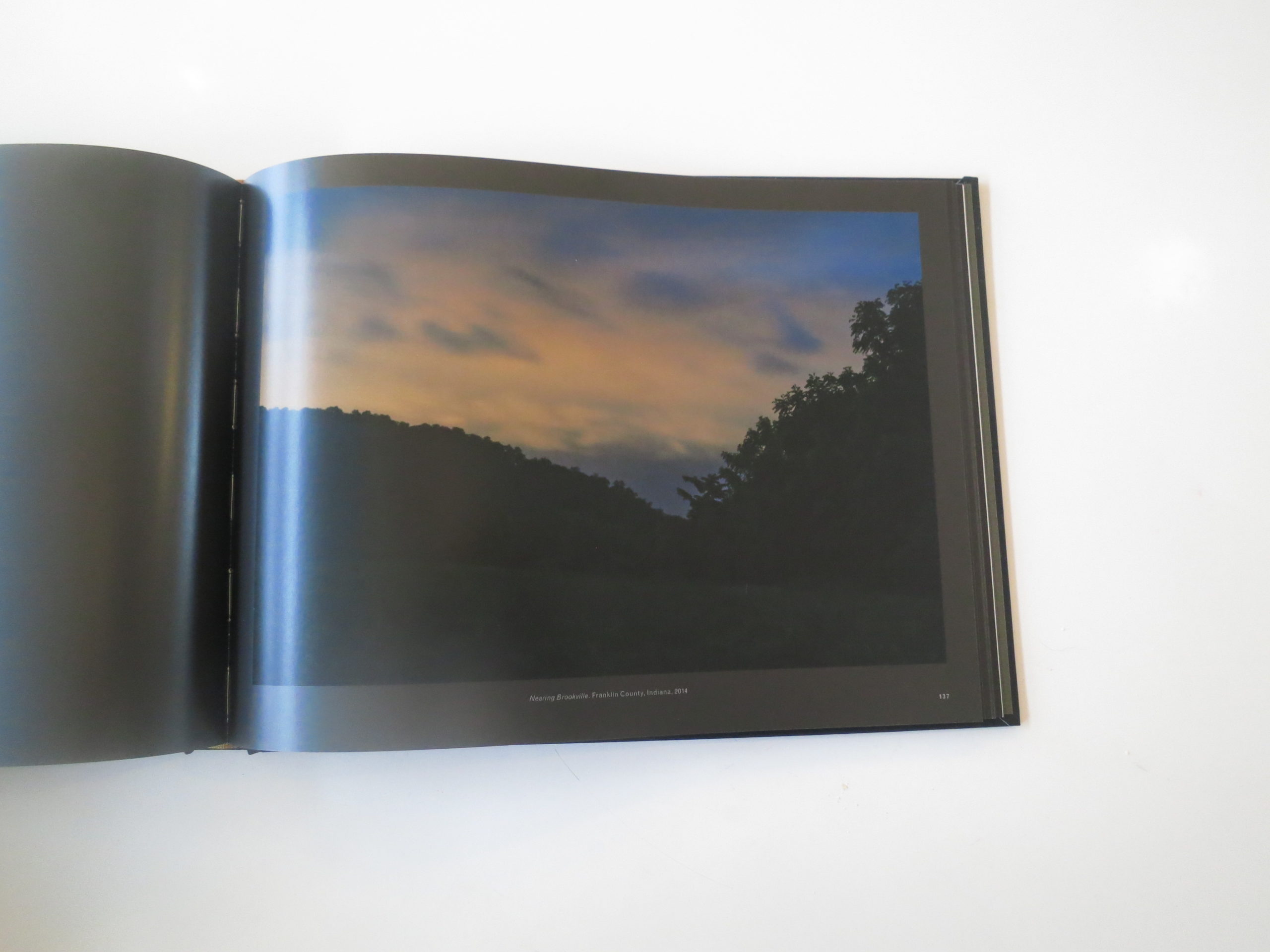
I’m thinking of Jeanine’s photographs right now, as I’ve just put down her new book “Through Darkness to Light: Photographs Along the Underground Railroad,” which was just published by Princeton Architectural Press.
We showed a chunk of the project here in 2014, during my usual festival roundup, and the photographs also look great on screen. The projected light allows for a luminous take on deep bayous and forgotten forests, late into the wee hours.

Amazing stuff.

And it was no easy project to execute, either, as Ms. Michna-Bales begged help from family, and hired off duty police officers to protect her, as she photographed each link in a painstakingly researched chain.

I requested this book as soon as it was available, and am predisposed to like it. There’s a cool intro by Civil Rights Leader Andrew Young, in which he segues from Curtis Mayfield to Bob Marley to Kendrick Lamar in one fell swoop of message-driven art.

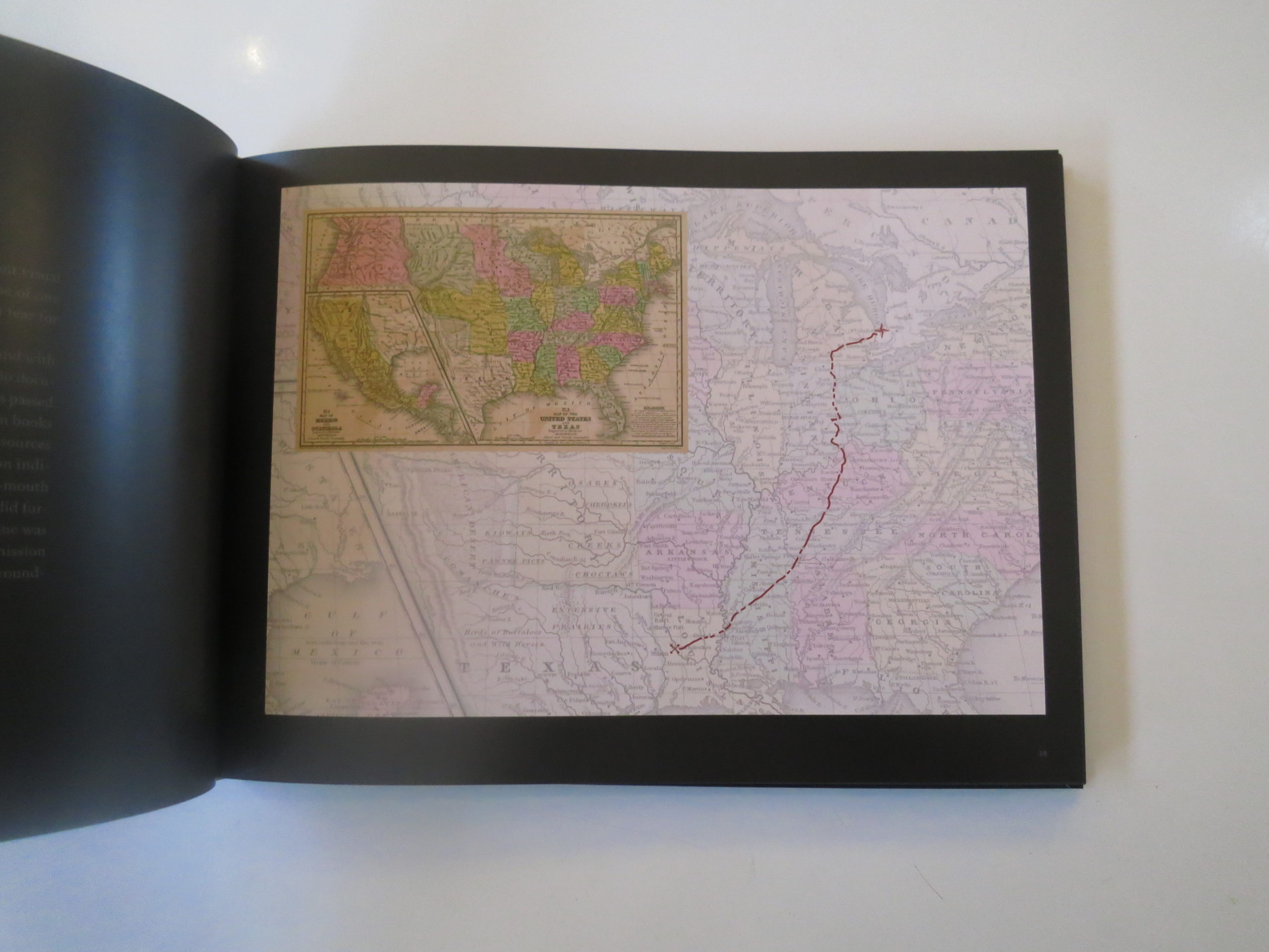
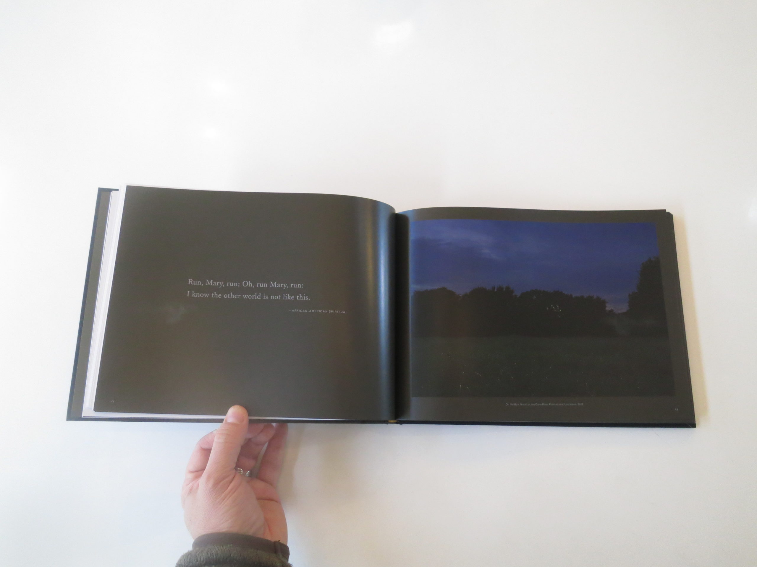
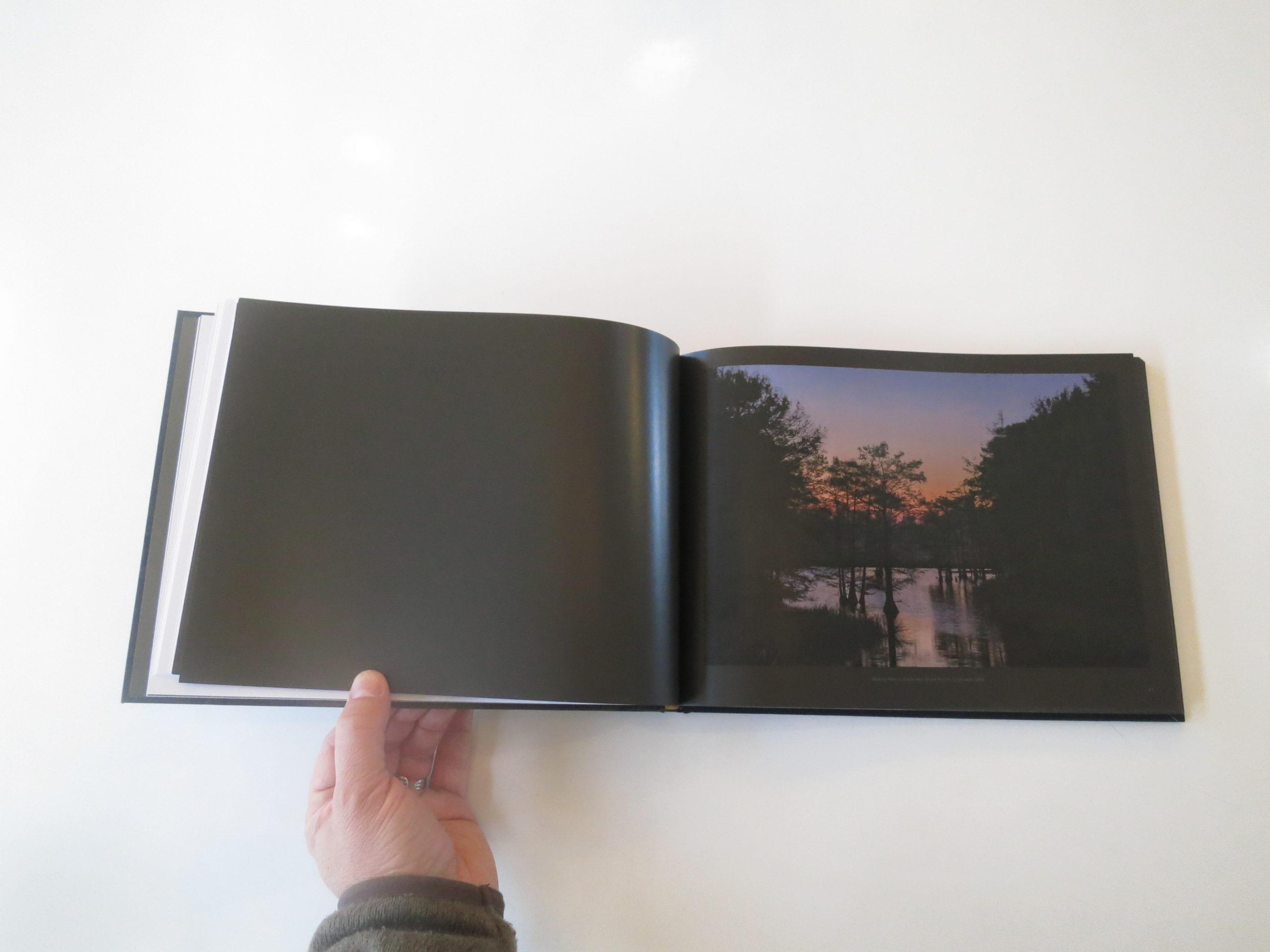
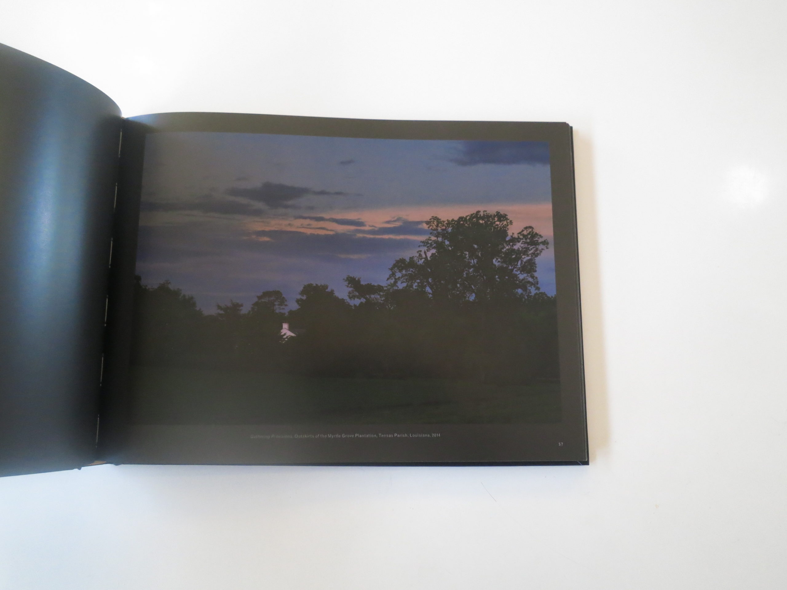
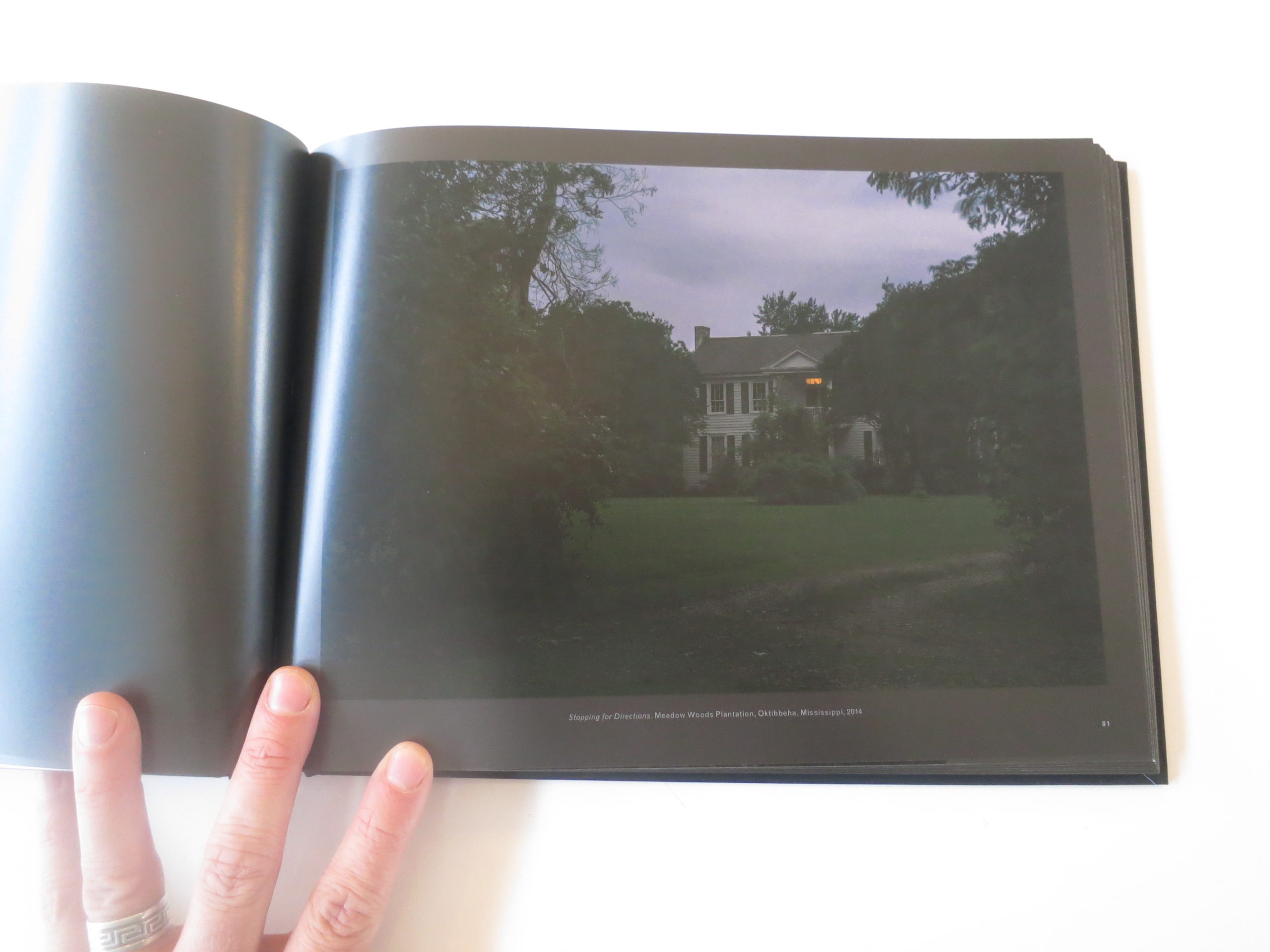
The book is surprisingly small, with a horizontal orientation, and I wondered if it was enough space for these mysterious landscapes. The designer went a step further and put a dark, charcoal gray border around many of the photographs, shrinking them further, but also making their murky depths harder to separate. (I would have gone with white.)

That dark gray is ever-present, including on image-less pages, and it makes for difficult viewing, with all the dark photographs.

The images don’t have a lot of three dimensionality, unfortunately, as I think they might have pushed the limitations of the printers they were using. There’s a flatness to the darkness here that suggests hyperreality, a visual styling I don’t remember seeing in her gorgeous, fine art prints.

I know it sounds like I’m being critical, so please allow me to reframe. This project, as a result of its awesomeness, has had a lot of success. A traveling exhibition of prints is going on a multi-city exhibition tour through Texas, the South and Midwest, through 2020.

She’s won prizes, and been supported by excellent organizations like Photo NOLA and the Open Society Institute.

I think the dark design, and repeating motif of historical quotes opposite photographs, are meant to suggest a somber and serious mood. While I admit it’s not exactly to my taste, I think I see where this is going.

Princeton Architectural Press belongs to Chronicle Books, the masters of the mass-market photobook. Given that it’s the only photobook offered in the “new releases” section of the PAP website, which also features several different types of notecards, I think this book is poised to speak to a larger audience.

Unlike me, most mainstream book buyers won’t be holding the color separations up against my memory of her original fine art prints. They’ll see these quiet, creepy places, and their imaginations will activate.

They’ll see themselves there, crawling through the mud, scared shitless, worried if the hounds are on your scent. They’ll appreciate the pictures, but more than that, they’ll be reminded that our country was built upon a heinous system of injustice, and that combatting racism, especially in the Age of You-Know-Who, is a worthy goal for any photobook to inspire in its viewers.

Bottom Line: Dark, somber photographs of the Underground Railroad, reconstructed

To Purchase “Through Darkness to Light: Photographs Along the Underground Railroad” Go Here: http://www.papress.com/html/product.details.dna?isbn=9781616895655

If you would like to submit a book to be considered for review, please contact jonathanblaustein@gmail.com.

The Art of the Personal Project: Vincent Dixon

Personal Projects are crucial in showing potential buyers how you think creatively on your own. I am drawn to personal projects that have an interesting vision or show something I have never seen before. In this revised column, I’ll include a link to each personal project with the artist statement so you can see more of the project. Please note: projects are found and submissions are not accepted.

Today’s featured artist: Vincent Dixon

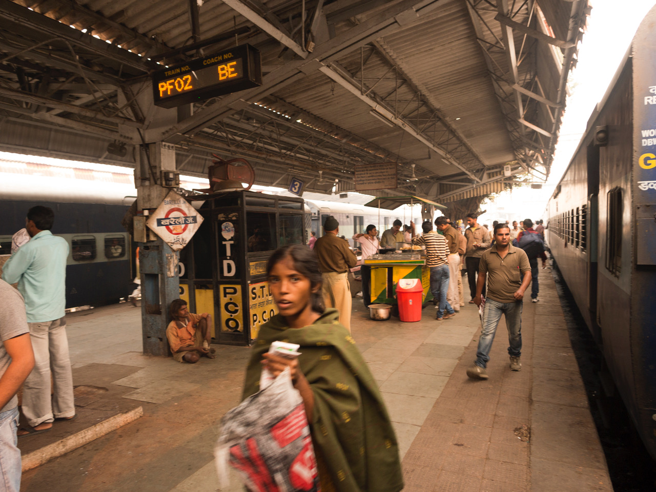
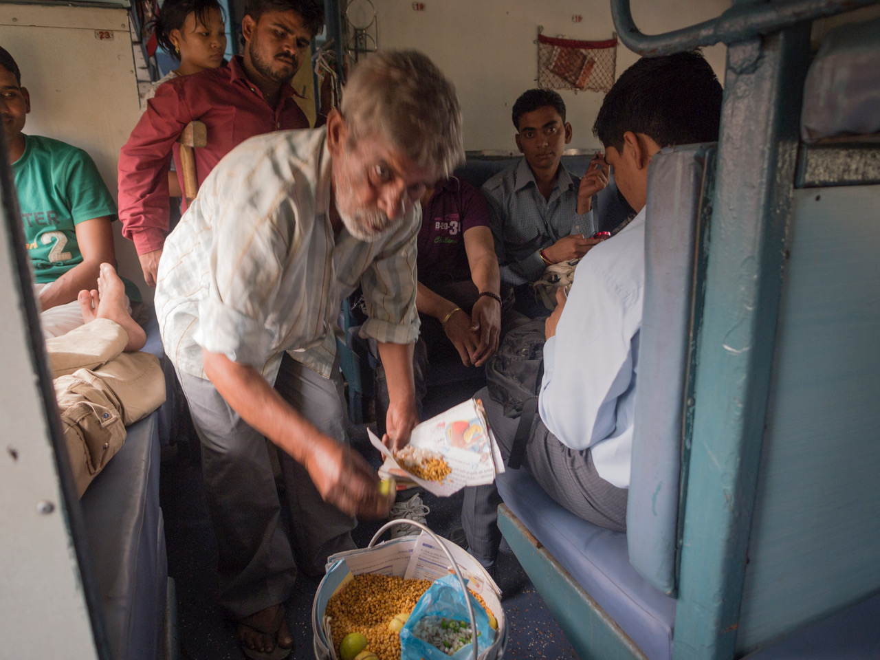
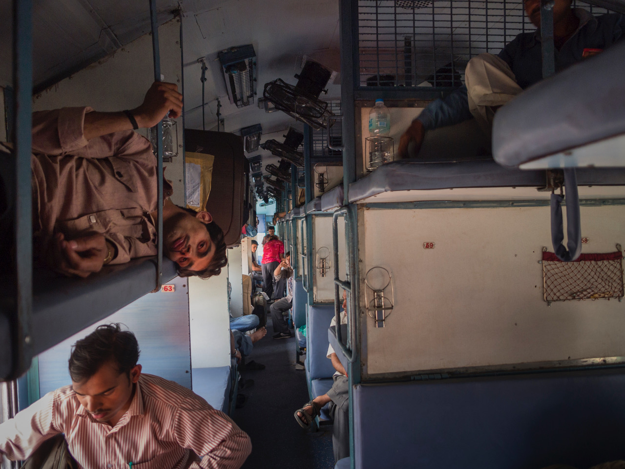
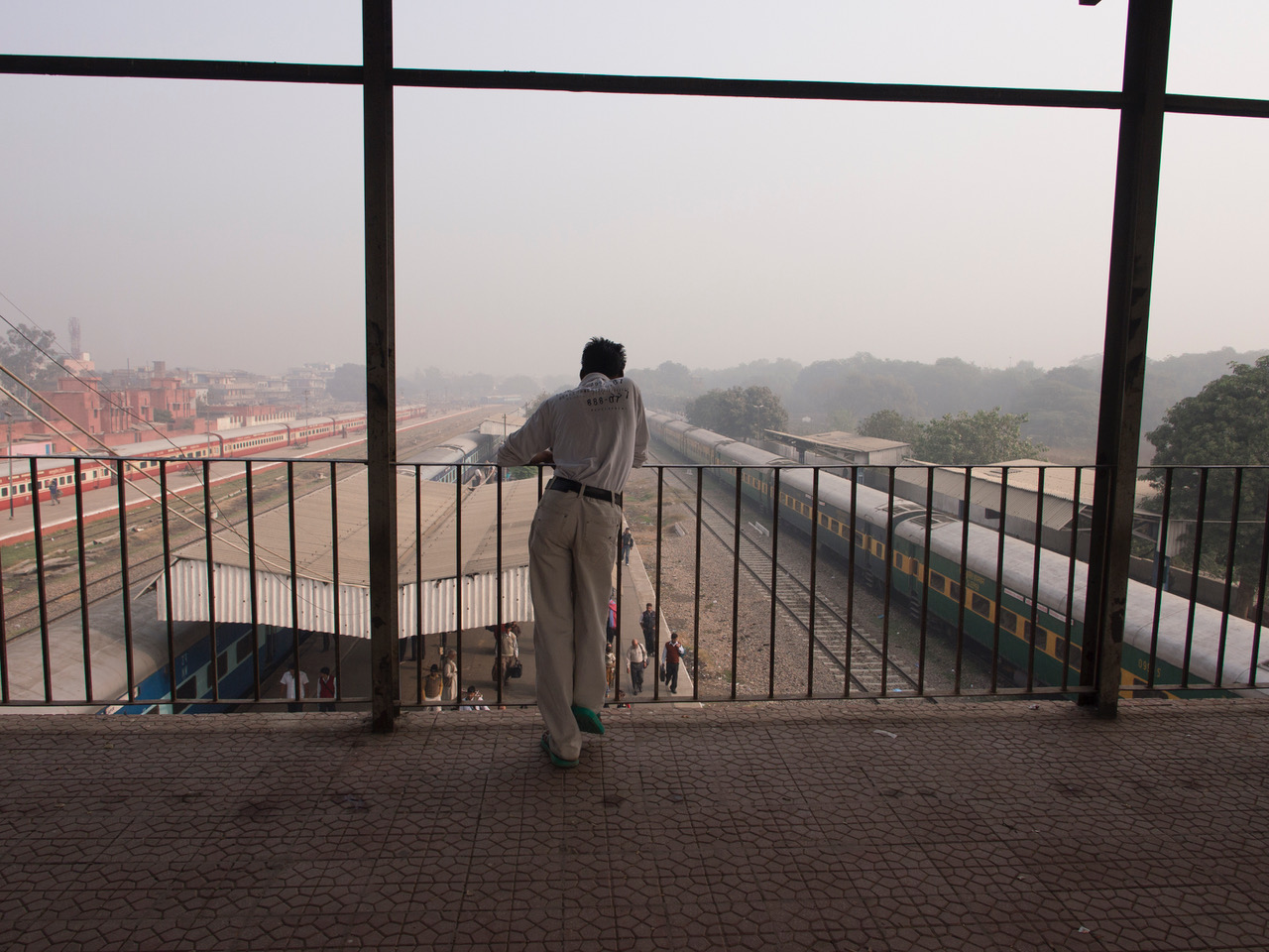
To see more: http://vincentdixon.com/wanderings/category/The+Train+Ride/

In 2011/12 I took a year off to travel around South East Asia and South America with my wife and four children. 

We had been on the road three months when we crossed the border from Nepal to India. I was nervous, I didn’t really know what to expect but had heard from other travelers that India was pretty chaotic. Just crossing the border conformed that. The station wasn’t much better, finding which platform our train was using wasn’t easy. We had been warned that people will always give you an opinion whether they know the answer or not. The 10 pm train was delayed, first for an hour, then two, it finally came to the station four hours late having apparently switched platforms several times. We boarded to find a family asleep in our bunks, gently woken they moved and I took a wet wipe to the top bunk, one swipe and the imprint of my hand was black, Ainlay my wife distracted the kids as I cleaned all the beds, we put our sneakers  on top of the old electric fans as we saw everyone else do, used our backpacks as pillows and got a few hours sleep. When I woke up I took some photos.
http://www.briteproductions.net/vincent-dixon

—————

APE contributor Suzanne Sease currently works as a consultant for photographers and illustrators around the world. She has been involved in the photography and illustration industry since the mid 80s. After establishing the art buying department at The Martin Agency, then working for Kaplan-Thaler, Capital One, Best Buy and numerous smaller agencies and companies, she decided to be a consultant in 1999. She has a new Twitter feed with helpful marketing information because she believes that marketing should be driven by brand and not by specialty. Follow her at @SuzanneSease.

Cleveland Museum of Art- Raja Deen Dayal

by Jonathan Blaustein

Hello there.

What am I doing here on a random Wednesday in February?

Well, that’s a great question.
So glad you asked.

This is the first installment of a new feature we’re trying out here at APE. For nearly seven years, I’ve been reporting on art exhibitions and festivals, interviewing artists and photography professionals, and reviewing photobooks every week.

As my writing career has evolved, I’ve found myself on the receiving end of countless PR emails, and stumbled through endless websites and social media postings. I see a lot of photography, it’s fair to say.

Prior to today, though, I had no outlet to just show incredible portfolios or projects here. Images that I saw only as jpegs, which we’ll publish here as jpegs, as this is meant to be an entirely online affair.

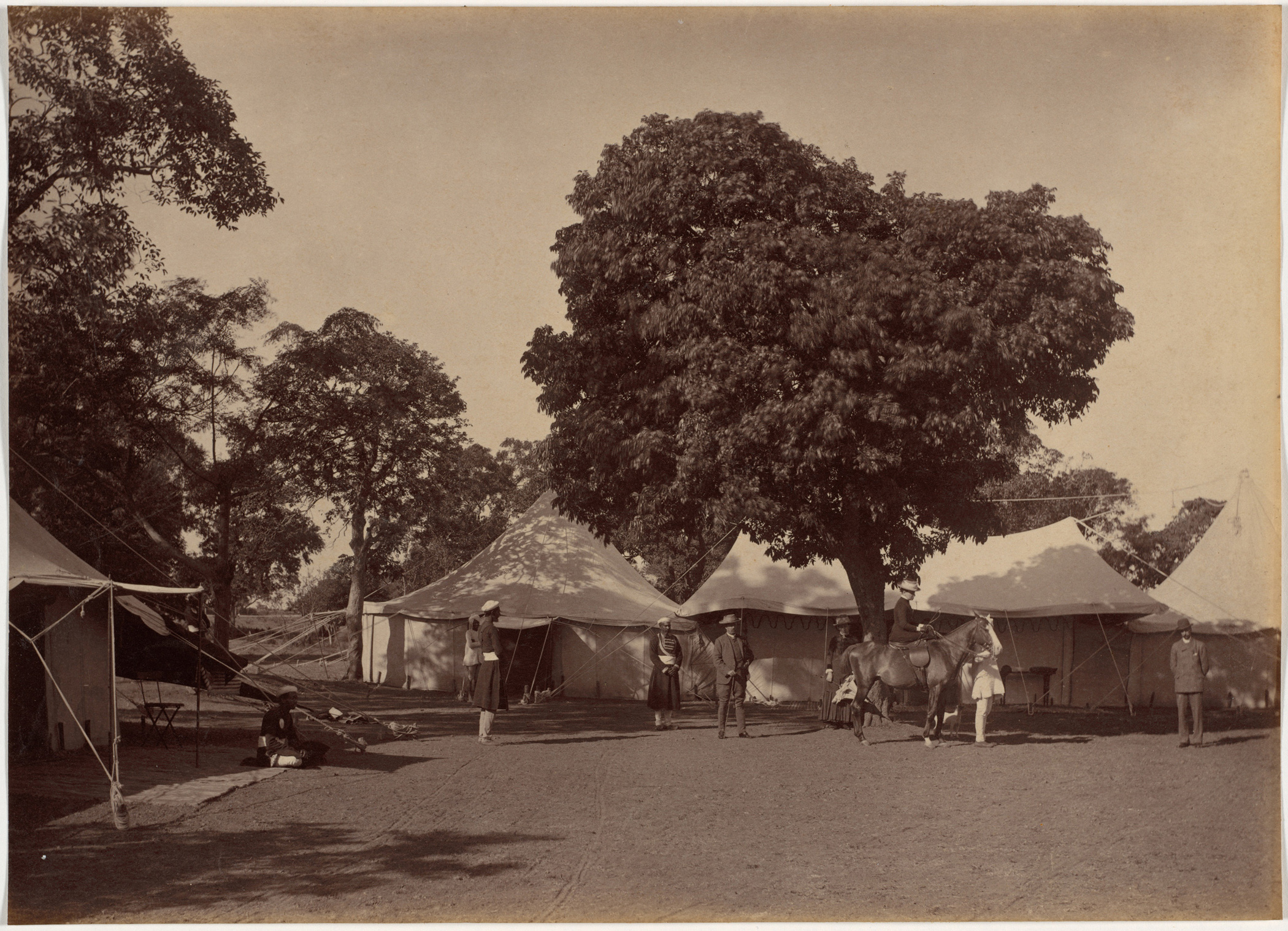
It’s ironic, then, that the first work we’ll show is as old school as it gets. We’re kicking off our 21st Century endeavor by examining a beautiful set of photographs from India in the 19th Century, made by the Indian master Raja Deen Dayal between 1885-87. (He was born Lala Deen Dayal. Raja was a title bestowed later in life.)

I first saw a couple of these images in one of those aforementioned PR emails from the Cleveland Museum of Art, as they’d recently acquired an album of albumen prints by Mr. Dayal.

The photographs caught my attention, and the Museum was kind enough to provide us with more information, and the entire portfolio for your viewing pleasure. Better yet, the CMA’s Curator of Photography, Barbara Tannenbaum, spoke with me about the entire acquisition process, from how pictures are first spotted to how they end up in an exhibition on the wall.

Apparently, she’d been interested in bringing Raja Deen Dayal’s work into the museum’s collection for several years, and her colleagues were aware of her desire. The Museum’s Chief Curator and Director were together in London, and saw a few of these Deen Dayal prints at a gallery.

After expressing interest, the museum asked for the prints to be sent to Cleveland for viewing. What came out of the box was thrilling for Ms. Tannenbaum.

“It’s a really unique album in a number of ways. First of all, it’s early work by Dayal, which is fairly rare,” she said.

“He’s is really most famous, and the majority of photos that you’ll see in museums and around on the market are images of buildings. They’re architectural shots.

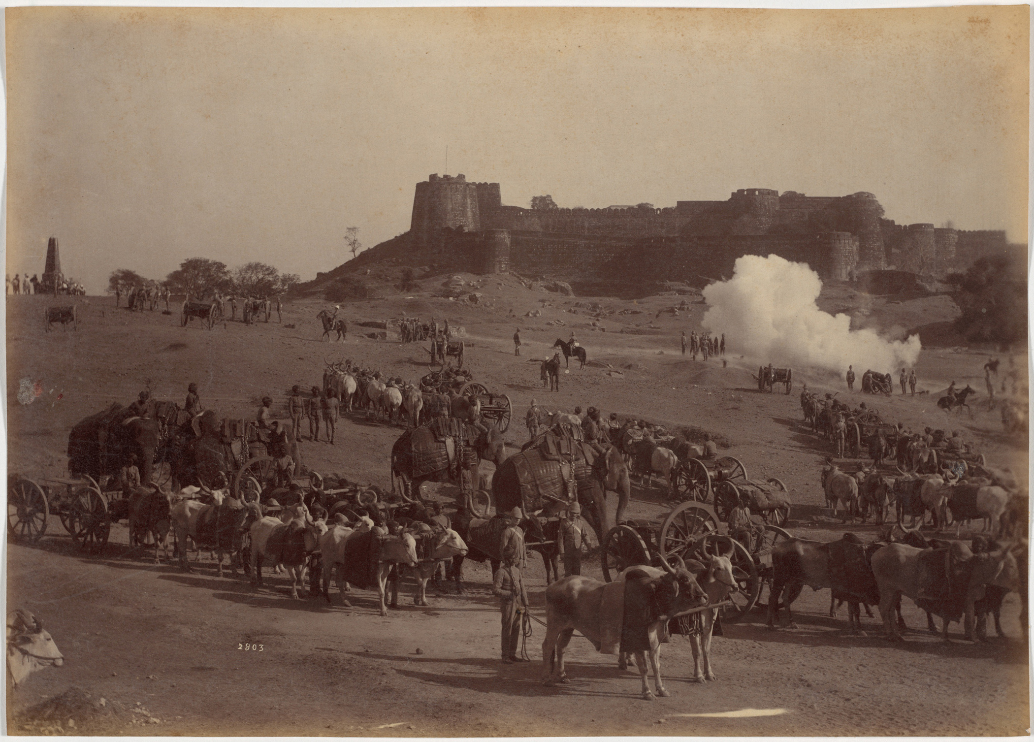
“This is almost entirely portraits, with a few scenes of military exercises thrown in.”

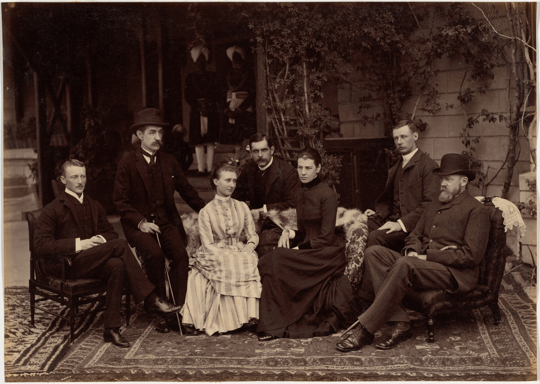
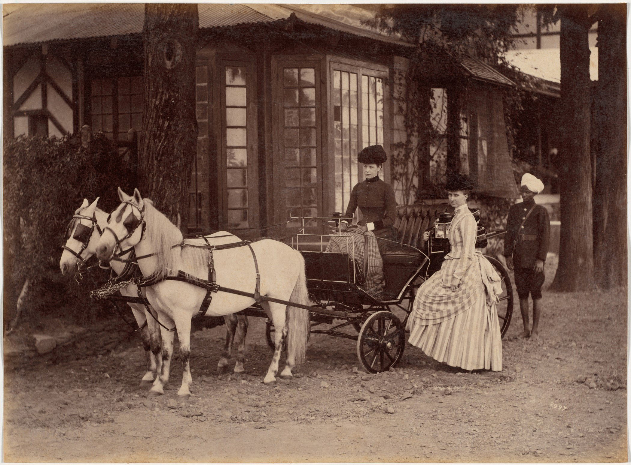
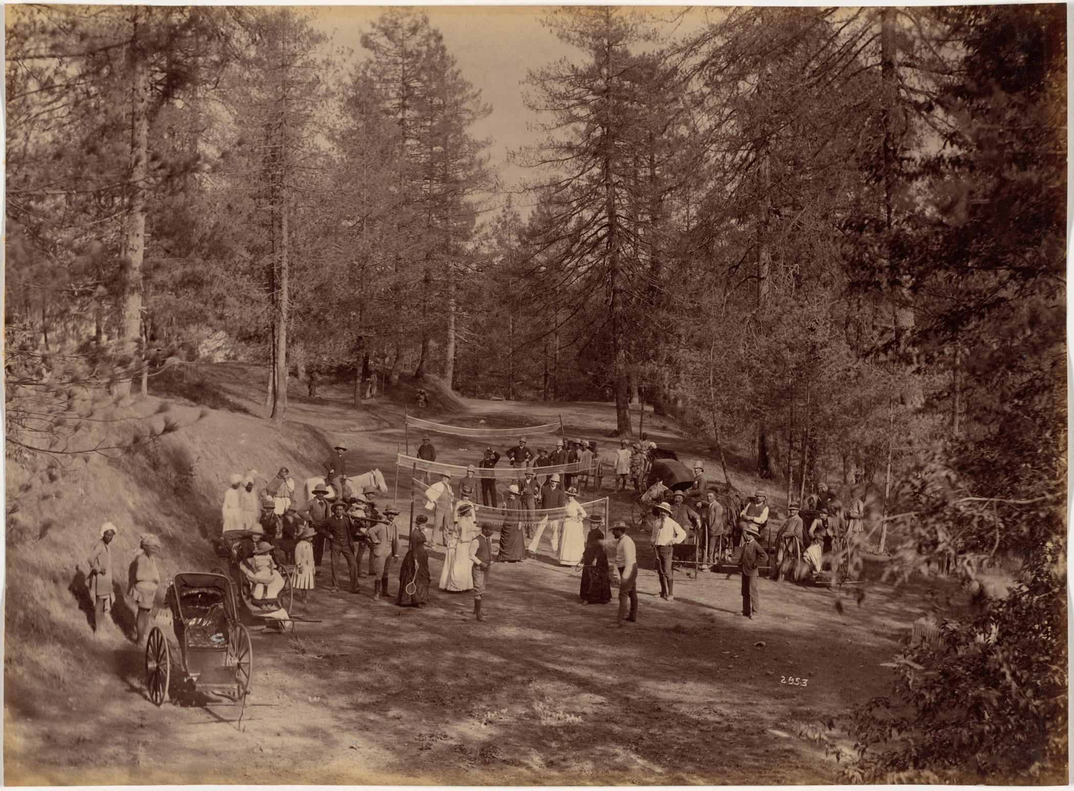
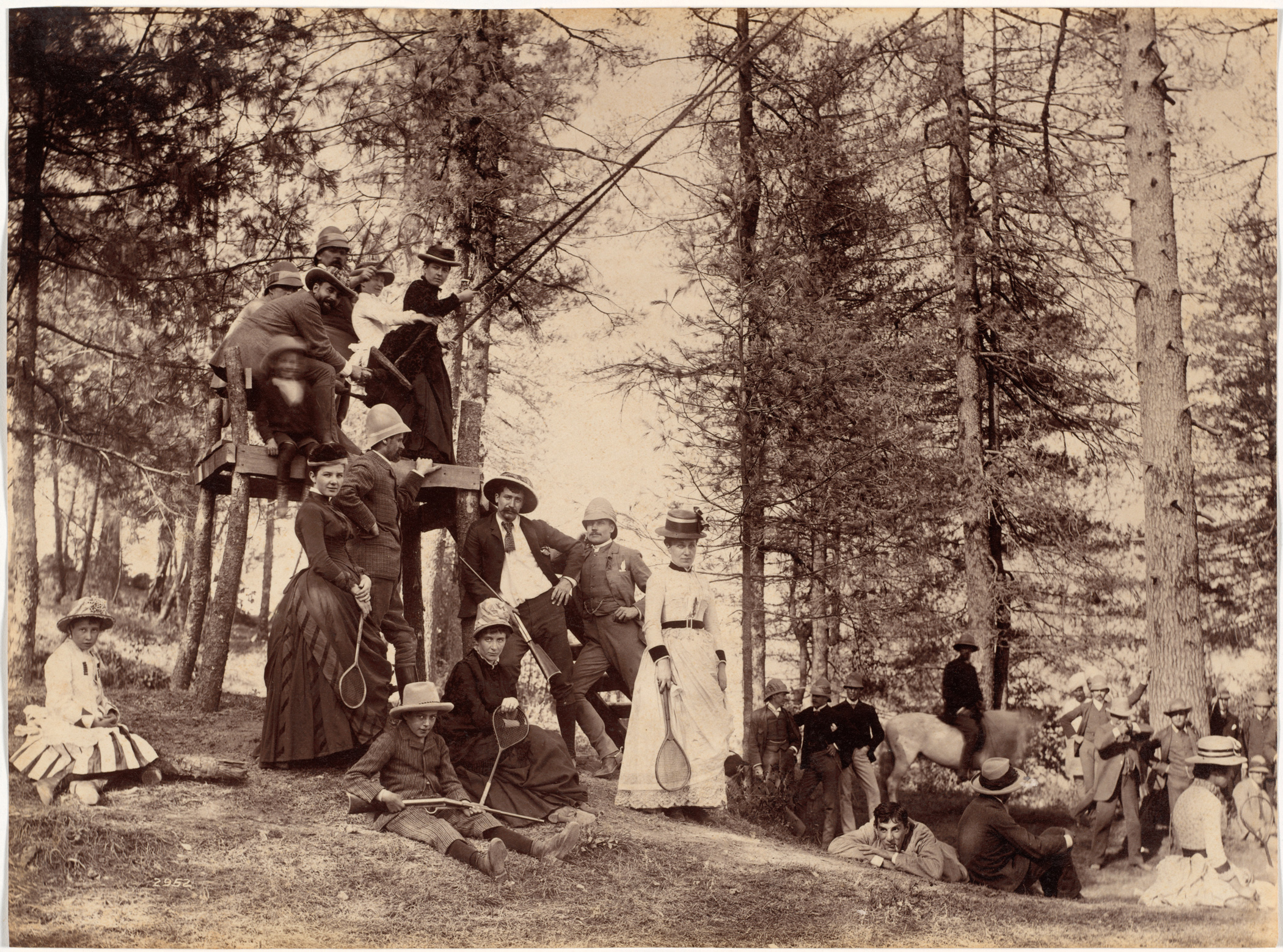
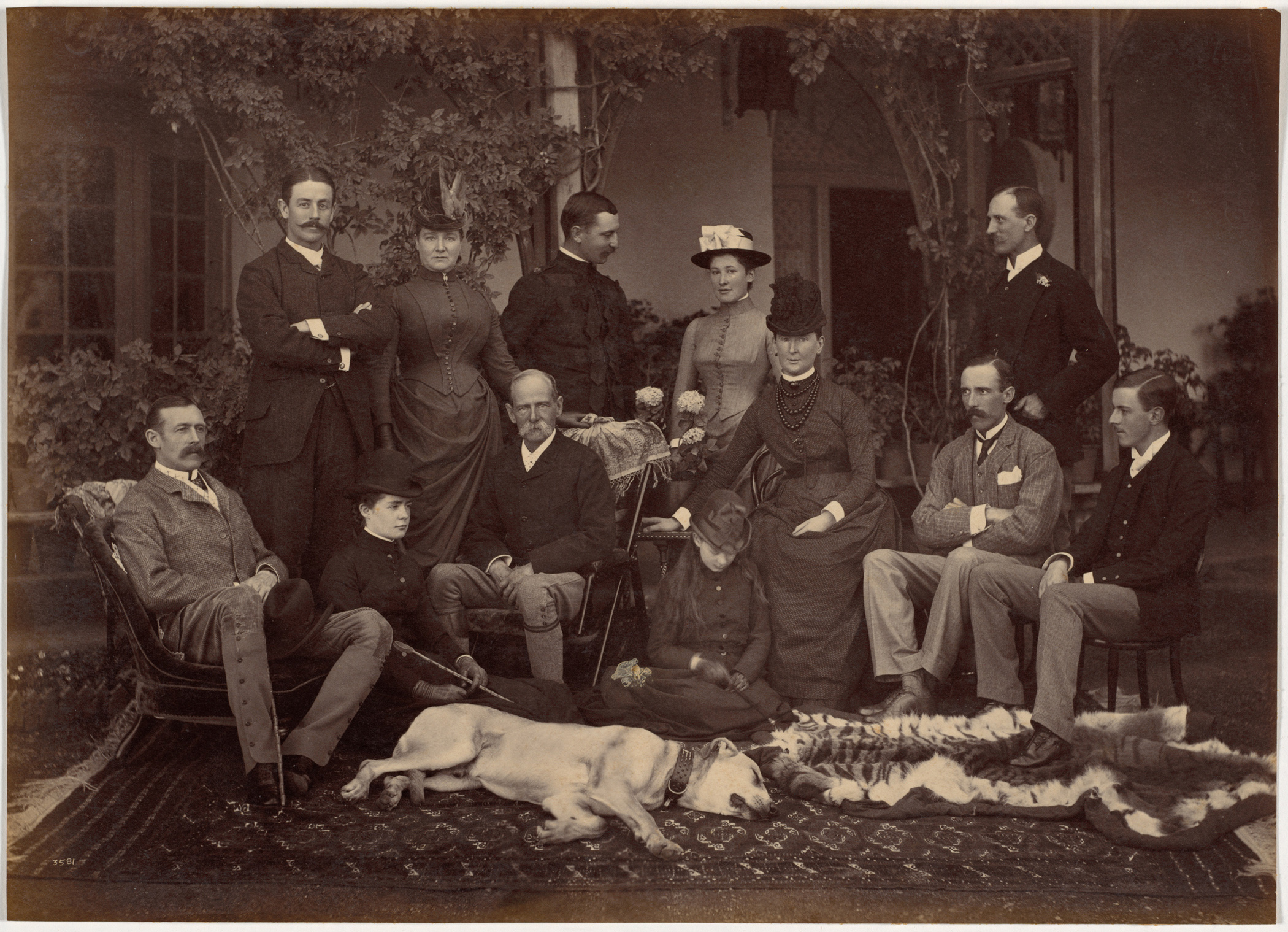
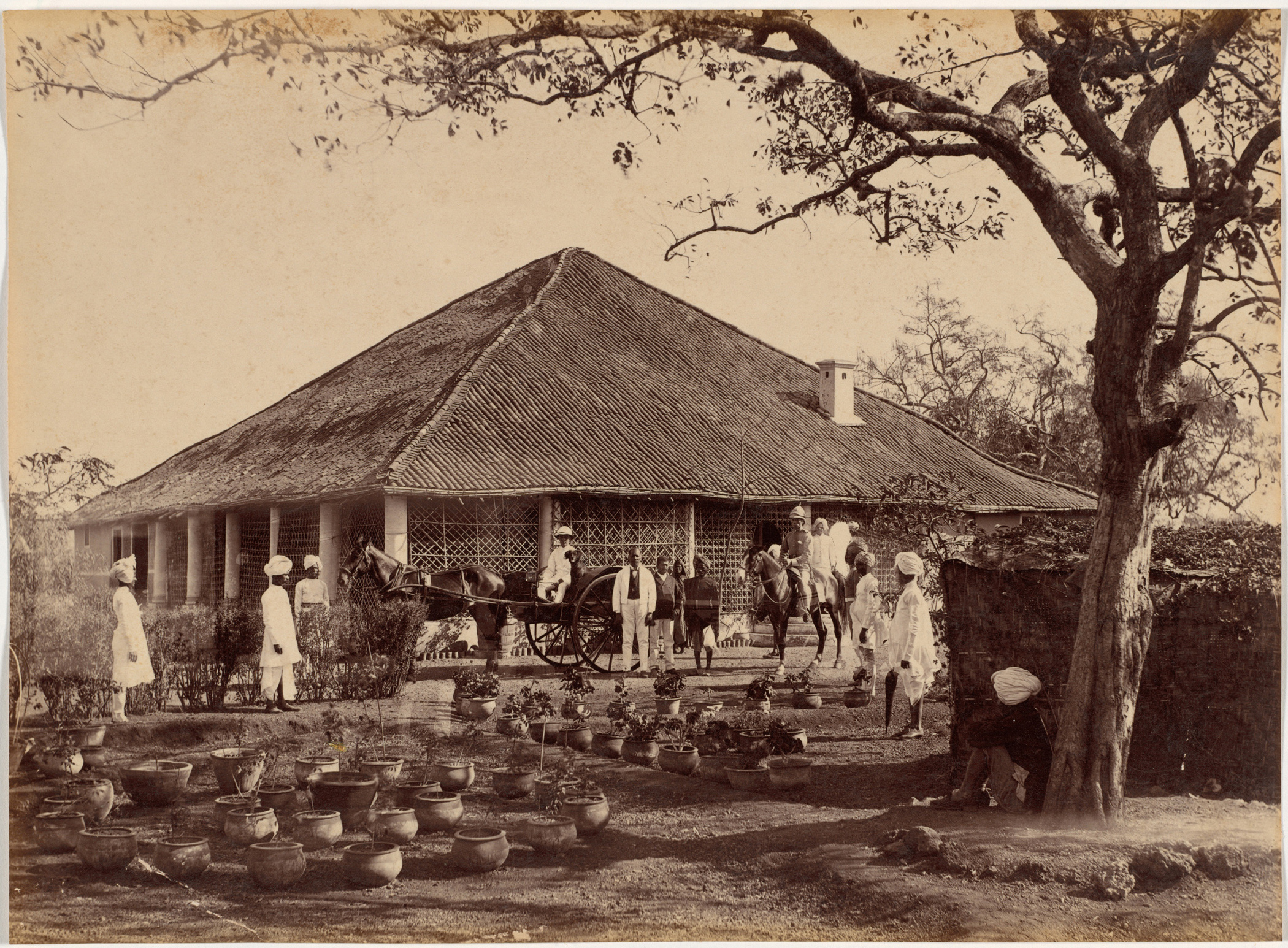
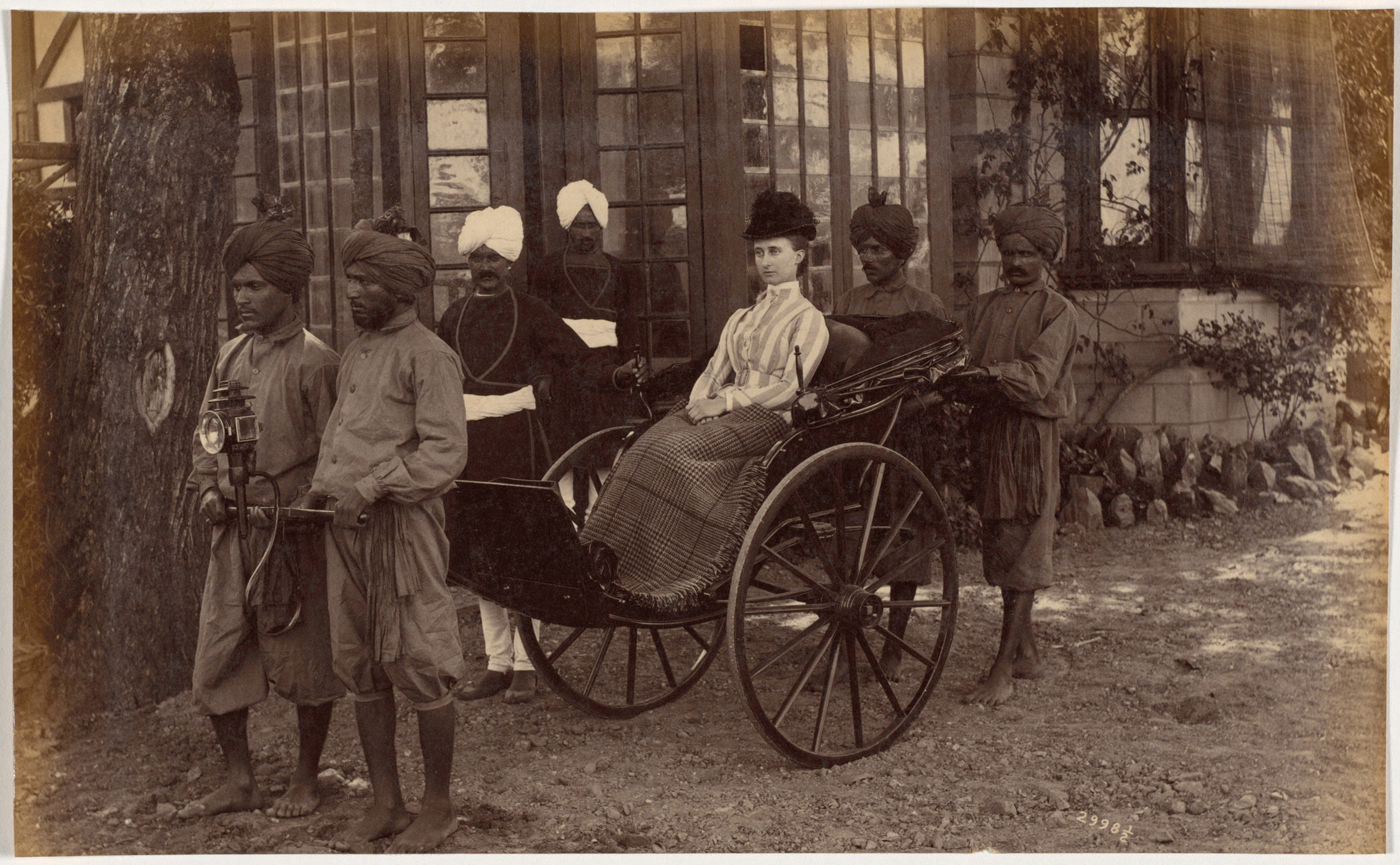
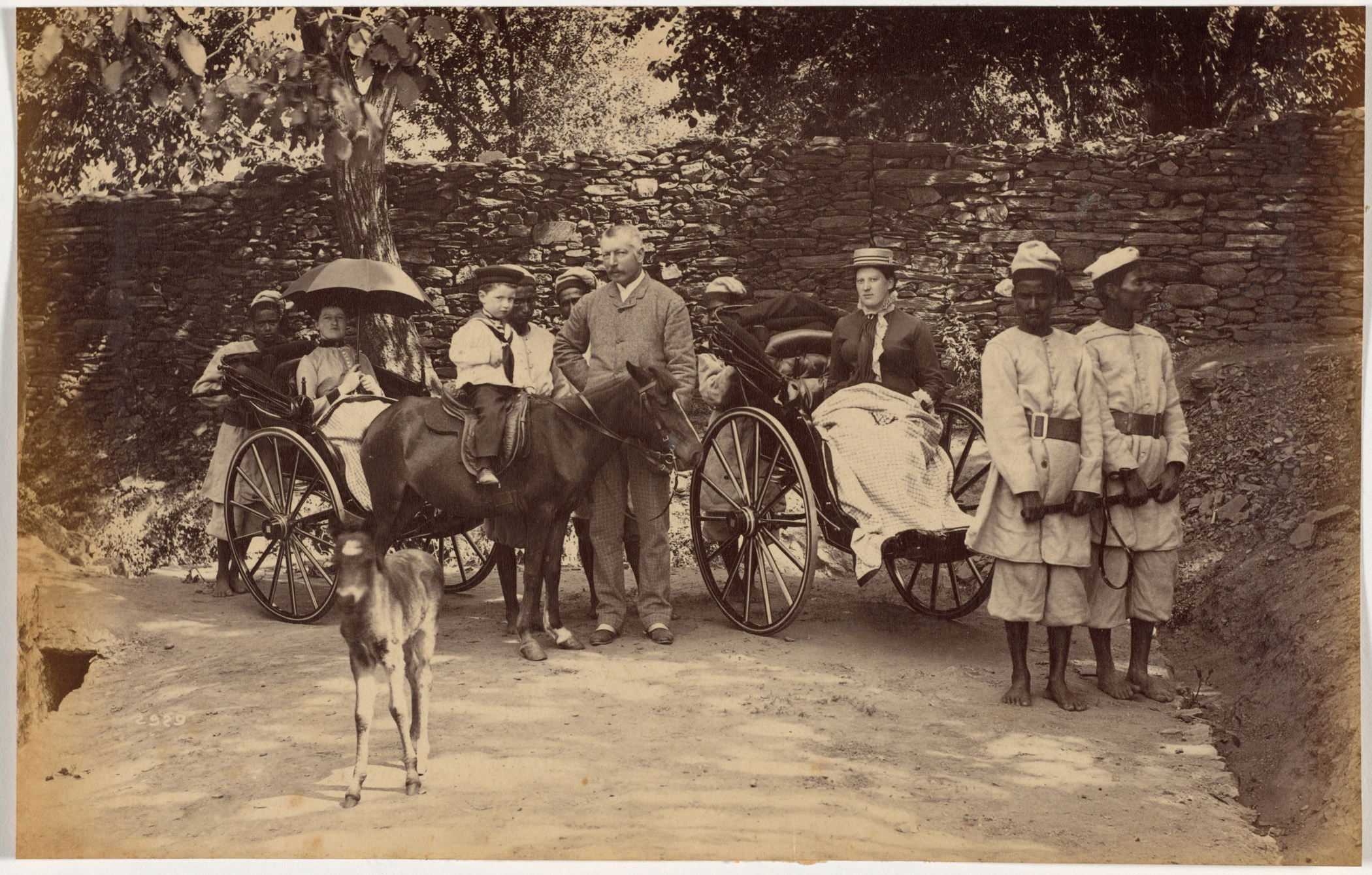
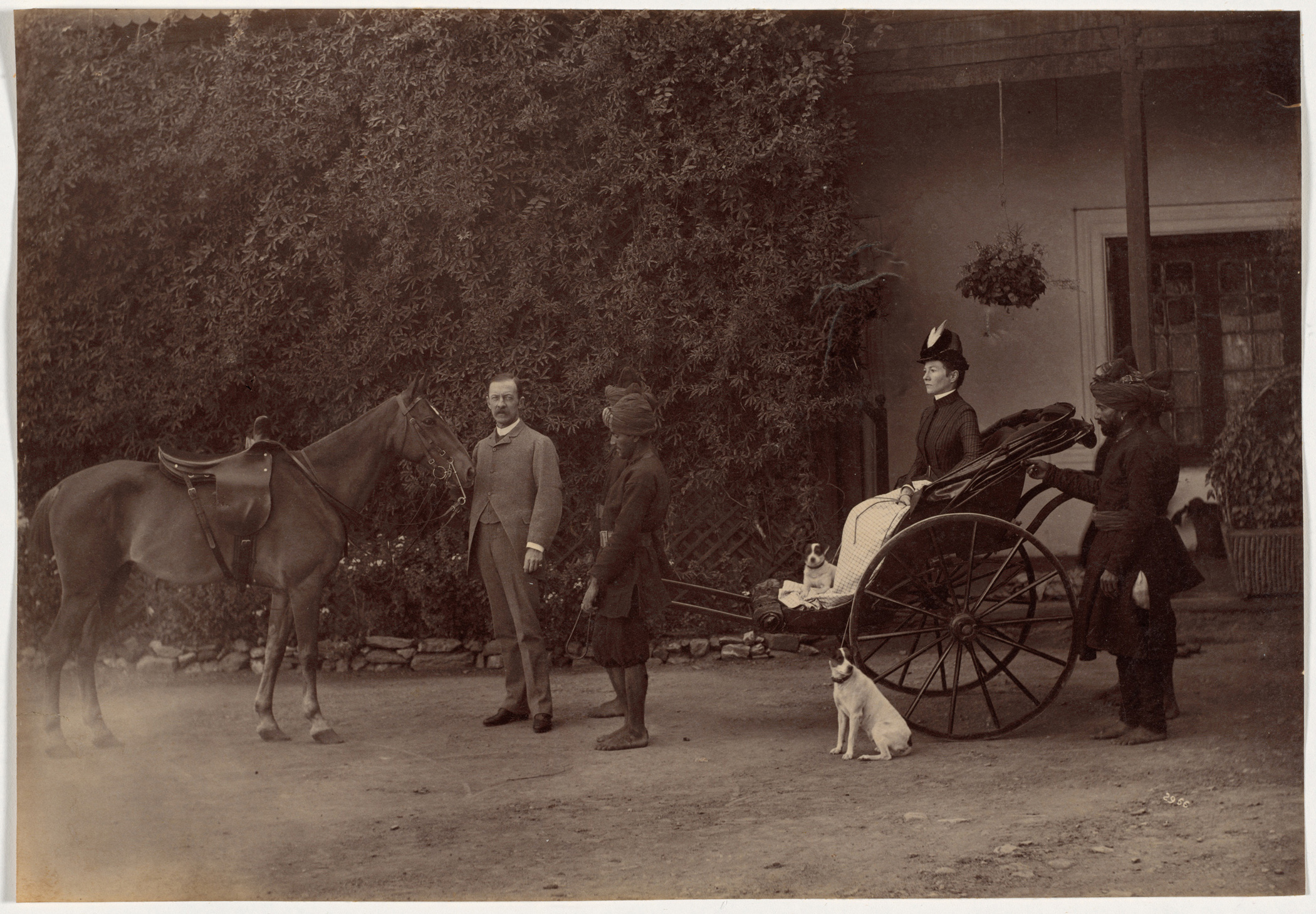
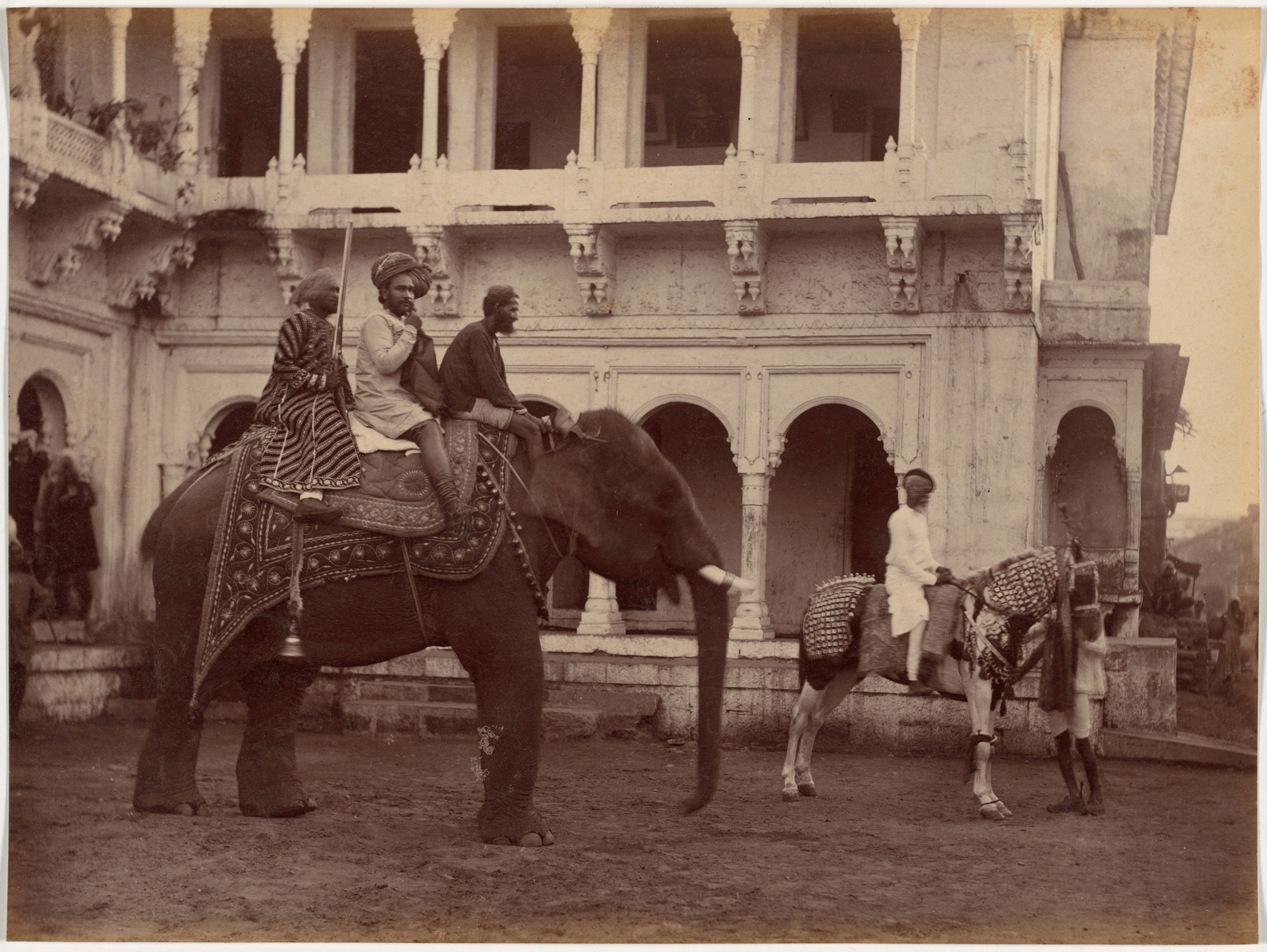
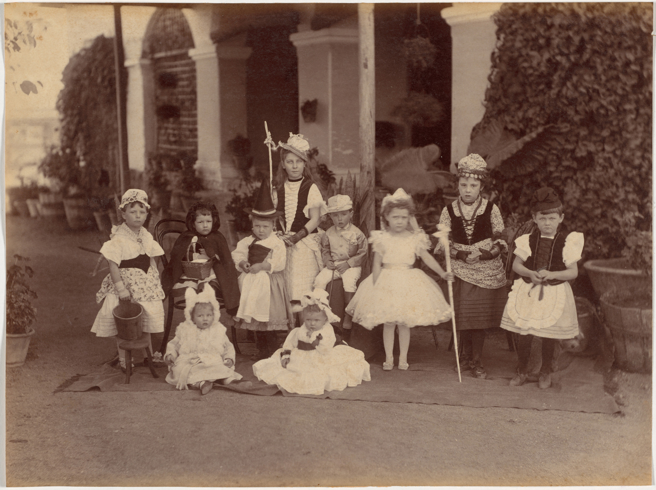
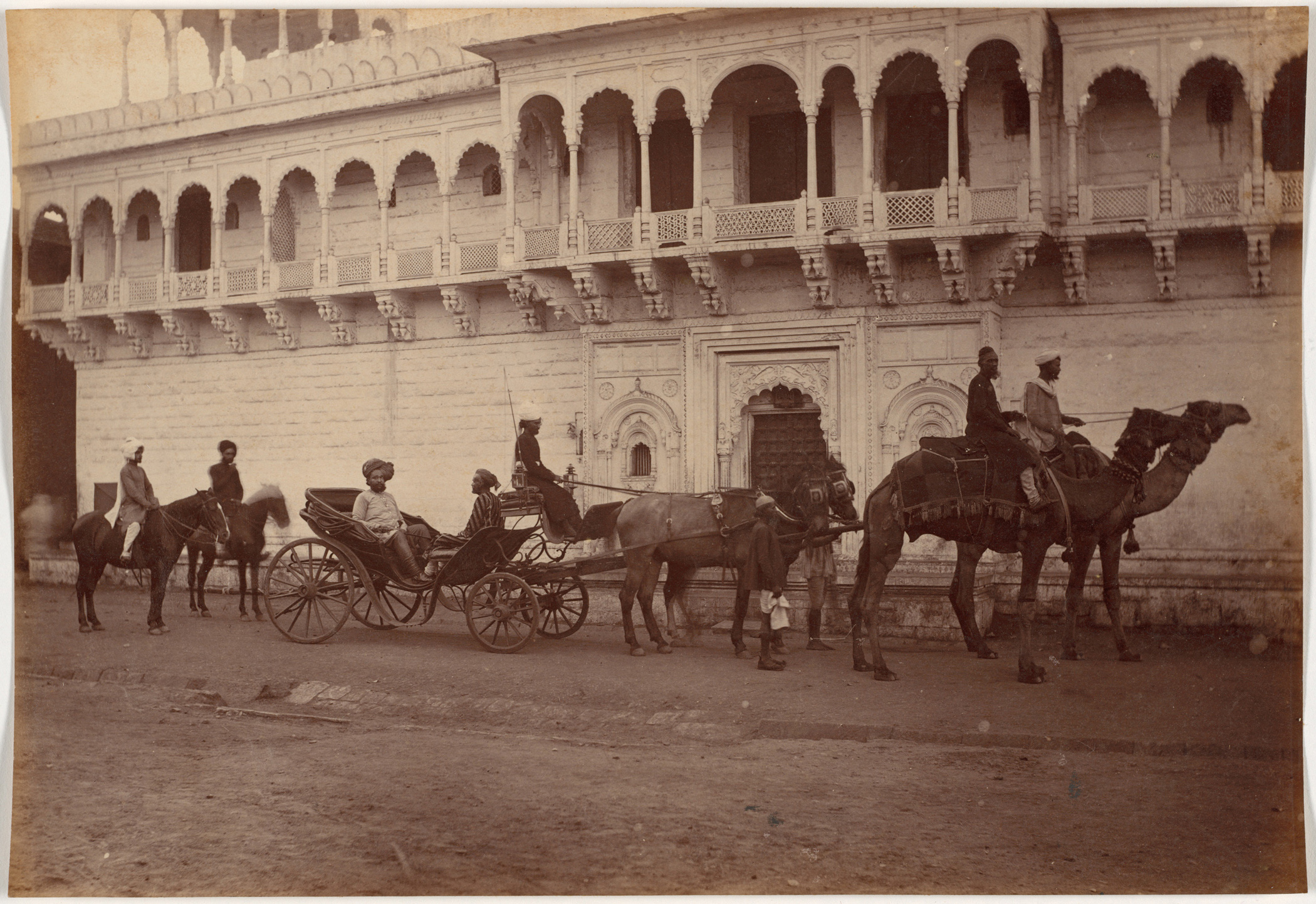
Indeed, these pictures are comprised of several subsets, one more fascinating than the next. We see formal and casual portraits of British Aristocracy summering in the Himalayas to avoid Delhi’s heat in the late 1880’s.

“Hello there, Alistair. Would you care for a game of Badminton?”

“I say, Old Chap. That is simply a brilliant idea. Brilliant! And, Nigel, do look over there. I believe I can spot an inch of shoe beneath Ms. Lyall’s dress. Simply scandalous!”

“Yes, scandalous!”

Sorry. Where was I?

The pictures. Surely, it was exciting to discover photos by a major, historically important artist that were totally under the radar. But why did Ms. Tannenbaum think they’re worthy of bringing into her institution’s collection?

“In this case,” she said, “we look at both the British and the princely Indian societies through the eyes of an Indian. And one of the first to really master the forms of expression, and get the opportunity to put his images out.”

“These have a particularly reverent feel to them. Great care has been taken in how they were made. He was just masterful at evoking the mood and the feel of the scene. You get the contrast of these two cultures here, and that same intensity for both of them, which I think is amazing.”

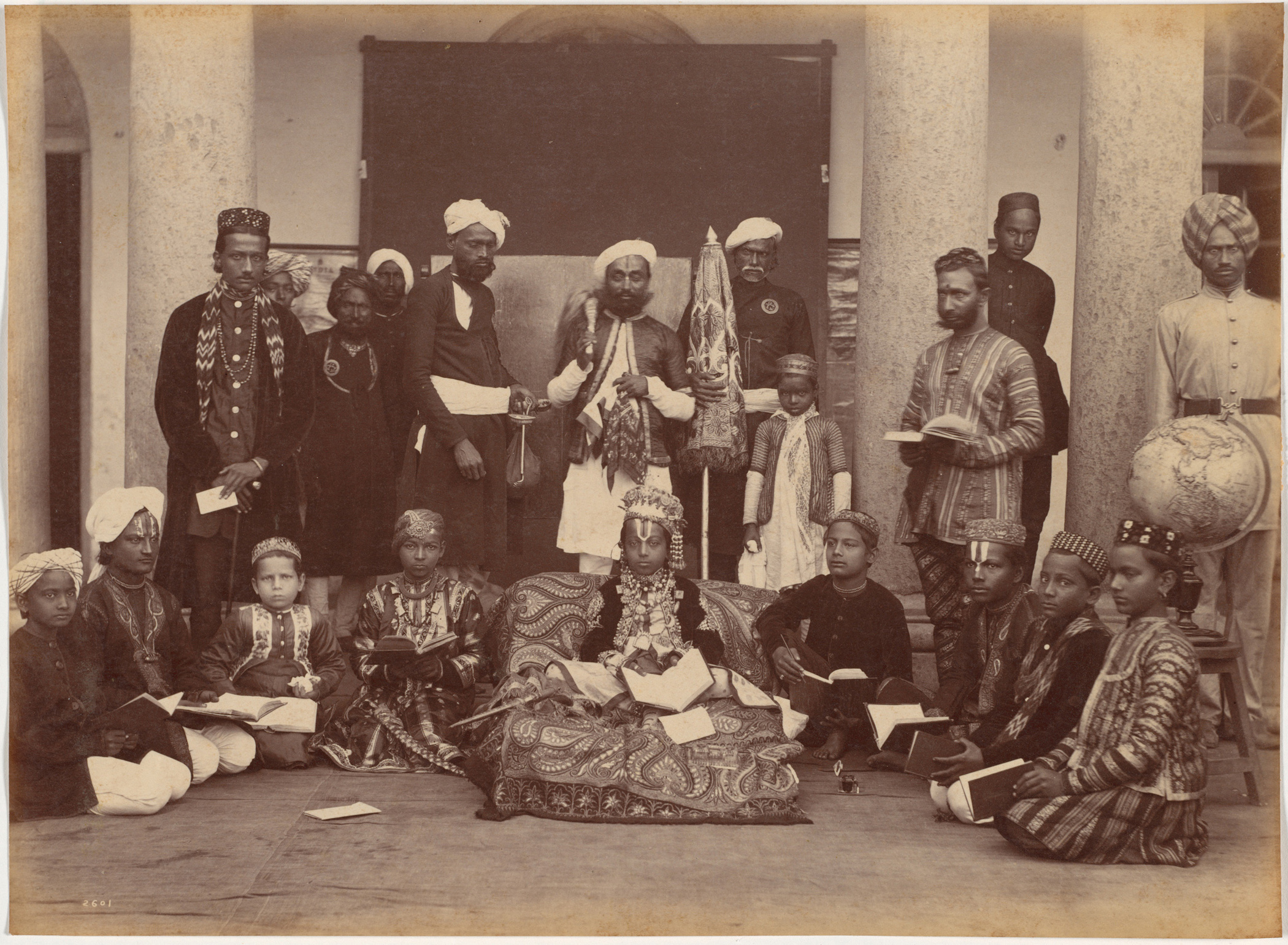
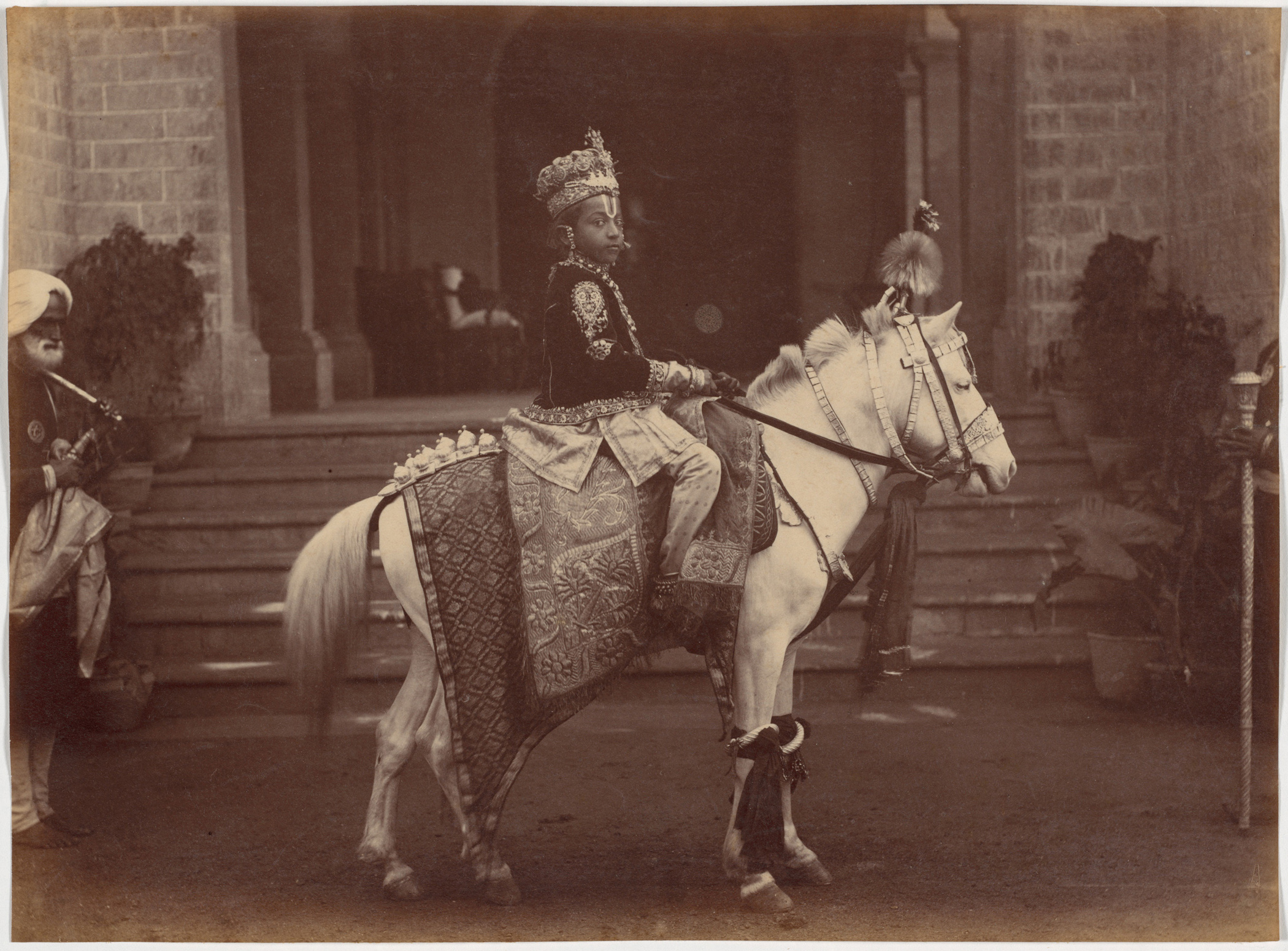
There are formal group portraits of native Indians, and a tighter group of young Maharajas; boys thrust into a grown-up world. (Immature leaders, imagine that?)

One of those images is among her favorites, Ms. Tannenbaum admitted. “Especially the boy king of Rewa,” she said.

“He just happens to be an incredibly poignant subject for photography. I love the one where he’s sitting there on this chair, with his crown and his gold jewelry. You look at the way his toes are curled under, because his feet don’t quite reach the ground.”

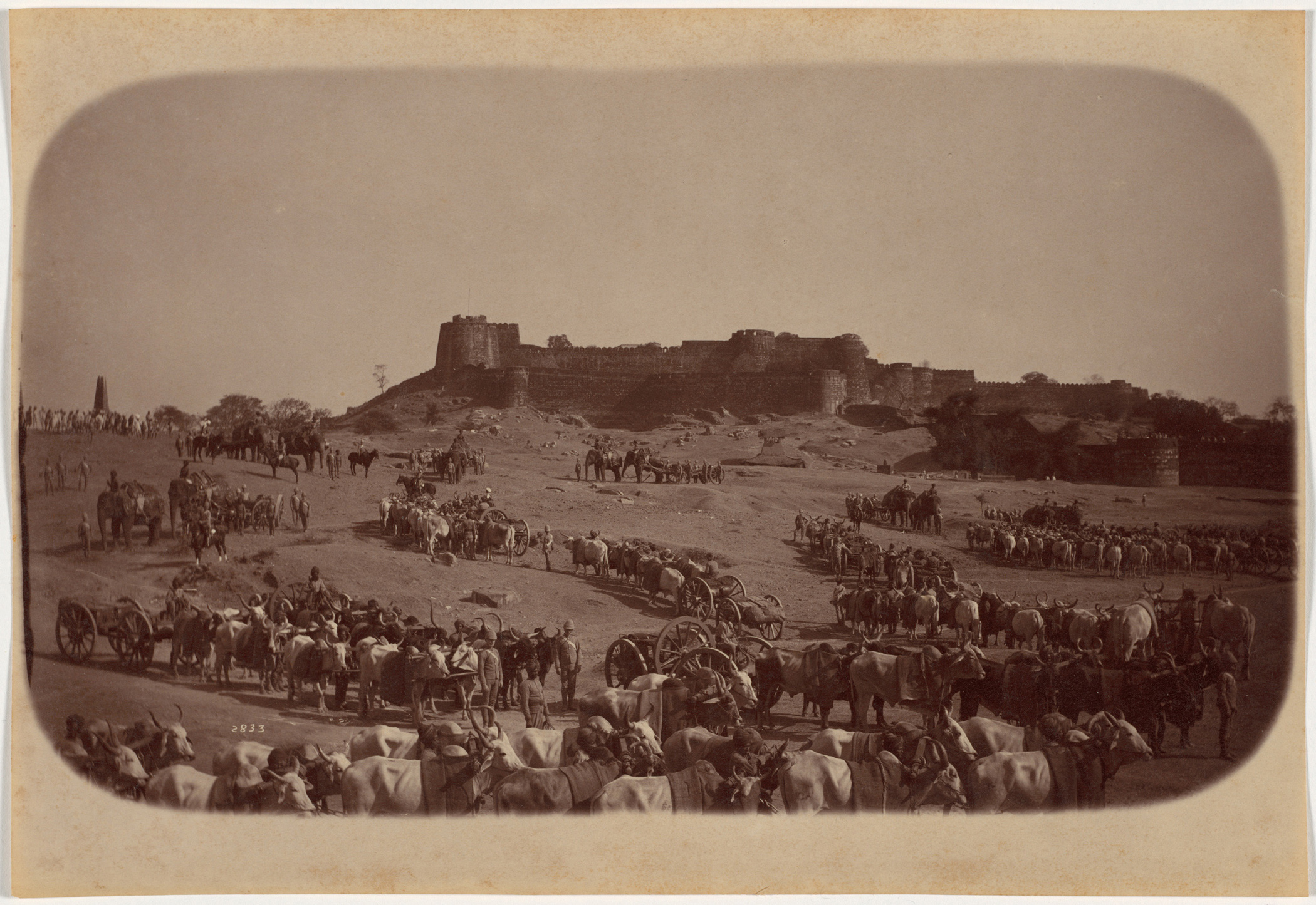
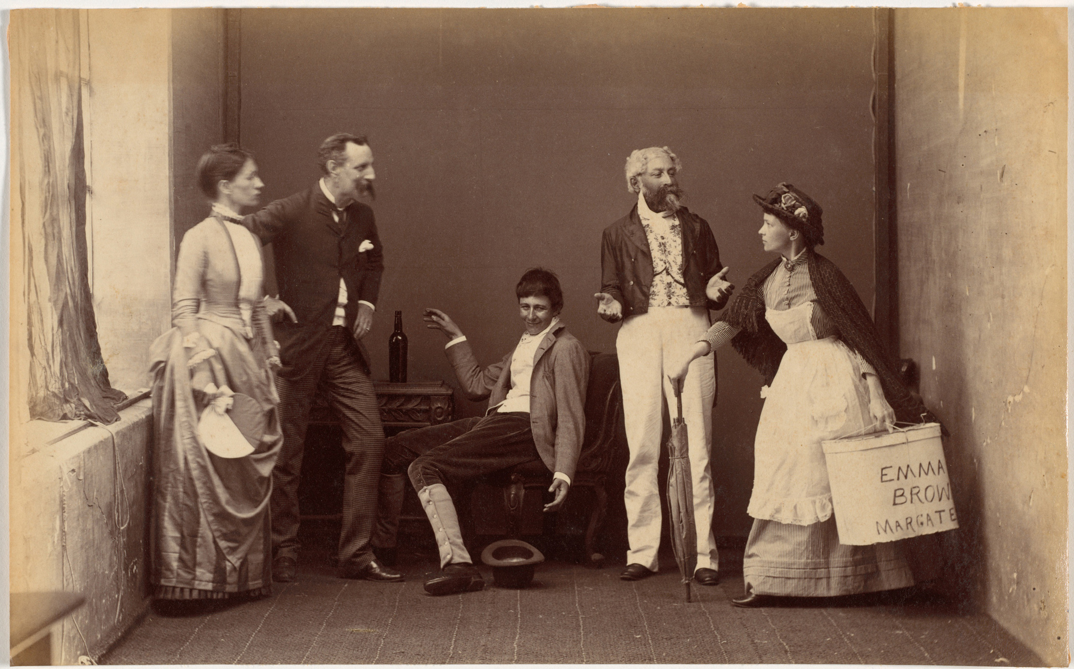
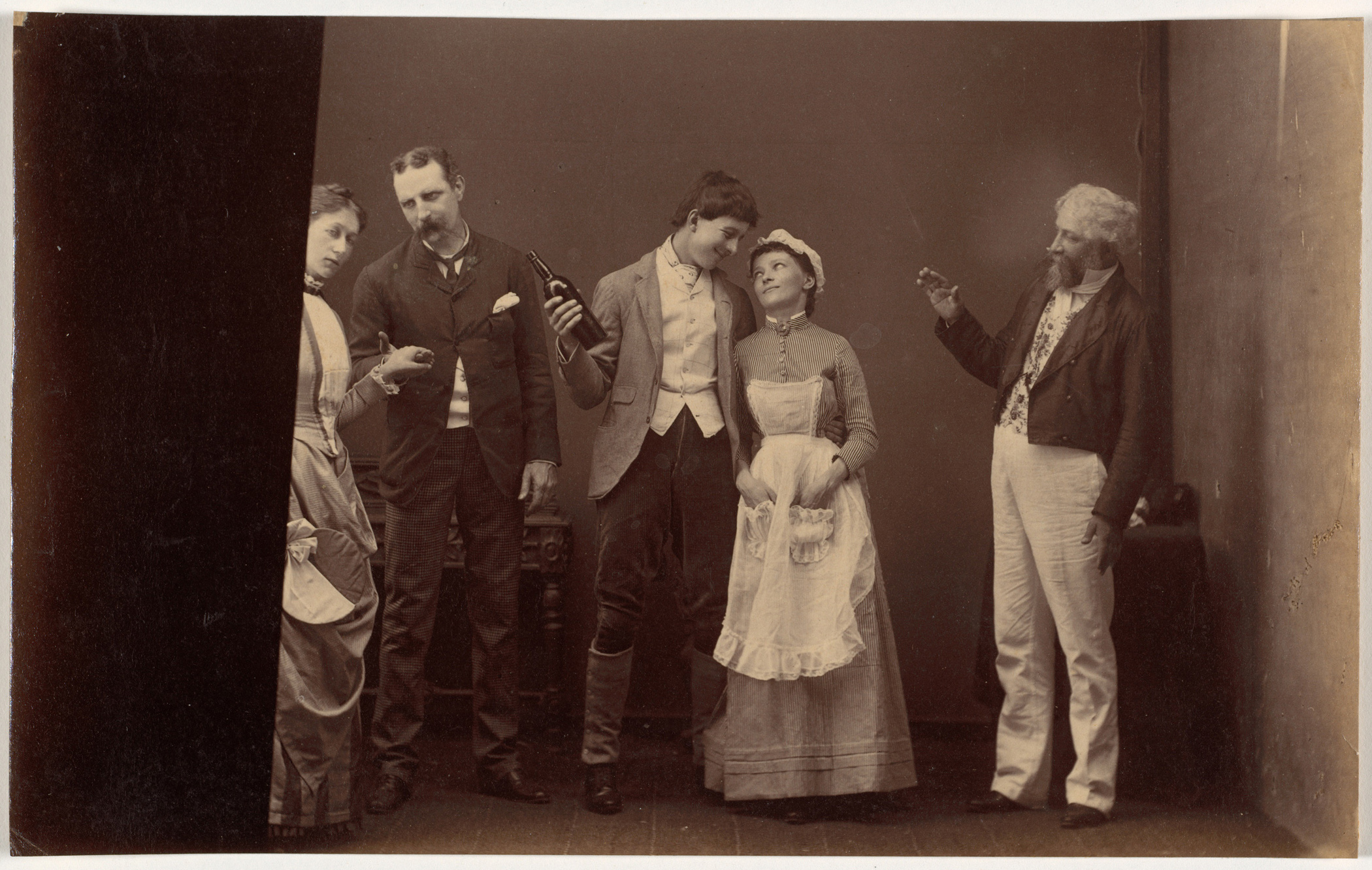
There are battle exercises from Jhansi, further to the South, and a suite of photographs of actors in a performance of some sort as well.

But we haven’t even gotten to the best part yet. This group of pictures originated as a photo album, though it’s since been deconstructed. Many of its subjects are named in the captions.

Basically, it existed as a collection of memories. Someone bought it directly from Raja Deen Dayal’s studio.

But whom?
That’s where things get interesting.

Nobody knows.

“Of course there’s the intriguing question of who he is, and we’ll try to pursue that and maybe find an answer,” Ms. Tannenbaum said.

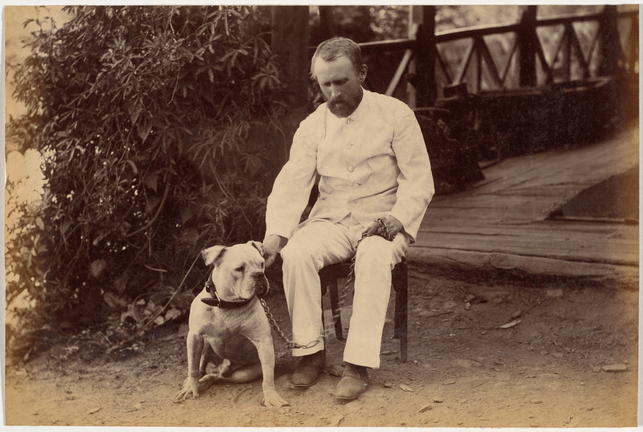
The current theory is that it might be the man featured in the solo portrait. The dude in three quarter profile. The one with the thick beard, clutching gloves in his hands and rocking the flower in his lapel.

It’s the only photograph that wasn’t captioned. One wouldn’t caption a photo of oneself, goes the thinking. So what about it?

We have a global audience.
I have to ask?
Do you know this man?

He was an Englishman, so you people in the UK, might this guy be your Great-Great Grandpa George? Did anyone in your family spend time in India in the late 1880’s?

Ms. Tannenbaum is dying to know, and plans to do research on her own in the future, so I suggested we could do our little bit, perhaps, and crowdsource it. She’s looking for a certain type of expert, preferably with time on his or her hands.

“The answer probably lies in archives in London about Colonial India,” she said. “My dream would be to hire someone who really knows who was there when. A historian of Colonial India, maybe, to track this down.

“It’s a riddle that will eat at me until I find it, or decide that I’m not going to be able to find the answer.”

So what do you say, cyberverse? Does anyone know anyone who wants to figure this out? Whose memories are these? Who commissioned this album?

Beyond the mystery, though, Raja Deen Dayal’s work fits in well with the Cleveland Museum of Art’s mission, as they’ve long had a strong Indian and South Asian Collection. (No surprise, once I learned that Sherman Lee was a Director there in the 60’s and 70’s. He wrote my textbook for Intro to Asian Art History in college.)

When the transaction was done, and the prints were (sort of) hers, Ms. Tannenbaum was elated. She’s hoping to exhibit the work later this decade, likely with other artworks from the collection in a larger context. She was also on the lookout for some of Raja Deen Dayal’s architecture shots, to enlarge her newfound holdings.

“You know, curators always want more,” she laughed. “If we’re not acquisitive, we shouldn’t be in this job.”

His Highness Lieutenant Governor of the Punjab and party at Simla, c. 1885-1887. Raja Deen Dayal (Indian, 1844-1905). Albumen print; image: 19.5 x 27.4 cm (7-11/16 x 10-13/16 inches); paper: 19.5 x 27.4 cm (7-11/16 x 10-13/16 inches). The Cleveland Museum of Art, Purchase from the J.H. Wade Fund.
Mrs. and Miss Lyall, Simla, c. 1885-1887. Raja Deen Dayal (Indian, 1844-1905). Albumen print; image: 19.9 x 27.0 cm (7-13/16 x 10-5/8 inches); paper: 19.9 x 27.0 cm (7-13/16 x 10-5/8 inches). The Cleveland Museum of Art, Purchase from the J.H. Wade Fund.
Badminton party at Mashobra, Simla, c. 1885-1887. Raja Deen Dayal (Indian, 1844-1905). Albumen print; image: 19.9 x 27.1 cm (7-13/16 x 10-11/16 inches); paper: 19.9 x 27.1 cm (7-13/16 x 10-11/16 inches). The Cleveland Museum of Art, Purchase from the J.H. Wade Fund.
Picnic party, Mashobra, c. 1885-1887. Raja Deen Dayal (Indian, 1844-1905). Albumen print; image: 19.3 x 26.1 cm (7-5/8 x 10-1/4 inches); paper: 19.3 x 26.1 cm (7-5/8 x 10-1/4 inches). The Cleveland Museum of Art, Purchase from the J.H. Wade Fund.
His Eminence Commander in Chief and party, Simla, c. 1885-1887. Raja Deen Dayal (Indian, 1844-1905). Albumen print; image: 19.5 x 27.2 cm (7-11/16 x 10-11/16 inches); paper: 19.5 x 27.2 cm (7-11/16 x 10-11/16 inches). The Cleveland Museum of Art, Purchase from the J.H. Wade Fund.
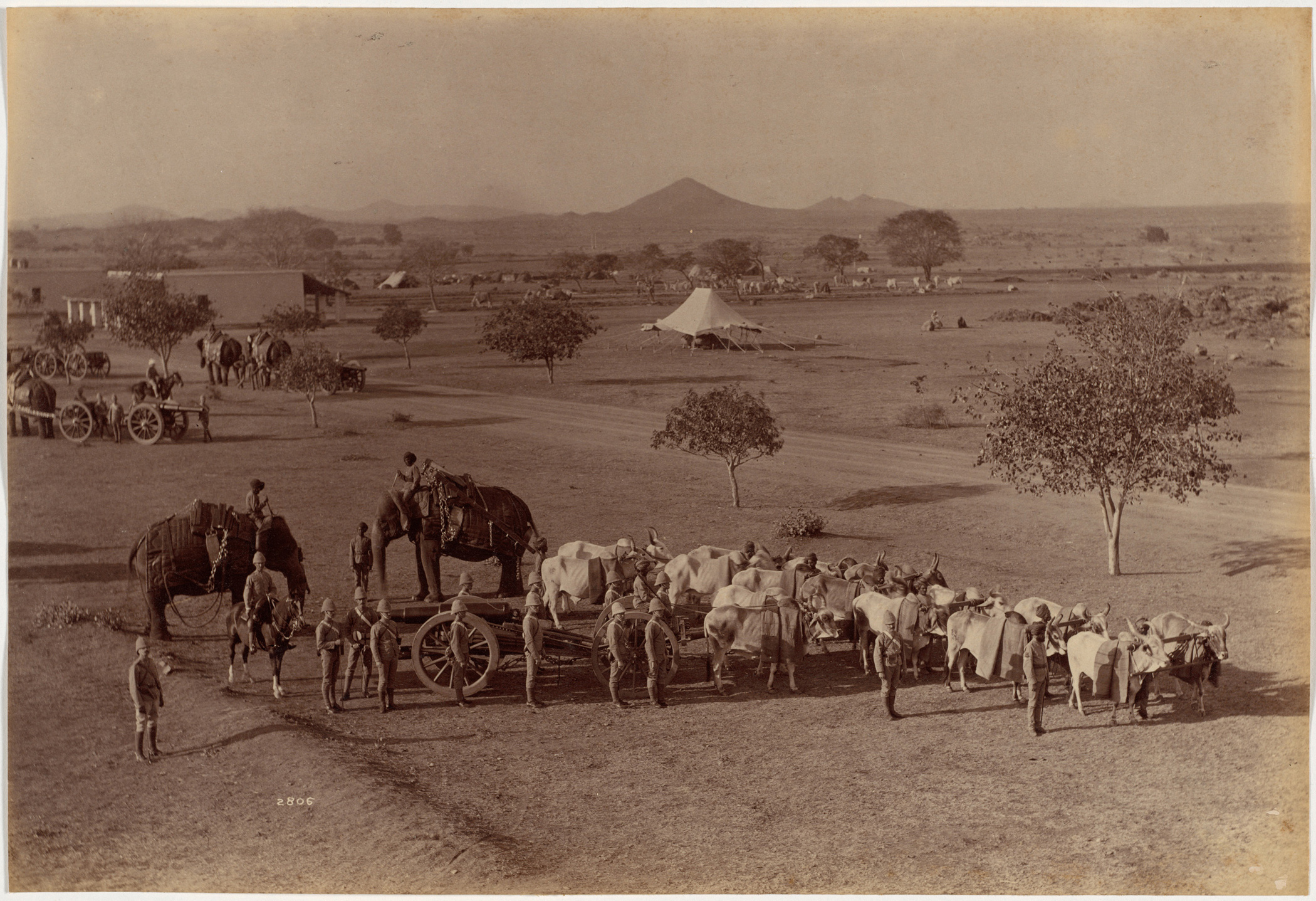
Elephant Battery, Jhansi, c. 1885-1887. Raja Deen Dayal (Indian, 1844-1905). Albumen print; image: 18.2 x 26.5 cm (7-3/16 x 10-7/16 inches); paper: 18.2 x 26.5 cm (7-3/16 x 10-7/16 inches). The Cleveland Museum of Art, Purchase from the J.H. Wade Fund.
His Highness Maharaja of Rewa, c. 1885-1887. Raja Deen Dayal (Indian, 1844-1905). Albumen print; image: 26.7 x 20.3 cm (10-1/2 x 8 inches); paper: 26.7 x 20.3 cm (10-1/2 x 8 inches). The Cleveland Museum of Art, Purchase from the J.H. Wade Fund.
Reverend Loch at Neemuch, c. 1885-1887. Raja Deen Dayal (Indian, 1844-1905). Albumen print; image: 19.4 x 26.5 cm (7-5/8 x 10-7/16 inches); paper: 19.4 x 26.5 cm (7-5/8 x 10-7/16 inches). The Cleveland Museum of Art, Purchase from the J.H. Wade Fund.
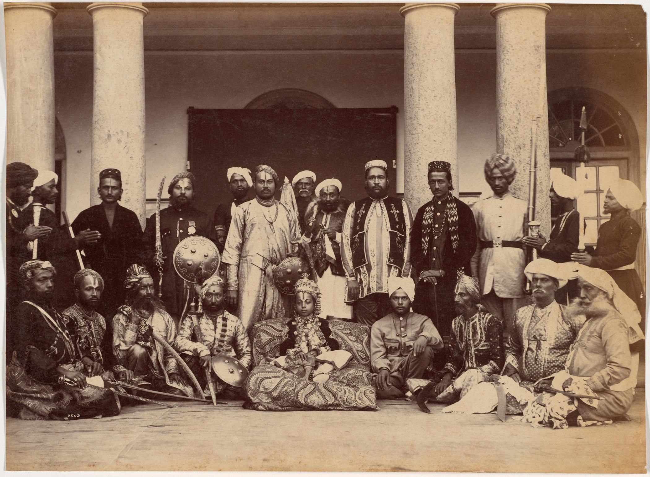
Maharaja of Rewa and classmates, c. 1885-1887. Raja Deen Dayal (Indian, 1844-1905). Albumen print; image: 19.8 x 27.1 cm (7-13/16 x 10-11/16 inches); paper: 19.8 x 27.1 cm (7-13/16 x 10-11/16 inches). The Cleveland Museum of Art, Purchase from the J.H. Wade Fund.
His Highness Maharaja of Rewa, c. 1885-1887. Raja Deen Dayal (Indian, 1844-1905)
Albumen print; image: 20.0 x 27.2 cm (7-7/8 x 10-11/16 inches); paper: 20.0 x 27.2 cm (7-7/8 x 10-11/16 inches). The Cleveland Museum of Art, Purchase from the J.H. Wade Fund.
Robert Hotz Esquire and bulldog, c. 1885-1887. Raja Deen Dayal (Indian, 1844-1905). Albumen print; image: 13.2 x 19.8 cm (5-3/16 x 7-13/16 inches); paper: 13.2 x 19.8 cm (5-3/16 x 7-13/16 inches). The Cleveland Museum of Art, Purchase from the J.H. Wade Fund.
Miss Lyall, Simla, c. 1885-1887. Raja Deen Dayal (Indian, 1844-1905). Albumen print; image: 12.4 x 20.3 cm (4-7/8 x 8 inches); paper: 12.4 x 20.3 cm (4-7/8 x 8 inches). The Cleveland Museum of Art, Purchase from the J.H. Wade Fund.
Colonel T.G. Oldham, Simla, c. 1885-1887. Raja Deen Dayal (Indian, 1844-1905). Albumen print; image: 13.0 x 20.3 cm (5-1/8 x 8 inches); paper: 13.0 x 20.3 cm (5-1/8 x 8 inches). The Cleveland Museum of Art, Purchase from the J.H. Wade Fund.
Colonel H.R. Thirillier, Simla, c. 1885-1887. Raja Deen Dayal (Indian, 1844-1905). Albumen print; image: 18.1 x 26.1 cm (7-1/8 x 10-1/4 inches); paper: 18.1 x 26.1 cm (7-1/8 x 10-1/4 inches). The Cleveland Museum of Art, Purchase from the J.H. Wade Fund.
Major Sparks, Indore, July 86, c. 1885-1887. Raja Deen Dayal (Indian, 1844-1905). Albumen print; image: 17.0 x 27.1 cm (6-11/16 x 10-11/16 inches); paper: 17.0 x 27.1 cm (6-11/16 x 10-11/16 inches). The Cleveland Museum of Art, Purchase from the J.H. Wade Fund.
Portrait of a gentleman, c. 1885-1887. Raja Deen Dayal (Indian, 1844-1905). Albumen print; image: 25.8 x 18.8 cm (10-3/16 x 7-3/8 inches); paper: 25.8 x 18.8 cm (10-3/16 x 7-3/8 inches). The Cleveland Museum of Art, Purchase from the J.H. Wade Fund.
Heavy Field Battery, Jhansi, c. 1885-1887. Raja Deen Dayal (Indian, 1844-1905). Albumen print; image: 18.3 x 27.0 cm (7-3/16 x 10-5/8 inches); paper: 18.3 x 27.0 cm (7-3/16 x 10-5/8 inches). The Cleveland Museum of Art, Purchase from the J.H. Wade Fund.
Maharaja of Scindia, nobles, and high officials, Gwalior, c. 1885-1887. Raja Deen Dayal (Indian, 1844-1905). Albumen print; image: 19.0 x 27.4 cm (7-1/2 x 10-13/16 inches); paper: 19.0 x 27.4 cm (7-1/2 x 10-13/16 inches). The Cleveland Museum of Art, Purchase from the J.H. Wade Fund.
Treacher and Cos Shop in the Fort, Bombay, c. 1885-1887. Raja Deen Dayal (Indian, 1844-1905)
Albumen print; image: 19.6 x 26.3 cm (7-3/4 x 10-3/8 inches); paper: 19.6 x 26.3 cm (7-3/4 x 10-3/8 inches). The Cleveland Museum of Art, Purchase from the J.H. Wade Fund.
Ramkishore Singh of Rewa, c. 1885-1887. Raja Deen Dayal (Indian, 1844-1905). Albumen print; image: 20.3 x 27.3 cm (8 x 10⁻³/4 inches); paper: 20.3 x 27.3 cm (8 x 10⁻³/4 inches). The Cleveland Museum of Art, Purchase from the J.H. Wade Fund.
Detachment of Bhopal Battalion at Indore, c. 1885-1887. Raja Deen Dayal (Indian, 1844-1905). Albumen print; image: 19.1 x 26.5 cm (7-1/2 x 10-7/16 inches); paper: 19.1 x 26.5 cm (7-1/2 x 10-7/16 inches)
Jhansi Fort and Elephant Battery, c. 1885-1887. Raja Deen Dayal (Indian, 1844-1905). Albumen print; image: 19.4 x 27.2 cm (7-5/8 x 10-11/16 inches); paper: 19.4 x 27.2 cm (7-5/8 x 10-11/16 inches). The Cleveland Museum of Art, Purchase from the J.H. Wade Fund.
Elephant Battery on Parade, c. 1885-1887. Raja Deen Dayal (Indian, 1844-1905). Albumen print; image: 18.1 x 27.0 cm (7-1/8 x 10-5/8 inches); paper: 18.1 x 27.0 cm (7-1/8 x 10-5/8 inches). The Cleveland Museum of Art, Purchase from the J.H. Wade Fund.
His Highness the Maharaja of Scindia, c. 1885-1887. Raja Deen Dayal (Indian, 1844-1905). Albumen print; image: 25.5 x 18.4 cm (10-1/16 x 7-1/4 inches); paper: 25.5 x 18.4 cm (10-1/16 x 7-1/4 inches). The Cleveland Museum of Art, Purchase from the J.H. Wade Fund.
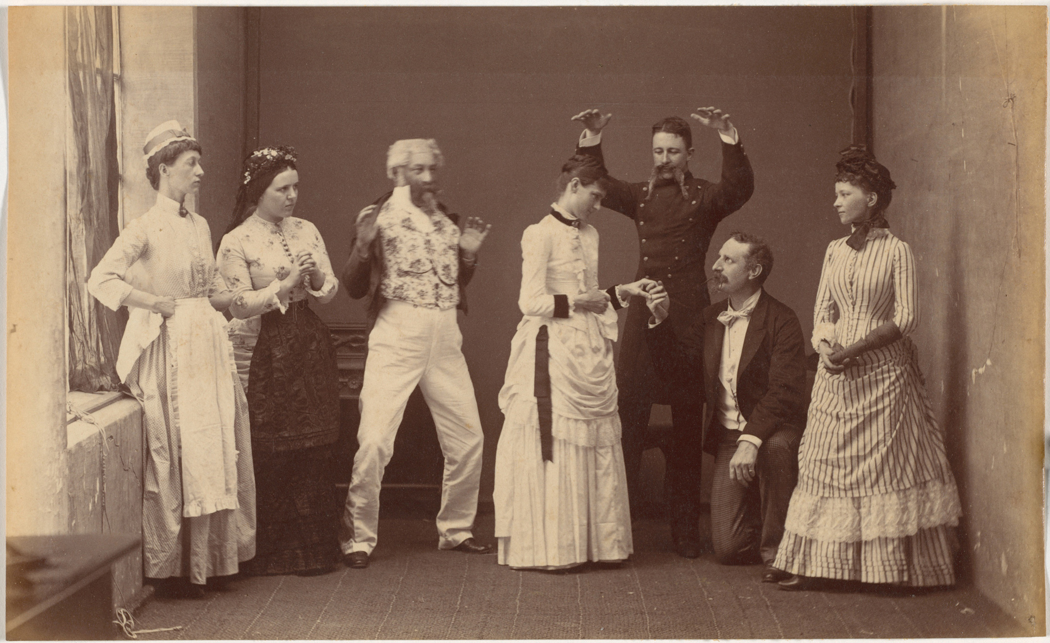
Fancy Group at Indore I, c. 1885-1887. Raja Deen Dayal (Indian, 1844-1905). Albumen print; image: 12.4 x 19.9 cm (4-7/8 x 7-13/16 inches); paper: 12.4 x 19.9 cm (4-7/8 x 7-13/16 inches). The Cleveland Museum of Art, Purchase from the J.H. Wade Fund.
Fancy Ball, Indore, c. 1885-1887. Raja Deen Dayal (Indian, 1844-1905). Albumen print; image: 12.2 x 19.9 cm (4-13/16 x 7-13/16 inches); paper: 12.2 x 19.9 cm (4-13/16 x 7-13/16 inches). The Cleveland Museum of Art, Purchase from the J.H. Wade Fund.
Maharaja of Rewa and Sardars, c. 1885-1887. Raja Deen Dayal (Indian, 1844-1905). Albumen print; image: 19.7 x 26.9 cm (7-3/4 x 10-9/16 inches); paper: 19.7 x 26.9 cm (7-3/4 x 10-9/16 inches). The Cleveland Museum of Art, Purchase from the J.H. Wade Fund.
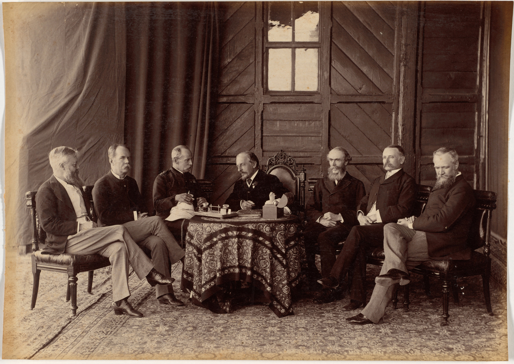
Lord Dufferin and the Supreme Council of Government of India, c. 1885-1887. Raja Deen Dayal (Indian, 1844-1905). Albumen print; image: 19.4 x 27.3 cm (7-5/8 x 10-3/4 inches); paper: 19.4 x 27.3 cm (7-5/8 x 10-3/4 inches). The Cleveland Museum of Art, Purchase from the J.H. Wade Fund.
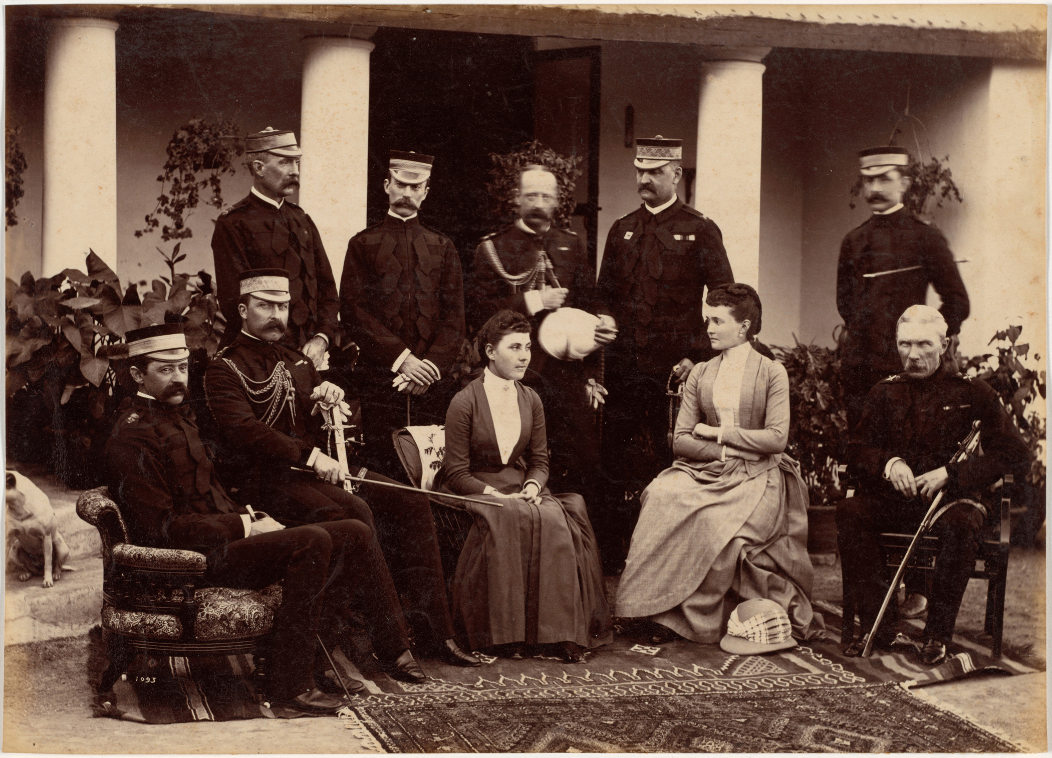
The Duke and Duchess of Connaught, with Col. Adam, Captain H.V. Benett, Col. Becher, Gen. Knowles, Captain Herbert, Col. Cavaye, Mrs. Cavaye, and Gen. R. Gellispie, Mhow, c. 1885-1887. Raja Deen Dayal (Indian, 1844-1905). Albumen print; image: 19.1 x 26.6 cm (7-1/2 x 10-1/2 inches); paper: 19.1 x 26.6 cm (7-1/2 x 10-1/2 inches). The Cleveland Museum of Art, Purchase from the J.H. Wade Fund.
Fancy Group of Children, Indore, c. 1885-1887. Raja Deen Dayal (Indian, 1844-1905). Albumen print; image: 19.7 x 26.3 cm (7-3/4 x 10-3/8 inches); paper: 19.7 x 26.3 cm (7-3/4 x 10-3/8 inches). The Cleveland Museum of Art, Purchase from the J.H. Wade Fund.
Ramkishore Singh of Rewa, c. 1885-1887. Raja Deen Dayal (Indian, 1844-1905). Albumen print; image: 18.6 x 27.0 cm (7-5/16 x 10-5/8 inches); paper: 18.6 x 27.0 cm (7-5/16 x 10-5/8 inches). The Cleveland Museum of Art, Purchase from the J.H. Wade Fund.
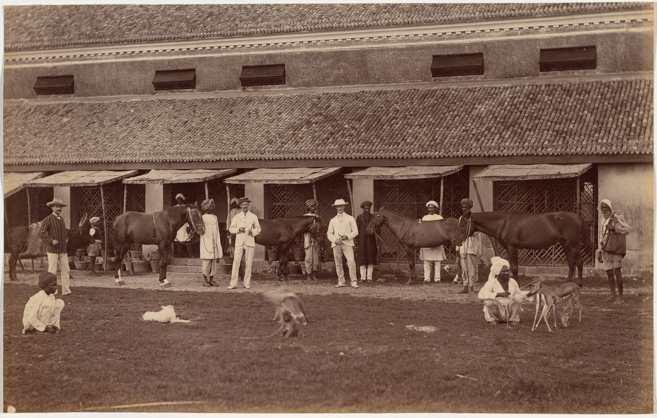
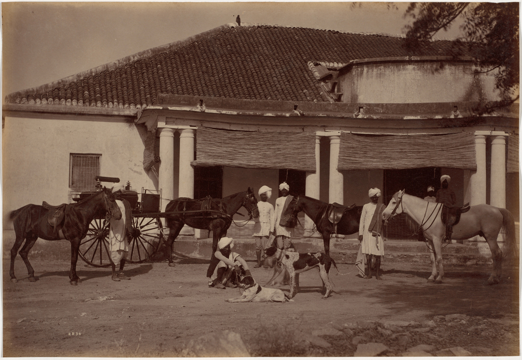
Mr. Brown’s Horses, Jhansi, c. 1885-1887. Raja Deen Dayal (Indian, 1844-1905). Albumen print; image: 18.9 x 27.6 cm (7-7/16 x 10-7/8 inches); paper: 18.9 x 27.6 cm (7-7/16 x 10-7/8 inches). The Cleveland Museum of Art, Purchase from the J.H. Wade Fund.
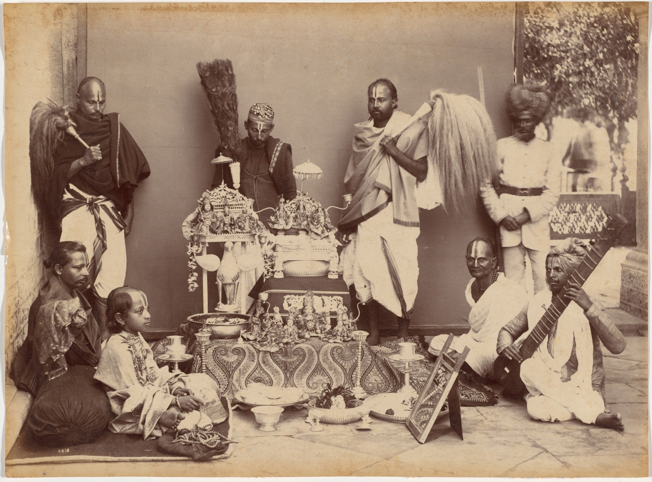
Maharaja of Rewa in Prayer, c. 1885-1887. Raja Deen Dayal (Indian, 1844-1905). Albumen print; image: 20.0 x 27.2 cm (7-7/8 x 10-11/16 inches); paper: 20.0 x 27.2 cm (7-7/8 x 10-11/16 inches). The Cleveland Museum of Art, Purchase from the J.H. Wade Fund.
Sir Auckland Colvin and family, Simla, c. 1885-1887. Raja Deen Dayal (Indian, 1844-1905). Albumen print; image: 20.0 x 26.9 cm (7-7/8 x 10-9/16 inches); paper: 20.0 x 26.9 cm (7-7/8 x 10-9/16 inches). The Cleveland Museum of Art, Purchase from the J.H. Wade Fund.
Picnic Party at Mr. Pelitis’ Country House, Mashobra, c. 1885-1887. Raja Deen Dayal (Indian, 1844-1905). Albumen print; image: 18.9 x 27.7 cm (7-7/16 x 10-15/16 inches); paper: 18.9 x 27.7 cm (7-7/16 x 10-15/16 inches). The Cleveland Museum of Art, Purchase from the J.H. Wade Fund.
Major Martellis Camp at Mhow, c. 1885-1887. Raja Deen Dayal (Indian, 1844-1905). Albumen print; image: 19.0 x 26.4 cm (7-1/2 x 10-3/8 inches); paper: 19.0 x 26.4 cm (7-41/2 x 10-3/8 inches). The Cleveland Museum of Art, Purchase from the J.H. Wade Fund.

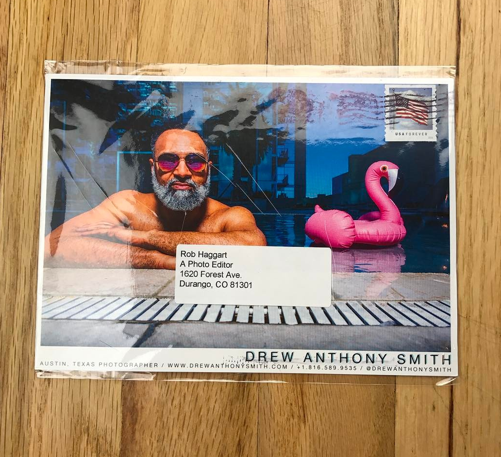
The Daily Promo: Drew Anthony Smith

Drew Anthony Smith

Who printed it?
Thomas Graphics in Austin.

Who designed it?
I designed it.

Who edited the images?
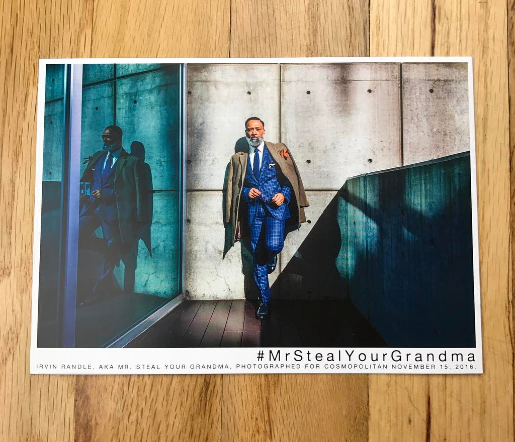
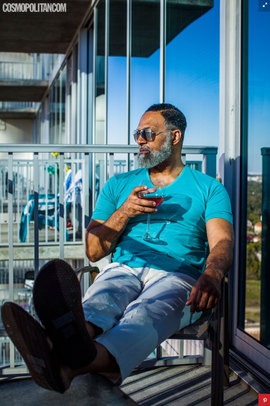
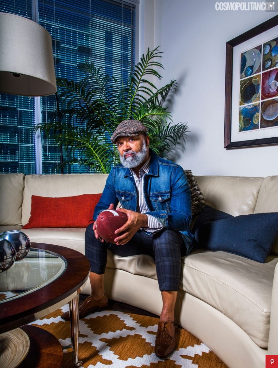
I selected and toned the images.  Two were used in the Cosmo feature while the others were some of my favorites.

How many did you make?
300

How many times a year do you send out promos?
I send a physical promo piece out about every quarter.

Did you write the copy and cast this model?
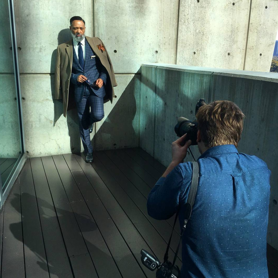
Irvin Randle has gained Instagram fame by being the man behind #MrStealYourGrandma.  This was an assignment for Cosmopolitan and part of their Internet’s Most Fascinating series.  In addition to this shoot, I also flew to Charlotte the same week to photograph Ryan Lochte as part of the collection.


I spent more time driving to Houston than photographing Irvin.  My assistant and I hit the ground running when we arrived and knocked out a dozen locations in about two hours.  Irvin had a great attitude and was ready to go with his slick outfits.  My assistant got a work out because in addition to helping me, Irvin kept asking her to shoot behind the scenes shots.  Gotta get that fresh Instagram content.

This Week In Photography Books: Piotr Zbierski

by Jonathan Blaustein

Nostalgia is a funny thing.
What is it, really?

A state of mind?
A sensation?

An emotion?

However we classify it, nostalgia is heavily responsible for the shocking shit-show that is the Trump Presidency. (I promise I won’t write about him every week.) Overwhelmed with longing for the past, a not-small segment of White America yearned for an idealized vision of the 1950’s.

They chose to reminisce, fondly, about an America that was entirely white. About a time when men, who wore hats, were the sole breadwinners, and women stayed home. It was a time when grabbing your secretary’s backside was fair game, and racist jokes were socially acceptable.

I’ll spare you a recap of this week’s version of Trumpsanity, but rest assured, it’s enough to make some people nostalgic for the George W. Bush years.

That’s a thing.
I’ve seen it on Twitter.

The world is so strange, at the moment, that some people think it was much better back then. As I recall, George W. Bush needed the Supreme Court to install him as President, presided over 9/11 and Hurricane Katrina, started two massive Wars, (one of which continues, the other of which begat ISIS) and then broke the Entire. Global. Economy.

Thankfully, though, the mid-aughts did have some highlights.

Take my neighbor here in Taos, Donald Rumsfeld, for instance. He was pretty high on the unintentional comedy scale. (Remember those oversized glasses?)

When Rummy philosophized about the known unknowns vs. the unknown unknowns, he wrote himself into the book of ridiculous rhetorical history. But he was right on many levels, if just this once. (In case you’re too young to know what I’m referencing, Rummy theorized that there are things we know we don’t know, and things that we don’t know we don’t know.)

So much of life is run by the unknown unknowns, though that’s terrifying to admit. We like our lives to be routine-based, built upon a sense of normalcy. Our computers give us answers, but only if we know what questions to ask.

We can’t even imagine what came before the big bang, or where we go after we die. Scientists don’t know what makes up dark matter, so they named it like a secret weapon invented by Darth Vader.

There are underpinnings of reality that speak of magic, or the super-natural, and most of us wouldn’t even know where to begin, as far as understanding what really makes the planet spin every day.

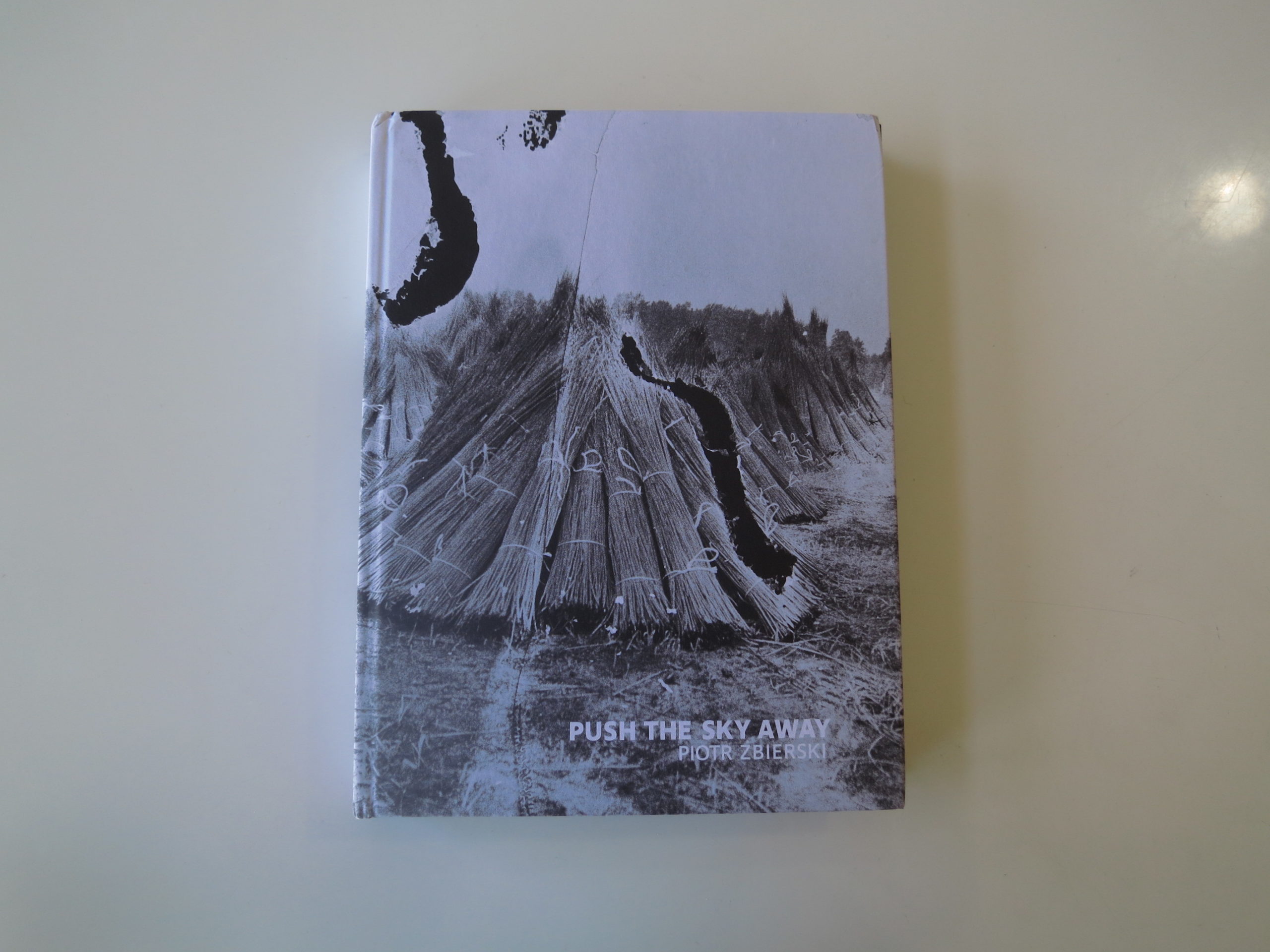
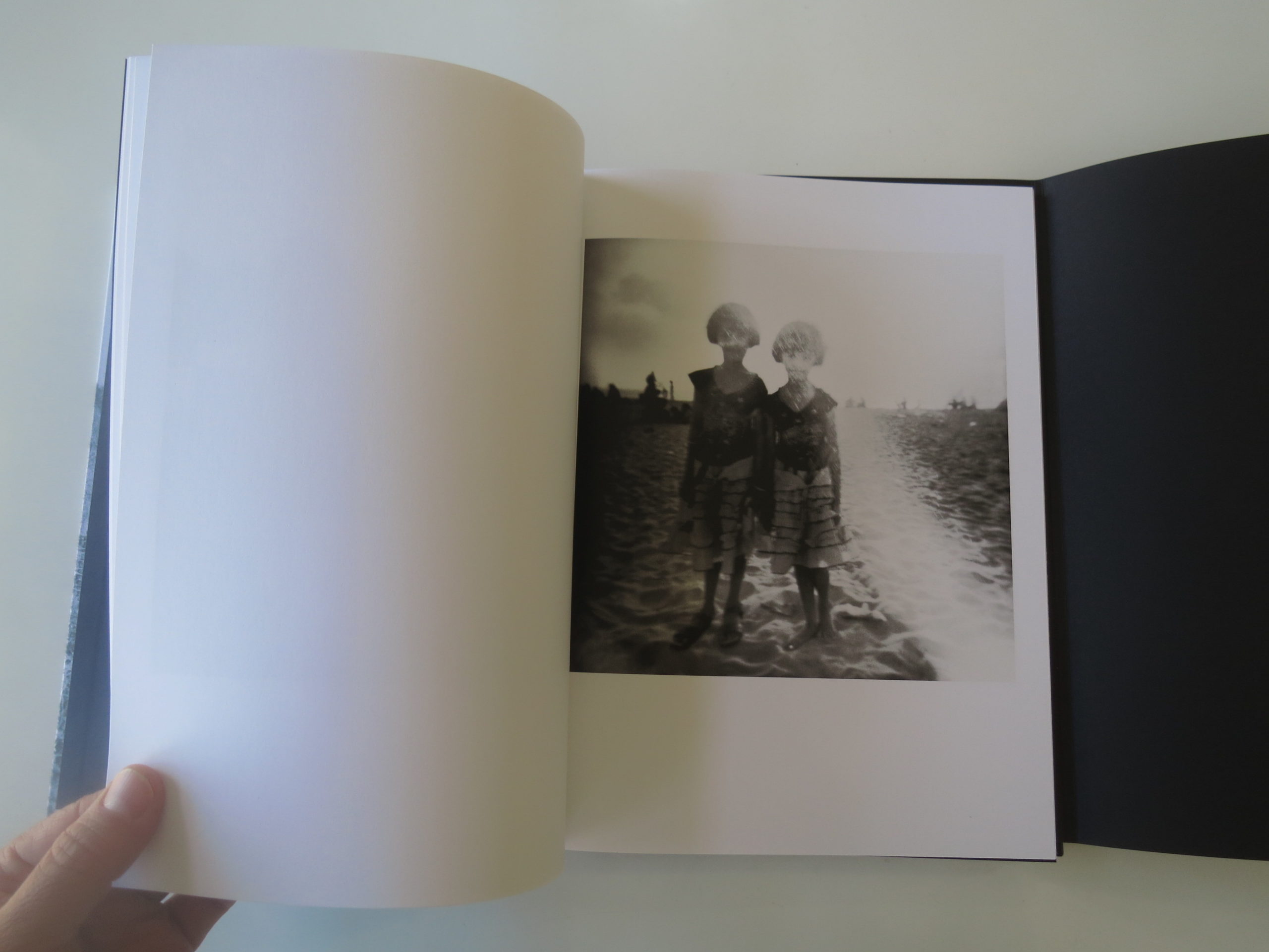
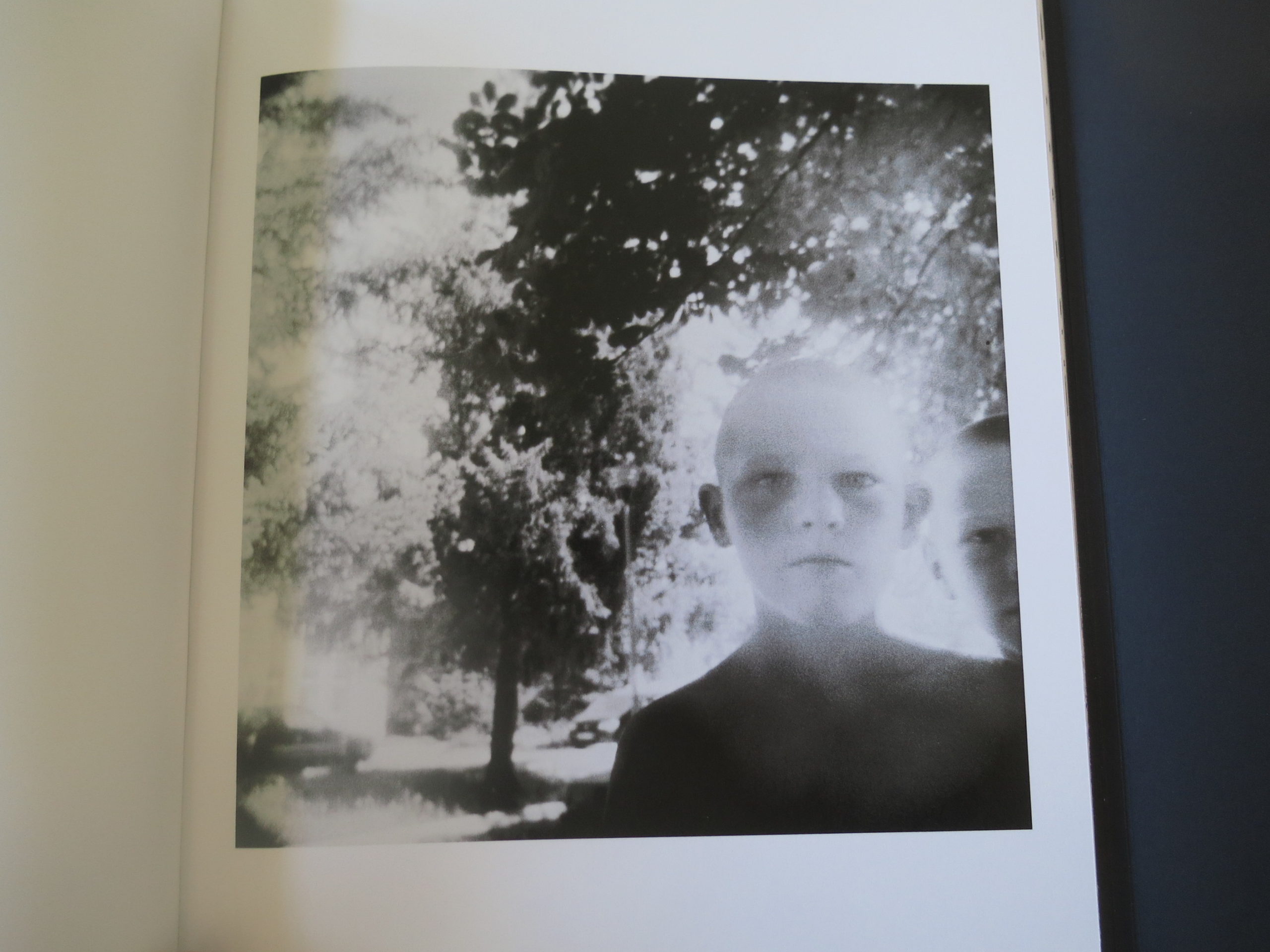
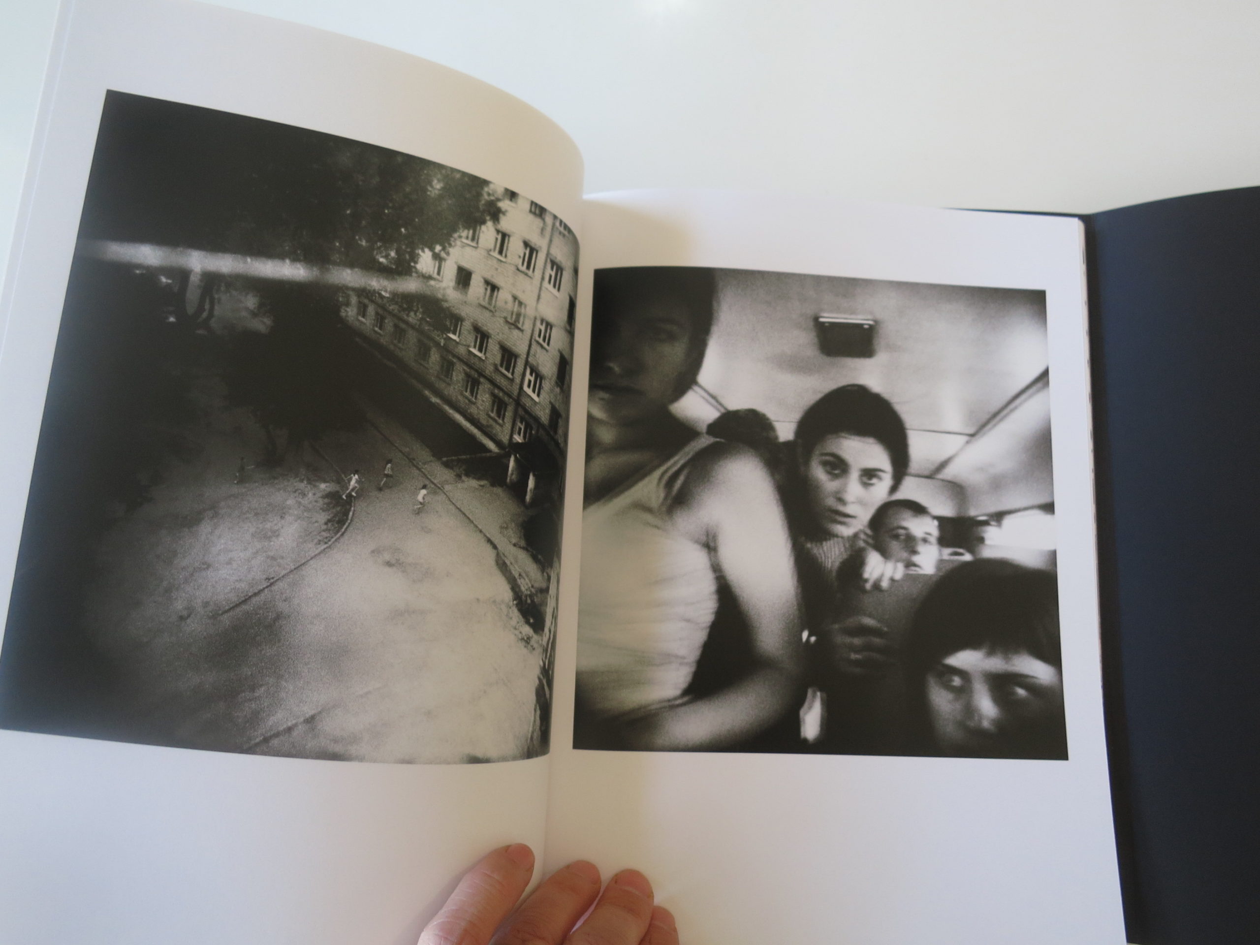
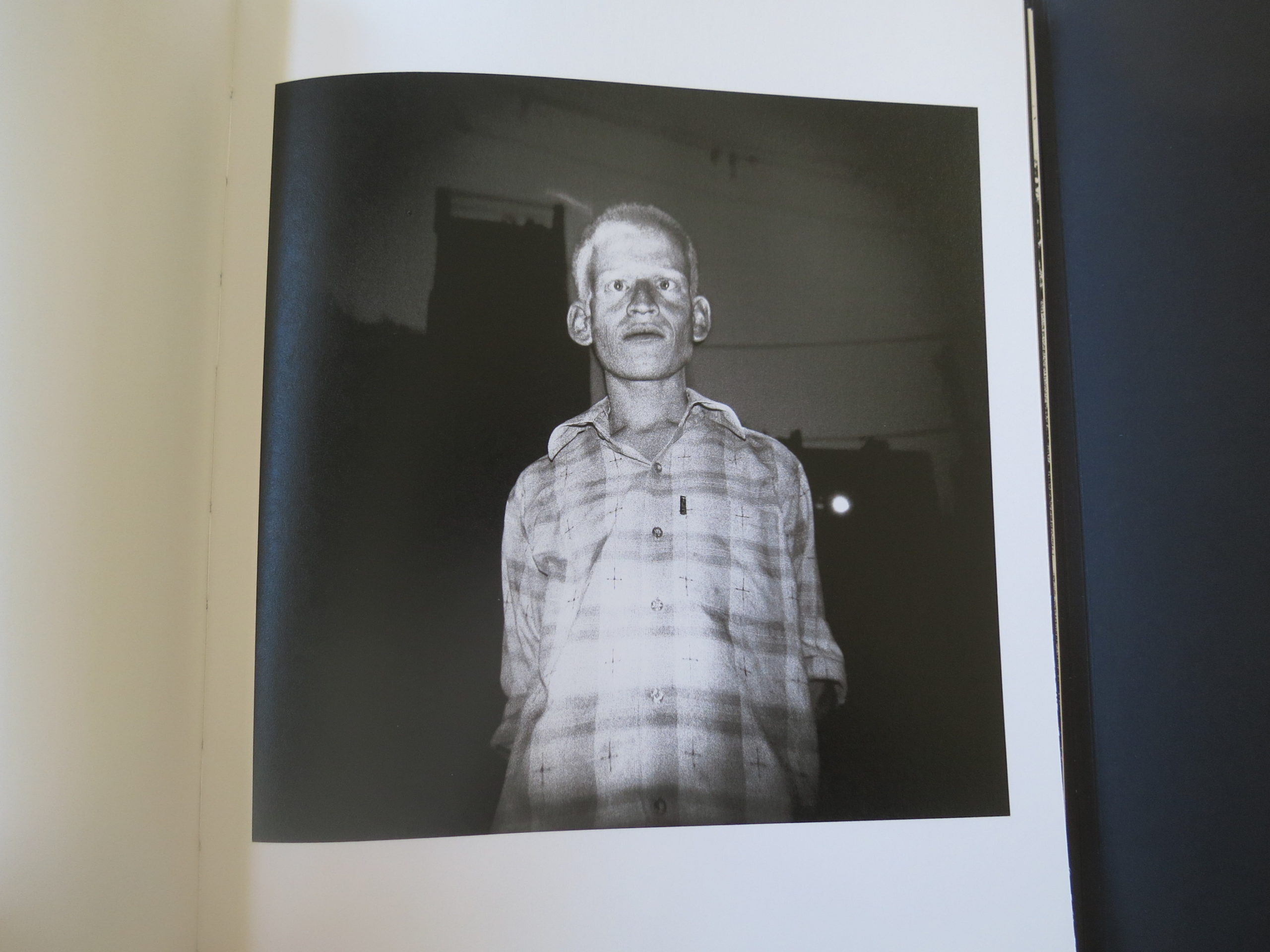
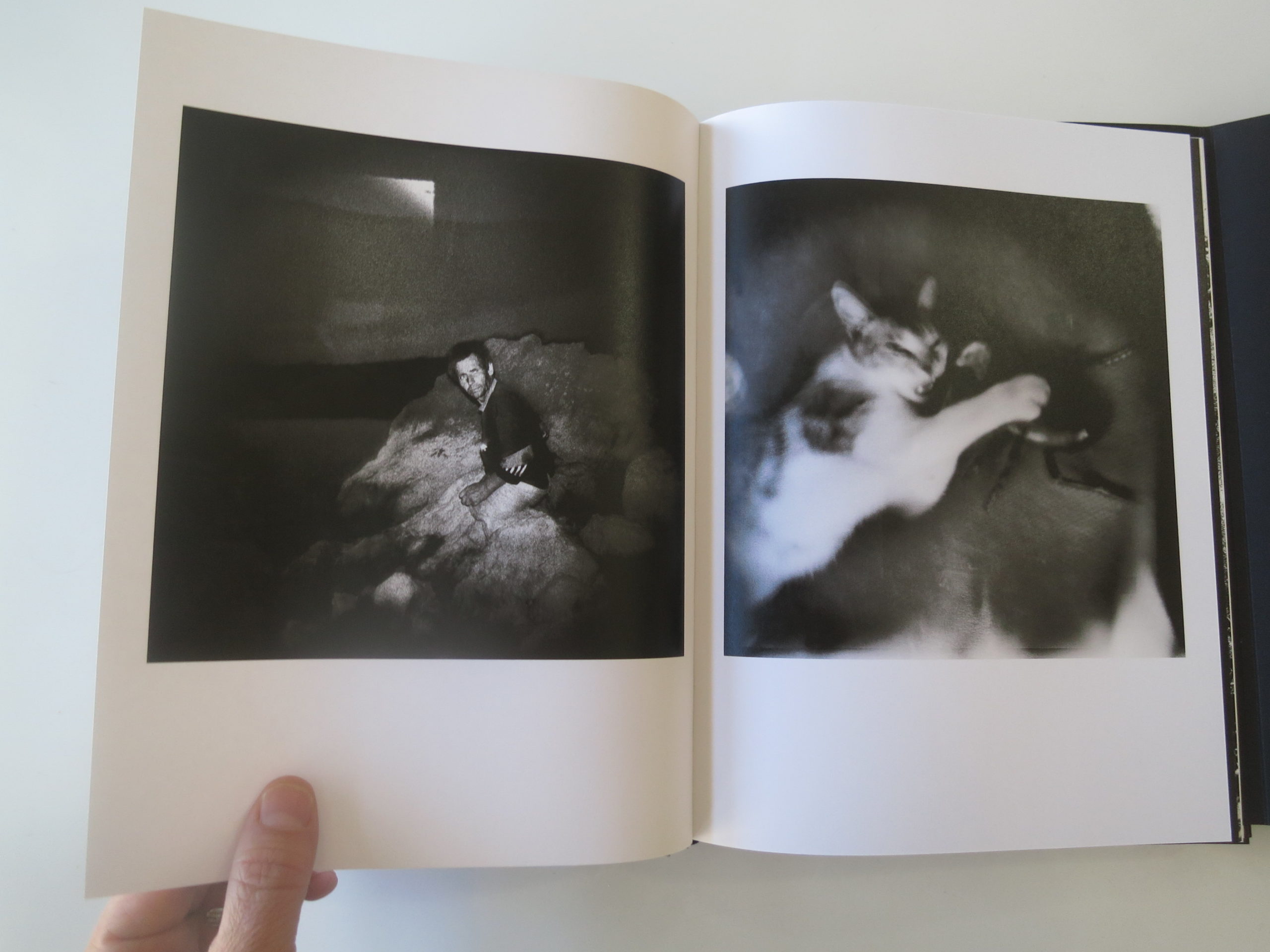
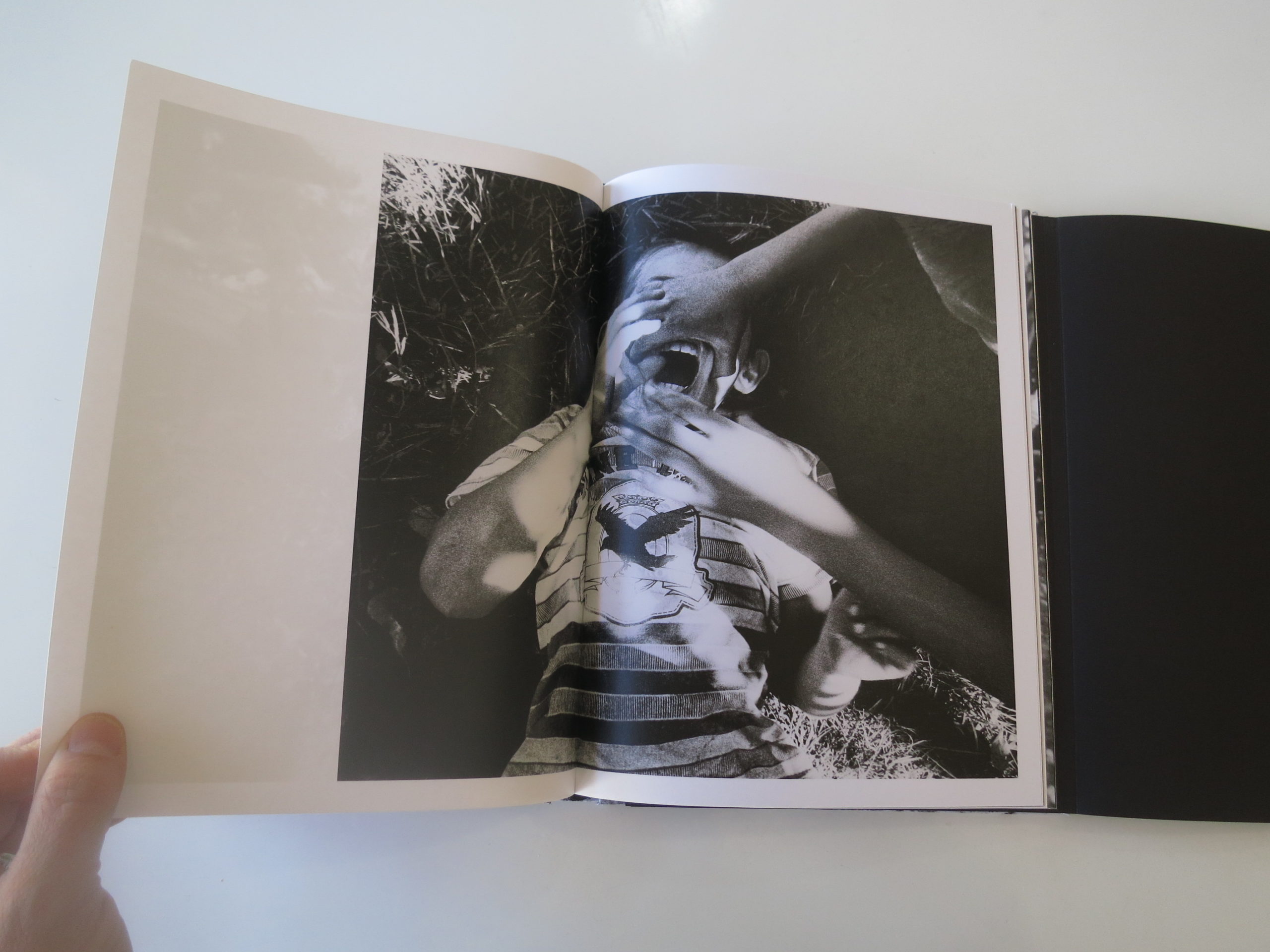
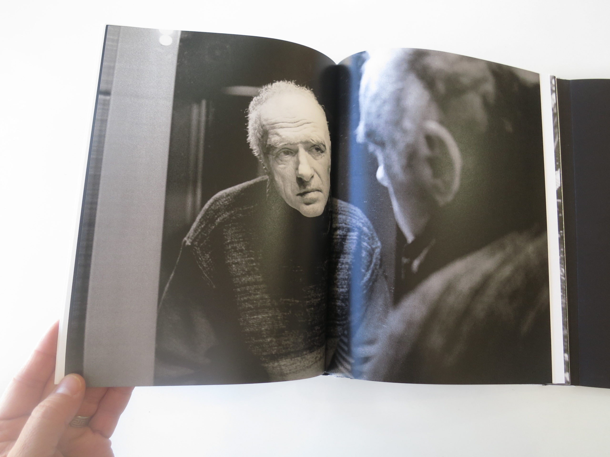
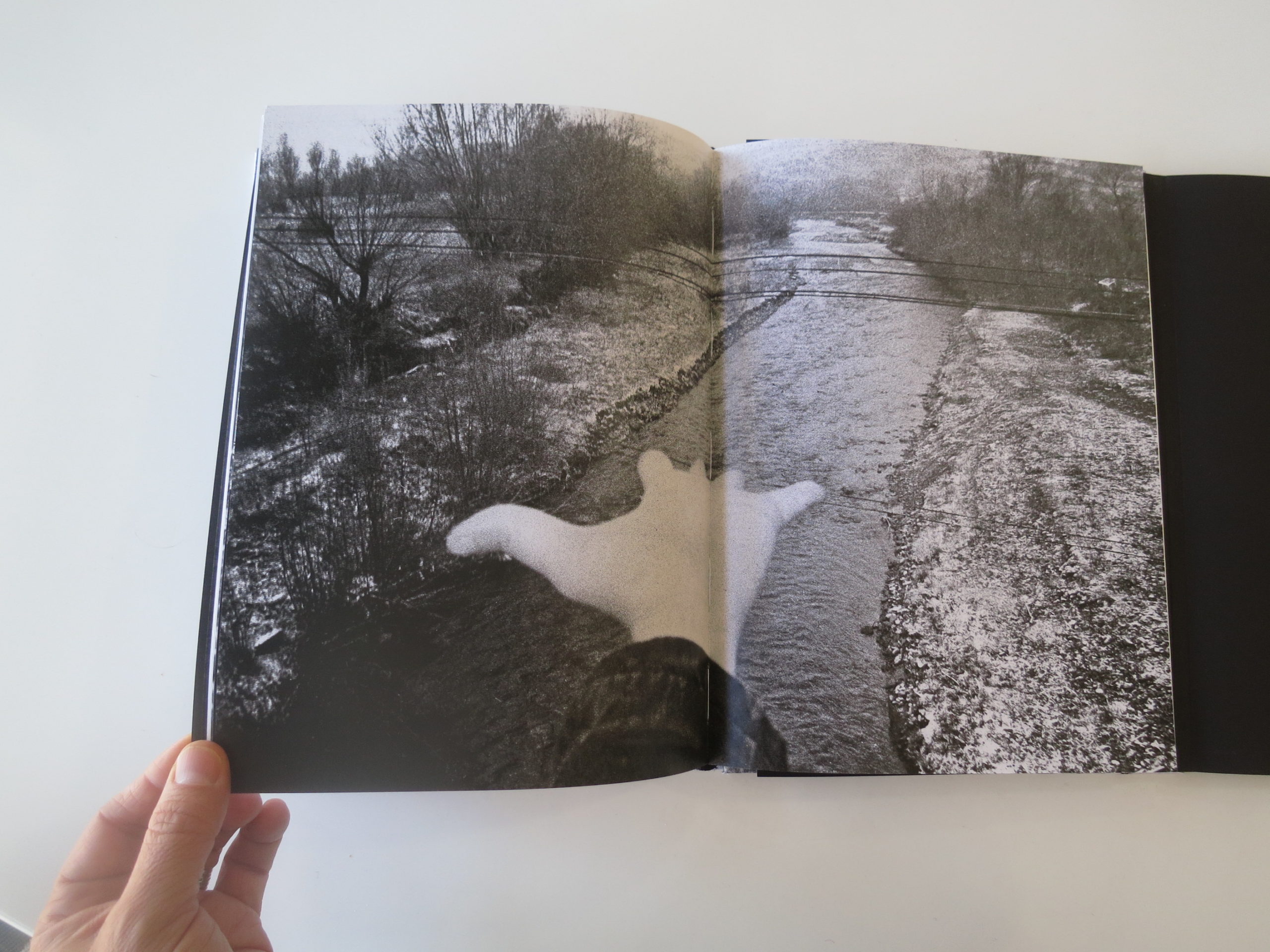
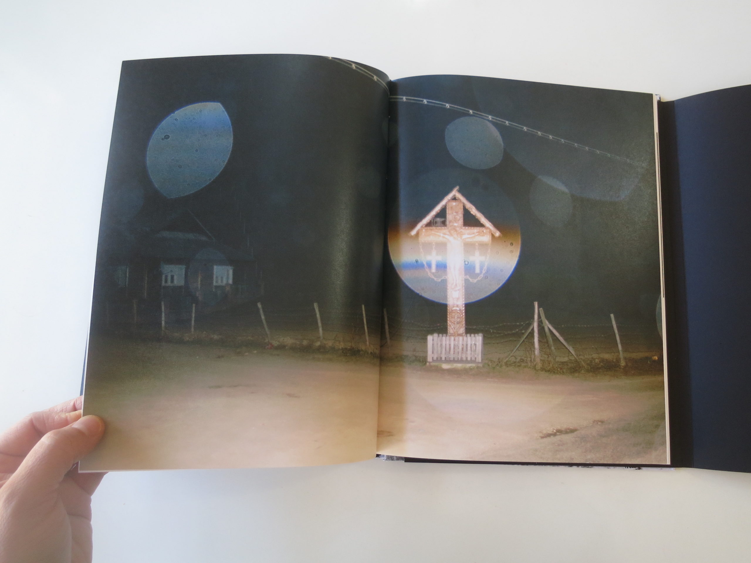
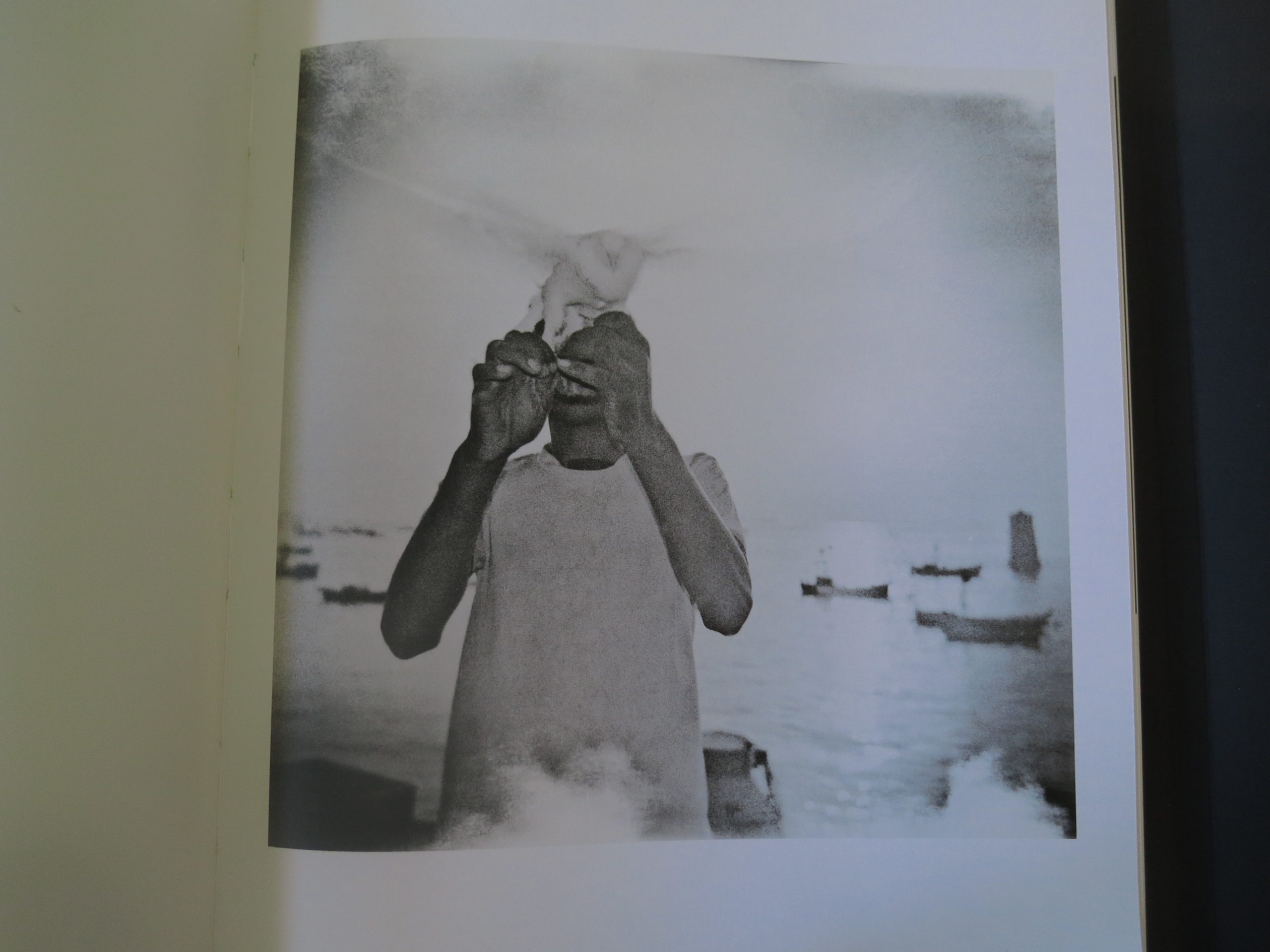
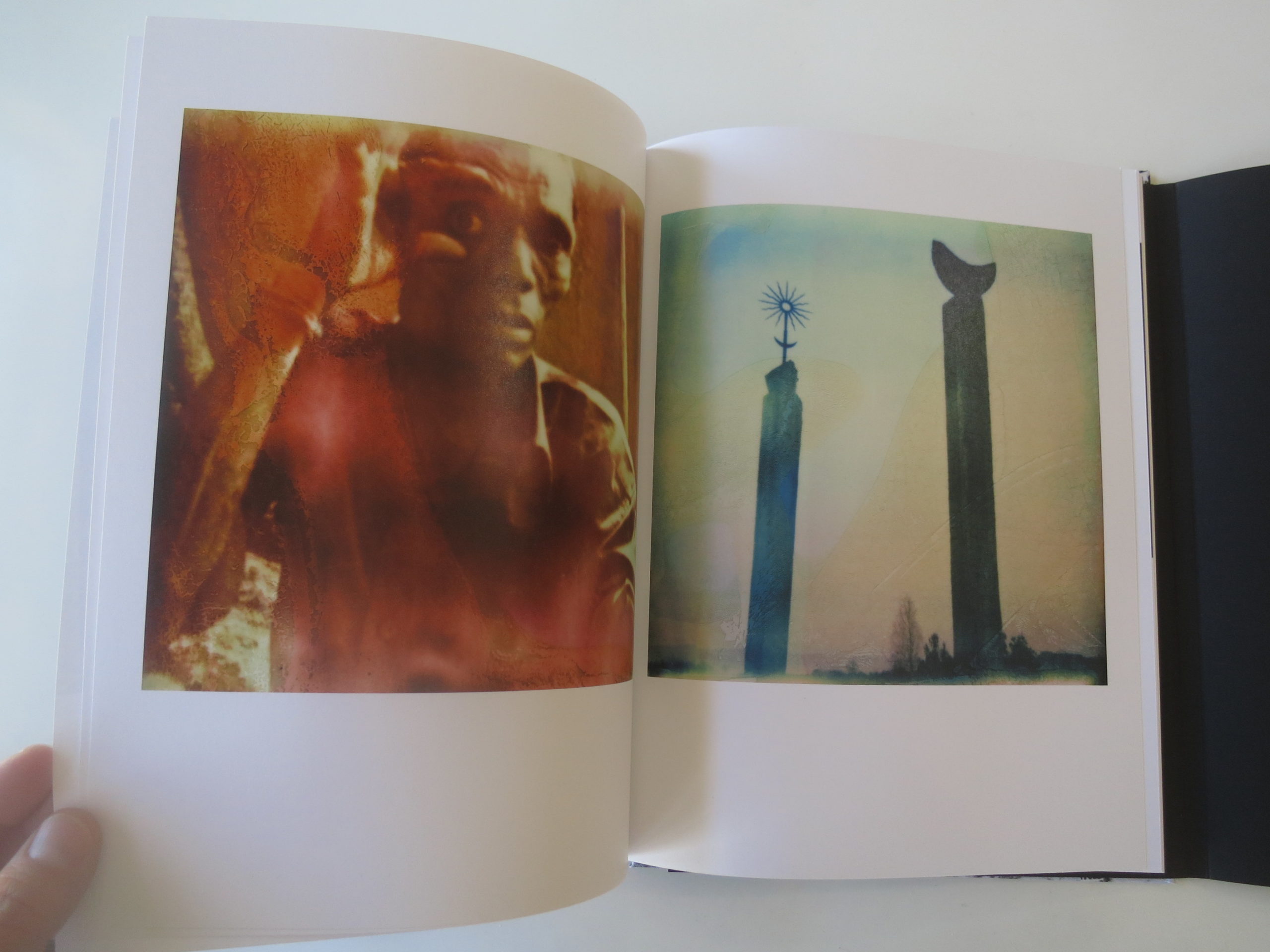
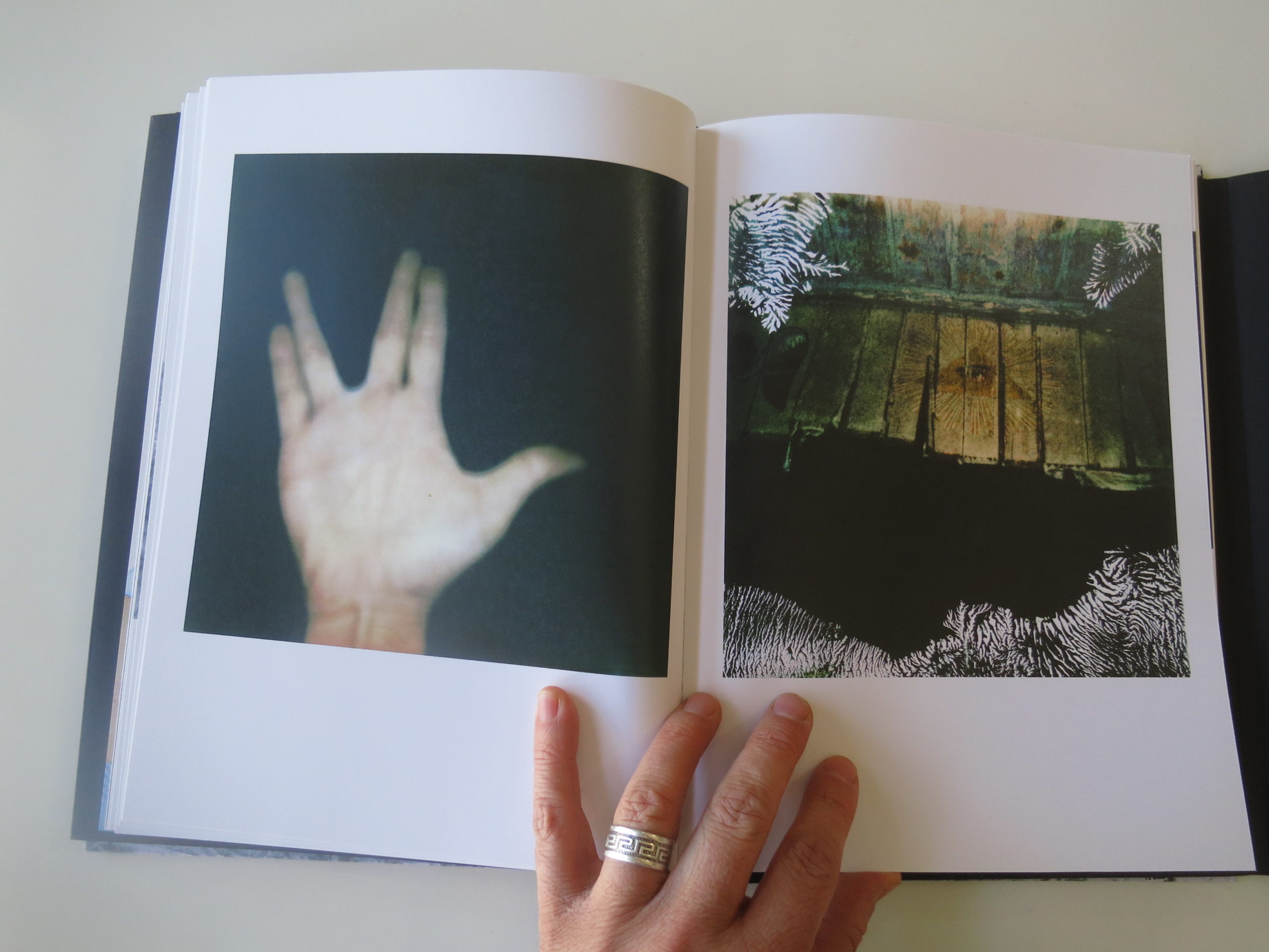
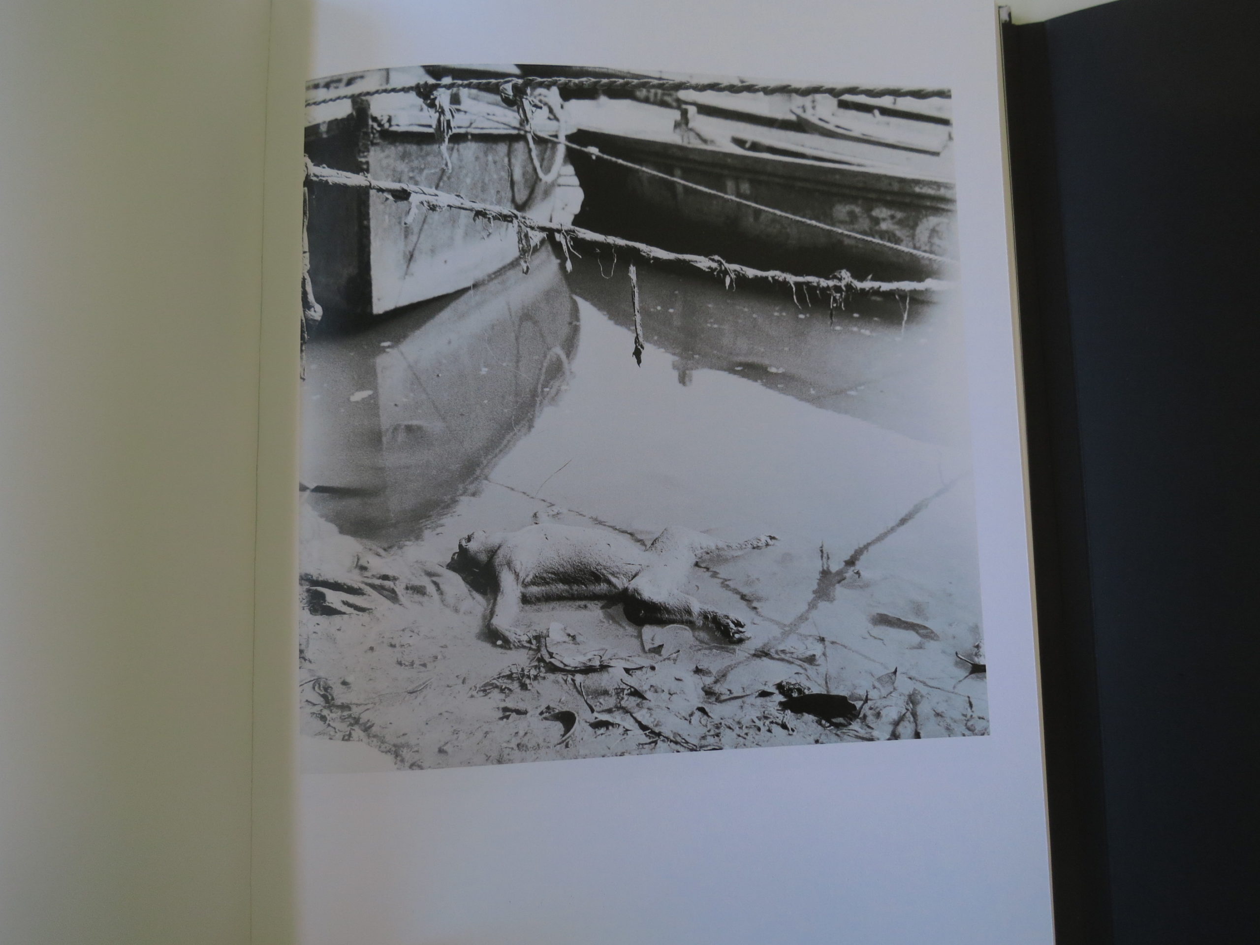
I like it when a photobook makes me think of the unknown unknowns. And that’s where I’ve gone today, having just put down “Push The Sky Away,” a new book by Piotr Zbierski, recently published by Dewi Lewis in Manchester.

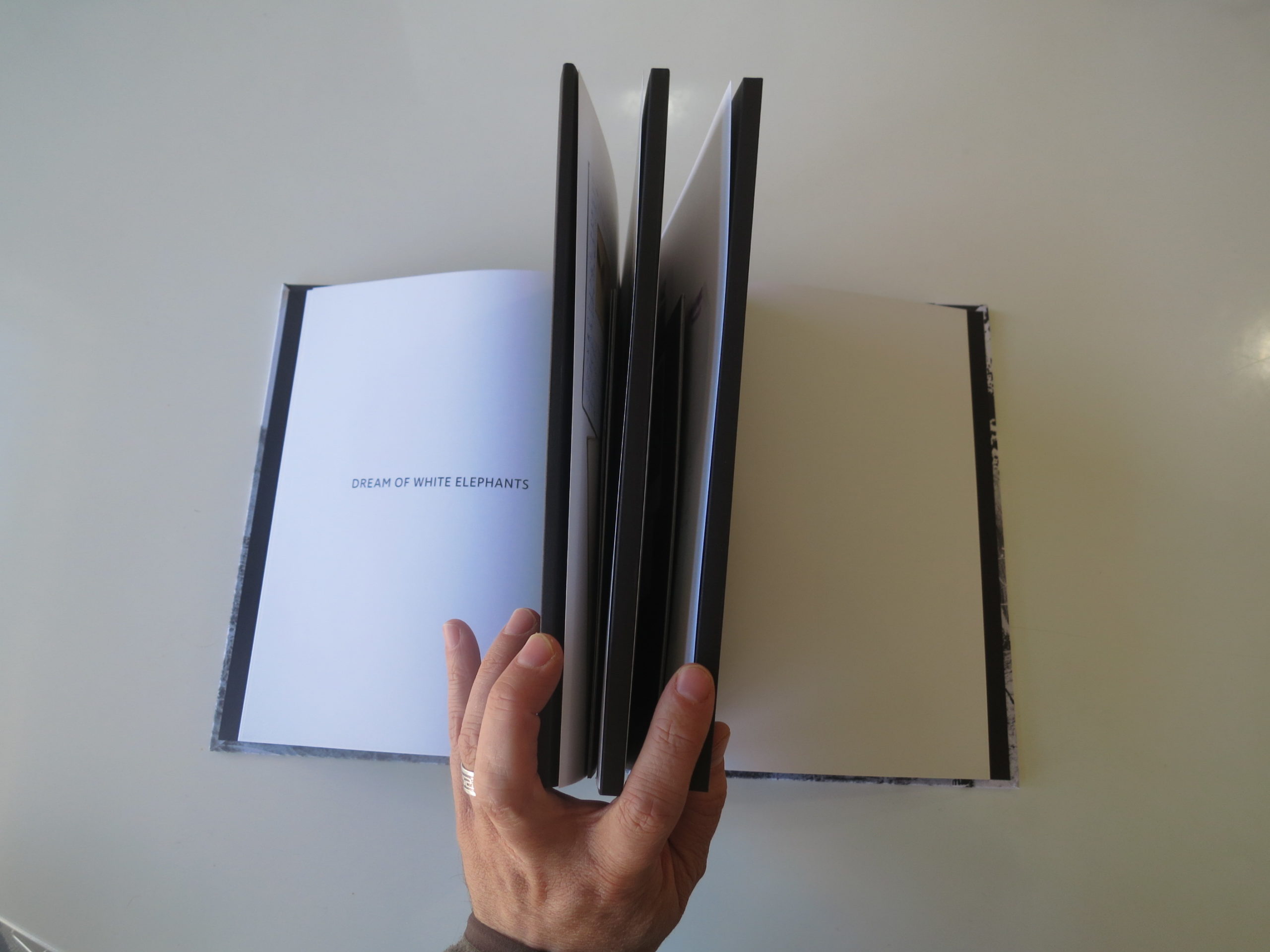
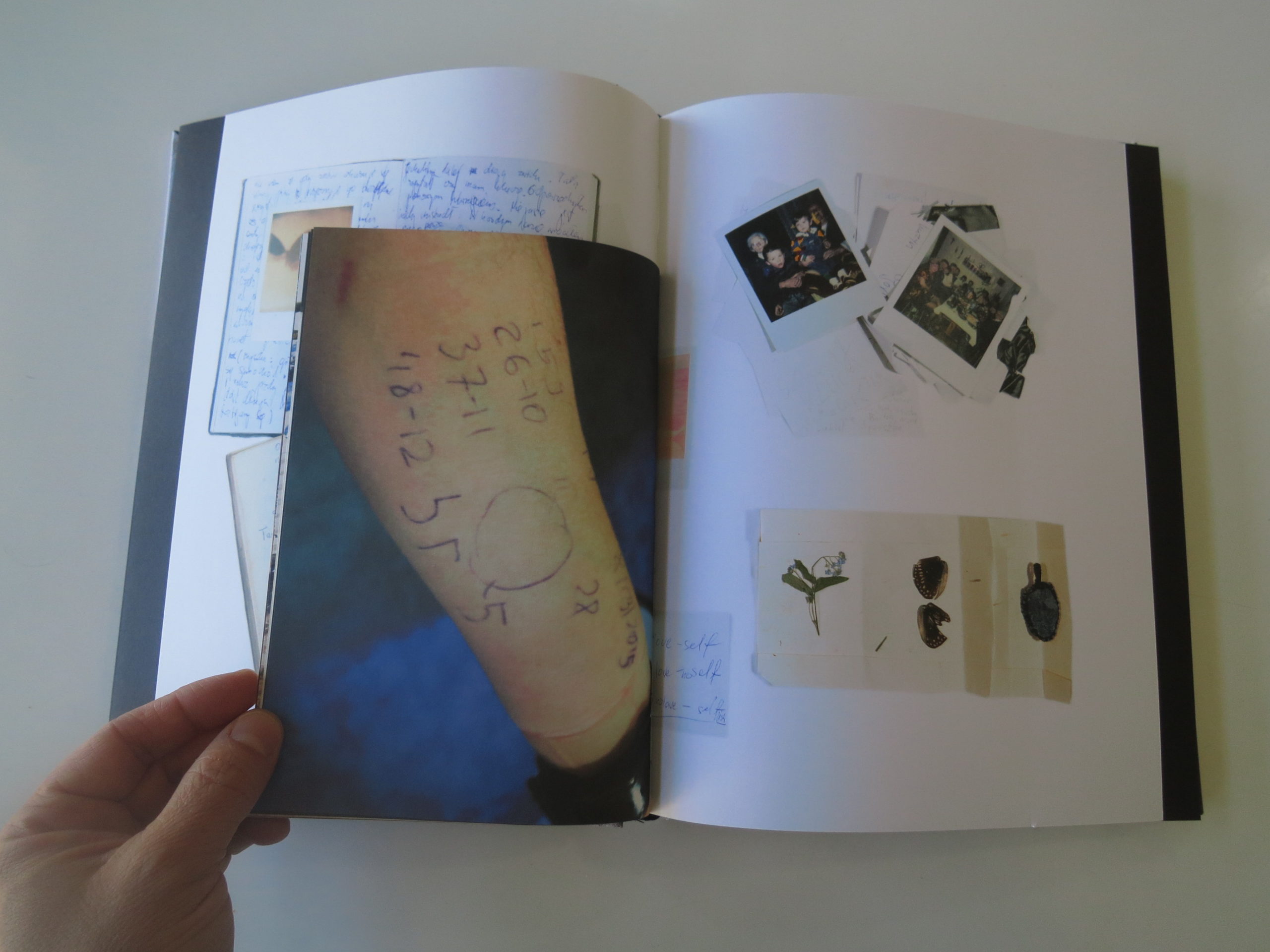
Structurally, this book is as well-put-together as you’re likely to find. The vertical orientation is big without being too-big; the black and white cover is stark. The photos are broken into three sections, as it’s a trilogy of projects, so there are black inserts that actually divide the book, but are removable. (So you have to put it back together each time.)

There are also small journal inserts, which are bound into the book, so the page size and image style also vary consistently. A lot of thought went into this presentation, I’m sure.

But what is actually being presented? (Finally, he talks about the pictures.)

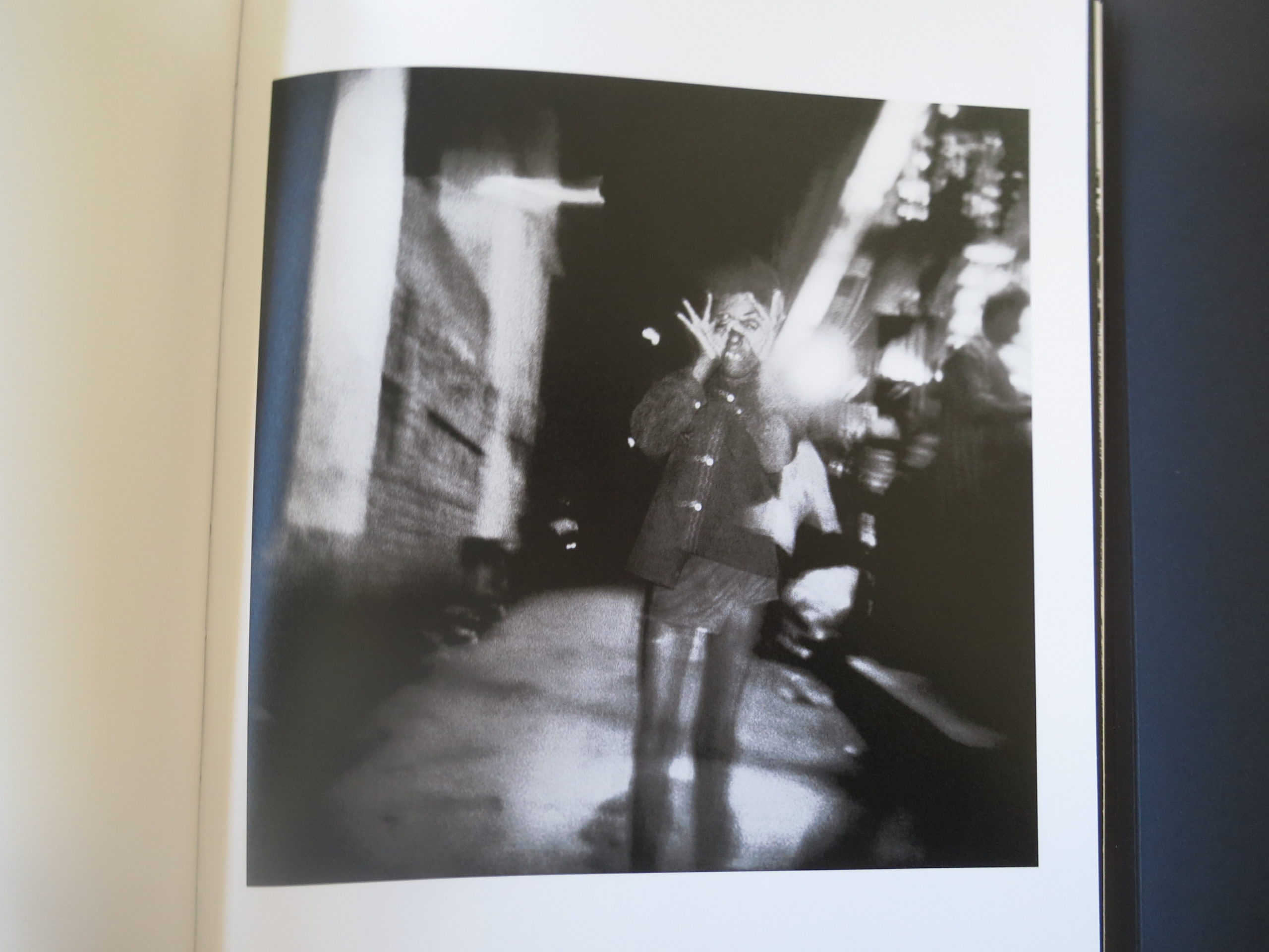
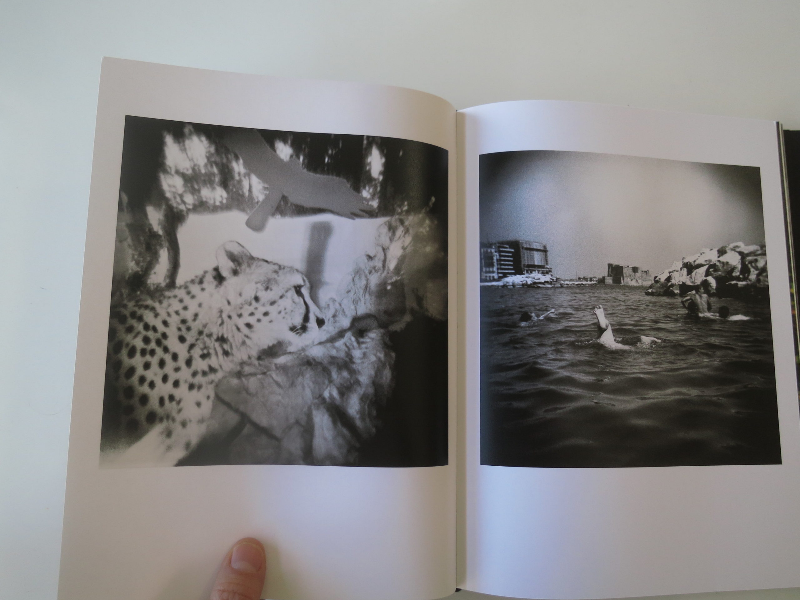
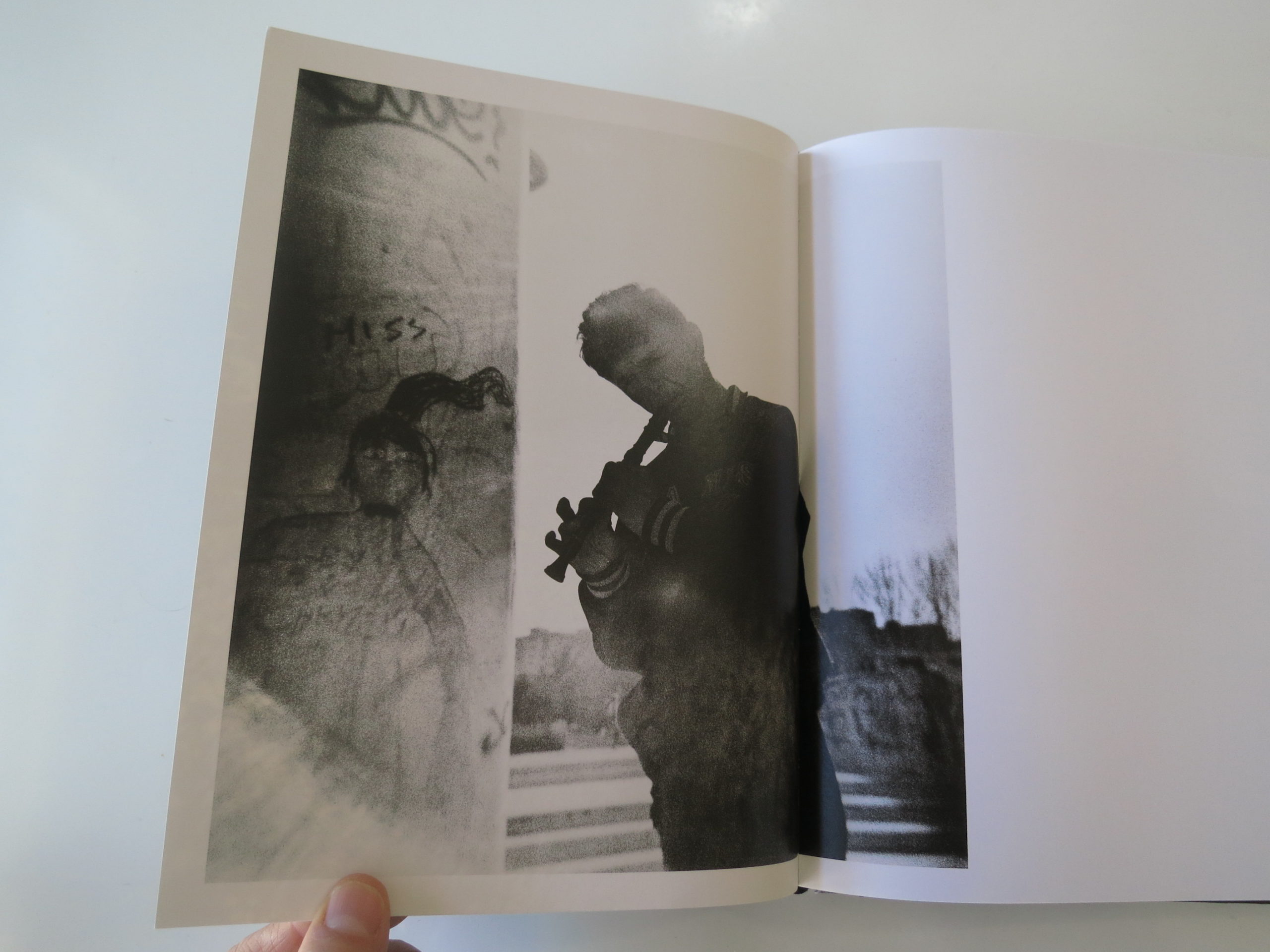
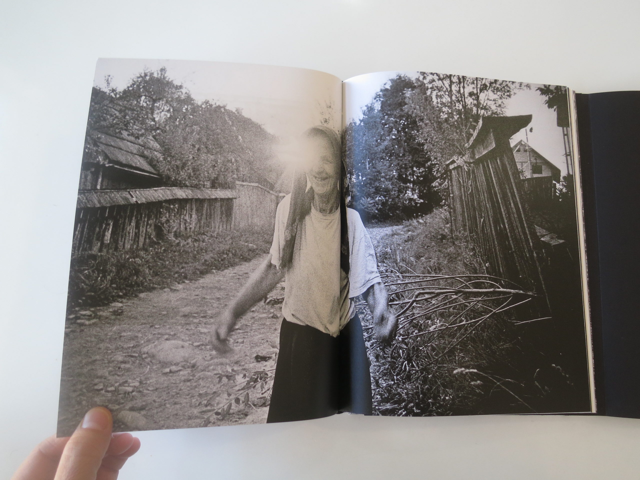
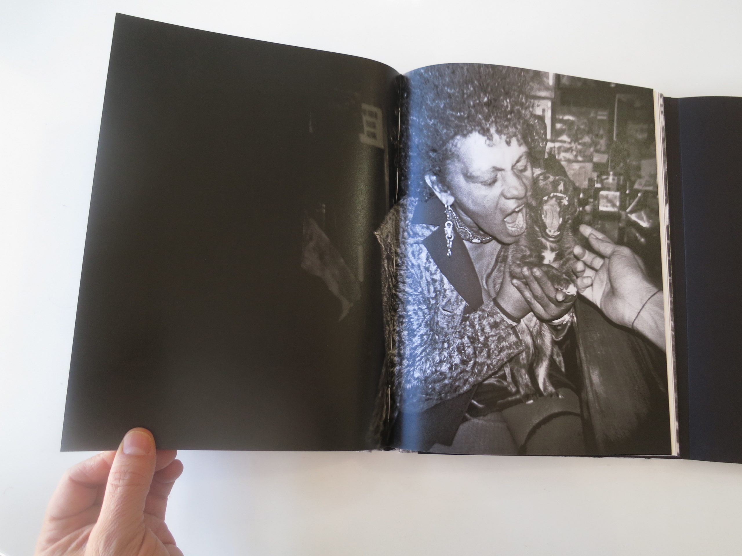
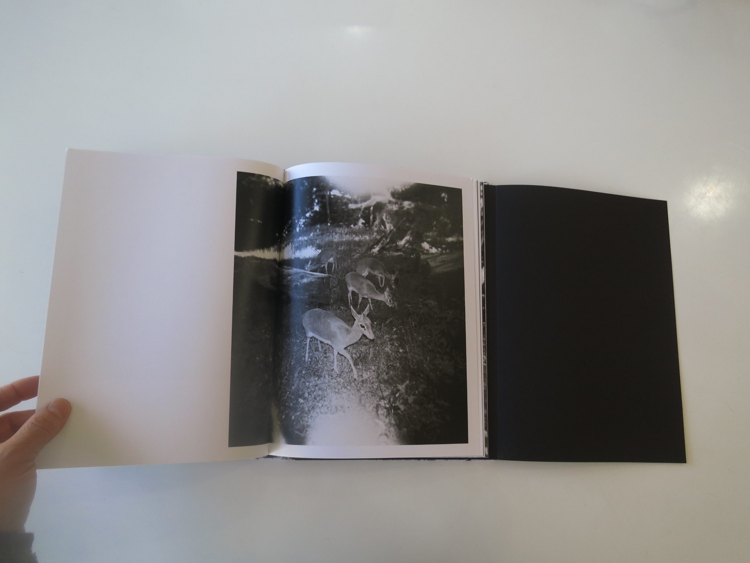
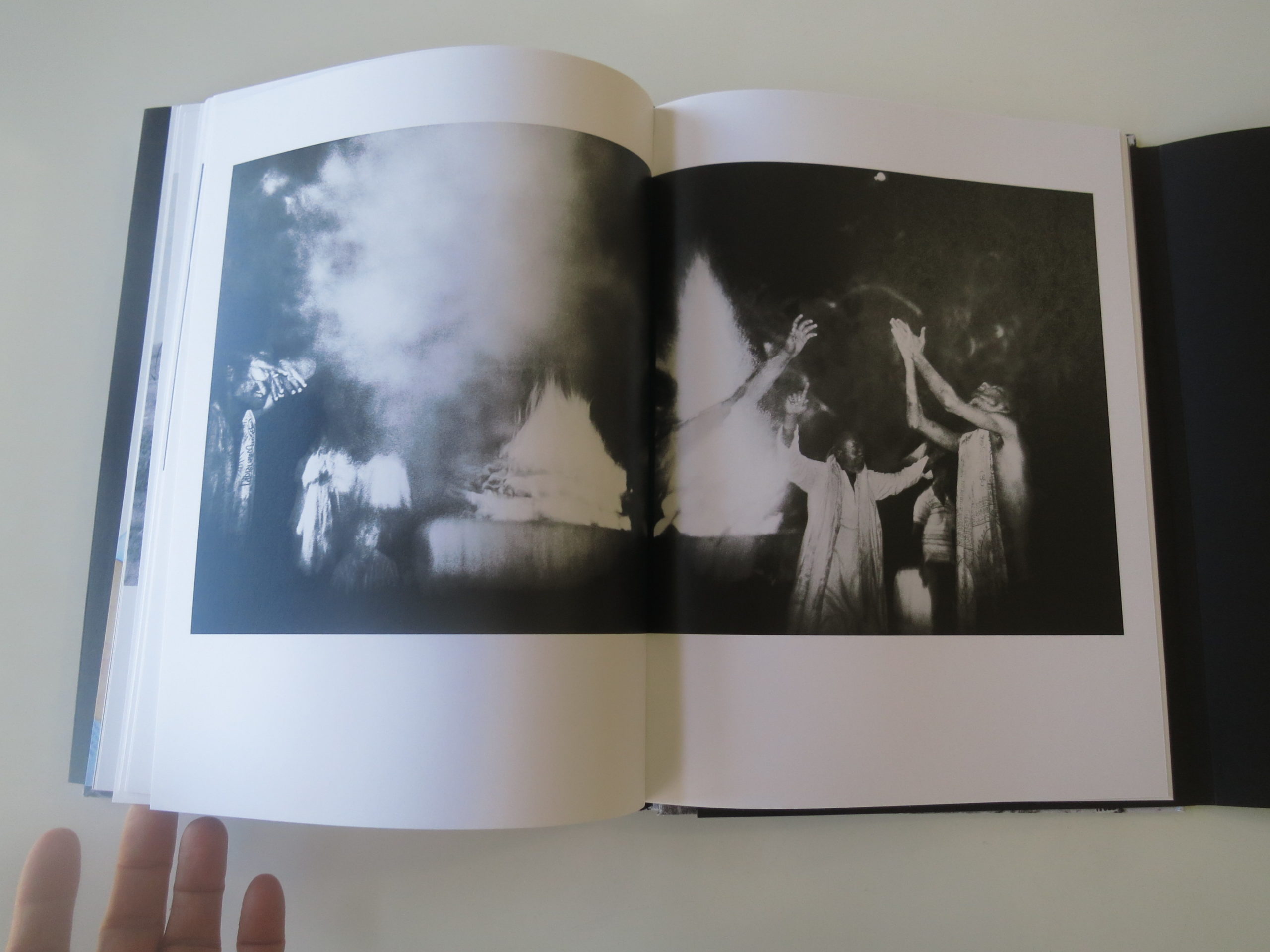
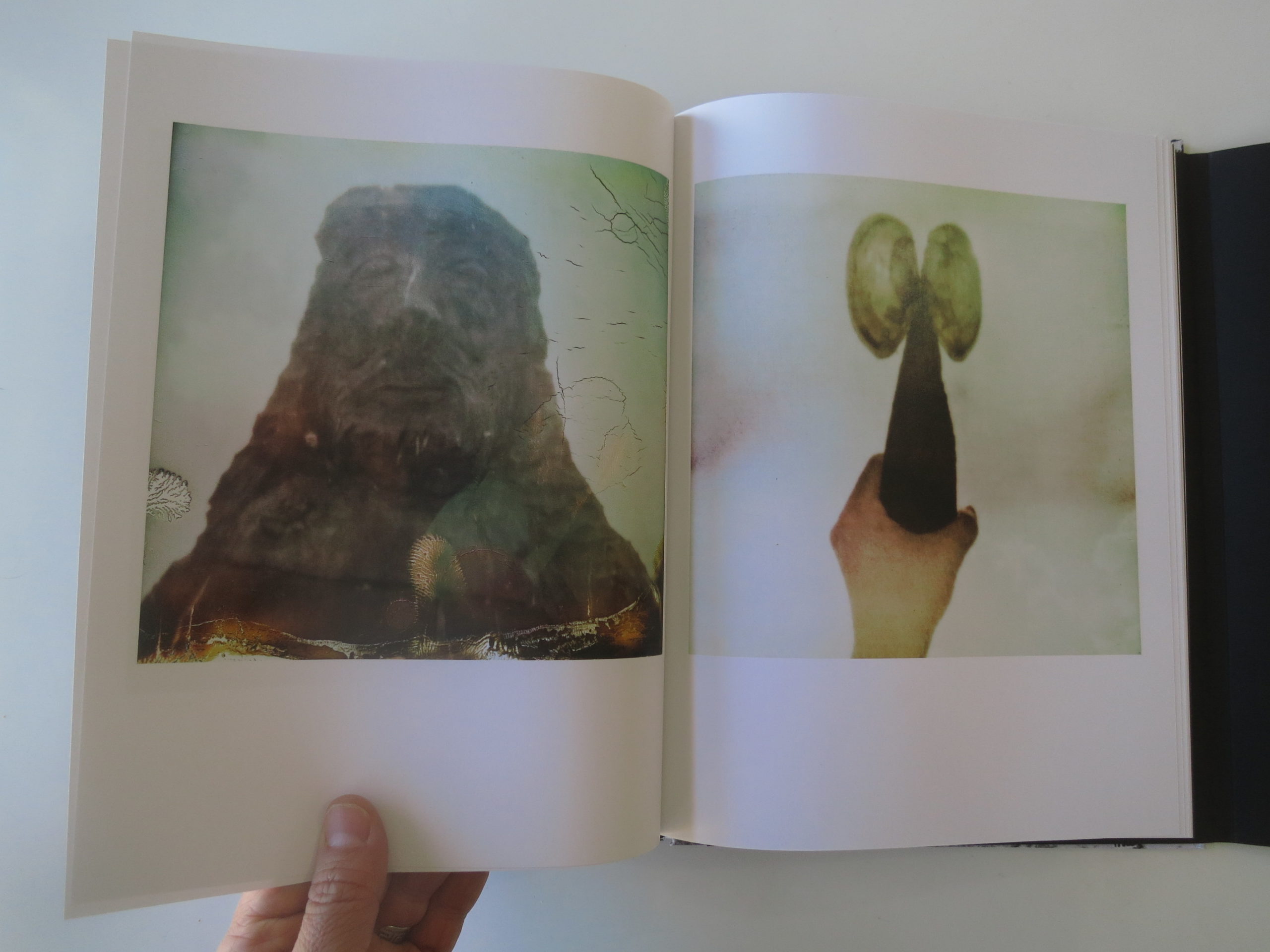
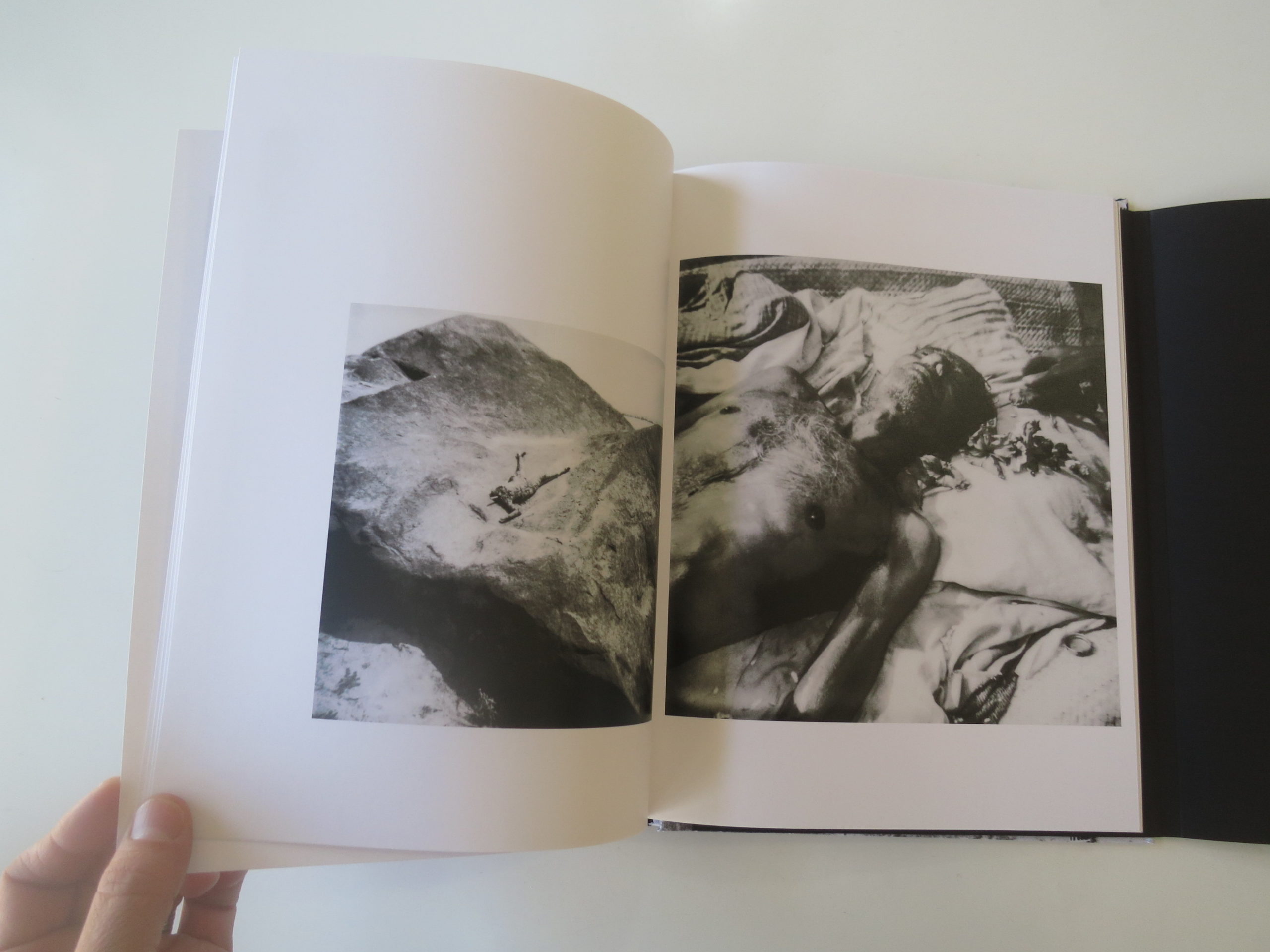
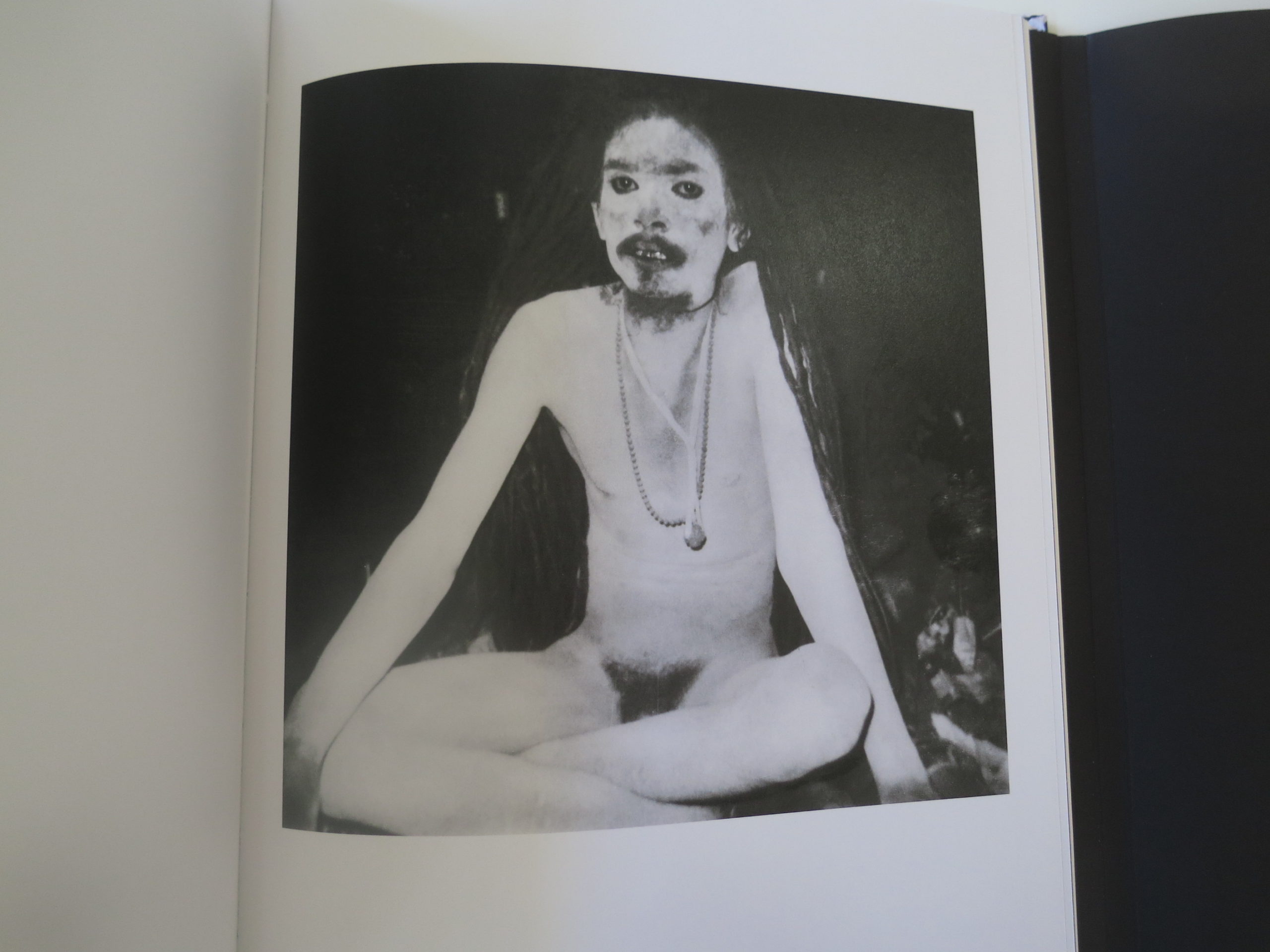
The images are mostly made with instant photographic technology, (hence the sponsor shoutout at the end to the Impossible Project,) and there’s a heavy spate of pictures shot in India. That much is clear.

But not much else is.
Clear.

There are black and white, grainy, often blurry pictures of grandmothers and statues. Cities and oceans. Live people and dead monkeys. And much in-between.

In an opening statement, the artist writes of a desire to connect to primal forces, and I think you can see it. Talismanic objects. Ecstatics in prayer. Odd people from odd angles.

There’s a hint of Diane Arbus and Roger Ballen, for sure, mixed with a tiny dose of any random person’s travel pictures from India. But it’s that final mix, the creative special sauce, that makes this such a cool book.

It feels non-linear in a way that references worm holes and peyote sessions and smoke signals, all at once. Visually, it offers a viewer that feeling that some things will never be revealed, but it’s OK, because our brains are too small and fragile to handle ALL the secrets of the Universe.

Bottom Line: Trippy, dreamy images that hint at deep forces at work, beneath our every-day existence

To Purchase “Push The Sky Away” Go Here: https://www.dewilewis.com/products/push-the-sky-away

If you would like to submit a book to be considered for review, please contact jonathanblaustein@gmail.com.

The Art of the Personal Project: Adam Moran

Personal Projects are crucial in showing potential buyers how you think creatively on your own. I am drawn to personal projects that have an interesting vision or show something I have never seen before. In this revised column, I’ll include a link to each personal project with the artist statement so you can see more of the project. Please note: projects are found and submissions are not accepted.

Today’s artist: Adam Moran

Shaun White, Beyond the Medals

In 2008 I was working for Burton Snowboards as a Team Manager and was approached help manage Shaun White. Shaun had just won gold at the Torino Olympics and was at times labeled the most popular teenager in the world. I knew it would be an interesting job, but also one that would allow me to document what life is like for someone in his shoes. Shaun and I had known each other for a few years, but suddenly we were spending over 5 months a year traveling and working together. Having always been inspired by the lifestyle of the skate and snow scene that Ari Marcopolous shot, and Walter Ioss’s behind the scenes of Michael Jordan, I knew this was a really cool opportunity. I wanted to show moments from  Shaun’s life that were real and honest and different than what might be in the magazines or catalogs at the time.

What made these photos possible and special to me was that there was a huge trust between us, and it was a pre social media world. Myspace existed, but Facebook was only at colleges, and Instagram still far away so whatever we shot never felt rushed or needed to be posted immediately. Shaun could always see what I shot, and he liked that someone was there to shoot all the fun and behind the scenes moments. We never shot with the goal of getting likes, it was just to document, and we laughed a lot along the way.  I quickly learned that everything needed to be shot on small cameras like a Leica, or point and shoots as to not create a scene around a celebrity. That also that allowed me to sneak in moments that people weren’t realizing.   The goal was to shoot what was real, and never make it feel like a photoshoot. At times we created moments, but it was always out of fun.

It was a crazy time for Shaun, he went from being a 19 year old famous in action sports, to a globally recognized celebrity everywhere we went. I saw the ups and down sides of fame, but also got to be a fly on the wall documenting it with no specific end goal. We spent a little over 3 years together, traveling the world non stop, and many of these shots just piled up as we went along. I was there at events, press conferences,  photo shoots, test driving cars, buying houses, etc, all the time snapping away. Not until recently did I go back through the archives and pull this all together to find some of my favorites.  As I look back, it was an experience worthy of two lifetimes, and I’m glad there was no Facebook or Instagram around to have felt compelled to post on.

To see the full gallery on my website click here.
http://www.adammoran.com/2918577-beyond-the-medals-shaun-white#0

—————

APE contributor Suzanne Sease currently works as a consultant for photographers and illustrators around the world. She has been involved in the photography and illustration industry since the mid 80s. After establishing the art buying department at The Martin Agency, then working for Kaplan-Thaler, Capital One, Best Buy and numerous smaller agencies and companies, she decided to be a consultant in 1999. She has a new Twitter feed with helpful marketing information because she believes that marketing should be driven by brand and not by specialty. Follow her at @SuzanneSease.