The Daily Promo – Apostrophe Reps: Kelly Montez

Apostrophe Reps

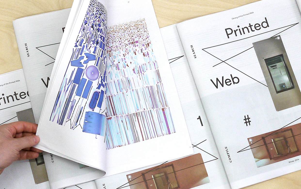
Who printed it?
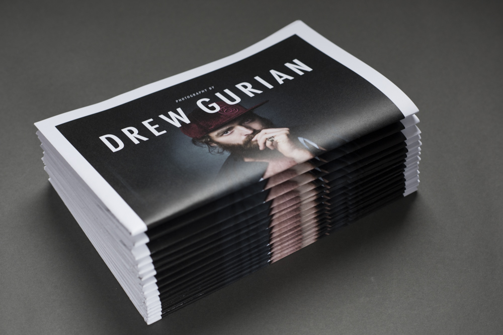
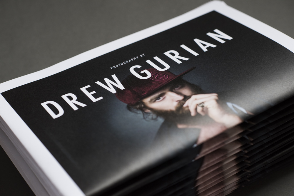
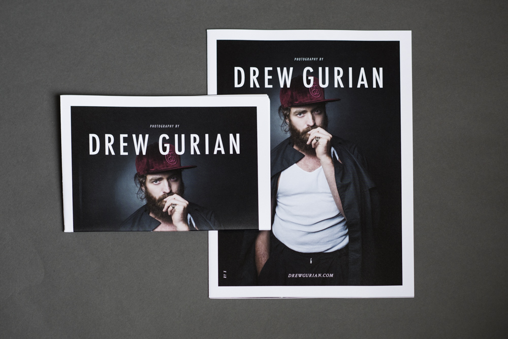
Serbin Communications printed the piece. They are the machine behind AtEdge, and by partnering with them on the printing we were able to access their press in China who does beautiful four-color printing, something that is quite difficult to find these days as most presses are now digital.

Who designed it?
We collaborated with Todd Richards at TAR Design Studio in San Francisco. He has been managing Apostrophe’s design identity for close to 15 years now. In addition to showcasing new images from our artists, we were also debuting our new logo. We worked with Todd on our visual rebranding as well.

The foil stamping is beautiful, what make you choose that tone?
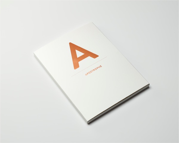
This piece was not only a beautiful promotion of our roster akin to the one we did in 2014, it also marked our 15th anniversary as an agency. Our signature color is a very bright fuchsia, and we thought the rose gold was a nod to the past while also celebrating our future.

Who edited the images?
Did the agents choose the images to be edited or did your photographers submit?

Our agents worked closely with each photographer to select images that best represented them. We wanted to strike the right balance of practical and aspirational, so some of the work is commissioned and some is purely personal. In terms of the final edits and layouts, it was a collaboration between the artist, Apostrophe and the designer.For some artists, we selected an image, and then the designer worked up a few layout versions for us to react to.

Did each artist get the same amount of images?
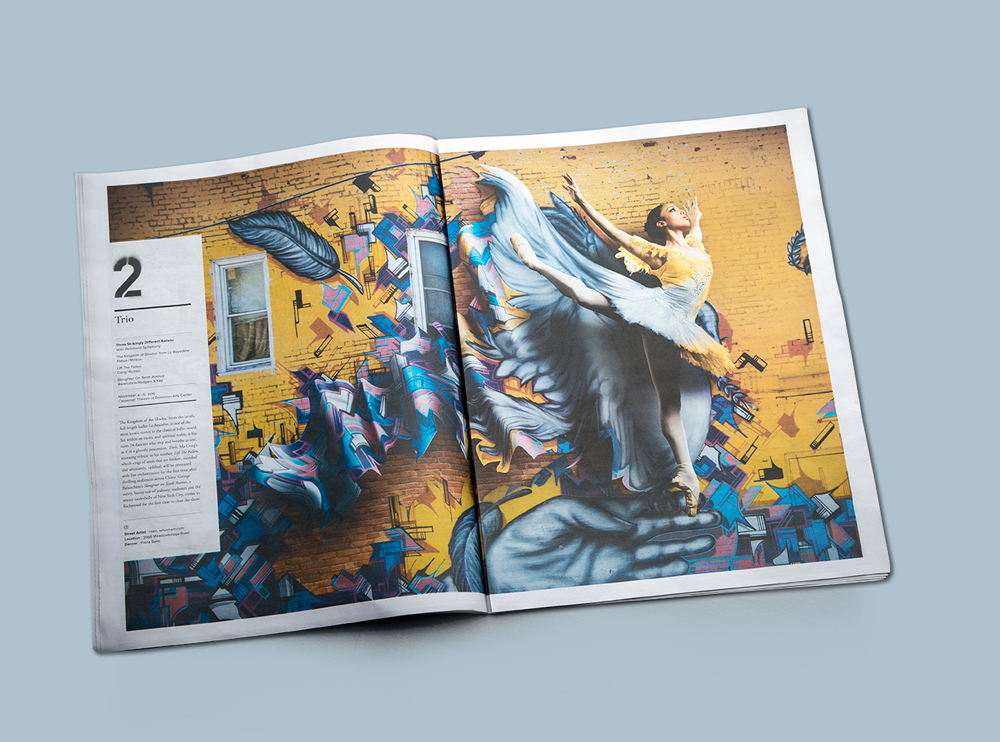
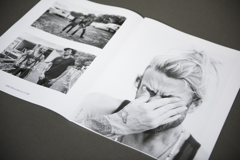
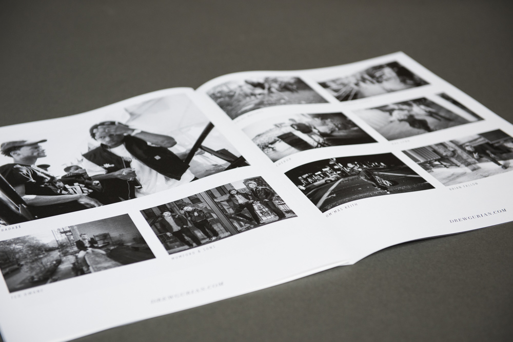
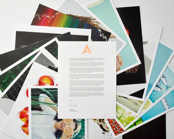
Each artist has the same amount of real estate, meaning the same number of pages. However, depending on the number of images we wanted to showcase for an artist, we changed how we utilized the space available. Their layouts go hand in hand with their work: Some have more of a storytelling style and as such chose to feature a grid of images on a page; while other are very graphic and therefore went with a single image full bleed. We wanted a consistent style throughout that also allowed each artist to find small variations and make it their own.
Each page was perforated so that clients could pick out their favorite images and put them on their walls or frame or file them.

How many did you make?
We printed 2,500 copies, so it was somewhat of a limited run. We never want to just send something out to the masses, we try our best to promote with intent. Developing the mailing list for this promo has been an intense process as we have tried to go through and verify each name. Of course the mailer went out to prospective clients with whom we are eager to develop relationships, but we also sent it to many of our close contacts in hopes that they would celebrate our anniversary with us and enjoy the artwork.

How many times a year do you send out promos?
A piece like this is certainly more of an investment, in time and money. So we send  them out every other year, which makes each one feel more precious as well.Developing this promo, creating the final edits, printing and shipping took well over a year as we were thoughtful about both the design and the content that went into it. We wanted clients to feel like they were receiving a gift when they opened it. We wanted them to experience an evolution of our brand and get excited for the next 15. Aside from this promo, we print a smaller version with one single image per photographer about 2-3 times a year.

Letter From Kelly:

My first experience with Apostrophe was as a client. It was the middle of the dot-com boom (the first one), and I was working as an account manager in advertising. Business was good, but it wasn’t, shall we say, fulfilling. Then, with one assignment, everything in my life started to change.

Knowing I was fascinated by photography, my over-burdened manager passed me a project that allowed me to work closely with one of Apostrophe’s photographers. As I’d hoped, the job connected me back with my artistic self and challenged me as a creative person. What I couldn’t have predicted was how well I would click with Apostrophe’s owner at that time, Jonathan, and what that would lead to.

We stayed in touch and two years later, he casually mentioned a desire to open a west coast office. He had just signed an amazing California-based photographer, fresh out of art school – Dwight Eschliman, I met the two of them for dinner, we drank too much wine, had great conversation, and the rest is history. When Jonathan came back to “train” me a few months later, we drove all over California, portfolios in tow, visited a bunch of clients and smoked a ton of pot – those were fun times.

Almost immediately, I could feel that things in the business were changing and we would need to get serious. Digital cameras had taken over, and the number of photographers and competition grew. The hustle was getting tougher—I loved it. It was exciting to be in such a dynamic industry. I leaned in and moved to New York to take over the company. With my sun-shiny Californian attitude and optimism I thought, “How hard could this be?” Answer: Hard

The recession hit and choices had to be made. I promised myself at that time that I would do what I thought was right and focus on the best talent. Not just people who could shoot amazing pictures, but people who were also passionate about this industry, saw opportunities in change, and were good souls. Individuals whose businesses you wanted to fight for and whose lives you wanted to see grow. I believed then, and still believe today, that you can have a successful business based on artistry, ethics, and integrity.

As it turns out, I was right. But I didn’t do it alone. Over the years, I’ve met some amazing people and have grown an incredible team. My co-workers are among my closest friends and together we’ve found rare and wonderful individuals who are also amazing artists. We feel blessed to be making art everyday and we know that none of this would be possible if it weren’t for our clients, who trust in us to bring their ideas to life.

So I want to take this opportunity to say thank you for joining us on this amazing journey. Thank you for supporting our artists, our vision, and most of all for supporting the idea that teamwork and passion are the key ingredients of the most successful and stunning projects. Your trust in us – and in the creativity of our artists – is the thing I’m most proud of at this 15-year mark.


As Always,
Kelly Montez

Owner, Apostrophe
www.apostrophereps.com


This Week in Photography Books: Michael Lesy


Remember John Woo?

He’s a Hong Kong filmmaker best-known for his gangster movies, which often featured a young, insanely charismatic Chow Yun Fat.

“Bullet in the Head” and “Hardboiled” had a huge influence on American filmmakers, which continues to this day. The balletic use of gunmanship in “John Wick,” (and presumably “John Wick 2,”) are direct descendants of his Gun Fu techniques.

Frankly, if you’ve EVER seen a protagonist leaping sideways while shooting guns in each hand, you’ve seen vestiges of John Woo.

So I was shocked, and also pleasantly surprised, to know he had a career re-invention in the aughts, once he left Hollywood for China. He came over here in the late 90’s, and if I tell you that his two best films featured a post-Pulp Fiction-successful-and-therefore-neither-ironic-nor-charming John Travolta, that’s probably enough information.

Back East, as it were, in the run-up to the Great Recession, (almost on its eve,) John Woo dropped a massive, historical-kung-fu-action-war drama called “Red Cliff,” which was released as a 2+ hour movie in the West, and a 2 part, 4+ hour epic in Asia.

It was as if he took a large Hollywood budget, and instead of going futuristic and alien, like “Star Wars,” or “Avatar,” instead chose to retell a particular battle from China’s endless history of war and dynastic succession.

The story, which is set in the 3rd Century AD, (when China already had 55,000,000 people,) follows a North-South Civil War in which northern aggressors, behind the Prime Minister Cao Cao, try to invade the South to unite an empire.

The opposing side, an alliance between Sun Quan and Liu Bei, together still possesses far less troops and weaponry. SPOILER ALERT, the smaller forces prevail, due to some strategic wizardry on the part of its leaders, and the propitious use of weather prognostication.

One of the good guys, Zhuge Liang, is a master of strategy, who also possesses high-level battle-observational skills. He’s depicted, at one point, discerning the size and tactical spread of oncoming calvary, simply by listening to the pattern of hoof-print-sounds on the ground.

That this key part, a man of almost mystical ability, was played by a Japanese actor, the heartthrob and singer, Takeshi Kaneshiro, was particularly surprising to me.

Because the Japanese are almost always the bad guys in Chinese action movies. Their history of Chinese repression, and imperial aggression, in the 19th and 20th Centuries, makes them sworn enemy number 1.

The English are number 2 on the list, due to their colonial violence, which resulted in multiple wars, and the annexation of Hong Kong.

We Americans are pretty lucky, from what I can tell. We never stole any Chinese turf, nor murdered its citizens. Conversely, we gave them Capitalism and let them into the WTO, thereby helping to bring hundreds of millions of people out of poverty.

So hopefully our future Chinese overlords will treat us better than other Westerners? (Fingers crossed.)

Wait, where was I?

Right. “Red Cliff” was pretty badass, and proved John Woo has mastered another genre of cinema. Kudos to him.

Big shout out to my man Tony Leung, too, because he brought the necessary acting chops to make it seem more like an art film than an action flick.

These guys spent tens of millions of dollars, (if not a hundred,) to recreate the past for the viewing pleasure of a global audience. They re-animated and re-interpreted history, for our entertainment.

We yearn for such things.

Because as long as there have been cameras, and before that sketchpads, people have wanted to see what other places look like. Other people. Different colors. Different foods.

I’ve said before photography allows us to travel in time. I’m very lucky, (and forgive me if I don’t say that enough,) to get to see exhibitions, read books, and look at pictures online, as a job. Because of my employment, I share the best of what I see with you, each week.

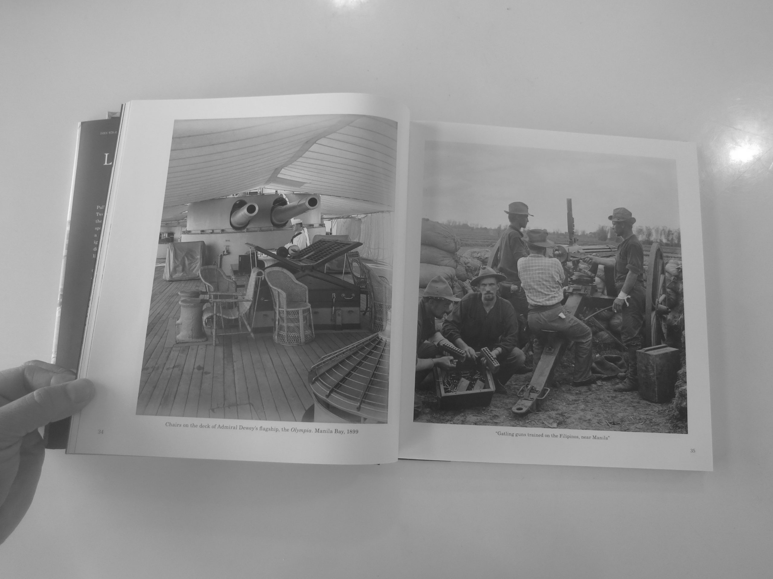
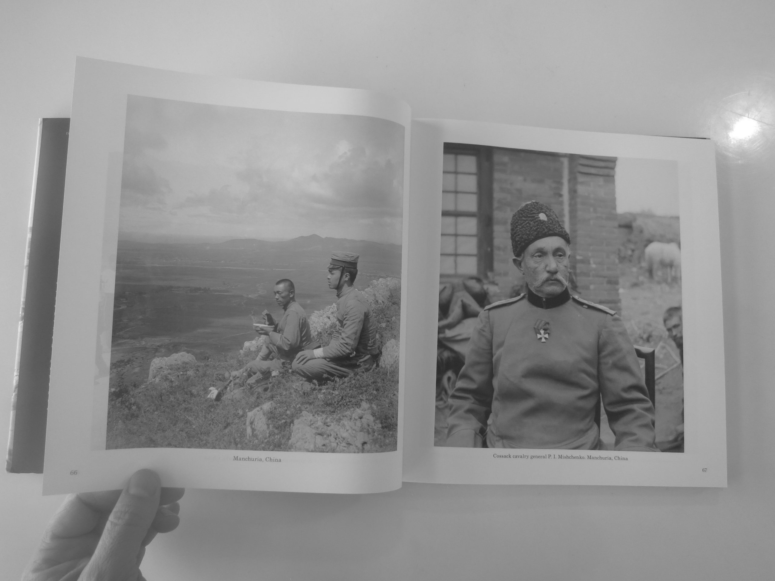
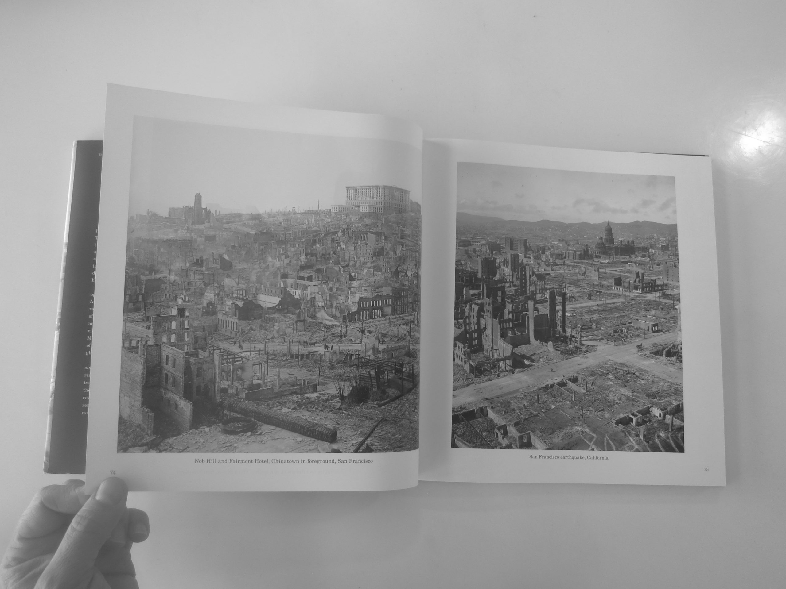
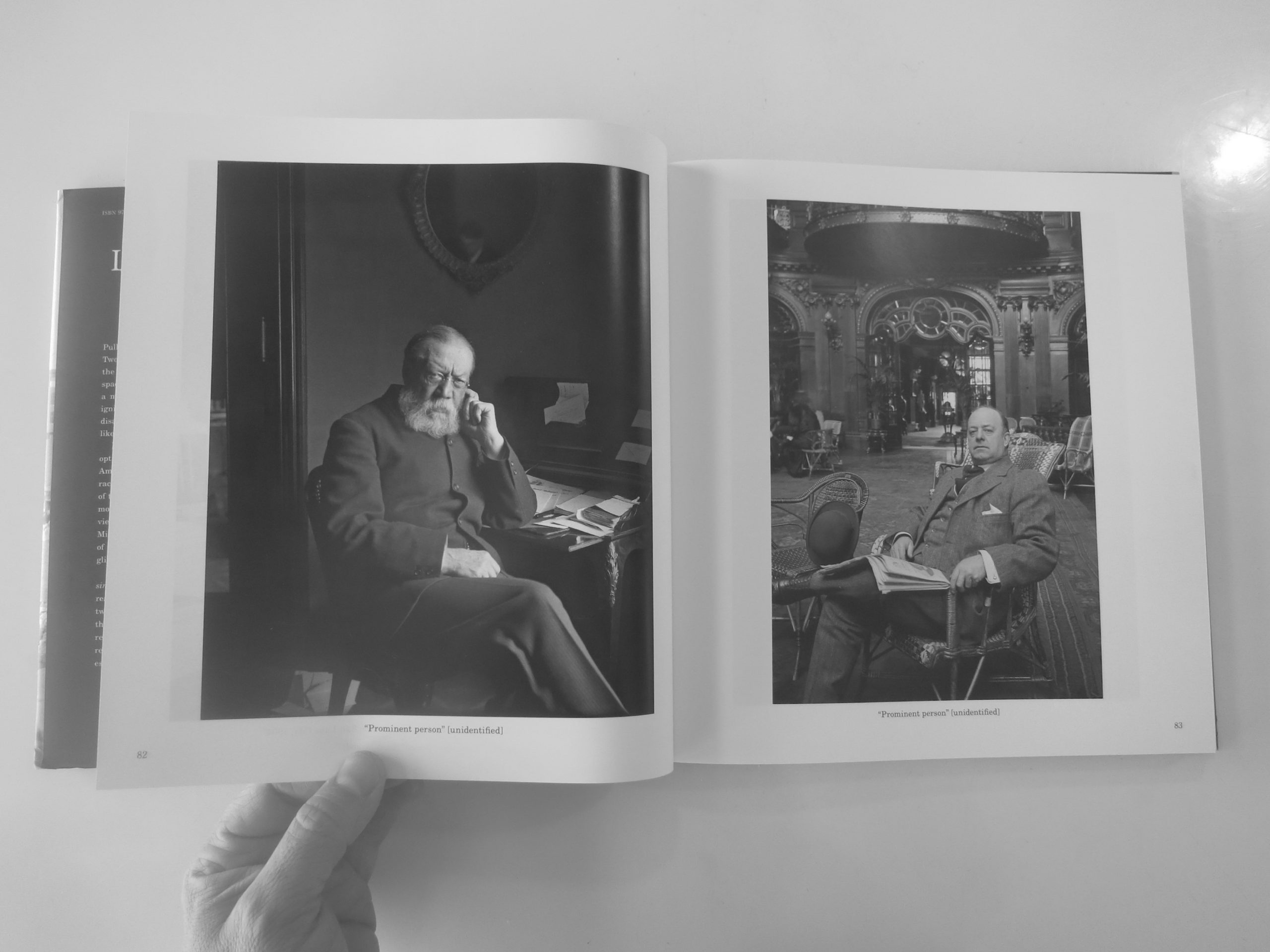
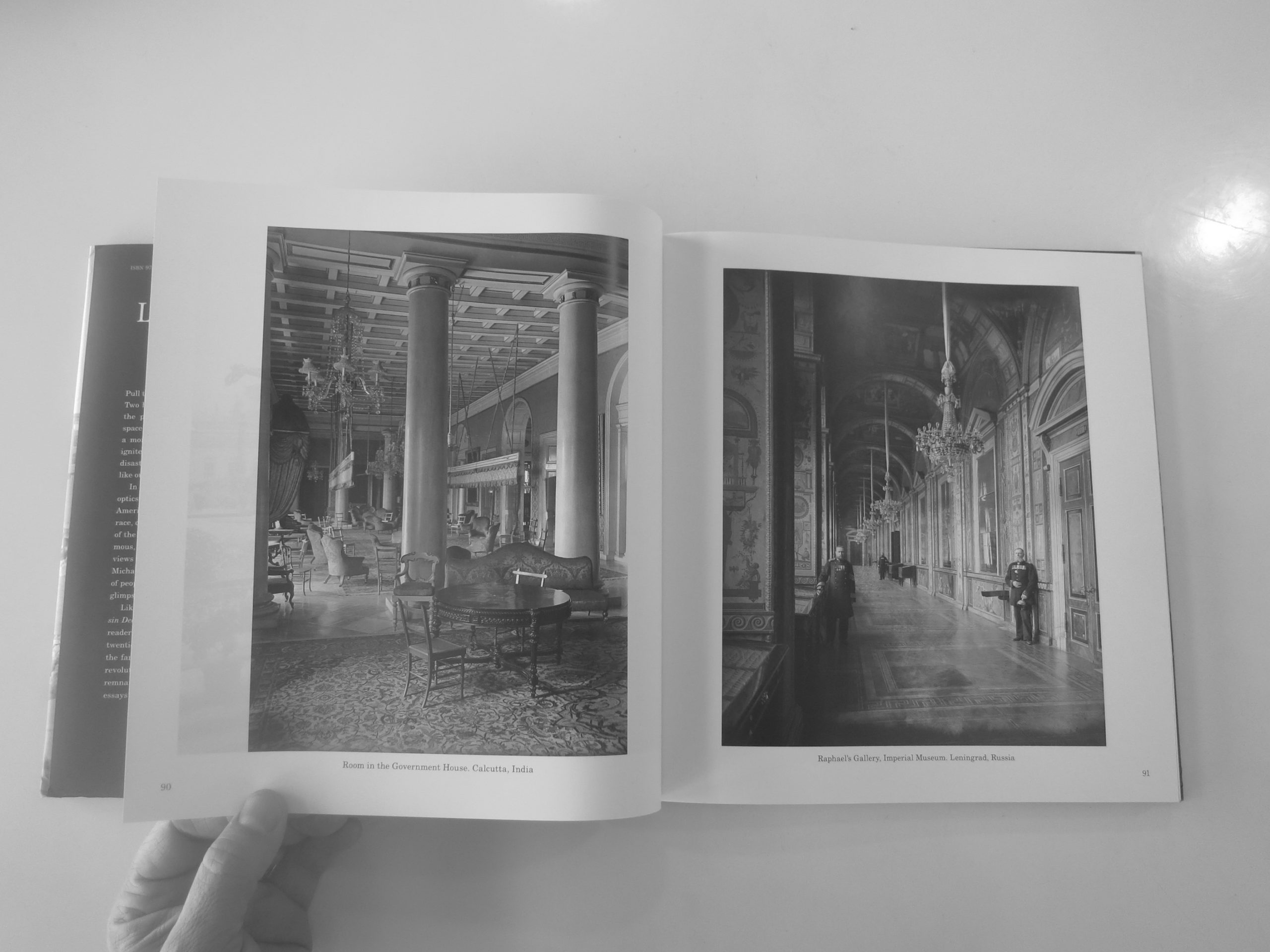
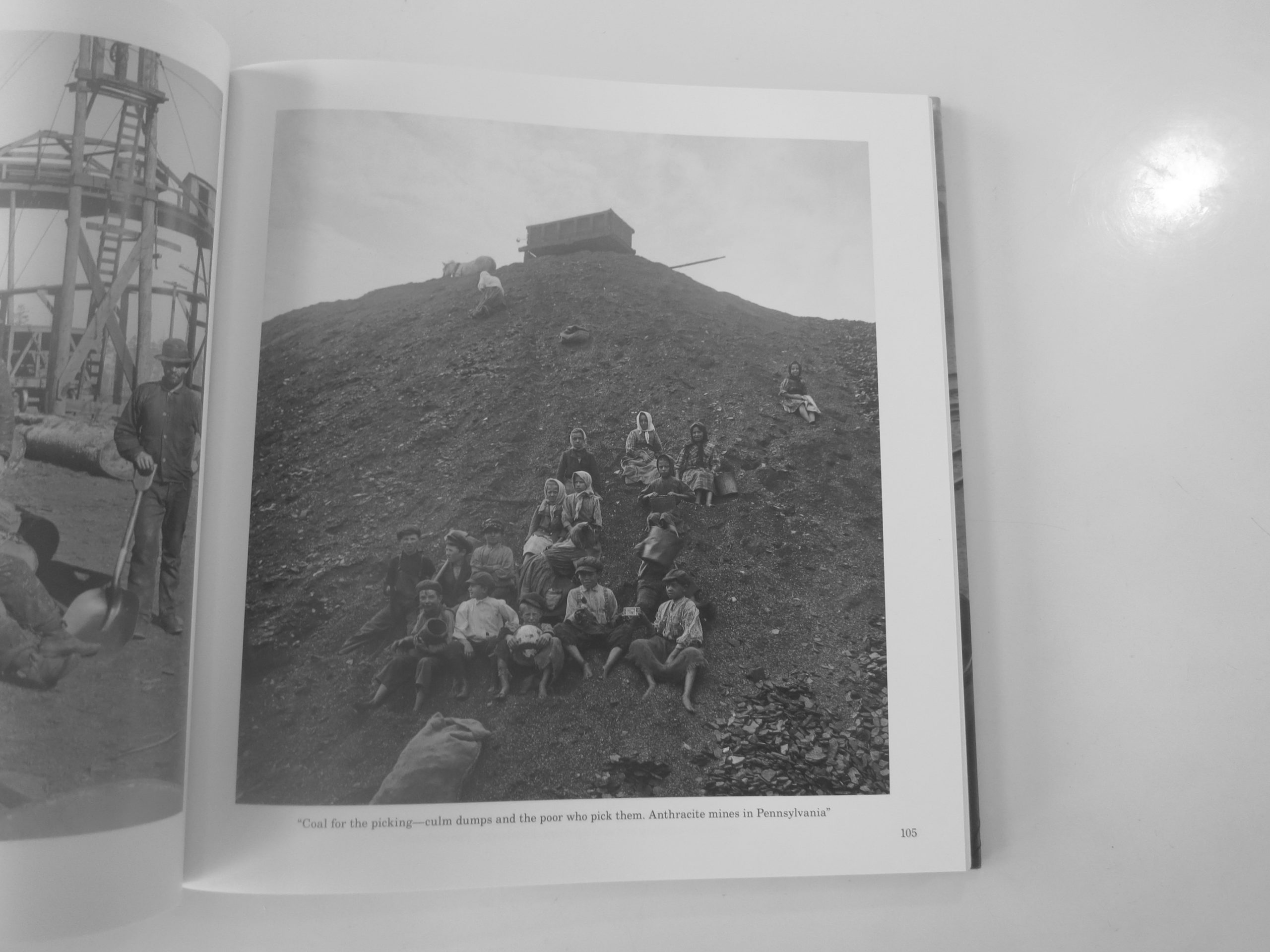
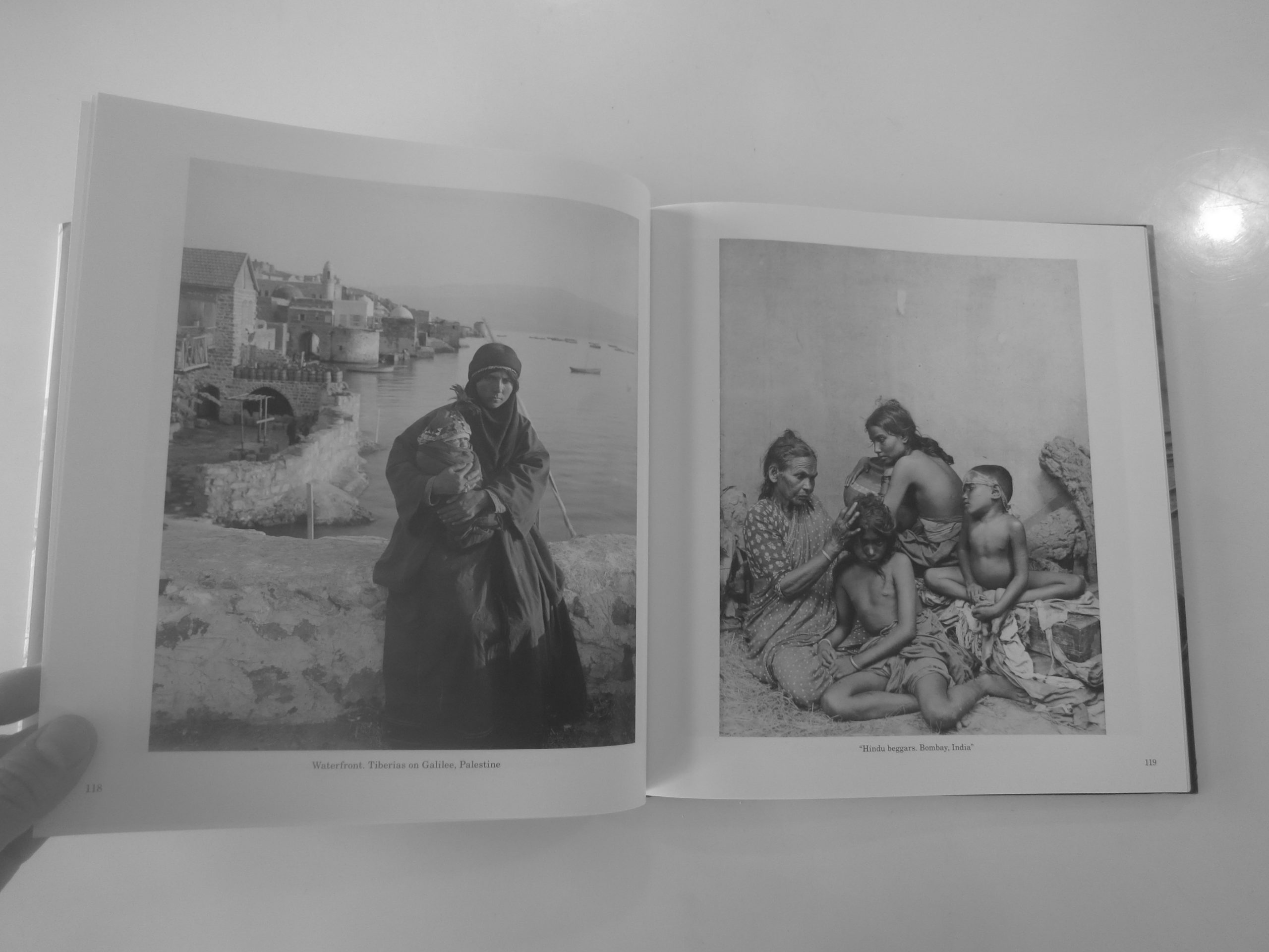
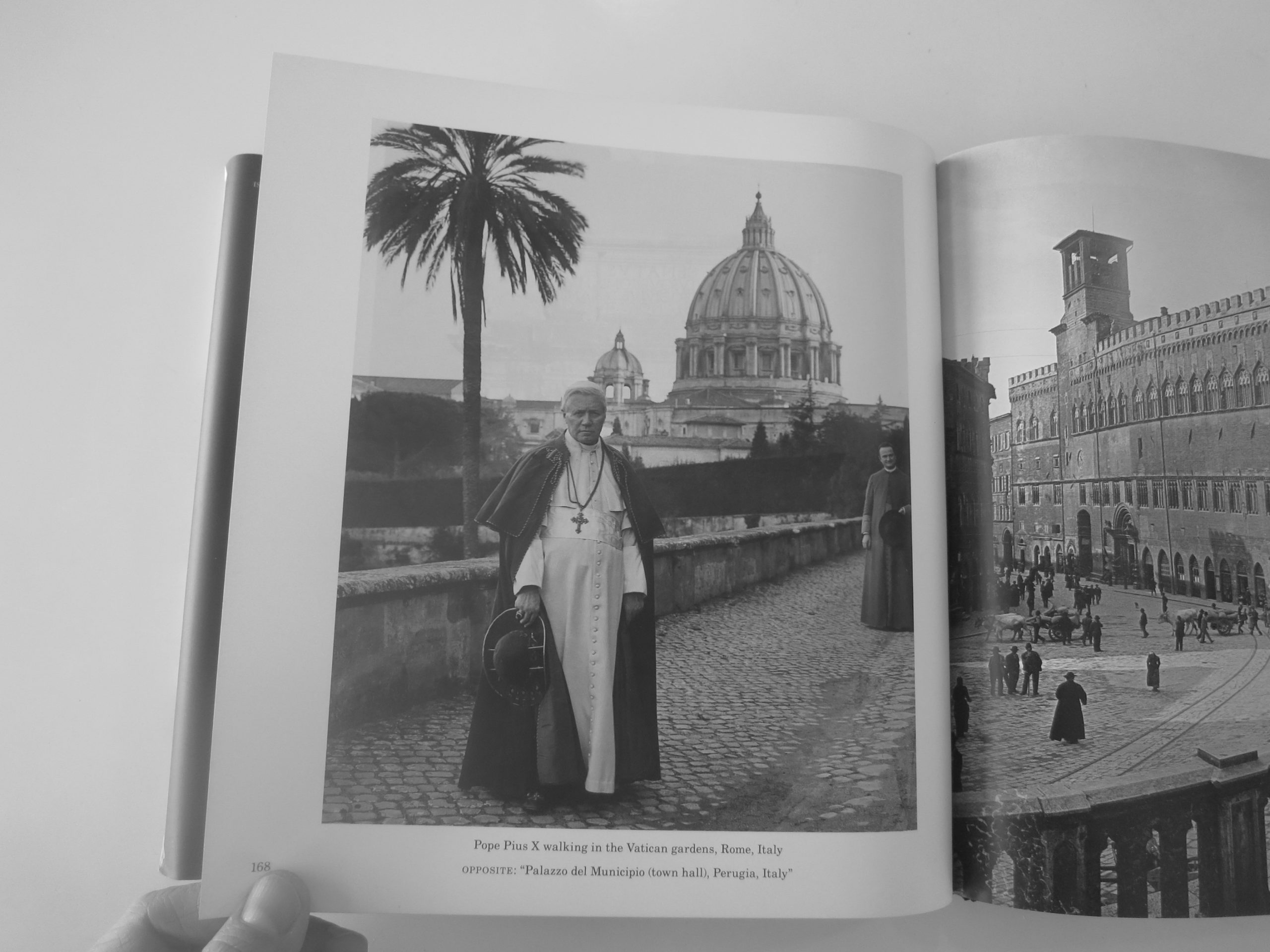
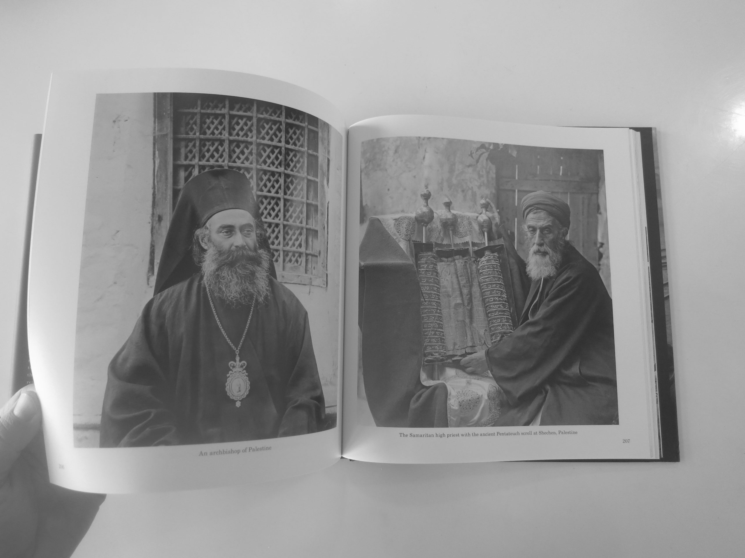
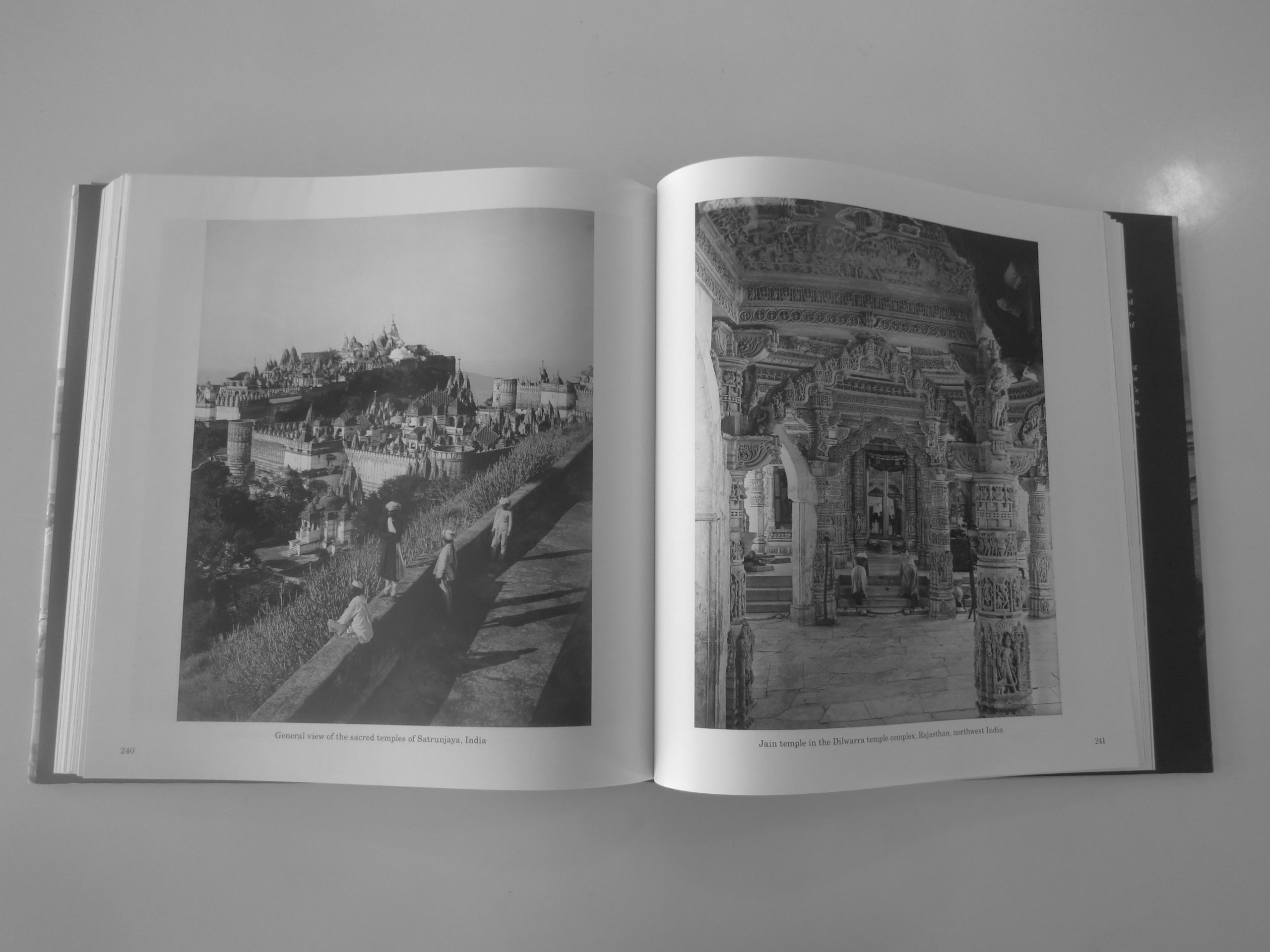
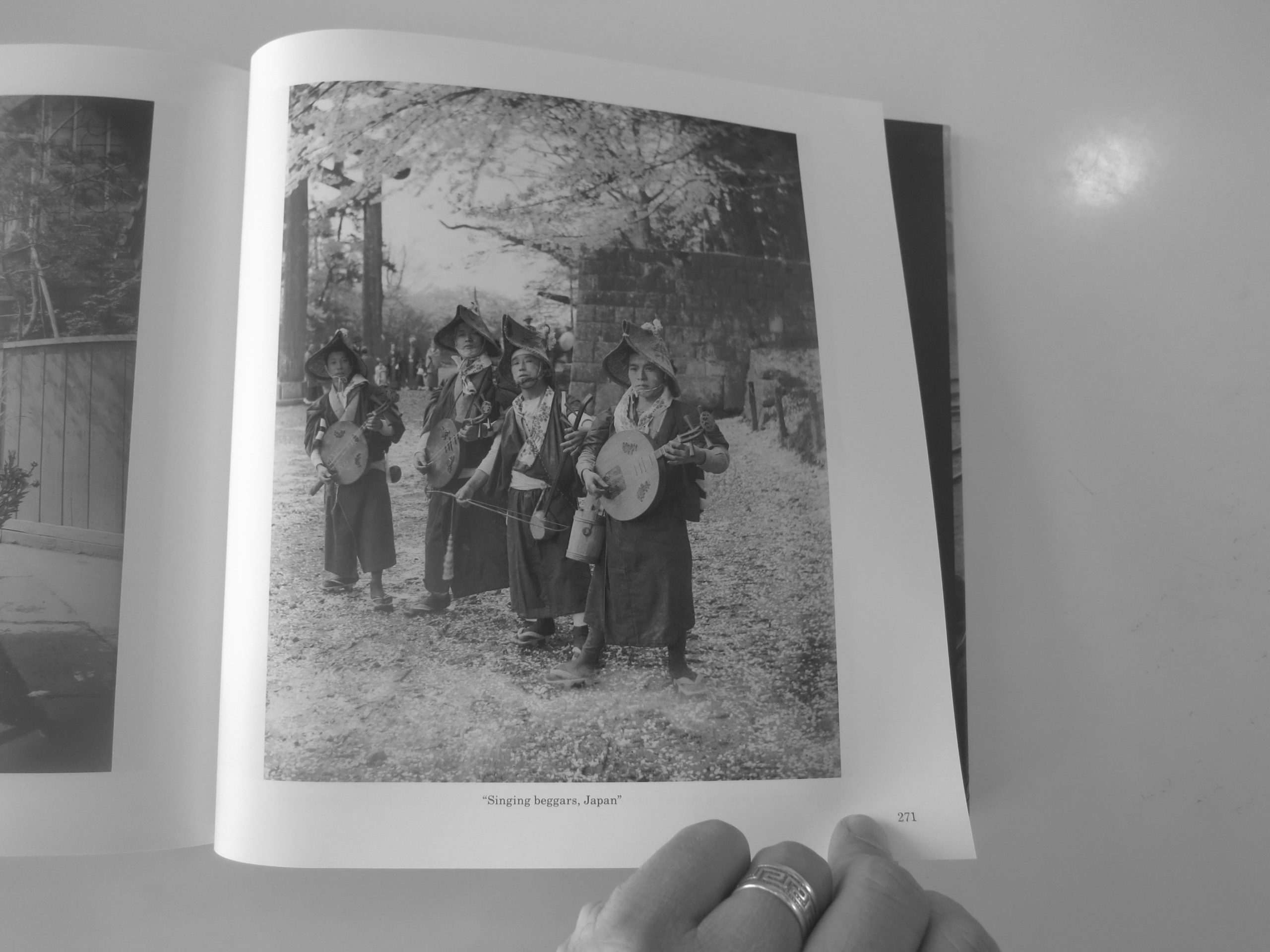
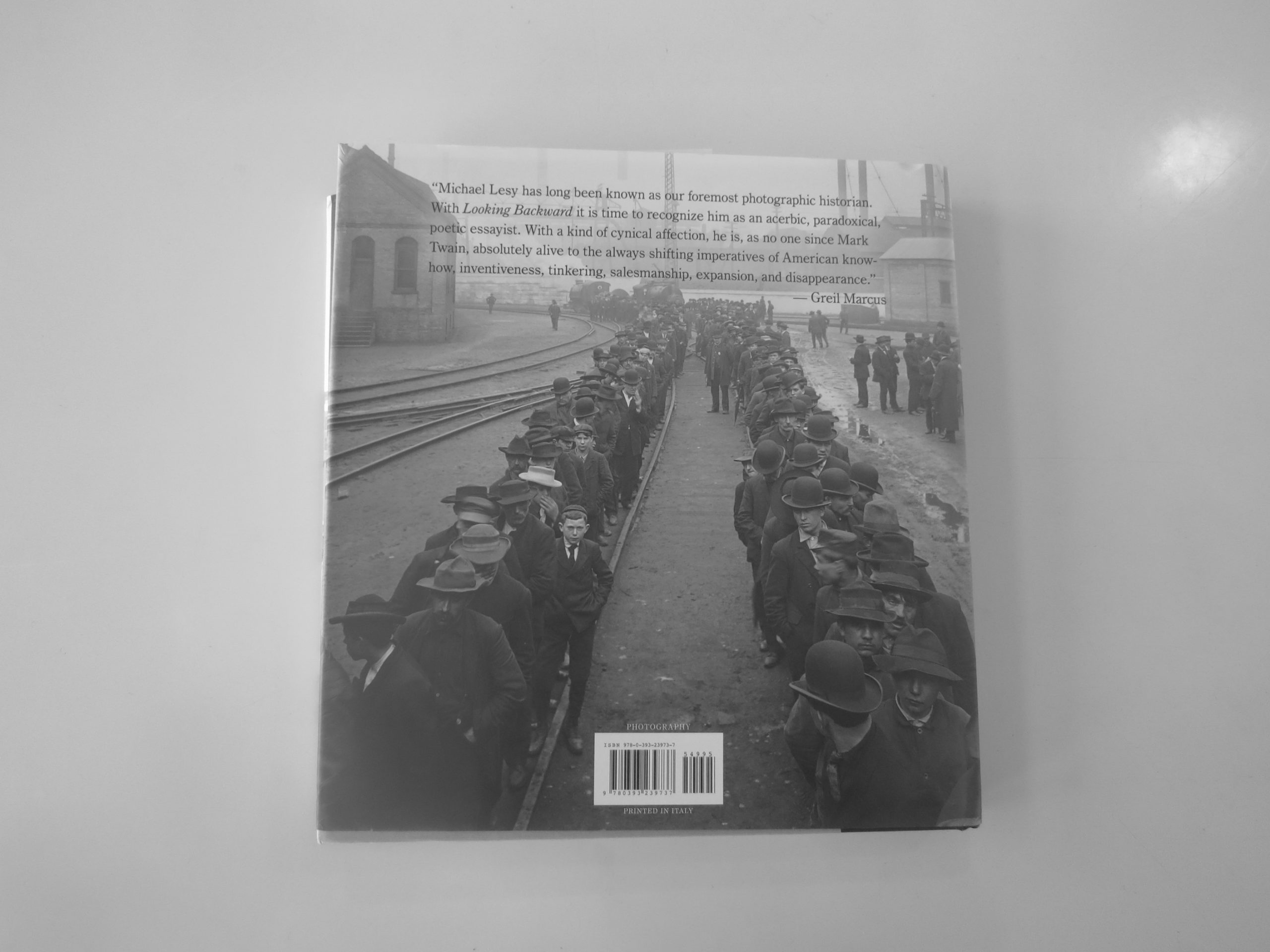
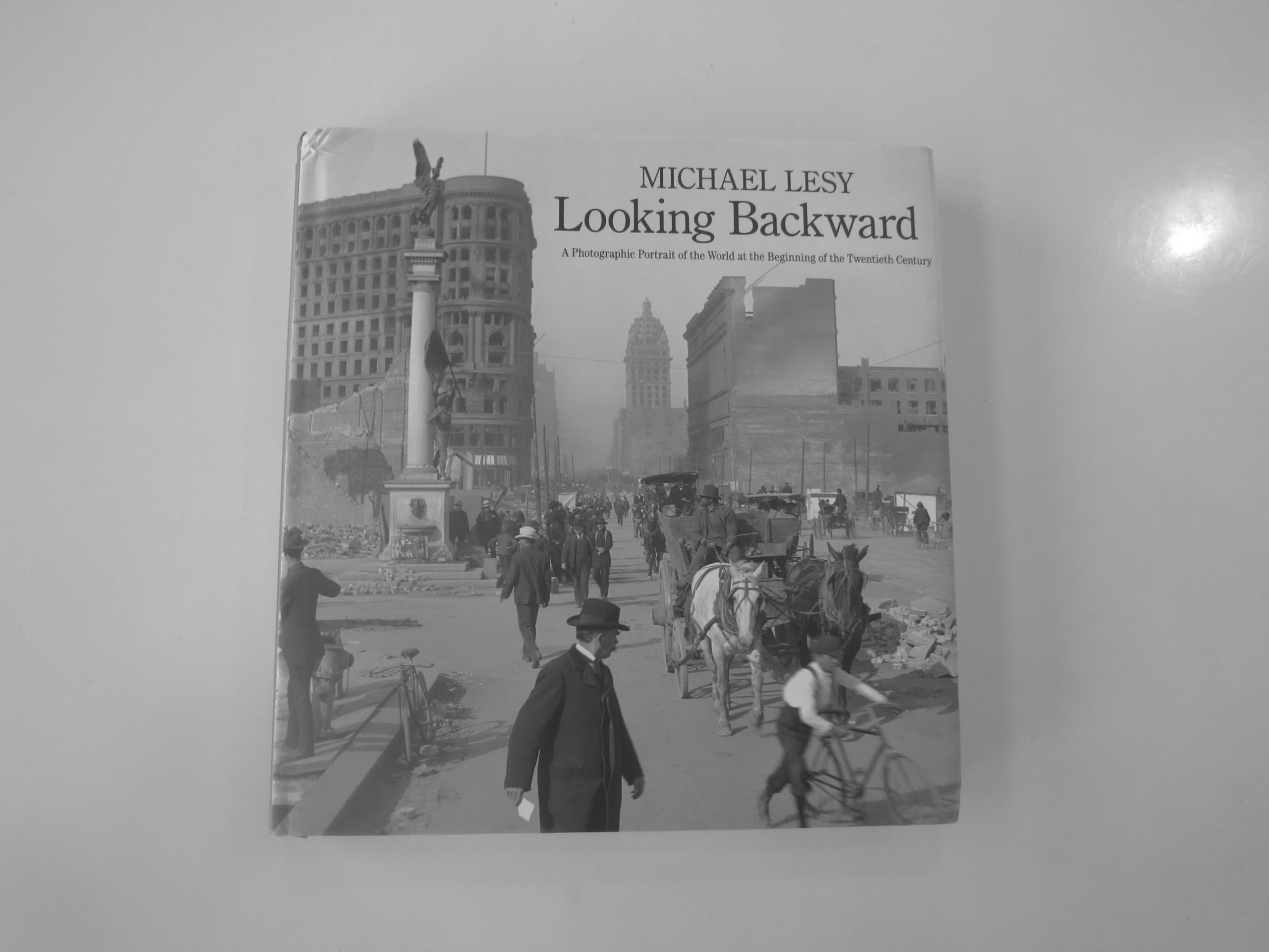
“Looking Backward: A Photographic Portrait of the World at the Beginning of the Twentieth Century,” a new book by Michael Lesy, recently published by WW Norton, definitely qualifies as something excellent to share.

It’s a fantastic book, actually, and fits in perfectly with the theme of historical work that we’ve been on for the last couple of months. (Have you noticed?)

Mr. Lesy makes a similar statement, in one of his well-written essays within, that photographs allow us to travel through time. And he should know.

He spent months combing through a massive archive of stereographs at the California Museum of Photography at Riverside. The Keystone-Mast Collection contains the entire remains of the two biggest stereograph companies of the late 19th and early 20th Centuries.

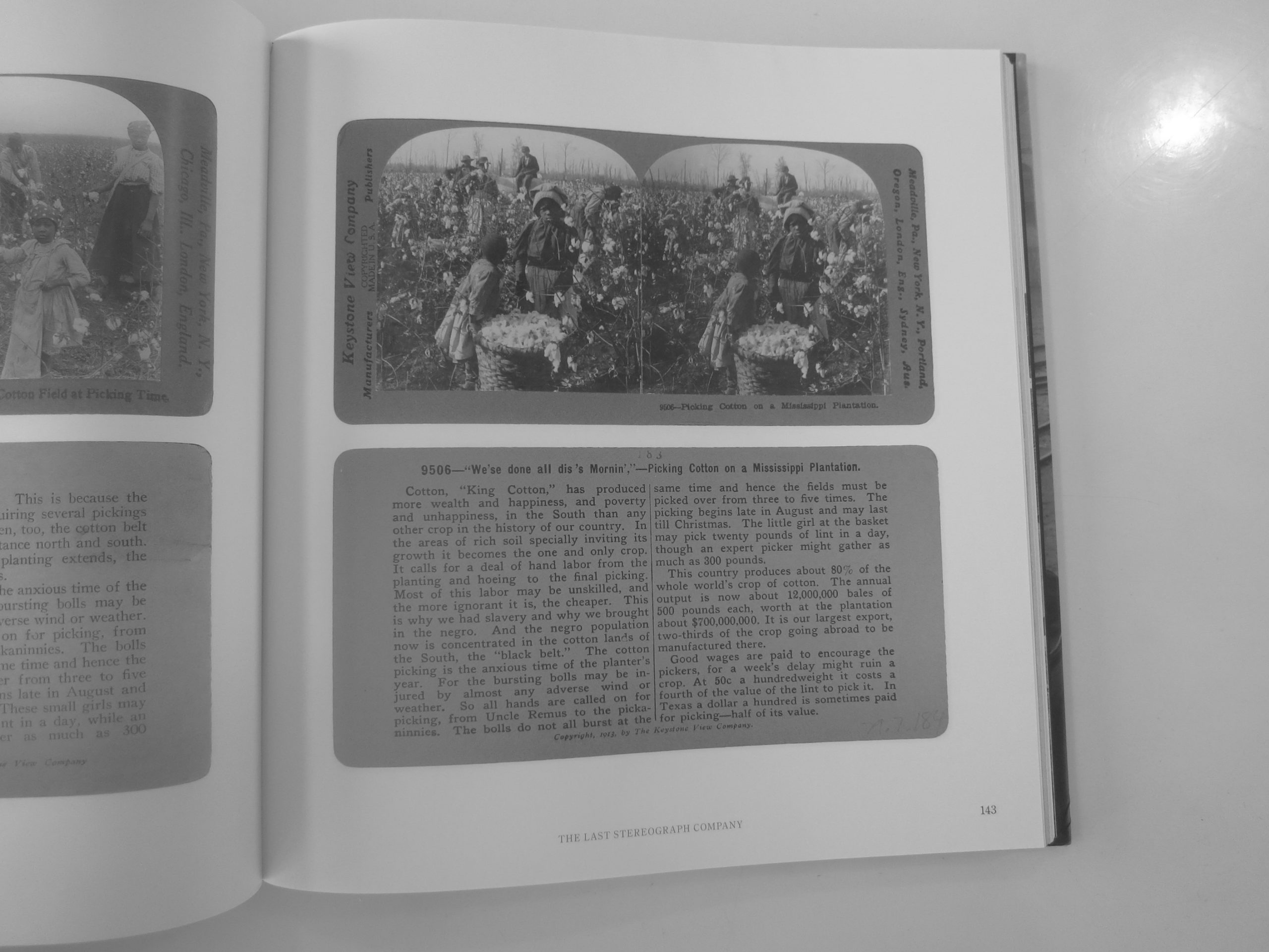
The essays educate us about the practice, of which I was unaware, in which stereoscopic images were packaged with text, and the mechanical means to turn them into 3 dimensional images that would appear before the eye.

An entire section of Keystone’s business was designed to sell to schools, so these pictures were the backbone of the American educational system for decades. (Before AV clubs.)

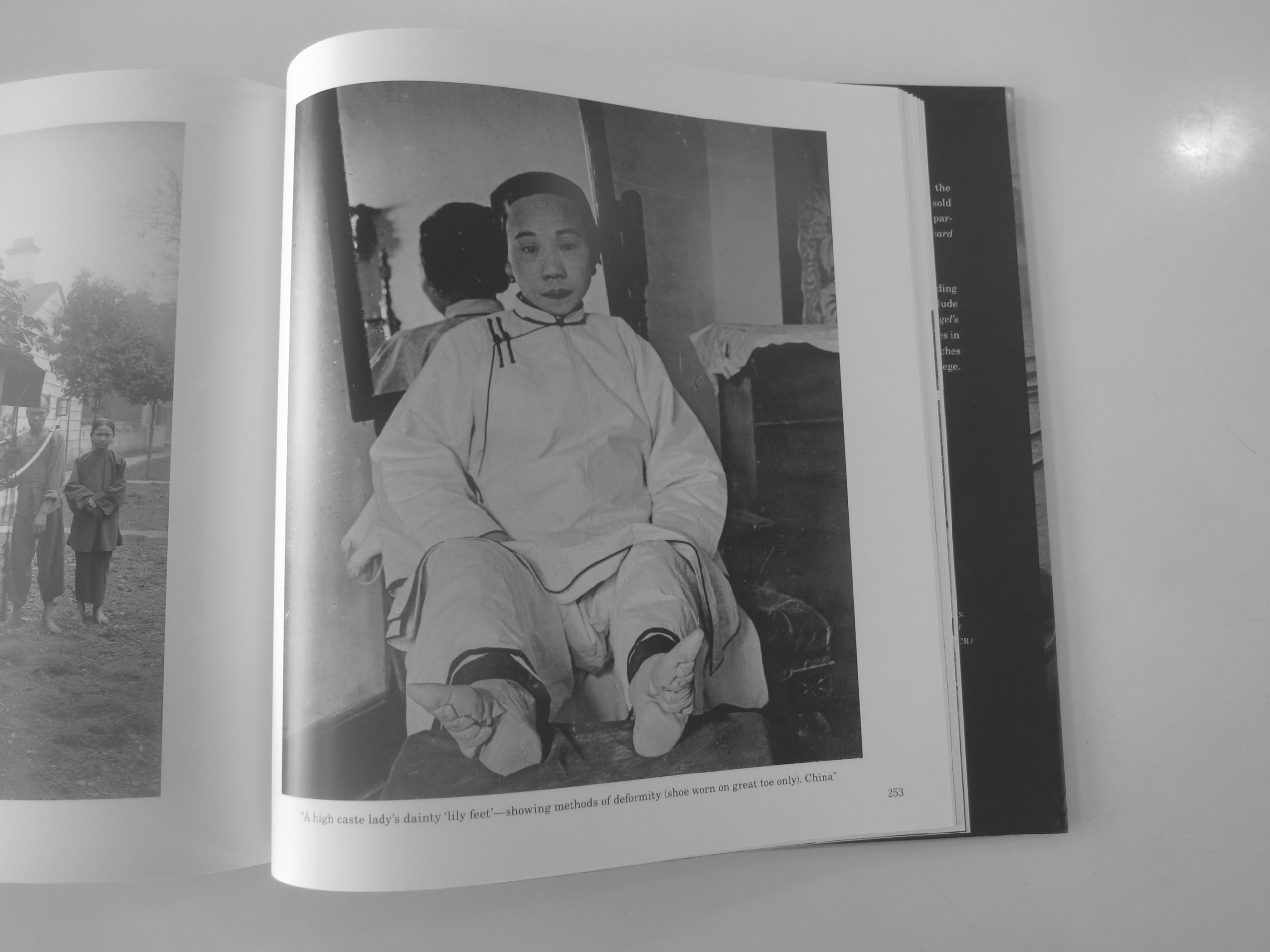
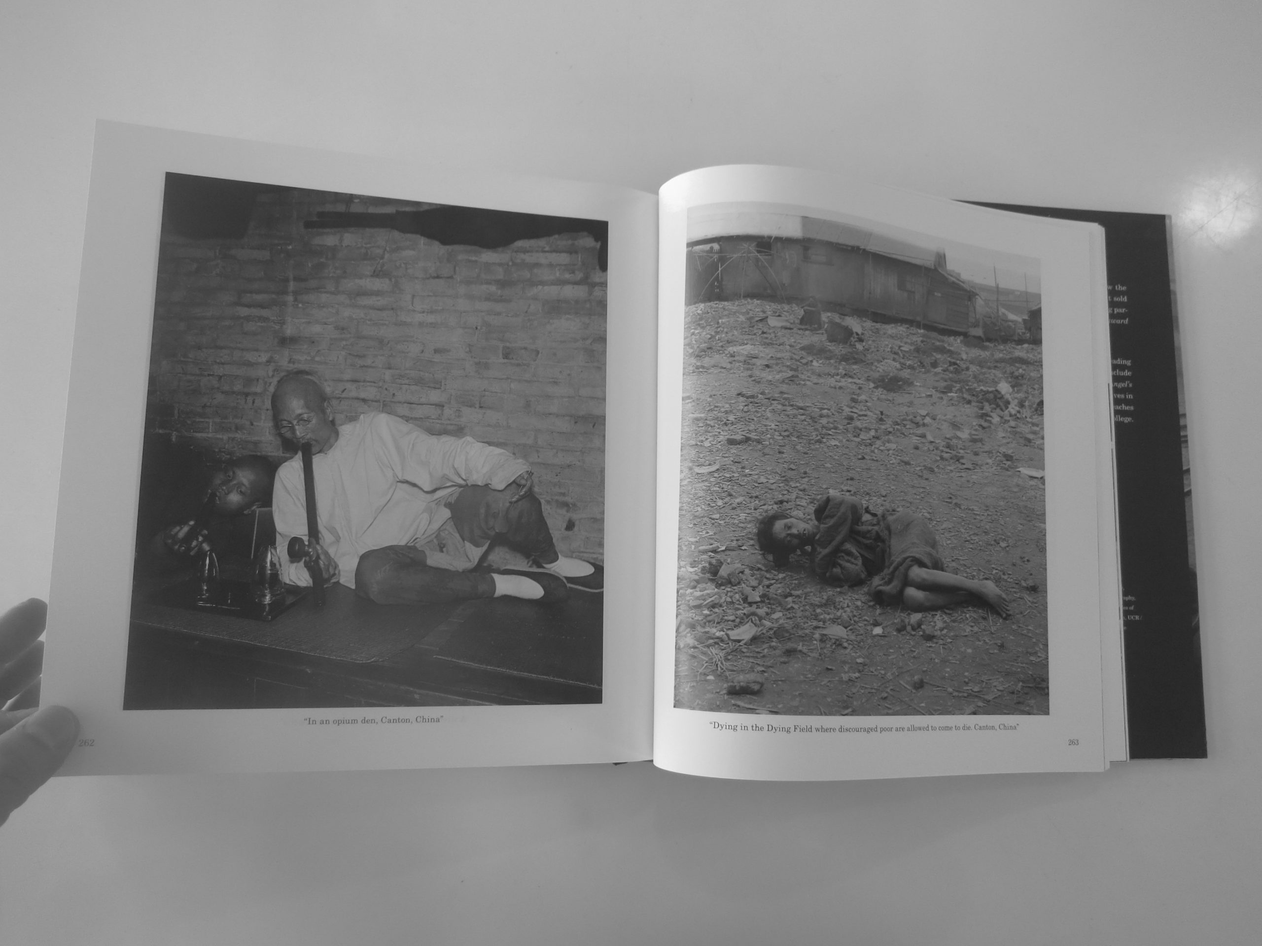
From today’s perspective, large parts of the content are racist. African-Americans are denigrated. The Chinese are savaged. Japanese culture, in contrast, is treated with respect bordering on veneration.

Mr. Lesy culled from 300,000 images to choose the selections in this book, which are broken down thematically, with sections of engaging writing in between.

The book focuses on 1900-10, the beginning of a new, dynamic century that felt like a different age entirely. (Sound familiar?) The writing makes explicit contemporary references to climate change, and treats the offending texts with proper context and condemnation.

Like the stereographs from which they originate, these pictures allow us the same vicarious thrill that the original buyers experienced. Except we get to step back in time as well!

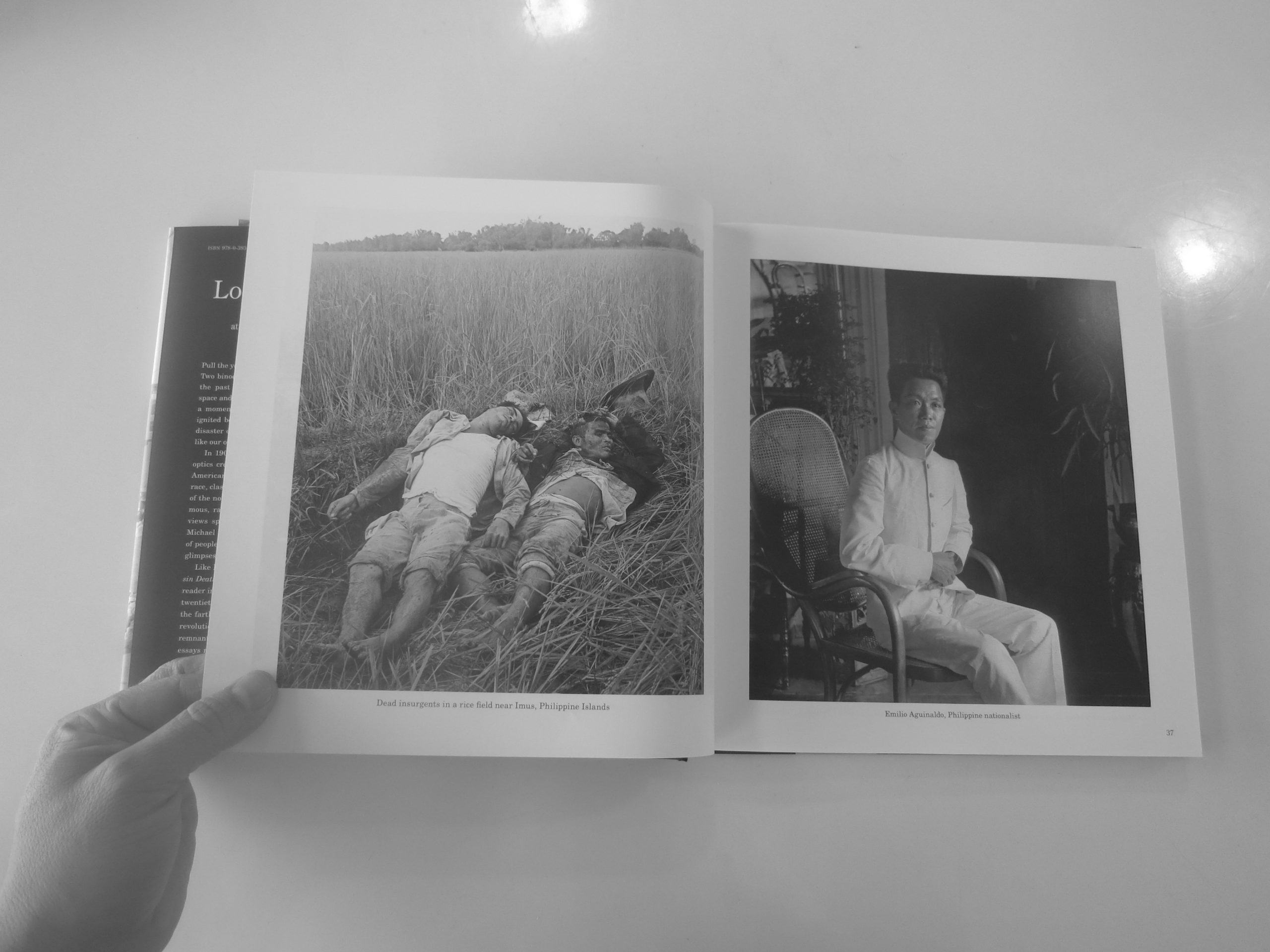
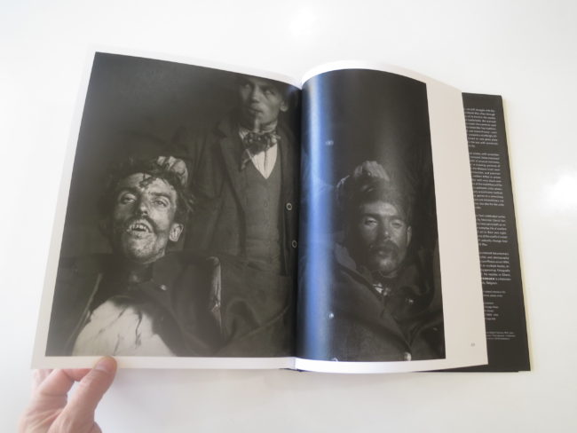
Look at those dead Filipino rebels. (Staged, apparently.) Who were they fighting?

Us.

Why?
Because we were occupying their country.

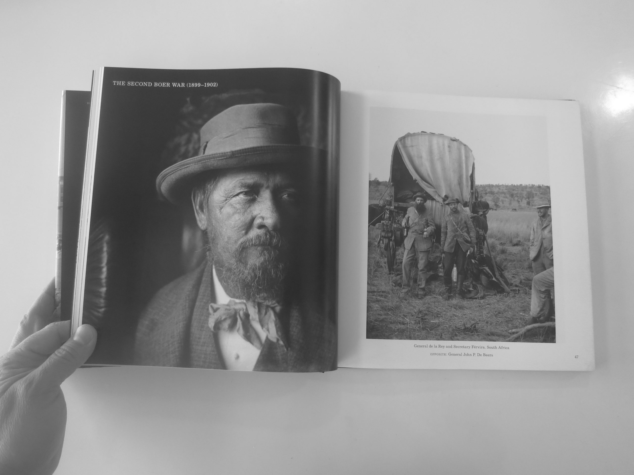
The company’s network was vast, in both distribution and hiring photographers, so we see pictures from almost every continent. (No Australia or Antarctica that I noticed.)

There are cities. And battlefields. Aristocrats. And architecture. South Africa. Peking. London. You name it.

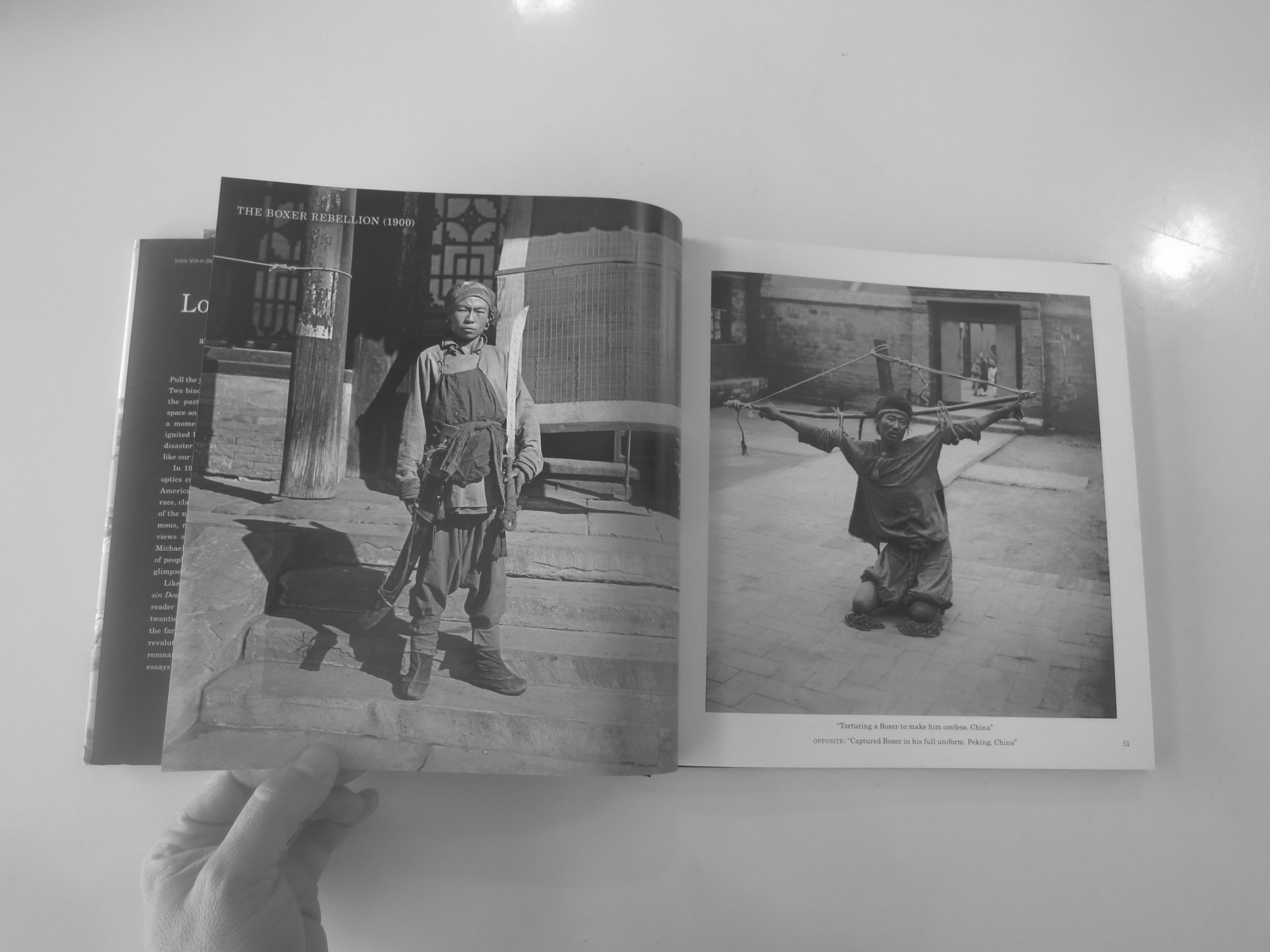
The wars were plentiful, and there is a fair bit about the Chinese rising up in the Boxer Rebellion, to battle the outside forces that were picking over her weakened carcass. There are pictures of that era in Beijing, (then Peking), including a beheading.

The Chinese are described as dirty, dishonest, and craven.

The Japanese, in conjunction with the biases shown by the photographer James Ricalton, who is chronicled within, are by contrast clean and orderly.

There were so many fascinating things to look at. I felt like a kid with a dollar in my pocket at the freak show, in Coney Island circa 1952, with so many choices I didn’t know what to do.

The best part is, I can open it up again, whenever I want, to get my jolt of a another tumultuous age, beset with technological changes and vast shifts in global power.

One of Mr. Lesy’s essays alludes to said shift, as the British Empire has ceded way to a world run by American and Chinese power. The 19th and 20th Centuries were not kind to the Chinese people, I now understand. (Thanks, Netflix. Thanks, Wikipedia.) How they co-exist with Trump’s America is anyone’s guess, but at least we’ll have Mar-a-Lago.

Bottom Line: Fascinating, excellent production featuring an archive of the world in the early 20th C

To Purchase “Looking Backward,” click here


If you’d like to submit a book for review, please contact jonathanblaustein@gmail.com

Personal Projects: Adair Rutledge


The Art of the Personal Project is a crucial element to let potential buyers see how you think creatively on your own.  I am drawn to personal projects that have an interesting vision or that show something I have never seen before.  In this new revised thread, I’ll include a link to each personal project with the artist statement so you can see more of the project. Please note: This thread is not affiliated with any company; I’m just featuring projects that I find.  Please DO NOT send me your work.  I do not take submissions.

Today’s Artist: Adair Rutledge

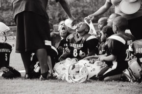
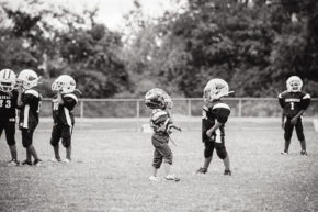
Nashville Cardinals

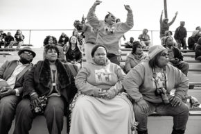
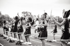
Each evening on my drive home in Nashville, I would pass a field dotted with tiny figures in plastic armor, smashing into each other again and again. It was a Pee Wee football practice, the players five and six years old. As a Southerner, I understand that football is a rite of passage taken very seriously, but the daily sight of kindergartners wearing oversized helmets and shoulder pads was curious and complicated. This photo essay looks at just one of the thousands of Pee-Wee football teams across America. I explore the tension between sweet, post toddler innocence and checks for concussions; between what it means to be a child and expectations for ‘what it means to be a Man.’ I try to understand how the dynamics between parents, coaches, and kids work to groom the next generation of professional athletes; how expectations of success and repeated physical contact impact kids early in their lives; how the industry of football establishes social norms of not only teamwork, discipline, and community, but also violence, race, class, and gender for American Youth

More of the project can be seen here

APE contributor Suzanne Sease currently works as a consultant for photographers and illustrators around the world. She has been involved in the photography and illustration industry since the mid 80s. After establishing the art buying department at The Martin Agency, then working for Kaplan-Thaler, Capital One, Best Buy and numerous smaller agencies and companies, she decided to be a consultant in 1999. She has a new Twitter feed with helpful marketing information because she believes that marketing should be driven by brand and not by specialty.  Follow her at @SuzanneSease.

Pricing & Negotiating: Trade Ad Environmental Portraits

Jess Dudley, Wonderful Machine

Shoot Concept: Environmental portraits for trade ads

Licensing: Unlimited use of up to two images for two years

Location: On location in Denver

Shoot Days: One

Photographer: Portrait specialist based in the Southeast

Agency: N/A – Client direct

Client: A large hotel group

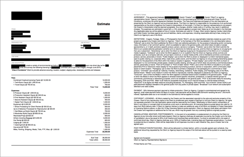
Here is the estimate:

Creative/Licensing: Earlier this year I helped to estimate a campaign for a large hotel group for one of our Southeast-based photographers. The concept was to highlight the client’s business services and corporate rewards programs by shooting an environmental portrait of an executive from another well-known brand that utilized the programs. The client secured the subject, and the subject secured the location (one of their very recognizable retail-storefronts). The client hoped to walk away with two portraits of the subject captured in slightly different setups within the location. One shot was an eyes-to-camera “hero” shot. The other was a secondary, more candid-feeling portrait (think captured moment while the subject assesses inventory or interacts with store staff).

Although the client required unlimited use of the two final selects, there was an inherent “trade advertising” limitation in the use. While I was mindful of the possibility that the ad could potentially be used in consumer-facing publications/platforms, the campaign was directed toward corporate travel departments & executives and, accordingly, would most likely be placed in trade publications. Though the intent was made clear, the client wasn’t willing to limit the licensing agreement to trade use only.

Additionally, the client requested two years of use for the images. Lately, I’ve tried to avoid anchoring licensing duration with the term “from first use” because it can be a bit too vague. It puts the onus on the photographer to chase down the client to determine when exactly the first insertion occurred (though some clients are good about sharing that info, others are trickier to pin down). Additionally, without more specific language, some clients may take a liberal interpretation of “first use” to mean first use of a given image, as opposed to the image set, effectively extending a given campaign (e.g. image one is used 6/16-6/18 and image two is used 1/17-1/19). To avoid these issues altogether, we’ve been using specific expiration dates, which will often include a bit of lead time for print production and insertion deadlines. So a shoot scheduled in early May, such as this, allowed for as many as six weeks of post and print production work (i.e a start date of June 30, 2016 and expiration date of June 30, 2018). It is possible the client could immediately insert one of the images in a web ad or elsewhere, but when pricing out durations in the 12+ month range, we feel the extent of the usage and clarity of the termination date outweigh the concern over early use.

After factoring in the intended use, duration of use, inherent limitations, the complexity of the shoot, nature of the campaign, variety of the imagery and the scale & reach of the client, we set the value for these images at 8,000 for the first, and 4,000 for the second. The value of the second image drops so significantly because it is a true variation of the first image that doesn’t drastically impact the core message or design on the campaign but still provides value.

Client Provisions: I was sure to note exactly what the client had committed to providing, including sourcing the location and subject, and securing the necessary releases.

Tech/Scout and Travel Days: I included one tech/scout day to walk through the storefront location with the creative team to determine compositions and block out the schedule. It was also particularly important in this case to determine appropriate staging areas, assess the availability of power options, overhead lighting control and store readiness as the product and store would feature prominently in the shots. Based on the flight schedules, we were able to fly in and scout on the same day, enabling us to estimate for one Tech/Scout day (including travel to the location) the day before the shoot and one return travel day the day following the shoot.

Producer and Production Assistant: I included a producer to manage all aspects of the production, from sourcing crew to booking travel to correspondence between the client and subject. I also added a PA to help with odds and ends throughout the production.

Assistants & Techs: I estimated for a first assistant to travel with the photographer and included a digital tech (with a workstation) & second assistant for the shoot day.

Equipment: I estimated one day of gear rental from a local rental house at 2000.00 for a medium format system, backup DSLR system, a handful of lenses, lighting and grip equipment. Our proposed itinerary would allow for our first assistant to pick up gear the afternoon of the tech/scout day and return it on the way to the airport the morning after the shoot.

Shoot Processing for Client Review: This covered the photographer’s time for the initial import, edit, color correction and upload of the entire shoot to an FTP for client review and final image selection.

Selects Processed for Reproduction: I included basic processing of “up to” two final selects as a lump sum (based on 150/image in this case), which protects the fee in the event the client ultimately selects fewer than two images (or more than two images, for that matter).

Styling: The subject would need stylists to manage wardrobe and hair & makeup needs for the shoot so I factored in a wardrobe stylist (including shopping and return days for the wardrobe stylist) and a budget for un-returnable wardrobe and small props like handbags, etc. (which would ultimately be offered up to the client, subject, or donated) as well as a hair and makeup stylist for the shoot day only.

Travel Expenses: I budgeted for airfare, lodging and car rentals for the traveling crew (Photographer, Producer and First Assistant). I was sure to consider parking, internet, baggage and car insurance costs as well.

Catering, Insurance, Miles, Meals, and Miscellaneous: To wrap everything up, I estimated for craft, breakfast and lunch catering at about 60.00/person, insurance costs to cover worker’s comp premiums (and a small portion of general liability, meals and miscellaneous costs for the traveling crew.

Results/Hindsight: The photographer was awarded the project, without negotiation, which meant we hit the budget on the nose, or that we left money on the table. Wonderful Machine managed the production and the client has since come back to the photographer and WM to produce and shoot additional versions of the same campaign.

If you have any questions, or if you need help estimating or producing a project, please give us a call at (610) 260-0200. We’re available to help with any and all pricing and negotiating needs—from small stock sales to large ad campaigns.

The Daily Edit – The Red Bulletin: Jim Krantz


The Red Bulletin

Creative Director: Erik Turek
Art Directors: Kasimir Reimann, Miles English
Photo Director: Fritz Schuster
Photo Editors:  Photo Editors Rudi Übelhör (Deputy Photo Director) Marion Batty, Susie Forman, Ellen Haas, Eva Kerschbaum, Tahira Mirza
Writer: Andreas Rottenschlager
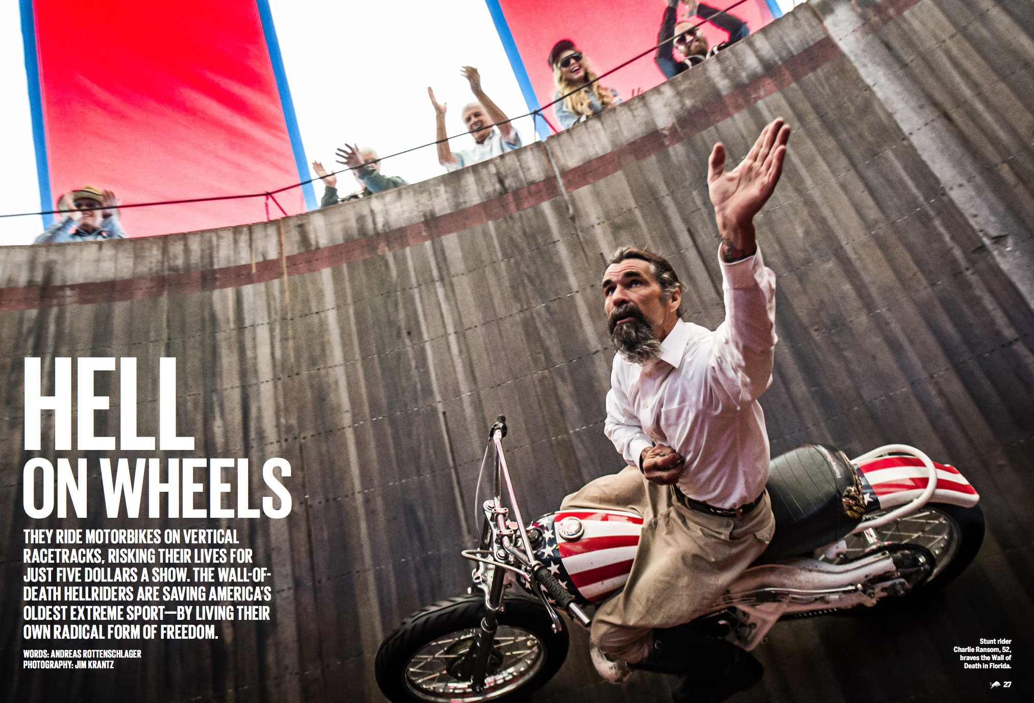
Photographer: Jim Krantz


Heidi: How did this assignment come about?

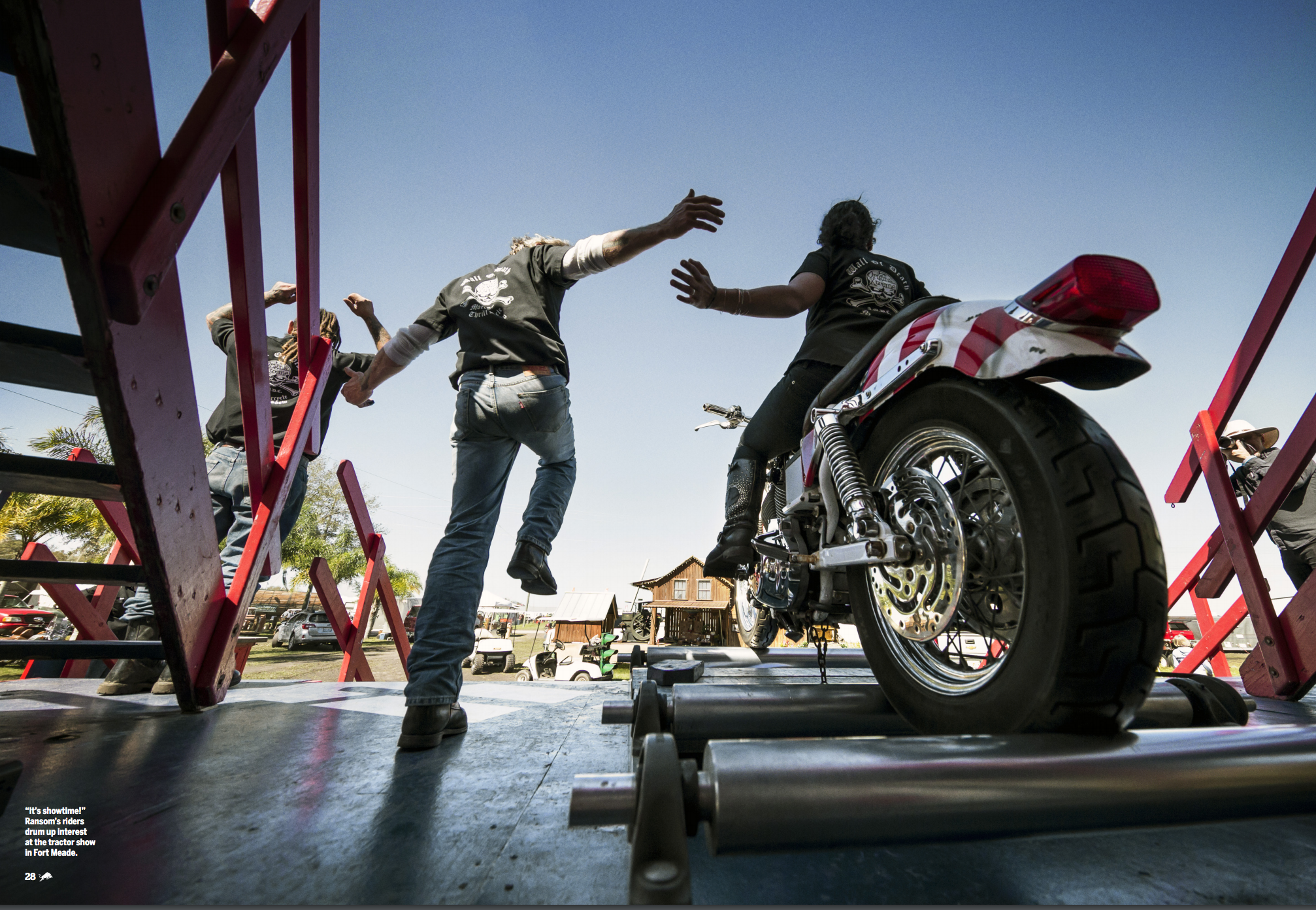
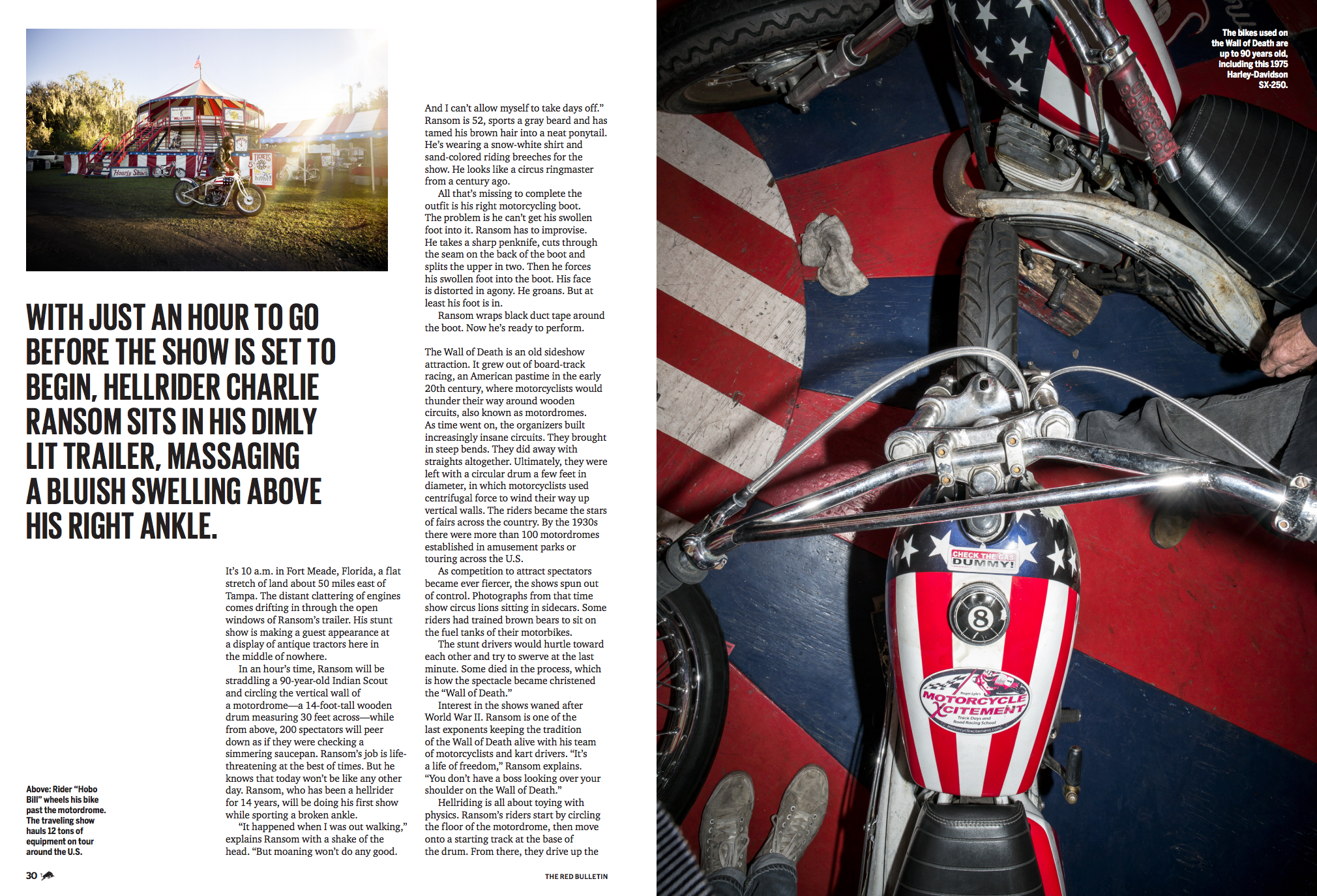
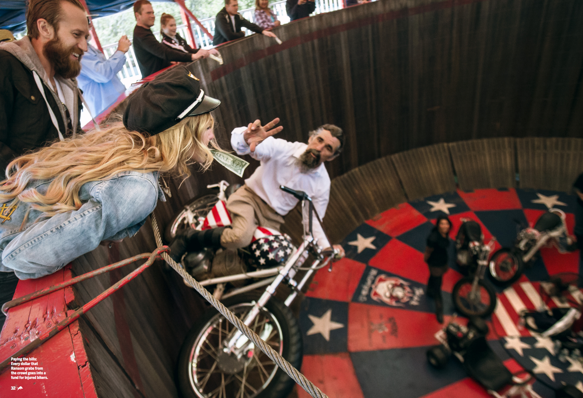
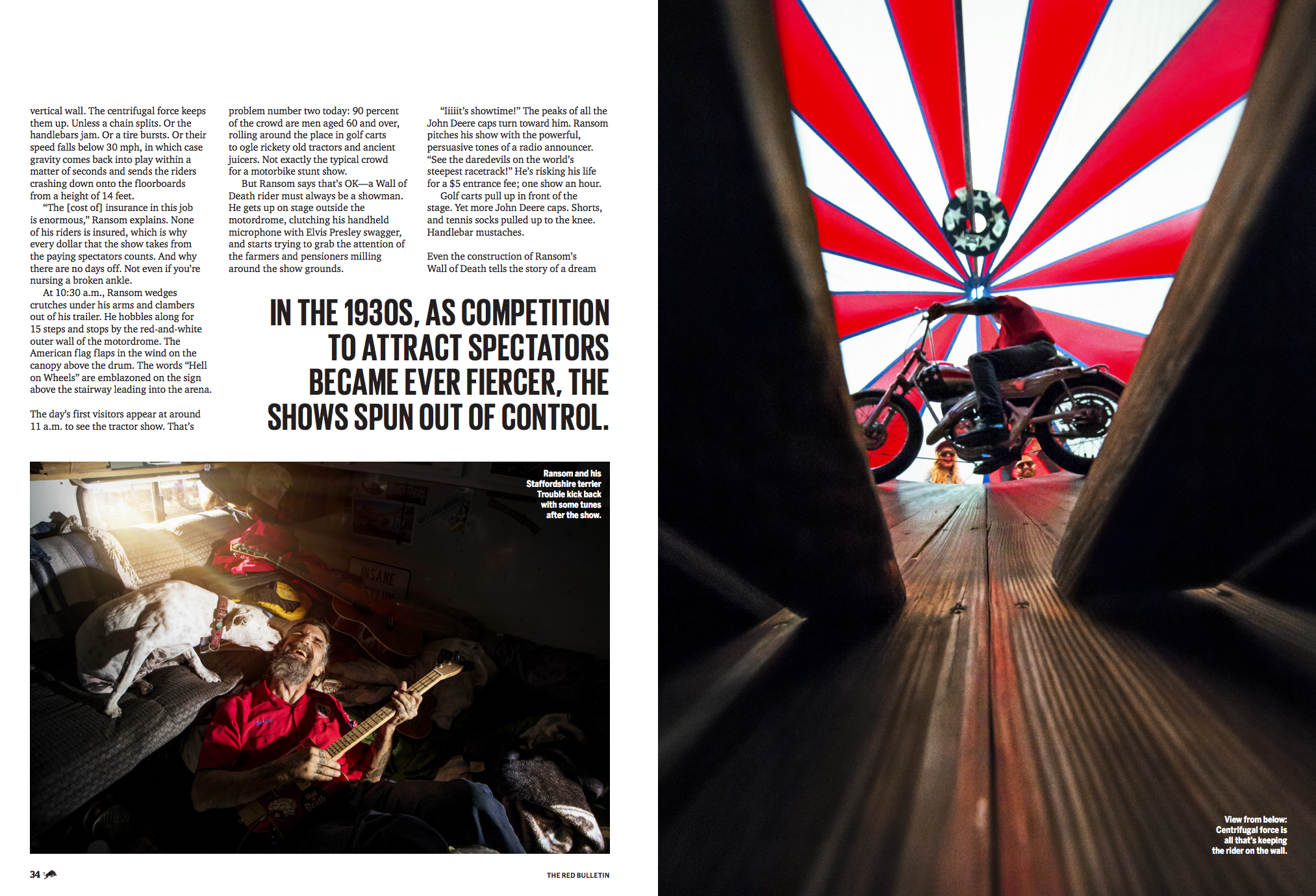
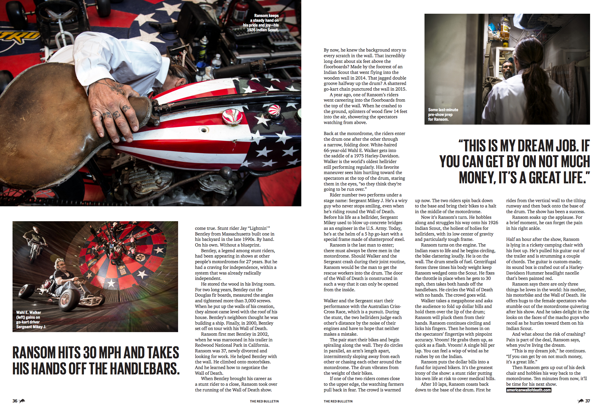
Jim: I was shooting a project in Austin Texas in 2015 and happened to stop in at the Hand Built Motorcycle show, and appearing there was The American Motordrome Company performing, I was captivated by the show and spectacle of the event. I presented the idea for the project to Red Bull and they loved the novelty of the idea and awarded the project to me to shoot.

I was shooting a project in Austin Texas in 2015 and happened to stop in at the Hand Built Motorcycle show, and appearing there was The American Motordrome Company performing, I was captivated by the show and spectacle of the event. I presented the idea for the project to Red Bull and they loved the novelty of the idea and awarded the project to me to shoot.

Having produced this project for you I know Charlie was injured but rose to the occasion.  How did you overcome that and what did you learn or what was reinforced about the creative process?
  As in any show regardless of injury or any misfortune “the show must go on” is Charlie’s mantra. On crutches and hobbling to his 1923 Indian motorcycle Charlie would mount up and without a grimace enter the Wall of Death and simply go for it. From my perspective, this unfortunate injury simply added an element that photographically defined his passion and dedication to his work. I embraced this aspect of Charlie’s current state of his health and photographed him making his way through the show. I think his example of pushing through and not letting this hamper his performance is also a characteristic I embrace when on a job, regardless of the situation, the show must go on.

Do you have difference creative processes for your still and video work?
Both still and motion take thorough preplanning and specific shot lists developed. I always make my shoot plan and have a backup plan “B” for the times situations change and a backup plan must be considered, this goes for still and motion work.

You have a gift for connecting with people, where does this stem from? Is this an innate trait or something you’ve practiced and built over the years?
Since I was a child I was alway curious and interested in people. I never felt uncomfortable around people I do not know, there were never “strangers” in my life. I think it’s also important to be open to inviting conversation and simply say “hi” to people, that’s where it all starts, it’s simple.

I know you have a love for the west and for motorcycles, how do your passions translate into your work?
The west, cowboys, and motorcycles are simply an expression of freedom. I think what I do best is photograph situations that give strength and empower my subjects.

Tell us about the collaboration with Supreme.
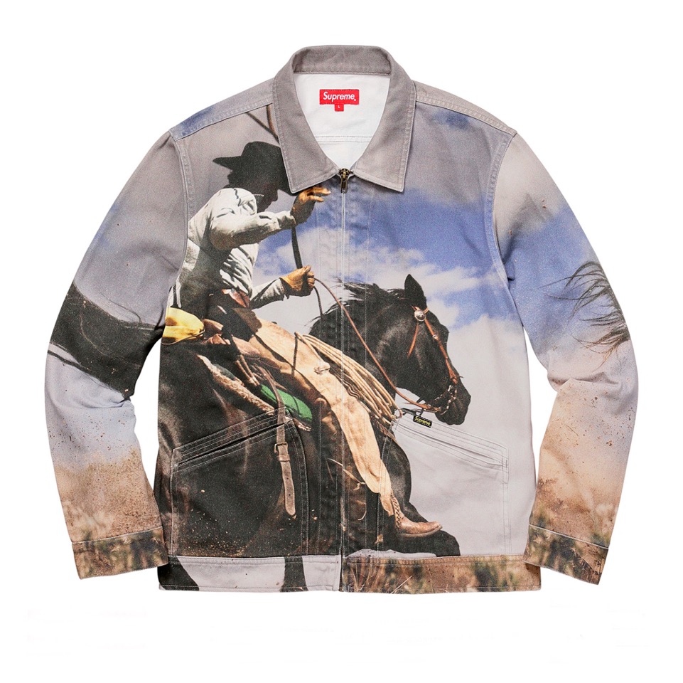
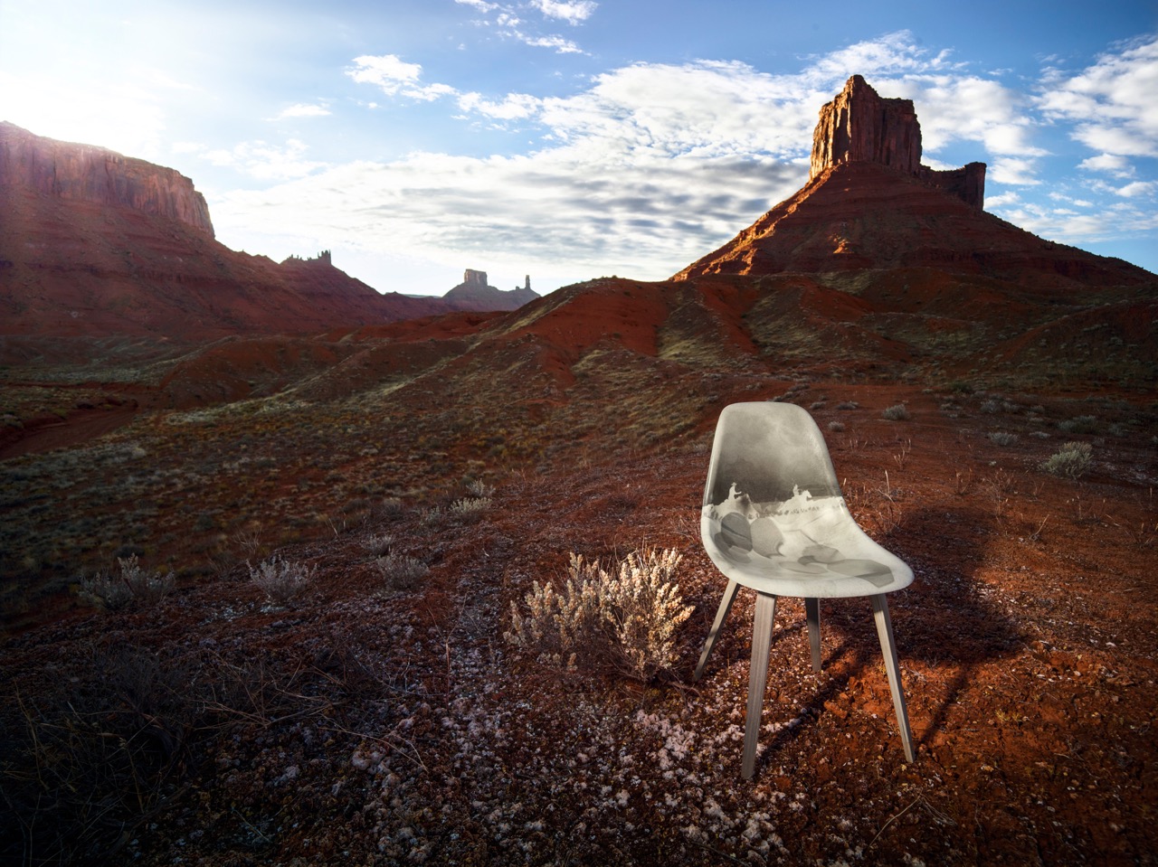
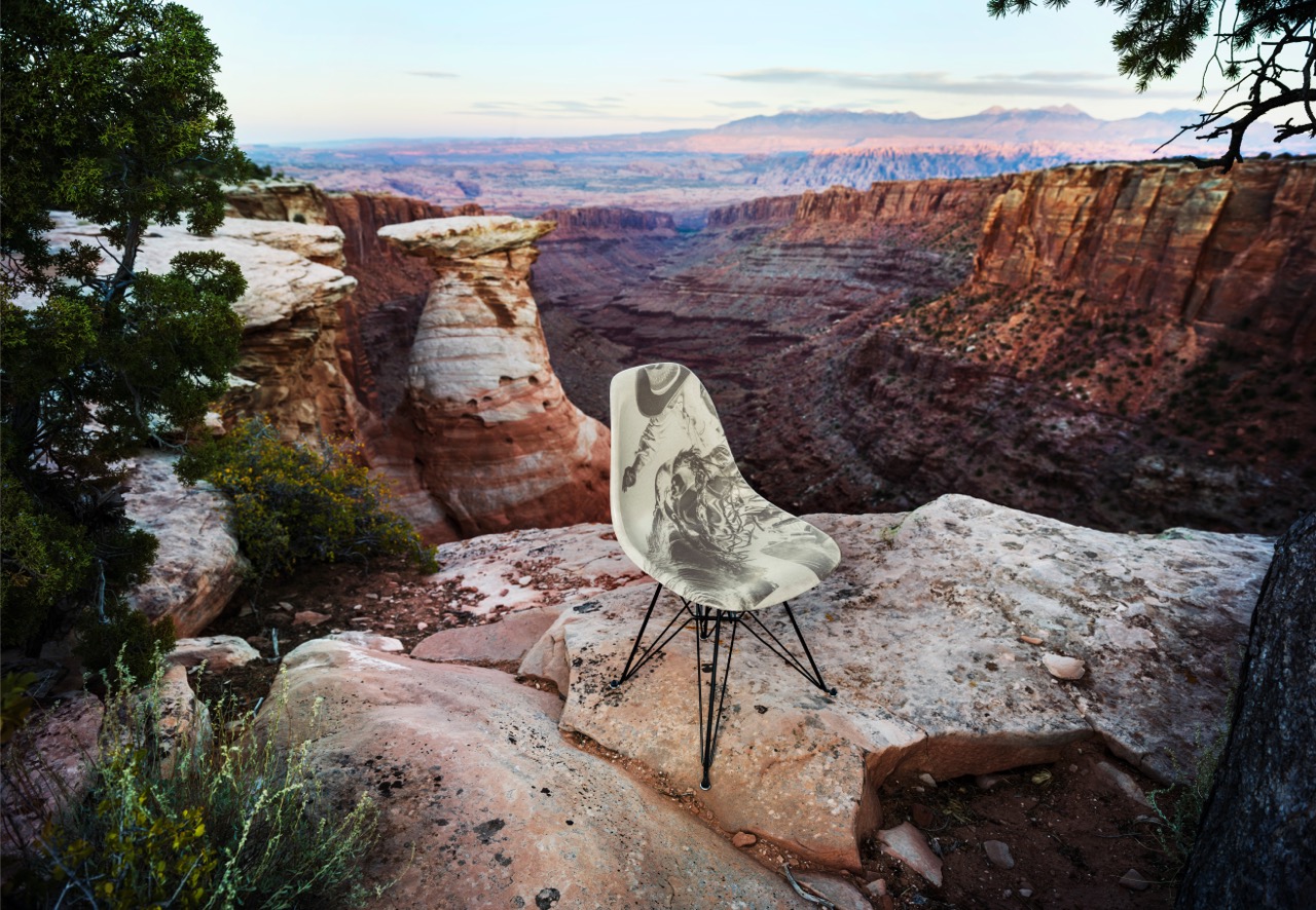
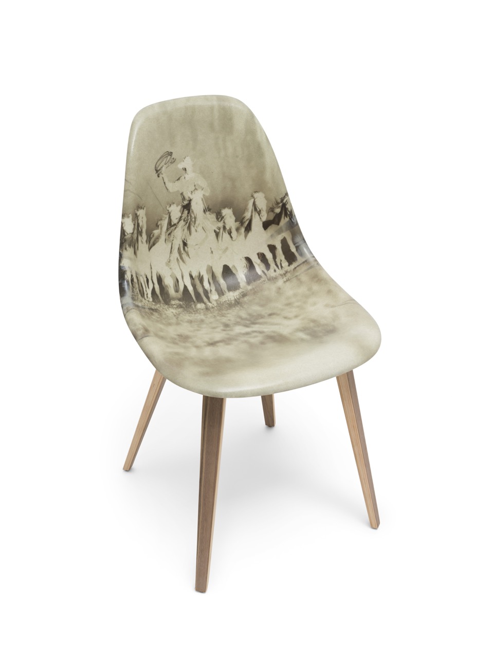
For me, the invitation to have my images expressed on clothing is a direction that I love. I appreciate that photographs do not have to be limited to 2-dimensional surfaces only, I have also been applying my work to furniture design as well as yet another example as to how images can integrate into a 3 D application and become something unexpected and fresh. Supreme is a magnificent brand and I was thrilled to collaborate with them to create clothing that was compelling and relevant. I have some unexpected and novel projects in the works at
For me, the invitation to have my images expressed on clothing is a direction that I love. I appreciate that photographs do not have to be limited to 2-dimensional surfaces only, I have also been applying my work to furniture design as well as yet another example as to how images can integrate into a 3 D application and become something unexpected and fresh. Supreme is a magnificent brand and I was thrilled to collaborate with them to create clothing that was compelling and relevant. I have some unexpected and novel projects in the works at  jimkrantzprojects.com that will expand the application and expression of my photography with other incredible artists to create collaborative works that redefine photographic applications.
You are a seasoned pro and have seen the industry evolve. What is some advice you can share for photographers getting into the game and those who need to stay relevant? Relevance is vital, as a career move on I feel it’s vital to continue to explore and remain curious. Without curiosity, there is nothing new to see or express. It sounds trite to say reinvent yourself but actually its never stop being curious and allow yourself to walk into situations that are unfamiliar and uncomfortable, that is where new work can be discovered. It’s not about technique, it’s about what you see, how you look at it and what you say about it that keeps you fresh and engaged. I think the distraction level in our lives is very high, so much information bombarding everyone, every second. For me, the key is to turn it off and simply look. Everything is right there.


The Daily Promo: Jim Krantz


Jim Krantz


Who printed it?

Regal Printing in Omaha Nebraska
I have been using them for 25 years!!

Who designed it?
Pace Kaminsky in NYC

Who edited the images?
I did

How many did you make?
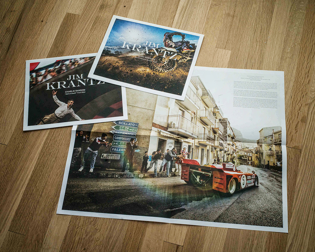
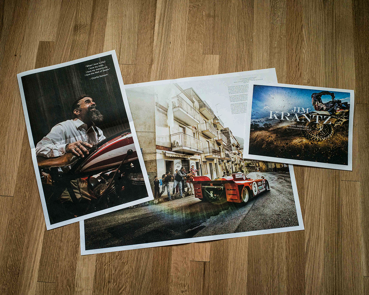
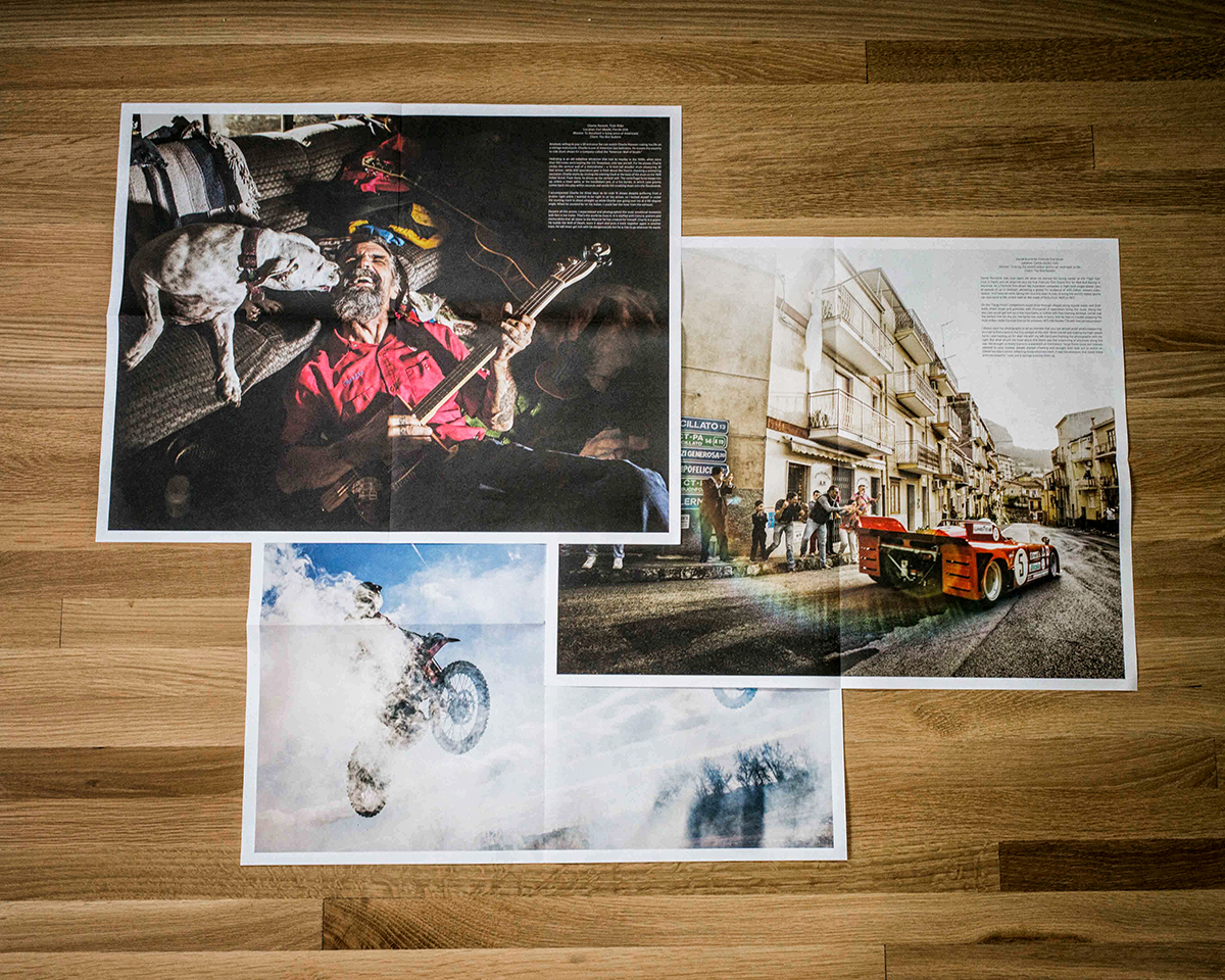
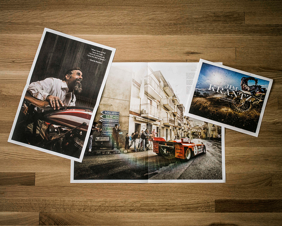
I did 3 pieces of 1000 each, they are kept  together in one stay-flat envelope and sent as a group

How many times a year do you send out promos?
2 to 3 times a year

Who wrote the text for you?
The text was written by Andreas Rottenschlager, a writer from the Red Bulletin in Vienna Austria

I know the Wall of Death images were from a story we worked on together for The Red Bulletin, what about the other images?
The Marc Marquez story was photographed in Lleida, Spain, his hometown racetrack he learned to ride on. Daniel Ricciardio was photographed on the Targa Florio race course in the mountains of Sicily near Palermo and Charlie Ransom was photographed in Port Charlotte, Florida

I know you have a love of motorcycles, how did that translate into this the theme of the promo?
The collection of the three pieces were all shot for Red Bull’s Red Bulletin magazine. I have always loved anything with motors, especially motorcycles, the common denominator of all of the men profiled is their drive. The drive to be the best that they can, the drive to perform at a very high level and the drive to emotionally be able to handle whatever comes their way in pursuing their profession. I relate to the mindset to be 150% percent dedicated to a profession, the tenacity to stay in the game and the deep love for their passion for always working at the highest level possible. As in any dedicated sport or interest winning and loosing is part of it but ultimately staying in the game and pushing yourself to work at the highest level possible is mandatory. I love each of these individuals dedication and commitment to doing what they love. Each person depicted is also a wonderful individual on a personal level, that is also most attractive in a champion.

This Week in Photography Books: Richard Bram


About a year ago, (give or take,) I read somewhere they decided the word “internet” should no longer be capitalized.

Now, I’m about the worst person to complain about the misuse of capital letters. I’m terrible at remembering the rules, so years ago, I decided to embrace the digi-world-acceptable practice of manipulating spelling and grammar as I choose.

I’m so bad, I even write entire emails in lower-caps. (Yes, I’m that guy.)

For some reason, though, I decided to abide by the new rules, though I’m not really sure who gets to make these decisions in the first place.

Seriously, who are these people?

And why was the internet no longer the Internet? Could something that powerful, ubiquitous, and just-shy-of-omniscient really have become less important?

Of course not.

Can you believe that someone, somewhere, got paid to make a decision like that? (You know there were committees involved.)

Maybe it was the Public Information Protocol Bureau? Or a cabal of nefarious magazine editors?

We’re ALL on the internet these days. Cell phones are everywhere; mobile carriers of the information network that binds us together.

And while we consider the digital world a different kind of experience, being online can manipulate your emotions, just like IRL. (That seems obvious, as who hasn’t felt anger or jealousy when scrolling through Twitter or Facebook.)

But just this morning, I read this article in The Atlantic in which researchers examine the way in which one person who wakes up grumpy can cause a chain reaction of negative energy, if that person happens to be a troll.

The word, in its original connotation, meant a monster that lived under a bridge and charged a toll. They were scary regulators of commerce, or highway-men of large stature with poor hygiene. They gummed up the works in fairy tales, just like they do now in the digiverse.

Most cities are located on the water, so they really need their bridges. When I lived in Brooklyn, and visited my family in New Jersey, I’d take the Holland Tunnel to the Manhattan Bridge to come home. I rarely came in through Staten Island, but I just heard the new toll on the Verrazano Bridge is $17.

$17, just to get into New York City.
I googled it, and the tunnels cost $15 too.

The train from Newark Airport to Penn Station is $15, so unless you fly into JFK and take the subway, there’s no cheap way into Manhattan.

The trolls must receive their tribute.

It’s an island, Manhattan, the ultimate limited supply, which is why they built up to the sky. It’s easy to look up, in New York City, as the tops of the skyscrapers are so beautiful.

People will peg you as a tourist, if they catch you ogling the tops of the buildings. (Or if you walk through Times Square in general.)

But street photographers have long known that it’s better to look around you then up at the sky, down at your phone, or off into your own thoughts as the Ipod pops in your eardrums.

Street photographers know that if you just watch the city unfold, block by block, it is ALWAYS interesting, often fascinating, and sometimes downright sublime.

It’s never boring, Manhattan, a city where no matter what someone says they saw, you’ll always just respond, “Sure. Why not.”

I guess I can believe you saw albino triplets on tricycles going down the sidewalk. Or a monkey walking a dog on a leash?

Why not?

The absurdity level is always turned up in New York, and if you have the time and inclination to look, the pictures are waiting to be taken.

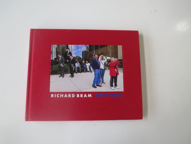
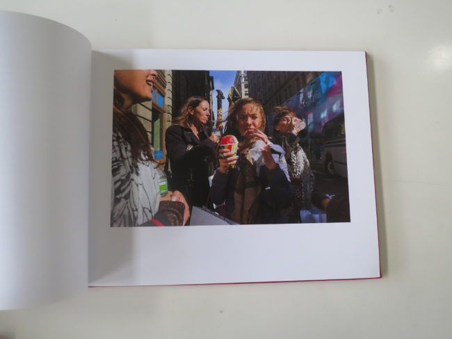
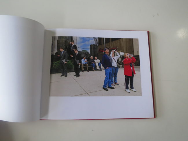
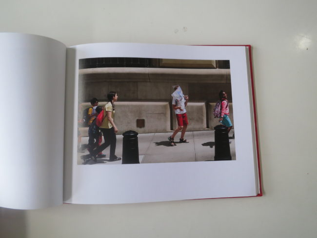
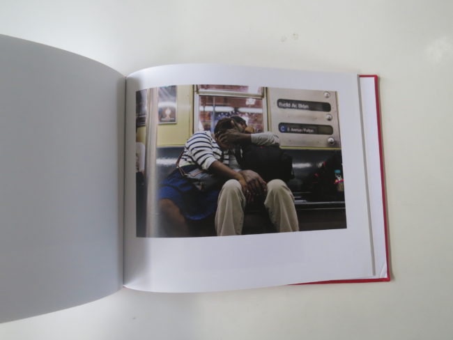
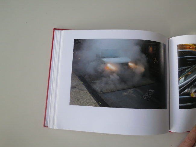
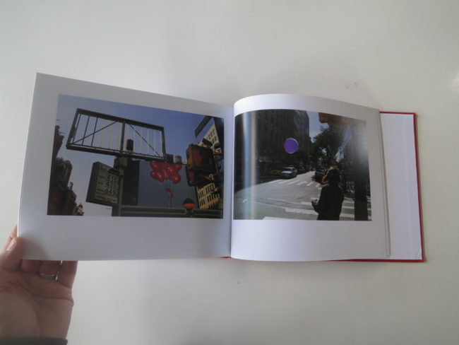
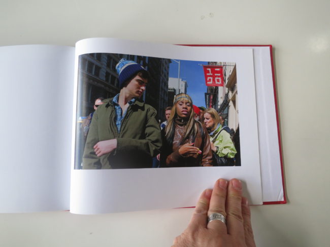
It’s why there are so many cameras in Richard Bram’s “New York,” a photobook published last year by Peanut Press. (And printed in the USA.)

Richard is a friend of mine, and I’ve written about him in this column before. Frankly, he came up and introduced himself at the PDN Expo in 2010, when I did my first travel piece for this very blog.

He’s a smart, considerate guy, and recently moved back to London from Lower Manhattan. He did a stint of 8 years in New York, and photographed it for much of the time lived there. When I was at FotoFest in 2012, he showed me a rough edit of this project, so I’ve seen the pictures evolve.

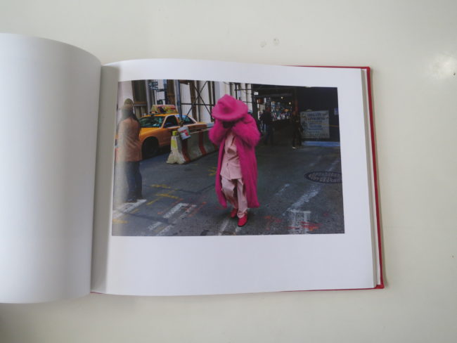
What I like best about this book is that it captures Richard’s wry sense of humor. There are some images I might have edited out, but whether it’s a woman in a flaming, furry pink suit, or a girl in hot pink boots, they’re cleverly observed.

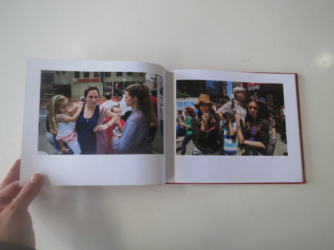
Cameras are everywhere in these photographs, which clearly marks them as being of-their-time. During those 8 years, the rest of the world became obsessed with our habit, so why shouldn’t cameras be a repeating motif?

There’s nothing mean-spirited, like Garry Winnogrand, though they do invade people’s space, if not their privacy. Unlike the aforementioned internet, cities push peoples’ bodies together. They force human beings to share air, and sidewalks, and square footage on the subway.

Richard observes with subtle curiosity, and it took me a few passes through the book to enjoy some of the nuance.

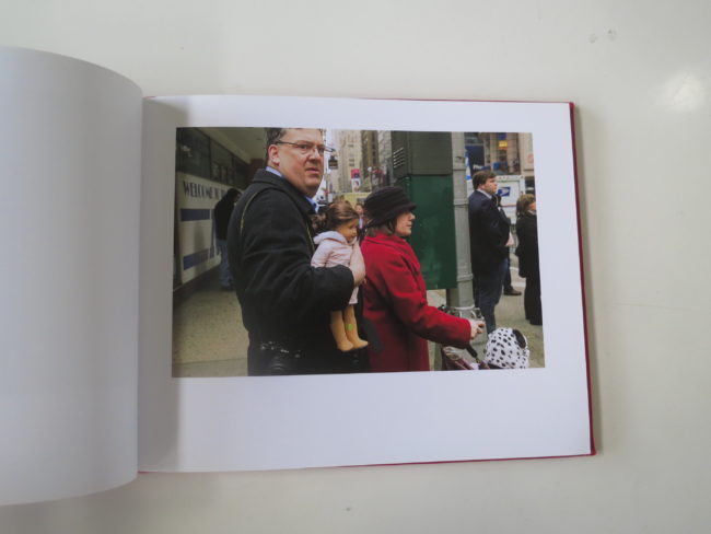
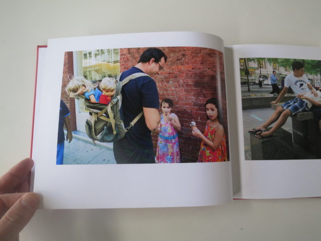
I love the grumpy guy who looks like he knows he’s being photographed, and he’s holding a creepy doll. The first time, I saw his face, and the doll, but only the second time did I see the nice Nikon around his neck.

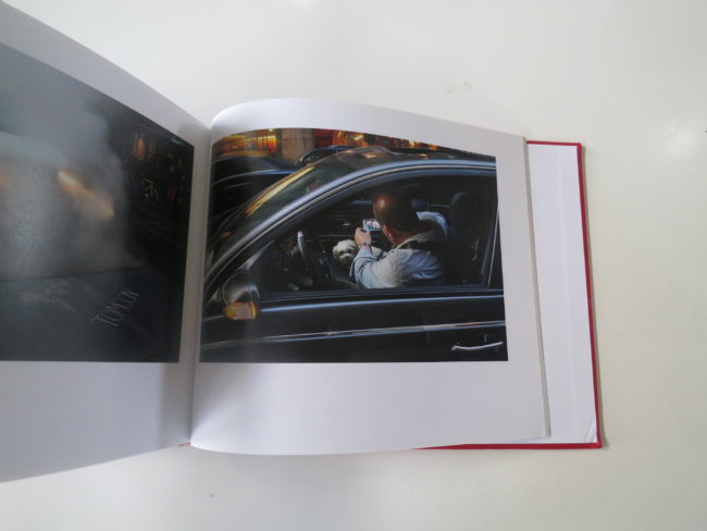
Dolls show up again in some guy’s backpack, though they likely just belong to his daughters. Later, he photographs a man, photographing a dog, in a car, with a cameraphone.

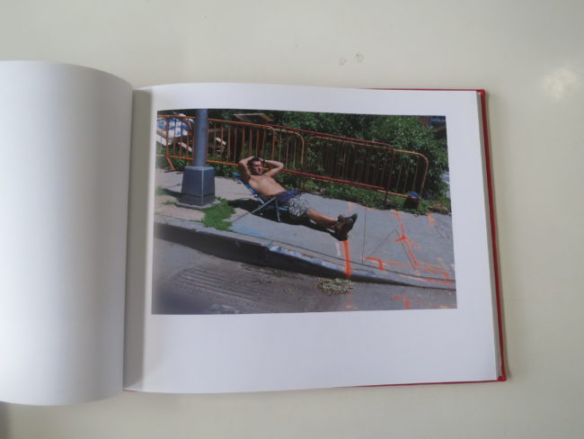
We see a guy sunbathing, shirtless on the sidewalk, surrounded by spray paint and barricades? Why not?

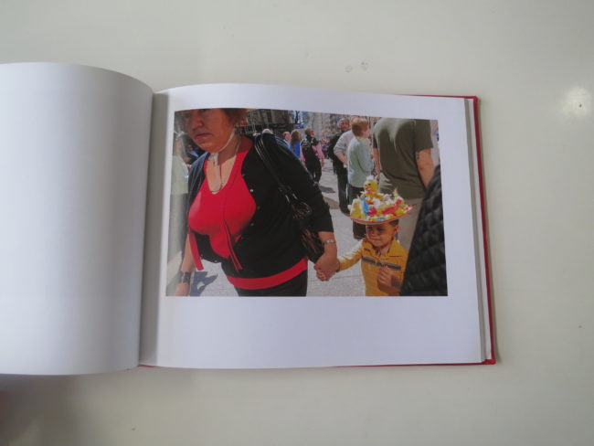
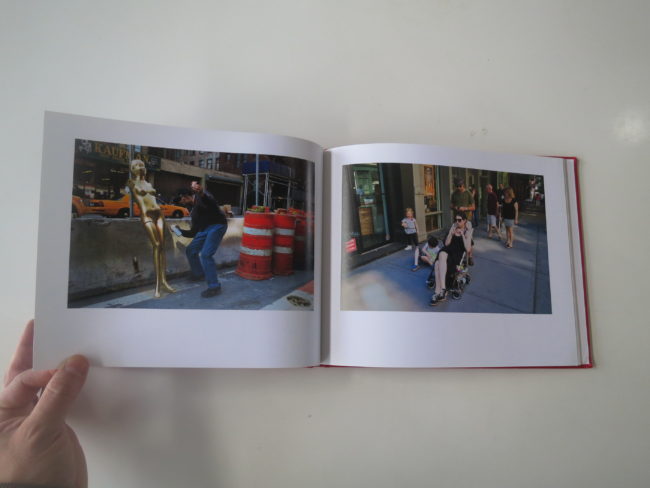
Or the little boy wearing ducks on his cowboy hat? Which follows the pink furry lady, and precedes a guy spray-painting gold a naked, apparently Asian mannequin, next to some giant orange traffic cones.

Sure. I’ll believe it.

Last week, I told you I’d try to scare up something silly, so I looked at my submission shelf, and this book was just right for today.

Look around. (That’s today’s message.) Look around, because it’s fun. And who knows what you might see?

Bottom Line: Witty, well-seen color street photographs in New York

To purchase Richard Bram’s “New York,” click here

If you’d like to submit a book for review, please contact me directly at jonathanblaustein@gmail.com
Personal Projects: Sasha Nialla

The Art of the Personal Project is a crucial element to let potential buyers see how you think creatively on your own.  I am drawn to personal projects that have an interesting vision or that show something I have never seen before.  In this newly revised thread, I’ll include a link to each personal project with the artist statement so you can see more of the project. Please note: This thread is not affiliated with any company; I’m just featuring projects that I find.  Please DO NOT send me your work.  I do not take submissions.

Today’s Featured Artist: Sasha Nialla

ARTIST STATEMENT

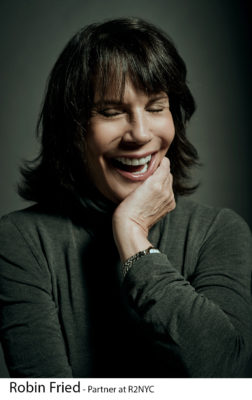
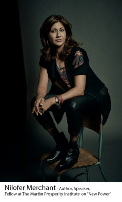
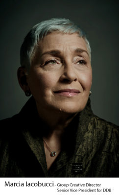
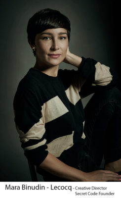
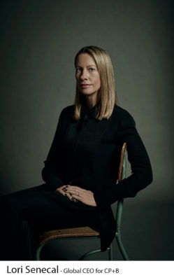
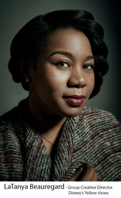
In partnership with The 3% Conference and Jack Morton Worldwide, I photographed a series of female leaders in the advertising world. Before The 3% Conference, started by Kat Gordon in 2012, only 3% of all U.S. Creative Directors were women. Since the inception of the conference, the number of female Creative Directors has grown to 11%.

Women continue to play a role in the world’s culture, there needs to be a call for gender-balanced leadership with women’s and men’s contributions valued equally.

Through my photographic series entitled Female Creatives Sitting for Change: Portraits Highlighting Women of The 3% Conference, my goal is to highlight some of the powerful women in the advertising world and challenge conscious and unconscious bias. The series emphasizes the women’s strength and beauty with the use of dramatic lighting and a minimal setting. With this technique, the viewer is forced to see the women’s femininity and power without distractions. I approach all portrait shoots in the same manner. I spend time getting to know the sitters, I ask them questions and connect with them. Only with their trust, I am able to show their vulnerabilities and strengths. Although there has been progress in society’s thoughts about women’s equality, women still are not present in equal numbers in business today.


SASHA NIALLA BIO

Sasha Nialla was raised in California and spent the last 17 years in New York City. As a photographer for 11 years, Ms. Nialla has been continuously getting involved in photography projects that bring awareness to different causes and life experiences, including; children with HIV/AIDS, diabetes, Iraq war survivors and many more. All these projects have resulted in supporting vulnerable groups and people, and those not exposed to these situations in their everyday lives. Highlights include multiple billboards in Times Square for Bideawee, standees of breast cancer survivors with NFL players in Kroger supermarkets and on PepsiCo and Gatorade packaging, a photo exhibition of women immigrants with New Women New Yorkers and a photo exhibition of cancer survivors in the NYU Medical Centerart gallery.

APE contributor Suzanne Sease currently works as a consultant for photographers and illustrators around the world. She has been involved in the photography and illustration industry since the mid-80s. After establishing the art buying department at The Martin Agency, then working for Kaplan-Thaler, Capital One, Best Buy and numerous smaller agencies and companies, she decided to be a consultant in 1999. She has a new Twitter feed with helpful marketing information because she believes that marketing should be driven by brand and not by specialty.  Follow her at @SuzanneSease.

The Daily Edit – Popular Science: The Voorhes

Popular Science


Group Design Director:
Sean Johnston
Deputy Design Director: Mike Schnaidt
Photo Director: Thomas Payne
Associate Art Director: Russ Smith
Photographer: The Voorhes

Heidi: When coming up with concepts, what is your process?
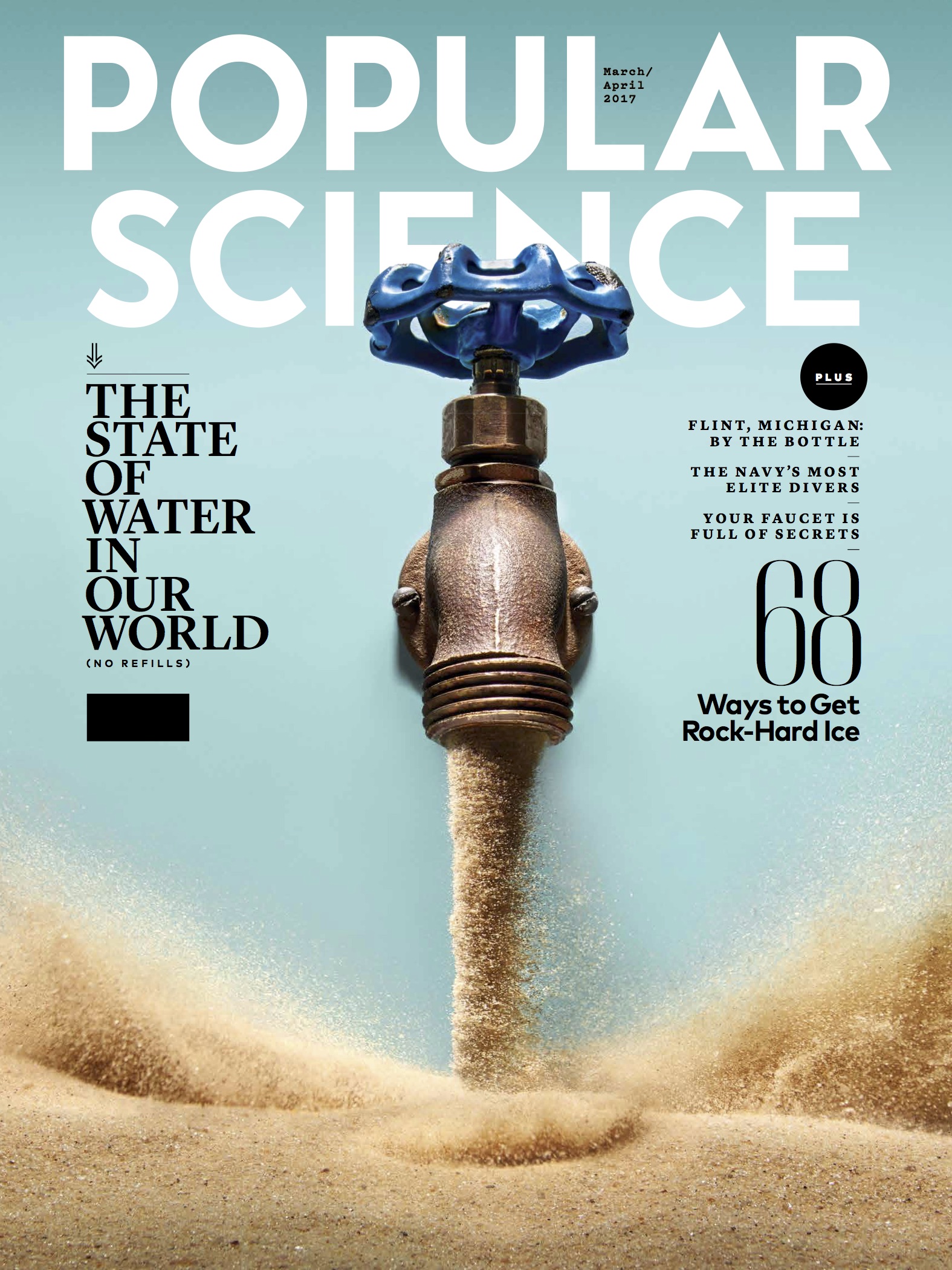
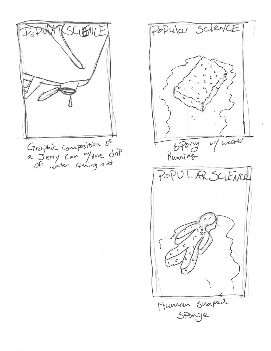
The Voorhes: It’s a collaboration the whole way. The magazine sends initial info (like what’s the theme of the issue, what are the features about, any loose initial thoughts. We then sit together (Adam and Robin) and brainstorm/sketch. We bounce ideas off each other, starting with obvious things or maybe not fully formed thoughts, tell them to each other and see how the idea grows. Then we take everything and refine sketches to around a dozen ideas. The magazine then usually take an idea and tweak it to fit the issue better. They send us back a cover mock-up using our sketches and we land on a final direction. Once we have a concept ironed out we fine tune things like color palette, prop direction, light direction, style and overall mood.

Do you journal, draw?
We don’t really think of it as journaling as much as concepting. But there is a LOT of drawing. We usually dedicate an afternoon a week to reading articles and brainstorming (Sunday afternoons on a patio during happy-hour is ideal!). Adam draws thumbnails as we brainstorm rather than taking notes. Robin too but her scribbles are not as legible so notes are required. Some ideas are half formed and some are really solid. We go round and round until we have a handful of solid ideas for each image a magazine needs. Then, later, at home at the kitchen table or at the studio over a cup of coffee we make refined sketches to send in to the magazine. Sometimes our sketches are nice, and sometimes they are pretty rough. Our goal is to simple get as many strong ideas out as we can.

 
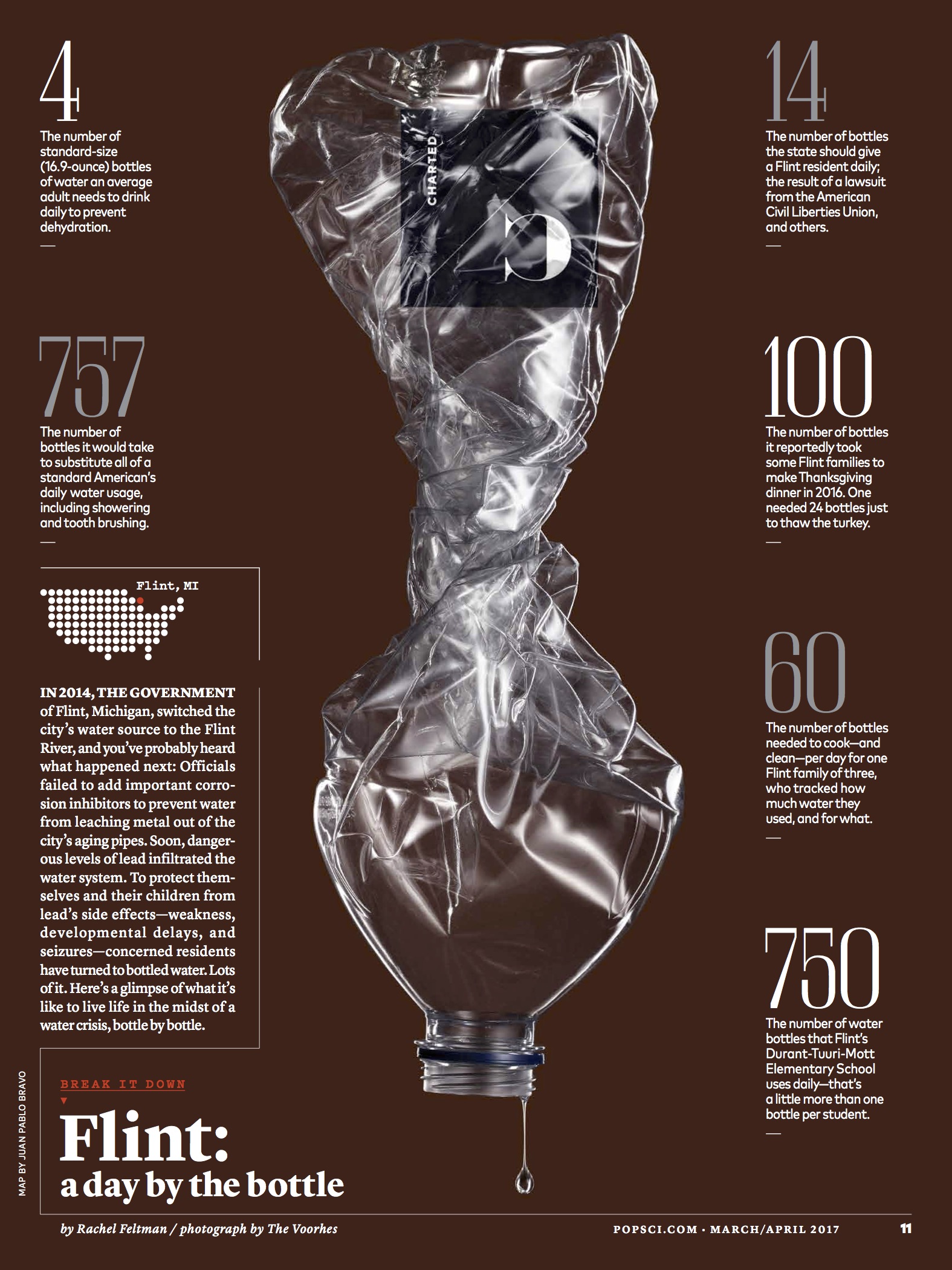
How did this idea develop?
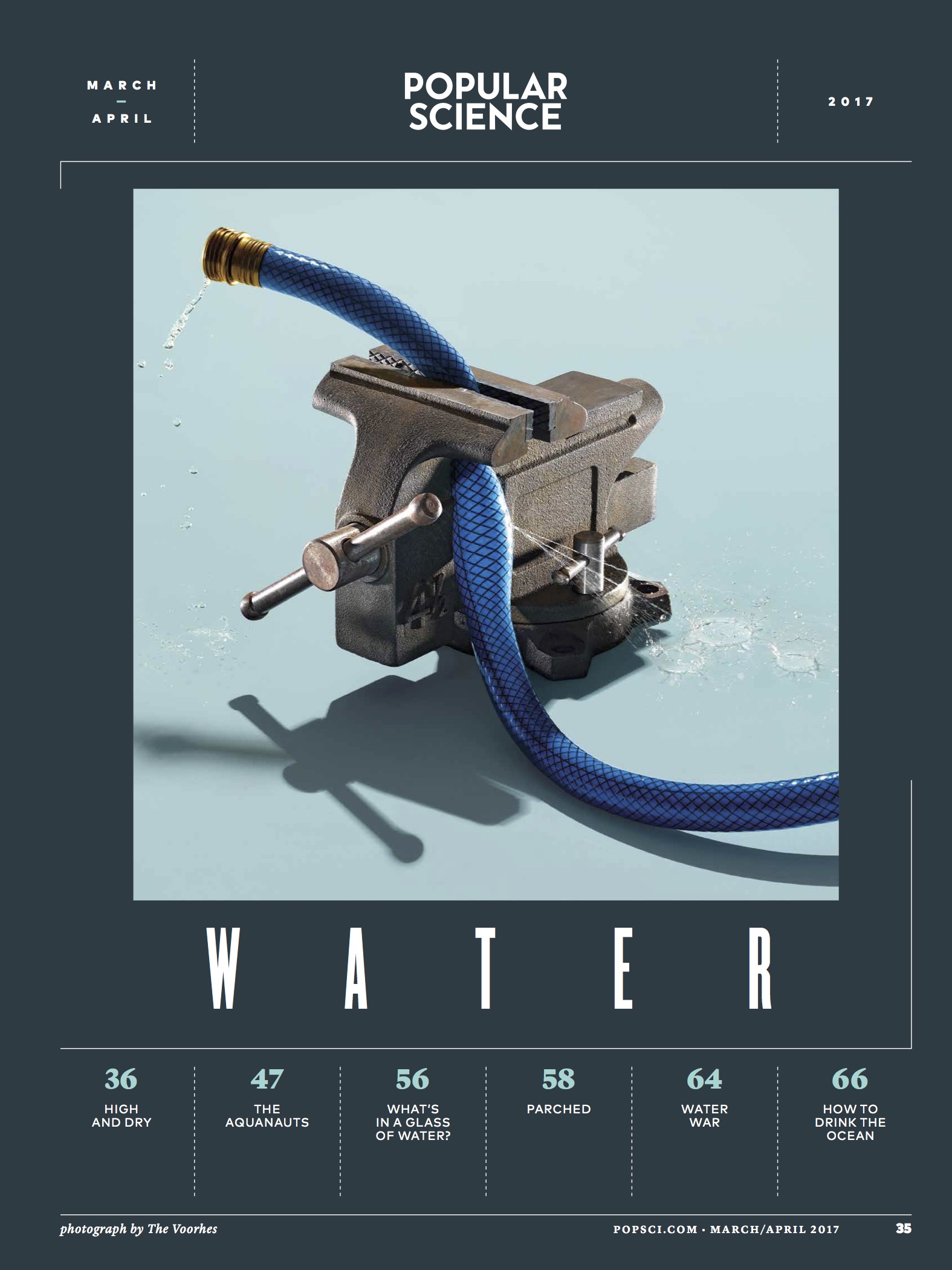
Avoidance I think. The whole issue is about water, the future of water, and in great part water scarcity. So the obvious is to do a play off of a glass of water, right? But we were given specific direction to NOT photograph any play on a of a glass of water. Adam couldn’t help but to doodle a glass of sand. The simplicity of it and the quick read was a draw. We also had sketched a faucet with fatter willing the bottom part of the page, and type was starting to break loose and float. We presented a bunch of ideas to the magazine, some well formed and some loose bits of ideas. They came back with the thought of sand replacing water in the faucet sketch. It was a totally collaboration. A mash up of brains and ideas.

What type of direction did you get from the magazine?
No glasses of water! ;-) Also there were ideas of water interacting with type in various ways. Our main direction was to create a simple graphic image that can be bold on the cover and work well with design. Beyond that it is a general nod to all of the features in the article. Something the wraps it all up into one general idea.During the shoot lighting direction came into play. Adam tends to light things in his head, then sets up exactly what he imagined. This, although a very convenient skill, can result in a lack of exploration. So, once things are lit and dialed in, Robin will ask Adam to light the scene a different way. Then after that she asks him if we can look at it any other ways. Often times the third variation is something new. It is one way we try to elevate out work.So this time we made options of pooling light from above, then we made a graphic option with crisp shadows. Same image, totally different vibe. We shared the light directions with Thomas at Pop Sci. He was digging the symmetry and cleanliness of the pooling light, so off we went!

How many ideas did you have before arriving at this one?
Oh man, maybe 30 on our end? Not that they were all GOOD ideas. And the magazine had a bunch to. It’s a journey sometimes.

How did you decide what was the right amount of sand to make things proportional?
The amount was decided on set with what looked right. The sand had to be completely dry to not clump together. We spread out and dried a couple big bags of sand from the hardware store then sifted it till we had around 40 pounds of really fine sifted sand. As we started putting together the set we realized we had WAY more sand than we needed. The sand was overpowering the faucet, so we came in closer, reduced the sand surface, and ended up maybe using 10 lbs of sand total. Then we had to take design and type into account, so there were some tweaks. For example the distance from the faucet to the sand surface was increased to accommodate type.

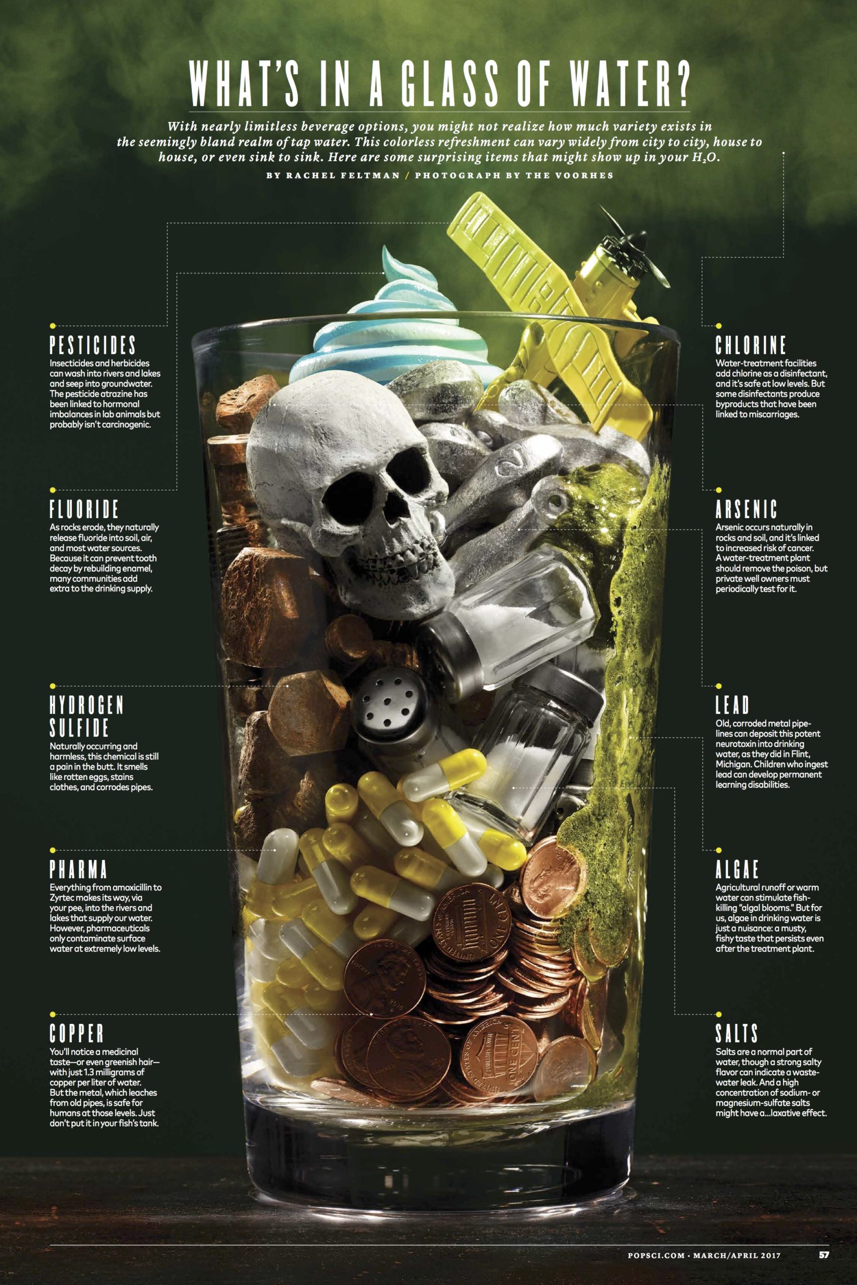
Were there any obstacles to getting the water shot? ( what’s in your water )
We shot this in January after a freeze. There was no alga floating on the lakes. Our assistant figured out how to make something that looked like alga using egg whites and matcha tea. It looked good for about an hour then started to get gross and dark. Other than that scale was an issue. Finding the right items that related to each other size wise and could all be styled into a vessel together so we would not have to make a Photoshop composite was tricky. Thank god for mini salt shakers and aquarium decor skulls.

What was the biggest challenge with this cover and feature assignment?
The details. Nothing was an overly complicated prop fabrication. But the details of each object mattered. Getting the right flash duration on the sand to have just enough drag to feel in motion but not blurred. Having light that is beautiful and just a touch dramatic. Pulling focus in a macro scene with moving subjects. It’s just attention to detail and a constant effort to make better work.

Where did you get the faucet?
We bought a variety of new faucets from the hardware store and tried various aging methods on them. While they looked fine, they were not quiet right. We needed something with character to be worthy of a cover. One of our assistant, who we keep asking to go get a tetanus shot, went to a metal recycling yard and spend an afternoon digging through rust piles till she found 5 different vintage faucets with PLENTY of character. The final faucet was with the knob from one and the spout from another. She still has yet to get the tetanus shot despite us telling her to go.

The Daily Promo: Newspaper Club


Newspaper Club

Instagram


Heidi: Why do you specialize in newspaper?
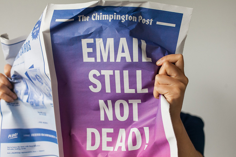
Newspaper Club: Newspaper is really versatile and great for all kinds of storytelling, but historically it’s only been available to massive publishers printing thousands of copies. We want everyone to be able to share their ideas quickly and easily with newsprint, even if they just need one copy. 

It’s been interesting to see the reaction to newsprint in a technology-focused world. Digital products tend to be sleek and flawless, and we’ve found people welcome a format that’s tangible and imperfect, and that doesn’t take itself too seriously.

Are you a global company?
Yes. Our newspapers are all printed in the UK, but our business is totally online and we can deliver just about anywhere. So far we’ve sent newspapers to 22 different countries!

How many clients do you service in the US and what are the shipping costs (average)?
About 20% of our orders come from the US. Prices start at $36 and larger runs can cost as little as $0.24 per copy. Shipping is included in the price, so there are no hidden fees. 

Do you have designers to help the clients?
We don’t have designers, but we do have templates, guides and our free layout tool, ARTHR.

When you upload a file, our system automatically checks that it’s set up correctly and will flag up issues like low resolution or spot colors. We also have a friendly support team ready to answer any questions along the way.

What is the largest segment of your client base?
That’s hard to say! We work with some big companies likes MailChimp and Spotify, but most of our customers are creative individuals – art students, graphic designers, illustrators and definitely lots of photographers.

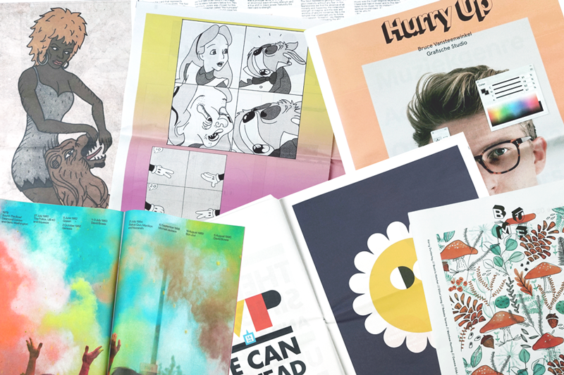
We try to share a good overview of what we’re printing on our blog, and our monthly roundups show what a mix it can be. Last month we printed Handsome Frank’s annual promo, a catalogue for an architecture exhibition and a set of posters for a furniture studio – to name just a few!

What has been a unique application of the service?
We’re surprised all the time by the ways people think to use newsprint! A few examples that come to mind: Fresh Flowers offers an alternative to short-lived bouquets, Eye of the Beholder has 25 animal eyeballs printed at life size (the giant squid’s just fit across a tabloid spread!) and a few years ago Canadian band The Famines released a “newsprint single” – a really cool poster that has a link to download the music.

We’ve printed newspapers for every part of life’s cycle – from birth announcements to birthdays, weddings, anniversaries and funerals. A couple weeks ago a customer tweeted us a photo of his proposal – he hid behind a broadsheet on one knee! That made our day.

Tell us about your tag line, “Print’s not dead” where does the love of print come from?
It’s very special to hold something you’ve made in your hands, and we don’t think people will ever get tired of that.

Newsprint is an effective medium that still has a lot of life in it. You don’t need batteries to read a newspaper and everyone knows how to use one. We love flipping through newspapers our customers have made and hanging favorites up in the office.

It’s not about print vs. digital, but rather the two working together to change how people can share ideas. Now, you can upload a file from your computer on a Sunday night, from just about anywhere in the world, and find your newspapers on the doorstep a few days later. That’s a great feeling.

This Week in Photography Books: Carl De Keyzer


No one alive has experienced a major war on American soil.

No one.

We adults can relate to 9/11, which still seems fresh, but that simply doesn’t compare to a massive ground invasion, where the tanks roll in and start killing people.

Even 9/11, which is the emotional touchstone of so many Americans today, seems like a token holiday to today’s youth.

I know, because I asked.

My students are all 15-18 years old, so not one of them was a sentient being during that horrible day. A few of them said their parents told them about September 11th, but for others, they didn’t even have that.

The consensus was that 9/11, for today’s kids, was akin to D-Day or Veteran’s Day for older generations. (Something that might get you the day off from school, but probably not.) They compared it to the way I might consider Pearl Harbor, which happened more than 30 years before I was born.

In other words, there are exactly NO people born and raised in this country who know what it feels like to be Syrian right now. Or a Congolese. Or even a Northern Mexican, as their Drug War has claimed countless victims right across the border from Trump’s proposed wall. (Maybe Fox News should run a story about El Chapo’s tunnels, JIC our gangsta President has forgotten?)

It’s all a game here in the US, (according to Michael Lewis writing for Vanity Fair,) because none of us is truly familiar with the stakes.

Massive World Wars that kill millions and millions of people, and devastate large parts of continents, are simply too removed from our collective experience.

Worse yet, the ghostly ramifications of the last time people killed each other here, en masse, are still being felt, as the Red State/Blue State divide tracks so-effing-closely with the boundaries of the Union and the Confederacy.

Honestly, I didn’t set out to write another dispiriting column. I know this space used to funny on a regular basis, and perhaps it will again some day. Lord knows I tried to crack 100 jokes at Trump’s expense, but it got us exactly nowhere.

These articles are now beholden to the books that turn up in the mail, and I respond to what I see, so if you guys start shipping in light-hearted, absurdist photo books, I’ll do my best to soften the mood.

Today, though, I want to show you a truly remarkable publication that came in during the Fall, in a batch of books I was sent by the University of Chicago Press. (BTW, if you Chicago-types have seen Obama around, can you please tell him there are 8 billion people out there who could really use his help?)

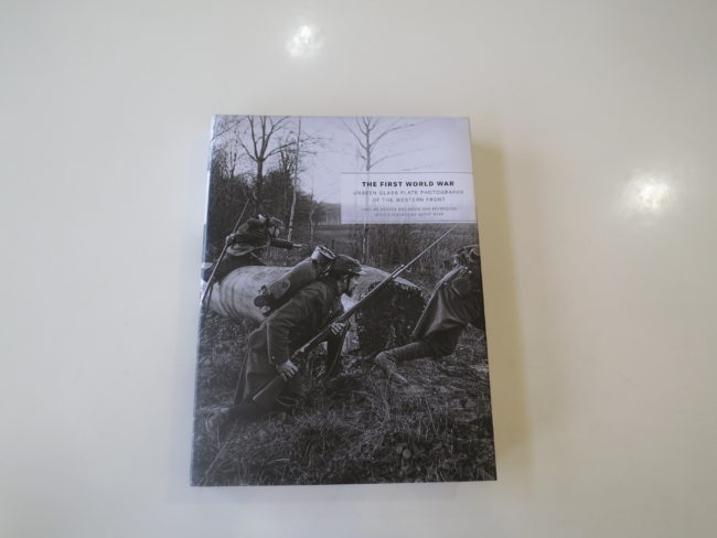
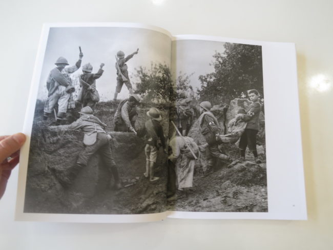
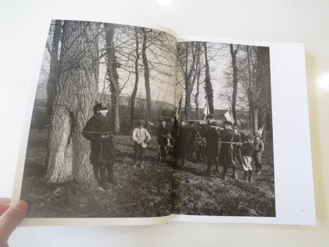
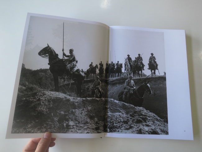
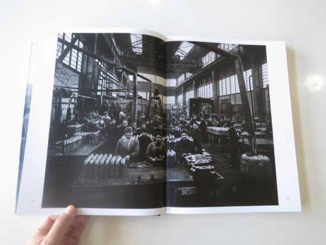
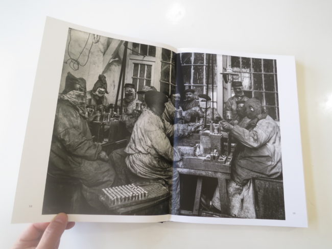
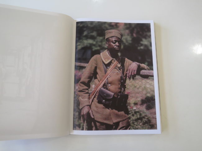
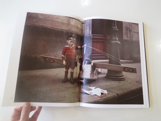
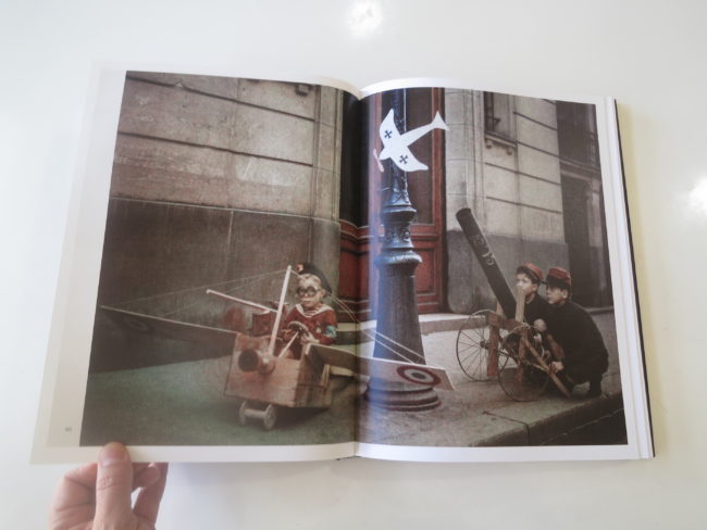
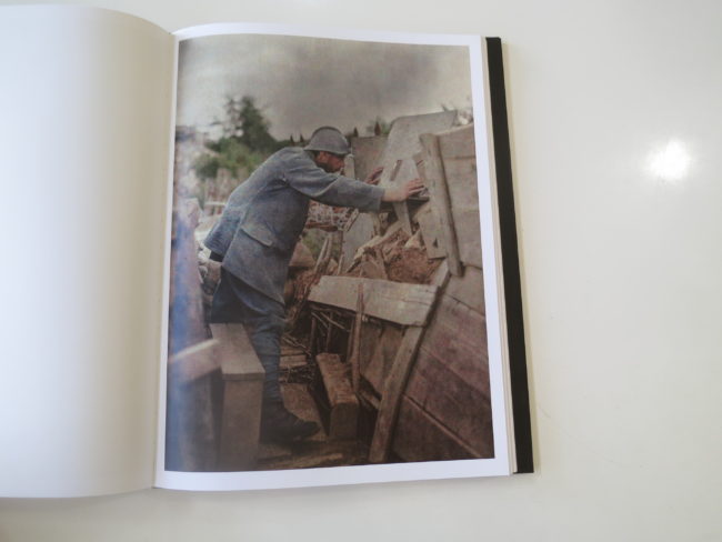
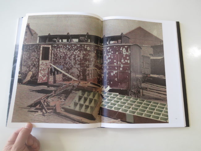
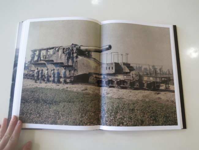
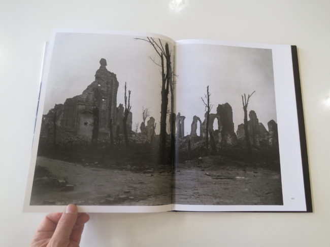
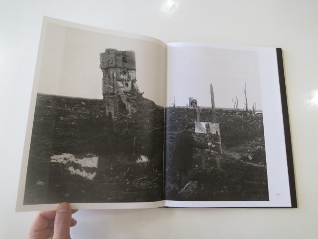
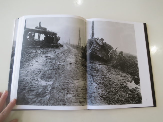
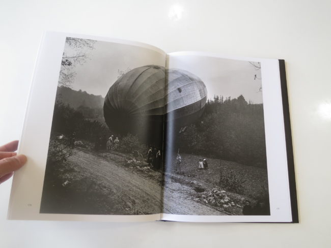
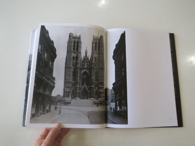
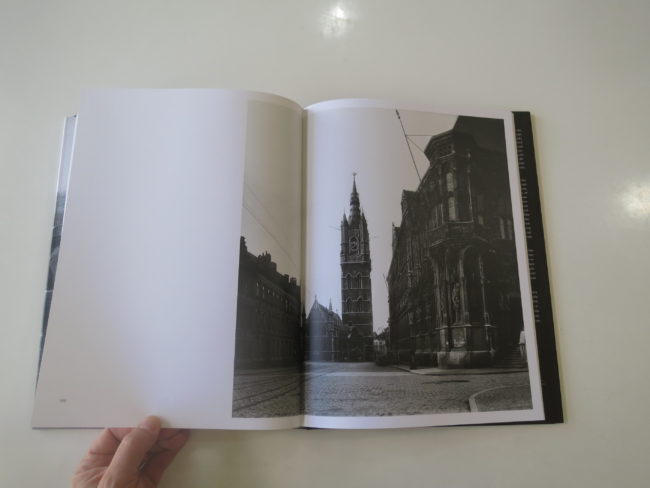
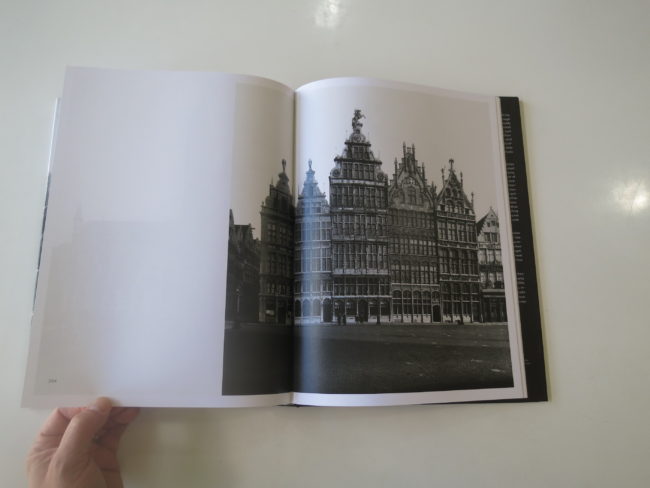
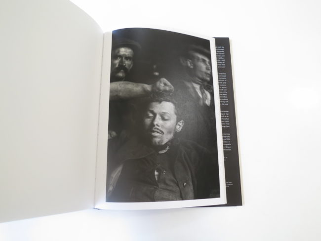
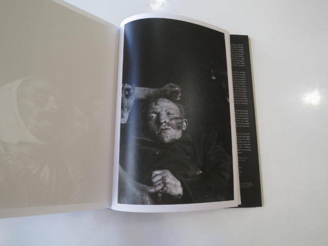
The book is called “The First World War: Unseen Glass Plate Photographs of the Western Front,” by Carl De Keyzer and David Van Reybrouck, in conjunction with an exhibition that happened in Bruges, Belgium, in 2014-15. It features a trove of previously unseen glass plate images from WWI, that have been digitized and cleaned up, which accounts for the killer contrasts and unscratched surfaces.

The sharpness is a result of the glass plates themselves, sharper than any print, and the color images were apparently made using potato starch, instead of collodion liquid.

I’ve always said I’m most excited when I see something I’ve never seen before, and that certainly happens here. The photographs, which were made by different photographers in Belgium and France, are mind-blowing in the best/worst possible way.

Children playing war games. Masked munitions workers, stuffing bombs for the next slate of killing. Razed villages. Bloated corpses in the mud.

We see an armless man selling souvenir postcards in front of the wreckage of the former tourist-spot. Or a soldier, alone, making a painting of the ruins that stand before him.

There are insanely-crisp photographs of Belgian architecture, taken by occupying German photographers, to preserve what was about to be annihilated. If you don’t see the antecedents of the now-famous, dry, Bernd-and-Hilla-Becher style, you’re simply not looking. (Or you might be my Dad, who doesn’t know about photo history, but reads each week because, you know, he’s my Dad.)

Most shocking of all, if you still have any breath left to exhale, are the set of portraits of young, dead, Belgian soldiers, made just after the war’s inception. They were used, we’re told, to identify the bodies of the young men, who all came from the same village, and died on the second day of WWI.

Big ups to the production team at the U of C Press, because these reproductions are about as good as I’ve seen, printing-quality-wise. They jump off the page and spit in your face, daring you to look away.

The sad truth of my job, which has been bothering me lately, is that no matter what I say, no matter how compelling the material I present here, it will never engage with any of Trump’s army.

That’s where were are in 2017. No amount of information, unless it comes from his mouth directly, can invade the pre-frontal cortex of a true believer.

Not even these pictures, which are definitive proof of what can happen, when things go really wrong.

So why do it?

Well, just yesterday, I went to see the new shows at the Harwood Museum of Art, here in Taos. They hired a new Director last year, and he’s doing great work, so there was much on the wall that moved me. 19th Century Spanish retablos, minimalist Agnes Martin grid prints, and some ink drawings, by novelist John Nichols, of Day-of-the-Dead style skeletons that were so good I smiled.

The first thing I did, when I left the museum, was to walk across the street to the art supply store and buy some good paper, a brush, and some Japanese ink, because all of a sudden, I felt compelled to do something beyond photography.

Inspiration is worth its weight in gold.

So I might not be able to imprint upon the minds of a certain type of American, but I don’t write for them. I write for you guys, the creators and difference makers, and if anything you see today inspires you to fight harder, or enjoy a few minutes of respite from the otherwise dire stories out there, that’s good enough for me.

Bottom Line: Fascinating, scintillating, never-before-seen pictures of WWI.

Click here to purchase “The First World War: Unseen Glass Plate Photographs of the Western Front,”

If you’d like to submit a book for review, please email me directly at jonathanblaustein@gmail.com
Personal Project: Sara Forrest

The Art of the Personal Project is a crucial element to let potential buyers see how you think creatively on your own.  I am drawn to personal projects that have an interesting vision or that show something I have never seen before.  In this new revised thread, I’ll include a link to each personal project with the artist statement so you can see more of the project. Please note: This thread is not affiliated with any company; I’m just featuring projects that I find.  Please DO NOT send me your work.  I do not take submissions.

Today’s featured Artist: Sara Forrest

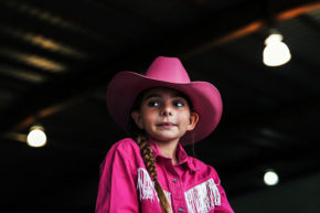
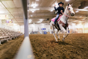
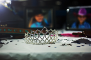
http://saraforrestphoto.com/personal/RODEO-QUEENS/8

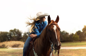
Growing up in ‘flyover country’ we were surrounded by the largest expanse of tall prairie grass in the world.  These are the Flint Hills, outside of Topeka, Kansas.  The wind moves through the tall grass, bending it and pushing it in waves, and it feels like you are standing on the edge of a vast green ocean.

My love for environment has always sparked my creativity, and I’m so grateful to have grown up in a family and a place with no preconceived notions of what I could or could not do.  My family and close friends have always encouraged to follow my dreams, so many years ago, I moved from Topeka, Kansas to NYC.  Lately, I find myself romanticizing my experience of growing up on the prairie.  Sometimes it takes leaving a place to realize how much it is a part of who you are.
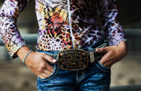
This Rodeo series was shot in Topeka one late Friday afternoon last fall.  I had always been aware of these competitions, though I never had an opportunity to attend one, so once I found out about it, I grabbed my camera and headed out the door with absolutely no idea of what the next two hours would bring.  I’m so grateful to have spent that afternoon with these wonderful young women.  The contestants were all hopeful and nervous as they prepared for a weekend of competition.  Most of them have been riding horses on their family farms and ranches for as long as they could remember and all of them worked really hard to compete there.  Their enthusiasm was contagious, and every time I see these photos, I’m reminded of how important it is to follow your dreams.
Whether I am working on a personal project or on assignment, I always strive to make images that are honest and authentic.  Photography transcends language and cultural barriers, and my camera gives me the opportunity to share a special moment and energy in a particular space and time. My career as an image maker has allowed me to connect to so many people and unique environments…situations that a young woman growing up on the prairie could only imagine.  I’m so fortunate and so happy to do work I love, and I never take it for granted.

APE contributor Suzanne Sease currently works as a consultant for photographers and illustrators around the world. She has been involved in the photography and illustration industry since the mid-80s. After establishing the art buying department at The Martin Agency, then working for Kaplan-Thaler, Capital One, Best Buy and numerous smaller agencies and companies, she decided to be a consultant in 1999. She has a new Twitter feed with helpful marketing information because she believes that marketing should be driven by brand and not by specialty.  Follow her at @SuzanneSease.

The Getty Research Institute’s Online Palmyra Exhibition


When I got to college in 1992, Pearl Jam was a big deal, and Kurt Cobain was still alive. The first Gulf War had recently ended, and Bill Clinton had not yet assumed office.

As a freshman, I took a Poli Sci class with a fiery professor, and learned a lot about the Cold War, and Spheres of Influence. We were taught about an important book, which had just been released by Francis Fukuyama, which theorized “The End of History.” (Insert ironic joke here.)

It’s now 2017, and for the last three semesters, I’ve been teaching Art History at the local community college. The class is called “Introduction to Art,” and I enjoy sharing my passion with a bunch of Post-Millennials who were reared on screens, calm in the knowledge that Barack Obama had their backs.

As I built my curriculum, I realized that for thousands of years, art was used in service of wealth and power, with few exceptions. This idea of personal expression, speaking truth to power, and radical innovation, that drives the best in contemporary art, would have been unimaginable to our artistic forebears.

Rather, artists and craftspeople were recruited, (if not compelled,) to make objects, buildings and images that communicated directly to an illiterate populace. The message was consistent across cultures: We are in charge. We are the ones bestowed with divine right. Cross us at your peril.

There have always been people who craved power, and were willing to do whatever it took to exercise control over others. Whether out of a desire for riches, because of actual belief in a religious theology, or because they simply craved violence and destruction.

Today, we look back on these artifacts as our collective, cherished history. One can spend hours traversing a great museum, like the Met or the Louvre, and wander amidst objects that reach back 5000 years, and there are often more commonalities than differences. (A basalt Ganesha from India and a basalt giant Olmec head from Mexico are not that different, when you get down to it.)

Hitting up your local museum, if you live in a major city, is far easier than catching a flight to Rome to walk through the Forum, before taking a train to Bari, grabbing the boat to Corfu, taking another boat to Athens, and then perusing the Acropolis for a little compare and contrast.

But sometimes, if you live in the sticks like I do, even getting to a major city can be too much. (Cash, time, you name it.) Thankfully, the best minds, or at least the people in the best museums, have begun to respond to that reality. (And to the fact that the aforementioned youth of today treat their screens as de-facto glass windows into reality.)

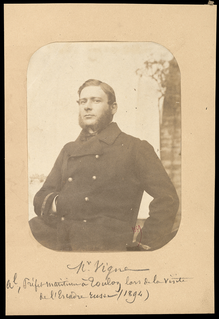
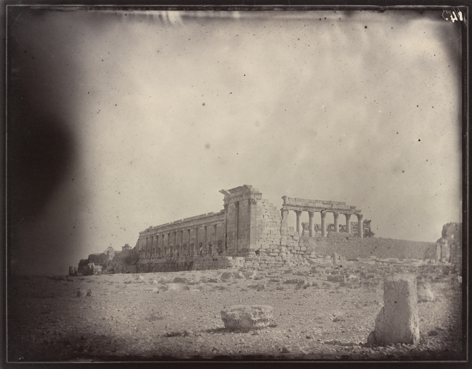
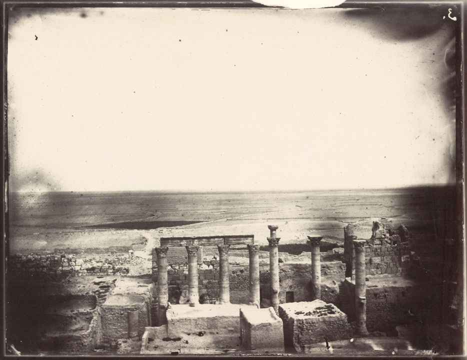
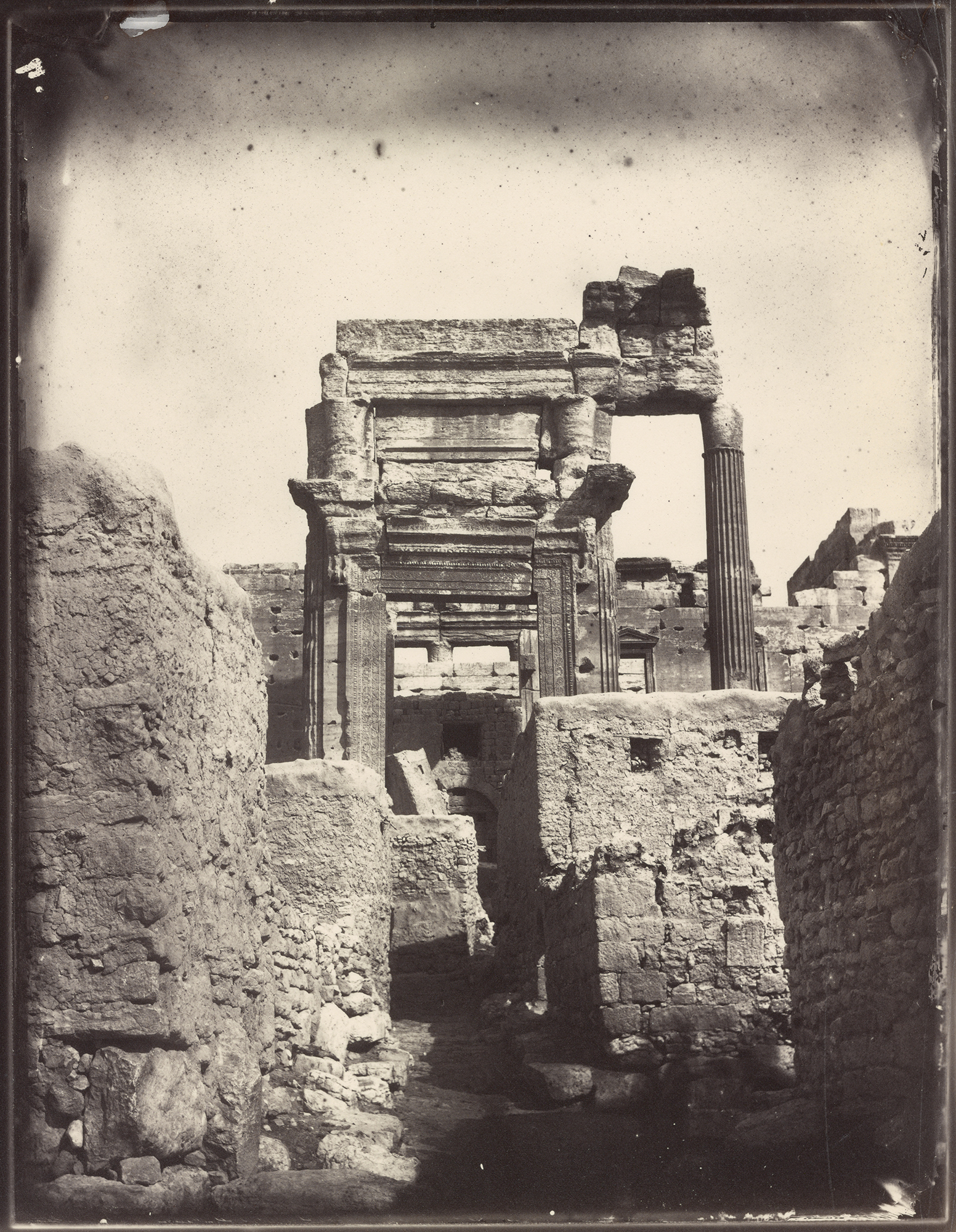
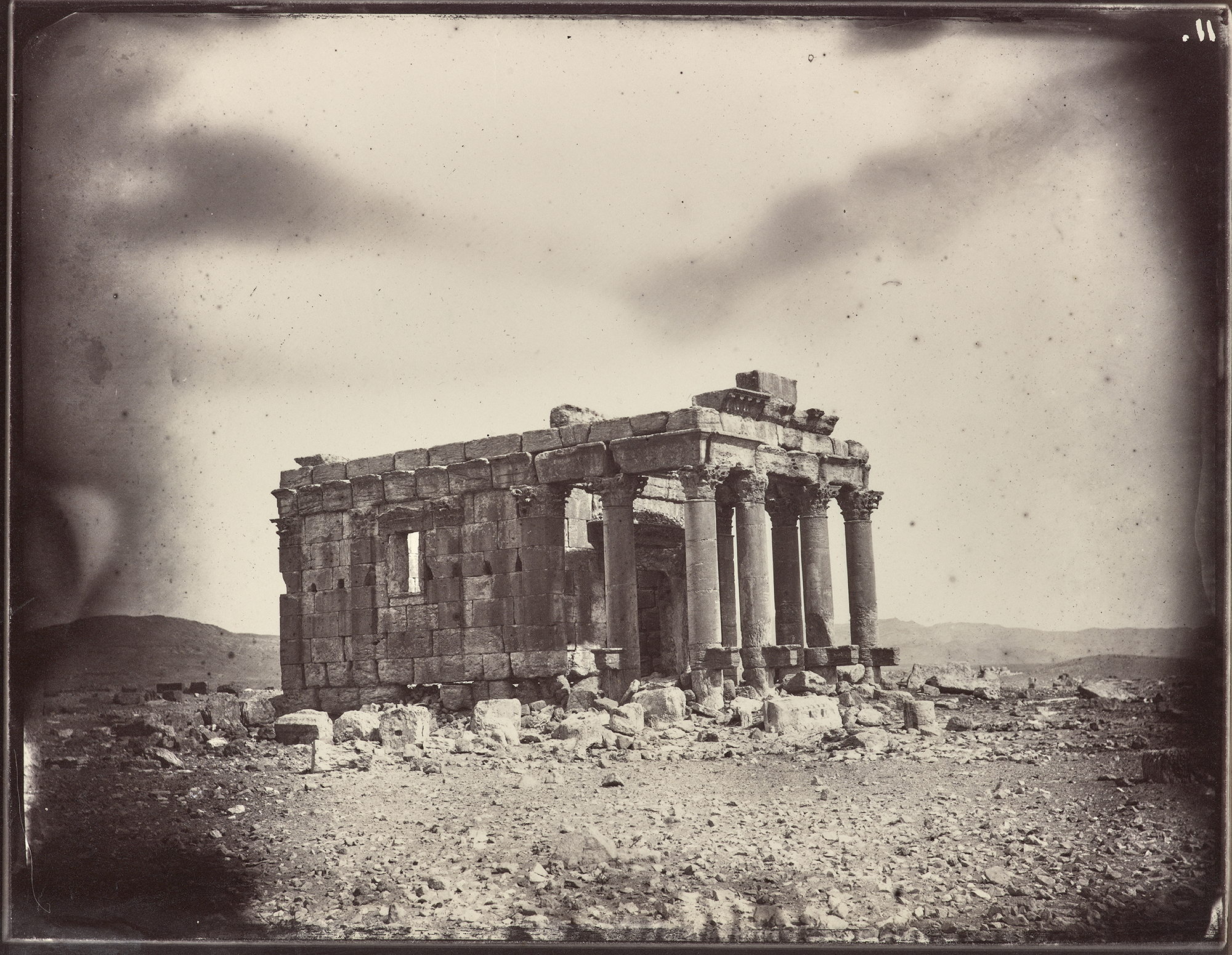
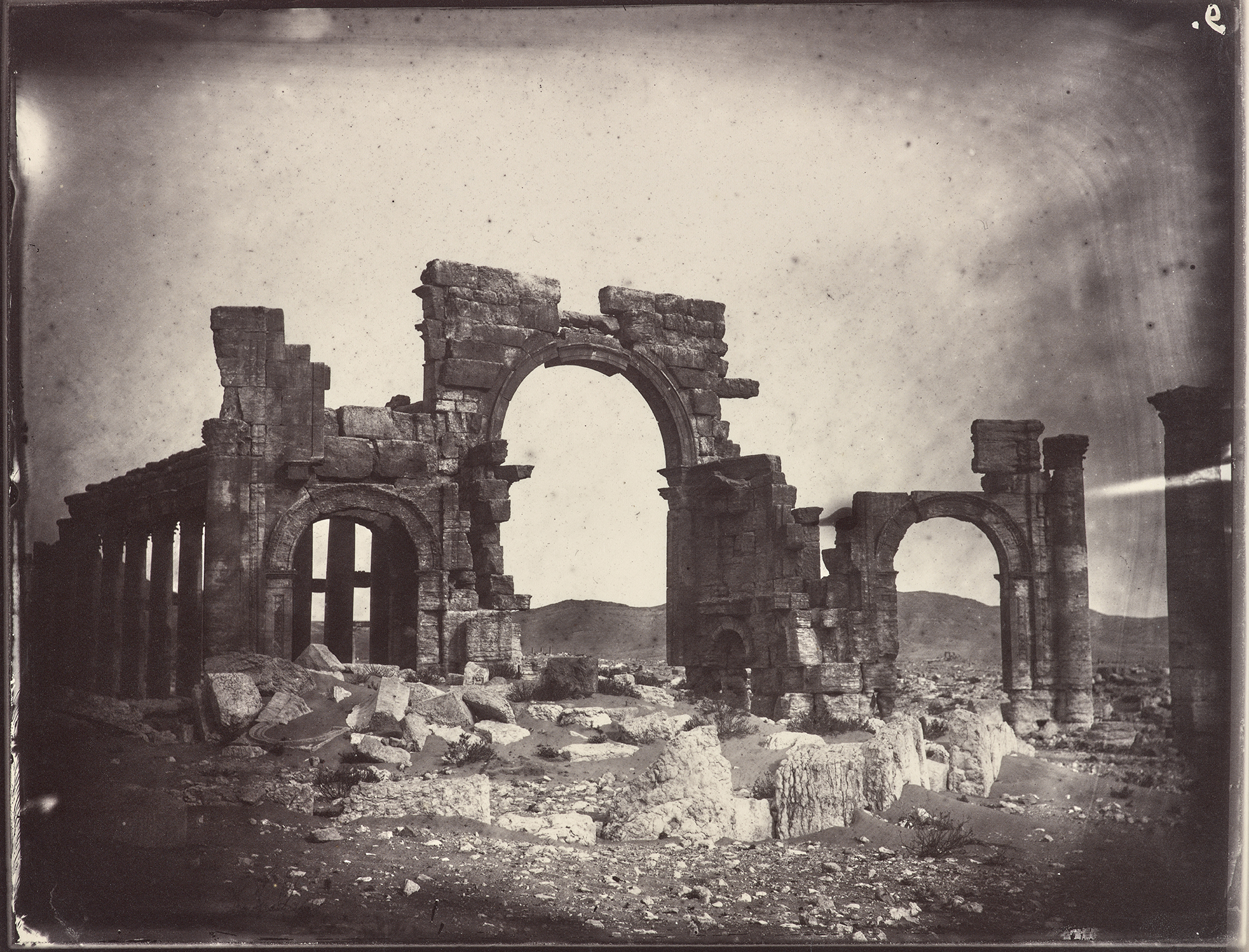
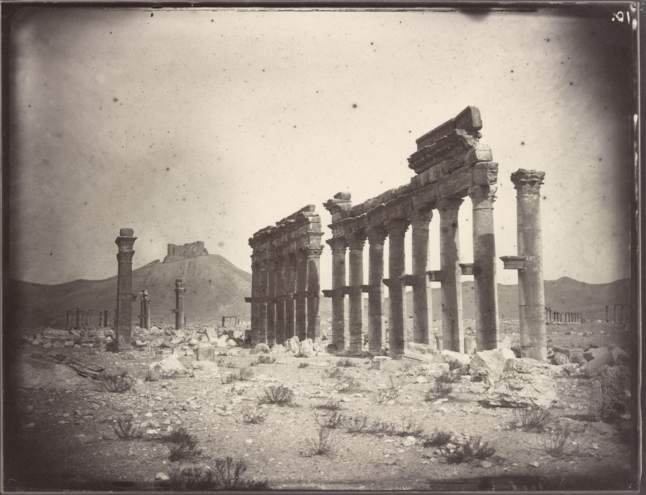
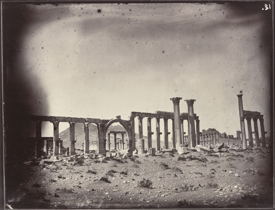
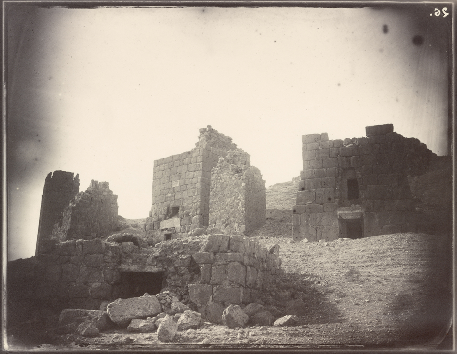
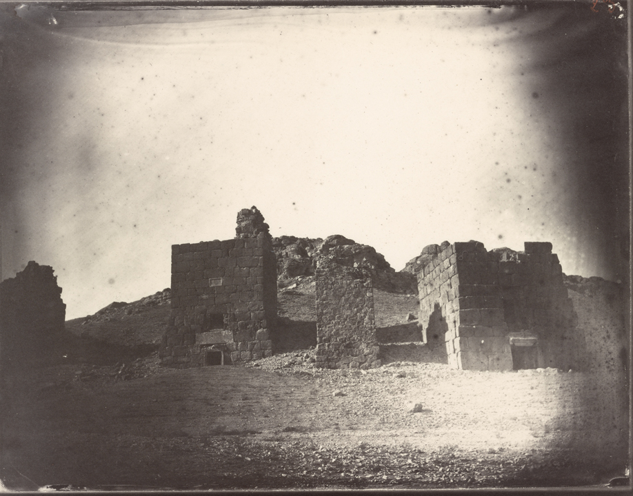
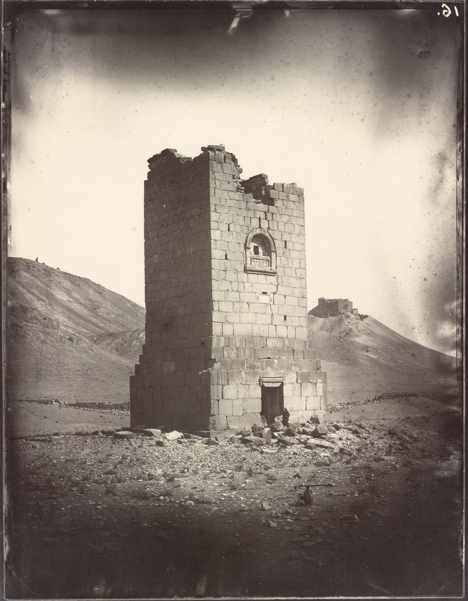
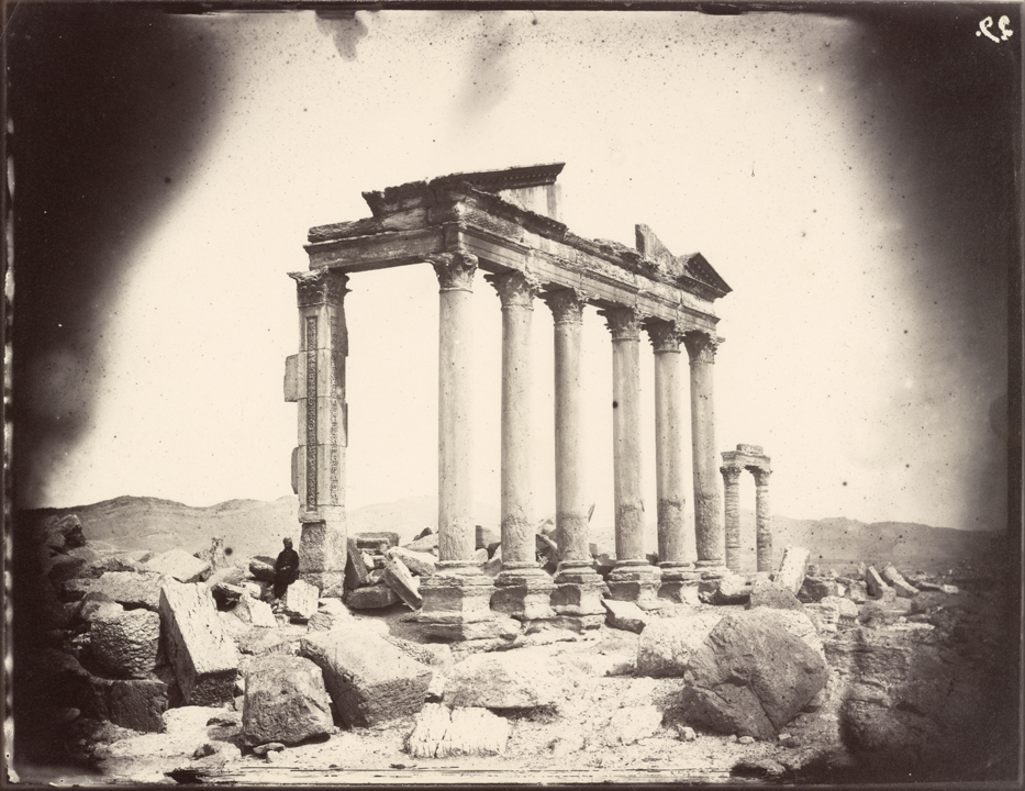
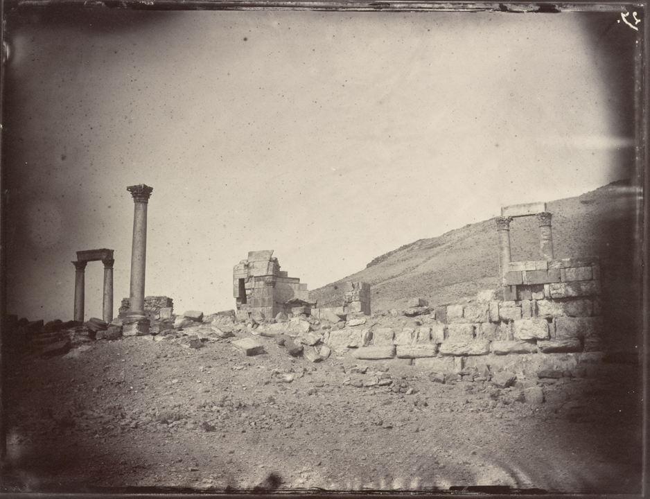
I wouldn’t be me if I didn’t ramble, but I always get to the point eventually. This month, in our new feature highlighting fascinating digital portfolios, we’re headed back to the 19th Century, when the French sea captain Louis Vignes first visited the ancient Syrian desert Oasis city of Palmyra.

Earlier this year, the Getty Research Institute in LA published, “The Legacy of Palmyra,” which they believe is the world’s first entirely online art exhibition. It features Mr. Vignes’ amazing photographs, alongside other visions of the city, which reached its peak in the 3rd Century AD, before it was conquered by the Romans.

As if we needed further refutation of the absurd idea that history can ever end, (beyond our fearless leader D. Trump,) his best buddy Vlad Putin has used his propaganda outlet, the RT network, to release visions of Palmyra today, as they’ve recently taken the city back from its former captors, ISIS. (Also known in this column as The. Worst. People. In. The. World.)

If you’re unaware, ISIS used Palmyra for target practice, in 2015 and again this year, much as they destroyed priceless historical artifacts in the Iraqi ruins of Nimrud, near Mosul. They released videos of the art-slaughter, which featured gleeful dickheads doing damage to things that belong to all of us. (IMHO.)

The GRI’s exhibition, which is as cool as ISIS is terrible, is an extensive effort to highlight the manner in which history remains relevant. It took a year to produce, featuring copious hours by a well-constructed team, which was led by curators Peter Bonfitto and Frances Terpak.

Ms. Terpak was kind enough to agree to an interview, so I could learn more about the Louis Vignes pictures, and the exhibition in general.

It all began back in 1864, when a French aristocrat, Honoré Théodore Paul Joseph d’Albert, the duc de Luynes, was organizing an expedition to the Middle East, as he was desperate to visit the Dead Sea, among other locations. (Including Petra and Palmyra.)

Many photographers working today are aware of the subset of photo history, in which independently wealthy people have risen to the top rank of the medium. (I’m not naming names, but then again, I don’t have to.) The tradition of the upper crust adventuring and creating is nothing new, and explains the origin of the Vignes photos.

“The duc, given his status, could self-fund this trip to the Dead Sea,” Ms. Terpak said. “He built a small team of scientists, with a geologist, a naturalist, and the duc himself, who studied archaeology and had an interest in biblical studies.”

“He wanted to take someone on the trip who would also record it photographically. With Vignes, what he got was a sailor who also knew the ports in the Eastern Mediterranean, and he was a photographer.”

Much of what transpired has been lost to history, she told me, including whether Louis Vignes made significant work after his excursion, but it is believed the duc hired the famed French photographer Charles Negre to teach Vignes how to make prints in the field.

The Getty Research Institute purchased the Palmyra prints in 2015, and received such an outpouring of interest in a blog story about the acquisition, (and a concomitant promotional Facebook post,) that the curators realized there was an untapped desire for further information. Surprisingly, the acquisition was made before ISIS destroyed much of the Palmyra ruins, but the subsequent ISIS attack made it all the more relevant.

Research institutions like the Getty have a mission to preserve and educate, and working within cyberspace allows them to reach all the people who can’t spend a day exploring the two lovely campuses on the West Side of LA.

Ms. Terpak confirmed as much, when she said, “As I think is evident, we wanted the audience to be everyone. From the specialist who knows Roman History and the Eastern Mediterranean, to the high school student who is approaching current events, and is curious about why Palmyra is important.”

“I think 80% of the site is downloadable. Everything the Getty owns is downloadable, and can be printed.”

She added that the site is also being translated into Arabic at the moment, so it can be better accessed by people who are actually being disrupted by War in the Middle East.

We also discussed why Putin is so intent on associating himself with Palmyra, as it has little strategic import in a larger war. Its power, rather, is symbolic, as it associates him with the history of human civilization, and the many rulers who’ve been etched into stone.

“I think ancient monuments throughout the ages, from the ancient to the present, have always been symbols for rulers to promote themselves, and to show their right to be in power, because they are connected with these great civilizations of the past,” she said.

“I don’t find it surprising that Putin is doing this.”

Lest you doubt me, just today, not minutes before I started writing, I discovered this article claiming that the Syrian Army had “annihilated” one of the perpetrators of the Palmyra destruction, and this fresh video from RT that shows Russian soldiers clearing land mines from the recaptured ruins.

We also discussed why ISIS would go out of its way to do such things. Victors have always raped and pillaged, to our eternal human shame, but this seemed so deliberate. So evil. (A word I typically avoid.)

I asked her why she thought they did it, and she replied, “Syrians don’t want to leave Syria. What people like ISIS are doing is they’re causing not just destruction of the monuments, but they’re forcing the people to leave because they’ve lost their heritage.

“They’ve lost their income. Palmyra was a site for tourism, and by destroying it, it’s destroying its economy.”

Ultimately, though, this is a photography blog, and the Louis Vignes pictures are pretty astonishing. They capture a place that no longer exists, and the thought that we need to reach back to the 19th Century for documentation is rather sad.

That said, Louis Vignes did not see the Palmyra that ISIS encountered, as some of what they destroyed was actually reconstructed by archaeologists in the 20th Century. The Vignes pictures far better reflect the Palmyra that sat, hidden in the desert for centuries, before being “rediscovered” by English explorers in the 18th C.

It was a multi-cultural place, even in antiquity, as it was a cross-roads between the massive Roman Empire to the West, and the Parthian Empire of Persia to the East. Ms. Terpak added that much of the 20th Century scholarship was conducted by Polish and Japanese teams, so the fact that it’s currently being mined by Americans digitally, and Russians IRL, is nothing new.

The Vignes images, quiet as they may be, speak for themselves. While I’m rarely at a loss for words, (including here, as we just cracked 1600,) I don’t think there’s much I need to say, description wise. They’re fantastic, and I’m very grateful that the GRI has allowed us to publish them here. (Again, you can download and print them directly, should you so choose.)

Rather, I think I’ll let Ms. Terpak have the last word on the pictures, as she’s earned the right.

“I think they’re haunting,” she said. “They just evoke the mystique of the place. I’m very upset that I never visited before 2010, because it clearly was a very special place.”

Louis Vignes, self-portrait, 1859, courtesy of the Getty Research Institute
Louis Vignes, 1864, courtesy of the Getty Research Institute


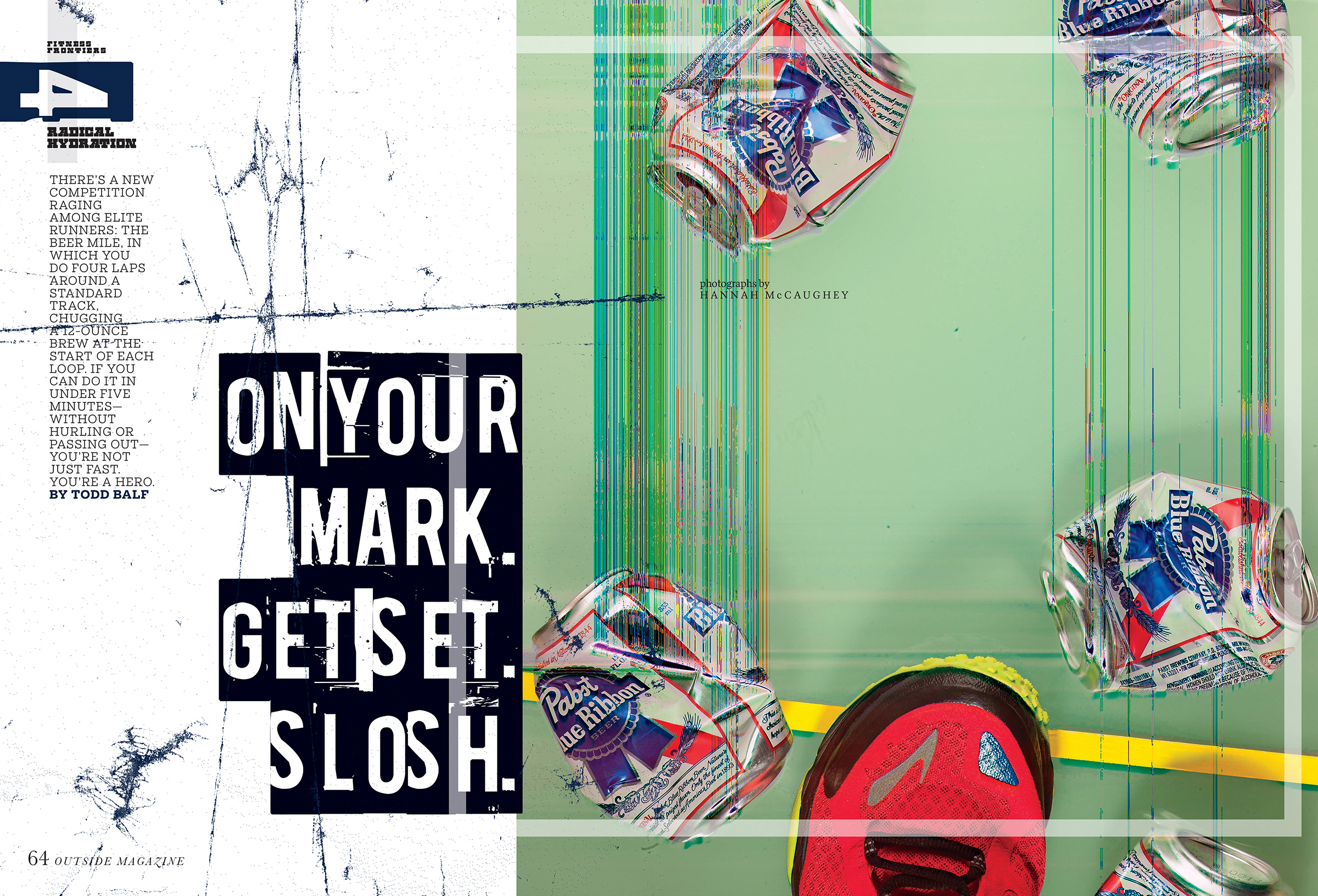
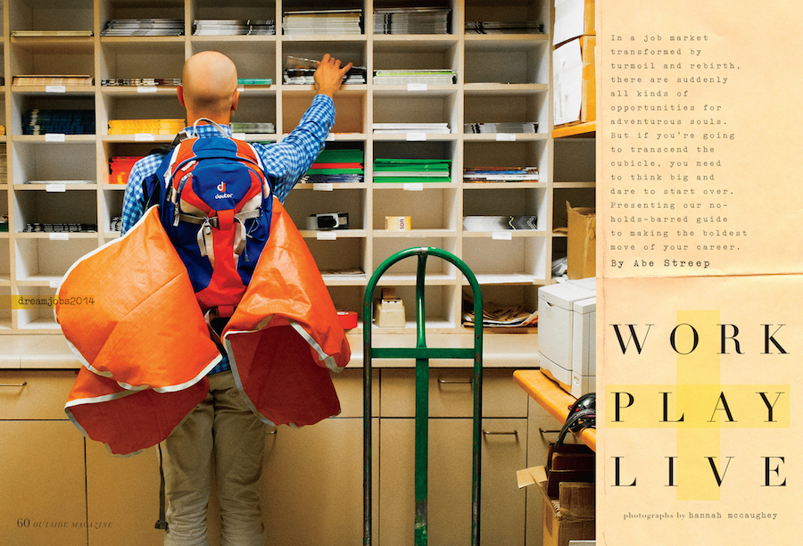
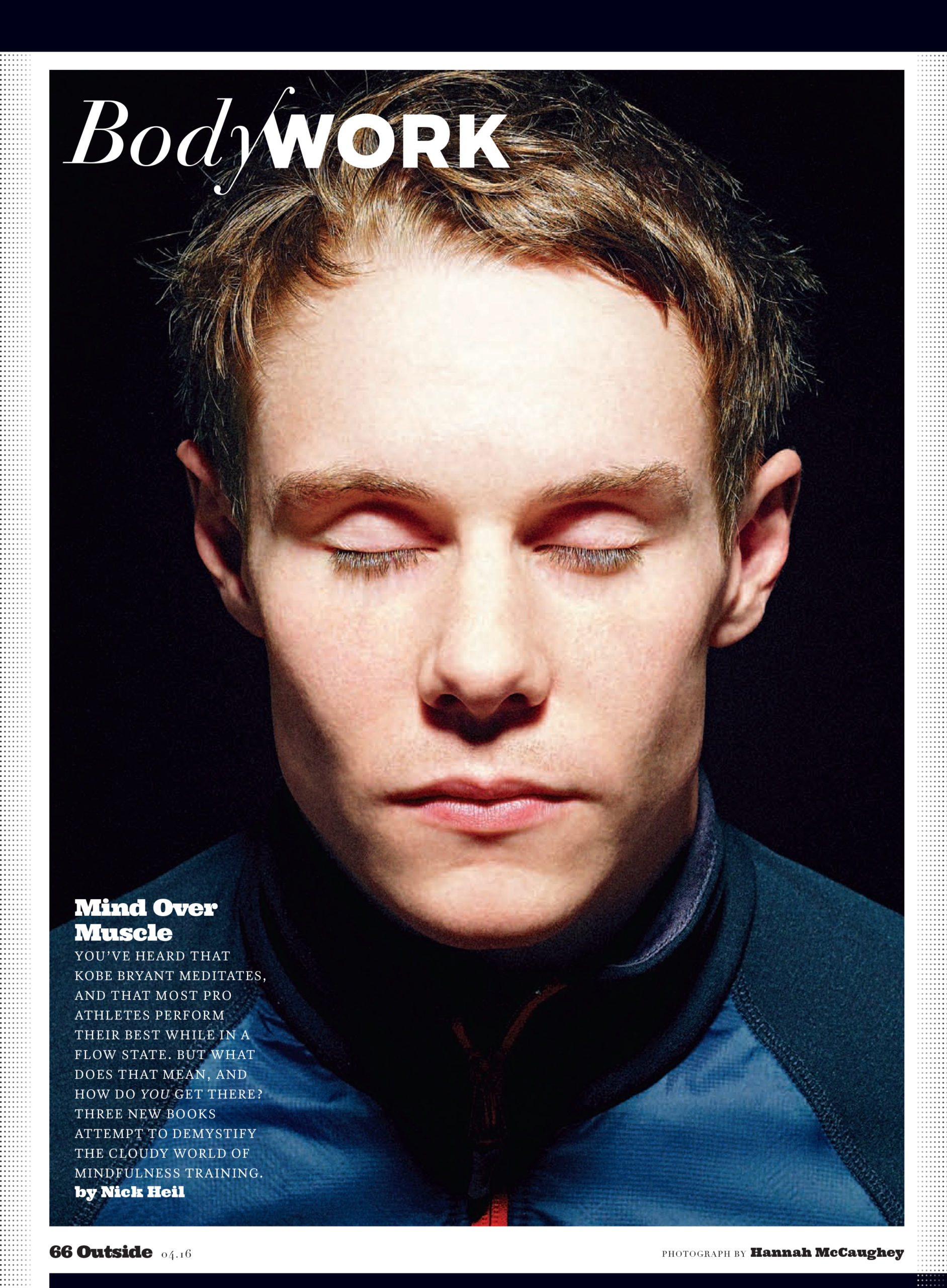
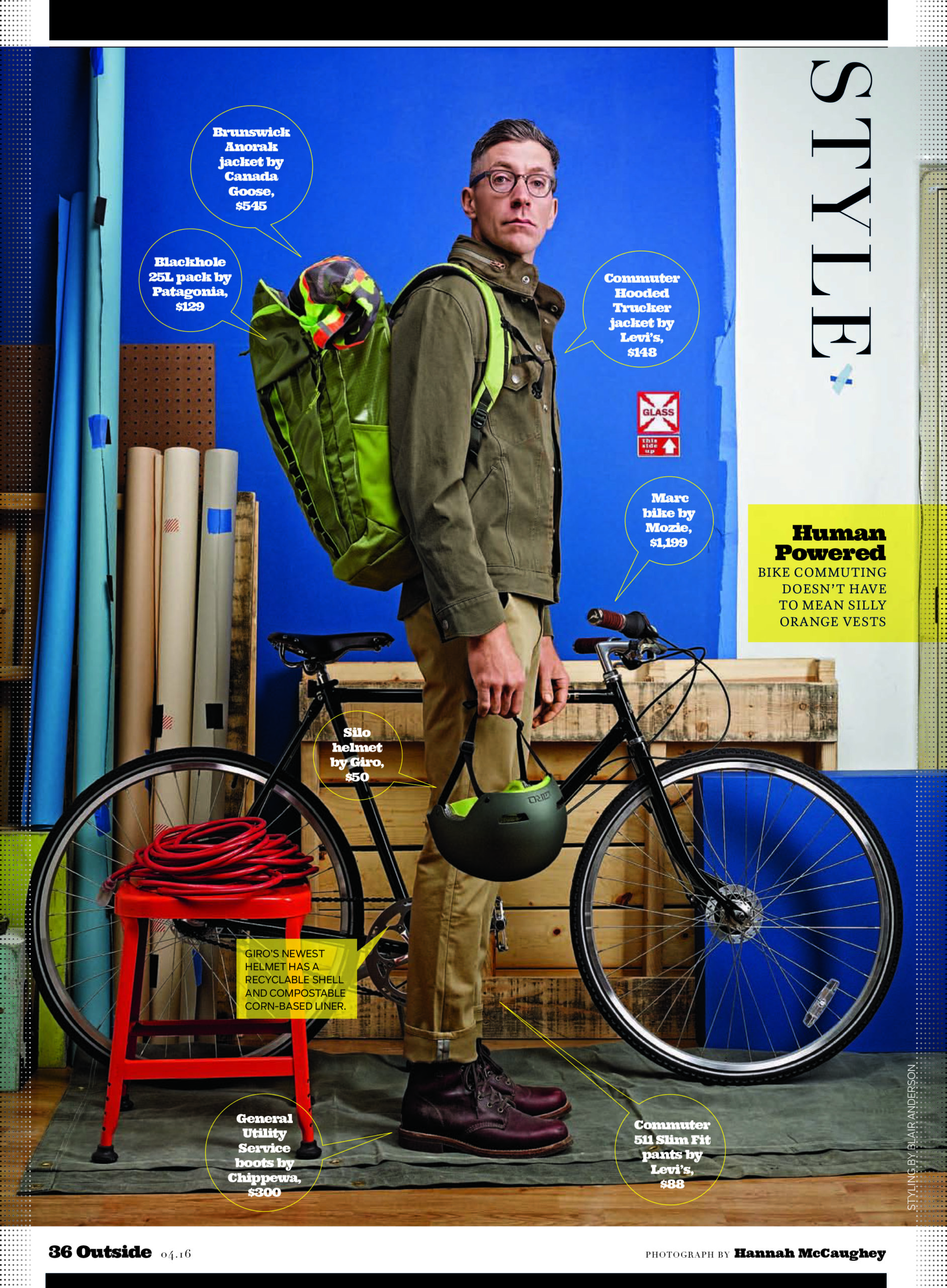
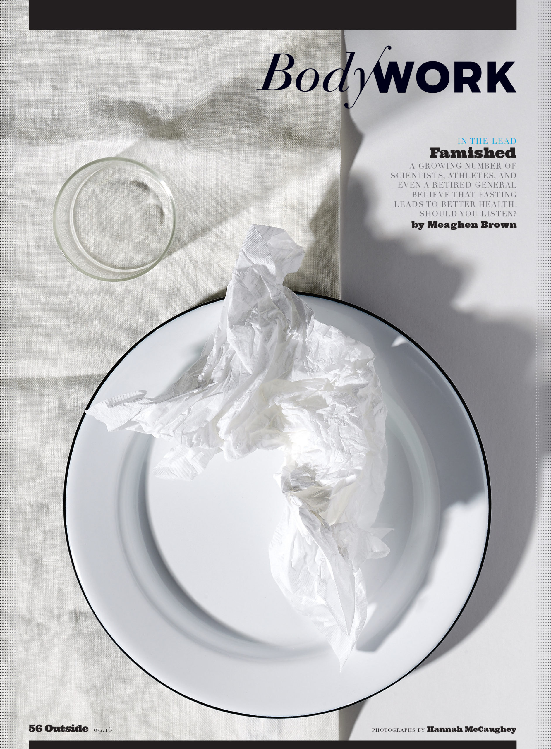
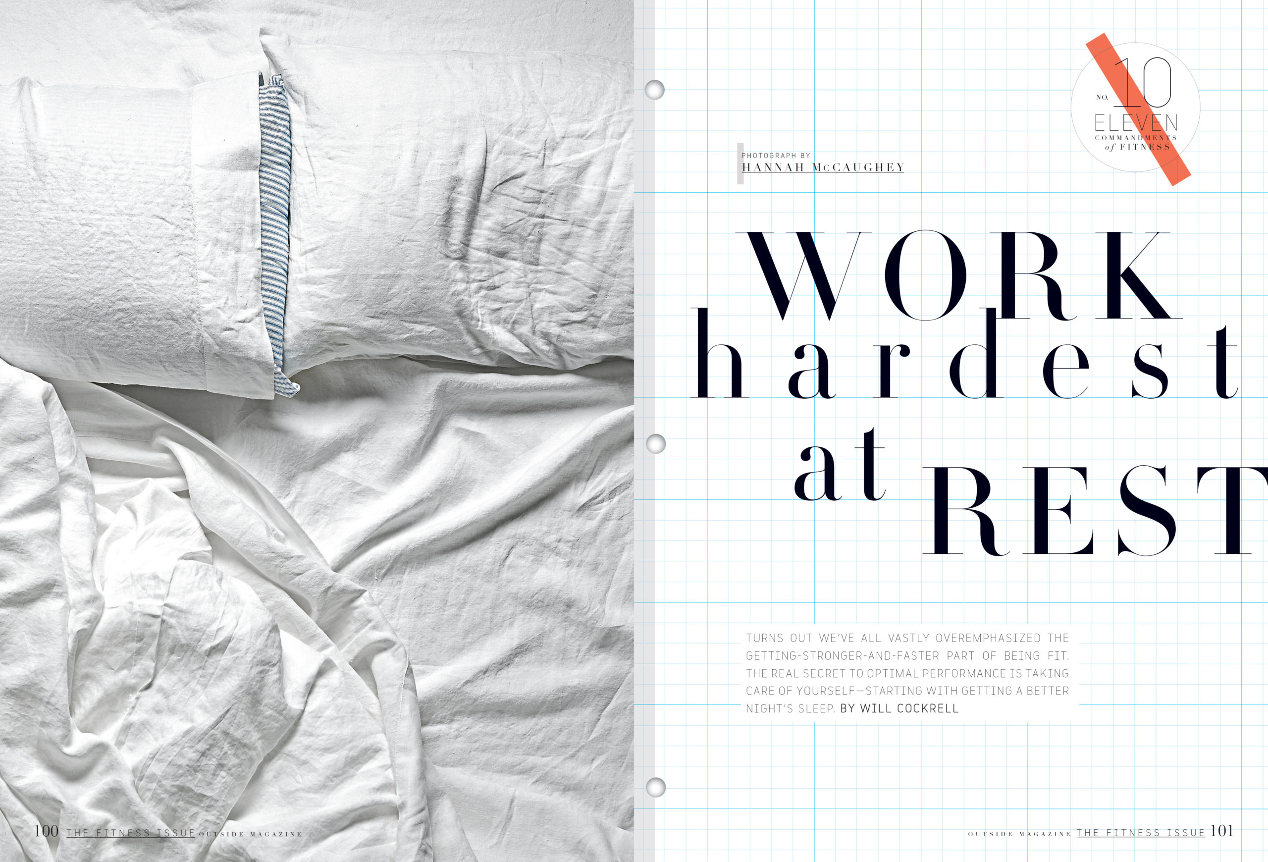
The Daily Edit – Design Director/Photo Director/Photographer: Hannah McCaughey


Outside Magazine

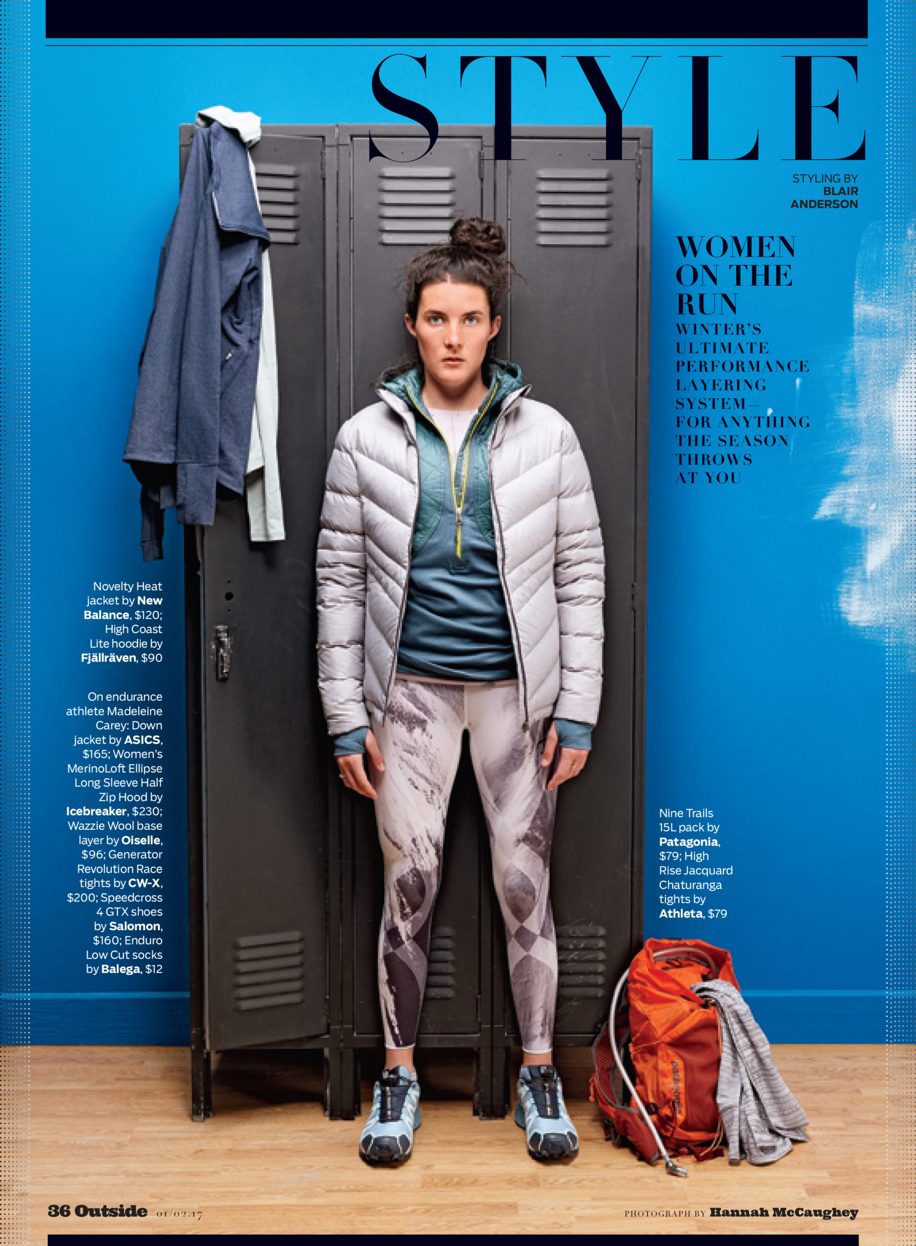
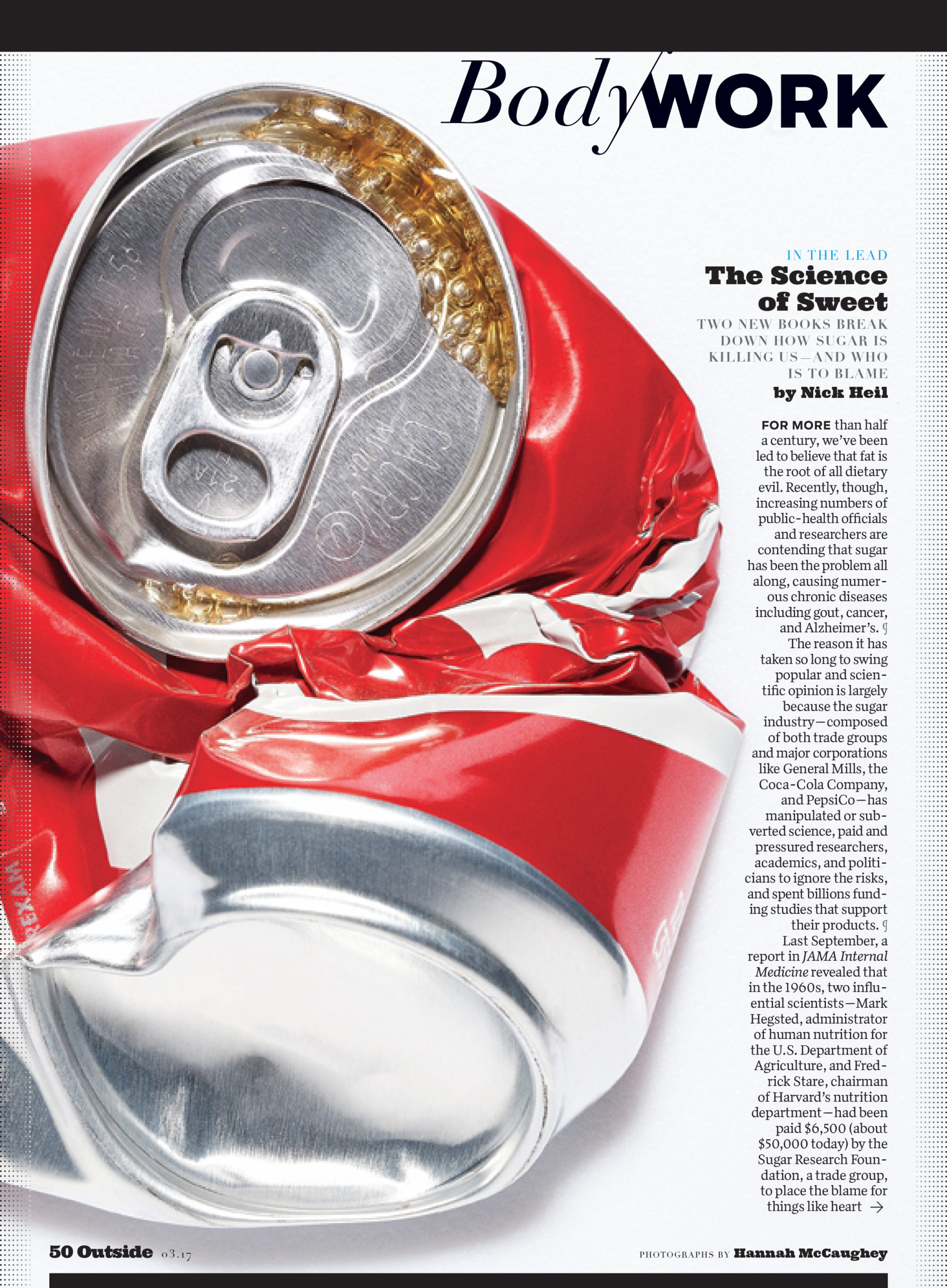
Design Director+Photo Director: Hannah McCaughey
Photography Editor: Amy Silverman
Deputy Art Director: Petra Zeiler
Assistant Photography Editor: Madeline Kelty
Junior Designer: Erica Clifford
Photographer: Hannah McCaughey

Heidi: I loved seeing your images in the latest issue, such a talent. Was this exciting for you?
Hannah: Yes, mainly because it’s a lot of fun, and by shooting a few things in house every month, we stay out of trouble with our accounting department. It allows us to save resources for the more ambitious projects in the magazine.

It’s similar to the way I feel about my design work. I don’t wow myself very often, but I find the process of it thoroughly enjoyable. I’m guessing that it’s this never fully satisfied, quasi-dissatisfaction that propels me forward. With every picture I (very spastically) make, the minute I see it in print, I see only what could have been better about it. It’s not that I’m aiming for perfection. It’s more like a running list of missed opportunities. This kind of thinking is well suited to the “work in progress” nature not just of life, but also of the cyclical nature of magazines. The repetition affords infinite possibilities to learn and grow, and it provides a kind of forgiveness for what went wrong. Much like in real life (although this example never happens), every day that I yell and scream at my kids to get dressed, eat breakfast, put on their shoes, file into the car to get to school on time, I can think about tomorrow and how we’ll be skipping and singing the whole way.

You’ve held the position at Outside as design director and photo director for some time; racking up several design and photography awards. Tell us about your evolution as a photographer.
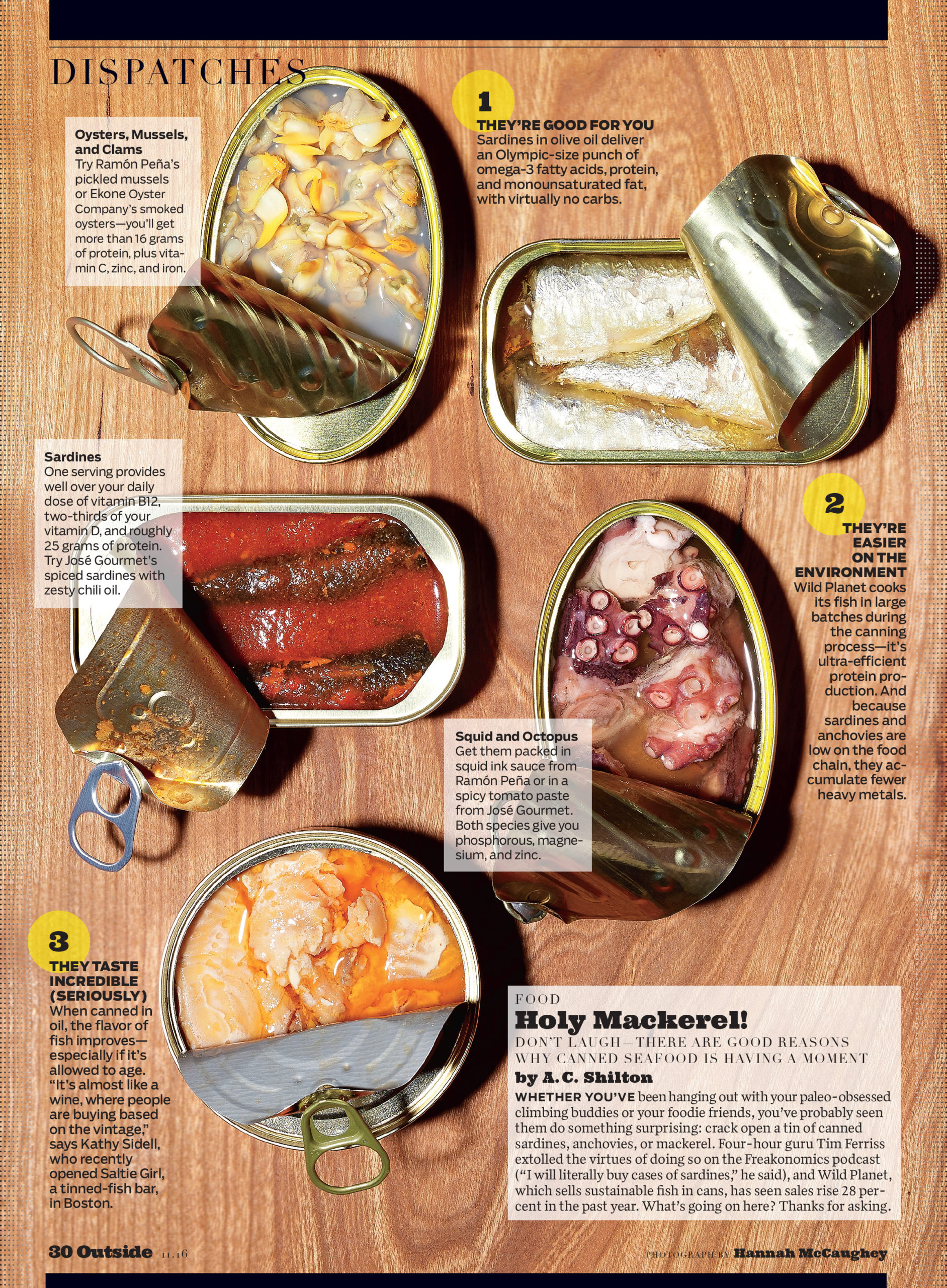
Part of me was working at staying creatively engaged and satisfied. Sixteen years working on the same title has its wonderful moments and challenges. And I must have had enough bad art-directing moments in a row to where I thought to myself, “Why don’t I just shoot it myself?” And that thought alone was like ding! “Hey. Why. Don’t. I?”

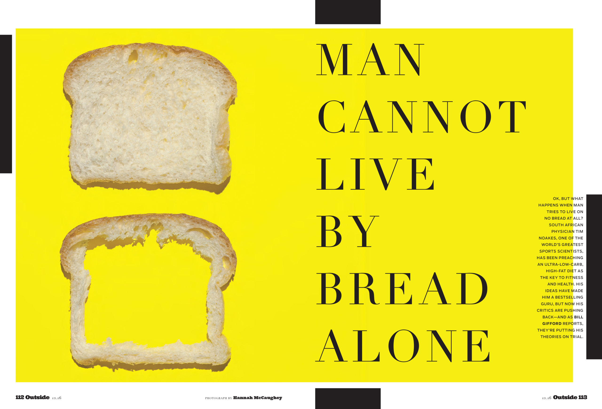
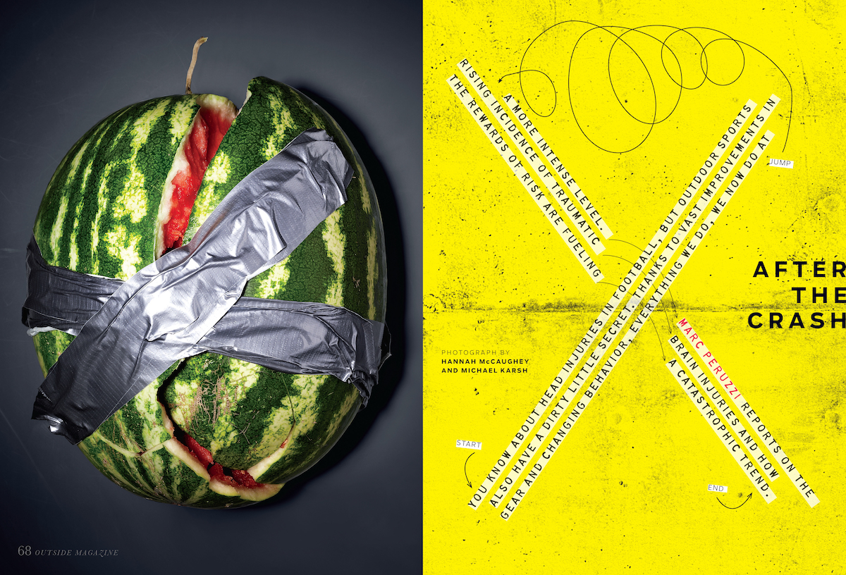
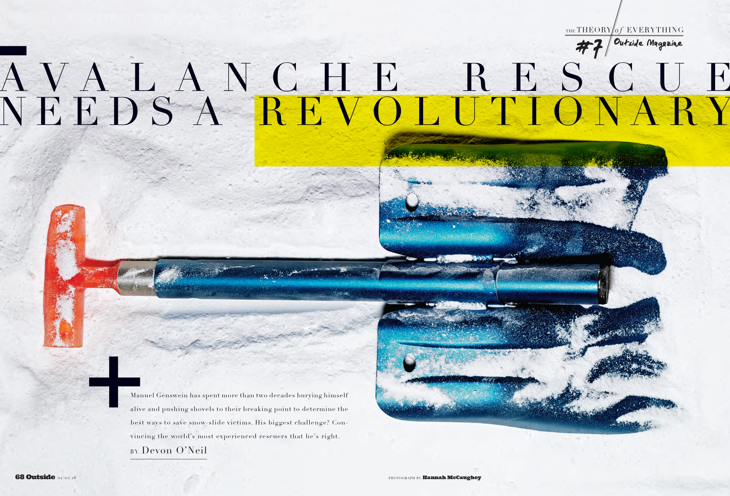
Disclaimer: I’m not sure I’m ready to call what I’m doing photography exactly. I have so much help on both the front end (with assistance setting up all the lights and the camera) and on the back end (with pretty generous retouching). Because I’m so inexperienced, I’m forced to keep things incredibly simple. The idea itself is mainly what these images have going for them. Often, if these weren’t accompanying a specific story, I’m not sure they’d make any sense, and they’re not particularly beautiful or artful. I sometimes wish there was another word for it.

I started super low tech with my iPhone, some Xerox paper (for backdrop and bounce), my desk, and the New Mexico sunlight that comes into my office like a klieg light every afternoon. When I thought I had something that looked even remotely “profesh,” I got up the nerve to ask one of our photo assistants at the time, Michael Karsh, to help me work the camera and set up lights in the studio to shoot it for real. Since he moved back to San Francisco, I have been shooting and learning a lot from Dustin Sammann, who is the most patient and generous teacher on the planet. We created a new kind of freelance position for him: über assistant (when he’s not the photographer himself). Which is basically assisting someone who is super “special”—a.k.a. me.

With your understanding of great photography and composition from your design background, did you feel like, “I can do that”? Clearly, those skills come into play.
Now that I’ve dipped my toes in, I am—more than ever-—blown away by the giant talent and creative genius of the people who contribute to magazines (ours and others). My eyes have been exposed to so much amazing art, dating back to my early days at Rolling Stone in the nineties, and I hope some of it has rubbed off. Some parts of it, like finding a good balance in composition and seeing negative space, come more easily now. But part of the appeal is how much more there is out there for me to learn.

The magazine industry has certainly changed—budgets are lower, multitasking is essential. How does your creative control behind the camera influence your design? Most photographers don’t have a keen understanding of the book as a whole: layout, the volume of text.
Working as the art director gives me a huge, almost unfair leg up on shooting for this magazine. I go into it knowing what the headline is, how much space we have for art, what hasn’t worked in the past, why the story is running in that particular month—or what role it plays in the mix of stories planned for that issue—because I was there in the meeting when it was discussed as a pitch. I know what pitfalls the editors are worried about avoiding, the narrative arc; sometimes I know the writer personally. Add to that, I sit and design pages about 50 steps from where we shoot the art. I can literally ping-pong back and forth between the set and my desk with the layout on my screen (and text on the page) to see whether or not a shot is working. If it doesn’t work, we try something else. And if at day’s end it’s still not working, we try again the next day.

The upshot is that those two halves of my brain—photographer and designer—don’t always agree. Sometimes I’ll have a picture that I would love to see printed and another one that’s better suited to the story. The two halves have to fight it out. In my case, the art director always wins, because she is older (and crabbier). And now I know how that feels for contributors who say, “But why didn’t you print this one? It’s clearly the better photograph.” To which I have to say, “I totally agree, but this one works better for the story.” Not the easiest thing to have to hear or say.

Recently, I had a shoot where I was asking our cover photographer to try it this way and cover it that way “so we could have loads of options.” That’s something I think art directors say because we feel like that’s what’s expected of us by our bosses.  To which he said, “Why? Why do you need options? We have something we both like. We should be done.” It was a record-skipping moment for me, the photographer part of me could totally relate: Why do we feel like we have to “cover it” this way and that way and every way possible? Why can’t we just say that’s amazing! and that’s a wrap? Is this something that happened when we started ordering half caff extra hot no foam 2% lattes at Starbucks? Or, it is because we aren’t shooting film so we feel like why not shoot it every which way? I don’t know the answer to this one.

What made you choose to start doing still-life? Was this partially a response to the expense of sending gear out to get shot?
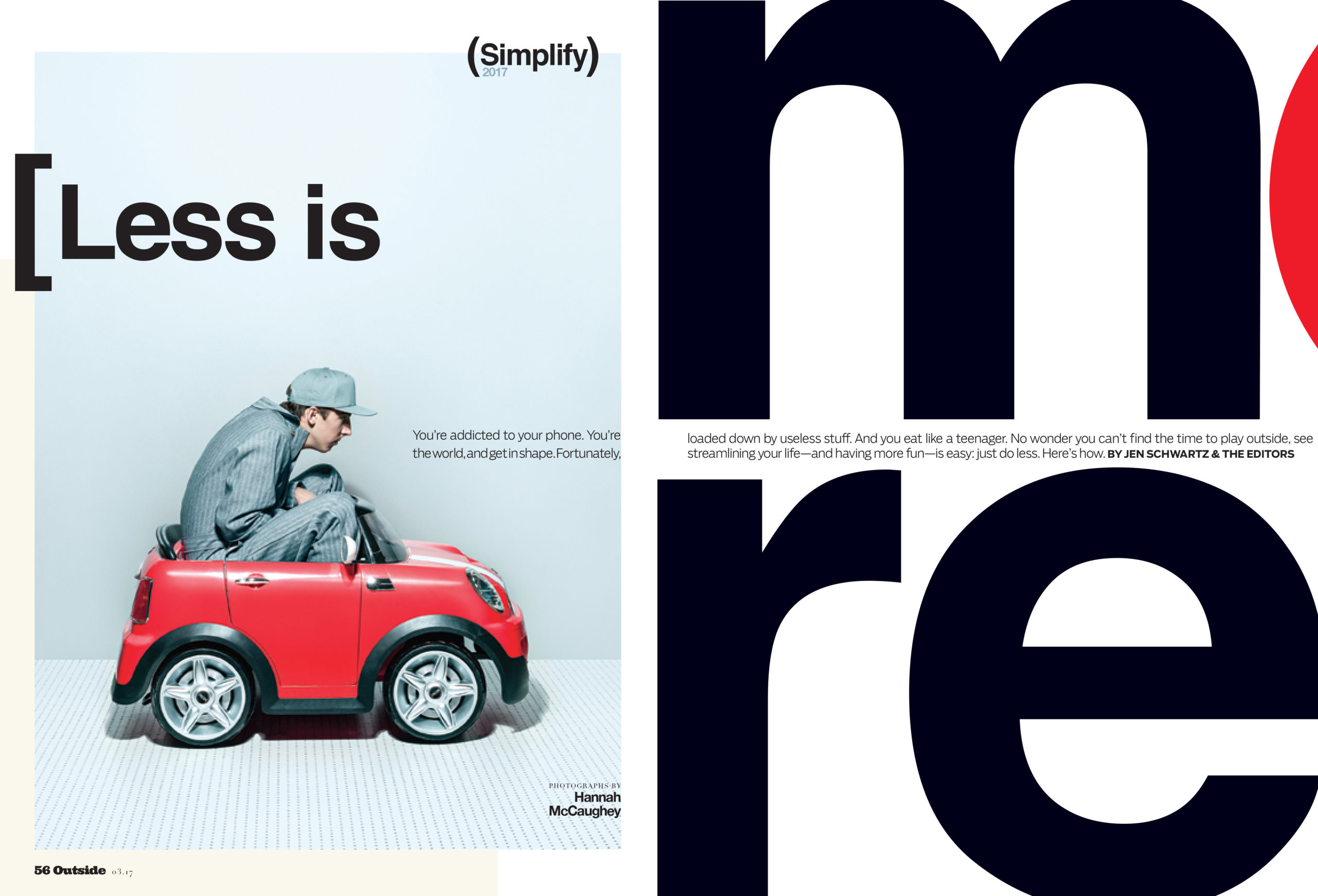
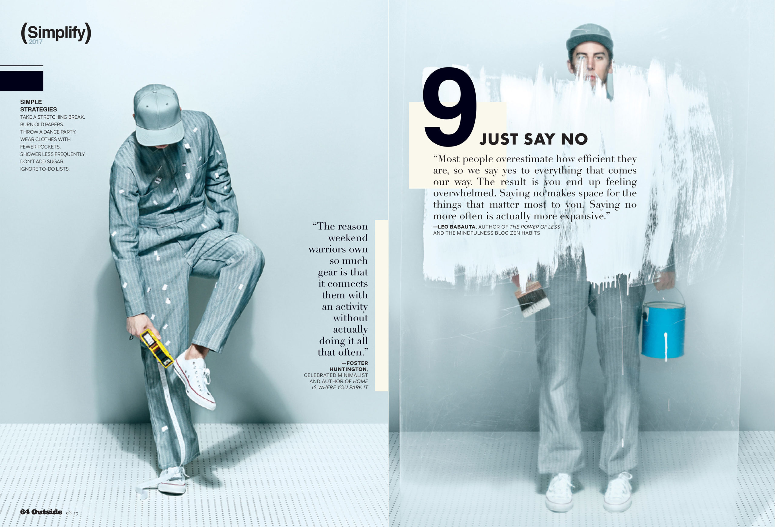
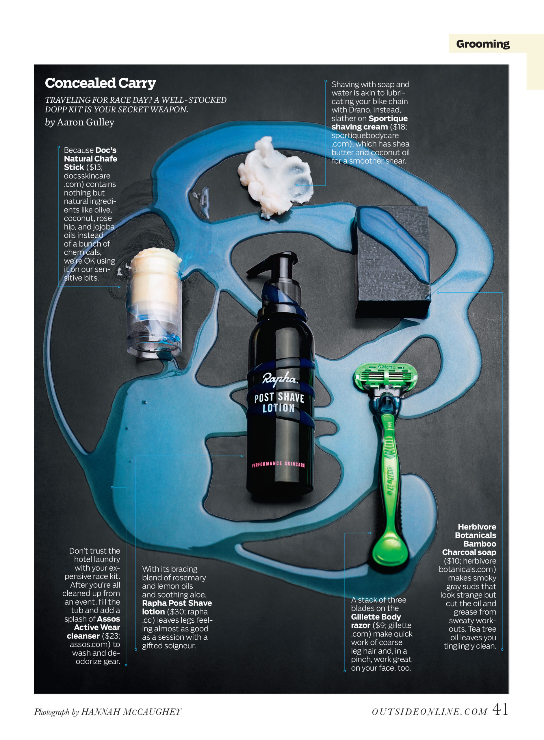
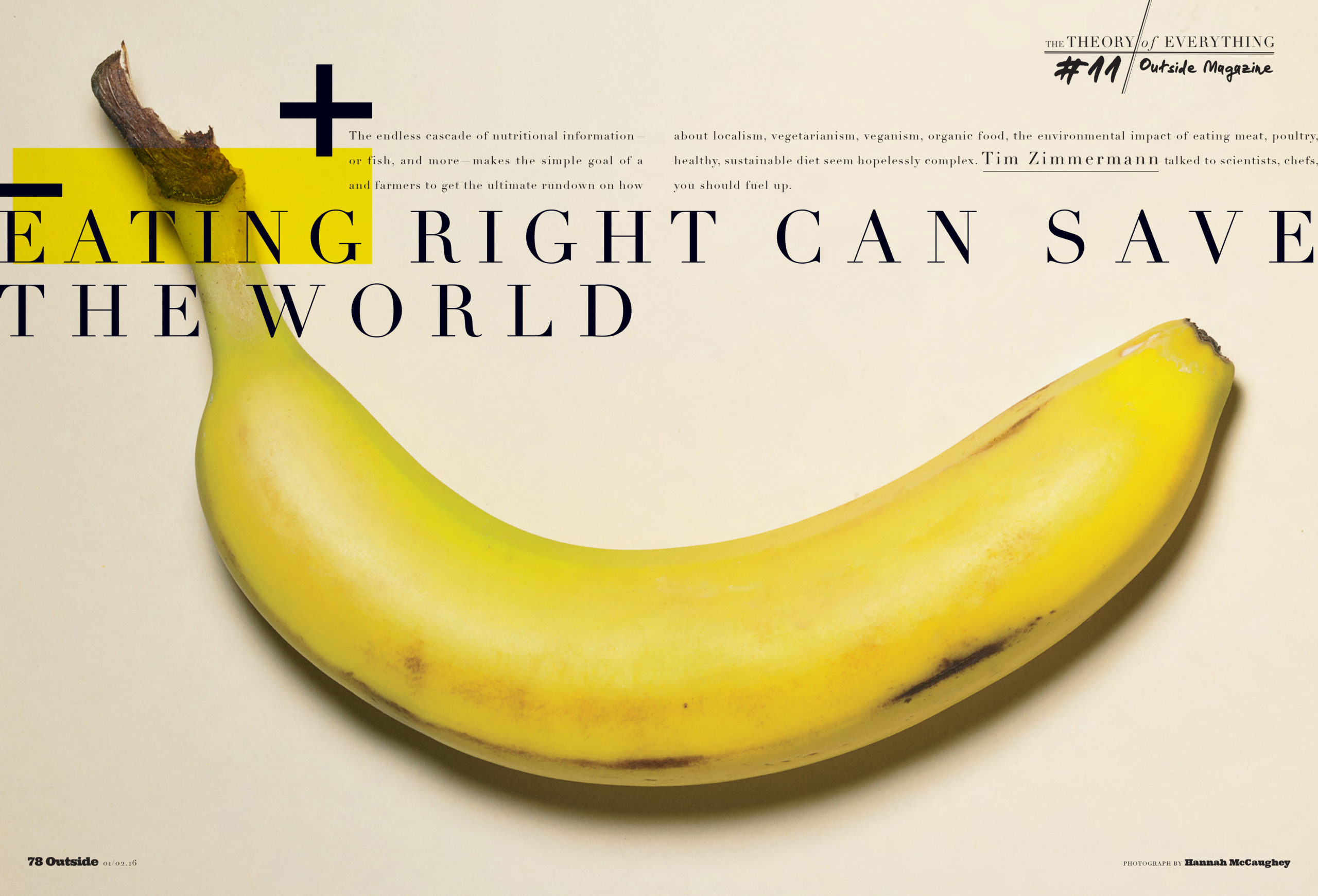
We have two amazing and talented photographers who shoot the mountains of gear that come through our offices for Outside and the two annual Buyer’s Guides, Inga Hendrickson and Dustin Sammann. That’s not something the magazine would ever need me to venture into. My happy place right now is conceptual still-life, which historically had been very difficult for us to assign. Sometimes it involves using a model to get a certain concept across (the Simplify package, for instance), but more often it means using basic objects from everyday life as symbols for something conceptual or hard to shoot, such as flexibility, traumatic brain injury, mental training, etc. And I like to shoot our one-page style and grooming pages just because there is a lot of freedom as far as what we can do. Young photographers always say to me, “I like to shoot people!” and I think, “Not me!” I much prefer to be alone in a dark room, just me and some random objects.

I know at Outside you transformed your gym into a photo studio—smart move. Did you propose this to the company? How hard was it to set up?
Rob Haggart came up with this idea. He was the one who got Larry Burke, the owner of the magazine, excited and on board to make the investment. He consulted various photographers on ordering the cameras and the lights and equipment and the design of the space itself—all of it, and years later it’s still a fantastic studio and a savvy business decision.

Describe how it feels to have done the entire layout from shooting, design and photo editing? Is it hard to be your own critic?
I think I’m getting better at being my own critic. It’s probably the most awkward for Amy Silverman, our photo editor, to pipe up when she doesn’t like something I’ve shot. I deliberately don’t mention it to the editors that I made the photographs when I first show them a layout, so they don’t get put in an awkward position. Because I’m such a beginner, I never care when they say, “Can we find something else for that?” And, it’s probably good to get thick-skinned about it.

Since now you do the job of three, what would you say are the challenges and benefits?
I feel like I made my bed on this one. I have a lot of designing and art directing left in me to do, and I enjoy it so much, that if I gave it up I would really miss it. By adding shooting to my list, I’ve made my life a lot busier but also more interesting and rewarding.

Do you remember you first assignment for the magazine, what it was like to see your image in print?
Yes! It was a very cool, somewhat scary moment. It was a broken melon duct-taped back together for a story about recovering from traumatic brain injury. I remember trying really hard not to be too precious about the retouching and the layout and the printing of it. I wanted to make sure I wasn’t giving it more attention than the other images in the issue as if the other photographs would tell on me.

Which thrills you the most of all the things you are currently doing?
At the moment, I’m doing a little DIY lighting seminar by moving objects around on my desk in the afternoon sun, mainly during long conference calls.

Do all art directors just want to shoot?
Yes! We do! Thank you, it feels so good to admit it. No, I’m kidding. In all my years of going on shoots for features and covers, I never wanted to be the photographer. How they manage the Herculean feat of juggling the big crowded set, managing all the assistants, dealing with the clients, the stylists and the groomers, the talent, the talents’ people, and, most importantly, pulling genius artwork out of all that chaos? I could no more fly to the moon.

It wasn’t until I found this quieter, calmer side of photography that I could even imagine myself shooting. What I could not have known is how incredibly gratifying it is for the cheerleader to jump in the game. I had no idea how much fun everyone was having. My hope is that the photographer in me is helping the art director and designer find better ways of communicating with our contributing photographers, now that I have a better understanding of the entire process. But on the flip side, I’ve noticed that if a photographer starts making excuses why they can’t or won’t do something for a story or a cover, I’m like “C’mon, quit yer whining!”

Tell us about being a woman in a lead position.
In my experience, being a woman in charge can be an incredibly tricky thing to maneuver. I’ve been going to various locations for feature and cover shoots all these years thinking that surely as I gain more experience, that would equal more respect. It’s true that I get to reap the benefits of being the more in-touch, capable, intelligent, compassionate, hard-working, better-at-multitasking, relatable, sensitive, and emotionally sensitive gender. The bad news is—and studies have proven this—that women don’t get heard as well as men because they’re not as well regarded. For my job, this has meant that in order to get what we need for the magazine, I sometimes have to come out louder, pushier, and more demanding than I’m sure my male counterparts have to be. Depressingly, being the “B—tch” seems like a way too easy booby trap for women in charge to fall into. And maybe part of me is tired of that. Which explains why shooting pictures (versus art-directing them) is so satisfying to me. It means being fully heard and seen, and not prejudged or discounted, and that feels really good.

The Daily Promo: Drew Gurian

Drew Gurian

Who printed it? 
Prestone Printing in Queens, NY printed the piece.

Who designed it?
Catherine Gray– an amazing creative director who splits her time between New York City and London.

Who edited the images?
Catherine and I worked on the image edit together.  I’ve depended on a group of friends, as well as hiring photo editors to help with image edits, who generally have an editorial background.  This was a bit different for me, in that I worked with someone embedded in the advertising world who’s not a photo editor by trade.  I really loved her perspective on my work, and since I’ve been meeting with lots of agencies, it made perfect sense to work with her.

How many did you make?
100

How many times a year do you send out promos? 
In the past, I’ve sent out small promos 4-5 times per year, but this promo is much more substantial (and costly).  With that said, this will certainly be my main promo for the year, marketing to a very specific group of people.  I plan to follow-up with some more simple promos as well throughout the year.

This Week In Photography Books: Eric Etheridge

by Jonathan Blaustein

Remember when people used to talk about the 24 hour news cycle?

How quaint.

These days, we’ve got a 60/60/24/7/365 news cycle, brought to you by the fine folks at Twitter, Facebook, Google, etc.

Personally, I don’t submit to the Borg all the time. I jump off email and social media each night at 5pm, and take the weekends off as well, so I avoid losing myself in the endlessness of it all.

Because it never. ever. stops.

There’s so much out there that I’m just as likely to get a sense of things during my “work hours,” as there is still plenty of time to look for memes and CULTURALLY SIGNIFICANT TWEETS.

For instance:

Just since Friday, we’ve had the American professor in Korea who got interrupted by his adorable kids during his BBC Skype interview. At first, he knocked his daughter back like he was Frank Costanza reaching across at a jarring traffic stop.

His wife came in, trying to be stealthy like a ninja, but the camera caught it all. At first, the guy was criticized for being a grump, instead of taking his child on his lap and making light of the whole thing.

Then, media scrutiny switched to the people who’d mistakenly assumed the Asian woman was his nanny, not his wife.

Is that racist?

If not, I know something that is definitely racist. Steve King, a sitting US Congressman from Iowa, tweeted that he couldn’t wait for America to become homogenous, as foreign babies were ruining civilization.

His tweet was received enthusiastically by more overt scumbags, like David Duke and Richard Spencer. Then Representative King doubled-down, (rather than retracting,) and stressed that Western Civilization was superior to all others.

Not to be outdone, Kellyanne Conway may or may not have said that Barack Obama spied on Donald Trump with microwaves.

And finally, today, Jorg Colberg tweeted an article, which I promptly read, in which a British cultural critic named Adam Curtis persuasively argued that art was no longer rebellious, in any way, as its ethos of personal expression had so perfectly been absorbed by the insatiable beast that is Global International Capitalism.

It was a good piece, and got me thinking a bit, as I often wonder if so much of what I do, with my writing and photographic work, isn’t just preaching to the crowd.

Even photography itself, once a specific habit, has been appropriated across the globe by EVERYONE.

Is art still relevant, if it’s only used to trumpet individual voices, one at a time in a sea of noise, as everyone else now has platforms to scream ME ME ME ME ME simultaneously?

I’m glad you asked. (Seriously, that was an astute question.)

I’m feeling pretty good about art, right now, having just put down “Cocoon” a new book that documents a public sculpture done by Kate Browne in the Goutte D’Or neighborhood in Paris, back in 2014.

This one came in not too long ago, as the photographer, Eric Etheridge, (Ms. Browne’s husband,) saw my review of the book that Matthew Chase-Daniel and Jerry Wellman made from their public art project on the Navajo Nation.

He noticed similarities, and hoped I might like his collaborative book as well.

Eric, you were right. This was the perfect book for me to see today.

The gist is that Kate Browne has engaged in a series of public art projects in places with fraught, violent histories. There were Cocoons in Mexico City, on the site where the Aztecs were vanquished by the Spanish, and two in Mississippi that investigated the dark history of Slavery and Jim Crow.

This endeavor was done in Goutte d’Or, a historically North African, Parisian neighborhood that has become a way station for many on the contemporary European Refugee Circuit.

The artist builds communities during her projects, while engaging those same communities in the construction of her sculptures. She offers workshops, and other programs, that reach directly into the neighborhood, and teaches people how to make their own little cocoons, personal talismen, to represent difficulties in their pasts.

There is a section of the book that is almost exactly what Matthew and Jerry did, as residents are photographed in a white, studio environment, holding their personal totems. How wild, that two ideas took hold on opposite sides of the world.

But that’s only a small part of this book, as there are opening essays, including two by local community organizers, and it ends with a litany of direct interviews from project participants, describing their racial and cultural pasts.

Essentially, this book refutes the idea that art is only about yelling “hey look at me” in an obnoxious echo chamber. There are countless artists out there who work with others to build teams. To enhance society. To make a difference in people’s lives.

I wrote last week about that famously Chinese ending in “Hero,” in which the greater good is presented as noble, and duty paramount, while individual desire appears sinful in context. That used to give me the willies, as I thought it meant that China intended to rule the world.

Now, though, I’ve begun to wonder whether America isn’t wounded, as it’s become so much harder for people to work together, or even get along, across the partisan divide.

I don’t want to end on a negative thought, though. One defining feature of the Cocoon series is that the sculptures, like their namesake, are temporary. After a public procession at the end of its construction, the Cocoon is lit up, enjoyed for 2 days, and then struck from the scene.

This book serves as proof of its existence. True. But if you read these stories, and look at the vibrance in the photographs, it’s clear that the Cocoon project strengthened a group of marginalized people, if only for a little while.

Bottom Line: Cool book that documents an inspiring, collaborative, public art project in Paris

The Art of the Personal Project: Kris Connor

Personal Projects are crucial in showing potential buyers how you think creatively on your own. I am drawn to personal projects that have an interesting vision or show something I have never seen before. In this revised column, I’ll include a link to each personal project with the artist statement so you can see more of the project. Please note: projects are found and submissions are not accepted.

Today’s Featured Artist: Kris Connor

Artist’s statement:

“We knew that it would need to be his decision,” says Amy Rough, the mother of  Dawson, an energetic nine-year-old boy from Meyerdale, Pennsylvania. About his decision to have limb lengthening done in the summer of 2012. He was born with achondroplasia, the most common type of dwarfism. The same type of dwarfism that I was born with. 

Achondroplasia was not the only thing Dawson and me had in common. In the spring of 1994, I had my first limb lengthening procedure done by the same group of doctors as Dawson. Over the next five years I would go through an additional three operations to gain 12 inches on my legs and four inches on my arms. 

Limb lengthening and the complex reconstruction of bone materials is not only possible but has been performed successfully for about 50 years, starting in Kurgan, Russia. Limb lengthening and reconstruction techniques is used to lengthen and/ or straighten deformed bone segments. The limb lengthening and deformity correction process works on the principle of distraction. In this process, a bone that has been cut during surgery can be gradually distracted (pulled apart), leading to new bone formation, or osteogenesis, at the site of the lengthening. In this way, bone segments can be lengthened by 15 to 100 percent of their original length.*

The story has been told more than once by other photographers, but the one thing that would separate me from these other photographers. Is that I have traveled the same path as my subjects…in a sense I would be looking into the mirror. I would have an understanding about the pain, doing hours of physical therapy each day, spending my summer in a wheelchair and getting to miss out on some of the activities that my childhood friends were able to participate in.

Starting with his fixatures being put on July 17th, 2012 and standing at 3.5 feet. I followed Dawson’s journey through his first procedure over the next six months that would see him gain four inches from the surgery. “First couple of days were rough! He is smiling again through it all,” said Amy a few days after the surgery. 

http://www.krisconnor.com/portfolio/C0000WcdzozgDX4c/G00007.z22Y6qtwQ

—————

APE contributor Suzanne Sease currently works as a consultant for photographers and illustrators around the world. She has been involved in the photography and illustration industry since the mid 80s. After establishing the art buying department at The Martin Agency, then working for Kaplan-Thaler, Capital One, Best Buy and numerous smaller agencies and companies, she decided to be a consultant in 1999. She has a new Twitter feed with helpful marketing information because she believes that marketing should be driven by brand and not by specialty. Follow her at @SuzanneSease.

Expert Advice: LinkedIn

By Rachel Walburn, Wonderful Machine

An active social media effort should be part of every photographer’s overall marketing strategy. LinkedIn has some unique features that make it an essential part of that strategy. Namely, it’s the only platform that is strictly business to business, making it easy to find and connect with clients and for them to find you. While LinkedIn is ideal for creating connections, it is also an excellent way to cultivate relationships and promote your brand. We have some advice on not only how to make your profile stand out to get those connections you’d like, but also how to market your brand!

Expert Advice, LinkedIn, Wonderful Machine, Rachel Walburn, Photography, Photographer​​

photo by Saverio Truglia

CREATING A PROFILE

LinkedIn is an online resume allowing you to share your experience, skills, and interests. It’s primarily a professional platform, but there’s an opportunity for you to show off your unique personality as well.

To create a basic profile, LinkedIn will prompt you for your name, your job title, your location (probably your nearest big city), your industry (probably Photography), and your work history. We recommend inputting your first and last name and then entering your company name as your current job. After getting these basics squared away, we recommend customizing your profile to add in your personality.

You can start off by creating a custom URL. When you make your LinkedIn account, LinkedIn will assign you a URL based on your name plus some random numbers, like linkedin.com/in/joeblow-2334234. LinkedIn gives you the ability to edit that, so create text that matches up as closely as possible with your brand. So instead of linkedin.com/in/joeblow-2334234, it might be better to have it read linkedin.com/in/joeblow-photography. To change this, please see our lovely staff member Ken’s profile below. Detailed instructions describing the process are explained on LinkedIn’s help page.

Expert Advice, LinkedIn, Wonderful Machine, Rachel Walburn, Photography, Photographer

Your headline counts. Instead of writing “Photographer” or “Freelance Photographer,” make it specific. Try “Photographer Specializing in Corporate and Architecture Photography.” Quick changes like this can take you from one of many to one that’s above the rest. Potential clients want to know who and what they’re viewing quickly and if it’s the right fit for them, so it’s important that your profile is thoughtful and complete.

Expert Advice, LinkedIn, Wonderful Machine, Rachel Walburn, Photography, Photographer

Jordan Hollender makes a very clear and descriptive use of his headline by noting that his company HollenderX2 is not just a husband and wife photo team but a duo specializing in conceptual images and portraits.

Make sure your profile picture is of you, not a model you’ve photographed. Keep it professional and in line with the rest of your branding – preferably without a camera hiding your face!

Expert Advice, LinkedIn, Wonderful Machine, Rachel Walburn, Photography, Photographer

D. Scott Clark’s professional profile image on LinkedIn.

You can also brighten things up on your brand’s page by adding banners. If you’re a photographer, you can upload a picture or a series of images to help bring out your personality and make your profile unique.

Expert Advice, LinkedIn, Wonderful Machine, Rachel Walburn, Photography, Photographer

Vance Jacob’s LinkedIn banner showcases examples of some of his portraits.

Use your summary to share your background and tell your story. Be personable and speak directly to the reader. Engage them, so they’re interested in learning more about you. Treat this overview like an elevator pitch of who you are as a photographer. Keep it short and straightforward. LinkedIn allows you to include images, documents, and links throughout your page. You can post a direct URL to your website (or specific pages within your site), and you can include photos or video. Having a few examples of your work in your summary is an excellent way to add visuals to break up boxes of text and give clients a sample of your actual work!

Expert Advice, LinkedIn, Wonderful Machine, Rachel Walburn, Photography, Photographer

Vance Jacob’s LinkedIn summary. Vance elegantly breaks up his bio with thumbnail image links directly to sections of his website.

Include personal interests and hobbies, certifications, causes that you’re interested in and volunteer work you’ve done; even if it was years ago. It’s sometimes those details that make it easy for others to relate to you.

Expert Advice, LinkedIn, Wonderful Machine, Rachel Walburn, Photography, Photographer

Liz Nemeth mentions her volunteer work and interests in children and families on her LinkedIn. This information shows clients her personality and these causes are reflected in the subject matter of her photographs! Your volunteer work is a great way to emphasize your passions are show your depth beyond photographic skills.

NETWORKING: FINDING CLIENTS

By creating a detailed profile, you’ll be making it easy for clients and others in our industry to find you. LinkedIn also provides a number of tools to make it easy for you to find others and to cultivate relationships within our industry.

When you first create a profile on LinkedIn, you won’t have any connections. Start by sending a connection request to people you already know and who are likely to accept your connection. Past clients and photographers who you have a strong relationship with would be ideal people to add. With those connections, you’ll be able to send out a connection request to others who have their privacy settings set so that you must share a common connection before you can request them. With each connection you add (these are your 1st connections), your 2nd and 3rd connections will also grow. You can ask someone in your immediate network for an introduction to a 2nd or 3rd connection if you see a connection that has great potential. You will see this option on your toolbar on the right under another handy tool which shows people similar to the profile you are on:

Expert Advice, LinkedIn, Wonderful Machine, Rachel Walburn, Photography, Photographer

As your network expands, more people will see you and your searches will yield more results. Since LinkedIn uses this algorithm, we recommend connecting with clients in the industry who are going to hire you or introduce you to industry professionals that can help to advance your career. You want to only connect with photographers who can endorse or introduce you to a client.

Follow companies that interest you. Once you follow a company, you’ll receive updates including job opportunities and other news that it shares on your LinkedIn homepage.

To find clients you’d like to work with, look at the company profile page to see who the creative director, art director, photo editor, or marketing director is. Those will be the people that are most likely to hire photographers or be interested in photography and the ones you want to connect with.

RECOMMENDATIONS & ENDORSEMENTS

While Instagram, Facebook, and Twitter are great for building a following, showcasing your images, and casual interaction; clients may not be able to get a sense of what it will be like to work with you. LinkedIn serves as a recommendation letter. Users can easily endorse the skills and expertise you list on your page, and in turn, it’s an easy way to confirm what you can do. Even better, users you’ve worked with in the past can write a recommendation discussing their experience with you. Nothing is more valuable to a client than seeing that you’re professional, experienced and a pleasure to work with.

So, how do you get a recommendation? You can contact up to three connections at a time to ask them to recommend you. Try writing a thoughtful recommendation for some connections you had great experiences with. This feedback might inspire them to do the same! Recommendations double as a thoughtful way to say thank you and make an impression that will help you stay on someone’s mind. Not only will recommendations show up on your LinkedIn page, but they will also be visible on the page of the user who wrote it for you – allowing all of their connections to see you shine as well.

To request recommendations from a particular person: Go to their profile, click on the drop down menu under their name and select recommend. From here you can write a recommendation, or you can choose to Ask for a Recommendation.
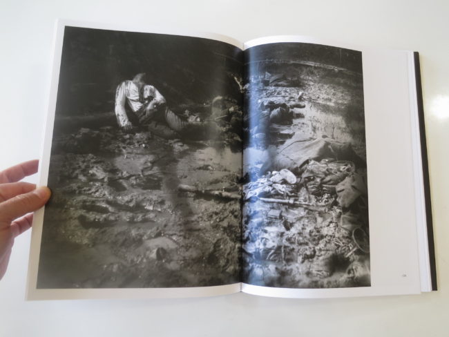
Endorsements are great because you essentially get to select the skill areas you’d like to be endorsed it! Don’t forget to set up these skills on your page by simply clicking add skill and typing your areas of expertise.

Expert Advice, LinkedIn, Wonderful Machine, Rachel Walburn, Photography, Photographer

Christina Gandolfo’s LinkedIn.

LinkedIn is full of networking opportunities to help you find the right professionals. And like many other social media sites, you have access to it right at your fingertips through its mobile app making it easy to stay connected and active almost anywhere in the world. Think of LinkedIn just as you would Twitter, Instagram or Facebook in regards to posting content! On the homepage, you can use: Share an update, Upload a photo or Write an article to keep your audience posted on new work, features, tearsheets and pieces written on your work. These posts will show up directly in your connections newsfeeds, like Facebook, and the content will permanently live on your LinkedIn profile page.
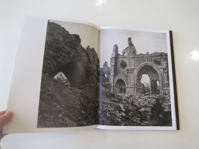
Expert Advice, LinkedIn, Wonderful Machine, Rachel Walburn, Photography, Photographer

Justin Bastien’s LinkedIn posts live on his profile page permanently after being featured on his connections newsfeeds.

A free account offers all of the features above, and if you decide to upgrade, you’ll gain access to even more connections, have the ability to make more targeted searches and receive more information on who’s viewing your profile. You’ll receive a number of InMail messages– these allow you to directly contact people even if they aren’t in your network. There are a few different options available, and LinkedIn sometimes offers free trials to see if an upgrade is right for you.
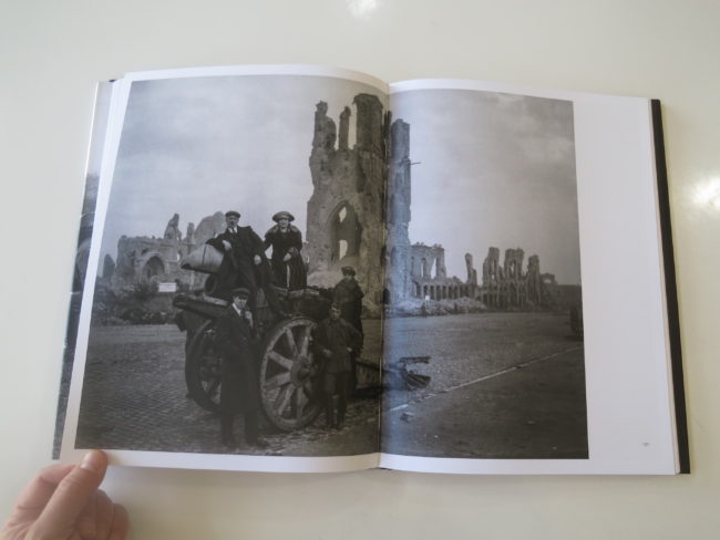
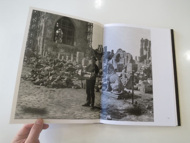
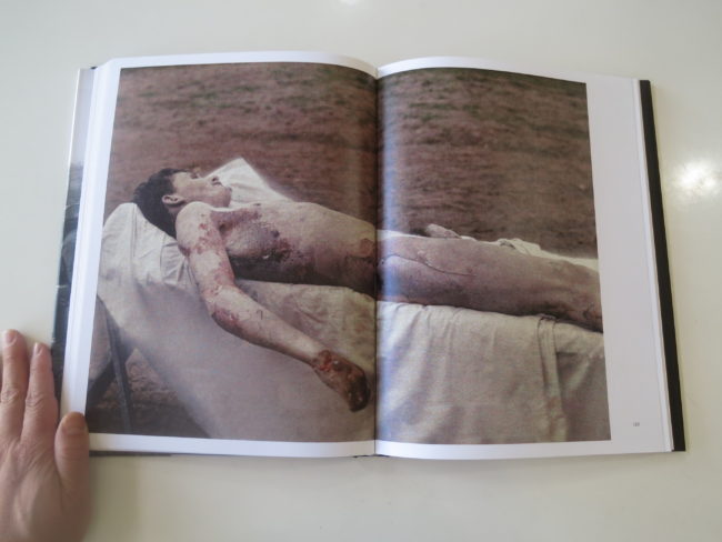
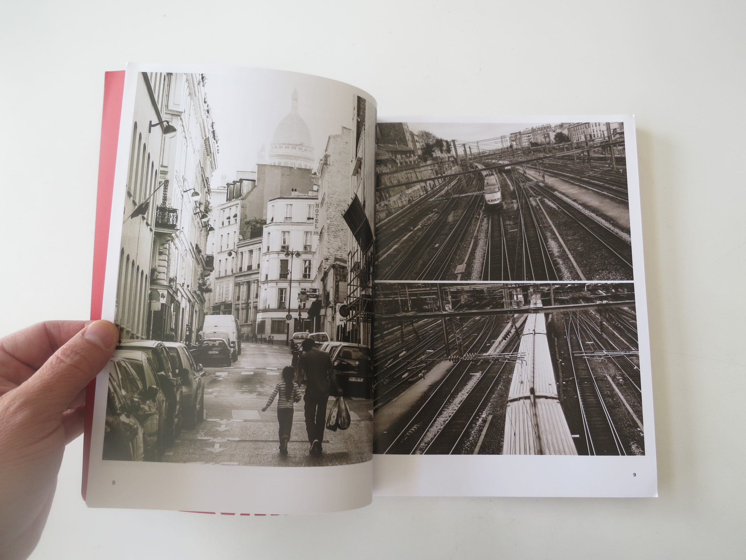
Need help with your marketing? Give Rachel Walburn at Wonderful Machine a shout!