Boris Mikhailov at FOAM

by Jonathan Blaustein

You’re in a museum, in a foreign country. Your brain has been inundated with massive amounts of new information. This is not unusual. Travel makes you smarter, as does art. Still, you’ve been on the road for days, and everything is starting to look the same.

You visit a famous photo museum in Amsterdam. It’s called FOAM. They have a magazine too, which you’ve heard of, but never really seen. It is assumed that you’ll like what is on display, because they ought to be experts at showing people cool photographs.

Let’s remove the hypothetical now. I did visit FOAM this past spring, and was jazzed up to see some great art. I was also more burnt than a chocolate chip cookie in an eight hundred degree oven. I’ve previously admitted to having killed off several million brain cells during this very trip, so you’ll have to imagine that my vision was woozy. (Though not literally. I was not under the influence at the time, as I’m a professional.)

As I wandered through the “Primrose: Russian Color Photography” exhibition, my expectations were not, exactly, met. The work presented spanned most of the Communist era, and was as indistinct as I can possibly recollect. The photos reminded me of magazine pictures from forty years ago covering news stories that no one remembers anymore. (Like a neighborhood fire that destroys five buildings, but leaves no one dead.)

Back and forth I marched, looking for any photo that excited me, or any tidbit of information that I could consider new or fascinating. “Fascinate, me, dammit. Fascinate me,” I screamed. The guard came over and told me that if I didn’t lower my voice, they’d have to escort me to the street. (Never happened. The Dutch guards were actually the nicest I’ve encountered, and they let you take photos of art in all the museums I visited.)

Basically, I found myself parsing photographs made during a totalitarian regime so powerful that it was able to erase even pleasure or meaning from a parade of color photographs. Yes, I was more impressed by the rigor of the Soviet censors than I was of the photographers trying to make anything interesting without saying anything of interest. (The color was pretty, I guess. So that’s something.)

And then, I walked into a small room and heard the familiar hum of a slide projector. A couple of people were seated, and not in an antsy kind of way. They were not moving, which was a good sign.

I leaned against the wall, and began to look. The pictures moved quickly, so each was gone too soon. But they were not boring, not from the outset. I began to see people, some naked, others frolicking, or doing real, actual things. There were plenty of seedy Soviet scenes, which were absent in the main exhibition space. What’s this, then?

I pushed myself off the wall, as my body was covering the wall text. Who made these naughty, beautiful photos? Boris Mikhailov. As if I should have been surprised. (Click here to read my insanely positive review of his 2011 exhibition at MoMA.) The project was called “Suzi et Cetera.”

It’s difficult for me to actually describe an onslaught of photographs, each seen for an instant, that took place almost four months ago. So that makes this a challenging review, I suppose. But I did manage to jot down some notes, so here goes:

A vagina peeing on the ground, a ram’s head, a girl with grass on her face, a Soviet sculpture, a flag, some nude girls, a grandma in a nightgown, a girl screaming, an image of Lenin, a skinned rabbit, a disgusting mottled leg, some rotten tomatoes with a milk bottle, a bruised and swollen penis, a fish like something out of a Hiroshige print, flowers, drying clothes, a guy on a moped talking to a girl, some horn players in a field, women dancing in a square, blood running down a leg…you get the picture.

Why was it so impressive? Why do the remnants of Mr. Mikhailov’s vision linger in my memory, despite the copious amounts of THC that tried to wipe it away? Desperation. Necessity. Toying with the ultimate risk.

At the time, in the 80’s, these pictures were illegal in their taking, making and showing. The underground group of compatriots that would have gathered to watch such a show, back in the day, were willing to face death and torture to experience these photographs. And that energy was palpable. It was kind of like watching Michael Jordan play pickup basketball in a North Carolina schoolyard, circa 1979. (The talent and need were dripping with sweat.)

I don’t know if the folks at FOAM knew that most of the Primrose exhibition was less-than-memorable. There is a business relationship between Holland and Russia at this point, as evidenced by the Van Gogh Museum collection’s long stint at the Amsterdam branch of the Hermitage Museum. Was this just another case of politics and money driving a museum’s exhibition program? I don’t know.

I’d like to think, though, that the curators were very conscious in their exhibition construction. A heap of PC, Soviet-acceptable photographs were the pomegranate husk, and Mr. Mikhailov’s flickering images were the juicy bits hidden within. It was the perfect structural metaphor for what life must have been like behind the Iron Curtain. The public face, with it’s inscrutable inoffensiveness, and the living, bloody heart at the core of it all, left to exist behind closed, locked, doors. (With the curtains drawn, of course.)

Looking Forward To The Day When I Run Out Of This Pesky Film Forever

I lug around those big ugly beer coolers that plug into cigarette lighters in a car, or can be plugged into a wall socket. Hunting for working freezers in a sub-Saharan war zone has been my task of Sisyphus for the last three years, and I’m looking forward to the day (coming soon) when I run out of this pesky film forever, and no longer need to worry about keeping the film cold. It has been like carrying around one of those Tamagochi toys which you have to keep alive like a feeble baby.

–Richard Mosse

via Raw File | Wired.com.

The Daily Edit
New York Times Magazine: Nolan Conway

Feuday: 7.12.13

Design Director: Arem Duplessis
Director of Photography: Kathy Ryan
Art Director: Gail Bichler
Deputy Art Director: Caleb Bennett
Deputy Photo Editor: Joanna Milter
Photo Editors: Stacey Baker, Clinton Cargill, Amy Kellner
Designers: Sara Cwynar, Raul Aquila, Drea Zlanabitni
Photographer: Nolan Conway

Art Producers Speak: Cathrine Westergaard

We emailed Art Buyers and Art Producers around the world asking them to submit names of established photographers who were keeping it fresh and up-and-comers who they are keeping their eye on. If you are an Art Buyer/Producer or an Art Director at an agency and want to submit a photographer anonymously for this column email: Suzanne.sease@verizon.net

Anonymous Art Producer: I nominate: Catherine Westergaard

One of the reasons I love what I do so much is the opportunity to work with incredible women from around the world. Ubah Hassan is the perfect example of what inspires me in women, both exotic and beautiful as well as intelligent and a heart of gold.
This image is one that universally art buyers gravitate toward. What woman doesn’t need to take a quiet moment?
These images are the first of a series I am working on about taboos.
This series was shot for a client in Australia. These images capture a common theme in my work. I am driven to explore the isolation and detachment people often experience in complex love relationships and how this causes us to our preconceived ideas to unravel
Sometimes a moment perfectly captures my sense of humor. This image always garners a satisfying response and a really big smile.
This collection of images has been published around the world. It is the editorial that keeps giving. I explore the idea of dolls and mannequins throughout my images as a commentary on the roles women play in modern society.
This shoot with Oh Land was so much fun. She is one artist I have shot whose personal side matches with her artist persona.
Working with Jana Wirth was an exquisite experience on this shoot. She embodied the lost spirit I was looking for with a sophistication and elegance too.
These images were a part of a series about women in power. We had a surreal time shooting this because Li Ming was so capivating that I ended up shooting roughly 3,000 frames that day.
This shot is from the second shoot I was lucky to do with Mathew Settle. It was fun being able to stop traffic in New York and succeed in catching that real New York moment
I loved the stylist’s sense for this series. Chrissy Lloyd created such a fun collection of characters perfect for our shoot in Williamsburg Brooklyn.
This shoot with blogger Jordan Reid titled Love resulted in images that that we were all felt captured their relationship perfectly
I was so lucky to have the chance to shoot next to the old Domino factory in Williamsburg Brooklyn for this campaign.
I loved the amazing Cuban restaurant we shot this campaign in. The lighting was perfect and gave the feeling that we had been transported to another time.
Actress Malgosia Garnys has appeared in my work for years. She has been a muse and inspiration for a lot of my work. Our work together serves as a contistant measure of my growth as an artist.

How many years have you been in business?

Professionally and seriously for five years.

Are you self-taught or photography school taught?

I am self-taught as a photographer but I have been formally trained and studied fine art at many top art schools.

Who was your greatest influence that inspired you to get into this business?

During my Williamsburg Brooklyn years (1997- 2005) I became close friends with photographer Natacha Merritt. We spent most of our friendship exploring our crazy, wild scene together through photographs. During that time I also discovered great photographers that opened up my creative perspective and helped me understand why photography is so powerful. Artists like Helmut Newton, Tim Walker, Nick Knight, and earlier Terry Richardson. Then after 9/11 I felt compelled to begin documenting anything and everything I could. I became so focused on the necessity of not taking anything for granted and photography provided me a sense of solace and connection to life.

How do you find your inspiration to be so fresh, push the envelope, stay true to yourself so that creative folks are noticing you and hiring you?

I honestly think my work is a direct extension of who I am as a person and artist. I crave new perspectives and experiences that are “out of the box.” So I seek them out and thrive in them. This gets translated into the way I live every aspect of my life including being an artist and a mother. If I do not stay true to myself and to my voice, how would I be able to teach my child to do so? When he was born I saw him as a perfectly clean slate. It gave me the opportunity to start from scratch and carry forward a life philosophy that challenges the norm and pushes us both to create and discover an exciting, honest, and unique experience.

Do you find that some creatives love your work but the client holds you back?

I have been lucky to have great clients that hire me because they love my work as well as my energy for life. I know there is a lot of pressure to translate images into commerce and that often plays a huge role in a client’s decisions. I just think it is important to understand your client’s needs which helps create trust and a sense of security. Then I work with them to open up their perspective, push boundaries and be provocative. It is what makes people take notice right?

What are you doing to get your vision out to the buying audience?

Over the past few years I have impressed buyers and agents by my marketing mojo. I remember when the recession hit I had the great fortune of being taken out for drinks with a VP of a great ad agency. I had gone to the agency for a portfolio review and met with their art buyers and producers. The VP was so kind to take his time to advise me. He began by telling me that due to the economy the industry was getting really tight and budgets were being compromised. He said “Cathrine our buyers loved you and your work. As an emerging talent my best advice is to keep creating work. Keep putting it out there and in front of people. When the budgets come back, you will be on people’s mind and when the right project presents itself they will come to you.” I am sharing this because it was great advice and applies really to any artist out there.

What is your advice for those who are showing what they think the buyers want to see?

I would always say that it is a dangerous road to go down because fundamentally it is the antithesis of your value as an artist and creative thinker. I think your career longevity comes from the ability and willingness to have a strong point of view and then the courage to stick by it.

Are you shooting for yourself and creating new work to keep your artistic talent true to you?

Shooting for me is akin to eating and breathing. If I am not creating new work all the time for myself I begin to feel a sense of emptiness and frustration. Creating is “my Everything” and for me there is no separation between art and life. My favorite new saying is “If you are not growing you are dying!” I create to grow, stay fresh and provocative, and to maintain an honest connection to life. I began directing film for this exact reason. Now I am directing a film of my own creation, a new category of film for me fusing art, fashion, and narrative called The Queens. It’s an example of how I need to make sure I am always exploring new modes of expression and taking myself artistically to the next level.

How often are you shooting new work?

If I go more than two weeks without creating it’s too long. I love what I do so much. I guess some might say it’s like a torrid love affair, and I need it always.

Cathrine, child of a Broadway producer, spent her childhood amidst aspiring creative dreamers, the world of auditions and red carpet openings. After studying in some of the most prestigious art & design schools in the U.S, she pursued a career as a painter, which eventually led her to find her life’s passion in photography and directing. Cathrine’s directorial music video debut won the MTV competition ‘freshmen’ and was placed in a worldwide rotation. Her work is defined by elegance with a modern twist but still maintains a progressive signature style, and has brought her opportunities to work with advertising clients, prestigious fashion magazines like Vogue Italia, celebrities, record labels, and publishing companies throughout the U.S. and Europe.

Cathrine Westergaard: info@cathrinewestergaard.com

For representation and booking:
 info@cathrinewestergaard.com

APE contributor Suzanne Sease currently works as a consultant for photographers and illustrators around the world. She has been involved in the photography and illustration industry since the mid 80s, after founding the art buying department at The Martin Agency then working for Kaplan-Thaler, Capital One, Best Buy and numerous smaller agencies and companies. She has a new Twitter fed with helpful marketing information.  Follow her@SuzanneSease.

George Steinmetz Arrested Taking Photos Of Kansas Feedlot

Finney Country Sheriff Kevin Bascue told AP the two men were charged because they didn’t have permission to take off from private property and hadn’t told anyone they intended to take photos… The sheriff didn’t mention Kansas’ ag gag law, the Farm Animal and Field Crop and Research Facilities Protection Act, which became the nation’s first when it was signed into law in 1990. The law bars individuals from entering and photographing an animal facility not open to the public.

via HuffPo.

The Daily Edit
More: Geof Kern thurs

Thursday: 7.11.13

Creative Director: Debra Bishop
Photo Director: Natasha Lunn
Senior Art Director: Jamie Prokell
Assistant Art Director: Faith Stafford
Associate Photo Editor: Stephanie Swanicke
Assistant Photo Editor: Gabrielle Sirkin
Photographer: Geof Kern

Pricing and Negotiating: Advertising and Collateral for a Prepared Foods Manufacturer

By Craig Oppenheimer, Wonderful Machine

Shoot Concept: Images of plated food (soups, entrees and sauces)

Licensing: Advertising and Collateral use of 42 images in perpetuity

Location: In a studio local to the photographer

Shoot Days: 5

Photographer: Midwestern Food and Portraiture Specialist

Agency: Small Ad Agency in the Northwest

Client: Prepared Foods Manufacturer in the Northwest

Here’s the estimate:

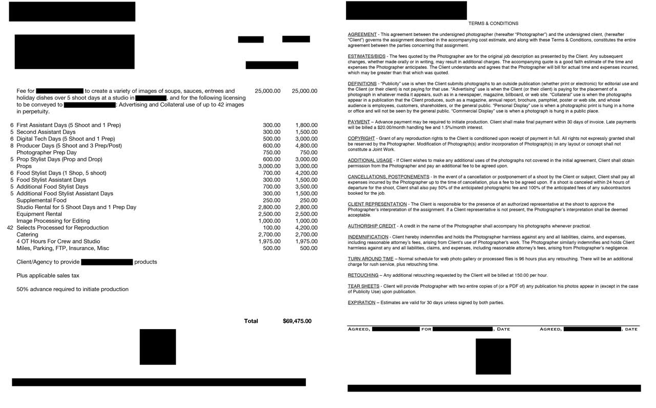
Creative/Licensing: The agency approached the photographer with a request to photograph 42 items for their client who primarily makes prepared soups. The client was branching out into manufacturing other items besides soup, and they needed images to showcase 8 sauces, 8 entrees, 10 soups and 16 holiday food items. We received one comp of a close up of a bowl of soup, and we were told that they didn’t have any other specific information on the complexity of the dishes that needed to be captured. The agency mentioned that they were anticipating 5 days of shooting, and this meant that the photographer would need to shoot at least 8 dishes a day, plus one day where he would photograph 10 dishes…no small task.

When I spoke with the account director at the agency, she told me that they were planning to use the images in web ads, on product packaging, on their website and potentially in other printed collateral pieces (although she couldn’t think of any likely examples), and they intended on using these images for 5-10 years. I learned that not only is it rare for this client to manufacture new items, but also that the client has never done a shoot of this scale before and didn’t set a specific budget. This told me that while the shelf life was lengthy for these photos, the client might be easily scared away by an exorbitant bottom line.

Based on their licensing needs, and due to the inexperienced client and the small size of the agency, I chose to price the first four images in the main categories (sauces, soups, entrées and holiday items) at $3,000 each. I figured that the images of their best selling items in each category would be the ones featured in advertisements, and that all of the other images were worth a bit less due to a decreased level of exposure. So, for the second and third image in each category, I dropped the fee for each one to a quarter of the full price (8 images at $750 each totaling $6,000), and then lowered it to a sixth of the full price for the fourth and fifth items in each category (8 images at $500 each totaling $4,000) and then priced the remaining 22 images at one-tenth the full price ($300 each totaling $6,600). This all tallied up to $28,600. This felt a bit high based on other projects I’ve estimated for food clients, so I ultimately decided to drop it down a bit to $25,000 which also helped to keep the bottom line under $70,000.

After coming up with my own fee, I checked it against other resources. Getty would price that first image in each group at $2,530 ($735 for the web ads, $1,225 for the packaging, and $570 for the website use) for 3 years. This was in line with the $3,000/image I originally came up with. Blinkbid priced 1 image at $4,500 for “website” and “collateral” use for 1 year, and FotoQuote also priced 1 image at $4,500 for their “web pack” which includes web advertising and use on a client’s website, however this didn’t include packaging use.

Assistants: In order to stay on pace with the schedule each day, we’d need the first assistant available for a prep day before the shoot to set up everything, and then both assistants would be there for all of the shoot days

Digital Tech: We’d also need the tech for the prep day and each shoot day, and we included his workstation equipment in the equipment line.

Producer: The photographer had a producer he worked with at $600/day (a bit lower than I might include typically) and he’d be a crucial part of the shoot to make sure each day stayed on schedule.

Photographer Prep Day: This was for his time to set up in the studio the day before the shoot

Prop Stylist and Props: We didn’t actually need a prop stylist on set, but we did need someone to gather all of the necessary items and drop them off at the studio. The food stylists would be able to collaborate with the photographer for prop placement in each shot. While a handful of the items would be reused, the prop budget included items such as bowls, plates, cutlery, and tabletops. After speaking with a prop stylist, we decided it could take between $50-$100 per shot in props, which would be between $2,100-$4,200. Also, since we didn’t know how many items could be reused, the prop stylist needed ample time to source unique items, come to the prep day to drop them off and sort them, and then return any unused items after the shoot. The veteran stylist I spoke to recommended that I include 6-7 days for her, but I felt that this was too high, so I included 5 days…which I still felt was on the high side.

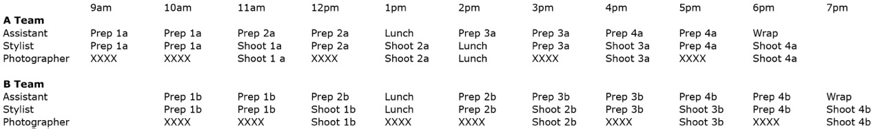
Food Stylists and Assistants: I included 5 shoot days for two teams of stylists with their assistants, and also included an extra day for the primary food stylist to shop for supplemental food before the shoot. In order to shoot 42 dishes in 5 days, there would need to be 2 teams of food stylists with their assistants, and they would also need to follow a very strict schedule to complete the project on time. To help us think through how this would work, we created the following chart:

The chart details the schedule for each team over a 10-hour day. The numbers and letters in each slot correspond to the dish number and team. For example, 1a means the first dish for team A, and 3b means the third dish for team B. This schedule would allow the food stylist’s assistant to prepare a dish for 2 straight hours, one hour of which the food stylist would be lending a hand. After the hour when the stylist and their assistant prep the dish together, the food stylist will then spend one hour with the photographer shooting that dish while the food stylist’s assistant begins to prep the next dish. The photographer would switch back and forth between the two different teams with their own sets.

Supplemental Food: The client would be providing the majority of food, but the stylists would need supplemental items (like garnishes) to make the prepared foods look their best.

Studio Rental: The studio we had in mind had a weekly rate of $2,500. I included an additional $300 that the studio would charge for the few hours of prep time before the shoot days.

Equipment Rental: We always recommend that photographers charge for their own equipment. However, this photographer decided that he didn’t want to. The fee here represents $500 per shoot day for the tech’s workstation rental. The tech would be using a laptop on the prep day.

Image Processing for Editing: This covers the time, equipment and costs to handle the initial import, edit and upload of images for client review.

Selects Processed for Reproduction: 42 final images would be further processed and delivered.

Catering: I included catering for 12 people at $35 each for the 5 shoot days, plus and additional $600 for dinner on the day that there would be overtime.

OT Hours: On one of the shoot days the crew would need to stay an extra 4 hours in order obtain images of 2 additional shots needed in order to capture 42 dishes. I arrived at this number by calculating each crew member’s hourly rate (based on an 8 hour day) and multiplying by 4.

Miles, Parking, FTP, Insurance, Misc: I included an additional $100 per shoot day to cover these miscellaneous expenses.

Housekeeping: I made sure to note that the all of the manufacturer’s food products would be provided to the photographer, and noted the advance requirements.

Results: The account director told us that this estimate was competitive and definitely in line with the other bids they received, but they ultimately decided to hire a photographer located in the same city as the agency and client. The decision was also a creative one, as the client preferred the style of the other photographer.

Hindsight: If I had known that we were bidding against photographers local to the client and agency, and I was also told beforehand that our bottom line was comparable, I would have tried to adjust our estimate appropriately to offset any travel costs potentially incurred by agency/client representatives to fly out to our photographer’s city.


The Daily Edit
GQ: Amy Neunsinger

Tuesday 7.9.13

Design Director: Fred Woodward
Creative Director: Jim Moore
Director of Photography: Dora Somosi
Senior Photo Editor: Krista Prestek
Photo Editor: Justin O’Neil
Art Director: Chelsea Cardinal

Photographer: Amy Neunsinger

Support: Shouldn’t It Be A Two-Way Street?

If you’ve had a photo project on indie-go-go, or Emphas.is, or Kickstarter asking for money, I wonder: have you contributed to other photographer’s projects? If you’ve got a book-signing coming up, or have published a book, did you buy someone else’s book, or go to their signing, or for that matter, their gallery opening?

As much as I can say there is a photography community in New York, I find myself questioning how much of it is self-interest and how much of it is reciprocal.

via Stella Kramer.

The Daily Edit
Wired: Brian Finke

Monday: 6.8.13

Design Director: Claudia de Almeida
Art Director: Bradley R. Hughes
Photo Director: Jim Merithew
Senior Photo Editor: Carrie Levy
Photo Editor: Kristen Fortier
Photographer: Brain Finke

This Week In Photography Books – Dash Snow

by Jonathan Blaustein

I was sitting on my porch the other day, chatting with a friend. He’s a wicked smart photographer, and has had a good bit of success, including a Guggenheim Fellowship. The ideas were flying rather quickly as we sat, rocking in our rocking chairs, killing black and red ants as they explored my territory. (They’re aggressive, and they bite, so they had it coming.)

He’d just returned from forty days roaming the hinterlands of Dick Cheney’s Wyoming, and was hungry for conversation, like a Jew who’s fasted after dropping a Torah. Mostly I listened, because he likes to talk. At some point, we reached the subject of artistic intent, which is guaranteed to rile up anyone/everyone.

My friend was an environmental activist for many years, and makes art for the noblest of intentions. He’s either trying to save the planet, or make us realize we’re all doomed. I haven’t decided yet. Regardless, he comes from a long line of artists who want to make the world a better place. The serious guys.

I mentioned that, though I occasionally vacillate, I mostly believe that no one reason for making art is inherently better than another. It’s the moral relativism argument, grafted onto an art conversation. He smiled, (or was it a smirk?) and said, sure, that’s the politically correct thing to say.

“But do you really believe that,” he asked?

I paused, and then said yes. I do. I’ve seen enough interesting art, over the years, that came from infantile experimentation, or anarchic rebellion, to believe that it’s not only the serious strivers who get to make the good stuff. Sometimes, great (or provocative) art can come from hedonistic, nihilistic nitwits, whether we like it or not.

This week’s book is a great example of the phenomenon. “I Love You, Stupid,” is a very thick book filled with Polaroid photographs (and video stills) taken by the now deceased art star Dash Snow. Before I say anything else, I’ll admit that the pictures you’ll see below will likely offend your better sensibilities. They’re meant to, and they succeed.

Mr. Snow was famous before he died, as he came from a line of very important people in the art world. (The de Menils.) I didn’t know this, nor had I seen his work while he was alive. I do remember him dying, but only because I must have heard third hand that some junkie art dude overdosed. That was the extent of my knowledge, though perhaps you know more than that.

The book contains a very well-written opening essay by Glenn O’Brien, of GQ and Andy Warhol circle fame. Great stuff, really. It will make you excited to make art, for sure, and also prejudice you towards liking the images that follow. He’s extremely persuasive, and also forthright in countering any rich-kid bias you might have. (Basically, he presents Mr. Snow as a 21st Century Shaman.)

Once you’re fired up and ready to go, you get to see countless photographs of all the bad stuff you’re not supposed to do. There is tons of sex, drugs, blood, semen, graffiti, partying, homelessness, vomit, and more sex. Seriously, if I had a dollar for every penis included in this book, I could…well…buy the book. Fortunately, all the bad behavior reeks of genuine effort. (Must be all the smack and coke.)

A little while back, I wrote about Mike Brodie’s book “A Period of Juvenile Prosperity,” and was a bit cynical about his intentions. Great project, but I could see his mind whirring as he realized how perfectly his photographs would deliver what people wanted. It wasn’t that he didn’t seem serious about his frisky lifestyle choice, (freight train hopping,) only that the concurrent calculation was also evident. This book obviates those concerns. This mayhem feels real, like it doesn’t care whether we’re there to look or not.

I’m not saying this art is brilliant. (It’s not.) Nor that you should like it. (You probably won’t.) But I’m pretty sure Dash Snow wasn’t trying to be bad. He just was. And darkness walks upon the Earth, whether we like it or not. So art that captures that essence is valuable. Every bit as valuable as the art that tries to improve upon our faulty existence on this spinning blue orb.

Bottom Line: A nihilistic, voyeuristic, bad boy thrill ride

To Purchase “I Love You, Stupid” Visit Photo-Eye

Full Disclosure: Books are provided by Photo-Eye in exchange for links back for purchase.

Books are found in the bookstore and submissions are not accepted.


Art Producers Speak: David Paul Larson

We emailed Art Buyers and Art Producers around the world asking them to submit names of established photographers who were keeping it fresh and up-and-comers who they are keeping their eye on. If you are an Art Buyer/Producer or an Art Director at an agency and want to submit a photographer anonymously for this column email: Suzanne.sease@verizon.net

An image of Lindsey Wixson from a personal portrait project
Outtake from a Loreal shoot
Enya Bakunova for Bambi Magazine
Marcela Jacobina
An image from my personal project "Nudes"
Outtake from an advertising shoot for Blank Jeans
Noreen Camody for Bambi Magazine
Outtake from a Loreal Shoot
Sara Stephens-outtake from a motion shoot
An image from my personal beauty project
An image from my personal project "Nudes"
Outtake from a recent editorial

Anonymous Art Producer: I nominate: David Paul Larson. “David is extremely talented, hard-working and wonderful to work with. Working with him is a definite creative collaboration and he brings a fresh and different perspective to every shoot.”

How many years have you been in business?

I have been shooting professionally for three years.

Are you self-taught or photography school taught?

I attended Columbia College Chicago and double majored in Advertising and Photography. I wanted to talk to my clients both as a peer and artist. After photography school I assisted Norman Jean Roy, Mark Seliger and Mario Testino. Assisting on large production, multiple day shoots is the best education.

Who was your greatest influence that inspired you to get into this business?

After being medically discharged from The United States Marine Corps I wanted a career that was detail oriented, fast paced, competitive and team driven. An early mentor told me that if I wanted to become the best I need to move to New York and learn from the best. New York has single handedly had more of an impact than anything else. Professionally and personally it has pushed me to places I never thought I would go. It’s an endurance race with yourself and your art.

Darren Aronosky, Stanley Kubrick, Guy Bourdin and Garry Winogrand have had a profound impact on my work as well.

How do you find your inspiration to be so fresh, push the envelope, stay true to yourself so that creative folks are noticing you and hiring you?

I am always looking for art directors,stylists and models to work with. I have found that the more personal work I create the more jobs I book.

Do you find that some creatives love your work but the client holds you back?

Rarely. I got into this business because I love collaborating and working with people. In the military everything is about teams and those lessons have translated a lot into my professional life. I get a lot of pleasure out of working with art directors and photo editors. Most of the work I get is a referral from existing clients so they often know a bit about me before we meet.

What are you doing to get your vision out to the buying audience?

I frequently post work  on many social media platforms-Tumblr, Twitter, Instagram and Facebook. I love showing my work in person. I try to do that at least once a week. In addition, I am sending out an email promo every 45 days and printed mailers every two months.

What is your advice for those who are showing what they think the buyers want to see?

Oscar Wilde said it best “Be yourself; everyone else is already taken.” Don’t try to be everything to everyone. Shoot what you love and over time it will develop into your vision.

Are you shooting for yourself and creating new work to keep your artistic talent true to you?

I am constantly shooting for myself and for clients. I am interested in creating timeless, raw, beautiful images that will stand the test of time.

How often are you shooting new work?

I shoot at least once a week. It’s the only way to stay sharp with your craft. I think about photography as a muscle and it constantly needs to be stimulated, stretched and pushed.

David Paul Larson is a young photographer based in Brooklyn and is seeking representation.

APE contributor Suzanne Sease currently works as a consultant for photographers and illustrators around the world. She has been involved in the photography and illustration industry since the mid 80s, after founding the art buying department at The Martin Agency then working for Kaplan-Thaler, Capital One, Best Buy and numerous smaller agencies and companies. She has a new Twitter fed with helpful marketing information.  Follow her@SuzanneSease.