Th Daily Edit – Tuesday
8.7.12


(click images to make bigger)
New York Magazine
Design Director: Thomas Alberty
Photography Director: Jody Quon
Photographer: Pari Dukovic
Note: Content for The Daily Edit is found on the newsstands. Submissions are not accepted
Camera Stealing Shark
Monday morning entertainment:
It’s a myth that it was easy twenty-five years ago
And so for all the challenges which young photographers face, and they do face serious challenges, I am not making them smaller than they are, there are also tremendous opportunities that didn’t exist then that do now.
First thing is the opportunity to have your work seen
It’s essentially a golden era.
via david alan harvey in conversation with jim estrin | burn magazine.
The Daily Edit – Monday
8.6.12


(click images to make bigger)
New York Times Magazine
Design Director: Arem Duplessis
Director of Photography: Kathy Ryan
Art Director: Gail Bichler
Deputy Photo Editor: Joanna Milter
Photo Editors: Stacey Baker, Clinton Cargill, Amy Kellner, Luise Stauss
Designers: Sara Cwynar, Hilary Greenbaum, Drea Zlanabitnig
Photographer: Richard Barnes
Note: Content for The Daily Edit is found on the newsstands. Submissions are not accepted
This Week In Photography Books – Dead Men Don’t Look Like Me
Good boys make good husbands, but bad boys have all the fun. So they say. Ever the dutiful first son, I fought the truth of the adage for years. While young, I doted, wrote poems, gave flowers, held doors, basked in my own chivalry. And what did it get me? Not very much.
As it stands, I am a good husband. I cook for my family, and sometimes even clean up. But I’d never have made it to husbandhood had I not embraced my dark side. It’s what makes us whole.
Argue if you must, but there are very few sociopaths out there, and fewer psychopaths still. Most of us possess the milk of love and murder in our veins, and almost everyone does the best they can. Horrible deeds, more often than not, come with easy justifications. Most miserable acts are not seen that way by those who commit them. There are reasons that cloak the wave of unstoppable emotions.
We have, and will always be fascinated by those who dance too close to the darkness. Literature, Film, Photography, and many other media have long mined the hills of sorrow, and rarely do they celebrate remorse. People just love to watch other people get killed. (Pretend, now. Not so, back in the day.)
Bad guys are like fun house mirrors. When we gaze into their eyes, we fool ourselves into believing they contain all the horrors of the world, sucking it out of us so we may remain clean as the carpets in the White House. (I’ve never visited, but even with our huge government debt, you know they’re not scrimping on the President’s hired help.)
I am no different, whether yelping with delight as a teen-ager, as Stephen Segal broke bones Aikido-style, or whooping with dismay as another head dropped in Game of Thrones. Like I said, I’m no different. It’s a part of the human psyche, and deny it at your peril. Repressed emotions, in my experience, are far more powerful than those honestly expressed.
“Dead Men Don’t Look Like Me” is a powerful new book, for all of the reasons above. Recently published by TBW Books in Oaktown, (as they call Oakland,) the small, black soft-cover book contains a trove of images found by one Mike Brodie in 2006. The book was put together by the publisher, Paul Schiek, with an opening essay by Vince Aletti.
Speaking of Oaktown, I recently read that there have been a spate of robberies of late, where photographers, like us, have been relieved of their heavy camera equipment. (Thoughtful burglers, no?) Televison news vans have been jacked too, multiple times. My wife’s friend swears that every major item in her home has been bolted to the floor. Her neighbors, she claims, have all done the same. Welcome to California in the 21st Century.
The book, though, remains rooted in the middle of the 20th. (Yes, I do remember to review the books from time to time.) The photos contained within were made in a Georgia prison; each image a portrait of an incarcerated inmate. Without the provided backstory, you’d probably figure that out for yourself.
They’re all white, as Mr. Aletti points out, and in the range of 25-40. Conmen, grifters, fighters, killers, car theives, rapers, hustlers, and maybe even one or two who didn’t do it. (Is everyone always innocent in their minds?) Most, if not all, have that look about them. Trouble, but the kind that makes you look twice. Dark charisma.
We’ve all seen books of found photos before. This time, the photographer was maybe some prison guard named PorkPie, who took his job seriously. Even mug shots can have class, after all. (Thanks, PorkPie.)
I love flipping through these pages. The images are not really that old, so maybe some of these guys are still alive. Drinking cold, cheap beer on a trailer porch. Shooting cans, laughing with a deep smoker’s growl, and telling tales of all the stuff they did before they got caught.
Bottom Line: A gem of found robber portraits
To purchase “Dead Men Don’t Look Like Me” visit Photo-Eye


Full Disclosure: Books are provided by Photo-Eye in exchange for links back for purchase.
Books are found in the bookstore and submissions are not accepted.
The Daily Edit – Friday
8.3.12


(click images to make bigger)
Lucky
Design Director: Lisa Steinmeyer
Photo Director: James Morris
Art Director: Barbara Reyes
Photo Editor: Jamie Keiter
Photographer: Fabio Chizzola
Note: Content for The Daily Edit is found on the newsstands. Submissions are not accepted
Rineke Dijkstra: A Retrospective @Guggenheim
Don’t be fooled by the seemingly endless stream of classic-looking portraits – there are as many pyrotechnics to be seen here as in any photographic show in recent memory. For me, this retrospective helped me to see the entire spread of Dijkstra’s genius (not just her greatest hits) and to more fully appreciate just how much she has successfully challenged and expanded the traditions of photographic portraiture.
via DLK COLLECTION
Still Images in Great Advertising- Vincent Dixon
Still Images In Great Advertising, is a column where Suzanne Sease discovers great advertising images and then speaks with the photographers about it.
I had the honor to attend the Lucie Awards the year Vincent Dixon won for his amazing ad campaign for Unicef. When I was an art buyer, I was very familiar with Vincent but never had the pleasure of working with him. I went to his website and was pleasantly surprised at the commercial produced work for large clients while giving back for public service campaigns like the Unicef campaign and The Foundation Abbe Pierre. I don’t know the specifics of the campaign but they usually ask for reduced fees to get the message out. And this campaign is so thought provoking that depicting the tragedy of Haiti, that I am sure it took more than just shooting.

AD: Mathias Laurent et Grégoire Lauzon,
Copy Writer: Pierre Clavaud
Art Buyer: Laurence Namhias
Creative Director: Chris Garbutt
Suzanne: Vincent, how did you get involved in this campaign and how much legwork did Unicef do prior to your arrival?
Vincent : Hi Suzanne, I shot this campaign for Unicef in France. I was contacted by Laurence Namhias, the head art buyer at Ogilvy & Mather, Paris and Matthias Laurent who did the creative.
To be honest we pretty much did everything ourselves. I went with Jonathan Orenstein, a photo assistant, who is great in these types of situations and Matthias came from Paris. We shot this over five days about six weeks after the earthquake. We weren’t sure what we would be faced with when we got to Haiti. We knew we needed a stark image of the destruction to really make the concept powerful but were not sure what would be there to shoot. I was worried before getting to Haiti that everything would be cleaned up in the six weeks since the earthquake and that we wouldn’t be able to get background plates, that unfortunately was not the case. Porte Au Prince was basically flattened and since almost all government buildings including hospitals were destroyed there were no government services and tent cities everywhere.
My agent in Paris, Florence, found us a place to stay with a friend’s father who lived in the hills above Porte Au Prince and he drove us around and acted as a guide for us. Mathias, the art director had a friend who worked for an NGO in Porte Au Prince and he helped us find the school and get permission to shoot the kids. We organized everything on the ground and that is one of the reasons I gave myself five days to shoot it, we didn’t know what to expect. If necessary we would have stayed longer.
We drove down to Porte Au Prince every morning at around 5 am and shot pretty much all day. The photo is a composite of different background elements and the school portrait. We also shot other plates as Matthias also wanted elements for additional Unicef projects including wrapping a school in Paris and having a mural outside the Parisian school of Haitian children waiting to get into school.

Working there was so moving, one of the ruins we shot was a flattened school with notebooks and report cards in the rubble. Everywhere you would find personal items like old photos, Music LPs and you never know what became of the people who lived in those buildings. Yet every day by about 8 am people were setting up market stalls in the rubble and getting on with their lives.
Suzanne: How has the campaign had an impact on the rebuilding of Haiti? Have donations continued to come in for Haiti after won the awards?
Vincent: Yes the campaign raised a lot of funds and awareness for UNICEF who were really happy with the results. It ran just as schools reopened after the summer holidays in France. This was about six months after the earthquake which was probably out of a lot of peoples thoughts by then so it was effective putting the relief efforts (which still continue) back in the public consciousness.
Suzanne: What are your thoughts on doing work for NGO’s (non governmental organization) where concepts are different from your work? A lot of the campaigns you are hired to produce have a subtle comical twist while this work does not. What are your thoughts on that?
Vincent: I really love doing work like this on many different levels, there are so many social and environmental issues that we need to be reminded about and often the story telling abilities of advertising are very effective for this. Photographically it is really refreshing for me and you always hope that the campaign will be effective. Quiet often we have little or no money but everyone helps and that is great. I really like the human aspects of these campaigns, for example the kids on the school wrap are happy despite the destruction, which I think was an important thing to say too. There is hope and education is the long-term solution for Haiti which has so many problems.
Note: Content for Still Images In Great Advertising is found. Submissions are not accepted.
Vincent Dixon is represented by Brite Productions in the US.
Irish born Vincent Dixon moved to Paris, France in his early 20’s where he discovered his true passion, photography. Shortly after starting his professional career, he was quickly awarded some of the top campaigns in Europe such as Absolut Europe & Perrier. Those highly visible campaigns, among others, quickly gained him notoriety throughout Europe and North America. An early champion of digital imaging, Vincent embraced the developing technology and quickly made it an integral tool in his work.
APE contributor Suzanne Sease currently works as a consultant for photographers and illustrators around the world. She has been involved in the photography and illustration industry since the mid 80s, after founding the art buying department at The Martin Agency then working for Kaplan-Thaler, Capital One, Best Buy and numerous smaller agencies and companies..
The Daily Edit – Thursday
8.2.12

(click images to make bigger)
Wired
Creative Director: Brandon Kavulla
Design Director: Leo Jung
Director of Photography: Zana Woods
Art Directors: Alice Cho, Bradley R. Hughes, Tim Leong
Senior Photo Editor: Carrie Levy
Photographer: Mitchell Feinberg
Note: Content for The Daily Edit is found on the newsstands. Submissions are not accepted
Is trust in photography declining?
At the advent of photography, most people didn’t believe it was possible for a photograph to be manipulated. Thus, when they saw visual “proof” in a photograph, it would bypass their normal filters for determining what is or is not believable.
As people have become more familiar with how much photographs can be manipulated, and as the tools for doing that manipulation have become more powerful and accessible, that special status that photography once enjoyed has faded away. It isn’t that photographs are inherently distrusted, but just that they’re no longer inherently trusted. Today, I would guess that a photograph carries only slightly more inherent trust than the written word—and then only because people know it is still much harder to convincingly fabricate a photo than it is to fabricate a story.
The Daily Edit – Wednesday
8.1.12


(click images to make bigger)
W
Creative Director: Alex Gonzales
Design Director: Anton Ioukhnovets
Art Director: Anna C. Davidson-Evans
Photography Director: Caroline Wolff
Photo Editor: Jacqeline Bates
Photographer: Alasdair Mclellan
Note: Content for The Daily Edit is found on the newsstands. Submissions are not accepted
Albert Watson Documentary
thx, Miller.
Bruce Springsteen: The Stories Behind the Photographs
My first professional job as a photographer was to make Bruce Springsteen’s first pictures at Columbia Records, in February of 1973,” Peter Cunningham writes. “It was just before ‘Greetings from Asbury Park’ was released—I got paid twenty-five dollars.
The Daily Edit – Tuesday
7.31.12


(click images to make bigger)
New York Magazine
Design Director: Thomas Alberty
Photography Director: Jody Quon
Photographer: Peter Hapak
Note: Content for The Daily Edit is found on the newsstands. Submissions are not accepted
The Story Behind The Cover Of Re-Magazine #7
I don’t think many covers are thought out in this level of detail but the conversation is always very similar with some sort of reference art, preferences of lighting and mood for newsstand sales and a description of an image you see in your head. I think the key to the cover discussions is to hire talented photographers and leave the description more amorphous so they can use their creative talent and on-set adjustments to make it great. This is obviously a great collaboration between a talented creative director and photographer.
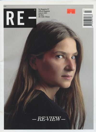
Dear Anuschka and Niels,
We would like to brief you on how we envisage the cover of Re-Magazine #7. As you both know, the theme of this issue will be ‘Re-View’; all the articles will, in some way or other, question their own place and function. Magazine formats such as fashion features, letters and interviews will be ‘reviewed’. It remains to be seen however, if the published images and texts will amount to a significant media contribution . They may verywell cause the same kind of pollution caused by the daily flood of undesired information.
In nearly every issue of Re-Magazine, we are inspired by the notion that people yearn for media silence because they’re continually subjected to information overkill. Texts Meant To Be Written, Not To Be Read. Pictures Meant To Be Taken, Not To Be Seen. In a way, ReMagazine is a magazine that refuses to be a magazine. The cover should communicate this ambiguous refusal – the cover as a review of itself.
How do you feel about a girl on the cover? In our opinion, it would be better to work with a non-professional model. Someone from your own scene, someone you already know. Maybe someone you know really well. For example, someone you shared the third story of a house with for four years when you were a student. Perhaps someone with mixed blood, an Albanian father or something? That her grandmother still lives in Albania and she visits her during the holidays. Someone with long brown hair, copper highlights, a sort of autumn feeling. A girl’s face that has something classical, but also with a modern aura. A face in which the features are all very small; the eyes, the mouth, the nose. There are so many people who seem quite ordinary, but if you look at them closely, have really striking faces.
We have a strong preference for a cover with a Vermeer connotation. The Girl with the Pearl, for example, is in fact already a cover avant la lettre. The glance the girl casts over her shoulder at the very moment the viewer catches her eye, is the central motif of this painting. That specific glance can be linked effectively to the concept ‘Re-View’. The painting is layered in gray tones and has a dark – nearly black – background. Regarding the cover, it’s probably better if the image is brighter and lighter because dark covers don’t sell at the newsstand.
Ideally the facial expression of the girl will be less subtle and sensual than in Vermeer’s painting. Possibly a bit startled, a combination of curiosity and fear. Maybe even a bit scary. You could achieve this effect by getting the model to pose in an uncomfortable position. Having her avert her gaze from the camera as far as possible, but still just able to look into the lens. A difficult pose to keep. Possibly this will result in that slightly uneasy, startled and anxious look. The image together with the word ‘Re-View’, no longer has the meaning ‘critique’ but more a sense of reawakening in a visual world, seeing your surroundings afresh. Maybe the image expresses ‘Don’t buy me!’, ‘Go away!’ A message that alienates people but also intrigues when displayed among all the other magazines at the newsstand.
We advise you not to take too long with the shoot. Have it take place, preferably, during the day. Towards the end of a Sunday morning, for example, so that the sleep wrinkles have just disappeared and the day’s weariness is not yet evident on the model’s face. Between eleven and two is probably the best time. When the model arrives you could make her feel at home by kissing her cheeks three times and offering her a cup of Earl Gray tea.
While Niels is reminiscing about his student days, Anuschka can get the rolls of film out of the fridge and put on some music. Music the model also likes. Nomi for example, that opera singer from the Eighties who has overdosed on heroin since then. The singer who sings extremely high and then very low, a bit of opera and then an Elvis cover.
When the model feels at ease, you can begin with the styling. A pearl earring or a headscarf à la Vermeer isn’t necessary. In actual fact you don’t need any styling at all.
Professional models have self-thinking hair that springs into form at the mention of the words ‘photo shoot’ and we don’t want that now, do we? Possibly, the model is a little disappointed that there are no hair and make-up artists running around on the set, but she’s sure to understand when you explain that you’d rather portray her naturally, with uncombed hair, to stress her simplicity. During the shoot Anuschka might possibly tuck the model’s hair behind her left ear, as a reference to the line of the headscarf in The Girl with the Pearl by Vermeer. It might also be wise to ask the model to wear something neutral. In case her clothing isn’t right, it’s best to keep a gray or black T-shirt in reserve.
For the lighting you could for example use a RedWing softbox measuring 90 by 120 centimeters. It would be best to place the softbox about one-and-a-half meters from the model. Set the RedWing softbox to medium to ensure the lighting isn’t too harsh. A light gray background seems to us a very suitable choice. Scenery would only distract.
Maybe it‘s a good idea to direct a small, subtle red spotlight on the model’s face? Not an obvious effect in first instance, but once you’ve discovered it, an essential part of the photo – like a stain. Niels could make a hole with his finger in a polystyrene partition.
Behind the partition you could aim the red spotlight on the model. In this way you can conjure up an improvised, painterly red spot on her face.
In the end you could flip the image horizontally. So the reader could see her as she sees herself when she looks in the mirror.
For this shoot you could use the Mamiya RZ67II instead of the Sinar technical camera. With the Mamiya RZ67II you can just keep snapping away, leaving you with 47 pictures to choose from in the end. With the Sinar you always have to change cassettes and ultimately you end up with only 5 pictures. With the versatile Mamiya RZ67II it’s easier to capture that specific look we’ve described. And don’t you agree that with the technical camera something of the picture’s inner focus might be lost because the model’s eyes, due to the slowness of the technique, assume a much dreamier expression?
Good luck!
Jop, Julia, Lernert, Arnoud
(via Richard Turley)
What was the most helpful part of your ‘education’ that wasn’t photo related?
‘Marketing. Photography – Marketing = Fail.
’How do you define ‘success’ in your own career?
‘It is complicated. Each achievement is a stepping stone to the next level of possibilities. There isn’t really a final goal to reach. So true success is never reached. We just keep working.’
The Daily Edit – Monday
7.30.12


(click images to make bigger)
Nylon Guys
Art Director: Chris Segedy
Co-Art Director: Evan Campisi
Photo Director: Stephen Walker
Photo and Bookings Editor: Rhianna Rule
Portrait: Ewelina Nietupska
Stills: George Underwood
Note: Content for The Daily Edit is found on the newsstands. Submissions are not accepted