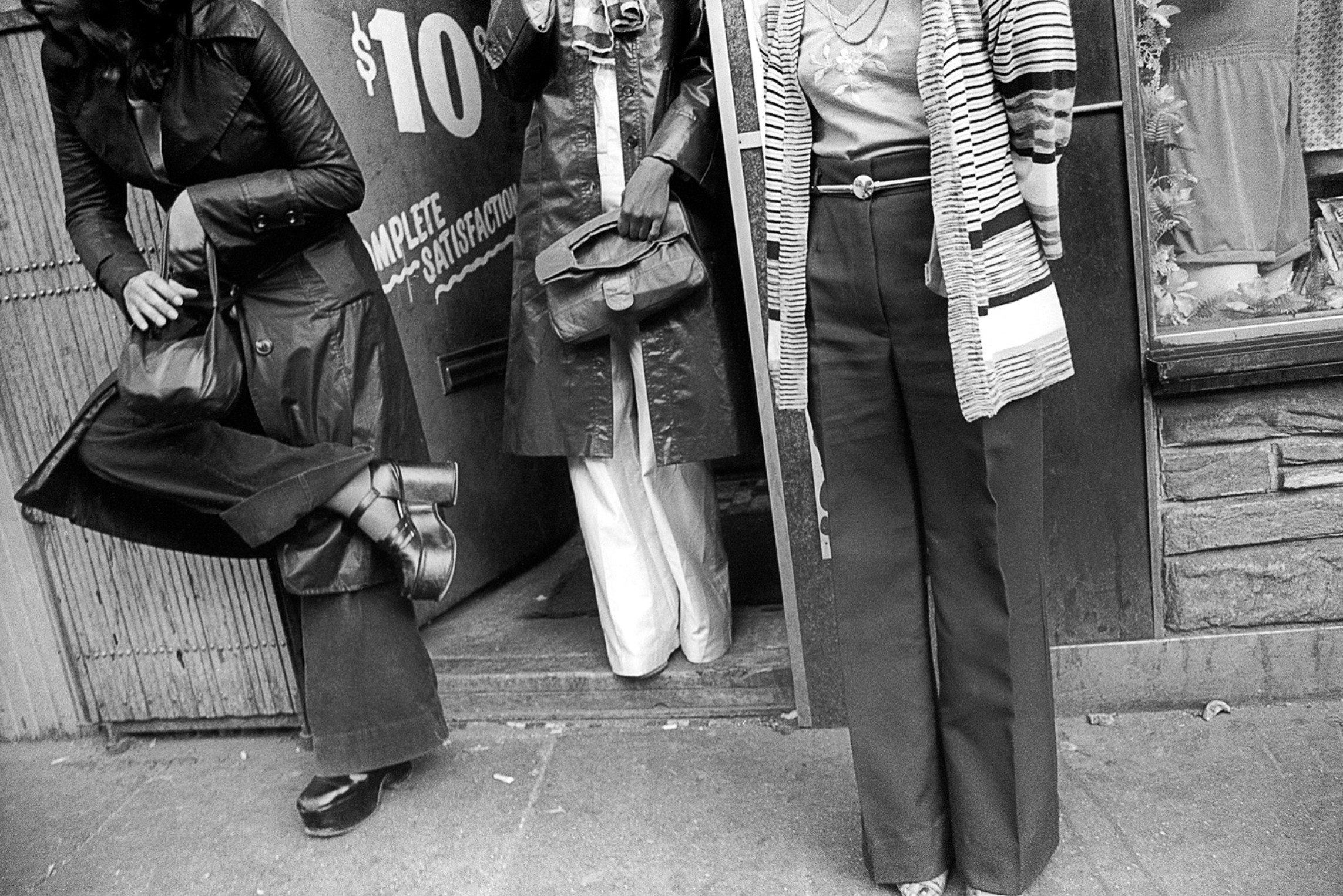
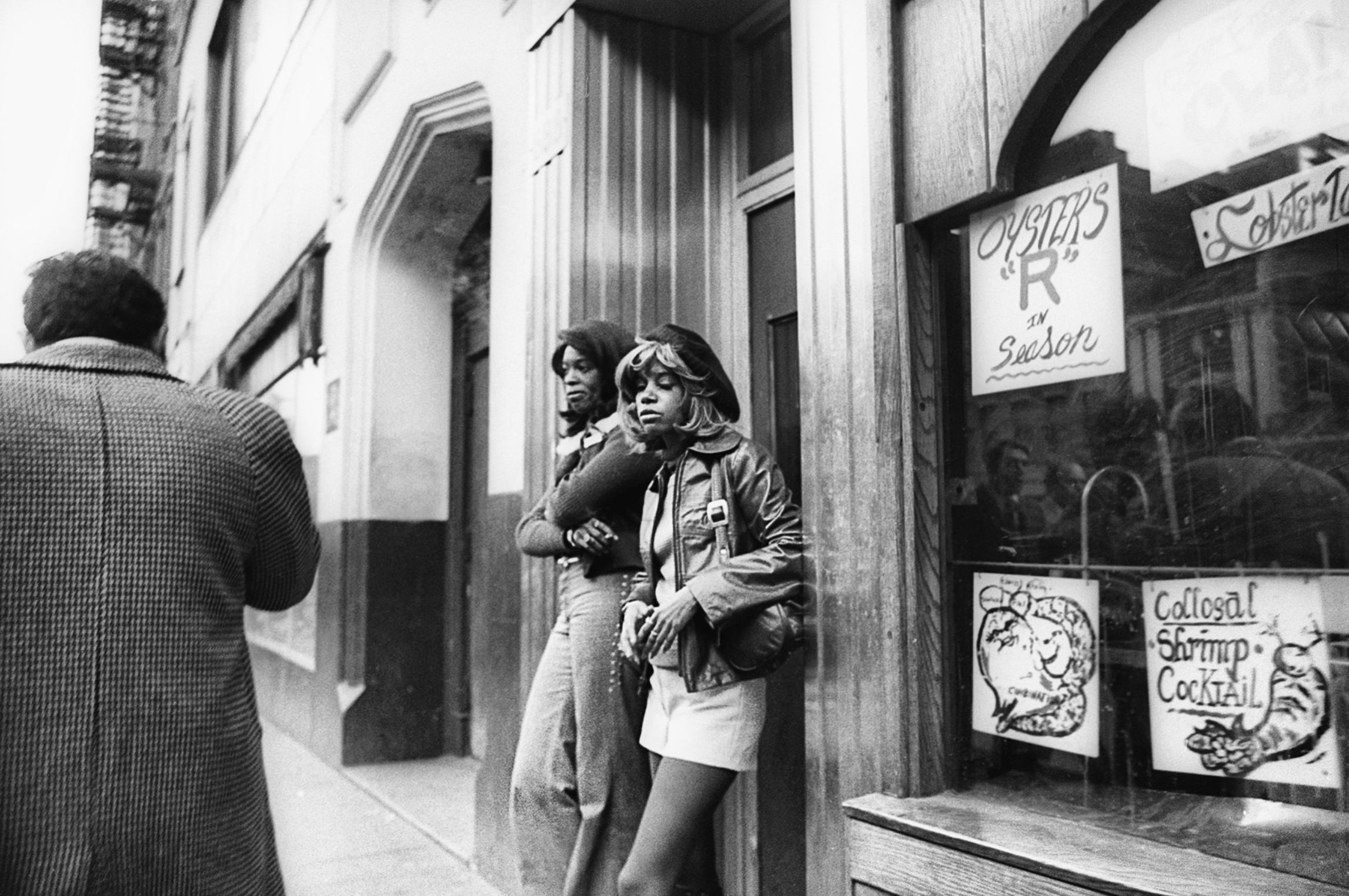
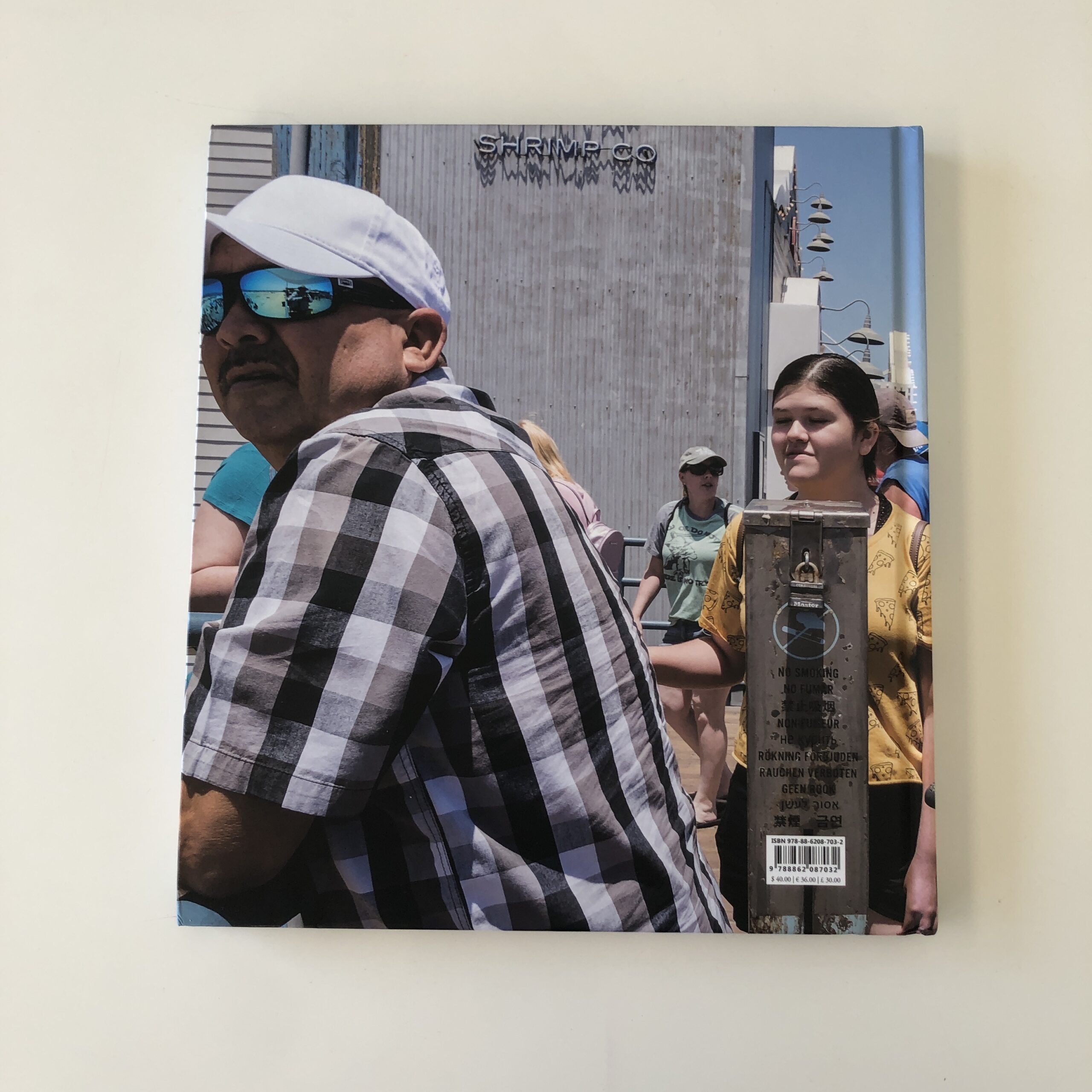
Heidi: How long did you work on this project, New York City 70s? and what was your process for shooting? ( did you walk everyday? was your camera always with you?) Leland: I never really considered my 70’s NYC street photos of Times Square, The Bowery and general NYC to be a “project”. It is a collection of photos of street scenes that I felt compelled to capture. I moved into Manhattan in 1974 and my main interest was playing drums in a band that was part of the CBGB’s scene. Photography was a hobby at that point. To support myself during this time I drove a taxi and spent hours on the streets observing the different neighborhoods. I didn’t bring a camera with me when I was driving because it would have been an easy target for a thief. Remember, this was the 70’s in NYC. Whenever I was going anywhere outside of driving a cab, I had my camera with me. Often, I would just go out with my camera either on foot or on by bicycle looking for things to shoot. For much of my Times Square work at that time I used a 28mm lens pre-focused at about 5-6 feet, while holding the camera at my waist and firing off shots as I walked by. I also used an 80-200 zoom when I didn’t want to get to close. 40 years later I realized that I had a collection of images of a period time in NYC that no longer existed. Times Square turned in to Las Disney and The Bowery turned into high end condos and restaurants. I showed these images to a curator at the Museum of the City of New York and they took 18 images into their permanent collection.
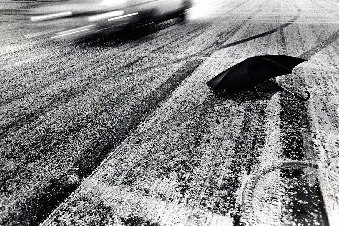
I loved the umbrella story, did you go out in all rain events in NYC and what drew you to the shape and visual appeal of the discarded umbrella?What attracted me to shoot discarded umbrellas on the street was not so much the shape of the umbrellas but seeing this discarded object on the street while life continued to hustle by this inanimate object. Many of these photos were shot at shutter speeds slow enough to capture the feeling of motion to illustrate this without total blurs usually at about a 30th or a 15th of a second. I would go out and look for these umbrellas after a rainy, windy day when umbrellas would get destroyed. I brought a portfolio of these over to Modern Photography Magazine and they ran a story titled Stormy Weather which was the first time I had any of my photos published.
When do you know a project is “done”? Good question. I know a project is done when I feel like I’ve been there, done that or I feel as if I’ve said all I need to say. I just know when it’s time to move on.
What have you been working on lately? The most recent photo project I finished was a collection of B&W street photos of NYC during the Covid lockdown in the spring of 2020. I titled this project Public Isolation. I have lived in Manhattan for 45 years and I’d never seen anything like this before. The streets were empty and quiet. I tried to captured photos with just 1 person in the frame to illustrate isolation. The museum of The City of NY is currently in the process of making selections for their permanent collection.
I’m currently working a music video of a song I wrote and recorded titled Don’t Know When (2020) incorporating my NYC lockdown photos and NYC Black Lives Matter protest photos shot by Mychal Watts.
What would you tell your younger self about photography as a career? I’d tell myself that it ain’t easy. I’ve been through numerous reinventions and phases over the years and have learned and that one must keep evolving. It’s really important as a commercial photographer to develop a personal style and to shoot personal work to keep the creative juices flowing.
This feels different though. (And on a smaller scale, obviously.)
All week, I’ve been trying to figure out: Why this article?
Why now, after all these years of writing for you?
Last Thursday, on a whim, I decided to write a super-long-read, sharing much of what I’ve learned about the photo-book publishing industry.
I’ve been a critic here for 10.5 years, have produced photo-books for clients since 2017, and made my own book over the course of 2019-20.
I have a lot of experience, from a variety of perspectives, and providing that inside info, for free, seems to have struck a nerve.
The publishing industry is opaque, yet so many artists want books, so shining a light on true practices, while also inspiring creativity, (rather than just focusing on the business-side,) felt like the right gesture to make.
And I did it for you.
Therefore, I was thrilled to know I’d been of help, and my advice was beneficial to others.
That’s always been the backbone of this website.
Industry professionals share knowledge, and try to help the community that supports us.
(Big ups to our leader, Rob Haggart, for building the platform, and supporting his team so well.)
Because photo-books can cost so much money, and take a lot of effort to make, (in addition to resources,) it seemed silly so few photographers know the reality of the industry.
What used to be termed “vanity publishing,” or “pay-to-play,” is now just the way business is done.
If few publishers can make money selling books, artists should not see their projects as profit-generating ventures, in general.
I mentioned there were exceptions, and Iain Sarjeant, of Another Place Press in Scotland, tweeted me that he doesn’t charge photographers for book production, and offers royalties.
I also once heard my former collaborator, Alejandro Cartagena, tell an online audience he’s gamed the system, taking the proceeds from one book to make another, so he manages to come out ahead.
But these are primarily exceptions to the rule.
Many people got excited that I shared realistic $$$ numbers.
By including potential costs, and setting up a ladder, from the cheapest ‘zines to expensive, fabric-bound, European-printed, high-end productions, I wanted to give photographers a real idea of their potential options.
Based upon the feedback I’ve received, folks appreciated the way I laid it out.
(Again, I’m honored to have been of service.)
So today, to get the book-review-portion of the column up and running again, I’ll focus on a really well-made book, that took the now-typical route into existence, and made it worthwhile.
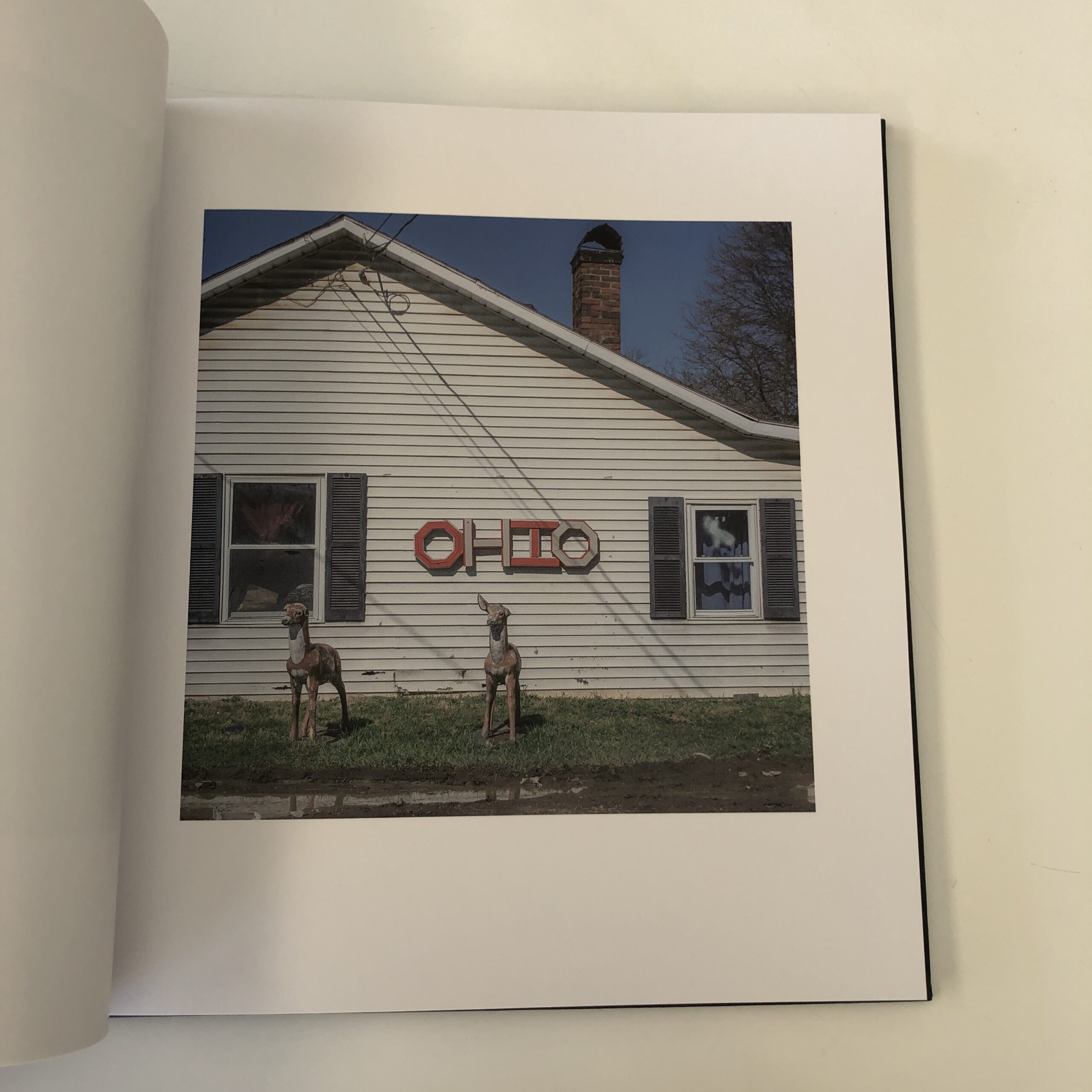
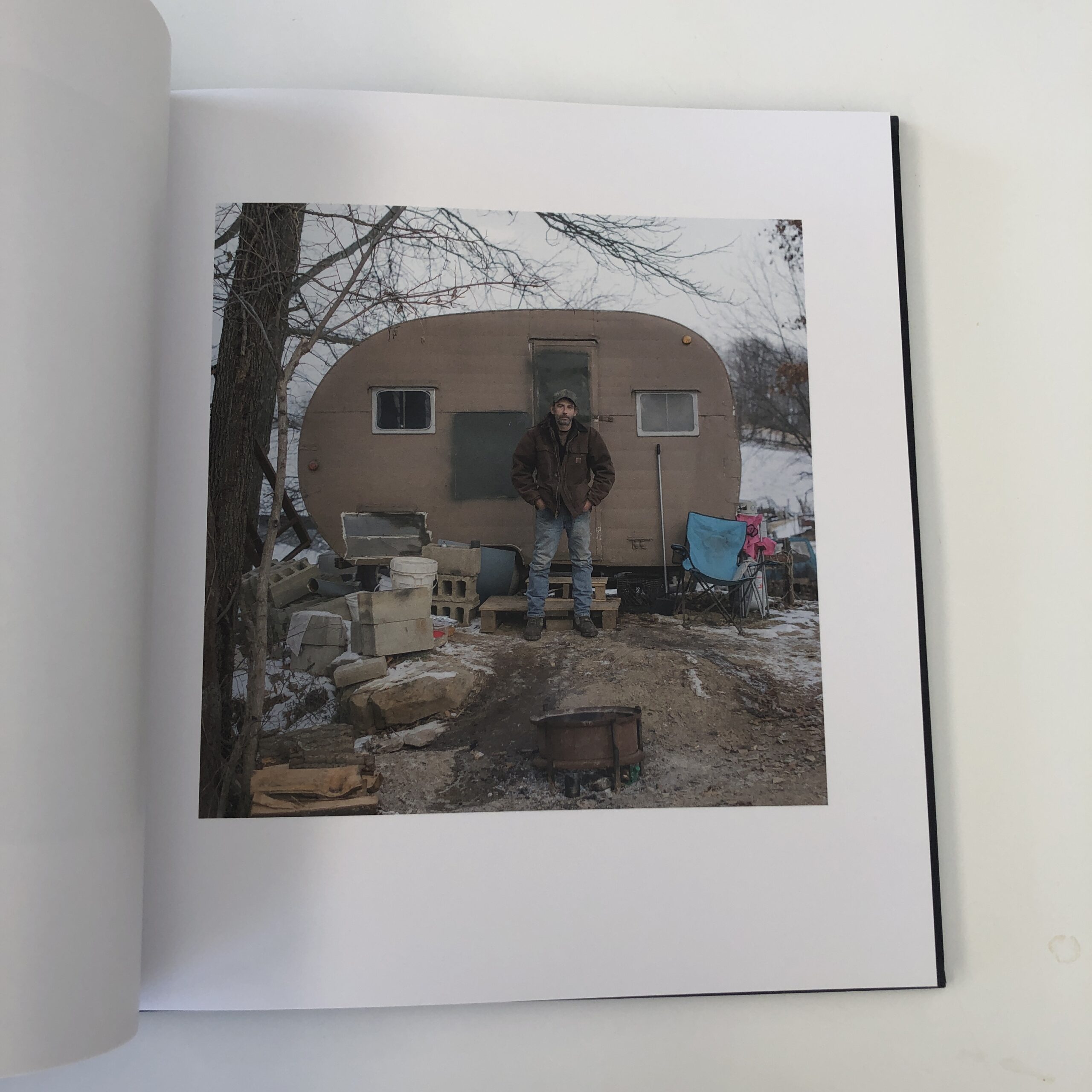
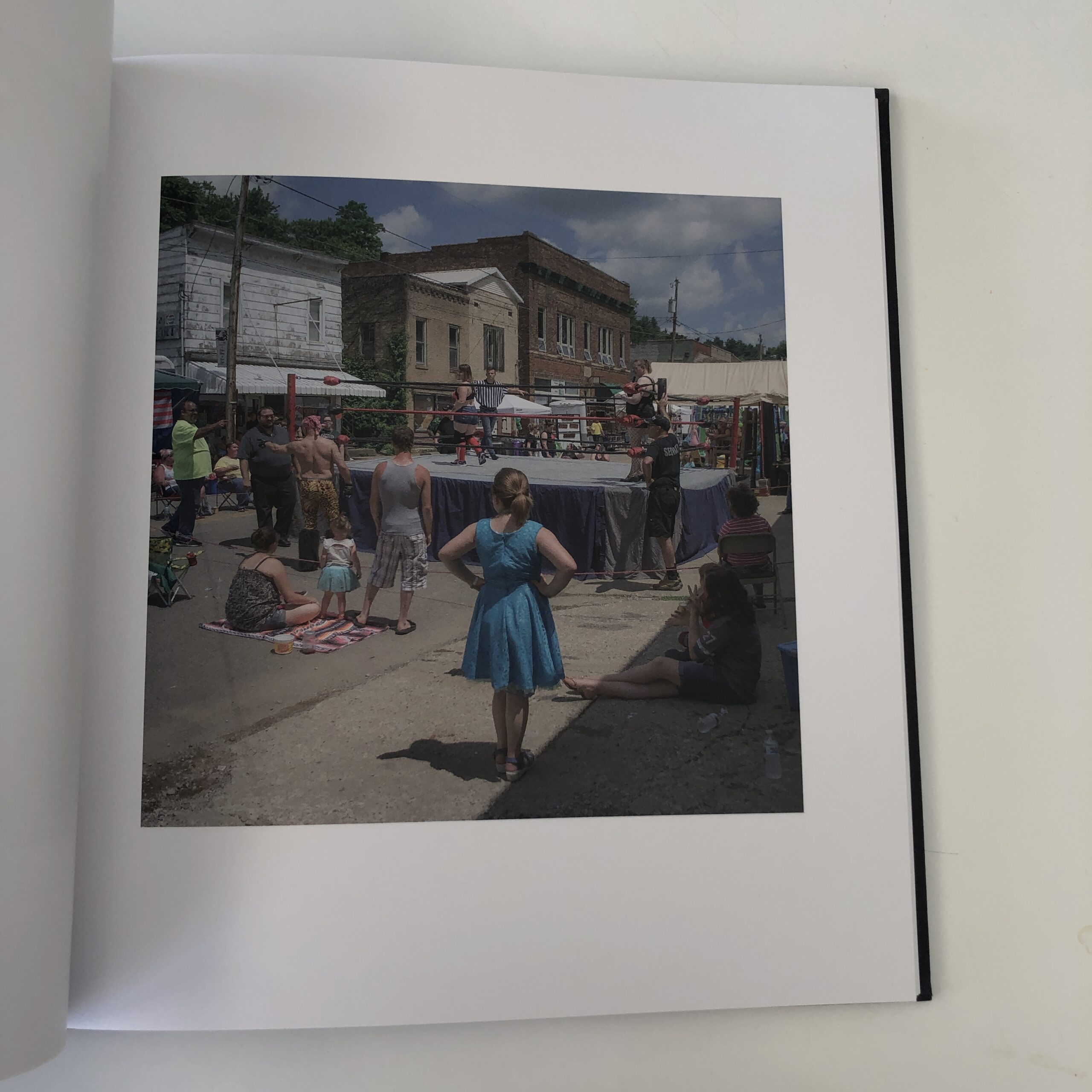
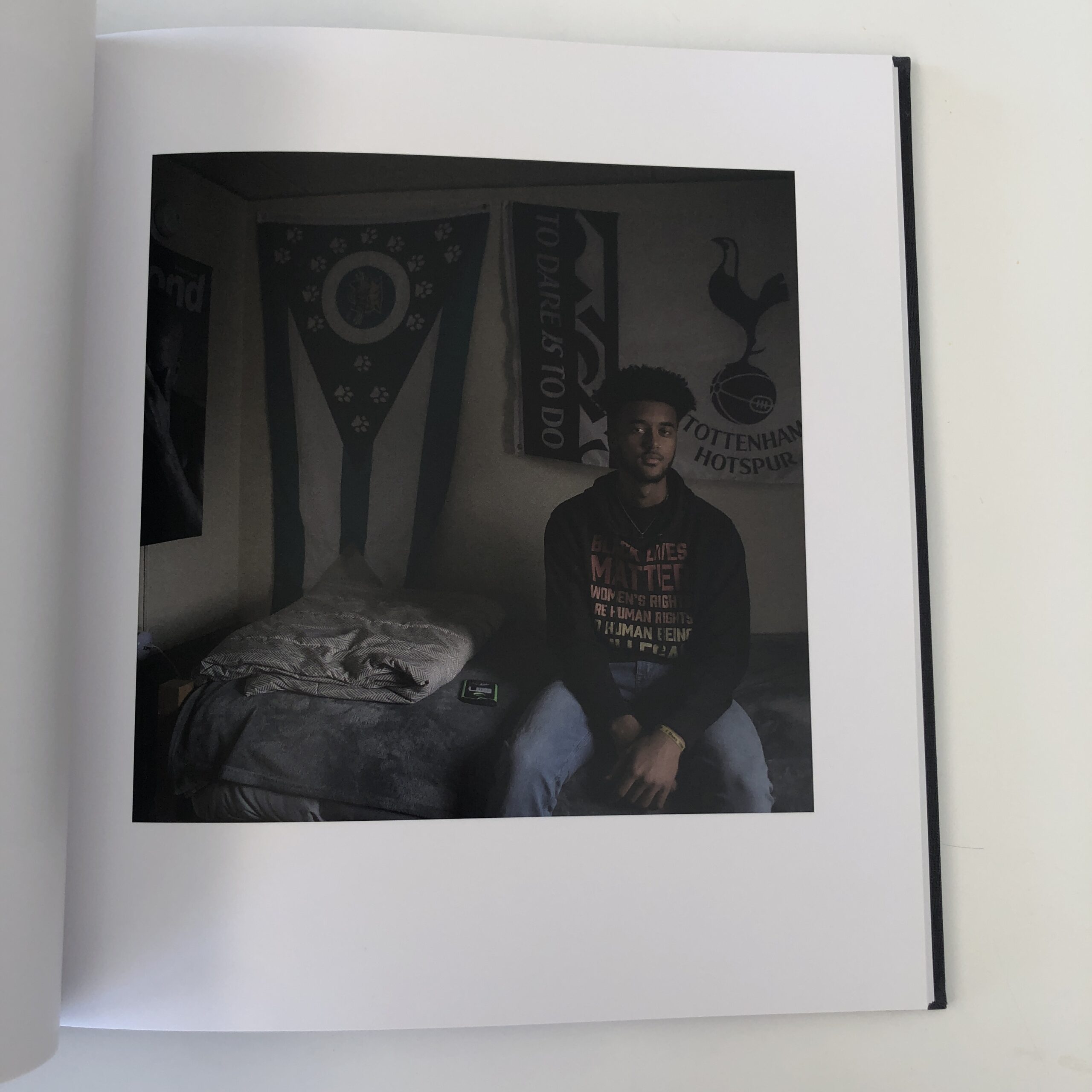
He’s based in the Southern Ohio portion of Appalachia, and Fall Line is in Atlanta, so this is a Southern production through and through.
(I did receive one email from a reader claiming I’m biased against the South, which I believe is untrue. Yes, I criticize “Red State” politics, but Trumpism and the South are not the same thing.)
I told Rich-Joseph I was interested, after perusing his .pdf, but it would take a while to get around to the review.
Fortunately, I had the opportunity to interview him for the PhotoNOLA Virtual Book Fair, and he shared a lot of information about his family, life, and book-making process.
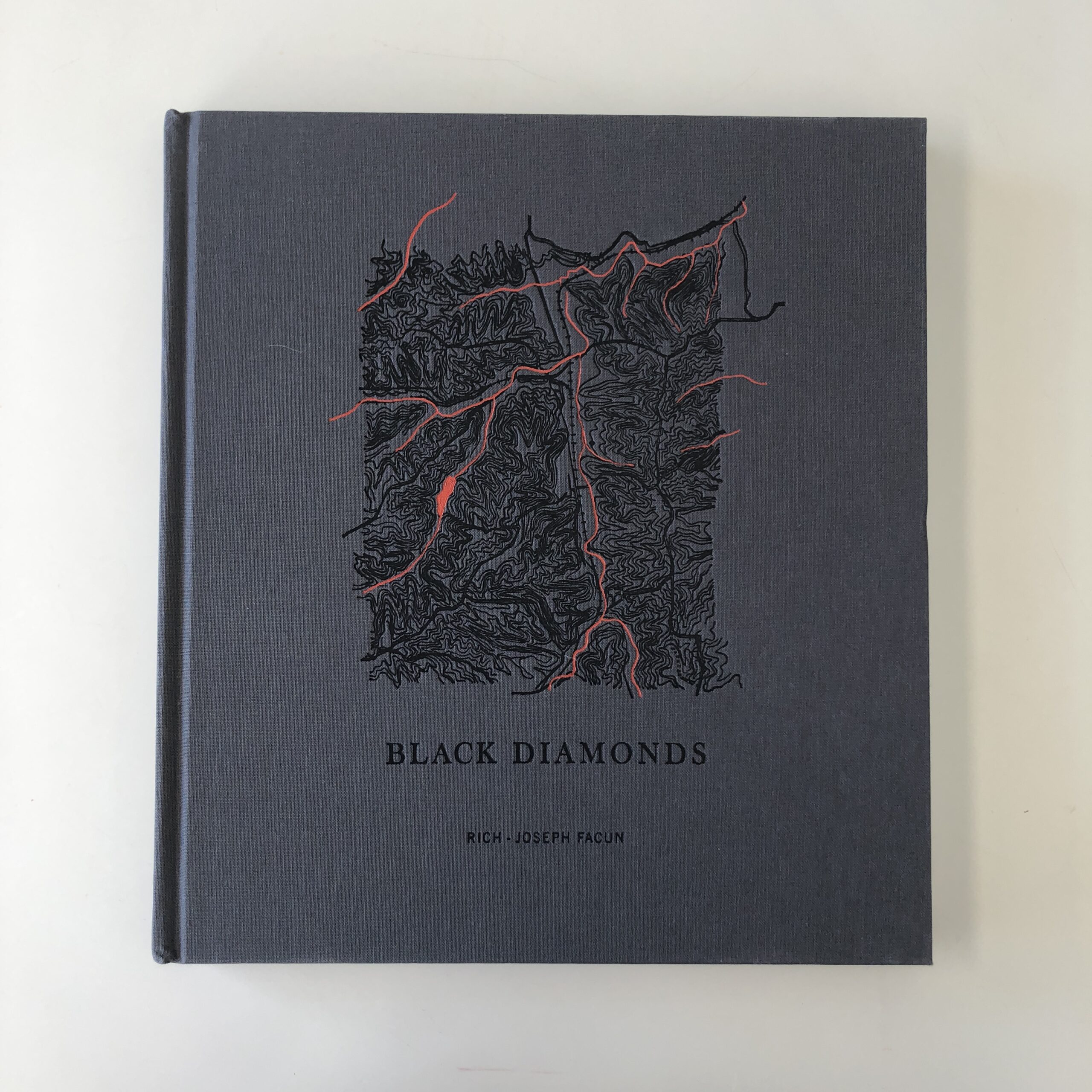
As to the book, “Black Diamonds,” Rich-Joseph built up his photographic practice over many years, first as a photojournalist.
(Making imagery more typically associated with fine art photography was new for him.)
Therefore, he worked like crazy to get things right.
He did a Kickstarter campaign, raised the funds, and printed in Barcelona.
To reiterate, if a book like this is going to cost a lot of money to produce, (as I wrote last week,) you better have a damn good reason for doing it, and give your all to make it as great as it can possibly be.
RJF confirmed, in our interview, that was his approach.
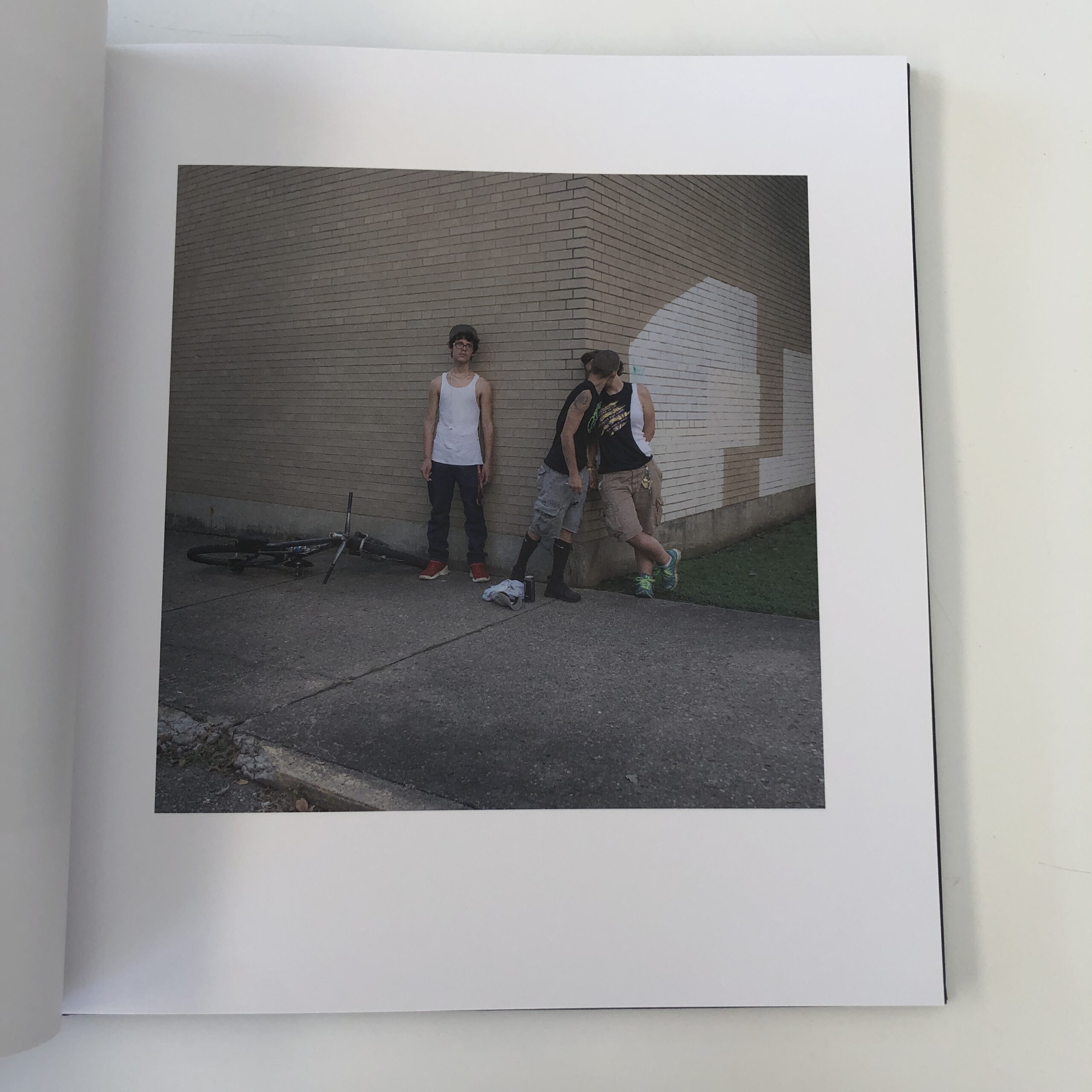
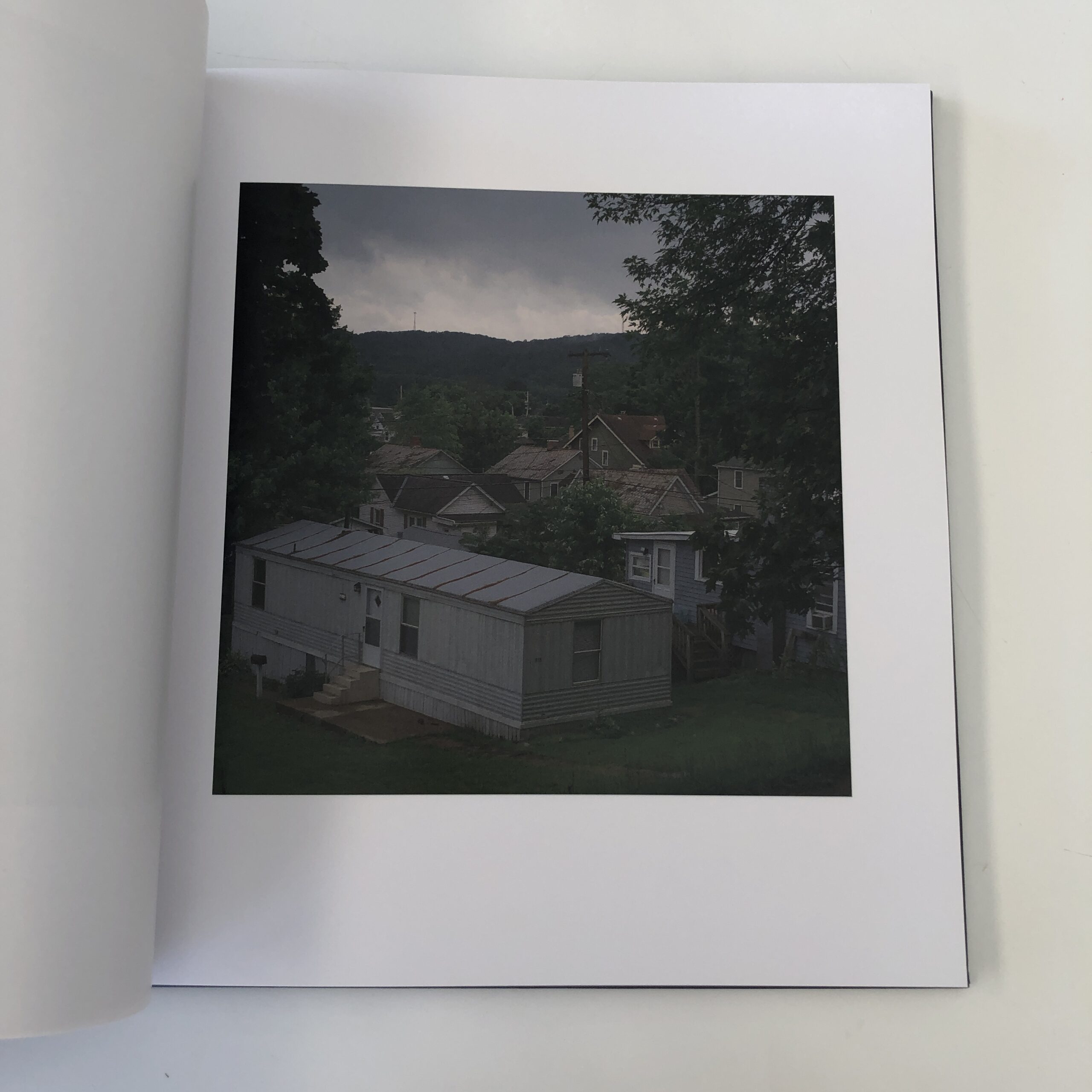
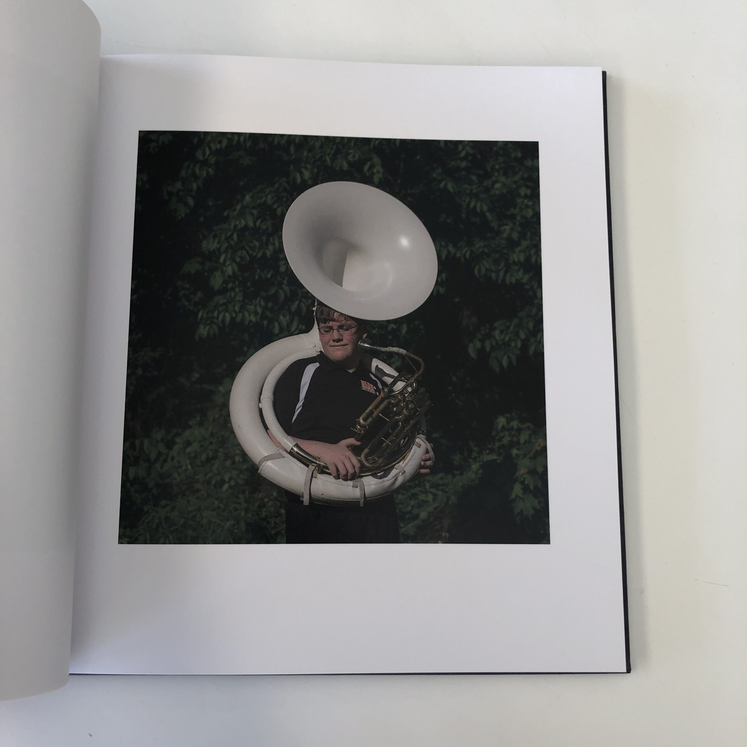
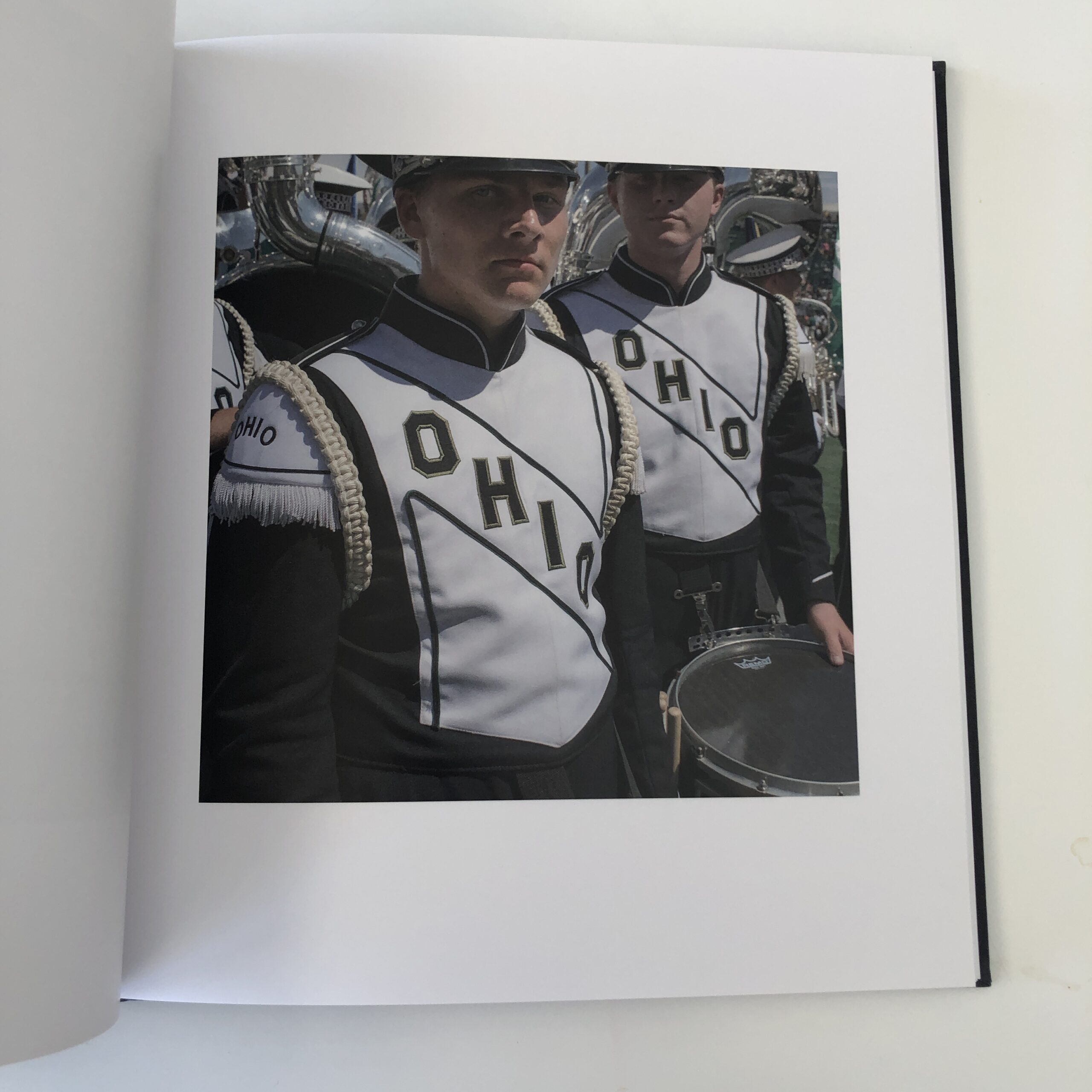
As to the book’s theme, though he is a Southern guy, and has lived all over, Rich-Joseph moved to Athens, Ohio for a university job.
Then he used this series to get out and about in his community, to see what made it tick, to meet people, and have an art project to occupy his time and mind as he drove around his world each day.
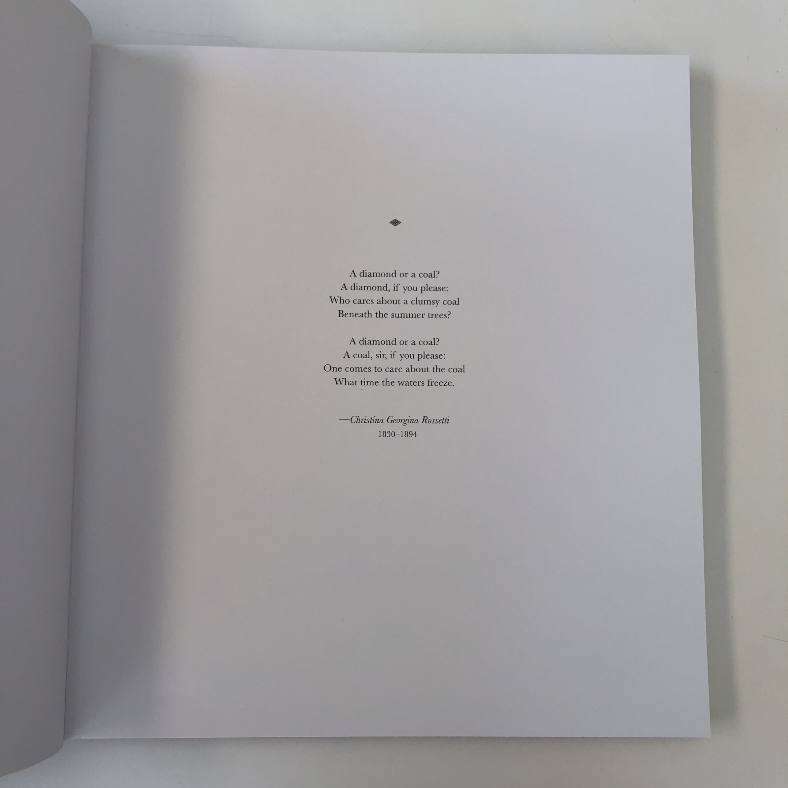
From the embossed, fabric cover, replete with a cool graphic, to the catchy poem that opens the book, a viewer is given the expectation it’s a serious offering.
And so it is.
As I wrote last week, one can tell the story straight away in words, to set the context, or wait until the end, once the pictures have led the way.
This book opts for the latter strategy, and I can understand why.
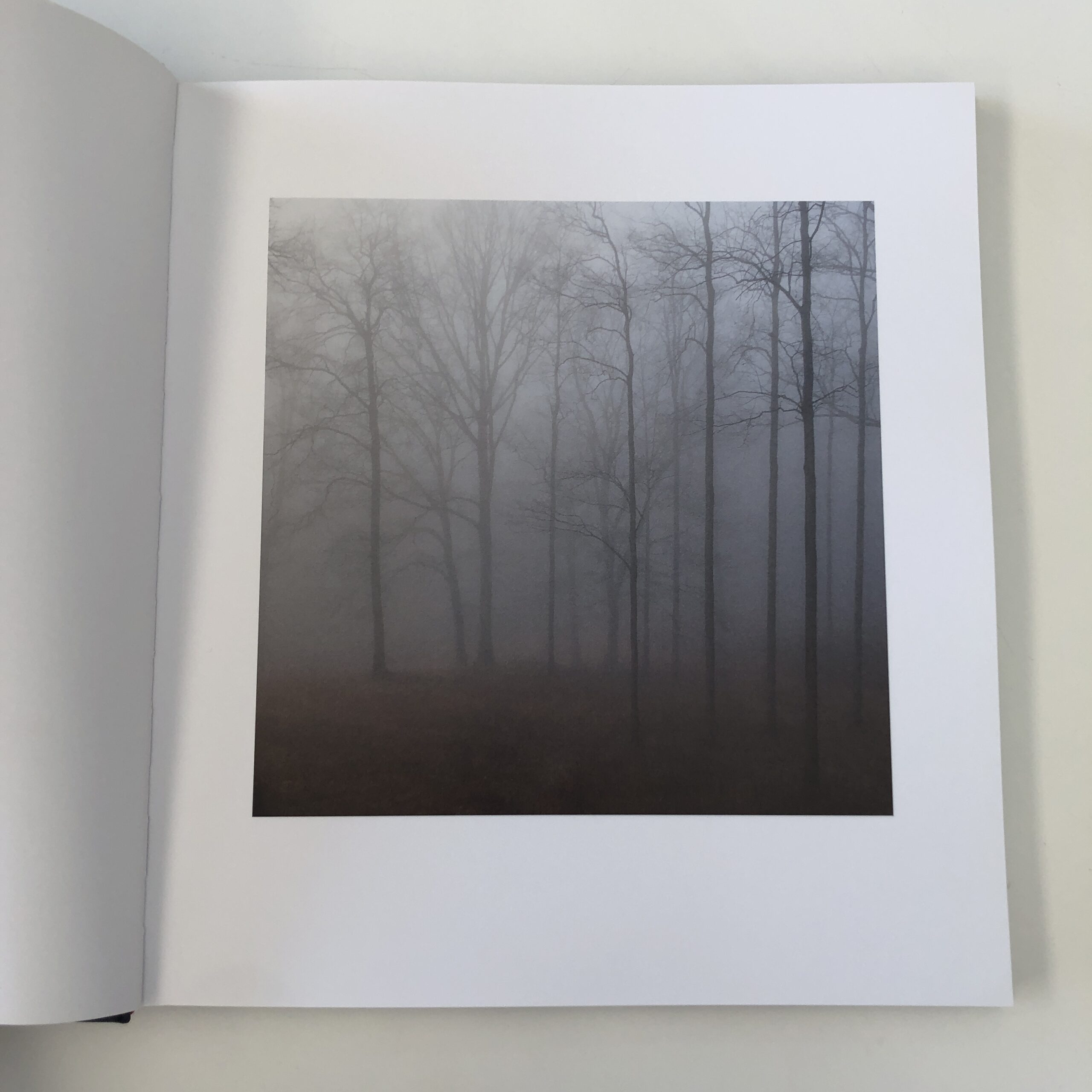
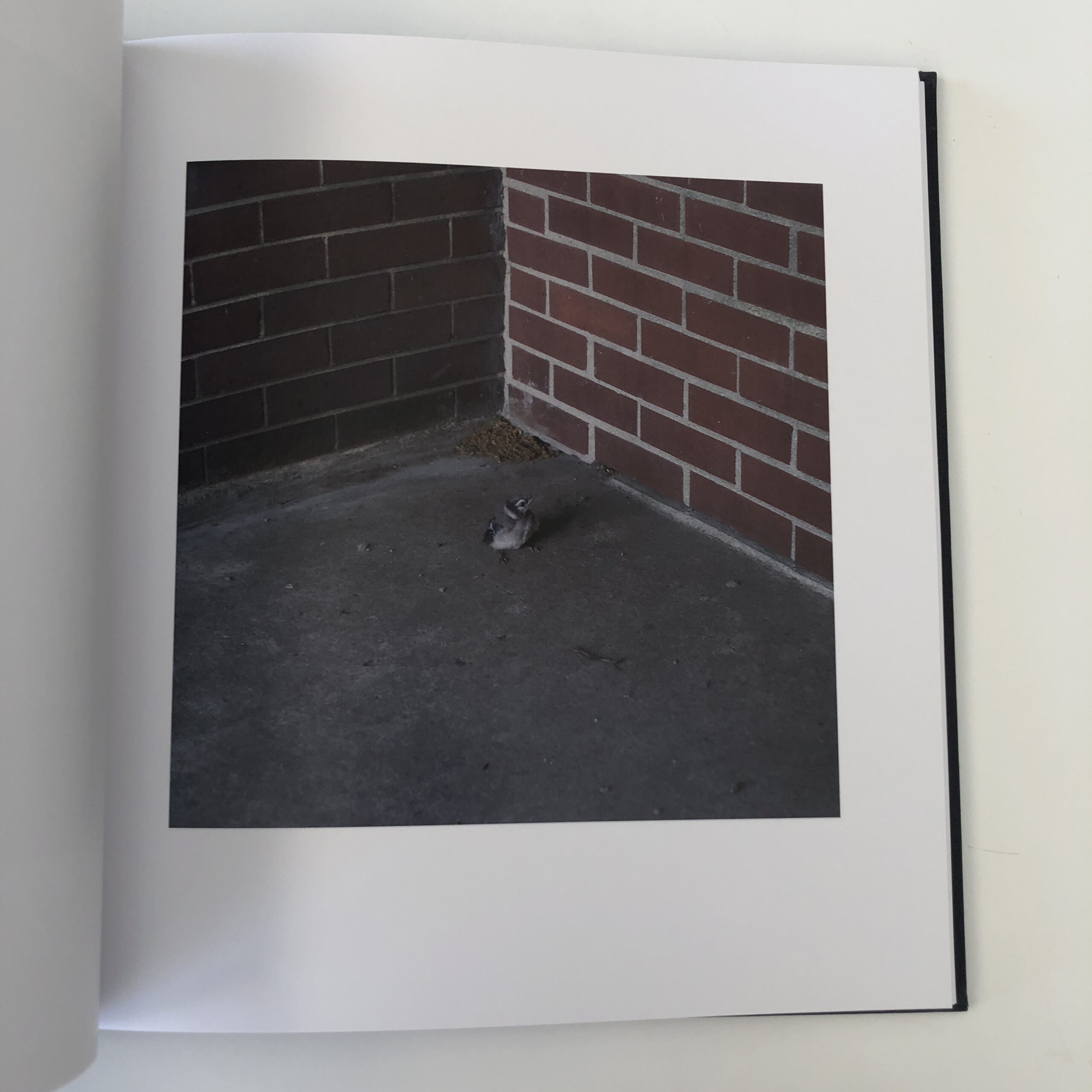
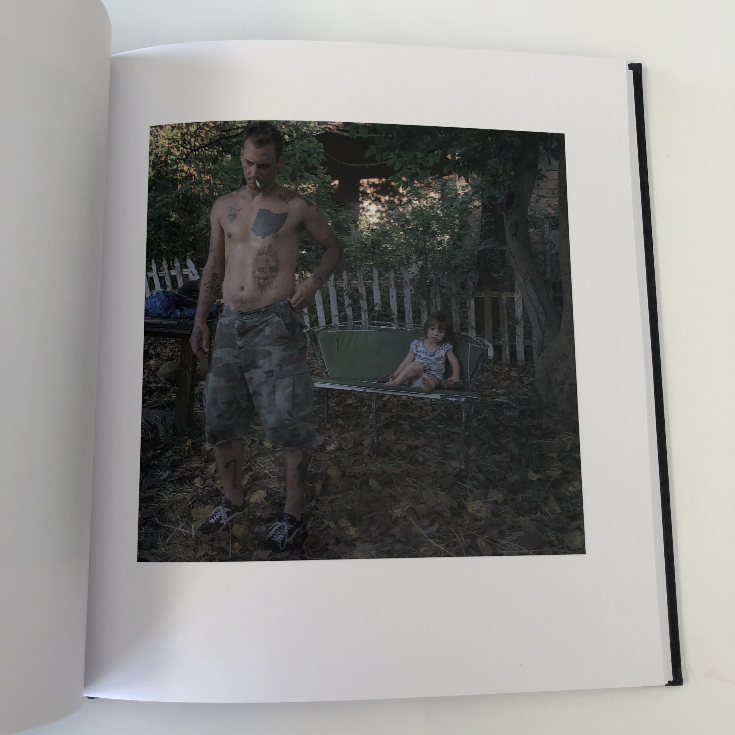
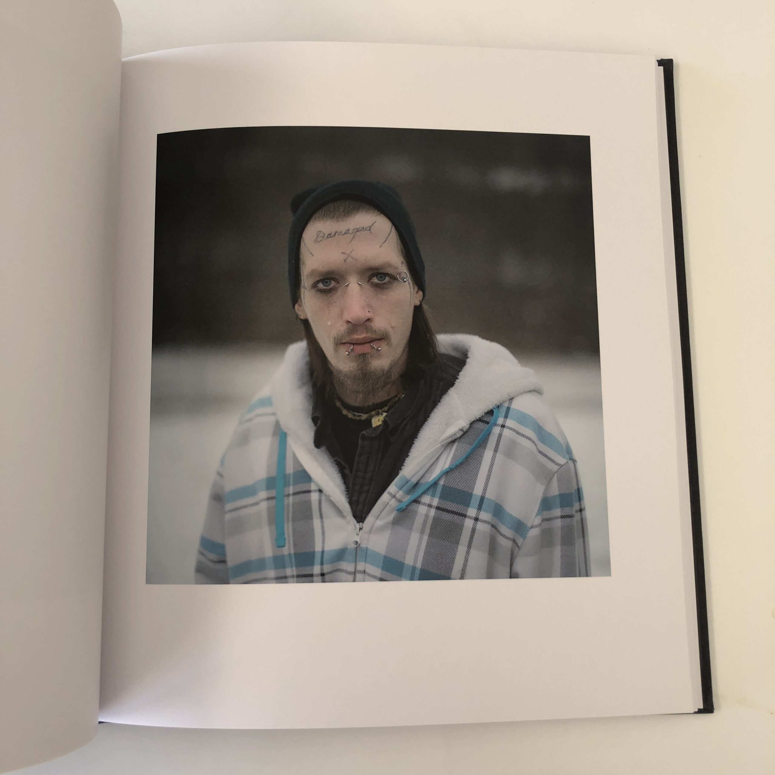
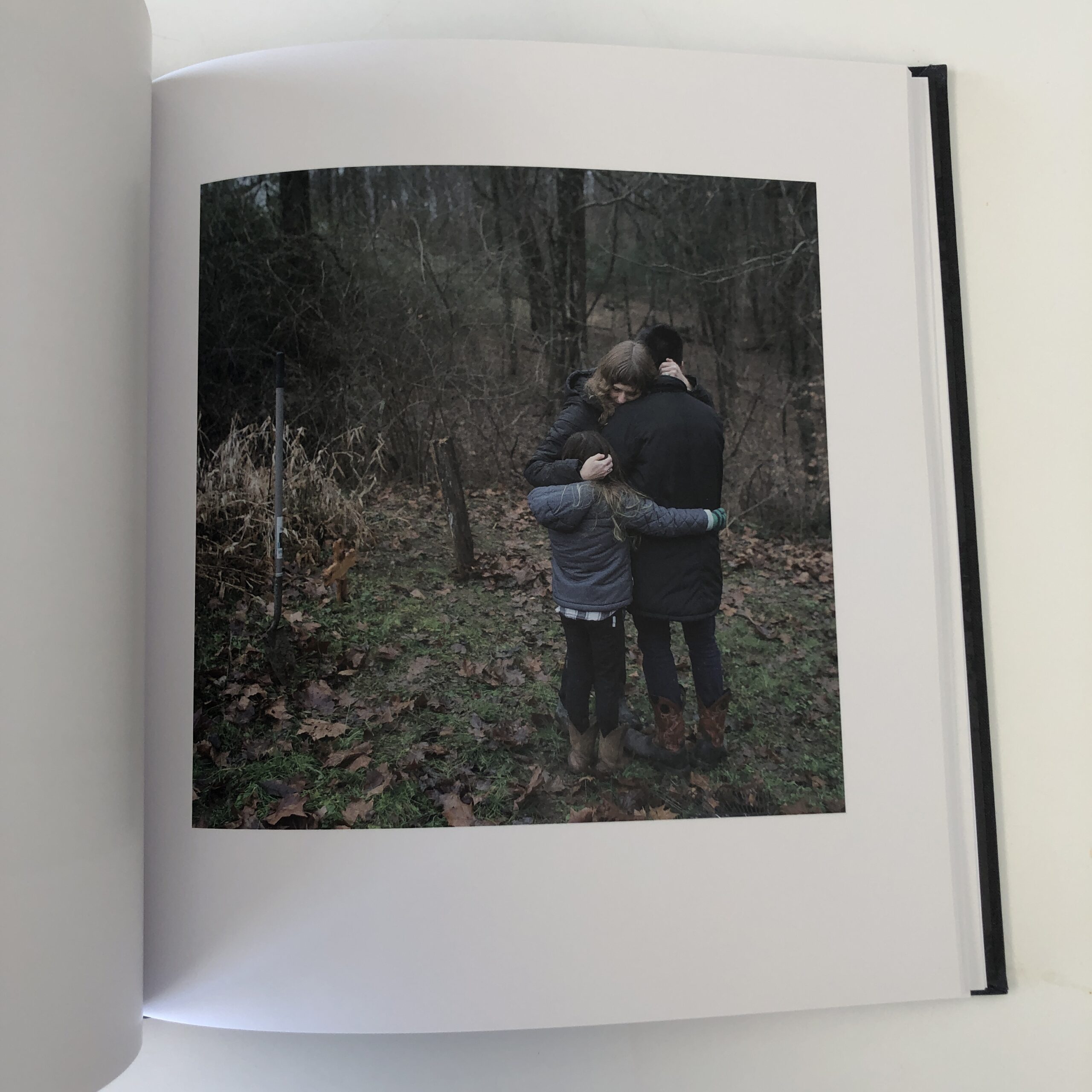
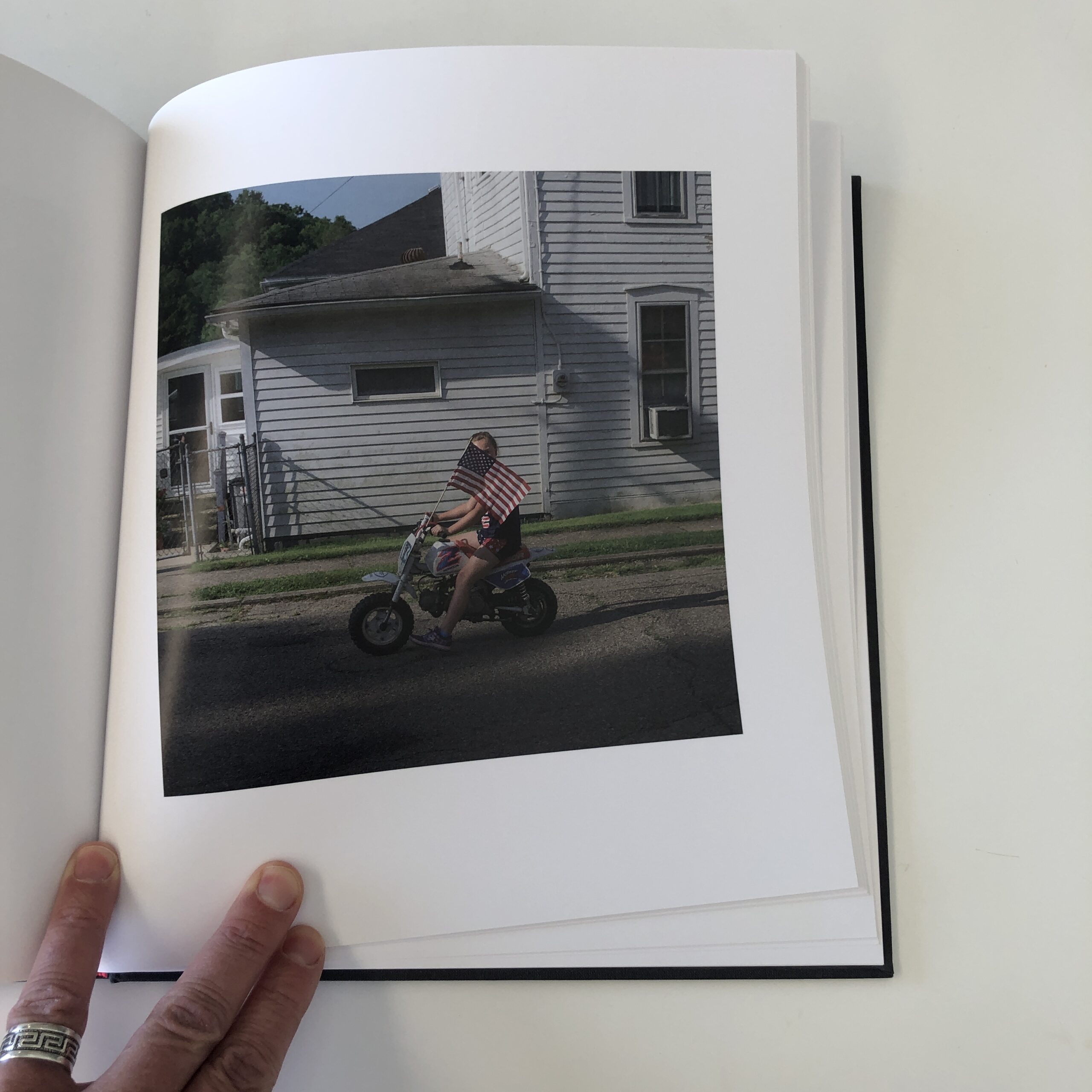
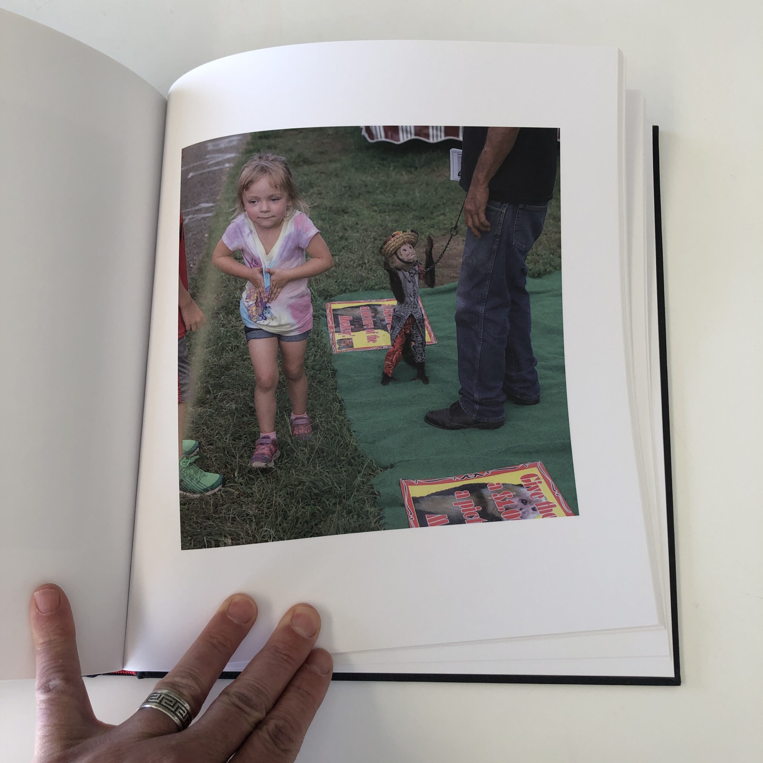
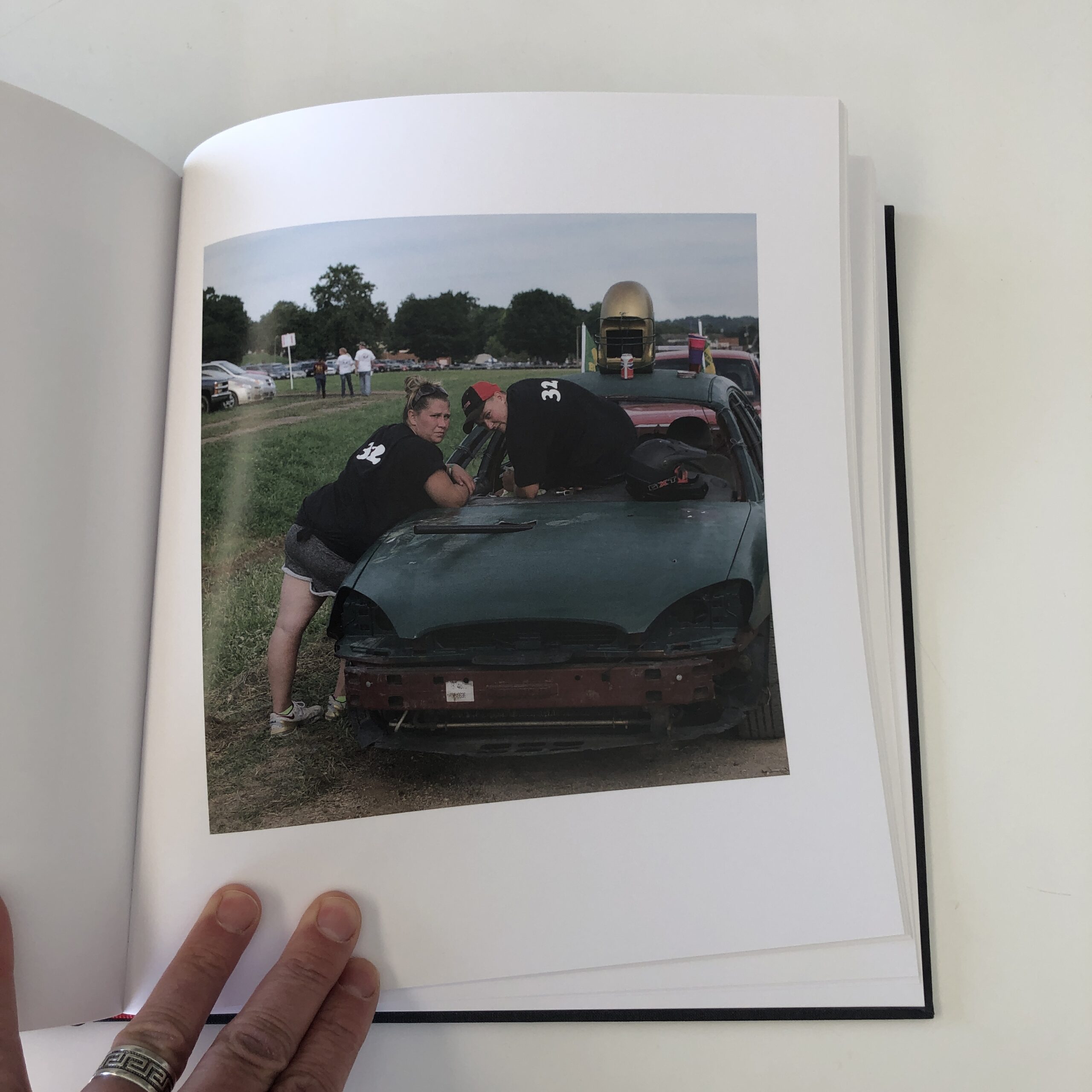
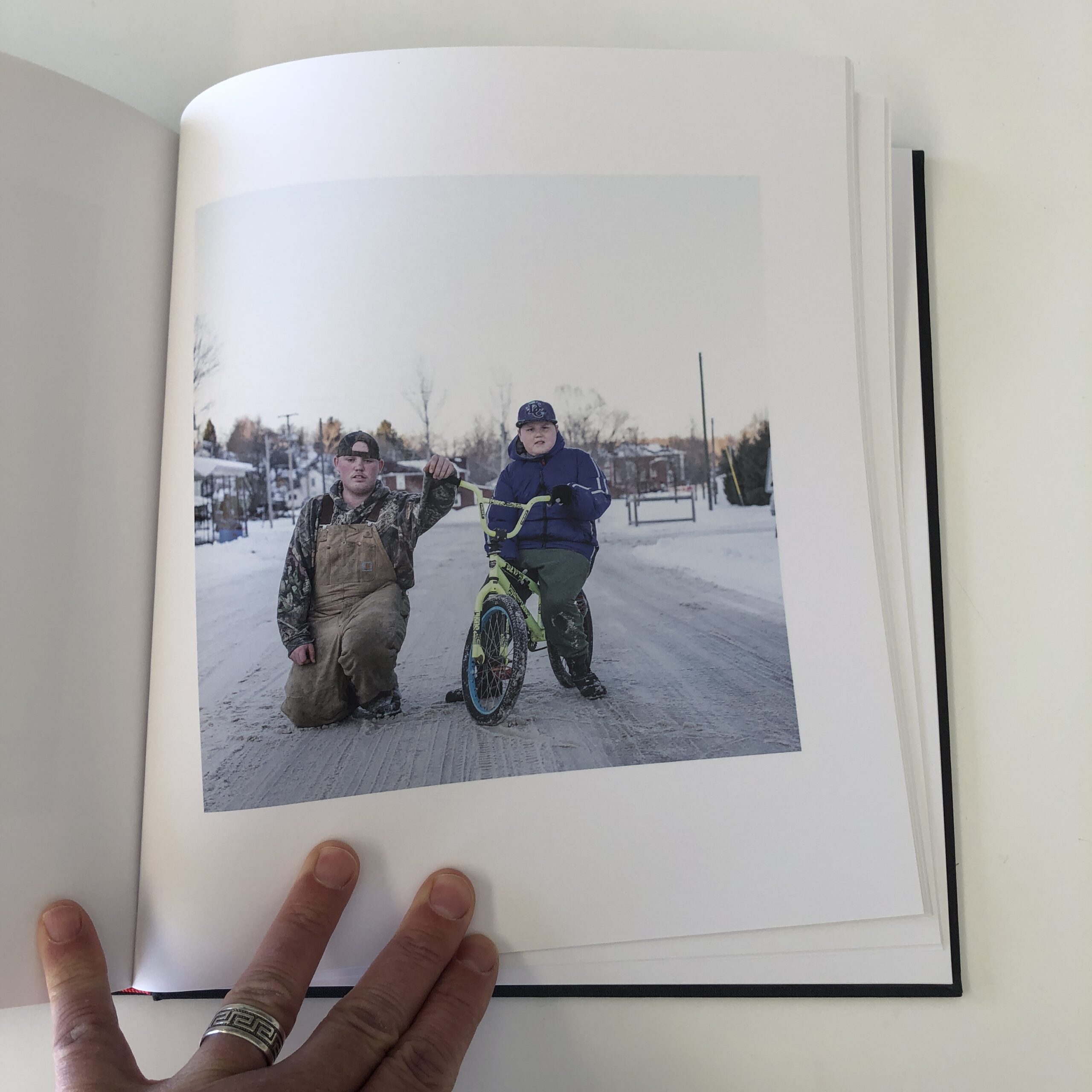
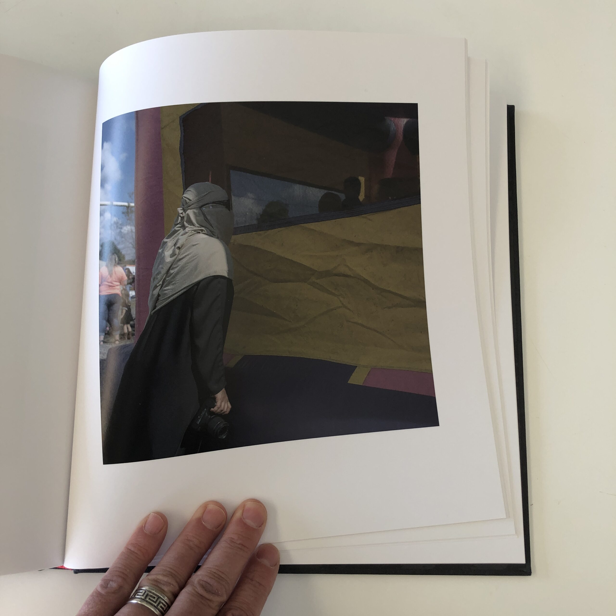
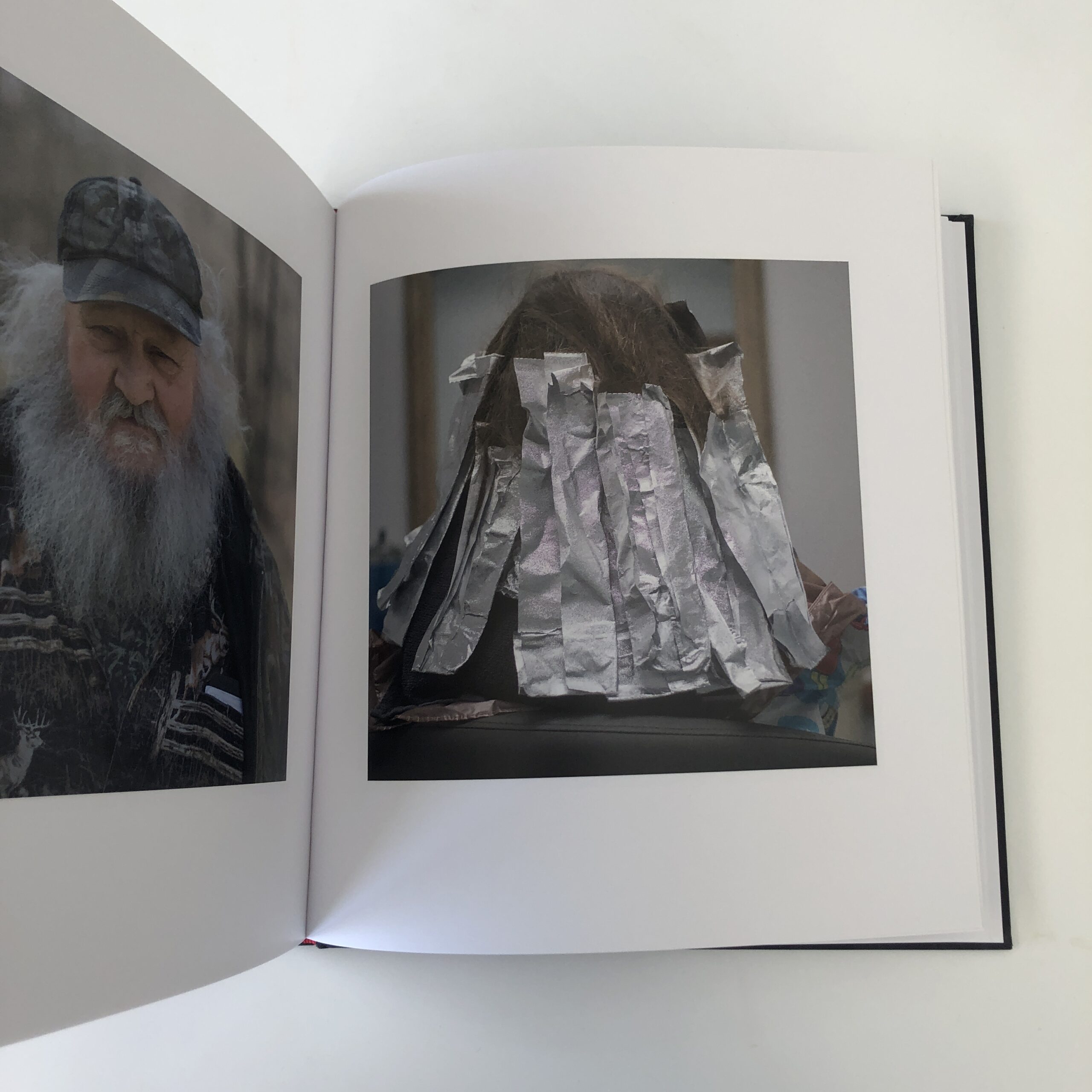
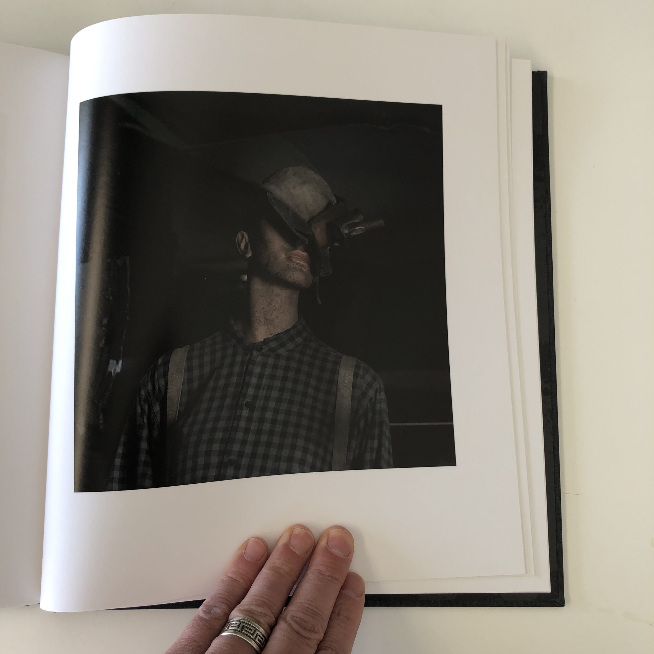
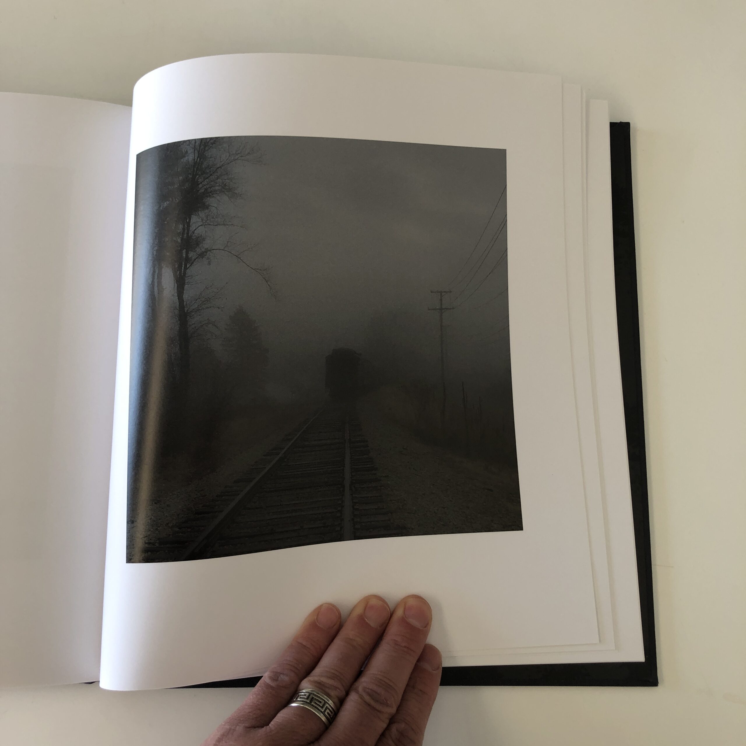
Though I might have trimmed the edit just a bit, (were I in charge,) the square photographs inside are moody, well-crafted, dramatic, consistent, and truly give a sense of place.
They’re stunning, in a grim sort of way.
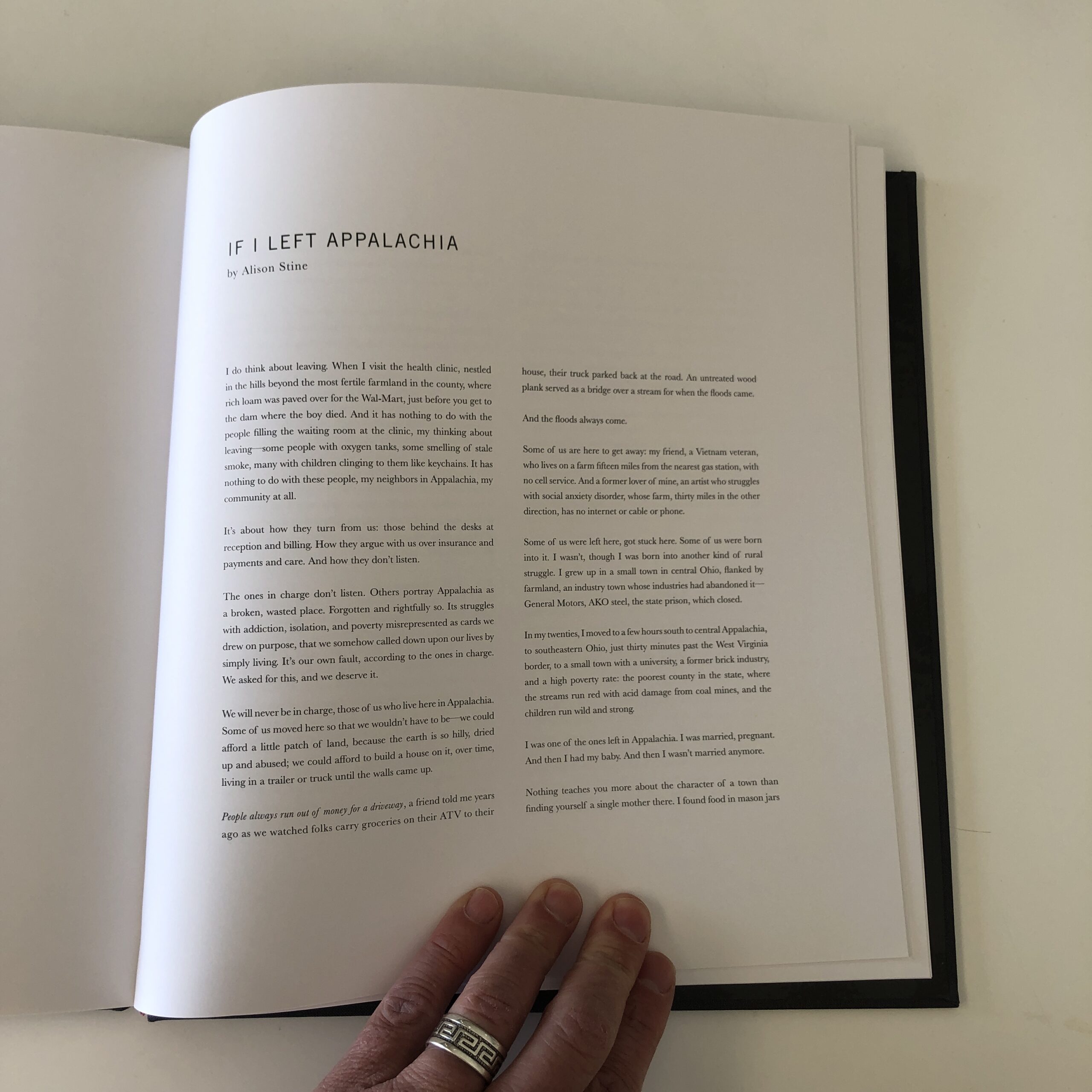
And yes, there is a lot of poverty, for which Appalachia is well known. (The culture is elegantly described in an ending essay by Alison Stine.)
We see oddities, such as the dancing monkey, and camo-clad boys who don’t seem like the sharpest knives in the rack.
Some subjects confront the camera; others look away.
But overall, the tone is not one of condescension, nor does it seem like the work of a total outsider.
The photographs are quite beautiful, and as there are no design bells and whistles within the edit, they’re good enough to hold one’s attention, which is a hard thing to do.
Then, in the Epilogue, after Alison Stine’s essay, we get a slightly art-speaky statement by RJF, and a heart-felt, loving thank-you page, paying respect to his family and community.
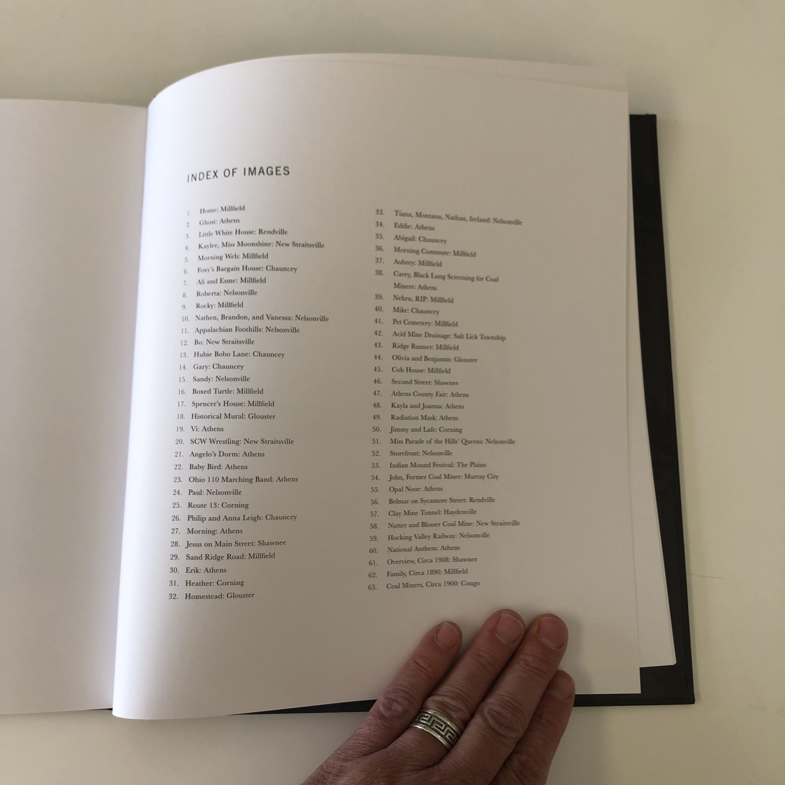
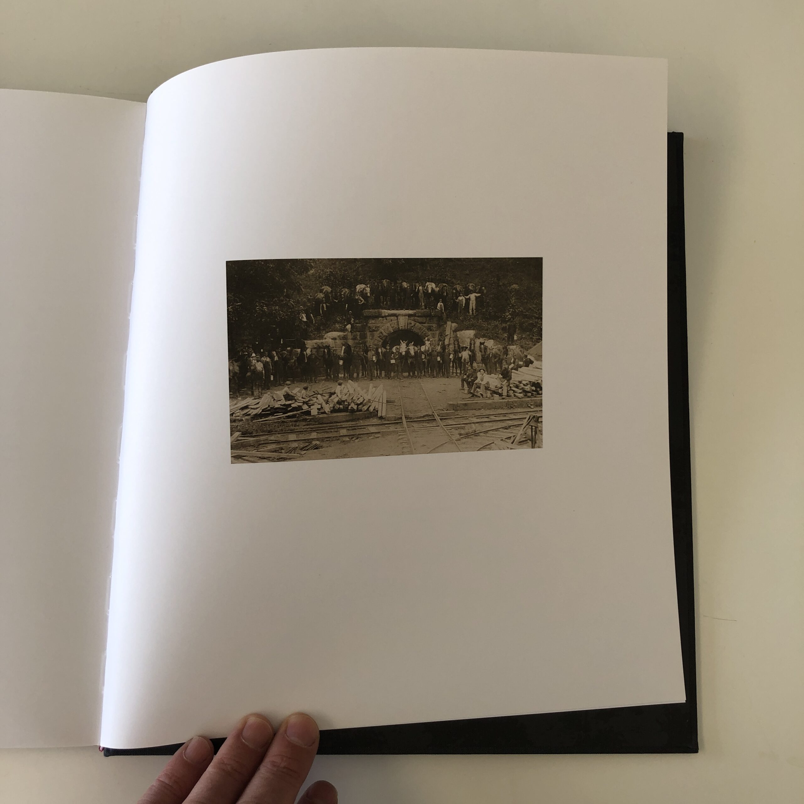
Three historical photos round out the book, and honestly, the whole thing is really well-thought-out.
It’s an example of how to do it right, if you’re going all in.
So to wrap it up today, (as last week’s 2700 words still weigh heavily on my consciousness,) not all photo projects need to end up as expensive books.
There are so many ways to make an artistic, publishing object out of your favorite (or current) series.
Please don’t go broke to make a book, nor do it just to do it.
But if you’re going for it, I’d suggest you make it worth your while.
If you’d like to submit a book for potential review, please email me at jonathanblaustein@gmail.com. We are particularly interested in books by artists of color, and female photographers, so we may maintain a balanced program. And please be advised, we currently have a significant backlog of books for review.
The Art of the Personal Project is a crucial element to let potential buyers see how you think creatively on your own. I am drawn to personal projects that have an interesting vision or that show something I have never seen before. In this thread, I’ll include a link to each personal project with the artist statement so you can see more of the project. Please note: This thread is not affiliated with any company; I’m just featuring projects that I find. Please DO NOT send me your work. I do not take submissions.
Today’s featured artist: Kendrick Brinson of Brinson+Banks
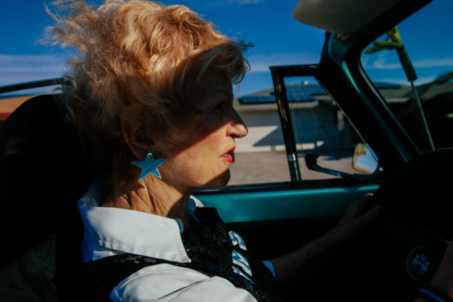
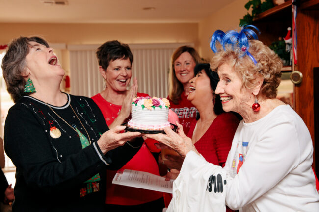
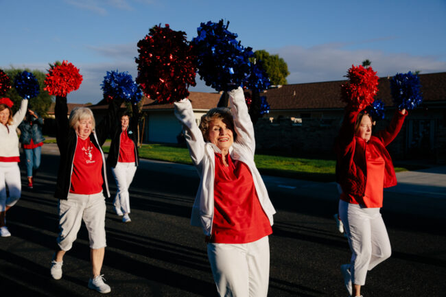
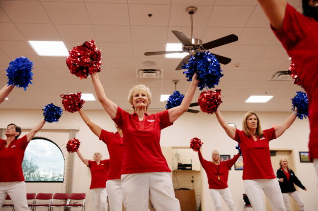
NOTE: This is on-going personal project I have featured before as it is so wonderful to see the project continue to grow with this extraordinary group of retirees.
I have been returning to take photos of the residents of Sun City, Arizona, an age-restricted community of 40,000 retirees, since December 2009 now. When Sun City first opened in 1960, it was the first place of its kind–a place for people who had spent their lives working and raising children to move to with the intention of playing and learning and socializing. It offered a new way to grow old. I love this idea of being more intentional with our time, exploring what makes us feel good, and looking forward to life in our later years.
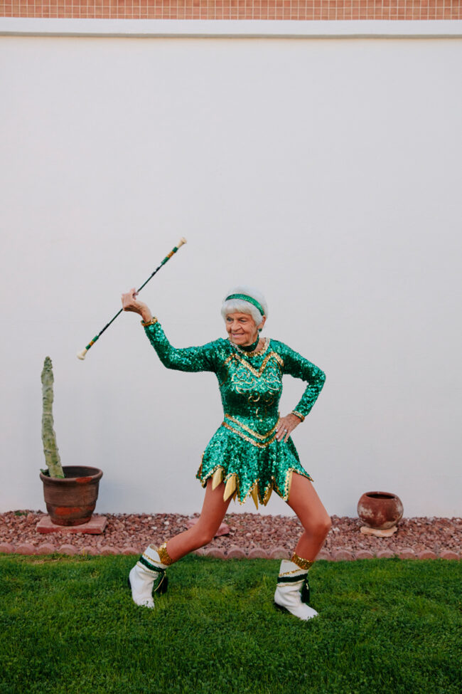
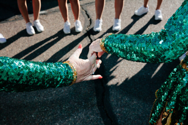
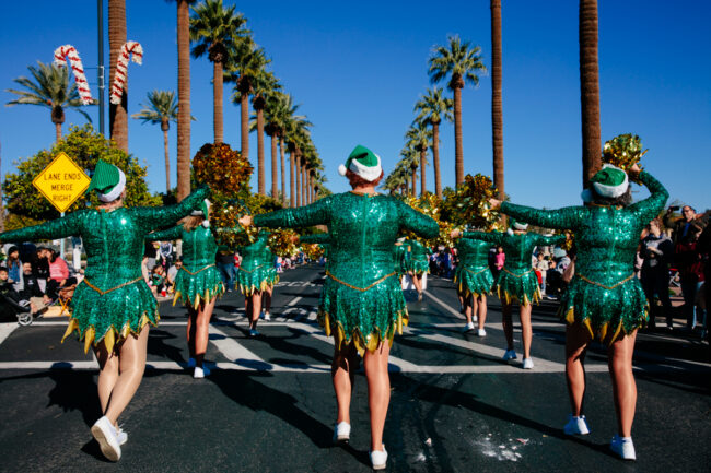
Until last month, my last trip to Sun City was for National Geographic as I photographed and interviewed residents during COVID lockdown in the late summer of 2020. In December of 2021, I decided it was time for me to go back again to see how life had picked back up once residents were vaccinated and the more than 100 clubs had opened back up. This trip, I focused the majority of my time documenting the Sun City Poms—a granny cheerleading squad whose ages range from 59 to 89. I followed the women through a parade rehearsal, their annual holiday luncheon and party, and then as Mary, who is 80 and the current longest member of the Poms at 21 years, got dressed in her sequined uniform, then to a holiday parade, and a performance for a 100 year old’s birthday at a VFW.
While I am always grateful and excited to be taking photos for my editorial and advertising clients, so much of the past two years has been fraught–COVID testing, masking, prioritizing photography outdoors when possible–this has indeed offered beautiful glimpses into life right now, but it has felt more distanced than I’d like. I’ve felt more disconnected from the people I get to photograph and this trip back to Sun City reminded me so much of why I love what I do–I love listening to and connecting and creating with people. Essentially, I sent myself back to Sun City in December to capture joy and community and I found it there while photographing these amazing women. It felt healing in a way.
I hope to make my ongoing personal project on retirement in Sun City into a book in the future.
Sharon Word, 82, drives her convertible VW bug she bought for herself for her 50th birthday years before.Kathy Villa, 65, left, Poms Marching Director, presents Ginger Price, right, with a birthday cake for her 89th birthday at the Pom’s annual holiday party at Sharon Word’s home in Sun City Arizona December 9, 2021. They asked Ginger what her birthday wish was and she replied, “I wish I’m still a pom when Im 90!”The Sun City Poms rehearse before a parade in Sun City Arizona, December 9, 2021.The Sun City Poms, including Sharon Word (center), 82 rehearse a routine together at the The Marinette Recreation Center in Sun City Arizona December 9, 2021. The Sun City Poms currently have 28 members ranging from 58 to 89 years old.
Members of the Sun City Poms hold hands and pray before marching in the Christmas in the Park holiday parade in Litchfield Park, Arizona December 11, 2021.The Poms, including Greta Paulsen, 73, center, march down the street in formation in the Christmas in the Park holiday parade in Litchfield Park, Arizona December 11, 2021. Paulsen said it “feels wonderful” to be able to march and perform together again. Afterword, Majorette Mary Zirbel, 80, said “that’s the best parade I’ve been in since I don’t know when.”
APE contributor Suzanne Sease currently works as a consultant for photographers and illustrators around the world. She has been involved in the photography and illustration industry since the mid 80s. After establishing the art-buying department at The Martin Agency, then working for Kaplan-Thaler, Capital One, Best Buy and numerous smaller agencies and companies, she decided to be a consultant in 1999. She has a new Twitter feed with helpful marketing information because she believes that marketing should be driven by brand and not by specialty. Follow her at @SuzanneSease. Instagram
Success is more than a matter of your talent. It’s also a matter of doing a better job presenting it. And that is what I do with decades of agency and in-house experience.
Licensing: Unlimited use of all images captured in North America for one year
Photographer: Lifestyle and portraiture specialist
Agency: Healthcare marketing specialists
Client: Pharmaceutical company
Here is the estimate:
Fees: At the onset of the project, the scope was based around 4 talent interacting and participating in lifestyle activities in and around a residential property. We anticipated three unique setups over the course of one day, however, we did not have a specific shot list to work with. While the agency requested unlimited use for one year, we knew the images would primarily be used for very targeted advertising, mostly web-based, and likely used within printed collateral pieces. Given the duration of just one year, I decided to price the three scenarios at $3,500 each, and I added a $2,000 creative fee. Based on previous experience, I knew the agency would be looking for a creative/licensing fee somewhere between 10-15k, and we were told the budget was initially tight, so we ultimately landed on $12,500. We included a tech/scout day at $1,000 for the photographer, and we included $750 for them to attend a wardrobe fitting day as well, which was specifically requested by the agency.
Crew: We knew this would likely require some heavy lifting and a lot of moving parts, so we included a producer along with a PA, as well as two assistants and a digital tech, at rates that were appropriate for the given market.
Styling: We included a hair/makeup stylist along with an assistant, and we combined the roles of the wardrobe and prop styling into one lead stylist with two assistants. At this point in the project, it seemed reasonable to combine these roles not only because the photographer had a stylist in mind that he was confident could handle it, but it was also a strategy to reduce the headcount on set, which is a covid compliance protocol we always try to implement. We made sure to include enough shopping time and extra days for attendance of a wardrobe fitting day prior to the shoot. We anticipate two outfits for each of the four talents and based the wardrobe costs on $300 per outfit. We included $4,000 for props but marked it as TBD since we didn’t have a clear sense as to what the exact needs would be at the onset of the project. Additionally, we included $750 for kit fees, shipping, and miscellaneous styling expenses.
Health and Safety: We included a covid compliance officer for both the shoot, tech/scout day and wardrobe fitting day. Additionally, we included one Covid test per attendee, as well as a few hundred dollars for PPE/supplies.
Locations: We had a general sense of the type of house that was needed, however, we also sensed that the client would be quite picky. We included what we felt was ample scouting days plus a location fee that would more than cover such a location in this market. We also included $500 as a location fee for the wardrobe fitting, as we’d need a location for that to take place.
Casting and Talent: I included $1,500 for casting, which was based on local knowledge of a casting agent who I knew would be able to cover our needs for that amount of money. Considering covid, rather than a live casting, they remotely collect virtual auditions that talent record themselves, with our casting director’s guidance. The agency planned to cover all talent fees, so we made sure to make a note of that.
Equipment: We made sure to include photographic equipment along with a workstation for our digital tech and production supplies. Throughout the pandemic, I’ve increased line items for production supplies considering the additional items needed to have a safe set (more tables/chairs to spread out, fans for airflow, etc.) in addition to normal items like tents and walkies.
Vehicles: While the house could possibly serve as a staging area, we included a production RV to help spread out and provide a dedicated styling area.
Catering: I included $70 per person for a light breakfast and lunch that would also conform to our covid protocols.
Misc.: I included $750 for insurance (however we did not know the policy limits at this point required by the agency), as well as added funds for miscellaneous expenses that might arise throughout the production.
Post Production: The agency planned to handle retouching, so this just included the photographer’s time to transfer the content to a hard drive and hand it over.
Results: The project was awarded to the photographer. During the pre-production process, a new concept came to light that would necessitate an additional day of shooting. We compiled another estimate to serve as an overage request that contained similar line items to the initial estimate but accounted for an additional day. The overage request for this new concept totaled approximately $60k, and that estimate was also approved.
Need help estimating or producing a project? Please reach out. We’re available to help with any and all pricing and negotiating needs, from small stock sales to large ad campaigns.
Design Director: Elias Carlson Photographer:Sashwa Burrous Writer: Lindsey Browne Davis
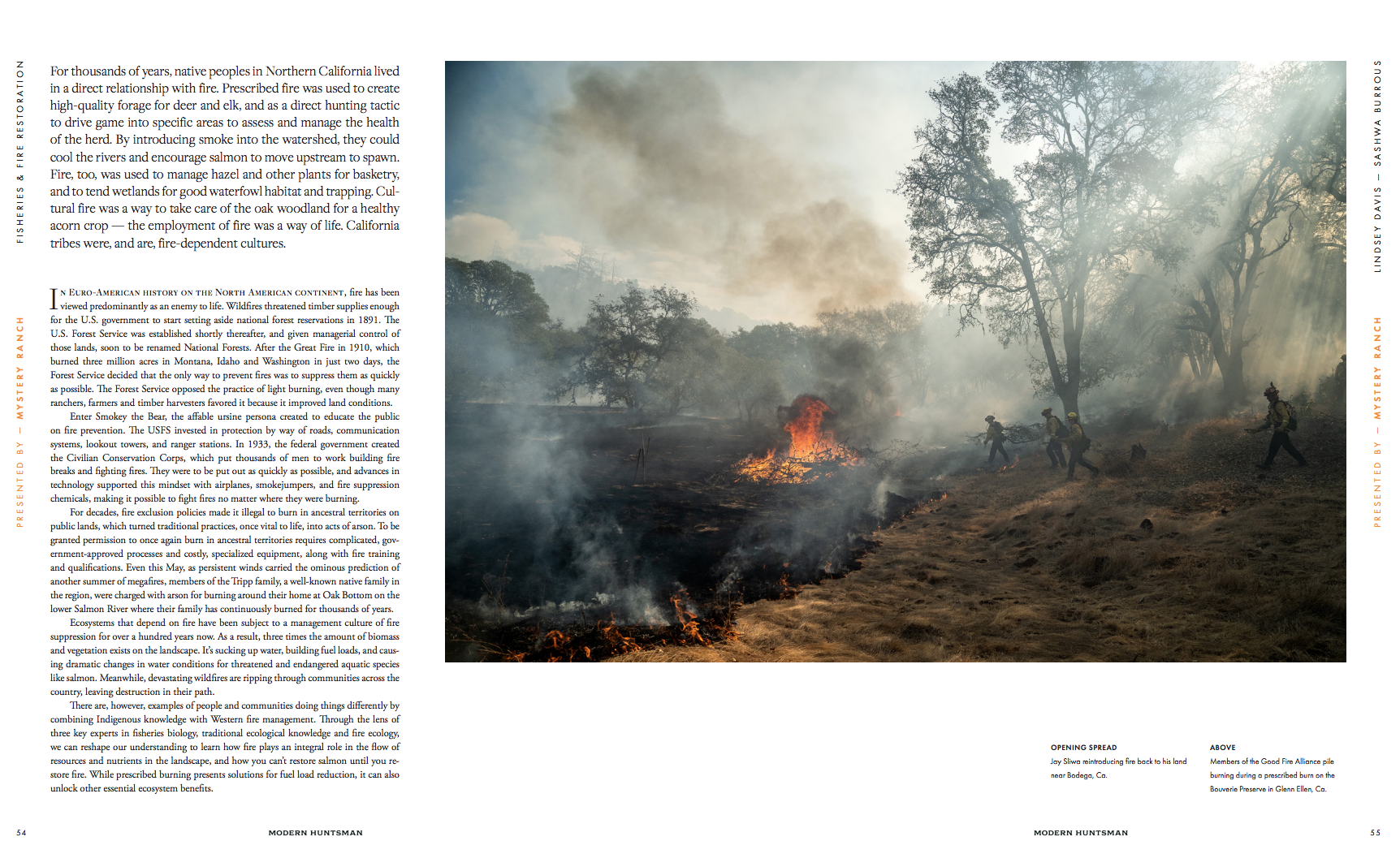
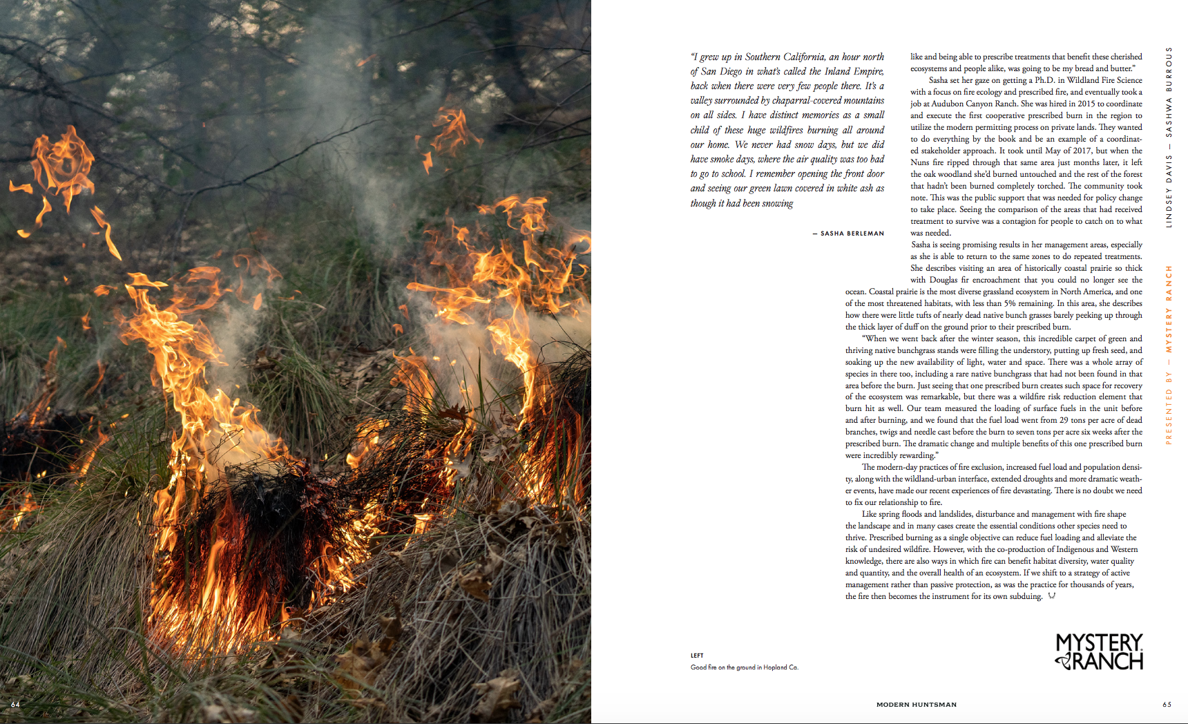
Heidi: How long have you lived in CA and when did your relationship with good fire begin?
Sashwa: I was born and raised in rural Sonoma County, California, Coast Miwok / Southern Pomo territory, and grew up just two ridges over from where I live now in Occidental. A tiny town nestled in the redwoods, not too far from the coast. My interest in “good fire” started in 2017 when Sonoma County saw record breaking wildfires, taking out entire neighborhoods, blanketing the entire county in smoke for weeks on end and waking a lot of us up to the reality that we are all living within a fire adapted landscape here in Northern California. I quickly realized that if I wanted to continue to live here in California I would need to learn to be in better relationship with fire. My interest in fire led me to start shooting a prescribed fire course with Fire Forward in Santa Rosa. Through photographing the course as a personal project, I began to learn both the skills needed to photograph wildfires along with how to reintroduce good fire back onto my own land where I live in Occidental.
Was this a personal project?
A majority of the images you see in this story I made on my own time. I found myself really inspired after every burn. I would come away with a ton of ideas, excited to sit down and edit what I just shot, a feeling you don’t get on every shoot. I have learned that when you feel that spark of creativity, to lean into it. Oftentimes “personal projects” are where an artist’s most powerful work comes from. The trick is then how to integrate this passion into “client work” so you can put food on the table.
After sharing stories with Lindsey Browne Davis, an outdoorswomen writer and good friend, we came up with a story about fire and water and how these two elements interact and relate to each other. We pitched it to Modern Huntsman for their Water Issue, the story got approved and was sponsored by Mystery Ranch.
What was your training like for this? Was the desire twofold; to be of help and gain access in order to document?
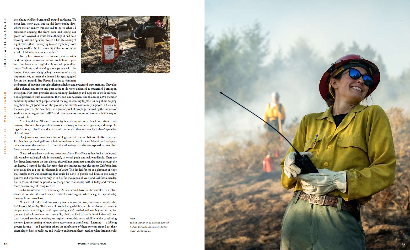
After shooting a few wildfires I realized that in order to do this safely I really needed to look into getting some formal training. Not only did I want to make sure I was safe when shooting the fires, I also wanted to be in service to my community and deepen my relationship to the land I am stewarding. I learned a lot from photographing the prescribed fire course with Fire Forward but I wanted to take it a step further. I signed up for and completed my FFT2 (Wildland Firefighter Type II) training in 2020. This course is the first step in becoming a Wildland firefighter and is required for a majority of the prescribed burns I attend. The training was really interesting and helped me understand how to read the wind, clouds, and topography, all important lessons in situational awareness. What are a few of the challenging aspects of photographing fires?
Personal safety and health are probably the most challenging and important aspects of shooting fires, especially wildfires. There is a lot of gear (Personal Protective Equipment) that is necessary as well and knowledge on how to get yourself into the right position. This sometimes means driving hours through dangerous roads to get to the other side of the fire because the wind changed slightly.
The smoke alone can be a huge challenge. After 3-4 days of shooting in conditions of 400+PPM in the air you can’t help but think how this is affecting your personal health. As a new father I often question whether or not I should continue chasing these stories. During fire season, I literally have the truck packed and ready to go at all times. If there is a local fire, I often have to leave the family with short notice to get the shots I need. This is exhilarating but also hard on my health and on my family.
In relation to photography specifically another challenge is the speed in which you need to move. Oftentimes you literally have seconds to pull out your camera, compose and make an image before needing to get yourself to a safer place. It’s a stark contrast from the commercial work I often do in studios where we spend hours perfecting every aspect of each image we’re creating.
I know you also have an interest in the power of the ocean, how are they different and similar in your creative approach to meeting them? In my experience there are far more similarities than differences. The first that comes to mind is that with both elements humility is key. When interacting with the ocean and with fires, you learn really quickly that you are not in charge. Instead you learn to slow down and observe. For instance, when I show up to the beach to shoot a surf sequence, the first step is to watch the ocean, observe the wind and current to ensure it’s safe to go out with the camera. Similarly, before a prescribed fire you take time to observe and analyze wind patterns, like wind direction – is it a dry (offshore) east wind or a wet (onshore) western wind coming off the coast. These factors play a huge role in whether or not it’s safe to carry out the burn. What I love about shooting in both of these elements is you never know what you are going to get. They are both complex and unpredictable which keeps me inspired and curious to learn more
Who printed it?
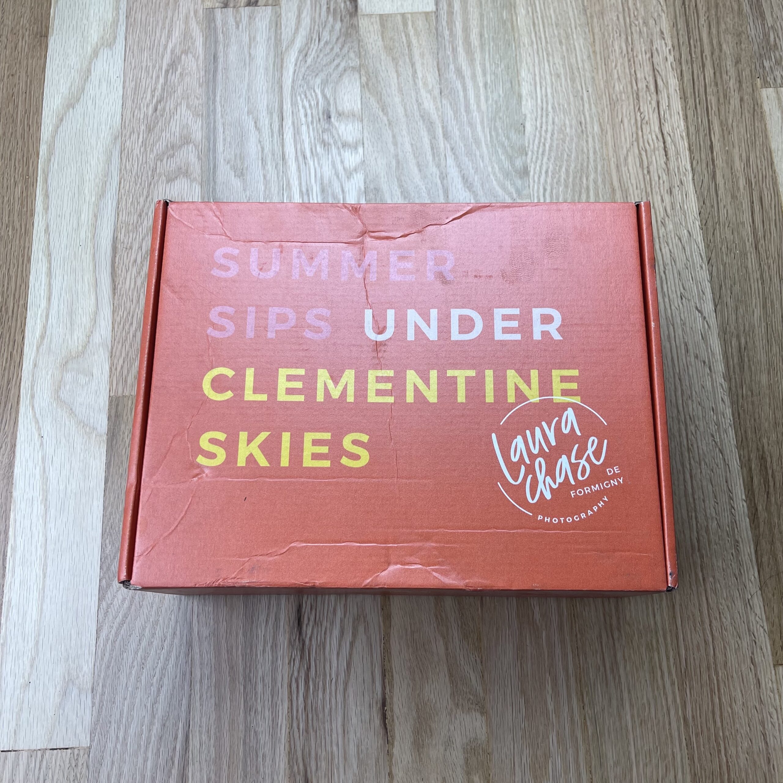
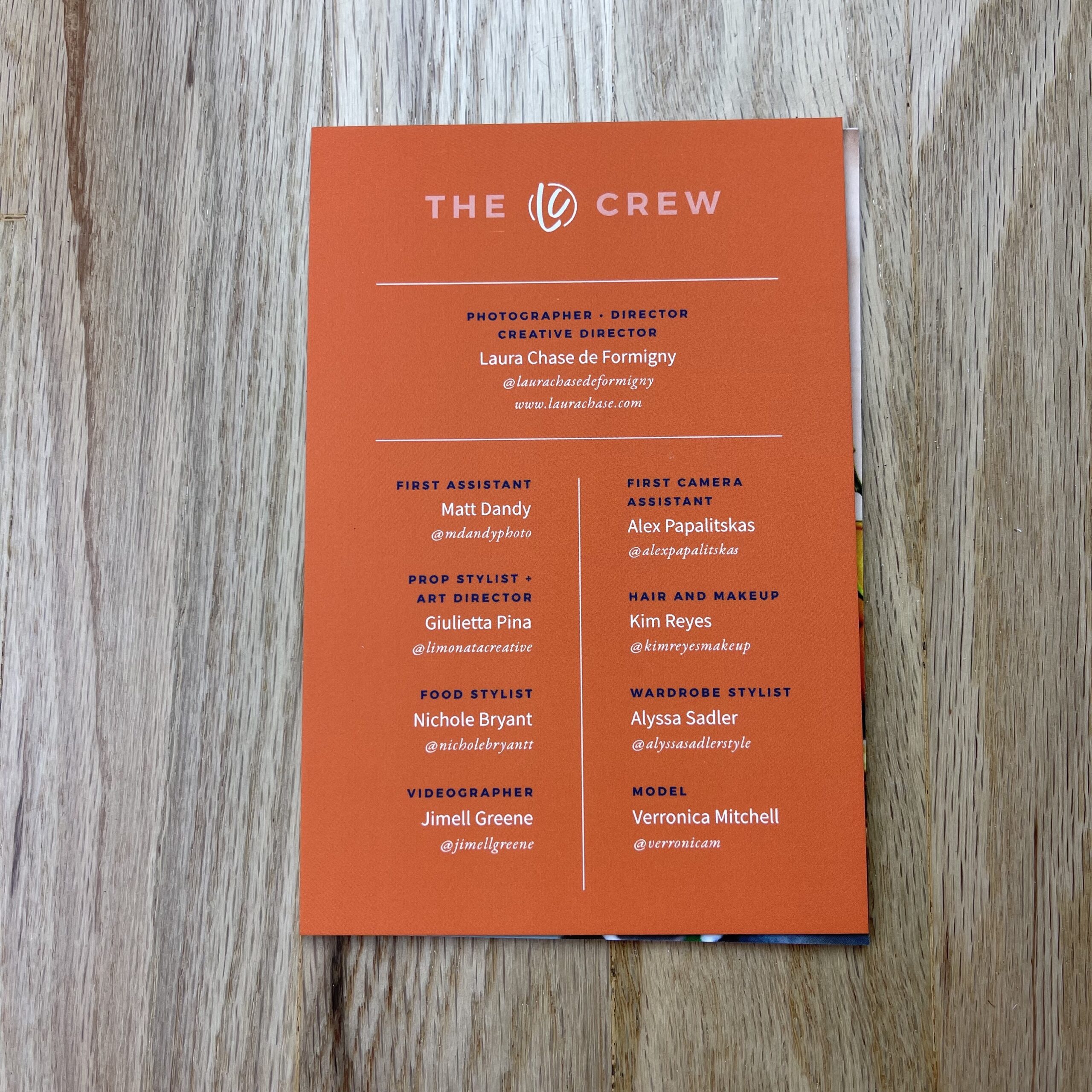
The postcards were printed by Moo and the box was printed by Packlane.
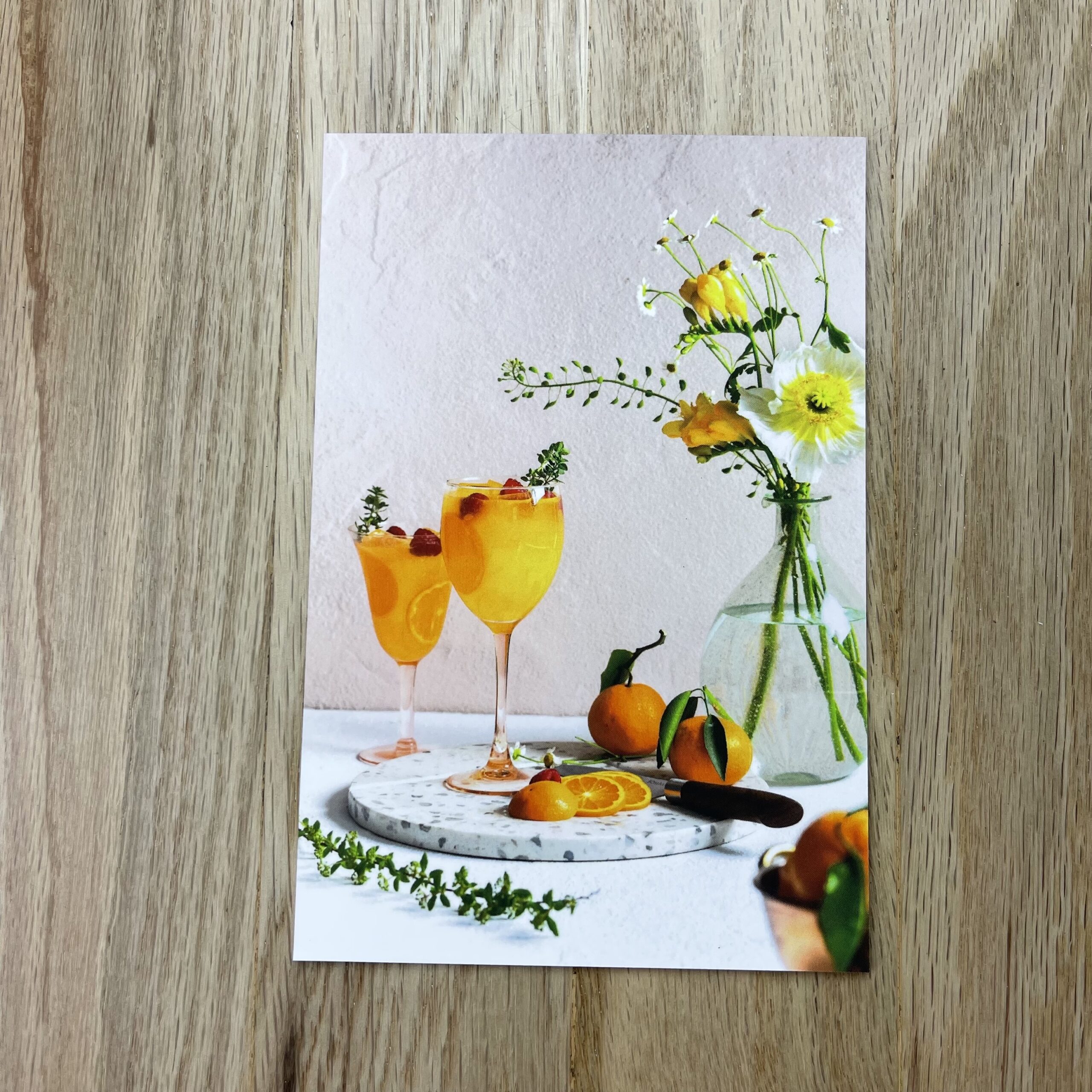
Who designed it? Nicole A. Yang designed the postcards and the box. She did my logo and branding several years ago, so I knew she’d be able to keep things on-brand for me. She’s fabulous and so professional. I’ve already booked her again for my next promo and I don’t even know what I’m shooting yet! I just know that it won’t shine as bring without Nicole’s keen design sense, so I made sure to get on her calendar early!
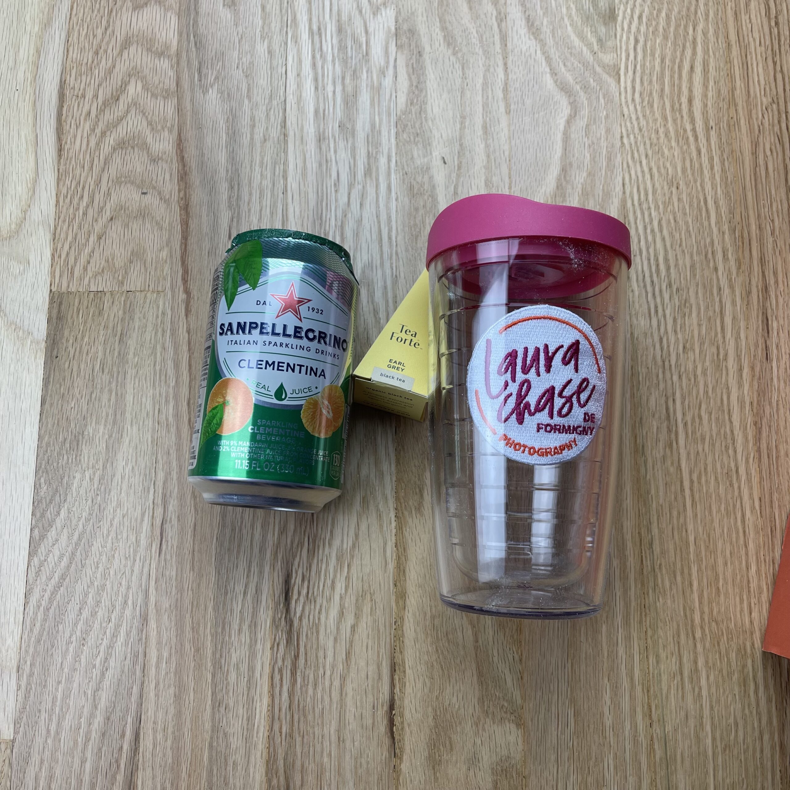
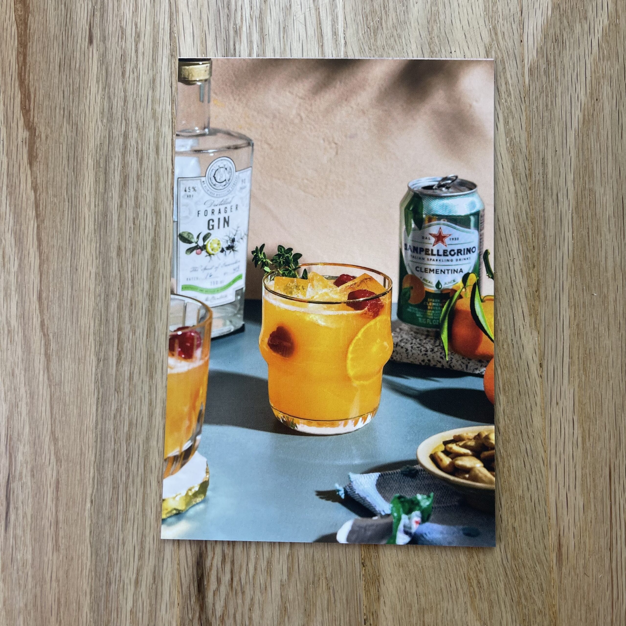
I creative directed what I wanted the box to look like. I knew I wanted an orange box so that it would be eye-catching, but also evoke the clementine vibe right off the bat. I picked out products to include in the box that was part of the custom cocktail recipe James Beard Award winning cocktail writer M. Carrie Allan created for the project. It was a no-brainer to include the Clementina San Pellegrino, but I did a lot of research on tea before I settled on Tea Forte to include in the promo. Their packaging is so beautiful and also I appreciated the individual packaging of tea bags during covid times. And of course, the tea is delicious and made the promo box smell wonderful!
Tell me about the photos:
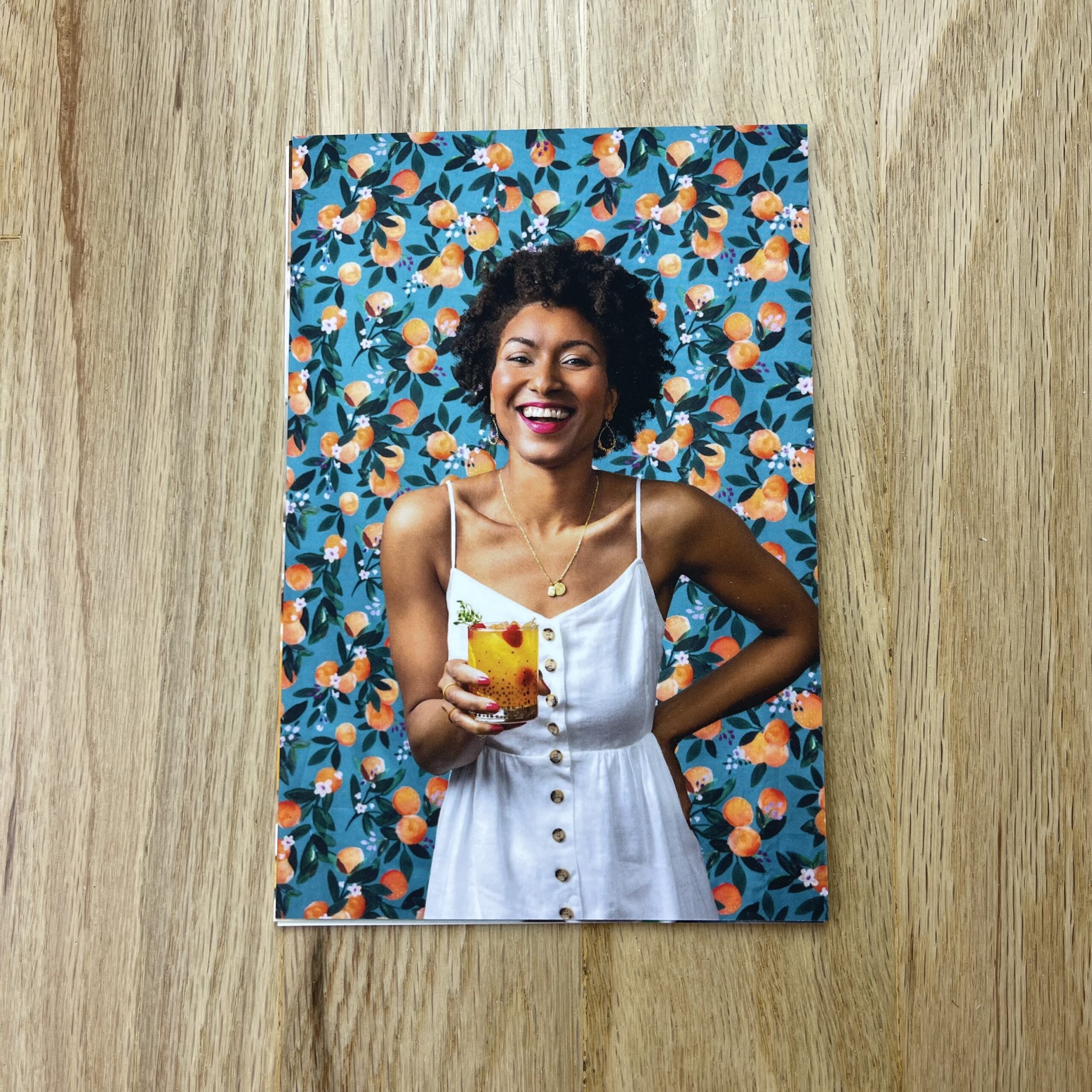
I spent an enormous amount of time researching and conceiving my shot list. I also used this time to really hone in on what kind of lighting I wanted to cast. I’m often lighting things based on what my client’s needs are, but this was a chance to define what I want my photographic voice to look like. I settled on the word “punchy” to evoke the kind of lighting and mood I wanted the photos to give off. To me, punchy photos have crisp shadows, vibrant colors, and plenty of fill. The light is contrasty, but not necessarily high key. It also means that every little detail matters because sometimes it’s the littlest thing that makes a photo pop.
I wanted to show clients that I can produce food lifestyle work and produce it at a high level. I felt like my portfolio had been missing the lifestyle side of food work, so I wanted to send out a promo with images showing I can do the lifestyle side of cookbooks, in addition to just food and beverage. Readers connect to cookbook authors through lifestyle imagery in their cookbooks and on social media. These lifestyle moments are critical to set the tone of an author’s book and overall brand. I couldn’t be more proud of how these images turned out.
We photographed 10 sets and Photo Editor Stacy Swiderski chose 8 images for the final edit. Every set was photographed with the cocktail in both an elegant cocktail glass and in the custom Laura Chase de Formigny Photography Tervis Tumbler I had made and included in the promo box. It definitely took extra time to shoot everything twice, but I’m glad we did! I ended up not publishing any of the images with the tumbler because the edit looks so much more elevated shot with the beautiful glassware prop stylist Giulietta Pinna selected.
I ordered 65 boxes and 60 Tervis Tumblers. I wanted room for error if boxes got returned, which is why I ordered a few extra. I ended up mailing 50 promos in total. It was a difficult undertaking because of covid. Since most of the country was working from home at the time, I had to pre-email everyone on my list and ask if they felt comfortable sharing a personal address that I could mail the promo to. This is my first promo ever, so very few of these people knew who I was! I did end up sending several boxes to office addresses with the hope that one day the recipient will return to their desk and find a lovely surprise. This also happens to be the biggest reason I did not include perishable items, like a clementine, in the promo box. That would be a very unhappy package to come back to after months or even years away from the office!
As I mentioned, this was my first promo. Go big or go home, right?! I’m planning to continue doing print promos biannually. Definitely nothing to the scale of Clementine Skies, just a postcard a couple of times a year. I just thought I’d kick off my marketing with a bang!
I’m honestly not sure if print promos are effective marketing anymore. What I do know is that most creatives have a bulletin board of inspiration and I want my photo to be on it, so all I can do is try, right?
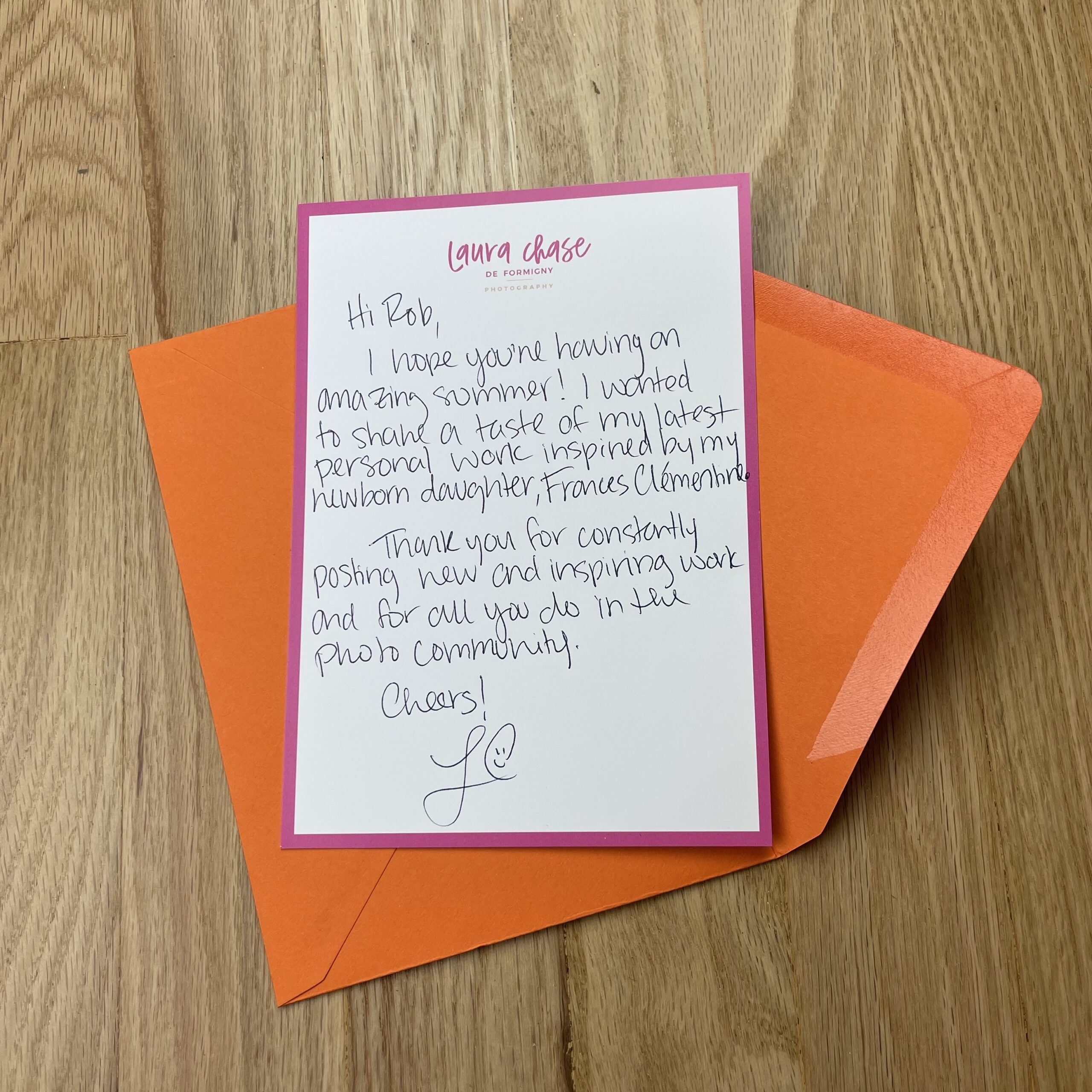
This project was conceived while I was pregnant with my daughter, Frances Clémentine. I executed the project only a few months after her birth because I want creatives to know that there are badass female commercial photographers out there producing exceptional work while balancing a family. I want my kids to watch me chase my dreams so that someday they do the same. More on this in the behind-the-scenes video on my website.
I was very clear with the recipe writer that I wanted the recipe to be non-alcoholic. I wanted the drink to be family-friendly and accessible to all recipients. You never know what someone else is going through, so I didn’t want to send somebody an alcoholic recipe if that could be potentially triggering for them. Also, since the inspiration for this project was a baby, it just seemed more appropriate to keep it kid-friendly.
I was very, very detail-oriented while sourcing for this promo. I color matched the model’s nail polish and lipstick to my business card. I also bought a real, live clementine tree to have on set to cast shadows in the background of one of the images. I wanted everything to feel super authentic so I didn’t cut any corners and I’m glad I didn’t! Food stylist Nichole Bryant ended up using some of the leaves from the clementine tree by gluing them to actual clementines on set! Chance favors the prepared, indeed.
It’s become the primary way I make a living, (along with writing,) though I certainly never planned it that way.
In a perma-freelance, side-hustle, gig-economy world, creative types do what we must.
(If it works, it works.)
I walked away from my long-term, adjunct teaching job in 2017, as the salary UNM-Taos offered me, in my last contract, was so bad I couldn’t justify the time commitment.
I remember thinking, so clearly, if I couldn’t generate more money than that, working for myself, I should probably find another career.
My first move was to found our Antidote Photo Retreat program, and it certainly grew, and was on an upward trajectory the first three years of its existence.
Then Covid hit, and having people come stay on my property, eat in my kitchen, and shower in my bathroom, was neither safe, nor practical.
(Shout out to Cliff Claven.)
In those first years, I did a small amount of consulting, trying to help people one-on-one, but certainly didn’t promote myself that way, and was still figuring out how to be an effective advocate for my clients/students.
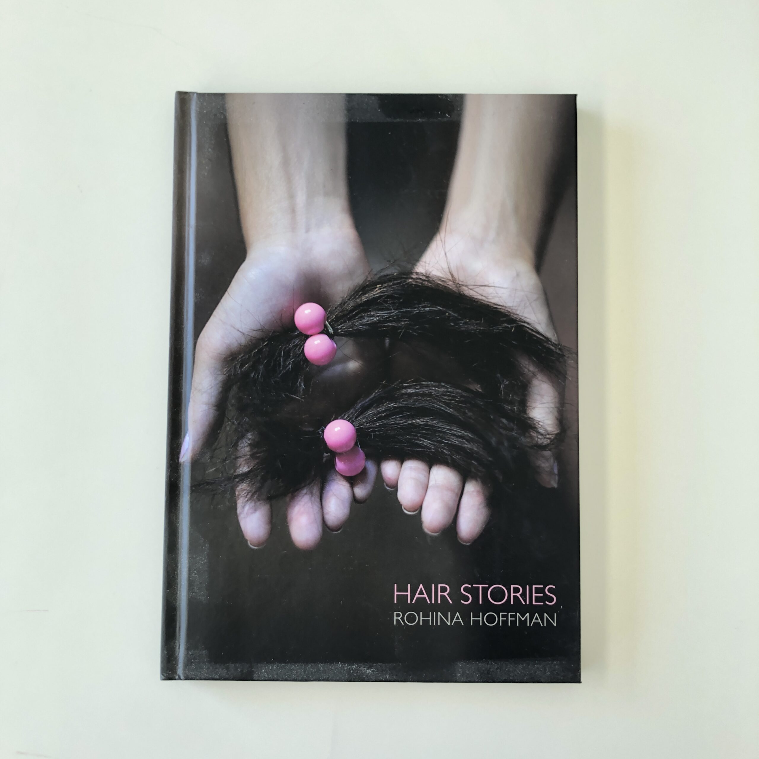
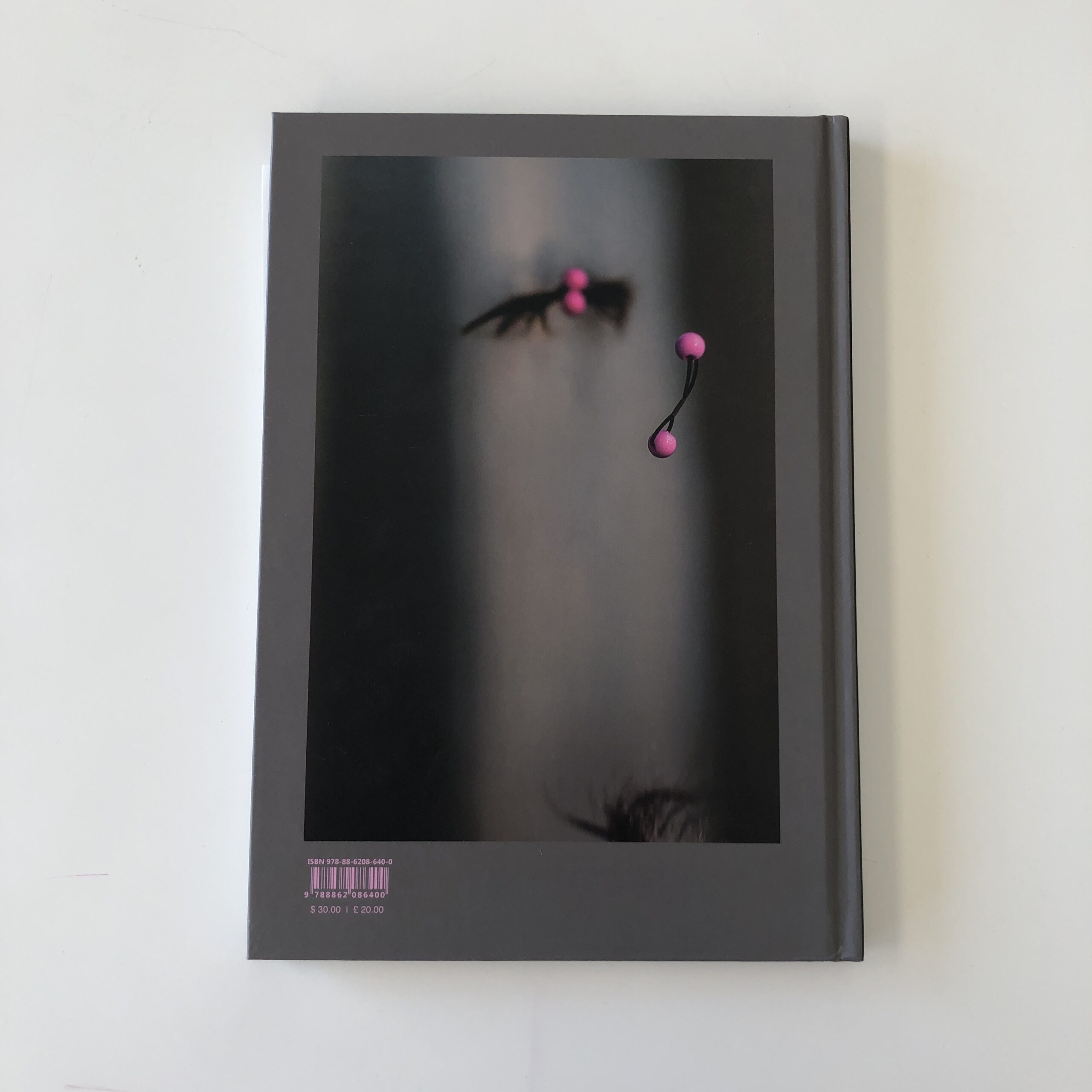
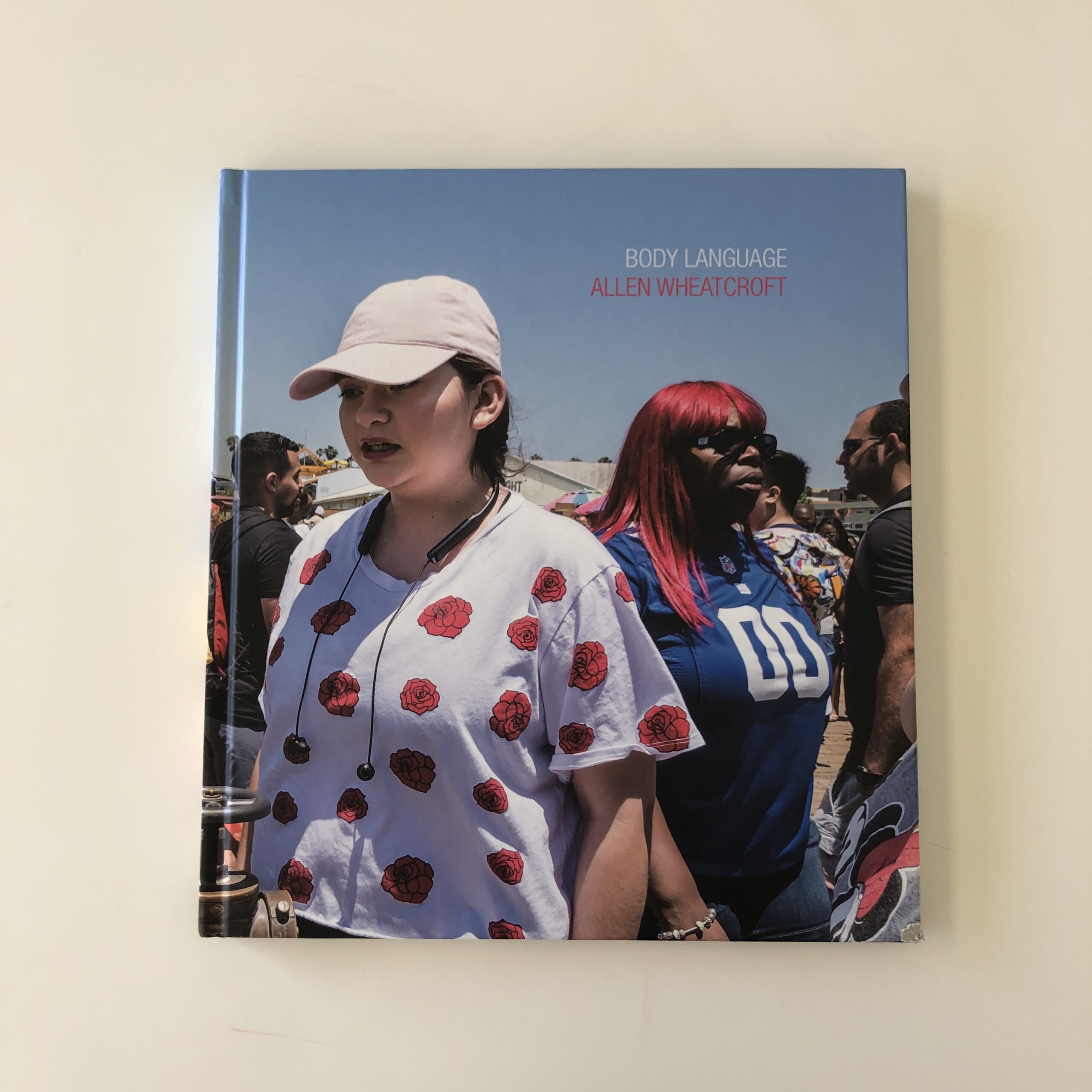
Private teaching was rewarding, and I helped Rohina Hoffman and Allen Wheatcroft produce photo-books with Damiani, but again, I was definitely figuring things out.
Rohina Hoffman’s “Hair Stories”
Allen Wheatcroft’s “Body Language”
After the pandemic began, I transitioned my Antidote program online, and offered free evening critique classes to my community, before ultimately charging them a nominal amount when it became clear there would be no retreats.
Zoom made in-depth, online teaching possible, and if I’m being honest, the amount of personal growth I endured, due to stress and trauma, has made me a better person, and a better teacher, so more work came my way, and I was able to raise my rates, bit by bit.
I can see how the process evolved, in retrospect, but I’m not surprised how much of the work has centered on one particular area:
Helping people conceive and produce photo-books.
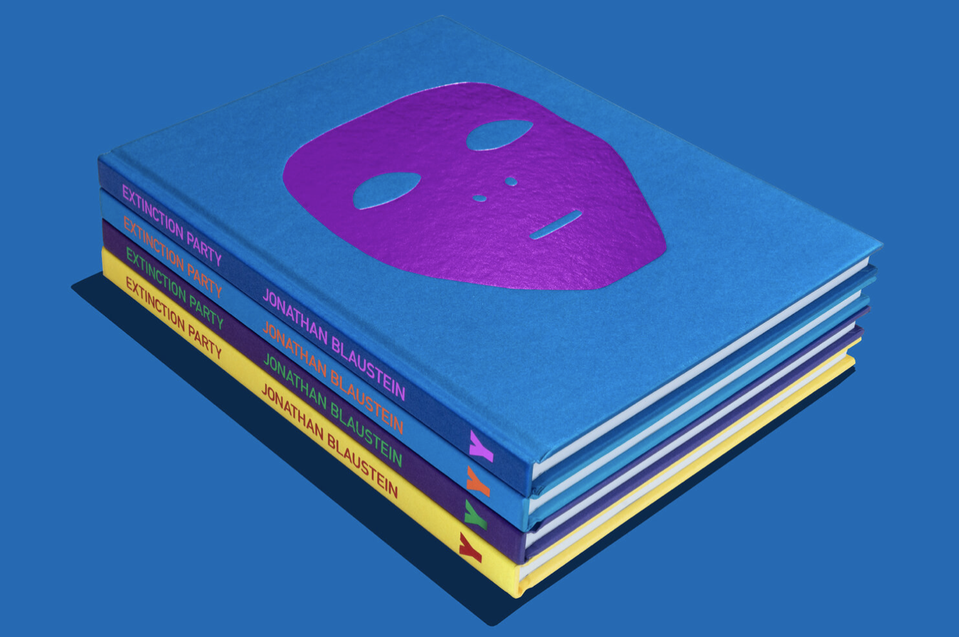
Because everyone wants a book these days, and you likely know I made my first book, “Extinction Party” in 2020, which was released on the cusp of the global lockdown, and was very well-received by the press, and the people who bought it.
“Extinction Party,” photo courtesy of Luminosity Lab
(Of course, we weren’t able to market it at art and book fairs, as they all shut.)
So today, I thought it might be a good idea to give you a primer on how the process works, because if I can do it for my clients, I should be able to share some of that info with you, my loyal audience.
Here we go.
If I were to break it down, the process would look something like this:
*Sometimes, the text comes before the design, it just depends.
Now, that’s how I work with my design partner, Caleb Cain Marcus, as he’s an acquisitions editor at Damiani, so we know they’ll look at the books we create.
In our case, we make the book, then find the publisher.
(I’ve got a network of contacts in the publishing world, so once the digital version of our books are done, we know we’ll get eyes on them within the industry.)
Back in the day, I think they called this process “book packaging,” but I just call myself a producer.
Not everyone needs outside help, of course, and some publishers do like to work on a book from start to finish, though those tend to be more indie, small-batch types, which is also a valid way to go.
Honestly, there is so much to unpack, I’ll do my best to keep it coherent.
At a photo festival in 2010, I met the great English publisher Dewi Lewis, whom I interviewed for the blog five years later, and he gave me some amazing advice, which I took to heart.
He said every artist seemed to want or expect a book for each project, compared to the “old days,” when one or two books in a career would have been an achievement.
Dewi recommended an artist wait until there was a compelling reason, and a clear vision, before making a book.
(Don’t do it just to do it.)
Things have only gotten crazier since then, as the amount of publishers has proliferated, as has the interest in photo-books, as the recent Clement Chéroux article in Aperture confirms.
However, in my experience, having spoken to publishers, (and listened to them on panel talks), the demand for photo-books, from the collector class, has not grown in concert with the supply, so very few photo-books actually sell well, and create profit for the publishers.
(Unless you’re already a famous art star.)
So how does one explain that supply/demand disconnect?
What I’ve learned, and am sharing here, is the industry no longer functions in a purely capitalistic sense, with respect to sales.
Rather, some publishers do it as passion projects, not expecting to really make money, or more likely, they build profit into the production system, marking up the printing costs, design costs, and things like that.
(They also make money when the artist “buys” additional copies of his/her book back from the publisher.)
One publisher, whom I won’t name, (out of respect,) is well-known for throwing book deals out there like crazy, sometimes without knowing or meeting the artist, because it’s their business model to make money on production, rather than sales, so the more books they take to market, the better they do.
Why does every artist want to participate in this process, if they’re not likely to “make money” off the sale of their book?
Good question.
Glad you asked.
Over the years, every photographer I interviewed considered his/her book to be a marketing object, and I never met one who said it wasn’t worth it.
Sending out books, giving them away as gifts, and asking your network to support you in the pre-sale or crowdfunding effort, means ultimately, a viewer will look at your work, and understand it, the way you want them to.
A book allows you to control the narrative surrounding your career.
And as I reported in an interview with MACK publisher Michael Mack, back in 2012, books have the potential to be art objects.
Meaning, if you create a great book, you can make a piece of art distinct from the photographs that live inside it.
(One benefit of doing this for so long is I’ve picked up great advice and knowledge, which I then pass along to you.)
As artists, if we view making a book as an “art project,” one that also functions as a high-end marketing tool, it will allow an audience to see what you’ve accomplished exactly as you’d like them to.
It’s a very valuable outcome.
The book can create new opportunities, and help you level up in your career.
You might not make money selling books, (at least nothing major,) but you CAN benefit from more jobs, opportunities, and relationships going forward.
Plus, crowdfunding and pre-sales, which are now so common, allow the artist to defray the costs, so even if books are increasingly expensive, you may not have to reach into your own pocket to pay for it.
(If you’re willing to put in the time and effort to raise the funding.)
With me so far?
There is a pretty wide range of costs, with respect to how you can produce your book.
(And all the numbers I’m going to share are approximate.)
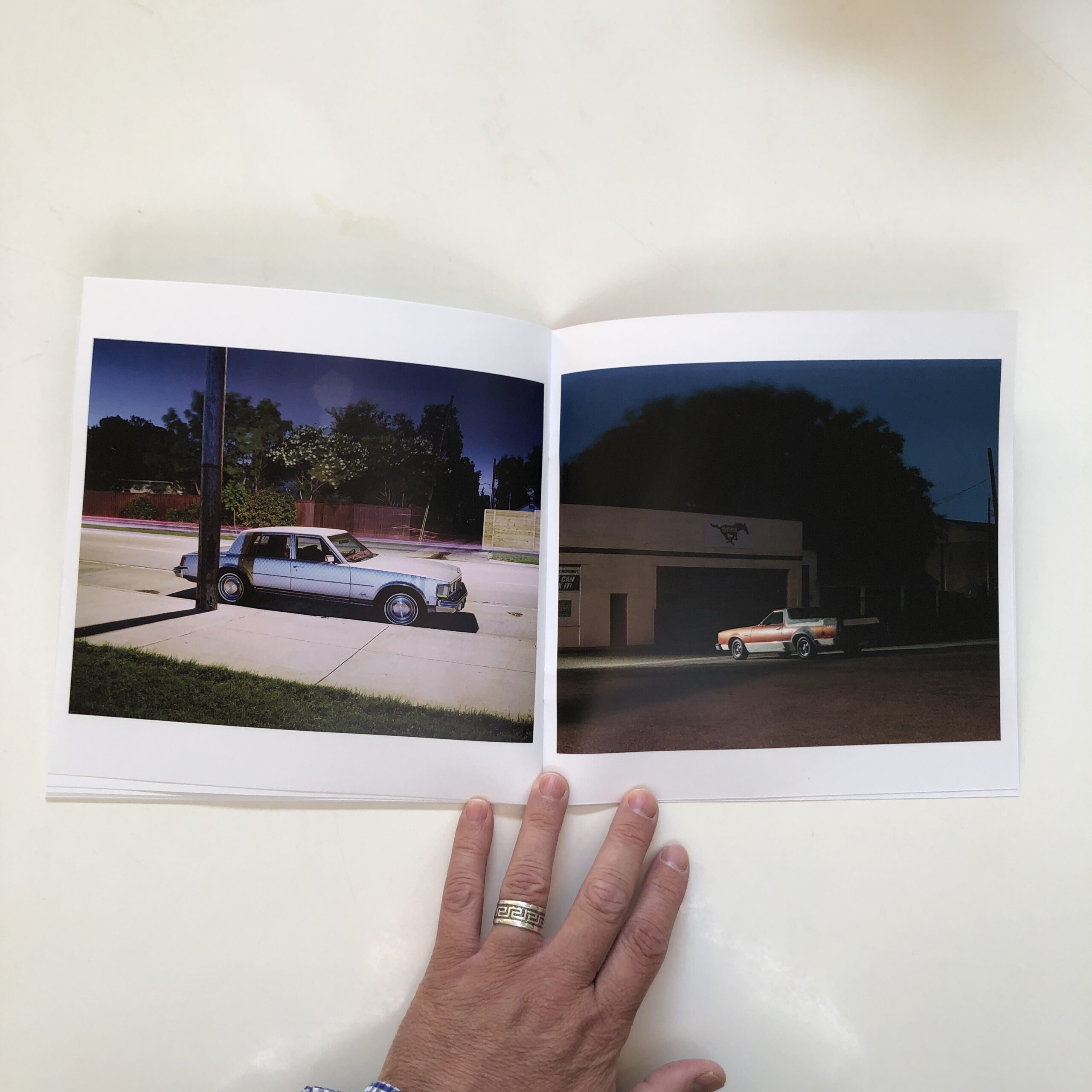
On the low end, DIY ‘Zines can be made for next to nothing, but you have to really know what you’re doing to get the production values high enough to make a positive impression.
‘Zine courtesy of Laidric Stevenson
It can be done for a budget in the hundreds of dollars, which is a huge advantage.
Next, we’d move on to self-produced, soft-cover, print-on-demand, (or digitally printed) exhibition-catalogue-type-offerings.
Andrew Molitor’s recent Blurb production
Those might cost in the high hundreds, or low-thousands, and can be helpful, but are normally seen as low-cost marketing objects by the people who look at them, I find.
If you hire a designer to help you, and go the high-quality digital printing, or offset printing route, you’re probably more in the $2000-5000 range, but getting professional help makes a difference.
(As a producer, I tell people the best books almost always have a designer’s fingerprints on them, somewhere along the line.)
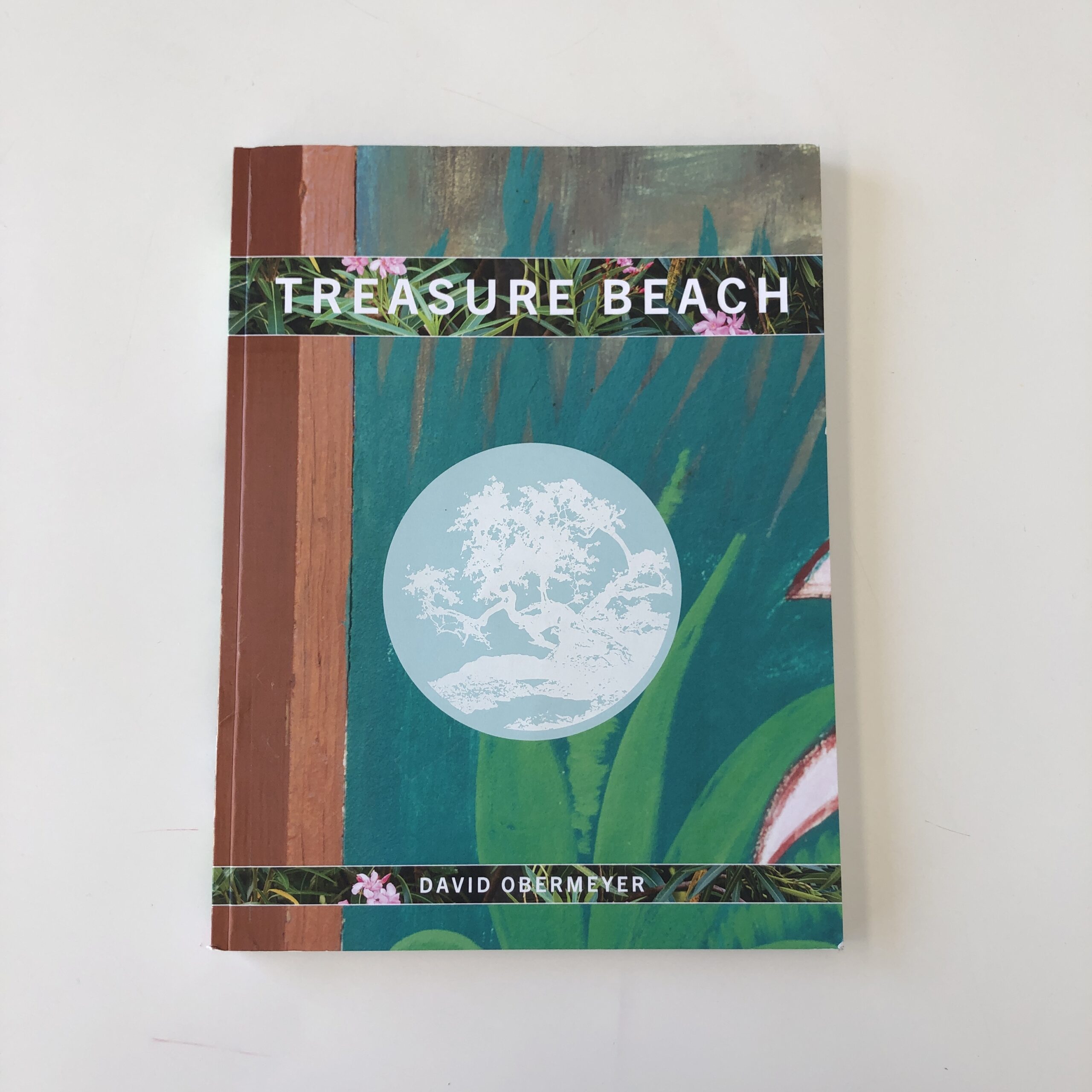
David Obermeyer’s self-published “Treasure Beach,” printed by Conveyor Studio, produced with a design team
The smallest run of soft-cover, offset printing of 400 books or so, in Europe, will likely be $7000-9000, though prices are rising with inflation, and tack on a bit more if you go the hard-cover route.
(That’s if you’re self-publishing, but having it professionally printed.)
Finally, we have the costs associated with traditional, mainstream publishers, which typically run from $20,000-35,000, with some high-end, prestige publishers charging $50,000 or more.
That’s a lot of cash, under any set of circumstances.
Small batch indie publishers might well cost more in the $10-20,000 range, but again, these are general figures, so there is variance.
(A tiny handful of publishers still cover costs, but there are so few, I wouldn’t count on that as you plow ahead.)
So let me circle back to that advice Dewi Lewis gave me.
He said, to paraphrase, if you’re going to make a book, you better have a damn good reason, a clear vision of what you want to achieve, and strong need to do so.
I took that to heart as an artist, and waited 10 years to produce a book that wove together four, interrelated projects into one narrative, so I could show “the world” what I’d been working on out here in the boonies, playing mad scientist in my studio/laboratory.
Even so, I needed my publisher, Jennifer Yoffy, to help me with the initial edit/sequence, and to serve as cheerleader and occasional CEO, over the year it took me and Caleb to make the book.
(As Caleb is my friend and partner, he didn’t charge me for the design, which saved me a bunch of money on the overall process.)
Jennifer and I were also friends, so she didn’t mark up the production costs, and I “only” had to raise about $15,000, instead of twice that.
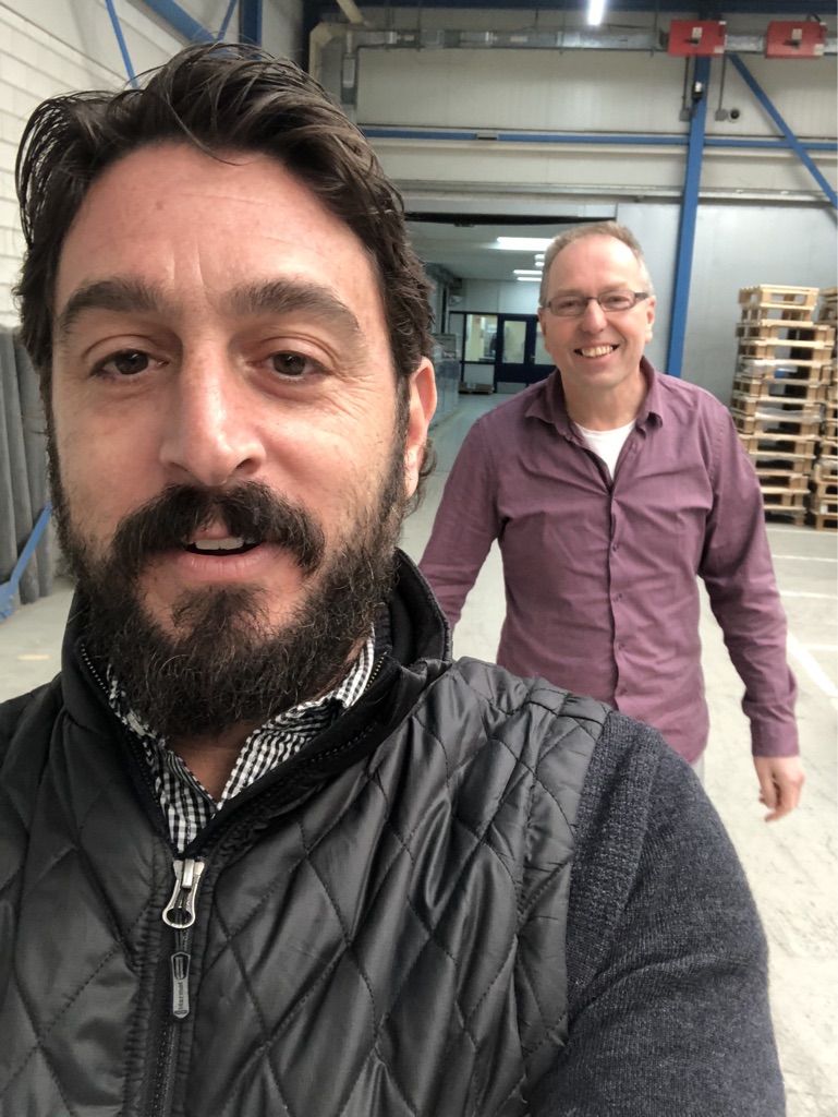
(That amount included going to the Netherlands to supervise production, which I highly recommend, but isn’t strictly required.)
Me and Marco Nap in the Wilco production facility, Amersfoort, The Netherlands, February 2020
But enough about money.
I wanted this article to give you a sense of how the industry works, but also how to make a book become a piece of art, representing the best you can achieve.
How do you do that?
It starts with the concept.
What will your book be about?
What will it say?
How will it present your project, (or projects,) in a compelling, interesting, creative, well-executed way?
What will the viewer take away from looking at, (and reading) your book?
I think every great book, as Dewi said, needs a compelling reason to exist, so if you don’t have a great idea, wait a bit longer, or ask yourself all sorts of hard questions until you get the answers.
From there, it’s time to whittle down all the images you have, which could conceivably be included, into a tighter group.
(When in doubt, start with more, but then edit ruthlessly.)
Cut, and cut some more.
Which are the best images?
How do they fit together?
What stories do they tell when they become a group?
What connections, and repeating motifs, begin to show themselves?
Many, if not most artists find it helpful to work with an editor on this, because outside perspective can be key to finding those through-lines, when we’re too close. (Or if we don’t have expertise in the process.)
I do have expertise, but still needed Jennifer’s eye, back in February of 2019.
After the edit, the sequence comes next, as building the visual narrative out of your best edit is a separate process.
I like to sequence in Apple’s Photos program, where I can see grids, and move things around easily, but most folks prefer making small prints, and moving them around on the floor.
(Whatever works.)
I’d recommend you keep the classic narrative structure in mind: Beginning, Middle, End.
And I always suggest you consider a viewer’s attention span.
(If they get bored, they’ll start to flip.)
50-60 images is a good target, for a non-coffee-table book, and keeping the viewer surprised, and interested, involves varying the emotional tenor, and offering up the unexpected.
That can mean inter-weaving text, changing image size, or breaking up runs of similar images with something totally different.
There are a lot of ways to skin a cat, but just doing the same thing over and over is a bad idea, unless your pictures are so good, and innovative, that a viewer will be enraptured without any bells and whistles.
(Possible, but unlikely.)
It’s totally cool to think about who will write for the book, and where that writing should be placed, from the jump.
No worries.
But in my experience, often it’s easier once the visual structure has taken shape, and you know more of what the book is, and looks like.
Do you want your voice included in the writing?
If so, what do you want to say?
Either way, at some point, you need to get the text right, because more often than not, text provides context.
Do you want to set up the context at the beginning, so the viewer knows what the book is about, or leave them guessing, and answer questions at the end?
(It’s a personal choice, but a vital one.)
Once it’s all put together, the designer has given you your layout, and it looks like a book, (digitally,) you’ll still need to let it sit.
Come back to it, make some changes, let it sit again, and refine it.
Consider everything.
Paper choice, where you captions will or won’t go, what color end paper, your cover design.
All of it.
Don’t rush.
Patience pays off in the book-making process.
As to finding a publisher, portfolio reviews are great for making relationships.
Festivals too.
And research what type of books the publishers are putting out, to see if your work will fit with their program.
(Fit really matters, as does the working relationship.)
Almost all publishers these days expect the artist to come to the table with the production funds, so have a plan to do that, based upon your budget, and willingness to ask the “crowd.”
Finally, when your book is done, few publishers invest a lot of time or money in marketing and PR, so many artists pay the extra cost to hire PR support on their own.
On the one hand, a publisher might send out bulk emails with a list of books.
(Maybe they’ll have a table at a fair, once those return in earnest.)
But if you’re willing to invest that little bit extra, (or not so little,) you get a PR professional sending out individual emails to press people, and following up.
They work hard to tap up their own networks, and in my experience, that really does matter, when it comes to getting great press placement.
If it all sounds like a well-oiled industry, where people throughout each part of the process are taking their cut, it’s because it is.
But that’s what tends to deliver high production values, wide distribution, and successful marketing campaigns.
This stuff doesn’t come cheap.
Remember, though, earlier in the article, I also discussed how to do this on a super-tight budget.
Books don’t have to be expensive.
For quality, very often though, you get what you pay for.
I swear, I didn’t wake up today planning to drop a 2700-word-treatise on you.
But I did spend an hour last night, pro-bono, explaining the process to a photographer friend I met at FotoFest in 2012.
I figured if he didn’t know how things really work, (and he’s a professional artist and long-time professor,) you might want some extra knowledge too.
Hope it helps!
See you next week!
{ED note, 02.02.22: It’s come to my attention this post is being used as a resource, so I wanted to add one final piece of intel that I tweeted in the viral response to the article. I’m told some artists have been able to create a workable edit/sequence/design book maquette, after taking a book design workshop. Yumi Goto, in Japan, has been recommended to me.}
The Art of the Personal Project is a crucial element to let potential buyers see how you think creatively on your own. I am drawn to personal projects that have an interesting vision or that show something I have never seen before. In this thread, I’ll include a link to each personal project with the artist statement so you can see more of the project. Please note: This thread is not affiliated with any company; I’m just featuring projects that I find. Please DO NOT send me your work. I do not take submissions.
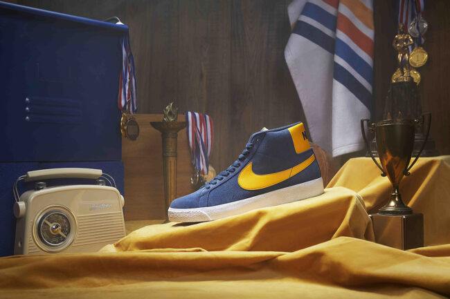
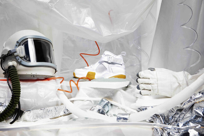
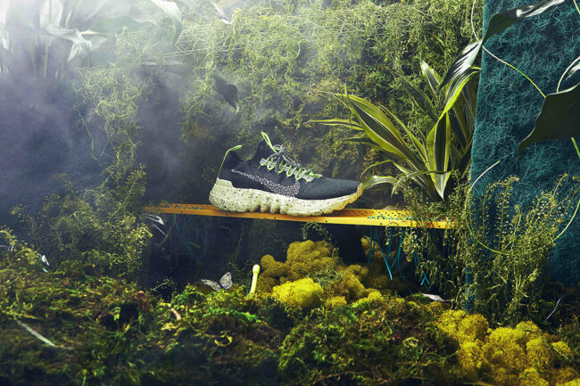
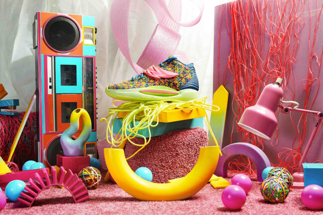
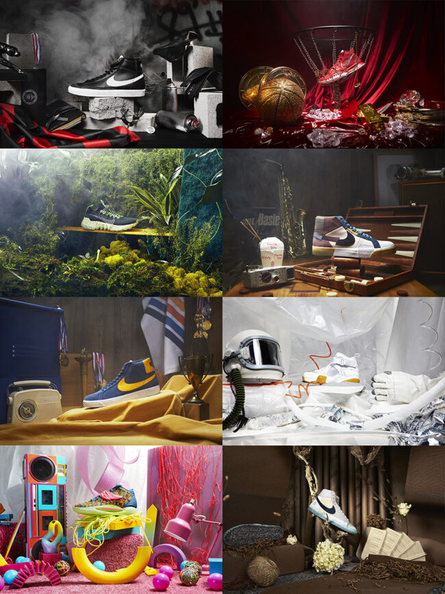
Nike’s World is a personal project inspired by different periods of time in our history, technological advancements, global warming and nature related subjects as well as social and political issues and of course sports.
The idea for the project was to tell stories through materials and objects. The reasoning for using Nike shoes as the main “subject” for the photo series was to include a sense of iconography and pop culture to draw people’s attention to specific ideas and have that as a hook for exploration. I wanted to use sneakers as my main subject as a way to tell a story and transport the viewer to a world without the prejudgment of having a person as the main subject and just let their imaginations decide who’s the owner of that shoe.
Nike also was a big inspiration because they have such a wide range of sneakers and shoes that every shoe made me think of a time period, an idea, or a material that I wanted to experiment with.
Each material and color palette has a direct relationship to an idea and a time period. This series is deeply inspired by a sense of eclecticism and the goal to create images that feel global.
BACKSTORY
This project came about in a very unusual way. I mostly shoot sports, portraits and fashion and I had been wanting to make some “funky” sets for a personal portrait project, but I found it hard to make it happen because of resources, delayed materials and also Covid, so I thought about how could I still shoot something without getting the least amount of people involved. I’ve always been a big Nike fan because of the graphic aspect of their clothes and the way they mix fashion, streetwear, and sports. I had an original idea of showcasing different moments in history through sneakers, like the Moon landing or the fall of the Berlin Wall, so I went back to that idea and mixed it with the “funky” sets vision I had. I started researching the Nike website for different sneakers and every shoe spoke to me in different ways. I started imagining those moments in history and sort of thinking what sneakers would people involved in those events wear. Some styles seemed more retro, some more modern, or futuristic, some spoke to me more in a material or texture way, some in color palette and some more on an ideology. It was hard to choose because there are hundreds of styles, I could have made 100 more sets! I decided to go with Nike shoes because of iconography, I wanted to use an icon that everyone knows and that has been used in pop culture to bring attention to the different subjects and make it more of an homage to the swoosh. I really love how the swoosh looks in different types of shoes and how there are many different styles and colors, but they are all united by that simple icon.
The set design was one of the most important things of the project since it was going to be what told the story around the shoe. I worked with my creative partner Sal on this. I had the original vision and the materials I wanted to use for each set, I wanted to use a lot of found objects or things that could be found in our daily lives for each set, and I also wanted to have each set with a color palette that was unique to each shoe. We ended up renting some props from prop shops in LA and sourcing materials from Home Depot, toy stores and some junkyards. We built, styled and decorated the sets between the two of us in my backyard. The project was funded by Wild Goats Creative.
APE contributor Suzanne Sease currently works as a consultant for photographers and illustrators around the world. She has been involved in the photography and illustration industry since the mid 80s. After establishing the art-buying department at The Martin Agency, then working for Kaplan-Thaler, Capital One, Best Buy and numerous smaller agencies and companies, she decided to be a consultant in 1999. She has a new Twitter feed with helpful marketing information because she believes that marketing should be driven by brand and not by specialty. Follow her at @SuzanneSease. Instagram
Success is more than a matter of your talent. It’s also a matter of doing a better job presenting it. And that is what I do with decades of agency and in-house experience.
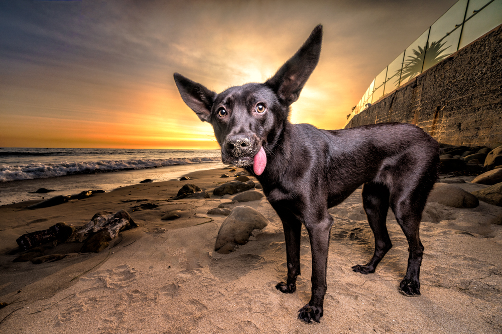
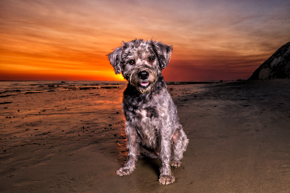
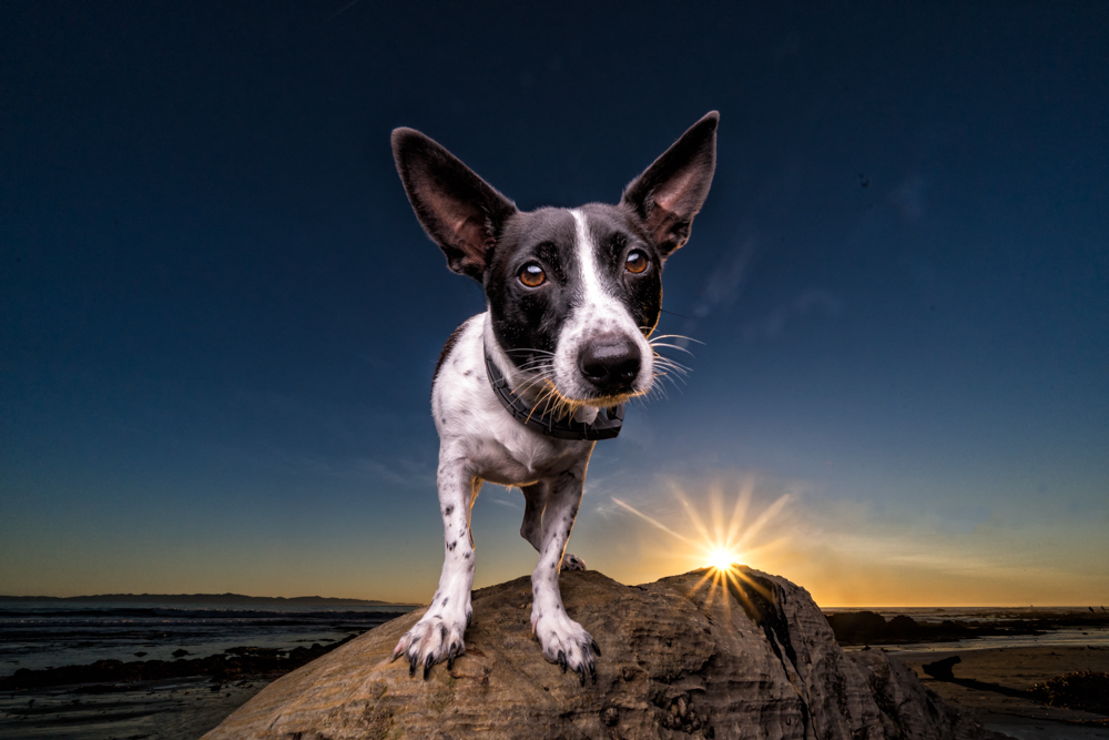
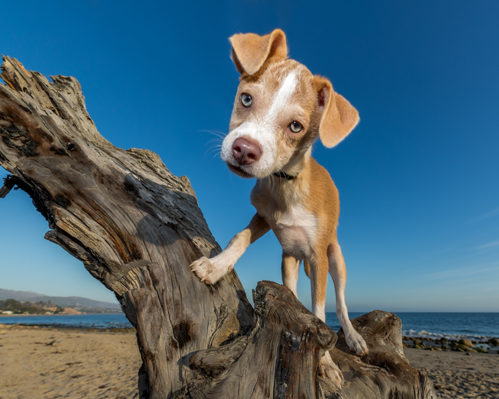
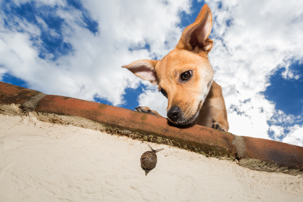
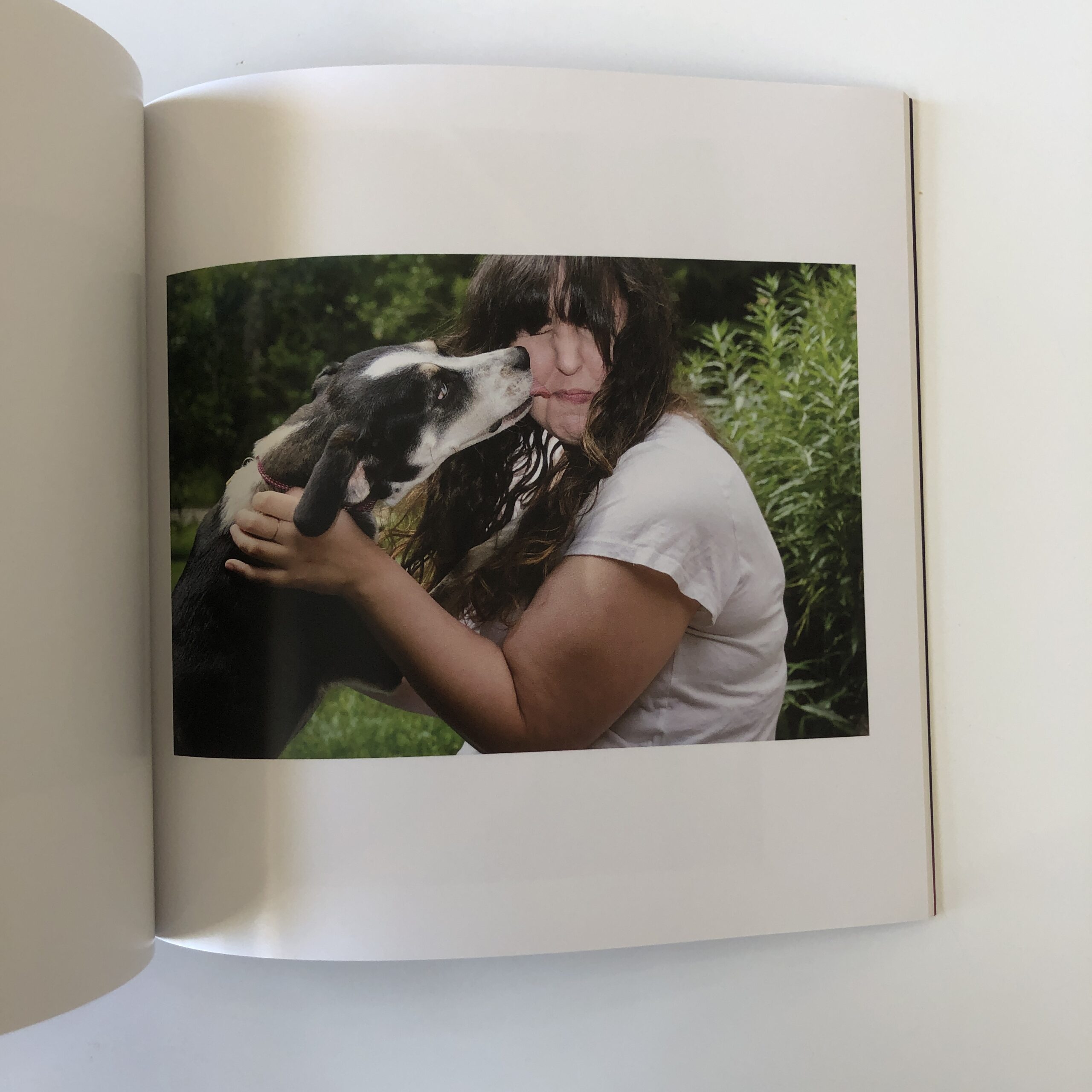
Heidi: Who is more nervous on set, the dogs or the owners? Wendy: It can be a combination of the two scenarios. Sometimes the dogs are a little shy when they see the camera or hear the shutter. If I am using off camera flash some dogs can be a bit nervous with the bright flashing lights. I always take extra time with the nervous dogs and start to desensitize them with treats if they are food motivated. The dogs are rewarded with a treat every time the shutter is pressed so they view it as a positive experience. The is especially true for dogs at the shelter that are often coming from a loud and stressful environment. The key is to go slow with them and help build trust before you can even think about bringing the camera out.
For the 2-legged people on set, a lot of times they’re worried or anxious about their dogs not behaving perfectly. I always try to have a conversation with them prior to the session and communicate with them that not everything is going to go perfectly and that’s okay. They are dogs or cats or whatever pet it is. There is a lot that is going to go wrong. I always tell them, if I wanted to photograph perfect dogs I’d be a stuffed animal photographer and what’s the fun in that?! If the owners are stressed the dog will pick up on it and it will ultimately translate to a stressed-out dog which clearly doesn’t make for great photos. I want it to be a fun experience for the dogs and the humans so I’m always very reassuring and joking with the owners to help put them at ease and laugh a lot at the “bloopers” so they know it totally normal and part of the experience. At the end of the session I hear more often than not from the owners they had so much fun.
What are some of the creative ways you have to engage the dogs? Every dog is different and it’s important to learn what motivates them. The best way to do that is to have a conversation with the owners prior to the session. For dogs it could be a ball, a treat, their favorite toy, or maybe certain words they react to. I’ll ask the owners if their pet is nervous around new people, loud noises, whatever it might be. The more information you have on the dog in advance the better it is so you can be prepared for the session. Noises are also a great way to get their attention. I always have my bag of every noise maker in the world including whistles, squeakers, and duck noise makers to name a few. I’ve also perfected a lot of silly noises myself to help get the dog’s attention. I often get a of strange looks from the owners and anyone observing the session wondering where the crazy sounds were coming from — “Did your camera make that noise?!” which always makes me laugh. I wish my camera made all those sounds and it was so easy. My dolphin noise is a classic example. You have to be prepared to do whatever it takes to get the dog’s attention and not care how crazy you look. I find that this helps to put the humans at ease too. If they’re also in the photos I’m getting genuine smiles from people laughing at me and having fun and I’m just fine with that. An important point to make with the noises however is that you must be prepared to the take the photo right after making the noise as each sound will only work once, maybe twice and then it’s time to go to the next trick in your bag.
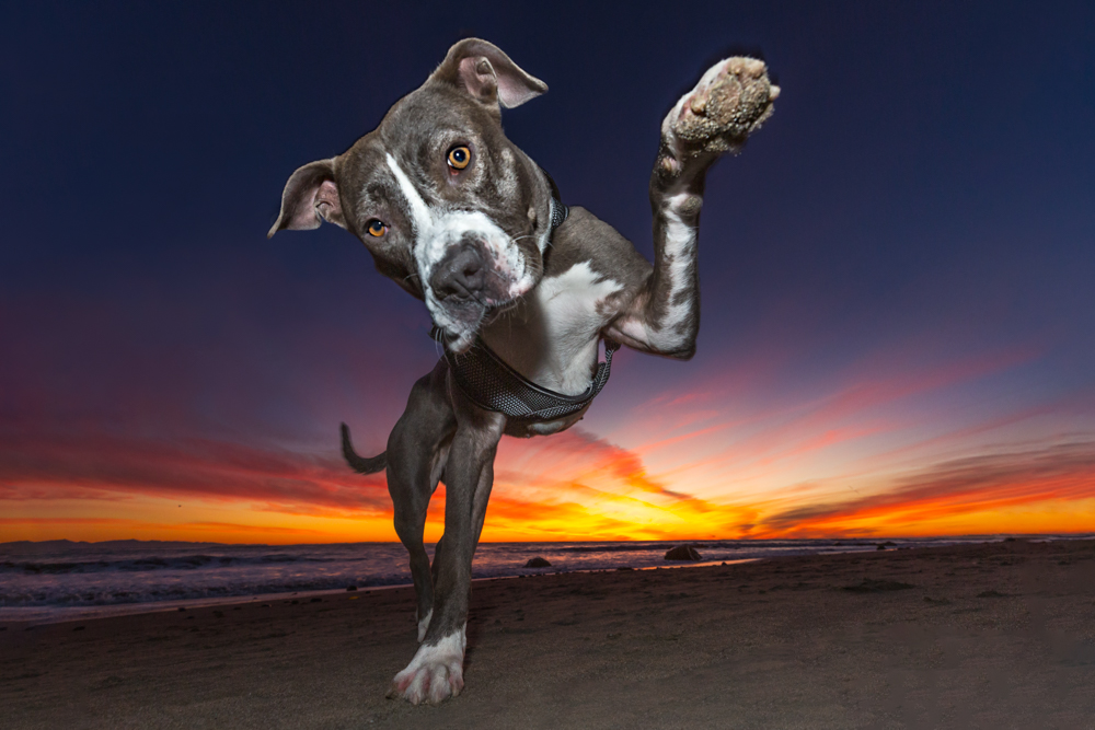
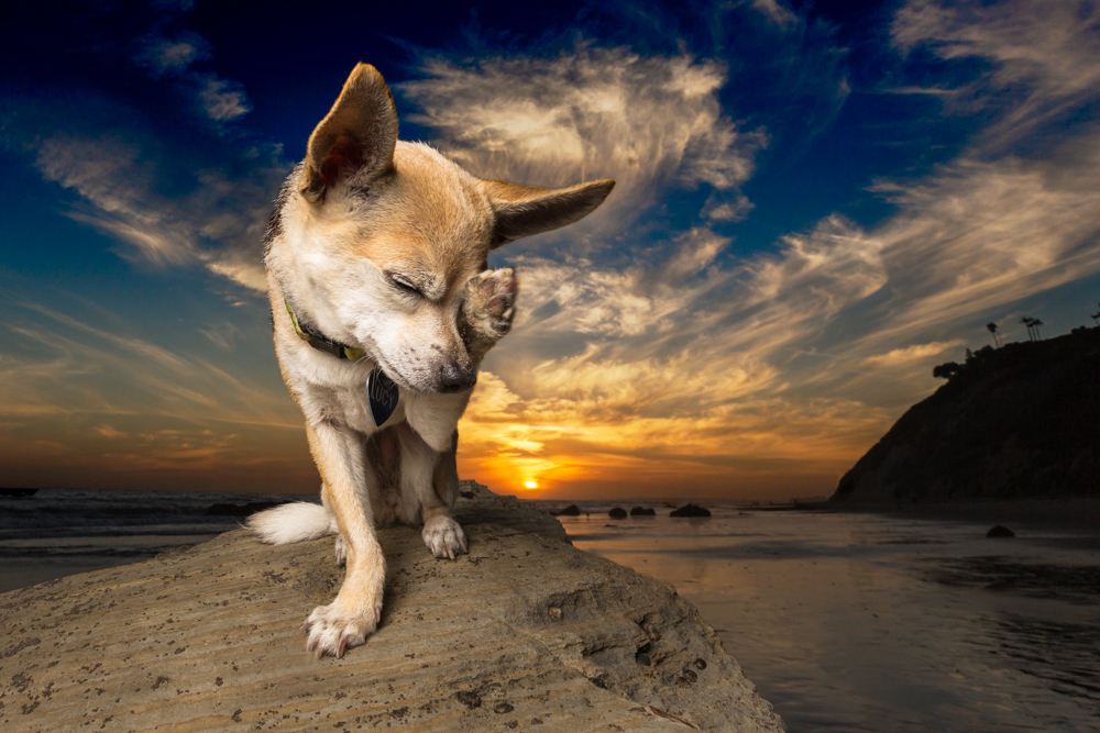
How has this type of work informed your photographic eye and you as a creative? The key to pet photography — especially dog photography — is to engage with the dog and bring out their unique personality. If a dog is happiest at the beach and running and jumping in the water then naturally we will pick a beach setting and we will do action shots. If a dog is nervous around other people or pets we may choose a quiet park. Based on how the dog is reacting and I may help put them at ease by choosing a longer lens so I can give the dogs more space. For the happy go lucky dogs that are playful and quirky I will often use my wide angle lens and get up close and personal to show off their funny expressions. This is often my favorite lens for pet photography not only because it helps bring out their fun features, but also to help incorporate the background or sky that is often an important element in my photos.
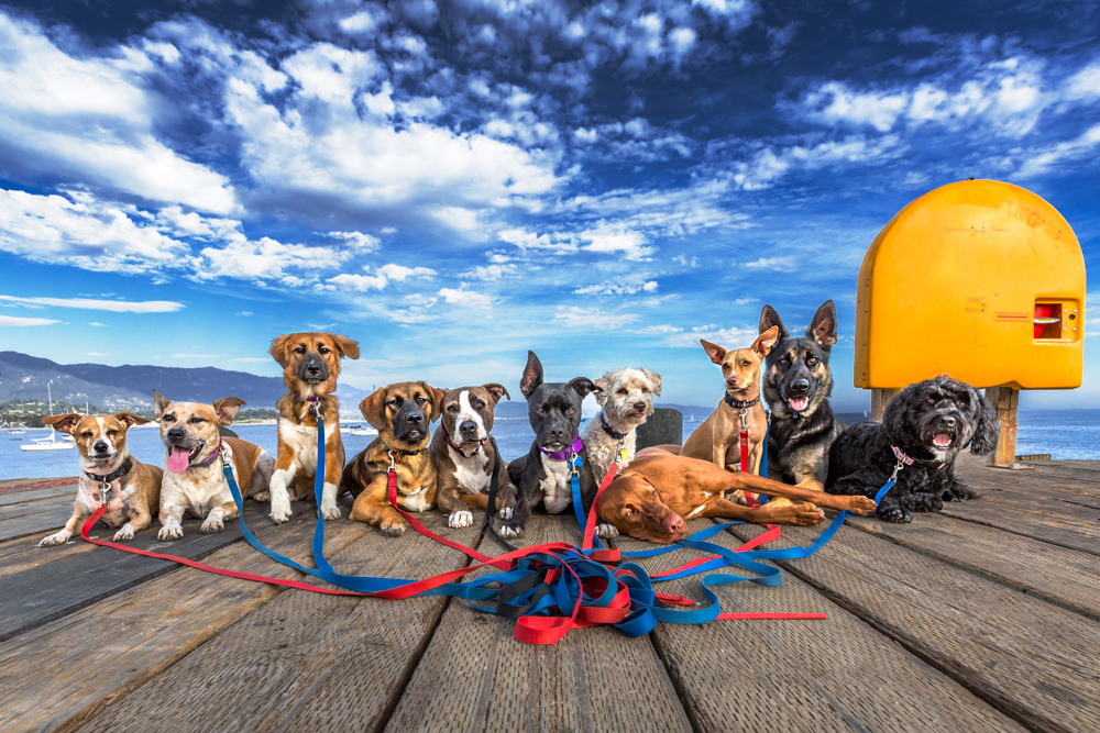
Your photography also involves outreach and rescue, how did that come about? I’ve been very active in animal welfare and rescue long before I became a pet photographer. In fact, it was the main reason that I became a pet photographer. I wanted to help take beautiful photos of the dogs at the shelter to help get them noticed and adopted faster. At that time I was in medical device sales and had no idea how to use a camera nor did I even own a fancy camera. I decided to take a leave of absence from my job and attend photography school in Montana the summer of 2015. While I was there I volunteered at the local Humane Society and Animal Control photographing their adoptable dogs and cats. This not only helped the shelters but it gave me valuable experience photographing animals and learning the craft of pet photography.
I fell in love with photography so much that when I returned home I took a leap of faith, quit the sales job and pursued pet photography full time. Keeping true to my mission of helping animals in need, in addition to booking regular client sessions I continue to donate a substantial amount of time photographing animals at local shelters as well as donating photography sessions to benefit numerous animal welfare agencies including C.A.R.E4Paws in Santa Barbara, CA.
What type of change have you seen since the onset of the pandemic? The biggest change has been the amazing number of people who have adopted or welcomed pets into their homes. I have had an increase in client sessions wanting to photograph their new family members. Sadly, as people are going back to work many dogs are ending up back at shelters and shelters across the country are filling up once again.
What is the main difference for you photographically, beside verbal (words) between dog and people portraits? and how are they similar. For me the main difference between photographing people and dogs is that people often require a lot more direction and posing. They look to the photographer for more guidance and can be self-conscious about their appearance. They may want techniques to help minimize whatever their perceived issue is or ask me to “Photoshop it out” if possible. But it’s exactly the opposite with a dog — whatever makes them different is what I want to capitalize on. If the dog has big ears then perfect, I want to get those ears in all their glory. If it’s a dog with a big head, long tongue whatever it is that is unique to them, I want to show it off. I feel like more people should embrace those unique things that make them so different.
Regardless if it’s a dog or human that I’m photographing, the most important things to do are to make a connection with them, put them at ease, and always have fun. I don’t want any forced smiles. For people that may mean I’m using my Midwestern sarcasm to make them laugh. For the dog, I’m probably doing something odd or funny or making the dolphin noise which many times works for both.
We had dinner, watched a little family TV, got the kids off to bed, and then climbed in ourselves.
Normally, we catch something on the Food Network, or an episode “House Hunters International” before turning in, and last night was no exception.
(Today being Thursday, as usual.)
I did a work Zoom before dinner, which amps me up, so that might’ve had something to do with it, or it could have been the offensive grub we saw on “Diners, Drive-Ins and Dives.”
We just added it to the pre-bed rotation, as that Guy Fieri has the kind of charm that creeps up on you, like a joint you think is milder than it actually is.
But what I saw last night shook me. (As a cultural critic, currently trapped in a cynical worldview of America.)
At an Alabama-style BBQ joint in Colorado Springs, (a notoriously conservative part of a now-purple State,) Guy watched the chef prepare a sandwich symbolic of so much that’s wrong here in the US.
The sloppy pig
First, slow-smoked-pulled-pork with BBQ sauce, and really, that’s typically a winning way to get going.
But then, he added some grilled kielbasa on top, (greasy, Polish pork sausage,) followed by a few slabs of bacon.
That’s right.
Three forms of artery-clogging pig, one on top of the other.
Then, they finished the monster with mayo-filled pimento cheese, creamy cole slaw, (gross!) and some fried-onion-strings.
It’s about as “Red State America” as it gets, and the world wonders why we have such high obesity rates?
Then again, the dreams might have been sparked by a confrontation I had with an anti-masker, in the bathroom of the mid-mountain lodge at Taos Ski Valley earlier in the day.
To be clear, New Mexico has had an indoor mask law for most of the pandemic, with only a slight gap after last Spring’s false hope.
(It was quickly re-instated when Delta showed up.)
It is literally the law.
TSV has “Mask Up” signs clearly posted, and I even saw a vaccine requirement to eat in the on-mountain restaurant where I stopped in to pee. (A first, in my experience here in NM.)
As I was washing my hands, post-pee, (TMI?) a short, early 60-something Baby Boomer strolled in, maskless, and got ready to do his business at the urinal. (Again, TMI?)
I pointed at my mask, gave him the stink eye, and said, “There’s a mask mandate here in New Mexico, and also at Taos Ski Valley.”
(I stopped trying to act like the mask police months ago, but it was just him and me, alone in a basement restroom, and he had that cocky, ant-vaxx look in his eye.)
“It’s a hoax,” he yelled at me.
“Don’t be an asshole,” I replied.
Then I thought about it for a minute, amped up my mad-dog-look, pivoted in my ski boots, and walked out.
But what I really wanted to say was:
“You don’t think the law applies to you, and you don’t mind giving me Omicron, should you have it.
You’re literally telling me you don’t care if I live or die, and you think laws are for suckers.
Fuck you!
But you assume I’ll obey the law, and not kick the living shit out of you. Which I can easily do.
Why is that?
Why is it OK for you to ignore the law, because you’re above it, but we both know if I elbowed you in the face, and broke your nose, you’d go crying to the cops like the little bitch that you are?”
(End imaginary quote.)
I wanted so badly to say that, and even more, I really wanted to beat his ass.
But I didn’t.
Because right now, this country is bifurcated, with one side feeling constrained by the bonds that hold society together, while the other taunts, trolls, baits, and bothers.
It’s a seriously messed up situation.
No lie.
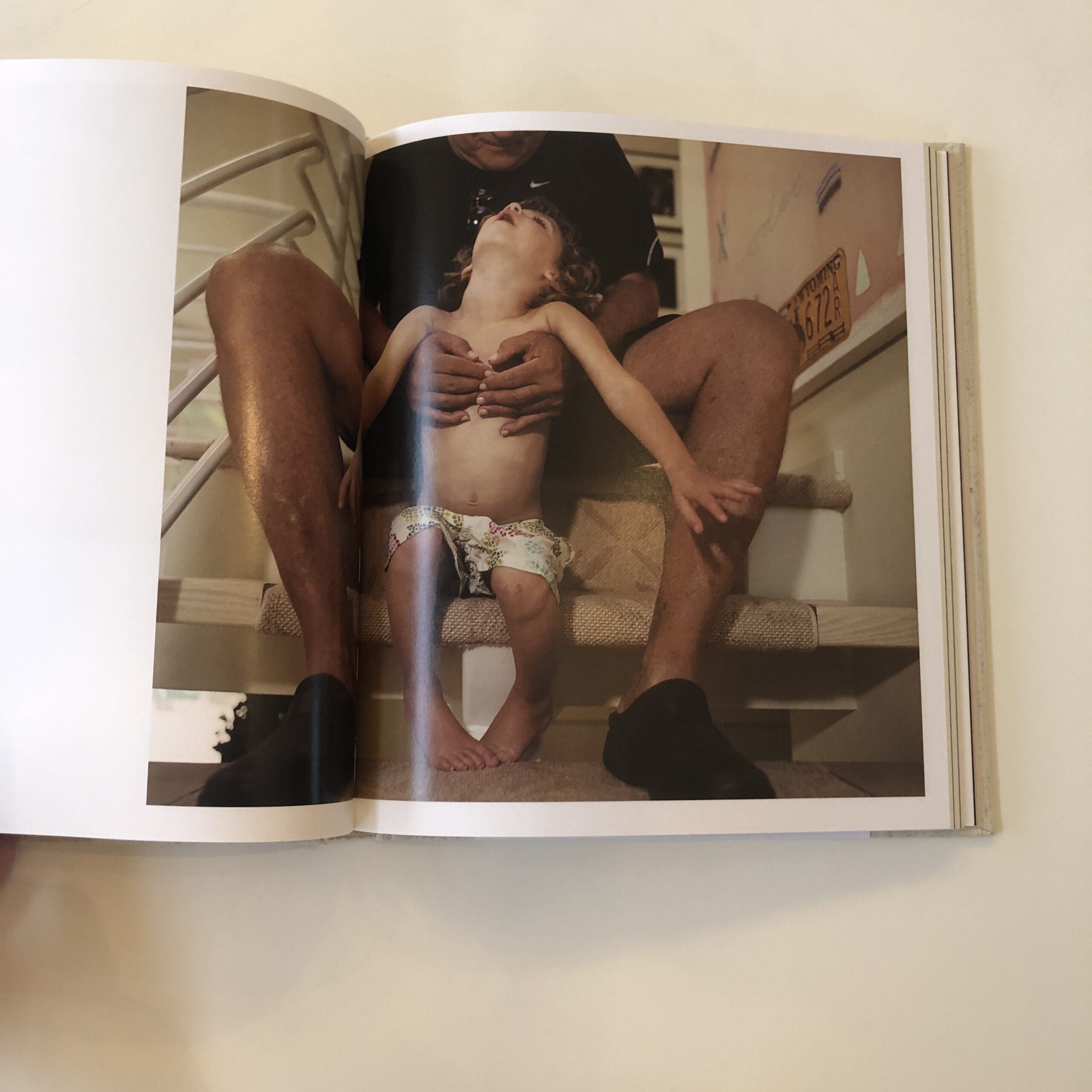
So halfway through the night, I dreamed of my mother-in-law, who’s been non-communicative, due to her advanced Alzheimer’s, since last summer.
Hearing her voice, as she spoke to me, healthy again in my subconscious, was more than I could bear.
It was like being visited by a ghost.
(Does that make me Scrooge?)
Bill Murray in “Scrooged,” courtesy of Den of Geek
So I woke myself up, at 3:30am, then tossed and turned for an hour.
Honestly, it’s only some very strong coffee allowing me to write at the moment.
But here we are.
These are strange times for American democracy, and for the stability of the global geo-political order.
With two young children, I want so badly for the world to right itself, so they can grow up and have long, healthy lives.
(I wonder, though.)
And yes, my musings today are partly inspired by a photo-book, as usual.
Just last week, I ended the review by stating I hadn’t seen much work yet, made during the pandemic, that was more than obvious.
Sure enough, as this column often takes on patterns I never anticipated, I reached into the stack today and grabbed a self-published, Blurb book that arrived in March 2021.
(It takes so long to get to the books these days, but does give us the benefit of hindsight.)
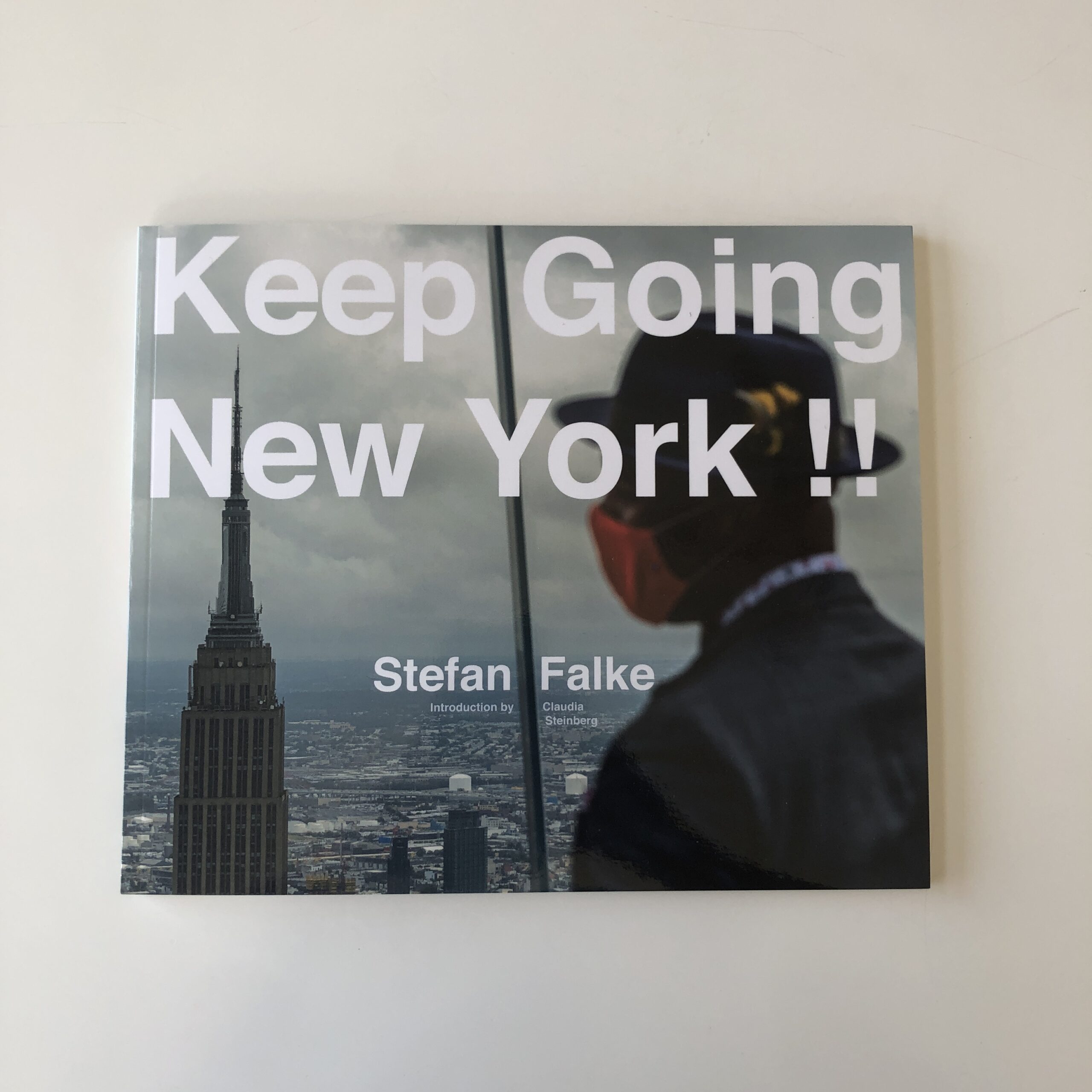
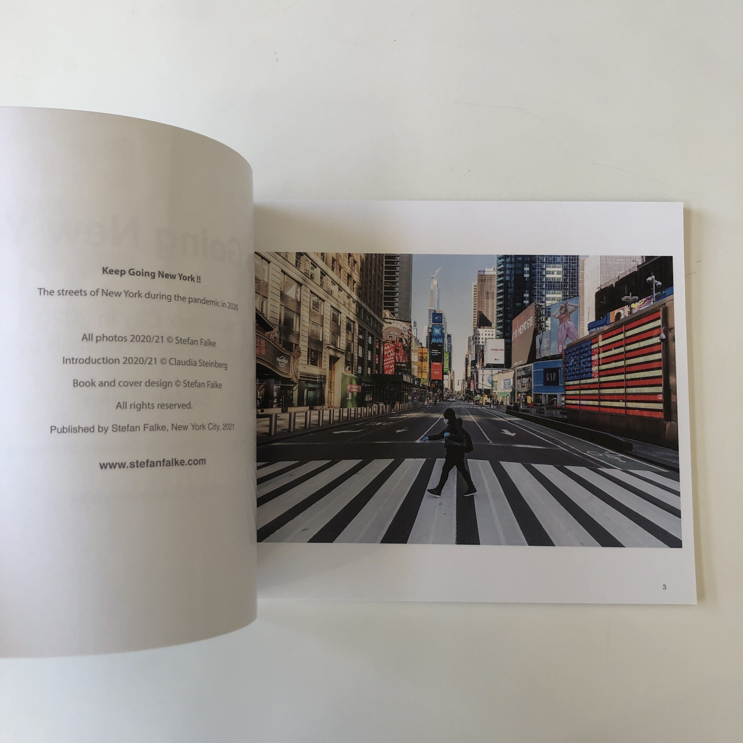
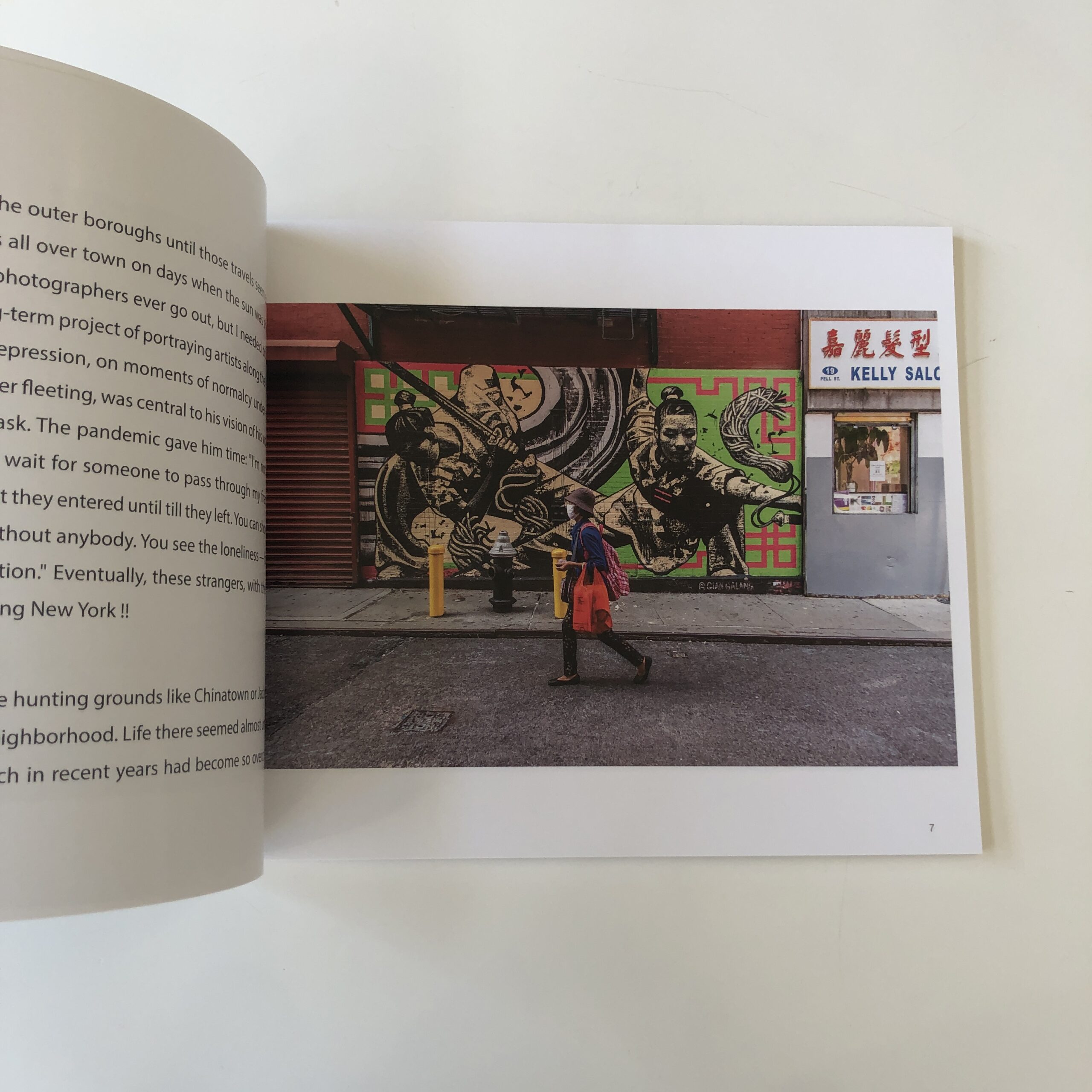
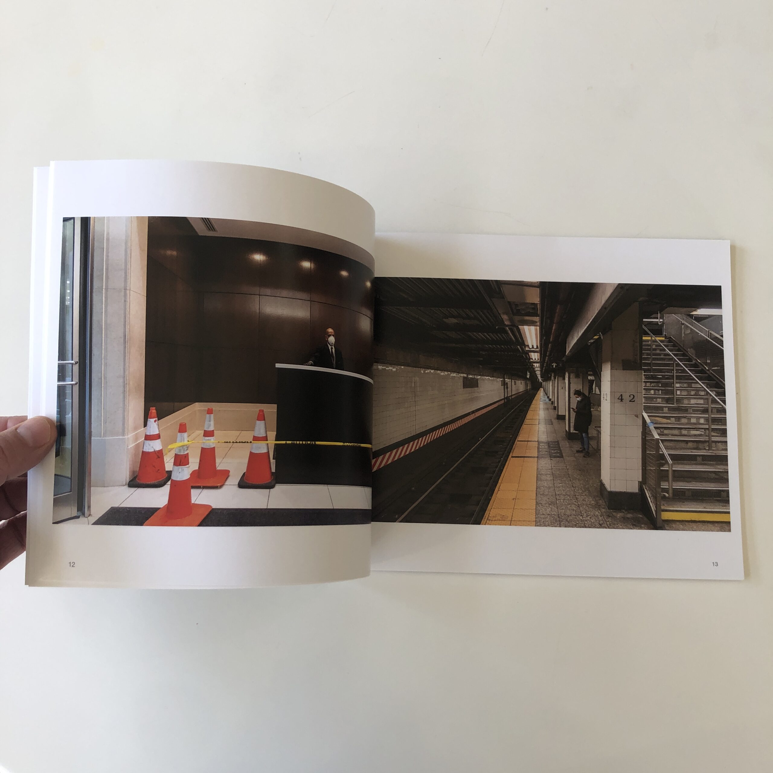
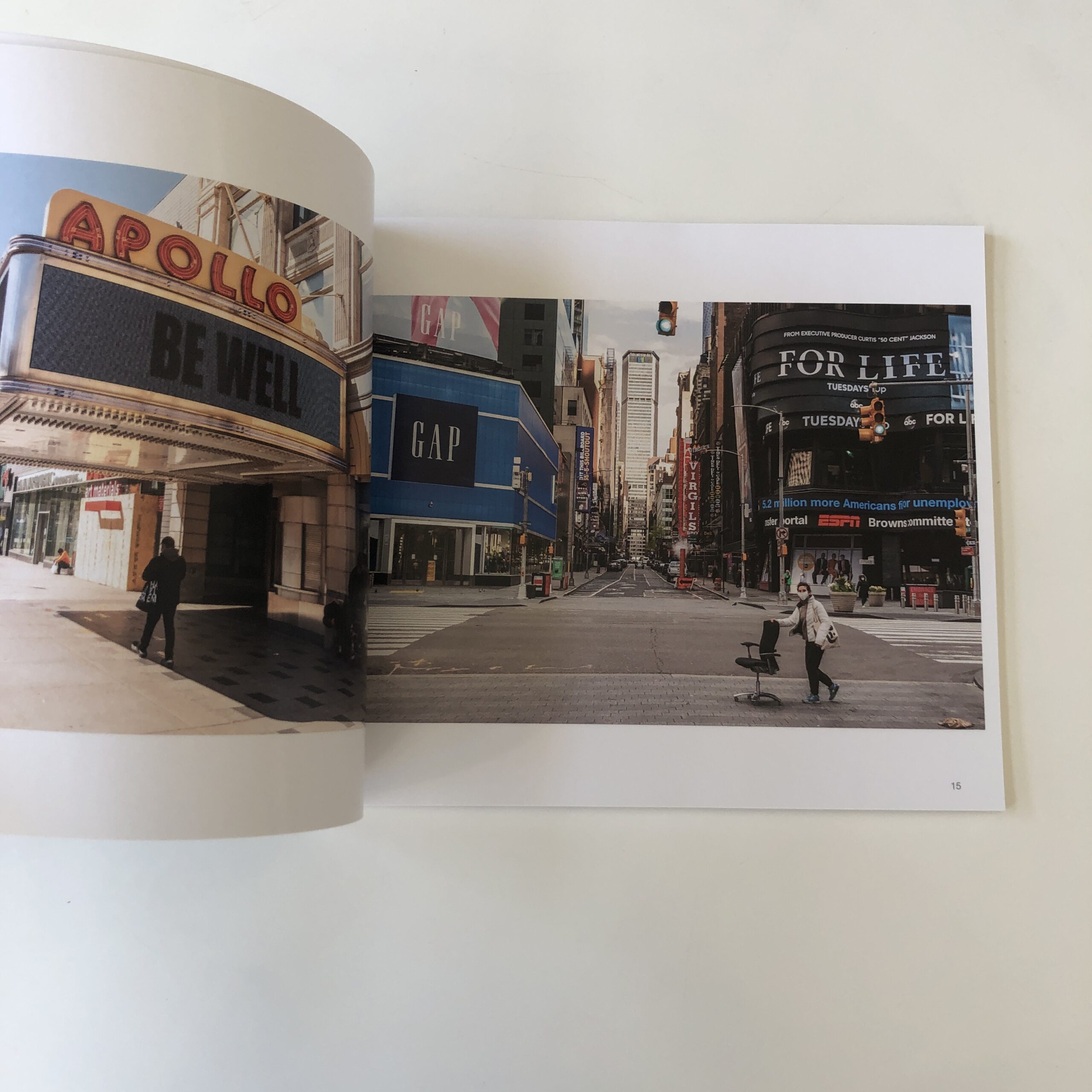
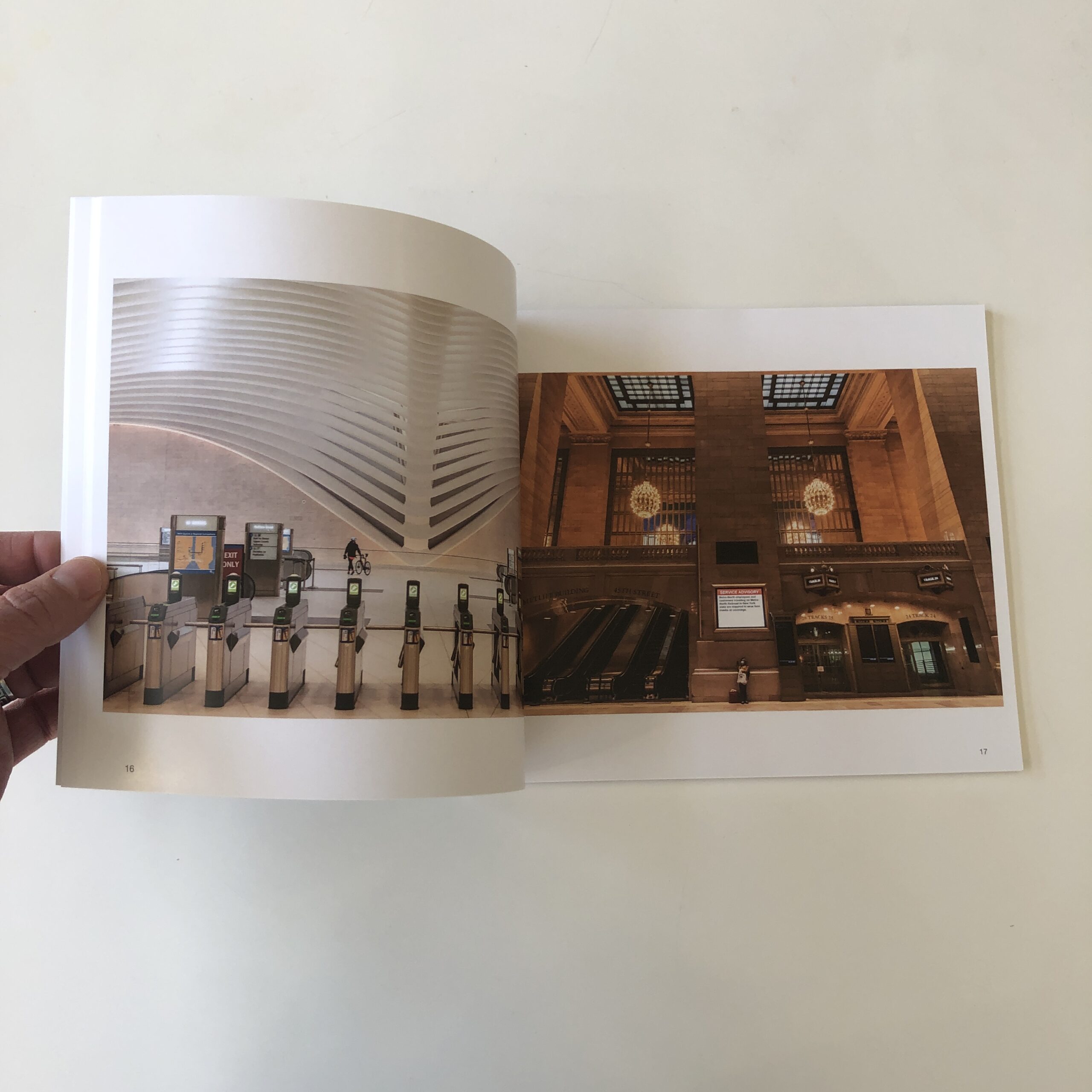
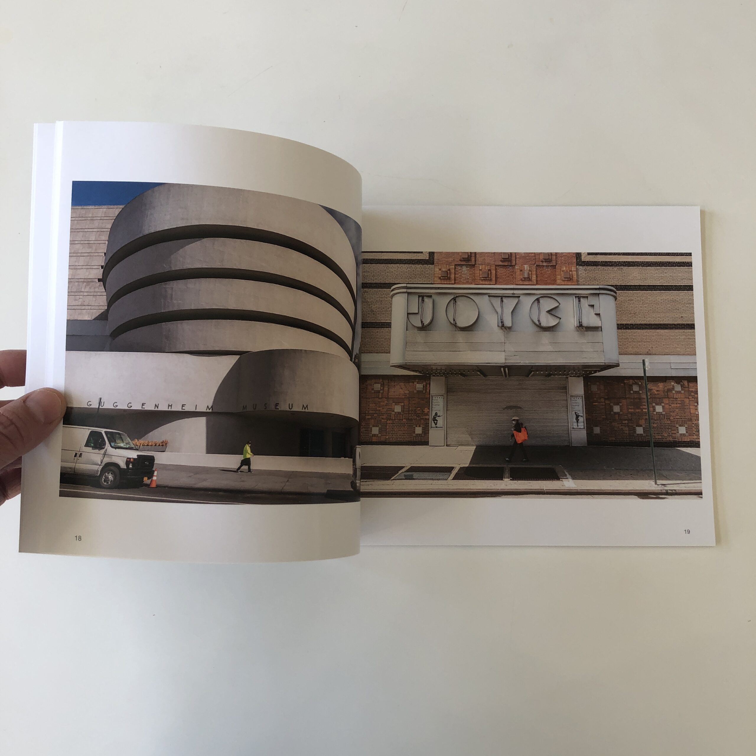
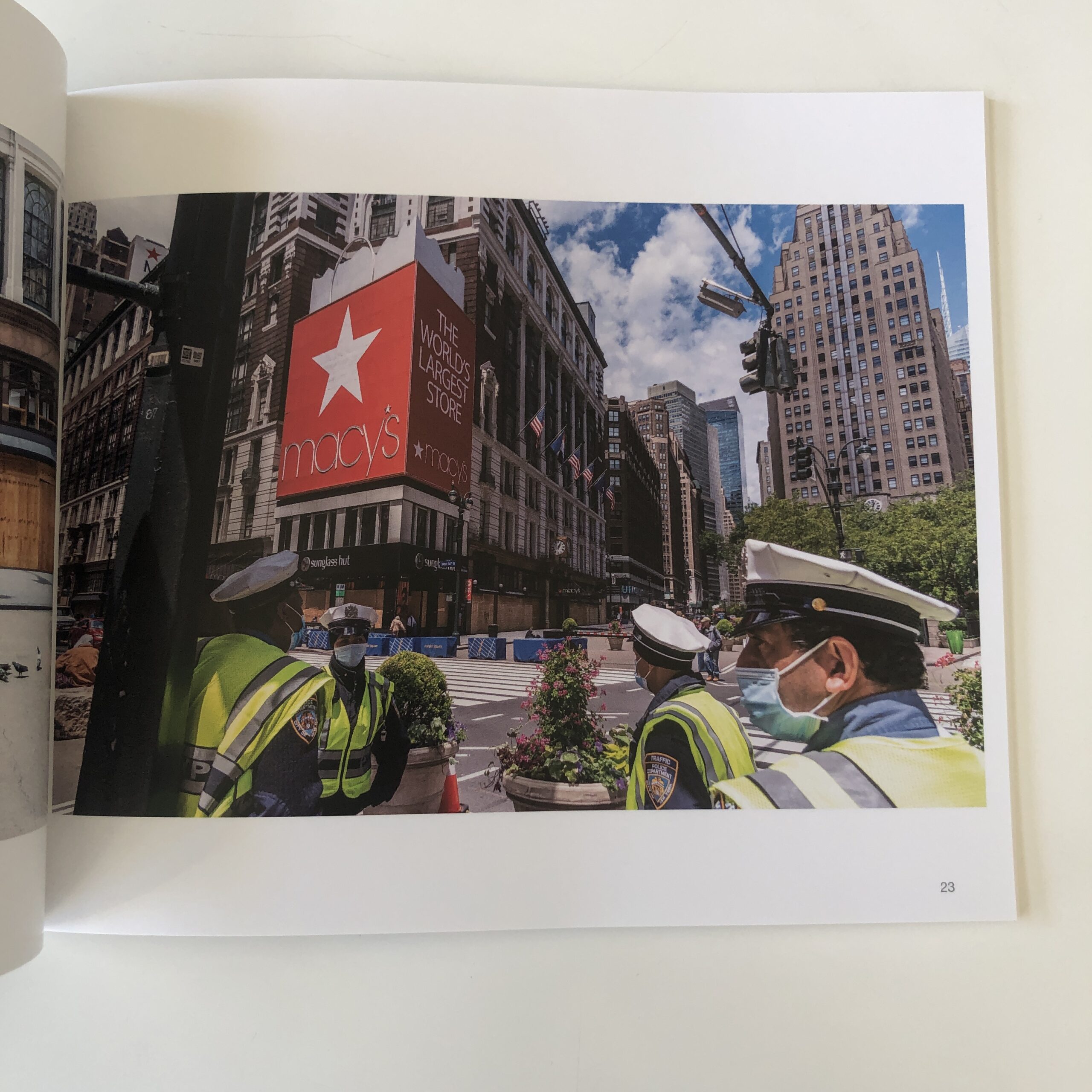
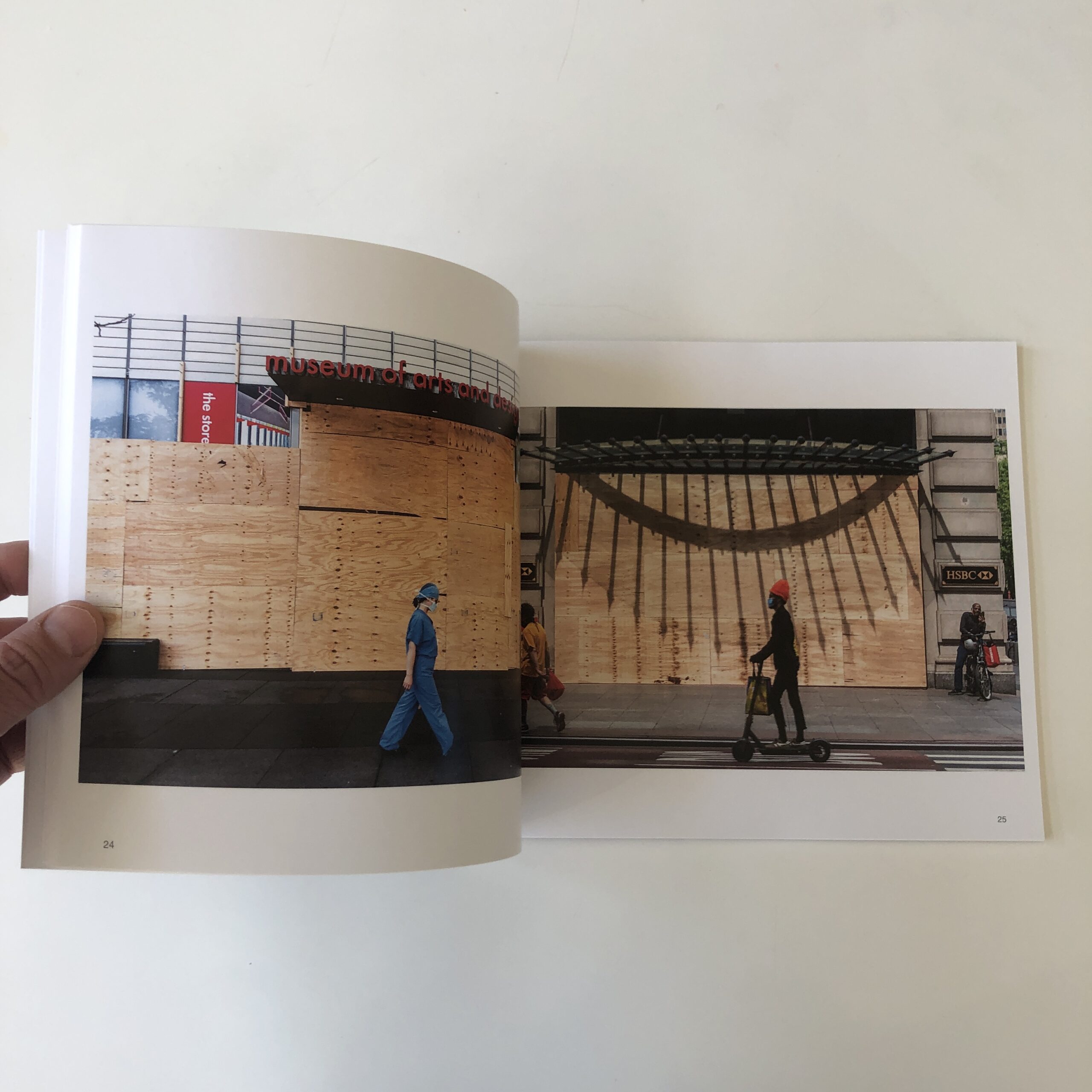
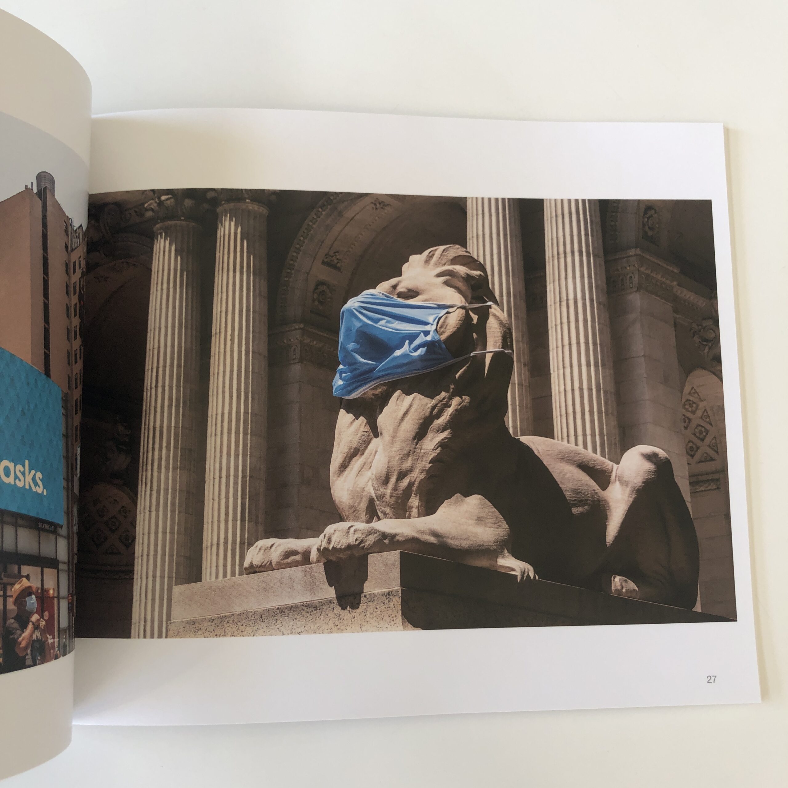
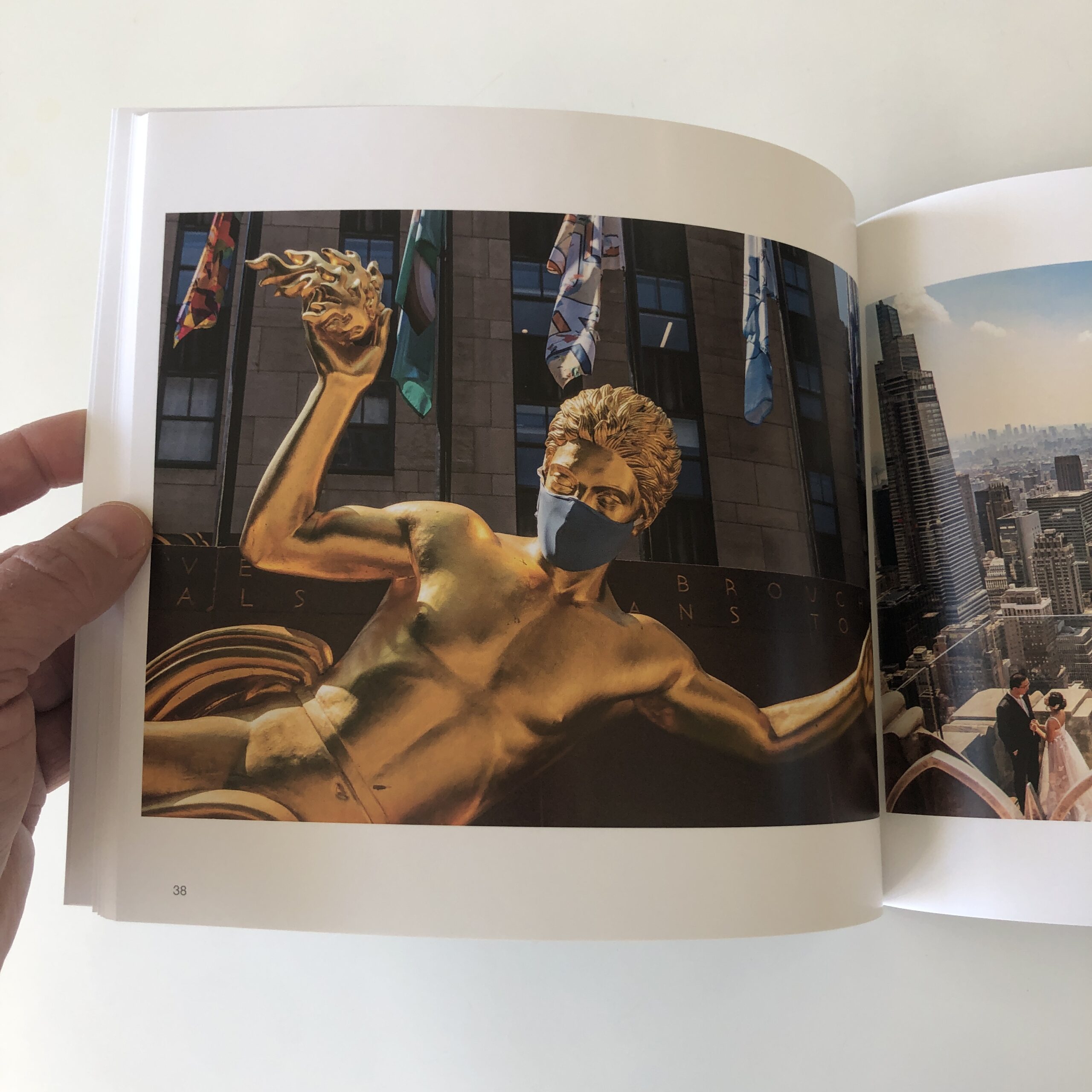
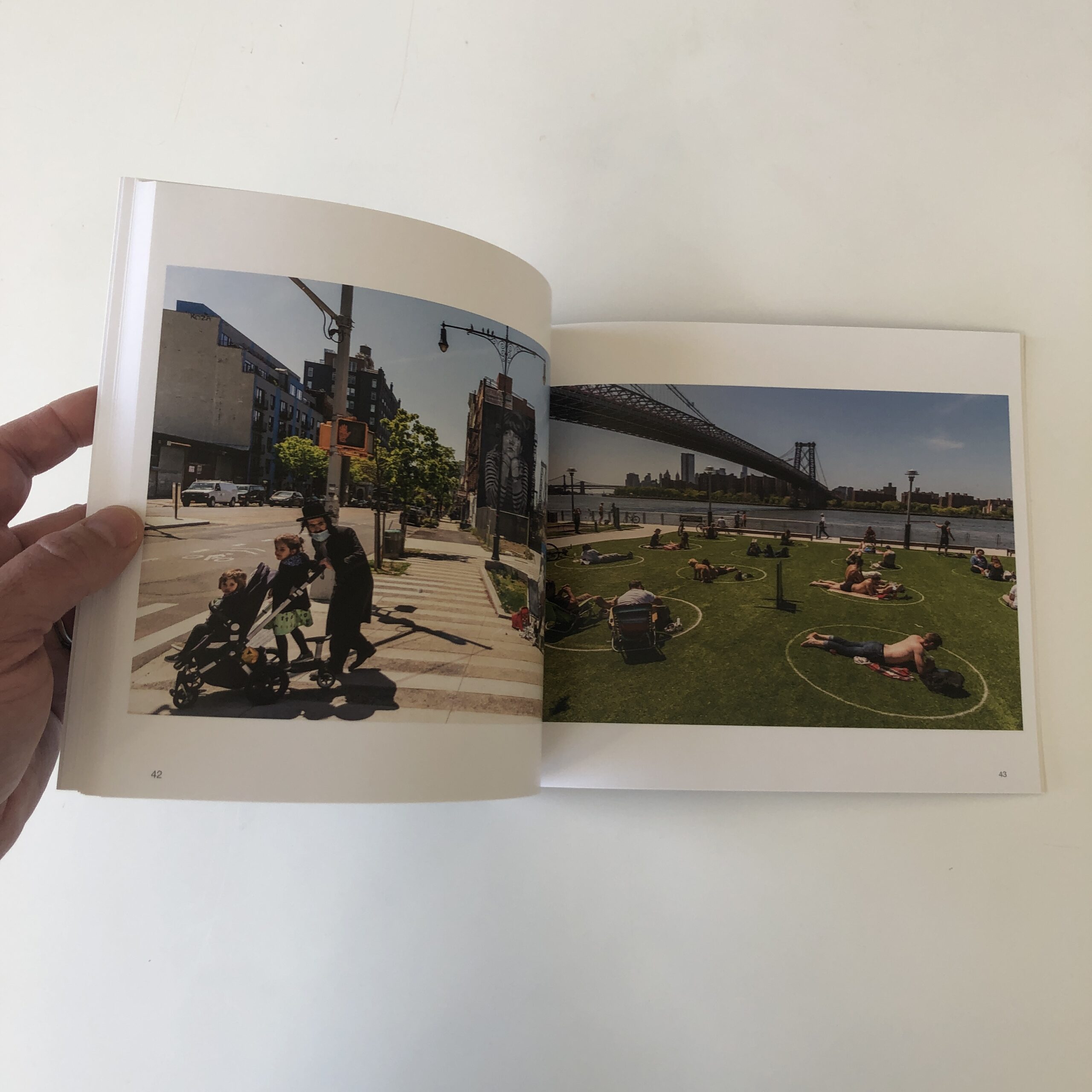
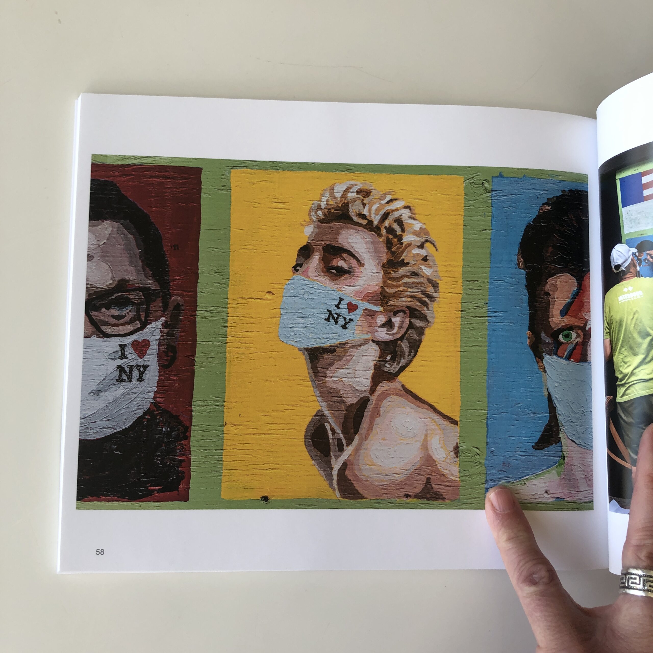
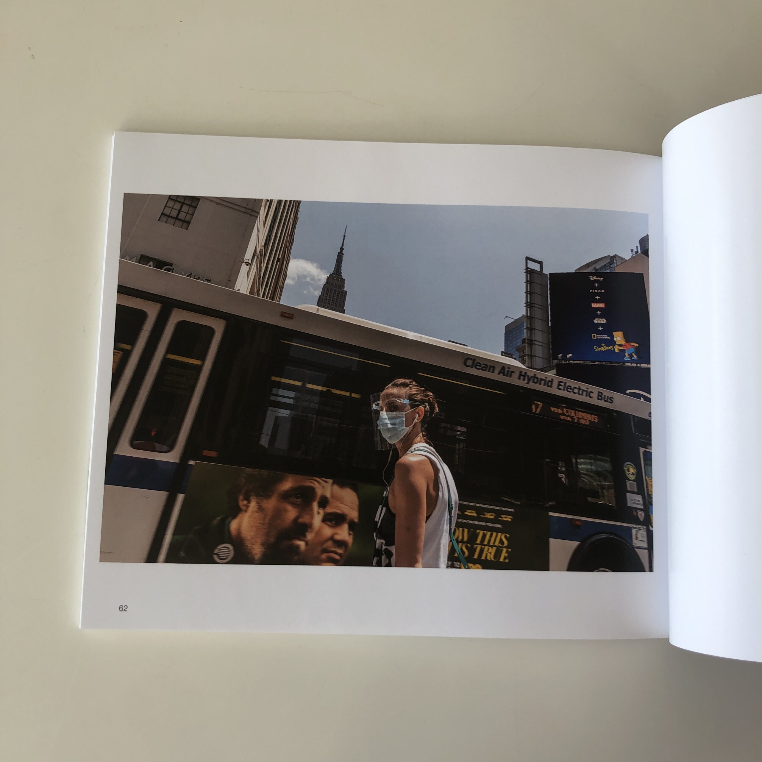
I opened up the cardboard, having no idea what was inside, and was treated to “Keep Going New York!!”, by Stefan Falke, a German-born photographer based in NYC.
And yes, it was made in the city, during the pandemic, over the course of #2020.
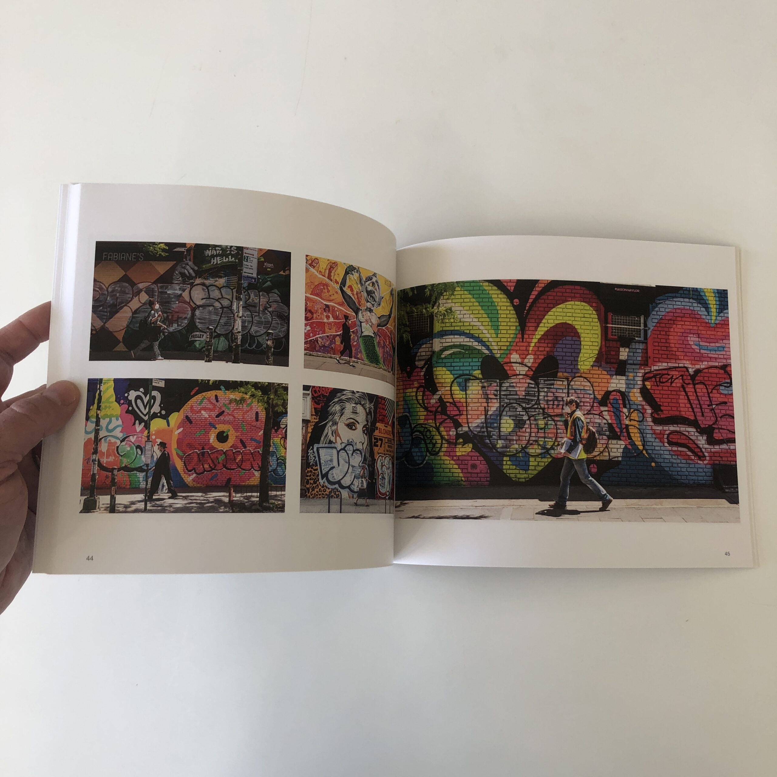
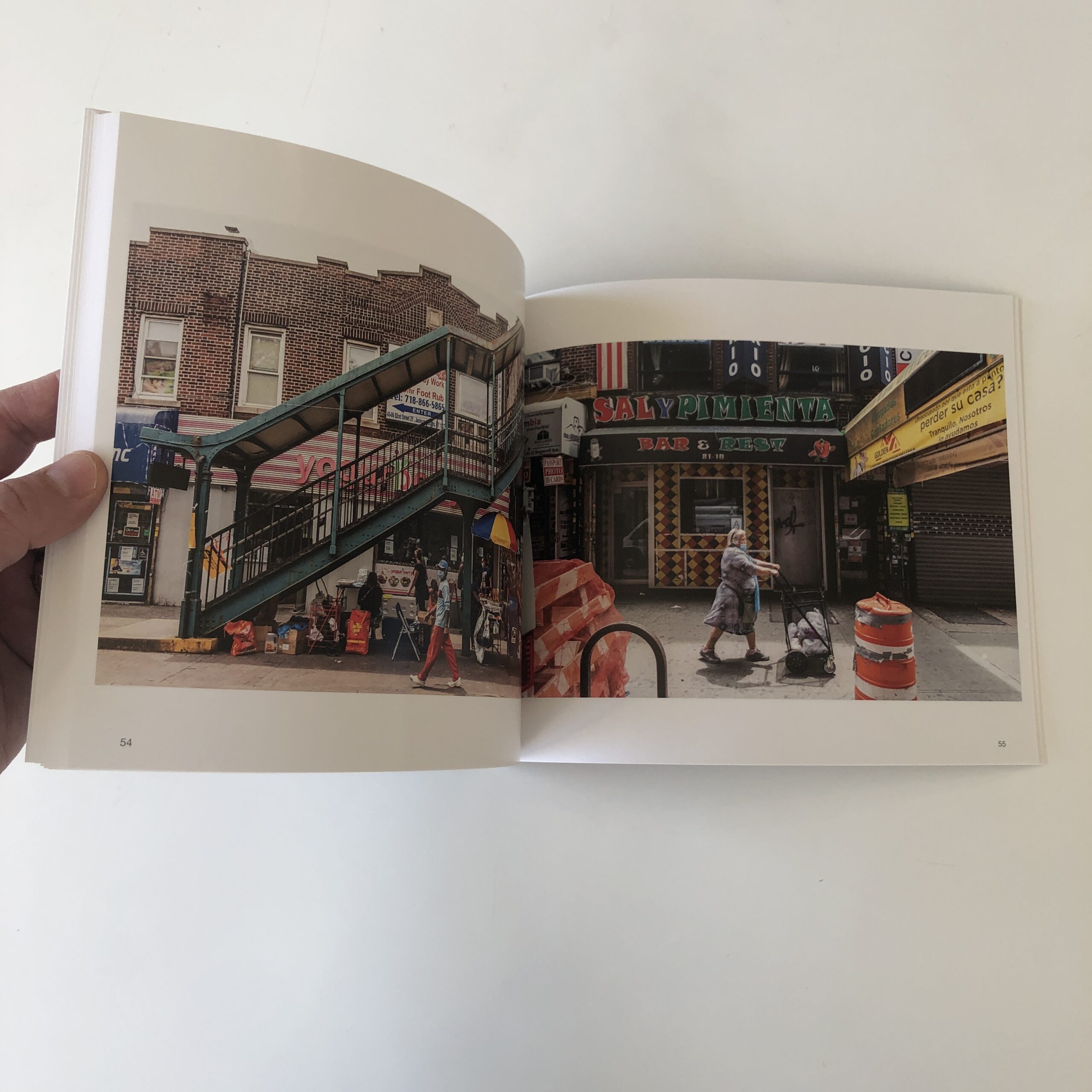
The text, by Claudia Steinberg, tells us Stefan roamed the outer boroughs, not just Manhattan, and shot at mid-day, as the bright sunshine helped run off his blues, and intensified the colors he sought to shoot.
So we see very bright murals, (in many cases,) often with lone figures in front.
(As the text also informs, he prefers to have at least one person in the frame, and stands waiting for them, rather than just shooting empty cultural landscapes.)
Hopefully, we’ll never again see the city this empty during the day.
It’s not right, though over the course of the book, there are other images that show at least some form of collective human congregation.
Do you remember when they drew circles in parks, so people stayed in their own pod?
I’d forgotten that already.
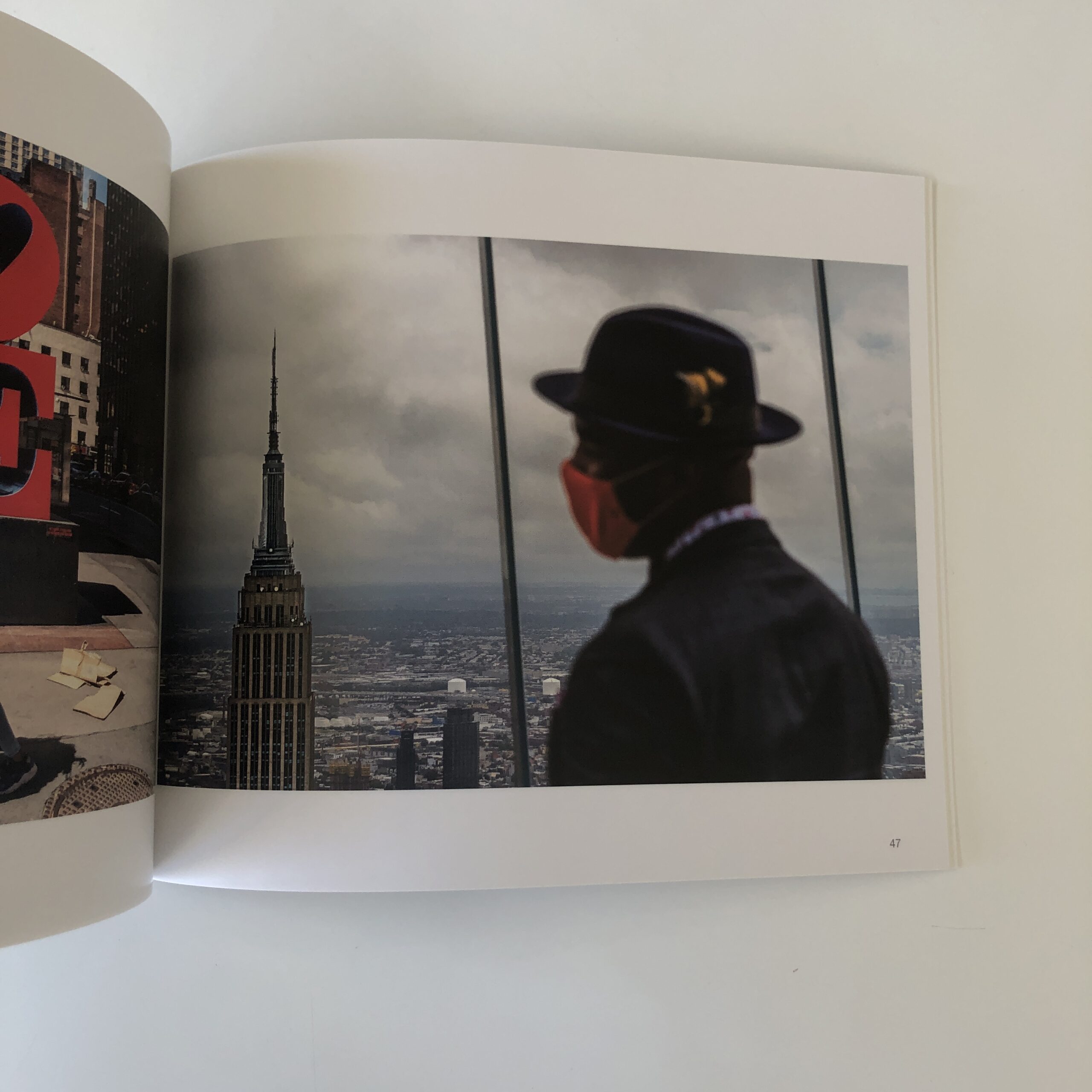
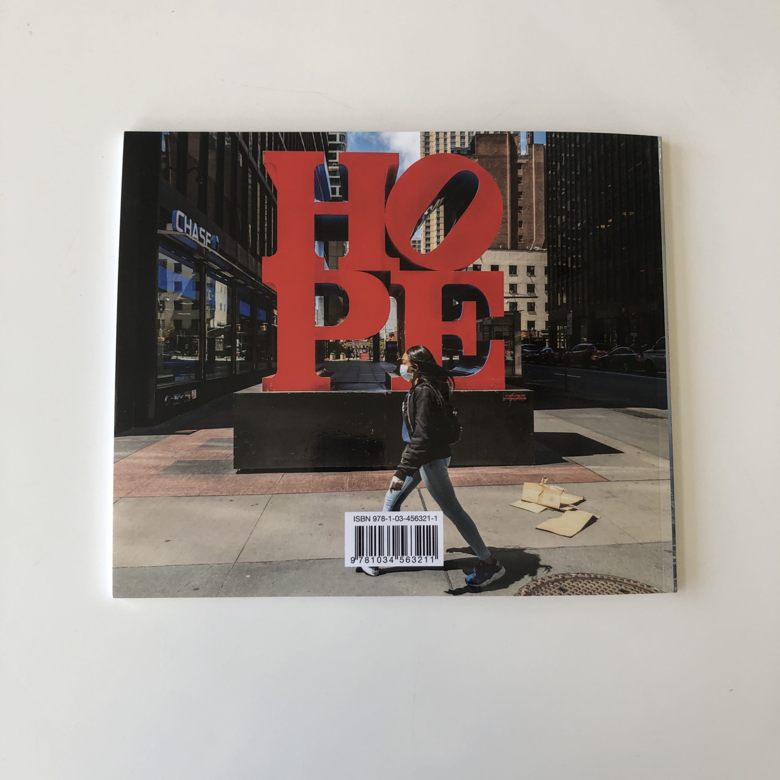
Some of these are properly dynamite, like the image of the Black gentleman wearing a cool hat, in the foreground, shot with shallow depth of field, set against the top of the Empire State Building.
Or the woman dragging an office chair through an empty Times Square.
But it’s the overall sense of having captured a place in time, (and a shocking time at that,) which forced me to write about this book.
So yes, that’s two #2020, pandemic photo books in two weeks.
(Not my intention, as I said.)
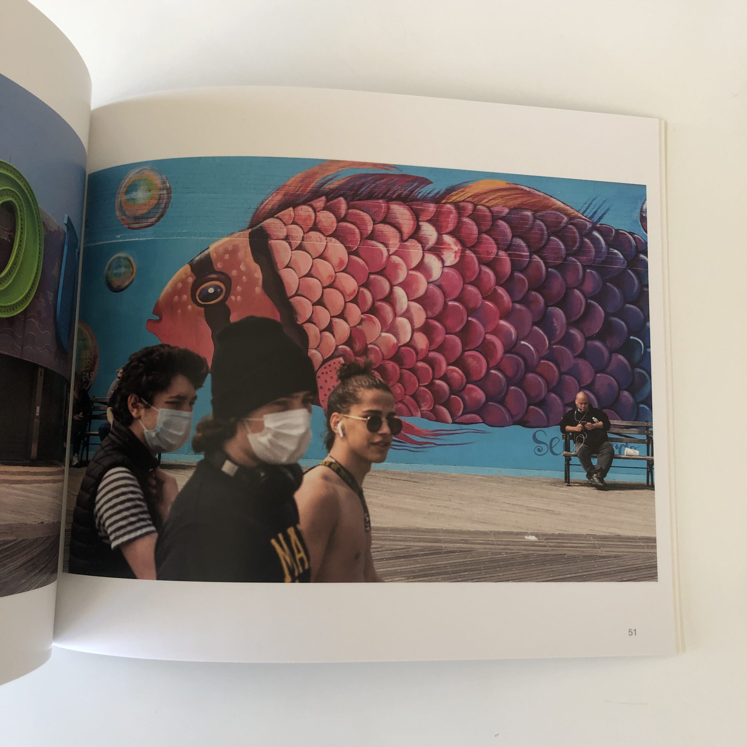
And in this one, there are several images that show people mis-wearing masks, or fully maskless, in the company of those who are masked up.
If you’d like to submit a book for potential review, please email me at jonathanblaustein@gmail.com. We are particularly interested in books by artists of color, and female photographers, so we may maintain a balanced program. And please be advised, we currently have a significant backlog of books for review.
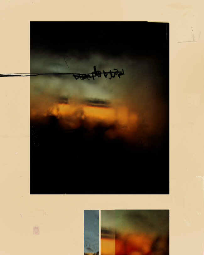
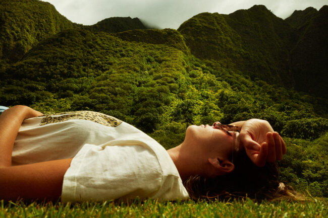
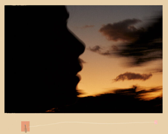
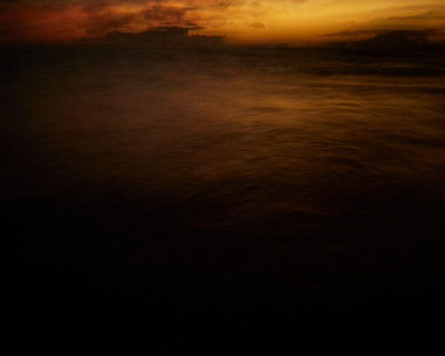
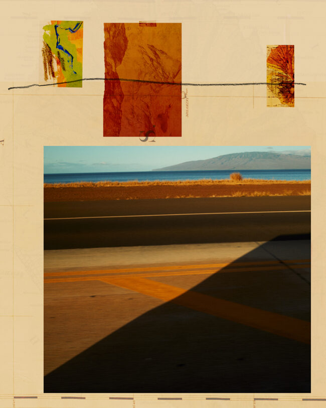
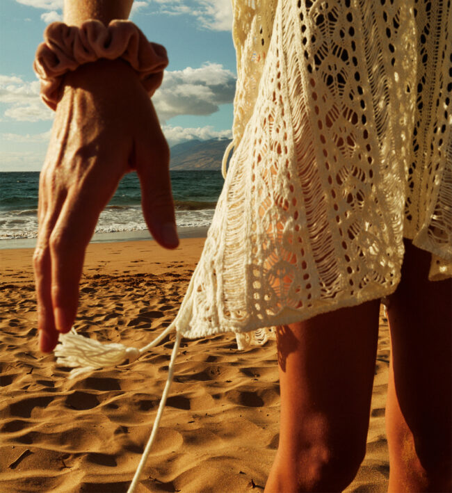
The Art of the Personal Project is a crucial element to let potential buyers see how you think creatively on your own. I am drawn to personal projects that have an interesting vision or that show something I have never seen before. In this thread, I’ll include a link to each personal project with the artist statement so you can see more of the project. Please note: This thread is not affiliated with any company; I’m just featuring projects that I find. Please DO NOT send me your work. I do not take submissions.
This is a recent collection of photographs and collages, from a few days of traveling on Maui. Whether I’m on the road or home in LA, I’m after it constantly. The color, the light, the evidence. How much of the experience can I let in? Circling in my head lately: staying open, staying loose. The possibilities seem endless.
APE contributor Suzanne Sease currently works as a consultant for photographers and illustrators around the world. She has been involved in the photography and illustration industry since the mid 80s. After establishing the art-buying department at The Martin Agency, then working for Kaplan-Thaler, Capital One, Best Buy and numerous smaller agencies and companies, she decided to be a consultant in 1999. She has a new Twitter feed with helpful marketing information because she believes that marketing should be driven by brand and not by specialty. Follow her at @SuzanneSease. Instagram
Photographer:Paris Gore Photo Editor: Jakob Reisinger
Heidi: How did you expand as a creative and photographer while working on this story, “Child of the Setting Sun” for Patagonia? Paris: Working on this story was very personal as I was part of the accident and close to the family. Most of the projects I’ve worked on in my career I’ve felt close to or always have some sort of tie to the story but this was just on another level. Knowing everything that went on and being so keen to show this piece the way I felt it should be showcased really drove my creativity out to shoot a certain way I felt I had never photographed before. I usually pull inspiration from New Yorker style photo pieces and wanted to really bring out a lot more emotion than what I feel like I normally do.
Where did you take this portrait?
The portrait I took of Stephanie Bennett to accompany her story had to really be powerful. At her house she had a barn that was walled with metal siding so it gave off a metallic reflection, also being an open door it provided us a really great location for the portraits. Holding her young child Robbie, squirming and looking in different directions posed some challenges but to be honest Robbie is very stoic. His eyes have a mature gaze that look deep. Stephanie too, her eyes are beautiful and could pierce your soul. We photographed for about 20 min, having them look out towards the house together and I really did know on this frame it was a special photo. Stephanie was giving me a hard time about not liking her portrait being taken but she really photographed so well and I truly did shoot some of the most powerful portraits in my career I felt.
It’s a monumental moment of resilience, courage, and the full spectrum of life, how did you know when to pick up the camera to capture those moments?
Our weekend shooting at Stephanie’s place was really fun and never felt any moment was forced. We just shot Steph and Robbie doing their thing and had a great time doing so. I also just feel so close to Robbie that any moment with him is a real gift so it’s pretty easy to have the camera out most of the time being an over zealous “Uncle Paris”.
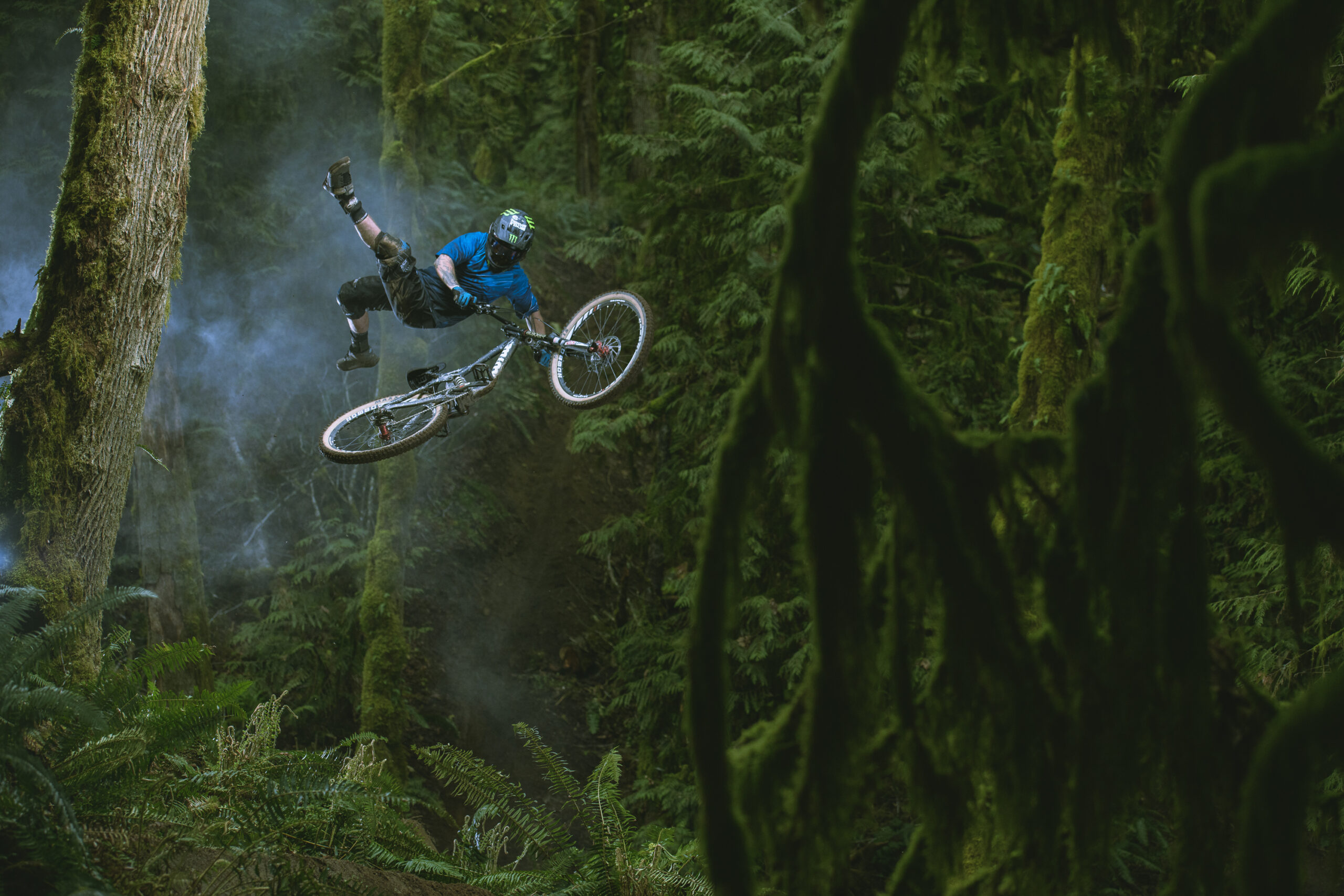
KC Deane and Geoff Gulevich in Þórsmörk, Iceland down a trail that is rarely ridden and never had been photographed for mountain biking. It’s always exciting to be somewhere and know you are one of the first to photograph MTB in the location. We lost the light behind the clouds which I was a little bummed about but it actually turned out for the better.Graham Agassiz in Bellingham, WA during a production for Dakine clothing. This is one of my more intricate lighting rigs that I’ve ever done on a job. We ended up hanging a softbox in a tree to get a top down light affect using arborist gear. Was pretty wild to put together and execute a shot like this deep in the woods where getting all the gear up was quite the challenge.
You were a mountain bike rider that evolved into a photographer, when did you know photography was your path? I got into photography pretty early on in high school but was mainly focused on shooting content for the yearbook and school sports not really thinking about applying it to mountain biking. Then one day me and a buddy went out to shoot some bike photos and had my a-ha moment. I had so much fun and just realized it was something I could possibly do for a living because at that point in my life there wasn’t much else in the way of a career I would have gone for.
How do you stay stoked and inspired?
A lot of people know me as a bike photographer and I do love it but any advice I can give is to have a passion outside of your work. I really enjoy snowboarding for example and I do photograph snow sports from time to time but it allows me to shoot it with pure enjoyment and not treat it as my “job”. Having an outlet just to go enjoy without the pressure of bringing a camera is so important to me and I work really hard to not taint that. Burnout is real and having the separation has really helped me appreciate the bike world and everything I’ve worked for!
I was sitting in my writing chair, wondering where to take today’s column, as Haley was lazing in the sun, just outside the sliding glass door.
All of a sudden, she leapt up and started barking.
(The full-throated, “I mean business” kind of bark.)
And this is one of the quietest creatures you’ll ever meet.
She can go all day without making a sound, unless she drops a little whine outside the front door when she wants to come in.
Barking, for her, is serious.
So I got right up, to see what was going on.
Just yesterday, (when she was away on a walk with my wife,) a massive coyote came strolling through the yard, practically prancing through Haley’s territory.
I called out to the kids, (who are home Zoom-schooling, b/c of Omicron,) and we all watched the gorgeous coyote for a good two minutes.
My son even captured a video, and I’ll post it here, if he’s up for sharing.
So today, my first thought was not psychopathic burglar, when the dog went ape-shit, but that it was probably the coyote coming back.
I was close, as this time, it was two.
Now, I’ve seen Haley tear off at full speed, determined to chase off her wild relatives, and maybe catch them if she can.
She must be a bit older and wiser, because despite her ferocious jaws, (she’s half-pit-bull,) Haley would be no match for two full-grown coyotes.
This time, she ran about ten paces, and then stopped, content to scream at them in dog-language.
I imagine she was saying something like, “Hey, assholes, get the fuck out of here! This is my turf! What’s your fucking problem? You don’t belong here! I’m in charge, not you! Leave! Now!”
I stood at the window, watching her body quake, giggling at the subtext of her unhappy barking, and then I decided to watch the coyotes.
They looked at her, only for a second, and then just pretended she wasn’t there.
It was an epic troll job.
They stood their ground, and went back to sniffing around, without the tiniest hint of hurry, or bother.
Then, and I swear this is true, one at at time, each had a leisurely poop, and then kicked at the dirt around the excrement with their hind legs.
You can’t make this up!
Living in a horse pasture in the heart of the American West, I admit life can be lonely, and almost boring, if you can’t take pleasure in watching the birds, the deer, the aspen leaves shaking in the breeze.
(And sometimes, the isolation does drive me crazy, especially since Covid began.)
But just now, in the last few minutes, I felt like the natural world was putting on a play, just for me.
In the end, the coyotes loped off, slowly, in their own good time.
They mocked Haley with their indifference, daring her to charge them.
Thankfully, she understood simple math.
2 coyotes, 1 dog.
Not a fair fight.
I bring this up, partly because it just happened before my eyes, as I sat with my computer on my lap, wondering what to write.
But also, (you know me well,) because I had a book in mind to review for today, and the coincidence is just uncanny.
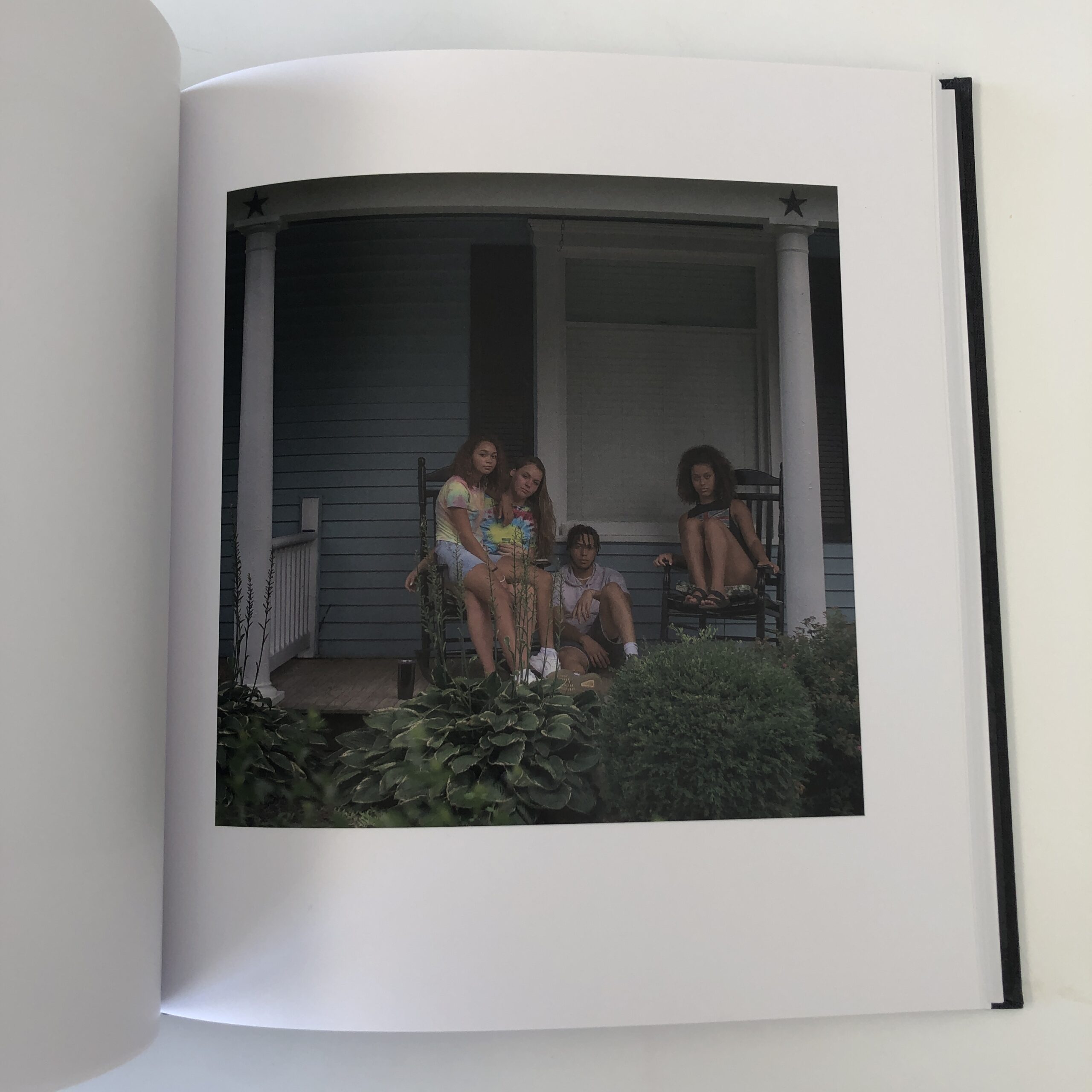
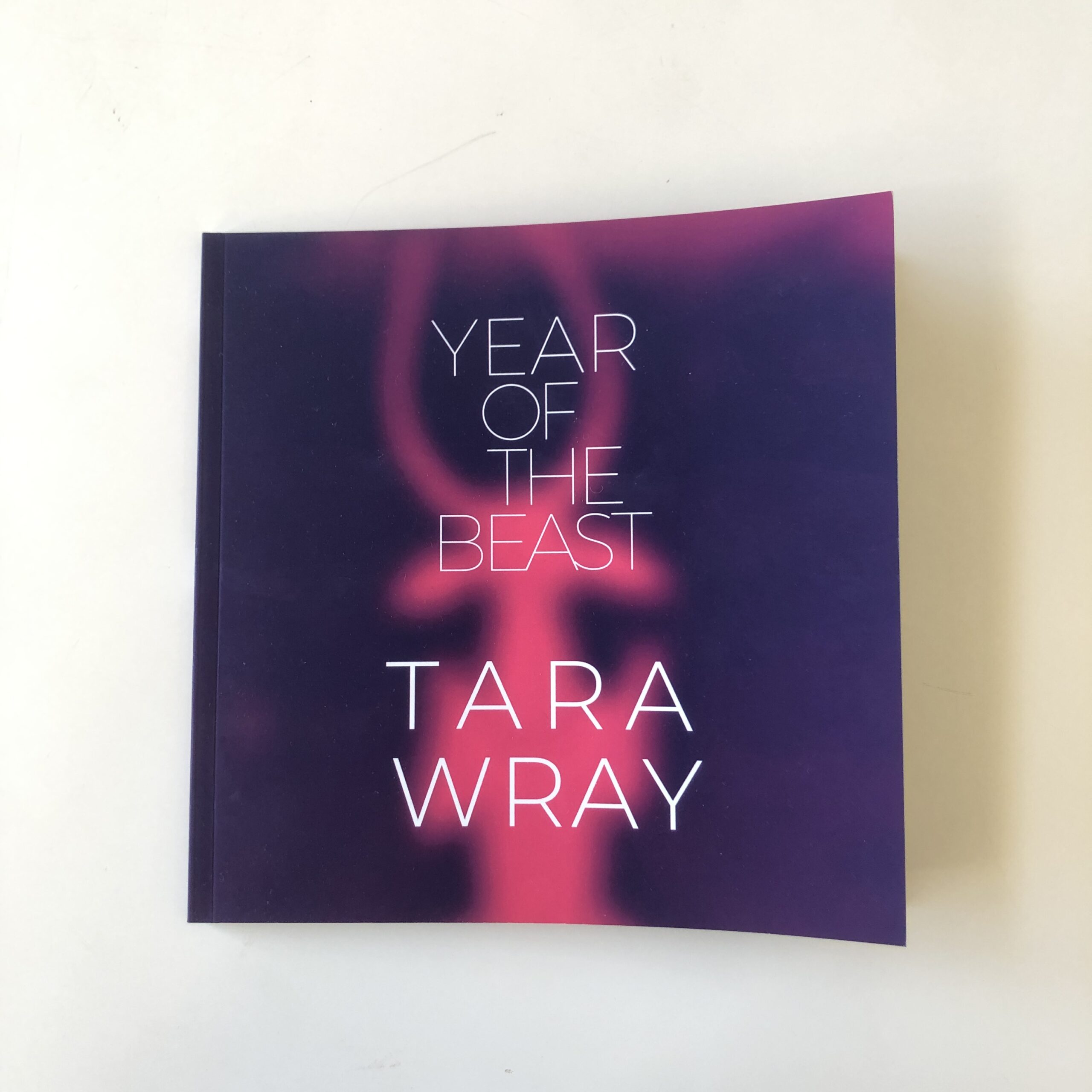
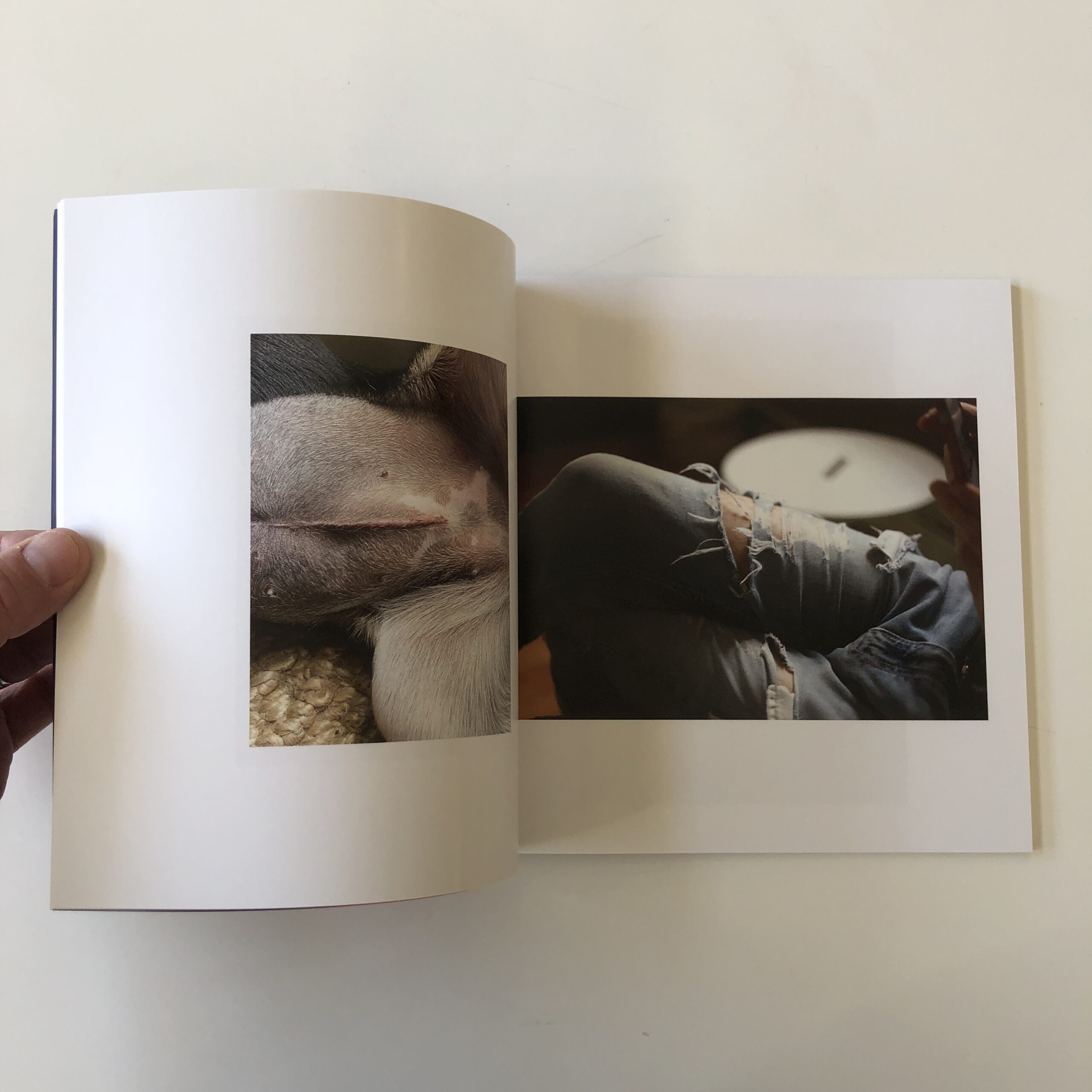
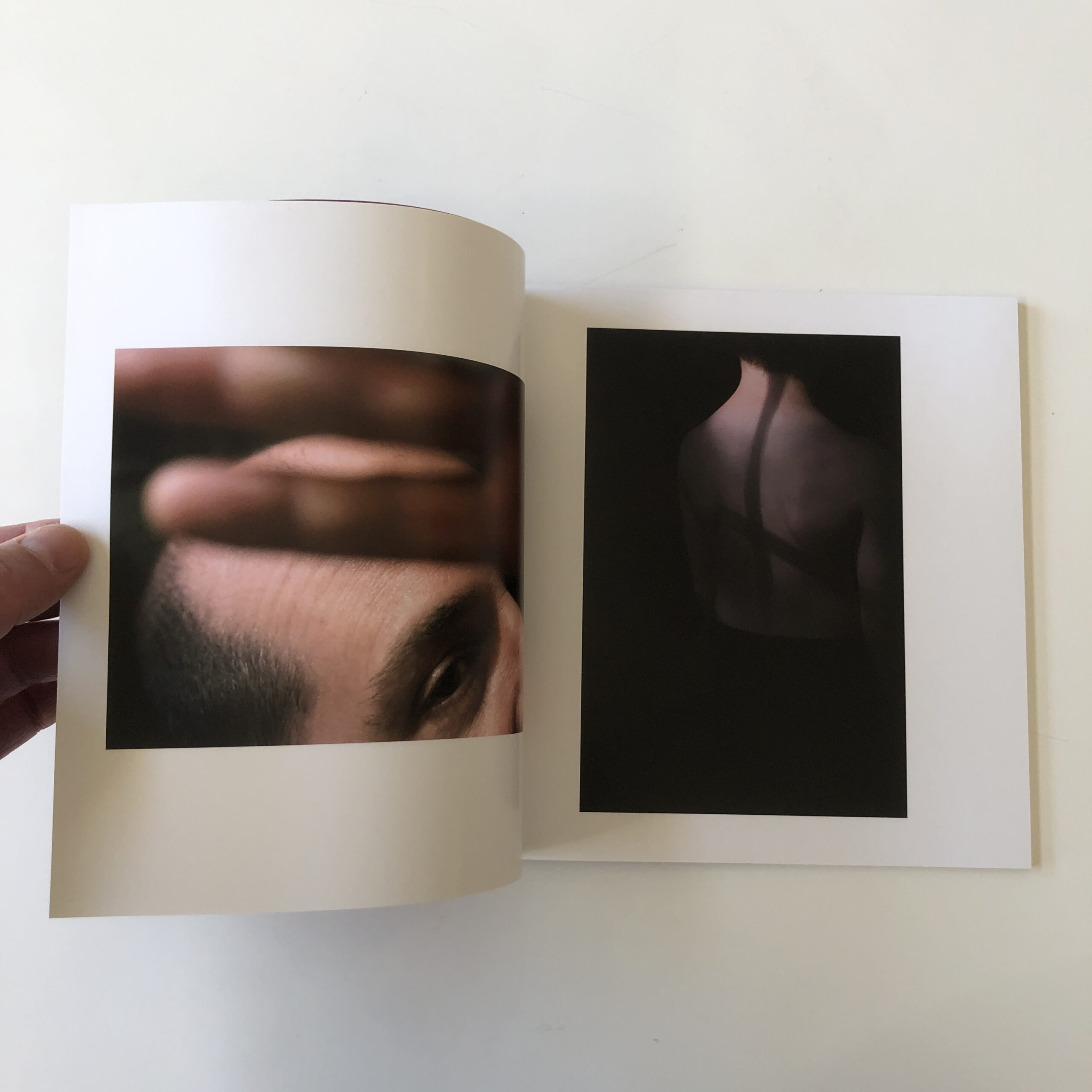
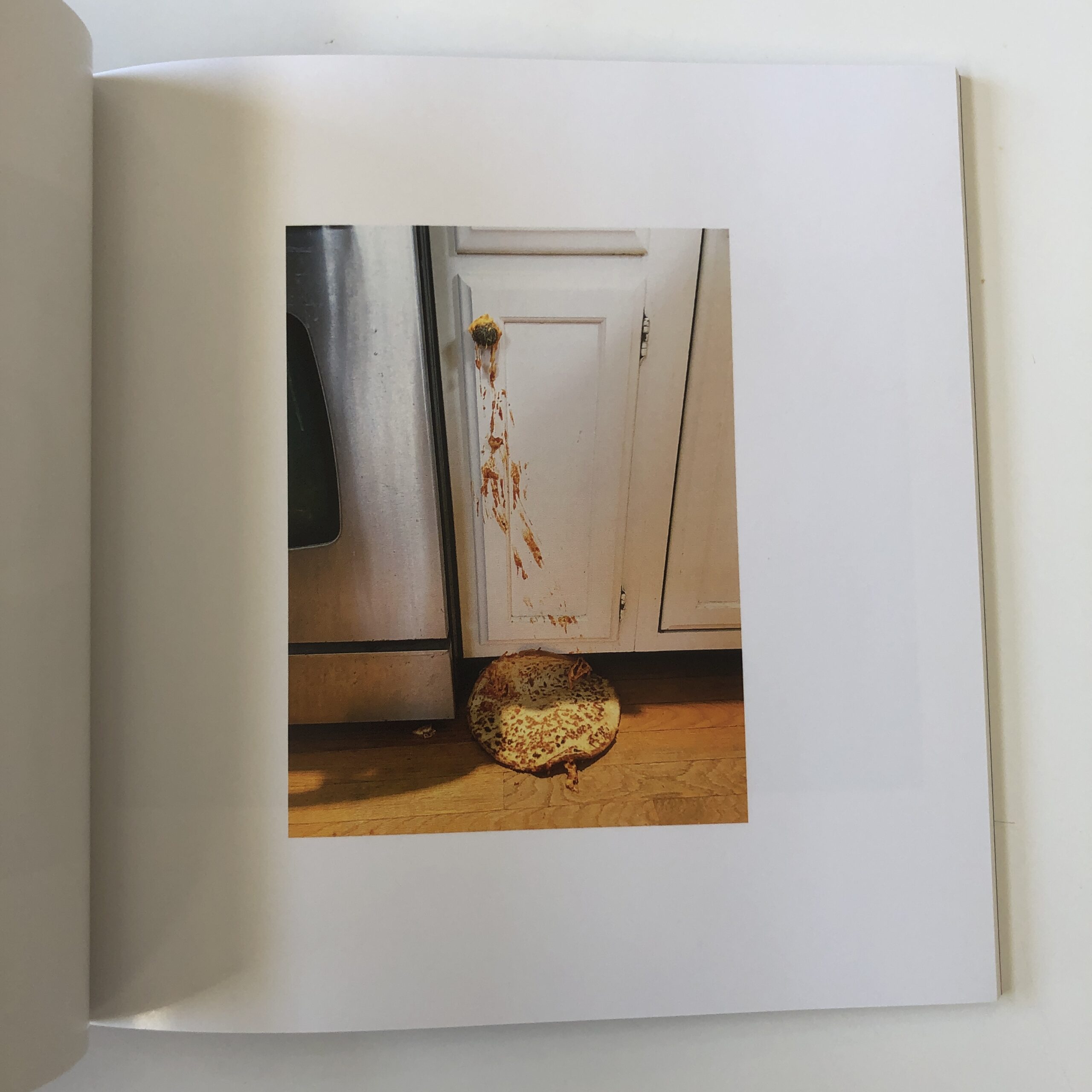
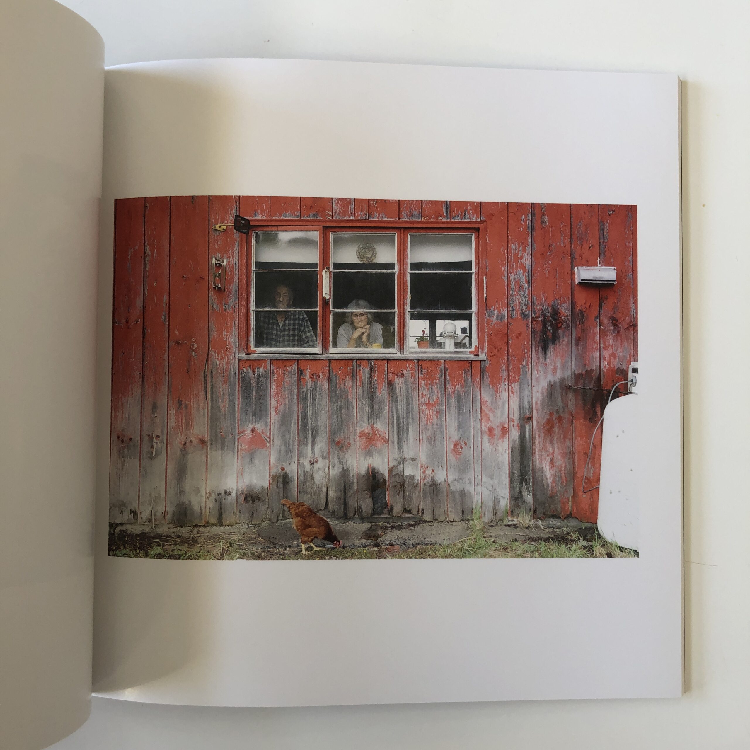
Tara Wray published a photo-book a few years ago, “Too Tired For Sunshine,” which I reviewed favorably, though in my experiential fashion, I had no idea it was really a treatise on using photography to combat depression.
Remembering what I wrote, I did wonder about the title?
Why would someone be too tired for sunshine?
And I was impressed by the search for rich, deep color, and powerful moments, as it seemed to have a hidden drive behind it.
The book became the basis for a movement, both on Instagram and IRL, with a series of group photo exhibitions around the world by other artists who also suffered from depression.
The phenomenon culminated in the formation of a non-profit organization, the Too Tired Project.
(Pretty badass, if you ask me.)
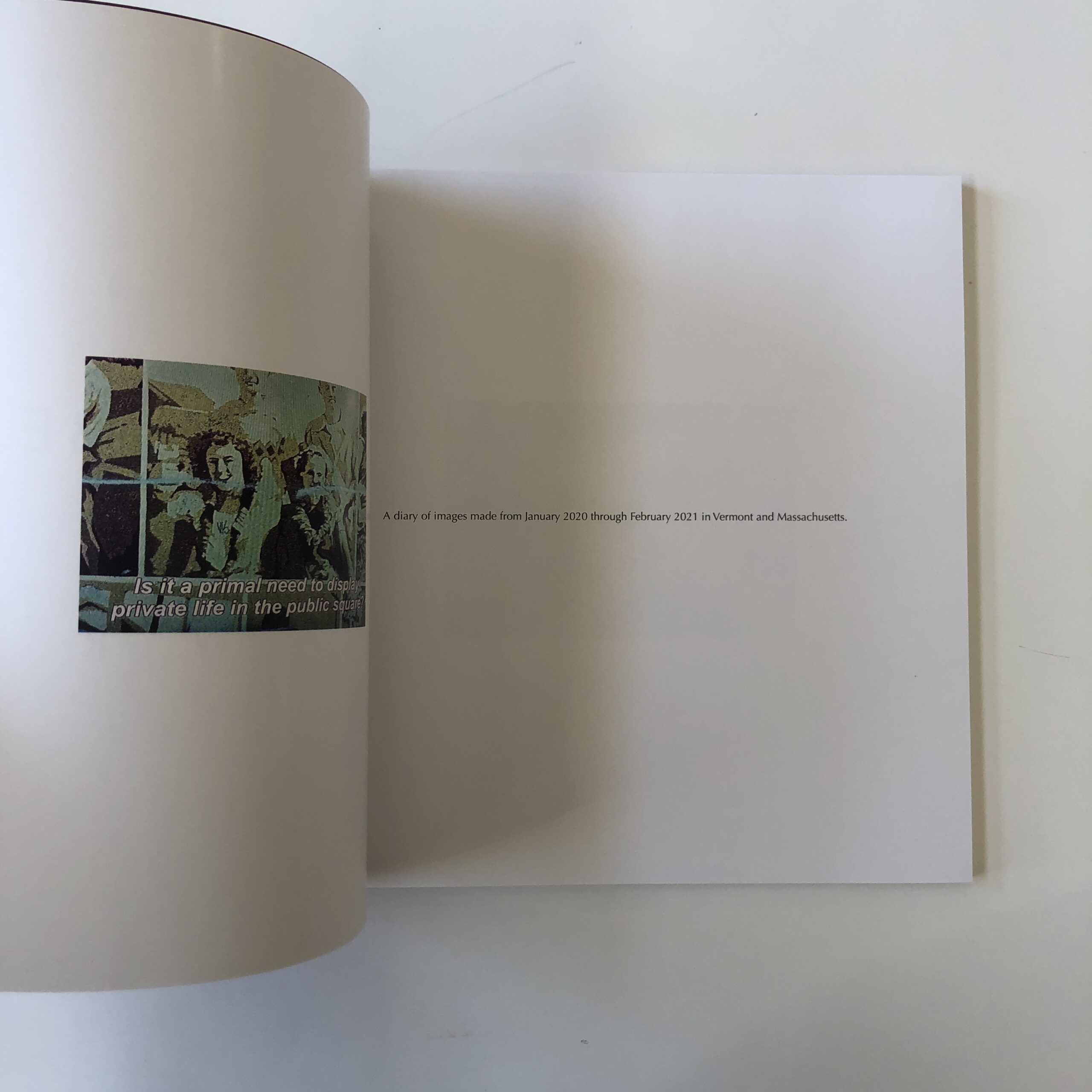
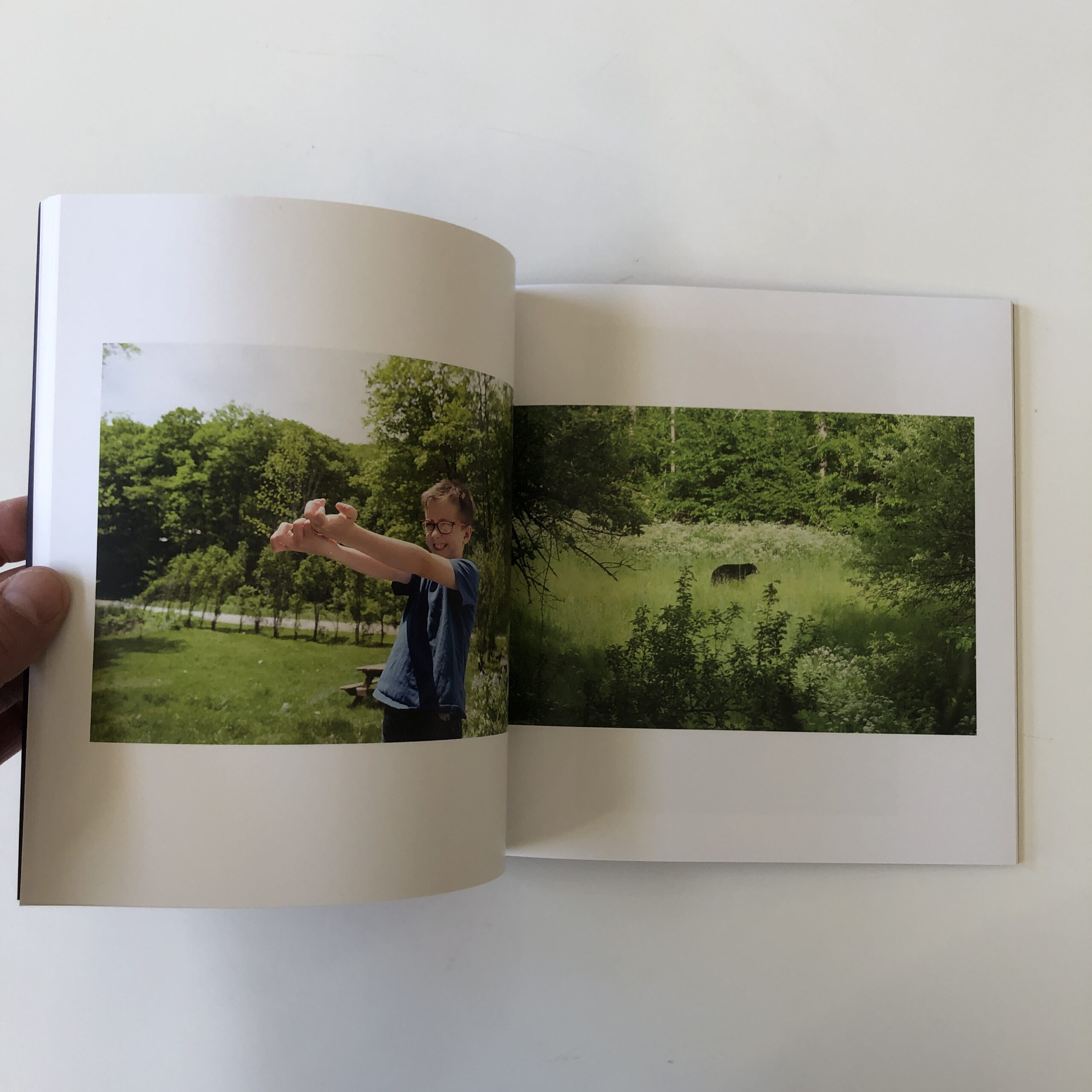
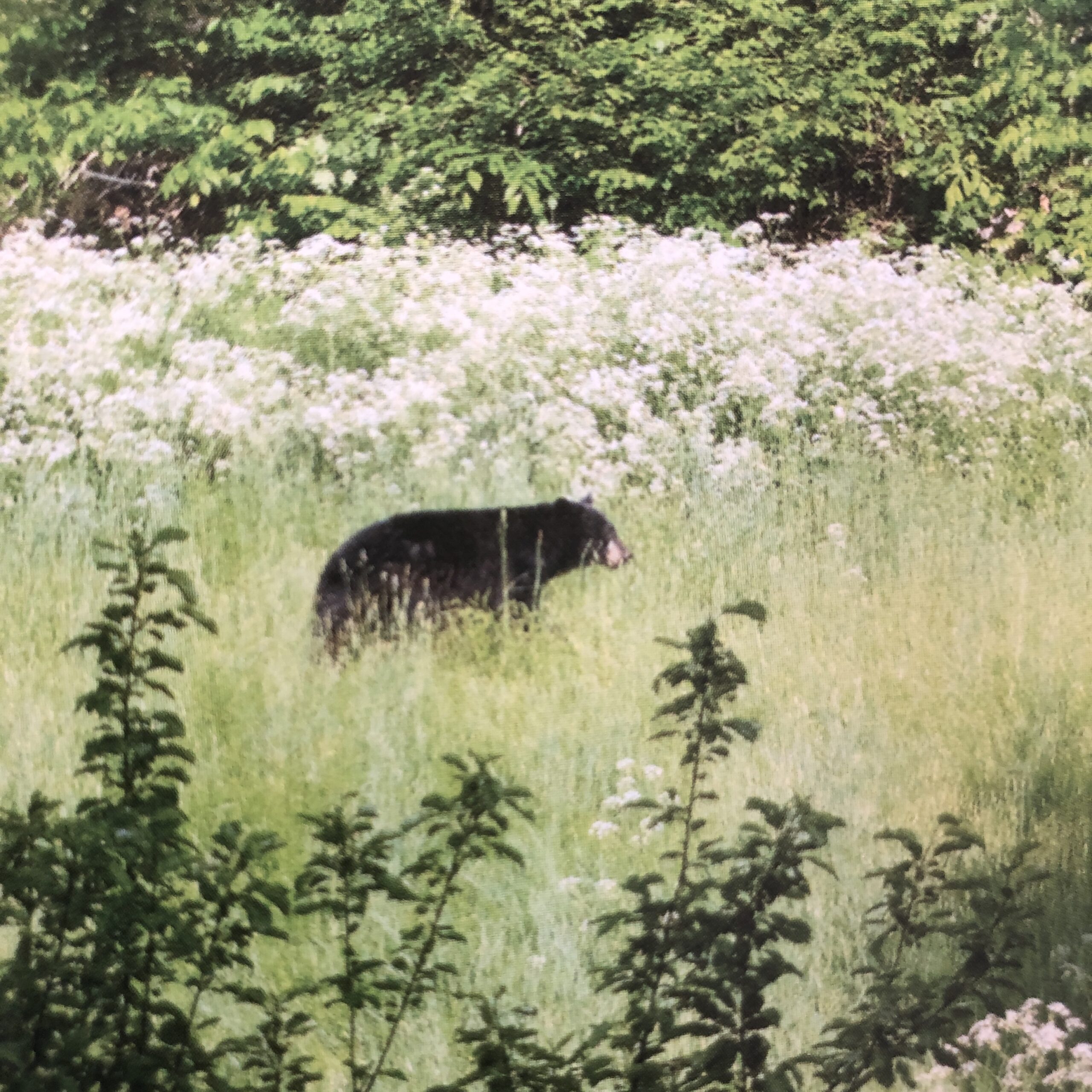
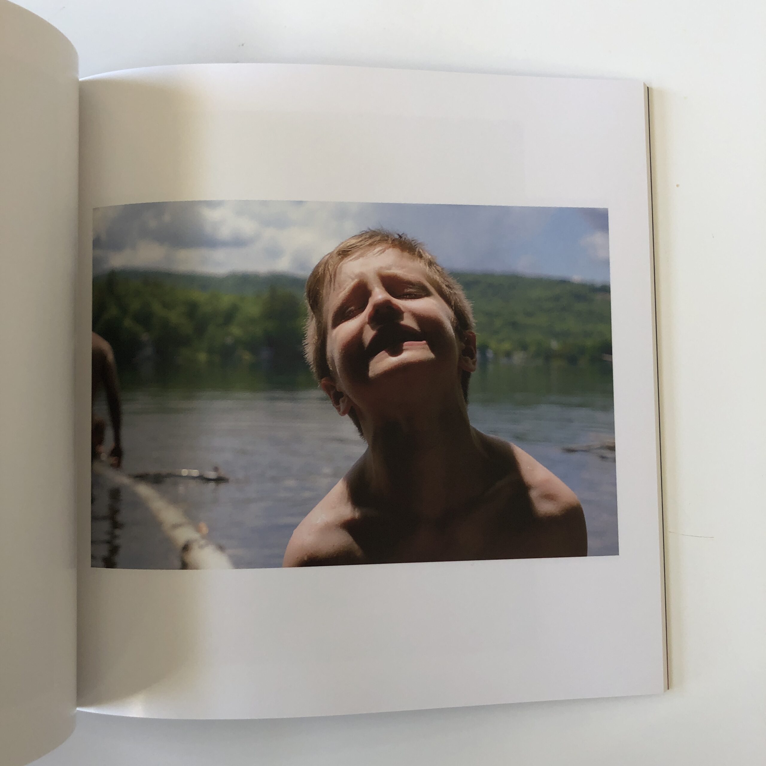
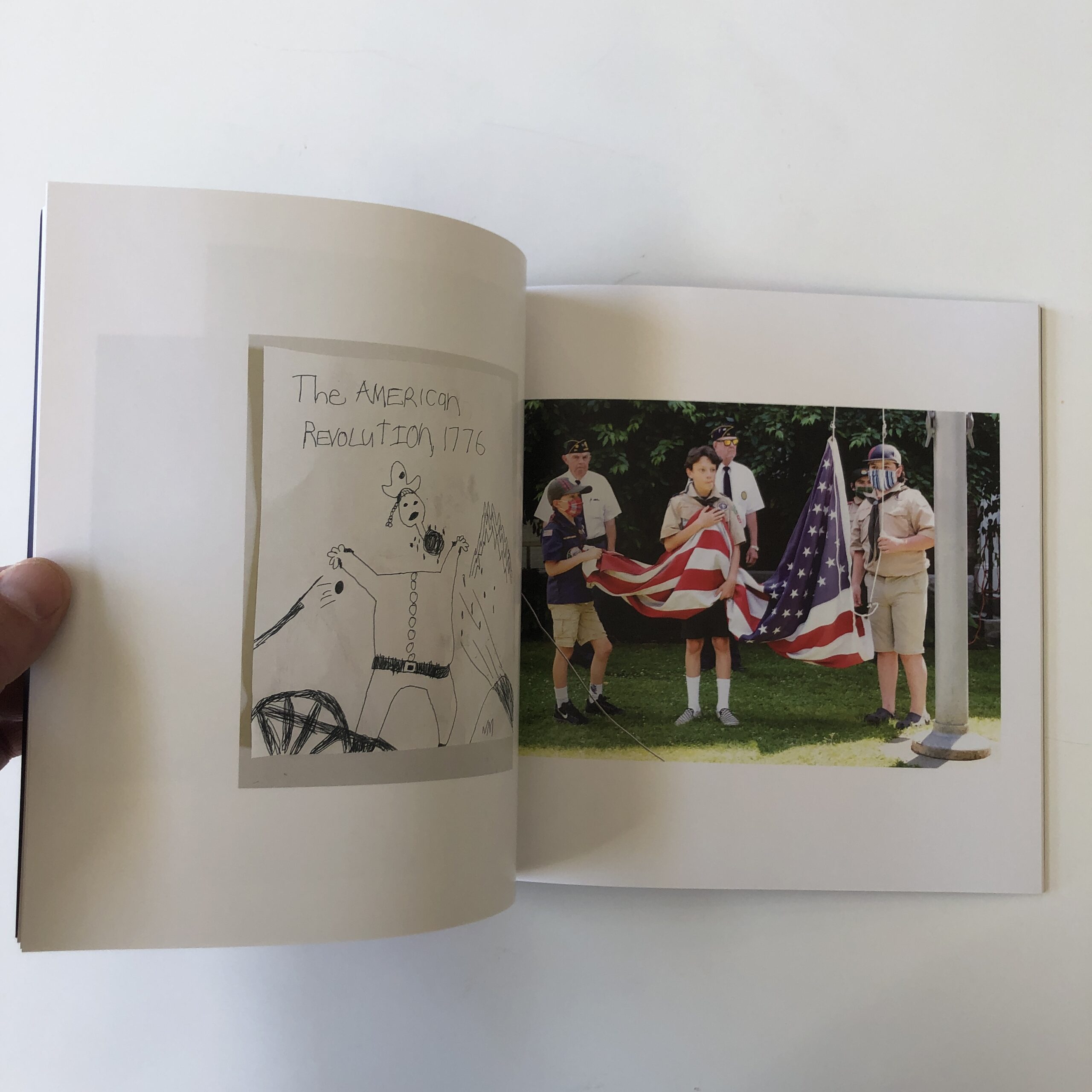
In early 2021, Tara kindly send me a copy of her new book, “Year of the Beast,” which was made during the first pandemic year.
(Hence the title.)
This one was published by her own imprint, Too Tired Press.
The artist lives in the mountains of Vermont, in an isolated, rural existence, much as I do. (Though I’d kill to be able to get to Boston or NYC in half a day, instead of Albuquerque.)
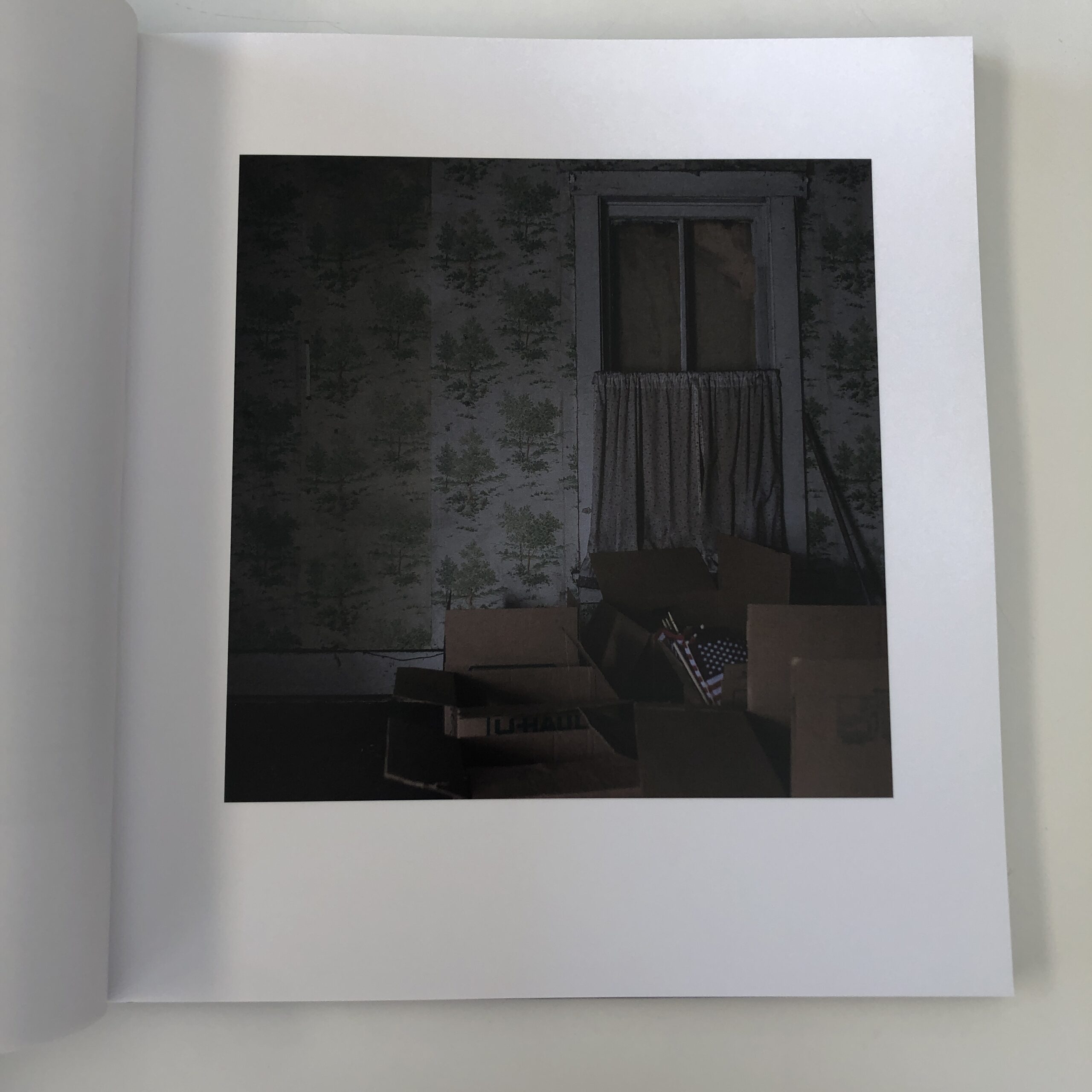
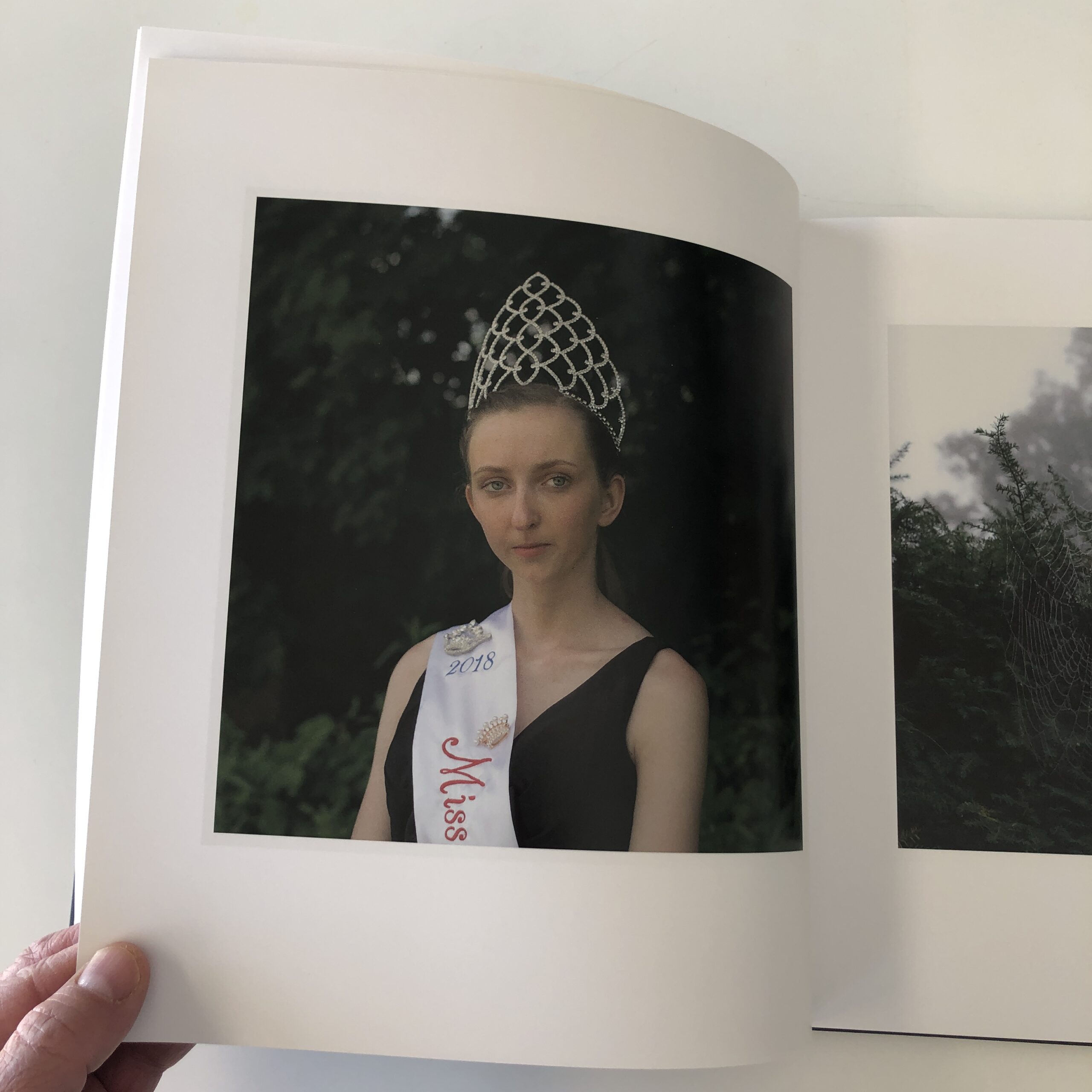
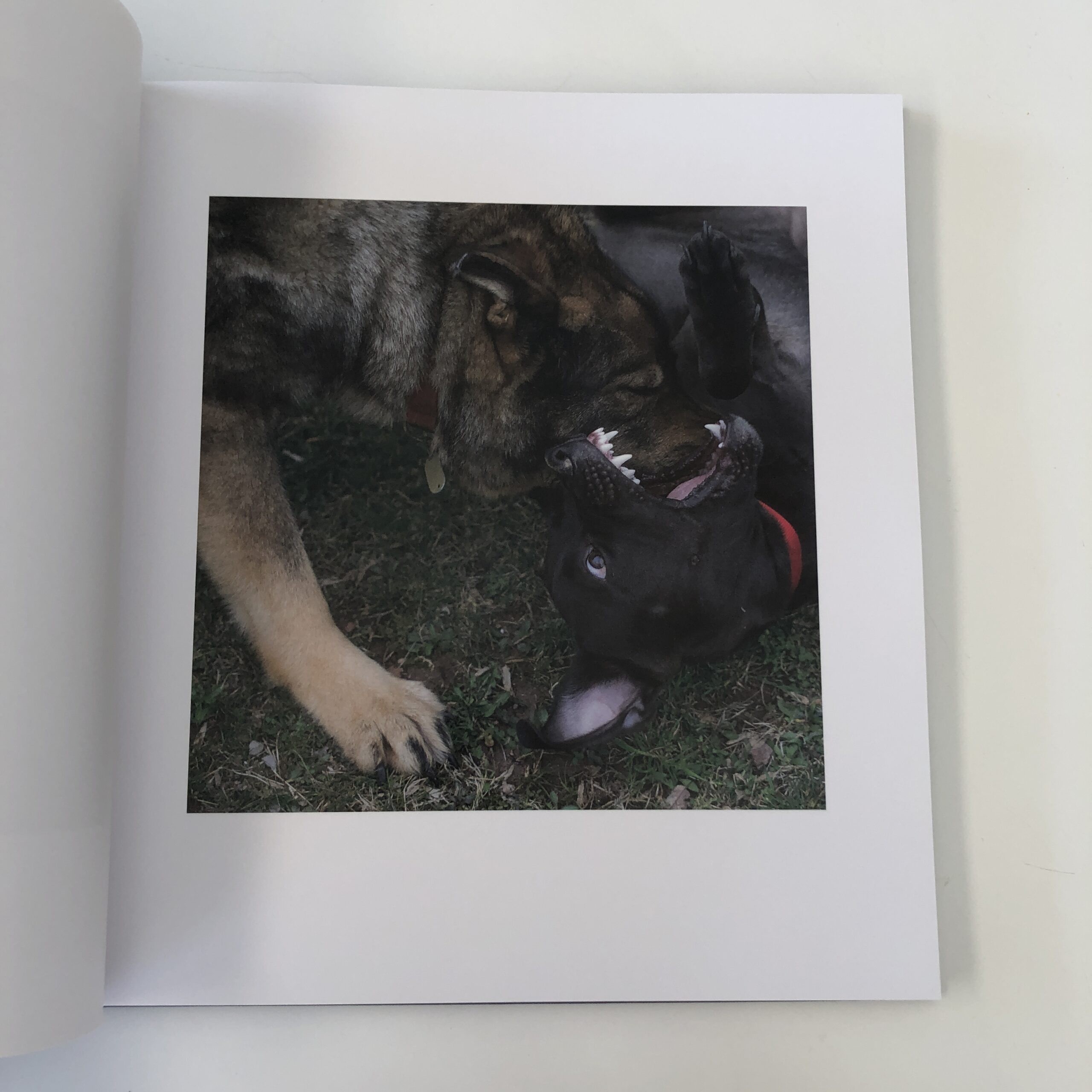
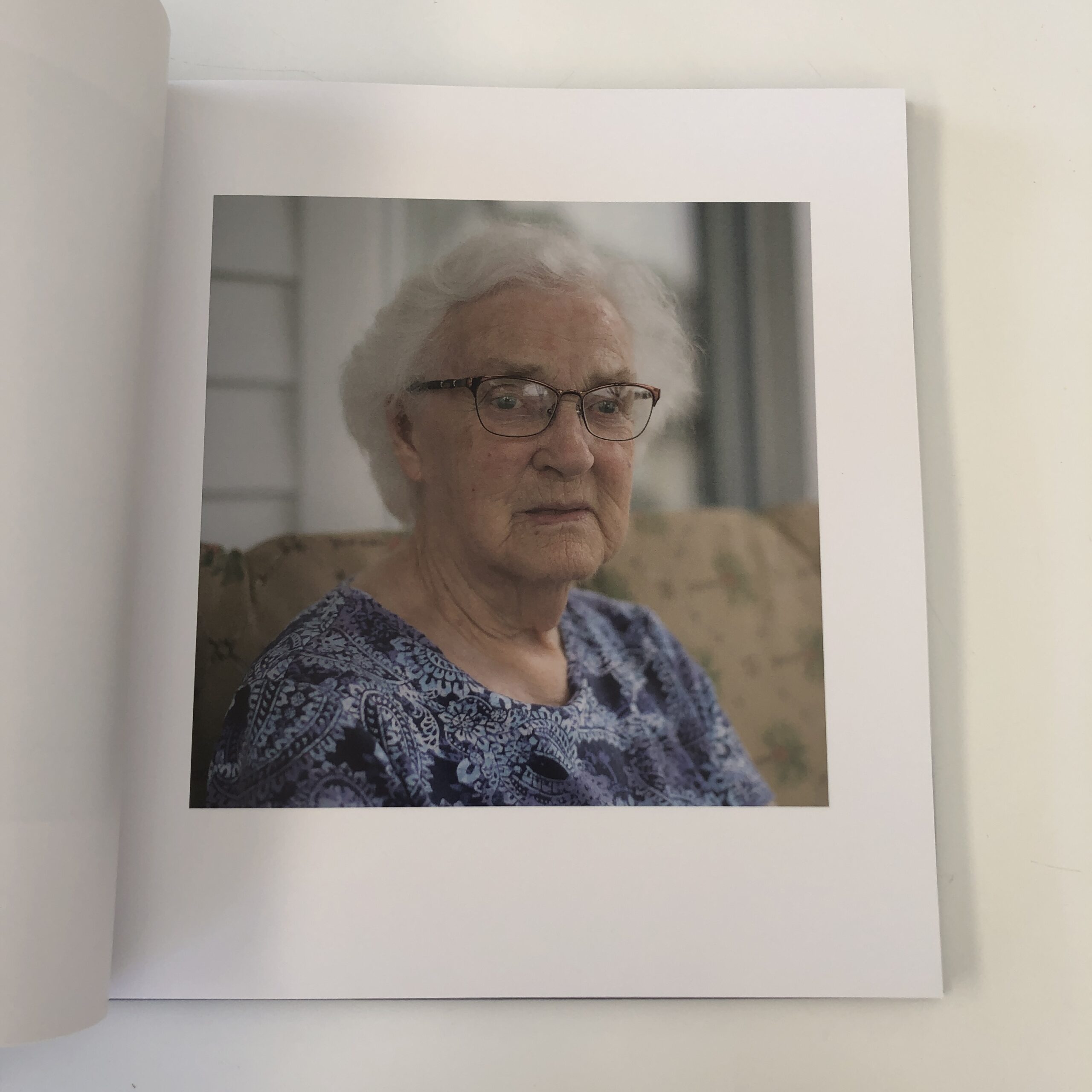
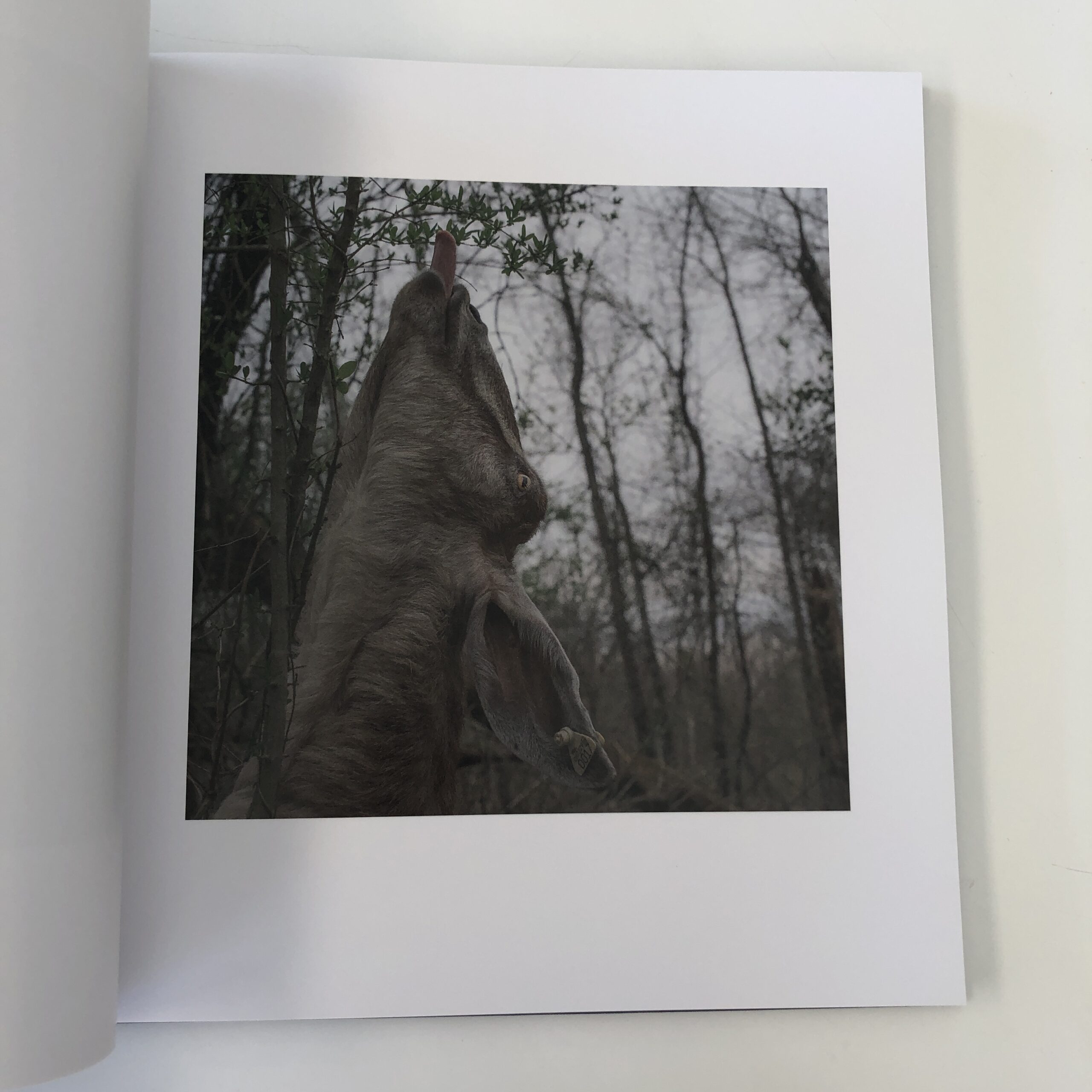
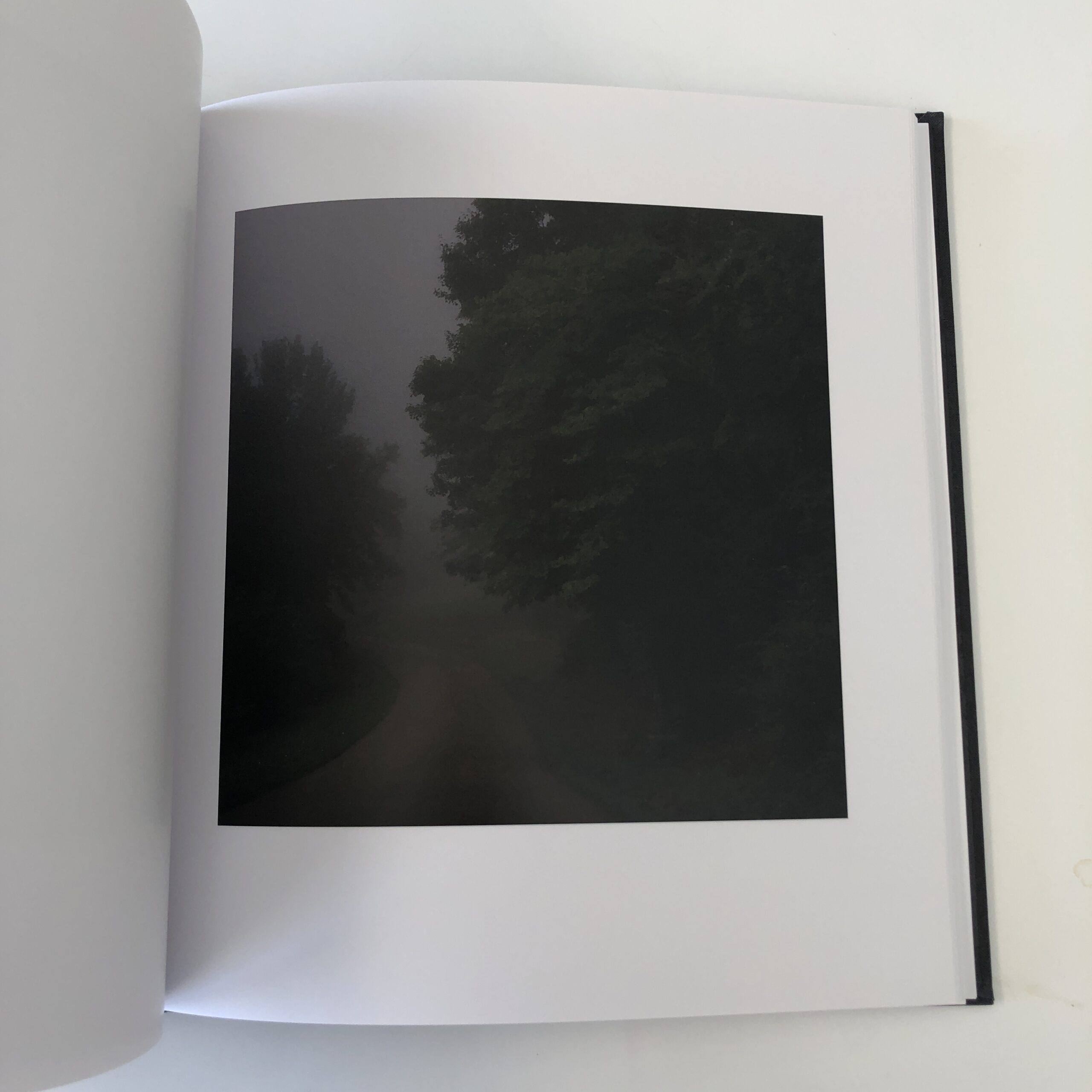
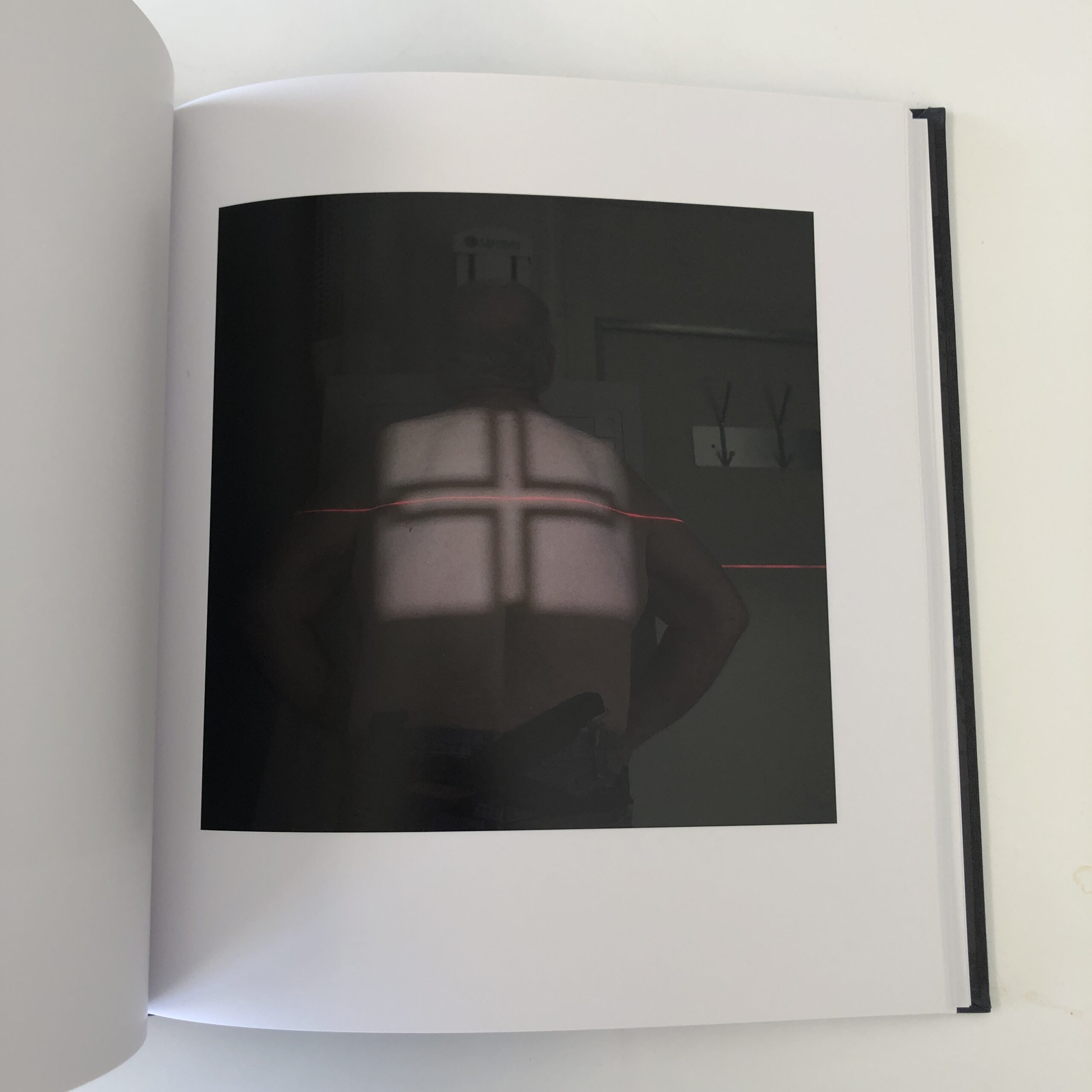
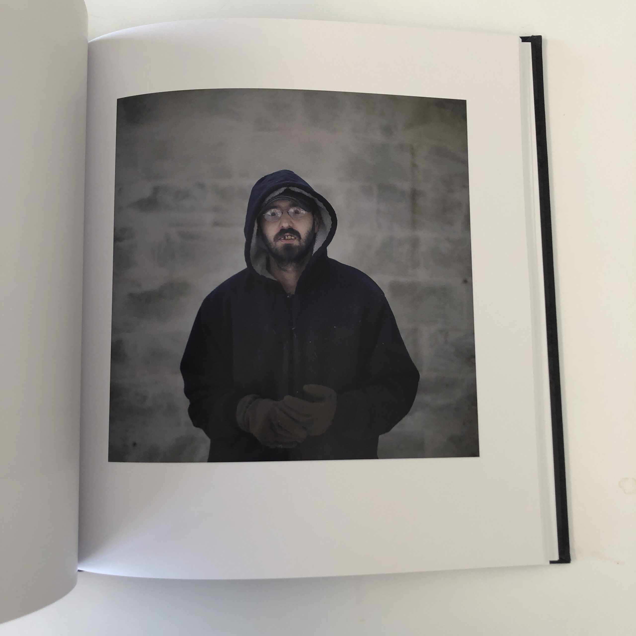
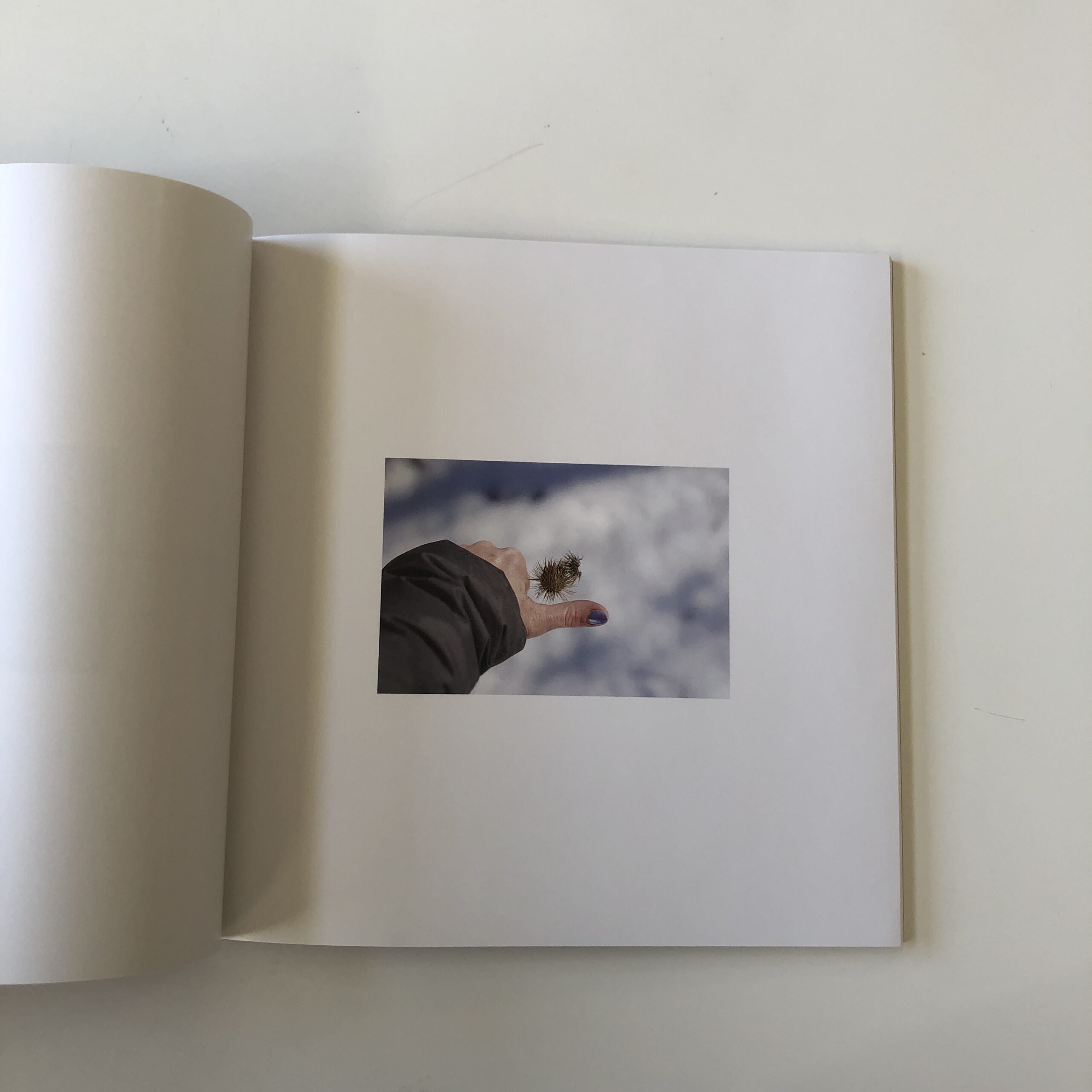
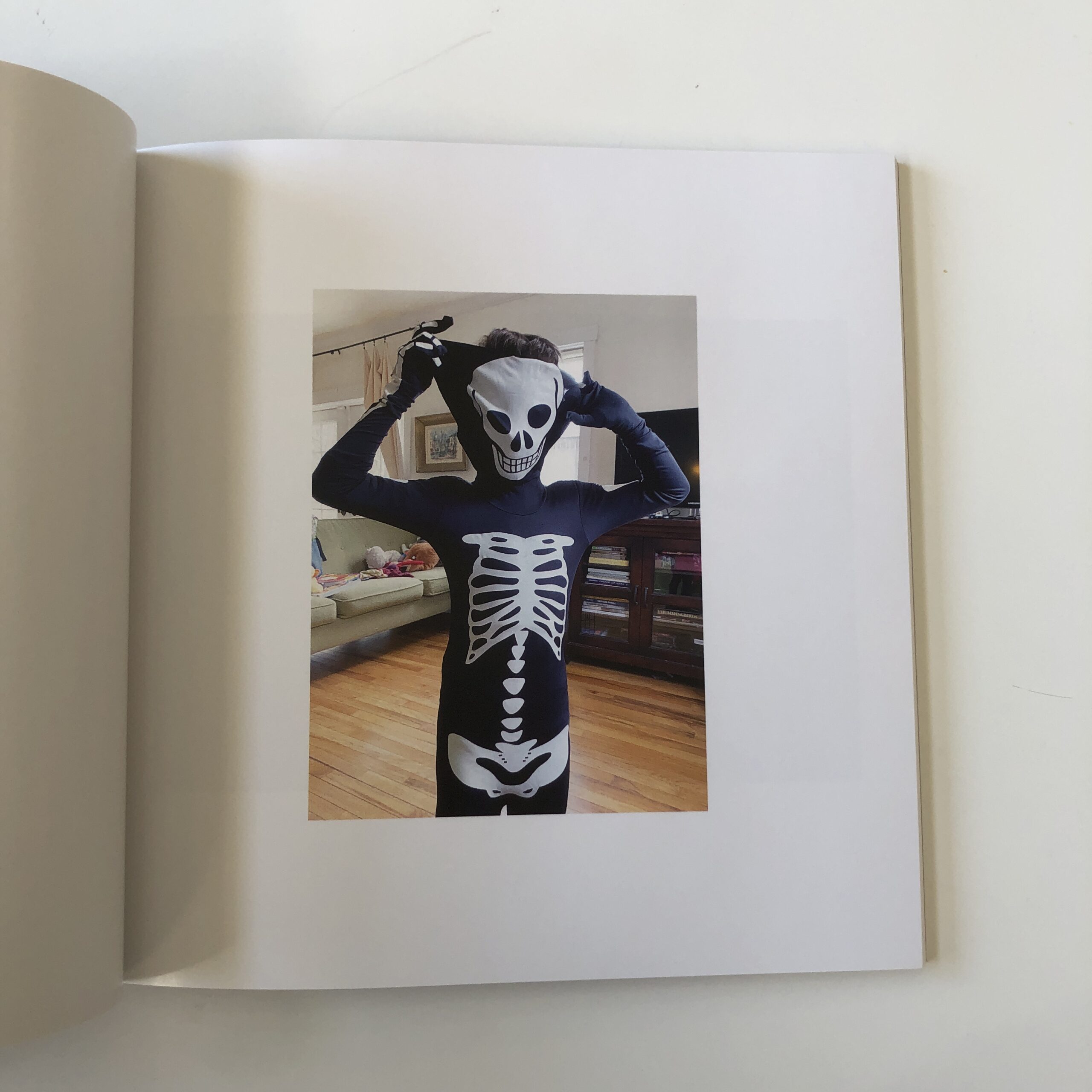
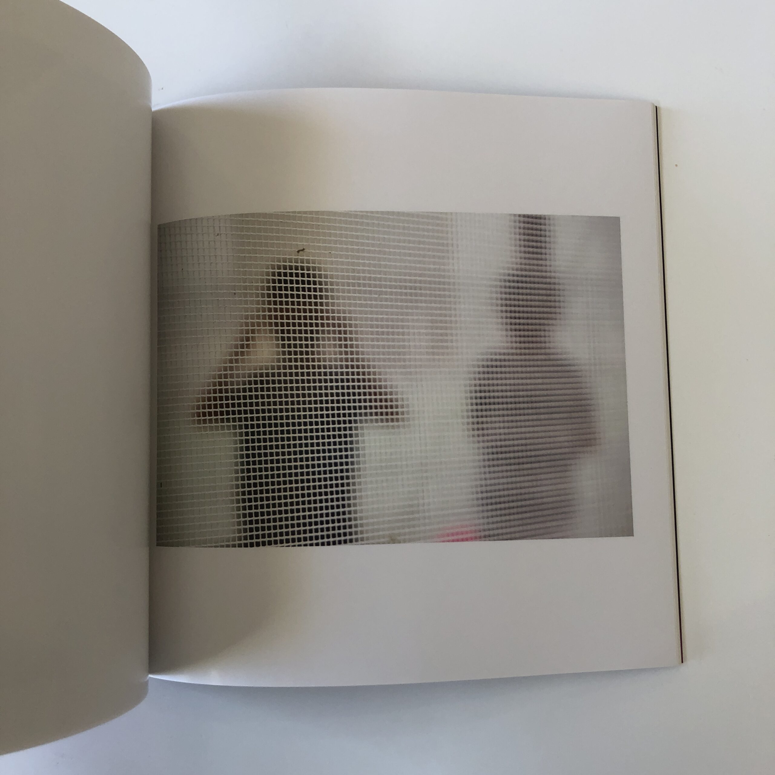
I found this set of images to be a bit looser, perhaps not as locked-in as the previous work, but still, it’s a compelling project.
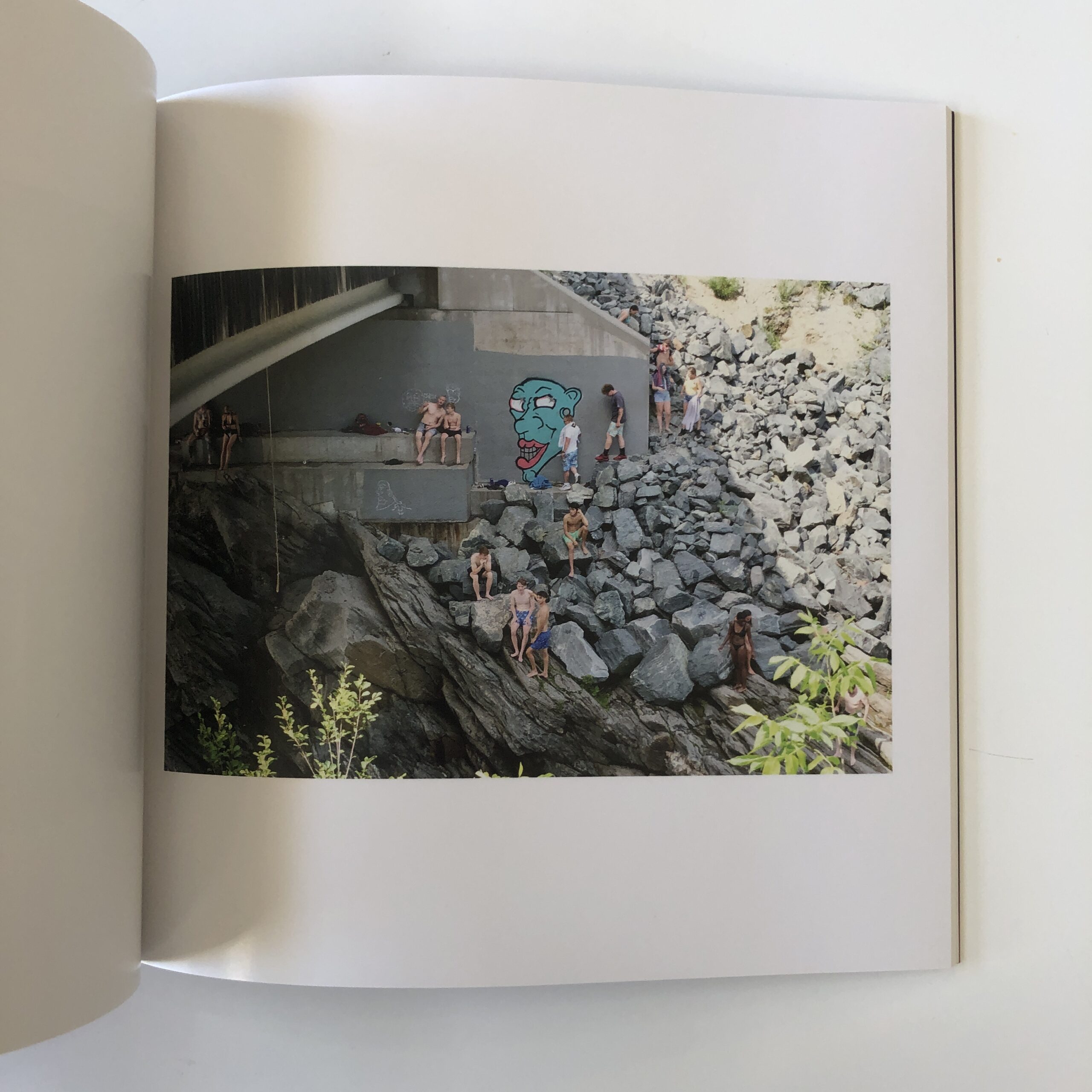
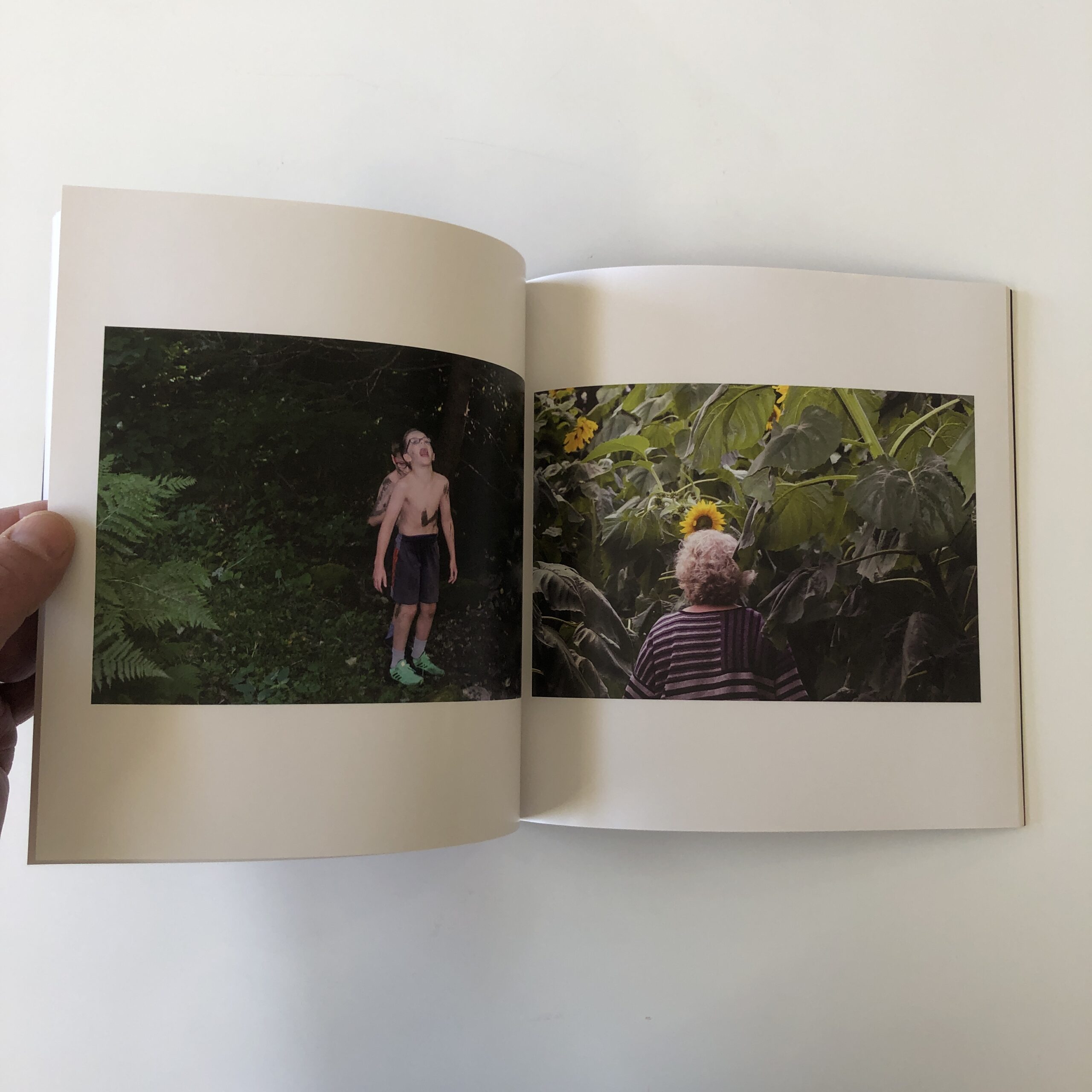
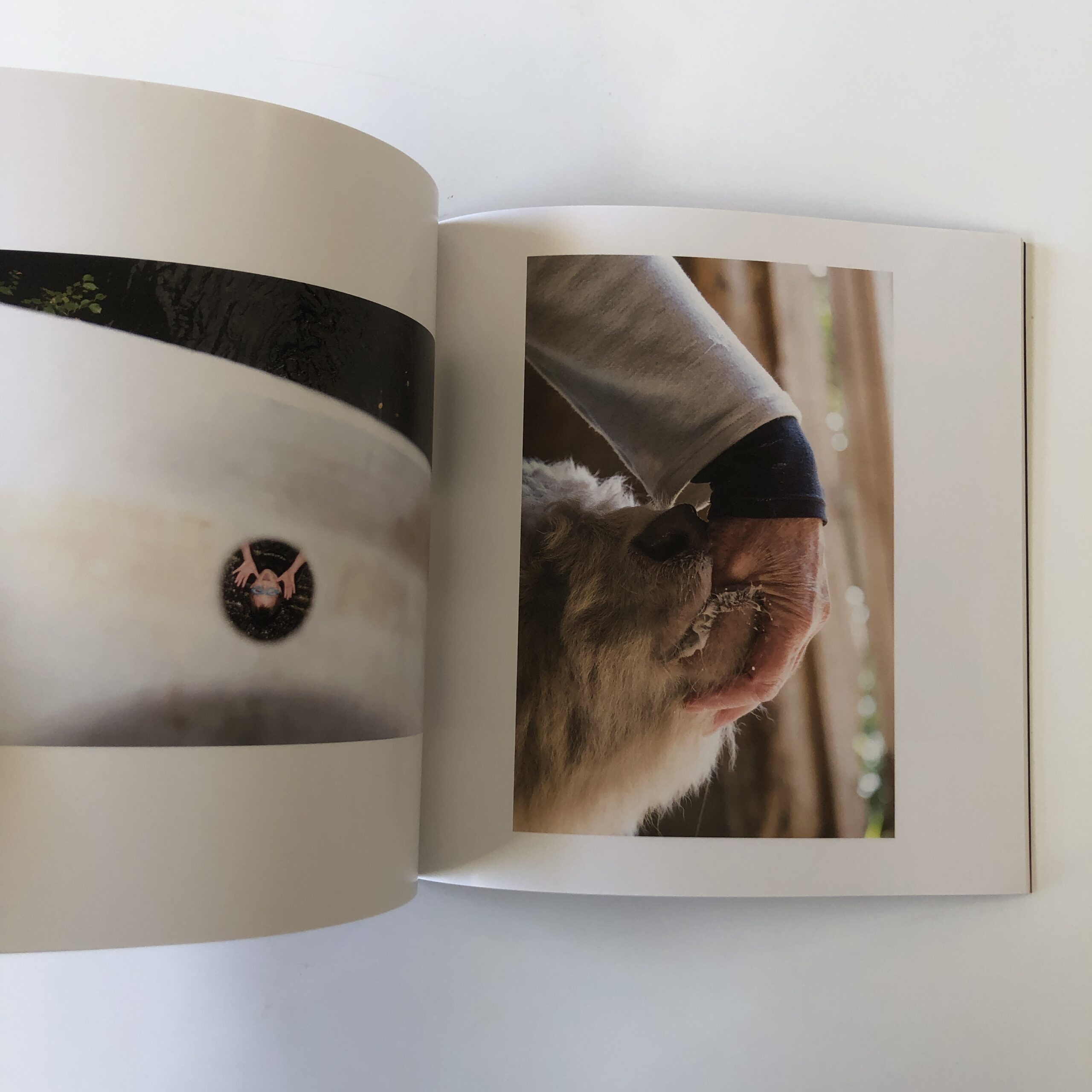
We see her children, in various guises, and lots and lots of animals.
Frankly, it was that connection with the natural world which I couldn’t shake from my brain, after the coyotes walked away.
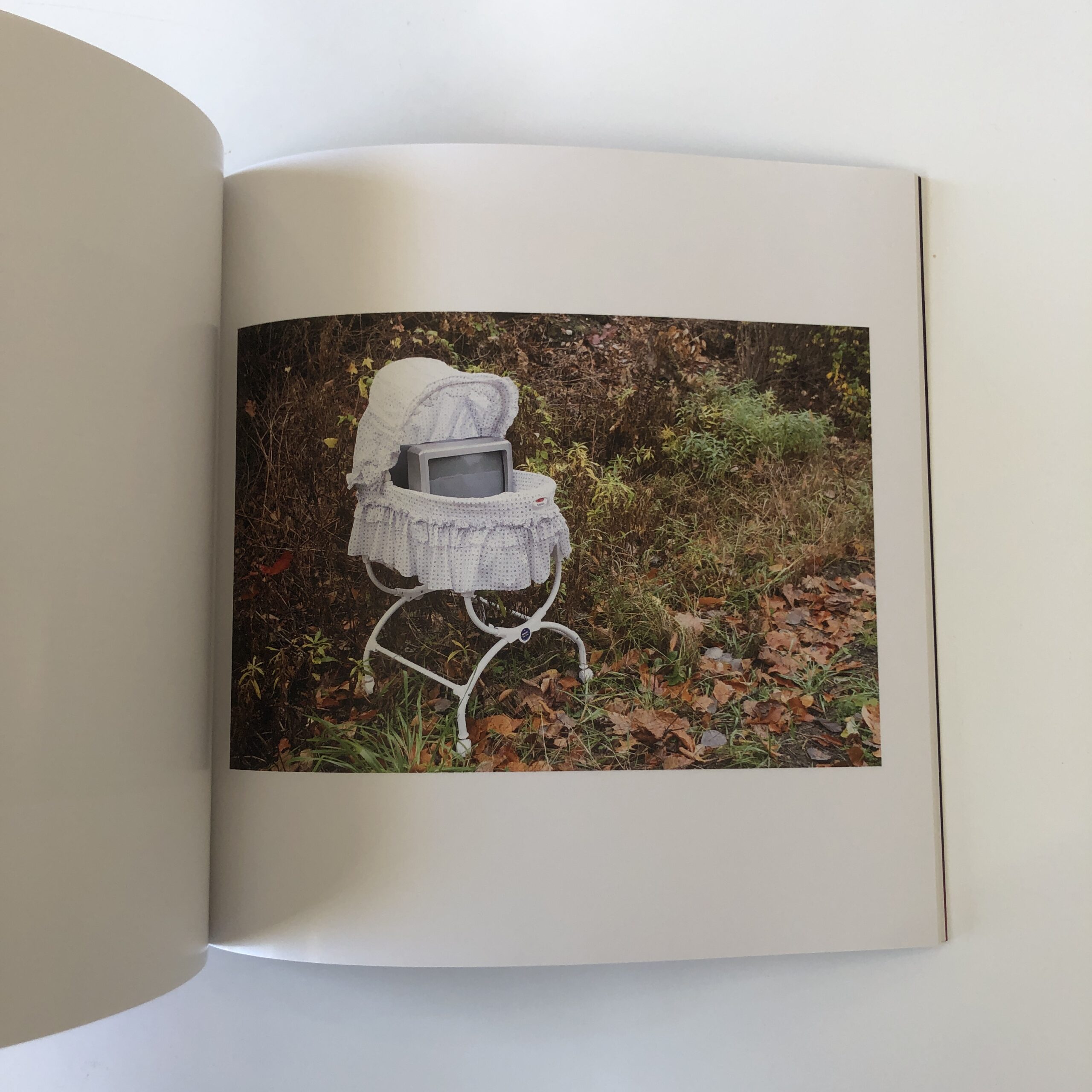
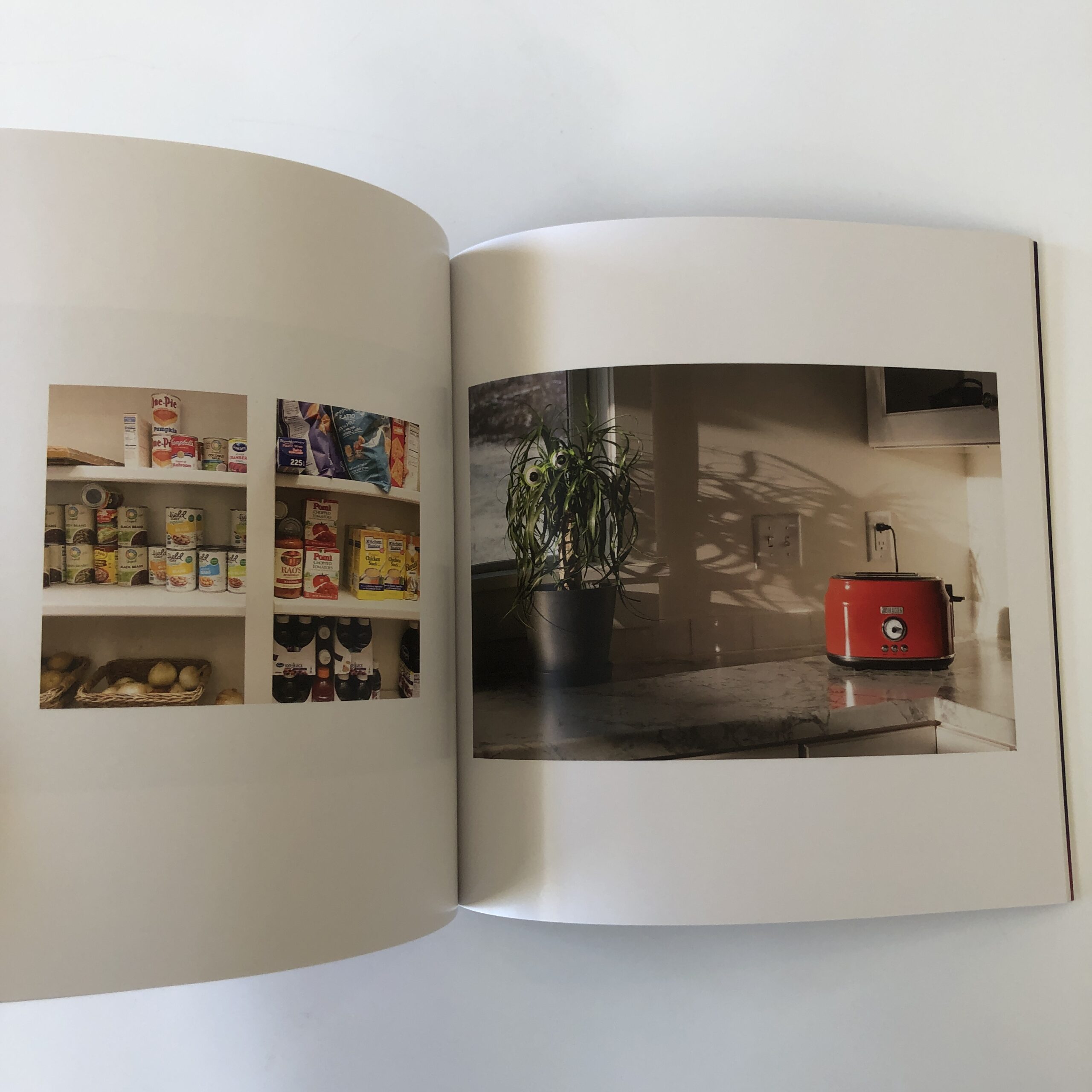
There are only a few clear, symbolic references to the pandemic, like the fully stocked pantry image, and I dig the subtlety.
Other than Bo Burnham’s genius Netflix special “Inside,” which I’ve shouted out before, I don’t think I’ve seen much art directly ABOUT the pandemic that had enough nuance not to feel “too soon.”
So I appreciate this book is not didactic.
I was fortunate to interview Tara for the PhotoNOLA Virtual Book Fair, about both books, the way she uses art to battle depression, and the movement that popped up in her wake.
You can check it out here, if you’d like.
The images in “Year of the Beast” are displayed in the order in which they were shot, so the narrative plays out in real time.
It’s a tactic many of us consider with our documentary style photo series, but so often we opt for sequencing with intentional rhythm, creating runs of images based upon color, symbolism, texture, or emotion.
As 2022 has just begun, now the third year of this public health crisis, I thought it appropriate to kick off the column with a book that shows us one artist’s vision of 2020.
If you’d like to submit a book for potential review, please email me at jonathanblaustein@gmail.com. We are particularly interested in books by artists of color, and female photographers, so we may maintain a balanced program. And please be advised, we currently have a significant backlog of books for review.
The Art of the Personal Project is a crucial element to let potential buyers see how you think creatively on your own. I am drawn to personal projects that have an interesting vision or that show something I have never seen before. In this thread, I’ll include a link to each personal project with the artist statement so you can see more of the project. Please note: This thread is not affiliated with any company; I’m just featuring projects that I find. Please DO NOT send me your work. I do not take submissions.
The Series of Textures was inspired by Robert Rymans series of white paintings which hang at Dia Beacon. Food stylist Charlotte Omnès and I had recently seen them and began discussing how we might interpret these paintings using food as the medium rather than paint. We drew further inspiration from Mondrian, Franz Klein, Rothko and Matisse – and set about creating this ongoing personal series.
Rather than purposefully arranging the food to appear appetizing as the primary visual goal, we focused on the textures, shapes and forms that the food was able to represent with some manipulation. We worked with a variety of surfaces as our canvass. I chose to light the series with a hard light bringing out the texture of the application of the food as well as the depth of the ingredients such as the jam and the catsup. By using this lighting technique, I hoped to further distance the food from its appetite appeal and allows the viewer to experience the piece for its form, color, and texture. The final images are graphic compositions that are both whimsical and structural.
As a food photographer, I instinctively set out to present food in all its yummy glory. I typically want viewers to see my food images and feel their stomachs growl or mouths fill with water. Taking on this project has allowed me to break with those constraints and play with my food. These images are abstract – but they make me hungry! Inspiration is everywhere.
APE contributor Suzanne Sease currently works as a consultant for photographers and illustrators around the world. She has been involved in the photography and illustration industry since the mid 80s. After establishing the art-buying department at The Martin Agency, then working for Kaplan-Thaler, Capital One, Best Buy and numerous smaller agencies and companies, she decided to be a consultant in 1999. She has a new Twitter feed with helpful marketing information because she believes that marketing should be driven by brand and not by specialty. Follow her at @SuzanneSease. Instagram
Success is more than a matter of your talent. It’s also a matter of doing a better job presenting it. And that is what I do with decades of agency and in-house experience.
The Art of the Personal Project is a crucial element to let potential buyers see how you think creatively on your own. I am drawn to personal projects that have an interesting vision or that show something I have never seen before. In this thread, I’ll include a link to each personal project with the artist statement so you can see more of the project. Please note: This thread is not affiliated with any company; I’m just featuring projects that I find. Please DO NOT send me your work. I do not take submissions.
“How we perceive and make sense of the world around us is becoming challenging. As our reality becomes more and more influenced by our screens, I wanted to find a way to visualize this subjective human experience in our contemporary culture.”
APE contributor Suzanne Sease currently works as a consultant for photographers and illustrators around the world. She has been involved in the photography and illustration industry since the mid 80s. After establishing the art-buying department at The Martin Agency, then working for Kaplan-Thaler, Capital One, Best Buy and numerous smaller agencies and companies, she decided to be a consultant in 1999. She has a new Twitter feed with helpful marketing information because she believes that marketing should be driven by brand and not by specialty. Follow her at @SuzanneSease. Instagram
Success is more than a matter of your talent. It’s also a matter of doing a better job presenting it. And that is what I do with decades of agency and in-house experience.
Founder: Adriana Teresa Letorney Co-founder: Scout Film Festival
Heidi: How long has Visura been publishing and how has the last two years informed how you’ve run your business?
Adriana: Visura was launched in 2016 as a networking platform for freelance visual journalists to build their online presence and connect with each other from one central place. The tech platform was built from the ground up as an alternative to the traditional systems used by visual journalists looking to connect with the global marketplace. During that time, the main problem we were aiming to address was the lack of platforms for freelance visual journalists worldwide that fostered inclusivity, sustainability, professional skill development, and equal and merit-based access to the global marketplace.
In time, editors wanted to use the platform to search, view stories, and directly connect with freelance visual journalists who were part of the global Visura community. This led us to also create an Editor’s account for visual researchers, editors and buyers to be able to search, connect and manage a growing list of freelance visual journalists and storytellers based on location, expertise, skills, and experience.
Our goal has always been to elevate media literacy by empowering a growing global community of publishers and freelance visual journalists with a central platform where they can connect, share work, and transact. During my studies, I learned how technology plays a significant role in the market of visual content. and ask these questions: Will this tool unite or divide? Is what we are doing fostering understanding and empathy, or inciting division? Is our service empowering or exploitative? Are the resources we are offering solving a problem for our community?
These questions leave room for debate, opportunity to connect with new thinkers, visionaries, leaders, and professionals looking to tackle some of the biggest challenges in media and journalism.
What were your hopes coming to New York from Puerto Rico?
I was born and raised in Puerto Rico. I came to New York with the dream of offering new perspectives about what it means to be Puerto Rican. I thought what I saw in the news or in films was biased and unfair. Never in a million years did I think I would build technology to tackle discrimination in the media and journalism industry. I was just a kid that loved being from Puerto Rico, and I thought, if the world had better access to the incredible work and talent that is being produced in my country, people would change their minds about who we are. I never imagined that my concern was a global problem. As soon as I realized it was—I chose to dedicate my professional career to tackling the systematic challenges that lead to more discrimination, abuse, biases and violence. And since, I have found hope in dedicating all these years to finding ways to empower the freelance community of visual journalists and storytellers, who just like me, want to share their stories and findings to offer new perspectives.
Your site has robust features such as maps and directories. Did you always have an interest in technology?
To be honest, I learned to use tech to solve a problem. And most of what we have developed was created by years of customer discovery. At Visura, our team serves its community. I don’t have a light bulb that turns on with some magic solution. Everything we have built has been the result of listening to understand our community, and their needs, we are thankful for community.
How and when did this idea come about, did the Scout Film Festival come shortly after?
Prior to Visura, I had launched an exhibition space, a magazine, and a self-publishing platform with a goal of highlighting a growing community of freelance visual journalists and storytellers worldwide. By the time Visura.co launched its first version in 2016, I had learned from the community of primarily freelance photographers from around the world that what they needed was tools to build their website and connect with the global marketplace to further their work and career. So, we worked really hard to build this for them.
Scout founder Anna Colavito and I met in 2014 at an Art Gala event. She shared with me the idea of launching a nonprofit organization called Scout Film Festival that aimed to support teen filmmakers. I loved the idea, and overnight we decided to join forces to realize her vision. When it launched in 2015, I joined as co-founder of the 501(c)3 organization. Throughout the years, Scout has evolved into an international festival supporting filmmakers aged 24 and under with resources, tools and opportunities to highlight their short films and further their careers.
Scout specifically highlights artists under 24, why is that?
That’s a great question! At the time, Scout became the first festival focused on emerging talent. Initially, we began by supporting teens. With time, we expanded the community to include college students because many of the initial filmmakers were aging out, and they expressed wanting to remain a part of the community as undergraduate students. So, we expanded to welcome filmmakers aged 24 and under. In the future, we hope to continue expanding further. Ultimately, the mission of Scout is to support, empower and connect diverse filmmakers worldwide. Throughout the years, the organization has become a premier destination for the professionals in the film industry to find new talent, particularly directors, screenwriters, and producers.
There are several collectives that emerged this past few years, what makes this one different?
Visura is not a collective. Visura is a market network that leverages technology to empower a growing community of freelance visual content creators with tools to manage their online presence and connect with the global marketplace. The way we envisioned the tech that would power the platform stems from our belief in the power of community. So, we are a media-tech platform that fosters professional development, inclusivity, equal and merit-based opportunities, enabling environments for media and journalism.
At Visura, professional photographers, filmmakers, photojournalists, journalists, arts, and other visual content creators can build their website interconnected to a networking platform that is used by editors, researchers and buyers to discover new work and talent. The platform is proprietary. It is not built on Squarespace or WordPress, or any of those platforms. We built our own technology platform to better serve our international community with the tools they need to connect, collaborate, and in the future transact.
Visura also offers editors access to exclusive stories, lightboxes, advanced search, image briefs, maps, and other tools to search by location, skills, expertise, and experience. More importantly, editors have direct access to a database of over 6000 professional visual storytellers worldwide. Any editor can access the creators’ profile which highlights their bio, contact, website, social media links, clips and samples of their work. They can contact the members or save stories or profiles in lightboxes for future references.
Sustainability goes beyond making lists, how are you creating a sustainable way forward?
Absolutely it does. I believe that the Visura platform serves to bridge the gap between visual content creators and buyers, and it does so in a way that does not exploit the talent or their work. This is very important. We are also very focused on streamlining merit-based opportunities. Quality is never at risk when you create an inclusive work environment. On the contrary, it elevates and enriches the space. And as a female woman of color, I strongly believe that publishers will further grow engagement if they can easily connect with a global community of professional visual journalists and storytellers ready to be hired.
How can I join as a contributor?
Start with a free account or download the Visura App that is now available on the Apple Store for free. Upgrade if you want to submit exclusive stories to the archive, or build one or more websites via Visura.
How do I join as an art buyer? Start by requesting an account, to access the advanced search, exclusive stories, contact info, lightboxes, and brief tools, amongst other things. Then download the Visura App that is now available on the Apple Store for free. In order to protect the community from spammers and hackers, editors need to request an account.
How can access make a difference and what are your hopes for the future of the industry?
There is a lot that we need to do to empower the media and journalism industry with better systems to power the marketplace. Over 70% of visual storytellers today are freelancers, publishers need better access to this incredible talent pool and we need to think carefully about how we approach these issues.
Over time, we’ve seen that relying on social media or spreadsheet lists as the primary solution to highlighting talent is unsustainable and in the long run, ineffective.
We need solutions that unite and foster career growth versus what is a marketing or social media strategy that serves the organizers in the name of “community”.
With a conglomeration of information, audiences demand authenticity and truth in content without being “sold to.” As a result, publishers are realizing the value of unique, in-depth, and compelling visual stories by diverse visual storytellers worldwide. We learned that in order to facilitate better access to quality visual content, we needed to re-envision the systems that power the marketplace and create access for breaking news, stock, and unique visual storytelling.
90% of the information that the brain retains is visuals; and publishers grow engagement much faster when they feature unique, compelling visual stories. I foresee that freelance visual journalists will hold the power in the future of this marketplace.
We strongly believe that technology can facilitate the tools they need to manage and grow their career. The best path forward is removing the gatekeepers and giving power back to the creators with a toolset to manage their online presence, connect, get hired, and sell their work.
I don’t have all the answers. I have failed much more than I have succeeded. But at this stage in my life and career, I am on a mission to continue finding ways to re-envision the marketplace and future of media and journalism
Tell me about the promo you sent me. I had assumed it was something CLIF Bar made as a promo of their own.
The last big print campaign I worked on before the pandemic featured soccer superstar Megan Rapinoe for CLIF Bar. Fresh off the Women’s World Cup title, Megan was to be one of a handful of CLIF-sponsored athletes promoted internationally ahead of the 2020 Summer Olympics.
While the last-second logistics was a little nuts, my art direction was pretty straight forward: take photos of Megan kicking a soccer ball. Megan was great to work with, client was really happy with selects and we wrapped up early. It was a good day. To me, the best part of the entire experience was collaborating with fun and talented creative directors and photographers I also consider close friends.
I don’t know who remembers REGGIE! candy bars, but I was stoked to learn my photo of Megan would be inspiration for a limited edition CLIF wrapper. Pretty surreal and fun. When the bars launched in early March 2020, I was excited to share what I had been a part of. Then the pandemic hit, and the print spots were held back with the Olympics on hold.
With the Summer Games officially back on, now for 2021, I was finally able to share the entire ad campaign. I had been noodling on soccer-themed promos, something that an art buyer would use/keep/share. I like producing fun promos that are unique and hard to toss. I kept coming back to customizing a miniature foosball table.
The problem, of course, was that no one was working in an office, let alone having in-person meetings. No point in spending a ton of money on a full promo campaign. But you, Rob, have a very large social media presence (44k followers on Instagram and 133k on Twitter). Many of the clients and photo agents I was hoping to reach follow you. So I decided to invest in a single, one-off foosball table and send it your way.
Despite what some might think, the entire promo wasn’t really that expensive – or that large. The 27” travel-size table was about $40 on Amazon, plus a few bucks for modeling paint, adhesive spray and a print of the ad. The s/h was the most expensive part, but again, I only had to ship one. I tossed in a couple double-sided tickets with my contact info and a fresh box of Megan’s CLIF bars.
For the record, I don’t think promos need to be expensive. Almost all of mine involve plenty of cheap DIY crafting. I do think promos need to be worth the time and effort of producing and delivering them. And I think they need to properly represent your work and personality. My brand is literally fun and games, so a kid-sized foosball table totally worked for me. This is really a continuation of what I’ve created in the past, like with my custom Weird Sports trading cards.
I’m not going to lie: I wasn’t sure whether to warn you or not about a massive box landing on your front doorstep, Rob. But I also wanted it to be a surprise. Love that you originally thought it was a CLIF-produced promotional gift, instead of something hand-painted and assembled on a dining room table in Portland. Pretty flattering. Thanks, Rob. I appreciate you for sharing my work.
Despite the cynicism I’ve developed the last few years, like a well-earned callus, I’m still hoping for the best.
Hoping we sort out the growing climate catastrophe.
Hoping we heal the political wounds tearing our nation asunder.
Hoping I’ll stay healthy enough to be there for my wife and children as they grow.
(It’s a lot to hope for, I know.)
To be honest, I’m totally cooked.
(Who doesn’t feel like burger meat in the week between Xmas and New Year’s?)
Plus, we’re leaving for a family vacation tomorrow; the first in several years.
And I still need to pack.
Beyond that, the book I just spent an hour reading, and perusing, hits close to home in ways I’d rather not excavate today.
But I promised the book’s author/artist I’d get it reviewed this week, and I’m a man of my word.
So it’s possible I’ll be less honest, or at least less open, about my own experience than I might if I were writing in a couple of months.
When my own wounds are more fully healed.
Compromise, though, is a highly undervalued concept, and I’m all for it.
We’ll review the book, then, to honor my commitment, and for once, I might keep some of my family business to myself.
(There’s a first time for everything, right?)
One of my publishing clients told me, a few months ago, that I should check out Gillian Laub’s new Aperture book, “Family Matters.”
With the East-Coast-Jewish-family-culture it mines, and the naked honesty on display, it was suggested I’d love this book.
And I’d likely want to review it.
(Sounds great, right?)
The problem, though, is that, Aperture, the publisher, has never sent me a book, nor seemed to take this column seriously.
All good, as far as I’m concerned, because we can’t be friends with everyone, but I feared I might have trouble getting a copy of “Family Matters.”
Predictably, the Aperture PR person ignored several requests, including when I responded to a press email that THEY sent ME.
(Stay classy, Aperture!)
Normally, I would have let it go, but a few weeks later, I randomly realized I was “friends” with Gillian Laub on Facebook, as I am with some other industry types I don’t actually know.
(I favorably reviewed some of her work in a gallery show in Santa Monica, back in 2013, so maybe we connected after that?)
I’ve never done this before, DM’ing an artist to see if they might send their book directly, after being stymied by the publisher, but I figured, “What do I have to lose?”
Full disclosure: I was flattered when Ms. Laub wrote back quickly, assured me she’d sort things out, and ask Aperture to send me a book straight away.
She made it happen, in a flash, so when she asked me to review the book while her solo show at the ICP Museum in NYC was still on display, I was happy to honor the request.
It is a terrific book, for sure, and one I’m not likely to criticize.
I admit, at first, when I realized I’d have to read text with each picture, I almost backed out.
I thought about being a punk, for once, and not “doing the right thing,” but I came to my senses.
In fairness, the writing is engaging, and well-edited, so it wasn’t a struggle to make it through the book.
I was riveted, and made to feel uncomfortable by the similarities to my upbringing and family, and also the drastic differences.
That said, I don’t think you have to be a Jewish Gen-X’er to appreciate this one.
It offers what we ask of an excellent photo-book: vulnerability, empathy, wisdom, and character development.
“Family Matters” is written in the first person, and follows more than two decades of growth and change in Gillian Laub’s extended family, up to the present.
From the jump, we learn the family of Ashkenazi Jewish immigrants, (who arrived from Europe when my family did, at the turn of the 20th Century,) became extremely wealthy as real estate developers.
My paternal grandparents’ gravestones, 2021. Both were born here before WWI. Courtesy of Richard Blaustein
Now that I think about it, there’s solid foreshadowing for where we end up later, but I’ll build to that.
Gillian shares an anecdote of being an ICP student in 1999, chatting with colleagues outside the (then) Upper East Side institution, when some garish older ladies walk by, in full-fur coats, as her companion makes a joke at their expense.
Only for Gillian to realize it’s her family, out on the town, going to see art.
That vein of self-awareness, and airing the dirty laundry, stays with us throughout the book.
And I love it.
Pure coincidence, but I’ve been re-watching “The Sopranos” this week, having only seen it, bit by bit, when it was released in 1999.
Photo by Anthony Neste/ Getty Images, courtesy of GQ
I probably binged it on HBO a few episodes at time, whenever I’d come back to Taos to visit my parents, (and my wife’s parents,) as I was never able to afford HBO myself.
I grew up in a town filled with New Jersey, suburban mafiosi families, and have therefore always related to the show.
(Plus, Italian food feeds my soul, rather than Jewish deli. Honestly, I’d take pizza and chicken parm over pastrami and smoked fish every single time.)
This book reminds me of the seminal, David Chase saga, as the sense of legacy, privilege, and family values pervades the narrative.
Just as Tony Soprano’s life was determined by having a thug dad, and his kids never had the chance to be “normal,” Gillian Laub is pretty clear that her personal privilege dominates much of her life, despite her artistic tendencies and liberal politics.
(Though the New Yorkers in the book might blanch at the comparison to Jersey.)
That immigrant, nouveau-riche, American-dream narrative is cultivated throughout, as Gillian Laub’s clan “made it,” moving to the ritzy, Westchester town that seduced the social-climbing Clintons.
Chappaqua.
Hillary in Chappaqua in 1999. Photo by Steve Chernin/AP, courtesy of The Guardian
Beyond money, though, we continually read of close relationships.
Gillian feels truly loved by her parents.
She is seen, emotionally supported, and understood for who she is, from what I gather.
However, it’s just that sense of deep, rich love that leads to the conflict in “Family Matters.”
The big reveal, (spoiler alert,) is that Gillian’s parents, and some of her extended family, come out as serious Trumpers in 2016, and it nearly breaks their bonds forever.
That they are so connected makes the political betrayal deeper on both sides, as neither can relate to the other anymore.
Enmity replaces joy.
Anger trumps positivity.
All seems lost.
Still, proper rupture never happens, and I applaud the artist’s introspection, admitting while she maintained her progressive political leanings, she still accepted her parents’ money to pay for private school for her children.
(As one who’s spent 10 years sharing my personal life with you, my readers, I found the honesty refreshing.)
Of course, I should have mentioned the pictures by now, and they’re great.
Lots of humor, (sometimes at the subjects’ expense,) but also respect, solid compositions, and razor-sharp exposures.
When I saw the photo of the wedding planner, Harriette Rose Katz, I was teleported to that gallery in Santa Monica, 2013, back when Bergamot Station was still going strong, and I was reminded why I liked this work so much the first time I saw it.
In the end, Gillian’s family reconciles, after Joe Biden is inaugurated, but as I said before, it’s not like they ever formally broke.
They still showed up for the family functions.
Celebrated the birthdays.
Offered up the backyard for a Mary J Blige photo shoot.
(OK, probably none of us can relate to that last one, but I did wait on her and her then-husband, at Bobby Flay’s restaurant in 2003, and the way MJB’s man made us stay open late, and ordered off the menu, I knew he was a prick. If she had only asked me, I could have saved her a lot of heart-ache.)
This book is one for the collection, and if you live in the Tri-State area, I’d suggest you go see the show at ICP, Downtown, before it closes.
Their museum and school have moved many times, since Gillian was a student on the Upper East Side. (I saw my first-ever photo show there, and then engaged in naughty behavior with my wife in a new, mid-town location several years later.)
Like the photo world in general, ICP changes with the times.
But they stick around, because photography is as relevant now as it’s ever been.
To wrap this up, (so I can go back to packing for my trip,) thank you all for reading, and supporting this column in 2021.
May you and your loved ones have a safe, healthy, and invigorating 2022.
If you’d like to submit a book for potential review, please email me at jonathanblaustein@gmail.com. We are particularly interested in books by artists of color, and female photographers, so we may maintain a balanced program. And please be advised, we currently have a significant backlog of books for review.