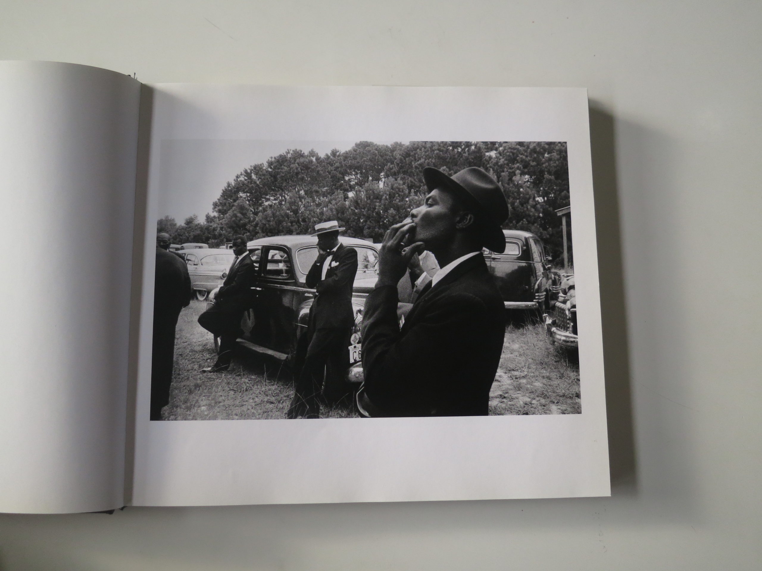
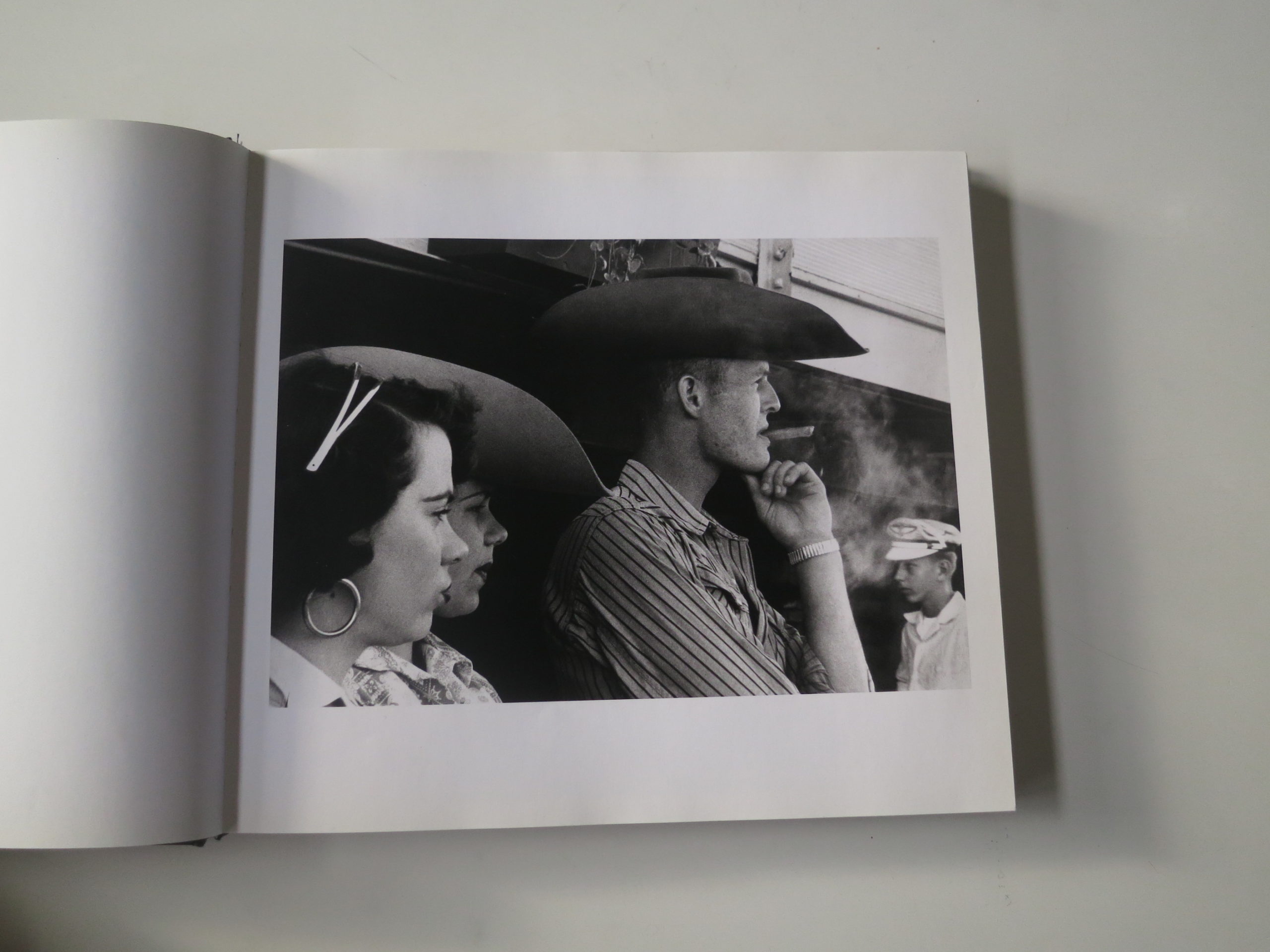
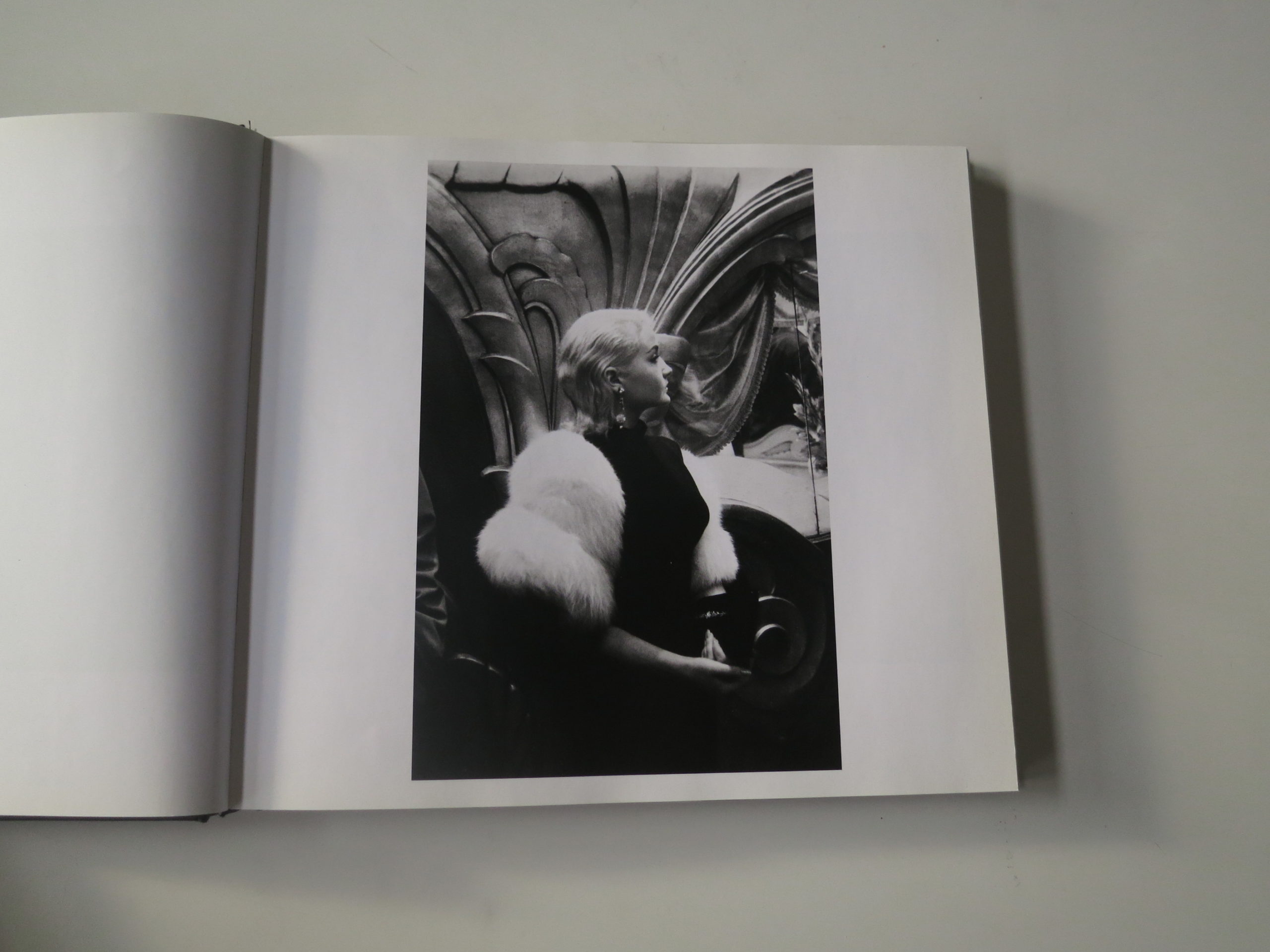
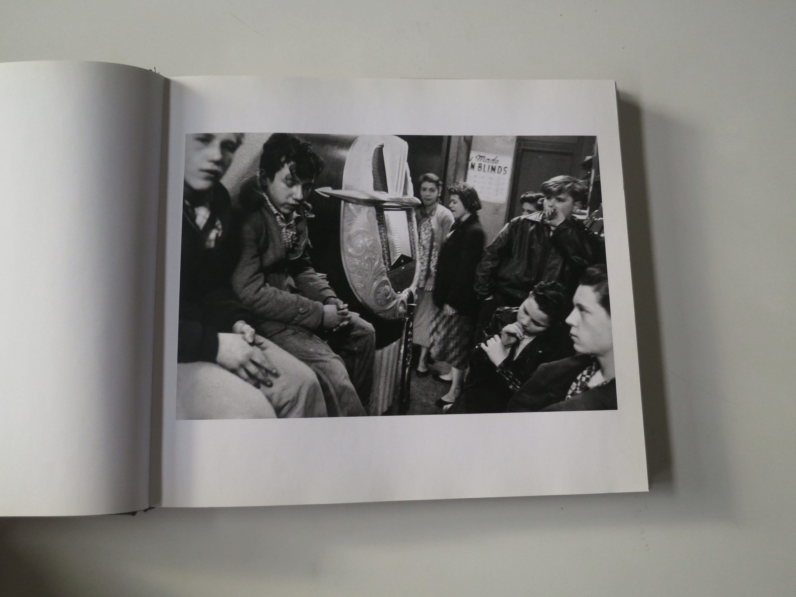
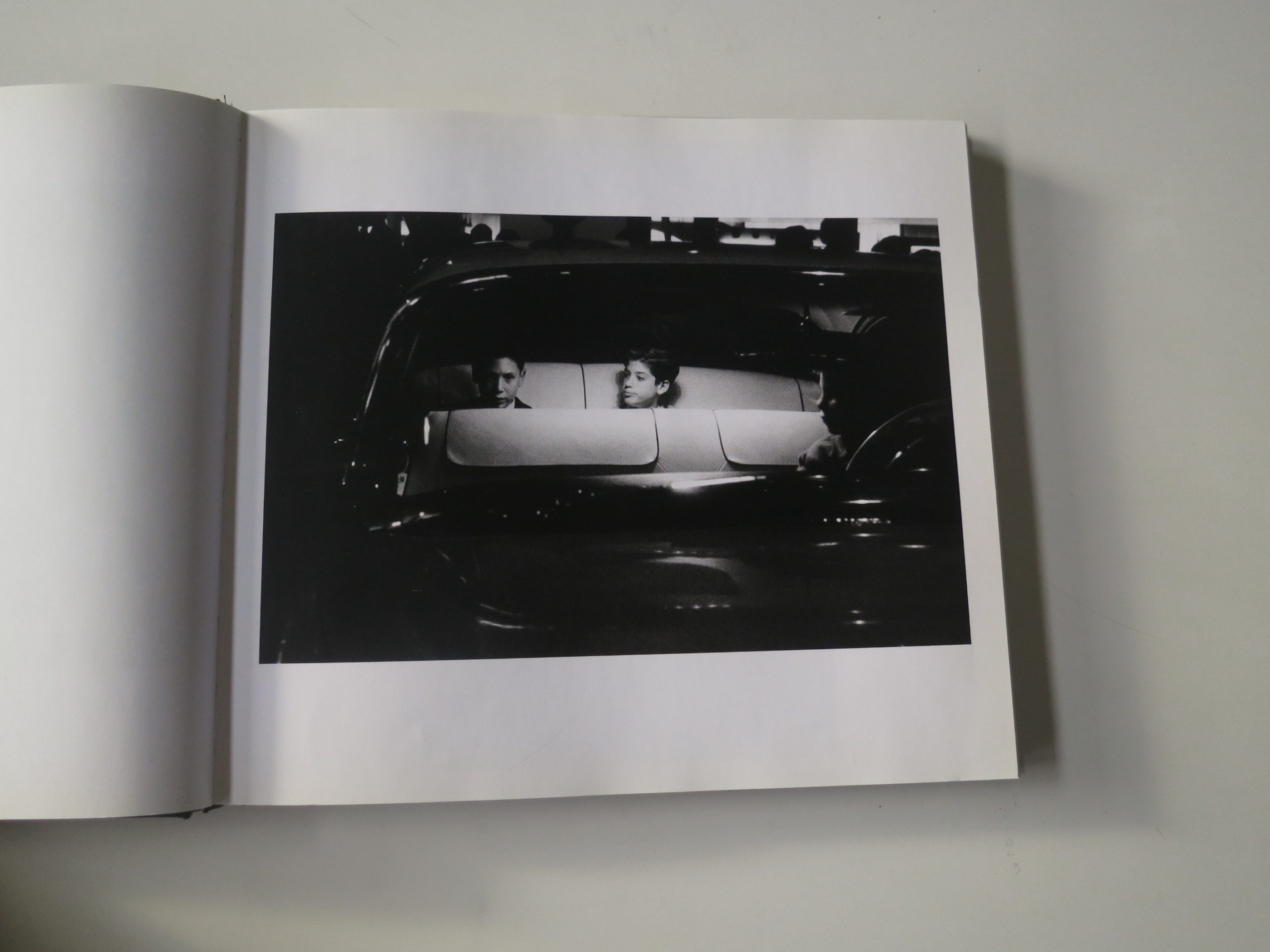
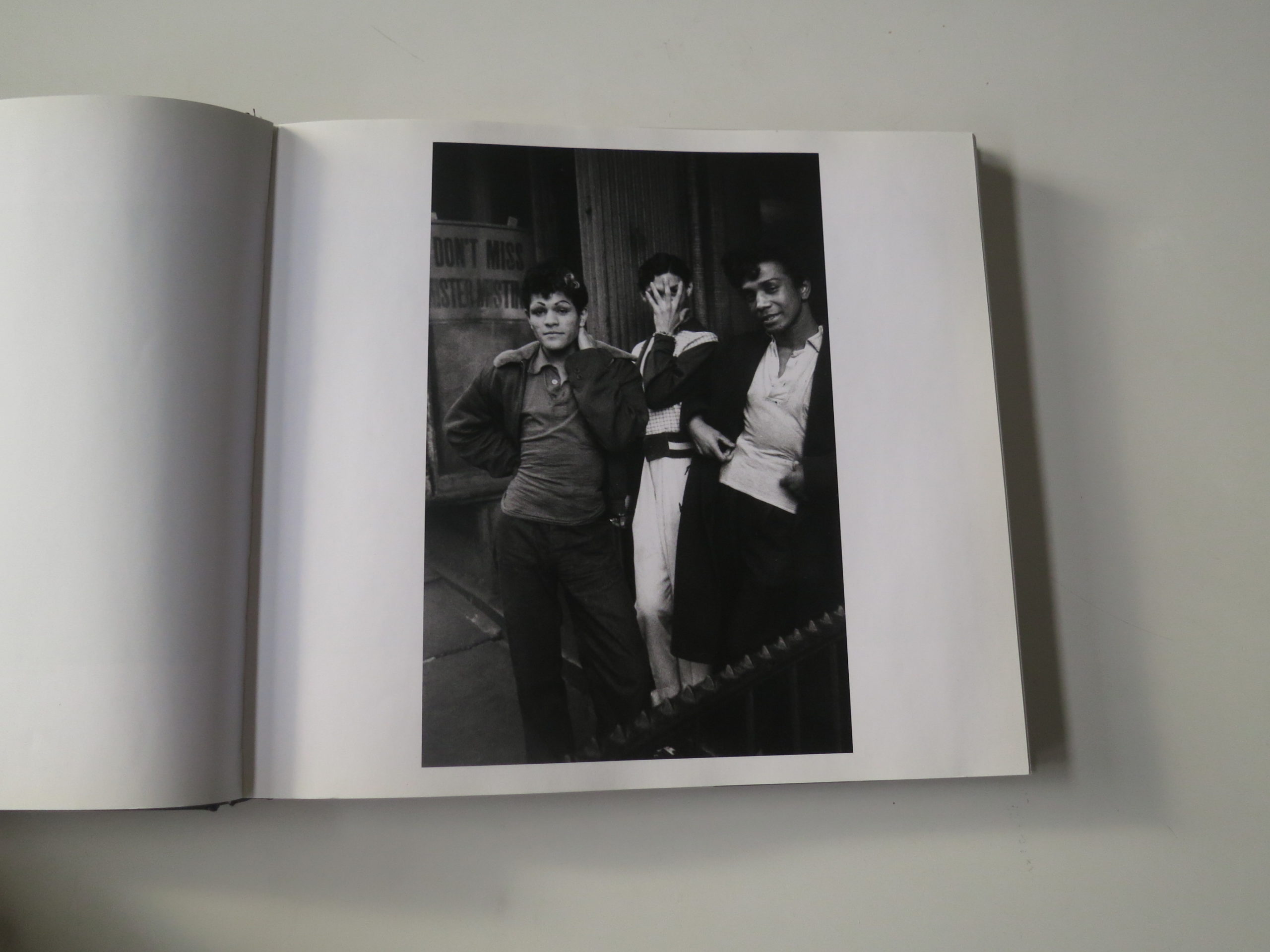
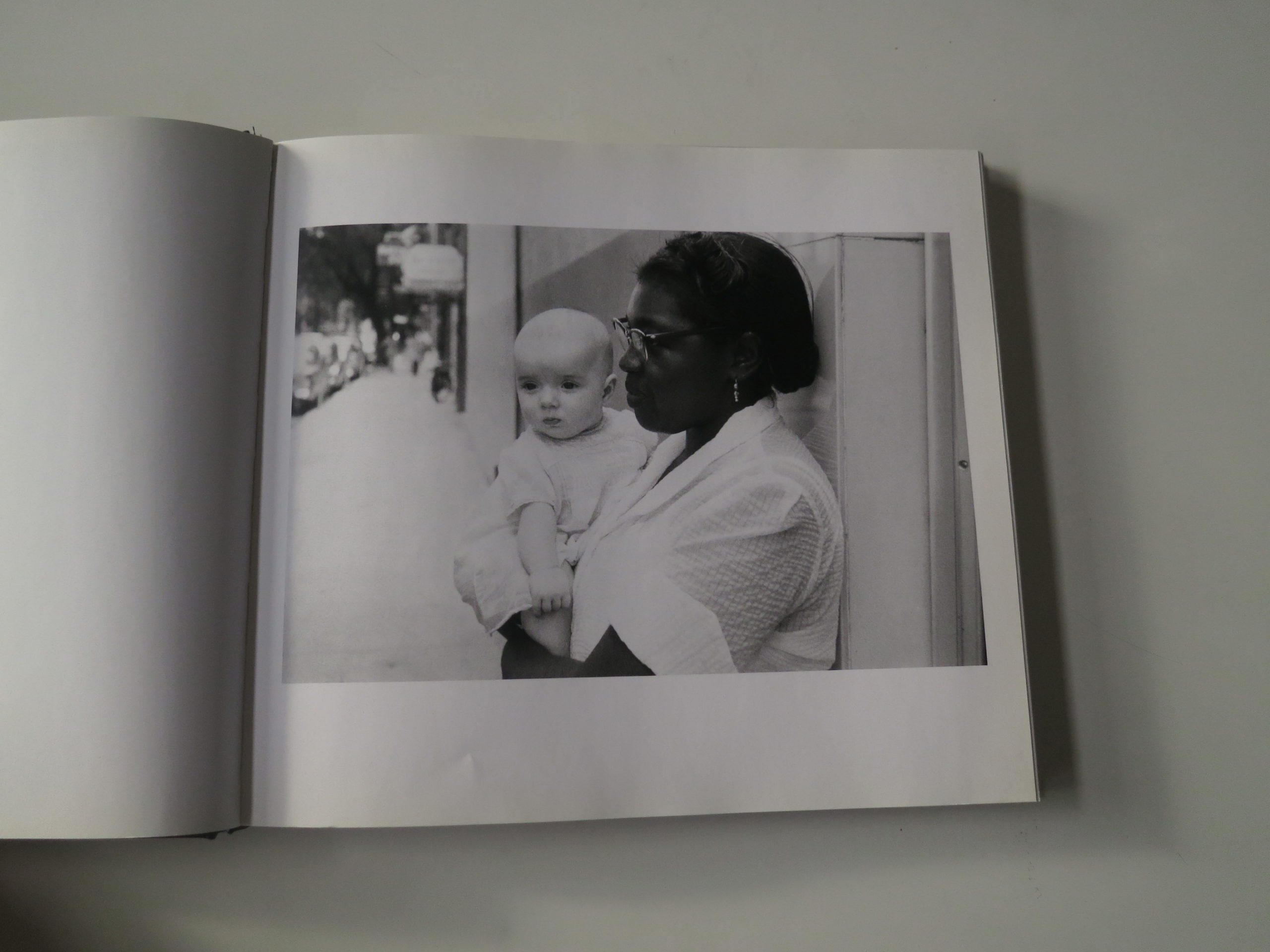
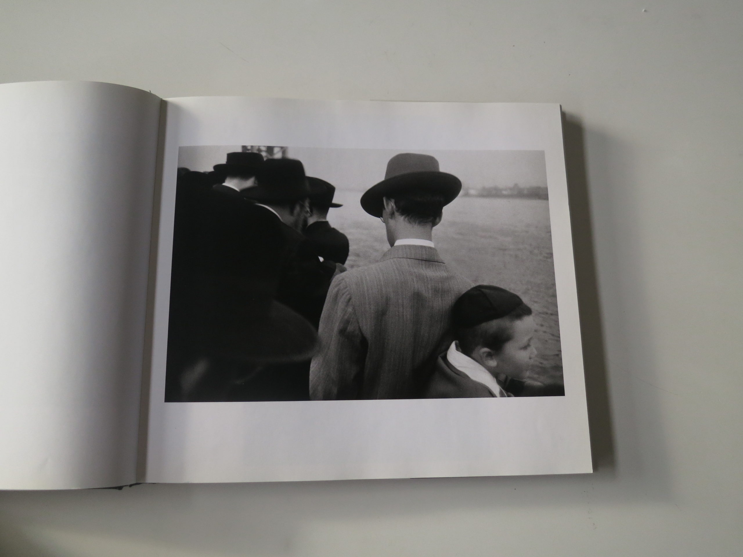
This Week in Photography: The Archive of Hugh Mangum


“They said I’m the most presidential except for possibly Abe Lincoln when he wore the hat–that was tough to beat. Honest Abe, when he wore that hat, that was tough to beat. But I can’t do that, that hat wouldn’t work for me. But I can’t do that…Yeah, I have better hair than he did. But honest Abe was tough to beat.”

President Donald Trump, the other day, #2019


I remember in the height of the Great Recession, when I just couldn’t wait for 2009 to end. “Come on, January. Let’s go 2010! Bring, it,” I thought.

Now, I don’t need to get into the particulars, but 2010 kicked my ass too. Maybe even harder than ’09.

Afterwards, I thought that “Be careful what you wish for” cliché might have something to it.

I bring this up, because honestly, who knows where all this is headed?

Donald Trump was caught red-handed, doing the one thing the entire Mueller investigation was trying to prove, under the assumption that such behavior was a priori impeachable, but they never found the smoking gun.

This time, Trump and his minions were caught together, plus a cover-up-secret-server? And then, just hours after I initially wrote this, he goes on TV to invite the Chinese government to investigate the Bidens too?

I’ve done this column for 8 years solid now, (Happy Anniversary, yay!) and I truly don’t know where this story lands anymore.

But I began the column with Trump essentially doing stand-up-comedy.

Right? He’s doing a bit?

Like Rodney Dangerfield (RIP) in “Caddyshack,” or Joe Pesci in “Goodfellas?”

That hat, it’s tough to beat. Tough to beat. Honest Abe was tough to beat in that hat.

Good Ol’ Abe.

How is that not funny, and yet with the fate of the free world hinging on this man’s behavior, (Did you read about his idea for alligator and snake moats?) maybe we all just need to laugh, or at least catch our breath for a second?

Break a pattern?

In my case, I remember when Rob set me free to do the travel and cultural criticism pieces I’ve since written over the last six months.

It was liberating.

I’d done book reviews for a few years solid, and wanted to see what would happen if I went out there for you, to eat and drink and look and investigate.

Sitting on the couch flipping through books had gotten stale, but then, after six months of pinging around the world, (East Coast, West Coast, Europe, West Coast, East Coast, Mid-West) my head is more fried than my daughter’s skin this summer when she went to the pool with a friend who didn’t have her re-apply her sunscreen properly.

(Very, very fried.)

So today, while trying to process a president doing stand-up-comedy about the millinery choices of Abe Lincoln, I thought, man, it sure would be nice to pick up a book here in my house.

To do something different.

Instead of crunching my previous experiences into an article, I’d rather read and engage with an existing story in book form.

To look at someone else’s narrative, and see what I can learn.

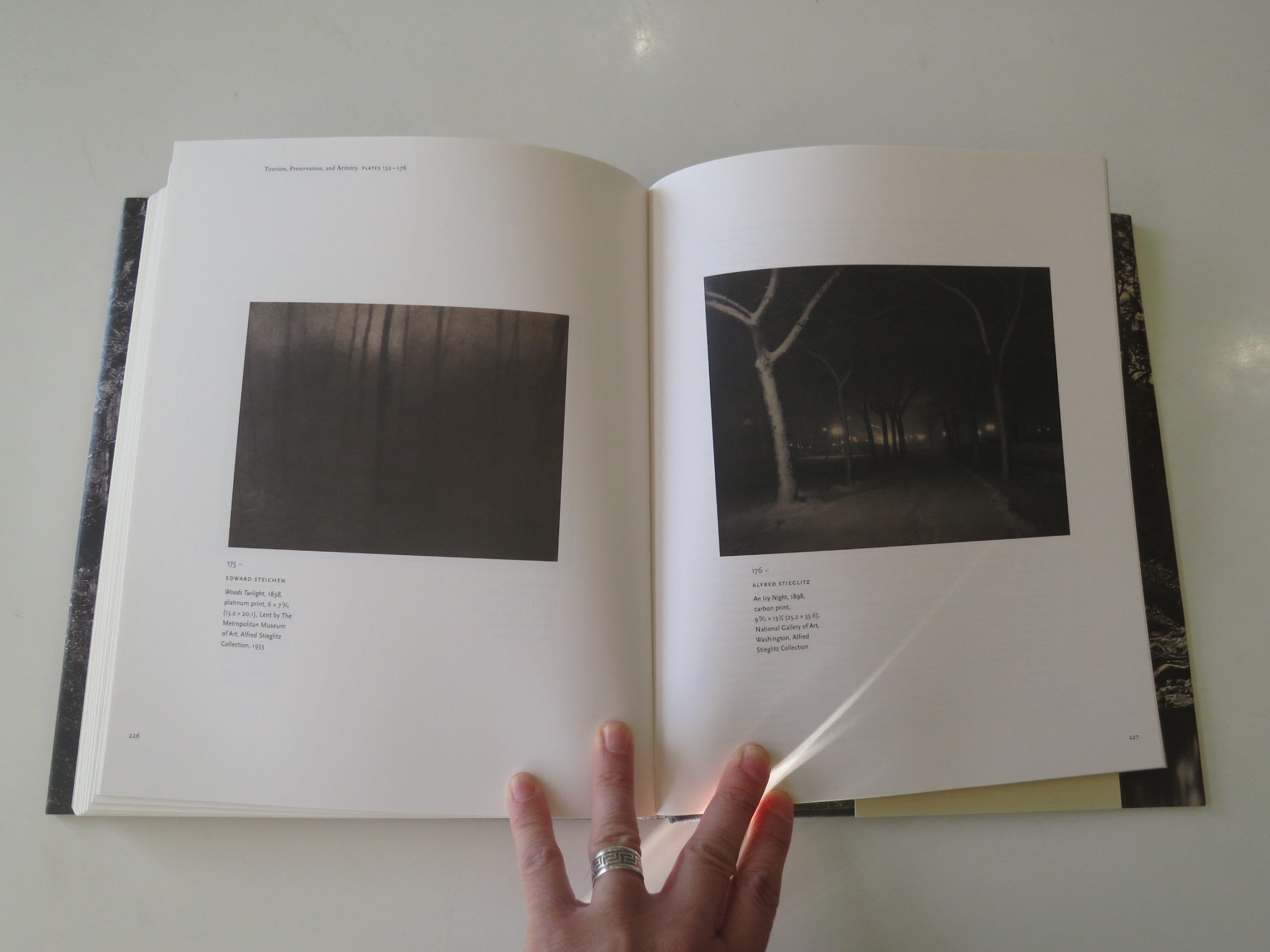
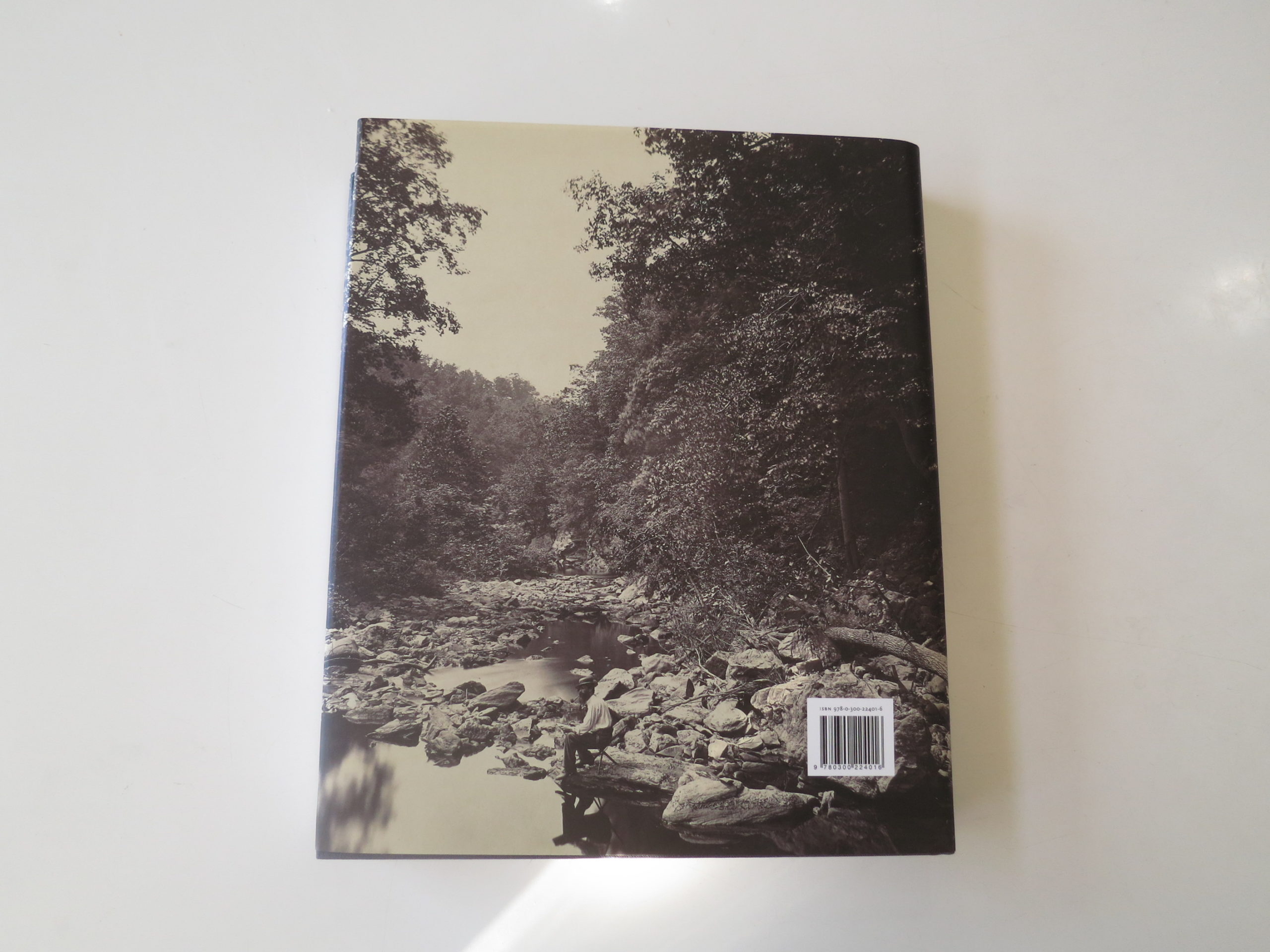
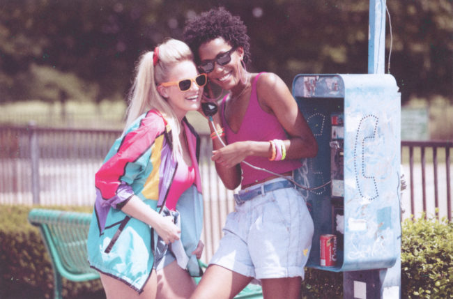
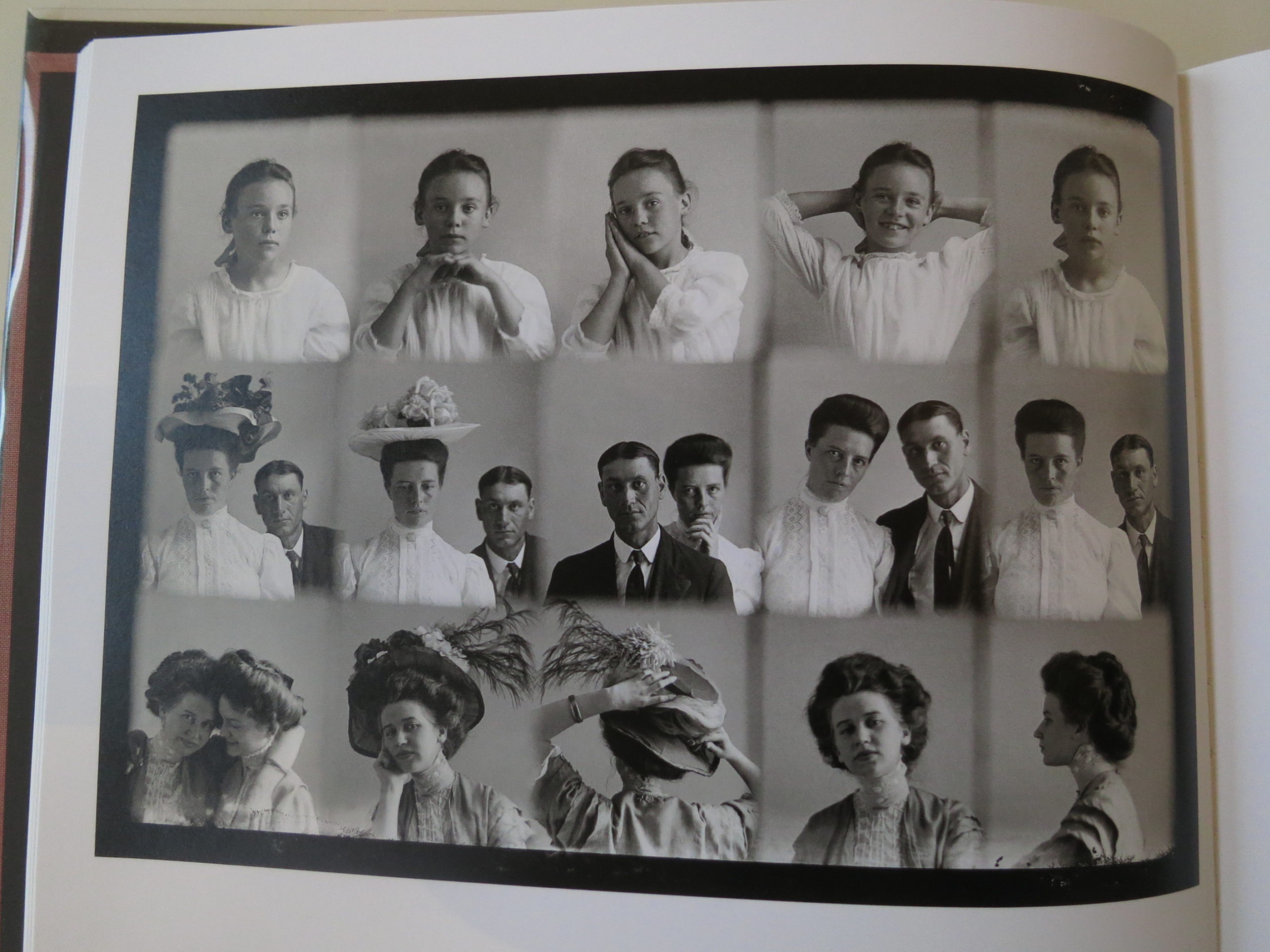
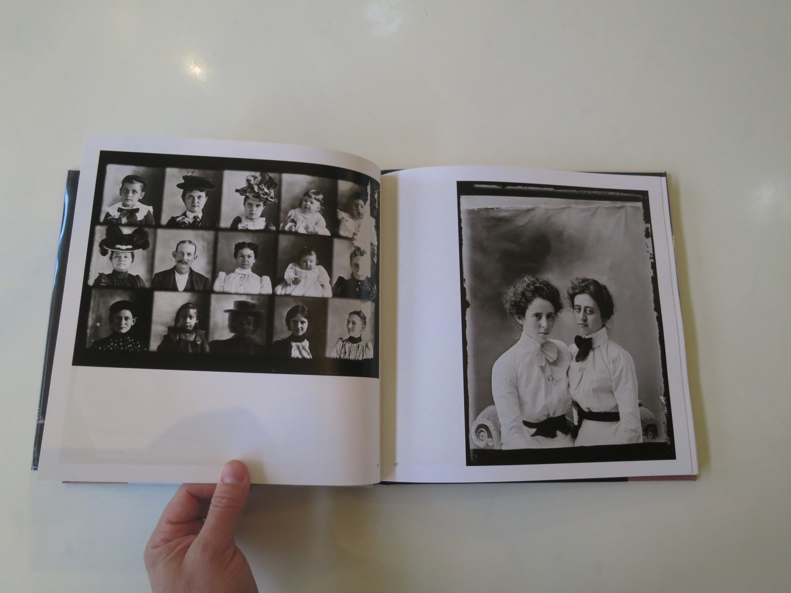
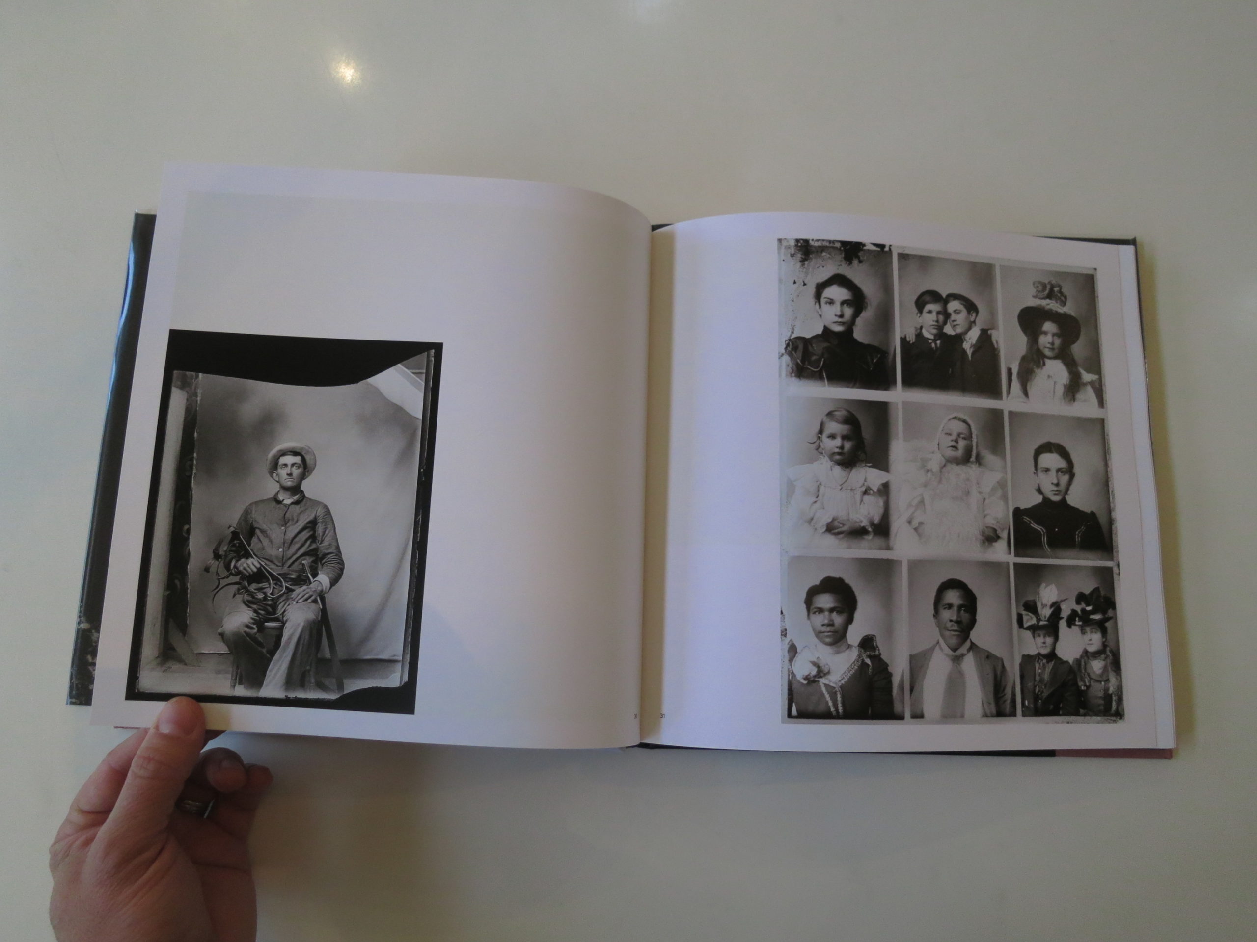
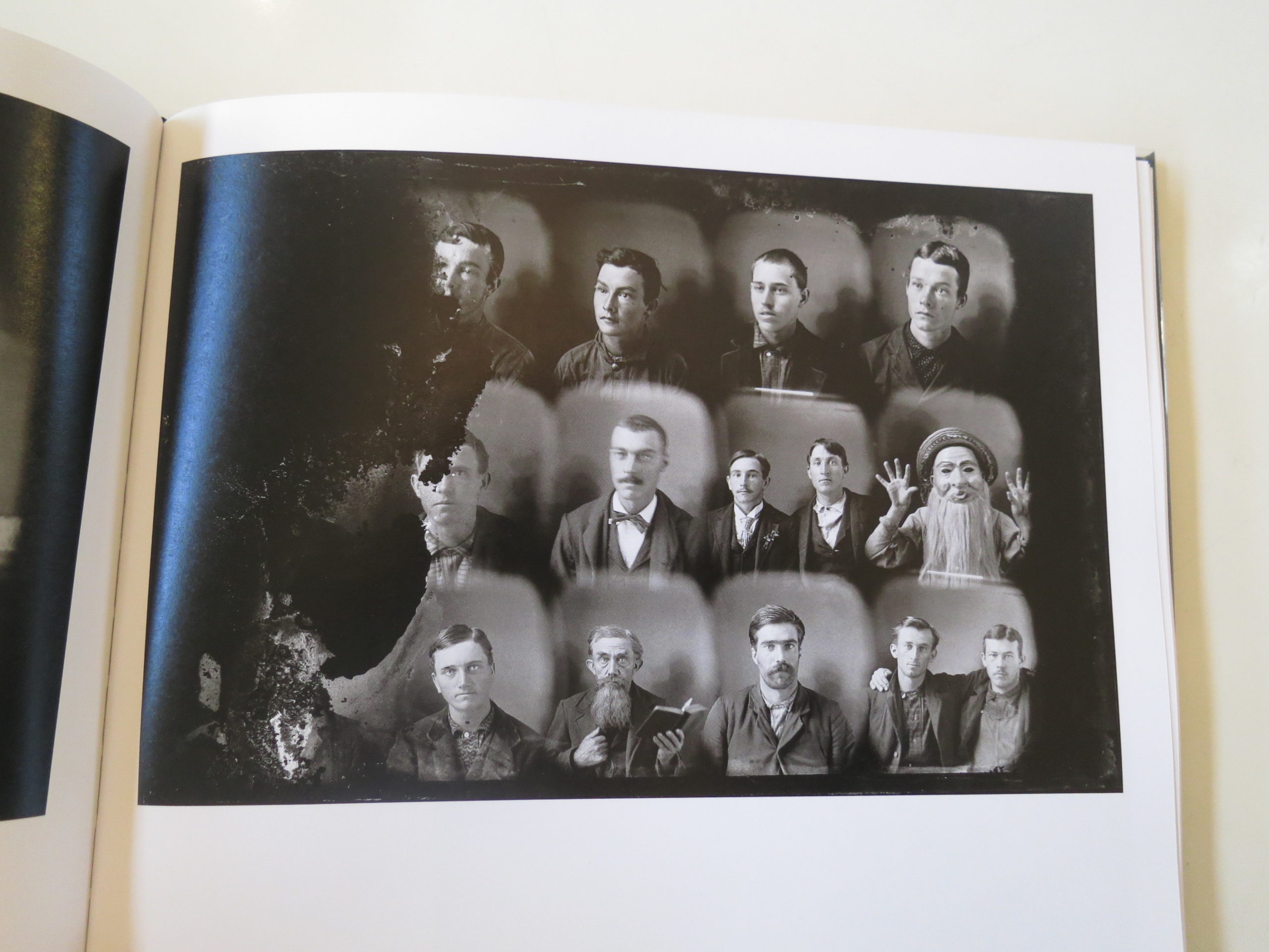
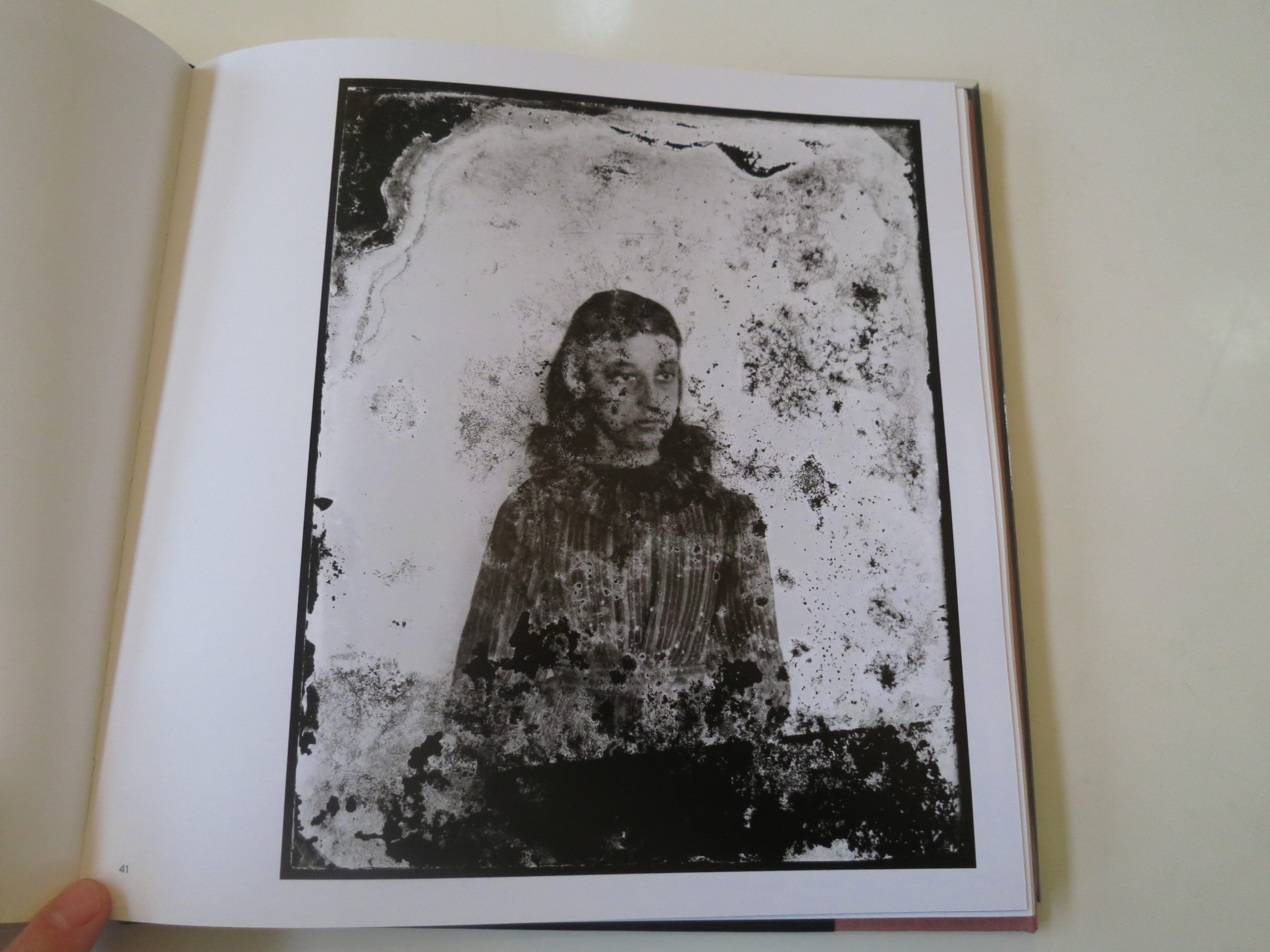
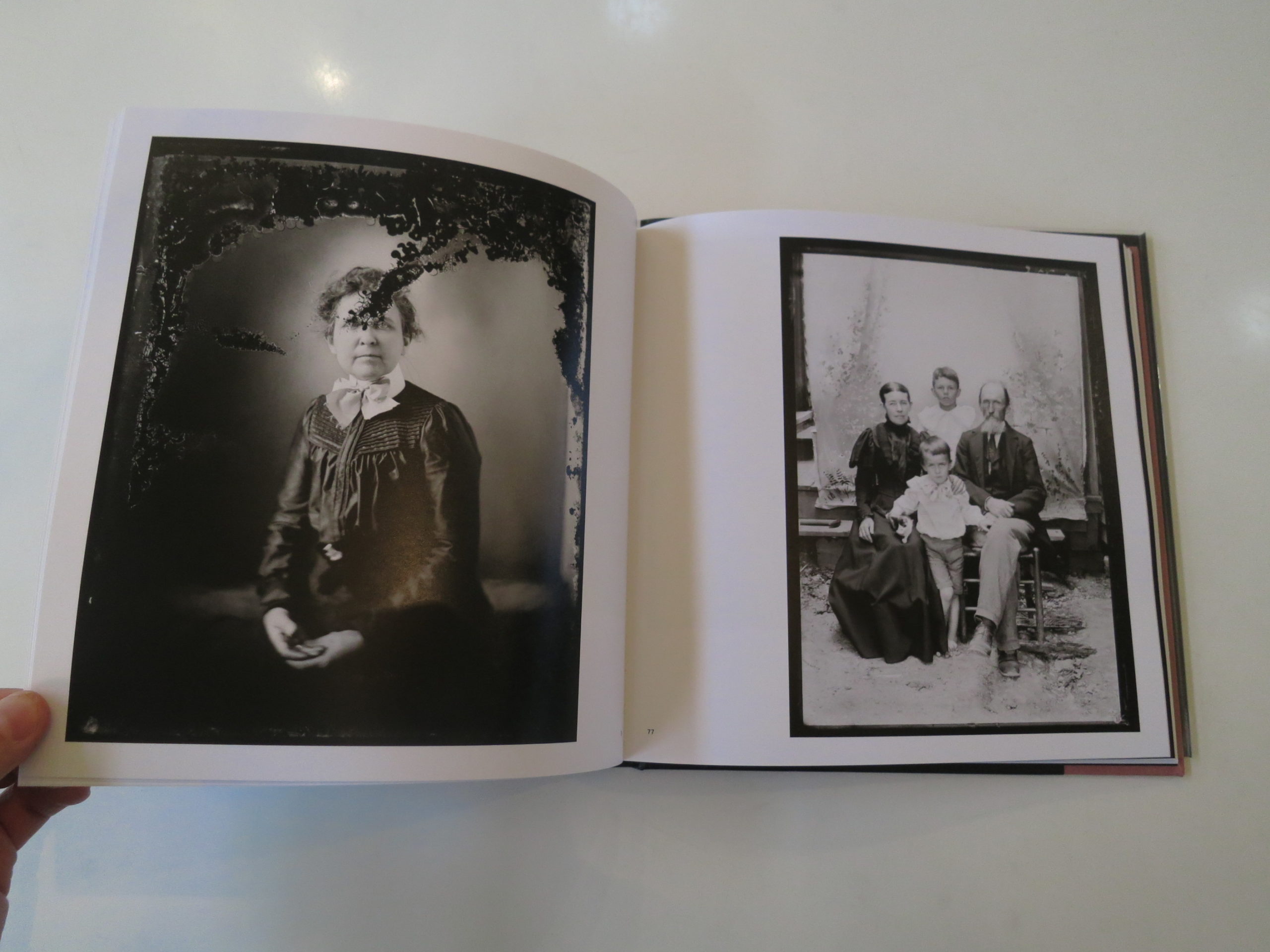
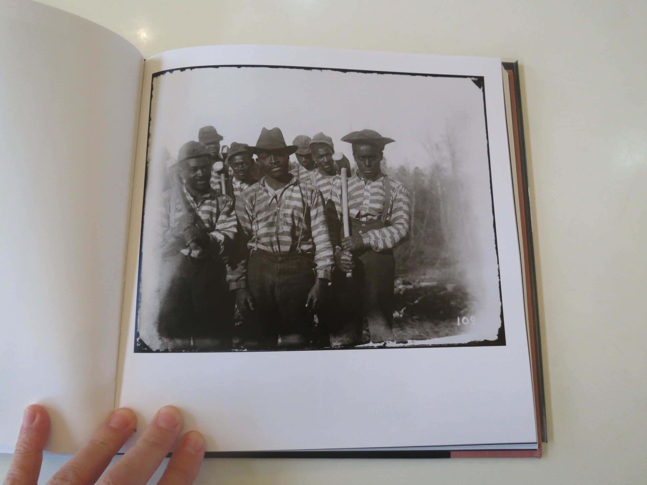
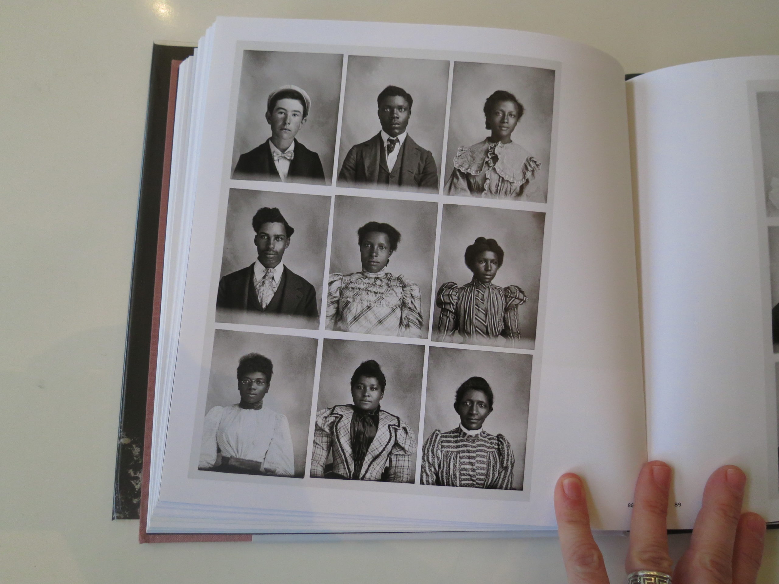
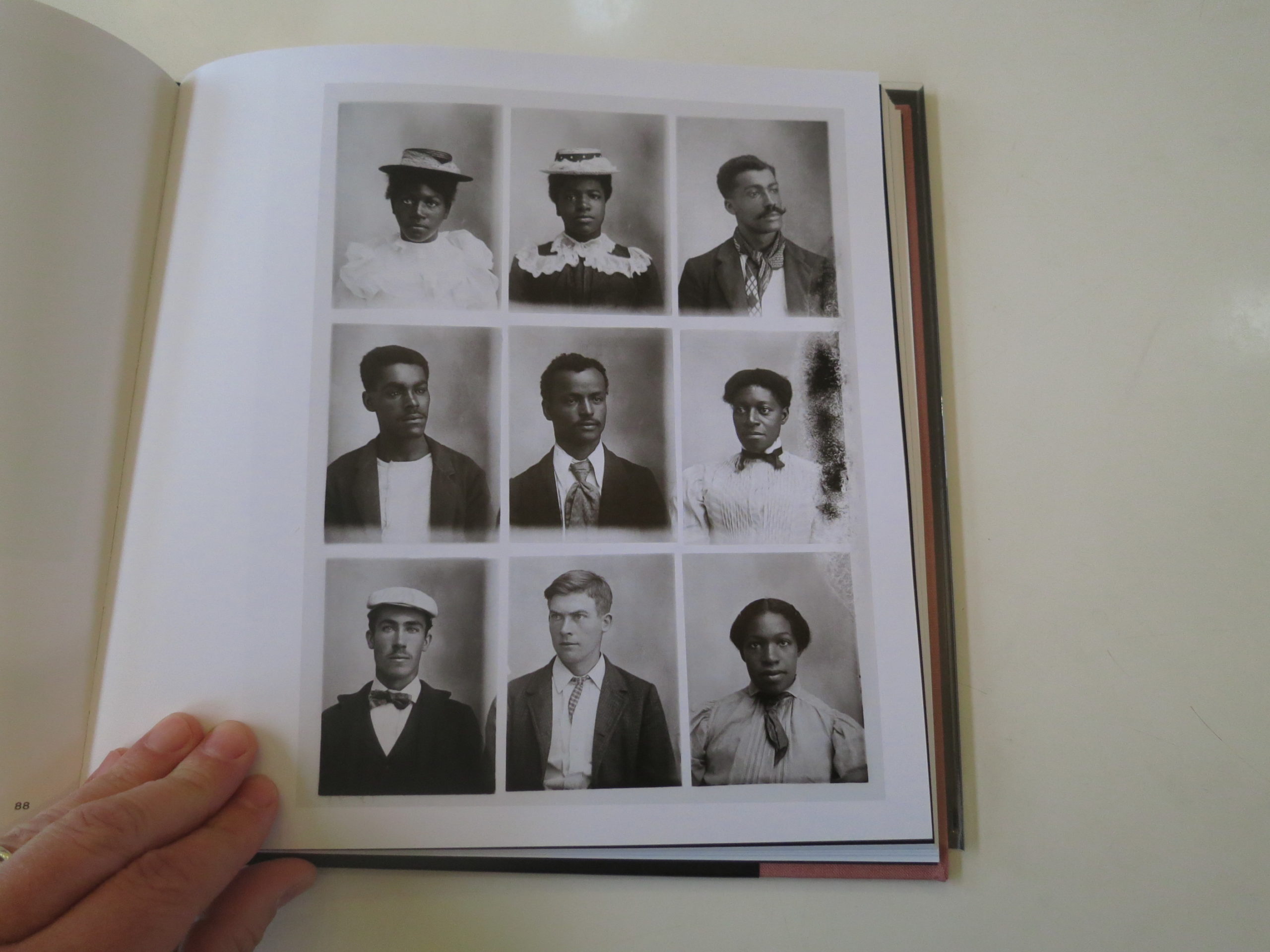
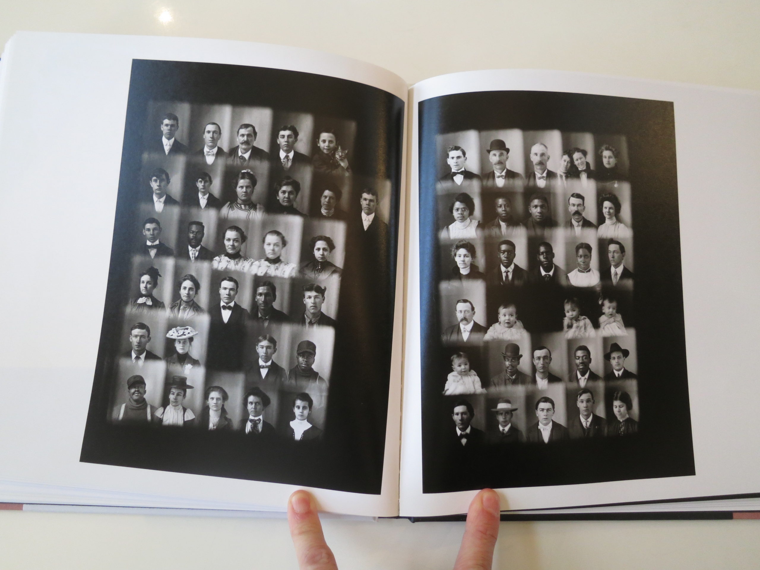
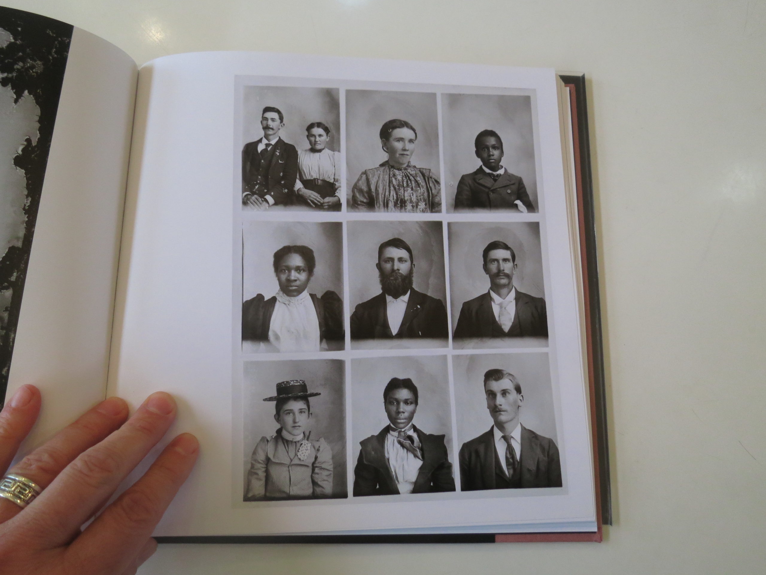
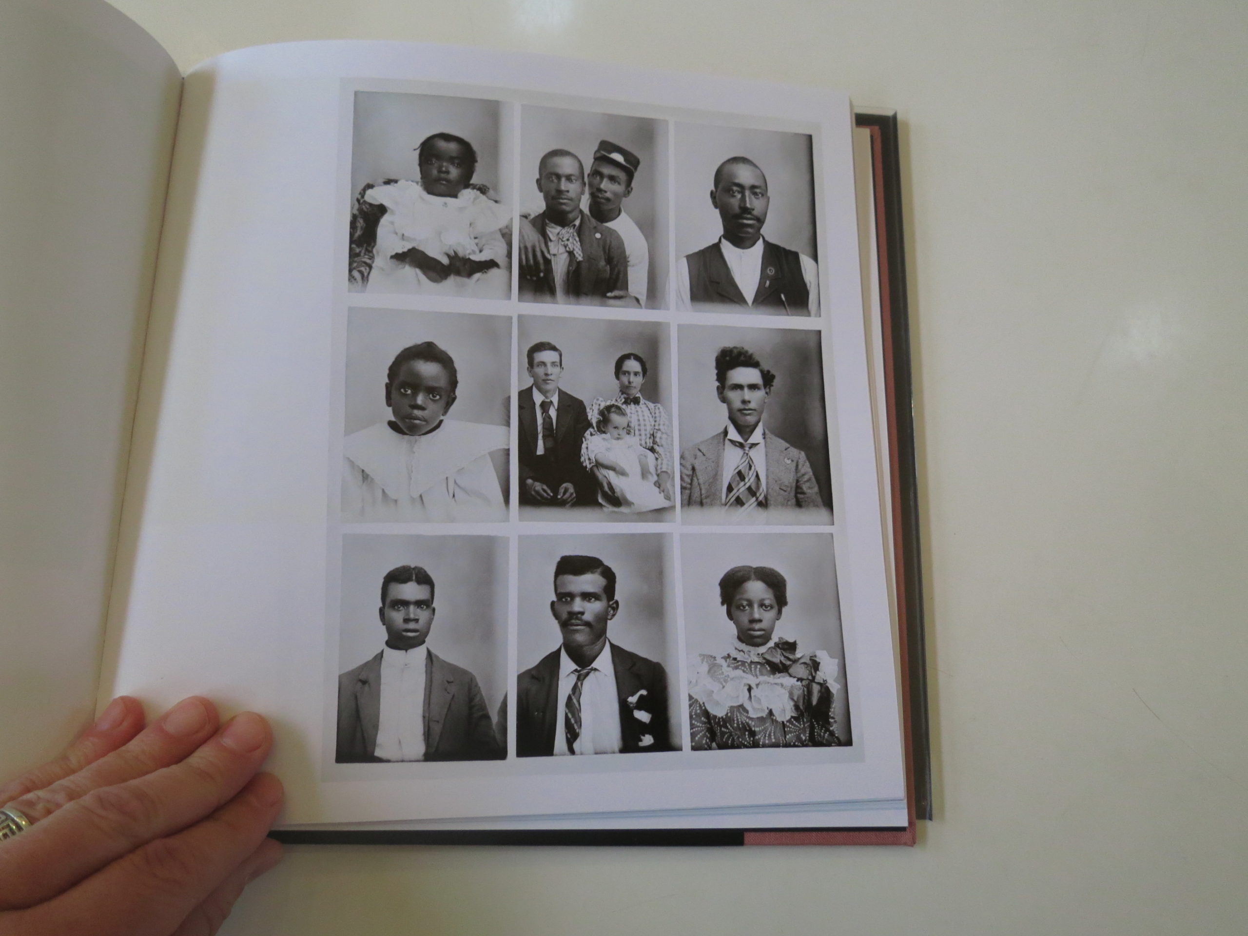
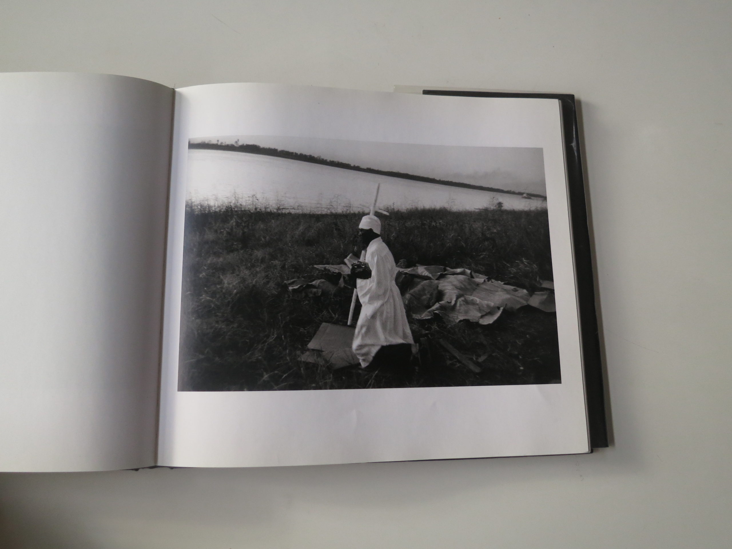
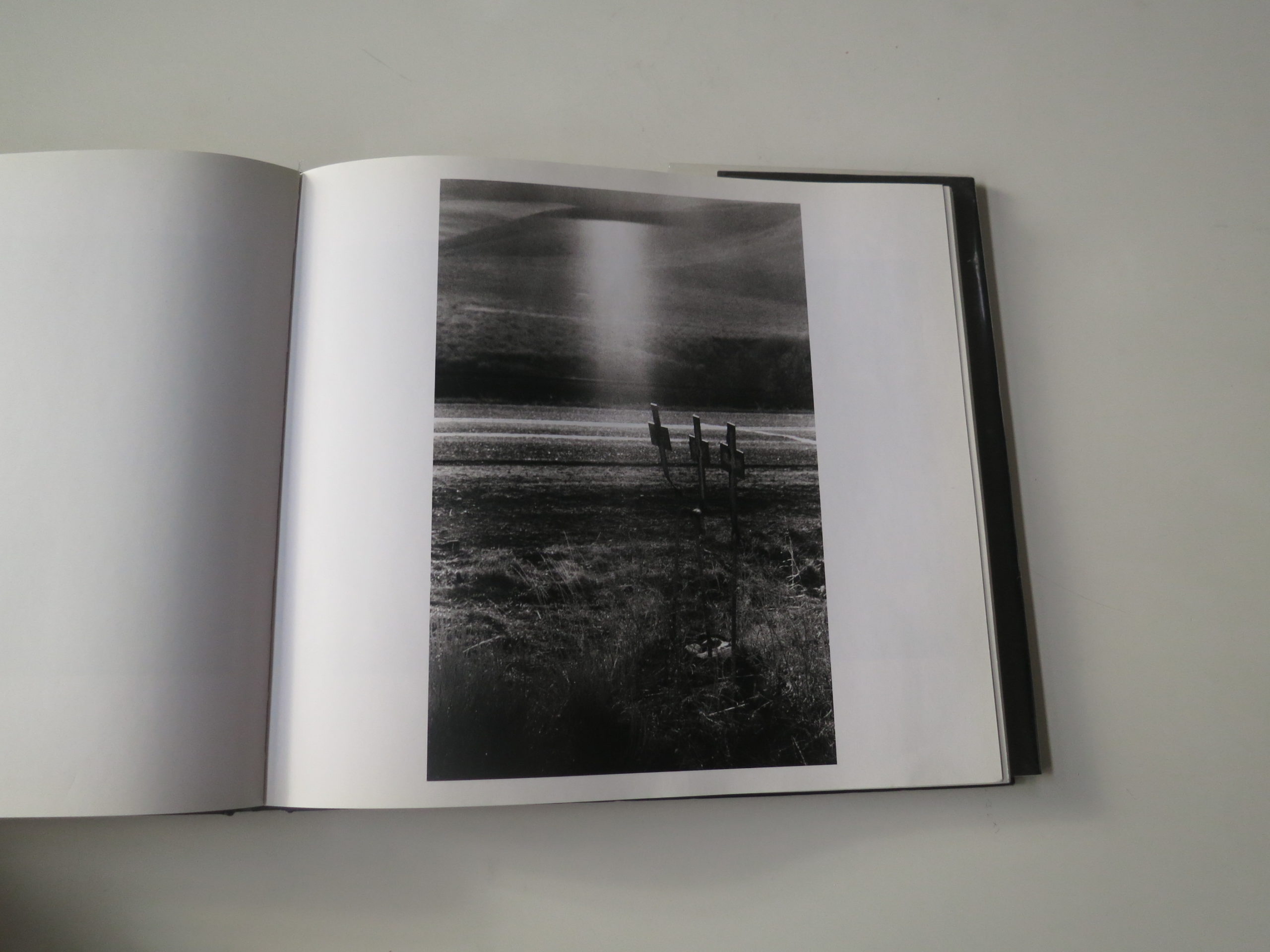
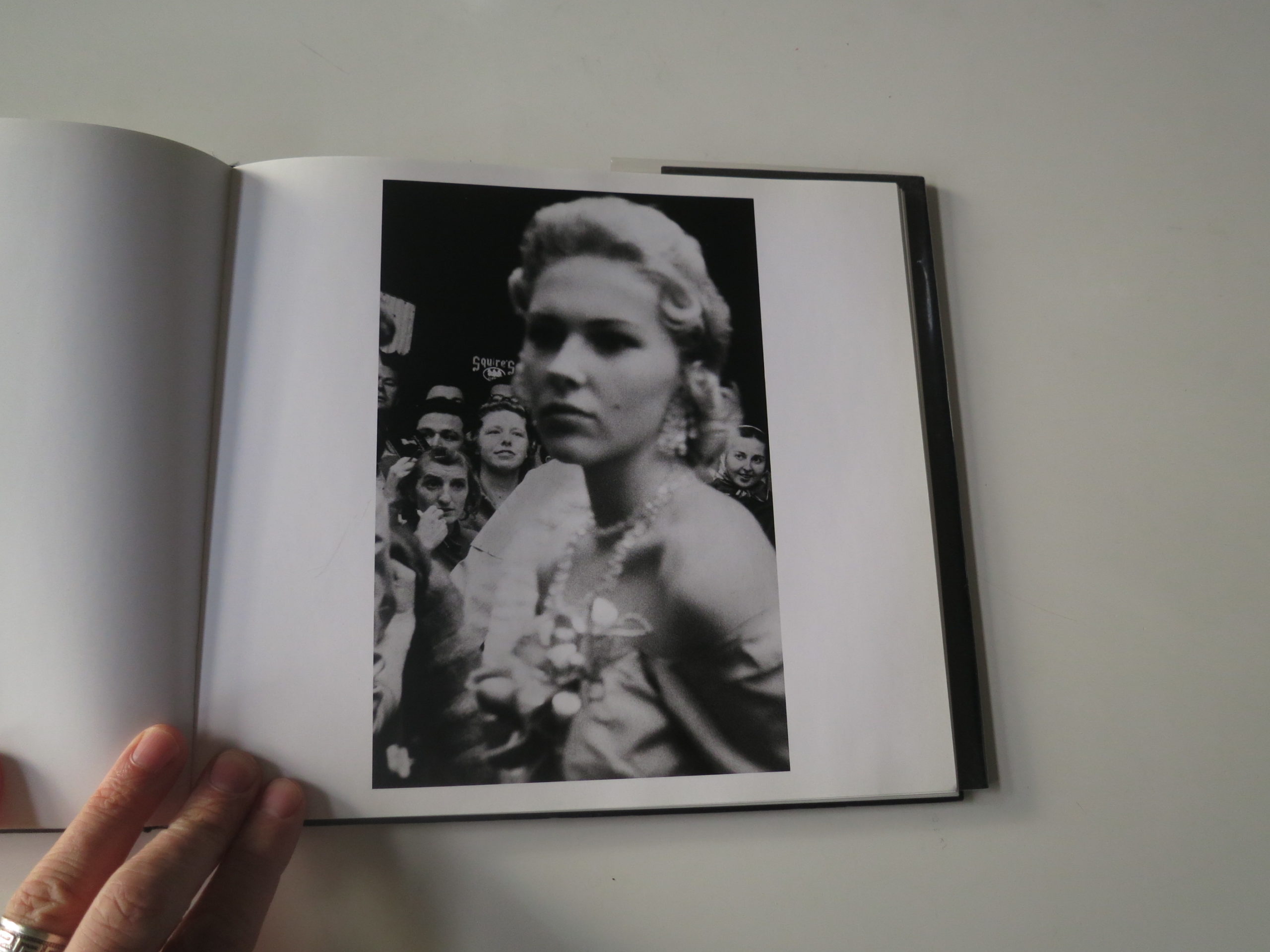
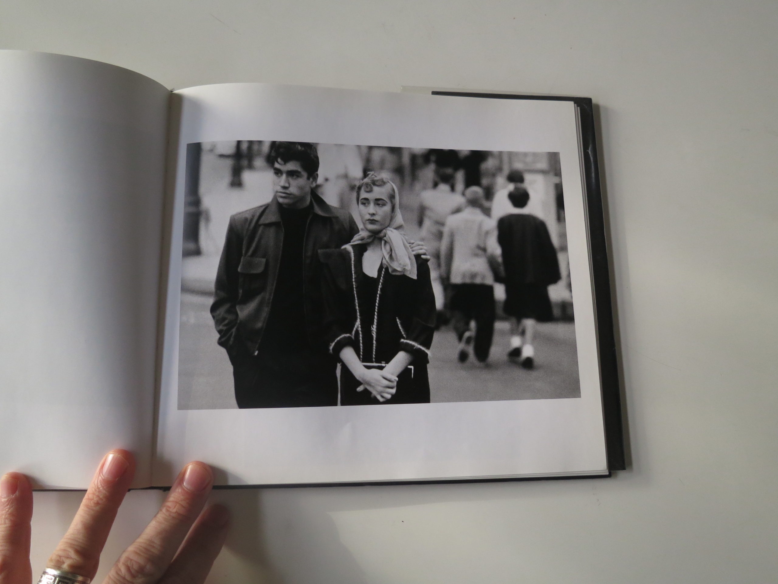
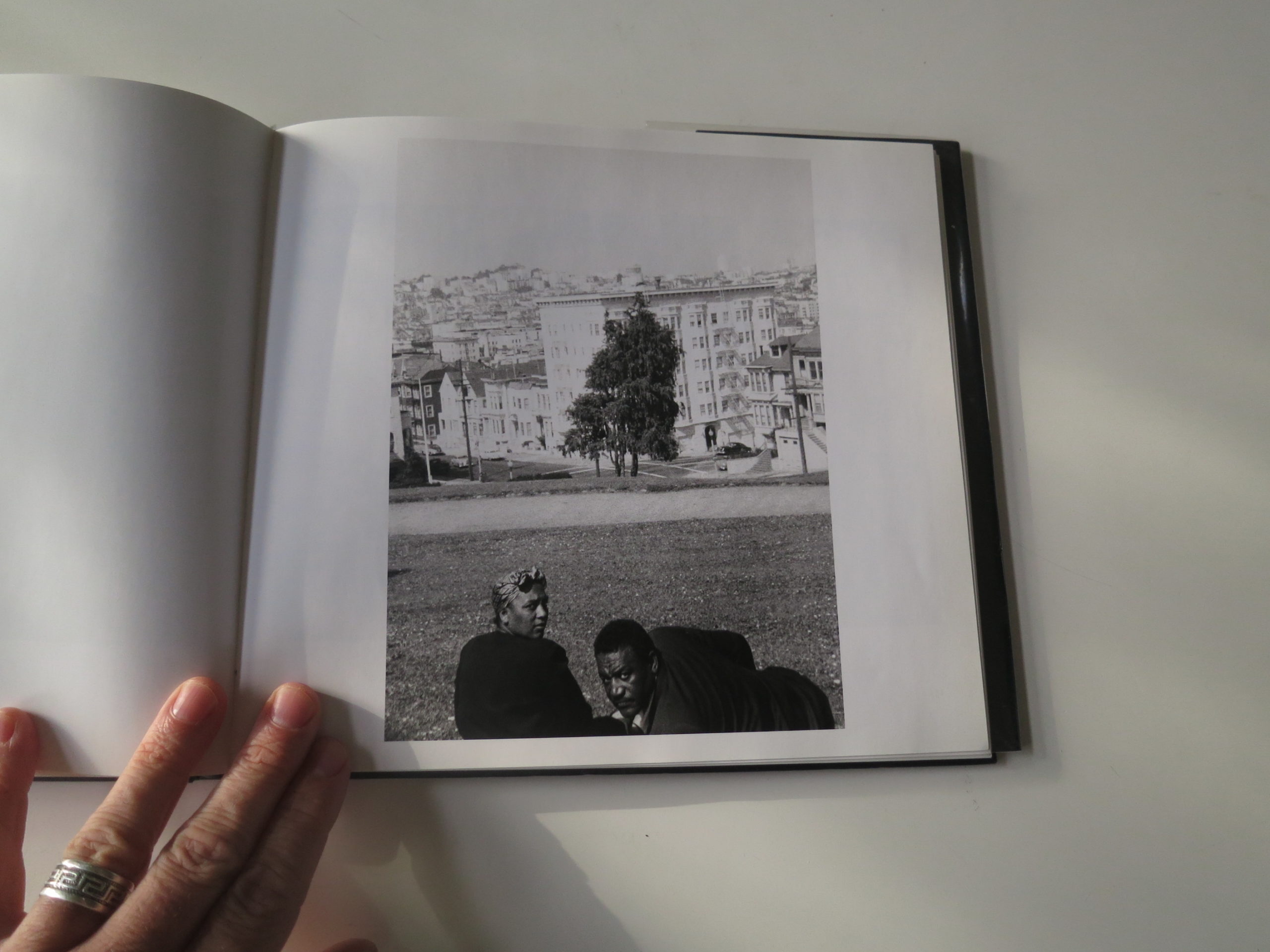
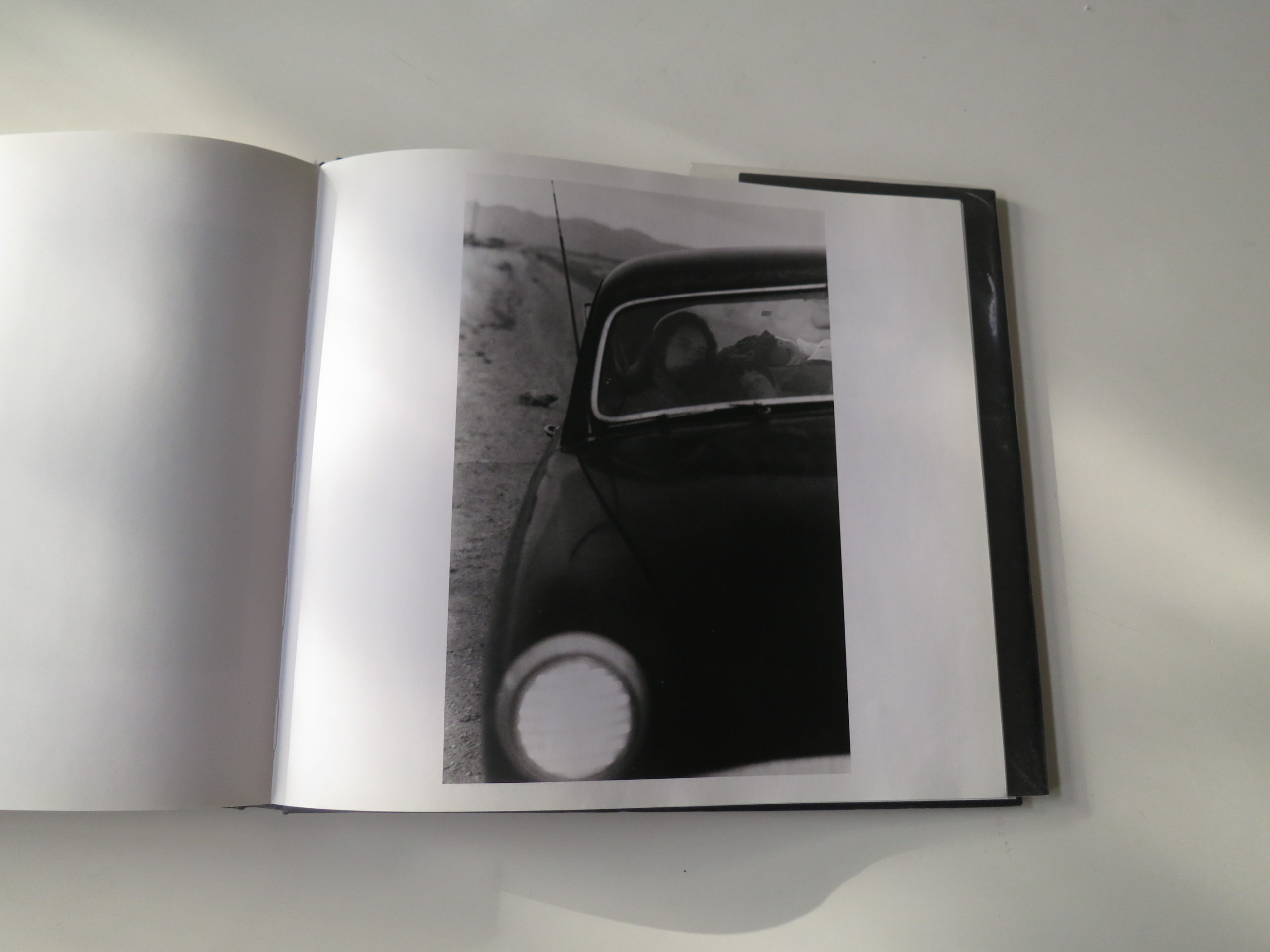
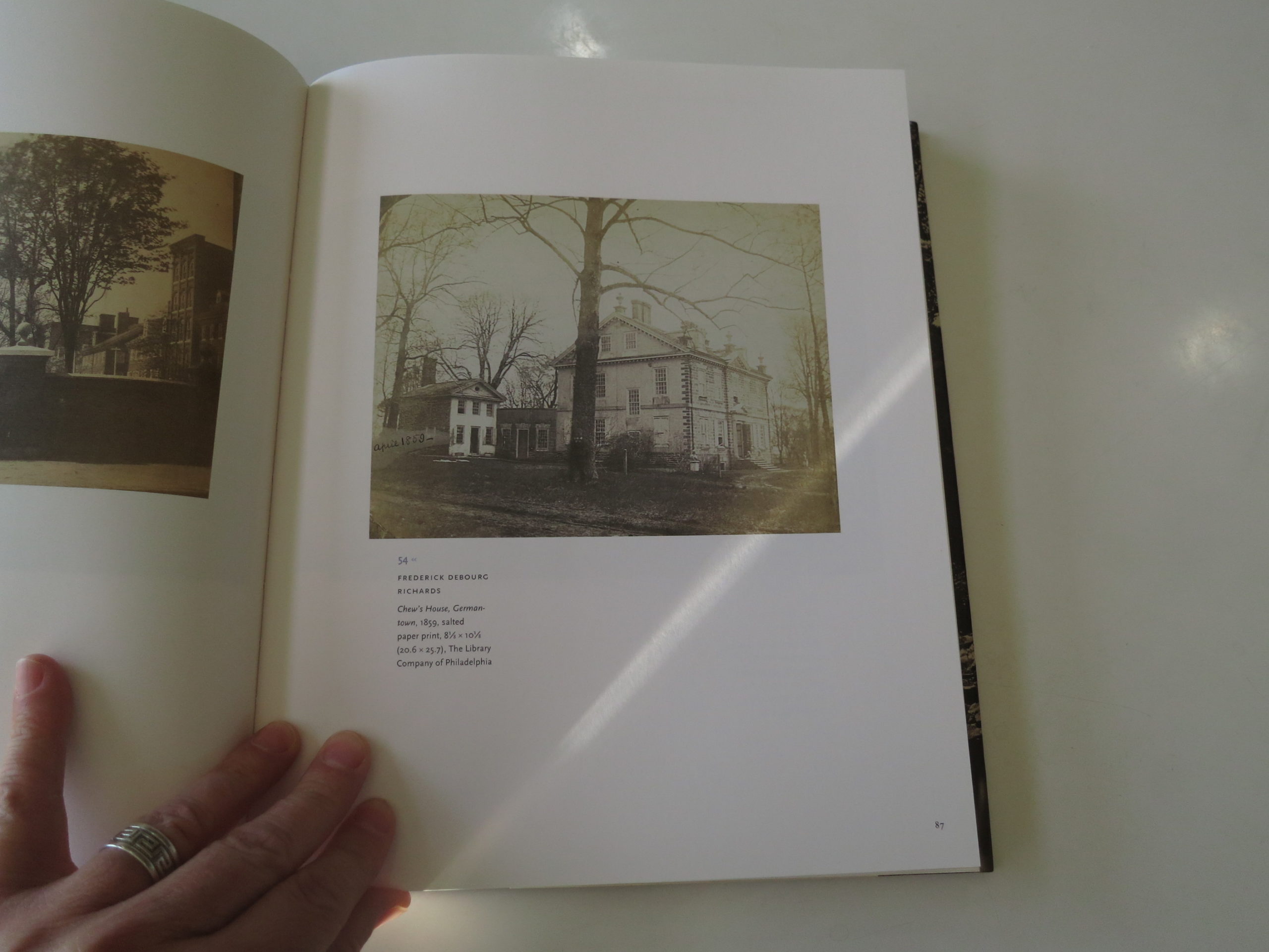
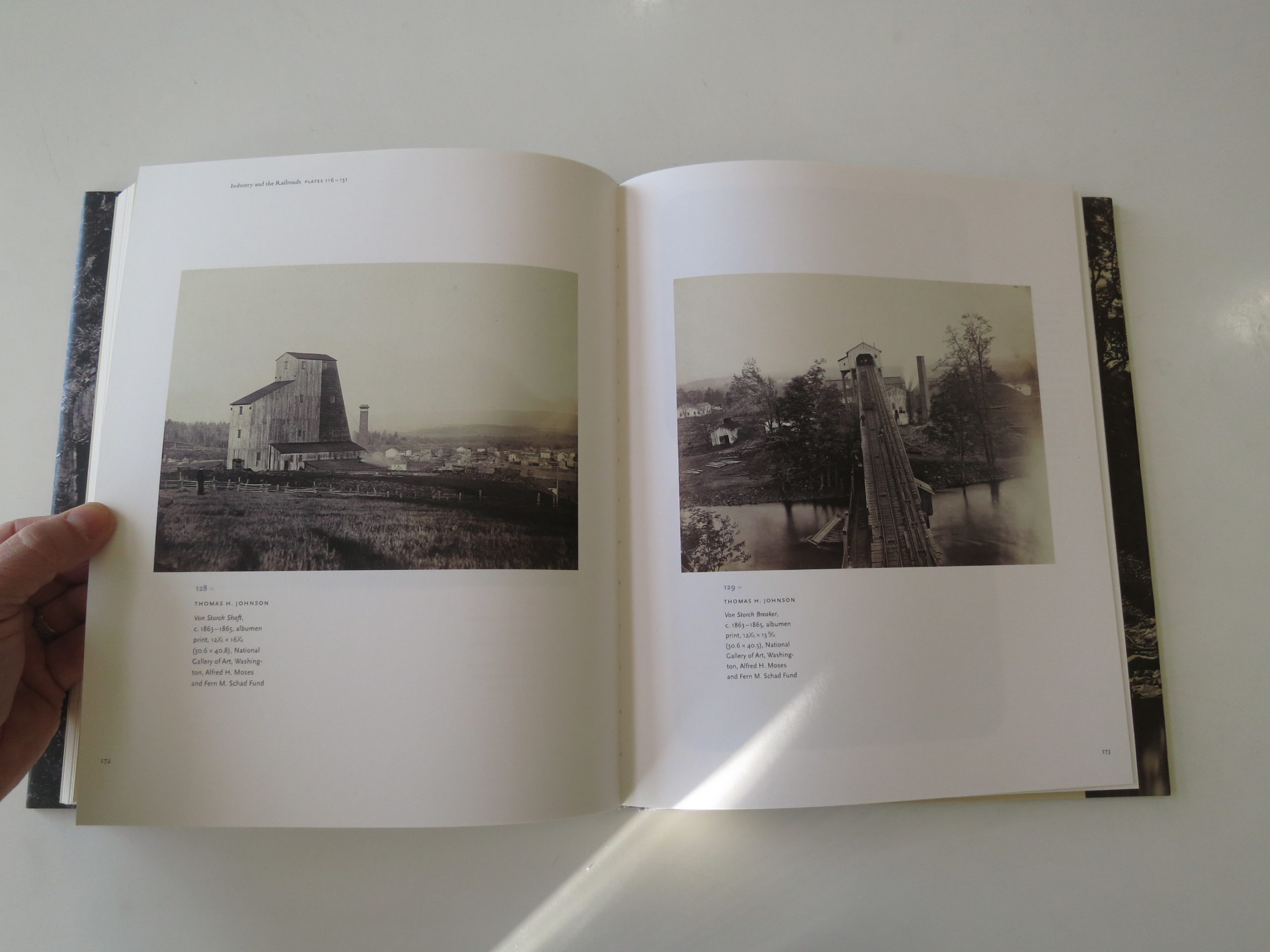
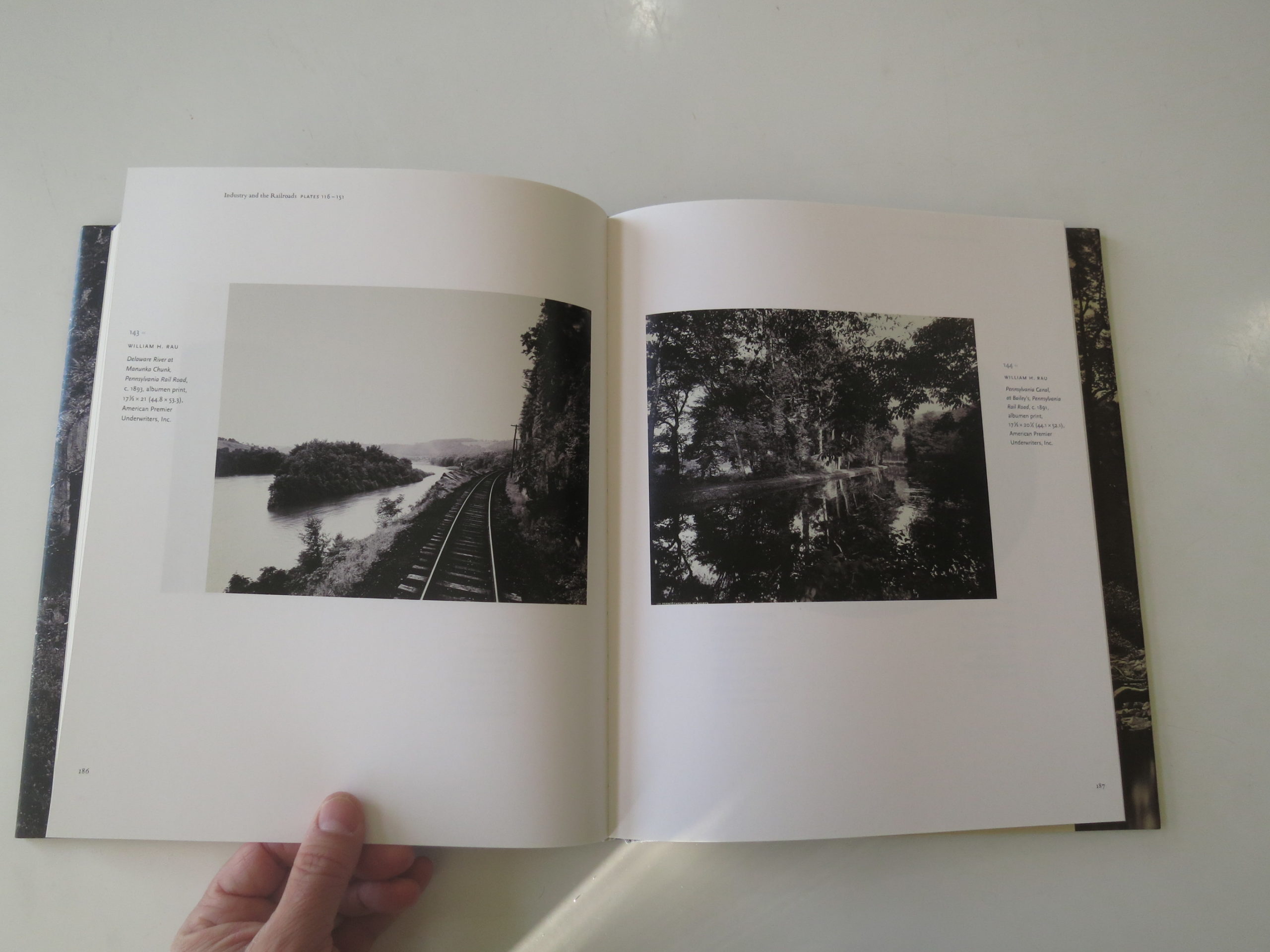
“Photos: Day or Night, The Archive of Hugh Mangum,” edited by Sarah Stacke, was published last year by Red Hook Editions. It seems straightforward enough, as the book exists to present the digitized, preserved history of a notable Southern photographer who died too young in 1922. (44, RIP)

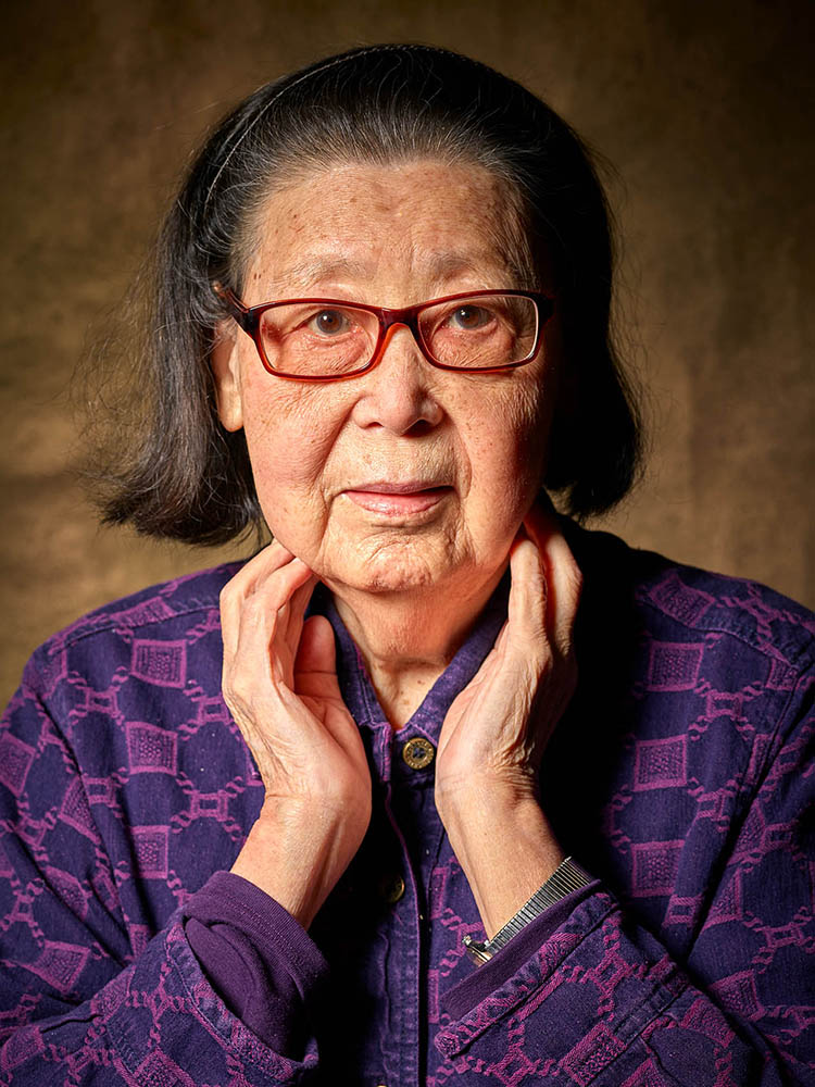
Sarah Stacke edited the book, wrote one essay, and interviewed Mr. Mangum’s granddaughter, Martha Sumler, at the end of the volume as well. (And shot her portrait.)

During his lifetime, at the end of the 19th and beginning of the 20th centuries, Hugh Mangum had a darkroom in an old tobacco barn at his family’s country property outside Durham, North Carolina. He also spent time in the city-home as a youth, in Durham, and according to one of the essays, the block was fairly integrated.

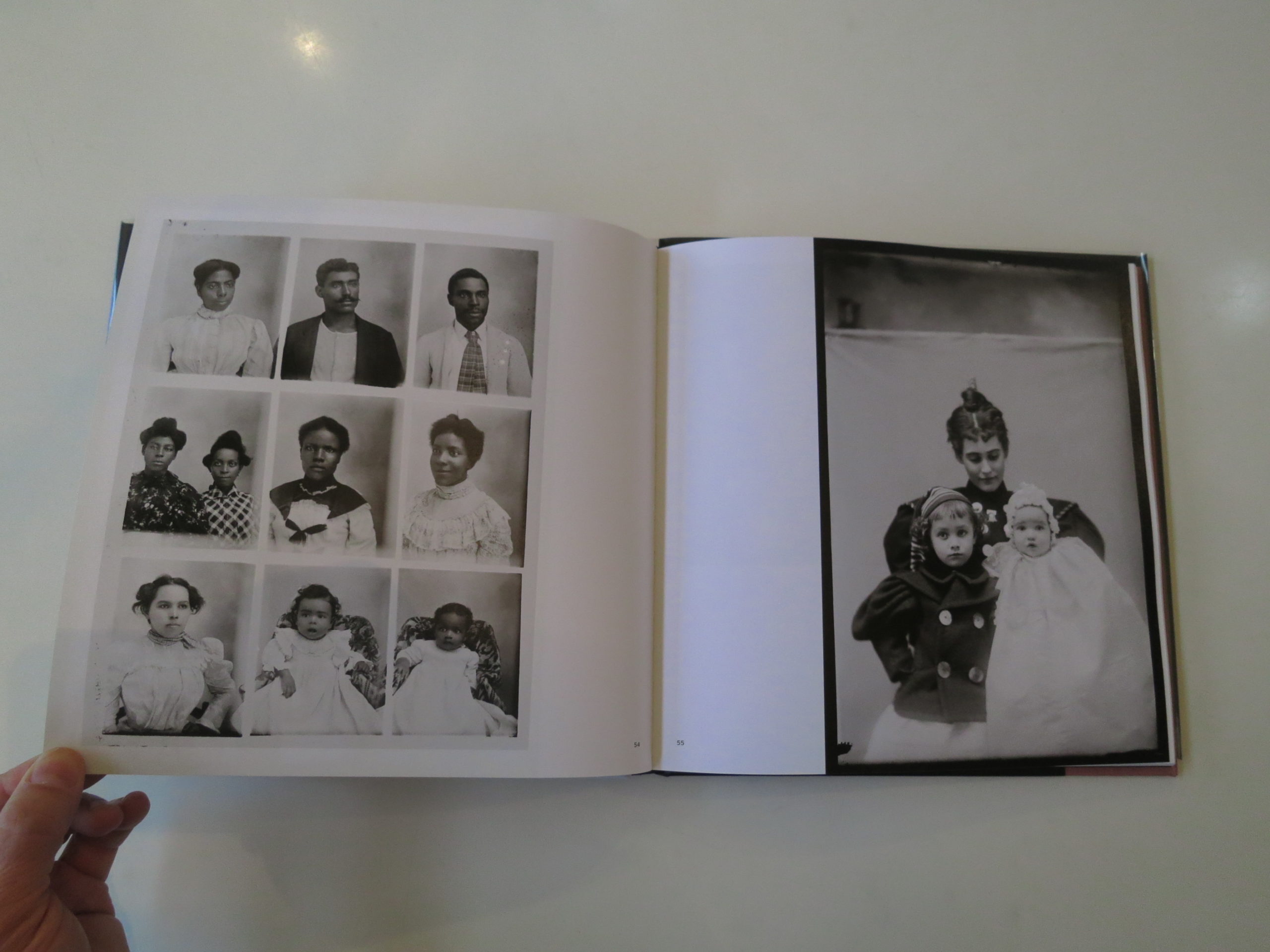
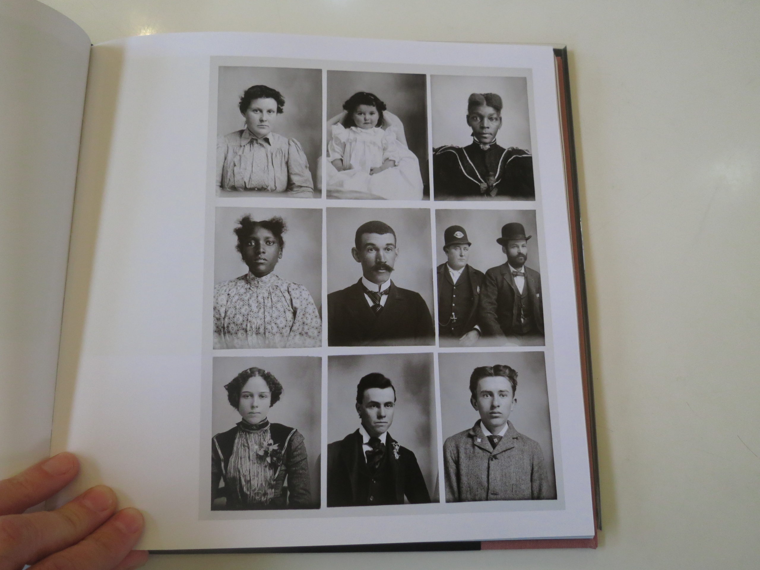
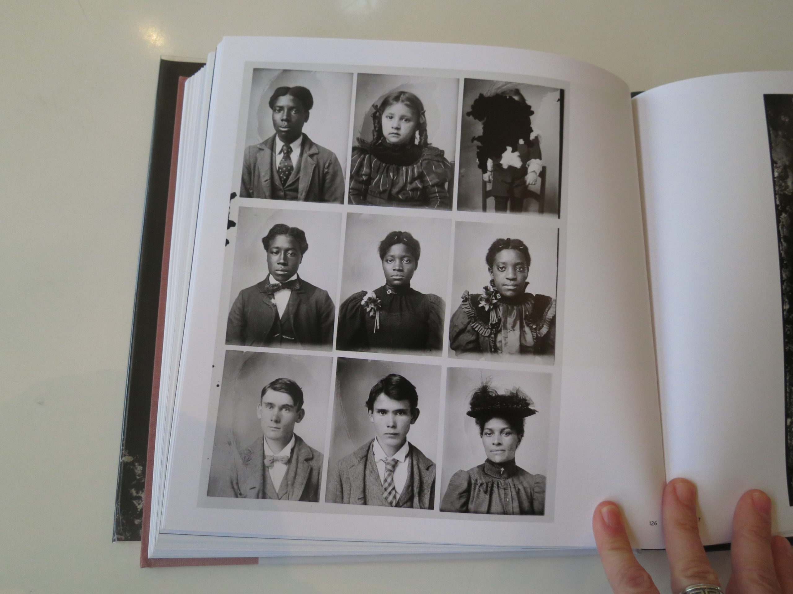
Whatever the reason, Hugh Mangum defied the mores of the South in which he was raised by photographing African American and white people, and his interracial practice would have been rare for the time.

Plus, the photographs in here are badass. I mean, like totally good. In some cases, showing me things I still can’t make sense of.

Really, when was the last time I saw something photographic that defied reality in the way Trump’s opening quote does?

(See, I always bring it back around in a book review.)

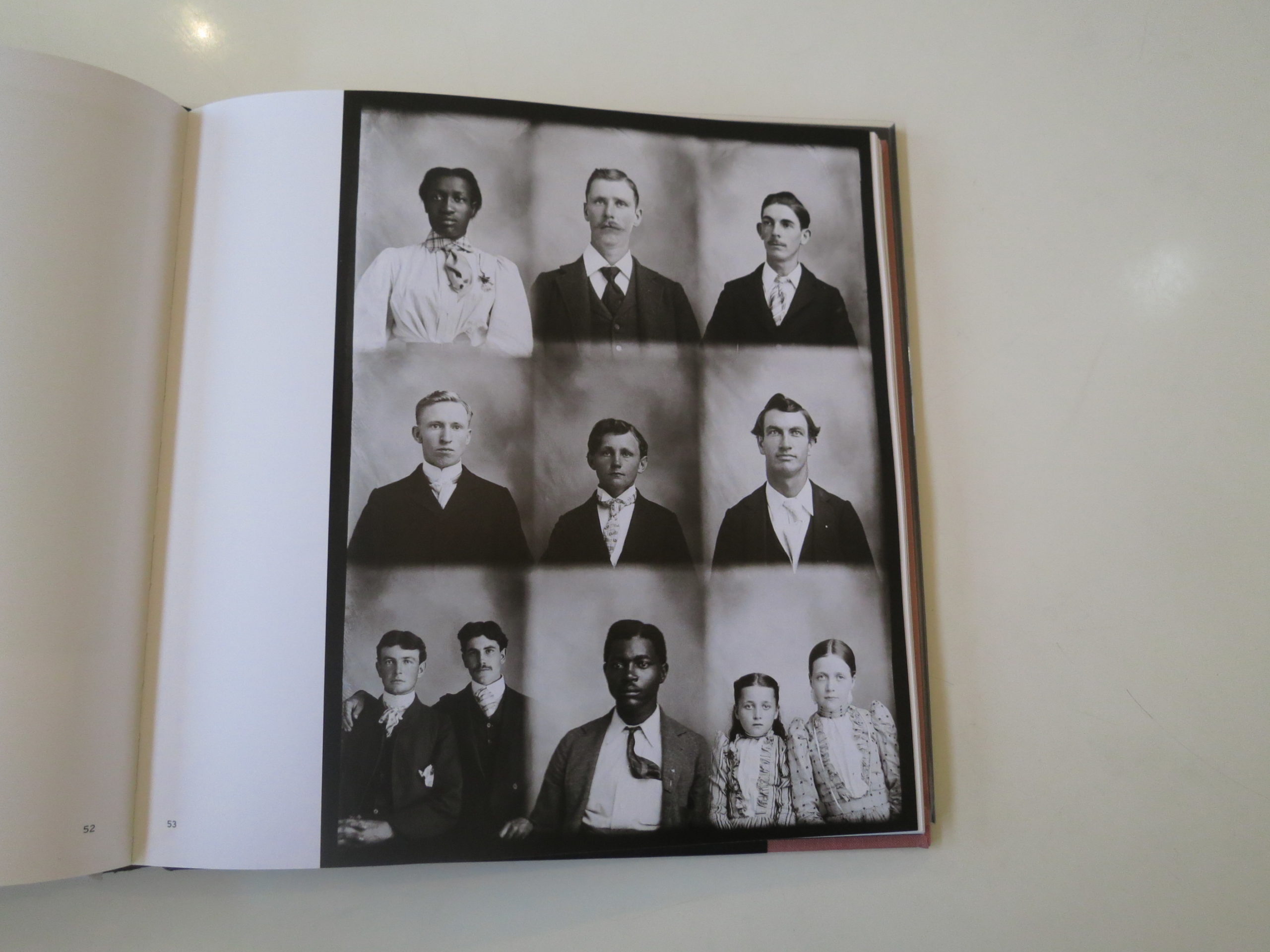
Mangum sold his prints cheaply, so that his regular-people-clients could afford them. He kept costs down by splitting glass plates into multiple exposures.

Let’s jump to page 38.

There are 15 narratives on one plate.

We’re interested in the middle row.

A woman stares at the camera, severe, in a white high-neck-top and a stylish hat that cascades dark flowers. In the background, below her, to her right, a man, who looks like a Peaky Blinder minus the trademark hat, is staring daggers through the camera.

In the second frame, she looks down and away in a new hat, and he’s in the same spot, eyes just off the camera’s center.

Then, frame three, BOOM, he’s up front, looking right through us, and she’s just off his left shoulder, her face in her left hand, the two of them looking like they just robbed a train and were about to go have sex and then spend a few dollars at the casino afterwards.

Then, he’s next to her, and in an instant, in frame five, he’s receded into the background again, and she owns the frame.

This time, no hat.

If it were a fashion shoot for W magazine, you’d think it was progressive. Or film stills from a German avant garde movie that inspired the guy who inspired the guy who inspired Wim Wenders.

My point is, these photographs exist, and they’re amazing, but they don’t make sense in any way.

Who were they, and what the hell were they doing in that studio?

They’re phantoms out of time.
Like us.

(#2019 feels like it’s ten or fifteen years mashed up into one.)

There are many other such pictures here, images that would captivate, by themselves. Together, they make for the kind of book that will reward upon multiple viewings.

But then, in the end, things get really interesting.

In the closing essay, Martha Sumler admits that as a youth, she and her friends used to throw Hugh Mangum’s glass plates at trees, smashing them to bits.

“I believe all of us regret destroying them,” she said.

Totally caught me off guard.

And then, just when I got over that one, Sarah Stacke asks Ms. Sumler about the rumor that Hugh Mangum had shot naked photographs of local wealthy women?

Say what now?

(Out of nowhere, like it’s the most natural way to end a book.)

“SS: There is this rumor that Hugh made nude images of prominent women in Durham. What do you know about that?

MS: The information came to me from my mother. She told me there were nude pictures of prominent women in Durham… Some of the relatives still had pictures, and that was fine, but she didn’t want the glass plate negatives to get out, so she destroyed them…

SS: So much mystery.

MS: There is. And a lot of things we will never know.”

I’m not sure I can adequately explain how little I expected to read those things in a book like this. One that presents a bit of history, and recontextualizes a fine, almost awkwardly good group of pictures.

This book was made in 2018, and I believe it took six years or so to make. A true labor of love.

No matter.
It’s #2019 through and through.

Bottom Line: Weird, super-interesting book of historical photos from the South

To purchase “Photos: Day or Night” click here
 

The Art of the Personal Project: Spencer Humphrey

The Art of the Personal Project is a crucial element to let potential buyers see how you think creatively on your own.  I am drawn to personal projects that have an interesting vision or that show something I have never seen before.  In this thread, I’ll include a link to each personal project with the artist statement so you can see more of the project. Please note: This thread is not affiliated with any company; I’m just featuring projects that I find.  Please DO NOT send me your work.  I do not take submissions.


Today’s featured artist:  Spencer Humphrey

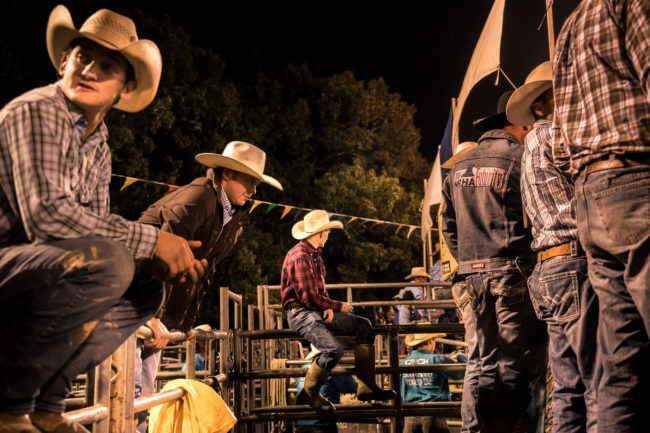
The goal of my photography is to notify the observer of a world that exists outside of their microcosm. For me the ultimate compliment comes in the form of the question “where is that?” I am currently measuring success by my ability to subtly guide the reader into a world right under their nose that they did not know existed.

In keeping with my theme of awareness, I have currently dedicated a large amount of my focus to stories based in the south. In the words of the famous Andre 3000 quote “the South got something to say.” And I feel that message is often muted and relegated to white noise preventing the masses, even southerners, from realizing all the South has to say from a visual perspective.

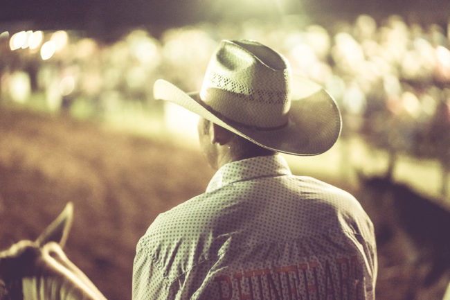
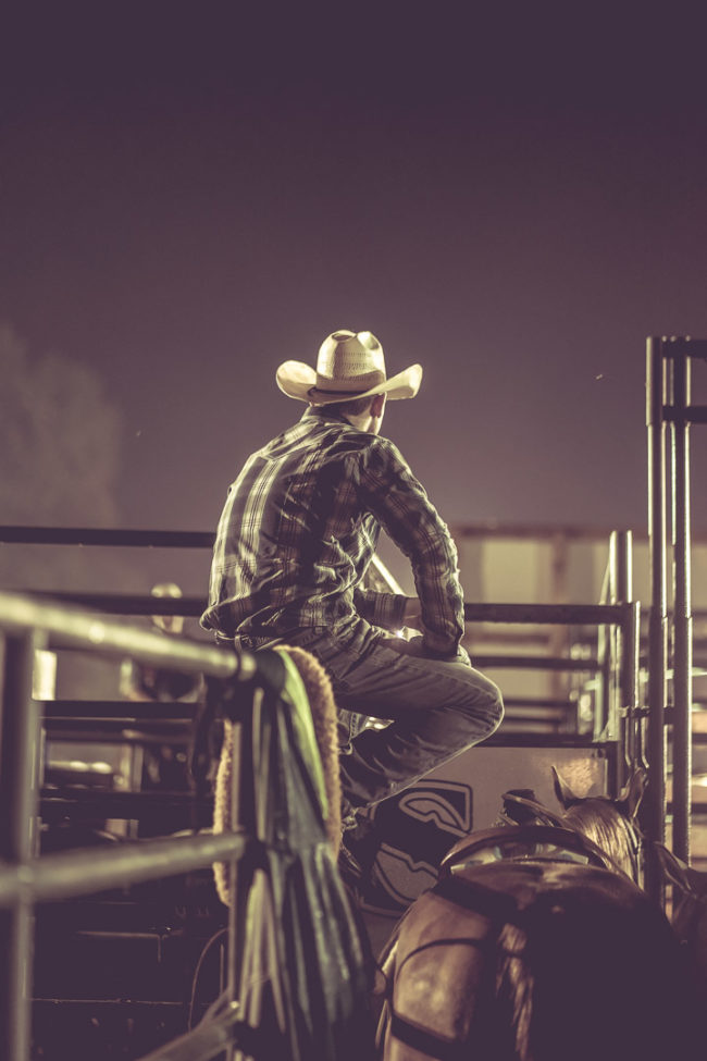
Continuing with my goal to help observers discover the same beauty and inspiration in their own back yard that some travel across the world to find. I chose the rodeo as a back drop to alert my audience of the unique, overlooked imagery and culture right in our own backyard that is entertaining and inspiring, yet offers a glimpse of life’s disappointments and triumphs. My rodeo images ultimately serve as a reminder that despite our differences there are many common emotional highs and lows that weave us all together in the human experience.

To see more of this project, click here.

APE contributor Suzanne Sease currently works as a consultant for photographers and illustrators around the world. She has been involved in the photography and illustration industry since the mid 80s.  After establishing the art buying department at The Martin Agency, then working for Kaplan-Thaler, Capital One, Best Buy and numerous smaller agencies and companies, she decided to be a consultant in 1999. She has a new Twitter feed with helpful marketing information because she believes that marketing should be driven by brand and not by specialty.  Follow her at @SuzanneSeaseInstagram

Success is more than a matter of your talent. It’s also a matter of doing a better job presenting it.  And that is what I do with decades of agency and in-house experience.


Pricing & Negotiating: Product Interaction Shots for Beverage Brand

Craig Oppenheimer, Wonderful Machine

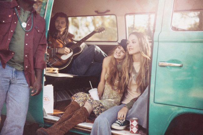
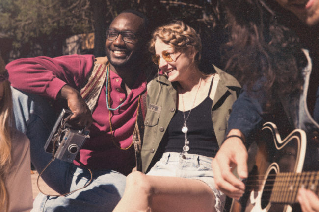
Concept: Professional talent interacting with various beverages in a residential property

Licensing: Collateral use of up to five images for one year

Photographer: Food/beverage and portraiture specialist

Agency: Mid-sized, PR-oriented, based in the Northeast

Client: Beverage brand

Here is the estimate:

Creative/Licensing Fees: We learned early on that the goal of this project was primarily to create content for social media, and there was also the possibility of the images living on the client’s website and being used for other collateral purposes. They only needed five shots and were willing to limit the usage duration to one year. These restrictions put downward pressure on the fee, as did the photographer’s limited experience working on commercial productions. I felt that each image was worth $500-$750, and on top of that I wanted to add $2-3k for the photographer’s creative fee. I ultimately decided that $5,000 was appropriate for a combined creative/licensing fee given the factors.

Photographer Scout Day: I included one day for the photographer to go see the location and do a walkthrough with the team. Typically I’d include a fee closer to $1,000, but I had a feeling the budget would be tight on this project, and the photographer was willing to go with a $500 fee for this.

Assistants: The first assistant would double as the photographer’s digital tech, and we included a second assistant as well for the one shoot day.

Producer: I included five days for a producer to help pull the project together and handle all bookings and logistical elements.

Hair/Makeup Stylist: I included one stylist to help prep the five talent we anticipated booking.

Wardrobe/Prop Styling: While I often break out these roles, I felt that given the minimal number of talent, a stylist could help arrange both of these elements, depending on the creative direction. I included appropriate shopping and return time for one stylist along with an assistant. I also included $500 per talent for wardrobe, and based on a conversation with the art producer at the agency I marked props as TBD which would be dependent on the final creative direction and location provisions.

Location Scouting and Location Fees: I included three days for a scout to help find a location and to be the liaison to the homeowner on the shoot, and I marked the location fee at $3,500. Additionally, I included $500 to cover floor protection and cleaning supplies.

Casting and Talent: As a cost-saving measure, we’d cast from cards rather than hold a live casting. Oftentimes I’d charge $500-$1,000 to handle this process, but we waived it and integrated the work into the producer’s time. I included $1,800 per talent based on a rate of $1,500+20% agency fee.

Equipment: This covered the photographer’s camera bodies, lenses, lighting, and grip equipment.

Catering: This was based on $65 per person for a light breakfast and lunch.

Production RV: I marked this as TBD, as it’s nice to have for a production like this, but the location could also serve as a staging area. We planned to discuss the potential need or lack thereof after we had a sense of what the location options were.

Post Production: I included $300 for the photographer to do an initial edit and provide a gallery of content for the agency/client to consider, and $100 per image for basic color correction, file cleanup, and delivery.

Mileage, Parking, Additional Meals, Misc.: I included $500 to cover transportation and miscellaneous unforeseen expenses that might arise during the production.

Feedback: After submitting the estimate, we were told that they had a $25k budget, and we were asked to revise based on this. Fortunately, the agency was willing to handle location scouting as well as retouching, and we compiled a revised estimate based on this. In addition to addressing those items, we also marked the scout day for the photographer as TBD and reduced a day for the producer. While we couldn’t quite get down to $25k, we felt that dropping it to under $30k would still be in the ballpark. Here was the revised estimate:

Results: The photographer was awarded the project. During the pre-pro process, the agency requested two additional talent to match an updated shot list, which impacted talent fees, wardrobe costs, catering, and a few other misc. expenses. Additionally, after the agency chose a location and had a conversation with the prop stylist, they approved additional shopping days and prop costs. In total, they approved nearly $10k of overages.

If you have any questions, or if you need help estimating or producing a project, please give us a call at 610.260.0200 or reach out. We’re available to help with any pricing and negotiating needs, from small stock sales to large ad campaigns.

The Daily Edit – Forest Woodward

Forest Woodward

Heidi: How did that experience and film making push you forward now that we’re 4 years out?
Forest: The making of that film with my father (The Important Places) has shaped and continues to shape me in ways that I am still working to understand. When we pushed our boats off into that river, it was November of 2013. It was supposed to be a 28 day trip. Little did I know, I’d never really get off the river, and I mean that in the best way. The currents of that journey, the experience of going that deep into the canyons and into our family history with my father…well, I guess I could have guessed that I wouldn’t just be able to step off that raft and forget about it. It was an experience that has fueled a curiosity in my work relating to time, to family, to aging and to our relationships to one another and the natural world. The making of that film taught me a lot about listening, about humility, about giving things their due time. I continue to trip over my own ego and desire to be somewhere further downstream from where I am. That film reminds me, both in my work and professional life, to watch the currents, pay attention to the people and landscape around me, a reminder that when I am able to do that, there is a certain ability to flow, not to fight or flail, or grasp or desire what’s beyond reach, but rather to appreciate being right where we are. It all passes soon enough. I saw that then in the way my dad looks at the canyon walls, and at me. But it is also all enough, I learned that from him too, to appreciate it, soak it in, and care for the people around you.

What advice would you give your younger self?
Do good work. Be kind to the people around you, and to yourself. Balance your idealism with healthy doses of action. Embrace failure and continually seek opportunities to learn – in whatever form or medium they might take. Question societal definitions of success. Make your own. Surround yourself with good people. And be one, as much as you can. Watch, listen, and when the time is right, act with conviction. Be willing to adapt, to flex, to see from different angles, but don’t ever give up on the unique point of view that makes you you.

Since you wrote the film are you also being hired as a writer for stories you are shooting? 
I have kept my writing mostly personal. I’ll do some script writing on films I work on, and share some snippets here and there on instagram or my site but by and large I’ve reserved that part of my creative process for self reflection and more personal explorations. Maybe I’ll try writing something longer than an instagram caption one of these days. I have a vague notion of doing a book of short fictional stories based on people I’ve met and places I’ve visited, a project for another decade though I think.

Images from Future Stewards
Tell us how you earn trust in order to stand next to a human being?
I think trust is built over time and there’s no shortcut around that really. I look at the creation of an image as an exchange, a relationship. It can take place over years, or it can take place in a thousandth of a second. Sometimes there is an understanding and trust that is implicit in a meeting, understood in the grip of a hand or the meeting of eyes. Sometimes it is there, for whatever reason, whatever past events led me and that person to that place in time – sometimes it adds up to an implicit trust. I try not to take advantage of or to force that though, and try to steer myself towards projects where I am allowed the time to build understanding and trust between myself and my subjects.How do you deal with “the hurry”?
I try not to. I try to create and cultivate situations and scenarios where “hurry” is the furthest thing from anyone’s mind. As humans we’re very perceptive to other people’s energy, and that sense of “hurry” or “busyness” comes through in imagery I think.  I used to be a lot more frantic about “getting the shot”. Now days I see a lot of shots, and know I can’t get them all, and that chasing each shot often makes it so you don’t get any of them. I think patience is an underrated skill, and like any skill, it takes practice. If I’m feeling hurried I know my subject is probably feeling that too, so I stop, try to step back, reset.

Creative Director: Marshall McKinney | Photo Director: Maggie Bret Kennedy

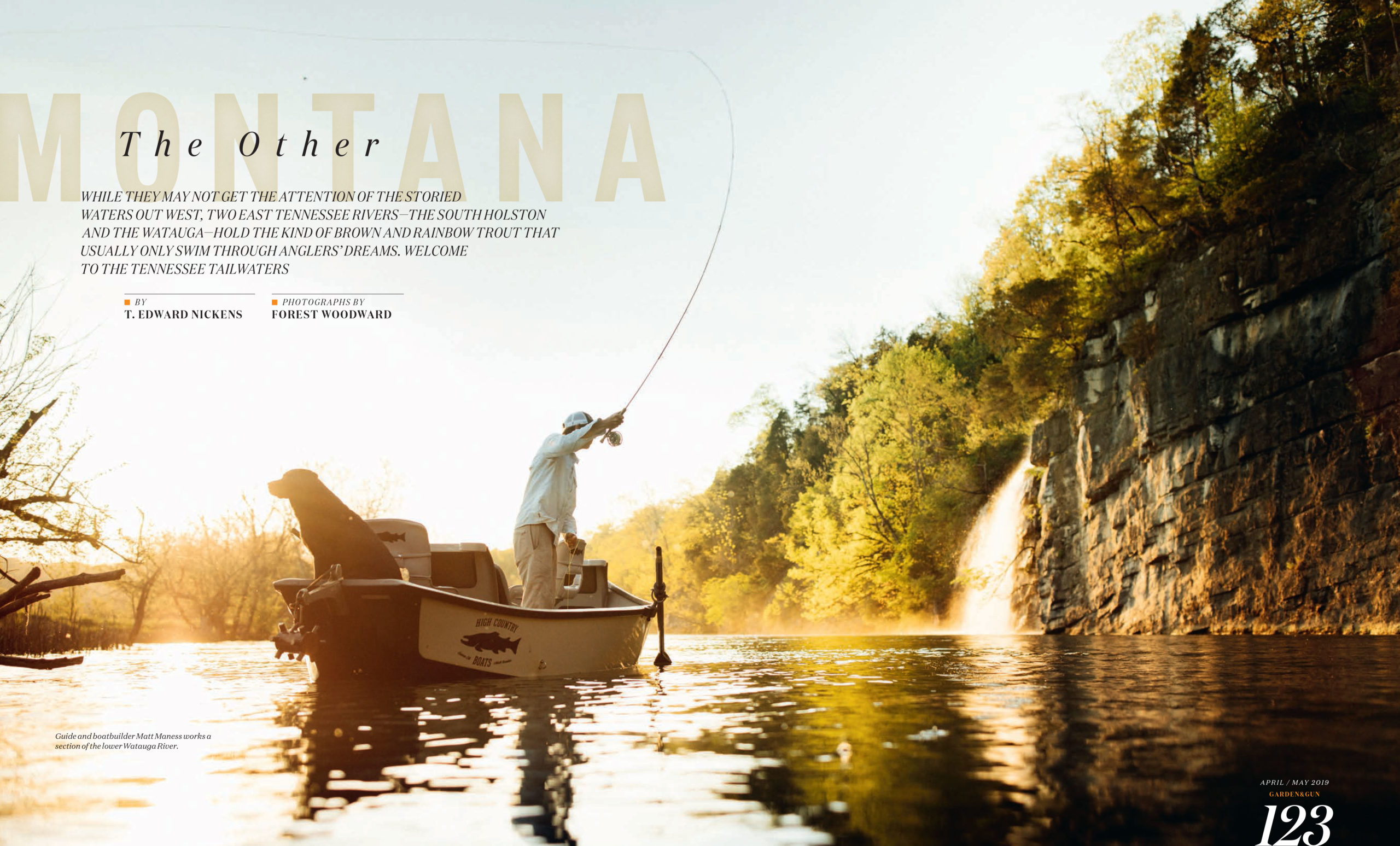
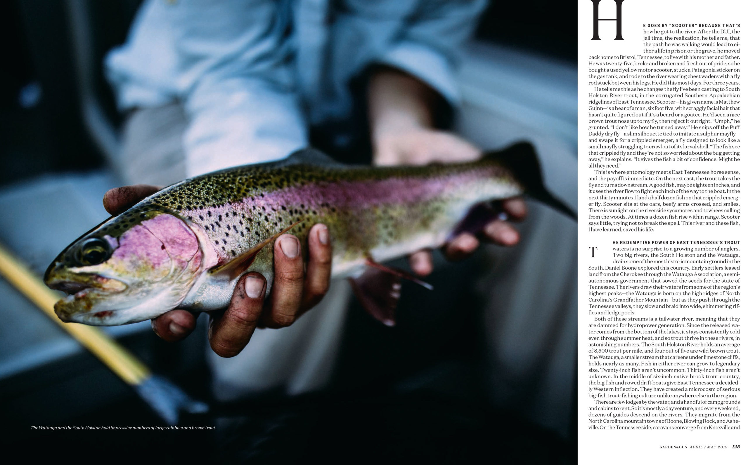
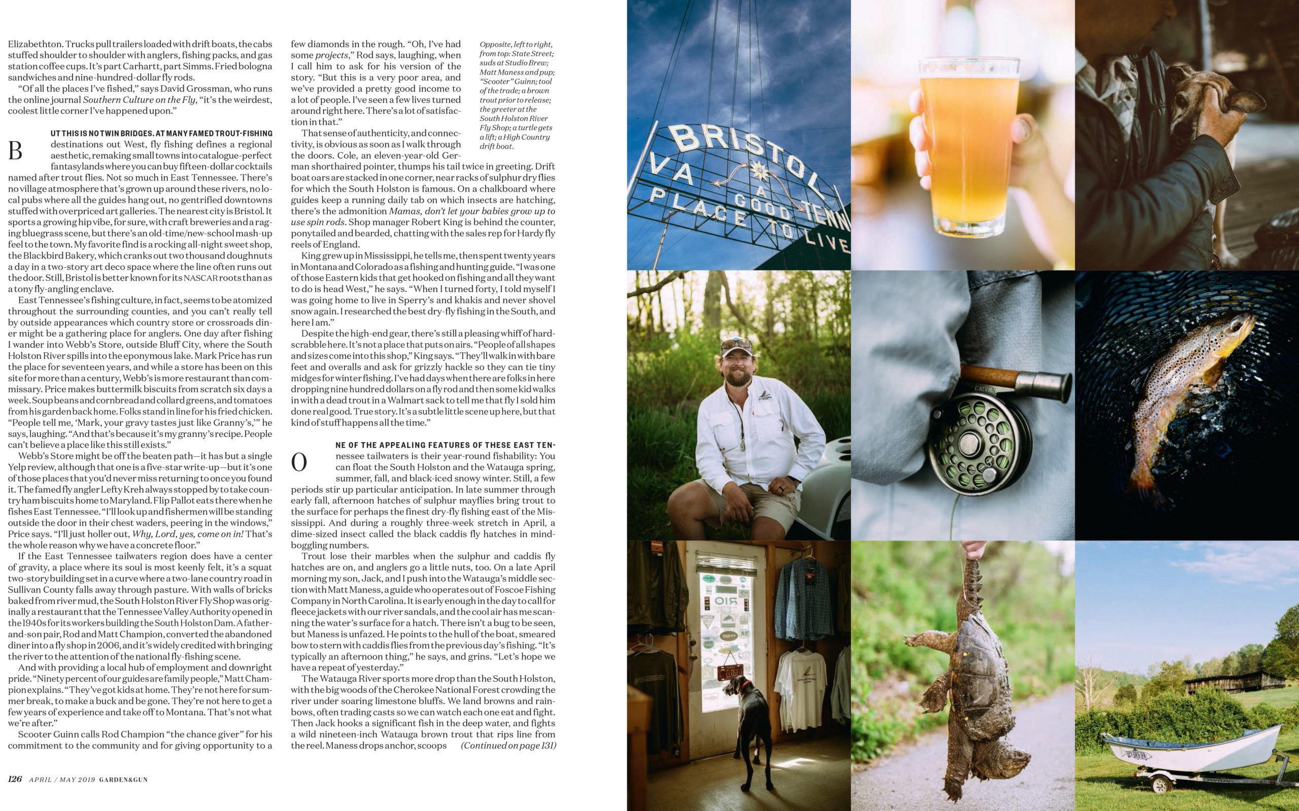
What are some parallels you can draw from the allure of the west and the south as eluded to in this Garden&Gun story?

I grew up in North Carolina, in Southern Appalachia – just south of Great Smoky Mountains National Park, but from age 12-17 my family lived in a very rural town (100 people, no phone lines or internet) in the North Cascades of Washington State, and during my early twenties I spent 7 formative summers in Missoula Montana. I think the tie between west and east is twofold for me – landscape and people. The people in rural Montana and Washington remind me in a lot of ways of the folks in rural Montana – they’re the first to stop and help you if you’re broken down on the side of the road, humble, quiet, knowledgeable of the landscape around them and in most cases with a deep appreciation of family and community. The thread that connects the landscapes for me is the rivers – and the wild country you can access by moving through them. A lot of folks don’t think this exists in the South – but in some ways it’s even more wild, more nuanced than the west, with incredibly diverse and rich ecosystems that are often best accessed by waterway or by taking a couple extra turns down unmarked dirt roads.

Was travel always a big part of your life?
I grew up homeschooled and learned at an early age that my family was not what the world would call “normal.” Looking back I see that as a badge of honor, but growing up I eschewed it, wanted nothing more than to be able to blend in. I became a bit of a chameleon at an early age. The way our parents raised us was with the idea of experiential education – so lots of time spent traveling, both in and out of the country – and interacting with folks of all different ages and walks of life. As a young man I continued following those same threads – majoring in sociology and Spanish in college in hopes of moving more fluidly through diverse communities and social settings. I continued to travel widely and eventually decided to swing the pendulum as far away from the town of 100 people where I lived as possible – living in New York City for 5 years.

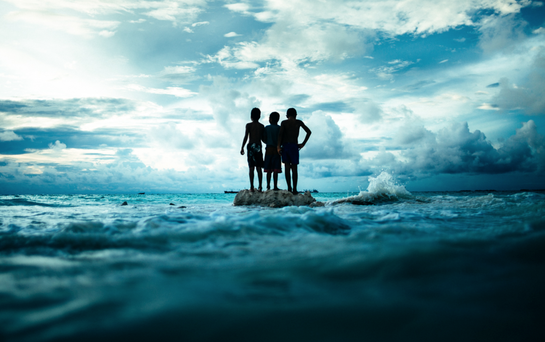
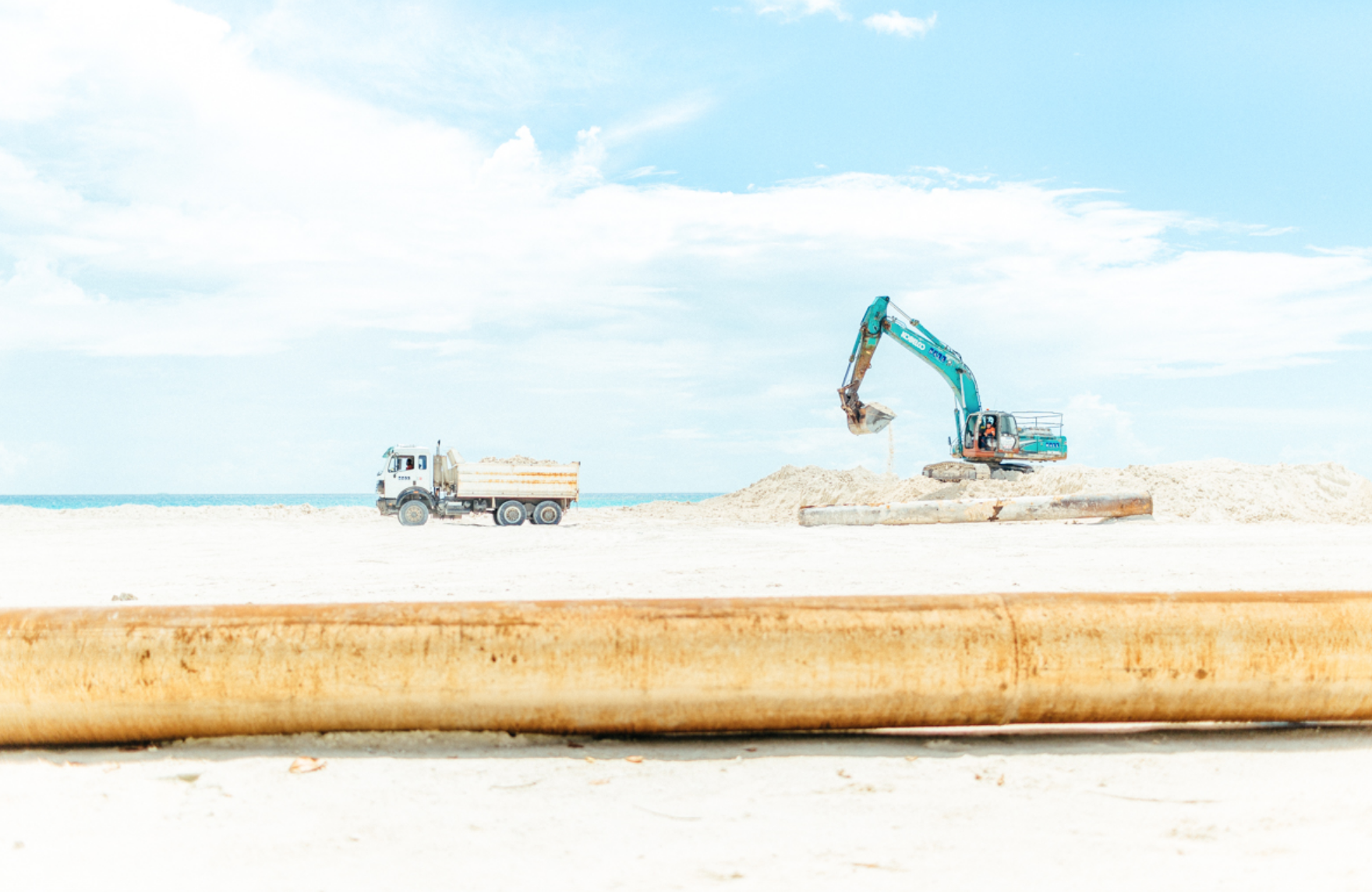
Images from Children of the Rising Sea


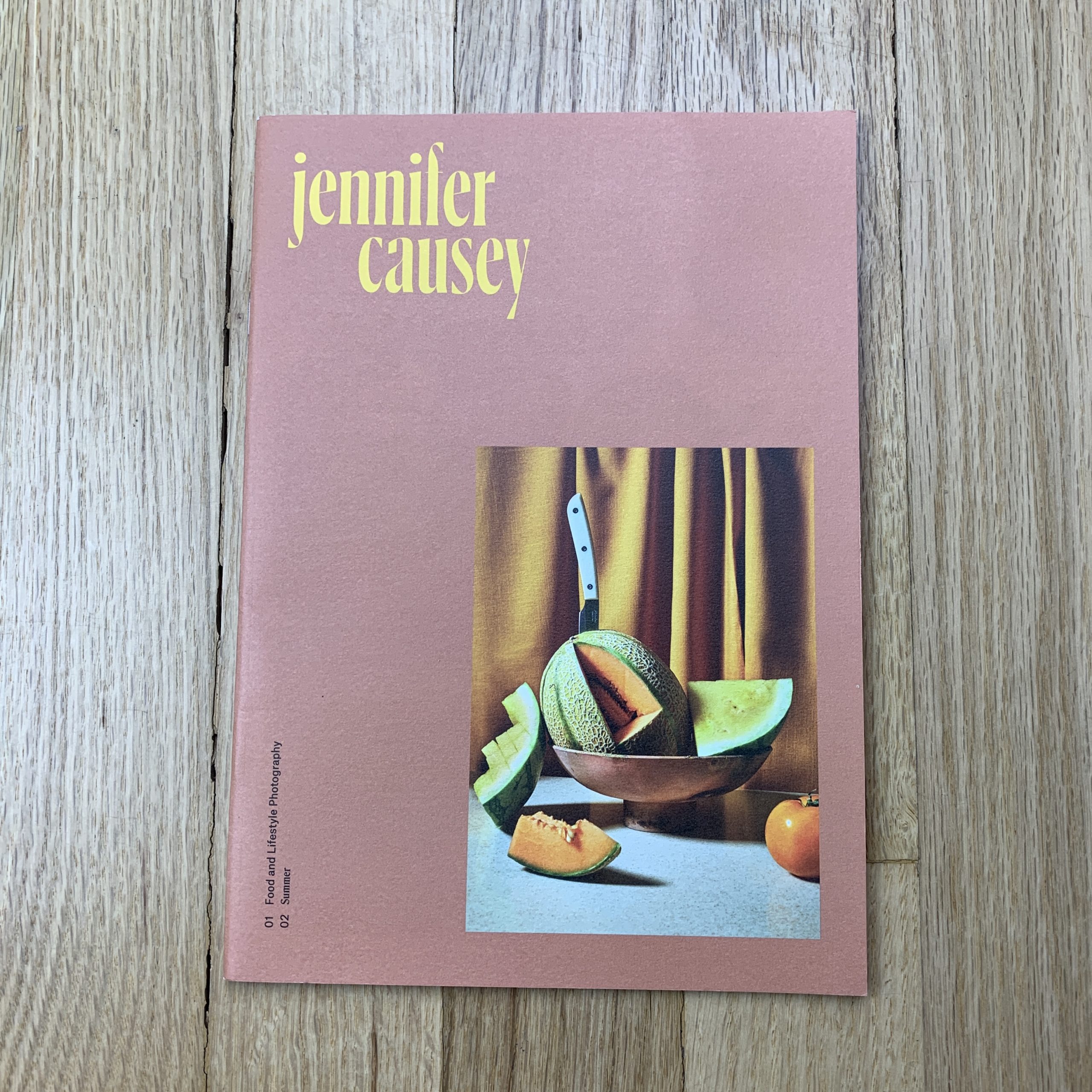
The Daily Promo – Jennifer Causey

Jennifer Causey

Who printed it?
Print West in Woodinville, Washington

Who designed it?
Kaela Rawson
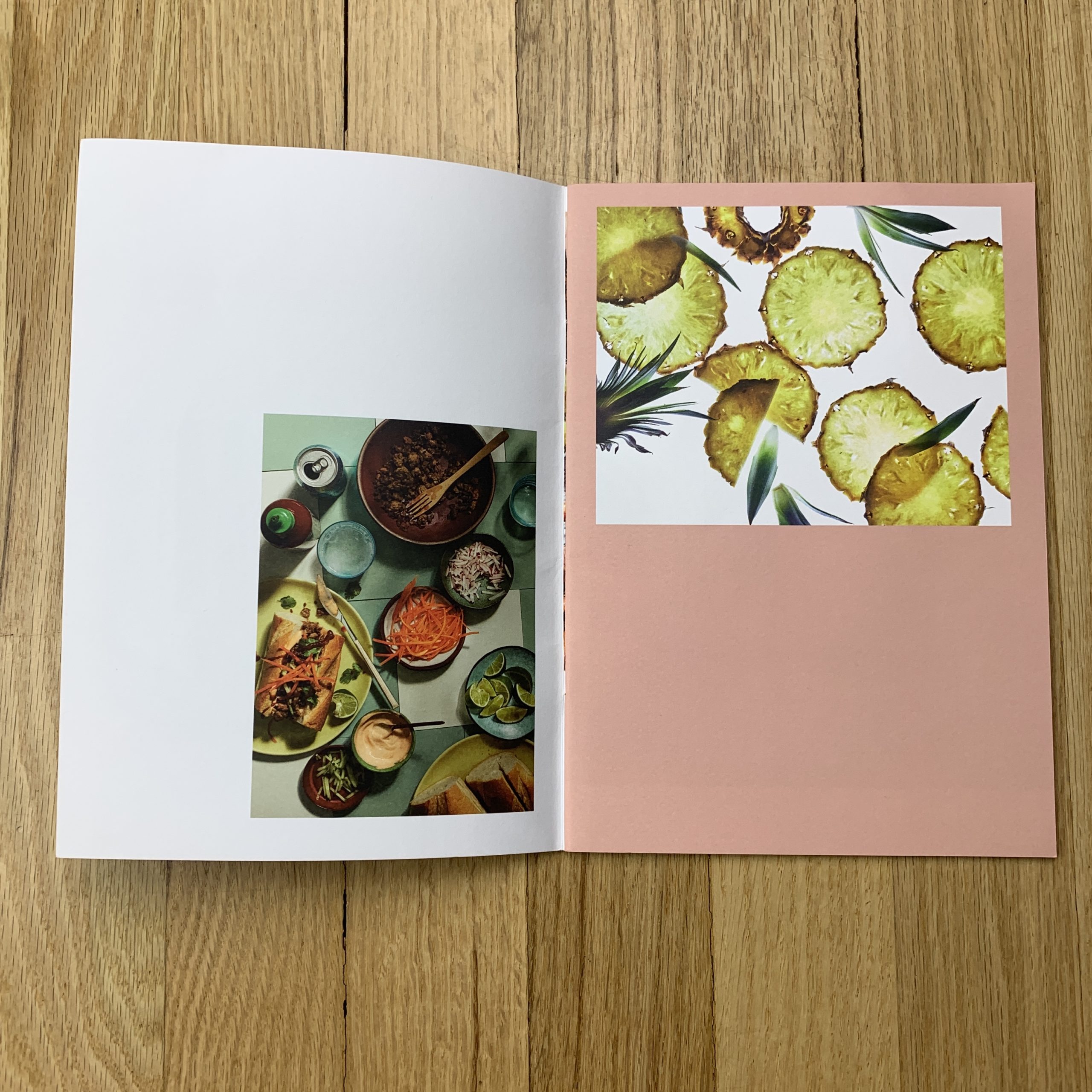
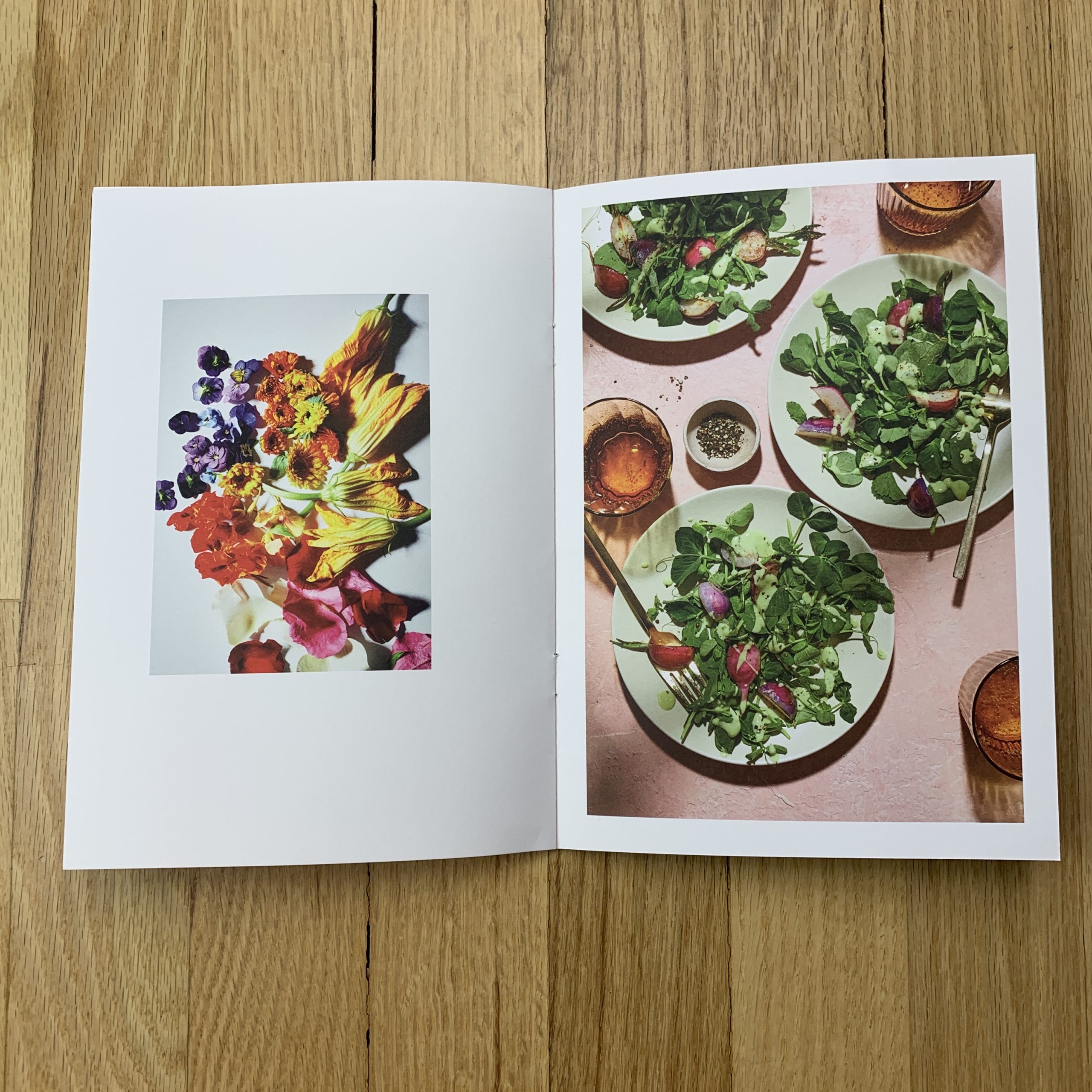
We worked together to create something that showcased the photos but also had a sense of design and aesthetic. I worked with some prop stylist friends to get feedback and help me choose and pace the imagery.

Tell me about the images?
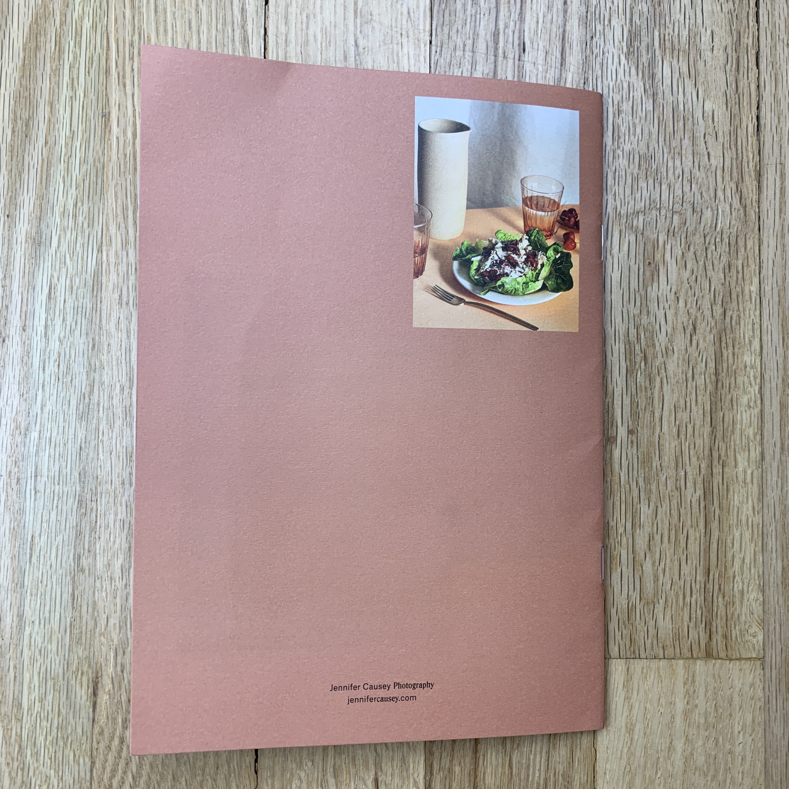
The images are a combination of test shoots and assignments. I wanted to showcase some shots that don’t really get a chance to be seen. I started looking at some of my recent work to see what I was drawn to. The images that stood out seemed to have a similar color story and feel. The cover image was actually a last-minute addition. It came from a test shoot I did with prop stylist, Audrey Davis. I was looking at a final draft of the promo while I was editing this shoot and I liked how it looked with the yellow font we had chosen to use, so I went with it.

How many did you make?
I printed 1000

How many times a year do you send out promos?
1 to 2

Do you think printed promos are effective for marketing your work?
Yes, I think it is nice to have something tangible to catch people’s eye and to hold on to, and to hopefully make them remember you for future assignments.

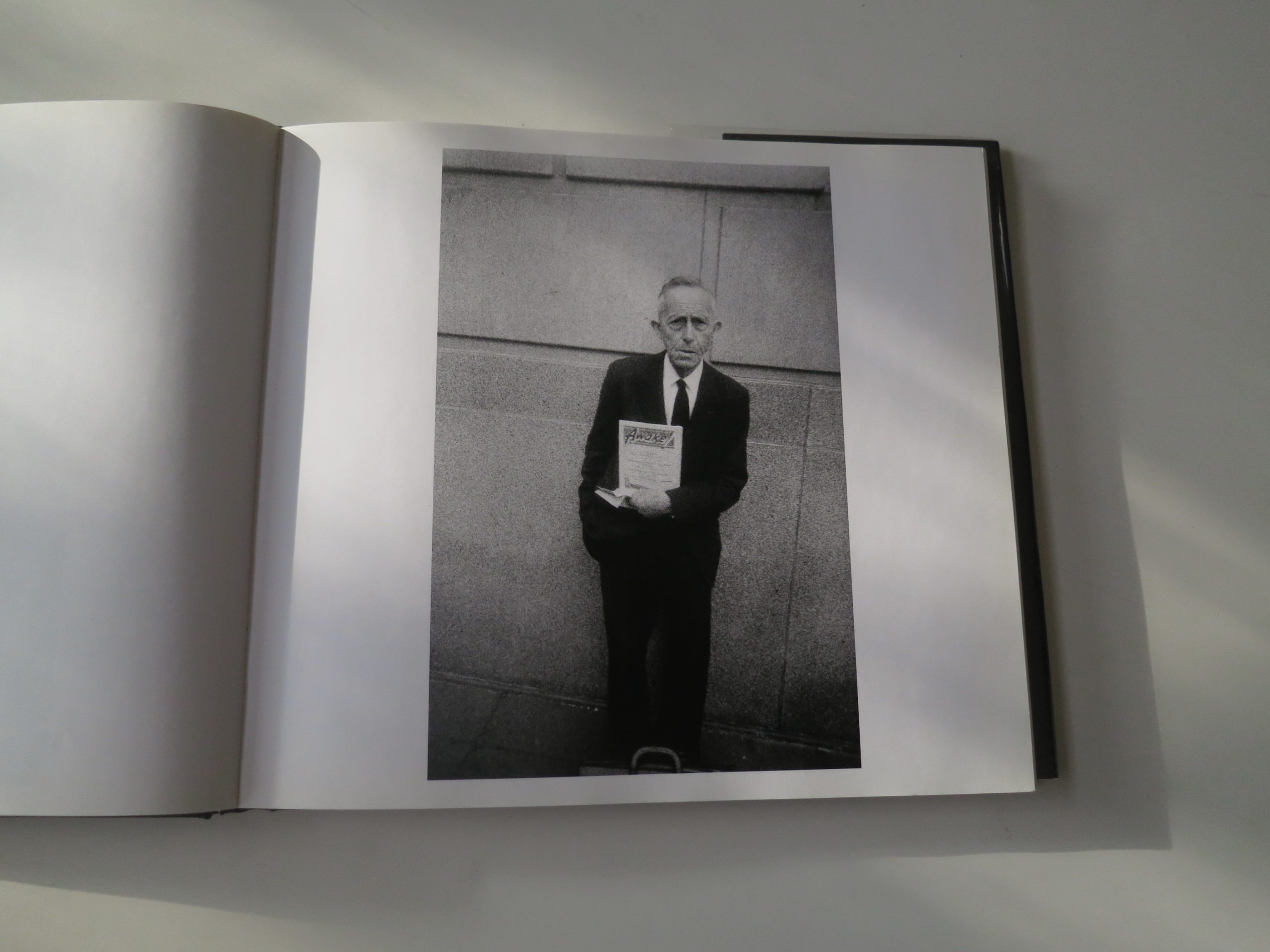
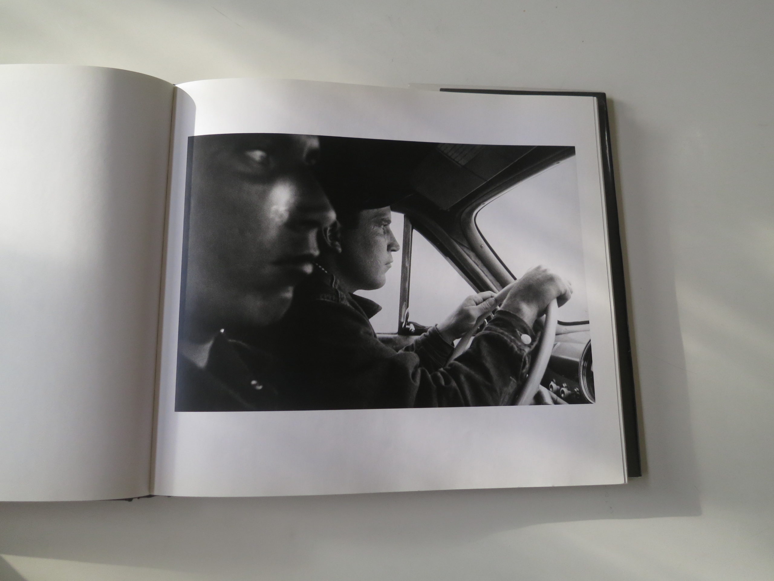
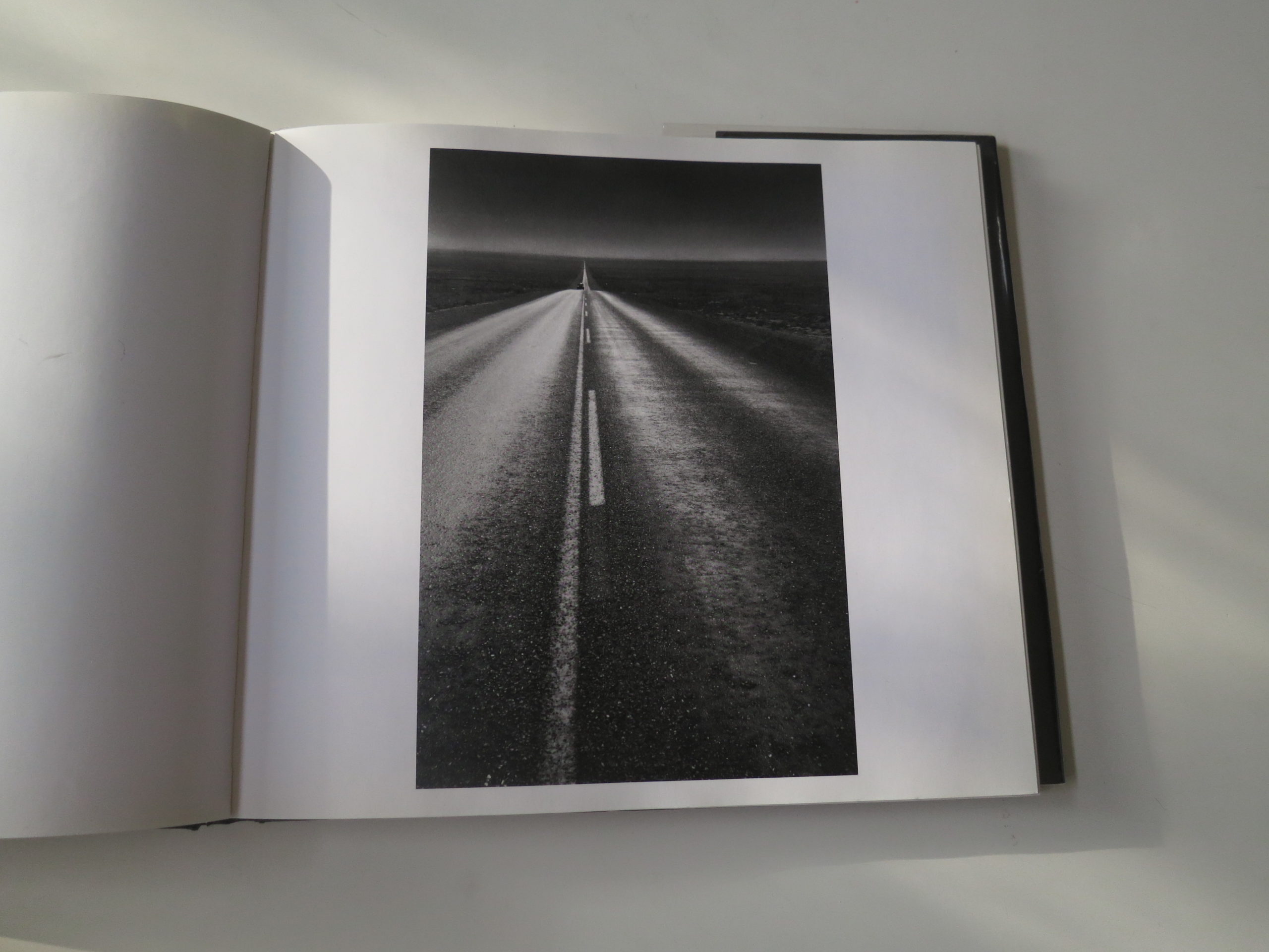
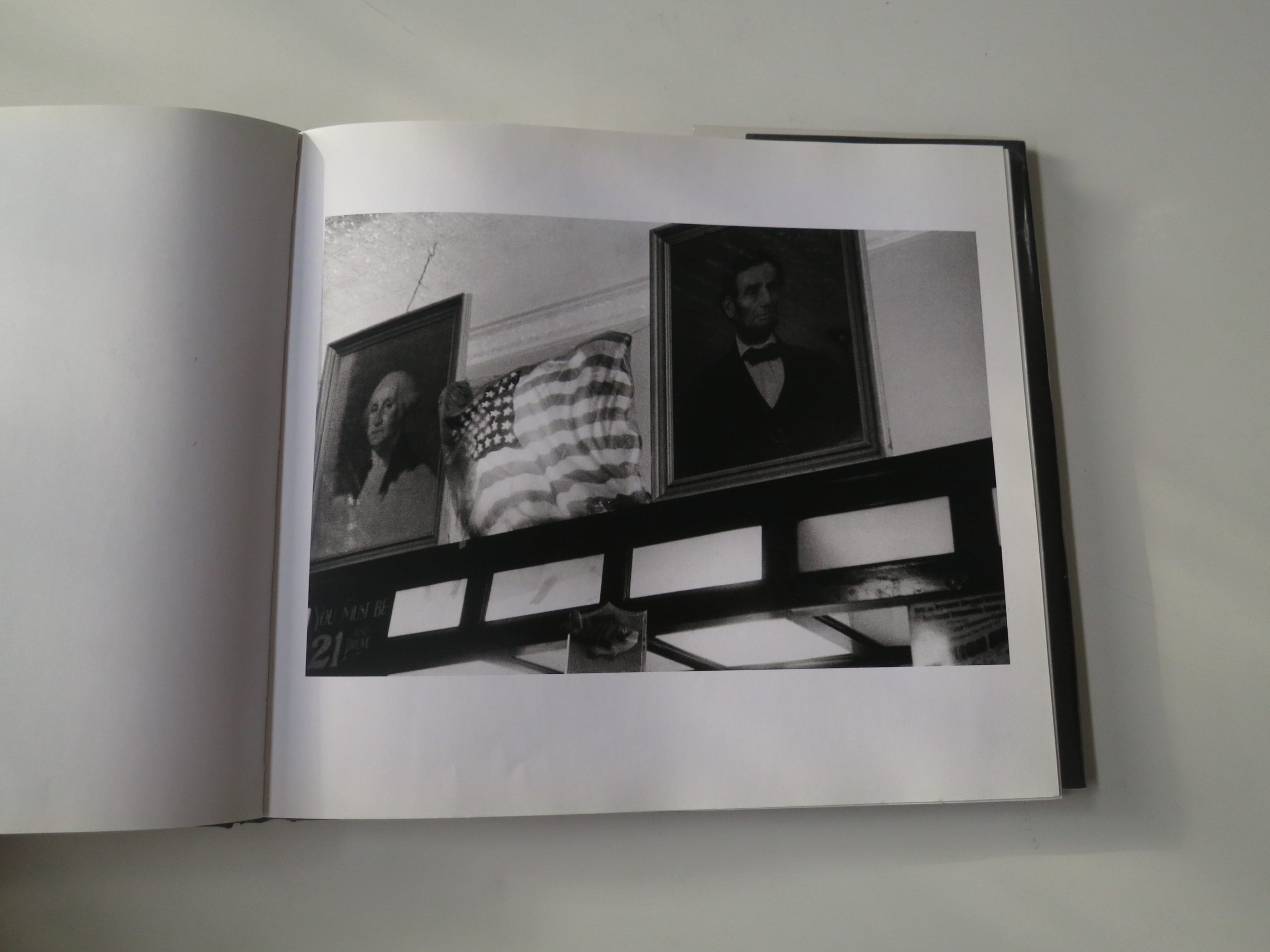
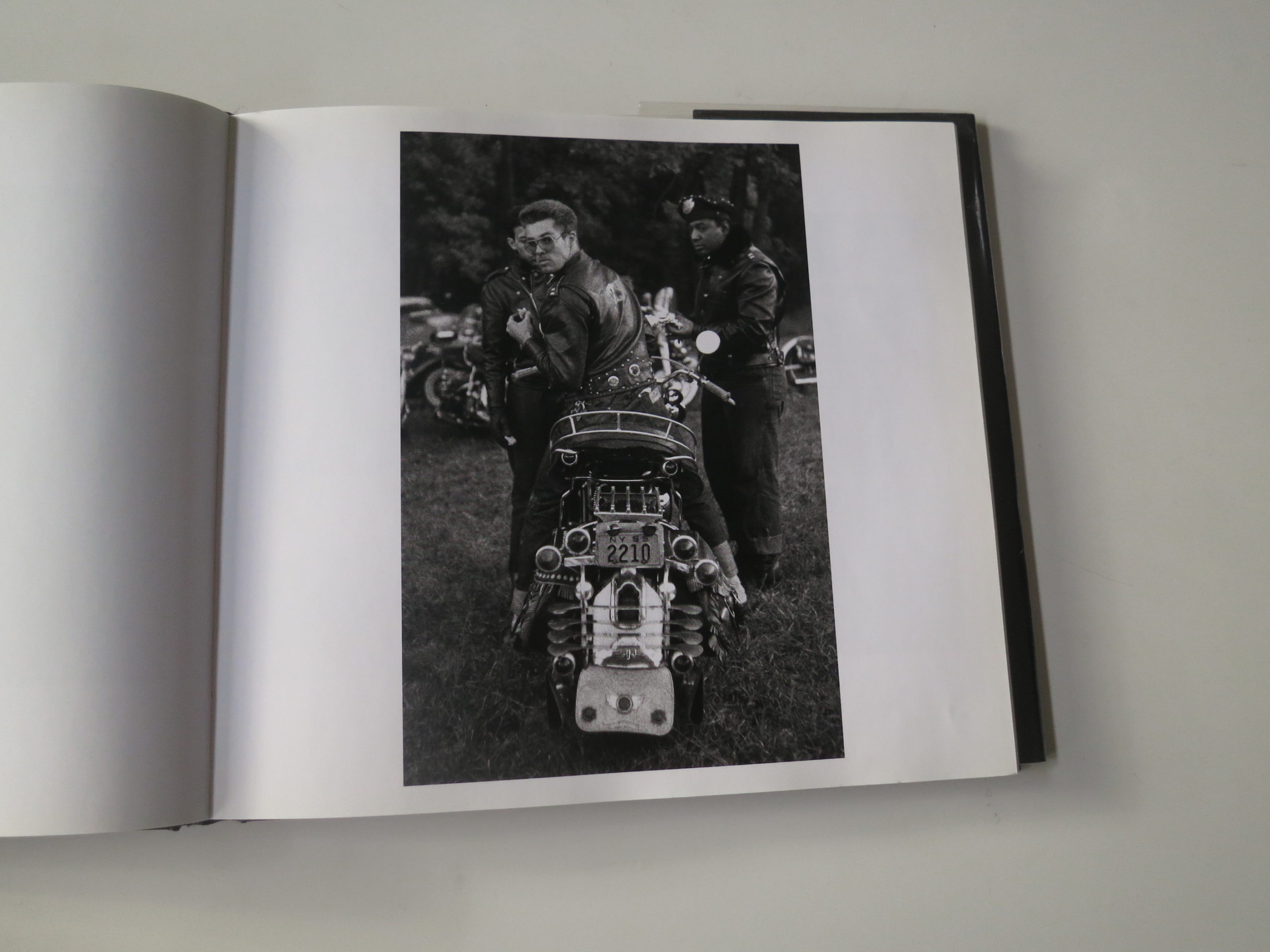
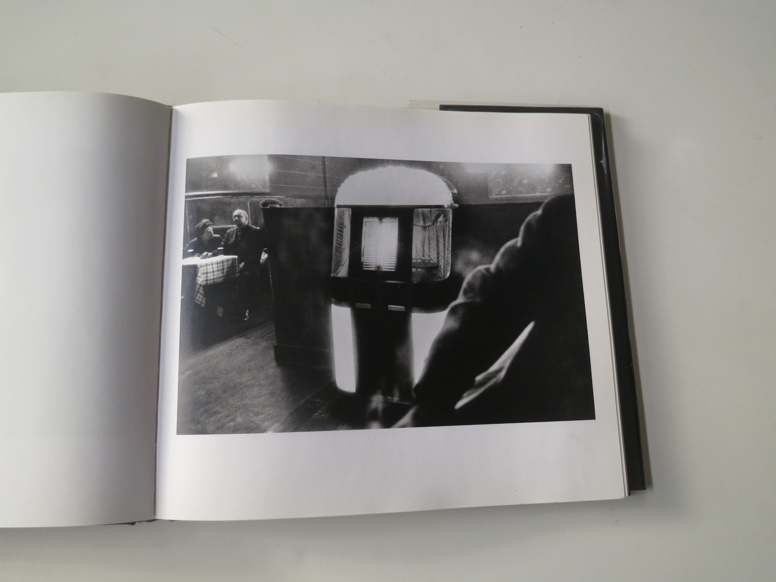
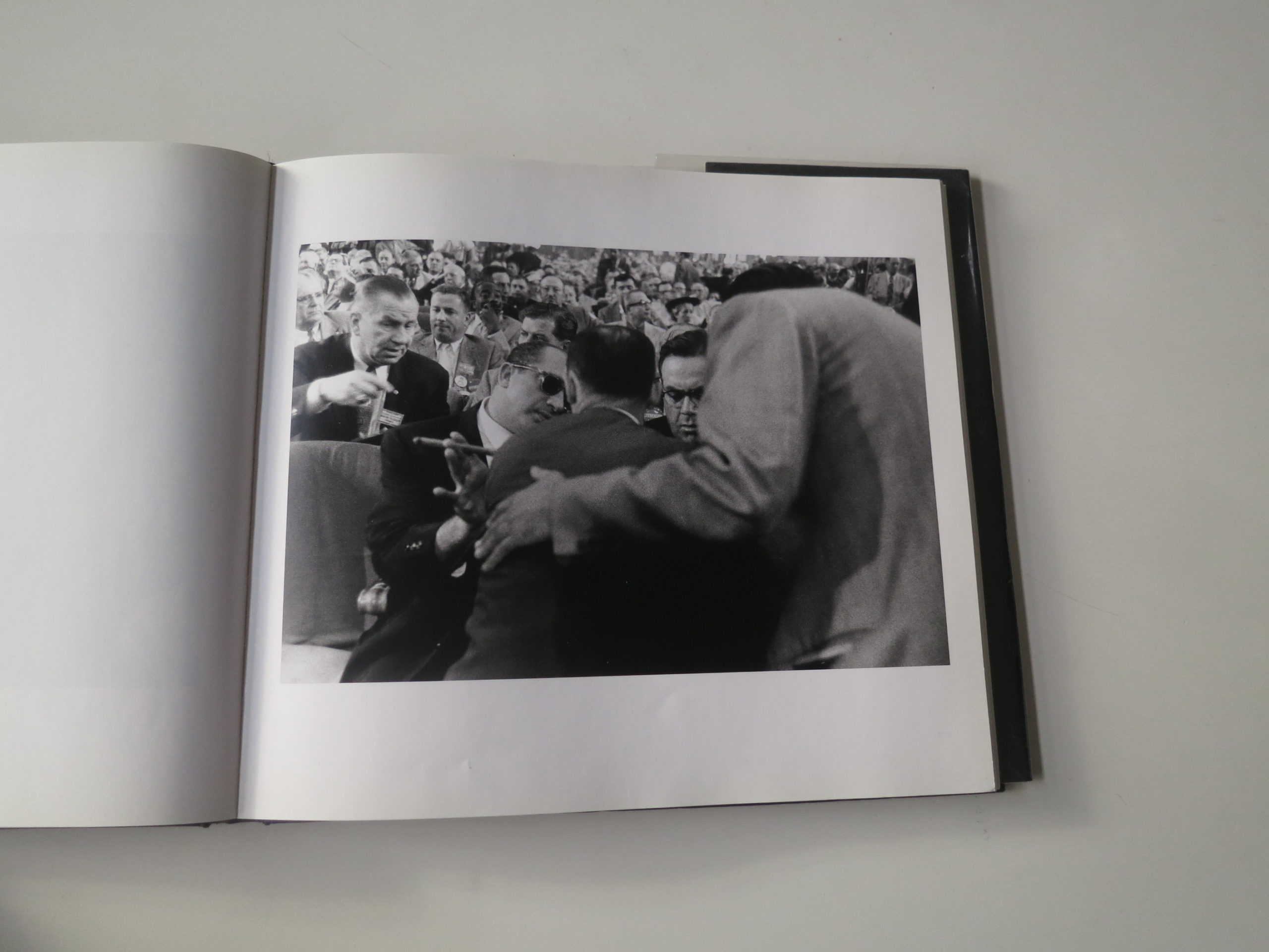
This Week in Photography Books: Robert Frank


My wife told me an awful story last night.

(Prepare yourself, it’s a tough one.)

Apparently, one of the kids in my daughter’s 2nd grade class gave a note to two of her best friends that read: I’m going to kill you.

They told the teacher, as you might expect, but it turns out the boy’s mom is co-workers with one of the victim’s mother.

So the perpetrator’s parent approached the victim’s mother at work, called her a “Snitch,” and started a physical altercation.

Now, the aggrieved mother told my wife, when the little boy, (who wasn’t suspended,) walks by the girls he threatened, he also whispers “Snitch” each time.

In 2nd grade.

In a charter school constantly ranked one of the best in the New Mexico.

Welcome to America in #2019!

This morning, trying to unwind from an overwhelmingly busy trip to Chicago, (a string of 18 hour days with zero downtime,) I put on “Next of Kin,” a silly-looking, late-80’s action film set in the same city.

It starred Patrick Swayze, (RIP,) rocking a mullet-ponytail, (of course,) and a thick Appalachian accent. It also featured Bill Paxton (RIP) and Liam Neeson playing “Hillbillies,” and a very young Ben Stiller as an Italian mobster.

Say what now?

Honestly, it’s no surprise we all miss the “seeming” innocence of the 80’s and 90’s.

I’m not done with the movie yet, as I took a break to write for you, but the Italian Mafia plays a central role, and we can thank them for the culture of “Omertà” that evolved into the 21st Century’s “No Snitchin’.”

How on Earth did “tattletale” become the worst thing a person can be? Worse than rapist, or killer, or thief? I mean, sure, we learn in kindergarten that “no one likes a tattletale,” but how many parents out there say “Go tell the teacher?”

I know I do.

Another word for “Snitch” or “tattletale” is “whistleblower.”

Right?

And sure enough, our pathological narcissist of a President may have finally managed to kick off an impeachment trial, because someone came forward to share that he, like the Mafia Don he appears to be, leaned on a foreign government to get dirt on Ol’ Joe Biden.

No one likes to hear “I told you so,” but honestly, I called him a Mafia-like-thug in this column so many years ago I don’t even remember when I first said it.

How did we get here?

And where is here?

2019 is so fucking confusing that sometimes I don’t even know what month it is, as I feel like I was just in London, (4 months ago,) or California, (2 months ago,) but if you told me it was December right now, I might not argue with you.

The NYT, my former employer, published an op-ed this week that confirmed this sense of perpetual confusion plays right into Trump’s hands, as the more unsettled people feel, the more likely they are to vote conservatively.

Which means there’s a strong chance that DJT is courting all this chaos ON PURPOSE.

All because 40% of the American population, nearly entirely white, wishes we could just go back to the 1950’s. That mythical time when non-ethnic, hat-wearing, square-jawed White Guys went out into the world each day to their office or factory job, and came home to a cooked dinner, served by their subservient, non-working wives, who kept their mouths shut, and did what they were told.

“Alice, why I oughta!”

That’s right.
The 50’s.

Sock hops and drive ins and juke boxes. Greasers and varsity jackets and pork chops and Coca Cola.

Mickey Mantle and Johnny Unitas.
Be like Ike.

This is what Trump means about Make America Great Again.

Let’s build a fucking time machine, out of a DeLorean big enough to fit 40% of America, and let’s all go back to a time when you didn’t have to acknowledge or respect other cultures.

When Thai Food was only in Thailand.

When 16 year old Swedish girls stayed in Sweden, and did what they were told.

When date rape was acceptable, and rampant pollution had not yet ruined America’s environment enough to draw regulatory blowback.

Make America Great Again?

No thanks.

Things may be royally insane these days, with our incels and our AR-15s and our Brexit and our Kardashians.

But I’d take it over a repressive, patriarchal monoculture each and every time.

You know who else was critical of the 50’s, while still managing to capture the best it had to offer?

That’s right.

Robert Frank. (RIP.)

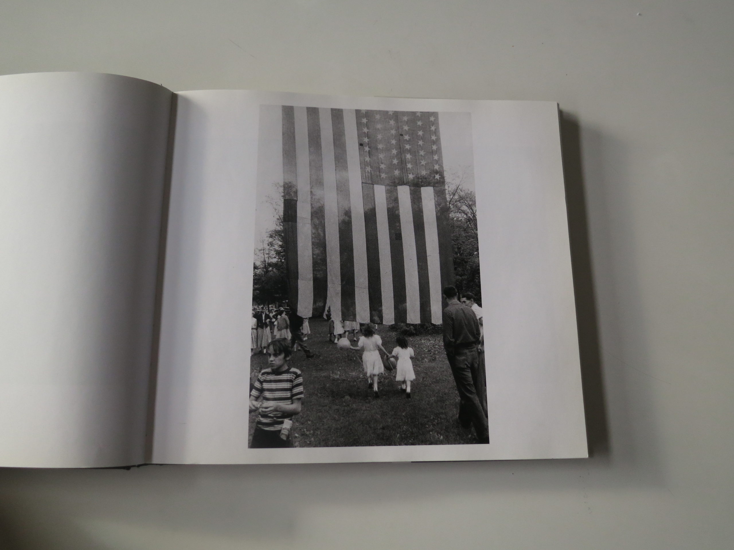
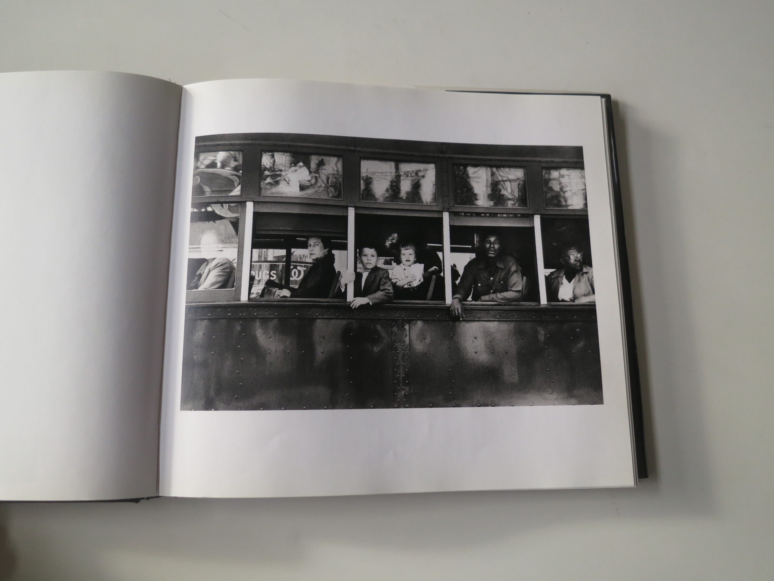
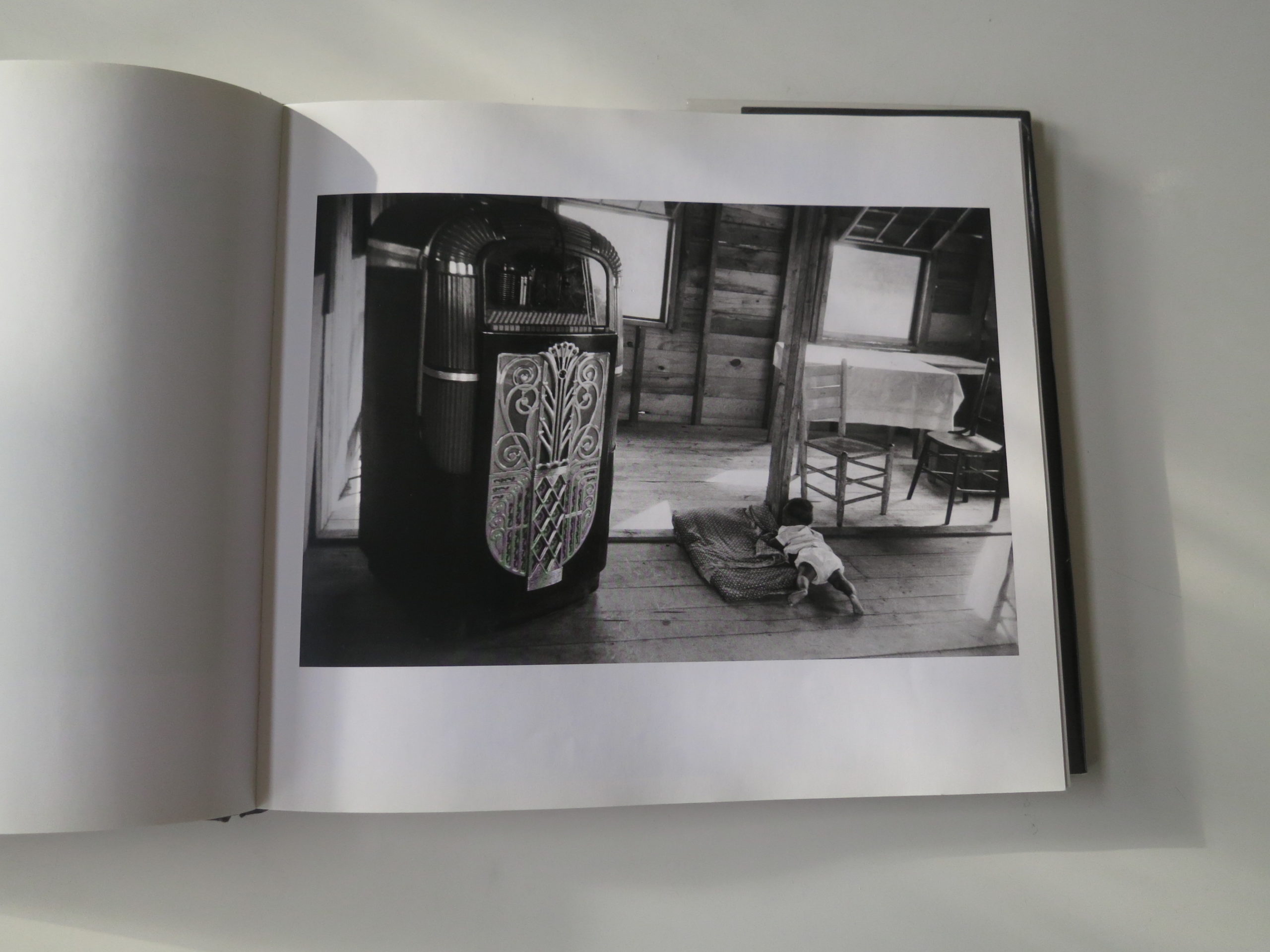
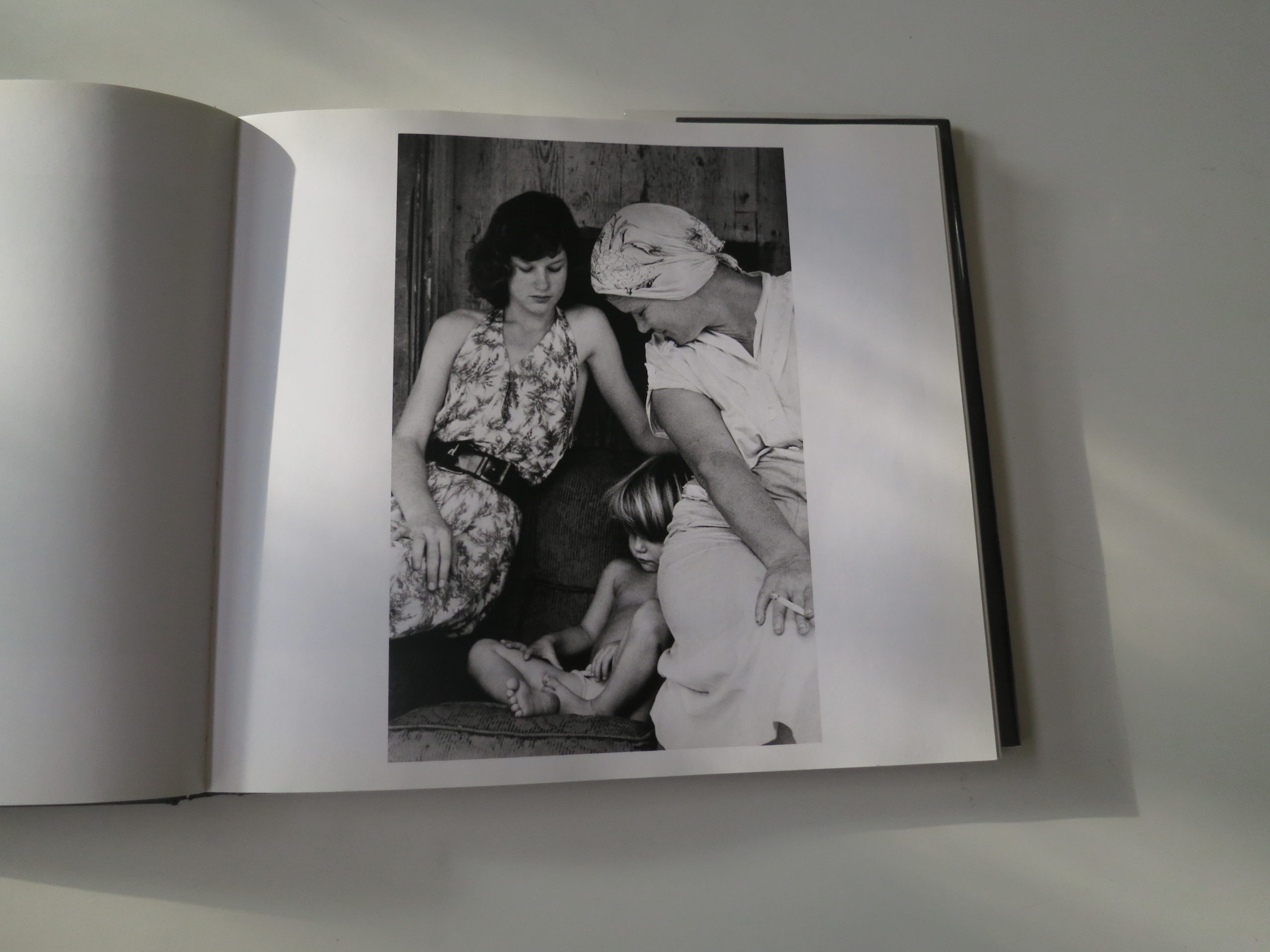
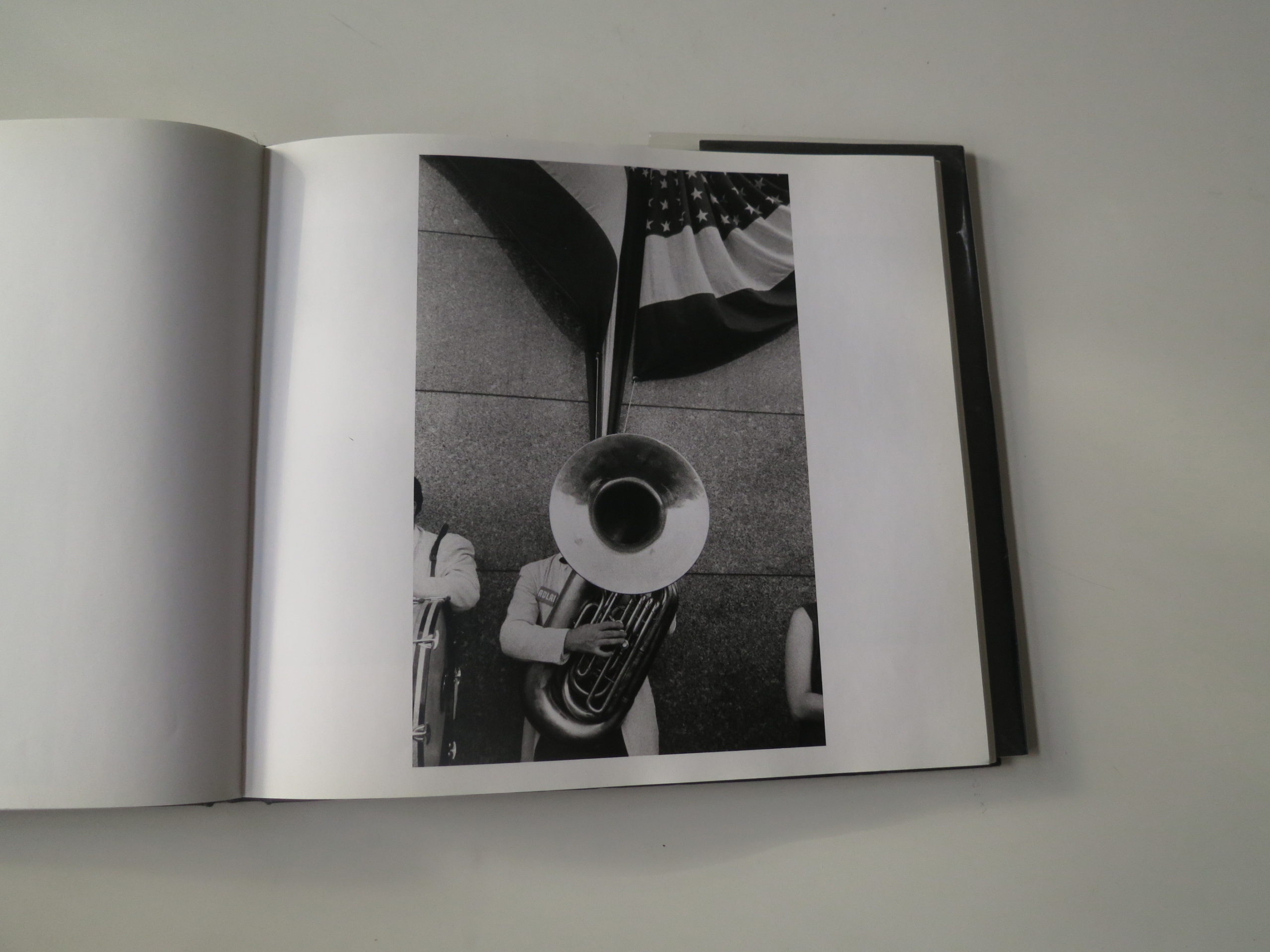
Given the title of the column, you probably knew I was going to get here eventually. But still, in honor of Jack Kerouac, who wrote the introduction to the never-famous-enough-to-be-too-famous masterpiece, “The Americans,” I thought I’d push my stream of consciousness skills as far as they can go.

(Hey Andy Adams, still think Blake Andrews is the most brilliant photo blogger out there?)

As anyone reading this likely knows, Robert Frank, that once-a-century-genius, passed away recently. And though I’ve had the honor to meet and interview many of photography’s legends in my 10 years as a journalist, I never met or spoke to the man.

Hell, I don’t think I was ever within a few miles of him at any given time, though friends and colleagues did know him, and I send them my condolences.

But really, Robert Frank, Swiss Jew turned proper American, and his seminal book named after all of us, belonged to everyone.

Show me a trained photographer who never saw the book, or never cared for it. I dare you! Because we all know, no such person exists.

Each and every human being who ever picked up a camera in earnest, and then devoted him or herself to the craft, found this book to be an inspiration.

And rightly so.

Robert Frank, in the middle of the middle decade of the 20th Century, that decade now considered our heyday, came across the Atlantic Ocean and showed us who we were.

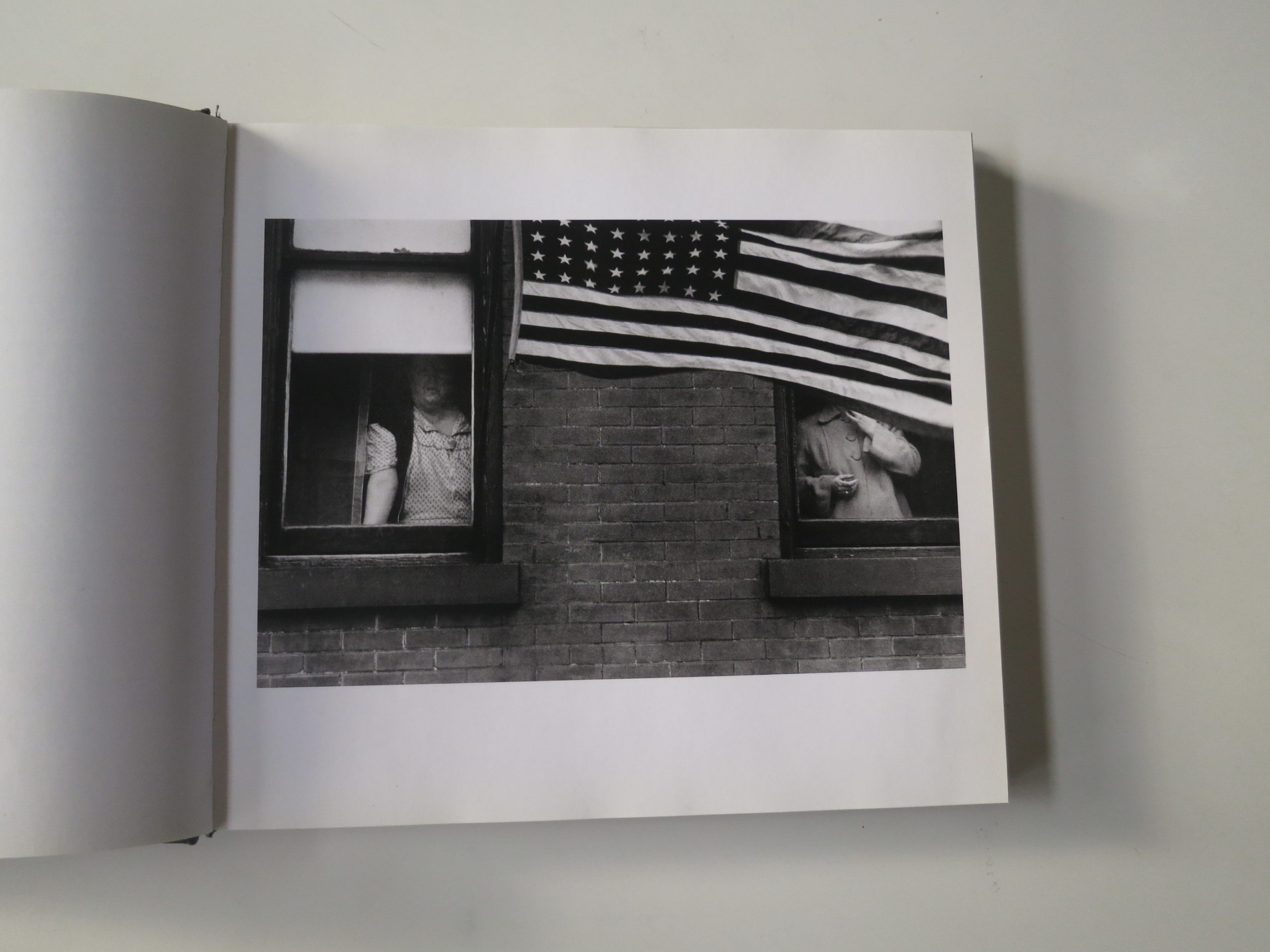
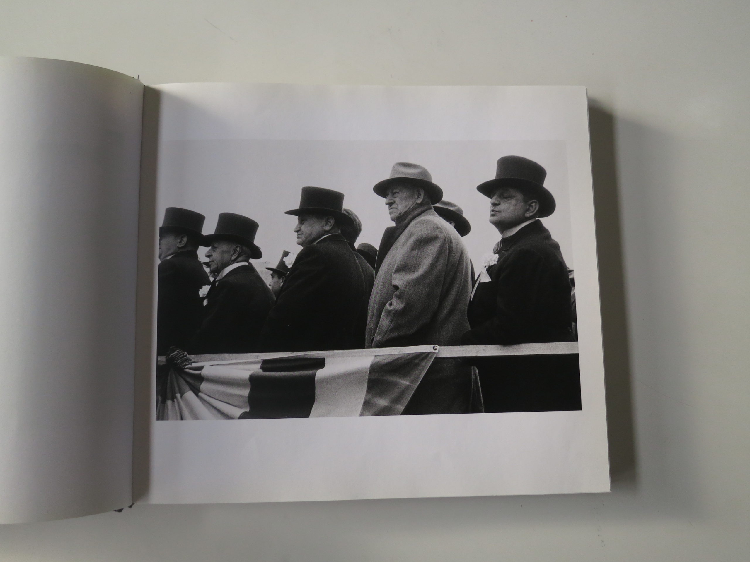
He used a camera, instead of a pen, to create a rambling visual poem, (as Kerouac correctly nailed,) that wove together a story about a newborn Superpower, one that used symbols in such a specific way that it took years for anyone else to have the guts to take back the American Flag, the crucifix, and the jukebox.

Because he owned them.
He made them his, and he made them sing.

Power brokers and fat cats.
Lonely workers and nobodies.
Trans people and cowboys.
African-American nursemaids and their lilly-white charges.

It was all in there.

TV screens and shotgun shacks.
Dancehalls and Drive-ins.

Death and despair.
Life and love.

It’s all there.

As a student, nothing impacted me more, as my final project for Photo 1 at UNM, called “Ten Hours to Vegas,” aped his style so strongly that I’m lucky I got out alive.

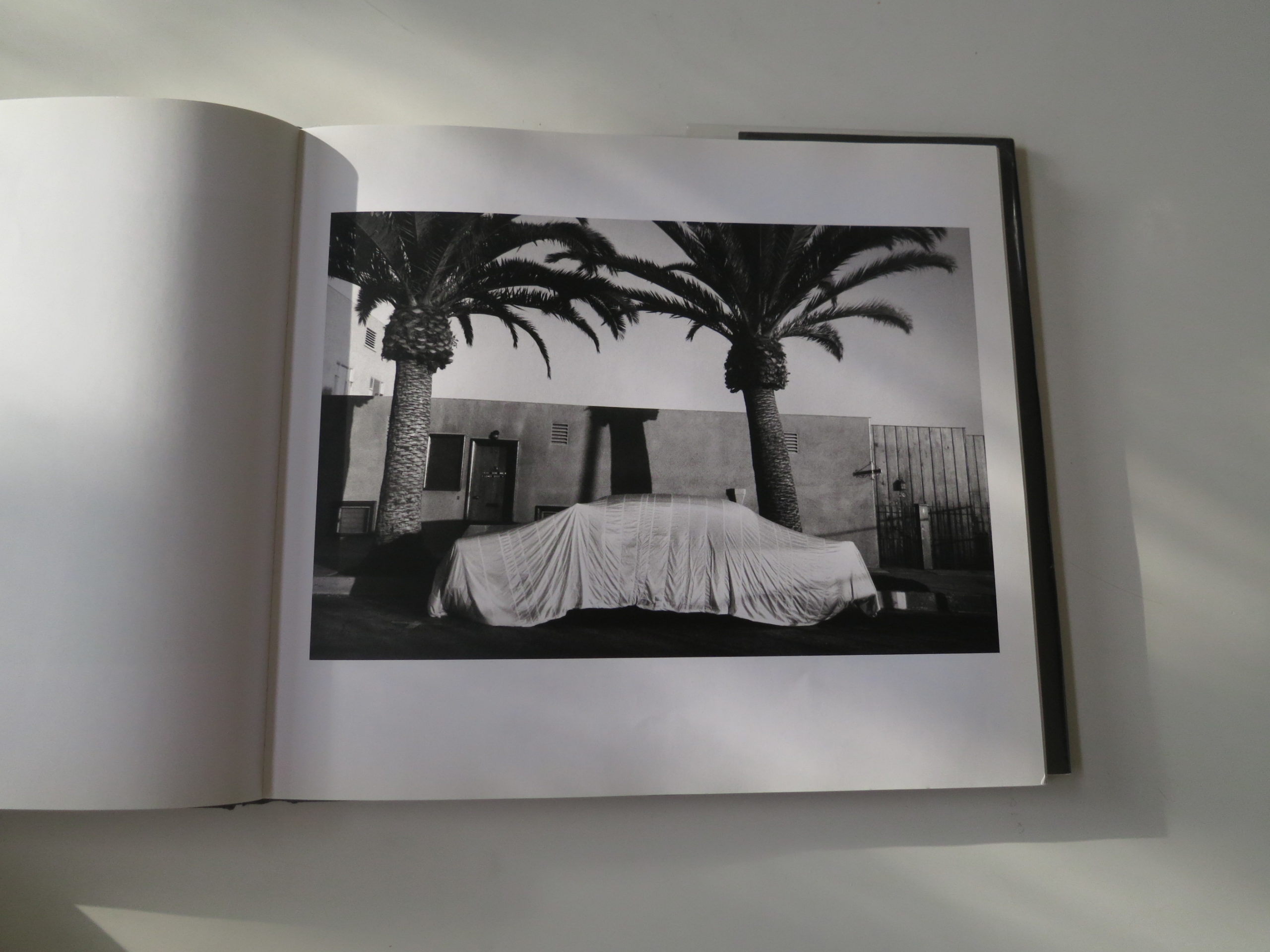
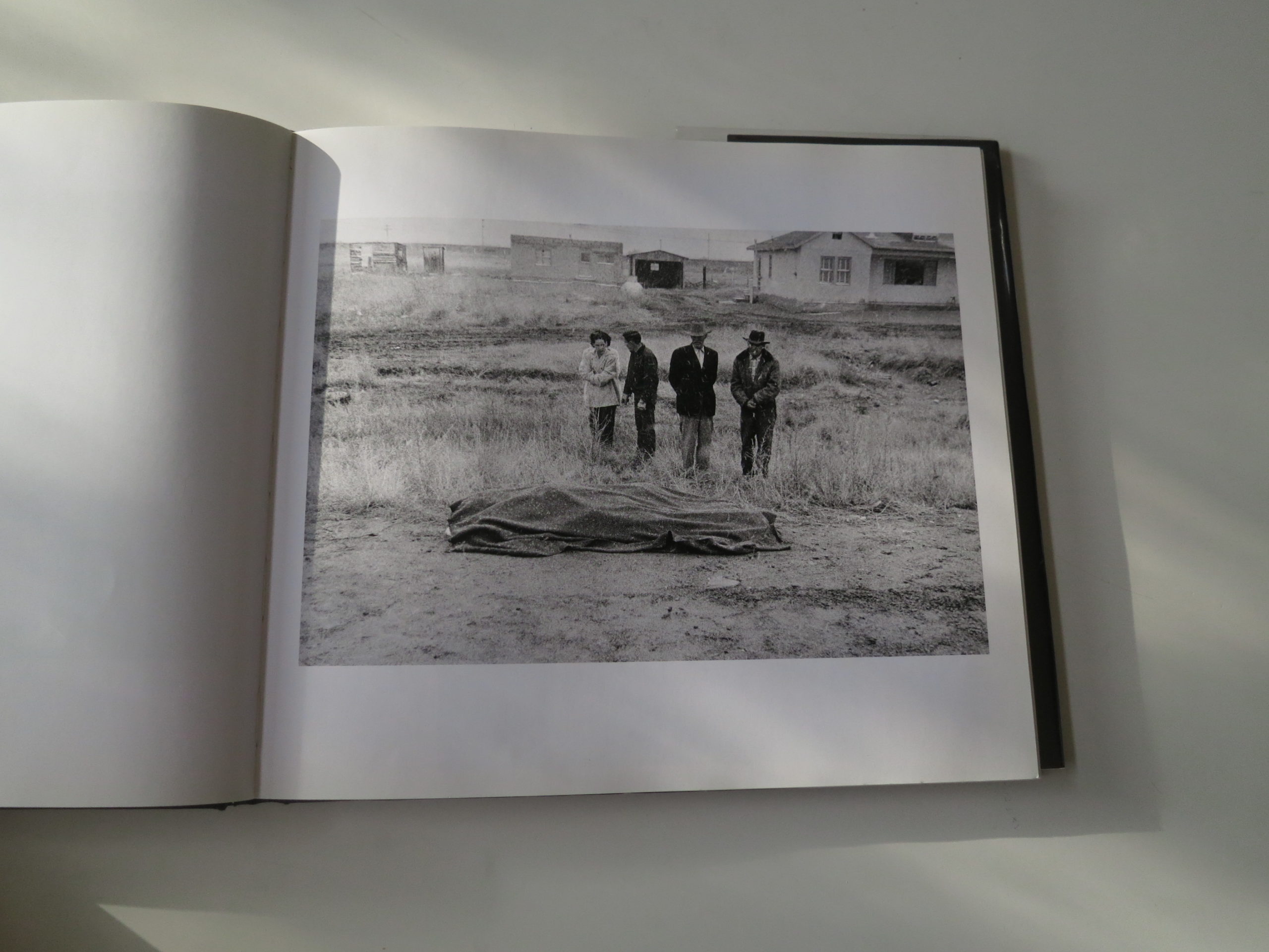
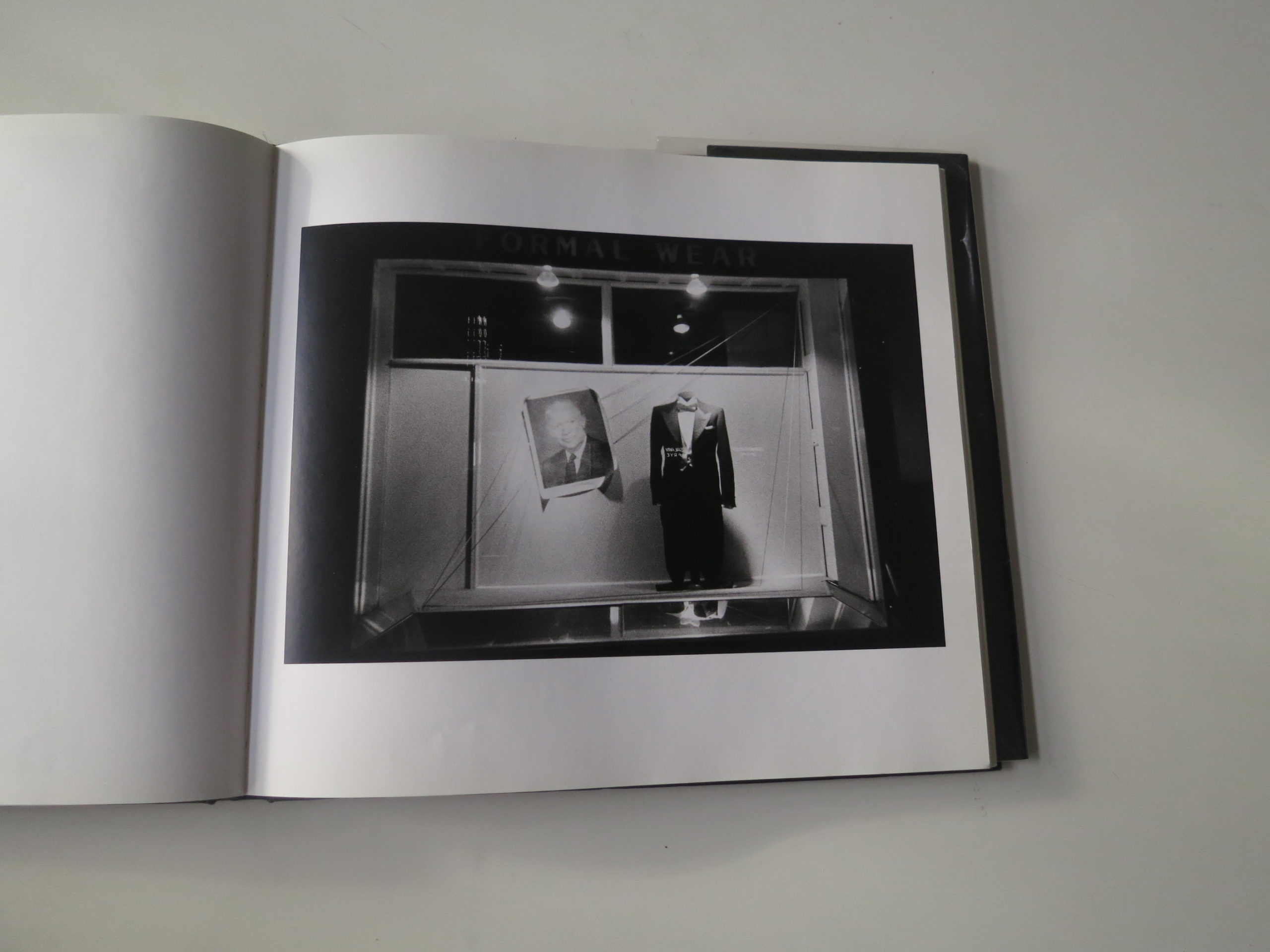
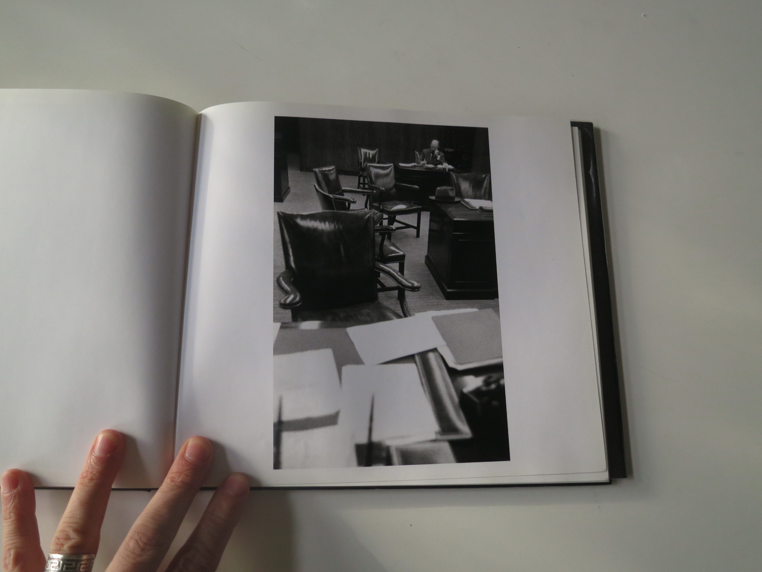
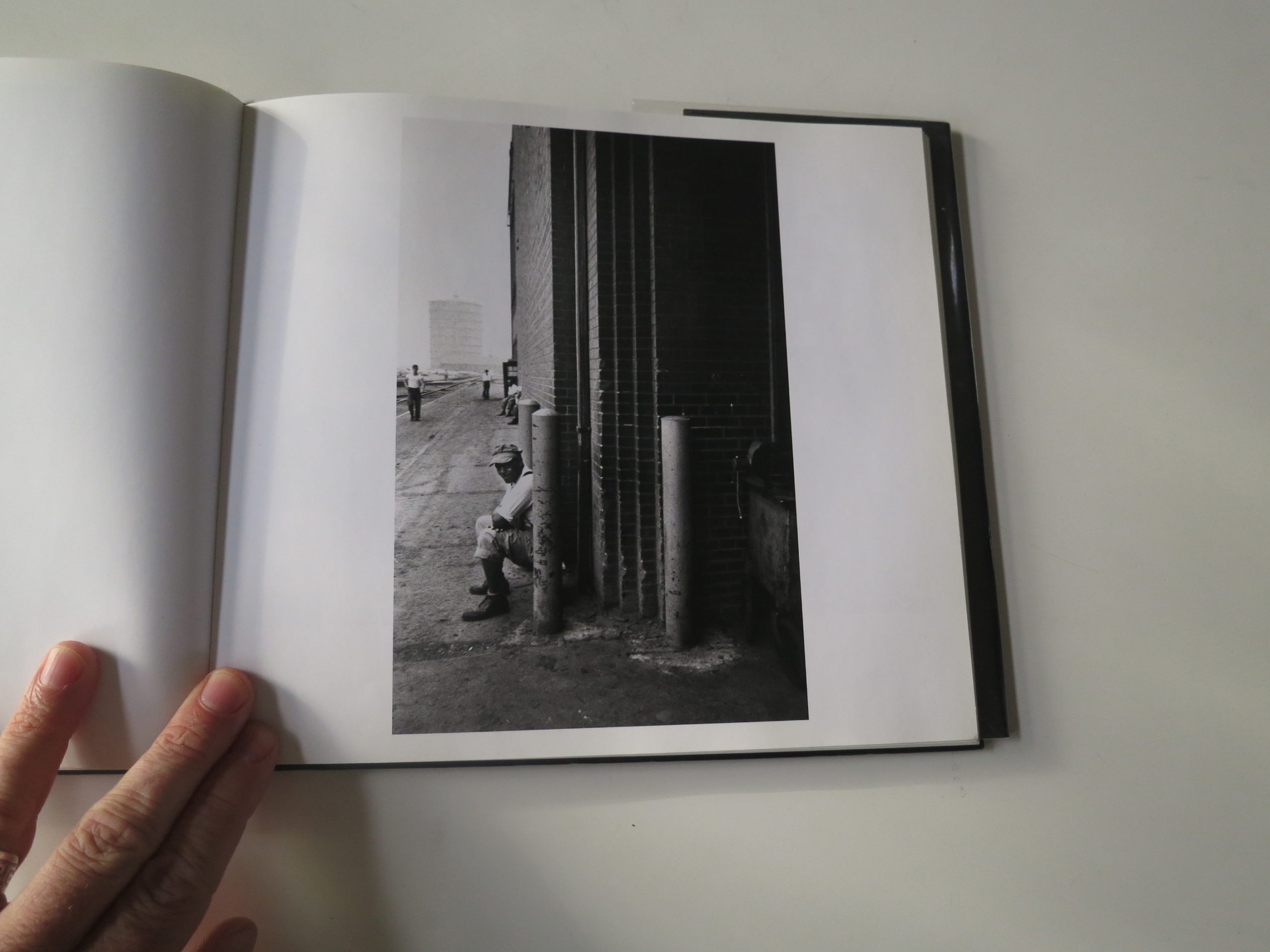
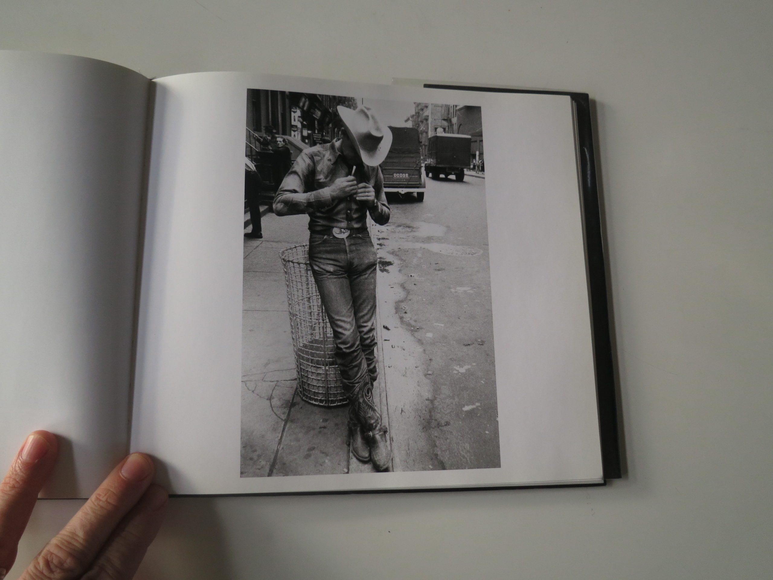
As a professor, I used the book to teach sequencing, as the transition from covered car to covered body, and rich banker in an office full of chairs followed by a worker squeezing his ass onto a narrow curb, will never be improved upon.

Those combinations are perfect, and help anyone and everyone understand how photographs can work together to strengthen each other.

I would not be the person I am today, nor the artist, had I not encountered it back in the 90’s, that decade the Millennials and Gen Z’ers are looking to as a model of a different kind of American Ideal.

Friends and Nirvana.
Pulp Fiction and Biggie Smalls.
Michael Jordan and Beavis and Butthead.

Yeah, I guess things weren’t so bad back then. But no matter what, unless you stumble on a wormhole, or a souped-up DeLorean, there’s no returning to the past.

Onward we go, instead.

So in honor of Robert Frank’s passing, I hope we all have the chance to do something important, like he did, because Lord knows the world needs all the help it can get.

Bottom Line: The best of the best, in honor of America


The Art of the Personal Project: Max Hirshfeld

The Art of the Personal Project is a crucial element to let potential buyers see how you think creatively on your own.  I am drawn to personal projects that have an interesting vision or that show something I have never seen before.  In this thread, I’ll include a link to each personal project with the artist statement so you can see more of the project. Please note: This thread is not affiliated with any company; I’m just featuring projects that I find.  Please DO NOT send me your work.  I do not take submissions.


Today’s featured artist:  Max Hirshfeld

As many countries are reassessing their responses to mass immigration, Max Hirshfeld, one of the great American photographers working today, delves deep into the visual memory of the Holocaust—a subject difficult to grasp and almost impossible to document—to share the story of his parents’ enduring love in a time of war.

Max’s parents, Polish Jews who survived the Holocaust raised him in a small city in Alabama, where life in the South of the 1950s and 1960s was quiet and mostly idyllic. But lurking under the surface was a remarkable yet tension-filled history that fully revealed itself only after he had a family of his own. Max knew the outer perimeters of his parent’s story – the challenges of being Jewish in a place that increasingly alienated them, their individual trajectories as they moved through adulthood, and their chance meeting and secret romance in the Polish ghetto.

But it took a pilgrimage to Poland with his mother in 1993 (and the discovery of post-war letters between his parents) to more fully acquaint him with the depths of their tragedies and the exceptional love story that sustained them throughout separation until they were reunited in the USA in 1949.

Though Sweet Noise: Love in Wartime (Damiani – October 2019) features events that began seventy-five years ago, the material is eerily timely.  As Eastern Europe grapples with this horrific legacy, and many countries are reassessing their responses to mass immigration, those in a position to bear witness need a supportive environment wherein art and language serve to remind the world what can occur when hatred and the concept of ethnic cleansing are given free rein.


To see more of this project, click here.

APE contributor Suzanne Sease currently works as a consultant for photographers and illustrators around the world. She has been involved in the photography and illustration industry since the mid 80s.  After establishing the art buying department at The Martin Agency, then working for Kaplan-Thaler, Capital One, Best Buy and numerous smaller agencies and companies, she decided to be a consultant in 1999. She has a new Twitter feed with helpful marketing information because she believes that marketing should be driven by brand and not by specialty.  Follow her at @SuzanneSeaseInstagram

Success is more than a matter of your talent. It’s also a matter of doing a better job presenting it.  And that is what I do with decades of agency and in-house experience.


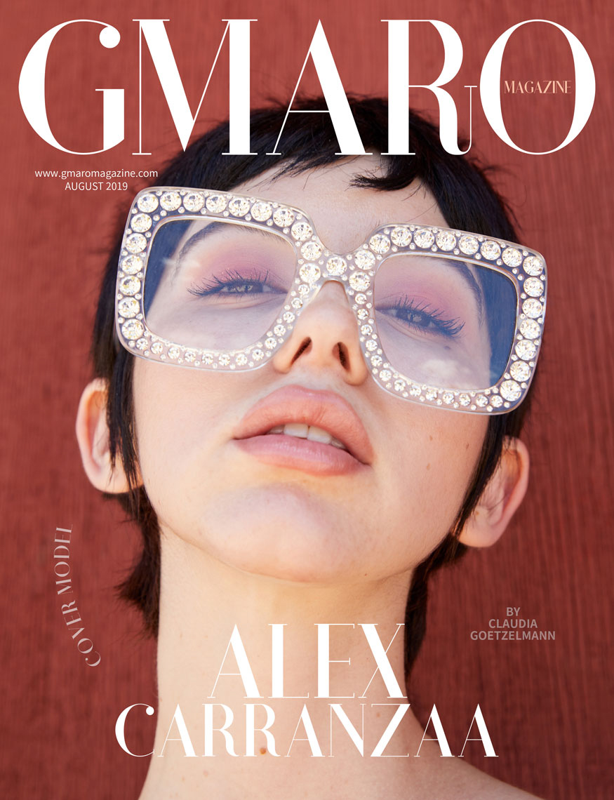
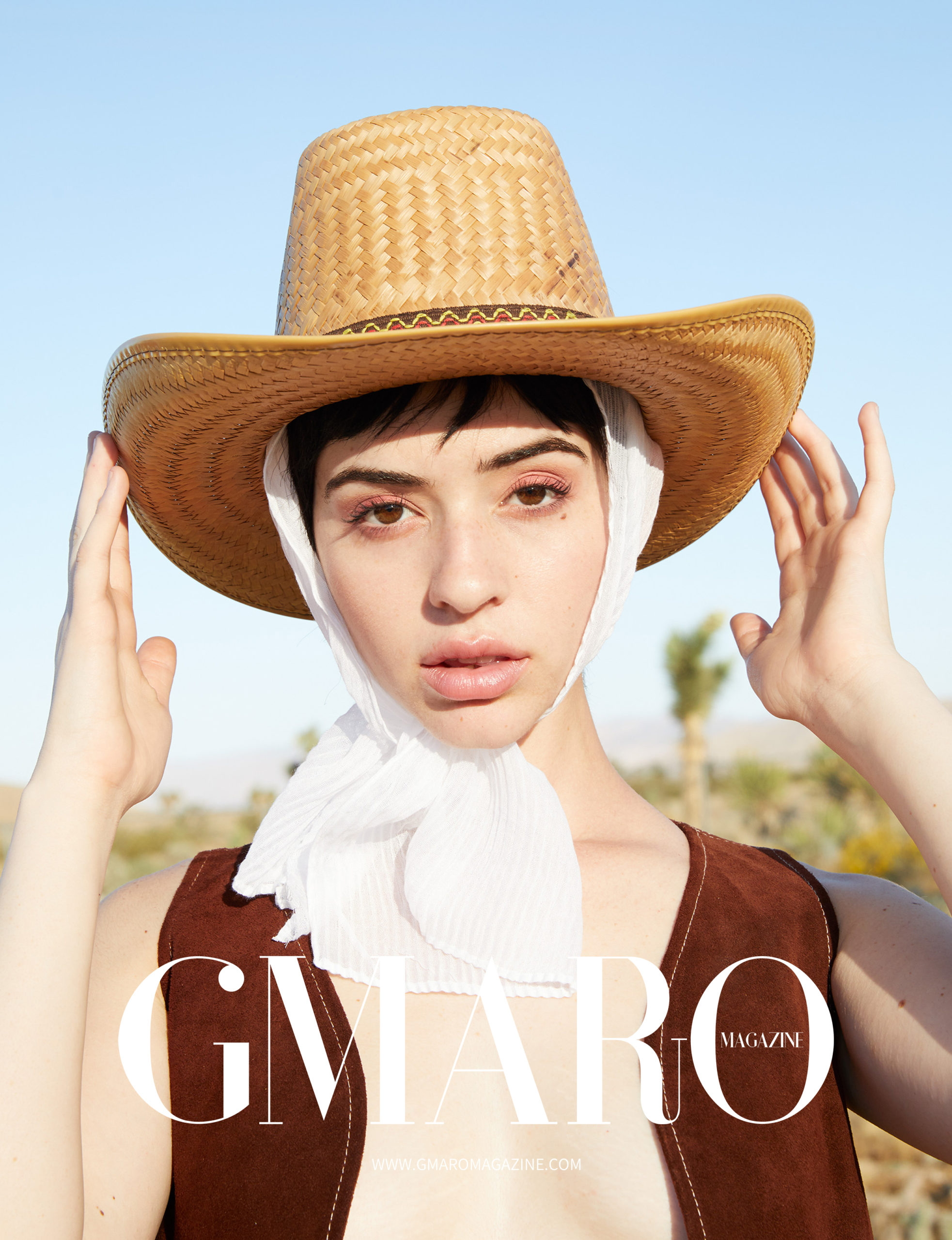
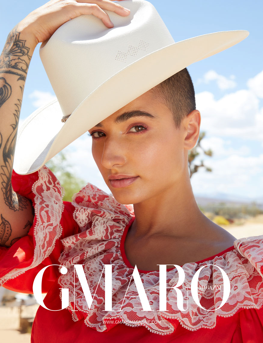
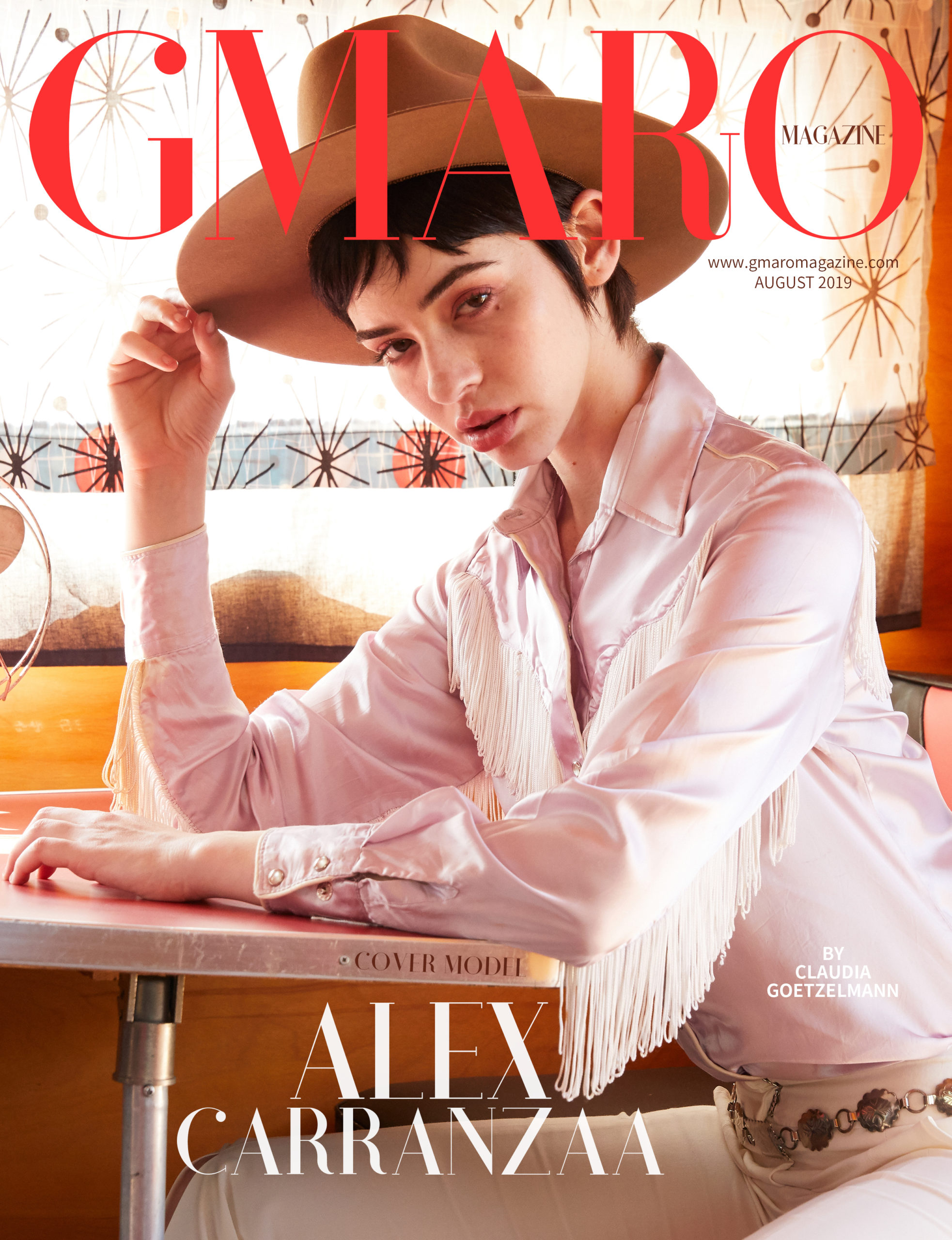
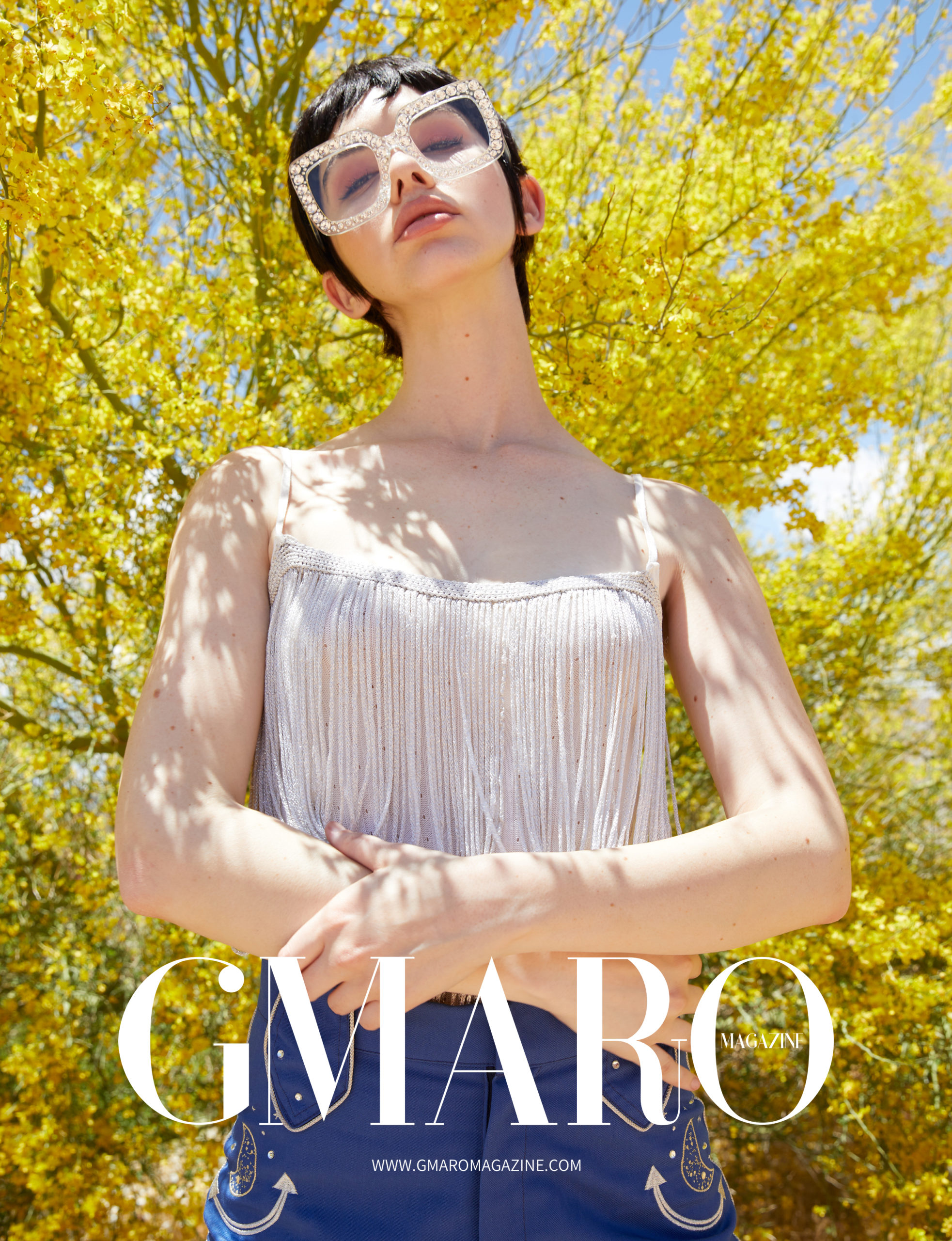
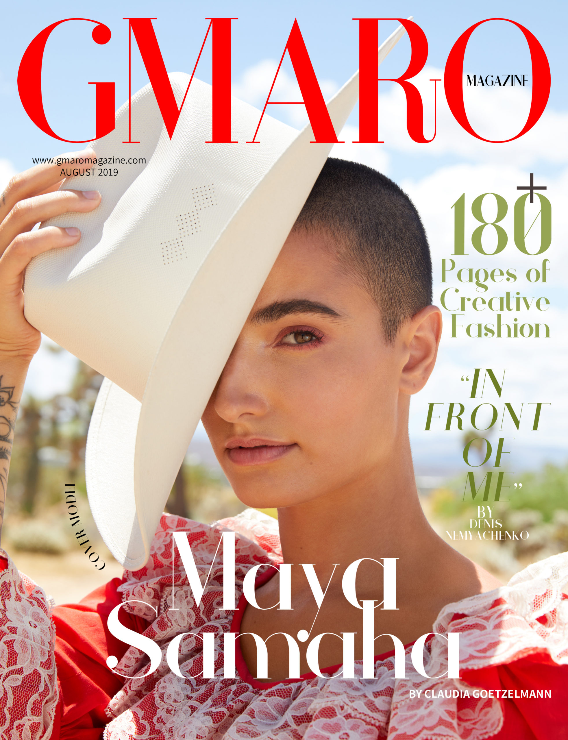
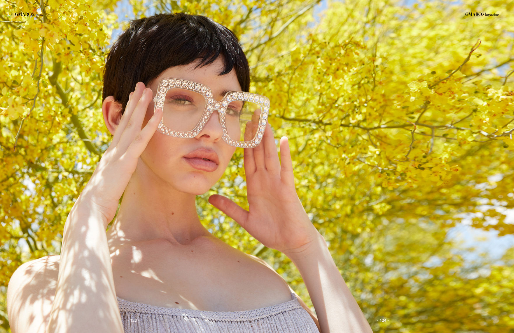
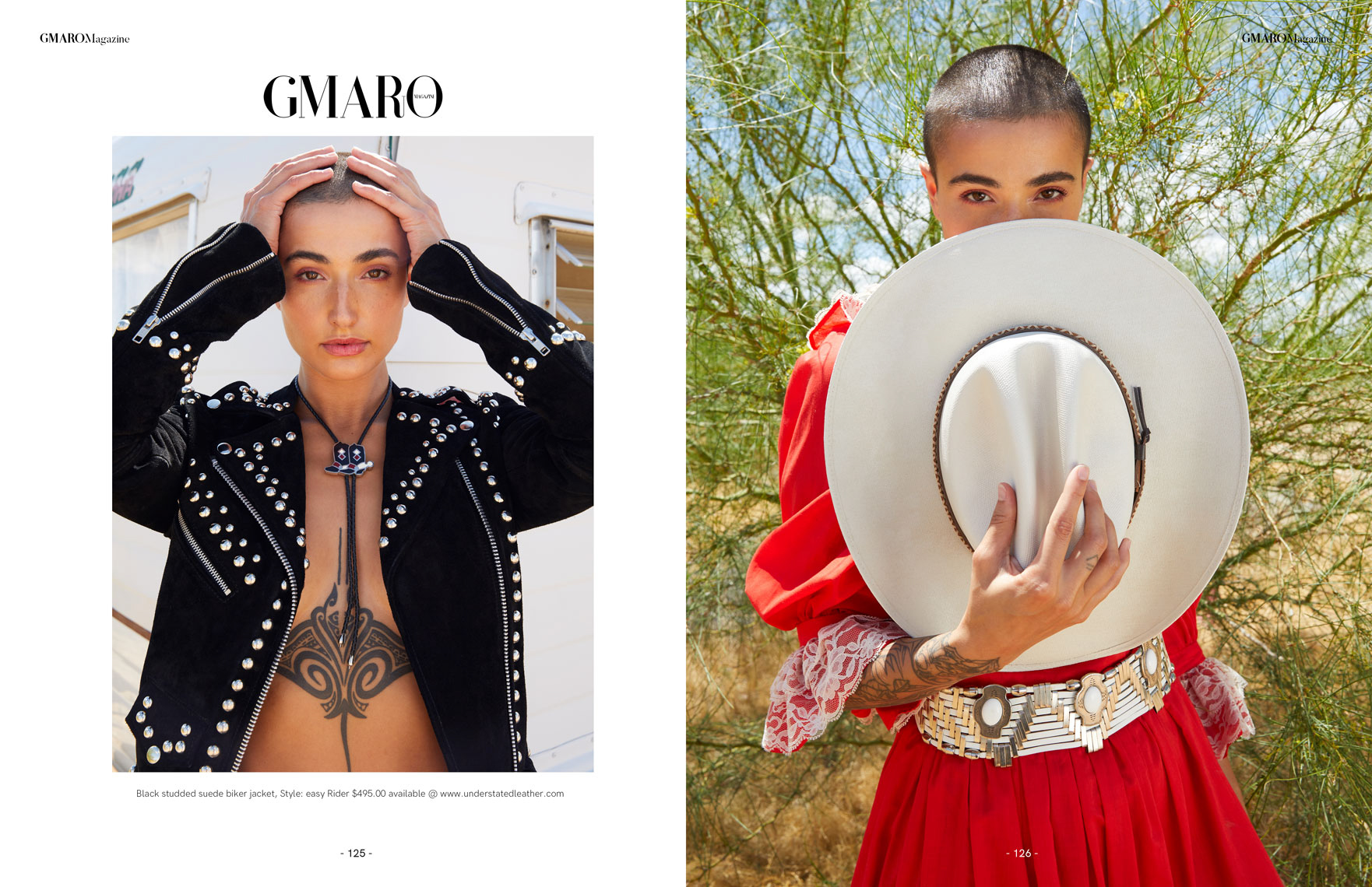
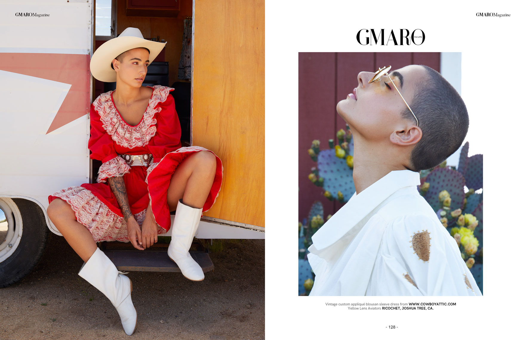
The Daily Edit – Gmaro Magazine: Claudia Goetzelmann

Front and Back covers Issue 15

Front and Back covers Issue 15


Front and Back covers Issue 18

Front and Back covers Issue 18


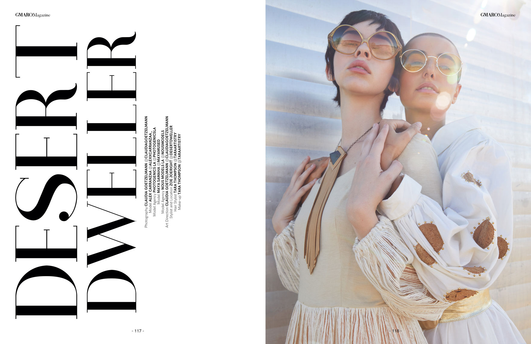
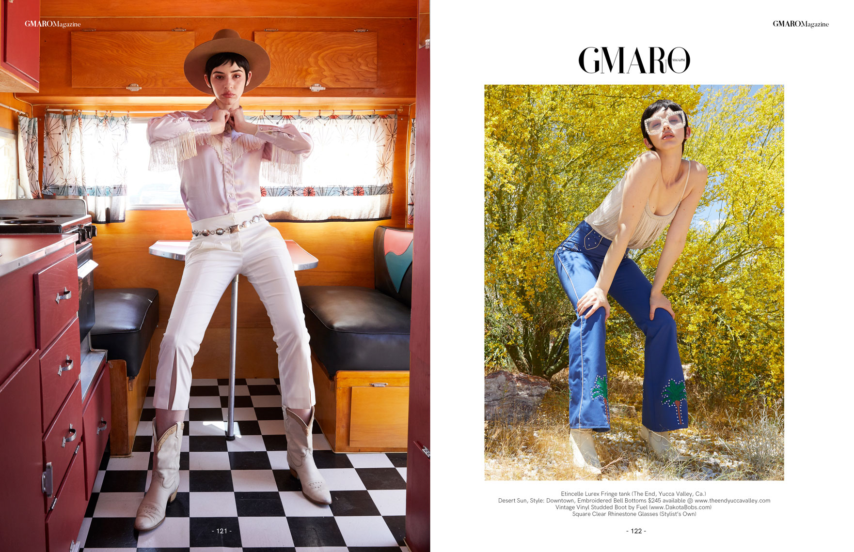
Gmaro Magazine

Photographer + Art Direction: Claudia Goetzelmann
Stylist: Zoe Joeright

Heidi: How did it come about to shoot front/back covers?
Claudia: Gmaro Magazine had contacted me awhile back about publishing some editorials with them as they feel my style aligns with the magazine. I send them a couple of editorials I had recently shot. They fell in love with the Desert Dweller Story and chose to make it front and back covers.

How often have you had the front and back covers?
I’ve published four for the magazine so far.

Where was this shot?
Joshua Tree. I love the desert and always enjoy shooting there as it makes such a great backdrop – setting and light. The location is actually the stylists home and the two vintage trailers are part of her property.

What was the photo direction from the magazine?
When Zoe (stylist) shared with me her vintage trailers I was hooked. We wanted to embrace what the location had to offer – desert vintage vibe with modern/ current looking models. The story feels very current Joshua Tree to me.

Where was the clothing sourced from?
80% of all the clothing we shot was pulled from stores in the Joshua Tree area.
We also wanted to support and feature local stores.

The Daily Promo – Chris Loupos

Chris Loupos

Who printed it?
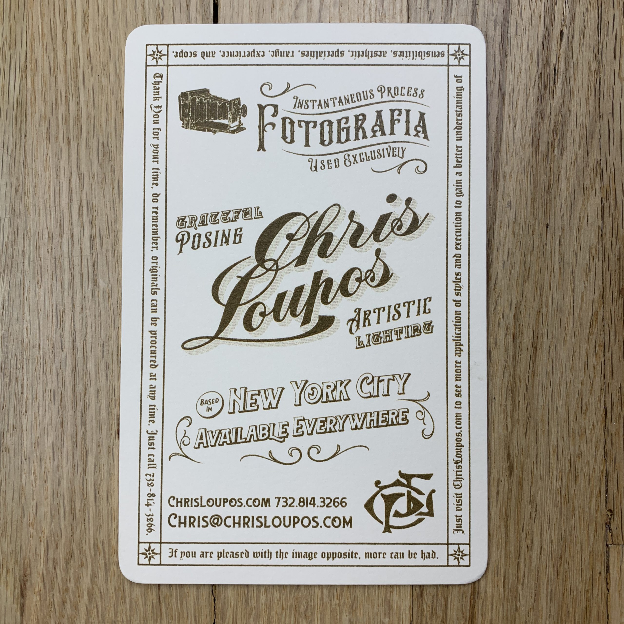
My promo was printed at Casa Papel (casapapel.com) in Philadelphia. It was honestly not easy to realize this promo. I went through quite a few meetings with printers before I met with Casa Papel and even with them, it took quite a bit of back and forth before we got it perfected. Not really their fault, it’s just funny how hard it is to recreate something that was so common in the early 1900s. Other places had offered to print it on paper stock backing or other materials to get it “close” but I didn’t want to cut any corners. It was very important to me to have them be as authentic as we could make them to how they used to be. There were more steps in the process than you probably would imagine.

Who designed it?
I kind of had a cheat code here in my back pocket because my younger brother Michael (dribbble.com/mikeydoesit) is a talented graphic designer in Philadelphia so he and I had been talking about this for a while before we decided to try and actually do it. I bought probably 15 vintage cabinet cards at thrift stores as examples to work off of as well as some images of them from the web and he took them and made a TON of custom logos with my name and photo business on the front and back that would kind of be an homage to that style. I originally was going to do 5 or 10 different backs, but once we started really trying to print it, we realized that could never happen logistically. It was hard to choose the final design, there were a bunch of good options and I struggled a bit with the final decision but I’m really happy with how they turned out.

Tell me about the image and the card itself?
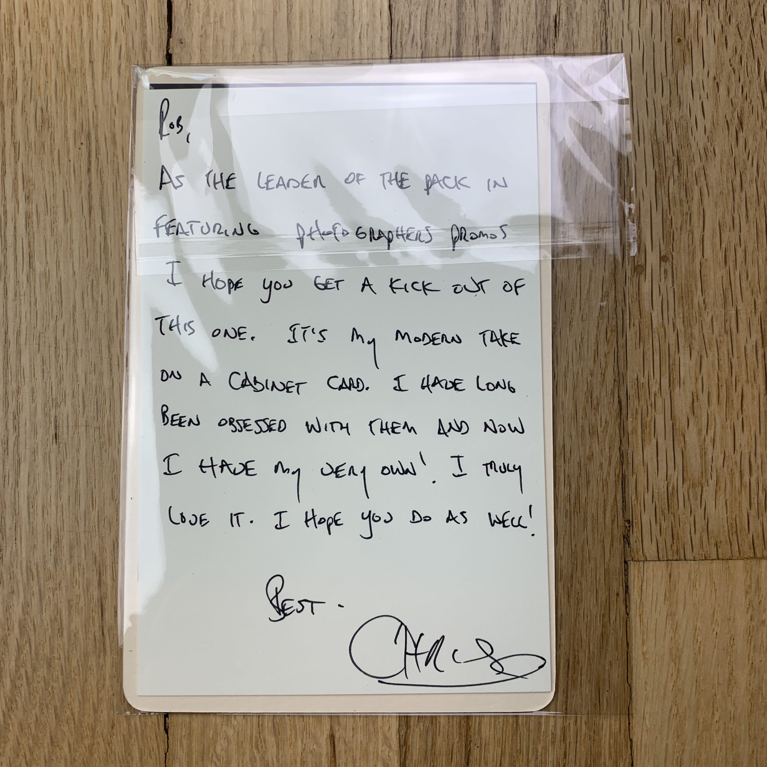
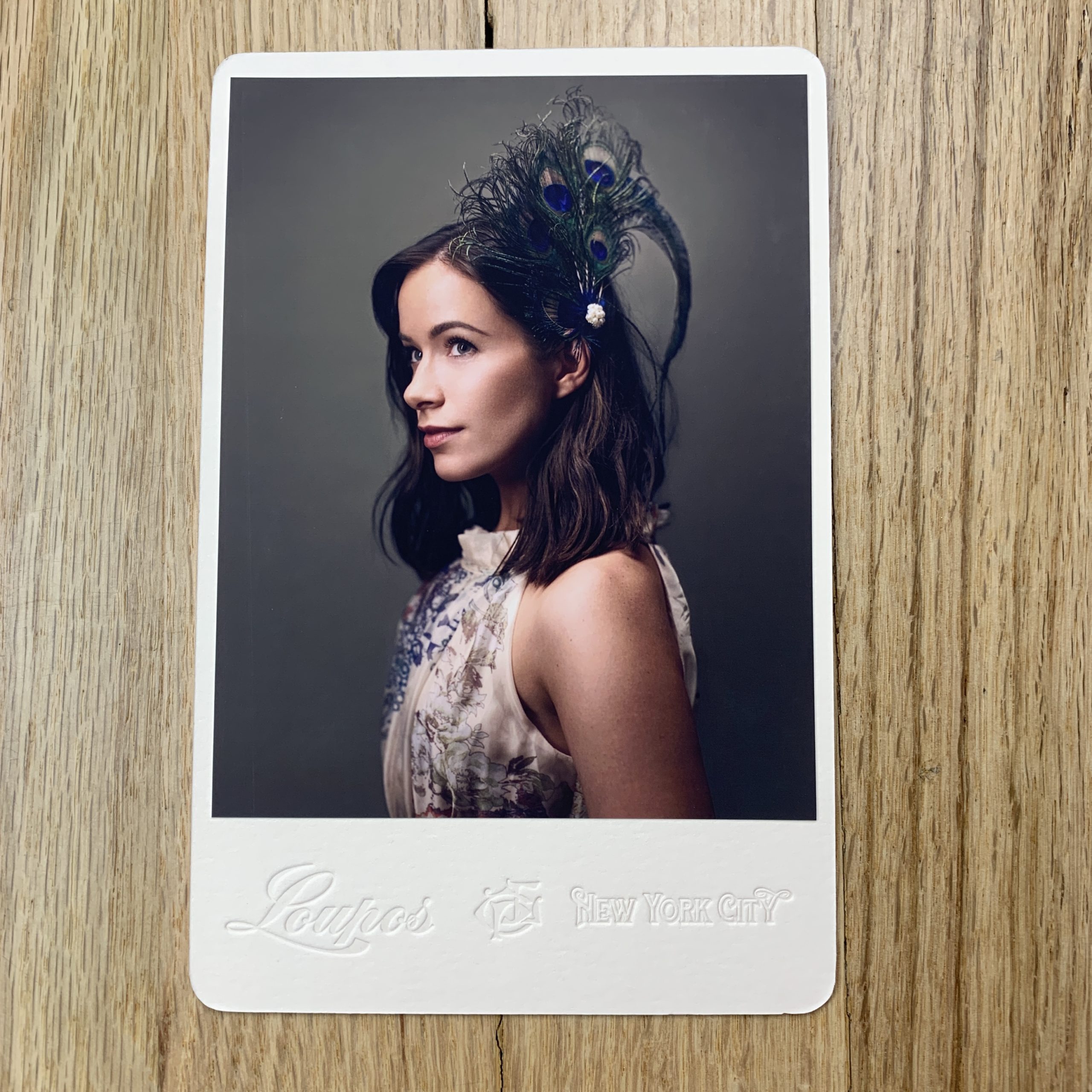
The image is of a model named Rebekah Marine (@rebekahmarine) who I’ve had an on-going working relationship with over the past few years. I just had an idea for a shoot with a sort of vintage feel to it and wanted to shoot with some peacock feathers and maybe a fascinator veil so I bought them both and we did a shoot together at a studio in Philadelphia. It wasn’t planned that this image was going to be a promo for me at all. I just liked the image. When my retoucher Nick (nicksilver.studio) sent it back to me and we talked about it I just thought this was an image that would make a perfect updated version of a cabinet card. It has that timeless feel to it. I could’ve gone black and white like they used to be, but my work is mostly based in color and I wanted to stay true to what I mostly do. And to add a little twist to make it my own as well.

How many did you make?
I printed around 75 of them with Rebekah on them and a couple individual ones for people that have been important to me in the photo business to give as personal gifts. They were NOT cheap to produce and I know people probably say this with promos, but I truly mean it when I say that I only sent these out to clients I really would want to work with and whose work I really really admire. I am not sure if most of the world, even the photo world, has any idea what a cabinet card is but my hope is that some of the real photography nerds like me will recognize it right away when they see it and those are the kind of people I want to work with the most.

How many times a year do you send out promos?
I don’t usually send promos, honestly. It’s been a while. I’ve spoken to a lot of photo editors I’ve worked with over the years and most of them say its a mixed bag on how effective they are. I didn’t want to do postcard mailers. I wanted to create something different and something unique. Something that someone might pin on their wall, put on their desk or at the very least remember when they’re trying to hire new photographers. I have to credit my brother for going the extra mile with some suggestions for complementary elements that ultimately brought the whole project together and highlighted what was most important, which was the cards.

Do you think printed promos are effective for marketing your work?
I’ve never directly gotten a job from one that I can recall, but I also have only sent out a couple. I’ve never sent out postcards. I find them to be impersonal and that’s not really me. In the past, I’ve created a zine with a mustache/beard photo series and accompanied it with custom made mustache wax in metal tins we custom branded and designed and now this cabinet card. I have an idea for the next one but we will see if I can actually follow through with it once the body of work is finished. It’s percolating though.

I’m endlessly fascinated with the world of photography. It’s one of the only jobs in the world where you want to work more than you do, if you love it like I do anyway. I think it’s becoming so hard to get anyone to stop and pay attention to you in the scrolling era, and with promos my goal is to make something unique that isn’t run of the mill and commonplace. I wanted people to be able to hold this in their hand, feel the letterpress, look at the gold etching on the edges and honestly just appreciate the work that went into making it. I think we succeeded and I’m happy people are appreciating them, I hope some prospective clients feel the same way.

The Best Work I Saw at Photolucida: Part 6


I didn’t sleep well last night.

Not at all.

I woke up, imagining it was nearly 6, and waited for the alarm to go off.

When it didn’t, I finally looked at the clock, and it was 3:15 in the morning.

Ouch.
Oof.
Barf.

All told, I was up from 2:45-4:45am, which is atypical for me. I even found myself doing Qi Gong exercises by the light of the moon, at 4am, trying to will myself to get tired again.

It didn’t work.

Why am I telling you this? (Silly question. I get personal each week.)

Well, I’m trying to establish my right to keep the intro short and sweet today. As it stands, I’ve got to be up at 5am tomorrow to drive to Albuquerque and fly out to Chicago for the Filter Photo Festival. (One of my favorite cities, and festivals, anywhere.)

This means I’ll have a whole new set of portfolios to show you in the coming months, as I’ll be reviewing work for a few days in Chicago. (And partying my face off. Man, do they know how to have a good time there.)

But it also means that we’ve got to end our series on Photolucida, the stellar festival I attended back in April, up in the Pac Northwest in Portland.

When I began this series, “The Best Work I Saw at Photolucida,” I told you there was so much good work, I’d be writing about it for months.

And so I have.

Never have I ever done a 7 part series on a festival before, but between 5 portfolio articles, and two stories about books I picked up, it’s exactly what’s happened.

And while it’s never taken me this long to wrap up a series before, there’s a first time for everything.

Kudos to the Photolucida team for bringing together so many talented photographers. But Chicago beckons, so it’s time to put this baby to bed. (And hopefully I’ll follow. Damn do I need a nap.)

As always, the artists are in no particular order, and I hope you enjoy the work below.

Let’s begin with Alexis Pike, if only because her work is fun, and as I’m both grumpy and nauseated from exhaustion, fun sounds good to me.

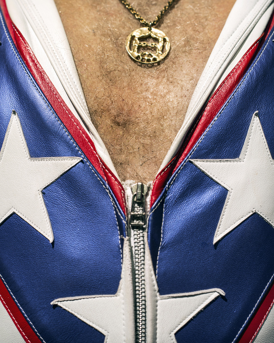
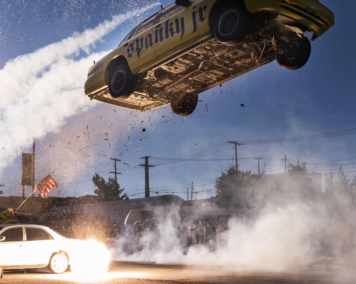
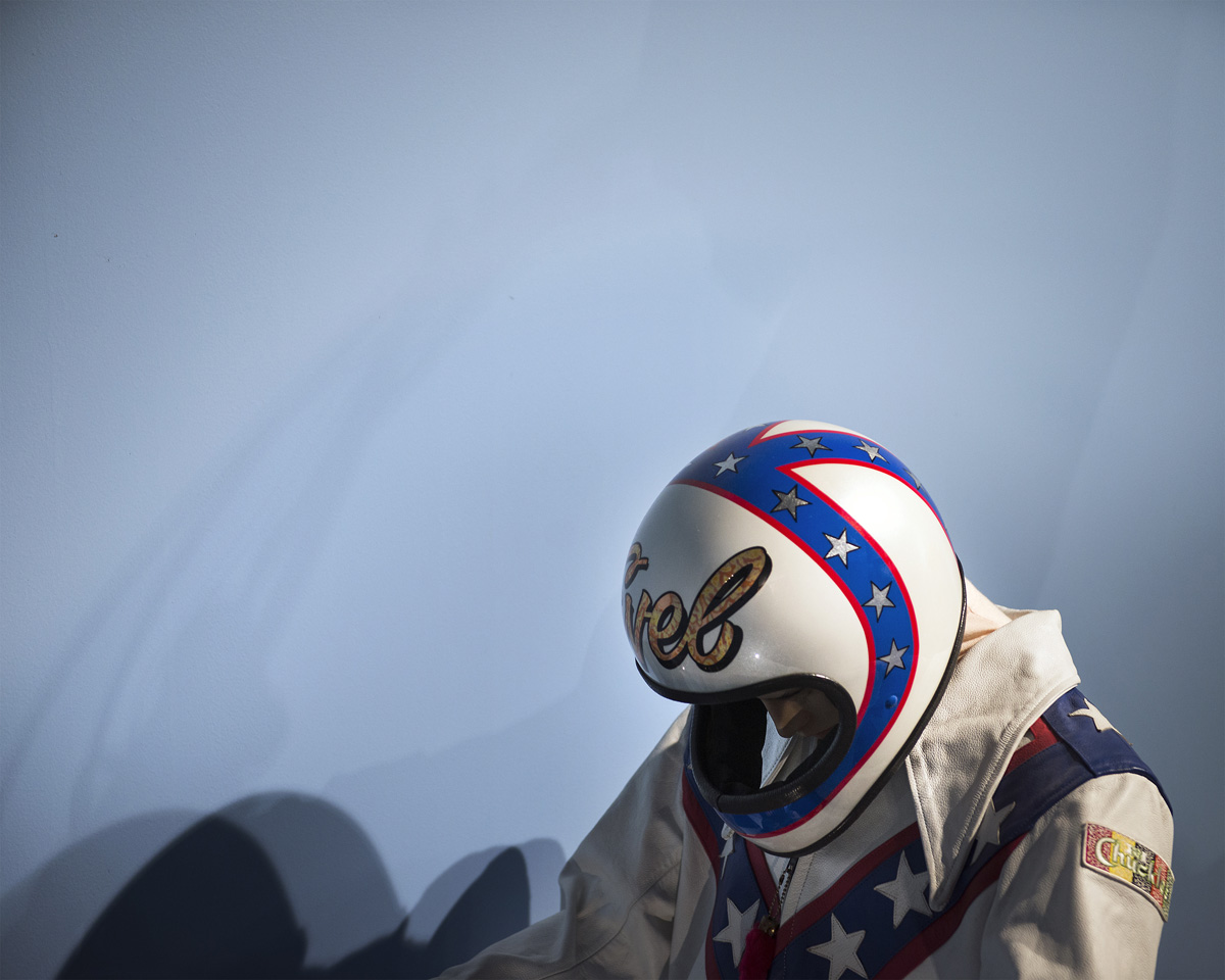
Alexis showed me her project, (also a book by Ain’t Bad,) featuring work about the cult of Evil Knievel. That name might not mean anything to all the millennials out there, (truth,) but the now-dead daredevil was the biggest thing going back in the 70’s. (Yes, I feel old today.)

Alexis is from Idaho, and teaches in Montana, where Evil’s demographic still runs deep. Killer stuff. (No pun intended.)

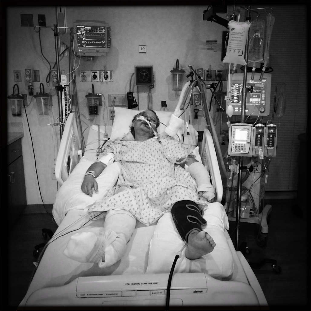
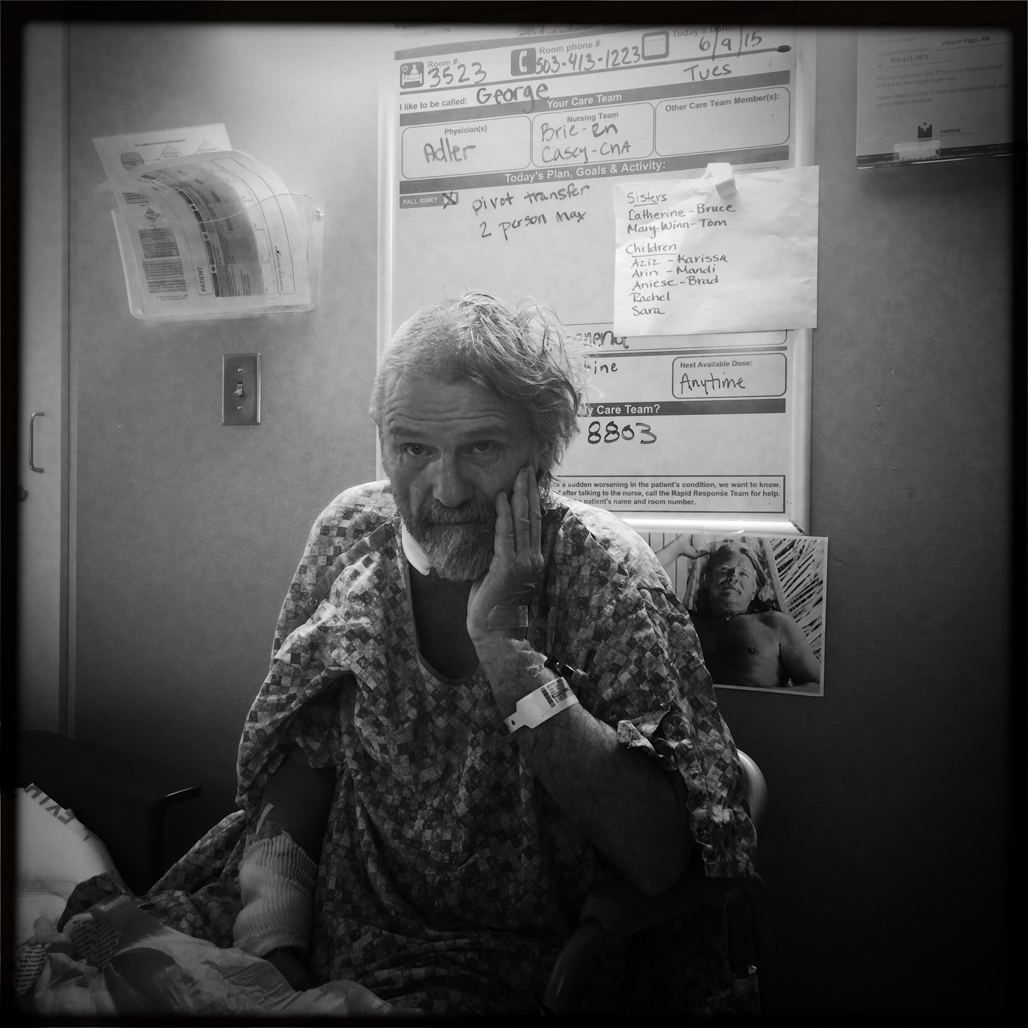
Now things are going to get a little gloomy. First, let’s look at the work of Hillary Clements Atiyeh, who showed me a very heavy project. Apparently, her (now) ex-husband was in a small plane crash, and and suffered serious injuries.

She helped nurse him back to health, before they divorced, and these photographs document their difficult journey. One imagines the art also served as a major stress release valve for Hillary, as we all know that art is among the best ways to express our emotions in a healthy, controlled way.

Super-poignant stuff.

And let’s get the other super-heavy project out of the way now too. Joe Wallace and I had a review together, and he brought along a project about people suffering from Alzheimer’s.

It’s a disease that affects so many people, but I don’t think it gets the same recognition in media as cancer does now, or perhaps AIDS did back in the 80’s and 90’s. But with the baby boomer generation rapidly aging, caring for the (potentially) millions of dementia sufferers will soon be a nationwide problem.

Powerful art, for sure.

On a political, but also weighty note, we’ll move on to Rich Frishman, whom I first met at Photo NOLA back in 2017. While Rich then showed me a series of Americana-themed images that have since gone on to success, this time, he dove into the belly of racism in America.

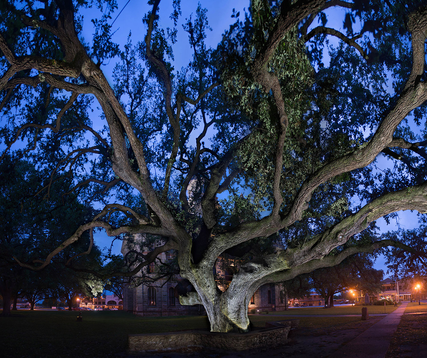
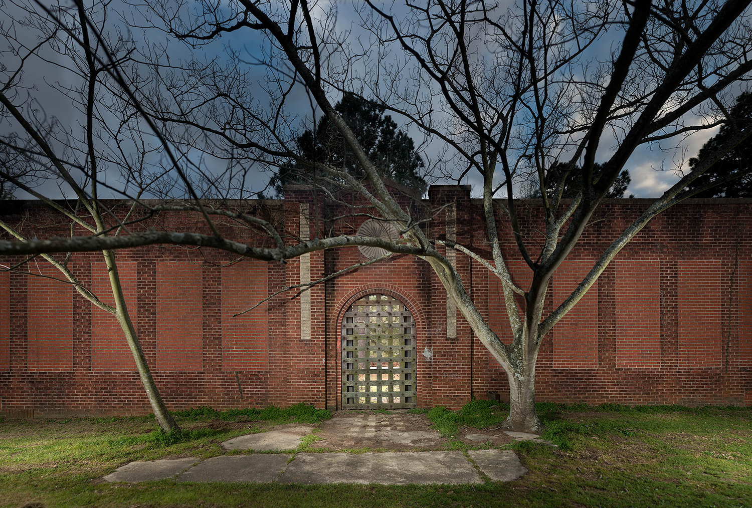
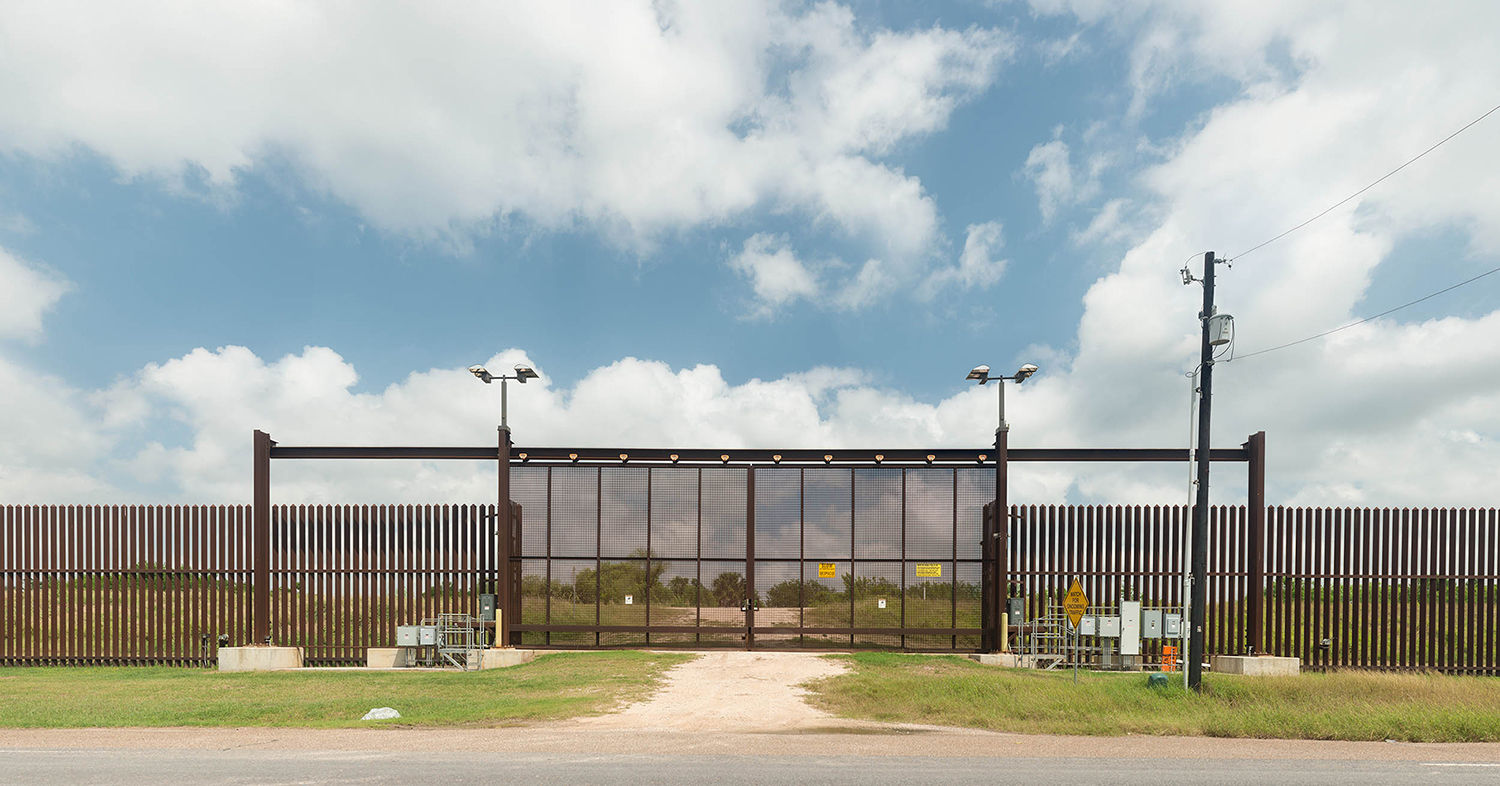
He photographed places that are seminal in the racist history of America, (how’s that for a not-proud subject,) and along with Jeanine Michna-Bales’ photos about the Underground Railroad, (which we’ve published a couple of times before,) they serve as a good example of the way visual history can supplement the written word, when it comes to proper preservation.

An official Texas Historic Landmark, the Goliad Hanging Tree is a symbol of justice, Texas-style.
The newly freed African Americans of the Shiloh Community established a school for their children shortly after the Civil War. The one-room building was demolished in the late 1800’s and classes were held at the Shiloh Baptist Church.
The United States government has recently begun fortifying the border between the US and Mexico. This new gate actually separates American farmers from their croplands just to the south, still in the United States.
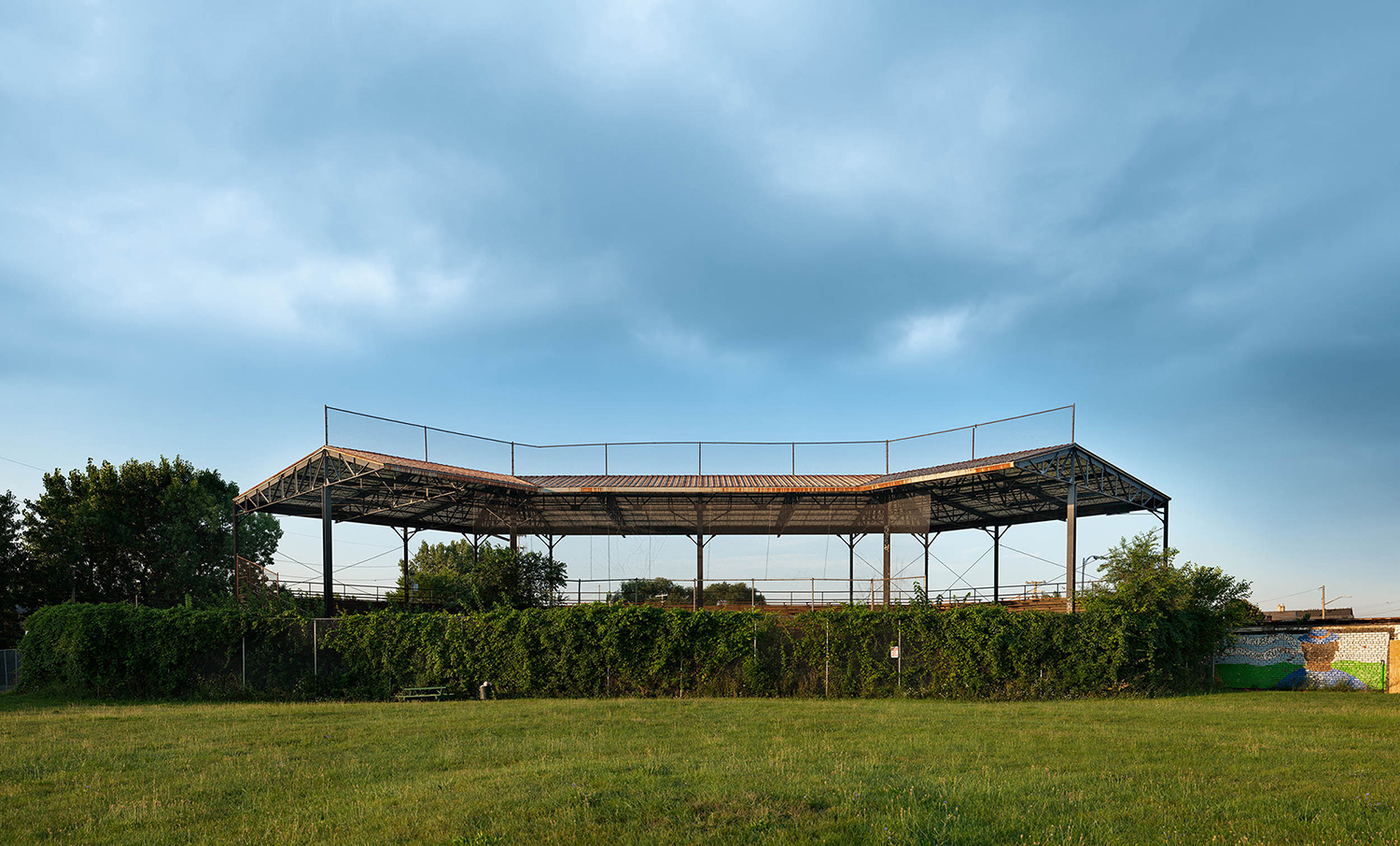
Built in 1930, Hamtramck Stadium was home to the Negro National League Detroit Stars in 1930-1931 and again in 1933. The field was also home to the Detroit Wolves of the Negro East-West League in 1932, and to the Negro American League Detroit Stars in 1937.
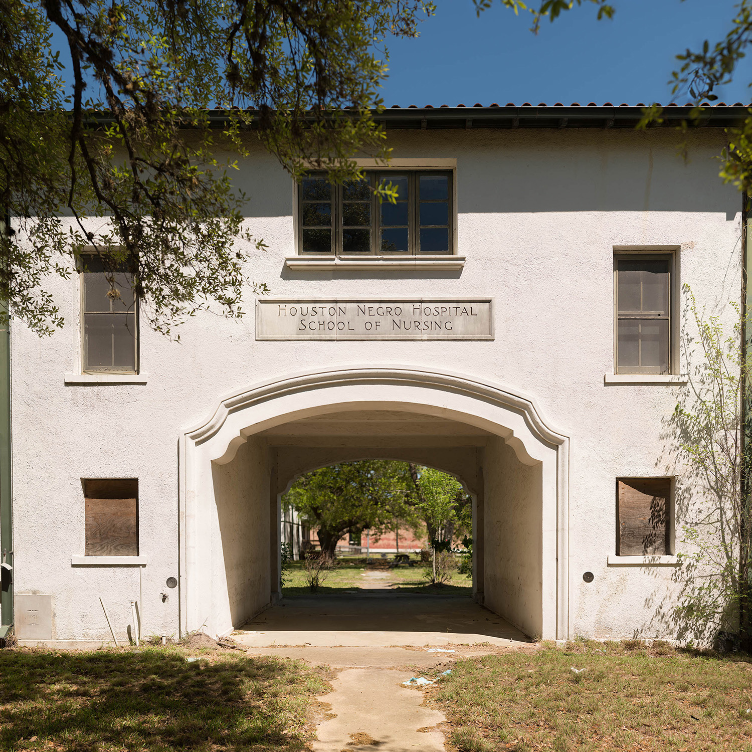
Houston Negro Hospital School of Nursing, built in 1931, now stands abandoned along with the hospital with which it once was associated.
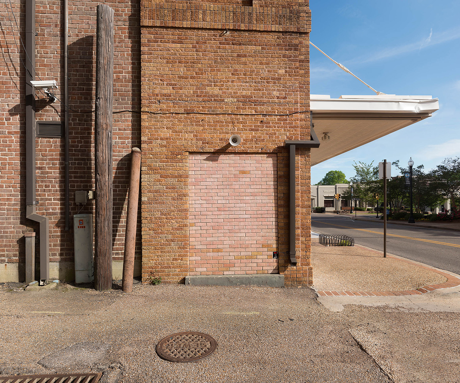
Palimpsest of bricks closing the former entrance for “Colored People” at the Saenger Theatre in Hattiesburg, Mississippi.
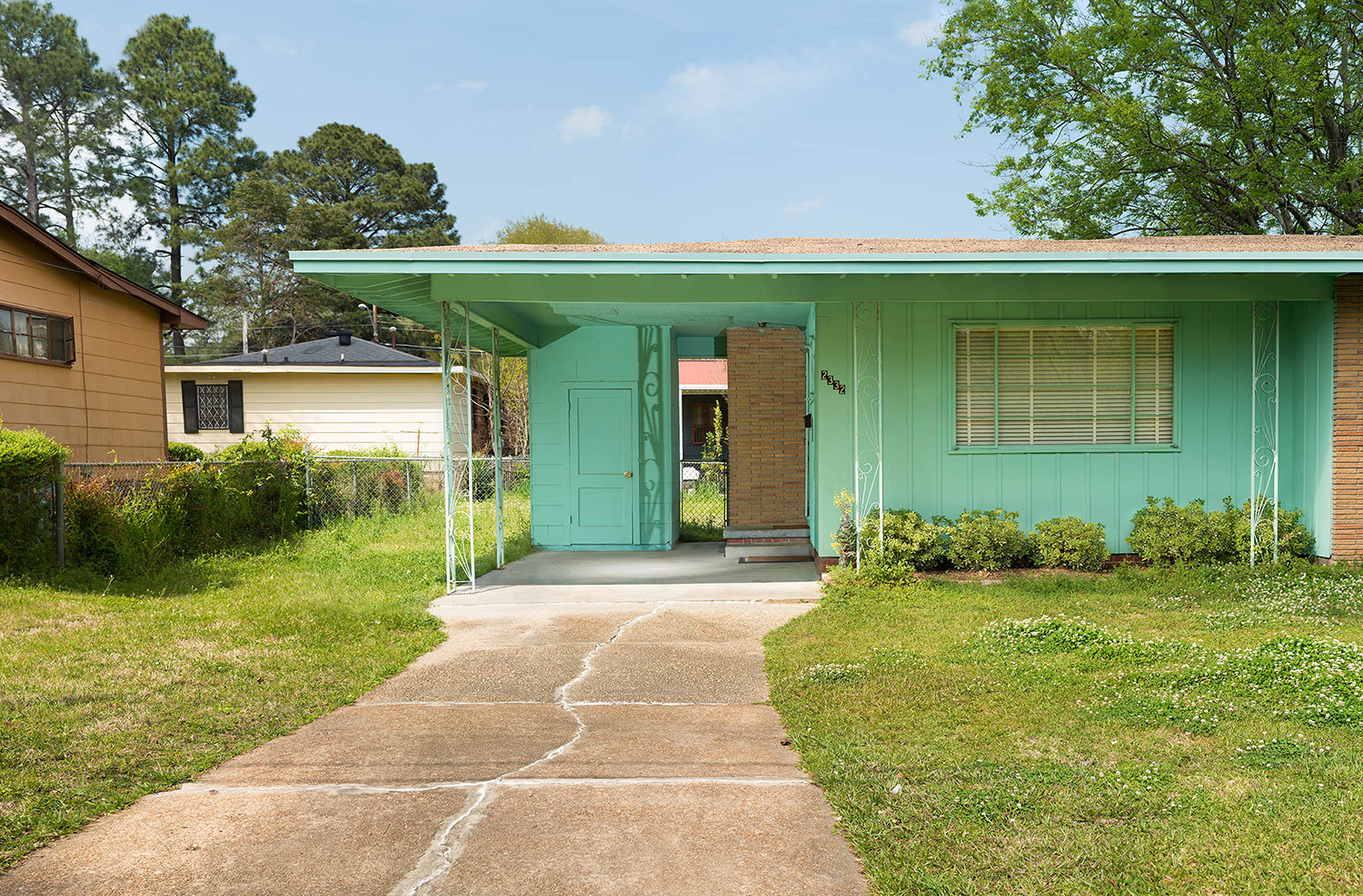
The first Mississippi state field secretary for the National Association for the Advancement of Colored People (NAACP), Medgar Evers was shot in the back in the carport of his humble home in Jackson, Mississippi, shortly after midnight on June 12, 1963. He died less than a hour later at a nearby hospital.
During the Freedom Summer of 1964 three civil rights activists were jailed briefly in the small Neshoba County jail on trumped up charges. When Mickey Shwerner, Andrew Goodman and James Chaney were released that night, they were followed by Ku Klux Klan members tipped off by the sheriff’s office. They were forced off the road en route to their office in Meridian, taken to this remote backroads location and bludgeoned to death. Their bodies were later found in an earthen dam.
During the first half of the 20th century, the small community of Idlewild was known as “The Black Eden.” It was one of the few resorts in the country where African-Americans were allowed to vacation and purchase property, before discrimination was outlawed in 1964 through the Civil Rights Act of 1964.

Richard Andrew Sharum, from Dallas, had some photographs of Cuba, and hoped that they might distinguish themselves from all the other projects shot in Cuba. (One of our Antidote students this summer also tried to claim a “different” version of Cuba, but I’m not sure it’s possible at the moment.)

As he’s a photojournalist who covers a variety of stories, Richard asked if I’d agree to look at more work online, to see if something else was appropriate for this article, and I agreed.

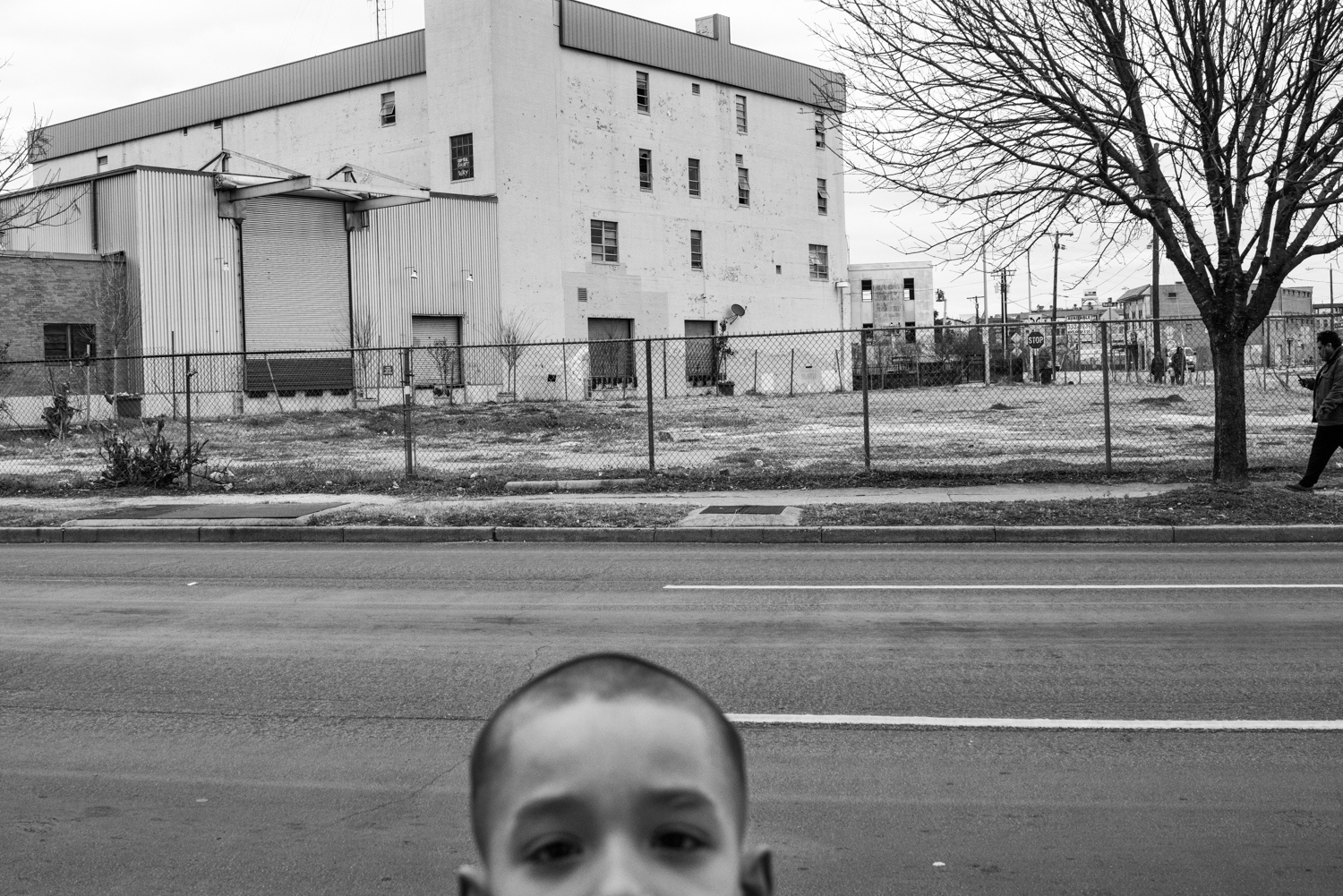
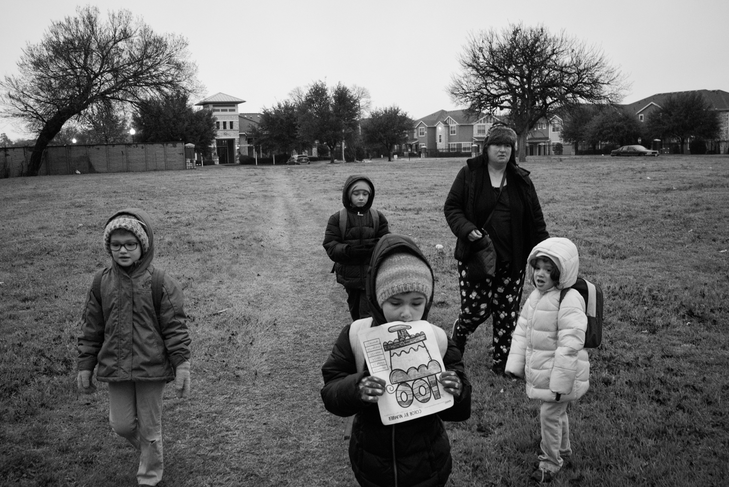
He sent me this very powerful project about homeless school children in Texas, and I gave him an immediate yes. (Not hard to see why, right?)

I may have my professional writer’s card taken away for using the word “Americana” twice in the same article, but since the first instance referred to an article from nearly 2 years ago, I’m going to risk it.

It’s the best way I can think of to describe Lisa Guerrero’s excellent little group of pictures, given that I’m down 10 or 15 IQ points at the moment. (Even with the coffee. There is not enough coffee in the world to make me feel better right now.)

But these pictures did put a smile on my face. It’s not that they’re glib, or overly lighthearted, but a few weeks ago I admitted that I still try hard to love this country, and pictures like this seem to channel the absurdist-yet-earnest take on the USA that I try to share, in my better moods.

Finally, we’ll finish with Rebecca Hackemann, who is English, but is a professor in Kansas. (Bet she has a hard time getting a proper fish and chips there. Hope she likes barbecue.)

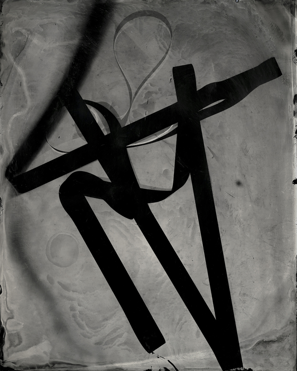
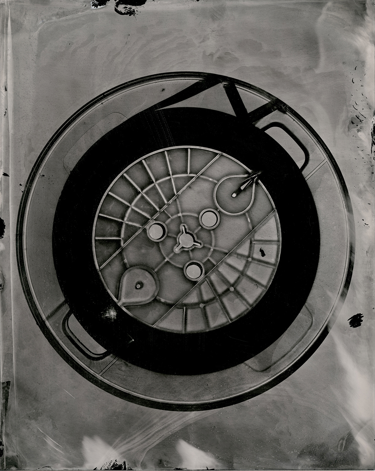
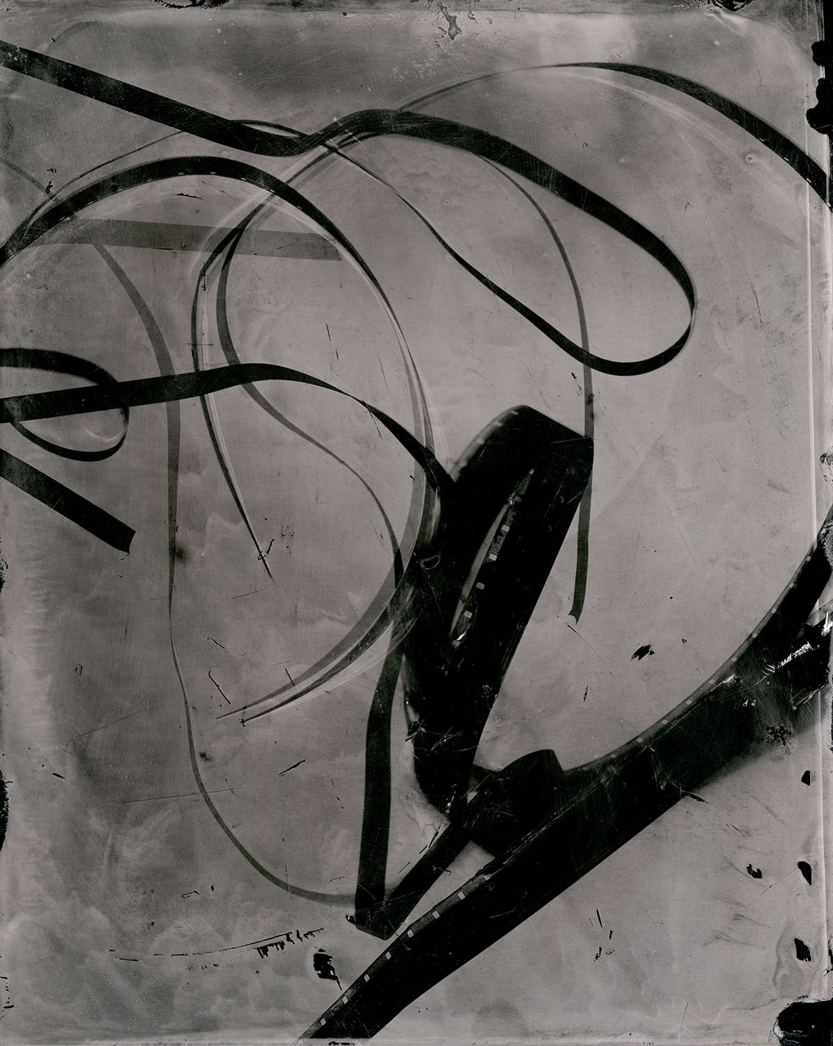
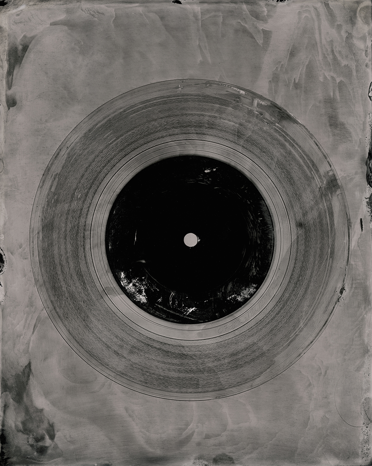
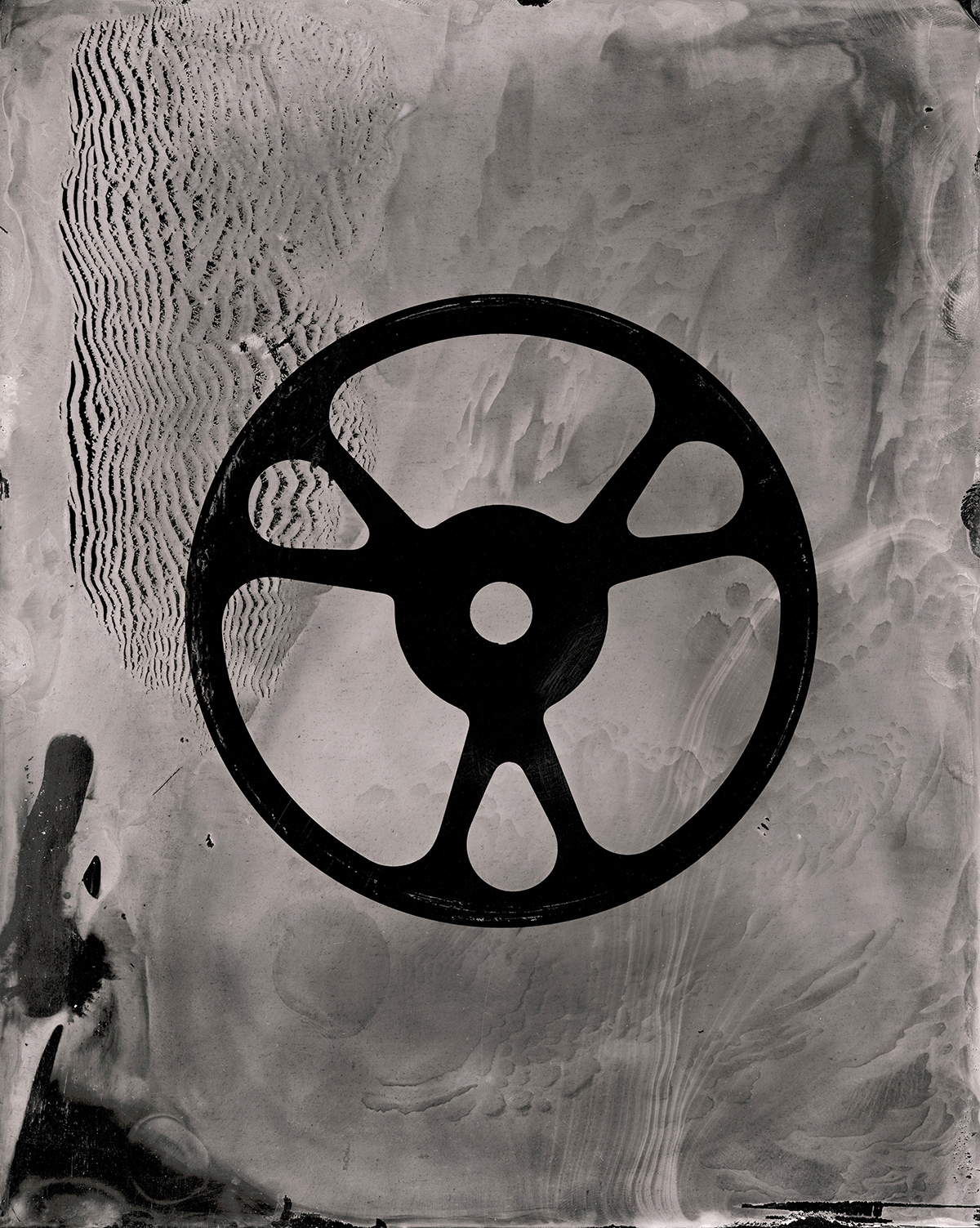
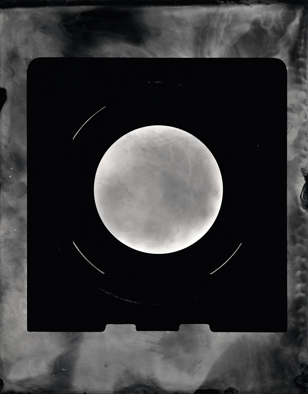
As to the work, it was conceptual, and 3D/sculptural, including a stereoscopic project, and these tintype photograms featuring antiquated technology. At first, I didn’t think it would reproduce well here, but once I saw her jpegs, I realized they were well worth showing. Hope you enjoy them, and see you next week.


The Art of the Personal Project: Kate Woodman

The Art of the Personal Project is a crucial element to let potential buyers see how you think creatively on your own.  I am drawn to personal projects that have an interesting vision or that show something I have never seen before.  In this thread, I’ll include a link to each personal project with the artist statement so you can see more of the project. Please note: This thread is not affiliated with any company; I’m just featuring projects that I find.  Please DO NOT send me your work.  I do not take submissions.


Today’s featured artist: Kate Woodman 

When I was a kid, my mom told me I could be or do anything I imagined.

I underwent various phases of imagined identities—adventuring archaelogist a la Indiana Jones, and apprentice to Leonardo DaVinci, to name a few–but before long, reality struck and I found myself in an office crunching numbers. Not that being an engineer and designing buildings isn’t a fulfilling career—it often even requires imagination—but gone were the days of building medieval castles in my head, replaced with the very real tasks of writing field reports and running computer analyses for seismic strength.

At what point does our imagination give way to reality? When do we lose that childlike sense of wonder and resign ourselves to our inevitable fates? More importantly, what happens to us when it does?

When I transitioned to full time photographer three years ago, I approached my job as any pragmatic adult would. How would I work within the parameters of the real world? Was there a formula for creating the “right” image?    How could I fit into the industry mold, ensuring commercial success and financial stability?

But I realized one day that my love for photography was not predicated on career viability; rather it is rooted in the idea of limitless imagination. You see in photography, imagination is everything. Your creativity is not bound by the laws of the universe, and whatever you can imagine, you can (with a little creative problem solving and some Photoshop know-how) create.

With that in mind, I embarked on a project in an attempt to honor that creative reawakening that photography has inspired—and continues to inspire—in me. “Imaginarium” is a photo series that explores the surreal creativity of children, untainted by the burden of reality. Accompanied by text from my supremely talented friend and author Nicole McKeon, this series serves as reminder to us all that those with their heads in the clouds rise above the rest.

To see more of this project, click here.

APE contributor Suzanne Sease currently works as a consultant for photographers and illustrators around the world. She has been involved in the photography and illustration industry since the mid 80s.  After establishing the art buying department at The Martin Agency, then working for Kaplan-Thaler, Capital One, Best Buy and numerous smaller agencies and companies, she decided to be a consultant in 1999. She has a new Twitter feed with helpful marketing information because she believes that marketing should be driven by brand and not by specialty.  Follow her at @SuzanneSeaseInstagram

Success is more than a matter of your talent. It’s also a matter of doing a better job presenting it.  And that is what I do with decades of agency and in-house experience.


The Daily Edit – Climate Change Covers

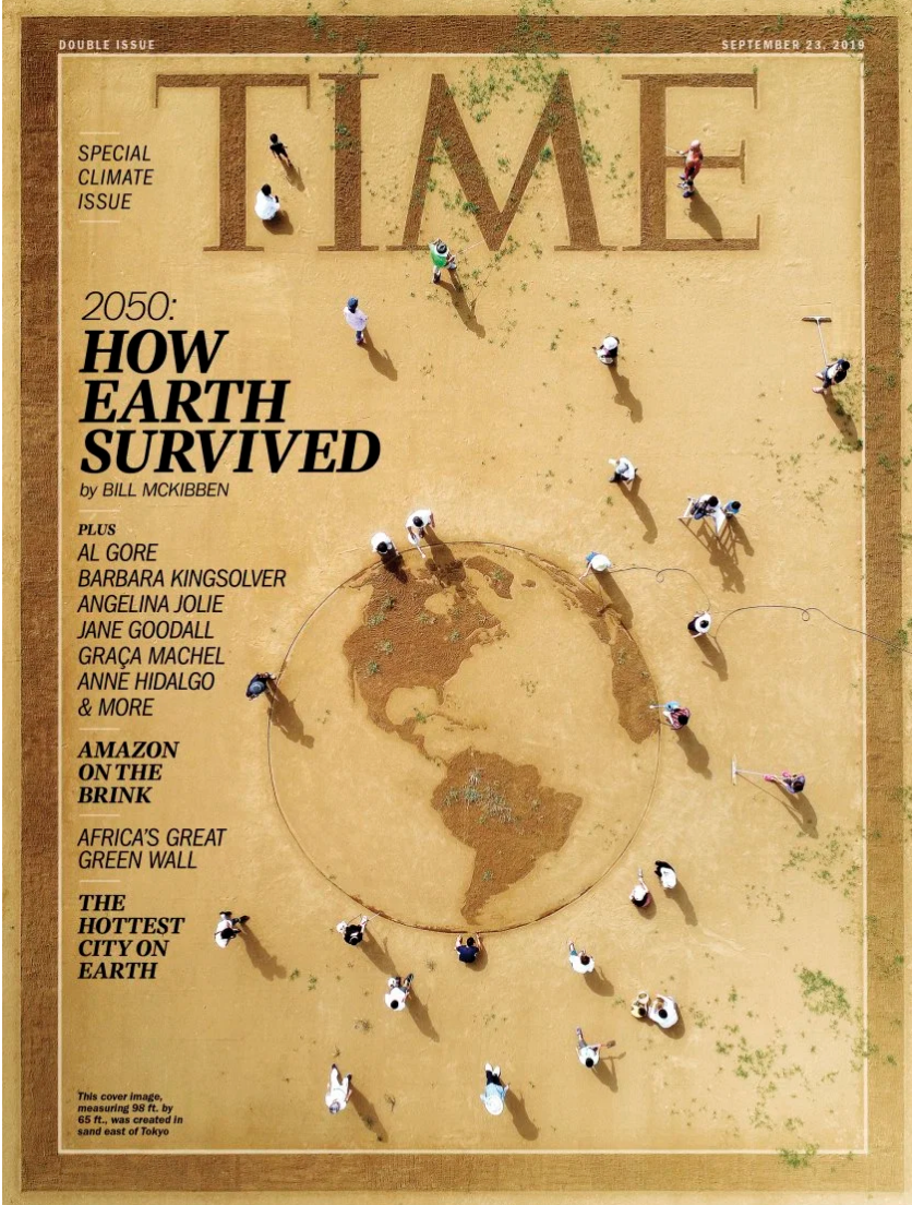
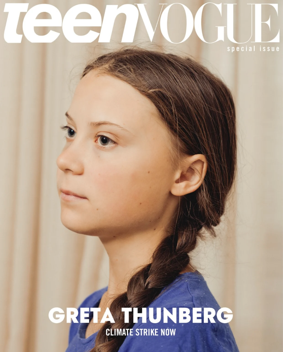
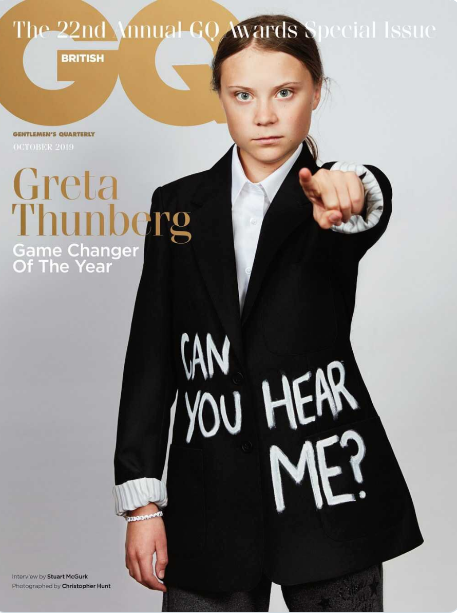
This week is a round up of newsstand covers addressing the topic of climate change in a variety of creative, graphic and portrait driven executions.
Climate Week NYC is an annual event that takes place every year in New York City. Started in 2009 this has become a global movement with greater awareness largely driven by our youth. The summit takes place alongside the UN General Assembly and brings together international leaders from business, government and civil society to showcase global climate action (or inaction).


Cover Sand Art By Toshihiko Hosaka


Cover Photograph by Ryan Pfluger


Cover Art By Pablo Delcan

Cover Photograph by Christopher Hunt

The Daily Promo – Michael Kunde

Michael Kunde

Who printed it?
It was printed by Modern Postcard https://www.modernpostcard.com

Who designed it?
The Promo was designed by my dear friend who’s been designing for me for about a decade now. His name is Nicolas D’Amico he is based in SLC, UT.
https://www.designbydiamond.com He also made my logo and design identity for my website.

Tell me about the images?
The images were shot this time last year for a client of mine Nutrien Ag Solutions. The creative agency was Osborn-Barr https://osbornbarr.com
Creative Directors: Zach Arnold and Dan Brindley. Agency Producer: Tammy Cheatham. We shot these images over a series of 3 days in a very rural area of Kansas near the city of Garden City. On this shoot I had help from my go-to assistant Alex Igidbashian @alexigidbashian and my very talented drone operator Rudy Lehfeldt-Ehlinger @rudy.le

Rudy and Alex are key people in the creation of my AG work. Rudy flys an Alta 8 Free-fly drone up in the air with my Canon 5Dmk4 so I can capture the iconic agriculture aerials of combines working harvest. I love putting up full-frame or medium format cameras into the air so I can grab the best possible files for these aerials. This gives me the best latitude with the files to push these images in whatever direction needed to give them the look and feel I’m going for. Alex basically reads my mind and somehow always knows which lens I’m going to want next.

How many did you make?
I printed 500 of these promos.

How many times a year do you send out promos?
I have initiated a new business strategy this year and will now be sending out promos quarterly. Before this year I only sent them out when I felt like I had the time or bandwidth to do so. I worked with my Designer Nic and he created a years worth of Promos for me. I printed them all at the same time so they are here and ready to go each quarter.

Do you think printed promos are effective for marketing your work?
I am a firm believer that printed promos are an effective marketing tool. The way I see it is, yes many of these promos will likely end up in the recycling bin. But many don’t. I have talked with many creatives at agencies throughout the country and consistently I hear that they appreciate a well designed and thought out promo. Many file them away, many creatives have them pinned onto giant walls in their office and reference when they need to find a photographer to match the agencies creative. I like to try put myself out there as much as possible. How can you be hired for a job if you’re not constantly on the radar of agencies around the country and the world.

The Best Work I Saw at Photolucida: Part 5


I made a new friend the other day.

His name is Keith.

He’s originally an East Coaster, like me, and now works as the security guard at the Harwood Museum of Art in Taos, where my “Party City is the Devil” show opens today.

Last week, while I was installing, Keith hung around a bit, and we got to talking. As the show took many hours to put together, over three days, it allowed for quite a bit of chatter.

In all honesty, when I first saw him, I did ask myself why he was the one protecting the joint. Not that he’s fat, old, or unimposing, (because he’s not,) but his look doesn’t scream dangerous either.

Keith has had an interesting life, filled with different phases, and confided he once spent years as the private chef for the CEO of Reebok.

Only after we’d gotten to know each other a bit, and he judged me cool, (I gather,) did he open up his jacket to show me his massive gun and even scarier knife.

Turns out, Keith knows some martial arts, but is a highly trained weapons specialist. A master marksman, he is quick off the draw, and is as familiar with handguns as shotguns and AR-15 rifles.

Yesterday, he showed me another knife, just as nasty, and a baton that can break bones faster than John Bolton is gonna get a tell-all book deal.

And he let me handle his Smith and Wesson .45 caliber hand cannon.

Truth time: it scared me shitless.

For most of us, guns, as objects, are terrifying. I don’t know how to use them, nor how to shoot, so to me, they emanate violence and misery.

I know they’re just a tool, (which Keith confirmed,) but man, are they unpleasant.

So you might be surprised to know I asked Keith to teach me how to shoot, and handle weapons properly. And he agreed.

Say what now?

Why would an artsy, hipster liberal want to know how to use a killing machine?

Because it was about as far out of my comfort zone as I could imagine going.

Over the years, I’ve come to dispense advice here, along with the art criticism, and doing things you find scary and difficult is one of the very best ways to grow as a human being. (And by extension, as an artist.)

That’s what it means, the phrase “get out of your comfort zone.” It’s about challenging yourself, and running towards the fear, and your weak spots, instead of away from them.

Another habit I think is undervalued, (or at least underutilized,) is knowing how to admit you’re wrong, and accept accountability and responsibility for your actions.

It may be the most Un-Trumpian thing a person can do, saying sorry and backtracking, but I believe it’s super-important.

Right now, I’m thinking of a particular incident that happened last April, when I was at the Photolucida festival in Portland. (We’re going to wrap up the series this and next week.)

It was on the last evening, at the closing party, when all the people from the festival were thrown together, artists and reviewers alike, and everyone was as worn down and low-functioning as they could be. (You try talking, looking, thinking and partying for 4 days straight.)

I wrote in a previous column that the photographers at this particular festival were too pushy and aggressive, for whatever reason, and that last night, people were approaching me left and right.

Someone even chastised me for removing my name tag, as if I’d broken the law.

I was grumpy, and spent, no question.

It took about 10 minutes to get from the front of the room to the back, and when I finally made it, Carol Isaak, a photographer I’ve since published here, approached me.

She asked, over the din, if I’d go outside with her for a private chat.

I was so tired, and burnt, that I was rude to her. I know I was.

“No, I said, I won’t go outside right now. But I will listen to you. Whatever you have to say, just say it here.”

Again, she implored me to go outside with her, and again I said no.

“Whatever you want to say there,” I grunted, “you can say here instead.”

I believe I mentioned in that last article that Carol is married to a Rabbi. I was courting some seriously bad Jewish karma by speaking to her like that.

So she looked me square in the eye, and took out a hearing aid. She held it up to my face, without a word, and watched me dangle on the hook like a dead hit man in a meat locker.

My face fell, I apologized profusely, and followed her to the front steps of the venue. (Sheepishly.)

As it happened, I’d asked Carol about the connection between her Buddhist-seeming India photographs, and her Jewish spirituality, and after a day or two of thinking about it, she had an answer for me. (She also accepted my apology graciously.)

Needless to say, I felt awful, but managed to salvage what I’d made of a potentially bad situation. (As a known good-guy, I really didn’t want people to think I’m an asshole.)

But now that we’re on the subject of Portland, it’s time to show the rest of the best work I saw. (This week and next week.) As usual, the artists are in no particular order, but as we have a lot to get through in the final two installments, I will be showing slightly smaller segments than I normally do.

Let’s get going!

Weldon Brewster is a successful commercial photographer based in Pasadena, who recently decided to focus more on his personal projects. He’s hardcore, for sure, as he sold his house and bought a new one with a studio, once he decided to commit.

Weldon is interested in Pictorialism, the style that was en vogue at the turn of the 20th C, before the group f.64 crew made it unfashionable in the 1920’s and 30’s. As such, the images he showed me of the California coast were intentionally soft and lush.

I liked them immediately, and later learned, (courtesy of Andy Adams,) that one of the images looked very much like a photograph on the cover of a famed Wynn Bullock book. So in our follow up, we discussed how one can stick with a project, and develop work more deeply, to move away from associations with things that have been done before.

Dawn Watson was one of several artists I met for a second time, as I’d reviewed one of her projects, (and published it here,) after the LACP Exposure portfolio review in 2017.

It was fascinating to see how it had evolved, as she clearly took some of my advice to heart, and it was strange to hear myself saying things that I’d clearly already said 2 years earlier. (Dawn and I both have good recall, I guess.)

Rather than showing the same work, though, we’re going to share a new, in-progress series she’s working on in the studio. The constructions, nature in an unnatural environment, are experimental, and very cool.

Marian Crostic, to lean into the theme, was also an artist I’d met at a previous LACP Exposure review. And she too had heard my critique, and then pushed herself much further. In particular, Marian, who lives on the West side of LA, and walks on the beach frequently, worked hard to imbue her imagery with more of a sense of Zen wonder.

They don’t need much of an explanation, (as you’ll soon see,) but are quite beautiful and lovely. No doubt you’ll be smitten, and wish that summer wasn’t 11.5 months away.

Cable Hoover is a fellow New Mexican, and was born and raised in Gallup. Anyone who’s driven through the West along I-40 might have passed through, and it presents as a dusty, hardcore Wild West town. (Not unlike Taos, but with less tourism, and no skiing.)

Rather, Gallup is in the Four Corners region, adjoining the Navajo Nation, and is known to be a properly tough town. These days, everyone likes to see “true” stories from inside a culture, rather than from without, and these images are about as raw as it gets.

Dynamite (and tragic) stuff.

Martha Ketterer, like Marian, is also smitten with the ocean. She presented a series of photographs made on the beach in Cabo, and explained a rather complicated technique she employs to create the panoramic effect.

I wasn’t sure the dividing lines made the pictures stronger, and told her so, but really, what’s not to like here?

Jesse Rieser was visiting from Arizona, and we had several friends and colleagues in common from the Phoenix photo crew. (Arizona, though I like to mock it as a place, does have a great history and tradition of photographic excellence.)

While he definitely presented me with my favorite single image, a young hipster woman wearing a unicorn hat and smoking a bowl, overall, I thought his series on Christmas in America was fucking awesome.

And now that it’s mid-September, Xmas is right around the corner, right?

Jean Sousa was one of several artists who showed headache work, as I previously mentioned. (At least I think I wrote about the phenomenon. After 5 months and six articles, it’s hard to be sure.)

They’re obviously blurry on purpose, via a lack of focus, and you’ll either love them or hate them. Personally, I’m working on some Op Art ideas myself, and didn’t love the headache these pictures induced, but still thought they were worth publishing for you.

Last, but certainly not least, we have Nate Gowdy, a documentary photographer/ photojournalist who’s spent a ton of time on the campaign trail. Given that I write about politics so often, I’m going to abstain from editorializing on the subject right here.

The work is properly excellent, and particularly relevant, so I’ll let the pictures do the talking. Nate is also working on something called “The American Superhero,” so be sure to check it out on his website.

The Art of the Personal Project: Fritz Liedtke

The Art of the Personal Project is a crucial element to let potential buyers see how you think creatively on your own.  I am drawn to personal projects that have an interesting vision or that show something I have never seen before.  In this thread, I’ll include a link to each personal project with the artist statement so you can see more of the project. Please note: This thread is not affiliated with any company; I’m just featuring projects that I find.  Please DO NOT send me your work.  I do not take submissions.


Today’s featured artist:  Fritz Liedtke

SACRED sā-krəd

2b: entitled to reverence and respect

In America’s current climate of divisiveness and moral outrage, how does one respond with something better than a tweet?  How do we stand up for the powerless? How might we reverence, honor, and dignify those who are often vilified and marginalized in 45’s America?

Perhaps it’s time to answer these questions with something other than words.  In my own quiet way, these images are my response.

I spent several months listening to and learning from the friends depicted here. I had to ask myself: what do I, a hetero, cis-gender, middle-class, white male, have to say about transgender people, Muslim women, Latina farm workers, young black men, or Native Americans? The answer: that we are one.  That each person has a rightful place as part of the beloved community.  I wanted to show that love trumps divisiveness, apathy, race, gender, politics, class, ignorance, fear, and hate. That when we take the time to know one another, to listen and learn, we become more.

So we collaborated to create images that celebrate their history, identity, humanity, and courage through traditional symbolism.  In spite of its religious undertones, iconography remains a valid way of speaking about that which is holy–that which we care deeply about, hold dear, consider beautiful and sacred.  This type of language is deeply needed today.

This set of 5 large photo-encaustic panels together create one body of work.  They are crafted of layers of wax and metal, wood and paper, ink and paint: many different elements that create a whole.  E pluribus unum. 

These people are my brother, sister, mother, father.  And they glow from the inside out. As Michael Golz explains, “The subject of the icon is a person transfigured by…love.”

Each of these pieces is a 24×36″ photo-encaustic assemblage.  They are composed of metal leaf, gold leaf, paint, ink, and paper, on a cradled 1.5″ wood panel.  Each piece is unique, requiring many days to create.

Many thanks to the Pine Meadow Ranch Residency program for their part in bringing this project to life.

Portland Photographer

To see more of this project, click here.

Or Instagram, click here
APE contributor Suzanne Sease currently works as a consultant for photographers and illustrators around the world. She has been involved in the photography and illustration industry since the mid 80s.  After establishing the art buying department at The Martin Agency, then working for Kaplan-Thaler, Capital One, Best Buy and numerous smaller agencies and companies, she decided to be a consultant in 1999. She has a new Twitter feed with helpful marketing information because she believes that marketing should be driven by brand and not by specialty.  Follow her at @SuzanneSeaseInstagram

Success is more than a matter of your talent. It’s also a matter of doing a better job presenting it.  And that is what I do with decades of agency and in-house experience.


The Daily Edit : The Red Bulletin: Alexis Berg


The Red Bulletin

Art Director: Miles English
Photo Editor:
Susie Forman
Photographer:
Alexis Berg (running imagery)

Heidi: The race course itself isn’t easy, how did you manage to shoot the athletes?
Alexis: The Barkley is a very unique race. Special to run, special to photograph. Laz, the fascinating organizer, wants to leave a mystery on the experience awaiting competitors outside the camp. What happens out there only concerns the 40 starters. It may sound strange, in the world of images that surround us, but it’s the only sporting event where it’s not allowed to go on the course to take pictures. The exceptions are minimal, barely 1% of the course. This leaves a lot of room for the imagination, and therefore, as photographer, you have to look for a different and creative way to tell the story.

What was some of the challenges you faced with this project?
The Barkley takes place at the end of March, the week of the year when it rains the most in this part of Tennessee. The trees don’t yet have leaves and the park itself appears very austere.The light is often rather mediocre. There is a dramaturgy, but we are far from optimal conditions for taking action shots. The race lasts three days and the only way to stay in the mood is to sleep in your car, a few hours when you can. Nothing is very comfortable, but it’s part of the experience.


I know you shoot a lot ultra running, what made this project different?

The Barkley is a mysterious and unusual event. More fascinating than an ordinary race. The Barkley is a bit of a tale, and just being a spectator makes you a character of the story. Like a lot of photographer, I try to make deep pictures. Photos that are not consumed in a second. Photos that require a caption. At the 2017 Barkley, I made a photo that has been published a lot. We see a man lying on the ground, in a fetal position. His wife touches him and seems very affected. Around them, there is a little void and a dozen spectators, whose only feet and legs are visible. This is of course a photo a little aesthetic, that can be read directly. But, she hides a long story. This man’s name is Gary Robbins and he just failed the biggest challenge of his life, in the most cruel way possible, falling for 6 seconds after 60 hours of struggles. And this is just the concise version of the story. As a result of this photo, I made a 20 minute film to tell the full depth of the story.
https://www.alexisberg.com/labarkleysanspitifilm-zkh3

How much did you the course did you cover and did you have to run at all?
As I said, the Barkley remains a race that can not really be photographed. The highest point is accessible, in less than an hour’s walk. It is strictly forbidden to follow the runners. When I photograph an ultra, I run only downhill, to reach my car faster. I must say that I photograph with two big cameras and quite heavy lenses. You have to make the right choices to get to the right place at the right time. This requires a very precise study of the maps and the passage times.

What draw you to these types of events/ultra running?
I’m not a runner. I started by photographing ultra-running by accident, the chance to follow my brother on a race. It’s pretty strange to run twenty hours in the mountains. This strangeness, this distance that I maintain with this sport, I believe, feeds my photos. My relationship to images is so, they are not a mirror for myself, but rather a window to the outside. I live in Paris, but I never do a picture in Paris. But facing the otherness in front of what I don’t know, photo became my language. That’s how I started to photograph people running.

Did you always plan on doing a book out of this body of work for the magazine?
Yes. The Barkley is a unique race because almost no one can finish it. In 30 years, only 15 people managed to finish the 5 loops. Who are these 15 finishers? Some are a bit famous in the community, some are anonymous full of mysteries. All are legends. Last April, with a friend journalist, we found them all. And we met, interviewed and I photographed each of these men, who live all over the US. It was an exciting journey, because everyone is a pretty incredible person. The book will prove it.

The Daily Promo – Greg Mionske

Greg Mionske

Who Printed It?
Print on Paper (printonpaper.com)

Who designed it?
I did.

Tell me about the images?
These photos were all made as part of a personal project this past spring at the U.S. Men’s Clay Court Championships in River Oaks, Texas. I was pretty determined to shoot here as I knew I wanted to shoot on red clay for color and textural reasons. I initially made a few editorial pitches focused on the event, all of which failed to gain enough traction. Fortunately, one of those editors was still willing to help me secure credentials to pursue the project on my own.
I spent every day at the tournament chasing light and photographing anything that caught the light nicely. Aside from the tennis, I was rather intrigued by the spectators as many of them seemed to be more worried about seeing and being seen or gossiping court-side than the event itself. Overall my goal was to come away with a set of images that made the viewer experience the beauty and uniqueness of this particular event.

How many did you make?
I had 100 printed.

How many times a year do you send out promos?
I don’t have a schedule set in stone at this time however it is certainly something I would like to do quarterly.

Do you think printed promos are effective for marketing your work?
I’m not sure. Obviously some people like to see printed photos while others don’t care, but I do think prints have the potential to be effective in a world where most email inboxes are overflowing with junk mail. Having said that, a friend from a particular Boston-based footwear company sent me an Instagram video of him opening my mailer, thumbing through a page or two and then walking it over to the recycling bin. I’d call that pretty decent engagement in the digital age ; )
Visiting California, Part 2: The Decline of San Francisco


Part 1. Synchronicity


Meaning is what we make of it.

That’s a fact.

A week ago exactly, I stood on my front porch as our Antidote event broke up, and I watched a newly formed community, people who hadn’t even known each other a few days before, split with sorrow, as if parting with family.

One student stayed a little longer, so I could set her up with a cool road trip around Southern Colorado.

Now, I’m the first to admit that our program, set in the hippie Mecca of Taos, NM, is rather progressive in the ways we teach creativity and open-mindedness.

Hell, I write about this every week for you guys, so I have no doubt you can imagine the ideas that get kicked around the breakfast table.

But a week ago, I stood there with Christina, discussing future possibilities for her art, when a red-tailed hawk began screeching loudly from the sky.
At first, I smiled and kept talking, but the hawk kept it up, so finally, I paused.

“Hey Christina, let’s go see what the hawk wants,” I said.

“Christina” photo courtesy of Hillary Johnson

So we did.

Immediately, I saw two in the sky, and began theorizing as to what they might mean for the two of us, symbolically.

Then, Christina saw a third bird, forming an upward-triangle-vortex in the deeply blue sky.

Her photographic art, both past and (potentially) future, revolves around her triplet daughters, who after some health scares are now successful young women, out in the world.

Three girls, three hawks.

The symbolism for both of us was unmissable.

Three birds.

Free.
Alive.
Glorious.

I looked at Christina and said, “Out here, on this farm, we choose to believe that the things like this can mean something. They are symbols, with power, as opposed to random events in the natural world. I know that can sound new-age, so feel free to think that’s crazy.”

But Christina lives in California, and was embedded in a very positive, life-affirming, artsy group for the weekend, so it was clear she saw those hawks in the sky, and her girls in her mind’s eye.

Photo courtesy of Hillary Johnson

In a normal year, that would have been one of the craziest moments I’ve had, fraught with metaphysical essence.

But it’s 2019, and many of you have been reading along, so you know it’s been one wild fucking ride.


Part 2. The sermon about San Francisco

I mentioned California just a few paragraphs up, and of course that’s where we’re headed today. But it won’t be a long, rambling visit, as we’ve had many of those.

I’ve tried to take you on the deep dive into contemporary New York this year, and New Jersey. Portland and London too.

That’s the East Coast, West Coast and Europe.

As to San Francisco, I don’t think I have it in me to drill into the core of the myriad problems.

It’s just too sad.

It’s easy to pile on San Francisco these days, but sometimes where there’s smoke, there’s fire.

I used to live in the city, from 1999-2002, back when booms were met with busts, and artists could still afford an apartment.

And I’ve reported on the growth and change here on APE since at least 2013. Year by year, we’ve discussed the rise in homelessness.
That’s what I called it at first.

Then, I reported on the rise of tent cities, and the sense of hopelessness that the problem could ever be solved, as income inequality grew to absurdist proportions.

Finally, we’ve settled on the term street class, which I wrote in last week’s book review, as the trend solidified into something normal. Something regular.

Something permanent to be tolerated.

Much as Trump’s America has given us kid jails, and ever-more-rampant spree killers, it’s also seen the final blow dropped on what was once a truly cool, vibrant, special American city.

Now it feels like one big tourist trap overlaid on a tech-bro landscape.

City Lights Bookstore


Part 3. Visiting a gallery in the old neighborhood

San Francisco is getting killed in the media, regularly, so it gives me no pleasure to write this. But as soon as we got to the rental car place, in Oakland, the nice Haitian woman who helped us swore that SF was so dangerous she didn’t go there anymore.
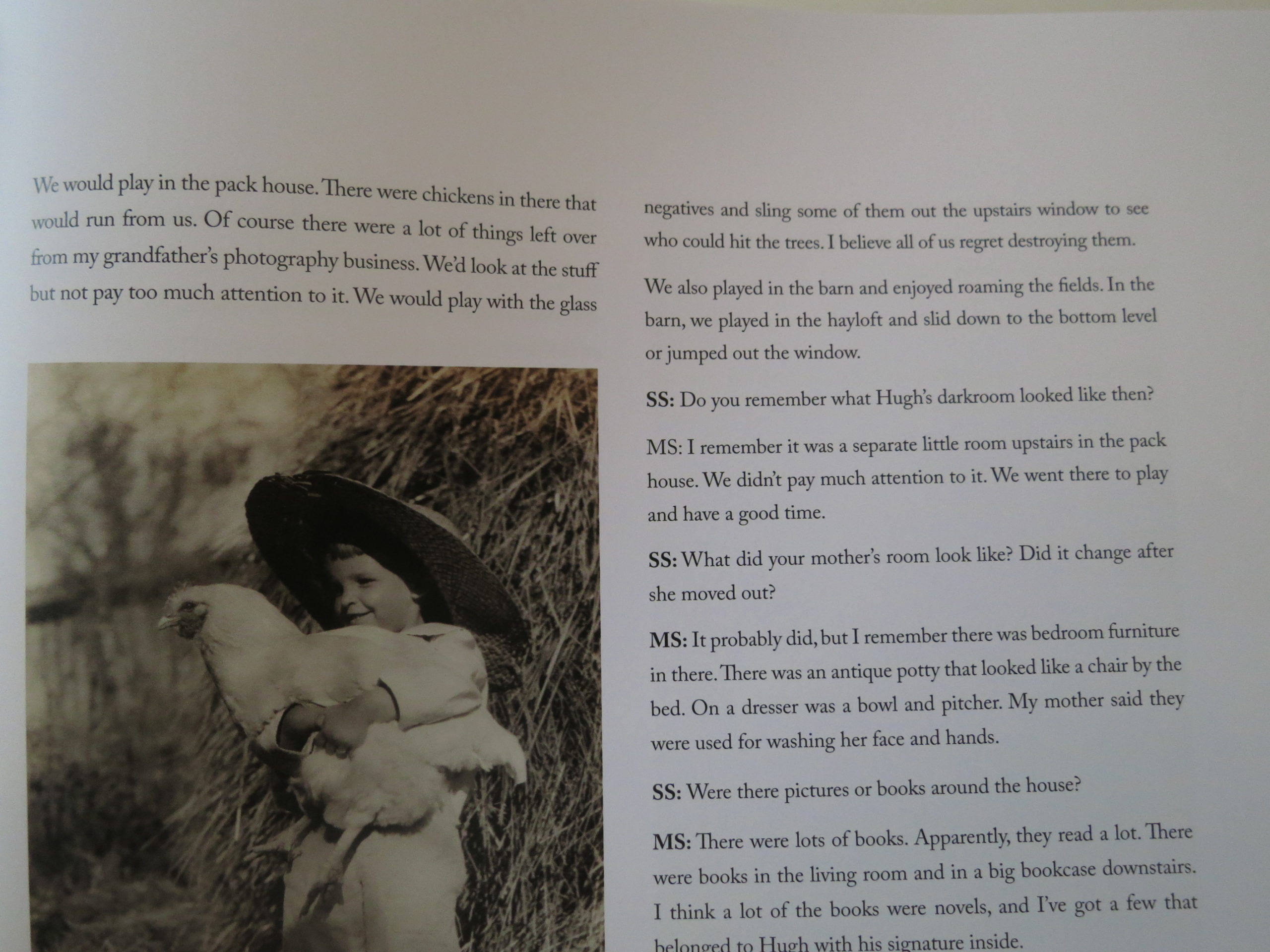
She even warned us off of the visit, if you can believe it.

But after leaving the airport only to land in Bay Area morning rush hour, with an 1.25 hour drive to go a few miles, (little did we know,) the only thing I was worried about was how long it would take to get my pupusas.

I’d promised the family some great Salvadoran food, in our old neighborhood, the Mission, and desperately hoped we could make it there before food crashes, or traffic, undermined us.
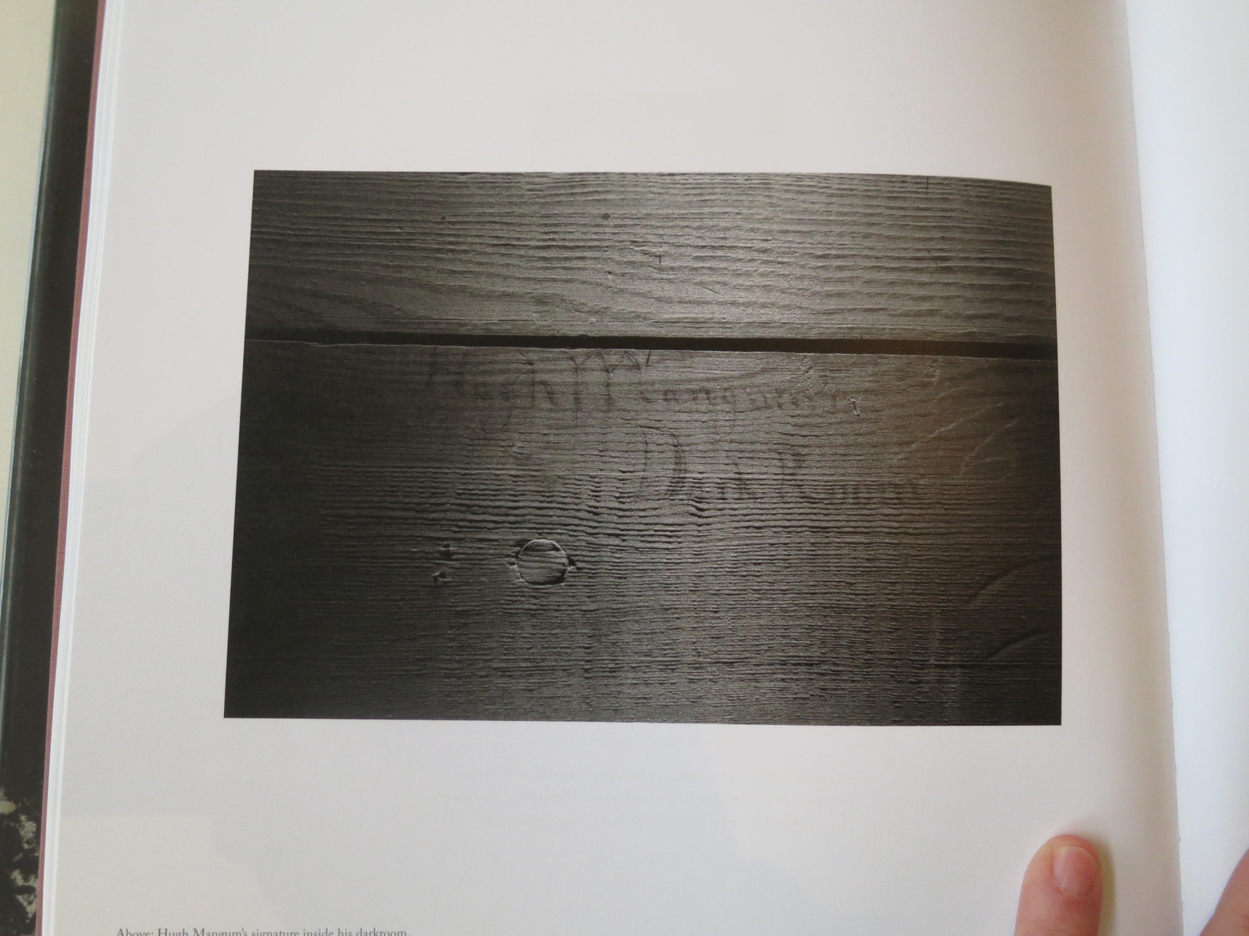
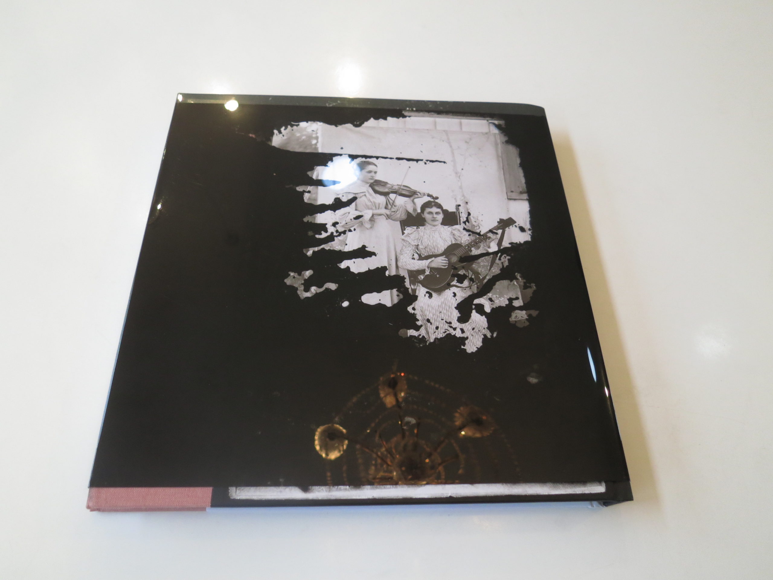
After a few close calls, in all the chaotic traffic, we made it, and stuffed our faces on masa-stuffed goodies, served with spicy salsa and a vinegary slaw.

La Santaneca de la Mission, right near Mission and 24th, is so fucking good. Try it, but make sure to bring cash, as they don’t take plastic. (Note that, Europeans.)

Thinking back, the meal was perhaps the highlight of the visit, as it resonated of the Central American immigrants who used to dominate the neighborhood, back in the day.

And then then we went on a short walk, and saw several local institutions in the midst of being replaced by gentrification. (Like the old school Locatelli Ravioli, which seems to have shut the day before we got there.)

I did a loop of the old haunts, and even Mission Street, which still looked the same, felt like a zombie. Somehow, I recognized the places, but the soul was gone.

That’s the best way I can describe it.

I split off from the family, and headed to Euqinom Gallery, where I was meant to hook up with Philip, an artist I’d met in Portland. We both wanted to see “Present Objects,” curated by Emily Lambert-Clements and Monique Deschaines, which featured 5 female artists who worked in very different ways.

But just before I got there, not 100 feet from the gallery, was a tent, sitting there, in the middle of the sidewalk.

By itself.

I stopped dead, but decided I would NOT take a picture for you, so I didn’t.

My heart sank.

The gallery is about 1/4 of a mile from where I used to live. My old home. The stomping grounds.

And now people are living in tents in the middle of the sidewalk.

I mentioned it to Monique, who said it happens constantly these days, as once residents call the police, the squatters still have 3-4 days before the cops come roust them.

Sometimes, Monique says, a few tents will join once one pops up, and they’re harder to move. She mentioned a story she’d heard about someone pouring water on a tent from above.

Again, this is normal now.

As to the exhibition, the work was strong overall, featuring a variety of processes, and fairly or not, my favorite were the paper-based wall sculptures by Julia Goodman. Totally textural and sumptuous, I was told the artist makes them with composites of old t-shirts, among other things.


There was also an installation of fake detective novels by Rachel Phillips that was clever, but not something over which I’d swoon. The other three projects were more photographic in nature, and featured a fairly disparate set of styles. (All of which I liked, for sure, but did not love.)

As we were wrapping up, I asked Monique if there was a theme to the entirely-female group, as it didn’t seem to be “about” feminism.

She told me the gallery will always have 2 female artist for every man, and then she turned the tables on me.

“You would never have said that, if it were five men in the show.”

“Yes, I would have,” I replied.

“No, you wouldn’t have,” she countered.

“You don’t know me very well,” I said. “It’s 2019. I absolutely would have noticed if it were five men, because that would have seemed out of step with the times. Not only that, I think a lot of people in the photo world would notice, after the last few years.”

Don’t you agree?


Part 4. Pier 24

We spent the night in a fancy hotel on the Embarcadero, a few blocks from Chinatown and the waterfront. In retrospect, (and having just watched “Warrior,” which is set in 19th C SF,) I guess that part of San Francisco, the Barbary Coast, has been dodgy for a long time.

Hotel View, on the Embarcadero
The Transamerica Building, from the Financial District
The Ferry Building at night

But while I had seen a lot of hard-core poverty in the Tenderloin, over the years, what I witnessed by the Bay, in late July, was several degrees worse.

I knew better than to take my kids out after dark, but Jessie and I took the briefest of walks to the Ferry Building, and almost got mugged once or twice.

No exaggeration.

The collection of desperate, down-on-their-heels people would have been darkly mesmerizing, if the natural human instinct wasn’t to get back to safe harbor as quickly as possible.

In order to avoid an alley, Jessie asked that we take Market Street, and in only one block, there was a woman wailing for anyone to help her move her wheelchair, several people sprawled out on the ground, and I swear it felt like we’d descended into Hell.

I know that stories like this fit Trump’s narrative that America’s cities are in bad shape, but as I’ve reported constantly over the last year, I don’t believe that’s the case.

Desirable cities are booming, but the income inequality wave is drowning more and more people each year.

It’s a horrible set-up, I know, but part of why we stayed near the Ferry Building was that we wanted to visit Pier 24, the very excellent, free photo museum/gallery that we’ve profiled here several times before.

I’m going to avoid editorializing right now, and state only that the museum, as I’ve previously reported, houses the collection of the Pilara Foundation, which runs the space.

They allow a very limited number of people inside, and the space is enormous, so they’ve created an excellent, boutique experience for viewing some truly exceptional contemporary and vintage photography.

It’s owned by a very wealthy patron, and in the past has featured an exhibition ABOUT the collector class.

The 1%.

But the wealth is put to the benefit of the public. (If you know about it, and can reserve a space online.)

The people who work there, though, are regular folks like us. They’re neither rich, nor Upper Class.

So when I took my family, (again, for free,) we walked along the waterfront, as people slept on the sidewalk, or leaning up against the sides of buildings.

The tourists were everywhere, creating side-walk passing lanes I hadn’t seen outside of New York.

Inside, Pier 24 was celebrating its 10th Anniversary, and the first space, which was filled with the Sugimoto wax royals, set the scene nicely.

As I said, the place is sprawling, with so many prints by so many famous names. Amidst all the great work, one mini-gallery felt so subversive, I did a double-take.

There, together, were a set of original Dorothea Lange images, and as she was a Bay Area photographer, they packed an extra punch.

BOOM!

The past few years, as I tried to explain to people what this new street class looked like, I would say, “It’s like those photographs from the Great Depression. It’s happening again.”

And there they were.

In my mind, I imagined some of them were hung on walls shared with the exterior. (It’s possible.)

Maybe, some nights, while the photos hung on the inside of the walls, sad, lonely humans slept on the other side.

(Whether it happens literally or not, it happens metaphorically every day.)

Major Kudos to curators Christopher McCall and Allie Haeusslein for sharing that gallery in the middle of a city in crisis.

Three photos by Adou

There was plenty of other great work on display, including Adou, a Chinese artist I’d never heard of before, but only one thing knocked me on my heels.

And it takes us back to today’s beginning.

Symbolism.
Meaning.
Synchronicity.

Because one little gallery was filled with vintage Robert Adams images, which were clearly from Colorado. (His old stomping ground.)

The looked so familiar, but I was sure I hadn’t seen them before.

My brain was whirring, one more mystery in a crazy year, when I saw it. Things clicked.

It was Eden.

Eden, Colorado.

Where my London adventure began, on the highway to Denver, four months ago.

It was in Eden, that mythically-named spot, where I noticed people living in their cars.

As if it were normal.

Welcome to 2019.