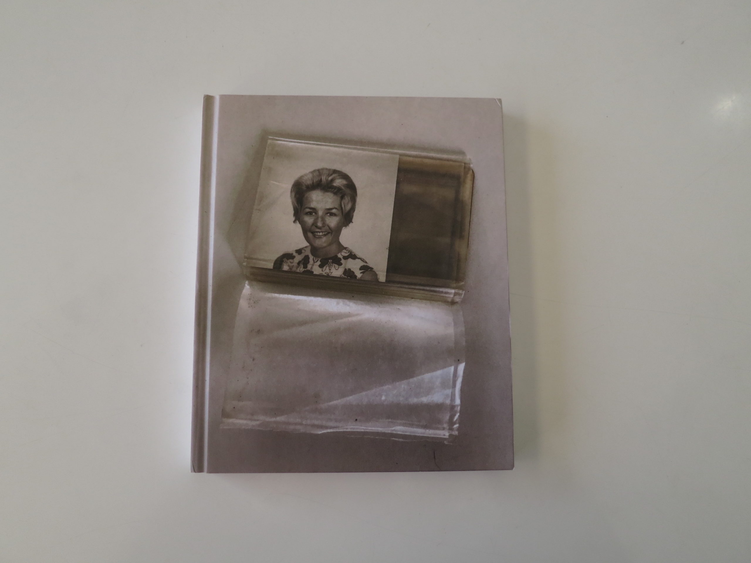
This Week in Photography Books: Cristina Garcia Rodero

I’m turning 45 on Monday.

(Halfway to 90.)

As of then, I can say I’ve been an artist for more than half my life, as I picked up the habit at 22, and it hasn’t let go yet.

Lately, though, I find I don’t have quite the thrill for photography that I used to.

It makes sense, as it’s been my primary medium the entire time. (Though one could argue I’ve been writing more than shooting the last few years.)

Still, doing the same thing, over and over again, will make almost anyone bored. (I say almost, because now that I’ve studied Japanese martial arts for 2 months, I already have a better handle on their obsession with repetition.)

Add in the fact that as resident book reviewer here, (400+ posts and counting,) I see a lot of photo projects, and it’s understandable that I’d get a bit jaded from time to time.

(I probably just need a vacation.)

Still, I love to be surprised, to see new things, and to keep it fresh for you, my loyal global audience.

Today, I was loathe to review the first few books I checked out, as they were reminiscent of things I’d reviewed quite recently. So I sat here on my couch, willing myself to be inspired to write.

Got to hit that deadline.

No inspiration, no column.

I closed my eyes, thinking about the feeling of inspiration. The rush of adrenaline as your mind expands in real time. The thrill of looking at things that make you want to create, or travel, or both.

In my imagination, I was back in Albuquerque at UNM, in 1997. I was studying Photo 1 at the time, and at the encouragement of my professor, Jeff Tomlinson, I headed to the Fine Arts library to look at some photo books.

Walking the stacks, creeping around like Inspector Javert, I ran my fingers across the spines in the photo section, cocking my head sideways to read the titles.

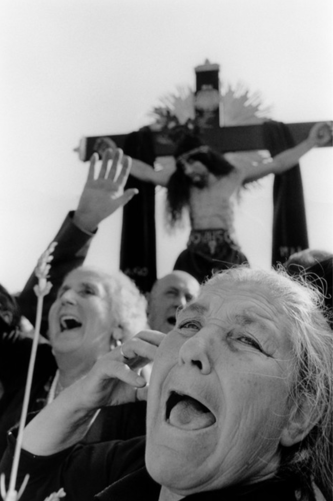
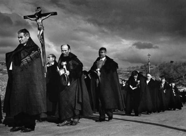
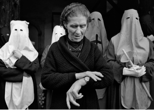
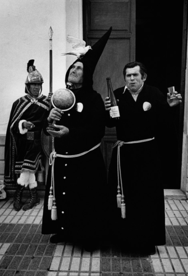
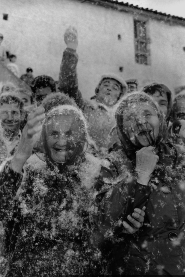
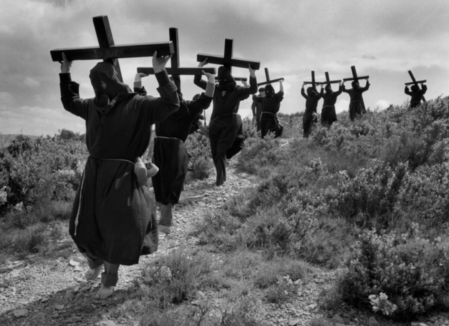
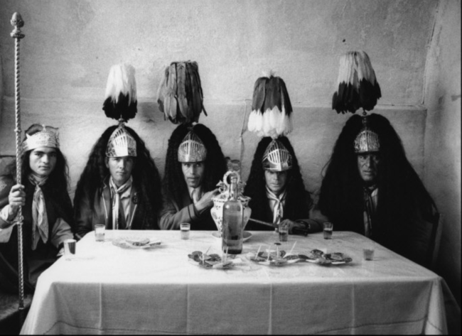
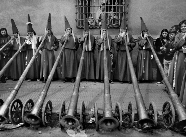
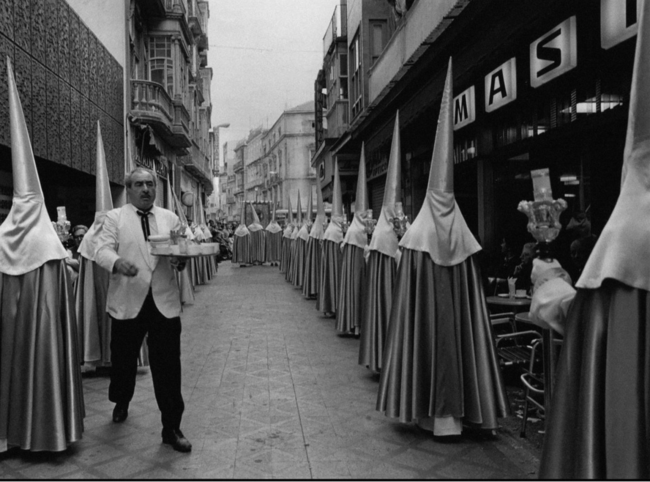
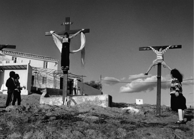
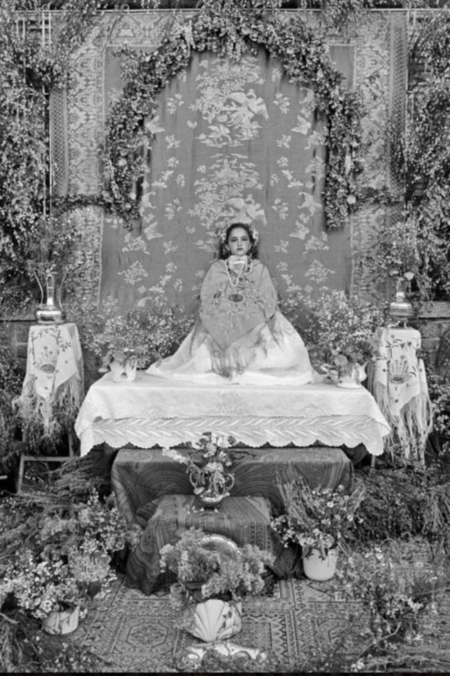
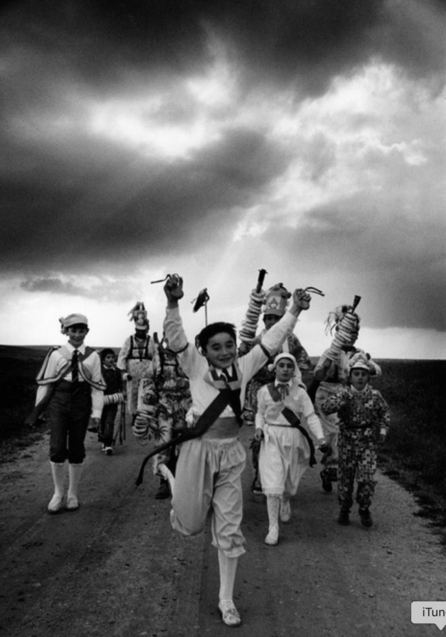
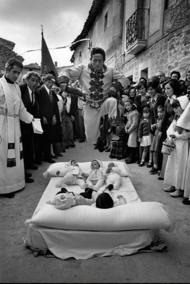
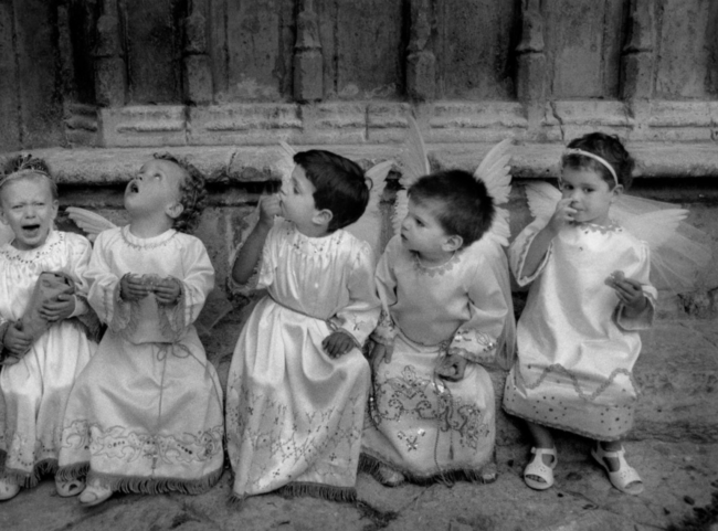
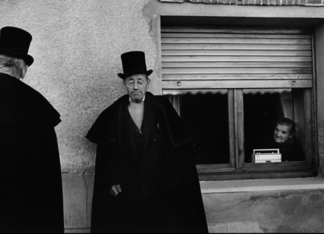
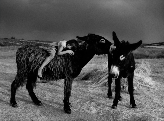
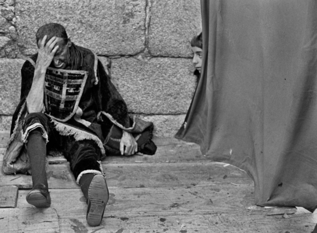
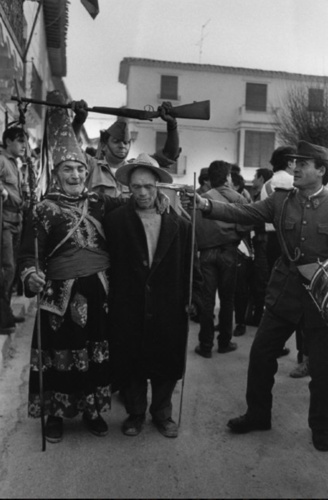
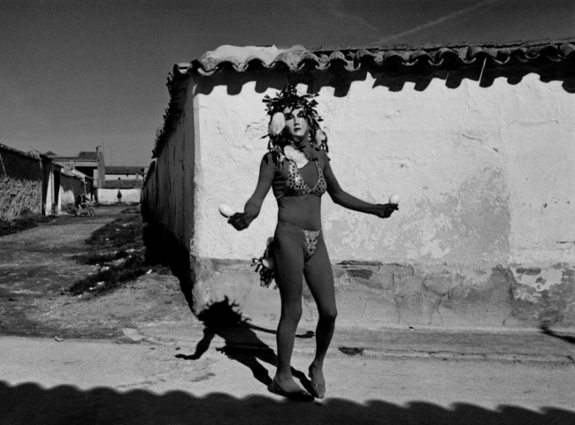
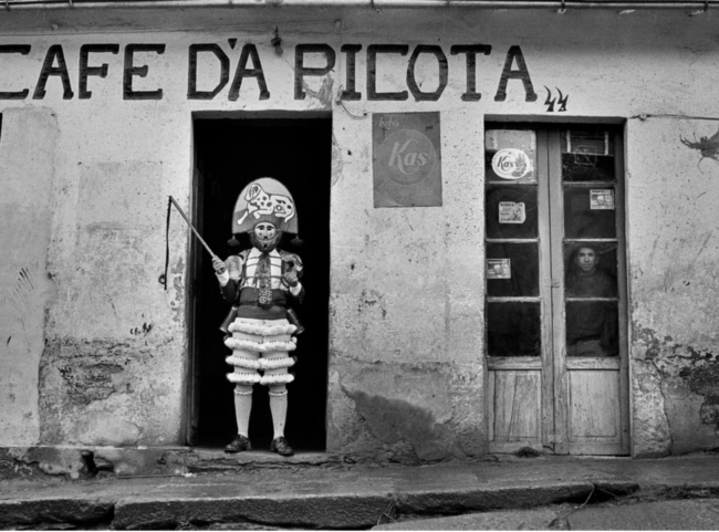
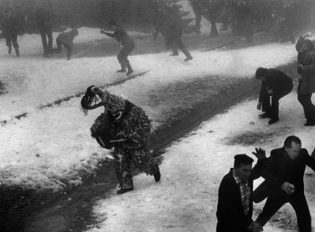
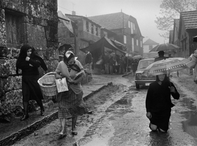
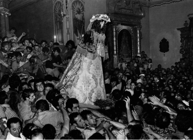
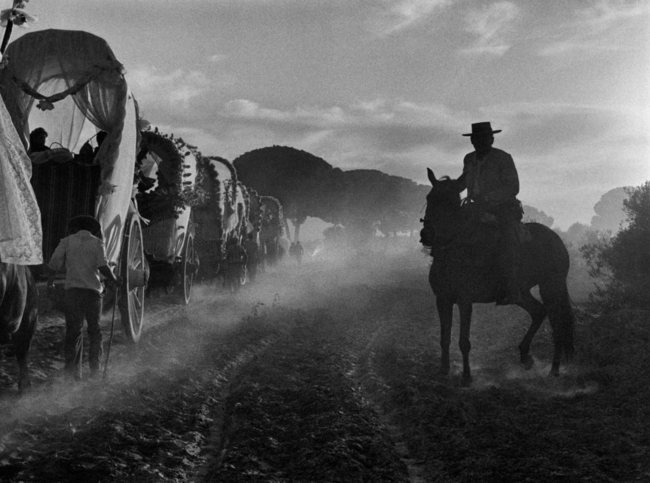
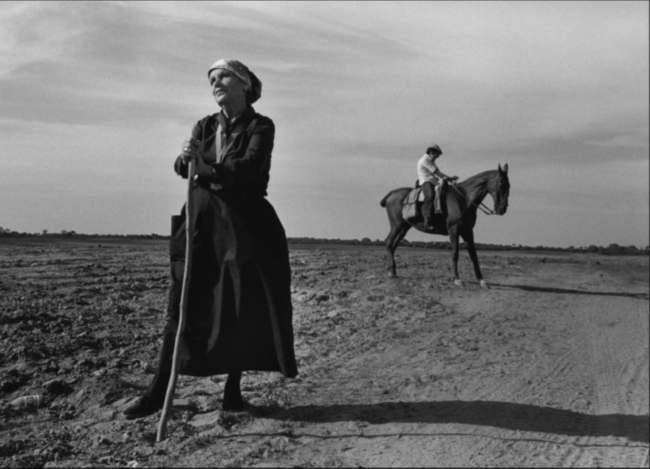
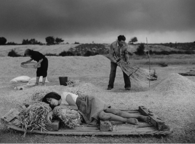
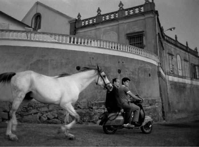
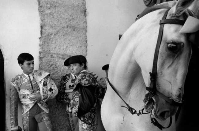
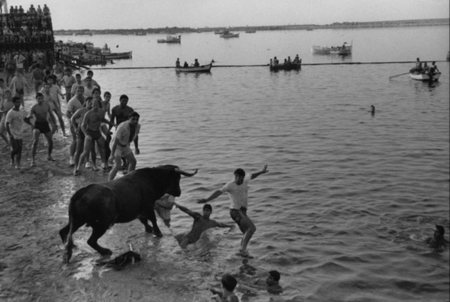
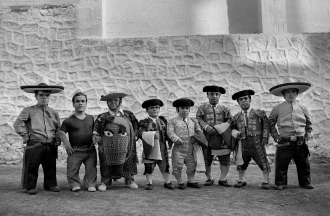
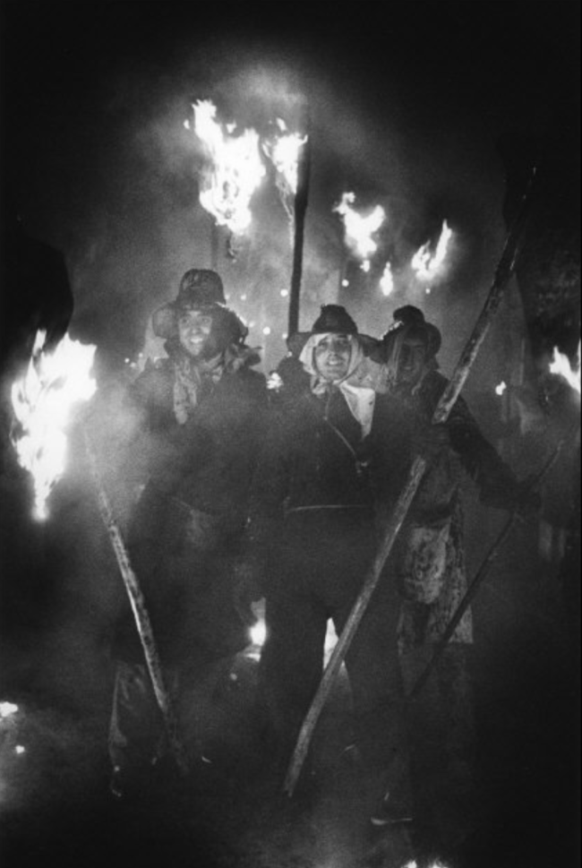
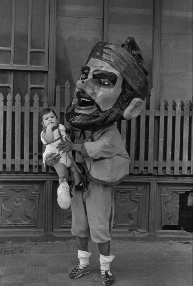
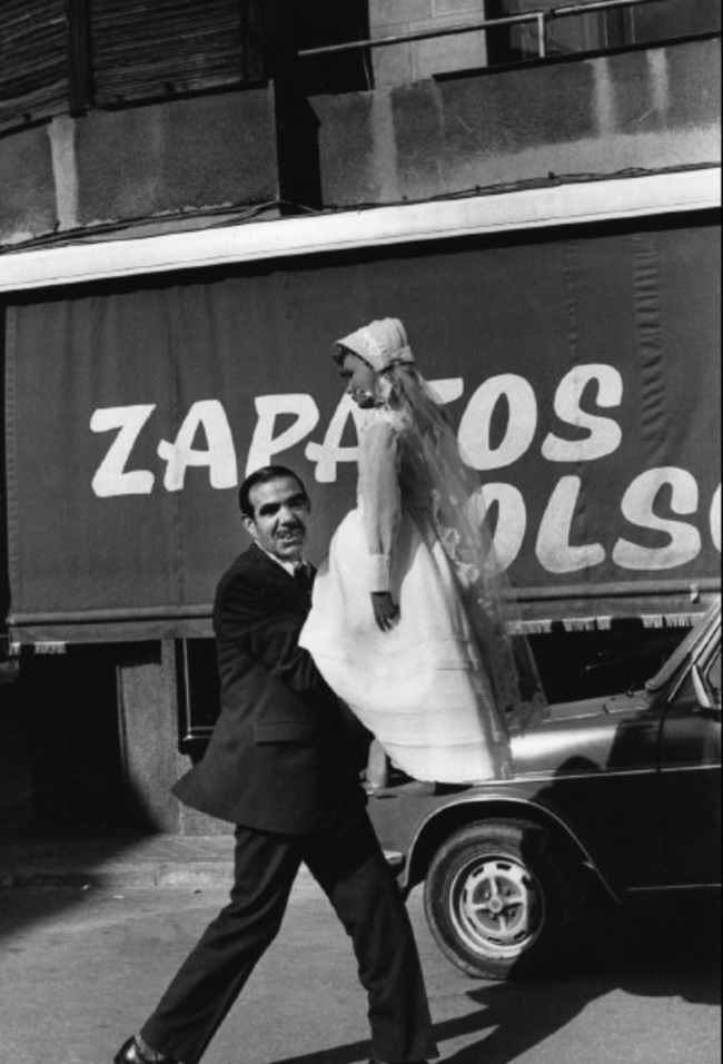
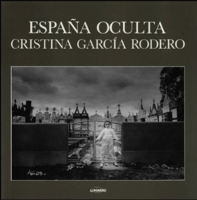
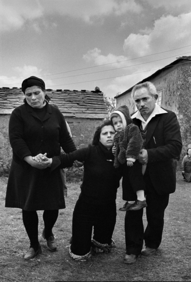
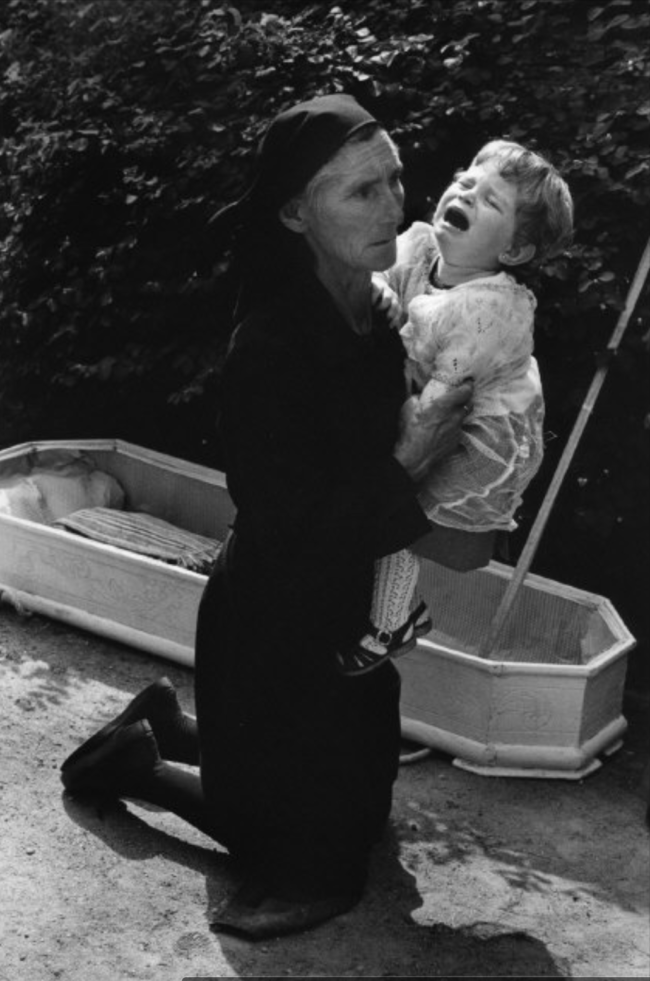
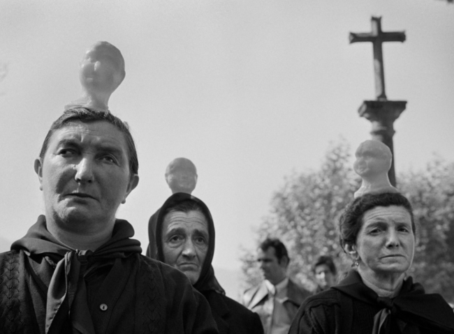
I stopped at “España Oculta: Public Celebrations in Spain 1974-89,” by Cristina Garcia Rodero, published by Smithsonian Books, and pulled it from its neighboring tomes.

“What are you,” I asked, curious to know?

15 years is a long time, and as I’m coming up on my 14th anniversary of moving back to New Mexico, I should know. It represents the length of this project, and even then, as a pure beginner, I wondered how anyone could sustain that kind of interest in one subject for that long.

The focus.
The discipline.

These days, I can imagine a Spaniard, around 30 or so, who enjoyed shooting at festivals in her native country, and checked in from time to time over a decade and a half. It doesn’t seem impossible, though at 23, that’s exactly how I viewed it.

The consistent surreality of the scenes won me over, and still does. The disbelief that these were real people, in real situations, and not staged fantasies.

Even then, as young-20-something who’d only been around New Mexico for 10 years, I’d heard stories of local Penitente societies still active, in which believers self-flagellated, and wore hoods.

Here, in the book, were versions of that before me, only exponentially more intricate. The Baroque nature of Spanish Catholicism was on full display, with crucifixion rituals, baby coffins, and midget bull-fighters. (Sorry. Little People.)

I bought the book soon afterwards, at the ICP bookstore in Manhattan, likely 3 or 4 locations back.

And even though it remains my favorite photo-book of all time, somehow, in between all the moves…

I lost it.

Luckily, Ms. Garcia Rodero is a member of Magnum, and they have a digital copy of the entire book on their site, which is a very 21st Century experience. (Even if it’s not the equal of those excellent reproductions on paper.)

The pictures feel relevant to me in a totally new way, on the day when Michael Cohen is testifying about his former-boss-and-buddy Donald J Trump.

Trumpism and Nationalism can be easily mistaken for each other, these days, though I might be generous and declare the latter is at least based on a proper love for the cultures and traditions of a place on Earth.

(Again, if I’m being kind. Trumpism is nothing more than narcissism having an incest baby with geopolitics.)

Here in America, we’re all from somewhere else. All of us. (Even our indigenous folks walked in 15,000 years ago.)

Our culture is polyglot and hybridic by nature. Many Americans, (myself included,) are Europhiles, either because their ancestors came from there, or because the allure of age and aesthetics entice us to stare longingly at rituals that make no sense next to Walmart and McDonalds.

These pictures revel in the “Spanishness” that you read, in think-pieces, is at risk of disappearing. The very specificity of place and time that gets annihilated when beanie-wearing-hipsters FaceTime with each other across national borders, giggling at outmoded concepts like local culture while fiddling with their Apple watches.

The Globalists.

Was that even a word when I first saw this book, back before the internet was even a thing?

Probably not.

But certain ideas represented in “España Oculta” never go out of style. Creative excellence, formal craftsmanship, patience and hard work, and shooting thousands of rolls of film.

After all these years, I’ve never reviewed a book from memory before, but there’s a first time for everything.

If you can find a copy of this one, by all means buy it. (Or probably anything else of hers you can get your hands on.) I once stumbled upon her show, at MoMAPS1, in which she’d made images of Voodoo rituals in Haiti that practically gave me nightmares.

Truth be told, I feel better now than I did before I found her images online, and reconnected with this marvelous narrative.

It’s an example of the best our medium has to offer, IMO, and reminds me why it’s so important to keep pushing that rock up the hill each day.

Bottom Line: A Baroque, Spanish masterpiece

If you’d like to submit a book for potential review, please email me at jonathanblaustein@gmail.com. We currently have a several month backlog, and are particularly interested in submissions from female photographers so we may maintain a balanced program.

The Art of the Personal Project: Kirsty Mitchell

The Art of the Personal Project is a crucial element to let potential buyers see how you think creatively on your own.  I am drawn to personal projects that have an interesting vision or that show something I have never seen before.  In this thread, I’ll include a link to each personal project with the artist statement so you can see more of the project. Please note: This thread is not affiliated with any company; I’m just featuring projects that I find.  Please DO NOT send me your work.  I do not take submissions.  

Today’s featured artist:  Kirsty Mitchell


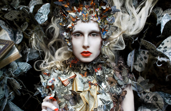
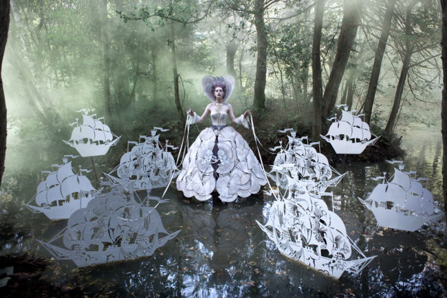
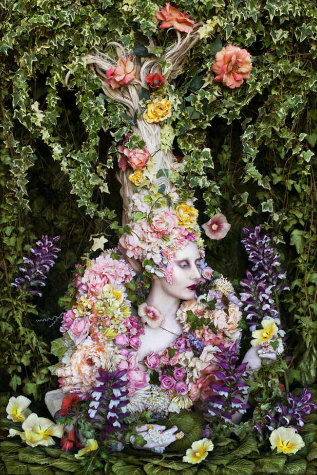
Described as a multi-faceted artist, British fine art photographer Kirsty Mitchell draws on her past careers in fashion design and costume making, to produce images of beguiling dream-like worlds all shot in the ancient woodlands of her home county Surrey. Kirsty describes her approach as ‘Fantasy for Real’ spending months meticulously handcrafting her character’s costumes and props to coincide with the bloom of wild flowers and the seasonal extremes of her local environment.
After graduating from six years of study at The London College of Fashion and Ravensbourne College of Art, Kirsty went on to complete internships at the studios of Avant Garde designers, Alexander McQueen and Hussein Chalayan. Her career as a fashion designer continued for over a decade until 2008 when Kirsty developed a sudden and deeply emotional passion for photography, during the treatment of her mother’s terminal cancer. It was through the lens that Mitchell felt able to channel her grief and communicate emotions she felt unable to talk about with the people she loved. She describes photography as becoming both an obsession and a therapy.

In the summer of 2009 Kirsty embarked on the creation of the Wonderland series, a project intended as a book in her mother’s memory. The international acclaim for this body of work led Mitchell to leave her fashion career behind in 2011 and after 5 intensive years, Wonderland was completed in 2014.

A year later, after a number of offers from major publishers, Mitchell decided to launch her own crowd funding campaign to create the Wonderland book in order to produce a high end publication made from the finest materials possible, printed in Italy. The campaign went on to become the most successfully funded photography book in crowd funding history, raising more than £334K in just 28 days and was completely sold out within 3 months. The Wonderland book is now in it’s Second Edition and continues to sell around the world. The series is now an international touring museum show, hosted by Fotografiska, one of the world’s largest and most prestigious museums for contemporary photography.

Gammelyn’s Daughter
The Fade Of Fallen Memories
The Ghost Swift 2018
The Queen’s Armada
The Secret Locked In The Roots

To see more of this project, click here.

A film about this project, click here 

APE contributor Suzanne Sease currently works as a consultant for photographers and illustrators around the world. She has been involved in the photography and illustration industry since the mid 80s.  After establishing the art buying department at The Martin Agency, then working for Kaplan-Thaler, Capital One, Best Buy and numerous smaller agencies and companies, she decided to be a consultant in 1999. She has a new Twitter feed with helpful marketing information because she believes that marketing should be driven by brand and not by specialty.  Follow her at @SuzanneSease.  Instagram

Branding and why it matters

Branding and why it matters.

Think of a restaurant, hotel or store where the whole experience was not only fantastic, it was a great experience that you wanted to go back and you tell all your friends about it…this is why branding is important.

So this is what you should be asking yourself about your brand.  What are the misconceptions you are saying or not saying about your brand?  Many think that a brand is your logo, but it is so much more. It is your images, your website navigation, your Instagram account, your twitter account and most important, your reputation.  How do you conduct business?  How buttoned up are you in your marketing?  Are you consistent in your marketing?  Are you targeting the right audience?  What message does your marketing convey?  And it goes beyond that when a project comes through from estimate, creative call, pre-production before the project starts and how professional are you on set?  Are you a team member with your crew and do you treat them fairly?  How do you treat the entire agency team (and not just the creative team), craft services that take into consideration dietary restrictions, getting images to the client quickly and then does your invoice match the estimate? This is all a part of your brand. Why this is important is because one person’s misconception of how you conduct your business can affect your longevity.

When I was an art buyer, I was fortunate to work with many photographers on all levels.  I have witnessed so many careers end because of the photographers lack of understanding that the whole experience was important.  I had creative directors tell me of on-set horror stories.  A photographer screamed at his crew in front of everyone; no food during the shoot for my art director although there is a receipt for food at a restaurant on the invoice; or photographers treating the account executive and client like they didn’t matter (client is paying the invoice).  During my career as an art buyer, I have seen it all. Photographers telling the client (major alcohol brand) to leave the set, overages on an invoice that were never approved or even bought to our attention, purchased wardrobe that wasn’t a part of our shoot and never returned to the agency, the receipt for a shirt and tie came from Neiman Marcus but the items returned to the agency were from JC Penney, invoices with missing receipts and even a meal receipt that included cleaning supplies, pet food and cat litter!

The majority of those photographers are no longer in this business.  Production is a part of your brand just like an experience at a hotel, restaurant or store is a part of their brand.  The hotel may be nice, but if you are charged for items you didn’t order, you are not going back. The food may be great but no one wants to pay top dollar to hear the chef scream at his staff.  Or the store may have nice merchandise but if the sales folks don’t acknowledge your presence then you are not going back.

On the flip side, we went back to a photographer’s studio over and over again because the whole experience was not only professional with fantastic results on our project but an all around enjoyable experience.

It is crucial that you look at your entire brand and what type of experience you offer.  Be honest with yourself as your longevity in this business depends on it.

APE contributor Suzanne Sease currently works as a consultant for photographers and illustrators around the world. She has been involved in the photography and illustration industry since the mid 80s.  After establishing the art buying department at The Martin Agency, then working for Kaplan-Thaler, Capital One, Best Buy and numerous smaller agencies and companies, she decided to be a consultant in 1999. She has a new Twitter feed with helpful marketing information because she believes that marketing should be driven by brand and not by specialty.  Follow her at @SuzanneSease.  Instagram

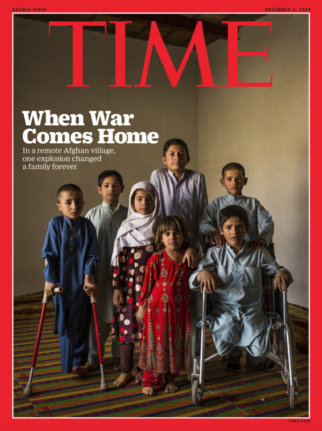
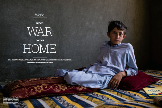
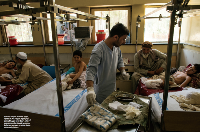
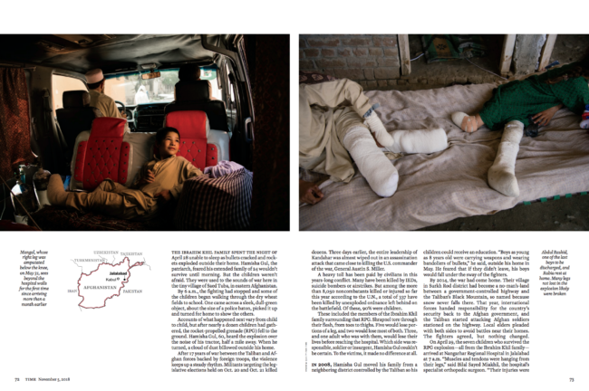
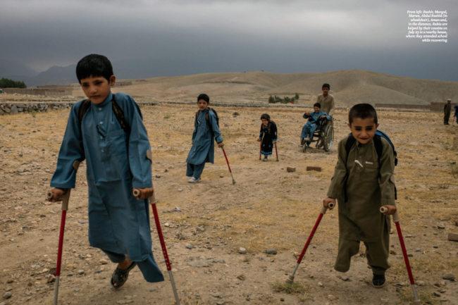
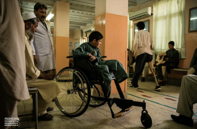
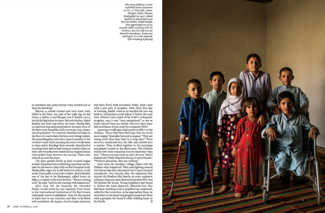
The Daily Edit – Andrew Quilty: TIME

TIME

Design Director/Creative Director: D.W. Pine
Photographer: Andrew Quilty

Heidi: How has politics shaped your work there?
Andrew: American foreign policy since 9/11 shaped my opinion and much of my mission here. I’ve been focusing on Afghans rather than on Americans in Afghanistan. Granted it’s little bit easier for me to concentrate on Afghans over Americans because I am here at a time when the American involvement has been significantly reduced, especially in comparison to  2008 to ‘12. Having said that, America’s involvement in Afghanistan since 2001—and it’s failures—affect affairs here on a daily basis. It’s hard to separate that affect from any subject a journalist might choose to look at here, and I don’t think it should be

What was your sense of the country before you arrived?
When I came here, all I knew of the country was what I had seen through the media

I have this photo in my head: 10 camouflage-wearing soldiers walking through a dusty village or across a dusty plain. Before 2001, I wouldn’t have even had that. I wouldn’t have even been able to place Afghanistan on a map, let alone tell you who was there, who’d come and gone or who was in charge on September 11.

What drives you?
More and more, I feel an obligation to redirect the minds of readers and viewers who, for the most part, like their governments, are only interested in Afghanistan insofar as it effects them or their national self interest. It’s playing out now with America’s number one priority during peace talks with the Taliban being a guarantee that Afghanistan won’t be used as a base for terror groups with international aspirations, with the future for Afghans seemingly a distant second.  There’s some anger toward the Americans and their allies for the hubris that allowed them to think they could mould yet another country that was only moderately willing into a shape more suitable to them. And there’s probably some guilt that I’m from one of those countries that followed the U.S. in, blindly, driven by emotion and revenge.

How do you think your images would have been different had you
 been in the country earlier?
I don’t want to criticise those who came before me because, in the early years of the war there was an appetite for what the international soldiers were doing. Of course readers from Australia want to know what their soldiers are doing; why they’re fighting and dying and coming home mentally ruined. I have no doubt that if I was here, then, I’d have been covering the international military mission almost exclusively, too. But what we rarely heard about were the Afghans affected by the war. The innocent ones being killed in horrific ways. Or why, after the Taliban had been ousted, were people turning against their “liberators.” Afghanistan was still depicted in simplistic way: government good, Taliban bad, when the reality was far more complex. That simplification not only damaged the international public’s understanding of Afghanistan and the deteriorating situation here in recent years, it also ensured the failure of the international military mission and built a culture of corruption into the government and its institutions.

Is this a reaction to how the media has imbalanced everything?
It wasn’t about Afghanistan. No one really cared about the outcome for Afghanistan. It was-and still is-all about Afghanistan in relation to how it will affect America. So I just find that a little unfair.

How are you trying to humanize this in your own mind?
I think about the people who had no say in this. First they were given hope, then despair and the whole roller coaster that’s ensued. What about them? International interest has tended to focus more on those who made the choice to come here. I hate the cliche of the journalist’s roll being to speak for the downtrodden, but when the balance is so far out of wack, as I feel it was through the majority of the war, and when those who have, and continue to impose well-meaning but dismal policy and strategy are all but impervious to reproach, it’s hard not to back the underdog. 

What speaks to you about this experience?
and what is misunderstood by those that consume your work?
Well, look, I think a lot of people assume that I’m here out of some sense of vocation– and yeah I think that’s part of it but I also think there’s a lot of other things to consider. I actually quite like my life here outside of my work. Although work is pretty all-consuming, I happen to love the work that I’m able to do here. But my point is, a lot of people assume I’m making huge sacrifices and taking massive risks being here, and that I’m doing it all for the sake of the Afghan people. In general, I don’t even think photographers and journalists are particularly empathetic people. That’s a myth that viewers can easily fall for by looking at the kind of subjects many of us focus on but I don’t think it’s entirely accurate. Sure, I get affected by things here – I’ll have to wipe away tears while listening to people tell their stories and I won’t sleep a wink for a couple of days after being close to a bombing but I’m not sure a deeply empathetic person would last long—assuming they had the choice to leave—in this kind of environment. I suppose it’s a journalist’s job to be able to switch it on and off; to be able to channel it into words or pictures rather than letting it overwhelm ones soul.


What is your life like there?
I manage a nice old Afghan house that’s home to two dogs taken off the street before I arrived and an assortment of others, mostly journalists, who stay for varying lengths of time. I read the news over breakfast and coffee most days and, if I don’t have something specific to work on I’ll try to get out on my motorcycle to shoot some pictures. As a photographer, I don’t think I’ll ever get tired of this city. Aside from that, like any photographer or journalist, I’m planning trips into the provinces, pitching or filing stories, sending invoices, responding to emails and, twice or three times each week I’ll do something social, usually dinner or drinks at a friend’s place, taking a new housemate along on the back of the bike.

Are you married? Do you have children?
No. No, no. Neither. I’ve had a couple of semi-long-term relationships here in Kabul. But I’ve never dated an Afghan. The foreigner crowd here is a good group of people, by and large. They’re all in similar life circumstances – no kids, no mortgage, maybe or maybe not married. So it’s a bunch of people who are at a similar stage in their life and they’re usually pretty good at what they do. It’s like small-town life with people who have chosen to eschew small-town life.

Dinner table conversation is always really interesting, save for when it inevitably turns to matters of security in Kabul. But that’s a bonus. Obviously good dinner table conversation wouldn’t be enough to keep me here if I didn’t love my work, as I do in a way I never have before. Back in Sydney, I was probably really invested in 20% of the work I did. I cared about it. I cared about what I was photographing. The other 80% was what I had to do to pay the bills. Here, I mean, it’s beyond the inverse. I mean, there’s very little that I photograph here that I don’t find interesting, that I’m not personally curious about or that I don’t think is important. It’s very hard to find a subject here that isn’t in some way affected by the country’s history, and that history makes those subject’s stories compelling in a way that is rare, especially somewhere like Australia. As a photographer, it’s hard to turn away from that.

When I go on your Instagram and see what you are publishing if looks like an incredible opportunity, photographically to personally grow so I would understand why.
Yes.

You’re going to come out the other side of this immersion a completely changed person,  Most people wouldn’t even think about trying…
Yeah, very much so. Most people assume that you can only come out the other end of a period working as a photographer in Afghanistan as a diminished person, damaged by what you’ve seen. If I left now, I’d leave a richer person than the one that arrived here five years ago.

You’ve said you arrived in  Afghanistan and just knew that was it. 
Many people struggle to craft a voice. What I enjoy about your work is — I feel like you’re happy. You’ve zeroed in on a very distinct voice and eye and you’re able to articulate your pictures. It’s fortunate that you’ve found this calling because most people search for this their whole lives.
Yeah. Yeah. I know. I know. And I didn’t even knew I was looking for it. I thought I was satisfied in the work I was doing back in Australia and from New York, and now I look back on it, and it’s like BC/AD – before and after I came to Afghanistan. Now, on my website, I don’t have a single picture that wasn’t taken in Afghanistan. It’s a very distinct line for me. It’s also helped me realise the potential of photography as a means to tell stories, or to inform, in a way I’d never understood. 


 I’m sure that there’s some haunting things that you’re seeing, too. How do you cope with that?
I try to look after myself and eat well and exercise and all those things. Speaking with friends. I mean, that’s the good thing about being here. Everyone is in the same boat, and strangely enough, some of my fondest memories here are of the nights following either a big bombing or an incident where someone we know has been killed or injured.  Coming together with a small group of friends, just being together, helps. What was that line in the movie Speed? Something about relationships formed under intense circumstances. Those will certainly be some of my strongest memories.

It’s rich. It’s real life that’s so visceral.
Yeah. It’s real experience. Yeah. And also part of the reason which makes it hard for me to think about leaving, and most people seem to think I should. 

Right. They’re probably afraid for you. People project and can’t even imagine themselves doing that, so it’s natural.
Yeah, of course.

Do you pitch stories written and shot by you?
Yes, I pitch stories myself and write them myself as well. But that’s relatively new. It came as a result of some of people I used to work and travel with leaving the country. All of a sudden I had to rethink where my assignments would come from, whereas previously, they tended to fall in my lap. Not only that, the stories attached to the assignments stopped coming, so, almost overnight I had to start thinking for myself. It’s a new way of working for me. Where I started my work as a photographer, at The Australian Financial Review in Sydney, I’d be handed my assignments on a piece of A4 paper each morning. It was very rare that I ever had to think for myself. It’s a bad habit that many photographers are bred into. The best photographers, I think, are thinking photographers, the ones who know their subjects intimately, rather than just turning up for a day after the writer has been and gone. So it’s actually been a blessing in disguise, and a challenge
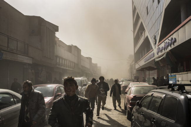
Tell us about the making of this photo which was nominated for World Press Photo for 2019.

I was in a shop, below street level, about 200 metres from where a man driving an ambulance packed with explosives detonated when he was stopped at a police checkpoint. 
I was asked a similar question when I was home in Sydney recently. I was sitting on on a beach on a hot summer day with some new friends. They asked me about the worst thing I’d seen in Afghanistan. Without much enthusiasm, I gave them the thirty second version of what followed the explosion. The reaction was predictable. The kind of shock expressed to fulfil the social obligation of revulsion, not through actual revulsion, because how could anyone who hasn’t seen something like that conceive of how horrific it is? But we should be horrified. It was at that moment that I decided, if I was ever asked about it again, that I’d tell the whole story or not at all. 

The Daily Promo – Callie Lipkin

Who printed it?
Dreamworks Graphic Communications — https://www.dreamworks-gc.com

Who designed it?
Lisa Itzkowitz http://litzko.com

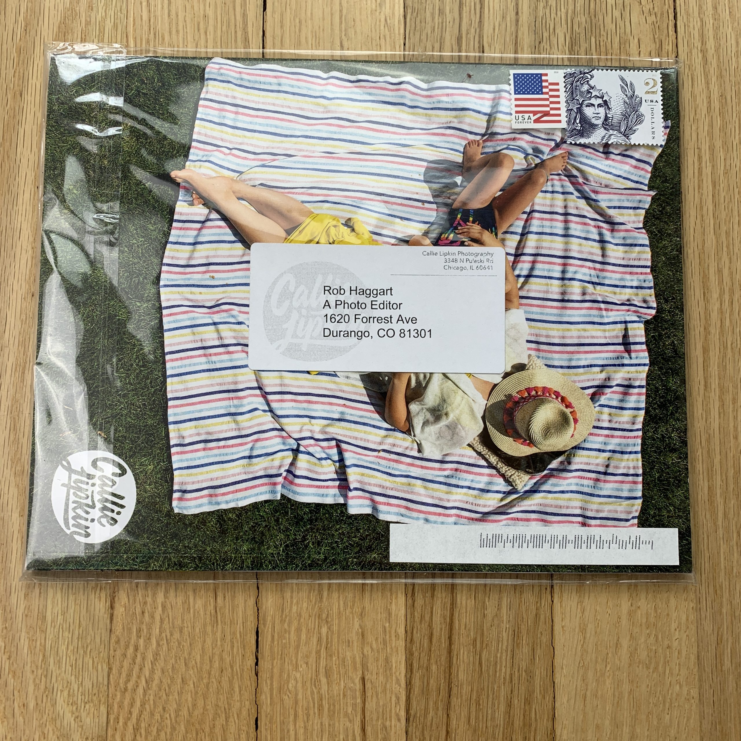
Tell me about the images?
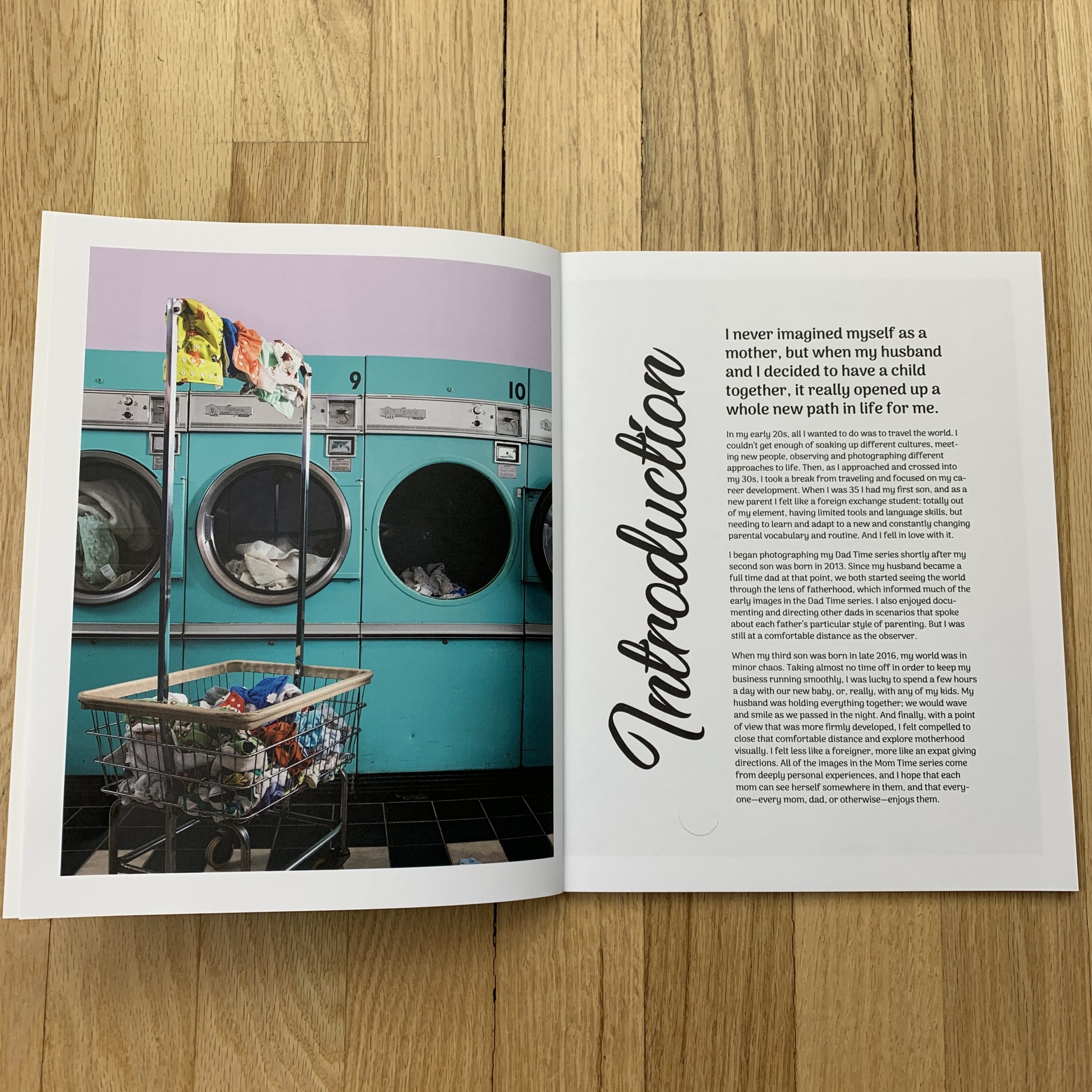
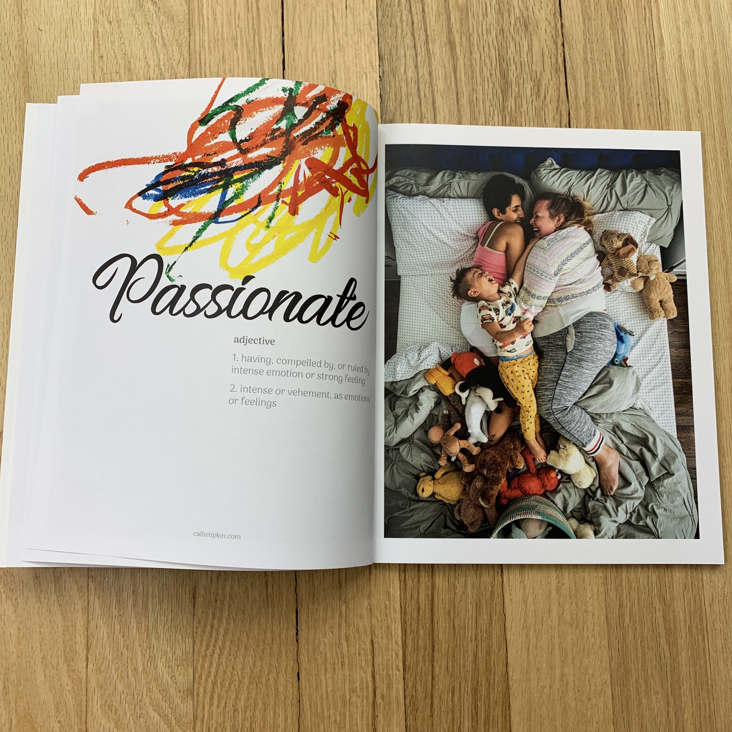
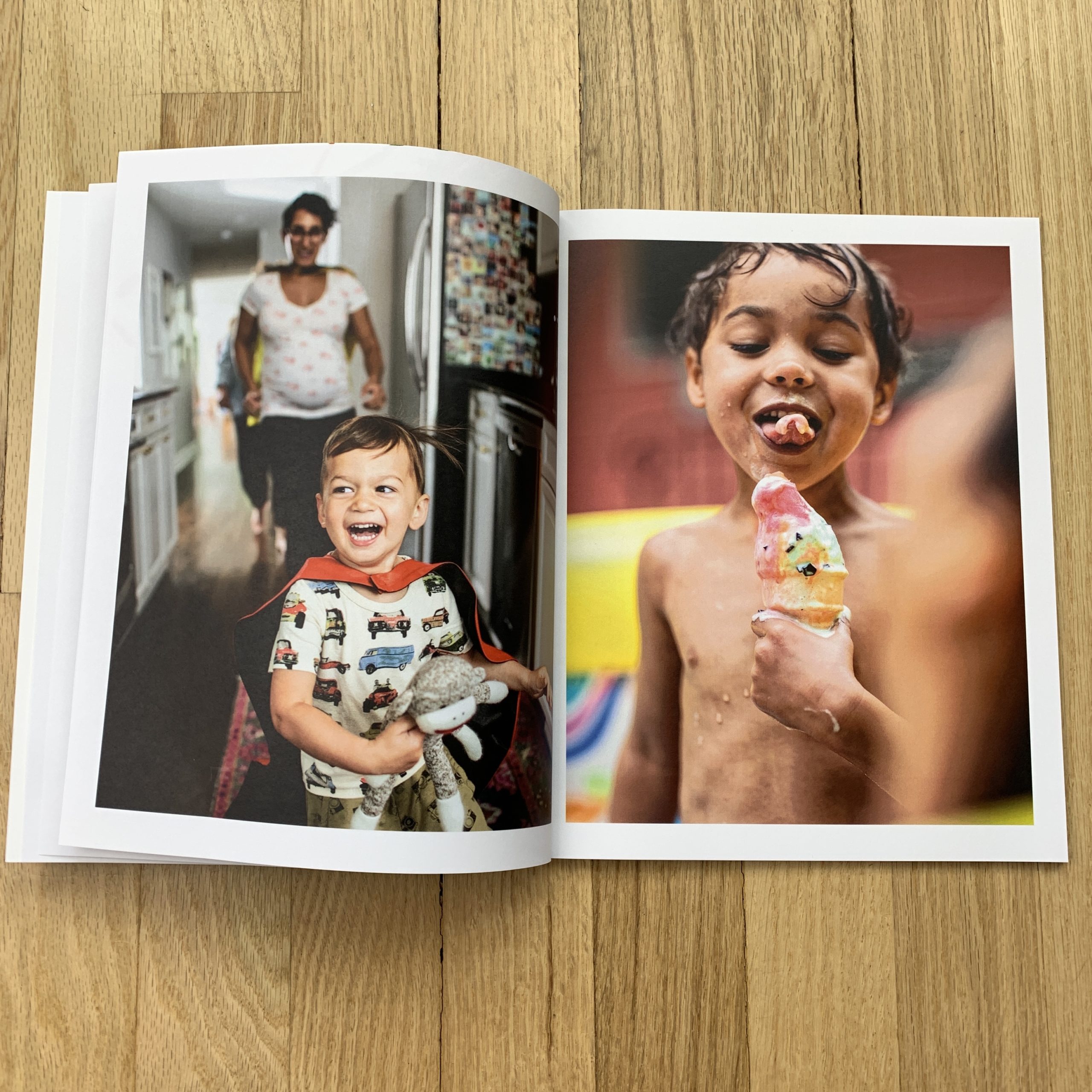
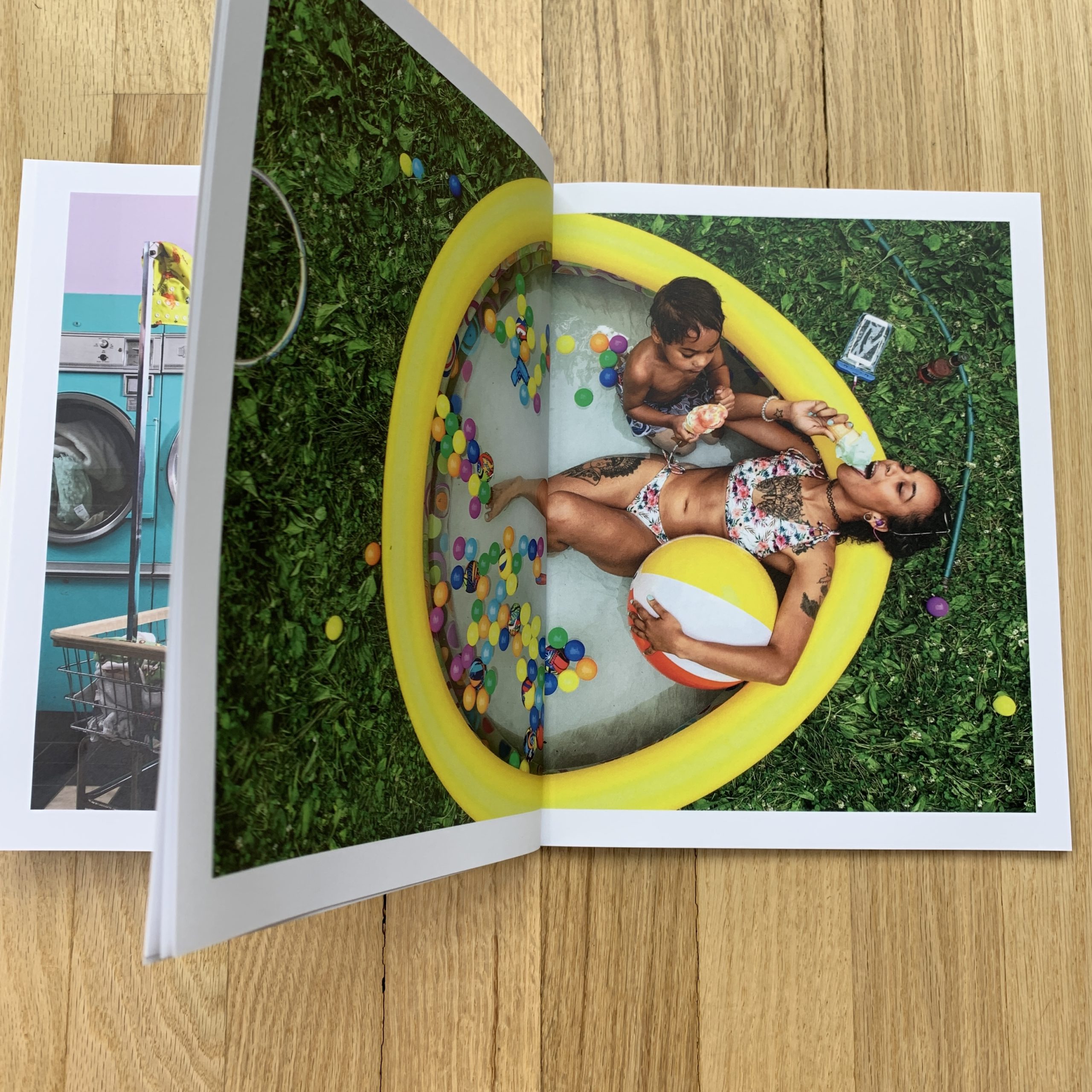
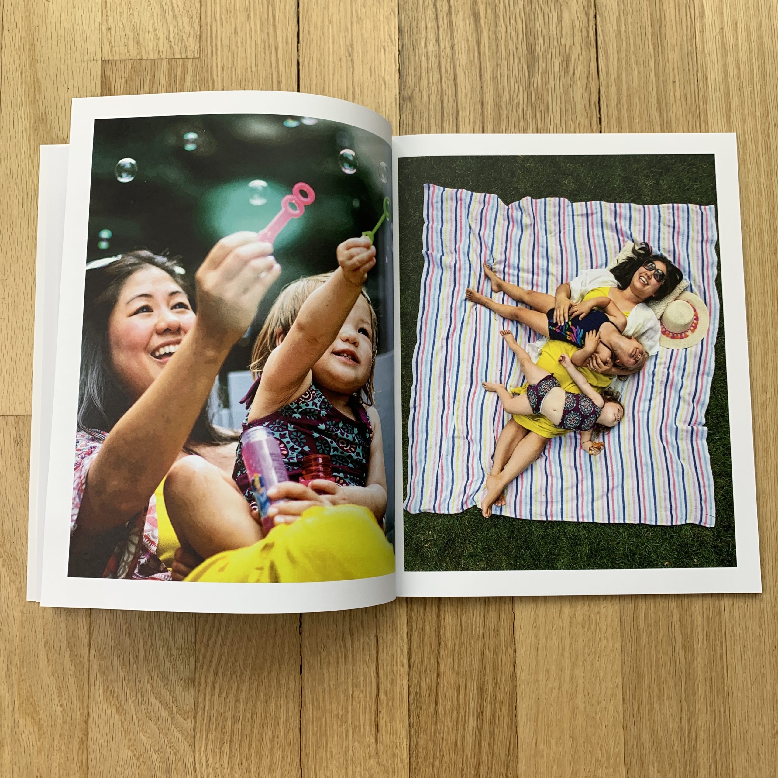
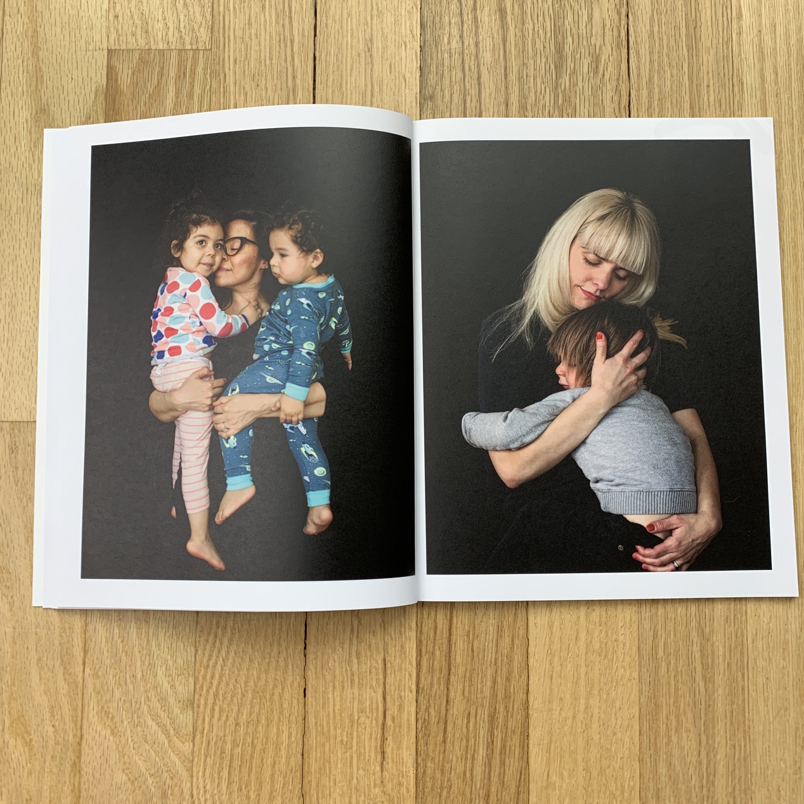
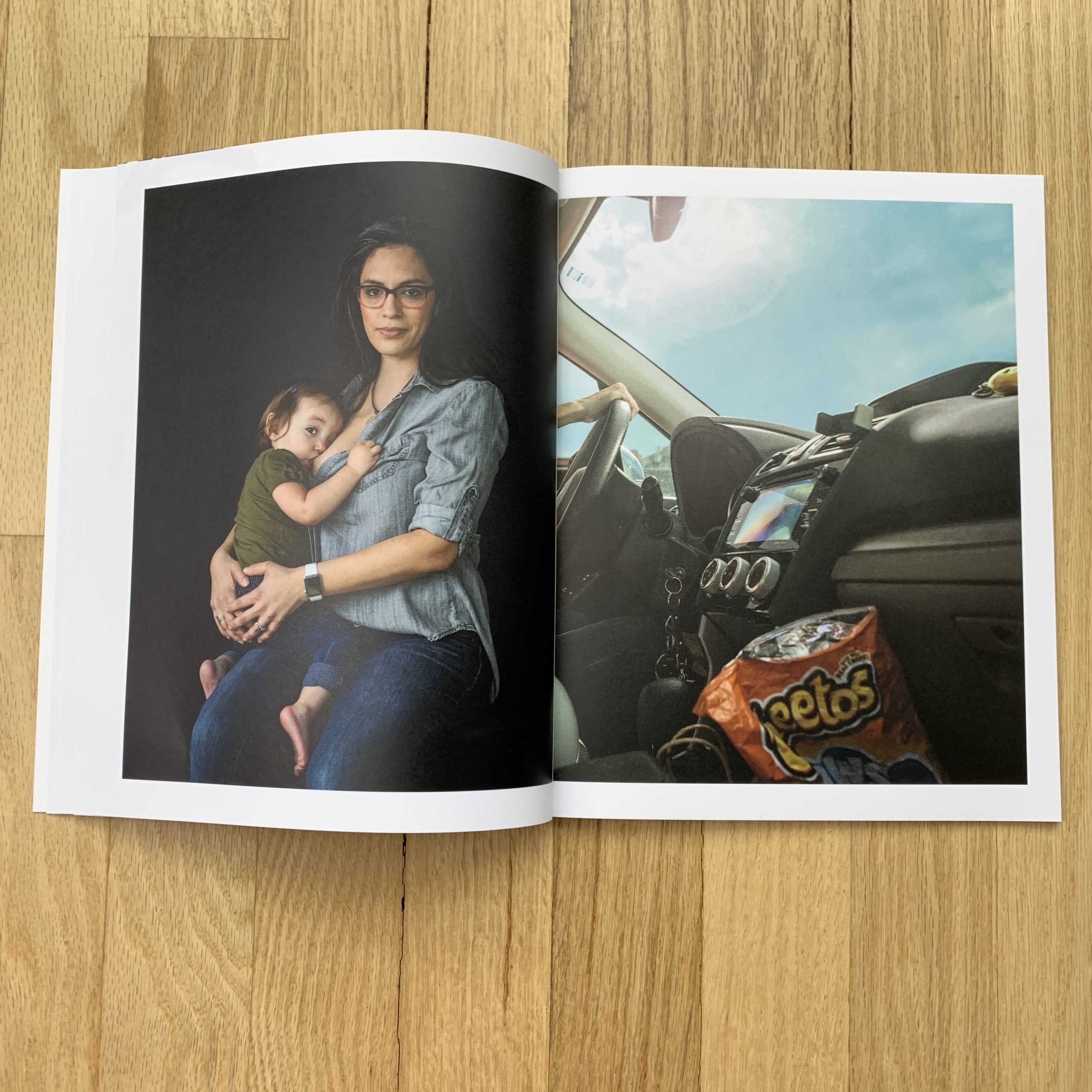
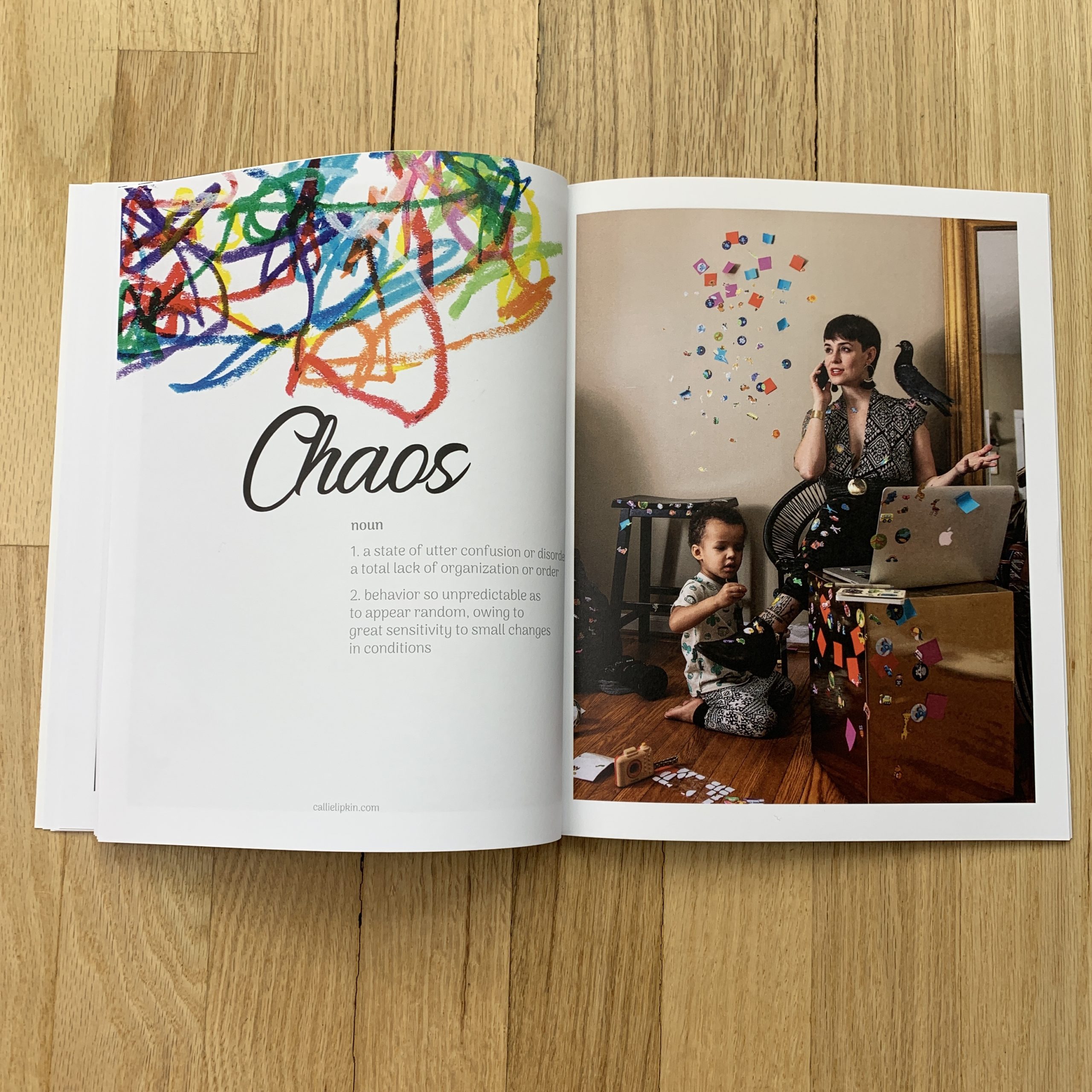
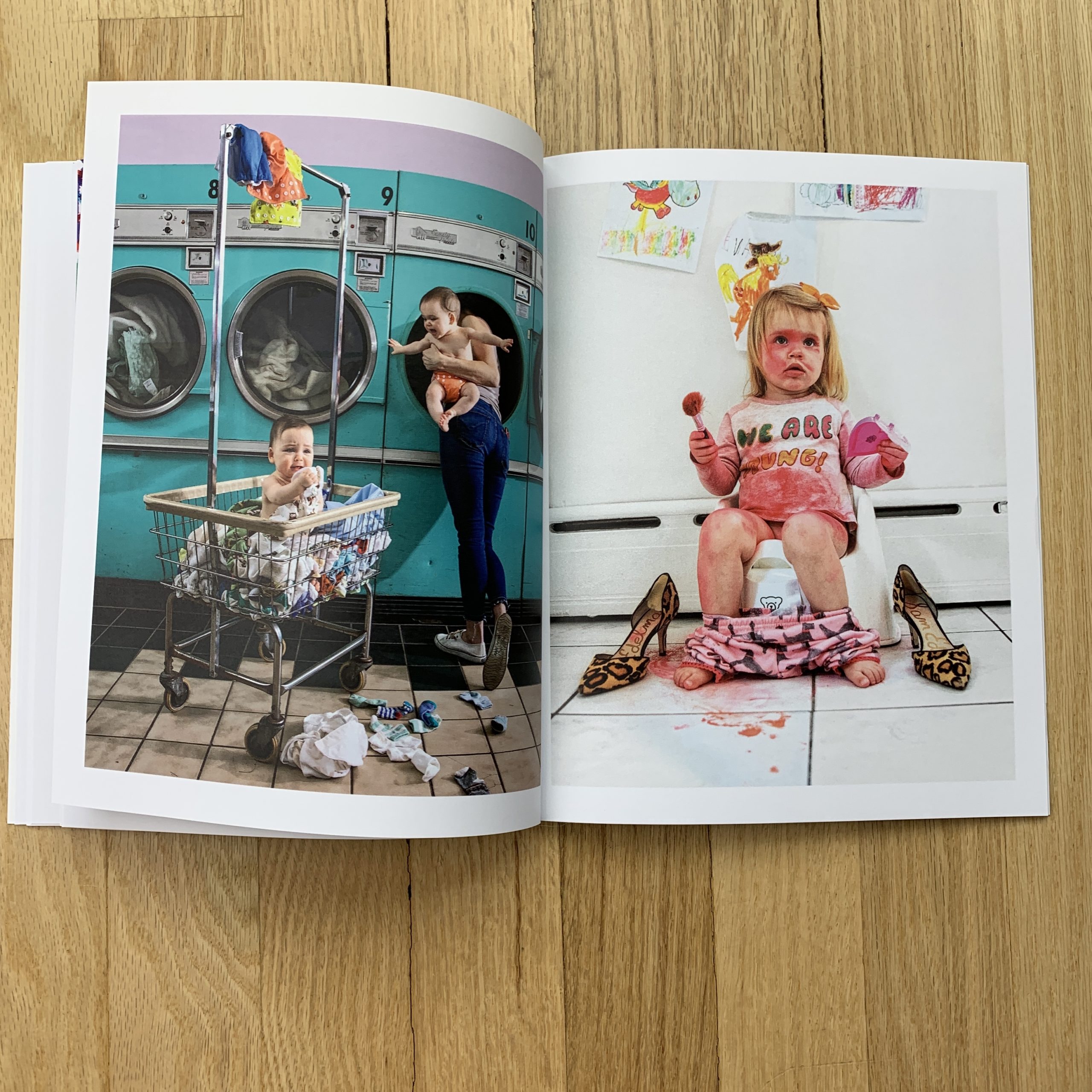
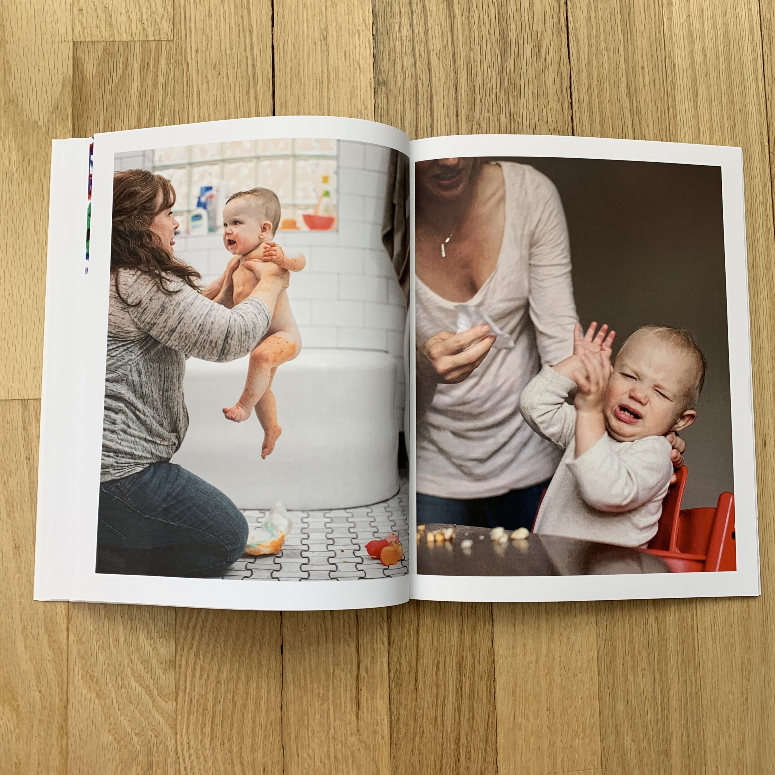
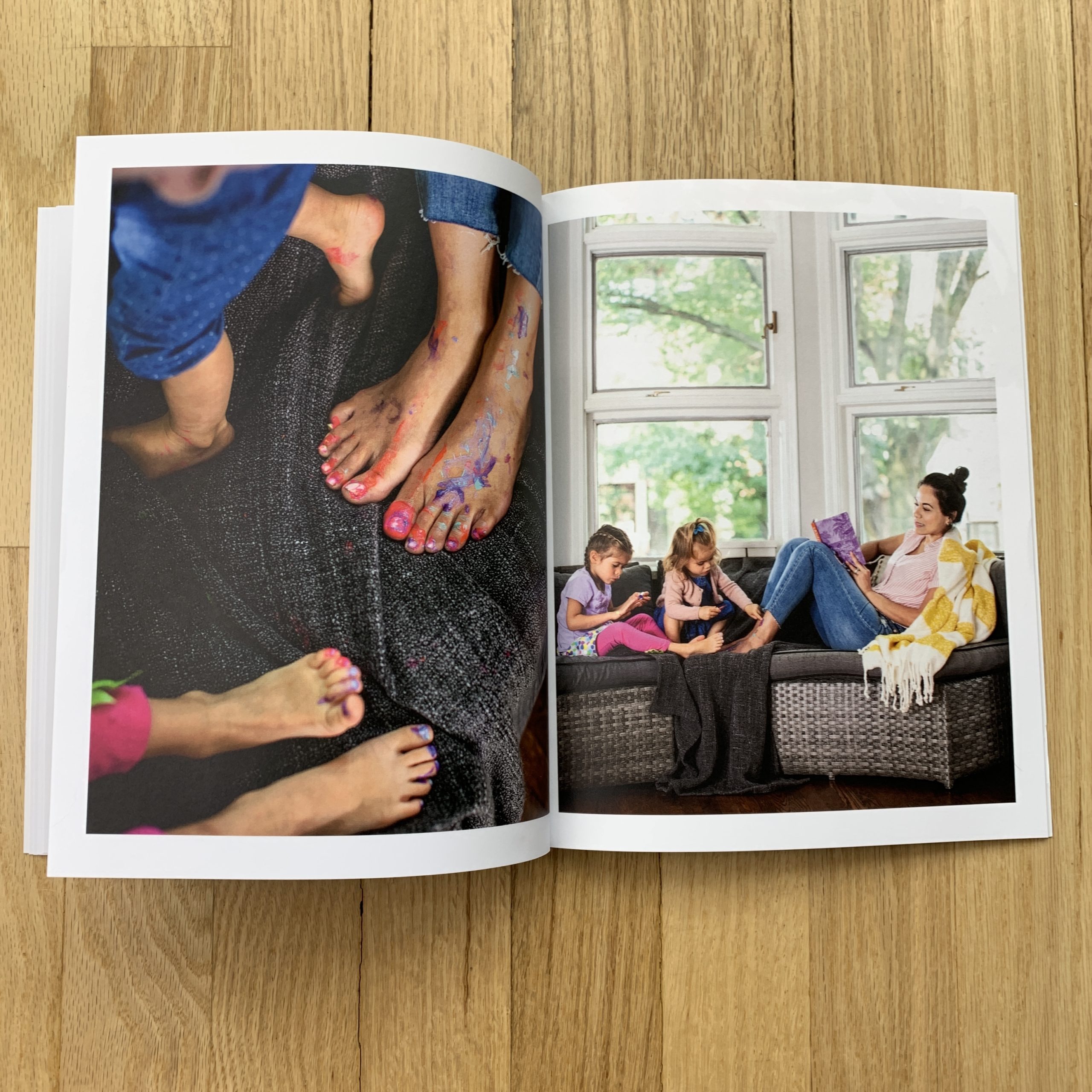
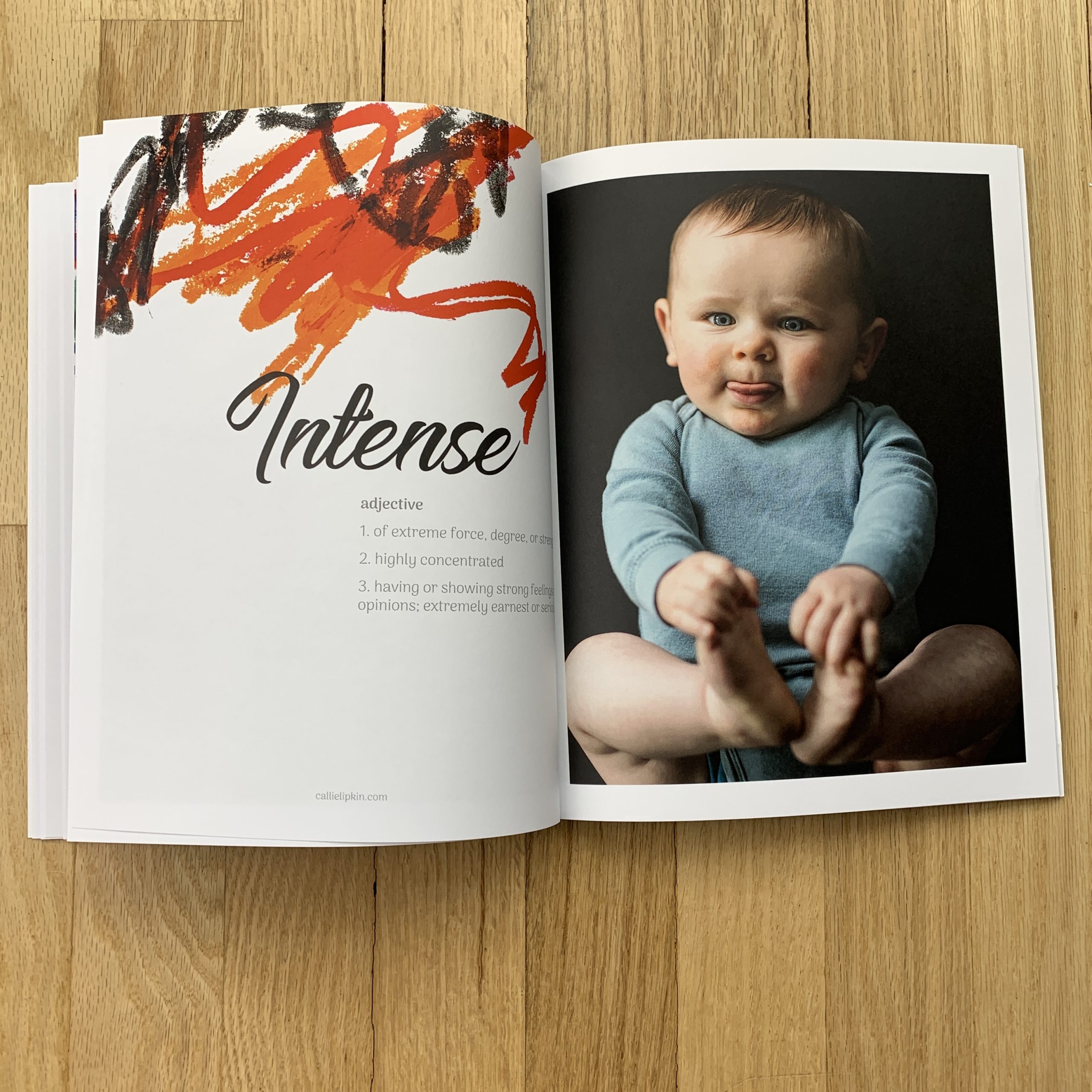
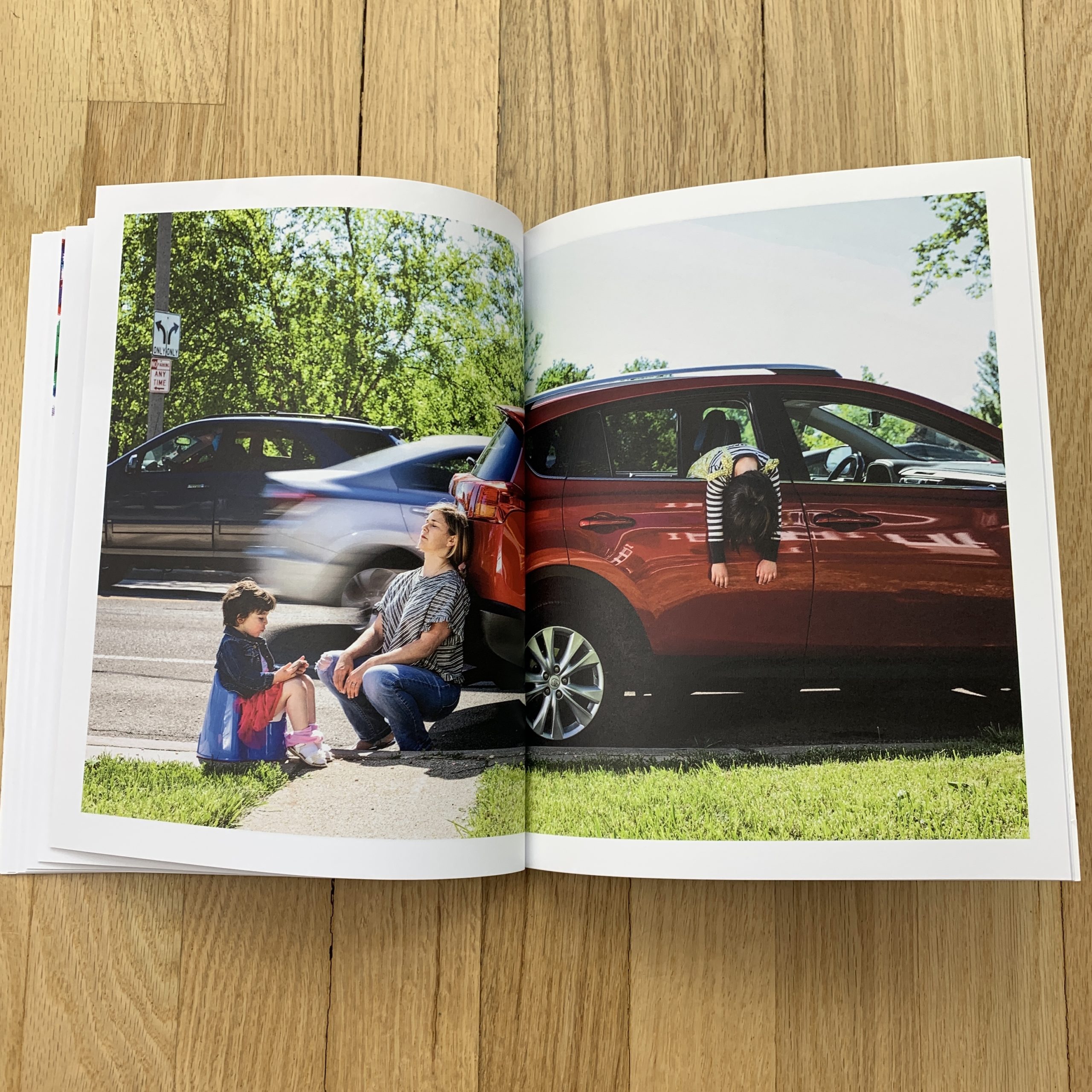
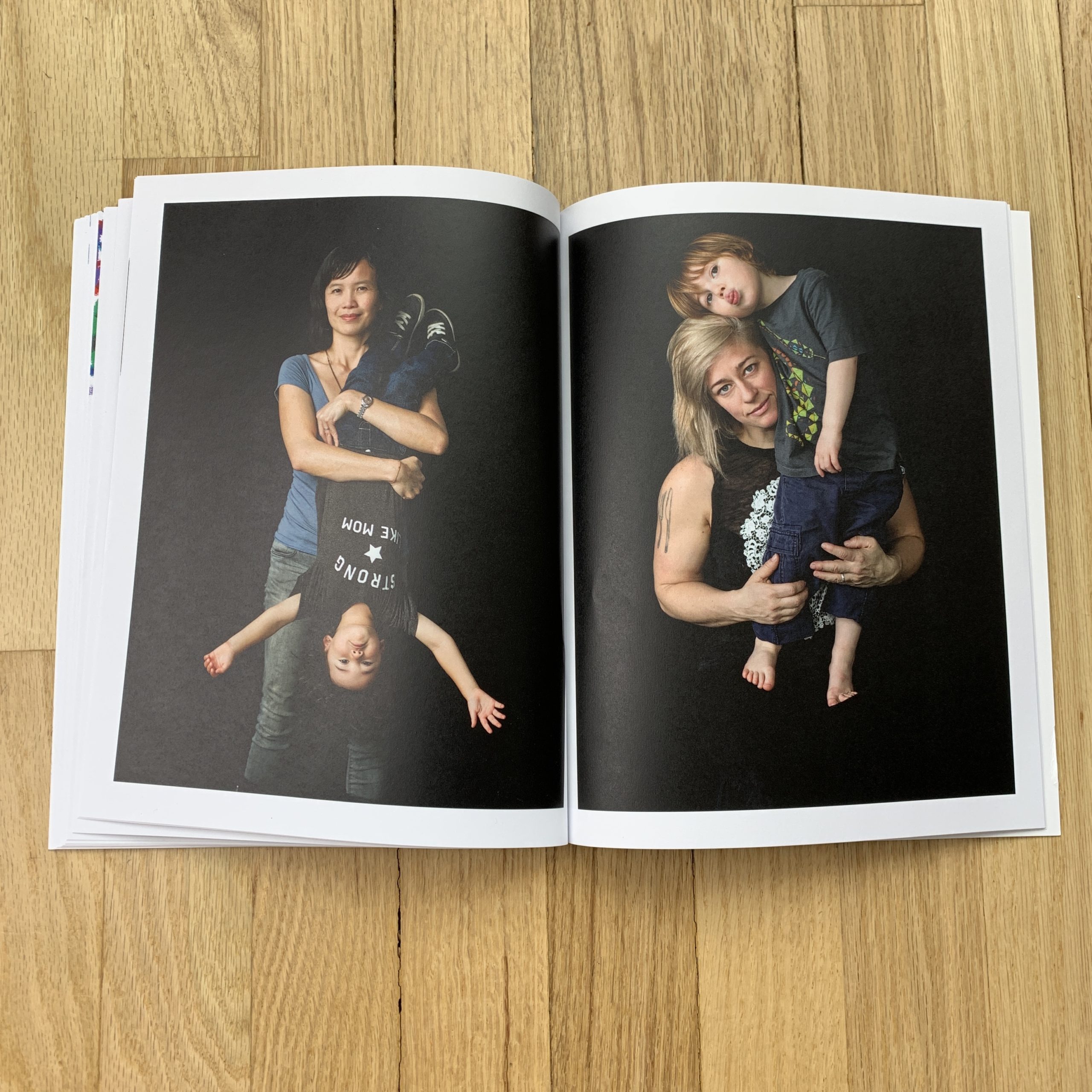
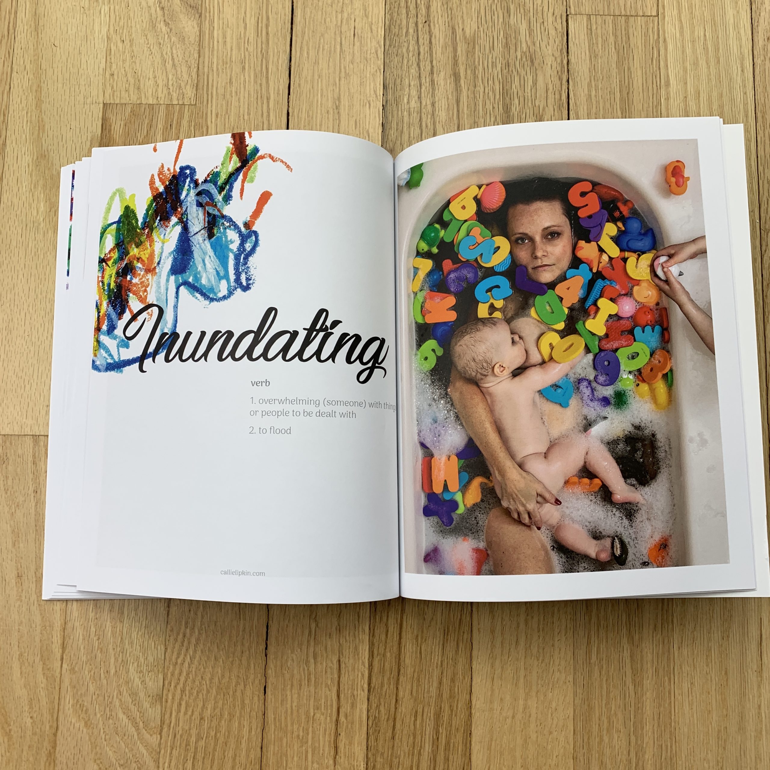
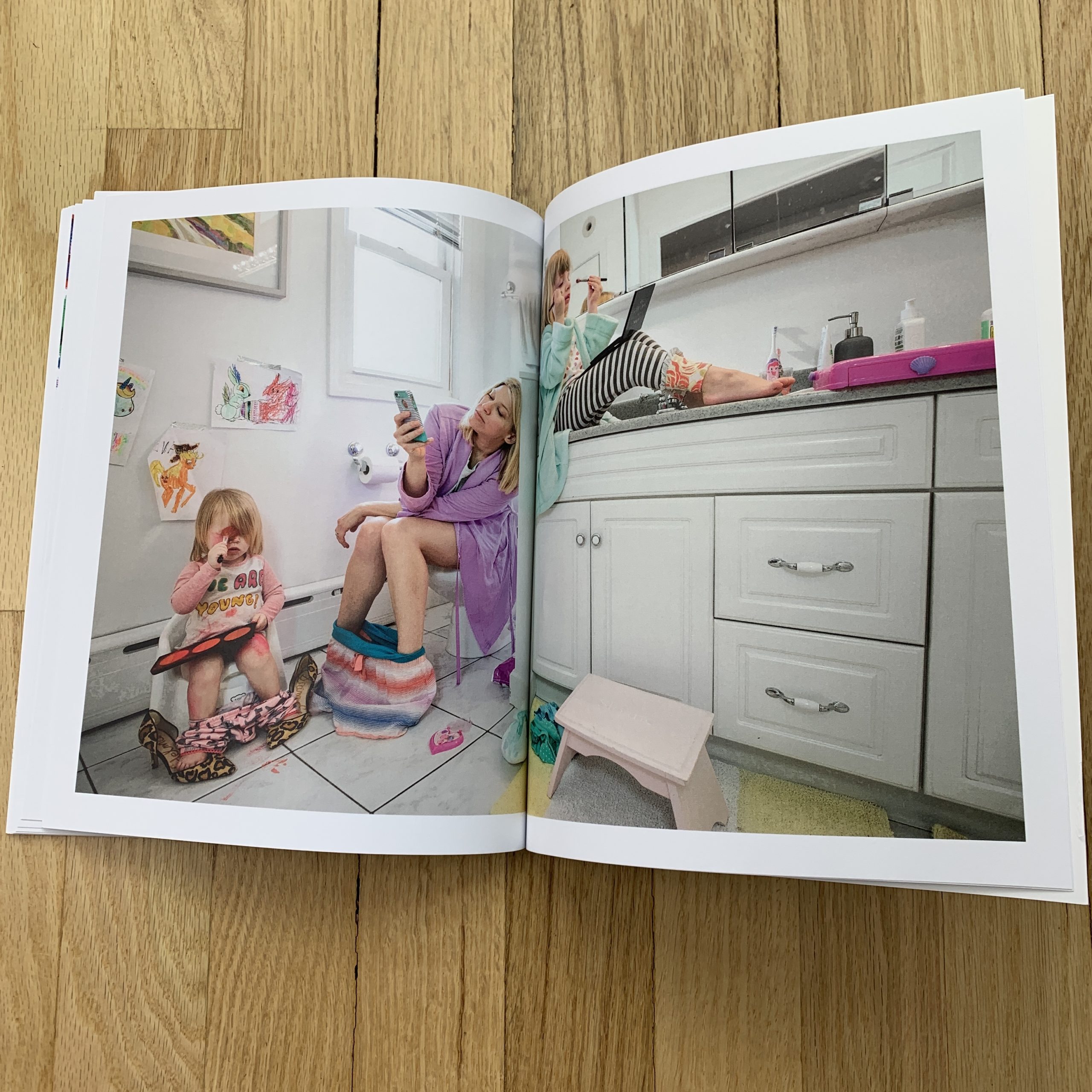
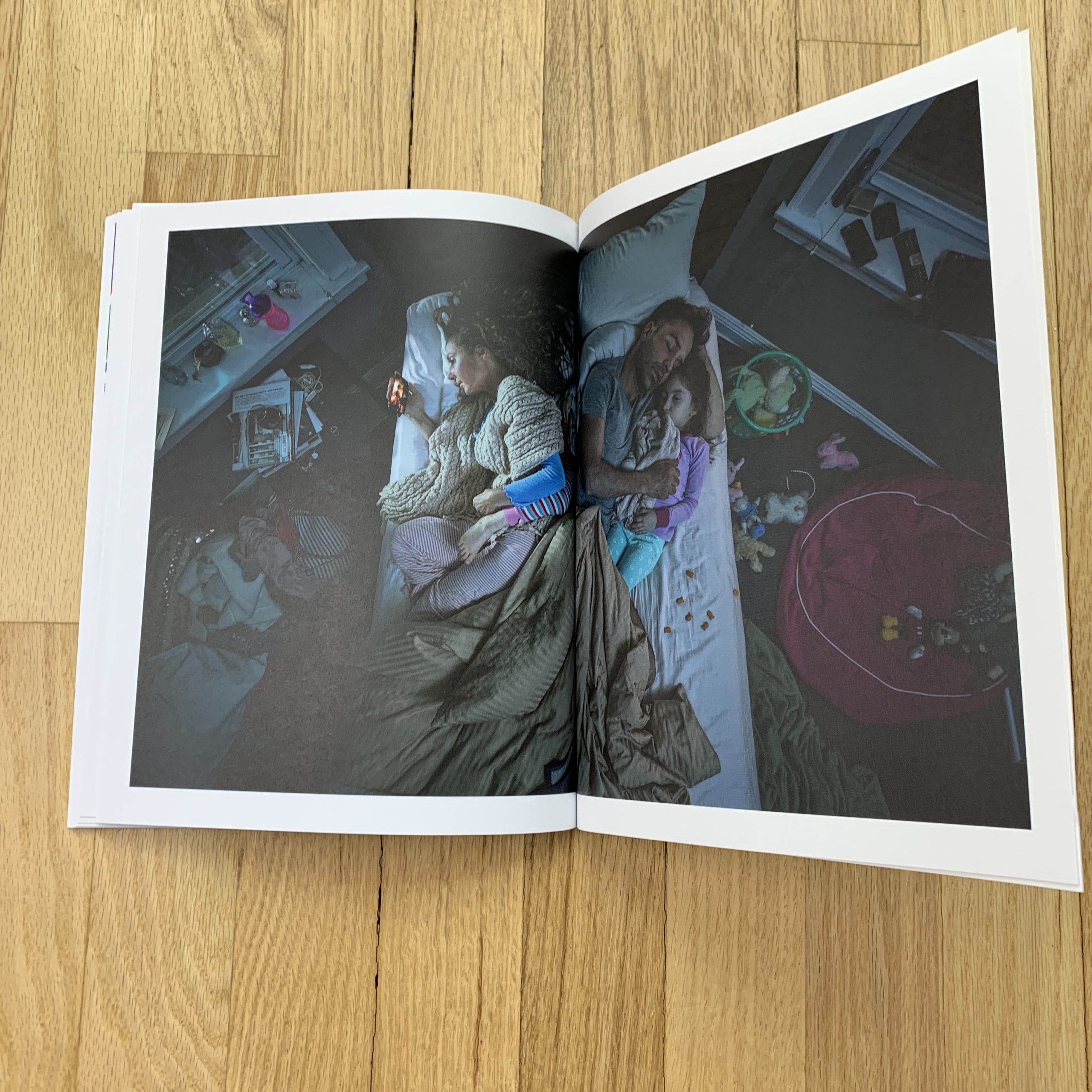
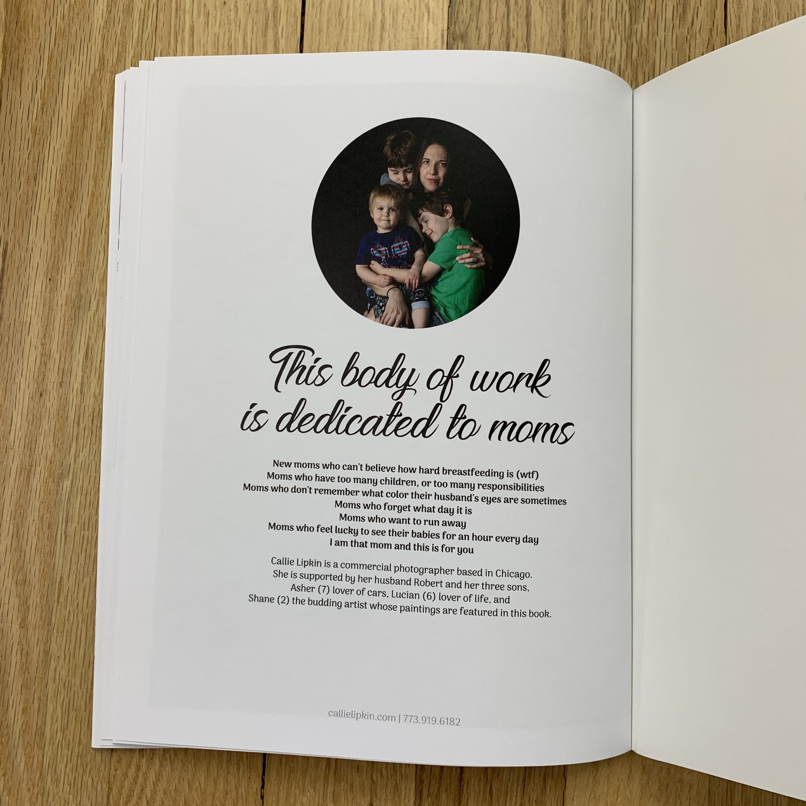
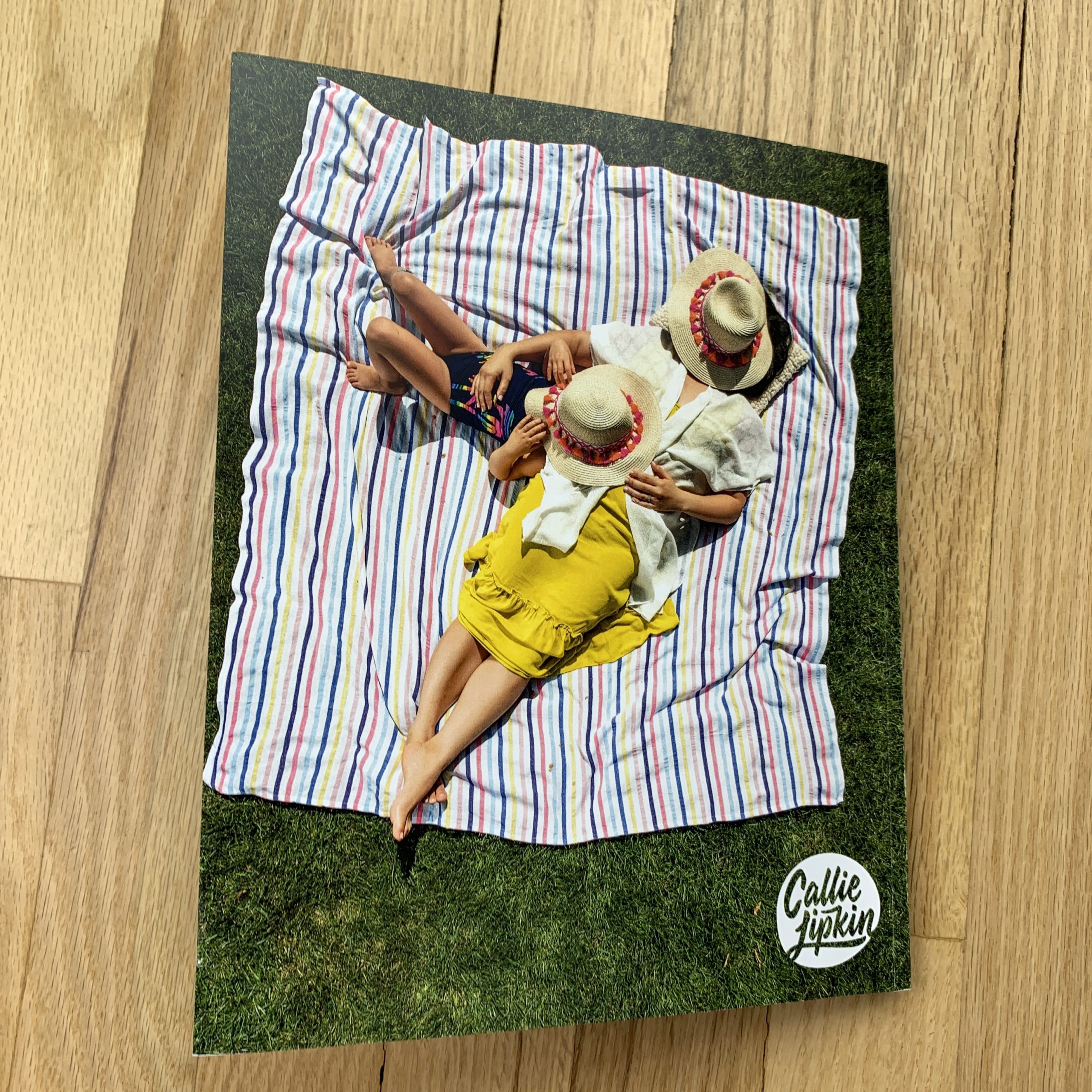
I never imagined myself as a mother, but when my husband and I decided to have a child together it really opened up a whole new path in life for me both personally and creatively.

In my early 20s, all I wanted was to travel the world. I couldn’t get enough – soaking up different cultures, meeting new people, observing and photographing different approaches to life. In my later 20s and 30s, I took a break from traveling and was incredibly focused on career development. When I had my first son at 35, I felt like a foreign exchange student as a parent, totally out of my element with limited tools and language skills, and I fell in love with it.

I began photographing my Dad Time series shortly after my second son was born in 2013. Since my husband really became a full time dad at that point, we both started seeing the world through the lens of fatherhood which informed much of the early images. I also enjoyed documenting and directing other dads in scenarios that spoke about their own particular styles of parenting. I was still at a comfortable distance as the observer.

When my third son was born in late 2016, my world was in minor chaos. Taking almost no time off to keep my business running smoothly, I was lucky to spend a few hours a day with the new baby, with any of my kids really. My husband was holding everything together, we would wave and smile as we passed in the night.

I finally felt compelled to explore motherhood visually. My point of view was now more firmly developed, I feel less like a foreigner, more like an expat giving directions.

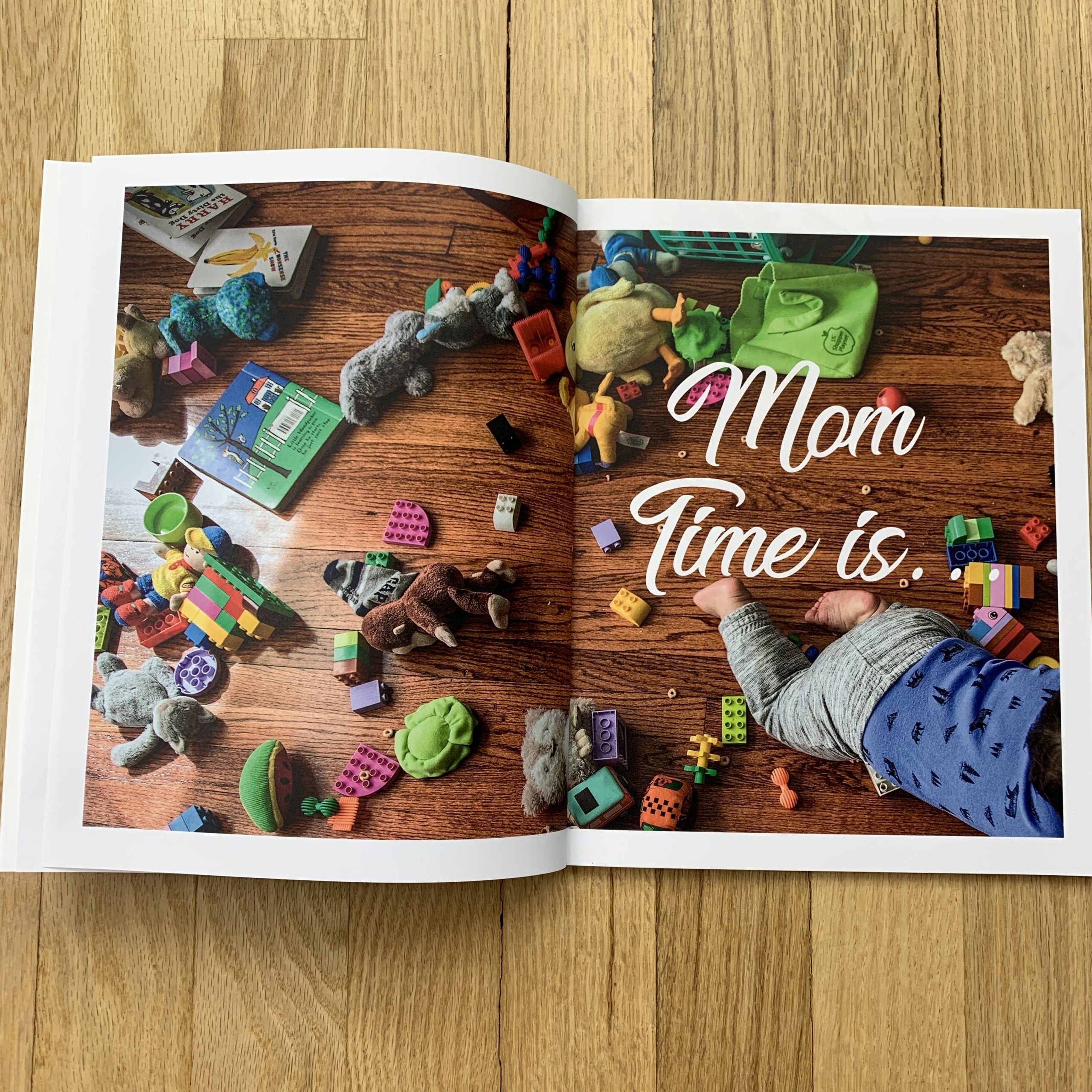
Many of the images in the Mom Time series come from deeply personal experiences. I have cleaned up my children when covered in food of every kind. I have used my breast pump on my way to work. I have tried to distract children during an unexpected client call. I have stolen a moment to watch TV while the rest of my family is asleep. Photography has helped me process and find humor in the difficulty of parenting.

How many did you make?
We printed 1000 – about 850 to mail and the rest to hand out during in person meetings as needed.

How many times a year do you send out promos?
We do a large mailing like this at the beginning of each year and probably 2-3 postcards or other mailings throughout the year.

Do you think printed promos are effective for marketing your work?
Yes, yes, yes! I don’t have an agent so I have to really fine tune my hustle in getting the word out. I am constantly trying to showcase my personal style and vision in a way that engages with clients. This helps them keep me in mind for projects that would be a good fit for my work.

This Week in Photography Books: Lawrence Schwartzwald

I made a few resolutions last month.

I give myself guidelines, each New Year, for things I’d like to work on. (Ways to better myself.)

This year, at the top of my list, I’m trying hard to talk less shit about other people.

That’s my number one goal.

I lost a few friends a couple of years ago, and am pretty sure that gossip-mongering played a role in it. (Not that I take the blame squarely, just that I own my part in it.)

On one hand, it makes me value my closest friends even more, as I know they’ll keep my confidence, but on a deeper level, I kept reliving the problem until I realized I needed to change.

For some reason, I didn’t understand that talking shit about people always gets back around to them. On steroids. (There’s nothing people love more than passing along a juicy story.)

More than that, though, it really is a karma thing.

Summoning that negative energy, and spreading it further, even if it feels funny, snarky or cathartic in the moment, has the habit of creating ripples of bad juju.

Coincidentally, last week, my Aikido Sensei told the class that he felt he had no enemies in life, and attributed it to the fact that he never talked shit about people.

He even used the same expression I do. (“Talking shit” is an American colloquialism that means speaking ill of people; going out of your way to denigrate them in front of others, at times for tactical purposes.)

Aikido, what I’m learning now, stresses ideas of reconciliation, rather than conflict. Even the fighting part is meant to minimize permanent damage to your opponent.

Wrist, hand and elbow locks can temporarily immobilize someone, but they will walk away unharmed, as long as they cooperate. (The techniques can be used to tear and break joints too.)

The truth is, you really never know when your enemy will become your friend, or your friend your enemy.

But if you keep your karma clean, good things will come your way.

In particular, I’m thinking about the story of Lawrence Schwartzwald, a photographer I met at a portfolio review a few years ago. We chatted briefly, but I didn’t see his work officially, and promised at a dinner party that if he followed up, I’d check out whatever he sent me.

Because it was the end of the festival, and I was drinking a glass of wine, chatting with a friend, I didn’t ask too many questions.

Therefore, I was pretty surprised when Lawrence emailed me in December of 2017 with a link to this Artnet news story about him winning a lawsuit against Gerhard Steidl.

THE Gerhard Steidl.

I was especially surprised, as it was right around the time that gushing New Yorker piece about Steidl came out, (which I referenced here in the column,) and this seemed like a wacky tale.
To synopsize, Lawrence Schwartzwald wanted compensation for a submission portfolio that Steidl lost, and accused the famed publisher of backing out of a deal to publish his book. Steidl responded that books take time, as it’s a creative process, and that the artist was fortunate to be chosen for a book in a highly competitive process.

The end result seemed to be that Steidl now owed him some money, but maintained they’d planned to publish his book all along.

(Awkward.)

So I was even more surprised, truly, genuinely surprised, when the next email I got from Lawrence Schwartzwald was one asking if I’d like a review copy of his upcoming book.

Published by Steidl.

(Cough, cough.) Say what now?

(Crickets.)

I’m rarely speechless.

But I swear, at first, I thought it was a joke. (As I did the other day on the ski lift, when my friend Derek started accosting the stranger sitting to my right, with whom we would be trapped for the next 5 minutes. Never a good time to pick a fight.)

Eventually, I opened the book today, in late February, 2019. So let’s figure out what all the fuss was about, shall we?

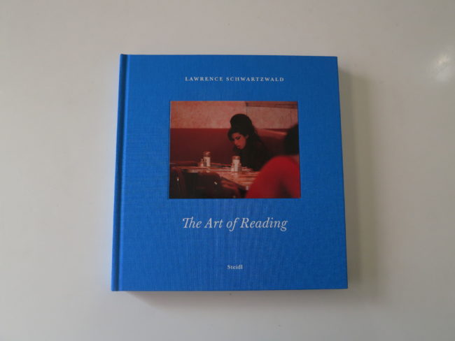
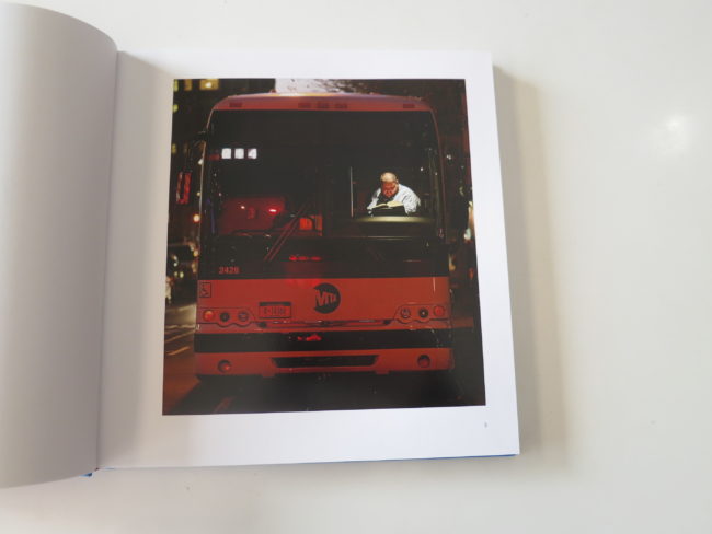
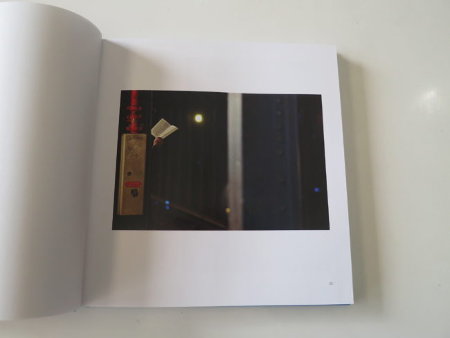
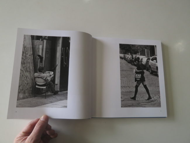
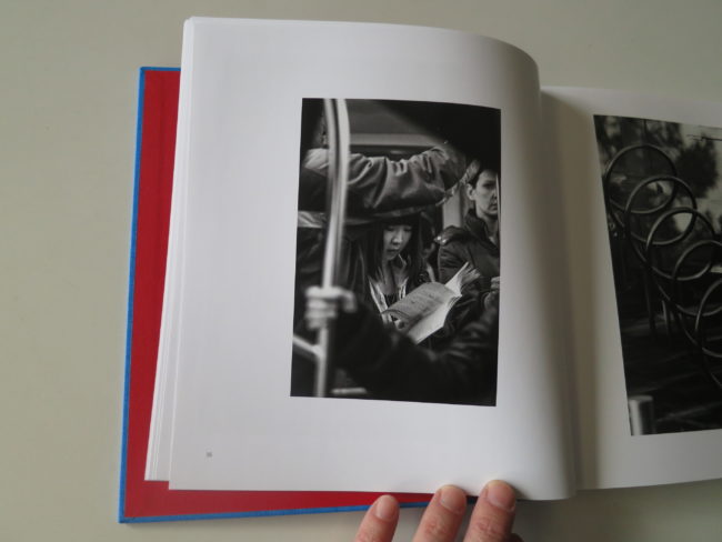
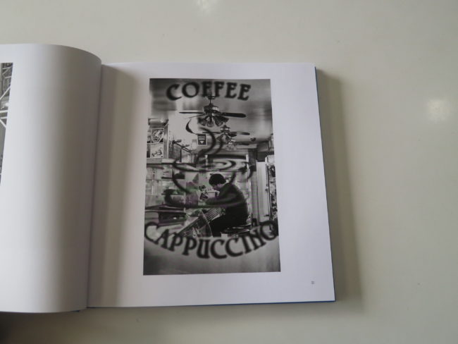
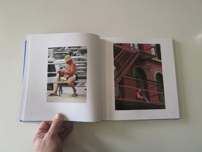
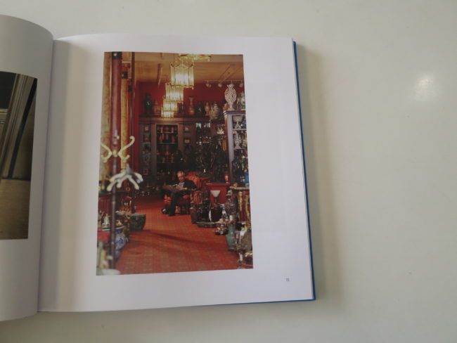
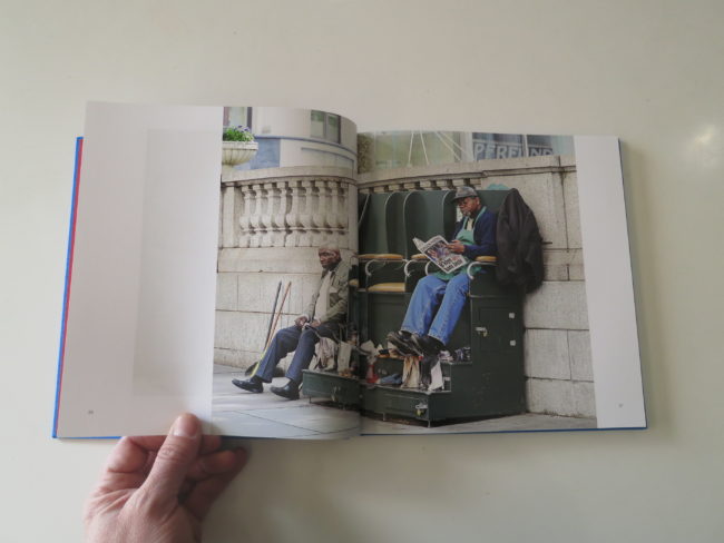
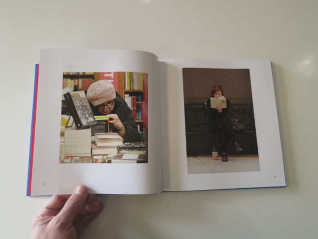
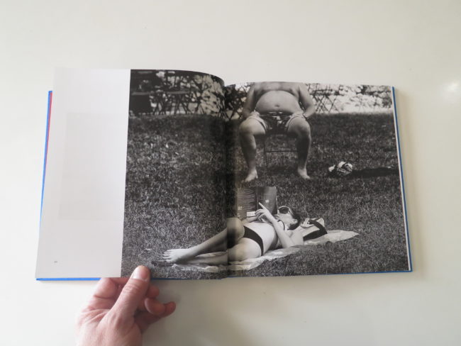
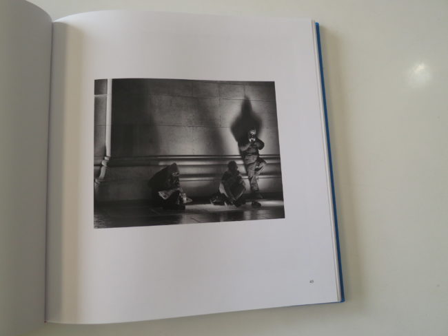
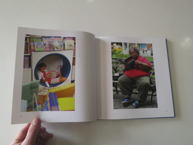
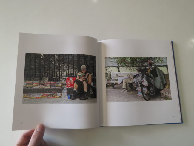
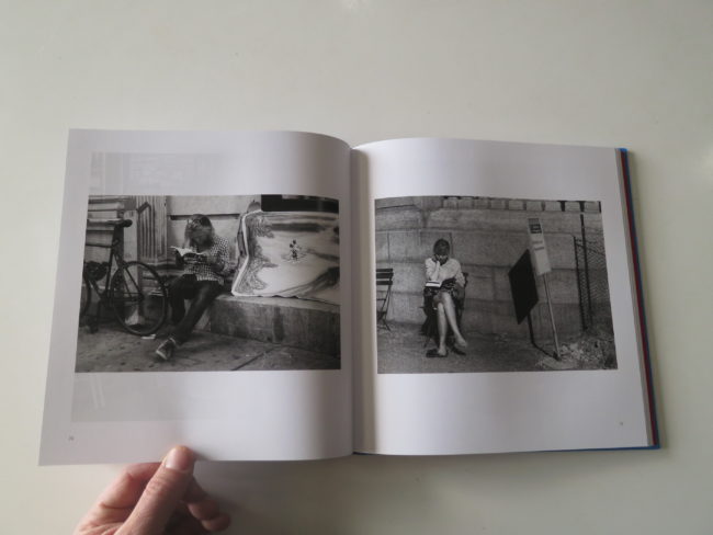
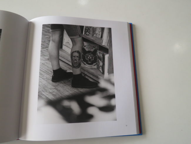
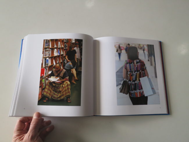
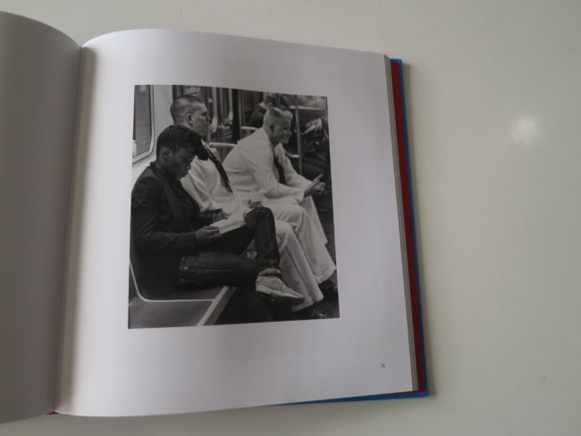
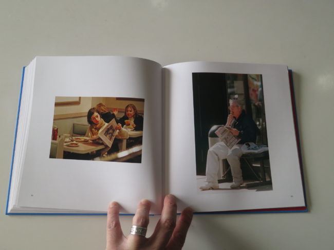
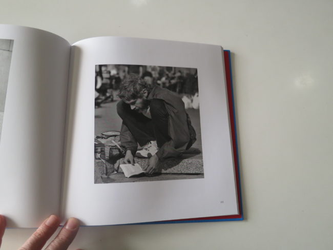
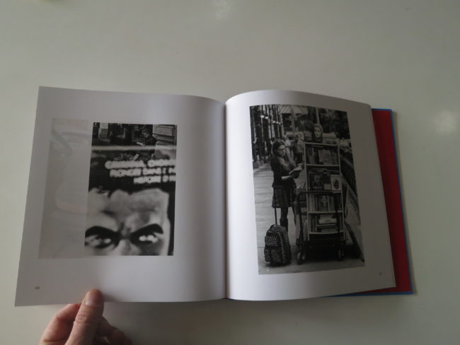
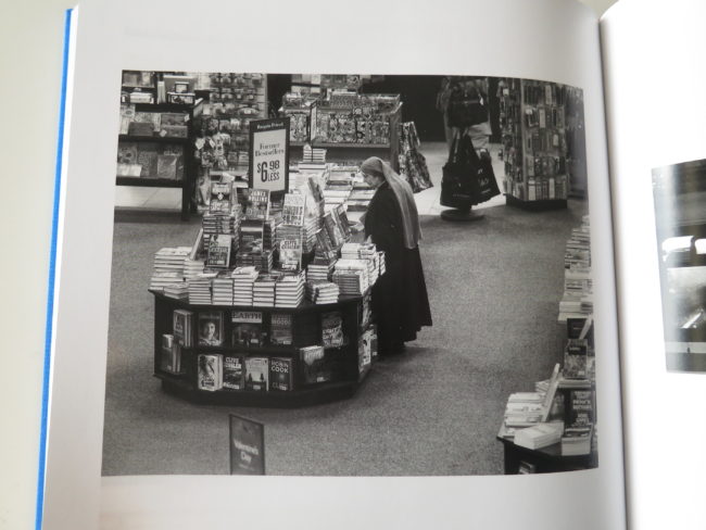
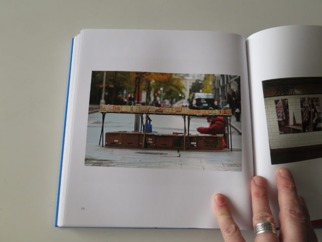
“The Art of Reading,” by Lawrence Schwartzwald, published by Steidl, is a book that seems straightforward, as it is mostly a series of documentary/fine art photos of people reading.

(Hence the title.)

But not all of them.

Some are photos of books.
Or photos of people with books who are not reading them.

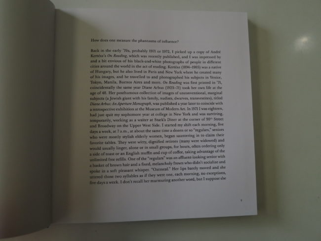
It opens with a really cool statement by the artist, as he was college-aged in the early 70’s, and discovered photography through Diane Arbus, when he bought her book after she died.

That, and a Kertesz photobook of people reading, inspired him to pursue photography, and he went on to work as a freelance photojournalist for the New York Post for many years.

He also did some celebrity freelance photography, which I take to mean paparazzi pictures. (But I could be wrong.)

As everyone and everything are interconnected, (a theme in the blog so far this year,) I happened to notice a Facebook post Lawrence made the other day, saying that his book was selling well, and he hoped it might be reviewed before it sold out.

It wasn’t a direct appeal to me, and given that I’ve been spending a fraction of the time on social media I used to, (a 2018 resolution,) it was yet another coincidence.

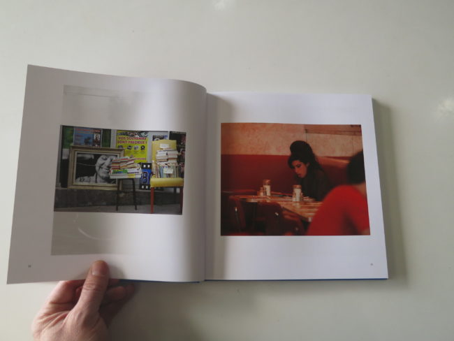
A coincidence, like noticing Amy Winehouse at a diner, with her full bee-hive hairdo kicking, and snapping a quick shot. (Which became the cover and signature image.)

Or spotting Anne Hathaway eating breakfast one morning, or a slightly disheveled Carl Bernstein licking ice cream above a Post headline about the anthrax scare in 2001.

Given the acrimony behind the book’s beginnings, this one does feel a bit disjointed to me. Like it didn’t cohere properly, despite the excellent text-piece-opening, which primed my curiosity.

While there are strong pictures throughout, the image quality is not amazing overall, though of course many of the photographs are sweet, thoughtful, and generally likable.

No, I’m not sure that’s true.

At first, I didn’t like this book, and I put it down.

I walked away.

But with its pretty blue cover, it roped me in again, and this time, I began to think about all photographers, (out in the world,) who watch others.

Look for their stories.
Steal their moments.

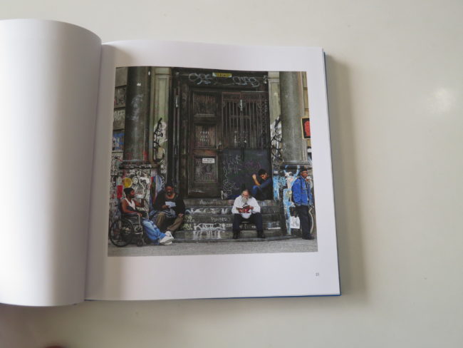
Is creeping on a pretty actress THAT different from being out shooting street photography, watching a stranger sit on a stoop, reading quietly?

How many of us have done that before? (I know I have.)

What if it’s one of those classic, incredibly New York stoops in Soho, with just the right amount of stairs, and one of those huge glass window-doors above it.

You know what I’m talking about.

On Prince Street.
Somewhere near there.

You notice her.

She’s so quiet.

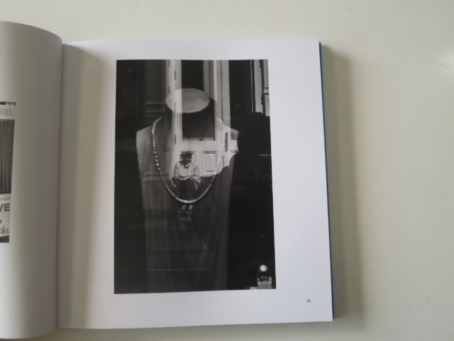
She has the Annie Hall hat on. And a man’s shirt. Or maybe it’s a light windbreaker? It’s hard to tell without staring outright.

Her shoes look sensible, and it’s possible she stepped outside her apartment to get some air with her book.

On her stoop.
Maybe she lives there?

But in 2015, when the photo was taken, rents in this neighborhood were already exorbitant. Can she afford it on her salary, with her sensible shoes?

Or was she out for a walk on a beautiful day, taking her book from stoop to park bench to stair railing, all day following the sun from spot to spot like a luxuriant cat.

You turn away, so as not to arouse her suspicion, and look into the store window before you. There’s a beautiful, no-doubt-expensive necklace in the window, but that’s not what draws your attention.

It’s her! There she is again.

In all her reflected glory.

You take your time now, secure in the knowledge no one will even recognize you’re framing up your composition, preparing to make this incredible photograph.

On page 23.

I love this one, because it’s perfect, but also because it evoked a strong memory for me.

I’m standing beside a light-rail stop in San Francisco, and I spot a charcoal-gray pearl necklace in the shop window next to me. I buy it for my girlfriend, wait to give it to her, and then am ultimately crestfallen when she hates it.

I was looking at this book, thinking about why it didn’t work for me, when all of a sudden, I was deep inside a memory.

Which led to another.
And another still.

(Big props to “The Art of Reading” for tunneling into my brain for a few minutes.)

Even now, as I flip back and forth, I notice some really excellent pictures, and some that seem like one-step-above snapshots.

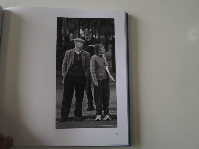
There are a lot of down-on-their-luck folks, a lot of happy people immersed in their stories, and one photograph, (p 57) in which it appears that a tall man is going to murder an older couple with his book, so menacing is his physical stance relative to theirs.

So there you have it.

This book falls somewhere in the middle, for me, as I really like parts of it, and it certainly makes me think, but then, it also feels like it needed a much tighter edit, and a stronger reason for being. (Other than a court order.)

Sorry. That was a mean joke.

Forgive me.

Bottom Line: Street photos of people reading, with a fascinating backstory

To Purchase “The Art of Reading,” click here

If you’d like to submit a book for potential review, please email me at jonathanblaustein@gmail.com. We currently have a several month backlog, and are particularly interested in submissions from female photographers so we may maintain a balanced program.

The Art of the Personal Project: Stephen Tayo

The Art of the Personal Project is a crucial element to let potential buyers see how you think creatively on your own.  I am drawn to personal projects that have an interesting vision or that show something I have never seen before.  In this thread, I’ll include a link to each personal project with the artist statement so you can see more of the project. Please note: This thread is not affiliated with any company; I’m just featuring projects that I find.  Please DO NOT send me your work.  I do not take submissions.  

Today’s featured artist:  Stephen Tayo

Featured on CNN 

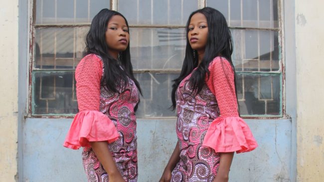
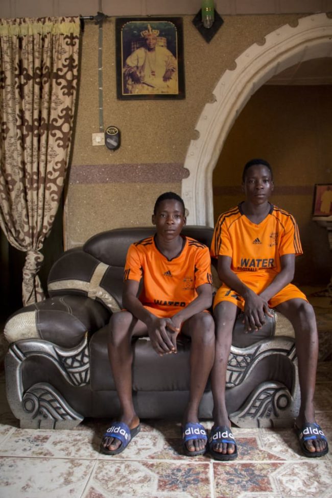
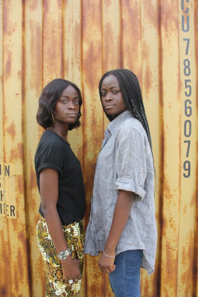
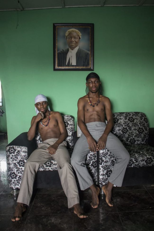
Tayo, who grew up in Ikere-Ekiti, Nigeria, and now lives in Lagos, is not a twin himself, but he wanted to tell “a story that identifies my tribe.”

“It was really important for me to establish how twins are seen in our culture,” Tayo said in a phone interview. “Other tribes see twins as an abomination from the precolonial era onwards, but the Yoruba see them as a blessing.”

For Tayo, “Ibeji” signifies a more conceptual and multivalent approach to portraiture in comparison to the street style photography that has landed him on Vogue.com, Dazed Digital and Nataal. His subjects, friends or members of his wider community, were photographed at their homes or out on the streets of Lagos over a six-month period.


To see more of this project, click here.

APE contributor Suzanne Sease currently works as a consultant for photographers and illustrators around the world. She has been involved in the photography and illustration industry since the mid 80s.  After establishing the art buying department at The Martin Agency, then working for Kaplan-Thaler, Capital One, Best Buy and numerous smaller agencies and companies, she decided to be a consultant in 1999. She has a new Twitter feed with helpful marketing information because she believes that marketing should be driven by brand and not by specialty.  Follow her at @SuzanneSease.  Instagram

Pricing & Negotiating: Portraits for a Fashion Accessory Brand

Craig Oppenheimer, Wonderful Machine

Concept: 6 subjects photographed against a solid background wearing fashion accessories                                                                                          

Licensing: Unlimited use of 12 images for 6 months

Photographer: Portraiture specialist on the East Coast

Client: A fashion accessory brand                                                                       

Here is the estimate:

Pricing and Negotiating Example of a Contract by Executive Producer Craig Oppenheimer at Wonderful Machine

Creative/Licensing Fees: The client asked the photographer to bid on a project for the brand’s new campaign, despite having little to no creative brief. The client saw a picture they liked in the photographer’s portfolio, and wanted to accomplish a similar aesthetic while integrating their product. We knew that they envisioned photographing 3 men and 3 women, all in a similar setup against a solid background, and they hoped to walk away with 2 images for each subject, totaling 12 final shots.

Initially, the usage was described to us as primarily being focused on social media, placement on their website, limited print advertisements and a mix of other guerilla style postings out-of-home, all for 6 months. When I discussed the usage with the client, it became clear that they wanted unlimited use during this time frame, despite the limited intended use they described. On one hand, the usage did seem quite limited, especially in duration, but on the other hand, the prominent brand would likely take out ads in high profile publications, and would likely pay a lot for their ad buy. Additionally, downward pressure was put on the fee due to the photographer’s limited experience working with such a brand, his eagerness to collaborate, the simple nature of the project, and the likelihood that only one or two images might see the light of day in advertisements, as most of the images would likely just end up on their website and on social media for a short duration.

After weighing all the factors, and based on the client’s intended use, I initially priced each of the first 6 images at $1,500 each, and then each of the additional 6 images (the second portrait for each subject) at $750 each, which brought me to $13,500.  My gut instinct based on other similar projects was that a fee between $10k-$15k would be appropriate for the day, and based on this experience and the eagerness of the photographer to get the job, we ended up going with $12,000, which broke down to $1,000/image if you look at it that way.

Travel and Pre-Production Day(s): The shoot would take place across the country, and the photographer would need a full travel day to fly there, and a full travel day to fly back. I also included one pre-production day for the photographer to book travel, wrangle crew and go through the paces with the client prior to the shoot. Typically I’d include a producer to help with these tasks and to handle the coordination of the entire project, but the client planned to coordinate many of the elements for this project, and the photographers was comfortable with just 1 day of prep to handle his tasks.

Assistant and Digital Tech Day(s): The photographer would be bringing an assistant with him, and hiring another one locally. I’d typically anticipate that the traveling assistant would be the “first assistant” and the local would most likely be the “second assistant”, but we flipped that in this case, as the photographer’s traveling assistant gave him a favorable rate for the three days out of town. We included one day for the digital tech, anticipating $500 for their day, plus another $500 for a basic workstation.

Hair/Makeup Stylist and Assistant Day(s): The client said that they had a few people in mind for hair/makeup styling who they planned to hire directly, but asked us to provide a sense of cost if they wanted the photographer to handle this. So, we therefore detailed TBD prices that didn’t impact the bottom line.

Studio Rental: This was based on feedback from a few local studios that we contacted to discuss rates and availabilities.

Equipment: While the photographer would be traveling with a bit of gear, he’d still need to rent a decent amount upon arrival, and this rate was primarily based on quotes received from the studios to provide such equipment.

Airfare, Lodging, Car Rental: I used Kayak.com to price appropriate travel expenses for the photographer and his assistant.

Parking, Per Diems, Misc.: This included $60/day/person as a per diem for the photographer and his assistant while traveling, plus $50/day in miscellaneous and unforeseen expenses.

First Edit for Client Review:  This covered the time it would take for the photographer to do an initial pass on the images, and provide the client with a gallery of images to consider

Retouching: This was based on a post processing rate of $150/hour, assuming two hours per image for each of the 12 images.

Insurance: We included this expense to help the photographer increase and maintain an appropriate policy.

Results: The client asked for two revisions. First, they decided to put hair/makeup responsibilities on the photographer, and asked that we send a revised estimate including those expenses, which was not a problem at all. Second, they asked if they could get 1 year usage for the 6 month price we quoted. I typically don’t recommend giving up something for nothing in return, but based on my previous experience with similar projects/budgets, and given how eager the photographer was to get the project, we decided to accept their offer. We submitted a revised estimate, and the photographer was awarded the project.

A few days later we were told that the client might want to add an additional day to the production, to capture a few additional shots with different talent, and with a slightly different background/setup. Specifically, they hoped to capture 3 subjects, with this additional day yielding 10 more images. Initially we were told that they only had $13,000 for this additional day, including all associated fees/expenses.

After calculating some rough numbers, I knew we weren’t going to be able to hit that, so I gave them a ring to negotiate. I learned that they could limit the usage to Web Collateral use and placement in up to 10 window displays of 3rd party retailers. This was a big jump down from the Unlimited use we were previously granting them. With this in mind, we submitted the following estimate:

Pricing and Negotiating Example of a Contract by Executive Producer Craig Oppenheimer at Wonderful Machine

We landed on $6,000 for this additional day/usage which was appropriate considering all of the factors. We also detailed the associated expenses with the additional day. We removed the first assistant (while essentially marking it as TBD) since the photographer didn’t feel they’d be needed on the second day consider the lighting setup would be similar to the first day, and his second assistant and tech could lend a hand as a cost savings measure. We increased equipment a bit for this additional day to account for a specific background the client wanted to procure, and included appropriate travel expenses in addition to more post processing time.

The overage for the additional day was approved, and the photographer quickly launched into pre-production to line everything up.

If you have any questions, or if you need help estimating or producing a project, please give us a call at 610.260.0200 or reach out. We’re available to help with any and all pricing and negotiating needs—from small stock sales to large ad campaigns.

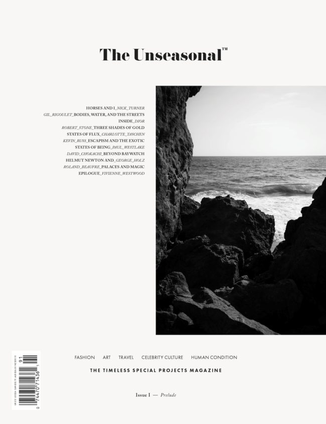
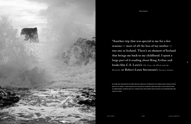
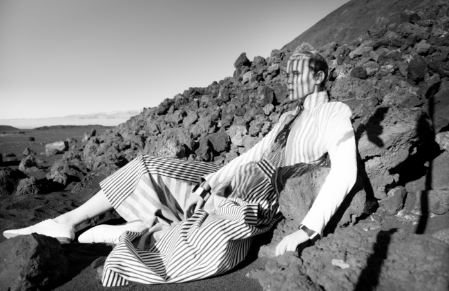
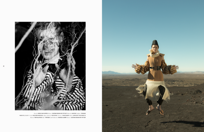
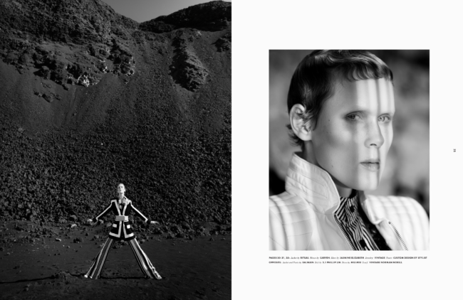
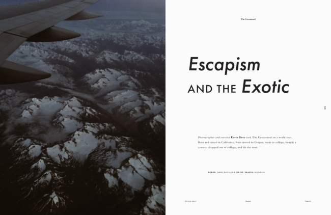
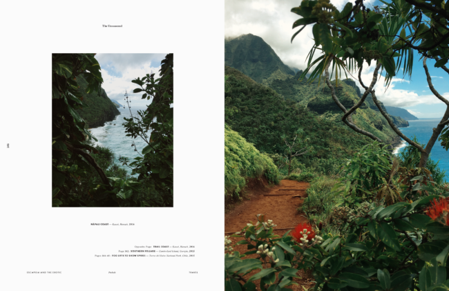
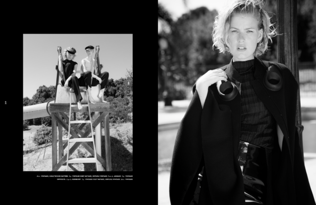
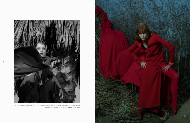
The Daily Edit – The Unseasonal: Ger Ger

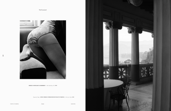
The Unseasonal

Editor in Chief and Creative Director: Ger Ger

Heidi: Is this your first project where you’re the EIC? I know you’ve had long, successful career as a creative director/ photographer.
Ger: My career as an artist started early as a teenager and over the decades I’ve found myself in many different roles, crossing various disciplines and mediums. Today I look at an unusually extensive set of skills and experiences even from times before I segued into working almost solely as a creative director and photographer in the fields of fashion, photojournalism, celebrity culture and conceptual art. For The Unseasonal all of that becomes one and it can be seen as a  proof that being a jack of several trades can sometimes create unusual opportunities and outcomes. I believe that only with me serving in multiple roles, I could make this magazine what it is today. The Unseasonal is a very intimate and uniquely homogeneous publication with one strong unified vision behind it. So I do find myself the first time also in the role of the editor-in-chief but I look at it more as a necessity than a choice. To me the written word has to be in symbiosis with the imagery and choices of angles, style and topics are following similar rules. The result is an overall feeling with some depth and integrity that readers can sense, that is difficult to put into words but many people seem to resonate with.

What are the differences between those roles?
In reality I’m the photo director as well but for The Unseasonal photography is so much in the DNA that a mention in the masthead becomes irrelevant. So since, I find myself in the main roles as the editor-in-chief and the creative director I try to disregard the lines in a similar way I learned to dismantle the boundaries of different mediums. For a while I was lecturing on what I call a universal artistic language. Mediums can be interchangeable and without boundaries. The very same aesthetic of a photograph for instance can be expressed in acoustic work alike. Grain becomes hiss, fog static noise and so on. There is no question that for big corporations and most magazines separating demanding top positions make a lot of sense. But with my diverse background I also saw the advantage in doing things differently. Differences between my roles become indistinct and sometimes things become a bit autocratic or autobiographic, then again very open and collaborative. The overall atmosphere of the outcome is what really counts. I look on every issue of The Unseasonal as a mix tape and it all needs to start in my gut or my heart. It is a very personal, artistic approach with a fantastic team behind it. This framework makes it possible to transport an absolute pure vision without any compromises or battles of egos. It is a very professional, quiet and peaceful way of working.

How did this idea come about? The longer I had been working for many of the most renowned magazines in the world — including Vogue, L’Officiel, and Interview — the more I felt there was also room for something else. For something of a different curation, of another voice, for a more timeless approach, and for treating fashion more as a feeling, artistic form of expression, and way of living. I wanted to put photography on a center stage, offer more room to breathe, give editorial projects more time, and make a magazine that can be a common denominator for many different types and classes of people. I also believed in a magazine that can be truly global, feels like a light summer breeze and at the same time is deep and substantial — something you want to bring on a vacation or that accompanies you for a long time. Something of a certain value that is between a collectible item, a periodical and a book.

Why did you feel the need launch this magazine?
With what is going on in the world today, I felt the urge to provide people with the inspiration and lightness for making the world a better place.I also felt it was time for a new over-spanning genre of a magazine that adapts to the change in seasons – both in fashion and the world — and counteracts fast fashion and meaningless social media madness with timeless aesthetics and deep storytelling. I was dreaming of a magazine about passion that unifies fashion, art, travel, and the human condition. A magazine of a rare artistic quality that represents the feeling of a getaway, of slowing down, of exotic places, escapism, breathtaking dreams, and lightness of being, all with elements from the past, the present, and the future. With job and budget cuts in publishing left and right I was even more so dreaming about a magazine that puts quality and content first again.

What do you feel is the problem if any with existing publications?
With the rise of digital and Instagram the existing editorial market imploded but the number of independent magazines exploded. Together with people getting increasingly tired of globalization, capitalism, impersonal corporate structures and digital technologies, there was a growing demand for something different, more personal, tangible, and substantial but market surveys do not seem to identify the gaps. So budgets for editorial projects have been continuously decreasing, resulting in a decline in quality and no willingness to take risks. Many established magazines lost their unique selling proposition and slipped into irrelevance. I think people more and more gave up on the publishing industry since for a while it seemed there were not many revolutionary ideas left to try for how a magazine in today’s world can feel and be put together. There is room for much more than doing just another magazine. But people need to step back, observe, take risks again and adapt to the present and the future. Also to how social media and new technologies changed our behaviors but this does neither mean that all will be digital nor  that print always needs to look the same. I see it as a great opportunity. It’s the right time for new structures and something warm, beautiful and meaningful.

Do you have an online component to this?
Yes. Although print is absolutely essential for The Unseasonal, we strongly believe that online is an important part as well. Just like the print magazine, the website is evolving and there are many plans and ideas for it. Both components have different strength, so we do not try to blindly mirror content but rather embrace each medium’s strengths. Also — some readers generally do not buy magazines, others do not read much online. And then there is a group of people who do both. With online we can put out things faster and with print we can take more time.

If I someone wanted to contribute, how do they get involved?
We usually do not accept submissions but do appreciate and try to respond to every email, letter or message we receive. Whenever possible I take the time myself to look through the work and read the pitches. I do value the potential or a steady, unique voice in someone’s work above an established but mainstream portfolio.

This Week in Photography Books: Luciana Pampalone

Proper civilizations depend upon the rule of law, in my opinion.

It might not work as a general rule, though, because China is an impressive civilization, for sure. (I guess Russia is too, if for Dostoevsky alone.)

But since the times of Hammurabi’s code, the idea of a system of justice has long been at the heart of most idealistic, successful societies. (I’d include America on that list, though our justice system is heavily imperfect.)

Even when they’re functioning, laws require distinctions to be made, as well as decisions.

This act or behavior is permitted. But that one is not.

Sometimes, though, things get murky.

Even the idea of pornography, sexual imagery that is considered illegal for traditional methods of media distribution, is unclear as a category.

Famously, the US Supreme Court justice Potter Stewart declared in Jacobellis vs Ohio that the standard was essentially: “I know it when I see it.”

Which means what?

Penetration is always porn, but boobs alone rarely are? Female frontal nudity is considered more acceptable than male, and why is that?

(Or the amazing “Broad City” girls can talk about pegging, on cable TV, but probably couldn’t use the word fuck.)

Speaking of laws, we’ve almost always kept our content SFW here at my APE book review column. (Safe for work.) Rob asked me to run it that way from the beginning, and then was open-minded as I experimented with showing a bit of nudity and light sexual behavior stuff here, years ago.

But it didn’t feel right for the audience, and we tightened up the restrictions ever since.

(One time, I specifically remember using my finger to tactically cover a hippie-dude’s-johnson in a photograph.)

I don’t mind the restriction.

I don’t think the column would be better if I could show sexually explicit photo books.

I’ve made plenty of “Boobs Sell Books” jokes over the years, but adding intercourse would not make my articles better, in my opinion.

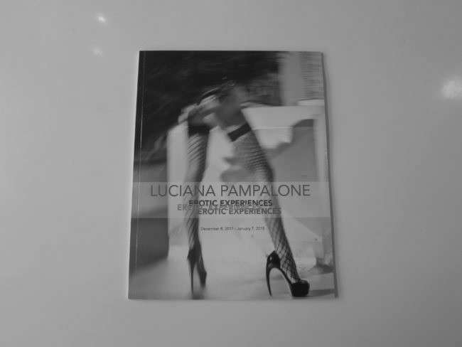
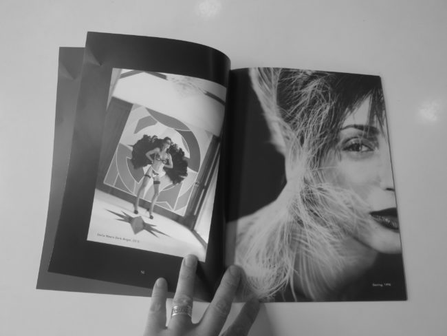
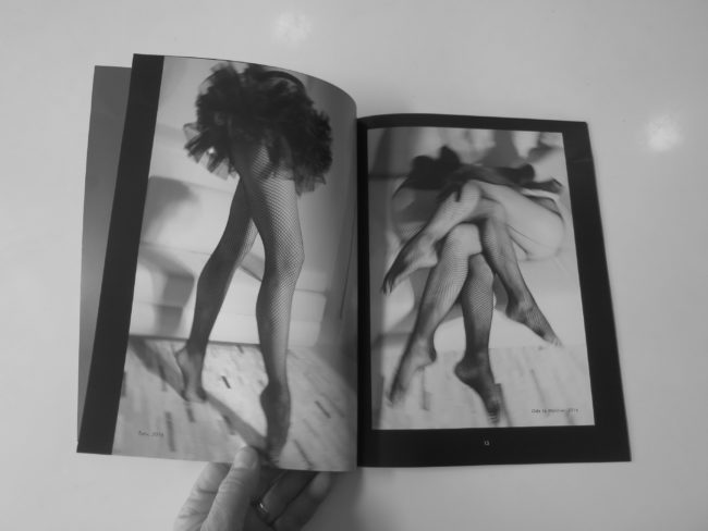
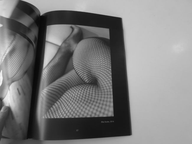
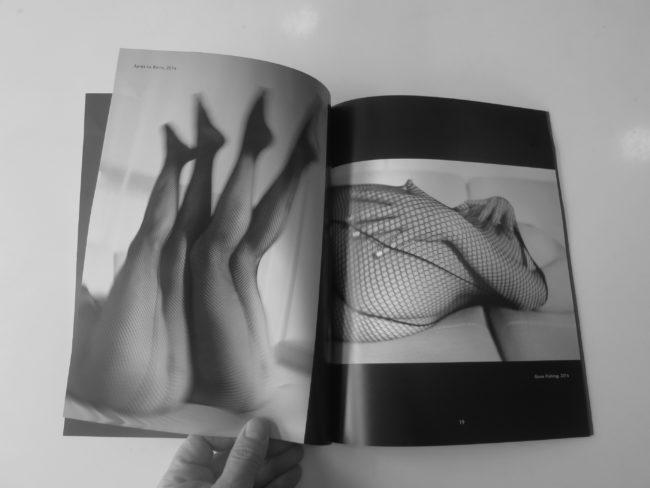
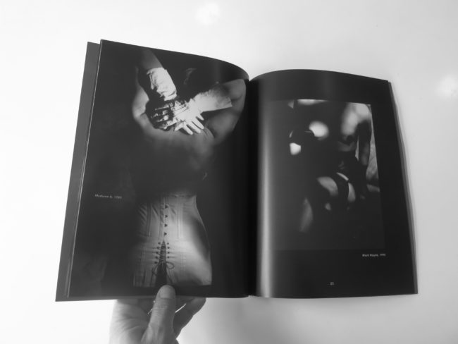
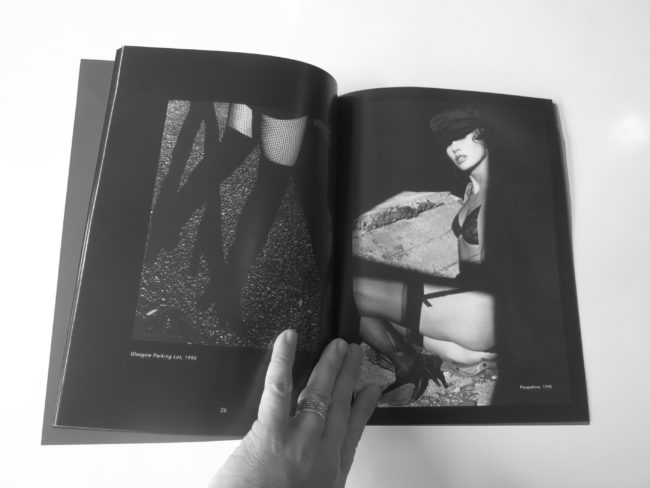
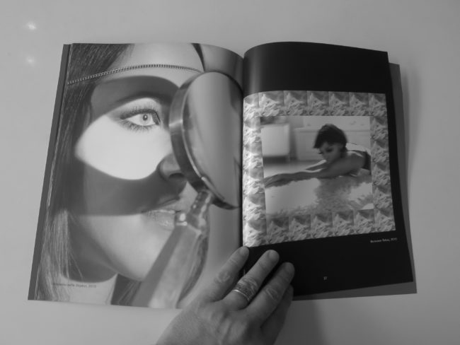
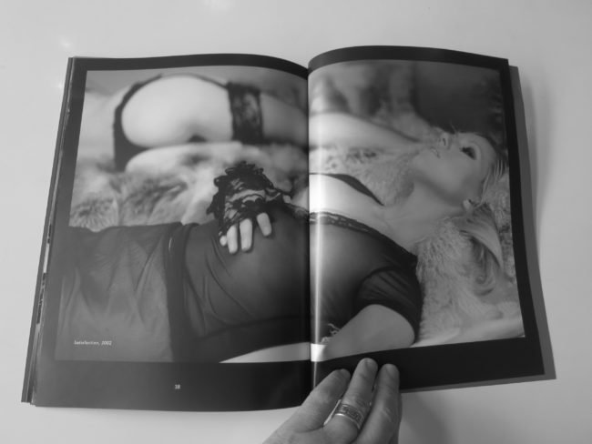
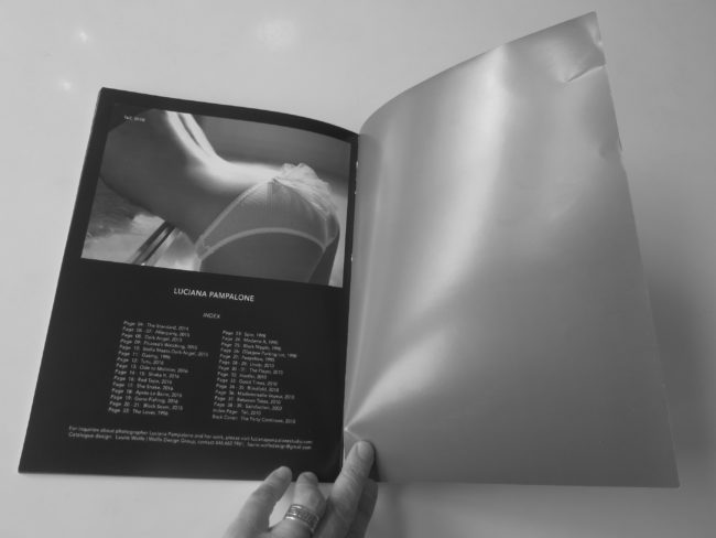
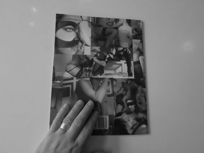
One photographer, Luciana Pampalone, reached out to me recently to see if I’d consider reviewing her exhibition catalog.

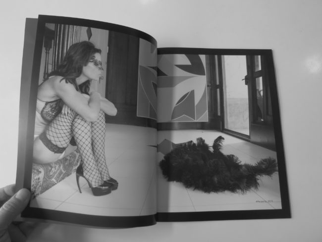
She said the pictures were erotic, not porn. And there were enough images for me to present that lacked out-right nudity. (Another photographer sent me a sample recently that was too hardcore, and I had to politely decline.)

The self-published catalog accompanied an exhibition that took place from December 2017 to January 2018 at The White Room Gallery in Bridgehampton, New York.

The pictures were made over a long range, dating back to 1990, so clearly it’s a subject of passion for the photographer.

An opening statement tells us she’s had a long commercial and editorial career, draws inspiration from Helmut Newton and Deborah Turbeville, and that she “depicts women as strong central figures in her work, allowing them to take on the roles of heroine or harlot, captivating onlookers and creating complex black and white compositions.”

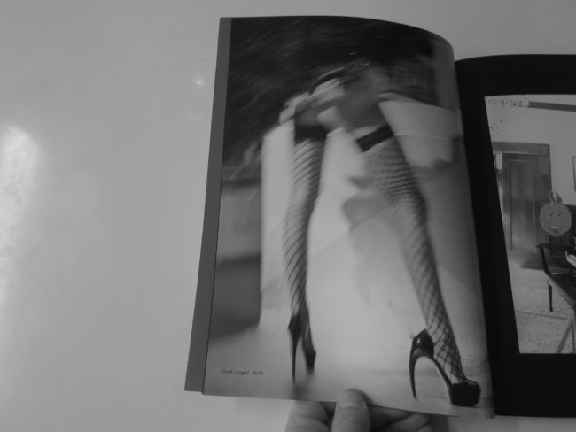
Now, I’m not going to photograph the nude shots, as is our policy, but there are more than enough that suggest, but don’t show. As to the ones that are too racy, there are a few that contain women’s breasts, a few that simulate a soft-core orgy, and a whole set showing women’s butts through fishnet stockings.

I’m not sure what I think of these pictures, honestly. They’re not exactly to my taste, but they are well made.

Who is the audience for work like this?

Art that titilates?

And what about the context, that they’re made by a woman instead of a man? Nudity is problematic for men these days, and rightly so in my opinion, but what are the rules that apply to female photographers?

(Kind of like Sofia Coppola can get away with opening “Lost in Translation” with Scarlet Johansson’s butt in see-through panties, but a male director probably wouldn’t make that move these days.)

To be clear, I kind of like this booklet. It’s honest, as the word erotic is on the cover.

It’s in the title of the project, for heaven’s sake.

If you don’t like those sort of things, you won’t look. And as the artist is a woman, the politics align with 2019.

It’s certainly something different, which I try to offer you on a semi-regular basis.

Stay warm out there.

Spring will be here soon enough.

Bottom Line: Cool catalogue of 30 years worth of erotica

If you’d like to submit a book for potential review, please email me at jonathanblaustein@gmail.com. We currently have a several month backlog, and are particularly interested in submissions from female photographers so we may maintain a balanced program.

The Art of the Personal Project: Eric Espino

The Art of the Personal Project is a crucial element to let potential buyers see how you think creatively on your own.  I am drawn to personal projects that have an interesting vision or that show something I have never seen before.  In this thread, I’ll include a link to each personal project with the artist statement so you can see more of the project. Please note: This thread is not affiliated with any company; I’m just featuring projects that I find.  Please DO NOT send me your work.  I do not take submissions.  

Today’s featured artist:  Eric Espino

Artist Statement:“Let us Play”

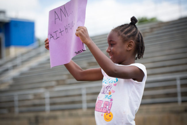
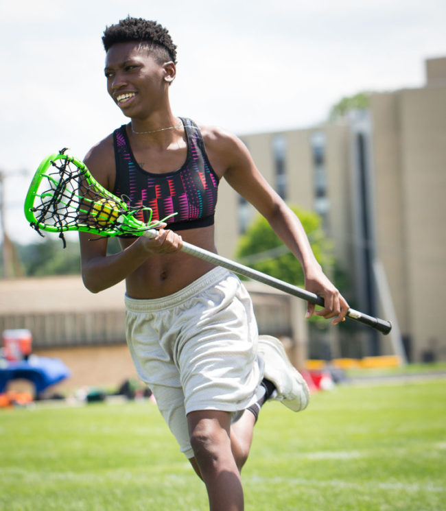
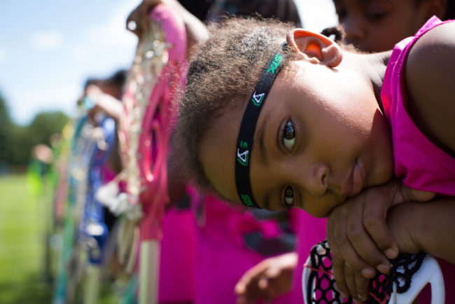
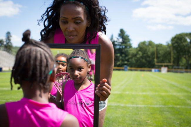
Our Mission at Eyekonzis to Empower, Educate and Motivate the next generation of field hockey and lacrosse Olympians. It is our belief, that through the structure and development of playing field hockey, we will provide our girls & boys with the skill set and development they need in areas such as sportsmanship, healthy lifestyle, team work, self- esteem, history of their culture, healthy body image and academic achievement. This will translate into a wholesome productive lifestyle, on and off the field.

Unfortunately, there are some who don’t believe in this cause. The girls of Eyekonz, along with coach Jazmine A. Smith, were photographed in this series shortly after Strawberry Mansion High School and the Philadelphia Unified School District dismantled the league from it’s district. This issue has led to a class action lawsuit against the district, for the injustice of the treatment of Eyekonz Sports League.

This story was later published in Essence magazine, amongst others. For more info, please click on the links below.

Refinery 29

Philadelphia Weekly

Now This

-Eric Espino

To see more of this project, click here.

APE contributor Suzanne Sease currently works as a consultant for photographers and illustrators around the world. She has been involved in the photography and illustration industry since the mid 80s.  After establishing the art buying department at The Martin Agency, then working for Kaplan-Thaler, Capital One, Best Buy and numerous smaller agencies and companies, she decided to be a consultant in 1999. She has a new Twitter feed with helpful marketing information because she believes that marketing should be driven by brand and not by specialty.  Follow her at @SuzanneSease.  Instagram

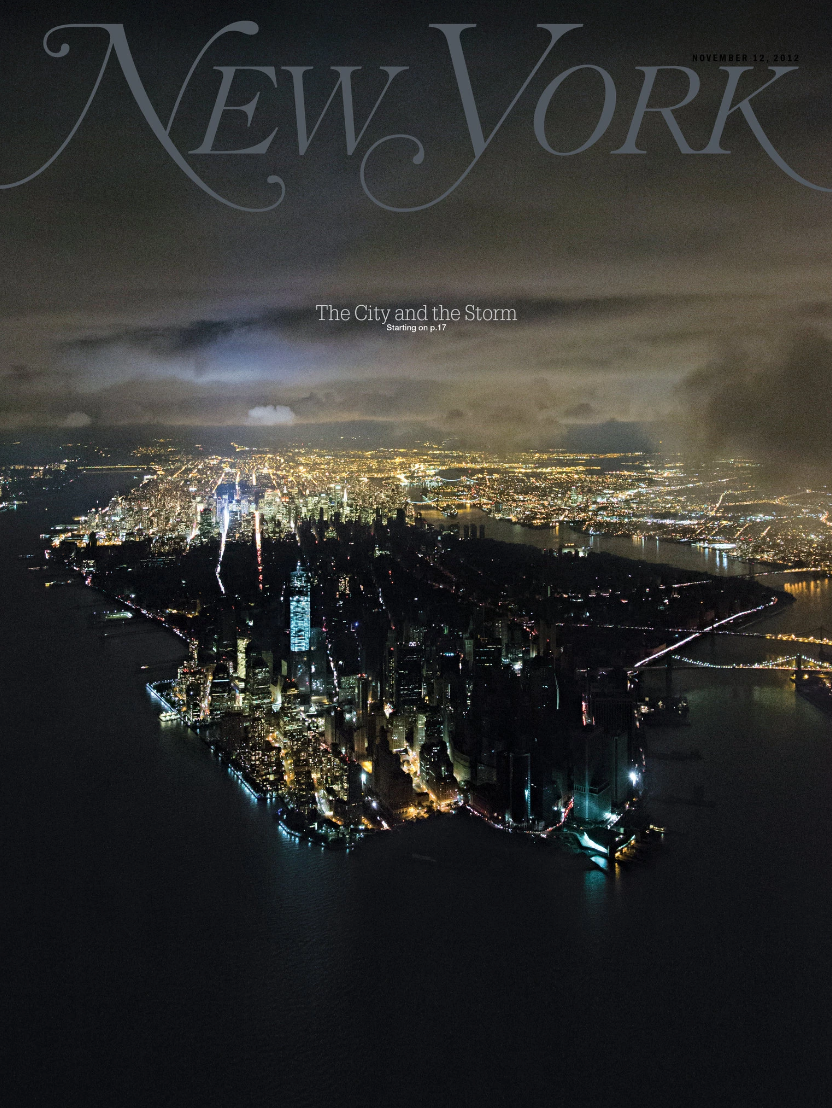
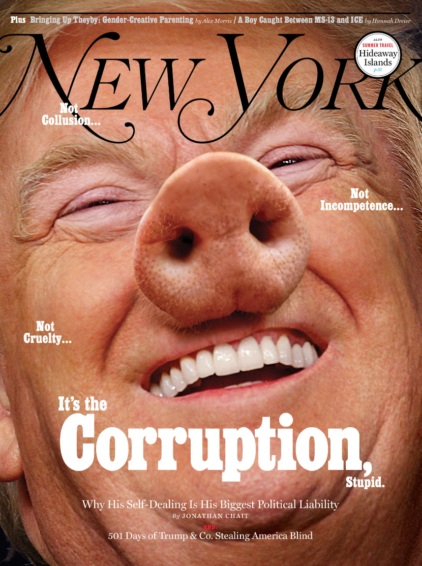
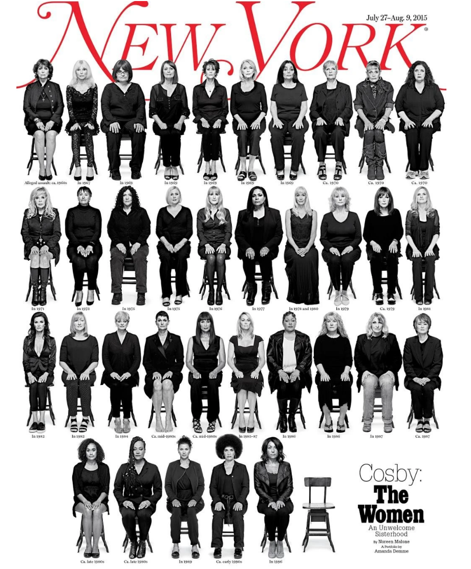
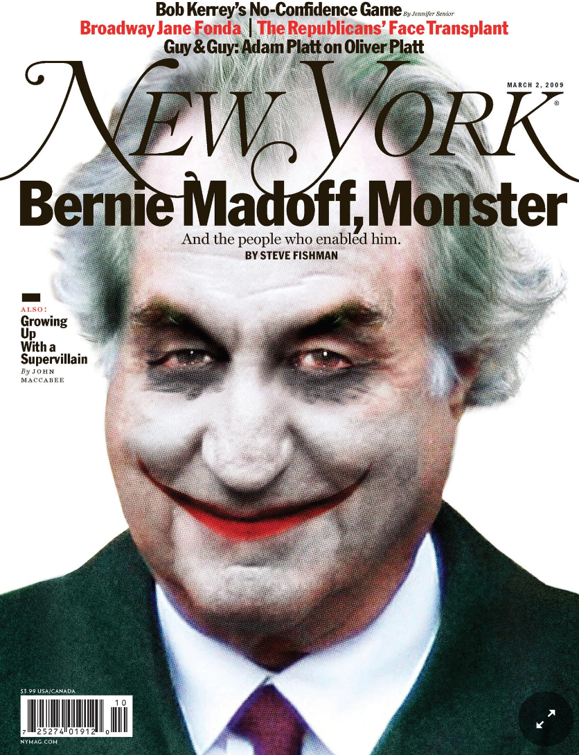
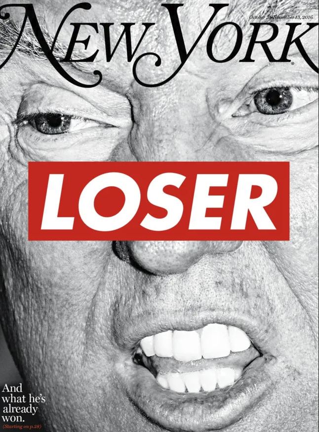
The Daily Edit – New York Magazine Covers: Adam Moss Legacy

Excerpt from “The New York Cover That Made Me Want to Make Magazines” / New York Press Room

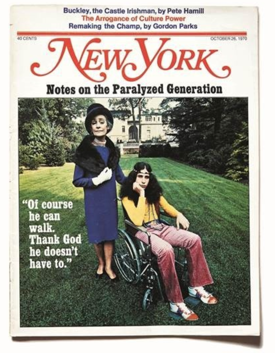
One of my favorite covers of this magazine is called “Notes on the Paralyzed Generation.” The issue came out in 1970, when I was 13 (not quite of that generation, but desperately wanting to be the hippie boy on the cover), and I remember yanking it from our mail pile. The cover picture is a deeply sarcastic portrait of mother and that bell-bottomed adult son — the son, obviously able, in a wheelchair. The photographer was a man who did many of New York’s early covers, Carl Fischer. He was a genius; satiric covers are incredibly difficult to pull off and he succeeded almost all of the time. The coverline of that issue read, “Of course he can walk. Thank God he doesn’t have to.” At the time, I thought it — picture and headline in unison — was hilarious. I still do. The cover taught me that great magazines are steeped in point of view, voice, tone. They live. And seeing that cover for the first time is probably what made me want to make magazines for a living, though I didn’t know that at the time. — Adam Moss

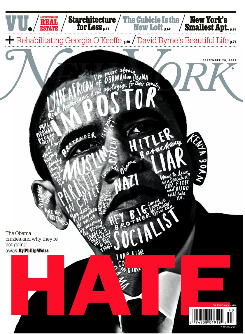
Adam Moss took over editorship of New York Magazine in 2004 and is now stepping down. Here’s a few of his seminal covers being shared online by those who praise his work.

This Week in Photography Books: Tony Fouhse

Did you hear about the guy who choked out a mountain lion?

Some Colorado-mountain-runner-guy got attacked by a cougar, from behind, and fought back.

The second I read it, (the story made national news, and you’ve likely already heard about it by now,) I thought, “I bet that guy does Brazilian Jiu Jitsu.”

Or martial arts of some sort.

I should know, because last week, within 24 hours, I found myself put in two potentially neck-crushing choke holds, (a rear-naked and a guillotine,) and then a proper sleeper hold, in which I woke up on my knees, facing the mat.

(I hadn’t realized quite how vulnerable our necks are, but there you go.)

We always minimize the risks out there, else how would we leave the house each morning to drive a car, trust the subway, or ski down the hill? (Three people have died at Taos Ski Valley since New Year’s.)

But back to the dude who killed the mountain lion.

Can you just imagine how that scenario played out?

You’re running along, you’re fit, you’re strong, and then you hear something behind you, and it’s the VERY WORST CASE SCENARIO, as it’s a FUCKING MOUNTAIN LION.

It starts biting and scratching you, trying to eat you.

TO EAT YOU.
RED ALERT.
INSTINCTS, KICK INTO OVERDRIVE!

Now, how many of us, even those who go to fighting class on a regular basis, would have the peace of mind to get behind the mountain lion, to take its back, and then crush its windpipe and choke it to death, while practically tasting its fur in your mouth.

Your heart is racing, your mind is thinking, “this can’t be real, this can’t be real.”

But it is real.
You’re choking out a fucking mountain lion, and then it’s dead.

It’s over.

You’ve won. You fought for your life, and he’s dead on the ground.

Now, a story like that is interesting now matter how you tell it. I opened by telling you how it ends, and still we’re fascinated.

I didn’t drag it out, teasing with tension.

Does the mountain lion prevail?

Does our intrepid hippie-mountain-runner-martial-artist-guy get eaten alive, a cougar baby nibbling on his jawbone?

But that’s not how I told it. I lead with the ending…

We all enter the pop-culture-continuum at different times, but I remember when I first saw “Reservoir Dogs,” as an 18-year-old, and was introduced by Quentin Tarantino to non-linear narrative.

Just last week, in this very column, I said that a good book should have a beginning, a middle and an end.

Just last week.

But today, I think it’s important to consider the alternatives, like non-linear, repeating, or reverse narratives.

It’s easy to think of movies, like “Pulp Fiction,” “Memento,” “12 Monkeys,” or “Looper.” (Man, what is it with Bruce Willis and weird-ass narratives?)

Given how many books I see, sometimes it’s fair to wonder, is the artist thinking two ways here?

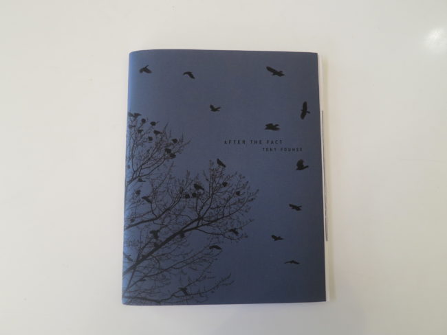
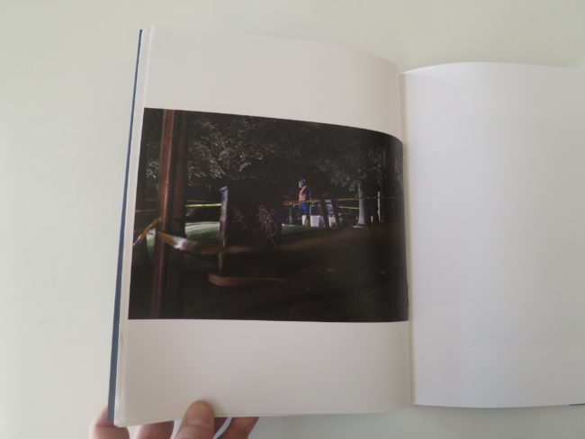
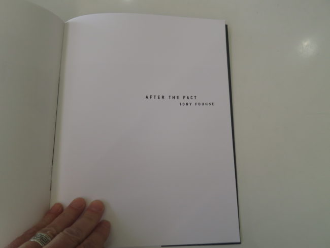
That’s certainly what I came away pondering, after looking several times at the excellent photobook “After the Fact,” by Tony Fouhse, published by his company, Starlight Press, in Ottawa.

(This is the winter of the Canadians, I guess.)

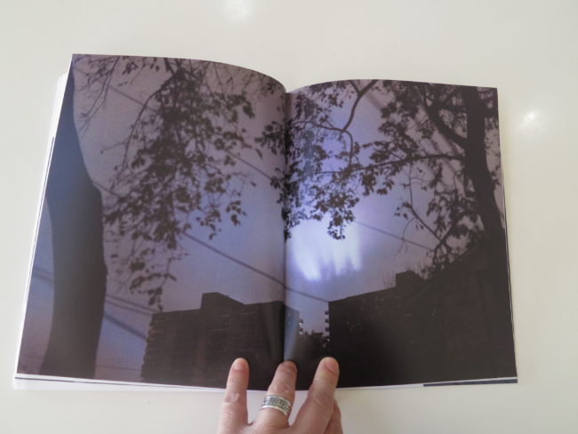
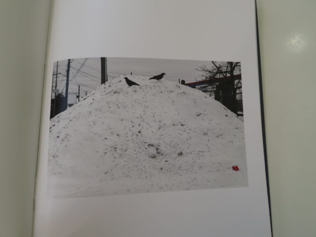
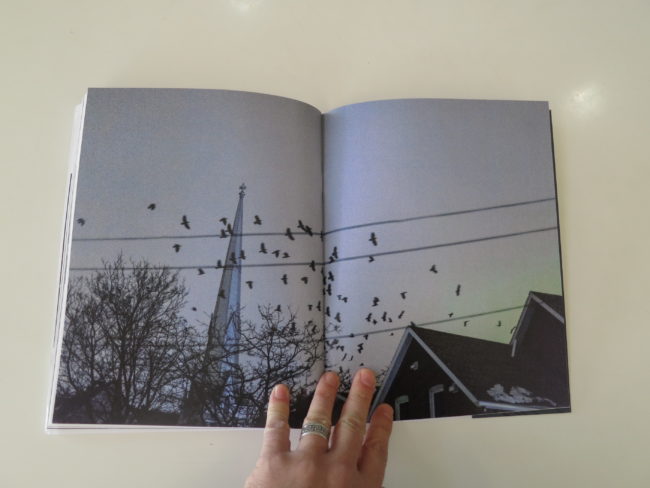
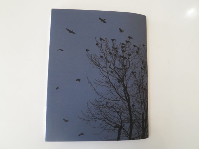
The cover is a dream-scape in silhouette of black on blue, with ravens and a tree and the sky.

This will be a repeating motif within, birds, and while I was OK with it, maybe it did seem a bit obvious.

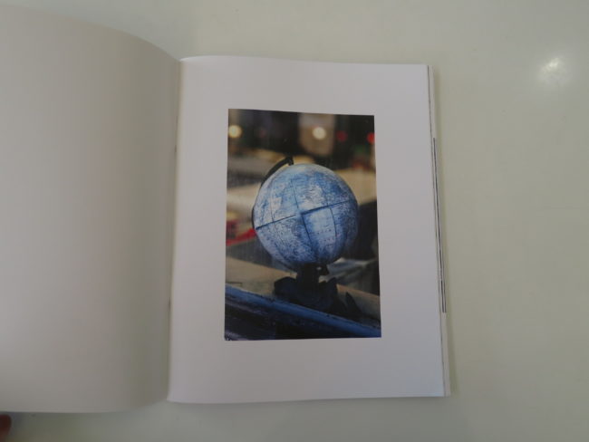
Open it up, and there’s a globe. The North Atlantic Sea is prominent, and I think it’s a pretty damn smart way to ground the story.

Then, a disaffected portrait of a tall guy crammed under a short ceiling.

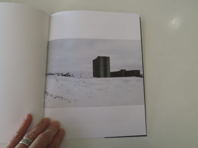
Then bleak, cold, yet undeniably beautiful landscapes of what I take to be Canada in Winter.

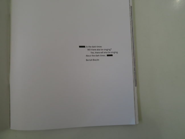
We start with a smart quote by Bertolt Brecht about singing in the face of darkness, which I took to mean that we need to make our art, to speak our peace, to sing our songs, in particular when we think things are going to shit.

(And of course many people regard our current situation as a particularly dangerous one, relative to the Post World War II era.)

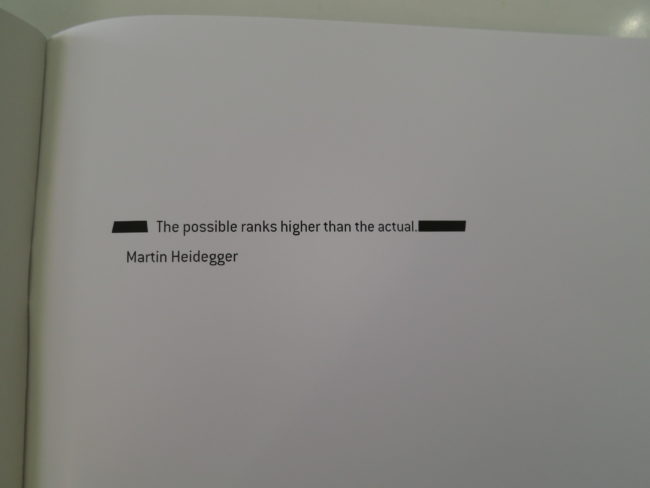
Then, some redacted text, and then a slew of excellent images.

Like I said, the bird theme is a bit on-the-nose for me, and I normally don’t use that expression. But I’d also like to ask that people stop including pictures of trash on the street or sidewalk. (We had them in last week’s book too.)

What do you say, folks?
A moratorium on garbage in the street pictures?

But other than that, the photography is spot on.

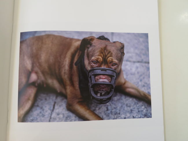
The portrait of the dog in the muzzle?
Amazing.

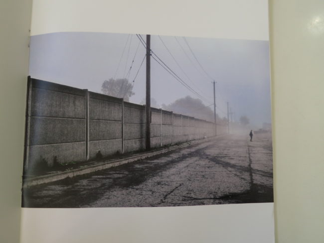
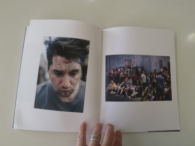
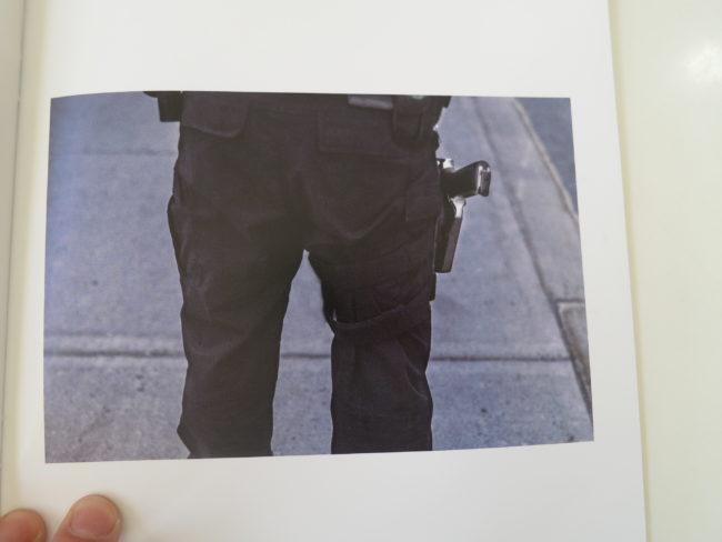
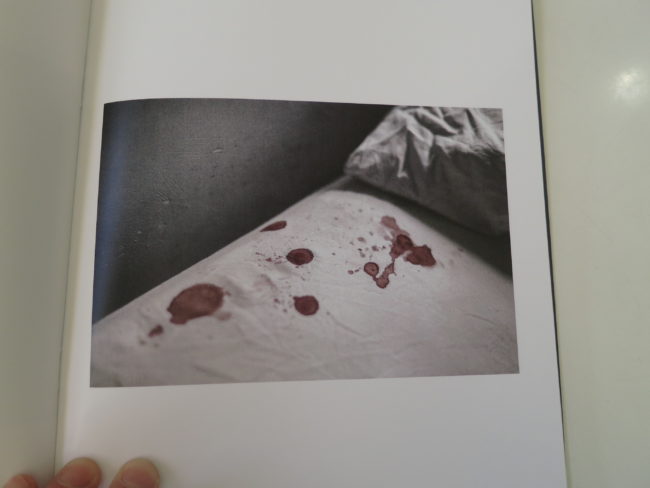
The yellow brick road, the policeman’s gun, the bloody bed, the sad portraits, the public places, it all adds up to a feeling of dread and impending doom.

Impending doom is the same as maybe-not-yet arrived doom. You can feel it coming, but is there still time to affect the outcome? To hope?

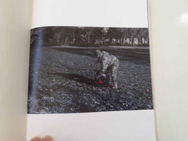
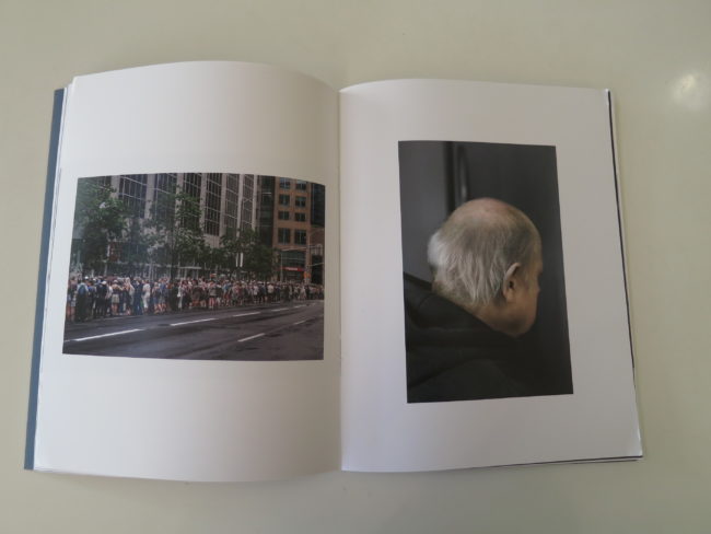
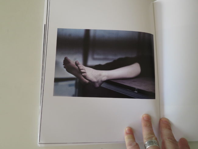
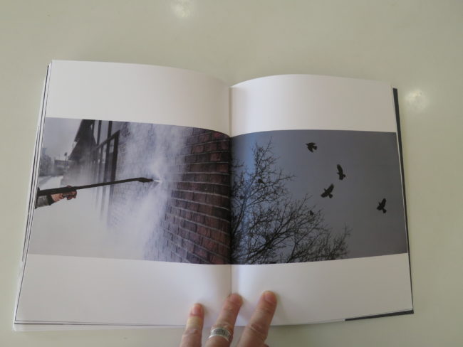
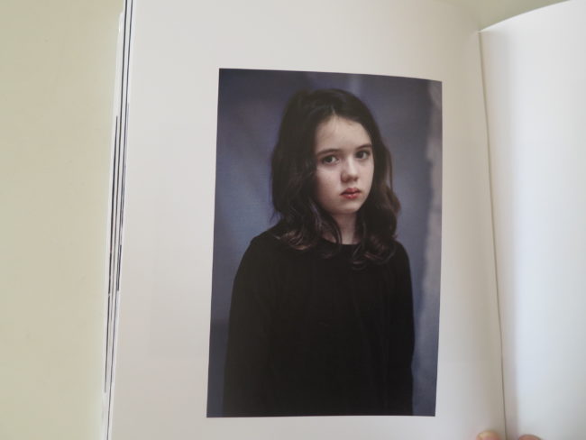
There’s a guy in camouflage unfurling a wire of some sort. Mennonite women, a power-company worker at night, more sad portraits, dead-people feet, power washing a building, and then that little girl looking right at you, from the side, like a young-21st-century-Mona-Lisa.

Towards the end, the book’s title page, “After the Fact.”

Then, another quote, this time from Martin Heidegger, “The possible ranks higher than the actual.”

Idealism before realism, I suppose?

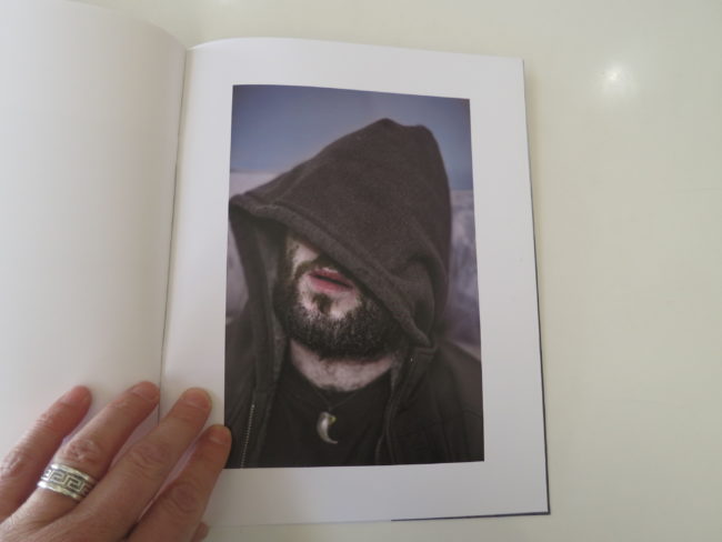
Next, another portrait of a guy looking away, (behind the hoodie,) the birds, and a cold Canadian landscape.

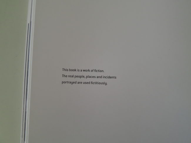
A last credits page, which quotes Joe Strummer, “The future is unwritten,” and states, unequivocally, “This book is a work of fiction. The real people, places and incidents portrayed are used fictitiously.”

The end.

Is it, though?

If you open it in the back, and start here, doesn’t the book make just as much sense?

You get opening quotes for context, and you’re explicitly told to see this as a work of visual fiction.

It opens similarly, motif wise, (birds/landscape/dude portrait,) and this way, it includes the title page in the beginning, where it would normally be.

Plus, it’s just so easy to flip-it back to front, given its design.

There are narrative waves and repeating motifs that work just as well this way, and even better, you can reverse direction whenever you want.

It’s a good reminder, perhaps, that we not get too rigid in our thinking. That books should be made this way. Or that.

Book making is a creative endeavor, and I’d like to hope we can continue to be surprised.

As as the Clash dude said, “The future is unwritten.”

Bottom Line: Smart, bleak Canadian story with a reverse narrative

To purchase “After the Fact” click here

If you’d like to submit a book for potential review, please email me at jonathanblaustein@gmail.com. We currently have a several month backlog, and are particularly interested in submissions from female photographers so we may maintain a balanced program.

The Art of the Personal Project: Robin O’Neill

The Art of the Personal Project is a crucial element to let potential buyers see how you think creatively on your own.  I am drawn to personal projects that have an interesting vision or that show something I have never seen before.  In this thread, I’ll include a link to each personal project with the artist statement so you can see more of the project. Please note: This thread is not affiliated with any company; I’m just featuring projects that I find.  Please DO NOT send me your work.  I do not take submissions.

Today’s featured artist:  Robin O’Neill

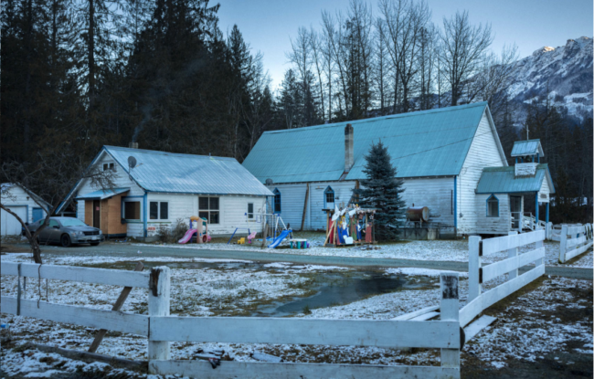
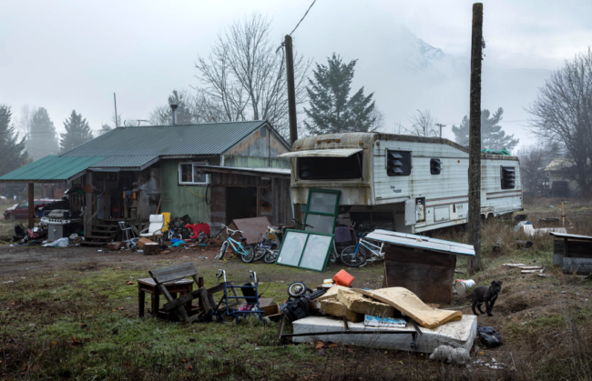
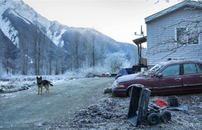
My photography is driven by my curiosity and attraction toward different cultures. Thirty minutes from my culturally homogenous home in Whistler is a small community called Lil’wat Nation. This is a First Nations reserve at the base of the majestic 8500-ft Mount Currie, surrounded by the Coast Mountain range.

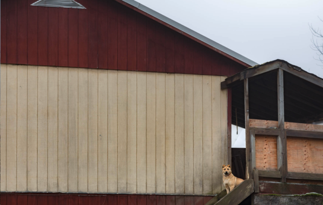
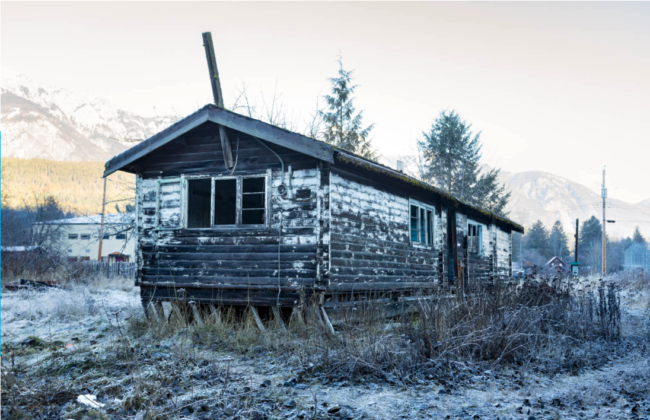
As a local backcountry skier, I make a weekly pass through the Lil’wat Nation in the winter. I look forward to this part of my day. I crane my neck to investigate the random items on the lawns, examine the texture of old paint cracking off the sides of houses, and watch the dogs roaming freely. Seeing the chimney smoke and warm condensation in the windows, all I want is to know the people inside.

Last winter I decided to drive out there more regularly, bring along my camera, and document the beauty I saw in these homes and in this community. Only 40 kms away, and a vastly different view of the world. I am left wanting more.

To see more of this project, click here.

APE contributor Suzanne Sease currently works as a consultant for photographers and illustrators around the world. She has been involved in the photography and illustration industry since the mid 80s.  After establishing the art buying department at The Martin Agency, then working for Kaplan-Thaler, Capital One, Best Buy and numerous smaller agencies and companies, she decided to be a consultant in 1999. She has a new Twitter feed with helpful marketing information because she believes that marketing should be driven by brand and not by specialty.  Follow her at @SuzanneSeaseInstagram


The Daily Edit – Motorcyclist: Amy Shore

Motorcyclist

Photographer: Amy Shore

Heidi: How did this assignment come about, did you bring the idea to them?
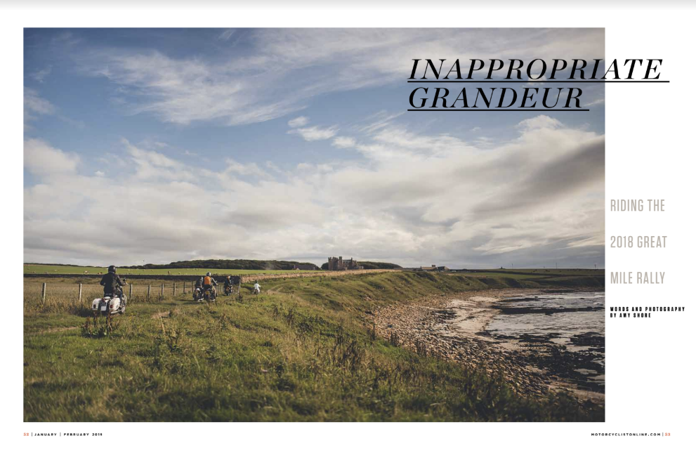
Amy: I had heard about the Malle London Great Mile previously and always thought it sounded amazing! But then I was approached by a German journalist to join the event for a number of magazines. I got to ride and photograph the journey. It was one of the best assignments I’ve ever been asked to photograph! I loved it so much as an assignment, myself and my fiancé have booked ourselves in for the 2019 Rally!

Do you find most are surprised you are a female in this type of work?
Yes!! I still get asked if I am photographing for a University project, and they are surprised when I tell them that I photograph cars for my job. I think it’s a little disappointing that it’s still a question I get asked, but I truly hope that I can try and help change this view for future females in the automotive world.

Do you ride motorcycles and where does your love for driving and and road tripping come from?
I learnt how to ride motorcycles just 2 years ago. I’ve always wanted to ride but felt I wouldn’t fit in to the riding world as a girl. It wasn’t until I started photographing the bike world that I realised it was so fun and anyone was welcome! I think I’ve always had a strong desire for adventure and road trips. When I was 19, I did a solo road trip in my classic Mini 1600 miles around Scotland, just because I wanted to. My parents have always encouraged us to explore, often taking us camping or hiking up mountains! My dad would always tell us stories of his road trips around the world, I don’t think I’d ever not be adventurous!

You have a lot of motorsport work, where does your interest in motorsport come from?
My dad has always worked in the motorsport world, at one point working for Team Lotus in Formula 1, so our family has always been around cars and had a love for classic cars especially. When I learnt to drive, I loved the feeling of freedom. I loved how classic cars looked, they were so full of character. I wasn’t interested in what was under the bonnet, I just loved the smells, the designs, the freedom these beautiful machines could give me. That’s when I bought my 1985 Mini Mayfair! And then when I learnt to ride motorcycles, I bought a 1972 Honda 350F. This year I acquired a 1930 BSA L30, a 1945 B33 and a 1961 BSA Bantam!

How many days was the rally? 
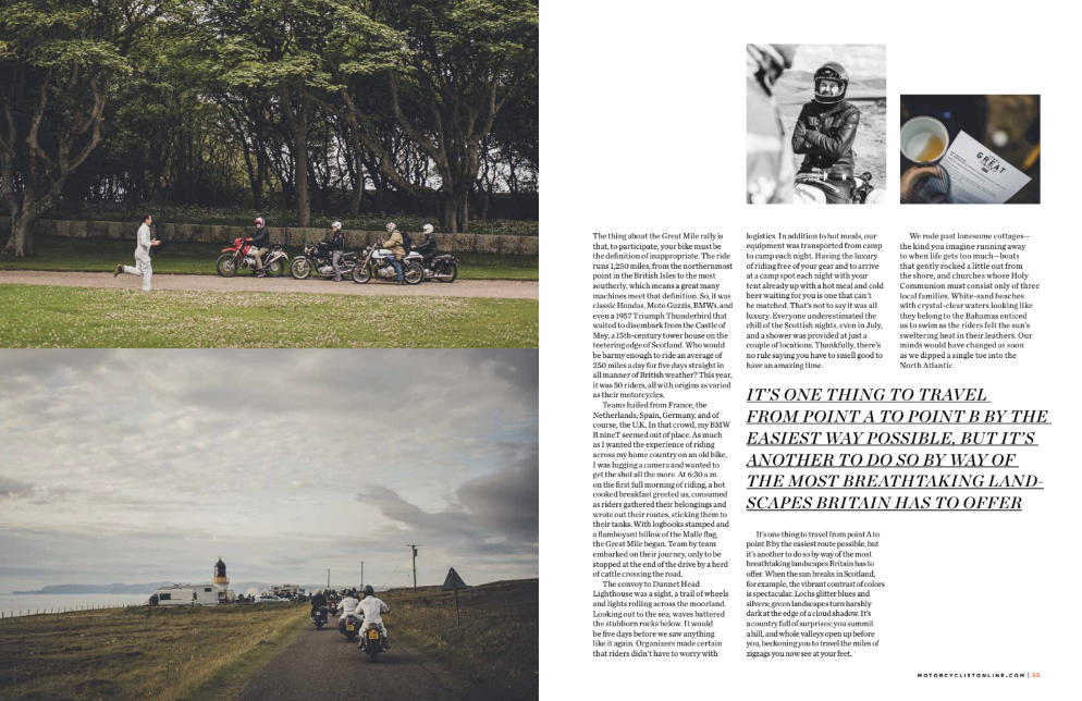
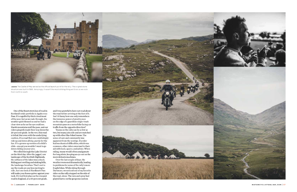
The Rally was 7 days in total, riding for 5 of them. We arrived on day 1, registered and met our rally-mates, and then set off early the following morning. Each day we roughly rode 230 miles along some of the smallest coastal roads in the UK, but the ones with the very best views. Each day was magical.

Did you shoot from the car or the back of motorcycle?
Both! At some points I was photographing from the back of a convertible Mini that came from the official Mini Museum! Other times I would sit on the back of one of our team members and photograph over their shoulder. I love to photograph from the bike of bikes as it gives the viewer a but better sense of doing the bike trip too, rather than simply observing the trip from a car.


The Daily Promo – Ramona Rosales

Ramona Rosales

Who printed it?
AW Litho x Clear Image

I use a broker (AW Litho) who finds the best partners & sourcing materials (with budget in mind). Clear Image was the best fit for this project, They have previously printed my promos and I can always count on them for the best equipment and care for detail.

Who designed it?
Boyfriend.Studio

This was in conjunction with a redesign of my website. The partner team designed the new website, promo booklet, and logo. There is an additional poster is production.

Tell me about the images?
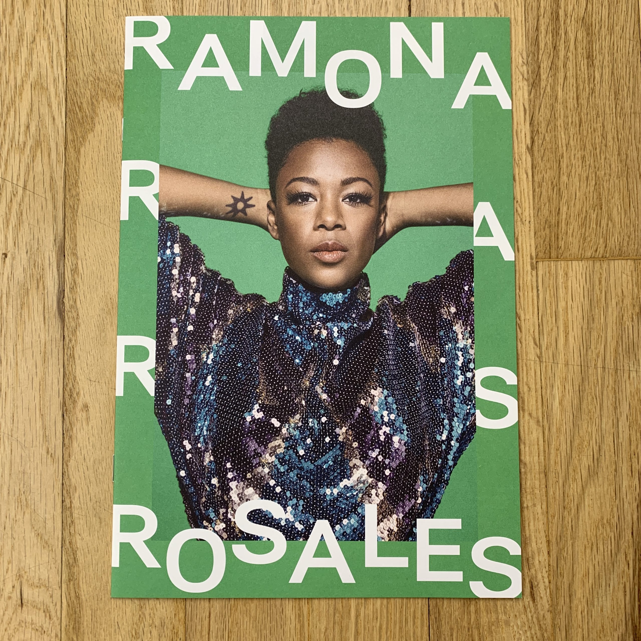
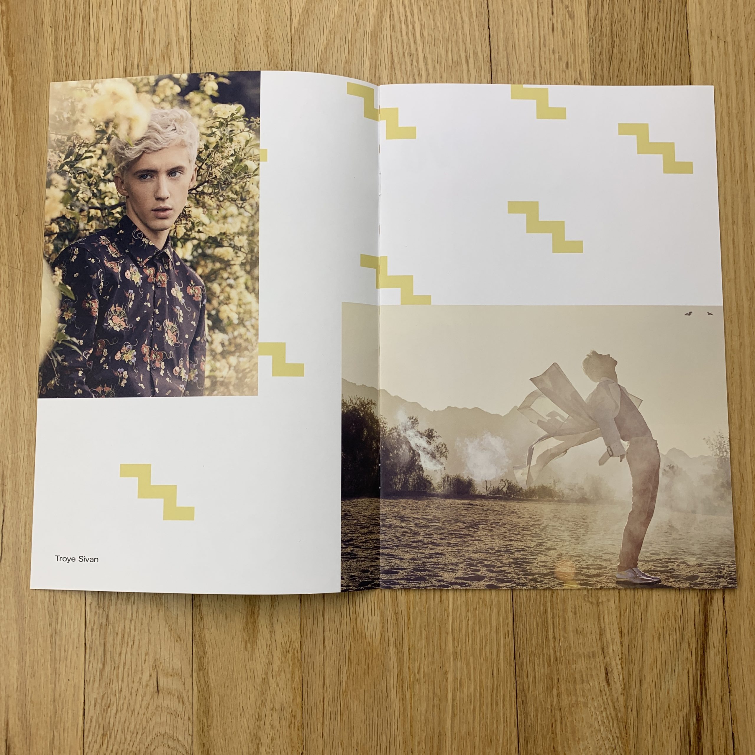
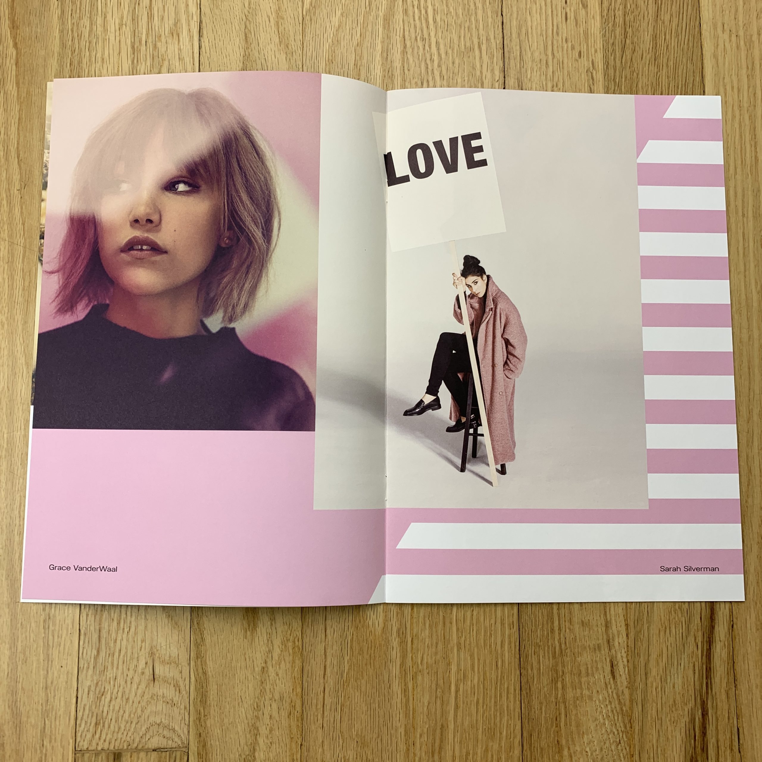
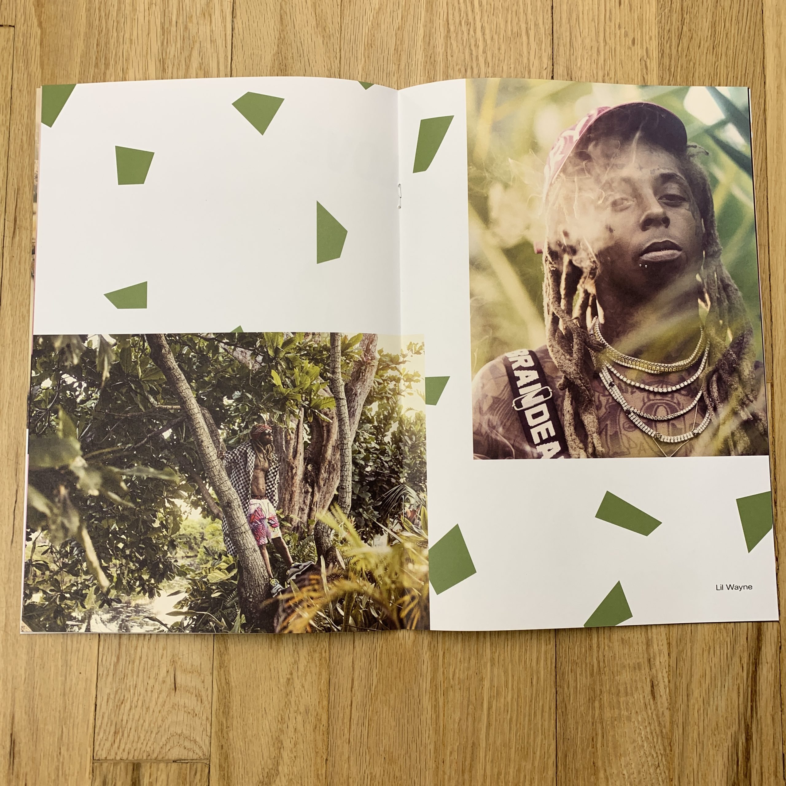
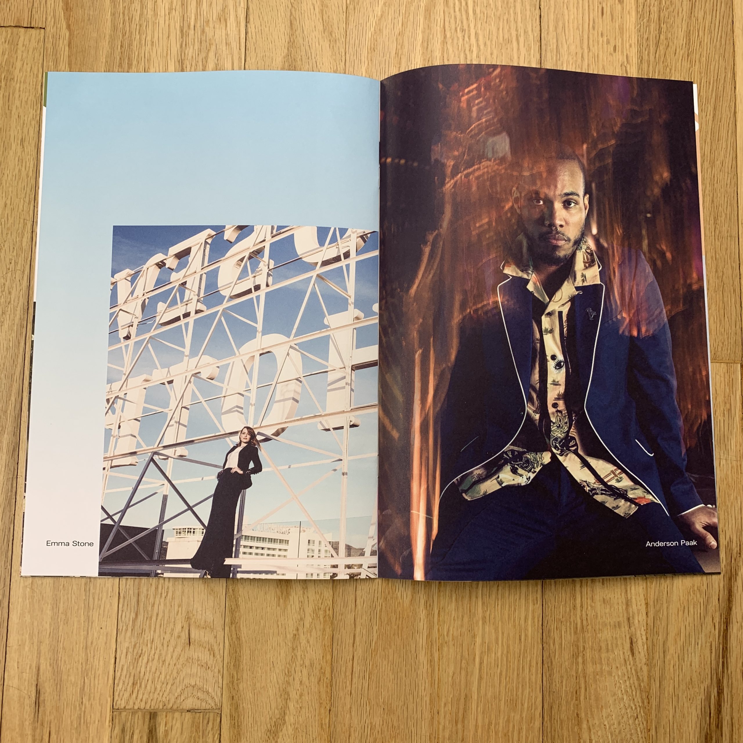
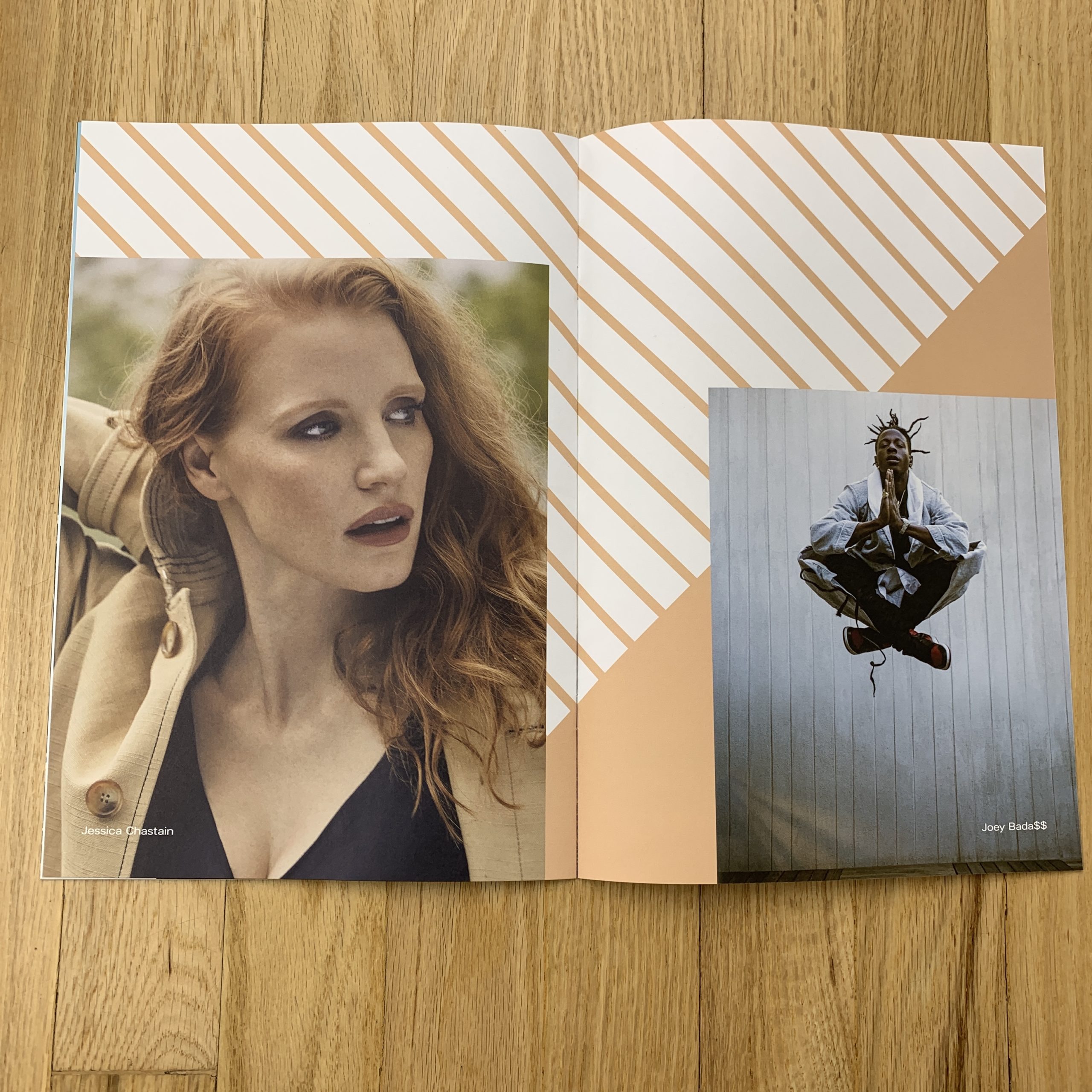
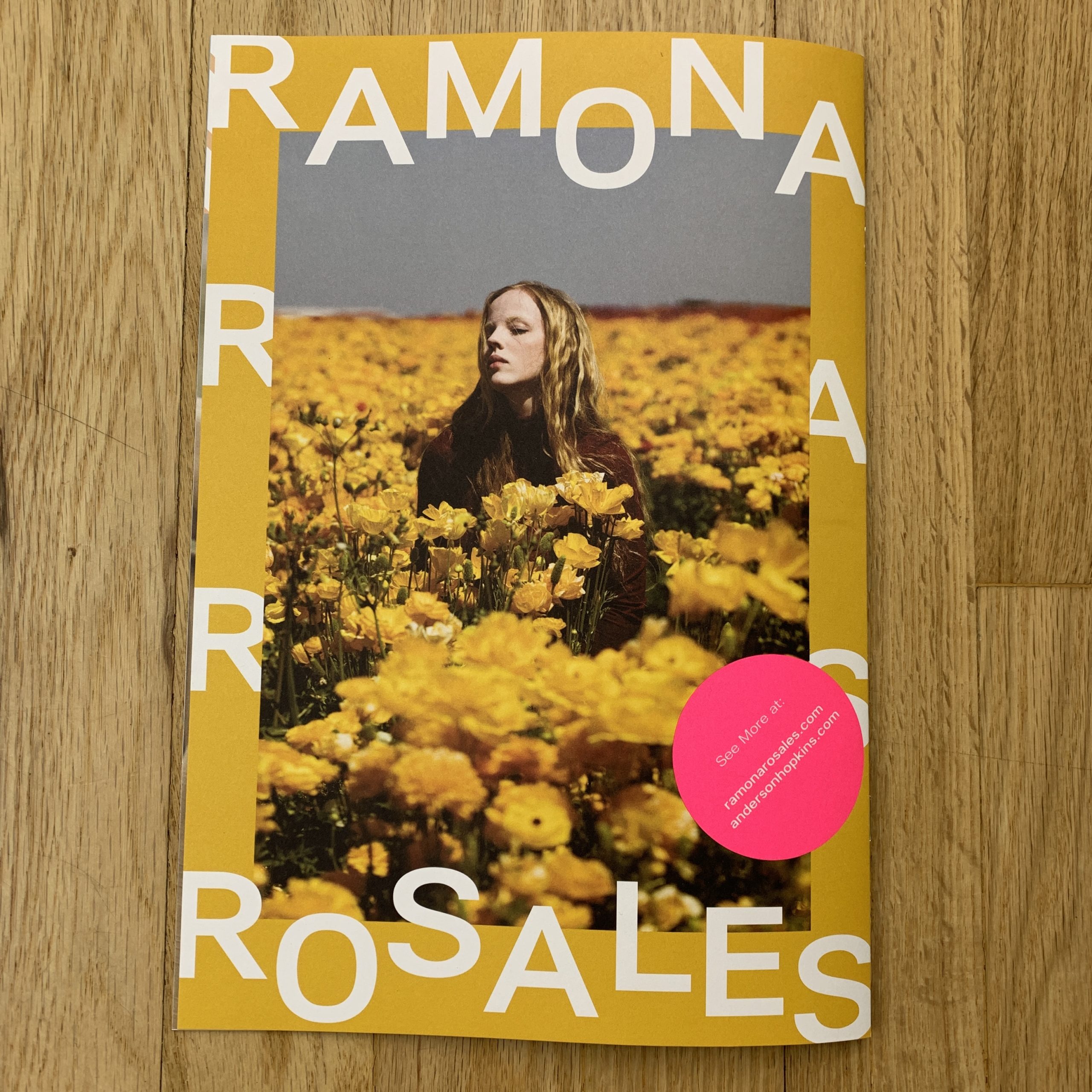
I made a selection of my favorite new work that best showcases what I do and illustrates the type of projects I hope to do in the future. I love to weave color narrative within my promos which is an approach I use for my website, printed portfolio and social media feeds. All of the images are from recent editorial assignments, except for the back cover which is a personal project. The cover is of actor Samira Wiley (shot for Bustle), I wanted to start with a strong image and she just draws you into her gaze. I follow this with two images of Troye Sivan and Grace Vanderwaal, both shot for Billboard Magazine, next to comedian Sarah Silverman (for Bust Magazine). Using design elements in each layout we took take cues from the color used in each image, including the green from the outdoor location featuring rapper Lil Wayne and the sky gradation with the portrait of Emma Stone. Keeping things asymmetrical but simple, we included an image of Grammy-nominated musician Anderson Paak followed by Jessica Chastain and Rapper & Actor Joey Bada$$. Majority of my assignments are entertainment and celebrity based. It’s my priority to share my approach to portraiture and versatility with talent.

How many did you make?
1700, 1500 sent to handpicked contact list made by rep and my own research. 200 are hand given at meetings and at promotional events my rep attends.

How many times a year do you send out promos?
1-2 year

Do you think printed promos are effective for marketing your work?
I think any attempt at getting your work in front of creatives is effective, its another opportunity for your name and your work to be seen by potential clients. With the over saturation of social media, a tangible piece is almost a breath of fresh air, especially to creatives still working with printed production. There are some things that can’t be achieved digitally and this approach has so much potential to spark interest on a different level, beyond scrolling up a feed. I believe creatives are receptive & appreciative of good design and images, especially if you target people who you are aligned with your type of photography & aesthetic. A little bit of homework can go a long way to save you time (and money) by researching your list of clients who you estimate are a good fit creatively.
This Week in Photography Books: Lorena Turner


I used to know Keanu Reeves.

It’s true.

Back in the 90’s, I worked on a couple of movies in New York, just before moving back to New Mexico. One of them, a major Warner Brother production, was called “The Devil’s Advocate,” and starred Keanu, Charlize Theron and Al Pacino.

I got hired as an office intern, was soon promoted to office PA, and then got a second promotion to location assistant. (Before I was fired in winter so they could hire a much more qualified person for the job.)
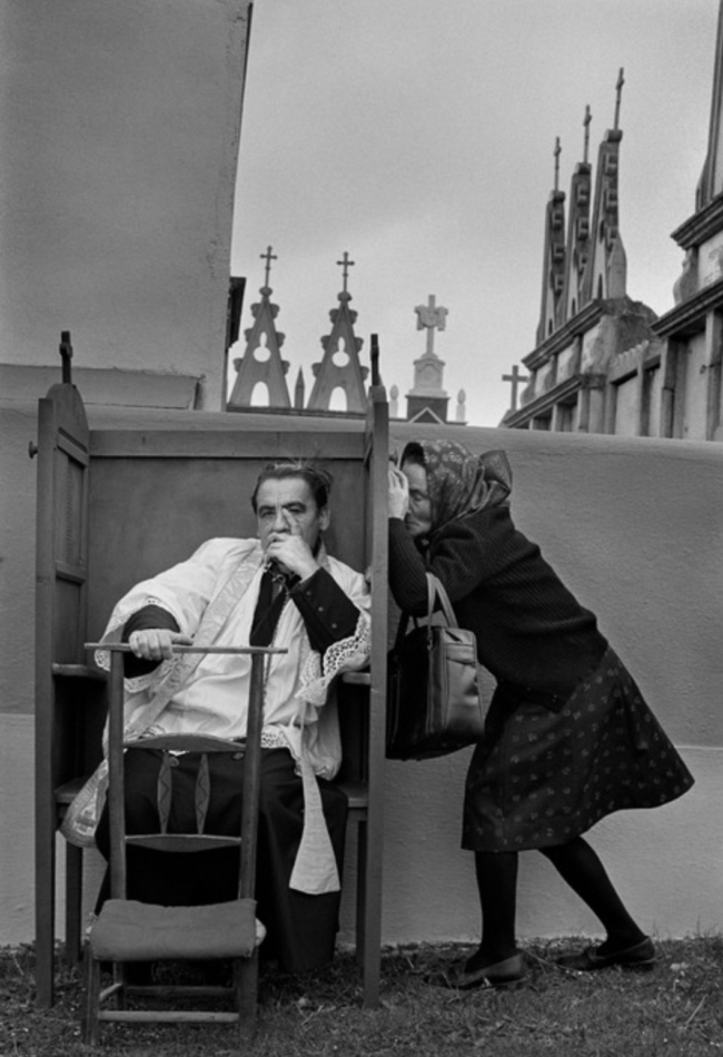
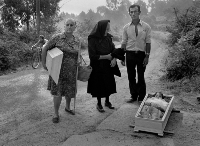
Because I answered the phones, made the coffee and took out the trash well before shooting, I was around to hear the gossip, pick up on the undercurrents, and generally make myself a part of the furniture.

Surprisingly, my fellow intern Sarah, who’d just gotten a film degree at NYU, told me she wanted to date Keanu, and then she went ahead and made it happen.

So it wasn’t that odd, in the end, to hang out in Keanu’s trailer and shoot the shit while he smoked, or keep him company while he was waiting for an actress to come in and test opposite.

The strangest thing was, though, that Keanu Reeves was insanely charismatic in person. He would do voices, and crack jokes.

Personally dripped off the guy.

But then, as soon as the cameras started rolling, he’d become stiff and wooden, and his line-readings made me cringe more than once. (Once a day, maybe. He was really bad.)

It was odd to see him behave one way IRL, but then freeze up, or shut down, once it was time to do his job.

At that point, in 1996, he was still known as the cute guy from Bill and Ted’s who couldn’t act for shit. (And I had to admit the reputation seemed appropriate.)

Then, after “The Matrix” came out, all of a sudden, he was a Sci-Fi action superstar, and his subdued on-screen persona made more sense. It’s hard to re-create the feeling of awe many of us had, seeing that film for the first time, but it obviously never would have worked with another actor.

Seemingly, after that, he went into another fallow period, and got super-into martial arts, so much that he directed a film about a Tai Chi fighter, and acted in an awful Japanese sci-fi Samurai film that ended in mass Seppuku. (Mercifully.)

Fast forward to 2019, and the world is eagerly awaiting the third “John Wick” movie, because Keanu managed to reinvent himself yet again, and his laconic, restrained acting is just perfect, when surrounded by the absurd, almost campy, but extremely-well-done action filmmaking.

While we all grow and change in life, (hopefully,) it seems to me like Keanu Reeves just can’t be understood outside of the context in which he’s seen.

Is he really a better actor as John Wick than he was as Neo, or Kevin, the literal son of the Devil?

I’m not so sure.

And what about that amazing personality of his? Does it change one’s perception of his wooden on-screen-persona to know he’s a hoot as a real guy?

I’m not sure of that either.

But my point today, if you haven’t gotten there yet, is that context really does determine most of how we receive our information, and make the judgements that imbue us with individuality.

It’s why you’re more likely to trust the same story published in the NYT over Fox News. (Or vice versa, if you’re conservative.)

Or why some people, who watched “The Apprentice” for many years, came to believe that Trump was a competent, intelligent, corporate titan. (If you haven’t, read the New Yorker piece on Mark Burnett, which offers a pretty fascinating context in which to view our President.)

Photo books, of course, the subject of this long-running column, rely heavily on context. In fact, I find myself telling students that if they don’t consider it properly, they have no shot at making a good book, much less a great one.

The way a photo book releases its information, teases out its narrative, and gives you what you need to know is as important, in my opinion, as the pictures themselves.

It’s what really separates an exhibition, in which you look at the pictures, (most likely big,) and then try to understand them as objects, from a book, which as I’ve written many times is an experience.

In fact, I was just talking with a book-designer-friend about the fact that even the number of pictures included will determine if a viewer looks at a book in one sitting, ingesting the entire message, or flips through a few pages, puts it down, and then picks it up another time and does the same thing.

Think of a photo book as a story, with a beginning, middle and an end, and the whole process makes more sense. (Unless you love non-sensical, non-linear video art, in which case, go crazy and make whatever weird shit you see in your head.)

I mention all of this because today, I spent some time with “A Habit of Self Deceit,” a self published book by Lorena Turner that showed up in the mail, unsolicited, last fall.

It’s important to me that we now show women and men equally here, as it allows us to present a much broader perspective than when I was mostly showing guys, because that’s what showed up in the post. (Let me say it again here folks, outreach is necessary to make change.)

But just as I don’t normally plan the themes that carry over from week to week, I’ve noticed lately that I’ve been a bit critical of some of the books I’ve reviewed by female photographers.

I doubt anyone else has picked up on it, (and my review of Josée Schryer’s book was glowing,) but as this is a column that embraces criticism, I guess it’s fair game.

This book fits the theme, because the individual images, and the style in which they’re shot, are pretty generic for 21st Century fine art photography. Just as I lambasted the Hartford-MFA-style earlier this month, there is a certain type of dry-but-poetic color photography that makes projects indistinguishable from one another, and I’m sure you know what I’m talking about.

Based purely on the pictures, I’m not sure I’d review this book.

But as I said before, just looking at the pictures misses the point.

“A Habit of Self Deceit” is sad, and as soon as you get into the narrative, that context envelopes the experience like a shrink-wrapped house.

It opens with a short statement in which the artist admits to having contemplated suicide, almost calling a hotline for help, before abandoning the idea. (The piece also misspells Diane Arbus’s name, which I took to be intentional, but what is that supposed to imply?)

The writing is immediately followed by a series of bleak-light pictures featuring things hidden, covered, wilting, and alone.

Boom!
Emotional tenor established.

There are more textual interruptions, each very-well-written, which share that the artist was estranged for her adopted mother for years, but now she visits her in a home for the aging and demented, as her mom no longer knows who she is.

We read a story about how her Dad is likely lonely, living on his own in a new home, and how he visits his wife each day. The story tells us that his own mother married her rapist, and that the family history is not happy in general.

The heavy tale weighs down the pictures, throughout, in the best possible way.

And then, at the end, there’s another text piece that discusses the book’s title, which derived from Jean-Paul Sartre and Simone de Beauvoir. (Obligatory intellectual street cred established.)

Add it all up, and I really enjoyed my time with this book, even though it’s sad, and made me feel glum until I took nice walk in the sun.

If I open it up again, and randomly pick a page, I immediately think, “That picture’s nice, it’s good, but it’s nothing special.”

Really though, so what?

In my personal and professional opinion, I judge the entire book not by it’s cover, but by its gestalt.

And this one is pretty good, all things considered.

Bottom Line: A poignant tale of family and loss

To purchase “A Habit of Self Deceit” click here 

If you’d like to submit a book for potential review, please email me at jonathanblaustein@gmail.com. We currently have a several month backlog, and are particularly interested in submissions from female photographers so we may maintain a balanced program.
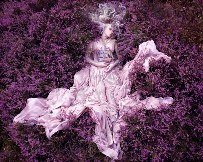
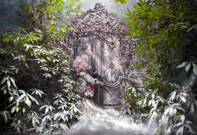
The Art of the Personal Project: Hugh Kretschmer

The Art of the Personal Project is a crucial element to let potential buyers see how you think creatively on your own.  I am drawn to personal projects that have an interesting vision or that show something I have never seen before.  In this thread, I’ll include a link to each personal project with the artist statement so you can see more of the project. Please note: This thread is not affiliated with any company; I’m just featuring projects that I find.  Please DO NOT send me your work.  I do not take submissions.
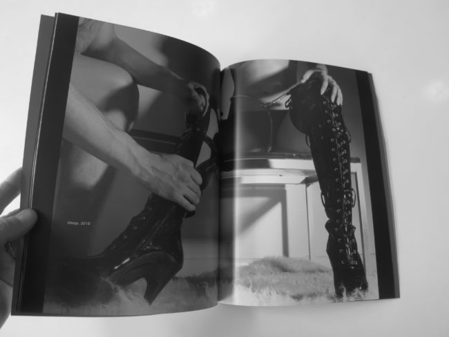
Today’s featured artist:  Hugh Kretschmer

I first noticed a change when I moved back to LA from New York after twelve years.  It seldom rains, and the weatherman is struggling to figure out when El Niño is supposed to arrive; a weather phenomenon that brings heavy rain to this part of the world every seven years. We’re past the seven-year mark.  I remember as a kid looking at the weather page of the newspaper on an El Niño year and seeing in the satellite photo one rainstorm after another coming from Hawaii.  It looked like they were on a conveyor belt, and they actually had a nickname for it – The Pineapple Express. Fire storms are more common than rainstorms, and I’ve been evacuated twice because of brush fires.  And then there are oil derricks out in the bay, a lot of them, and there is a faint smell of crude and a rainbow sheen on the ocean surface.  Like a siren call, it is alluring to the eye but toxic to the touch.

And, if all of this is happening in my home city, I can only imagine what the effects are elsewhere around the world. Add to the mix a prediction by experts that future wars will be waged over water, it is hard to sit on my hands and leave it to the experts, “more qualified than me”, to do something about this.

Then the idea came to me: create photographs around the subject of water but have not a drop of it in the images.  It sat in the back of my mind until I was interviewed by an Arab arts and culture magazine while teaching workshops in Dubai. It dawned on me why this project was gnawing at me when she asked, “Have you ever considered having your work serve a purpose?”  That one question brought it all together as if the universe was telling me to start the project.

“Mirage” has a double message: bring water back to where it once flowed and was pristine; and take a glimpse into dystopian future where the only way to see water in its purest form would be through artificial means. Think museum diorama!

My vision for this project is to ultimately expand my vistas beyond California to the rest of the country, and eventually other parts of world where natural water systems are in peril.  By way of gallery exhibitions, print sales, and an eventual book, I will donate a portion of the proceeds to a non-profit organization dedicated to water conservation — come hell or high water.

To see more of this project, click here.

APE contributor Suzanne Sease currently works as a consultant for photographers and illustrators around the world. She has been involved in the photography and illustration industry since the mid 80s.  After establishing the art buying department at The Martin Agency, then working for Kaplan-Thaler, Capital One, Best Buy and numerous smaller agencies and companies, she decided to be a consultant in 1999. She has a new Twitter feed with helpful marketing information because she believes that marketing should be driven by brand and not by specialty.  Follow her at @SuzanneSeaseInstagram