The Art of the Personal Project: Todd Weaver

The Art of the Personal Project is a crucial element to let potential buyers see how you think creatively on your own.  I am drawn to personal projects that have an interesting vision or that show something I have never seen before.  In this thread, I’ll include a link to each personal project with the artist statement so you can see more of the project. Please note: This thread is not affiliated with any company; I’m just featuring projects that I find.  Please DO NOT send me your work.  I do not take submissions.

Today’s featured artist:  Todd Weaver

I counted audibly…one,two, three, clicking the shutter each time I got to five. I was standing on a mark I placed on the floor of my studio that I could not move from.  While my subjects could move freely, in and out of the frame  indicated by tape marks on the floor.  I did this 36 times continuously, equaling 3 minutes time.

This limitation is the foundation of my new book 36.

The idea came to me a couple of years ago after I bought an Olympus Half-frame camera made in the 60’s.  I became enamored with the black line in between each frame. I imagined the grid of 36 photos not unlike a contact sheet but different.

My subjects: 36 artists that are a part of my artistic community in Los Angeles. People I admire for their art, their humanity and their passion. Many of whom I have known for a decade.

The first person I shot for the book was my friend Devendra Banhart. Our mutual friend Mel Shimkovitz was over at Dev’s house during our shoot  and when I described what I was doing, she interrupted me by saying “yeah, yeah, I get it. You’re doing this whole John Cage thing.”  Using fate and giving up control to define the outcome.  Little did I know the outcome would be capturing my community, something I had been wanting to do for a long time.

The people in the book didn’t know anything about the limitation until they came to my studio. They only knew that it would be shot in black and white against a white wall.

I kept this project a secret for 2 years and I’m thrilled to finally share it.

Andru Sisson

Ariana Papademotroupolis

Devendra Banhart

Elena Stonaker

Eric Johnson

Jasmine Albuquerque

Mark Maggiori

Ryan Heffington

Zak Schlagel

To see more of this project, click here.

To purchase 36, click here

APE contributor Suzanne Sease currently works as a consultant for photographers and illustrators around the world. She has been involved in the photography and illustration industry since the mid 80s.  After establishing the art buying department at The Martin Agency, then working for Kaplan-Thaler, Capital One, Best Buy and numerous smaller agencies and companies, she decided to be a consultant in 1999. She has a new Twitter feed with helpful marketing information because she believes that marketing should be driven by brand and not by specialty.  Follow her at @SuzanneSease.

Dora Somosi’s Journey From Photography Director To Photographer

aPhotoEditor: Can you tell me how you came to work at GQ?

Dora Somosi: I studied art history in college, and I had aspirations of being a photographer, and my incredible, but very practical, Hungarian immigrant parents encouraged me to find a career that would make it possible for me to support myself. I didn’t want to abandon photography, though, so I got a job at Magnum Photos—the agency that owned the archive of a photographer I idolized, the Hungarian photojournalist Robert Capa. I like to say that Magnum was my graduate program in photography history. My time there overlapped with Natasha Lunn and Justin O’Neill, both currently brilliant photo directors, plus uber-agent Liz Leavitt, David Strettel of Dashwood Books, and Chris Boot of Aperture—all formidable influences at the start of my career in photography. It was a brilliant time to work there—because of my co-workers, of course, but even more because of Magnum’s 50 internationally renowned photographers. I got to work with them every day, and every day was hilarious and inspiring, working together as a cooperative, even if sometimes all those talented and strong-willed people in one place made it operate more like an uncooperative. After the experience of being an agent at Magnum, I knew I wanted to be on the assigning side of photography, and so I worked my way through magazine photo departments until I landed my then dream job as the Director of Photography at GQ, working with the design force, Fred Woodward.

aPE: GQ had such a strong reputation for photography during your tenure, can you tell me why it was such a focus for the magazine?

DS: Thank you for saying that. I worked on the visuals for GQ for a decade, and it means a lot to receive praise for all that I accomplished during my tenure there. I was fortunate to arrive at GQ when Jim Nelson was just starting out as editor-in-chief, and he invested a lot of money and attention on modernizing the GQ brand through the use of photography. He let me build a roster that could include a wide breadth of visual styles — Inez Van Lamsweerde and Vinoodh Matadin, Martin Schoeller, Robert Polidori, Ben Lowy. He also gave me the latitude to develop new talent in fashion photography while also being as ambitious as possible with the biggest names in the industry.

aPE: After working with such talented photographers, what made you think you could become one?

DS: I didn’t set out to become a full-time photographer after I decided to leave GQ. It happened organically. I left in large part because I wanted to spend a lot more time with my family and more time outdoors. Maintaining work-life balance everyone talks about had become untenable for me. At the same time, I had identified myself for so long as a successful working woman, and my identity was completely bound up in that professional success. I felt really lost for that first year. That’s when I started taking my own photographs, documenting our family time together in upstate New York.

Once I developed a new body of work, I began sharing it with friends and trusted former colleagues. I feel lucky to be surrounded by so many strong women who appreciated the work and who backed up their words with assignments, shooting artists and interiors and travel destinations.  It was incredible meeting all those other creative women who weren’t at corporate jobs, or on paths to their next job, and who were also successful and fulfilled. In my previous career, I’d come up through institutions, in the editorial and commercial fields. My evolution as a photographer has taken a very different path. My work is personal, and primarily landscape photography—pretty much the precise opposite of glossy shoots for which GQ is so renowned.

aPE: Tell me about your journey from hiring photographers to becoming one?

DS: I was introduced to black-and-white printing at an early age by my step-grandfather who was an accomplished amateur photographer in Hungary, where I was born. I remember pouring over his documentary photography dating back to World War II, in particular, the Russian occupation of Hungary. I’ve been taking photographs since high school, and I studied at ICP when it was still a dilapidated mansion on the Upper East Side. I published work in magazines and had one brief stint as a set photographer on low-budget movies, including one with Michael Showalter. And I took lots and lots of portraits of friends and other people I knew.

When I left magazines to go back to making my own pictures, it was a means to find an identity for myself, one that was just for me and wasn’t tied to being a mother or a wife or a picture editor. I had a successful side business consulting for photographers and independent brands, so I had the room to explore without the pressure of having to sell work.

I learned post production and master printing, and I educated myself about the technical side of making fine-art prints. I studied with Ben Gest at ICP—a brilliant fine art photographer and the most patient teacher I’ve ever known.  I was taking landscapes and still lives, then printing them large scale. In the beginning, they were pure homages to nature—the healing power of the natural landscape, and a sort of love letter slash thank-you note to upstate New York for rescuing me at a crossroads in my life.

But then the 2016 election happened, and suddenly nothing looked as pretty to me anymore. I poured my feelings into my work, digitally manipulating the landscape, and once I started to mess with the images, I could feel my voice emerging as a photographer. That body of work resulted in my first show in Brooklyn, Altered Landscapes. I had a lot riding on that show—I was worried that if I didn’t sell any prints, it would be a clear sign that I should give up. Instead, my show nearly sold out, and my pieces are now in the collections of trustees from renowned art institutions, business leaders, accomplished interior designers wonderful former colleagues from GQ. That show gave me the confidence I needed to keep at it.

aPE: Can you reflect on what it feels like to now to be on the other side and pitch yourself as a photographer?

DS: Well, that has been a real revelation! I wish I’d been this vulnerable while I was a picture editor. To know what it feels like to spend years pouring your heart and soul into this collection of images, and then show them to someone who’ll spend maybe 15 minutes flipping through them with you. I now understand just how thick-skinned you have to be. I always think about my mentor, the late George Pitts, who I worked with at Vibe Magazine and who gave every photographer all his time, his care and his insight. I think his decency came in part because he had his own work, and like all of us he was surely a little fragile about how people reacted to it, and so he treated everyone’s photographs with the care he’d like to receive himself. I’m learning on the fly just how brave you have to be now just to create a body of work from scratch, but also share it with the world, in galleries, in meetings, on social media—everywhere. I’m also seeking out teaching opportunities at places like SVA, mentoring students and working with photographers to help them achieve their vision. When I was working in magazines, I didn’t have the luxury of that kind of time. Now I do and it helps me connect my experiences in agencies and magazines with my current practice.

aPE: Tell me about your show at NeueHouse in LA?

DS: This will be my second solo show, and this time I’m working with a curator and a whole team of people, which is very exciting. Making my photographs is pretty solitary work, so this is a welcome break from that—a chance to collaborate with other creative people on a larger show for a wider audience. This show will focus on a body of work I made in Mexico City. These images, like my other work, begin with a layer grounded in reality, in this case, architecture, and then through color collage, they build into a fantastical, hyper-real expression of my interaction with the city, its people, and its kinetic energy. There are strong influences of Josef Albers’ work in Mexico, the colors from Luis Barragán homes, and the Bauhaus movement.

The show will also highlight my floral work, which will also be on view at ICFF in May. This work has parallels to the Mexico City work in terms of its use of saturated colors, and the tondo format. The florals—records of moments both happy and sad—achieve an eerie sense of perfection, fragile and fleeting, whose authenticity is meant to feel dubious. The flowers, though ravishing in life as in death, serve as the vanitas: a reminder of the inevitability of change. I invite viewers to look with attention at such seductive natural beauty without forgetting all there is to lose. And finally, there will be a preview of photographs I am currently at work on—seascapes, meditations on the horizon inspired by Hiroshi Sugimoto. The simplicity of the seascapes is meant to draw the viewer’s attention to the building blocks of our existence, and the ease with which we can squander the most fundamental elements of life, water, and air.

The Color of Air, an exhibition of new and recent work exploring architectural and environmental abstraction will open at NeueHouse Hollywood on June 28, 2018.

See more of my work at dorasomosi.com
and through IG – @dorasomosiphotography

The Daily Edit – National Geographic: Vaughn Wallace and Randy Olson

Cover illustration by Jorge Gamboa/Courtesy National Geographic

Photograph by Randy Olson / National Geographic.

After sheets of clear plastic trash have been washed in the Buriganga River, in Dhaka, Bangladesh, a woman spreads them out to dry, turning them regularly—while also tending to her son. The plastic will eventually be sold to a recycler. Less than a fifth of all plastic gets recycled globally. In the U.S. it’s less than 10 percent.

Photograph by Justin Hofman / National Geographic
To ride currents, seahorses clutch drifting seagrass or other natural debris. In the polluted waters off the Indonesian island of Sumbawa, this seahorse latched onto a plastic cotton swab—“a photo I wish didn’t exist,” says photographer Justin Hofman.


Photograph by Randy Olson / National Geographic
Under a bridge on a branch of the Buriganga River in Bangladesh, a family removes labels from plastic bottles, sorting green from clear ones to sell to a scrap dealer. Waste pickers here average around $100 a month.


Photograph by Randy Olson / National Geographic
Trucks full of plastic bottles pull into a recycling facility in Valenzuela, Philippines. The bottles were plucked from the streets of metropolitan Manila by waste pickers, who sell them to scrap dealers, who bring them here. The plastic bottles and caps will be shredded, sold up the recycling chain, and exported.


Photograph by Randy Olson / National Geographic
Colored chips of plastic—collected, washed and sorted by hand—dry on the banks of the Buriganga. About 120,000 people work in the informal recycling industry in and around Dhaka, where 18 million inhabitants generate some 11,000 tons of waste a day.


Photograph by Randy Olson / National Geographic


National Geographic: Planet or Plastic


Creative Director: Emmet Smith
Photography Director: Sarah Leen
Senior Photo Editor: Vaughn Wallace
Photographers: Randy Olson, Justin Hofman for images listed above

Heidi: How many countries and photographers were involved?
Vaughn: Our feature spans 52 pages and highlights photography from fourteen different photographers. The majority of the feature was photographed by long-time contributor Randy Olson, who shot nearly 50,000 photos across seven countries.

What was the time frame for this assignment as it involved so much travel for the photo team?  
Vaughn: We’ve been discussing the idea of a large feature focused on plastic around the world for years, but it really started coming together in spring 2017. Randy and I began a period of immense research in early summer, looking for locations where we could show the grand scale of plastic pollution. Shooting took place throughout the fall and winter, with Randy carrying a grueling travel itinerary between multiple countries until late January. In early February, Randy returned to NG headquarters in Washington DC, where we spent several days together editing his entire take, presenting his coverage to the magazine staff and beginning work on the print and digital layouts.

How has your daily use of plastic changed after this project?
Vaughn:During my research on the story, one expert recommended practicing what I came to understand as ‘plastic mindfulness’ – being hyper-aware of how the material has permeated every aspect of our individual lives. One morning, I began to count the number of plastic objects I interacted with, from the moment I woke up to when I walked out the front door. I touched 73 plastic objects in about an hour: everything from the buttons on my shirt to the orange juice container in my refrigerator, the shower curtain and the toilet seat to the snaps on my backpack and my phone charger.

Once you become aware of the scale of plastic waste around the world, it’s hard not to think about the impact of your own consumer choices. It isn’t a matter of cutting plastic out of your life completely as much as reducing extraneous plastic day-to-day. When ordering a soda at a restaurant, ask the server to not bring a straw. When buying just a few items at the supermarket, refuse the plastic bag. So much of our consumer plastic waste is born out of small, mindless convenience.

Working on this project also made me more aware of larger lingering questions. If plastic bottle caps will sit for hundreds of years in a landfill, why are we throwing them away after a single use? If certain colored dyes make a plastic less recyclable, why should we dye plastic at all? In what world do we need to wrap a single banana in plastic film? As depressing as the scale of the problem can sometimes be, there’s tons of potential for future change.

National Geographic’s Planet or Plastic? campaign is a multi-year initiative aimed at raising awareness of the global plastic crisis and reducing the amount of single-use plastic that is polluting our world’s oceans.

I know you’ve done extensive work with National Geographic, whats was directive from the magazine for this feature and what did you hope to share with the world as a photographer?
My directives from NG have always been open ended… stories like the Pygmies are losing their forests…OR the Ogallala Aquifer is being depleted. My friends and family accuse me of being Mr. Gloom and Doom for all the facts I have filed away when I tackle a story with difficult issues. A big factor in survival as a National Geographic photographer has always been the ability to research and resolve your own narrative. It’s the only magazine I know that gives photographers that level of freedom.

So, of course, the catchlines we’ve all been seeing this last year like: “There will be more plastic than fish in the ocean by 2050” OR only 9 percent of plastic waste is recycled—these were part of my thinking. But the focus of the first @natgeo Instagram posts is my main narrative: There are millions of slum workers around the world involved in an informal plastic waste industry that is “always hiring.” This third-world “gold rush” to process plastic waste is an economy with no end in sight. One big reason this will continue is the shale oil boom – companies that are in the early years of gearing up “cracker plants” that “crack”  frack-gas-molecules into mostly single-use-plastic for food packaging. Plans are in the works for more cracker plants that will push peak plastic production all the way out to the year 2100. Despite growing concern and much discussion in the media this past year, these corporations plan for more and more single-use-plastic in our lives.

With burgeoning populations and ramped up plastic production, the only way to reduce plastic waste is to consume less. The zero-waste movement is more established in Europe, but there is a USA vanguard. I photographed a zero-waste-blogger who managed to accumulate only one jar of landfill trash over the last two years She adheres to the movement’s mantra: Refuse, Reduce, Re-use, Recycle, Rot (Compost). In her world recycling is a last ditch alternative to Refuse, Reduce and Re-use.

Are you editing as you shoot each location? The images have a haunting beauty to them, were they difficult for you to to review due the large human imprint we have on the planet.
Yes, I edit as I go along because ultimately I am story boarding a small movie (the movie never is shot but the still pictures need to relate to each other and move the narrative along). So as I shoot and edit day by day I’m looking for bullet points that are missing from the narrative. When I returned from the field, my editor, Vaughn Wallace reviewed the entire take to weigh in on the strength of the images, and we worked together to select photos that build continuity to the story.

Did you have any challenges photographing your subjects in the more rural areas?
I was mostly in the slums and dumpsites of megacities but everyone couldn’t be friendlier. The only bad street vibe I got was in Freeport TX where I photographed aerials of a cracker plant built in a precarious site at sea level. My heart went out to a plastic worker in Manila who wasgreeting mourners at a funeral on the street. His wife (also a plastic picker) was in a shrink wrapped plastic coffin that sat on a street in the middle of the city’s informal plastic waste industry. And photographing artisanal trash picking at dump sites is very dangerous. Many workers have died as they try to pick scraps of plastic while standing on top of a load as it shifted by a huge track hoe. Walls of trash can collapse and bury people, and I needed to be right next to pickers when they are working.

You’ve been documenting stories for National Geographic for sometime and have founded the The Photo Society, what made this assignment stand out for you?
I am amazed by the magnitude of plastic. It was difficult thing to show size and scale and amounts of trash. I wanted to photograph people in relation to the plastic In hopes that it would not add to compassion fatigue about global problems.

How was your daily use of plastic changed after this project?
We live in a world of too many people with too many needs so many of my stories revolve around how resource extraction screws the little guy or the environment. So the idea of getting rid of plastic waste is fraught with problems. What helped me understand how to do this in my life is the zero waste movement in Europe. This charge is being led primarily by young women who are tired of the abuses of consumerism. They educate anyone who is interested in a very kind way, that, for example, adopting a zero waste lifestyle can save you money, time and reduce the plastic waste in the world. So I bought a tin for toothpaste because tooth paste tubes (like potato chip bags) have so many layers of materials they can never be recycled. We recycle and compost for the last 20 years, but we always wondered if it mattered. I realized I needed to do more. My wife bought beeswax resin cotton cloths that we are using instead of plastic wrap for food storage. I bought a stainless container to take to restaurants for carry out. I bought a really cool red double walled titanium coffee container to take to coffee shops. These items in anyone’s personal life means they aren’t buying one-use-plastic that becomes trash in a matter of minutes. The one hard part of recycling is knowing only 9 percent is ever turned into plastic objects…and now there is more pressure and fewer options since China stopped taking a lot of our plastic waste.

The Daily Promo – Cedric Angeles

Cedric Angeles

Who printed it?
Newspaper Club in the UK. www.newspaperclub.com I have always liked Newsprint and Newspaper Club was an easy choice. I uploaded my layout to their website and they turned it around fairly quickly.

Who designed it?
I designed it myself. My wife, who is an artist, helped me with editing the images. My priority was to make it simple and make it all about the images. And more importantly, I wanted the process of making the promo to be quick and easy. Once, I had the final images, going to press went quickly.

Tell me about the images?
The Images are part of an editorial story originally commissioned by British Airways High Life Magazine. I went to Mexico City to document the art scene; photographing established and up and coming artists, gallerists, galleries, museums and the city itself. It was a fantastic assignment.

How many did you make?
I had 150 printed. Sent to my favorite editorial and advertising clients.

How many times a year do you send out promos?
I actually have not sent a promo out myself in years. My previous agent handled it for me and that worked out well. I am not a big promo person and not because I don’t want to do it, sometimes I just get too ambitious in the design phase that it takes too long and I never gets done. I am sure most photographers are guilty of doing the same thing. So, I am trying to change that this year, hence the simple design of the “Angeles Journal” promo. I am planning to print 4 of the Angeles Journal during the year, a quarterly. And using my favorite commissioned and personal stories per issue. A big reason for this promo is that I love to share these stories the way I visualize it with my own edit after it comes out in the magazine version. To be able to lay out my own version is always exciting.

Do you think printed promos are effective for marketing your work?
I think printed promos are effective if you make it personal. And that is very subjective. I am also a big believer in sending to smaller client list instead of sending out thousands. Pick your favorite your clients, keep it small. I established myself at the beginning of my career as a magazine photographer, so I love print. I think printed promos if done right is the most personal way to share your work, hopefully, that makes if the most effective.

This Week in Photography Books: Katsu Naito


Once upon a time, Billy and Sally Bunny were frolicking in the front yard.

Behind them, Aspen trees swayed in the light breeze; the leaf-flutter shadows dancing on the wall.

(Yes, bunnies know what shadows are. Duh! What did you think, bunnies were dumb, because they have small brains?)

Sally Bunny had her back to the trees, and the rich, red fence behind them. Billy Bunny faced her, his back heels sitting on the concrete steps that divided the front yard in two equal parts.

(Of course bunnies can do math. Get with the program!)

Sally and Billy faced off, and then Sally pounced at Billy, her front legs a blur, like vintage Cassius Clay, as they forced Billy back.

“I didn’t have to step back, you know. I wanted to,” he taunted.

“You wanted to? Are you fucking kidding me? I made you step back. My Bunny-Fu is far too quick for the likes of you. Puny bunny,” Sally replied.

“Oh yeah, let’s go again. Again, I say. Again!”

The bunnies resumed their positions, and upon some instinct-driven signal, Sally pounced, and Billy retreated.

Again.

“I did it again! Admit it. You’re no match for me.”

“Whatever. You’re faster. A better bunny-fighter. I get it. You win. Satisfied?”

“Not really. When you put it like that, it takes all the fun out of it,” Sally said.

“Fine. I’ll try again. You’re the best bunny fighter I know. Much quicker than I will ever, ever, ever be. (Pause) Is that better?”

“I’ll accept it.”

“Do you think the humans know we can see them,” Billy asked?

“What do you mean, do the humans know we can see them?”

“Standing there at the window. The four of them. Do you think they know that we know that they’re watching us,” Billy wondered again in earnest?

“They must know,” Sally replied. “They must. How could they not? Just because they’re humans, and we’re bunnies, that doesn’t mean we don’t have eyes and brains? That we can’t distinguish a human from a hawk from a field mouse? Why would they think that?”

“Good point, cousin. That wouldn’t make any sense. They must know we can see them, and that we can talk to each other, same as they can. And that you’re a better fighter than I am, but my Greek Salad is the bomb.

“Speaking of which, I hope the human boy watches “Chopped” again tonight so I can pick up some more tricks,” Billy said, and then the two bunnies hopped off.

END SCENE.

We watched those bunnies this week, after my daughter noticed them facing off. I’m 100% certain the above story is true, and you’ll never convince me otherwise.

But I thought about the whole thing again today after looking at “Once in Harlem,” a new photobook by Katsu Naito, published by TBW Books in Oakland.

Man, is this a cool book.
I love it.

(Pause)

Now that the transition is over with, I have an announcement to make. This is the first week in many months that I didn’t publish a female photographer in this slot.

I made up my own rule to alternate male and female photographers, as a way of creating a balance to a book selection that had become wholly unbalanced. (Almost all men.)

Today, (I’m writing on Thursday,) I honestly didn’t have a book in the stack I could review by a female artist, and I’ve put out the call many ways, as you’ve seen. I’ll do more outreach in the coming weeks, and do have a potential book for next week that is reading-heavy, so I’ll get started on that first thing Monday morning.

But I’m not going to compromise the integrity of the column, and am featuring a photographer of color today instead, so I think that satisfies the spirit of diversity we’re trying to foster here at APE.

Back to the book.

The end notes confirm that the Katsu Naito lived in Harlem from 1988-94, but really, it doesn’t matter.

The looks on the subjects faces, of suspicion, disdain, hopeful curiosity, sardonic humor, or straight-up-stare-down, are so damn good.

Some of these people look at Katsu Naito like he’s an Alien with three arms sticking out of his head. Or the Earth-bound ghost of Andre the Giant.

Or a talking bunny!

This book is one of the rare occasions where you really don’t need words at all.

We can imagine them.

When I looked at one photo, I heard Gary Coleman’s voice spontaneously in my head, “Whachoo talkin’ ’bout, Willis?”

(I swear.)

And when I got to the picture of the little baby holding a bottle, mad-dogging the camera, I nearly peed in my pants. (And I never pee my pants.)

Oh man, this stuff is funny.

It’s rare that photographs so clearly depict the residue of the interaction between photographer and sitter. The exchange is written all over their faces.

The photographs are evidence that getting out of your lane in life can provoke strong reactions, but also opportunities for massive growth and new knowledge.

I don’t know Katsu Naiuto personally, but I’d be willing to bet he came out of his time living in Harlem, (six years,) a wiser, different person.

It serves as another great reminder why supporting diversity matters. When people from different backgrounds and cultures mix, new ideas emerge.

Until next week…

Bottom Line: Fantastic portraits by a Japanese guy in Harlem

To purchase “Once in Harlem” click here

If you’d like to submit a book for potential review, please email me at jonathanblaustein@gmail.com. We are particularly interested in submissions from female photographers. 

The Art of the Personal Project: Clay Cook

The Art of the Personal Project is a crucial element to let potential buyers see how you think creatively on your own.  I am drawn to personal projects that have an interesting vision or that show something I have never seen before.  In this thread, I’ll include a link to each personal project with the artist statement so you can see more of the project. Please note: This thread is not affiliated with any company; I’m just featuring projects that I find.  Please DO NOT send me your work.  I do not take submissions.

Today’s featured artist:  Clay Cook

While stationed in Tanzania in 2015, the crew and myself met a man named Adrian McCrae who had been casually enjoying a Kilimanjaro Beer at the Mount Meru Hotel bar. Adrian owned a mining company in northern Australia and did a lot of humanitarian work throughout Tanzania, but his passion was paragliding. We soon came to discover, Adrian led an expedition entitled Wings Of Kilimanjaro, in which a group of brave paragliding pilots trek up Mount Kilimanjaro and sail off the top. He and his expedition are the only group allowed by Tanzanian law to make the jump, as they are one of the leading charitable organizations in Tanzania. Top paragliding pilots from all over the world raise thousands to have this adventure of a lifetime.

When I learned I would have the opportunity to scale the highest free-standing mountain in the world, Mount Kilimanjaro, I was on my death-bed at 311 pounds and 50% body fat. One year later, I set foot on the summit of Mount Kilimanjaro. Then, along with an expedition of 16 professional pilots, attempted to paraglide off the summit. I had lost nearly 130 pounds and helped raise nearly half a million dollars for clean water and education in Tanzania, Africa. Although our project Wings of Kilimanjaro pulled off an amazing feat and set a Guinness World Record, I believe our greatest accomplishment was not sailing off a volcano at 19,341 feet. Our triumph was raising nearly a half-million dollars for the progress of education and clean water in Tanzania. Kilimanjaro had set a beacon, sparked a fire and cleared a black cloud. It was a gift, that solidified my wellness journey and provided a new sense of strength. I guess you could say it saved my life.


To see more of this project, click here.

APE contributor Suzanne Sease currently works as a consultant for photographers and illustrators around the world. She has been involved in the photography and illustration industry since the mid 80s.  After establishing the art buying department at The Martin Agency, then working for Kaplan-Thaler, Capital One, Best Buy and numerous smaller agencies and companies, she decided to be a consultant in 1999. She has a new Twitter feed with helpful marketing information because she believes that marketing should be driven by brand and not by specialty.  Follow her at @SuzanneSease.


Pricing & Negotiating: Comparing Two Bids with Identical Concepts

Jess Dudley, Wonderful Machine

Concept: Employee profile in multiple workplace situations

Client A: Fortune 500 professional services and consulting company

Client B: Fortune 500 insurance company

Here are the estimates:

screenshot of a pricing estimate for a professional services and consulting company

Estimate for Client A 

screenshot of a pricing estimate for a large insurance company

Estimate for Client B 

I thought it might be interesting to present two bids for very similar projects, in similar markets, shot by comparably experienced photographers, for two different Fortune 500 companies with wildly different bottom lines.

One client (A) was a professional services and consulting company, the other (B) was a large insurance company. Both concepts were nearly identical – profile an employee, shoot in a few different situations in/around the workplace in an “editorial style,” with a change or two of wardrobe ranging from street clothes to active-wear to business attire. The resulting imagery would effectively be the same from both shoots.

There was a subtle but significant disparity in the usage; Client B required more limited use (just Web Collateral) of an unspecified number of images for one year. Client A required a slightly broader use (Collateral and Publicity) of an unspecified number of images for a much longer duration (forever). Despite not being willing to limit the usage to a specific number of images, they both expressed reasonable expectations, 3-5 finished images. Generally, we prefer limiting the usage to a set number of images, but considering the nature of the concepts and usage, it was pretty clear that whatever value they might be able to squeeze out, the entire shoot would be limited by the fact that we were shooting just one subject in 2-3 different scenarios. The variations would be subtle and likely wouldn’t generate a significant amount of value relative to the hero images. As such, we were comfortable foregoing the limitation on the number of images in both cases.

The other divergence was in the production expectations, which varied quite a bit. Client A expected a low-impact, editorial-style approach, while Client B expected a more comprehensive approach with a fair amount of production support, replete with a tech/scout day, stylist, digital tech, supplemental wardrobe, and catering.

What’s most interesting and noteworthy is the difference in the overall budget allocated, and specifically the photography fees. Bear in mind these are two companies that operate on the same scale. We were only able to muscle out a $1,800 creative fee from Client A, including the more extensive usage. Our first bid was more than double the bottom line shown here and we were ultimately presented with a take it or leave it budget. On the other hand, Client B accepted a $5,500 creative fee for more limited usage.

There are countless justifications for the discrepancy. Organizational structure, intended use (passive profile page vs. an internal campaign), the importance of the subject, fiscal timing (one may have had money to burn, who knows), audience (consumer, trade, internal, external, etc.) all factor into the value a client attributes to any given project.

Licensing value is subjective, driven more-so by the client’s expectations than anything else. Until we determine otherwise, we approach each potential project and bid with the assumption that the client has high expectations for quality and a budget to match. From there, we sometimes whittle down as needed to land the gig, while avoiding the pitfalls of underbidding (leaving money on the table, doing more production work than agreed to, etc.).

If you have any questions, or if you need help estimating or producing a project, please give us a call at 610.260.0200 or reach out by email. We’re available to help with any and all pricing and negotiating needs—from small stock sales to large ad campaigns.

Peloton Magazine: Paolo Ciaberta

Peloton Magazine

Creative Director/Photo Editor: Tim Schamber
Photographer: Paolo Ciaberta


Heidi: How did the project come about and is this the first time you’ve worked with Peloton?
Paolo: My first collaboration with Peloton was in 2014, I proposed a reportage about the cycling path from Venice to Turin along the Po river. The Morocco trip my friends and I were looking for a ride in an exotic place but not too far from Italy where I’m based so it was a perfect opportunity.

How long did the trip take?
Due to work commitments we decided on 7 days for the entire trip. One day of transportations and six days to ride. Average 80-90km/day, not too much because we don’t want to only pedal but also discover people and places.

Do you often ride, write and shoot?
While I wrote the article, I’m not a proper writer but in this instance I tried to communicate my experiences and sensations, in addition to some technical details. For longer and more articulated articles I prefer to work with professional writers.

How difficult was the photo edit and approx how many images did you take?
More or less 600 images for the entire trip. There are two different aspects that I consider while editing.  First is selection of the images and second the post-production; I don’t like too much elaboration on my pictures.  I make little adjustment of levels, lights, shadows and contrast. I think that photo reportage should be real as possible, too much editing makes images artificial or constructed.  The trick is to find the right balance and choose the photos that best describe your work

Was it difficult to protect your gear from the travel/weather?
After years of experience I’ve achieved a good level of protetcion for my equipment, Olympus Italia provided me an excellent mirrorless camera (Pen F) that is easy to transport due to its small size but also resistant to bad weather. Basically the biggest problems during bike packing trips could be dust, rain, condensation and vibrations. Rain in Morocco is rare but dust and condensation could happen, a good plastic bag with smaller little salt bags solve the problem and you can go everywhere. Furthermore I use little stripes of foam rubber to avoid the vibrations when the camera is in the bags.


This Week in Photography Books: M L Casteel


Last Friday, my dog died, and I sold my car.

In the same morning.

By Monday, I had a better car, and a profound sense that a new phase in my life had just begun.

You can dismiss it as Taos-New-Age-mumbo-jumbo if you like, but in my experience, our lives are almost always divvied up into chapters.

You move.
Take a new job.
Break up with your spouse.
Have a falling out with your friends.

Sometimes, the delineations between one iteration of our “self” and another are hard to parse.

Other times, like last weekend, it’s impossible to miss the signs. (Especially as I traded up to a much nicer ride.)

By now, if you’ve been reading this column for a long time, you’ll know I had privilege, comfort and safety in my childhood. My father was a lawyer when I was young, so we had a nice house, and nice cars.

Harvey drove a Mercedes, a BMW, and a Porsche at different times, back in the 80’s and 90’s. (Now, it’s a sensible, 4 cylinder Honda SUV.)

Throughout my childhood, it was always assumed I’d be a lawyer, like him. Everyone I knew, adult-wise, was a lawyer, doctor, dentist, accountant, stock-broker, bond-trader, or something of that ilk.

Ending up as an artist, living in New Mexico, was a pretty hard left-turn. (If I had told my 15 year old self where I’d end up, I think he would have had a nervous breakdown.)

But the one thing I never, ever, ever would have considered doing as a career?

Going into the military.

If you’d told the 15 year-old-me to make a list of professions, soldier would have been at the bottom of the list.

For real.

Following orders. Shaving your head. Getting yelled at. Sleeping in uncomfortable beds. (Or no beds at all.)

No thank you.

And one more thing: you might get exploded by a bomb, shot in the head by a sniper, or gutted with a hunting knife by an angry Afghan on a mountain-top, far from home.

That last bit, the part about potentially getting killed in awful ways, meant that I never thought, for even one second, that I might join the Army.

Or the Marines.

Never, ever, ever, ever.

It’s a class issue, basically. Given the culture in which I was raised, and the opportunities that were presented, (some of which I chose to spurn,) I didn’t have to think about joining up.

The American Military, since the end of the draft, has become progressively less a representation of the entirety of America, and instead is heavily populated by certain demographics.

It’s overwhelmingly Christian, and features so many men and women from less-privileged circumstances, and rural areas that lack economic opportunity. In many places, joining the military offers a job where there may be none at home, plus training, money for education, and the chance to see the world.

What it does not offer is a decent living, financially, or an obvious path out of poverty. (I guess maybe Colonels and Generals make some bank, but I’m pretty sure you don’t get to be an officer by being a grunt-private-from-the sticks.)

I get tired of these rants sometimes, but it’s egregious that the people who we hire to fight and die get paid so poorly.
And they suffer from mental illness to alarming degrees, with suicide rates that are beyond acceptable.

This is the America we’re living in, and I’ve been considering such things this morning, having just put down M L Casteel’s excellent “American Interiors,” a new book by Dewi Lewis in Manchester, with essays by Jörg Colberg and Ken MacLeish.

I was curious about the concept, when I was first made aware of the book, but was far more impressed once I got to see the actual photographs.

The idea is that M L photographed the inside of veteran’s cars as a way of presenting metaphorical portraits. It’s a concept that makes sense, but also seems like it could easily skew gimmicky.

Thankfully, the pictures preclude that from happening.

There are American Flags, as you might expect. And Bibles. Lots of pictures of Jesus.

But also more canes that I cared to count. Cane after cane, each representing a mangled limb, injured joint, or maybe a body worn out from the all-of-it.

It’s hard to see the canes and not feel something inside.

The dirty underwear is heart-breaking too.

So many filthy cars.
So many stained cloth seats.

It feels like Chaos to me, and this comes from a guy who’s next clean car will be his first.

These are not the type of photographs that will fly off the walls of a commercial gallery, because they’re hard to look at, and use the anti-aesthetic fully, but not to the point where anything looks pretty.

The messages about poverty, religion and neglect are simply un-missable.

I may have dropped nearly 1000 words on you, but the best part of a book like this is once you know what’s going on, (it starts with an intro-stats-page that sets the scene,) the pictures do all the talking.

And the point, sad though it may be, comes through loud and clear.

Bottom Line: Cool, smart, poignant look at soldiers’ cars

To purchase “American Interiors,” click here

If you’d like to submit a book for potential review, please email me at jonathanblaustein@gmail.com. We are particularly interested in submissions from female photographers. 

The Art of the Personal Project: Gustav Schmiege

The Art of the Personal Project is a crucial element to let potential buyers see how you think creatively on your own.  I am drawn to personal projects that have an interesting vision or that show something I have never seen before.  In this thread, I’ll include a link to each personal project with the artist statement so you can see more of the project. Please note: This thread is not affiliated with any company; I’m just featuring projects that I find.  Please DO NOT send me your work.  I do not take submissions.

Today’s featured artist:  Gustav Schmiege

Fire Roasted in Williamstown, MA


To see more of this project, click here.

APE contributor Suzanne Sease currently works as a consultant for photographers and illustrators around the world. She has been involved in the photography and illustration industry since the mid 80s.  After establishing the art buying department at The Martin Agency, then working for Kaplan-Thaler, Capital One, Best Buy and numerous smaller agencies and companies, she decided to be a consultant in 1999. She has a Twitter feed with helpful marketing information because she believes that marketing should be driven by brand and not by specialty.  Follow her at @SuzanneSease. Instagram at suzanne.sease

The Daily Edit – Rollacoaster: Justin Campbell

Rollacoaster Magazine

Fashion StylistMorgan Pinney
Photographer: Justin Campbell


Heidi: What type of direction did you get from the magazine?

Justin: I love working with Rollacoaster because they give you a lot of creative freedom. The concept we came up with was this idea of “Summer in Suburbia.”

Describe the shoot, it looks like you two were simply hanging out. 
Cameron and I have shot a lot together, (below is an image from a previous shoot) so in a sense it felt like that when we were working, that we were just hanging out.  We wanted the story to feel like it could be Cameron’s parallel life as a 23-year old in the suburbs (If he wasn’t one of the highest followed influencers and world famous). The stylist Morgan and I wanted the clothing to feel like they could be pieces from Cameron’s own wardrobe. The house we rented felt like it could be Cameron’s home.


Did you direct him at all?
Every image is orchestrated. What is amazing about Cameron is the spontaneity and playfulness he brings to set. I find that the final picture always exists somewhere between what was in your head before the shot and what the subject brings to the table. I’ve always approached my work as a living dialogue between my ideas and the person I’m shooting.

Did you think twice about what to wear?
I wear a uniform everyday. I own 40 of the same black t-shirt and 6 pairs of the same black jeans. I only switch up my shoes and jackets. When I’m working I don’t want to have to think about what I’m putting on in the morning.

Was this your first shoot with Rollacoaster?
This was my first shoot with Rollacoaster. We have a lot more coming out soon!

Where is the magazine based?
The magazine is based in London. My favorite city!

How many covers have you done with Cameron?
This is the third cover Cameron and I have shot together. He is a great friend and collaborator.

Do you skate?
I don’t.


The Daily Promo – Lila Lee

Lila Lee

Who printed it?
I was actually visiting my sister who currently lives in China, & found a local shop that did it out there. It was hard communicating what I wanted because I’m not Chinese & unfortunately can’t speak any, but I was pleasantly surprised with how they turned out.

Who designed it?
I did it, myself.

Tell me about the images?
My parents had planned a month long trip to Korea to visit all my relatives, but that was about the same time people were dying from SARS. It didn’t reach Heuksando, where my Grandma lived, so we ended up staying on the island for the whole month because everyone said going into the city was too dangerous. In a way, it was nice being able to stay for a longer period of time to really be able to see how my Aunts & Uncles lived day to day rather than when the family came on vacation. I shot these photos, going with them to work or roaming around the island because this is part of my family’s history. This island is part of my family & learning about them is important to me. I never really knew my extended family growing up because my parents moved to Hawaii before my sister & I were born. Taking photos of my family is kind of a compulsion, I guess. Even if no one ever sees them, I still have to. I was always a sentimental child & I think that bled into my photography. Preserving a memory is more important to me than how it looks. I ended up making this zine because my aunt said she wasn’t sure if anything would be left of this island in 10 years with everyone moving away & places deteriorating. I hope someone will see these photos & want to visit before it’s too late. And I really hope in 10 years I can take my kids to visit their great Aunts & Uncles & experience the quiet wonder that’s Heuksando.

How many did you make?
100

How many times a year do you send out promos?
I don’t have a set time or amount I sent out a year. I’m constantly making things just because & will send some stuff out as a promo if I feel like maybe a possible client might enjoy it. I know others make new promos twice a year & send them out like clockwork, & that’s what Art Center taught us to do, but I think the things I make are sometimes more personal than just promotional pieces so it’s hard to put a timeline on it.

Do you think printed promos are effective for marketing your work?
Yes, I personally love printed work! Having something to hold & look at is nice. I just had a new photo book published, so I’m currently touring the middle to the east coast with it. People look through the book & strike up conversations, which has led me to meet a lot of great people.

This Week in Photography Books: Barbara Diener


Nobody likes a know-it-all.

It’s the reason some people hated Barack Obama so much. (Including my own aunts and uncles.) Obama was so confident in his intelligence, so suave in his mojo, that he never really thought to mask either.

Some people, insecure though they may be, find that sort of attitude arrogant, and the use of mental acumen as “professorial.” (Despite the fact that being a professor is a high-status job, the term is normally used as a pejorative.)

Arsene Wenger, the legendary Arsenal soccer coach, who stepped down recently after 22 years, (it wasn’t voluntary,) was painted with the same brush. With his oversized glasses, big 90’s suits, and weird Gallic accent, he was an easy target. (I still maintain that Sacha Baron Cohen imitated Arsene in “Talladega Nights.”)

Beyond the perception of arrogance, the other main irritant is that people don’t like being “lectured.” It’s a subset of reality that people don’t like to be told what to do in general, but they hate being “lectured.”

In college, a lecture is a positive experience. It’s where you go to learn, and hang out with friends and colleagues.

Lectures are where we build community.

As an opinion columnist, (and long-time professor,) I’m always in that place; trying to inform, but not lecture you or get preachy. It’s always best to stop before enough is too much, but knowing there’s a line, and then trying to find it, is tricky.

I try to keep the direct-admonitions and from-on-high-proclamations to a minimum, but I don’t avoid them.

Today, for instance, I want to go back to that word: community. It’s something many of us crave, and it needs to be watered and nourished when it does spring into being.

But man, getting people together, not knowing exactly what will happen, but knowing FOR CERTAIN that good things will come, it’s a great feeling.

I’ve learned about it watching others, and recently wrote of the New York Times efforts to foster diversity IRL. In the 9 years since I first went to Review Santa Fe, I’ve learned about community-building from other festivals, like Center, Filter, Photo NOLA, and Medium.

As I’m building Antidote, our photo retreat program here in Taos, one thing I’ve realized, FOR CERTAIN, is that artists do better when they have a support group of fellow artists.

The job is too difficult, too original, and so many of us “work” alone. Plus, there are so many intricacies to marketing, and building a career.

Success as an artist is like raising a child: it takes a village.

So when I went to Chicago last week, to meet a few consulting clients and hang out with my friends, I decided to arrange an Antidote Meet Up, as two of our 2018 Session 1 students live in the city, and another lives three hours away in Indianapolis. (I was confident she’d drive in, and she did.)

I knew these ladies would hit it off in August, when they met here in Taos, so why not let them become friends/colleagues a few months earlier? They’d have each other as sounding boards all-the-sooner.

The four of us booked a gallery tour last Thursday afternoon. In that same spirit, I invited two young, talented, female photographers to join us, just in case they were free.

The more the merrier.

One of them, Barbara Diener, was featured in this column last year, as the former-Santa-Fe-artist I bumped into on the street in Chicago. (After I paid for a Buddhist blessing in what is a really long story.)

Barbara, who moved to Chicago to get an MFA at Columbia College, is now the collections manager in the photo department at the Art Institute of Chicago, and graciously, generously offered to host our meet-up at the museum.

For free!

How classy is that?

In what can only be described as that good-Chicago-juju I’m always writing about, our group then bumped into legendary photography curator Anne Wilkes Tucker, as she was ducking into a private tour.

She stopped what she was doing, came over, met the group, and told everyone about her new exhibition, curated from the Library of Congress collection, that’s currently on display at the Annenberg Center of Photography in Los Angeles. (Go see it. I’ll be catching it in July.)

What are the odds of that happening?

1 in a million?

I got to introduce a group of female artists to one of the most important role-models this industry has ever seen. All because I chose to follow those instincts towards being generous with my new-found ability to bring people together.

One of the students was running late, shortly before we all met Anne, so Barbara was kind enough, at my request, to do a little presentation on her new photo book “Phantom Power,” recently published by Daylight, with essays by Allison Grant and Gregory Harris.

As professors, we encourage our students to dig into their own experiences, and mine their own lives, their expertise, to find the strands of curiosity that lead to exploration.

Formally, this takes shape in a “project,” but really that’s just a fancy word for our artistic inquiry, and, best case, a mastery of certain visual skills.

Barbara explained to us that she was thinking about her father’s death, as he’d died suddenly, and it was obviously impactful. (One of our students, Jessica Paullus, is dealing with a similar experience in her work.)

Barbara grew up in Germany, before moving to America, and was exploring farm country in Illinois that reminded her of the landscape of her youth. She met a woman named Kathy, and they spoke of ghosts.

It was a thread, and she pulled at it.

Eventually, she met a medium named Irene, who claims she can connect to the dead.

(Obviously, it’s a much longer story, and hopefully I’ll have a chance to revisit it, but the night before I saw Barbara’s book, I found myself in conversation with the ghost of Garry Shandling, via a medium named Jim, over a Subaru-bluetooth-phone-system.)

Back to the book.

The use of color here is strong, and worth mentioning, because on second viewing, I realized, (surprisingly,) that the book is not creepy.

Or scary.

It’s not really haunting at all. The photographs metaphorically deal with the practice of communing with the dead, and reference spirit photography. (Including all the lights.)

They’re moody, sure, but there are rainbow colors throughout this book. Pops of illumination everywhere. One picture simulates a field of fireflies.

Who doesn’t like fireflies?

There is a short story insert, which Barbara wrote, that tells of her first meeting with the medium Irene, in a group setting, in which she purported to speak for Barbara’s Dad.

But in a second, private session, held later, Irene at first forgot, and believed Barbara’s father was alive and well.

It’s hard not be cynical about the underlying premise, unless you believe in ghosts. (Do you?) Barbara admits in the text she’s a cynic.

When I was talking to Garry Shandling’s ghost, all I could think was, “Stay open. Stay open.”

Meaning: experience this as intrinsically real, in the moment, because it will be more fun that way. Can I say I’m 100% certain I’m NOT talking to Garry Shandling’s ghost?

No, I can not.

Because I stayed open, I had an experience I’ll remember for the rest of my life.

The short story echoes the sentiment. In the end, once Irene figured out that Barbara’s Dad has passed on, she told Barbara her father said he loved her.

He never said that in life, she writes. (Heart-breaking stuff.) But once it was said, she felt better, and was able to move along.

That’s why this book isn’t creepy, even though it’s about ghosts.

The dead.

Instead, it’s a weird, sci-fi, love-letter, and what more could you want, really?

Bottom Line: A look at ghost culture in the country-side

To purchase “Phantom Power” click here

If you’d like to submit a book for potential review, please email me at jonathanblaustein@gmail.com. We are particularly interested in submissions from female photographers.

The Art of the Personal Project: Tom Hussey

The Art of the Personal Project is a crucial element to let potential buyers see how you think creatively on your own.  I am drawn to personal projects that have an interesting vision or that show something I have never seen before.  In this thread, I’ll include a link to each personal project with the artist statement so you can see more of the project. Please note: This thread is not affiliated with any company; I’m just featuring projects that I find.  Please DO NOT send me your work.  I do not take submissions.

Today’s featured artist:  Tom Hussey

Last year my producer and I decided we were going to travel once a month to shoot personal work.  It was an ambitious goal and we only had to completely cancel one trip. Thankfully we were able to reschedule other trips around jobs and wound up completing 11 trips for the year.  In January, we decided to go to the World’s Largest Ice Fishing Tournament — The ICE FISHING EXTRAVAGANZE at hole in the Day Bay, on Gull Lake just north of Brainerd, Minnesota.

We hired a local assistant who was also an ice fisherman, which helped a great deal since I am from Dallas, Texas, and had never stood on a frozen lake.  Driving a two-ton pickup truck out on to a completely frozen lake with 20,000 holes drilled into the ice (visualize Swiss cheese) was a nerve-racking experience for me. Once we reached the “City on Ice” I was amazed at the over 18,000 fishermen on the ice, ready to go in the -10 degree weather — they actually told me it was a warm year!

Photographing the fishermen and the ice fishing lifestyle lead me to truly appreciate the sport and the camaraderie of the participants. The ICE FISHING EXTRAVAGANZA is a charitable event that awards over $150,000.00 in prizes to the contestants while raising over $1,000,000.00 to the area and to local charities.  If you ever have the chance, I say GO FISH!

To see more of this project, click here.

APE contributor Suzanne Sease currently works as a consultant for photographers and illustrators around the world. She has been involved in the photography and illustration industry since the mid 80s.  After establishing the art buying department at The Martin Agency, then working for Kaplan-Thaler, Capital One, Best Buy and numerous smaller agencies and companies, she decided to be a consultant in 1999. She has a new Twitter feed with helpful marketing information because she believes that marketing should be driven by brand and not by specialty.  Follow her at @SuzanneSease.


Expert Advice: Printing with Lightroom

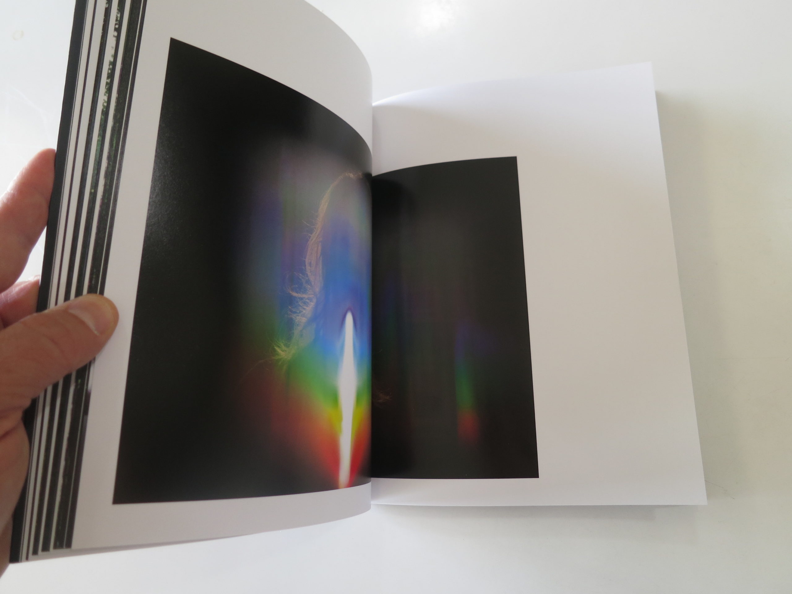
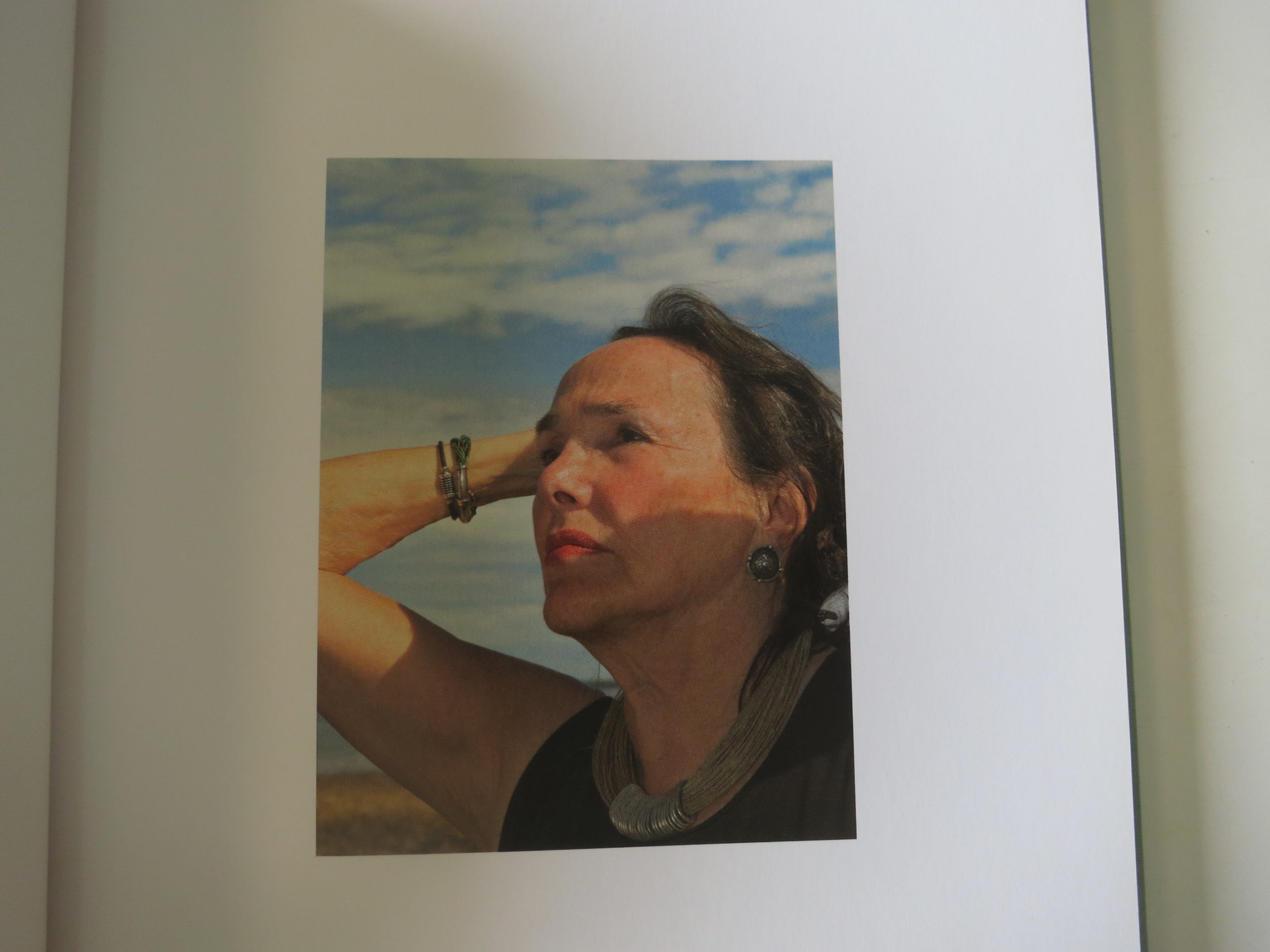
Molly Glynn, Wonderful Machine

Printing is a process of problem-solving and iteration, from loading the paper into the printer to ensuring the final product is color corrected. I like to say that printing is mostly just putting out fires– as soon as you solve one issue, another is bound to arise.

Not every photographer finds owning and running their own printer worth the cost. It can be a time-consuming process, and ink and paper don’t come cheap. But, it can also be intensely satisfying to create an image from an initial concept to the final print.

I’ll preface by saying that there are many opinions when it comes to printing and equally as many methods for printing as there are printers in the world. Everyone has their preferences, and this guide is made to be a baseline on which you can develop your skills and form your own style of printing.

Step One: Choose Your Printer

We have two Epson Surecolor P800 printers, which are large format printers designed for a variety of paper types. We’ve found them perfect for our Print Portfolio Production, as well as for some larger, poster-sized prints.

Black Epson Surecolor P800 printer at Wonderful Machine

The P800 accepts paper up to 17 inches wide, which makes it a perfect size for making test prints or small exhibition prints. If you are looking to make even larger prints, take a peek at the P7000 or its older friend the Stylus Pro 7880.

It seems that with larger print size comes an increase in printer trouble – from file buffering to color banding. Ultimately, my advice is to leave especially large or important prints to professional printing houses who have the tools, expertise, and time to create a perfect print for you.

Step Two: Choose Your Paper

We use Moab Lasal Matte paper, which is double-sided and can be ordered pre-punched and pre-scored for standard-size screw post binders. Heavyweight matte paper is great for most photo uses, but specific clients may want a pearl, luster, or full gloss finish instead. We generally discourage photographers from using glossy paper for portfolios due to its tendency to glare, gather fingerprints, and collect dust.

Whatever paper you choose, make sure you purchase a size and type that is compatible with your printer. Most finished papers are single-sided, so if you want front and back images in your portfolio, that’s an important factor to consider. Other important factors include the weight of your paper and the ink recommendations, as well as the reputation of the color profiles associated with the paper. For instance, I’ve found Moab profiles generally easy to use but Hahnemühle profiles difficult to print.

Step Three: Choose Your Program

Here is where the opinions really start coming in. Depending on your experience with printing, you’ll find yourself drawn to one program over another. There are a few different reputable programs to print, including nearly all of the Adobe Creative Suite. Most photographers are proficient in Photoshop and/or Lightroom, and either is a great choice for printing. Some printing houses and even advanced home printers will use special drivers or RIP software to ensure perfect results between multiple printers.

Photoshop does offer more print customization and flexibility in layout, but we’ve found that Lightroom is better for producing multiple prints in succession due largely to its library and preset functionality.

Lightroom is the most user-friendly printing option but still maintains the level of control necessary for making high-quality prints. As such, this guide is written for Lightroom with the novice printer in mind.

Wonderful Machine photo editor Molly Glynn using Adobe Lightroom

Step Four: Choosing Templates and Settings

Lightroom’s print module comes with pre-designed templates for a variety of printing options (all designed for 8.5×11 paper). These work well as an introduction to what you can do to lay out an image– whether you’re looking to print a contact sheet, some 5×7 images, or one basic test print.

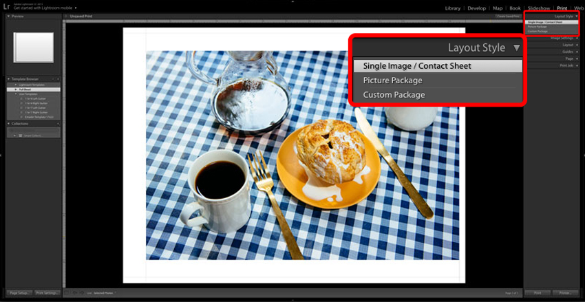
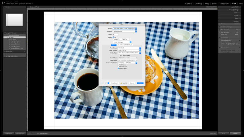
What’s even nicer about Lightroom’s printing templates is the ability to customize them. On the right-hand side of the print module, you’ll notice there are six sections with options to make adjustments to your final print: Layout Style, Image Settings, Layout, Guides, Page, and Print Job.

LAYOUT STYLE

Adobe Lightroom screenshot of Print Layout Style

Most often, you’ll stick to “Single Image/Contact Sheet,” unless printing a retail picture package. Either way, just use the cells menu to add images in your preferred size and build out as you please!
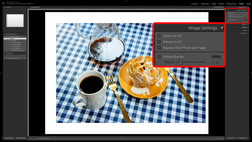
IMAGE SETTINGS

Adobe Lightroom screenshot of Print Image Settings

Your images won’t always fit into a template exactly the way you want them, and that’s where image settings come in. The checkboxes give you options to Zoom to Fill, Rotate to Fit, or Repeat One Photo per Page. This is mostly self-explanatory, but it’s good to note that selecting Zoom to Fill will crop your image. You can adjust the crop by clicking and dragging your mouse over the image.

There’s also an option to add a stroke border around your image. I generally don’t recommend adding any sort of border to an image– most of the time, it only makes an image look dated.
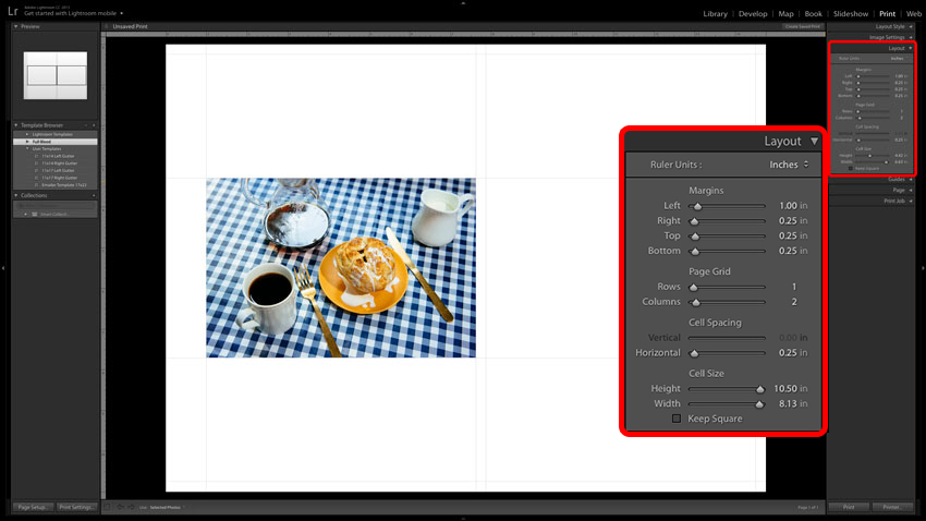
LAYOUT

Adobe Lightroom screenshot of Print Layout

Perhaps one of the most important menus to use when creating custom templates or adjusting pre-existing ones, the Layout menu allows you to adjust the Margins, Page Grid, Cell Spacing, and Cell Size of a print.

Setting Margins allows you to work within what you know or wish to be printable space. For example, when I am setting up a portfolio print for a screw post book, I know that I need to allow for at least one inch on the inside edge of the page for the punched holes. If I want a vertical image to sit all the way to the left side of the page, I’ll adjust the right margin to push it towards the left edge.

The Page Grid sets how many image cells (in rows and columns) are on a single page. If I want a top and bottom image, I’ll set the rows to two. If I want a triptych, I’ll up the columns to set three images side-by-side. Whenever you have more than one image cell on a page, the Cell Spacing field will come into play. Increasing the horizontal or vertical spacing will add white space between your cells so the images no longer touch.

The Cell Size adjusts the space allotted for each image on the page. When the sliders are all the way to the right, a cell is as large as it can possibly be on the page. This is inversely related to cell spacing, so be careful when adjusting. I usually find it most useful to first set my cell size, then my spacing.
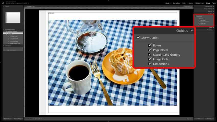
GUIDES

Adobe Lightroom screenshot of Print Guides

Guides don’t affect the final print. They are just as they advertise– guides that help you understand how your print is laid out on the page. Just as in Photoshop, the Rulers give you, in inches, a way to see the scale of your print. If you have custom settings in page setup (such as the printable area on your chosen paper), then checking Page Bleed will gray out any areas that cannot be safely printed.

Margins and Gutters show up as light gray lines that intersect all the cross sections of your page (your outer margins, image cells, etc). The Image Cells Guide looks like a stroke border around the border of the image cell. It’s usually a good idea to keep an eye on how much space is available for an image and is especially useful if your image has a white background that blends in with the print preview. Finally, Dimensions shows just that– the numerical dimension of each image.
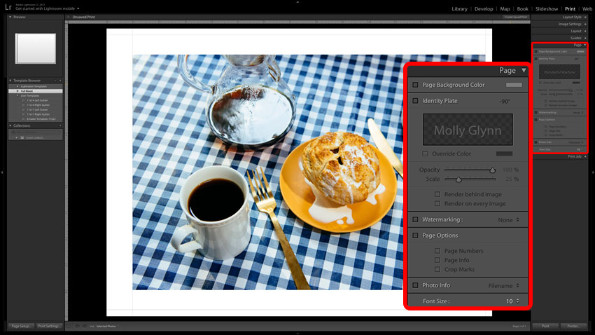
PAGE

Adobe Lightroom screenshot of Print Page settings

If you are printing proofs, a series of pages, or contact sheets, you might find Page settings useful. Here, you can set a background color, add an Identity Plate (a rudimentary watermark) upload or create your own watermark, include print settings, add page numbers or crop marks, or include file information under each image. Each adjustment has its uses, and I’ll leave it to you to imagine the possibilities.
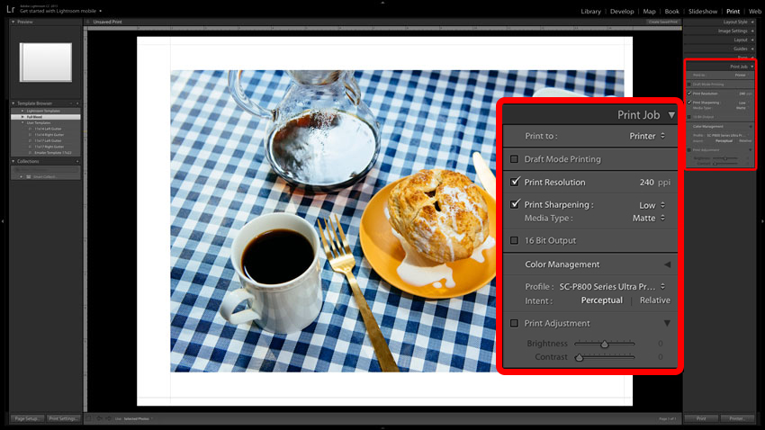
PRINT JOB

Adobe Lightroom screenshot of Print Job settings

Maybe you were nodding off, but here’s the time to pay attention. The Print Job settings can radically adjust the way your image is rendered by your printer, so it’s important to make sure you choose the correct settings for your intended use.

The Epson printers we use have a native print resolution of 240ppi (pixels per inch), so that is our ideal Lightroom Input Resolution. We have found that a minimal amount of sharpening looks best, so we keep Print Sharpening set to Low. If you’re using a pearl or luster paper, your Media Type may be Glossy, but with paper like the Moab Lasal we use, make sure Media Type is set to Matte. If your printer accepts 16-bit Output, select that box, but if your printer doesn’t or you don’t know, it is best to leave it unchecked. Printers not designed for 16-bit Output will print the image much slower without any improvement in quality.

Color Management can have a profound effect on your prints, and you almost never want to leave the Managed by Printer setting on. Instead, look up the proper ICC profile for your paper and make sure it is installed, or check out the list of paper profiles provided by your printer manufacturer. I leave the Intent set to Perceptual, leave Print Adjustment off, and save my entire template.

Once you’ve adjusted your settings just how you like them, you can save those adjustments as a User Template. Lightroom will save these templates and you’ll be able to easily pick up where you left off with a contact sheet, test print, or portfolio image with the click of a button whenever you reopen Lightroom (even between catalogs).

Step Five: Using the Printer

Each printer has different features and accepts different paper in different ways. If possible, I recommend using a front or rear flat loading option for heavyweight paper to avoid the possibility of bending or jamming the paper. See your printer manufacturer’s instructions for more info on loading paper.

Some printers give you the option to print wirelessly, but I recommend printing through a USB because it’s faster and easier to troubleshoot.

When sending an image to the printer from Lightroom (or any other program), you never just press Print. You’ll always have the option of Printer…, which will lead you to the print dialogue and give you the option to adjust your print settings.

Adobe Lightroom screenshot of Print Settings


Final Adobe Lightroom print dialogue
 

If your computer is connected to multiple printers, first ensure you’re selecting settings for the right printer. There’s no frustration quite like getting all your settings straight only to have to swap printers and do it all over again.

Unless you’re using roll paper, your page setup should be set to Standard. This will also bring up the Paper Source menu, where you can find whichever flat loading option you’ve used with your printer.

Your Media Type should match your paper as closely as possible. For the most part, you’ll either use the photo paper or matte paper options, and you can check with your paper manufacturer to see which media type is the best fit. For Moab Lasal Matte, the setting is Ultra Premium Presentation Matte paper.

If you properly selected an ICC color profile in Lightroom and unchecked Managed by Printer, the Print Mode and Color Mode options should be greyed out. If they aren’t, chances are you neglected to save your settings.

We set the Output Resolution to SuperFine 1440 dpi (dots per inch). Anything less will adversely affect your print quality, and SuperPhoto’s 2880 dpi is a level of detail beyond what most printers can accurately produce. Leave High Speed and Mirror Image unchecked, and select Finest Detail for a slightly slower but more intricate print.

You can also create presets in the print dialogue so that these settings are the default, and you’ll only need to check that nothing has changed before sending the image off to the printer.

Step Six: Viewing your Prints

Remember the old adage “don’t judge a book by its cover?” Likewise, don’t judge a print before it’s dry. Depending on the type of paper you use, a print can take between 10 minutes and a few hours to completely dry. Darker colors take longer to dry and can come out of the printer looking almost totally black, then show more detail as the ink fully dries.

Since I am normally printing on both sides of a page, I give a large leeway for pages to dry, usually overnight, before I run them through the printer again. This helps prevent nicks and scratches on the first side and keeps the interior of the printer as clean as possible for the second side.

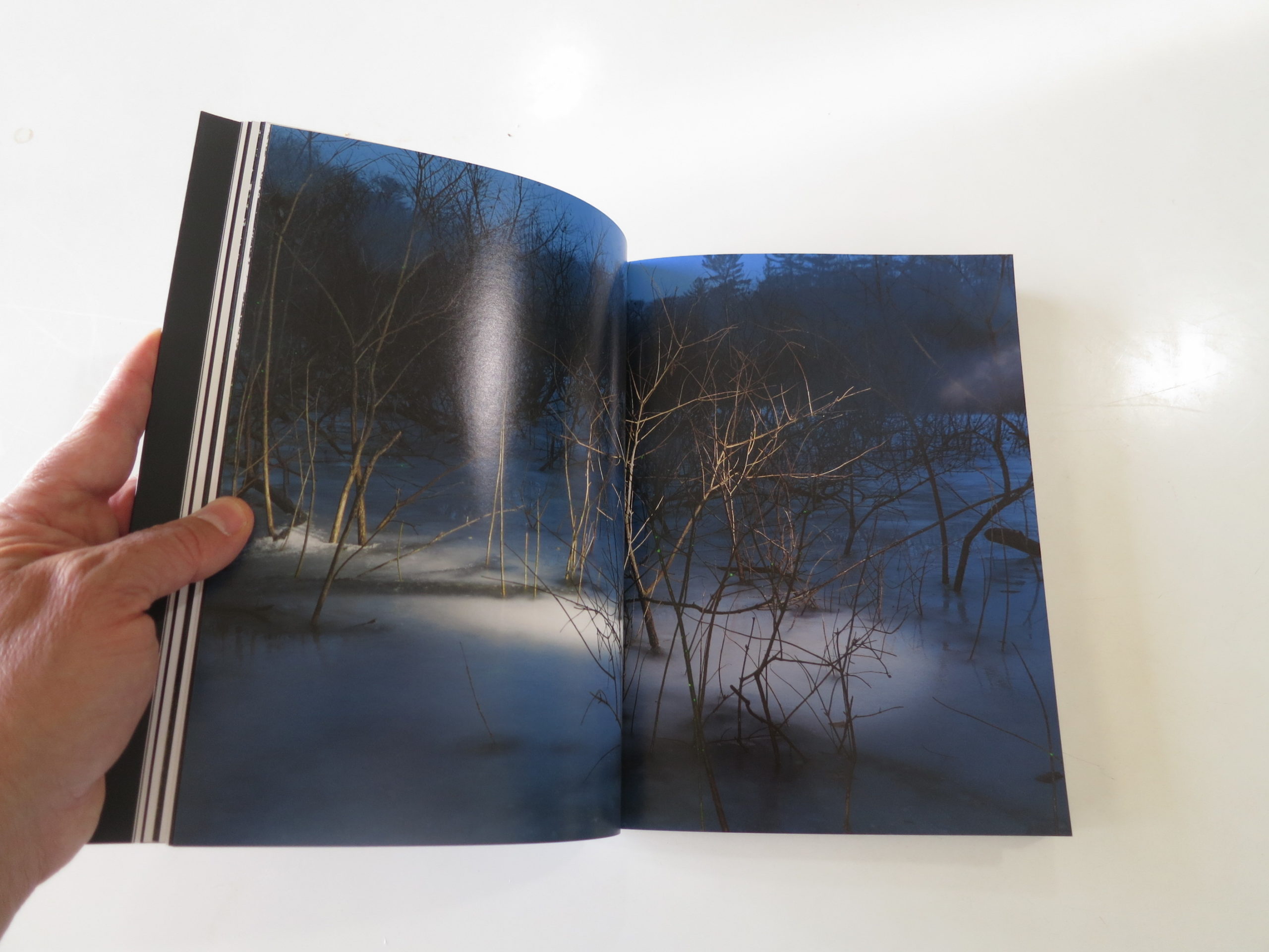
Printing on matte paper leaves you with beautiful final prints, but it’s also more susceptible to marks. If you have a print that has deep blacks or generally darker colors, you’ll want to take a flashlight to it to detect any scuff marks.

Finally, you will also want to view the prints in multiple lighting scenarios. We all know that daylight affects colors differently than fluorescent or incandescent light, and since a printed portfolio will end up in all sorts of lighting situations, you want to check that you’re comfortable with the overall color and contrast of your book.

Printing is no easy task. It’s sort of like learning to drive– you might be able to get from one place to another, but it takes time to really feel comfortable with the process.

Be patient with your mistakes, and keep track of the problems you’ve solved before, lest they come up again. And, like driving, always check and double check before you put your foot on the gas.

Wonderful Machine photo editor Molly Glynn loads paper into Epson P800 printer

Have any questions or opinions about printing you’d like to share? Feel free to reach out!

The Daily Edit – Airbnb Magazine: Gabrielle Sirkin


Airbnb Magazine


Creative Director: Michael Wilson
Director of Photography:
Natasha Lunn
Contributing Photo Editor: Katie Dunn
Senior Photo Editor: Gabrielle Sirkin
Art Director: Mallory Roynon
Designer: Lisa Lok


Heidi: Tell us about the magazine, how often does it come out and where can we find it?

Gabrielle: Community is at the heart of Airbnb and the magazine is a place where readers can feel at home in the world. We cover authentic travel around the globe, with the aim of uncovering hidden gems through our Airbnb host’s insights and inspiring people to travel the way locals live. We try to embody those visceral moments through visual storytelling. The Spring 2018 issue is our third issue with three more this year. Airbnbmag is print and digital, distributed to the Airbnb community globally and can be found on newsstands in North America.

What are you looking for in someone’s work?
Natasha Lunn, our Director of Photography, Katie Dunn, our Contributing Photo Editor and myself (Senior Photo Editor) make up the photo team. We are looking for someone with a unique point of view who can photograph experiences with a sense of spontaneity and authenticity. We want the viewer to feel engaged and inspired. We also bring a diversity to the photography by using photojournalists, documentary, fine art, street and landscape photographers. And whenever possible, we try to use local photographers in the regions we are shooting.

Is the entire magazine shot?
I would say about ninety percent of the magazine is original photography. For us, the magazine is so much about the community and people that we often go deep into these cultures seeking out the undiscovered.

Are you assigning these stories or are photographers coming with pitches?
We’re assigning based on writer’s stories but also approaching photographers who may have ideas for beautiful photo essays with a unique point of view  that can speak nicely to the Airbnbmag reader and community.

Where are you searching for photographers since you’re in the global arena?
That’s a good question! I must say, largely Instagram. So many photographers are using the Instagram Stories feature to inform editors of their whereabouts. We’ll also look at global, regional and online publications, which are always great resources for discovering local talent.

Do you work with satellite photo editors?
The photo team is made up of Natasha Lunn, Director of Photography, Katie Dunn Contributing Photo Editor and myself, Senior Photo Editor. Natasha and Katie work from the New York Hearst office and I work remotely from LA (where I live). When Natasha was brought on to launch the magazine, she asked me if I’d want to join and of course I jumped at the opportunity. Natasha and I used to work together at More Magazine a few years back (which has since folded) and work very well together. It makes the bi-coastal relationship really fluid and strategic especially when dealing with different time zones and global production. Katie has great travel related photo editing experience, so we’ve been able to direct and produce the magazine by collectively pulling all our resources together!

Do you use Instgram to source talent?
I discovered photographer Julia Sellmann on Instagram. We absolutely loved her work and asked her if she was working on any personal projects that would be nice for the Spring 2018 issue. She proposed a continuation of her project on the Mongal Dosha, a somewhat complicated and controversial system of beliefs in India. We sent Julia to Jaipur, Tarapith and West Bengal for ten days to document the Mongal Dosha (a condition where if the planet Mars is in a certain position in a woman’s birth chart, it could have negative impacts on the success or failure of a marriage) and the Indian astrologers who are consulted prior to the marriage. She did an incredible job of capturing a relatively abstract concept of beliefs and myths in a visceral way. The body of work is lyrical and transcendent. 

The Daily Promo – Bojan U.

Bojan U.

Who printed it?
Blurb Books.

Who designed it?
I designed it myself and then had some close and trusted friends with a critical eye look it over and give me pointers.

Tell me about the images?
This collection came together over 3 different shoots for Cycling Canada last year: a portrait/training shoot focusing on the athletes; a shoot to accompany a new sponsorship announcement; and a behind the scenes photo documentary of a UCI Track World Cup. There was a lot latitude in the client specs which really afforded me the freedom to approach this from any angle I wanted.

The superhero physical stature of the athletes was striking to me and I really wanted to capture this in the portraits. I set up a makeshift studio against the concrete (industrial feel) wall at the bottom of the ramp that leads to the track. The athletes would stop by on their way to their post-training massage where I had about 2 minutes with each athlete to make a compelling portrait. Another challenge was the track itself. It can be very cluttered and the different races can be a little confusing. There can be a lot of waiting around but when things do happen, they happen quickly and being in position is key. All in all it was one of the toughest subjects I’ve ever photographed but it also turned out to be one of the most satisfying and rewarding.

How many did you make?
I only printed 50. I had a very specific mailing list for this promo. I will be making a second print run of these.

How many times a year do you send out promos?
This is my first time sending out printed promos. It’s a bit of a test run to see if I want to make this a part of my regular marketing. I’m thinking I will send out one or two printed promos per year.

Do you think printed promos are effective for marketing your work?
So far the response has been very positive and I will definitely make this part of my marketing. I can’t say that I have gotten work directly from it but I have received really good messages and feedback about the promo.

This Week in Photography Books: Philip Trager


One of our readers sent me a powerful and arresting email today.

I’m not going to divulge details, but a man wrote that he’d been deeply affected by the information in Laia Abril’s book last week.

I don’t get emails like that often, so props to the sender, but it also ratifies my decision to continue to use this platform to talk about real ideas.

Things that matter.

Rob encouraged me to write this way back in 2010. (That’s right, I’m celebrating my 8th anniversary next month.) And I’ve stuck by it ever since.

Take today’s book, “Photographing Ina,” for instance.

It’s odd that I’m reviewing it, as it’s been on my shelf for a couple of years now, still in plastic wrap. It had been sent in a small shipment by Steidl, (a rare occurrence,) and I’d reviewed another by Philip Trager, along with a sister book of NYC images by Richard Sandler.

(An NYC double-double back in 2017.)

For some reason, I’d never looked at this one.

The light hitting the plastic caught my eye, otherwise I would have kept right on past. (I was returning my first choice book to the stack, as it was also by Dewi Lewis, and I didn’t want to repeat publishers back to back.)

The cover is pale green, like sun-bleached St Patrick’s day decorations. The image, cropped and vintage, features a young-ish woman with eyes closed

OK.
I was curious.

The book opens with little warning, and then set of images of a woman in older middle age, who’s photographed in a variety of ways, including mirrors.

Are they digital composites, or clever placement of objects in the real world?

I guess, (correctly, I later find,) that the woman is Ina Trager, and the photographer is her husband, Philip Trager. I learn a few things about his art practice in an essay that is oddly placed in the middle, but which I chose to read after seeing the second set of plates.

The first group, digital, in color, was made from 2007-11. The images lack the clarity of high-end-digital-capture, or medium/large format film, and therefore register as digital-SLR-without-a-$1200-lens images.

The second set, in black and white, from 1980-84, on the other hand, are formal, structured, dry, and definitely made with a larger format machine.

They’re sharp, crisp and affected, in a weird-but-cool kind of way.

The early images feel like resolved ideas to me, while the new color pictures seem more like practice, or experimentation. The essay, by academic Andrew Szegedy-Masak, confirms as much, as Mr. Trager says he wanted to do a digital color project, and then thought of doing a follow-up-project with his wife as a consequence.

(The essay also states Mr. Trager works in clearly-defined projects, and rarely repeats subjects, so the photos of his wife are differentiated from those by Harry Callahan, Alfred Stieglitz, Emmet Gowin, Lee Friedlander or Nicholas Nixon.)

And it’s those last two names that drove today’s review. (Especially after seeing the subtle-but-still-nude images of the younger Mrs. Trager.)

In the last few months, Lee Friedlander’s son-in-law, Thomas Roma, stepped down from his job running the photo program at Columbia University because of allegations of sexual misconduct, or abuse of power. Then, a month or so ago, Nicholas Nixon left the School of the Museum of Fine Arts, where he’d taught for ages, after students alleged that he’d been sexually inappropriate during his teaching practice.

(ie., Encouraging nude photos, making students uncomfortable with lewd or sexually explicit assignments, hitting on models.)

So when I see “Photographing Ina,” I can no longer view it outside of that context. Nor can I forget what I wrote just last week, that men have been controlling women’s bodies for millennia.

(And continue to control women’s bodies, in most of the world.)

I understand that Ina Trager was a creative partner. But it is still her husband taking pictures of her boobs, and showing other people.

It’s not, NOT that, if you feel me.

And the new work, in which she’s unsmiling and dour, alongside the mirror-props, also reinforces the stereotype that older women are no longer interesting, by themselves. (And are little-seen in media and popular culture as a result.)

I don’t think work like this will be made by the next, or even current generation of photographers. Not un-ironically. Not un-apologetically.

And the book is probably not something I’d review, outside this context, but then again, that’s the whole point.

The entire context in which “heterosexual-white-men-photographing-attractive-naked-women” is normal, and fine, has been exploded.

That world is gone.

And now, every time we look at the artifacts of the previous paradigm, they appear not to fit quite right anymore.

Bottom Line: A provocative look at the photographer’s aging wife

To purchase “Photographing Ina,” click here

If you’d like to submit a book for potential review, please email me at jonathanblaustein@gmail.com. We are particularly interested in submissions from female photographers.