Pricing & Negotiating: Still Life Images for a Home Goods Brand

Julia Hanley, Wonderful Machine

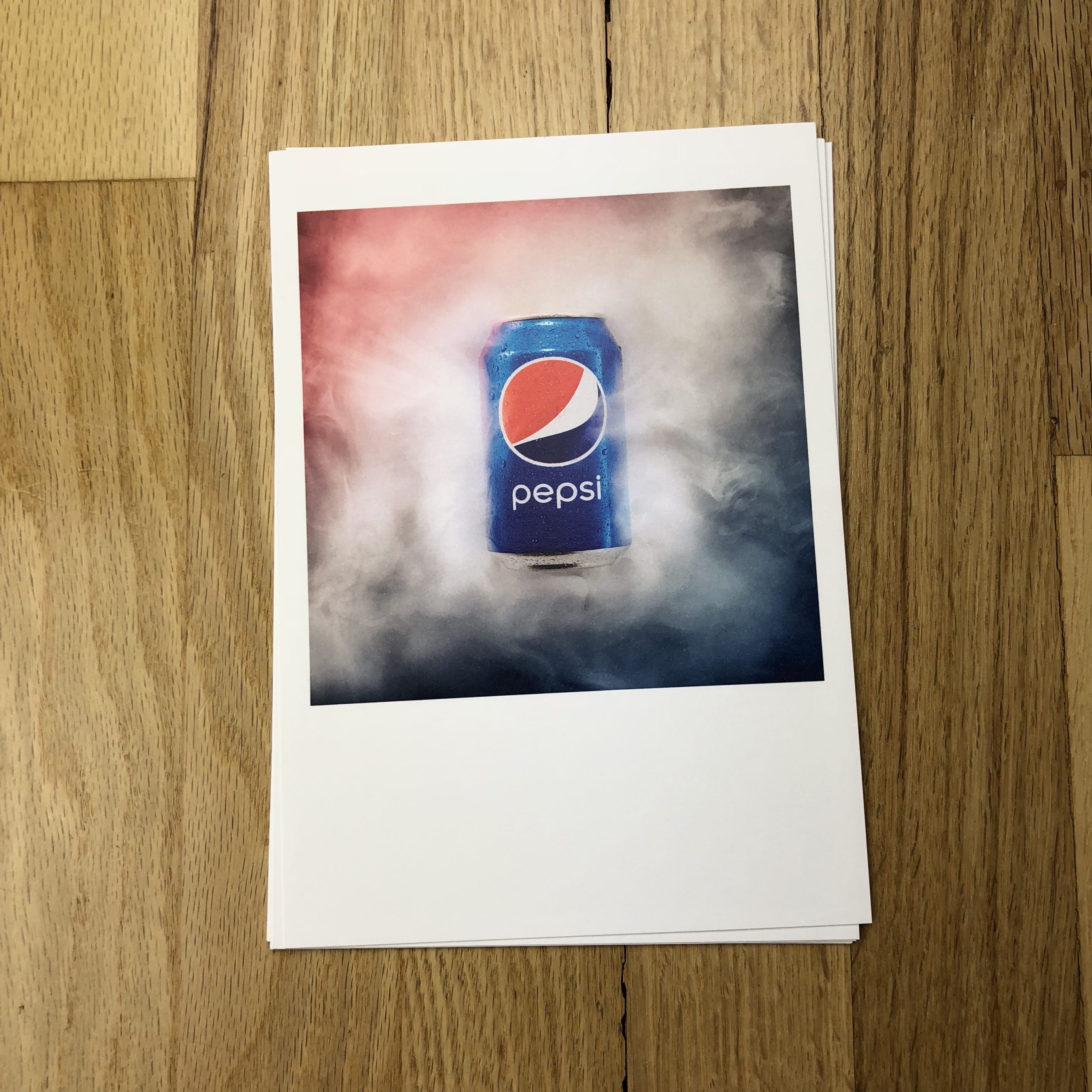
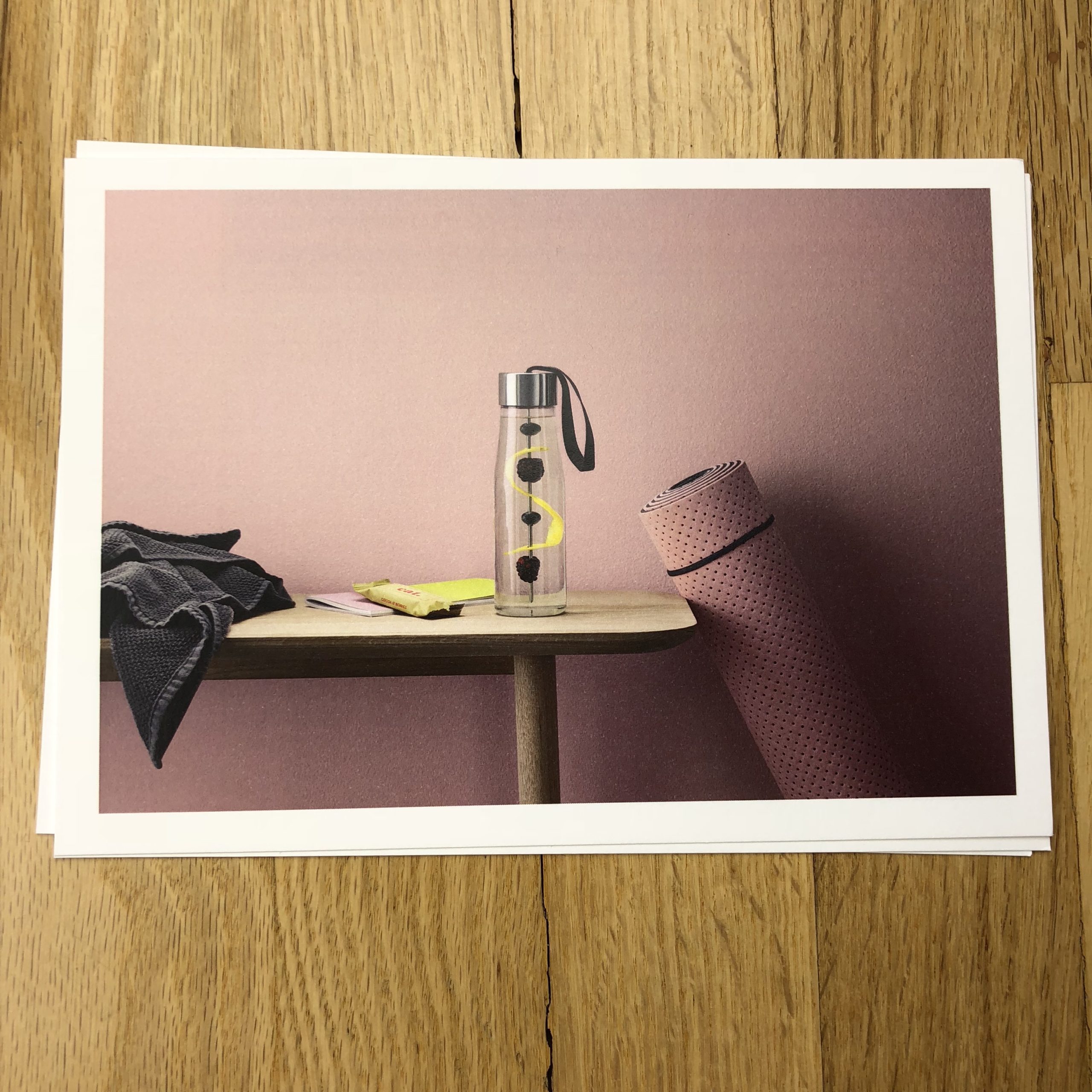
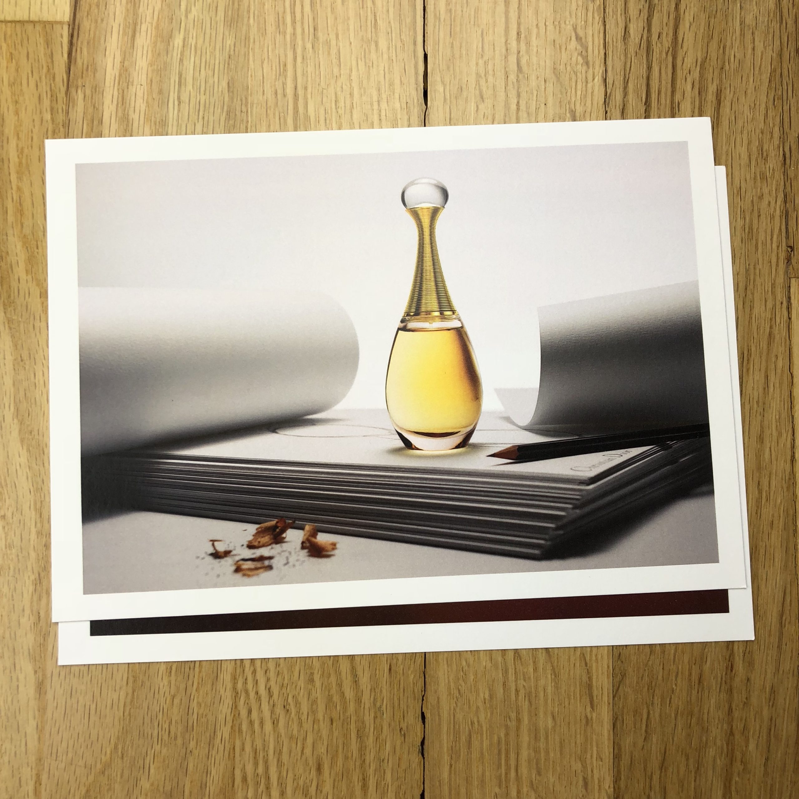
Concept: Still life images of a consumer product

Location: A studio in a major market

Licensing: Out-of-Home, Print Advertising, and Web Advertising use of up to five hero images and ten insert images in perpetuity

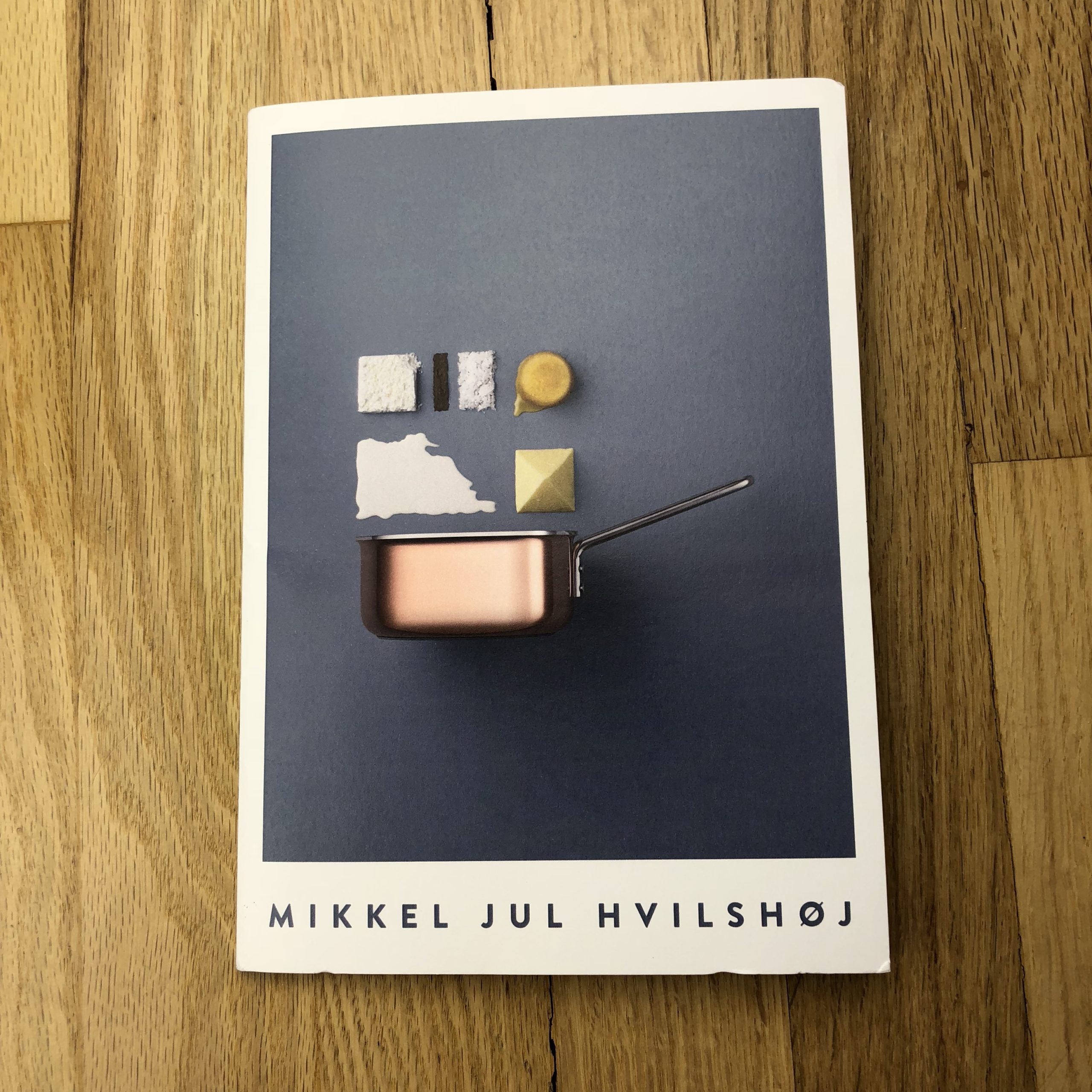
Photographer: Still life specialist

Client: A large US-based home goods brand

Here is the estimate:

PDF of pricing and negotiating estimate for a US American home goods brand

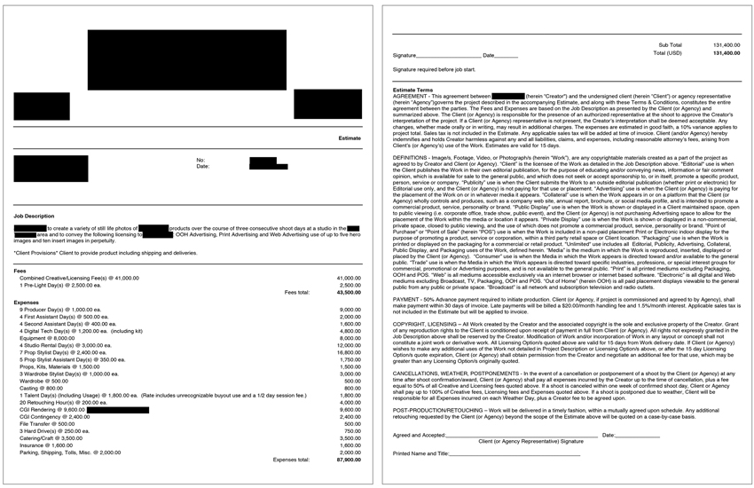
Creative/Licensing: The agency came to us with five distinct conceptual ads, each of which featured one hero image portraying a single product in use, accompanied by two to three smaller images (referred to as “insert images” by the agency) showcasing specific features of each product. Additionally, each ad incorporated conceptual text/copy that would need to be created in post via CGI.

Each conceptual still life scene was unique and involved a complicated set in terms of the design and prop elements. For each set, we had to incorporate both 3D layout copy and create an effect where the set began to blend into the studio background. In order to execute the desired effects, we would need a top-tier prop styling team in addition to supplementing with CGI in post. The use of CGI would enhance the three-dimensional text and the textured background elements.

The agency requested out-of-home, print advertising, and web advertising use of the final ads in perpetuity. I considered factors that increased the overall value of the images, such as the brand’s name recognition, the photographer’s expertise and creative input, the usage requirements and uniqueness of each ad, etc. Based on previous experiences and similar projects, we determined the appropriate creative/licensing fee to be $41,000, which broke down to $8,200 for each final ad.

Pre-Light Day(s): Due to the technical lighting needed for the various sets, we included one pre-light day at the studio space for the photographer and incorporated this day throughout the estimate for the crew.

Producer Day(s): I estimated four prep days, one pre-light day, three shoot days, and one wrap day for the producer. We expected a large amount of pre-production in a short window to hire a crew, book a studio, rent equipment, manage talent, etc. The producer would also help manage the CGI post-production components.

Assistants and Digital Tech: I included two assistants for the shoot days and pre-light day and a digital tech for an equal amount of days. The digital tech’s fee also included the cost of their workstation and kit.

Studio Rental and Equipment: We’d need ample space to work within, which didn’t come cheap in this market. A studio in this major market can range from $1,500-$3,000/day. We included $3,000/day for a studio to account for one pre-light day and three shoot days, and an additional $2,000/day for grip and lighting equipment.

Prop Stylist, Assistant, and Props: Each hero image involved sophisticated prop styling as well as minor set design skills. Although the sets consisted of simple materials, it would require a seasoned professional to pull off such sophisticated styling, so I wanted to be sure the stylist had the assistance and prep time needed to source the necessary items. Being a New York-based prop stylist, it is not unusual that the price is higher as stylists cost more in bigger markets, on top of a typical agency fee. I estimated two prep days, one pre-light day, three shoot days, and one day of returns for the prop stylist, and included an assistant for one of those prep days, each shoot day and one day of returns.

Wardrobe Stylist and Wardrobe: The wardrobe stylist’s fee and wardrobe expense covered one day of prep, one day on set, and one day of returns. The wardrobe specs were very straightforward, with minor shopping needed, and covered one unrecognizable talent for a half-day.

Casting and Talent Day(s): We had to cast one adult male, from cards, for a half-day on set as unrecognizable talent. Because of this, we negotiated a modest fee for the talent, inclusive of unlimited use.

Post Production (Retouching Hours, CGI Rendering, CGI Contingency, File Transfer, Hard Drives): We received three different quotes (and treatments) from CGI artists. The CGI rendering fee was based on one of the quotes we received, determined by the number of shots, the complexity of the scenes, and the deadline for images (which was a tight turnaround). Because of these factors, we incorporated a rush fee and a contingency fee, in case we exceeded the estimated number of retouching hours or needed to pull in additional resources to meet the agency’s deadline.

Catering/Craft: Catering/Craft covered three days on set with as many as 10-12 people on set per day.

Insurance: This covered a policy that would meet the requirements of the agency, based on an industry standard rate of approximately 2% of the production expenses.

Parking/Shipping/Tolls/Misc.: Finally, we included a miscellaneous fee to cover some costs that may be incurred during the pre-light day and any last-minute production costs that could arise.

Feedback: Although the art buyer assured us that our numbers were competitive, it came down to creative preference and they decided to move forward with a different photographer.

If you have any questions, or if you need help estimating or producing a project, please give us a call at 610.260.0200 or reach out by email. We’re available to help with any and all pricing and negotiating needs—from small stock sales to large ad campaigns.

The Daily Edit – Entreprenuer Magazine: Andy Isaacson

Entrepreneur Magazine


Creative Director:
 Paul Scirecalabrisotto

Photography Director: Judith Puckett-Rinella
Photographer: Andy Isaacson


Heidi: How many days were on location?
Andy: I was in Puerto Rico for 4 days.

What was the most challenging obstacle during the shoot?
The fact that much of the compelling action in the story (the actual hurricane relief and recovery work that the subject of the story was involved in) had already taken place several weeks before I arrived! So I really didn’t know what I’d be able get on the ground – basically, I was winging it. As it happened, I spent most of the time joining the subject of the story for casual meetings with people in unremarkable locations, so I just had to grab pictures along the way: from the rooftop of an office building in Old San Juan after one meeting, inside an office within the Governor’s mansion on another occasion, etc.

Had you been to Puerto Rico before? Did you have a guide on location?
I’d never been to Puerto Rico before, and I leaned heavily on my guide, who was also the subject of the story– Jesse Levin, an entrepreneur and volunteer disaster relief worker. I shadowed Levin as he bounced around San Juan to different meetings, but he’d also arranged for me, as the author of the story, to meet characters that might be helpful sources. On my last afternoon he drove me through the island’s rural interior, and we poked around the mountains, which still bore plenty of evidence of the storm’s wrath.

What was the direction from the magazine?
None, really. As the reporter and writer on the story, I was also driving the photography on the fly. However, there were two essential shots that I wanted to come home with: a portrait of Levin, and an image that conveyed the hurricane’s devastation (which was not so easy to find in the capital, four months after the storm, where I did all of my reporting). On our drive through the island’s mountains, on that final afternoon, I finally was able to get my portrait of Levin, in the late afternoon (in between rain showers), and also, fortuitously, that picture–from the side of a mashed up road– that conveyed the hurricane’s damages.

You are often a photographer/reporter for projects, what other tasks do you find yourself doing?
Carrying house plants into the Puerto Rican Governors Mansion was different. My subject has been granted permission to redesign a government innovation office in an effort to make it more reflective of SF startup culture.

The Daily Promo – Mikkel Jul Hvilshøj

Mikkel Jul Hvilshøj

Who printed it?
The promos were printed by a print house called Bording, located just outside Copenhagen, Denmark.

Who designed it?
I did myself, but inspired by a client of mine, who produced a deck of postcards with the images I did for them, I decided to follow that lead. I liked the idea of a selection of postcards inside a cover/sleeve, which was fairly simple. Not a lot of text, but just image driven.

Tell me about the images?
The images are a selection of images made during the past 6 months. It’s a mix of commissioned campaigns and personal work. They represent my general style very well. The product in focus, colourful and minimalistic.

Previously I have made a magazine-style promo with a lof of text and a large tri-fold, but this time around I wanted to make single sheets, that can easily be passed around and hopefully end up on the wall at the agencies.

How many did you make?
I only did 50 this time. I have sent them out to carefully chosen agencies in Copenhagen, and a few has been sent to London and the US.

How many times a year do you send out promos?
I try at least once a year.

Do you think printed promos are effective for marketing your work?
I think it is essential. It’s a great way to get your name and work in front of creatives. I am well aware that a good portion of the promos probably end up in the trash, but I feel the hit rate is a lot better than email promos. I don’t think photographers in Denmark use print promos as much as they do in the US. Therefore the Danish agencies are not bombarded with promos every week, and it is easier to get their attention that way. They get so many cold calls and 99 percent of the time they ask you to send an email with a link to your website. I prefer to skip the cold call and go straight to a print piece I know they will flip through and hopefully share with their colleagues.

This Week in Photography Books: Laia Abril


Sometimes in life, people find themselves in what is known as a “no win” situation.

Basically, it means you’re fucked.
(No matter what you do.)

Take Michael Cohen, for example.

I remember the first time I saw him on TV, vociferously defending his boss, Donald J. Trump, in the summer of 2016.

“What a clown,” I thought. “A buffoon. A caricature of a wanna-be gangster.” I knew so many guys like that back in Jersey, because the real mob kids didn’t need to front.

As we all know, his boss did become President, and it appears Cohen was an actual criminal, not just a Fugazi. (Unfortunately for him, he wasn’t a very good one, as he was so easily caught, once they started looking.)

Setting aside one’s personal political beliefs, this is Peak-American-Absurdity right here. Rudy Giuliani, another NYC 80’s player, and formerly “America’s Mayor,” has now inserted himself into the mess, and went from “we’re going go wrap this Mueller investigation up shortly” to incriminating his client on Fox News in two short weeks.

Compared to the Scaramucci era, two weeks is practically an eon.

But back to Cohen.
The rock, and the hard place.

MC is currently facing a long prison sentence, (for campaign finance and potential money laundering violations,) or he has to roll over on Trump, the Number 1 worst thing a fixer can possibly do.

It’s a long stint in jail, or turn Rat.
Snitch.
Traitor.

Can’t say the guy doesn’t deserve it, but he’s most certainly facing no good options. (And I hate that he gives Jews a bad name.)

There are worse situations, though.
Far worse, if you can believe it.

Can you imagine being a mother, with cancer, and being told you can’t get an abortion to save your life, but they’re going to shut off your cancer drugs, so they don’t further hurt the life of your unborn child, who has no chance of survival.

So the mother and the child both die.

Or being forced to decide whether keep a baby you can’t afford to raise, or drop it in an outdoor-slot down at the orphanage, knowing once that door slams shut, you’ll never see him or her again?

Or being so desperate to induce a miscarriage, because you were raped by a psycho, that you’ll swallow poison you ordered off the internet, or stick a needle through your belly?

Michael Cohen might be justifiably up shit’s creek, but like I said, there are far worse outcomes in the world, in particular if you’re a woman.

I know these things, because I just finished reading Laia Abril’s brilliant “On Abortion,” published this year by Dewi Lewis in Manchester. (Congrats to Man City for winning the EPL title, at the expense of Mr. Lewis’s beloved Manchester United.)

Sorry, trying the lighten the mood.

When I interviewed Dewi Lewis a few years ago, he singled out one of Ms. Abril’s previous books as genius, so when I saw a PR email about this one, I requested a copy, and they were kind enough to send it along.

I’m sure it will make all the “Best Of” lists, come December, because it’s incredibly well done.

Remarkable, really.

The end notes say it was originally mounted as an exhibition in Arles in 2016, and I wonder how it was brought to life IRL? Because in book form, (which works better for reading than standing in front of a wall card,) the experience is taut, and fraught.

Story after story of the history of the horror, where photographic styles are constantly mashed up, but certain fonts repeat, which is one way it all holds together.

The obvious comp here is Taryn Simon, as there are a lot of similarities in the use of research and text. (Though the end notes credit only Ms. Abril for the research, while Ms. Simon is known to have a team.)

There are a few positive stories within, like the Dutch organization that has an abortion boat, and drops pills into Poland via drone.

But even then, they’re just aiding women who have to make such an awful, tragic, terrible decision.

To kill an unborn child.
Or a fetus.
Or a handful of cells, depending on when it happens.

Whether or not the style is entirely original, the imagery, text, and story-telling-decision-making are all top notch. It’s informative, powerful, and got under my skin emotionally as well.

Men have controlled women’s bodies throughout the millennia. The power dynamic has always been there, and at least we’re now living in a Me Too world where these public discussions can be had, driving change.

It’s already happening.

Hell, my high school nemesis, Jodi Kantor, just won a freaking Pulitzer Prize, and will now be the subject of a movie, because women are chopping down the traditional, and oft-abused trees of power, which protected monsters like Harvey. (No, not you Dad.)

If you buy books from the reviews I write, this one comes highly recommended. (Though you may need a shot of whiskey when you’re done with it.)

Bottom Line: Incisive, exhaustive look at the History of Abortion

To purchase “On Abortion” click here 

If you’d like to submit a book for potential review, please email me at jonathanblaustein@gmail.com. We are particularly interested in submissions from female photographers.

The Art of the Personal Project: Agnes Lopez

The Art of the Personal Project is a crucial element to let potential buyers see how you think creatively on your own.  I am drawn to personal projects that have an interesting vision or that show something I have never seen before.  In this thread, I’ll include a link to each personal project with the artist statement so you can see more of the project. Please note: This thread is not affiliated with any company; I’m just featuring projects that I find.  Please DO NOT send me your work.  I do not take submissions.

Today’s featured artist:  Agnes Lopez

Artist Statement

Agnes Lopez – www.agneslopezphoto.com

With each portrait in The Faces to Remember Project I want to record my subject’s story indelibly. So far I have met and photographed Holocaust survivors, the first African-American schoolteacher at a historically all-white school in my hometown of Jacksonville, Florida, and Filipino veterans of World War II, who shed blood for the United States and then had to fight another 75 years to even be recognized for their service and sacrifices.

My process for creating these portraits centers on eliminating ornamentation. I want to take a simple photograph and yet have a strong impact on a viewer through my subject’s expression. This challenges me to connect with my subjects on a personal level.

It started with the portrait of a client’s grandmother, Ella Rogozinski, who survived the horrors of the Holocaust in Budapest, the Auschwitz concentration camp, and the death march to Bergen-Belsen. I expanded the scope of the project to include veterans in South Carolina, and eventually traveled across the country to San Francisco to a gathering of Filipino World War II veterans.

As a commonwealth of the United States before and during the war, Filipinos were legally American nationals, and the 260,000 Filipinos who fought for the U.S. were promised all the benefits afforded to those serving in the armed forces of the United States. In 1946, Congress voted to pass the Rescission Act, stripping Filipino soldiers of the veteran benefits they were promised. It was only in 2009 that the U.S. authorized the release of a small, one-time lump-sum payment to eligible World War II Filipino veterans. In 2016, the Filipino Veterans of World War II Congressional Gold Medal Act was signed into law to award a Congressional Gold Medal to the Filipino veterans of World War II, in recognition of their service.

My hope is that the people I photograph will see their participation in this project as an opportunity to receive a definitive portrait of themselves in the twilight of their life, so it can be an heirloom for their families, and that viewers of the portraits will be inspired to learn more about the events in history that each person endured.

Ella Rogozinski, 91
Holocaust survivor, Auschwitz

Patricio Ganio, 97
World War II veteran and Bataan Death March survivor

Bevelyn Demps, 103
First African-American teacher at Justina Road Elementary School, Jacksonville

Ponciano Mauricio, 100
World War II veteran and Bataan Death March survivor

Morris Bendit, 77
Holocaust survivor and Israeli Navy veteran

To see more of this project, click here.

APE contributor Suzanne Sease currently works as a consultant for photographers and illustrators around the world. She has been involved in the photography and illustration industry since the mid 80s.  After establishing the art buying department at The Martin Agency, then working for Kaplan-Thaler, Capital One, Best Buy and numerous smaller agencies and companies, she decided to be a consultant in 1999. She has a new Twitter feed with helpful marketing information because she believes that marketing should be driven by brand and not by specialty.  Follow her at @SuzanneSease.


The Daily Edit – Wired Magazine: Jake Rowland

Creative Director: David Moretti
Design Director:
Ivy Simones
Photography Director: Anna Alexander
Deputy Design Director:
Frank Augugliaro
Photographer: Jake Rowland

Heidi: The blurred lines between fact/ fiction, fake news are the essence of your work. Tell us how this cover came about.
Jake: The Mark Zuckerberg cover for WIRED came about when the deputy design director of WIRED Frank Augugliaro contacted my colleague David La Spina at Esto, who I’m working with on a new digital imaging studio in New York called Light Manufacturing, and he recommended me for the job. The team at WIRED– David Moretti, Frank, Anna Alexander- wanted a portrait of Zuckerberg looking beat up to reflect the beating he was taking in the media post-Trump’s election. I didn’t know the details of Nicholas Thompson and Fred Vogelstein’s article but was already well aware of Cambridge Analytica’s interference in the election via Facebook through my activism in New York. So it was very exciting to create the piece. I really could not have hoped for a better editorial project since the topic of “fake news” and fact vs. fiction online dovetails perfectly with my digital composite work in portrait photography.

The team at WIRED was amazing to work with and the cover took about a month to complete. The final image is a composite made up of four different photographs: two stock photos and two photographs I shot myself. I hired two models and did the “beat up” make-up myself. I used my photos for the sweat, blood, bandage, etc. and the stock was the main image of Zuckerberg with some manipulation to shape his expression.

Tell us how this style developed for you.
When I started to work with photography I experimented with double exposures, darkroom manipulation, collage and finally began working with Photoshop. It was a natural progression in my personal work over many years. I’ve also been a professional retoucher for over a decade in New York and have worked on a wide variety of mainstream commercial and advertising imagery.

Describe the space between photography and technology for you as an artist.
Quick answer: there is no space between technology and photography. Photography is a technology through which we express a vision of our humanity. That said, the combination of photography and digital media is an extremely powerful tool that can shape that vision in subtle and profound ways.

Do all of your portraits involve a casting and a shoot?
No. I mainly work with family and friends in my personal work.

Fact and fiction are blurred with this type of work, how much of what you create is commentary on our media landscape?
I became interested on making a statement about the line between fact and fiction in photography with my family photos starting around 2004. I felt that creating seamless, extremely life-like fictional photographic portraits and making large scale, detailed prints the viewer could walk up to and be convinced what they are seeing is real would be a flash-point for creating a dialog on the subject of fact/fiction in photography, digital media and other technologies as well. Lately, bio-technology is an area that I think about a lot with regards to this work. That’s an area that is obviously going to be rapidly developing in very unpredictable ways in the very near future.

In your eyes, are there any truthful images in the media?
The jury is out on that one.

The Daily Promo- Christopher Patey

Christopher Patey

Who printed it?
Modern Postcard

Who designed it?
The design was a collaboration between myself and my reps @ Day Reps. We kept the design as simple as possible. I really like the selection of work so minimal text and “doo-dads” were ideal when trying to give the viewer clean space to appreciate the pictures.

Tell me about the images?
We knew we wanted the use the pictures of John Goodman and the Roseanne cast (Shot for Hollywood Reporter) right in front because it was such a great shoot. These promo pieces were hitting the mail shortly after the show was set to air so it was also very current/relevant in the celebrity and entertainment genre. The following two pictures of Eiza Gonzalez (Hollywood Reporter) and Caleb McLaughlin (Shot on spec for his PR) were chosen because they look nice together and also show a bit of range between studio and environmental portraits. They were also a nice transition into the last picture of the Marvel group from Comic-Con which was also shot for Hollywood Reporter. We wanted to showcase my group portraits and that one has been a bit of a crowd-pleaser.

How many did you make?
500. I have a pretty specific mailing list so we don’t mail out a TON and I still have some left over to pass out as leave-behinds at meetings.

How many times a year do you send out promos?
2x per year

Do you think printed promos are effective for marketing your work?
Whenever I post new promos I get asked by other photographers about whether or not the printed piece is successful in getting work. My response is always yes/no. Does my phone start ringing with clients the week after I drop them in the mail? No. Do I get emails from recipients gushing over the piece and congratulating me on making good pictures? No. BUT at the end of the day, I got some printed photographs with my name on them in front of the eyes of clients that I want to work with. Timing is such a big part of getting in with a new client so by just reminding them you exist regularly is important to keep yourself on their radar. And who knows, maybe they’ll happen to get the promo on the same day they have an assignment that I’d be good for… HEY IT COULD HAPPEN!

Printed promos are just one part of the marketing machine. Consistency with mailers, email blasts, meetings, going to events, and keeping the website up to date are all contributing factors to getting work. I often fall behind on these things but try to use downtime to catch up when I can.

This Week in Photography Books: Matthew Brandt


Within the African-American community, the idea of reparations is a popular one. (As far as I understand it.)

The plan, which calls for a massive payment to be made to all African-American descendants of slaves, is not without precedent, as West Germany paid reparations to Jews after World War II.

After hundreds of years of breaking up families, and precluding community from emerging naturally, the actions of Southern Whites are still felt today, and can explain the vast chasm in income inequality that exists.

It’s also an idea that gets lots of Conservative White People angry as hell, as it contravenes their sense of “individual responsibility.” Not to mention, money for reparations would clearly come from taxes on all other Americans, including White People.

Hopefully, most of us have seen Dave Chapelle’s hilarious skit on Reparations, or the one with Clayton Bigsby, the blind, black white supremacist. Chapelle used humor to both present these ideas, and also slough off any sense that they might happen IRL.

Some ideas are too radical to seem possible even in the 21st Century.

Short of the US Government dispersing Billions of dollars to try to level an unequal playing field, it is often left to individuals with power to do what they can to boost those who come from less-privileged circumstances.

If Diversity Matters, but is hard to achieve without concerted effort, then it makes sense to pay attention to the people who are putting their money where their mouths are. (So to speak.)

In this case, I’m thinking of the New York Portfolio Review, which is presented by my editors at the NYT Lens Blog, in conjunction with Photoville’s Laura Roumanos, and hosted by the CUNY Graduate School of Journalism in NYC.

I attended the event on Saturday, (and am still discombobulated as a result,) and am here to report that the Lens team has responded to contemporary circumstances with full force. Long-time readers know I’ve been there before, and have reported on previous attempts to build a diverse community.

It is admittedly a rough count, (and I could be wrong,) but of the 100+ photographers in the room, I only encountered 2 White American Males, and I was one of them. (I also counted 3 White Non-American Males, though of course there were likely more, as I was busy attending my reviews.)

Every other photographer I met, saw, or reconnected with was female, a person of color, or both.

In other words, almost everyone there was a Non-White-Male.

It was as if to end the privilege enjoyed by White Guys over the years, the Lens team made an effort to give almost all the slots over to those who have been ignored for so long.

We’ve all seen the statistics from Women Photograph, and other organizations, showing how disproportionate the jobs are in favor of the group in power.

Here, the script was entirely flipped.

It was done on purpose, obviously, as Jim Estrin and David Gonzalez are fierce advocates of supporting minority communities and women.

All to the good, as far as I’m concerned.

But as a reporter, I do have to mention the one Achilles heel of such efforts, at least given what I noted in person: almost everyone congregated into easily-observable groups defined by their skin color or likely area of origin.

All around the room, the pockets were visually obvious. Gaggles of people together, with very little cultural diversity within each group.

As an example, there was a moment when I was waiting in line for lunch. (Free Pizza. Hard to beat.) The young woman behind me appeared to be African, and I struck up a conversation.

When she said she was from South Africa, the African-American guy in line in front of me immediately turned and said, “Your from SA too?”

I interjected, “You’re from South Africa?” (He lacked the accent.)

“No,” he said, “but I was there recently.”

The two began speaking rapidly about the country, and his experience there as an African-American. He told how people were constantly trying to place him by tribe, and how he never felt he knew himself until he went to Africa.

I asked questions, as the two of them understood each other so easily. They told me that there are 11 tribes in the country, and they’re easily distinguishable by skin color, style, but more importantly by their vibe. Apparently the Zulus are most aggressive, and end up doing a lot of taxi-driving work.

I continued to ask questions, but almost imperceptibly, the two began talking more to each other. Finally, I realized I was not in the conversation at all, and turned to talk to the woman behind me, who was white, and lived in the mountains of the American West. (Like me.)

Behind us, two women of South Asian descent spoke in another pair.

While no one would have been the wiser, inside, I was disappointed, as I’d clearly tried to break beyond the boundaries that pervaded the room, and while it worked for a minute or two, that was it.

(To be clear, I had many conversations with people of diverse backgrounds all day long, from a Korean guy from Argentina to an Afro-Colombian woman from Brooklyn, because I like to talk to people, and see my efforts as reporting for you.)

Rather than suggesting there was fault on the part of the organizers, I’m sharing my observations because I think it pushes the ball further down the field.

It’s difficult and vital to get people in the same room. But perhaps it’s also important to then go one step further, and create organized activities that force people to get out of their own comfortable micro-communities, and talk to each other across boundaries?

When you think about it, it says a lot about human nature that racial divides are still as prominent as they are in America in 2018.

We evolved as tribal species, Homo Sapiens, and survived for eons by sticking with our kind. It offers safety, and understanding, but also allows for a kind of intra-cultural blinder phenomenon that can lead to evils like the Holocaust, or African Slavery.

The pre-Civil War South likely contained some “very fine people,” but collectively they came together to perpetuate monstrosity on a GRAND SCALE.

And we suffer from their actions still.

Why am I talking about the Civil War again? Haven’t I written enough about race relations these last few years?

Well, (as usual,) I’m glad you asked.

This morning, I spent some time looking at the excellent “1864,” a new book by Matthew Brandt, published by Yoffy Press in Atlanta. (With a nice essay by High Museum curator Gregory Harris.)

“1864” is a book that takes its pacing seriously, as it comes with a peach bow tied around it, (hinting at the contents within,) and then shows a couple of plates to whet the appetite, before explaining itself with the aforementioned essay.

By the second picture, I thought, “Man, this reminds me of those amazing George Barnard pictures I wrote about for APE a few years ago.”

Do you remember? I saw a show at SFMOMA that was meant to feature edgy, contemporary processes that manipulate time, and came away agog at those perfect, magnificent images of Post-Sherman’s-March Atlanta.

Coincidentally, the essay proved me prescient, as all the images in the book are based on Barnard’s stereoscopic images from Atlanta in 1864. (Well, not all of them, as the last image in the book was made of the Capitol Building under construction.)

Mr. Brandt found Barnard’s images on the Library of Congress website, when he was looking for inspiration for an upcoming show.

I first became acquainted with Matthew Brandt’s work when a friend curated him into a show at MOPA a few years ago. He’s a part of the California Craft style, where his fellow artists, like Meghann Riepenhoff, use chemical, one-of-a-kind, analog processes to counter our digital realty.

For example, he once used polluted lake water to process his images that were made of those same polluted lakes. Images of a subject often contain the existential materials of it as well.

In this case, as Georgia is famous for peaches, he actually included ingredients for peach pie into the chemicals that developed his albumen prints, (which themselves contain egg whites,) and the book claims the resulting tones are due to the confectionary nature of the process.

I’m not sure if he appropriated jpegs, or made photographs of computer screens or actual prints to “take” Barnard’s source material, but the resulting aesthetic is consistent with Mr. Brandt’s previous work.

What do we have, in the end?

They’re textured, and creepy, feeling more ancient than contemporary. But the mashup of temporal eras is real, even if it likely needs textual support to be understood.

The title of the book, too, hints at the metaphorical images within, as good book design often drops clues in all the right places.

Great art shows us things we haven’t seen before, or helps define a time and place for future generations. While this seems more like a minor project for an important young artist, (to me,) it makes for a cool little book.

And a perfect one to codify today’s musings:

You all, our audience, are high-ranking members of the creative class. You offer jobs, and build organizations. You take pictures to move the needle on public opinion.

So today, with a book that shows the scars of a still-divided country, I leave you with this thought.

How can we all transcend our borders, get out of our lanes, and learn things from people who grew up in different worlds, with different knowledge?

How can you help make things better?

Bottom Line: A cool, smart, Georgia Peach of a photobook

The Art of the Personal Projects: Tony Novak-Clifford

The Art of the Personal Project is a crucial element to let potential buyers see how you think creatively on your own.  I am drawn to personal projects that have an interesting vision or that show something I have never seen before.  In this thread, I’ll include a link to each personal project with the artist statement so you can see more of the project. Please note: This thread is not affiliated with any company; I’m just featuring projects that I find.  Please DO NOT send me your work.  I do not take submissions.

Today’s featured artist:  Tony Novak-Clifford

Artist’s Statement On the Book:

I first traveled to the Island of Bali, one of the over 14,000 islands making up the Republic of Indonesia and the Indonesian Archipelago, back in the mid-1980’s. At that time, my only goal was to surf the fabled waves of Bali’s coastline and enjoy a relatively cheap holiday in an exotic destination with my wife. It was our first trip to Asia and we knew very little about the country, the island or its culture. Little did I know at the time that this would be the beginning of a love affair that continues to this day.

While the waves and other amenities related to the tourism scene were fantastic, it was difficult not to notice a graceful and dignified people engaged in daily activity devoted to prayer and ritual in order the please and appease an enormous pantheon of spirits, gods and demons with the intent of maintaining a spiritual balance to not only their world, but also to ours.

It wasn’t more than a couple of days before I was ditching the surfboard and grabbing the camera and making inquiries. Before long, I was pursuing ritual activities and temple festivals (Bali has over 20,000 temples, each one holding a “birthday festival every 210 days) all over the island, visiting remote villages and temples well of the beaten tourist trail in pursuit of documenting the lives and spiritual activities of this generous and hospitable people.

What I found along the way was a culture rich in art; though their language has no word for “art”, highly refined forms of music & dance, painters, sculptors and wood-carver producing amazing, elegant and colorful rituals of devotion, joyful rites surrounding death, ancient mysticism and a generosity and hospitality I had never before experienced. Everywhere I ventured I was welcomed, fed, protected. As a photographer, the culture displayed enough pomp and circumstance to make a pope envious. Finding subject matter at which to aim my lenses were never-ending.

Thirty years later the love affair continues and I have been making nearly annual visits to the island to the island, sometimes for a month or more at a time, ever since that first visit. Through friendships developed over the years, I have been afforded access to sites and places few westerners will ever venture.

On the prodding of friends and family, I have finally set out on this book project, collecting and editing nearly 30 years of images down to a collection that I hope brings a sense of dignity and appreciation of this remarkable culture, along with  curiosity to the viewer.  With the assistance of designer Zenobia Lakwadalla and some editing by a dear friend and amazing journalist Tad Bartimus, the book was completed just over two weeks ago, self-published & released to the public. So far, the response has been very encouraging. The goal now is to use this version of the book to pitch to a publisher/distributor in Singapore with a large distribution network throughout Asia.

To see more of this project, click here.

The hands of a “Gambuh” dancer. Gambuh is perhaps the oldest surviving form of Balinese performing arts, dating back to the 15th century. From a very young age, aspiring dancers begin stretching the tendons of their fingers with various exercises in order to perform the acrobatic hand movements required of this dance form.

A Bull sarcophagus (Lembu) is engulfed in flames during the Cremation of a member of the Royal family of the village of Batubulan. The “Bull” represents that deceased is of Brahmin (high) caste, the color black indicated the deceased is male.

A young boy stands before an offering laden temple altar during festivities at Pura Tama Sari, a remote mountain temple in Tabanan Regency

In the remote mountain lake village of Gubung, high above Bali’s norther coast, a woman sets out baskets of fighting cocks to air in the early morning sun.

A simple candid street portrait made roadside in the village of Sukawati.

A woman dances a style known as “Pendet” while deep in a state of trance as a welcoming to her gods during a ritual in the village of Selumbung in Karangasem Regency.

Bali: Portraits of Life, Culture & Ritual

 Published: April 2018

Author: Tony Novak-Clifford

Available Online at Blurb.com and direct from the author. (Amazon.com coming soon.)

Hard Cover, Linen Bound with Full Cover Dust Jacket with Flaps.

124 pages, Over 120 color and B&W Photographs.

Contact: tony@tonynovak-clifford.com

Website: http://www.tonynovak-clifford.com

Tony Novak-Clifford is a commercial/editorial photographer based in Maui, Hawaii, producing award-winning advertising campaigns and editorial features for international, regional & local brands & publications.

APE contributor Suzanne Sease currently works as a consultant for photographers and illustrators around the world. She has been involved in the photography and illustration industry since the mid 80s.  After establishing the art buying department at The Martin Agency, then working for Kaplan-Thaler, Capital One, Best Buy and numerous smaller agencies and companies, she decided to be a consultant in 1999. She has a new Twitter feed with helpful marketing information because she believes that marketing should be driven by brand and not by specialty.  Follow her at @SuzanneSease.


The Daily Edit – The Red Bulletin: Jim Krantz

The Red Bulletin

Fritz Schuster: Head of Photography
Creative Director: Erik Turek
Art Director: Kasimir Reiman
Photo Editor: Rudi Uebelhoer
Photographer: Jim Krantz

Heidi: What was the biggest challenge for this type of shoot?
Jim: Finding my lost cards in the desert dust after 2 days of shoot in degree+ temperatures. That’s its own story!

Was weather and issue? Sand isn’t friendly for cameras.
My equipment was trashed, its ok, they are only tools. I love rental equipment

In a few words describe the Wasteland weekend festival and why is was so inspiring to shoot.
The high level of creativity in each persons individuality was spectacular, these alter egos created became the person for the duration of this post apocalyptic festival. This is a very enigmatic situation to experience, the cars and personalities are haunting and intimidating yet the warmth and camaraderie between all involved is all for one, one for all. I just loved being a part of it.

Did you also camp at the festival?
I did not, the process of making a “camp” is also part of the process, I was a transient observer.

What kind of direction did you get from the magazine?
“Jimmy, shoot a story that you love and do what you do”

With so much visual appeal how did you decide what to shoot?
The event is a kaleidoscope  of  visual candy. Every where, in every direction there were shots to consider. The difficult aspect is not simply making a photograph that is “bizarre” because on the surface,  every image that flashes by is as such. Photographing in these overwhelming situations must go deeper, on a more narrative or personal level of the subject. Its simple to shoot a documentation of a person, but what are they feeling and thinking, is this a moment of repose or reflection? Then the images become individualized. A question I ask myself when I work is would the photograph be as good if they were not dressed in what they are wearing? For me it is very important to ease into the situation, strip away the wild surface of the event and see what is happening as if they were not in the regalia – that’s when the photos happen. This is a very important concept I consider whenever I shoot and that allows me to strip away the obvious and see what is really beneath the surface


The Daily Promo – Katherine Wolkoff

Katherine Wolkoff

Who printed it?
Aldine Inc in NYC. They did a great job hand folding each one!

Who designed it?
Karly Mossberg, a really amazing freelance designer who has also done work for my agency Hello Artists.

Tell me about the images?
I wanted to make a promo that was grounded in my fine art work but also highlighted my more commercial work. I am always riding this line between art and commerce. We chose to use the blue shadow picture on one side of the promo and a selection of landscapes and portraits on the other side. I wanted this promo to feel unique – Karly came up with the idea of the die cut folding. It makes the promo feel like an origami package that you are unwrapping. The idea was that you were left with a really beautiful object to hang on the wall- there is minimal text.

How many did you make?
300

How many times a year do you send out promos?
Usually once a year.

Do you think printed promos are effective for marketing your work?
I hope so! I always feel like I am sending my heart and soul out into the world and am never exactly sure where they land.

I am a professor at Parsons and was teaching my students about making promos as I was going through this process which was very humbling reminder to follow my own advice!

This Week in Photography Books: Jo Ann Chaus


Control is an illusion.

Human beings, IMO, see themselves as far more important to the Universe’s ecosystem than we actually are.

It explains why we took over Earth, subjugating all other species to our needs. (Seriously, did you see that viral story about the baboons escaping from a Texas research facility by boosting over barrels?)

We are far from the only intelligent life form here, yet we act as if we are.

Perhaps I’m not telling you anything you didn’t know, but I’ve been thinking about this a lot lately, as I work to sublimate my ego. (I’m not trying to get all Buddhist on you, but I have been enjoying the Dalai Lama’s Twitter feed lately.)

What could be more 21st Century than the Dalai Lama, and the President of the United States, spreading their ideas around the planet, in real time, via an app created by (likely) stoners in NorCal?

Basically, I’m suggesting we’ve reached “Peak Absurdity” in 2018, and it’s time to admit that none of us know what the fuck is going on.

Not me.
Not you.
Not anyone.
(Especially not DT Junior. Boy, does that kid seem dim.)

Here’s the hard truth: not everything makes sense, and the good guys don’t always win. While that might be a great synopsis of “Westworld” Season 1, it’s also an apt description of our Global times, with authoritarianism on the march in so many places.

And that reality is the impetus for today’s book review, as I recently put down “Sweetie & Hansom,” a cool, self-published photobook that showed up in the mail a few months ago, by Jo Ann Chaus.

I met Jo Ann at Photo NOLA in December, and we hit it off. As I wrote in my post-review-review, she is a Jewish grandmother from Northern New Jersey, and I couldn’t shake this sense of familiarity, as we obviously come from a similar “tribe.”

She was making edgy self-portraits, including dressing up in a French maid’s outfit, and I loved the series. It was cohesive, and I understood her POV.

Which is a stark contrast to “Sweetie & Hansom,” which I could not suss out, no matter how hard I tried. (Editor’s note: As I was going back through the book again to photograph it, it seemed like maybe this was about three neighboring families? But I wouldn’t swear to it.)

Normally, I’d bristle at something that doesn’t explain itself, and is difficult if not impossible to parse. Normally, I’d criticize it for a muddy vision.

But as long-time readers of this column know, I often get onto multi-week themes, even if they’re not intentional. And our current module is about opening your mind, getting out of that blasted comfort zone, and growing by expanding your range.

To be clear, I like this book a lot. I like the pictures within, and I like its vibe. I never review a book I don’t find interesting, nor one that doesn’t make me think, and compel me to write.

I suspect you guys will dig it too.

At first, I assumed that Sweetie and Hansom were nicknames for Jo Ann and her husband, and it would be about them. When the book opened with an older, naked man’s ass, I thought of Susan Rosenberg Jones’s project about her oft-naked husband, Joel.

And the array of family photos, composted together, made me think of Nancy Borowick’s “The Family Imprint,” though this book precedes it. (Sweetie & Hansom was published in 2016.)

Then I read some poetry which alluded to loss, and the protagonists changed to another late-middle-aged couple. Who may have lost a son to a drug overdose?

Like I said, I’m not exactly sure what’s going on, as Jo Ann & her husband return to the story’s forefront again, so it’s hard to get a proper sense of who the protagonists are, or what the narrative is here. (Second editor’s note: Or perhaps I guessed right in my first editor’s note?)

Death is a part of this book. I know that, because there’s a photo of a death certificate, and poem about someone discovering their dead son Larry.

But is it real?

Is any of this?

The images are obviously staged, and take inspiration from Larry Sultan and Gregory Crewdson, but they’re weird in a way that I appreciate.

There is a thank you page at the end, but even that doesn’t really explain WTF just happened.

And for once, I’m OK with that.
It feels appropriate to our moment in time.

The end notes do suggest that Jo Ann studied in one of the ICP programs, so perhaps this was her final student project? As with everything else, I can’t be sure.

So today, I might leave you slightly confused, rather than entirely satiated, but at least we’re keeping it real.

Bottom Line: Weird, cool, inexplicable book from Jersey…

To purchase “Sweetie & Hansom” contact the artist here

If you’d like to submit a book for potential review, please email me at jonathanblaustein@gmail.com.

The Art of the Personal Project: Amy Neunsinger

The Art of the Personal Project is a crucial element to let potential buyers see how you think creatively on your own.  I am drawn to personal projects that have an interesting vision or that show something I have never seen before.  In this new revised thread, I’ll include a link to each personal project with the artist statement so you can see more of the project. Please note: This thread is not affiliated with any company; I’m just featuring projects that I find.  Please DO NOT send me your work.  I do not take submissions.

Today’s featured artist:  Amy Neunsinger

I adore taking photos of flora because of the intimacy, the ease and the beauty. In my everyday job I work with many people, hectic schedules and tight parameters so it’s invaluable when I can be quiet and intimate with my subject. The simple things can be the hardest to capture but in the end can have the biggest reward.

To see more of this project, click here.

APE contributor Suzanne Sease currently works as a consultant for photographers and illustrators around the world. She has been involved in the photography and illustration industry since the mid 80s.  After establishing the art buying department at The Martin Agency, then working for Kaplan-Thaler, Capital One, Best Buy and numerous smaller agencies and companies, she decided to be a consultant in 1999. She has a new Twitter feed with helpful marketing information because she believes that marketing should be driven by brand and not by specialty.  Follow her at @SuzanneSease.

The Daily Edit – Wired Magazine: Amy Silverman


Wired

Design Director: Ivylise Simones
Photography Director: Anna Goldwater Alexander
Photo Editor: Amy Silverman
Art Director: Ben Bours
Photographer: Nik Mirus

Heidi: Tell us about the sets.
Amy:The sets were made from pieces of plexiglass with colored paper or gels placed on them. We worked with a flat sheet of plexi with various colors of paper under it and then they placed the squares that were upright for each individual shot

What was the evolution of this idea, did it start one way and then evolve?
We started with a few different ideas- and i have to say this is one of the most collaborative issues I’ve ever worked on. We knew we were doing a special “life issue” broken down into various stages of one’s life (but including pre-birth and post-death). So the art department met a lot to talk about various ideas that were photo based and illustration based. We all brought ideas to the meetings with reference photos from different artists and across different styles. Eventually, art directors Ben Bours and Mike Ley put together a beautiful presentation for our editors that went through 3 different possible approaches we had agreed on. We called them Organic, Cellular, and Discovery and Decline. Each treatment had its own fonts and artists and colors associated with it. All focused on progression and stages and metamorphosis. When you are thinking about life and death it’s hard to avoid well worn metaphors so we decided to embrace them. Eventually we decided we wanted to use a photographic approach, our “organic” treatment. Our creative director, David Moretti, who left WIRED right as we were shooting, was excited about using flowers as a way to show the stages.


How long did they take to build?
We shot the cover plus the four chapter openers over two days. the cover taking most of one of those days. So to place the flowers and the evolving structure took only a couple hours for each shot because we had sketched it out and had a very clear idea of how each page would look.

How did you decide on what flowers to use?
Flowers were chosen for each stage of life based on their shape and color and the state of their flowering. We wanted it to feel like it was becoming more lush and complex as it went through the stages and then becoming more pared down in the final stage. The first stage 00-12 was elemental/simple shapes and not a lot of colors- no flowers, just hints of buds. 13-26 we really wanted to be about these simple flowers beginning to bloom- as well as the colors being bright and vibrant. 27-54 we wanted to be the most complex- referencing fullness of life and social networks- we brought in the most flowers here making it more lush, overflowing, bursting forth with more saturated colors. 55-death and beyond we wanted to circle back around to less complex shapes and colors and to bring in the idea of decline. We also grafted an orchid onto a tulip as a nod to science and the extended possibilities afforded to us through science and technology.

The cover was an encapsulation of this idea of progress/evolution/layers. We were trying to contain all of the chapter openers into one idea. The orchid felt like a natural choice here- with it’s intricate/complex shapes and as a reference to vitality. We wanted it to feel very alive and moving its way through different layers.

What direction did you give to the photographer?
As soon as we decided to go the photographic route, we got the photographer on board to bring his ideas into it. Nik had shot for WIRED once before and we loved his approach. He had a previous project that we looked at because it combined materials that felt futuristic with something that is somewhat timeless- maps. We went to him with the idea of the organic (flowers) and the use of the layers of plexi or some material that spoke to structure and technology. There were many discussions back and forth with sketches and reference pictures. We knew we wanted certain elements- transparency, layers, playing with optical illusions. We knew we wanted to use real flowers and build most of the effects in studio so that you see real shadows and reflections. We also knew we wanted the evolution to occur on various levels- so the changes are happening with the plexi structure that becomes more complex throughout, the colors loosely going from light to dark/summer to winter, and the placement of the text on the page moving as well. Nik has a set designer that he works with very closely, Camille Boyer, who was in all the meetings and had great ideas about how we could create shapes with the plexi and what kinds of flowers we might use. Especially for the cover- Camille suggested using a box with a layer of plexi in front of it that we could shoot into creating a really nice depth and the super vibrant colors.


The Daily Promo – Tony Luong

Tony Luong

Who printed it?
Linco Printing in New York.

Who designed it?
My partner, Emily Luong. The process usually starts with me making small prints, shuffling them around, going back into old pictures or printing new ones out. One difficult part about the design is figuring out how each image ends up on the page as the top right image is always the same size and in the same spot so the rest of the layout is kind of dictated by how everything falls from there. The other challenge is working with scale and how each image talks to one another and of course the biggest task is defining the ethos of the piece all the while making it seem like it is effortless. I am most surprised by how different the final piece looks than how I imagine it will be when the process initially starts.

Tell me about the images?
It’s a mix of commissioned and personal work.

How many did you make?
400

How many times a year do you send out promos?
I have been sending these posters once a year at the beginning of spring for the last few years. I also do email newsletters twice or so a year.

Do you think printed promos are effective for marketing your work?
Definitely. I have received some very thoughtful and nice responses about these. I also think it is beneficial to see work printed regardless.

The Lost Rolls America Archive


Last week, I said I like to shake things up.

And I meant it.

So today, we’re going to pivot away from book reviews, and bring you a special feature about the Lost Rolls America Archive, a project led by NYU professor Lauren M. Walsh, and photojournalist Ron Haviv.

I wrote a piece about the endeavor for Lens in late 2016, just as it was getting started. The gist is that Fuji offered to develop and scan one roll of lost or forgotten film from anyone in America. All you had to do was dig the film canister out of your couch cushions, or the back of your fridge, and send it in. (Apparently, the archive is now closed.)

They sent back the scans, and then each person picked one (or more) of the photos to be included in an archive of lost images from contemporary America. (And occasionally beyond, as you’ll see below.)

Now that the Lost Rolls America archive has gathered steam, there are several hundred images posted online, in a database of forgotten moments.

Lauren and Ron were kind enough to answer a few questions about the project, and mass-culture-photography in general. They also allowed me to edit the following series for you, as a way of looking for through-lines in the burgeoning archive.

There’s an exhibition of images from the LRAA in an airstream in Los Angeles this week, in conjunction with the MOPLA, so if you’re in SoCal, go check it out.

(Photo credits: All images copyright Lost Rolls America Archive, and the photographer. The photographers are as follows: Rikki Reich, Ed White, Russel Gontar, Stephen Desroches, Scott Ellerby, Jessica Lipkind, Jeremy Harris, Jonathan Schaefer, Mary Croft, Beth Urpanil, David Burnett, Terry Bliss, Philip Maechling, Orquidea, William Bennett, Beth Urpanil, Nora Curry, Tamika Jancewicz, Alan Wong, Mary Keane, Valerie Ferrier, J Printen, Deb Treanor, Valentina Zavarin, Rikki Reich, Alex Cave, Linda Walker, Stephanie Heimann, Lisa French, Jeffrey Robins)


Q&A with Professor Lauren M. Walsh and Photojournalist Ron Haviv 


JB: Why did you think people would submit their personal memories to the public Lost Rolls America Archive?

LW & RH: The process allows participants to re-engage with a time from the past, to literally view a forgotten moment and re-experience it. And the experience isn’t just for the individual. In contributing to the archive, you become part of a collective dynamic, where you realize that there are points of commonality across these once-lost images and the memories they call forth.

Additionally, the memories written in the archive often reflect a desire to share deep feelings about life experiences. In consisting of all kinds of photography—not just professional, but the snapshots of amateurs and hobbyists—Lost Rolls America celebrates the average person’s personal experience. In this sense, it works to offer a sense of community and a space to acknowledge and commemorate all of our pasts.


JB: Do you think the archive, in its current form, says anything about contemporary America?

LW & RH: Today, when the perception is often that we are a divided country (politically, economically, and so forth), the archive stands a powerful reminder of the many ways that we are in fact more similar than different. There are shared themes that appear through the photos and memories, such as the attention to family, the celebration of youth, the nostalgia for lost loved ones, the exuberance of travel, and even the value of the mundane in all of our lives.


JB: Has the ubiquity of cellphone cameras changed the nature of photography, or are there just infinitely more photographs?

LW & RH: The ubiquity of camera phones has indeed influenced our photo-taking habits. We self-document with photos more than ever before, but what is the role of these sometimes enormous personal archives? Moreover, how has the ubiquity of cellphone cameras changed the way historical narratives are recorded? These are two of the central questions we address in a talk we’re giving on Sunday, April 15th, at 4pm at the LINE Hotel (3515 Wilshire Blvd) in Los Angeles. For those who can’t make it, it’ll be streamed and a record of the talk will eventually appear on the Lost Rolls America website: www.lostrollsamerica.com


JB: If you could go back in time and re-shoot one roll of film in your life, which would it be? (Or where would you be?)

LW: In college, at one point, I was traveling in France. My suitcase, in the back of the train, was stolen. The most important items (passport, laptop) were in my backpack with me in my seat on the train. So I mostly just lost clothes, which are replaceable. But in that suitcase were eight rolls of film. That was the worse part of the losing the luggage – because those were irreplaceable. If I could go back in time, I’d try to recapture those college travel memories. I imagine such photos would only become more valuable over time, taking on a wistful tinge as I look backward reliving those younger days.

RH: The dream of all photojournalists: to transport oneself to a moment in time where the history and future of humanity was being decided. From documenting a time when there were no cameras to pivotal events in war/politics/culture/etc, my choices are endless. It will remain an unanswered question as the answer changes moment by moment as I think I should go there or here or somewhere else…


JB: How would you describe the difference between the celluloid aesthetic, and the hyperreal digital aesthetic that’s taken its place?

LW & RH: One of the most significant differences that Lost Rolls America celebrates is the “delay” inherent to analog film. In the digital age you can see your image immediately. This changes the experience, both of picture taking and of the memory of the moment captured. With analog, you can’t see your photo right away, you don’t know exactly what the picture looks like. That slice of recorded time from the past is returned to the photographer only after the film is developed – that could be a few hours or a few days, or in the case of this archive it can be years and even decades. It has been nothing short of magical to view the responses of participants in the archive who are seeing moments from their past after such long periods of time. It’s a revelatory experience and for many, the memories, summoned up in response to the once-lost photo, are raw, fresh, powerful, and poignant.


JB: How will the photographs be exhibited in LA? What are the exhibition details? 

LW & RH: The photos from the archive are exhibited in a retro-style Airstream at The LINE Hotel. We invite visitors to step backward in time as they experience others’ photos and memories. It’s simultaneously a collective Americana experience and personalized one, as if stepping into someone’s home, seeing their old photos and hearing their memories. The Airstream–outfitted with a picnic table, rocking chairs, and picket fence–displays the archive contents in unique, interactive ways – through journals, photo albums, with large prints and small, in a bedroom, a kitchen, outside and inside the Airstream. We encourage anyone in the area to visit!

The Art of the Personal Project: Ian Spanier

The Art of the Personal Project is a crucial element to let potential buyers see how you think creatively on your own.  I am drawn to personal projects that have an interesting vision or that show something I have never seen before.  In this new revised thread, I’ll include a link to each personal project with the artist statement so you can see more of the project. Please note: This thread is not affiliated with any company; I’m just featuring projects that I find.  Please DO NOT send me your work.  I do not take submissions.

Today’s featured artist: Ian Spanier 

RIGHT NEXT DOOR

There’s a world-record holder living just three houses away. In the home adjacent to yours resides a guy who worked as a set carpenter for The Sopranos but now just relaxes in blissful suburban anonymity.

Two blocks over is the home of the air-traffic controller who guided the “Miracle on the Hudson” jetliner gently down to its landing in the river.

People with stories like these are all over, in every neighborhood across this vast country. Do we know about them, though? Do we really have any idea who our neighbors are? Right Next Door will cross that threshold to show that amazing human beings with extraordinary lives aren’t just found on television or online.

They’re all around us — and many live far closer than we think.

Please note that I write the interviews with MUCH help of editor Brian Dawson.

Dane Elliott Lewis, Civil War Reenactor, Aerospace Engineer.

Growing up in a small town in NY with just a handful of African-Americans Lewis chose the opposite path and attended Morehouse College- a historically black all-male school in Atlanta. There he learned of Civil War reenactment. A lover of history he jumped in with both feet, continuing his side passion on the occasional weekends.

Chris Paparo and Red-Tailed Hawk Emmy, Falconer, Naturalist, Conservationist

Some might find it odd to have a full-grown bird of prey in your backyard — but Paparo and his wife, who both work at their local aquarium, regard it as a natural outgrowth of their passion for animals. Emmy isn’t just a freeloader, though — when Paparo isn’t writing or photographing articles about the environment, he’s often hunting with her.

Jon Hayman, Television Comedy Writer

Ever wonder why you never see Bubbleboy in the infamous Trivial Pursuit “Moops” episode of Seinfeld? Well after the producer couldn’t cast an appropriate teen that was enough of a “foulmouthed bastard” to play the part- he asked writer Hayman to pull it off, admittedly, more of a behind-the-scenes guy, his 38 years-old arm took to the stage for the memorable TV moment. He’s also written and appeared on Larry David’s Curb Your Enthusiasm amongst his other projects.

– Lena Marquise “Mistress Lady Wednesday,” Dominatrix

Not one to be hidden behind the curtain, Marquise is not a stereotypical dominatrix. With an ability to speak about her life like a TED talk, Marquise is a steadfast cheerleader for sexual liberation and the unabashed embrace all of one’s quirks and desires.

George Lois, Famed Creative Director.

An original Manhattan adman, Lois created many of the most memorable advertisements and publication designs of the last 50 years: Esquire magazine’s glory days in the 1960s, Volkswagen, ESPN, Ed Koch’s mayoral campaigns and many, many more. He’s also the inspiration for Don Draper- minus the cigarettes, booze and philandering.

To see more of this project, click here.

In the press, check this out

APE contributor Suzanne Sease currently works as a consultant for photographers and illustrators around the world. She has been involved in the photography and illustration industry since the mid 80s. After establishing the art buying department at The Martin Agency, then working for Kaplan-Thaler, Capital One, Best Buy and numerous smaller agencies and companies, she decided to be a consultant in 1999. She has a new Twitter feed with helpful marketing information because she believes that marketing should be driven by brand and not by specialty.  Follow her at @SuzanneSease.


Expert Advice: One-On-One Portfolio Reviews

Erika Blatt, Wonderful Machine

One-on-one portfolio reviews should be an essential part of any photographer’s marketing plan. It’s an excellent opportunity to get your work literally under the noses of decision makers at ad agencies, publications, and brands. We’ve found that creatives are more likely to work with photographers they know, and meetings are a great way to solidify those relationships. It’s your opportunity to present your brand, your work, and yourself. However, many photographers find the idea of setting up meetings to be somewhat daunting, so I’ve put together a step-by-step guide to securing and preparing for your portfolio reviews.

erika blatt, expert advice, wonderful machine, one-on-one portfolio events

PREPARING YOUR PROMOTIONAL MATERIALS

Before even setting up a meeting, your promotional materials need to be in order and ready to go.

  • First things first, make sure your website is up-to-date and fully functional. Nobody is going to make an appointment with you without first checking out your site. Make sure it’s solid (see our Expert Advice: Website Dos and Don’ts).
  • Make sure your book is up-to-date and well-edited. Get a second opinion on your edit from a friend or a consultant (see our Expert Advice: How to Edit Photographs).
  • Consider whether an iPad portfolio is appropriate for you. Print portfolios still get more attention from clients at our portfolio events than iPads do. But tablets are essential if you shoot motion, and they’re also a nice supplement to show recent projects or to go into greater depths on a particular subject.
  • Have an appropriate leave-behind ready to go. A simple postcard can work. However, you’ll score extra points for something unique like a small booklet or even an app (like Tony Burns’ Shooting The World). Whenever possible, your leave-behind should be memorable, inventive, and reflective of your brand.

RESEARCH YOUR PROSPECTS

Whether you’re traveling across the country, or just across town, take the time to do some research and make sure you’re barking up the right trees. Check out each client’s website to make sure that your photography matches up with their needs, so you don’t waste your time or theirs. Start close to home and then branch out from there. You will only be able to meet with a relatively small number of prospects over the course of your career, so make each appointment count.

As useful as list services are, nothing is more valuable than personal networking. When you find one client who responds to your work, ask them if they know any others who might be a good match for you. As you start to cultivate relationships with prospective clients, it will be essential to keep good records of your interactions with them.

REQUESTING & PLANNING FOR MEETINGS

After you’ve compiled your list of prospects that you want to meet with, the next step is to start reaching out. We’ve found that contacting people roughly a week before you’d like to meet is a good rule of thumb. Do it too far in advance, and you risk having them forget about the meeting or canceling on you. Too little notice may find them already booked up. Start with a casual email that includes the following:

  • The prospect’s name
  • A little about how your skills and interests might match up with their needs
  • A link to your site
  • The dates and times you’re available

There are a few tricks you can use that can help you get noticed:

  • Don’t attach images to your email. I find that this increases the chance of your email getting stuck in spam filters. But it doesn’t hurt to attach a JPEG to your follow-up email.
  • Give the impression that you’re going to be in town for other meetings (even if you haven’t set up any others yet). You don’t want anyone to feel the pressure that you’re making a special trip for them.
  • Don’t ask for too much time. “A few minutes” is what you should ask for. If you get more than that, then great! Here’s a basic template you can follow:

erika blatt, wonderful machine, expert advice, marketing consulting, prospect list services, face to face with clients

A couple of days later, if you haven’t heard back from them, follow up with a phone call. Keep the call short and sweet:

Hi, this is XXX, I’m a type of photographer based in city. I sent you an email a few days ago about meeting with you for a few minutes to hear about your creative needs and if there’s a way my style would fit in.

Sometimes it’s helpful to write out a script and practice it, so you’re comfortable with what you’re going to say. You might have to practice it a few times, so you don’t sound like a robot. Creating a succinct message that you can deliver in a relaxed way will give you the best chance of success. Creating an alternate script for voicemails is a good idea too.

Similar to the email, only ask if they have a few minutes to take a look at your book. If they don’t answer, or don’t get back to you, you can try sending one last email. But don’t get hung up on this one client, just move on to the next. Remember, the more people you reach out to for meetings, the more likely someone will have some interest or time available.

Once you start booking meetings, make sure you give yourself enough time for each meeting plus travel time to get to the next one. If you’re going to New York, try to book as many meetings as possible within walking distance so you can maximize your time. If you have to drive from one meeting to the next, account for the time it takes to get your car out of the parking garage and then find parking at the next place. Give yourself enough time for meetings to run long.

Build an itinerary for yourself including time of meetings, contact’s name, phone number, email address, physical address. Plan ahead how you’ll be getting around. (By the way, TripIt is a great (free) app for keeping track of meetings.)

THE MEETINGS

Now that you’ve booked your meetings, time to do some additional research on the clients. One-on-one portfolio meetings are usually with one or two other people and quite casual, lasting less than 20 minutes. Check out their LinkedIn, Instagram, and social media sites in addition to their website. You’ll want to demonstrate that you know their business and you’ll have enough to talk about. If you’re meeting with an agency because you think you’d be a great fit for their client, make sure they still have that client. See if there are any similarities between the two of you, it’s nice to have those candid moments during the meeting that show your interest and preparation. Plus, the client will feel more at ease. If it’s in the morning, it can be a nice touch to pick up a couple of extra coffees to bring along to the meeting.

Make sure you’re dressed for the occasion. While most ad agencies have casual dress codes and work environments, that doesn’t mean you should show up for a meeting in a hoodie. Dress the part of someone that could command a high-value shoot.

erika blatt, expert advice, wonderful machine, one-on-one portfolio events

Once you’ve arrived at your meeting, it’s time to turn on the charm! Be relaxed, but energetic. I’d start with your elevator pitch and then walk them through your portfolio, explaining your creative process, and then offer up interesting stories or details about your experience on that shoot when you see them lingering on a certain image. You’ll find that some clients are expressive and chatty when looking through your book, while others like to flip through the pages quietly. You’ll have to gauge yourself whether or not they feel like talking while they look at your work.

Don’t ask clients to critique your photography or your presentation. That’s not their job, and it will make you seem like an amateur. Just guide them through your work and express an interest in their projects. Show that you’re interested in what they’re doing, but no hard sell. They may ask you about any personal projects you’re working on … sometimes to see if you are an inspired photographer with your own ideas or sometimes to see if it’s something they’d be interested in seeing.

Don’t expect to get an assignment on the spot and don’t be upset if you feel like you didn’t get the praise you were hoping for! The purpose of these meetings is for creatives/photo editors to get to know you and hopefully build up a comfort level so they will ask you for a bid when an appropriate project comes up.

Be sure to take your print book (obviously!), your print promo or leave-behind, as well as business cards. Again, if you shoot motion, it’s a must to bring an iPad or tablet.

FOLLOW UP

A few days later, send a hand-written thank-you note. Keep it short and sweet, just to thank them for the meeting. If you have any additional promos or branded garb (t-shirts, mugs, notebooks, etc.) now’s a good time to send that as well.

From there, an occasional email or print promo update is appropriate (every few months), especially if you have some news to share. It’s also smart to connect on LinkedIn so you can keep track of their career path. Creative departments are continually evolving and switching accounts, or following accounts to different agencies – you never know when a good prospect moves to a new company that would be perfect for your photography. Plus, it helps you to stay on their radar.

If you need a hand building a client list or setting up meetings, please call us at 610.260.0200 or reach out. Or you can visit our consulting page to learn more.