IKEA has it all figured out.
They rope most of us in with their cheap, stylish furniture. (Everyone loves a good deal, right?)
But that’s not enough for IKEA. They throw in Dollar hot dogs, cheap Swedish meatballs, free childcare, and I swear one time I saw a sign for free coffee.
It’s a heavy pitch indeed, but it makes sense, as they’re trying to convince people to walk around a space that is at once maze-like and cavernous. (We practically hugged the employee in Denver last time, when she finally showed us a shortcut.)
I like to be a student of success, when I can, and have learned a lesson or two from the Swedish behemoth. Most of the time, I try to be funny and/or witty in this part of the column, and then entice you into reading about a photobook. (At least that’s what I tell myself. I’m sure some of you skip right to the book each time.)
I never planned to be entertaining, or political, though as last week attests, it’s best to step away from the keyboard when I’m in a bad mood.
But there’s nothing funny about the book I read and looked at this morning. It was a completely unique experience in all my years reviewing photo books.
I cried the entire time.
Not bawling, if I’m being honest, but the tears streamed down my cheeks at a consistent pace, like the lines of Taiwanese people buying toilet paper at the store, when it was announced the prices would soon rise. (Apparently, it led to shortages. Napkins, anyone?)
Right, I was writing about crying. I was preparing you for a sad review.
So why am I in a decent mood?
I guess it’s because excellence makes me feel good. Seeing things done well, in particular photobooks, gives me inspiration and excitement to keep pushing forward.
Last fall, Women Photograph, the advocacy organization that recently won an ICP Infinity award, was kind enough to nudge some female photographers to submit books for review in this column.
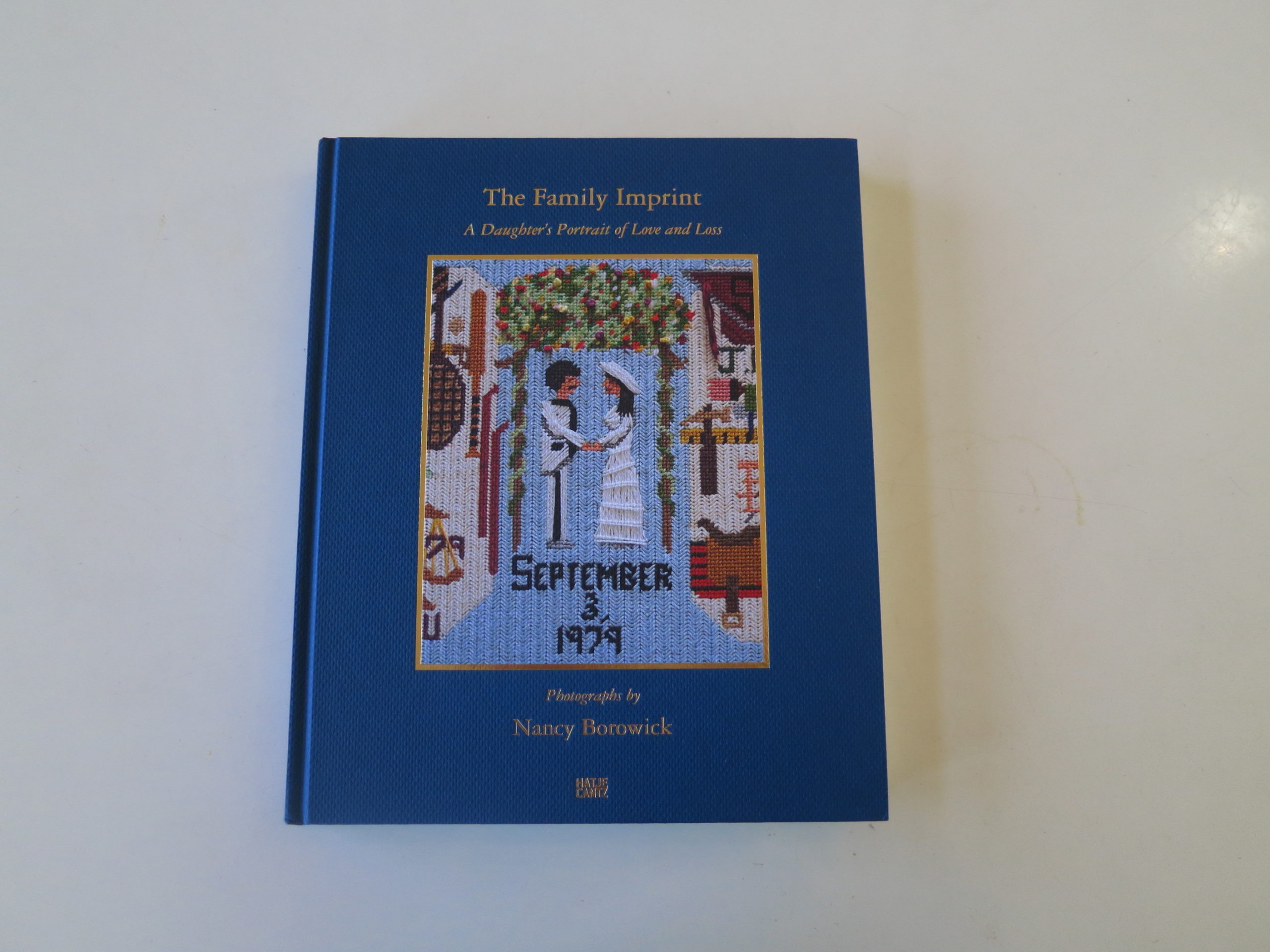
I thanked them recently on Twitter, and am doing so here, because it lead to reviews of Kathy Shorr’s “SHOT”, Nina Berman’s “An autobiography of Miss Wish,” and now “The Family Imprint: A Daughter’s Portrait of Love and Loss,” by Nancy Borowick, published by Hatje Cantz.
(We’ll also be looking at Debi Cornwall’s “Welcome to Camp America: Inside Guantanamo Bay”, by Radius, and it’s good, as Debi gave me a preview in NYC last spring.)
I know the books that were recommended were pre-selected for being successful, but their commonalities are impossible to ignore.
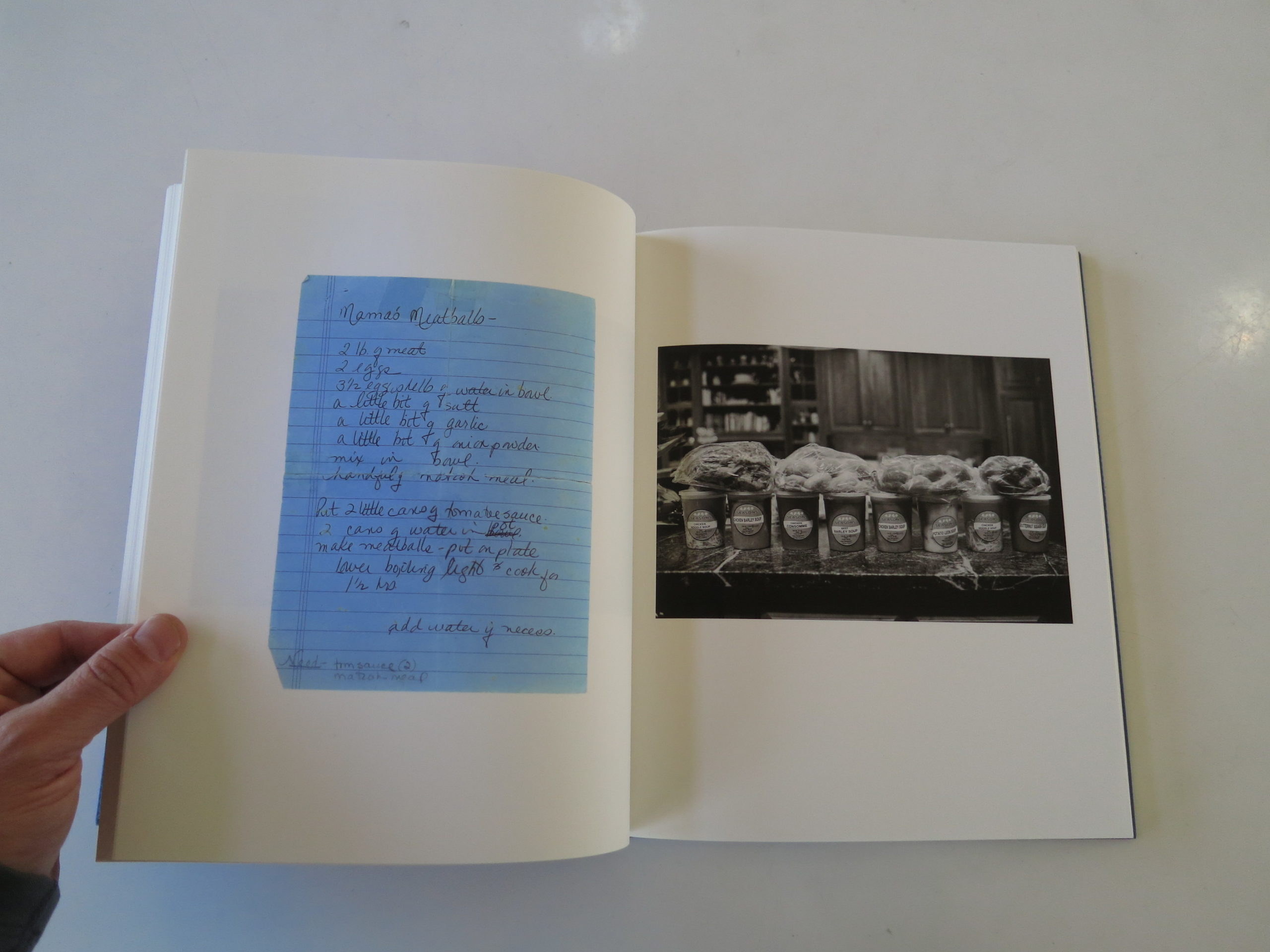
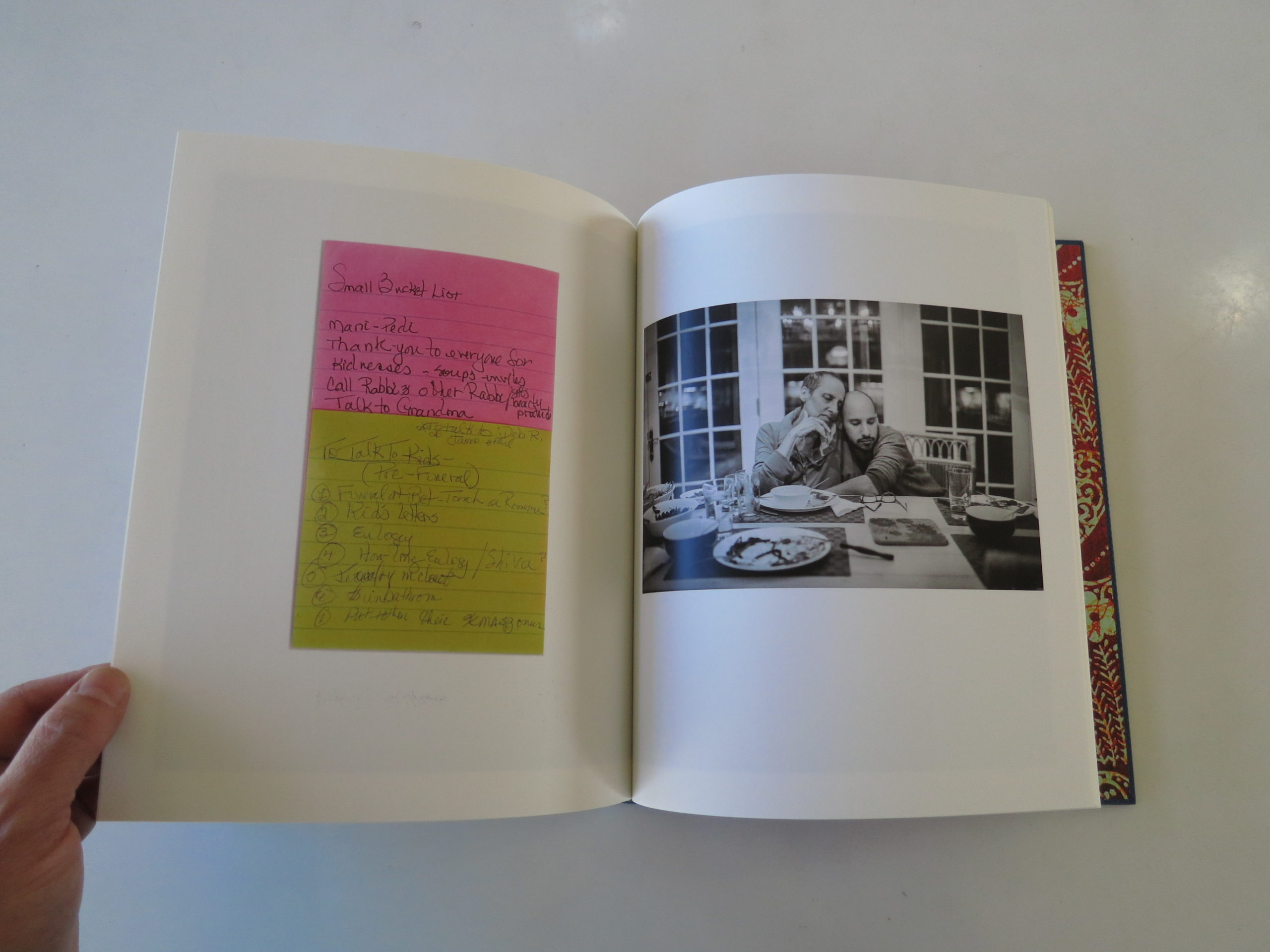
These books are personal, and emotional. They’re exhaustive, and incorporate text that is as strong as the pictures. They use nontraditional materials within, like cards and medical forms, to break up the monotony of the narrative.
And each discusses a subject that is at the outer edge of human experience, while simultaneously being entirely human.
(At this point, I’ll stop lumping Nancy’s book in with the others, and tell you why it’s so great.)
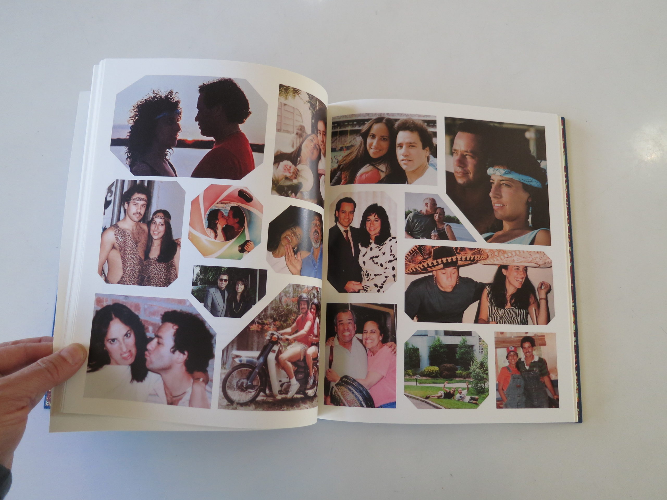
Nancy Borowick grew up Jewish, in New York, to loyal, loving parents. Her father, like mine, was a lawyer, a baby-boomer, a Giants fan, and his initials were HB.
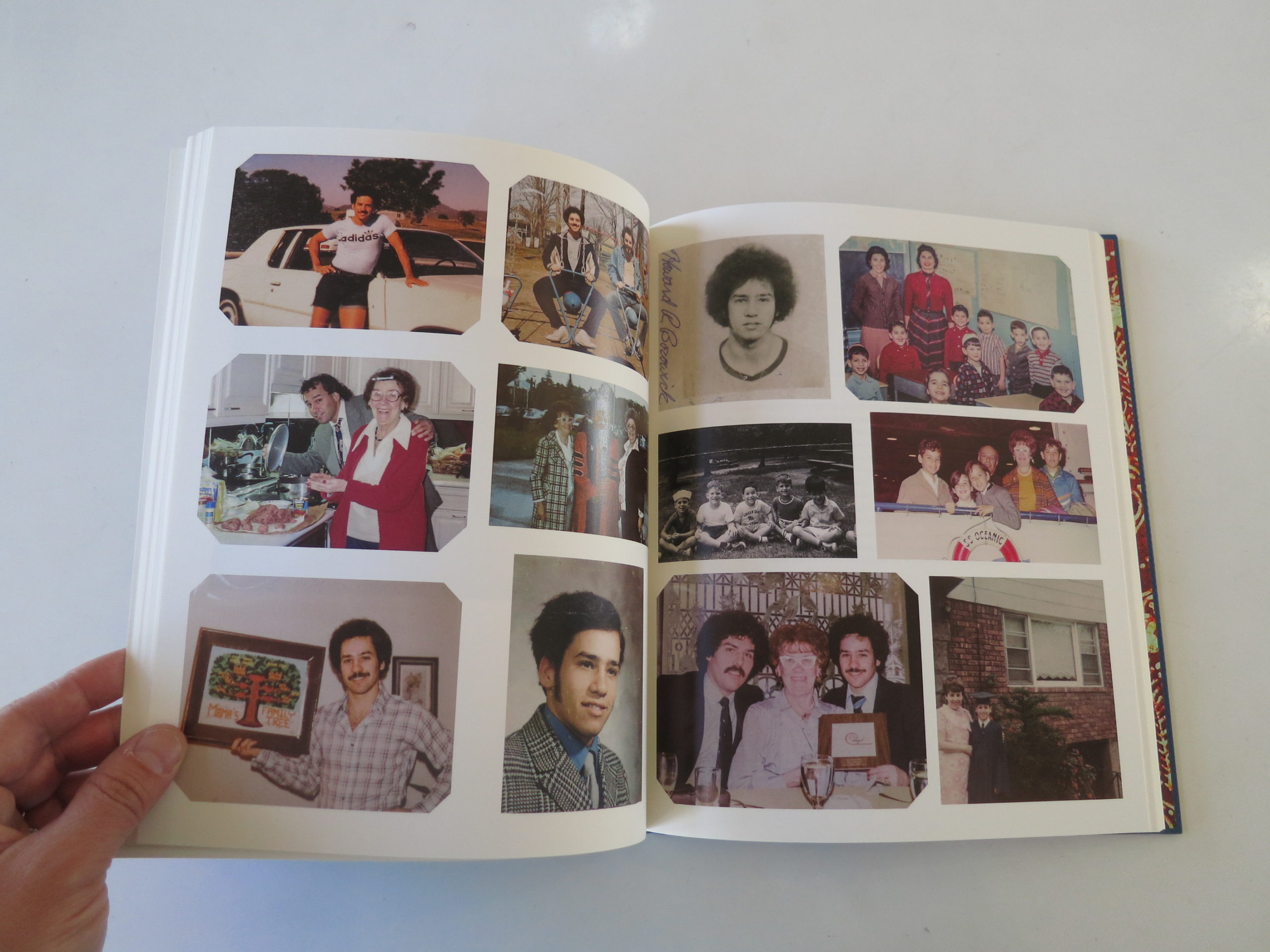
Like my folks, her parents went to costume parties, took their family on skiing vacations, and had photographs of embarrassing 80’s fashion.
It’s no surprise that life in the New York City suburbs might be similar.
I get it.
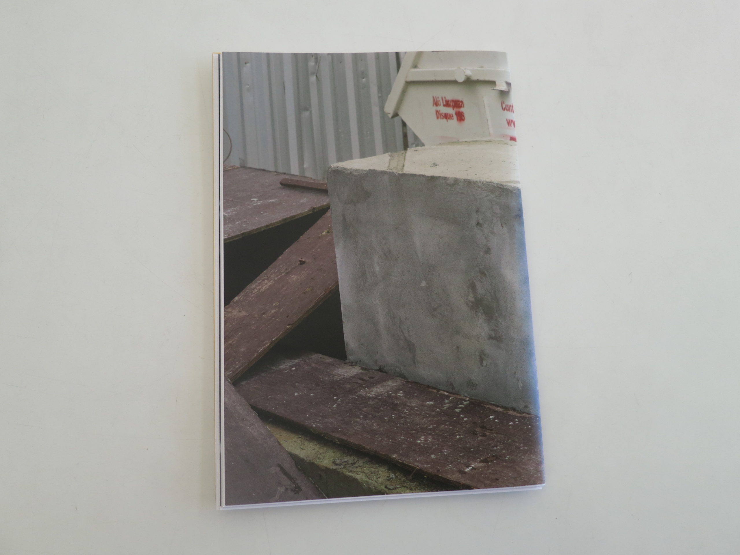
But that’s where our stories diverge. (If you don’t make that hard right turn, at just the right time, you’re sure to crash into the concrete stanchion up ahead.)
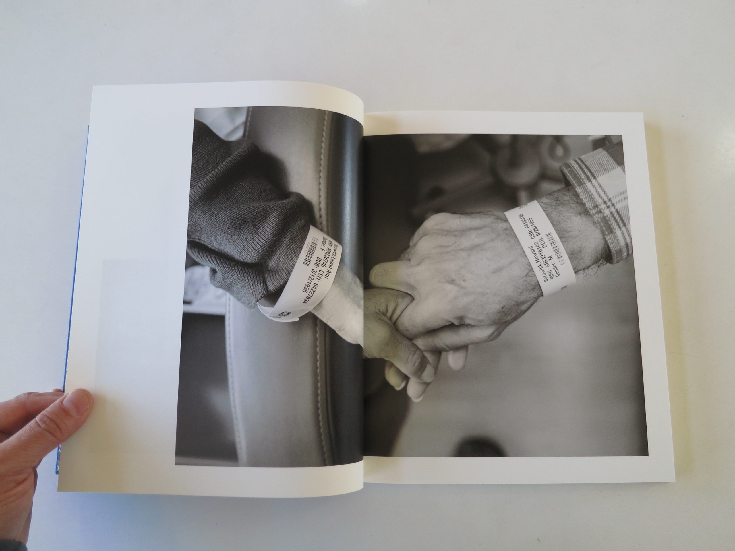
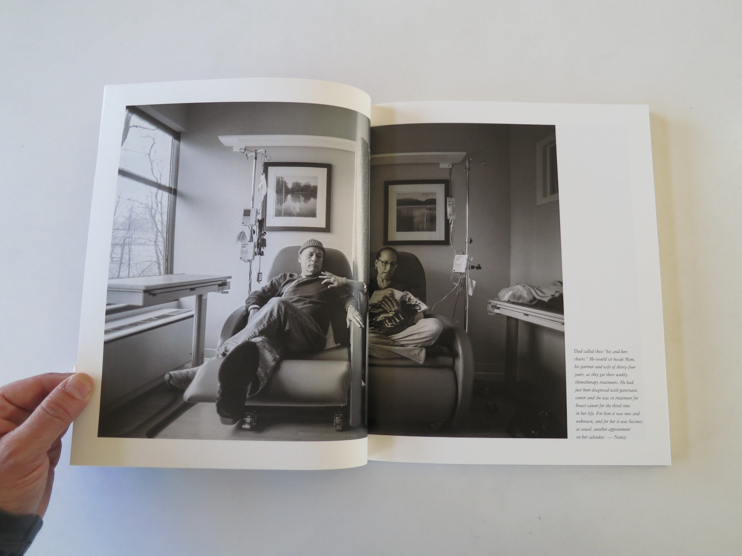
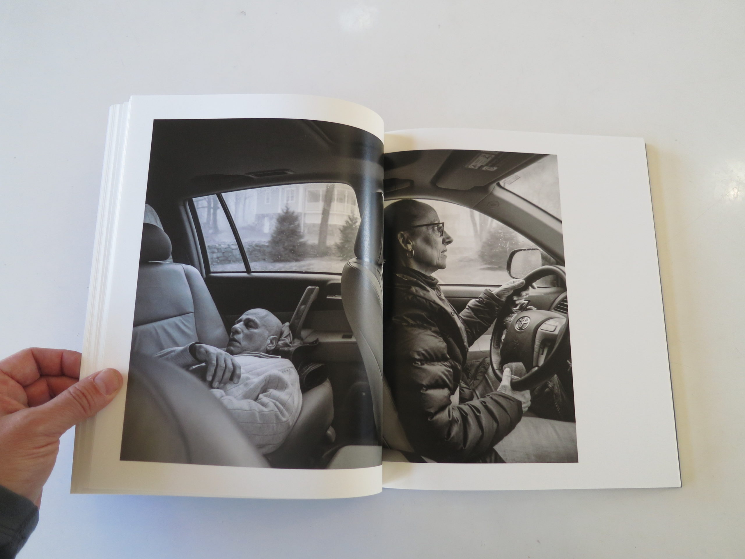
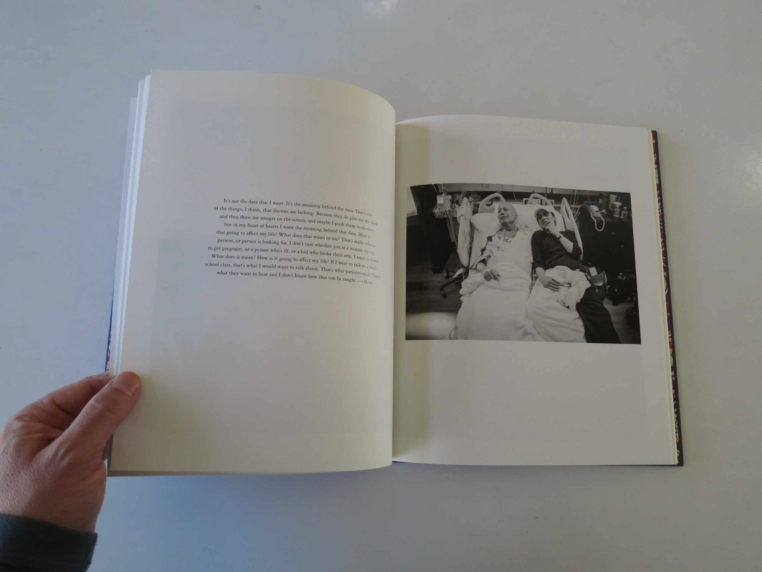
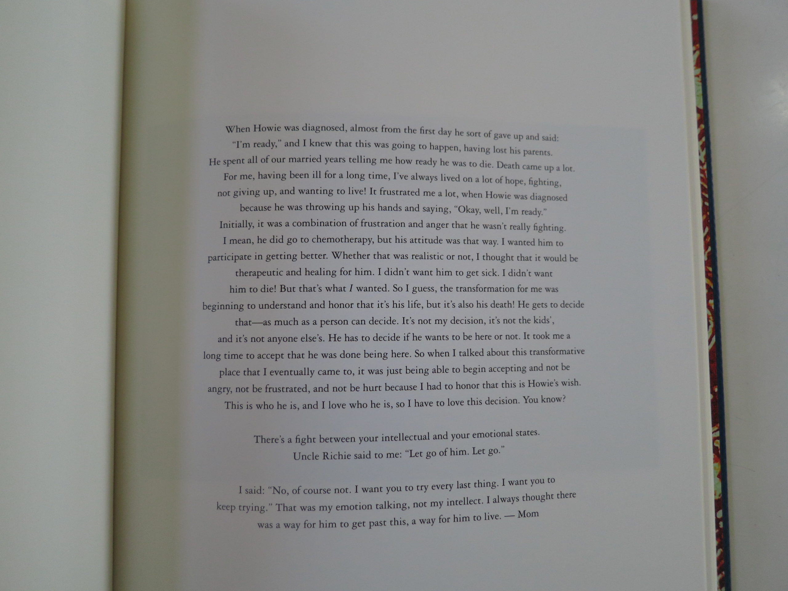
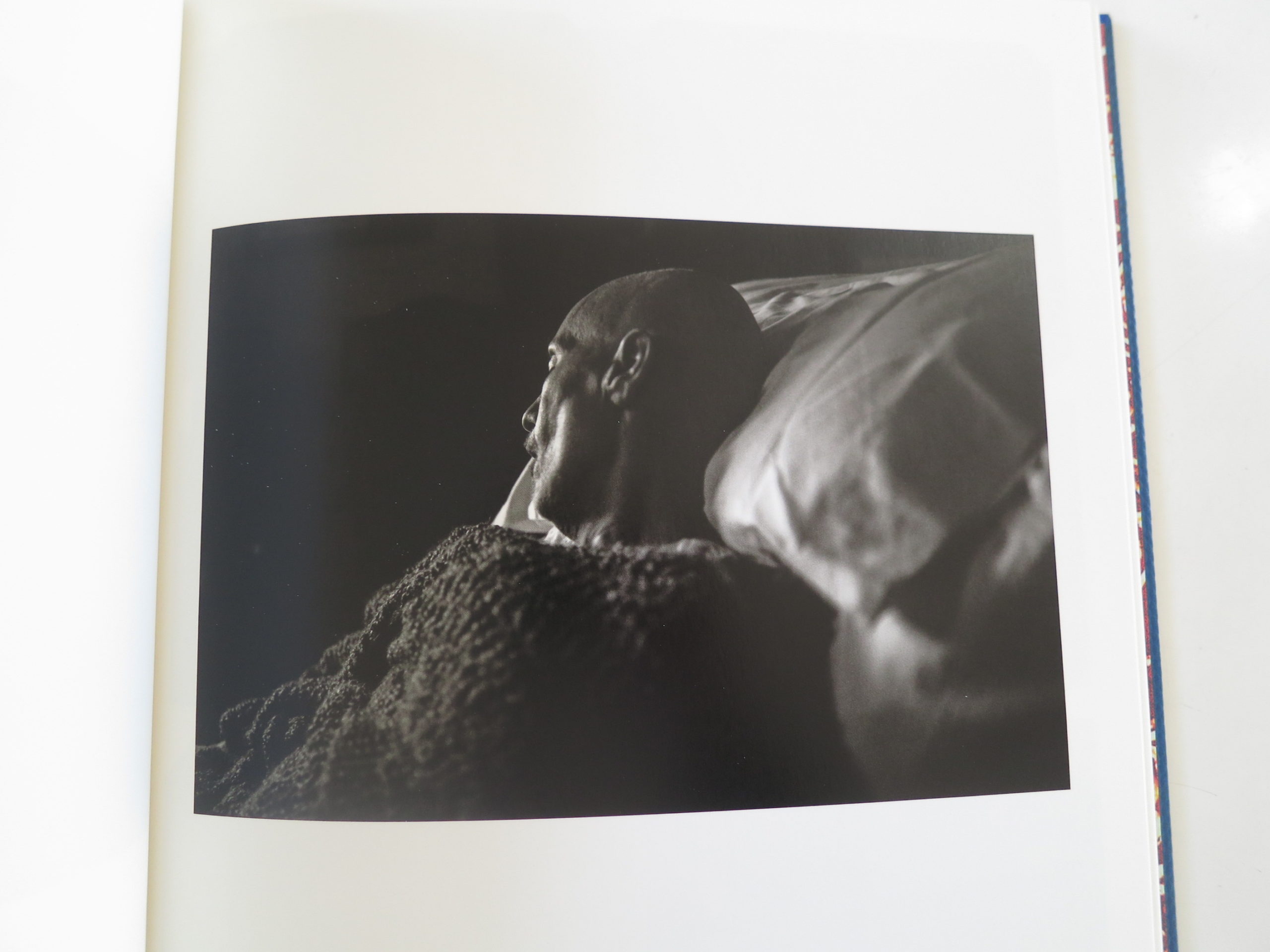
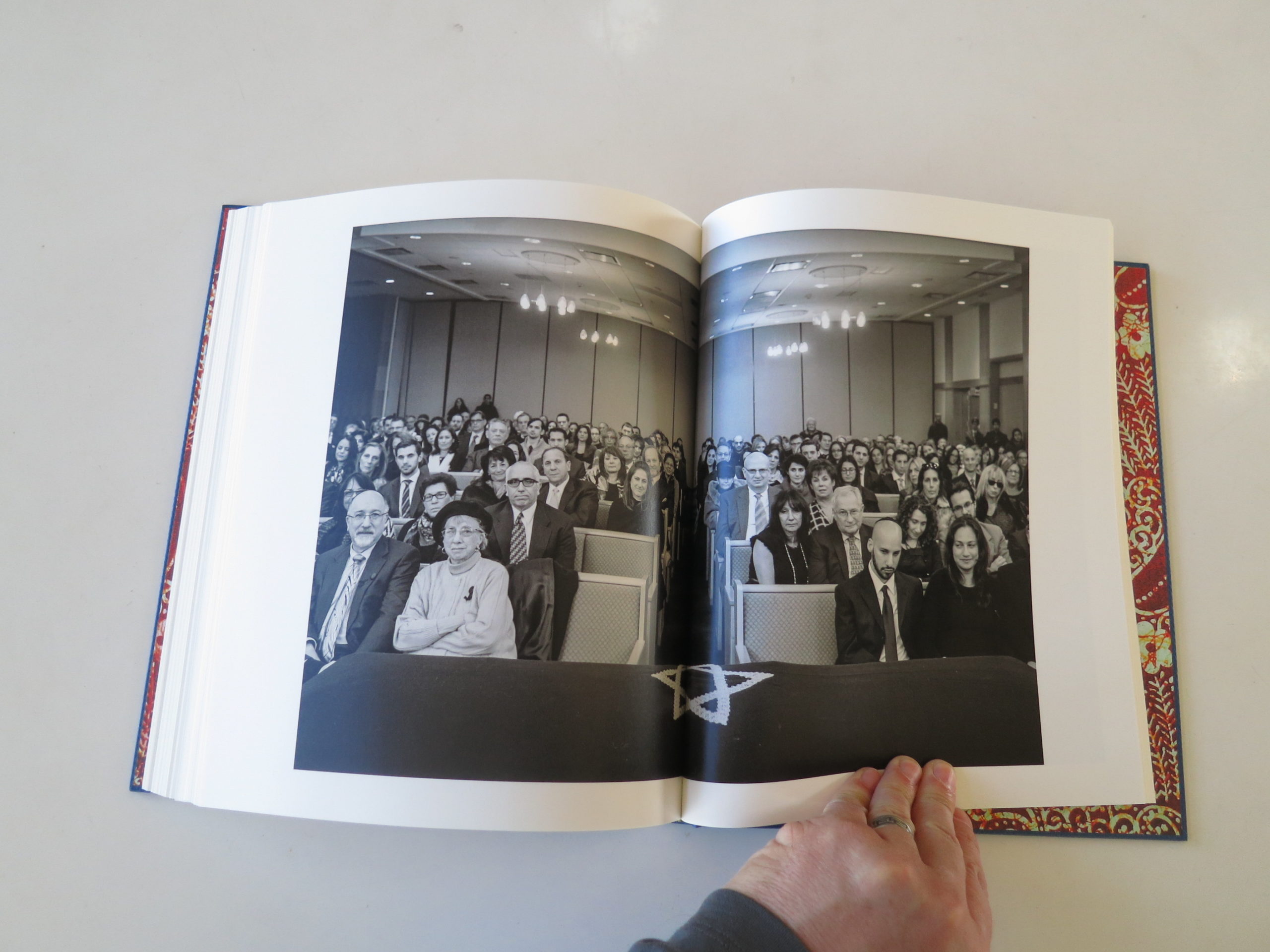
Cancer runs in Nancy Borowick’s family, and Nancy’s mother, Laurel, was first diagnosed with breast cancer in 1997, and it recurred in 2009 and ’11. Her father, Howie, developed terminal pancreatic cancer in 2012, so her parents slowly died together.
Her father was buried 364 days before her mother, who had to live that last year of her life without her soulmate.
The book opens with a heartfelt essay, by my friend and mentor James Estrin, who warns of the extreme emotional nature to follow. He said he cried many times, as this project evolved, and I thought, “Yeah, well, I don’t cry. It’ll never happen.”
Like I said: water works.
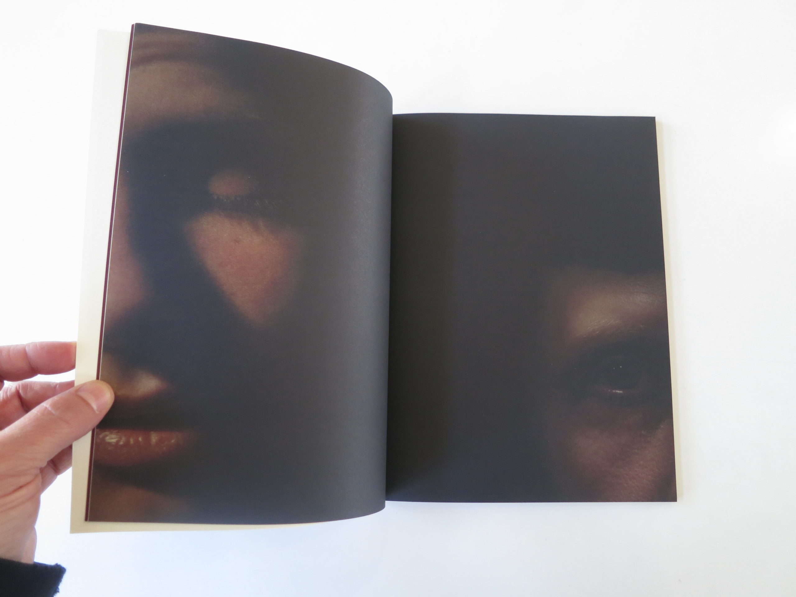
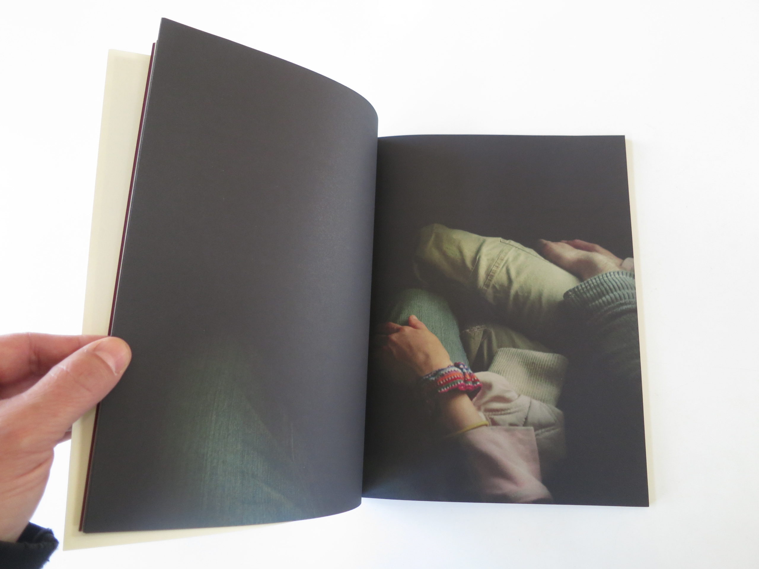
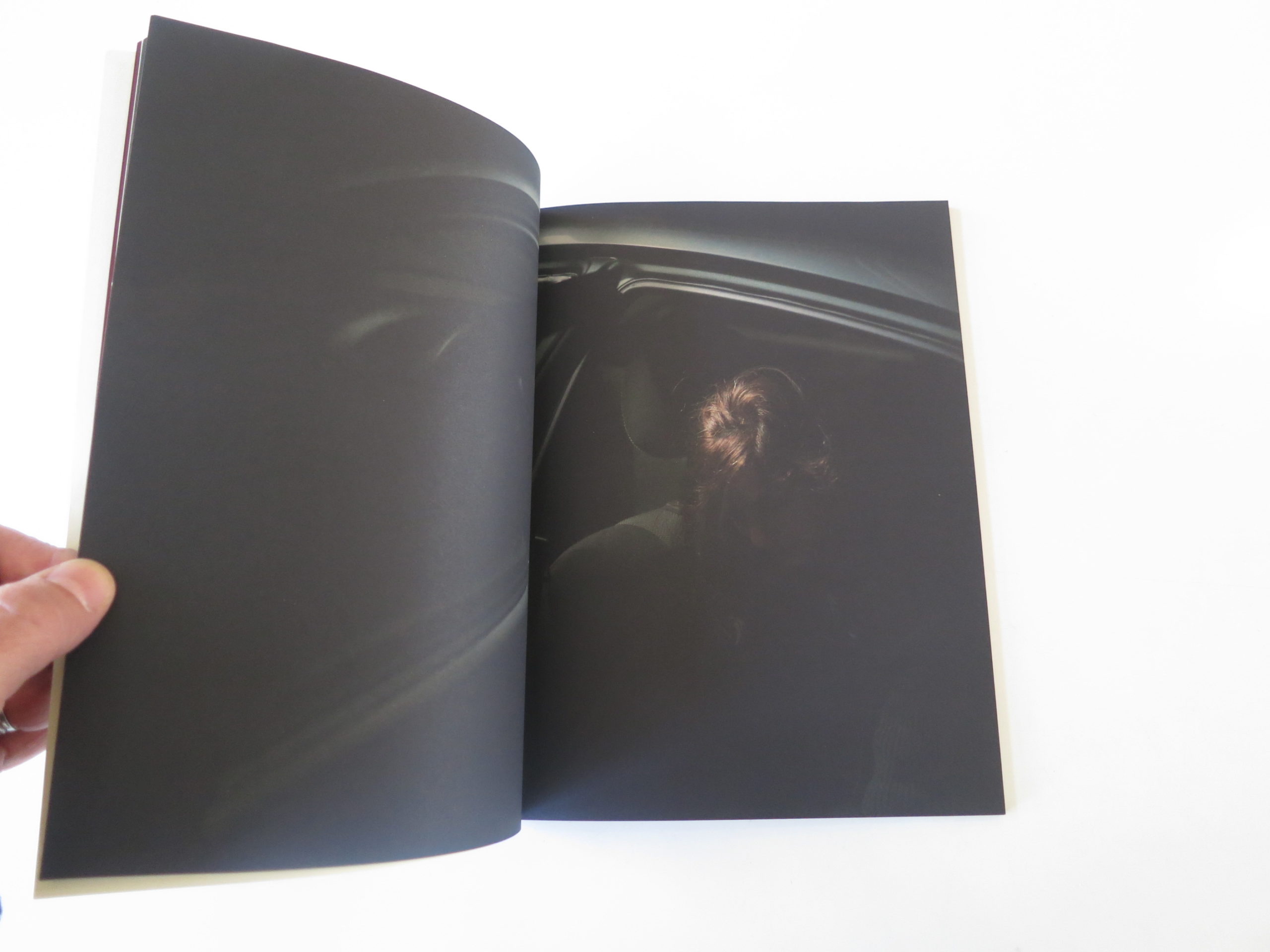
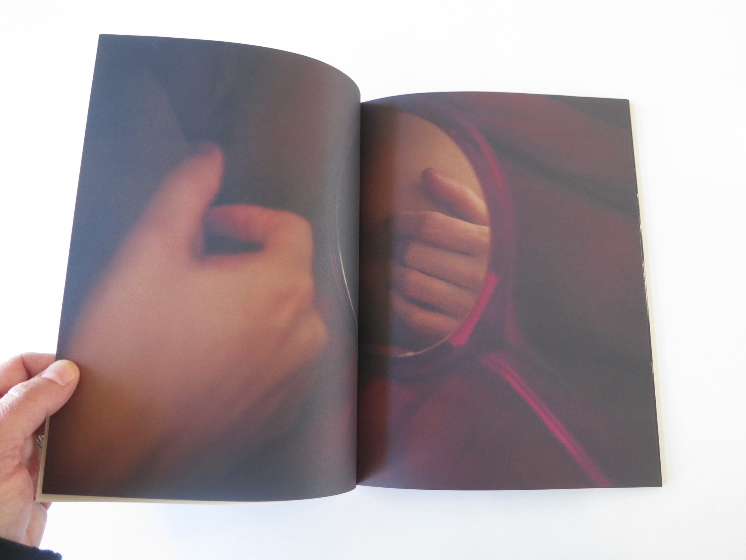
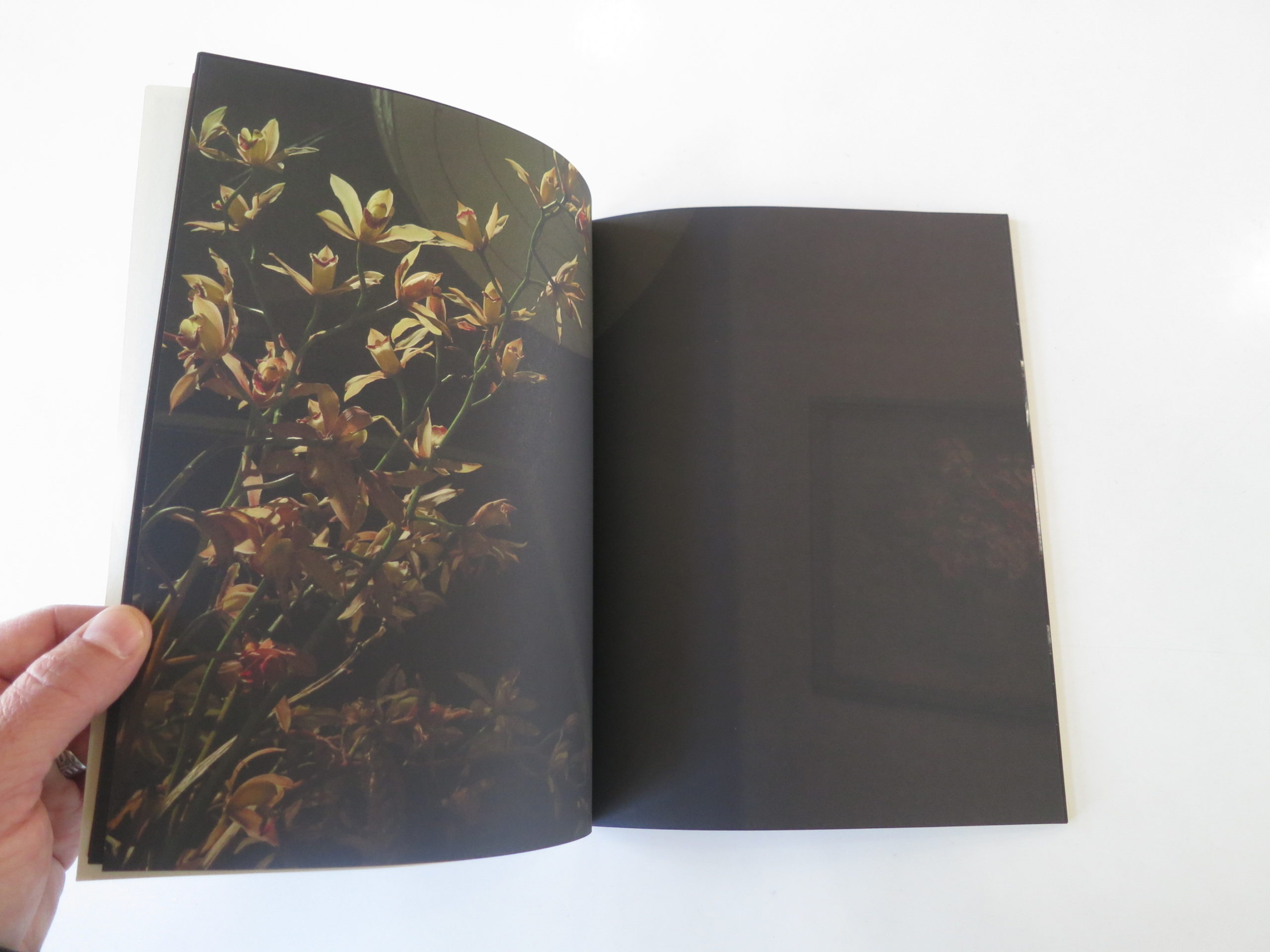
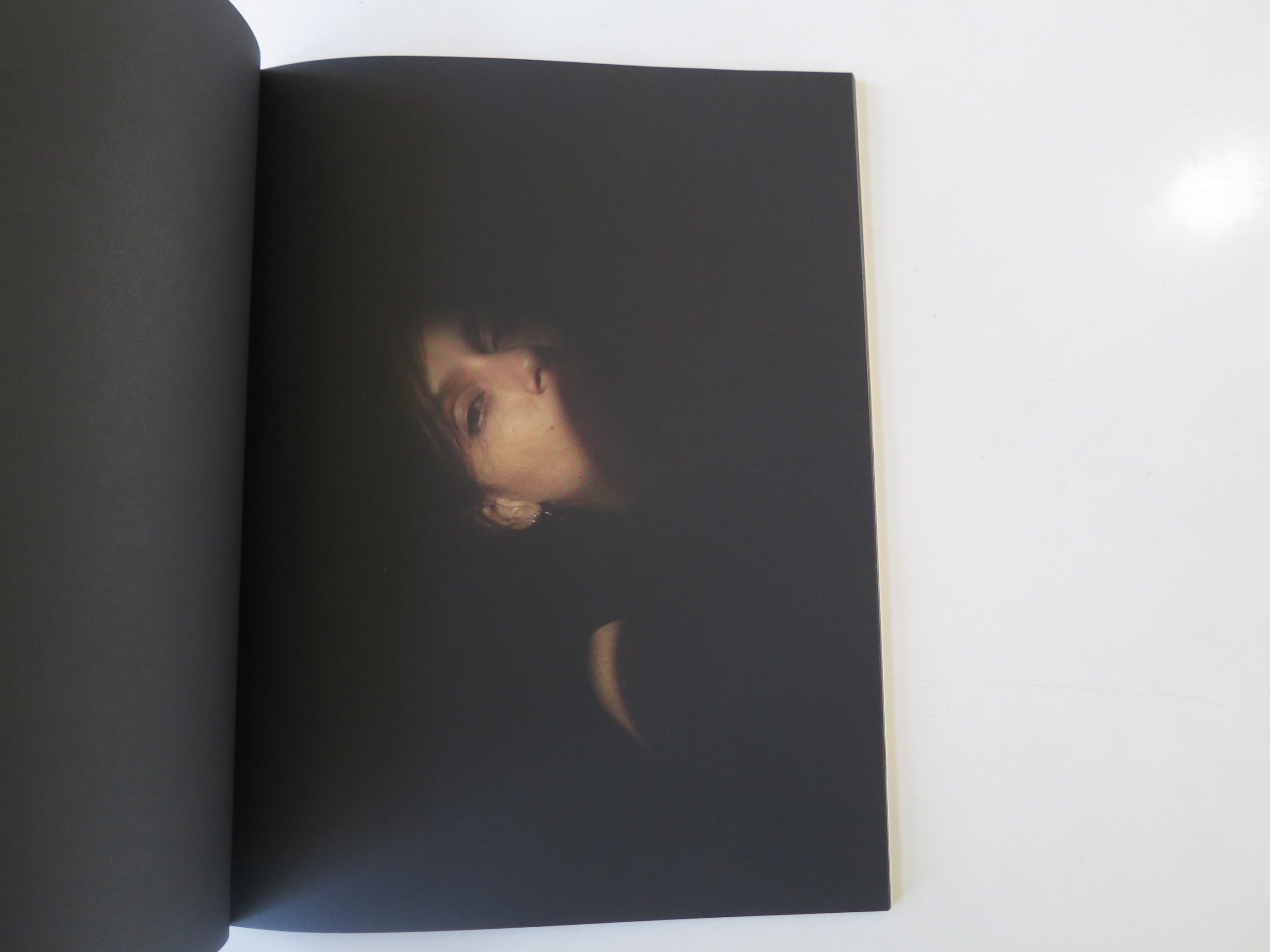
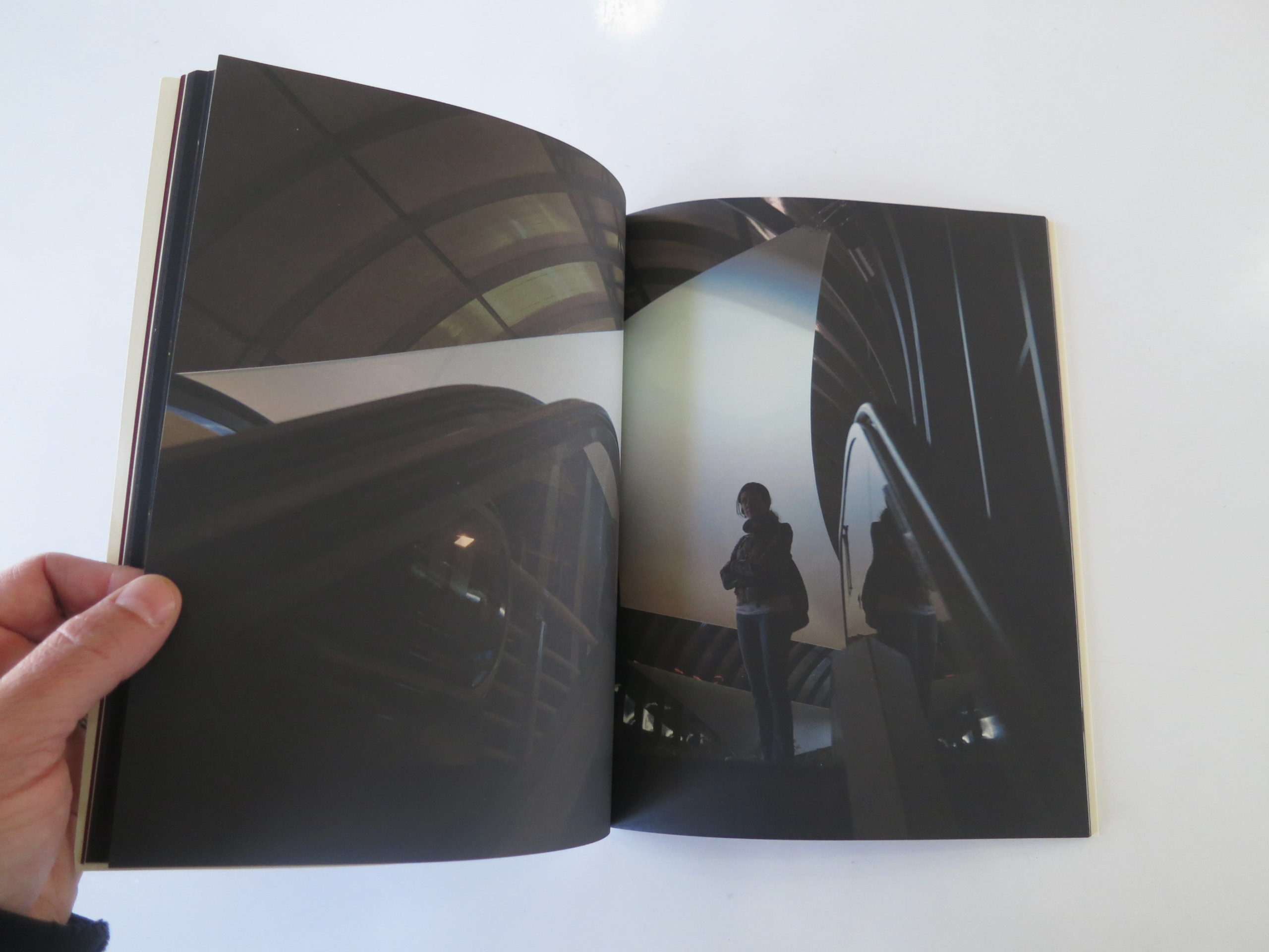
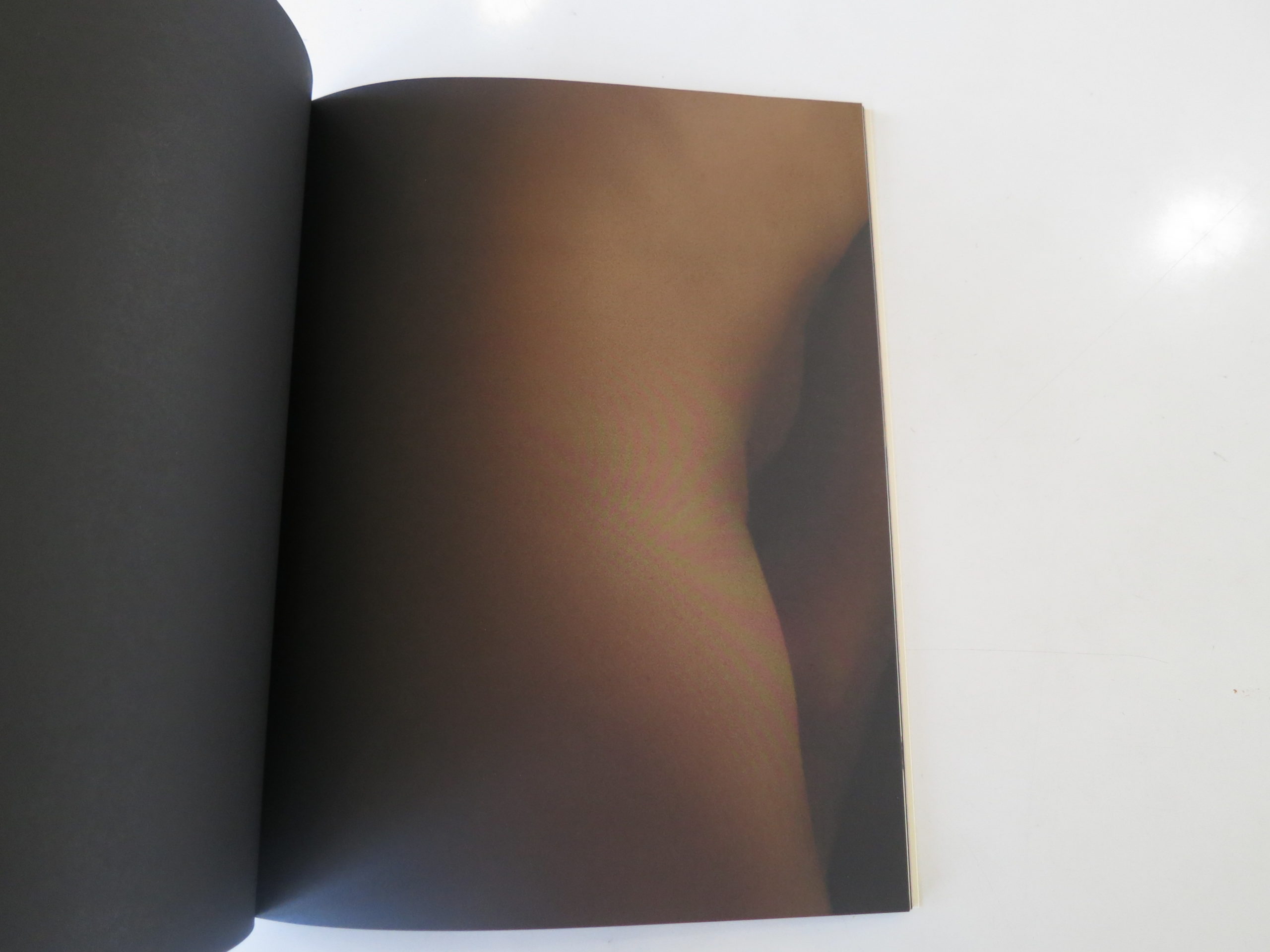
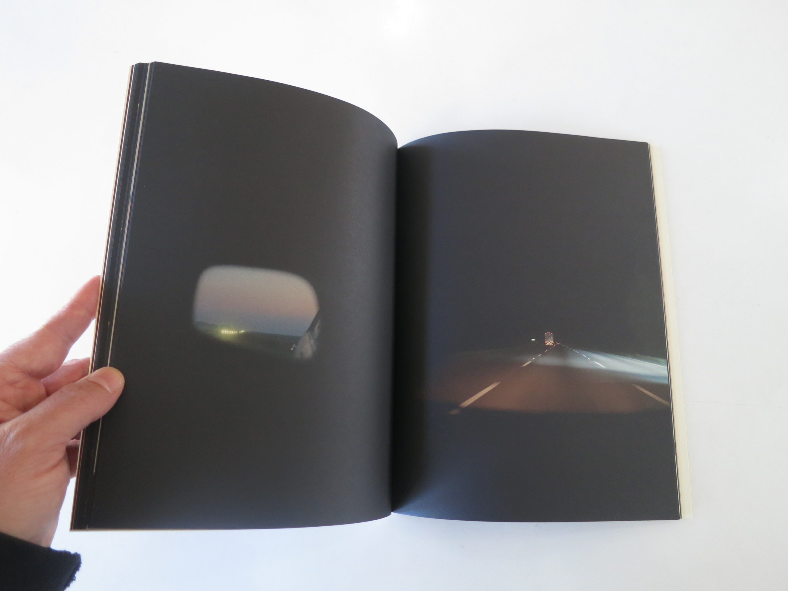
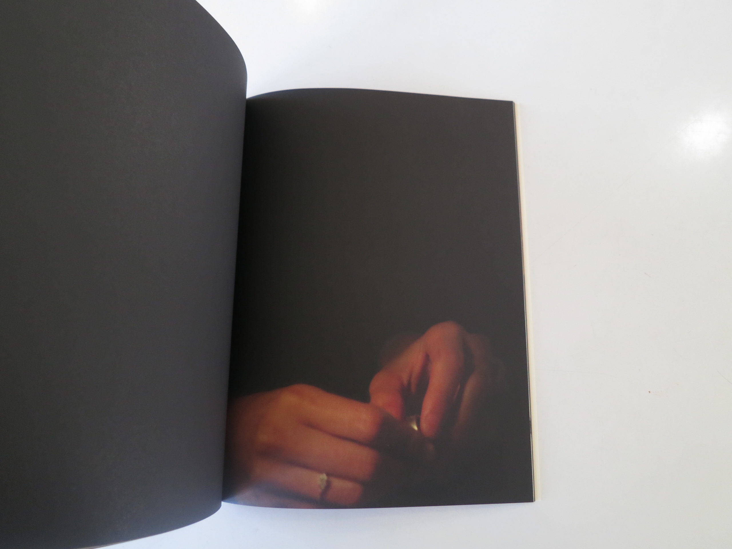
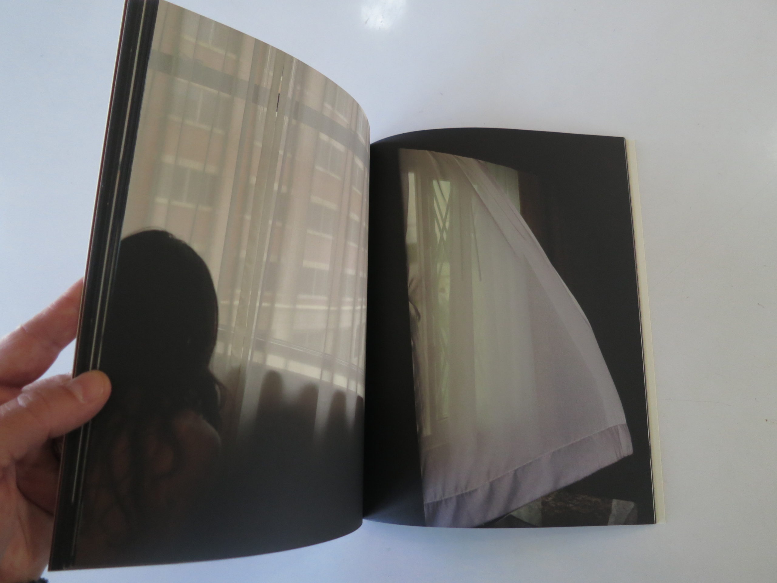
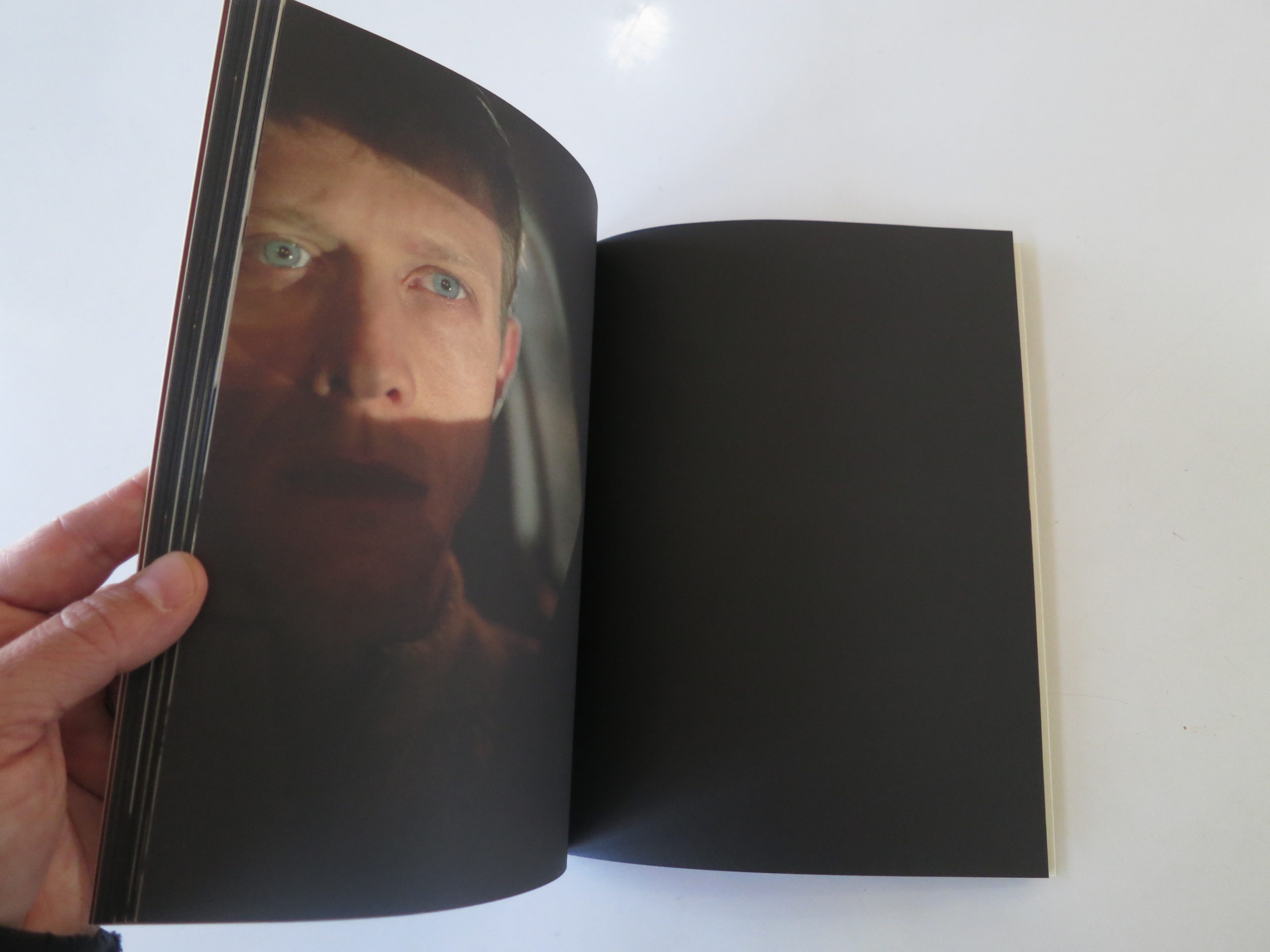
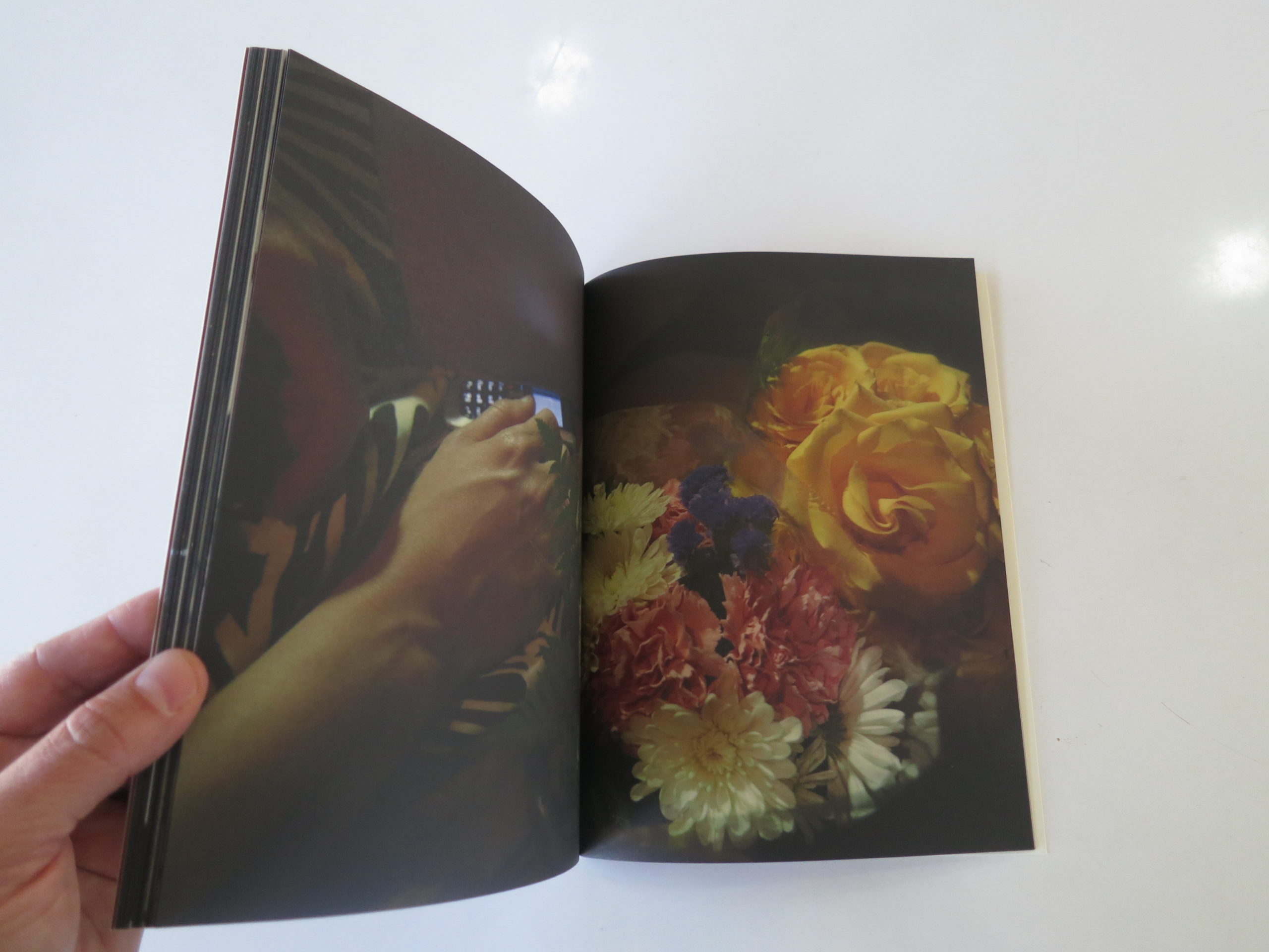
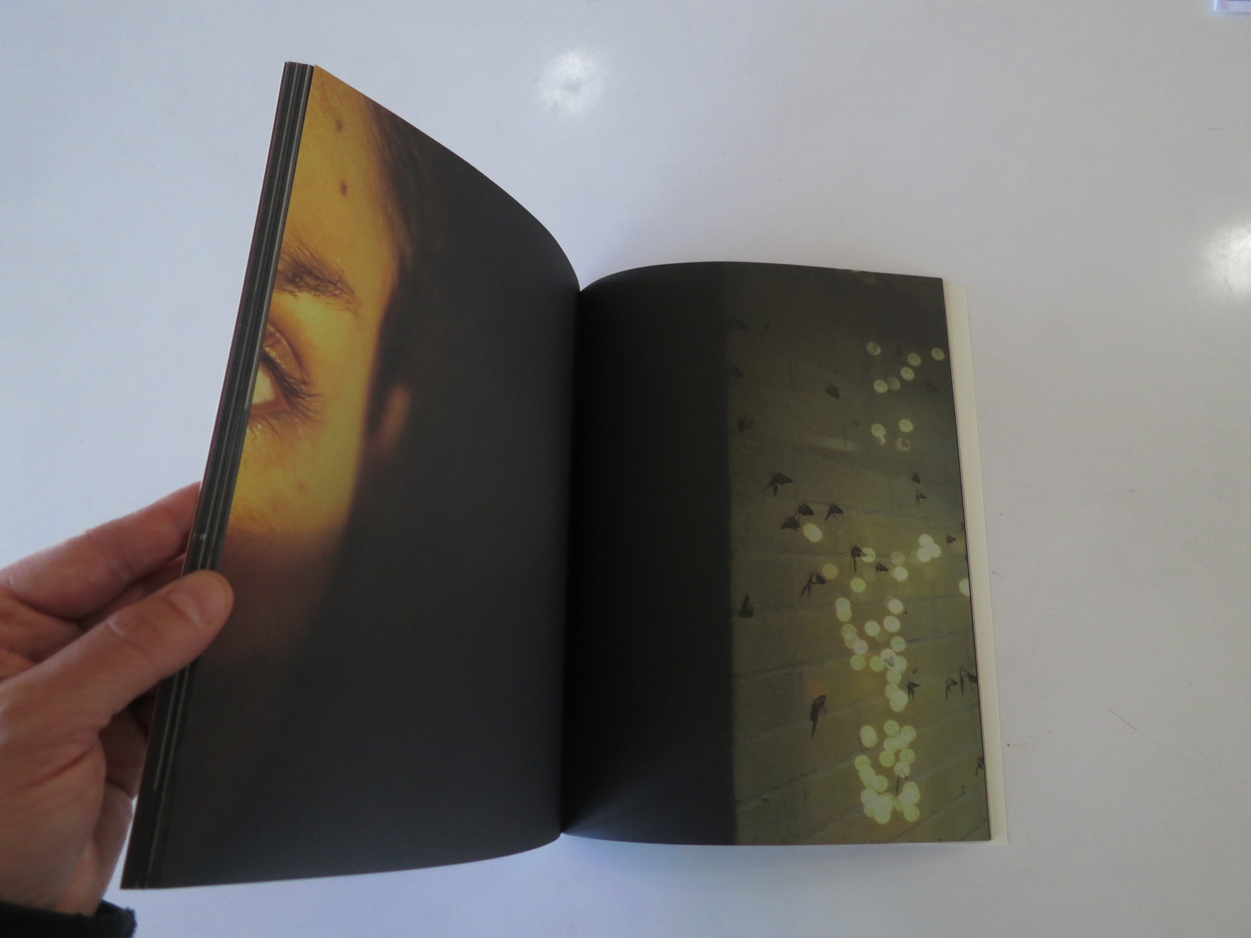
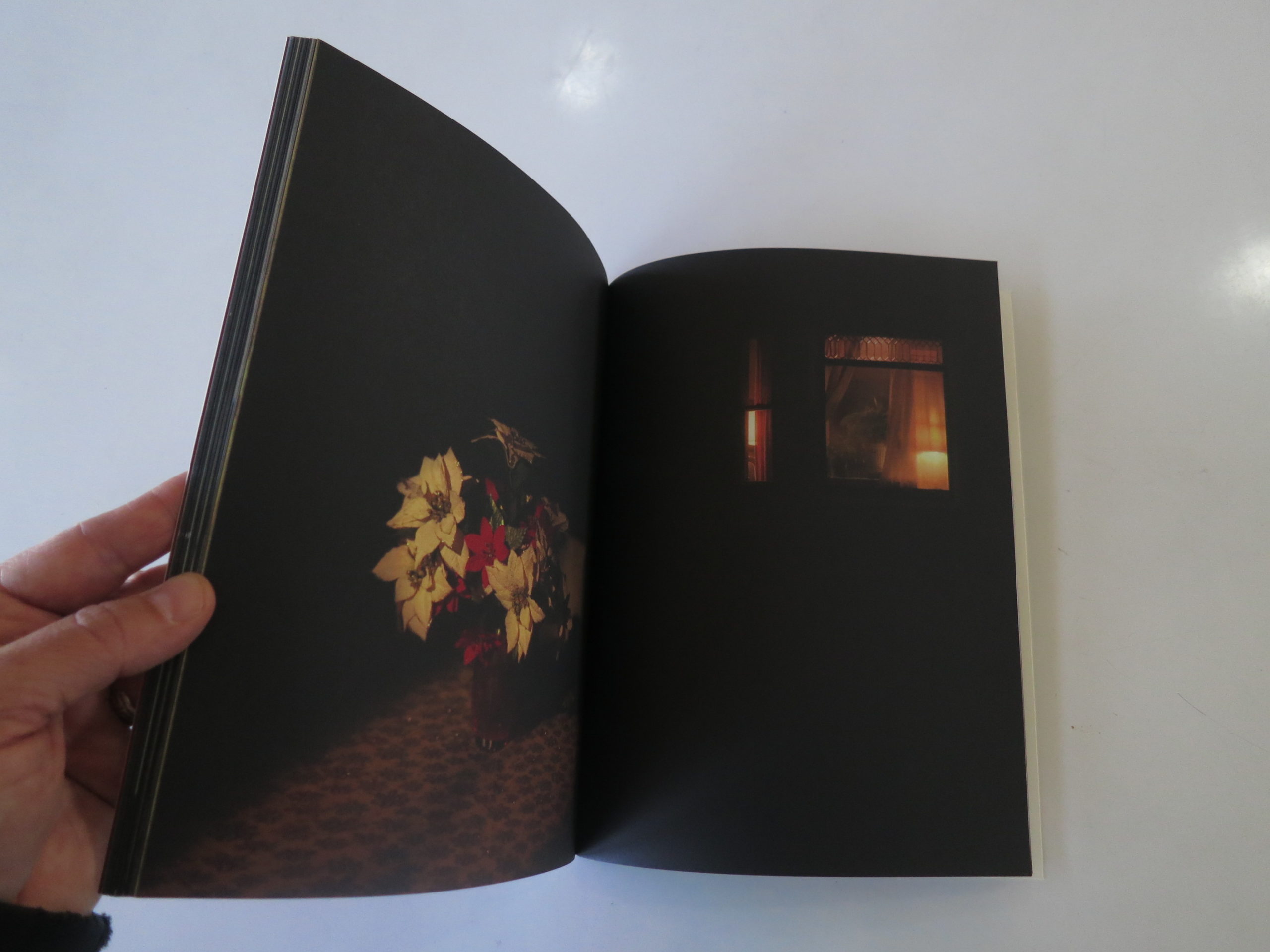
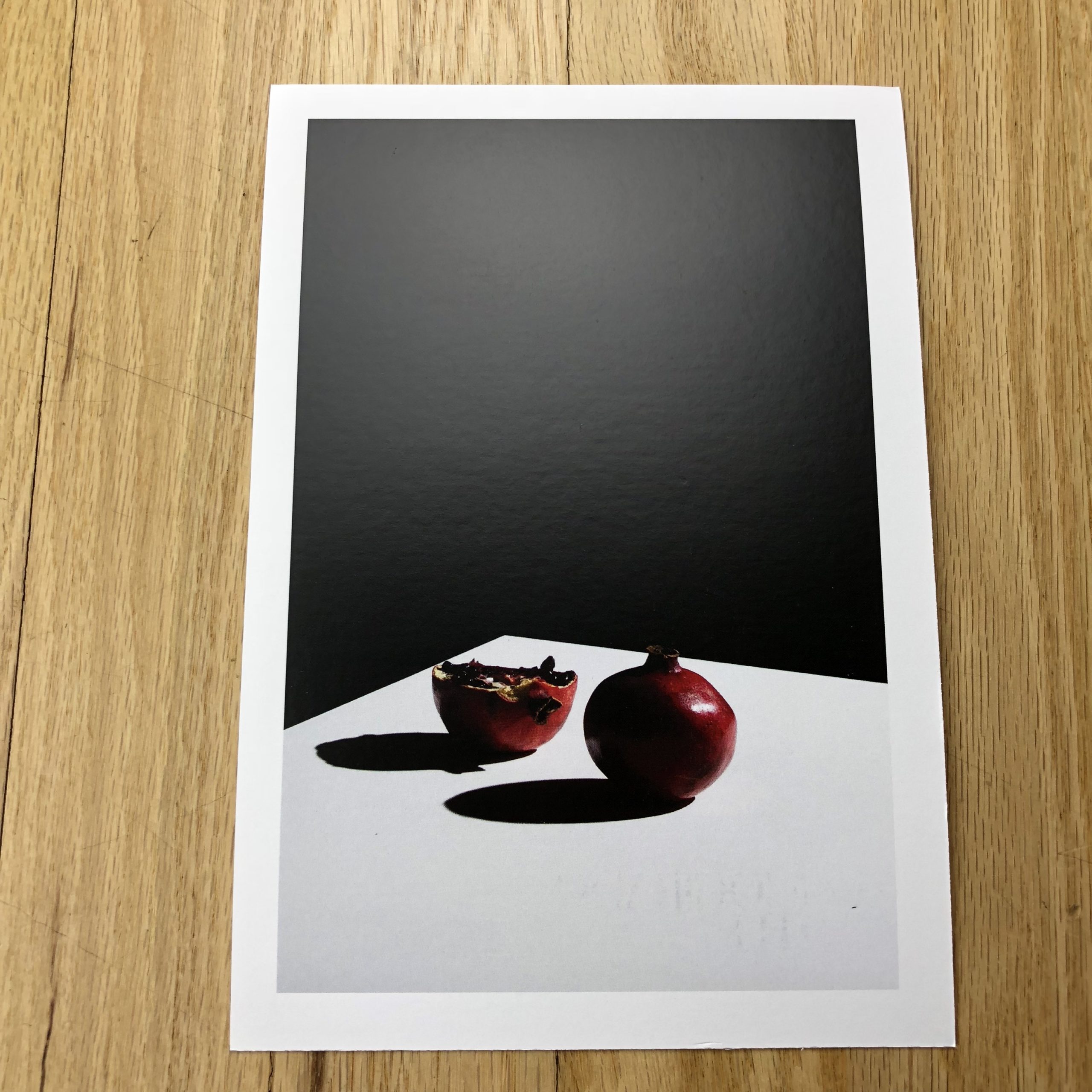
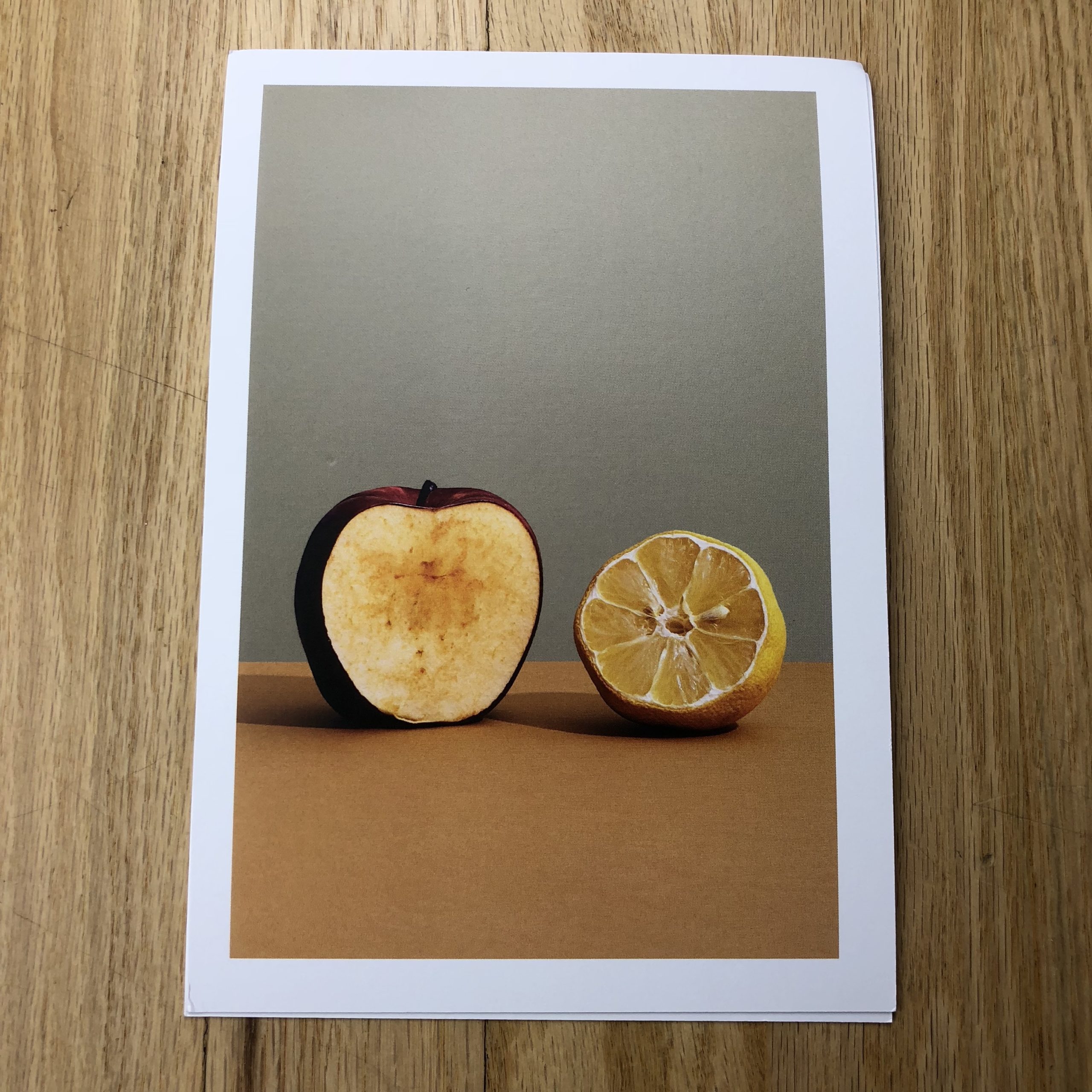
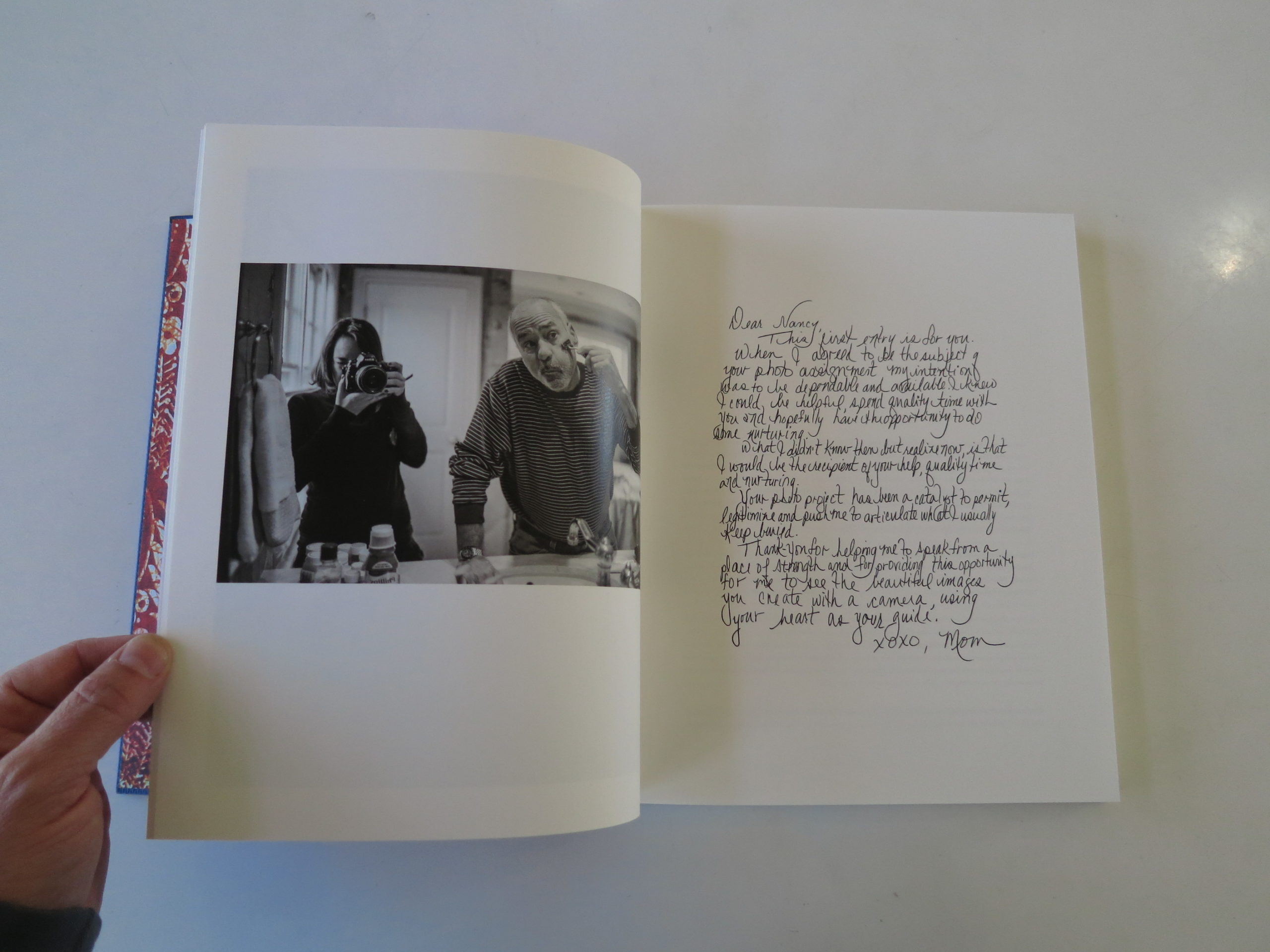
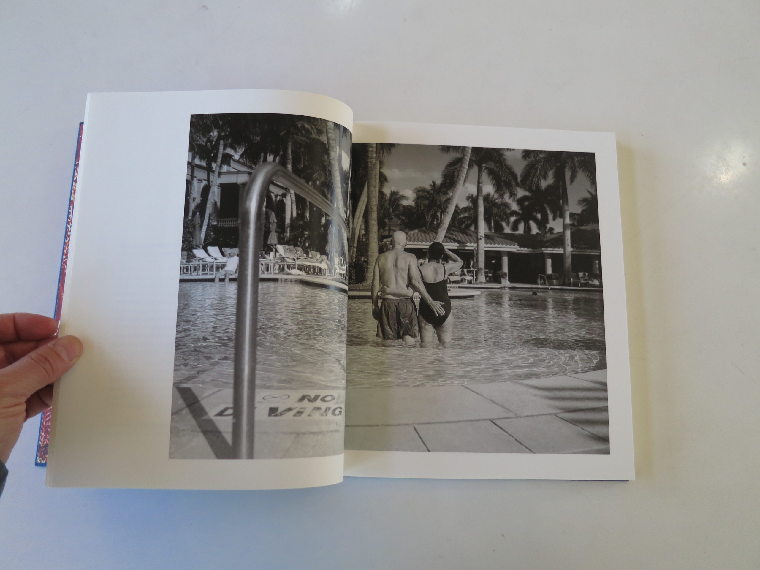
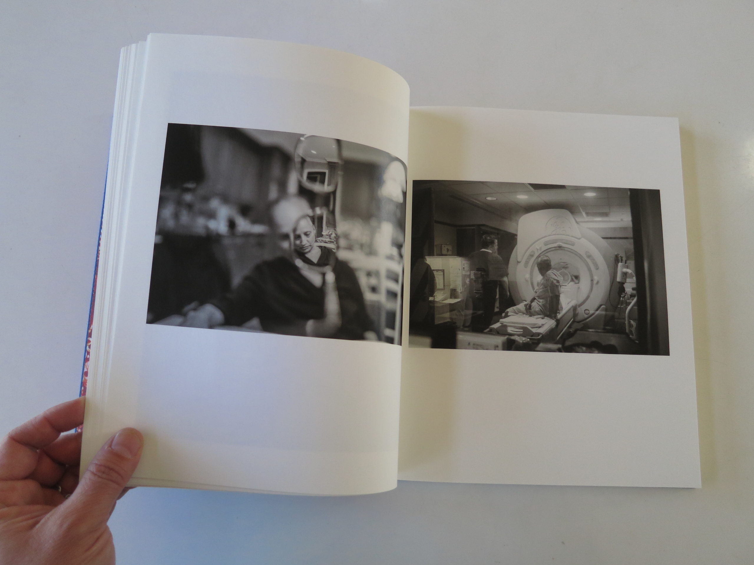
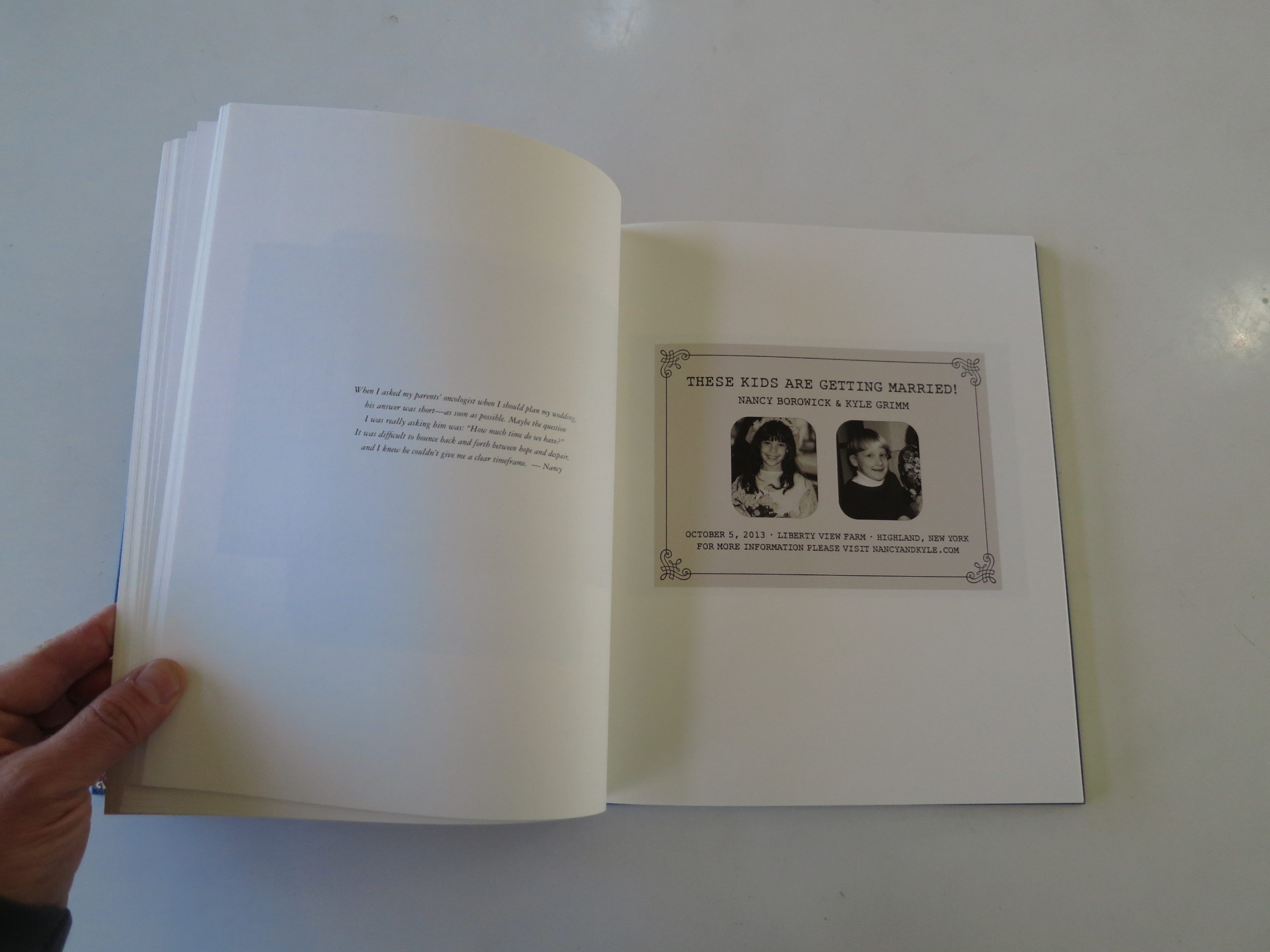
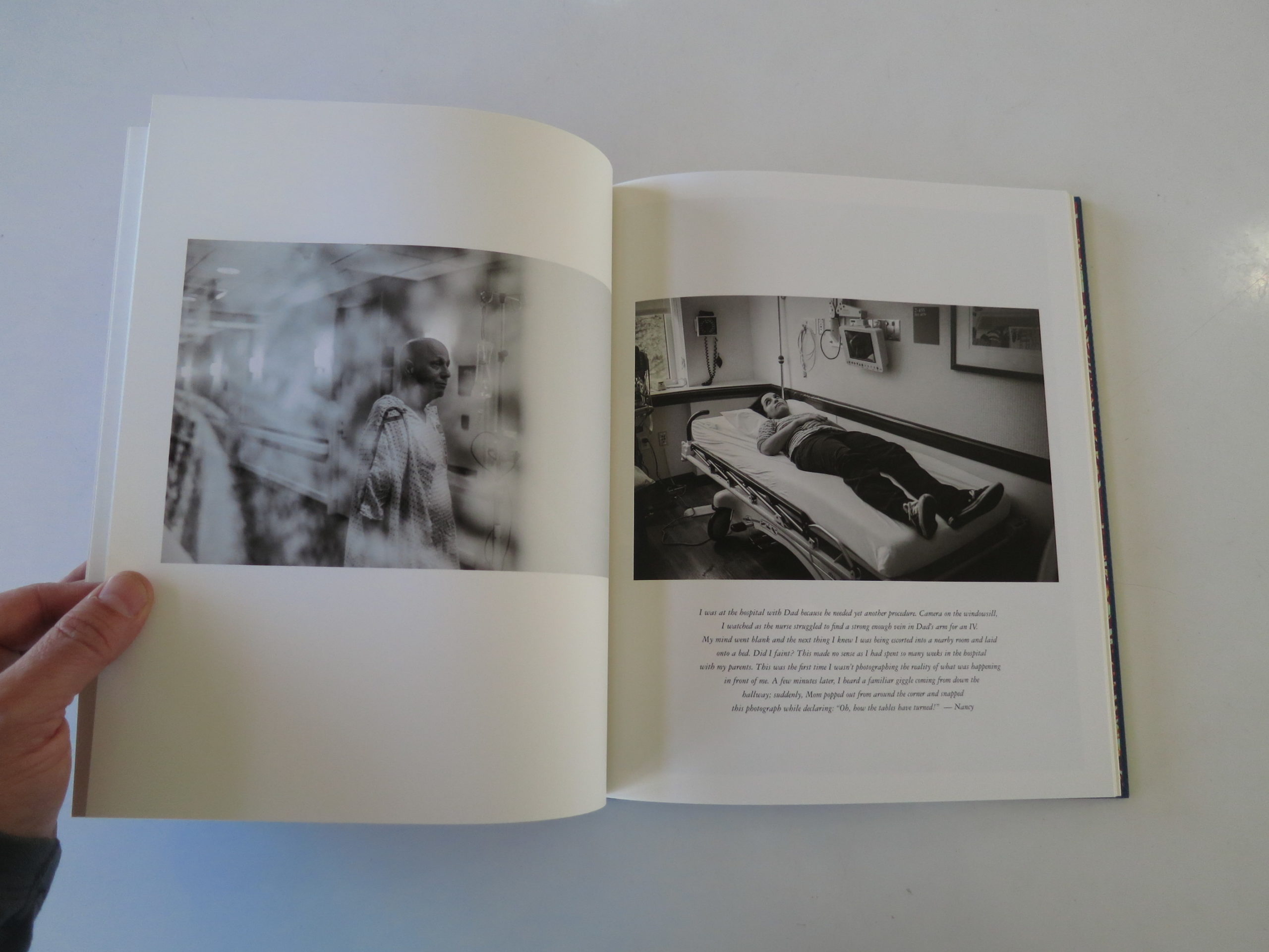
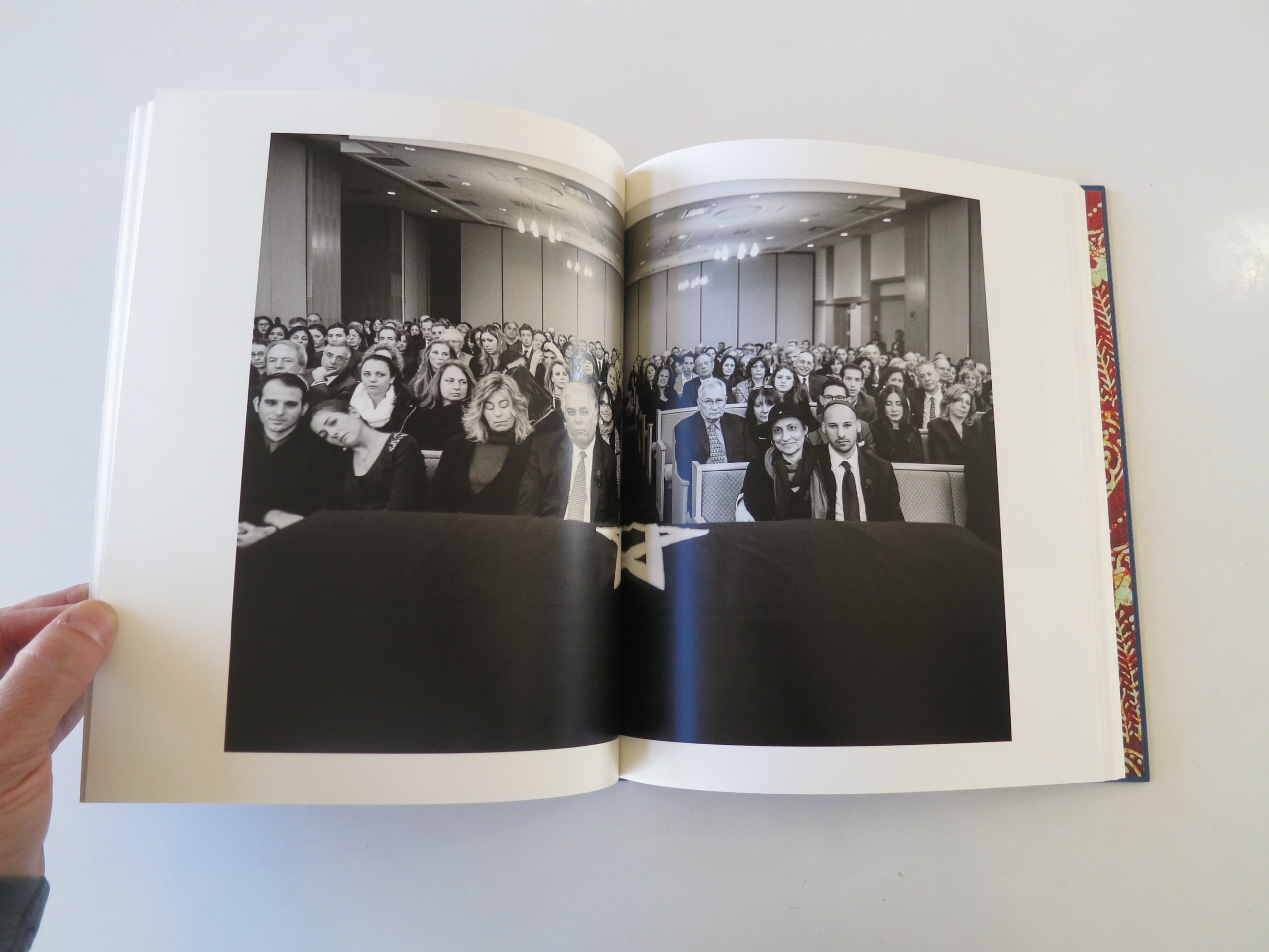
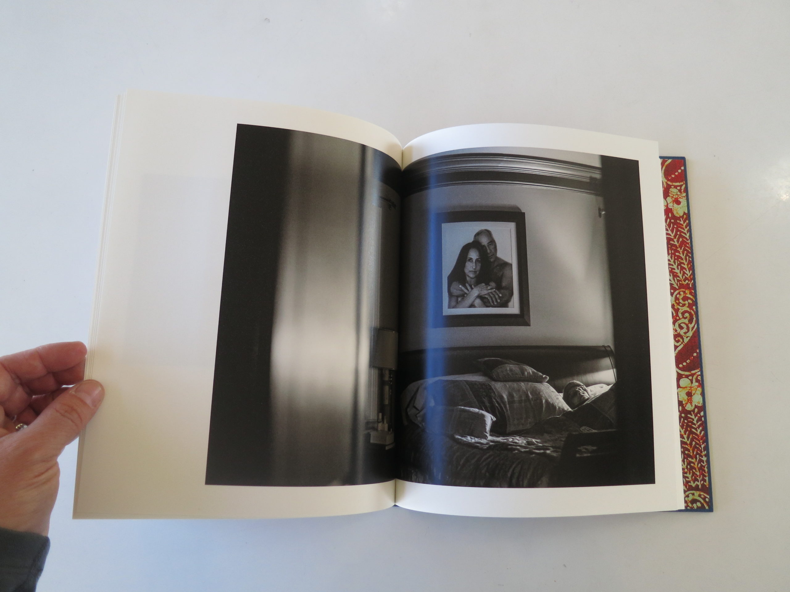
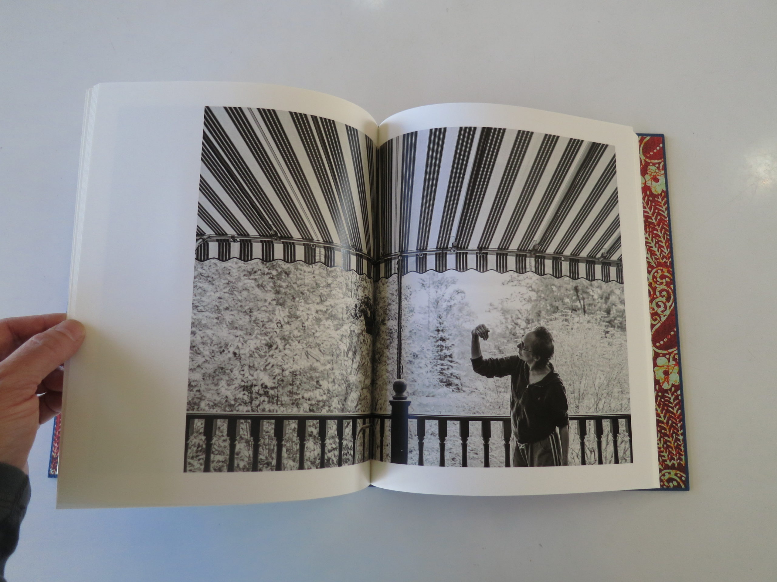
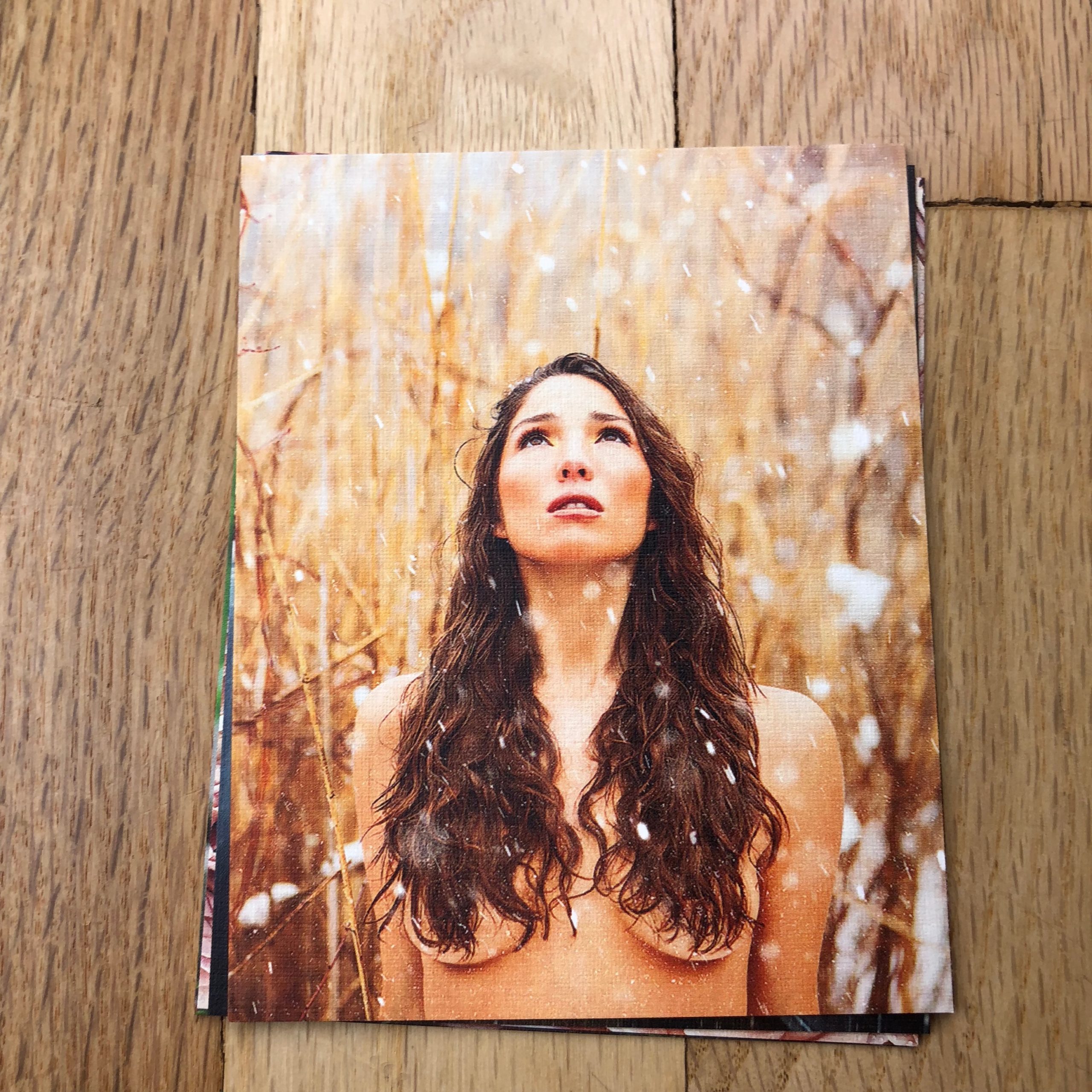
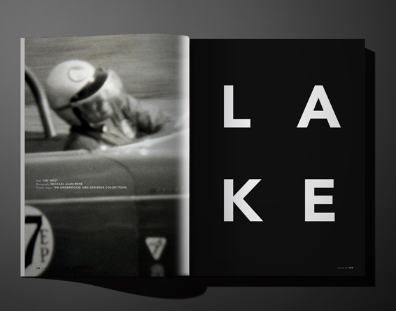
The bulk of the book is comprised of black and white photographs that document this phase of the Borowick family’s life, including a wedding, and unfortunately two funerals.
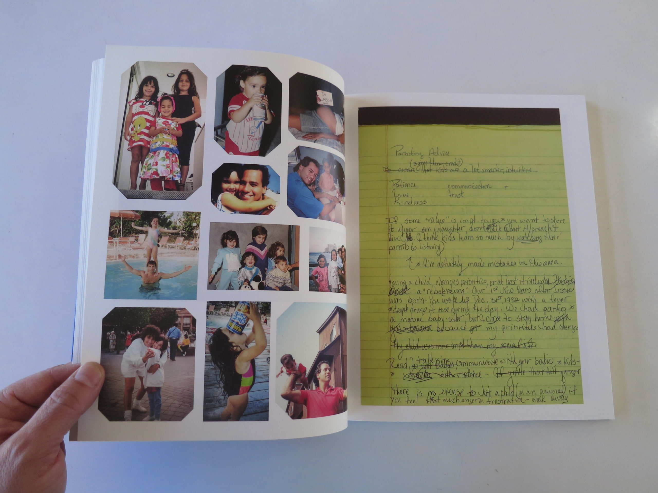
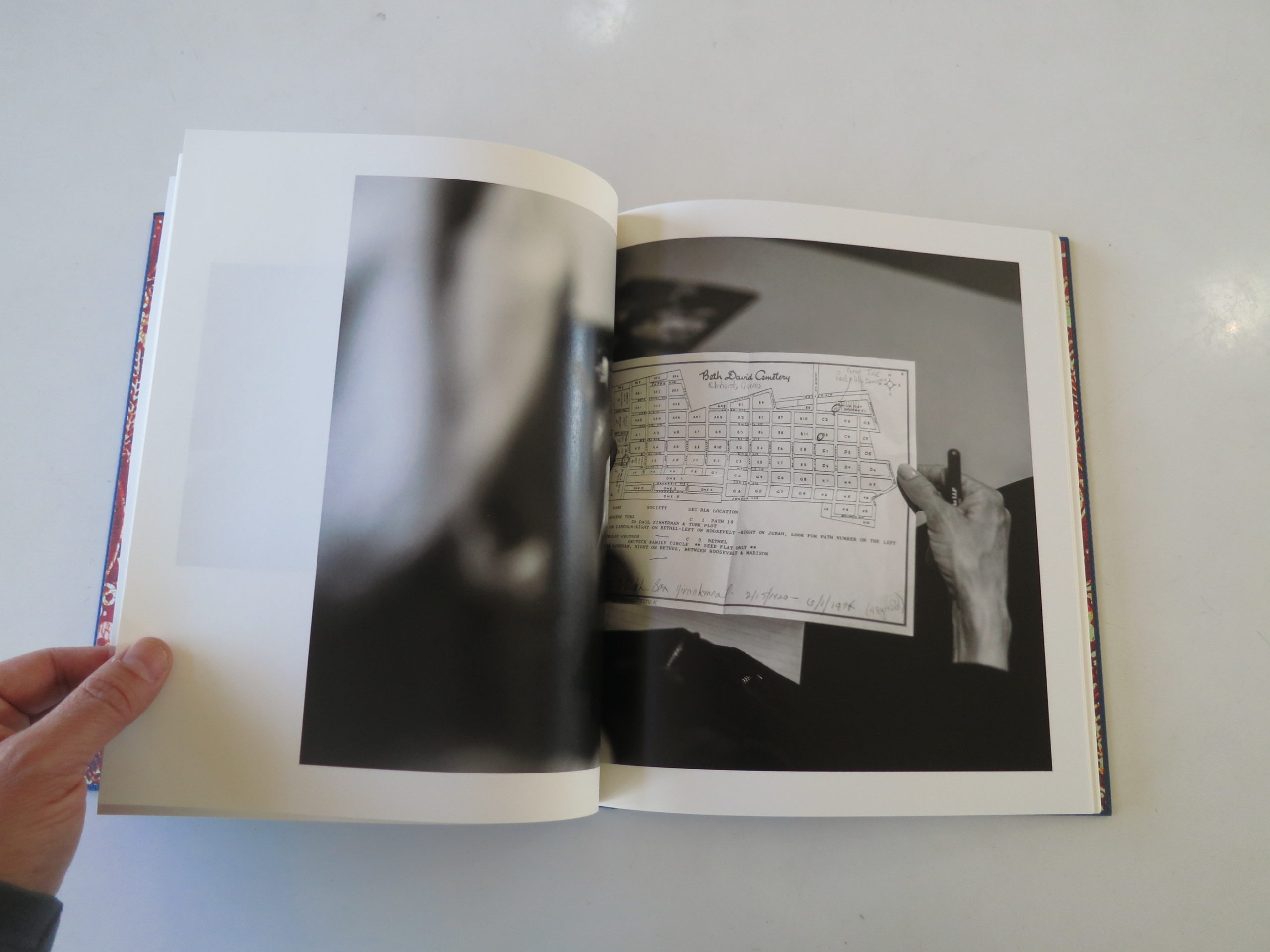
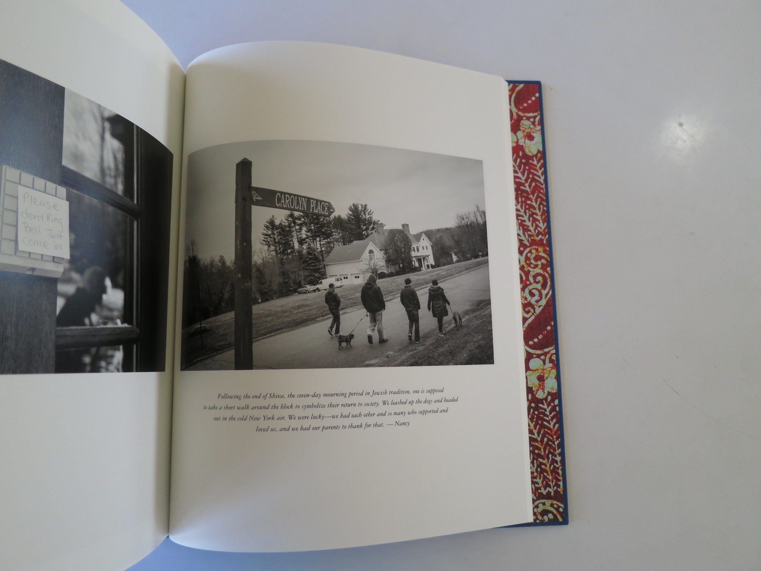
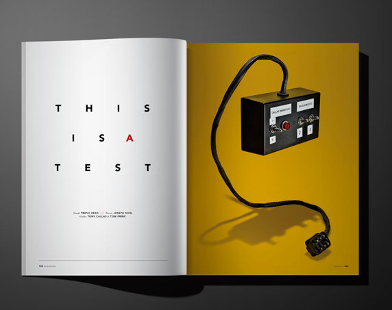
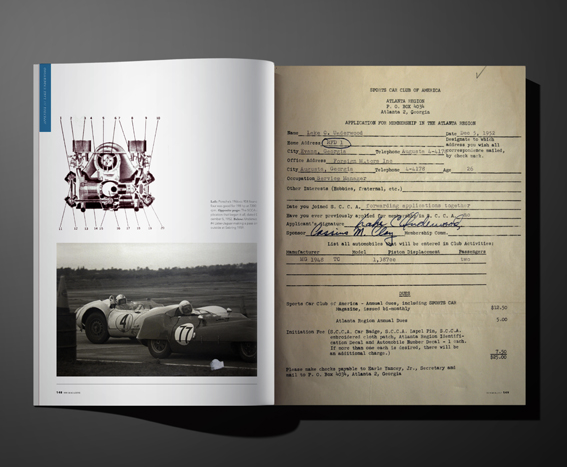
There are diary entries, pain journals, statements from each of her parents, reproductions of handwritten greeting cards, old photos from family albums, and even scans of needlepoint that collectively rocket the reader into the story.
Having two parents die of cancer simultaneously is a hardcore, unlikely experience. It’s the kind of thing everyone prays will never happened to them.
The book is therefore an allegory, as much as a family album. My greatest teacher, Allen Frame, always preached that the deeper you dig into your own personal life, the more likely you are to tap into a universal story.
That’s what Nancy Borowick has done here. There is an inherent shock value in her premise, in her life, that will always draw curiosity. So this book could’ve been mediocre, and I think people still would’ve paid attention.
Instead, by varying the narrative techniques, and ratcheting up the sadness, the power of this family’s love comes through loud and clear. That’s why I felt inspired, rather than wretched.
It’s why I was excited to write about this book for you, instead of sheepish. (Ironically, as the morose emotions coursed through my system, I thought about losing my wife, or dying without seeing my kids grow up, rather than focus on my own aging parents.)
The narrative, design, and photographs here are all top class, so together they create the gestalt of a talismanic object. If I hadn’t been so blown away by Nina Berman’s book a few weeks ago, I’d be happy to tell you this is the best book I’ve seen in a long time.
Instead, I can gladly say the books I’ve been receiving from female photographers are kicking some serious ass. They’ve all been dynamite, so I don’t have to pick a favorite.
Fellas, you best bring it, or step to the back of the line.
Bottom Line: A brilliant book about tragic circumstances
To purchase “The Family Imprint,” click here