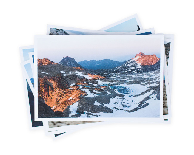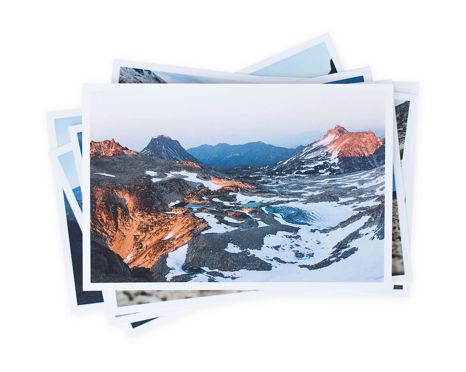
Many of the postcard promos are actually postcards you could send out and sometimes you run across a set that you would actually send out. Here’s a set I just loved and kept.
Jennilee Marigomen
https://www.instagram.com/jennileem/
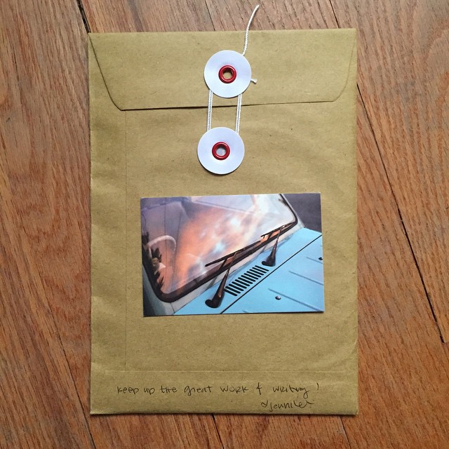
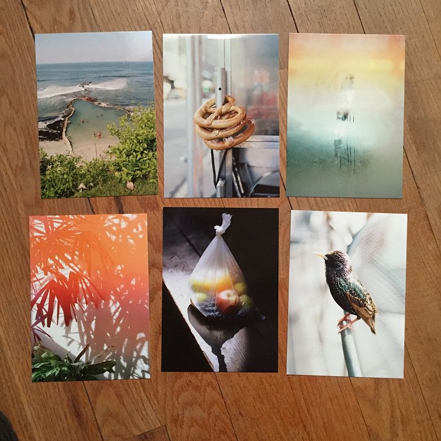
Many of the postcard promos are actually postcards you could send out and sometimes you run across a set that you would actually send out. Here’s a set I just loved and kept.
https://www.instagram.com/jennileem/
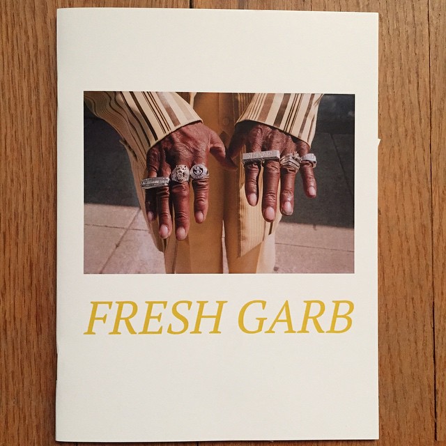
I love zines. There really is an art to doing them well. The best seem to come from zine makers who happen to be photographers. Regardless, if you have a killer story to tell you can easily and cheaply make a zine about it, and those of us who have a passion for stories told through pictures will love it. Here are the zines that stood out in 2015:
https://www.instagram.com/adamjasoncohen/
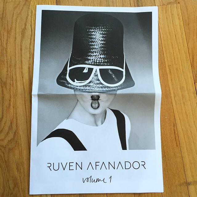
Newsprint is back! Of the 7 most common promo types I receive, newsprint promos are the most creative and exciting. I just love the feel and look of it, plus the enormous space creative photographers have available to work with. Here are the memorable newsprint promos from 2015:
https://www.instagram.com/ruvenafanador/
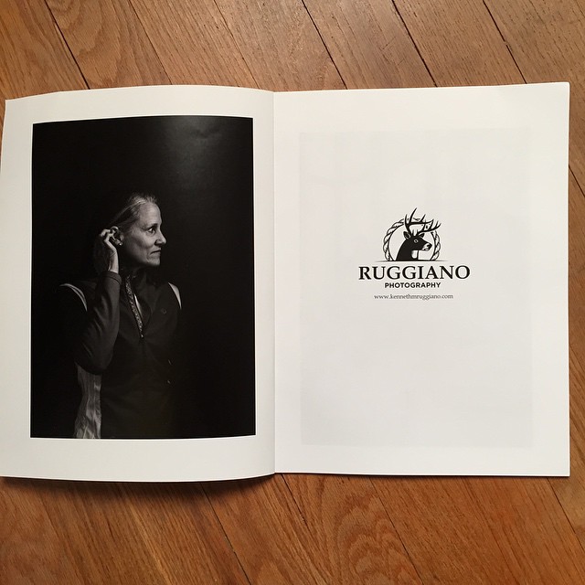
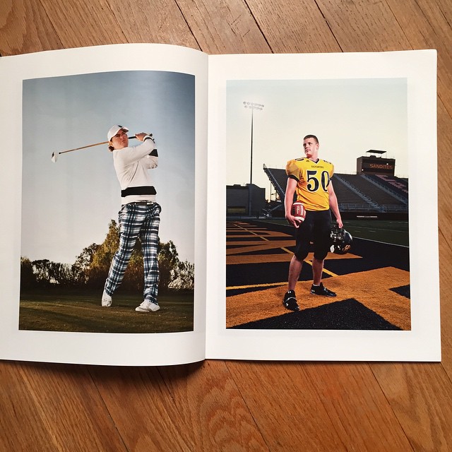
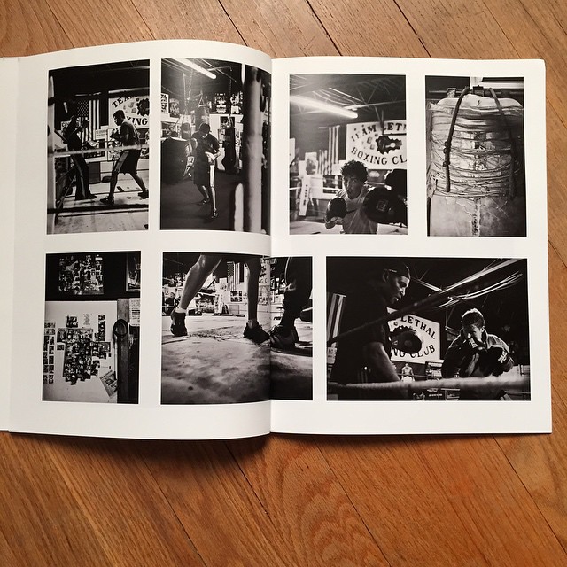
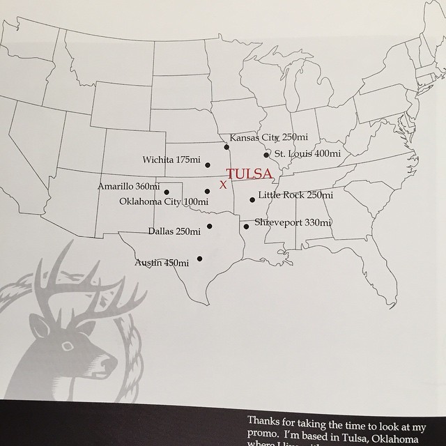
Not only are the pictures great in this promo the photographer doesn’t live in NY or LA and is proud of it. Love the map because many times you have to do research to figure out where they actually live.
https://www.instagram.com/kmruggiano/
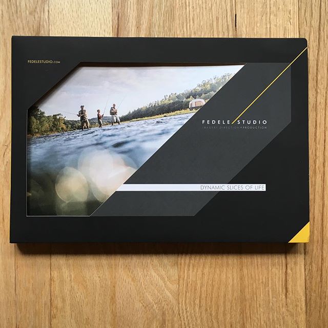
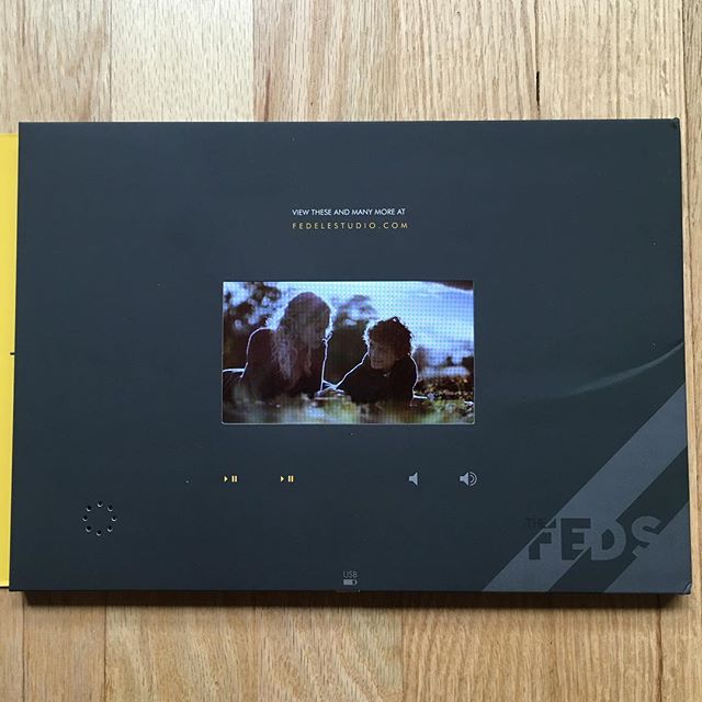
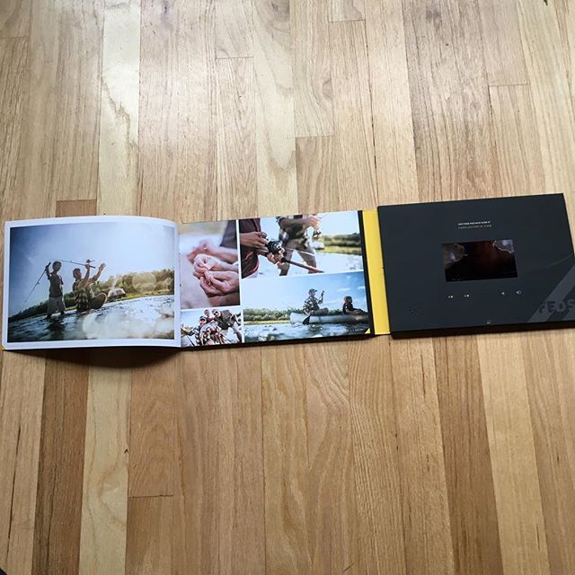
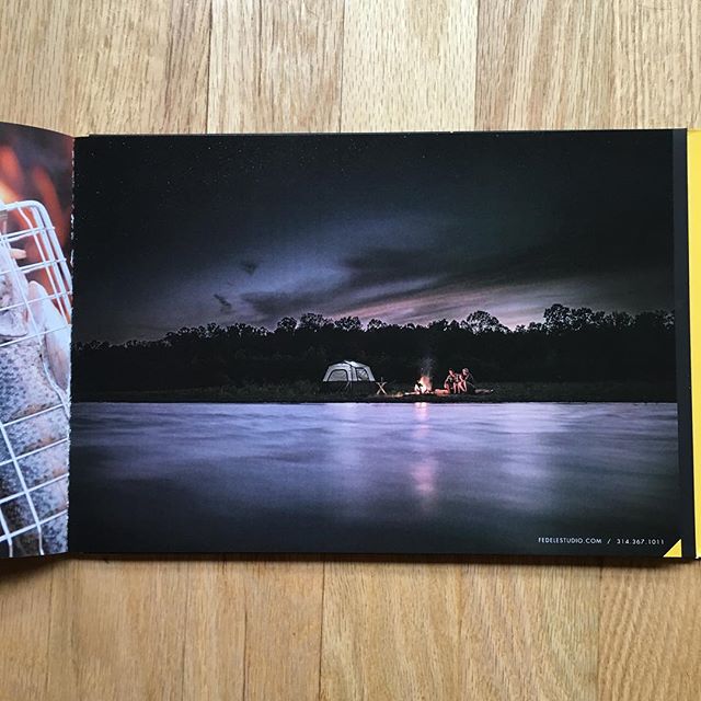
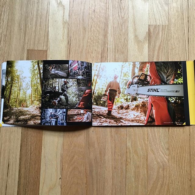
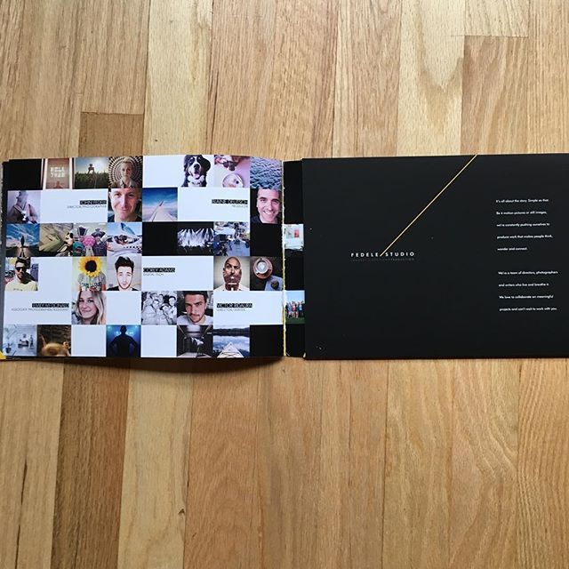
A promo in the mail showing motion?! Yeah, I was pretty blown away when I got this promo in 2015:
https://www.instagram.com/fedelestudio/

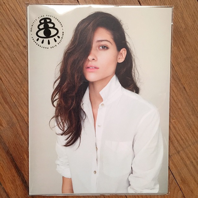
The pack of single image promos is probably the most useful and accessible promo there is for photographers. You don’t need a great designer, you can stick to your best images, there are plenty of printers available who do a great job with this and it’s fairly inexpensive compared to other promo types. Best of all, the recipient has a variety of images to choose from to save and remember you by. Here are the best I saw in 2015:
https://www.instagram.com/bbbsire/
My mail lady delivers a lot of promos and she told me this one was passed around the post office in Durango as a favorite. Way to go Andy!
https://www.instagram.com/shootandyshoot/
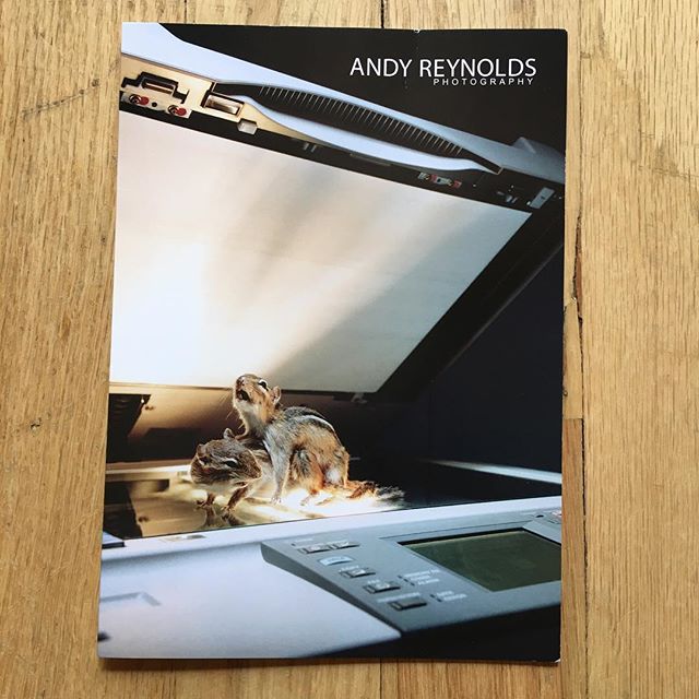
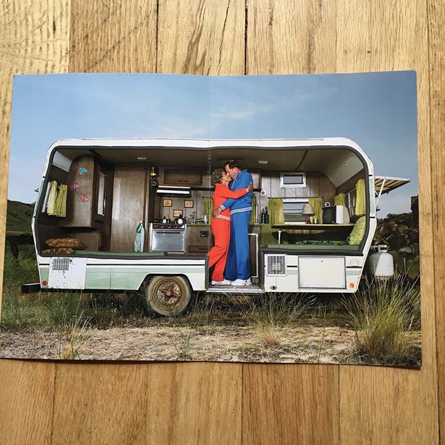
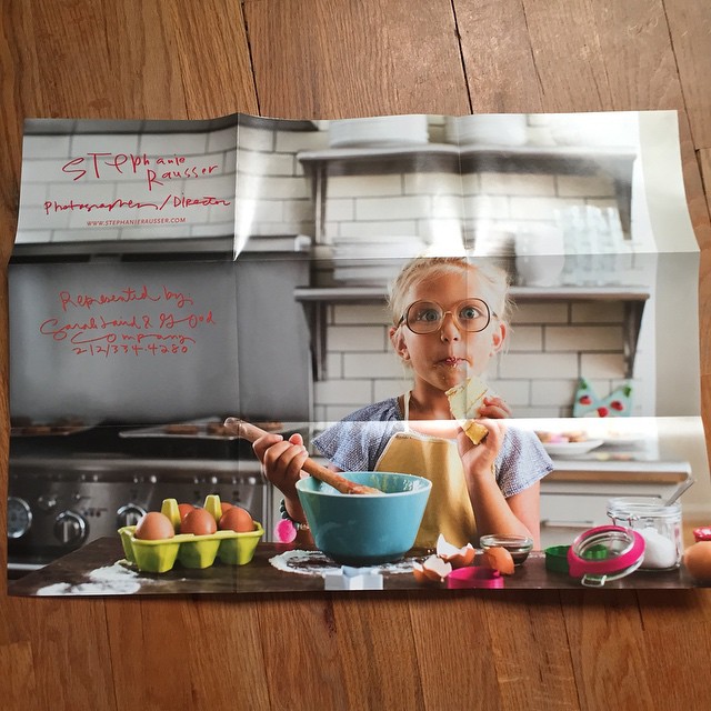
The foldout promo is a new one for me because it wasn’t popular many years ago when I was a photo editor and I have to say I think it’s awesome. It’s not entirely practical for tacking to the bulletin board or saving, but it has a great impact with the ability to show a poster size image along with a collection of smaller ones. Here are the foldout promos that stood out to me in 2015:
https://www.instagram.com/stephrausser/
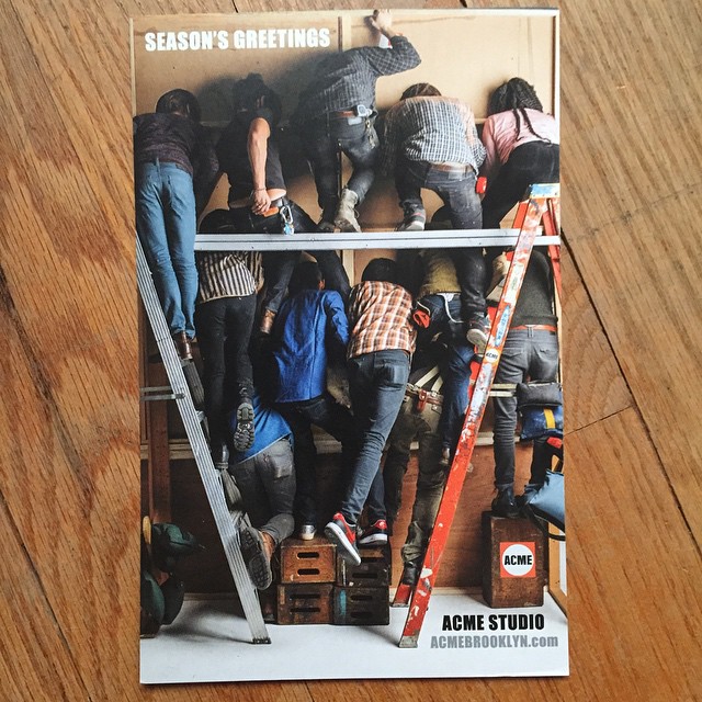
Seasonal promos are always a treat in your mailbox as they break up the monotony of the standard fare, but it’s rare to see them smartly executed. Here are 2 that stood out in 2015:
https://www.instagram.com/acmebrooklyn/
The multi-panel is one of the 7 main styles of promos and excellent for connecting a series of images and, in general, making an impression with the design, printing and photography all connected. Here are the promos that were memorable in 2015:
https://www.instagram.com/capturedaesthetic/
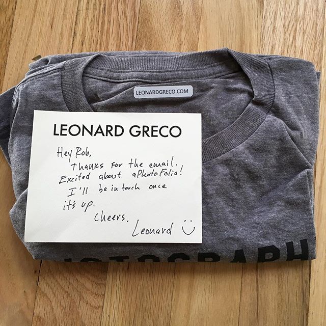
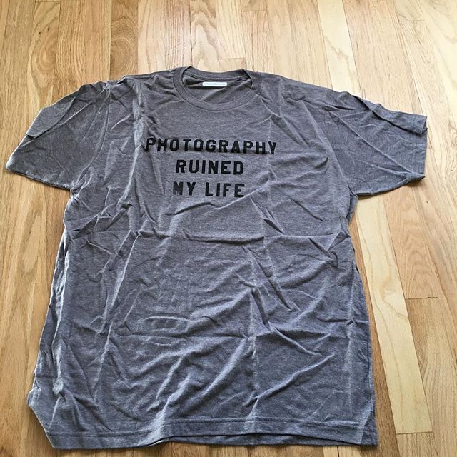
While I would never recommend that photographers send a gift or a tchotchke as a promo, in some cases it fits the photographers personality or genre perfectly and really works. Leonard Greco hit a home run with this one:
https://www.instagram.com/thetallestgreco/

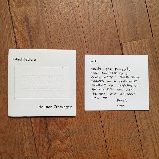
There seem to be 7 popular types of promos (postcard, pack-of-singles, multi-panel, foldout, newsprint, zine and booklet). Of all 7 the booklet is the most difficult to get right. The printing and design need to be at a certain level to appeal to the advertising and editorial community but the real killer is the edit. Get it down to the best images, making a great sequence and stopping while you are ahead are all hallmarks of a great promo booklet. Here are many that I found compelling in 2015:
https://www.instagram.com/mattiabalsamini/
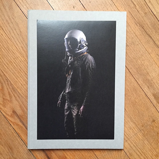
Is there any better promo than having a book of your photography to send out? Perhaps not, but the bar for photography books is so very high I wouldn’t attempt it unless a serious publisher and designer were involved. These photographers sent me amazing books of their work:
https://www.instagram.com/pedenmunk/
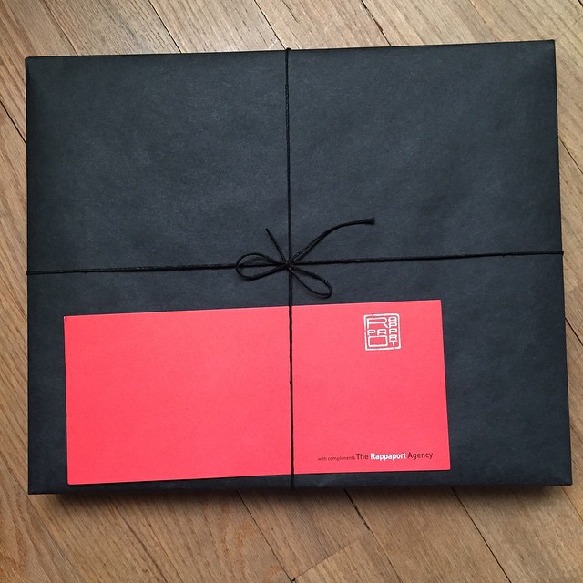
The best promos are a combination of great photos, great design and great printing, but sometimes the concept behind the promo can make it extra memorable. Here are the unforgettable promos from 2015:
https://www.instagram.com/justinpoulsenphoto/
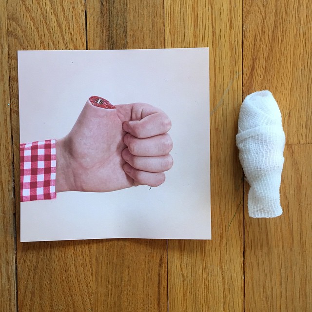
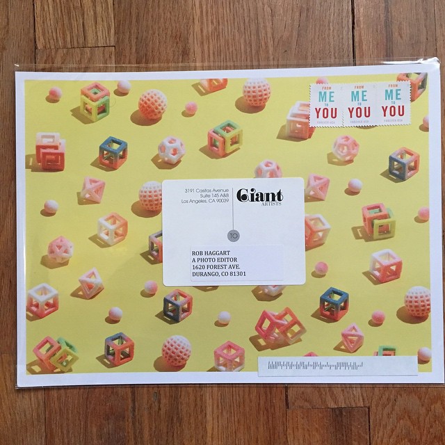
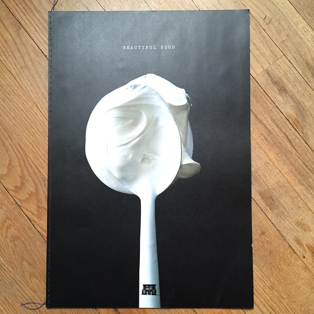
Agents don’t have an easy job when it comes to promos. With a roster of photographers to promote you are always in danger of crushing your recipients and your bank account sending out mailers. I really enjoyed the simple large cards Giant Artists sends out for each photographer and their year-end book was superb. Peter Bailey Productions went the opposite direction with the smallest and smartest little book of artists I have ever seen. DS Reps are known for sending out a top notch promo for all their artists and this years is no exception. Well designed and edited it was something worth hanging onto. Finally, Gill Turner had a book full of detachable cards that was beautiful and useful for identifying people you might want to work with.
https://www.instagram.com/giantartists/

It would be unfair to put Armstrong Pitts and their amazing studio in any other category but their own. The production and photography in their promos is out of this world. Add to that the frequency in which they send out these behemoth marketing pieces and there’s really no comparison to anything else I’ve received this year.
https://www.instagram.com/armstrongpittsstudios/
Several years ago I decided to photograph a few of the promos photographers were sending me and post them on Instagram. I was looking for a way to get on Instagram and I hated to have all these nice promos collecting dust in my office. The response to my little experiment has been nothing short or overwhelming. My mailbox is filled every day with wonderful promos from around the world. And the notes you have been sending with them have really meant a lot to me, it’s so good to hear from photographers in the mail again and to hear your appreciation for the promo feed, the blog and the websites.
I received so many outstanding promos this year I decided to go back and pick out my favorites and make a special post for each category that they fit in. Well, it got a little out of hand and I have hundreds and hundreds of promos to show you, but I think this could be the start of another great feature here at APE and maybe I can get a better handle on it for 2016.
Over the next 4 days I will be making 5 posts a day for my different categories with my “Promos Of The Year for 2015”, so check back often or come be overwhelmed with all the promos when you have a little time to spend looking through it all. 2015 has been a great year for promos.
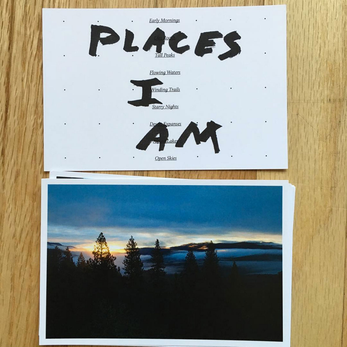
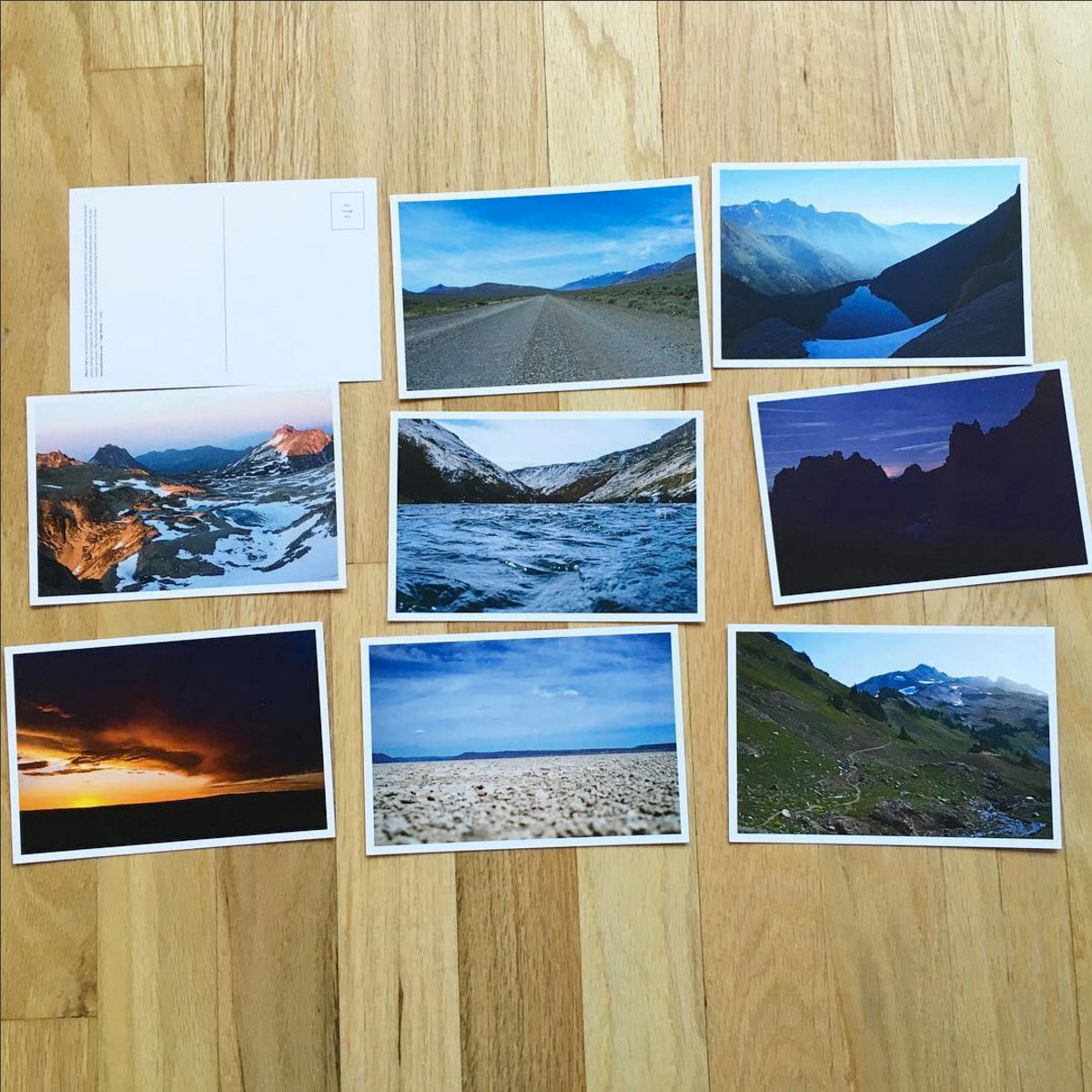
Who printed it?
I had the postcards printed at smartpress.com – they allowed me to do different versions in the same order which I think helped save on cost in the long run.
Who designed it?
My background is in design, so I designed it myself.
Who edited the images?
Mostly just me – I narrowed the edit down from a much larger selection of images from the past year and a half, and then got some input from friends and colleagues.
How many did you make?
I think it was about 100 sets.
How many times a year do you send out promos?
This was my first, but this year I’d like to get in the regular habit of mailing work out. There’s something so nice about getting a nice postcard or printed piece in the mail.
Tell us how this promo evolved.
As a designer and photographer, spending a lot of time in front of the computer as part of my job is extremely difficult. I really need to get outside, move, and be active on a regular basis. At some point last year I was having a particularly hard time with it, and often found myself wishing I was anywhere but at my desk. At the time I was working at an agency, going through some fairly major health issues, and was slowly losing my mind. So, I began to make a list of places I’d rather be.
The original list went something like this: early mornings, running, dirt roads, sunrises, mountains, streams, road trips, unknown trails, swimming holes, lakes, birds, hiking, cool water, flowers, the desert, climbing, hot springs, two wheels, sunsets, and so on…
The idea slowly morphed and changed, and after talking to a friend I realized it’s not the places I’d rather be that I was dreaming of, but the Places I Am. It’s the places that have inspired me, shaped me, and in some way become a part of me that I was day dreaming about.
Instead of just posting another photo from a past adventure to Instagram, I decided it was time to make something that might stick around a little longer. So I made a website and some postcards. It’s fairly simple, but I think the entire process was somewhat cathartic.
In the end, Places I Am ended up being a small series of photos taken in 2014 throughout Oregon and Washington. The accompanying website can be seen at www.placesiam.com.