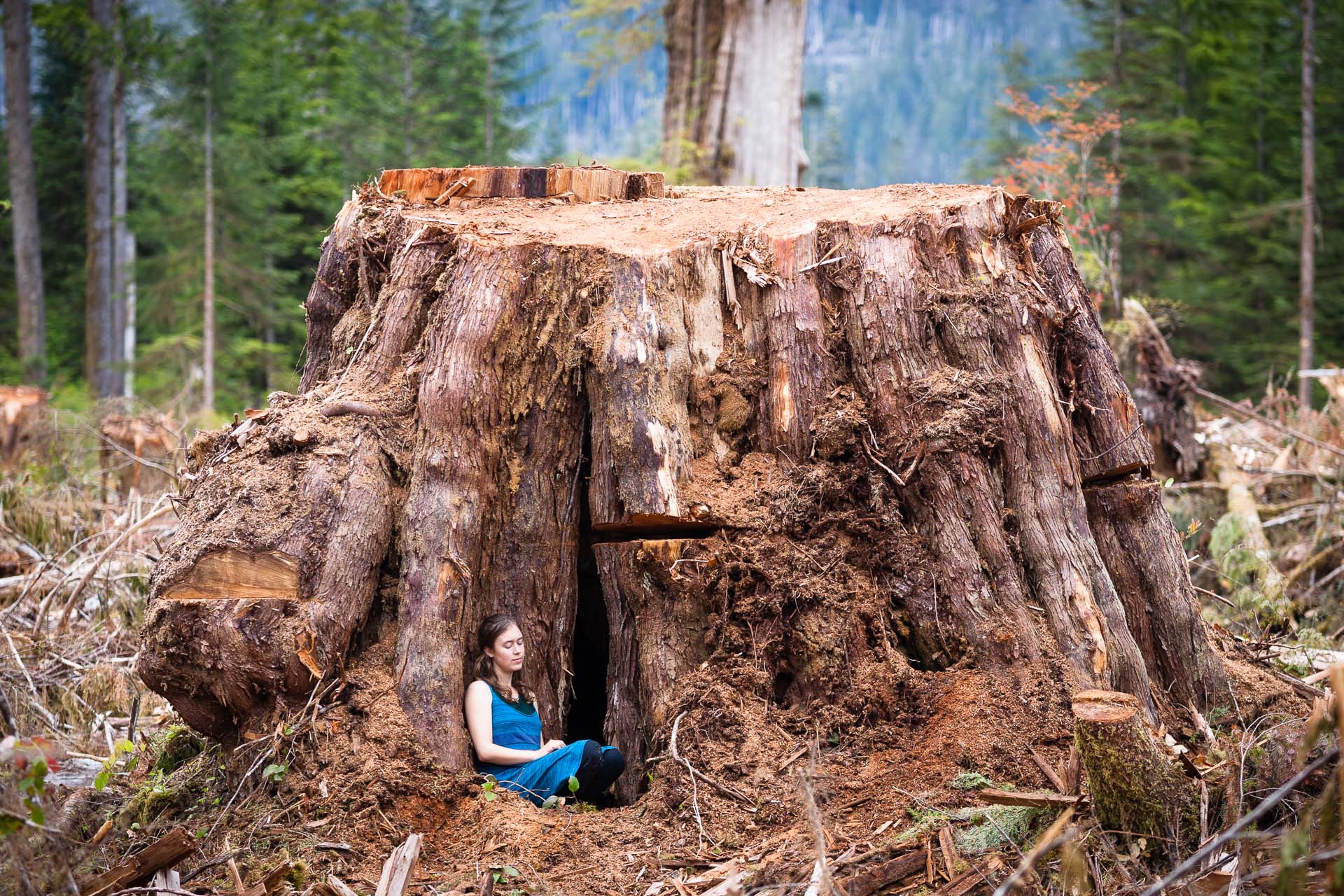
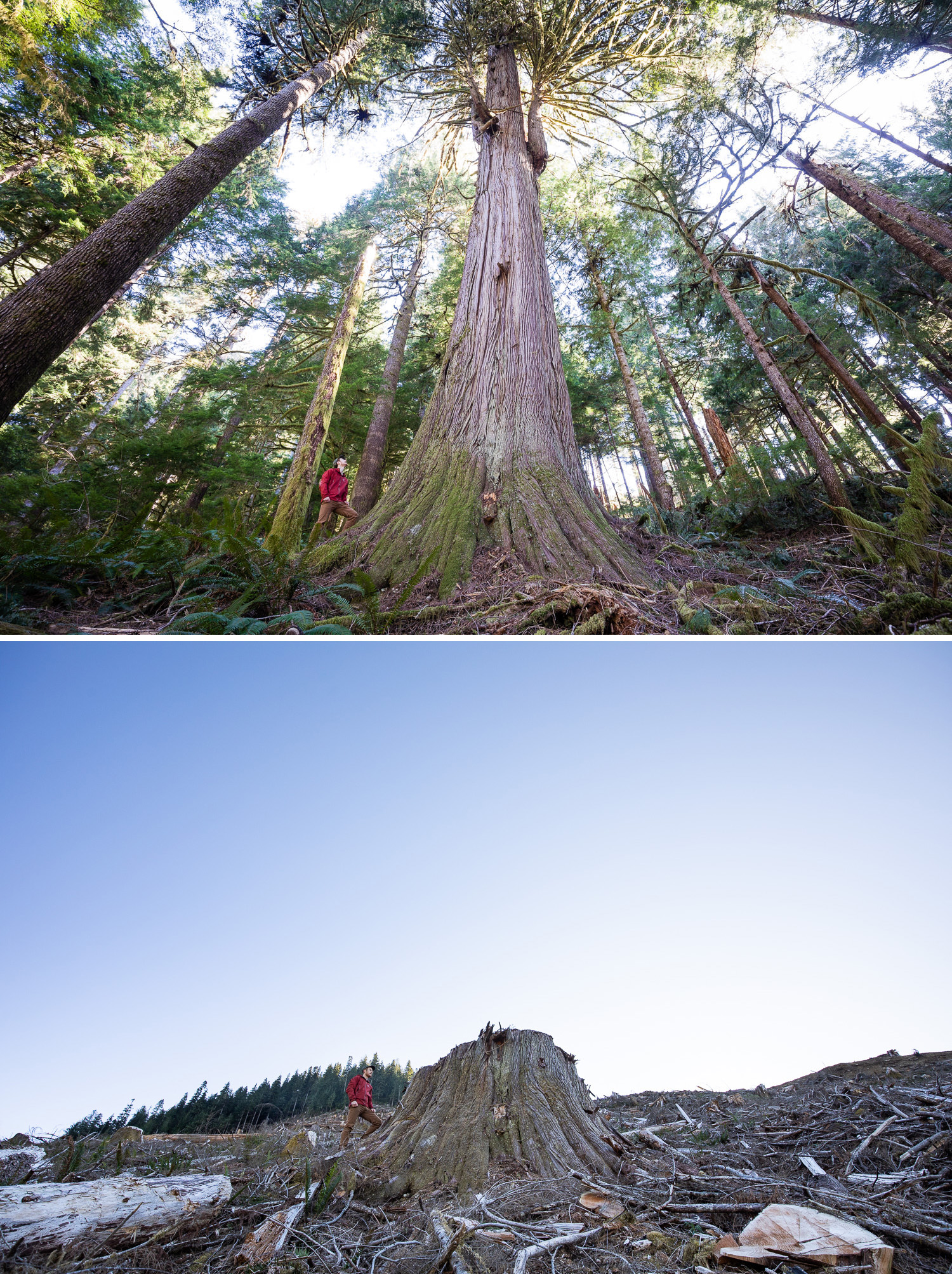
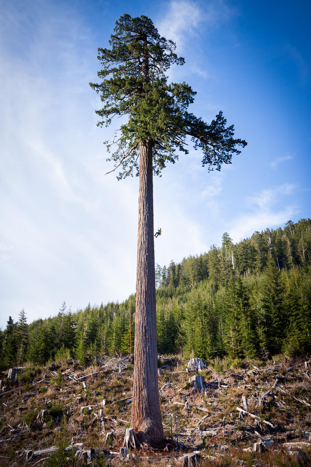
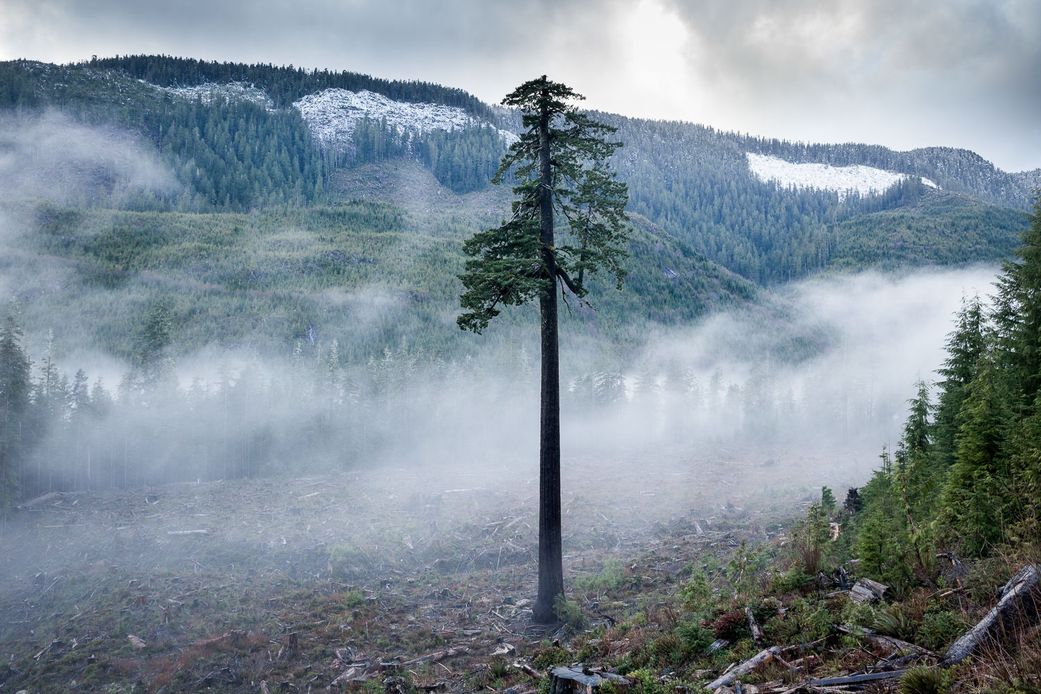
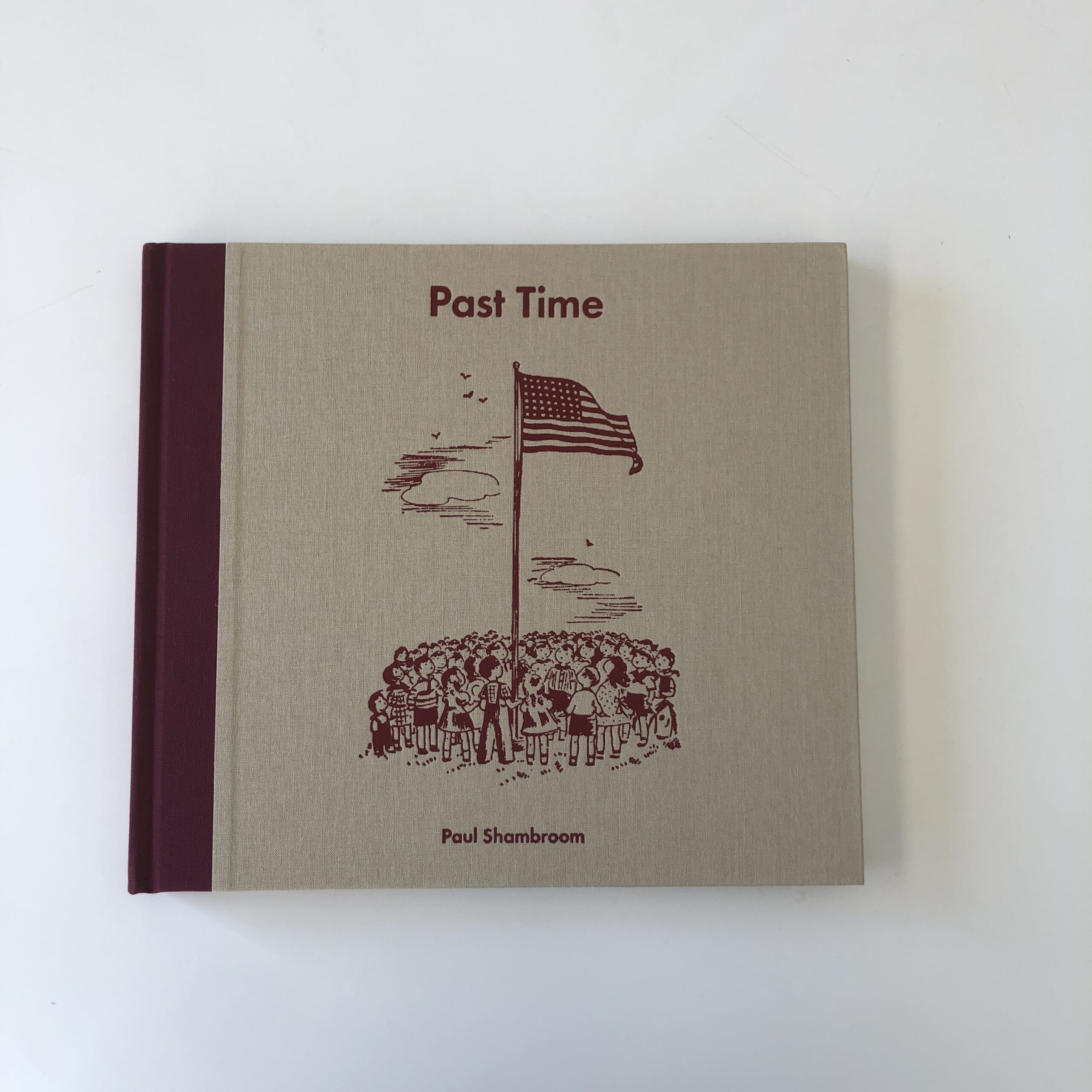
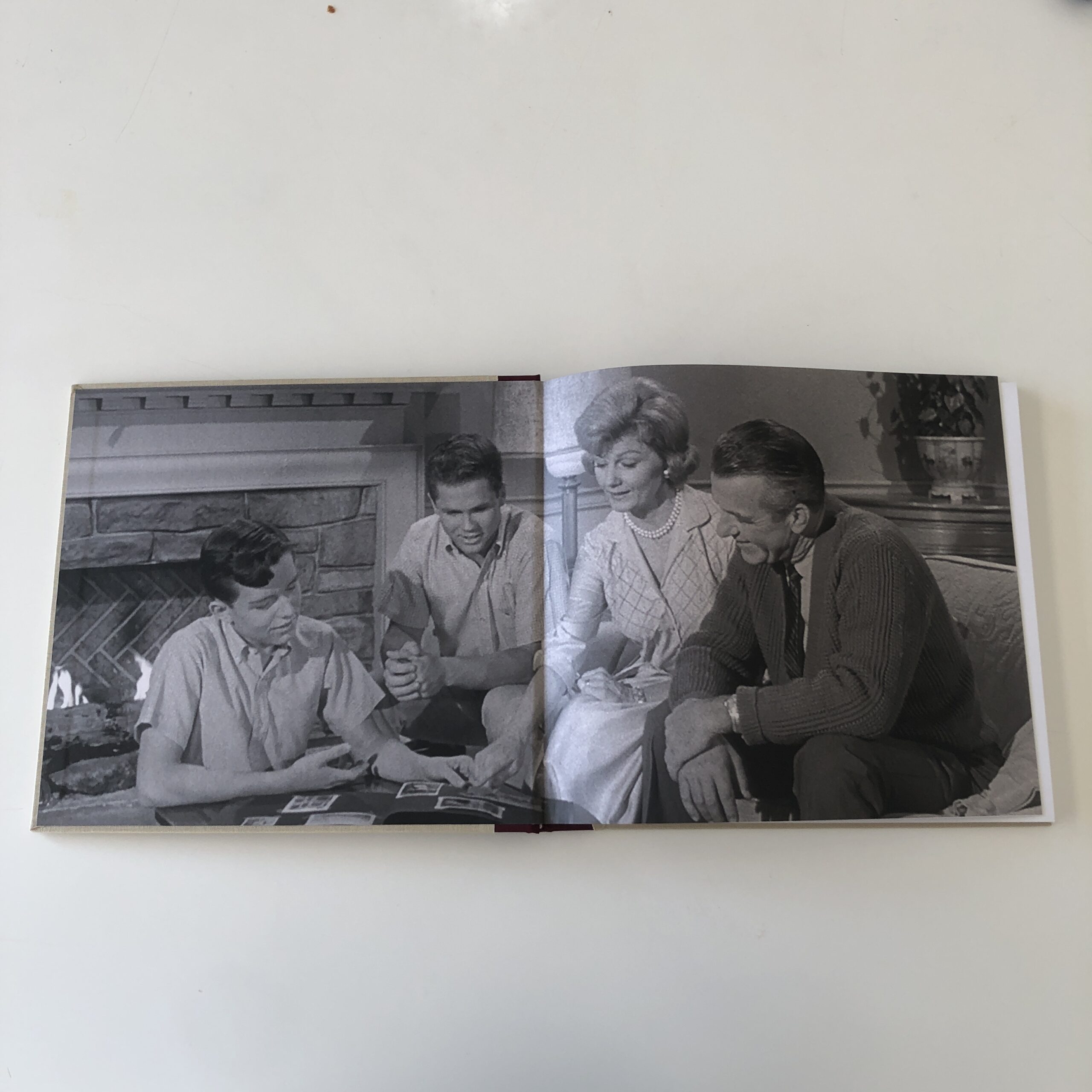
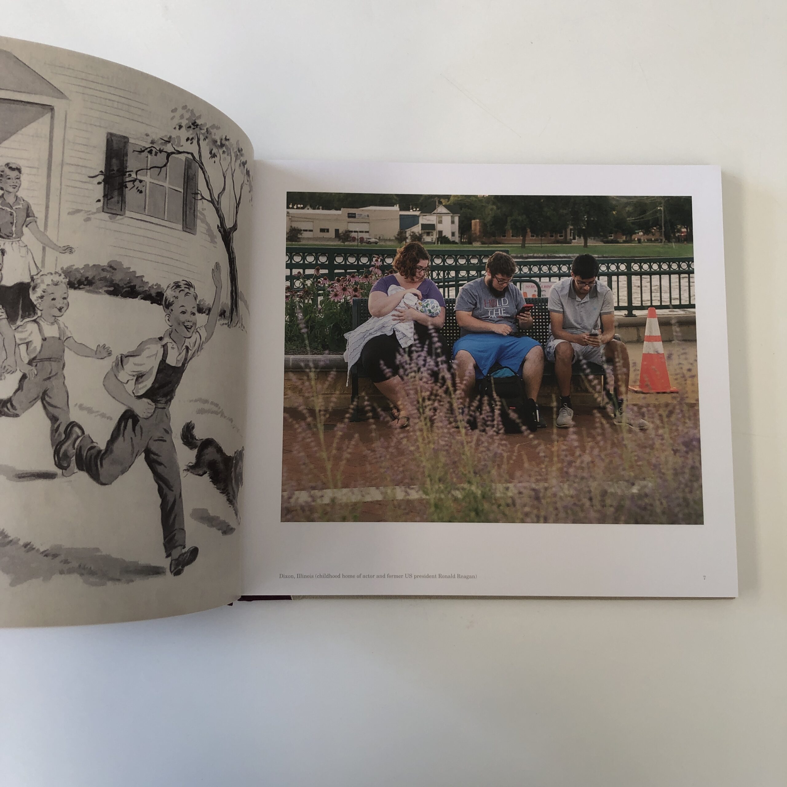
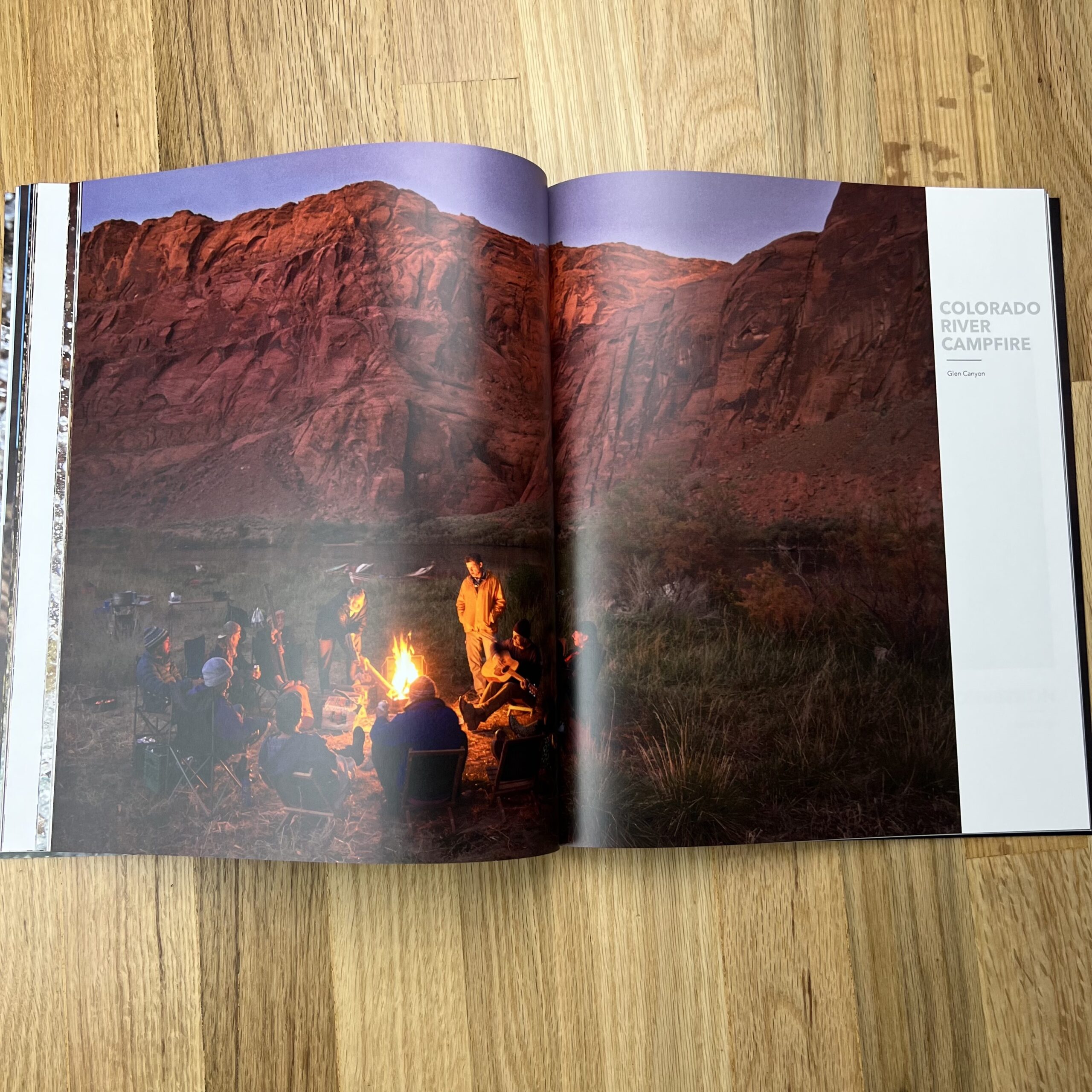
The Art of the Personal Project is a crucial element to let potential buyers see how you think creatively on your own. I am drawn to personal projects that have an interesting vision or that show something I have never seen before. In this thread, I’ll include a link to each personal project with the artist statement so you can see more of the project. Please note: This thread is not affiliated with any company; I’m just featuring projects that I find. Please DO NOT send me your work. I do not take submissions.
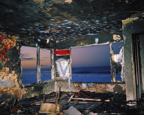
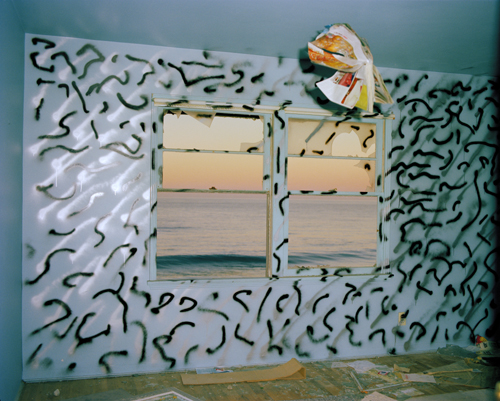
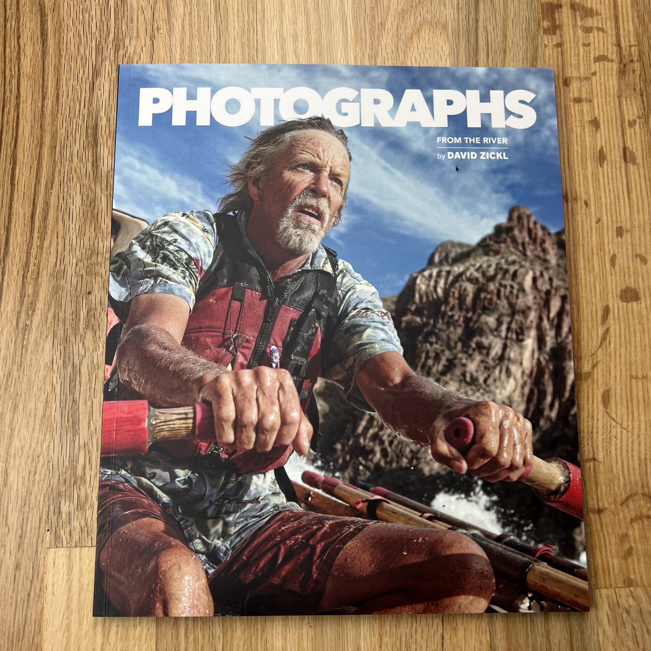
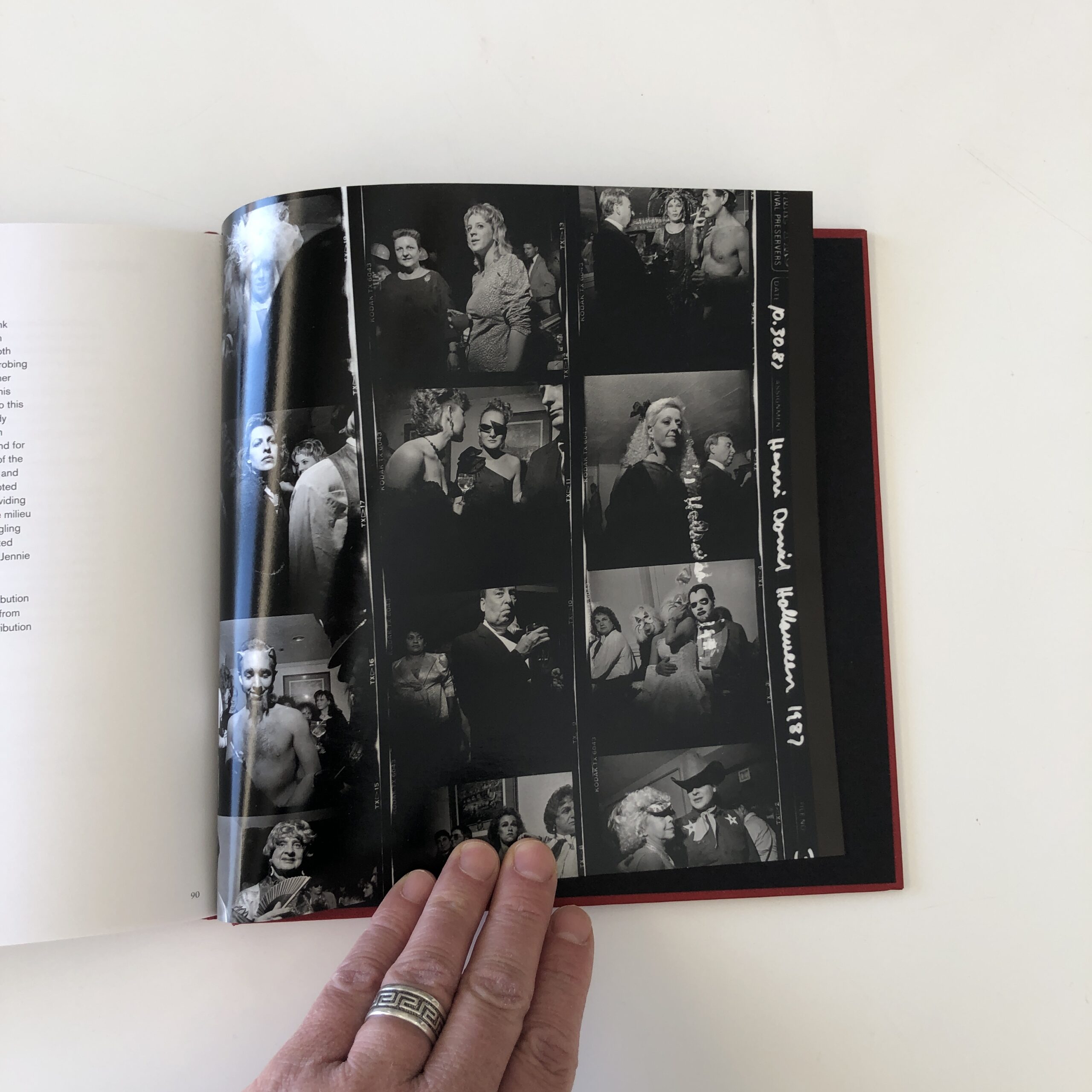
Today’s featured artist: John Dyer
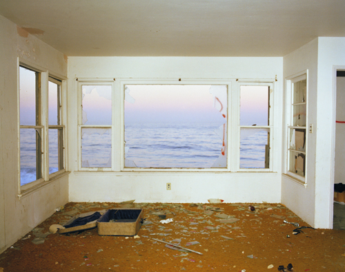
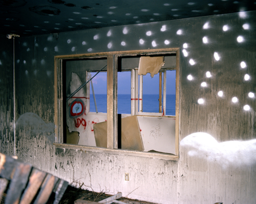
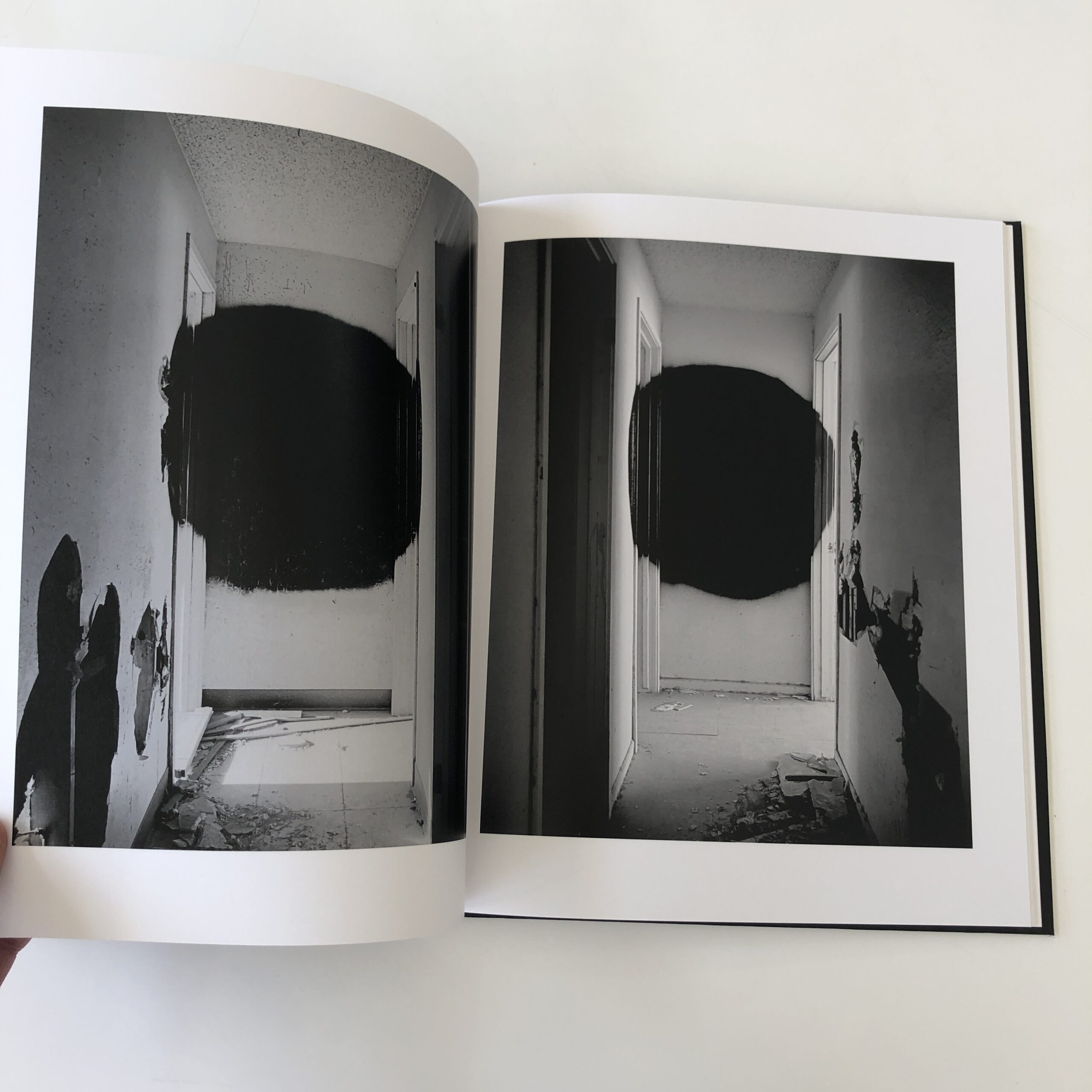
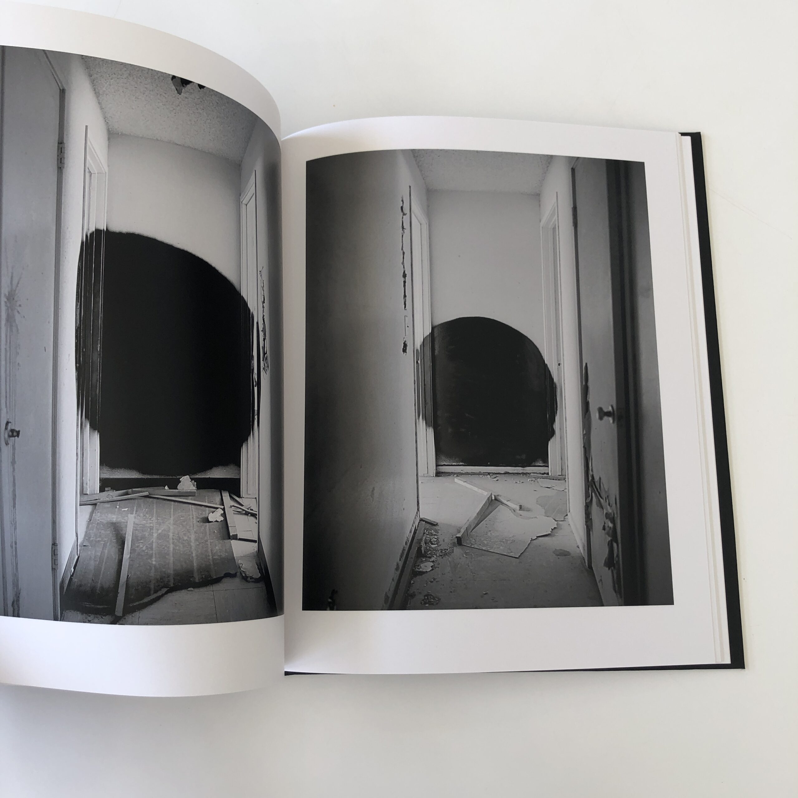
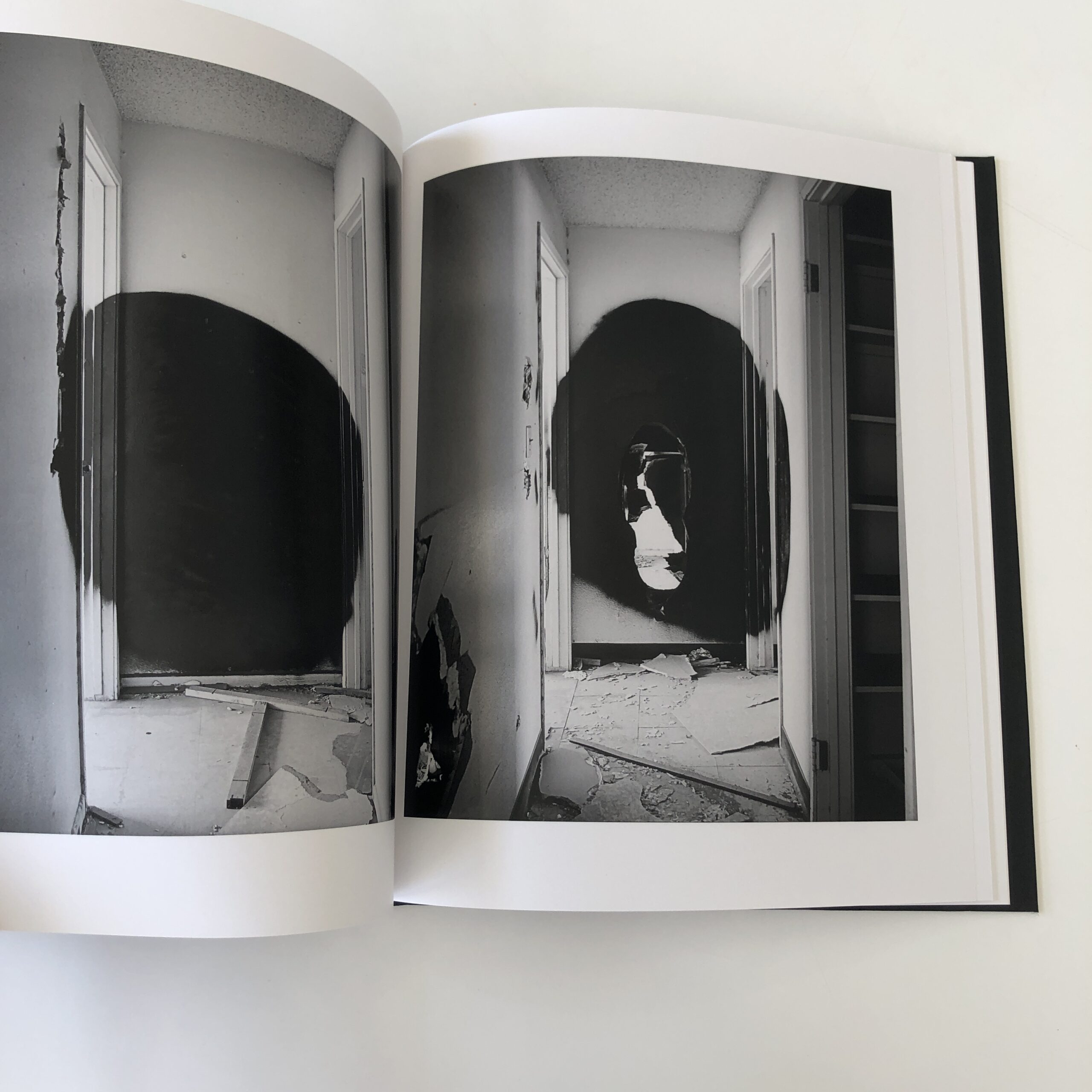
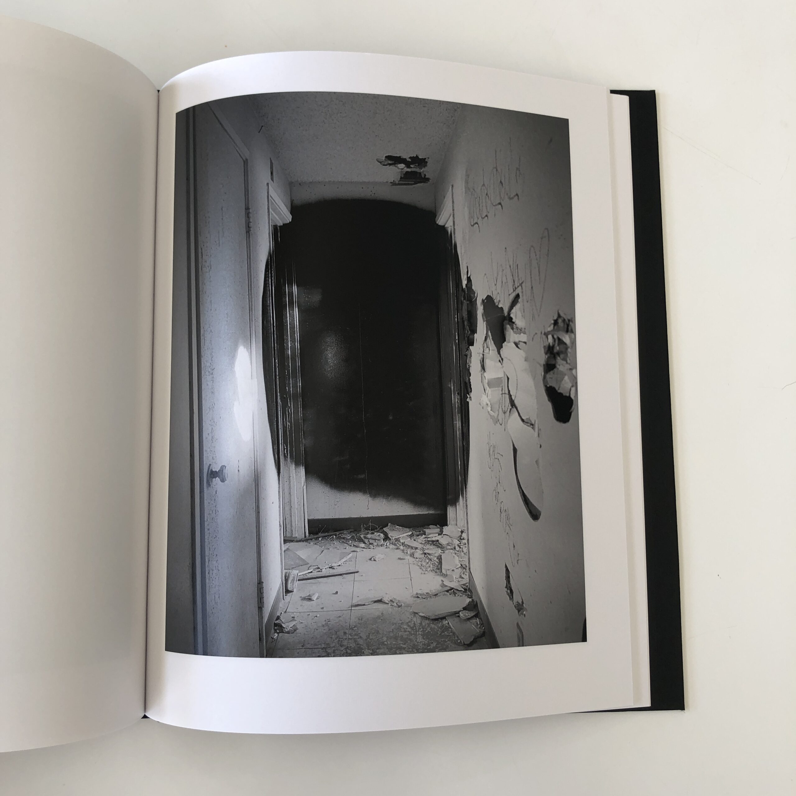
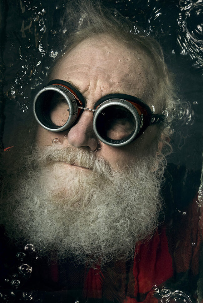
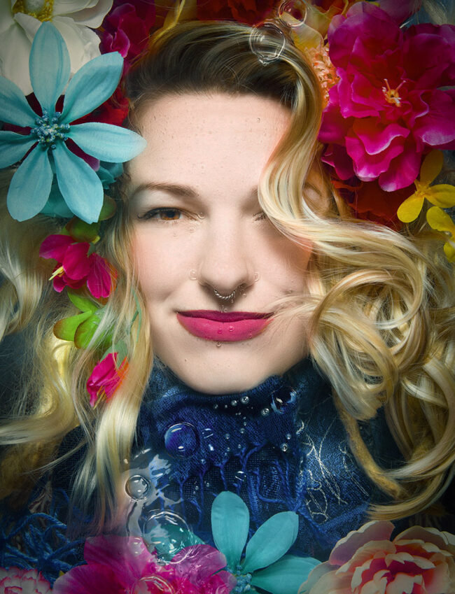
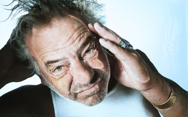
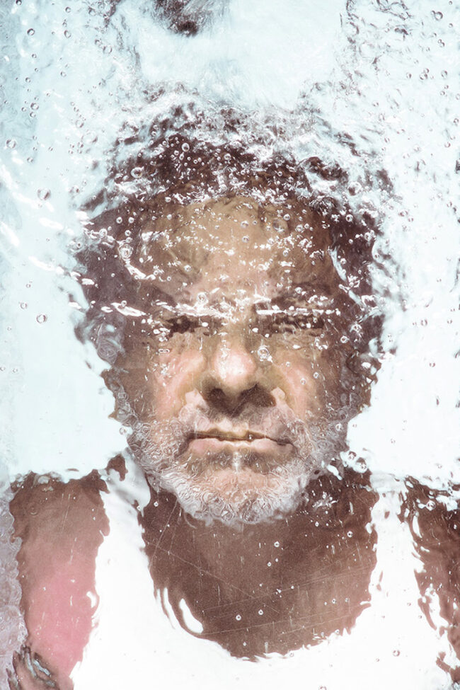
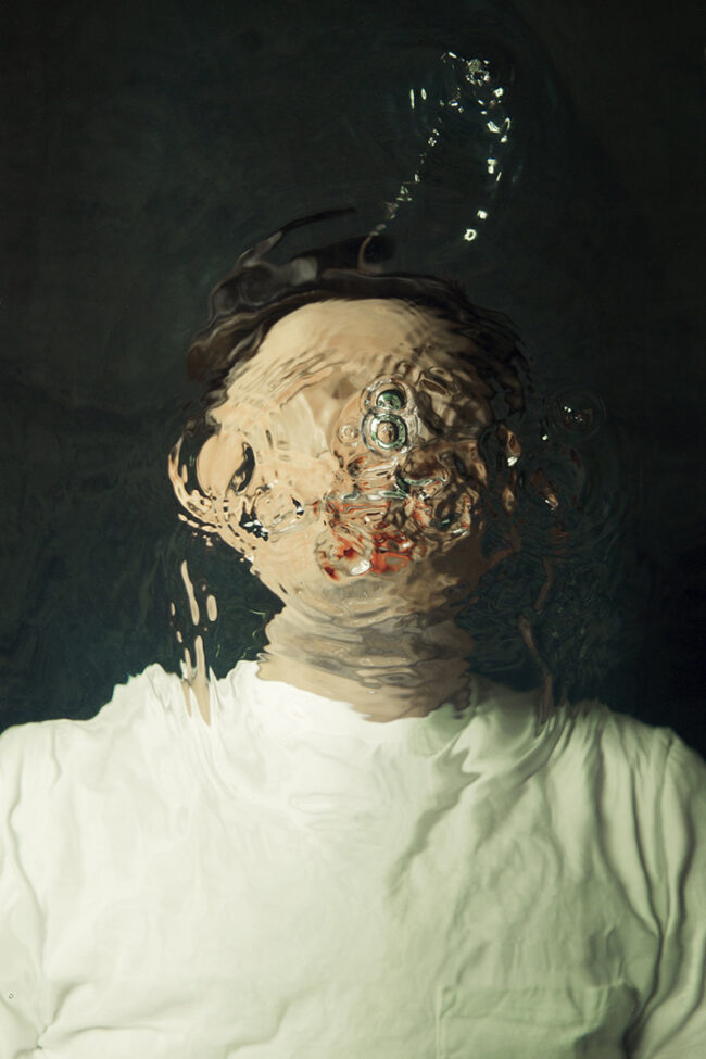
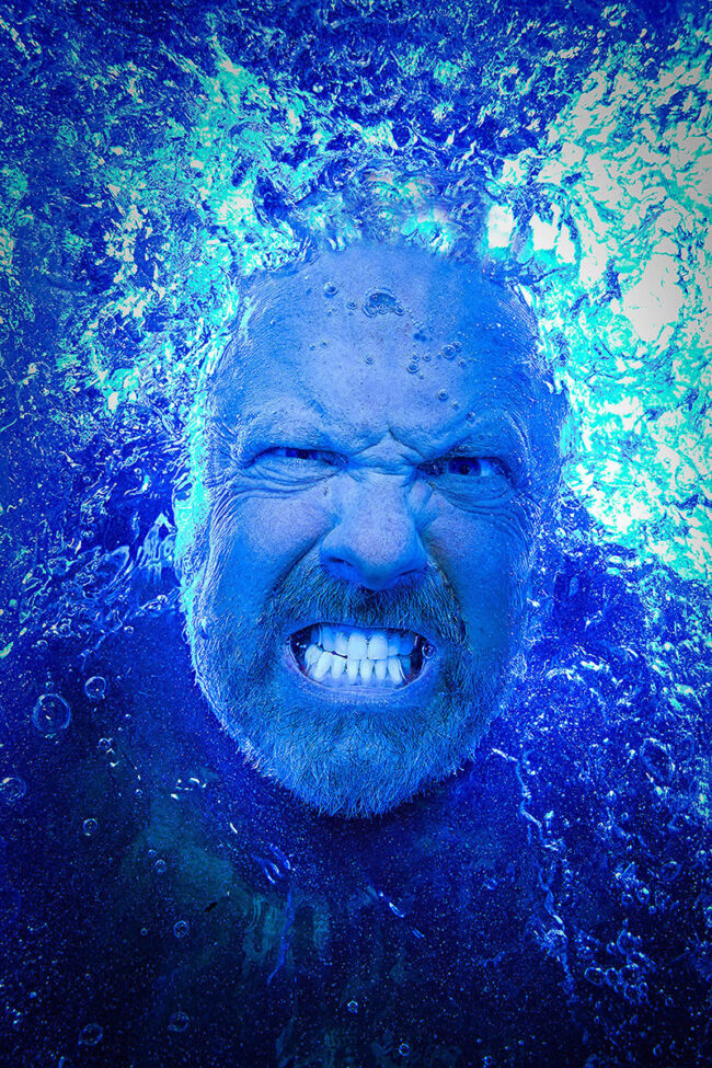
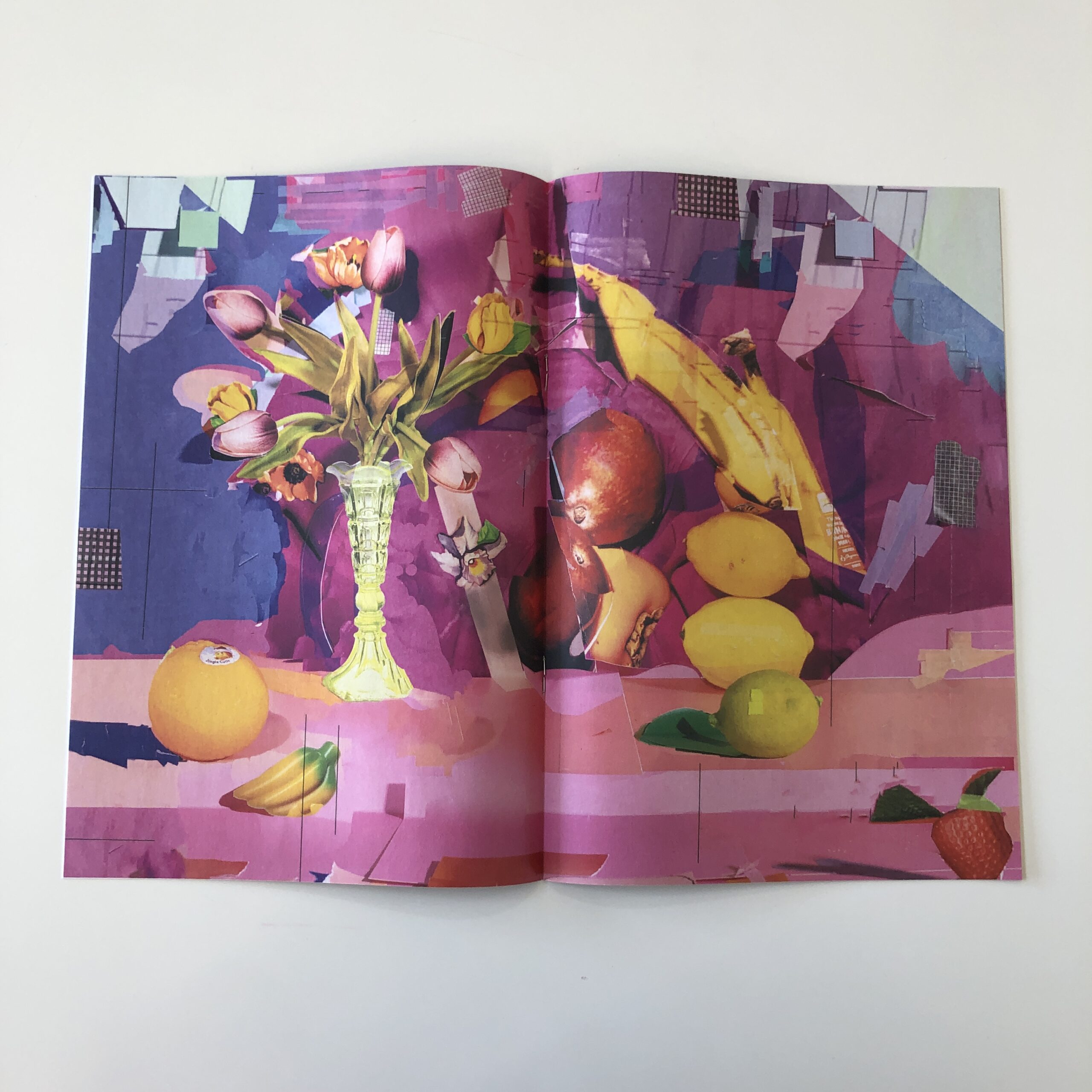
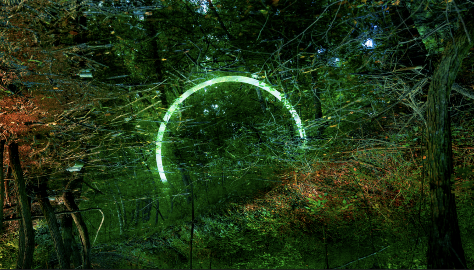
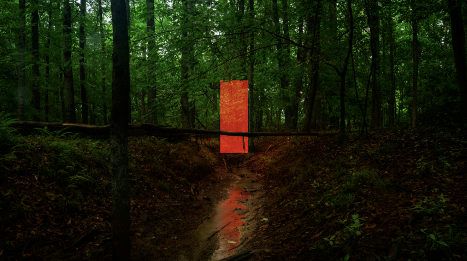
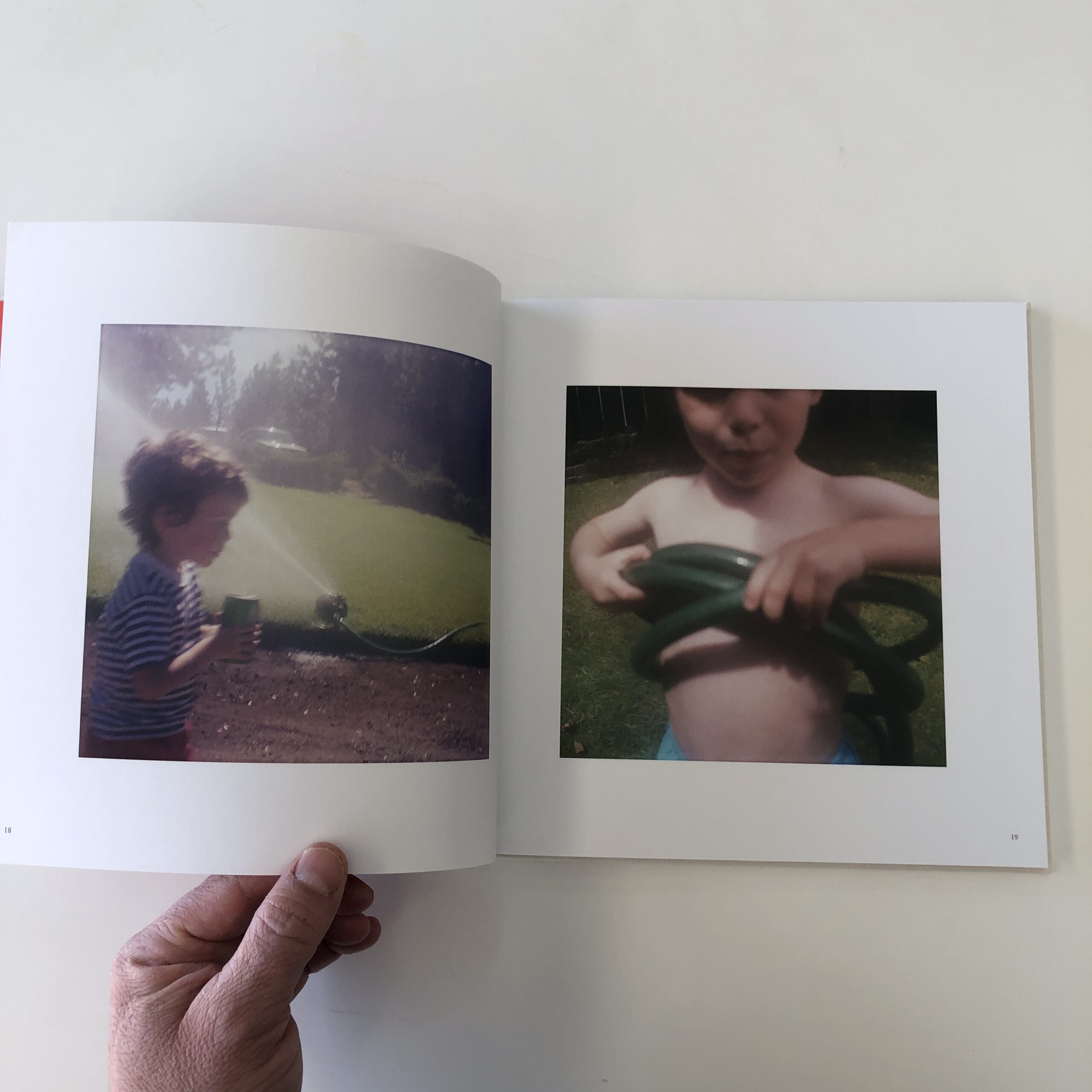
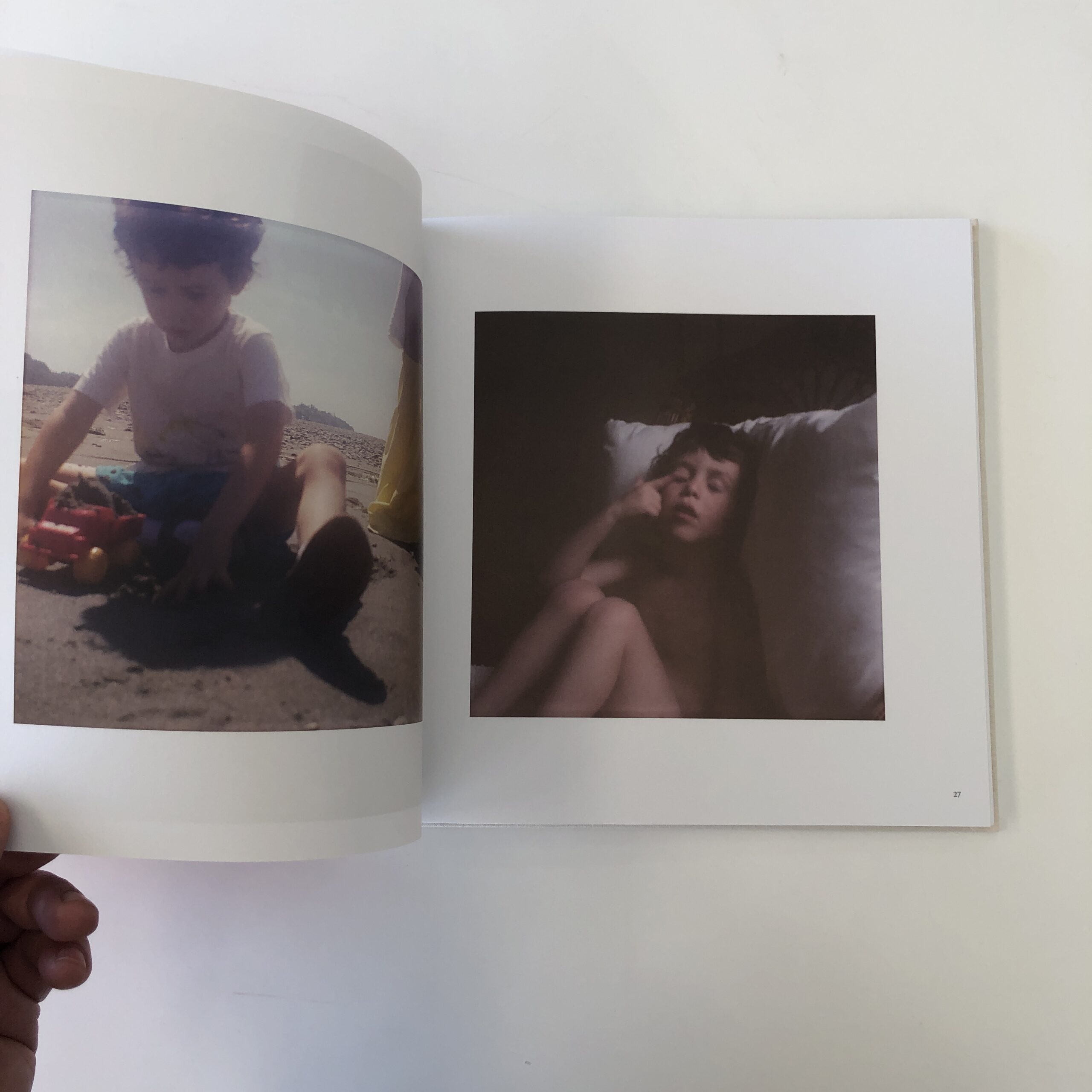
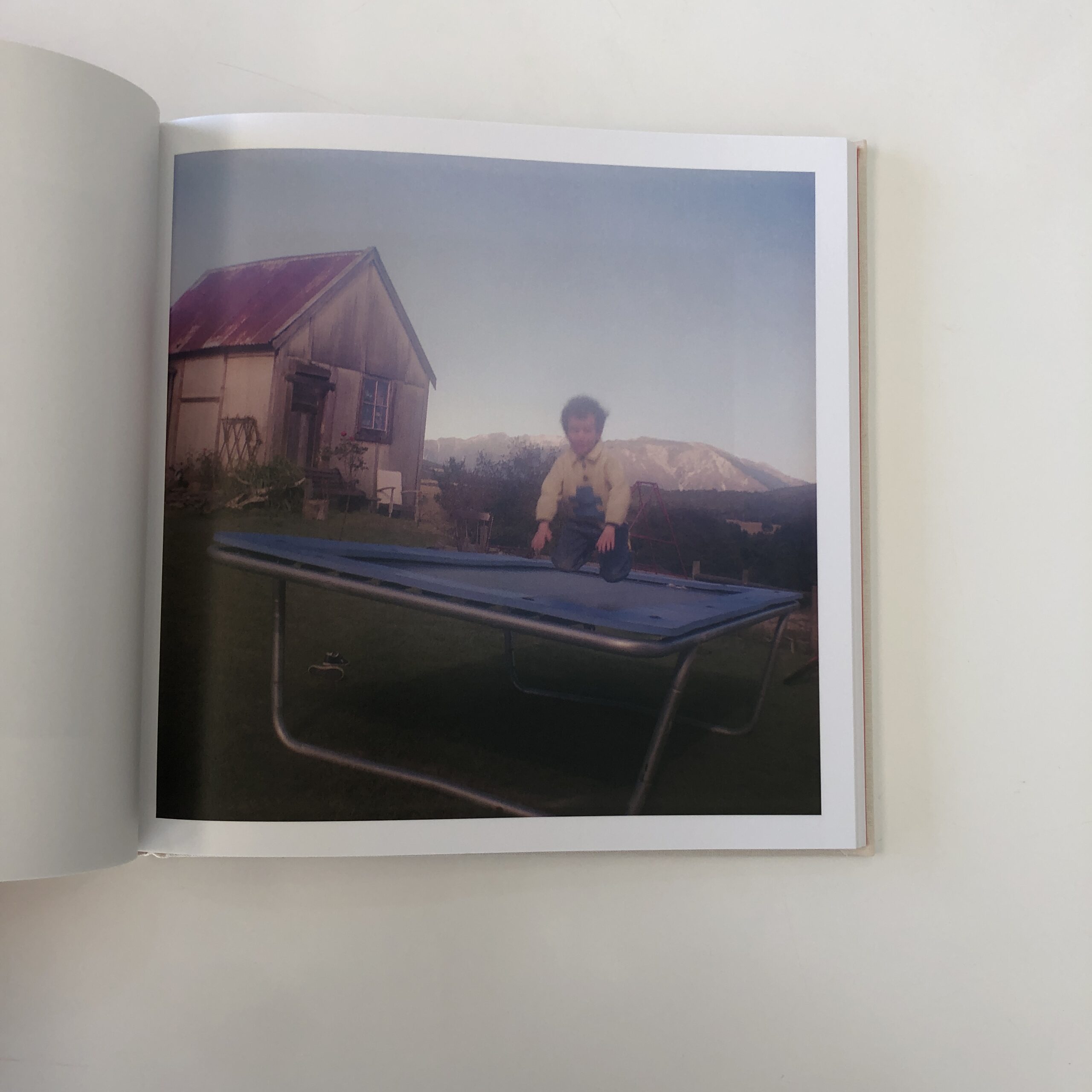
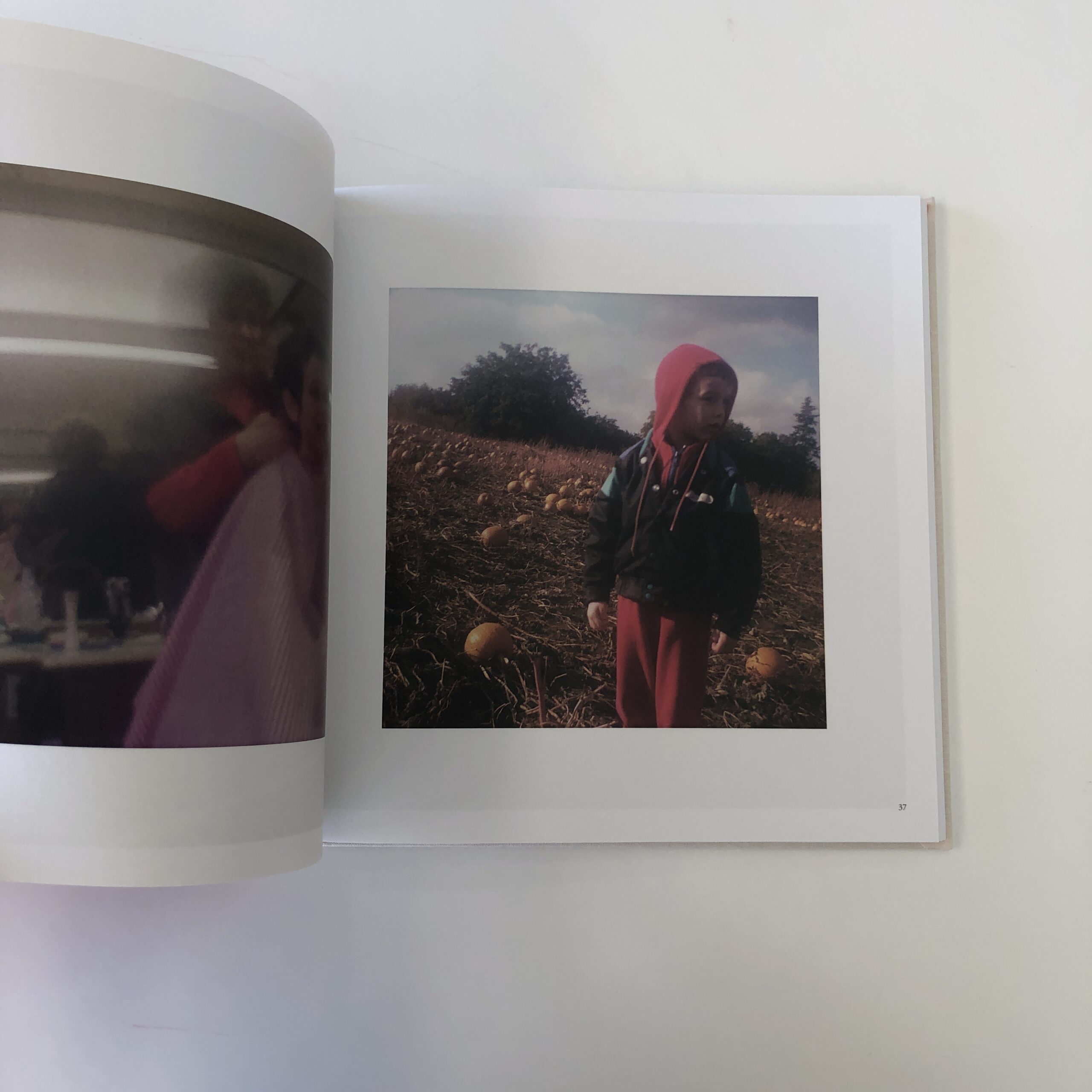
My love for photography comes from seeing what something looks like when it’s photographed. The camera sees differently than the human eye. Different lenses see differently from each other. Shooting color (at least for me) is not the same as shooting black & white. Placing the frame of a camera and freezing a bit of time and space creates something new, something different from what was photographed. That something has its own rules and esthetic: a transformation that I find intoxicating. A photograph has no narrative ability so it cannot tell you what was happening at the time the shutter was released. The photograph must exist on its own, justifying itself by the intrinsic elements that it is composed of. Whenever all those elements are in complete balance, a photograph becomes something more, something mysterious, something fascinating. The best photograph is an enigma that asks more questions than it answers. Whatever that dynamic is, I can’t get enough of it.
Acting on a Whim
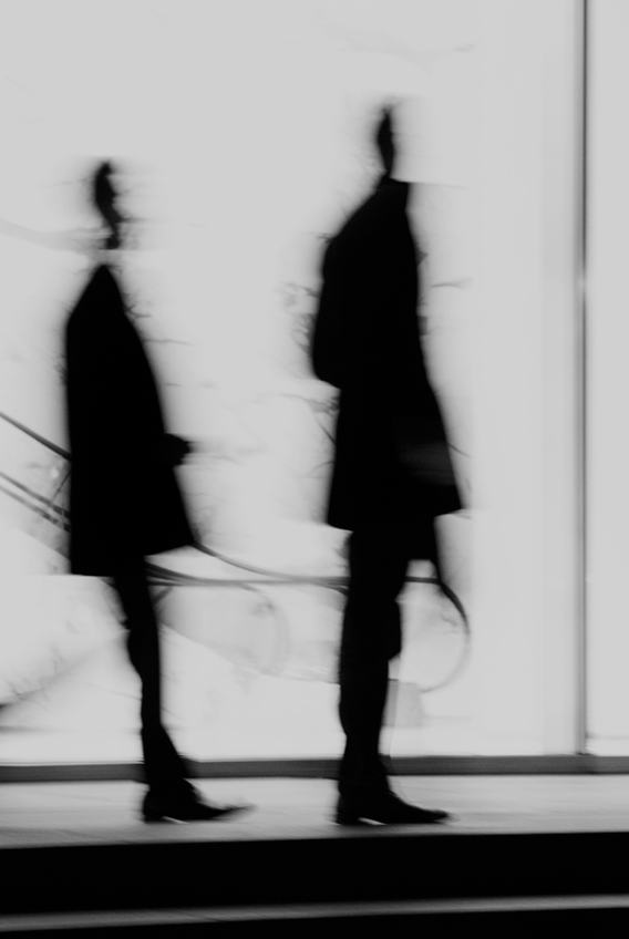
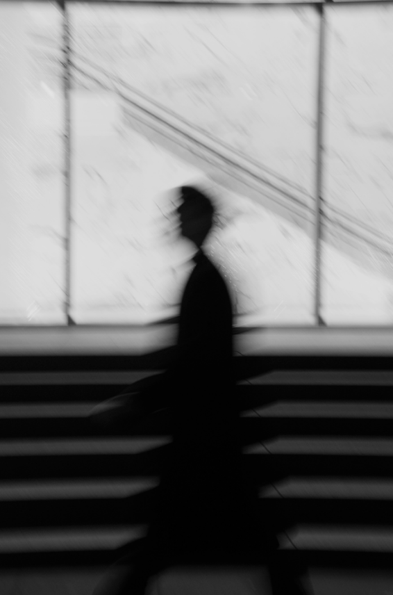
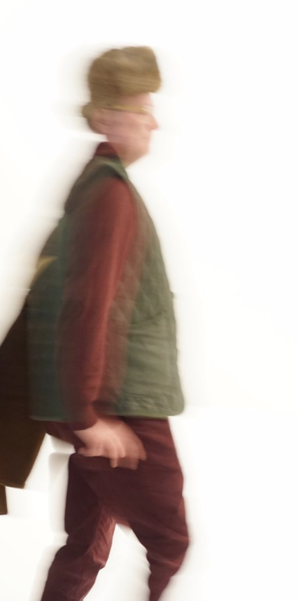
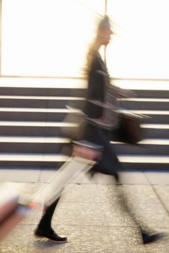
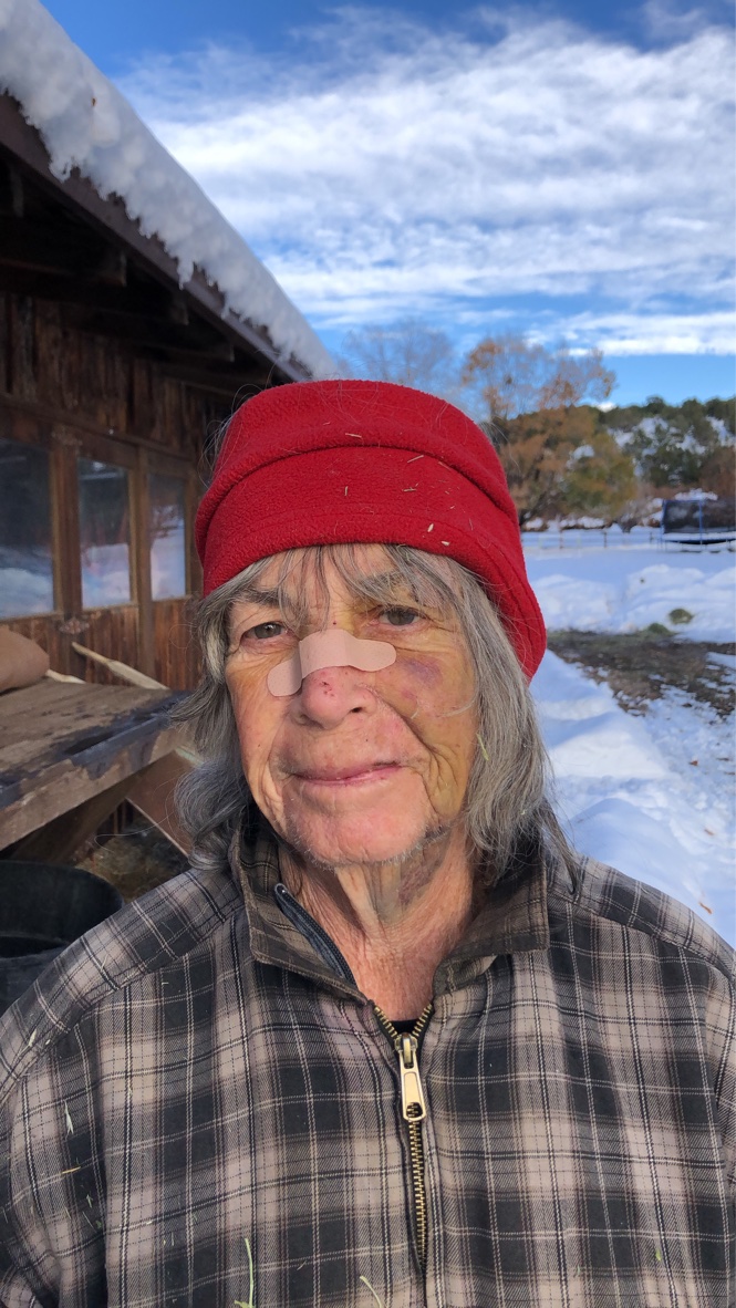
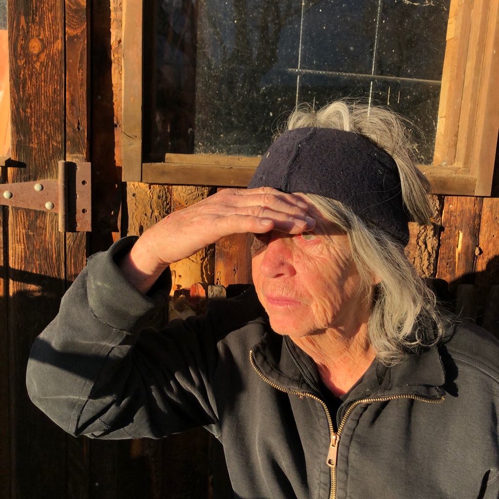
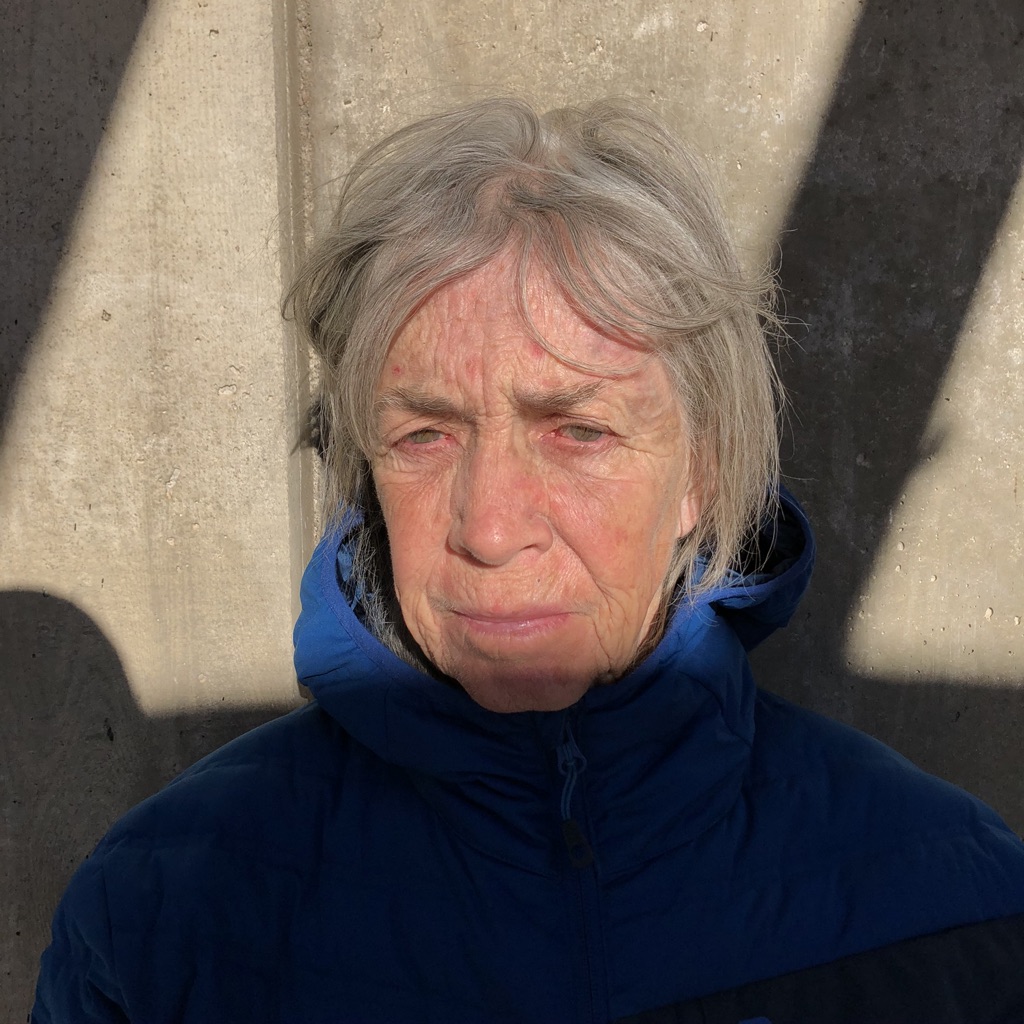
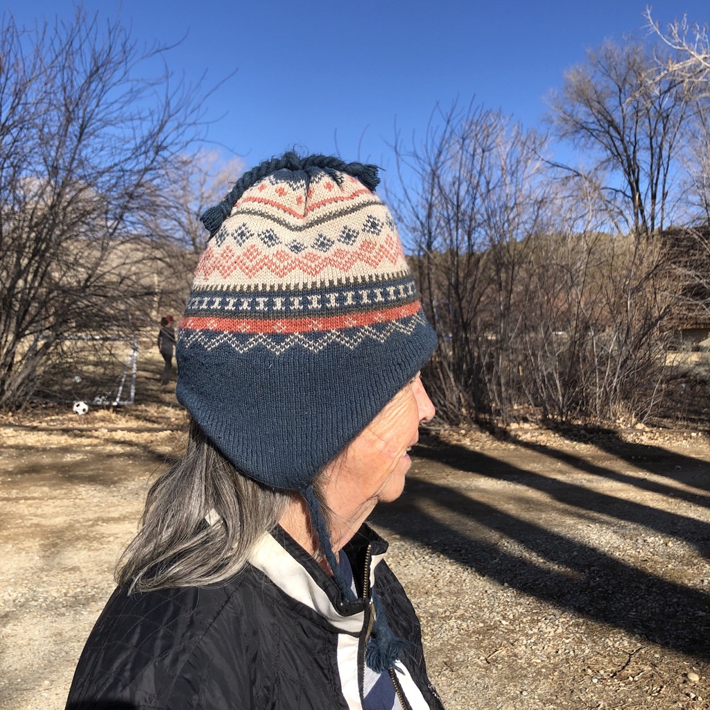
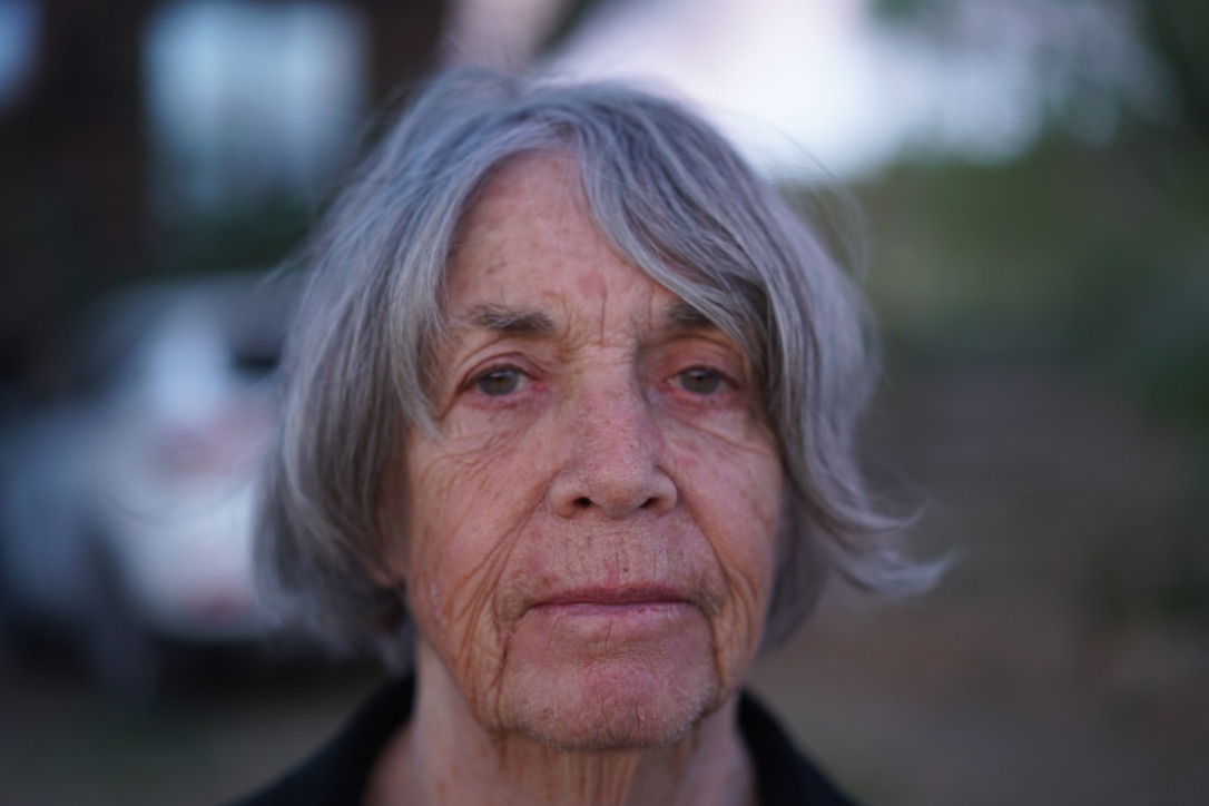
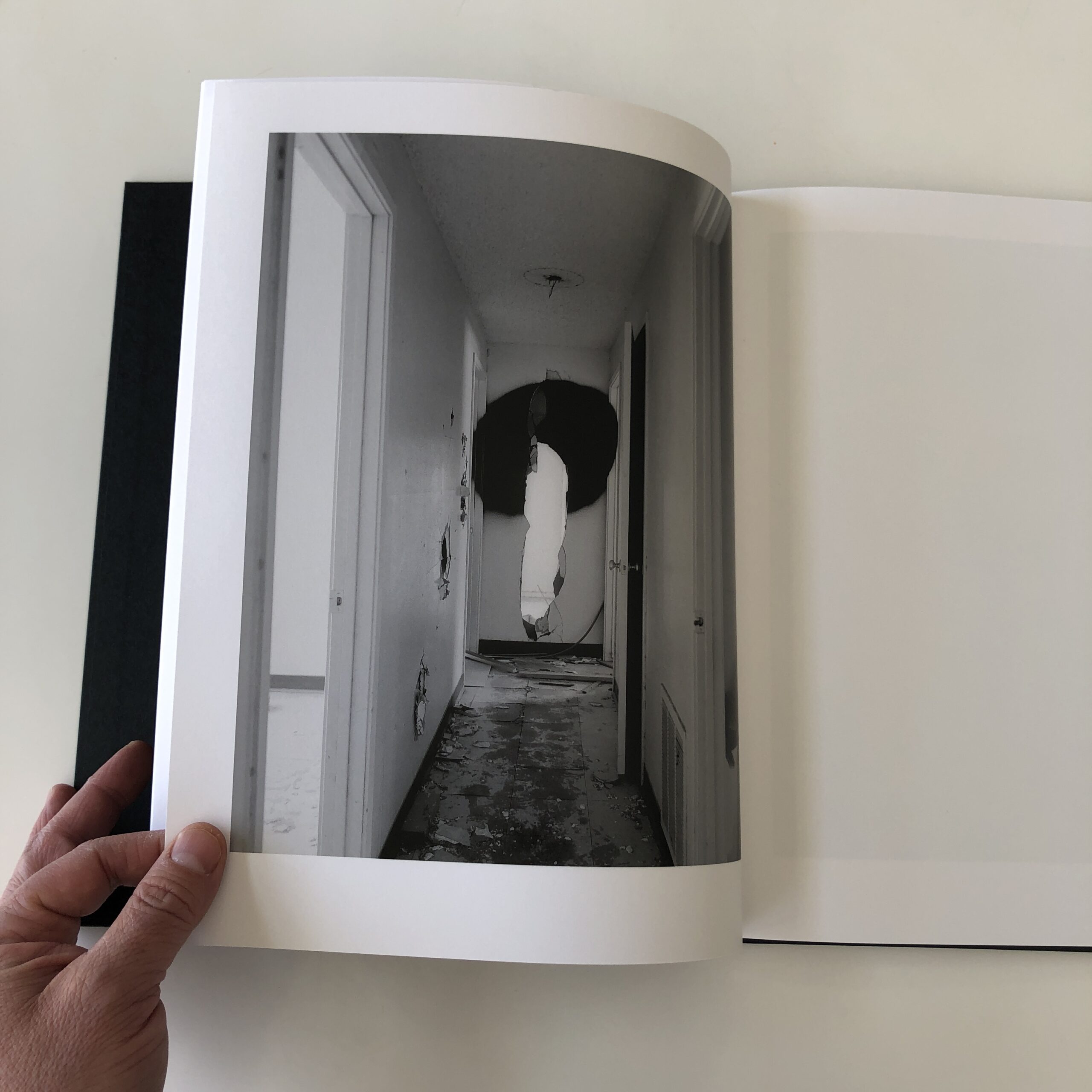
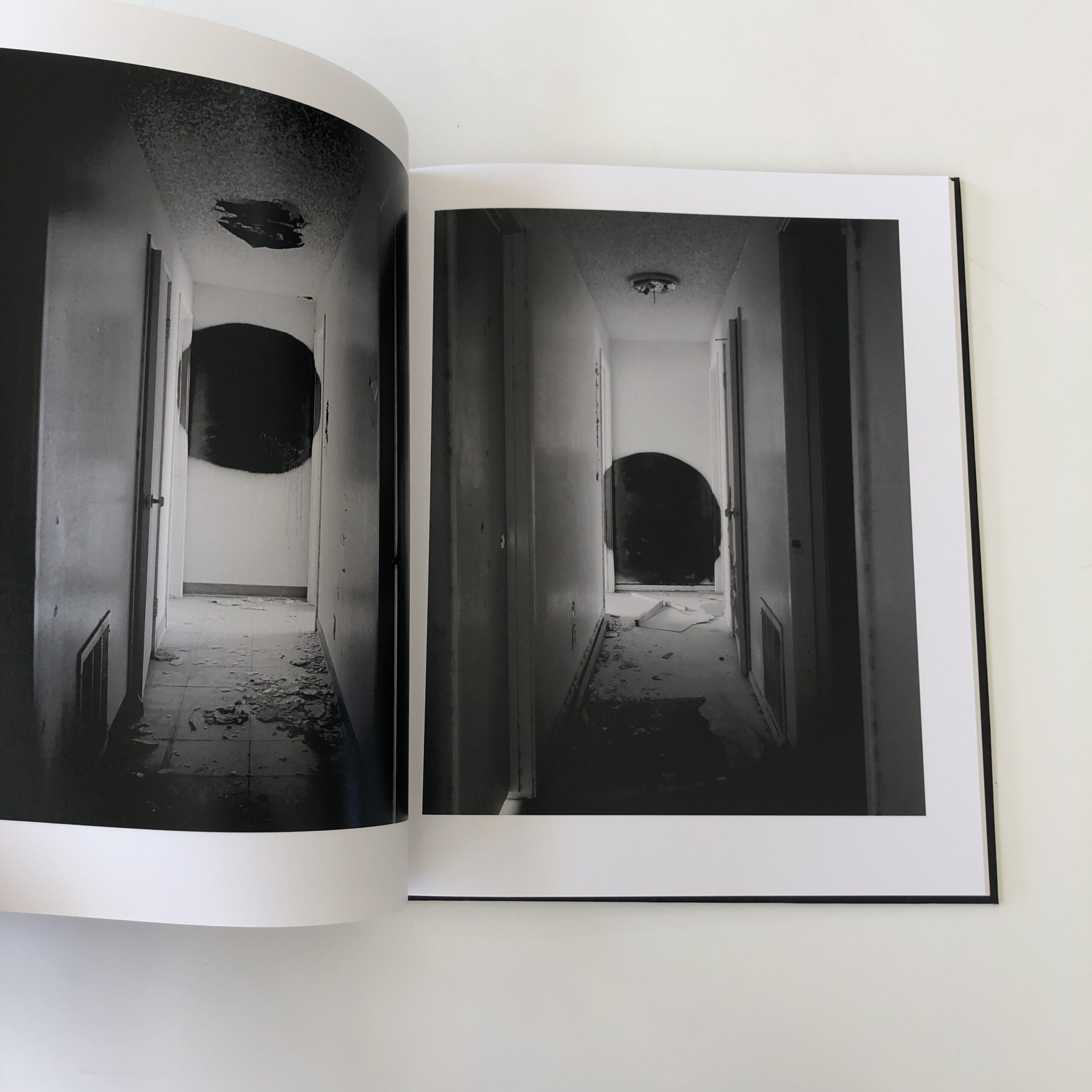
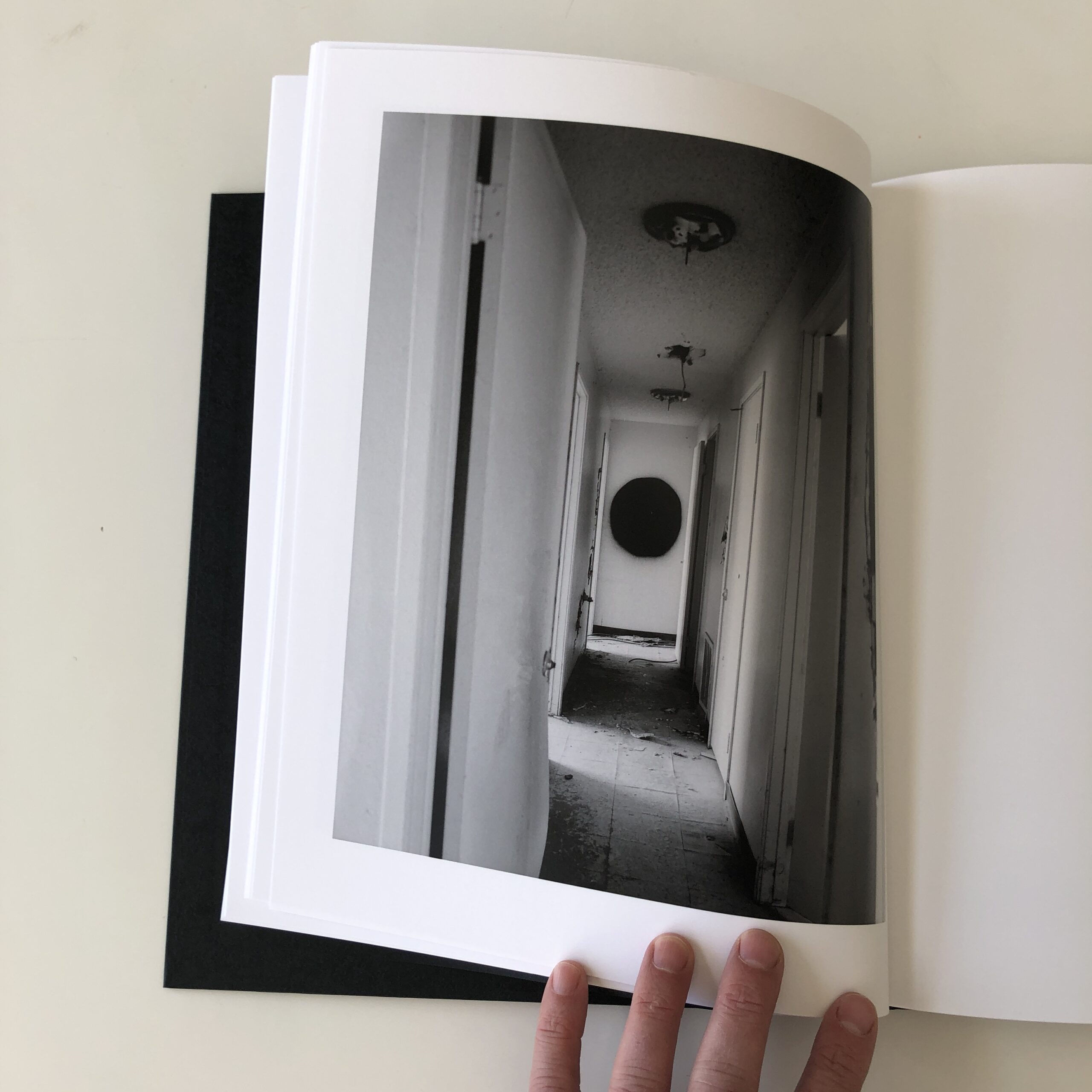
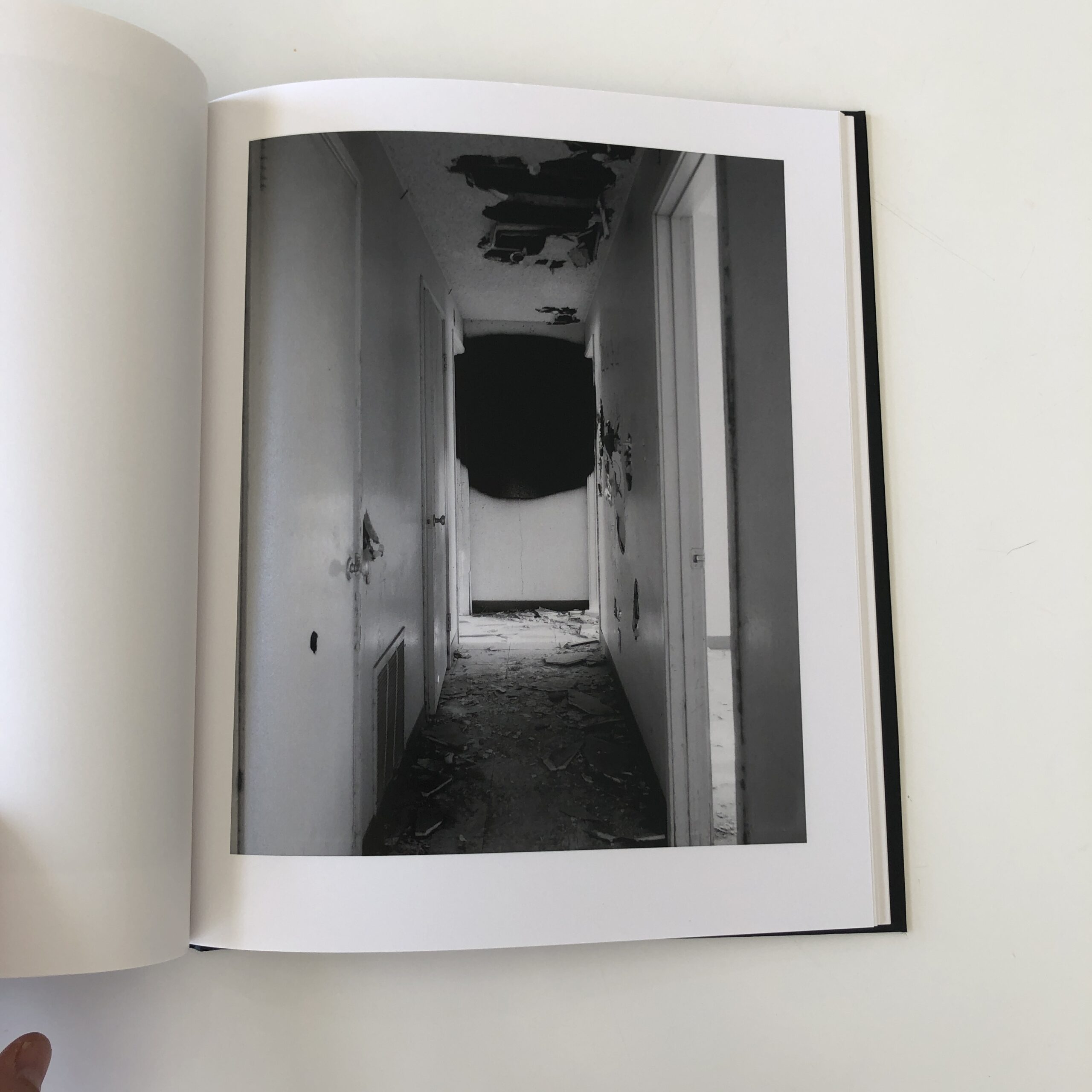
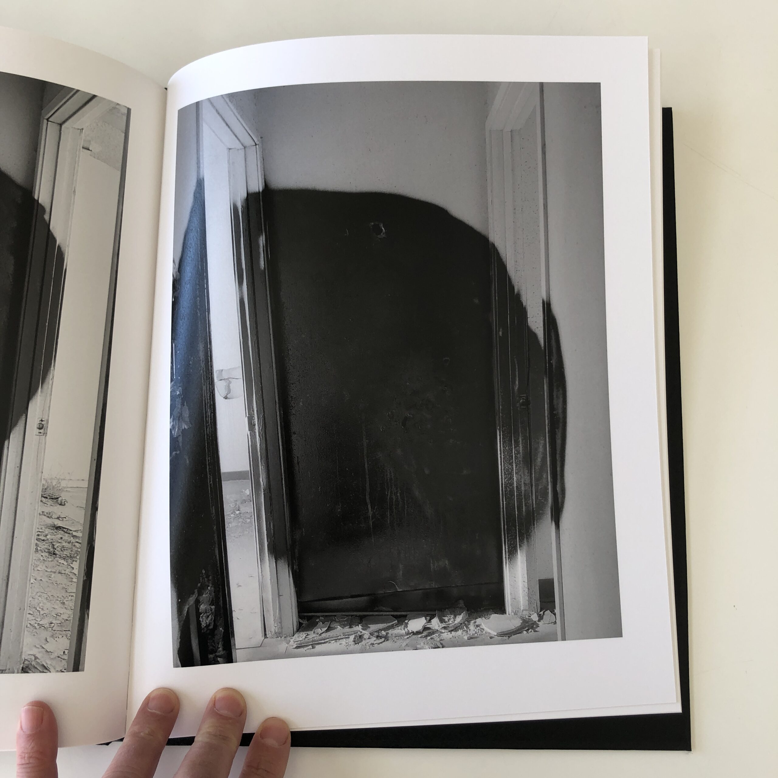
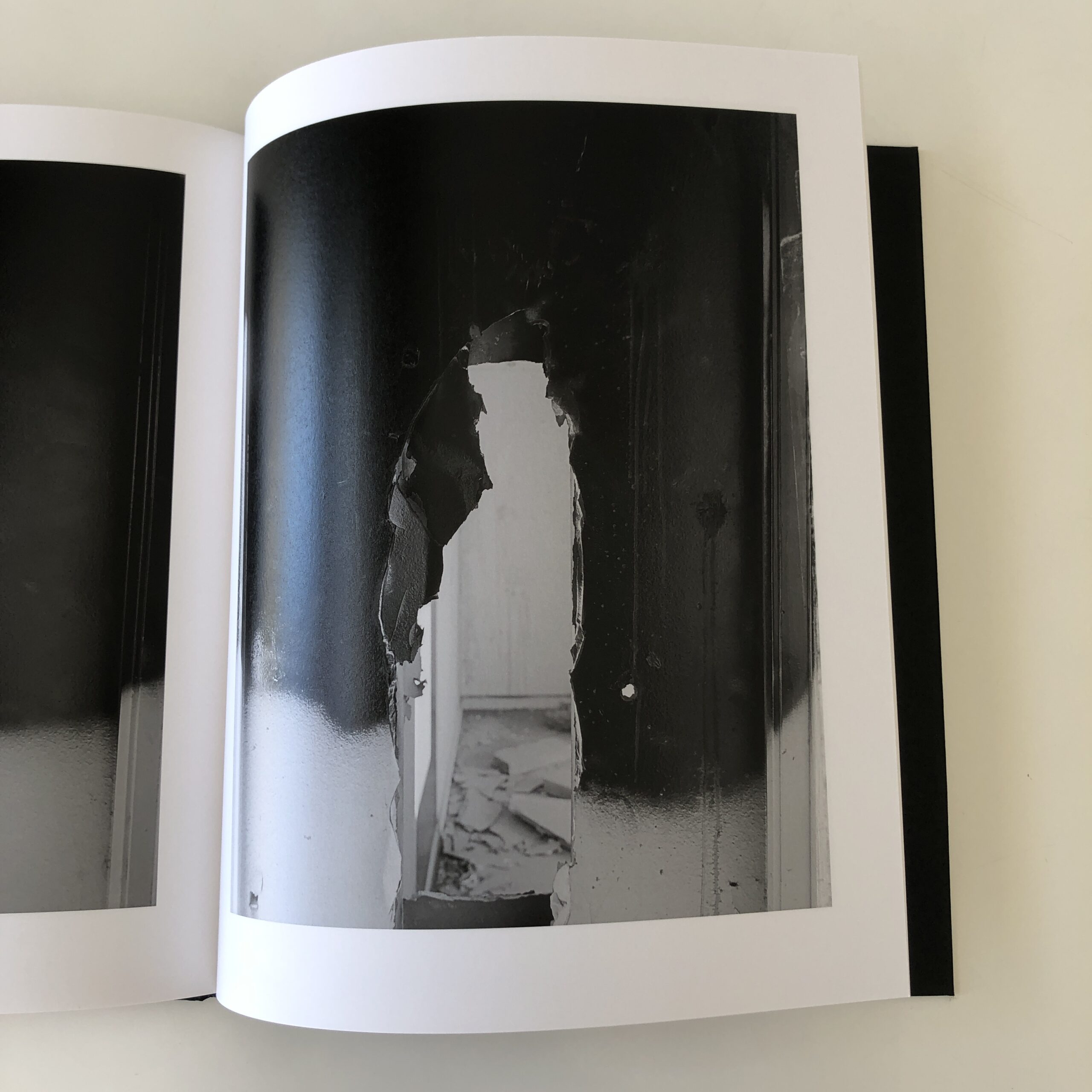
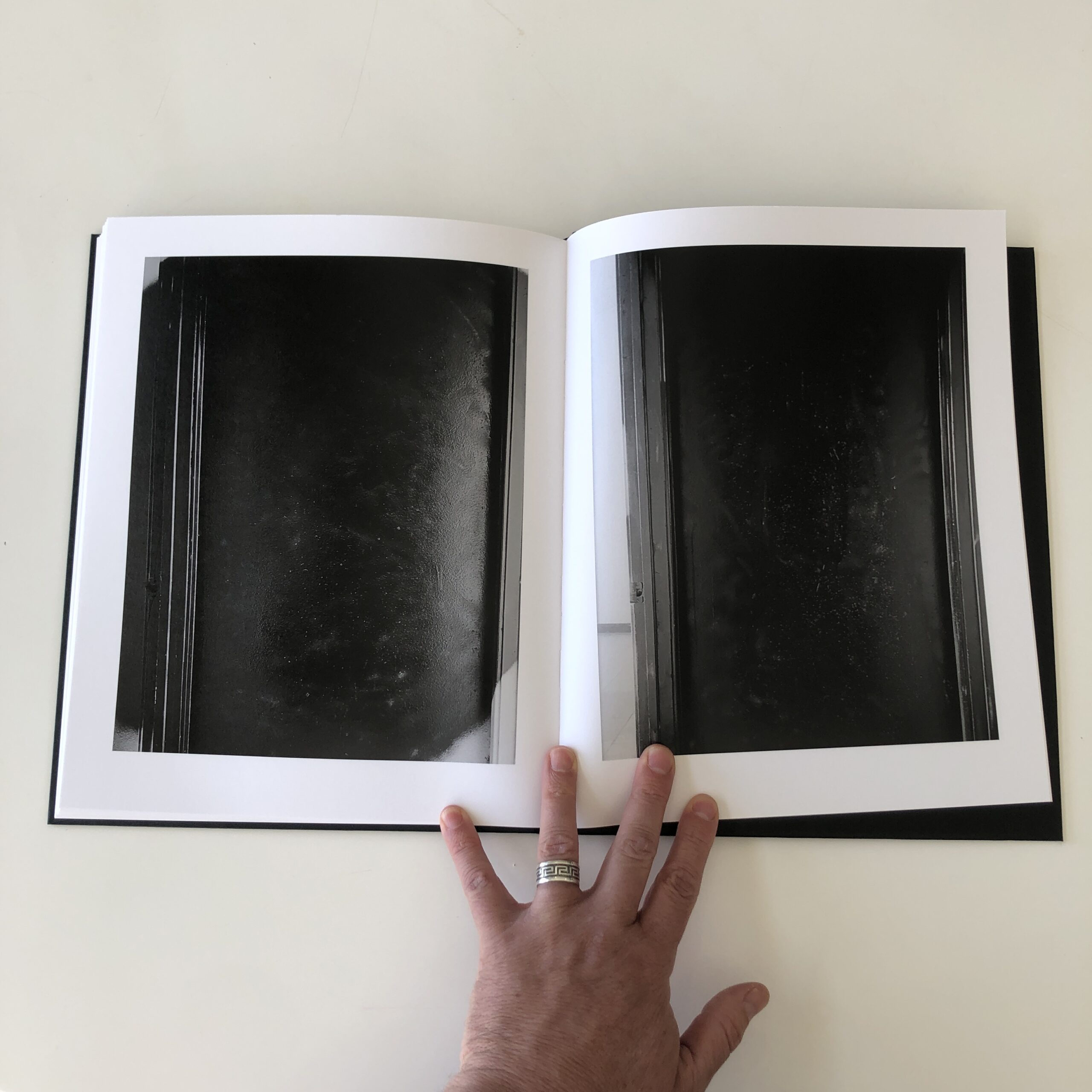
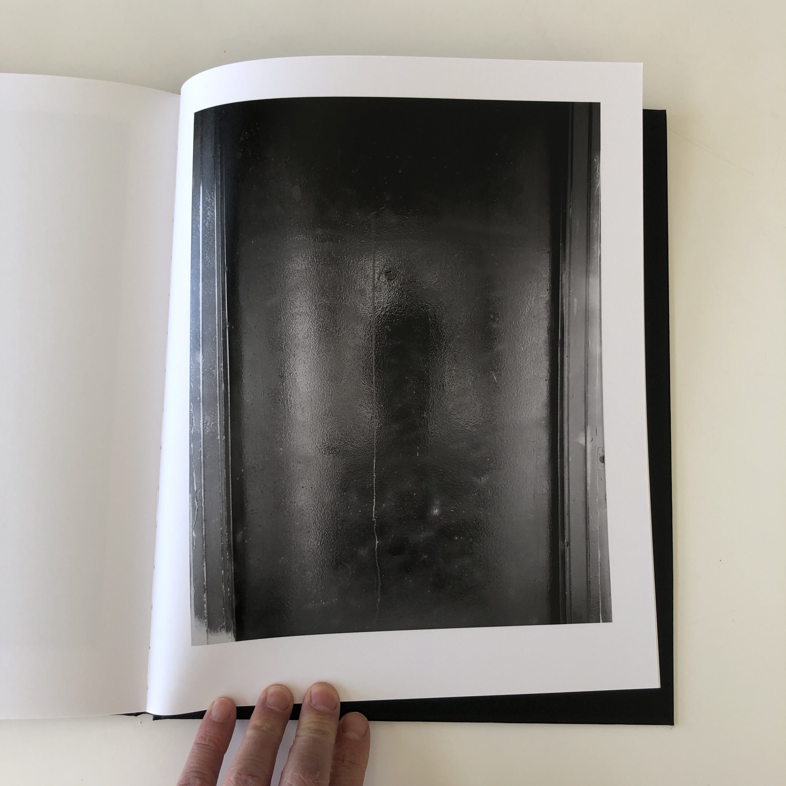
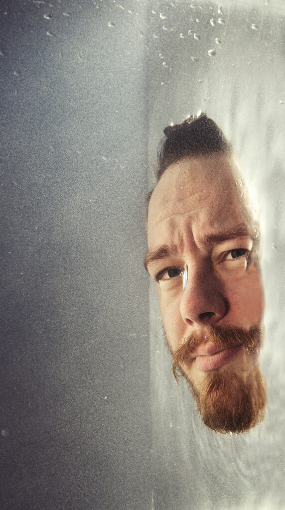
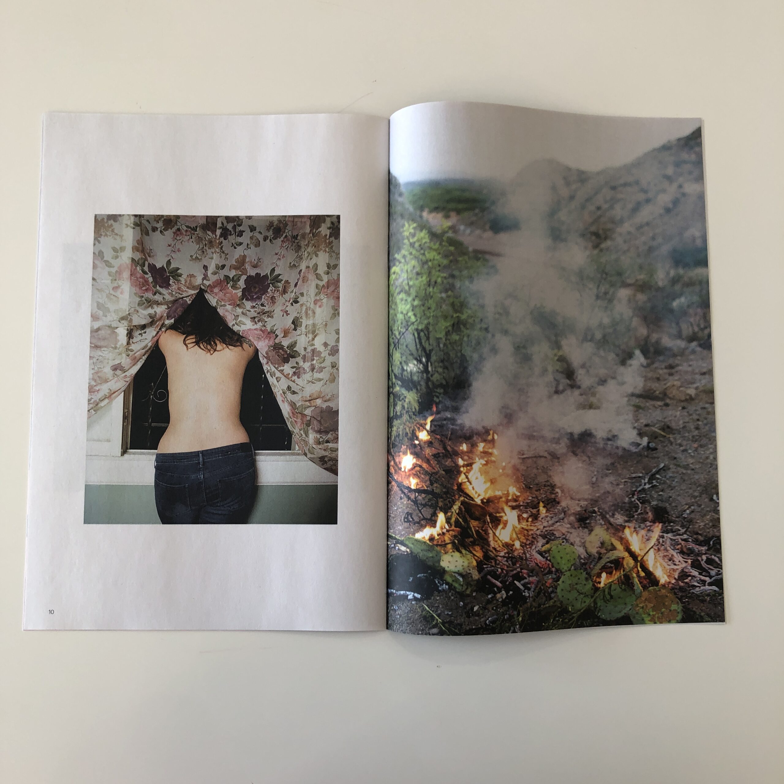
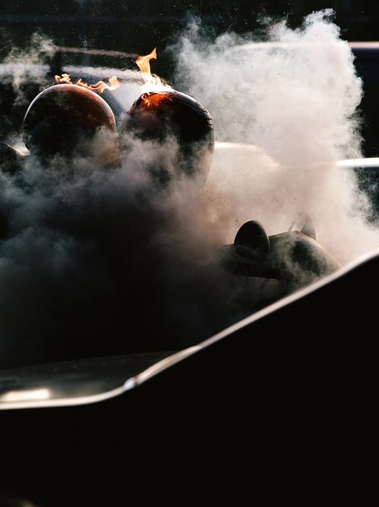
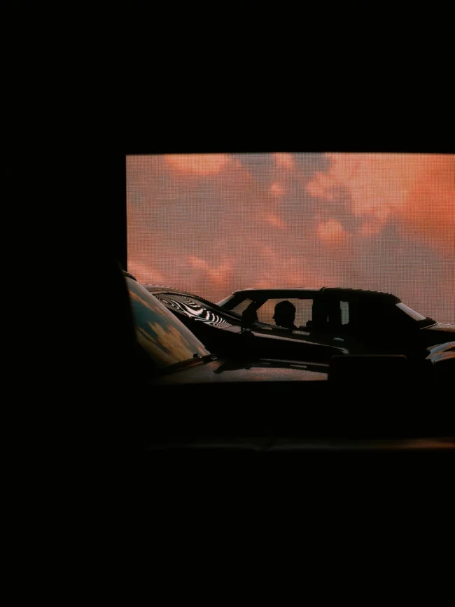
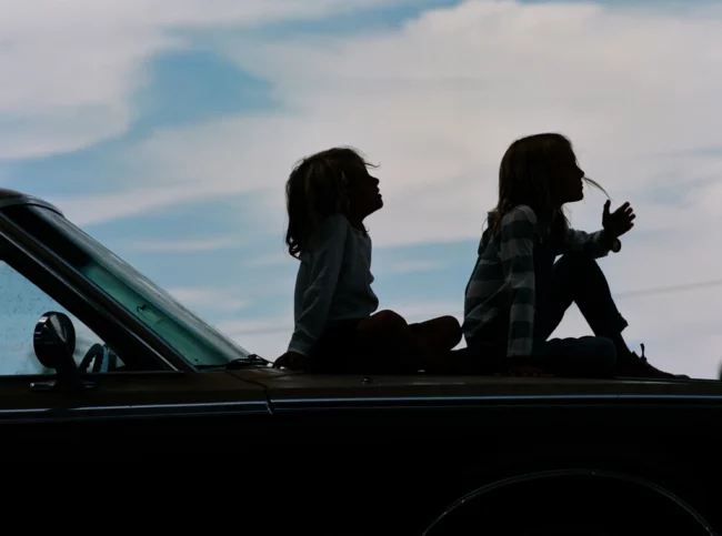
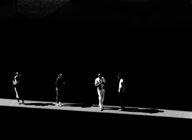
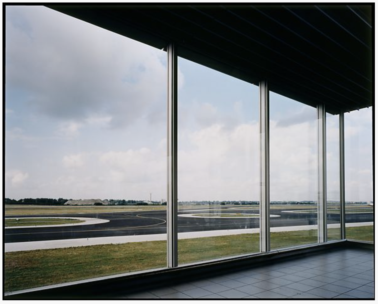
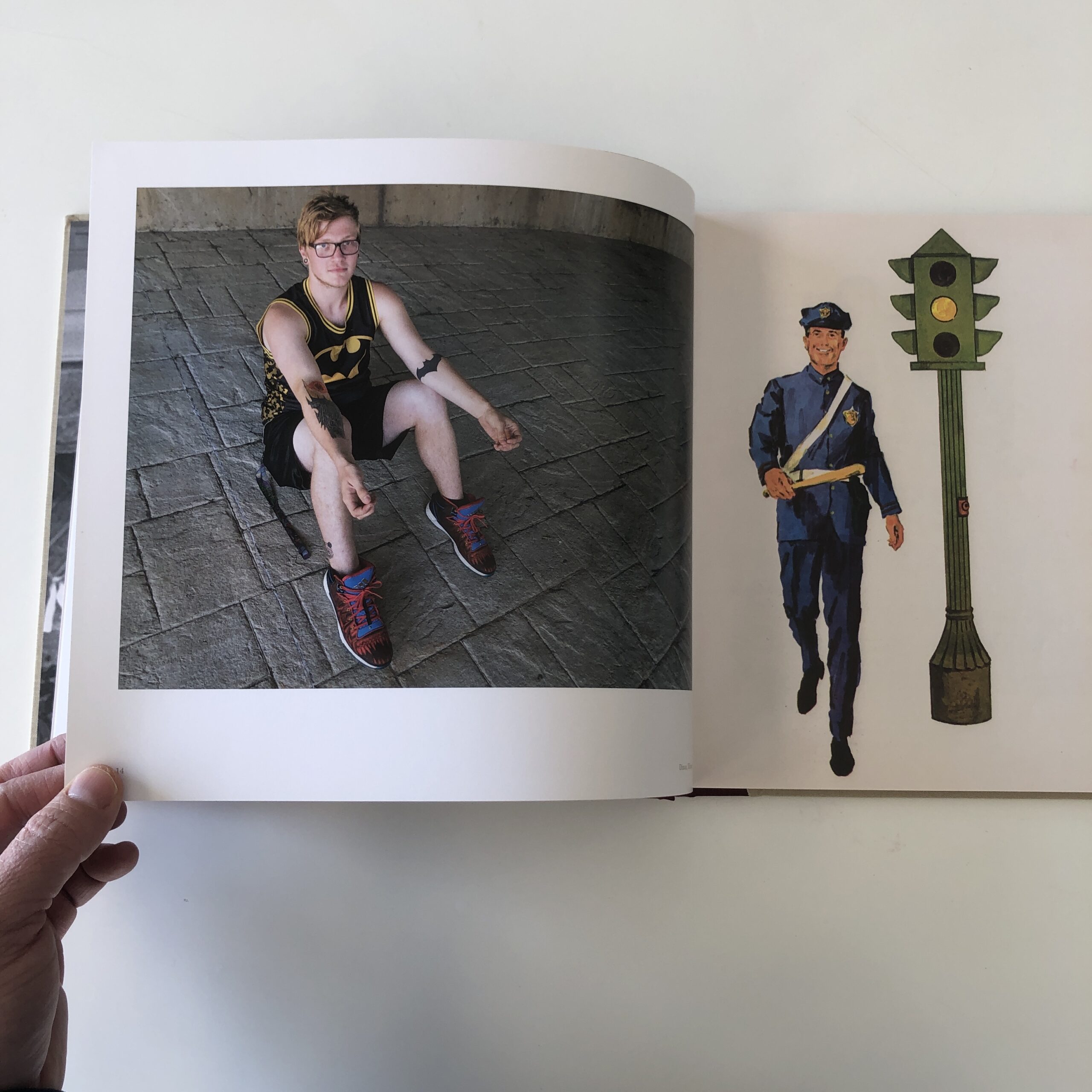
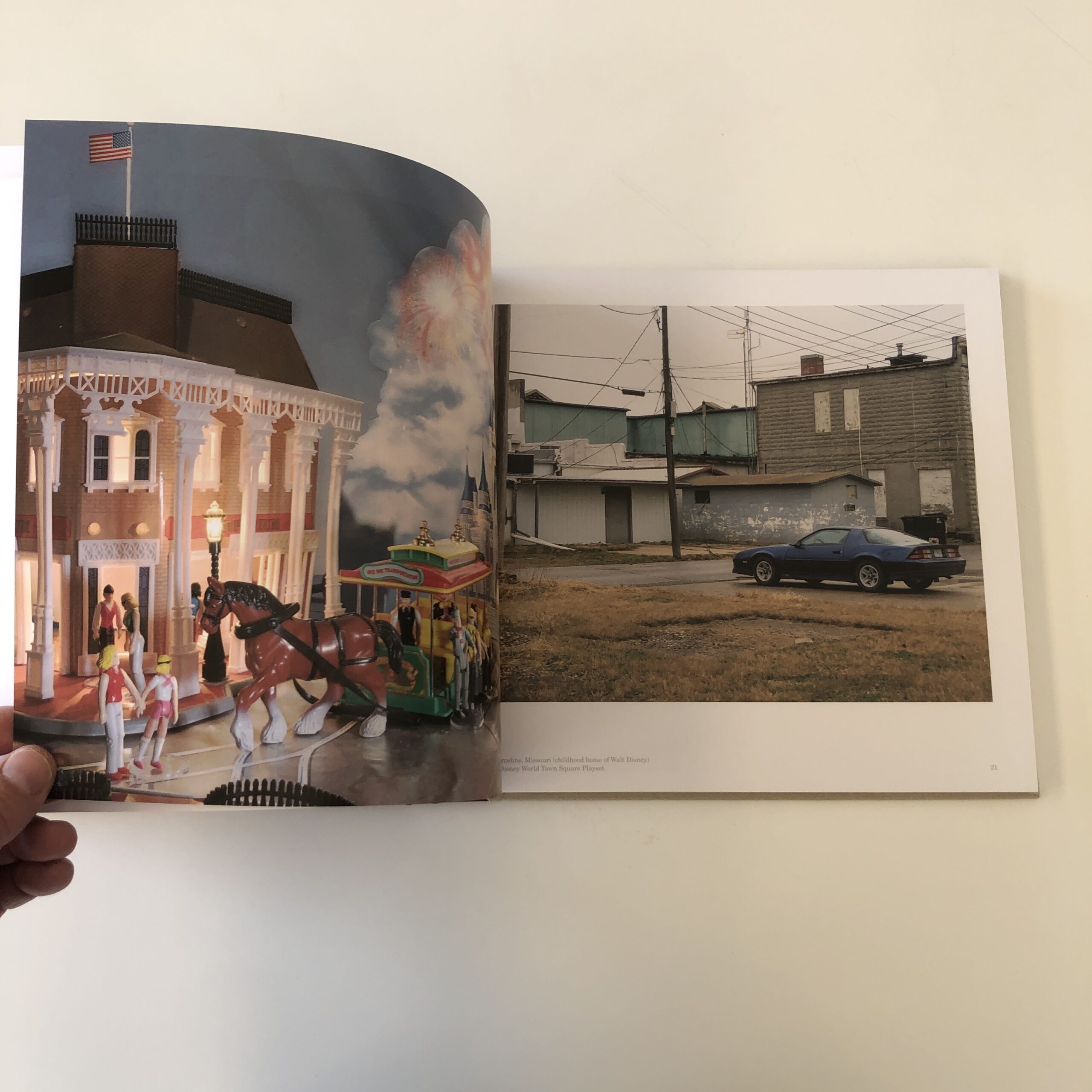
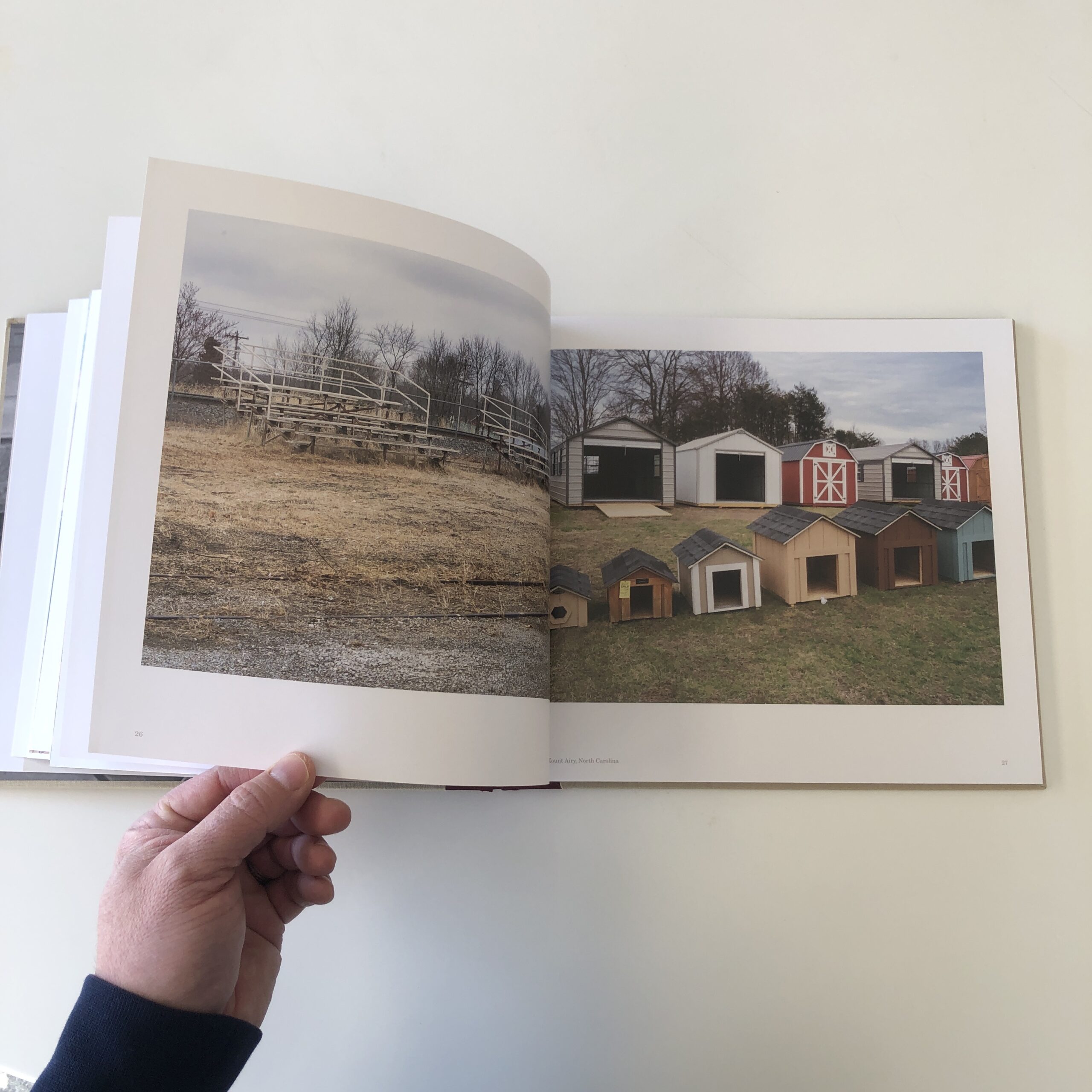
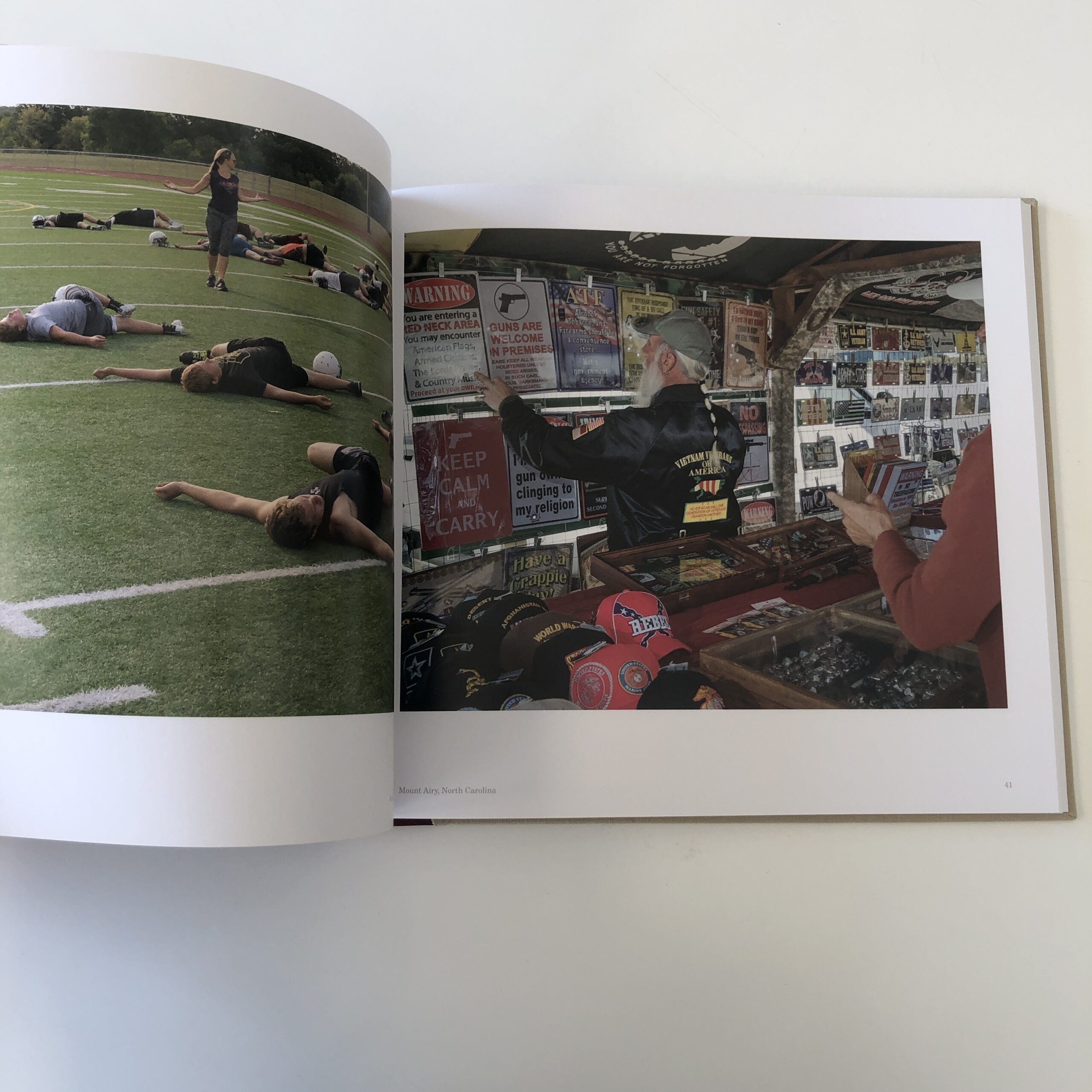
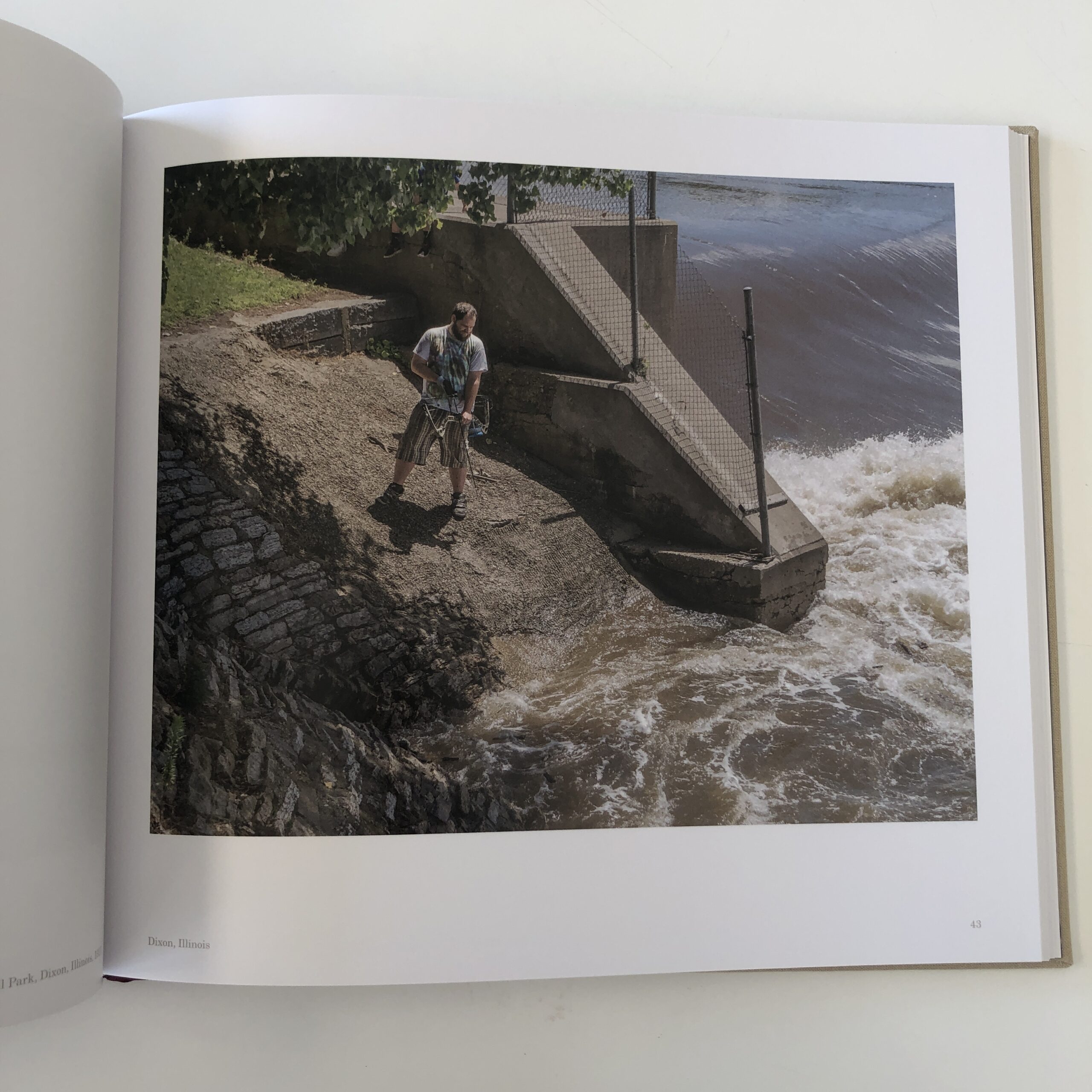
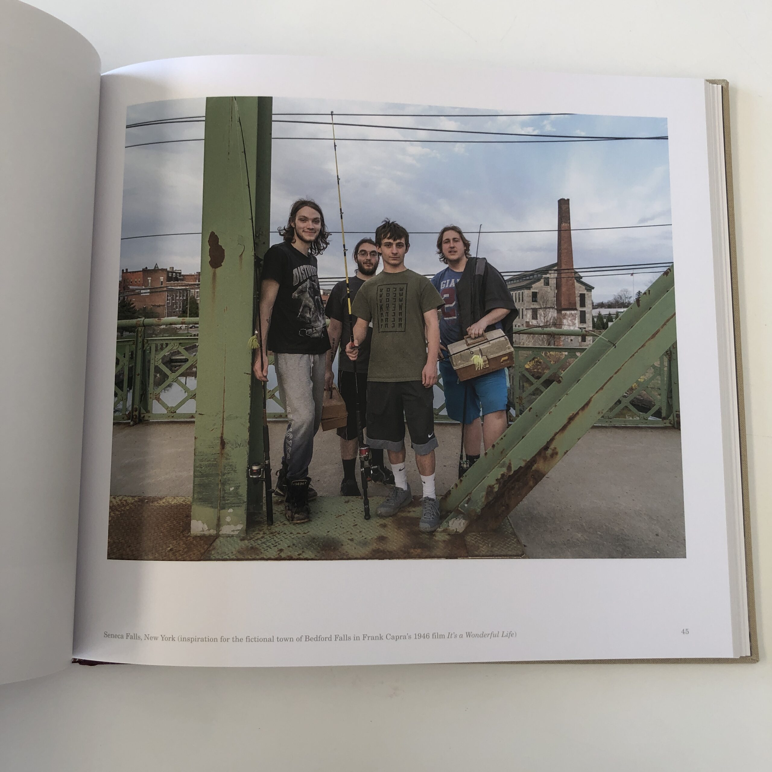
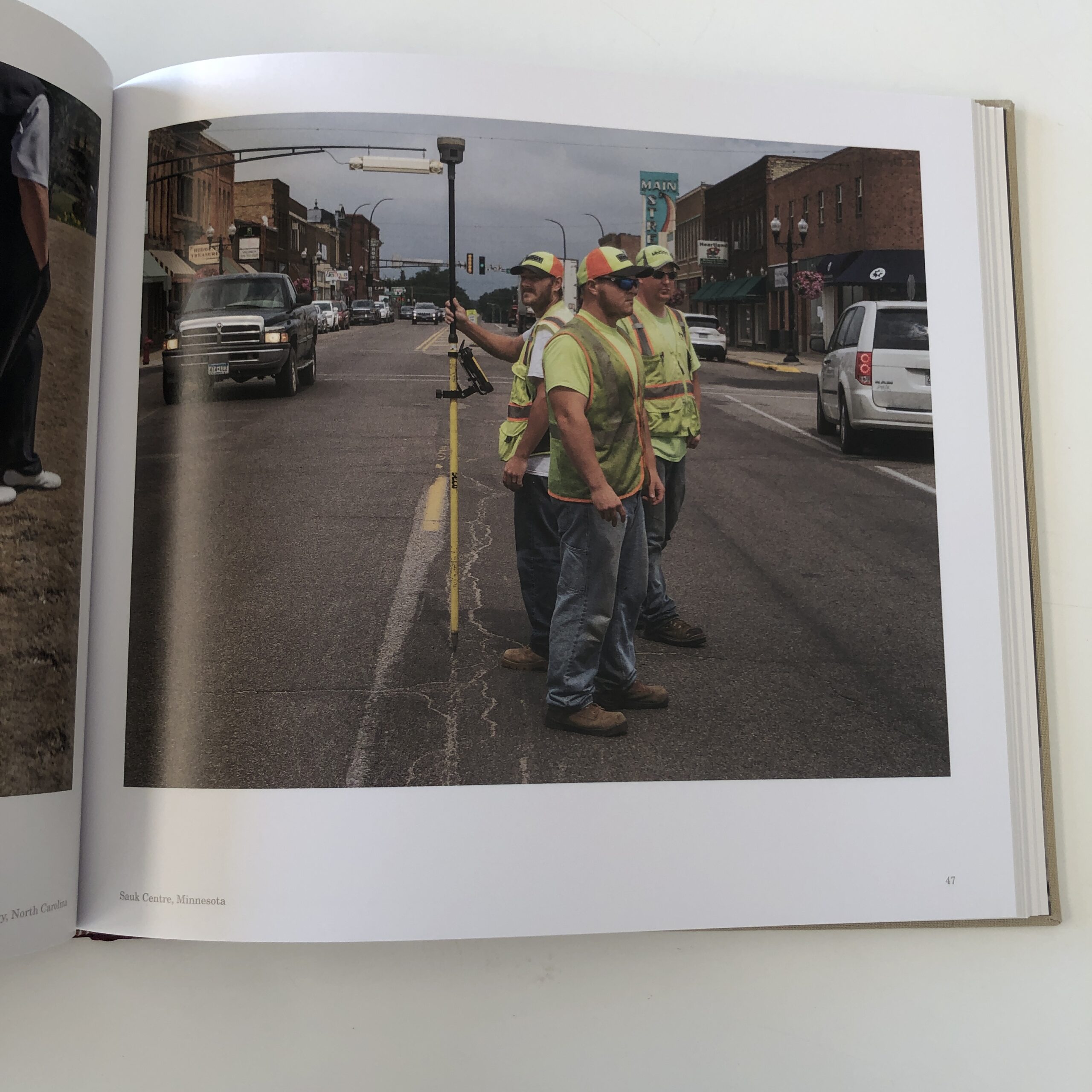
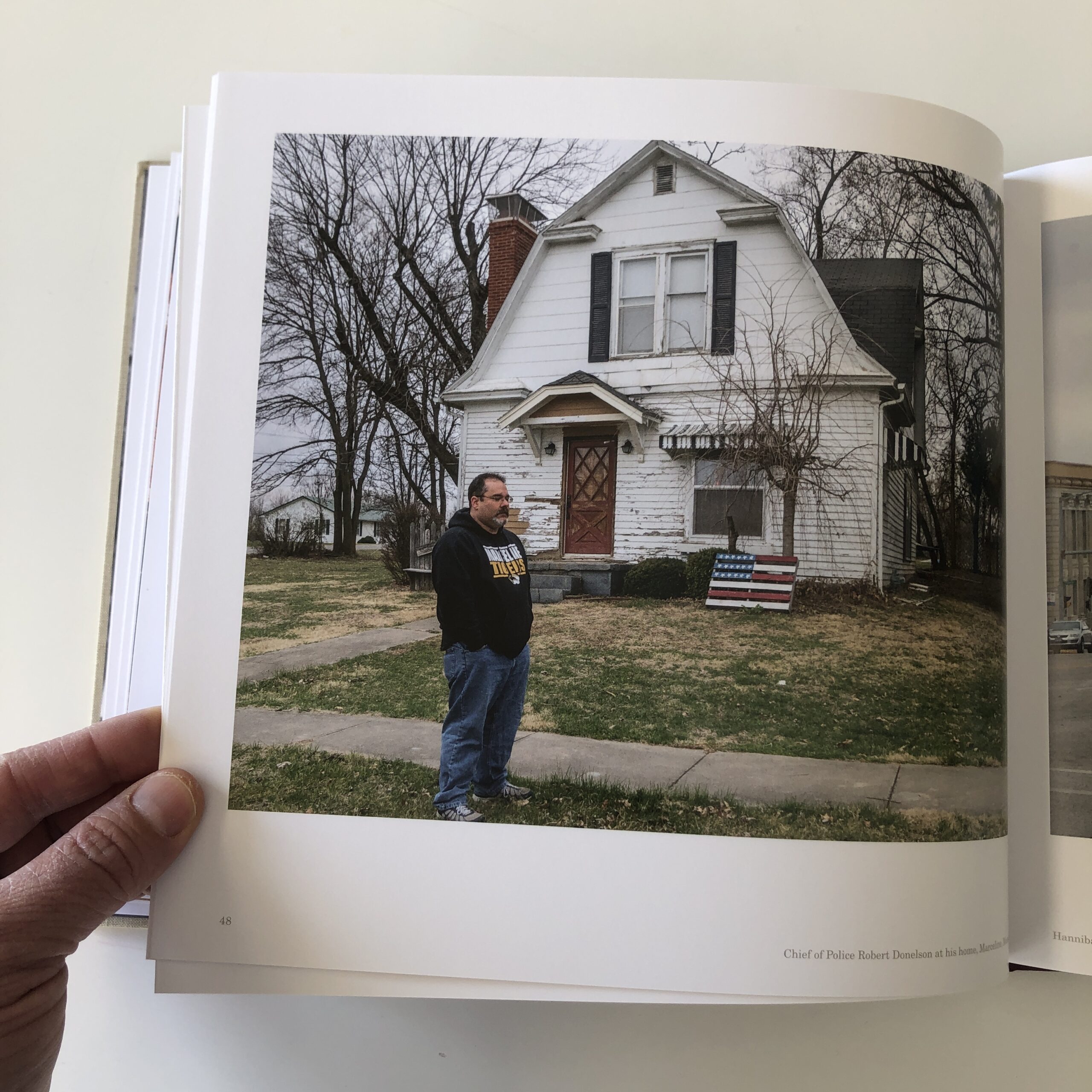
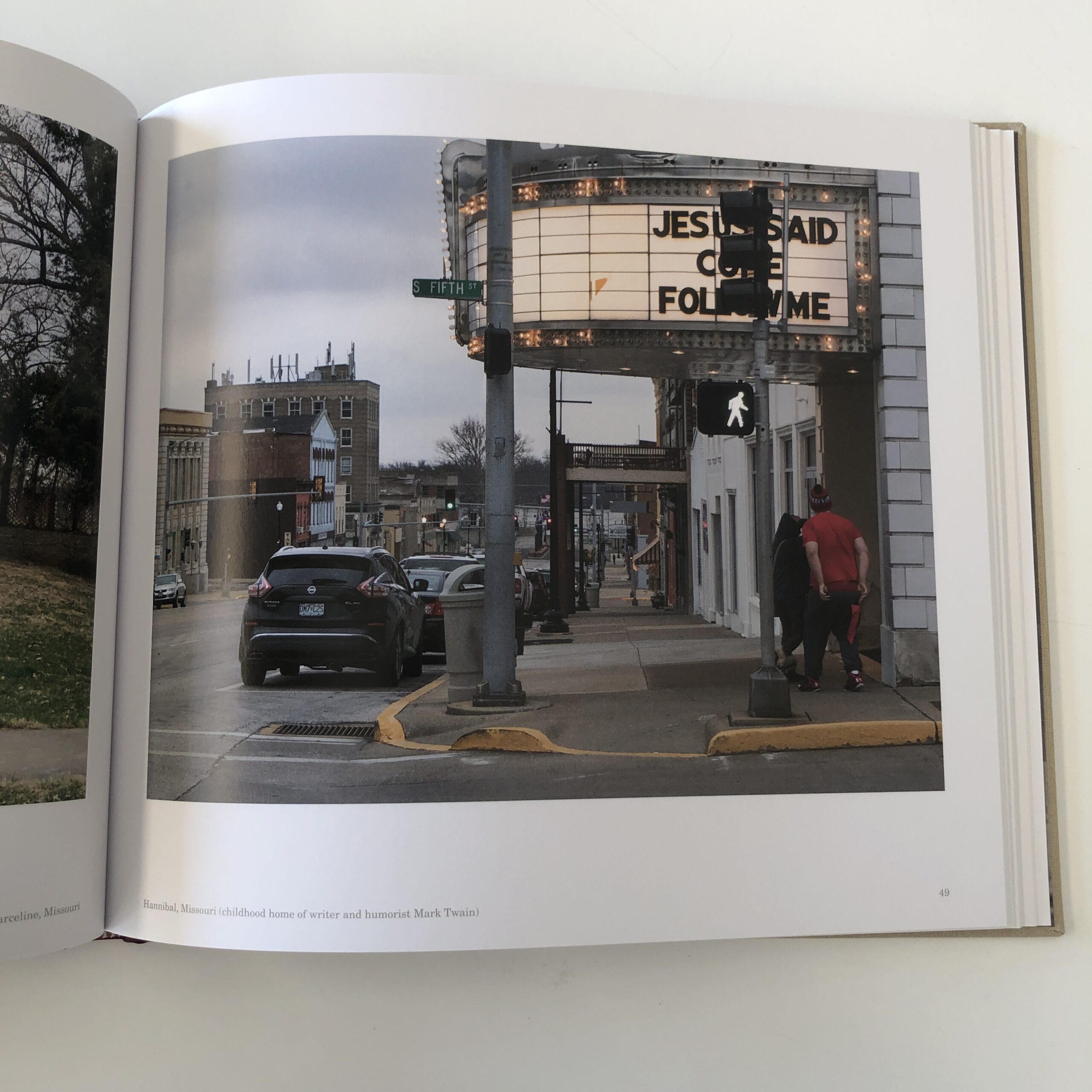
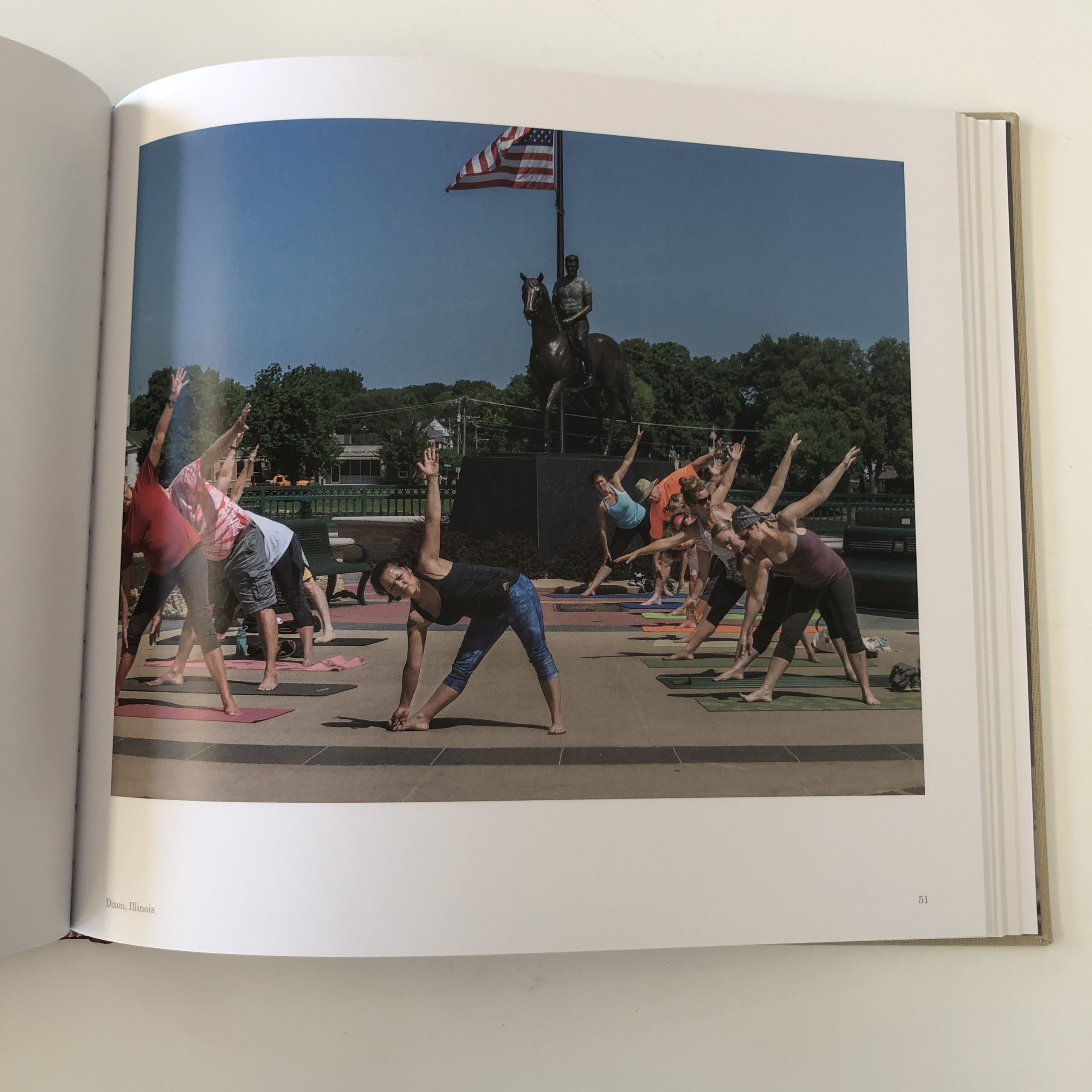
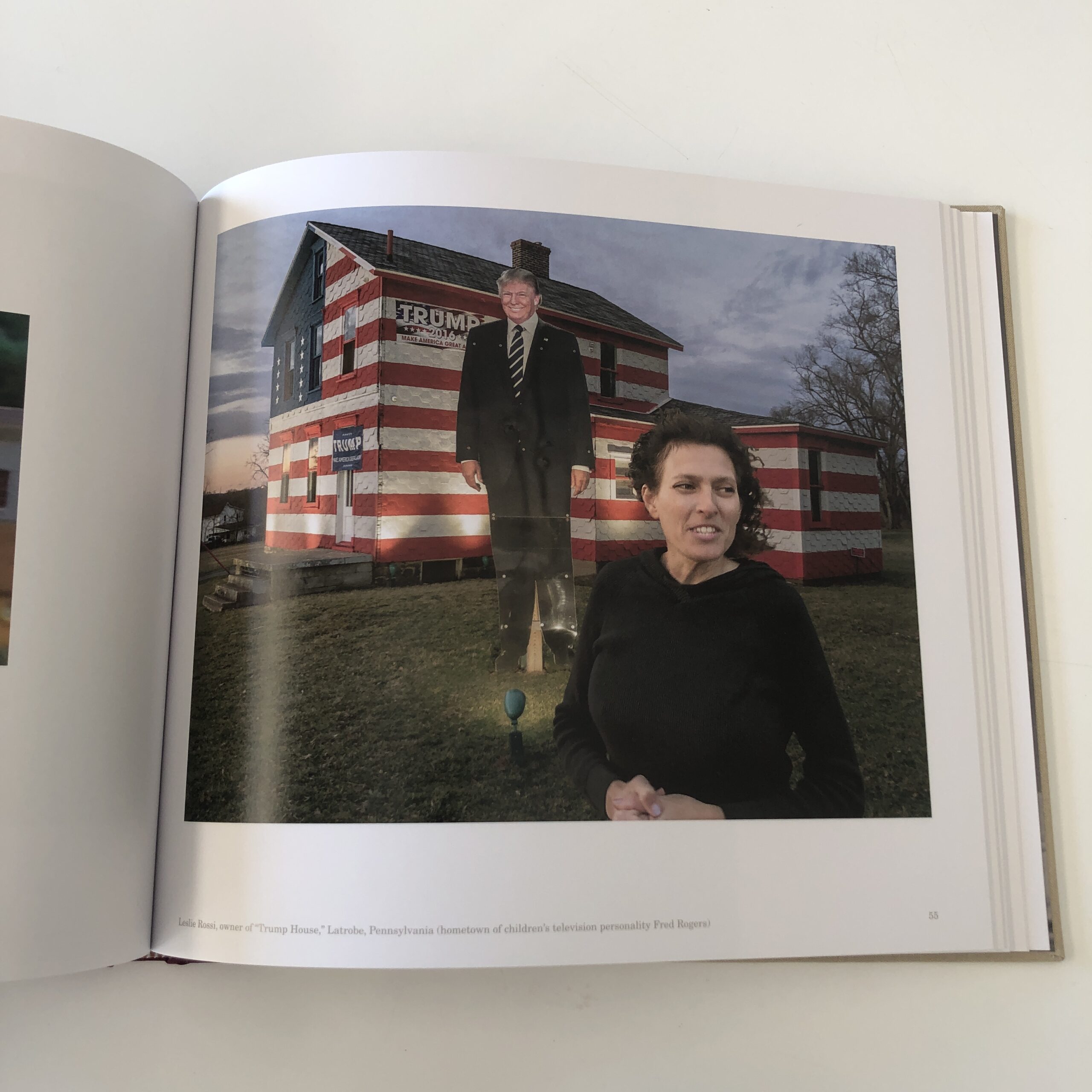
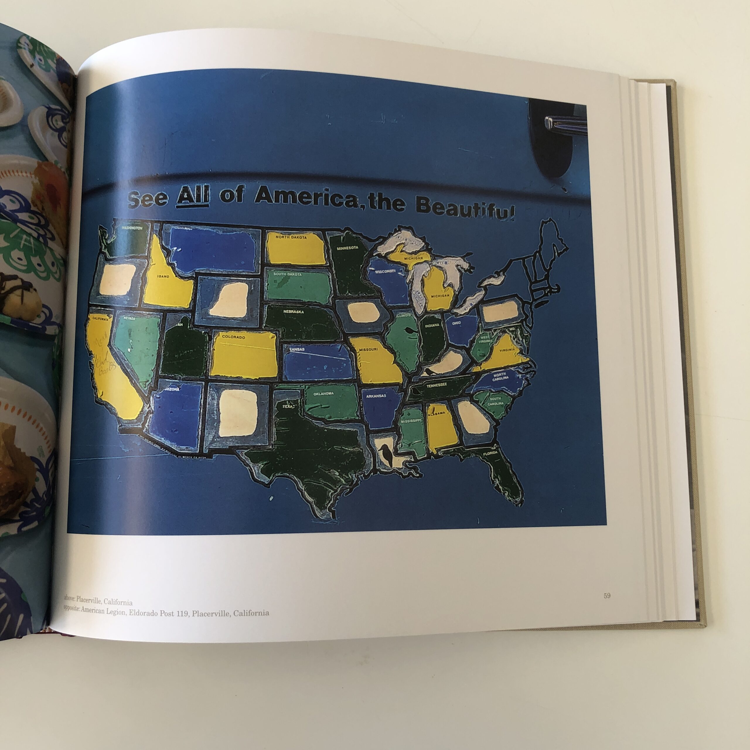
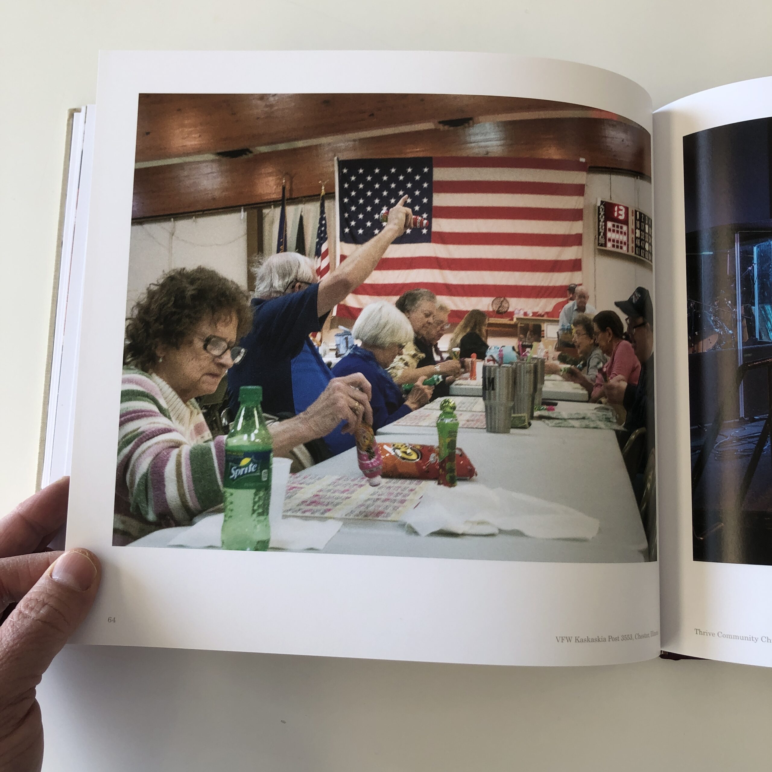
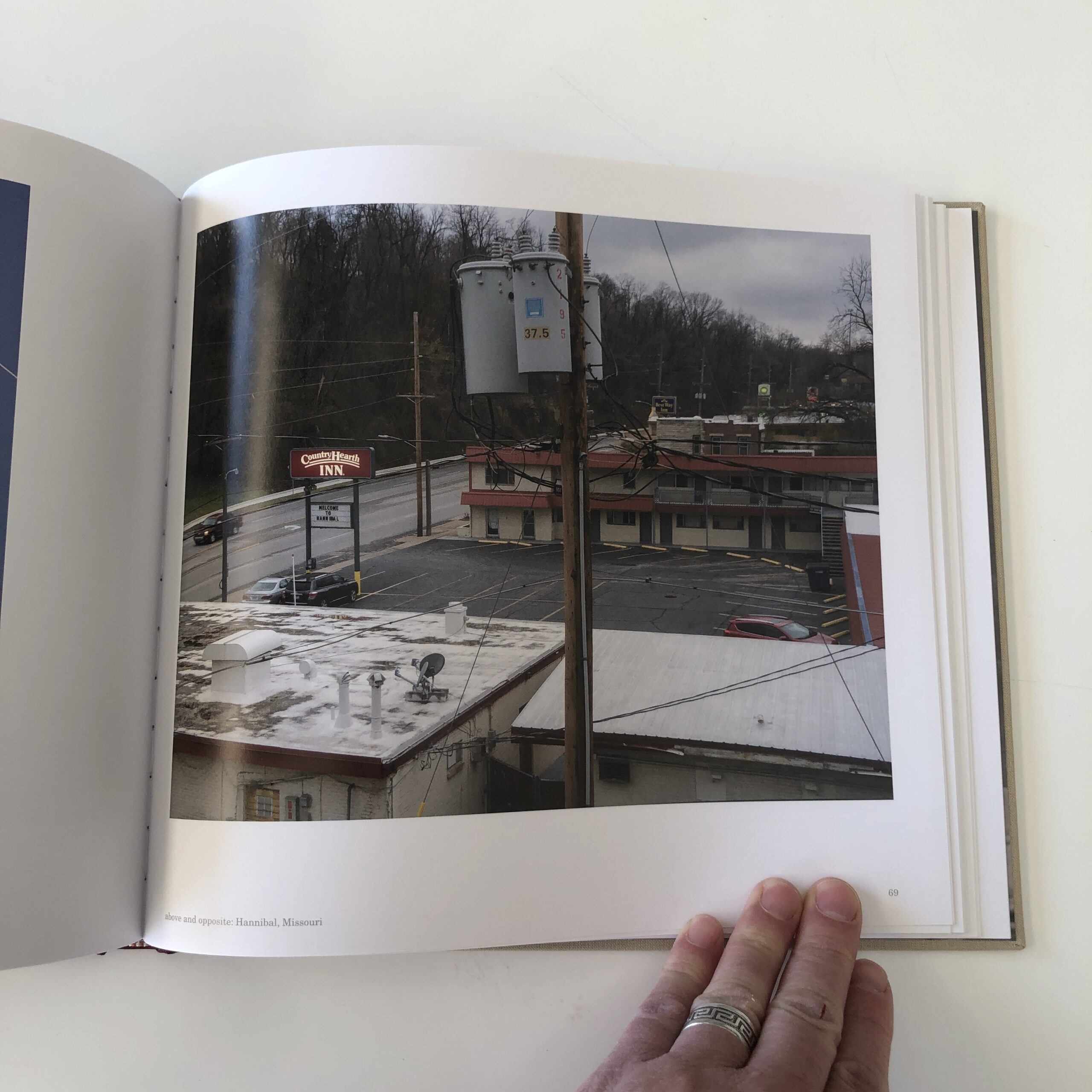
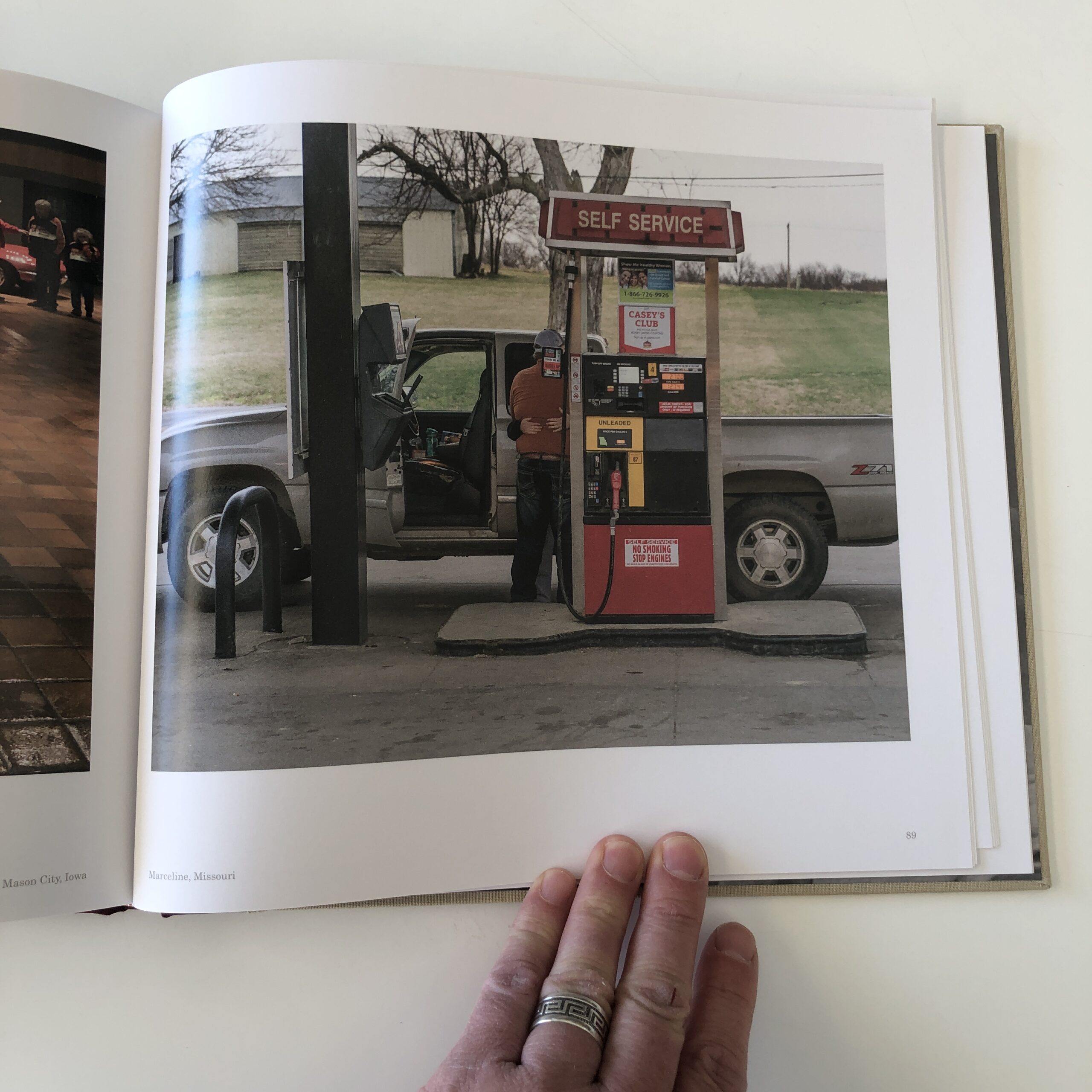
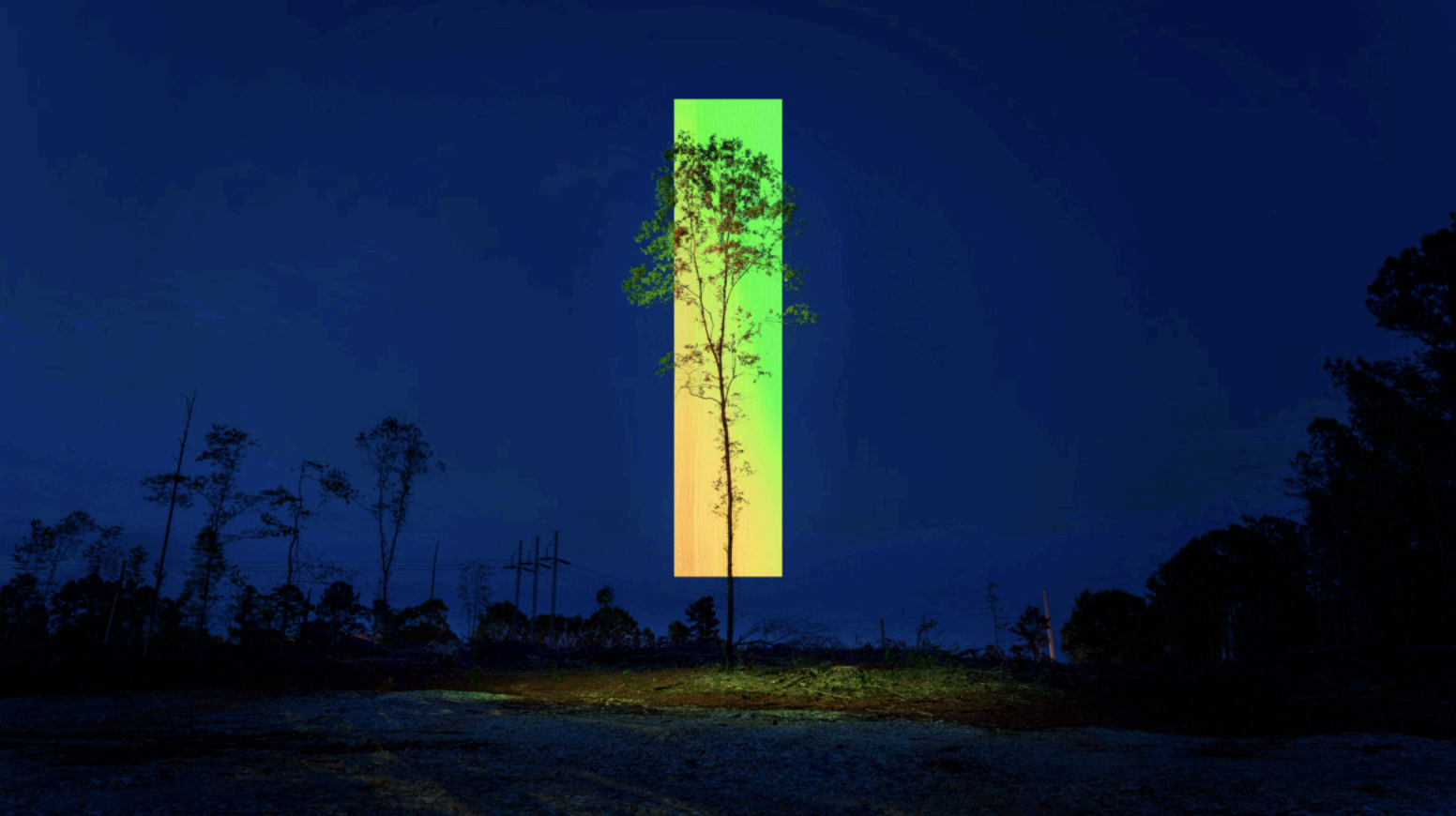
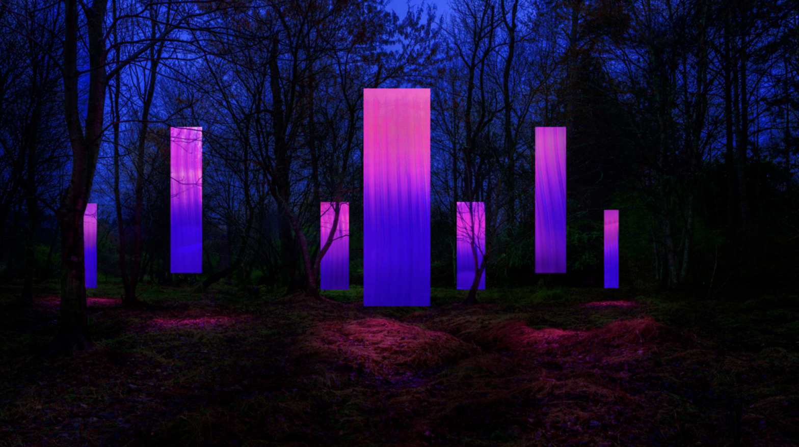
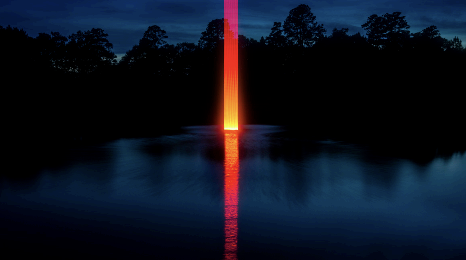
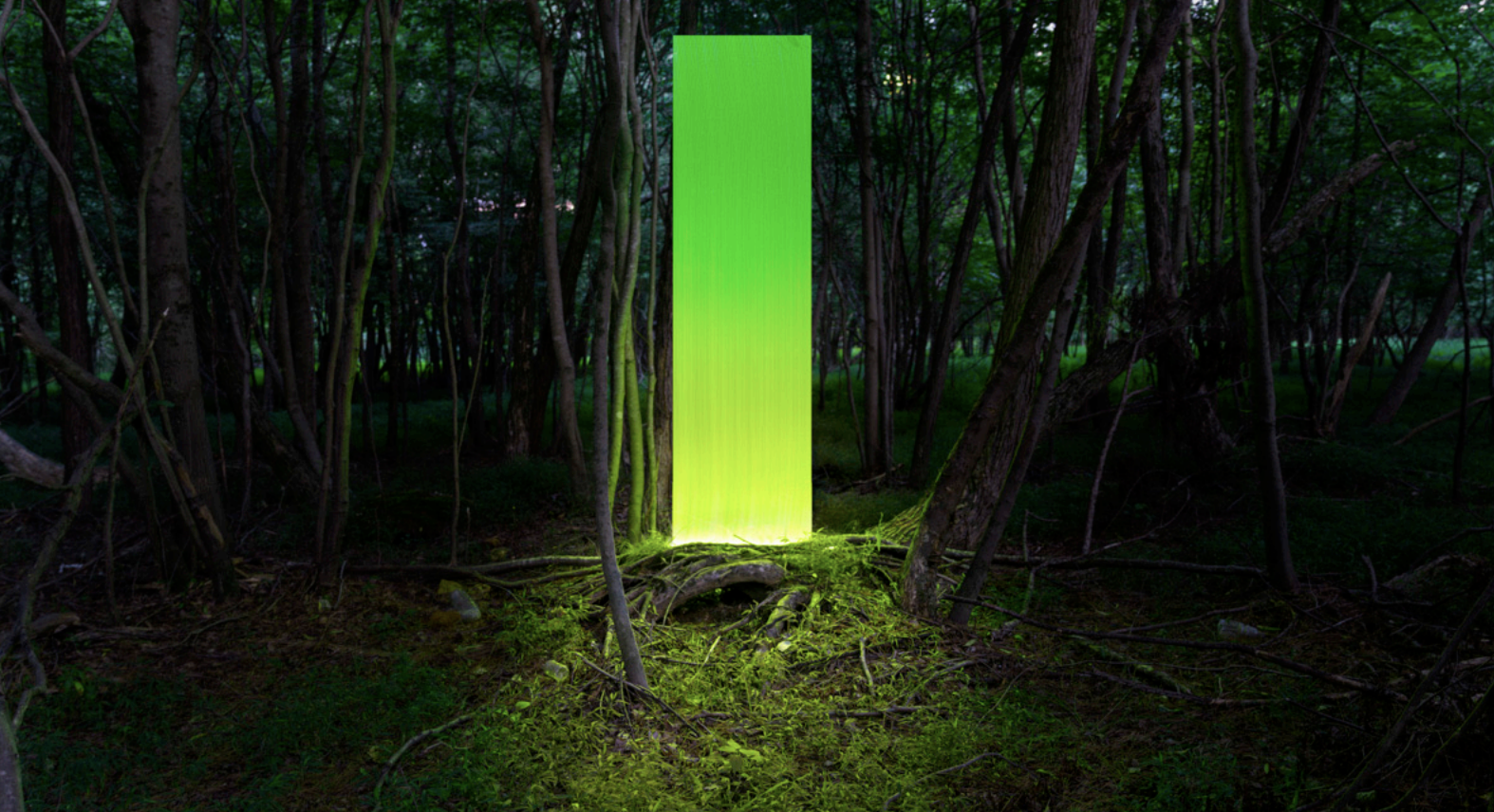
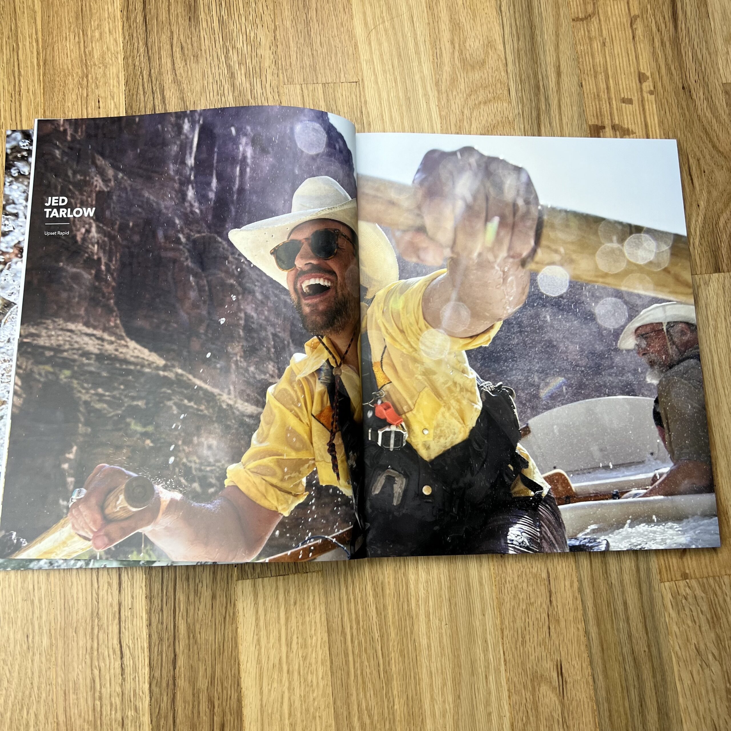
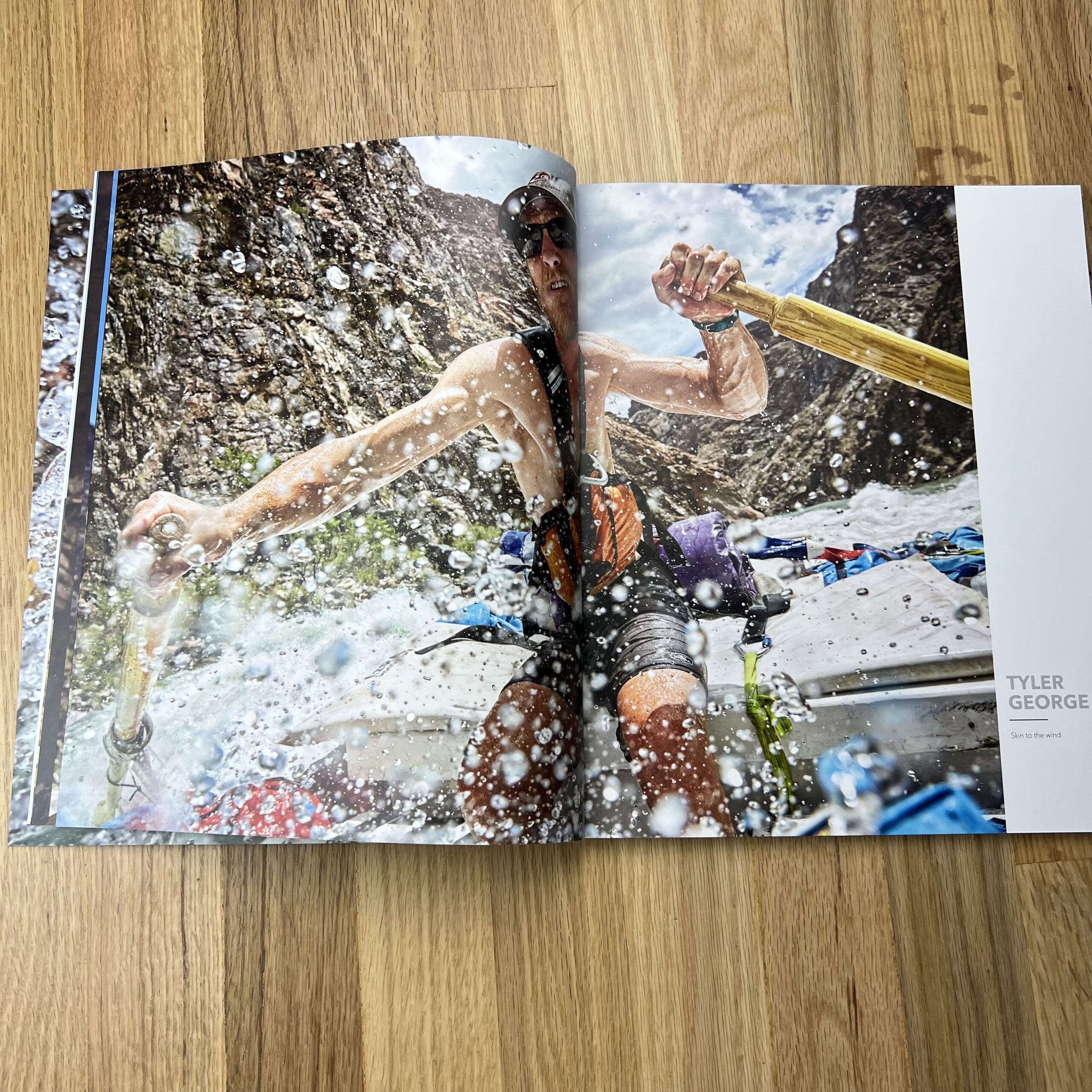
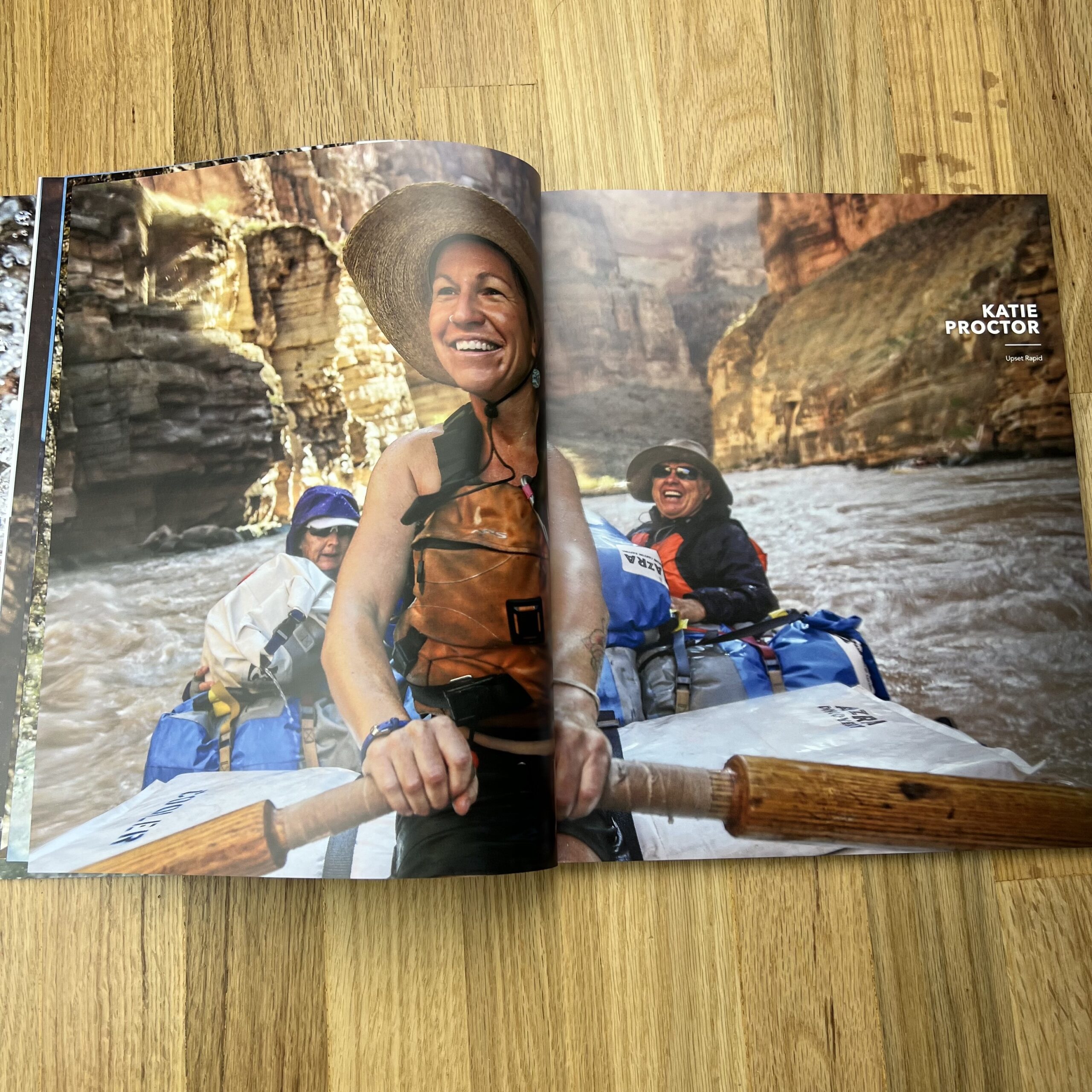
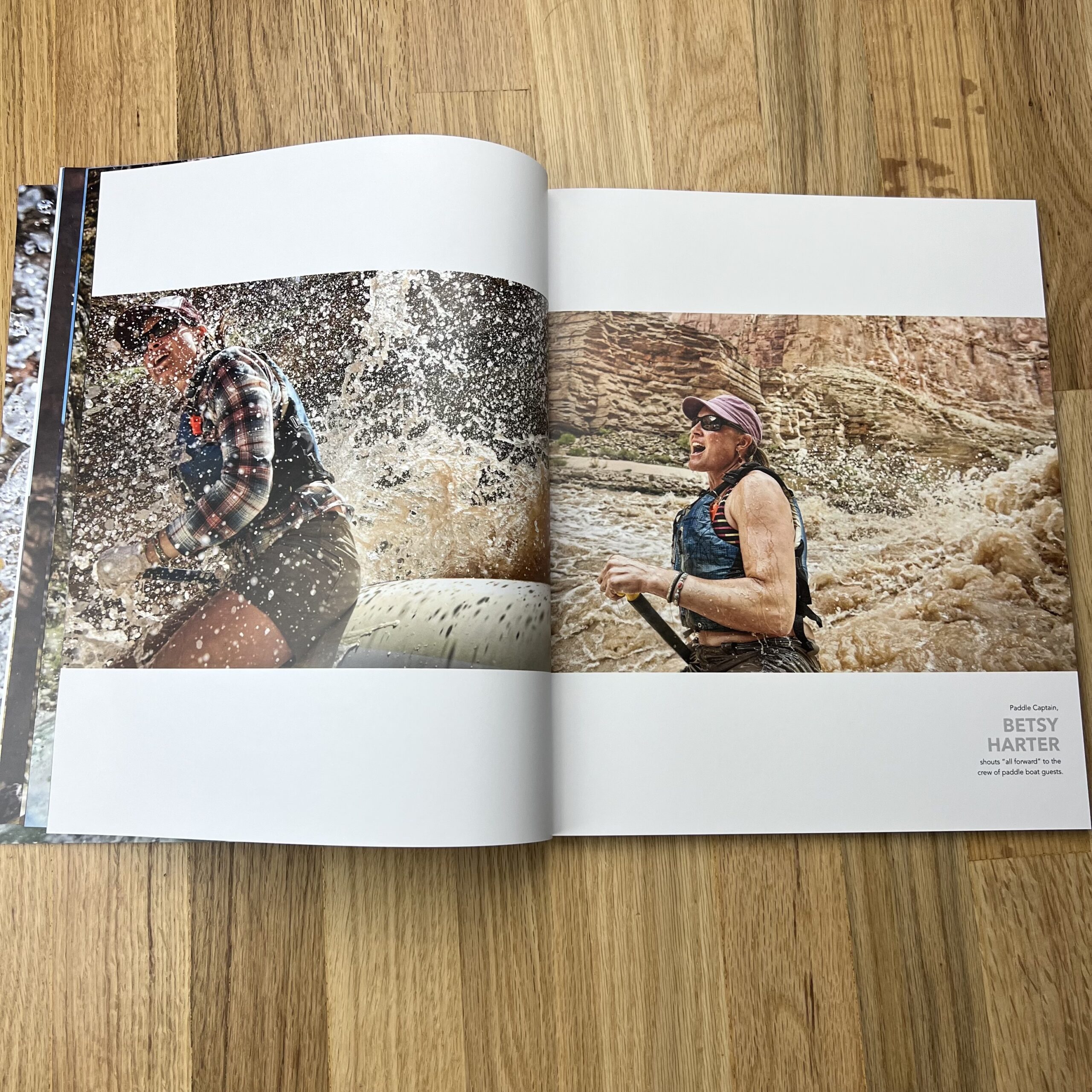
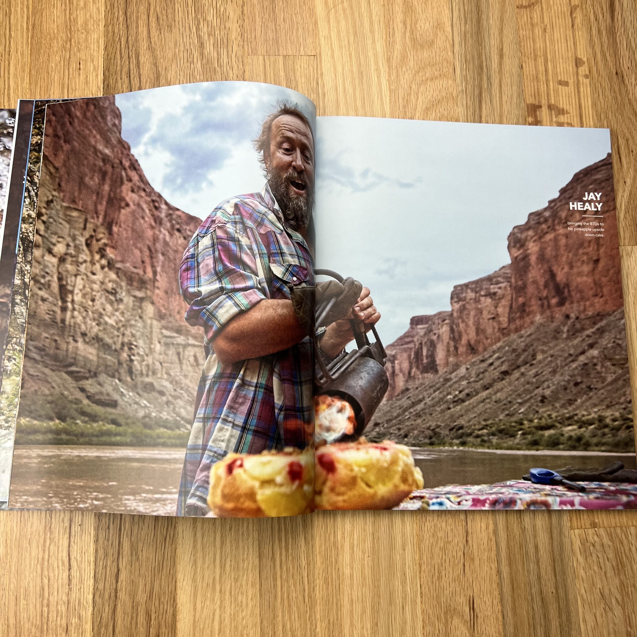
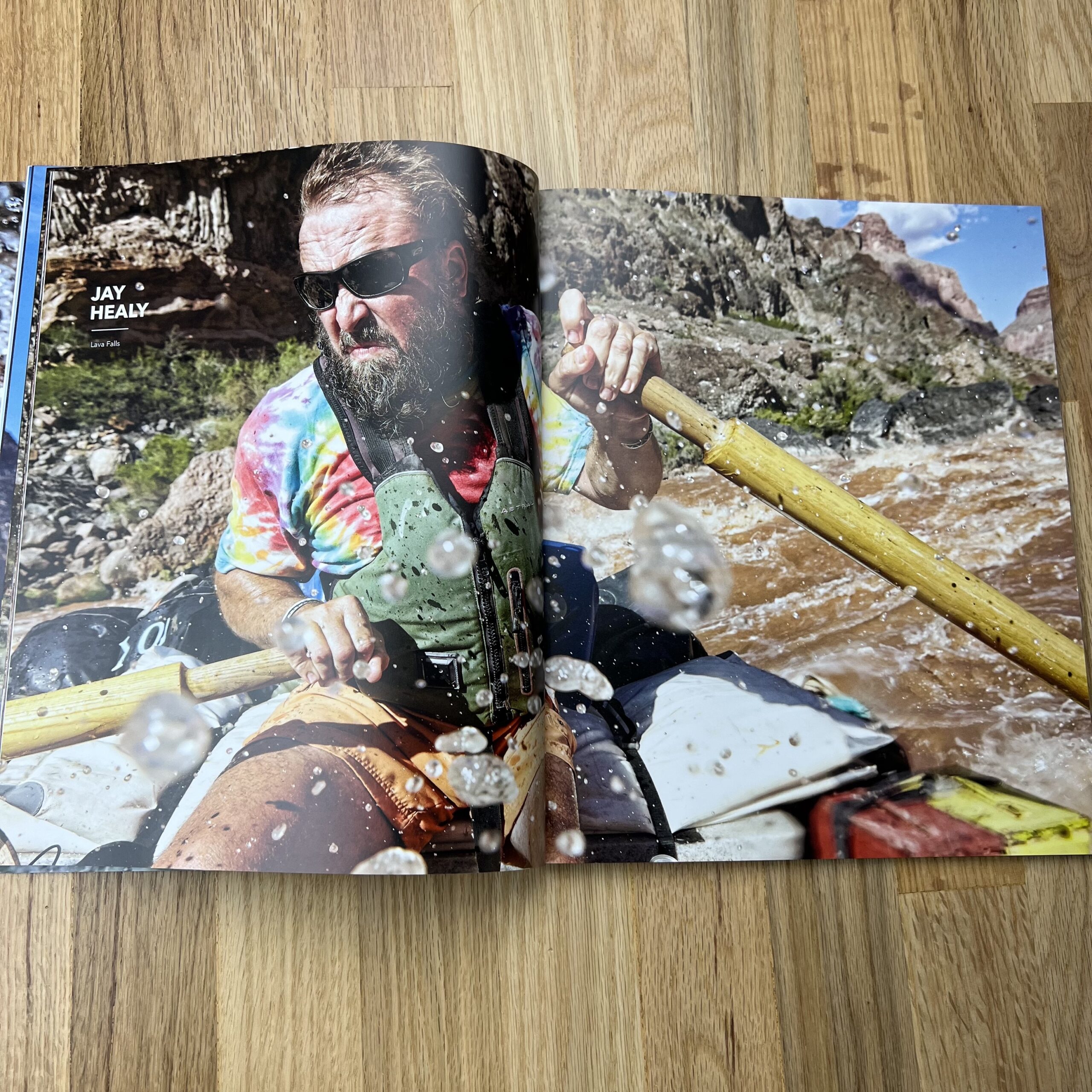
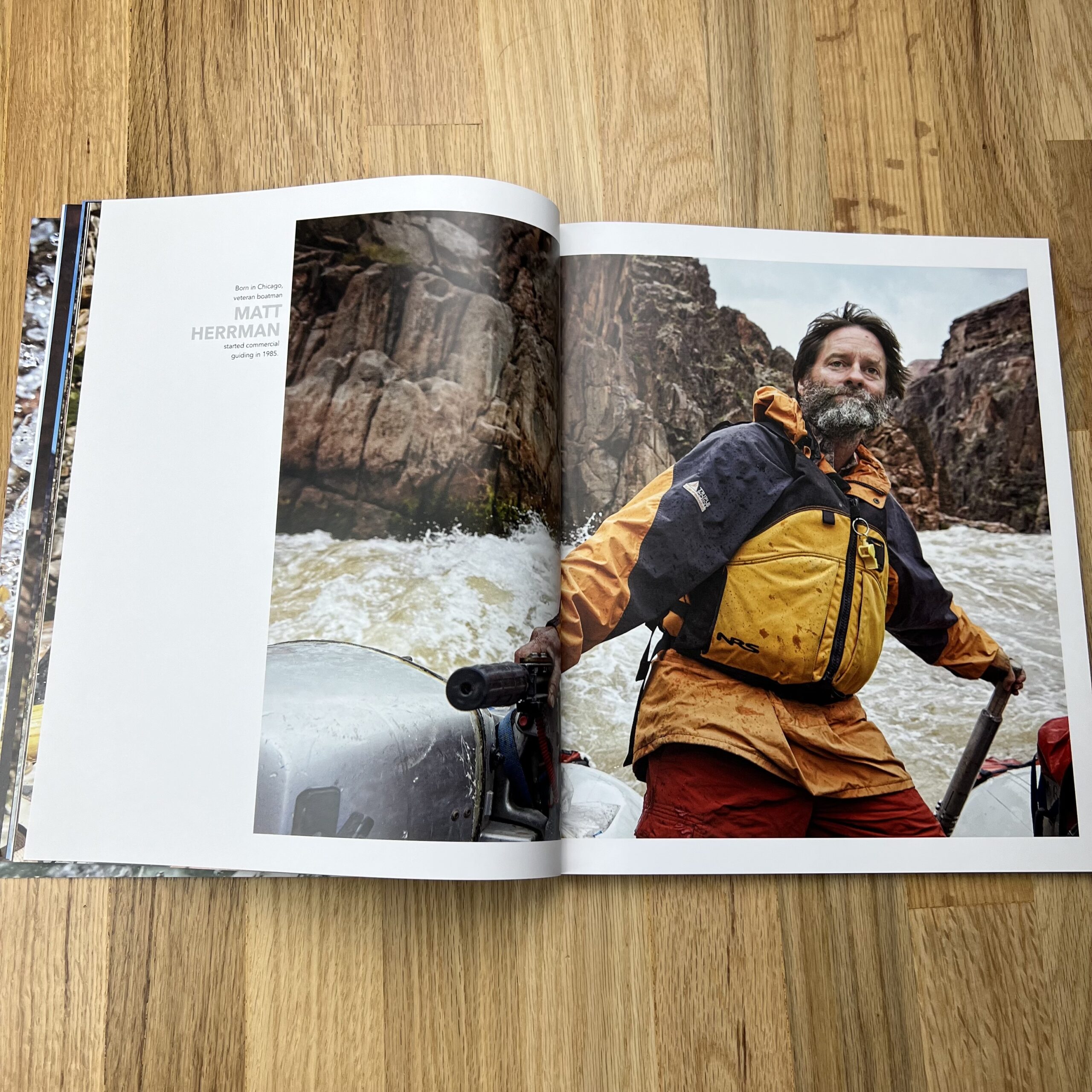
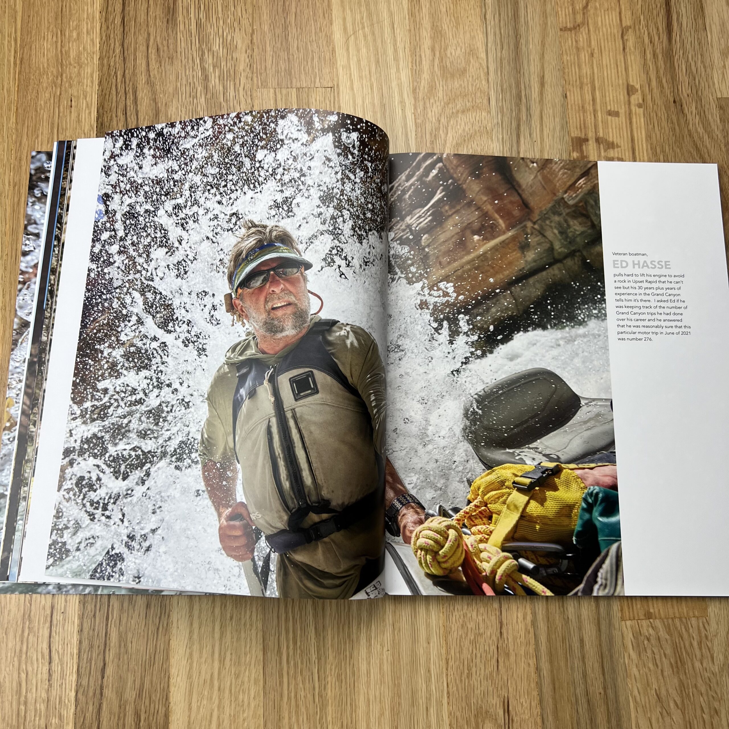
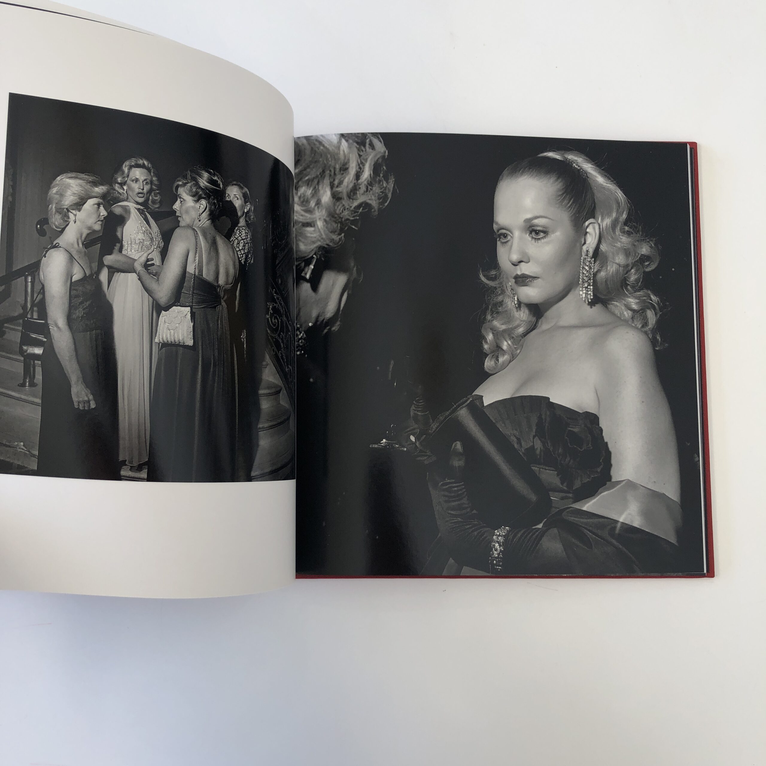
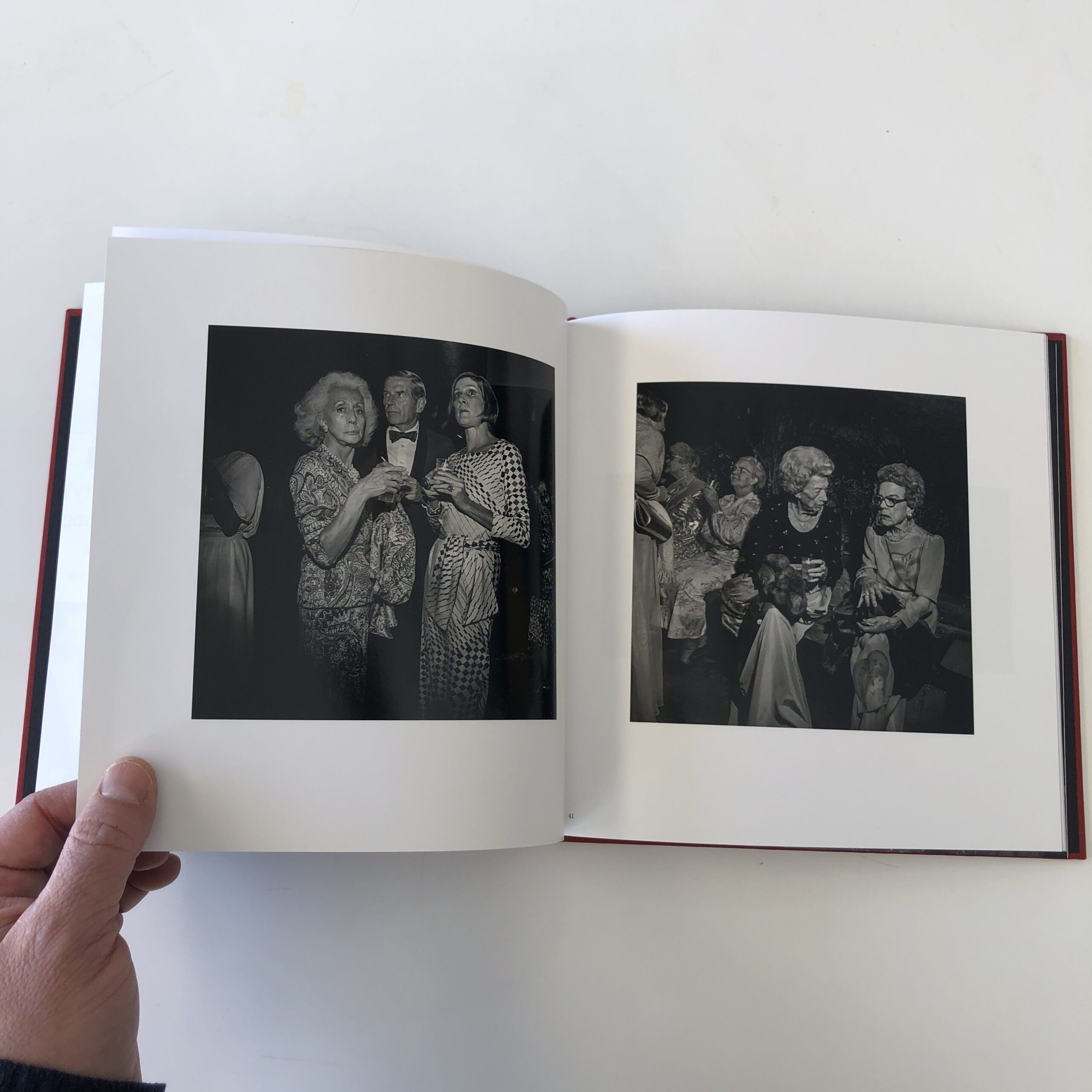
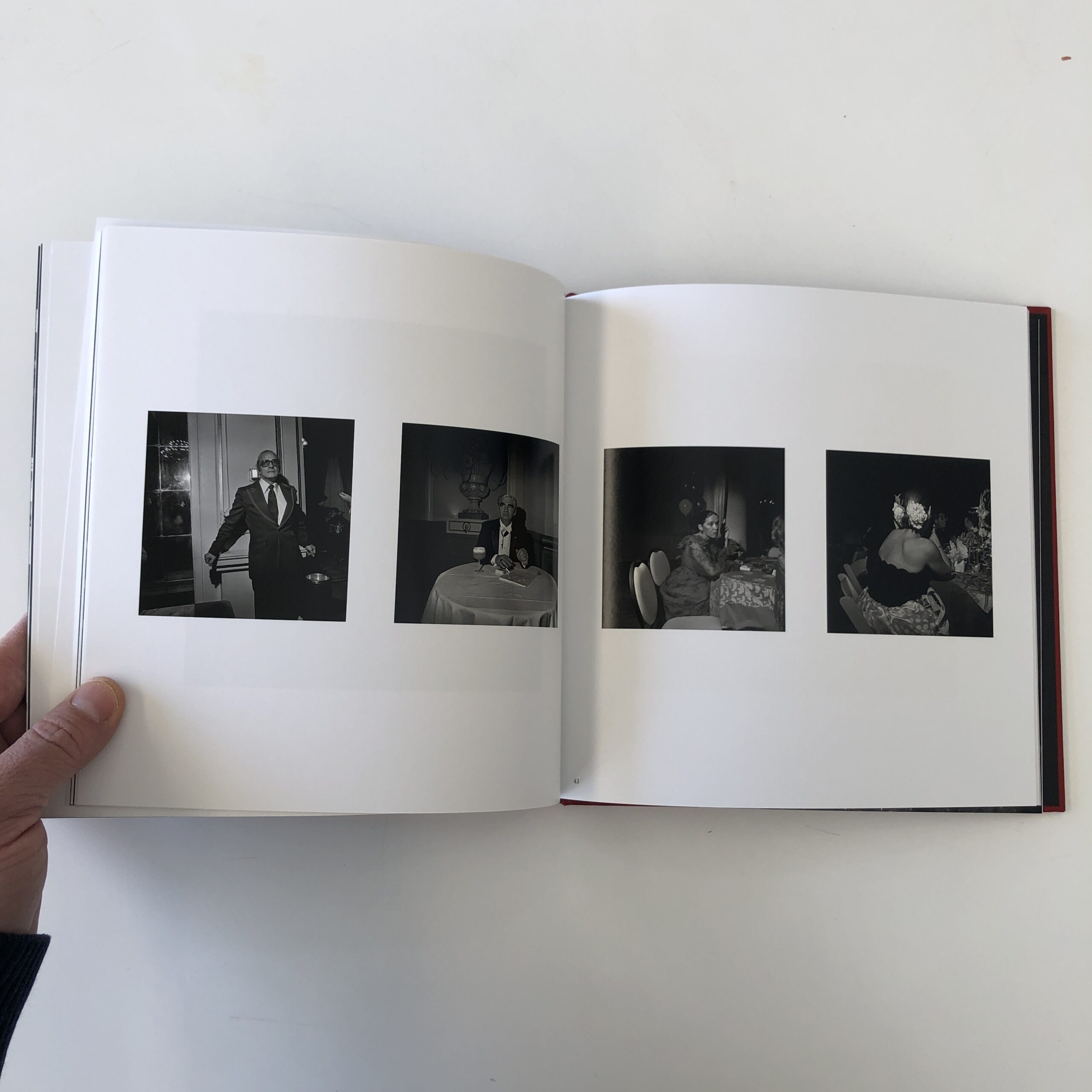
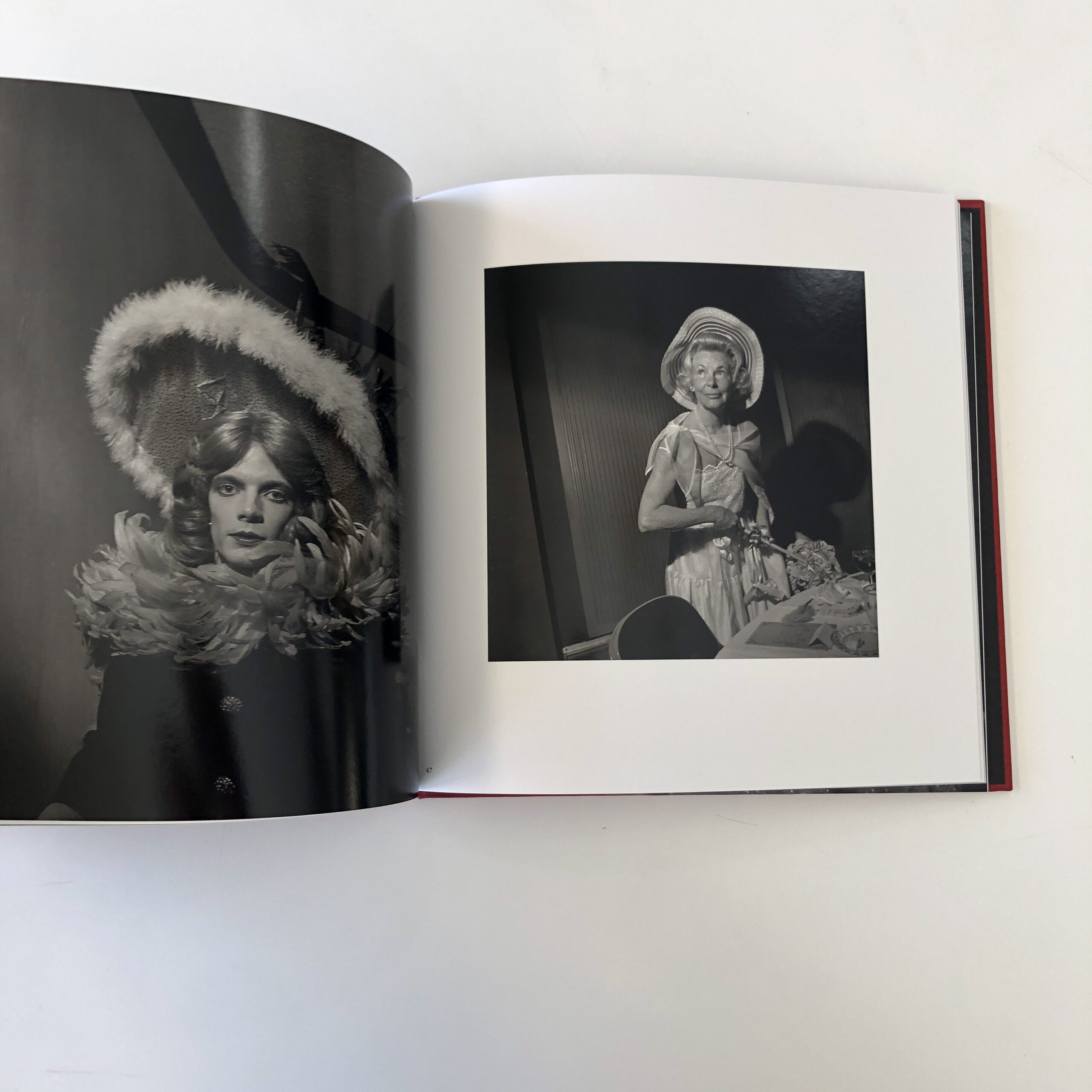
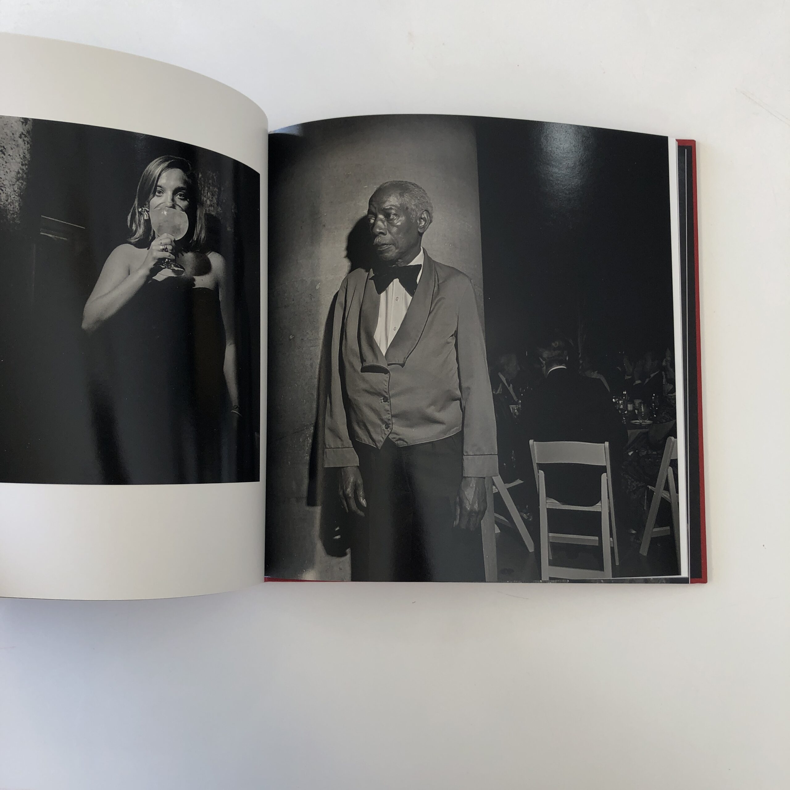
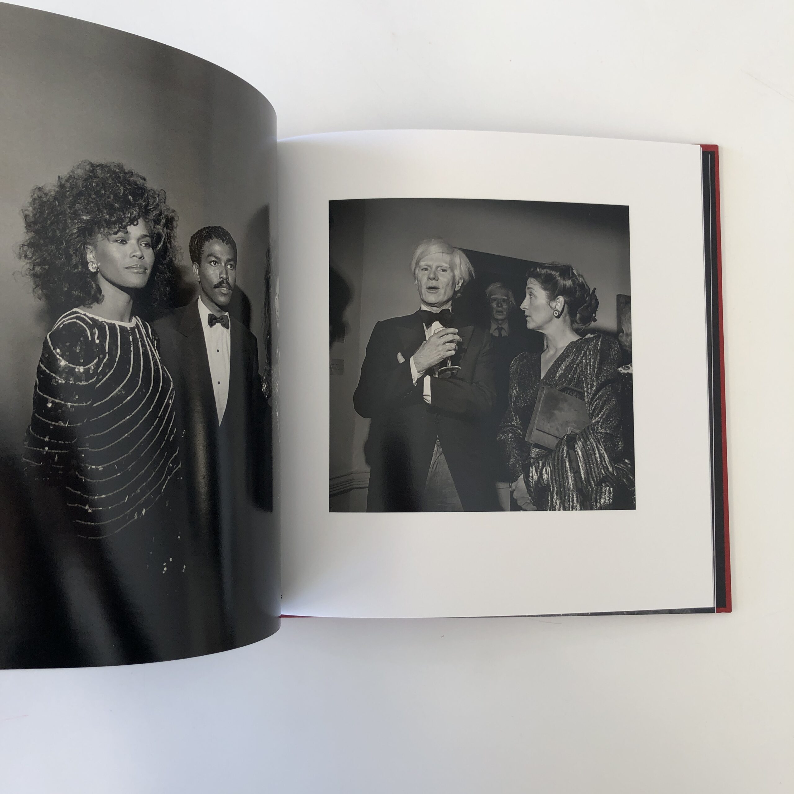
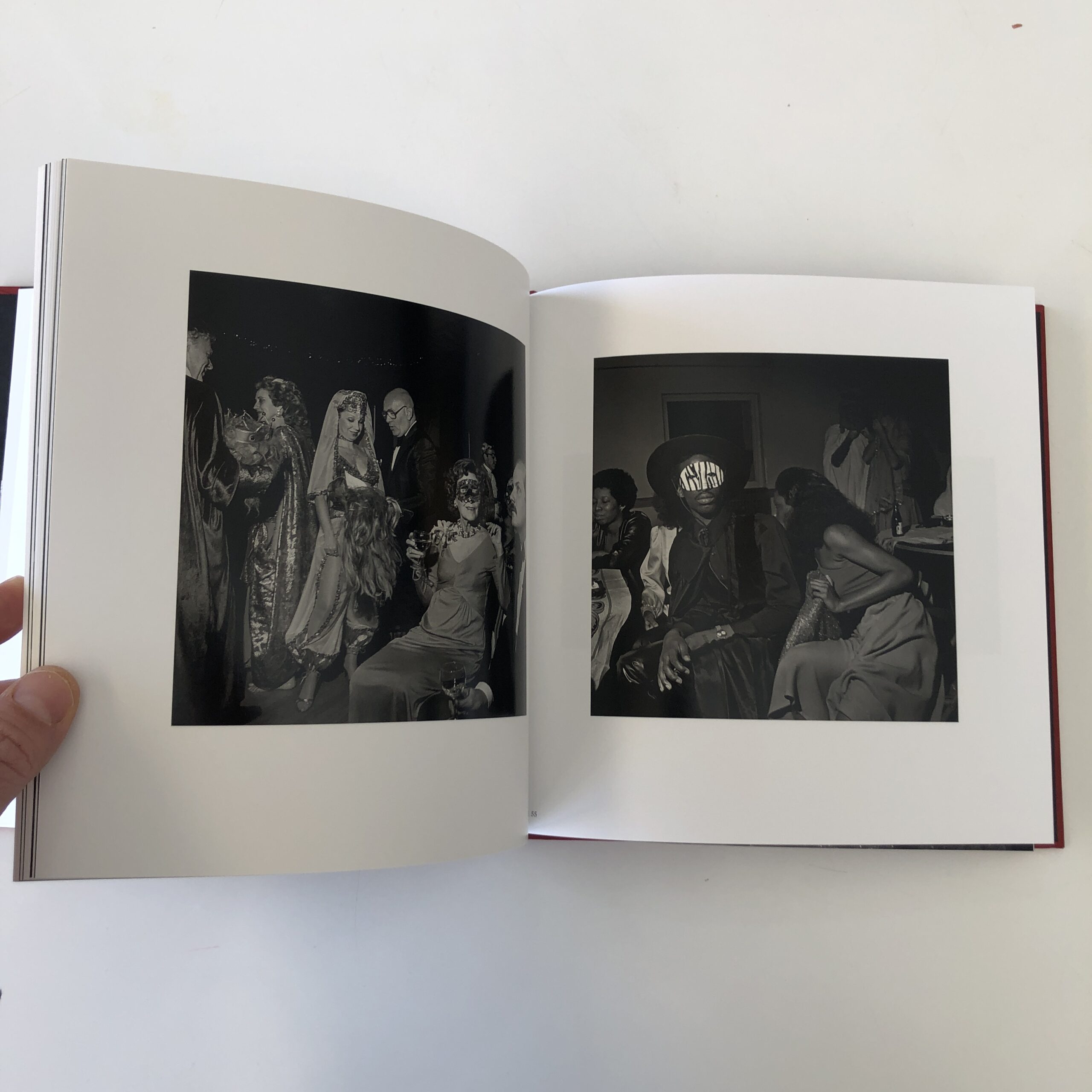
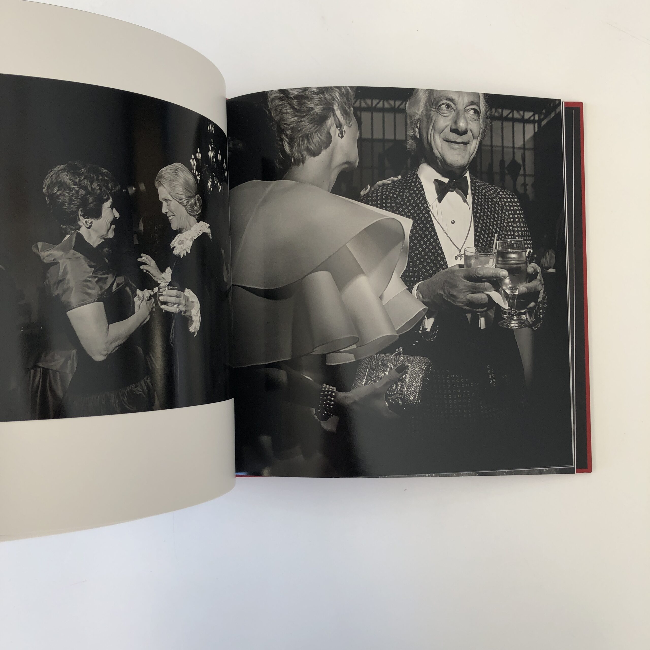
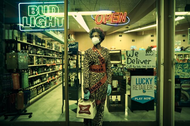
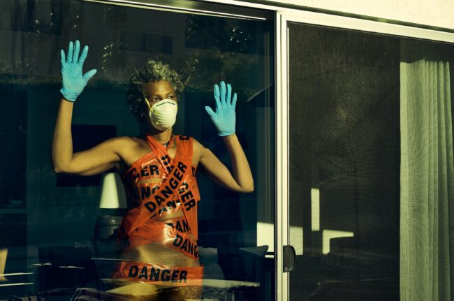
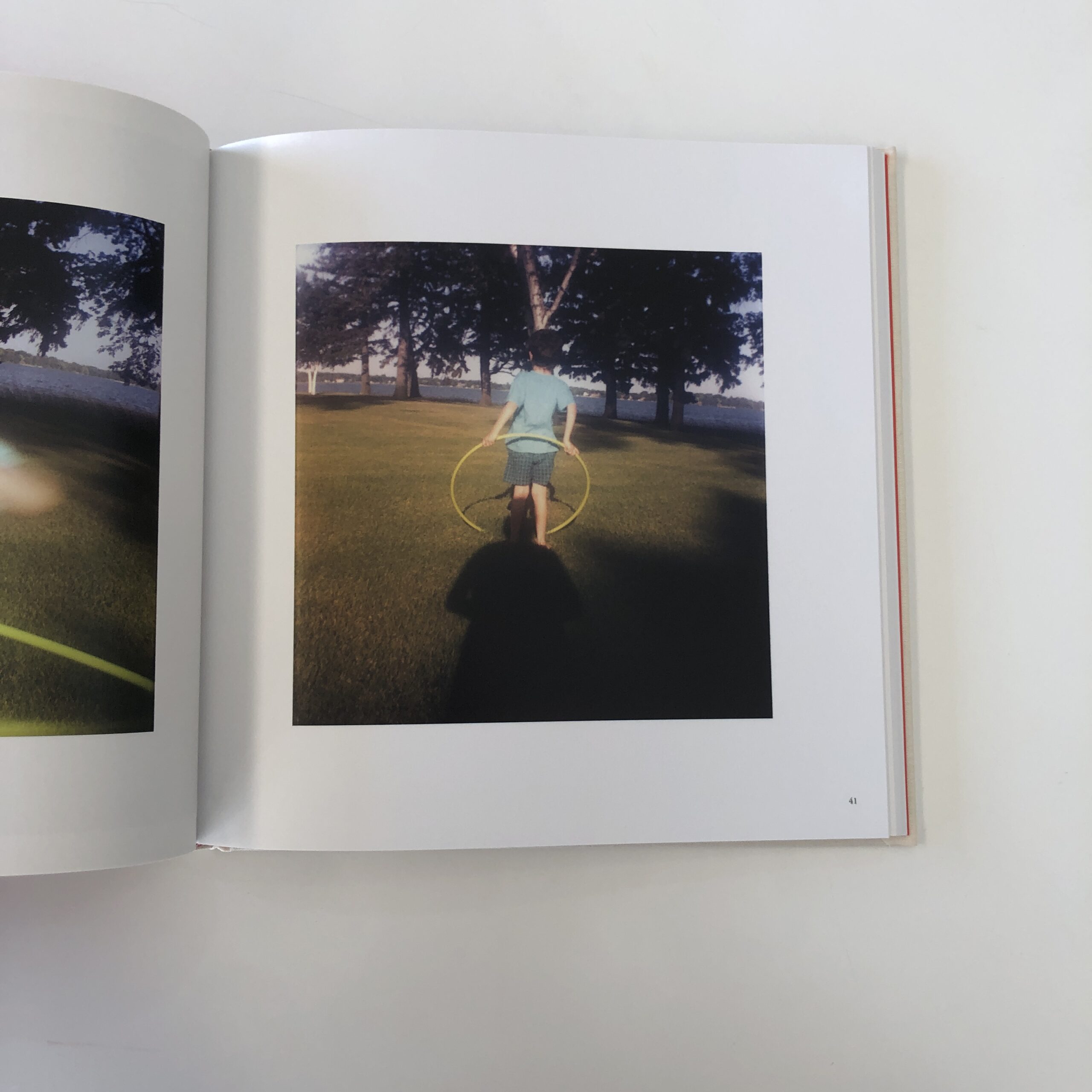
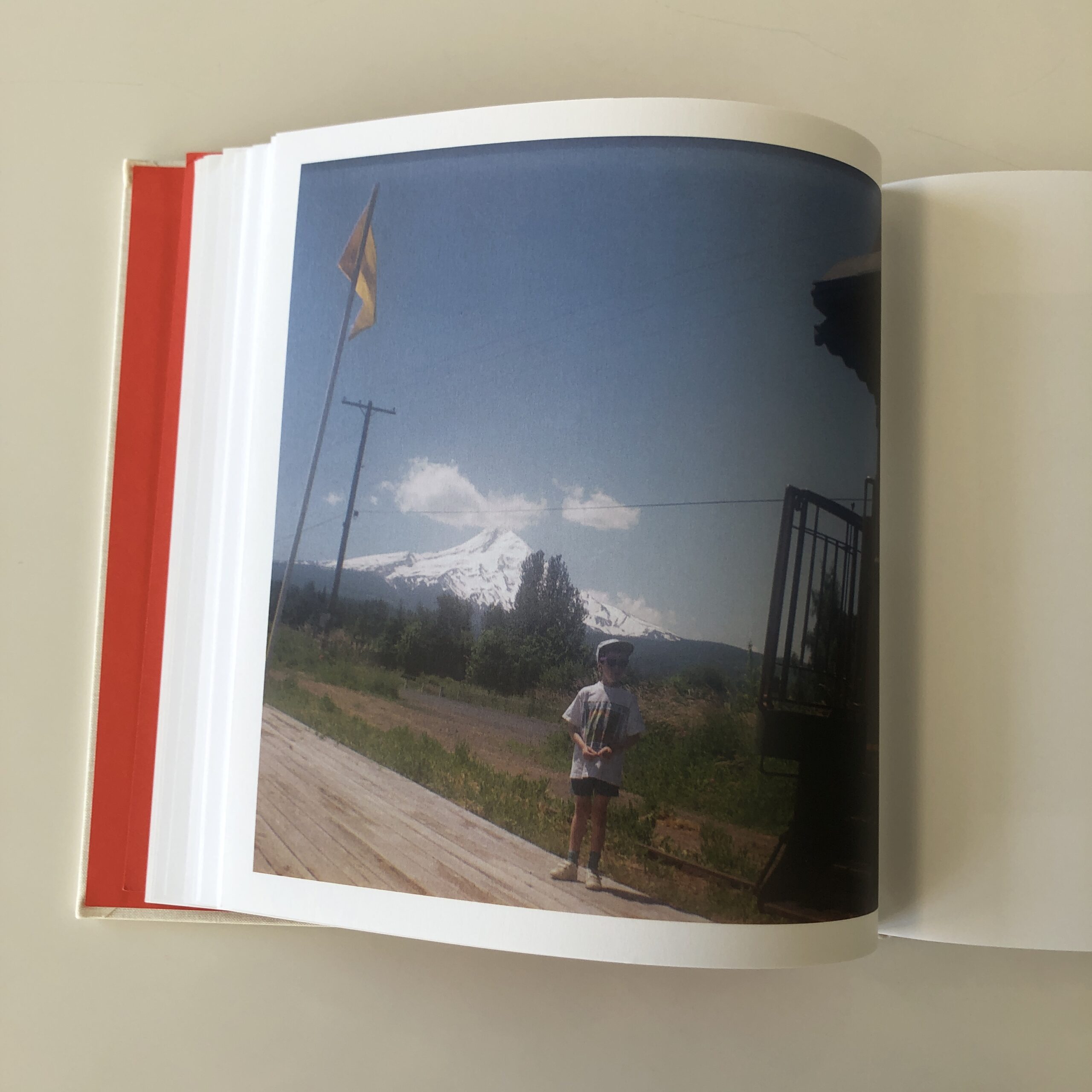
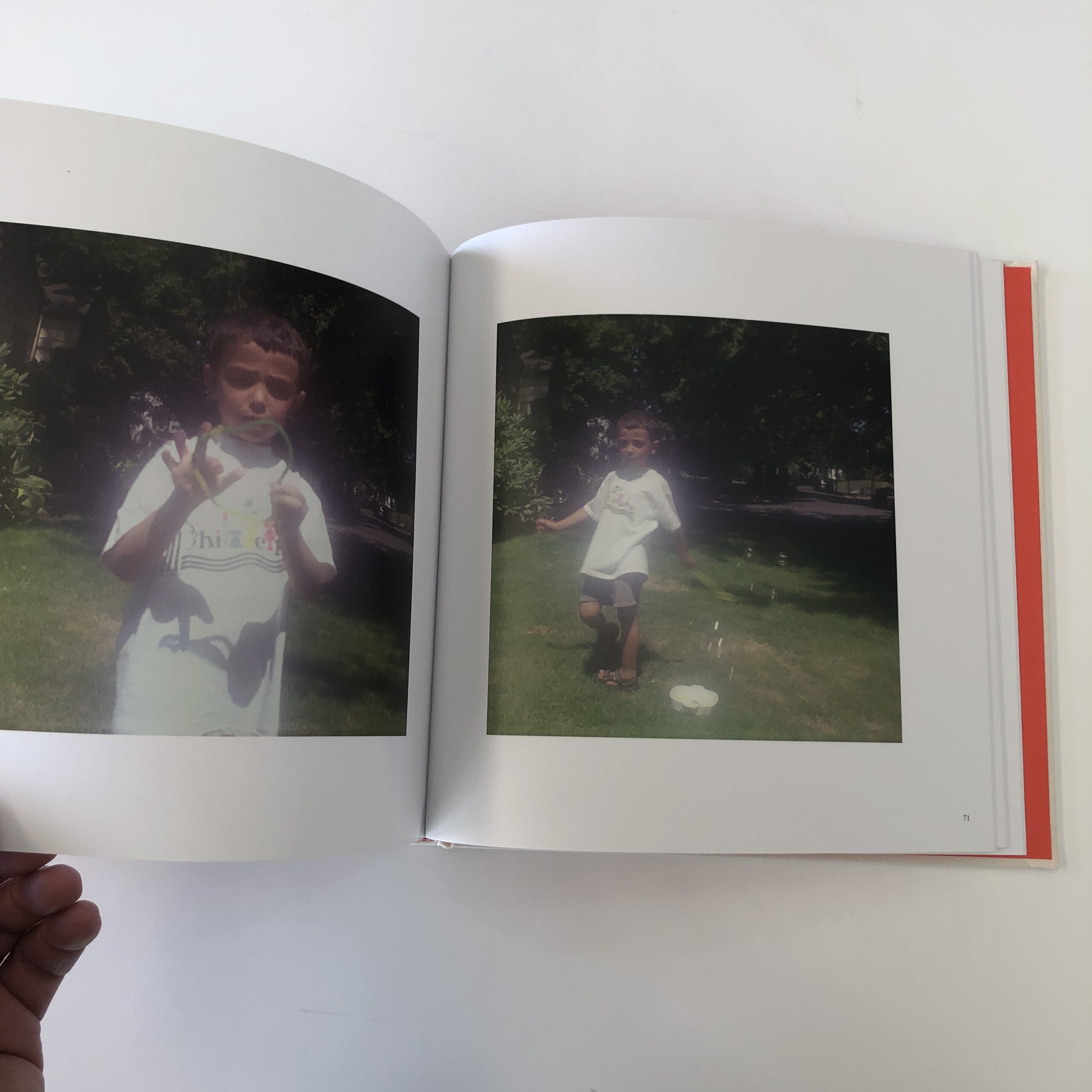
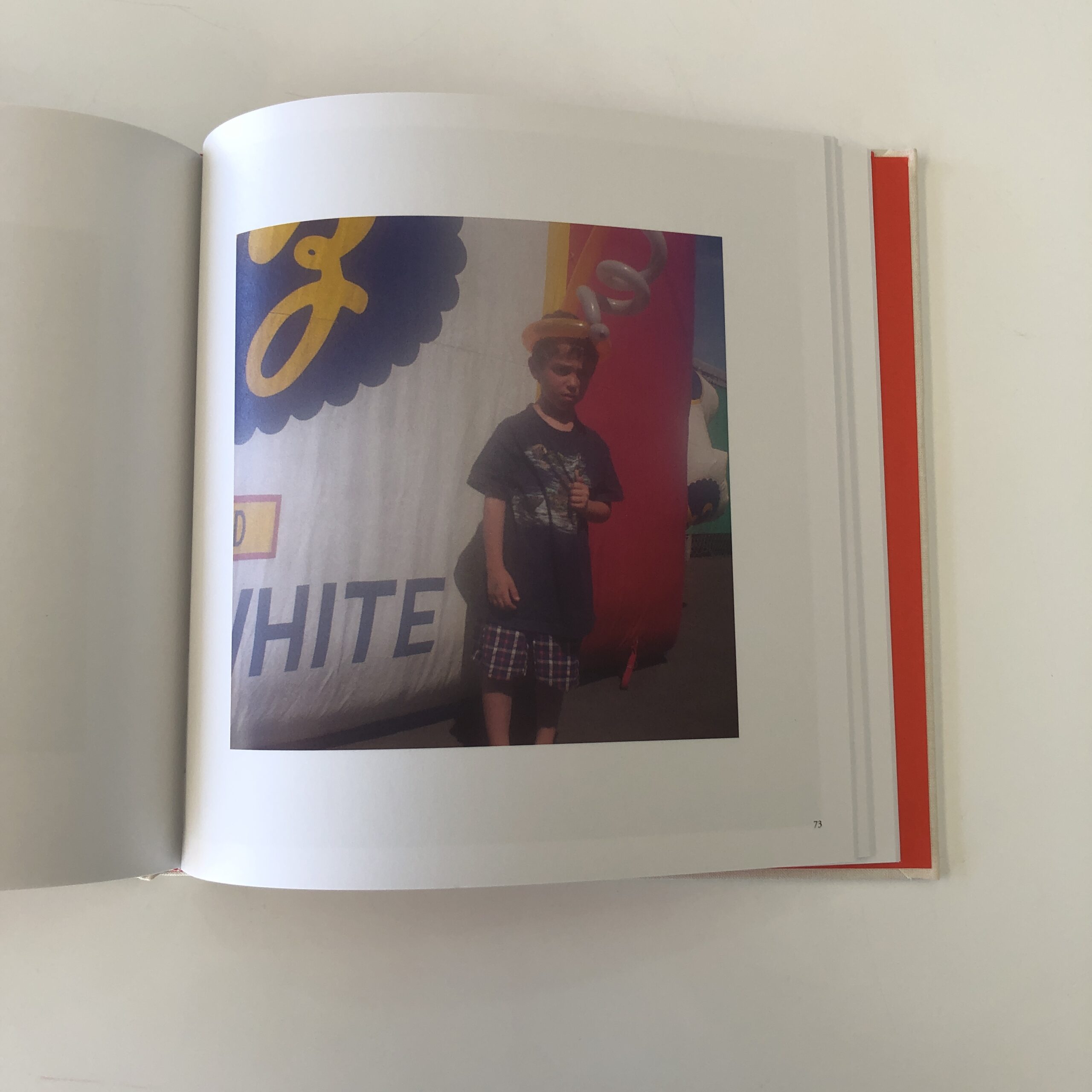
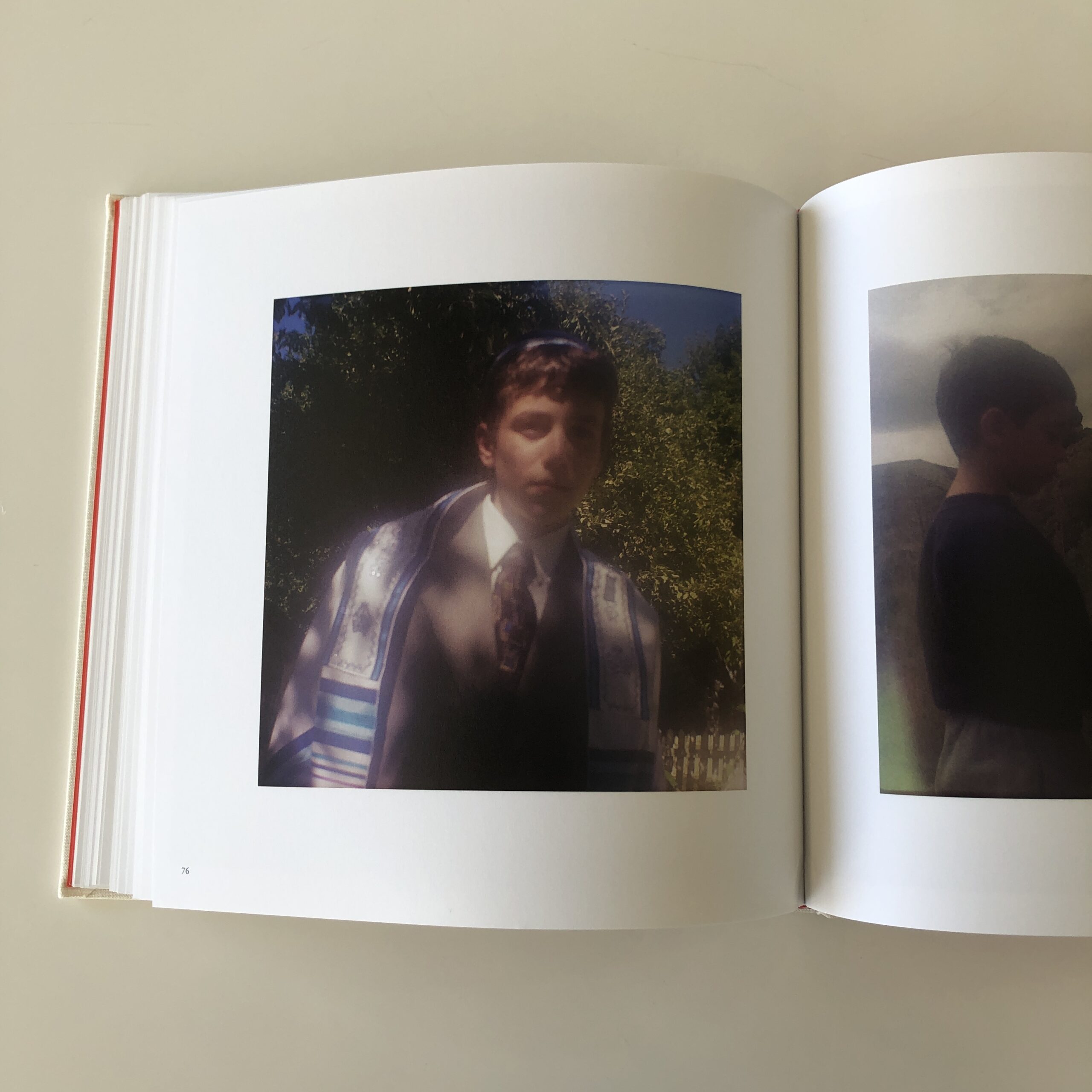
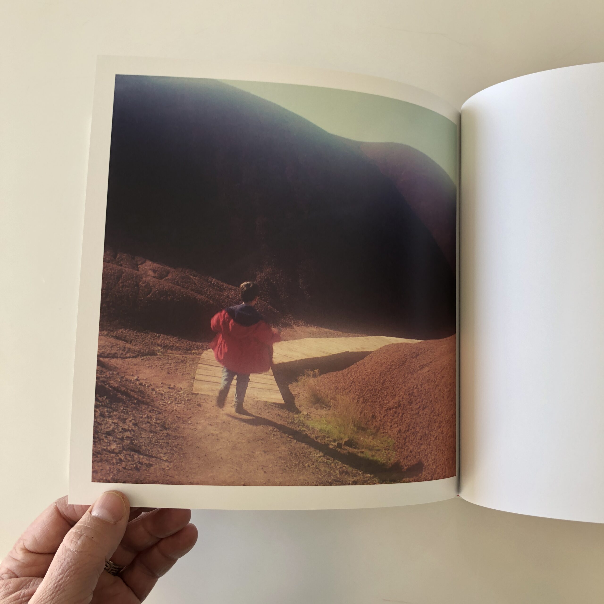
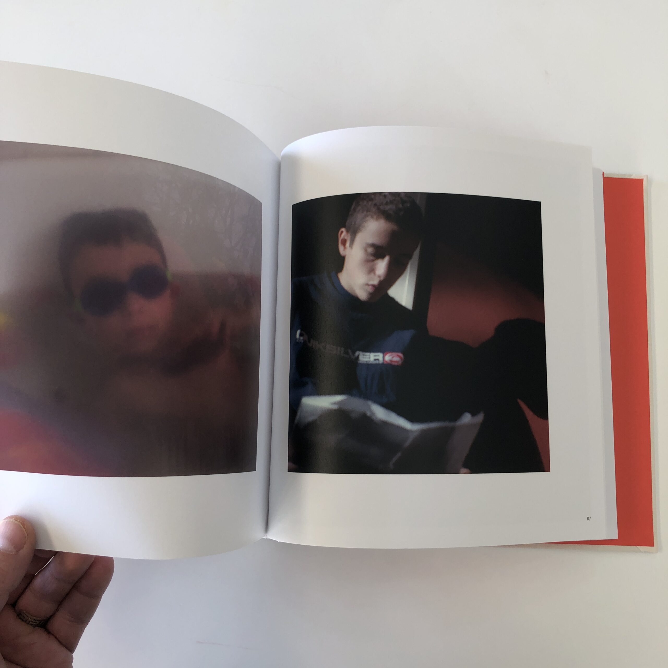
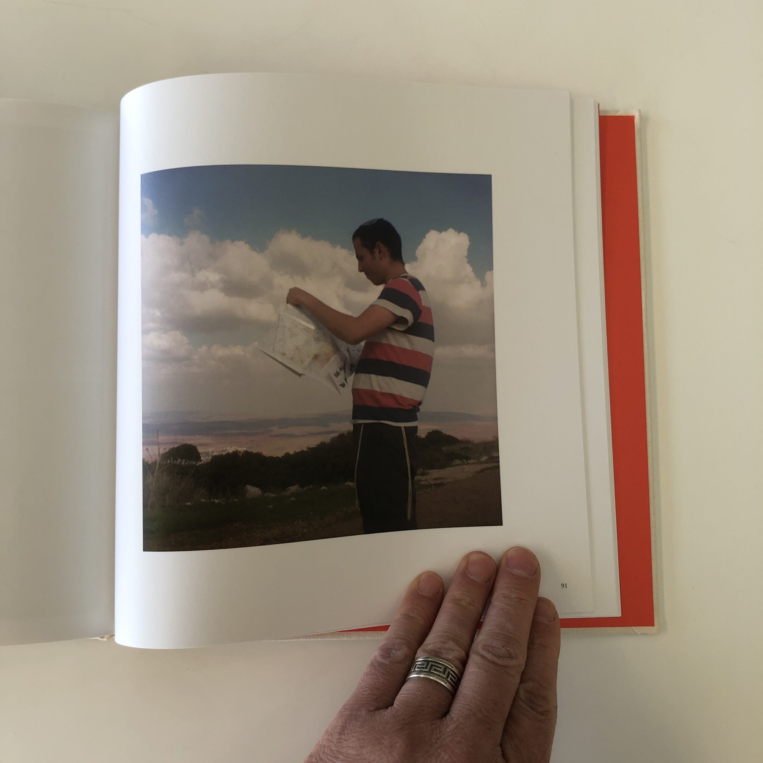
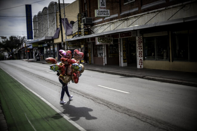
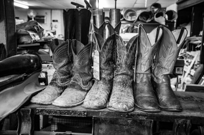
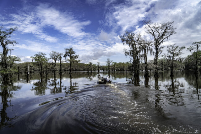
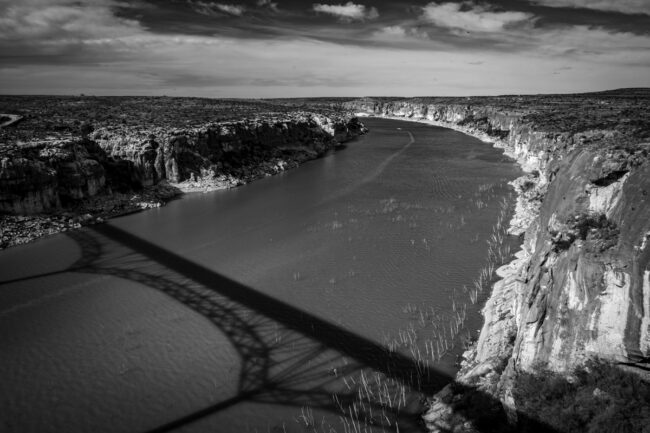
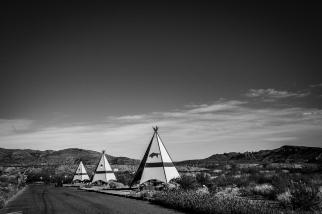
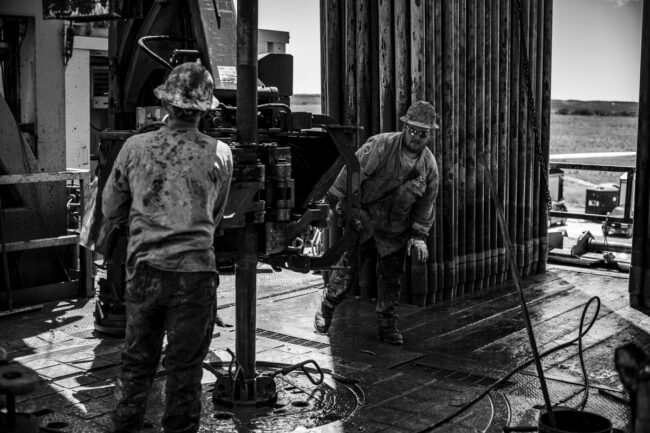
Bob Dylan has a song called, “Love Minus Zero”. He says he thought of the title before he wrote the lyrics. I did something similar. I thought of the title, “Edge of Texas”, before I tookthe photographs. I’m not the most analytical of photographers. What good ideas I have mostly tiptoe in unannounced and tap me on the shoulder. In the fall of 2018, it occurred tome that it might be interesting to see how people live at the very edges of our state. Culture, geography, accents, demographics…all differ a great deal from East Texas to West Texas. From the Rio Grande to the Oklahoma border. So, in February of 2019, I set out to drive theperimeter of this huge state. To find things to photograph. I’ve been a commercialphotographer for many years. My clients would give me parameters for what they wanted photographed. For “Edge of Texas” I would be my own client. I’d try to satisfy myself. No one else. I would follow my nose and take photos of what drew my interest. This would not be adocumentary where I felt obligated to take photos in every small town. If I saw something interesting, I’d shoot. I realized early on that this endeavor couldn’t be done all in one long trip. I divided my touring into what I call legs. I started south on Interstate 35 to Laredo on my first leg. I had no idea what I would shoot or if I’d find anything to shoot at all. I walkedaround downtown Laredo for most of a day, limbering up my photographic muscles,shooting what caught my eye. Then I headed west along the Rio Grande to Eagle Pass, to Big Bend, along what must surely be one of the most beautiful drives in America, FM- 170, the Texas River Road. Finally, to El Paso. From there I drove back to San Antonio to take a look at what I’d shot. For me, getting the photos on a big monitor is where I find out if I’ve beenwasting my time or not. The second leg was to Laredo again, then along HWY 281 to LosEbanos, where the state operates the last hand-pulled ferry across the Rio Grande. Down to Brownsville and Boca Chica, where the Rio Grande flows into the Gulf of Mexico. North to Kingsville and back to San Antonio. The third and fourth legs were much the same. Corpus to Newton, Jasper to Selfs, Powderly to Pecos. Young people with guns on the banks of the Prairie Dog Town Fork of the Red River, Big Tex Muffler Man in Conlen, an interesting ranchgate near Ft. Stockton. When I finished my trip, I did a rough edit of the 3,000 or sophotographs I’d taken. I put the best 200 shots together to see how everything held up. I’m happy with the result.
To see more of this project, click here
APE contributor Suzanne Sease currently works as a consultant for photographers and illustrators around the world. She has been involved in the photography and illustration industry since the mid 80s. After establishing the art-buying department at The Martin Agency, then working for Kaplan-Thaler, Capital One, Best Buy and numerous smaller agencies and companies, she decided to be a consultant in 1999. She has a new Twitter feed with helpful marketing information because she believes that marketing should be driven by brand and not by specialty. Follow her at @SuzanneSease. Instagram
Success is more than a matter of your talent. It’s also a matter of doing a better job presenting it. And that is what I do with decades of agency and in-house experience.