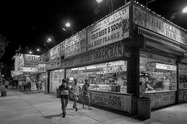
I saw the greatest Kung Fu movie the other day.
New stuff.
Nothing vintage.
Netflix had been nudging me to watch “The Bodyguard” for a long time, as Chinese action movies are strong in my personal algorithm. (I don’t know why I resisted.)
Oh, sweet algorithm.
You know me so well.
“The Bodyguard” not only features living legend Sammo Hung, but it was the first film he directed since the seminal “Once Upon a Time in China and America.” (Thank you, Wikipedia.)
Sammo plays a fat, old, retired super agent, but his weight is not his biggest problem. Unfortunately, Sammo’s character, Old Ding, is suffering from serious dementia.
Like, so-bad-he-lost-his-own-granddaughter level dementia. (And they never found her, setting up his tragic backstory, some of which was unspooled in a short, wonderful, animated sequence.)
What’s that?
Have I ever seen a fat, old, senile action hero before?
No.
I have not.
I mention all of this because the final battle scene takes place between Sammo and three massive, nasty-looking, fully-tatted-up Russian gangsters, presumably trained in Sambo and jail-fighting.
One had a knife as big as a sword, and in fairness, Sammo did take them on one at a time, but then he (SPOILER ALERT) kicked each of their asses and killed them individually.
I mention this here because last night night, after dinner, I was telling my son about all this, and how cool it was that Sammo beat up three Russian bad guys. (An old guy! Who knew?)
Theo looked at me like I had a fork sticking out of my ear.
“It was in the movie, right? I mean, it was staged.”
Then my wife piped up, trying to save me embarrassment.
“I think he means the choreography was really good, honey. He knows it wasn’t real.”
I tried to defend myself.
“I know it wasn’t real. I just mean… it’s cool to see… I… Sammo Hung…”
And then I walked away with my tail between my legs.
But you guys know what I mean, right? Action heroes are powerful symbols for mass culture, and this underdog, woebegone loser, Old Ding, comes along and stands up for the little guy against those evil, psychopathic Russians.
Not only was this film unique in its choice of hero, and super-well-built with its choreography, but it also featured, out of nowhere, an all time great song right in the middle: “Ain’t No Sunshine When She’s Gone,” by Bill Withers.
Such.
A.
Great.
Song.
Shit like that is what made America great to begin with. (Funny aside, in the hotel in LA last week, I saw a guy in a red MAGA hat. Seemed odd on the West side of LA. I approached and saw that it had a yellow “not” sewed on it, this not 3 days after the fiasco. Someone got to work quickly on that one.)
Where was I?
Right.
“Ain’t No Sunshine When She’s Gone.”
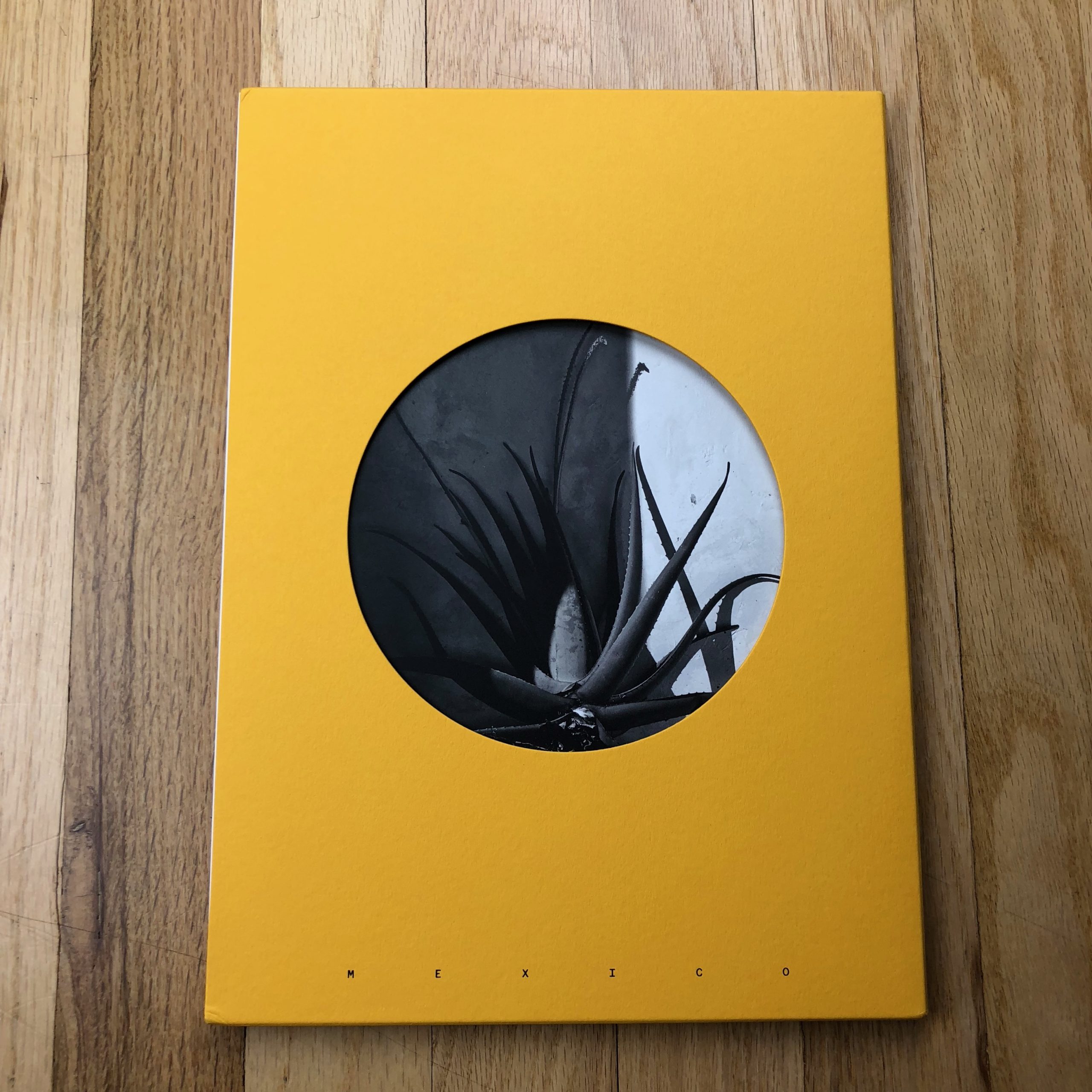
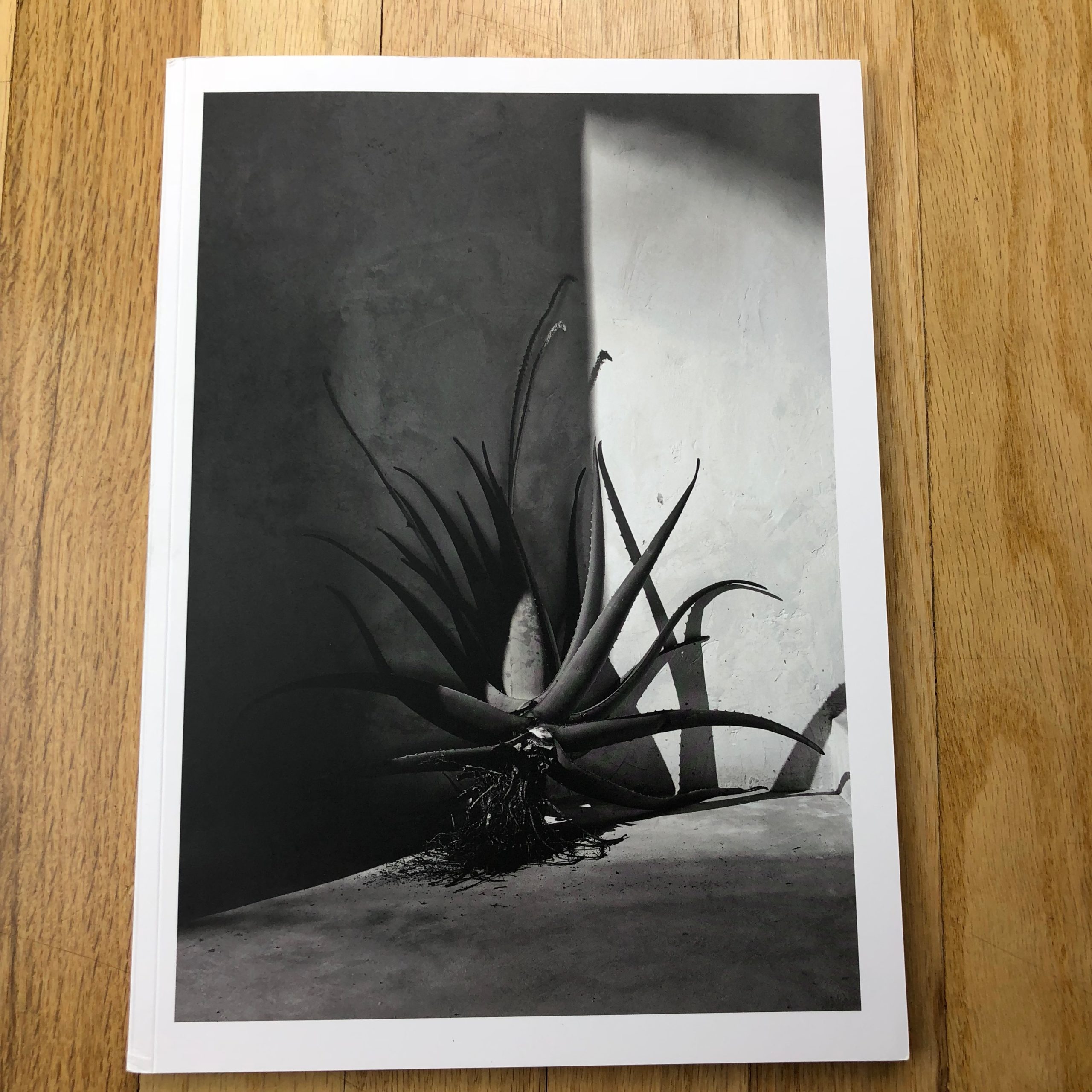
People move to New Mexico and California for the sunshine. It’s addictive, that Vitamin D, as is the requisite blue sky. (Yellow and blue being a power combination in color theory.)
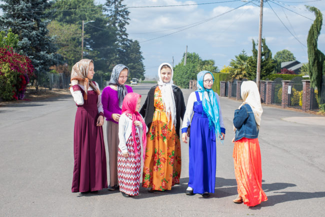
So I was intrigued to open “Too Tired for Sunshine,” a new book by Tara Wray, published by Yoffy Press in Atlanta. I never know when I’m going to go off on a little sub-theme in this column, but this is now two books in a row where I gave serious thought to a book’s innards, once I read the title.
Normally, titles are afterthoughts, if we’re being honest.
But this one is so damn poetic, and visual. (The opening essay confirms Ms. Wray is also a writer.)
Too tired for sunshine.
Why?
Are you depressed?
Or just world-weary?
Have you succumbed to a deep, French ennui?
Or have you sucked so much juice from life that you need to stay in bed, despite the great weather, because you need to rest up for the next onslaught of creativity?
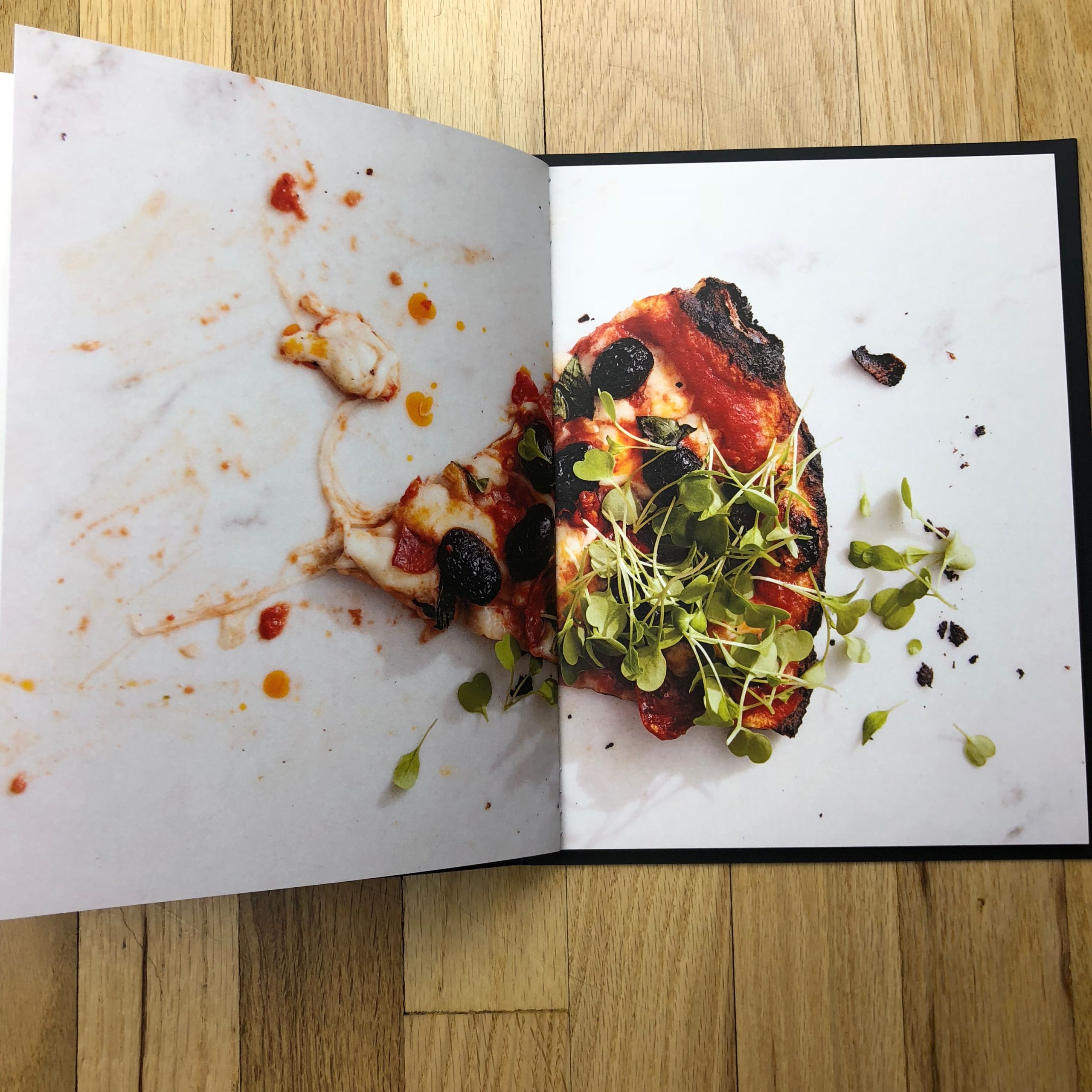
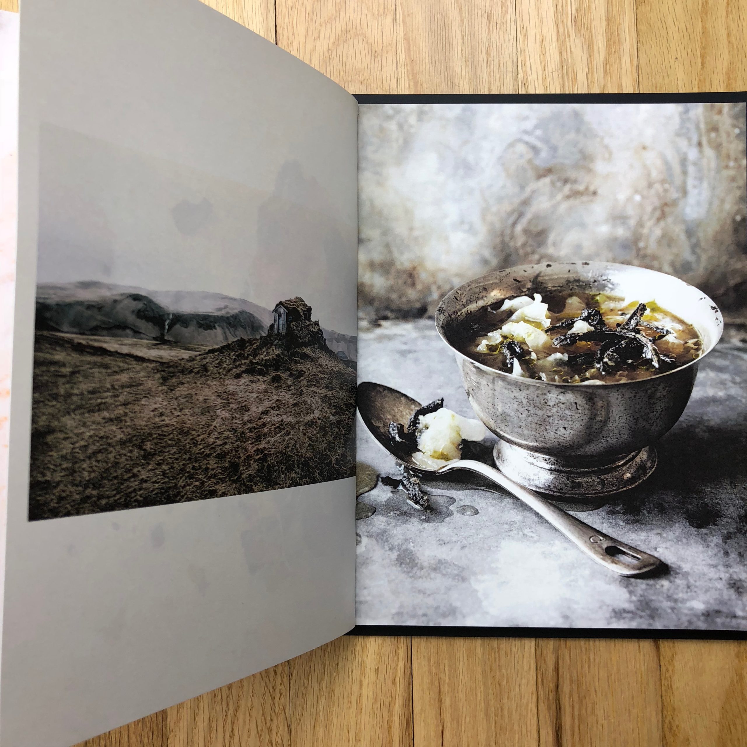
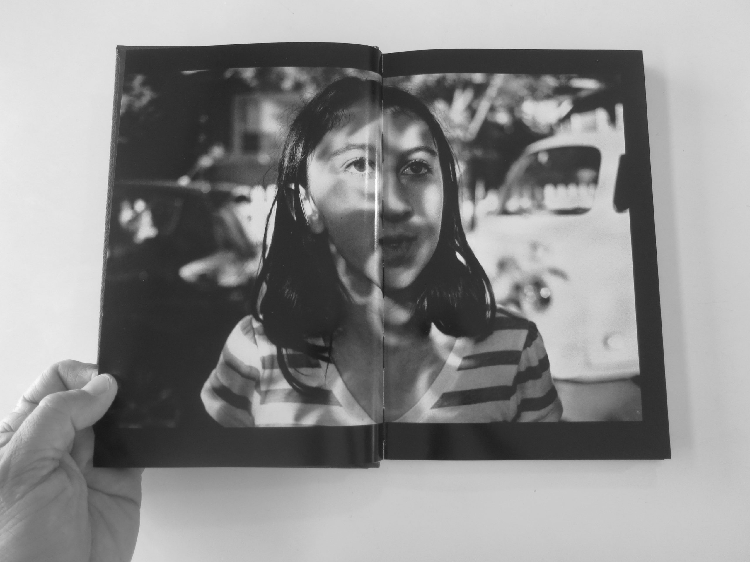
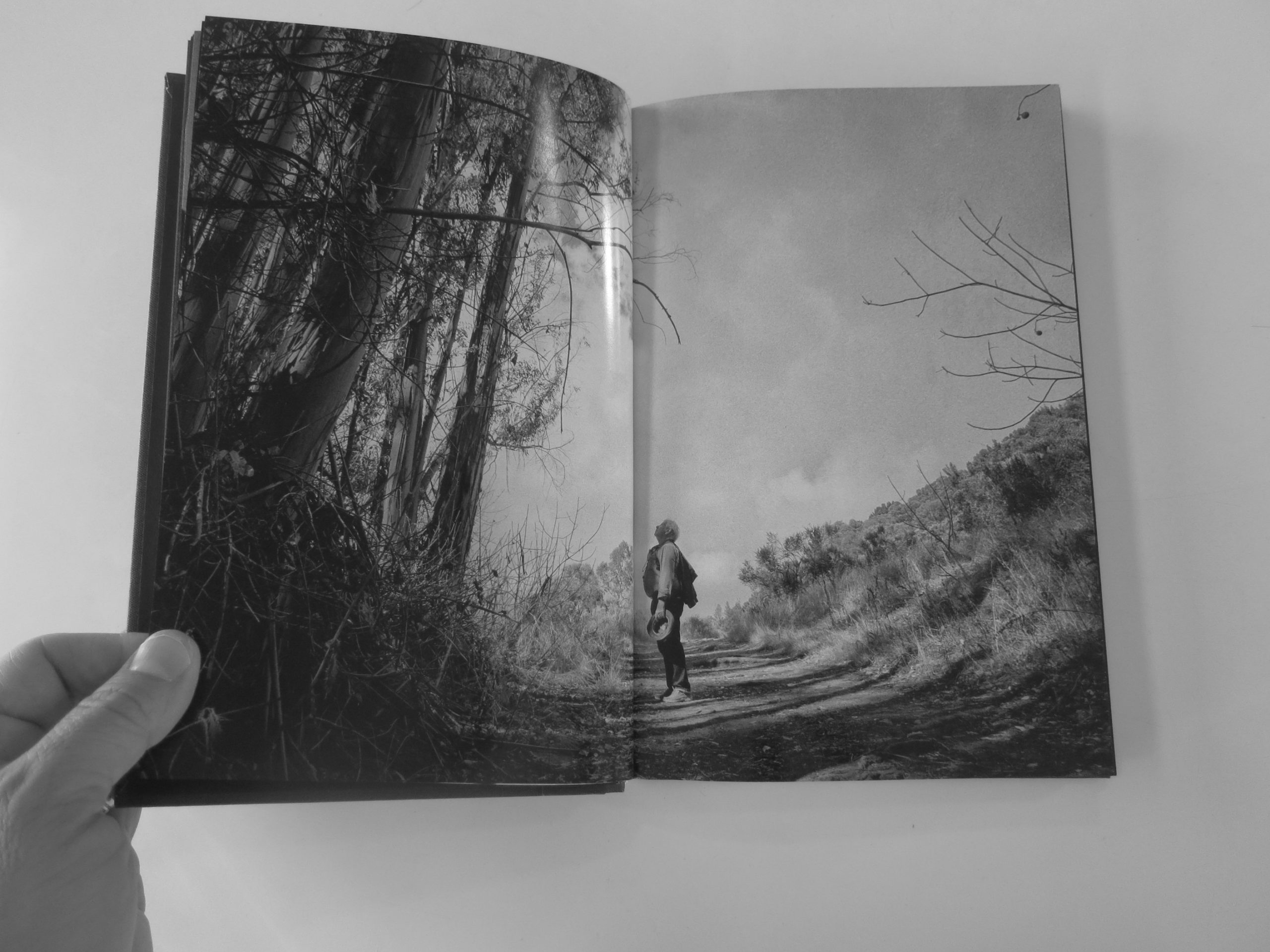
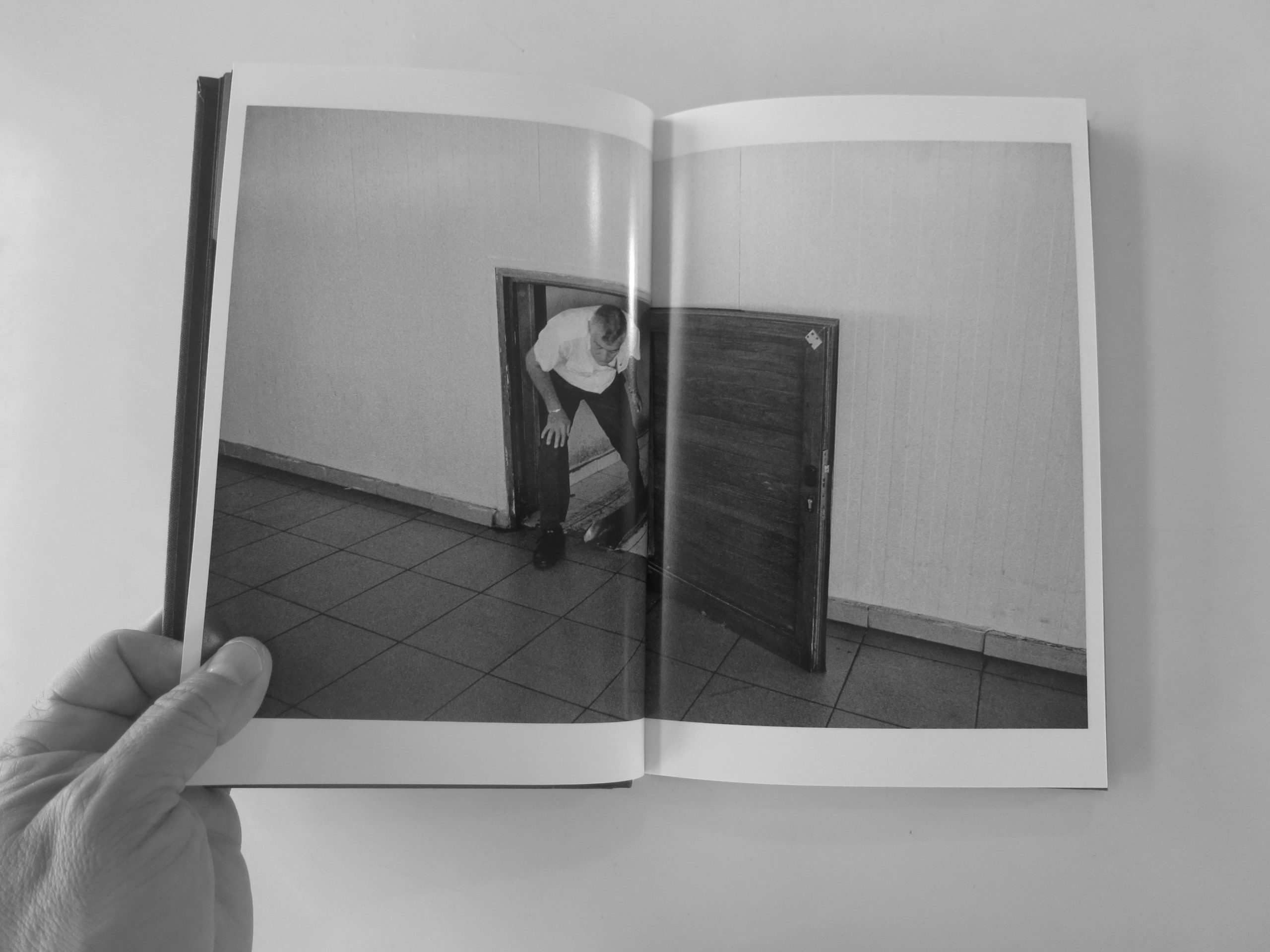
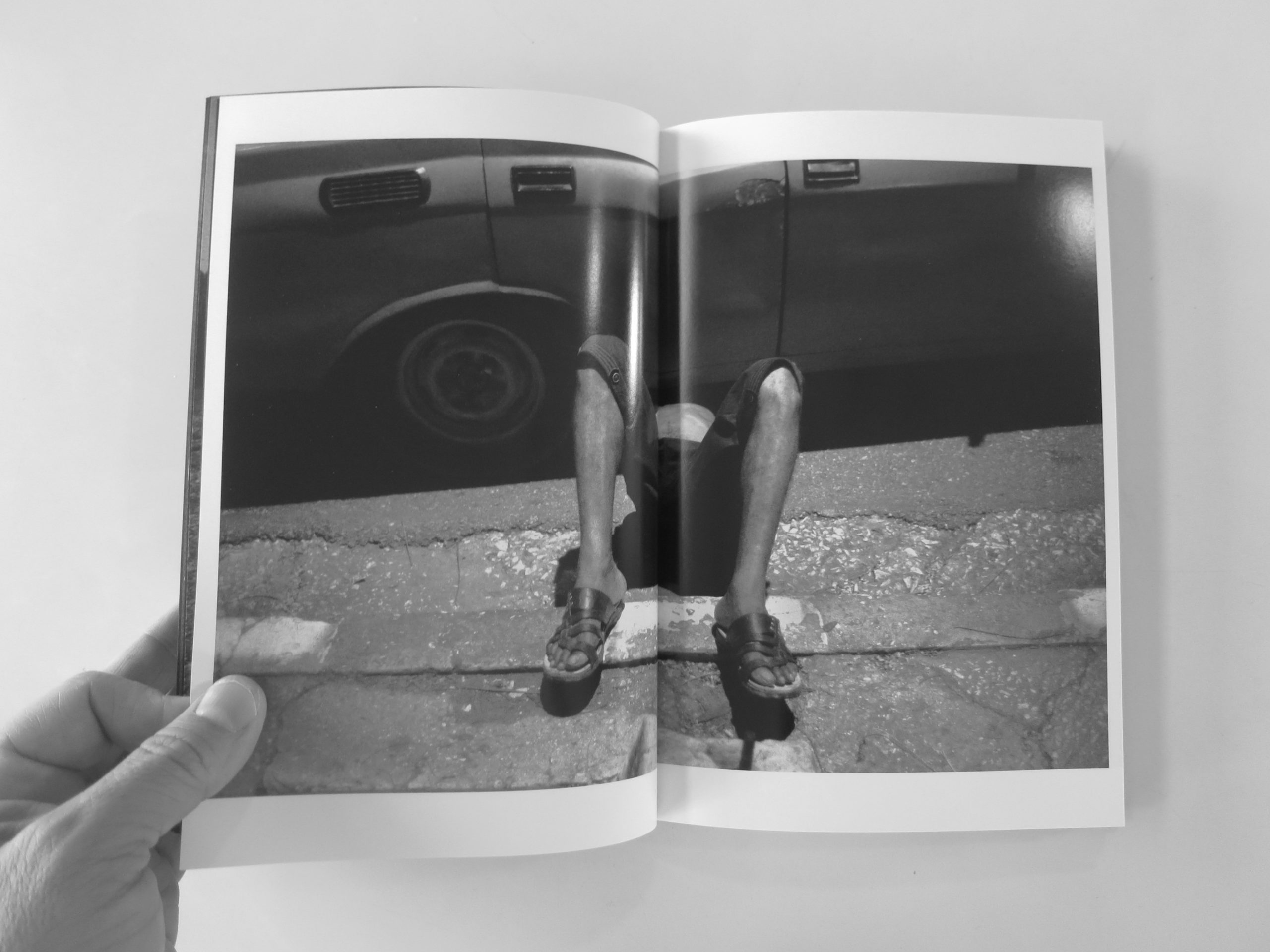
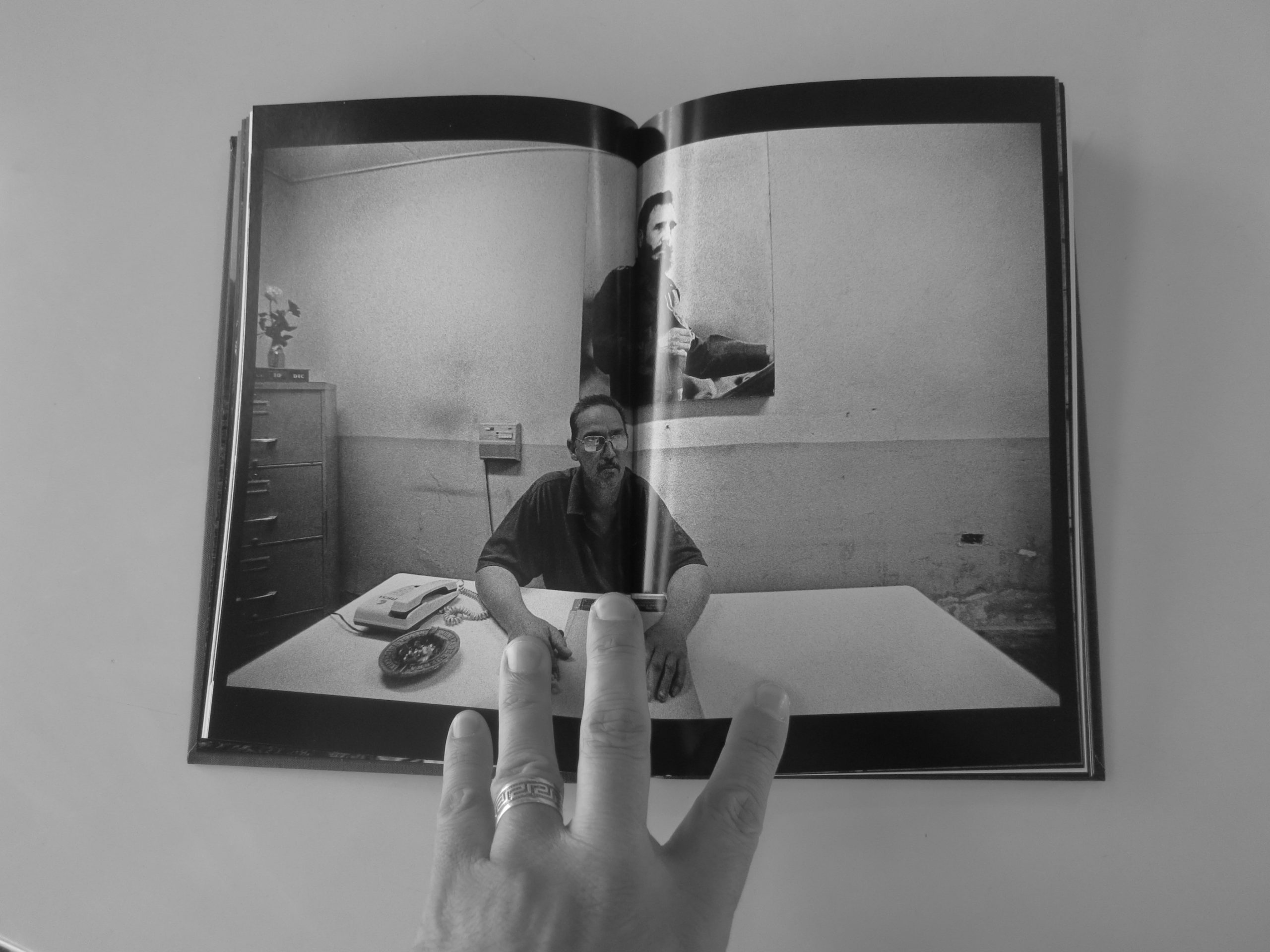
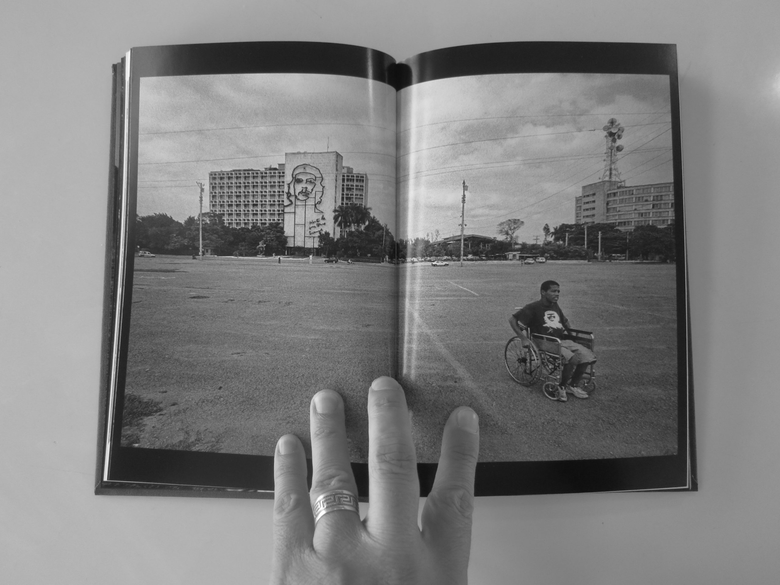
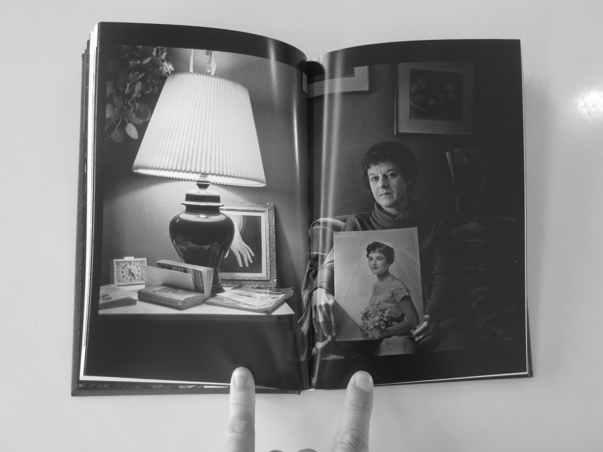
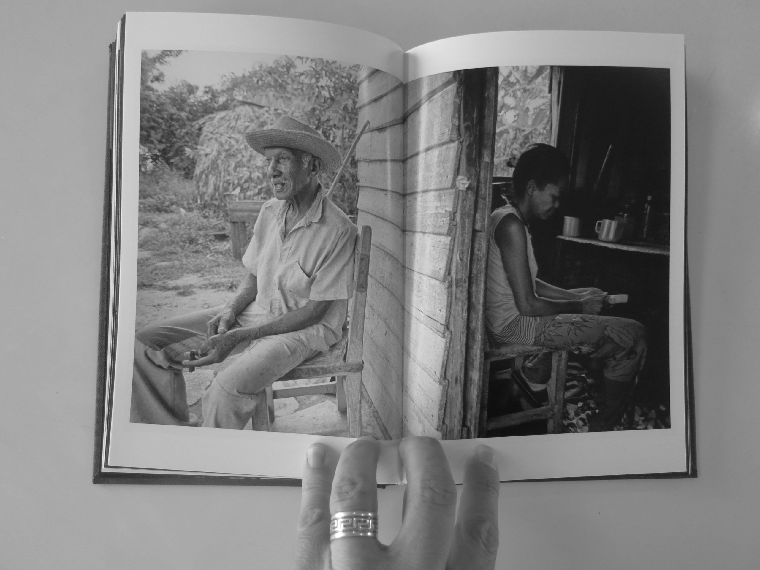
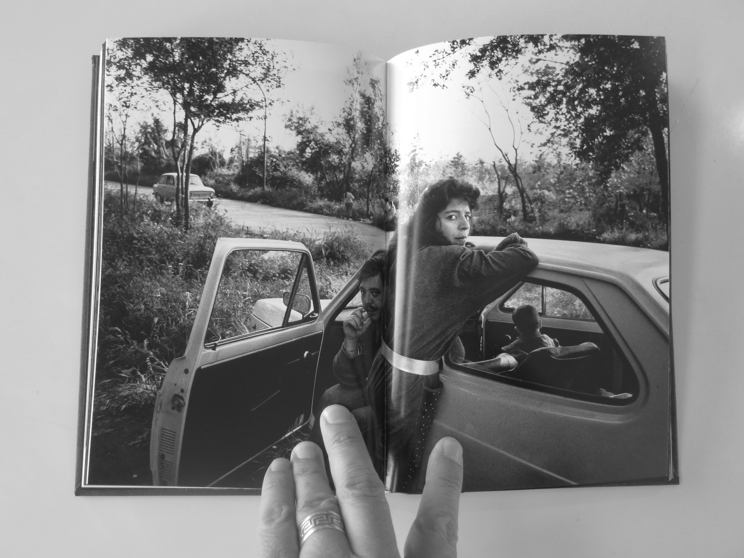
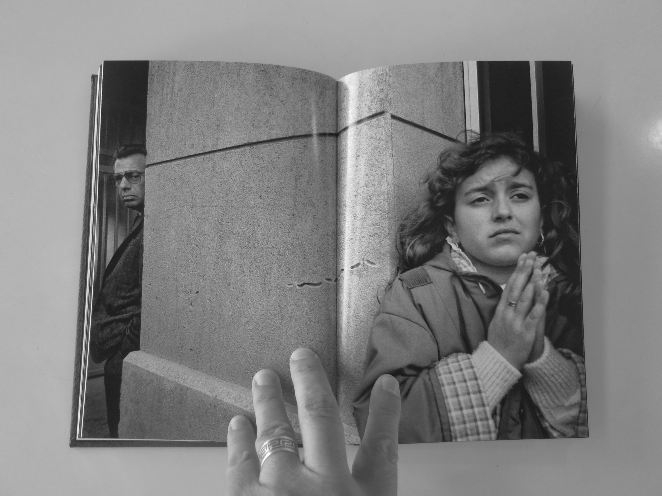
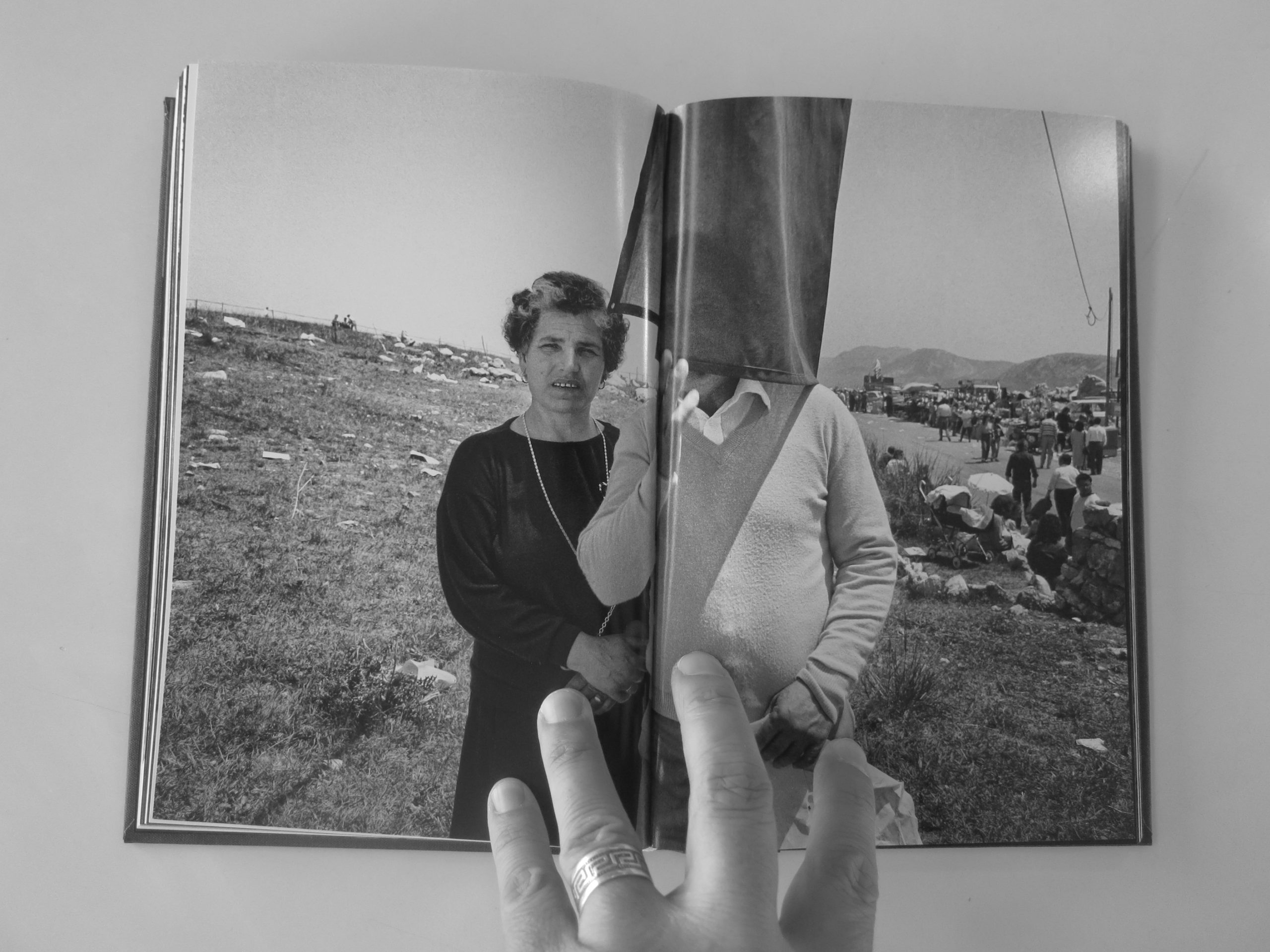
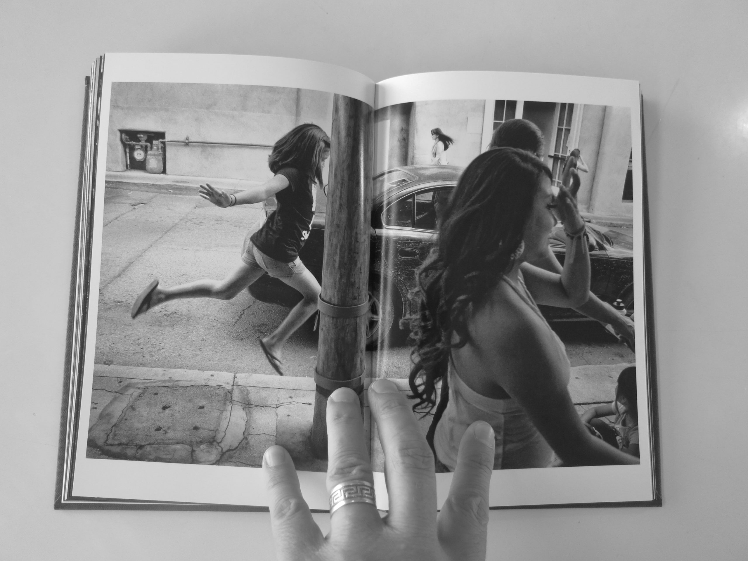
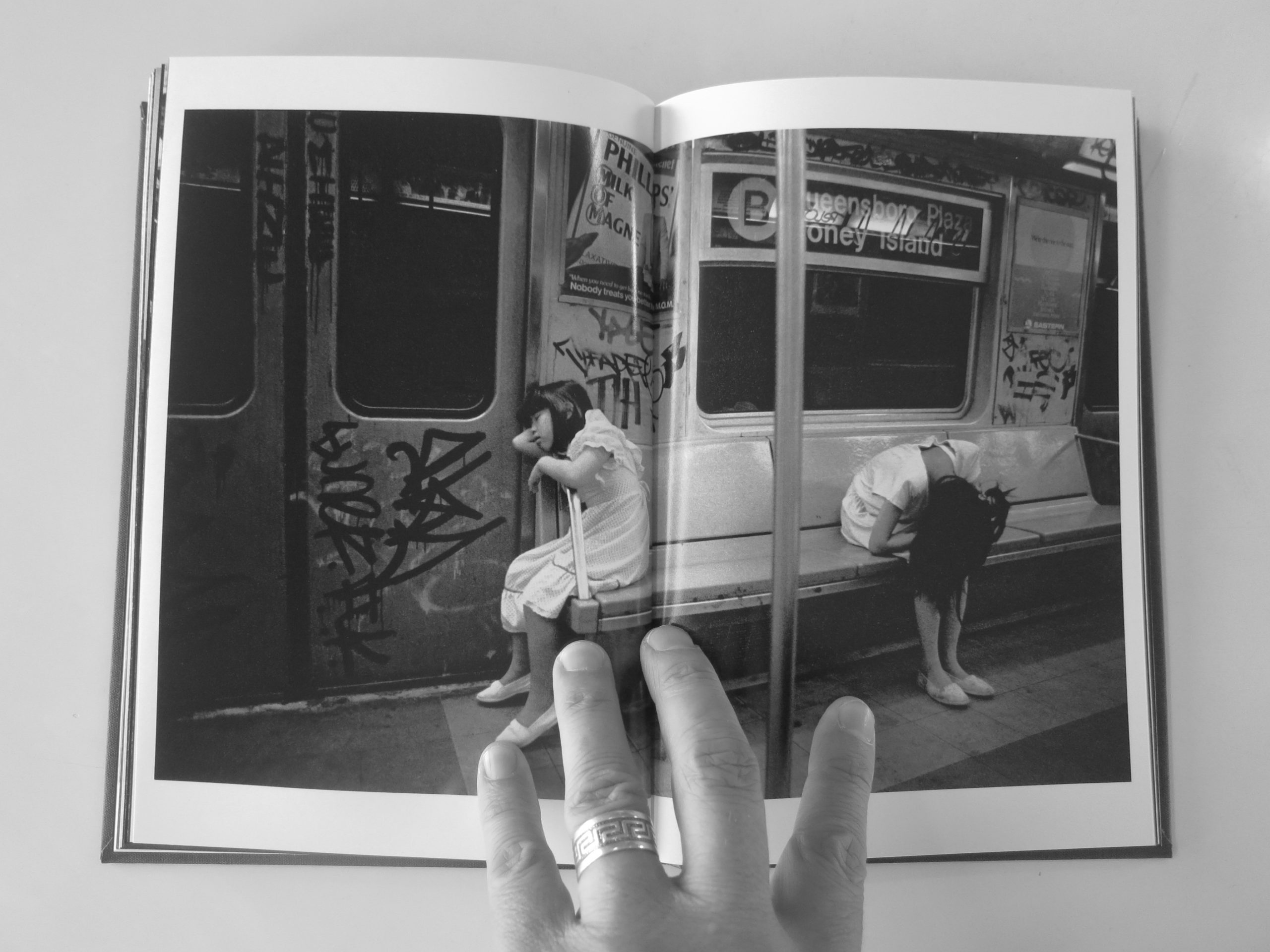
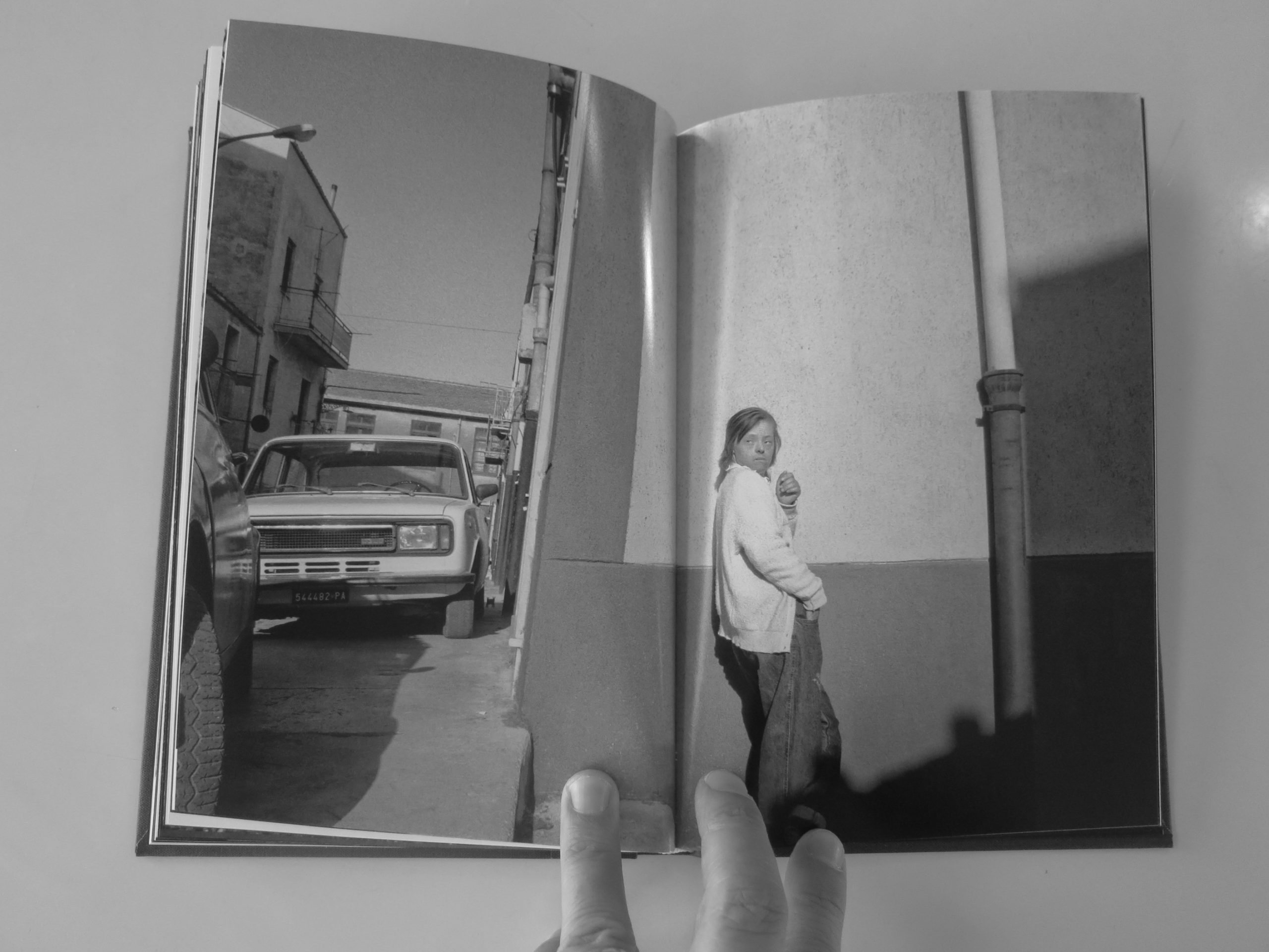
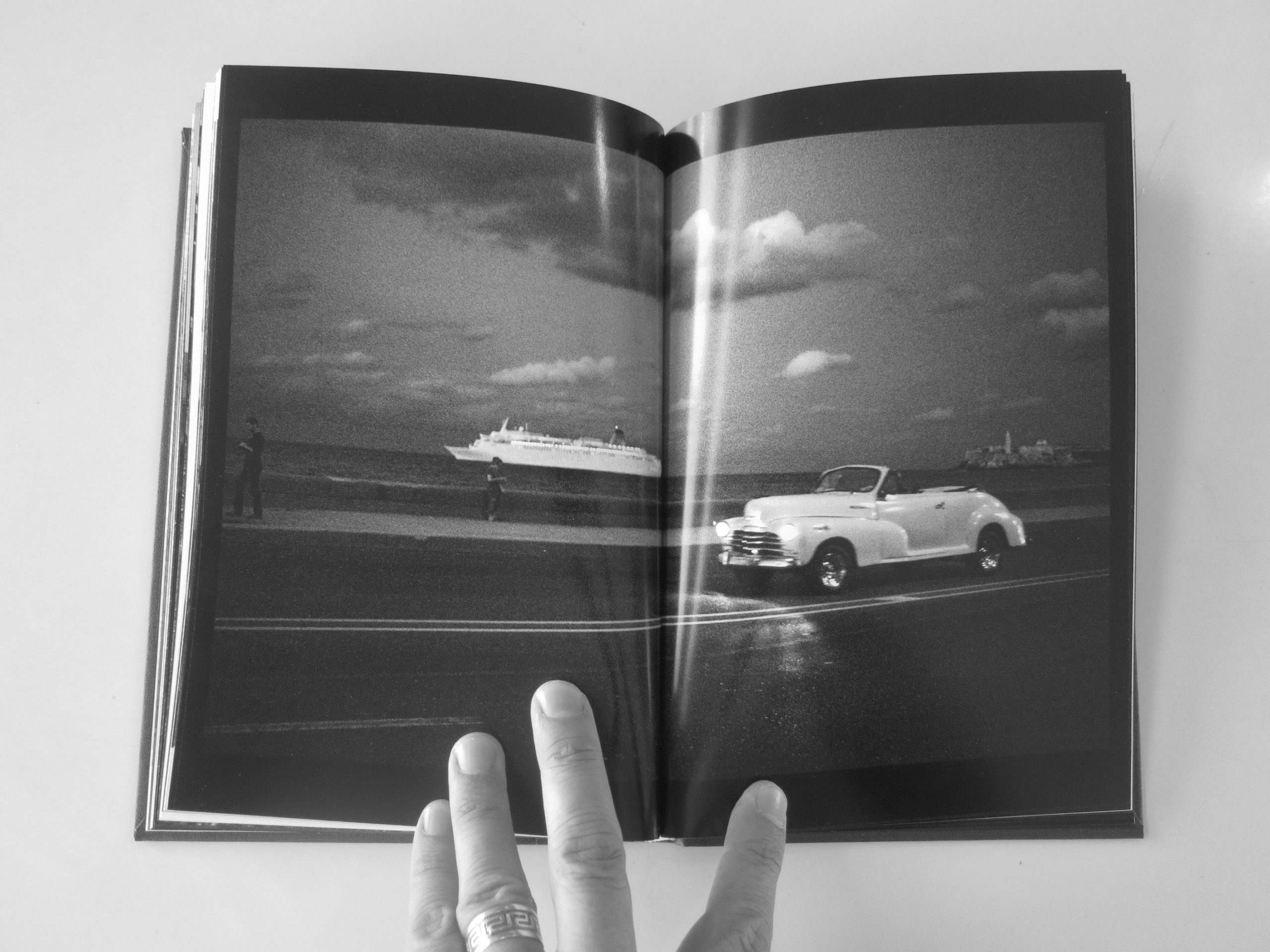
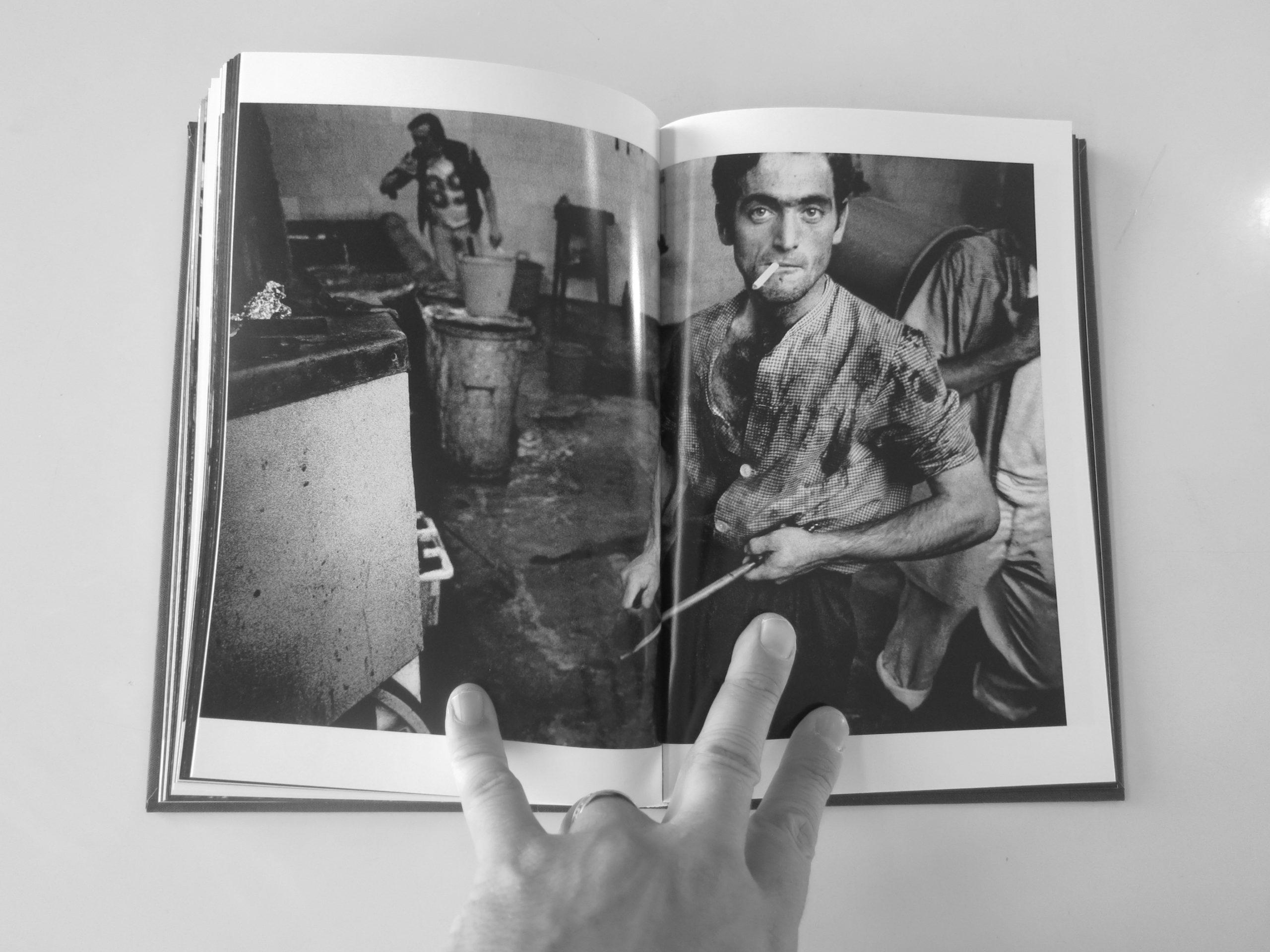
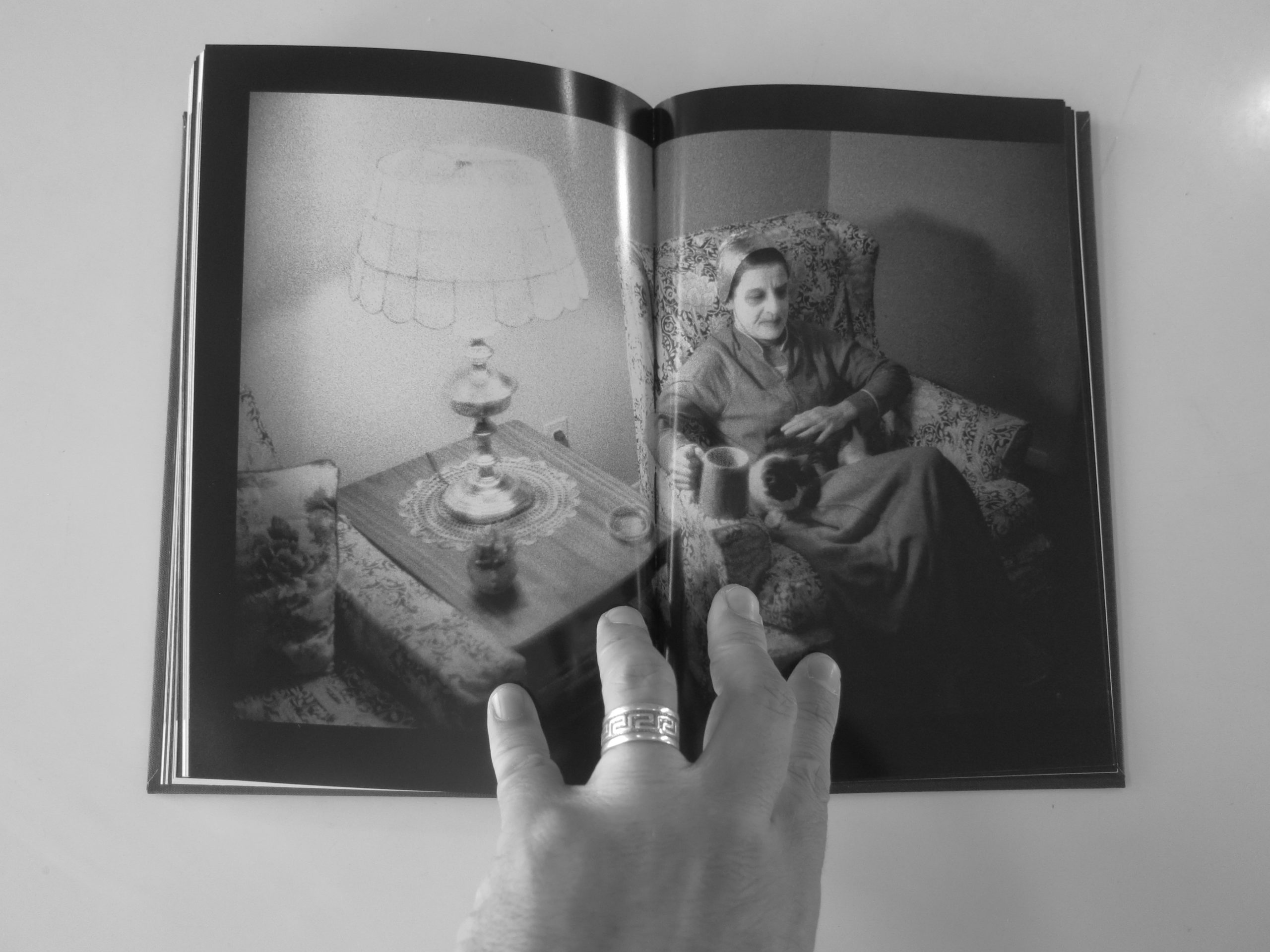
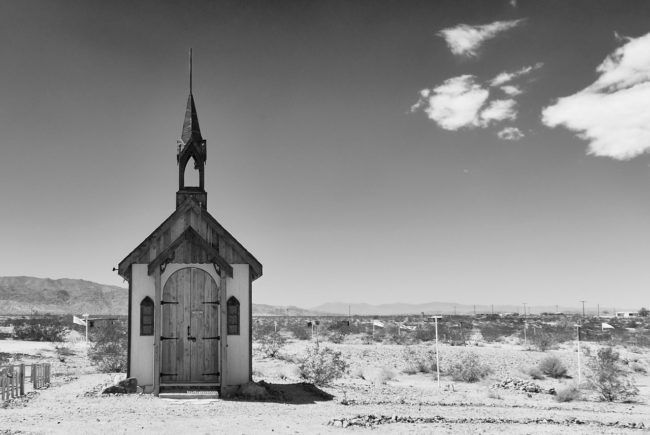
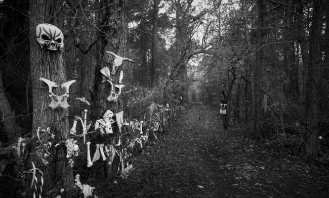
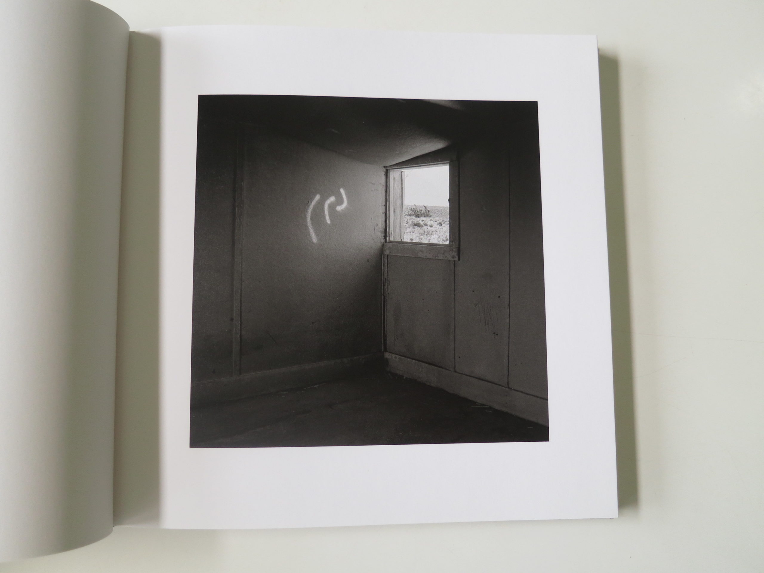
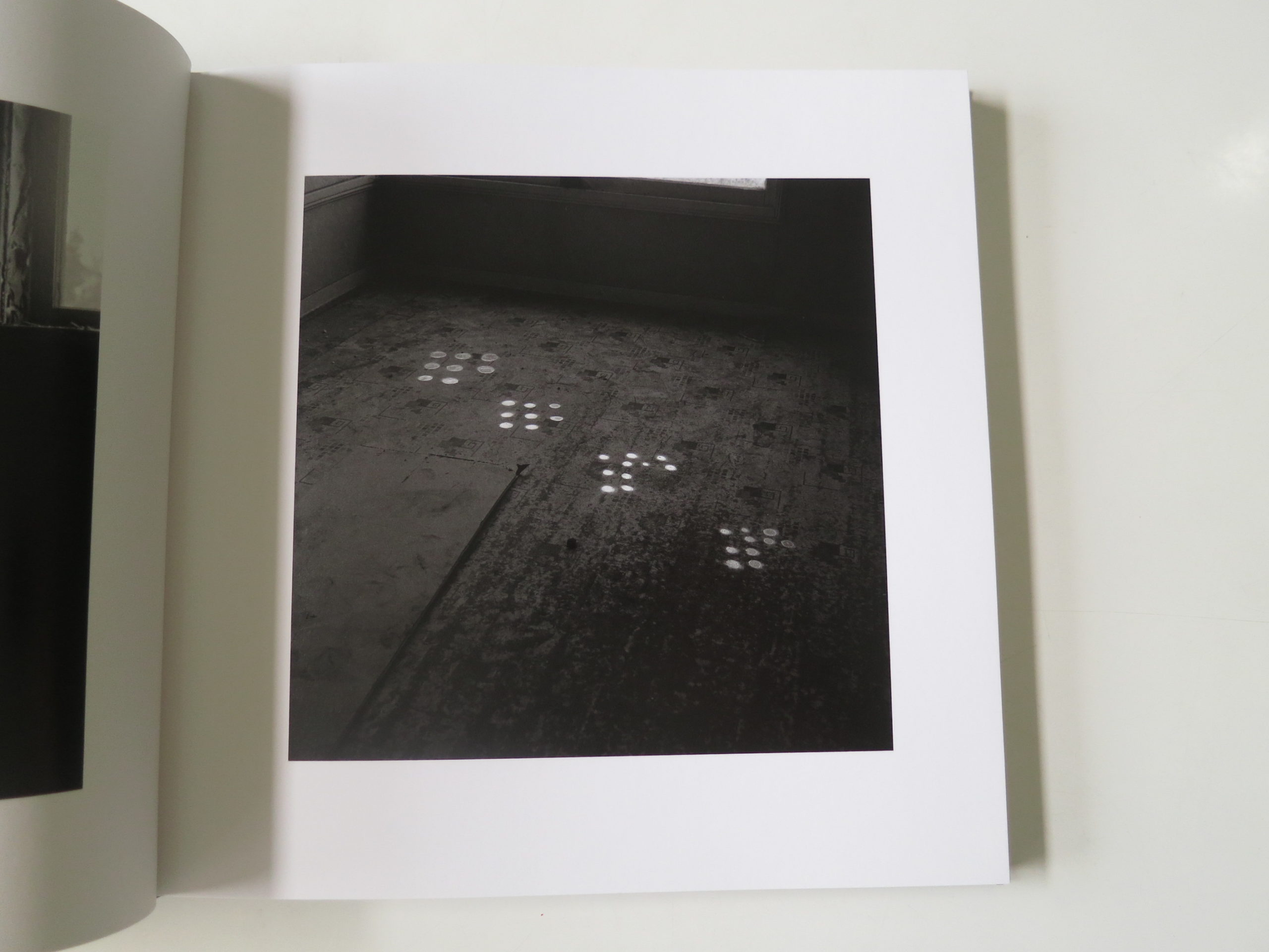
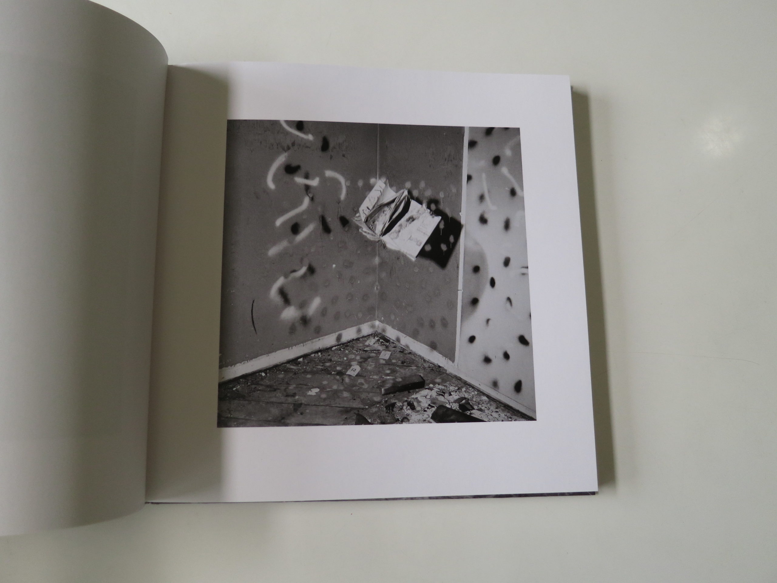
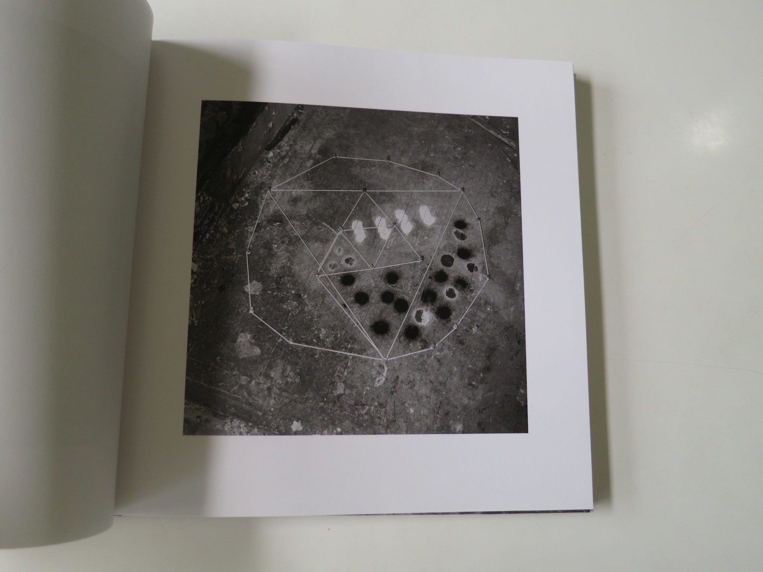
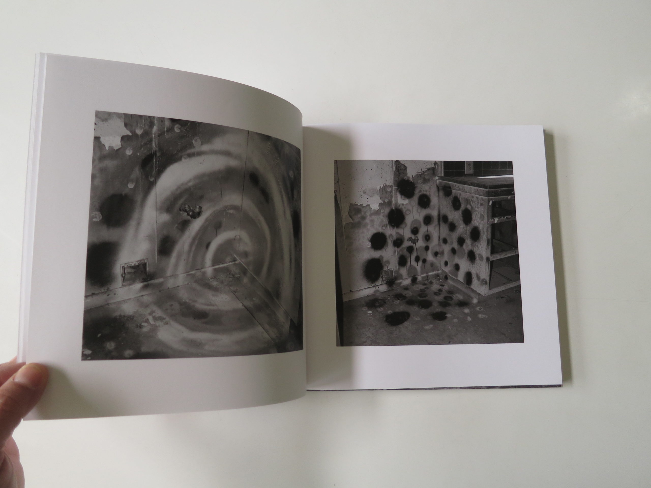
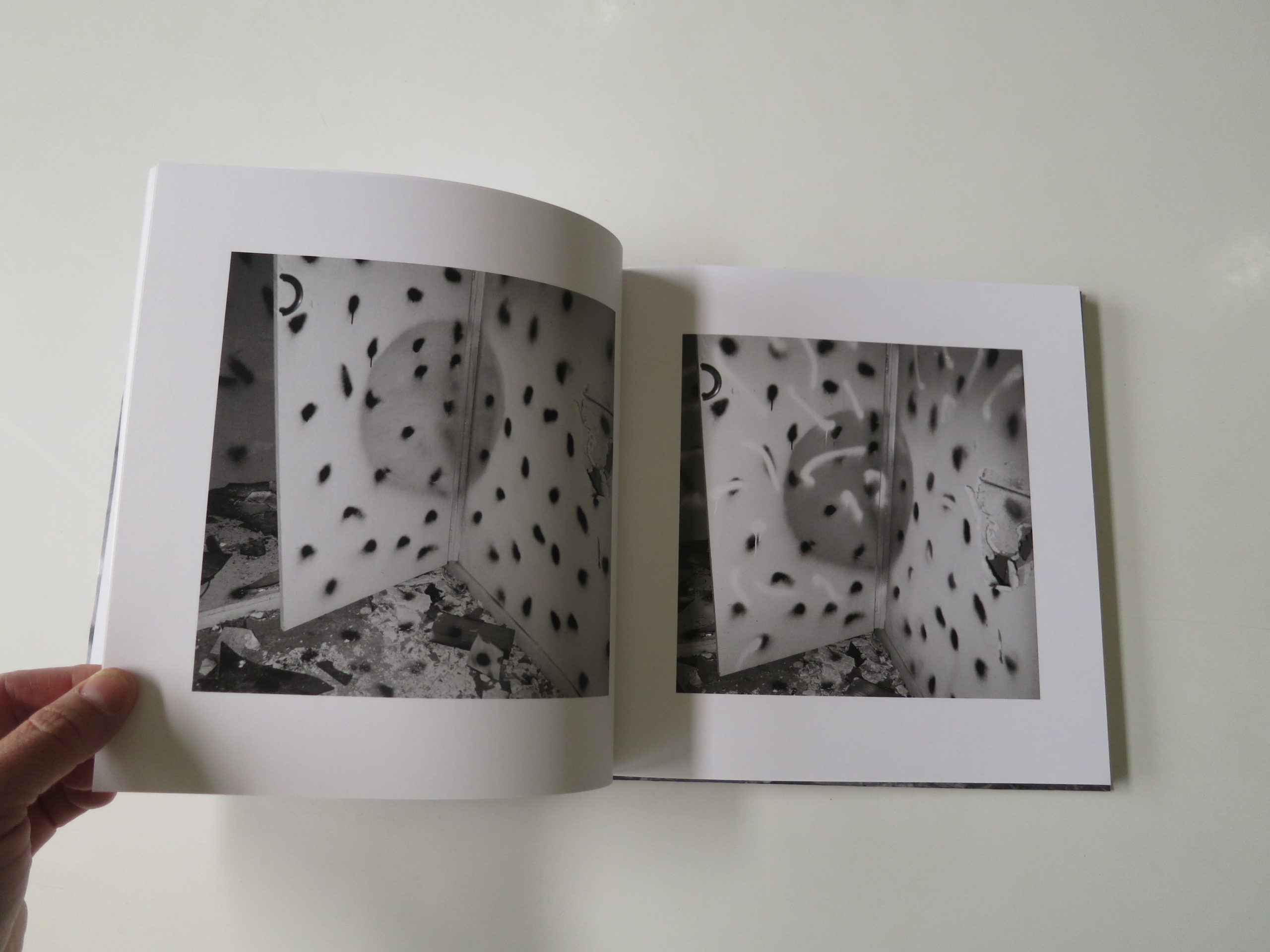
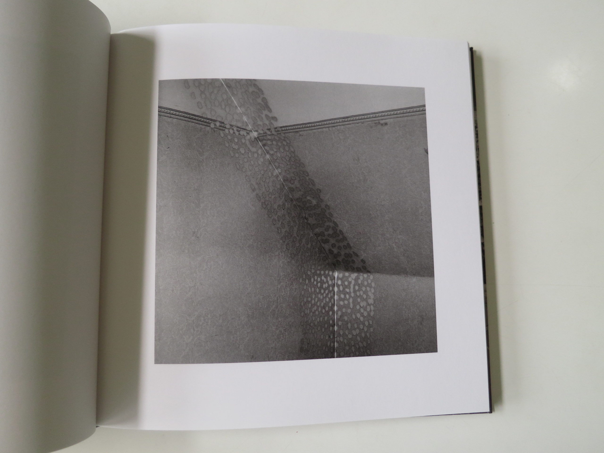
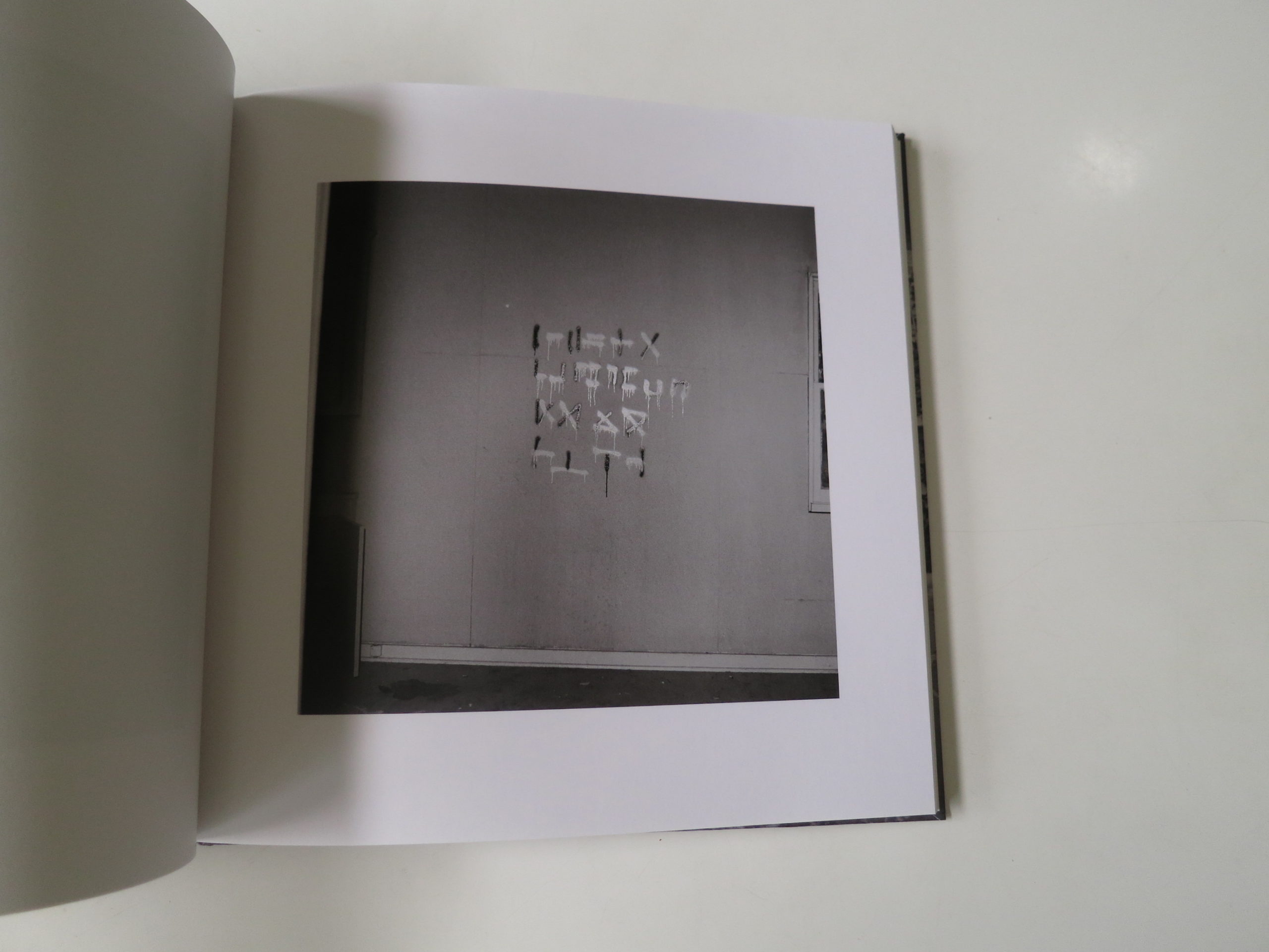
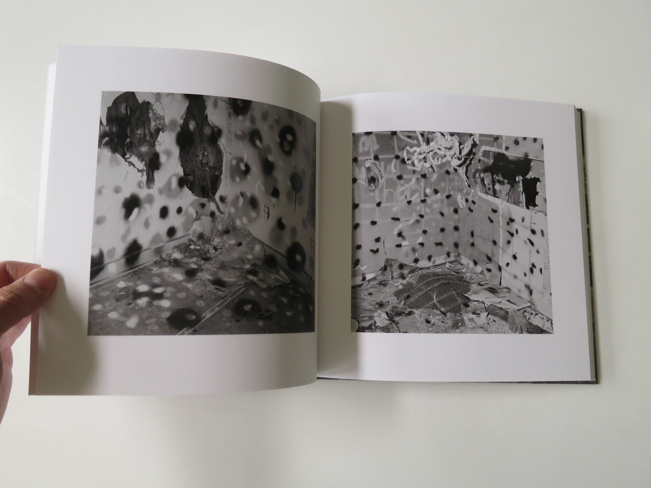
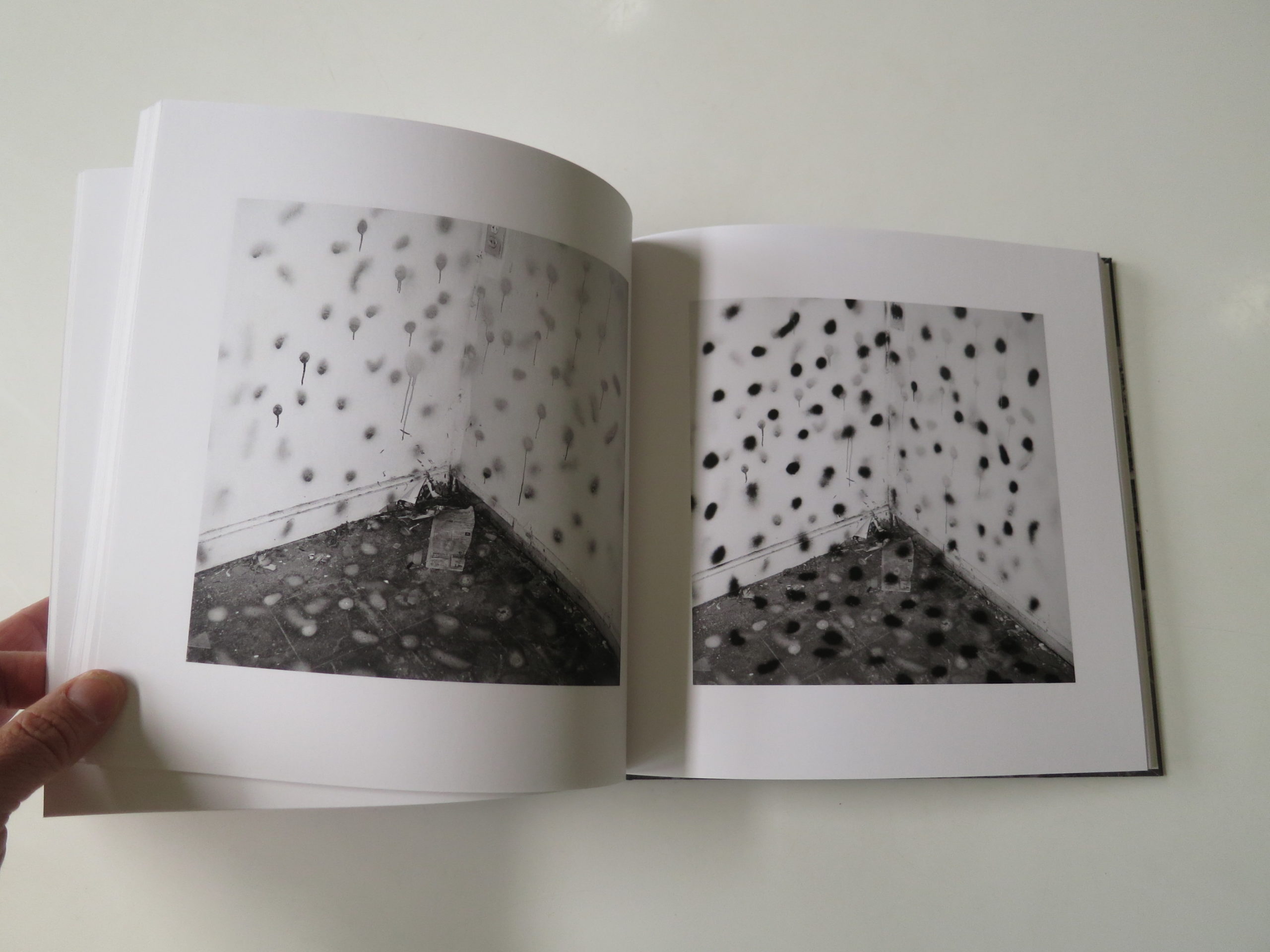
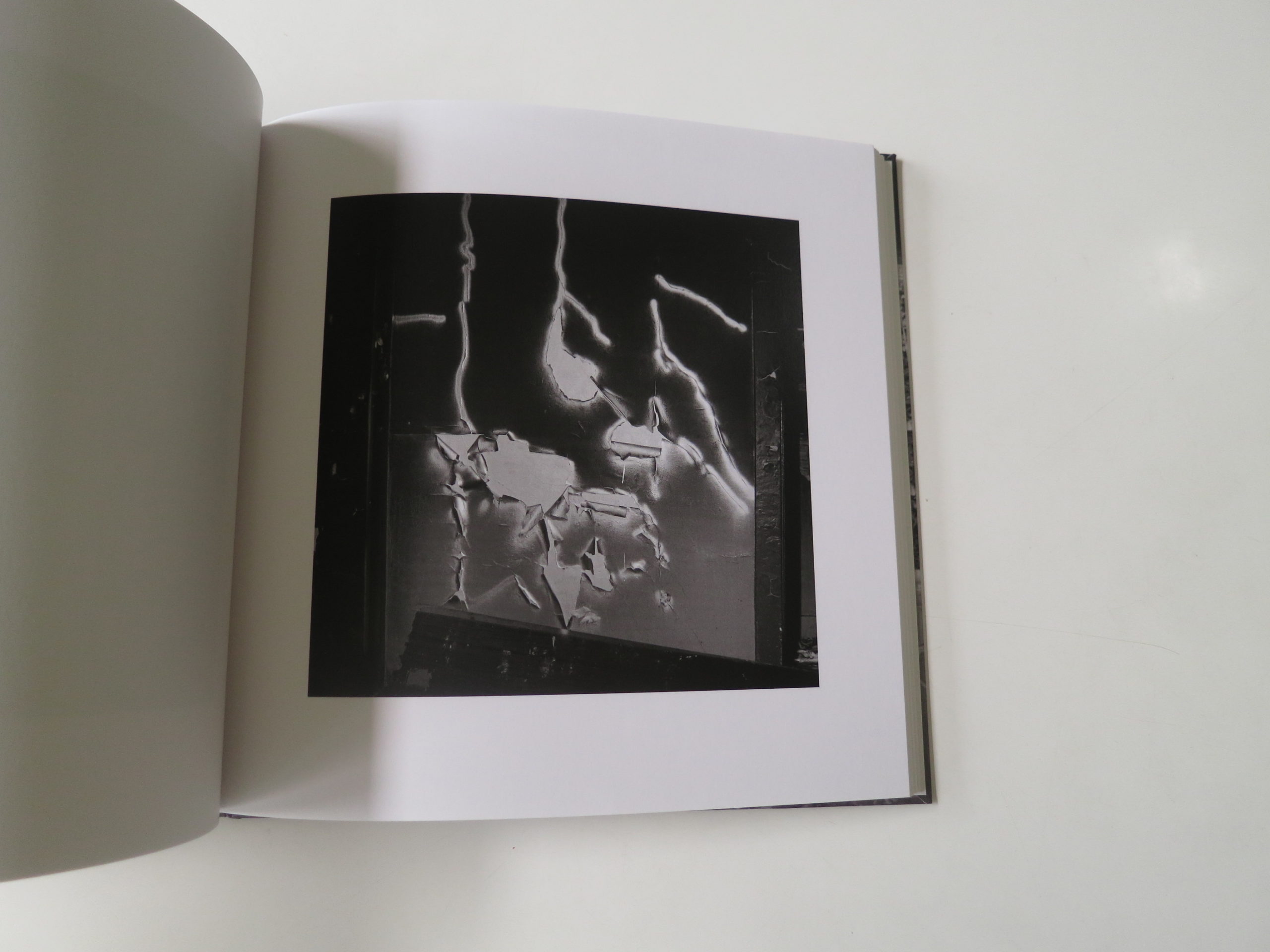
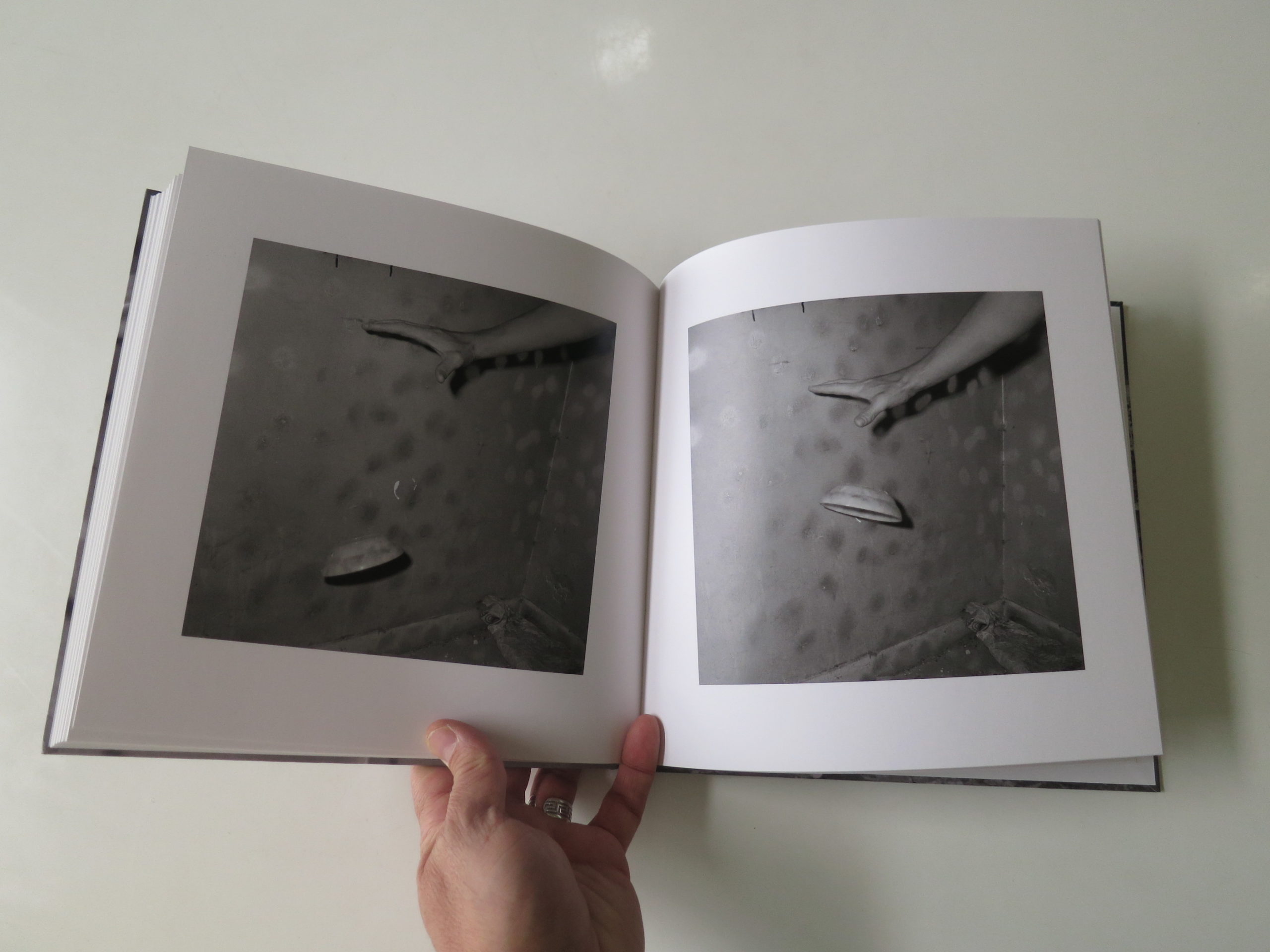
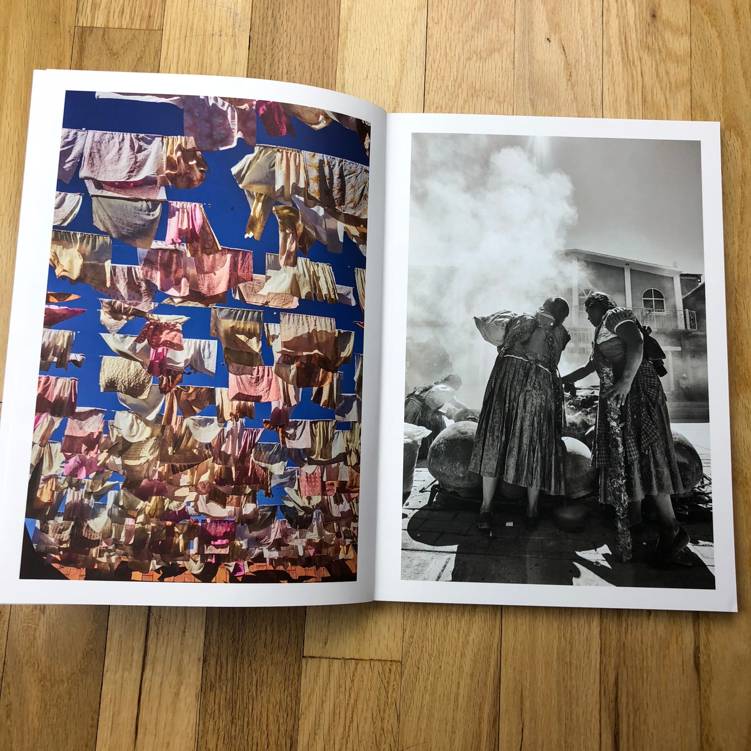
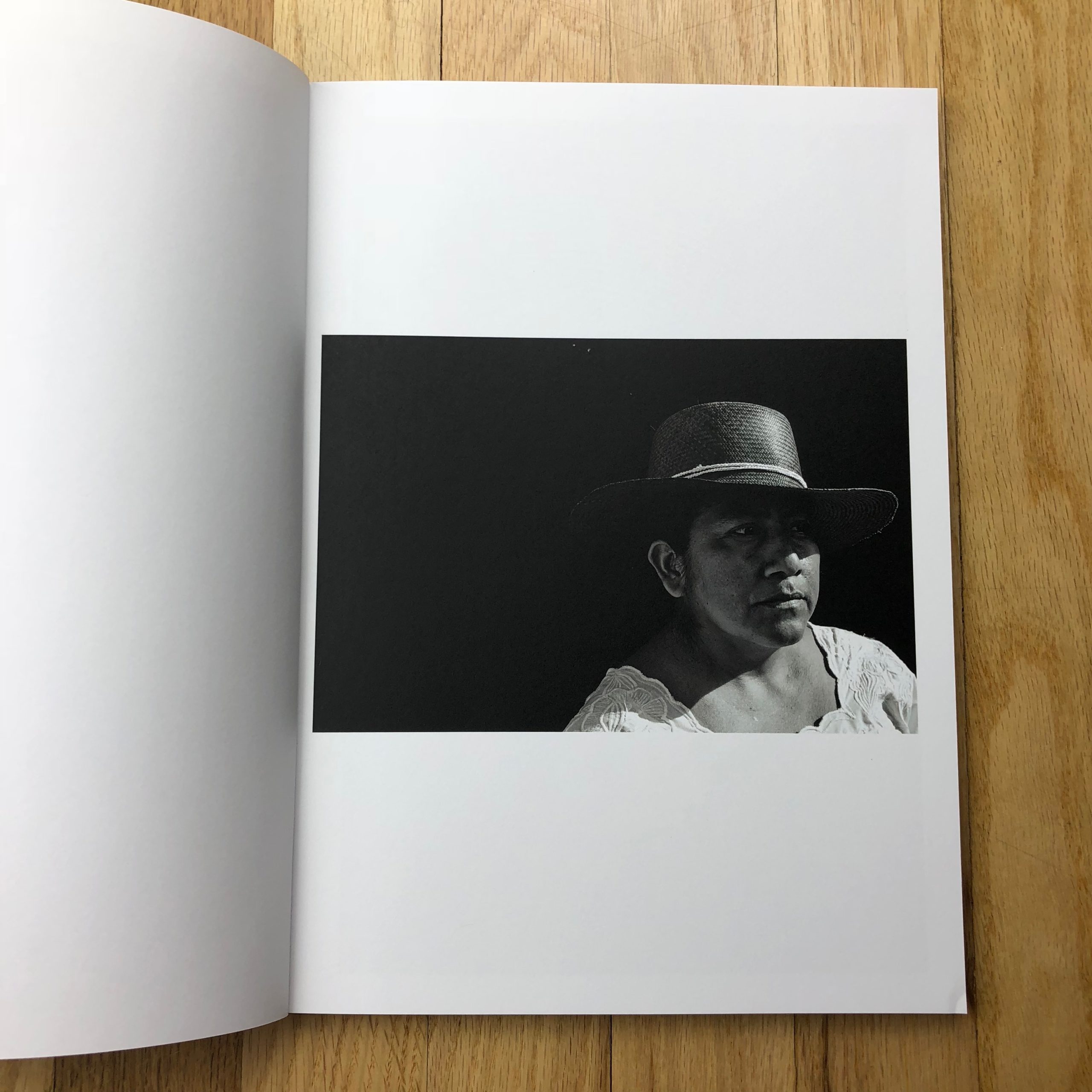
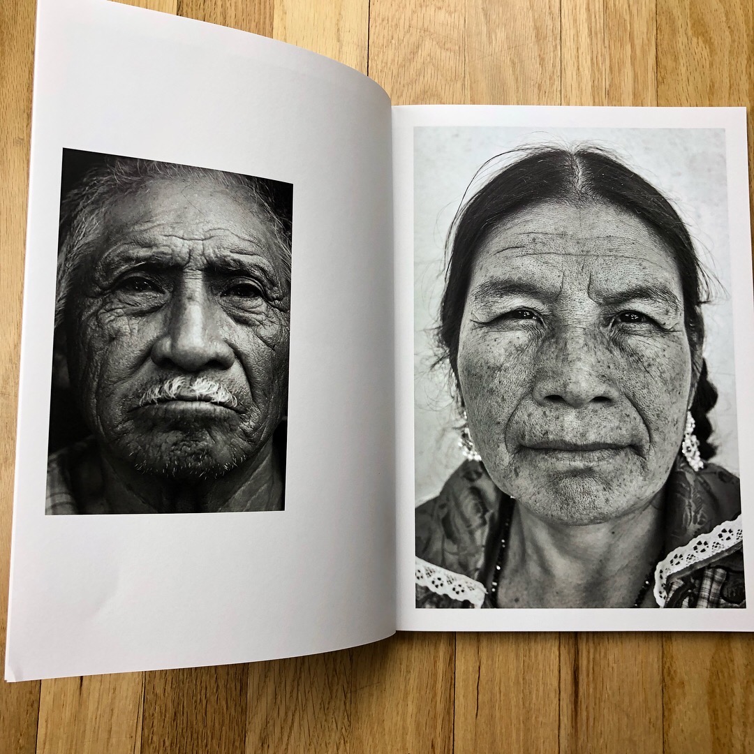
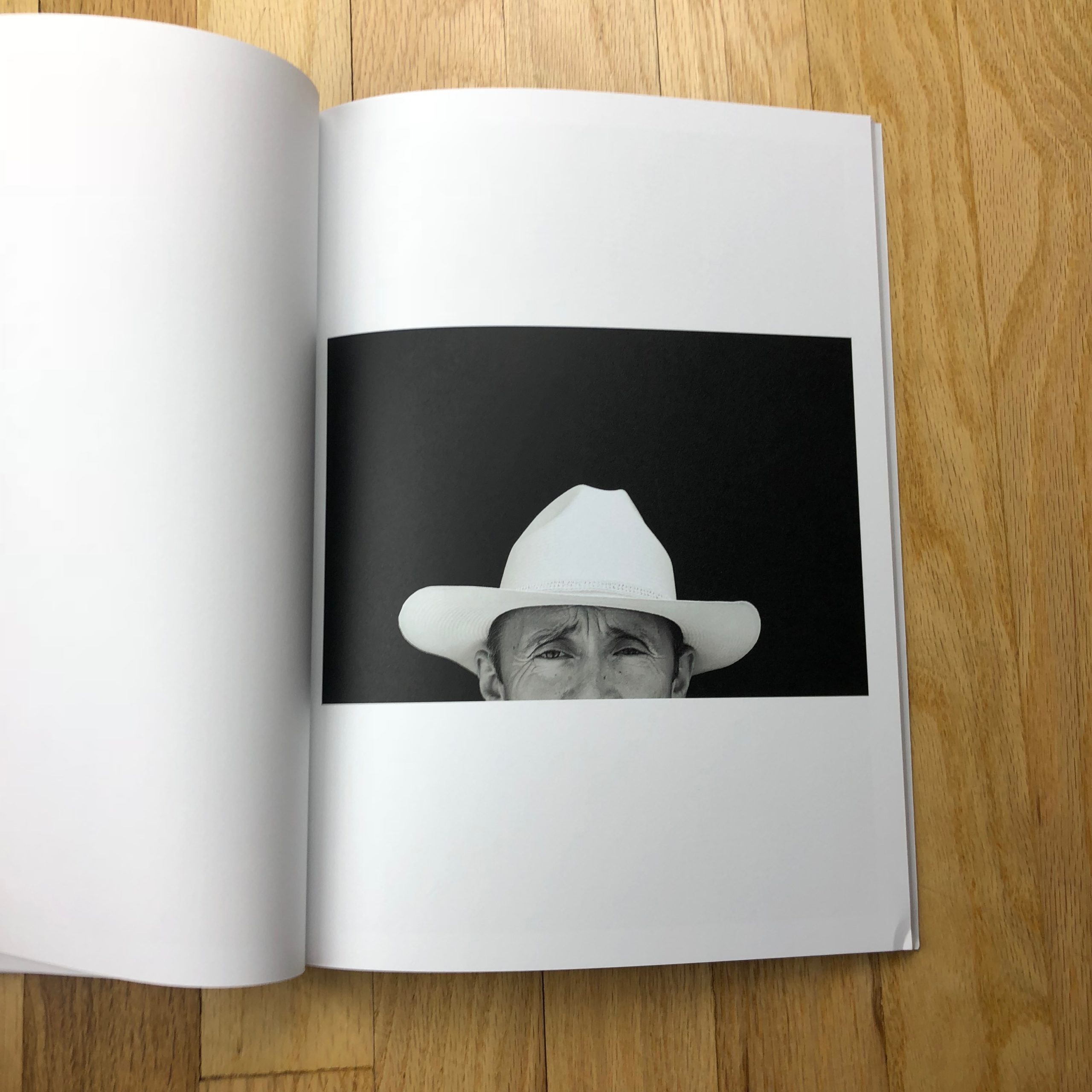
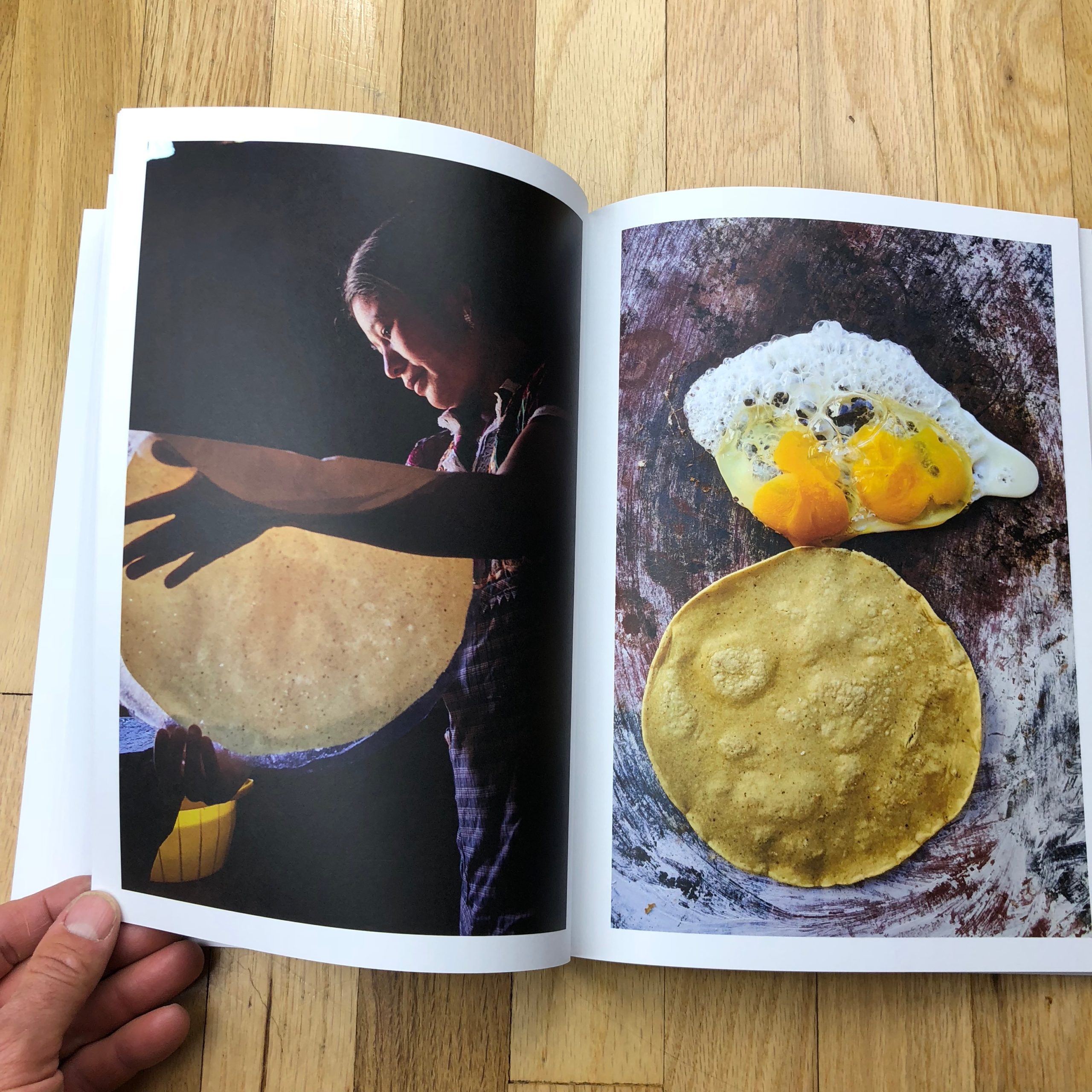
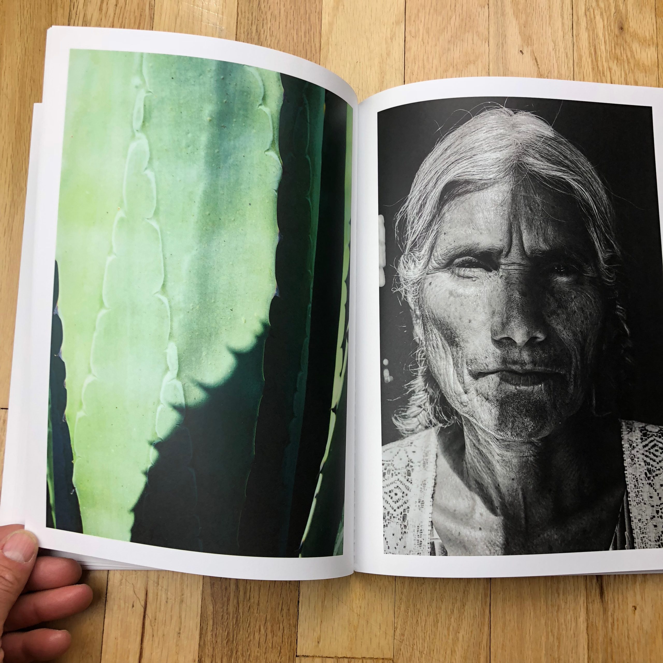
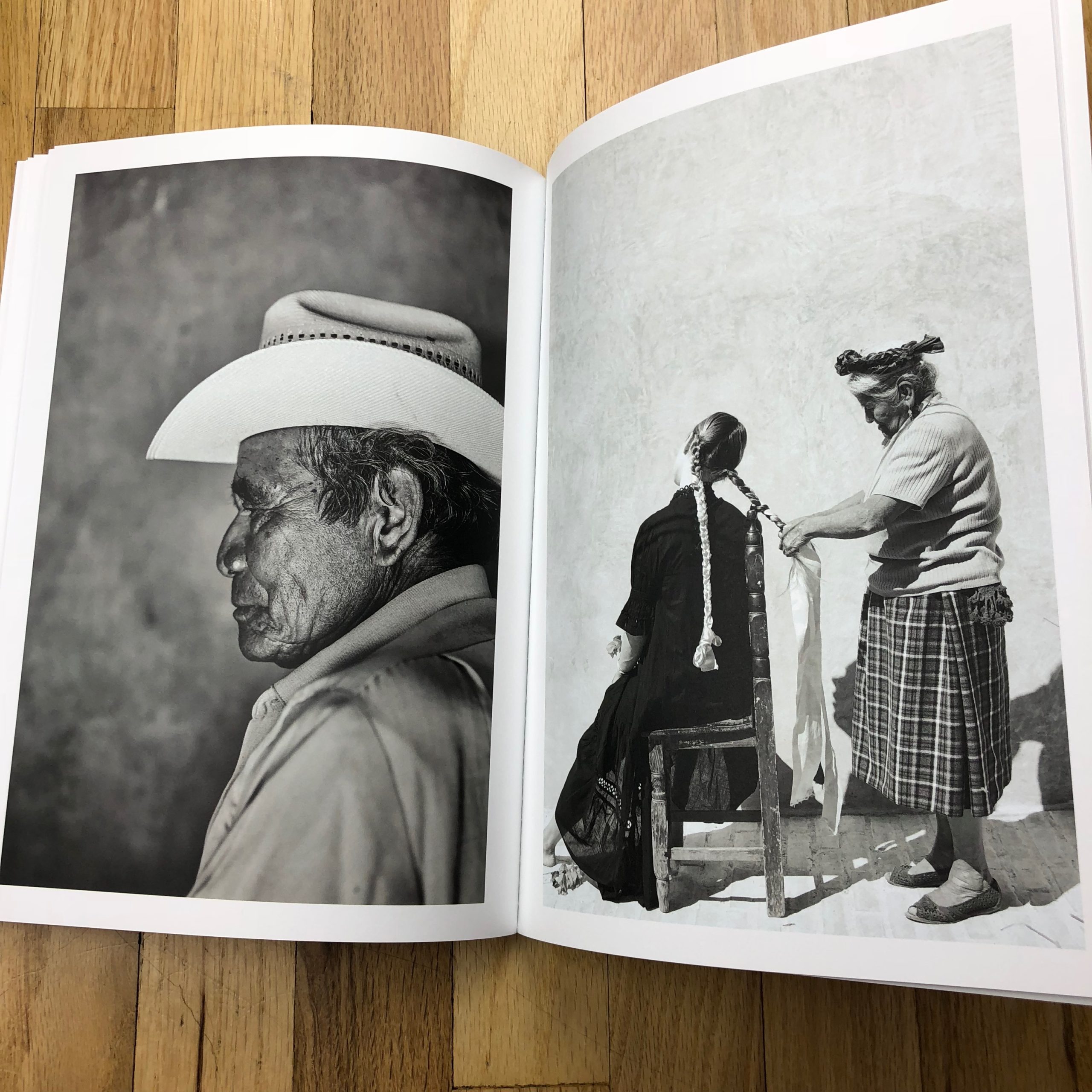
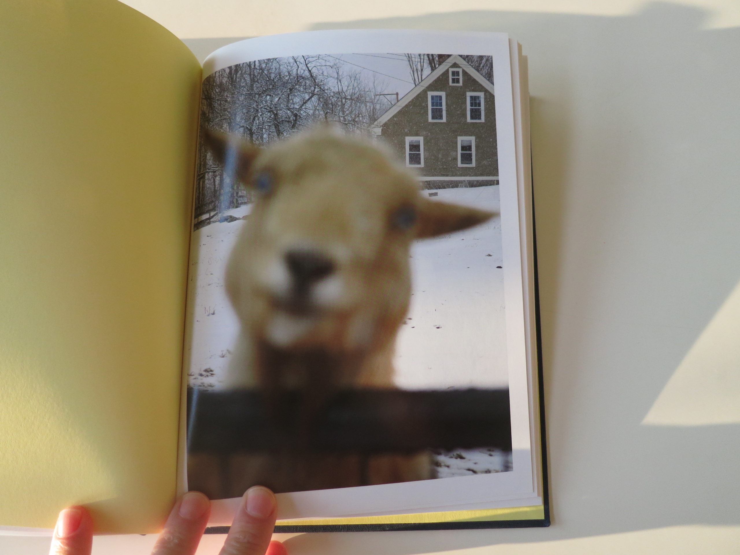
I admit, the earlier reads make more sense, based on gut feeling, but when you look at these pictures, you realize it’s both.
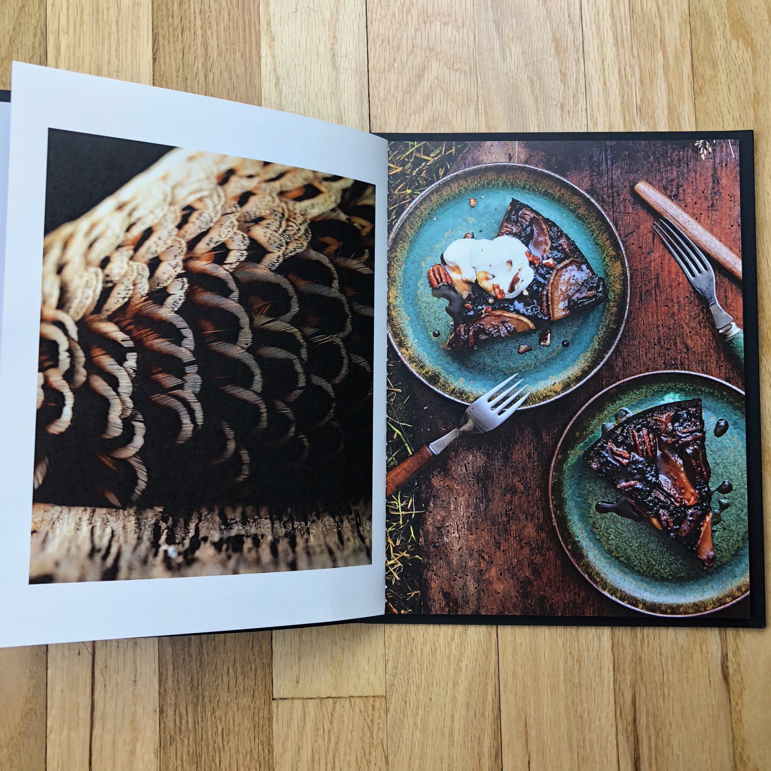
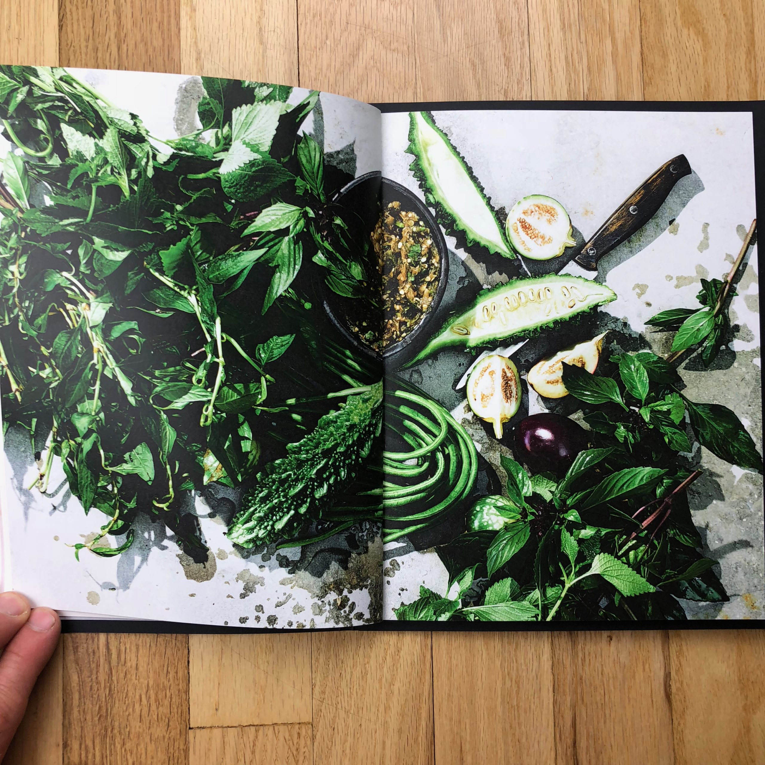
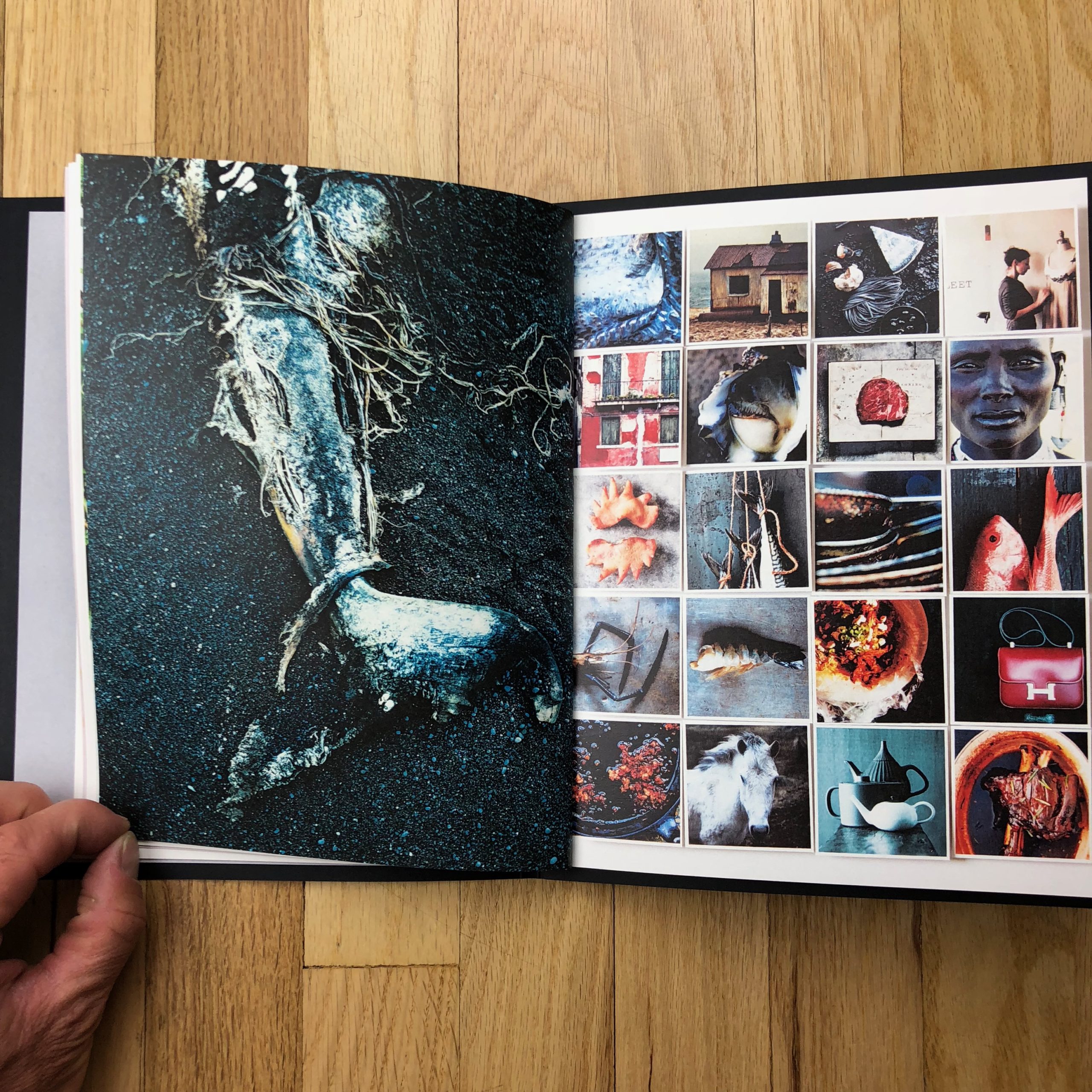
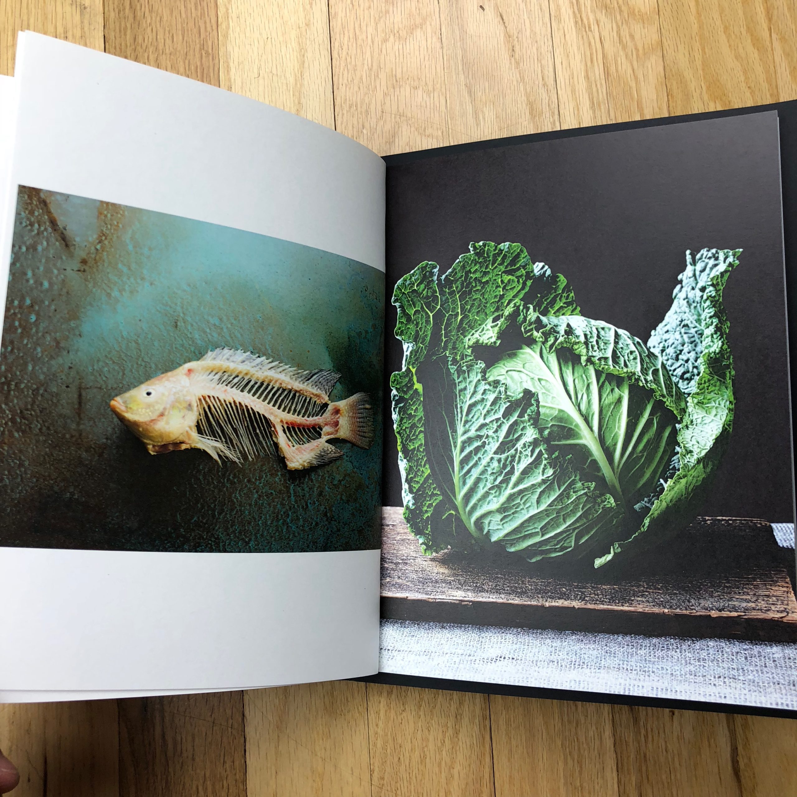
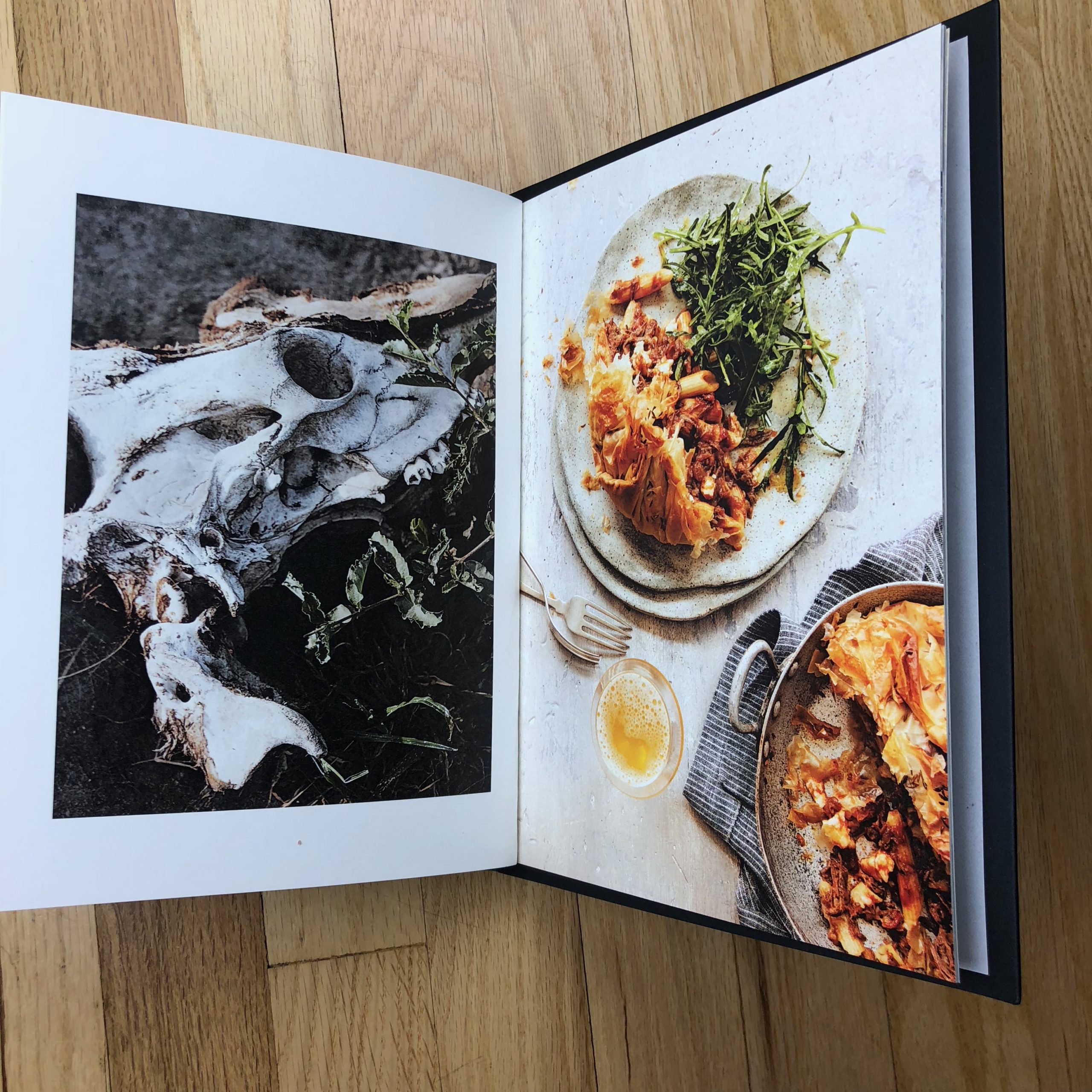
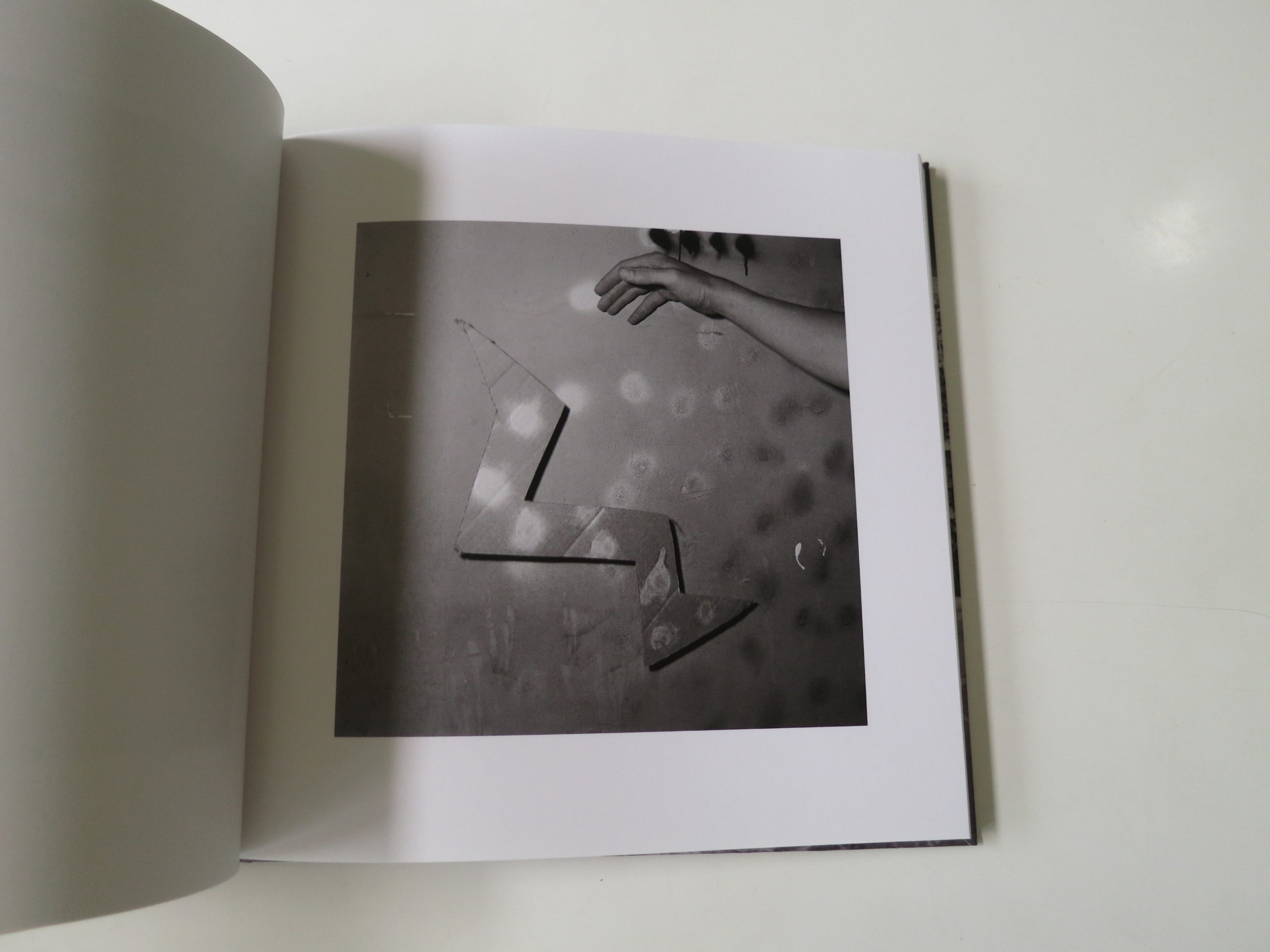
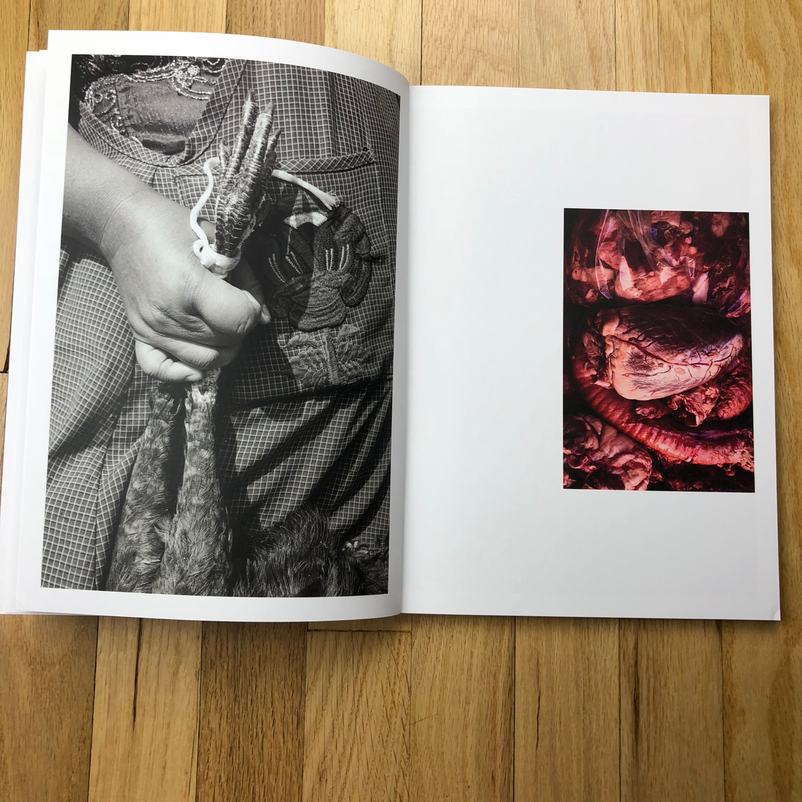
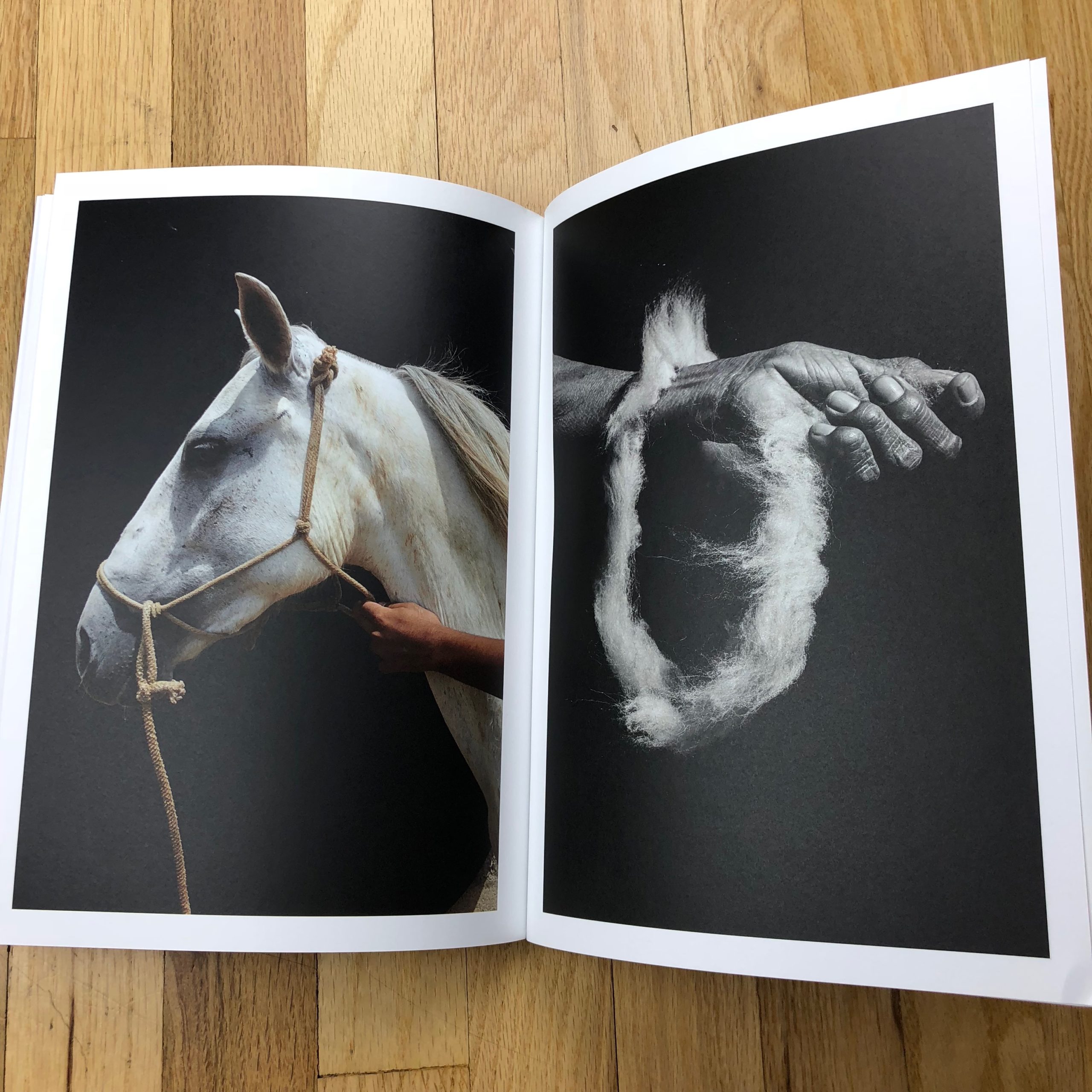
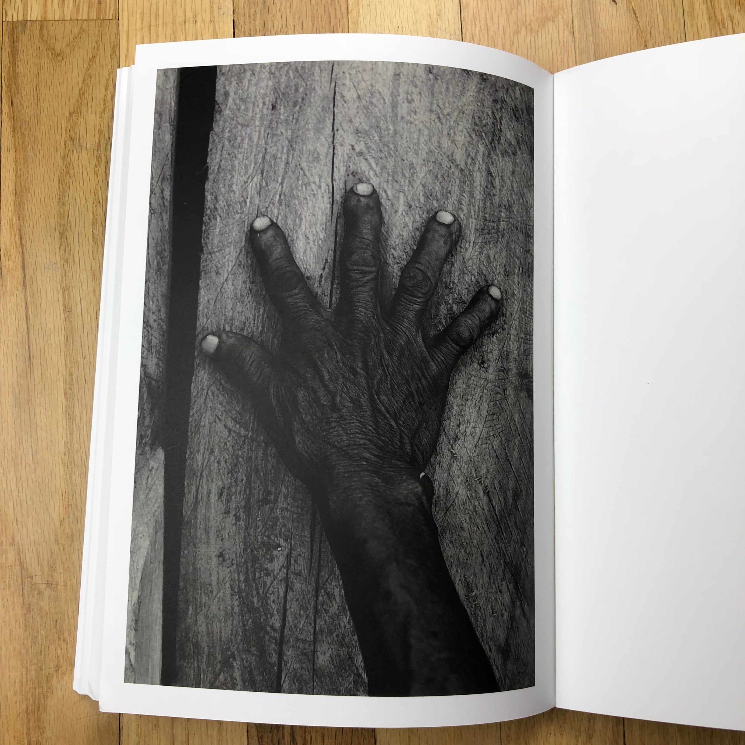
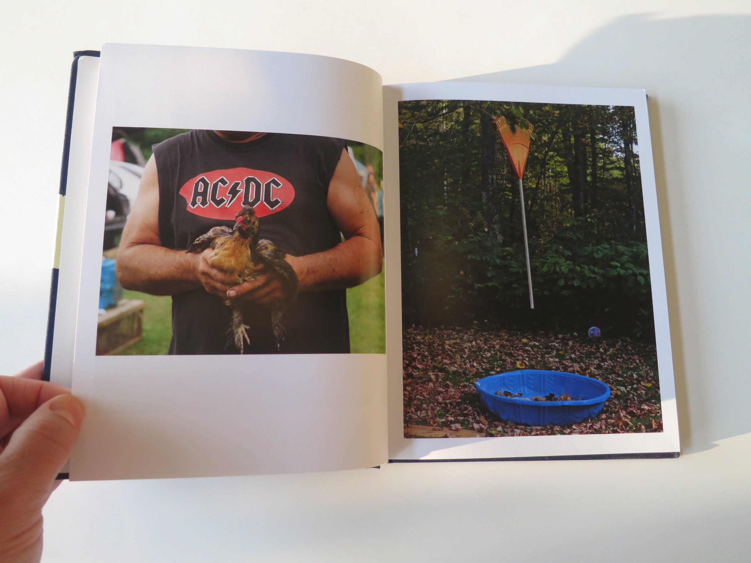
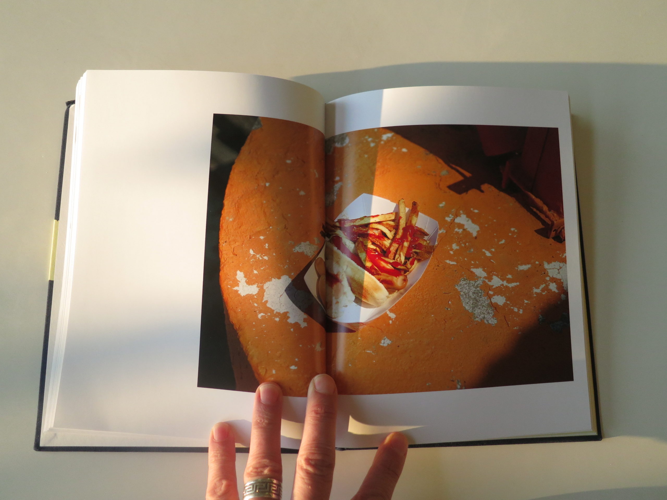
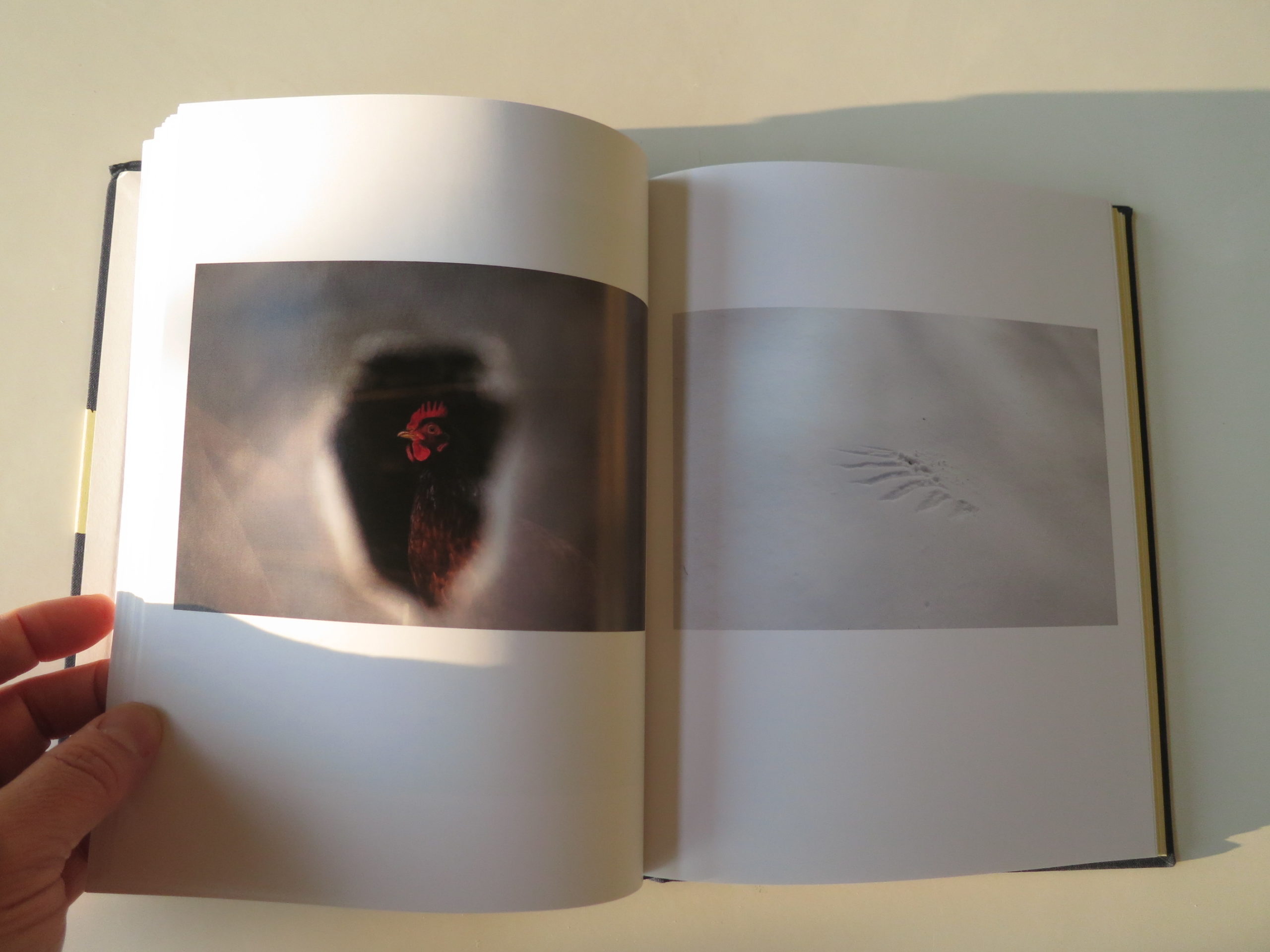
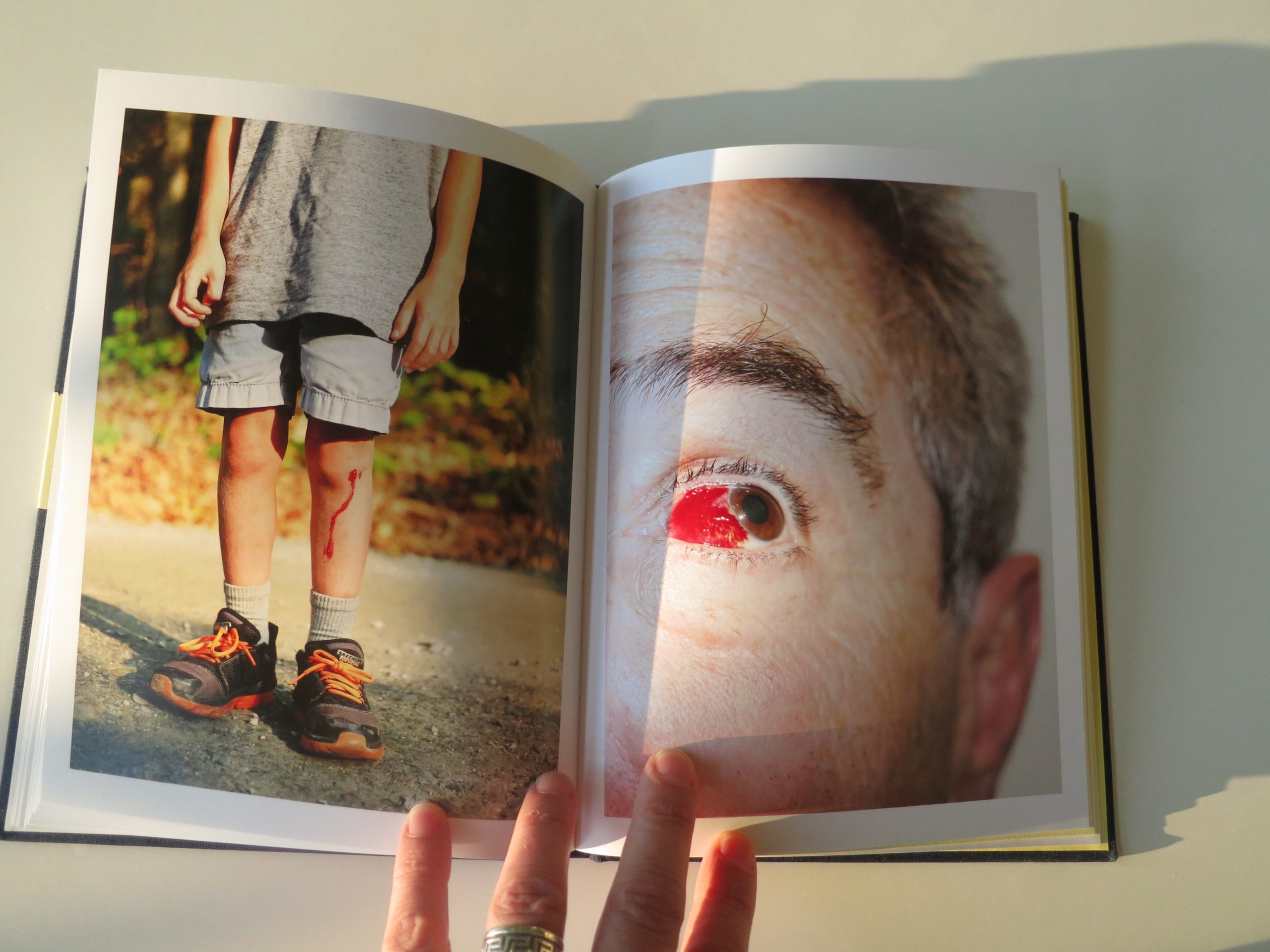
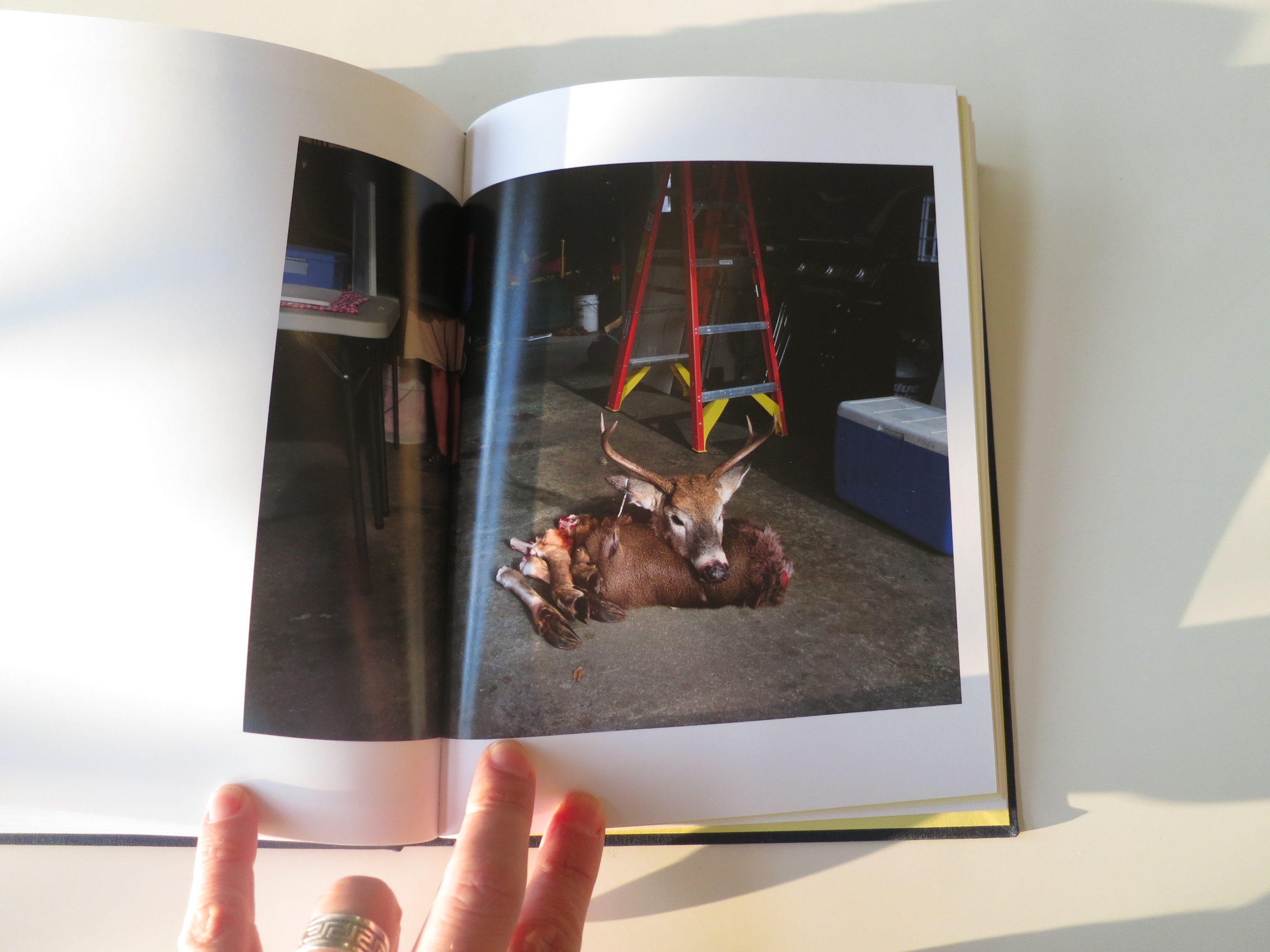
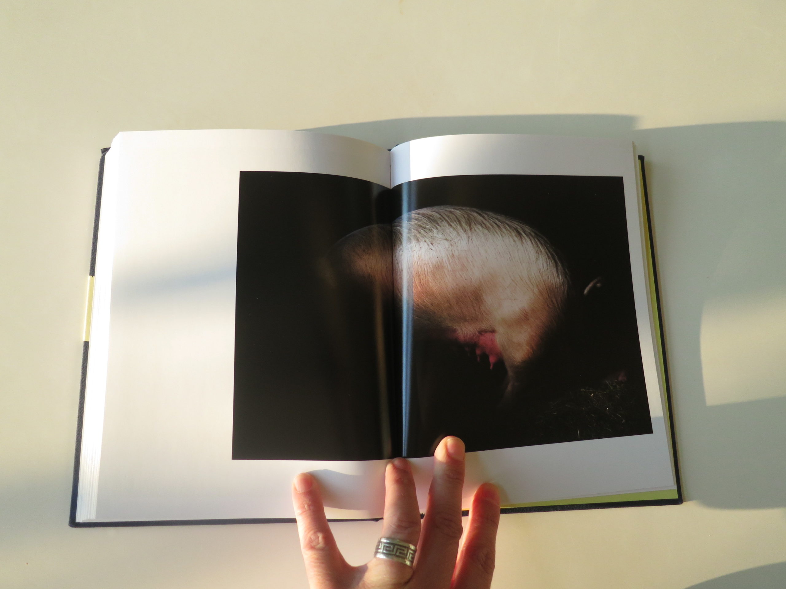
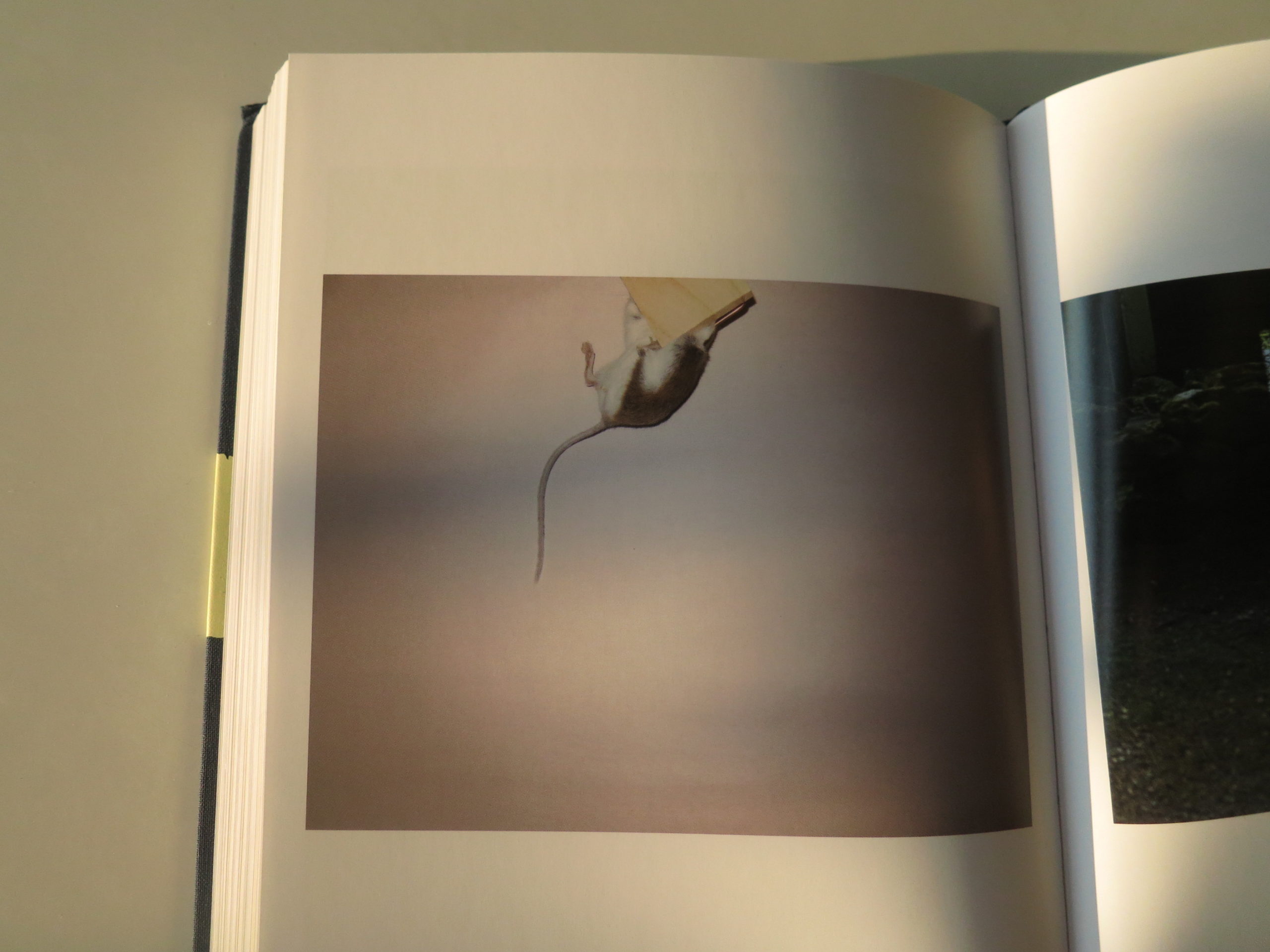
We see dark reality, the kind that often kills off naiveté: chopped up animals, an actual bloody heart, more blood on snow, a blood-red eyeball.
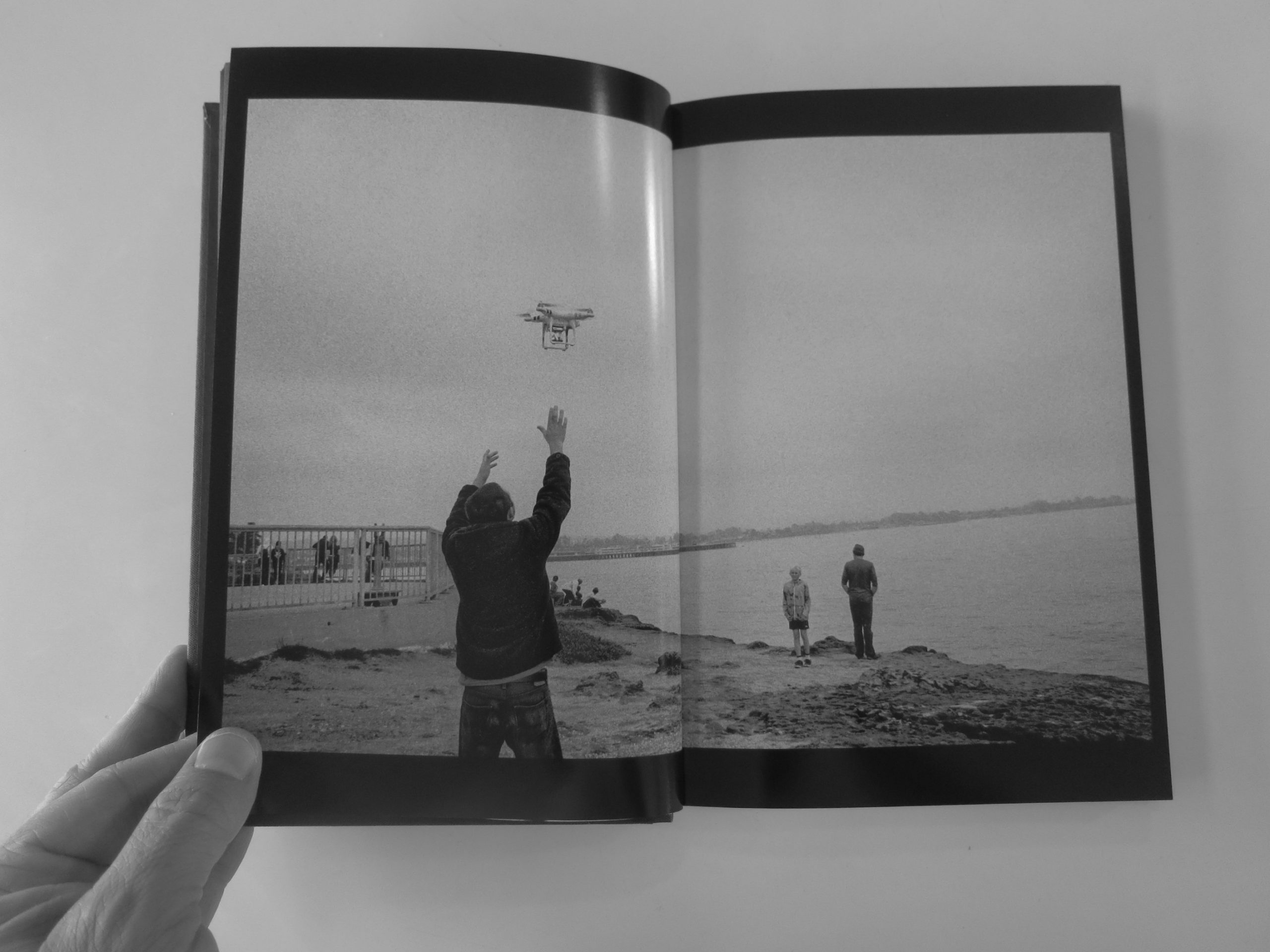
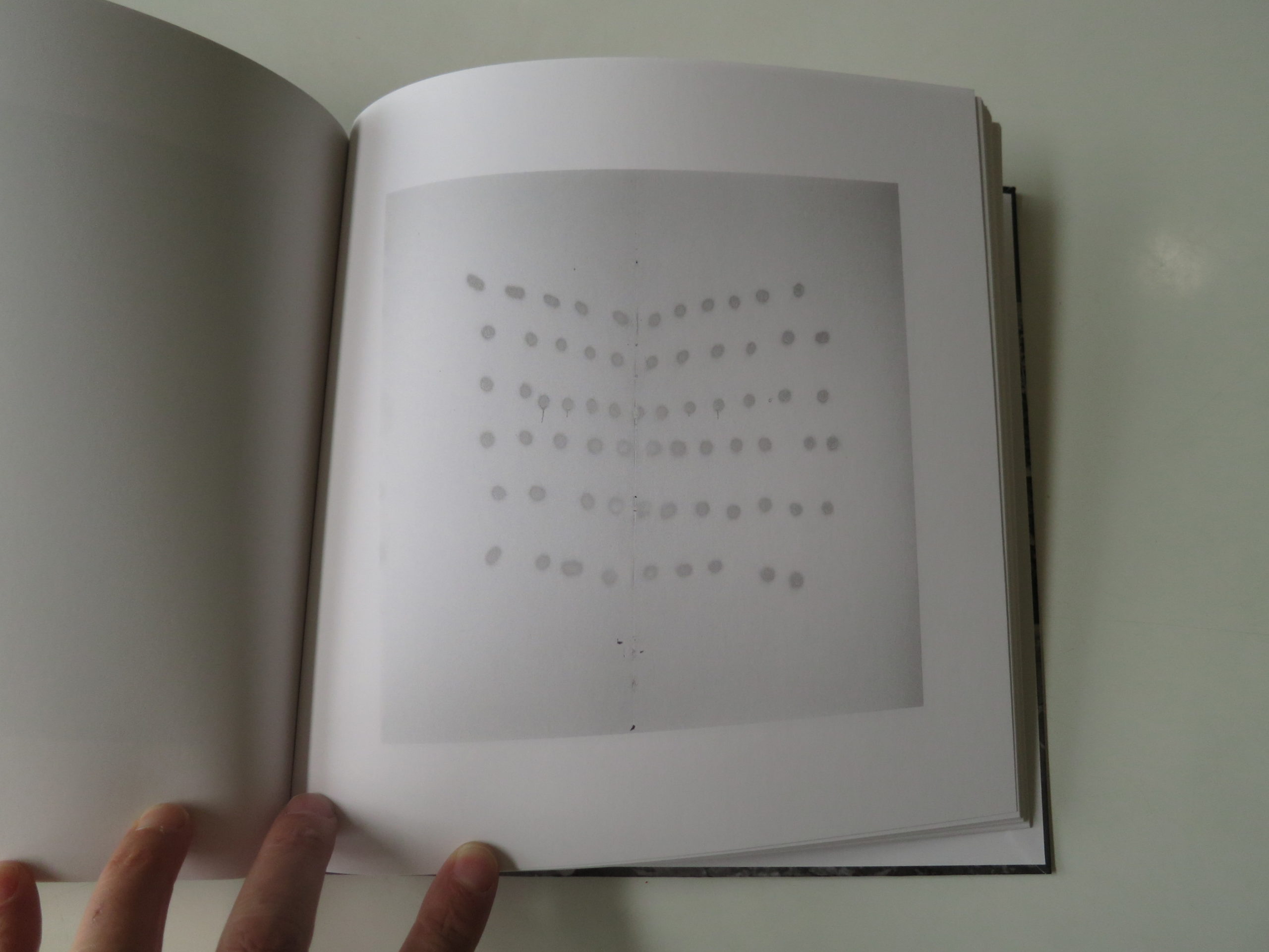
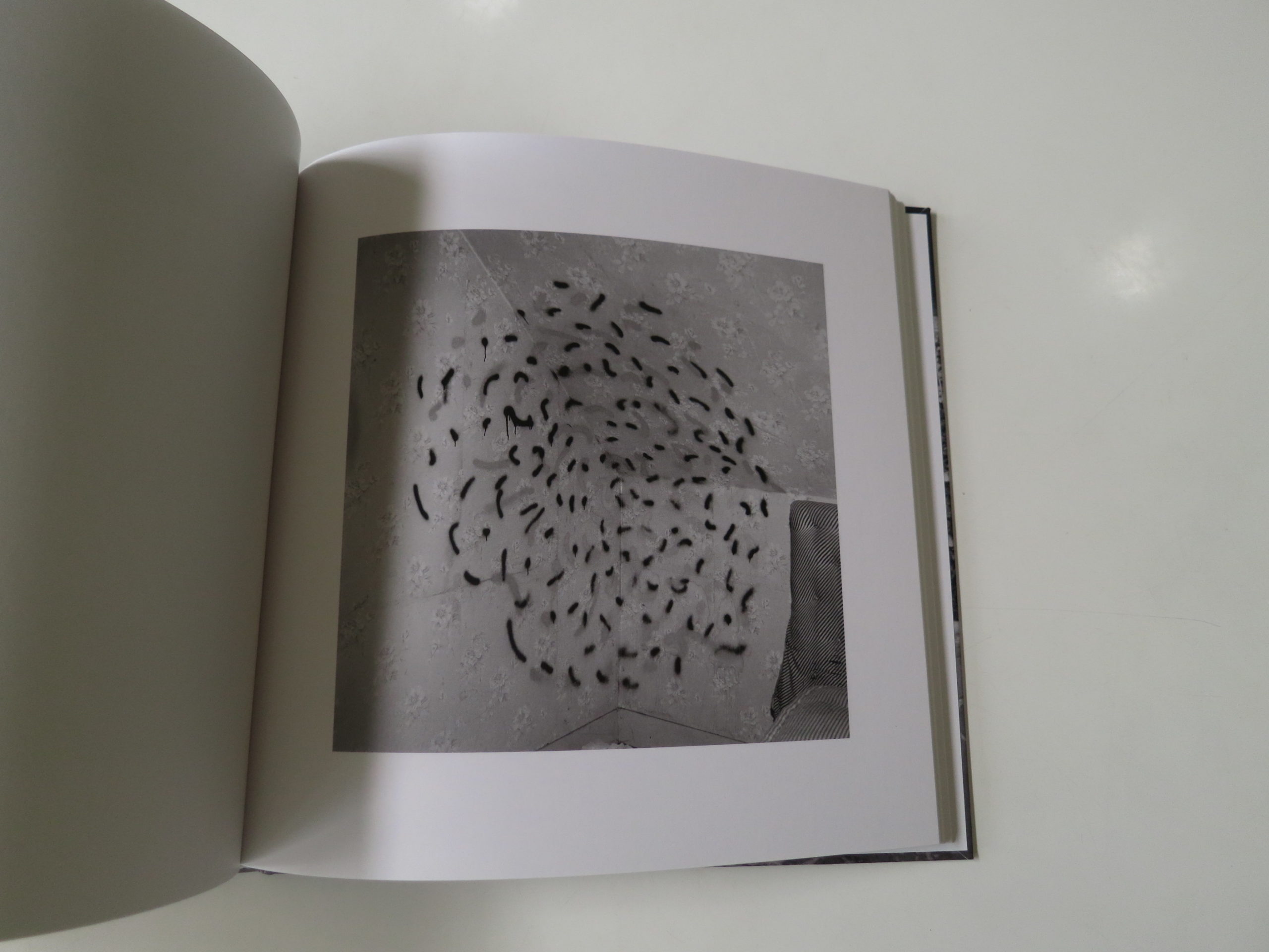
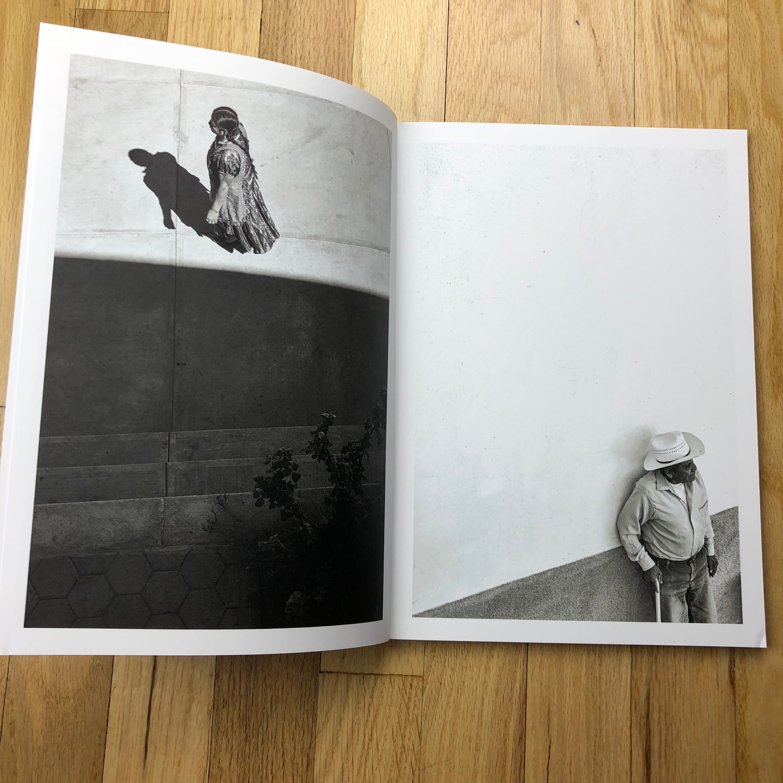
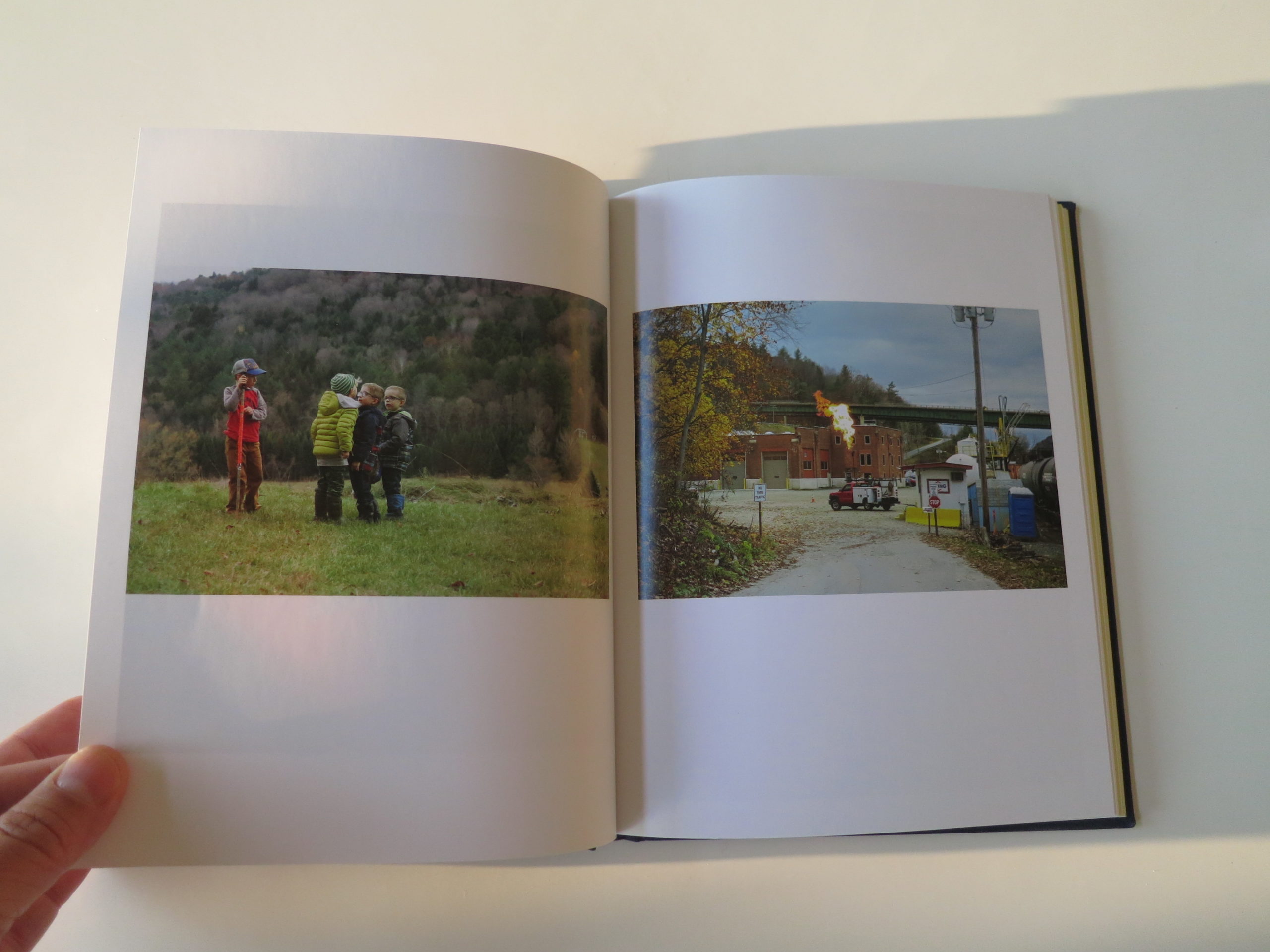
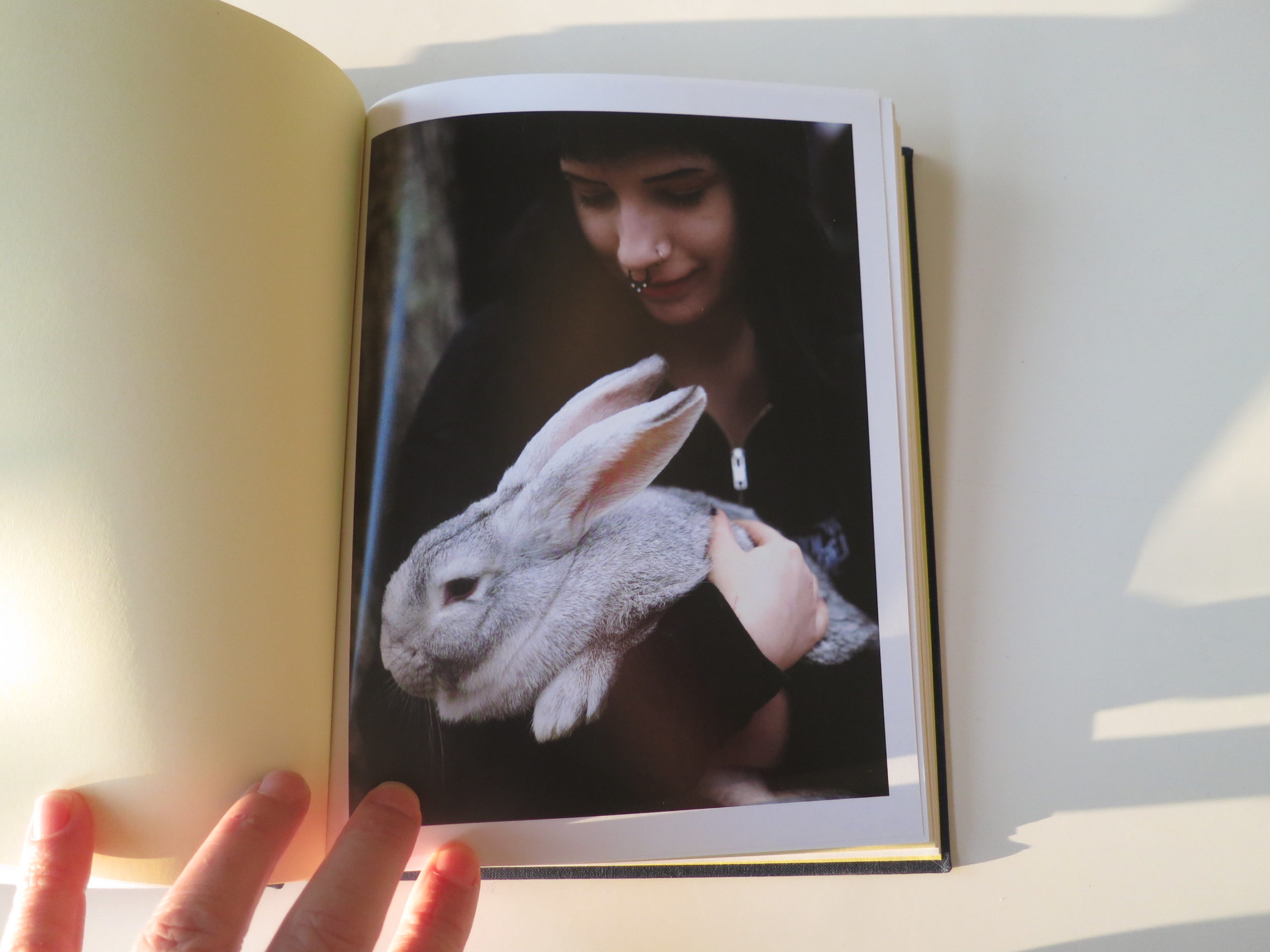
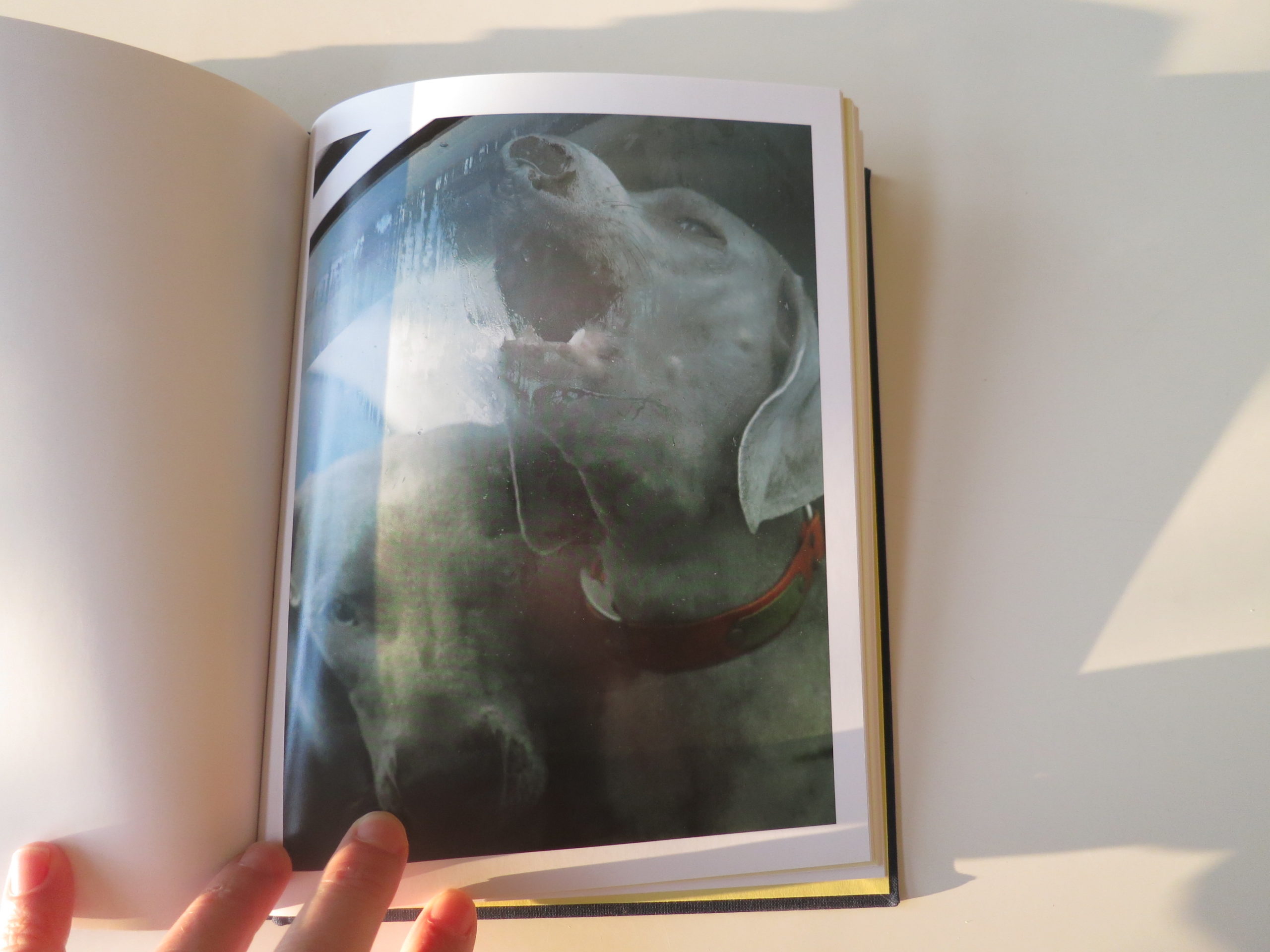
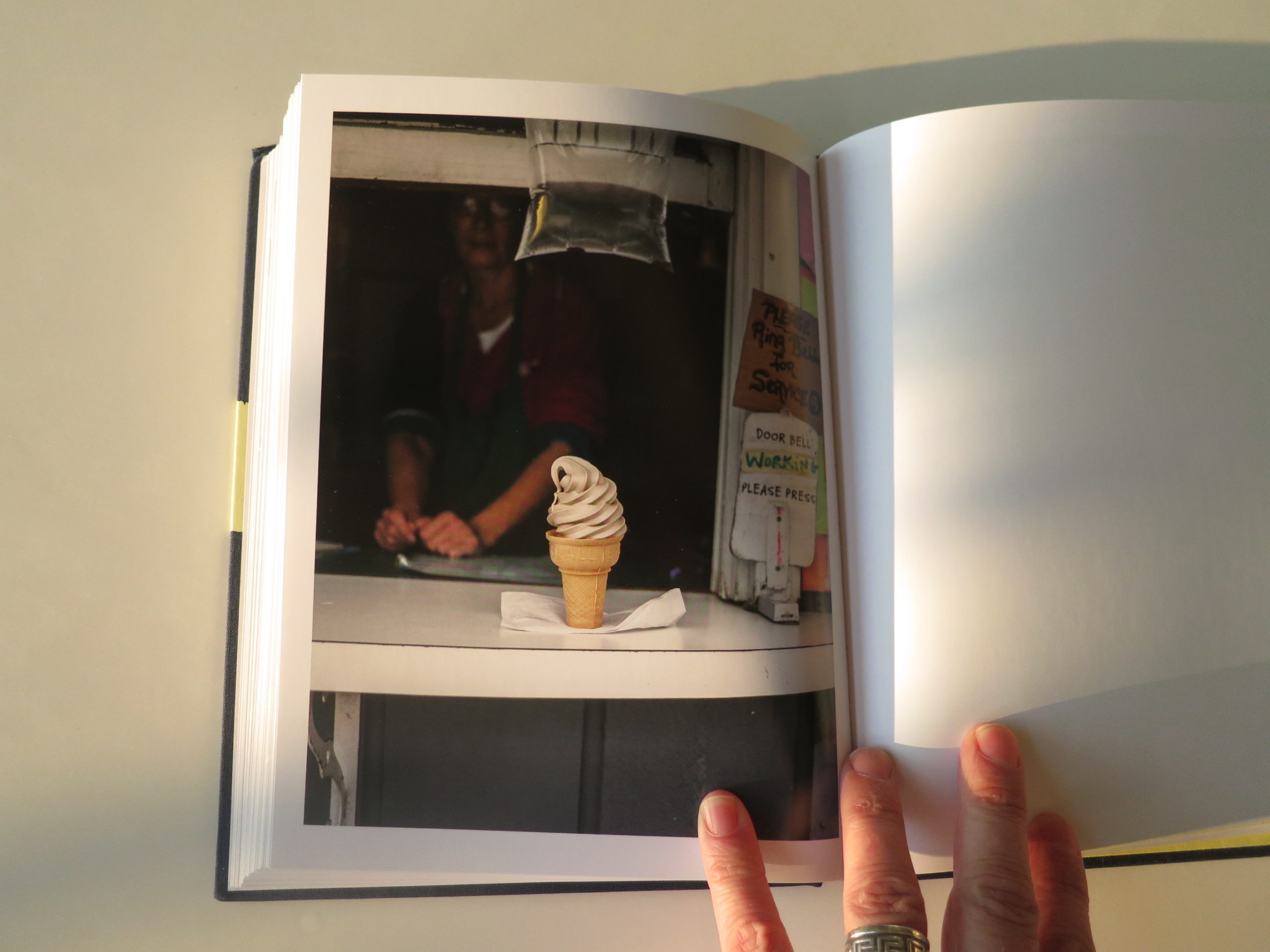
But beyond that, most of the book has a witty wonder that is lots of fun.
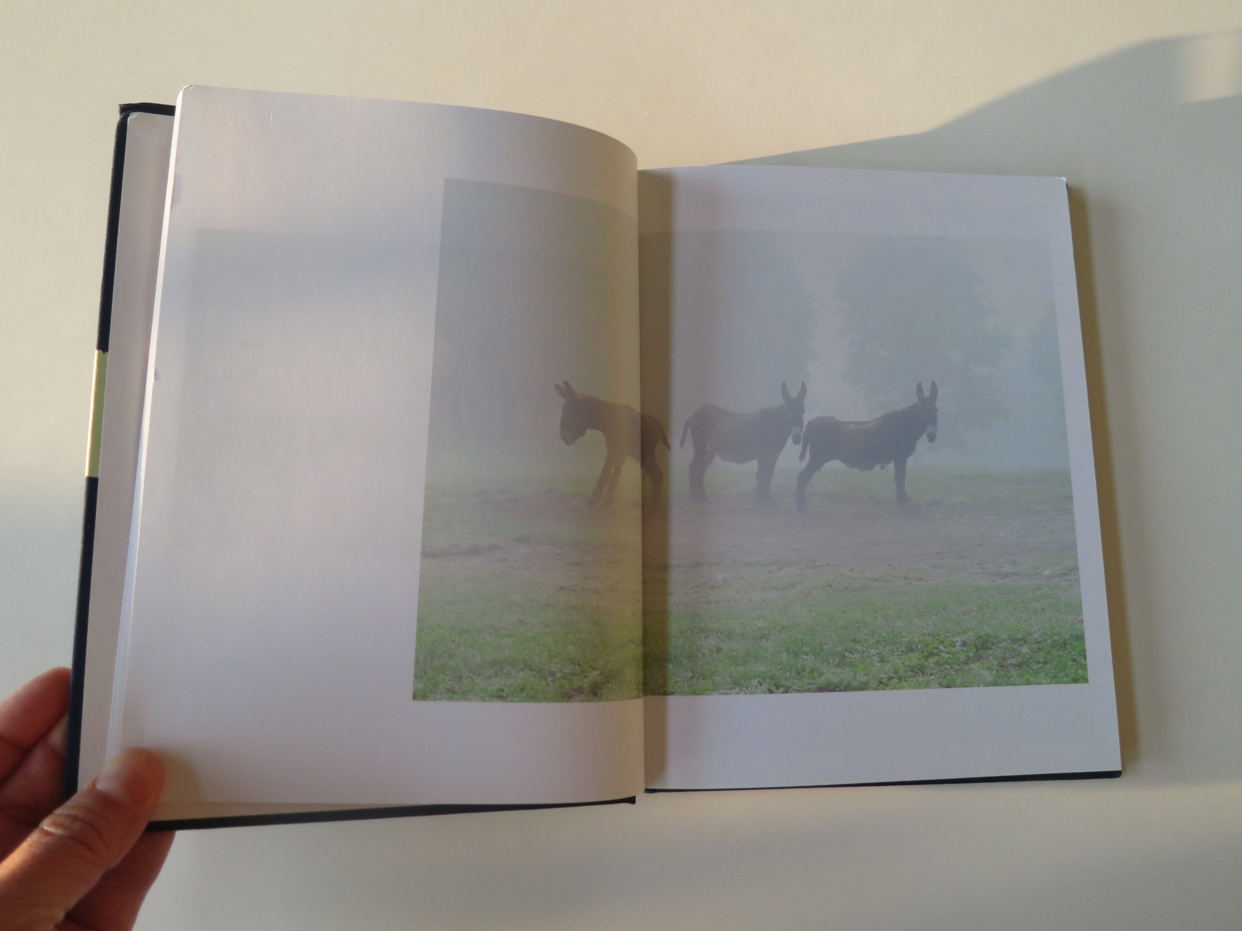
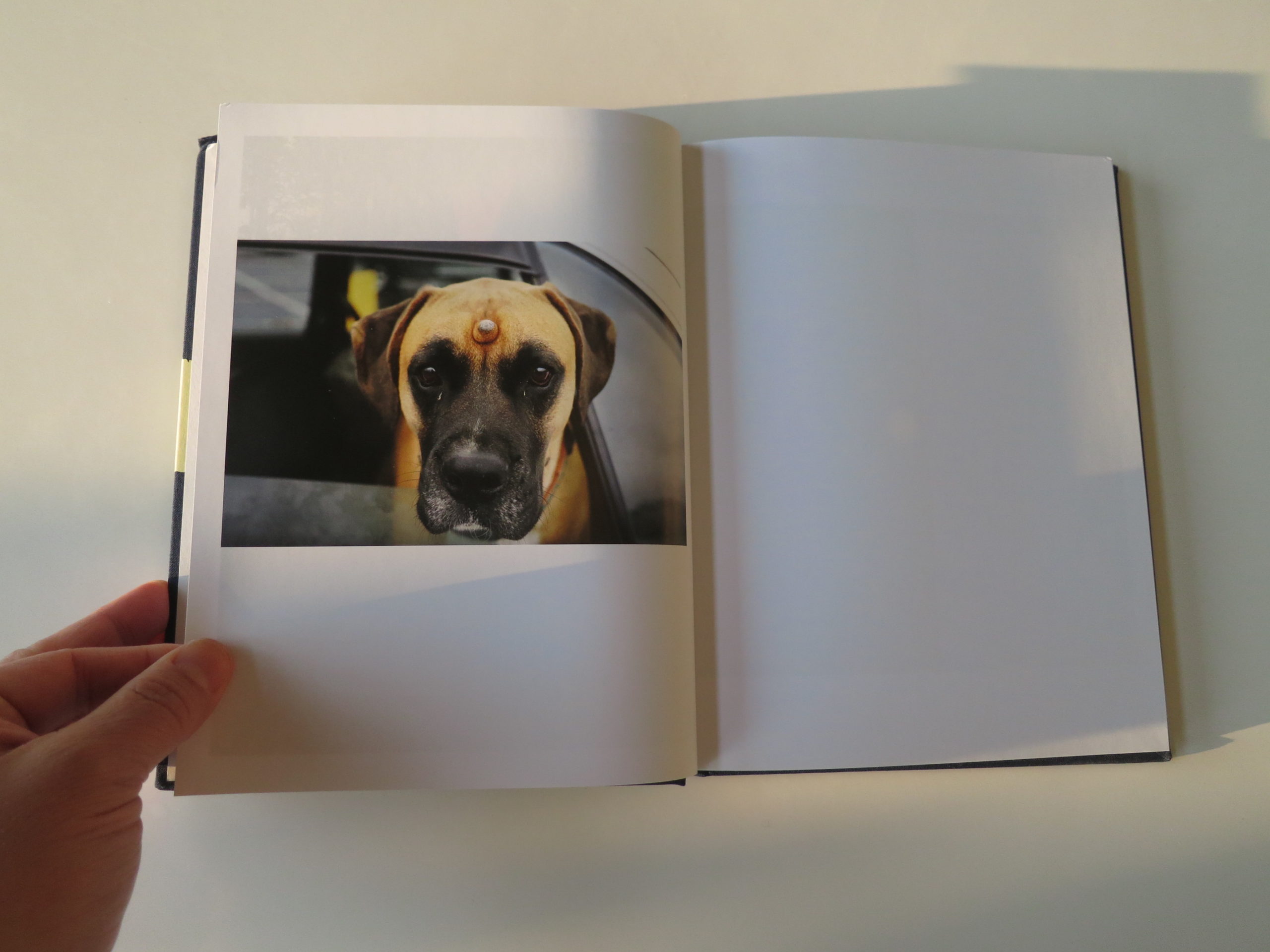
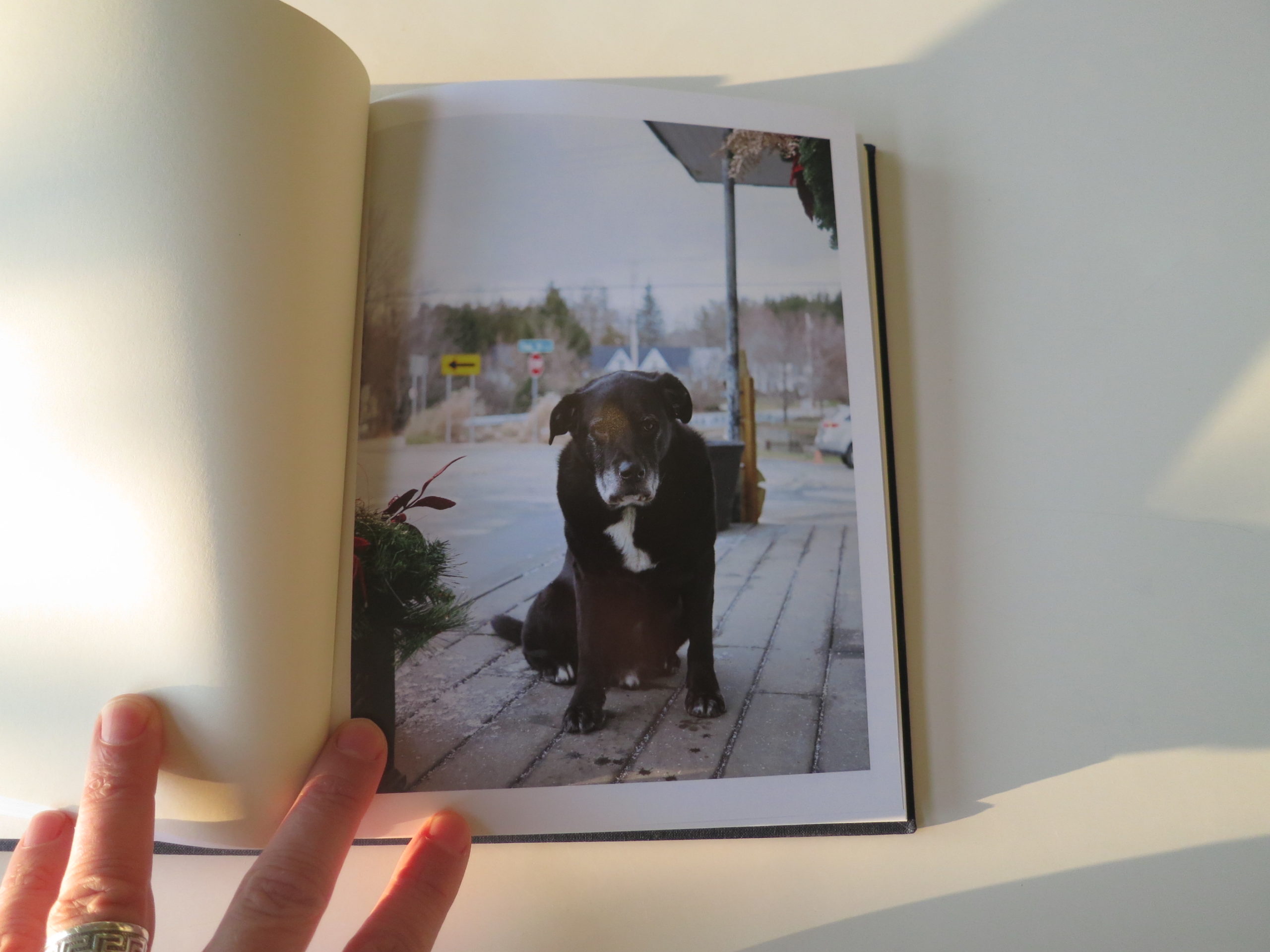
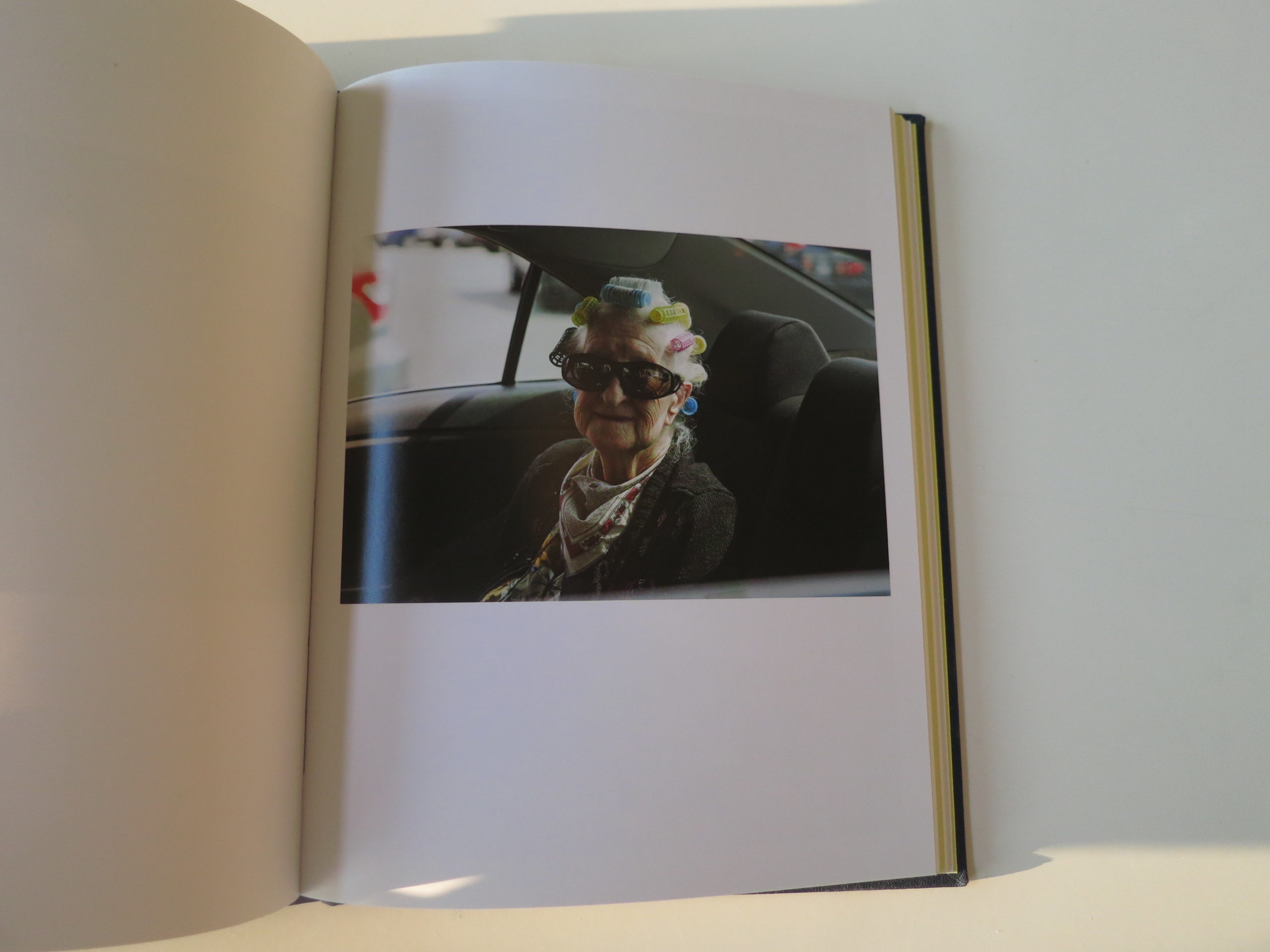
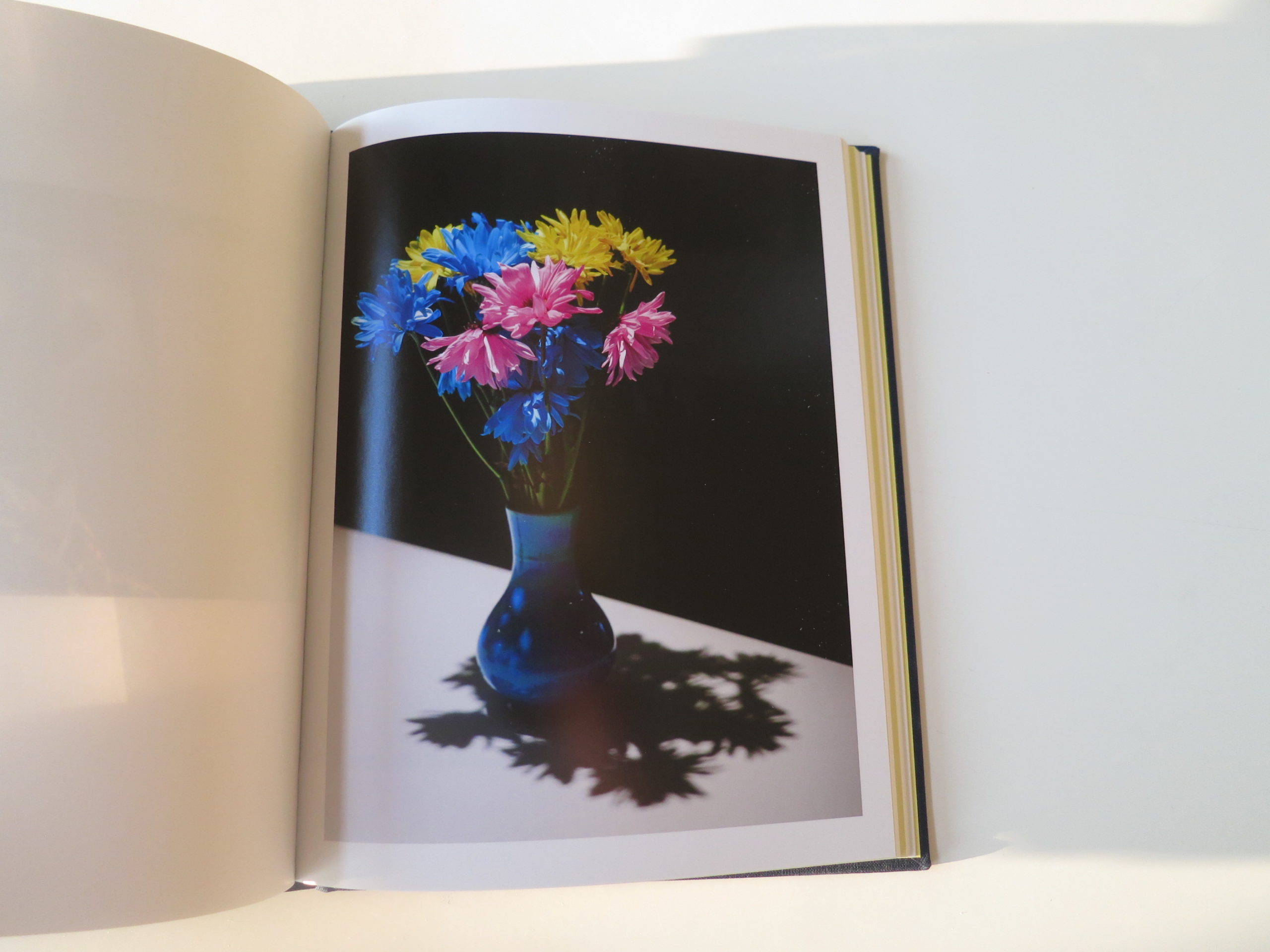
The warm, glowing light on an Adams apple. Two donkeys facing one way, and the third in the opposite direction. A grandma in colored curlers, followed by flowers in the same color palette. And lots and lots of silly dogs.
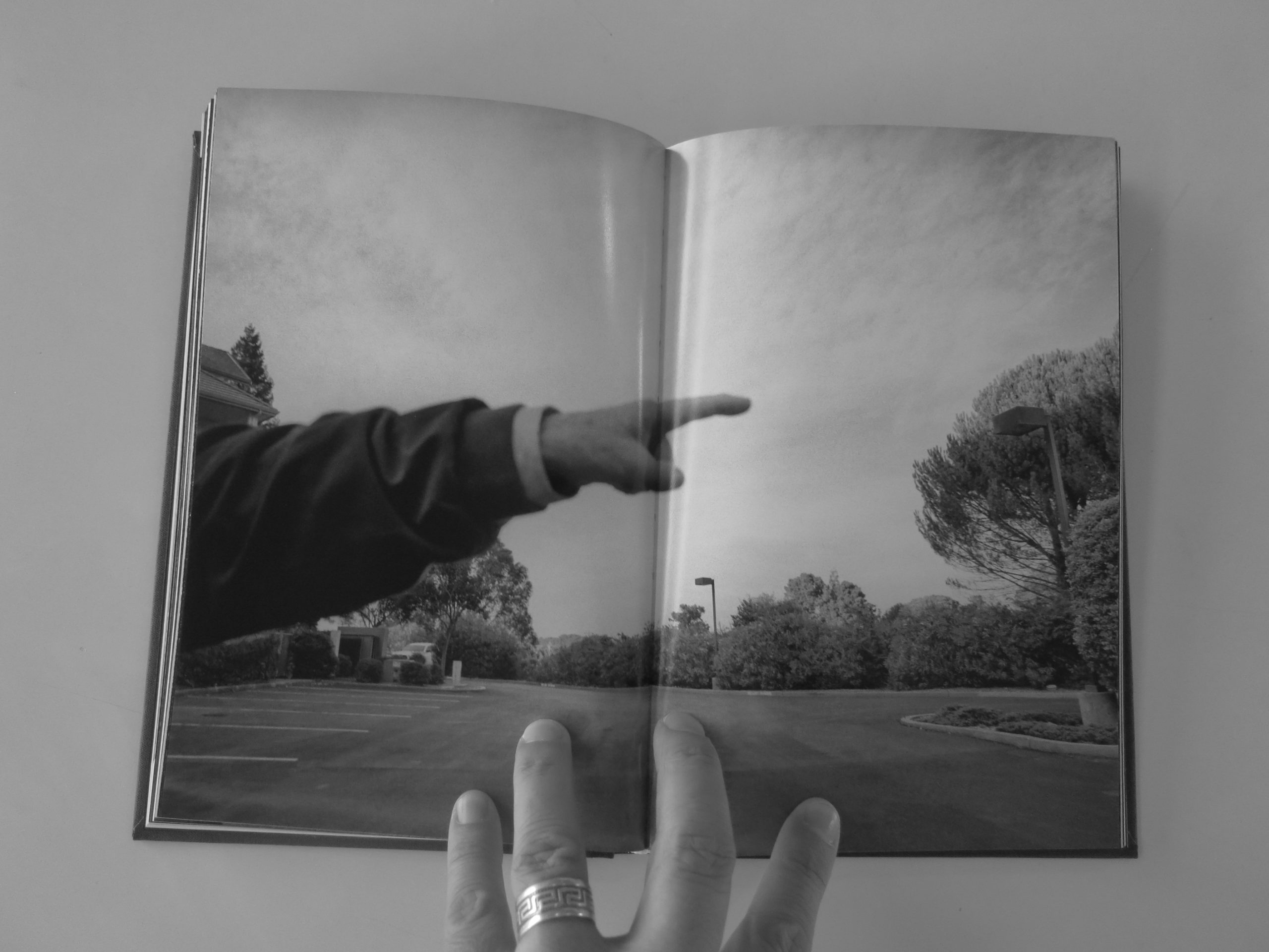
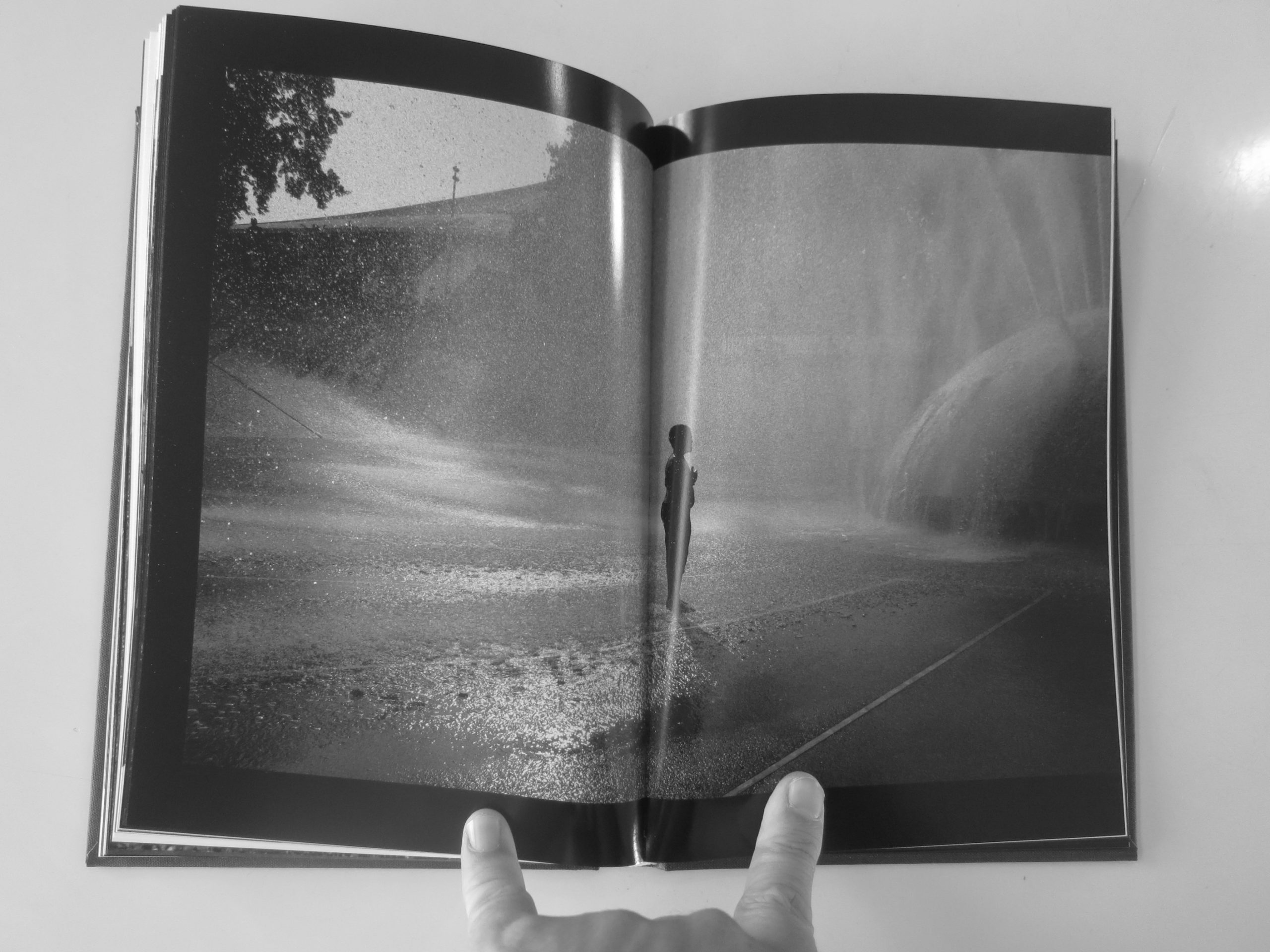
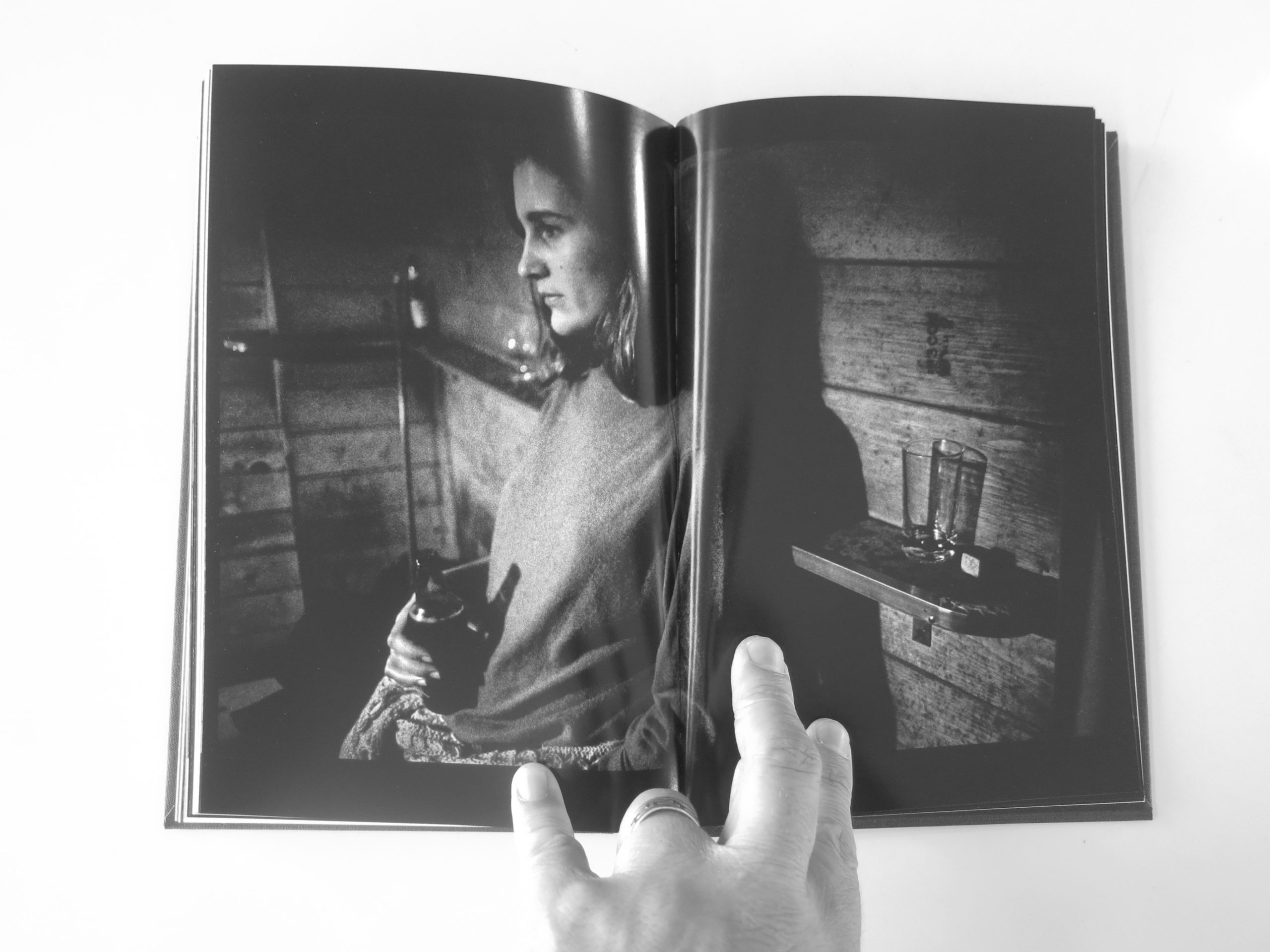
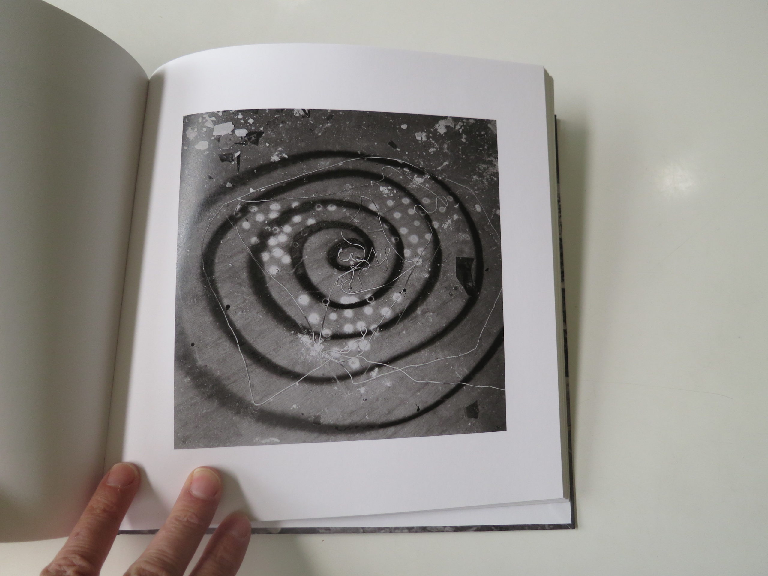
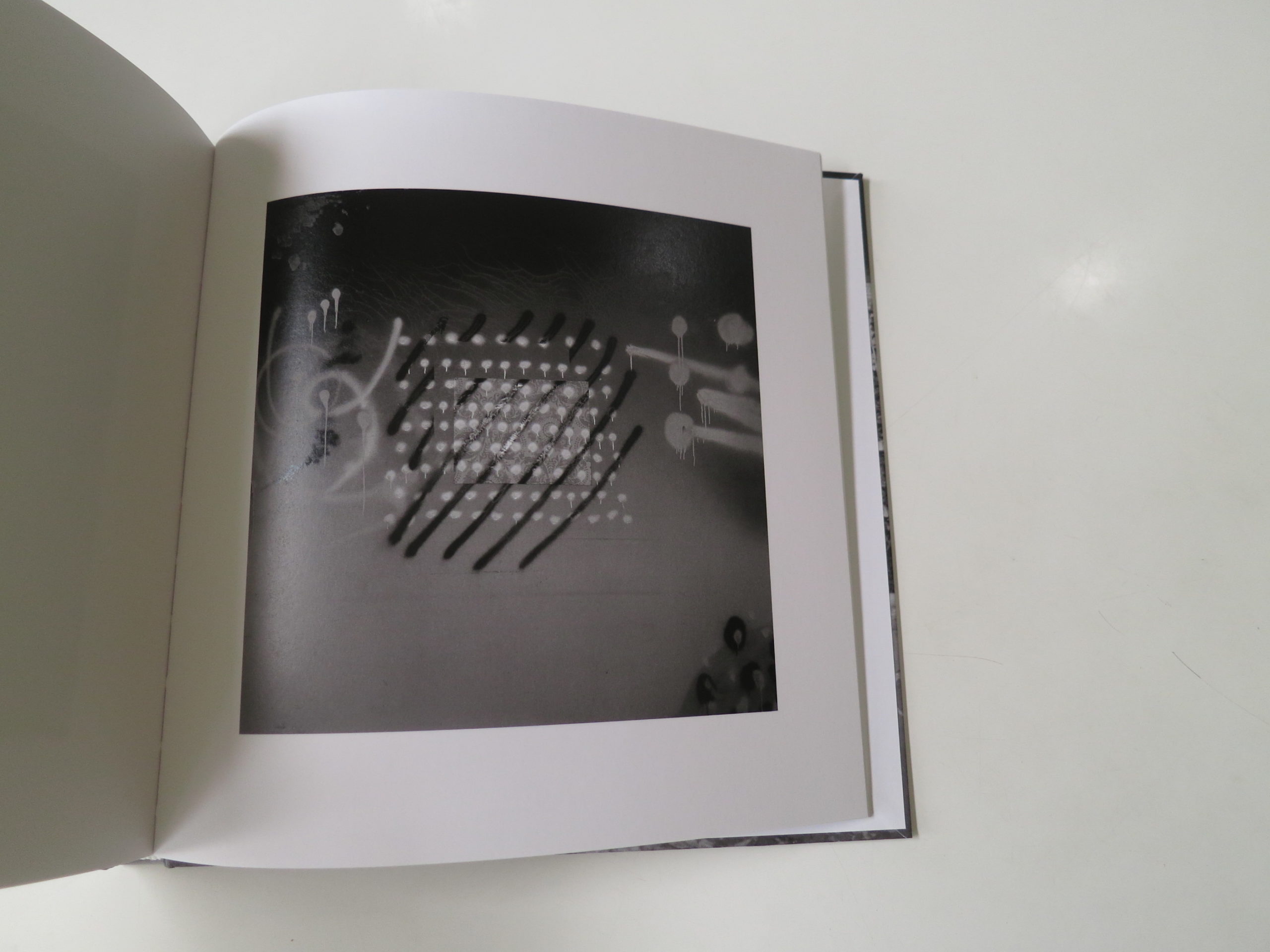
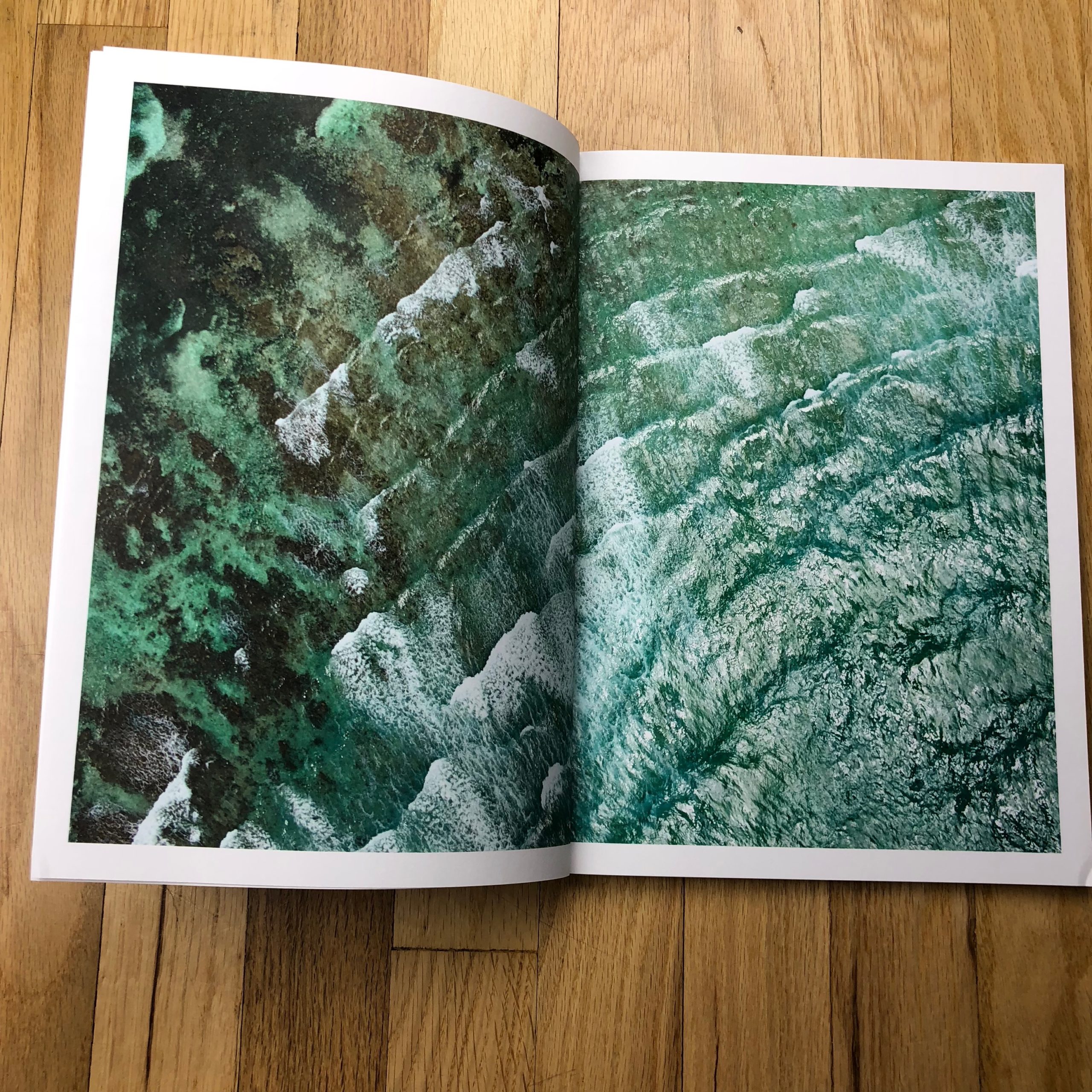
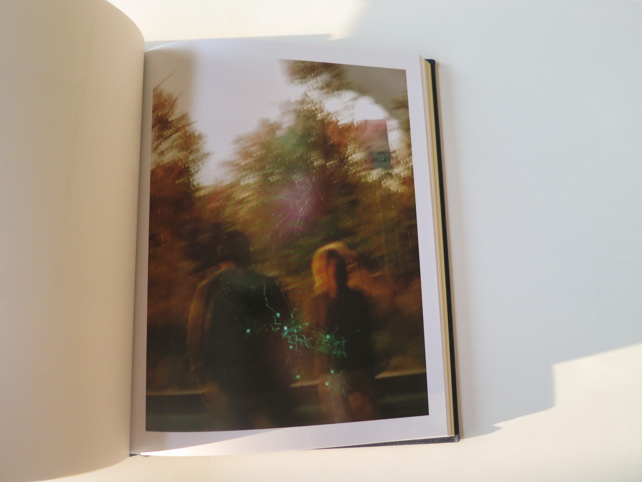
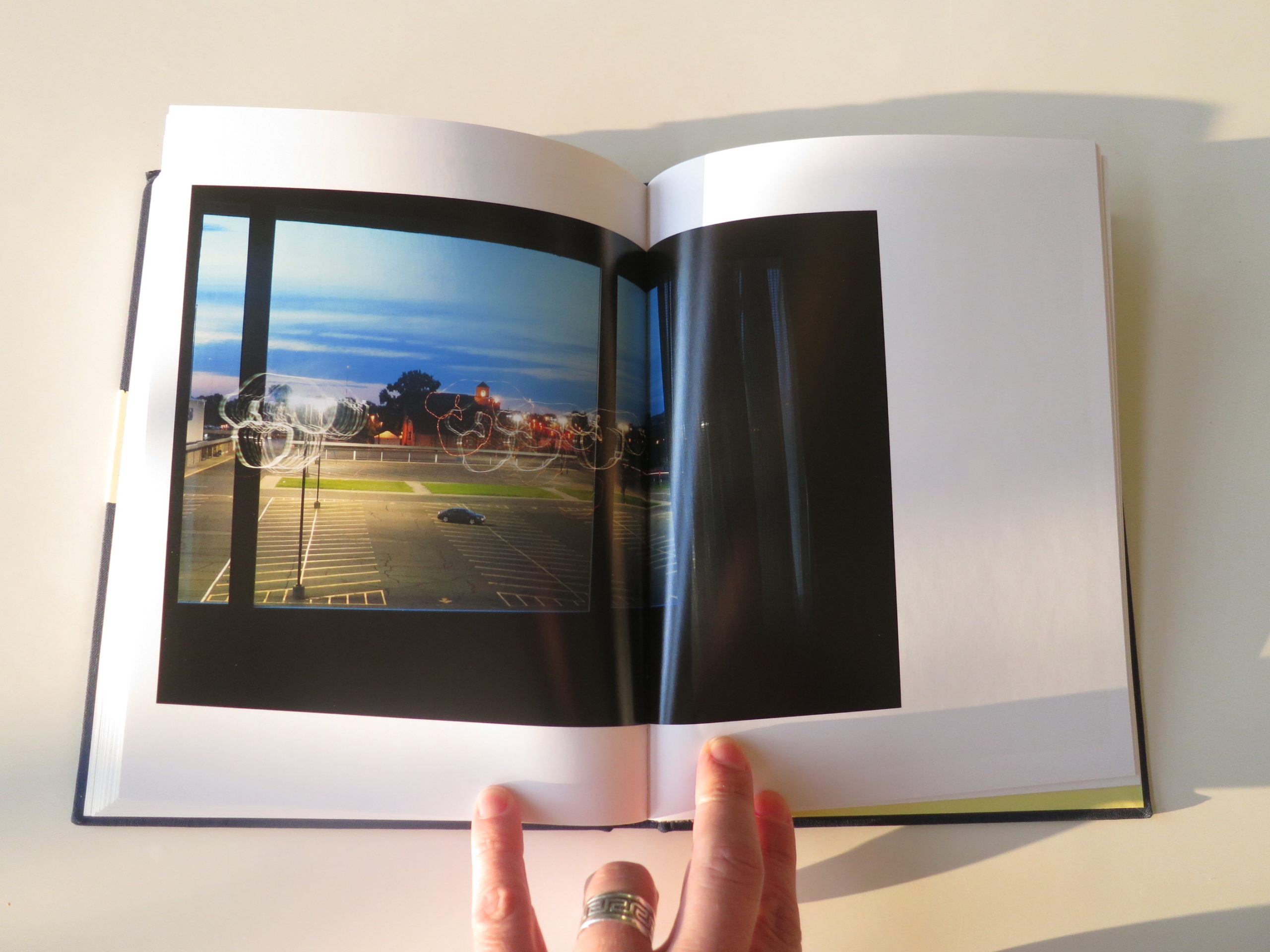
At first, I took exception to an image that turned up, blurry, with conventional light trails.
1. I hate light trails.
2. It had no business being in the edit, as it was then constructed.
(Can you believe I debuted the listicle last week, and then came right back to it?)
But then, later on, there were other such images inserted for balance. So even my one nit-picky quibble was put to bed before the end of the book. (Though I still hate light trails.)
There is serious joie de vivre in this book. It’s perfect for today, because my half-dead brain was not getting woken up by any half-ass book today, and this one goes all they way.
Bottom Line: Funny, poignant, POV on life in general
To Purchase “Too Tired for Sunshine,” click here


If you’d like to submit a book for potential review, please email me at jonathanblaustein@gmail.com. We are particularly interested in submissions from female photographers, so we may maintain a balanced program.