The Art of the Personal Project: Jason Schmidt

The Art of the Personal Project is a crucial element to let potential buyers see how you think creatively on your own.  I am drawn to personal projects that have an interesting vision or that show something I have never seen before.  In this new revised thread, I’ll include a link to each personal project with the artist statement so you can see more of the project. Please note: This thread is not affiliated with any company; I’m just featuring projects that I find.  Please DO NOT send me your work.  I do not take submissions.

Today’s featured artist: Jason Schmidt

Jason Schmidt

May 13, 2012

Brooklyn, New York

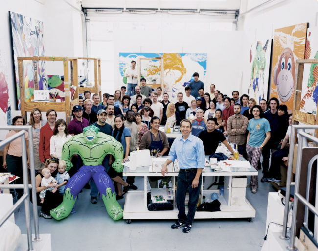
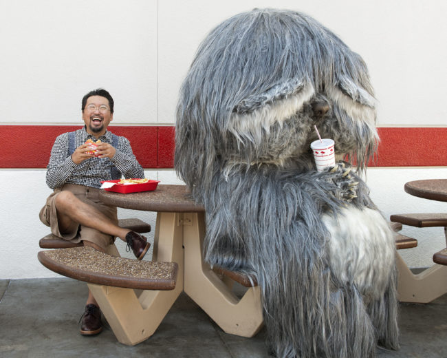
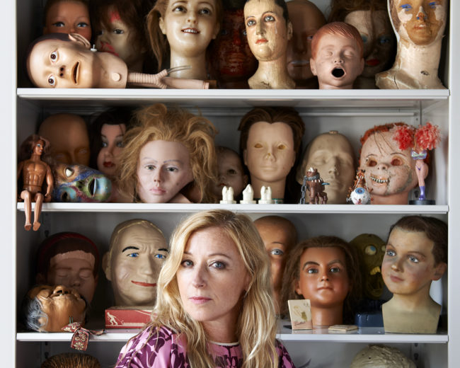
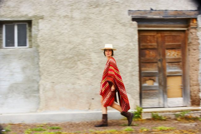
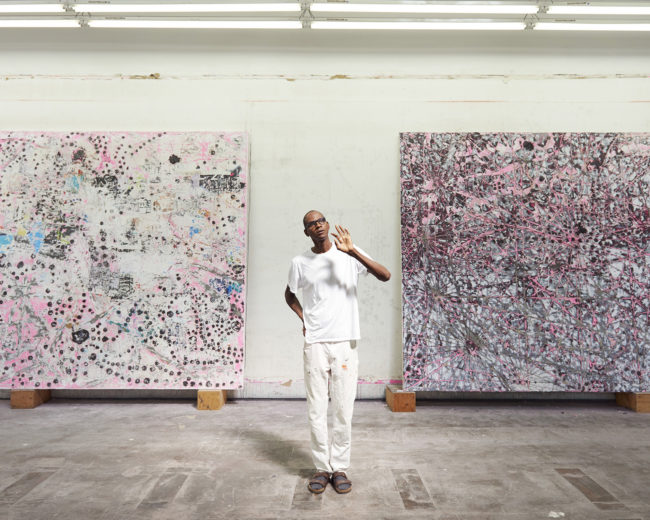
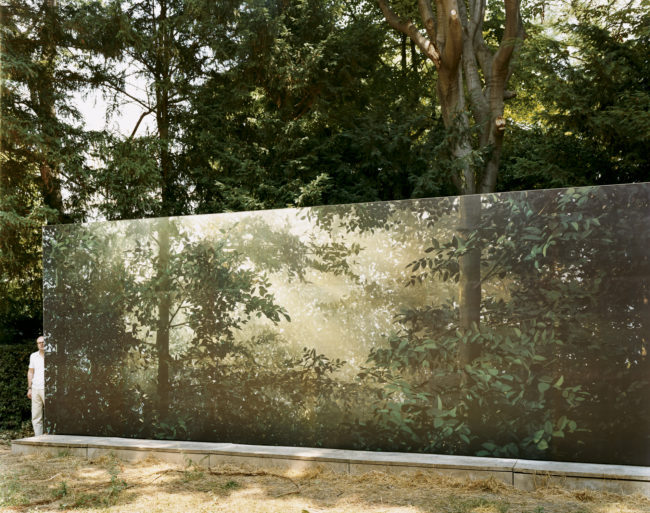
At this point, I have photographed more than five-hundred artists, starting from 1997, carting my Linhof 4×5 and Nikon cameras through boroughs, up what might amount to several hundred flights of stairs, and occasionally to far-flung destinations around the globe to take a portrait of an artist in her or his (and sometimes their) studio or work environment. Much of the earlier artist portraits were collected in Artists, which came out in 2007. This book is a continuation of that project: the artists range from young to old, emerging to career peaking, world-famous to as-of-yet little known. It includes those exploring traditional mediums to those down-right confounding the entire premise of the art world as it exists today. The pages are rife with internal connections—some of the artists are friends, partners, studio mates, mentors. A few came to me by way of a suggestion from a fellow artist, and, perhaps, some are even competitors or enemies. But, for me, the 168 artists here represent something of an improvisatory art community, not so much a “group show” in industry speak but a barrage of very different scenarios where very different kinds of work is being made under some kind of constraint. That constraint might be time, money, a deadline, a market hungry for more, or simply the fact that a photographer demanded anywhere from a half an hour to four hours out of their busy schedules..

Each experience with an artist is singular—the resultant photograph is often a mixture of collaboration, on-the-spot inventiveness, my attempt to capture the artist and the environment in a concise, material way, and the restrictions that the studio or location provides. What I don’t do is editorialize. I try not to impose my conception of what an artist should be doing, and, since my job is to document, I don’t create scenarios or forge clever, telltale demonstrations. (You will never hear me say, “pretend you’re painting!”) I do often speak with an artist in advance and discuss a possible concept or conceit, and I’m always impressed by the number of subjects who actively want to get out of their comfort zones and participate in the creative process., Just as often, however, I let my first impression right from the studio door guide me. The first view is often the best solution. Generally speaking, I like to frame a picture around the studio space or around an in-progress artwork and then to decide where to place the artist. The artist might recede into the space and become another object in the tableau or he or she might become the focus of the photo. I don’t see these photographs as portraits first and environments second—the two are not mutually exclusive. Mostly I am interested in understanding an artist in the context of the work. I try to capture how the art was being made or conceived—the circumstances and the conditions, which are often insanely messy or shockingly organized and usually somewhere in between. Unlike the final installation shot, the money shot as it were, the photographs in this book record a very specific moment in time—when the photographer went on a visit to see an artist. The artworks in these photographs looked different the day before I arrived and many of them surely changed dramatically in the days after I left. These are the instants when everything is up in the air and the art, the artist, the photograph, and even this photographer wait and wonder how it will all turn out.
To see more of this project, click here.

To purchase his most recent book click here

(Artist I is sold out)

APE contributor Suzanne Sease currently works as a consultant for photographers and illustrators around the world. She has been involved in the photography and illustration industry since the mid 80s. After establishing the art buying department at The Martin Agency, then working for Kaplan-Thaler, Capital One, Best Buy and numerous smaller agencies and companies, she decided to be a consultant in 1999. She has a new Twitter feed with helpful marketing information because she believes that marketing should be driven by brand and not by specialty.  Follow her at @SuzanneSease.

Jason Schmidt is a photographer and director who specializes in portraits of artists and cultural figures, as well as architecture and interiors. A New York native, he received a Bachelors of Arts in art history from Columbia University in 1992.

Schmidt has photographed over 600 contemporary fine artists since 2000. His first book, Artists, was published in 2007 and Artists II (Steidl), his second book on the subject, was published in the fall of 2015. This body of work has been exhibited at Deitch Projects, New York and The Museum of Contemporary Art, Los Angeles. His work is included in the Marguiles Collection in Miami, where 135 artist portraits are currently on view.

New York Times art critic Karen Rosenberg observes that Schmidt’s photographs “transcend Pollock-paints-a-picture clichés; each photograph has its own peculiar aesthetic, from Paul McCarthy’s being caught like a serial killer in a boat spattered with fake blood, to prankster Maurizio Cattelan’s installing his infamous sculpture of a fallen pope.”

Schmidt shoots regularly for magazines including Architectural Digest, New York Magazine, The New York Times T Magazine, Vogue, W and Wallpaper. In addition to his print work, Schmidt has been directing short films on both art and architecture for several years.
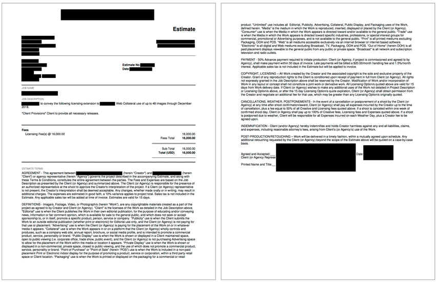


Pricing & Negotiating: Usage Extension of an Existing Lifestyle Library

Jess Dudley, Wonderful Machine

Original Shoot Concept: Real People Lifestyle Library License Extension

Licensing: 1-year extension for 48 images Web Collateral use

Photographer: Established Midwestern portrait, youth culture, and fashion specialist

Client: National For-Profit College

Here’s the quote:

When negotiating a given agreement, one is often faced with the challenge of balancing a client’s budget, their licensing requirements, and the intended use. As you no doubt have experienced, those three don’t often align. And just about as often, the client is resolute on the terms and unwilling to budge on any of those points. However when a negotiating window does open, I’ve found the limitation presenting the greatest upside on the backend is the duration, provided it’s short enough on the front end.

Certainly, there are instances when limiting the scope and image count can present a terrific opportunity for future revenue, and you should always press for limitations on those. But generally speaking, by the time we’re talking with a client, they’ve got a really good idea of how many images they need and how they plan to use them and aren’t likely to be open to limiting either. However, in spite of having a firm grasp on their intended usage, most clients can only anticipate, plan and budget for that use within a relatively short time horizon, typically a year or two. Beyond that, the additional duration they’re requesting is usually for peace of mind and not a concrete intention. This, combined with the facts that new budget is usually made available annually and the staying power of a given set of images is uncertain, clients are occasionally open to limiting the duration of use.

In 2015, I shared a post about a four-day library shoot, including unlimited use of the imagery for about 2.5 years. Just before the license was set to expire, we followed up with the client to see if they were interested in extending the usage. Unlike the initial agreement which included the license to all images, at this point the client was only interested in renewing the licensing to a subset of the library, 48 images, for just one additional year, and for Web Collateral use only.

Normally, we might have discounted the additional year along the same curve that we build out the majority of quotes (a doubling of duration yields a 50% increase in value, ie. 1year = x, 2 years = 1.5x, etc). Usually, that equation is applied on the front end when the value is less-than-certain to all parties. On the back-end, leverage shifts. Now the images are a “known quantity” and have enough value to the client to seek additional use. In this case, the approach we took was to simply prorate based on the original quote and duration, which came to $16,000 per year. Finally, we had to consider the pricing ceiling, which would be the cost to produce a new project substantial enough to generate 48 unique location-specific lifestyle images. It’s safe to say that would be considerably more costly than our re-use quote, so we weren’t in any real jeopardy of the client considering a re-shoot alternative.

Although it is becoming increasingly difficult, limiting licensing is an integral component of a sustainable commercial photography business model and can generate continual opportunities for residual income such as this. So keep pressing for limitations, on every project, and you may be able to generate these opportunities for yourself.

If you have any questions, or if you need help estimating or producing a project, please give us a call at 610.260.0200 or reach out. We’re available to help with any and all pricing and negotiating needs—from small stock sales to large ad campaigns.

The Daily Edit – Trupal Pandya: Tribal Portraits

Trupal Pandya: Tribal Portraits


Heidi: What is your process for gaining trust in these different subcultures?
Trupal: When I am traveling, I make an effort to be accepted and slowly assimilating their ways of life. The first few days that I spend with them I don’t photograph them, but instead wait until they accept and understand why am I there. Sometimes, this would mean I live with them in their houses, sleep where they sleep, eat what they eat and talk to them, show them my work from other parts of the world so they understand what am I there to do. It’s about making a connection. It’s very important to me that they feel comfortable and let their guards down before I start photographing them. I also carry a Polaroid camera which is my only camera for the first few days so I could share my photos with them. I feel if your intentions are right, people can sense it. I am also a big believer of the universal language where one doesn’t need words to communicate.

You mention “when your intentions are right” what are yours?
I find it more important now than ever to spread awareness of all that is contained in these precious tribes. I believe that man was meant to live on the earth, joyous and free, in harmony with his surroundings. These are qualities I’ve seen in the Konyak, the Huaorani, and the people of the Omo Valley.  Installed in all these tribes that are slowly being dissolved, is a peace of mind and heart that the people of the industrial societies are forever longing for.  It is ironic that the cycles of civilization have us forever coveting the lives of others.  The people of the western world, after centuries-long reliance on technology, are now beginning to look again toward nature. Herbal medicines, organic, sustainable farming and even wild foraging are coming into vogue in the major cities. Meanwhile, for these tribes there are repercussions of invading philosophies, removing from the “primitive” people their methods and magic, and their sacred ways have now been replaced with antibiotics and accusations of ineffectiveness and unsophistication. When the day comes that the developing nations find that modern is not always better, will the knowledge still be there when they return to seek it? I don’t know if it will, so it is with great care that I do my best to fulfill this inherent feeling of duty, this calling, that through my photography I may lend a voice to those who can’t always speak loud enough for others to listen. What I hope to be heard is, that no matter what the opinion may be of certain rituals or ideals, as a whole these communities, closely tied to the earth, closely tied to the wellbeing of their tribes as a whole, embody a greater happiness and wealth than could ever be found in the isolating madness of the material-driven world. 

.How do theses tribes benefit from your work?
I don’t really think I go there to benefit the tribes specifically, nor am I there to change the way they live or stop them from changing. I don’t think I am anyone to decide who changes and who doesn’t. What might seem like a loss of culture to you and me might be a better way of living for them. More facilities and a brighter future. I am not sure if my work benefits a particular tribe. What I am there to do is honor their culture and preserve a record of it so that it can benefit our whole human family. 

How much time do you spend with a group before you pull out the camera?
I usually spend 3-4 days with the tribe before I take out my camera. However, I use my polaroid sooner.
 
What tools do you use to make sure they don’t feel exploited?
I have a very close bond with every tribe I have photographed. I have made it a point to go back to them and give them back their photographs, do small exhibits for them in their villages. A lot of the people I have photographed have seen themselves on a printed form for the first time. It’s extremely rewarding. Hitting a shutter is only 5% of my job. I feel there’s a lot more than that. I don’t necessarily have any tools. It’s all family for me.
 
Tell us about the other 95%
A lot of research and planning. Finding the right person who speaks the right languages and understands what I do so they can convey my messages to the people I am photographing and get me access to certain places. There’s a lot which happens after I photograph them. I am very sensitive about where my photos go afterward, how are they printed and how are they presented. Their journey doesn’t end till they reach where they belong. 
If the roles were reversed, would you be open in having someone live with you and document you as well?
Yes, absolutely. My life goal is to have an exhibition in a space which has hundreds of portraits of people from around the world on a white backdrop. I want the distractions of culture and geography to fade into the background. I want to have no name tags, no location, no country name and call the exhibition ‘Human.’ Aren’t we all the same in the end? Of course, I would let someone come to my house and let them document my life.

The Daily Promo – Delaney Allen

Delaney Allen

Who printed it?
It was printed at home in my studio. I’ve got an Epson P8000 that I’ve been using for making small-batch promos. With that speech promo, I’ve been using Moab’s Lasal double-sided matte paper. I’ve found it to hold the ink without much bleed through of the images. It’s a very time-consuming effort to get these promos built. Each print takes roughly 4 minutes on the printer. With 10 images per promo, that’s 40 minutes alone just on the printer itself. There’s also the info insets that I’ve got to print as well as trim in occasions (I use a lot of various papers in my studio). All in all, it seems like from start to finish the print time for each individual promo is one hour.

Who designed it?
I designed it. I was hoping to create something simple that allowed for the images to be the focal point. I also attempt to make promos and takeaways that are hard for the client to discard. So making this loose leaf booklet was a strategy to give the client a book that could very well be made into individual prints that could hang on a wall as well. It also allows them integration with the book allowing them to mix and match the images and seeing how they can work as diptychs.

Tell me about the images?
The images are a various collection from the past few years. I’ve just signed with Redeye in LA so it feels a lot of people on the commercial side of photography aren’t familiar with my work. I wanted to put together something that showcased a variety of what I’m able to capture. A promo like this also gave me a template to create work that can be specific to individual clients as well. There seem to be a few images that are included in each booklet but I typically change out what is in there.

How many did you make?
With the one you received, I ran a batch of 20. I had been taking them to meetings as takeaways. Those specific promos are 11×14 inches. I’ve now changed to using the 8.5×11 paper for my promos I’m sending out.

How many times a year do you send out promos?
I just started sending out promos a year ago. For that, I sent out a collection of 20 postcards to each client as well as these small handmade books I’d made. This is only the second promo I’ve sent out. I think I might need to find a way to make some that are a little more time efficient.

Do you think printed promos are effective for marketing your work?
I’m hoping so. I’ve been fortunate to find some success and contacts with what I’ve been able to get out there in the world.

This Week in Photography Books: Victoria Will


This is a true story.

Back in 2013, almost five years ago, I began writing for the New York Times.

Though I’d been blogging for four years by then, it still seemed like a major leap.

I remember thinking that people were whispering, can he write in a serious way? Isn’t he just the guy who obsessively talks about himself, and says fuck a lot, and makes jokes?

(Obviously, five-years-ago-me thought people actually talked about him. 44-year-old-me knows people are too busy just-getting-by to wonder what I’m doing out here in my horse pasture.)

Anyway, it will be five years in May, and I’ve written 45 articles, so I guess it was always going to come around again.

I recently sent a pitch to a local magazine, and included a few of my NYT clips. I heard back that they liked the idea, but wondered if I was also able to write in a more light-hearted, whimsical style?

After the LOL, I quickly sent them last week’s column. The one with an opening sentence that includes the word shit.

I admitted the subject matter was serious, mental illness and darkness and all, but the jokes showed I could handle it with a light touch. I explained that most documentary photo books, which include most of my submissions, often have a heavy socio-political theme.

I’ll admit that I’m writing on a Thursday, and my kids are binge-watching on a Kindle Fire in a bedroom nearby, because they don’t have school today.

I’m in Full Dad Mode.

That’s the context.

But the first book I picked up, which I’ll review in a different week, when I’m not on deadline, it was another one with a powerful, political subject matter.

And lots and lots of reading.

I rarely do this, but I put the book down.

After all the heavy books lately, it didn’t feel right for today.

I wanted something lighter.
Something visual.
Digestible.

(Like I said, this is a true story.)

I knocked on my son’s door, as my book stack is in his closet, and interrupted the digi-gorging so I could grab something else.

I swear I never do this.

The first thing I found, from the top the stack, had a woman’s name on the envelope, and I’m trying to alternate male and female artists each week.

This was the one.
I could feel it.

It came with a nice note, from someone named Victoria Will, and she complimented the column. (Thanks, Victoria.)

Very kind.

The cover featured what looked like a tintype of Maggie Gyllenhaal, and it reminded me of an image I once saw on Vulture’s best photos of the year, of Philip Seymour Hoffman shot in that style.

It stopped me in my tracks.

I included that one on a list of my favorite images, on fototazo, and then it receded into my memory.

Filed away, like so many other things.

LeBron James scorelines.
Restaurant names.
That sort of thing.

But the second I saw this Maggie Gyllenhaal image, it made me think of PSH.

That’s a powerful imprint.

That one was one of Victoria’s too, and this book, “Borne Back,” was published in 2017 by Peanut Press, and features a set of tintypes made at Sundance. (Including Robert Redford himself.)

I admit, in the context of this review, the book serves as the metaphorical “Us Weekly,” something light and easy, when I don’t feel like exercising my brain too hard.

(I’m saying it so you don’t have to think it.)

But, to be clear, that’s not true.
And this is a true story, remember?

Actors are professionals at communicating information through their bodies. It’s not just the eyes, though they’re of course the most important part, if we had to rank them. (And Hollywood loves a good ranking, no? A list, B list, C list_)

I know professional models do it too, but actors emote in real time, all the time, for a rolling camera. They master the subtle nuance of movement, and the good ones can bring that out for a still camera too, under proper direction, from someone who knows what they’re doing.

That’s the premise I felt behind this work.

An intro by actor Jason Momoa confirms that Victoria Will makes people feel comfortable in their skin, and then she makes tintypes, which naturally contrast the old school with the contemporary.

I’ve seen a lot of people work with tin types lately at portfolio reviews, and remarked on that in this column, after my trip to Photo NOLA last December.

Here, though, it has a defined purpose. It creates this temporal clash.

Add the textural power of the gloopy or sliding chemistry, and it allows for a stylistic structure that gives a boost to the famous faces.

Like a trampoline.

Which explains why that image of a dead actor came back to me
so quickly.

I remember him best as Brandt in “The Big Lebowski,” more than anything. And then how I felt when I read that his performance in “The Master” was closer to reality than I could have known.

Poor guy.

But of course I never knew him.

Celebrities are in the odd position of having millions of people know who they are, and feel some odd connection. They actually ARE gossiped about by people all the time.

People in Spokane.
Or Des Moines.

In that sense, we imagine celebrities perfect the public face; the extension. “I’ll show them this, this outer skin, and it will keep them happy, and they’ll buy their movie tickets, or downloads, or however the kids are consuming content these days, and the real me I’ll keep for myself.”

Kevin Bacon looks a little like an orangutan.
Elijah Wood looks like Billy the Kid.

Scoot McNairy looks like Caravaggio himself, and that dude
was so good in “Halt and Catch Fire” and “Godless.” (Shout out to Scoot McNairy.)

Flea really brings it.
Anna Kendrick looks like Morticia Adams.

Billy Crudup looks like an Edward Weston vegetable.
Lance Reddick looks like he knows what I’ve done when no one’s looking.

Nick Cave looks like he was drawn, not photographed.

And Scott Weiland stopped me in my tracks.

I was 19 when Stone Temple Pilots first got hot. Now that the 90’s are trendy again, we should give those guys their due. No, they weren’t Nirvana, but then who was?

STP were loud, and brash, and they had that theme song to “The Crow,” which I saw in the theaters with Evan Lucash back in Jersey. (Shout out, Evan.) It featured Brandon Lee, another tragic hero, and he died during the filming.

We mark our lives, sometimes, by the art we consume, popular or otherwise.

We use elements of culture to understand who we are.

The biggest movie stars become parts of America, be they John Wayne, Clint Eastwood, or Denzel Washington.

“Borne Back” gets this, which is why the edit leaves Scott Weiland for the final photograph. (And Sam Shepard as the first.) He’s far from the most famous, Weiland, nor the most important artist in this book.

But he died recently. And people of a certain generation (X) will know that.

It exacerbates that final part of why I like this work.
The permanence.

Sure, these are scans.
But they’re scans of plates.

Those plates are one of a kind, and if treated properly, should last for hundreds of years.

There’s a plate somewhere with Scott Weiland’s face.
It outlasts him already.

In this obsessedly-digital-world, reminders of the analog, of the 19th Century, give these pictures extra frisson.

It’s the perfect book for today.
See you next time.

Bottom Line: Dynamic, fun, excellent set of celebrity tintypes

To purchase “Borne Back” click here 

If you’d like to submit a book for potential review, please email me at jonathanblaustein@gmail.com

The Art of the Personal Project: Gustav Schmiege

The Art of the Personal Project is a crucial element to let potential buyers see how you think creatively on your own.  I am drawn to personal projects that have an interesting vision or that show something I have never seen before.  In this new revised thread, I’ll include a link to each personal project with the artist statement so you can see more of the project. Please note: This thread is not affiliated with any company; I’m just featuring projects that I find.  Please DO NOT send me your work.  I do not take submissions.

Today’s featured artist: Gustav Schmiege

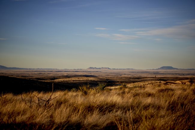
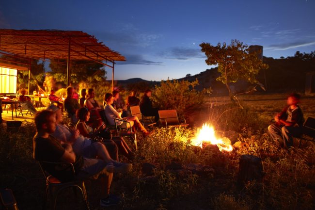
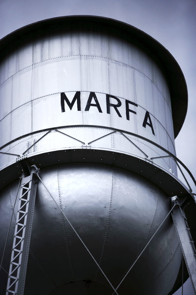
I fell in love with Marfa at first sight, in 1993, but it took me many years to get back to far west Texas. My ongoing project now takes me there often. It’s an eclectic oasis of fifth generation ranchers going about their day-to-day, artist and writers from all over the world and travelers in search of a decompression spot that is almost off the grid.  The combination of its high desert light and minimalistic beauty keeps drawing me back to continue my work. 

To see more of this project, click here.

APE contributor Suzanne Sease currently works as a consultant for photographers and illustrators around the world. She has been involved in the photography and illustration industry since the mid 80s. After establishing the art buying department at The Martin Agency, then working for Kaplan-Thaler, Capital One, Best Buy and numerous smaller agencies and companies, she decided to be a consultant in 1999. She has a new Twitter feed with helpful marketing information because she believes that marketing should be driven by brand and not by specialty.  Follow her at @SuzanneSease.

The Daily Edit – Dan Tobin Smith: Alphabetical


Alphabetical:  Dan Tobin Smith 

Heidi: Is there a secret message/anagram in the letter forms you’ve photographed thus far?
Dan: No, but its funny being able to spell more words each time you make a new letter, especially rude ones!

Where did your love of type come from?
I think there is something very satisfying about making the form of type but in reality. The form exists already so in a sense you are just filling in, and that can be done in so many ways.

Typographically what inspired you to create the 16 letters thus far?
They are all Helvetica, although they have been distorted somewhat in their photographic interpretation. I wanted to use a simple font that acted as a conduit for the different treatments. Sometimes there is a reason behind the letter and the content and sometimes there’s no reason apart from visually I thought they would work together.


All are stunning though I particularly enjoyed the textural and tactile quality of X. How did that specific idea develop?
We (the set designer Nicola Yeoman and I) liked the idea of marking a spot and we thought marking by cutting open would work with wood really well. Once it was done, it presented lots of visual opportunities by changing light and perspective.

Was there a thrill to the destruction into something beautiful for the X?
It was definitely fun watching it take shape from an outline in masking tape!

For your mesmerizing film T, how big of a space did you need for that?  and what was the genesis of this piece?
The space was a railway arch in Shoreditch, East London. The letter T is symmetrical back to front, ie you can flip it horizontally and it looks the same. Because of this I wanted to use the light very specifically so that two different light treatments could be achieved in one moment . This meant it could be filmed from two sides at the same time.


What exactly is exploding in that lovely form?
I’m pretty sure it was talcum powder! which is very fine, but wont kill you if you breathe a bit in.

Do you have a favorite font?
I think what I love most about typography is the variation, so pinning down one in particular would be impossible.

The Daily Promo – Rowan Fee

Rowan Fee

Who printed it?
The promo was printed by PCL Digital in the UK (https://www.pcldigital.co.uk)

Who designed it?
I designed this one myself with help from Tom Ashton Booth (https://tomashtonbooth.co.uk). I’ve collaborated with Tom on a number of projects including the Lightning Bolt image in this promo.

Tell me about the images?
This was a cross-section of my work both commissioned and personal.

How many did you make?
200 like this with the bags.

How many times a year do you send out promos?
I aim for printed promos twice a year if possible, mixed in with online marketing.

Do you think printed promos are effective for marketing your work?
I personally always enjoy receiving something unexpected in the post. I hope my clients/prospective clients feel the same and my printed work hangs around on their desks a little longer than an email.

This Week in Photography Books: Roger Ballen


The last season of “House of Cards” was a bit shit, if I’m being honest.

And still, I watched.

The main plot premise, (spoiler alert,) was that the Republican nominee for President was working with a social media network to mine and scrape their data, so he could micro-target and manipulate people into voting for him.

(Pause.)

I swear. I’m not making this up. Those guys wrote it, and of course it seems to have actually happened.

In reality.

To counter this, the crooked President, Frank Underwood, played by Kevin Spacey, used NSA software to do some data mining of his own, so he could counter their highly-unethical program.

Kevin Spacey’s performance was probably what kept me glued to the TV for 5 seasons of binge-watching. He’s the kind of actor that everyone loved to watch, for years, as he brought a powerful intelligence to his roles, dating back to his brilliant performance as Keyzer Söze.

The master-manipulator-criminal-genius.

In “House of Cards,” of course, he murdered, cheated, lied, and was also secretly gay. He played a sociopath with such conviction, it was almost as if he were plumbing the depths of his own psyche.

In reality.

Of course, now we all know that’s true. According to multiple news reports, which came out in the early part of the #MeToo movement, Kevin Spacey is a lying, raping, pedophile.

He appears to be an actual sociopath.

In reality.

And now we’ll never know how Frank Underwood was meant to meet his fate, as Spacey was rightly fired from his job quicker than DJT can make it through a single Big Mac. (Shout out to Dave Chapelle, as his Kevin Spacey joke in one of his new Netflix specials was much better than anything I can come up with.)

To be clear, I’m not suggesting we should all tread lightly, each and every day, lest we find our friends and loved ones are secretly awful.

Rather, my point is that people are far messier and more complex than we’d like to believe, and each and every one of us has a shadow. (Shout out to Carl Jung.)

In Kevin Spacey’s case, it seems he was able to channel his charismatic-evil, believably, into some of his roles. But for the rest of us, the dark parts of our psyche are there, and those of us that admit it, and shine a little light down into the basement from time to time, seem to be a tad healthier than those who deny their demons.

And that’s just talking about those of us who consider ourselves sane. Once brain chemistries get shaken around, or life circumstances get too difficult, or we were simply born with faulty genetics, mental illness can change the game entirely.

Just the other day, I was telling a new Taos resident that our town is famous for having a super-high incidence of mental illness. As a Wild West enclave for outlaws and weirdos, it’s always been a draw for those that have a hard time with conventional society.

There’s even a part of Taos County, dubbed “The Mesa,” that is essentially lawless, and has an extremely high proportion of mentally ill people living together, miles from everyone else.

People disappear out there all the time.

But mental illness, according to some, is really a construction, as who is anyone to judge what’s “normal” and what’s not?

What if the darkness was really the light?

My longtime readers, (Hi Dad, Hi Rob,) might rightly remember that phrase from my extensive interview with Roger Ballen back in 2013. He’s an American-born, South Africa-based photographer and artist renown for skulking the depths of the nastiest corners of the human condition.

(Sorry, Joel-Peter Witkin, but I think Roger has surpassed you as the King of the creepily surreal.)

It’s a great interview, IMO, as he had some pretty interesting things to say, and decades of experience to back it up. We stayed in touch, tangentially, and I felt fortunate when he offered me a copy of “Ballenesque: roger ballen: a retrospective,” his new career-spanning tome recently released by Thames & Hudson.

First off, as Roger Ballen has always preferred books to exhibitions, due to their permanence, he’s published a lot of them in his career. If you already have one, or some, you might not need this one.

It’s big, and bold, and includes a long-running, diaristic statement by the artist, that’s broken up through the chapters. If you’re a serious fan, I’d say this book is a must-purchase. And if you’re new to his work, and dig the style, which now has its own adjective, (hence the title,) then I’d say you should buy this one too.

Though I was familiar with many of the images in the book, there were some genuine surprises, like the few fashion photos he made for the New York Times, of the actress Selma Blair, in 2005. Whoever had the idea to take a slim, Hollywood It Girl and put her through these paces should be fired.

Not surprisingly, Roger admits he was not offered another fashion gig thereafter.

But he’s done music videos, like Die Antwood’s amazing “I Fink U Freeky,” built scary Ballen houses for art installations, (no thank you,) and also did a project with fellow creepster Asger Carlsen, whom I also interviewed back in the day.

(I’m no prude, as you know, but seeing Carlsen’s gorgeous, naked, young female bodies digitally morphed left me feeling a little queasy, in 2018, as it seems simultaneously too easy, and too misogynistic for my liking.)

The French painter, Jean Dubuffet, comes up a few times in the text as well, and I was glad to see it, as personally, I think his work had a tremendous influence on the raw, naked, visceral style that is now called “Ballenesque.”

I always loved Basquiat, and found him super-oringial, until I saw Dubuffet’s work, and realized that all of us have influences, and even radically new things take their inspiration from somewhere. (Like Orville and Wilbur trying to fly like birds, which are also a common Ballen subject.)

The most controversial part of this work, without a doubt, is Ballen’s photographic treatment of mentally ill people. Work like this is always pilloried for being exploitative, though the artist develops deep and longstanding relationships with his subjects.

The text gives us some really juicy quotes on the issue, including the part where Ballen admits that when people ask him what his subjects think of the work, he says, “I am not sure what anybody thinks.”

Tough to argue. But he questions whether mental illness is a societal construction, at one point, wondering who has the right to declare what’s normal?

As we discussed in our interview, he spent much of his career as a mining engineer in South Africa, as he didn’t want his art practice to get corrupted by the need to make money. (The lengthy biography also emphasizes he grew up throughly counter-culture.)

Anyone that looks at this work, and hears him discussing the need to plumb the depths, will have no trouble making the metaphorical connection.

So on that note, I’ll leave you with his direct thoughts on the subject, and suggest you consider your own darkest thoughts, rather than pretending they’re not there, and then locking the door behind them.

“Delving into the deepest parts of one’s subconscious is like going down the mine, down the shaft. You get there, and now you are on level ten, whether in the mine or in the mind, Things are not going to manifest themselves down there, so I have to go from level ten back up again and make visible what I have found, bring them to the surface. That is the hard part.”

The hard part indeed.

Bottom Line: Massive, through retrospective for a master of darkness

To purchase “Ballenesque” click here

If you’d like to submit a book for potential review, please email me at jonathanblaustein@gmail.com.

The Art of the Personal Project: Michael Greenberg

The Art of the Personal Project is a crucial element to let potential buyers see how you think creatively on your own.  I am drawn to personal projects that have an interesting vision or that show something I have never seen before.  In this new revised thread, I’ll include a link to each personal project with the artist statement so you can see more of the project. Please note: This thread is not affiliated with any company; I’m just featuring projects that I find.  Please DO NOT send me your work.  I do not take submissions.

Today’s featured artist: Michael Greenberg

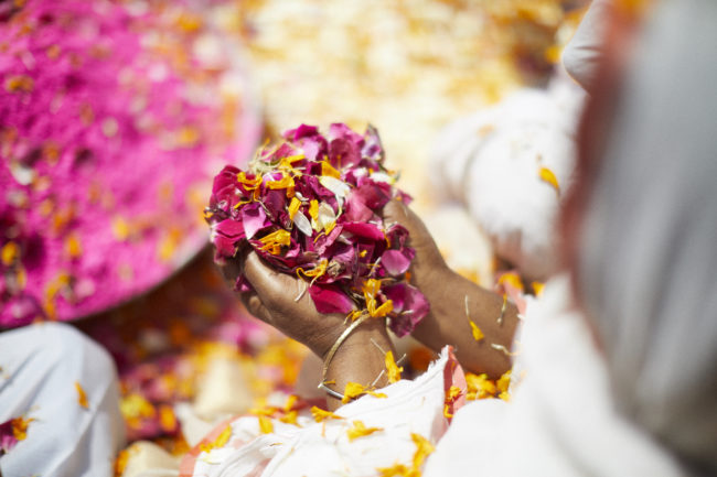
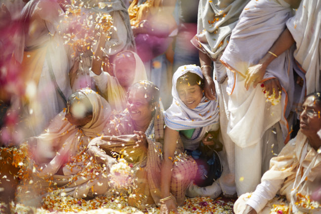
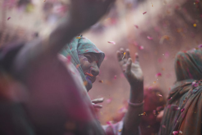
After losing their husbands, the widows of India are often ostracized by their communities and their families. Many move to the city of Vrindavan, the birthplace of lord Krishna, to finish out their lives in service of Krishna. Until very recently widows were left out of Holi celebrations. Organized by Sulabh founder Bindeshwar Pathak, the widows now celebrate Holi in the historic Gopinath Temple in Vrindavan. It was an honor to join them this year.

To see more of this project, click here.

Or for his Instagram, look here:

APE contributor Suzanne Sease currently works as a consultant for photographers and illustrators around the world. She has been involved in the photography and illustration industry since the mid 80s. After establishing the art buying department at The Martin Agency, then working for Kaplan-Thaler, Capital One, Best Buy and numerous smaller agencies and companies, she decided to be a consultant in 1999. She has a new Twitter feed with helpful marketing information because she believes that marketing should be driven by brand and not by specialty.  Follow her at @SuzanneSease.

The Daily Edit – ESPN: Ramona Rosales

ESPN

Director of Photography: Karen Frank
Senior Photo Editor:
Kristine LaMana
Creative Director: Chin Wang
Art Director: Eric Paul
Associate Art Director: Linda Root Pouder
Photographer:
Ramona Rosales

Heidi: How did the project develop?
Ramona: Originally I though it was just a shoot with Chloe Kim, the other 2 assignment came later. It was mentioned in the early stages that this was for an Winter Olympics issue and that a female athlete was to be featured, which I believe was a first for the Olympics. I just shot my first Body Issue project with ESPN and was thrilled they considered me for this project since my editors thought it would be a great match.
Tell us about the set design and approach.
I liked the idea was getting her in mid air, so I studied tons of footage of her during competitions and took note of the conditions of the half pipes and environment. There wasn’t very much press or photos out in the world about her (yet), but from what I could find, I wanted to bring her personality and age into the mix and was able to pitch the idea of hoisting her in a harness with this specific body position in mid twist. I was able to present a mock up that ESPN approved and made sure the athlete was comfortable flying with ropes and able to get into the pose. It was risky since she had never done it before but her great attitude and adventurous spirt was into the idea. I collaborated with my set designer to build the top corner section of a halfpipe and chose to create at sunset sky gradation with light on a larger cyc. I didn’t want to go overall girlie with the colors and feel more environmental but also very current in color pallet to tie in her aesthetic.
What were some of the challenges?
Once we got her in the harness, I could see there was going to be challenges since it’s not the most comfortable thing to do and holding a pose can be difficult. I knew we would have little time for this shot, we did it in two 10 minute tries. We got it on the first run luckily, because by the second round you she couldn’t hide the discomfort as easily. We did another 4 set ups, including the halfpipe, cover portraits with variations, trampoline jumps and quick fun loose shots at the end. It was a full day but so rewarding in collaborating with such a fun & amazing athlete with a strong team backing her along with my team & ESPN helping me achieve a great series which forever will be a favorite.
How Important did you think it was for a woman to photograph this?
I don’t think it was necessarily important that a woman photography this project. There was a genuine connection I had with all three of the subjects on our shoots, which I think was the intention  of my editors choosing me for this project along with my style and ability to pull it off. Collaboration and camaraderie with subjects are a high priority in my approach and is a big component that comes through in my work. The collective goal was to present our Olympic Athletes in a strong heroic way without striping away their personalities and only aiming for an authentic point of view, which I believe we successfully delivered.

The Daily Promo – Jared Soares

Jared Soares

Who printed it?
Smart Press in Minnesota. I’ve been using them for all my printing needs lately.

Who designed it?
Though I designed the piece, I had a lot of help in the process. Matt Eich and Justin Gellerson gave me solid thoughts on the edit/sequence of images. Amy Wolff provided substantial feedback on the design as well as the image sequencing. If I did everything on my own it would look like hot garbage.

Tell me about the images?
The photographs included in the booklet are a combination of personal and commissioned work from last year. My goal with any promo is to share what I’ve been up to and highlight images that I’m excited about.

How many did you make?
200 booklets were printed. 190 of them were mailed out and the rest will be kept for in-person meetings or anybody that I forgot.

How many times a year do you send out promos?
In terms of print promos, at least 3 to 4 times a year. An overview booklet gets sent near the beginning of the year then I follow up with tailored pieces when it makes sense.

Do you think printed promos are effective for marketing your work?
In the past 2 years, print promos have lead to work. Additionally, conversations were sparked because of the pieces, which later lead to assignments.

This Week in Photography Books: Debi Cornwall


I’m listening to the hum of the fan beside me.

A magenta bag, filled with birthday socks, sits glowing in
the sunlight by the window.

Thankfully, I’m free.

Free to say what I like in this space each week. (Thanks, Rob.) Free to wear what I’d like, and go where I please.

These freedoms come at a cost, as we all know.

The United States government, through war and covert (i.e. CIA-led) actions, has undermined freedom, democracy, and sovereignty elsewhere. Countless have died in wars in other places, like Vietnam, or Iraq, or Afghanistan, as we’ve maintained our position at the top of the global economic food chain.

Given our original sins, slavery and the genocide of Native America, we shouldn’t be surprised that we also fomented revolution, claimed territory by force, committed assassinations, and installed puppet regimes in foreign countries.

(As much as I dislike Vlad Putin, he’s always pointing out that we’ve done the same things he’s accused of…)

The Monroe Doctrine was conjured to claim our sphere of influence over this part of the world. We’re seeing a return to that bygone era, (Shout out to Professor Timothy Lomperis, Freshman Year at Duke,) where major powers like the US, Russia and China patrol their own waters, and balance each other out.

Add to the list of things nasty things we’ve done in the name of democracy: torture.

Yes, in the early years of the War on Terror, George W. Bush had some lawyers, (we’re looking at you John Yoo,) come up with legal justification for “enhanced interrogation” techniques.

Including: water boarding, slapping, sleep deprivation, sexual touching, being forced to live in your own shit and piss, no access to light, little activity, hooding, general humiliation, and being shackled in painful positions.

I’m likely leaving a few out.

These black sites are on all of us, as citizens.
We’re complicit.

These discussions will be before us again, as Trump’s new nominee to head the CIA once ran a black site herself, and has been outwardly in favor of torture, according to this article in The Atlantic.

But Barack Obama famously promised to close Guantanamo Bay, and didn’t, so again, this issue crosses political affiliations.

I’ve been thinking about it all morning, having read/looked at Debi Cornwall’s excellent “Welcome to Camp America,” published by Radius Books in Santa Fe.

Straight up, I’ll admit I didn’t enjoy this one as much as some of the others I’ve reviewed lately. It’s a bit clinical for my liking. Such opinions are, of course, subjective, and it’s obviously a well-made production of important work.

It’s informative, and rich, and succeeds in many ways.

But since I try to always keep it real, and have been gushingly-over-the-top in my praise of late, I thought I’d tell the truth.

I like that the book forced me to pay attention. Like the other books I’ve featured lately, this one has multiple themes that repeat throughout, interrupting each other in a rhythm, so you’ll never get bored.

There are dry, formal landscape photos taken from inside the areas she was allowed to photograph at Gitmo.

Then, there are fold out pieces, untethered and interspersed, which feature former detainees who were freed, and have been patriated to other countries, Uighurs and Egyptians in places like Albania.

Always these men are photographed from behind. (A nod to the military regulation at Gitmo that says no faces are to be photographed? More likely, as Fred Ritchin suggests in his essay, it was out of empathy for the men’s privacy.)

Personally, I don’t like the unbound tactic. But I’m a big fan of the use of Arabic text, as it reminds us there is more than the American perspective to consider.

My favorite photos are the still life objects available at the gift shop. Dolls, and stuffed animals and lip balm?

Dial 911 for the tacky police.

There are smudgy, difficult-to-read pages depicting the actual torture techniques employed in the Bush Era, and a lawsuit/ story that plays out, slowly over the book, in first person.

Eventually, we realize it’s from the standpoint of a soldier who was playing an unresponsive inmate in a drill, only the soldiers kicking the shit out of him didn’t think it was a drill, and then the tapes were destroyed.

There are always tapes, with people like this, and they’re always getting destroyed. It’s like something out of that Tom Cruise/Jack Nicholson movie from back when they were both important.

What was that called?

That reminds me, in the book, that soldier who got beat up by mistake even said the safe-word was literally “Code Red,” like that movie, god, what was its name?

At first, jolting between that many types of images, and words, and styles of viewing, with overfolds and pull outs, it felt like a bit much.

I questioned what the personal connection was, between the artist and the subject, because clearly there was one. Nobody jumps through that many military hoops to get access, and publishes damaging information, in a photobook, without an ax to grind.

It goes against human nature.

So there it was, in Ms. Cornwall’s statement at the end of the book. “For twelve years I practiced as a wrongful conviction lawyer representing innocent exonerees in civil rights suits in the United States.”

That would do it.

I learned a lot from this book, and think it’s kickass in many ways. It’s just that it left me feeling a bit cold.

You know who else was cold?

One of the torture victims, when he was left shivering, naked, in his own excrement, while the air conditioning was turned on full blast.

I read that in this book. I expect it will stay with me for a while.

As it should.

Bottom Line: A fascinating, multi-layered look at Gitmo

To purchase “Welcome to Camp America,” click here 

The Art of the Personal Project: Peden + Munk

The Art of the Personal Project is a crucial element to let potential buyers see how you think creatively on your own.  I am drawn to personal projects that have an interesting vision or that show something I have never seen before.  In this new revised thread, I’ll include a link to each personal project with the artist statement so you can see more of the project. Please note: This thread is not affiliated with any company; I’m just featuring projects that I find.  Please DO NOT send me your work.  I do not take submissions.

Today’s featured artist: Peden+ Munk

“Ever since I was a teenager watching anime and trying sushi for the first time, I’ve wanted to travel to Asia and in particular Tokyo. This feeling only intensified when I left New York City for Art Center College of Design in Pasadena CA. The Asian culture is huge in So-Cal and so many of my friends from school were either Korean or Japanese.  All of a sudden I found myself in the middle of Ktown in a hidden speakeasy at 3am slurping the most delicious bone broth from a metal bowl. Or on Sundays after we graduated Jen and I would travel to San Gabriel Valley to try some new noodle spot or dim sum. But the be all end all was definitely the kotteri chashu ramen at Daiukokuya in downtown LA. This was quite possibly the best thing I had ever eaten.
Jen and I share the same passion for Japan and Japanese culture. After getting lucky with some airline miles we were on our way to Tokyo for our first taste of Japan. We are lucky enough to have great clients that seized our travel opportunity and gave us an assignment to shoot once we got there. Landing in Tokyo we quickly got on a bullet train and headed to the mountains. Arriving in the middle of the night to our Ryokan we had no idea what to expect. We awoke the next morning to discover a beautiful town shrouded in snow that was to be our new home for the next couple of days.
Immediately everything felt different from what we were used to at home. The people were nice and accommodating, almost to a fault. The food was delicious everywhere we went. And the scenery was mind bogglingly beautiful, so much so that we found ourselves using our iPhones more than the DSLR’s we lugged along everywhere.  It was just easier, faster and allowed for editing on the fly.
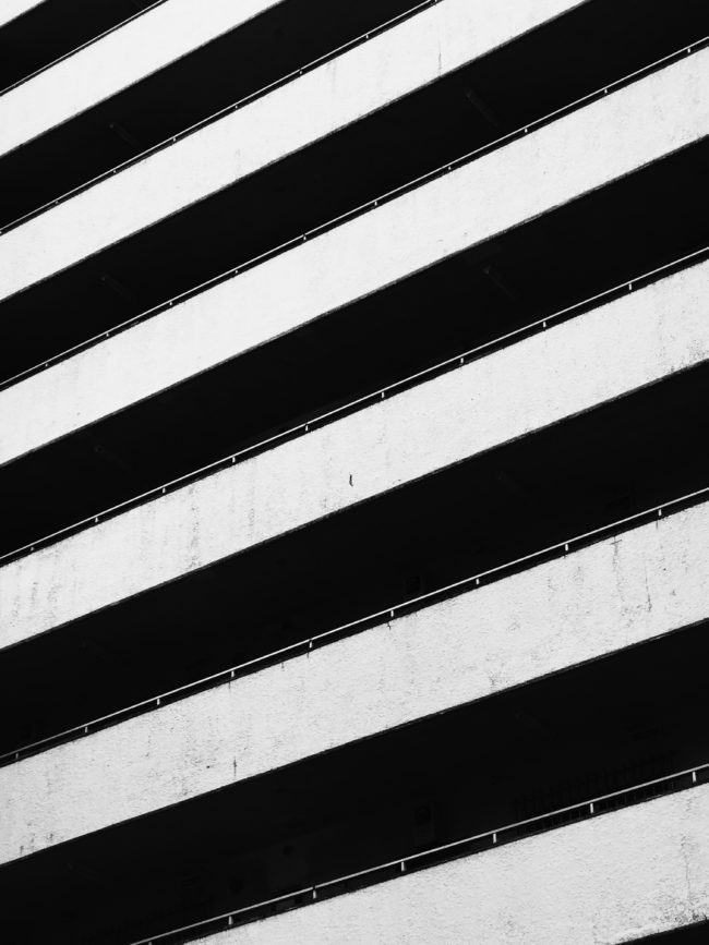
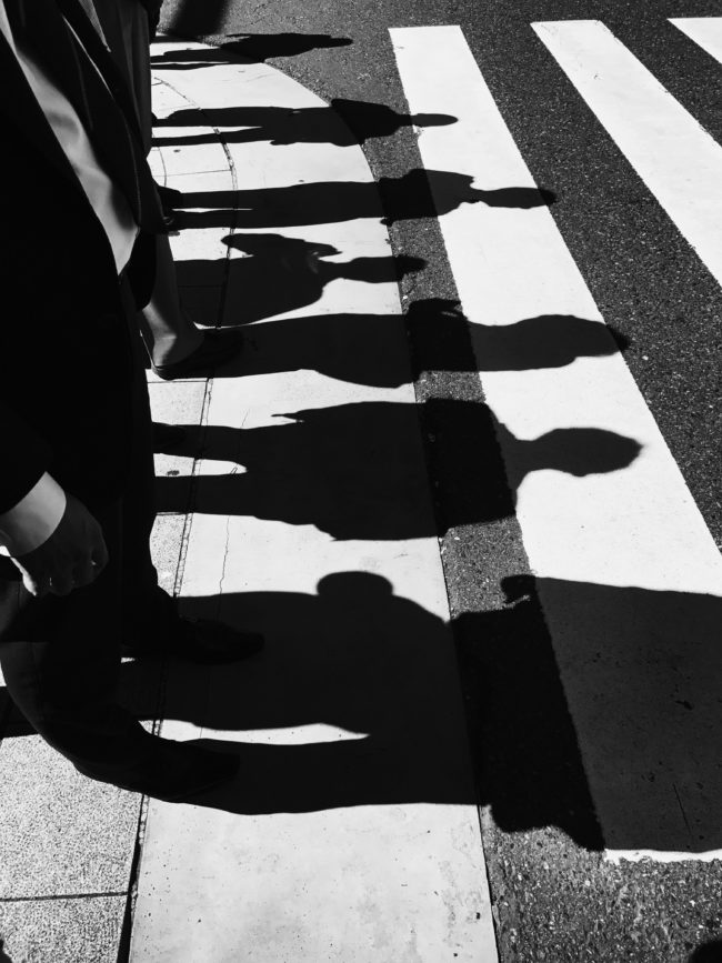
It soon became very apparent that we couldn’t walk more than 10 ft without whipping out our phones and snapping away. It became an obsession. We would turn and corner and all of a sudden a ray of light shined across a busy intersection as salary men and women lined up to cross the street. Both of us noticed that we were drawn to the very angular graphic nature (man-made and natural) that is Japan. Everything was neat and orderly and when the light hit just the right way it was marvelous. We snapped away and ducked into bookstores, parks and cafes to edit the photos.
Shooting with the iPhone gave us the freedom to spontaneous and secretive. Nobody thinks anything of you because 99.9% of the population is on a cell phone anyway.
This Video and series of photos represents what inspired us from our travels.”

To see more of this project, click here.

Motion portion of this personal project:  Click here

APE contributor Suzanne Sease currently works as a consultant for photographers and illustrators around the world. She has been involved in the photography and illustration industry since the mid 80s. After establishing the art buying department at The Martin Agency, then working for Kaplan-Thaler, Capital One, Best Buy and numerous smaller agencies and companies, she decided to be a consultant in 1999. She has a new Twitter feed with helpful marketing information because she believes that marketing should be driven by brand and not by specialty.  Follow her at @SuzanneSease.


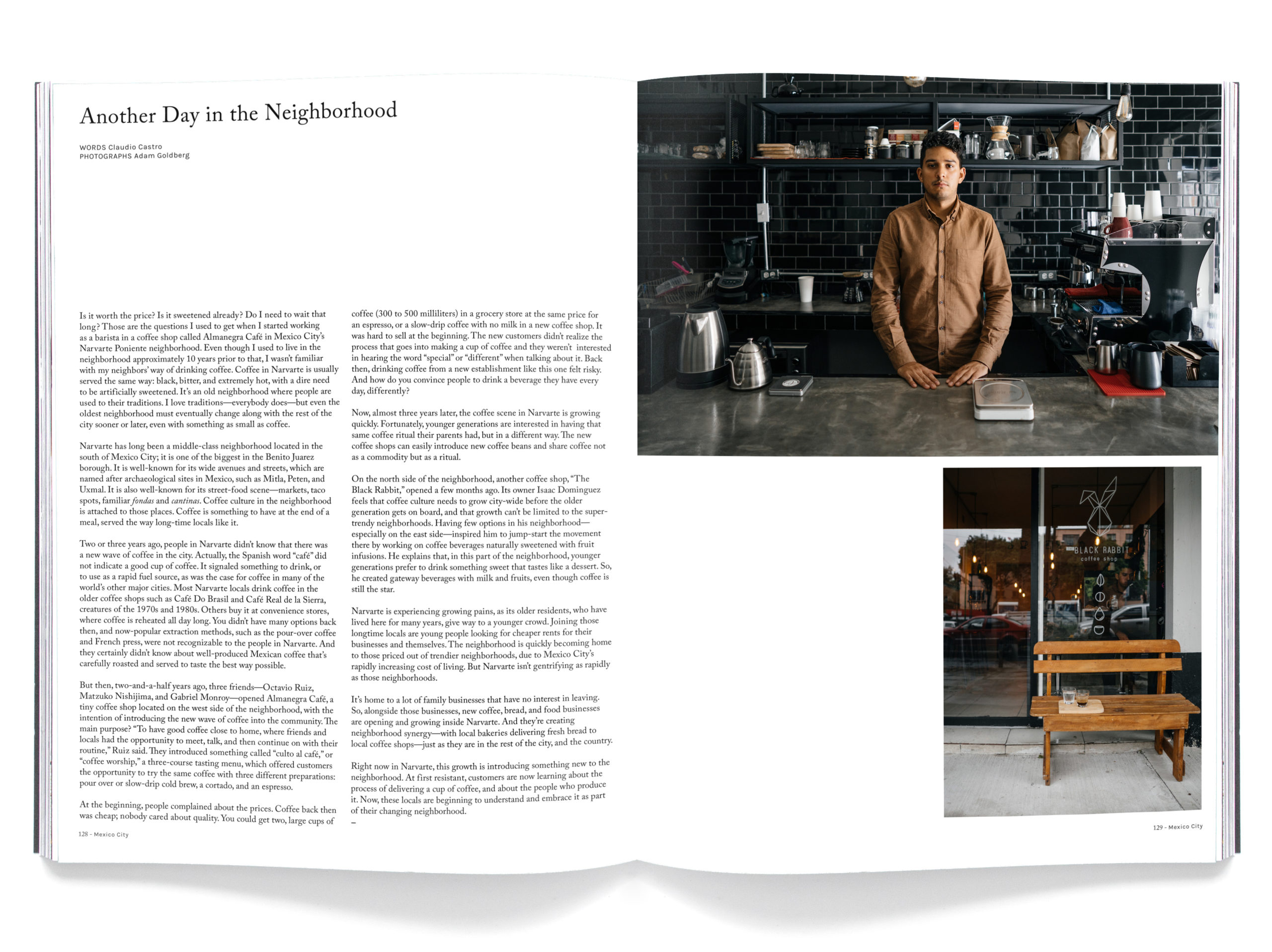
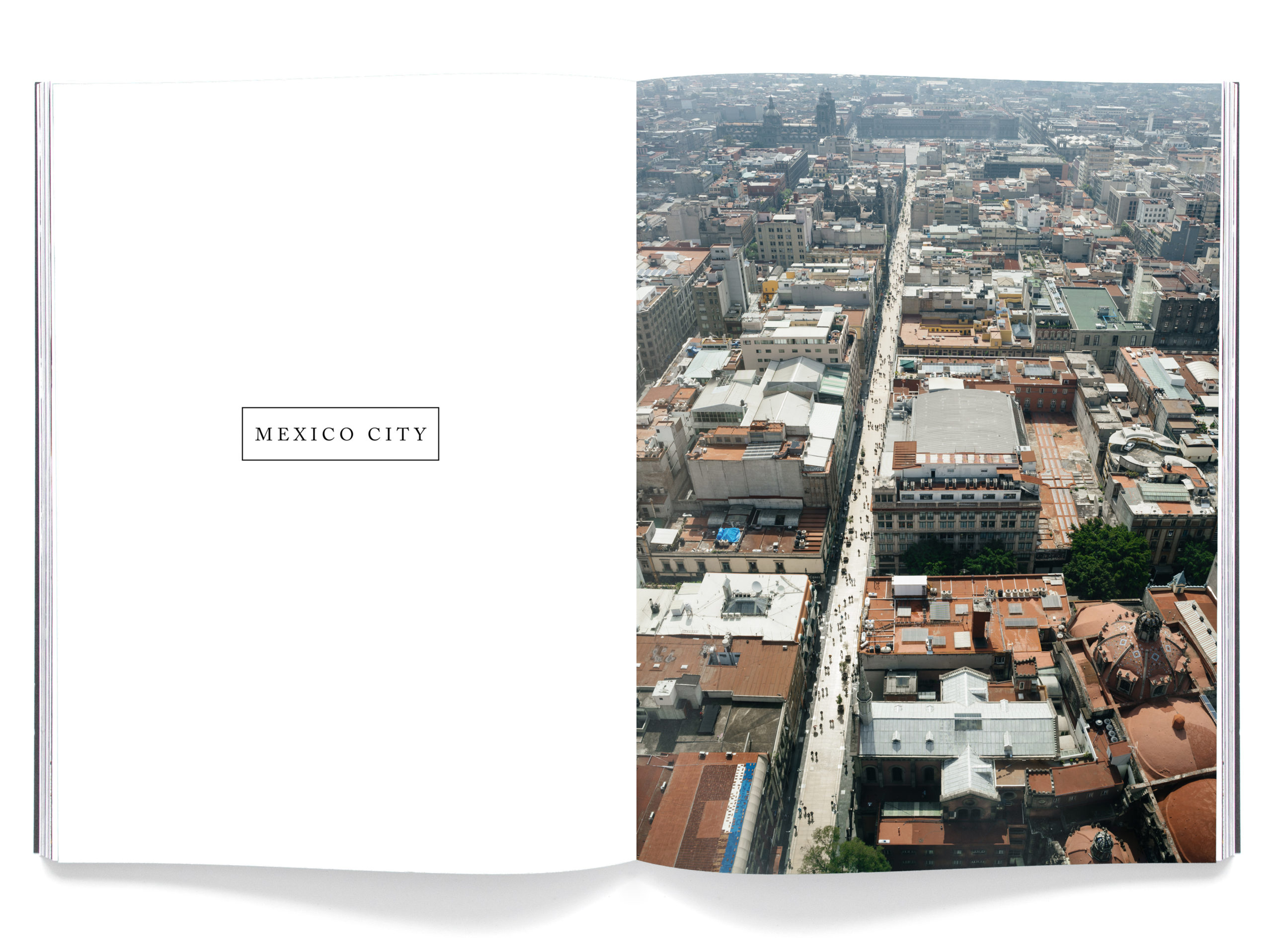
The Daily Edit – DRIFT Magazine: Dedicated to Everything Coffee

Cover by Adam Goldberg

Photograph by Fabian Martinez

Photograph by Daniela Velasco

Photographs by Adam Goldberg

Photograph by Adam Goldberg

Photograph by Daniela Velasco

Drift Magazine

Creative Director: Daniela Velasco
Editor: Adam Goldberg

Heidi: How does Drift decide which city to feature?
Daniela: It’s a combination of a few factors. We have a running list of cities we feel have either an established or developing coffee culture. We then look at the list and make an assessment as to which city has the best “coffee story” to tell right now. Feedback from our readers is particularly valuable to us: when there’s overlap in the cities readers suggest, we tend to emphasize those cities. It also helps if we have a personal interest in visiting and learning more about the particular city since we spend so much time there putting together each issue. We also try to vary regions so each Volume of Drift feels very different from the previous one.

Once a city is determined, is all the photography assigned?
Generally, we first plan and assign the written content, using it as a guide to direct the photography. But there are exceptions, for example in Volume 5: Melbourne we ran a piece about the interior design of Australian coffee shops. This piece began with photographs we shot in-house, reaching out to writers afterwards. We love receiving pitches from both photographers and writers, each can lead to interesting, well-developed content.

What do you look for in someone’s work in order to be considered?
We try to hire as many photographers local to the city we are covering as possible. The local perspective is particularly interesting to us. Many contributors are ones who have previously reached out to us. Others are ones we’ve stumbled across on Instagram, who we feel could show a particularly interesting angle. We take photographers’ work seriously: their portfolios should show good use of light, a subtle editing process, an understanding of unique perspectives, creativity, and a strength in the type of coffee and travel lifestyle photos we are looking for.

Do you art direct the shoots and go on location?
We used to take almost all photos in the magazine therefore we would always be on location but as we’ve been growing we’ve been able to hire more local photographers that plan their own shoots following the creative direction we provide in the brief for each city.

What’s been your most memorable cup of coffee thus far?
Probably the “Angel Stain” at Bear Pond Espresso in Tokyo–espresso as thick as maple syrup and dark as ebony. Or perhaps the Natural-process coffees coming out of Yemen, roasted by Oakland’s “Port of Mokha” – but you’ll have to wait for our next issue to read more about that!

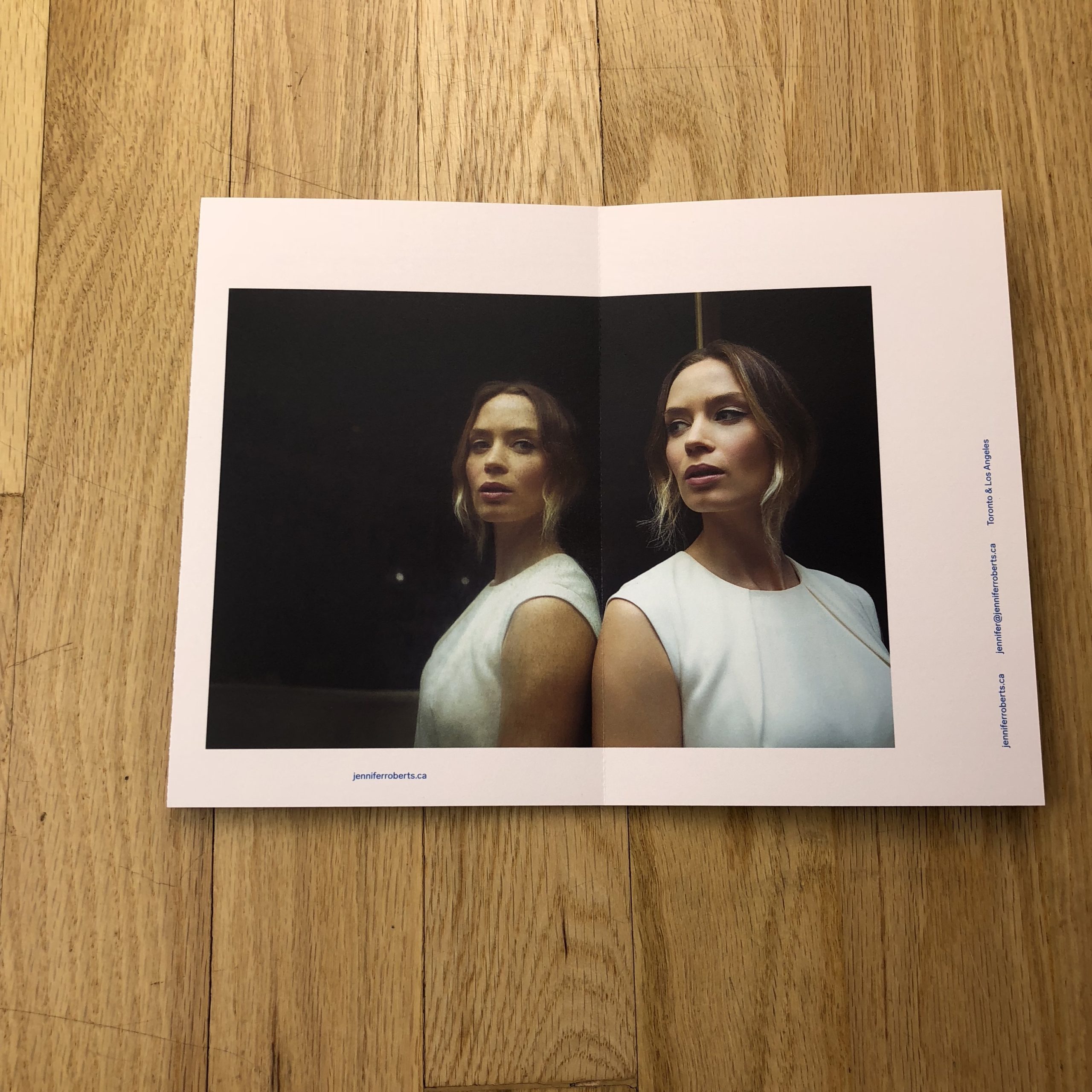
The Daily Promo – Jennifer Roberts

Jennifer Roberts

Who designed it?
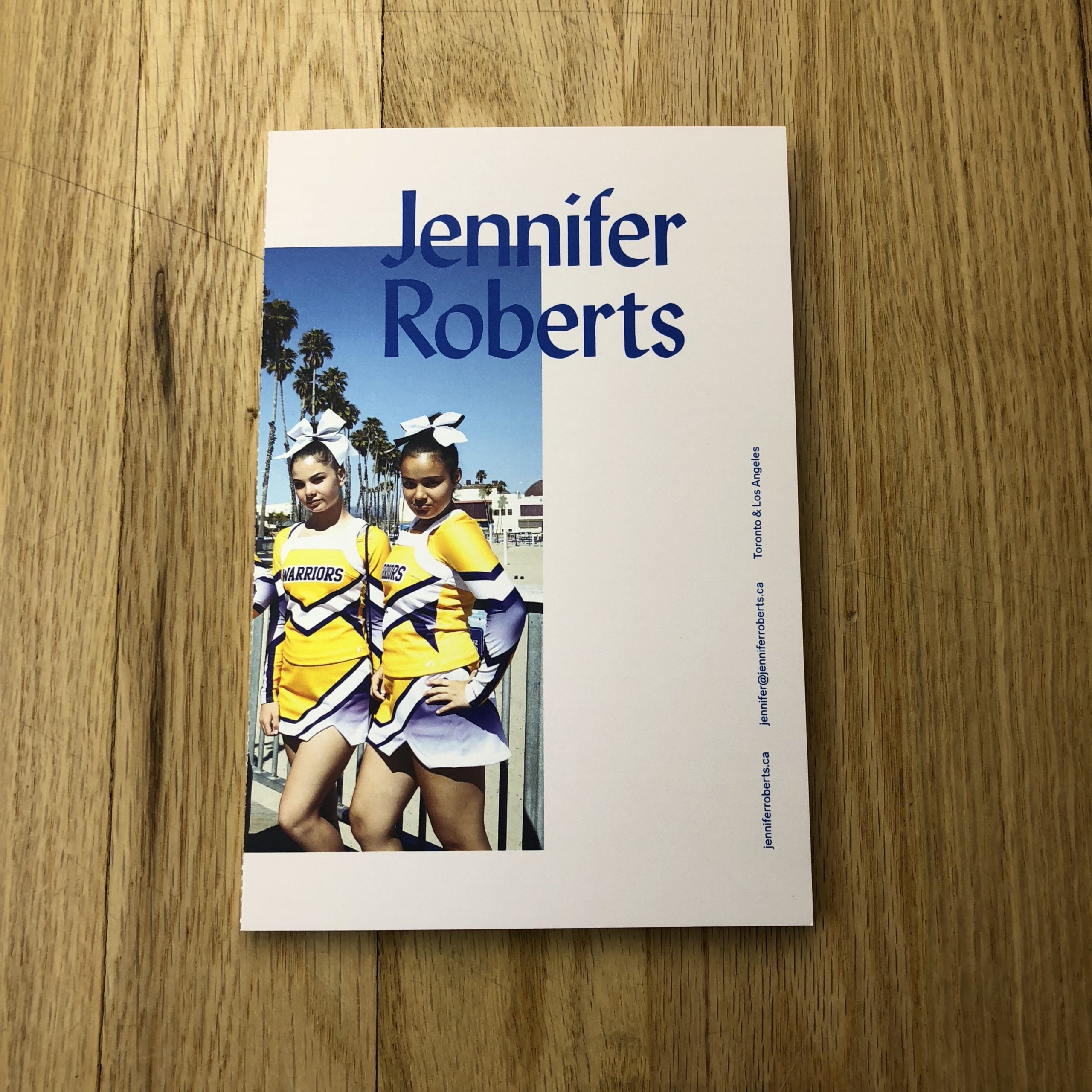
The promo was designed by Studio Wyse http://www.studiowyse.com/ in Toronto. The Creative Director, Vanessa Wyse and the Art Director, Nicola Hamilton are incredibly talented and it was wonderful to work with them on this. Since I am such a big fan of their work, I felt pretty open to whatever concept they came up with.
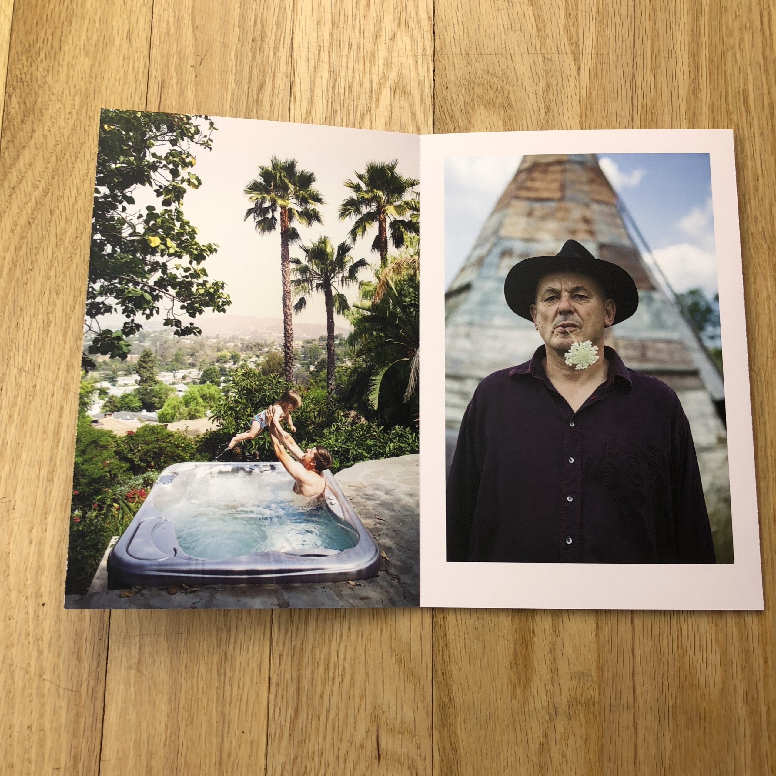
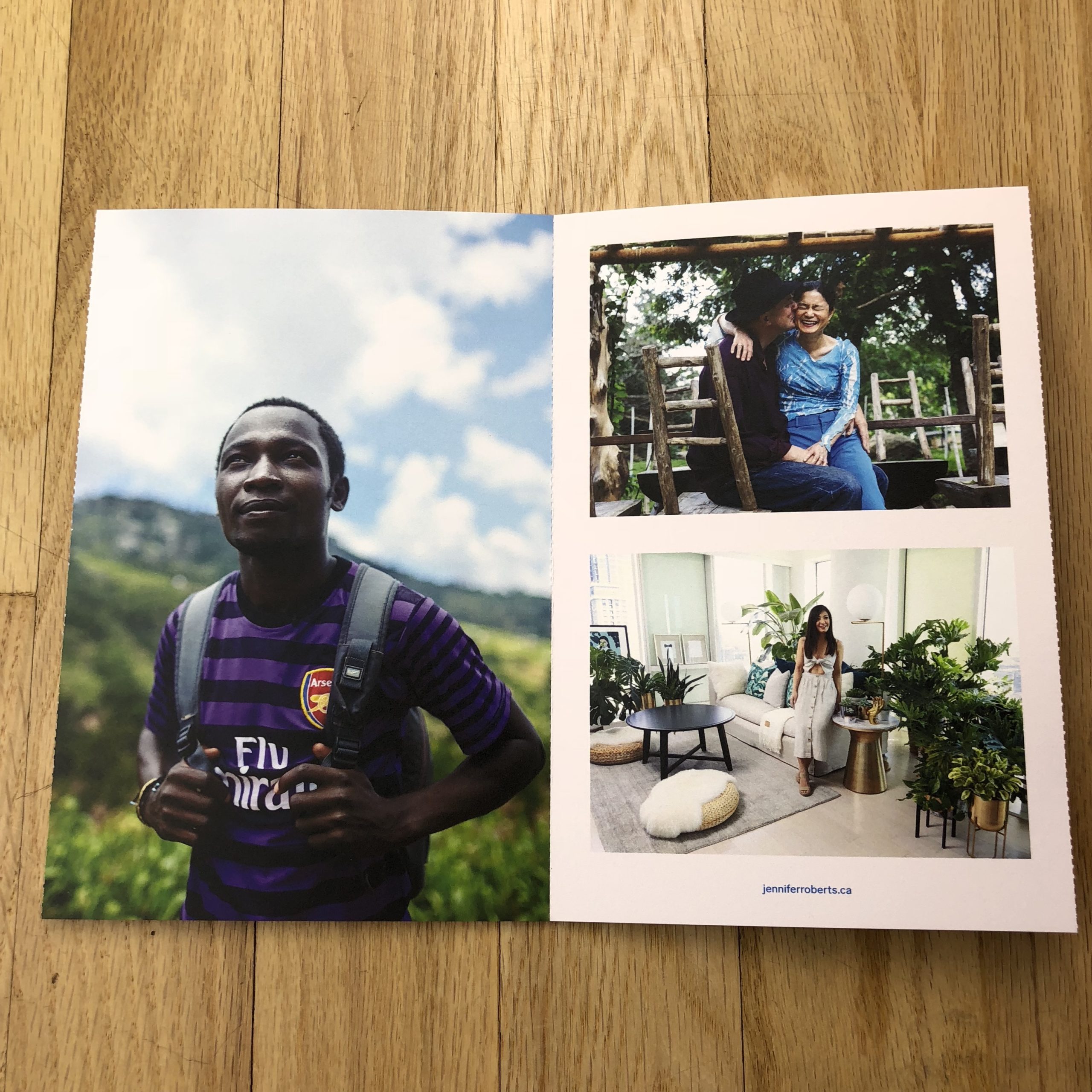
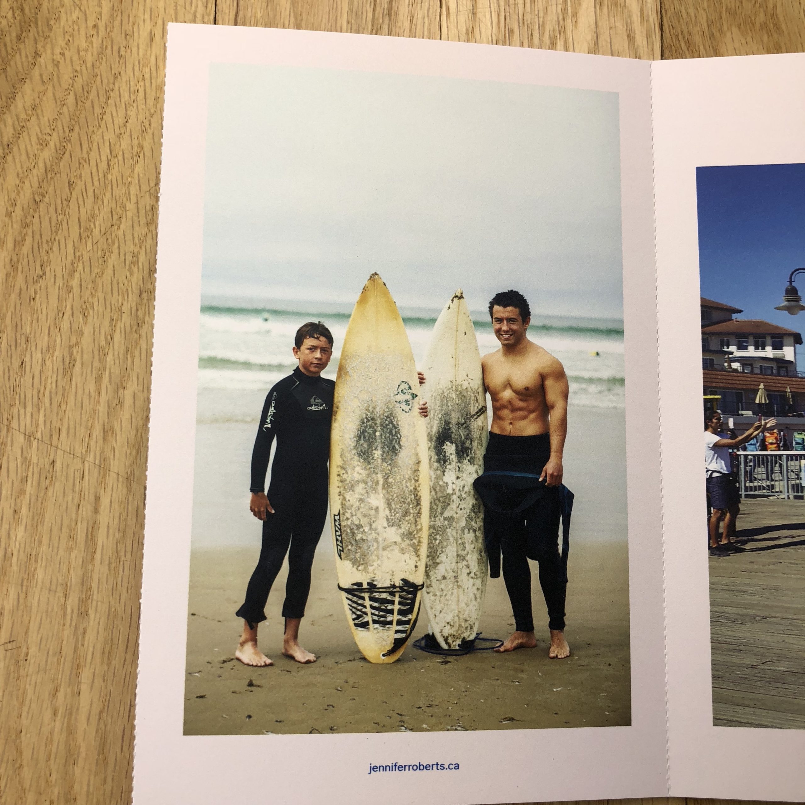
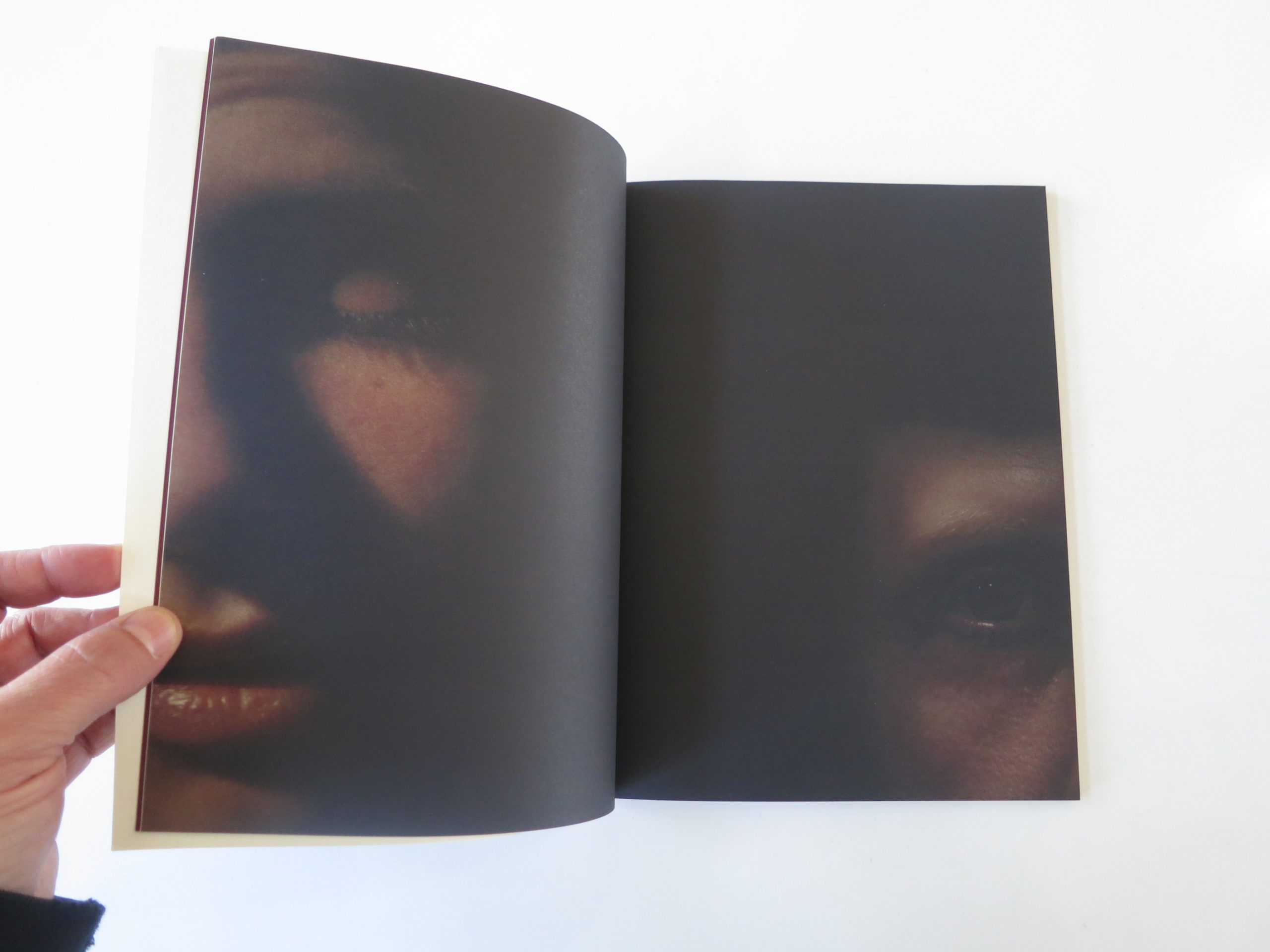
I probably drove Nicola the art director (and also my sister-in-law) a little crazy going back and forth on the paper stocks. Her instinct was to go with a textured paper while mine was to do something a little smoother. We both wanted an uncoated finish so the mowhawk cougar was a happy compromise. The finished piece is a six-panel, accordion folded booklet that easily tears into single postcards, so you can pin your favourite image.

Who printed it?
They were printed in Toronto at Flash Reproductions.

Tell me about the images?
The objective of the promo was to highlight my portraiture and lifestyle work. I pulled a wide edit of photos and then Studio Wyse selected images from both my edit and from my website. I really trusted Studio Wyse’s direction and some of the photos they chose weren’t in my edit but when I saw them in the layout, they totally worked. I would have never thought of using the cheer squad photo but then when I saw their design, I loved it. When I saw my photos in their beautiful layout I felt like a better photographer.

How many did you make?
We did a run of 200 promos. I figured that way they could be divided up between the multiple markets I was targeting.

How many times a year do you send out promos?
This is the first time I’ve ever made a proper print promo. I’m very happy with it and it’s been well received so I think realistically I’d aim to have a new made once a year.

Do you think printed promos are effective for marketing your work?
I think for me printed promos are a fantastic marketing tool. The timing was right because I’ve recently started dividing my time between Los Angeles and Toronto. In Toronto, my background is in newspaper photography and I’ve been trying to advance into more portraiture and lifestyle work. In Los Angeles, I’m new so it seemed like a good way to introduce myself. So far I’ve mostly sent them to new clients and they’ve been a great way to introduce people to my work. They’ve been great to hand out at meetings and a good way to reach clients that aren’t in the same city.

This Week in Photography Books: Tom Griggs


Hey guys.

Thanks for coming back.

After the last couple weeks, with the anger and the sorrow, I wasn’t sure if I’d see you today.

You might not realize it, but I always try to keep the balance in mind. If I hit you with some really heavy stuff for a few weeks, then I think it’s time for breather.

Lately, I’ve also had the opportunity to alternate male and female photographers each week.

Like I said, balance.

So today, we’re going to have a really short review. On the off chance you really like the long articles, and want to see them every time, I’ll offer my apologies.

Last week, I began making connections between the books that were sent to me by some very talented female photographers. I’m fairly sure I use the word emotional.

It’s a tricky word, emotional, and a tricky premise to suggest that women are more emotional than men. It’s often used as a pejorative term, and I should know, as it’s been hurled my way many times.

We all have emotions. (That should be blindingly obvious.) But traditionally, men have been less comfortable exploring and understanding their emotional reality. We all know the stereotype of the macho, stoic, heroic, cowboy type.

It’s been held up as a model forever, and only recently has “emo” been an acceptable state of mind for certain subsets of the male population.

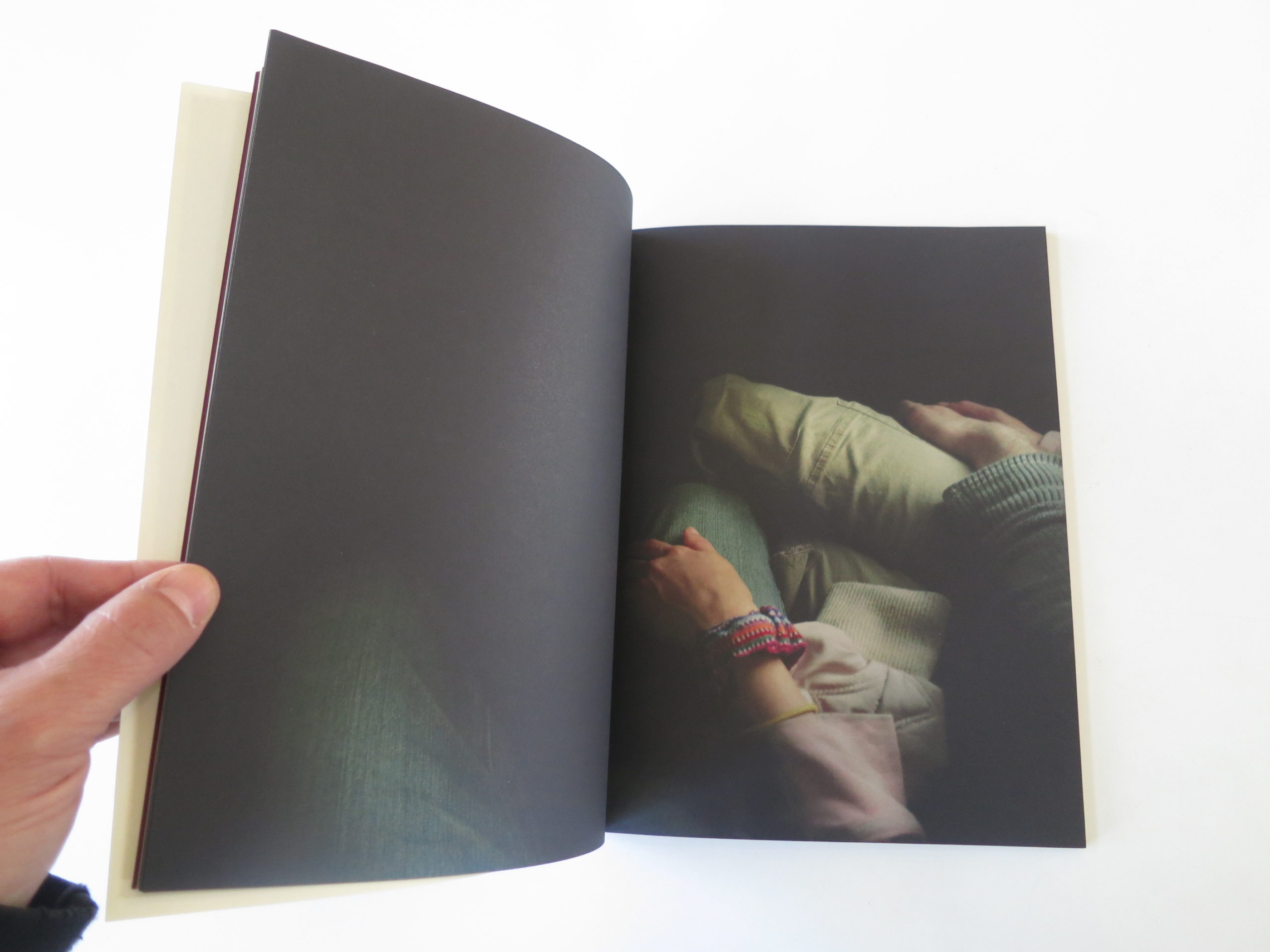
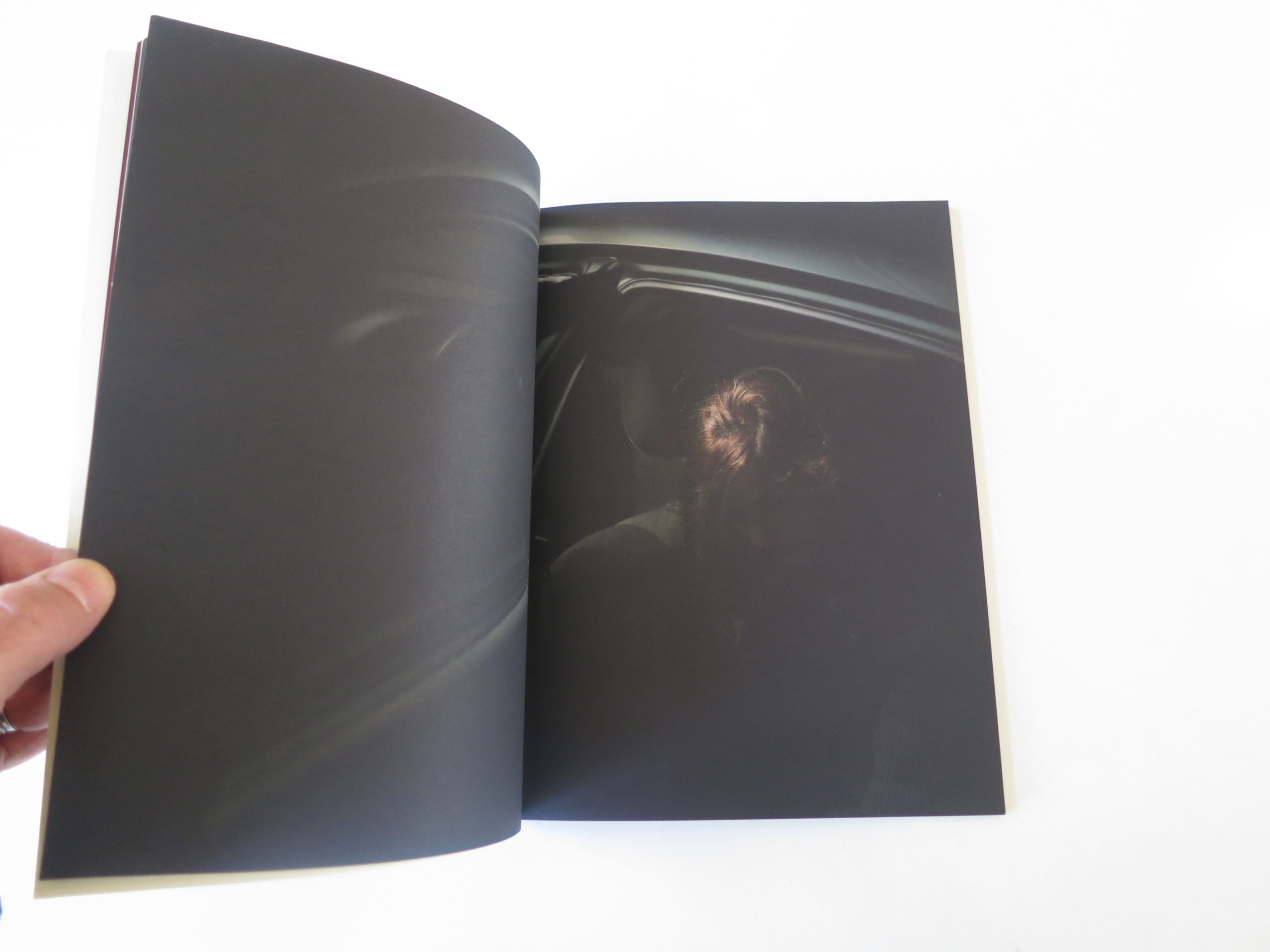
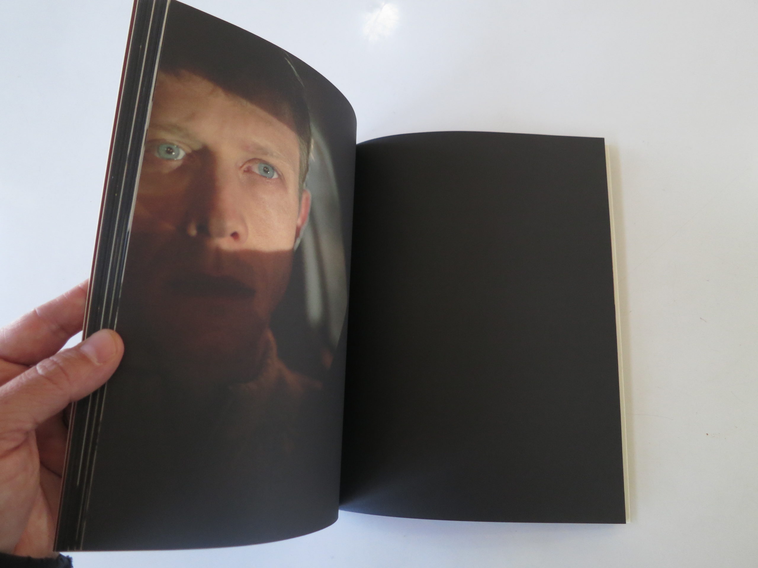
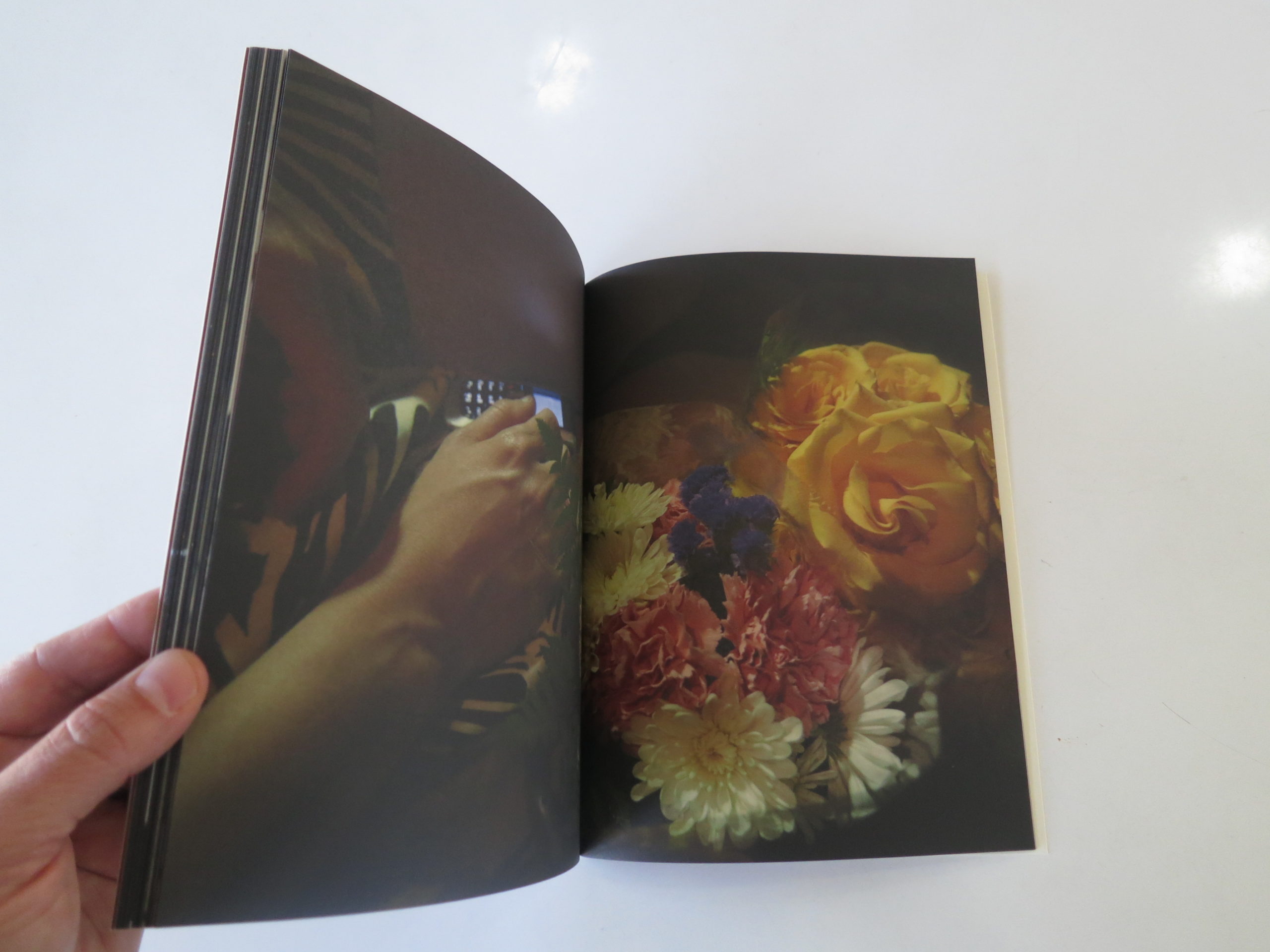
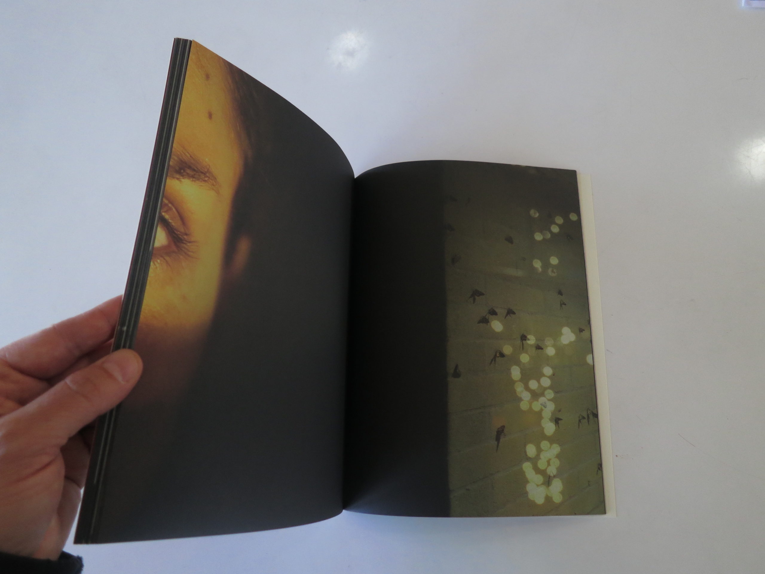
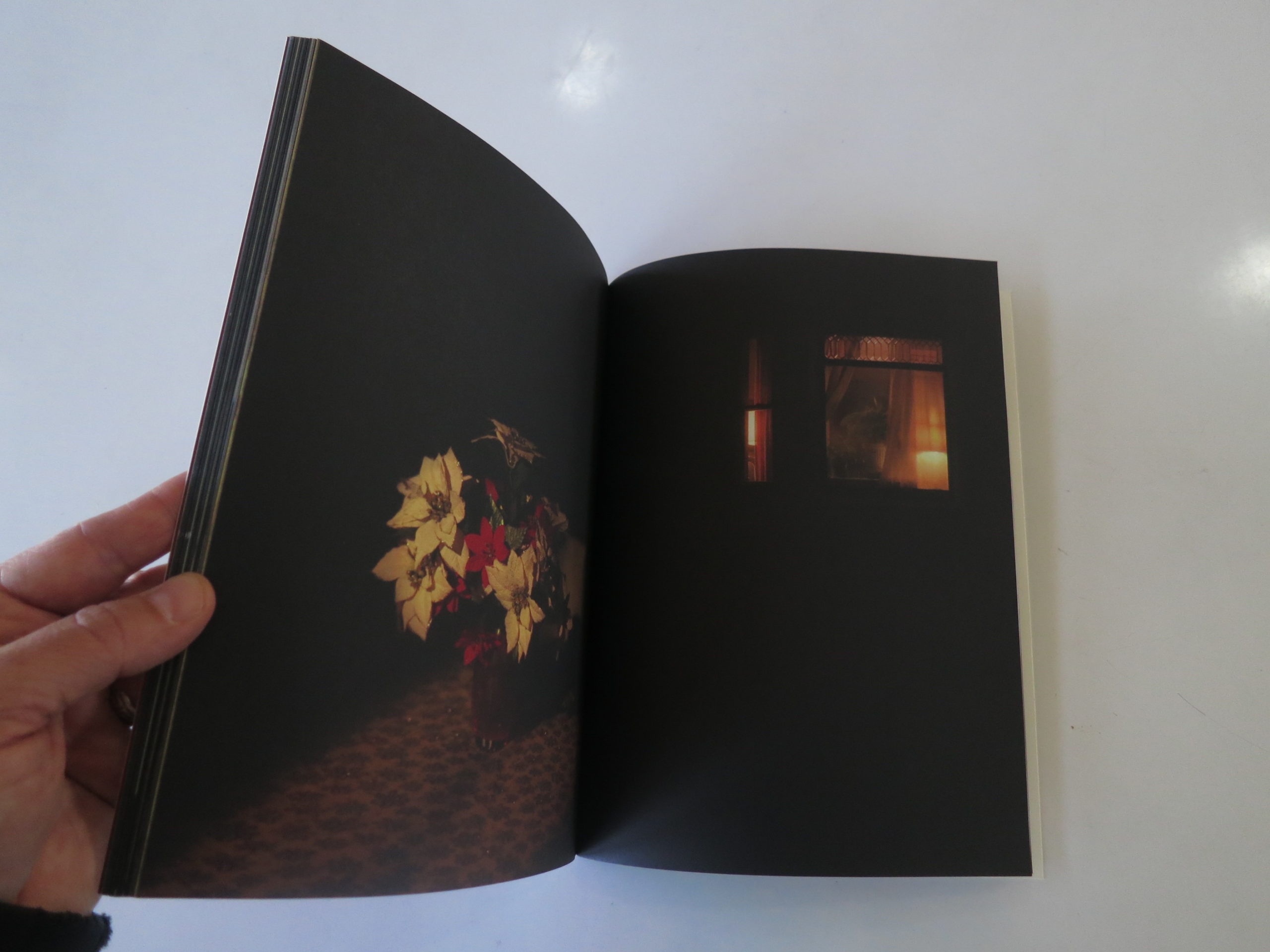
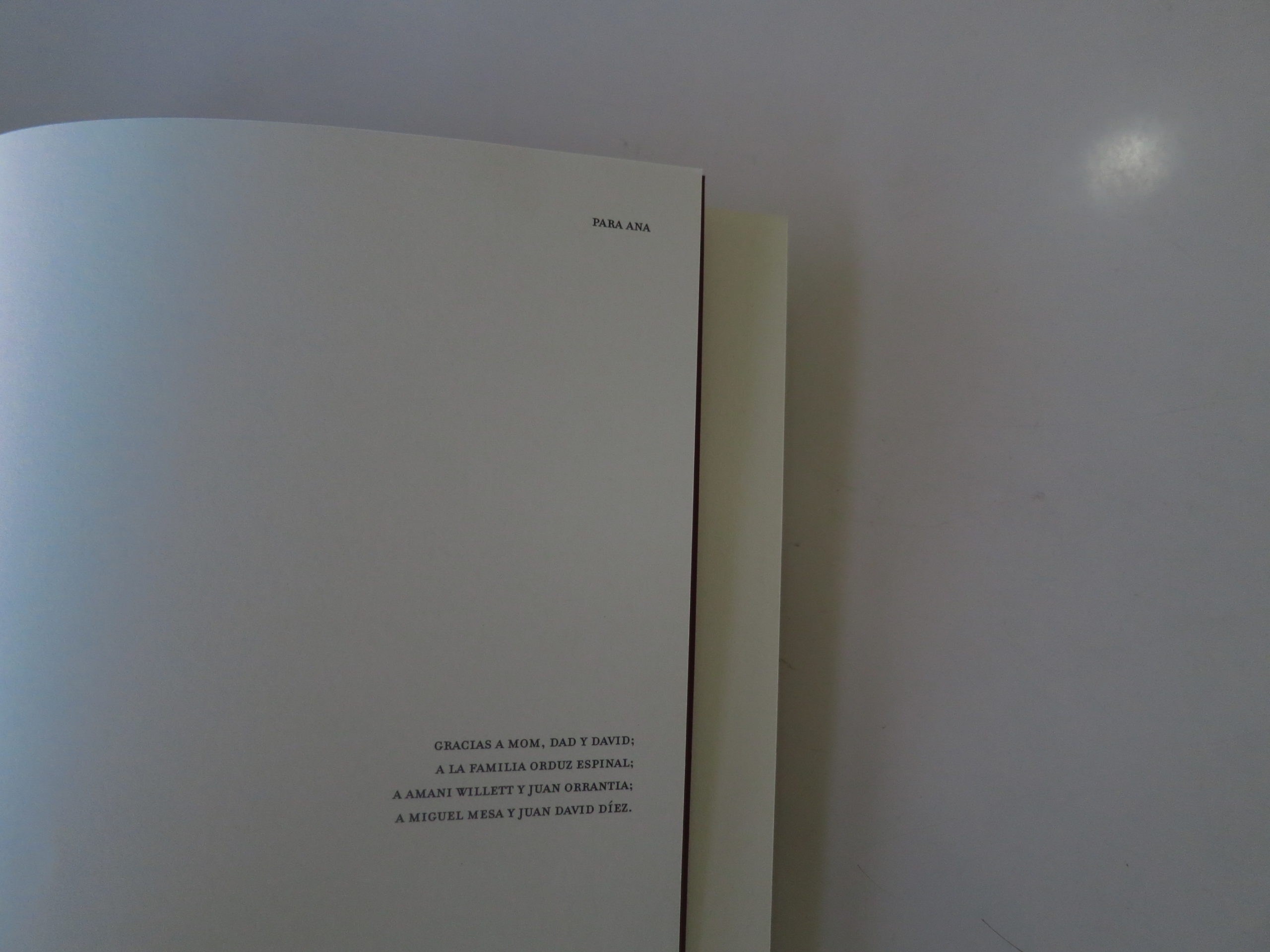
Today’s book, “Herida y Fuente,” was made by an American photographer, Tom Griggs, who’s been living in Colombia for a long time. (Published by Mesaestander) He runs the blog fototazo, and works hard to support Latin American photography.

He’s definitely a good guy.

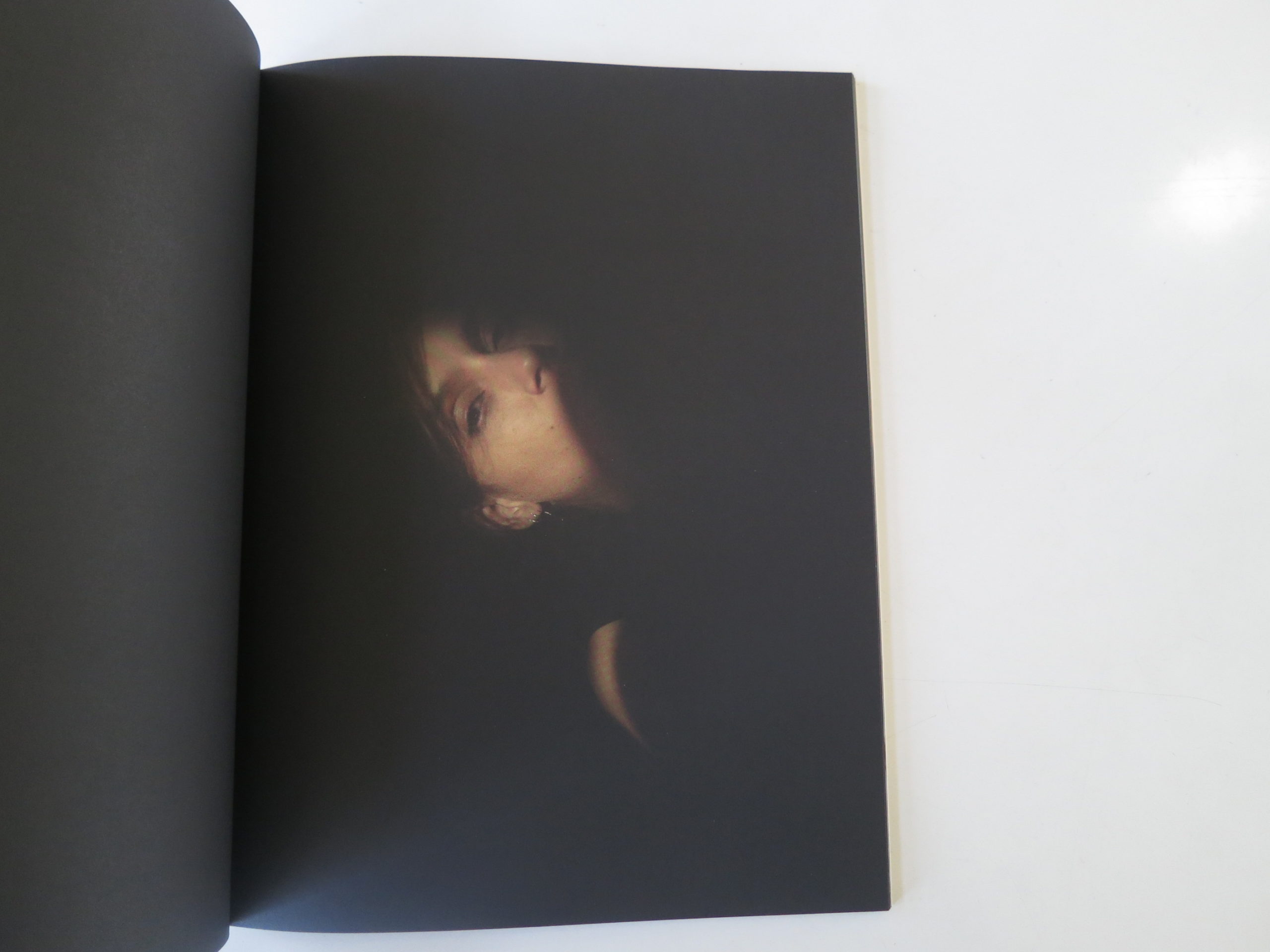
But I hadn’t seen his work before this book showed up a few months ago. I finally got to take a look at it today, and found it to be soulful, soft, and definitely emotional.

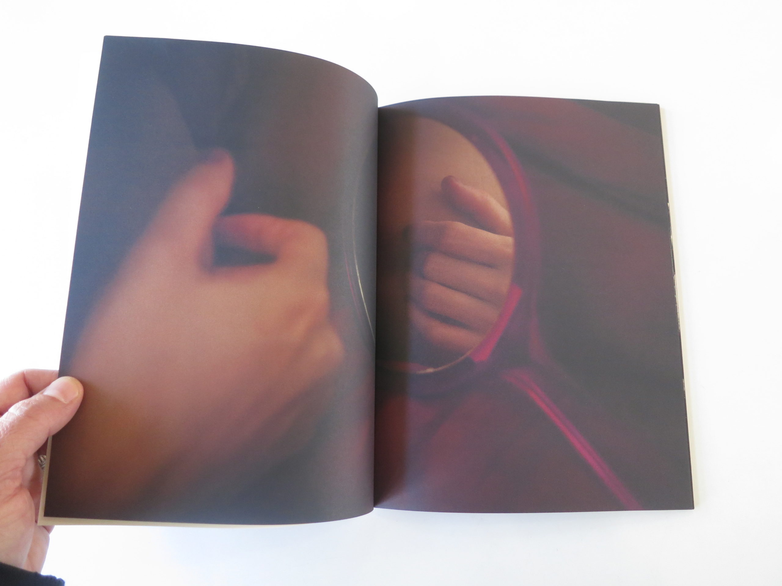
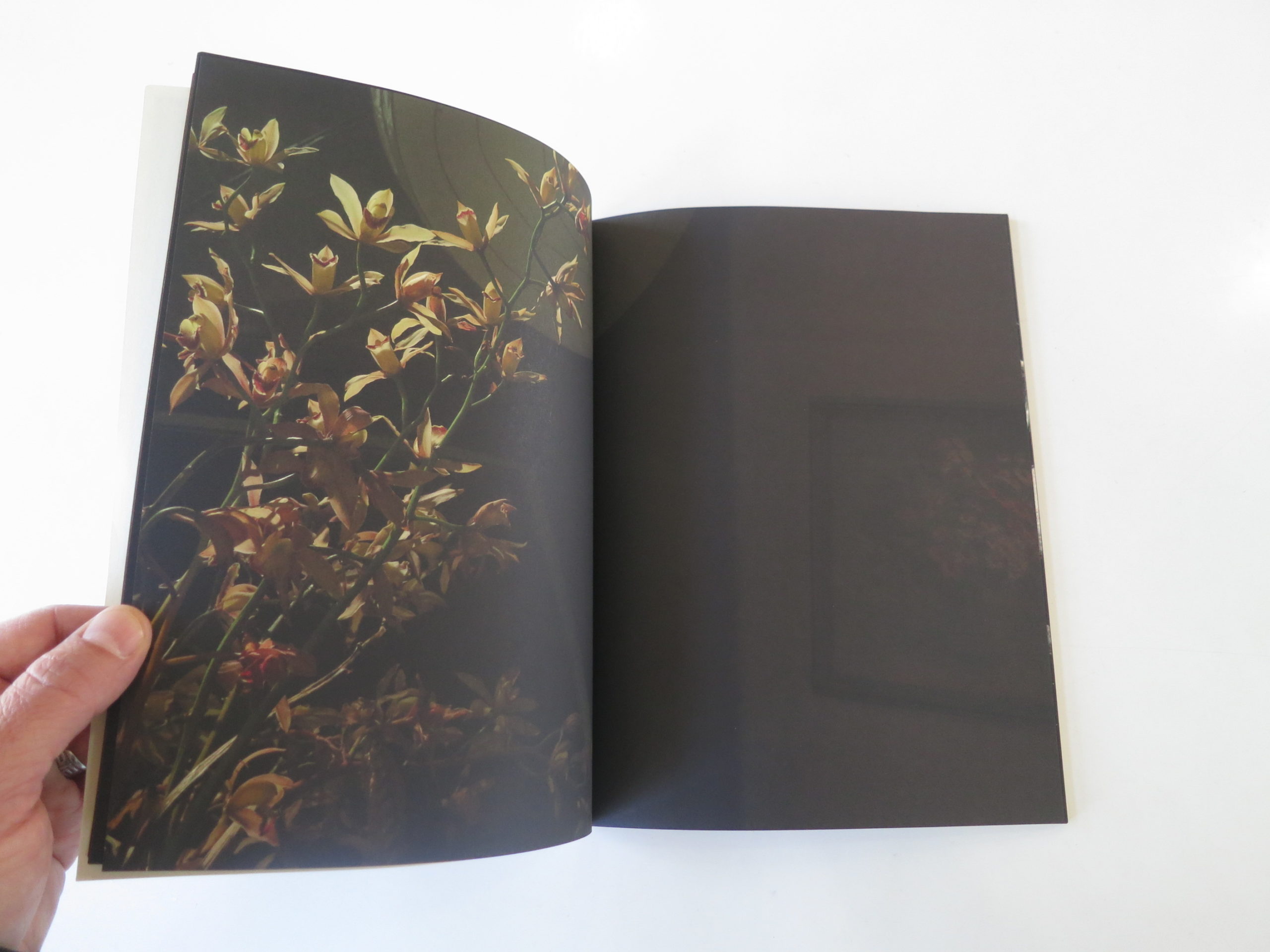
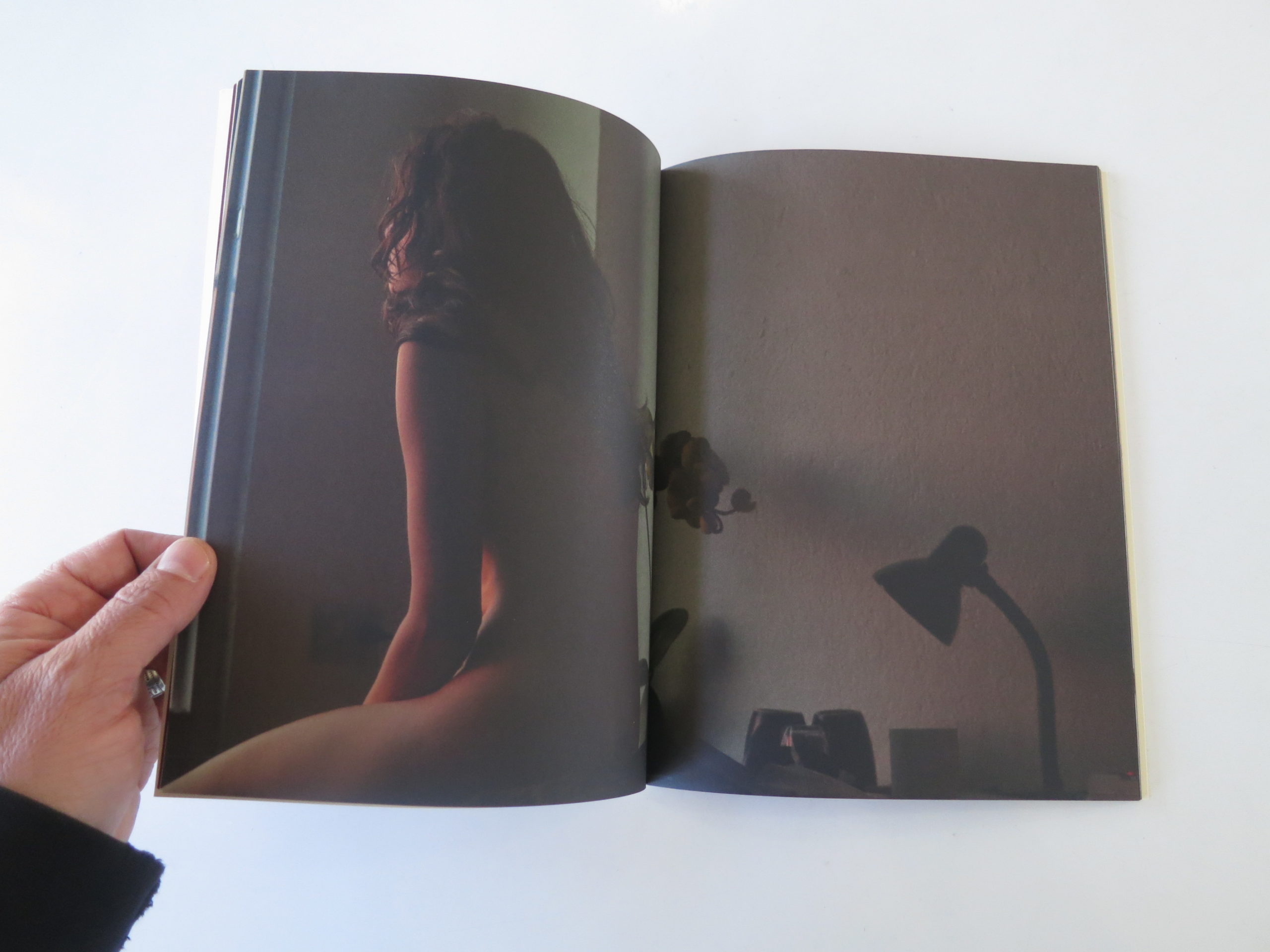
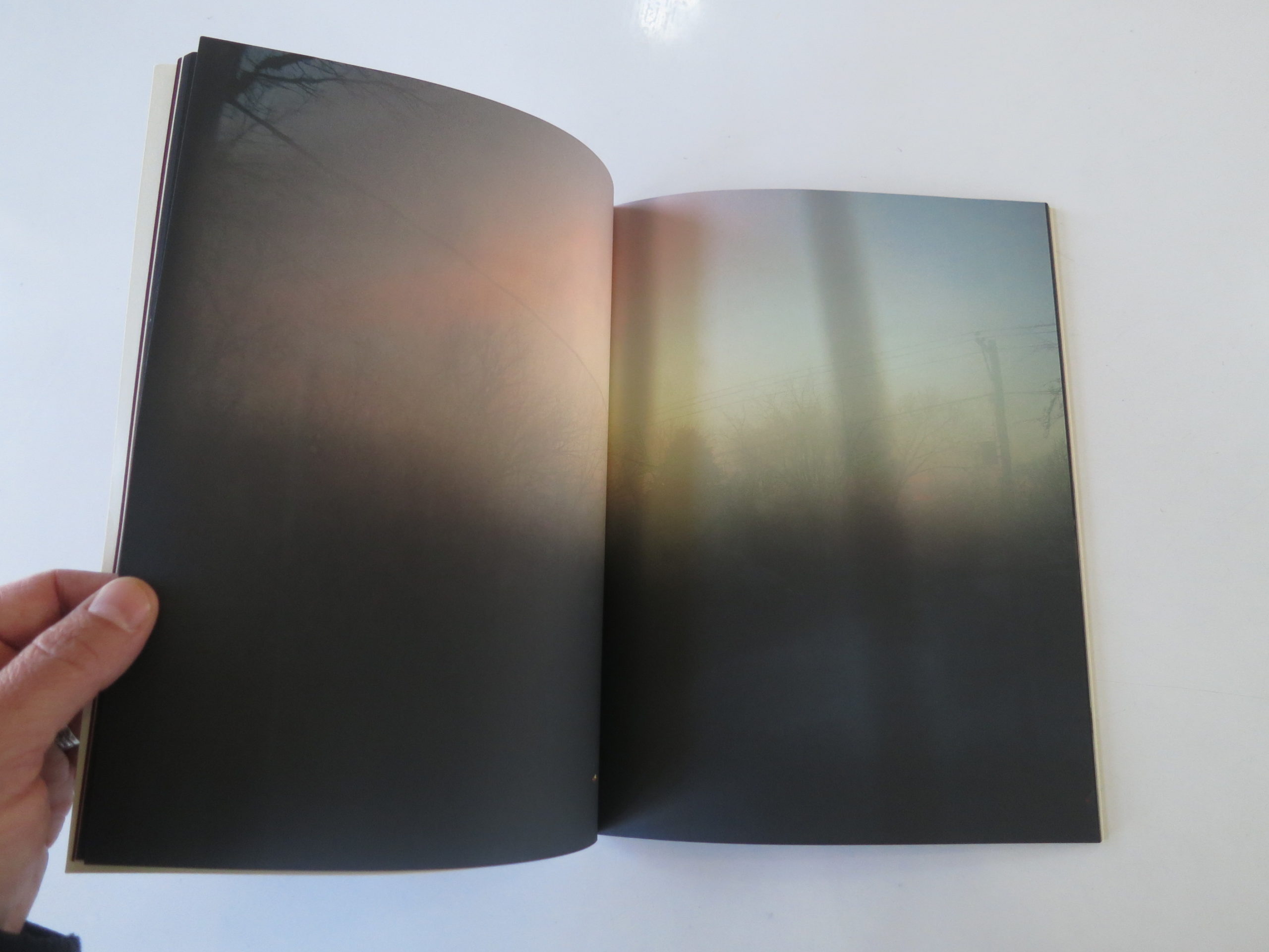
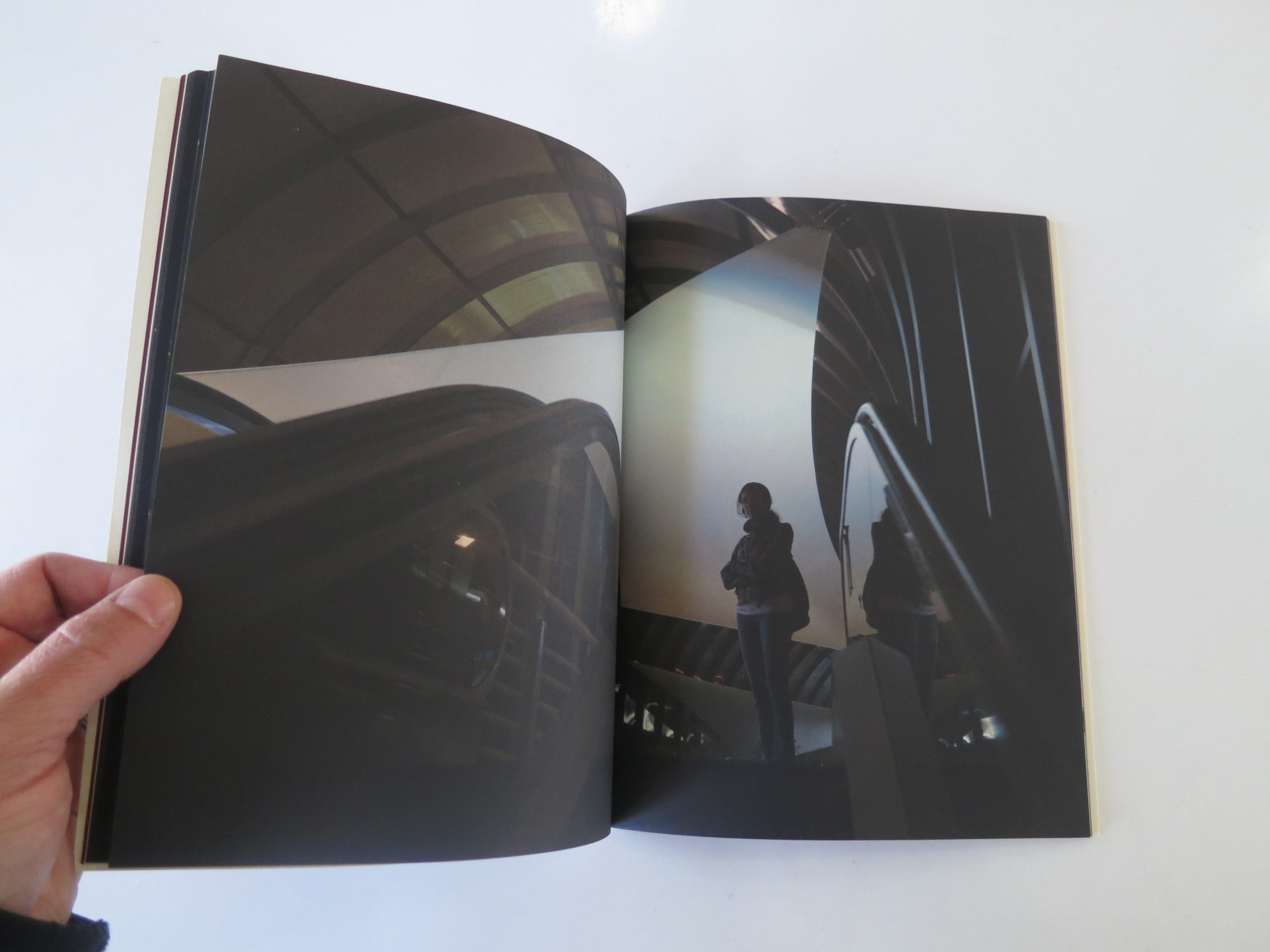
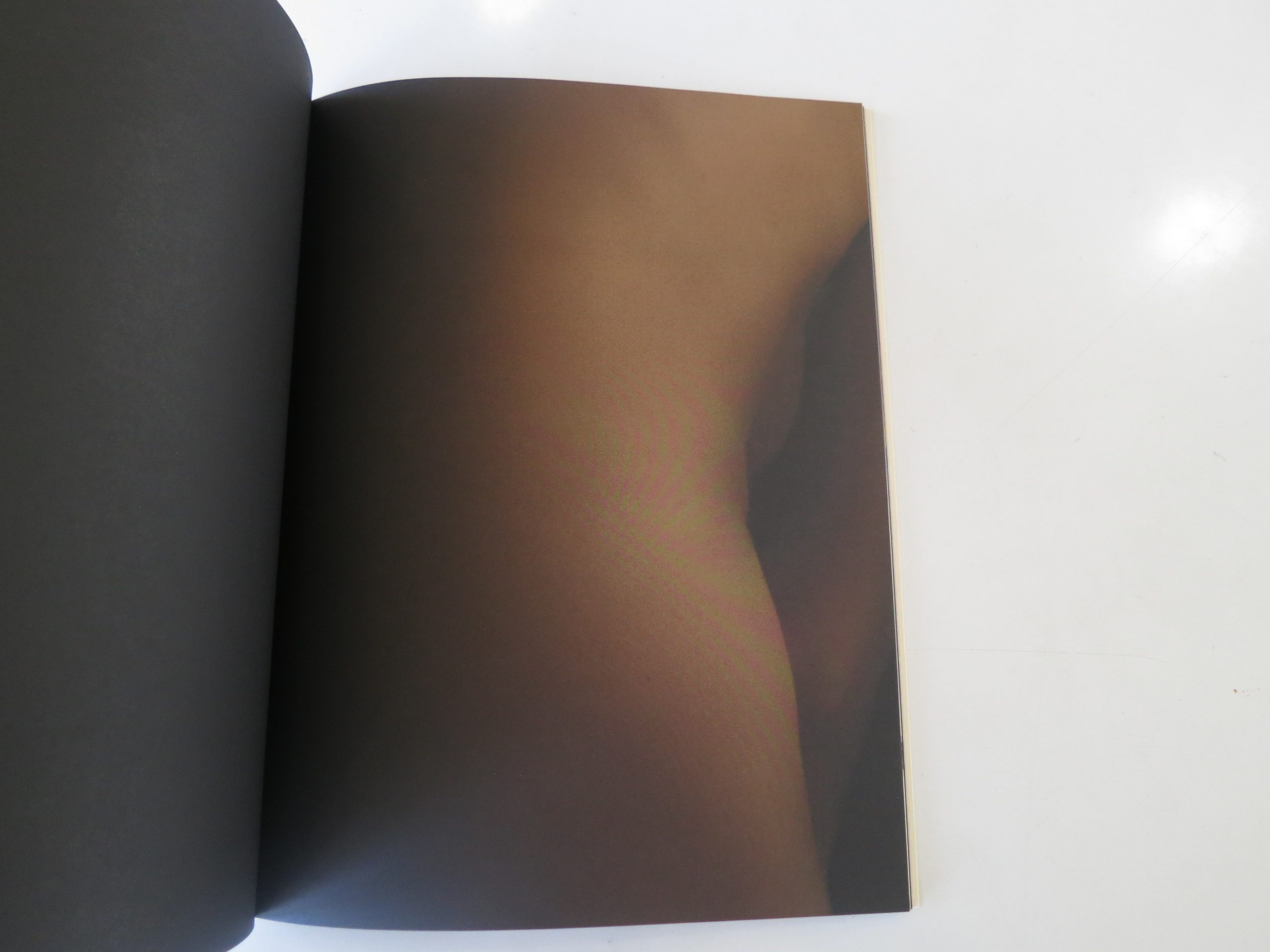
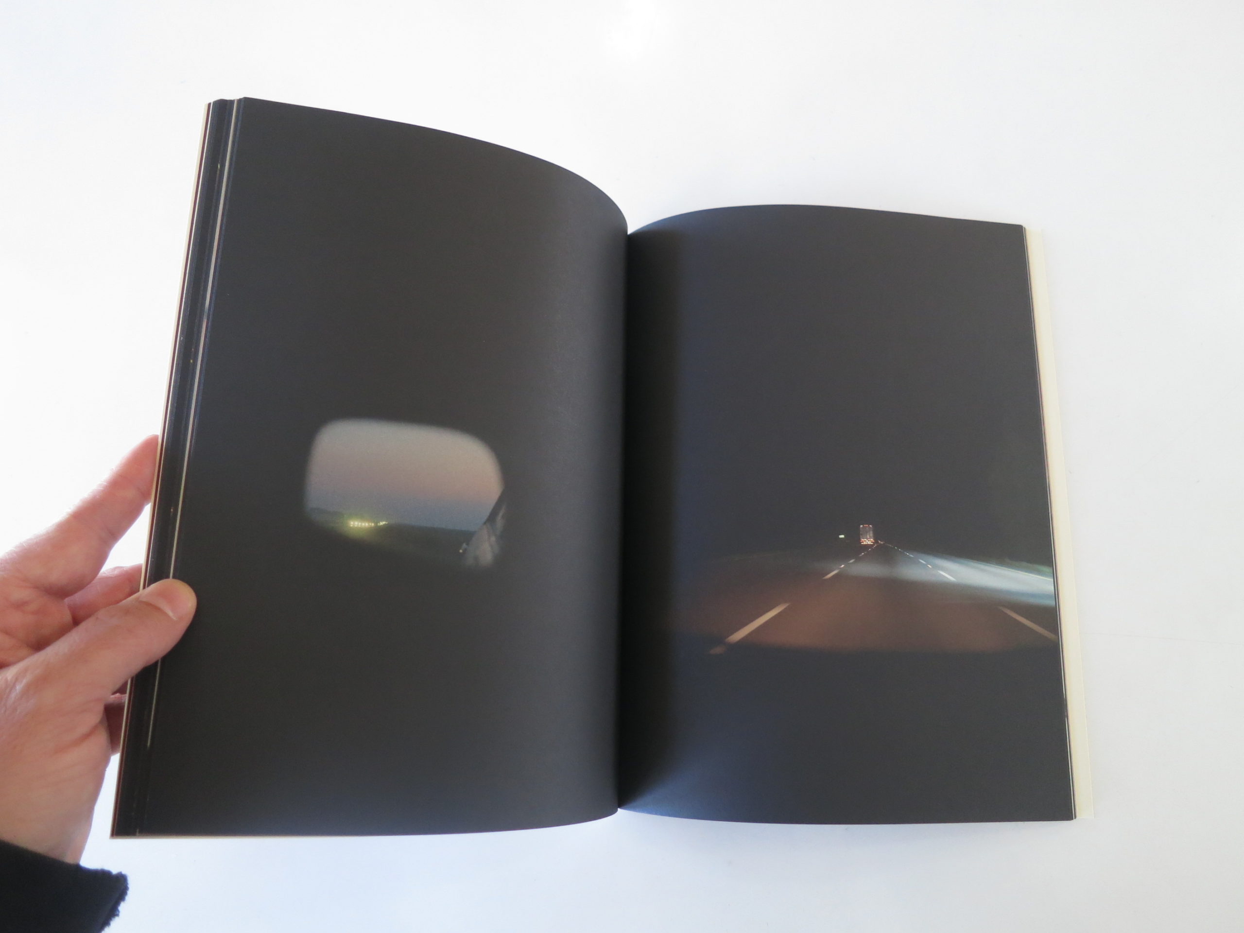
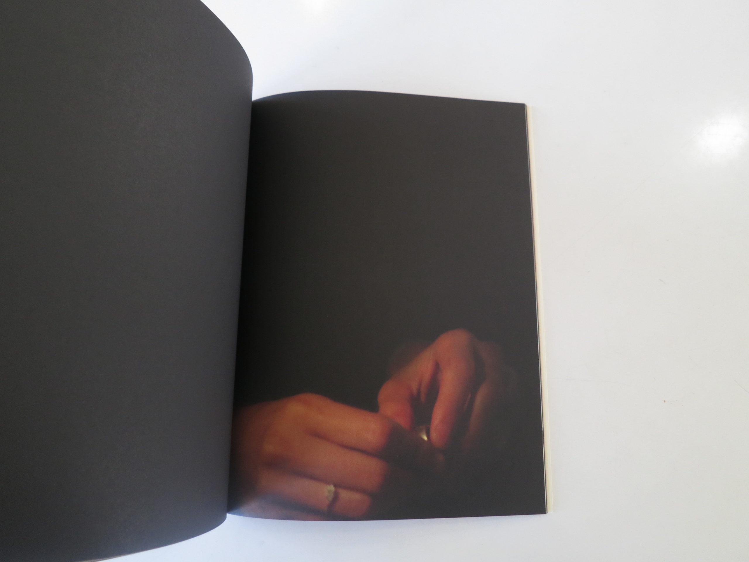
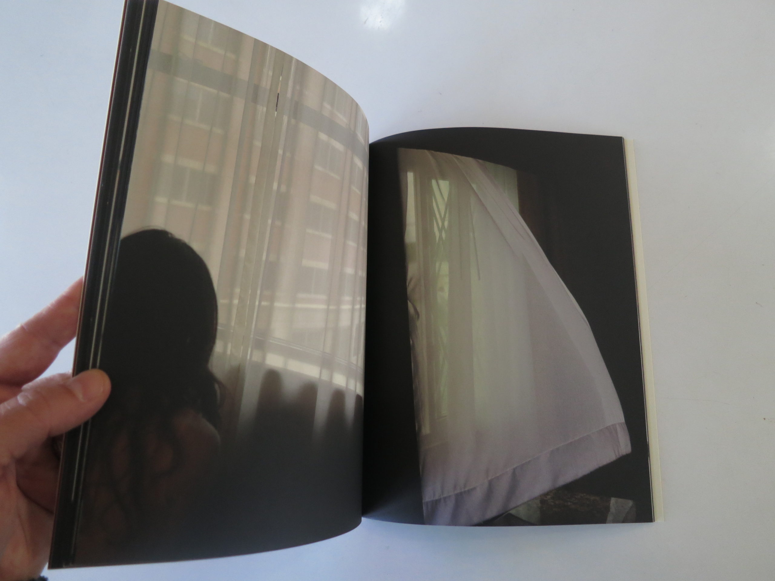
There’s a lot of visual darkness in this book, but it’s mostly the kind that serves as a foil for little spots of illumination. (Chiaroscuro, if you will.) The pictures are lovely, moody, and indirect. As the title is in Spanish, and there’s no English text at all, you’re on your own as far as interpretation goes, unless you speak Spanish.

(I know some, but not enough to decipher the title without Google’s help.)

Beyond the repetition of the black color palette, there are hints of discord. We see glimpses of the female body, but rarely the whole thing. A partner? A wife?

There’s one photograph that reminded me of a breast self-examination, so I wondered if there was an undertone of cancer?

But then we see pillows piled on the couch, like someone had to sleep there. Later, there’s a made bed that no one has slept in. In that sense, the book feels like a set of stills from a movie by one of those crazy Mexican directors.

There are flowers, and butterflies, and a sensibility I would feel comfortable describing as feminine. Unlike some people, I don’t see that as a negative term. Lots of artistic guys are comfortable with their emotions.

Eventually, I did translate the title, which means “wound and source.” I have no idea if this is a literal narrative, but the title clearly pushes us towards seeing this as a romantic breakup, a tumultuous relationship, or a legitimate battle with illness.

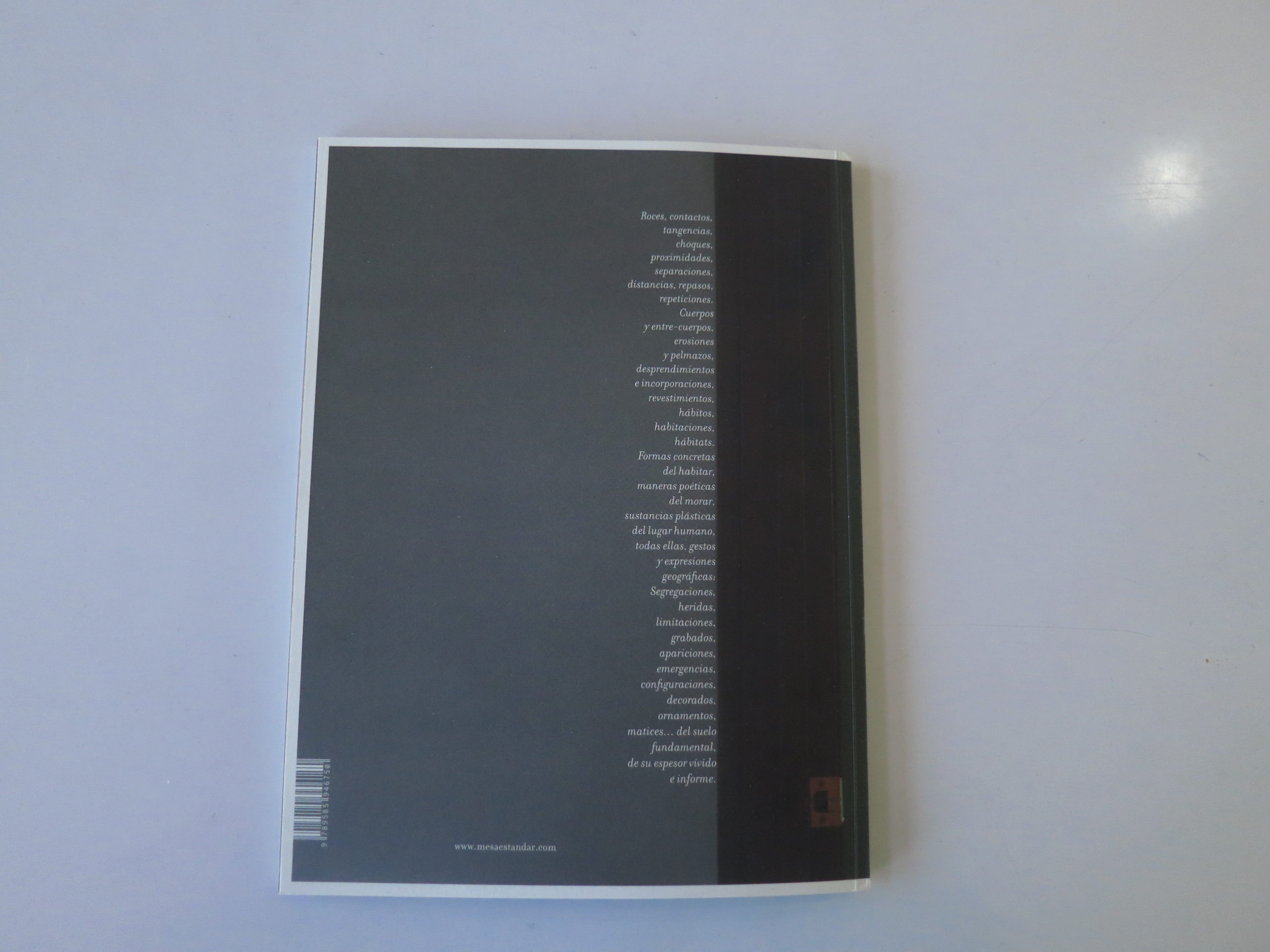
There’s a long poem on the back cover, also in Spanish, but I didn’t bother to run it through the software. I figure if Tom wanted us to read it in English, he would’ve written it in English.

Here are some of the words I made out: Contacts, tangents, proximity, separation, distance, bodies, corrosions, rooms, concrete forms, poetic manners…you get the point.

After the disconcerting reviews the last two weeks, I see today’s book as a heartfelt love poem tucked inside a photo book.

Hope you like it too.

Bottom line: A beautiful, poetic meditation on love? 

To purchase “Herida y Fuente,” click here

If you’d like to submit a book for review, please email me at jonathanblaustein@gmail.com. We are particularly interested in submissions from female photographers, to maintain the balance.

The Art of the Personal Project: Rob Gregory

The Art of the Personal Project is a crucial element to let potential buyers see how you think creatively on your own.  I am drawn to personal projects that have an interesting vision or that show something I have never seen before.  In this new revised thread, I’ll include a link to each personal project with the artist statement so you can see more of the project. Please note: This thread is not affiliated with any company; I’m just featuring projects that I find.  Please DO NOT send me your work.  I do not take submissions.

Today’s featured artist: Rob Gregory

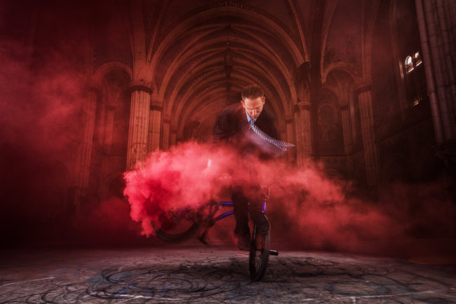
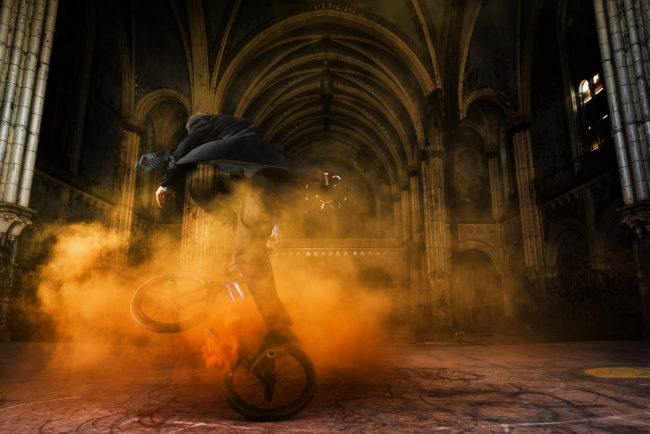
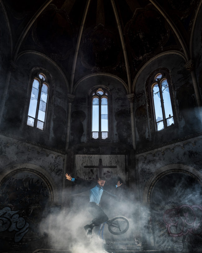
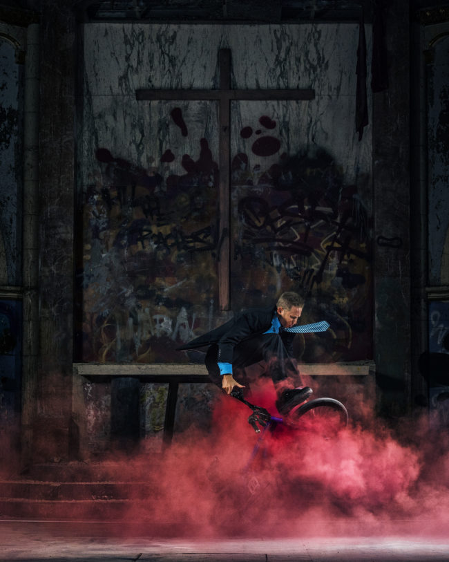
When looking at the landscape of BMX photography, I noticed some trends regarding wardrobe and location. Most riders seemed to be wearing jeans and a t-shirt, and were shot in street or skate park environments. As I set out to make Church with Matt Wilhelm, I wanted to take on the challenge of breaking these conventional molds. I started with the wardrobe and decided that a suit would be very different from anything I had seen. But in order for that to make sense, we needed a location where you would actually wear a suit, which is why I chose a church. Using an abandoned church seemed to fit the spirit of BMX and also allowed us to add one more final flourish to the series: smoke bombs. By strapping these to his bike and placing them in the environment, we were able to achieve some very unique and beautiful effects that were challenging at times, but worth the extra effort.

To see more of this project, click here.

APE contributor Suzanne Sease currently works as a consultant for photographers and illustrators around the world. She has been involved in the photography and illustration industry since the mid 80s. After establishing the art-buying department at The Martin Agency, then working for Kaplan-Thaler, Capital One, Best Buy and numerous smaller agencies and companies, she decided to be a consultant in 1999. She has a new Twitter feed with helpful marketing information because she believes that marketing should be driven by brand and not by specialty.  Follow her at @SuzanneSease.